Evaluation By: Mia Jones

Welcome message from author
This document is posted to help you gain knowledge. Please leave a comment to let me know what you think about it! Share it to your friends and learn new things together.
Transcript
Evaluation
By: Mia Jones
In what ways does your magazine use, develop or challenge forms and conventions of real media products

Use
Feature article photo
Feature article photo
Small barcode Small barcode
Graphic featureGraphic feature
Bold white mast head that contrasts with dark background
Bold white mast head that contrasts with dark background
Yellow banner Yellow banner
White and yellow cover lines
White and yellow cover lines
Advertisement
Advertisement
headline
headline
I have copied elements from this other magazine on the right.
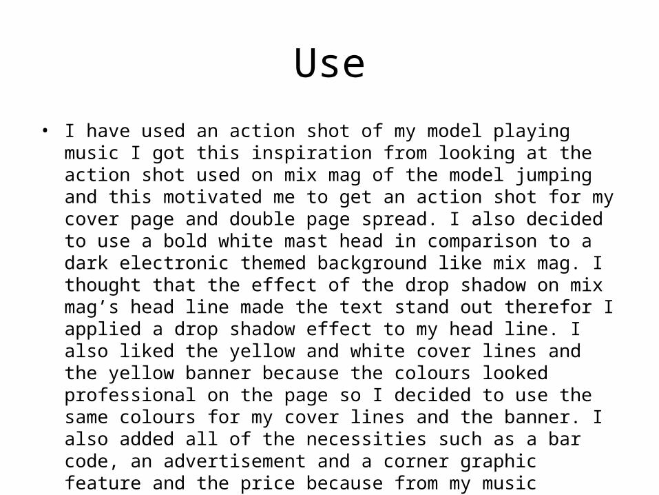
Use• I have used an action shot of my model playing music I got this inspiration
from looking at the action shot used on mix mag of the model jumping and this motivated me to get an action shot for my cover page and double page spread. I also decided to use a bold white mast head in comparison to a dark electronic themed background like mix mag. I thought that the effect of the drop shadow on mix mag’s head line made the text stand out therefor I applied a drop shadow effect to my head line. I also liked the yellow and white cover lines and the yellow banner because the colours looked professional on the page so I decided to use the same colours for my cover lines and the banner. I also added all of the necessities such as a bar code, an advertisement and a corner graphic feature and the price because from my music magazine research all of the magazines included these feature. The mix mag also includes a small shot on the top right hand side of the page. I also added a small image, I used an image of head phones I thought this looks effective.
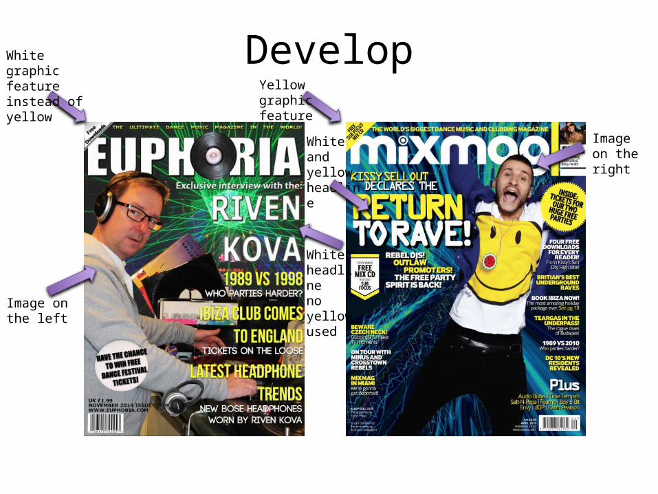
DevelopWhite graphic feature instead of yellow Yellow graphic
feature
Image on the left
Image on the right
White headlineno yellowused
White and yellow headline
Develop
• I then developed my magazine by making my text stand out more than the text on mix mag because I thought that Riven kova stood out in an all white font in comparison to having one word in yellow on the headline like mix mag’s. I also thought that my feature article photo looked better on the left hand side rather than the right. I changed the corner graphic feature to white because the contrasted successfully with the green background. I also preferred to have a larger barcode so I free transformed it and enlarged it.

ChallengeRecord image for the letter ‘O’
Action shot related to dance music.
Action shot
No imagery used
Challenge• I challenged mix mag by adding a feature they hadn't thought of and that I
had not seen on any other magazine whilst I did my research. I changed the letter ‘O’ in the mast head, ‘Euphoria’ as an image of a record because not only does it fit in perfectly with my genre it also looks interesting on the pages composition. I also challenged mix mag with the feature article photo I used on my front cover, the image mix mag used looks effective however I wanted to take it to the next level and take an image that represented my music magazine throughout, I did this by choosing the models clothes, getting him to play a record, and to pose with a slightly serious face.
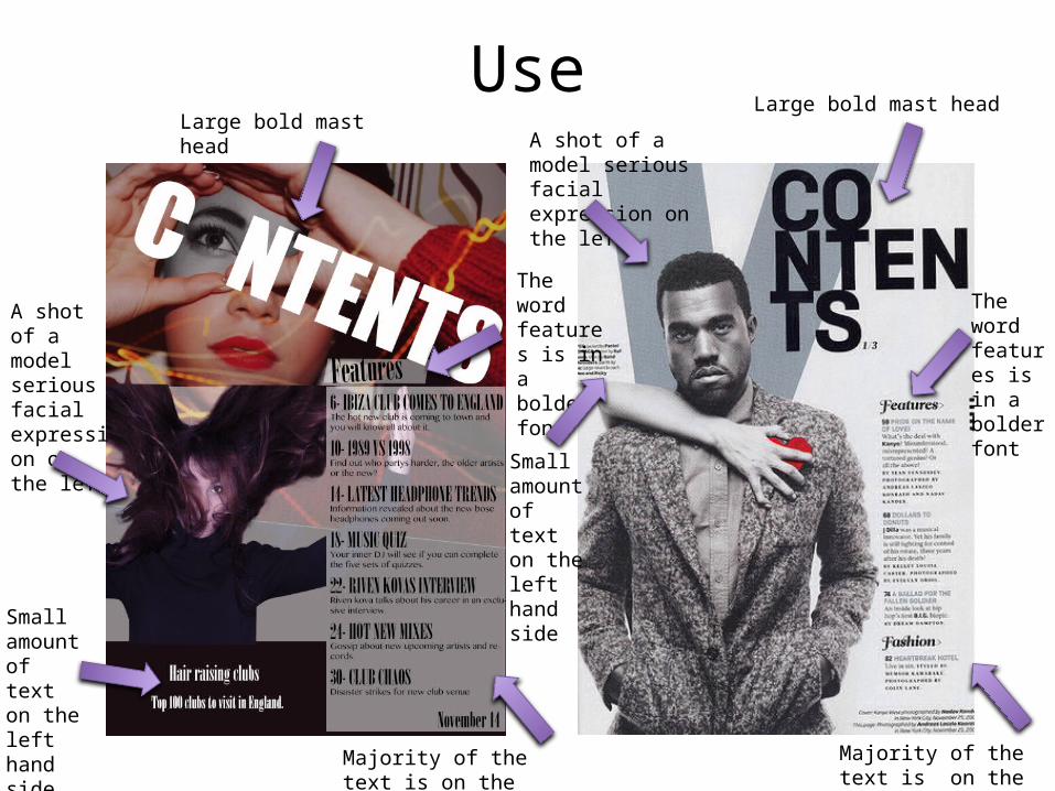
UseLarge bold mast head
Large bold mast head
Majority of the text is on the right hand side
Majority of the text is on the right hand side
A shot of a model serious facial expression on the left
A shot of a model serious facial expression on the left
The word features is in a bolder font
The word features is in a bolder font
Small amount of text on the left hand side
Small amount of text on the left hand side
Use
• I used this Vibe contents page in order to decide the composition of my music magazine’s contents page. Therefor many of my features are placed in the same places as in vibe. I have used the same features as vibe such as including a bold mast head, a shot of a model with a serious facial expression to attract the audience, a small amount of text on the left hand side of the page to fill a space as the majority of the listed features are placed on the right hand side of the page in a column and the ‘features’ heading is in a bold font in comparison to the rest of the text.
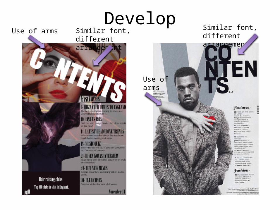
DevelopUse of arms
Use of arms
Similar font, different arrangement
Similar font, different arrangement
Develop
• The use of arms within the main image has developed from one arm to the use of two and placing them in front of the face whereas the arms on vibes image are around the models shoulders. Also although the fonts of the mast head are in a similar font I have developed the text into a different layout by having it placed diagonally across the top of the page whereas Vibe has the text in a column.
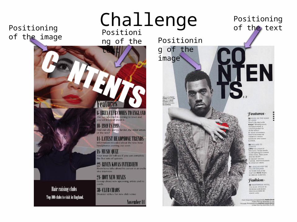
ChallengePositioning of the image
Positioning of the text
Positioning of the text Positioning of
the image
Challenge
• I faced the challenge of where I should place the photo of my model in order to represent her eye as the letter ‘O’ in the word‘contents’. Another challenging factor was ensuring that the theme of my magazine reoccurred throughout the pages for example, dark background so I had the challenge of creating a dark background.
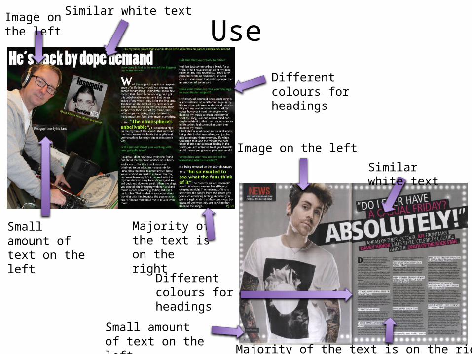
Use
Similar white text
Similar white text Image on the left
Image on the left
Majority of the text is on the right
Majority of the text is on the right
Different colours for headings
Different colours for headings
Small amount of text on the left
Small amount of text on the left

Use
• After I had completed my double page spread I found this other double page spread that is similar to mine. My image is placed on the left and the text is on the right, with a small amount of text on the left page. They are both stories about famous artists who have been interviewed. Both of the magazines have a similar bold, white text for the mast heads font and different colours are used for the headings in the text in order to make them stand out in comparison to the rest of the text.

DevelopPlaced my mast head on the left
Mast head is placed on the right
Free transformed image
Larger image
Develop
• I developed my magazine by placing my mast head on the left. I also developed my image by free transforming it in order for it to fit on the page and so that the text slightly overlaps the models head because I thought that this looked effective. I also cropped the image into a mid shot like the other magazine by using the crop tool to remove the bottom of the image.
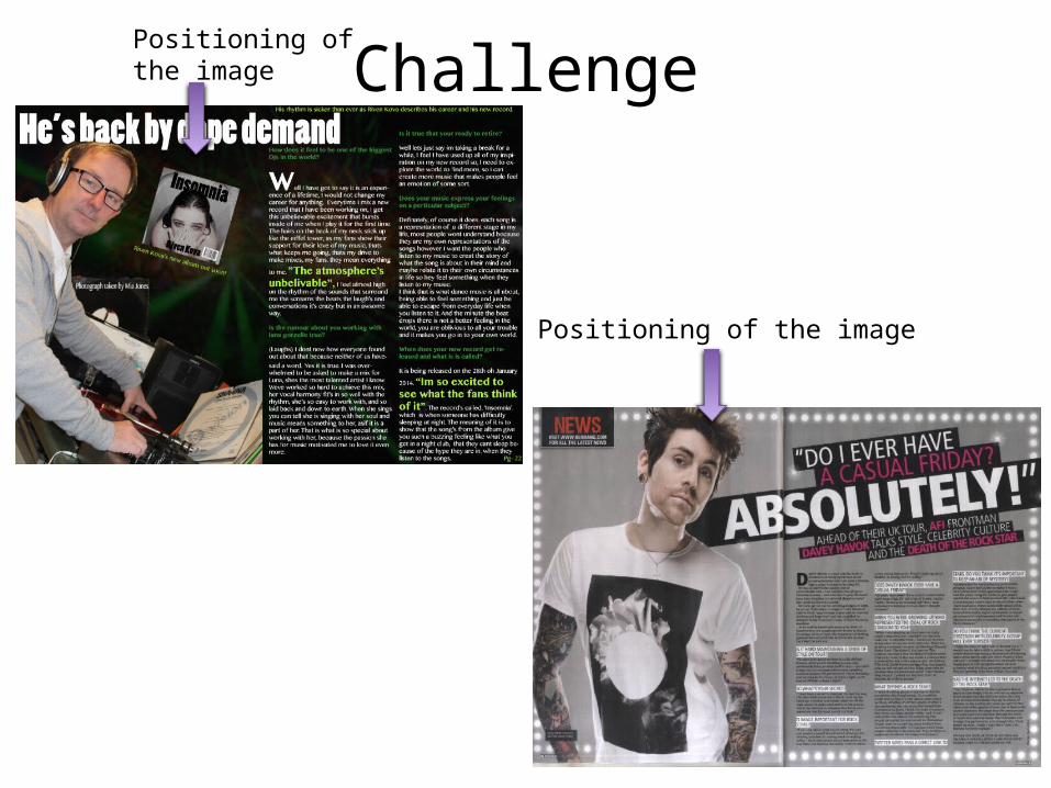
ChallengePositioning of the image
Positioning of the image
Challenge
• I didn’t face many challenges however a struggle I faced was deciding how to place my image of the artists record, I didn’t know whether to place it straight or on a diagonal.
Related Documents