How did I use new media technologies in the construction and research, planning and evaluation stages? Peter Fleetwood

Welcome message from author
This document is posted to help you gain knowledge. Please leave a comment to let me know what you think about it! Share it to your friends and learn new things together.
Transcript

How did I use new media technologies in the construction and research, planning and evaluation stages?
Peter Fleetwood
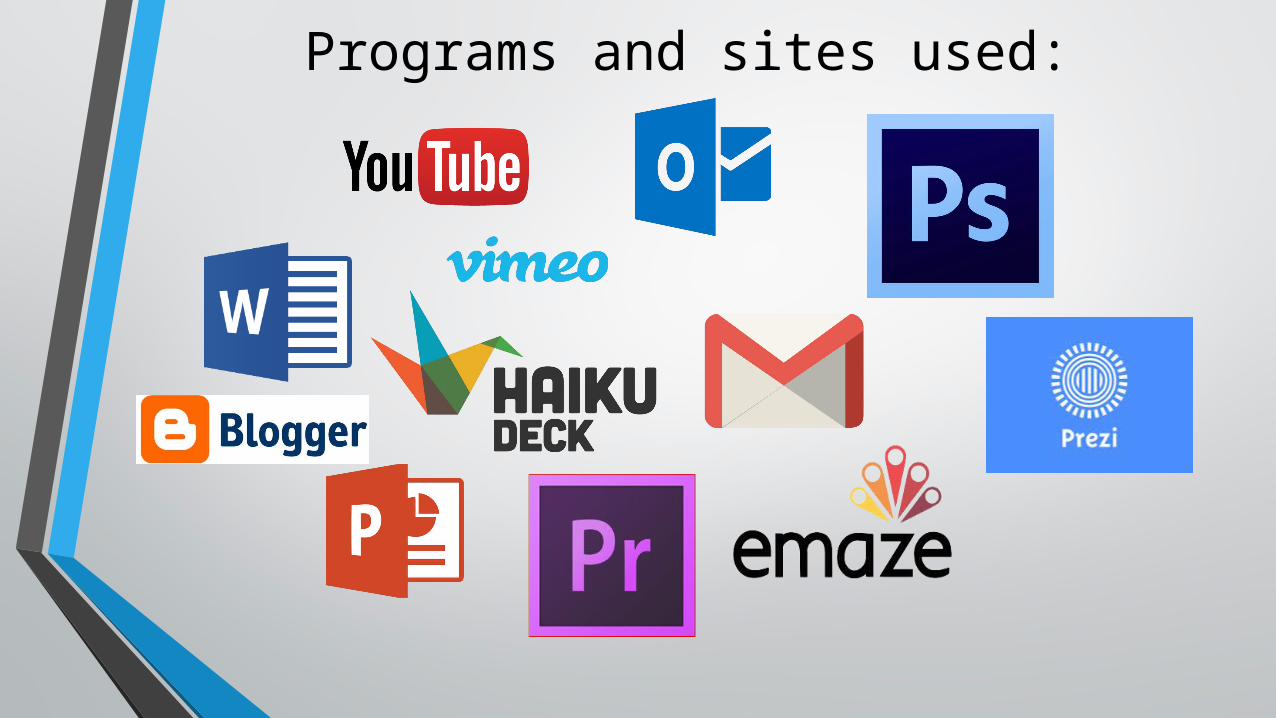
Programs and sites used:
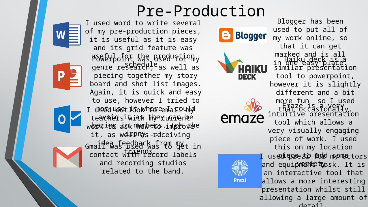
Pre-ProductionI used word to write several of my pre-production pieces, it is useful as it is easy and its grid
feature was useful for the production schedule.Powerpoint was used for my genre
research, as well as piecing together my story board and shot list images. Again, it is quick and
easy to use, however I tried to not use it where I could avoid it as they can be boring in numbers. (oh the
irony...) I used outlook to email my
teachers with my current work to ask how to improve it, as well as receiving idea feedback from my
friends.Gmail was used was to get in contact with record labels and recording studios related to the
band.
Blogger has been used to put all of my work online, so that it can get marked and is all in one easy place.Haiku deck is a similar
presentation tool to powerpoint, however it is slightly different and a bit more fun so I used that
occasionally.Emaze is a very intuitive presentation tool which allows a very visually
engaging piece of work. I used this on my location
piece to add some variety.I used prezi for my actors and
equipment task. It is an interactive tool that allows a more interesting presentation
whilst still allowing a large amount of detail.
The Presentation Tools:• Emaze, Prezi and Haiku Deck are all examples of presentation tools, but all have subtle
differences which make them a bit more fun to work with. They also add variety to my work which is a nice thing for anyone having to look at multiple pieces of work.
• Haiku Deck works very similarly to power point in the way it works, it allows you to have slides where you can put text and images in. However, it looks slightly sleeker and is quicker to put something together, which was really good when doing the pre-production as it let me get my thoughts down quicker. One drawback of it is though is that it has some problems and is very basic and doesn't allow any editing of text size or text boxes, or image sizing. This made it really aggravating to use, hence why I resorted to screen shotting the slides to add them separately to my blog afterwards.
• Emaze is very interesting to use as it is a very creative tool, it makes the transitions between each piece of information a fly by round a certain environment, I picked an art gallery for mine as it seemed the least intrusive option and wasn't too flashy. It was a good tool and I think that people prefer it to most others as it is more interactive and interesting to watch.
• Prezi is also really cool, and probably my favourite of the tools, it allows for you to put your content into little bubbles which then get zoomed in on and you can keep zooming in to see more information. I designed mine like a London tube map and you follow the stops and each stop is a different subject and point.

Production and Editing (Software)
I used vimeo several times to put my first drafts of my video online for friends to watch and to give me initial feedback so I
could go and tweak bits of it.
I used Adobe Premiere to edit all of my video, I cut all the clips down, placed them together, colour graded them and did all the basic lighting editing that my film required. Had my film
needed more heavy duty editing, with effects and other video techniques, I would have used Adobe After Effects. I did not
have to do this in the end as the effects were not demanding in my video.
I used youtube to upload my video for marking, however there were complications with the copyright. I had a long stream of
emails with the bands publisher who seemed co-operative to help me, they went over and reviewed the copyright strike.
Unfortunately they came back to me the next morning saying that it was higher up the chain and Sony was involved and it would
have to go through them to get any further. He provided me with a direct email for someone in Sony, but I am yet to receive any
replies from any of my requests.

Colour Grading• I colour graded my film so that all of the footage looked coherent when put
together. When I was shooting some of my footage, I was sometimes facing towards the sun, and sometimes wasn't, this made all of the colours and light different each shot. So I tried to average everything out using RGB Curves within Premiere, increasing or decreasing reds/greens/blues so that each shot looked good together. I would also alter the contrast depending on the shot if was sun facing or not, to try and lessen the differences. So I went through my video shot by shot and I altered the colours so that when played it was all seamless and there were no random changes of light/colour continuity, it all flowed nicely from one shot to another.

Production and Editing (Hardware)I used a Windows computer to edit my video on. It was good as it a very fast computer and
so rendering all of the clips was very quick which made
the whole process faster.
The Canon 700d was the camera that I used for all of my video, it was great as the quality was brilliant. Also because it had a flip view screen it allowed me to
see myself when I was filming the scenes of me so that I knew I was always in the image. One annoying feature (although unavoidable) was that the zoom on the lense wasn't great at staying sharp at
long range. The shots where I was trying to get the flying bird were difficult to get a good take, however I think I managed to get the best I could in the end after about half an hour sitting waiting for
birds to fly in the right direction.
There was also the Velbon tripod I used
which was invaluable when I was doing moving shots, as I
used it as a primitive steadicam, which for me worked better as I am not good at using real steady cams. But
the extra stability made the shots look
better than they would have done otherwise so I am
happy with how it all worked out.
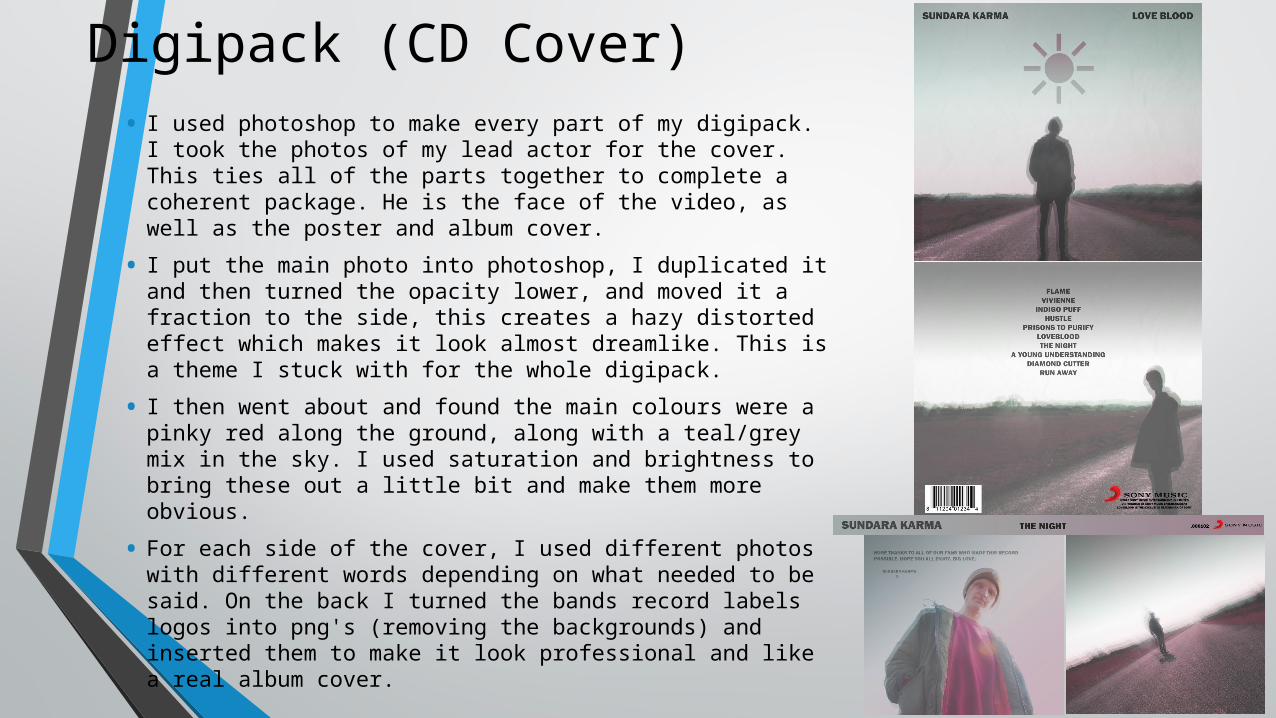
Digipack (CD Cover)• I used photoshop to make every part of my digipack. I
took the photos of my lead actor for the cover. This ties all of the parts together to complete a coherent package. He is the face of the video, as well as the poster and album cover.
• I put the main photo into photoshop, I duplicated it and then turned the opacity lower, and moved it a fraction to the side, this creates a hazy distorted effect which makes it look almost dreamlike. This is a theme I stuck with for the whole digipack.
• I then went about and found the main colours were a pinky red along the ground, along with a teal/grey mix in the sky. I used saturation and brightness to bring these out a little bit and make them more obvious.
• For each side of the cover, I used different photos with different words depending on what needed to be said. On the back I turned the bands record labels logos into png's (removing the backgrounds) and inserted them to make it look professional and like a real album cover.
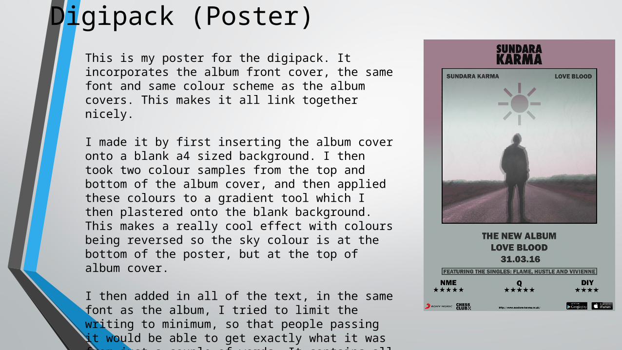
Digipack (Poster)This is my poster for the digipack. It incorporates the album front cover, the same font and same colour scheme as the album covers. This makes it all link together nicely.
I made it by first inserting the album cover onto a blank a4 sized background. I then took two colour samples from the top and bottom of the album cover, and then applied these colours to a gradient tool which I then plastered onto the blank background. This makes a really cool effect with colours being reversed so the sky colour is at the bottom of the poster, but at the top of album cover.
I then added in all of the text, in the same font as the album, I tried to limit the writing to minimum, so that people passing it would be able to get exactly what it was from just a couple of words. It contains all of the important information, like date of release, singles, reviews as well as where to buy it. Finally on the bottom I added the bands website and their affiliated labels and publishers.
Related Documents