HOW EFFECTIVE IS THE COMBINATION OF YOUR MAIN AND ANCILLARY TEXTS?

Evaluation Question 2
Aug 10, 2015
Welcome message from author
This document is posted to help you gain knowledge. Please leave a comment to let me know what you think about it! Share it to your friends and learn new things together.
Transcript

HOW EFFECTIVE IS THE COMBINATION OF YOUR MAIN AND ANCILLARY
TEXTS?

OUR PRODUCTS

HOW HAVE YOU CONNECTED ALL THREE OF YOUR
PRODUCTS?
The main connectivity between our three products
is the motif of a strong female character. This
represents the independence aspect to the video that
we wanted audiences to see and feel. Acting as both
our juxtaposition to the R&B genre as well as a
synergistic element to all three of our products,
which audiences could see.

HOW DOES EACH DEVELOP THE OTHER? (MUSIC VIDEO)
When creating the music video we aimed to stand out from all its R&B
predecessors, which meant we had to do the opposite of what you would
usually expect to see in a typical R&B music video. Rather than a slow beat
over meaningful lyrics, we went for meaningful lyrics over a faster more rapid
beat. Instead of a female protagonist that anguishes in a break up we chose to
instead have one that relishes in it. An example of this typical R&B convention
is Mariah Carey’s ‘We belong together’. In this we can see mariah in heart ache
as she dread over the loss of her lover. We felt that rather than conveying this
typical convention and moulding into the same generic product we would break
the chain. In doing this, we were able to create a sense of independence that
would in turn tie to our print products.
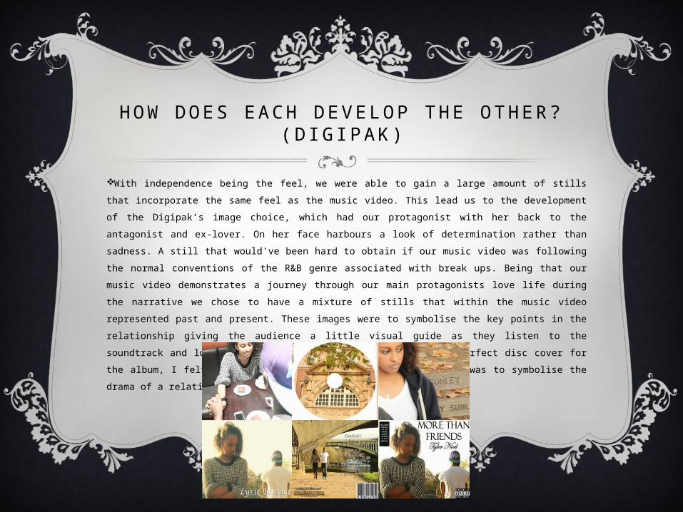
HOW DOES EACH DEVELOP THE OTHER? (D IGIPAK)
With independence being the feel, we were able to gain a large amount of stills that
incorporate the same feel as the music video. This lead us to the development of the
Digipak’s image choice, which had our protagonist with her back to the antagonist and
ex-lover. On her face harbours a look of determination rather than sadness. A still that
would've been hard to obtain if our music video was following the normal conventions of
the R&B genre associated with break ups. Being that our music video demonstrates a
journey through our main protagonists love life during the narrative we chose to have a
mixture of stills that within the music video represented past and present. These images
were to symbolise the key points in the relationship giving the audience a little visual
guide as they listen to the soundtrack and look at the digipak cover. When choosing the
perfect disc cover for the album, I felt it best to use an image of a theatre, this was to
symbolise the drama of a relationship that our protagonist goes through.

HOW DOES EACH DEVELOP THE OTHER? (MAGAZINE
ADVERT)
Using stills directly from the music video, we decided upon the
choice of enlarging an image of the female protagonist in order
to make the magazine advert stand out from a distance but also
to show a sense of empowerment. This coupled well with the
‘sassy’ expression on the actors face; it added to the feeling of
no longer caring about the relationship that we aimed to
portray within our music video. We chose to use the colour
black as a background to our magazine advert in order to
further add to the boldness of the digipak cover whilst
conveying the boldness of the lyrical content both within the
music video and the album.

W H AT D O Y O U R A N C I L L A RY T E X T S A D D T Y O U R M A I N T E X T ?
With the magazine, the use of the colour black was a
choice I felt we should take in order to give audiences a
slight taste of what our music video is about whilst still
adding to the main texts theme of independence. This is
because of the meaning of the colour black which stands
for power and control. Coupled with the enlarged still
image we aimed for audiences to get the sense of challenge
as the main texts content challenge the R&B conventions to
be expected by audience.
In terms of the digipak, using a still image used to
express the past in the music video. We felt it would be
good to use this still to show the sense of reflection that the
main text harbours alongside its theme of independence.

DOES OUR PRODUCT SHARE AN IDENTITY?
As a whole I feel that though they have some similarities our three
products have different identities. Whilst all of them have elements of the
Magazine Advert shows more focus on independence with the use of the
colour black and enlarged still of our female protagonist. The digipak
however shows more of a reflective stand point whilst still harbouring
some independence. This is due to the two individuals facing back to back
as if ‘reflecting’ each others actions as both arms are crossed for both
individuals.
The main text borrows and incorporates both the stand out points of the
magazine adverts independence and the Digipaks reflection as a whole.

HOW COULD WE HAVE DEVELOPED OUR PRODUCT TO INCREASE THEIR
SYNERGY?
We could've developed our products to increase their synergy by using
the same image from the same still. This would show a more clear
connection between the three products, as the attire that the female
protagonist wears different clothes in the magazine advert and digipak
cover, even though a large amount of the music video was sung in the
attire seen in the enlarged photo on the magazine advert.
The implementation of a link to the music video in both the magazine
advert and digipak as it is a debut single for an unknown artist our
audience are likely to believe that the action is actually the unsigned
artist. Which could lead to confusion.

HOW DO YOU FEEL AB OUT THE F INAL PRODUCT?
In a whole, I like the turn out of our final
products as it does demonstrate the feel of
independence we were aiming for whilst
looking like an actual music video, magazine
advert and Digipak Cover.
Related Documents