Welcome message from author
This document is posted to help you gain knowledge. Please leave a comment to let me know what you think about it! Share it to your friends and learn new things together.
Transcript

Synergy is the term used to describe a situation where different entities cooperate advantageously for a final outcome. Simply defined, it means that the whole is greater than the sum of its parts. The media institution exploit various platforms to sell various products. In the music industry, different media platforms will be created in order to promote the song along with its music video. This will be posters and adverts within magazines to promote the new release of a song and also to spread awareness of it through advertising and word of mouth.

CD Digipak:
Advert:
I feel positive that our ancillary task suits our finished music video and
follows the same themes throughout. It captures the essence of the
drum n bass genre and it is clear both products link together making it
clear to the audience what they are promoting.

The cover of our digipak can be seen in the image on the left (top). As you can see, our design for the album cover is much different from Nero’s actual album cover. As we were creating our own ideas for the song, we didn’t want to make ours similar to Nero’s original designs atall and therefore tried to make ours different and original. We wanted to make it clear that our digipak was promoting the music video and therefore followed themes throughout such as the black and white filter along with the costumes and other mise enscene elements that the audience will be seeing within the music video. Nero’s actual album over is quite sci-fi based which is very different to our grunge look but I still think ours is just as effective. I wanted to add the characters that are within the music video because then synergy is created across both platforms and fully promotes the ideas within the video. It also gives the audience an idea of what they will be seeing within the music video. A drum n bass band such as Nero never uses their actual identities within their music videos so we didn’t want to do the same and therefore used two main characters who are not part of the band. Although we wanted to be original, we still felt that we needed to follow some similar aspects to make sure we follow some conventions of drum n bass products and videos.
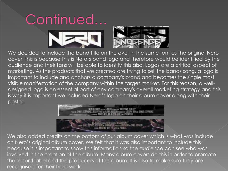
We decided to include the band title on the over in the same font as the original Nero
cover, this is because this is Nero’s band logo and therefore would be identified by the
audience and their fans will be able to identify this also. Logos are a critical aspect of
marketing. As the products that we created are trying to sell the bands song, a logo is
important to include and anchors a company's brand and becomes the single most
visible manifestation of the company within the target market. For this reason, a well-
designed logo is an essential part of any company's overall marketing strategy and this
is why it is important we included Nero’s logo on their album cover along with their
poster.
We also added credits on the bottom of our album cover which is what was include
on Nero’s original album cover. We felt that it was also important to include this
because it is important to show this information so the audience can see who was
involved in the creation of the album. Many album covers do this in order to promote
the record label and the producers of the album. It is also to make sure they are
recognised for their hard work.

Again, the inside of our album cover follows the themes that are within the video and the rest of the album designs. This image is of Lara on her own rather than an image of the two together. This image does differ from the others because here, Lara appears upset and disturbed whereas in the other images, she looks happy and in love. We thought that including the image would get the audience’s attention and hopefully make them curious as to what is within the music video because from the cover you can see that the music video will show some kind of story- thus promoting the album further. The image also follows the same grunge theme and also black and white look. We added some text to the inside such as ratings from music related companies and also other artists such as Skrillexwho writes music of a similar genre. This will bring in audiences who are interested in this genre of music therefore promoting the album further because if an artist who is of a similar genre is promoting the album, then fans will identify this and think that the album includes content of their fancy and are more likely to buy it.

Before creating our music video, we took these images with the green screen which we thought we would be using for our digipak. However, after a number of group discussions and after we had started to film, we decided that these images may not be the best ones to use because we took others which followed the themes that are within our music video e.g. costumes and location. To help us decided, we gathered some feedback from our target audience and the majority said that they felt like the image of Lara was effective and stood out. We wanted to incorporate the image somewhere within our digipak so in the end we decided to use it for the face of our CD. We thought this was the best idea because the reasons we didn’t want to use these images were because she wasn’t wearing the same costume as within the music video, but for the CD this didn’t matter because you cant see her outfit. After adding a black and white filter, I think it still follows the themes however, after finishing the digipak, I would have liked to have added the name of the album on the CD in small print as most album CD’s do this.
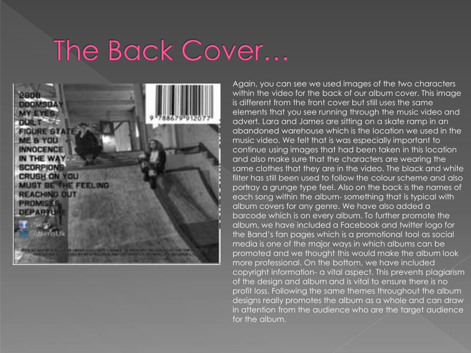
Again, you can see we used images of the two characters
within the video for the back of our album cover. This image
is different from the front cover but still uses the same
elements that you see running through the music video and
advert. Lara and James are sitting on a skate ramp in an
abandoned warehouse which is the location we used in the
music video. We felt that is was especially important to
continue using images that had been taken in this location
and also make sure that the characters are wearing the
same clothes that they are in the video. The black and white
filter has still been used to follow the colour scheme and also
portray a grunge type feel. Also on the back is the names of
each song within the album- something that is typical with
album covers for any genre. We have also added a
barcode which is on every album. To further promote the
album, we have included a Facebook and twitter logo for
the Band’s fan pages which is a promotional tool as social
media is one of the major ways in which albums can be
promoted and we thought this would make the album look
more professional. On the bottom, we have included
copyright information- a vital aspect. This prevents plagiarism
of the design and album and is vital to ensure there is no
profit loss. Following the same themes throughout the album
designs really promotes the album as a whole and can draw
in attention from the audience who are the target audience
for the album.
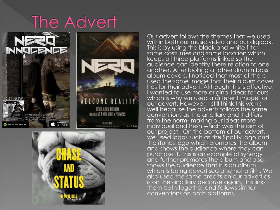
Our advert follows the themes that we used within both our music video and our digipak. This is by using the black and white filter, same costumes and same location which keeps all three platforms linked so the audience can identify there relation to one another. After looking at other drum n bass album covers, I noticed that most of theirs used the same image that their album cover has for their advert. Although this is affective, I wanted to use more original ideas for ours which is why we used a different image for our advert. However, I still think this works well because the adverts follows the same conventions as the ancillary and it differs from the norm- making our ideas more individual and fresh which was the aim of our project. On the bottom of our advert, we used logos such as the Spotify logo and the iTunes logo which promotes the album and shows the audience where they can purchase it. This is an example of synergy and further promotes the album and also shows the audience that it is an album which is being advertised and not a film. We also used the same credits on our advert as is on the ancillary because again, this links them both together and follows similar conventions on both platforms.
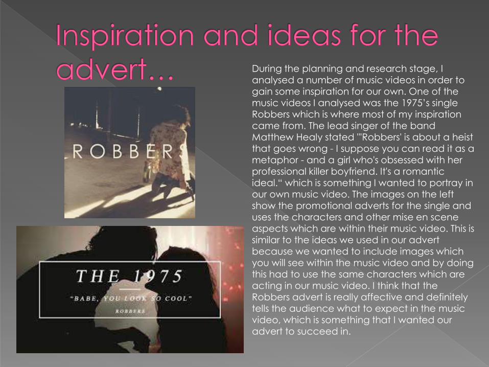
During the planning and research stage, I analysed a number of music videos in order to gain some inspiration for our own. One of the
music videos I analysed was the 1975’s single Robbers which is where most of my inspiration came from. The lead singer of the band Matthew Healy stated "'Robbers' is about a heist that goes wrong - I suppose you can read it as a metaphor - and a girl who's obsessed with her professional killer boyfriend. It's a romantic ideal.“ which is something I wanted to portray in our own music video. The images on the left show the promotional adverts for the single and uses the characters and other mise en scene aspects which are within their music video. This is similar to the ideas we used in our advert because we wanted to include images which you will see within the music video and by doing this had to use the same characters which are acting in our music video. I think that the Robbers advert is really affective and definitely tells the audience what to expect in the music video, which is something that I wanted our advert to succeed in.

After analysing other drum n
bass album covers and seeing
that they usually use the same
image for their album cover and
their advert, we felt that we
needed to make it clear to the
audience what album we were
promoting because using
another image can be quite
risky. On the right, you can see
Adele's 21 album advert. She
also uses a different image for
her advert to her album cover
so on her advert she has
included a small image of her
CD cover on the bottom left
hand corner which we decided
to include on ours to make sure
the audience know exactly
which album we are promoting.
We thought this made our
advert more effective and really
promotes the album.

When creating the ancillary task we wanted to bring elements of our music video so that the audience remember what they have seen in the music video and therefore identify which band the album is promoting when they see the album. I think it was important to add the band’s logo to both the CD and the advert so the audience realise what band the album is for. All platforms use the same mise en scene elements such as costume, location, makeup and colour which means they are all clearly linking together and therefore promote one another. I think the images are powerful and really help the audience to remember what they have seen in the music video. The group have made a number of changes to both the digipak and advert in order to make sure that both platforms are promoting the final product, these changes are things like adding images and copyright text which also make the album more professional. I think they all work really well together and even though they follow some different conventions of typical drum n bass digipaks, it is still effective and what we wanted to do was make ours more individual and create our own ideas. We used different conventions of other genres in order to create a more individual piece.

Colour- the colour scheme is one of the main design elements of our digipak. These colours are black and white which runs throughout and represents the band logo and also the band name itself. In the video we have used this colour scheme in order to show the ‘dark’ side to the video and also create a more grunge theme which links to the drug and drink aspects of the video. The colours give the audience a chance to recognise a link to the band so when they see it again in a shop for example, they will identify the artist.
Style- The style of the album is current in both the video and ancillary task too. Both are grunge and capture the audience with the dark and mysterious colours along with the use of drink and drug abuse. The cover is an example of this as you can see that the characters are sitting together but drinking and smoking, it shows the characters identity and also the activities in which they do which can also make the audience see that they are drug addicts and therefore help to identify the target audience (teenagers/ young adults). The genre of the music shines through the video and ancillary task and having the characters involved in both means that a journey is shown throughout, making it more appealing to the audience.
Font- The font used for the ancillary task is the same throughout. The band logo is an important factor when promoting their album and therefore is a vital selling point and needed to be used on both. A logo is used as an identity and the audience will be able to notice this identity this identity of the artists on both the advert and CD. When looking for the album in stores, one of things that the buyer will be looking for is the logo so they can see that it is Nero’s album they are buying. We didn’t really use any text within the music video however, a fault that I identified after finishing the music video was that at the end of it, ‘ Nero, Innocence’ appears but in a different font to what is used in our ancillary task. Although this is not a major issue, it is something that I would have liked to go back and changed if I had time in order to 100% link up all platforms using text.

Selling point- The main selling point of the video is the love and hate story line which ties in with drugs and drink and also the music. This is displayed in both the ancillary and the video, through the story line involving the main characters which are in all images on both the advert and album. The story line of our music video was inspired by the ‘We found love’ and ‘Robbers’ music videos which I researched during research and planning. Our music video shows two teenagers in love and vulnerable, thinking they can enjoy a life of drink, drugs and each other without a care in the world until the affects of all the drug abuse takes place and they find themselves arguing and Lara becoming a victim of domestic violence until the point when things go to far and James ends up in a critical position. This is juxtaposing the lyrics ‘innocence’ as we wanted to subvert the lyrics with the acting in order to create and affect. I think that this would sell mostly to teens where they can relate to the drink and drug aspect as most drug taking is associated to young adults and teenagers compared to pensioners. I think that making the characters in the video the same age helps the audience to identify the target audience.
Image- The image of the characters is the same in both the video and ancillary task. They both appeal to the teenage audience and work well together as a group. The costumes that the characters wear are supposed to tie in with a grunge theme and a careless look which can be linked with the activities they are participating in. The costumes also tie in with the style of music and theme of the video. The video and characters are dark and grunge like.
Genre- The genre I feel is evident on both projects as the photography and editing on the ancillary task is dark and mysterious, which is the same as the video. The shots contain many cuts which match the pace of the song. The whole of the two tasks combined are dark and although there is no mention of a love/hate story in the ancillary task, the way the characters are shown on the ancillary shows the elements of love that are involved. The grunge genre is apparent because the video and ancillary both fit well with the audience.

I believe our overall product has been successful and worked really well, it represents
not only the much genre by using black and white colouring and the character
costumes along with the location but also appeals to our target audience of
teenagers and young adults. I think that the Nero logo is iconic to the band, it is also
used on all of their past albums. The black and white colouring works well too with the
themes and also the feel of the song. I believe the ancillary looks very professional and
we have used our research as well as developing original ideas aswell which differ
from the normal conventions of drum n bass products. The product also worked well
with the music video itself.
The Effect Of How It All Links Together: The effect is the audience can see the relationship between the two characters and
how this is juxtaposed with the lyrics of the song. The colour of black and white shows
the band are following a grunge theme and the use of the characters on the cover
show they are an important part of the music video and overall album. The fact the
logo is used on both the advert and album adds to the effect that the artist wants to
be recognised and they use this logo on a number of their products. The selling point
of the artist is evident through the poses of the characters and the editing suggests
that they do not take pride in their appearance or style. Overall I believe that not only
do the music video and ancillary task work well together but they compliment one
another whilst keeping the audience’s attention. They clearly show the genre, style
and selling point with the use of colour, font and photography.
Related Documents