Evaluation Question 1 - In what ways does your magazine use, develop or challenge forms and conventions of real media products?

Evaluation question 1
Aug 06, 2015
Welcome message from author
This document is posted to help you gain knowledge. Please leave a comment to let me know what you think about it! Share it to your friends and learn new things together.
Transcript
Evaluation Question 1-In what ways does your magazine use, develop or
challenge forms and conventions of real media products?
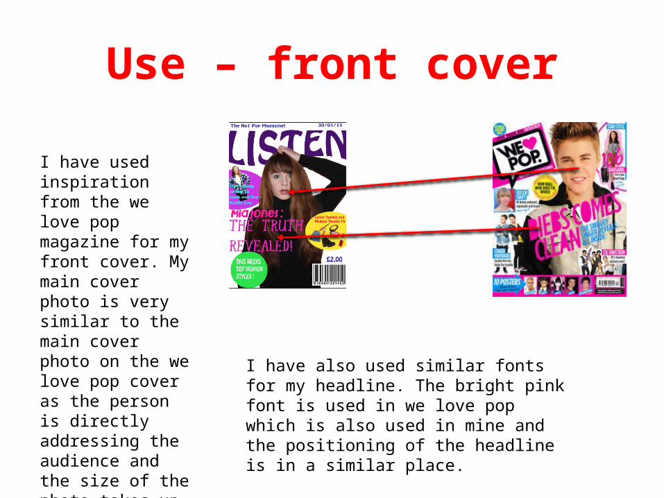
Use – front cover
I have used inspiration from the we love pop magazine for my front cover. My main cover photo is very similar to the main cover photo on the we love pop cover as the person is directly addressing the audience and the size of the photo takes up most of the space on the cover.
I have also used similar fonts for my headline. The bright pink font is used in we love pop which is also used in mine and the positioning of the headline is in a similar place.
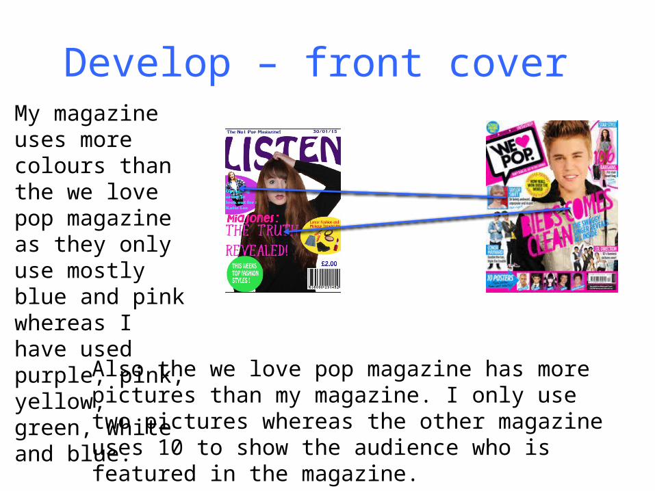
Develop – front cover My magazine uses more colours than the we love pop magazine as they only use mostly blue and pink whereas I have used purple, pink, yellow, green, white and blue.
Also the we love pop magazine has more pictures than my magazine. I only use two pictures whereas the other magazine uses 10 to show the audience who is featured in the magazine.

Challenge – front coverMy magazines mast head is across the top of the whole page whereas the we love pop magazine has the masthead small in the corner. The masthead on my magazine is one of the biggest features on the page but the masthead on the other magazine is not.
Also the we love pop magazine has an information bar at the bottom with information about what is in the magazine and the barcode on it whereas my magazine doesn’t have a bar it just has information around the sides and a barcode at the bottom.
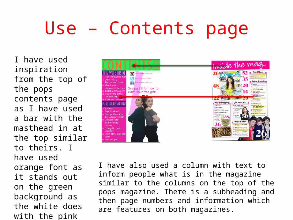
Use – Contents page
I have used inspiration from the top of the pops contents page as I have used a bar with the masthead in at the top similar to theirs. I have used orange font as it stands out on the green background as the white does with the pink in the other magazine. I have also used a column with text to inform people what
is in the magazine similar to the columns on the top of the pops magazine. There is a subheading and then page numbers and information which are features on both magazines.

Develop – contents page
My magazine only has one picture on the contents page whereas the top of the pops magazine uses 3. The images are similar with more than one person in them but the quantity is different.
The page numbers on the we love pop magazine are a lot bigger than the page numbers on my magazine. As they are so bug you immediately know that it is a contents page whereas my numbers are quite small.

Challenge – contents page
My magazine has social media links to instagram, facebook and twitter which the top of the pops magazine does not have. They allow the audience to interact with the magazine and get involved. They also are specific to my target audience as social media is popular amongst teenagers.
Also the top of the pops magazine features a picture of the front cover on their contents page which my magazine does not have. This is so they can show the features that are on the front cover and tell the audience what page they are on.

Use – double page spreadI have used inspiration from this double page spread as the image I have used is very similar to the other one. The images both take up a full page and are directly addressing the audience.
Also the columns that the text in are similar. They use a small font and and take up the other half of the page. The layout of these double page spreads are very similar.

Develop – double page spreadMy magazine uses quotes from the main story around the side of it to give an insight to the readers to what the story is about whereas the other magazine just has one as the main title.
My magazine has information at the bottom about how to read more on the article with a web address whereas the other magazine only has a web address but doesn't’t say what it is for.

Challenge – Double page spread
My magazine has social media links so that the audience can interact with the story and can get in touch with the magazine whereas the other magazine doesn't’t have this feature. Also my magazine has a bar at the side with an
insight to the story and the title of the page which will interest the reader if they are just flicking through the magazine, the other magazine does also not have this feature.
Related Documents


