Evaluation Question 1 In what ways does your media product use, develop or challenge forms and conventions of real media products?

Welcome message from author
This document is posted to help you gain knowledge. Please leave a comment to let me know what you think about it! Share it to your friends and learn new things together.
Transcript

Evaluation Question 1
In what ways does your media product use, develop or challenge forms and conventions
of real media products?
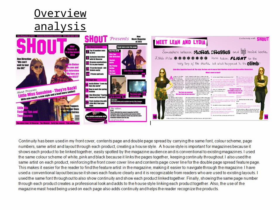
Overview analysis

ResearchI researched several existing music magazines to gather inspiration and ideas for the layout, colour scheme, main images and features used within them.
I experimented with different fonts from the website dafont for my header. I also used the font ‘impact’ on Photoshop for my main text in feature stories and cover lines.
When choosing the colour scheme, I incorporated my music genre and target audience into the process, as it would have to reflect those characteristics to create continuity and be recognisable. Creating mood boards was a good way to research my music genre and target audience.
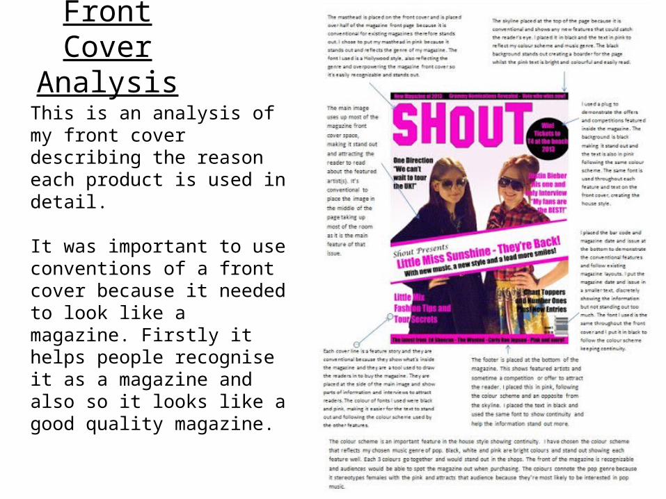
Front Cover Analysis
This is an analysis of my front cover describing the reason each product is used in detail.
It was important to use conventions of a front cover because it needed to look like a magazine. Firstly it helps people recognise it as a magazine and also so it looks like a good quality magazine.
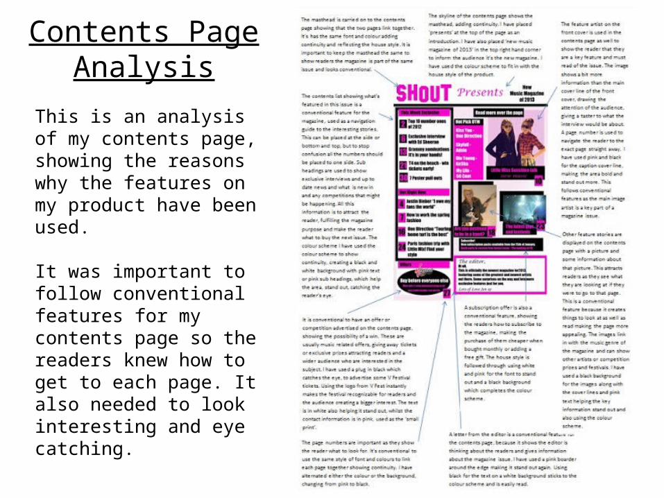
Contents Page Analysis
This is an analysis of my contents page, showing the reasons why the features on my product have been used.
It was important to follow conventional features for my contents page so the readers knew how to get to each page. It also needed to look interesting and eye catching.

Double Page Spread Analysis
This shows an analysis of my double page spread product and the features taking place in it. The double page spread had to look conventional to fit in with the rest of the magazine, showing a good quality magazine.
Related Documents


