In what ways does your media project use, develop or challenge forms and conventions of real media products?

Welcome message from author
This document is posted to help you gain knowledge. Please leave a comment to let me know what you think about it! Share it to your friends and learn new things together.
Transcript

In what ways does your media project use, develop or challenge
forms and conventions of real media products?

Conventions are the way in which something is usually done. Although there are many different types of magazines of different genres and for different audiences, they all follow similar conventions. Every magazine will use conventions such as a masthead, a large central image, features, headlines and the date/ price of the magazine. Although, music magazines may have some slight extra conventions, such as album reviews, artist interviews and references to music throughout. Each magazine’s conventions will slightly vary, depending on if and how they decide to use them and what genre the magazine is. Even throughout different music magazines the conventions will vary as there are many music genres, such as pop, indie, rock etc. Each separate type of music magazine will use different conventions to attract the attention of their target audiences, for example pop magazines will use bright, vibrant colours such as pink, yellow, blue, etc. whereas indie magazines would use muted colours such as pastel colours.
CONVENTIONS
FRONT COVER
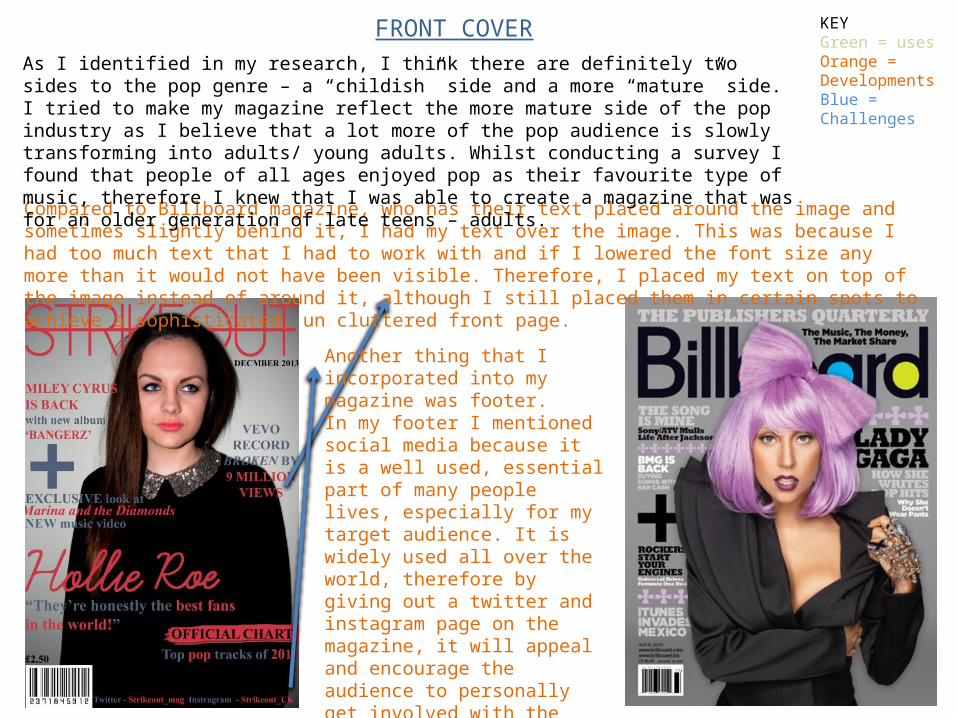
Compared to Billboard magazine, who has their text placed around the image and sometimes slightly behind it, I had my text over the image. This was because I had too much text that I had to work with and if I lowered the font size any more than it would not have been visible. Therefore, I placed my text on top of the image instead of around it, although I still placed them in certain spots to achieve a sophisticated, un cluttered front page.
Another thing that I incorporated into my magazine was footer.In my footer I mentioned social media because it is a well used, essential part of many people lives, especially for my target audience. It is widely used all over the world, therefore by giving out a twitter and instagram page on the magazine, it will appeal and encourage the audience to personally get involved with the magazine. Billboard magazine gives a link to their website, however I included twitter and instagram because it appeals more to a younger audience
As I identified in my research, I think there are definitely two sides to the pop genre – a “childish” side and a more “mature” side. I tried to make my magazine reflect the more mature side of the pop industry as I believe that a lot more of the pop audience is slowly transforming into adults/ young adults. Whilst conducting a survey I found that people of all ages enjoyed pop as their favourite type of music, therefore I knew that I was able to create a magazine that was for an older generation of late teens – adults.
KEYGreen = usesOrange = DevelopmentsBlue = Challenges

MASTHEADI decided that I liked the look of having the masthead behind the head of the model in the main image. This way I was able to make sure that the whole picture was visible, whilst also taking adding a slight 3D affect to the magazine cover. I saw this convention used in many different pop magazines and decided that it would add an appealing effect to my own magazine, whilst making sure that the audience of my magazine would still be able to clearly read and identify the name of the magazine.
GRAPHIC IMAGESI really liked the use of the plus sign symbol that I saw used in many magazines, especially pop. I used this group the two features together that features female singers, as well as also using it as a way to fill up any dead space down the side of the magazine.
MAIN IMAGEI used to a mid shot for my main image on the magazine because I think it connects to the audience more. The audience can clearly see the model’s facial expression and identify who they are. From my research I found out that a lot of people bought magazines depending on who was on the front cover. This was a way of the audience being able to clearly identify the singer on the front.
KEYGreen = usesOrange = DevelopmentsBlue = Challenges

Throughout the front cover of my magazine I switch font colours. I used a code of writing important key words/phrases in pink so that they stand out easily, and wrote everything else in blue. I did this so readers could easily identify key information if skimming the front cover in a shop.
I decided to incorporate this into my magazine. I did this because I wanted to draw attention to this specific piece of information without using a plain white box like most magazines do, so instead I used a sort of paint brush effect which also helped to make sure my house style was sustained (e.g. the colours).
KEYGreen = usesOrange = DevelopmentsBlue = Challenges
CONTENTS PAGE
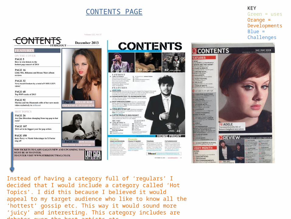
Instead of having a category full of ‘regulars’ I decided that I would include a category called ‘Hot Topics’. I did this because I believed it would appeal to my target audience who like to know all the ‘hottest’ gossip etc. This way it would sound more ‘juicy’ and interesting. This category includes are debates over the best artists etc.
KEYGreen = usesOrange = DevelopmentsBlue = Challenges

CONTENTS PAGEFor my mast head I decided that in order to retain my house style throughout the whole of the magazine, I would again put a line through the word ‘CONTENTS’ as I did on the front cover.
KEYGreen = usesOrange = DevelopmentsBlue = Challenges
I used teaser text at the bottom of my contents page that included a competition to win tickets. I did this to ensure readers that they’re getting their moneys worth in content and to also ensure that they carry on buying my magazine as they can see competitions are regularly included.

LAYOUTMagazines generally have a similar contents page style. Contents pages are usually very boxed off into sections with subheadings directing the reader where to look. I incorporated this idea into my own magazine contents page and also included lines underneath each title to make it look organised and easy to navigate.
IMAGESMany of the magazines that I looked at used one main large image on the contents page and then either a few or one smaller image. I also did this on my magazine, as you can see the main image is of the girl and there is a noticeably smaller image underneath it/ I have included another example above which uses one large image and one smaller image.
KEYGreen = usesOrange = DevelopmentsBlue = Challenges

DOUBLE PAGE SPREAD
LAYOUTOn a double page spread, the article is usually written in columns. I incorporated this into my magazine not only because it is used widely across many magazines but also because it helped to make the text look more interesting and like there was less of it – therefore my audience would be more likely to read it if it separated out into little paragraphs, rather than long lines of text.
IMAGESTo make my double page spread more interesting, I added one photo to each side. I also made the photos blend into the background of the DPS, in which I meant there is no background to the images. The text also goes around the images which makes them stand out more.
TEXTI used a different colour text for writing that I thought was key information such as quotes and the album title etc. Although I didn’t specifically see this used in a magazine, I thought it would benefit my audience so they were able to identify key information if they were to skim read the text and then go back and read it fully. This would also help to attract the reader as it doesn’t look like big bulks of text and you can see where vital information to be read is situated.
KEYGreen = usesOrange = DevelopmentsBlue = Challenges
Related Documents


