Question 1 ( IN WHAT WAY DOES YOUR MEDIA PRODUCT USE DEVELOP OR CHALLENGE FORMS & CONVENTIONS OF REAL PRODUCT MEDIA?) EVALUATIO N

Evaluation Question 1
Aug 02, 2015
Welcome message from author
This document is posted to help you gain knowledge. Please leave a comment to let me know what you think about it! Share it to your friends and learn new things together.
Transcript

Question 1(IN WHAT WAY DOES YOUR MEDIA PRODUCT USE DEVELOP OR
CHALLENGE FORMS & CONVENTIONS OF REAL PRODUCT MEDIA?)
EVALUATION
• 1. In what ways does your media product use, develop or challenge forms and conventions of real media products?
• WHAT IT MEANS: Is your magazine typical or a bit different and in what way?
• HOW TO DO IT: Use a Powerpoint to upload pictures of your own production alongside those of other magazines and compare them. Pick out the conventions on the pages and say why they have been constructed in that way. You can find the conventions in the ‘REF – Flat Plans’ at the bottom of the coursework folder.
• TYPICAL EXAMPLE: The first sections of this powerpoint: Question 1 covering all three pages of your magazine in detail.

My magazine cover is based loosely around NME’s edition featuring ‘The Wombats’, the house colours I used (white, black, red & yellow) are the same as that used in the NME magazine but order different when it comes to what is primarily used with me using black and white as primary and red and yellow as secondary colours.
I think I have a lot of the conventions that are used on most if not all music magazines somewhere on my front cover, some of the conventions are in different places to that of the ones used on the NME magazine which I used as one of my research examples. The selling line is predominantly found along the top of the page to draw the attention of those scanning across magazine racks but I have placed mine along the bottom so that the top half of the page is dominated by the masthead, because this is the first issue of the magazine people will be attracted simply by the new name they see.
I have also kept the background of my cover white and placed lines in between my kickers which separates them from one another giving my magazine more of a poster look than a traditional busy punk magazine
FRONT COVER
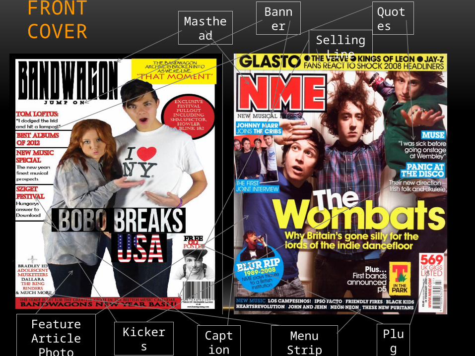
FRONT COVERMasthead
Menu Strip
QuotesBanner
Feature Article Photo
Selling Line
PlugCaptionKickers
The contents page I created around a mix up of the traditional contents pages created by NME & KERRANG! Magazines. Within this page I kept to my house colours (White, Black & Red) but opted to use no yellow as I felt it was effective enough with the use of only three colours.
The set out of the page is based around the NME style but with little KERRANG! like tweaks, having the pictures in each quarter of the page gives a lot more room for text rather than a dominating main article picture that would fill the entire page leaving the text to a more secondary role.
The use of the dominating red catches the eye of the reader and having that at the top and bottom gives the reader encouragement to read what is in-between. Having page numbers and section dividers gives the page a bit more formation and helps the overall set up of the contents come together, the same can be said for the navigation bars which help the reader identify what they're looking at and help them find what they are looking for.
CONTENTS
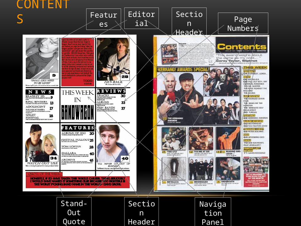
Features Section Headers Page Numbers
Section Header
Navigation Panel
Editorial
Stand-Out Quote
CONTENTS
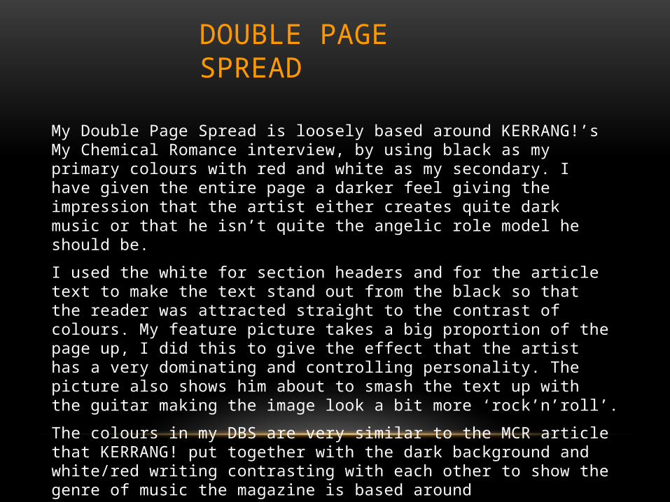
My Double Page Spread is loosely based around KERRANG!’s My Chemical Romance interview, by using black as my primary colours with red and white as my secondary. I have given the entire page a darker feel giving the impression that the artist either creates quite dark music or that he isn’t quite the angelic role model he should be.
I used the white for section headers and for the article text to make the text stand out from the black so that the reader was attracted straight to the contrast of colours. My feature picture takes a big proportion of the page up, I did this to give the effect that the artist has a very dominating and controlling personality. The picture also shows him about to smash the text up with the guitar making the image look a bit more ‘rock’n’roll’.
The colours in my DBS are very similar to the MCR article that KERRANG! put together with the dark background and white/red writing contrasting with each other to show the genre of music the magazine is based around (punk/rock/indie).
DOUBLE PAGE SPREAD

DOUBLE PAGE SPREADHeadline/Quote
Section Header
Feature Picture Pull Quotes
Introductory Text
By Line (Who Its By)
Related Documents


