Evaluation By Melissa Storey

Evaluation question 1
Jul 16, 2015
Welcome message from author
This document is posted to help you gain knowledge. Please leave a comment to let me know what you think about it! Share it to your friends and learn new things together.
Transcript

Evaluation
By Melissa Storey

1. In what ways does your media product use, develop or challenge
forms and conventions of real media products?

Front Page
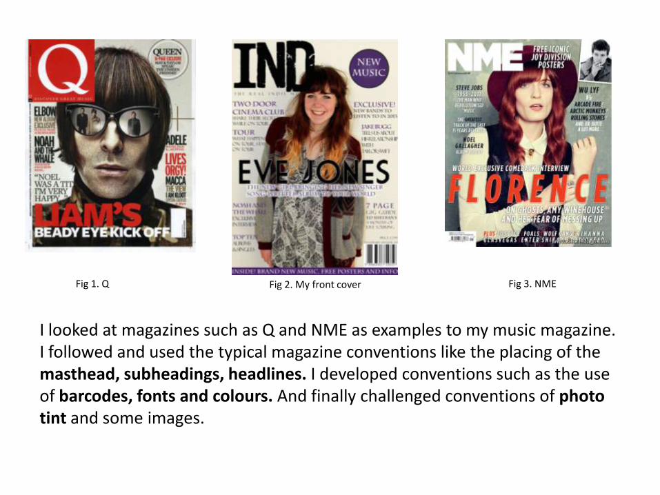
I looked at magazines such as Q and NME as examples to my music magazine. I followed and used the typical magazine conventions like the placing of themasthead, subheadings, headlines. I developed conventions such as the use of barcodes, fonts and colours. And finally challenged conventions of photo tint and some images.
Fig 1. Q Fig 2. My front cover Fig 3. NME

Masthead• I have followed and used the conventions of placing the masthead at the top
left hand side of the page. This is the most successful place to the masthead because it quickly advertises and informs the audience in what they are reading. The font size is big and bold to stand out from the image and text on the front cover, I chose a front from dafont.com which looks messy with the slight bits of colour missing from inside the fill. This makes it appeal to indie to the rock side of the genre consisting of a messy and gungy look. Yet the sophistication lies in from the letters being the same length and size and sitting in the corner of the magazine just like how Q and NME are placed. I chose to have to have the masthead in front of my image, this indicates the magazine isn’t too well known but the artist behind the text is as part of her has been hidden by the text. I chose to use this convention because I believed my magazine is all about the artists inside as that is what people like to read about.
Fig 1. InD Fig 2. Q Fig 3. NME

Main Image• From looking at front covers from other music
magazines who have women as their main image they use a slightly extended medium close up to show the full view of their body to appear to the male audience, the male gaze. And also influences women to look like that as they are successful. I tried to use this technique in my cover. She is wearing a short dress but a oversized cardigan as this shows the indie genre to be unique with their clothing.
• I took the photograph in a photography studio so I could control the lighting so it didn’t need much Photoshop work to it as the shadow and lighting was set up where I needed it.
• Placing the image on the page was the first thing I did and everything else was placed around her to make her the main feature on the cover drawing attention to her almost immediately.
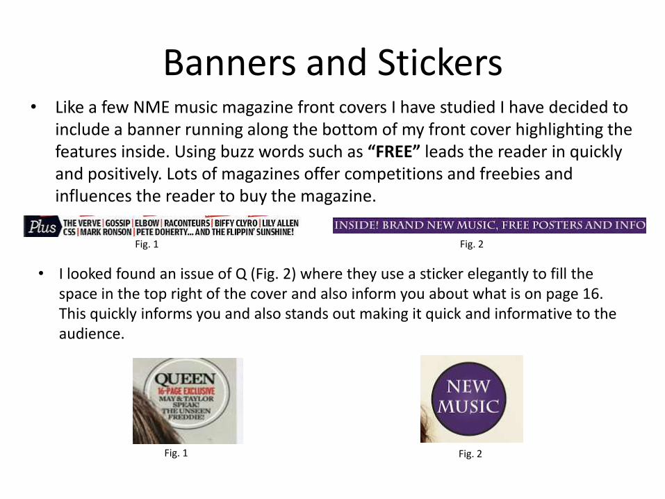
Banners and Stickers• Like a few NME music magazine front covers I have studied I have decided to
include a banner running along the bottom of my front cover highlighting the features inside. Using buzz words such as “FREE” leads the reader in quickly and positively. Lots of magazines offer competitions and freebies and influences the reader to buy the magazine.
Fig. 1 Fig. 2
• I looked found an issue of Q (Fig. 2) where they use a sticker elegantly to fill the space in the top right of the cover and also inform you about what is on page 16. This quickly informs you and also stands out making it quick and informative to the audience.
Fig. 1 Fig. 2

• I followed the typical magazine conventions of a barcode. Above the barcode is the information of the magazine such as the date, issue and price. This is a good place to place this sort of information as it is all together to make it easy to get the information quickly and the price above the barcode is conventional because they both link and people will look for the barcode for the price of the magazine to see if it is in their price range. In Q magazine the barcode is placed to the bottom right of the magazine but some choose to place it at the left of cover, I developed
• this by choosing which side to place my barcode with the way it
• works with the main photograph on the cover. But I kept it to
• the bottom of the page like all the other music magazine I have
• studied.
Barcode
Fig 1. My barcode
Fig 2.

Cover line• The cover lines on my magazine front cover use the font I use inside the
magazine to keep it all structured from inside to out. A main convention is to have the artists name is bold “TWO DOOR CINEMA CLUB” or to have a key word either in bold or set in a different colour to make it stand out eg. “TOUR”. The lettering frames the image on the cover but sometimes a couple of words go over the clothing of the body as this magazine is for people who can be considered to be clean and smart but have a few rough edges to them. I kept to the convention of using two colours to highlight the over lines and the text underneath (Purple and black). Black and white or black and red are very common colours to use so I went for an original colour like purple to stand out from other magazines in compotation.
Fig. 1 Fig. 2

Headline
• The headline on my magazine follows the typical conventions of a headline on a music magazine. This is for it to be stretched across the cover and to be bold and stand out. I challenged this convention by putting a white border around the edges of the font to make it stand out even more and without the white border the headline merged in with the black and white dress the model is wearing so it made it stand out from the image more too. I placed it across the middle of my image and across the page, this is to indicate who “Eve Jones” is (the main image). The headline is always the artist or bands name so I followed and used this convention correctly.
Fig. 1 Fig. 2

Colours and Fonts• I used a plain capital font to draw attention as of the
capital lettering. The bands name or the buzz words are all larger and in the usual deep purple colour I have chosen to use as a main outstanding colour to contrast the black and white. Although it doesn't stand out a lot from the black, making the font smaller does. I chose the colour purple as it is a gender neutral colour relating again to my audience but also because the genre of indie is known for its individuality I thought of challenging the typical conventions (black, white, red) and standing out from other magazines by using a deep purple. The font is used throughout the magazine bringing the whole of the inside and out together which is a typical convention found on magazines.
Contents Page

Headline
• I followed the simple conventions of a headline on a contents page. By having the name/logo on the left side of the page across the top in a bold banner and having the word “contents” bigger than the name so it can be easily found while looking through the pages. I followed this convention by studying the NME contents pages. They all sit on a black banner across the top of the page which makes it stand out. The white contrasts the black helping it to be eye catching and as their NME logo uses the colour red it brings a bit of colour into the headline. I tried this but it didn’t look right so I kept with the black and white contrasting theme.
Fig. 1 Fig. 2
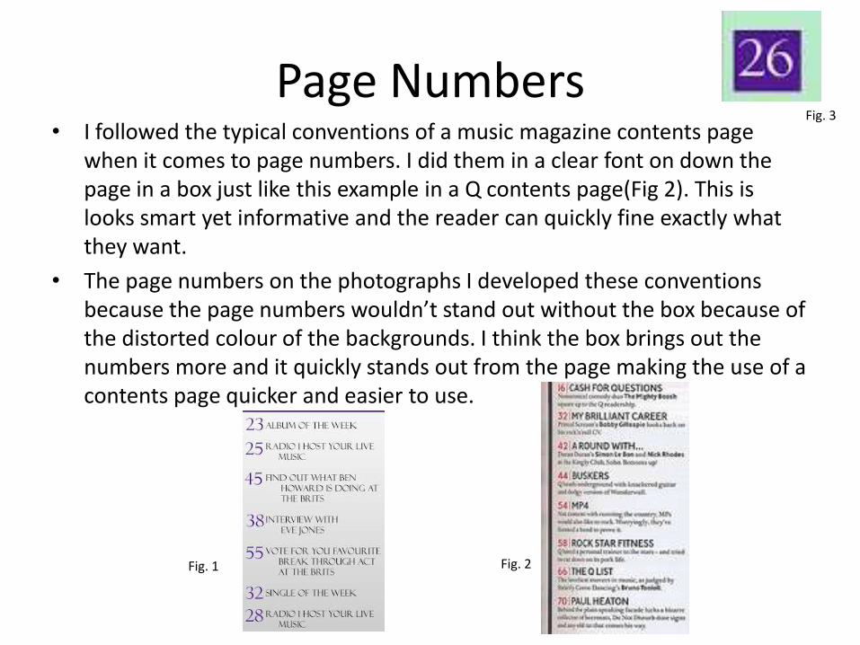
Page Numbers• I followed the typical conventions of a music magazine contents page
when it comes to page numbers. I did them in a clear font on down the page in a box just like this example in a Q contents page(Fig 2). This is looks smart yet informative and the reader can quickly fine exactly what they want.
• The page numbers on the photographs I developed these conventions because the page numbers wouldn’t stand out without the box because of the distorted colour of the backgrounds. I think the box brings out the numbers more and it quickly stands out from the page making the use of a contents page quicker and easier to use.
Fig. 1 Fig. 2
Fig. 3

Images• From the contents pages I studied they used 2-3 images
throughout the page. They usually had one large image showing a big band/artist that a lot of people know and a smaller image underneath showing a smaller artist who is just starting out that might interest a lot of people reading the magazine because they are from the same genre.
• My large image is longer than my smaller image. I didn’t make the difference of size too dramatic as they both have the same identity. But my “bigger” artist is on top, I shot this image in a studio and shot it as a mid shot so you could see the way he is stood, his posture and what he is wearing. The other artist is wearing casual clothes showing him to be less successful but maybe more connecting to the indie genre.
• I challenged the use of tone through my images as I used a filter on both of the images making the colours looks a bit distorted. I chose to do this as Tumblr.com is a big website aimed a lot at the indie genre and a lot of the images include filtered images to make them look older or highlight main features in the photograph. It also makes them look like they’ve been taken on a vintage camera which are now coming back through store such as Urban Outfitters aimed again at the indie genre.

Layout• I used the conventions of using a features column to show what is in the
magazine. This makes it easy to find out information but also looks smart and professional the way it is laid out in a column. I took the idea from (Figure 1) and placed the features column down the left hand side of the page and have images down the right, next to the text column. A lot of magazines include a box down at the bottom advertising how to sign up to their magazine for a cheaper price, which I have included because through my research I have
Fig. 1 Fig. 2
found out most people who read magazine regularly they subscribe to the magazine which brings this option open. A banner at the top includes the magazines name and what page this is while a smaller banner shows the features column.I chose to include a small piece of information on the main artist on the page so I made a small banner across the bottom of the photograph and made a small, quick caption about what you would find on his small interview article in the magazine.

Double Page Spread

Page Layout
• I have followed they typical convention of having the same artist on the front cover and having them in the double page spread. Having them on the front cover instantly makes you think they are going to have the main article page in the magazine. The headline on the front page matches with the article in the double page spread so people know what they are going to be reading about and finding out about this artist. The typical conventions of a double page consist of a large image of the artist, a large headline, sub headline underneath the headline, drop quote and column text. I used two drop quotes as it shows the artist talking in her own words and it is effectively shown and brought out from the text to highlight interesting information and details from out of the text. The interview is set out in the typical column layout to make it easy to read and it also looks smart and professional. I made the page layout look individual by placing a few blobs around the side of the page to frame the article to fill in the negative space and shows the genre as being individual and quirky.
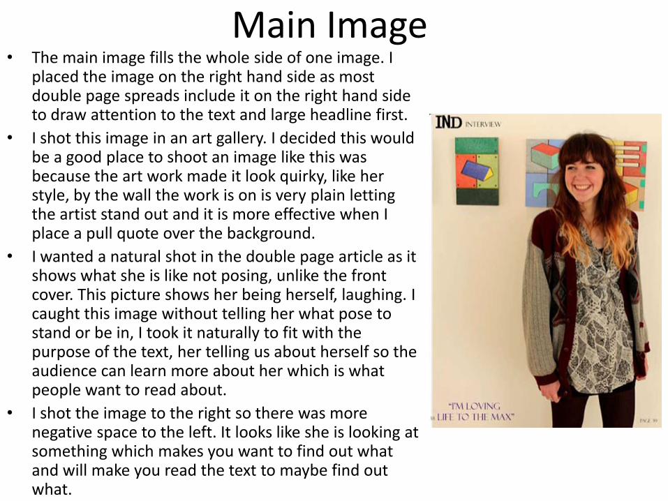
Main Image• The main image fills the whole side of one image. I
placed the image on the right hand side as most double page spreads include it on the right hand sideto draw attention to the text and large headline first.
• I shot this image in an art gallery. I decided this would be a good place to shoot an image like this was because the art work made it look quirky, like her style, by the wall the work is on is very plain letting the artist stand out and it is more effective when I place a pull quote over the background.
• I wanted a natural shot in the double page article as it shows what she is like not posing, unlike the front cover. This picture shows her being herself, laughing. I caught this image without telling her what pose to stand or be in, I took it naturally to fit with the purpose of the text, her telling us about herself so the audience can learn more about her which is what people want to read about.
• I shot the image to the right so there was more negative space to the left. It looks like she is looking at something which makes you want to find out what and will make you read the text to maybe find out what.
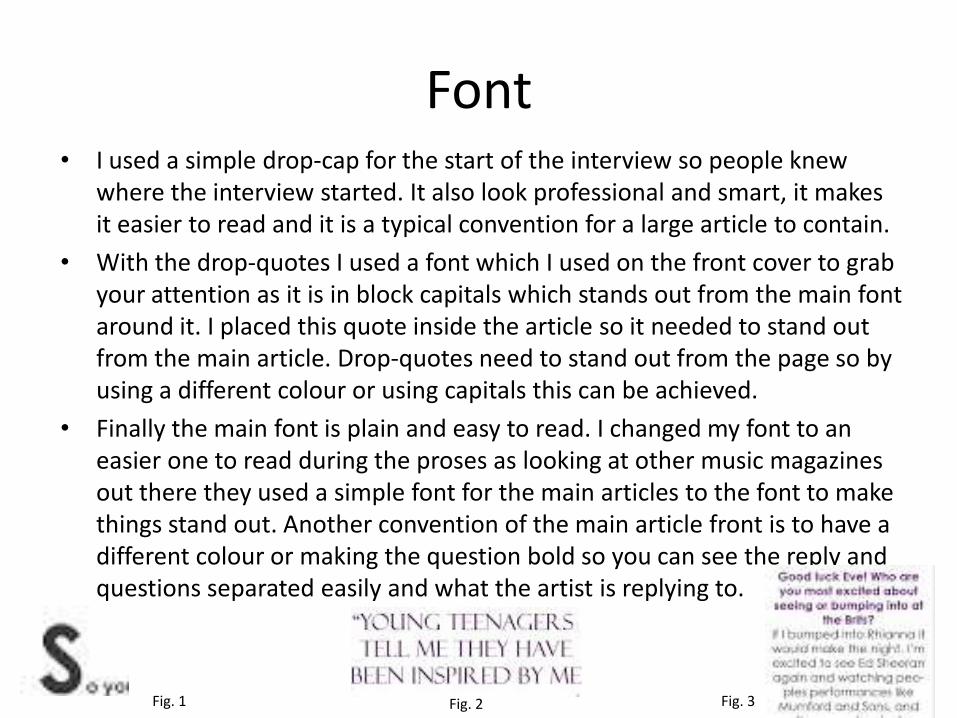
Font• I used a simple drop-cap for the start of the interview so people knew
where the interview started. It also look professional and smart, it makes it easier to read and it is a typical convention for a large article to contain.
• With the drop-quotes I used a font which I used on the front cover to grab your attention as it is in block capitals which stands out from the main font around it. I placed this quote inside the article so it needed to stand out from the main article. Drop-quotes need to stand out from the page so by using a different colour or using capitals this can be achieved.
• Finally the main font is plain and easy to read. I changed my font to an easier one to read during the proses as looking at other music magazines out there they used a simple font for the main articles to the font to make things stand out. Another convention of the main article front is to have a different colour or making the question bold so you can see the reply and questions separated easily and what the artist is replying to.
Fig. 1 Fig. 3Fig. 2
Related Documents


