Q1) In what ways does your media product use, develop or challenge forms and conventions of real media products? EVALUATION

Evaluation q1
Aug 07, 2015
Welcome message from author
This document is posted to help you gain knowledge. Please leave a comment to let me know what you think about it! Share it to your friends and learn new things together.
Transcript
Q1) In what ways does your media product use, develop or challenge forms and conventions of real media products?
EVALUATION

EVALUATION
TEMPO vs VIBE
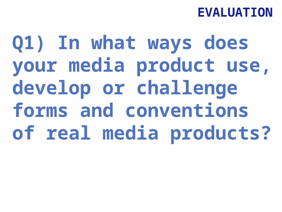
EVALUATIONMasthead
Here is the masthead for my magazine, TEMPO and the magazine VIBE in which I got a lot of inspiration from. Both of these mastheads are conventional as they both convey the theme of the magazine, which is music as they’re both musically related words. When deciding on the name for my magazine I knew that I wanted a music related word that would suit the genre of my magazine, I did some research and the word Tempo stood out as it’s quite edgy fitting the rap genre of my magazine where as VIBE Is more suiting genres such as pop and hiphop. I thought the way VIBE used block capitals for the whole masthead looked good and bold so i took this inspiration and used it on my own masthead. I have a similar taret audience to VIBE though mine is more rap based, so seen as though VIBE is successful i chose to get inspiration from them but still changed aspects like the colour as I added a gradient across the letters to make it unique and stand out so that i wasnt completely copying them.

EVALUATIONMise en sceneImages: For my front cover image I wanted a shot that showed the artist looking directly at the audience to draw them in. I also wanted the background to be quite dark as I felt this was the most conventional for the genre of magazine, a bright or light coloured background wouldn't’t work with rap music. I used a medium shot which allowed me to show the artist from the waist up, this enables the audience to see her clothes aswell as her facial expression, the audience ay get a feel for her music through this as she looks edgy and has a serious expression looking directly at them as if she is addressing them. When researching images on magazine covers I noticed that they were mainly taken in a photography studio with a plain background screen, I chose to also do this making my magazine look as professional as possible, I did this for all of the images in which I used in my magazine. On my double page spread I used an image from the same photoshoot, this one shows the artist peering round from a black curtain, this also makes the audience feel involved as it gives the implication that the artist is looking round at them. I used a medium shot for this so that you could see the artist from the waist upwards and still see her facial expression clearly. On all of my images I did some editing on photoshop where I airbrushed and enhanced some facial features making her stand out and look more eye-catching to the audience as you would see in any other music magazine. I edited the images to follow the conventions of a rap magazine, dark shadows, dark make up etc, to make her have an edgy look about her.
Costume:Throughout my magazine I chose for all the people featured to wear mainly black and dark colours, this enables my magazine to look more conventional as you wouldn’t see a rap artist in a bright yellow top, black is much more suitable for the genre, when researching other rap music magazines I saw that the majority of clothing was black too so for my magazine to feature this too makes it look more professional.
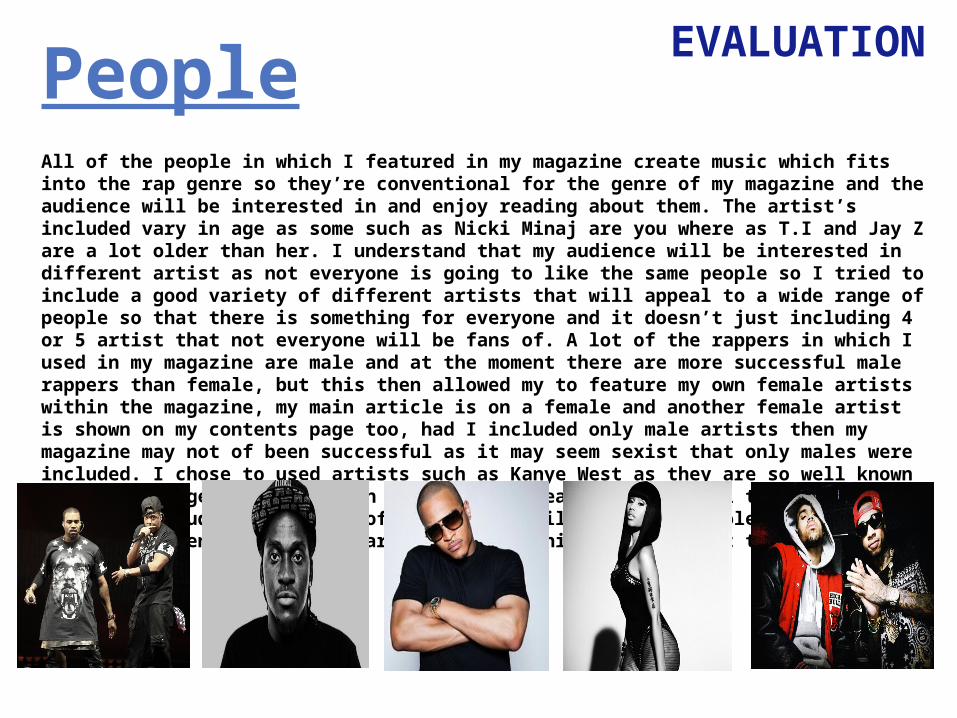
EVALUATIONPeopleAll of the people in which I featured in my magazine create music which fits into the rap genre so they’re conventional for the genre of my magazine and the audience will be interested in and enjoy reading about them. The artist’s included vary in age as some such as Nicki Minaj are you where as T.I and Jay Z are a lot older than her. I understand that my audience will be interested in different artist as not everyone is going to like the same people so I tried to include a good variety of different artists that will appeal to a wide range of people so that there is something for everyone and it doesn’t just including 4 or 5 artist that not everyone will be fans of. A lot of the rappers in which I used in my magazine are male and at the moment there are more successful male rappers than female, but this then allowed my to feature my own female artists within the magazine, my main article is on a female and another female artist is shown on my contents page too, had I included only male artists then my magazine may not of been successful as it may seem sexist that only males were included. I chose to used artists such as Kanye West as they are so well known and have a huge fan base which will attract readers and appeal to my audience, but also including the likes of Chris Brown will attract a whole other fan base as he is currently very popular and trendy, which will reflect that my magazine is current.

EVALUATIONTitle, fonts and styles
I used a range of different fonts for my magazine to make it look attractive and interesting, I still tried to use the same font for all body text to keep to a house style otherwise it wouldn’t look very professional. I edited some text on photoshop and I also used some fonts from online websites such as dafont.com which has a huge variety of interesting fonts. Below are 3 fonts, each from a different page of my magazine:
This is the font I used for the masthead on my front cover. I used a default font called ‘arial blakc’ and edited the colour on Photoshop adding a grey to black gradient. The boldness of the font is very dramatic and instantly catches the audience’s attention as well as standing out behind the image of the main artist. The colour choice fits the house style used throughout the magazine which uses a lot of black and also works with the genre of magazine being dark.
I used ‘arial black’ font on my subheading on the contents page, It is different from the body font used throughout but isn’t too over the top so that it distracts the reader when reading other parts of the page. I thought the use of all capitals allowed the text to stand out as a subheading and it was easily separates from the list of articles underneath it. Again I used black and white to contrast each other, suit the genre and fit the house style.
This font is seen on the title of the article on my double page spread. I chose this from a range of different fonts on ‘dafont.com’ I felt that this suited my magazine the most as it holds an edgy look to it which suits the look I was following throughout my magazine and create originality . The colour I chose to use on this font was a very pale grey, I didn’t want to use white as it looked too harsh so choosing a light grey makes it blend into the page better and doesn’t distract the attention of the reader from the article and the image.

EVALUATIONCopy/written content When doing my research I found that a lot of the writing is very light and easy to read, I don’t want to include language that a lot of the audience wont undertsand o I tried to write it I a way that the audience will understand and enjoy. I have included the personal pronoun “you” which gives the impression that I am talking directly to the audience, which helps them to feel involved and invited to my magazine. Using this personal pronoun addresses the reader directly and they are going to feel as if they have a connection to the magazine and will want to read it and buy it again. “we’ve had the chance to catch a few minutes with worldwide superstar Molly Mason” is a sentence that is include on my double page spread, the use of “we’ve” will make the audience feel as if they were part of the interview and that they were there, but also this sentence as a very relaxed feel about it as if it was just a friendly catch up, which illustrates the nature of reading the magazine, its not intense reading just casual and enjoyable.
EVALUATIONHow if your genrereflected?
I used many different features to reflect the genre of my magazine. The main thing I did to reflect my rap genre is include artists the produce this style of music, including: Kanye West, Pusha T, The weeknd and many more. Through mentioning these artist my target audience are naturally going to be attracted to my magazine as they are familiar with them and their music.
My colour use was also a way that I could reflect the genre. I researched many artists and looked at magazine in which the were featured, their music videos, album cover and tour advertisements. I found that a lot of these contain a lot of black and red, which are very contrasting, bold and intimidating colours, very much like rap music. Therefore, I decided to add a lot of black into my house style along with red and white to break it up.
On my front cover I designed a plug offering readers a chance to win tickets to a music festival, which features so many artists from the rap genre, my target audience are going to be attracted automatically to my magazine as this is guaranteed to be something that they’re interested in.
EVALUATIONLayout- front cover
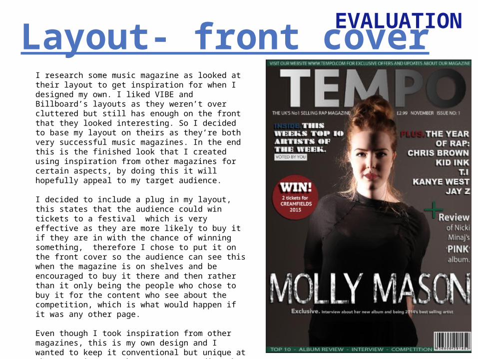
I research some music magazine as looked at their layout to get inspiration for when I designed my own. I liked VIBE and Billboard’s layouts as they weren’t over cluttered but still has enough on the front that they looked interesting. So I decided to base my layout on theirs as they’re both very successful music magazines. In the end this is the finished look that I created using inspiration from other magazines for certain aspects, by doing this it will hopefully appeal to my target audience.
I decided to include a plug in my layout, this states that the audience could win tickets to a festival which is very effective as they are more likely to buy it if they are in with the chance of winning something, therefore I chose to put it on the front cover so the audience can see this when the magazine is on shelves and be encouraged to buy it there and then rather than it only being the people who chose to buy it for the content who see about the competition, which is what would happen if it was any other page.
Even though I took inspiration from other magazines, this is my own design and I wanted to keep it conventional but unique at the same time . I chose to use a medium shot of the artist in the front cover image which shows her body and face unlike the majority of magazine that generally use close ups of the artists face, so when on shelves my magazine will stand out as it looks different.
EVALUATION
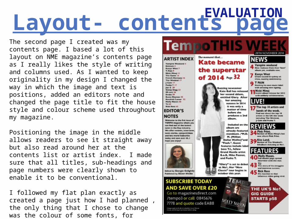
The second page I created was my contents page. I based a lot of this layout on NME magazine’s contents page as I really likes the style of writing and columns used. As I wanted to keep originality in my design I changed the way in which the image and text is positions, added an editors note and changed the page title to fit the house style and colour scheme used throughout my magazine.
Positioning the image in the middle allows readers to see it straight away but also read around her at the contents list or artist index. I made sure that all titles, sub-headings and page numbers were clearly shown to enable it to be conventional.
I followed my flat plan exactly as created a page just how I had planned , the only thing that I chose to change was the colour of some fonts, for example I changed the ‘subscription’ font from red to yellow, as red is used a lot throughout my magazine and on this page it didn’t stand out very well, where as yellow is very contrasting and stands out, which an advertisement should.
Layout- contents page
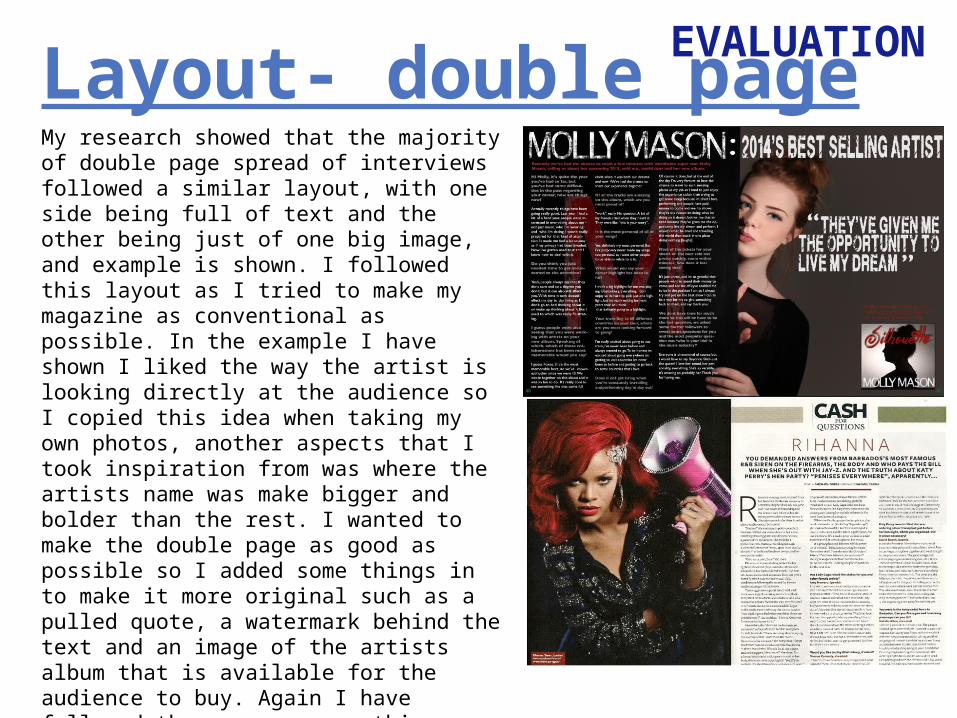
EVALUATIONLayout- double pageMy research showed that the majority of double page spread of interviews followed a similar layout, with one side being full of text and the other being just of one big image, and example is shown. I followed this layout as I tried to make my magazine as conventional as possible. In the example I have shown I liked the way the artist is looking directly at the audience so I copied this idea when taking my own photos, another aspects that I took inspiration from was where the artists name was make bigger and bolder than the rest. I wanted to make the double page as good as possible so I added some things in to make it more original such as a pulled quote, a watermark behind the text and an image of the artists album that is available for the audience to buy. Again I have followed the rap genre on this page by using a lot of black and red from my house style which hopefully will attract my target audience.
Related Documents