Evaluatio n By Sophie Zhakata HIP-HOP Magazin e

Welcome message from author
This document is posted to help you gain knowledge. Please leave a comment to let me know what you think about it! Share it to your friends and learn new things together.
Transcript

EvaluationBy Sophie Zhakata
HIP-HOP Magazine

In what ways does your media product use, develop and challenge forms and conventions of real media products?
MASTHEAD: My Masthead is bold and in font size ‘150’ as I noticed that more often than not, one of the most predominant features of a hip hop magazine is its conspicuous masthead at the top of the page. Its also conventional to use the colours black and red together as they are very striking together. Red is often use on hip hop magazines as it’s a very strong colour and connotes anger , I used Red to outline my masthead to support this and also reflect the strong emotions being portrayed in the music. The Black glow surrounding the text contrasts with the red outline. -The Font of the Masthead is an informal Graffiti style which represents the hip hop/gang culture. The curved edges reflect the movement of hip hop music, the creativity and free style rapping. Mastheads of hip hop magazines are informal or written In a graffiti style.
MODEL/ CHOSEN IMAGE: Hip hop’s about the beats, the music and the fashion. Originating from African American youths hip hop artists today often feature in their music videos wearing urban street wear and a lot of gold jewellery ‘bling’. Women in the hip hop industry often promote a sex appeal through their fashion which consists of tight revealing clothing. The inside of the masthead is filled with silver diamonds to make it eye catching and establish the hip hop theme. The image I have used is conventional as the model is wearing tight leopard print leggings and a low cut black top. She is also wearing a lot of gold jewellery and is dressed to standout with her extra long eyelashes and bright pink earrings. -she has a very serious expression on her face which suggests confidence in herself.
Barcode and date conventional
Model ‘Miss - X’ conventional to have the artist featuring in the music article to also feature on the front cover.
The plain white background is also conventional for a hip hop magazine.
model often seen as looking tough or over confident, reflects the
gang culture.
Sell lines: - Black and red theme- conventional, - use of Question marks and exclamation marks – speaking directly to the reader, making think about the questions and exclamation marks – make everything seem exciting.

Chosen Images: -the models have all adopted a conventional rapper/gangster pose, expressing attitude and a high level of confidence . With their over confident body language and facial expressions it’s believable that they feel that they are one of the ‘greatest rappers of all time’.
Use of colour: - bold black writing with the contrast of a red highlight over key words. -The colours black white and red have been layered around each other to grab the audiences attention with the contrast
Information:- There are certain headings
on the page such as ‘get the hip hop look’ and match the trade marks’, which make it clear that the magazine features hip hop culture in general rather than just the music.
- The typography is informal which suits the target audience however the layout which enables readers to read clearly and swiftly find the page they want to read.

What have you learnt about technologies from the process of conducting this product?
In order to meet the demands of this course we have used a variety of technologies to create a successful media product. As I do not often use the more advanced programs such as ‘final cut pro’ I was unaware of the advantages that they gave me. Final cut pro: I had only used this once and was therefore inexperienced. We used this program to edit our peer evaluations. cutting out un needed parts and including text and images the final outcome was very professional.Photoshop: I had used this program a few times and I’ve come to see how it creates an accessible way of editing photographs and adding finishing touches. It’s an essential program that allowed me to create an image which was perfect for my media product.

Lasso and eraser tool – erase background
Enhanced brightness and contrast – windows live photo gallery

Photography: I have learnt how to use a Nixon D3000 which allowed me to take high quality professional photographs. Using a camera like the D3000 allowed me to have more control over the photos as it’s manual. This means I can adjust the focus and aperture etc to my advantage. The Nixon D3000 is better quality than an average camera and has a much higher zoom again leaving me with more control.
Social networks: I used websites such as blogger.com to post my work showing progression throughout each week. I used survey monkey to conduct questionnaires. Without this I wouldn’t of been able to collect as much audience research as I did as it was all online. Using these websites was quite easy to go about as I am already familiar with other social networks such as face book and you tube.

Publishing a post Survey monkey: audience research.
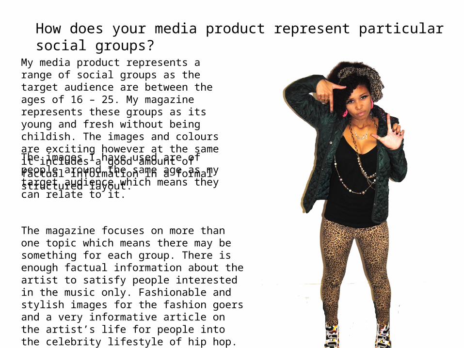
How does your media product represent particular social groups?
My media product represents a range of social groups as the target audience are between the ages of 16 – 25. My magazine represents these groups as its young and fresh without being childish. The images and colours are exciting however at the same it includes a good amount of factual information in a formal structured layout.
The images I have used are of people around the same age as my target audience which means they can relate to it.
The magazine focuses on more than one topic which means there may be something for each group. There is enough factual information about the artist to satisfy people interested in the music only. Fashionable and stylish images for the fashion goers and a very informative article on the artist’s life for people into the celebrity lifestyle of hip hop.

What kind of media institution might distribute your media product
and why?
One of the media institutions to distribute my magazine would be the consumer magazine, located in New York, ‘Harris Publications‘. The reason I chose ‘Harris Publications’ is because at the moment they distribute two major hip hop magazines: ‘XXL’ and ‘King’ among 75 titles. This shows that although they have an interest in hip hop magazines and distribute them well as ‘XXL’, and ‘King’ are very successful; there will be not as much competition to consider between the magazines as only 2 out of 75 are similar to mine within the institution.

What would be the audience for your media product?
My magazine is aimed at an audience including both males and females between the ages of 16 and 25. Hip hop is usually aimed at a particular audience however I have ensured that my magazine features lighter hip hop, with some fusion of Pop and R&B meaning that it will appeal to a wider audience as there is a variety of styles incorporated. An example of this is the ‘billboard hot 100’ chart which features all music. This is mentioned of the front cover. The hip hop in my magazine also falls into the mainstream category as it features hip hop artists ‘Miss –X’, an exciting up and coming artist and information on the ‘young money thieves’ organisation and therefore is suitable for the target audience. The Price of my magazine will be between £1.50 -£2.50 as it’s comparable to other magazines on the market. Filled with factual information, exclusive images and interviews, fashion tips and a chance to win free gig tickets the magazine is value for money. It’s suitable to the target audience as students/young adults don’t usually have a lot of money. My target audience will shop in places such as, Nike, Office, Foot Locker, River island, Republic, Landal Sports and use social networking to listen and share new hip hop tracks. My target audience will also be inspired to be like successful artists featuring in the magazine. As they are young they will look up to people like the artist on my front cover and admire them.

How did You attract/address your
audience?
I attracted and addressed my audience by including a young and attractive female artist on the front cover. As well as the career- focused information which focuses on her chart success; unique style and collaborations with other artists, the music article also includes a short recall about the artists life when they were younger and the struggles they faced and the target audience may be able to relate to it. The informal language such as ‘Imma tear up the charts’ will be appropriate for the target audience. The relaxed style and grammar will make the reader feel relaxed whilst reading as it’s familiar to them. It reflects how they would write to their friends or even speak.

There is a good balance of images and editorial as people in general don’t like to read too much in a magazine without having images to look at and relate the text too. There is enough text in order for the readers to get a satisfying amount of factual information without getting bored and the images are interesting giving the same amount of information. The model on the front cover is of a young, fresh and fashionable female hip hop artist. Not only will this be sexually appealing to the male audience but will draw in female attention as they will aspire to be like her. The model is also dressed in clothes that are the trends and fashions today which will be wore by and appeal I used bold eye catching titles and text, varying the font and including bright colours he magazine would definitely catch peoples eye.

Look back at your preliminary task, what do you think you have learnt in the progression?
I have made progress between constructing the school magazine and the music magazine. I have learnt to think more closely about all the factors involved in the process such as the amount of careful planning needed to ensure the media product is successful. I have also found that my skills using technologies such as ‘Final cut pro’ have improved and I have successfully been able to manipulate and edit images, text and video. The quality of the pictures for my music magazine were 100% more successful and effective as I had thought carefully about all of the details such as the background, props, lighting etc unlike the school magazine. As my editing skills have progressed, my music magazine is very much more a magazine format than the school magazine.
Related Documents