Evaluatio n

Welcome message from author
This document is posted to help you gain knowledge. Please leave a comment to let me know what you think about it! Share it to your friends and learn new things together.
Transcript
Evaluation
In what ways does your media product use, develop or challenge forms and conventions of real media products?
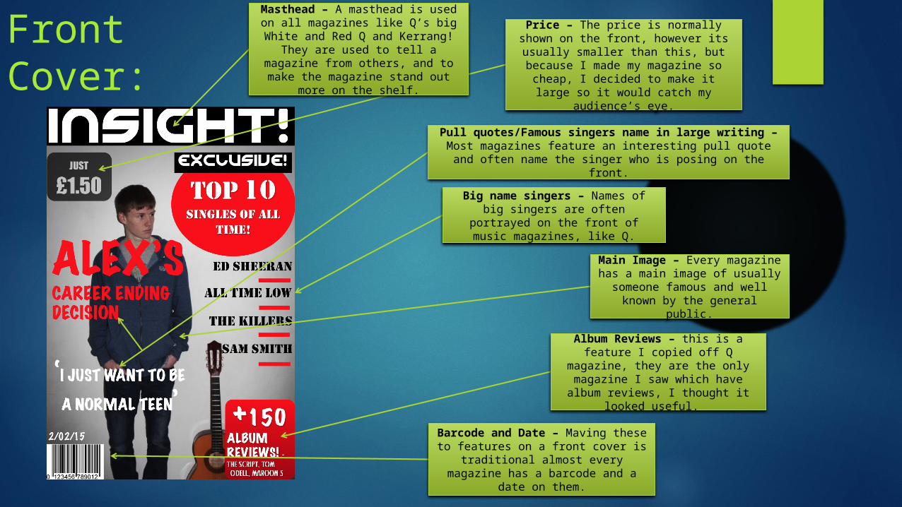
Front Cover:
Pull quotes/Famous singers name in large writing – Most magazines feature an interesting pull quote and often
name the singer who is posing on the front.
Big name singers – Names of big singers are often portrayed on the front of music magazines, like Q.
Album Reviews – this is a feature I copied off Q magazine, they are
the only magazine I saw which have album reviews, I thought it
looked useful.
Main Image – Every magazine has a main image of usually someone famous and well
known by the general public.
Barcode and Date – Maving these to features on a front cover is
traditional almost every magazine has a barcode and a date on them.
Price – The price is normally shown on the front, however its usually smaller
than this, but because I made my magazine so cheap, I decided to make
it large so it would catch my audience’s eye.
Masthead – A masthead is used on all magazines like Q’s big White and Red Q and Kerrang! They are used to tell a magazine from others, and
to make the magazine stand out more on the shelf.
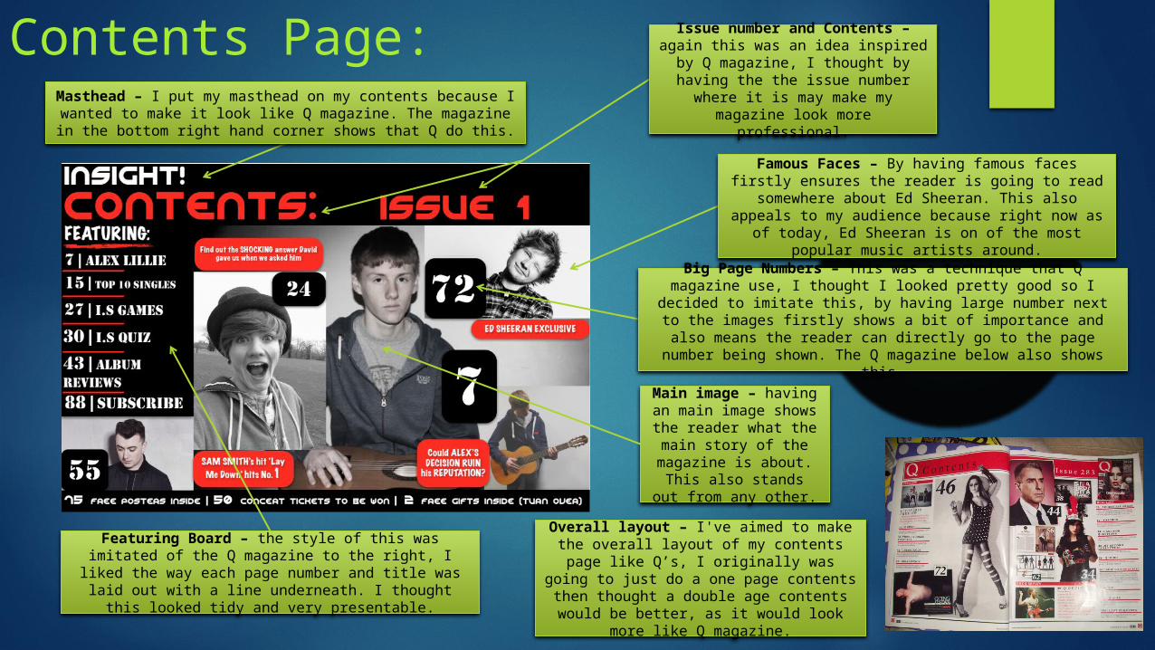
Contents Page:Masthead – I put my masthead on my contents because I
wanted to make it look like Q magazine. The magazine in the bottom right hand corner shows that Q do this.
Overall layout – I've aimed to make the overall layout of my contents page like
Q’s, I originally was going to just do a one page contents then thought a double age contents would be better, as it would look
more like Q magazine.
Famous Faces – By having famous faces firstly ensures the reader is going to read somewhere
about Ed Sheeran. This also appeals to my audience because right now as of today, Ed Sheeran is on of
the most popular music artists around.
Big Page Numbers – This was a technique that Q magazine use, I thought I looked pretty good so I decided to imitate this,
by having large number next to the images firstly shows a bit of importance and also means the reader can directly go to the
page number being shown. The Q magazine below also shows this.
Featuring Board – the style of this was imitated of the Q magazine to the right, I liked the way each page number and title was laid out with a line underneath. I
thought this looked tidy and very presentable.
Issue number and Contents – again this was an idea inspired by Q magazine, I thought by having the the issue number where it is may
make my magazine look more professional.
Main image – having an main image shows the reader what the
main story of the magazine is about. This
also stands out from any other.
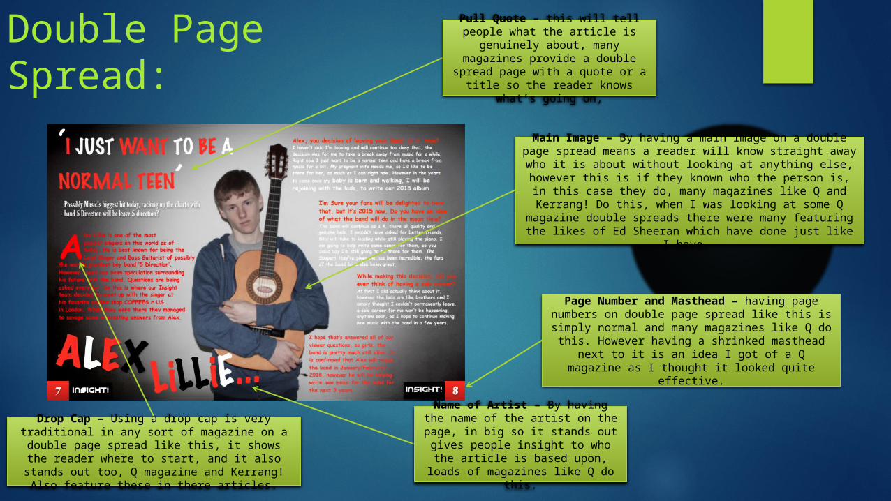
Double Page Spread:
Page Number and Masthead – having page numbers on double page spread like this is simply
normal and many magazines like Q do this. However having a shrinked masthead next to it is
an idea I got of a Q magazine as I thought it looked quite effective.
Main Image – By having a main image on a double page spread means a reader will know straight away who it is about without looking at anything else, however this is if they known who the person is, in this case they do, many magazines like Q and Kerrang! Do this, when I was looking
at some Q magazine double spreads there were many featuring the likes of Ed Sheeran which have done just like I
have.
Name of Artist – By having the name of the artist on the page, in big so it stands out gives people
insight to who the article is based upon, loads of magazines like Q do
this.
Pull Quote – this will tell people what the article is genuinely about, many magazines provide a double spread page with a quote or a title so the reader knows what’s going
on,
Drop Cap – Using a drop cap is very traditional in any sort of magazine on a double page spread
like this, it shows the reader where to start, and it also stands out too, Q magazine and Kerrang!
Also feature these in there articles.
How does your media product represent particular social groups?

When researching some magazines, (mostly Q) I eventually got an idea of the age I would need my target audience to be. I thought should aged around 15/20 this is because of the content. However I believe I did achieve this, but however I did also want to aim to attract males and females over 20 to about 30. I thought that my headline would attract my younger audience as many people aged 15/16 (mainly females) love 5 Direction. I then focused on attracting an older audience by including a big variety of big names like Ed Sheeran who some people could take inspiration from. I also advertised about Album reviews, I got this from Q magazine, I feel this adds to the range of my audience because 30 year olds or just a little younger who are interested in music will find reading reviews helpful if they are going to be purchasing an album mentioned. Despite including this the overall content throughout the magazine is like Q’s however, it does contain more gossip to attract the younger audience.
Social Groups…
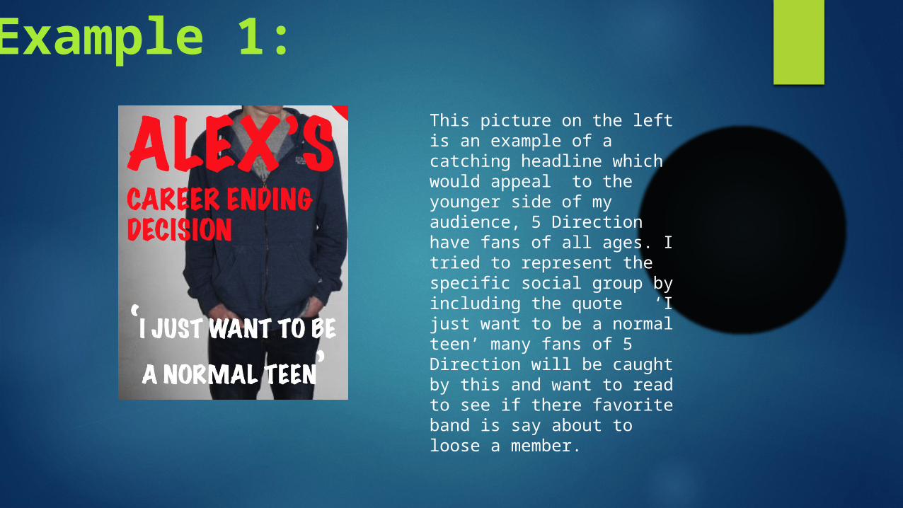
This picture on the left is an example of a catching headline which would appeal to the younger side of my audience, 5 Direction have fans of all ages. I tried to represent the specific social group by including the quote ‘I just want to be a normal teen’ many fans of 5 Direction will be caught by this and want to read to see if there favorite band is say about to loose a member.
Example 1:
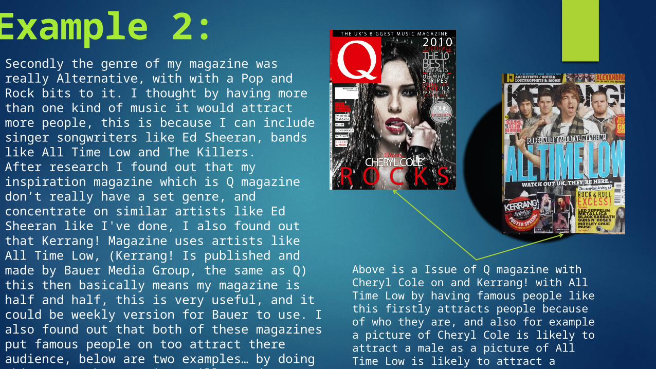
Secondly the genre of my magazine was really Alternative, with with a Pop and Rock bits to it. I thought by having more than one kind of music it would attract more people, this is because I can include singer songwriters like Ed Sheeran, bands like All Time Low and The Killers. After research I found out that my inspiration magazine which is Q magazine don’t really have a set genre, and concentrate on similar artists like Ed Sheeran like I've done, I also found out that Kerrang! Magazine uses artists like All Time Low, (Kerrang! Is published and made by Bauer Media Group, the same as Q) this then basically means my magazine is half and half, this is very useful, and it could be weekly version for Bauer to use. I also found out that both of these magazines put famous people on too attract there audience, below are two examples… by doing this means the magazines will stand out because they’ll either attract people in too ways, one way depending on who it is say Cher
Above is a Issue of Q magazine with Cheryl Cole on and Kerrang! with All Time Low by having famous people like this firstly attracts people because of who they are, and also for example a picture of Cheryl Cole is likely to attract a male as a picture of All Time Low is likely to attract a female.
Example 2:
What kind of media institution might distribute your media product and why?
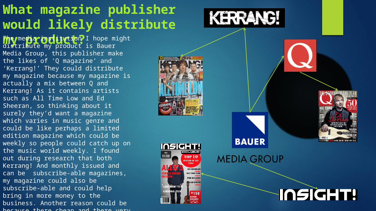
What magazine publisher would likely distribute my product?The media institution I hope might distribute my product is Bauer Media Group, this publisher make the likes of ‘Q magazine’ and ‘Kerrang!’ They could distribute my magazine because my magazine is actually a mix between Q and Kerrang! As it contains artists such as All Time Low and Ed Sheeran, so thinking about it surely they’d want a magazine which varies in music genre and could be like perhaps a limited edition magazine which could be weekly so people could catch up on the music world weekly. I found out during research that both Kerrang! And monthly issued and can be subscribe-able magazines, my magazine could also be subscribe-able and could help bring in more money to the business. Another reason could be because there cheap and there very similar to the monthly magazines people would definitely buy something that cheap every week.
Who would be the audience for your media product?
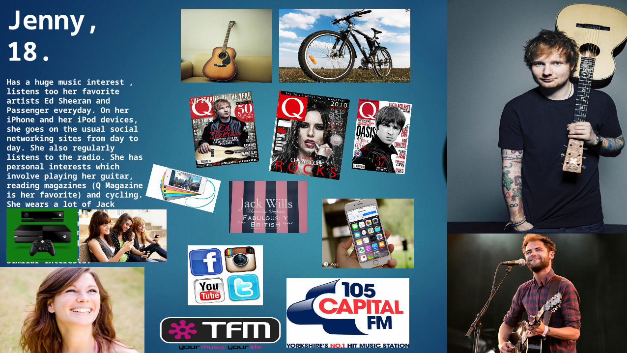
Jenny, 18.Has a huge music interest , listens too her favorite artists Ed Sheeran and Passenger everyday. On her iPhone and her iPod devices, she goes on the usual social networking sites from day to day. She also regularly listens to the radio. She has personal interests which involve playing her guitar, reading magazines (Q Magazine is her favorite) and cycling. She wears a lot of Jack Willis make clothes, and likes to play on her Xbox from time to time. Jenny is reasonably independent but does have a few friends with similar interests.
Firstly, my audience need a strong interest in Pop/Alternative/Rock music. I have also made a Target Audience Board; (on the previous slide) this shows the type of audience who would be my ideal target. This is because there at an age where they’ll have more understanding and be able to read the big articles, as say a 14 year old will most likely struggle. However there is no reason why 14/15 year olds could by it for the gossip, because the could be fan girls and like to here the gossip side of things. Which isn't to compressive and complex to read, however most of the surroundings of the Gossip sections will be.
However my magazine ins’t just for the female, the other artists which are mentioned, for example Ed Sheeran, many males who like music singer/songwriters like Ed, would see him as a huge inspiration.
My audience however does vary and expand even more. Despite the middle aged/older teens, this magazine could still appeal to the likes of perhaps males and females in there 20s/30’s, this is firstly because I really tried to imitate Q; now the audience for Q feature these type of people as well as many others as it’s possibly the most popular music magazine, which contains a vast majority of music genre. So therefore, these people would like my magazine primarily because of it’s content, it has the odd bit of gossip, but later on it has things such as Album Reviews for over 100 albums and facts about the musicians, which would surely get a music lover captivated.
Overall my target audience is big, I think this is good because to have a limited target audience, the magazine wouldn’t be as popular, Pop music being one of the most popular genres today, is bound to drag many people to buy, also, with big music names like Ed Sheeran who many. Many people love, it’s guaranteed that most music lovers will want to read this magazine. The aim is to attract more and more people primaryly aged at least 17 or over, as it’s meant to be a mature magazine.
How did you attract/address your audience?
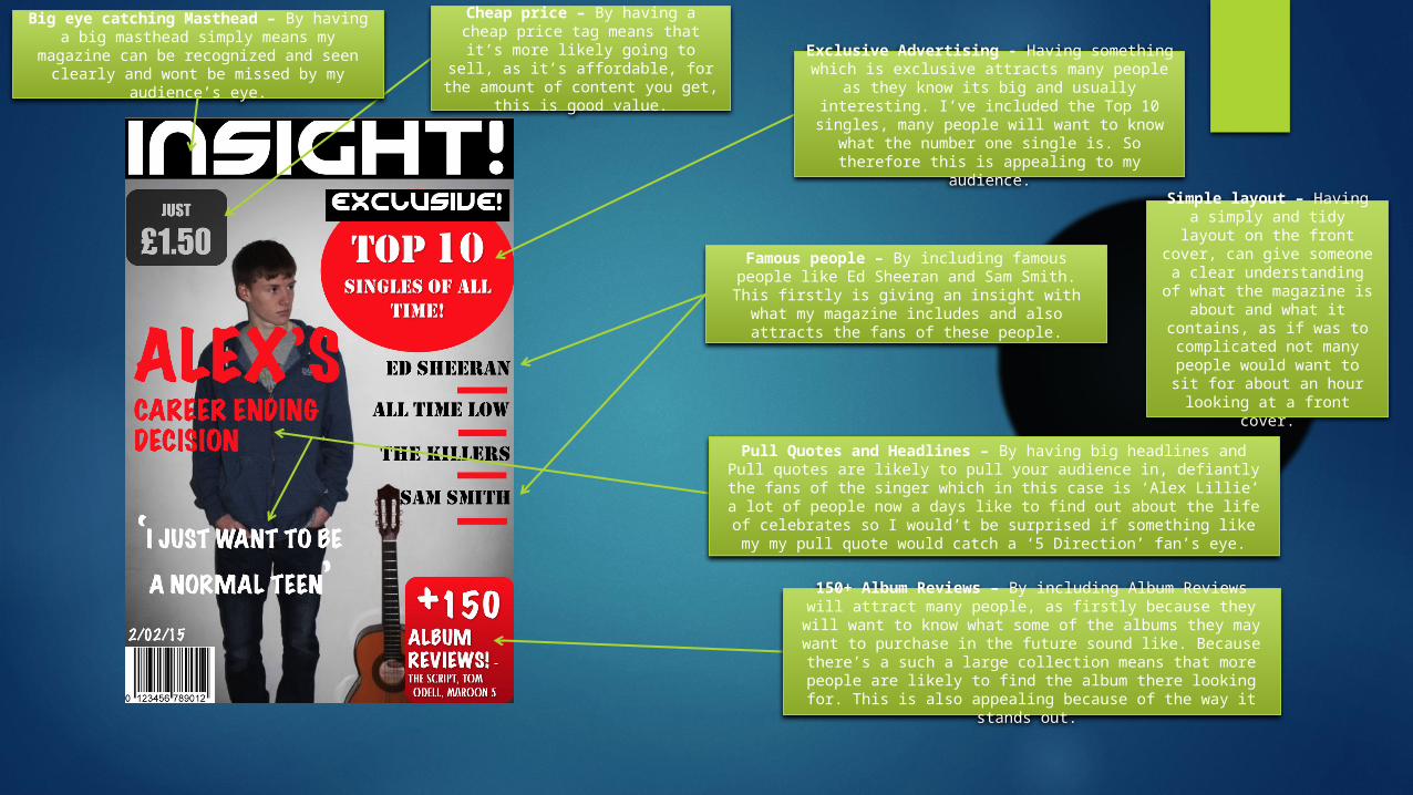
Exclusive Advertising - Having something which is exclusive attracts many people as
they know its big and usually interesting. I’ve included the Top 10 singles, many people will want to know what the number one single is. So therefore this is appealing to my audience.
Big eye catching Masthead – By having a big masthead simply means my magazine
can be recognized and seen clearly and wont be missed by my audience’s eye.
Cheap price – By having a cheap price tag means that it’s more
likely going to sell, as it’s affordable, for the amount of
content you get, this is good value.
Famous people – By including famous people like Ed Sheeran and Sam Smith. This firstly is
giving an insight with what my magazine includes and also attracts the fans of these
people.
Simple layout – Having a simply and tidy layout on the front cover, can give
someone a clear understanding of what the
magazine is about and what it contains, as if was to complicated not many
people would want to sit for about an hour looking at a
front cover.
Pull Quotes and Headlines – By having big headlines and Pull quotes are likely to pull your audience in, defiantly the fans of the
singer which in this case is ‘Alex Lillie’ a lot of people now a days like to find out about the life of celebrates so I would’t be surprised if
something like my my pull quote would catch a ‘5 Direction’ fan’s eye.
150+ Album Reviews – By including Album Reviews will attract many people, as firstly because they will want to
know what some of the albums they may want to purchase in the future sound like. Because there’s a such a large
collection means that more people are likely to find the album there looking for. This is also appealing because of the
way it stands out.
What have you learnt about technologies from the process of constructing this product?

Firstly Photoshop, I used Photoshop to edit my photos, (which are below). I thought that my photo editing was much better than my previous attempt, The way I edited was very simple.I was simply adjusting the colour, exposure and the contrast then I played around with the levels to create a vignette effect around them.
Photoshop
This first image was simply cropped so I could use it to feature on my contents, it was also enhanced with a little saturation and exposure.
This other image was simply turned black and white and a little contrast was added, this was another image I used for my contents page
The 3 other images are the more Photoshop-genic ones where I sued more editing techniques to make them look like they do. They have also been mentioned on the left paragraph.
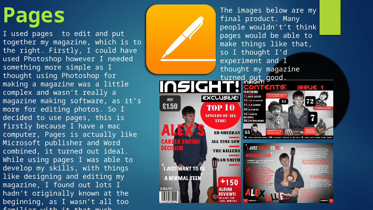
PagesI used pages to edit and put together my magazine, which is to the right. Firstly, I could have used Photoshop however I needed something more simple as I thought using Photoshop for making a magazine was a little complex and wasn’t really a magazine making software, as it’s more for editing photos. So I decided to use pages, this is firstly because I have a mac computer, Pages is actually like Microsoft publisher and Word combined, it turned out ideal. While using pages I was able to develop my skills, with things like designing and editing my magazine, I found out lots I hadn't originally known at the beginning, as I wasn’t all too familiar with it that much however in the end it helped a lot and I came out with three pages a Front Cover, Contents and a Double Page Spread.
The images below are my final product. Many people wouldn't’t think pages would be able to make things like that, so I thought I’d experiment and I thought my magazine turned out good.
Looking back at your preliminary task, what do you feel you have learnt in the progression from it to the full product?
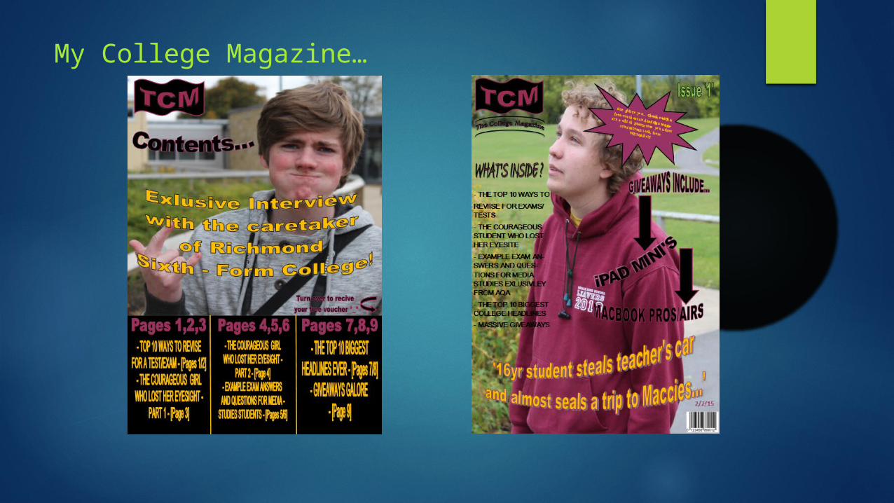
My College Magazine…
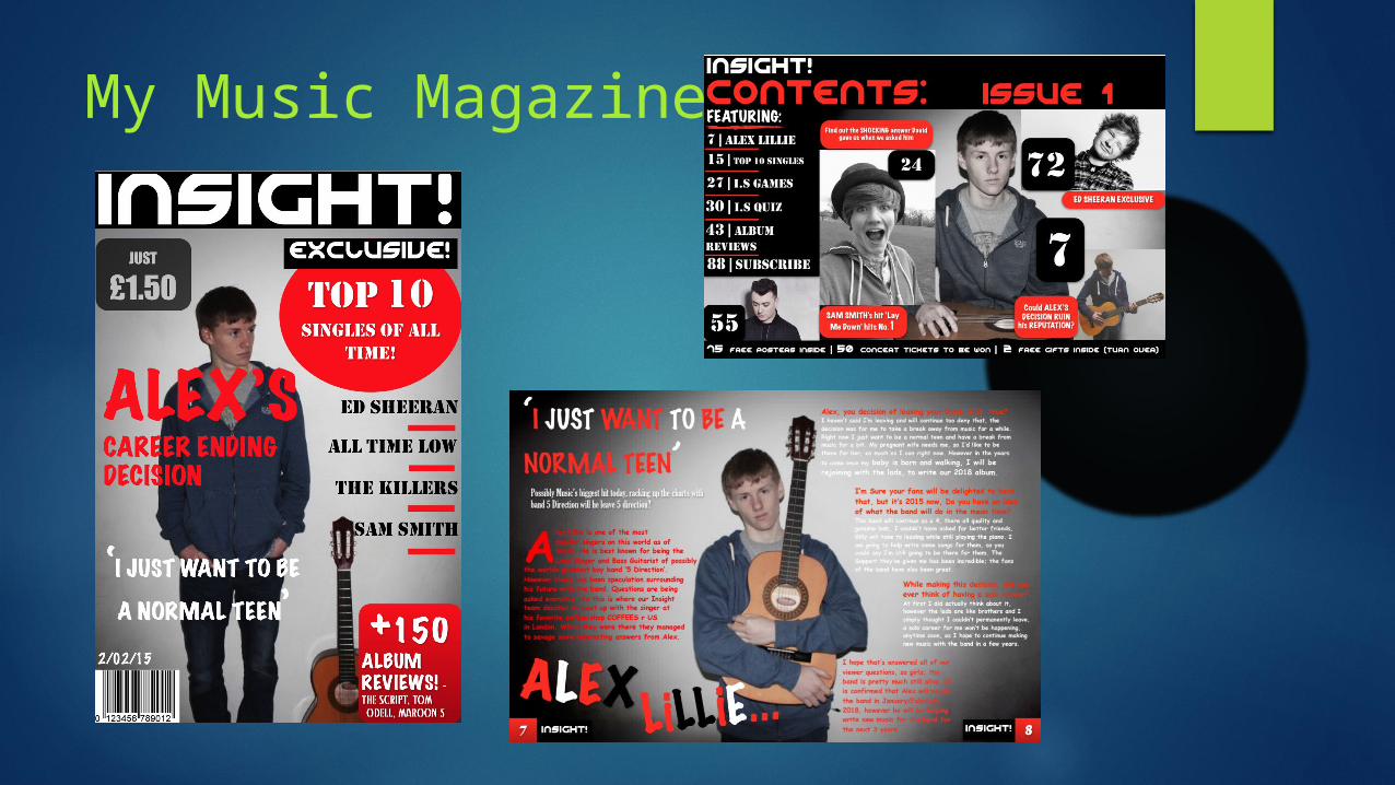
My Music Magazine…
What have I learnt?
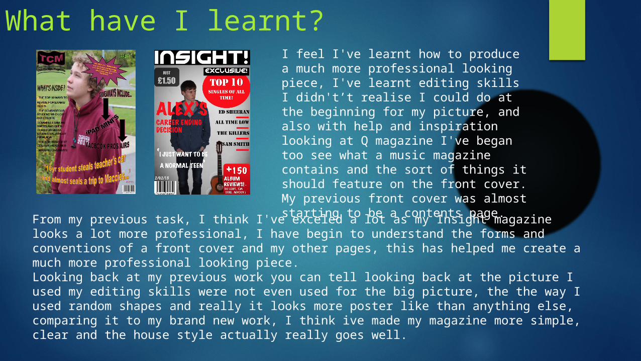
From my previous task, I think I've exceled a lot as my Insight magazine looks a lot more professional, I have begin to understand the forms and conventions of a front cover and my other pages, this has helped me create a much more professional looking piece.Looking back at my previous work you can tell looking back at the picture I used my editing skills were not even used for the big picture, the the way I used random shapes and really it looks more poster like than anything else, comparing it to my brand new work, I think ive made my magazine more simple, clear and the house style actually really goes well.
I feel I've learnt how to produce a much more professional looking piece, I've learnt editing skills I didn't’t realise I could do at the beginning for my picture, and also with help and inspiration looking at Q magazine I've began too see what a music magazine contains and the sort of things it should feature on the front cover. My previous front cover was almost starting to be a contents page.
Related Documents