Evaluation

Welcome message from author
This document is posted to help you gain knowledge. Please leave a comment to let me know what you think about it! Share it to your friends and learn new things together.
Transcript

Evaluation
In what ways does your media product use, develop or challenge forms and conventions of real media
products?
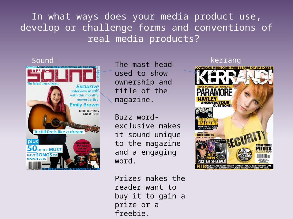
Sound- mine kerrangThe mast head- used to show ownership and title of the magazine.
Buzz word- exclusive makes it sound unique to the magazine and a engaging word.
Prizes makes the reader want to buy it to gain a prize or a freebie.

Pull quote
Pull quote- I looked at Q magazine, it presented a pull quote to be bold and had a colourful highlighting to make it stand out and to engage the audience to read the magazine in order to see the whole article. I presented this pull quote to have a simple white highlighting so I could get it as close to the artist as possible so the reader could link text to face. Their pull quote is engaging it makes you want to buy the magazine in order to read what music has changed their life. My pull quote goes against this slightly by saying it feels like a dream so the audience will want to read on to see about this new artist dream however it is not as engaging as the q magazine.

Colour schemeQ magazine colour scheme is black red and white.Kerrang colour scheme is yellow black and white traditionally Nme is usually red black and whiteThe colour scheme I choose to use was neon blue, pink, white and black, I choose this as the other magazine’s feature bright bold colours. Therefore I choose this colour scheme in order to attract the audience attention as bright colours are stereotypically associated with young adults. Also as it’s a hip hop themed magazine I needed to use bright colours to fit in with the genre.I also used the blue and pink to show a unisex colour to show my magazine is aimed at both genders.
mine
Other magazines with a similar genre
buzzword

barcode
I found that the barcode on magazines are small as it is the least important aspect of the magazine. The Barcode is a common convention therefore in magazines they are seen to be in corners of the magazine to use less space and also so the consumer can see how much the magazine is. Hence in my magazine I put my barcode in the corner small to take up less space but big enough to see the price.

Features/ regulars of contents page
In music magazines I found there are features which is the main articles and those featured on the front cover and also regulars which are in the magazine for every issue.< in my magazine I used features and also regulars I adapted the regulars and created my own monthly items such as a monthly albumn review. I also used subscribe and a review section that I have previously seen being used in my research.< I updated my features to a more up date article such as Leeds fest line up which will engage the target audience and fit in with the genre as it is a hip hop music festival.I also matched the photos to the article in the text using the same number in the list.

How does your media product represent particular social groups?
My social group is (hip-hop)- young adults/teenagers who have an interest in hip-hop music. I represented this genre by including similar themes that are included in hip-hop magazines. I have done this to attract my target audience and engage them to read the magazine. Gender- my magazine mainly features female characters, the models used were female and the list of articles is also mainly female. Therefore it is aimed at women but also men on a lustful level. I used a young girl on my front cover with pink hair which is a gender stereotype that pink is linked with female such as they like pink things and want to wear pink things etc. I also used featured the girl holding a guitar which would normally be featured in a male hand due to stereotype

As my magazine is aimed at young adults and teenagers my magazine features people of a similar age in order to fit in with the style of the magazine and engage the audience. The stereotypes around ages is that teenagers are seen as troublesome youths and therefore they get critised a lot. Therefore I went against these stereotypes and made the front cover look like a nice presentable girl that fit in with the genre but went against stereotypes that the older generation have. My magazine was made with the middle class and working class in mind therefore if had a relatively cheap price for the magazine that is affordable amongst both classes. The working class get judged a lot for not having the most current clothes etc. therefore they can get stigmatised that they are thief's or discriminated against therefore I have featured in my contents page how to get a celebrity look therefore they can wear similar clothes for a cheap affordable price.I featured a male black artist to not make it look like a racist magazine and so it is multi cultural, there is no racism or prejudice in my magazine. The male artist is in his stage clothes therefore it does support the stereotypes that male blacks are ‘ gangsta’s’ or rappers.

Media Institution: any of the organisations responsible for the production, marketing, distribution or regulation of media texts. Some of the key magazine publishing institutions in the uk are BAUER, IPC and future.I believe that my magazine could be featured on the I books on apple therefore it is being extended into other media areas and gaining more public attention. The front cover could also be featured on billboards or buses to gain more public attention. Bauer also know how to publicise similar magazines therefore would know how to publicise mine. KERRANG has a reader ship of 396,000 and q is 339,000 therefore my readership would be similar and worthwhile.
What kind of media institution might distribute your media product and why?

What kind of media institution might distribute your media product and why?
I think the media institution that would distribute my magazine would be BAUER, because they distribute Q which I think is similar to my magazine however mine is more informal style/layout and a cheaper price so if they distributed mine it would be read my more of a lower class compared to Q. Therefore by running both magazines they are making sales from a much wider audience. However they could not want to distribute mine due to already having Q and kerrang therefore they may not want to distribute another music magazine the same genre to Q. BAUER is a large European-based media company it has a portfolio of more than 600 magazines, over 400 digital products and 50 radio and TV stations around the world. My magazine I think would blend in with their popular magazines due to the title for example: they both are the same and yet not at the same time therefore I believe this would be a great new addition

Who would be the audience for your media product?
My final production shows that my target audience is more pop than hip-hop due to the fact the main person is dressed and looks more respectable and has more clothes on than girls pictured in hip=hop magazines she is more modernised in my magazine. Therefore she may not relate to all the audience I aimed for in the first place but may relate to more middle class people especially to women as she doesn’t really have the lustful poses men would need in order to take interest in this magazine.

How did you attract/address your audience?
I used a crackled featured masthead to engage the audience as it fits in with the hip-hop genre and draws attention. I then matched the colour of the title with the artist hair to draw attention to the singer as well and to show that she also relates to the genre this will engage the target audience.
I choose bold cover lines and I underlined and used italic on exclusive to attract the audience attention, I also underlined and made bold certain words that I thought would engage and attract the reader.

I also including a chance to win tickets to a concert I did this because everybody likes free things and the audience will be attracted to this magazine in order to win the free stuff.
The colour scheme I choose to do I choose bright colours to attract the orders I also choose blue and pink as the clash and therefore draw the readers eye to look at the whole page. And due to my research I found that other magazine used similar colours and this engaged the same audience I am hoping to engage. I also believe it shows unisex. I addressed my audience in an informal way as research shows the audience wont be engaged if you speak to them in a formal way and will lose attention. My photos are eye level therefore they make the audience feel connected and involved and want to buy the magazine.

What have you learnt about technologies from the process of constructing this product?
The technology I used was: my iPhone to record the interview and pictures of the male artist. I used premier pro and photo shop to create the preliminary task and final production, I also used word and PowerPoint to create the pitch etc. I learnt how to use Photoshop to create and edit images as I had never used this software before, I learnt that it can be difficult to use all the tools and there still aspects of Photoshop I have no idea what it is. Without it I wouldn’t have a final product though, I already knew how to use PowerPoint so I just developed my skills more. I learned that it takes a lot of time to perfect the magazine as it took my 3 weeks maybe more to finish the production. I also learnt how to use and create a blog that I never knew I could do before. I could of done without the use of premier pro and word to create the magazine. I couldn’t of done without PowerPoint the blog and Photoshop. The negatives was learning how to use all the new software it took a lot of time time that I needed.

Looking back at your preliminary task, what do you feel you have learnt in the progression from it to the
full product?
Doing the task helped me when creating my final front cover , therefore it helped me learn the basics of photo shop.
I am better at using Photoshop and PowerPoint now I also know how to research and analyse things better. I can now create a flat plan and what I enjoyed the most was creating the style sheet just making loads of fonts and titles was enjoyable. I didn’t like writing the copy or planning photographs but now I know what to details to pick out when I see magazine in shops and I hope it will help me in my exams.
Related Documents