evaluation Mahamed nor

Welcome message from author
This document is posted to help you gain knowledge. Please leave a comment to let me know what you think about it! Share it to your friends and learn new things together.
Transcript
evaluation
Mahamed nor

evaluation
In what ways does your media product use, develop or challenge forms and conventions of real media product?
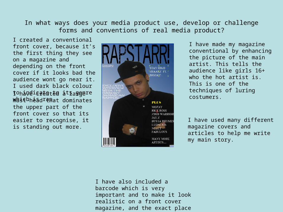
I have created a large mast-head that dominates the upper part of the front cover so that its easier to recognise, it is standing out more.
I have also included a barcode which is very important and to make it look realistic on a front cover magazine, and the exact place I put it is similar to most magazines especially rap.
I created a conventional front cover, because it’s the first thing they see on a magazine and depending on the front cover if it looks bad the audience wont go near it. I used dark black colour to indicate to its genre which is rap.
I have made my magazine conventional by enhancing the picture of the main artist. This tells the audience like girls 16+ who the hot artist is. This is one of the techniques of luring costumers.
I have used many different magazine covers and articles to help me write my main story.
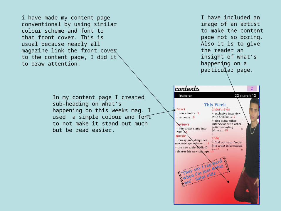
i have made my content page conventional by using similar colour scheme and font to that front cover. This is usual because nearly all magazine link the front cover to the content page, I did it to draw attention.
I have included an image of an artist to make the content page not so boring. Also it is to give the reader an insight of what’s happening on a particular page.
In my content page I created sub-heading on what’s happening on this weeks mag. I used a simple colour and font to not make it stand out much but be read easier.

This time its unconventional and un-linked to the other pages. This double page spread is to indicate and match all colours with what the main artist is wearing.
I also created a banner to show the reader that will be in a particular studio. It is linked because the question has been answered the next page
I created a large font to show the reader that the main big thing is being done on this page. Also that it stands for Rapstarr hat is on my front page.
I made that banner to give a message to the reader that there is no hidden lies in this page.

How does your media product represent particular social groups?
My magazine represents all people from different classes who are in to rap. My magazine mainly and strongly represents young males because all my images I used are boys older than 17. the reason why I chose males for my rap magazine was because over 85% males are into rap which I’m saying that there are more males than females that do rap.
My magazine portrays young male rappers doing their thing such as writing lyrics, in the studio rapping and showing off their swag. All colours schemes that I used really match rap genre because of the dark red and black I chose for my double page spread.
I did not produce my rap magazines for only rappers, but also for newcomers that don’t know anything of rap so its to let them know more about rap and maybe eventually they end up being lyrical artists.
What kind of media institution might distribute you and why?
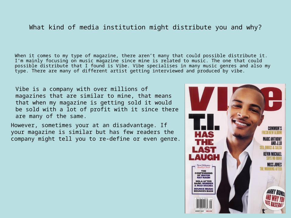
When it comes to my type of magazine, there aren’t many that could possible distribute it. I’m mainly focusing on music magazine since mine is related to music. The one that could possible distribute that I found is Vibe. Vibe specialises in many music genres and also my type. There are many of different artist getting interviewed and produced by vibe.
Vibe is a company with over millions of magazines that are similar to mine, that means that when my magazine is getting sold it would be sold with a lot of profit with it since there are many of the same.
However, sometimes your at an disadvantage. If your magazine is similar but has few readers the company might tell you to re-define or even genre.
Who would be the audience for your media product?
The audience for my magazine products would mainly be males 14+ that are interested in writing lyrics and rapping. Although there are few things that are for people who don’t really understand what rap is about which is for all ages male or female.
Also that the artists on my magazine are 16-17 which links to my target audience.
Due to my colour scheme I used and the music genre, I think that my magazine would attract more male readers but I could also attract young females because they might be interested in my main artist who is on my front page.
Surprisingly, my main head-line is called “rapperr” so that it may attract readers.
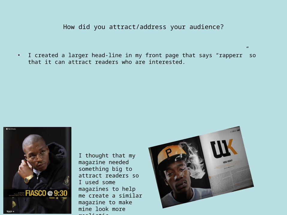
How did you attract/address your audience?
• I created a larger head-line in my front page that says “rapperr” so that it can attract readers who are interested.
I thought that my magazine needed something big to attract readers so I used some magazines to help me create a similar magazine to make mine look more realistic.
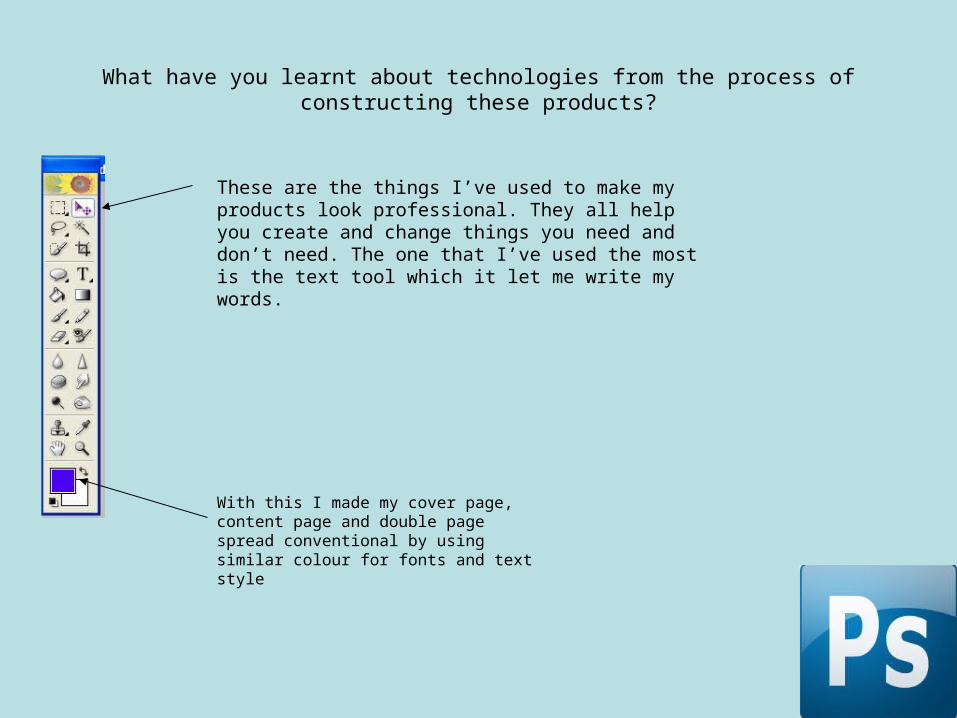
What have you learnt about technologies from the process of constructing these products?
These are the things I’ve used to make my products look professional. They all help you create and change things you need and don’t need. The one that I’ve used the most is the text tool which it let me write my words.
With this I made my cover page, content page and double page spread conventional by using similar colour for fonts and text style
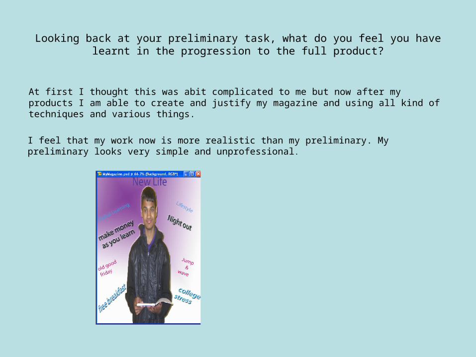
Looking back at your preliminary task, what do you feel you have learnt in the progression to the full product?
At first I thought this was abit complicated to me but now after my products I am able to create and justify my magazine and using all kind of techniques and various things.
I feel that my work now is more realistic than my preliminary. My preliminary looks very simple and unprofessional.
Related Documents