How effective is the combination of your main products and ancillary tasks. Evaluati on 2

Welcome message from author
This document is posted to help you gain knowledge. Please leave a comment to let me know what you think about it! Share it to your friends and learn new things together.
Transcript
How effective is the combination of your main products and ancillary
tasks.
Evaluation 2
Introduction
• The aim of our project at the beginning was to create an elite brand surrounding the artist in our music video. the purpose of this was to create an influential media figure, to entice a large fan base. To succeed with this we had to keep the characteristics of our artist to keep it realistic. To help with this, we created a Digipak and magazine advert to promote the video. By linking all three tasks, it helped us to achieve our goal.
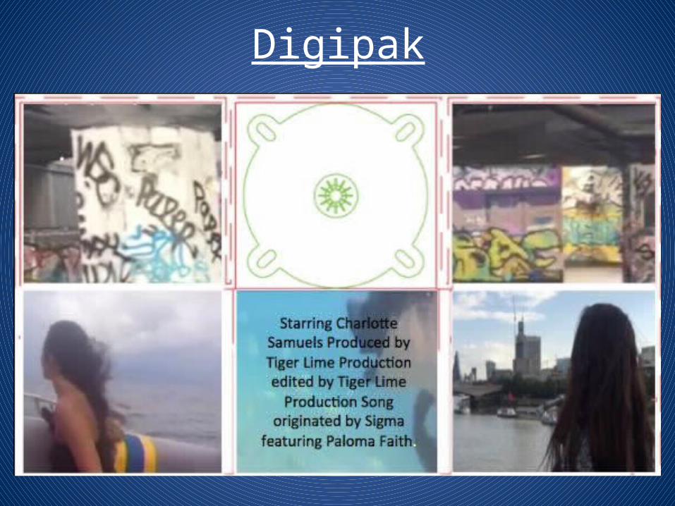
Digipak

When creating our ancillary task of a Digipak, we wanted to give the audience a taste of what our music video will be like. Therefore, we put different aspects of the video into the digipak.This part id the main, middle section of the digipak. Where the CD would be inserted, as shown below. The background is an establishing show of one of the locations, a graffiti covered skate park in London, the colours display the colourful nature of the video.
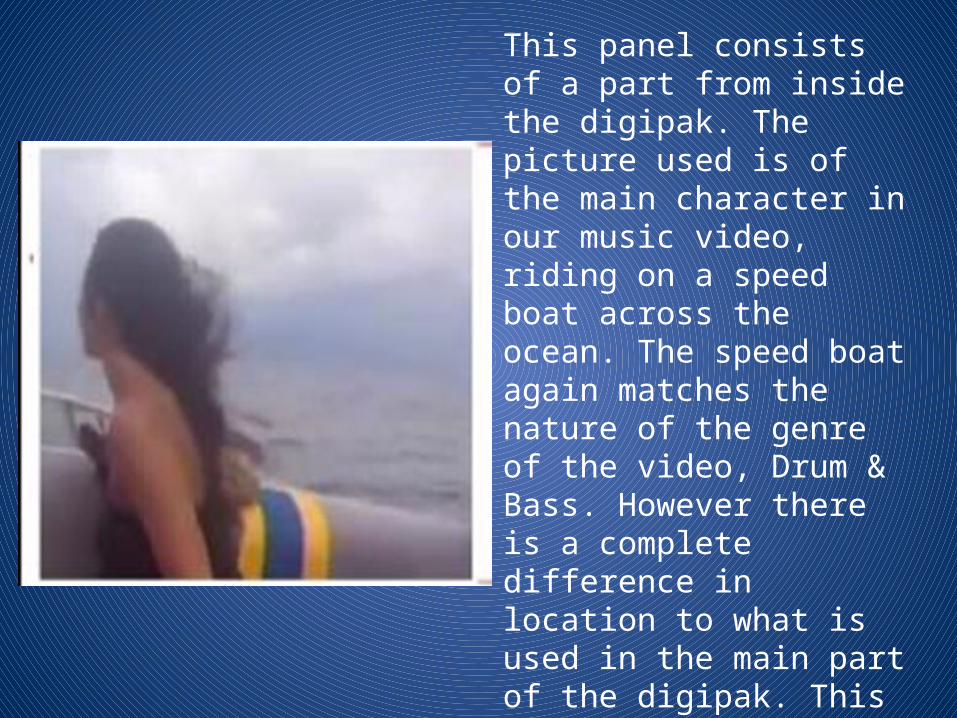
This panel consists of a part from inside the digipak. The picture used is of the main character in our music video, riding on a speed boat across the ocean. The speed boat again matches the nature of the genre of the video, Drum & Bass. However there is a complete difference in location to what is used in the main part of the digipak. This contrast in location matches the song we chose, talking about Changing. The bright colours also catches the eye and entices people to look at the digipak.
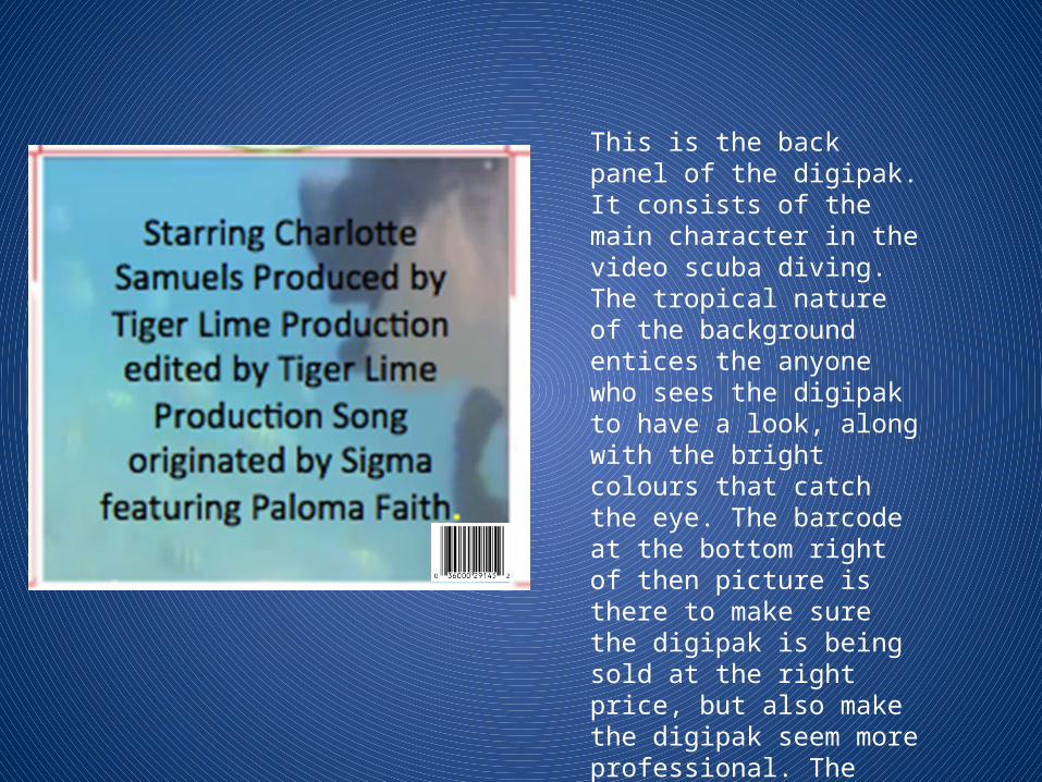
This is the back panel of the digipak. It consists of the main character in the video scuba diving. The tropical nature of the background entices the anyone who sees the digipak to have a look, along with the bright colours that catch the eye. The barcode at the bottom right of then picture is there to make sure the digipak is being sold at the right price, but also make the digipak seem more professional. The more professional the digipak looks, the better the effects will be on our brand.

This is the front cover of the digipak. Its an over the shoulder shot of Charlotte, our main character looking of the river Thames. The front cover of the digipak shows Charlotte looking into the distance, representing how she is looking for freedom and could be tired of the same old thing. This links in with the song we chose to make a music video to with the lyrics stating ‘Changing’ and ‘I’ve been here for too long’. Having Charlotte on the cover intrigues the audience, and gives them an insight to what could be seen within the music video, as well as this it can create a connection between the audience and the main character, encouraging them to buy the product.

• The main aim of the digipak was to further promote the brand we have created through our final music video. I believe as a group we done this well as we have shown the feelings of the main character to the audience, as well as representing what sort of video ours is. The panels on the digipak explore into how the main character wants change in her life, and the different locations used further help to represent the change. The different locations also act as a beacon to entice customers in through catching their eyes with the bright colours we decided to use. The contrast between a skate park in London and the tropical nature of Saint Lucia displays a unique and audacious theme to the video, which in turn makes the video more interesting. Furthermore, we used different costumes to add to the adventurous style we had created.
• The above points are example of how we branded our video. Branding is a convention of a music video, as the label represents the artist that the audience wants to see. This means that maintaining a style, and themes that the audience are interested in to assure they’re happy with al products released.

• Our digipak can be found in supermarkets, as well as HMV. As these stored sell other well branded digipaks, we knew we had to make ours stand out in order to catch the eye of customers, and entice them to purchase our product. We done this by using bright, different colours, to make the digipak noticeable as well as having the front cover of a well known location. By doing this to the front cover, people may notice the digipak through recognition of the location which could then result in them looking into our brand and possibly purchasing the product. By having no writing on the front cover of the digipak, it means that anyone who looks at the digipak may be intrigued to find out more about the product. The sense of mystery leaves the audience guessing as to what it is about and entices them to answer their questions by purchasing the product and finding out what they want to know. The back cover of the digipak makes reference to the main protagonist in the video, as well as the production team. By making reference to these people, their reputation is maintained and credit is given where it’s deserved, enhancing the profile of the brand.
Magazine advert

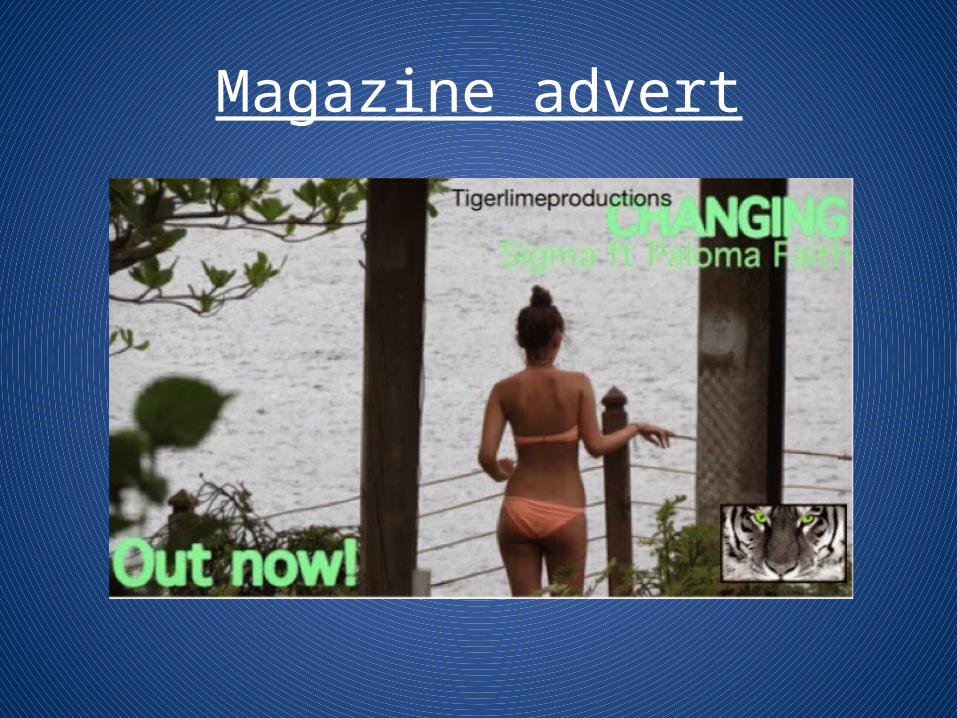
• The purpose of the Magazine advert if to promote the single as ‘Changing’. The main character is the main target in the advert, this is done to create a connection with the audience. The picture used in the advert was chosen due to the sense of voyeurism it has. The picture will intrigue males to look at the advert, which can then lead to them looking further into our video. The picture is bright and displays the colourfulness of our video, broadening the audience we have. This matches our locations which are outstanding, and also seem interesting for the audience to see.
• The layout for our advert was distinguished by the photo used. In this case, we had a landscape photo which fits in with an A4 sizing. The composition of the advert meant that we could emerge text in the bottom left, and top right sections. This allowed both the text, and the artist to be clearly shown in the advert.
• The font chosen is bold, to stand out to the audience and catch their eye. The bright green is hard not to see, and also matches our brand name of ‘TigerLime’. The text informs the audience of the song name, and who it is originally by. In the bottom left side of the advert it says ‘Out Now’. This gives the audience information that the song is available to them at this current moment, which is useful as they can search for it whenever they want, without having to wait for a specific date.
• In the bottom right hand side of the advert, we have implemented our brands logo. This again is a form of branding by promoting our brand to the audience when they see the advert, an effective way of advertising.
Conclusion• After analysing both the digipak and the magazine advert, I believe the skills used
in both help to promote our video in an effective way. The magazine advert gives the audience knowledge of release dates, whereas the digipak consists of the information about what is included in the video, giving the audience a taste. Both forms of advertising work hand in hand, with the digipak giving a taste of what the video is like, and the magazine advert making the audience want to find out more. Both ancillary tasks as well as the main product follow the theme of branding. This means that throughout, our artist was maintained allowing us to create the target audience. Leading on from this, the brand matches that of the genre we chose for our music video to be. The bright colours used throughout match that of the drum & bass genre along with the beat of the song. The colours used are aesthetically pleasing, which results in the audience staying engaged. Throughout both ancillary tasks the font has remained similar, this creates a sense of recognition for the audience, so when they see any other products from our brand they will notice them. To conclude, over all three tasks we have completed, I feel we have created a brand that can be noticed by out target audience successfully. Without using noticable fonts/images it would be unlikely for this to occur.
Related Documents


![Evaluation [2]](https://static.cupdf.com/doc/110x72/5499401ab4795902178b4570/evaluation-2-5584a82e204e6.jpg)
