Welcome message from author
This document is posted to help you gain knowledge. Please leave a comment to let me know what you think about it! Share it to your friends and learn new things together.
Transcript
In what ways does your media product use, develop or challenge forms and conventions of real media products?

Album Cover and Advert
Our use of colour fits in with the rock genre, and while there are greens, these can be traced back to the theme of UFOs, and ties in with the 40s Roswell incident, which involved abductions and UFOs. This in turn ties in with the band name ‘Foo Fighters’ which was a name given to UFOs by US pilots in the pacific.
The colour pallet of the digipak is mainly masculine, with a strong use of black and red. The use of a black and white filter in our photographs keeps the pallet strict and concise. This reflects the tastes of the target market: males who like rock music. This attention to pairing the aesthetics of the product with the target market is a method copied from the industry.
We have included a bar code at the bottom of one of the panels. This enforces a genuine feel and also helps to replicate the needs of a commercial product. On a similar note, just to the right of the bar code is the copyright information and label. This further enforces an authentic feel and would increase commercial validity.
The use of a black and white filter on the photos we used on the inside cover is indeed reflective of the melancholic attitude present in a rockers outlook. It also helps hone in on a teenage audience who can better connect with some of the feelings associated with cathartic posing and a colourless filter. This means that not only does it function as an enforcer of the genres attitude, it functions as a marketing strategy to entice a target market.
The choice of having a UFO theme almost came inherently with the bridging theme across much of the Foo Fighters franchise. We thought this was best honoured by making their greatest hits album a pure UFO themed scheme, with the Foo Fighters logo being abducted.
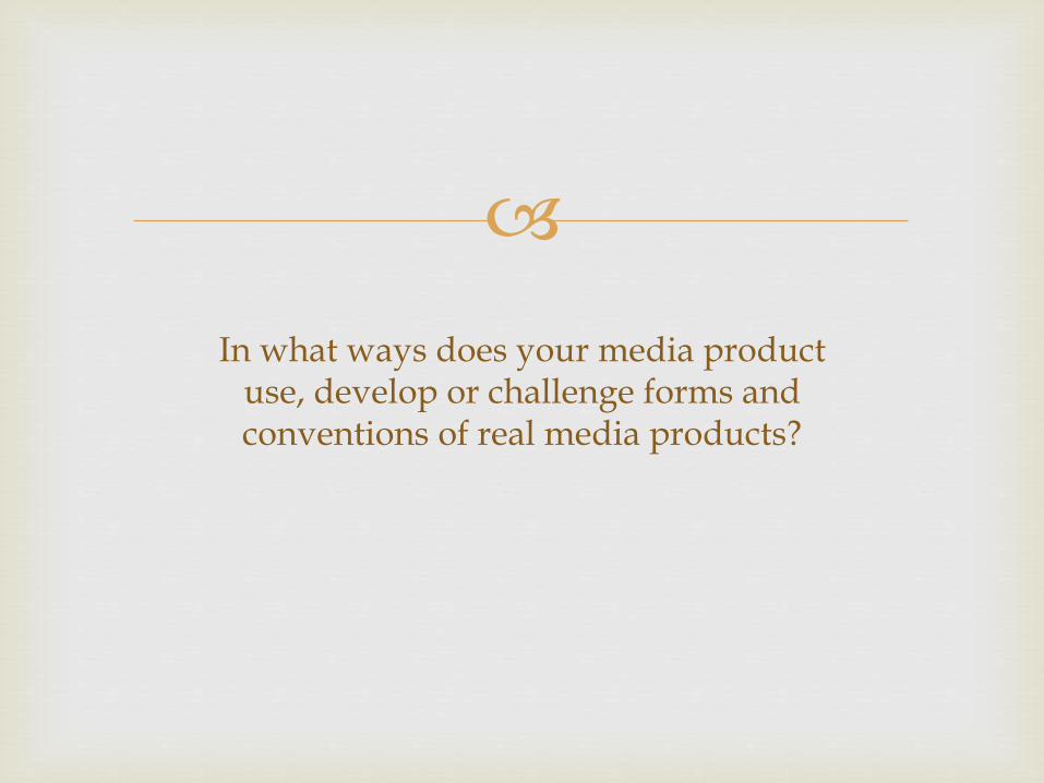
The star rating is something seen often throughout the media industry, not only does this replicate a common featurette found in many real media products, it also works within the field of space, and actual stars seen in the night sky.
The concise nature of information on the advert is reflective of similar minimalistic approaches to magazine adverts. By keeping the literary information to a minimum we are fully engaging the reader with the precise details of the pruduct. This includes the band name twice, for re-enforcement, but only one use of ‘Greatest hits.
The advert appears as an extension of the album artwork. By allowing the magazine audience to ‘see beyond’ what is visable only on the album cover, we deliver a sense of reward. Giving a more loyal supporter the completed poster, as opposed to a cropped version.
Release date has been enlarged for emphasis, this is done as a marketing strategy because with a bigger bold font you are embedding that information further into readers heads, for a better result. The large font also increases the chance to catch the attention of shelf readers. This is a technique utilised by professional advertisements.
Underneath the date is some information on the contents. Kept concise by the minimalistic layout it still contains elements which can entice an audience such as special edition exclusive features. It is typical for special edition releases to be packaged in digipack style housing, we have also done this.
Similar to what I mentioned with the album art, we have gone for a low contrast pallet, bar reds and greens. Again this coincides with the rock and roll genre and is typical when reflecting the attitudes which follow the music.
Putting a square around the area we used for the album cover is something we have tried to be original with. This method offers a degree of synergy within our product, connecting the marketing with the product closely.

Music Video
There are many ways in which our whole process utilised elements of real media production. For a start our music video bares many traits found in your standard to above standard music video. When the song begins a small graphic on the screen shows you the name of the band, song and label. This is very common in music videos on TV, and by replicating this and putting it in the music video we are in many ways challenging a real life convention.
As I mentioned earlier the use of a visual plot is fundamental to many music videos, and we have replicated that also. The use of location shooting is something seen often in music videos, we shot our video around York. While York as a city and The Foo Fighters as a band are more or less unrelated, I feel that by making a point of a significant location would be seen as more something to make the actual product more distinctive.
When looking at wardrobe, there has been an effort to match the style of the genre. Our lead character is wearing a black leather jacket, black jeans and a white t-shirt. This is a very common combination of colours and materials when you imagine the stereotypical rocker. Additionally he wears his hair in a close crop fashion, this all significant for the same reasons.
Like most, if not all music videos, we imply themes through visual cues. To encourage a sense of entrapment many of the shots were compose with walls, or fences on the sides of the frame. Either that or the camera pulls in to a close up so as to isolate the character. When the character makes a breakthrough and attempts an escape, the shot composition reflects that in that it opens out the frame. The camera also moves freely, as opposed to being mounted in a fixed frame for the inner city shots. The third to last shot of the video has the camera pull into a close up which returns our character to his sense of entrapment. This is then confirmed in the final two shots
Above is one of the first shots of the movie, yet it is the second visual occurrence implying entrapment. The heavy use of this motif can imply a feel without the need for speech.

How effective is the combination of your main product and ancillary texts?
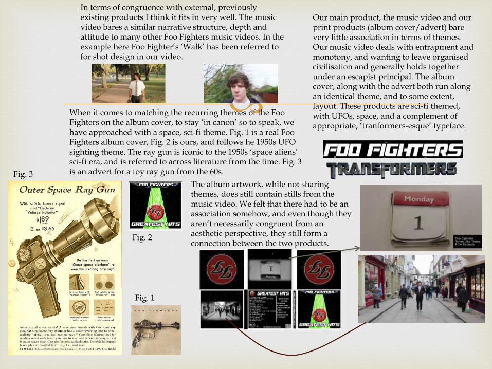
Our main product, the music video and our print products (album cover/advert) bare very little association in terms of themes. Our music video deals with entrapment and monotony, and wanting to leave organised civilisation and generally holds together under an escapist principal. The album cover, along with the advert both run along an identical theme, and to some extent, layout. These products are sci-fi themed, with UFOs, space, and a complement of appropriate, ‘tranformers-esque’ typeface.
The album artwork, while not sharing themes, does still contain stills from the music video. We felt that there had to be an association somehow, and even though they aren’t necessarily congruent from an aesthetic perspective, they still form a connection between the two products.
In terms of congruence with external, previously existing products I think it fits in very well. The music video bares a similar narrative structure, depth and attitude to many other Foo Fighters music videos. In the example here Foo Fighter’s ‘Walk’ has been referred to for shot design in our video.
When it comes to matching the recurring themes of the Foo Fighters on the album cover, to stay ‘in canon’ so to speak, we have approached with a space, sci-fi theme. Fig. 1 is a real Foo Fighters album cover, Fig. 2 is ours, and follows he 1950s UFO sighting theme. The ray gun is iconic to the 1950s ‘space aliens’ sci-fi era, and is referred to across literature from the time. Fig. 3 is an advert for a toy ray gun from the 60s.
Fig. 1
Fig. 2
Fig. 3
What have you learnt from your audience feedback?
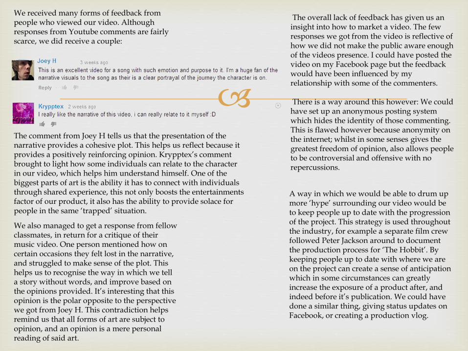
The comment from Joey H tells us that the presentation of the narrative provides a cohesive plot. This helps us reflect because it provides a positively reinforcing opinion. Krypptex’s comment brought to light how some individuals can relate to the character in our video, which helps him understand himself. One of the biggest parts of art is the ability it has to connect with individuals through shared experience, this not only boosts the entertainments factor of our product, it also has the ability to provide solace for people in the same ‘trapped’ situation.
The overall lack of feedback has given us an insight into how to market a video. The few responses we got from the video is reflective of how we did not make the public aware enough of the videos presence. I could have posted the video on my Facebook page but the feedback would have been influenced by my relationship with some of the commenters.
There is a way around this however: We could have set up an anonymous posting system which hides the identity of those commenting. This is flawed however because anonymity on the internet; whilst in some senses gives the greatest freedom of opinion, also allows people to be controversial and offensive with no repercussions.
We also managed to get a response from fellow classmates, in return for a critique of their music video. One person mentioned how on certain occasions they felt lost in the narrative, and struggled to make sense of the plot. This helps us to recognise the way in which we tell a story without words, and improve based on the opinions provided. It’s interesting that this opinion is the polar opposite to the perspective we got from Joey H. This contradiction helps remind us that all forms of art are subject to opinion, and an opinion is a mere personal reading of said art.
A way in which we would be able to drum up more ‘hype’ surrounding our video would be to keep people up to date with the progression of the project. This strategy is used throughout the industry, for example a separate film crew followed Peter Jackson around to document the production process for ‘The Hobbit’. By keeping people up to date with where we are on the project can create a sense of anticipation which in some circumstances can greatly increase the exposure of a product after, and indeed before it’s publication. We could have done a similar thing, giving status updates on Facebook, or creating a production vlog.
We received many forms of feedback from people who viewed our video. Although responses from Youtube comments are fairly scarce, we did receive a couple:


Pre-ProductionEven when it came to conceiving the idea for our music video we solely referenced the website Youtube. When trading ideas we would refer to music videos we had already seen. We also used Youtubeto show each other potential songs we would base our video on.
When it came to refining our plans so that they would fit better within a demographic, we used the website Surveymonkey. The website has software which helps represent the findings of the survey we created, all in website. We could easily create a survey and publish it into places others will easily see it. This helps us gain a greater response and helped us hone in on what people really want.
We drew up the storyboard using a pencil and paper, but when it came time to publish findings to a blog we used a scanner. This allowed us to maintain our original ideas while still transferring them onto a platform more widely available for people to see.
Publishing the link to our survey on social media outlets like Facebook and Twitter allowed us to reach more people much faster. By utilising social media as a tool we were able to speed up the process of audience research, and overall speeding up pre-production.
We used the built in camera on our phones to film random individuals for in depth audience research. A focus group if you will. Because of the casual nature of our filming we could get a more valid and comfortable response from people. This increases the overall validity of our research.
Throughout the entire production process, the whole group communicated via phone calls, texts and messages on social media. By using social media in this way we were able to communicate with each other easily, even if one of us was not present when the rest were.

ProductionThe primary piece of tech we used during the filming process was the camera. We shot the entire video on a Canon 70d DSLR. The use of digital photography meant we were able to store the footage on a memory card. This meant we were able to directly manipulate the footage on the camera, deleting clips we didn’t want, and trimming clips to create space. That takes me to the next point about digital format. The capacity was much larger than the analogue counterparts meaning we were able to stay out in the field for longer and didn’t have to worry about maintaining, or producing the film to reach the final product.
The nature of the format was so easy to work with that when we needed to do another shoot, about a week or so after we had finished our main one we could just turn on the camera, and our settings would automatically be applied. This helped speed up some elements of post-production. If we were to take this further, we could have spaced out our filming by a number of days and only extraneous factors such as the weather and light levels would be out of our control. The camera settings would have stayed the same, producing a similar outcome.
The camera also had a number of digital features that, if we wished, we could have used. An example of this would be the digital creative filters built into the camera.
Despite being no bigger than the average thumb, this card will hold over 40 minutes of 25fps, 1080p footage.
Post-Production
To the left is a clip edited using a multitude of crops and edge feathers. This is an example of the power this software has, but with modern technology this kind of process is commonplace.
The software even went as far as being able to repair footage that was perhaps a little bit too shaky, or hadn’t the correct light level to the shots surrounding it. For example we had one shot which was far too shaky to use, but we couldn’t get another one. So we ran it through a stabilising processor and that shot now appears in the final product. We attempted, with some success, to use the colour gradient tool to match the colours between two shots. During the shooting of these two shots the light level changed, as the low hanging sun from our early start cut through the clouds casting a yellow tinge on everything that was formerly neutral (white).
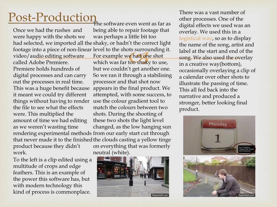
There was a vast number of other processes. One of the digital effects we used was an overlay. We used this in a logistical way, so as to display the name of the song, artist and label at the start and end of the song. We also used the overlay in a creative way(bottom), occasionally overlaying a clip of a calendar over other shots to illustrate the passing of time. This all fed back into the narrative and produced a stronger, better looking final product.
Once we had the rushes and were happy with the shots we had selected, we imported all the footage into a piece of non-linear video/audio editing software called Adobe Premiere. Premiere holds hundreds of digital processes and can carry out the processes in real time. This was a huge benefit because it meant we could try different things without having to render the file to see what the effects were. This multiplied the amount of time we had editing as we weren’t wasting time rendering experimental methods that never made it to the finished product because they didn’t work.

Extra NotesAll of my work throughout this project was carried out and organised on a PC. The use of a computer in the administrational side of the project made everything much faster and easier. For a start this evaluation was all written out and gathered on Microsoft powerpoint. This program makes it easier to present my findings and opinions on the work I have done. Similarly, the risk assessment was etched out on Microsoft word. This was useful for the same reasons.
Because all the work I have done over the project spans various platforms and formats, the best place to bring that all together is an online blog. Blogs are used all the time by people who want to quickly refer to other areas of their work without leaving the online space. Chances are you are reading this on my blog, and have already seen all the various other artefacts I have assembled.
When it came to rendering the video two major factors were in mind: maintaining the 1080p resolution, and keeping the file size small. We attempted to export the first copy of the product as a generic .AVI. Because we hadn’t put much thought into the parameters of the export we ended up with a file of about 10GB. With the upload rate we had, that file would be too large to upload to Youtube. After revising the output specifications we decided to use the output format H.264. This found a good balance between a sharp resolution and modest file size. If I had one criticism for this codec it would be that it washes out the whites a little too much, causing a different shades of white to be harder to differentiate.
Youtube is a fantastic platform to publish the finished product on. It is a household name and one we used to publish our finished video. It is very mainstream and so gives our video the best opportunity for exposure. It could be argued that this falls under the ‘marketing’ section of the project, and the use of Youtube as a marketing platform absolutely raises the validity of our product
Related Documents