Enhancing the value of an incidents database with an interactive visualization tool Catherine Morency 1 , Martin Trépanier 2 , Nicolas Saunier 3 and Jean- Philippe Akélaguélo 4 1 Assistant professor, Department of civil, geological and mining engineering ([email protected] ), 2 Associate professor, Department of mathematics and industrial engineering ( [email protected] ), 3 Assistant professor, Department of civil, geological and mining engineering ([email protected] ), 4 Civil engineering student, Ecole Polytechnique of Montreal, P.O. Box 6079, Station Centre-Ville, Montreal, PQ, CANADA, H3C 3A7 ABSTRACT The growing capabilities of computational tools and the advent of multiple data providing systems have increased the needs and ability to process large sets of microscopic data. Since the data are not directly suited for analysis or modeling, they are often stocked without further question, while they could shine a new light on critical traffic phenomena such as congestion. This research is a spin-off of a project on the modelling of travel time reliability on highway corridors. The project relies on floating cars data but has also led to the exploration of historical incidents datasets that required various pre-processing steps. A visualization tool was developed using Microsoft Excel in an innovative way. This paper reports on the development of this tool that provides some insight into the analytical potentialities of the incident databases. Four years of data are examined and converted into usable information through cross-examination and interactivity. INTRODUCTION The increasing capacity of technological tools, as well as the advent of multiple data providing systems, has multiplied the needs and ability to process large sets of microscopic data. At the same time, expectations towards infrastructure managers are increasing both from the public and decision makers. On the one hand, travelers are seeking more detailed and up to date information on the various transportation networks while decision makers ask for continuous assessments of the quality and reliability of the infrastructures and services they are responsible for. Data are being gathered, in various formats, at different scales, in multiple locations and at varying time frames. Depending on their origins they can be ready for analysis and modeling or simply unusable in their current form. Often, multiple sets of data are stocked without further analysis, while they could shine a new light on critical traffic indicators such as congestion or travel time reliability. In this context, tools to enhance the value of datasets, of various forms, are welcome contributions both for analysts and decision makers. The tool that is described in this paper is a spin-off of a project on the modeling of travel time

Welcome message from author
This document is posted to help you gain knowledge. Please leave a comment to let me know what you think about it! Share it to your friends and learn new things together.
Transcript
Enhancing the value of an incidents database with an interactive
visualization tool
Catherine Morency1, Mart in Trépanier
2, Nicolas Saunier
3 and Jean-
Philippe Akélaguélo4
1Assistant professor, Department of civil, geological and mining engineering
([email protected]), 2Associate professor, Department of mathematics and
industrial engineering ([email protected]), 3Assistant professor, Department of
civil, geological and mining engineering ([email protected]), 4Civil
engineering student, Ecole Polytechnique of Montreal, P.O. Box 6079, Station
Centre-Ville, Montreal, PQ, CANADA, H3C 3A7
ABSTRACT
The growing capabilities of computational tools and the advent of multiple data
providing systems have increased the needs and ability to process large sets of
microscopic data. Since the data are not directly suited for analysis or modeling, they
are often stocked without further question, while they could shine a new light on
critical traffic phenomena such as congestion.
This research is a spin-off of a project on the modelling of travel time reliability on
highway corridors. The project relies on floating cars data but has also led to the
exploration of historical incidents datasets that required various pre-processing steps.
A visualization tool was developed using Microsoft Excel in an innovative way. This
paper reports on the development of this tool that provides some insight into the
analytical potentialities of the incident databases. Four years of data are examined
and converted into usable information through cross-examination and interactivity.
INTRODUCTION
The increasing capacity of technological tools, as well as the advent of
multiple data providing systems, has multiplied the needs and ability to process large
sets of microscopic data. At the same time, expectations towards infrastructure
managers are increasing both from the public and decision makers. On the one hand,
travelers are seeking more detailed and up to date information on the various
transportation networks while decision makers ask for continuous assessments of the
quality and reliability of the infrastructures and services they are responsible for. Data
are being gathered, in various formats, at different scales, in multiple locations and at
varying time frames. Depending on their origins they can be ready for analysis and
modeling or simply unusable in their current form. Often, multiple sets of data are
stocked without further analysis, while they could shine a new light on critical traffic
indicators such as congestion or travel time reliability.
In this context, tools to enhance the value of datasets, of various forms, are
welcome contributions both for analysts and decision makers. The tool that is
described in this paper is a spin-off of a project on the modeling of travel time
reliability on the main highway corridors of the Greater Montreal Area. While the
main focus of the project was on floating cars data (probe vehicles), other peripheral
datasets were made available since they were thought to increase understanding of the
congestion phenomena. Amongst these were historical incidents datasets. Since these
datasets had not been examined previously, pre-processing was required (geo-
codification, classification of incidents). Also, a visualization tool was developed
using Microsoft Excel spreadsheet software in an innovative way. This paper reports
on the development of the interactive visualization tool that provides some insight
into the analytical potentialities of the incident databases. The paper first proposes
some background info on the travel time reliability project as well as on the role and
relevance of visualization tools to assist analysis and dissemination of results. It then
describes the structure of the tool as well as the development process. Some insights
into the potentialities of incidents datasets to contribute to the modeling of congestion
in urban areas are then proposed.
BACKGROUND
Project context
In 2007, our research group was mandated by the Quebec Ministry of
Transportation (MTQ) to assess the challenges and potentials of travel time’s data to
monitor the reliability of the Montréal highway network. At the core of the project
was the processing of 29,229 measurements from 6 years of floating car data,
covering some 800 km of freeways. This was aimed to model the frequency
distribution of travel times on road segments and develop reliability indicators (see
Loustau et al., 2010 a, b and c). Clustering techniques were used to classify segments
according to the similarity of the frequency distributions of travel times. This process
led to the identification of 16 clusters (8 for each peak period) and distributions were
modeled using a three lognormal distribution approach.
Modeling context
During the modeling process, various data requests were formulated. While
the current models on the frequency distribution of travel times provide good results
through simulation, we are looking for explanatory variables to explain the
distribution patterns. We also want to apply the models where travel time data are not
available as well as for forecasting purposes. Our ultimate goal is to integrate three
types of information to enhance the explanatory power of the model:
Travel times and speed data from various types of technology: floating cars, GPS
traces Bluetooth devices, video data, etc.
Incident data recorded by the MTQ, such as accidents, vehicle breakdowns and
other sources of traffic interruptions
Urban features data describing the geometry of the road segments, the features of
the neighborhood as well as the surrounding travel conditions
The research team first got access to 5 years of incident data, files that had
hardly been used. To borrow Olsen (1999) data use cycle, data was in a stage of
chaos (raw, unorganized data). Wongsuphasawat et al. (2009) make similar
observations about many state departments of transportation. Unification and
codification (second stage) was required to convert these data into data usable for
analysis and modeling (stage 3).
The role of visualization in the analysis and decision making process
According to Buliung and Morency (2009), visualization can be compared to
an anamorphosis interpreter wherein the act of visualization makes use of specialized
devices (e.g., computer programs, statistical tools, GIS, interactive spreadsheets), or
compels the viewer to occupy a specific perspective (spatial, temporal, or social
feature), with a view to reconstituting the “original” for the purpose of developing a
clearer understanding of “process.” Actually, visualization is relevant at all stages of
the transportation planning process, from data acquisition to data dissemination
(Manore et al., 2008). Early interest in visualization in transportation revolved around
“creating 3D geometry, images and animations to better communicate how proposed
projects will “look”” (Visualization in Transportation Committee web site). Hughes
(2004) insists on the need to engage the public and other stakeholders and get
feedback throughout the design process, beyond the presentation of engineering facts.
The boundary between geographical information systems (GIS) and other
visualization tools is quickly disappearing as “visualization is migrating from
conceptual illustration into geospatially accurate decision aids and tools” (Hughes
2005). Multimedia dissemination of origin-destination survey data has been initiated
by Chapleau et al. (1997). Several web-based visualization tools have been developed
at the Center for Advanced Transportation Technology Laboratory (CATT LAB) of
the University of Maryland, among which some allow the visualization of incidents
(Wongsuphasawat et al. 2009) and try to identify correlations between incidents and
congestion (Lund et al. 2010). In a more general framework, MacEachren’s cube
(MacEachren, 1995) details the multiple roles of visualization according to the
audience (public vs. private/technical), the objective (presenting known facts vs.
discovering patterns), and the level of interactivity (high vs. low). Depending on how
these three aspects are combined, the use of data visualization tools can vary from
communication to scientific analysis. In our project, the visualization tool aims at
assisting the descriptive analysis of the raw dataset and at obtaining a better
understanding of its content.
METHODOLOGY
Data processing leading to the construction of the Excel spreadsheet is shown
at Figure 1. First, the incidents from the raw datasets are geocoded by using the
incident description, road number and nearest intersection. The GIS layer comes from
the highway network. The same network has been used to estimate travel times from
floating cars data. Therefore, the incidents are matched with the road segments that
were probed. Then, incident data is prepared: incidents are classified by type, and
most of the indicators presented in the next section are calculated. Finally, data is
stored in hidden Excel sheets within a regular Excel spreadsheet. Visual Basic for
Applications (VBA) macros and cell formulas are used to format and display data in
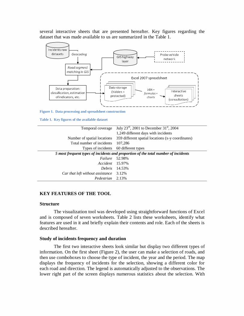
several interactive sheets that are presented hereafter. Key figures regarding the
dataset that was made available to us are summarized in the Table 1.
Figure 1. Data processing and spreadsheet construction
Table 1. Key figures of the available dataset
Temporal coverage July 23rd, 2001 to December 31st, 2004
1,249 different days with incidents
Number of spatial locations 359 different spatial locations (x-y coordinates)
Total number of incidents 107,286
Types of incidents 60 different types
5 most frequent types of incidents and proportion of the total number of incidents
Failure 52.98%
Accident 15.97%
Debris 14.53%
Car that left without assistance 3.12%
Pedestrian 2.13%
KEY FEATURES OF THE TOOL
Structure
The visualization tool was developed using straightforward functions of Excel
and is composed of seven worksheets. Table 2 lists these worksheets, identify what
features are used in it and briefly explain their contents and role. Each of the sheets is
described hereafter.
Study of incidents frequency and duration
The first two interactive sheets look similar but display two different types of
information. On the first sheet (Figure 2), the user can make a selection of roads, and
then use comboboxes to choose the type of incident, the year and the period. The map
displays the frequency of incidents for the selection, showing a different color for
each road and direction. The legend is automatically adjusted to the observations. The
lower right part of the screen displays numerous statistics about the selection. With
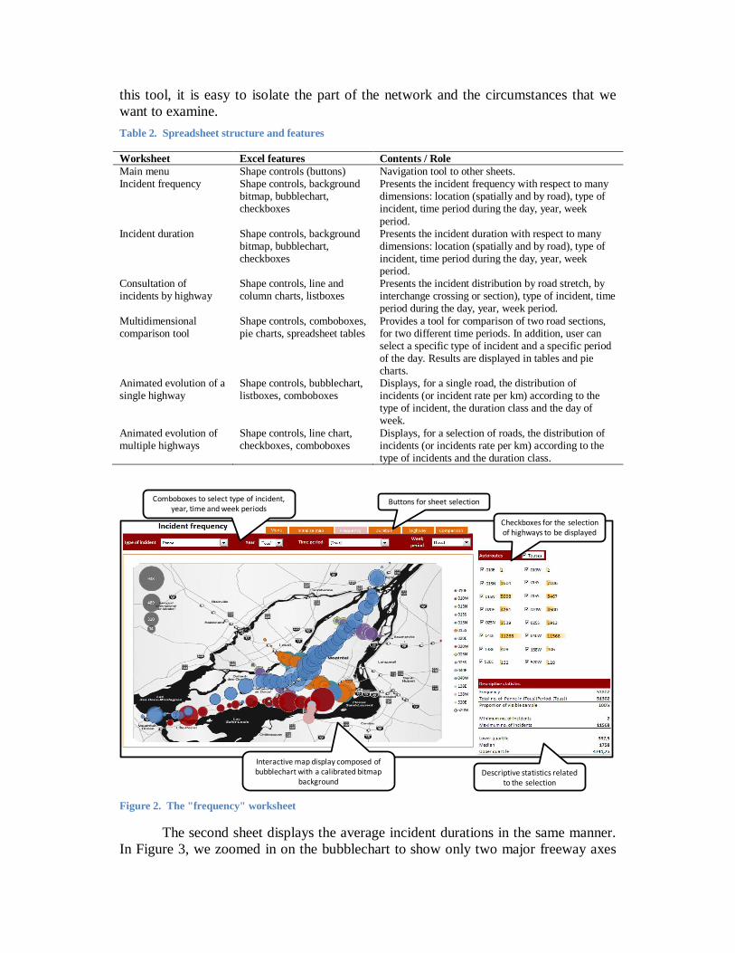
this tool, it is easy to isolate the part of the network and the circumstances that we
want to examine.
Table 2. Spreadsheet structure and features
Worksheet Excel features Contents / Role
Main menu Shape controls (buttons) Navigation tool to other sheets. Incident frequency Shape controls, background
bitmap, bubblechart, checkboxes
Presents the incident frequency with respect to many dimensions: location (spatially and by road), type of incident, time period during the day, year, week
period. Incident duration Shape controls, background
bitmap, bubblechart, checkboxes
Presents the incident duration with respect to many dimensions: location (spatially and by road), type of incident, time period during the day, year, week period.
Consultation of incidents by highway
Shape controls, line and column charts, listboxes
Presents the incident distribution by road stretch, by interchange crossing or section), type of incident, time period during the day, year, week period.
Multidimensional comparison tool
Shape controls, comboboxes, pie charts, spreadsheet tables
Provides a tool for comparison of two road sections, for two different time periods. In addition, user can select a specific type of incident and a specific period of the day. Results are displayed in tables and pie charts.
Animated evolution of a single highway
Shape controls, bubblechart, listboxes, comboboxes
Displays, for a single road, the distribution of incidents (or incident rate per km) according to the type of incident, the duration class and the day of week.
Animated evolution of multiple highways
Shape controls, line chart, checkboxes, comboboxes
Displays, for a selection of roads, the distribution of incidents (or incidents rate per km) according to the type of incidents and the duration class.
Buttons for sheet selection
Checkboxes for the selection of highways to be displayed
Descriptive statistics related to the selection
Interactive map display composed of bubblechart with a calibrated bitmap
background
Comboboxes to select type of incident, year, time and week periods
Figure 2. The "frequency" worksheet
The second sheet displays the average incident durations in the same manner.
In Figure 3, we zoomed in on the bubblechart to show only two major freeway axes
of the region. We can see that the average duration of incidents is quite variable over
the region. The most affected part is the “Turcot” interchange, linking several
freeways near the downtown area. The bridges at the extremities of the Montreal
Island are also experiencing higher incident durations. This figure is for vehicle
failures only. Therefore, the analysts can browse through all types of incidents, like
accidents, animal or trash removal, ice and snow removal, regular maintenance,
power outage, etc.
Figure 3. Average duration of failure incidents over the whole period for two major freeway axes (in minutes)
Study of incidents by highway
The next sheet is aimed to display the number and the duration of incidents for
a given highway, in both directions (Figure 4). The tool permits to filter this
information according to the type of incident, the time period of the day (AM, PM
peaks, midday and evening off-peak) and the week period (weekday of week-end).
This very detailed examination of data can help to identify problematic sectors that
would be hard to see on a map. It also helps to identify missing or erroneous data.
Comparison tool
Figure 5 presents the comparison tool worksheet. Here, the user can select
alternatively two highways with their own incident type, and two daily periods
filtered by year. The results are displayed for each combination of these dimensions,
in the form of charts and tables. With this tool, it is easier to see the differences
between two different sub-sets of data, may it be in the same circumstances or not.
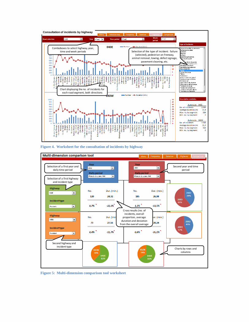
Comboboxes to select highway, year, time and week periods
Chart displaying the no. of incidents for each road segment, both directions
Selection of the type of incident: failure (selected), pedestrian on freeway,
animal removal, towing, defect signage, pavement cleaning, etc.
Consultation of incidents by highway
Figure 4. Worksheet for the consultation of incidents by highway
Selection of a first year and daily time period
Second year and time period
Selection of a first highway and incident type
Second highway and incident type
Cross results (no. of incidents, overall
proportion, average duration and deviation
from the overall average
Charts by rows and columns
Figure 5: Multi-dimension comparison tool worksheet
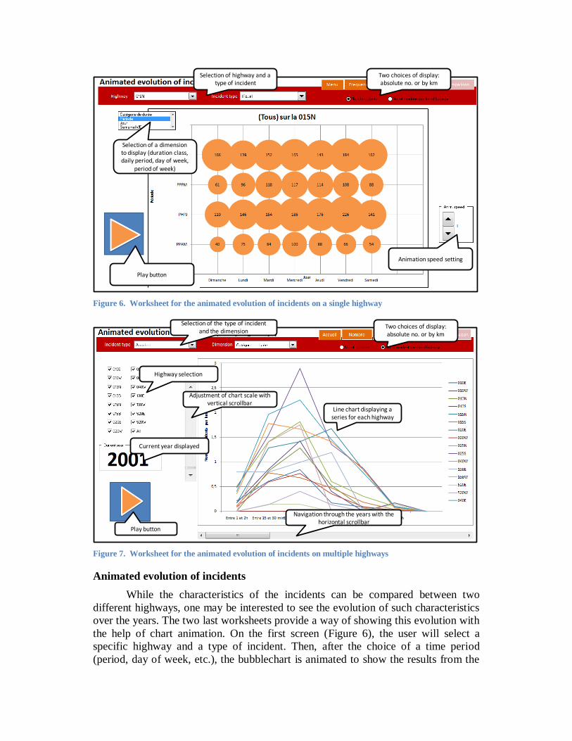
Animation speed setting
Play button
Selection of a dimension to display (duration class, daily period, day of week,
period of week)
Selection of highway and a type of incident
Two choices of display: absolute no. or by km
Figure 6. Worksheet for the animated evolution of incidents on a single highway
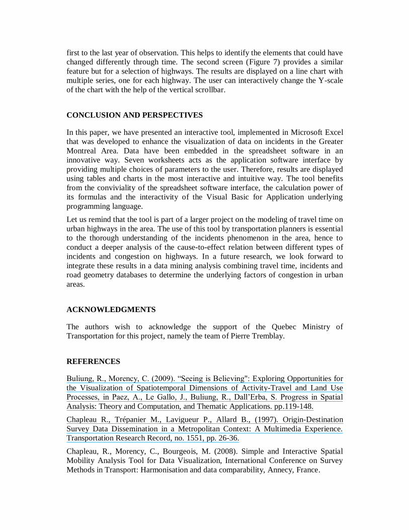
Play button
Current year displayed
Highway selection
Selection of the type of incident and the dimension
Line chart displaying a series for each highway
Two choices of display: absolute no. or by km
Adjustment of chart scale with vertical scrollbar
Navigation through the years with the horizontal scrollbar
Figure 7. Worksheet for the animated evolution of incidents on multiple highways
Animated evolution of incidents
While the characteristics of the incidents can be compared between two
different highways, one may be interested to see the evolution of such characteristics
over the years. The two last worksheets provide a way of showing this evolution with
the help of chart animation. On the first screen (Figure 6), the user will select a
specific highway and a type of incident. Then, after the choice of a time period
(period, day of week, etc.), the bubblechart is animated to show the results from the
first to the last year of observation. This helps to identify the elements that could have
changed differently through time. The second screen (Figure 7) provides a similar
feature but for a selection of highways. The results are displayed on a line chart with
multiple series, one for each highway. The user can interactively change the Y-scale
of the chart with the help of the vertical scrollbar.
CONCLUSION AND PERSPECTIVES
In this paper, we have presented an interactive tool, implemented in Microsoft Excel
that was developed to enhance the visualization of data on incidents in the Greater
Montreal Area. Data have been embedded in the spreadsheet software in an
innovative way. Seven worksheets acts as the application software interface by
providing multiple choices of parameters to the user. Therefore, results are displayed
using tables and charts in the most interactive and intuitive way. The tool benefits
from the conviviality of the spreadsheet software interface, the calculation power of
its formulas and the interactivity of the Visual Basic for Application underlying
programming language.
Let us remind that the tool is part of a larger project on the modeling of travel time on
urban highways in the area. The use of this tool by transportation planners is essential
to the thorough understanding of the incidents phenomenon in the area, hence to
conduct a deeper analysis of the cause-to-effect relation between different types of
incidents and congestion on highways. In a future research, we look forward to
integrate these results in a data mining analysis combining travel time, incidents and
road geometry databases to determine the underlying factors of congestion in urban
areas.
ACKNOWLEDGMENTS
The authors wish to acknowledge the support of the Quebec Ministry of
Transportation for this project, namely the team of Pierre Tremblay.
REFERENCES
Buliung, R., Morency, C. (2009). “Seeing is Believing": Exploring Opportunities for
the Visualization of Spatiotemporal Dimensions of Activity-Travel and Land Use
Processes, in Paez, A., Le Gallo, J., Buliung, R., Dall’Erba, S. Progress in Spatial
Analysis: Theory and Computation, and Thematic Applications. pp.119-148.
Chapleau R., Trépanier M., Lavigueur P., Allard B., (1997). Origin-Destination
Survey Data Dissemination in a Metropolitan Context: A Multimedia Experience.
Transportation Research Record, no. 1551, pp. 26-36.
Chapleau, R., Morency, C., Bourgeois, M. (2008). Simple and Interactive Spatial
Mobility Analysis Tool for Data Visualization, International Conference on Survey
Methods in Transport: Harmonisation and data comparability, Annecy, France.
Hughes, R. (2004) Visualization in Transportation: Current Practice and Future
Directions Transportation Research Record, no. 1899, pp. 167-174.
Hughes, R. (2005) Research Agenda for the Application of Visualization to
Transportation Systems, Transportation Research Record, no. 1937, pp. 145-151.
Loustau, P., Grasset, V., Morency, C., Trépanier, M. (2010) Comparing floating car
data and carsharing GPS data for travel time assessment, to be presented at the 12th
World Conference on Transport Research, Lisbonne, Portugal.
Loustau, P., Morency, C., Trépanier, M. (2010). Measuring, Describing and
Modeling Travel Time Reliability, presented at the 89th
Annual Meeting of the
Transportation Research Board, Washington D.C.
Loustau, P., Morency, C., Trépanier, M., Gourvil, L. (2010). Travel time reliability
on a highway network: estimations using floating car data, Transportation Letters,
Vol. 2(1), pp. 27-37, 2010
Lund, A., Pack, M. (2010) Dynamic Wide-Area Congestion and Incident Monitoring
Using Probe Data, Transportation Research Record, in press.
MacEachren AM (1995) How maps work: representation, visualization, and design.
The Guilford 828, Press, New York.
Manore, M., Krygsman, S. (2008), Workshop B5 – Data visualization techniques,
Workshop Summary Report, International Conference on Survey Methods in
Transport: Harmonisation and data comparability, Annecy, France.
Morency, C., Trépanier, M., Piché, D., Chapleau, R. (2008) Bridging the gap between
complex data and decision makers: an example of innovative interactive tool,
accepted for publication in the Journal of Transportation Planning and Technology.
Olsen, Dan. R. Jr. (1999). Interacting in Chaos, Interactions Journals, September +
October 1999.
Visualization in Transportation Committee web site
http://www.trbvis.org/MAIN/TRBVIS_HOME.html
Wongsuphasawat, K.; Pack, M.; Filippova, D.; VanDaniker, M. & Olea (2009) A.
Visual Analytics for Transportation Incident Data Sets Transportation Research
Record, no. 2138, pp. 135-145
Related Documents