Empire, Modernity and Design: Visual Culture and Cable & Wireless’ Corporate Identities, 1924-1955 Submitted by Jenny Rose Lee, to the University of Exeter as a thesis for the degree of Doctor of Philosophy in Geography, August 2014. This thesis is available for Library use on the understanding that it is copyright material and that no quotation from the thesis may be published without proper acknowledgement. I certify that all material in this thesis which is not my own work has been identified and that no material has previously been submitted and approved for the award of a degree by this or any other University. ………………………………………………………………………………

Welcome message from author
This document is posted to help you gain knowledge. Please leave a comment to let me know what you think about it! Share it to your friends and learn new things together.
Transcript
Empire, Modernity and Design: Visual Culture and
Cable & Wireless’ Corporate Identities,
1924-1955
Submitted by Jenny Rose Lee, to the University of Exeter as a thesis for the degree of Doctor of Philosophy in Geography, August 2014.
This thesis is available for Library use on the understanding that it is copyright material and that no quotation from the thesis may be published without proper acknowledgement.
I certify that all material in this thesis which is not my own work has been identified and that no material has previously been submitted and approved for the award of a degree by this or any other University.
………………………………………………………………………………
i
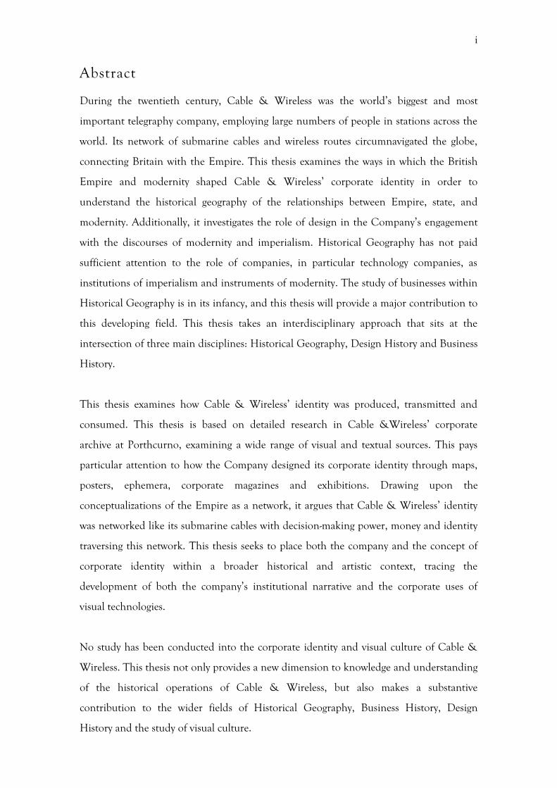
Abstract
During the twentieth century, Cable & Wireless was the world’s biggest and most
important telegraphy company, employing large numbers of people in stations across the
world. Its network of submarine cables and wireless routes circumnavigated the globe,
connecting Britain with the Empire. This thesis examines the ways in which the British
Empire and modernity shaped Cable & Wireless’ corporate identity in order to
understand the historical geography of the relationships between Empire, state, and
modernity. Additionally, it investigates the role of design in the Company’s engagement
with the discourses of modernity and imperialism. Historical Geography has not paid
sufficient attention to the role of companies, in particular technology companies, as
institutions of imperialism and instruments of modernity. The study of businesses within
Historical Geography is in its infancy, and this thesis will provide a major contribution to
this developing field. This thesis takes an interdisciplinary approach that sits at the
intersection of three main disciplines: Historical Geography, Design History and Business
History.
This thesis examines how Cable & Wireless’ identity was produced, transmitted and
consumed. This thesis is based on detailed research in Cable &Wireless’ corporate
archive at Porthcurno, examining a wide range of visual and textual sources. This pays
particular attention to how the Company designed its corporate identity through maps,
posters, ephemera, corporate magazines and exhibitions. Drawing upon the
conceptualizations of the Empire as a network, it argues that Cable & Wireless’ identity
was networked like its submarine cables with decision-making power, money and identity
traversing this network. This thesis seeks to place both the company and the concept of
corporate identity within a broader historical and artistic context, tracing the
development of both the company’s institutional narrative and the corporate uses of
visual technologies.
No study has been conducted into the corporate identity and visual culture of Cable &
Wireless. This thesis not only provides a new dimension to knowledge and understanding
of the historical operations of Cable & Wireless, but also makes a substantive
contribution to the wider fields of Historical Geography, Business History, Design
History and the study of visual culture.
ii
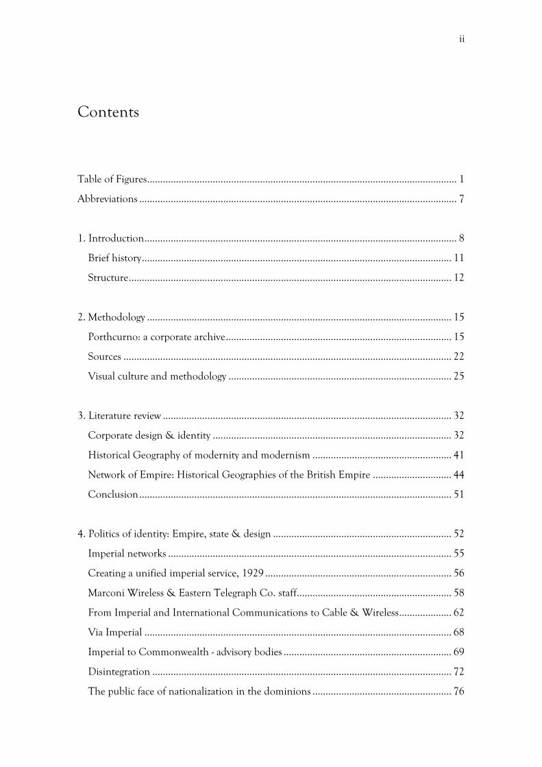
Contents
Table of Figures ...................................................................................................................... 1
Abbreviations ......................................................................................................................... 7
1. Introduction ....................................................................................................................... 8
Brief history ...................................................................................................................... 11
Structure ........................................................................................................................... 12
2. Methodology .................................................................................................................... 15
Porthcurno: a corporate archive ...................................................................................... 15
Sources ............................................................................................................................. 22
Visual culture and methodology ..................................................................................... 25
3. Literature review .............................................................................................................. 32
Corporate design & identity ........................................................................................... 32
Historical Geography of modernity and modernism ..................................................... 41
Network of Empire: Historical Geographies of the British Empire .............................. 44
Conclusion ....................................................................................................................... 51
4. Politics of identity: Empire, state & design .................................................................... 52
Imperial networks ............................................................................................................ 55
Creating a unified imperial service, 1929 ....................................................................... 56
Marconi Wireless & Eastern Telegraph Co. staff ........................................................... 58
From Imperial and International Communications to Cable & Wireless .................... 62
Via Imperial ..................................................................................................................... 68
Imperial to Commonwealth - advisory bodies ................................................................ 69
Disintegration .................................................................................................................. 72
The public face of nationalization in the dominions ..................................................... 76
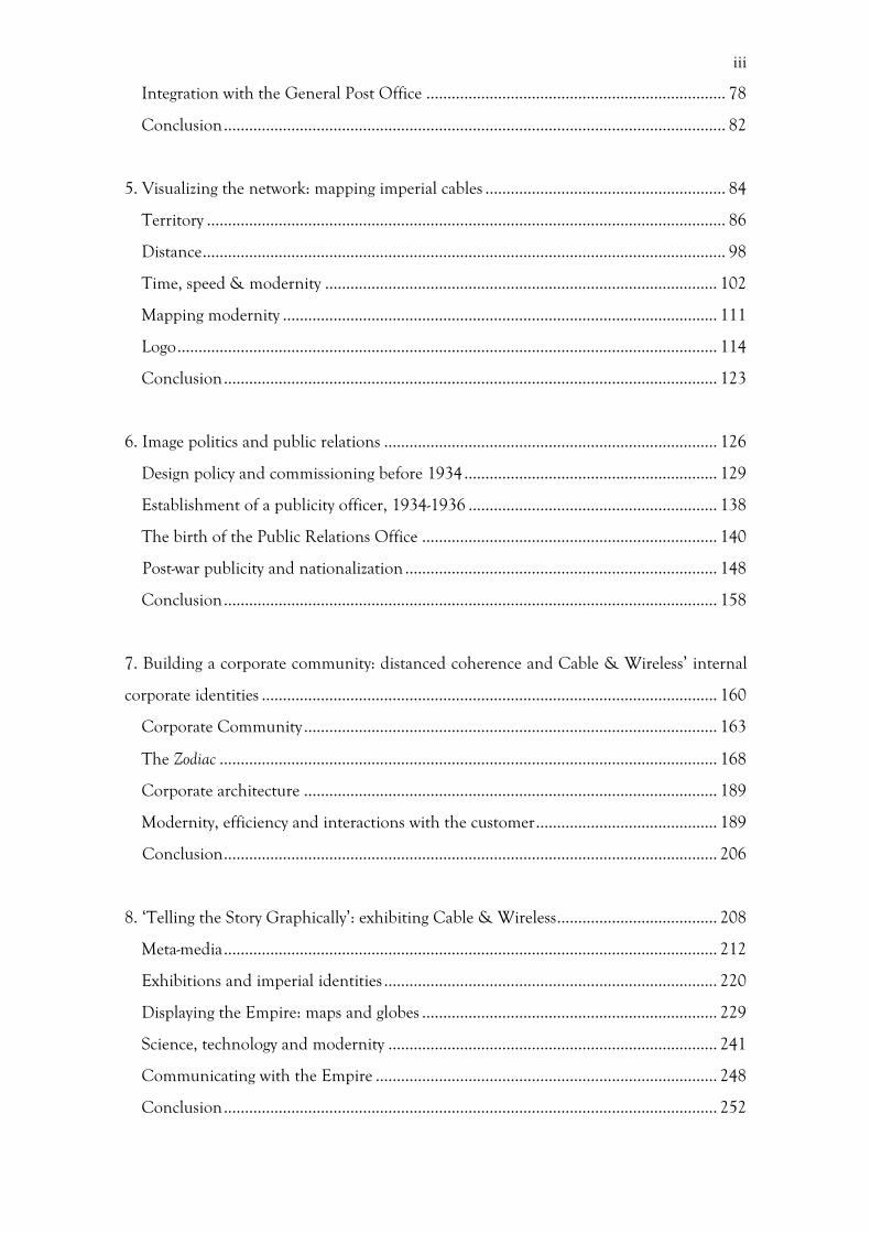
iii
Integration with the General Post Office ....................................................................... 78
Conclusion ....................................................................................................................... 82
5. Visualizing the network: mapping imperial cables ......................................................... 84
Territory ........................................................................................................................... 86
Distance ............................................................................................................................ 98
Time, speed & modernity ............................................................................................. 102
Mapping modernity ....................................................................................................... 111
Logo ................................................................................................................................ 114
Conclusion ..................................................................................................................... 123
6. Image politics and public relations ............................................................................... 126
Design policy and commissioning before 1934 ............................................................ 129
Establishment of a publicity officer, 1934-1936 ........................................................... 138
The birth of the Public Relations Office ...................................................................... 140
Post-war publicity and nationalization .......................................................................... 148
Conclusion ..................................................................................................................... 158
7. Building a corporate community: distanced coherence and Cable & Wireless’ internal
corporate identities ............................................................................................................ 160
Corporate Community .................................................................................................. 163
The Zodiac ...................................................................................................................... 168
Corporate architecture .................................................................................................. 189
Modernity, efficiency and interactions with the customer ........................................... 189
Conclusion ..................................................................................................................... 206
8. ‘Telling the Story Graphically’: exhibiting Cable & Wireless ...................................... 208
Meta-media ..................................................................................................................... 212
Exhibitions and imperial identities ............................................................................... 220
Displaying the Empire: maps and globes ...................................................................... 229
Science, technology and modernity .............................................................................. 241
Communicating with the Empire ................................................................................. 248
Conclusion ..................................................................................................................... 252
iv
9. Conclusion: ‘Changing the Conception of Empire’ .................................................... 255
Corporate identity Production and the British state .................................................... 256
Transmission and reception .......................................................................................... 260
Networks and geographies of identity ........................................................................... 263
Design as a barometer for corporate identity ................................................................ 264
Appendix ............................................................................................................................ 268
1. Key Dates ................................................................................................................... 268
2. Chart showing the mergers in Cable & Wireless’ history........................................ 270
3. Map showing the extent of the cable network in 1922 ............................................ 271
10. Bibliography ................................................................................................................. 272
Primary ........................................................................................................................... 272
Secondary ....................................................................................................................... 278
Internet ........................................................................................................................... 296
1
Table of Figures
Figure 1: Wartime File: London Central Station – Proposed Transfer to Electra House, Embankment: Plan showing the third floor of Electra House. Source: Porthcurno Archive (hereafter PK) DOC/CW/1/526.
Figure 2: Wartime File: London Central Station – Proposed Transfer to Electra House,
Embankment: Plan showing the fifth floor of Electra House. Source: PK DOC/CW/1/526
Figure 3: Cable & Wireless envelope. Source: PK (uncatalogued) Figure 4: Advertisement, Fairplay, 5th July 1945, Guard Book Source: PK
(uncatalogued) Figure 5: Send a Cable It’s Easy, by T. Eckersley, Source: PK PIC/GPO/8/11 Figure 6: Cable & Wireless logo, by Stanley Morison, 1945. Source: PK DOC//8/8 Figure 7: The Great Circle Map, by MacDonald Gill, 1946. Source: PK MAP///430 Figure 8: Imperial Federation: Map Showing the Extent of the British Empire in 1886, by
Walter Crane, 1886. Source: V&A http://www.vam.ac.uk/vastatic/microsites/victorians/finals/world.html
Figure 9: Cable & Wireless Telegram, 2/5/1942. Source: PK DOC//6/36/1
Telegrams No.1-92. Figure 10: Cable & Wireless Logo, by Stanley Morison, 1945. Source: PK DOC//8/8 Figure 11: Zodiac, 253 (August 1929). Source: PK PUB/ZDC/5/3/80 Figure 12: Window, designed by Pomeroy, at Electra House, Moorgate (now London
Metropolitan University). Source: [http://www.waymarking.com/gallery/image.aspx?f=1&guid=7f01cd8b-7e1f-4efc-83bf- 828efe7e8e3e]
Figure 13: Photograph of the globe used in a number of Cable & Wireless exhibitions, 1945. Source: PK PHO///1601
Figure 14: Cable & Wireless stand at the Singapore Constitution Exposition, January
1959. Source: PK PHO///1814 Figure 15: Cable & Wireless stand for Hong Kong British Week, March 1966.
Source: PK PHO///1868

2
Figure 16: Cable & Wireless stand for Hong Kong British Week, March 1966. Source: Porthcurno Archive, PHO///1869
Figure 17: Still from the ‘ “Buy British” Royal Boost’ film produced by British Pathé,
1966. Source: British Pathé, http://www.britishpathe.com/video/stills/buy-british-royal-boost [Accessed 1/7/2014]
Figure 18: Highways of Empire, by MacDonald Gill, 1927. Source: V&A
http://collections.vam.ac.uk/item/O757605/highways-of-Empire-poster-gill-leslie-macdonald/] [Accessed 1/7/2014]
Figure 19: Mail Steamship Routes GPO, by MacDonald Gill. Source: MacDonald Gill
Website http://www.macdonaldgill.com/media-gallery/detail/19/62 [Accessed 1/7/2014]
Figure 20: Nationalisation of Cable and Wireless: Pamphlet produced following the nationalization of Cable & Wireless in 1946, entitled ‘The Effects of the Transfer’. Source: PK DOC/CW/1/122
Figure 21: Poster advertising Cable & Wireless exhibition, Charing Cross Station, by
Percy Ford, 1936. Source: London Transport Museum http://www.tfl.gov.uk/assets/images/general/beckmap1.jpg [Accessed 1/7/2014]
Figure 22: Northern Hemisphere Universal Clock, by Sir Herbert Baker. Source: PK
2014PKO19 Figure 23: Southern Hemisphere Universal Clock, by Sir Herbert Baker. Source: PK
2014PKO19 Figure 24: Prototype of the Universal Clock, by Reitz, 1948. Source: PK PHO//1845 Figure 25: Universal Clock, by Reitz, on the Cable & Wireless stand at the British
Industries Fair, May 1949. Source: PK PHO///1846. Figure 26: Cable & Wireless Pamphlet, c.1930s. Source: PK (uncatalogued) Figure 27: Photograph of the ‘186,000 Miles a Second’ Exhibition in Charing Cross
Underground Station, 1946. Source: PK PHO///1801 Figure 28: Photograph of the ‘186,000 Miles a Second’ Exhibition in Charing Cross
Underground Station, 1946. Source: PK PHO///1802 Figure 29: 186,000 Miles a Second Exhibition, by Henrion advertising Cable &
Wireless exhibition, Charing Cross Station, 1946. Source: PK PIC///263/
3
Figure 30: Commonwealth Telecommunications Board: Report to the Governments on the Future Development of the Cable network: Systems maps, 5/12/1956. Source: PK DOC/CTB/1/1
Figure 31: Cable & Wireless System Map, 31/12/1951. Source: PK MAP///105 Figure 32: Cable & Wireless System Map, 31/12/1951. Source: PK MAP///105 Figure 33: I&IC Logo, Source: Anon, The Court of Directors of Cables and Wireless
Limited and Imperial and International Communications Limited, Zodiac, 252 (July 1929) 442. Source: PK PUB/ZDC/5/3/79
Figure 34: Cable & Wireless’ Logos. Source: PK DOC//8/8 Figure 35: Cable & Wireless’ Logos. Source: PK DOC//8/8 Figure 36: Cable & Wireless’ Logos. Source: PK DOC//8/8 Figure 37: I&IC Logo, Source: Anon, The Court of Directors of Cables and Wireless
Limited and Imperial and International Communications Limited, Zodiac, 252 (July 1929) 442. Source: PK PUB/ZDC/5/3/79
Figure 38: Cable &Wireless Envelope. Source: PK DOC//6/36/1 Telegrams Nos 1-92 Figure 39: Cable & Wireless’ Logos. Source: PK DOC//8/8 Figure 40: Cable & Wireless Logo, by Stanley Morison, 1945. Source: PK DOC//8/8 Figure 41: Logo proof, by Stanley Morison. Source: Cambridge University Library
Add.9812/B4/4/4 Figure 42: Via Imperial, The Financial Times, November 23rd, 1932 (13,679), 3. Figure 43: Marconi display advertisement, Illustrated London News, 1907 Figure 44: Be patriotic, buy Empire Grown tea – poster Source: Museum of London
[http://www.20thcenturylondon.org.uk/mol-84-1-890] Figure 45: Via Eastern Christmas Greeting, by Fred Guisely, 1926. Source: PK
(uncatalogued) Figure 46: Telegraph Imperially, by A. E. Halliwell, c.1929-1934. Source:
PIC/I&IC/8/1 Figure 47: Organizational Chart for the Press Liaison Office, 1945. Source: PK
DOC/CW/1/413 Figure 48: Organizational Chart for the Press Liaison Office, 1945. Source: PK
DOC/CW/1/413

4
Figure 49: Standard Lettering to be used on Company Signs, 1956. Source: PK
DOC/CW/4/341 Figure 50: Cable and Wireless Ltd Display Advertisement, The Times, February 10,
1948 (50991), 6. Figure 51: Cable and Wireless Ltd Display Advertisement, The Times, April 15, 1948
(51046), 2. Figure 52: Cable and Wireless Ltd Display Advertisement, The Economist, June 21,
1947 (5417), 983. Figure 53: Cable Display Advertisement, Illustrated London News, January 10, 1948
(5673), 55. Figure 54: Cable Display Advertisement, The Financial Times, May, 1947 Figure 55: A Family Affair, Financial Times, September 25, 1945: Press Cuttings and
Advertisements, 1938-1960, Source: PK DOC/CW/13/16. Figure 56: Front cover, The Zodiac, 153 (April 1921). Source: PK Figure 57: Front cover, The Zodiac, 155 (June 1921). Source: PK Figure 58: Front cover, The Zodiac, 186 (January 1924). Source: PK
PUB/ZDC/5/3/21 Figure 59: Front cover, The Zodiac, 238 (May 1928). Source: PK PUB/ZDC/5/3/65 Figure 60: Front cover, The Zodiac, 253 (August 1929). Source: PK
PUB/ZDC/5/3/80 Figure 61: Imperial Federation: Map Showing the Extent of the British Empire in 1886, by
Walter Crane, 1886. Source: V&A [http://www.vam.ac.uk/vastatic/microsites/victorians/finals/world.html]
Figure 62: Front cover, The Zodiac, 311 (June 1934). Source: PK PUB/ZDC/5/3/81 Figure 63: Front cover, The Zodiac, 320 (March 1935). Source: PK
PUB/ZDC/5/3/89 Figure 64: Front cover, The Zodiac, 343 (February 1937). Source: PK
PUB/ZDC/5/3/100 Figure 65: Front cover, The Zodiac, 361 (August 1938). Source: PK
PUB/ZDC/5/3/118
5
Figure 66: Front cover, The Zodiac, 421 (February 1940). Source: PK PUB/ZDC/5/3/109
Figure 67: Poster advertising Cable & Wireless exhibition, Charing Cross Station, by
Percy Ford, 1936. Source: London Transport Museum http://www.tfl.gov.uk/assets/images/general/beckmap1.jpg
[Accessed 1/7/2014] Figure 68: Front cover, The Zodiac, 421 (January 1944). Source: PK
PUB/ZDC/5/3/109 Figure 69: Back cover, The Zodiac, 421 (January 1944). Source: PK
PUB/ZDC/5/1/36 Figure 70: Front cover, The Zodiac, 460 (July 1947). Source: PK PUB/ZDC/5/3/130 Figure 71: Front Cover, Life Magazine, February 1946. Source: Library of Congress
http://www.loc.gov/exhibits/bobhope/mopic.html#obj071 [Accessed 1/7/2014]
Figure 72: Electra House Embankment Commemorative Booklet, 1933. Source: PK
DOC/I&IC/6/4/1 Figure 73: Electra House Embankment Commemorative Booklet, 1933. Source: PK
DOC/I&IC/6/4/1 Figure 74: Electra House Embankment Commemorative Booklet, 1933. Source: PK
DOC/I&IC/6/4/1 Figure 75: Booklet Mercury House – Opening by Lord Reith. Source: PK 6.1.10 Figure 76: Booklet Mercury House – Opening by Lord Reith. Source: PK 6.1.10 Figure 77: Exterior of Cable & Wireless branch, photograph from glass plate
negative. Source: PK (Uncatalogued) Figure 78: Parliament Street Station Office: Instrument Room. Source: PK PHO///313 Figure 79: Booklet Mercury House – Opening by Lord Reith. Source: PK 6.1.10 Figure 80: Booklet Mercury House – Opening by Lord Reith. Source: PK 6.1.10 Figure 81: Empire Communications Booklet. Source: PK (uncatalogued) Figure 82: Florist Telegraph Delivery Association Stand, Mayfair Hotel, 1950. Source:
PK PHO///1809. Figure 83: Actress Jean reading a reply telegram at the 1947 Radiolympia Exhibition,
The Zodiac, 464 (November 1947) 6. Source: PK PUB/ZDC/5/3/134
6
Figure 84: Queen Mary inspecting the Cable & Wireless globe at the Radiolympia Exhibition, 1947, The Zodiac 464 (November 1947) 7. Source: PK PUB/ZDC/5/3/134
Figure 85: ETC stand at the British Empire Exhibition, 1924, The Zodiac, 192 (July
1924) 370. Source: PK PUB/ZDC/5/3/27 Figure 86: Front Cover, The Zodiac, 507 (June 1951). Source: PK PUB/ZDC/507 Figure 87: Advert for the Empire Exhibition, 1924, The Zodiac, 194 (September 1924)
11. Source: PK PUB/ZDC/5/3/29 Figure 88: Cable & Wireless stand at the 1938 Empire Exhibition, Glasgow, The
Zodiac, 362 ( September 1938) 62. Source: PK PUB/ZDC/5/3/119 Figure 89: Lions in the Empire Exhibition, Glasgow, 1938, The Zodiac, 362
( September 1938) 62. Source: PK PUB/ZDC/5/3/119 Figure 90: Entrance to the British Pavilion at the Salonika International Exhibition,
1954. Source: PK, PHO///1853. Figure 91: Cable & Wireless stand at the 1936 Birmingham BIF, The Zodiac. Figure 92: Cable & Wireless stand at the 1932 BIF. The Zodiac Figure 93: Frontispiece of the Official Guide to the British Empire Exhibition, 1924.
Source: PK DOC//6/120 Figure 94: Figure 95 - Cover of the folded Eastern Associated Map from the Official
Guide to the British Empire Exhibition, 1924. DOC//6/120 Figure 95: Eastern Associated Map from the Official Guide to the British Empire
Exhibition, 1924. DOC//6/120 Figure 96: Charing Cross Underground Exhibition 1946. Porthcurno Archive,
PHO///1802 Figure 97: Photograph of the interior of the Sydney Telegraph Office, 1924. Source:
PK (uncatalogued) Figure 98: Photograph from an undated glass plate negative of a telegraph office.
Source: PK, Glass Plate Negative Box 1. Figure 99: ETC stand at the British Empire Exhibition, 1924. Source: PK
(uncatalogued) Figure 100: Cable & Wireless stand at the Canadian National Exhibition, 1947.
Source: Porthcurno Archive, PHO///1843
7
Figure 101: Still from the ‘King's Message Round The World In 80 Seconds’ film produced by British Pathé, Empire Exhibition, 1924. Source: British Pathé
Figure 102: Poster advertising the Cable & Wireless stand at the Festival of Britain,
1951. Source: PK (uncatalogued) Figure 103: Daily Express Exhibition, 1949. Source: PK PHO///1847 Figure 104: Model of the C.S. Edward Wilshaw at the Schoolboy's Own Exhibition,
1946. Source: PK (uncatalogued) Figure 105: Cable ship section of the Singapore Constitution Exposition, 1959.
Source: PK PHO///1816. Figure 106: Sketch of the Cable & Wireless stand at the Festival of Britain, The Zodiac,
507 (June 1951). Source: PK PUB/ZDC/507 Figure 107: Cable & Wireless stand at the 1936 BIF, The Zodiac, Source: PK Figure 108: Photograph of the ‘186,000 Miles a Second’ Exhibition in Charing Cross
Underground Station, 1946. Source: PK, PHO///1801

7
Abbreviations
BEA British European Airways BIF British Industries Fair BOAC British Overseas Airways Corporation CCC Commonwealth Communications Council CDA Collaborative Doctoral Award CTB Commonwealth Telecommunications Board C&W Cable & Wireless DRU Design Research Unit EMB Empire Marketing Board ETC Eastern Telegraph Company GPO General Post Office ICAC Imperial Communications Advisory Committee I&IC Imperial and International Communications Ltd. PK Porthcurno
8
1. Introduction
During the twentieth century Cable & Wireless was the world’s biggest and most
important telegraphy company, employing large numbers of people in stations across the
world. Its network of submarine cables and wireless routes circumnavigated the globe,
connecting Britain with the Empire. This thesis primarily seeks to examine the ways in
which the British Empire and modernity shaped Cable & Wireless’ corporate identity.
No study has been conducted into how Cable & Wireless’ corporate identity was shaped,
and this thesis will provide a new dimension of knowledge and understanding of the
historical operations of Cable & Wireless. Historical Geography, while being attentive to
these external geopolitical, economic, and cultural forces, has not paid sufficient
attention to the role of companies, in particular technology companies, as institutions of
imperialism and instruments of modernity. In doing so, this thesis will also provide a
unique and novel lens through which to view larger historical and geographical processes
of imperialism and modernity, as well as elucidate the complex processes of corporate
identity production, transmission and consumption.
This identity was shaped by location and changes within the geopolitical world,
and is one that requires a close examination within Historical Geography. From the
1920s to the 1950s Cable & Wireless experienced a merger and nationalization.
Additionally, the Company also faced what Jones described as the three ‘shocks’ of the
Great Depression, the Second World War and the fall in receptivity of multinational
companies in the developing world following the end of European colonial Empires,
which had ‘destroyed, dismantled or diminished’ the first global economy during the
1930s and 1940s.1 All these factors influenced the corporate identity of the company, as
well as impacting upon its revenue and organization. However, most business histories
and works on corporate identity and design have largely ignored these, giving them only a
cursory glance and placing them as neat dividers in chronological accounts.
This thesis examines the corporate identity of Cable & Wireless, tracing how the
Company’s identity developed in response to challenges posed by these contextual forces.
It elucidates the processes of corporate image creation, maintenance, transmission and
1 G. Jones, Multinationals from the 1930s to the 1980s, in: A. D. Chandler, B. Mazlish (Eds), Leviathans: Multinational Corporations and the New Global History, Cambridge, 2005, 81-104, 84.
9
reception within a commercial environment. It will challenge the business-centric
approach of business historians and design historians, by paying attention to the
commercial, political, economic and artistic landscape in which the Company was
situated and suggesting that it was through responding to various external influences and
challenges that the Company’s identity was formed.
This thesis examines the following questions in order to understand Cable &
Wireless’ corporate identity and the Historical Geography of the relationship between
Empire, state and modernity:
1. How was Cable & Wireless’ corporate identity produced, transmitted and
consumed? How does Cable & Wireless’ corporate identity help us to understand
concept of corporate identity in the early- and mid-twentieth century?
2. In what ways was Cable & Wireless’ identity shaped by its relationship with the
British Empire, British state and other companies? In turn, what does this tell us
about the nature of Empire and the British state?
3. What role did design play in the Company’s engagement with the discourses of
modernity and imperialism?
As this thesis is situated within the traditions of historical geography, implicit within
these questions is a sensitivity to questions of time and space. Historical Geography is
well placed to study the spatial elements of a company operating on a global scale, whose
cable network encircled the world, as well as being sympathetic to the examination of
visual culture. The study of Cable & Wireless provided in this thesis contributes to a
limited but growing literature on the historical geographies of individual companies,
which will be discussed in more detail within the literature review. The examinations of
the Hudson’s Bay Company by Royle and the East India Company by Ogborn, provide a
few of the scant examples of this literature, which tends to focus on eighteenth and
nineteenth century iterations of the British Empire.2 This thesis is primarily concerned
with the shaping of Cable & Wireless’ corporate identity and its place in relation to
twentieth century processes of decolonization and the transformation from the British
Empire to the Commonwealth of Nations.
2 See, M. Ogborn, Indian Ink: script and print in the making of the English East India Company, Chicago, 2007; S. Royle, Company, Crown and Colony: The Hudson's Bay Company and Territorial Endeavour in Western Canada, London, 2010.
10
Visual culture is central to this study of corporate identity, as it allows for the
examination of a wide range of communicative technologies. Operating in an era of mass
communication, Cable & Wireless had a large variety of visual technologies at its disposal
and, by its very nature as a communication company, the mechanisms to disseminate its
message. The role played by various visual media, including cartography, advertising and
ephemera, in articulating and communicating this corporate identity to the public will be
examined throughout this thesis. From the Company logo, staff uniforms, the
architecture of offices to advertisements, marketing, and ephemera, the main ways in
which Cable & Wireless communicated its identity to the public was visual. In this
respect, Historical Geography lends itself well to this study as it has been attentive to not
only the use of visual sources, but has also been keen to examine the spatiality and
mobility of images, as will be discussed in the methodology and literature review.
In particular, this thesis seeks to examine ‘design’ as a distinct subsection of visual
culture. ‘Design’ has been defined within the discipline of Design History as the aesthetic
of the modern age, of industrial production and scientific methods. 3 While visual
methods have been employed extensively within Historical Geography, design has been
somewhat neglected. Studies that aim to marry the visual elements of a company with its
corporate identity are sparse and often focus on one specific visual technology, such as
Nye’s examination of the use of photography within General Electric. 4 This thesis
proposes a new holistic approach to the study of corporate identity, which examines how
the Company communicated with both internal and external audiences. This will seek to
break down disciplinary boundaries that have hitherto prevented the comprehensive
study of the various, and often overlapping, activities of businesses. This contextualization
also extends to comparisons with other companies operating during the interwar and
post-war period, such as the General Post Office (GPO) and London Underground.5
The studies that have been carried out on the Company have focused on its
contribution to telegraphy and telecommunications more generally, but none have thus
far placed the Company within its broader social and commercial context. 6 More
3 J. Attfield, Bringing Modernity Home: Writings on Popular Design and Material Culture, Manchester, 2007, 1. 4 D. E. Nye, Image Worlds: Corporate Identities at General Electric, 1890-1930, Cambridge, MA, 1985. 5 For example: Y. Suga, Image Politics of the State: Visual Publicity of the General Post Office in Inter-war Britain, unpublished PhD thesis, The Royal College of Art, 1998; M. Ovenden, London Underground By Design, London, 2013. 6 K. C. Baglehole, A Century of Service: A Brief History of Cable and Wireless Ltd., 1868-1968, London, 1986; W. Baker, A history of the Marconi Company, London, 1970; H. Barty-King, Girdle Round the Earth: History of “Cable and Wireless”, London, 1980.
11
generally, existing studies of corporate identity have not attempted to compare the
internal and external presentation of a company’s corporate identity. Such a comparison
in the case of Cable & Wireless within this thesis therefore provides a new perspective on
how corporate identity in a major twentieth century company was shaped.
Brief history
Before setting out the structure of this thesis, it is helpful to give a brief historical
overview of the Company in the period covered by this thesis (see Appendix 1 for key
dates). In 1929 the Eastern Telegraph Company (ETC) and Marconi Wireless, along with
a plethora of smaller telecommunications companies, merged to form Imperial and
International Communications Ltd (I&IC) (see Appendix 2). The history of these
individual companies stretches back into the nineteenth century, where they facilitated
the expansion of the British Empire. I&IC represented an attempt by the British
government to create an Empire-wide telecommunications system, which played a tactical
role in securing the infrastructure of the Empire. Five years later, after the effects of the
Great Depression had taken force and the transformation from Empire to
Commonwealth had been cemented into law through, I&IC emerged as the newly
named Cable & Wireless. The next reorganization of the Company was in 1947, when it
was nationalized; its assets dispersed among the Dominions and India and the remaining
domestic elements incorporated into the GPO. In the intervening period, the Second
World War transformed the Company’s fortunes, dramatically increasing traffic levels
and saw the Company effectively working as the government’s communication office.7
Added to this, the process of decolonization that had accelerated in the interwar period
was in full force following the war. This changing relationship between the Company, the
Empire and subsequently the Commonwealth is manifest in the Company’s design and
corporate identity, as will be shown later in the thesis.
The time period covered by this thesis is bookended by two exhibitions in which
the Company participated: the British Empire Exhibition at Wembley in 1924 and the
Festival of Britain at the South Bank in 1951. The British Empire Exhibition represents
the high water mark of imperial spectacle and sentiment at the height of the Empire, 7 For a discussion on the role of Cable and Wireless during the Second World War, see B. Oldcorn, On the Wire: The Strategic and Tactical Role of Cable and Wireless during the Second World War, unpublished PhD thesis, University of Exeter, 2013.
12
while the Festival of Britain marked a new introversion following the Second World War
and decolonization, particularly in India (1947), but also beginning across in Britain’s
African colonies. This timeframe allows the discussion of the two biggest dates in
traditional narratives of the Company, the merger in 1929 and nationalization in 1947. It
also allows for discussion of the various identities that existed before the merger, as well
as the impact of nationalization and incorporation within the GPO. This period is
extended to include the opening of Mercury House, Cable & Wireless’ new London
Head Office, in 1955, which marks a change both in the architectural language of the
Company, as well as the expansion of the London station as a result of nationalization
(discussed below in chapter 7). Within this period, as noted earlier, there were also a
number of dramatic changes within the geopolitical and global economic sphere, namely
the Great Depression, the Second World War and decolonization. These all impacted
upon Cable & Wireless’ corporate identity, supporting one of the central arguments of
this thesis, namely that this identity was not self-contained, but emerged out of the
tensions and compromises made in the wake of these external historical and geographical
forces.
Structure
The first three introductory chapters provide an overview of the Company’s history and
situate the thesis in relation to the literature on corporate identity, design, modernity,
and empire. The structure of the empirical chapters draws upon and develops Nye’s
study of corporate identities at General Electric, which separates out the different
processes involved in the production of a corporate identity: production, transmission
and reception.8 This thesis also follows Rose’s call for an investigation of the three sites
where the meanings of visual images are made: the site of production, the site of the
image itself and the site of audiencing.9 Within the thesis chapters 4, 5 and 6 examine the
production of the Company’s image, while chapters 7 and 8 consider its transmission and
reception. Unlike some other approaches, which tend to focus solely on the production
of identity, this thesis explores production, transmission and reception.
Beginning with the process of production, chapter 4 of this thesis examines the
8 Nye, Image Worlds. 9 G. Rose, Visual Methodologies: An Introduction to Researching with Visual Materials, London, 2012, 21.
13
relationship between Cable & Wireless and the British Empire, and asks how changes
within this relationship were manifest within the Company’s identity and design. The
two themes of ‘unification’ and ‘disintegration’ of the Company, the Empire system and
the Company’s design frame the discussion within this chapter. The idea of imperial
networks is also called into question, as this chapter simultaneously charts the
transformation of the metropole-centred British Empire to the Dominion focussed
Commonwealth, as well as the decentralization of the decision-making power and assets
of the Company. Linked with this are the attempts of the British government to cultivate
an Empire-wide telecommunications system in the interwar period, culminating in the
merger between the ETC and Marconi Wireless to form I&IC. This was followed by the
supposed disintegration of this system after the nationalization, and effective
internationalization, of the Company after the Second World War. This chapter also
seeks to ascertain the level of control that the Company’s directors and staff had over the
strategy of the Company, in order to ultimately determine how much input they had over
its own identity. This aspect examines the role of the various advisory bodies that were set
up by the government to look after the strategic elements of the Company’s running.
This thesis then moves on, in chapter 5, to examine more closely the cartographic
visualizations of the Company’s imperial networks more closely. The design and use of
maps and globes was an integral element within the production of the Company’s
identity, as a means of informing customers of the scale of Cable & Wireless’ operations
and routes offered, as well as practical tools for the Company’s engineers and telegraphers.
This chapter charts the Company’s cartographic output, starting with the use of imperial
conventions of depicting territory in the interwar period, and moving on to show how
this was transformed in the post-war period into depictions of speed and, in turn,
modernity. Within this chapter there is also a discussion of the various logos deployed by
the Company, which relied heavily on cartographic imagery. This chapter develops some
of the themes discussed in the previous chapter, namely the relationship between the
Company and the British Empire and the networked nature of the Company’s identity.
Moreover, this chapter makes a contribution to the history of cartography, by
demonstrating the ways in which maps were utilised commercially.
Chapter 6 continues the themes of production, and also transmission by
exploring the mechanisms by which the Company formally communicated its identity to
the public, primarily through the development of the Public Relations Office and the
Press Liaison Office. This charts the oscillations between prestige marketing, where the
14
Company’s reputation was promoted, and traffic-raising advertising, which aimed to
increase revenues. As this chapter shows, these oscillations were mainly the result of
external political and economic forces such as the Great Depression and the Second
World War, demonstrating that the Company had adopted a reactionary rather than
strategic policy. This contributes to one of the overarching arguments of this thesis, that
the processes of identity formation and maintenance was often beyond the control of the
Company, which contradicts and complicates the straightforward processes outlined in
most investigations of corporate identity. Furthermore, this chapter builds upon some of
the points made in chapter 4, primarily how the merger and nationalization impacted
upon the Company’s design and policies.
Corporate identity was not just an outward projection of marketing, but was
shaped by internal structures, processes and social groups. Chapter 7 investigates the
Company’s internal identity, firstly through an investigation of the creation of a
community within the Company in order to combat the problems posed by the dispersed
nature of the staff, and secondly through an examination of the architecture and interior
design of the Head Offices and the overseas stations. Within this chapter there is also an
examination of the discourses of modernity and imperialism in relation to the
Company’s internal identity and how this changed across the network.
Chapter 8 discusses the exhibitionary practice of Cable & Wireless, as well as the
consumption of images and maps. This chapter draws upon the conceptualization of
exhibitions as ‘meta-media’, as posited by Geppert and discussed in the literature review
(see chapter 3). This chapter also acts as a means of tying together all of the various forms
of communicative media used by the Company and discussed in the previous chapters.
Cable & Wireless’ participation in these exhibitions can also be used to provide another
lens through which the decline of the British Empire can be examined.
15
2. Methodology
Archival research and the analysis of visual sources has formed the methodological basis
of this thesis, primarily using Cable & Wireless corporate archive, located within
Porthcurno Telegraph Museum. This chapter will firstly examine the archive at
Porthcurno, examining the nature of a corporate archive and its role in the construction
of the Company’s identities, as well as discussing the positionality of being a
Collaborative Doctoral Award (CDA) researcher within the archive. Next, is a discussion
of the range of sources that have been consulted in the course of the research for this
thesis. Finally, there will be a discussion of the visual methodologies employed in the
analysis of these archival sources.
Porthcurno: a corporate archive
This thesis is part of a three-year CDA funded by the Arts and Humanities Research
Council, working with the Porthcurno Telegraph Museum, which houses Cable &
Wireless’ corporate archive. Porthcurno is a small, privately-run museum, located in an
isolated valley near Land’s End in Cornwall, which was originally ETC’s, and later Cable
& Wireless’, training college. While Cable & Wireless own the contents of the archive,
they are not involved with its day-to-day running. This means that a degree of autonomy
is afforded to those researching within the archive, which is contrary to some corporate
histories that are written in-house. As Lewis and Newton suggest, for every well-researched
academic contribution to the field of Business History, there are many more ‘puff jobs or
institutional advertisements’ that are hastily prepared by journalists or public relation
departments, which are often self-promoting and uncritical. 10 Despite this lack of
involvement from Cable and Wireless themselves, my role within the archive was affected
by a restructuring of the staff and the relocation of the archive.
One of the initial problems encountered was the departure of the Curator in the
first year of the project, the outcome of a restructuring of the Porthcurno Museum’s staff.
This resulted in a loss of knowledge about the Company and the archive collection itself,
as well as a high degree of intellectual and supervisory input. The former Collections
10 W. D. Lewis and W. P. Newton, The writing of corporate history, The Public Historian 3 (1981) 63-74, 65.
16
Assistant, in the newly formed role of Collections Manager, succeeded the Curator.
Although the new Collections Manager was enthusiastic about my research, there was not
the same level of interest or knowledge in the topics I wanted to pursue that had existed
previously. This restructuring did, on the other hand, allow me an increased level of
freedom to pursue the topics I was particularly interested in. Increasingly, the museum
became uninterested in the work I produced, and the number of supervisory meetings
steadily declined. Although I frequently submitted drafts of my work to the archive, there
was no formal requirement to do so. In this sense, I was being treated like every other
researcher using the archive, and had lost the privileged, insider, position that
accompanies a CDA. The initial benefits I had enjoyed within the archive and museum
of being a CDA researcher, namely unfettered access to the archive collection and a close
working relationship with the staff, increasingly disappeared over the three years. By the
end of the project I assumed the position, not of CDA researcher, but of an outside
researcher.
Looking more specifically at my role within the archive, I aided in the
documentation and digitization of the collection. This dual role of researcher and
cataloguer of this material proved mutually beneficial, and a strength of the project. I was
able to substantially increase the metadata of objects and documents as a result of the
research I was conducting, which will hopefully aid in the navigation of this material by
future researchers. Furthermore, this role helped to solve one of the main problems in
using this specific archive – the large number of uncatalogued items. This was particularly
useful in establishing what aspects of the archive were actually missing and which were
simply uncatalogued.
The uncatalogued nature of a large proportion of the archive collection posed
some challenges. During my three years in the archive, there were moves to increase the
levels of documentation, in particular in preparation for the relocation of the archive.
Prior to this relocation, vast swathes of the archive that were uncatalogued, making it
difficult for me to search for items on the archive database. This was partially remedied by
the fact that the collections staff allowed me to, initially, wander around the shelves
unaccompanied. This gave me an opportunity to rummage in boxes of material and
understand the context of each item within the collections as a whole. This made
serendipitous finds quite frequent, as I was able to find things in a more intuitive manner.
The ability to sift through boxes of uncatalogued material was particularly important
when considering the visual nature of this project. For instance, graphic design elements
17
are very difficult to search for on a database as the search terms and attached information
do not stretch to the typeface used or the allusions created by the imagery. When
searching through an archival database, the researcher is at the mercy of the metadata
attached to each record, written by the collections team, usually containing very basic
information pertaining to the provenance of the item and a brief description. The design
and form of these documents and objects are often neglected during the documentation
process, with the content of the letter or the telegraph form, for example, forming the
metadata attached by the archivist. However, the ability to sift through this material first
hand in the archive means that examples of graphic design can be seen in a wide range of
material, for instance examples of lettering on stationery, booklets, and telegram forms.
With the relocation of the archive also came the implementation of higher
archival standards that extended to the access of the archive storeroom. Although the
archive catalogue had grown dramatically as a product of the relocation of the archive,
this resulted in a greater reliance on the database. With a climate controlled storeroom
and staff offices no longer situated within the store itself, I was no longer able to enter the
storeroom. This made it considerably harder to find material, and I was fortunate in
having conducted the bulk of my research prior to this relocation. As a result, I became
more remote from the archival material. I was no longer a privileged researcher, who had
been given the same level of access as a member of staff. Instead, I was now demoted to
an outside researcher, at the mercy of an incomplete database and recommendations
from the staff.
It should be noted that there were occasions where genuine gaps in the material
did exist. This is a common within corporate archives, making it difficult to assemble a
coherent and consistent account of the company’s development.11 These gaps present a
number of problems for the researcher, highlighting the pitfalls of depending solely upon
a company’s archive. Beyond the Porthcurno archive, I also consulted the Special
Collections of the University of Cambridge for information on the Company’s
typographic consultant, Stanley Morison (discussed in chapters 4 and 6). I also consulted
a number of online archives to source examples of design by Cable & Wireless and other
companies operating at the same time. These online archives include the London
Transport Museum, the British Postal Archive, Visual Arts Data Service (VADS), the
11 Lewis and Newton, The writing of corporate history, 66.
18
Museum of London and the Royal Institute of British Architects (RIBA).12
While there are cases where these gaps are a hindrance to the research, these can
at times also be seen as a positive attribute. These gaps in the archival material allow us to
view the original collection practices and rational, as well as the survival of material
within the archive. In turn this can tell us vast amounts about the company’s corporate
identity. A prime example of this is the newspaper advertisements, for which the
Porthcurno archive does not have a complete record, with the vast majority from the
interwar years onwards. Indeed, it was only in the 1930s that Cable & Wireless started to
collate newspaper advertisements into ‘Guard Books’. This is not to suggest that
advertisements of this sort did not appear beforehand, as there are numerous examples to
be found in online repositories of newspapers that predate these books. Instead, the fact
that Cable & Wireless started to collect and store newspaper advertisement from this
point is suggestive of a change in attitude to both the preservation of such material and to
the concept of advertising. From this, it can be cautiously deduced that there was less
interest in advertisements before this period by comparison – the lack of sources from
before this period telling us as much as their subsequent presence.
The nature of a CDA meant that this thesis effectively became the study of this
specific archive. While material has been brought in from other archives, the bulk of the
research was done in the Porthcurno archive. This is one of the main benefits of being a
CDA researcher, allowing me the time and facility to immerse myself within the archive
collection, dedicating the majority of my research to a single archival collection. The
result of this archive-specific enquiry produced a distinctive critical account of what can
be read into the archive, in particular this corporate archive. This is a particular strength
in this project, as it allows the archive to be read as a distillation of the Company’s
corporate identity. What had been collected within this archive, as well as what hadn’t,
became a crucial factor in allowing me to construct the historical geography of Cable &
Wireless.
The archive itself is important in the creation of the Company’s corporate
identity, and this is something that has been wholly ignored in the literature. The archive
acts as a means of ossifying this identity, providing a further layer of selection and
presentation that is occasionally contemporary, but largely retrospective. As Nye states,
corporations edit archives, and this should make researchers both cautious and
12 London Transport Museum [http://www.ltmuseum.co.uk/collections]; British Postal Archive [http://postalheritage.org.uk/page/collections]; VADs [http://www.vads.ac.uk/].
19
intrigued.13 Indeed, it is unclear from the archive records when the bulk of the material
had been accessioned and incorporated into the collection. Two successive Head Offices,
Electra House (Embankment) and Mercury House, had rooms specifically designated as
museums, suggesting a desire to both preserve and display its history, as well as create an
institutional memory.14 It was primarily telegraph equipment that was on show, and while
this display might not have been any different from that being used within the
Instrument Rooms in the respective Head Offices, in this exhibitionary space these
objects were transformed from working objects into carriers of memory. It is unclear
whether this was contemporary collecting or whether these objects were used to construct
a narrative about the past iterations of the company. Either way, this displays an
important point about the Company’s conception of its past and identity.
Geppert’s conceptualization of exhibitions as meta-media, which is discussed in
more detail in the literature review and chapter 8, can be applied to the archive.15 The
archive acts as a specific form of media, like exhibitions in Geppert’s discussion,
encompassing a wide variety of other mediums. In this sense, the act of researching allows
different documents pertaining to the Company’s identity to be viewed as a cohesive
whole, rather than the otherwise disparate items spread out in different boxes across the
archive. The researcher is effectively reconstructing this identity within the archive, or
even constructing an identity that hitherto had not existed. Each of these sources, within
their original context, had varying degrees of visibility to the public and the Company.
Some were part of the public domain, such as newspaper advertisements and telegram
forms, while the personal photograph albums, for instance, have only been visible and
connected to the Company since their inclusion within the archive. Here, the archive is
in a sense conferring and recreating this identity, with successive archive managers acting
as arbiters of this identity. In the case of the staff’s personal photograph albums, in
particular, there is a danger in conflating the strictly domestic and personal lives of the
staff with the Company’s corporate identity. Prior to their inclusion within the archive,
these albums never formed part of the Company’s identify, and their presence within the
archive grants an importance and meaning that is not necessarily deserved. These are
considerations that we must be mindful of when conducting such research,
demonstrating that the corporate archive should be read with caution. 13 Nye, Image Worlds. 14 DOC/CW/1/526 London Central Station – Proposed transfer to Electra House WC2, 1938; 6.1.10 Mercury House – Opening by Lord Reith, 14. 15 A. C. T. Geppert, Fleeting Cities: Imperial Expositions in Fin-de-Siècle Europe, Basingstoke, 2010, 3.
20
Sekula, who suggests that when an image enters an archive its meaning changes,
has also addressed the question of context.16 In this suggestion, it is the context rather
than the observation that is deemed more important. It is unclear, however, how much
the context of an image alters and influences the manner in which it is viewed. My
argument here is that the corporate context of the Porthcurno archive alters the meaning
of this material, creating new and different narratives about the Company’s corporate
identity.
Rose further develops this question of context, in relation to photographs. Some
attention should be paid to the specificities of dealing with this photography within a
research environment as photographs form the largest form of visual sources within the
Porthcurno archive. This photographic material is discussed in more detail later in this
chapter. Rose, drawing on her own experiences looking at the photographs taken by Lady
Hawarden in the mid-nineteenth century, stored in the British Museum, discusses the
relationship between the historical geographer and photographs, in both an archive and a
study.17 She starts with the assumption that it is through the use of photographs that the
meaning is established. By viewing these photographs, the researcher can thus be seen to
become central in the creation and articulation of the meaning. This, in itself, does not
negate the interpretations levied by the researcher, but is an important notion that should
be acknowledged, providing an additional level of discussion.
Rose states that her understanding of the photographs changed when she was
looking at them in the controlled environment of an archive, opposed to the freer space
of her own study.18 The manner in which the images are presented is an additional form
of context. Photographs within an album or magazine present a different interpretation
than individual loose photographs (this material is discussed in chapter 7). Here, the
interrelationship between the photographs themselves and their interaction and
contextualization with text, presents a narrative that is greater than the sum of its parts.
Edwards and Hart talk about the presentational forms of photographs, such as albums,
mounts and frames, which they state are ‘inseparably meshed’ with the photographs.19
However, this presentational form is not intrinsic to the image itself, it is merely a
16 A. Sekula, Reading an archive: photography between labour and capital, in: P. Holland, J. Spence, S. Watney (Eds), Photography/Politics Two, London, 1986, 153-61, citied in: G. Rose, Practising photography: an archive, a study, some photographs and a researcher, Journal of Historical Geography 4 (2000) 555-571, 558. 17 Rose, Practising photography. 18 Rose, Practising photography. 19 E. Edwards and J. Hart, Photographs Objects Histories: On The Materiality of Images, New York, NY, 2004, 3; E. Edwards, Material beings: objecthood and ethnographic photographs, Visual Studies 17 (2002) 67-76, 68.
21
material supplement which can be removed or altered, thus changing the dynamic of the
image itself in terms of its observation by a researcher, who is only able to view the
photograph in one form.
The idea of the archive acting as a form of ‘meta-media’ can also be applied to the
sources relating to Cable & Wireless’ exhibitions. Once the ephemeral exhibitions were
dismantled, the fragmentary residues of their existence within the extant photographs
and textual reviews become dispersed.20 Purpose built stands were the main form of
display at exhibitions, each with a varying degree of scale and complexity. Archival
collecting goes some way to re-assemble these stands; however, the material is not
arranged as it was during the exhibition. Instead, the items are hidden away in a
multitude of boxes and folders. It is only during the research of this topic that these visual
strands are once more joined together, and although the physical remains of the stands
do not survive; their depiction through photographs can be viewed once more. However,
these photographs are not a straightforward and unproblematic window onto the
exhibition, they provide a snapshot of a certain assemblage of media and people at a
single point in time. The importance of the presence or absence of people within
photographs is that these show both the display of the Company and how the public and
employees used and interacted with this space. What might, at first glances, simply be
photographic documentation, is actually a form of ‘meta-media’ in itself, tying together
the Company’s visualization with a performative element, ossified within a visual source,
which has a history of its own.
Furthermore, a large part of a company’s corporate identity is about the reception
of this identity. This is extremely difficult to research, and attempts have been tentatively
made throughout this thesis to pay adequate attention to reviews of designs and
exhibitions, as well as the use of photographs to examine how people interacted with the
Company both in telegraph offices and at exhibitions. However, I have had to be careful
not to conflate my own reception of this material with that of past audiences. As a result,
the role of the researcher in this process should be assessed, particularly with regard to
visual sources, as Belting suggests that observation is an intrinsic element of the image
itself.21
20 P. Greenhalgh, Ephemeral Vistas: History of the Expositions Universelles, Great Exhibitions and World’s Fairs, Manchester, 1990; J. M. MacKenzie, Propaganda and Empire: the Manipulation of British Public Opinion, 1880-1960, Manchester, 1984. 21 H. Belting, Image, medium, body: a new approach to iconology, Critical Inquiry 2 (2005) 302-319, 304.
22
Sources
Despite the self-contained nature of the archive, there is no section, box or catalogue
designation relating specifically to the Company’s corporate identity. As a result, a wide
range of sources were consulted and analysed, including those that appeared at first to be
unrelated to the focus of the thesis. The majority of the sources I used within the archive
were visual. These comprised photographs; advertisements; printed ephemera; maps and
plans; and the Company’s magazine, the Zodiac.
Photographs were one of the largest categories of visual sources that I examined.
There are a large number of photographs depicting the life of the staff and the operations
and architecture of the overseas stations. Many of the photographs within the archive of
the stations are personal photographs taken by staff, documenting their new living and
working environment. A number of these photographs depict the local environment in
which these employees found themselves. These photographs appear to be typical of what
one might expect of European settlers within regions of the Empire. Urban streetscapes
and portraits of locals form the bulk of such photographs. The staff took a large
proportion of the photographs within the archive, in the form of personal photograph
albums, which are discussed in greater depth in chapter 7.
These photographs can be seen in two different ways. Firstly, they can be viewed
as images through which architectural design, staff, events and the material culture that
surrounded the Company can be viewed, as discussed above. Secondly, these photographs
can be examined as attempts by the Company to document and record for posterity its
corporate identity. These photographs proved invaluable when attempting to investigate
the transmission and reception of the Company’s identity. Determining reception is
often a challenging pursuit. However, the photographs showing maps and exhibition
stands in specific contexts aided this endeavor enormously by showing the design of the
stands and often depicting people observing or interacting with these objects and designs.
Additionally, a large number of the maps and globes discussed within chapters 5 and 8
are depicted within photographs similar to those of exhibitions. The ability to see these
exhibition stands and maps in situ was particularly useful in examining reception within
chapter 8, as they are shown within a specific context, and occasionally being observed.
The majority of photographs within the archive have detailed captions on the
reverse. These captions provide a wealth of information, allowing the researcher to
23
properly situate the image within its historical and geographical context. This was
particularly useful with regard to the exhibition photographs, with the captions usually
providing information about features of the exhibition stand, as well as who was
responsible for its design. More generally, these captions are found on the majority of the
images, and include information about the date, location, the people depicted, as well as
a description of the subject matter, and sometimes some contextual information.
Throughout the research process, these captions allowed me to cross-reference
information. The significance of these captions is discussed further in chapter 6.
Beyond the many photographs showing the Company’s maps and globes, there
are a number of maps within the archive. Maps were one of the key visual elements
deployed by Cable & Wireless, and a large number of maps can be found within the
Porthcurno archive. These range from large cable maps that were part of exhibition
displays, to maps found on telegram forms, advertisements, and pamphlets. Some, such
as the Great Circle Map, are in their original poster format, while others form parts of
pamphlets, exhibition catalogues, and telegram forms. There are also a number of plans
and diagrams, which were used to examine the organization and spatial relationships
within the Company. The first of these were the plans for Electra House (Embankment),
discussed in chapter 4. These architectural plans detailed which rooms were allocated to
certain elements of the Company in the early 1930s, highlighting internal divisions
between the parent companies that merged in 1929. The second was a chart detailing the
hierarchical organization of the Press Liaison Office, giving an indication of the remit and
responsibilities of each of the roles within this office.
Telegraphy ephemera forms another significant source that is important in
understanding the Company’s corporate identity. This primarily includes telegram forms,
and booklets advertising the Company’s services and rates. These items were not expected
to last long, and their collection was sporadic owing to their fleeting and disposable
nature. These items were presumably quite common when they were first used, making it
somewhat unusual for people to keep hold of them, unless, for instance, a telegram
contained an important or sentimental message. Posters can also be considered
ephemeral and very few survive within the archive. This is probably the result, again, of
their ubiquity and disposable nature. Graphic design is one of the unifying features of
these sources, with the combination of image and text utilised to communicate with the
Company’s customers.
Although design and visual culture are central to this thesis, it was not just visual

24
sources that were consulted. Contextualization of these images was key in understanding
how these images were commissioned, produced, transmitted and consumed. Some visual
sources were supplemented by textual information such as the captions on the back of
photographs, the articles within the Zodiac, the text within advertisements and the
unpublished internal memoranda, reports and correspondence. Within this element of
the research I focused on the way that words were used and their design. This resulted in
the critical discourse analysis of certain words the were recurrent in these textual sources,
for examples ‘efficient’ and ‘modern’, in this case alluding to the discourse of modernity.
I was also interested in the typefaces used and how this communicated Cable &Wireless’
identity.
One of the most useful sources within the archive was the Company’s magazine,
the Zodiac, which ran from 1906 on a monthly basis. The history of the Zodiac and its role
in creating a corporate community is discussed in chapter 7. These magazines, coupled
with an invaluable handwritten index, were used as a starting point in many of the lines
of enquiry within this thesis, underpinning all of the empirical chapters within this thesis.
The Zodiac provides a wealth of information pertaining to both the operations of the
Company, important events and biographic details of members of staff. These articles are
usually contain a commentary, often by anonymous writers, on events and changes within
the Company. The Zodiac gave a voice to the staff, one that is rarely witnessed in the
official Company records and is often ignored within business histories. A prime example
of this is the numerous reviews of the Company’s stands at various exhibitions, providing
another insight into the reception of these stands. This provided an opportunity to
examine how the visitors interacted with these stands, in particular the telegram quizzes,
which will be discussed later in chapter 8. These details are not obvious or present in the
plethora of photographs available, reiterating the value of these Zodiac articles. The Zodiac
is not, however, a neutral vessel containing useful information about the Company, but is
an important source in itself. The magazine represents the manifestation of the
Company’s desire to communicate internally and to create a corporate community
amongst its dispersed staff. The history of the magazine, as well as its form and design are
discussed in detail in chapter 7.
Another insight into the lives of the Company’s employees, in particular the
overseas staff, can be found in the oral histories collected in 1999 by Cable & Wireless.22
22 D. Souden, Voices Over the Horizon: Tales from Cable & Wireless, Cambridge, 1999.
25
This provides a series of highly selective snapshots of the Company. While the name of
the person and bibliographic details are made explicit there are rarely any references to
dates, making it hard for the researcher to situate the information provided. These oral
histories are presented almost as the definitive word on different aspects of the
Company’s activity, with no room for differing interpretations.
Important information about the specificities and intricacies of the Company’s
operations was gained from a number of unpublished official sources, namely committee
records, reports, merger agreements, position papers, official statements, memoranda,
correspondence and publicity plans. These sources were particularly important in
unpicking the somewhat confusing history of the Company’s internal organization,
especially the development of the Pubic Relations and Press Liaison Offices (discussed in
chapter 6). Additionally, these sources were useful when examining the Company’s
external relationships with the British state and Empire. Overall, this extensive range of
sources provided an opportunity to gain a comprehensive insight into the Company’s
identity, demonstrating the pervasive nature of corporate identity.
Visual Culture and Methodology
Visual culture is crucially important to this thesis, as Cable & Wireless’ identity was
primarily visual and was communicated to the public and its employees using
photographs, logos, maps, exhibitions, graphic design and illustrations. Furthermore, it is
mainly through these visual sources that the researcher encounters this identity within
the archive. The field of visual culture is an emerging one and, as Belting suggests, the
discourse of images is suffering from an abundance of differing, even contradictory,
conceptions of what images are and how they operate.23 This sentiment is echoed by
Mitchell, who states that we still do not exactly know what pictures are, how they relate to
language, how they operate on observers and on the world, and how we are to use or
discuss them.24 A survey of the corporate identity and advertising literature, discussed in
the literature review, highlights a division between theoretical works and largely
chronological and narrative historical accounts of business. There is a need to bridge this
gap by critically analysing the source material within an historical context. The analysis of
23 Belting, Image, medium, body. 24 W. J. T. Mitchell, Picture Theory: Essays on Verbal and Visual Representation, Chicago, 1995, 13.
26
images within Historical Geography allows for a more critical approach that is attentive to
the materiality and mobility of images. The final chapter of this thesis will address these
issues of the mobility of images with regard to exhibitions, by investigating how changes
in the contextualization of the material image changes the meaning and perception of the
image.
This thesis seeks to adhere to the rules Burke formulated for examining visual
sources, as they provide a useful framework for those engaged in visual research.25 Briefly,
this includes: whether the images derive from direct observation or from another image;
the location of the images within their cultural tradition; the reception and especially the
re-employment of images as a means of revealing their past functions; an awareness of the
mediator(s); an awareness of the context of the images, and an awareness of the
interaction between the image and the outside world.26 These considerations will all be
taken into account in this thesis. Burke himself states that this is not an exhaustive list
and that due to the variety of visual sources and the agendas of different historians, these
rules should not be too prescriptive. Despite this, these questions are a good starting
point allowing for a critical analysis similar to that applied to textual sources.
W. J. T Mitchell’s ‘picture theory’ is an excellent starting point within the field of
visual culture, as it seeks to move the focus away from the linguistic turn that dominated
academia in the twentieth century. This is a ‘post-linguistic, post-semiotic rediscovery of
the picture as a complex interplay between visuality, apparatus, institutions, bodies and
figurality’.27 Mitchell states that the pictorial turn is the realization that spectatorship is as
deep an issue as the reading of images, suggesting that ‘visual literacy’ might not be fully
explicable on the model of textuality.28 This adds a new dimension to the study of images,
which has the effect of aligning this area of study closer to film studies and cultural
geography, rather than being a strictly art historical pursuit. Indeed, through the ‘pictorial
turn’, Mitchell envisages a more balanced and nuanced approach, seeing the visual image
at once as instrument and agency, and as an autonomous source of its own purpose.29
This approach proposed by Mitchell is helpful in understanding the social role of images
and allowing these images to be seen more broadly.
25 P. Burke, Interrogating the eyewitness, Cultural and Social History 4 (2010) 435-443, 438-441. 26 Burke, Interrogating the eyewitness, 438-441. 27 Mitchell, Picture Theory, 16. 28 Mitchell, Picture Theory, 16. 29 W. J. T. Mitchell, Showing seeing: a critique of visual culture, Journal of Visual Culture 2 (2002) 165 -181, 175.
27
Rose also provides a framework for the treatment of images, suggesting that the
social conditions and the cultural practices of images should be taken into account.30
Here, Rose suggests an approach that primarily examines the spatial aspects of an image,
suggesting that there are three sites where the meaning of images are made – the site of
production, the site of the image itself, and the site where it is seen by various
audiences.31 Within this thesis each of these three sites will be taken into consideration.
The sites of productions will be investigated when looking at the Public Relations Office
in chapter 6, while the sites of audiencing will be looked at when considering exhibitions
and in particular the display of maps in chapter 5, while the site of the images themselves
will be discussed throughout.
The mobility of images, and their associated materiality, are both central to the
methodological approach taken in this thesis. The image can be separated from its
material form, allowing what Belting describes as the migration of images from one
medium to another, making them nomadic.32 This has tempted many scholars to reduce
the history of images to what Belting deems, a ‘mere media history’, where only the visual
technologies, rather than the image itself is the focus of the enquiry. 33 By Belting’s
definition, images ‘do not exist by themselves, but they happen,’ suggesting that each
observation of a visual source is unique.34 While this is not necessarily the best definition
of an ‘image’, it is a very useful way of thinking about the role of the researcher and their
relationship with the visual sources they research. It can be argued instead that an image
is tethered to the time in which it was created, to a specific point in time and space,
which can be observed from a number of different vantage points, each of which creates a
unique interpretation.
The main benefit of using visual sources is the ability to reconstruct everyday
culture, which is often neglected within the historical record. Burke praises the use of
images in this way, citing the examples of the reconstruction of interiors, architecture and
clothing.35 The concept of the everyday, as espoused by de Certeau and Lefervre, is an
important aspect of visual culture and one which separates it as a discipline from art
30 Rose, Visual Methodologies. 31 Rose, Visual Methodologies, 21. 32 Belting, Image, medium, body, 310. 33 Belting, Image, medium, body, 310. 34 Belting, Image, medium, body, 302-303. 35 P. Burke, Eyewitnessing: The Use of Images as Historical Evidence, London, 2006.
28
history, aligning it more with social history and anthropology.36 Mirzoeff states that visual
culture averts our attention from ‘structured formal viewing settings like the cinema and
art gallery to the centrality of visual experience in everyday life’.37 An example of this
approach is Kinmonth’s book Irish Rural Interiors in Art, in which she uses painting in
order to reconstruct the domestic and commercial interiors of vernacular landscapes of
people who do not feature prominently, if at all, in the written historical record.38 In
addition, images can be a means of studying social and cultural practices that are not in
themselves visual in nature, and would not traditionally be considered as ‘images’. For
instance, a photograph showing the arrangement of an office can be revealing of
organizational structures that may be spatially delineated. Indeed, the arrangement of
Kinmonth’s book is not by objects, but by events and social practices such as eating and
sleeping. In this sense, the visualization of cultural and social practices, as seen through
images, creates yet another avenue of investigation.
The link between visual culture and material culture is attracting more attention
from scholars, in particular anthropologists, design historians and geographers. Many
discussions of visual methodologies do not seek go beyond an examination of the content
of an image, by examining, for instance, more complex issues of how the image was
created and perceived, as well as its materiality.39 Edwards and Hart suggest that there is a
need to conceptually break with the dominance of image content, looking instead at the
physical attributes of images.40 There appears to be a disparity, however, in the way that
various mediums are discussed and conceptualised with regard to materiality. With
paintings for example, it would not seem out of place to talk about the texture and other
material attributes of the picture alongside a discussion of the content. The viewer can
separate the referent from the material picture, however, as Barthes suggests, it is usually
only the referent that is seen in photographs. 41 Edwards and Hart’s work on the
materiality of photographs is an important step in this new direction of thinking, and one
that informs this thesis.
The incorporation of images and visual sources in historical work is often
36 M. de Certeau, The Practice of Everyday Life, Berkley, CA, 1988; H. Lefebvre, Critique of Everyday Life, London, 2008. 37 N. Mirzoeff, An Introduction to Visual Culture, London, 1999, 7. 38 C. Kinmonth, Irish Rural Interiors in Art, New Haven, CT, 2006. 39 See, Rose, Visual Methodologies. 40 Edwards and Hart, Photographs Objects Histories. 41 R. Barthes, Rhetoric of image, in: N. Mirzoeff (Ed), The Visual Culture Reader, London, 1998; J. R. Ryan, Picturing Empire: Photography and the Visualization of the British Empire, Chicago, 1998.
29
overlooked or not deemed important enough for discussion, usually ending up as mere
illustrations. The problems with the use and inclusion of images are summed up by Ryan,
who states that approaches fail either to critically examine the images themselves, or do
not contextualise these images within their broader cultural and historical settings. 42
Burke states that even on the occasions where there is a discussion of images in the body
of the text, this is usually only to illustrate conclusions that the writer has already reached
using textual sources. 43 Here, the writer abandons the critical source interrogation,
otherwise rigorously applied to textual sources. Historians treat these images as truthful
representations beyond reproach – this is especially true of photographs, often seen as
windows onto a past reality. This counterproductive pursuit undermines the integrity and
merit of the work, in part through an inconsistent methodological approach. Textual and
pictorial sources should be subject to the same critical approach and source analysis.
Within the more theoretical pieces that focus on contemporary advertisements,
particularly those using a semiotic method, there is a tendency to focus solely on the
advertisement at the expense of contextualization and a historical perspective. Roland
Barthes states that advertising provides the perfect object for the use semiotics, as in this
form, ‘signification of the image is undoubtedly intentional’ and that the ‘signified of the
advertising message are formed ‘a priori’’.44 Williamson’s key text Decoding Advertisements:
Ideology and Meaning in Advertising, provides an in-depth analysis of the visual elements of
advertisement, something that is often lacking in other works on advertising.45 Goldman,
too, talks of the currency of signs using contemporary examples.46
While the approach of semiotics does have some value in identifying discourses,
there are some problems that arise when looking within an historical context, which is
often overlooked. The suggestion is that advertisements consist of a code that is, in the
words of Williamson, ‘decoded’ by the viewer. 47 However, there is an implicit
understanding that these codes are both self-evident and exist outside of historical time –
one signifier will remain the same regardless of location or time. Researchers today
looking at advertisements from the early twentieth century have experienced nearly a
century of evolution of this ‘code’, of refinement and alteration in accordance to present
42 Ryan, Picturing Empire, 19. 43 P. Burke, Eyewitnessing: The Use of Images as Historical Evidence, London, 2006, 10. 44 Barthes, Rhetoric of image, 45 J. Williamson, Decoding Advertisements: Ideology and Meaning in Advertising, London, 2002. 46 R. Goldman, Reading Ads Socially, London, 1992. 47 Williamson, Decoding Advertisements.
30
tastes and sensibilities. We cannot understand an advert in the same way that someone of
the time, the advertisement’s intended audience, would. Indeed, a semiotic approach also
assumes that a historical consumer had a perfect understanding of this code. This calls
into question the notion of visual literacy, as well as our familiarity with the social logic of
advertising and consumerism.48 There is also a great deal of nuance lost in the pursuit of
‘decoding’ a code for which the key has long been lost. Burke comments that one of the
weaknesses of this approach is the assumption that images have a single meaning, without
ambiguity; that it is a puzzle with a single solution.49 As such, we should attempt to
understand the context of the imagery, and conventions used within advertisements, as
well as the means of production, for instance the growth in posters being attributed to
the advent of lithography in the late nineteenth century.50 This approach may require the
scope of the enquiry being extended beyond that of advertisements to look at other forms
of contemporaneous visual culture.
Too often studies of advertising and corporate identity do not pay adequate
attention to both sides of the communication between the company and the customer,
focussing instead on just the company. An awareness of the potential and actual
audiences who received advertisements and expressions of corporate identity is crucial,
and also touches upon ideas of perceived visual literacy. As Jordanova states, ‘audience’ is
an umbrella term to convey the idea of being in the presence of something and likely to
be eliciting some response. 51 This thesis takes inspiration from the work of Nye on
General Electric’s use of photography, which provides a good example of semiotic
principles within an historical study. Nye’s study is divided into two sections: the first
examines the senders of the corporate identities, while the second section investigates the
recipients of this message. The recipients are the engineer, workers and managers at
General Electric, as well as the consumers.52 This thesis, therefore, adopts an approach
alert to the multiplicities of identities, meaning and audiences.
Theoretical approaches to advertising tend not to set the advertisements within
their historical context. Indeed, as Church comments, many ‘generalize without being
48 Goldman, Reading Ads Socially, 1. 49 Burke, Eyewitnessing, 176. 50 Nevett, Advertising in Britain: A History, London, 1982, 86; R. Opie, Rule Britannia. Trading on the British Image, New York, NY, 1985, 6. 51 L. Jordanova, The Look of the Past: Visual and Material Evidence in Historical Practice, Cambridge, 2012, 158. 52 Nye, Image Worlds.
31
time specific’.53 Church goes on to suggest the distinct possibility that advertising might
have been important at different times, in different societies, and in different ways.54
Coupled with this is the tendency within semiotics to not allow images to exist ‘beyond
the controllable territory of signs, signals and communication’.55 The advertisement is
rendered as a two-dimensional image rather than a three-dimensional object, in much the
same way that other items of visual culture, such as photographs, are generally viewed. As
Loeb states, references to the advertisement as a carrier of culture are marginal at best.56
The work of historical geographers, such as della Dora and Rose, and anthropologists
such as Edwards and Hart suggests that images are material objects, occupying a space
and are mobile. 57 Although they do not explicitly discuss advertising, this approach
provides an extremely useful way of investigating how advertisements operated within the
space that they were viewed. This in turn, enables examinations of how the customer
interacted with advertising and how different environments and spaces affected this.
This methodological chapter has sought to provide a detailed account of the wide
range of sources that I have consulted and show these can be effectively used to examine
Cable & Wireless’ corporate identity. This chapter has also sought to elucidate some of
the issues faced when using a corporate archive, and how the corporate context can affect
the narratives that are reconstructed. Additionally, the discussion of visual methodologies
has demonstrated that Historical Geography is well placed to assess the visual culture and
corporate identity of Cable & Wireless. The next chapter will provide a detailed
discussion of the literature on corporate identity and design, historical geographies of
modernity, and networks of Empire.
53 P. Messaris, Visual Persuasion: the Role of Images in Advertising, New York, NY, 1997; R. Church, Advertising consumer goods in nineteenth-century Britain: reinterpretations, The Economic History Review 4 (2000) 621-645, 625. 54 Church, Advertising consumer goods, 625. 55 Belting, Image, medium, body, 304. 56 L. A. Loeb, Consuming Angels: Advertising and Victorian Women, Oxford, 1994, viii. 57 V. della Dora, Travelling landscape-objects, Progress in Human Geography 3 (2009) 334 -354; Rose, Visual Methodologies; Edwards and Hart, Photographs Objects Histories.
32
3. Literature Review
What follows is a discussion of the relevant literatures to which this thesis contributes,
primarily examining the work that has been done on corporate design and identity, the
historical geography of modernism and the networks of Empire. This thesis takes an
interdisciplinary approach that sits at the intersection of three main disciplines: Historical
Geography, Design History and Business History. As this literature review and the
subsequent chapters demonstrate, there are currently inadequacies within each of these
disciplines for examining the corporate identity of a specific company, which will be
discussed in the first section of this literature review. This thesis aims to marry the
approaches of these disciplines together in order to provide a framework for the
comprehensive study of Cable & Wireless’ corporate identity. This literature review will
go on to examine the literature on the historical geography of modernity and modernism,
which is key to understanding one of the main narratives of Cable & Wireless, who as a
technology Company, embraced the discourses of modernity. The last section of this
literature review will discuss the historical geographies of the British Empire and the
conceptualization of Empire as a network. It will also assess the debate surrounding the
reception of imperial imagery and propaganda. The focus on a single British, Imperial,
global telecommunications company, with shifting corporate identities, allows a critical
insight into these core themes.
Corporate Design & Identity
An investigation of corporate identity reveals vast swathes about the Company’s
operations, its internal organization and its presentation, but also elucidates ideas about
design, as well as the development of formal public relations and graphic design practices
during the first half of the twentieth century. Moreover, as Cable & Wireless was a global
company operating within the British Empire, and at times in association with the British
government, an examination of corporate identity can expose the ways in which changes
in the political, geopolitical and economic landscape were communicated, experienced
33
and understood by the public. Businesses, such as Cable & Wireless provided a
communicative link between the economic and political environments, and popular
culture, translating large events and global forces into everyday advertisements, ephemera
and design. This study of Cable & Wireless represents an attempt to examine the
corporate ramifications of decolonization, how a Company whose identity was predicated
on imperial ideology and institutions dealt with a transition from Empire to
Commonwealth, and how this was communicated to the public. The existing literature
pertaining to corporate identity, in its loosest definition, can be roughly divided between
into Business Studies and Design History.58 Historical geographers, while providing a
strong analytical tradition for the study of the contextual elements of a company’s
operations, have rarely studied specific businesses.
There is a value to the study of businesses and commercial enterprise that has
largely been underestimated and often overlooked within the field of Historical
Geography. There is a limited literature of historical geographers examining specific
businesses, in particular those connected to the British Empire. However, the focus has
primarily been upon earlier companies, operating in the seventeenth and eighteenth
centuries. Notable examples of this are Royle’s examination of the Hudson Bay Company
and Ogborn’s investigation of the East India Company.59
This thesis seeks to build upon Ogborn’s approach, which examines the ways in
which the writings associated with the East India Company were ‘produced, disseminated
and consumed in a variety of spaces and travelled through a range of networks’.60 The
examination of networks will be discussed within the last section of this literature review.
Although Ogborn is not directly assessing the corporate identity of the East India
Company, the company’s writings can be considered commensurate with corporate
identity. Both are forms of communication, and have a materiality that is shaped by both
58 For a literature on Business History, see C. Dellheim, The creation of a company culture: Cadburys, 1861-1931, The American Historical Review 92 (1987) 13–44; L. Downey, This is a Pair of Levis Jeans: Official History of the Levis Brand, San Francisco, CA, 1996; N. Koehn, Henry Heinz and brand creation in the late nineteenth century: making markets for processed food, The Business History Review 73 (1999) 349-393; N. Koehn, Brand New: How Entrepreneurs Earned Consumers’ Trust from Wedgewood to Dell, Cambridge, MA, 2001. For literature on Design History, see D. J. Huppatz, Globalizing corporate identity in Hong Kong: rebranding two banks, Journal of Design History 18 (2005) 357–369, 357; F. Jackson, The new air age: BOAC and design policy 1945-60, Journal of Design History 4 (1991) 167–185; S. O’Brien, Representing the Shannon Scheme: Electrical Technology, Modernisation and National Identity in the Irish Free State, 1924-32, unpublished PhD thesis, University of Brighton, 2011; S. O’Brien, Technology and modernity: the Shannon Scheme and visions of national progress, in: E. Sisson, L. King (Eds), Ireland, Design and Visual Culture: Negotiating Modernity 1922-1992, Cork, 59-75, 60; Suga, Image Politics of the State. 59 Royle, Company, Crown and Colony; Ogborn, Indian Ink. 60 Ogborn, Indian Ink, 19.
34
time and space. Sensitivity towards the processes of dissemination and consumption goes
beyond other studies of companies, which tends to only look at production, and is similar
to the approach of Nye, who is writing a History background.61 Nye is more explicit than
Ogborn about production, dissemination and consumption, with these processes forming
the organizing structure of his book on General Electric.62
Business histories, which look at company-specific case studies, do not sufficiently
contextualise the companies they investigate, the result being a narrow and often
hagiographical account of the founder and managers. Business History, emerging over the
last forty-five years as a sub-discipline of History, utilizes company archives to construct a
narrative accounts. The historical methods employed by the vast majority of business
histories, both academic and those commissioned by businesses, are not in line with
modern historiography. While a chronological approach does allow developments to be
charted, and although typical within business histories, this approach has been almost
entirely abandoned by academic historians. 63 As Evans states, the presentation of a
‘simple’ chronological narrative is flawed, as there are often too many events and
processes going on at any given time.64 Chronological, narrative accounts are fraught with
problems, primarily that the sequential presentation of historical material
indiscriminately implies causation. In addition, chronological accounts are also conveying
a sense of inevitability and creates the illusion that the contemporary business has
reached its zenith.
The most comprehensive Business History of Cable & Wireless, Barty-King’s
Girdle Round the Earth, takes a chronological narrative structure.65 While this is useful in
aiding a reconstruction of the minutiae of cable laying and financial information, there is
a distinct lack of analysis and it is more akin to a chronicle than a history. This thesis will
seek to rectify this by critically analysing the source material and presenting it in a
thematic manner in order to comprehensively assess different elements of the Company
and its activity that were occurring at the same time.
61 Nye, Image Worlds. 62 Nye, Image Worlds. 63 R. J. Evans, In Defence of History, London, 2001. 64 Evans, In Defence of History, 147. 65 H. Barty-King, Girdle Round the Earth: History of “Cable and Wireless”, London, 1980.

35
Coupled with the strong chronological narrative in business histories, and equally
out-dated, is the focus on the founder.66 This is similar to the attention paid by design
historians to top designers and visionary figures within organizations, which will be
discussed later. One of the main problems with this somewhat hagiographical approach is
that it makes the assumption that the founder or director shaped the company’s identity,
ignoring the possibility that the identity might have been the product of a range of factors,
some of which might not even have been from within the company itself. It is with
studies such as these that there is a tendency to ignore contextual factors. Many of these
businesses are not placed within the wider commercial, and more importantly, societal
context in which they operated.
The nexus between the founder and a company’s corporate identity makes this
adoption of a biographical structure appear logical. Olins hypothesised that in its
formative years organizations mirror the personality of its founder, and many histories
take this form. 67 This is particularly true in Dellheim’s work, which argues that ‘a
historical approach to company culture begins with the guiding beliefs of the founders,’
and includes a biography of Richard and George Cadbury in tandem with a
chronological examination of the company.68 So too, Koehn’s article on the creation of
the Heinz brand is more a biography of Henry Heinz than of the company itself. 69
Koehn’s work more generally on brands focuses on Josiah Wedgewood, Henry Heinz,
Marshall Fields, Estée Lauder, Howard Shultz, and Michael Dell themselves as a starting
point, the businesses becoming almost secondary.70 Closely linked with this is the idea of
myth-building and corporate sagas, considered by Dellheim as a means of strengthening
corporate identity; however these histories are in themselves just a formalization of these
often ad hoc sagas recounted during corporate functions.71 The notion of a company saga
referred to by Dellheim in his examination of the creation of the corporate culture at
Cadbury’s, suggests this is a means by which the culture was both represented and
disseminated at company rituals.72 Dellheim makes reference to Clark, who argued that
66 Dellheim, The creation of a company culture; Koehn, Henry Heinz; Koehn, Brand New; J. D. Rowan, Imagining Corporate Culture: the Industrial Paternalism of William Hesketh Lever at Port Sunlight, 1888-1925, unpublished PhD thesis, Louisiana State University and Agricultural and Mechanical College, 2003. 67 W. Olins, The Corporate Personality : An Inquiry Into the Nature of Corporate Identity, London, 1978. 68 Dellheim, The creation of a company culture, 31. 69 Koehn, Henry Heinz. 70 Koehn, Brand New. 71 Dellheim, The creation of a company culture, 31. 72 Dellheim, The creation of a company culture, 31.

36
sagas transformed places of employment into beloved institutions.73 The notion of a saga
has implications of a family history, recounting stories of various generations, which
supports Dellheim’s overarching suggestion that Cadbury’s built upon a corporate culture
that was similar to a family. The family aspect of a company’s corporate identity is one
overlooked by many business commentators, but is a recurrent theme in historical studies,
with businesses often being personified.
The most sensible approach is the selective application of theory, picking only a
few of the broader concepts and ideas proposed by business academics, and using this as a
framework to guide the archival research. Balmer and Greyser pose a number of
questions that are well suited to historical enquiry as a means of focusing research. These
questions include; what are the corporation’s distinctive attributes; to whom and what do
they communicate; and how are they perceived over time?74 Dellheim, one of the few
business historians to overtly apply an analytical framework to his historical investigations,
focuses on four key aspects – founding, transmission, perception, and transformation.75
There are some similarities with the aspects of identity espoused by Balmer, namely
perception and transmission; however, the remaining two aspects have an overt temporal
perspective – both of which are not considered by business commentators. Within this
thesis, each of the aspects that Dellheim presents will be examined.
Within this thesis I will examine the ways in which the Company communicated
with its employees, primarily through its staff magazine, the Zodiac (see chapter 7). Within
those works that specifically discuss corporate magazines, none have paid attention to
their design. Along with other areas of History, Business History has been affected by the
‘linguistic turn’, and its attentions have turned to language, semiotics and meaning.76
This has primarily been manifest in the study of corporate communications, namely in
the form of company magazines. A special addition of the Management & Organizational
History journal published a number of articles on this topic in 2008, which currently
forms the majority of this specific literature.77 This is primarily a linguistic approach and
73 B. R. Clark, The organizational saga in higher education, Administrative Science Quarterly, 2 (1972) 178-184, cited in: Dellheim, The creation of a company culture. 74 J. Balmer and S. Greyser, Revealing the Corporation: Perspectives on Identity, Image, Reputation, Corporate Branding and Corporate Level Marketing, London, 2003, 4. 75 C. Dellheim, Business in time: the historian and corporate culture, The Public Historian 8 (1986) 9-22, 12-15. 76 M. Heller, Company magazines 1880-1940: an overview, Management & Organizational History 3 (2008) 179-196, 181. 77 H. Cox, Shaping the corporate identity from below: the role of the BAT Bulletin, Management & Organizational History 3 (2008) 197-215; Heller, Company magazines; S. A. Phillips, ‘Chemists to the
37
examines the different ways in which a company communicated with its employees, and
in turn, how this contributed to the shaping of a corporate identity. While some
attention will be paid to the language used, in line with the current literature, the visual
form of the magazines, from its design to the subject matter of the images will form the
basis of this analysis. The emphasis of design historians in their examination of magazines
has been more visual, however, they do not address the specificities of staff magazines.78
As Aynsley notes, the literature on magazines within Design History is divided into those
who examine the magazine as a specific literary genre, those who interpret the magazine
as a source of evidence for consumption practices, those who study the history of the
magazine industry and those interested in the history of the interior, none of which
investigate the use or design of corporate magazines.79
The place of design in shaping corporate identity has attracted some attention
from Design History. As this thesis will demonstrate, the somewhat messy picture
presented by Cable & Wireless’ corporate identity and design is far removed from the
accounts of corporate identity typically found within Design History, where there
traditionally has been an emphasis on a strong, visionary individual, as well as the
privileging of ‘good design’. 80 The view that this creates is that the formation of a
company’s corporate identity was a neat process, with a clear focus and direction. The
companies that gain the attention of design historians are, therefore, often those that fit
this pattern. Studies of the London Underground are, for instance, prime examples of
this tendency, with Frank Pick explained as the creative genius behind a coherent and
consistent unified design that is still in use today in a relatively unaltered form.81 Other
organizations such as the GPO and the EMB, under the guidance of Stephen Tallents,
have also received similar treatment.82
There is a danger of over emphasizing the importance of these companies and
attention should, instead, be paid to those companies whose approach to their identity,
Nation’: house magazines, locality and health at Boots the Chemists 1919-1939, Management & Organizational History 3 (2008) 239-255. 78 J. Aynsley, Graphic change: design change: magazines for the domestic interior, 1890-1930, Journal of Design History 18 (2005) 43-59; B. Osgerby, The bachelor pad as cultural icon: masculinity, consumption and interior design in American men’s magazines, 1930-65, Journal of Design History, 18 (2005) 99-113. 79 Aynsley, Graphic change: design change, 58. 80 C. Dilnot, The state of Design History, part I: mapping the field, in: G. Lees-Maffei, R. Houze (Eds), The Design History Reader, Oxford, 2010, 273-279, 275; G. Lees-Maffei, Methods and themes: introduction, in: G. Lees-Maffei, R. Houze (Eds), The Design History Reader, Oxford, 2010, 259-263, 259. 81 See, Ovenden, London Underground By Design. 82 Suga, Image Politics of the State; S. Antony, Public Relations and the Making of Modern Britain: Stephen Tallents and the Birth of a Progressive Media Profession, Manchester, 2012.

38
publicity, and design was more tactical than strategic.83 As Wally Olins noted some years
ago, many of the books on the subject of design and identity focus on atypical companies
that were highly significant and influential.84 This goes some way to explain why Cable &
Wireless, the world’s largest telecommunications company during the early-twentieth
century and integral to the operations of Britain and her Empire, has received no
previous attention with regards to its corporate identity and design.
Part of this problem is, as Lees-Maffei has stated, the perceived dominance within
Design History of works focussing of the canon of ‘good design’.85 Atfield attempts to
deconstruct this canonical interpretation of ‘good design’, urging that more attention be
given instead to ‘actual non-design that was not produced with an aesthetic awareness’.86
The reasoning behind this is not just that objects outside the remit of ‘good design’ have
been largely overlooked, but because of the sheer magnitude in comparison with the
otherwise narrow scope of material ‘worthy of study by Design History’.87 Even despite
the fact that Cable & Wireless commissioned designers who would comfortably fit within
this canon of ‘good design’, namely, Edward McKnight Kauffer, Misha Black and FHK
Henrion, these appear to be the exception rather than the rule. The literature on these
designers usually fails to mention their commissions from Cable & Wireless, further
intensifying the focus on a few companies who partook in ‘good design’. Other
companies, such as the London Underground and the GPO, consistently commissioned
such designers, as well as helping the field of design more generally. The GPO advanced
the status of graphic design through their Poster Advisory Committee, while the London
Underground used their display sites to showcase designers and even held exhibitions for
posters in a time when fine, rather than commercial, art was dominant. Graphic design,
poster adverting, and the Company’s name and logo were extremely important in terms
of Cable & Wireless’ visual identity, however, this thesis seeks to challenge the Design
History canon and the modernist approach which focuses on the role of individuals.
Advertising history can help elucidate issues of image presentation, and this thesis
also draws on and seeks to contribute to this literature. It has been through the literature
on Advertising History that the more visual studies of business activities have been made.
Often pictorial in form, advertisements can provide a wealth of information about how a
83 W. Olins, Corporate Identity: Making Business Strategy Visible Through Design, London, 1990, 50. 84 Olins, Corporate Identity, 50. 85 Lees-Maffei, Methods and themes, 259. 86 Attfield, Bringing Modernity Home, 15, 13-49. 87 Attfield, Bringing Modernity Home, 15.
39
company seeks to present itself to the public and their customers. However, despite the
visual form of advertising, many of the historical studies of advertising are reluctant to
engage with the advertisements themselves. As Loeb notes, this literature is almost
exclusively on the emergence advertising as a business. 88 Such studies display a
preoccupation with the role of advertising agencies.89 Their priority is with the history of
the advertising industry rather than the history of advertisements. The use of advertising
agencies, as opposed to in-house advertising, is a point of divergence in the respective
histories of American and British advertising. In-house advertisers survived longer in
Britain than in America, and as such it is uncertain whether the developments observed
in the large literature on American advertising can be applied British advertising, which is
much less studied by comparison.90 This literature is useful in providing a background to
help understand the mechanisms that Cable & Wireless used.
Loeb, McClintock and Opie are exceptions when considering the majority of
advertising literature, as they combine an historical perspective with attention to the form
of the advertisement. Loeb rightly states that the potential to use advertisements as
historical documents are largely unrealised, and the blend of pictorial and textual
elements with an advertisement produces a source that is far greater than the sum of its
parts.91 The role of images within historical studies is an often-overlooked area; however,
the inclusion of the text within advertisements makes it a more accessible source for those
historians who are either cautious of such sources or unfamiliar in the methods of using
them within historical enquiry. As Richards points out, the failure to discuss the actual
visual form of the advertisements is tantamount to ‘writing literary criticism about books
that one has not bothered to read’.92 This thesis, in common with the best writings on
advertisements, seeks to marry these various elements by analysing the advertisements
themselves, drawing on issues of production, and the role of advertising agents,
dissemination and reception.
Some studies seek to examine the imagery found within the advertisements in
order to comment on larger themes such as Empire or gender. These studies present a
good balance of contextualization and attention to the imagery and form of the
88 Loeb, Consuming Angels, viii. 89 D. Hindley and G. Hindley, Advertising in Victorian England, 1837-1901, London, 1972; Nevett, Advertising in Britain. 90 For notable examples of this trends, see Church, Advertising consumer goods, 621. 91 Loeb, Consuming Angels, 1994. 92 T. Richards, Commodity Culture of Victorian England: Advertising and Spectacle, 1851-1914, Stanford, CA, 1991, 9.

40
advertisement. For example, McClintock and Opie deal with the use of British imperial
imagery within advertising, while Loeb looks at the depictions of femininity within
Victorian advertisements.93 However, unlike the work of Pollay, who takes a systematic
approach by randomly sampling magazines, these studies only draw upon examples that
justify their argument. In this situation there is a danger of making generalizations based
on these sporadic examples and this area would benefit more from company-specific case
studies such as that of Cable & Wireless. This examination of advertising imagery within
a broader context is the approach that will be adopted within the thesis.
There are some notable studies of the advertising used by individual companies, a
prime example being Suga’s study of the advertising of the GPO in the interwar years.94
This is the approach and scale that most closely fits with this study of the advertising of
Cable & Wireless. Here, the ability to focus on just one company allows the writer to
gain a full understanding of the corporate identity of that company, drawing in historical
context when necessary. Case studies such as these present a solution to Pollay’s assertion
that results may not be applicable at a macro level.95 A greater number of micro level
historical case studies of historical company-specific advertising, in contrast to unwieldy
overviews, will mean that a more comprehensive analysis of trends and the development
of both the form and function of the advertisements can be seen for a given period. The
study of the advertising of Cable & Wireless will provide a valuable contribution to this
growing body of literature.
Cable & Wireless presents an interesting case study in the field of Advertising
History as it deviates from the more common model of a company marketing a product.
The history of advertising primarily focuses on attempts to market commodities and,
linked with this, the notion that advertising was a means for firstly selling surplus goods
then later for creating the demand for these goods during the twentieth century.
Telegraphy, although having materiality in the form of telegrams, cables and cable
stations, was effectively a service rather than a product. As a result, some of the assertions
made in many advertising histories do not apply to the telegraph company. The work of
Suga on the GPO provides a rare and useful example of another company seeking to sell
a telecommunications services, making this a perfect point of comparison and a means of
locating the advertising activities of Cable & Wireless.96
93 Loeb, Consuming Angels; A. McClintock, Imperial Leather: Race, Gender and Sexuality in the Colonial Contest, London, 1995; R. Opie, Rule Britannia. 94 Suga, Image Politics of the State. 95 R. W. Pollay, The subsiding sizzle: a descriptive history of print advertising, 1900-1980, The Journal of Marketing 3 (1985) 24-37. 96 Suga, Image Politics of the State.
41
Historical Geography of modernity and modernism
This thesis is a contribution of historical geographies of British modernity. It follows the
definition of modernity adopted by the geographers Gilbert, Matless and Short, that in
general terms modernity can be viewed as a ‘description both of major social and material
changes’ and ‘of the growing consciousness of the novelty of these changes’.97 It is also
concerned with modernity understood as the cultural response to the material
modernization of the world.98 These modernizations included technological advances,
making Cable & Wireless an ideal lens through which to view this process. Indeed, Cable
& Wireless can be viewed as an instrument of modernity, as it was a technology company
that provided the infrastructure for modern capitalism and the mechanism to compress
time and space. This will be discussed in greater detail later in subsequent chapters, for
example chapter 5 on Cable & Wireless’ cartographic output. Cable & Wireless, like
other global communications companies, played a critical roles in ‘preparing’ the
condition of modernity in the form of ‘time’ and ‘space’ compression, altering the sense
of time and space through simultaneous contacts with different places. 99 Suga has
examined the parallel role of the GPO, although she overstates the claim that this was a
unique task entrusted to the GPO. Cable & Wireless were at the forefront of
telecommunications and, as we shall see, this was an integral narrative within Cable &
Wireless’ identity.100
From the birth of telegraphy in the nineteenth century, commentators have been
noted its ability to annihilate time and space.101 Berman, in his influential book, All That
is Solid Melts to Air: The Experience of Modernity, states that, among other things, modernity
is the experience of space and time.102 Moreover, the notion of time-space compression
has been considered by writers such as Conrad, Duffy, Harvey and Kern, who have
97 D. Gilbert, D. Matless, B. Short (Eds), Historical Geographies of British Modernity, Oxford, 2003, 2. 98 P. Greenhalgh, The Modern Ideal: The Rise and Collapse of Idealism in the Visual Arts From the Enlightenment to Postmodernism, London, 2005, 23. 99 Suga, Image Politics of the State, 13-14. 100 Suga, Image Politics of the State, 13-14. 101 I. R. Morus, ‘The nervous system of Britain’: space, time and the electric telegraph in the Victorian age, The British Journal for the History of Science 33 (2000) 455-475, 456. 102 M. Berman, All That is Solid Melts Into Air: The Experience of Modernity, New York, NY, 1988, 15.
42
examined the advances in technology and related this to notions of modernity.103 Linked
with time and space are notions of speed, which became an obsession during the interwar
period for designers and engineers, as well as themes of efficiency.104 Time and space were
often altered within exhibitions, forming what Geppert describes as ‘spaces of
modernity’.105 Cable & Wireless participated in a number of national and international
exhibitions (discussed in chapter 8) and through the use of live telegraphy
demonstrations, further eschewed these notions of time and space.
This thesis is centrally concerned with modernity, modernization and modernism.
These terms are often conflated and used synonymously, and there is a need to
differentiate between them at the outset. As Greenhalgh states, these three are all ‘made
from the same clay’, where modernity represents the broad collective response to changes
in society and to modernizations, while modernisms are the specific movements in the
arts that address the issues of living in a modernized world.106 Different disciplines tend
to examine different facets of the modern; for historical geographers the focus is on
modernity and modernization, while design historians are often more concerned with
modernism(s). Here, if we apply Greenhalgh’s distinction, historical geographers seek to
understand the societal implications of modernization, while design historians are
concerned with the material responses that cultures have had to these processes. This
thesis seeks to marry these two concepts together by examining the design manifestations
of the Company’s engagement with the discourse of modernity. This will be discussed
later in the thesis, in particular with regard to the Great Circle Map in chapter 5, the
architecture of the Company’s Head Offices in chapter 7, and the display of modernity in
Cable & Wireless’ exhibition stands in chapter 8.
It is important to note that Greenhalgh talks about modernisms in the plural
rather than the singular, suggesting that the artistic responses to this new world were not
monolithic.107 As I argue later in the thesis, the idea of multiple modernisms can be seen
in Cable & Wireless’ designs. Similarly, O’Brien states that there is a tendency towards
homogenization in ahistorical interpretations of modernism that masks the particular and
103 For a discussion on time-space compression and simultaneity, see P. Conrad, Modern Times, Modern Places: Life and Art in the 20th Century, London, 1999; E. Duffy, The Speed Handbook: Velocity, Pleasure, Modernism, Durham, NC, 2009; D. Harvey, The Condition of Postmodernity, Oxford, 1989, 260-308; S. Kern, The Culture of Time and Space, 1880-1918, Cambridge, MA, 2003. 104 I. Christie, Mass-market modernism, in: C. Wilk (Ed), Modernism: Designing a New World, London, 2006, 375-415, 383. 105 Geppert, Fleeting Cities, 3. 106 Greenhalgh, The Modern Ideal, 23. 107 Greenhalgh, The Modern Ideal, 23.
43
specific ways in which each nation interpreted the concept of the ‘modern’.108 O’Brien
examines the adoption of a German style of architecture and technology by the Irish Free
State through the Shannon Scheme, which launched widely available electricity in the
late 1920s.109 The national scale is apt in this context, and feeds into a discussion of the
creation of an Irish national identity following independence from Britain. Cable &
Wireless did not just operate on a national scale, but also a regional and global scale.
However, within the context of this thesis, this scale masks the different interpretations of
the ‘modern’ made by different companies operation at the same time, within the same
nation. Therefore, this thesis argues that the investigation of different modernisms
should be made on a smaller company scale to enable nuance and, in turn, a greater
understanding of the various modernisms present. Cable & Wireless were multiscalar,
operating on a local, national and globe scale. Narratives of scale also featured
prominently in the Company’s cartography, in particular the display of globes and maps
on their exhibition stands.
As we shall see throughout the thesis, these notions of modernity were sometimes
presented with a modernist aesthetic, which can be defined loosely as ‘abstract, rectilinear
geometry and the use of industrial forms and materials’.110 Some of Cable & Wireless’
graphic designs exhibited these features, and this will be examined in the context of
Cable & Wireless’ graphic experimentation, discussed below (see chapters 5 and 6).
However, this was not always the case and often modernity was couched in an historicist
style. In the case of some of Cable & Wireless’ designs, the function is wholly modern
while the form was not. Wilk states that there might be agreement as to what is not
modernist, namely the embrace of tradition and historicism, while eschewing the new.111
However, as we shall see, particularly in reference to their cartography, Cable & Wireless
combined an historicist aesthetic with modernist tropes of speed and technology. This is
crucial to understanding how a company applied modernism in a practical sense rather
than professional design practitioners who were strict adherents of tenets of modernism.
Both modernism and modernity also need to be understood historically in
relation to imperialism. As Butlin points out, the concept of modernity has ‘relevance to
questions and processes of imperialism’ characterised by changes through time of places,
108 O’Brien, Technology and modernity, 60. 109 O’Brien, Representing the Shannon Scheme; S. O’Brien, Technology and modernity. 110 C. Wilk, Introduction: what was modernism? in: C. Wilk (Ed), Modernism: Designing a New World, London, 2006, 11-23, 14. 111 Wilk, Introduction, 12.

44
societies, economies, institutions and knowledge. Williams highlights the multiplicities
present in terms such as ‘Empire’ and ‘modernism’, with some writers preferring to
homogenize these two entities. Williams poses the question that certain types of Empires
might incite certain types of modernism.112 Furthermore, as Nash states, Western models
of modernization and development created a ‘hierarchy of social development’ with the
imaginative geography of the ‘centre’ and the ‘periphery’, effectively defining European
modernity, superiority and centrality against the seemingly primitive character of the
‘margins’.113 A degree of this can be witnessed within Cable & Wireless with British
stations experiencing modernization and engaging with modernity much earlier than the
overseas stations. This dichotomy has permeated into Design History, which still
privileges Western, modernist design. As, Gilbert Matless and Short state, historical
geographers have ‘begun to demonstrate the impossibility of understanding modernity […]
in an aspatial fashion’. 114 As this thesis will go on to discuss, Cable & Wireless’
engagement with discourses of modernity and empire were contingent upon the location
within the telegraphy network, as will be discussed in the next section.
Network of Empire: Historical Geographies of the British Empire
For much of its history, Cable & Wireless was seen, and saw itself, as a British imperial
company. The relationship between corporate identity and the British Empire is a core
theme of this thesis. The Empire provided a visual language for the Company’s design, in
particular their cartography, and provided a model for the Company’s structure, based on
the core and the periphery and bearing a striking resemblance to the Colonial Service.115
The Company participated in the imperial spectacle of the Empire Exhibitions at
Wembley in 1924 and Glasgow in 1938. The investigation of the role played by the
British Empire in shaping the Company’s identity provides an in-depth examination of
the design and operations of the Company, as well as a unique perspective on the
112 P. Williams, Simultaneous uncontemporaneities: theorising modernism and Empire, in: H. J. Booth, N. Rigby (Eds), Modernism and Empire: Writing and British Coloniality 1890-1940, Manchester, 2000, 13-39, 15. 113 C. Nash, Historical geographies of modernity, in: B. Graham, C. Nash (Eds), Modern Historical Geographies, Harlow, 2000, 11-41, 18. 114 Gilbert, Matless and Short, Historical Geographies of British Modernity, 3. 115 A. H. M. Kirk-Greene, On Crown Service: a History of HM Colonial and Overseas Civil Services, 1837-1997, London, 1999.
45
transformation of the Empire to the Commonwealth.
Cable & Wireless is an effective barometer for imperial sentiment beyond the
confines of the exhibition hall into the Empire itself. The imperial elements in both the
company and its external representation can be used as a means of charting the British
Empire, reaching its peak and subsequent decline in the twentieth century. Much of the
attention of post-colonial theory and imperial historiography is concerned with the height
of the British Empire and imperial sentiment. Charting the decline of the British Empire
across the twentieth century through Cable & Wireless provides a valuable contribution
to this debate by providing a new, commercial dimension that considers how the removal
of imperial control and sentiment impacted upon a company whose identity was largely
imperial. Thus, the British Empire was inextricably linked to Cable & Wireless and its
parent companies, in both shaping corporate culture and influencing corporate identities
and visual culture. An investigation of the Company provides an invaluable case study to
answer larger questions about the British Empire and modernity, for instance a means of
tracing the decline and fall of imperial sentiment in the twentieth century.
Imperial historians and historical geographers have been the largest contributors
to scholarly work on the British Empire. Indeed, Driver comments that Empire is one of
the main subfields of Historical Geography. 116 As Ross states, geographers are in an
advantageous position in recognising the ‘importance of space within various imperial
worlds’ as well as the ability to see the world ‘as a network of interconnected localities’.117
Historical Geography studies of Empire have primarily taken the form of research into
the political economy, societies and cultures of Empire;118 research on British imperial
government and regulation; and studies of settlement, migration and identity. 119
Furthermore, as Blunt has stressed, the geographers have made significant studies of the
‘spatial politics of representation and the material effects of colonialism in different
places at different times’. 120 The work on these studies of settlement, migration and
identity within Historical Geography will be drawn upon in chapter 7, which examines,
116 F. Driver, Research in historical geography and in the history and philosophy of geography in the UK, 2001-2011: an overview, Journal of Historical Geography 42 (2013) 203-211, 204. 117 R. Ross, Review: David Lambert and Alan Lester, eds,. Colonial Lives and the British Empire: Imperial Careering in the Long Nineteenth Century, Itinerario 31 (2007) 147-148, 147. 118 Driver, Research in historical geography, 204; A. Lester, Imperial Networks: Creating Identities in Nineteenth Century South Africa and Britain, London and New York, 2001; D. Lambert, A. Lester (Eds), Colonial Lives Across the British Empire: Imperial Careering in the Long Nineteenth Century, Cambridge, 2006. 119 A. Blunt, Domicile and Diaspora: Anglo-Indian Women and the Spatial Politics of Home, Oxford, 2005; R. A. Butlin, Geographies of Empire: European Empires and Colonies c.1880–1960, Cambridge, 2009. 120 Blunt, Domicile and Diaspora, 177.

46
in part, the experience of staff stationed overseas and how this contributed to a corporate
community and culture. Empire runs through the whole thesis, but is emphasised in
certain chapters. Chapter 4 examines the formal relationship between the Company and
the British Empire, while chapter 5 assesses the use of imperial imagery in the
construction of the Company’s cartography. Finally, chapter 8 investigates the display of
Empire within exhibitions.
Clayton suggests that the study of imperialism has been critically approached in at
least three main ways within Historical Geography. 121 The first is the analysis of
imperialism in economic and political terms, with a focus on the nation state and the
evolution of capitalism. The second has been the study of imperialism as a discourse of
domination, examining its narratives, representations and images, and shaped by themes
such as gender, sexuality, class, race and religion. Finally, imperialism has been examined
through the imperial networks approach, which ‘treats metropole and colony as mutually
constitutive’.122 This third approach, imperial networks, with its linked conceptualization
of the metropole and the periphery, is especially central to the approach of this thesis.
This approach appears well suited to the study of an imperial company, aptly
demonstrated by Ogborn’s work on networks and the East India Company.123 Ogborn
argues that in order to understand the ‘relationship between power and knowledge’
present within the histories of writing, attention needs to be paid to the ‘geographies of
these forms of writing’. 124 In the same way, attention needs to be paid to the geographies
of Cable & Wireless’ identity and communications in order to understand the power
relationship between the Company and the British Empire and state.
Ward comments that the ‘rigid conceptual barriers between the metropole and
periphery are still very much intact’ for those investigating the British Empire after the
Second World War.125 However, Cannadine seeks a focus on the interconnectedness
between the social visions of the metropolis and the periphery, as well as the structures
and systems that unified them.126 The telegraphy network was one of the systems that
unified the metropolis with the periphery, and this will be a prominent theme in this
121 D. Clayton, Imperialism, in: D. Gregory, R. Johnston, G. Pratt, M. Watts, S. Whatmore (Eds), The Dictionary of Human Geography (5th edn), Chichester, 2009, 373-374, quoted in: J. Morrissey, Imperialism and Empire, in: J. Morrissey, D. Nally, U. Strohmayer,Y. Whelan (Eds), Key Concepts in Historical Geography, London, 2014, 17-26, 22. 122 D. Clayton, Imperialism, quoted in: J. Morrissey, Imperialism and Empire, 22. 123 Ogborn, Indian Ink. 124 Ogborn, Indian Ink, 19-20. 125 S. Ward, Introduction, in: S. Ward (Ed), British Culture and the End of Empire, Manchester, 2001, 1-21, 1. 126 D. Cannadine, Ornamentalism: How the British Saw Their Empire, London, 2002, xx.

47
thesis. The result of such an examination, continues Cannadine, puts the ‘history of
Britain back into the history of Empire and the history of Empire back into a history of
Britain’. 127 Moreover, Cannadine discusses the British exportation of ‘projected
vernacular sociological visions’ from the metropolis to the periphery, which were then
imported and analogized back to Britain from the Empire. 128 The result was the
construction of ‘comforting and familiar resemblances and equivalencies and
affinities’. 129 These ideas inform the discussion (see chapter 7) of the differences
between the staff working at the Head Office in London, and those stationed overseas.
The social structure of Cable & Wireless formed the basis for an introspective corporate
identity, while the perceptions, how the public and customers saw the company, provided
the external element.
Lester has suggested that a more effective approach, than the previous centripetal
framework for conceptualizing the spaces of imperialism by Robinson and Gallagher, and
the later centrifugal model by Cain and Hopkins, is to examine the networks that existed
between the various overseas locations, primarily through the medium of
communications.130 Lester highlights that these colonial networks must be seen as both
contingent and provisional, and sometimes ephemeral. 131 He goes on to state that
although the ‘networked nature of interconnectedness’ is itself constant, the ‘precise
constitution of interconnections’ is momentary. 132 On a very basic level the ‘precise
constitution of interconnections’ was indeed momentary; the sending of the telegram, a
message travelling at 186,000 miles per second, the speed of light, connecting the
network.
On a broader and more complex level, it is not just our own envisaging of these
colonial networks that is contingent and provisional. If we apply this to the case of Cable
& Wireless, the telegraph network remained mostly intact throughout the interwar and
post-war period, except for the closure of unprofitable lines and the opening of
strategically beneficial ones. However, the importance of the metropole and the periphery
altered depending on the flow of capital and decision-making power across the network.
127 Cannadine, Ornamentalism, xx. 128 Cannadine, Ornamentalism, 122. 129 Cannadine, Ornamentalism, 122. 130 A. Lester, Imperial circuits and networks: geographies of the British Empire, History Compass 4 (2006) 124–141. Also see R. Robinson and J. Gallagher, with A. Denny, Africa and the Victorians: The Official Mind of Imperialism, Basingstoke, 1981, xxi; P. J. Cain and A. G. Hopkins, British Imperialism: Innovation and Expansion 1688–1914, Harlow, 1993, 5. 131 Lester, Imperial circuits and networks, 135. 132 Lester, Imperial circuits and networks, 135.

48
As we shall see in chapter 4, which explores the geopolitical factors that shaped the
Company’s image, in the interwar period metropolitan London held all of the decision-
making power and capital of this telecommunications network. However, after the
Second World War, through processes of decolonization and nationalization, this shifted
to the peripheries.
This idea of networks is also employed in this thesis in relation to exhibitions of
corporate identity. Here the thesis draws on Geppert’s conceptualization of exhibitions as
‘knots’ in a worldwide web.133 The locations of these exhibitions were carefully selected
nodes in time and space that were ‘woven into a delicate but resilient web of national and
international networks’.134 These exhibitions, in which Cable & Wireless participated,
thus provided yet another network for the Company to operate within.
Attention to the ways Cable & Wireless was networked across space allows critical
insight into how decolonization across the Empire affected corporate culture within
Britain. As Ward states, there remains a ‘firmly entrenched assumption that the broad
cultural impact of decolonization was confined to the colonial periphery’ and that this
had little influence upon post-war culture and society in Britain.135 A large proportion of
this thesis examines the presence Cable & Wireless had within British society from the
zenith of imperialism in the 1920s to its nadir following the Second World War. Ranging
from its advertising output, to its participation in exhibitions, this can be used to
demonstrate that the cultural impact of decolonization was not confined to the
peripheries, but was also evident in Britain. If the British Empire had provided the visual
language for the Company and shaped its identity, then the process of decolonization, as
well as the transformation of the Empire to the Commonwealth, posed a massive
problem for the Company. This thesis will examine how an imperial company, such as
Cable & Wireless, responded to these changes and moved from being an imperial to a
global company.
There is some contention over the extent to which imperialism permeated the
British popular consciousness, even at its height. The historical orthodoxy until the mid
1980s was that the masses were indifferent to the British Empire during the interwar
period and beyond. 136 However, later studies have attempted to restore an imperial
133 Geppert, Fleeting Cities, 3. 134 Geppert, Fleeting Cities, 3. 135 Ward, Introduction, 1-2. 136 J. Richards, Boy’s Own Empire: feature films and imperialism in the 1930s, in: J. M. Mackenzie (Ed), Imperialism and Popular Culture, Manchester, 1986, 140-165, 140.
49
dimension to domestic British history.137 Indeed, MacKenzie challenges the assumption
of many historians that the First World War killed off residual popular imperialism.138
Darwin outlines conflicting assumptions about British public opinion regarding
decolonization; the first is an increasing hostility to anti-democratic policies abroad, while
the second is characterised by a fundamental indifference to Empire. 139 In terms of this
study, the second assumption is the most relevant. The degree to which the public had an
understanding and an interest in the British Empire may have affected how attuned the
public were to the appropriation of imperial imagery and references by Cable & Wireless,
as well as how far Cable & Wireless wished to publically identify itself as an imperial
company.
Porter suggests that imperialism might not have been as deep-rooted and pervasive
as historians such as MacKenzie have suggested, and espouses this second assumption
highlighted by Darwin. 140 Porter states that the ‘MacKenzie School’, primarily seen
through the Manchester University Press ‘Studies in Imperialism’ series, are too focussed
on the supply of imperial propaganda and assume that its sheer magnitude was
overwhelming to the public. He counters this by suggesting that the prevalence of
imperial propaganda might not have been a response to demand, but instead a sign that
it was ineffective. 141 Indeed, in response to criticisms of a disappearance of popular
imperial sentiment following the First World War, MacKenzie states that there is ample
evidence to show that Britain’s position as an imperial power was ‘being projected to the
British public’.142 The key word here is ‘projected’ and MacKenzie and others pay little
attention to how this was received. The solution that Porter suggests is an examination of
the reception of imperial propaganda, something that he rightly points out is very
difficult to do.143 This idea of reception is discussed in chapter 8, with an examination of
the Company’s participation in exhibitions and the publics’ interaction with these stands.
Additionally, the reception of the Company’s maps, one of the main areas of the
Company’s visual culture where imperialism features prominently, is also considered in
chapter 5.
137 Richards, Boy’s Own Empire, 140. Also see MacKenzie, Propaganda and Empire. 138 MacKenzie, Introduction, 1. 139 J. Darwin, Decolonization and the end of Empire, in: W. R. Louis, R. W. Winks (Eds), The Oxford History of the British Empire: Historiography, Oxford, 2001, 541-558, 547. 140 B. Porter, The Absent-Minded Imperialists: Empire, Society and Culture in Britain, Oxford, 2004, 6. 141 Porter, The Absent-Minded Imperialists, 6. 142 MacKenzie, Introduction, 8. 143 Porter, The Absent-Minded Imperialists, 6.
50
While Porter actively seeks to demonstrate that there was a discernible lack of
interest in the British Empire on the part of the British public in the twentieth century,
other historians have diminished the centrality of imperialism among the public by
interpreting it through the ‘multi-faceted prism of the Cold War, the post-war consensus,
austerity and affluence, the rise of welfarism, the demise of deference and youth
culture.144 This ‘minimal impact’ thesis, as Ward argues, was largely shared by British
cultural historians, and has resulted in a lack of attention to the cultural impact of
decolonization within Britain.145 He goes on to state that virtually no attention has been
paid to the question of how the ‘dramatic changes in Britain’s relationship with the wider
world decolonization were reflected in the wider world’.146 This is pertinent, as this thesis
effectively charts the decolonization of the Empire by examining the changing use of
imperial sentiment and imagery within graphic design and exhibitions held within
Britain, as well as the Company’s identity in the peripheries.
The use of visual sources for the study of the British Empire is an intrinsic
element within this thesis. Indeed, Cannadine states that an aspect of the imperial
experience that has been insufficiently studied surrounds the question of ‘what did the
British Empire look like?’147 This is an area where Historical Geography has excelled, with
the use of artistic and literary representations of geographical and landscape change, as
well as historical photographs and the deconstruction of maps.148 A particularly rich area
of scholarship within Historical Geography has examined the role of photographs within
the British Empire.149 However, with some notable exceptions, such as they study of
geographies of imperial London, Historical Geography has not addressed the issue of
design within the British Empire.150 Studies of the use of imperial design have primarily
come from Design History.151 Linked with this, there has also been a lack of interest in
examining the Empire through a commercial lens, to which the use of commercial art
and design is well suited. There have been a number of studies investigating commodities
144 Ward, Introduction, 4. 145 Ward, Introduction, 4. 146 Ward, Introduction, 1. 147 Cannadine, Ornamentalism, xvii. 148 Butlin, Geographies of Empire, 4. 149 Ryan, Picturing Empire; J. Schwartz and J. Ryan (Eds), Picturing Place: Photography and the Geographical Imagination, London, 2003. 150 D. Gilbert and F. Driver, Capital and Empire: geographies of Imperial London, GeoJournal 51 (2000) 23-32; F. Driver and D. Gilbert, Imperial cities: overlapping territories, intertwined histories, in: F. Driver, D.
Gilbert (Eds), Imperial Cities: Landscape, Display and Identity, Manchester, 1999, 1-21. 151 Jackson, The new air age; J. Woodham, Images of Africa and design at the British Empire Exhibitions between the wars, Journal of Design History 2 (1989) 15–33.
51
within the British Empire, most notably examining the advertising of these
commodities.152 This thesis represents a substantive contribution to the use of design
within Historical Geography.
Conclusion
What emerges from this literature review is a sense of disciplinary compartmentalization,
with a lack of interaction between disciplines, namely Historical Geography, Design
History, Business History, and Advertising History. Each of these disciplines looks at
slightly different, but often overlapping, aspects of a business’ history, and there is a
tendency for useful analysis to disappear into the gaps left in this patchwork of study.
What is required, and what this thesis seeks to provide, is a more holistic approach where
a wide range of areas of the Company’s activities and organization are taken into account.
In marrying together these somewhat disparate literatures, this thesis will provide an
innovative and rich examination of the corporate identity of Cable & Wireless.
152 McClintock, Imperial Leather; A. Ramamurthy, Imperial Persuaders: Images of Africa and Asia in British Advertising, Manchester, 2003.
52
4. Politics of identity: Empire, state & design
The period from the 1920s to the 1950s witnessed a dramatic change in the relationship
between Cable & Wireless and the British Empire. This chapter charts the
decentralization of the Company from London to the Dominions, alongside the
movement of assets and decision-making power from the metropole to the periphery. An
examination of the complex process of identity formation provides a crucial insight into
the Company’s history, the relationship between the Company and the State, and the
prevailing involvement and independence of the Dominions and India. This study of
Cable & Wireless also provides a lens through which we can view the intersection
between the British state and the Dominions.
Additionally, this chapter assess the themes of unification and ‘disintegration’
within both the Company’s operations, and their manifestations within the Company’s
design.153 A cursory glance at the narrative histories of the Company marks the merger
between the ETC and Marconi Wireless in 1929 as a point of unification, the creation of
an Empire-wide telecommunications network for which the British government now had
the monopoly. While the nationalization of the Company in 1947 has been highlighted
as the point at which this unified system broke up, the unity of this ‘hitherto integrated
system’, as Collins states, has been largely overstated.154 This chapter will demonstrate
that many of the points of unification were merely illusionary and disguised a fractured
power dynamic between different companies, governmental bodies and within the
Company itself.
The theme of unification played a role in the Company’s visual culture, primarily
in the form of a unified design policy. We can see unification and disintegration at a
number of different levels within the company. From the supposed unification and
disintegration of the telegraph system to the integration of Marconi and ETC staff, and
later that of Cable & Wireless staff with the GPO. While Cable & Wireless presented a
153 DOC/CW/12/404 Cable & Wireless Limited and Empire Communication: Note for Guidance, 1945. 154 R. Collins, The Reith Mission: global telecommunications and the decline of the British Empire, Historical Journal of Film, Radio and Television 32 (2012) 167–185, 167.
53
united front to the public, internal divisions were still rife throughout this period, a well
as conflict with the imperial telegraphic community. Notions of unity and disintegration
will be assessed through an investigation of the internal and exterior perceptions of the
different iterations of the company, primarily manifest in the Company’s design choices.
An investigation of the narratives presented in the staff magazine, the Zodiac, reveals a
great deal about these processes, in particular by presenting semi-official internal
perspectives. Additionally, the role of the government, through the Imperial
Communications Advisory Committee (ICAC), the Commonwealth Communications
Council (CCC) and the Commonwealth Telecommunications Board (CTB), went largely
unseen by the public, but was crucial to the history and direction of the Company, and
will provide another layer of investigation.
This chapter will firstly set out the history of the Company, examining how and
where policies were formulated. Within this will be an examination of the changing
relationship between Cable & Wireless, the British Empire and the British State, as well
as other companies and organizations such as the GPO and the merged companies. It will
be argued that corporate identity was not determined in isolation by Cable & Wireless,
but instead that it was the elucidation and articulation of many external influences. What
emerges from this chapter is that from the early 1930s the Company was fighting a battle
with the British State and later the British Empire over its control.
There is a tendency within business histories to look at the company in isolation,
without much consideration of the external environment in which they operated and
how this might have affected the company. As a global company, it is important to situate
Cable & Wireless within the context of the UK and the wider world. The changes that
took place in this period happened against the backdrop of political debates about
imperial preference and a desire by the Conservative government, under Baldwin, to
champion trade within the British Empire as a solution to tariff reform. Additionally, the
Balfour Declaration of 1926 and the Statute of Westminster of 1931 transformed the
Empire into the Commonwealth, giving increasing influence and power to the
Dominions and India.155 The British Empire and references to imperialism were integral
to both the operations of the Company and their identity. My argument is that these
external forces, and the responses of the Company to these stimuli, had a greater impact
155 P. Williamson, National Crisis and National Government: British Politics, the Economy and Empire, 1926-1932, Cambridge, 1992, 3.
54
upon the company's identity than purely the internal workings of the company in
isolation, contributing to one of the wider themes of this thesis. This is important as it
moves the focus of the debate on corporate identity beyond the bounds of the Company
itself, looking at those factors they had no control over, but that ultimately had a large
impact upon their identity.
Too often in histories of Cable & Wireless, the merger in 1929 and
nationalization in 1947 act as focal points and are presented as crucial turning points in
the company’s history and narrative.156 Indeed, the current Cable & Wireless website
displays a timeline of a few important events in the Company’s past, and these include
the merger with Marconi Wireless, the rechristening of the Company as Cable and
Wireless, and the nationalization of Cable & Wireless. 157 The business historian
Dellheim states that ‘especially revealing are moments of dramatic change such as
leadership succession or corporate mergers’.158 However, I argue that these points of
change often act as ways of cementing underlying changes that were transforming the
identity of the Company over a longer period. The merger and nationalization present
highlights in a brief narrative history of the Company, but there was a lot more going on
below the surface. Between the period of the merger and nationalization there was a fight
between the will of the company, the British government, and, increasingly, the
Dominion governments.
Examinations of mergers and nationalizations are rare within historical studies of
businesses, though discussion of the link between this and corporate visual design is even
rarer. Ovenden, for instance, devotes a chapter to the unification of the London
Underground; however, this provides only an opportunity to talk about the introduction
of the roundel logo, without linking it to changes within the company.159 One possible
explanation for this dearth of literature dealing with company mergers and
nationalization is the lack of available sources and the associated difficulties of attempting
to piece together both the internal tensions and the external intricacies and persona.
Additionally, current disciplinary divides prevent questions of design being dealt with
outside of Design History, and questions of business development rarely surfacing beyond 156 Baglehole, A Century of Service; Baker, A history of the Marconi Company; Barty-King, Girdle Round the Earth; Cable & Wireless Communications: Our History, http://www.cwc.com/past-present/our-history.html [Accessed 26 Sept. 2013], 157 Cable & Wireless Communications: Our History, http://www.cwc.com/past-present/our-history.html [Accessed 26 Sept. 2013] 158 Dellheim, Business in time, 15. 159 Ovenden, London Underground By Design.
55
Business History. These different academic realms may assume that they have little in
common, but I am arguing that there needs to be a more holistic approach that looks at
both the strategic and organizational changes in the Company, and how design
responded to this.
Looking at the merger of the ETC and Marconi Wireless in particular, the sources
available within the Porthcurno archive are skewed towards formal documents and
government reports, presenting only one side of the story. Searching the archive catalogue
for documents pertaining to the merger directs the researcher only to these official
documents, and does not provide a fuller picture of the plethora of changes that a merger
entailed. These formal sources provide the information for the books of both Barty-King
and Baker, who discuss the specificities of the I&IC merger, from a Cable & Wireless
and Marconi viewpoint respectively. 160 While this information is highly valuable in
providing the background, both present a narrative account with little or no analysis of
how each of these changes affected the corporate identities of the merged company. In
order to ascertain this, a more diverse range of sources is required.
There is a difference in the ways that the merger and nationalization are presented
within the sources in the Porthcurno archive, which in itself is telling of the company’s
differing attitude towards each event. As the ETC was the dominant constituent within
the merger, it appears that there was a sense of acceptance by the staff, as displayed in the
Zodiac, and as a result, the sources available are primarily positive. In contrast, by the time
of nationalization, the decision-making power of Cable & Wireless had been greatly
reduced and the Company was strongly opposed to a transfer to public ownership. As a
result, numerous documents within the archive detail the perceived ramifications of this
change upon both the Company and imperial communications. Here, the ‘voice’ of the
Company within the archive has gone from the victor of the merger to the victim of
nationalization.
Imperial networks
At the start of the twentieth century, power and capital within the Company were firmly
placed at the centre, in London. As the period progressed power and capital travelled
throughout the network, reaching the nodal points of the peripheries, which in turn
160 Barty-King, Girdle Round the Earth; Baker, A history of the Marconi Company.

56
fashioned themselves as centres of power and capital, and found a rhetorical voice. This
chapter seeks to further Lester’s ideas about imperial networks, discussed in the literature
review, by arguing that the dynamic of the network changed across the period.161 The
telegraph system was a network of submarine cables and wireless routes, which by 1930
mimicked the organizational structure of the British Empire. The Company’s successive
headquarters at Electra House (Moorgate), Electra House (Embankment), and
subsequently Mercury House were located in the heart of the imperial city of London, the
metropole, serving as the nerve centre for the Company and the Empire in the early-
twentieth century. From here, scattered across Britain, were various Cable & Wireless
offices, with the terminus or funnel of the submarine cables being in Porthcurno,
Cornwall. Further afield, a myriad of cable stations radiated from Britain, connected to
one another via a network of submarine cables and wireless routes.
Cable and Wireless presents the perfect case study for this notion of evolving
networks as it had both physical immovable communications networks, in the form of
submarine cables, and a more transient communications network, in the form of the
wireless routes. From the 1920s to the 1950s both capital and decision-making power
appears to have moved from the metropole to the peripheries, from London to the
Dominions and India. Moreover, the rhetoric that surrounds these shifts of power and
money, namely about the perceived unification and disintegration of the system, provides
a wealth of information about the internal and external perceptions of the Company’s
identity.
Creating a unified Imperial service, 1929
The merger between the ETC and Marconi Wireless in 1929 was not just a case of two
privately operating companies merging; this was the creation of the Empire Scheme – the
All-Red Network. 162 Before the merger, eight different authorities were in charge of
Empire communications, and there was a strategic advantage from the point of view of
the British state to be able to control all the telecommunications within its bounds.163
With the increased competition from Marconi in the 1920s potentially putting the
161 Lester, Imperial circuits and networks. 162 D. R. Headrick, The Invisible Weapon: Telecommunications and International Politics, 1851-1945, Oxford, 1991, 207. 163 Barty-King, Girdle Round the Earth, 212.
57
imperial cables out of business, the government, under the leadership of the Conservative
Stanley Baldwin, sought to merge the companies and introduce government regulation in
the image of P&O-British India Line and Imperial Airways.164
For Cable & Wireless, the key driver was the government’s desire to unify the
cable and the wireless elements of their communication operations within the British
Empire to create a single service. Added to this was the security gained by being able to
control all the telecommunications within the Empire. This unification echoes the
government’s broader approach to instruments of Empire, notably when it was decided
in 1927 to unify the Colonial Service.165
This was also the unification of infrastructural companies, integrating both
submarine cable and wireless technologies within a single system. In many ways, this was
similar to the creation of the national grid in 1926, and the unification of the various
companies operating on the London Underground. 166 This was a solution to the
demands and nature of modernity, through the creation of standardized systems that
were about efficiency and consistency.
Beyond the integration of cable and wireless technologies, this unification was
somewhat illusionary. While the narrative of a unified Empire system abounded, this was
not a truly integrated service as the GPO still operated wireless and cable overseas
telegraph and telephone services. In addition, two American and one French cable
company competed for service within the UK.167 One of the reasons for falling traffic
after the merger was the competition faced by other companies, namely American ones,
demonstrating that this was not the airtight Empire-wide system that it was publically
lauded to be. Nor did this sense of unification extend to the running of the company,
which from 1929 was fractured into ‘operations’ and ‘policy’. In practice this meant that
policy was controlled by only one body, the International Communication Advisory
Committee (ICAC), with operations in the hands of the Company’s Court of Directors,
with little interaction between these.168 Indeed, the report of the Enquiry Committee in
1931, the ‘Greene Committee’, which was set up to assess the low levels of traffic and
income of the company, suggested that such an arrangement hampered ‘rapidity and
164 Headrick, The Invisible Weapon, 207. 165 Kirk-Greene, On Crown Service, 33. 166 See, T. P. Hughes, Networks of Power: Electrification in Western Society, 1880-1930, Baltimore, MD, 1993; Ovenden, London Underground By Design. 167 DOC/I&IC/1/27 Inquiry Committee File 12/8/1931 – 1/3/1932. 168 DOC/I&IC/1/27 Inquiry Committee File 12/8/1931 – 1/3/1932.
58
flexibility of management’ and that this gave American companies an advantage as they
had a ‘complete identity’ between policy and operation.169
Marconi Wireless & Eastern Telegraph Co. Staff
To the British public, Cable & Wireless were a united company; they visited Cable &
Wireless offices, used Cable & Wireless telegram forms and sent their telegrams 'Via
Imperial'.170 However, if we look within the internal sphere of the Company we see that
this unity did not exist in the practical day-to-day running of the business behind the
doors of Electra House. While the external names relating to the company changed
following the merger, creating a single external identity, some of the internal names that
pre-dated 1929 continued in use, giving the ETC faction of the Company a chance to
dominant. This in turn highlights the importance of assessing both the internal and
external identities of the company in order to gain a comprehensive picture.
One key example of the dominance of the ETC elements was the Company
headquarters, Electra House. Built on Victoria Embankment in London from 1929-1933
and designed by the architect Sir Herbert Baker, this building shared its name with the
ETC’s London station in Moorgate. This may seem like a missed opportunity as this
building could have demonstrated the independence of I&IC from the past if it had been
given an entirely new name.171 However, Barty-Kings suggests that the continued use of
‘Electra House’ was ‘probably intentional’ as the management was ETC dominated and
that Electra House would not be anything other than cable-oriented as long as this
continued.172 Here, the domination of the ETC was not allowing for the creation of a
new, unified identity. This seems highly likely, especially when it is considered that other
aspects of the ETC continued past the merger, most notably the staff magazine, The
Zodiac.
Despite the name, this new building provided an opportunity for the various
merged companies to centralise in one location, as before this they had been operating
from seven different sites around London. Outwardly, there was now an appearance of
unity, however, this was not the case internally. When the building was completed the
169 DOC/I&IC/1/27 Inquiry Committee File, 12/8/1931 – 1/3/1932. 170 Barty-King, Girdle Round the Earth, 236. 171 Barty-King, Girdle Round the Earth, 238. 172 Barty-King, Girdle Round the Earth, 236-8.
59
Court of Directors changed their minds about using this building, for unknown reasons,
and sought to sell the building; when nobody wanted to buy it they were forced to move
in themselves.173 The estate agent details for this property survive, with a number of
architectural layouts showing where the offices were located. 174 These plans were
annotated in pencil to show which offices were to be allocated to each faction of the
Company. This reveals that Marconi had separate offices from Cable & Wireless. The
entire third and fourth floors of the building were given to Cable & Wireless (Figure 1),
while the fifth and sixth floors were Marconi’s (Figure 2). Additionally, it was only
Marconi that had designated publicity departments demarcated on these plans, with four
‘Wireless Publicity’ offices situated on the upper ground floor of the building. From this
it can be tentatively posited that it was the Marconi side of the Company that had an
existing publicity arm that they needed to house, and in turn it can be suggested that they
had more of an interest in publicity. As I will discuss later in the thesis, it would be
another year until Cable & Wireless hired a publicity officer and another eleven years
before they established a Public Relations Office.
The ETC do not feature on these plans, yet there are numerous references to
Marconi. Indeed, the name of the ETC disappeared from view following the merger, yet
the identity of Marconi remained near enough intact. There are a number of possible
reasons for this. Firstly, the disappearance of the ETC’s name was precisely because it was
the most dominant element of the new company. Cable & Wireless became synonymous
with the ETC, in the same way that England and Britain have frequently been used as
interchangeable terms in the past, with Scotland being seen as a distinct entity regardless
of the union. Another possible dimension of this was that the wireless communications
element of Marconi was one of many, and the company itself was very diverse. As a
company, Marconi existed outside of Cable & Wireless, as wireless telegraphy was only
one element of their business. Indeed, a strange situation existed where advertising for
Marconi was present within the Cable & Wireless Zodiac magazine. This presents a
confusing picture for researchers in the present, however a contemporary reader might
have been aware of these differences. Indeed they might not have even realised that an
element of the Marconi Company was part of this merged Company. Although the
Zodiac was initially the magazine of the ETC, this became the magazine of Imperial and
International Communications and subsequently Cable & Wireless.
173 Barty-King, Girdle Round the Earth, 238. 174 PK Archive: DOC/CW/1/526, London Central Station – Proposed Transfer to Electra House, WC2, 1933.
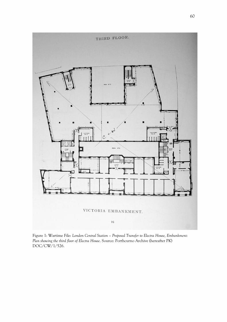
60
Figure 1: Wartime File: London Central Station – Proposed Transfer to Electra House, Embankment: Plan showing the third floor of Electra House. Source: Porthcurno Archive (hereafter PK) DOC/CW/1/526.
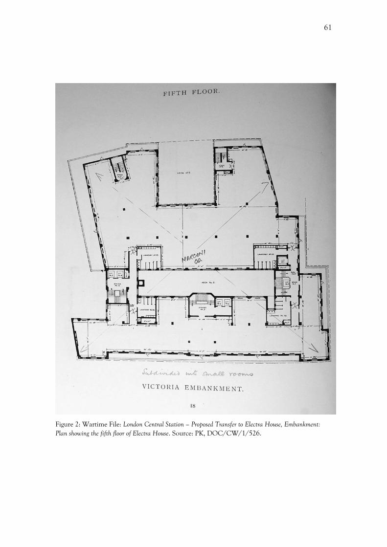
61
Figure 2: Wartime File: London Central Station – Proposed Transfer to Electra House, Embankment: Plan showing the fifth floor of Electra House. Source: PK, DOC/CW/1/526.
62
From Imperial and International Communications to Cable & Wireless
As has been shown with the example of Electra House, the Company’s nomenclature was
very important to its identity. The names chosen by the company following the merger
are very revealing about the way in which the company sought to present itself,
representing one of the most formal aspects of the company's identity. This was also one
of the most visible aspects of the Company to the public. From the choosing of the
company name following the merger, to the rechristening of the company five years later,
the choice of designation and the naming of the new company headquarters, these often
overlooked elements can provide a wealth of information. Some name choices reflect the
dominance of one of the parent companies and disunity within the company, while other
choices reflect the changing ethos of the company and its relations with the outside world.
One of the difficulties in assessing the nomenclature is that for the most part there is no
record of the company's decision making process or intentions. Similar to looking at the
Company’s designs unaided, we only have the surviving instances of the name to go by.
In this situation it is useful to compare the Company with others operating during the
inter-war period in order to assess whether there were trends present more broadly in the
commercial world, or whether these nomenclatural choices were unique to the I&IC,
later Cable & Wireless.
Broadly there were two sets of names used, those adopted by the Company
themselves, and those used by the governmental policy bodies set up to advise the
Company, each of which will be examined in turn within this section. Looking firstly at
the names adopted by the Company, the initial choice of the name Imperial and
International Communications Ltd demonstrates an overt desire to align the Company
with the British Empire, while representing the unification of the various telegraphy
outfits that operated within the Empire. The use of the word 'International' further
highlights the scope of the new company beyond the bounds of the Empire. At times, the
names of the various constituent companies alluded to their method of telegraphy, the
Marconi Wireless or the Pacific Cable Board for instance, or their geographical reach,
such as the Eastern Associated Telegraph Company. As a result, the new name had to
reflect both the wide geographical reach of the new company, as well as the diversity of its
63
methods of telegraphy. The vagueness of the word 'Communications' may have been
intentional, potentially leaving scope for future technological development that might
have moved away from submarine telegraphy, or even telegraphy itself. In contrast, the
rechristening of I&IC as Cable & Wireless in 1934 better reflected the integrated nature
of the company’s technologies.
It should be noted that the name Cable & Wireless was not an innovation in
1934, but instead an adaptation of 'Cables and Wireless', the name of the holding
company created at the time of the merger in 1929.175 The removal of the pluralization of
'cable' changes the word from a noun to a verb, making it appear more active. Rather
than just describing the assets of the company, it also suggests the method of sending the
telegram. It appears from an official letter written by the company secretary to the
stockholders, reproduced in the Zodiac, that the name Imperial and International
Communications had been the ‘subject of complaint and criticism’, primarily due to its
cumbersome nature and the fact that it did not clearly state that this was a telegraphy
business.176 Indeed, the Greene Committee suggested that the public were unfamiliar
with the name Imperial and International Communications Ltd, something that the
Company did not agree with.177
Publicly, it appeared that the decision to rechristen the Company was their own
rather than one made by an outside advisory body, and the way that it was portrayed
within the Zodiac suggests that it was the Company’s idea, a demonstration of their
willingness to be innovative and adapt to a changing economic climate. However, this
rechristening was in fact not the idea of the Company. The suggestion came from the
Greene Committee, who had been brought in by the government to assess the activities
of the company in the wake of the dire economic climate and falling traffic, to advise on
possible changes.178 The Court of Directors at first rejected this name change. In their
opinion it would be injurious to the company and costly,179 so one can only imagine the
desperation three years later that led to the acceptance of this decision. The report made
by the Greene Committee was never published, and the Company’s initial rejection of
175 The ampersand within the Company’s name was used interchangeably with ‘and’. 176 PUB/ZDC/5/3/85 Anon, A Rechristening! Cable and Wireless Via Imperial, The Zodiac, 311 (June 1934), 369-371, 370. 177 DOC//11/49 Letter from J. C. Denison Pender to the Secretary of the ICAC, 17/12/1931 178 DOC//11/49 Letter from J. C. Denison Pender to the Secretary of the ICAC, 17/12/1931; Barty-King, Girdle Round the Earth. 179 DOC//11/49 Letter from J. C. Denison Pender to the Secretary of the ICAC, 17/12/1931; Barty-King, Girdle Round the Earth, 233.

64
the name change was not made public. Additionally, the report does not survive within
the Porthcurno archive, but instead information has been gleaned from other sources
such as correspondence and internal documents. It is unclear whether the changes in the
nomenclature were the direct result of a changed attitude or simply succumbing to the
pressures of the advisory bodies.
Within the Zodiac an unknown writer posited a further reason why 'Imperial and
International Communications' was dropped, revealing a great deal about the mind-set of
the company, or at least how it sought to be perceived by its employees and the public.
The author claimed an overt commercial motive, noting the name change was to 'meet
the intense competition which the Company is exposed in various quarters.'180 These
comments were made after the decision for the name change had occurred, and was
written in a semi-formal manner within the company magazine.
The dropping of the word ‘Imperial’ from the Company name presents a very
interesting situation. There is the suggestion at one point that it was superfluous, as non-
imperial countries in which the company operated knew that they were a British
company and understood that ‘being British’ they were ‘naturally imperial’.181 While on
the surface this explanation for the dropping of ‘Imperial’ may have seemed slightly trivial
and offhand, it pre-empted the problems that would be faced after the Second World
War when there was a problem with the company highlighting their imperial status too
explicitly due to the changed relationship between Britain and the Empire. It also pre-
empted the changes in the relationship between the Empire and the Company after the
Second World War following the nationalization, discussed later in this chapter. The
period in which the merger and the rechristening occurred was a transitional phase for
relations between Britain and the Empire, and in turn between the Company and the
Empire. The idea of an imperial chain of communications radiating from the 'Mother
Country' operated at both ends by the British company lost favour with those in the
Dominions following the Statute of Westminster of 1931.182 The Statute of Westminster
ratified the recommendations made at the Imperial Conferences of 1926 and 1930. This
was largely symbolic, but there were practical ramifications, such as enabling the
Dominions to override Imperial law.183
180 Anon, A Rechristening!, The Zodiac, 370. 181 Anon, A Rechristening!, The Zodiac, 370. 182 Barty-King, Girdle Round the Earth, 223. 183 L. Zines, Constitutional Changes in the Commonwealth, Cambridge, 1991, 5.
65
With the changing relationship between Britain and the Dominions now
cemented in law, there was a desire from the constituent members of the new British
Commonwealth of Nations to communicate directly with each other rather than via
Britain. Here, the importance of the binary connection between the metropole and the
periphery had been diminished and the peripheries were now seeking ways of bypassing
the metropole entirely. The result of this was further reductions in traffic and increased
competition from other telegraphy companies. In this context, the removal of the word
'Imperial' and its connotations was designed as a response to the altered nature of the
Empire, and its relationship with the Company.
While the names I&IC and subsequently Cable & Wireless were used in Britain,
this was not necessarily the case across the Empire. Despite having joined the Company
and assumed the name Cable & Wireless, from 1936 the old names re-emerged and
'West India and Panama Telegraph Company Ltd' became the working name of Cable &
Wireless in the West Indies in the eyes of the local government and the public.184 One
possible reason for this was the fact that the West Indies was peculiar in hiring a large
number of its staff locally, as opposed to most other parts of the world, where staff were
sent over from Britain.185 Here, the station had shed its British identity and assumed as
local one, demonstrating the changing relationship between Britain and the Empire, as
well as a desire for a sense of continuity with the pre-merger company. Whatever the
reasons, local geography clearly shaped how the Company’s identity was understood
around the world.
Despite the apparent desire to distance themselves from the imperial element of
the name, ‘Via Imperial’ remained the Company’s routing instruction well into this
period, suggesting that it may have just been a desire to simplify the name. Routing
instructions, or designations, determined which telegraph company would be used to
send the telegram. There was a practical aspect to this, as the common practise in the
choosing of designations had been the use of one of the most identifiable words from the
company’s name. If Cable & Wireless had adopted this practice then the designations
had to be either Via Cable or Via Wireless, which in turn would have given the customer
the opportunity to choose which element of the business they wished to use. Considering
184 Barty-King, Girdle Round the Earth, 257-60. 185 Barty-King, Girdle Round the Earth, 260.
66
the precarious position of cable telegraphy, this would not have solved any of the
Company’s problems. Additionally, it would have been enough trouble to change the
company name and alerting the public to this change, without having to also change the
designation. A new designation required further advertising, all of which would cost the
ailing business more money, as well as adding an additional level of confusion to the
customer.
A 1934 article in the Zodiac discussed the reasons why the ‘International’ element
was dropped from the company name, stating that ‘things have been simplified’.186 Here,
the word ‘simplified’ might have been used instead of ‘reduced’, with simplifying having
connotations of streamlining. As a result of the Great Depression there was a heavy
reduction in the Company’s traffic, which, coupled with competition from a multitude of
companies outside the Empire, resulted in the Company seeking to consolidate the
network within the bounds of the Empire and reduce the number of unprofitable
cables.187 The writer went on to state that, despite having branches registered in foreign
countries, ‘Imperial points the way to our main road’, demonstrating that the Company’s
business was concentrated within the British Empire.188 There are two separate meanings
here, firstly imperial in terms of the geographical extent of the British Empire, and
secondly, imperial as a quality.
There were other reasons why there might have been a need to focus more on the
‘Imperial’ element of the business, rather than the ‘International’, as it is implied within
an article in the Zodiac that these two terms were considered intrinsically oxymoronic.
The author claimed that at this time internationalism was synonymous with
totalitarianism, both of which were a form of dictatorship, and that neither could
‘breathe the same free air as Imperialism’.189 ‘International’ was a somewhat loaded term
within the context of the period, contemporary commentators suggesting that it was
evocative of socialism.190 It was seen as reminiscent of the Communist Internationals, as
well as the Labour Party policy of internationalism.191 The image of the Labour Party
during the 1920s had been plagued with perceived associations with communism and the
electorate had many fears. This was primarily seen during the 1924 general election 186 Anon, A Rechristening!, The Zodiac, 370. 187 Barty-King, Girdle Round the Earth, 230. 188 Anon, A Rechristening!, The Zodiac, 370. 189 Anon, A Rechristening!, The Zodiac, 370. 190 Anon, A Rechristening!, The Zodiac, 370. 191 C. Sylvest, Interwar internationalism, the British Labour Party, and the historiography of international relations, International Studies Quarterly 48 (2004) 409-432.
67
campaign when the Zinoviev letter, which the Communist International of Moscow was
purported to have sent to the Communist Party of Great Britain, urged increased
communist activity, marring the identity of the Labour Party and returning the
Conservatives to power. It was also the Labour Party that snubbed the Company in June
1929 when Ramsay MacDonald’s cabinet decided to favour the GPO’s Rugby station for
transatlantic radio-telephony over the I&IC’s proposed shortwave service, which was
‘widely interpreted as a political decision’ which favoured ‘a government enterprise over a
private company established under Conservative auspices’.192 In other words, the design
of a company names was a political as well as pragmatic issue.
One of ways of dealing with both competition and falling demand was a new
outlook for the Company based upon modernization and efficiency, with the new
succinct name pointing 'to more effective action in the future'.193 As a result, it was an
overtly commercial decision. Indeed, it is mentioned in the Zodiac that:
Signs of a lively and forceful Management suggest vigorous and clear-sighted leadership and the pulling together of all of us under a new inspiration will lift the old galley over the billows with such a way on her that will carry her into the coming Trade Winds as soon as they start to blow.194
Here, there is the suggestion that the company were seeking to reposition themselves for
possible changes in the economic and business world following the Great Depression,
which made practical sense. This passage features very imperial rhetoric, in particular the
use of commercial and maritime imagery. This foreshadows the maritime imagery used in
MacDonald Gill’s Great Circle Map, 1946, which is discussed in the next chapter. The ‘old
galley’ might refer to the out-dated cable ships that were used during this time, or to a
traditional company whose focus had been on the past rather than the future. So too, the
mention of the ‘Trade Winds’ is evocative of much earlier ships engaged in commerce
around the world. The motif of the sea and maritime power deployed here was frequently
used within the Company’s graphic output, as will be discussed in subsequent chapters.
It is noted in the Zodiac that the Company, ‘out of character with the short, quick,
speedy methods’, deployed the full title of Imperial and International Communications
Ltd.195 In this sense, the new title of Cable & Wireless mirrored how the company sought
192 Headrick, The Invisible Weapon, 212. 193 Anon, A Rechristening!, The Zodiac, 369. 194 Anon, A Rechristening!, The Zodiac, 370. 195 Anon, A Rechristening!, The Zodiac, 370.
68
to be perceived by the public and their customers. The emphasis on efficiency and speed
epitomises notions of modernity, and indeed contemporary accounts often make
frequent reference to words and phrases such as the 'largest and most efficient’, ‘speed’
‘rapid and efficient’.196
Via Imperial
With a new unified service, there was a need to have a single designation, which became
Via Imperial. Prior to the merger there were number of different designations, briefly
comprising Via Eastern (ETC), Via Marconi (Marconi Wireless), Via Empiradio (GPO –
wireless) and Via Imperial (GPO – cable). These were the main way in which the customer
interacted with the company name, as they were required to write their chosen
designation on their telegram form. This decision on the part of the customer was based
around their perceived notions of the service, primarily its speed and accuracy, as well as
cost. The variety of these is testament to the amount of competition that was present
within the British telegraphy market prior to the merger.
One of the problems with introducing a new designation was that customers and
the public had grown accustomed to using each of the old designations, and a large
proportion of each respective company’s reputation was closely associated with these
names. Indeed, in an article in the Zodiac, from March 1929, announcing the merger, it
was stated that the Via Eastern slogan was ‘world famous for accuracy secrecy and speed’
representing the ‘greatest cable service in the world’, which was built upon ‘nearly sixty
years of untiring energy and persistence’.197 Here, the importance of the past was stressed,
something which a new designation might have eradicated. So too, the article states that
the Via Marconi designation had a similar reputation for ‘rapid and efficient
communication by wireless telegraphy’. 198 Following the merger, I&IC used the
designation ‘Via Imperial’, which like previous designations mirrored the name of the
company. It should be noted that ‘Via Imperial’ did exist prior to 1929 as the designation
for the GPO.
It was not only the designation that had been unified, but also the typography
196 PUB/ZDC/5/3/75 Anon, A Triumph for British Industry, The Zodiac, 248 (March 1929), 274. 197 Anon, A Triumph, The Zodiac, 274. 198 Anon, A Triumph, The Zodiac, 274.
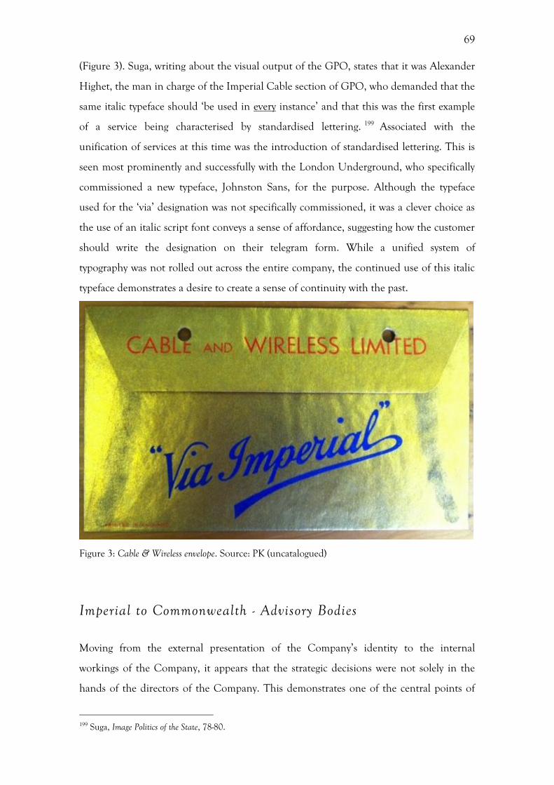
69
(Figure 3). Suga, writing about the visual output of the GPO, states that it was Alexander
Highet, the man in charge of the Imperial Cable section of GPO, who demanded that the
same italic typeface should ‘be used in every instance’ and that this was the first example
of a service being characterised by standardised lettering. 199 Associated with the
unification of services at this time was the introduction of standardised lettering. This is
seen most prominently and successfully with the London Underground, who specifically
commissioned a new typeface, Johnston Sans, for the purpose. Although the typeface
used for the ‘via’ designation was not specifically commissioned, it was a clever choice as
the use of an italic script font conveys a sense of affordance, suggesting how the customer
should write the designation on their telegram form. While a unified system of
typography was not rolled out across the entire company, the continued use of this italic
typeface demonstrates a desire to create a sense of continuity with the past.
Figure 3: Cable & Wireless envelope. Source: PK (uncatalogued)
Imperial to Commonwealth - Advisory Bodies
Moving from the external presentation of the Company’s identity to the internal
workings of the Company, it appears that the strategic decisions were not solely in the
hands of the directors of the Company. This demonstrates one of the central points of
199 Suga, Image Politics of the State, 78-80.
70
this thesis, that the processes of identity creation were not necessarily directly influenced
by the Company themselves, but contingent upon external organizations and influences.
Throughout this period the government bodies that were set up to advise the company
and make policy decisions changed in both form and name. It is unlikely that the public
were aware of the names of these bodies, so the significance of these changes lies in the
Company’s internal identity. The first of such bodies was the Imperial Communications
Advisory Committee (ICAC), which was set up following the merger to supervise the
Company. 200 This name survived until 1942, outliving the ‘imperial’ element of the
Company’s name by eight years. The ICAC was then renamed the Commonwealth
Communications Council (CCC), which reflected not only its new composition, but also
changing relations within the British Empire. The members of the reconstituted council
now resided in their respective Dominions, with the Chairman and the Secretariat
remaining in London.201 This moved control of the company further away from London
into the Dominions, as prior to this all members had been resident in London. Now
decisions concerning the policy of Cable & Wireless were made across the
Commonwealth, from the furthest reaches of the telegraphy network. This was
emblematic of the move from a British based Empire to a Dominion dominated
Commonwealth. Indeed, the move from ‘Imperial’ to ‘Commonwealth’ is quite telling of
the changed dynamic within the Empire system, with an increasing focus on the
Dominions. This change in relationship was one of the most crucial moments in the
Company’s history. It was no longer a telegraphy system for the Empire; it was now a
system run by the Empire.
All of these changes happened without the consent of Cable & Wireless, yet were
crucial to their future. The directors and managers of Cable & Wireless were losing their
power within the company, and even losing their voice. When the decision was made at
the Commonwealth Conference on Telegraphy, held in Australia in 1942, to change the
nature of the council, Cable & Wireless were not invited to participate and did not even
receive a copy of the report.202 The Company protested against such a change, stating that
this was ‘in fact a unilateral change in the arrangements which had been made between
200 Headrick, The Invisible Weapon. 201 DOC/CW/12/404 Cable & Wireless Limited and Empire Communication: Note for Guidance, 1945, 6. 202 DOC/CW/12/405 Cable & Wireless Limited and British Communication: Historical Notes 1857-1946, c.1946, 8.
71
the Governments and the Company in 1928’. 203 This was a turning point in the
operational structure of the company, and one into which the Company themselves had
no input whatsoever.
Furthermore, the Company complained that ‘the new Council could not function
as a Committee, that it would disrupt the normal means of communications between the
governments and the Company and that in short it was unworkable and would lead to
unnecessary friction’. 204 If we focus on the first point of protest, the Company are under
the belief that the function of the body as a ‘Committee’ would remain, however, as is
evident from the change in name, this was no longer a committee but a ‘Council’. The
word ‘Council’ had resonances of a governance body with further reaching powers to
implement policy, whereas ‘Committee’ evokes a sense of a purely advisory body.
The hand of the government was forced by the CCC, who formulated the ‘Anzac
Scheme,’ which ‘involved the formation of government-owned public-utility corporations’
in the UK and the Dominions.205 This scheme proposed to move power and money away
from the UK, dismantling of the Empire-wide telegraphy network, through the creation
of national corporations within each of the Dominion countries. Disagreeing with the
lack of a central authority, the UK government sent Lord Reith to the Dominions and
India to explain the UK’s views and to explore alternatives. The ‘Anzac Scheme’ then
evolved into the ‘Canberra Proposal’, which established an overriding authority,
responsible for decisions on matters of policy. 206 Although this was unanimously
approved at the Commonwealth Telecommunications Conference in July 1945, Cable &
Wireless issued a disclaimer the following month stating that ‘the attendance of their
representatives at the Commonwealth Telecommunications Conference should not be
taken to mean that they concurred with the report.’207
In May 1948, the CCC was reconstituted as the Commonwealth
Telecommunications Board (CTB) as part of the Commonwealth Telegraph Agreement
which was signed by the governments of the UK, Canada, Australia, New Zealand, South
Africa and Southern Rhodesia. The CTB was part of the bill on nationalization, and at
the White Paper stage of the Bill, the Economist stated that it could ‘hardly be described as
203 DOC/CW/1/53 Statement Summarising C&W Reaction to Proposed Nationalisation, 25/10/1945, 1. 204 DOC/CW/12/404 Cable & Wireless Limited and Empire Communication: Note for Guidance, 1945, 6 205 DOC/CW/1/53 Statement Summarising C&W Reaction to Proposed Nationalisation, 25/10/1945, 7. 206 DOC/CW/1/53 Statement Summarising C&W Reaction to Proposed Nationalisation, 25/10/1945, 7 207 DOC/CW/12/405 Cable & Wireless Limited and British Communications: Historical Notes 1857-1946, c.1946, 12.

72
a simple administrative body’.208 Indeed, substitution of the word ‘Council’ for ‘Board’
suggests a move from an advisory and deliberative body to one with real decision-making
powers, similar to a board of directors. This emphasises that corporate power was shifting
away from centralised control. These changes to the advisory bodies reflected the
changing relationship between the British state and the Company in the conduct of
imperial management. This demonstrates that the shifts within the Empire towards a
Commonwealth were well underway, away from the eyes of the public, before the
nationalization and the very visible break-up of the imperial telegraphy system.
Disintegration
The nationalization of Cable & Wireless in the late 1940s has been described as a
‘decisive break in the history of the Imperial/Commonwealth telecommunications
system’.209 However, Collins’ view that the nationalization of the Company in the 1940s
heralded a profoundly changed relationship between the headquarters in London and the
British Empire is too simplistic an explanation. Instead, the ‘disintegration of the
network’, described by Sir Edward Wilshaw, began much earlier. A feeling of disparity
between the UK and the Empire was felt as early as 1931 within the Company, it was
stated that there was a ‘lack of identity of interest between home and overseas authorities’
with the Greene report concluding that the set up at that time did ‘not provide adequate
machinery for securing identity of aim and policy between the central authority of IIC
and the overseas companies and governments’. 210 By 1942, as has been previously
discussed, this disparity had been addressed with the power dynamic within the Company
changing dramatically when those the CCC allowed those resident in the Dominions to
be members. Nationalization merely ossified, in financial terms, the changes that had
been occurring before the Second World War, sending assets to the areas of the network
that had already gained decision-making powers. With increasingly reduced decision-
making powers, Cable & Wireless’ Board of Directors did not have full control of the
Company’s identity. This eventually led to the distinct lack of coherency between Britain
and the rest of the telegraphy system in matters such as design and public relations, which
208 Business Notes, The Economist, 4th May 1946, p. 716. 209 Collins, The Reith Mission, 178. 210 DOC/I&IC/1/27 Inquiry Committee File 12/8/1931 – 1/3/1932, 4.
73
will be discussed in chapter 6.
The warnings of ‘disintegration’ came from Cable & Wireless themselves, in
particular the Company Chairman Sir Edward Wilshaw, who vocally opposed
nationalization, stating that the proposed changes to Empire communications ‘could only
lead to disintegration instead of unity’. 211 This patriotic appeal was made during a
committee hearing for the nationalization bill. Sir Edward Wilshaw stated that the main
reason for the opposition of the bill was not due to politics or based on the question of
nationalization versus private enterprise, but that the Company feared that it would mean
the ‘break-up of the great British Commonwealth system of communications’.212
This appeal to the government may have been disguising fears of a loss of profit
and a further removal of the directors’ control over the running of the Company. Indeed,
Cable & Wireless provided an alternative that they believed would instil a greater sense
of unity. 213 They suggested a pooling scheme for receipts from traffic among all the
companies operating overseas, so that each would have ‘a common interest in the Empire
system as a whole’. 214
This rhetoric of disintegration and a lack of unity from Cable & Wireless forces
us to think in binary opposites, however it was a transformation in the relationships of
key players within both telegraphy and the wider Empire. If it was a case of
transformation rather than the dismantling of the imperial communications project, then
the importance of nationalization as a defining moment in the history of Cable &
Wireless is somewhat diminished. This process of transformation can be seen on a
number of different levels, all of which were connected by the telegraphy network. The
assets and decision-making powers were decentralised from London. However, this can
also be read as the unification of the Dominion governments, allowing them to
commune on matters of communication in a way that was only afforded in a periodic
manner prior to nationalization at the various telegraph conferences. So too, the physical
cable network remained intact. Cable & Wireless also believed that the proposals for
nationalization would be ‘inimical to the interests of the peoples of the Empire and to all
211 DOC/CW/12/404 Cable & Wireless Limited and Empire Communication: Note for Guidance, 1945. 212 PUB/ZDC/5/3/119 Anon, “Adequate Protection” for staff on nationalisation’ The Zodiac, 448 (July 1946), 75-76, 75. 213 DOC/CW/1/53 Statement Summarising C&W Reaction to Proposed Nationalisation, 25/10/1945, 1. 214 DOC/CW/1/53 Statement Summarising C&W Reaction to Proposed Nationalisation, 25/10/1945, 1.
74
classes of telecommunication users’.215 This view was expressed in a letter from the Court
of Directors to the Company’s shareholders.
Using similar words to those used to object to the changing composition of the
ICAC, Cable & Wireless stated that the plans for nationalization would be ‘unworkable
and impracticable’.216 This ‘flat uncompromising objection’ to the Nationalization Bill
featured in an article in The Economist in May 1946.217 It stated that Cable & Wireless
had made the ‘strongest representations to the Government against it; and they entertain
“the greatest fears as regards the concessions held in foreign countries if the proposed
scheme is adopted”’ considering the entire scheme ‘“fundamentally unsound”’.218 Indeed,
Cable and Wireless even petitioned the House of Lords to reject the Bill during a Select
Committee in July 1946.219
The narrative that the Company chose to portray during this period from the first
proposal of nationalization until the transfer of the assets can be characterised as one that
sought unification. A newspaper advertisement from July 1945 displays the notion of
telegraphy facilitating a dialogue between nations in the spirit of cooperation (Figure
4).220 Entitled ‘The World is our Concern’, this advertisement shows two stylised figures,
one whispering in the ear of the other, with a wireless transmitter in-between them. It is
stated within the advertisement’s copy that the ‘furthest corners of the earth can now
speak together, freely and intimately, as two men face to face.’ The advertisement goes on
to state that the vast network of Cable & Wireless routes meant that ‘nation speaks to
nation’ and that ‘this great service of world communications will link the peoples of the
earth in a closer friendship and co-operation’.221 Here, the nations have been reduced to a
single figure, suggesting a sense of intimacy and unification. This advertisement was a
reaction to post-war reconciliation, highlighting the theme of peace that abounded at this
time. Additionally, in this advertisement Cable & Wireless looked beyond the
Commonwealth towards the ‘world’, and the stylised, overly simplistic rendering of two
men suggests an ethnic vagueness. This advertisement can be read as a means by which
the Company sought to demonstrate the importance of unity, a subtle defence against the
215 DOC/CW/12/405 Cable & Wireless Limited and British Communications: Historical Notes 1857-1946, c.1946, 13. 216 DOC/CW/12/404 Cable & Wireless Limited and Empire Communication: Note for Guidance 1945. 217 Business notes, The Economist, 4th May 1946p. 716. 218 Business notes, The Economist, 4th May 1946p. 716. 219 Cable petition to Lords, The Financial Times, 24th July 1946. 220 Fairplay, 5th July 1945, Guard Book, PK Archive. 221 Fairplay, 5th July 1945, Guard Book, PK Archive.
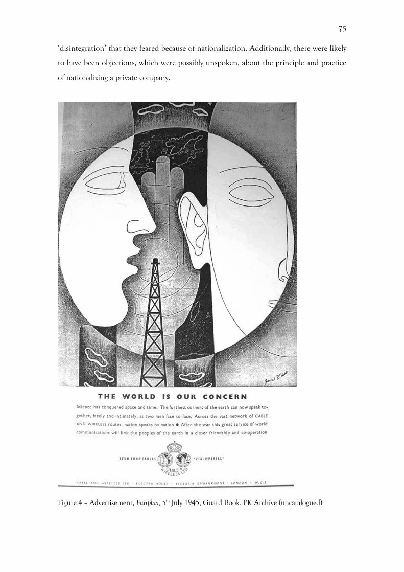
75
‘disintegration’ that they feared because of nationalization. Additionally, there were likely
to have been objections, which were possibly unspoken, about the principle and practice
of nationalizing a private company.
Figure 4 – Advertisement, Fairplay, 5th July 1945, Guard Book, PK Archive (uncatalogued)
76
While Cable & Wireless were in strong opposition to nationalization, the Houses
of Parliament were unanimous in their support. 222 While members of the Labour
government, who came in power in 1944 under Clement Attlee, saw nationalization as
the forward march of socialism, this was an era of consensus amongst the political parties.
The period between 1946-48 saw the nationalization of the Bank of England, civil
aviation, electricity, steel, coal, gas, rail, and road haulage, alongside Cable & Wireless.
With the exception of steel, these bills were uncontroversial in the Houses of Parliament,
owing in part from a growing call for efficiency and control over production in the wake
of the Second World War.223 However, it appears from the material in the Porthcurno
archive that the ideological wishes of the Labour government had little impact on the
nationalization of Cable & Wireless. The decision was made during the General Election
campaign in 1945, and it is reasonable to assume that as the decision had been made so
conclusively within the Telegraph Conference that nationalization would have gone
ahead regardless of outcome of the election. This demonstrates the determination of the
Dominion governments in securing control of the telecommunications system.
The public face of national ization in the dominions
As well as looking at nationalization as simply being emblematic of Britain’s changing
relationship with the British Empire and Commonwealth, there is an opportunity to
gauge how Cable & Wireless’ identity translated to the Dominions and India. Cable &
Wireless was seen as the public face of Britain throughout the Empire, in much the same
way that British Overseas Airways Corporation (BOAC) and its sister company British
European Airways (BEA) were.224 However, crucially Cable & Wireless was not the public
face of the British government, instead it were viewed as a private commercial business.
Indeed, according to Lord Reith, the purpose of nationalization was to remove this
‘London commercial company’ from a position of dominance, replacing ‘commercial
222 DOC/CW/8/48 Cable & Wireless Limited: its Part on the Commonwealth Overseas Telecommunication System, 6. 223 A. Thorpe, A History of the British Labour Party, Basingstoke, 2001, 108. 224 Jackson, The new air age, 167.

77
motive’ with ‘public utility’.225 Here, the perception of the Company, which was largely
inaccurate, allowed the people of the Colonies and the Dominions to disentangle the
identity of Cable & Wireless from that of the state.
The Dominions wanted to exorcise the control of Britain. Cable & Wireless were
successful beyond nationalization because the people of the Dominions had misconceived
the organization of Cable & Wireless. It was not strictly a private, commercially successful
company, but one that was already being run on public utility lines. The two directors of
Cable & Wireless (Holding) Ltd had to be approved by the government, one of whom
was also required to be the Chairman of the communications company, and nominees of
the Dominion and Indian governments had to sit on the boards of the respective overseas
companies.226 Additionally, while the Holding Company had a large number of private
shareholders, only the Treasury and the holding company were the shareholders of the
Operations Company. Moreover, the commercial value had been buoyed up by an
upsurge in government and press traffic during the Second World War. Otherwise the
Company was ailing, and was required to designate 50% of profits above a standard
revenue of 4% to the reduction of rates. Thus, the perception of the company as a purely
private and commercial enterprise does not match the reality of a company constrained
by the government.
Cable & Wireless were able to disassociate themselves from the British
government, allowing them to continue operations amidst the swelling of nationalist
feelings. Within the Cable & Wireless’ records there are numerous references to forms of
foreign nationalism, however, Cable & Wireless were able to maintain their position in
these countries ‘despite the avowed nationalistic tendencies’ present. 227 In 1945, in
response to the proposals for nationalization, Cable & Wireless stated that the work they
had done overseas during the war, which wasn’t made public for security reasons, had
been of ‘inestimable value’ to many government departments.228 This may, in part, be the
result of the rechristening of the Company in 1934, with the removal of the word
‘Imperial’ creating the illusion that the Company were no longer involved with the
British government. The Company felt that if it were to be placed under government
ownership then the foreign countries would ‘immediately take steps to take over existing
225 J. Reith, Into the Wind, London, 1949, 510. 226 DOC/CW/1/54 Notes on the Reith Commission. 227 DOC/CW/12/404 Cable & Wireless Limited and Empire Communication: Note for Guidance, 1945, 5. 228 DOC/CW/1/53 Statement Summarising C&W Reaction to Proposed Nationalisation, 25/10/1945, 8.
78
concessions and to nationalise their overseas communication’.229 There is the implication
that Cable & Wireless had a more favourable identity in these foreign countries. Cable &
Wireless were keen to state that this was not based purely upon speculation and the
Company’s managers, but also H.M. Ambassadors in many of the countries.230
Perhaps their fears were credible as, it appears, in a linked example, that following
nationalization, the identity of the Post Office and any associations with the government
body were thought to have caused trouble overseas. A memorandum on Cable &
Wireless reorganization, produced by the Cable & Wireless Administrative Steering
Committee for the Director General of the GPO, stated that ‘while nationalization in its
present form has been accepted by the Administrations concerned [the Dominion
governments], they will take a different view of the Post Office as actively controlling the
services, cable terminals, wireless stations and offices operating in their territory’.231 As a
result, the memorandum suggests that while Cable & Wireless would be ‘subordinate to
the Post Office’ it would continue to operate services overseas. The memorandum goes
on to state that they doubted whether ‘Post Office ownership of buildings in foreign
counties’ would be ‘acceptable to the foreign administrations’.232 This demonstrates that
Cable & Wireless’ corporate identity and reputation was much stronger than that of the
GPO, and by extension the British government.
Integration with the Post office
As part of nationalization, Cable & Wireless became operationally and strategically
subordinate to the Post Office within the UK. Relations between Cable & Wireless and
the Post Office prior to nationalization were reported as being very cordial. 233 The
incoming Chairman of Cable & Wireless, Sir Stanley Angwin, wrote to the staff through
The Zodiac in February 1947, stating that ‘co-operation with the great Post Office
229 DOC/CW/1/53 Statement Summarising C&W Reaction to Proposed Nationalisation, 25/10/1945, 8. 230 DOC/CW/1/53 Statement Summarising C&W Reaction to Proposed Nationalisation, 25/10/1945, 9. 231 DOC/CW/1/687 Cable & Wireless Administrative Steering Committee: Memorandum on C&W re-organisation handed to the Director General of the GPO, 111/3/1948, 4. 232 DOC/CW/1/687 Cable & Wireless Administrative Steering Committee: Memorandum on C&W re-organisation handed to the Director General of the GPO, 111/3/1948, 3. 233 DOC/I&IC/1/47 Précis of evidence given before the Bridgemon Committee 8/4/1932.
79
organization, always happy, will naturally be closer than in the past’.234 However, despite
past relations between the two organizations, there were anxieties felt by Cable &
Wireless employees about their future prospects. As part of a privately run company prior
to nationalization, the employees had enjoyed higher wages, better pensions and bonuses
linked to profits. This was something that Wilshaw had fought for at the committee
stages of the nationalization bill in 1946, where he pointed out that during the merger in
1929 all of the staff transferred from the Post Office and the Pacific Cable Board,
government institutions, were given a ‘five year guarantee on terms no worse than they
had had in their previous employ’.235
The reactions to nationalization within the Zodiac in 1947 were negative, whereas
they were positive in 1929, in response to the merger. The main reason for this difference
was the position and future of the staff. In 1929 the merger meant very little in practical
terms to the employees of ETC, for whom the magazine was written, instead it was the
Marconi employees who had to accept different conditions when they joined the merged
company. By 1947, the situation had effectively reversed, and now it was the employees of
Cable & Wireless who were facing worse remuneration as a product of nationalization.
Indeed, the stories in The Zodiac relating to nationalization appear to focus upon these
changed condition, ranging from apprehension and uncertainly about what might change
to a sense of relief and reassurance that some of the staff, for instance pensioners, would
be protected. 236 By early 1947, with nationalization well under way, the tone of the
articles within The Zodiac changed. There was now a feeling of acceptance, and the
movement of the staff was reflected in the issues – in January there were profiles of those
leaving the company, and in February, a ‘who’s who’ of the new board.237 From these
stories it becomes clear that the entire board of Cable & Wireless was replaced as part of
nationalization.
At the Labour Party Conference in Margate in 1947, the Chancellor of the
Exchequer, Hugh Dalton, said that the government was planning to integrate the Cable
234 PUB/ZDC/5/3/125 S. Angwin, We Shall Together Do Great Things, The Zodiac, 455 (February 1947), 1. 235 Anon, “Adequate Protection”, The Zodiac, 75. 236 PUB/ZDC/5/3/118 Anon, Post Office may operate C. and W. Service, The Zodiac, 447 (June 1946), 51-53; Anon, “Adequate Protection”, The Zodiac, 75-76; PUB/ZDC/5/3/122 Anon, Staff (‘that means retired Staff as well’) are Protected – says Chairman, The Zodiac, 452 (November 1946), 187-188; PUB/ZDC/5/3/125 Anon, Future of Cable and Wireless Staff, The Zodiac, 455 (February 1947), 323. 237 PUB/ZDC/5/3/124 Anon, Sir Edward Wilshaw says “Goodbye”, The Zodiac, 454 (January 1947), 260; Anon, Future of Cable and Wireless Staff, The Zodiac, 323.
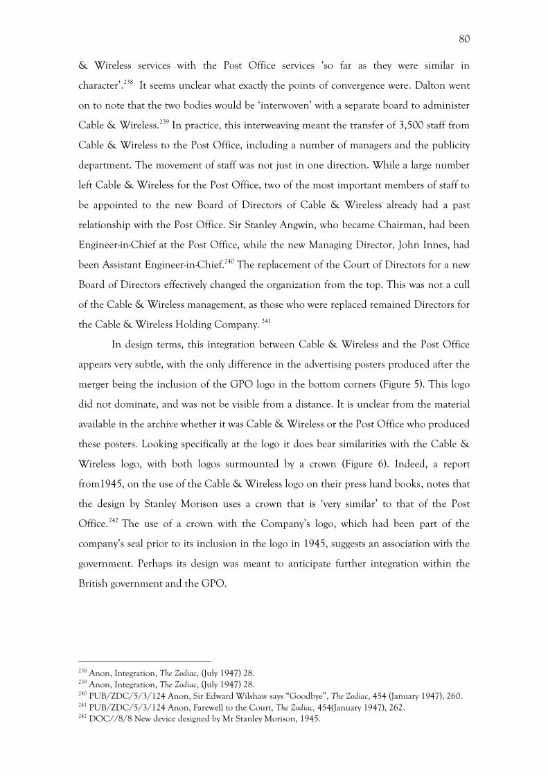
80
& Wireless services with the Post Office services ‘so far as they were similar in
character’.238 It seems unclear what exactly the points of convergence were. Dalton went
on to note that the two bodies would be ‘interwoven’ with a separate board to administer
Cable & Wireless.239 In practice, this interweaving meant the transfer of 3,500 staff from
Cable & Wireless to the Post Office, including a number of managers and the publicity
department. The movement of staff was not just in one direction. While a large number
left Cable & Wireless for the Post Office, two of the most important members of staff to
be appointed to the new Board of Directors of Cable & Wireless already had a past
relationship with the Post Office. Sir Stanley Angwin, who became Chairman, had been
Engineer-in-Chief at the Post Office, while the new Managing Director, John Innes, had
been Assistant Engineer-in-Chief.240 The replacement of the Court of Directors for a new
Board of Directors effectively changed the organization from the top. This was not a cull
of the Cable & Wireless management, as those who were replaced remained Directors for
the Cable & Wireless Holding Company. 241
In design terms, this integration between Cable & Wireless and the Post Office
appears very subtle, with the only difference in the advertising posters produced after the
merger being the inclusion of the GPO logo in the bottom corners (Figure 5). This logo
did not dominate, and was not be visible from a distance. It is unclear from the material
available in the archive whether it was Cable & Wireless or the Post Office who produced
these posters. Looking specifically at the logo it does bear similarities with the Cable &
Wireless logo, with both logos surmounted by a crown (Figure 6). Indeed, a report
from1945, on the use of the Cable & Wireless logo on their press hand books, notes that
the design by Stanley Morison uses a crown that is ‘very similar’ to that of the Post
Office.242 The use of a crown with the Company’s logo, which had been part of the
company’s seal prior to its inclusion in the logo in 1945, suggests an association with the
government. Perhaps its design was meant to anticipate further integration within the
British government and the GPO.
238 Anon, Integration, The Zodiac, (July 1947) 28. 239 Anon, Integration, The Zodiac, (July 1947) 28. 240 PUB/ZDC/5/3/124 Anon, Sir Edward Wilshaw says “Goodbye”, The Zodiac, 454 (January 1947), 260. 241 PUB/ZDC/5/3/124 Anon, Farewell to the Court, The Zodiac, 454(January 1947), 262. 242 DOC//8/8 New device designed by Mr Stanley Morison, 1945.
81
Figure 5 – Send a Cable It’s Easy, by T. Eckersley, Source: PK PIC/GPO/8/11

82
Figure 6: Cable & Wireless logo, by Stanley Morison, 1945. Source: PK DOC//8/8
Conclusion
The interwar and post-war period was characterised by the decentralization of power away
from the directors of Cable & Wireless, firstly with the introduction of advisory
committees controlling policy, then with the further transfer of power away from both
the Company and the UK in the form of the CCC, and finally nationalization. The
movement of decision-making power and assets away from the Company headquarters in
London marked a key turning point in the organization of the Company, which was
closely linked with the wider geopolitical changes within the governing of the British
Empire. The network of submarine cables remained in situ while the structure of the
Company, as well as the Empire, was reorganised. This study provides a valuable insight
into the commercial ramifications of changes within the British Empire and
Commonwealth, as well as highlighting an important aspect of the Company’s history.
These changes had a profound effect upon the company’s internal identity, with
organizational alterations, staff mergers and accountability to an external
intergovernmental body. However, very few of these internal changes surfaced in a
conscious manner in the Company’s external identity, through their advertising, for

83
instance. Indeed, in some cases the external identity of the Company, which had been
particularly built up during the Second World War, was more appealing to the
governments of the Dominions and India than that of the Post Office. Here, Cable &
Wireless’ identity had a value separate from that of its physical assets, from its cables and
stations. This intangible, but crucially important, aspect of the Company will be explored
in the following chapters.
This chapter highlights the importance of situating a business within its historical
context when thinking about corporate identity. Through an investigation of these
contextual elements we are able to glean a considerable amount of information about the
external pressures faced, and how the Company responded. It is in these responses that
the Company’s identity was formed. What emerges from this study is that during this
period there was a plethora of political, economic and social forces influencing the
corporate identity of the Company. These factors came from both the internal
organizational changes as well as the external political and cultural environment in which
the Company operated. I have argued that these factors are inexplicably linked and
therefore it would be both impossible and impractical to attempt to look at them in
isolation. This is often one of the failings of many business histories, which do not seek
to understand the business within its milieu. Additionally, this chapter demonstrates that
a company’s corporate identity is not a homogenous entity that consistently changes over
time, everywhere. Instead, it is the product of the interaction between a whole host of
elements, each of which develop and change at different rates in different places.
84
5. Visualizing the Network: Mapping Imperial Cables
This chapter is about the cable maps of Cable & Wireless, and the use of cartography
within the company’s visual identity as an articulation of the changing relationship
between the Company and the British Empire. Within the corpus of maps stored in the
archive at Porthcurno there is a preoccupation with global maps, with only a few
examples of more localised maps. This is a clear indication that Cable & Wireless were a
Company operating on a global scale and that this was an area of their identity that they
sought to articulate and stress to their customers. As well as the maps displayed by the
Company and used by the customers, there were also technical maps used by the
employees. The disparity within the function of the decorative and technical maps was
also manifest within the design, which will be discussed later in the chapter.
A large amount of work has been done on the history and theory of maps,
particularly as an articulation of state power.243 Despite this, little work has been done on
the maps used by companies and there has been no work specifically on cable maps. In
addition, as Cosgrove points out, there is a need to examine twentieth century maps, as
critical studies of cartography have focussed largely on pre-modern maps.244 The study of
Cable & Wireless’ maps goes some way to redress this balance. Moreover, many histories
of cartography focus on the form of the map: its projection and imagery. 245 Far less
attention has been paid to the commissioning of maps, the role of the designer, and most
importantly the use of the map as a three-dimensional object.246 Furthermore, there has
been no attention paid to the commercial use of cartography within both business and
Design History.
While the conception of the Empire as a series of binary connections between the
core and the periphery has been the mainstay of imperial history, Lester has suggested
that a more effective means of writing imperial history and Geography is to examine the
243 See, J. B. Harley, Deconstructing the map, Cartographica 26 (1989) 1-20. 244 D. Cosgrove, Maps, mapping, modernity: art and cartography in the Twentieth Century, Imago Mundi 57 (2005) 35–54. 245 See for example, Harley, Deconstructing the map; P. Whitfield, The Image of the World: 20 Centuries of World Maps, London, 2010. 246 Notable exceptions include, P. Biltcliffe, Walter Crane and the Imperial Federation Map Showing the Extent of the British Empire (1886) Imago Mundi 57 (2005) 63-69; D. Cosgrove, Apollo’s Eye: A Cartographic Genealogy of the Earth in the Western Imagination, Baltimore, MD, 2001.
85
networks that existed between the various overseas locations, primarily through the
medium of communication.247 This approach enables us to view a series of nodal points
within the same analytical framework.248 Indeed, through Cable & Wireless’ cartographic
output, all these nodal points are visually represented within the same document,
displaying the networks of Empire at a fundamental, infrastructural level. In basic terms,
these cable maps are a visualization of a spatial relationship. The cable routes that were
then added to these maps demonstrated a development of these spatial relationships; the
maps became the visualization of a communication network as well as one of territory.
Furthermore, this communication network enabled the retention of that territory as
colonial property. Cable maps were the most obvious visualization of this cable network,
forming a significant part of the company’s marketing material. In these cable maps, the
territory and landmasses displayed were of secondary importance, with the cable routes
forming the main feature. The cable networks displayed were not unique, but part of an
evolution from trade routes and shipping lanes. What differentiates the cable routes from
trade routes was that information, rather than people or physical commodities, was
travelling along them. These cable maps do not only represent a spatial relationship
between areas in the world linked by the telegraph network, they also represent the
relationship between Cable & Wireless and the British Empire.
This chapter focuses on the design of Cable & Wireless’ maps and how this
related to the changing relationship between the Company and the British Empire. This
will start with an analysis of the various ways that territory was depicted in Cable &
Wireless’ maps including the use of colour, projection, and distance. This will include an
examination of MacDonald Gil’s Great Circle Map, 1946 (Figure 7), drawing on the
methods of Harley and Biltcliffe regarding power. 249 From here, there will be an
examination of the ways in which time and speed, and by extension modernity, were
communicated through maps and universal clocks. There appear to be notable stylistic
differences in the ways in which territory and speed were represented cartographically,
and these differences show the changing relationship of the company to the Empire, and
in turn can be used to help explain the reticence within design towards adopting a
‘modernist’ style in Britain during the early twentieth century. Finally, there will be a
discussion of the Company’s logo, which utilised images of the globe throughout this
period. 247 Lester, Imperial circuits and networks. 248 Lester, Imperial circuits and networks, 133-4. 249 Harley, Deconstructing the map; Biltcliffe, Walter Crane, 63-69.
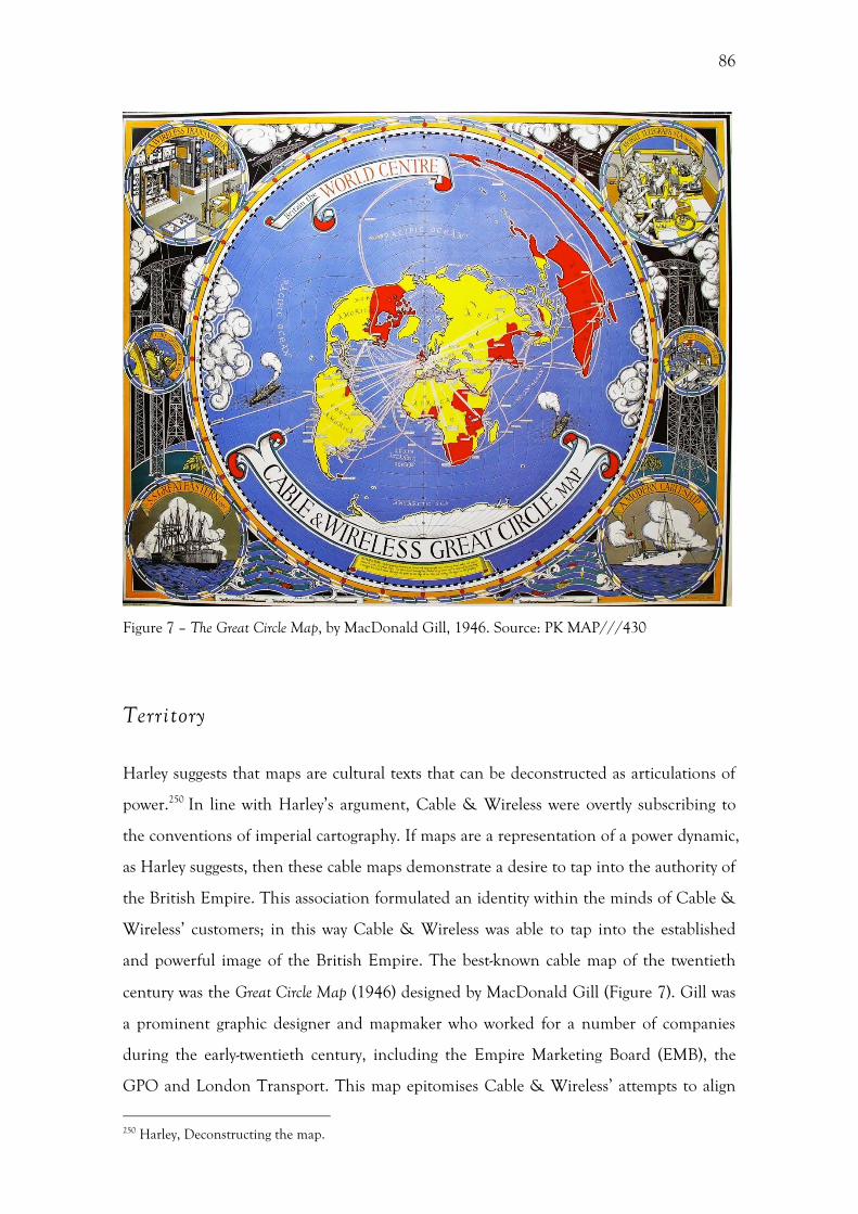
86
Figure 7 – The Great Circle Map, by MacDonald Gill, 1946. Source: PK MAP///430
Territory
Harley suggests that maps are cultural texts that can be deconstructed as articulations of
power.250 In line with Harley’s argument, Cable & Wireless were overtly subscribing to
the conventions of imperial cartography. If maps are a representation of a power dynamic,
as Harley suggests, then these cable maps demonstrate a desire to tap into the authority of
the British Empire. This association formulated an identity within the minds of Cable &
Wireless’ customers; in this way Cable & Wireless was able to tap into the established
and powerful image of the British Empire. The best-known cable map of the twentieth
century was the Great Circle Map (1946) designed by MacDonald Gill (Figure 7). Gill was
a prominent graphic designer and mapmaker who worked for a number of companies
during the early-twentieth century, including the Empire Marketing Board (EMB), the
GPO and London Transport. This map epitomises Cable & Wireless’ attempts to align
250 Harley, Deconstructing the map.
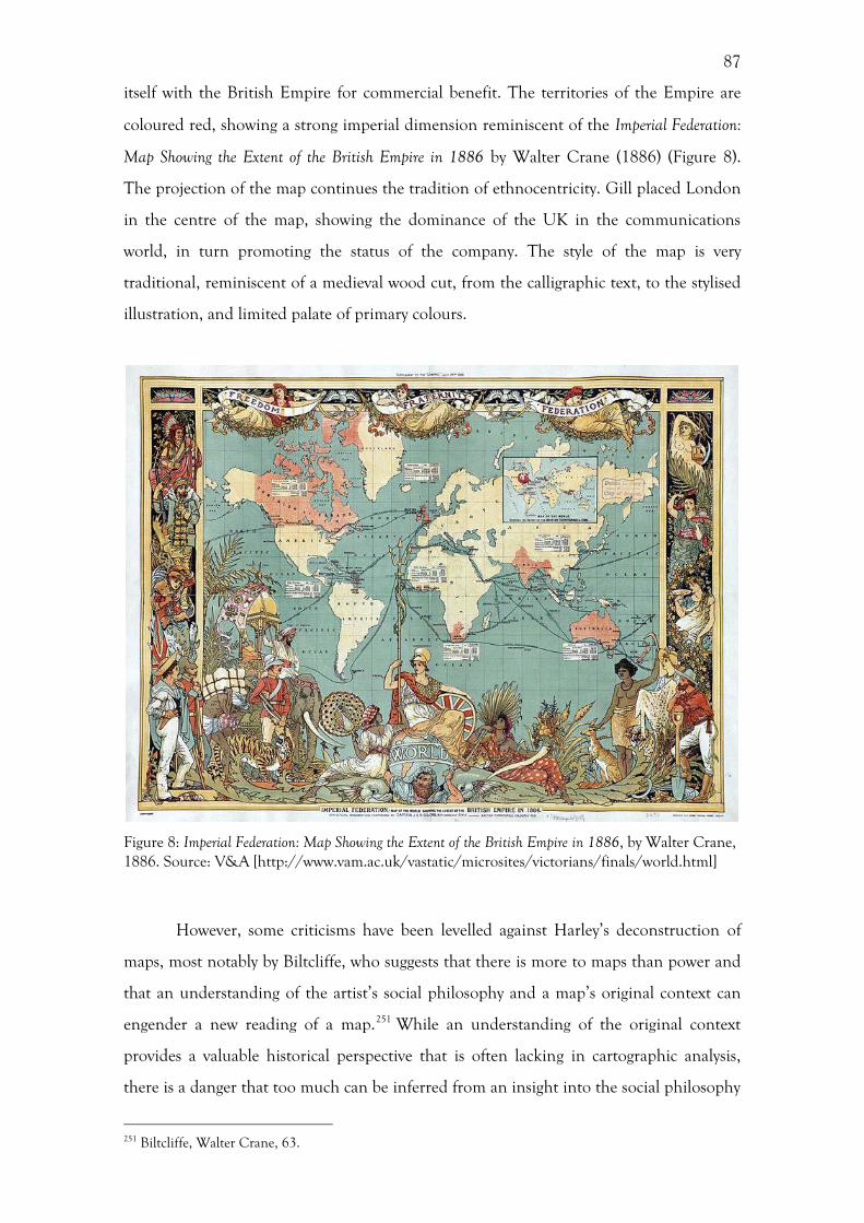
87
itself with the British Empire for commercial benefit. The territories of the Empire are
coloured red, showing a strong imperial dimension reminiscent of the Imperial Federation:
Map Showing the Extent of the British Empire in 1886 by Walter Crane (1886) (Figure 8).
The projection of the map continues the tradition of ethnocentricity. Gill placed London
in the centre of the map, showing the dominance of the UK in the communications
world, in turn promoting the status of the company. The style of the map is very
traditional, reminiscent of a medieval wood cut, from the calligraphic text, to the stylised
illustration, and limited palate of primary colours.
Figure 8: Imperial Federation: Map Showing the Extent of the British Empire in 1886, by Walter Crane, 1886. Source: V&A [http://www.vam.ac.uk/vastatic/microsites/victorians/finals/world.html]
However, some criticisms have been levelled against Harley’s deconstruction of
maps, most notably by Biltcliffe, who suggests that there is more to maps than power and
that an understanding of the artist’s social philosophy and a map’s original context can
engender a new reading of a map.251 While an understanding of the original context
provides a valuable historical perspective that is often lacking in cartographic analysis,
there is a danger that too much can be inferred from an insight into the social philosophy
251 Biltcliffe, Walter Crane, 63.
88
of the artist. Biltcliffe uses the example of Walter Crane’s Imperial Federation: Map
Showing the Extent of the British Empire in 1886 (Figure 8). This map uses the Mercator
projection, which over-inflates the size of Europe compared with the rest of the world and
places the British Isles at the centre of the map in the northern hemisphere. The
Mercator projection, coupled with the depiction of the territory of the British Empire in
pink, was typical of imperial maps during the nineteenth century. Around this map is an
array of detailed illustrations depicting various scenes from around the Empire. However,
Biltcliffe argues that the depictions of slavery in the map were more a result of Crane’s
socialist leaning than imperial sentiment.252
Biltcliffe’s approach, applied to the Great Circle Map, proves problematic as it
assumes that the subject matter depicted was solely controlled by the artist himself. With
this map, it was only the style that displayed a consistency with Gill’s previous work. This,
in turn, suggests that his style was largely independent of companies for whom he
produced maps. This traditional style can be attributed to Gill’s association with the Arts
and Crafts movement. 253 Indeed, Walker traces Gill’s interest in maps back to a
childhood book he owned with a fold out map showing ‘galleons, llamas and jungles,
with place names written in elegant lettering’.254 However, with the Great Circle Map, it is
unclear how much input Cable & Wireless had over the content, and how much of this
was left up to Gill. What is needed, more than just personal bibliographical details about
the artist or designer, is an assessment of the consistency and independence of their style.
As a result, we can gauge how much of this style was determined by the commissioning
companies.
One of the main ways in which imperial power was articulated within Cable &
Wireless’ maps was in the use of colour, with the vast majority depicting the territory of
the British Empire in red, while colouring the rest of the world yellow. Firstly, the fact
that the designer felt the need to demarcate these areas shows an obvious desire for the
company to align itself with the Empire. Although it is unclear why red and pink was
originally chosen to represent the British Empire,255 this was a convention that Cable &
Wireless chose to adopt. It was not just the land that was depicted in red, so too were the
cable routes. This stylistic choice may have been the product of a political decision – the
252 Biltcliffe, Walter Crane, 68. 253 Cosgrove, Maps, mapping, modernity. 254 Harley, Deconstructing the map; Biltcliffe, Walter Crane, 63–69. 255 B. Anderson, Imagined Communities: Reflections on the Origin and Spread of Nationalism, London, 1991, 175.
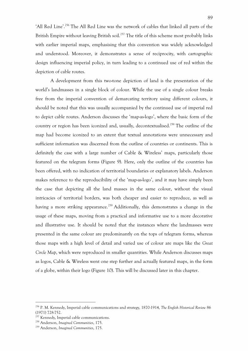
89
‘All Red Line’.256 The All Red Line was the network of cables that linked all parts of the
British Empire without leaving British soil.257 The title of this scheme most probably links
with earlier imperial maps, emphasising that this convention was widely acknowledged
and understood. Moreover, it demonstrates a sense of reciprocity, with cartographic
design influencing imperial policy, in turn leading to a continued use of red within the
depiction of cable routes.
A development from this two-tone depiction of land is the presentation of the
world’s landmasses in a single block of colour. While the use of a single colour breaks
free from the imperial convention of demarcating territory using different colours, it
should be noted that this was usually accompanied by the continued use of imperial red
to depict cable routes. Anderson discusses the ‘map-as-logo’, where the basic form of the
country or region has been iconized and, usually, decontextualised.258 The outline of the
map had become iconized to an extent that textual annotations were unnecessary and
sufficient information was discerned from the outline of countries or continents. This is
definitely the case with a large number of Cable & Wireless’ maps, particularly those
featured on the telegram forms (Figure 9). Here, only the outline of the countries has
been offered, with no indication of territorial boundaries or explanatory labels. Anderson
makes reference to the reproducibility of the ‘map-as-logo’, and it may have simply been
the case that depicting all the land masses in the same colour, without the visual
intricacies of territorial borders, was both cheaper and easier to reproduce, as well as
having a more striking appearance.259 Additionally, this demonstrates a change in the
usage of these maps, moving from a practical and informative use to a more decorative
and illustrative use. It should be noted that the instances where the landmasses were
presented in the same colour are predominantly on the tops of telegram forms, whereas
those maps with a high level of detail and varied use of colour are maps like the Great
Circle Map, which were reproduced in smaller quantities. While Anderson discusses maps
as logos, Cable & Wireless went one step further and actually featured maps, in the form
of a globe, within their logo (Figure 10). This will be discussed later in this chapter.
256 P. M. Kennedy, Imperial cable communications and strategy, 1870-1914, The English Historical Review 86 (1971) 728-752. 257 Kennedy, Imperial cable communications. 258 Anderson, Imagined Communities, 175. 259 Anderson, Imagined Communities, 175.

90
Figure 9: Cable & Wireless Telegram, 2/5/1942. Source: PK DOC//6/36/1 Telegrams No.1-92.
Figure 10: Cable & Wireless Logo, by Stanley Morison, 1945. Source: PK DOC//8/8
91
The globe was one of the main motifs deployed by Cable & Wireless following
the merger in 1929, and this became an intrinsic element of both their exhibitions and
subsequent logos.260 There is a symbolic significance to globes, representing the authority
and power of the British Empire, and, as Cosgrove states, acting as a ‘figure of enormous
imaginative power’.261 Aside from the logo, there where other two-dimensional depictions
of the globe. From July 1929 until May 1934, the period when the company was called
I&IC, the front cover of the Zodiac magazine showed a globe surmounted by a woman
(Figure 11). The woman depicted was Electra, as she is holding a caduceus, which is the
winged snake staff usually held by Hermes, the messenger of the Gods. There is a
similarity here between Walter Crane’s Imperial Federation: Map Showing the Extent of the
British Empire in 1886, where Britannia was depicted sitting on a globe. Both Britannia
and Electra were mythical figures representing the national identity of Britain and
communications respectively. Electra is draped in blue cloth, representing the sea, while
the band around her torso resemble a cable. Above her head, she holds a decorative
metallic leaf with lines radiating, perhaps suggesting wireless transmission. The globe
itself has all countries and cable routes shown in red, suggesting imperial ambitions and
expansion during this period. This image was not just used on the front cover of the
Zodiac, but also features in the stained glass, designed by Pomeroy in the portico of the
headquarters of the company, Electra House Moorgate (Figure 12). This shows the
importance of this image, as it was the first thing people saw when entering the
headquarters.
During exhibitions these globes became three dimensional, with model globes
forming an intrinsic and consistent component of Cable & Wireless’ stands, as shown in
a large number of exhibition photographs. Cosgrove states that model globes were used as
an emblem of the global nature of exhibitions, signalling ‘authority and possession of an
Empire of knowledge’.262 Indeed, they were also used by Cable & Wireless to present the
idea of a fully connected communications network, something that a two-dimensional
map could never achieve. Cable & Wireless used the same globe for a number of
exhibitions, showing the principal cable and wireless routes (Figure 13). In line with other
cable maps produced by the company, the cable routes were depicted as a solid line, while
the wireless routes were a dotted line. Additionally, these routes on the globe were also
260 For literature on globes, see Cosgrove, Apollo’s Eye; A. Mattelart, Mapping modernity: Utopia and communications network, in: D. Cosgrove (Ed), Mappings, London, 1999, 169-193, 179-180. 261 Cosgrove, Apollo’s Eye, 3. 262 Cosgrove, Apollo’s Eye, 228.
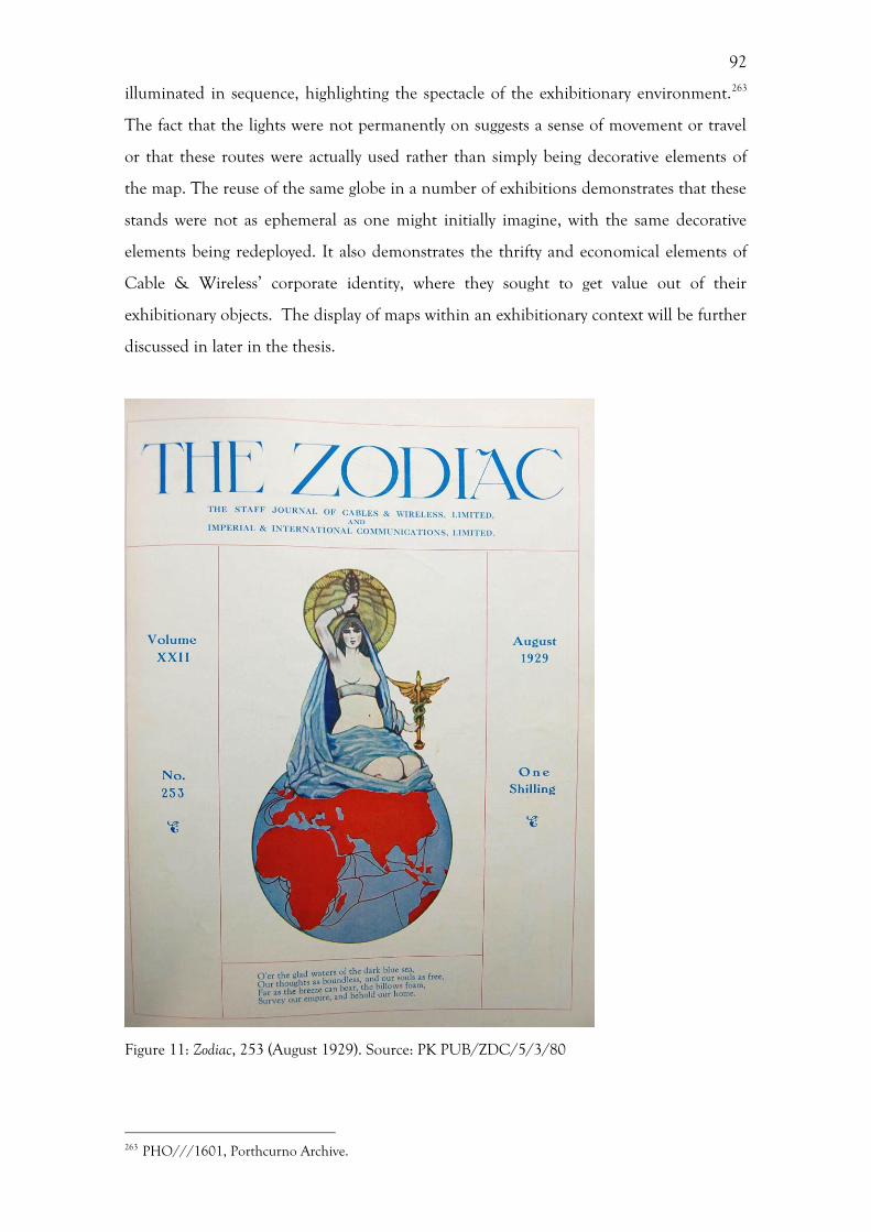
92
illuminated in sequence, highlighting the spectacle of the exhibitionary environment.263
The fact that the lights were not permanently on suggests a sense of movement or travel
or that these routes were actually used rather than simply being decorative elements of
the map. The reuse of the same globe in a number of exhibitions demonstrates that these
stands were not as ephemeral as one might initially imagine, with the same decorative
elements being redeployed. It also demonstrates the thrifty and economical elements of
Cable & Wireless’ corporate identity, where they sought to get value out of their
exhibitionary objects. The display of maps within an exhibitionary context will be further
discussed in later in the thesis.
Figure 11: Zodiac, 253 (August 1929). Source: PK PUB/ZDC/5/3/80
263 PHO///1601, Porthcurno Archive.

93
Figure 12: Window, designed by Pomeroy, at Electra House, Moorgate (now London Metropolitan University). Source: [http://www.waymarking.com/gallery/image.aspx?f=1&guid=7f01cd8b-7e1f-4efc-83bf- 828efe7e8e3e]
Figure 13: Photograph of the globe used in a number of Cable & Wireless exhibitions, 1945. Source: PK PHO///1601

94
The other way that a sense of imperialism was articulated in these maps was
through the choice of projection, dramatically altering both the appearance and the tone
of the map. A large number of Cable & Wireless’ maps use the Mercator projection,
which has a long association with imperial maps, including Walter Crane’s Imperial
Federation: Map Showing the Extent of the British Empire in 1886. As Anderson states,
European-style maps with a Mercator projection worked on the basis of a ‘totalizing
classification’.264 Indeed, the use of this projection visually demonstrated the perceived
importance and dominance of Western European powers over the rest of the world.
There are instances when Cable & Wireless did not use the Mercator projection,
breaking with the cartographic norm and creating a startling appearance for
contemporary viewers. The Great Circle Map deploys an azimuthal projection, which
allows distances to be accurately plotted from a central point. However, this central point
is still the British Isles, maintaining a sense of visual supremacy. Within this azimuthal
projection the only country that appears undistorted is Britain, which again reiterates the
perceived superiority of Britain over both the world and the Empire. Whitfield points out
that the distortions are so extreme with this projection that the map is rendered alien and
nonsensical, when in actual fact it is no less accurate that more traditional and familiar
projections.265 The fact that many of Cable & Wireless’s maps adhered to this imperial
convention of ethnocentricity further emphasises their desire to align themselves visually
to the British Empire, and additionally, by placing the British Isles in the centre of the
map, the dominance of the company is further shown.
Deviations from the imperial centrality of the British Isles in later global maps
reveal both changes within the Empire and Cable & Wireless’ relation to it. The two
maps displayed on the Cable & Wireless stand at the Singapore Constitution Exposition
in 1959, for example, tell us a great deal about Cable & Wireless’ marketing strategy, as
well as their approach to decolonization (Figure 14). This exposition commemorated the
impending independence of Singapore, and sought to demonstrate ‘Singapore’s status as
the center [sic] of world trade’.266 The first of these maps places Singapore at the centre of
the projection. The second of these maps is a circular excerpt from a Mercator map,
showing only the Far East area. These two maps demonstrate Cable & Wireless’
264 Anderson, Imagined Communities, 173. 265 Whitfield, The Image of the World, 135. 266 President of the Singapore Chinese Chamber of Commerce and Industry, quoted in: H. Liu, Organized Chinese transnationalism and the institutionalization of business networks: the Singapore Chinese Chamber of Commerce and Industry as a case analysis, Southeast Asian Studies 37 (1999) 391-416.
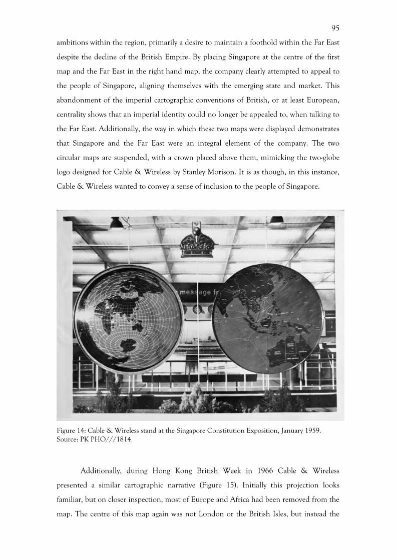
95
ambitions within the region, primarily a desire to maintain a foothold within the Far East
despite the decline of the British Empire. By placing Singapore at the centre of the first
map and the Far East in the right hand map, the company clearly attempted to appeal to
the people of Singapore, aligning themselves with the emerging state and market. This
abandonment of the imperial cartographic conventions of British, or at least European,
centrality shows that an imperial identity could no longer be appealed to, when talking to
the Far East. Additionally, the way in which these two maps were displayed demonstrates
that Singapore and the Far East were an integral element of the company. The two
circular maps are suspended, with a crown placed above them, mimicking the two-globe
logo designed for Cable & Wireless by Stanley Morison. It is as though, in this instance,
Cable & Wireless wanted to convey a sense of inclusion to the people of Singapore.
Figure 14: Cable & Wireless stand at the Singapore Constitution Exposition, January 1959. Source: PK PHO///1814.
Additionally, during Hong Kong British Week in 1966 Cable & Wireless
presented a similar cartographic narrative (Figure 15). Initially this projection looks
familiar, but on closer inspection, most of Europe and Africa had been removed from the
map. The centre of this map again was not London or the British Isles, but instead the
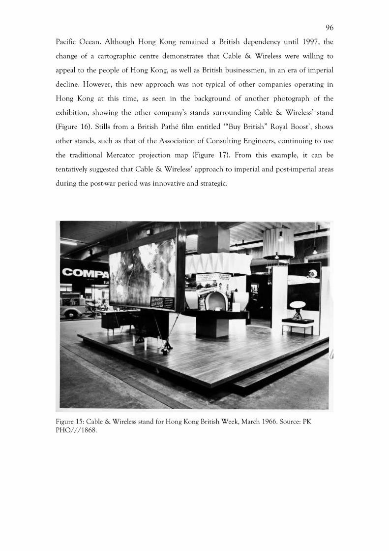
96
Pacific Ocean. Although Hong Kong remained a British dependency until 1997, the
change of a cartographic centre demonstrates that Cable & Wireless were willing to
appeal to the people of Hong Kong, as well as British businessmen, in an era of imperial
decline. However, this new approach was not typical of other companies operating in
Hong Kong at this time, as seen in the background of another photograph of the
exhibition, showing the other company’s stands surrounding Cable & Wireless’ stand
(Figure 16). Stills from a British Pathé film entitled ‘“Buy British” Royal Boost’, shows
other stands, such as that of the Association of Consulting Engineers, continuing to use
the traditional Mercator projection map (Figure 17). From this example, it can be
tentatively suggested that Cable & Wireless’ approach to imperial and post-imperial areas
during the post-war period was innovative and strategic.
Figure 15: Cable & Wireless stand for Hong Kong British Week, March 1966. Source: PK PHO///1868.
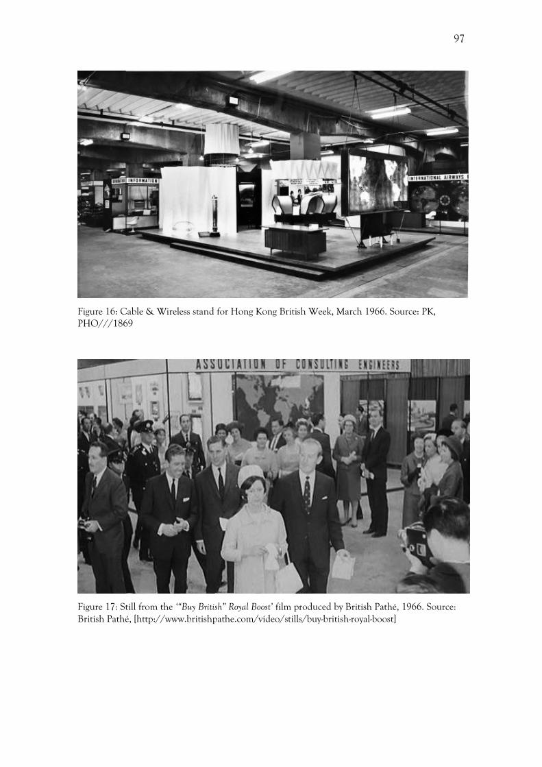
97
Figure 16: Cable & Wireless stand for Hong Kong British Week, March 1966. Source: PK, PHO///1869
Figure 17: Still from the ‘“Buy British” Royal Boost’ film produced by British Pathé, 1966. Source: British Pathé, [http://www.britishpathe.com/video/stills/buy-british-royal-boost]
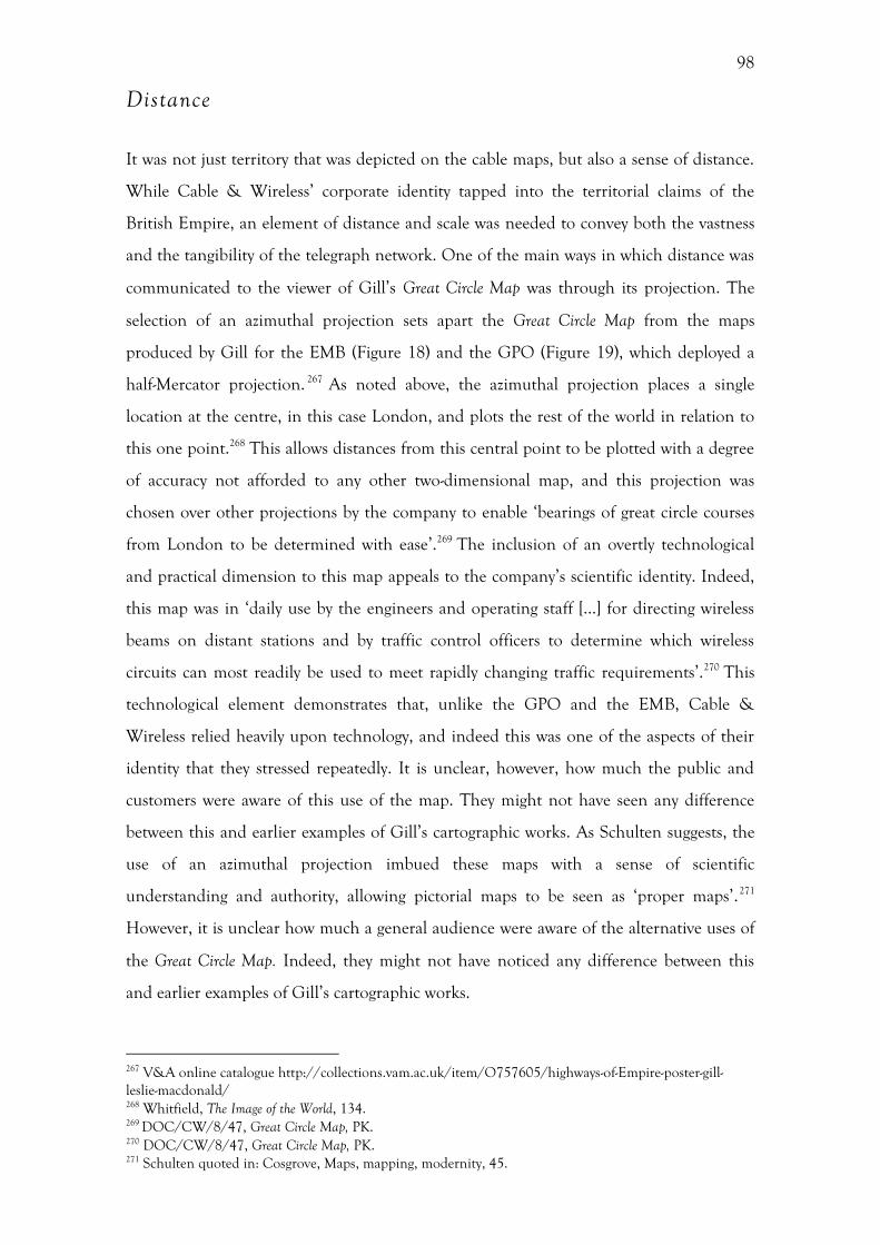
98
Distance
It was not just territory that was depicted on the cable maps, but also a sense of distance.
While Cable & Wireless’ corporate identity tapped into the territorial claims of the
British Empire, an element of distance and scale was needed to convey both the vastness
and the tangibility of the telegraph network. One of the main ways in which distance was
communicated to the viewer of Gill’s Great Circle Map was through its projection. The
selection of an azimuthal projection sets apart the Great Circle Map from the maps
produced by Gill for the EMB (Figure 18) and the GPO (Figure 19), which deployed a
half-Mercator projection. 267 As noted above, the azimuthal projection places a single
location at the centre, in this case London, and plots the rest of the world in relation to
this one point.268 This allows distances from this central point to be plotted with a degree
of accuracy not afforded to any other two-dimensional map, and this projection was
chosen over other projections by the company to enable ‘bearings of great circle courses
from London to be determined with ease’.269 The inclusion of an overtly technological
and practical dimension to this map appeals to the company’s scientific identity. Indeed,
this map was in ‘daily use by the engineers and operating staff […] for directing wireless
beams on distant stations and by traffic control officers to determine which wireless
circuits can most readily be used to meet rapidly changing traffic requirements’.270 This
technological element demonstrates that, unlike the GPO and the EMB, Cable &
Wireless relied heavily upon technology, and indeed this was one of the aspects of their
identity that they stressed repeatedly. It is unclear, however, how much the public and
customers were aware of this use of the map. They might not have seen any difference
between this and earlier examples of Gill’s cartographic works. As Schulten suggests, the
use of an azimuthal projection imbued these maps with a sense of scientific
understanding and authority, allowing pictorial maps to be seen as ‘proper maps’.271
However, it is unclear how much a general audience were aware of the alternative uses of
the Great Circle Map. Indeed, they might not have noticed any difference between this
and earlier examples of Gill’s cartographic works.
267 V&A online catalogue http://collections.vam.ac.uk/item/O757605/highways-of-Empire-poster-gill-leslie-macdonald/ 268 Whitfield, The Image of the World, 134. 269 DOC/CW/8/47, Great Circle Map, PK. 270 DOC/CW/8/47, Great Circle Map, PK. 271 Schulten quoted in: Cosgrove, Maps, mapping, modernity, 45.
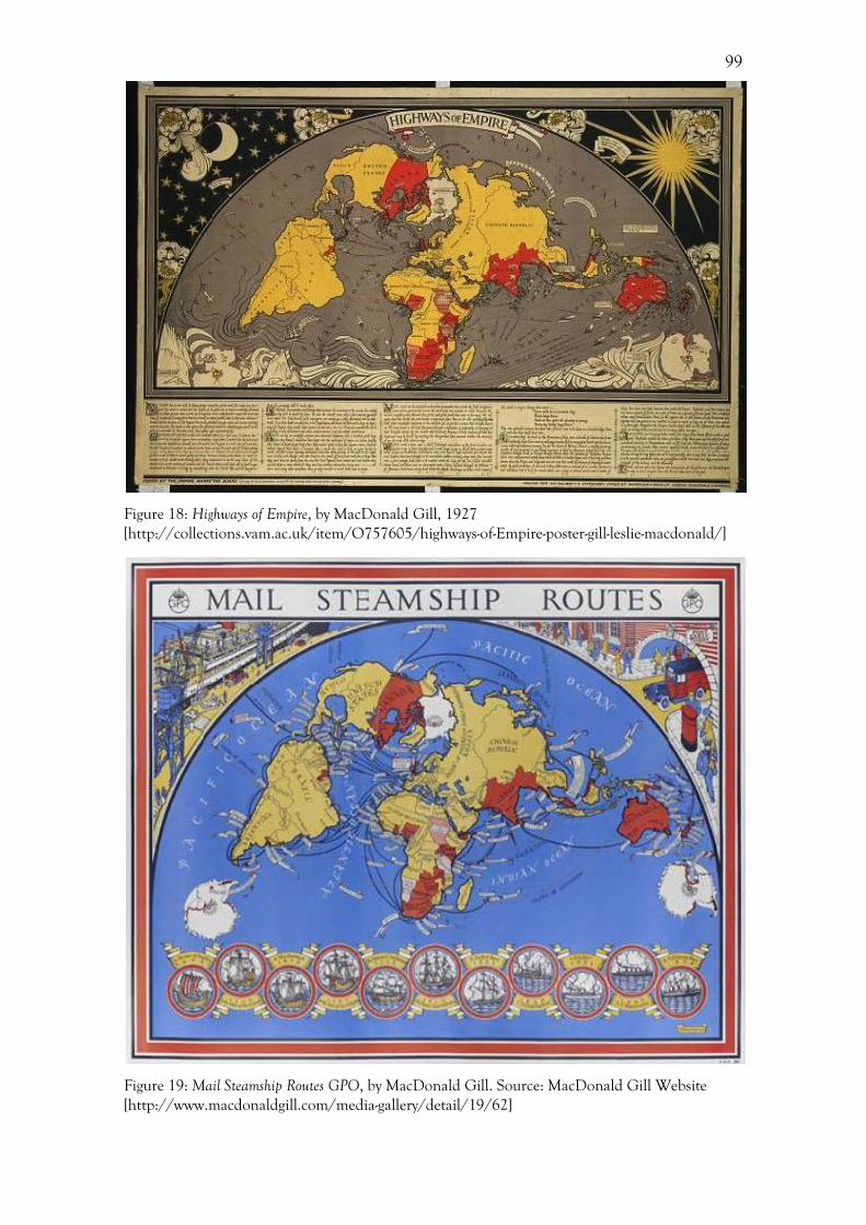
99
Figure 18: Highways of Empire, by MacDonald Gill, 1927 [http://collections.vam.ac.uk/item/O757605/highways-of-Empire-poster-gill-leslie-macdonald/]
Figure 19: Mail Steamship Routes GPO, by MacDonald Gill. Source: MacDonald Gill Website [http://www.macdonaldgill.com/media-gallery/detail/19/62]

100
The way in which the cable lines were depicted on the cable maps is another
avenue of investigation, providing an additional insight into the representations of
distance within Cable & Wireless’ maps. It should be pointed out that none of the
representations of cables found on the maps presented to the public provided an accurate
representation of the cable route, which weaved between undersea mountains and valleys.
However, assessing topographic veracity is not our main concern here, and if we move
beyond this we are able to freely examine the various ways in which the Company
presented the cable routes.
Firstly, the depiction of submarine cables routes and wireless routes were
markedly different. Wireless routes were always depicted as a straight dotted line, whereas
submarine routes were always shown as a solid line with varying degrees of curvature.
Submarine cables adhere to the position of landmasses, skirting between countries and
jumping from island to island across oceans. Conversely, the wireless routes were
presented as the shortest route between two points. The solidity of the submarine route
aptly represents the physical presence of the cable, but does not allude to the sending of a
message, whereas each dot of the wireless route could represent a telegram message or
individual elements of Morse code. However, there are a few times when the wireless
routes were depicted differently. A pamphlet produced to explain the organization of
telegraph routes following the nationalization of Cable & Wireless in 1946, shows
wireless routes as zigzagged lines rather than the usual dotted line (Figure 20). Although
the use of a zigzag is one of the typical ways in which electricity was depicted, a possible
reason for its inclusion here and not in other maps might be one of scale. This map is
very small, only depicting the British Isles and Western Europe. In this case, it seems
reasonable to deploy such a stylized line. However, on the large scale of a global map,
where more routes were depicted, this would be too confusing for the viewer.
Additionally, there were instances where the submarine cables were depicted in an
interesting manner. The poster designed by Percy Ford for the 1936 Charing Cross
Exhibition, for example, shows a global map (Figure 21). This map adheres to both the
imperial conventions of depicting areas of the British Empire in red, while also following
artistic trends. Here, the cable routes are depicted as whiplash curves, reminiscent of art
nouveau, creating a sense of movement and alluding to the cables as organic forms.

101
Figure 20: Nationalisation of Cable and Wireless: Pamphlet produced following the nationalization of Cable & Wireless in 1946, entitled ‘The Effects of the Transfer’. Source: PK DOC/CW/1/122
Figure 21: Poster advertising Cable & Wireless exhibition, Charing Cross Station, by Percy Ford, 1936. Source: London Transport Museum http://www.tfl.gov.uk/assets/images/general/beckmap1.jpg [Accessed 1/7/2014.
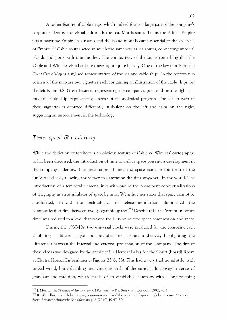
102
Another feature of cable maps, which indeed forms a large part of the company’s
corporate identity and visual culture, is the sea. Morris states that as the British Empire
was a maritime Empire, sea routes and the island motif became essential to the spectacle
of Empire.272 Cable routes acted in much the same way as sea routes, connecting imperial
islands and ports with one another. The connectivity of the sea is something that the
Cable and Wireless visual culture draws upon quite heavily. One of the key motifs on the
Great Circle Map is a stylised representation of the sea and cable ships. In the bottom two
corners of the map are two vignettes each containing an illustration of the cable ships, on
the left is the S.S. Great Eastern, representing the company’s past, and on the right is a
modern cable ship, representing a sense of technological progress. The sea in each of
these vignettes is depicted differently, turbulent on the left and calm on the right,
suggesting an improvement in the technology.
Time, speed & modernity
While the depiction of territory is an obvious feature of Cable & Wireless’ cartography,
as has been discussed, the introduction of time as well as space presents a development in
the company’s identity. This integration of time and space came in the form of the
‘universal clock’, allowing the viewer to determine the time anywhere in the world. The
introduction of a temporal element links with one of the prominent conceptualizations
of telegraphy as an annihilator of space by time. Wenzlhuemer states that space cannot be
annihilated, instead the technologies of telecommunication diminished the
communication time between two geographic spaces.273 Despite this, the ‘communication
time’ was reduced to a level that created the illusion of time-space compression and speed.
During the 1930-40s, two universal clocks were produced for the company, each
exhibiting a different style and intended for separate audiences, highlighting the
differences between the internal and external presentation of the Company. The first of
these clocks was designed by the architect Sir Herbert Baker for the Court (Board) Room
at Electra House, Embankment (Figures 22 & 23). This had a very traditional style, with
carved wood, brass detailing and crests in each of the corners. It conveys a sense of
grandeur and tradition, which speaks of an established company with a long reaching
272 J. Morris, The Spectacle of Empire: Style, Effect and the Pax Britannica, London, 1982, 41-3. 273 R. Wenzlhuemer, Globalization, communication and the concept of space in global history, Historical Social Research/Historische Sozialforschung 35 (2010) 19-47, 30.

103
history. There are two clocks representing each of the hemispheres; this separation
symbolises European supremacy, with the majority of land being projected on the
northern clock, while oceans are the prominent feature of the southern clock. The
audience of these clocks were the upper echelons of the company, as well as possible
investors, so the illusion of prestige created by the dark carved wood and gilt finishes was
beneficial. The clocks are mechanical, with the map moving around the hours like clock
hands. In basic terms, if the map is a representation of the earth and the numbers a
representation of time, then time remains the unmoved construct, while the earth is
moving. This can be equated to the annihilation of time experienced in sending a
telegram: if a telegram was sent from one side of the earth to another then a vast distance
had been traversed in mere seconds. 274 Here, primacy was still placed on space and
territory, with time remaining unmoved and receding into the background, almost
becoming just a decorative element.
Figure 22: Northern Hemisphere Universal Clock, by Sir Herbert Baker. Source: PK 2014PKO19
274 For a discussion on time-space compression and simultaneity, see Conrad, Modern Times; Duffy, The Speed Handbook; Harvey, The Condition of Postmodernity, 260-308; Kern, The Culture of Time and Space.

104
Figure 23: Southern Hemisphere Universal Clock, by Sir Herbert Baker. Source: PK 2014PKO19
In contrast to this internal presentation, the universal clock produced by the
designer F H Reitz in 1947 (Figure 24) presents a different style and narrative. Here, both
time and space remain unmoved, with the viewer having to work out the relationship
between the two by tracing a line from the location and reading off the time. What is
striking when the Baker and Reitz clocks are compared is the modern style used in the
Reitz clock. From the san-serif typeface to the restrained and stylised illustrations, this
clock marks a stylistic departure from the previous maps produced by Cable & Wireless.
It can be suggested that while the depiction of territory gained authority from a tradition
style, the depiction of time was free from these constraints. Indeed, the Reitz clock may
have even gained a degree of authority by presenting this temporal aspect in a modern
style, with a restrained and stylised design using flat blocks of colour. Displayed to the
public in a number of exhibitions (Figure 25) and in the branch office windows, the Reitz
clock depicted a circular map with an absence of ethnocentricity within the projection,
with the North Pole being placed at the centre. This demonstrates a shift in the portrayal
of territory within Cable & Wireless’ cartography, similar to the shift seen in the use of
the azimuthal projection within the Great Circle Map.
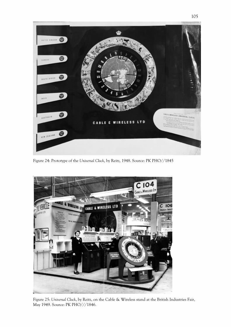
105
Figure 24: Prototype of the Universal Clock, by Reitz, 1948. Source: PK PHO//1845
Figure 25: Universal Clock, by Reitz, on the Cable & Wireless stand at the British Industries Fair, May 1949. Source: PK PHO///1846.
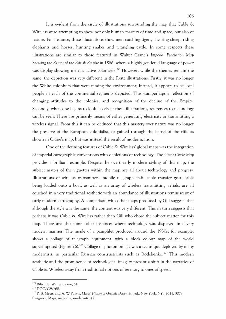
106
It is evident from the circle of illustrations surrounding the map that Cable &
Wireless were attempting to show not only human mastery of time and space, but also of
nature. For instance, these illustrations show men catching tigers, shearing sheep, riding
elephants and horses, hunting snakes and wrangling cattle. In some respects these
illustrations are similar to those featured in Walter Crane’s Imperial Federation Map
Showing the Extent of the British Empire in 1886, where a highly gendered language of power
was display showing men as active colonizers.275 However, while the themes remain the
same, the depiction was very different in the Reitz illustrations. Firstly, it was no longer
the White colonizers that were taming the environment; instead, it appears to be local
people in each of the continental segments depicted. This was perhaps a reflection of
changing attitudes to the colonies, and recognition of the decline of the Empire.
Secondly, when one begins to look closely at these illustrations, references to technology
can be seen. These are primarily means of either generating electricity or transmitting a
wireless signal. From this it can be deduced that this mastery over nature was no longer
the preserve of the European colonialist, or gained through the barrel of the rifle as
shown in Crane’s map, but was instead the result of modernization.
One of the defining features of Cable & Wireless’ global maps was the integration
of imperial cartographic conventions with depictions of technology. The Great Circle Map
provides a brilliant example. Despite the overt early modern styling of this map, the
subject matter of the vignettes within the map are all about technology and progress.
Illustrations of wireless transmitters, mobile telegraph staff, cable transfer gear, cable
being loaded onto a boat, as well as an array of wireless transmitting aerials, are all
couched in a very traditional aesthetic with an abundance of illustrations reminiscent of
early modern cartography. A comparison with other maps produced by Gill suggests that
although the style was the same, the content was very different. This in turn suggests that
perhaps it was Cable & Wireless rather than Gill who chose the subject matter for this
map. There are also some other instances where technology was displayed in a very
modern manner. The inside of a pamphlet produced around the 1930s, for example,
shows a collage of telegraph equipment, with a block colour map of the world
superimposed (Figure 26).276 Collage or photomontage was a technique deployed by many
modernists, in particular Russian constructivists such as Rodchenko. 277 This modern
aesthetic and the prominence of technological imagery present a shift in the narrative of
Cable & Wireless away from traditional notions of territory to ones of speed.
275 Biltcliffe, Walter Crane, 64. 276 DOC/CW/68. 277 P. B. Meggs and A. W Purvis, Meggs’ History of Graphic Design 5th ed., New York, NY, 2011, 307; Cosgrove, Maps, mapping, modernity, 47.
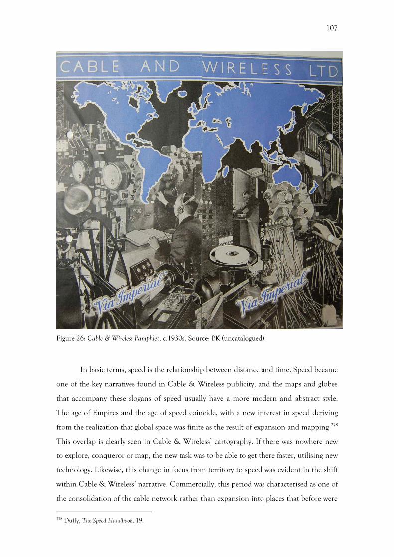
107
Figure 26: Cable & Wireless Pamphlet, c.1930s. Source: PK (uncatalogued)
In basic terms, speed is the relationship between distance and time. Speed became
one of the key narratives found in Cable & Wireless publicity, and the maps and globes
that accompany these slogans of speed usually have a more modern and abstract style.
The age of Empires and the age of speed coincide, with a new interest in speed deriving
from the realization that global space was finite as the result of expansion and mapping.278
This overlap is clearly seen in Cable & Wireless’ cartography. If there was nowhere new
to explore, conqueror or map, the new task was to be able to get there faster, utilising new
technology. Likewise, this change in focus from territory to speed was evident in the shift
within Cable & Wireless’ narrative. Commercially, this period was characterised as one of
the consolidation of the cable network rather than expansion into places that before were
278 Duffy, The Speed Handbook, 19.
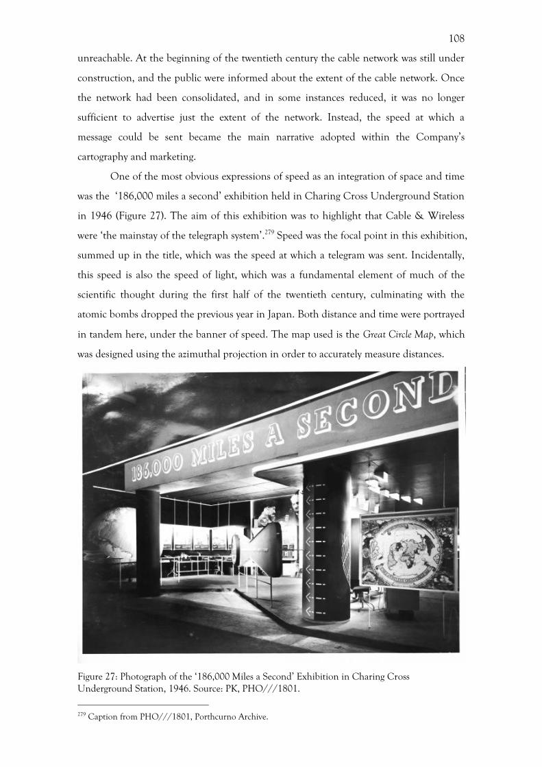
108
unreachable. At the beginning of the twentieth century the cable network was still under
construction, and the public were informed about the extent of the cable network. Once
the network had been consolidated, and in some instances reduced, it was no longer
sufficient to advertise just the extent of the network. Instead, the speed at which a
message could be sent became the main narrative adopted within the Company’s
cartography and marketing.
One of the most obvious expressions of speed as an integration of space and time
was the ‘186,000 miles a second’ exhibition held in Charing Cross Underground Station
in 1946 (Figure 27). The aim of this exhibition was to highlight that Cable & Wireless
were ‘the mainstay of the telegraph system’.279 Speed was the focal point in this exhibition,
summed up in the title, which was the speed at which a telegram was sent. Incidentally,
this speed is also the speed of light, which was a fundamental element of much of the
scientific thought during the first half of the twentieth century, culminating with the
atomic bombs dropped the previous year in Japan. Both distance and time were portrayed
in tandem here, under the banner of speed. The map used is the Great Circle Map, which
was designed using the azimuthal projection in order to accurately measure distances.
Figure 27: Photograph of the ‘186,000 Miles a Second’ Exhibition in Charing Cross Underground Station, 1946. Source: PK, PHO///1801.
279 Caption from PHO///1801, Porthcurno Archive.

109
Additionally, the notion of quantifiable speed is one frequently deployed by
Cable & Wireless, with the time taken to send a telegram decreasing over the period.
During this exhibition in 1946, there was a clock which ‘ticks out the 10 seconds
required to send a 20 word message round the world’ (Figure 28).280 During the opening
of the Empire Exhibition in 1924, King George V sent a telegram ‘Round the World in
80 Seconds.’281 Here, there is an obvious allusion to the fictional journey of Phileas Fogg,
who took 80 days to circumnavigate the globe.282 The ever-increasing speed at which a
telegram could be sent was a key tenet in Cable & Wireless’ marketing repertoire, and
highlights technological progress and modernity.
Figure 28: Photograph of the ‘186,000 Miles a Second’ Exhibition in Charing Cross Underground Station, 1946. Source: PK PHO///1802.
The poster designed to advertise the 1946 Charing Cross exhibition, by the
design consultant H K Henrion (Figure 29), again presents a notion of speed. Henrion
was a German graphic designer and consultant on corporate identity. 283 The lines of
latitude and longitude create a representation of the globe. These lines were depicted in
280 Caption from PHO///1802, Porthcurno Archive. 281 http://www.britishpathe.com/video/kings-message-round-the-world-in-80-secs-aka-kings 282 J. Verne, Around the World in Eighty Days, London, 1873. 283 See, R. Artmonsky and B. Webb, FHK Henrion: Design, Woodbridge, 2011; A. Shaughnessy, FHK Henrion: The Complete Designer, London, 2013; F. H. K. Henrion, Design Co-ordination and Corporate Image, London, 1967.
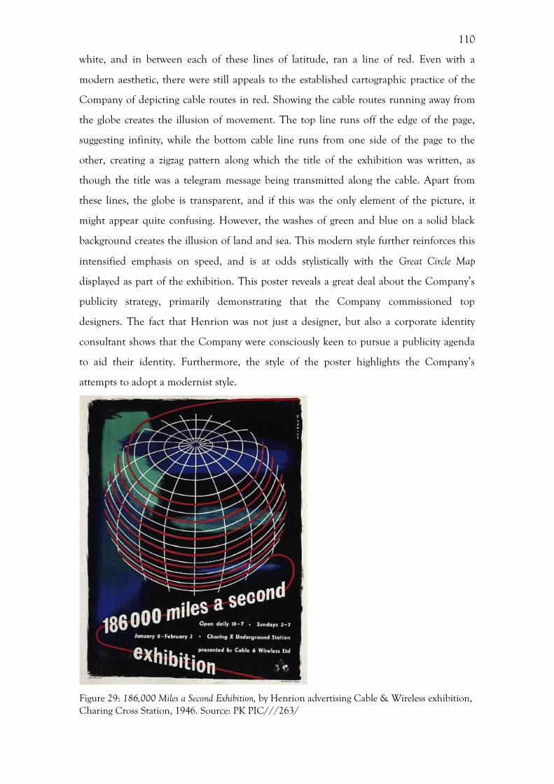
110
white, and in between each of these lines of latitude, ran a line of red. Even with a
modern aesthetic, there were still appeals to the established cartographic practice of the
Company of depicting cable routes in red. Showing the cable routes running away from
the globe creates the illusion of movement. The top line runs off the edge of the page,
suggesting infinity, while the bottom cable line runs from one side of the page to the
other, creating a zigzag pattern along which the title of the exhibition was written, as
though the title was a telegram message being transmitted along the cable. Apart from
these lines, the globe is transparent, and if this was the only element of the picture, it
might appear quite confusing. However, the washes of green and blue on a solid black
background creates the illusion of land and sea. This modern style further reinforces this
intensified emphasis on speed, and is at odds stylistically with the Great Circle Map
displayed as part of the exhibition. This poster reveals a great deal about the Company’s
publicity strategy, primarily demonstrating that the Company commissioned top
designers. The fact that Henrion was not just a designer, but also a corporate identity
consultant shows that the Company were consciously keen to pursue a publicity agenda
to aid their identity. Furthermore, the style of the poster highlights the Company’s
attempts to adopt a modernist style.
Figure 29: 186,000 Miles a Second Exhibition, by Henrion advertising Cable & Wireless exhibition, Charing Cross Station, 1946. Source: PK PIC///263/
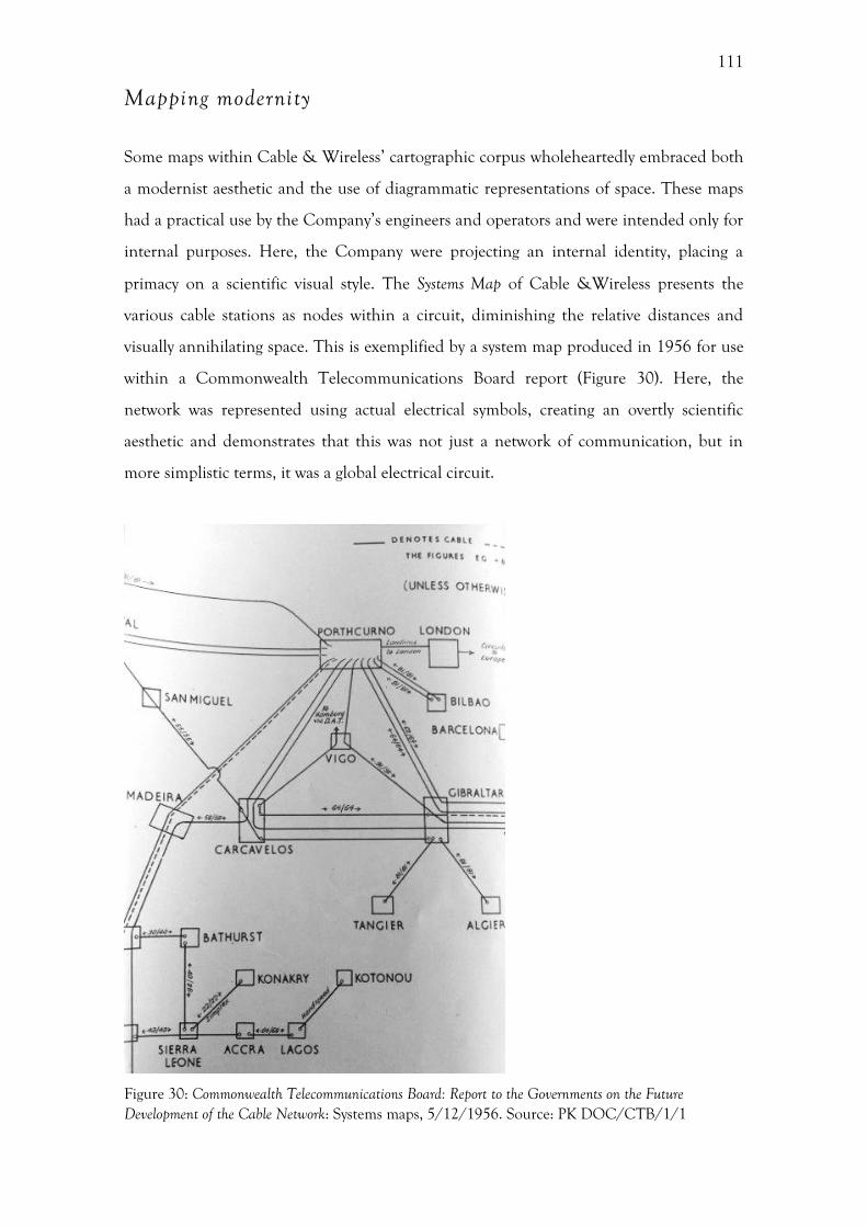
111
Mapping modernity
Some maps within Cable & Wireless’ cartographic corpus wholeheartedly embraced both
a modernist aesthetic and the use of diagrammatic representations of space. These maps
had a practical use by the Company’s engineers and operators and were intended only for
internal purposes. Here, the Company were projecting an internal identity, placing a
primacy on a scientific visual style. The Systems Map of Cable &Wireless presents the
various cable stations as nodes within a circuit, diminishing the relative distances and
visually annihilating space. This is exemplified by a system map produced in 1956 for use
within a Commonwealth Telecommunications Board report (Figure 30). Here, the
network was represented using actual electrical symbols, creating an overtly scientific
aesthetic and demonstrates that this was not just a network of communication, but in
more simplistic terms, it was a global electrical circuit.
Figure 30: Commonwealth Telecommunications Board: Report to the Governments on the Future Development of the Cable Network: Systems maps, 5/12/1956. Source: PK DOC/CTB/1/1
112
Although this map visualises complex relationships, the design has a pared down
simplicity, with no superfluous decoration, starkly contrasting with the ‘Great Circle’ map
produced only six years before. There is, however, an attractive quality to this map that
has a thoroughly modern aesthetic, in particular the rectilinear forms coupled with the
light-weight sans serif typeface. This seemingly modernist style might not have been a
conscious effort on the part of the Company. Instead, this may have been the incidental
result of seeking to have a clear, rational style that took its cues from an established
scientific visual grammar. In this sense, the form was driven by the function, as was the
case for modernist design, in particular modernist architecture. The map had an actual
function in constructing a route, rather than being decorative.
These system maps bear a striking resemblance to the form of the diagrammatic
map designed by Harry Beck for the London Underground, eighteen years previous in
1933. Beck’s Underground map provided a revolutionary visualization of the
underground network, communicating a message of ‘convenience, service and
modernity’. 284 Beck’s map was initially rejected by the Publicity Department of the
London Underground, presumably for fear of being too revolutionary, although it was
widely loved by the public.285 The system map produced by Cable & Wireless in 1951
displays a further similarity with the Beck map, with colour-coded lines (Figure 31 & 32).
On this map, black lines represented landlines, blue lines were submarine cables, red
were wireless routes and green lines represented radiotelegraphy. The use of colour here
allowed for a quick understanding of the relationship between the constituent elements
of the telegraphy network. Additionally, the different shapes of the nodal points
represented differing ownership of the stations; circles represented stations owned by
Cable & Wireless, squares were stations owned by the Commonwealth, and triangles
were ‘other administrations’. This complex map thus presents not only a visualization of
the network, but also displays the relationship between the different stations in terms of
ownership.
284 O. Green, Appearance values: Frank Pick and the art of London Transport, in: D. Bownes, O. Green (Eds), London Transport Posters: A Century of Art and Design, London, 2008, 104. 285 K. Garland, Mr Beck’s Underground Map: A History, London, 2003, 19-21.
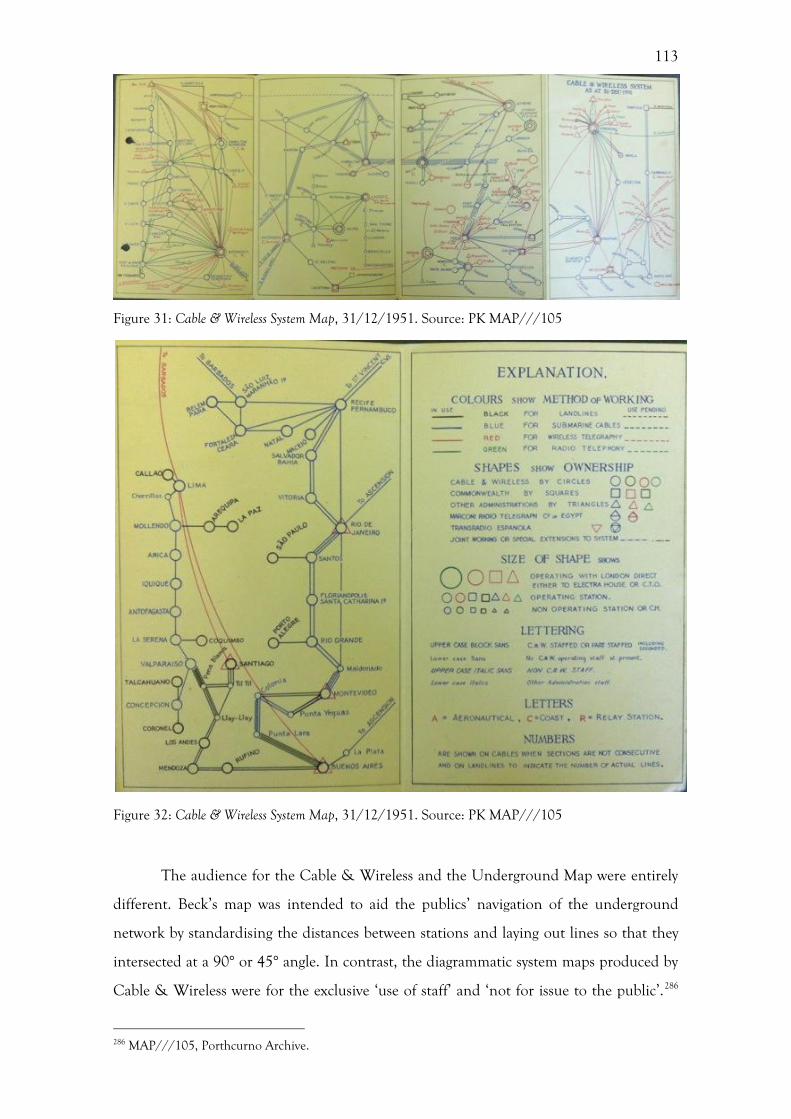
113
Figure 31: Cable & Wireless System Map, 31/12/1951. Source: PK MAP///105
Figure 32: Cable & Wireless System Map, 31/12/1951. Source: PK MAP///105
The audience for the Cable & Wireless and the Underground Map were entirely
different. Beck’s map was intended to aid the publics’ navigation of the underground
network by standardising the distances between stations and laying out lines so that they
intersected at a 90° or 45° angle. In contrast, the diagrammatic system maps produced by
Cable & Wireless were for the exclusive ‘use of staff’ and ‘not for issue to the public’.286
286 MAP///105, Porthcurno Archive.
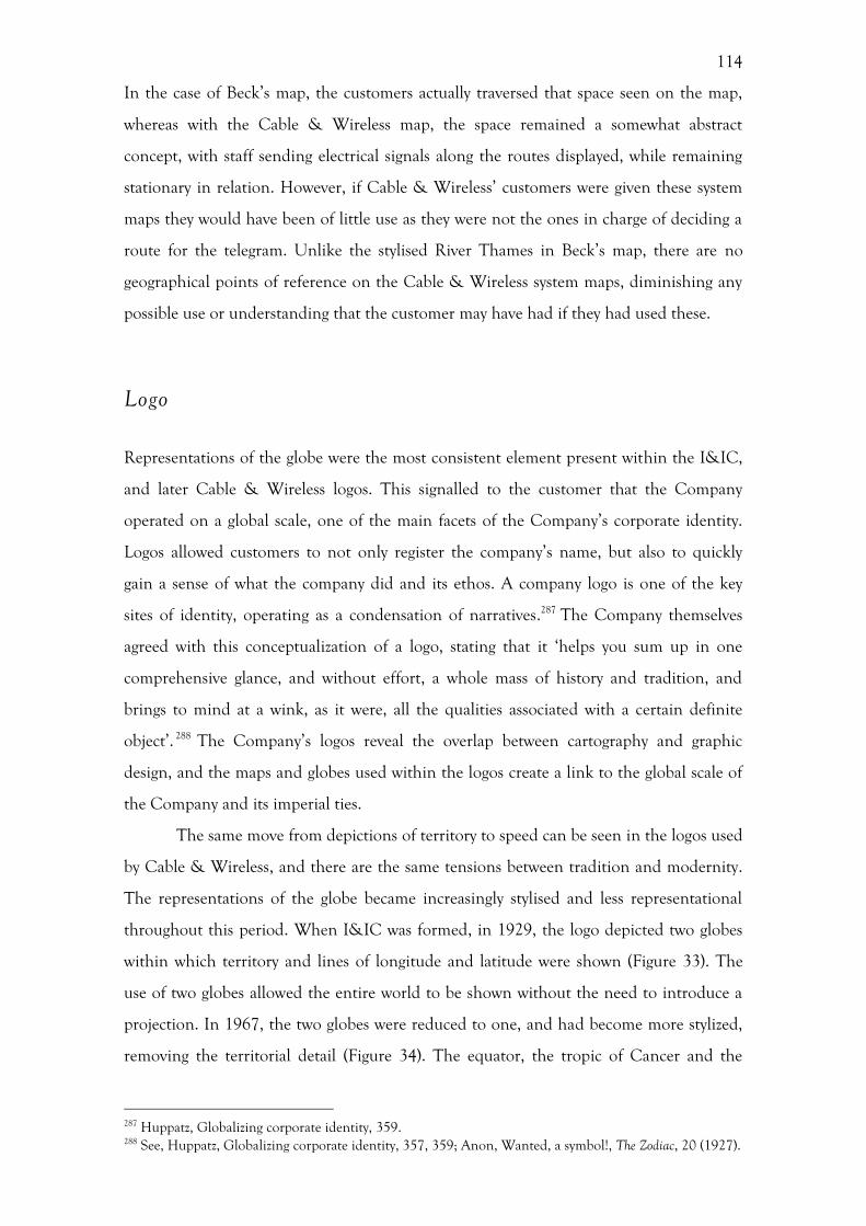
114
In the case of Beck’s map, the customers actually traversed that space seen on the map,
whereas with the Cable & Wireless map, the space remained a somewhat abstract
concept, with staff sending electrical signals along the routes displayed, while remaining
stationary in relation. However, if Cable & Wireless’ customers were given these system
maps they would have been of little use as they were not the ones in charge of deciding a
route for the telegram. Unlike the stylised River Thames in Beck’s map, there are no
geographical points of reference on the Cable & Wireless system maps, diminishing any
possible use or understanding that the customer may have had if they had used these.
Logo
Representations of the globe were the most consistent element present within the I&IC,
and later Cable & Wireless logos. This signalled to the customer that the Company
operated on a global scale, one of the main facets of the Company’s corporate identity.
Logos allowed customers to not only register the company’s name, but also to quickly
gain a sense of what the company did and its ethos. A company logo is one of the key
sites of identity, operating as a condensation of narratives.287 The Company themselves
agreed with this conceptualization of a logo, stating that it ‘helps you sum up in one
comprehensive glance, and without effort, a whole mass of history and tradition, and
brings to mind at a wink, as it were, all the qualities associated with a certain definite
object’. 288 The Company’s logos reveal the overlap between cartography and graphic
design, and the maps and globes used within the logos create a link to the global scale of
the Company and its imperial ties.
The same move from depictions of territory to speed can be seen in the logos used
by Cable & Wireless, and there are the same tensions between tradition and modernity.
The representations of the globe became increasingly stylised and less representational
throughout this period. When I&IC was formed, in 1929, the logo depicted two globes
within which territory and lines of longitude and latitude were shown (Figure 33). The
use of two globes allowed the entire world to be shown without the need to introduce a
projection. In 1967, the two globes were reduced to one, and had become more stylized,
removing the territorial detail (Figure 34). The equator, the tropic of Cancer and the
287 Huppatz, Globalizing corporate identity, 359. 288 See, Huppatz, Globalizing corporate identity, 357, 359; Anon, Wanted, a symbol!, The Zodiac, 20 (1927).
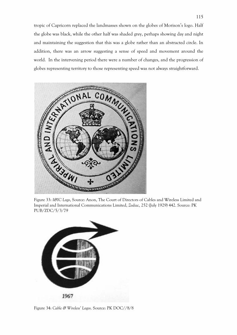
115
tropic of Capricorn replaced the landmasses shown on the globes of Morison’s logo. Half
the globe was black, while the other half was shaded grey, perhaps showing day and night
and maintaining the suggestion that this was a globe rather than an abstracted circle. In
addition, there was an arrow suggesting a sense of speed and movement around the
world. In the intervening period there were a number of changes, and the progression of
globes representing territory to those representing speed was not always straightforward.
Figure 33: I&IC Logo, Source: Anon, The Court of Directors of Cables and Wireless Limited and Imperial and International Communications Limited, Zodiac, 252 (July 1929) 442. Source: PK PUB/ZDC/5/3/79
Figure 34: Cable & Wireless’ Logos. Source: PK DOC//8/8
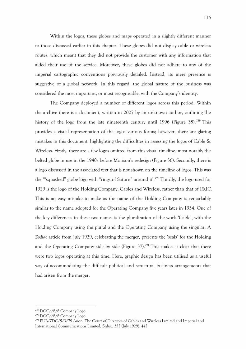
116
Within the logos, these globes and maps operated in a slightly different manner
to those discussed earlier in this chapter. These globes did not display cable or wireless
routes, which meant that they did not provide the customer with any information that
aided their use of the service. Moreover, these globes did not adhere to any of the
imperial cartographic conventions previously detailed. Instead, its mere presence is
suggestive of a global network. In this regard, the global nature of the business was
considered the most important, or most recognisable, with the Company’s identity.
The Company deployed a number of different logos across this period. Within
the archive there is a document, written in 2007 by an unknown author, outlining the
history of the logo from the late nineteenth century until 1996 (Figure 35).289 This
provides a visual representation of the logos various forms; however, there are glaring
mistakes in this document, highlighting the difficulties in assessing the logos of Cable &
Wireless. Firstly, there are a few logos omitted from this visual timeline, most notably the
belted globe in use in the 1940s before Morison’s redesign (Figure 36). Secondly, there is
a logo discussed in the associated text that is not shown on the timeline of logos. This was
the ‘“squashed” globe logo with “rings of Saturn” around it’.290 Thirdly, the logo used for
1929 is the logo of the Holding Company, Cables and Wireless, rather than that of I&IC.
This is an easy mistake to make as the name of the Holding Company is remarkably
similar to the name adopted for the Operating Company five years later in 1934. One of
the key differences in these two names is the pluralization of the work ‘Cable’, with the
Holding Company using the plural and the Operating Company using the singular. A
Zodiac article from July 1929, celebrating the merger, presents the ‘seals’ for the Holding
and the Operating Company side by side (Figure 37).291 This makes it clear that there
were two logos operating at this time. Here, graphic design has been utilised as a useful
way of accommodating the difficult political and structural business arrangements that
had arisen from the merger.
289 DOC//8/8 Company Logo 290 DOC//8/8 Company Logo 291 PUB/ZDC/5/3/79 Anon, The Court of Directors of Cables and Wireless Limited and Imperial and International Communications Limited, Zodiac, 252 (July 1929), 442.
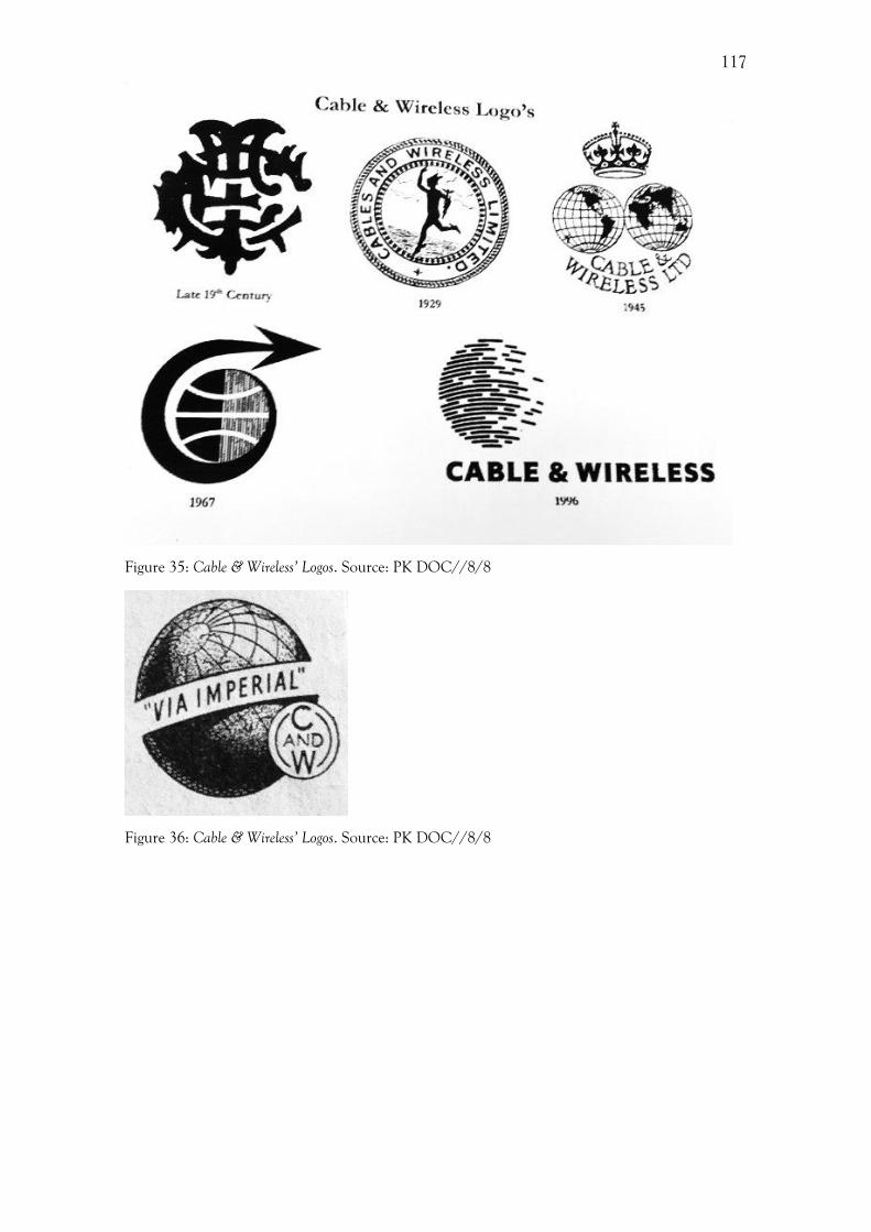
117
Figure 35: Cable & Wireless’ Logos. Source: PK DOC//8/8
Figure 36: Cable & Wireless’ Logos. Source: PK DOC//8/8
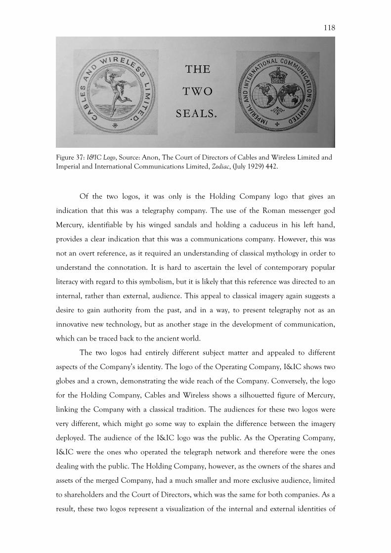
118
Figure 37: I&IC Logo, Source: Anon, The Court of Directors of Cables and Wireless Limited and Imperial and International Communications Limited, Zodiac, (July 1929) 442.
Of the two logos, it was only is the Holding Company logo that gives an
indication that this was a telegraphy company. The use of the Roman messenger god
Mercury, identifiable by his winged sandals and holding a caduceus in his left hand,
provides a clear indication that this was a communications company. However, this was
not an overt reference, as it required an understanding of classical mythology in order to
understand the connotation. It is hard to ascertain the level of contemporary popular
literacy with regard to this symbolism, but it is likely that this reference was directed to an
internal, rather than external, audience. This appeal to classical imagery again suggests a
desire to gain authority from the past, and in a way, to present telegraphy not as an
innovative new technology, but as another stage in the development of communication,
which can be traced back to the ancient world.
The two logos had entirely different subject matter and appealed to different
aspects of the Company’s identity. The logo of the Operating Company, I&IC shows two
globes and a crown, demonstrating the wide reach of the Company. Conversely, the logo
for the Holding Company, Cables and Wireless shows a silhouetted figure of Mercury,
linking the Company with a classical tradition. The audiences for these two logos were
very different, which might go some way to explain the difference between the imagery
deployed. The audience of the I&IC logo was the public. As the Operating Company,
I&IC were the ones who operated the telegraph network and therefore were the ones
dealing with the public. The Holding Company, however, as the owners of the shares and
assets of the merged Company, had a much smaller and more exclusive audience, limited
to shareholders and the Court of Directors, which was the same for both companies. As a
result, these two logos represent a visualization of the internal and external identities of
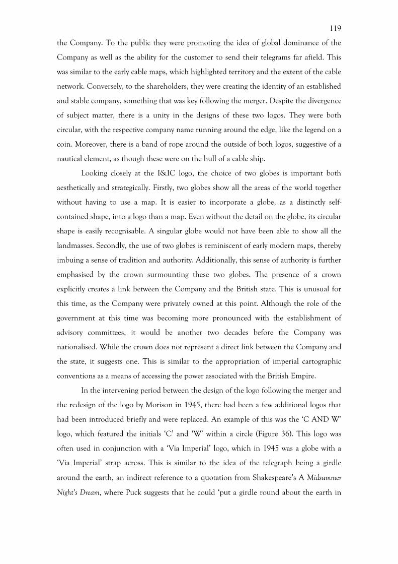
119
the Company. To the public they were promoting the idea of global dominance of the
Company as well as the ability for the customer to send their telegrams far afield. This
was similar to the early cable maps, which highlighted territory and the extent of the cable
network. Conversely, to the shareholders, they were creating the identity of an established
and stable company, something that was key following the merger. Despite the divergence
of subject matter, there is a unity in the designs of these two logos. They were both
circular, with the respective company name running around the edge, like the legend on a
coin. Moreover, there is a band of rope around the outside of both logos, suggestive of a
nautical element, as though these were on the hull of a cable ship.
Looking closely at the I&IC logo, the choice of two globes is important both
aesthetically and strategically. Firstly, two globes show all the areas of the world together
without having to use a map. It is easier to incorporate a globe, as a distinctly self-
contained shape, into a logo than a map. Even without the detail on the globe, its circular
shape is easily recognisable. A singular globe would not have been able to show all the
landmasses. Secondly, the use of two globes is reminiscent of early modern maps, thereby
imbuing a sense of tradition and authority. Additionally, this sense of authority is further
emphasised by the crown surmounting these two globes. The presence of a crown
explicitly creates a link between the Company and the British state. This is unusual for
this time, as the Company were privately owned at this point. Although the role of the
government at this time was becoming more pronounced with the establishment of
advisory committees, it would be another two decades before the Company was
nationalised. While the crown does not represent a direct link between the Company and
the state, it suggests one. This is similar to the appropriation of imperial cartographic
conventions as a means of accessing the power associated with the British Empire.
In the intervening period between the design of the logo following the merger and
the redesign of the logo by Morison in 1945, there had been a few additional logos that
had been introduced briefly and were replaced. An example of this was the ‘C AND W’
logo, which featured the initials ‘C’ and ‘W’ within a circle (Figure 36). This logo was
often used in conjunction with a ‘Via Imperial’ logo, which in 1945 was a globe with a
‘Via Imperial’ strap across. This is similar to the idea of the telegraph being a girdle
around the earth, an indirect reference to a quotation from Shakespeare’s A Midsummer
Night’s Dream, where Puck suggests that he could ‘put a girdle round about the earth in
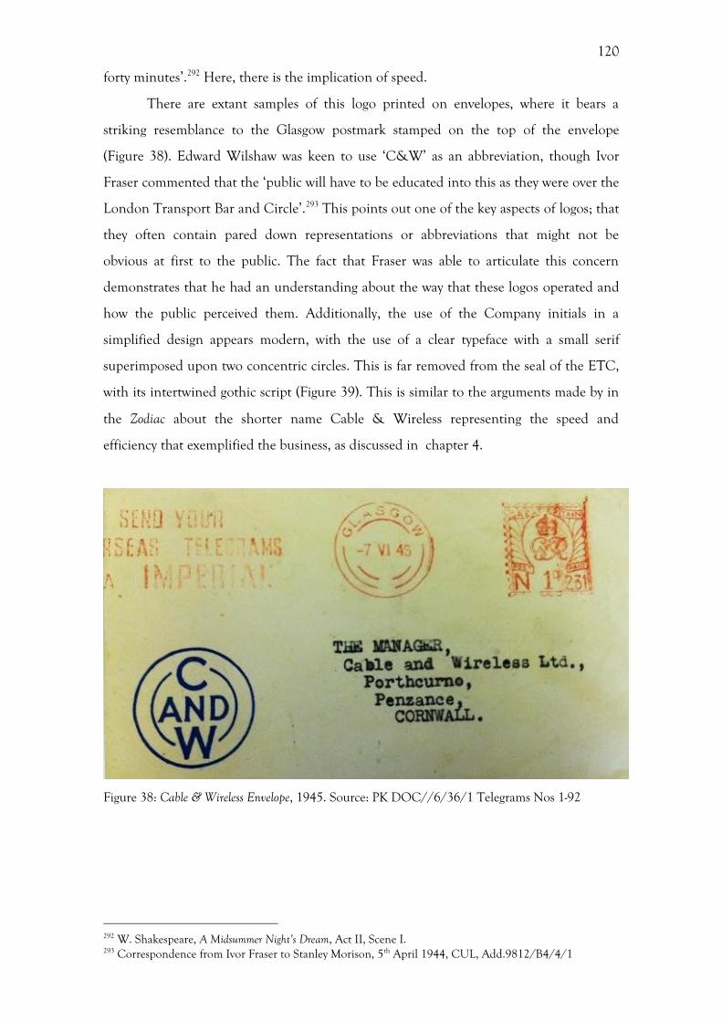
120
forty minutes’.292 Here, there is the implication of speed.
There are extant samples of this logo printed on envelopes, where it bears a
striking resemblance to the Glasgow postmark stamped on the top of the envelope
(Figure 38). Edward Wilshaw was keen to use ‘C&W’ as an abbreviation, though Ivor
Fraser commented that the ‘public will have to be educated into this as they were over the
London Transport Bar and Circle’.293 This points out one of the key aspects of logos; that
they often contain pared down representations or abbreviations that might not be
obvious at first to the public. The fact that Fraser was able to articulate this concern
demonstrates that he had an understanding about the way that these logos operated and
how the public perceived them. Additionally, the use of the Company initials in a
simplified design appears modern, with the use of a clear typeface with a small serif
superimposed upon two concentric circles. This is far removed from the seal of the ETC,
with its intertwined gothic script (Figure 39). This is similar to the arguments made by in
the Zodiac about the shorter name Cable & Wireless representing the speed and
efficiency that exemplified the business, as discussed in chapter 4.
Figure 38: Cable & Wireless Envelope, 1945. Source: PK DOC//6/36/1 Telegrams Nos 1-92
292 W. Shakespeare, A Midsummer Night’s Dream, Act II, Scene I. 293 Correspondence from Ivor Fraser to Stanley Morison, 5th April 1944, CUL, Add.9812/B4/4/1
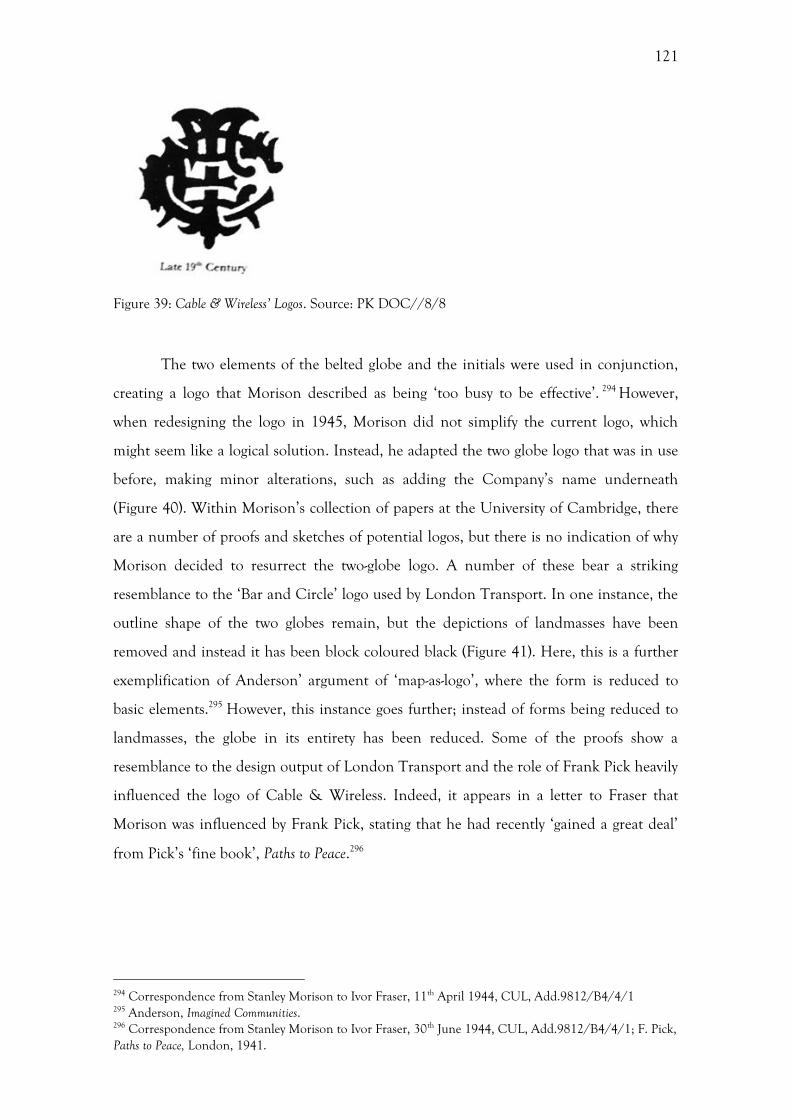
121
Figure 39: Cable & Wireless’ Logos. Source: PK DOC//8/8
The two elements of the belted globe and the initials were used in conjunction,
creating a logo that Morison described as being ‘too busy to be effective’. 294 However,
when redesigning the logo in 1945, Morison did not simplify the current logo, which
might seem like a logical solution. Instead, he adapted the two globe logo that was in use
before, making minor alterations, such as adding the Company’s name underneath
(Figure 40). Within Morison’s collection of papers at the University of Cambridge, there
are a number of proofs and sketches of potential logos, but there is no indication of why
Morison decided to resurrect the two-globe logo. A number of these bear a striking
resemblance to the ‘Bar and Circle’ logo used by London Transport. In one instance, the
outline shape of the two globes remain, but the depictions of landmasses have been
removed and instead it has been block coloured black (Figure 41). Here, this is a further
exemplification of Anderson’ argument of ‘map-as-logo’, where the form is reduced to
basic elements.295 However, this instance goes further; instead of forms being reduced to
landmasses, the globe in its entirety has been reduced. Some of the proofs show a
resemblance to the design output of London Transport and the role of Frank Pick heavily
influenced the logo of Cable & Wireless. Indeed, it appears in a letter to Fraser that
Morison was influenced by Frank Pick, stating that he had recently ‘gained a great deal’
from Pick’s ‘fine book’, Paths to Peace.296
294 Correspondence from Stanley Morison to Ivor Fraser, 11th April 1944, CUL, Add.9812/B4/4/1 295 Anderson, Imagined Communities. 296 Correspondence from Stanley Morison to Ivor Fraser, 30th June 1944, CUL, Add.9812/B4/4/1; F. Pick, Paths to Peace, London, 1941.
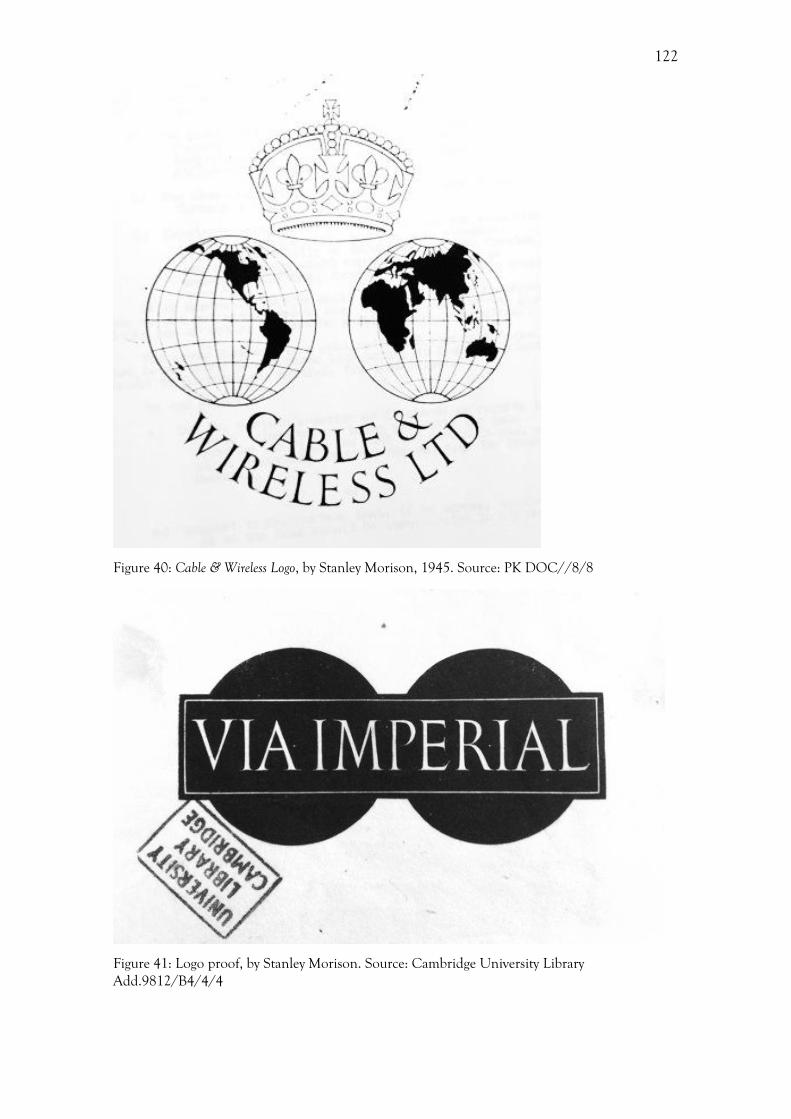
122
Figure 40: Cable & Wireless Logo, by Stanley Morison, 1945. Source: PK DOC//8/8
Figure 41: Logo proof, by Stanley Morison. Source: Cambridge University Library Add.9812/B4/4/4
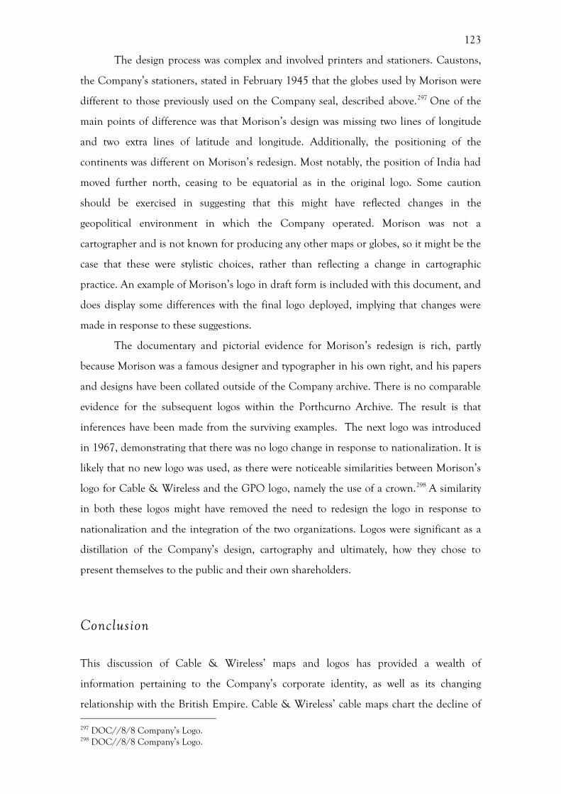
123
The design process was complex and involved printers and stationers. Caustons,
the Company’s stationers, stated in February 1945 that the globes used by Morison were
different to those previously used on the Company seal, described above.297 One of the
main points of difference was that Morison’s design was missing two lines of longitude
and two extra lines of latitude and longitude. Additionally, the positioning of the
continents was different on Morison’s redesign. Most notably, the position of India had
moved further north, ceasing to be equatorial as in the original logo. Some caution
should be exercised in suggesting that this might have reflected changes in the
geopolitical environment in which the Company operated. Morison was not a
cartographer and is not known for producing any other maps or globes, so it might be the
case that these were stylistic choices, rather than reflecting a change in cartographic
practice. An example of Morison’s logo in draft form is included with this document, and
does display some differences with the final logo deployed, implying that changes were
made in response to these suggestions.
The documentary and pictorial evidence for Morison’s redesign is rich, partly
because Morison was a famous designer and typographer in his own right, and his papers
and designs have been collated outside of the Company archive. There is no comparable
evidence for the subsequent logos within the Porthcurno Archive. The result is that
inferences have been made from the surviving examples. The next logo was introduced
in 1967, demonstrating that there was no logo change in response to nationalization. It is
likely that no new logo was used, as there were noticeable similarities between Morison’s
logo for Cable & Wireless and the GPO logo, namely the use of a crown.298 A similarity
in both these logos might have removed the need to redesign the logo in response to
nationalization and the integration of the two organizations. Logos were significant as a
distillation of the Company’s design, cartography and ultimately, how they chose to
present themselves to the public and their own shareholders.
Conclusion
This discussion of Cable & Wireless’ maps and logos has provided a wealth of
information pertaining to the Company’s corporate identity, as well as its changing
relationship with the British Empire. Cable & Wireless’ cable maps chart the decline of 297 DOC//8/8 Company’s Logo. 298 DOC//8/8 Company’s Logo.
124
the British Empire and the changing relationship between the Dominions and
independent states. This chapter contributes to the debates within Historical Geography
about the connection between maps and power, by highlighting the commercial use of
cartography in the early- and mid-twentieth century. Cable & Wireless initially evoked the
power of the British Empire in their early maps, primarily produced prior to the Second
World War. At the beginning of the twentieth century, the company had benefitted from
an alignment with the British Empire, conferring a sense of authority and tradition.
However, as the century progressed, and Britain’s hold on its colonies loosened and
ended, there was a new commercial imperative to move away from these imperial
associations. This was particularly the case when communicating with a colonial and post-
colonial audience. In these later maps there is a focus on the discourses of modernity and
science.
There is a disparity between the style and subject matter deployed within the
Company’s maps. This disparity can go some way to explain the reticence of British
design in the full adoption of modernist style that had flourished across Continental
Europe, primarily in graphic design and art. Even when Cable & Wireless were
employing the subject matter of modernity – of technology, machinery and speed – this
was often couched in a more tradition style. MacDonald Gill’s Great Circle Map is a
brilliant example of this dichotomy between imperialism and modernity. This map
adheres to all the key characteristics of an imperial map: the British Empire demarcated
in red and an ethnocentric projection placing London and the centre of the map.
However, when this map is examined in closer detail, it is clear that while the style is very
traditional and imperial, the subject matter is about modernity and progress. From the
azimuthal projection conveying scientific accuracy, to the depictions of technology and
progress, this map was a microcosm of the tensions present within graphic design during
this period.
While, the style of the Company’s various maps was similar to those used by
different Company’s, many of Cable & Wireless’ maps were unique in extolling the
discourse of modernity, often alongside the discourse of imperialism. The Great Circle
Map had a duel function as a decorative and scientific map, in contrast to the purely
decorative maps produced by Gill for the EMB and the GPO in the same style. The same
designer designed all three of these maps in a remarkably similar style, however, the
differences present within the projection and subject matter suggest that the authority in
the design of the map lay with the commissioning company, rather than the designer

125
himself. Beck’s map of the London Underground is the closest in style and function to
Cable & Wireless’ later systems maps. However, these were for entirely different
audiences, with Cable & Wireless’ systems maps exclusively intended for internal use, in
contrast to the London Underground maps which was to solely aid the users of the
system.
As the twentieth century progressed, the use, content, and style of these maps
changed. The period started with maps depicting the territory of the Empire, in line with
imperial conventions, and the extent of the cable network. These detailed maps, replete
with place names and borders, provided the customer with information about where in
the world they could send their telegrams. The use of imperial cartographic conventions
clearly aligned the company with the British Empire, giving the company an illusionary
claim on the territory and imbuing the corporate identity with a sense of authority. With
the consolidation of not only the merged companies, but also the cable network, the
focus of Cable & Wireless’ maps and marketing material changed their focus from
territory to speed. The integration of clocks within a number of the maps shifted the
attention away from the spatial towards the temporal. As the twentieth century
progressed, the maps and globes included less information, becoming more abstract in
form. It can be postulated that as the twentieth century progressed, customers became
more aware of the locations of the various submarine cables and where they could send a
telegram. As a result, the purpose of these maps changed from providing just spatial
information to conveying the speed at which a telegram could traverse this space. These
maps demonstrate that Cable & Wireless had not only annihilated time and space
through telegraphy, they had also mastered it, mapped it and repackaged it for the public.
The discussion of the use of maps and globes in the Company’s logos highlights
an overlap between cartography and graphic design. Cartographic images were not bound
purely to maps. Cable & Wireless were able to utilise the narratives of territory, Empire,
speed and modernity throughout their graphic output, greatly increasing the importance
of cartography within the Company’s visual repertoire. The next chapter continues this
discussion about the production of the Company’s corporate identity and its graphic
output by assessing its public relations activities.
126
6. Image Politics and Public Relations
While the previous chapters have examined the relationship between the Company and
the British Empire, this chapter moves the discussion into the Company Headquarters in
order to assess the Company’s relationship and communications with the public and
their customers. Furthermore, it seeks to examine the development of an official Public
Relations Office as a means of ascertaining the remit and the extent of the company’s
direct involvement in the formation of their corporate identity. This is an important
consideration, as it is often the assumption within the Business histories and the Design
History literature that a company’s corporate identity was directly created and controlled
by the company itself. As previously discussed in the literature review, the picture that we
gain from an investigation of the development of Cable & Wireless’ publicity activity is
somewhat messier that the neat accounts typically found within Design History. What
emerges from this study of Cable &Wireless is the complex nature of identity formation,
the inconsistencies in direction and execution, the crucial external influences, as well as
the networks that existed between companies. This study of Cable & Wireless paves the
way for the investigation of other companies whose visual identities have not entered the
canon of good and iconic design.
It is not only the focus of ‘good design’ that has held back the study of business,
but also the boundaries between different disciplines, which is the result of a clear
demarcation between the different professions of advertising, public relations and graphic
design within businesses today. However, these divisions were blurred during in the early
twentieth century. The interwar and post-war periods bore witness to the birth and
development of publicity departments within private companies, which sought to both
increase trade and to communicate the company’s ethos to the public. As these types of
departments were in their infancy, their role and functions were in a state of flux,
encompassing a variety of professional areas. As L’Etang notes, a characteristic of this
period was the porous boundaries between public relations, propaganda, marketing, and
advertising.299 Advertising can be viewed as a means of selling a product or service, while
299 J. L’Etang, Public Relations in Britain: A History of Professional Practice in the 20th Century, Mahwah NJ, 2004, 60.
127
public relations and marketing are about creating a certain perception of the company.
Moreover, public relations and marketing were ways of selling a relationship between the
customer and the company, rather than a product or a service.
Despite the porous boundaries in the eyes of contemporary practitioners, there
have been clear boundaries drawn between the different activities within the twentieth
century academic literature, including Advertising History, the history of public relations,
Design History and business histories. Each of these disciplines only deals with a specific
area often without assessing a company’s activities in its entirety. This lack of integration
between the disciplines has led to a fragmentation in the study of commercial
communications. The history of graphic design is integral to the study of Advertising
History, and if there is no integration between these disciplines then both will be
limited.300 The result of these narrow retrospective projections on corporate histories
means that the activities of these companies are not fully examined nor is any attention
given to contemporary conceptions of this activity. A more holistic approach is required.
The study of a single company, such as Cable & Wireless, can help to integrate these
different elements within the same analytical framework, providing a more
comprehensive picture that pays attention to nuances and the relationship between the
various media deployed by companies in the period.
There is a tendency within design historical accounts of businesses to focus on
visionaries who guided and shaped the design of the Company. The difference with
Cable & Wireless is that it did not have a figure such as Stephen Tallents or Frank Pick.
Ivor Fraser, who was hired by Cable & Wireless as a Press Consultant in 1944, a former
employee of the London Underground, came close, but his input was not as wide
reaching as Tallents or Pick, nor did it overtly shape the design of the Company. This
goes some way to explain why Cable & Wireless, the world’s largest telecommunications
company during the early-twentieth century and integral to the operations of both Britain
and the Empire, has received no attention as yet with regards to its corporate identity and
design.
The history of the Cable & Wireless publicity department is illusive and
fragmented within the archive. A variety of sources have been used in attempting to
reconstruct the history of the publicity department. Extant examples of advertising and
publicity material are available, within the archive, but this is not a complete record and
300 S. Heller, Advertising, mother of graphic design, in: G. Lees-Maffei, R. Houze (Eds), The Design History Reader, Oxford, 2010, 435–441, 435, 440.
128
usually there is little or no attached evidence to assist with contextualization. A few
publicity plans survive from after the Second World War, providing a valuable insight
into both the specifics of the Company’s publicity activities as well as the function of the
department. One of the most valuable sources available within the archive is the staff
records, which detail the various wages issued to all the top-level members of staff. This
shows exactly who was working for this department, for what period, in what capacity and
their remuneration. The different levels of remuneration demonstrate the relative value
placed on these different activities.
The history of Cable & Wireless’ public relations office can be divided into four
phases, which will be examined in turn. The first phase encompasses the publicity
activities of the company before 1934, with an insight into the commissioning process
and experiments with a contemporary, modern aesthetic. The second phase sees the
establishment of a publicity officer between 1934-1936, following the suggestion of the
government and an inquiry committee. The creation of a public relations department in
1944, during the Second World War (1939-45), to deal with the press and complaints
from the public forms the third phase. The last phase (1945 onwards) deals with the post-
war market and the dismantling of the department as a result of nationalization and
integration with the GPO. It appears from the outset that this department of the
Company was not in consistent existence throughout the period from the 1920s to the
1950s, but instead that its existence was in responses to exterior forces.
It appears that the attention of Cable & Wireless’ Public Relations Office
oscillated between publicity activity based around i) boosting the ‘prestige’ of the
company and ii) advertising to raise traffic levels. These oscillations were predominately
in response to exterior forces such as the Great Depression and the Second World War,
which will be discussed in detail later in the chapter. Cable & Wireless was not alone in
distinguishing ‘prestige’ from ‘selling’. Indeed, this distinction was devised by the Poster
Advisory Group of the GPO in the interwar years.301 ‘Prestige’ posters were pictorial in
form and were purely for self-publicity. In the case of the GPO, these were mainly used to
decorate and add to the amenities of public post offices and to increase the interest of the
public. 302 In contrast, ‘selling’ posters advertised delivery services, telephones and
301 Suga, Image Politics of the State, 146; Postal Heritage Museum [http://www.postalheritage.org.uk/page/designsondelivery] 302 Suga, Image Politics of the State, 146.
129
telegrams with the aim of highlighting special services and facilities.303 This division was
roughly contemporaneous with the work of Cable & Wireless’ Public Relations Office
detailed in this chapter. Although Cable & Wireless did not formulate their publicity so
explicitly, it does aptly describe both the types of posters and advertisements produced
and the motivation of the Public Relations Office, which alternated between, firstly,
wanting to highlight the prestige of the Company and, secondly, increasing levels of
traffic. On numerous occasions the Company actually used the term ‘prestige’ when
referring to the work of the Public Relations Office.
Design policy and commissioning before 1934
Before the appointment of a publicity officer in 1934 there was no specific person or
department in charge of organising and deploying Cable & Wireless’ publicity materials.
It was not unusual during the interwar period for a company to have no public relations
office. Within the private sector, publicity was usually confined to advertising.304 Indeed,
as Suga notes, the nature of the GPO publicity in the late 1920s was ‘sporadic’ before the
setting up of the Post Office Publicity Committee in 1931.305 It should not be assumed,
however, that the absence of a dedicated public relations department meant that there
was no publicity or advertising deployed by the Company in the 1920s and early 1930s.
The extant material within the archive reveals that during this time newspaper
advertisements, posters and booklets were produced. As there was no specific department
in charge of articulating the company’s message and communicating directly with the
public, it is extremely difficult within the archive to ascertain who was behind the formal
identity creation for the Company. Examples of advertising exist within the archive,
which pre-dates the instatement of a publicity officer, and indeed the company chairman,
John Denison-Pender, stated in 1933 that the Company had distributed about 541,000
pamphlets and booklets, as well as over 11,500 maps of the Company’s system. 306
Denison-Pender defended the publicity activities of the Company in a letter to the
chairman of the Imperial Communications Advisory Committee (ICAC), Sir Campbell
Stuart. The ICAC, (discussed in more detail in chapter 3) was the governmental body set
303 Suga, Image Politics of the State, 147. 304 L’Etang, Public Relations in Britain, 51. 305 Suga, Image Politics of the State, 85, 98. 306 DOC//11/48 Letter from J. C. Denison-Pender to Sir Campbell Stuart, 19/10/1933, Porthcurno Archive.

130
up to advise the Company. The fact that Dension-Pender was corresponding with the
ICAC about the Company’s publicity activities demonstrates that the state were active in
promoting corporate identity. Additionally, within the same letter, Denison-Pender states
that the Company had displayed a variety of posters, as well as placing articles and
advertisements in newspapers.307
It is possible to discern an understanding of the value of publicity, even before it
was formalised into a department. Shortly following the merger in 1929 it was proposed
to distribute circulars and display posters in Great Britain, notifying the public of the
takeover of the Post Office Cable and Wireless Circuits.308 Unfortunately, no examples of
these posters or circulars survive in the archive. Additionally, the Company suggested that
envelopes bearing the new name of the Company could be used to the same effect (see
Figure 3).309 In both these examples, the Company were seeking to educate the public by
making them aware that there had been a change within the Company and the service.
The example of the envelopes can be tentatively seen as an early instance of branding; the
reiteration of the Company name in order to create a sense of familiarity on the part of
the customer.
It appears from contemporary newspaper advertisements that the Company was
aware of their customer base. Commercial traffic was the company’s main source of
business and between November and December 1932 the Company ran a series of
advertisements within the Financial Times aimed at ‘Business men’ (Figure 42).310 All of
these advertisements were placed in the bottom right hand corner of the page, making
them highly visible. Looking closely at this advertisement, it is interesting to note that the
telegram form used within this advertisement was actually a GPO one. This seems
somewhat confusing and a missed opportunity for the Company to display their own
telegram forms. A possible reason for this was that the public were more familiar with
GPO telegram forms than those of the newly formed Company. Indeed, there are a
number of extant examples of I&IC telegram forms within the archive, demonstrating
that these existed at this time. In 1907 Marconi Wireless advertised in the Illustrated
London News deploying the same telegram form placed at an angle (Figure 43), suggesting
that Cable & Wireless’ advert may have been based on this earlier Marconi advertisement.
307 DOC//11/48 Letter from J. C. Denison-Pender to Sir Campbell Stuart, 19/10/1933, Porthcurno Archive. 308 DOC/I&IC/1/51 Merger Agreements No.21 Transfer of Service File, Memorandum to the Management Committee, 1. 309 DOC/I&IC/1/51 Merger Agreements No.21 Transfer of Service File, Memorandum to the Management Committee, 1. 310 Via Imperial, The Financial Times, November 23rd, 1932 (13,679) 3.

131
Figure 42: Via Imperial, The Financial Times, November 23rd, 1932 (13,679), 3.
Figure 43: Marconi display advertisement, Illustrated London News, 1907
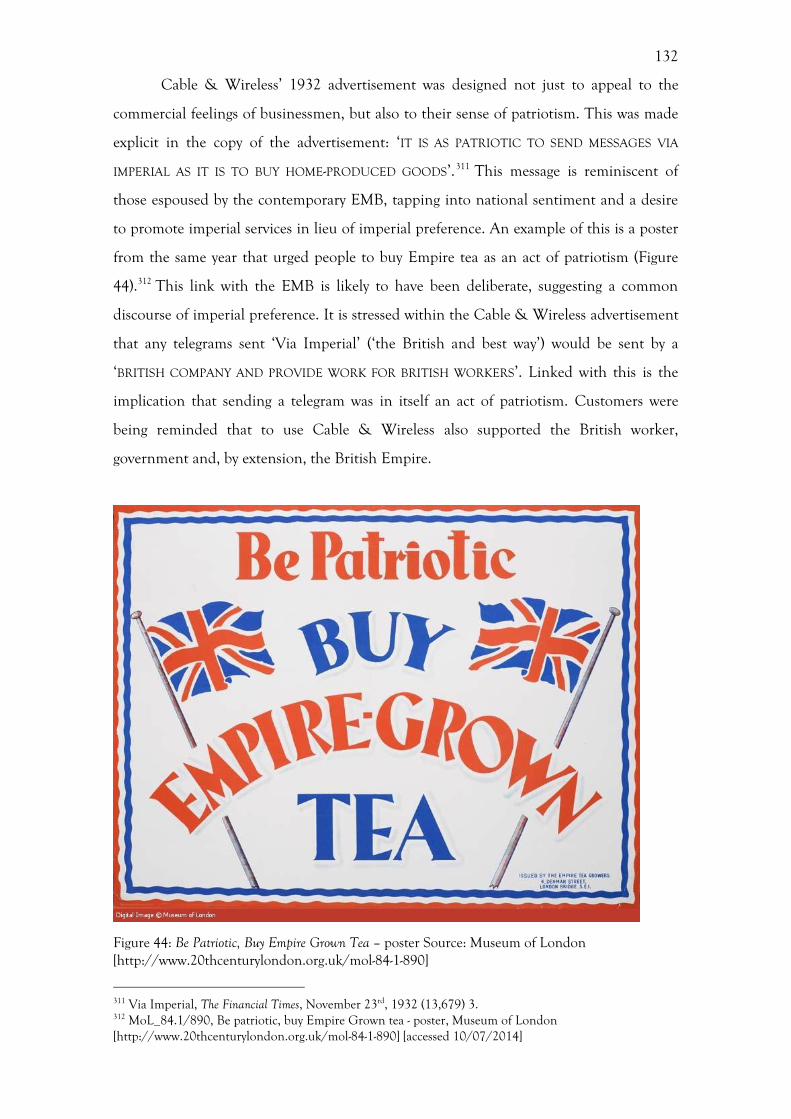
132
Cable & Wireless’ 1932 advertisement was designed not just to appeal to the
commercial feelings of businessmen, but also to their sense of patriotism. This was made
explicit in the copy of the advertisement: ‘IT IS AS PATRIOTIC TO SEND MESSAGES VIA
IMPERIAL AS IT IS TO BUY HOME-PRODUCED GOODS’.311 This message is reminiscent of
those espoused by the contemporary EMB, tapping into national sentiment and a desire
to promote imperial services in lieu of imperial preference. An example of this is a poster
from the same year that urged people to buy Empire tea as an act of patriotism (Figure
44).312 This link with the EMB is likely to have been deliberate, suggesting a common
discourse of imperial preference. It is stressed within the Cable & Wireless advertisement
that any telegrams sent ‘Via Imperial’ (‘the British and best way’) would be sent by a
‘BRITISH COMPANY AND PROVIDE WORK FOR BRITISH WORKERS’. Linked with this is the
implication that sending a telegram was in itself an act of patriotism. Customers were
being reminded that to use Cable & Wireless also supported the British worker,
government and, by extension, the British Empire.
Figure 44: Be Patriotic, Buy Empire Grown Tea – poster Source: Museum of London [http://www.20thcenturylondon.org.uk/mol-84-1-890]
311 Via Imperial, The Financial Times, November 23rd, 1932 (13,679) 3. 312 MoL_84.1/890, Be patriotic, buy Empire Grown tea - poster, Museum of London [http://www.20thcenturylondon.org.uk/mol-84-1-890] [accessed 10/07/2014]
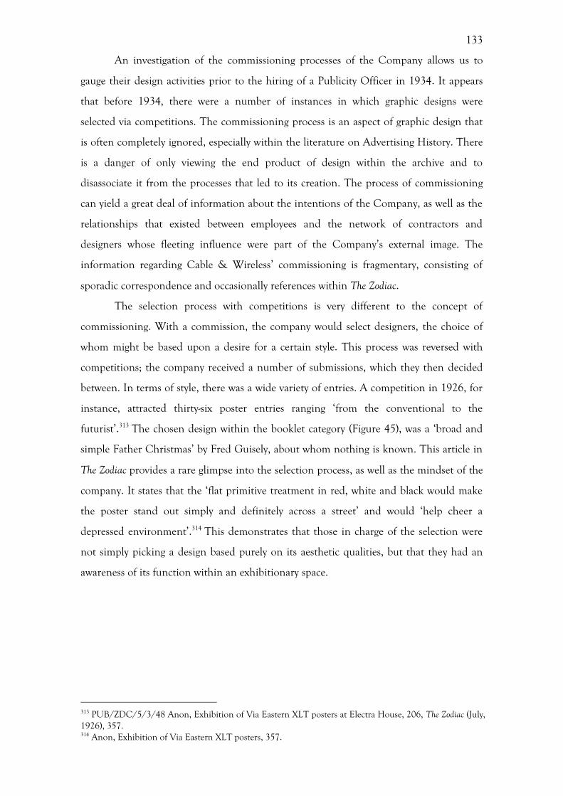
133
An investigation of the commissioning processes of the Company allows us to
gauge their design activities prior to the hiring of a Publicity Officer in 1934. It appears
that before 1934, there were a number of instances in which graphic designs were
selected via competitions. The commissioning process is an aspect of graphic design that
is often completely ignored, especially within the literature on Advertising History. There
is a danger of only viewing the end product of design within the archive and to
disassociate it from the processes that led to its creation. The process of commissioning
can yield a great deal of information about the intentions of the Company, as well as the
relationships that existed between employees and the network of contractors and
designers whose fleeting influence were part of the Company’s external image. The
information regarding Cable & Wireless’ commissioning is fragmentary, consisting of
sporadic correspondence and occasionally references within The Zodiac.
The selection process with competitions is very different to the concept of
commissioning. With a commission, the company would select designers, the choice of
whom might be based upon a desire for a certain style. This process was reversed with
competitions; the company received a number of submissions, which they then decided
between. In terms of style, there was a wide variety of entries. A competition in 1926, for
instance, attracted thirty-six poster entries ranging ‘from the conventional to the
futurist’.313 The chosen design within the booklet category (Figure 45), was a ‘broad and
simple Father Christmas’ by Fred Guisely, about whom nothing is known. This article in
The Zodiac provides a rare glimpse into the selection process, as well as the mindset of the
company. It states that the ‘flat primitive treatment in red, white and black would make
the poster stand out simply and definitely across a street’ and would ‘help cheer a
depressed environment’.314 This demonstrates that those in charge of the selection were
not simply picking a design based purely on its aesthetic qualities, but that they had an
awareness of its function within an exhibitionary space.
313 PUB/ZDC/5/3/48 Anon, Exhibition of Via Eastern XLT posters at Electra House, 206, The Zodiac (July, 1926), 357. 314 Anon, Exhibition of Via Eastern XLT posters, 357.
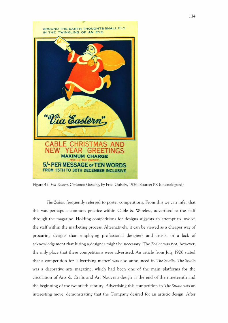
134
Figure 45: Via Eastern Christmas Greeting, by Fred Guisely, 1926. Source: PK (uncatalogued)
The Zodiac frequently referred to poster competitions. From this we can infer that
this was perhaps a common practice within Cable & Wireless, advertised to the staff
through the magazine. Holding competitions for designs suggests an attempt to involve
the staff within the marketing process. Alternatively, it can be viewed as a cheaper way of
procuring designs than employing professional designers and artists, or a lack of
acknowledgement that hiring a designer might be necessary. The Zodiac was not, however,
the only place that these competitions were advertised. An article from July 1926 stated
that a competition for ‘advertising matter’ was also announced in The Studio. The Studio
was a decorative arts magazine, which had been one of the main platforms for the
circulation of Arts & Crafts and Art Nouveau design at the end of the nineteenth and
the beginning of the twentieth century. Advertising this competition in The Studio was an
interesting move, demonstrating that the Company desired for an artistic design. After
135
the First World War The Studio adopted a more modern approach, in line with design
trends throughout Europe. The intended readership of this magazine was different from
that of, for example, a national newspaper or indeed the Zodiac itself. This audience was
one that had either an interest or a practical talent in decorative arts and design. As a
result, it is likely that this advertisement caught the attention of people who were
especially interested and qualified in art and design. This in turn suggests that the
company were appreciative of the place of the arts within advertising, in much the same
way that London Transport had an intention for posters to provide public art
education.315
As well as competitions for posters, there were also requests for photographs for
the Company to use. In 1927 a feature in the Zodiac asked readers to supply the
Company with photographs:
Drop your snap into an envelope We adopt the suggestion of a Correspondent and use (above) the slogan he suggests. Address the envelopes to the Zodiac; that is simple enough: Zodiac, Electra house, Moorgate, London. We should like to add, however, that we are still more pleased when photographs are accompanied by a yarn, though if there is nothing to say, well ‘nuff said! Verb sap. There is an idea that it is necessary to send films or negatives for the purpose of reproduction. This is quite wrong, prints, only, are required.316
It is not clear from this what these photographs would be used for, but it is likely
that these were used for the Zodiac. The colloquial language used in this small article
disguises this formal request. Phrases such as ‘nuff said!’ and the use of the word ‘snap’
instead of photograph suggest that they sought to appeal to the employees in a casual way,
as though it was a employee talking to a colleague. Additionally, it is noted that this was
not the idea of the Company, but was instead the adoption of a suggestion made by a
correspondent, using his slogan. The suggestion that only prints were required, rather
than films or negatives, suggests that the people in charge of the Zodiac were not
necessarily expecting staff to go out and take photographs specifically for the magazine.
Instead, the implication is that the staff might come across images suitable for inclusion
within the Zodiac, while going through their photographic prints.
Aside from these competitions and calls to staff for submissions, little is known
315 R. Hollis, Graphic Design: A Concise History, London, 2001, 92. 316 PUB/ZDC/5/3/60 Anon, Drop your snap into an envelope, The Zodiac, 231 (October 1927), 77.
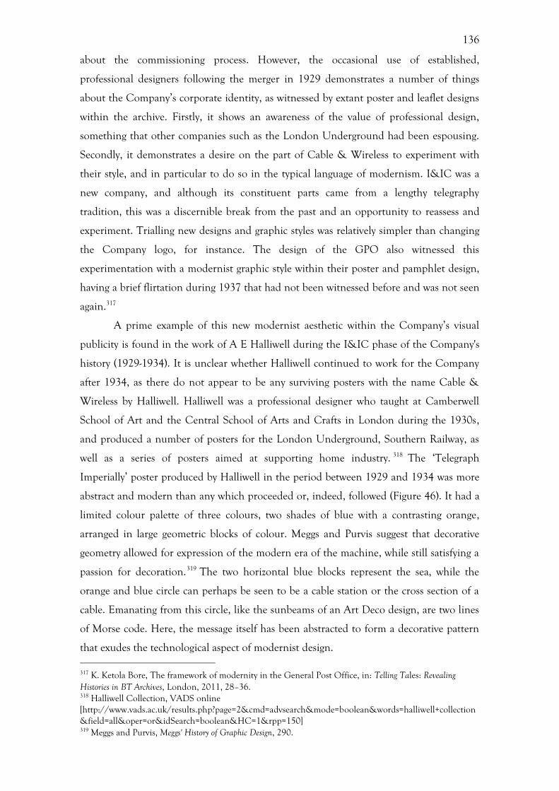
136
about the commissioning process. However, the occasional use of established,
professional designers following the merger in 1929 demonstrates a number of things
about the Company’s corporate identity, as witnessed by extant poster and leaflet designs
within the archive. Firstly, it shows an awareness of the value of professional design,
something that other companies such as the London Underground had been espousing.
Secondly, it demonstrates a desire on the part of Cable & Wireless to experiment with
their style, and in particular to do so in the typical language of modernism. I&IC was a
new company, and although its constituent parts came from a lengthy telegraphy
tradition, this was a discernible break from the past and an opportunity to reassess and
experiment. Trialling new designs and graphic styles was relatively simpler than changing
the Company logo, for instance. The design of the GPO also witnessed this
experimentation with a modernist graphic style within their poster and pamphlet design,
having a brief flirtation during 1937 that had not been witnessed before and was not seen
again.317
A prime example of this new modernist aesthetic within the Company’s visual
publicity is found in the work of A E Halliwell during the I&IC phase of the Company's
history (1929-1934). It is unclear whether Halliwell continued to work for the Company
after 1934, as there do not appear to be any surviving posters with the name Cable &
Wireless by Halliwell. Halliwell was a professional designer who taught at Camberwell
School of Art and the Central School of Arts and Crafts in London during the 1930s,
and produced a number of posters for the London Underground, Southern Railway, as
well as a series of posters aimed at supporting home industry. 318 The ‘Telegraph
Imperially’ poster produced by Halliwell in the period between 1929 and 1934 was more
abstract and modern than any which proceeded or, indeed, followed (Figure 46). It had a
limited colour palette of three colours, two shades of blue with a contrasting orange,
arranged in large geometric blocks of colour. Meggs and Purvis suggest that decorative
geometry allowed for expression of the modern era of the machine, while still satisfying a
passion for decoration.319 The two horizontal blue blocks represent the sea, while the
orange and blue circle can perhaps be seen to be a cable station or the cross section of a
cable. Emanating from this circle, like the sunbeams of an Art Deco design, are two lines
of Morse code. Here, the message itself has been abstracted to form a decorative pattern
that exudes the technological aspect of modernist design. 317 K. Ketola Bore, The framework of modernity in the General Post Office, in: Telling Tales: Revealing Histories in BT Archives, London, 2011, 28–36. 318 Halliwell Collection, VADS online [http://www.vads.ac.uk/results.php?page=2&cmd=advsearch&mode=boolean&words=halliwell+collection&field=all&oper=or&idSearch=boolean&HC=1&rpp=150] 319 Meggs and Purvis, Meggs' History of Graphic Design, 290.
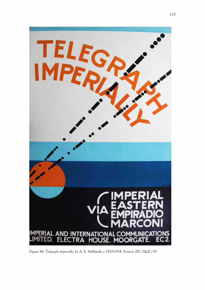
137
Figure 46: Telegraph Imperially, by A. E. Halliwell, c.1929-1934. Source: PIC/I&IC/81

138
It is also interesting that the title of the poster is ‘Telegraph Imperially’. Here, the
word ‘Imperial’ has been modified from an adjective to an adverb. On face value this
poster is notifying the customer about the merging of the various designations into the
single Via Imperial. However, the use of the adverb ‘Imperially’ in the title not only
informs but also urges the customer to use the service. It can also be suggested that there
is an implication within this phrase that the action of sending a telegram had become an
imperial action since the merger. This poster represents and early attempt by the
Company to engage with the discourse of modernity through the use of modernist design
within their publicity material. However, this was short-lived and demonstrates that the
Company did not embark on a linear path of progress from traditional, representational
design to modernism, as often extolled within Design History. Instead, this example of
Cable & Wireless highlights the inconsistent nature of the design output of companies
operating in the early-twentieth century that did not have visionary designers or managers
at the helm. Furthermore, this inconsistency demonstrates the problems encountered
when there was no centralised control of publicity policy. This was partially remedied the
hiring of a publicity officer in 1934.
Establishment of a publicity office r, 1934-1936
Prior to Cable & Wireless hiring H. L. Morrow as Publicity Officer in 1934, there had
not been a designated, named person in charge of the Company’s publicity. Before this
date there were a number of advertisements, posters, pamphlets and publicity material
produced. An assumption can be made that because there was not a specific department
that there was a degree of inconsistency and incoherency to the publicity material. This
assumption is supported by the 1931 Greene report, which was produced to provide
guidance to the Company in a period of declining traffic during the Great Depression.
This report suggested that the Company should improve their publicity as a means of
alleviating their economic difficulties and to stimulate demand in the service. 320 The
suggestion here is that the supposed lack of publicity was in some way to blame for the
decreasing traffic and fortunes of the company. Additionally, this also shows that the
government at this time were aware of the commercial benefits that good publicity
320 DOC//11/48 Letter from Sir Campbell Stuart to J. C. Denison Pender, 26/9/1933, Porthcurno Archive; Barty-King, Girdle Round the Earth, 233.

139
brought, which may have been the result of such government activities as the EMB and
the close association between the government and Stephen Tallents, a pioneer of
publicity who had worked for the EMB and the GPO.321 Indeed, before the Second
World War very few businesses within the private sector were fully engaged with publicity
as a separate activity to advertising.322 In this case, it can be argued that the stimulus was
coming from the government, rather than commercial sources, who were aware of the
benefits from such publicity as they were themselves one of the main users of publicity.323
Moreover, this suggestion of a lack of publicity demonstrates that the Greene
Committee might not have investigated the activities of the Company fully. At first glance
there appears to have been a decline in the amount spent by the Company on advertising
and canvassing, falling from 5.17% in 1929, when expressed as a proportion of total
expenditure, to 3.8% in 1932. 324 This coincides with an overall decrease in traffic,
however it is difficult and problematic to make a causal link between a supposed drop in
advertising and decreased traffic. Indeed, decreased traffic can be accounted for by the
economic depression experienced at the time and the general decline in trade, with
commercial traffic being the Company’s main source of income. The fact that these
expenditure figures group together canvassing and advertising could be hiding a move
away from graphic advertising, in the form of posters and pamphlets, towards canvassing.
Canvassing involved telephoning businesses in an attempting to muster their custom and
therefore raising traffic levels. Correspondence between the Company chairman, J. C.
Denison-Pender, and the chairman of the ICAC shows that the Company found
canvassing to be more successful in securing traffic than advertising, having made
100,000 calls between January 1932 and October 1933.325 This reliance on canvassing
might explain why there are absences in the publicity record within the archive.
Canvassing was not visual, nor did it leave a permanent record.
The delay of three years from the initial suggestion from the Greene Committee
to the hiring of a Publicity Officer, H. L. Morrow, was significant. It suggests that this was
not a knee-jerk reaction on behalf of the Company to bow to the demands of the Greene
Committee. Instead, this initial rejection of the recommendation might have been very
321 Antony, Public Relations. 322 L’Etang, Public Relations in Britain, 51. 323 L’Etang, Public Relations in Britain, 21-51. 324 DOC//11/48 Letter from J. C. Denison Pender to Sir Campbell Stuart, 19/10/1933, Porthcurno Archive. 325 DOC//11/48 Letter from J. C. Denison Pender to Sir Campbell Stuart, 19/10/1933, Porthcurno Archive.
140
gradually overturned by the realization that this was a viable solution to falling traffic. It is
not clear why the Company were reticent to appoint a Publicity Officer, but it does
demonstrate a disparity between the approach of the government and that of a private
business. Furthermore, it is not clear how much pressure was placed upon the Company
to hire a Publicity Officer in the intervening period, or what the remit of the suggested
job entailed, the only reference in the staff records being to Morrow’s wages.
Morrow resigned in 1936, only two years after the post was created. It is not
known what his reasons for resigning his post were, but it is interesting to note that this
post was not filled by anyone else. This, coupled with the fact that there was a reluctance
to establish the position in the first place, leads us to assume that Cable & Wireless might
now have felt that it was necessary to have a Publicity Officer. Alternatively, it could
suggest that the presence of a Publicity Officer had not had a discernible impact upon
traffic. It is likely that both of these reasons were true, with a lack of impact seen after the
appointment of Morrow perhaps confirming the Company’s initial suspicions about the
position. It was not until 1944 that someone was again appointed in a public relations
capacity within Cable & Wireless, with the establishment of the Public Relations Office,
and there is no record of any official activity in this area in the intervening period. The
short period that Morrow worked as Publicity Officer effectively amounted to an
experiment in professional public relations for the Company. While the Company appear
to have felt comfortable without someone dealing explicitly with public relations in the
late 1930s, the impact of the Second World War forced the Company to reconsider.
The Birth of the Public Relations Office and the Second World War
During the Second World War the Company faced a number of problems affecting both
its image and traffic levels. Firstly, a bad relationship had developed between Cable &
Wireless and the press, created primarily by the attitude of the Chairman, Sir Edward
Wilshaw. Secondly, the Company did not have a very good system to deal with the
complaints made by members of the public; this became a bigger problem when
government censorship frequently delayed telegrams. Thirdly, press and government
traffic reached unprecedented levels and the Company was unable to cope, the result of
141
which was an ‘inevitable decline in the standard of service to the user’.326 The main
solution to these issues was the hiring of Ivor Fraser as Press Consultant in 1944 and the
subsequent establishment of a Press Liaison Office and a Public Relations Office.
Improving the ‘prestige’ of the company appears to have been the focus of these
departments, rather than increasing traffic. All of these problems will be explored below.
The first problem that Cable & Wireless sought to correct, with the hiring of Ivor
Fraser, was their relationship with the press. This situation had arisen primarily through
the attitude of the Company’s managing director, Sir Edward Wilshaw.327 Wilshaw held a
number of press conferences, which he conducted by himself, that were more akin to
lavish banquets than sober press conferences. This aroused suspicion amongst the press as
these took place during a time of rationing. Harold J. Wilson, who was later appointed as
Public Relations Officer, recollected his experiences of visiting one of these press
conferences as a reporter for The Telegraph in an interview with Hugh Barty-King in
1978.328 Wilson suggests that Wilshaw’s tone was condescending; that the press simply
did not understand the wonderful work that the Company were doing.329 Additionally,
this might be partially the result of a lack of Publicity Officer from 1936. Wilshaw was left
in charge of communicating the company’s message and he appears to have been
remarkably out of touch with both the public and the press.
In this situation, Wilshaw looked to another company who had experienced
similar problems, the London Underground, and hired the man who had solved them,
their Publicity Manager Ivor Fraser.330 The hiring of Fraser demonstrates that Cable &
Wireless were not operating in a vacuum, but looking to other companies for solutions to
their problems. A great deal of information can be deduced from this single example. It
shows that Wilshaw had an awareness of other companies, and that Cable & Wireless
were not alone in experiencing problems with the press. Additionally, it displays a sense
of pragmatism not recorded before this time, and a sense of self-awareness. The fact that
they sought to solve this problem suggests that they believed that a negative image would
be detrimental to the company.
The establishment of the Press Liaison Office and the Public Relations Office
later in 1944 on the advice of Fraser demonstrates the beginnings of a strategic publicity
326 CW/12/132 Cable & Wireless Publicity Policy Statement, 1947, Porthcurno Archive, 1. 327 ADV///867 Interview of Harold J. Wilson by Hugh Barty-King, 1978, Porthcurno Archive. 328 ADV///867 Interview of Harold J. Wilson by Hugh Barty-King, 1978, Porthcurno Archive. 329 ADV///867 Interview of Harold J. Wilson by Hugh Barty-King, 1978, Porthcurno Archive. 330 ADV///867 Interview of Harold J. Wilson by Hugh Barty-King, 1978, Porthcurno Archive.
142
approach. The main purpose of these newly formed departments was to ‘increase the
company’s prestige by emphasising its positive achievements in the face of grave
difficulties’ experienced during a time of war, rather than increasing traffic.331 As Wilson
later recalled, the ‘Press Liaison Office was to see that the press had the best possible
service in the circumstances and the Public Relations Office was to see that they knew
they were getting it’.332 It was not enough to provide a good service; the customers had to
be informed of this as well. Here, there is a clear distinction in the remit of these two
departments. The Press Liaison Office was concerned with conveying the technical
aspects of the providing a good service to the press, while the Public Relations Office was
concerned with the perception of the Company from the point of view of the customer.
This demonstrates the beginnings of what we would now describe as public relations and
corporate identity.
The way in which each of these departments were staffed further displayed a sense
of pragmatism and highlights that Fraser had a deep understanding of the requirements
of these posts. ‘Telegraph men’ staffed the Press Liaison Office, while the Public
Relations Office was staffed with people from a press background.333 Harold J. Wilson,
for example, who became Public Relations Officer in 1944, worked as a reporter for the
Daily Telegraph and the Morning Post, being promoted to Political Correspondent and
News Editor.334 His deputy, John L. Young, was previously an editor at World’s Press News
the outbreak of war.335 The fact that people with a technical background were liaising
with the press suggests that the Company were seeking to espouse a highly competent and
scientific narrative. In contrast, placing people with a press background within the Public
Relations Office meant that they were aware of the ways in which the press worked,
enabling them to fully utilise publicity opportunities and be in tune with the needs of the
press and appetite of the general public.
In addition to a press background, it appears that both the Public Relations
Officer and his Deputy had also worked within government departments concerned with
the dissemination of information or in a publicity role. Harold J. Wilson had worked for
the Air Ministry as Deputy Press and Publicity Officer from 1937-1941.336 During his
time at the Air Ministry, he was involved in pre-war recruiting publicity for the RAF as 331 CW/12/132 Cable & Wireless Publicity Policy Statement, 1947, Porthcurno Archive, 1. 332 ADV///867 Interview of Harold J. Wilson by Hugh Barty-King, 1978, Porthcurno Archive. 333 ADV///867 Interview of Harold J. Wilson by Hugh Barty-King, 1978, Porthcurno Archive. 334 PUB/ZDC/5/1/36 Anon, Two New, The Zodiac, 429 (April 1944), 92. 335 Anon, Two New, The Zodiac, 92. 336 Anon, Two New, The Zodiac, 92.
143
well as the development of its ‘war-time news and publicity services’.337 From this we can
see that Wilson had prior experience of dealing with publicity during a time of war. So
too, did John L. Young, who joined the News Division of the Ministry of Information as
Press Liaison Officer and later Deputy News Editor. He went on to spend fifteen months
as Head of the Empire Division of the Ministry of Information and Joint Secretary of the
Standing Joint Committee of the Ministry of Information and Overseas Empire
Correspondents in London, prior to joining Cable & Wireless.338 Thus, it appears that
both of these men effectively received their training from the government. This in turn
suggests that some of the methods and policies deployed by these men were more akin to
those of the government than a private business.
A functional chart from 1945 detailing the organization of the Press Liaison
Office provides an overview of the staff in this department as well as the remit of each of
their roles (Figure 47).339 It shows that that duties of the Press Liaison Officer were to
handle press traffic, anticipating when a news story might break, dealing with complaints
and enquiries from press filers, informing press filers of alterations to the Company’s
service or delays, and providing press filers with ‘the necessary telegraphic facilities’ for
overseas press correspondence.340 In addition to a Deputy Press Liaison Officer, there
were three Assistants to the Press Liaison Officer, who dealt with complaints, queries,
and liaised between the Company and all English and foreign newspapers, as well as the
BBC and MORI.341 Two of these three assistants had a further role, one dealing with all
American newspapers, press agencies and magazines, Office of War Information and the
American Embassy, while the other dealt with all Dominion and Colonial Newspapers
and Press Agencies.342 The fact that there was a specific person to liaise with American
news outlets was likely the result of close political associations between Britain and
America during the Second World War. The aesthetics of this chart are reminiscent of
military command charts detailing the various ranks and the line of command, suggesting
that this department had been carefully organized with a clear demarcation of
responsibilities and order.
337 Anon, Two New, The Zodiac, 92. 338 Anon, Two New, The Zodiac, 92. 339 DOC/CW/1/413 London Branches Functional Charts, February 1945, Porthcurno Archive. 340 DOC/CW/1/413 London Branches Functional Charts, February 1945, Porthcurno Archive, Chart E. 341 DOC/CW/1/413 London Branches Functional Charts, February 1945, Porthcurno Archive, Chart E. 342 DOC/CW/1/413 London Branches Functional Charts, February 1945, Porthcurno Archive, Chart E.
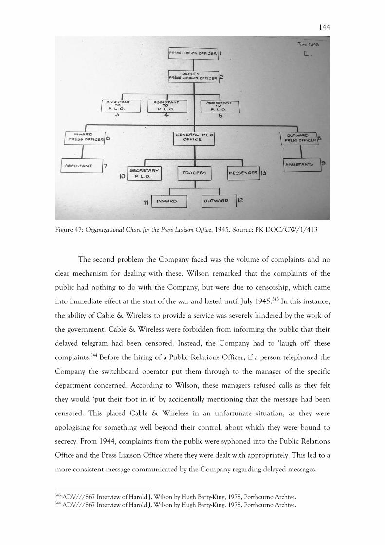
144
Figure 47: Organizational Chart for the Press Liaison Office, 1945. Source: PK DOC/CW/1/413
The second problem the Company faced was the volume of complaints and no
clear mechanism for dealing with these. Wilson remarked that the complaints of the
public had nothing to do with the Company, but were due to censorship, which came
into immediate effect at the start of the war and lasted until July 1945.343 In this instance,
the ability of Cable & Wireless to provide a service was severely hindered by the work of
the government. Cable & Wireless were forbidden from informing the public that their
delayed telegram had been censored. Instead, the Company had to ‘laugh off’ these
complaints.344 Before the hiring of a Public Relations Officer, if a person telephoned the
Company the switchboard operator put them through to the manager of the specific
department concerned. According to Wilson, these managers refused calls as they felt
they would ‘put their foot in it’ by accidentally mentioning that the message had been
censored. This placed Cable & Wireless in an unfortunate situation, as they were
apologising for something well beyond their control, about which they were bound to
secrecy. From 1944, complaints from the public were syphoned into the Public Relations
Office and the Press Liaison Office where they were dealt with appropriately. This led to a
more consistent message communicated by the Company regarding delayed messages.
343 ADV///867 Interview of Harold J. Wilson by Hugh Barty-King, 1978, Porthcurno Archive. 344 ADV///867 Interview of Harold J. Wilson by Hugh Barty-King, 1978, Porthcurno Archive.
145
The third problem faced by Cable & Wireless was the dramatic increase in traffic,
caused by a rise in government and press traffic during the Second World War. All these
Public Relations initiatives meant that during the Second World War Cable & Wireless
were effectively acting as the communications office of the government, and in this
respect no longer functioned as a private, profit-making business.345 This was particularly
the case when Cable & Wireless adopted a policy to avoid anything that might increase
traffic.346 This was due to two reasons. Firstly, by encouraging the public to not use the
service, they were effectively freeing up manpower and bandwidth for use by the British
government.347 As government traffic accounted for a large proportion of all traffic sent
during the Second World War, this made commercial sense. Secondly, there was a fear
that due to the unprecedented levels of traffic, the service provided to customers would
suffer. 348 By attempting to stabilise the levels of traffic, the Company was able to
consolidate their customer service, in the hope of retaining clientele in the event of falls
in government or press traffic. Indeed, the publicity deployed before 1947 was limited to
the ‘dissemination of knowledge of the services offered and the best methods of using
them’. 349 Here, the focus was on highlighting and nurturing the brand, rather than
attempting to increase traffic. The strategy of actively trying to discourage any increases in
traffic runs counter to aims of marketing and public relations today, but made
commercial sense at the time. This clearly demonstrates that Cable & Wireless’ publicity
policy during the Second World War was highly adaptive and determined by a number of
exterior factors, namely the involvement of the British government.
Alongside the establishment of the Public Relations Office and the Press Liaison
Office to deal with the problems listed above, Fraser also suggested hiring a Typographic
Consultant in the same year. This signalled an overt move to align the Company with a
high standard of design and to create a degree of uniformity across their printed material.
The Typographic Consultant, Stanley Morison, was a well-known typographer who had
worked for a number of companies in this capacity, including The Times, for whom he
created the typeface Times New Roman. Correspondence between Stanley Morison and
Ivor Fraser reveals a great deal about the motivations of the Company, namely their
345 Oldcorn, On the Wire, 207. 346 CW/12/132 Cable & Wireless Publicity Policy Statement, 1947, Porthcurno Archive, 1. 347 Oldcorn, On the Wire, 207. 348 CW/12/132 Cable & Wireless Publicity Policy Statement, 1947, Porthcurno Archive, 1. 349 DOC/CW/12/406, Memorandum on 1948 and some subsequent operations, Porthcurno Archive,10.
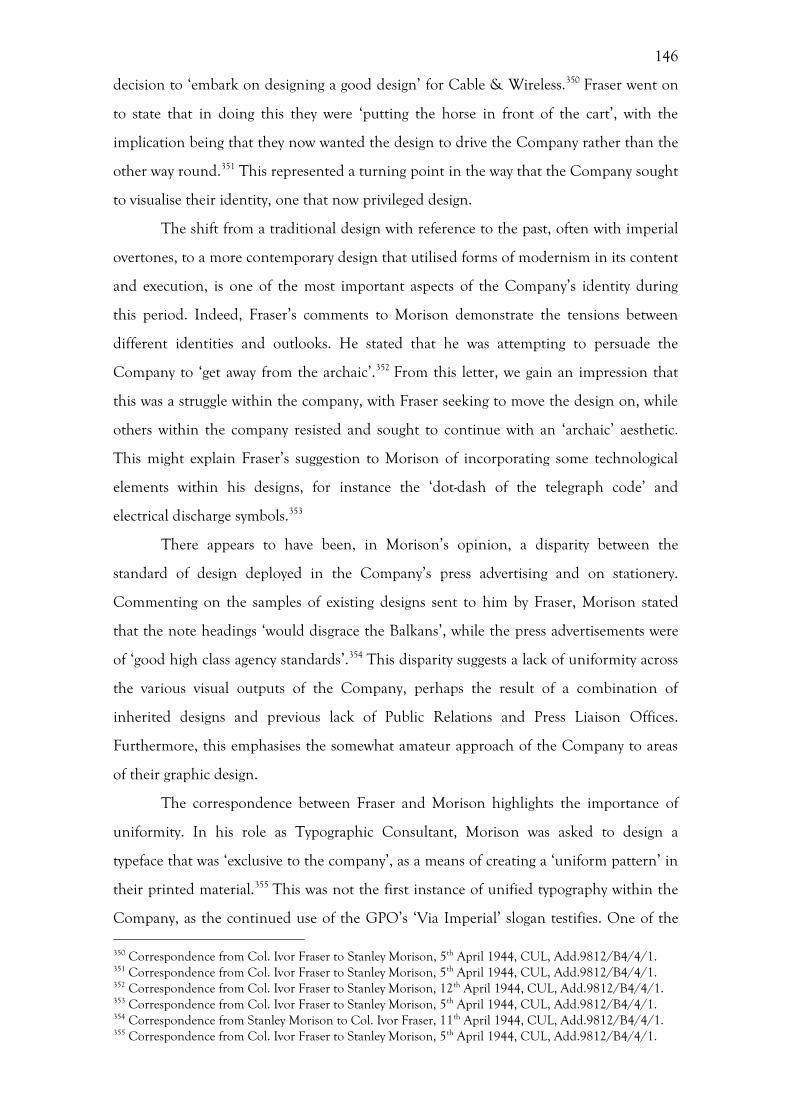
146
decision to ‘embark on designing a good design’ for Cable & Wireless.350 Fraser went on
to state that in doing this they were ‘putting the horse in front of the cart’, with the
implication being that they now wanted the design to drive the Company rather than the
other way round.351 This represented a turning point in the way that the Company sought
to visualise their identity, one that now privileged design.
The shift from a traditional design with reference to the past, often with imperial
overtones, to a more contemporary design that utilised forms of modernism in its content
and execution, is one of the most important aspects of the Company’s identity during
this period. Indeed, Fraser’s comments to Morison demonstrate the tensions between
different identities and outlooks. He stated that he was attempting to persuade the
Company to ‘get away from the archaic’.352 From this letter, we gain an impression that
this was a struggle within the company, with Fraser seeking to move the design on, while
others within the company resisted and sought to continue with an ‘archaic’ aesthetic.
This might explain Fraser’s suggestion to Morison of incorporating some technological
elements within his designs, for instance the ‘dot-dash of the telegraph code’ and
electrical discharge symbols.353
There appears to have been, in Morison’s opinion, a disparity between the
standard of design deployed in the Company’s press advertising and on stationery.
Commenting on the samples of existing designs sent to him by Fraser, Morison stated
that the note headings ‘would disgrace the Balkans’, while the press advertisements were
of ‘good high class agency standards’.354 This disparity suggests a lack of uniformity across
the various visual outputs of the Company, perhaps the result of a combination of
inherited designs and previous lack of Public Relations and Press Liaison Offices.
Furthermore, this emphasises the somewhat amateur approach of the Company to areas
of their graphic design.
The correspondence between Fraser and Morison highlights the importance of
uniformity. In his role as Typographic Consultant, Morison was asked to design a
typeface that was ‘exclusive to the company’, as a means of creating a ‘uniform pattern’ in
their printed material.355 This was not the first instance of unified typography within the
Company, as the continued use of the GPO’s ‘Via Imperial’ slogan testifies. One of the 350 Correspondence from Col. Ivor Fraser to Stanley Morison, 5th April 1944, CUL, Add.9812/B4/4/1. 351 Correspondence from Col. Ivor Fraser to Stanley Morison, 5th April 1944, CUL, Add.9812/B4/4/1. 352 Correspondence from Col. Ivor Fraser to Stanley Morison, 12th April 1944, CUL, Add.9812/B4/4/1. 353 Correspondence from Col. Ivor Fraser to Stanley Morison, 5th April 1944, CUL, Add.9812/B4/4/1. 354 Correspondence from Stanley Morison to Col. Ivor Fraser, 11th April 1944, CUL, Add.9812/B4/4/1. 355 Correspondence from Col. Ivor Fraser to Stanley Morison, 5th April 1944, CUL, Add.9812/B4/4/1.
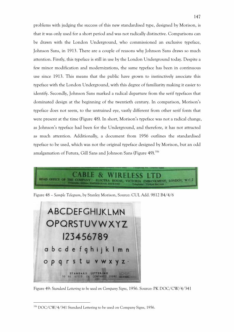
147
problems with judging the success of this new standardised type, designed by Morison, is
that it was only used for a short period and was not radically distinctive. Comparisons can
be drawn with the London Underground, who commissioned an exclusive typeface,
Johnson Sans, in 1913. There are a couple of reasons why Johnson Sans draws so much
attention. Firstly, this typeface is still in use by the London Underground today. Despite a
few minor modification and modernizations, the same typeface has been in continuous
use since 1913. This means that the public have grown to instinctively associate this
typeface with the London Underground, with this degree of familiarity making it easier to
identify. Secondly, Johnson Sans marked a radical departure from the serif typefaces that
dominated design at the beginning of the twentieth century. In comparison, Morison’s
typeface does not seem, to the untrained eye, vastly different from other serif fonts that
were present at the time (Figure 48). In short, Morison’s typeface was not a radical change,
as Johnson’s typeface had been for the Underground, and therefore, it has not attracted
as much attention. Additionally, a document from 1956 outlines the standardised
typeface to be used, which was not the original typeface designed by Morison, but an odd
amalgamation of Futura, Gill Sans and Johnson Sans (Figure 49).356
Figure 48 – Sample Telegram, by Stanley Morison, Source: CUL Add. 9812 B4/4/6
Figure 49: Standard Lettering to be used on Company Signs, 1956. Source: PK DOC/CW/4/341
356 DOC/CW/4/341 Standard Lettering to be used on Company Signs, 1956.
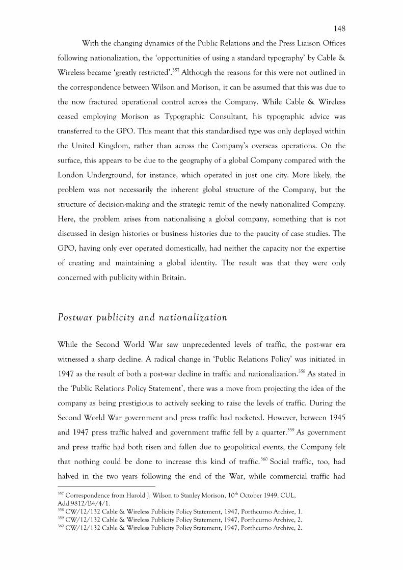
148
With the changing dynamics of the Public Relations and the Press Liaison Offices
following nationalization, the ‘opportunities of using a standard typography’ by Cable &
Wireless became ‘greatly restricted’.357 Although the reasons for this were not outlined in
the correspondence between Wilson and Morison, it can be assumed that this was due to
the now fractured operational control across the Company. While Cable & Wireless
ceased employing Morison as Typographic Consultant, his typographic advice was
transferred to the GPO. This meant that this standardised type was only deployed within
the United Kingdom, rather than across the Company’s overseas operations. On the
surface, this appears to be due to the geography of a global Company compared with the
London Underground, for instance, which operated in just one city. More likely, the
problem was not necessarily the inherent global structure of the Company, but the
structure of decision-making and the strategic remit of the newly nationalized Company.
Here, the problem arises from nationalising a global company, something that is not
discussed in design histories or business histories due to the paucity of case studies. The
GPO, having only ever operated domestically, had neither the capacity nor the expertise
of creating and maintaining a global identity. The result was that they were only
concerned with publicity within Britain.
Postwar publicity and nationalization
While the Second World War saw unprecedented levels of traffic, the post-war era
witnessed a sharp decline. A radical change in ‘Public Relations Policy’ was initiated in
1947 as the result of both a post-war decline in traffic and nationalization.358 As stated in
the ‘Public Relations Policy Statement’, there was a move from projecting the idea of the
company as being prestigious to actively seeking to raise the levels of traffic. During the
Second World War government and press traffic had rocketed. However, between 1945
and 1947 press traffic halved and government traffic fell by a quarter.359 As government
and press traffic had both risen and fallen due to geopolitical events, the Company felt
that nothing could be done to increase this kind of traffic.360 Social traffic, too, had
halved in the two years following the end of the War, while commercial traffic had 357 Correspondence from Harold J. Wilson to Stanley Morison, 10th October 1949, CUL, Add.9812/B4/4/1. 358 CW/12/132 Cable & Wireless Publicity Policy Statement, 1947, Porthcurno Archive, 1. 359 CW/12/132 Cable & Wireless Publicity Policy Statement, 1947, Porthcurno Archive, 2. 360 CW/12/132 Cable & Wireless Publicity Policy Statement, 1947, Porthcurno Archive, 2.
149
actually risen slightly following an export drive.361 Cable & Wireless felt that commercial
and social traffic could be stimulated, and this was where the attention of the Public
Relations Office focussed.
In order to increase the levels of commercial traffic, Cable and Wireless adopted a
policy to propagate the idea that the overseas telegram was an ‘indispensible adjunct of
export trade’, something which the government was also encouraging.362 By extension, the
Company was trying to suggest to businesses that by sending more overseas telegrams,
export trade would also increase. This link between telegrams and trade was made explicit
in some of the Company’s newspaper advertisements. For example, in February 1948 the
text across the top of the advertisement read ‘STIMULATE EXPORT TRADE’, displaying the
same angled telegram with the message ‘SELL BY CABLE’ (Figure 50). 363 Another
advertisement within the same series, with the same telegram depicted, ran the title
‘SPEED THE EXPORT DRIVE’ (Figure 51).364 The pictorial element of this advertisement
mimics that of an earlier advertisement from 1932 featured in the Financial Times. The
recurrent use of this motif is one of the few instances of visual consistency in the
Company. The motif of the telegram with the Company’s message written upon it allows
the use of one of the few tangible elements of telegraphy. It allowed the Company to
quickly alert the customer to the fact that this advertisement was about the use of
telegraphy and reminded them of the look of the Cable & Wireless telegram forms. This
design was also seen in another trade-related advertisement from June 1947 in The
Economist, which shows a Cable & Wireless telegram with the statement ‘If you’ve goods
for export OFFER THEM BY CABLE’ (Figure 52).365 The fact that this was placed in The
Economist, shows that they were directly targeting a specific audience for stimulating
commercial trade.
361 CW/12/132 Cable & Wireless Publicity Policy Statement, 1947, Porthcurno Archive,1; DOC/CW/12/406, Memorandum on 1948 and some subsequent operations, Porthcurno Archive, 10. 362 CW/12/132 Cable & Wireless Publicity Policy Statement, 1947, Porthcurno Archive, 2. 363 Cable and Wireless Ltd Display Advertisement, The Times, February 10, 1948 (50991) 6. 364 Cable and Wireless Ltd Display Advertisement, The Times, April 15, 1948 (51046) 2. 365 Cable and Wireless Ltd Display Advertisement, The Economist, June 21, 1947 (5417), 983.
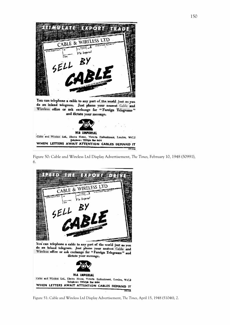
150
Figure 50: Cable and Wireless Ltd Display Advertisement, The Times, February 10, 1948 (50991), 6.
Figure 51: Cable and Wireless Ltd Display Advertisement, The Times, April 15, 1948 (51046), 2.
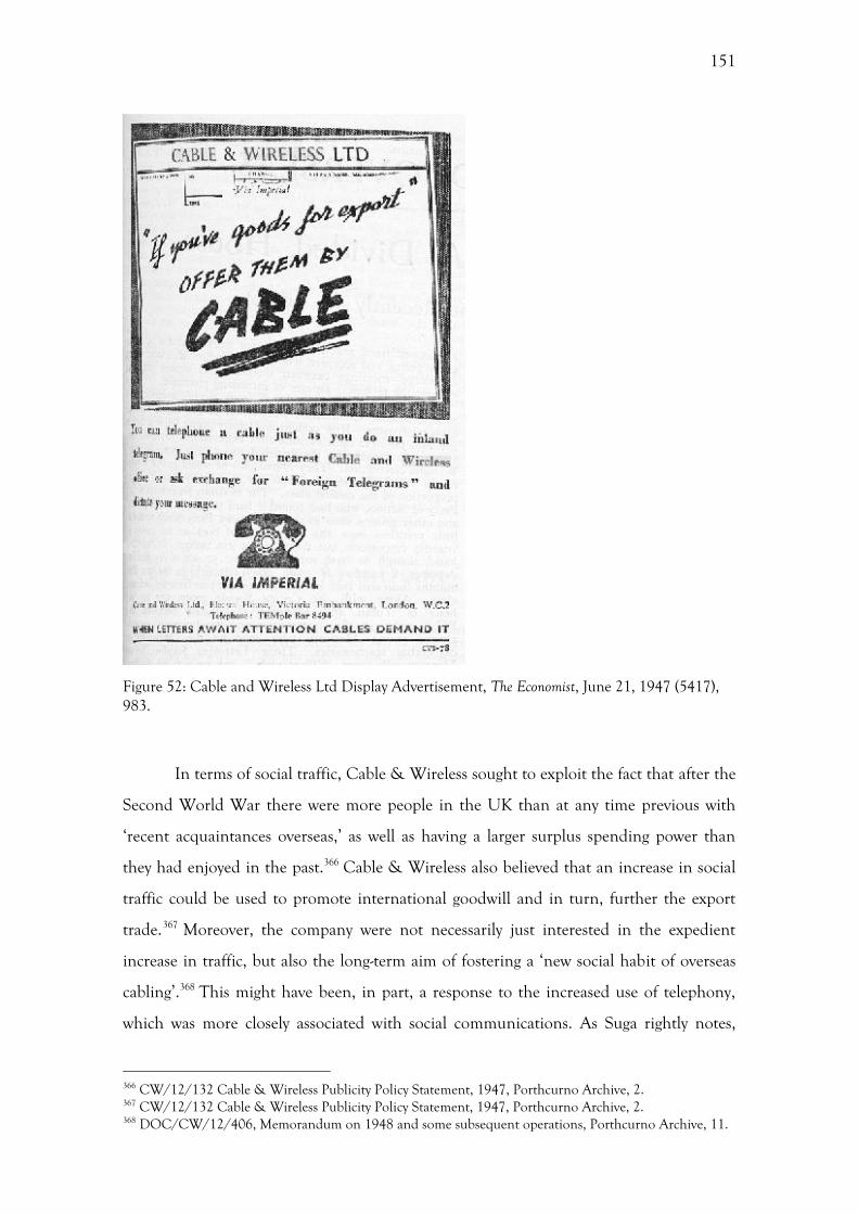
151
Figure 52: Cable and Wireless Ltd Display Advertisement, The Economist, June 21, 1947 (5417), 983.
In terms of social traffic, Cable & Wireless sought to exploit the fact that after the
Second World War there were more people in the UK than at any time previous with
‘recent acquaintances overseas,’ as well as having a larger surplus spending power than
they had enjoyed in the past.366 Cable & Wireless also believed that an increase in social
traffic could be used to promote international goodwill and in turn, further the export
trade.367 Moreover, the company were not necessarily just interested in the expedient
increase in traffic, but also the long-term aim of fostering a ‘new social habit of overseas
cabling’.368 This might have been, in part, a response to the increased use of telephony,
which was more closely associated with social communications. As Suga rightly notes,
366 CW/12/132 Cable & Wireless Publicity Policy Statement, 1947, Porthcurno Archive, 2. 367 CW/12/132 Cable & Wireless Publicity Policy Statement, 1947, Porthcurno Archive, 2. 368 DOC/CW/12/406, Memorandum on 1948 and some subsequent operations, Porthcurno Archive, 11.
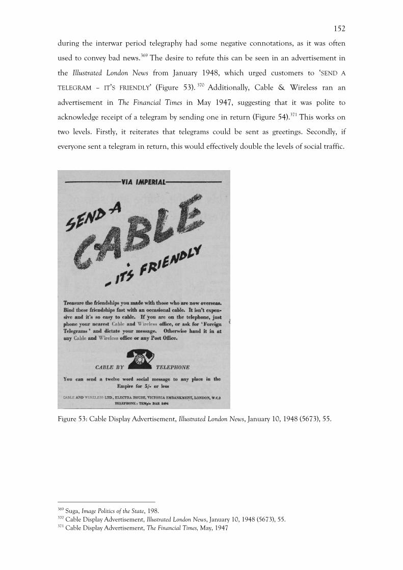
152
during the interwar period telegraphy had some negative connotations, as it was often
used to convey bad news.369 The desire to refute this can be seen in an advertisement in
the Illustrated London News from January 1948, which urged customers to ‘SEND A
TELEGRAM – IT’S FRIENDLY’ (Figure 53). 370 Additionally, Cable & Wireless ran an
advertisement in The Financial Times in May 1947, suggesting that it was polite to
acknowledge receipt of a telegram by sending one in return (Figure 54).371 This works on
two levels. Firstly, it reiterates that telegrams could be sent as greetings. Secondly, if
everyone sent a telegram in return, this would effectively double the levels of social traffic.
Figure 53: Cable Display Advertisement, Illustrated London News, January 10, 1948 (5673), 55.
369 Suga, Image Politics of the State, 198. 370 Cable Display Advertisement, Illustrated London News, January 10, 1948 (5673), 55. 371 Cable Display Advertisement, The Financial Times, May, 1947
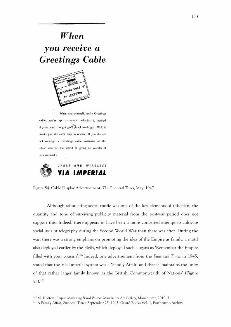
153
Figure 54: Cable Display Advertisement, The Financial Times, May, 1947
Although stimulating social traffic was one of the key elements of this plan, the
quantity and tone of surviving publicity material from the post-war period does not
support this. Indeed, there appears to have been a more concerted attempt to cultivate
social uses of telegraphy during the Second World War than there was after. During the
war, there was a strong emphasis on promoting the idea of the Empire as family, a motif
also deployed earlier by the EMB, which deployed such slogans as ‘Remember the Empire,
filled with your cousins’.372 Indeed, one advertisement from the Financial Times in 1945,
stated that the Via Imperial system was a ‘Family Affair’ and that it ‘maintains the unity
of that rather larger family known as the British Commonwealth of Nations’ (Figure
55).373
372 M. Horton, Empire Marketing Board Posters: Manchester Art Gallery, Manchester, 2010, 5. 373 A Family Affair, Financial Times, September 25, 1945, Guard Books Vol. 1, Porthcurno Archive.
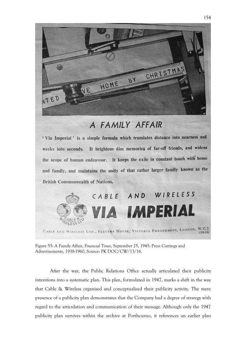
154
Figure 55: A Family Affair, Financial Times, September 25, 1945: Press Cuttings and Advertisements, 1938-1960, Source: PK DOC/CW/13/16.
After the war, the Public Relations Office actually articulated their publicity
intentions into a systematic plan. This plan, formulated in 1947, marks a shift in the way
that Cable & Wireless organised and conceptualised their publicity activity. The mere
presence of a publicity plan demonstrates that the Company had a degree of strategy with
regard to the articulation and communication of their message. Although only the 1947
publicity plan survives within the archive at Porthcurno, it references an earlier plan
155
produced in June 1945, which detailed the general policy being pursued by the Company.
It appears that the publicity plan of 1947 was circulated to ‘acquaint Head Office
Departments and Branch Offices, stations and ships at home and overseas, with the
changes’. 374 Here, the intention was for other departments within the Company to
cooperate with the Public Relations Office, in order to create a more integrated public
relations policy, rather than the department operating in isolation. Indeed, the copy of
the report within the archive was the one issued to the Contracts Manager.
Beyond the bounds of the Company, the publicity plan for 1947 was also
advertised in the form of a pamphlet. It is not clear who the intended audience of this
pamphlet was, but it was most likely for the press. It could also have been for the public,
though it seems unlikely that they should publicise internal policies to the public. One of
the most interesting features of this pamphlet is that it contains the motif of the telegram
form as well as copies of the proposed advertisements. These advertisements therefore
clearly belong to a series. The fact that these different advertisements were released
throughout the year might lead us to believe that the different slogans were created on an
ad hoc basis. However, the presence of all of the slogans in this pamphlet highlights that
this was a strategic plan.
The increase in the formalization of strategic public relations policy coincided
with the nationalization of the Company in 1947, marking an increased involvement of
the government. The presence of the first publicity plan highlighted that the government
had a greater level of experience with regard to public relations than the Company. The
process of nationalization resulted in the decision making power of Cable & Wireless
moving, alongside its assets, overseas and in some instances to the GPO. The same was
true of the publicity work of the Company. An undated document written by Sir Stanley
Angwin, the Company Chairman following nationalization, concerning the future
organization of the Company massively redefined the remit of the Public Relations
Office.375 As the title of this document attests, this was only a suggested plan for the
future organization of the Company, and it is not entirely clear whether these changes
were enacted exactly as laid out in Angwin’s plan. Correspondence between Harold J.
Wilson and Stanley Morison in 1949 suggests that in terms of publicity Cable & Wireless
374 CW/12/132 Cable & Wireless Publicity Policy Statement, 1947, Porthcurno Archive, 1. 375 DOC/CW/1/122, Report by Sir Stanley Angwin Concerning Suggested Future Organisation of Cable & Wireless Ltd, Porthcurno Archive.
156
were now only dealing with the public overseas.376 Control of publicity was also removed
from the hands of Cable & Wireless through the use of subsidiary companies, which
dealt with public relations in the more populous areas overseas.377 This meant that Cable
& Wireless’ control over its own public relations was limited overseas. By 1949, Cable &
Wireless no longer communicated directly to the British people, but instead only with
those living overseas.
This report by Angwin sets out the duties to be undertaken by the new Public
Relations Office, with an apparent change in focus when compared with the publicity
plan of 1947. Traffic-raising policies were restricted to the Crown Colonies and foreign
countries, rather than within the UK.378 From this it can be deduced that the role of
raising traffic in the UK was now the responsibility of the Post Office. The main role of
the new Public Relations Office, instead, appears to be increasing the prestige of the
Company and education, effectively reverting to the functions it had during the Second
World War. The purpose was primarily to ‘propagate knowledge of the Company’s part
in the scheme of Commonwealth and world telecommunications’ as well as ‘generally
promoting the Company’s prestige of the Company in the UK, the Dominions, the
Crown Colonies and the foreign countries’ in which it operated.379
The report proposed these plans be achieved via ‘unpaid’ forms of publicity;
primarily press editorial columns in the UK and abroad, as well as reference books, news-
reel films, broadcasting and lectures.380 While such forms of publicity were mentioned in
previous plans, the virtue of being free was not proclaimed before this point. This might
be, in part, the result of the company now being under public ownership and the fact that
it could not be seen to be spending large sums of money on publicity. Within this plan an
important distinction was made between prestige-raising publicity and traffic-raising
publicity. For the latter, it was stated that it would be necessary for various forms of paid
publicity to be used, including press and poster advertising, exhibitions, films, sponsored
376 Correspondence from Harold J. Wilson to Stanley Morison, 10th October, 1949, CUL, Add.9812/B4/4/1. 377 Correspondence from Harold J. Wilson to Stanley Morison, 10th October, 1949, CUL, Add.9812/B4/4/1. 378 DOC/CW/1/122, Report by Sir Stanley Angwin Concerning Suggested Future Organisation of Cable & Wireless Ltd, Porthcurno Archive, 1. 379 DOC/CW/1/122, Report by Sir Stanley Angwin Concerning Suggested Future Organisation of Cable & Wireless Ltd, Porthcurno Archive, 1. 380 DOC/CW/1/122, Report by Sir Stanley Angwin Concerning Suggested Future Organisation of Cable & Wireless Ltd, Porthcurno Archive, 1.
157
broadcast programmes and direct mail advertising.381 Here, Angwin only allowed money
to be spent on advertising that would result in a direct financial return. This suggests that
the increased government involvement, as a result of the nationalization of the Company
had injected some business aptitude into the Company, with strategic publicity policies.
One of the ways that the Public Relations Office sought to capitalize on ‘unpaid’
forms of publicity was to ask the staff to supply photographs. However, the way that this
request was formalised within the 1947 ‘Publicity Policy Statement’ highlights the
problems caused by the fact that the Company’s employees were dispersed across the
world. All departments of the Company were asked to submit photographs and
information to be used within the Zodiac and marketing material. It is also stated that the
photographs supplied by the employees were needed for ‘reproduction in exhibitions,
window displays, pamphlets, in advertisements and on posters, and as illustrations for
lantern lectures’. 382 This advice reveals a great deal about not only the marketing
intentions of the Public Relations Office, but also the ways in which the department
worked. This meant that the employees at each station were effectively working as proxy
publicity officers, reporting back to Head Office.
This ‘Publicity Policy Statement’ highlights one of the most salient points about
the difficulties faced by the Company in cultivating the corporate identity and
community of a multi-national company, namely that the staff of the PR Office were ‘not
familiar with local conditions or the personnel […] serving in stations’. 383 One might
assume, at first, that the supply of images from employees was a cost-saving exercise.
Instead, it was a practical solution to the logistical problem of the Company being spread
across the world at the numerous stations. The fact that the Public Relations Office
requested that all photographs submitted were accompanied by detailed captions,
containing the ‘names of personnel’ and ‘descriptions of posts’, at first seems
unimportant.384 However, this highlights the lack of knowledge that the Office had about
the overseas operations of the Company. This informal decentralization of publicity work
occurred at the same time as the decentralization of the assets and organization of the
Company following nationalization in 1947, (which was discussed above in chapter 4).
Despite the global scale of the Company, the Public Relations Office were
381 DOC/CW/1/122, Report by Sir Stanley Angwin Concerning Suggested Future Organisation of Cable & Wireless Ltd, Porthcurno Archive, 1. 382 CW/12/132 Cable & Wireless Publicity Policy Statement, 1947, 5. 383 CW/12/132 Cable & Wireless Publicity Policy Statement, 1947, 5. 384 CW/12/132 Cable & Wireless Publicity Policy Statement, 1947, 5.
158
interested in publicising the role of individuals in what might be called today a ‘human
interest story’. The reasoning behind this is partially explained in the publicity plan,
stating that any item of news, or photograph which ‘reflects creditably on a member of
the staff, also reflects creditably on the Company’. 385 The remit dictated by the Public
Relations Office regarding the subject matter of these photographs was very broad, stating
that they should depict ‘station life’. 386 Here, the emphasis is on the performative
elements of the stations, the daily activities of the staff, rather than the simply recording
scenery. Indeed, the publicity plan states that it was an essential requirement that these
photographs ‘should tell a story’ and that each photograph should contain a ‘human or at
least and animal form’ who should be ‘recognisably doing something’.387
This is contrary to the narratives discussed in the chapter 5 with regard to the use
of maps and globes to reiterate the global reach of the Company. This disparity suggests
that different forms of media were utilised to create different narratives that would
contribute to a broader corporate identity. It was most likely the case that members of the
public could relate to these personal stories, while at the same time understanding that
this was a global company through the reception of the Company’s use of cartography
and global imagery, which will be discussed in chapter 8. These calls for staff
contributions formed part of the Company’s Publicity Policy Statement of 1947, which
formalized the Company’s post-war publicity intentions.
Conclusion
The picture presented of the publicity activities of Cable & Wireless during the period
from the merger to nationalization (1929-1947) challenges the assumption made in
Business History and Design History that companies have coherent publicity plans. By
focussing on the periods in which Cable & Wireless did not have a strategic plan, a
consistent style or even any control over their publicity, this chapter has demonstrated
that identity creation and dissemination was not a neat process or one that necessarily
adhered to a distinct model. What emerges is a Company trying to find their way
amongst the pressures of external forces, namely the downturn in traffic levels following
the Depression and the end of the Second World War, as well as the temporary upsurge
385 CW/12/132 Cable & Wireless Publicity Policy Statement, 1947, 5. 386 CW/12/132 Cable & Wireless Publicity Policy Statement, 1947, 5. 387 CW/12/132 Cable & Wireless Publicity Policy Statement, 1947, 5.
159
in traffic experienced during the war.
This chapter has charted the oscillation between advertising seeking to raise traffic
levels, with a direct financial return, and the more intangible notion of prestige and
public relations. During the Second World War, there was a desire to emphasise the
prestige of the company and this was again highlighted in the plans for the reorganization
of the Public Relations and Publicity departments following nationalization. Prestige was
based on influencing perceptions of achievements and past successes, rather than
attempting to market a product or service. Both before and after the Second World War,
the Company were advertising a service. Conversely, during the war they were not selling
a service, they were selling a series of relationships, between the customer and the
Company, between the Company and the British State and between the UK and the
Dominions.
The examination of the publicity staff of Cable & Wireless highlights the number
of links that existed between the company and other companies and organizations
operating at the time, such as the GPO, the EMB, the BBC and London Transport. It
seems obvious that there might be members of staff working for Cable & Wireless who
had worked elsewhere previously, and this movement from one company to another
might engender the exchange of ideas. This highlights the need to contextualise the
Company and to look at other business operating at the same time. The networks that
existed between businesses should be a prime consideration in the evaluation of a
company’s corporate identity as it was effectively the result of a myriad of influences
beyond the walls of the company headquarters. Furthermore, the core shifts in publicity
and corporate promotion of the Company occurred as a result of the Second World War,
in particular the massive state involvement. The history of Cable & Wireless’ public
relations cannot, therefore, be disentangled from that of the government or other
companies operating at this time. This was not the neat process of identity formation that
is often lauded in design historical texts.
160
7. Building a corporate community: distanced coherence
and Cable & Wireless’ internal corporate identities
While the previous chapters have examined the formal creation of an external identity,
this chapter assesses the internal identity of the Company, as well as the role played by
the employees in the co-creation of this identity. In particular, this chapter examines the
idea of distanced coherence within the Company’s management and culture throughout
the telegraphy network. This will investigate how people stationed across the world were
encouraged to feel part of the Cable & Wireless corporate culture, and the ways in which
the Company communicated with the staff, primarily looking the Company’s internal
magazine, the Zodiac and their participation in company organised social pursuits. This
chapter will also investigate the environment in which they worked in order to ascertain
how the Company sought to portray themselves internally. As Downey states, the ‘lived
geography’ of the telegraph network has been ignored by historians of telegraphy in
favour of a focus on system builders and inventors, and by geographers of
communication who have traditionally examined the impact of the network on cities and
the speed of business.388 In most studies of businesses, the staff are seen merely as passive
conduits for the Company’s identity, whereas this chapter will demonstrate that they were
active contributors. A number of sociologists, ethnographers, cultural anthropologists and,
more recently, historians, have argued that consumers are co-producers of culture, and
the same concept can be extended to the staff within the Company. 389 These
contributions from the staff were often not the unedited views of the staff, as there was a
degree of mediation present on the behalf of the Company or more specifically, the
Public Relations Office, as discussed in chapter 6.
The dispersal of employees across the British Empire and beyond created a
somewhat fragmented corporate body. As chapter 6 has shown, this created some
problems for the Public Relations Office in exercising centralised control over the
388 G. Downey, Telegraph messenger boys: crossing the borders between history of technology and human geography, The Professional Geographer 55 (2003) 134-145, 134. 389 B. Melman, The Culture of History: English Uses of the Past 1800-1953, Oxford, 2006, 18.
161
Company’s identity. A solution to this fragmentation was the Exiles Club, which created
an ‘imagined community’ in the various overseas stations through the provision of social
and sporting activities. 390 Established in the late nineteenth-century, this social club
provides an institutional link with the traditions of public schools and the Colonial
Service. The activities of the Exiles Club were mainly recorded in the Zodiac magazine.
The Zodiac presents both a quasi-official view of the Company’s internal identity
and a channel of communication between the headquarters and the stations across the
Empire and beyond, as well as a mechanism used by the Company to connect the various
employees working across the telegraph network. As a communications company it is
pertinent to assess how Cable & Wireless communicated with their staff, and the Zodiac
provides the perfect opportunity to do so. Both the content and the form of the magazine
will be taken into consideration to assess how much the management of the Company
were involved and how this form of commutation evolved. Additionally, an investigation
of the changing front covers will determine the level of professionalism and consistency
deployed, and in turn the degree of involvement of the Company will become clear. The
picture that emerges from this investigation of the Zodiac is one of increased
professionalization from the 1920s to the 1950s, as well as an opportunity to experiment
with the cover design. The examination of the Zodiac builds upon the previous chapter
with regard to the remit and increasing professionalization of the Public Relations Office.
As this chapter shows, there does not appear to be a single identity, but a series of
identities experienced at the different locations where the Company operated. Through
an investigation of both those stationed overseas and the staff working in the London
Head Office, this chapter shows how the internal corporate identity of the Company was
constructed, and asks whether this had any influence upon its external identity. This will
not only take into account the experiences of the staff and their engagement with the
Company’s corporate culture, but will also examine the environment in which they
worked, namely looking at the Company’s architecture.
The architecture of the branches, the Head Offices and the overseas stations all
had an impact upon the creation of both the Company’s internal and external identity.
In this instance, it is important to assess the varying levels of visibility that the different
staff had across the network, as well as the public. To the British public and Cable &
Wireless’ domestic customers, the branches and those working within them, would have
been highly visible, while the Head Offices in London were only partially visible. 390 Anderson, Imagined Communities.
162
Although the overseas cable stations were an incredibly important aspect of the Company
in terms of both operations and the shaping of a corporate culture, this was not an aspect
of the company’s visual culture that was highly visible to the public, especially to the
British public. In this respect, the overseas stations were entirely hidden from view, only
being visible to local customers. There is a potential danger of homogenizing both the
staff and customers of the Company, without any acknowledgement of the interactions
between these two groups.
There is an understandable focus on the various headquarters that the Company
occupied during this period, which were iconic seats of power and identity for the
Company. Numerous photographs are held within the Porthcurno archive of the
Company’s headquarters. Additionally, there is a wealth of material showing the overseas
stations, primarily photographs. This material enables us to build a comprehensive
picture of the architectural styles deployed, as well as how the staff interacted with these
spaces. There were a number of regional branches scattered across the British Isles where
the public sent their telegrams, however, there are scant extant sources pertaining to these
branches within the archive at Porthcurno, with the Zodiac being one of the main source
of information. The disparity of material between the domestic branches and the overseas
stations could be due to the fact that the branches were not as exotic and exciting as the
overseas stations and not as important as the Head Office. Indeed, they rarely feature in
histories of the Company. Despite this, these branches were the way that the vast majority
of the British public came into direct contact with the Company, and therefore they
deserve some attention and analysis.
The disparity of information pertaining to the various sites of the Company’s
stations, offices and branches should be approached with some caution. The records
relating to the Company’s Head Office and domestic branches focus almost exclusively
on the Company’s corporate space. Conversely, the material that exists within the archive
relating to the overseas stations tends to focus more on the domestic elements of the lives
of the overseas staff. This material is also incomplete, providing only random snapshots,
creating a partial picture of the Company’s corporate spaces overseas. If we wanted to
look at comparing the rates of modernization between the London offices and the
overseas stations, this would be incredibly difficult.
This chapter starts with an examination of the mechanisms used by the Company
to cultivate a corporate community. This will be achieved through an examination of the
Exiles Club and a detailed analysis of the design of the Company’s internal magazine, the
163
Zodiac. From here there will be a discussion of the environment encountered by the staff
and the customers, from the overseas stations to the Company’s branch offices and Head
Offices in London. This will investigate the different architectural styles deployed. This
will include an examination of the Company’s use of imperial and neoclassical styles, as
well as the display of scientific and technological motifs. Following this there will be a
discussion of the ways in which the staff and the customers used this space. This will
focus on the work of the National Institute of Industrial Psychology, who were contracted
to assess the efficiency of Electra House, and the emphasis placed by the Company on
notions of modernity within their internal identity.
Corporate Community
One of the fundamental differences between Cable & Wireless and other companies was
its large scale and multinational element. This presented the need to cultivate a
community within the Company, more so than in those companies operating solely
within Britain. A similar situation arose for the soap company, Port Sunlight, who could
no longer rely on the ‘personal paternalism’ of the Company’s founder, William Lever,
once the company became multinational.394 Instead, they had to ‘construct a sense of
community’ for a wider audience.395 The Exiles Club was established by the ETC, and
following the merger in 1929, Cable & Wireless continued to the running of this social
club. Originally starting in Porthcurno, where the overseas staff trained, the Exiles Club
provided social and sporting activities to those who felt isolated on the Cornish peninsula.
The name itself was derived from the isolation felt by the staff at Porthcurno, who were a
considerable distance from the nearest town. This feeling of isolation was translated to
their experiences stationed overseas, and the Club became a mechanism for connecting
the various staff dispersed across the world.
This theme of connection is emphasised by the club’s motto, ‘Oceanus non
dissociat’ (‘The ocean does not separate’), which was also the motto of the Zodiac and
some cable ships. This was not just about the annihilation of space through telegraphy, as
previously discussed in relation to the Company’s cartography, but was also about the
394 Rowan, Imagining Corporate Culture, 16. 395 Rowan, Imagining Corporate Culture, 16.
164
apparatus in place to connect otherwise isolated staff. 396 This link of course was
illusionary and imagined.397 Parallels can be drawn between the imagined communities
that Anderson discusses with relation to nationalism; the majority of staff stationed
overseas had little contact with employees at other stations, but they had a ‘communion’,
as Anderson puts it.398 This communion came in the form of the Zodiac, which allowed
for the communication between different stations. Anderson goes on to state that
national communities are distinguished by ‘the style in which they are imagined’.399 In the
case of Cable & Wireless, this style was often copied or adopted from the British Empire,
then formalised and disseminated through the Zodiac. This provided a reassuring
sentiment to those staff posted overseas, implying that even though there was a physical
distance between them and their home or colleagues at other stations, there is a sense of
community created through communication, either through the use of telegraphy or the
internal staff magazine. Through the social activities, communicated through the Zodiac,
they were ‘exiles’ only in name.
The motto, ‘Oceanus non dissociat’, was usually accompanied by the club’s crest,
depicting a red horse surmounting waves, holding a trident. The trident taps into the use
of classical imagery, alluding to either Poseidon or Neptune. An article in the Zodiac from
1927 asked staff to contribute suggestions of a new symbol. It is not clear from the article
whether this was to replace the sea horse or to supplement it. The fact that the red sea
horse continued to be used after this time indicated that they did not find a replacement.
The main point to be gained from this advert was the fact that the staff were consulted
about the visual identity of their club, conferring a sense of ownership over the club by
the staff.
The fact that the Exiles Club had both a motto and a crest is indicative of a
broader trend within imperial settlements, the desire for the ‘trappings of tradition’.400
Whereas the Company logo was primarily for external communications with the public as
part of the Company’s branding, the crest was for the employees – something that would
define them as a community, almost separate from the main operations of the company.
The connotations of a crest or coat of arms are different from a logo; there is a sense of
deep-rooted history, of continuity with a previous age and to a particular place. There was
396 I. R. Morus, The electric Ariel: telegraphy and commercial culture in early Victorian England, Victorian Studies, 39 (1996) 339-378. 397 See, Anderson, Imagined Communities. 398 Anderson, Imagined Communities, 6. 399 Anderson, Imagined Communities, 6. 400 Cannadine, Ornamentalism, 28.
165
also a sense of the familial, which emphasised that at times the Company, or at least the
Exiles Club, was the personification of a family.
As Cannadine argues, the British Empire was as much, and often more, about the
‘replication of sameness’ of home, the familiar and the domestic, as it was about ‘the
insistence on difference’ and the exotic.401 When the British settled within the Empire
they did not seek to create a new, egalitarian society, but instead choose to replicate the
hierarchical structure of the societies from whence they came.402 Indeed, one of the main
points to emerge from an investigation of the Company’s culture in the overseas stations
is one of social hierarchy and the replication of home. With Cable & Wireless this is
primarily witnessed in the hierarchical commercial context of the company, but also in
terms of the various sports teams, where class and status were more important than race.
Sport has been viewed by some writers such as a Stoddart as one of the main
agents of transferring social behaviour, standards and conformity from Britain to the
Empire.403 Tennis was by far the most popular ‘recreation’ amongst the overseas staff,
with twenty-nine stations offering it in 1923, and tennis courts usually featured in the
foreground of photographs depicting the station buildings.404 Tennis was seen as a social
game, designed to bring people together of the same social rank in a leisurely, rather than
a competitive, manner.405 Other popular sports were cycling, golf, football, sailing, hockey
and cricket, as well as more solitary pursuits such as photography and shooting.406 Cricket
is considered by Stoddart to be the main vehicle for the transfer of a British moral code
to the local populations; however, there is little evidence to suggest that cricket was played
outside of the confines of the stations. 407 What is important when considering team
sports such as cricket, football and hockey, was that they instilled as sense of co-operation
between the player, as well as creating a sense of loyalty and belonging towards the Exiles
Club, and by extension, the Company.
This sense of community was visually confirmed by the presence of Exile Club
uniforms, which had the club crest. In transporting these social activities overseas, they
replicated not only a British culture, but also provided an extension of the public school
system. Indeed, if we think of the structure of the Company in terms of a public school,
401 Cannadine, Ornamentalism, xix. 402 Cannadine, Ornamentalism, 28. 403 B. Stoddart, Sport, cultural imperialism, and colonial response in the British Empire, Comparative Studies in Society and History, 30 (1988) 649-673, 651. 404 DOC/CW/5/186 Memorandum Re. Outfits, 1923, Eastern Telegraph Company, Porthcurno Archive. 405 Stoddart, Sport, cultural imperialism, 657-658. 406 DOC/CW/5/186 Memorandum Re. Outfits, 1923, Eastern Telegraph Company, Porthcurno Archive. 407 Stoddart, Sport, cultural imperialism, 658.
166
then each of the overseas stations was the equivalent of a ‘house’. There was an
overarching ethos, but within that there were differences in each station, with some
stations being stronger in some sports.
Indeed, much of the operational and cultural aspects of the life at overseas
stations were predicated on traditional institutions, such as the British public school
system, the military and the Colonial Service, which inextricably bound the Company to
the instruments of Empire.408 The well-trodden route of public school to imperial civil
service was mimicked by the process of training in Porthcurno and subsequent posting to
the far reaches of the Empire.409 The unification of the Colonial Service in 1930, which
previously had comprised a myriad of different agencies, to create a single Empire-wide
service, came only a year after the creation of I&IC.410 Indeed, John Packer, who spent
the 1970s working for the Company in the British Solomon Islands stated that ‘the
overseas life of Cable & Wireless was akin to the Colonial Service’.411
Secondly, similarities between the Company and the public school system help
confirm the suggestion that there was a close association between British imperialism and
the public school.412 The training college at Porthcurno strongly resembled a boarding
school in its ethos and operations, and employees were usually drawn from such schools.
This background aided the employees’ transition to living at an overseas station and
being away from home. Indeed, Ted Amor, who was stationed in Egypt during the late
1940s, was asked in an oral history interview whether he had felt homesick. 413 His reply
of ‘No, no. Boarding school boy’” exudes a sense of identity that had remained with him,
an identity that was comparable with that of the Company.414 Indeed, Mangan states that
we should remind ourselves that the Empire was served by technologists and scientists of
all kinds, many of which were educated at public schools, and that their skills in
maintaining the infrastructures of Empire requires some investigation.415
Furthermore, visually and operationally, Cable & Wireless appeared to be a facet
of the British military or government. The nomenclature deployed amongst the
408 Notable exceptions include, Cox, Shaping the corporate identity from below, 197; Heller, Company magazines 1880-1940, 179; Anderson, Imagined Communities, 175. 409 J. A. Mangan, Benefits Bestowed: Education and British Imperialism, Manchester, 1988; Kirk-Greene, On Crown Service. 410 Kirk-Greene, On Crown Service, 12-13. 411 Souden, Voices Over the Horizon, 88. 412 J. A. Mangan, Introduction: imperialism, history and education, in: J. A. Mangan (Ed), Benefits Bestowed: Education and British Imperialism, Manchester, 1988, 1-23, 6. 413 Souden, Voices Over the Horizon, 39. 414 Souden, Voices Over the Horizon,39. 415 Mangan, Introduction: imperialism, history and education, 8.

167
employees stationed overseas was often borrowed from the military, words such as
‘messes’, and ‘fulough’.418 The uniforms, too, took their cues from the military. This was
particularly true of those who worked on the cable ships, who were issued with what
appears to be a naval uniform. Work on the history of uniforms has stated that uniforms
signify order and conformity.419 This desire to align employees with the military actually
had a practical dimension during the Second World War, when the Telcom staff were
given a military uniform.420 The Telecom Organization was effectively working under a
military aegis, as they were mobile wireless telegraphers who Cable & Wireless, in
agreement with the British government, sent to the frontlines. Despite this role, these
telegraphers were still civilians, and would have been treated as civilian if the enemy
captured them. With these uniforms came the protection of the Geneva and Hague
Conventions.
The notion of having a uniform is an important aspect when considering the
Company’s corporate identity, as it creates a sense of visual unity across the company,
similar to a unified typeface or logo as discussed in chapter 5. The staff that wore the
uniform saw themselves as belonging to the community of the Company, seeing other
employees wearing the same uniforms. Moreover, these uniforms were not just worn, they
were also seen by others; acted as shorthand for the ‘behaviour exhibited by the wearer’
and ‘expected by the observer’. 421 As Craik states, uniforms are crucial for public
perception of status, skill and trustworthiness.422 As Yagou suggests, the employee was not
viewed as a recipient of a finished product, but instead as ‘active co-creators and co-
producers’.423 This was achieved through practices of creative consumption and object
adaption.424 This adaptation of the uniforms is hard to establish, and the visual sources
that we have from the Company’s archive are usually official photographs taken during
formal events. The picture that this creates is one of conformity and adherence on the
part of the staff. It is only in the personal photograph albums, or occasionally within the
Zodiac, that we catch glimpses of the staff in a more natural presentation
418 Souden, Voices Over the Horizon, 34. 419 J. Craik, Uniforms Exposed: From Conformity to Transgression, Oxford, 2005, 3; A. Yagou, Foreword: uniforms in design-historical perspective, Journal of Design History, 24 (2011) 101- -104, 101. 420 For a discussion about the strategic aspects of Telcom, see Oldcorn, On the Wire, 133-153. 421 Craik, Uniforms Exposed, 5. 422 Craik, Uniforms Exposed, 121. 423 Yagou, Foreword, 101-2. 424 Yagou, Foreword, 101-2.
168
The Zodiac
The Zodiac magazine was the primary mechanism used by the Company for overcoming
the distances between employees, cultivating a sense of community. The magazine also
served as a mouthpiece for the Company’s management, and as a vehicle for the
dissemination of practical information amongst the staff stations across the world. The
Zodiac, a monthly publication starting in 1906, was initially the staff magazine for the
ETC, but following the merger it became the magazine for I&IC, and later Cable &
Wireless. The magazine comprised articles, short stories and poems, sports fixtures, social
notices, as well as an abundance of photographs and illustrations. Very few records
survive prior to 1944, except the magazine themselves.426 Corporate magazines are usually
only used a source of information about aspects of the Company, and are rarely the focus
of the enquiry within business histories. 427 Where there have been studies of these
magazines, there has been a disparity between those seeking to show that these magazines
represented a top-down managerial strategy,428 and those that view the magazines as a
manifestation of actual staff relations.429 Indeed, Cox, using the example of the BAT
Bulletin, suggests that this publication arose from the staff themselves. 430 However, it
should be noted at the outset that, despite appearances, the Zodiac did not arise from
overseas staff, but instead started life in the Company’s Head Office. It was the brainchild
of Charles Holroyd-Doveton, from the Accounts Department, Joe pitman, from the
Secretary’s Office, and J. U. Burke from the Staff Department in 1906.431
The Zodiac can also be used to assess how the Company communicated with their
employees. Griffiths describes company magazines as a barometer of the transmission,
perception and transformation of organizational cultures within a company. 432 The
function of the magazine was to be the ‘principle instrument for promoting the morale of
the staff’, as well as a means of ‘promoting the Company’s prestige generally’.433 As seen
in the previous chapter, the idea of prestige was a recurrent one within Cable & Wireless’
426 PUB/ZDC/5/3/346 H. J. Wilson, The Future looms bright for Zodiac, The Zodiac, (May 1965) 23-26, 23. 427 See, Cox, Shaping the corporate identity from below, 197; Heller, Company magazines 1880-1940, 179. 428 Phillips, ‘Chemists to the Nation’. 429 Cox, Shaping the corporate identity from below. 430 Cox, Shaping the corporate identity from below, 197. 431 Wilson, The future looms bright, The Zodiac, 23. 432 J. Griffiths, ‘Give my regards to Uncle Billy…’: the rites and rituals of company life at Lever Brothers, c.1900–c.1990, Business History 4 (1995): 25–45, 35. 433 DOC/CW/1/122, Report by Sir Stanley Angwin Concerning Suggested Future Organisation of Cable & Wireless Ltd, Porthcurno Archive, 1
169
publicity activities; however, the difference here is that they were now seeking to promote
this prestige internally. This demonstrates that the Company had some understanding of
the importance of internal, as well as external, perceptions of the Company.
An article from the Zodiac from May 1965, which considered both the history and
future of the magazine, suggested that the need for a means of personal liaison between
the Company and its employees, such as the Zodiac, ‘grows as the universal trend towards
organizational disintegration becomes more pronounced’.434 This suggests that, by 1965,
the nature of business had changed, becoming more fragmented and perhaps less
personal. However, the opposite trend appears to have been happening within the Zodiac.
Increasingly, as the twentieth century progressed, the focus of the articles changed from
those detailing social events and sporting fixtures of those members of staff stationed
overseas, to articles that were more corporate in character. From the 1930s onwards,
there is a sense of detachment with the management now communicating with the staff.
Part of this change of tone was the product of the newly formed Public Relations Office,
who took over editorial responsibility for the magazine in 1949, with Harold J. Wilson as
Editor.435 From this point, the same people who were in charge of disseminating the
Company’s message to the public were also in charge of communicating with the
employees. In these circumstances, it appears natural that the tone of these articles would
become more professional and linked more with publicity policies than the social
calendar of the stations.
It is not entirely clear from the Zodiac who exactly was responsible for writing the
articles. Gagen states that narratives found within the earlier editions of the Zodiac, which
presented the cable men as heroic imperial adventurers, were self-created.436 However,
there is an intriguing article within the Zodiac, in 1927, that throws this suggestion into
some doubt. The article states that the ‘man who writes for the Zodiac’ came into contact
with ‘people and places, in which everyone is interested’, and that the frequent
movement of the overseas staff, on their ‘great adventure’, meant that they would not get
‘stale’.437 However, the writer goes on posit the question of whether these stories were in
fact written by a ‘professional journalist’ as there is ‘no internal evidence’ to show that it
434 Wilson, The future looms bright, The Zodiac, 26. 435 Anon, New Editor for Zodiac, The Zodiac, June 1949 (Vol.39, No.483), 20. 436 W. Gagen, Not another hero: the Eastern Telegraph and Associated Companies’ creation of the soldier hero and company man, in: S. McVeigh and N. Cooper (Eds), Men After War, Abingdon, 2013, 92-111. 437 PUB/ZDC/5/3/56 Anon, At the sign of the buoy, The Zodiac, 227 (June 1927), 334.
170
came from ‘the hand of an exile’. 438 Indeed, the writers within the Zodiac used
pseudonyms and any identifiable information, such as the name of the station, was
removed, leaving the reader to trust that ‘there is no cheating being done and that he
really is a pucka’.439
Some of the Zodiac covers included the name of the designer; this was more
common on illustrated, rather than photographic, covers. Although some of these images
were attributed to known artists, such as Percy Ford, most of the time, these names yield
no information within the archive. It should be noted that in the late 1910s and early
1920s, women designed a large number of front covers. No evidence of these female
contributors survives within the archive, suggesting that they were not employed by the
Company, and might have therefore been the relations of employees. This supports the
assessment that in this early stage of the magazine’s production, it was somewhat informal
and produced by the staff and their families. What is striking about the covers designed
by women is that they all feature depictions of women, suggesting that there as a female
element within the Company’s identity. This element was perhaps more obvious at the
stations were the family lives of the staff permeated the Company, and was a key internal
identity. Some of these illustrations were divorced from the Company and its identity,
such as two separate covers showing women applying makeup. This seems somewhat odd,
but this display of femininity might be a reflection of the readership, which is likely to
have included the female relations of male employees. Other cover illustrations do allude
to some of the themes that have already been discussed in previous chapters, namely the
display of the Company’s large geographical reach. Indeed, one image shows a woman
stood in front of a window with her hand placed idly atop a globe. The design of the
Zodiac front covers ends during the interwar years, signalling a move towards increased
professionalization and a more corporate feel, while moving away from the domestic.
What follows is a detailed analysis of the evolution of the front cover design of
the Zodiac. Changes within the design and subject matter of the Zodiac front covers can be
attributed to larger structural changes within the Company, such as the merger in 1929,
demonstrating that this is a brilliant source for examining changes within the Company’s
identity. This discussion of the cover designs will take a chronological form, allowing the
complicated developments and frequent changes to be examined in detail.
There are three main points that emerge within the magazine, from the 1920s to
the 1950s that should be highlighted here. The first is the professionalization of the
438 Anon, At the sign of the buoy, The Zodiac, 334. 439 Anon, At the sign of the buoy, The Zodiac, 334.
171
magazine, moving from being an amateur employee driven magazine to being fully under
the auspices of the Company’s management and Public Relations Office. This
demonstrates a growing interest on the part of the Company is shaping their corporate
identity. The Zodiac went through a period of professionalization in the interwar years,
emerging after the Second World War as an organ of the newly formed Public Relations
Office in 1949. This transition appears in line with other corporate magazines, which
often start as having an exclusive character aimed at the upper echelons of the Company,
while being somewhat amateur in style as a result of being initiated, written and edited by
the staff themselves.442 As these magazines developed they became more professional, with
a cadre of editors, sub-editors and writers.443 This professionalization was manifest visually
in an increasing degree of consistency in the form and design of the magazines front
covers.
The second theme to gained from this analysis is a change in focus, from the
1920s to the 1950s, from those stationed overseas to the London Head Office. Looking
across the period from the 1920s to the 1950s, the events and scenes depicted in the
photographs on the front cover of the Zodiac displays a distinct move from the overseas
stations to the UK. This was the opposite of what was happening with both the assets and
the decision-making powers of the Company, and indeed the British Empire, which was
becoming increasingly focussed on the Dominions, as seen in chapter 4. This change in
focus of the Zodiac might demonstrate an attempt to regain some control of the publicity
in lieu of any actual power over the direction of the Company. This was also a period of
public ownership of the Company and the eventual transfer of much of the publicity
activity to the GPO. It is unclear from the evidence within the archive exactly what
happened to the running of the Zodiac beyond the point of nationalization. An article
written in 1965 by Harold J. Wilson, the Company’s Public Relations Officer, suggests
that the Cable & Wireless element of the Company continued to have control over the
magazine. As we have learned, the remit of the Public Relations Office altered after 1947
to become more focussed on overseas customers, so the new UK focus of the Zodiac
might have been a way of communicating the GPO controlled publicity to those members
of staff working overseas.
Finally, the third theme to emerge from this analysis is the opportunity that the
Zodiac presented for the Company to experiment with their visual style to an internal
442 Heller, Company magazines 1880-1940, 186. 443 Heller, Company magazines 1880-1940, 186.
172
audience, gained from the ephemeral nature of the magazine. As Henrion and Parkin
rightly remark, cost was one of the main determining factors in the rate of application of
design coordination and corporate image. 444 Advertisements, stationery and other
typographic items with a low unit cost were redesigned frequently, while larger items such
as signage take longer to change.445 In this respect, the Zodiac can be considered highly
responsive to changes within the Company; designs could be introduced one month and
replaced the next. The fact that the audience of the magazine was largely internal to the
Company meant that styles could be trialled before being translated to the Company’s
external audience.
The front cover of the Zodiac went through a number of changes during the
interwar and post-war years, in terms of both style and subject matter. These covers are
also a useful way of gauging the extent to which the Zodiac appeared to be following a
coherent and consistent policy. Consistency is the key here, with the repeated use of the
same design and style reflecting a thought-out plan, while frequent changes demonstrated
experimentations with the style, as well the lack of a strategic publicity plan. Prior to the
merger, when the Zodiac was the magazine of the ETC, the design of the front covers
changed many times. The typography and images used, as well as the overall style
oscillated wildly from traditional representational images (Figure 56) to abstract ones
(Figure 57). This resists the model presented within Design History of a linear
progression from ornamental and representational design to abstract and modernist styles.
Amongst these, there were periods of consistency. From January 1924 until June 1925,
October 1925 until January 1926, and again from March 1926 until July 1926 the same
design was used, featuring an illustration of a man standing on a buoy at sea (Figure 58).
The flag on the buoy appears torn, as if the buoy had been experiencing storms, and the
crashing waves suggest a sense of turbulence. It is unclear whether there is a deeper
meaning to this image, but what is important to consider is that this was the first style
and illustration to have been used, unchanged, more than once. Additionally, the fact
that there were two gaps in the use of this design of three to four months suggests that
there might have been the desire to experiment with different styles. This degree of
consistency was not seen again until May 1928, when the same cover design was used for
just over a year (Figure 59). This design shows a ‘cable ships searchlight assisting a shore-
end job’, and had a limited colour palette of two shades of blue with the foreground in
silhouette. This cover was in place until July 1929, when a change in the makeup of the
company and a new name called for a new identity. 444 F. H. K. Henrion and A. Parkin, Design Coordination and Corporate Image, London, 1966, 12. 445 Henrion and Parkin, Design Coordination, 12.
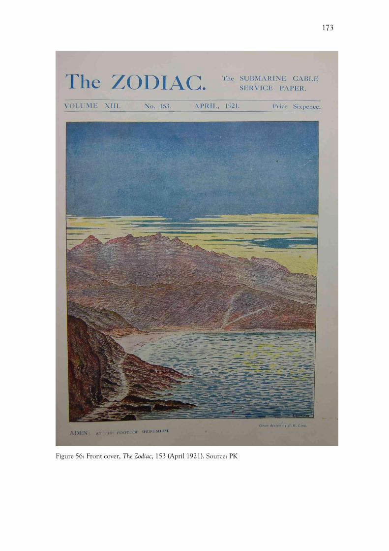
173
Figure 56: Front cover, The Zodiac, 153 (April 1921). Source: PK
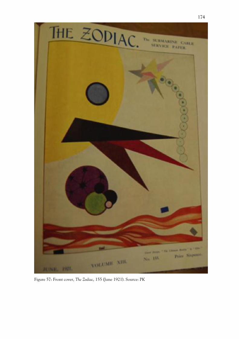
174
Figure 57: Front cover, The Zodiac, 155 (June 1921). Source: PK

175
Figure 58: Front cover, The Zodiac, 186 (January 1924). Source: PK PUB/ZDC/5/3/21
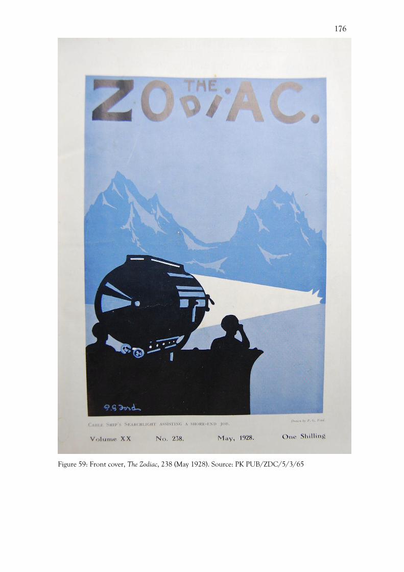
176
Figure 59: Front cover, The Zodiac, 238 (May 1928). Source: PK PUB/ZDC/5/3/65
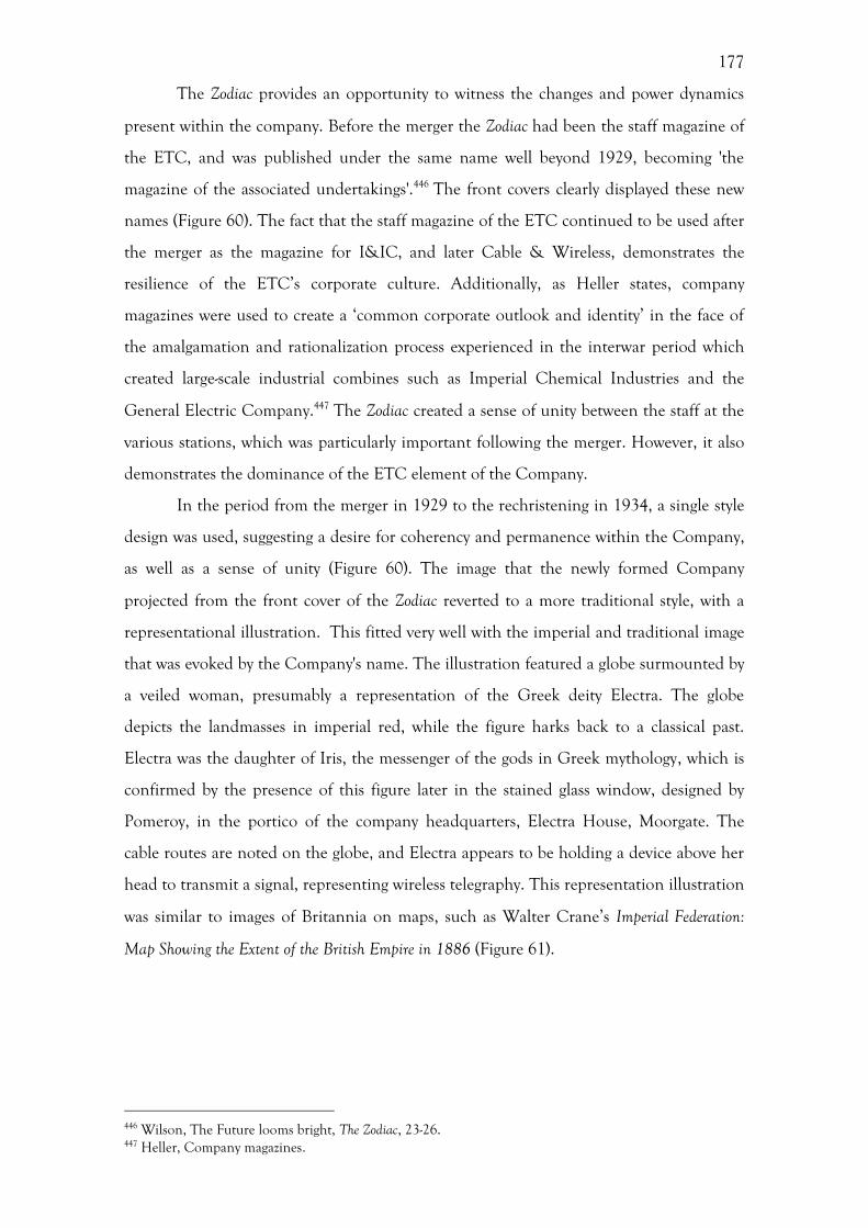
177
The Zodiac provides an opportunity to witness the changes and power dynamics
present within the company. Before the merger the Zodiac had been the staff magazine of
the ETC, and was published under the same name well beyond 1929, becoming 'the
magazine of the associated undertakings'.446 The front covers clearly displayed these new
names (Figure 60). The fact that the staff magazine of the ETC continued to be used after
the merger as the magazine for I&IC, and later Cable & Wireless, demonstrates the
resilience of the ETC’s corporate culture. Additionally, as Heller states, company
magazines were used to create a ‘common corporate outlook and identity’ in the face of
the amalgamation and rationalization process experienced in the interwar period which
created large-scale industrial combines such as Imperial Chemical Industries and the
General Electric Company.447 The Zodiac created a sense of unity between the staff at the
various stations, which was particularly important following the merger. However, it also
demonstrates the dominance of the ETC element of the Company.
In the period from the merger in 1929 to the rechristening in 1934, a single style
design was used, suggesting a desire for coherency and permanence within the Company,
as well as a sense of unity (Figure 60). The image that the newly formed Company
projected from the front cover of the Zodiac reverted to a more traditional style, with a
representational illustration. This fitted very well with the imperial and traditional image
that was evoked by the Company's name. The illustration featured a globe surmounted by
a veiled woman, presumably a representation of the Greek deity Electra. The globe
depicts the landmasses in imperial red, while the figure harks back to a classical past.
Electra was the daughter of Iris, the messenger of the gods in Greek mythology, which is
confirmed by the presence of this figure later in the stained glass window, designed by
Pomeroy, in the portico of the company headquarters, Electra House, Moorgate. The
cable routes are noted on the globe, and Electra appears to be holding a device above her
head to transmit a signal, representing wireless telegraphy. This representation illustration
was similar to images of Britannia on maps, such as Walter Crane’s Imperial Federation:
Map Showing the Extent of the British Empire in 1886 (Figure 61).
446 Wilson, The Future looms bright, The Zodiac, 23-26. 447 Heller, Company magazines.
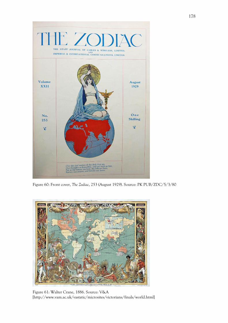
178
Figure 60: Front cover, The Zodiac, 253 (August 1929). Source: PK PUB/ZDC/5/3/80
Figure 61: Walter Crane, 1886. Source: V&A [http://www.vam.ac.uk/vastatic/microsites/victorians/finals/world.html]
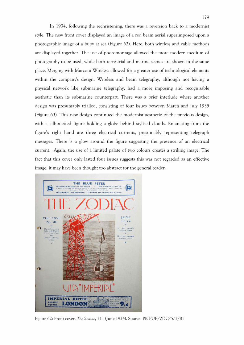
179
In 1934, following the rechristening, there was a reversion back to a modernist
style. The new front cover displayed an image of a red beam aerial superimposed upon a
photographic image of a buoy at sea (Figure 62). Here, both wireless and cable methods
are displayed together. The use of photomontage allowed the more modern medium of
photography to be used, while both terrestrial and marine scenes are shown in the same
place. Merging with Marconi Wireless allowed for a greater use of technological elements
within the company's design. Wireless and beam telegraphy, although not having a
physical network like submarine telegraphy, had a more imposing and recognisable
aesthetic than its submarine counterpart. There was a brief interlude where another
design was presumably trialled, consisting of four issues between March and July 1935
(Figure 63). This new design continued the modernist aesthetic of the previous design,
with a silhouetted figure holding a globe behind stylised clouds. Emanating from the
figure’s right hand are three electrical currents, presumably representing telegraph
messages. There is a glow around the figure suggesting the presence of an electrical
current. Again, the use of a limited palate of two colours creates a striking image. The
fact that this cover only lasted four issues suggests this was not regarded as an effective
image; it may have been thought too abstract for the general reader.
Figure 62: Front cover, The Zodiac, 311 (June 1934). Source: PK PUB/ZDC/5/3/81
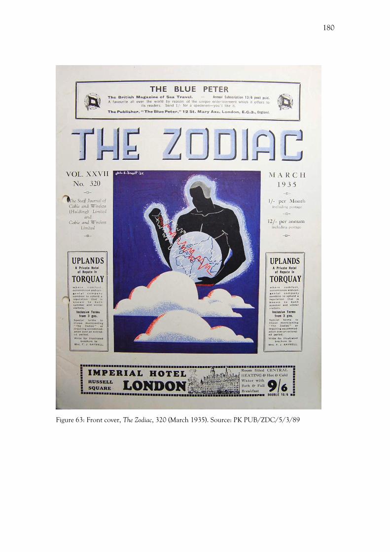
180
Figure 63: Front cover, The Zodiac, 320 (March 1935). Source: PK PUB/ZDC/5/3/89
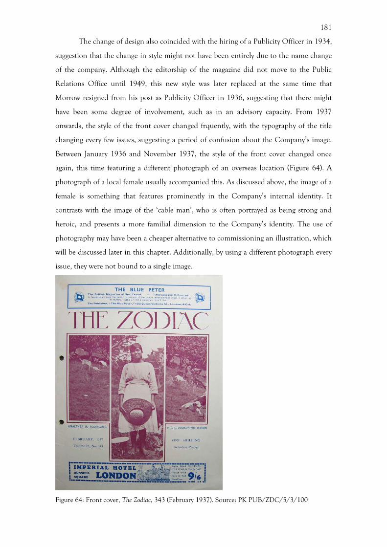
181
The change of design also coincided with the hiring of a Publicity Officer in 1934,
suggestion that the change in style might not have been entirely due to the name change
of the company. Although the editorship of the magazine did not move to the Public
Relations Office until 1949, this new style was later replaced at the same time that
Morrow resigned from his post as Publicity Officer in 1936, suggesting that there might
have been some degree of involvement, such as in an advisory capacity. From 1937
onwards, the style of the front cover changed frquently, with the typography of the title
changing every few issues, suggesting a period of confusion about the Company’s image.
Between January 1936 and November 1937, the style of the front cover changed once
again, this time featuring a different photograph of an overseas location (Figure 64). A
photograph of a local female usually accompanied this. As discussed above, the image of a
female is something that features prominently in the Company’s internal identity. It
contrasts with the image of the ‘cable man’, who is often portrayed as being strong and
heroic, and presents a more familial dimension to the Company’s identity. The use of
photography may have been a cheaper alternative to commissioning an illustration, which
will be discussed later in this chapter. Additionally, by using a different photograph every
issue, they were not bound to a single image.
Figure 64: Front cover, The Zodiac, 343 (February 1937). Source: PK PUB/ZDC/5/3/100
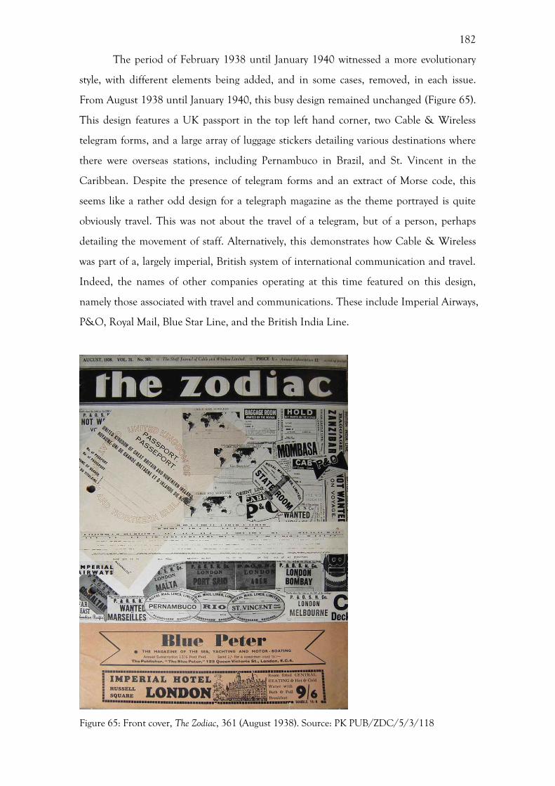
182
The period of February 1938 until January 1940 witnessed a more evolutionary
style, with different elements being added, and in some cases, removed, in each issue.
From August 1938 until January 1940, this busy design remained unchanged (Figure 65).
This design features a UK passport in the top left hand corner, two Cable & Wireless
telegram forms, and a large array of luggage stickers detailing various destinations where
there were overseas stations, including Pernambuco in Brazil, and St. Vincent in the
Caribbean. Despite the presence of telegram forms and an extract of Morse code, this
seems like a rather odd design for a telegraph magazine as the theme portrayed is quite
obviously travel. This was not about the travel of a telegram, but of a person, perhaps
detailing the movement of staff. Alternatively, this demonstrates how Cable & Wireless
was part of a, largely imperial, British system of international communication and travel.
Indeed, the names of other companies operating at this time featured on this design,
namely those associated with travel and communications. These include Imperial Airways,
P&O, Royal Mail, Blue Star Line, and the British India Line.
Figure 65: Front cover, The Zodiac, 361 (August 1938). Source: PK PUB/ZDC/5/3/118

183
During the Second World War, both the style and the form of the Zodiac changed
markedly. Firstly, in February 1940 the Zodiac reverted once again to a more tradition
pictorial style, with representational illustrations of a marine and a countryside scene
depicted on the cover (Figure 66). One reason for this dramatic change in style may have
been a desire to reassure the overseas staff who were involved in the war effort. The
insertion of aerials into a romanticised rural landscape, complete with a cottage and
agricultural ground, reminded the staff of what they were working to protect. This new
cover was designed by Percy Ford, who the Company had previously commissioned in
1936 to design a poster advertising an exhibition in Charing Cross station (Figure 67).448
The difference in the style of Ford’s poster and his cover design is striking, with a move
from bold primary colours and stylised forms to a softer, more painterly style. This change
suggests a sense of confusion on the part of the Company regarding their style of design,
with a regression to more representational, picturesque style.
Figure 66: Front cover, The Zodiac, 421 (February 1940). Source: PK PUB/ZDC/5/3/109
448 Anon, Percy Ford, The Zodiac, May 1940; [http://www.ltmcollection.org/posters/poster/poster.html?_IXSR_=WPwTbjmyGkz&_IXMAXHITS_=1&IXinv=1983/4/4520&IXsummary=artist/artist&IXartist=Percy%20Ford&_IXFIRST_=1]
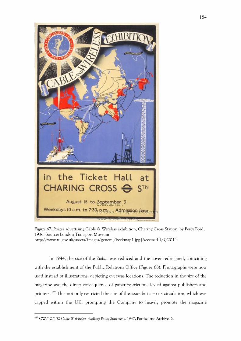
184
Figure 67: Poster advertising Cable & Wireless exhibition, Charing Cross Station, by Percy Ford, 1936. Source: London Transport Museum http://www.tfl.gov.uk/assets/images/general/beckmap1.jpg [Accessed 1/7/2014.
In 1944, the size of the Zodiac was reduced and the cover redesigned, coinciding
with the establishment of the Public Relations Office (Figure 68). Photographs were now
used instead of illustrations, depicting overseas locations. The reduction in the size of the
magazine was the direct consequence of paper restrictions levied against publishers and
printers. 449 This not only restricted the size of the issue but also its circulation, which was
capped within the UK, prompting the Company to heavily promote the magazine
449 CW/12/132 Cable & Wireless Publicity Policy Statement, 1947, Porthcurno Archive, 6.
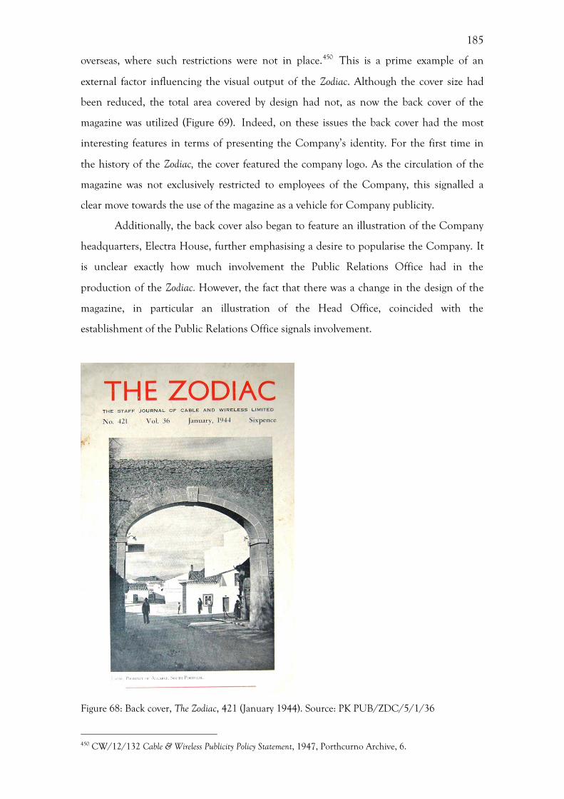
185
overseas, where such restrictions were not in place.450 This is a prime example of an
external factor influencing the visual output of the Zodiac. Although the cover size had
been reduced, the total area covered by design had not, as now the back cover of the
magazine was utilized (Figure 69). Indeed, on these issues the back cover had the most
interesting features in terms of presenting the Company’s identity. For the first time in
the history of the Zodiac, the cover featured the company logo. As the circulation of the
magazine was not exclusively restricted to employees of the Company, this signalled a
clear move towards the use of the magazine as a vehicle for Company publicity.
Additionally, the back cover also began to feature an illustration of the Company
headquarters, Electra House, further emphasising a desire to popularise the Company. It
is unclear exactly how much involvement the Public Relations Office had in the
production of the Zodiac. However, the fact that there was a change in the design of the
magazine, in particular an illustration of the Head Office, coincided with the
establishment of the Public Relations Office signals involvement.
Figure 68: Back cover, The Zodiac, 421 (January 1944). Source: PK PUB/ZDC/5/1/36
450 CW/12/132 Cable & Wireless Publicity Policy Statement, 1947, Porthcurno Archive, 6.
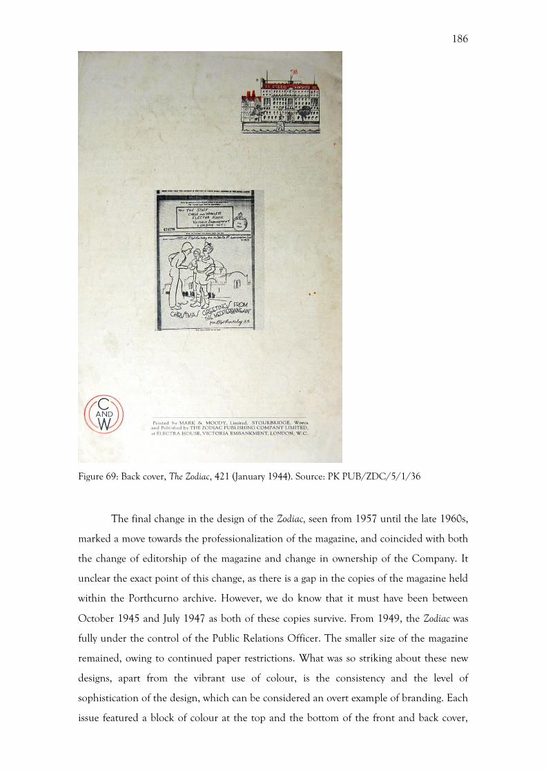
186
Figure 69: Back cover, The Zodiac, 421 (January 1944). Source: PK PUB/ZDC/5/1/36
The final change in the design of the Zodiac, seen from 1957 until the late 1960s,
marked a move towards the professionalization of the magazine, and coincided with both
the change of editorship of the magazine and change in ownership of the Company. It
unclear the exact point of this change, as there is a gap in the copies of the magazine held
within the Porthcurno archive. However, we do know that it must have been between
October 1945 and July 1947 as both of these copies survive. From 1949, the Zodiac was
fully under the control of the Public Relations Officer. The smaller size of the magazine
remained, owing to continued paper restrictions. What was so striking about these new
designs, apart from the vibrant use of colour, is the consistency and the level of
sophistication of the design, which can be considered an overt example of branding. Each
issue featured a block of colour at the top and the bottom of the front and back cover,
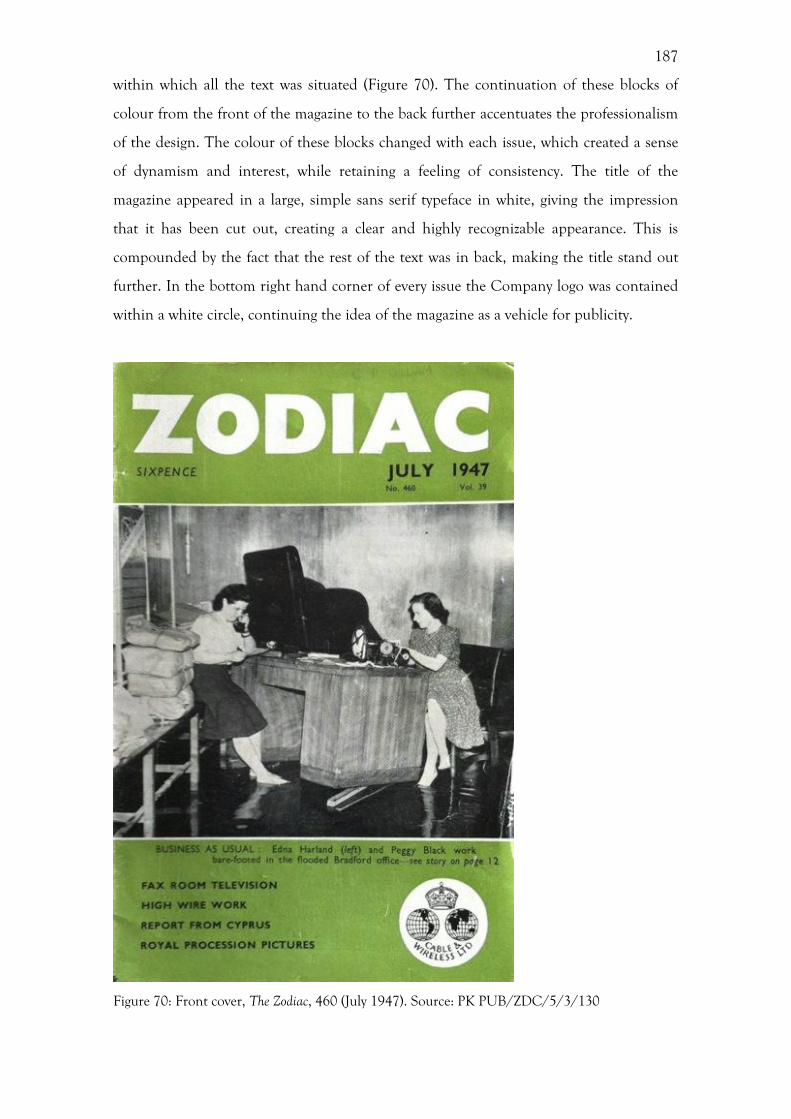
187
within which all the text was situated (Figure 70). The continuation of these blocks of
colour from the front of the magazine to the back further accentuates the professionalism
of the design. The colour of these blocks changed with each issue, which created a sense
of dynamism and interest, while retaining a feeling of consistency. The title of the
magazine appeared in a large, simple sans serif typeface in white, giving the impression
that it has been cut out, creating a clear and highly recognizable appearance. This is
compounded by the fact that the rest of the text was in back, making the title stand out
further. In the bottom right hand corner of every issue the Company logo was contained
within a white circle, continuing the idea of the magazine as a vehicle for publicity.
Figure 70: Front cover, The Zodiac, 460 (July 1947). Source: PK PUB/ZDC/5/3/130
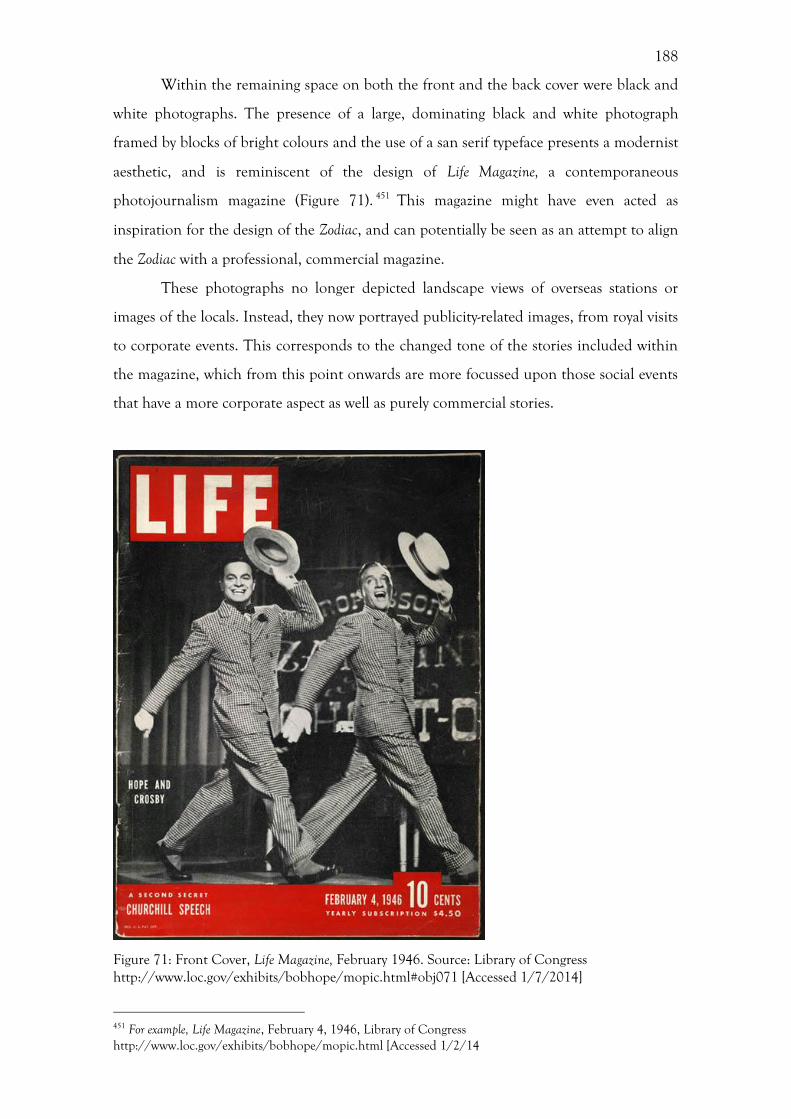
188
Within the remaining space on both the front and the back cover were black and
white photographs. The presence of a large, dominating black and white photograph
framed by blocks of bright colours and the use of a san serif typeface presents a modernist
aesthetic, and is reminiscent of the design of Life Magazine, a contemporaneous
photojournalism magazine (Figure 71). 451 This magazine might have even acted as
inspiration for the design of the Zodiac, and can potentially be seen as an attempt to align
the Zodiac with a professional, commercial magazine.
These photographs no longer depicted landscape views of overseas stations or
images of the locals. Instead, they now portrayed publicity-related images, from royal visits
to corporate events. This corresponds to the changed tone of the stories included within
the magazine, which from this point onwards are more focussed upon those social events
that have a more corporate aspect as well as purely commercial stories.
Figure 71: Front Cover, Life Magazine, February 1946. Source: Library of Congress http://www.loc.gov/exhibits/bobhope/mopic.html#obj071 [Accessed 1/7/2014]
451 For example, Life Magazine, February 4, 1946, Library of Congress http://www.loc.gov/exhibits/bobhope/mopic.html [Accessed 1/2/14
189
Thus, the degree of consistency displayed on these covers does appear to correlate
with changes within the Company’s Public Relations Office, with periods of consistent
design coinciding with the presence of either a publicity officer or a public relations
officer. The design of the magazine became most consistent and professional when the
editorship finally moved to the Public Relations Office. With increased consistency and
professionalization came a decreased opportunity to experiment, suggesting that the
Company had finally decided upon a style.
Corporate architecture
One of the recurring issues when discussing Cable & Wireless’ corporate identity is the
relative permanence or temporality of the visual material in question. As we have seen
previously in this chapter, due to its ephemeral nature the Zodiac, along with the other
forms of printed material, such as posters, pamphlets and advertising, allowed for
experimentation of style, which was quickly adapted to suit changing societal and cultural
influences. Architecture, on the other hand, was more permanent, which meant that
changes occurred much slower and were, therefore, more deliberate alterations to the
Company’s visual identity. The Company’s architecture was a visual manifestation of how
it sought to project its identity to both its staff and the public who viewed the exterior of
these buildings and, in varying degrees, used the interior space. This section will examine
the different styles of architecture adopted by the Company across its network. The
identity that emerges from the Company’s architecture displays a shift from the adoption
of local styles in the overseas stations and the use of neoclassical motifs in Electra House,
exuding an image of imperial, to one that stressed modernization and the centrality of
science and technology to the Company’s narrative from the 1950s.
Looking firstly at the architectural style of the Company’s overseas stations, these
were in line with imperial traditions. The majority of the Company’s early overseas
buildings displayed these hybrid indigenous forms. As Auerbach states, there has been a
lack of attention paid in the past to buildings that sought to incorporate indigenous
forms, such as the monumental ‘Sarancenic’ facades or domestic bungalows, which were
disregarded as ‘exotics’.452 This architecture varied widely from place to place, and until
452 J. Auerbach, Art and Empire, in: W. R Louis, and R. W. Winks (Eds), The Oxford History of the Empire: Historiography, Oxford, 2001, 571-584, 589-590.
190
the post-war period this mostly took cues from the local architectural styles. As the
network of cables was not laid simultaneously, developing over time and responding to
the needs of both the Empire and the market, these buildings were constructed as they
were required. The result was an organic style, which that changed with both the fashions
of the respective times of construction and their location, rather than a unified and
consistent style that was deployed across the network.
It was not just commercial buildings that were required, but also domestic
buildings, which tapped into discourses of imperial domesticity. 453 Married staff had their
own quarters in overseas stations, and these usually took the form of bungalows; the ‘true
vernacular of Empire’, as Morris states.454 The concept of a vernacular architecture is
interesting in this instance, as it has implications of domestic rather than the
monumental buildings, and suggests an informality and crudeness in its design and
construction. This is at odds with the high architectural style of Sir Herbert Baker’s
Electra House, discussed later. A veranda often surrounded these buildings, following the
traditional form of bungalows. For Morris the veranda represented a metaphor for
Empire.455 It was the most overtly Indian element of the building, allowing women to
experience the Other from the safety of the domestic space.456 These verandas were often
the subject matter of photographs taken by the staff of their built environment.
The interiors of these buildings can also be seen to house what Jasonoff has
described as ‘imperial collections’.457 The investigation of these collections provides a
means of integrating the domestic and imperial histories of Britain. Photographs of
domestic interiors are sparse compared with exterior views, and there appears to be a
concentration between the 1890s and 1900s, with very few from the interwar period and
beyond. One possible reason for this concentration was the novelty both of photography
as a medium and for overseas employees of documenting their new environment. This
also coincides with a larger point about the corporate identity of Cable & Wireless,
moving from a culture of domesticity and family to one of commercialism. This mirrored
the evolving style of the Zodiac, discussed above. The interior of the buildings represented
453 A. Blunt, Home and Empire: photographs of British families in the Lucknow Album, 1856-57, in: J. Schwartz, J. Ryan (Eds), Picturing Place: Photography and the Geographical Imagination, London, 2003, 243-261, 247. 454 Morris, The Spectacle of Empire, 93; A. D. King, The Bungalow: The Production of a Global Culture, London, 1984. 455 Morris, The Spectacle of Empire, 93. 456 Morris, The Spectacle of Empire, 93. 457 M. Jasanoff, Collectors of Empire: objects, conquests and imperial self-fashioning, Past & Present 184 (2004) 109-135, 111-112.

191
the introspective and domestic side of the corporate identity, while the exterior
represented the public facing and overtly corporate minded culture that became
increasingly common as the twentieth century progressed.
It is clear from some of the handbooks, given to overseas staff, that in some
locations they were able to purchase furniture and other domestic items locally. This was
the case for Aden, Carcavellos, Gibraltar, Marseilles, Bona, Malta, Alexandria, Mombassa,
Durban, St and Helena.458 This meant that some of these domestic quarters contained
local items, creating a hybridised interior. For other stations it was advised that married
staff take furniture from England, which resulted in a replication of the domestic space
experienced by the employees in England. It is likely that these handbooks were
distributed not just in 1923, but also throughout the interwar and post-war period,
responding to changes in the various localities. However, this is the only one that survives
within the archive at Porthcurno. These interiors, and the photographs depicting
interiors, represented an attempt to ‘order, fashion and comprehend’ imperial society
overseas. 459
In London, the staff not only facilitated the communications with the Empire,
they also experienced it through the architecture of the Company’s Head Office. Between
the 1920s and the 1950s the Company occupied three different premises, Electra House
(Moorgate), Electra House (Embankment), which they moved to in 1933, and Mercury
House, which they moved to in 1955. These relocations were the response to changes
within the organization structure of the Company. These two points of relocation are very
useful to the researcher, as ordinarily architecture, along with the Company name, was
more permanent in nature and not so easily changed. Electra House, on London’s
Victoria Embankment was built to house the newly merged I&IC. Later in the 1950s,
with the GPO taking over the UK assets and services of Cable and Wireless, the London
Telegraph station grew in importance, but there was no room to expand at Electra House,
Embankment.460 The head office moved to Mercury House, and the rest of Electra House
was converted into additional space for the London Station. A comparison between
Electra House, Embankment and Mercury House, can therefore reveal changes within the
Company identity at these two points in 1933 and 1955, moving from neoclassical
evocations of imperialism to the display and performance of modernity.
When looking at Electra House and Mercury House, some of the best sources of 458 DOC/CW/5/186 Memorandum Re. Outfits, 1923, Eastern Telegraph Company, Porthcurno Archive. 459 Cannadine, Ornamentalism, 121. 460 6.1.10 Mercury House – Opening by Lord Reith, 4.
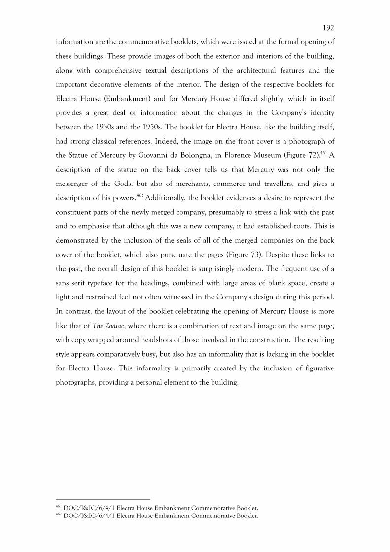
192
information are the commemorative booklets, which were issued at the formal opening of
these buildings. These provide images of both the exterior and interiors of the building,
along with comprehensive textual descriptions of the architectural features and the
important decorative elements of the interior. The design of the respective booklets for
Electra House (Embankment) and for Mercury House differed slightly, which in itself
provides a great deal of information about the changes in the Company’s identity
between the 1930s and the 1950s. The booklet for Electra House, like the building itself,
had strong classical references. Indeed, the image on the front cover is a photograph of
the Statue of Mercury by Giovanni da Bolongna, in Florence Museum (Figure 72).461 A
description of the statue on the back cover tells us that Mercury was not only the
messenger of the Gods, but also of merchants, commerce and travellers, and gives a
description of his powers.462 Additionally, the booklet evidences a desire to represent the
constituent parts of the newly merged company, presumably to stress a link with the past
and to emphasise that although this was a new company, it had established roots. This is
demonstrated by the inclusion of the seals of all of the merged companies on the back
cover of the booklet, which also punctuate the pages (Figure 73). Despite these links to
the past, the overall design of this booklet is surprisingly modern. The frequent use of a
sans serif typeface for the headings, combined with large areas of blank space, create a
light and restrained feel not often witnessed in the Company’s design during this period.
In contrast, the layout of the booklet celebrating the opening of Mercury House is more
like that of The Zodiac, where there is a combination of text and image on the same page,
with copy wrapped around headshots of those involved in the construction. The resulting
style appears comparatively busy, but also has an informality that is lacking in the booklet
for Electra House. This informality is primarily created by the inclusion of figurative
photographs, providing a personal element to the building.
461 DOC/I&IC/6/4/1 Electra House Embankment Commemorative Booklet. 462 DOC/I&IC/6/4/1 Electra House Embankment Commemorative Booklet.
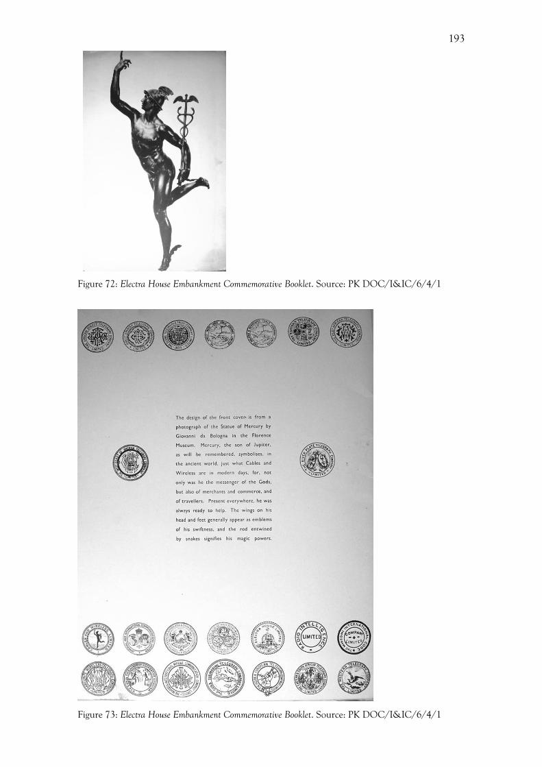
193
Figure 72: Electra House Embankment Commemorative Booklet. Source: PK DOC/I&IC/6/4/1
Figure 73: Electra House Embankment Commemorative Booklet. Source: PK DOC/I&IC/6/4/1

194
The relocation of the Company to the new Head Office, Electra House, on London’s
Victoria Embankment, presents a snapshot of the Company’s corporate identity at this
point. The identity created by this architecture stressed the Company’s imperial nature.
The location of all three of the Company’s Head Offices, Electra House (Moorgate),
Electra House (Embankment) and Mercury House, within the imperial centre of the City
of London conferred an imperial identity. Black, writing about the rebuilding of the
Bank of England, states that the City of London was ‘clearly identified in the public
imagination as the heart of the Empire’. 463 Not only was the City a space of the
imaginative geographies of Empire, it was also a space of capital. Although the Company
did not operate within the financial sector, like the majority of offices within the City, its
presence facilitated the transfer of capital on a global scale as this was the means by which
the businesses operating in this area communicated with their customers, clients and
associates abroad. Gilbert and Driver state that certain dimensions of Empire were
associated with different areas of London; in this case the City was associated with
commerce.464
This was a reciprocal relationship. While the location of the Company’s headquarters
within the imperial City of London created an imperial context for Electra House, the
mere existence of this telegraph office not only created an imaginary link with the Empire,
it also created an actual one. In this sense, the communicative and technological link
between the City of London and the British Empire was made possible by the presence of
Cable & Wireless. Indeed, as Gilbert and Driver state, it was during the 1920s and 1930s
that the ‘imperial influence’ was ‘perhaps most pronounced in everyday life within
London’.465 Through the Cable & Wireless branches, it was possible to instantaneously
be in the heart of the metropole and connect with the peripheries of the British Empire.
This imperial identity was clearly seen through the heavy use of classical
symbolism. The choice of architect reveals the intentions of the Company, in displaying a
building with classical connotations. Electra House was designed by Sir Herbert Baker,
who had redesigned the Bank of England in the 1920s, as well as designing India House
1925 and South Africa House in 1930. Baker not only ‘contributed substantially to the
shaping of late imperial London’, he was also responsible for influencing the architectural
463 Black, Imperial visions, 96. 464 Gilbert and Driver, Capital and Empire, 24. 465 Gilbert and Driver, Capital and Empire, 27.
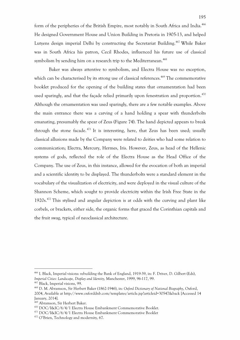
195
form of the peripheries of the British Empire, most notably in South Africa and India.466
He designed Government House and Union Building in Pretoria in 1905-13, and helped
Lutyens design imperial Delhi by constructing the Secretariat Building.467 While Baker
was in South Africa his patron, Cecil Rhodes, influenced his future use of classical
symbolism by sending him on a research trip to the Mediterranean.468
Baker was always attentive to symbolism, and Electra House was no exception,
which can be characterised by its strong use of classical references.469 The commemorative
booklet produced for the opening of the building states that ornamentation had been
used sparingly, and that the façade relied primarily upon fenestration and proportion.470
Although the ornamentation was used sparingly, there are a few notable examples. Above
the main entrance there was a carving of a hand holding a spear with thunderbolts
emanating, presumably the spear of Zeus (Figure 74). The hand depicted appears to break
through the stone facade. 471 It is interesting, here, that Zeus has been used; usually
classical allusions made by the Company were related to deities who had some relation to
communication; Electra, Mercury, Hermes, Iris. However, Zeus, as head of the Hellenic
systems of gods, reflected the role of the Electra House as the Head Office of the
Company. The use of Zeus, in this instance, allowed for the evocation of both an imperial
and a scientific identity to be displayed. The thunderbolts were a standard element in the
vocabulary of the visualization of electricity, and were deployed in the visual culture of the
Shannon Scheme, which sought to provide electricity within the Irish Free State in the
1920s.472 This stylised and angular depiction is at odds with the curving and plant like
corbels, or brackets, either side, the organic forms that graced the Corinthian capitals and
the fruit swag, typical of neoclassical architecture.
466 I. Black, Imperial visions: rebuilding the Bank of England, 1919-39, in: F. Driver, D. Gilbert (Eds), Imperial Cities: Landscape, Display and Identity, Manchester, 1999, 96-117, 99. 467 Black, Imperial visions, 99. 468 D. M. Abramson, Sir Herbert Baker (1862-1946), in: Oxford Dictionary of National Biography, Oxford, 2004, Available at http://www.oxforddnb.com/templates/article.jsp?articleid=30547&back [Accessed 14 January, 2014]. 469 Abramson, Sir Herbert Baker. 470 DOC/I&IC/6/4/1 Electra House Embankment Commemorative Booklet. 471 DOC/I&IC/6/4/1 Electra House Embankment Commemorative Booklet 472 O’Brien, Technology and modernity, 67.
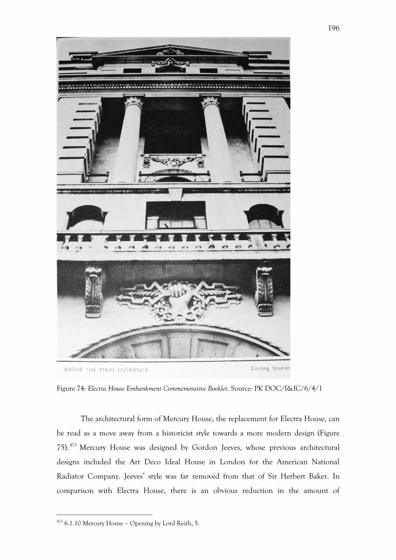
196
Figure 74: Electra House Embankment Commemorative Booklet. Source: PK DOC/I&IC/6/4/1
The architectural form of Mercury House, the replacement for Electra House, can
be read as a move away from a historicist style towards a more modern design (Figure
75). 473 Mercury House was designed by Gordon Jeeves, whose previous architectural
designs included the Art Deco Ideal House in London for the American National
Radiator Company. Jeeves’ style was far removed from that of Sir Herbert Baker. In
comparison with Electra House, there is an obvious reduction in the amount of
473 6.1.10 Mercury House – Opening by Lord Reith, 5.
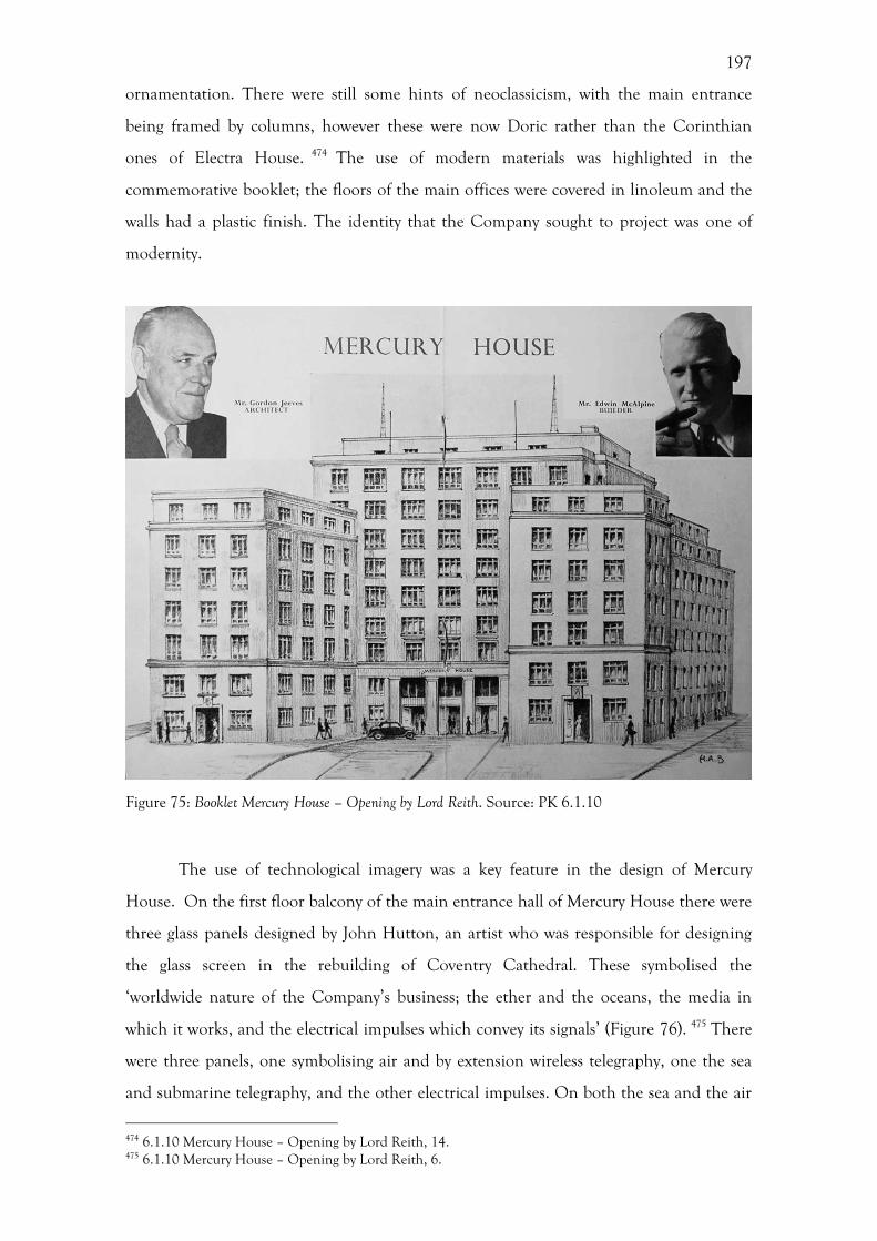
197
ornamentation. There were still some hints of neoclassicism, with the main entrance
being framed by columns, however these were now Doric rather than the Corinthian
ones of Electra House. 474 The use of modern materials was highlighted in the
commemorative booklet; the floors of the main offices were covered in linoleum and the
walls had a plastic finish. The identity that the Company sought to project was one of
modernity.
Figure 75: Booklet Mercury House – Opening by Lord Reith. Source: PK 6.1.10
The use of technological imagery was a key feature in the design of Mercury
House. On the first floor balcony of the main entrance hall of Mercury House there were
three glass panels designed by John Hutton, an artist who was responsible for designing
the glass screen in the rebuilding of Coventry Cathedral. These symbolised the
‘worldwide nature of the Company’s business; the ether and the oceans, the media in
which it works, and the electrical impulses which convey its signals’ (Figure 76). 475 There
were three panels, one symbolising air and by extension wireless telegraphy, one the sea
and submarine telegraphy, and the other electrical impulses. On both the sea and the air
474 6.1.10 Mercury House – Opening by Lord Reith, 14. 475 6.1.10 Mercury House – Opening by Lord Reith, 6.
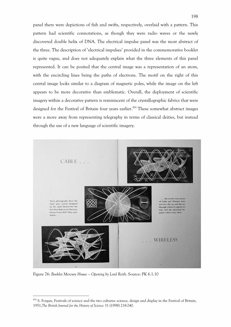
198
panel there were depictions of fish and swifts, respectively, overlaid with a pattern. This
pattern had scientific connotations, as though they were radio waves or the newly
discovered double helix of DNA. The electrical impulse panel was the most abstract of
the three. The description of ‘electrical impulses’ provided in the commemorative booklet
is quite vague, and does not adequately explain what the three elements of this panel
represented. It can be posited that the central image was a representation of an atom,
with the encircling lines being the paths of electrons. The motif on the right of this
central image looks similar to a diagram of magnetic poles, while the image on the left
appears to be more decorative than emblematic. Overall, the deployment of scientific
imagery within a decorative pattern is reminiscent of the crystallographic fabrics that were
designed for the Festival of Britain four years earlier.476 These somewhat abstract images
were a move away from representing telegraphy in terms of classical deities, but instead
through the use of a new language of scientific imagery.
Figure 76: Booklet Mercury House – Opening by Lord Reith. Source: PK 6.1.10
476 S. Forgan, Festivals of science and the two cultures: science, design and display in the Festival of Britain, 1951,The British Journal for the History of Science 31 (1998) 218-240.
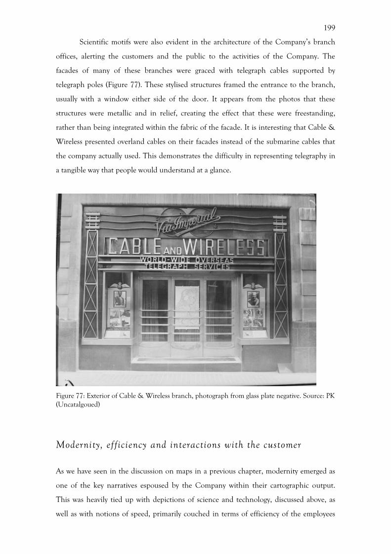
199
Scientific motifs were also evident in the architecture of the Company’s branch
offices, alerting the customers and the public to the activities of the Company. The
facades of many of these branches were graced with telegraph cables supported by
telegraph poles (Figure 77). These stylised structures framed the entrance to the branch,
usually with a window either side of the door. It appears from the photos that these
structures were metallic and in relief, creating the effect that these were freestanding,
rather than being integrated within the fabric of the facade. It is interesting that Cable &
Wireless presented overland cables on their facades instead of the submarine cables that
the company actually used. This demonstrates the difficulty in representing telegraphy in
a tangible way that people would understand at a glance.
Figure 77: Exterior of Cable & Wireless branch, photograph from glass plate negative. Source: PK (Uncatalgoued)
Modernity, efficiency and interactions with the customer
As we have seen in the discussion on maps in a previous chapter, modernity emerged as
one of the key narratives espoused by the Company within their cartographic output.
This was heavily tied up with depictions of science and technology, discussed above, as
well as with notions of speed, primarily couched in terms of efficiency of the employees
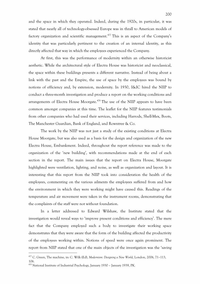
200
and the space in which they operated. Indeed, during the 1920s, in particular, it was
stated that nearly all of technology-obsessed Europe was in thrall to American models of
factory organization and scientific management.477 This is an aspect of the Company’s
identity that was particularly pertinent to the creation of an internal identity, as this
directly affected that way in which the employees experienced the Company.
At first, this was the performance of modernity within an otherwise historicist
aesthetic. While the architectural style of Electra House was historicist and neoclassical,
the space within these buildings presents a different narrative. Instead of being about a
link with the past and the Empire, the use of space by the employees was bound by
notions of efficiency and, by extension, modernity. In 1930, I&IC hired the NIIP to
conduct a three-month investigation and produce a report on the working conditions and
arrangements of Electra House Moorgate.478 The use of the NIIP appears to have been
common amongst companies at this time. The leaflet for the NIIP features testimonials
from other companies who had used their services, including Harrods, Shell-Mex, Boots,
The Manchester Guardian, Bank of England, and Rowntree & Co.
The work by the NIIP was not just a study of the existing conditions at Electra
House Moorgate, but was also used as a basis for the design and organization of the new
Electra House, Embankment. Indeed, throughout the report reference was made to the
organization of the ‘new building’, with recommendations made at the end of each
section in the report. The main issues that the report on Electra House, Moorgate
highlighted were ventilation, lighting, and noise, as well as organization and layout. It is
interesting that this report from the NIIP took into consideration the health of the
employees, commenting on the various ailments the employees suffered from and how
the environment in which they were working might have caused this. Readings of the
temperature and air movement were taken in the instrument rooms, demonstrating that
the complaints of the staff were not without foundation.
In a letter addressed to Edward Wilshaw, the Institute stated that the
investigation would reveal ways to ‘improve present conditions and efficiency’. The mere
fact that the Company employed such a body to investigate their working space
demonstrates that they were aware that the form of the building affected the productivity
of the employees working within. Notions of speed were once again prominent. The
report from NIIP stated that one of the main objects of the investigation was the ‘saving 477 C. Green, The machine, in: C. Wilk (Ed), Modernism: Designing a New World, London, 2006, 71–113, 106. 478 National Institute of Industrial Psychology, January 1930 – January 1939, PK.
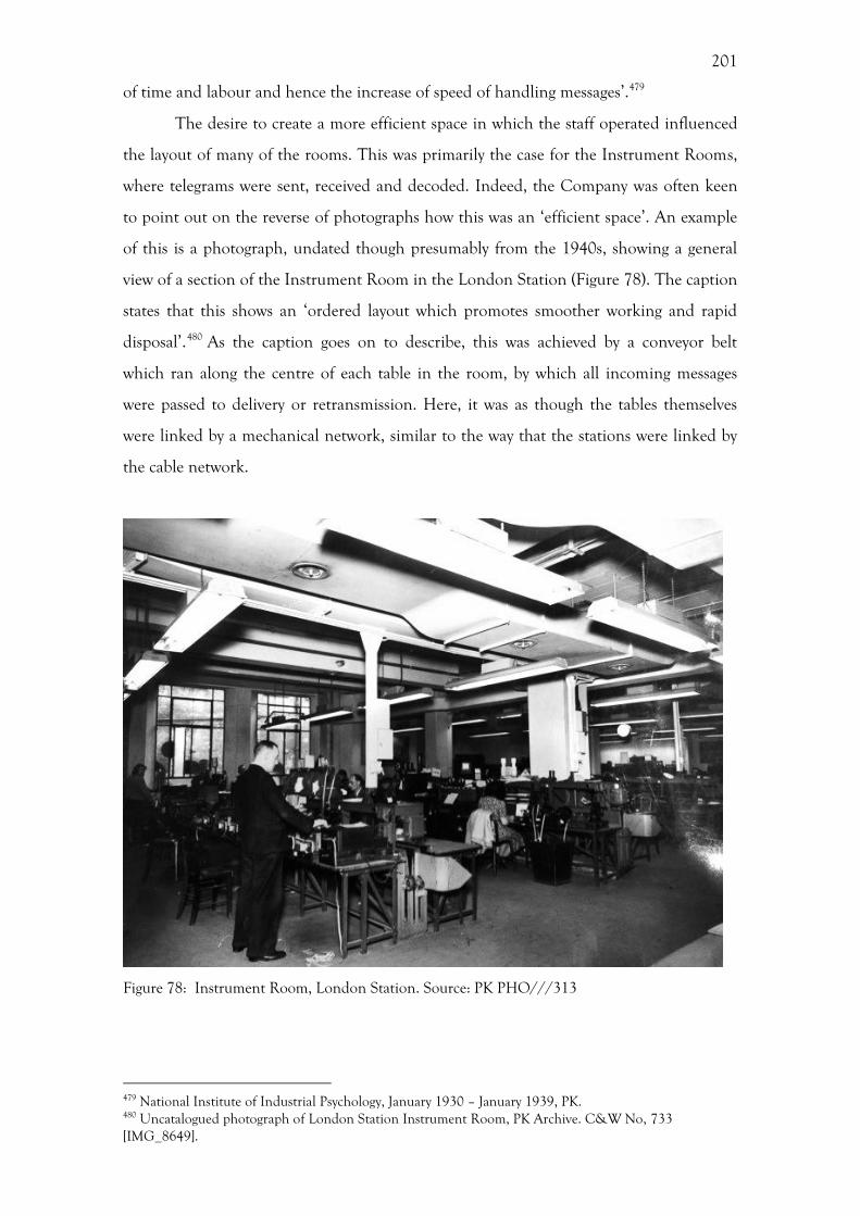
201
of time and labour and hence the increase of speed of handling messages’.479
The desire to create a more efficient space in which the staff operated influenced
the layout of many of the rooms. This was primarily the case for the Instrument Rooms,
where telegrams were sent, received and decoded. Indeed, the Company was often keen
to point out on the reverse of photographs how this was an ‘efficient space’. An example
of this is a photograph, undated though presumably from the 1940s, showing a general
view of a section of the Instrument Room in the London Station (Figure 78). The caption
states that this shows an ‘ordered layout which promotes smoother working and rapid
disposal’.480 As the caption goes on to describe, this was achieved by a conveyor belt
which ran along the centre of each table in the room, by which all incoming messages
were passed to delivery or retransmission. Here, it was as though the tables themselves
were linked by a mechanical network, similar to the way that the stations were linked by
the cable network.
Figure 78: Instrument Room, London Station. Source: PK PHO///313
479 National Institute of Industrial Psychology, January 1930 – January 1939, PK. 480 Uncatalogued photograph of London Station Instrument Room, PK Archive. C&W No, 733 [IMG_8649].
202
The highlighting of technological equipment and devices was an increasingly
common feature of Cable & Wireless’ visual and textual output. Within the
commemorative booklet for the opening of Mercury House a photograph shows windows
and radiators within the Court Room (Figure 79). Radiators such as these seem so
commonplace today that they would not be considered an important feature in an
equivalent booklet now, however their inclusion here suggests that this was an important
feature within the building. Indeed, the use of radiators was highlighted as a suggestion
within the NIIP report for the building of Electra House. In this respect, the inclusion of
this photograph provides a visualization of this earlier recommendation.
Figure 79: Booklet Mercury House – Opening by Lord Reith. Source: PK 6.1.10
Notions of efficiency within the internal spaces of the Company’s Head Offices
extended beyond the placement of furniture and environmental controls, to the very
fabric of the building. When decorating the interior of the new Company headquarters,
Mercury House, in 1955, the Company commissioned R. F. Wilson, Art Director of the
British Colour Council, to design the interiors with ‘the most modern standards of
economy and functional efficiency’.481 He used only four colours throughout the building
which had been ‘calculated to promote health and efficiency’ by reducing eyestrain
(Figure 80).482 There is no explanation beyond this description about how certain colours
would reduce eye-strain, however, the fact that the Company sought advice on this area
481 6.1.10 Mercury House – Opening by Lord Reith, 5. 482 6.1.10 Mercury House – Opening by Lord Reith, 5.
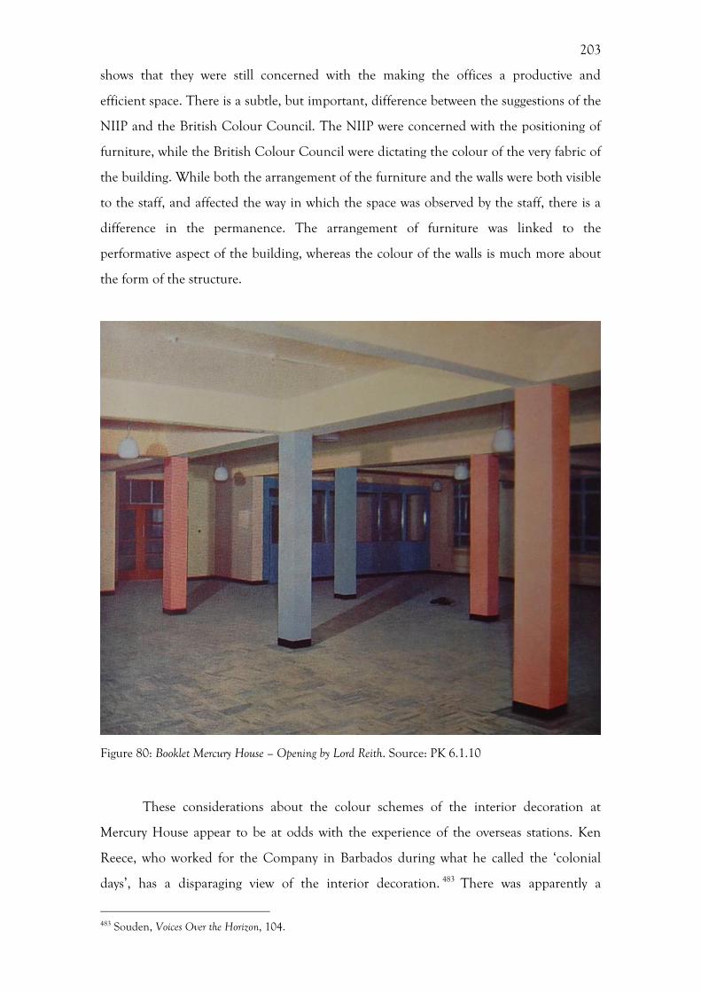
203
shows that they were still concerned with the making the offices a productive and
efficient space. There is a subtle, but important, difference between the suggestions of the
NIIP and the British Colour Council. The NIIP were concerned with the positioning of
furniture, while the British Colour Council were dictating the colour of the very fabric of
the building. While both the arrangement of the furniture and the walls were both visible
to the staff, and affected the way in which the space was observed by the staff, there is a
difference in the permanence. The arrangement of furniture was linked to the
performative aspect of the building, whereas the colour of the walls is much more about
the form of the structure.
Figure 80: Booklet Mercury House – Opening by Lord Reith. Source: PK 6.1.10
These considerations about the colour schemes of the interior decoration at
Mercury House appear to be at odds with the experience of the overseas stations. Ken
Reece, who worked for the Company in Barbados during what he called the ‘colonial
days’, has a disparaging view of the interior decoration. 483 There was apparently a
483 Souden, Voices Over the Horizon, 104.
204
suggestion that the equipment should match the colour of the walls; the result being
everything painted battleship grey or ‘dark, dismal blue’. 484 He refers to the ‘grey, dim
days in the office’, suggesting that the colour was symbolic of the mood that it created.
Here, the colour scheme seems to have had an adverse affect on morale.
While the discussion within this chapter has focussed on the working
environment of the Company’s employees, it should be noted that elements of this
internal identity did translate to the Company’s external identity. Electra House, and
later Mercury House, were part of the architectural fabric of London, and was therefore
visible to all who walked past it. There were a number of different audiences who viewed
different and, sometimes, overlapping aspects of the architecture and interior design of
the Company’s Head Office. Too often, studies of corporate identity either assume that
there is a monolithic identity, with little consideration of the audience, or homogenise
the customers and the employees. Indeed, often there is a neglect of the reception of the
corporate identity to those operating within the Company, focussing instead on a
presumed public reception. The headquarters of I&IC and later Cable & Wireless
presents an interesting opportunity to see these divisions in the demarcation and
hierarchy of space created.
It was not only the Company employees who viewed this building, but also the
public and the Company’s customers who viewed this building, making the Company’s
London architecture both external and internal. There is a differentiation between the
public, who would only observe the exterior of the building, and customers, who would
view both the exterior and restricted elements of the interior. On the ground floor there
was a Public Counter ‘for the receipt of telegrams, payments of accounts and the
registration of shares’.486 The next layer were the employees who worked in the various
departments, from those interacting with the customer on the Public Counter, to the
bustling, but private, instrument room. These employees saw all the areas that the public
saw, and then dependent upon their position within the company, the relevant spaces
within the interior of the building. The further one moved up the Company, the more
spaces within the building became visible. The Directors’ Suite, comprising of the
Governor’s Room, Board Room and Directors’ Luncheon Room, was located on the
third floor of the building, all of these rooms having access to a balcony that ran along
484 Souden, Voices Over the Horizon, 104. 486 DOC/I&IC/6/4/1 Electra House Embankment Commemorative Booklet
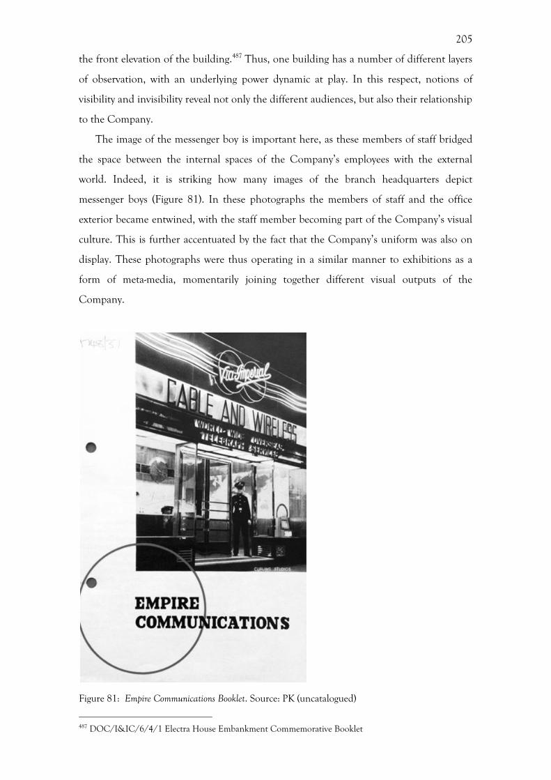
205
the front elevation of the building.487 Thus, one building has a number of different layers
of observation, with an underlying power dynamic at play. In this respect, notions of
visibility and invisibility reveal not only the different audiences, but also their relationship
to the Company.
The image of the messenger boy is important here, as these members of staff bridged
the space between the internal spaces of the Company’s employees with the external
world. Indeed, it is striking how many images of the branch headquarters depict
messenger boys (Figure 81). In these photographs the members of staff and the office
exterior became entwined, with the staff member becoming part of the Company’s visual
culture. This is further accentuated by the fact that the Company’s uniform was also on
display. These photographs were thus operating in a similar manner to exhibitions as a
form of meta-media, momentarily joining together different visual outputs of the
Company.
Figure 81: Empire Communications Booklet. Source: PK (uncatalogued)
487 DOC/I&IC/6/4/1 Electra House Embankment Commemorative Booklet
206
By presenting both the worker and the building in the same image, Cable & Wireless
were seeking to provide a link between these two in the minds of the customer. In this
regard, it is important to note that the individuals depicted in these photos are not those
who worked inside the building, behind the counter or in the instrument room, but
those who provided the physical link between the Company and the recipient of the
telegram. This leads on to another point, that the sender and the receiver of a telegram
each had a different experience of the Company and their identity. The sender visited
one of the Company’s branches, viewing the architecture and interior decoration of the
building, the materiality of the telegram, as well as interacting with the staff behind the
counter. In contrast, the recipient of a telegram received a visit from one of the
Company’s messenger boys, either at their home or place of work. In this instance, the
customer observed both the telegram itself and the uniform of the messenger boy.
Conclusion
This chapter has demonstrated how a Company operating on such as large global scale
sought to create a sense of cohesion and community amongst its dispersed staff. The
creation and continued use of the Exiles Club effectively created a secondary internal
identity for the Company. This was an overt attempt to cultivate a loyal and cohesive
workforce, who felt a sense of belonging and inclusion even in the most remote of
locations. The Exiles Club would not have been as successful without the circulation of
the Zodiac, which effectively allowed the staff to communicate between the different
stations, gaining a sense of awareness of life in other areas of the world. While the Zodiac
appears from the outset to have been an initiative devised by the cable men and overseas
staff, the magazine was started in the Company’s Head Office. Instead of being an overt
demonstration of employee-led community building, the Zodiac should be seen as an
organ used by the Company to communicate from London to the stations on the
peripheries, and to cultivate a corporate community.
The experimentation of the styles used on the front cover of the Zodiac reveals a
degree of self-reflection by the Company, deciding upon which style best suited their
identity. This, in turn, helps us understand the processes of corporate identity creation by
suggesting that some of their visual expressions of their identity were trialled on an
internal audience before being translated to an external audience. Indeed, if the Exiles

207
Club and the Zodiac can be viewed at overt attempts at cultivating an internal corporate
identity for the Company, as well as simply providing entertainment, then this predated
the attempts to actively cultivate an external identity. In this instance, the genesis for
elements of the Company’s identity started internally.
The varying degrees of permanence seen in the different visual mediums discussed
within this chapter, namely magazine publications; internal decoration and organization;
and external architecture, determined the rate of translation of the Company’s identity
from internal to external audiences. If we look specifically at the examples of corporate
architecture used within this chapter, we see that there is a disparity between the rates of
change between the external and internal decoration of these buildings. This has a
practical element, with furniture arrangements and colour schemes being far easier to
change than external ornamentation. Ideas about modernization were trialled on an
internal audience before being translated to an external audience. The next chapter will
examine the external presentation of the Company’s identity at exhibitions.
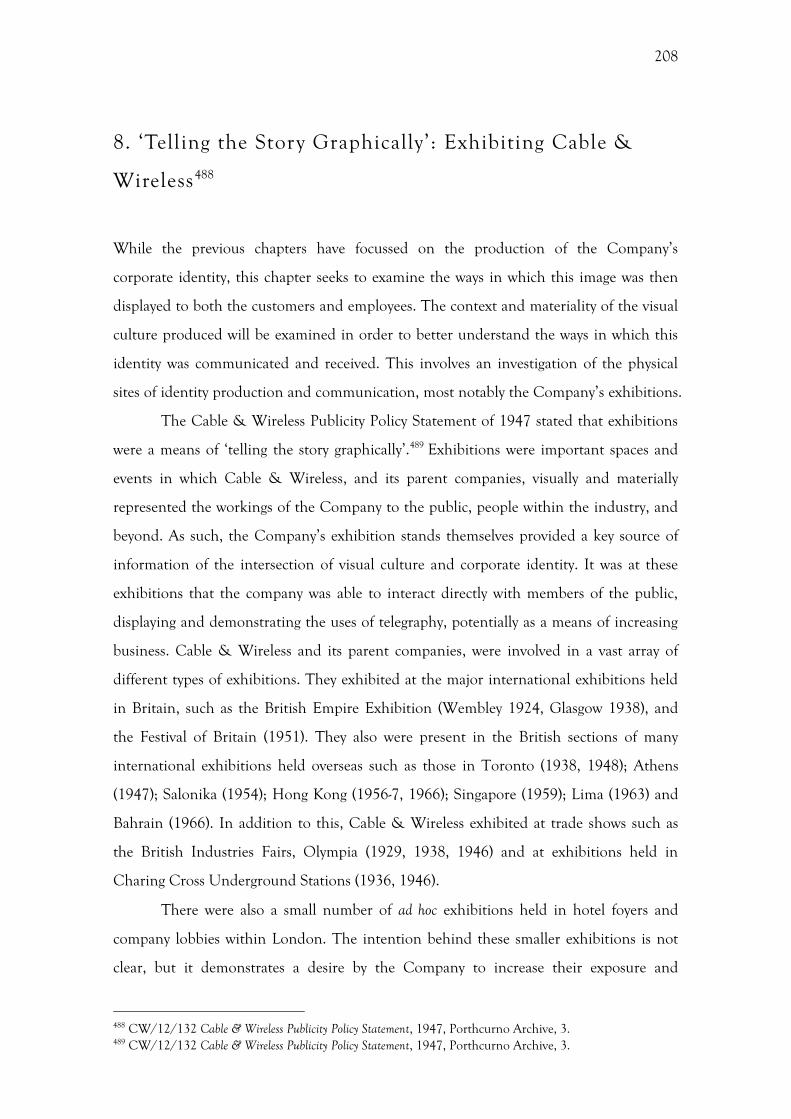
208
8. ‘Telling the Story Graphically’: Exhibiting Cable &
Wireless488
While the previous chapters have focussed on the production of the Company’s
corporate identity, this chapter seeks to examine the ways in which this image was then
displayed to both the customers and employees. The context and materiality of the visual
culture produced will be examined in order to better understand the ways in which this
identity was communicated and received. This involves an investigation of the physical
sites of identity production and communication, most notably the Company’s exhibitions.
The Cable & Wireless Publicity Policy Statement of 1947 stated that exhibitions
were a means of ‘telling the story graphically’.489 Exhibitions were important spaces and
events in which Cable & Wireless, and its parent companies, visually and materially
represented the workings of the Company to the public, people within the industry, and
beyond. As such, the Company’s exhibition stands themselves provided a key source of
information of the intersection of visual culture and corporate identity. It was at these
exhibitions that the company was able to interact directly with members of the public,
displaying and demonstrating the uses of telegraphy, potentially as a means of increasing
business. Cable & Wireless and its parent companies, were involved in a vast array of
different types of exhibitions. They exhibited at the major international exhibitions held
in Britain, such as the British Empire Exhibition (Wembley 1924, Glasgow 1938), and
the Festival of Britain (1951). They also were present in the British sections of many
international exhibitions held overseas such as those in Toronto (1938, 1948); Athens
(1947); Salonika (1954); Hong Kong (1956-7, 1966); Singapore (1959); Lima (1963) and
Bahrain (1966). In addition to this, Cable & Wireless exhibited at trade shows such as
the British Industries Fairs, Olympia (1929, 1938, 1946) and at exhibitions held in
Charing Cross Underground Stations (1936, 1946).
There were also a small number of ad hoc exhibitions held in hotel foyers and
company lobbies within London. The intention behind these smaller exhibitions is not
clear, but it demonstrates a desire by the Company to increase their exposure and
488 CW/12/132 Cable & Wireless Publicity Policy Statement, 1947, Porthcurno Archive, 3. 489 CW/12/132 Cable & Wireless Publicity Policy Statement, 1947, Porthcurno Archive, 3.
209
reiterates the importance of exhibitions to the Company. Without the context of other
exhibitions stands, it is harder to reconstruct the original context of these smaller
exhibitions. A photograph of an exhibition held in the Mayfair Hotel in London in 1950
for a conference of the Florist Telegraph Delivery Association aptly demonstrates this
point (Figure 82). Here we see a stand fashioned out of two side tables and framed on
either side by standard lamps. On display is a copy of the Great Circle Map, which has
been placed within a wooden frame mirroring the picture of the wall behind and the
surrounding décor shows panelled walls, damask winged chairs, and curtains with a heavy
pelmet, which further accentuates the aesthetic of a domestic interior. The resulting
visual impression is far removed from that of an exhibition, with the style of the hotel
environment subsuming that of the stand and forcing it to adopt a more traditional feel
than was seen on other stands by Cable & Wireless during this time.
Figure 82: Florist Telegraph Delivery Association Stand, Mayfair Hotel, 1950. Source: PK PHO///1809.
The vast majority of the literature pertaining to corporate identity implies that the
design of exhibition stands and their appearance were firmly within the control of the
Company. However, this chapter will demonstrate that the visual output of the Company,
in its various forms, was subject to the context in which it was deployed by the Company

210
and observed and interacted with by the customer. For instance, although the Company
created or commissioned the exhibition stands and window displays, the branches were
positioned in streets of other businesses in the same way that exhibition stands were
situated alongside a number of other stands. Both attempted to entice the public into
becoming a customer, advertising their service and providing information about the
Company. However, these different methods of display operated within, and created,
different spaces. In contrast to the somewhat quotidian space of the Company branches
discussed in the previous chapter, the Company’s exhibition stands were positioned in
the spectacular space created by the exhibitionary context.
Most of the literature pertaining to corporate identity looks solely at the
production of marketing material and advertising, without paying attention to the
reception of these images. In what follows the notions of display and observation will be
addressed, bringing in conceptual ideas such as Geppert’s ‘meta-media’ and Bennett’s
‘exhibitionary complex’.490 Bennett discusses the notion of ordering when talking about
the exhibitionary complex, stating that the Great Exhibition of 1851 ordered not only the
objects for public inspection, but also the public who were inspecting the objects.491 In
terms of exhibitions, the tension between the invisibility of telegraphy and the visual
requirements of the exhibitionary form will be examined.
One of the main focuses of this chapter is the reception of the Company’s
identity by the public and their customers. Establishing the reception of these images is
notoriously difficult, which goes some way to explain why this is largely ignored in the
literature on corporate identity, with the focus on the production of marketing materials
and advertising instead. However, some information can be garnered from contemporary
photographs that show the interaction of the public with the Company’s exhibitions
stands and maps, as well as reviews from visitors featured in the Zodiac. It should be noted
that images have a materiality that was displayed and observed. Indeed, as the
anthropologists Edwards and Hart suggest, even photographs should be considered as
three-dimensional objects rather than just two-dimensional images. 492 Often the
materiality of an image, along with the context in which it was displayed can alter the
perception of that image. The customers and the staff consumed these images. The
meaning of a cable map, for example, was not just influenced by the stylistic or
490 T. Bennett, The Birth of the Museum: History, Theory, Politics, London, 1995; Geppert, Fleeting Cities. 491 Bennett, The Birth of the Museum, 61. 492 Edwards and Hart, Photographs Objects Histories. See also, della Dora, Travelling landscape-objects.
211
cartographic details, but also by its use and display. The context in which the map was
displayed, whether on an exhibition stand, a branch window, or a classroom, had an
impact on the meaning, as did the manner in which the viewer interacted with the map.
Were they viewing the map from a distance, or up close? Was it a wall mounted map or a
folded hand-held one? Even the difference between viewing a three dimensional globe
and a flat map altered the way it was perceived and ultimately changed the way the
company was viewed.
There appears to be a dearth of literature investigating how individual companies
used exhibitionary apparatus. Instead, most of the literature is concerned either with the
design elements of the overall exhibitions, as is the case of the Festival of Britain,493 or
trying to decipher the overarching narratives that were found across the whole exhibition
– for instances of imperial or national sentiment.494 For many of those exhibiting, this
was one of the best opportunities for exposure to a mass audience. Exhibitions provided a
concentrated commercial centre, with an array of corporate identities within a finite space,
all vying for the attention of the visitor. This presents the perfect resource for those
seeking to understand the workings of corporate identity, as well as gaining an
understanding of the individual companies involved.
Despite the fact that these exhibitions consisted of a multitude of disparate stands,
organised and standardised to differing degrees at each exhibition, the scale of the
investigations within the literature is usually exhibition-wide rather than honing in on
specific stands. As a result, these exhibitions are unduly homogenised. Focussing on a
single company throughout this period not only illuminates the identity and narratives
presented by the company itself, but also allows a large variety of exhibitions to be
analysed during this period. Through this focussed investigation, shifts in the politics of
display, the decline of imperialism, and the rise of modernism can be assessed in a more
comprehensive manner, in relation to the history of the Company. Additionally, the
examination of the participation of one company provides a unique perspective on the
exhibitions more broadly, one that is often ignored in favour of narratives on the might
of the state or high architectural design. This company-based perspective allows an
investigation of the interactions between the visitors and the exhibitors on a more
personal level.
493 See, B. Conekin, The Autobiography of a Nation: The 1951 Festival of Britain, Manchester, 2003. 494 See, Greenhalgh, Ephemeral Vistas; T. Mitchell, The world as exhibition, Comparative Studies in Society and History 31 (1989) 217-236; T. Mitchell, Orientalism and the exhibitionary order, in: N. Mirzoeff (Ed), The Visual Culture Reader, Basingstoke, 1998, 495-506.
212
This chapter will also show that Cable & Wireless’ exhibition stands operated
differently from those of their fellow exhibitors. Cable & Wireless’ stand became a
gateway to the British Empire and the outside world, allowing the public to directly
communicate with the Empire by telegram. This subverted the form of imperial
exhibitions by seeking to look beyond the exhibition space rather than to constrain it.
This is important as it presents a new perspective on the exhibitionary apparatus used
within imperial exhibitions. Additionally, there was an opportunity to send telegrams
from both exhibition stands and from branches, within both a quotidian and a
commercial space.
Meta-media
Geppert’s conceptualization of exhibitions as ‘meta-media’ is a particularly useful way of
approaching the exhibitionary output of Cable & Wireless.495 Here the exhibition, as an
event comprising a variety of visual strands, is a means of momentarily assembling and
ordering these somewhat disparate strands of visual culture into one coherent ‘meta-
media’, only for these sources of visual culture to disperse once more after the
dismantling of the exhibition. In essence, it is a form of communication that
encompasses other communicative technologies. 496 This allows another dimension of
interpretation and is particularly pertinent when discussing the visual culture of Cable &
Wireless and the articulation of this through the medium of exhibitions.
A distinction needs to be made between the exhibition stand, which was unique
to each company or organization, and the exhibition itself, as an event drawing together
these various exhibits. While Geppert talks of an exhibition as an event, the concept of
‘meta media’ can also be applied to the Cable & Wireless stand. The stand by itself is an
interesting object for analysis, drawing together the various strands of visual culture seen
elsewhere – the uniform of the staff, posters and telegraph forms for instance. However,
the stand did not exist in isolation and the reception of this stand changed depending
upon where it was placed within the exhibition. Cable & Wireless exhibited in a number
of locations, from the large international exhibitions to hotel lobbies and even Charing
Cross underground station. In each of these locations, the surrounding environment
495 Geppert, Fleeting Cities, 3. 496 Geppert, Fleeting Cities, 3.
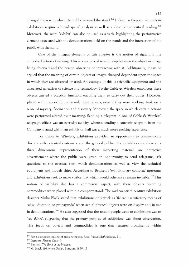
213
changed the way in which the public received the stand.497 Indeed, as Geppert reminds us,
exhibitions require a broad spatial analysis as well as a close hermeneutical reading.498
Moreover, the word ‘exhibit’ can also be used as a verb, highlighting the performative
element associated with the demonstrations held on the stands and the interaction of the
public with the stand.
One of the integral elements of this chapter is the notion of sight and the
embodied action of viewing. This is a reciprocal relationship between the object or image
being observed and the person observing or interacting with it. Additionally, it can be
argued that the meaning of certain objects or images changed dependent upon the space
in which they are observed or used. An example of this is scientific equipment and the
associated narratives of science and technology. To the Cable & Wireless employees these
objects carried a practical function, enabling them to carry out their duties. However,
placed within an exhibition stand, these objects, even if they were working, took on a
sense of mystery, fascination and discovery. Moreover, the space in which certain actions
were performed altered their meaning. Sending a telegram in one of Cable & Wireless’
telegraph offices was an everyday activity, whereas sending a souvenir telegram from the
Company’s stand within an exhibition hall was a much more exciting experience.
For Cable & Wireless, exhibitions provided an opportunity to communicate
directly with potential customers and the general public. The exhibition stands were a
three dimensional representation of their marketing material; an interactive
advertisement where the public were given an opportunity to send telegrams, ask
questions to the overseas staff, watch demonstrations as well as view the technical
equipment and models ships. According to Bennett’s ‘exhibitionary complex’ museums
and exhibitions seek to make visible that which would otherwise remain invisible.499 This
notion of visibility also has a commercial aspect, with these objects becoming
commodities when placed within a company stand. The mid-twentieth century exhibition
designer Misha Black stated that exhibitions only work as ‘the most satisfactory means of
sales, education or propaganda’ when actual physical objects were on display and in use
in demonstrations.500 He also suggested that the reason people went to exhibitions was to
‘see things’, suggesting that the primary purpose of exhibitions was about observation.
This focus on objects and commodities is one that features prominently within
497 For a discussion on site of audiencing see, Rose, Visual Methodologies, 21. 498 Geppert, Fleeting Cities, 3. 499 Bennett, The Birth of the Museum. 500 M. Black, Exhibition Design, London, 1950, 11.
214
Advertising History.501 However, this was a challenge for a company such as Cable &
Wireless who were providing a service rather than a commodity. This might be one of the
reasons why there was such a strong focus on the more performative aspects, such as
demonstrations, in lieu of having a product to display.
Despite the importance of people to both the aesthetic and the more performative
aspects of the exhibitionary process, exhibition visitors are often ignored in many studies.
The majority of references to exhibition visitors relate to famous visitor who wrote about
their experiences. An example of this is Cohen’s article, which uses the memoir of
Virginia Woolf who visited the British Empire Exhibition in 1924.502 This is not to say
however, that famous visitors are not worth studying. Indeed, Cable & Wireless’
exhibitions often had well-known visitors, as the Zodiac magazine was only too keen to
report. The Zodiac reported a number of famous visitors to Cable & Wireless stands, as a
means of publicising the importance of their displays. The way in which the 1947
Radiolympia Exhibition was recorded in the Zodiac provides a key example of this.
Alongside photographs of the actress Jean Simmons reading a reply telegram from
Barbados (Figure 83) and Queen Mary looking at a Cable & Wireless globe (Figure 84), it
was noted that the stand was visited by ‘C. B. Clarke, the West Indies and
Northamptonshire cricketer […] Tommy Hadley and members of the I.T.M.A show, Jessie
Matthews, Commander A. B. Campbell, Carroll Levis, Adelaide Hall, and film stars
Esmond Knight, Anne Crawford, Valerie Hobson, Bonar Colleano, Petula Clark’. 503
There is also a noticeable focus upon depictions of the upper echelons of the Company
or members of the Royal Family visiting exhibits within the collection of exhibition
photographs in the Porthcurno archive. This might be more a reflection of the collection
process rather than how the company initially chose to document these exhibitions.
Photographs which included either highly important and known visitors, as well as those
depicting the Company’s stand might have been viewed as more important for
preservation purposes that those obscured by swarming crowds. In this respect, the
images of exhibitions found in the Zodiac are more representative, showing images of
directors, royalty, and celebrities, alongside those of the general public and crowds.
501 Nevett, Advertising in Britain; Richards, The Commodity Culture of Victorian England. 502 S. Cohen, The Empire from the street: Virginia Woolf, Wembley, and imperial monuments, MFS Modern Fiction Studies 50 (2004) 85-109. 503 PUB/ZDC/5/3/134 Anon, Barbados “Brains Trust” was star turn at Radiolympia, The Zodiac, 464 (November, 1947) 4-7.

215
Figure 83: Actress Jean reading a reply telegram at the 1947 Radiolympia Exhibition, The Zodiac, 464 (November 1947) 6. Source: PK PUB/ZDC/5/3/134
Figure 84: Queen Mary inspecting the Cable & Wireless globe at the Radiolympia Exhibition, 1947, The Zodiac 464 (November 1947) 7. Source: PK PUB/ZDC/5/3/134
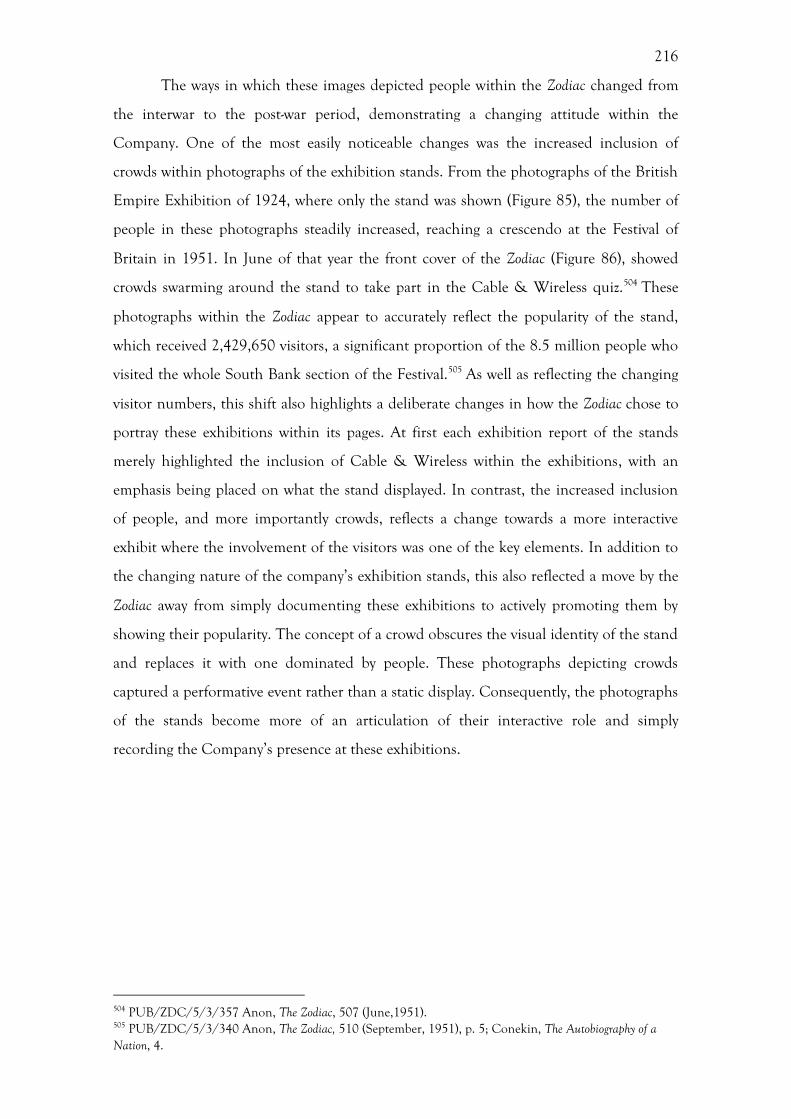
216
The ways in which these images depicted people within the Zodiac changed from
the interwar to the post-war period, demonstrating a changing attitude within the
Company. One of the most easily noticeable changes was the increased inclusion of
crowds within photographs of the exhibition stands. From the photographs of the British
Empire Exhibition of 1924, where only the stand was shown (Figure 85), the number of
people in these photographs steadily increased, reaching a crescendo at the Festival of
Britain in 1951. In June of that year the front cover of the Zodiac (Figure 86), showed
crowds swarming around the stand to take part in the Cable & Wireless quiz.504 These
photographs within the Zodiac appear to accurately reflect the popularity of the stand,
which received 2,429,650 visitors, a significant proportion of the 8.5 million people who
visited the whole South Bank section of the Festival.505 As well as reflecting the changing
visitor numbers, this shift also highlights a deliberate changes in how the Zodiac chose to
portray these exhibitions within its pages. At first each exhibition report of the stands
merely highlighted the inclusion of Cable & Wireless within the exhibitions, with an
emphasis being placed on what the stand displayed. In contrast, the increased inclusion
of people, and more importantly crowds, reflects a change towards a more interactive
exhibit where the involvement of the visitors was one of the key elements. In addition to
the changing nature of the company’s exhibition stands, this also reflected a move by the
Zodiac away from simply documenting these exhibitions to actively promoting them by
showing their popularity. The concept of a crowd obscures the visual identity of the stand
and replaces it with one dominated by people. These photographs depicting crowds
captured a performative event rather than a static display. Consequently, the photographs
of the stands become more of an articulation of their interactive role and simply
recording the Company’s presence at these exhibitions.
504 PUB/ZDC/5/3/357 Anon, The Zodiac, 507 (June,1951). 505 PUB/ZDC/5/3/340 Anon, The Zodiac, 510 (September, 1951), p. 5; Conekin, The Autobiography of a Nation, 4.
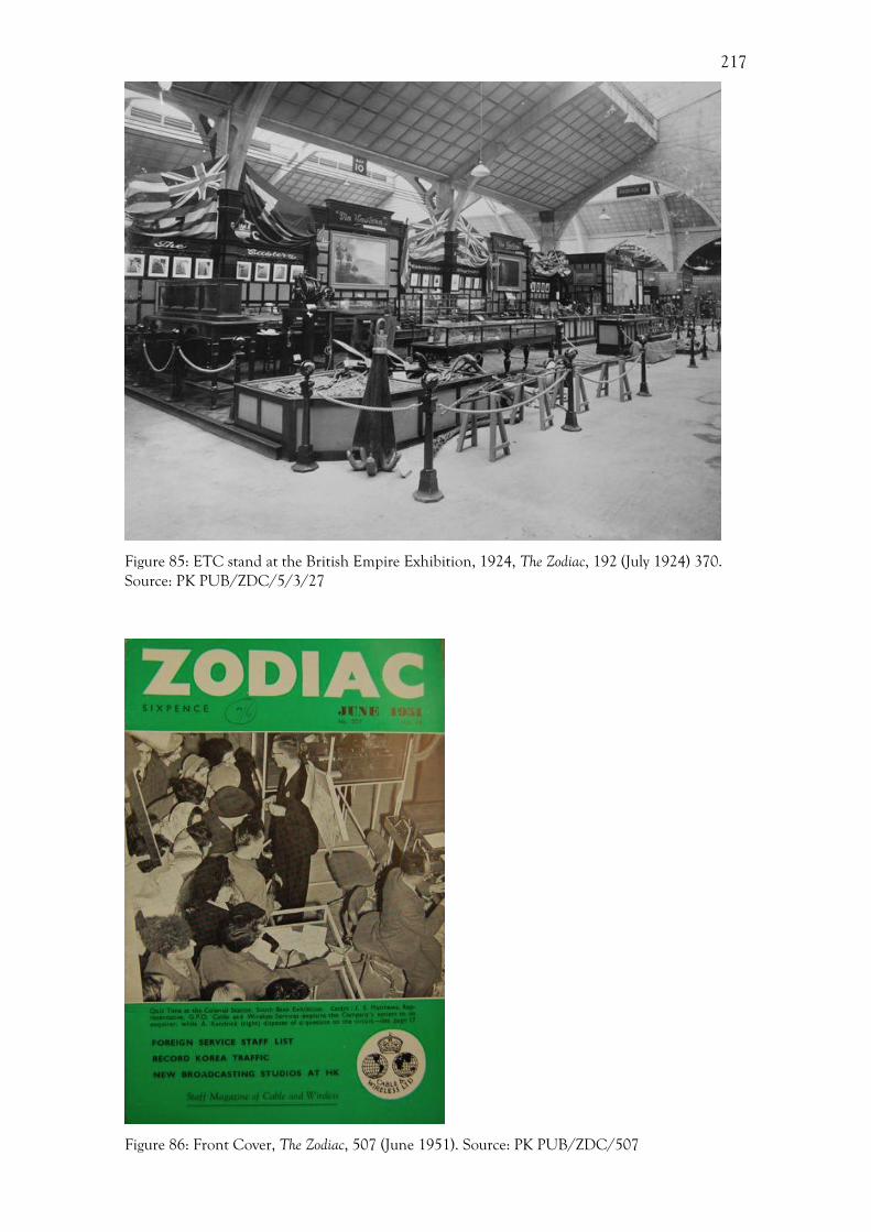
217
Figure 85: ETC stand at the British Empire Exhibition, 1924, The Zodiac, 192 (July 1924) 370. Source: PK PUB/ZDC/5/3/27
Figure 86: Front Cover, The Zodiac, 507 (June 1951). Source: PK PUB/ZDC/507

218
As noted above, exhibition were an important aspect of Cable & Wireless’
activities, and the sheer volume of archive material pertaining to these events
demonstrates how significant Cable & Wireless’ interest was in both participating in, and
recording, these exhibitions. The Zodiac featured a large array of reviews of exhibitions
and details of the various Cable & Wireless stands. The increased depiction of
exhibitions within the Zodiac demonstrates the changing nature of the publication,
moving away from being a social magazine to a commercial one. There is a marked
change from the 1920s to the 1950s characterised by an increased willingness to report
and record these exhibitions. A descriptive article from July 1924 entitled ‘The New
Station at Wembley’ provides some details of the Company’s stand at the British Empire
Exhibition, for instance.506 However, there was no accompanying photograph, despite the
fact that the company did take photographs of the stand. Instead, this article is
supplemented by a small advertisement for the Company’s stand (Figure 87); again
without an image of the stand.507 On this advertisement there are five line drawings of the
iconic lion, which became the motif for the Empire Exhibition. Here, within its own
publicity the Company appropriated the official imagery, which used lions to represent
the might of the British Empire. By 1938, with the reporting of the Empire Exhibition in
Glasgow within the Zodiac, there was a distinct change, with exhibits being reported only
by photographs. In September of that year, a small photograph of the company stall
(Figure 88) was produced in the Zodiac showing the Company stand. The Festival of
Britain, in 1951, was the first exhibition to be extensively covered by the Zodiac, which is
an indication of an increased interest in publicity by the company. Whereas previous
exhibitions had been referred to almost in passing, now large sections of the magazine,
including the front and back covers, were dedicated to the Festival of Britain.
Figure 87: Advert for the Empire Exhibition, 1924, The Zodiac, 194 (September 1924) 11. Source: PK PUB/ZDC/5/3/29 506 PUB/ZDC/PUB/5/3/35 Anon, New Station at Wembley, The Zodiac, 194 (July 1924). 507 PUB/ZDC/PUB/5/3/35 Anon, Advertisement, The Zodiac, 194 (July 1924).
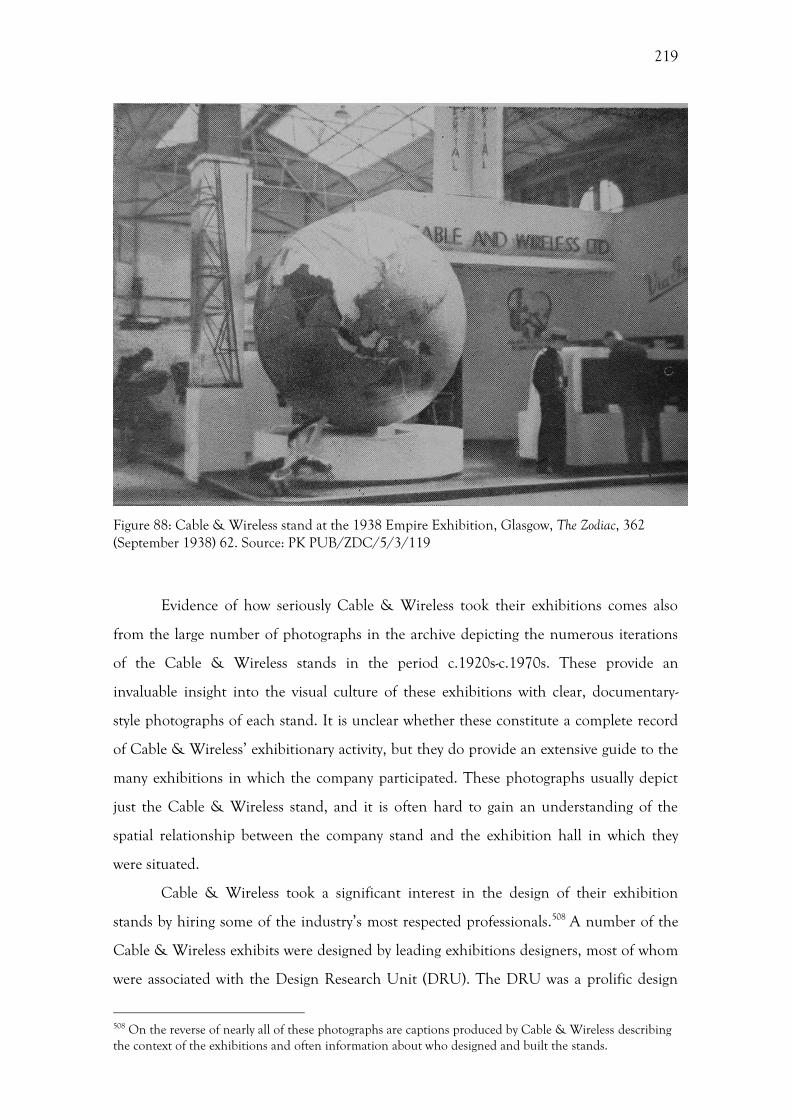
219
Figure 88: Cable & Wireless stand at the 1938 Empire Exhibition, Glasgow, The Zodiac, 362 (September 1938) 62. Source: PK PUB/ZDC/5/3/119
Evidence of how seriously Cable & Wireless took their exhibitions comes also
from the large number of photographs in the archive depicting the numerous iterations
of the Cable & Wireless stands in the period c.1920s-c.1970s. These provide an
invaluable insight into the visual culture of these exhibitions with clear, documentary-
style photographs of each stand. It is unclear whether these constitute a complete record
of Cable & Wireless’ exhibitionary activity, but they do provide an extensive guide to the
many exhibitions in which the company participated. These photographs usually depict
just the Cable & Wireless stand, and it is often hard to gain an understanding of the
spatial relationship between the company stand and the exhibition hall in which they
were situated.
Cable & Wireless took a significant interest in the design of their exhibition
stands by hiring some of the industry’s most respected professionals.508 A number of the
Cable & Wireless exhibits were designed by leading exhibitions designers, most of whom
were associated with the Design Research Unit (DRU). The DRU was a prolific design
508 On the reverse of nearly all of these photographs are captions produced by Cable & Wireless describing the context of the exhibitions and often information about who designed and built the stands.

220
consultancy operating during this period specialising primarily in corporate identity and
exhibition design. Little research has been conducted on such an important network of
designers, except for a recent travelling retrospective exhibition. 509 This gives further
evidence that Cable & Wireless were operating within part of a much larger network of
designers rather than having a solely in-house approach. The fact that Cable & Wireless
hired the DRU to design a number of its exhibitions stands shows an overt attempt by
the Company to present itself using the visual language of modernism.
Exhibitions and imperial identities
The influence of imperialism upon both the tone and design of late-nineteenth and early-
twentieth century exhibitions is a prominent feature of exhibition literature.510 Cable &
Wireless, and its parent companies, operated on a global scale primarily within the
bounds of the British Empire. The display of imperialism was one of the main
characteristics of Cable & Wireless’ exhibition stands. The mere presence of Cable &
Wireless stands, and those of their parent companies, at these imperial exhibitions
conferred a sense of imperialism on the Company. Indeed, as Geppert suggests, it is
essential to assess the layout and location of the exhibition within the respective
metropolises.511 Visitors at the Empire Exhibitions of 1924 and 1938, for instance, were
greeted with overt overtones of imperialism before they even laid eyes on the Company
stand. An example of this was the decorative lions found at the entrances to the pavilions
at the 1938 Glasgow exhibition (Figure 89), which were widely read, even by reviewers in
the Zodiac, as emblematic of the British Empire.512 In this sense, these exhibitions were
the perfect home for Cable & Wireless’ exhibition stands. A British Pathé film from the
1938 exhibition in Glasgow entitled ‘The Empire Comes to Town’ declared confidently
that the exhibition “[…] presents the Empire to the Empire and to the world”.513
509 M. Cotton, Design Research Unit: 1942-72, Cologne, 2012. 510 See, Greenhalgh, Ephemeral Vistas; Mitchell, The world as exhibition; Mitchell, Orientalism and the exhibitionary order. 511 Geppert, Fleeting Cities, 4. 512 PUB/ZDC/5/3/119 Anon, The Zodiac, 362 (September, 1938). 513 The Empire Comes to Town, 1938, British Pathé [http://www.britishpathe.com/video/the-empire-comes-to-town].
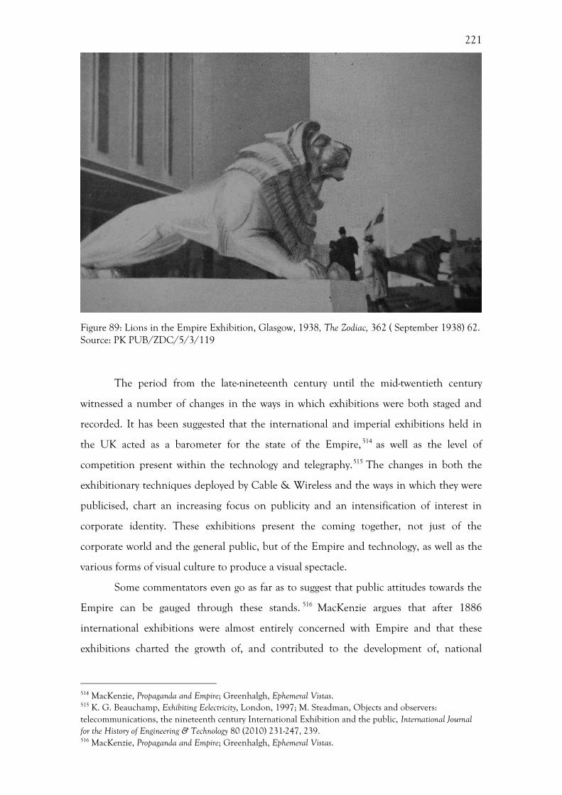
221
Figure 89: Lions in the Empire Exhibition, Glasgow, 1938, The Zodiac, 362 ( September 1938) 62. Source: PK PUB/ZDC/5/3/119
The period from the late-nineteenth century until the mid-twentieth century
witnessed a number of changes in the ways in which exhibitions were both staged and
recorded. It has been suggested that the international and imperial exhibitions held in
the UK acted as a barometer for the state of the Empire, 514 as well as the level of
competition present within the technology and telegraphy.515 The changes in both the
exhibitionary techniques deployed by Cable & Wireless and the ways in which they were
publicised, chart an increasing focus on publicity and an intensification of interest in
corporate identity. These exhibitions present the coming together, not just of the
corporate world and the general public, but of the Empire and technology, as well as the
various forms of visual culture to produce a visual spectacle.
Some commentators even go as far as to suggest that public attitudes towards the
Empire can be gauged through these stands. 516 MacKenzie argues that after 1886
international exhibitions were almost entirely concerned with Empire and that these
exhibitions charted the growth of, and contributed to the development of, national
514 MacKenzie, Propaganda and Empire; Greenhalgh, Ephemeral Vistas. 515 K. G. Beauchamp, Exhibiting Eelectricity, London, 1997; M. Steadman, Objects and observers: telecommunications, the nineteenth century International Exhibition and the public, International Journal for the History of Engineering & Technology 80 (2010) 231-247, 239. 516 MacKenzie, Propaganda and Empire; Greenhalgh, Ephemeral Vistas.
222
perceptions about, the Empire.517 He goes on to state that exhibitions provided a valuable
and rare opportunity to gauge public reaction through press reports and through
attendance figures. 518 This view is echoed by Greenhalgh who suggests that an
examination of major exhibitions from 1851 to 1940 shows that the type and shape of
imperialism incorporated within exhibitions altered qualitatively in much the same way as
Empire throughout the world changed.519 The Great Exhibition of 1851 showcased the
manufacturing prowess of Britain, utilising the raw materials of the Empire. By the time
of the British Empire Exhibition of 1924, the Empire had reached its zenith, and this
exhibition was centred on imperial spectacle. The decline of the Empire and imperial
sentiment following the Second World War culminated in the introspective Festival of
Britain. As such, exhibitions can be used as socio-political gauge for attitudes to
Empire.520
The use of exhibitions as a barometer for imperial sentiment is particularly
relevant when looking at the breakup of the British Empire in the mid-twentieth century.
Ward asserts that there remains a firmly entrenched assumption that the broad cultural
impact of decolonization was confined to the colonial periphery.521 If we examine this
notion through the lens of exhibitions then this assumption does appear to have some
weight. Until the Festival of Britain in 1951, the Empire had been the focal point of the
various international exhibitions held within Britain. By 1951, with the independence of
India, Burma, and Ceylon in the intervening period, the Festival of Britain took an
unashamedly introspective approach, highlighting the strength of British production and
design, while seemingly ignoring the fact that Britain had ever had an Empire.
While exhibitions were able to shed their imperial garb in such an easy manner,
this was considerably harder for a company such as Cable & Wireless, whose entire
business was based around communicating with the Empire. As such, Empire still
featured prominently in the Cable & Wireless exhibition stand at the Festival of Britain,
placing its narrative somewhat at odds with the rest of the Festival. Despite the Festival’s
new introversion, Cable & Wireless remained a geographically global company, not
necessarily in an imperial sense, but in a practical one as their cables covered the globe. It,
therefore, was impossible for them to ignore this aspect of their identity, as their revenue
517 MacKenzie, Propaganda and Empire, 99. 518 MacKenzie, Propaganda and Empire, 98. 519 Greenhalgh, Ephemeral Vistas, 57. 520 Greenhalgh, Ephemeral Vistas, 57. 521 Ward, Introduction, 1-2.
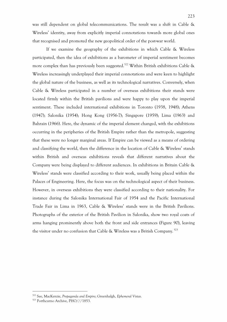
223
was still dependent on global telecommunications. The result was a shift in Cable &
Wireless’ identity, away from explicitly imperial connotations towards more global ones
that recognised and promoted the new geopolitical order of the post-war world.
If we examine the geography of the exhibitions in which Cable & Wireless
participated, then the idea of exhibitions as a barometer of imperial sentiment becomes
more complex than has previously been suggested.522 Within British exhibitions Cable &
Wireless increasingly underplayed their imperial connotations and were keen to highlight
the global nature of the business, as well as its technological narratives. Conversely, when
Cable & Wireless participated in a number of overseas exhibitions their stands were
located firmly within the British pavilions and were happy to play upon the imperial
sentiment. These included international exhibitions in Toronto (1938, 1948); Athens
(1947); Salonika (1954); Hong Kong (1956-7); Singapore (1959); Lima (1963) and
Bahrain (1966). Here, the dynamic of the imperial element changed, with the exhibitions
occurring in the peripheries of the British Empire rather than the metropole, suggesting
that these were no longer marginal areas. If Empire can be viewed as a means of ordering
and classifying the world, then the difference in the location of Cable & Wireless’ stands
within British and overseas exhibitions reveals that different narratives about the
Company were being displayed to different audiences. In exhibitions in Britain Cable &
Wireless’ stands were classified according to their work, usually being placed within the
Palaces of Engineering. Here, the focus was on the technological aspect of their business.
However, in overseas exhibitions they were classified according to their nationality. For
instance during the Salonika International Fair of 1954 and the Pacific International
Trade Fair in Lima in 1963, Cable & Wireless’ stands were in the British Pavilions.
Photographs of the exterior of the British Pavilion in Salonika, show two royal coats of
arms hanging prominently above both the front and side entrances (Figure 90), leaving
the visitor under no confusion that Cable & Wireless was a British Company. 523
522 See, MacKenzie, Propaganda and Empire; Greenhalgh, Ephemeral Vistas. 523 Porthcurno Archive, PHO///1853.

224
Figure 90: Entrance to the British Pavilion at the Salonika International Exhibition, 1954. Source: PK, PHO///1853.
The way in which the Company discussed its presence at some of the earlier
exhibitions during the interwar period suggests that the Company saw its stand as both
an exhibit and a cable station. This idea of a station, primarily articulated through the
Zodiac, suggests that the workers of the company were unfamiliar with the concept of an
exhibition stand, but fully understood the concept of a cable station. An article from July
1924 entitled ‘The New Station at Wembley’ aptly demonstrates this, noting that the staff
were ‘stationed there’. Later, in 1951 during the Festival of Britain, the Cable & Wireless
stand was known officially as the ‘Dome Colonial Telegraph Station’, demonstrating that
this official and practical use of telegraphy in a ‘colonial’ context continued well into the
twentieth century.524
This recreation of a cable station within an exhibition also reflects the practical
use of telegraphy within these exhibitions. These were working stands that were capable
of sending telegrams anywhere on the cable network, allowing fellow exhibitors and
524 PUB/ZDC/5/3/356 Anon, Dome Colonial Station will soon be calling: Company contributes overseas quiz and cableship film to the Festival, The Zodiac, 506 (May, 1951), 5.
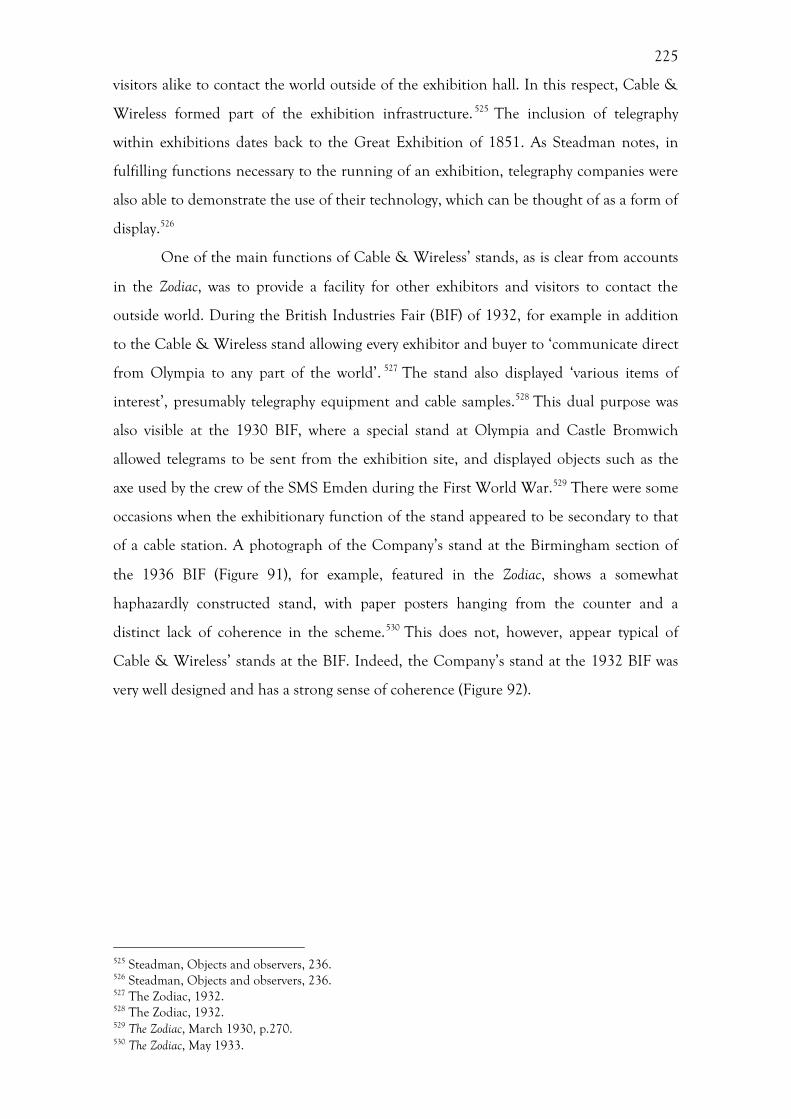
225
visitors alike to contact the world outside of the exhibition hall. In this respect, Cable &
Wireless formed part of the exhibition infrastructure. 525 The inclusion of telegraphy
within exhibitions dates back to the Great Exhibition of 1851. As Steadman notes, in
fulfilling functions necessary to the running of an exhibition, telegraphy companies were
also able to demonstrate the use of their technology, which can be thought of as a form of
display.526
One of the main functions of Cable & Wireless’ stands, as is clear from accounts
in the Zodiac, was to provide a facility for other exhibitors and visitors to contact the
outside world. During the British Industries Fair (BIF) of 1932, for example in addition
to the Cable & Wireless stand allowing every exhibitor and buyer to ‘communicate direct
from Olympia to any part of the world’. 527 The stand also displayed ‘various items of
interest’, presumably telegraphy equipment and cable samples.528 This dual purpose was
also visible at the 1930 BIF, where a special stand at Olympia and Castle Bromwich
allowed telegrams to be sent from the exhibition site, and displayed objects such as the
axe used by the crew of the SMS Emden during the First World War.529 There were some
occasions when the exhibitionary function of the stand appeared to be secondary to that
of a cable station. A photograph of the Company’s stand at the Birmingham section of
the 1936 BIF (Figure 91), for example, featured in the Zodiac, shows a somewhat
haphazardly constructed stand, with paper posters hanging from the counter and a
distinct lack of coherence in the scheme.530 This does not, however, appear typical of
Cable & Wireless’ stands at the BIF. Indeed, the Company’s stand at the 1932 BIF was
very well designed and has a strong sense of coherence (Figure 92).
525 Steadman, Objects and observers, 236. 526 Steadman, Objects and observers, 236. 527 The Zodiac, 1932. 528 The Zodiac, 1932. 529 The Zodiac, March 1930, p.270. 530 The Zodiac, May 1933.
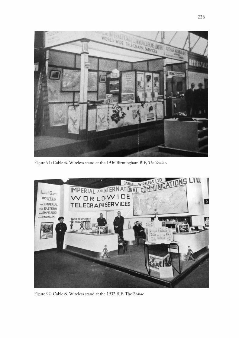
226
Figure 91: Cable & Wireless stand at the 1936 Birmingham BIF, The Zodiac.
Figure 92: Cable & Wireless stand at the 1932 BIF. The Zodiac
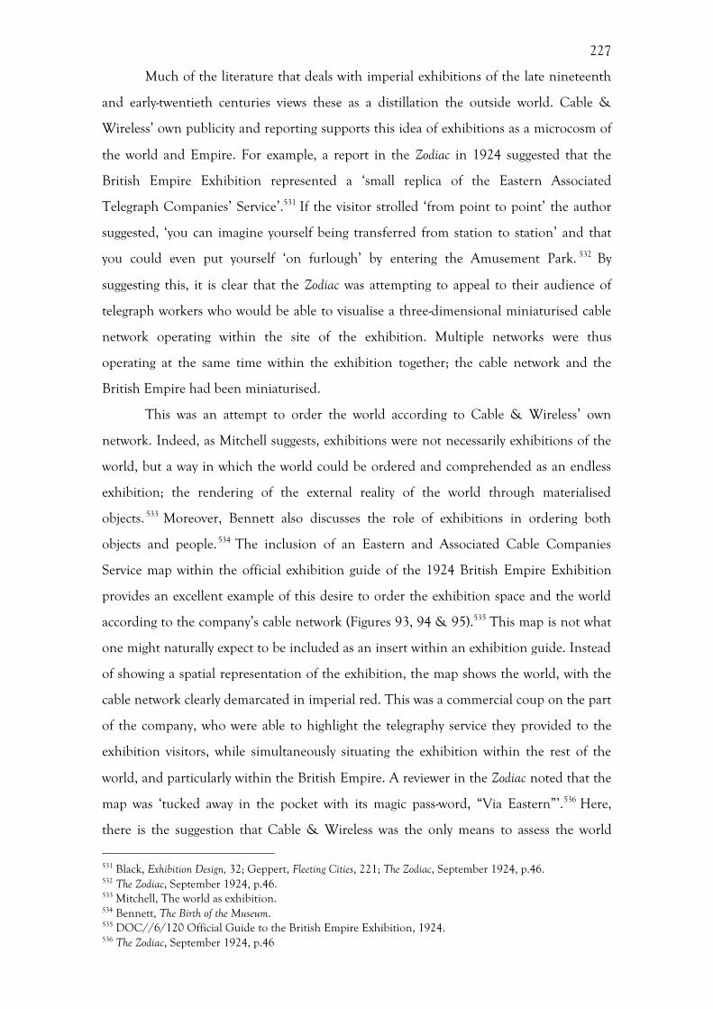
227
Much of the literature that deals with imperial exhibitions of the late nineteenth
and early-twentieth centuries views these as a distillation the outside world. Cable &
Wireless’ own publicity and reporting supports this idea of exhibitions as a microcosm of
the world and Empire. For example, a report in the Zodiac in 1924 suggested that the
British Empire Exhibition represented a ‘small replica of the Eastern Associated
Telegraph Companies’ Service’.531 If the visitor strolled ‘from point to point’ the author
suggested, ‘you can imagine yourself being transferred from station to station’ and that
you could even put yourself ‘on furlough’ by entering the Amusement Park. 532 By
suggesting this, it is clear that the Zodiac was attempting to appeal to their audience of
telegraph workers who would be able to visualise a three-dimensional miniaturised cable
network operating within the site of the exhibition. Multiple networks were thus
operating at the same time within the exhibition together; the cable network and the
British Empire had been miniaturised.
This was an attempt to order the world according to Cable & Wireless’ own
network. Indeed, as Mitchell suggests, exhibitions were not necessarily exhibitions of the
world, but a way in which the world could be ordered and comprehended as an endless
exhibition; the rendering of the external reality of the world through materialised
objects. 533 Moreover, Bennett also discusses the role of exhibitions in ordering both
objects and people.534 The inclusion of an Eastern and Associated Cable Companies
Service map within the official exhibition guide of the 1924 British Empire Exhibition
provides an excellent example of this desire to order the exhibition space and the world
according to the company’s cable network (Figures 93, 94 & 95).535 This map is not what
one might naturally expect to be included as an insert within an exhibition guide. Instead
of showing a spatial representation of the exhibition, the map shows the world, with the
cable network clearly demarcated in imperial red. This was a commercial coup on the part
of the company, who were able to highlight the telegraphy service they provided to the
exhibition visitors, while simultaneously situating the exhibition within the rest of the
world, and particularly within the British Empire. A reviewer in the Zodiac noted that the
map was ‘tucked away in the pocket with its magic pass-word, “Via Eastern”’.536 Here,
there is the suggestion that Cable & Wireless was the only means to assess the world
531 Black, Exhibition Design, 32; Geppert, Fleeting Cities, 221; The Zodiac, September 1924, p.46. 532 The Zodiac, September 1924, p.46. 533 Mitchell, The world as exhibition. 534 Bennett, The Birth of the Museum. 535 DOC//6/120 Official Guide to the British Empire Exhibition, 1924. 536 The Zodiac, September 1924, p.46
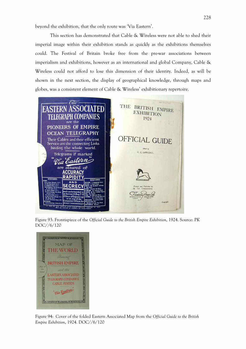
228
beyond the exhibition, that the only route was ‘Via Eastern’.
This section has demonstrated that Cable & Wireless were not able to shed their
imperial image within their exhibition stands as quickly as the exhibitions themselves
could. The Festival of Britain broke free from the pre-war associations between
imperialism and exhibitions, however as an international and global Company, Cable &
Wireless could not afford to lose this dimension of their identity. Indeed, as will be
shown in the next section, the display of geographical knowledge, through maps and
globes, was a consistent element of Cable & Wireless’ exhibitionary repertoire.
Figure 93: Frontispiece of the Official Guide to the British Empire Exhibition, 1924. Source: PK DOC//6/120
Figure 94: Cover of the folded Eastern Associated Map from the Official Guide to the British Empire Exhibition, 1924. DOC//6/120

229
Figure 95 - Eastern Associated Map from the Official Guide to the British Empire Exhibition, 1924. DOC//6/120
Displaying the Empire: Maps and Globes
The display of scale and the large reach of the company was one of the main ways that
Cable & Wireless articulated their imperial message, and this was not just through maps,
but also globes. While chapter 5 examined Cable & Wireless’ production of maps and
globes, this section investigates the transmission and consumption of these maps and
globes by looking at their display in exhibitions and branch offices, as well as how the
public interacted with them. Indeed, the contemporary writer Ainsworth-Davis, writing
about the British Empire Exhibition commented that examining a globe was the best way
of understanding the vast scale of the British Empire.537 This is aptly displayed by an
anecdote within the Zodiac recounting a small boy, who was stood in front of the nine-
foot globe, at the entrance of the Charing Cross exhibition in 1946 (Figure 96). He
watched it revolve with ‘wonder in his eyes. Then he pulled excitedly at his mother’s hand.
“Mummy,” he said, “is the world really as big as that?”538 By presenting the world as a
globe Cable & Wireless were able to accentuate rather than diminish the large
geographical extent of their cable network. The display of commercial scale was also
commented upon by a female visitor to the 1947 Radiolympia Exhibition who was
reported to have said to her friend: “They must be quite a big firm dear, mustn’t they?” in
response to reading that Cable & Wireless had transmitted 622 million words in the
previous year.539 In these two instances, the narrative produced by the design and content
of the exhibition stand was one of global scale and the Company’s global importance. 537 J. R. Ainsworth Davis, The Book of the Empire, London, 1924. 538 The Zodiac, February, 1946, 539 The Zodiac, November 1947, p.7.
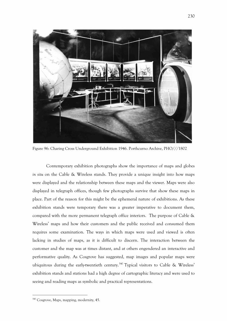
230
Figure 96: Charing Cross Underground Exhibition 1946. Porthcurno Archive, PHO///1802
Contemporary exhibition photographs show the importance of maps and globes
in situ on the Cable & Wireless stands. They provide a unique insight into how maps
were displayed and the relationship between these maps and the viewer. Maps were also
displayed in telegraph offices, though few photographs survive that show these maps in
place. Part of the reason for this might be the ephemeral nature of exhibitions. As these
exhibition stands were temporary there was a greater imperative to document them,
compared with the more permanent telegraph office interiors. The purpose of Cable &
Wireless’ maps and how their customers and the public received and consumed them
requires some examination. The ways in which maps were used and viewed is often
lacking in studies of maps, as it is difficult to discern. The interaction between the
customer and the map was at times distant, and at others engendered an interactive and
performative quality. As Cosgrove has suggested, map images and popular maps were
ubiquitous during the early-twentieth century.540 Typical visitors to Cable & Wireless’
exhibition stands and stations had a high degree of cartographic literacy and were used to
seeing and reading maps as symbolic and practical representations.
540 Cosgrove, Maps, mapping, modernity, 45.
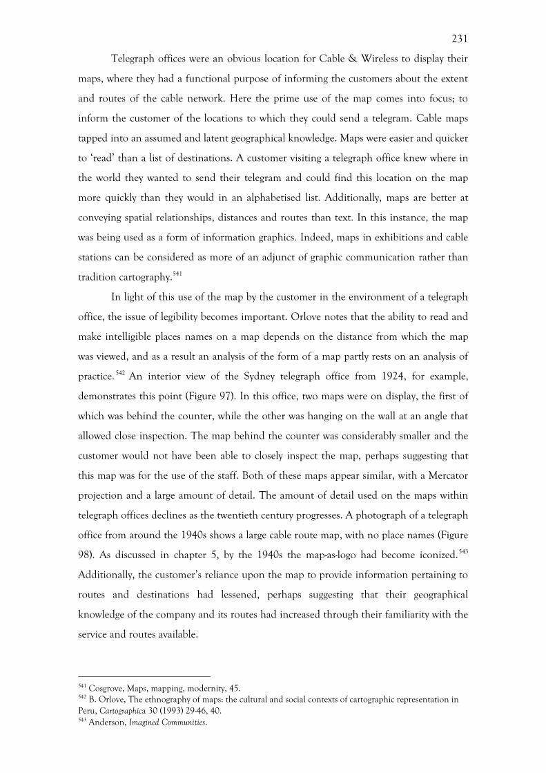
231
Telegraph offices were an obvious location for Cable & Wireless to display their
maps, where they had a functional purpose of informing the customers about the extent
and routes of the cable network. Here the prime use of the map comes into focus; to
inform the customer of the locations to which they could send a telegram. Cable maps
tapped into an assumed and latent geographical knowledge. Maps were easier and quicker
to ‘read’ than a list of destinations. A customer visiting a telegraph office knew where in
the world they wanted to send their telegram and could find this location on the map
more quickly than they would in an alphabetised list. Additionally, maps are better at
conveying spatial relationships, distances and routes than text. In this instance, the map
was being used as a form of information graphics. Indeed, maps in exhibitions and cable
stations can be considered as more of an adjunct of graphic communication rather than
tradition cartography.541
In light of this use of the map by the customer in the environment of a telegraph
office, the issue of legibility becomes important. Orlove notes that the ability to read and
make intelligible places names on a map depends on the distance from which the map
was viewed, and as a result an analysis of the form of a map partly rests on an analysis of
practice. 542 An interior view of the Sydney telegraph office from 1924, for example,
demonstrates this point (Figure 97). In this office, two maps were on display, the first of
which was behind the counter, while the other was hanging on the wall at an angle that
allowed close inspection. The map behind the counter was considerably smaller and the
customer would not have been able to closely inspect the map, perhaps suggesting that
this map was for the use of the staff. Both of these maps appear similar, with a Mercator
projection and a large amount of detail. The amount of detail used on the maps within
telegraph offices declines as the twentieth century progresses. A photograph of a telegraph
office from around the 1940s shows a large cable route map, with no place names (Figure
98). As discussed in chapter 5, by the 1940s the map-as-logo had become iconized.543
Additionally, the customer’s reliance upon the map to provide information pertaining to
routes and destinations had lessened, perhaps suggesting that their geographical
knowledge of the company and its routes had increased through their familiarity with the
service and routes available.
541 Cosgrove, Maps, mapping, modernity, 45. 542 B. Orlove, The ethnography of maps: the cultural and social contexts of cartographic representation in Peru, Cartographica 30 (1993) 29-46, 40. 543 Anderson, Imagined Communities.
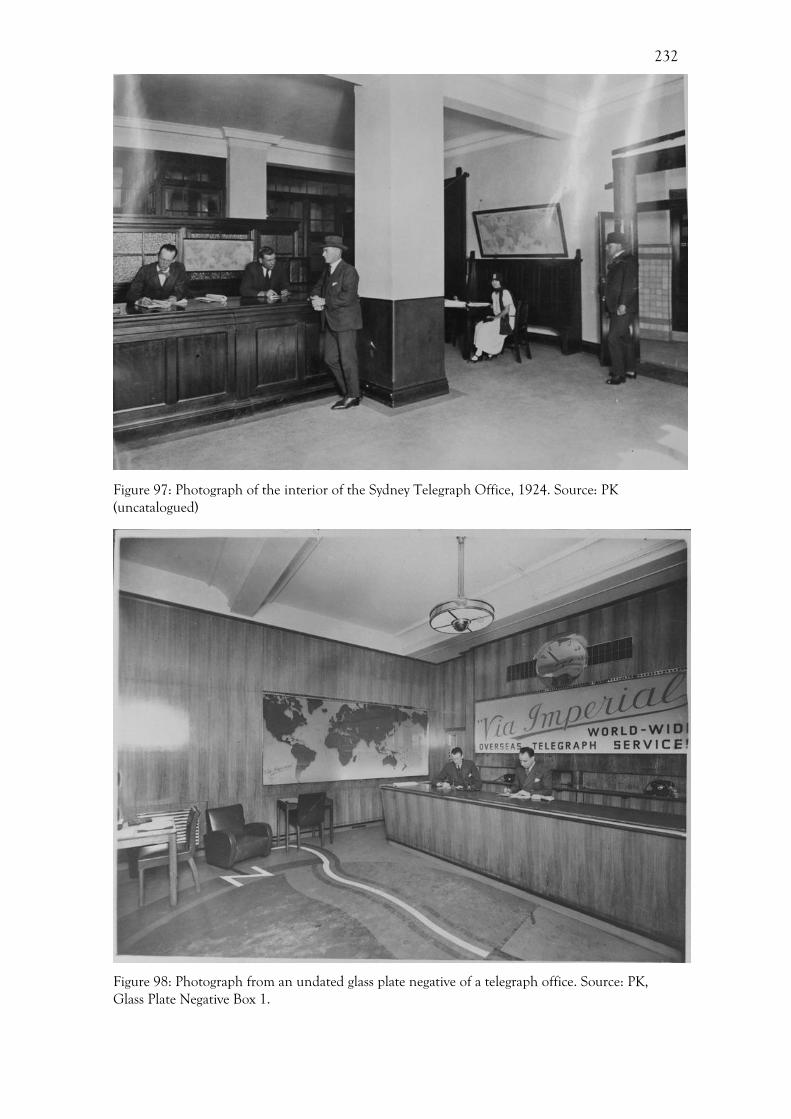
232
Figure 97: Photograph of the interior of the Sydney Telegraph Office, 1924. Source: PK (uncatalogued)
Figure 98: Photograph from an undated glass plate negative of a telegraph office. Source: PK, Glass Plate Negative Box 1.
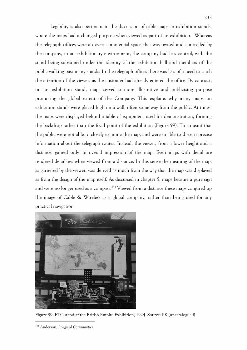
233
Legibility is also pertinent in the discussion of cable maps in exhibition stands,
where the maps had a changed purpose when viewed as part of an exhibition. Whereas
the telegraph offices were an overt commercial space that was owned and controlled by
the company, in an exhibitionary environment, the company had less control, with the
stand being subsumed under the identity of the exhibition hall and members of the
public walking past many stands. In the telegraph offices there was less of a need to catch
the attention of the viewer, as the customer had already entered the office. By contrast,
on an exhibition stand, maps served a more illustrative and publicizing purpose
promoting the global extent of the Company. This explains why many maps on
exhibition stands were placed high on a wall, often some way from the public. At times,
the maps were displayed behind a table of equipment used for demonstration, forming
the backdrop rather than the focal point of the exhibition (Figure 99). This meant that
the public were not able to closely examine the map, and were unable to discern precise
information about the telegraph routes. Instead, the viewer, from a lower height and a
distance, gained only an overall impression of the map. Even maps with detail are
rendered detail-less when viewed from a distance. In this sense the meaning of the map,
as garnered by the viewer, was derived as much from the way that the map was displayed
as from the design of the map itself. As discussed in chapter 5, maps became a pure sign
and were no longer used as a compass.544 Viewed from a distance these maps conjured up
the image of Cable & Wireless as a global company, rather than being used for any
practical navigation
Figure 99: ETC stand at the British Empire Exhibition, 1924. Source: PK (uncatalogued)
544 Anderson, Imagined Communities.
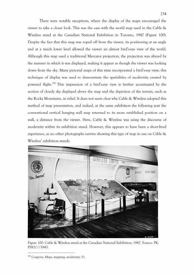
234
There were notable exceptions, where the display of the maps encouraged the
viewer to take a closer look. This was the case with the world map used in the Cable &
Wireless stand at the Canadian National Exhibition in Toronto, 1947 (Figure 100).
Despite the fact that this map was roped off from the viewer, its positioning at an angle
and at a much lower level allowed the viewer an almost bird’s-eye view of the world.
Although this map used a traditional Mercator projection, the projection was altered by
the manner in which it was displayed, making it appear as though the viewer was looking
down from the sky. Many pictorial maps of this time incorporated a bird’s-eye view; this
technique of display was used to demonstrate the spatialities of modernity created by
powered flight. 545 This impression of a bird’s-eye view is further accentuated by the
section of cloudy sky displayed above the map and the depiction of the terrain, such as
the Rocky Mountains, in relief. It does not seem clear why Cable & Wireless adopted this
method of map presentation, and indeed, at the same exhibition the following year the
conventional vertical hanging wall map returned to its more established position on a
wall, a distance from the viewer. Here, Cable & Wireless was using the discourse of
modernity within its exhibition stand. However, this appears to have been a short-lived
experience, as no other photographs survive showing this type of map in use on Cable &
Wireless’ exhibition stands.
Figure 100: Cable & Wireless stand at the Canadian National Exhibition, 1947. Source: PK, PHO///1843.
545 Cosgrove, Maps, mapping, modernity, 51.

235
The display of globes on Cable & Wireless exhibition stands also shows another
technique of display. Firstly, the sheer size of the main globe used by the Company in its
exhibitions (over eight foot in diameter) made it impossible for the viewer to see the globe
in its entirety. This provided an imposing spectacle that reaffirmed Cable & Wireless’
dominance over the global communications network. This globe also rotated (by means
of an electric motor) allowing all areas of the globe to be observed by the viewer,
something that is not evident from photographs. This rotation, coupled with the fact that
many of the cable routes were illuminated in sequence, also created a sense of movement
and dynamism, and contributed to the narratives of speed and modernity espoused by the
company. The fact that all the photographs which depict this globe are in black and
white, means it is unclear whether there was an explicit display of imperialism in the form
of territory or telegraphy route being depicted in red, as discussed in chapter 5.
These performative qualities were an established part of the company’s
exhibitionary repertoire, and were also seen in 1924 during the opening of the Empire
Exhibition. A film produced by British Pathé entitled ‘King's Message Round The World
In 80 Seconds’ shows the route of a telegram sent by King George V.546 A map displaying
the main cable routes, produced by the Eastern Associated Company, a parent company
of Cable & Wireless, had been wrapped around a cylinder. During the course of the film
this cylinder rotated and the progress of the telegram was followed using a pencil (Figure
101). It is the map that moved, rather than the pencil, which has been used to represent
the telegram, so that the world moves while the telegram remains fixed in the centre of
the screen seen by the viewer. This movement of the pencil along the cable route on the
map gives the telegram a materiality. The point of the pencil gives a finite geographical
location to the message, almost as if it were a letter being transported rather than the
pulse of electricity that it actually was.
Figure 101: Still from the ‘King's Message Round The World In 80 Seconds’ film produced by British Pathé, Empire Exhibition, 1924. Source: British Pathé.
546 http://www.britishpathe.com/video/kings-message-round-the-world-in-80-secs-aka-kings [Accessed 9/11/2012]

236
This idea of the materiality of the telegram message ‘travelling’ along the routes
on the cable maps was also seen in 1949 on the ‘Florist Telegraph Delivery Association
Display’ for a conference in the Mayfair Hotel in London.547 Here, Gill’s Great Circle Map
formed the centre of the display, with examples of flower delivery messages attached to
the corresponding maps using pieces of thread (Figure 82). By connecting these messages,
the cable routes marked on the map became something tangible rather than something
that would otherwise seem quite abstract. This abstraction of a conversation from a map
is also the subject of the It’s a Small World poster advertising the Cable & Wireless stand
at the Festival of Britain in 1951 (Figure 102). Here, the globe was depicted in orange at
the centre of the poster, with a yellow circle above and a blue circle below; these larger
circles represented two people at either end of a telegraph cable. From these circles
emanate thin black lines, which all join a central spot on the globe. The suggestion here is
that although these two people were physically very far apart, the cable network joined
them together at one similar point. This idea is confirmed by the accompanying text,
which stated that ‘Cable and Wireless Limited diminish distance’.
Figure 102: Poster advertising the Cable & Wireless stand at the Festival of Britain, 1951. Source: PK (uncatalogued)
547 Caption from PHO///1809, Porthcurno Archive.
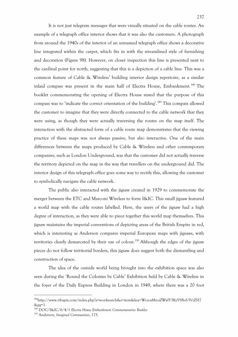
237
It is not just telegram messages that were visually situated on the cable routes. An
example of a telegraph office interior shows that it was also the customers. A photograph
from around the 1940s of the interior of an unnamed telegraph office shows a decorative
line integrated within the carpet, which fits in with the streamlined style of furnishing
and decoration (Figure 98). However, on closer inspection this line is presented next to
the cardinal point for north, suggesting that this is a depiction of a cable line. This was a
common feature of Cable & Wireless’ building interior design repertoire, as a similar
inlaid compass was present in the main hall of Electra House, Embankment.548 The
booklet commemorating the opening of Electra House stated that the purpose of this
compass was to ‘indicate the correct orientation of the building’.549 This compass allowed
the customer to imagine that they were directly connected to the cable network that they
were using, as though they were actually traversing the routes on the map itself. The
interaction with the abstracted form of a cable route map demonstrates that the viewing
practice of these maps was not always passive, but also interactive. One of the main
differences between the maps produced by Cable & Wireless and other contemporary
companies, such as London Underground, was that the customer did not actually traverse
the territory depicted on the map in the way that travellers on the underground did. The
interior design of this telegraph office goes some way to rectify this, allowing the customer
to symbolically navigate the cable network.
The public also interacted with the jigsaw created in 1929 to commemorate the
merger between the ETC and Marconi Wireless to form I&IC. This small jigsaw featured
a world map with the cable routes labelled. Here, the users of the jigsaw had a high
degree of interaction, as they were able to piece together this world map themselves. This
jigsaw maintains the imperial conventions of depicting areas of the British Empire in red,
which is interesting as Anderson compares imperial European maps with jigsaws, with
territories clearly demarcated by their use of colour.550 Although the edges of the jigsaw
pieces do not follow territorial borders, this jigsaw does suggest both the dismantling and
construction of space.
The idea of the outside world being brought into the exhibition space was also
seen during the ‘Round the Colonies by Cable’ Exhibition held by Cable & Wireless in
the foyer of the Daily Express Building in London in 1949, where there was a 20 foot
548http://www.ribapix.com/index.php?a=wordsearch&s=item&key=WczoxMzoiZWxlY3RyYSBob3VzZSI7&pg=1 549 DOC/I&IC/6/4/1 Electra House Embankment Commemorative Booklet 550 Anderson, Imagined Communities, 175.
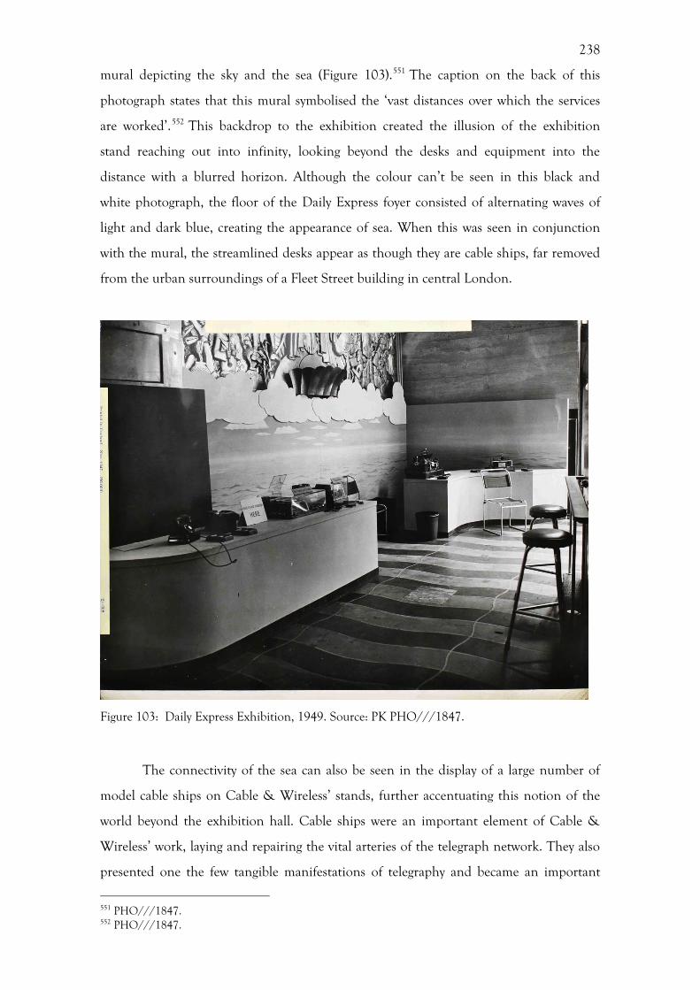
238
mural depicting the sky and the sea (Figure 103).551 The caption on the back of this
photograph states that this mural symbolised the ‘vast distances over which the services
are worked’.552 This backdrop to the exhibition created the illusion of the exhibition
stand reaching out into infinity, looking beyond the desks and equipment into the
distance with a blurred horizon. Although the colour can’t be seen in this black and
white photograph, the floor of the Daily Express foyer consisted of alternating waves of
light and dark blue, creating the appearance of sea. When this was seen in conjunction
with the mural, the streamlined desks appear as though they are cable ships, far removed
from the urban surroundings of a Fleet Street building in central London.
Figure 103: Daily Express Exhibition, 1949. Source: PK PHO///1847.
The connectivity of the sea can also be seen in the display of a large number of
model cable ships on Cable & Wireless’ stands, further accentuating this notion of the
world beyond the exhibition hall. Cable ships were an important element of Cable &
Wireless’ work, laying and repairing the vital arteries of the telegraph network. They also
presented one the few tangible manifestations of telegraphy and became an important
551 PHO///1847. 552 PHO///1847.
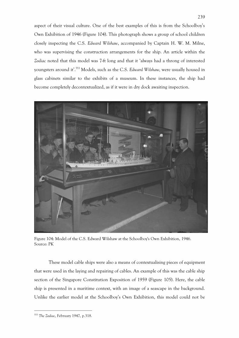
239
aspect of their visual culture. One of the best examples of this is from the Schoolboy’s
Own Exhibition of 1946 (Figure 104). This photograph shows a group of school children
closely inspecting the C.S. Edward Wilshaw, accompanied by Captain H. W. M. Milne,
who was supervising the construction arrangements for the ship. An article within the
Zodiac noted that this model was 7-ft long and that it ‘always had a throng of interested
youngsters around it’.553 Models, such as the C.S. Edward Wilshaw, were usually housed in
glass cabinets similar to the exhibits of a museum. In these instances, the ship had
become completely decontextualized, as if it were in dry dock awaiting inspection.
Figure 104: Model of the C.S. Edward Wilshaw at the Schoolboy's Own Exhibition, 1946. Source: PK
These model cable ships were also a means of contextualising pieces of equipment
that were used in the laying and repairing of cables. An example of this was the cable ship
section of the Singapore Constitution Exposition of 1959 (Figure 105). Here, the cable
ship is presented in a maritime context, with an image of a seascape in the background.
Unlike the earlier model at the Schoolboy’s Own Exhibition, this model could not be
553 The Zodiac, February 1947, p.318.
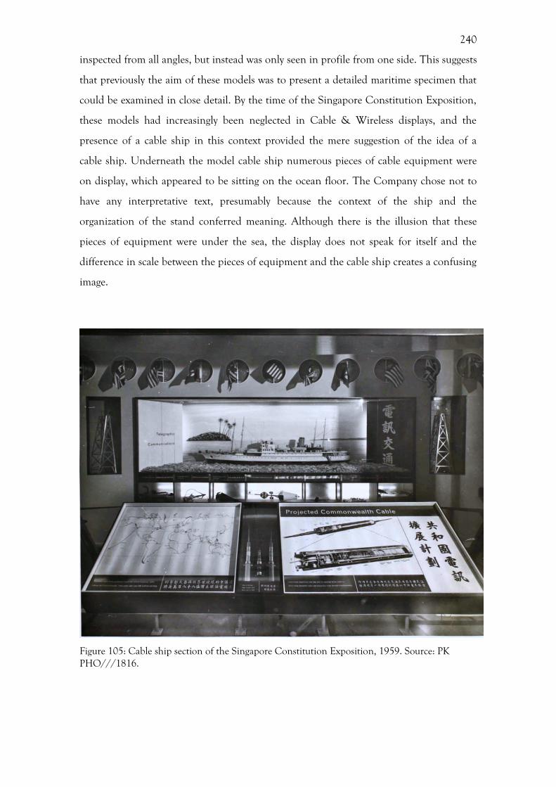
240
inspected from all angles, but instead was only seen in profile from one side. This suggests
that previously the aim of these models was to present a detailed maritime specimen that
could be examined in close detail. By the time of the Singapore Constitution Exposition,
these models had increasingly been neglected in Cable & Wireless displays, and the
presence of a cable ship in this context provided the mere suggestion of the idea of a
cable ship. Underneath the model cable ship numerous pieces of cable equipment were
on display, which appeared to be sitting on the ocean floor. The Company chose not to
have any interpretative text, presumably because the context of the ship and the
organization of the stand conferred meaning. Although there is the illusion that these
pieces of equipment were under the sea, the display does not speak for itself and the
difference in scale between the pieces of equipment and the cable ship creates a confusing
image.
Figure 105: Cable ship section of the Singapore Constitution Exposition, 1959. Source: PK PHO///1816.
241
Maps and globes allowed Cable & Wireless to communicate their global reach
graphically to the public. This section has demonstrated that the Company were aware
that exhibition visitors were not passive observers, but actively engaged with the displays.
Cable & Wireless responded to this through the display language of modernity. As has
been discussed in chapter 5, Cable & Wireless’ cartography moved away from the use of
imperial cartographic conventions in favour of the discourse of modernity. This was also
true in their exhibitions, where there was an increasing attention paid to narratives of
science, technology and modernity.
Science, Technology and Modernity
As Geppert notes, instances of modernity may be traced back into the nineteenth century,
as themes of exhibitions. 554 As he points out, the very act of holding a large-scale
exhibition was a ‘de facto manifestation of the modern’.555 The display of science and
technology presents a key narrative strand of Cable & Wireless’ identity within their
exhibition stands, and can be seen in a number of ways from the position of the stands
amongst other technological exhibits, the display of equipment and model cable ships to
the integration of technological design cues within the fabric of the stand.
The literature on technological exhibitions is sparse, with a few notable
exceptions.556 Beauchamp provides a detailed narrative of various exhibitions around the
world that featured technological exhibits. While this very comprehensive account
provides a great deal of valuable information on who exhibited and the types of exhibits
found, it does not provided any information on the reception or popularity of these
exhibits. A different viewpoint is gained from Steadman’s work on telegraphic exhibitions,
the only work specifically on this topic, where he claims that telegraph exhibits lost
popularity with the advent of the telephone and often people were more interested in the
domestic applications of telecommunications in the form of telephony during the later
nineteenth century.557 This interest in telegraphy appears to have been reignited by 1951
in the Festival of Britain.
This dearth of literature pertaining to technology may be due to a variety of
554 Geppert, Fleeting Cities. 555 Geppert, Fleeting Cities, 2. 556 See for example, Beauchamp, Exhibiting Electricity; Steadman, Objects and observers. 557 Steadman, Objects and observers, 239.
242
reasons. Firstly, it is suggested by Beauchamp that it was only at the turn of the twentieth
century that art was exhibited separately from technology, after which these exhibits no
longer had to compete for the attention of the visitor with paintings and objet d’art on
the same ground.558 This competition for attention was still present, with a plethora of
secondary works on the artistic output of the exhibitions, particularly the Festival Britain,
which is primarily from a design historical or architectural perspective.559 In addition,
most of the literature is preoccupied with the imperial overtones present at this time,
ignoring the technological sections and themes. Cable & Wireless straddles both the
imperial and the technological worlds.
The location of Cable & Wireless stands within the Palace of Engineering at a
number of exhibitions, most notably the 1924 and 1938 British Empire Exhibitions,
highlighted immediately to the visitor that this was a technological company. The placing
of the stand within this palace immediately brought the engineering element to the fore,
rather than the social and communicative elements that were highlighted at other
exhibitions. The Cable & Wireless exhibition stands were situated alongside other
technological companies, further accentuating this element of their identity. The Festival
of Britain in 1951, which is noted for not being in the pre-war mould of having ‘Palaces
of Power’ or ‘Halls of Industry’, instead adopted a more thematic approach, with a Dome
of Discovery.560 While there is no direct evidence within the archive pertaining to the
location of the Cable & Wireless stand within the Dome of Discovery, there is a sketch in
the Zodiac by S. Buzas, the architect who designed the stand for Misha Black (Figure 106),
which shows the stand running alongside a set of stairs in a somewhat hidden location.561
This suggests that the Festival organisers were not keen to prominently display the
Company’s identity, which they may have feared would jar with the modern aesthetic of
the Festival. Cable & Wireless also held a number of exhibitions in Charing Cross
Underground Station, ‘one of the most chic exhibition spaces in London’.562 While these
exhibitions were conveniently located to attract the attention of passers-by going about
their daily routines, they also had overt technological overtones.563
558 Beauchamp, Exhibiting Electricity, 195. 559 P. Rennie, Festival of Britain 1951, Woodbridge, 2007; H. Goodden, The Lion and the Unicorn: Symbolic Architecture for the Festival of Britain, 1951, Norwich, 2011; B. Conekin, The Autobiography of a Nation. 560 Forgan, Festivals of science and the two cultures, 221. 561 The Zodiac, May 1951, pp.6-7. 562 D. Linehan, A new England: landscape, exhibition and remaking industrial space in the 1930s, in: D. Gilbert, D. Matless, B. Short (Eds), Geographies of British Modernity: Space and Society in the Twentieth Century, New York, NY, 2003, 132-151, 141. 563 H. Atkinson, The Festival of Britain: A Land and Its People, London, 2012, 35.
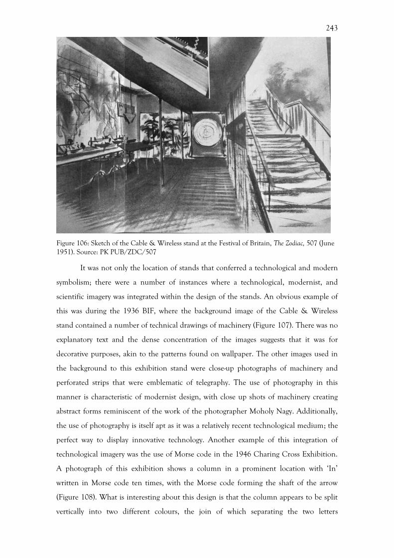
243
Figure 106: Sketch of the Cable & Wireless stand at the Festival of Britain, The Zodiac, 507 (June 1951). Source: PK PUB/ZDC/507
It was not only the location of stands that conferred a technological and modern
symbolism; there were a number of instances where a technological, modernist, and
scientific imagery was integrated within the design of the stands. An obvious example of
this was during the 1936 BIF, where the background image of the Cable & Wireless
stand contained a number of technical drawings of machinery (Figure 107). There was no
explanatory text and the dense concentration of the images suggests that it was for
decorative purposes, akin to the patterns found on wallpaper. The other images used in
the background to this exhibition stand were close-up photographs of machinery and
perforated strips that were emblematic of telegraphy. The use of photography in this
manner is characteristic of modernist design, with close up shots of machinery creating
abstract forms reminiscent of the work of the photographer Moholy Nagy. Additionally,
the use of photography is itself apt as it was a relatively recent technological medium; the
perfect way to display innovative technology. Another example of this integration of
technological imagery was the use of Morse code in the 1946 Charing Cross Exhibition.
A photograph of this exhibition shows a column in a prominent location with ‘In’
written in Morse code ten times, with the Morse code forming the shaft of the arrow
(Figure 108). What is interesting about this design is that the column appears to be split
vertically into two different colours, the join of which separating the two letters
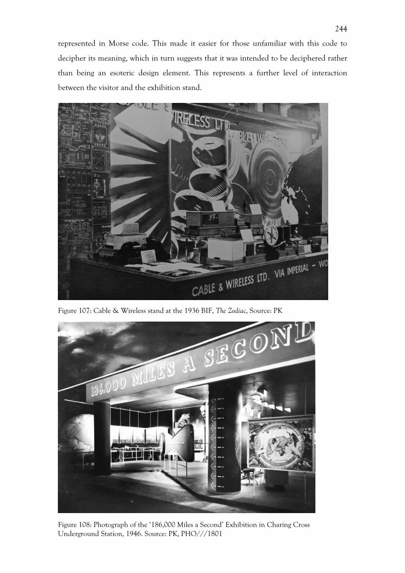
244
represented in Morse code. This made it easier for those unfamiliar with this code to
decipher its meaning, which in turn suggests that it was intended to be deciphered rather
than being an esoteric design element. This represents a further level of interaction
between the visitor and the exhibition stand.
Figure 107: Cable & Wireless stand at the 1936 BIF, The Zodiac, Source: PK
Figure 108: Photograph of the ‘186,000 Miles a Second’ Exhibition in Charing Cross Underground Station, 1946. Source: PK, PHO///1801
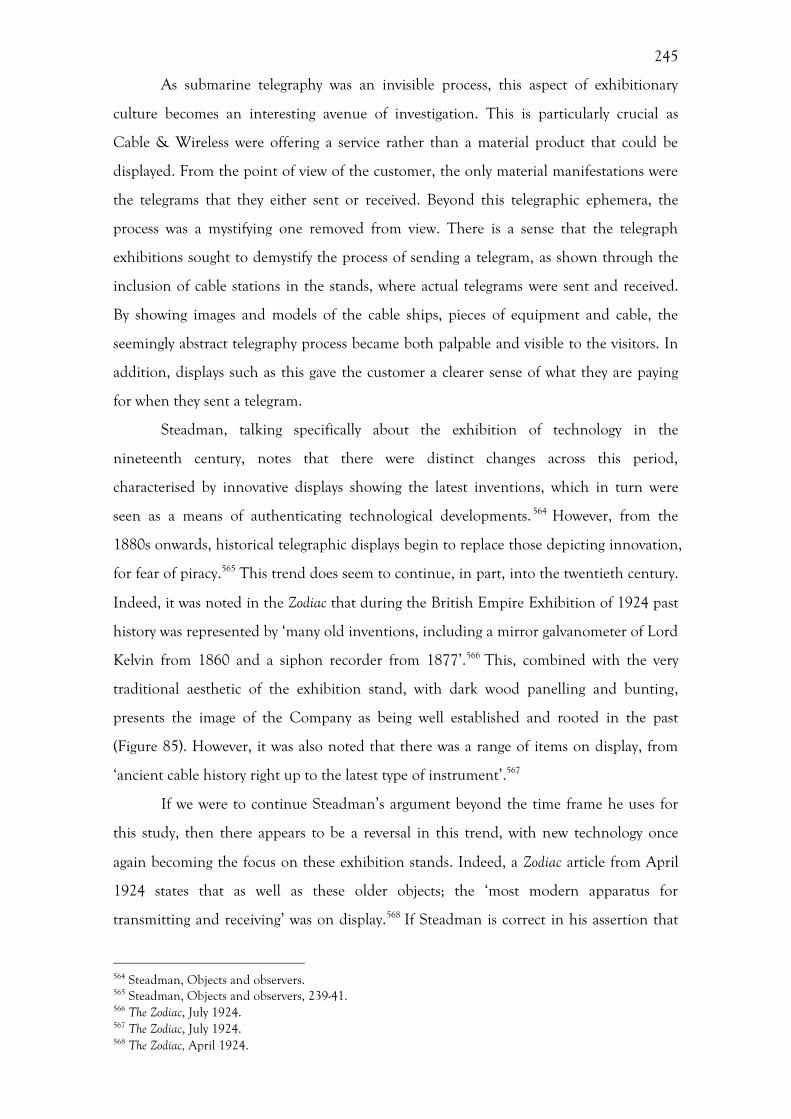
245
As submarine telegraphy was an invisible process, this aspect of exhibitionary
culture becomes an interesting avenue of investigation. This is particularly crucial as
Cable & Wireless were offering a service rather than a material product that could be
displayed. From the point of view of the customer, the only material manifestations were
the telegrams that they either sent or received. Beyond this telegraphic ephemera, the
process was a mystifying one removed from view. There is a sense that the telegraph
exhibitions sought to demystify the process of sending a telegram, as shown through the
inclusion of cable stations in the stands, where actual telegrams were sent and received.
By showing images and models of the cable ships, pieces of equipment and cable, the
seemingly abstract telegraphy process became both palpable and visible to the visitors. In
addition, displays such as this gave the customer a clearer sense of what they are paying
for when they sent a telegram.
Steadman, talking specifically about the exhibition of technology in the
nineteenth century, notes that there were distinct changes across this period,
characterised by innovative displays showing the latest inventions, which in turn were
seen as a means of authenticating technological developments. 564 However, from the
1880s onwards, historical telegraphic displays begin to replace those depicting innovation,
for fear of piracy.565 This trend does seem to continue, in part, into the twentieth century.
Indeed, it was noted in the Zodiac that during the British Empire Exhibition of 1924 past
history was represented by ‘many old inventions, including a mirror galvanometer of Lord
Kelvin from 1860 and a siphon recorder from 1877’.566 This, combined with the very
traditional aesthetic of the exhibition stand, with dark wood panelling and bunting,
presents the image of the Company as being well established and rooted in the past
(Figure 85). However, it was also noted that there was a range of items on display, from
‘ancient cable history right up to the latest type of instrument’.567
If we were to continue Steadman’s argument beyond the time frame he uses for
this study, then there appears to be a reversal in this trend, with new technology once
again becoming the focus on these exhibition stands. Indeed, a Zodiac article from April
1924 states that as well as these older objects; the ‘most modern apparatus for
transmitting and receiving’ was on display.568 If Steadman is correct in his assertion that
564 Steadman, Objects and observers. 565 Steadman, Objects and observers, 239-41. 566 The Zodiac, July 1924. 567 The Zodiac, July 1924. 568 The Zodiac, April 1924.

246
historical displays were used in order to protect new technologies in the climate of
competition that existed within the nineteenth century, then the mergers that occurred in
the twentieth century removed the prerogative of competition, and thus removed the
need to be guarded in the display of new technology.
What is interesting about the display of technological equipment at the British
Empire Exhibition of 1924 was the way in which past and present were displayed side by
side; creating a narrative of progress that is often cited as a theme of international
exhibitions. An article in The Zodiac commented that a model of the Great Eastern could
be compared with the ‘up-to-date’ looking Mirror, thus creating both a sense of continuity
and progress.569 This idea of progress was later displayed on the Great Circle Map, where
the Great Eastern was presented in a vignette on the left hand side of the map, with a
‘Modern Cable ship’ in a vignette on the right. The idea of displaying progress through
contrasting objects can be seen later in the period. An article in the Times, reviewing the
Round the World by Cable Exhibition held in Charing Cross in 1936 states that although
the exhibition did not claim to trace the history of communication through its display, it
did provide ‘some interesting contrasts’, namely a replica of Marconi’s first transmitting
oscillator from 1895, alongside ‘the most modern’ synchronized device.570 These instances
highlight an important point about the ways in which modernity was displayed; that it
was through contrast that people were able to comprehend a sense of the modern. This in
turn can perhaps throw some light onto the inclusion of more traditional aesthetic
elements within displays. They were attempting to display the cutting edge technology of
their telegraphy equipment, the juxtaposition of a traditional medium with a modern
message.
Another display of modernity was seen in the show of power within the Cable &
Wireless stand. An article in the Times from 1924, reviewing the Palace of Engineering at
the Empire Exhibition at Wembley, stated that one of the most ‘important factors of
modern life is that of power, both from the aspect of its sources and its application’.571
Here, and throughout the article, there was an emphasis placed upon the notion of power
becoming an intrinsic element of ‘modern life’, implying a sense of progress and the
increasing use of machines by all levels of society.572 This centrality of power was also
shown when the Palace of Engineering was referred to as the ‘Palace of Power’, wireless
569 The Zodiac, July 1924, 359 570 The Times, 15th August, 1936, 7. 571 The Times, 29th July, 1924, xx. 572 The Times, 29th July, 1924, xx.
247
and cable telegraphy ‘take[s] the imagination’ when it is realised that the understanding of
electricity was still in its infancy.573 This article demonstrates an interest in the novelty of
electricity and how its applications could dramatically improve industry. Additionally, it
also conveys a sense of enthusiasm and intrigue, with the lack of understanding of how
electricity works fuelling the imagination. Indeed, it states that these ‘modern marvels’
were all the more notable because of this. However, through the display of electrical
equipment and through the numerous demonstrations, Cable & Wireless sought to
provide a better understanding. A better understanding meant that the public might have
been more inclined to use the service.
The display of these electrical instruments was not static; instead most of these
items were working. Indeed, as a writer in the Zodiac commented in 1924, the ‘ticking of
instruments and the sensitive movement of the little siphon always attracts attention and
draws hesitating questions’. 574 Here, an aural element had been introduced by the
presence of working equipment; it was not just the case that the visitors were able to view
these items; they would also have been able to hear them. This is an aspect of exhibition
history that is remarkably hard to reconstruct, and it is only fleeting references such as
this within the Zodiac that give us any indication that the visitor was afforded the sound
and well as sight of technology. This difficulty is shown in the distinct lack of secondary
literature pertaining to the aural experience of exhibition visitors.
The role of demonstrations and quizzes within Cable & Wireless’ stands
highlights that these exhibitions should be thought of as a dialogue between the company
and the visitors. The notion of people forming part of the exhibitionary landscape is
highlighted during the 1901 Pan-American Exposition, where visitors were instructed:
‘Please remember when you get inside the gates that you are part of the show’.575 As noted
earlier in this chapter, photographs can be used to reconstruct the various Cable &
Wireless exhibition stands, many of which included exhibition visitors. These
photographs acted as a form of meta-media, tying together the various elements of the
exhibition and preserving this for posterity. The visitors to the exhibition featured in
these photographs are forever bound visually to that exhibit, even though their presence
was temporary. Subsequently, these visitors become subsumed within the company’s
visual culture, albeit temporarily. It is through images such as this that we are able to see
the observations of those who attended the exhibitions, and how they interacted with the
exhibits themselves. 573 The Times, 29th July, 1924, xx. 574 The Zodiac, July, 1924, p.360. 575 Cited in: Bennett, The Birth of the Museum, 68-9.
248
Communicating with the Empire
The use of live demonstrations of how to use or make things was an enduring element of
the spectacle of international exhibitions. 576 Atkinson, talking about the Festival of
Britain, pays a great deal of attention to the demonstrative element of exhibitions, stating
that they were an ideal way of explaining how processes operated outside of their working
context.577 However, with the exception of grapnels and other cable laying and repairing
equipment, a large amount of the telegraph equipment on display was actually used in its
working condition to send real telegraphs. Cable & Wireless thus presents a unique case.
These demonstrations were not just for show, but also fulfilled a practical function. The
ability to see something in action was a draw for many of the visitors. Indeed, during the
Radiolympia Exhibition in 1947, it was noted by the Zodiac that the Cable & Wireless
stand was ‘among the few in the exhibition which had a crowd round it all the time.
Perhaps it was the chance to see something “working”’. An accompanying photograph
shows these crowds gathered around the stand.578 In addition, visitors also watched radio
pictures being transmitted and received, as well as a high-speed photo-electric
transmitter.579
A sense of wonderment and mystery surrounded telegraphy and the
demonstrations were a means of exploiting this. A Zodiac article from April 1924 reported
that the British Empire Exhibition will be ‘the home of revelations’, and that the
company staff would ‘make known the secrets of their magic’.580 This links with the
previously discussed interplay between the invisible, somewhat abstract, nature of
telegraphy and the visual display of objects, which was a practical requirement within the
exhibitionary space, as well as with Bennett’s ‘exhibitionary complex’. Through these
various demonstrations, the unseen would become highly visible, while the unknown and
seemingly magical, would become known to the visitors. Within this quotation from the
Zodiac there is a strong theatrical and performative element, almost as if the
demonstrations culminated in a dramatic grand reveal. Although these demonstrations
can be considered somewhat didactic and passive, with the visitor simply watching the
576 Atkinson, The Festival of Britain, 110. 577 Atkinson, The Festival of Britain, 111. 578 The Zodiac, November, 1947, 8-9. 579 The Zodiac, November, 1947. 580 The Zodiac, 189 (April 1924), 216.
249
equipment being used by trained staff, there were instances where the visitors sought and
found more interaction. For example, during the 1946 Charing Cross exhibition,
contemporary reports noted how most of the visitors took a ‘really intelligent interest in
the Exhibition’, and that staff were kept busy answering questions on the equipment, but
also on other aspects of the company and the service.581 Here, the staff involved in the
demonstrations clearly engendered an interactive response from the visitors.
While these demonstrations had an obvious educative dimension, the ability for
the visitor to actually send a telegram from the exhibition stand displays a higher degree
of interaction between the visitor and the Company. This communication took four
main forms, the first being the practical use of the telegram by visitors and fellow
exhibitors, as previously discussed. The second was the highly visual spectacle of royalty
and dignitaries sending telegrams around the British Empire during the opening
ceremonies. The next two forms operated at a more ordinary level, allowing the visitor to
send a souvenir telegram. Moving on from this, the various quizzes that the Company
held allowed the visitor to talk to the Empire and for the Empire to respond. Indeed,
communication with the Empire was one of the defining characteristics of Cable &
Wireless’ exhibition stands during this period.
Examining the second form of this communication, as detailed above, one of the
most notable instances of this communication between the exhibition and the Empire
was during the opening ceremonies of a number of international exhibitions, where
dignitaries would send a message, ‘Via Imperial’, around the Empire. One of the first,
and possibly the most famous, was King George V, who sent a message ‘around the world
in 80 seconds’. By doing this, the exhibition was locating itself, not just in the singular
location of Wembley, but instead within a much larger system, of which the King was
head. Cohen notes that this stunt was a fitting beginning to an exhibition ‘devoted to
monumentalizing images of imperial unity and demonstrating the British Empire’s global
reach’.582 However, there were no replies. Although this message had encircled the world,
it did not invite a dialogue with any of the areas through which the message passed. Later
in 1938, during the Canadian National Exhibition in Toronto, Lord Stanley, Secretary of
State for Dominion Affairs, sent a telegram to the ‘various Empire Governments
represented at the Exhibition’. 583 This message was sent via Montreal; Bamfield;
Auckland; Sydney; Adelaide; Capetown; London; and Montreal; and by the time Lord 581 The Zodiac, February, 1946, p.243. 582 Cohen, The Empire from the street, 85. 583 The Zodiac, October, 1938, p.112
250
Stanley had left that stage and taken his seat, replies of congratulations and well wishes
were received from Auckland, Sydney, and Capetown.584
In these instances, this was high-level communication between heads of the
Empire, which became part of the overall imperial spectacle of the exhibition. However,
there were also opportunities for interaction between the average visitor and the rest of
the Empire and world, presenting another performative element to Cable & Wireless’
exhibition stand. At times this simply mimicked communication with the outside world,
the messages never actually leaving the exhibition stand. During the 1938 Canadian
National Exhibition where visitors were able to send telegrams between two desks – one
with the skyline of Toronto, the other with the London’s Town Bridge.585 Here, the
external reality of the world has been rendered through representation of the two
respective skylines. 586 Additionally, this presented a link between the Canadian
peripheries and the centre of the Empire. However, this link did not breach the limits
imposed by the exhibition hall. This was also the case with the numerous souvenir
telegrams that were sent.
Souvenir telegrams became an integral part of Cable & Wireless’ exhibitionary
repertoire, and are interesting as the visitor simultaneously became the sender and the
recipient of the message. While this fully demonstrated both aspects of the telegraphy
process, this was effectively a one sided conversation that was constrained within the
bounds of the Cable & Wireless stand. A brilliant example of these souvenir telegrams
can be found during the 1947 ‘Schoolboys Own’ Exhibition, where visiting schoolboys
were asked to enter a competition describing the Cable & Wireless stand in an acrostic of
eleven words, the start of each word beginning with the letters ‘v-i-a-i-m-p-e-r-i-a-l’.587 Here,
there was an obvious desire to reiterate the routing designation, a form of commercial
advertising aimed at this young audience.
Visitors to the Cable & Wireless stands were also given the opportunity to send
messages direct to the Empire, the most notable and interesting example being the
quizzes that the company staged. This connected the people with the outside world,
rather than attempting to bring the outside imperial world into the exhibition hall, as
had previously been the case.588 These quizzes, a post-war phenomenon, allowed visitors
584 The Zodiac, October, 1938, p.112 585 The Zodiac, October, 1938. 586 Mitchell, The world as exhibition. 587 The Zodiac, February, 1947, 318. 588 Mitchell, The world as exhibition.
251
to send telegrams to various stations around the world, asking questions and receiving an
immediate response. During the 1947 Radiolympia Exhibition over two thousand
messages were sent over a two week period at a rate of over six hundred a day, while at
the Festival of Britain a total of 15,609 quiz messages were sent.589 During the 1947
Radiolympia Exhibition, this quiz was billed as the ‘Brains Trust’, where visitors were able
to send a message to Barbados from the Cable & Wireless stand and receive a reply.
There appears to have been a level of consistency in the type of questions that were asked
during both the Radiolympia and the Festival of Britain. For instance, women asked if it
was possible to get nylons in Barbados, while men asked about the whisky and rum that
was available in Barbados. Additionally, there were a number of more general questions,
such as the exports of Barbados and its geographical location.590 The same format of
quizzing continued to be in used during the Festival of Britain in 1951. This was a
consistent feature of the exhibition, with quizzes taking place for two hours every
Wednesday, Thursday and Saturday of the six month run of the Exhibition.591 Quizzes
communicated on a rota basis with stations in Accra, Aden, Ascension Island, Barbados,
Cyprus and Nairobi.592 It was a highly popular feature of the exhibition stand, attracting
visitors and providing a personal and interactive link with the Empire.
While the experience of sending a telegram within the spectacular space of an
exhibition may have been an exciting experience, this was dramatically different to
sending a telegram from one of Cable & Wireless’ telegraph offices. There is scant
evidence within the archive about the practices of sending telegrams within this everyday
environment. Indeed, the quotidian nature of telegram sending might have removed an
impetus to record this activity, in contrast to the fleeting and spectacular nature of
exhibitions.
If these quizzes are thought about in a more conceptual manner, the exhibitions
acted as a means of funnelling people from across the Empire and the world into a finite
space occupied by the exhibition site. These quizzes allowed visitors to communicate with
the outside world. Moreover, it should be noted that this was a reciprocal conversation;
there was a question and a response. It should also be noted that these responses did not
come from members of the public overseas, but instead from Cable & Wireless staff
589 The Zodiac, November, 1947; September 1951. 590 The Zodiac, November, 1947, p. 5. 591 Anon, Dome Colonial Station will soon be calling: Company contributes overseas quiz and cableship film to the Festival, The Zodiac, 506 (1951) 5. 592 Anon, Dome Colonial Station, 5.
252
posted at the stations. These overseas employees were able to briefly form part of the
exhibitionary landscape, further shrinking the world and gathering the corners of the
Empire within the exhibition hall. In a way, telegraphy provided a link between the
internal representation of the world through the exhibition and the ‘external reality’ to
which Mitchell references. This link with the outside world, both in a real sense and in
an imperial sense of talking to the colonies, was an important aspect of the popular
appeal of exhibitions.
The rising levels of interaction with the Company’s exhibition stand demonstrates
that imperial sentiment amongst the British public had not necessarily declined, even
though the exhibitions themselves had ceased stressing imperial sentiment following the
Second World War. The fact that the exhibition visitors were communicating with the
Cable & Wireless staff, rather than people from the Dominions might go some way to
explain this success. This was similar to the newspaper advertisements that the Company
ran after the Second World War (see chapter 5), which sought to promote the social uses
of telegraphy by providing a familial link rather than an imperial one. In this sense, the
visitors weren’t necessarily communicating with the Empire, but with their fellow
countrymen.
Conclusion
From the overtly imperial British Empire Exhibition in 1924 to the introspective,
forward-looking Festival of Britain in 1951, the exhibitionary landscape had changed
dramatically. Cable & Wireless operated on a global scale, and this was a narrative that
was consistently highlighted throughout this period, namely in the form of maps and
globes, moving from an imperial to a more global identity. While the narratives of
imperialism might have disappeared from view following the Second World War, the
Company’s display of modernity threaded through the majority of their exhibition stands.
Whether it was the neon lights on the stand in the 1924 British Empire Exhibition or the
use of modernist photomontage of machinery as a backdrop of the display of telegraphy
equipment, the narratives of modernity were prominent throughout Cable & Wireless’
exhibitions.
The idea of contrast, mentioned earlier in this chapter, is an important point to
discuss in relation to the stories that Cable & Wireless chose to tell graphically within its

253
exhibitions. It appears as though the main way that people were able to comprehend
modernity was through its juxtaposition with a more traditional aesthetic. By placing the
old next to the new, the visitors were able to perceive the Company as modern, while not
being alienated. There would have been a comfort in more traditional forms, maybe even
a sense of nostalgia for those looking at old telegraphy equipment. As has been seen
within this chapter and previous chapters, often it was the case that modernity was
displayed through a more tradition aesthetic, rather than modernism.
As this chapter has shown, Cable & Wireless invested a large amount of time and
money in mounting displays and stands at various exhibitions in Great Britain and
around the world. What made Cable & Wireless exhibition stands unique was that they
often had a practical function that went beyond simple observation; people were able to
send telegrams from the exhibition hall. However, this was not the everyday activity
experienced by the outside world. Instead, the context of the exhibition, combined with
Cable & Wireless’ increasing ability to draw crowds of interested people meant that they
had transformed the act of sending a telegram into a spectacle. After the Second World
War, Cable & Wireless’ stands were some of the most popular at the Radiolympia
Exhibition and the Festival of Britain. It should be noted that this also coincided with
increased government involvement through nationalization.
The notion of making telegraphy visible was a key strand in Cable & Wireless’
exhibitions. The work of Geppert and Bennett has been useful in this respect.593 The
conceptualization of exhibitions as meta-media allowed for an examination of the ways in
which Cable & Wireless assembled their various visual mediums, as well as the people
visiting the stand, to create a large form of communicative media. Furthermore, Cable &
Wireless were successful in ordering the visitors to their stand, particularly through the
use of live demonstrations and participatory events. There was a theatrical element to this,
with many of the reviews commenting on telegraphy occupying an almost magical
position in peoples’ imaginations. In this sense, the exhibition stand worked as a means
of demystifying this process. By allowing visitors to witness the workings of the telegraphy
equipment and providing the opportunity to send actual or souvenir telegrams, they were
able to experience first-hand the workings of the company. So, although Cable &
Wireless did not have a product or commodity to display, as with other stands, they
successfully adapted the exhibitionary apparatus to create highly interactive and popular
stands. In this way they were designing the elements that they could control.
593 Geppert, Fleeting Cities; Bennett, The Birth of the Museum.
254
While Cable & Wireless had no control over the architectural environment in
which their stands were situated, or over who they were placed next to, they designed the
space through maps, globes, graphics and demonstrations. Through this, Cable &
Wireless were able to gain a degree of control and order over the visitors. Additionally,
the visitors who formed such a large part of both the visual culture of the stand and the
other half of a dialogue with the company were ultimately beyond the control of the
company. Indeed, one of the crucial elements within the photographs of the various
Cable & Wireless exhibitions was the inclusion of people. This gives us a real sense of
how these stands operated. An exhibition is a dialogue between the exhibitor and the
visitor, and in terms of Cable & Wireless’ participation, this was also a dialogue between
the visitor and the rest of the British Empire and the world.
One of the overriding messages from Cable & Wireless’ exhibitionary
involvement was the contact with the outside world. While the exhibitions gates, often
guarded by imperial lions, funnelled people from around the Empire into the exhibition
space, Cable & Wireless’ stand was a gateway back into the real world, or the external
reality discussed by Mitchell. While exhibitions were usually about condensing the world
into a finite space and about re-creating the world on a smaller scale, Cable & Wireless’
stands were about opening this back up. Visitors were able to communicate with the
outside world, either by using the telegraph service that the Company provided as a
facility within the exhibition hall or participating in colonial quizzes. Additionally,
through the display of maps and giant globes, visitors gained a sense of the scale of the
Company’s reach.
255
9. Conclusion: ‘Changing the Conception of Empire ’594
Through a study of Cable & Wireless, this thesis has demonstrated the complexity
present within the processes of corporate identity production, transmission and
consumption. Cable & Wireless’ identity was not monolithic or static. Instead, there
were multiple identities that fluctuated over both time and space, complicating the linear
and location-specific narratives of progress found in the majority of studies on corporate
identity. Design was central in both articulating and communicating the Company’s
identity to their employees, customers and the public. It is also through design that we are
able to chart the changes that occurred within these identities. The design and identity of
the company changed dramatically from that exhibited by the ETC at the 1924 British
Empire Exhibition at Wembley to that displayed by Cable & Wireless in 1951 at the
Festival of Britain. An historicist aesthetic that sought to stress the established nature of
the Company, a continuation from its Victorian and imperial roots, was replaced by a
more modern aesthetic that looked, instead, towards the future and embraced the speed
and efficiency of modernity. The design and identity also varied from station to station
across the telegraphy system, and especially between the Head Office and the peripheries.
Cable & Wireless was a corporate microcosm of the British Empire, replicating its
institutions, traditions, cultures, and imagery, while ultimately mirroring and charting its
demise. This thesis has demonstrated the importance of a contextual understanding of
the Historical Geography of the British Empire in determining, shaping, and affecting
Cable & Wireless’ corporate identity. In turn, this thesis has shown the value of
examining the Empire and the processes of decolonization through the lens of a single
company. A complex negotiation of increasing government involvement, both from
Britain and the Dominions, has emerged. Additionally, the Company had to balance
imperial sentiment with popular opinion and business requirements. This thesis has
extended not only the understanding of the operations of Cable & Wireless and its
internal structure, but also its position in relation to the changing nature of the British
Empire in the interwar and post-war periods.
594 Anon, Changing the conception of Empire, The Zodiac, (June 1934).
256
While the ways in which the British Empire shaped the Company will be
discussed later in this conclusion, this thesis has also called into question some larger
points about the nature and Historical Geography of the Empire. One of the main
problems encountered in this thesis was the complexity of Empire. This is remedied by
the conceptualization of the Empire as a network. Lambert and Lester make the claim for
the need to understand complexity through the examination of networks, and this thesis
has supported their arguments.595 The British Empire was not monolithic, but instead
multi-dimensional and imbricated, encompassing the governance, discourse, and
materiality of Empire. It was an ideology, as well as the flow of capital, information and
people. The Empire was present in all areas of Cable & Wireless’ business, from its
structure to its material and visual culture, as well as being part of a popular imaginary.
This conclusion will address a number of themes that have emerged. The first
section looks at the specifics of Cable & Wireless’ corporate identity production and how
this was influenced by its relationship with the British government. This also assesses the
typicality of the Company and the ways in which this thesis can contribute to further
studies of the corporate identity of individual companies. This is followed by a discussion
of the transmission and reception of Cable & Wireless’ identity, in particular the
consumption of imperial imagery. The last two sections of this conclusion address how
this identity changed over time and space, discussing the larger themes of modernity and
networks respectively.
Corporate identity production and the British state
Through the study of Cable & Wireless, this thesis has elucidated the processes of
corporate image creation in the early- and mid-twentieth century. Furthermore it has
problematized the implicit suggestion within studies of corporate identity from both
Design History and Business History that corporate identity formation was a series of
conscious decisions made within a neat trajectory of progress. What has been
demonstrated is that Cable & Wireless had a limited and inconsistent control of their
own official publicity and identity. Indeed, this thesis has shown that the process of
identity formation and maintenance was somewhat messy in nature, with multiple
identities operating at different times and in different locations, which will be discussed
595 Lambert and Lester, Colonial Lives.
257
later within this conclusion.
The period covered by this thesis (1924-55) was a crucible in which notions of
public relations, advertising and professional graphic design were born and formalised in
Britain. The typicality of Cable & Wireless is hard to ascertain, due primarily to the
messy and company-specific nature of identity production outlined above. In terms of the
nature of its business, it can be compared with other telecommunications companies,
such as the GPO, that provided a service rather than commodities. Both of these
companies were instruments of modernity, compressing space and time through their
respective telecommunications networks and engaging with the discourse of modernity
within their identities.
There were also a number of companies operating at the same time as Cable &
Wireless who had a similar relationship with the British government. The P&O British
India Line, Imperial Airways, as well as the BBC, were also run along public utility lines
in a similar manner to Cable & Wireless.596 However, all these various elements are like
pieces within a kaleidoscope, producing different arrangements and different identities
with each individual Company. This thesis provides a framework for studying other
companies, highlighting the need for a comprehensive, holistic, and contextual
understanding of corporate identity, utilising elements of Historical Geography, Business
History and Design History. It has demonstrated that there is a value to studying a
Company whose identity does not belong to the canon of ‘good design’ or whose
management were not design or public relations visionaries. This thesis has also stressed
the need for an examination of identity transmission and reception, which will be
discussed in the next section.
As Olins states, there is a difference between those companies whose approach to
identity, design and publicity was tactical, often only concerned with immediate
commercial benefit, and those who were strategic, who considered the longer-term
economic and cultural impact.597 In short, this is the difference between a responsive and
a generative identity production. This thesis has demonstrated that this approach
oversimplifies this distinction, presenting it as a binary state where a company is either
one or another. While Cable & Wireless was primarily a tactical Company with regard to
its identity, responding to the three ‘shocks’ outlined by Jones, there were occasions when
596 Headrick, The Invisible Weapon, 207. 597 Olins, Corporate Identity, 50; Oldcorn, On the Wire examines the role of Cable & Wireless during the Second World War. Oldcorn also distinguishes between ‘tactical’ and ‘strategic’, but with regard to the Company’s military operations.
258
they oscillated between these two.598 The moments when their action precipitated longer-
term benefits, the change of the Company’s name in 1934 being a prime example, were
usually in response to government intervention.
This thesis has attempted to decentralise the study of corporate identity away
from those companies with an established position within the canon of ‘good design’, for
instance the London Underground and the GPO, as well as organizations such as the
EMB. Beyond this thesis, this approach presents an exciting opportunity to broaden the
scope of enquiry to those companies, like Cable & Wireless, who struggled to find a
coherent and consistent corporate identity. The study of corporate identity would be
greatly enriched if there were a series of studies examining companies who don’t fit into
the neat models outlined in the literature review (chapter 3) or who weren’t successful or
coherent in their approach to identity creation and maintenance. Furthermore, if such
studies were undertaken of different businesses, this would also allow for a more
comparative approach, which could assess the typicality of these companies and move the
scale away from individual businesses, to look at similarities within and across different
sectors. While there were benefits to conducting using a single corporate archive,
outlined in chapter 2, there is also a need for greater contextualisation and comparison,
that neither time nor space allowed within this thesis.
The need to both contextualise the operations of the Company within its
commercial environment and to disentangle the Company’s identity from that of other
companies and the government has been highlighted throughout. The relationship with
the British government, while not being typical of the majority of businesses operating at
this time, proved invaluable for Cable & Wireless. It was the Greene Committee,
promoted by the repercussions from the Great Depression, who suggested that the
Company change its name to Cable & Wireless, as discussed in chapter 4. Although the
name change did not alter the way the Company operated or its organization, it freed the
Company’s image from exclusively imperial associations. This proved beneficial in the
face of nationalist tendencies within the Dominions following nationalization, allowing
the Company to absolve its identity of overtly political and colonial connections to the
British state. Despite the British government, in the form of the GPO, taking over the
UK assets of the Company, it was the GPO rather than Cable & Wireless, which became
the target for anti-British feelings within the Dominions. Furthermore, the extensive use
598 Jones, Multinationals, 84.
259
of Cable & Wireless by the government during the Second World War, in terms of both
telegram traffic and censorship (as outlined in chapter 6), not only kept the Company
afloat, it also highlighted the inadequacies present within the Company’s public relations.
This was remedied by the appointment of Ivor Fraser and the creation of the Public
Relations Office and the Press Liaison Office.
What becomes clear is that for most of this period those in charge of the
Company’s official identity, its advertising and publicity, were naïve and amateurish. In
this respect, Cable & Wireless benefitted greatly from outside intervention, namely in the
form of the various advisory committees as well as the previous experience of hired staff.
This is something that other studies of companies and their corporate identities have
failed to acknowledge. If it wasn’t for the involvement of the British government, or the
skills learnt from other businesses, then the most crucial moments in both the survival of
the Company and in their image creation would not have happened.
This thesis has demonstrated that instead of studying a company in isolation,
attention should be paid to the links and networks that existed between contemporary
companies. These networks of staff and designers were crucial to the development of
Cable & Wireless’ conceptualisation and visualisation of its identity. This was particularly
the case with the establishment of a Public Relations Office and a Press Liaison Office
mentioned above. Beyond the scope of this thesis, there is an opportunity to examine the
movement of staff from company to company, and how this might have affected the
identities of each of these companies. This would require the use of a number of
corporate archives and personal collections. Furthermore, this approach could also be
developed by looking at the shared use of designers and cartographers by companies.
These two developments would move the focus away from individual businesses, with a
usual focus on the managing director, towards groups of individuals.
Cable & Wireless did not have a single identity, nor was there a single audience.
Instead, multiple identities existed simultaneously, and this thesis has highlighted the
need to disentangle these different identities, rather than homogenize and oversimplify
the Company’s corporate identity. This thesis has demonstrated that the Company’s
internal identity was often different from the identity projected externally to the
customers and public. The internal identity can be loosely characterised as one that harks
back to the imperial history of the parent companies, while the external identity was more
ready to embrace modernity and modernism.
The examination of the Company’s design in this thesis reveals a disparity
260
between the aesthetic styles deployed for these two different audiences, internal and
external. For example, the universal clock produced for the Directors of the Company by
Sir Herbert Baker was remarkably different in form from the clock designed by Reitz for
used in branch windows and at exhibitions, as discussed in chapter 4. This same disparity
can be seen in the design of the logos for the I&IC, the operating and public facing
Company which emerged from the merger in 1929, and the holding company, Cables &
Wireless, whose only audience consisted of internal shareholders and directors. As
discussed in chapter 4, I&IC’s logo demonstrated the global reach of the Company, while
the use of classical symbolism in Cables & Wireless’ logo evoked continuity with the past.
This disparity between the internal and external identity of the Company was also shown
in the design of Electra House (Embankment), with the public areas on the ground floor
creating a ‘modern’ space, while the upper floors, which were occupied by the director of
the Company, were replete with mahogany-lined rooms, creating a traditional interior
aesthetic. These disparities clearly demonstrate that there were multiple identities
operating in tandem, rather than a singular identity.
There were a number of internal identities each presented to a different audience.
To the overseas staff this identity was imperial; they lived the life of imperial settlers. To
the staff working in Britain, the identity was about modernity, efficiency and speed. In
contrast the identity presented to the Directors of the Company was based upon tradition
and stability. There were also a number of external identities. As has been shown with
regard to the name change, after nationalization the Company were considered to be
separate from the British government by the people in the Dominions, whereas to the
public in Britain Cable & Wireless was the face of the British Empire and later the
Commonwealth. These identities were not static, a topic which is discussed later in this
conclusion.
Transmission and reception
This thesis has demonstrated how crucial it is to understand how Cable & Wireless’
identity was transmitted and received by both external and internal audiences, as well as
how a corporate identity was produced. This thesis has built upon the work of Nye and
Obgorn, going beyond an examination of only the production of a corporate identity and
261
has sought to provide a framework for future studies of corporate identity.599 Through an
examination of the transmission and reception of Cable & Wireless’ identity, this thesis
has highlighted the value of studying businesses as a communicative medium. Cable &
Wireless formed a communicative link between the British Empire and the British public.
Through the changes within the Company’s identity, the public were able to witness the
changes within both the geopolitical and economic climate, which they might not
otherwise have been aware of. Cable & Wireless’ identity can be seen as a distillation of
economic and political forces, presented in a manner that was easily understood by the
public. Additionally, the Company’s identity was also transmitted to, and was received by,
its employees, which helped them to identify their position and contribution within the
Company.
An assessment of the transmission and reception of Cable & Wireless’ corporate
identity has allowed us to ascertain both the visual literacy of the customers and how the
Company understood their identity. Exhibitions were one of Cable & Wireless’ key
communicative devices, allowing the public to witness the otherwise invisible processes of
telegraphy, as well as directly communicate with the Empire and the rest of the telegraph
network from inside the exhibition hall. It has been shown that the public were
enthusiastic participants in technological demonstrations and imagined Cable & Wireless
through geographical imagery and knowledge. The abundance of photographs showing
not only the Company’s exhibition stands, but also the visitors, has facilitated the
discussion of both transmission and reception in a visual manner. These photographs
reveal how the Company used the language of modern design in their exhibition and also
that the public audiences were not passive or disinterested.
This thesis has answered Porter’s call for increased attention into issues of the
reception of imperial imagery and propaganda. Porter’s argument is based on the premise
that while there was a high degree of imperial imagery presented to the public, the public
were somewhat passive and unreceptive to this. However, as the example of Cable &
Wireless’ hugely popular quizzes at the Festival of Britain demonstrates, the British public
actively and enthusiastically participated in communication with the Commonwealth.
While much of the Festival of Britain (in contrast to the heavily imperialist exhibitions of
Wembley (1924) and Glasgow (1938)) was dedicated to the promotion of Britain, Cable
& Wireless’ stand allowed customers to directly communicate with the Commonwealth
599 Nye, Image Worlds; Ogborn, Indian Ink.
262
and staff stationed overseas. The evidence of the participation in the imperial quizzes
demonstrates that the public had an on-going interest in life on the peripheries of the
British Empire and supports MacKenzie’s argument that the display of Britain’s imperial
power to the public continued after the First World War.600 Indeed, the example of Cable
& Wireless shows that this interest even went beyond the Second World War.
Utilising Geppert’s conceptualization of exhibitions as ‘meta-media’, this thesis
has demonstrated that Cable & Wireless’ stands acted as nodes within their networked
identity. Exhibitions drew together the Company’s cartography and its graphic design, as
well as displaying its relationship with the British Empire and narratives of speed and
modernity. These stands, like the branch offices, acted as an interface areas where the
customers and public came into direct contact with the Company.
The best way to demonstrate the importance of the perception of the Company is
by way of an important example, where perception was paramount to Cable & Wireless’s
continued success. As has been discussed above, the rechristening of the Company in
1934 was instrumental in changing the way that the Company was viewed across the
telegraph network, and in particular within the Dominion territories. Prior to this, the
Company’s identity had been closely entangled with that of the British Empire and state.
To those on the periphery of the Empire, the Company appeared as another adjunct to
the British colonial settlement. Cable & Wireless’s corporate structure, culture and
organization mimicked that of the British army and colonial service, and the telegraphy
network facilitated imperial expansion and trade. The rechristening allowed some
distance to be gained between the Company and the British state. However, this was
illusionary, with the new name masking the increased role of the state in the strategy of
the Company. With growing nationalistic feeling within the Dominions, Cable &
Wireless’s new name made it seem more palatable to those in the Dominions. In this
instance, the perception of the Company was distinct from the reality of the operations of
the Company.
This example demonstrates that the Company had to be sensitive to how their
identity was perceived and consumed in the Dominions, removing references to the
imperial nature of their business. In Britain, the removal of ‘Imperial’ from the
Company’s name made little difference. The customers still sent their telegrams ‘Via
Imperial’ and the discourse of imperialism was shown in the Company’s cartography,
600 MacKenzie, Introduction, 8.

263
graphic design and exhibitions. While Cable & Wireless stopped being the face of the
British government and Empire in the peripheries, they were the public face of the
British Empire in Britain. Whether they were communicating with their relatives or
participating in trade, as the advertisements from after the Second World War attest, or
taking part in an exhibition quiz, telegraphy allowed a direct link between the public and
the Empire. It was not only an actual link between the metropole and the periphery that
was achieved through the public’s interactions with the Company, it also created an
imaginary link with the Empire, fuelled by the narratives found within the Company’s
identity.
Networks and Geographies of Identity
This thesis has demonstrated the importance of assessing the geography of the
Company’s identity. The global reach of the Company, while having been a key element
in its identity, as seen in chapters 4 with the use of maps, also posed problems. What has
been highlighted, particularly in chapters 6 and 7, are the difficulties Cable & Wireless
encountered in creating, disseminating, and maintaining a coherent identity across a
global company. The Public Relations Office, in the Company’s Head Office, relied upon
the contributions of photographs and stories from the overseas stations, emphasising the
networked nature of Cable & Wireless’ identity. This lack of coherency and consistency
within Cable & Wireless’ identity, the product of a sprawling organization, can go some
way to explain why the design and identity of this important Company has received little
scholarly attention. Other companies, such as the London Underground, who operated
in a small geographical area, were able to control their identity more closely, the result
being more coherent and polished than companies, such as Cable & Wireless, who had
to contend with such a wide reaching geography.
There were a number of identities operating, each with a varying degree of
involvement and influence from the Company themselves. Cable & Wireless’ core
identity was not forged exclusively at the centre or the peripheries, but across the
telegraph network. Within each of the overseas stations, variations within the identity
emerged, creating a myriad of smaller identities. This thesis has sought to brake down the
264
conceptual boundaries described by Ward between the metropole and the periphery.601
As chapter 7 demonstrated, the boundary between the Head Office and the overseas
stations was fluid, with the Zodiac and the Exiles Club seeking to connect the Company’s
staff. Staff also moved from station to station.
The identity and operations of Cable & Wireless corroborate Lester’s suggestion
that the nature of colonial networks were ephemeral, contingent and provisional. 602
Throughout the interwar and post-war periods, the decision-making power within the
Company, as well as the assets, moved across Cable & Wireless’ telegraphy network, from
London to the Dominions. This network shifted and responded to changes within
geopolitics and, as a result, was not constant. This in turn, highlights the benefits of a
networked approach to corporate identity formation and transmission, as well as to the
historical geography of the Empire and modernity.
Design as a barometer for corporate identity
It was not just across space that changes in the Company’s identity was witnessed, but
also across time. As has been shown, during the interwar and post-war period, Cable &
Wireless experienced a number of structural, cultural and visual shifts, which can be
charted through the Company’s design. In the 1920s, the identity of the Company was
firmly placed in the imperial world of Cable & Wireless’ parent companies, an aesthetic
and cultural extension of the traditions established during the end of the long nineteenth
century. With a historicist style, which created an air of authority and permanence, this
was what John Packer, a Company employee, termed ‘the age of polished mahogany and
lacquered brass’.603 By the time of the Festival of Britain in 1951, and the opening of
Mercury House in 1955, the Company’s identity, as well as its organizational structure
and that of the British Empire, had changed dramatically. It embraced the modern;
technology, speed and the compression of time and space, increasingly within a
modernist aesthetic. The Company’s assets and decision-making power had gone from
being centralised in London, to being nationalized and dispersed across the telegraph
network, placed firmly in the hands of the Dominion governments.
601 Ward, Introduction, 1. 602 Lester, Imperial circuits and networks, 135. 603 Quoted in: Barty-King, Girdle Round the Earth, 352.
265
These shifts within the Company’s identity happened at different times, in
different areas of the Company and in different locations. This contextualization needs to
be dealt with cautiously, and attention should be paid to the different rates of change of
each of the communicative mediums used by the Company, which has been touched
upon throughout this thesis. It was not necessarily the case that changes in the
geopolitical and commercial climate were instantly manifest within the Company’s
identity and visual output, and there is a danger when contextualising the activities of the
Company in simply inferring direct causation.
The responsiveness of each of the communicative mediums used by the Company
differed, governed by their respective cost, permanence and the practicalities involved in
redesign. As discussed in chapter 7 with regard to the front cover deign of the Zodiac, the
design and corporate image consultants Henrion and Parkin commented in 1966 that
cost was one of the main determining factors in the rate of application of design
coordination and corporate image.604 This meant that items with a low unit cost and high
turnover rate, such as advertisements and stationery, could be redesigned frequently,
while larger items such as signage took longer to change.605 This idea can be broadened to
include other visual elements of Cable & Wireless’ identity, such as their name, logo and
architecture, which were not redesigned or changed frequently, and the telegraph forms
and other ephemera such as booklets and posters, which went through many changes.
The most expensive elements were those that involved the identification of the
Company by the public, primarily the Company name and logo. Changes to these
incurred great costs and represented a large undertaking; indeed, one of the Company’s
complaints, when asked to change its name by the Greene Committee in 1931, was the
cost and the potentially injurious consequences for the Company. As a result, the
Company was reluctant to change its name from I&IC. This demonstrates that the
Company’s name and, by extension, the logo had a value and suggests that there was a
high degree of recognition from the public. The name Cable & Wireless has remained in
place since 1934 until the present day, demonstrating both its permanence and its
continued relevance to the environment within which the Company has operated. In
contrast to this, items with a low unit cost could be changed quickly. Newspaper
advertisements, discussed in chapters 4 and 6, enabled the Company to quickly respond
to the changed demographic of the telegraphy users, for instance targeting businessmen
604 Henrion and Parkin, Design Coordination, 12. 605 Henrion and Parkin, Design Coordination, 12.
266
when commercial traffic waned. Posters also allowed for an experimentation of graphic
styles, including the adoption of a modernist aesthetic during the period of 1929-1934.
Additionally, the monthly nature of the Zodiac allowed the design of the magazines to
change rapidly.
There were also times when the form and the function of the Company’s design
changed at a different rate. This might also have been an issue of cost and practicality, as
seen in the architecture and interior design of the Company’s Head Offices. The
architectural fabric of these buildings was expensive to alter and was done on a wholesale
basis, with a new Head Office being built in 1933 and 1955, rather than renovations on
the existing structure. However, the interior decoration, being less permanent and
cheaper to alter, was more responsive to the needs of the Company. The architecture of
Electra House, Embankment, for example, was replete with neoclassical ornamentation,
allusions of classical mythology and an historicist style, which blended in with the
architectural fabric of the City of London. This building belonged to the long tradition of
imperial architecture within metropolitan London, a far cry from the more modernist
style that replaced it in 1955 with Mercury House. However, within Electra House’s
structure, distinct forms of modernity were performed. The use of industrial psychologists,
in 1931, to devise a more efficient use of the interior space, for example, demonstrates
that the Company were engaging with the modernist trope of efficiency.
In other cases, the disparity between the form and function of the Cable &
Wireless’ designs allowed the Company to engage with a discourse of modernity, while
using a more traditional aesthetic. The Great Circle Map provides a particularly good
example of this. The style of the map cannot be described as ‘modernist’; there is no
abstraction, no geometric forms, no restrained used of decoration. Instead, this map
forms part of an historical and imperial cartographic tradition, with vignettes, florid
lettering, scrolls, illustrations and the depiction of imperial territory in red. While the
style was markedly historicist, the subject matter of the illustrations shows typical
identifiers of modernity, namely technology, machinery and speed. Moreover, the
function of the map is about modernity and the annihilation of space through technology.
The use of the azimuthal projection, which allowed Company engineers to accurately
work out distances, directly corresponds to the ideas of speed that was prominent during
the early twentieth century.
This discrepancy between the form and function of design touches upon the
relationship between modernity and modernism. If modernism represents the material
267
response to the modernity, and there is a multiplicity of modernisms, as Greenhalgh
suggests, then this demonstrates that the corporate design of Cable & Wireless was a
different modernism to that extolled within Design History. The material representations
of the world did not necessarily have to conform to a single modernist aesthetic. Instead,
there are a number of different forms of modernism. Again this complicates the
narratives found within Design History, proving that modernist Design History’s
triumphalist narrative of progress is out of date.606
This problematization of seemingly linear narratives is a recurrent theme
throughout this thesis. From modernity, as discussed above, to the development of a
Public Relations Office, the history of Cable & Wireless is characterised by indecision,
fluctuations and inconsistency. This was the result of a combination of inexperience
within the field of corporate identity, as well as the dramatic changes to the global
economy and to the British Empire. In untangling the multitude of different influences,
relationships and identities, this thesis has shown the complexity of corporate identity, as
well as the importance of assessing the historical geographies of modernity and
imperialism.
606 Teasley, Riello, and Adamson, Introduction, 2.
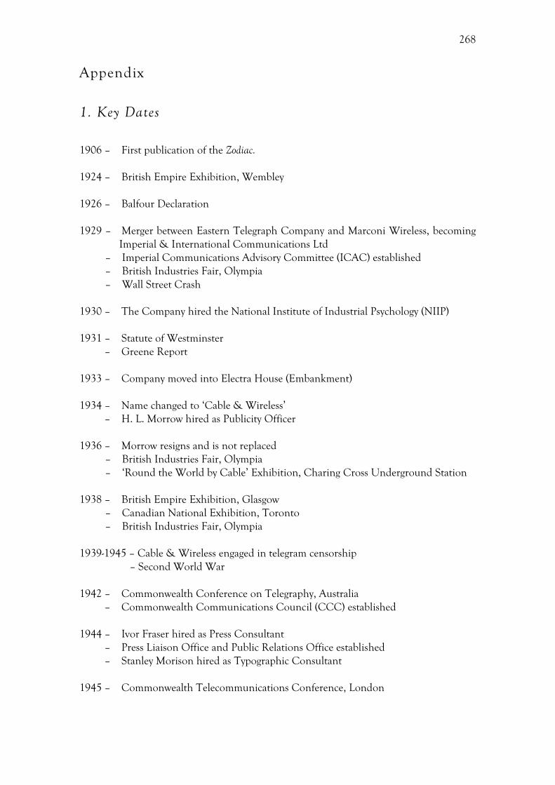
268
Appendix
1. Key Dates
1906 – First publication of the Zodiac. 1924 – British Empire Exhibition, Wembley 1926 – Balfour Declaration 1929 – Merger between Eastern Telegraph Company and Marconi Wireless, becoming
Imperial & International Communications Ltd – Imperial Communications Advisory Committee (ICAC) established – British Industries Fair, Olympia – Wall Street Crash
1930 – The Company hired the National Institute of Industrial Psychology (NIIP) 1931 – Statute of Westminster – Greene Report 1933 – Company moved into Electra House (Embankment) 1934 – Name changed to ‘Cable & Wireless’ – H. L. Morrow hired as Publicity Officer 1936 – Morrow resigns and is not replaced
– British Industries Fair, Olympia – ‘Round the World by Cable’ Exhibition, Charing Cross Underground Station
1938 – British Empire Exhibition, Glasgow
– Canadian National Exhibition, Toronto – British Industries Fair, Olympia
1939-1945 – Cable & Wireless engaged in telegram censorship – Second World War 1942 – Commonwealth Conference on Telegraphy, Australia – Commonwealth Communications Council (CCC) established 1944 – Ivor Fraser hired as Press Consultant
– Press Liaison Office and Public Relations Office established – Stanley Morison hired as Typographic Consultant
1945 – Commonwealth Telecommunications Conference, London
269
1946 – Great Circle Map by MacDonald Gill – Schoolboy’s Own Exhibition – British Industries Fair, Olympia – ‘186,000 Miles a Second’ Exhibition, Charing Cross Underground Station
1947 – Nationalization of Cable & Wireless
– Publicity Policy Statement – Canadian National Exhibition, Toronto – Radiolympia Exhibition, London
1948 – Commonwealth Telecommunications Board (CTB) established 1949 – Public Relations Office take over editorial responsibility for the Zodiac – ‘Round the Colonies by Cable’ Exhibition, Daily Express Building, London 1951 – Festival of Britain, South Bank London 1954 – Salonika International Trade Fair 1955 – Company moved into Mercury House 1959 – Singapore Constitution Exposition 1963 – Pacific International Trade Fair, Lima 1966 – Hong Kong British Week
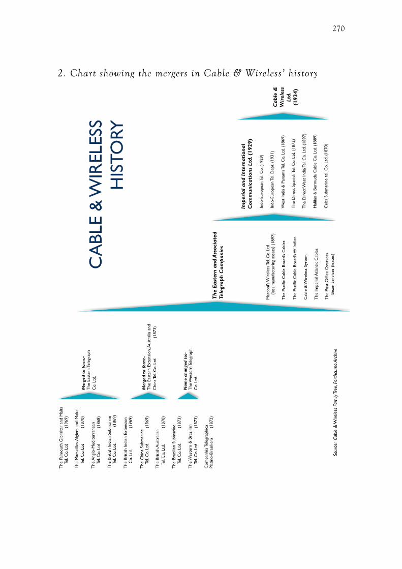
270
2. Chart showing the mergers in Cable & Wireless’ history
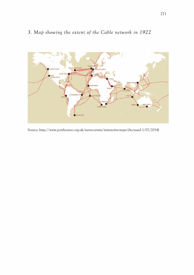
271
3. Map showing the extent of the Cable network in 1922
Source: http://www.porthcurno.org.uk/nerve-centre/interactive-maps [Accessed 1/07/2014]

272
10. Bibliography
Primary
Porthcurno Archive
ADV///867 Interview of Harold J. Wilson by Hugh Barty-King, 1978 DOC/I&IC/1/27 Inquiry Committee File 12/8/1931 – 1/3/1932 DOC/I&IC/1/47 Précis of evidence given before the Bridgemon Committee 8/4/1932 DOC/I&IC/1/51 Merger Agreements No.21 Transfer of Service File, 1929 DOC/I&IC/6/4/ Electra House Embankment: Commemorative Booklet DOC/CW/1/53 Statement summarizing Cable & Wireless’ reaction to proposed
nationalization, 25/10/1945 DOC/CW/1/54 Notes on the Reith Commission, 1946 DOC/CW/1/122 Nationalisation of Cable and Wireless: Pamphlet produced following
the nationalization of Cable & Wireless in 1946, entitled ‘The Effects of the Transfer
DOC/CW/1/122 Nationalisation of Cable and Wireless: Report by Sir Stanley Angwin
Concerning Suggested Future Organization of Cable & Wireless Ltd
DOC/CW/1/413 London Branches Functional Charts, February 1945 DOC/CW/1/526 Wartime File: London Central Station – Proposed transfer to Electra House,
Embankment DOC/CW/1/687 Cable & Wireless Administrative Steering Committee: Memorandum on
C&W re-organisation handed to the Director General of the GPO, 11/3/1948 DOC/CW/4/341 Standard Lettering to be used on Company Signs, 1956. DOC/CW/5/186 Memorandum Re. Outfits, 1923, Eastern Telegraph Company DOC/CW/8/47 Great Circle Map, by MacDonald Gill, 1946 DOC/CW/8/48 Cable & Wireless Limited: its Part on the Commonwealth Overseas
Telecommunication System: How the Commonwealth System Grew Up, 5/12/1958
273
DOC/CW/12/132 Cable & Wireless Publicity Policy Statement, 1947 DOC/CW/12/404 Cable & Wireless Limited and Empire Communication: Notes for
Guidance, 25/10/1945. DOC/CW/12/405 Cable & Wireless Limited and British Communications: Historical
Notes 1857-1946, c.1946 DOC/CW/12/406 Memorandum on 1948 and some subsequent operations
DOC/CTB/1/1 Report to the Governments on the Future Development of the Cable Network:
Systems Maps, 5/12/1956 DOC//5/166 Staff: Personal Papers – Bowers, 1920s-1940s DOC//5/166/13 Bowers Personal Papers – Correspondence DOC//6/36/1 Telegrams No.1-92 Cable & Wireless Telegram, 2/5/1942
DOC//6/120 British Empire Exhibition Official Guide, 1924 DOC//8/8 New device designed by Mr Stanley Morison, 1945 DOC//8/8 Collection of Various Company Logos: Cable & Wireless’ Logos DOC//11/48 Imperial Communications Advisory Committee: Letter from Sir Campbell
Stuart to J. C. Denison Pender, 26/9/1933 DOC//11/49 Imperial Communications Advisory Committee: Letter from J. C. Denison
Pender to the Secretary of the ICAC, 17/12/1931 DOC//12/56 Cable & Wireless City Branch Offices, 18/3/1935 PHO///666 Bowers Personal Album, 1936-1938 PHO///669 Bowers Personal Album, 1935-1942 PHO///670 Bowers Personal Album, c.1927 PHO///313 Parliament Street Station Office, London: Instrument Room PHO///1601 Photograph of the globe used in a number of Cable & Wireless
exhibitions, 1945 PHO/// 1801 Photograph of the ‘186,000 Miles a Second’ Exhibition in Charing Cross
Underground Station, 1946 PHO///1802 Photograph of the ‘186,000 Miles a Second’ Exhibition in Charing Cross
Underground Station, 1946
274
PHO///1809 Florist Telegraph Delivery Association Stand, Mayfair Hotel, 1950 PHO///1814 Cable & Wireless stand at the Singapore Constitution Exposition, 1959. PHO///1845 Prototype of the Universal Clock, by Reitz, 1948. PHO///1846 Universal Clock, by Reitz, on the Cable & Wireless stand at the British
Industries Fair, May 1949. PHO///1847 Daily Express Exhibition, 1949. PHO///1853 Entrance to the British Pavilion, Salonika International Exhibition, 1954 PHO///1868 Cable & Wireless stand for Hong Kong British Week, March 1966. PHO///1869 Cable & Wireless stand for Hong Kong British Week, March 1966. PHO///2307 Antofagasta Station, Chile, 1955. PIC/I&IC/81 Telegraph Imperially, by A. E. Halliwell, c.1929-1934. PIC/GPO/8/11 Send a Cable It’s Easy, by T. Eckersley. PIC///263/ 186,000 Miles a Second Exhibition, by Henrion advertising Cable & Wireless
exhibition, Charing Cross Station, 1946. MAP///430 The Great Circle Map, by MacDonald Gill, 1946. MAP///105 Cable & Wireless System Map, 31/12/1951. 6.1.10 Mercury House – Opening by Lord Reith.
Uncatologued items:
Advertisement, Fairplay, 5th July 1945, Guard Book. Cable & Wireless Pamphlet, c.1930s Via Eastern Christmas Greeting, by Fred Guisely, 1926 Exterior of Cable & Wireless branch, photograph from glass plate negative Empire Communications Booklet
275
The Zodiac
PUB/ZDC/PUB/5/3/35 Anon, New Station at Wembley, The Zodiac, 194 (July 1924) PUB/ZDC/PUB/5/3/35 Anon, Advertisement, The Zodiac, 194 (July 1924) PUB/ZDC/5/3/48 Anon, Exhibition of Via Eastern XLT posters at Electra House, The
Zodiac, 206 (July, 1926), 357 PUB/ZDC/5/3/56 Anon, At the sign of the buoy, The Zodiac, 227 (June 1927), 334 PUB/ZDC/5/3/59 Anon, Wanted, a symbol!, The Zodiac, 230 (September 1927) PUB/ZDC/5/3/60 Anon, Drop your snap into an envelope, The Zodiac, 231 (October
1927), 77 PUB/ZDC/5/3/75 Anon, A Triumph for British Industry, The Zodiac, 248 (March 1929),
274 PUB/ZDC/5/3/79 Anon, The Court of Directors of Cables and Wireless Limited and
Imperial and International Communications Limited, Zodiac, 252 (July 1929), 442 PUB/ZDC/5/3/85 Anon, A Rechristening! Cable and Wireless Via Imperial, The Zodiac,
311 (June 1934), 369-371 PUB/ZDC/5/3/85 Anon, Changing the conception to the Empire, The Zodiac, 311
(June 1934), 373 PUB/ZDC/5/3/119 Anon, The Zodiac, 362 (September, 1938) PUB/ZDC/5/3/127 Anon, New Cable and Wireless Office, The Zodiac, 370 (May 1939),
349 PUB/ZDC/5/3/136 Anon, Belfast branch, The Zodiac, 379 (February 1940), 238 PUB/ZDC/5/1/36 Anon, Two New, The Zodiac, 429 (April 1944), 92 PUB/ZDC/5/3/118 Anon, Post Office may operate C. and W. Service, The Zodiac, 447
(June 1946), 51-53 PUB/ZDC/5/3/119 Anon, “Adequate Protection” for staff on nationalisation’ The
Zodiac, 448 (July 1946), 75-76 PUB/ZDC/5/3/122 Anon, Staff (‘that means retired Staff as well’) are Protected – says
Chairman, The Zodiac, 452 (November 1946), 187-188 PUB/ZDC/5/3/124 Anon, Farewell to the Court, The Zodiac, 454(January 1947), 262.
276
PUB/ZDC/5/3/124 Anon, Sir Edward Wilshaw says “Goodbye”, The Zodiac, 454 (January 1947), 260
PUB/ZDC/5/3/125 Anon, Future of Cable and Wireless Staff, The Zodiac, 455
(February 1947), 323 PUB/ZDC/5/3/125 S. Angwin, We Shall Together Do Great Things, The Zodiac, 455
(February 1947), 1 PUB/ZDC/5/3/130 Anon, Integration, The Zodiac, 460 (July 1947), 28 PUB/ZDC/5/3/134 Anon, Barbados “Brains Trust” was star turn at Radiolympia, The
Zodiac, 464 (November, 1947) 4-7 PUB/ZDC/5/3/167 Anon, Appointments from Furlough, The Zodiac, 496 (July 1950),
39 PUB/ZDC/5/3/356 Anon, Dome Colonial Station will soon be calling: Company
contributes overseas quiz and cableship film to the Festival, The Zodiac, 506 (May, 1951), 5
PUB/ZDC/5/3/346 H. J. Wilson, The Future looms bright for Zodiac, The Zodiac, (May
1965) 23-26
Cambridge University Library
Add.9812/B4/4/1 Correspondence from Col. Ivor Fraser to Stanley Morison, 11th May 1944
Add.9812/B4/4/1 Correspondence from Harold J. Wilson to Stanley Morison, 10th
October, 1949 Add.9812/B4/4/4 Logo proof, by Stanley Morison
Transport for London archives (online)
PF11/9/1-22 Correspondence between W H Meggs and Ivor Fraser, 1921-23 http://www.ltmuseum.co.uk/assets/PickCollectionAbbreviatedWeblist2013.pdf [Accessed 01/07/2014]
Poster advertising Cable & Wireless exhibition, Charing Cross Station, by Percy Ford, 1936 http://www.tfl.gov.uk/assets/images/general/beckmap1.jpg [Accessed 1/7/2014]
277
RIBA (Online)
RIBA60153 Electra House, Victoria Embankment, London: the entrance hall, 1933 http://www.ribapix.com/index.php?a=wordsearch&s=item&key=WczoxMzoiZWxlY3RyYSBob3VzZSI7&pg=1 [Accessed 12/11/2012]
V&A (Online)
Imperial Federation: Map Showing the Extent of the British Empire in 1886, by Walter Crane http://www.vam.ac.uk/vastatic/microsites/victorians/finals/world.html
Highways of Empire, by MacDonald Gill, 1927 http://collections.vam.ac.uk/item/O757605/highways-of-Empire-poster-gill-leslie-macdonald/
Published
British Empire Exhibition, 1924. Pocket guide to the Empire Exhibition at Wembley, 1924, London, 1924
J. R. Ainsworth Davis, The Book of the Empire, London, 1924
T. Eckesley, Poster Design, London, 1954 F. H. K. Henrion, Design Co-ordination and Corporate Image, London, 1967 F. Pick, Paths to Peace, London, 1941 J. Reith, Into the Wind, London, 1949 J. Verne, Around the World in Eighty Days, London, 1873
Newspapers
Rosenfeld, A. (May 12, 1951). Science Advertised, Not Portrayed, The Manchester Guardian, ProQuest Historical Newspapers, p.4
Cable and Wireless outlook, The Spectator, 11th May, 1939, 39
278
Secondary
D. M. Abramson, Sir Herbert Baker (1862-1946), in: Oxford Dictionary of National
Biography, Oxford, 2004, Available at: http://www.oxforddnb.com/templates/article.jsp?articleid=30547&back [Accessed 14 January, 2014]
B. Anderson, Imagined Communities: Reflections on the Origin and Spread of Nationalism, London, 1991, 175
S. Antony, Public Relations and the Making of Modern Britain: Stephen Tallents and the Birth of
a Progressive Media Profession, Manchester, 2012
D. Arnold, Europe, technology, and colonialism in the 20th century, History and Technology 21 (2005) 85-106
R. Artmonsky and B. Webb, FHK Henrion: Design, Woodbridge, 2011
J. Attfield, Bringing Modernity Home: Writings on Popular Design and Material Culture, Manchester, 2007
H. Atkinson, The Festival of Britain: A Land and Its People, London, 2012
J. Auerbach, Review: Alexander C. T. Geppert. Fleeting Cities: Imperial Expositions in Fin de
Siècle Europe, The American Historical Review, 117 (2012), 919–920
J. Auerbach, Art and Empire, in: W. R Louis, R. W. Winks (Eds), The Oxford History of the
Empire: Historiography, Oxford, 2001, 571-584 J. Aynsley, Graphic change: design change: magazines for the domestic interior, 1890-
1930, Journal of Design History 18 (2005) 43-59
J. Balmer and S. Greyser, Revealing the Corporation: Perspectives on Identity, Image,
Reputation, Corporate Branding and Corporate Level Marketing, London, 2003 J. Balmer and S. Greyser, Corporate marketing: integrating corporate identity, corporate branding, corporation communications, corporate image and corporate
reputation, European Journal of Marketing, 40 (2006), 730-741
W. Baker, A history of the Marconi Company, London, 1970
279
K. C. Baglehole, A Century of Service: A Brief History of Cable and Wireless Ltd., 1968, London, 1986
R. Barthes, Rhetoric of image, in: N. Mirzoeff (Ed), The Visual Culture Reader, London, 1998
H. Barty-King, Girdle Round the Earth: History of “Cable and Wireless,” London, 1980
K. G. Beauchamp, Exhibiting Electricity, London, 1997 M. Bell, R. A. Butlin, and M. Heffernan, Introduction: Geography and imperialism,
1820-1940, in: M. Bell, R. Butlin, M. Heffernan (Eds), Geography and Imperialism
1820-1940, Manchester, 1995, 1-13
H. Belting, Image, medium, body: a new approach to iconology, Critical Inquiry 2 (2005) 302-319 T. Bennett, Speaking to the eyes: museums, legibility and the social order, in: S.
MacDonald (Ed), The Politics of Display: Museums, Science, Culture, London, 1998, 25–36
T. Bennett, The Birth of the Museum: History, Theory, Politics 1st ed., London, 1995
M. Berman, All That is Solid Melts Into Air: The Experience of Modernity, New York, NY, 1988
P. Biltcliffe, Walter Crane and the Imperial Federation Map Showing the Extent of the
British Empire (1886), Imago Mundi 57 (2005) 63–69 I. Black, Imperial visions: rebuilding the Bank of England, 1919-39, in: F. Driver, D.
Gilbert (Eds), Imperial Cities: Landscape, Display and Identity, Manchester, 1999, 96-117
M. Black, Exhibition Design, London, 1950
A. Blunt, Home and Empire: photographs of British families in the Lucknow Album, 1856-
57, in: J. Schwartz, J. Ryan (Eds), Picturing Place: Photography and the Geographical
Imagination, London, 2003, 243-261 A. Blunt, Colonialism/Postcolonialism, in: D. Atkinson, P. Jackson, D. Sibley, N.
Washbourne (Eds), Cultural Geography. A Critical Dictionary of Key Concepts, London, 175-181
280
A. Blunt, Domicile and Diaspora: Anglo-Indian Women and the Spatial Politics of
Home, Oxford, 2005
B. Benedict, International exhibitions and national identity, Anthropology Today 7 (1991) 5-9
H. J. Booth and N. Rigby (Eds), Modernism and Empire: Writing and British Coloniality 1890-
1940, Manchester, 2000
C. Breward, Undressing the past, Gender & History 8 (1996) 286–289
E. H. Brown, The Corporate Eye: Photography and the Rationalization of American Commercial
Culture, 1884-1929, Baltimore, MD, 2008
P. Burke, Eyewitnessing: The Use of Images as Historical Evidence, London, 2006
P. Burke, Interrogating the eyewitness, Cultural and Social History 4 (2010) 435-443 R. A. Butlin, British geographical representations of imperialism and colonial
development in the early and mid-twentieth century, in: D. Gilbert, D. Matless, B.
Short (Eds), Historical Geographies of British Modernity, Oxford, 2003, 229-250
R. A. Butlin, Geographies of Empire: European Empires and Colonies c.1880–1960, Cambridge, 2009
P. J. Cain and A. G. Hopkins, British Imperialism: Innovation and Expansion, 1688-1914, Harlow, 1993
M. Calinescu, Modernity, modernism, modernization: variations on modern themes,
Symplokē 1 (1993) 1-20
D. Cannadine, Ornamentalism: How the British Saw Their Empire, London, 2002
M. de Certeau, The Practice of Everyday Life, Berkley, CA, 1988
C. Chajet and T Shachtman, Image by Design: From Corporate Vision to Business Reality, Boston, MA, 1991
D. Chambers, Family as place: family photograph albums and the domestication of public
space and private space, in: J. Schwartz, J. Ryan (Eds), Picturing Place: Photography and
the Geographical Imagination, London, 2003, 96-115

281
A. Chandler and B. Mazlish, Introduction, in: A. Chandler, B. Mazlish (Eds) Leviathans:
Multinational Corporations and the New Global History, Cambridge, 2005, 1-16
R. Chester, Cornwall: the western colony, in: W. Gagen, D. Dawson (Eds), Nerve Centre of
Empire: Connecting Cornwall, Expanding Frontiers, 1870-1918, Porthcurno, 2010, 10-14
I. Christie, Mass-market modernism, in: C. Wilk (Ed) Modernism: Designing a New World, London, 2006, 375-415
R. Church, Advertising consumer goods in nineteenth-century Britain: reinterpretations,
The Economic History Review 4 (2000) 621-645
B. R. Clark, The organizational saga in higher education, Administrative Science Quarterly 2 (1972) 178-184
D. Clayton, Imperialism, in D. Gregory, R. Johnston, G. Pratt, M. Watts, S. Whatmore
(Eds), The Dictionary of Human Geography (5th edn), Chichester, 2009, 373-374
H. Cocks, Modernity and modernism, in: F. Carnevali, J.-M. Strange (Eds), Twentieth
Century Britain: Economic, Cultural and Social Change, London, 2007, 26–42 S. Cohen, The Empire from the street: Virginia Woolf, Wembley, and imperial
monuments, MFS Modern Fiction Studies 50 (2004) 85-109 R. Collins, The Reith Mission: global telecommunications and the decline of the British
Empire, Historical Journal of Film, Radio and Television 32 (2012) 167-185
B. Conekin, The Autobiography of a Nation: the 1951 Festival of Britain, Manchester, 2003
P. Conrad, Modern Times, Modern Places: Life and Art in the 20th Century, London, 1999
S. Constantine, Buy and Build: The Advertising Posters of the Empire Marketing Board, London, 1986
S. Constantine, ‘Bringing the Empire alive’: the Empire Marketing Board and imperial
propaganda, 1926-33, in: J. M. MacKenzie (Ed), Imperialism and Popular Culture, Manchester, 1987, 192–232
le Corbusier, Towards a New Architecture, 2008
D. Cosgrove, Apollo’s Eye: A Cartographic Genealogy of the Earth in the Western Imagination, Baltimore, MD, 2001

282
D. Cosgrove, Maps, mapping, modernity: art and cartography in the Twentieth Century,
Imago Mundi 57(2005) 35–54
M. Cotton, Design Research Unit: 1942-72, Cologne, 2012
H. Cox, Shaping the corporate identity from below: the role of the BAT Bulletin,
Management & Organizational History 3 (2008) 197-215
M. Coyle, With a plural vengeance: modernism as (flaming) brand, Modernist Cultures 1
(2005) 15-21
J. Craik, Uniforms Exposed: From Conformity to Transgression, Oxford, 2005
J. Darwin, Britain and Decolonisation: The Retreat From Empire in the Post-War World, London, 1988
J. Darwin, Decolonization and the end of Empire, in: W. R. Louis, R. W. Winks (Eds),
The Oxford History of the British Empire: Historiography, Oxford, 2001, 541-558
V. della Dora, Travelling landscape-objects, Progress in Human Geography 3 (2009) 334-354
C. Dellheim, Business in time: the historian and corporate culture, The Public Historian 8 (1986) 9-22
C. Dellheim, The creation of a company culture: Cadburys, 1861-1931, The American
Historical Review 92 (1987) 13–44 C. Dilnot, The state of Design History, part I: mapping the field, in: G. Lees-Maffei, R.
Houze (Eds), The Design History Reader, Oxford, 2010, 273-279 G. Downey, Telegraph messenger boys: crossing the borders between history of
technology and human geography, The Professional Geographer 55 (2003) 134-145
L. Downey, This is a Pair of Levis Jeans: Official History of the Levis Brand, San Francisco, CA, 1996
F. Driver, Research in historical geography and in the history and philosophy of
geography in the UK, 2001-2011: an overview, Journal of Historical Geography 42 (2013) 203-211

283
F. Driver and D. Gilbert, Imperial cities: overlapping territories, intertwined histories, in:
F. Driver, D. Gilbert (Eds), Imperial Cities: Landscape, Display and Identity, Manchester, 1999, 1-21
F. Driver, On Geography as a visual discipline, Antipode 35 (2003) 227-231
F. Driver, Review of A. Christopher ‘The British Empire at its zenith’, Land Use Policy 5 (1988) 447-448
E. Duffy, The Speed Handbook: Velocity, Pleasure, Modernism, Durham, NC, 2009
E. Edwards, Material beings: objecthood and ethnographic photographs, Visual Studies 17 (2002) 67-76
E. Edwards and J. Hart, Photographs Objects Histories: On The Materiality of Images, New York, NY, 2004
R. J. Evans, In Defence of History, London, 2001
K. Fallan, Design History: Understanding Theory and Method, Oxford, 2010
E. S. Ferguson, Technical museums and international exhibitions. Technology and Culture, 6 (1965) 30-46
C. Fombrun and C. Van Riel, The reputational landscape, Corporate Reputation Review 2 (1997) 1-16
S. Forgan, Festivals of science and the two cultures: science, design and display in the
Festival of Britain, 1951, The British Journal for the History of Science 31 (1998) 218-240
M. Foucault, Discipline and Punish: The Birth of the Prison, London, 1991 W. Gagen, Not another hero: the Eastern Telegraph and Associated Companies’ creation
of the soldier hero and company man, in: S. McVeigh, N. Cooper (Eds), Men After
War, Abingdon, 2013, 92-111 W. Gagen and R. Noakes, The British Empire and the exotic: telegraphy and British
domination, in: W. Gagen, D. Dawson (Eds) Nerve Centre of Empire: Connecting
Cornwall, Expanding Frontiers, 1870-1918, Porthcurno, 2010, 6-10
K. Garland, Mr Beck’s Underground Map: A History, London, 2003
284
A. C. T. Geppert, True copies, time and space travels at British Imperial Exhibitions,
1880-1930, in: H. Berghoff, B. Korte, R. Schnieder, C. Harvie (Eds), The Making of
Modern Tourism: The Cultural History of the British Experience, 1600-2000, Basinstoke, 2002
A. C. T. Geppert, Fleeting Cities: Imperial Expositions in Fin-de-Siècle Europe, Basingstoke, 2010
D. Gilbert and F. Driver, Capital and Empire: Geographies of Imperial London,
GeoJournal 51 (2000) 23-32
D. Gilbert, D. Matless and B. Short (Eds), Historical Geographies of British Modernity, Oxford, 2003
R. Goldman, Reading Ads Socially, London, 1992
H. Goodden, The Lion and the Unicorn: Symbolic Architecture for the Festival of Britain, 1951, Norwich, 2011 C. R. Gorman, Review: The interface, IBM and the transformation of corporate design,
1946-1976, Journal of Design History 27 (2014) 101-103
B. Graham, C. Nash (Eds), Modern Historical Geographies, Harlow, 2000
C. Green, The machine, in: C. Wilk (Ed), Modernism: Designing a New World, London, 2006, 71-113
O. Green, Appearance values: Frank Pick and the art of London Transport, in: D.
Bownes, O. Green (Eds), London Transport Posters: A Century of Art and Design, London, 2008
P. Greenhalgh, Introduction to modernism in design, in: G. Lees-Maffei and R. Houze
(Eds), The Design History Reader, Oxford, 2010, 91-98
P. Greenhalgh, The Modern Ideal: The Rise and Collapse of Idealism in the Visual Arts From the
Enlightenment to Postmodernism, London, 2005
P. Greenhalgh, Ephemeral Vistas: History of the Expositions Universelles, Great Exhibitions and
World’s Fairs, Manchester, 1990 J. Griffiths, ‘Give my regards to Uncle Billy…’: the rites and rituals of company life at
Lever Brothers, c.1900–c.1990, Business History 4 (1995) 25–45
285
J. E. Grunig, Image and substance: from symbolic to behavioural relationships, Public
Relations Review 2 (1993) 121-139 M. F. Guillén, Scientific management’s lost aesthetic: architecture, organization, and the
Taylorized beauty of the mechanical, Administrative Science Quarterly, 42 (1997) 282-715
R. Guyatt, 1950. Models and display devices, in: M. Black (Ed), Exhibition Design, London, 121–133
L. Hannah, Electricity Before Nationalisation: A Study of the Development of the Electricity
Supply Industry in Britain to 1948, Baltimore, MD, 1979
J. B. Harley, Deconstructing the map, Cartographica 26 (1989) 1–20
D. Harvey, The Condition of Postmodernity, Oxford, 1989
E. Harwood and A. Powers, Festival of Britain, London, 2001
J. Harwood, Interface: IBM and the Transformation of Corporate Design, 1945-1976, Minneapolis, MN, 2011
D. R. Headrick, The Invisible Weapon: Telecommunications and International Politics, 1851-
1945, Oxford, 1991 B. Heilbrunn, Representation and legitimacy: a semiotic approach to the logo, in: W.
Nöth (Ed), Semiotics of the Media: State of the Art, Projects and Perspectives, Berlin, 1998, 175–191
M. Heller, Company magazines 1880-1940: an overview, Management & Organizational
History 3 (2008) 179-196
S. Heller, Advertising, mother of graphic design, in: G. Lees-Maffei, R. Houze (Eds), The
Design History Reader, Oxford, 2010, 435–441
F. H. K. Henrion and A. Parkin, Design Coordination and Corporate Image, London, 1966
B. Hillier, Introduction, in: M. Banham, B. Hillier (Eds), Tonic to the Nation: Festival of
Britain, 1951, London, 1976, 10–20
D. Hindley and G. Hindley, Advertising in Victorian England, 1837-1901, London, 1972
286
C. M Hinsley, The world as marketplace: commodification of the exotic at the World’s
Columbian Exposition, Chicago, 1893, in: S. D. Lavine and I. Karp (Eds) Exhibiting
Culture: The Poetics and Politics of Museum Display, Washington, DC, 1991, 344-366 A. K. Hoagland, The architecture of efficiency: the US army and the colonial revival style
in the West, in: R. G. Wilson, S. Eyring and K. Marotta (Eds) Re-creating the
American Past: Essays on the Colonial Revival, Charlottesville, VA, 2006 J. Holder, “Design in Everyday Things”: promoting modernism in Britain, 1912-1944, in:
P. Greenhalgh, (Ed), Modernism in Design, London, 1990, 123-145
R. Hollis, Graphic Design: A Concise History, London, 2001
M. Horton, Empire Marketing Board Posters: Manchester Art Gallery, Manchester, 2010
T. P. Hughes, Networks of Power: Electrification in Western Society, 1880-1930, Baltimore, MD, 1993
D. J. Huppatz, Globalizing corporate identity in Hong Kong: rebranding two banks,
Journal of Design History 18 (2005) 357–369
F. Jackson, The new air age: BOAC and design policy 1945-60, Journal of Design History 4 (1991) 167-185
M. Jasanoff, Collectors of Empire: objects, conquests and imperial self fashioning, Past &
Present 184 (2004) 109-135 G. Jones, Multinationals from the 1930s to the 1980s, in: A. D. Chandler, B. Mazlish
(Eds), Leviathans: Multinational Corporations and the New Global History, Cambridge, 2005, 81-104
L. Jordanova, The Look of the Past: Visual and Material Evidence in Historical Practice, Cambridge, 2012.
I. Karp, Festivals, in: S. D. Lavine, I. Karp (Eds), Exhibiting Culture: The Poetics and Politics
of Museum Display, Washington, DC, 1991, 279-288
C. Kaul, Reporting the Raj: The British Press and India, c.1880-1922, Manchester, 2003
P. M. Kennedy, Imperial cable communications and strategy, 1870-1914, The English
Historical Review, 86 (1971) 728-752
287
S. Kern, The Culture of Time and Space, 1880-1918, Cambridge, MA, 2003
K. Ketola Bore, The framework of modernity in the General Post Office, in: Telling Tales:
Revealing Histories in BT Archives, London, 2011, 28-36 A. Kieser, Why organization theory needs historical analyses - and how this should be
performed, Organization Science 4 (1994) 608-620
A. D. King, The Bungalow: The Production of a Global Culture, London, 1984
C. Kinmonth, Irish Rural Interiors in Art, New Haven, CT, 2006
A. H. M. Kirk-Greene, On Crown Service: A History of HM Colonial and Overseas Civil
Services, 1837-1997, London 1999 N. Koehn, Henry Heinz and brand creation in the late nineteenth century: making
markets for processed food, The Business History Review 73 (1999) 349-393
N. Koehn, Brand New: How Entrepreneurs Earned Consumers’ Trust from Wedgewood to Dell, Cambridge, MA, 2001 D. Lambert and A. Lester, Introduction: imperial spaces, imperial subjects, in: D.
Lambert, A. Lester (Eds), Colonial Lives Across the British Empire: Imperial Careering in
the Long Nineteenth Century, Cambridge, 2006, 1-32 H. Leblebici and N. Shah, The birth, transformation and regeneration of business
incubators as new organisational forms: understanding the interplay between
organisational history and organisational theory, Business History 3 (2004) 353-380 G. Lees-Maffei, Methods and themes: introduction, in: G. Lees-Maffei, R. Houze (Eds),
The Design History Reader, Oxford, 2010, 259-263
G. Lees-Maffei, The production-consumption-mediation paradigm, Journal of Design
History 22 (2009) 351-376 G. Lees-Maffei, Studying advice, historiography, methodology, commentary, bibliography,
Journal of Design History 16 (2003) 1-15
H. Lefebvre, Critique of Everyday Life, London, 2008 D. Leinster-Mackay, The nineteenth-century English preparatory school: cradle and
crèche of Empire? in: J. A. Mangan (Ed), Benefits Bestowed: Education and British
Imperialism, Manchester, 1988, 56-76
288
A. Lester, Historical geographies of imperialism, in: B. Graham, C. Nash (Eds), Modern
Historical Geographies, Harlow, 2000, 100-120
A. Lester, Imperial Networks: Creating Identities in Nineteenth Century South Africa and Britain, London and New York, NY, 2001
A. Lester, Imperial circuits and networks: geographies of the British Empire, History
Compass 4 (2006) 124–141
A. Lester, D. Lambert (Eds), Colonial Lives Across the British Empire: Imperial Careering in the
Long Nineteenth Century, Cambridge, 2006 A. Lester, Imperial networks: creating identities in nineteenth-century South Africa and
Britain, in: S. Howe (Ed), The New Imperial Histories Reader, London, 2010, 139-147
J. L’Etang, Public Relations in Britain: A History of Professional Practice in the 20th Century, Mahwah, NJ, 2004
J. Lever, Greene, Wilfrid Arthur, Baron Greene (1883–1952), in: Oxford Dictionary of
National Biography, Oxford, 2004, Available at: http://www.oxforddnb.com/view/article/33538
[Accessed July 8, 2013]
W. D. Lewis and W. P. Newton, The writing of corporate history, The Public Historian 3 (1981) 63-74 D. Linehan, A new England: landscape, exhibition and remaking industrial space in the
1930s, in: D. Gilbert, D. Matless, B. Short (Eds), Geographies of British Modernity:
Space and Society in the Twentieth Century, New York, NY, 2003, 132-151 H. Liu, Organized Chinese transnationalism and the institutionalization of business
networks: the Singapore Chinese Chamber of Commerce and Industry as a case
analysis, Southeast Asian Studies 37 (1999) 391-416
L. A. Loeb, Consuming Angels: Advertising and Victorian Women, Oxford, 1994
C. Lutz and J. Collins, The photograph as an intersection of gazes: the example of
National Geographic, in: L. Wells (Ed), The Photography Reader, London, 2002, 354-375
289
S. MacDonald, Exhibitions of power and powers of exhibition: an introduction of the
politics of display, in: S. MacDonald (Ed), The Politics of Display: Museums, Science,
Culture, Basingstoke, 1998, 1–25
J. M. MacKenzie, Propaganda and Empire: the Manipulation of British Public Opinion, 1880-
1960, Manchester, 1984
J. M. MacKenzie, Introduction, in: J. M. MacKenzie (Ed), Imperialism and Popular Culture, Manchester, 1986, 1-17
J. M. MacKenzie, ‘The Second City of the Empire’: Glasgow – imperial municipality, in: F.
Driver, D. Gilbert (Eds), Imperial cities: landscape, Display and Identity, Manchester, 1999, 215-238
J. M. MacKenzie, The persistence of Empire in metropolitan culture, in: S. Ward (Ed),
British Culture and the End of Empire, Manchester, 2001, 21–37
R. Macleod, Passages in imperial science: from Empire to Commonwealth, Journal of
World History, 4 (1993), 117-150
J. A. Mangan, Introduction: imperialism, history and education, in: J. A. Mangan (Ed),
Benefits Bestowed: Education and British Imperialism, Manchester, 1988, 1-23 A. Mattelart, Mapping modernity: Utopia and communications network’ in: D. Cosgrove
(Ed), Mappings, London, 1999, 169-193
A. McClintock, Imperial Leather: Race, Gender and Sexuality in the Colonial Contest, London, 1995
K. McIlvenna, From experiment to Relic: The Transnational Identity of the Atlantic Telegraph
Cable and the Creation of Cable Communications through Submarine Cable Collections, Unpublished MA thesis, University of London, 2011
W. D. McIntyre, The Commonwealth, in: W. R Louis,R. W. Winks (Eds), The Oxford
History of the Empire: Historiography, Oxford, 2001, 558-571
P. B. Meggs and A. W. Purvis, Meggs' History of Graphic Design, Fifth Edition, Hoboken, NJ, 2011
B. Melman, The Culture of History: English Uses of the Past, 1800-1953, Oxford, 2006
P. Messaris, Visual Persuasion: the Role of Images in Advertising, New York, NY, 1997
290
T. R. Metcalf, Architecture in the British Empire, in: W. R Louis, R. W. Winks (Eds),
The Oxford History of the Empire: Historiography, Oxford, 2001, 584-596
N. Mirzoeff, An Introduction to Visual Culture, London, 1999
T. Mitchell, The world as exhibition, Comparative Studies in Society and History 31 (1989) 217-236
T. Mitchell, Orientalism and the exhibitionary order, in: N. Mirzoeff (Ed), The Visual
Culture Reader, Basingstoke, 1998, 495-506
W. J. T. Mitchell, Picture Theory: Essays on Verbal and Visual Representation, Chicago, 1995
W. J. T. Mitchell, Showing seeing: a critique of visual culture, Journal of Visual Culture 2 (2002) 165 -181
K. O. Morgan, Labour in Power, 1945-1951, Oxford, 1984
J. Morris, The Spectacle of Empire: Style, Effect and the Pax Britannica, London, 1982 J. Morrissey, Imperialism and Empire, in: J. Morrissey, D. Nally, U. Strohmayer, Y.
Whelan (Eds), Key Concepts in Historical Geography, London, 2014, 17-26 J. Morrissey, Colonialism and anti-colonialism, in: J. Morrissey, D. Nally, U. Strohmayer,
Y. Whelan (Eds), Key Concepts in Historical Geography, London, 2014, 26-36
J. Morrissey, D. Nally, U. Strohmayer, Y. Whelan (Eds), Key Concepts in Historical
Geography, London, 2014 I. R. Morus, The electric Ariel: telegraphy and commercial culture in early Victorian
England, Victorian Studies 39 (1996) 339-378 I. R. Morus, ‘The nervous system of Britain’: space, time and the electric telegraph in the
Victorian age, The British Journal for the History of Science 33 (2000) 455-475
C. Nash, Historical geographies of modernity, in: B. Graham and C. Nash (Eds) Modern
Historical Geographies, Harlow, 2000, 11-41
T. R. Nevett, Advertising in Britain: A History, London, 1982 A. Nordström, Making a journey: the Tupper scrapbook and the travel they describe, in:
E. Edwards, J. Hart (Eds), Photographs Objects Histories: on the Materiality of Images, London, 2004, 84-100
291
D. E. Nye, Image Worlds: Corporate Identities at General Electric, 1890-1930, Cambridge MA, 1985
S. O’Brien, Representing the Shannon Scheme: Electrical Technology, Modernisation and
National Identity in the Irish Free State, 1924-32, unpublished PhD thesis, University of Brighton, 2011
S. O’Brien, Technology and modernity: the Shannon Scheme and visions of national
progress, in: E. Sisson, L. King (Eds), Ireland, Design and Visual Culture: Negotiating
Modernity 1922-1992, Cork, 59-75
K. Offen, The visual culture of Empire, Journal of Historical Geography 45 (2014) 116-119
M. Ogborn, Historical geographies of globalisation, c. 1500-1800, in: B. Graham, C. Nash
(Eds), Modern Historical Geographies, Harlow, 2000, 43-70
M. Ogborn, Indian Ink: Script and Print in the Making of the English East India Company, Chicago, 2007
M. Ogborn, Global Lives: Britain and the World, 1550-1800, Cambridge, 2008
B. Oldcorn, On the Wire: The Strategic and Tactical Role of Cable and Wireless during the
Second World War, unpublished PhD thesis, University of Exeter, 2013
W. Olins, The Corporate Personality : An Inquiry Into the Nature of Corporate Identity, London, 1978
W. Olins, Corporate Identity: Making Business Strategy Visible Through Design, London, 1990
R. Opie, Rule Britannia: Trading on the British Image, New York, NY, 1985 B. Orlove, The ethnography of maps: the cultural and social contexts of cartographic
representation in Peru, Cartographica 30 (1993) 29–46 B. Osgerby, The bachelor pad as cultural icon: masculinity, consumption and interior
design in American men’s magazines, 1930-65, Journal of Design History 18 (2005) 99-113
M. Ovenden, London Underground By Design, London, 2013 S. A. Phillips, ‘Chemists to the Nation’: house magazines, locality and health at Boots the
Chemists 1919-1939, Management & Organizational History 3 (2008) 239-255
292
T. Ploszajska, Historiographies of geography and Empire, in: B. Graham, C. Nash (Eds),
Modern Historical Geographies, Harlow, 2000, 121-146 R. W. Pollay, The subsiding sizzle: a descriptive history of print advertising, 1900-1980,
The Journal of Marketing 3 (1985) 24-37
B. Porter, The Absent-Minded Imperialists: Empire, Society and Culture in Britain, Oxford, 2004.
A. Rabinbach, The Human Motor: Energy, Fatigue, and the Origins of Modernity, Los Angeles, 1992
S. Raitt, The rhetoric of efficiency in early modernism, Modernism/modernity 13 (2006) 835–851
A. Ramamurthy, Imperial Persuaders: Images of Africa and Asia in British Advertising, Manchester, 2003
P. Rennie, Festival of Britain 1951, Woodbridge, 2007
P. Rennie, GPO: Design, Woodbridge, 2010 J. Richards, Boy’s Own Empire: feature films and imperialism in the 1930s, in: J. M.
Mackenzie (Ed), Imperialism and Popular Culture, Manchester, 1986, 140–165
T. Richards, The Commodity Culture of Victorian England: Advertising and Spectacle, 1851-
1914, Stanford, CA, 1991 J. Robinson, Johannesburg’s 1936 Empire Exhibition: interaction, segregation and
modernity in a South African City, Journal of Southern African Studies 29 (2003) 759–789
R. Robinson and J. Gallagher, with A. Denny, Africa and the Victorians: The Official Mind
of Imperialism, Basingstoke, 1981 G. Rose, Practising photography: an archive, a study, some photographs and a researcher,
Journal of Historical Geography 4 (2000) 555-571
G. Rose, On the need to ask how, exactly, is Geography ‘visual’?, Antipode 35 (2003) 212-221
293
G. Rose, Visual Methodologies: An Introduction to the Interpretation of Visual Materials: An
Introduction to Interpreting Visual Objects, New York, NY, 2012.
R. Ross, Review: David Lambert and Alan Lester, eds,. Colonial Lives and the British Empire:
Imperial Careering in the Long Nineteenth Century, Itinerario 31 (2007) 147-148
J. D. Rowan, Imagining Corporate Culture: the Industrial Paternalism of William Hesketh Lever
at Port Sunlight, 1888-1925, unpublished PhD thesis, Louisiana State University and Agricultural and Mechanical College, 2003
S. Royle, Company, Crown and Colony: The Hudson's Bay Company and Territorial Endeavour
in Western Canada, London, 2010 D. Sugg Ryan, Staging the imperial city: the Pageant of London, 1911, in F. Driver, D.
Gilbert (Eds), Imperial Cities: Landscape, Display and Identity, Manchester, 1999, 117-136
J. R. Ryan, Picturing Empire: Photography and the Visualization of the British Empire, Chicago, 1998
J. R. Ryan, Who’s afraid of visual culture, Antipode 35 (2003) 232-237
E. W. Said, Orientalism, London, 2003
J. Schwartz, J. R. Ryan (Eds), Picturing Place: Photography and the Geographical Imagination, London, 2003
A. Sekula, Reading an archive: photography between labour and capital, in: P. Holland, J.
Spence, S. Watney (Eds), Photography/Politics Two, London, 1986, 153–61
A. Shaughnessy, FHK Henrion: The Complete Designer, London, 2013
B. Shope, Masquerading sophistication: fancy dress balls of Britain’s Raj, The Journal of
Imperial and Commonwealth History 39 (2011) 375–392
D. Souden, Voices Over the Horizon: Tales from Cable & Wireless, Cambridge, 1999
D. Souden, Voices of Change: Cable & Wireless, Cambridge, 2001 M. Steadman, Objects and observers: telecommunications, the nineteenth century
International Exhibition and the public, International Journal for the History of
Engineering & Technology 80 (2010) 231-247
294
S. Stevenson, The Empire looks back: subverting the imperial gaze, History of Photography 2 (2001) 142-156
B. Stoddart, Sport, cultural imperialism, and colonial response in the British Empire,
Comparative Studies in Society and History, 30 (1988) 649-673 A. L. Stoler and F. Cooper, Between metropole and colony: rethinking a research agenda,
in: F. Cooper, A. L. Stoler (Eds), Tensions of Empire: Colonial Cultures in a Bourgeois
World, Berkeley CA, 1997, 1-59
Y. Suga, Image Politics of the State: Visual Publicity of the General Post Office in Inter-war
Britain, unpublished PhD thesis, The Royal College of Art, 1998 Y. Suga, State patronage of design? The elitism/commercialism battle in the General Post
Office’s Graphic Production, Journal of Design History 13 (2000) 23-38 Y. Suga, Modernism, commercialism and display design in Britain: the Reimann School
and Studios of Industrial and Commercial Art, Journal of Design History 19 (2006) 137-154
C. Sylvest, Interwar internationalism, the British Labour Party, and the historiography of
international relations, International Studies Quarterly 48 (2004) 409–432 S. Teasley, G. Riello, and G. Adamson, Introduction: towards global design history, in: G.
Adamson, G. Riello, S. Teasley (Eds), Global Design History, Abingdon, 2011, 1-11 N. J. Thomas, Embodying imperial spectacle: dressing Lady Curzon, Vicerine of India,
1899—1905, Cultural Geographies, 14 (2007), 369-400
A. Thorpe, A History of the British Labour Party, Basingstoke, 2001
C. Van Reil and C. B. M. Van Riel, Principles of Corporate Communication, Upper Saddle River, NJ, 1995
C. Walker, Discovering MacDonald Gill: a brief biography, MacDonald Gill Symposium, University of Brighton, 2011
K. Ward, Networks of Empire: Forced Migration in the Dutch East India Company, Cambridge, 2009
S. Ward, Introduction, in: S. Ward (Ed), British Culture and the End of Empire, Manchester, 2001, 1-21
295
A. Warren, Citizens of the Empire, in: D. A. Whetten, Paul C. Godfrey (Eds), Identity in
Organizations: Building Theory Through Conversations, New York, NY, 1998 R. B. White, ‘An Exposition of Our Own’: corporate identity, consumer advertising and
Atlantic City’s national exhibits, 1898-1968, Journal of Design History 26 (2013) 47–65
P. Whitfield, The Image of the World: 20 Centuries of World Maps, London, 2010 R. Wenzlhuemer, Globalization, communication and the concept of space in global
history, Historical Social Research/Historische Sozialforschung 35 (2010) 19-47
C. Wilk, Introduction: what was modernism? in: C. Wilk (Ed), Modernism: Designing a
New World, London, 2006, 11-23 P. Williams, Simultaneous uncontemporaneities: theorising modernism and Empire, in:
H. J. Booth, N. Rigby (Eds), Modernism and Empire: Writing and British Coloniality
1890-1940, Manchester, 2000, 13–39
J. Williamson, Decoding Advertisements: Ideology and Meaning in Advertising, London, 2002
P. Williamson, National Crisis and National Government: British Politics, the Economy and
Empire, 1926-1932, Cambridge, 1992 J. Woodham, Images of Africa and design at the British Empire Exhibitions between the
wars, Journal of Design History 2 (1989) 15–33
A. Yagou, Foreword: uniforms in design-historical perspective, Journal of Design History 24 (2011) 101 -104
B. S. A. Yeoh, Historical geographies of the colonised world, in: B. Graham, C. Nash
(Eds), Modern Historical Geographies, Harlow, 2000, 146-167
L. Zines, Constitutional Changes in the Commonwealth, Cambridge, 1991
296
Internet
"A Marconi Message." Illustrated London News [London, England] 23 Nov. 1907: 775.
The Illustrated London News Historical Archive, 1842-2003.
[Accessed 24/1/2012]
"The Eastern Telegraph Company." Times [London, England] 13 Jan. 1911: 17. The
Times Digital Archive
[Accessed/1/2012]
Cable & Wireless Communications: Our History
http://www.cwc.com/past-present/our-history.html
[Accessed 26/9/2013]
Visual Arts Database
http://www.vads.ac.uk/collections/HC.html
Postal Heritage Museum
http://www.postalheritage.org.uk/page/designsondelivery
Empire Exhibition Scotland 1938, Glasgow School of Art
http://www.Empireexhibition1938.co.uk
[Accessed 27/2/2013]
MacDonald Gill Website http://www.macdonaldgill.com/media-gallery/detail/19/62 [Accessed 1/7/2014]
Modernist Britain
http://heritage.elettra.co.uk/modernism/post/building/Daily+Express+Building
[Accessed 11/3/2013]
297
Museum of London
http://www.20thcenturylondon.org.uk/mol-84-1-890
[Accessed 10/7/2014]
British Pathé
‘The Empire Comes to Town’ (1938)
http://www.britishpathe.com/video/the-Empire-comes-to-town
[Accessed 15/3/2013]
Still from the ‘ “Buy British” Royal Boost’ film produced by British Pathé, 1966
http://www.britishpathe.com/video/stills/buy-british-royal-boost
[Accessed 15/3/2013]
Related Documents