Storyboarding and Data Visualization Basic Steps To Create Effective Presentations By Carmen Proctor E2E IT / CloudenUp

Effective Business Presentations with Storyboarding and Data Visualization
Aug 16, 2015
Welcome message from author
This document is posted to help you gain knowledge. Please leave a comment to let me know what you think about it! Share it to your friends and learn new things together.
Transcript

Storyboarding and
Data VisualizationBasic Steps To Create Effective Presentations
By Carmen Proctor
E2E IT / CloudenUp
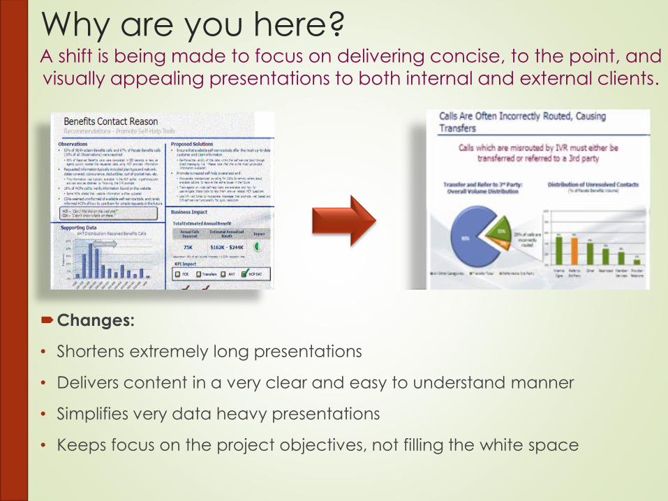
Why are you here?
Changes:
• Shortens extremely long presentations
• Delivers content in a very clear and easy to understand manner
• Simplifies very data heavy presentations
• Keeps focus on the project objectives, not filling the white space
A shift is being made to focus on delivering concise, to the point, and
visually appealing presentations to both internal and external clients.
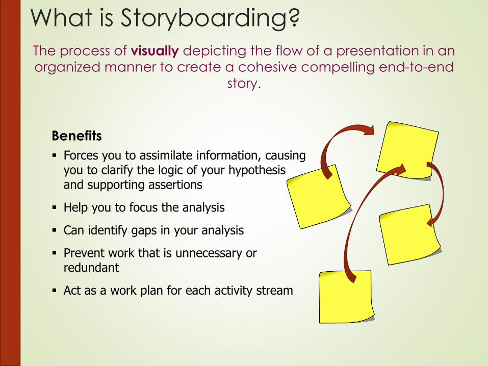
What is Storyboarding?The process of visually depicting the flow of a presentation in an
organized manner to create a cohesive compelling end-to-end
story.
Benefits
Forces you to assimilate information, causing you to clarify the logic of your hypothesis and supporting assertions
Help you to focus the analysis
Can identify gaps in your analysis
Prevent work that is unnecessary or redundant
Act as a work plan for each activity stream

How Is It Done?
Storyboarding is an iterative process, where you make
adjustments as you go to create the best story.
Gathering the information you found through
analysis
Collect
Findings
Create
Headlines
Organize
Findings
Sequence
Findings
Determine the message for each piece of analysis
Look to identify themes among
findings
Add, remove, and sequence themes and findings to create the story.

Collect Your FindingsAs you come to the end of data analysis, begin to collect your
findings based upon hypothesis’ and assertions.

Create Headlines
Create your headline for each of your findings, briefly conveying the
message of the content to be included within the slide.
Authentication
CustomerAuthentication
CSA’s are frequentlyunable to authenticate
the customer
MultipleAuthentications
Customer’s areauthenticated multiple
Times each contact
Headlines
Concise and to the point
Identifies which pieces of analysis fit where
Occasionally, one finding yields creation of multiple headlines

Organize Findings
Categorize your headlines to identify high level themes or pre-
targeted areas of analysis to create a preliminary structure to the
presentation.
IVR Process Systems Operations
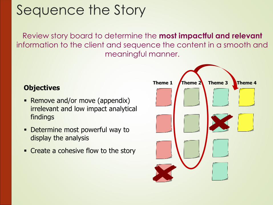
Sequence the Story
Review story board to determine the most impactful and relevant
information to the client and sequence the content in a smooth and
meaningful manner.
Theme 1 Theme 2 Theme 3 Theme 4
Objectives
Remove and/or move (appendix) irrelevant and low impact analytical findings
Determine most powerful way to display the analysis
Create a cohesive flow to the story

How Do I Support My Story?The Assertion-Evidence methodology provides a guideline to adding
content within each presentation slide.
Assertion Sentence
• Top of the slide, below slide headline
• Expresses the answer to each question in a clear succinct manner
• Short, but not so short it’s cryptic
Assertion Evidence
• Supports assertion sentence with evidence or an explanation and visual aids
• Evidence can be an example, statistics, flowchart, etc. (data visualizations)
Things to keep in mind:
• The key topic/objective of the slide
• The audience of the slide and their knowledge/familiarity of the topic
• Possible questions the audience may have about the key message
Client
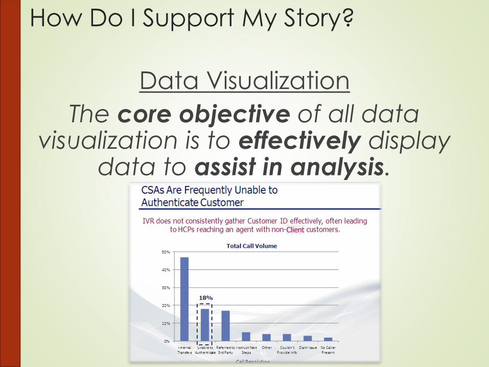
How Do I Support My Story?
Data Visualization
The core objective of all data visualization is to effectively display
data to assist in analysis.
Client

The 6 fundamental questions guide how we see the world around us.
We should use these same questions to guide us in data visualization.
PORTRAIT
CHART
MAP
TIMELINE
FLOW CHART
MULTI VAR PLOT
Align Visuals to How Most People See
the World
Who
What
How Much
Where
When
How
Why
Visualization
X
X
X
X
X

Certain charts lend themselves best to showing certain types of
data; whether relationship, comparison, distribution, or composition.
Data Driven Teams Use Charts Often,
But Which Chart Type Should I Use?

Get rid of any elements in a chart that do not convey anything
new, distort data, or distracts the audience from the story you
want to convey.
Grid Lines
Axis Values
3D Aspect Distorts Data
Simple, Accurate, and No Distractions
Actual value is 600
but shown to be
below 600
Actual value is 403 but
shown to be below 400
Simplify Charts to Focus on the Main
Point

How Much Should I Simplify?
We need to strike a balance between over-ornamenting and
over-simplifying charts. Charts should be simplified to the point
where they are not distracting but can still convey the message
clearly.
Extremely Ornate Extremely Bare
Strike a
Balance

For More Complicated Data, Use Sparklines
to Ensure Clarity and Scalability
Break down multiple axes/series of data and show as
“Sparklines”, whereby a chart may be broken down and
displayed as a series of separate charts placed next to each
other.
Transfer Rate
Queue Current Q1 Q2 Q3 Q4 1-Year
Sales 33% 25% 29% 35% 32%
Technical Support 34% 35% 36% 37% 38%
Retentions 14% 10% 9% 6% 11%
Billing 28% 20% 20% 35% 15%
General Info 72% 74% 79% 85% 65%
All Queues 36% 33% 35% 40% 32%
• Confusing To Read
• Need to Consult Legend
• Space Consuming
• Difficult to Analyze Especially When Scaled Down
• Detailed But Easy to Read
• No Need to Consult Legend
• Easily Scalable
• Easy to Spot Trends
Line Graph Sparklines

Color Reinforces Analysis
Only Use Color to Reinforce a Message
Use color to merely supplement/reinforce the message and never as
the main vehicle for delivering analysis. When printed in B/W, colors
can be indistinguishable; use shapes instead.
Red
=
Green
Color Critical to Analysis Analysis Washed Out in B/W
Analysis Fully Intact in B/W

The brain naturally wants to compare items of different color even when there isn’t anything to compare. Use simple color contrast to
draw the audience’s attention to specific items.
Multiple Colors but
Nothing Emphasized Color Used to Emphasize
Multiple Colors Confuse the Brain, Instead
Use Contrast to Emphasize

What Does This All Look Like In Action?
Findings Organized & Sequenced
Visible White Space
Simple & Easy to Read Chart that Supports the Tag
Line
Assertion-Evidence
Methodology
Consistent Theme
Uses Only Relevant Text
Use Color to Highlight Elements
Company Team
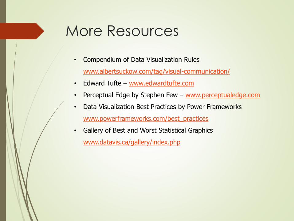
• Compendium of Data Visualization Rules
www.albertsuckow.com/tag/visual-communication/
• Edward Tufte – www.edwardtufte.com
• Perceptual Edge by Stephen Few – www.perceptualedge.com
• Data Visualization Best Practices by Power Frameworks
www.powerframeworks.com/best_practices
• Gallery of Best and Worst Statistical Graphics
www.datavis.ca/gallery/index.php
More Resources
Related Documents