Using Responsive Web Design to future proof your Websites & Apps

Welcome message from author
This document is posted to help you gain knowledge. Please leave a comment to let me know what you think about it! Share it to your friends and learn new things together.
Transcript

Using Responsive Web Designto future proof your Websites & Apps
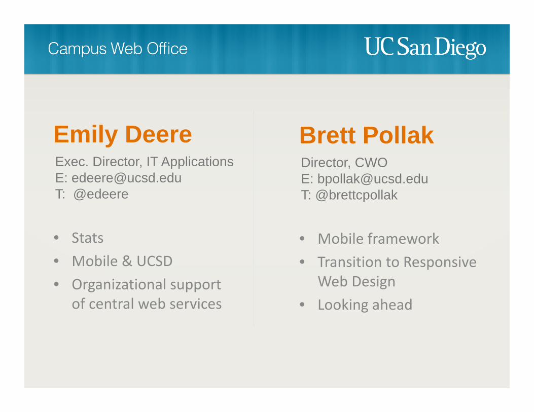
Emily DeereExec. Director, IT ApplicationsE: [email protected]: @edeere
• Stats• Mobile & UCSD• Organizational support
of central web services
Brett PollakDirector, CWOE: [email protected]: @brettcpollak
• Mobile framework• Transition to Responsive
Web Design• Looking ahead
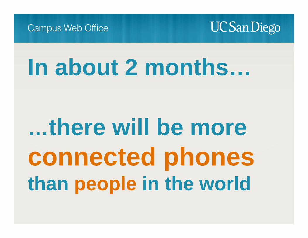
In about 2 months…
…there will be more connected phonesthan people in the world
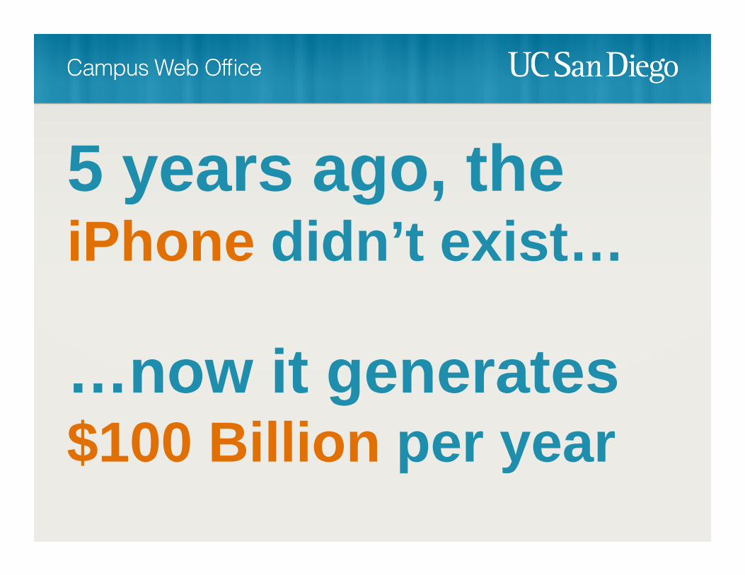
5 years ago, the iPhone didn’t exist…
…now it generates $100 Billion per year
The iPhone is bigger than
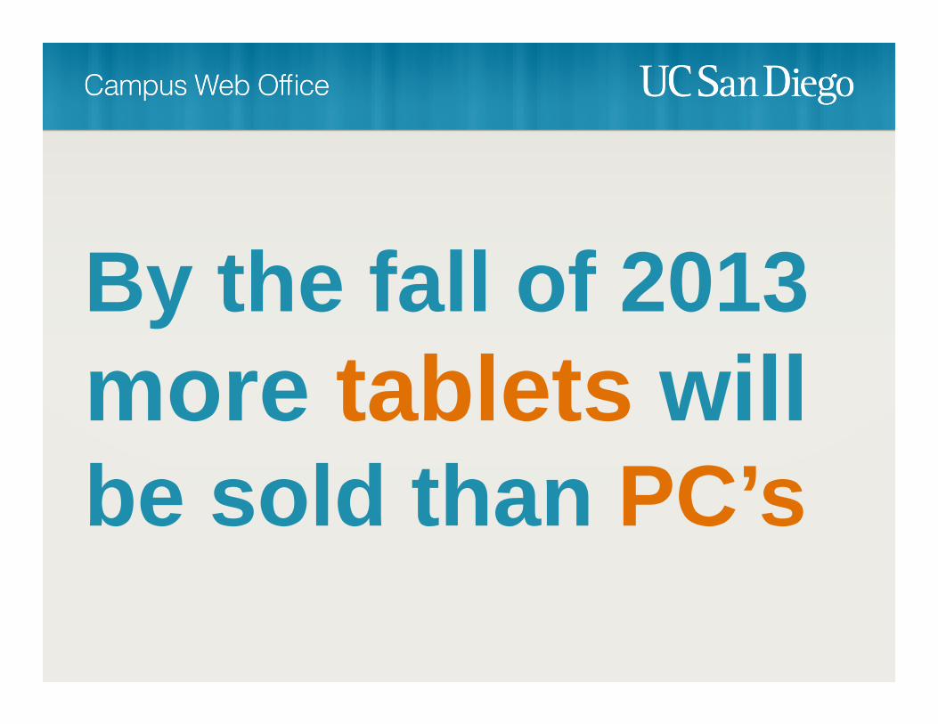
By the fall of 2013 more tablets will be sold than PC’s


May 20102.19% of visits from mobile
Higher Ed. Home Page Visits
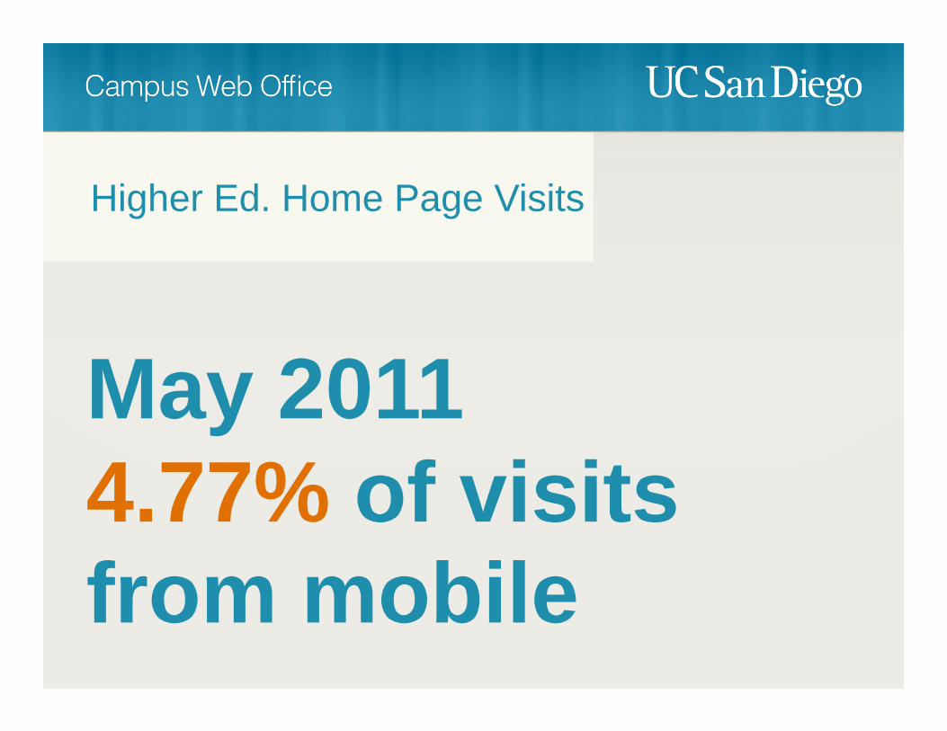
May 20114.77% of visits from mobile
Higher Ed. Home Page Visits

May 20129.82% of visits from mobile
Higher Ed. Home Page Visits

112% average increaseyear over year
Higher Ed. Home Page Visits
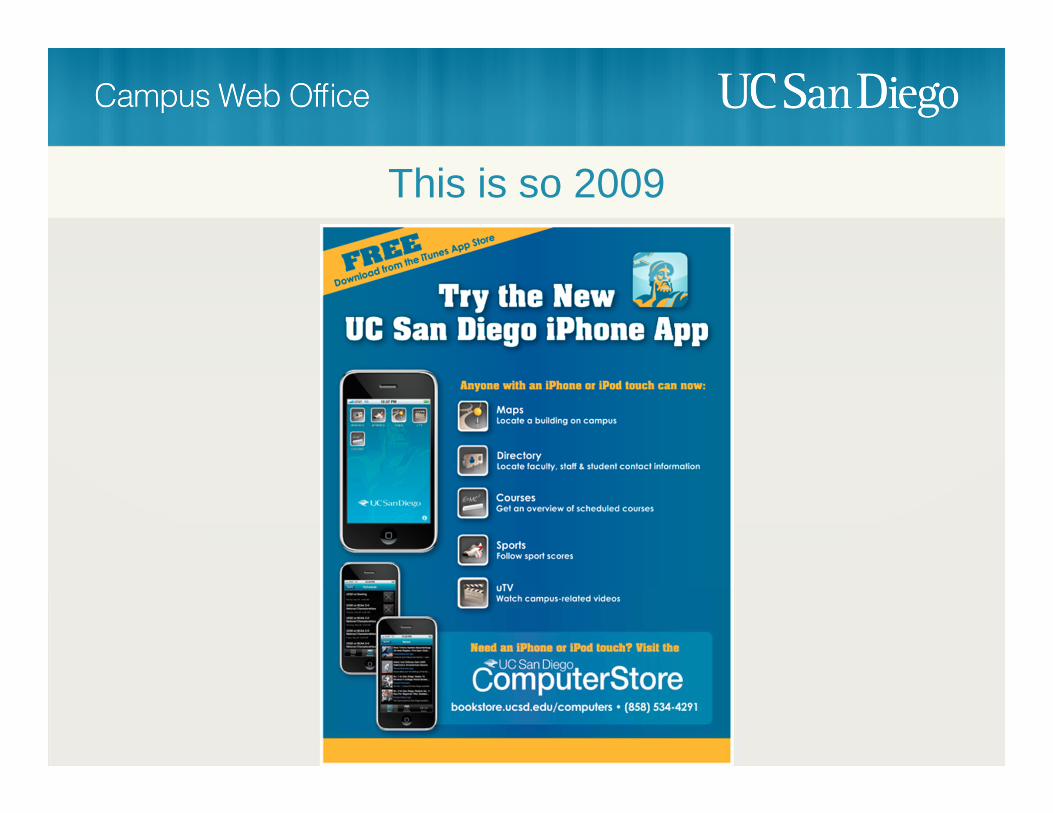
This is so 2009

iPhone Application Launch - 2009

This is so 2009


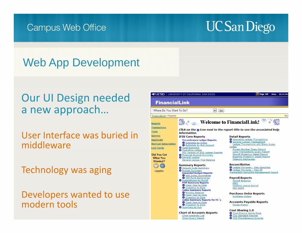
Our UI Design needed a new approach…
User Interface was buried in middleware
Technology was aging
Developers wanted to use modern tools
Web App Development

We hosted a competition!

UI Design Guidelines for Apps

An organizational shift occurred


Benefits of the Transition


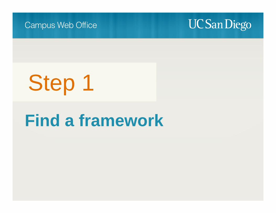
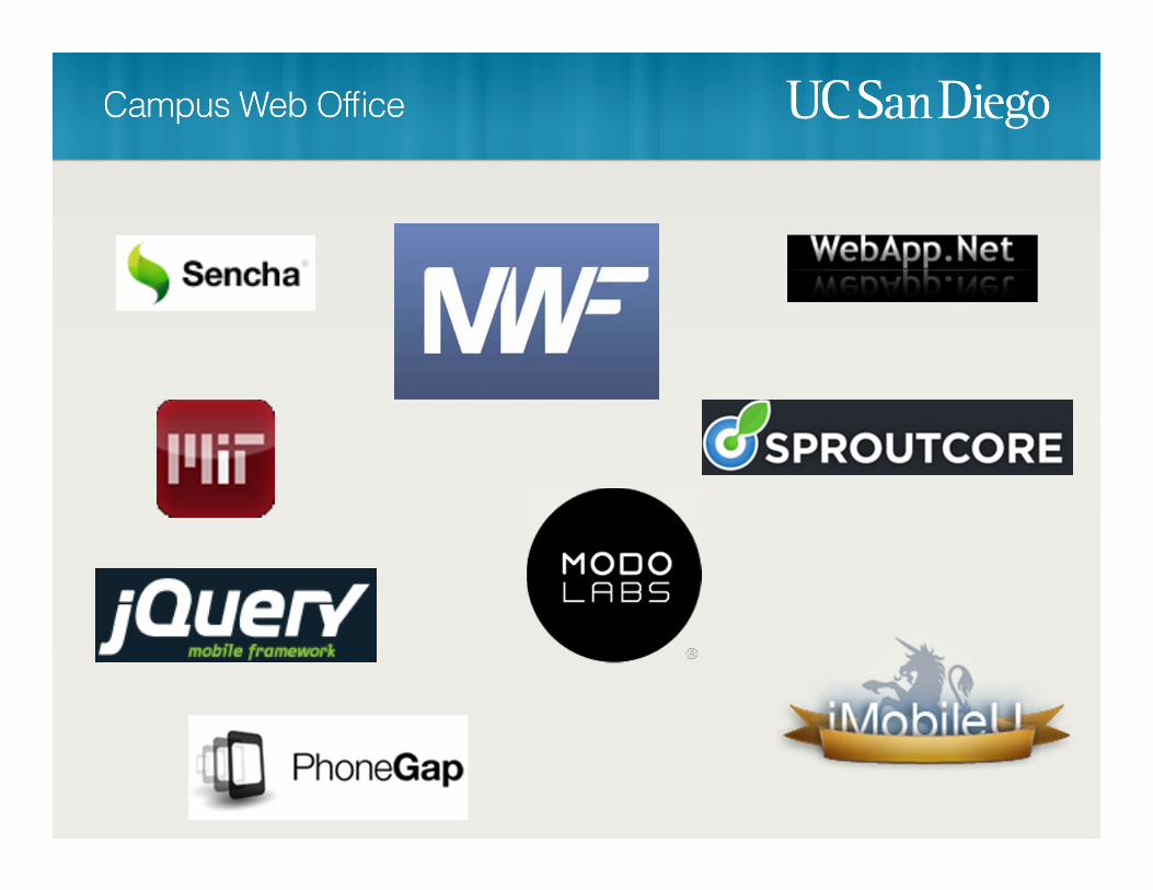
Find a framework
Step 1

Student AffairsIT
Academic AffairsIT
Housing & DiningIT
LibrariesIT
Admin Computing
Academic Computing
Student AffairsIT
Framework that required data feeds had downsides

Student AffairsIT
Academic AffairsIT
Housing & DiningIT
LibrariesIT
Admin Computing
Academic Computing
Student AffairsIT


We launched m.ucsd.edu

What about ouriPad App?
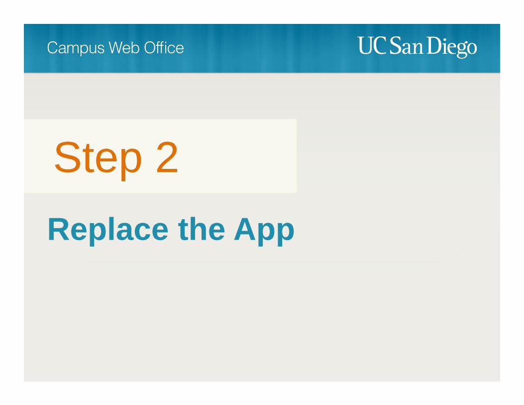
Replace the App
Step 2
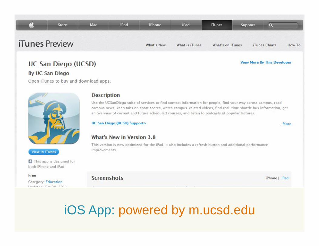
iOS App: powered by m.ucsd.edu
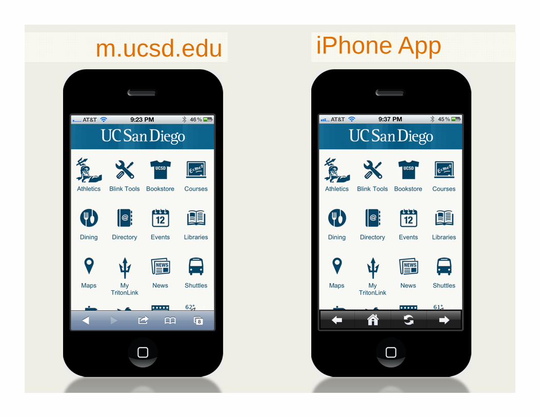
m.ucsd.edu iPhone App

iPad App

Android App: powered by m.ucsd.edu

uxt.ucsd.edu


What about all the CMS content?
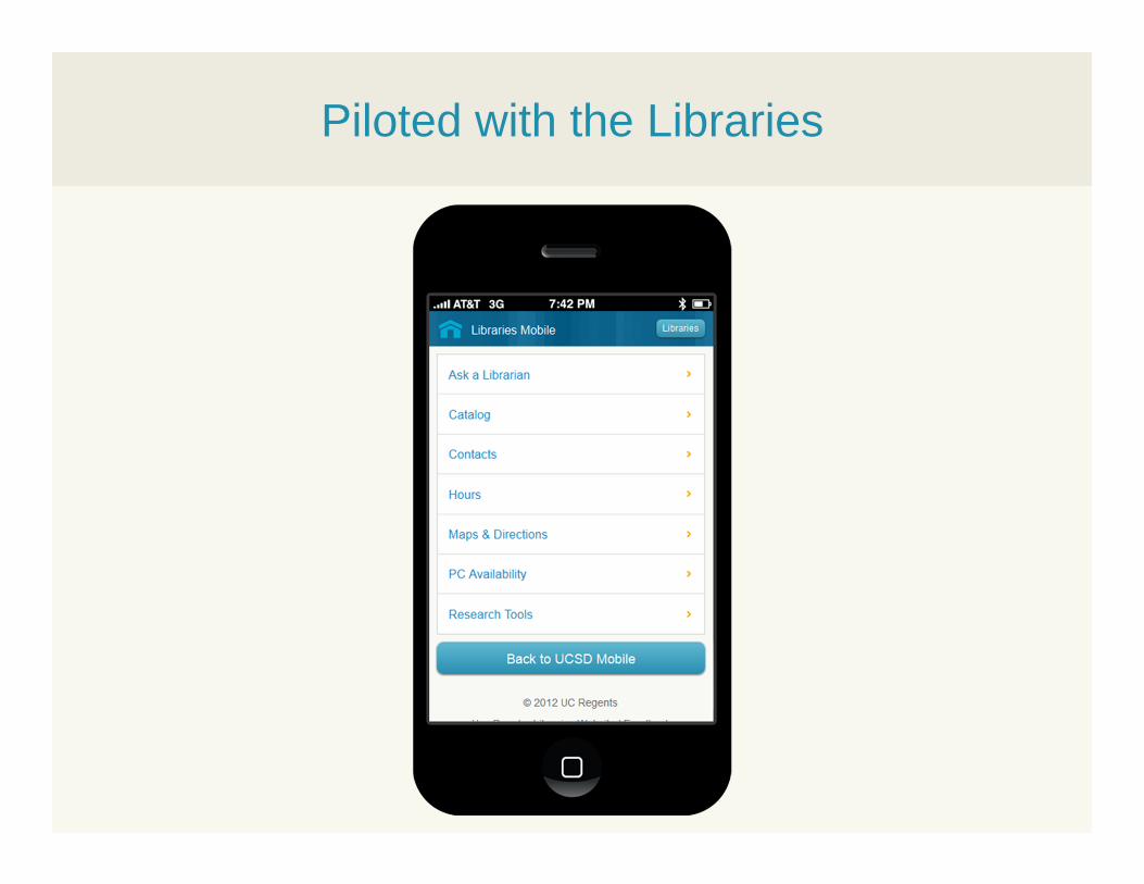
Piloted with the Libraries

Courtesy: Brad Frost
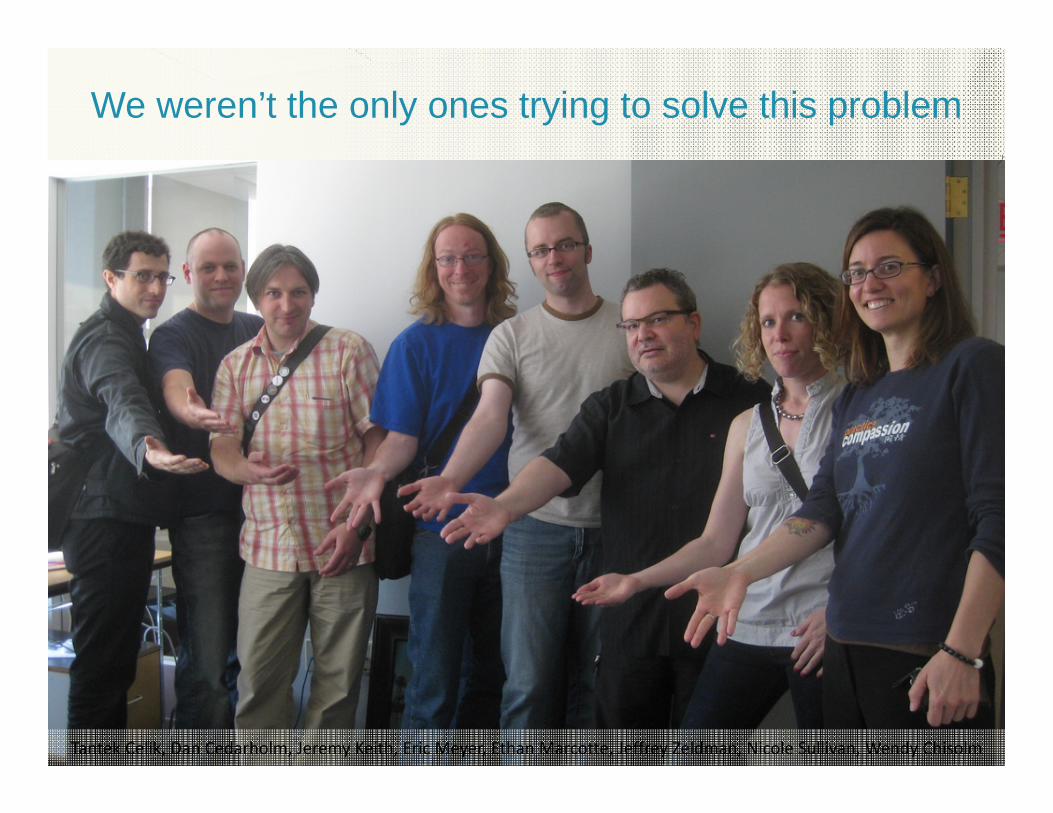
We weren’t the only ones trying to solve this problem
Tantek Celik, Dan Cedarholm, Jeremy Keith, Eric Meyer, Ethan Marcotte, Jeffrey Zeldman, Nicole Sullivan, Wendy Chisolm
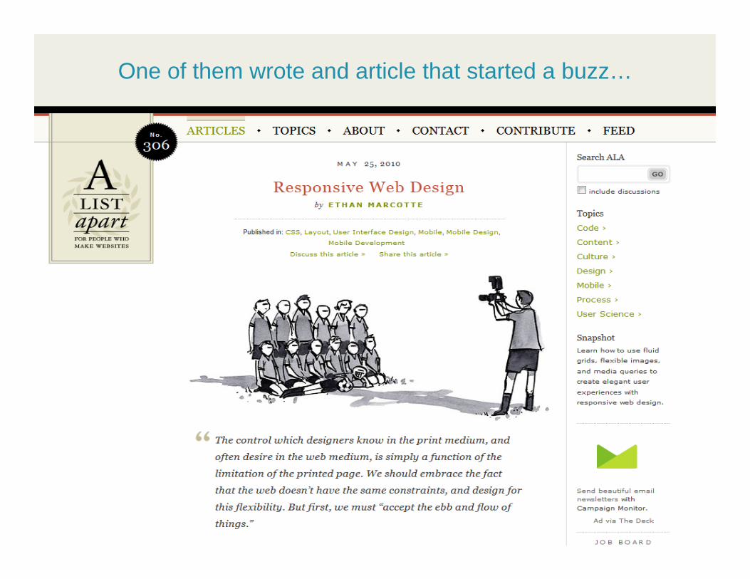
One of them wrote and article that started a buzz…
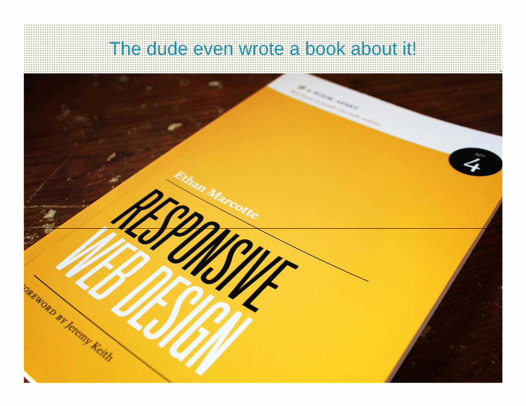
The dude even wrote a book about it!


.HTML(structure)
.CSS(layout)
The solution is based off existing web technologies
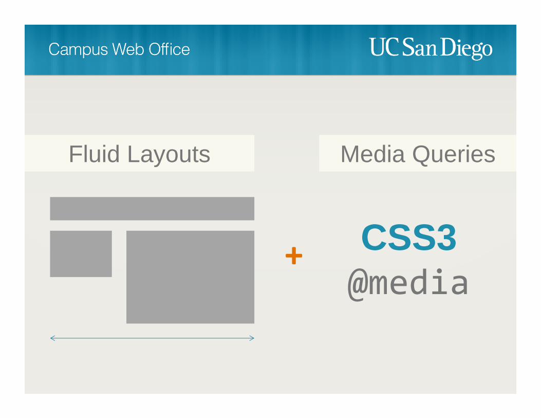
CSS3@media
+
Fluid Layouts Media Queries
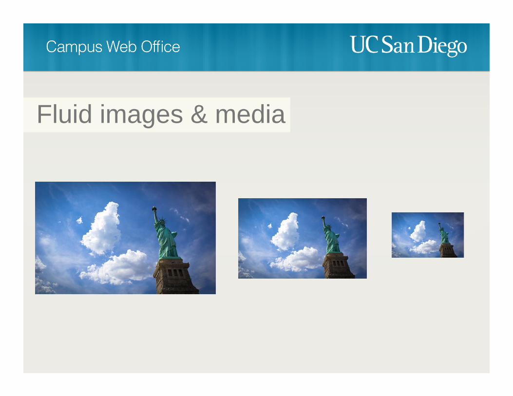
Fluid images & media
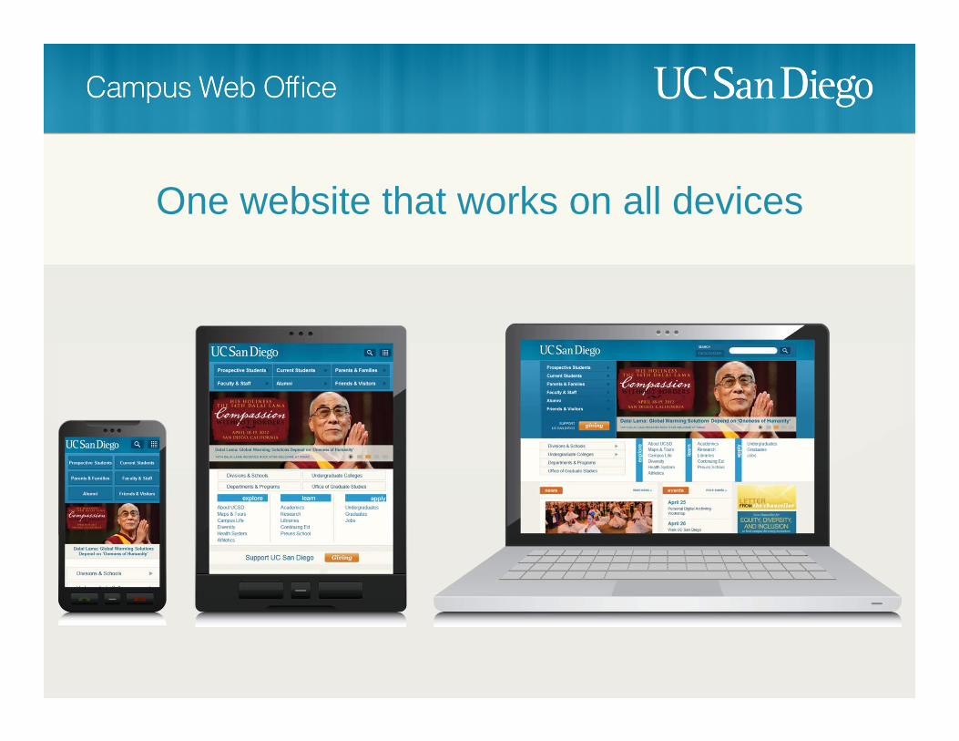
One website that works on all devices
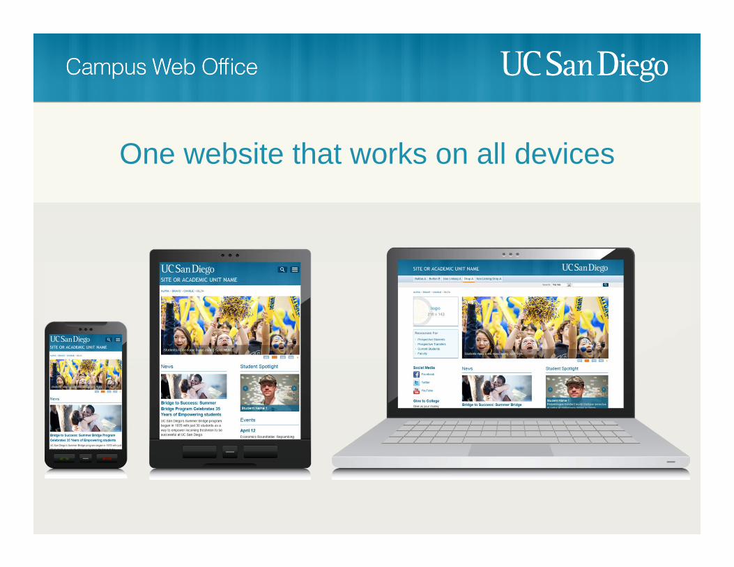
One website that works on all devices


What about the Mobile Web Framework?
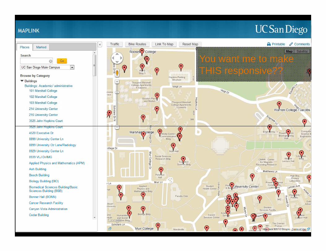
You want me to make THIS responsive??
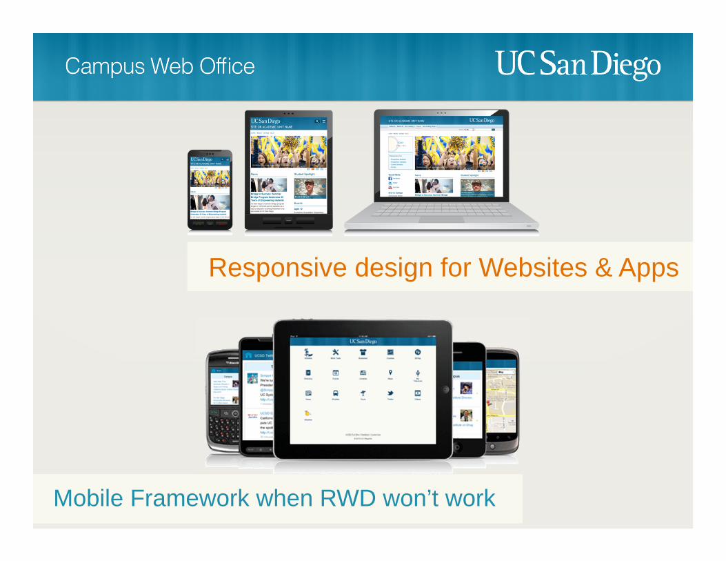
Responsive design for Websites & Apps
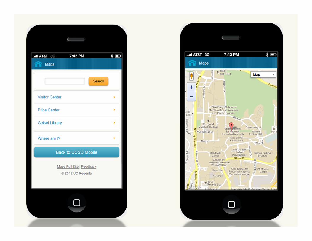
Mobile Framework when RWD won’t work

Works for apps too


Make sure your design looks good in all resolutions
Add breakpoints when the design starts to break down
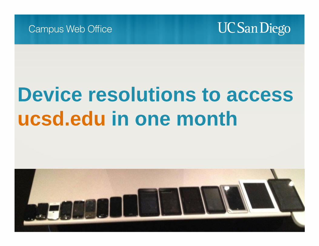
Device resolutions to access ucsd.edu in one month

fluid layouts using percentages
Responsive Design
fixed width layouts targeted for specific devices
Adaptive Design


Be ready to iterate
Adjust development cycles to be agile
Does it take more time?
Yes. It will increase the length of a project by 32.6345%
There is no more “fold”
Work with content owners to pair down content

Test on real devices
Ask different teams to pitch in and help test
Downsides
Images
Devices with smaller resolutions still need to download the full image

RESSResponsive Design + Server Side Components
Offload some of the work to the server…
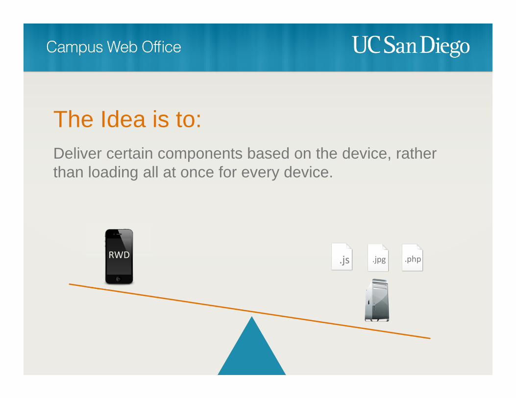
The Idea is to:Deliver certain components based on the device, rather than loading all at once for every device.
RWD .js .jpg .php


1. Use a Responsive Web Design framework as the primary way to deliver websites & web apps
2. Use a Mobile Framework to augment when responsive design won’t work
3. Deliver the frameworks through a central host and allow other IT units to leverage the capabilities
4. Finally…

Do it!
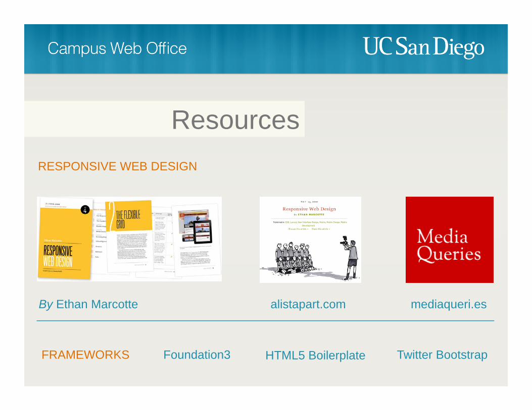
ResourcesRESPONSIVE WEB DESIGN
By Ethan Marcotte alistapart.com mediaqueri.es
FRAMEWORKS Foundation3 Twitter BootstrapHTML5 Boilerplate

cwo.ucsd.edu