Analysis of Existing Double Page Spreads

Welcome message from author
This document is posted to help you gain knowledge. Please leave a comment to let me know what you think about it! Share it to your friends and learn new things together.
Transcript

Analysis of Existing Double Page Spreads
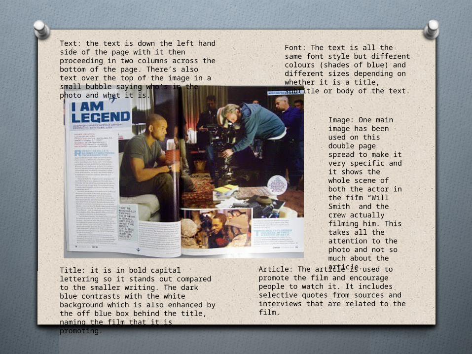
Image: One main image has been used on this double page spread to make it very specific and it shows the whole scene of both the actor in the film “Will Smith” and the crew actually filming him. This takes all the attention to the photo and not so much about the article.
Article: The article is used to promote the film and encourage people to watch it. It includes selective quotes from sources and interviews that are related to the film.
Title: it is in bold capital lettering so it stands out compared to the smaller writing. The dark blue contrasts with the white background which is also enhanced by the off blue box behind the title, naming the film that it is promoting.
Text: the text is down the left hand side of the page with it then proceeding in two columns across the bottom of the page. There’s also text over the top of the image in a small bubble saying who’s in the photo and what it is.
Font: The text is all the same font style but different colours (shades of blue) and different sizes depending on whether it is a title, subtitle or body of the text.
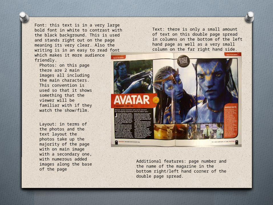
Font: this text is in a very large bold font in white to contrast with the black background. This is used and stands right out on the page meaning its very clear. Also the writing is in an easy to read font which makes it more audience friendly.
Text: there is only a small amount of text on this double page spread in columns on the bottom of the left hand page as well as a very small column on the far right hand side.
Additional features: page number and the name of the magazine in the bottom right/left hand corner of the double page spread.
Photos: on this page there are 2 main images all including the main characters. This convention is used so that it shows something that the viewer will be familiar with if they watch the show/film.
Layout: in terms of the photos and the text layout the photos take up the majority of the page with on main image with a secondary one, with numerous added images along the base of the page

This is a page completely dedicated to documentaries showing during the week in What’s on TV weekly magazine. They all have a photograph which is symbolic of the show and to represent what it will be about vaguely without having to read the corresponding text. These are usually close ups or a mid shot showing multiple people. Otherwise they will show some form of scenery but they almost always include a person. Underneath the photograph is a brief sentence to kind of symbolise the documentary without explaining it. Then the name of the documentary is shown so it can be recognised when seen later on in the guide, alongside its time of broadcast and its channel.This is all shown in more bold writing so that its easily read and picked up on when skimming the magazine. However when the description goes into more depth with the full brief of the programme a smaller and more simple font and colour is used, compared to the red titles.
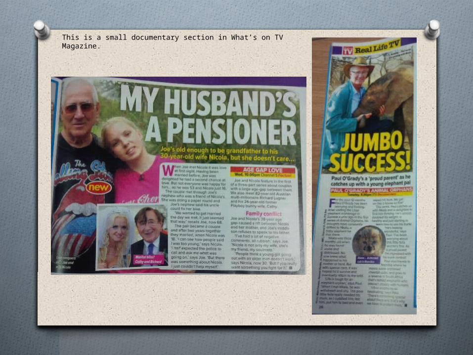
This is a small documentary section in What’s on TV Magazine.
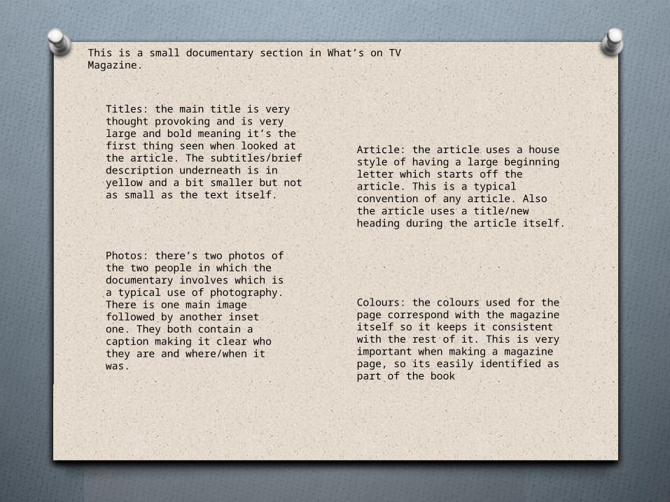
This is a small documentary section in What’s on TV Magazine.
Article: the article uses a house style of having a large beginning letter which starts off the article. This is a typical convention of any article. Also the article uses a title/new heading during the article itself.
Titles: the main title is very thought provoking and is very large and bold meaning it’s the first thing seen when looked at the article. The subtitles/brief description underneath is in yellow and a bit smaller but not as small as the text itself.
Photos: there’s two photos of the two people in which the documentary involves which is a typical use of photography. There is one main image followed by another inset one. They both contain a caption making it clear who they are and where/when it was.
Colours: the colours used for the page correspond with the magazine itself so it keeps it consistent with the rest of it. This is very important when making a magazine page, so its easily identified as part of the book
Related Documents