Double page spread ideas

Double page spread ideas
Aug 04, 2015
Welcome message from author
This document is posted to help you gain knowledge. Please leave a comment to let me know what you think about it! Share it to your friends and learn new things together.
Transcript
Double page spread ideas
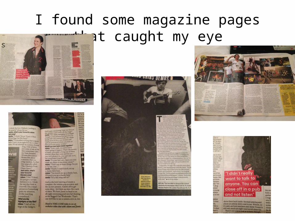
I found some magazine pages that caught my eye
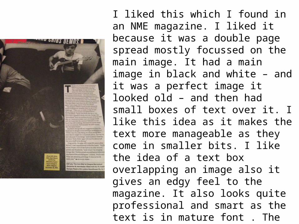
I liked this which I found in an NME magazine. I liked it because it was a double page spread mostly focussed on the main image. It had a main image in black and white – and it was a perfect image it looked old – and then had small boxes of text over it. I like this idea as it makes the text more manageable as they come in smaller bits. I like the idea of a text box overlapping an image also it gives an edgy feel to the magazine. It also looks quite professional and smart as the text is in mature font . The box isn’t completely bright white also - so it’s even more easy on the eye. It also uses mainly quotes too which I like as I find that will be appealing to audiences as they can feel closer to band members they may look up to.
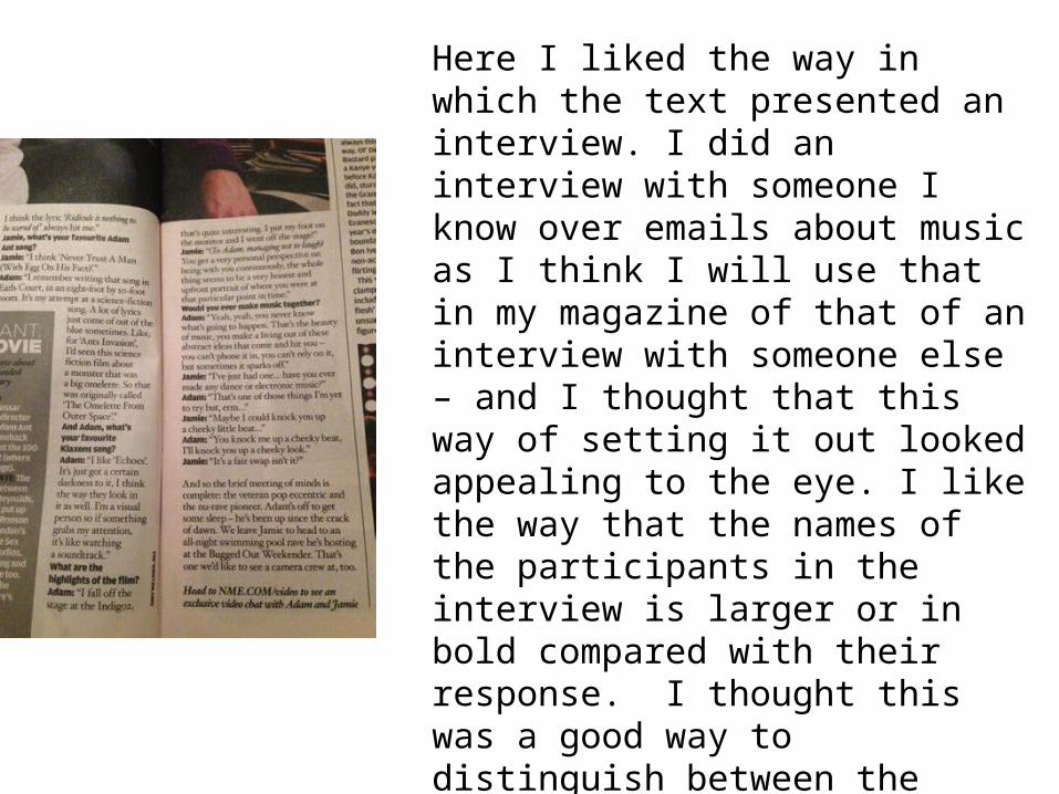
Here I liked the way in which the text presented an interview. I did an interview with someone I know over emails about music as I think I will use that in my magazine of that of an interview with someone else – and I thought that this way of setting it out looked appealing to the eye. I like the way that the names of the participants in the interview is larger or in bold compared with their response. I thought this was a good way to distinguish between the questions and the answers. It also makes the text stand out a little more as it is not just large blocks on the same font and size of text which makes it easier to read for people and maybe not seem so daunting.
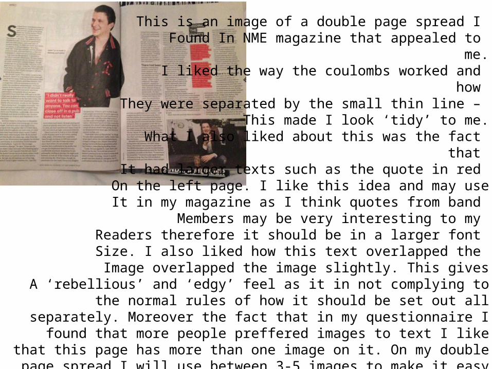
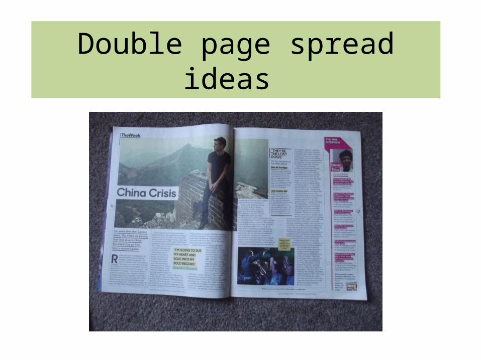
This is an image of a double page spread I Found In NME magazine that appealed to
me.I liked the way the coulombs worked and
how They were separated by the small thin line –
This made I look ‘tidy’ to me.What I also liked about this was the fact
that It had larger texts such as the quote in red
On the left page. I like this idea and may useIt in my magazine as I think quotes from band
Members may be very interesting to my Readers therefore it should be in a larger font Size. I also liked how this text overlapped the
Image overlapped the image slightly. This givesA ‘rebellious’ and ‘edgy’ feel as it in not complying to the normal rules of how it should be set out all separately. Moreover the fact that in my questionnaire I found that more people preffered images to text I like that this page has more than one image on it. On
my double page spread I will use between 3-5 images to make it easy on the eye and appealing to my target audience.
Related Documents