“Don't make me think” Steve Krug Alma Trejo & Vero Traynor | 2016 www.puntolab.co | #tertuliaspuntolab |

Welcome message from author
This document is posted to help you gain knowledge. Please leave a comment to let me know what you think about it! Share it to your friends and learn new things together.
Transcript

“Don't make me think” Steve Krug
Alma Trejo & Vero Traynor | 2016
www.puntolab.co | #tertuliaspuntolab |

THE BOOK
1. DON'T MAKE ME THINK2. HOW WE REALLY USE THE WEB3. BILLBOARD DESIGN 1014. WHY USERS LIKE MINDLESS CHOICES5. OMIT NEEDLESS WORDS6. DESIGNING NAVIGATION7. DESIGNING THE HOMEPAGE8. THE FARMER AND THE COWMAN SHOULD BE FRIENDS9. USABILITY TESTING ON 10 CENTS A DAY
10. USABILITY AS COMMON COURTESY 11. WEB ACCESSIBILITY
1. DON’T MAKE ME THINK
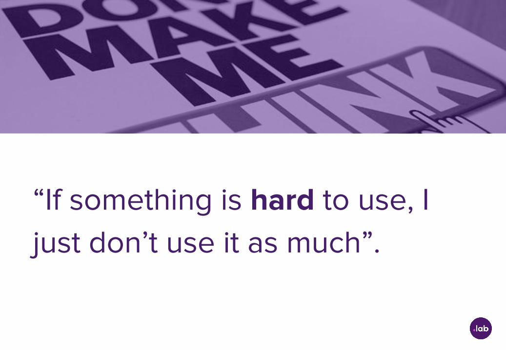
“If something is hard to use, I just don’t use it as much”.

“If you can’t make a page self-evident, you at least need to make it self-explanatory”.
2. HOW WE REALLY USE THE WEB

“We’re usually in a hurry. We know we don’t need to read everything. We’re really only interested in a fraction of what’s on the page. We know that it works”.

3. BILLBOARD DESIGN 101
“Create a clear visual hierarchy on each page. The more important something is, the more prominent it is”.

“Things that are related logically are also related visually. For instance, you can show that things are similar by grouping them together under a heading, displaying them in a similar visual style, or putting them all in a clearly defined area”.

“Things are nested visually to show what’s part of what. For instance, a section heading would appear above the title of a particular book, visually encompassing the whole content area of the page, because the book is part of the section”.

“Conventions are your friends. As a rule, conventions only become conventions if they work. When you know you have a better idea (and everyone you show it to says “Wow!”), but take advantage of conventions when you don’t.

“Dividing the page into clearly defined areas is important because it allows users to decide quickly which areas of the page to focus on and which areas they can safely ignore”.
“Make it obvious what’s clickable. It’s important to make it obvious what’s clickable and what’s not”.
“When you’re designing Web pages, it’s probably a good idea to assume that everything is visual noise until proven otherwise”.

4. WHY USERS LIKE MINDLESS CHOICES
“Three mindless and unambiguous clicks = One click that requires thought”
5. OMIT NEEDLESS WORDS
“Your objective should always be to eliminate instructions entirely by making everything self-explanatory”
● It reduces the noise level of the page.● It makes the useful content more prominent.● It makes the pages shorter, allowing users to see
more of each page at a glance without scrolling.

6. DESIGNING NAVIGATION
Three consequences of lacking navigation design
● No sense of scale● No sense of direction● No sense of location
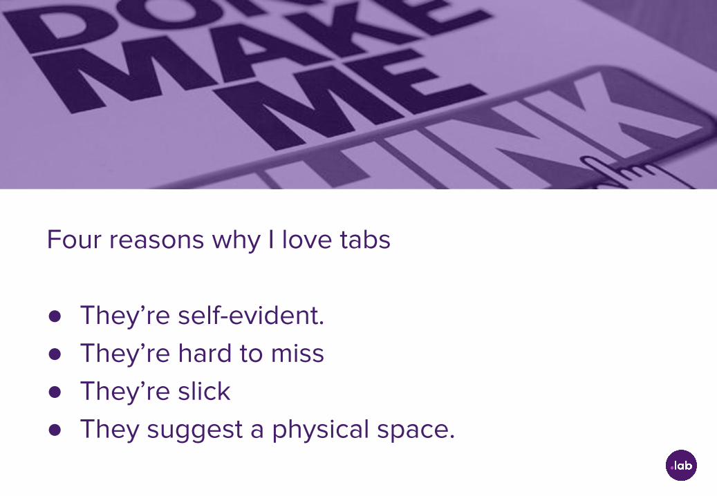
Four reasons why I love tabs
● They’re self-evident.● They’re hard to miss● They’re slick● They suggest a physical space.
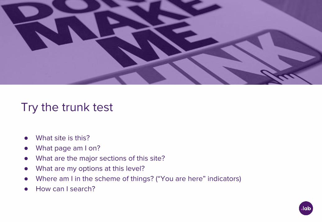
Try the trunk test
● What site is this?● What page am I on? ● What are the major sections of this site? ● What are my options at this level?● Where am I in the scheme of things? (“You are here” indicators)● How can I search?
7. DESIGNING THE HOMEPAGE

The trouble with pulldowns
● You have to click on the pulldown to see the list● They’re hard to scan● They’re twitchy
8. THE FARMER AND THE COWMAN SHOULD BE
FRIENDS

“Where debates about what people like waste time and drain the team’s energy, testing tends to defuse arguments and break impasses by moving the discussion away from the realm of what’s right and into the realm of what works or doesn’t work”.
9. USABILITY TESTING ON 10 CENTS A DAY
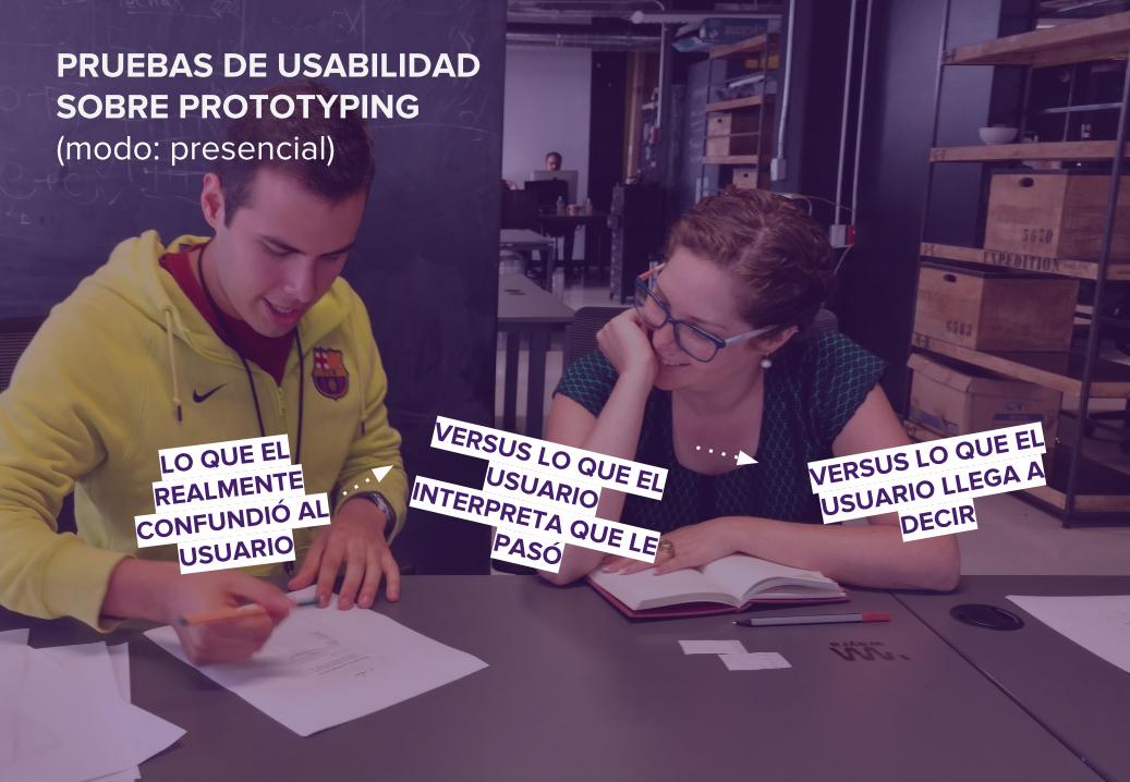
LO QUE EL
REALMENTE
CONFUNDIÓ AL
USUARIO
VERSUS LO QUE EL USUARIO INTERPRETA QUE LE PASÓ
VERSUS LO QUE EL
USUARIO LLEGA A
DECIR
PRUEBAS DE USABILIDAD SOBRE PROTOTYPING(modo: presencial)
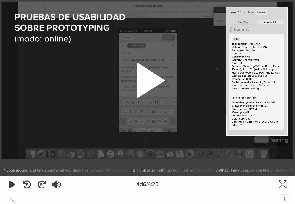
PRUEBAS DE USABILIDAD SOBRE PROTOTYPING(modo: online)
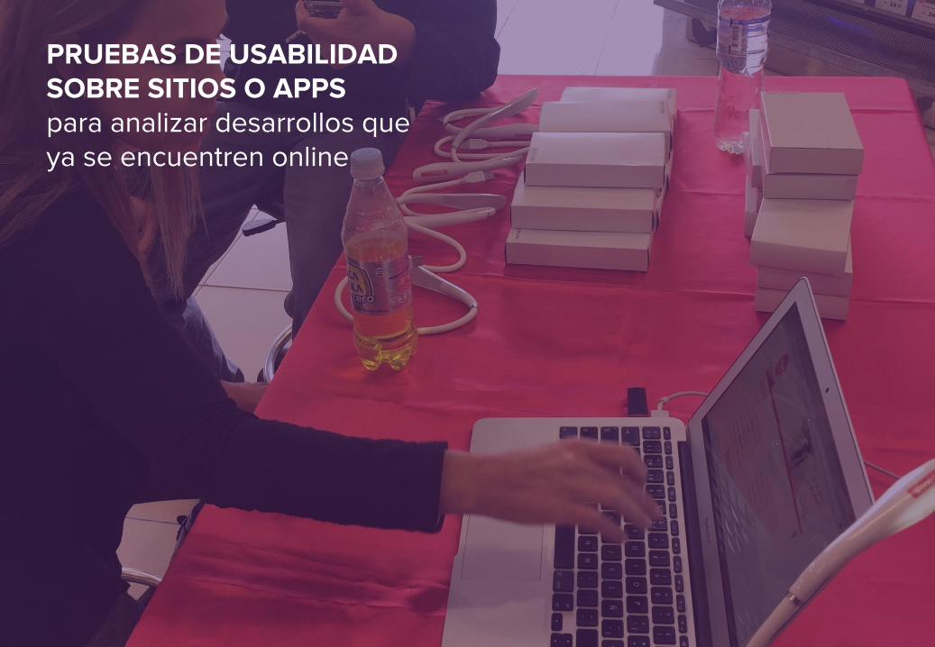
PRUEBAS DE USABILIDAD SOBRE SITIOS O APPSpara analizar desarrollos que ya se encuentren online

10. USABILITY AS COMMON COURTESY
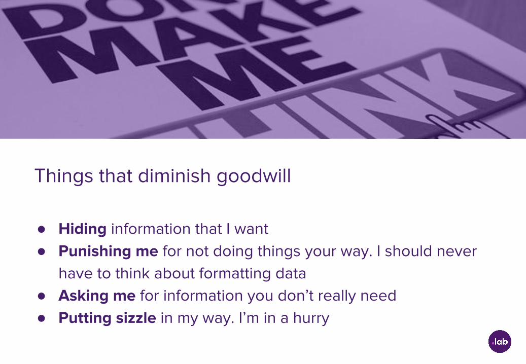
Things that diminish goodwill
● Hiding information that I want● Punishing me for not doing things your way. I should never
have to think about formatting data● Asking me for information you don’t really need● Putting sizzle in my way. I’m in a hurry
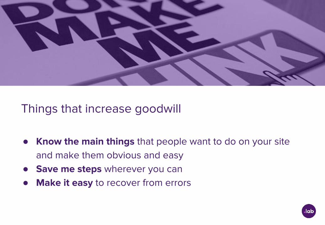
Things that increase goodwill
● Know the main things that people want to do on your site and make them obvious and easy
● Save me steps wherever you can● Make it easy to recover from errors

11. WEB ACCESSIBILITY
“Don't make me think” Steve Krug
Alma Trejo & Vero Traynor | 2016
www.puntolab.co | #tertuliaspuntolab |
Related Documents