Dominating the Web Typography Eduardo Shiota Yasuda — @shiota Conferência CSS Brasil

Dominating the Web Typography
Jul 18, 2015
Welcome message from author
This document is posted to help you gain knowledge. Please leave a comment to let me know what you think about it! Share it to your friends and learn new things together.
Transcript

Dominating the
Web Typography
Eduardo Shiota Yasuda — @shiota Conferência CSS Brasil

Hello! twitter.com/shiota github.com/eshiota slideshare.net/eshiota [email protected]


I Typography

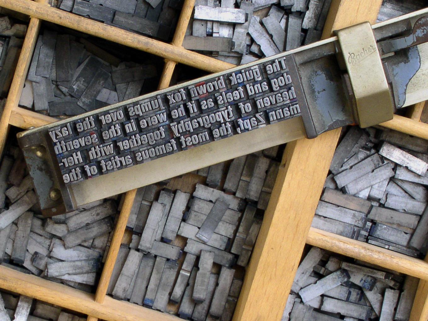
Typography is everywhere.


We gotta remember the roots of what we do.

15.000 BC – 12.500 BCAltamira & Lascaux
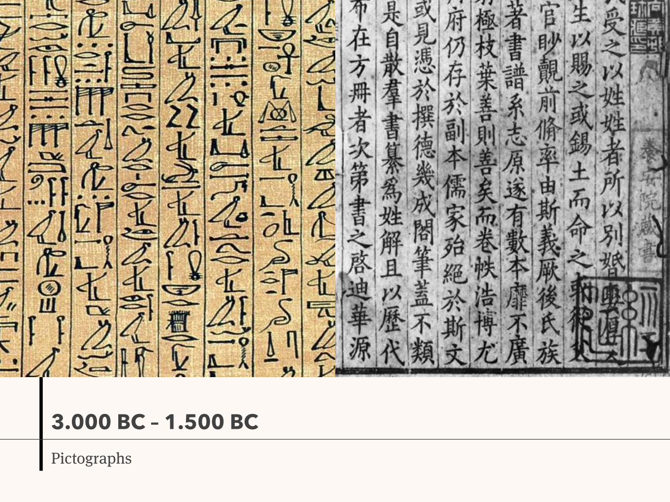
3.000 BC – 1.500 BCPictographs

1.500 BCPhoenician alphabet

750 BCGreek alphabet

146 BCRoman alphabet, “Capitalis quadrata”

0Better materials, “Capitalis rustica”

4th – 5th centuriesUncials and semi-uncials

8th centuryCarolingian minuscules

12th centuryApex of goth art and Middle Ages

15th – 16th centuriesRenaissance, Gutenberg press, “Cursiva humanista”, type foundries

19th centuryIndustrial Revolution, linotype, Art Nouveau, display types

20th centuryModern Design, Avant-garde, Bauhaus, sans-serif types, digital typography

21th centuryWeb typography and CSS

The basics

Basics
Classification

Most of the classification systems agree with these type categories:

Serif types
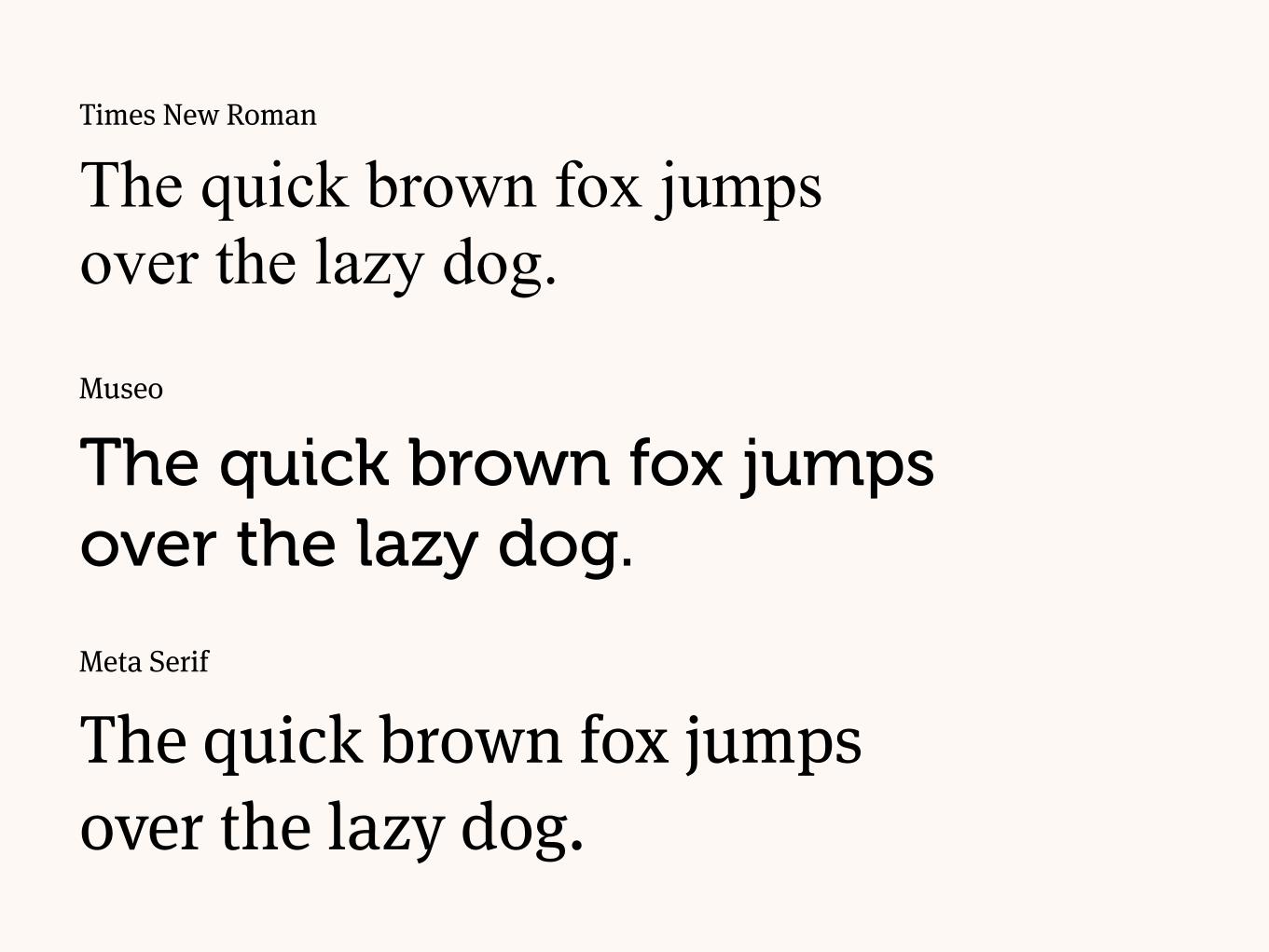
Museo
The quick brown fox jumps over the lazy dog.
Meta Serif
The quick brown fox jumps over the lazy dog.
Times New Roman
The quick brown fox jumps over the lazy dog.
Sans serif types

Futura
The quick brown fox jumps over the lazy dog.Museo Sans
The quick brown fox jumps over the lazy dog.
Helvetica
The quick brown fox jumps over the lazy dog.

Gothic types

Fette Fraktur
The quick brown fox jumps over the lazy dog.
Goudy Text
The quick brown fox jumps over the lazy dog.
Wilhelm Klingspor Gotisch
The quick brown fox jumps over the lazy dog.

Cursive types

Lucida Calligraphy
The quick brown fox jumps over the lazy dog.Mistral
The quick brown fox jumps over the lazy dog.
Apple Chancery
The quick brown fox jumps over the lazy dog.

Display types
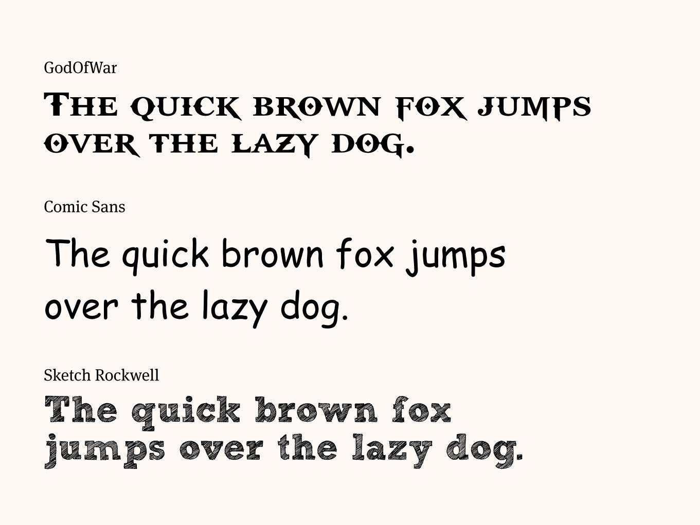
Comic Sans
The quick brown fox jumps over the lazy dog.Sketch Rockwell
The quick brown fox jumps over the lazy dog.
GodOfWar
The quick brown fox jumps over the lazy dog.

Dingbats

Bodoni Ornaments
The quick brown fox jumps
over the lazy dog.
Travel Icons
The quick brown fox jumps over the lazy dog.
Wingdings
The quick brown fox jumps over the lazy dog.

On the CSS, you may choose generic families as fallbacks.

.my-serif-text { font-family: "Meta Serif", Times, serif; }
.my-sans-serif-text { font-family: "Proxima Nova", Arial, sans-serif; }
.my-monospace-text { font-family: Monaco, "Courier New", monospace; }
.my-cursive-text { font-family: "Zapf Chancery", "Brush Script", cursive; }
.my-fantasy-text { font-family: "Sketch Rockwell", Papyrus, fantasy; }

Basics
Anatomy of a type

baseline
font size
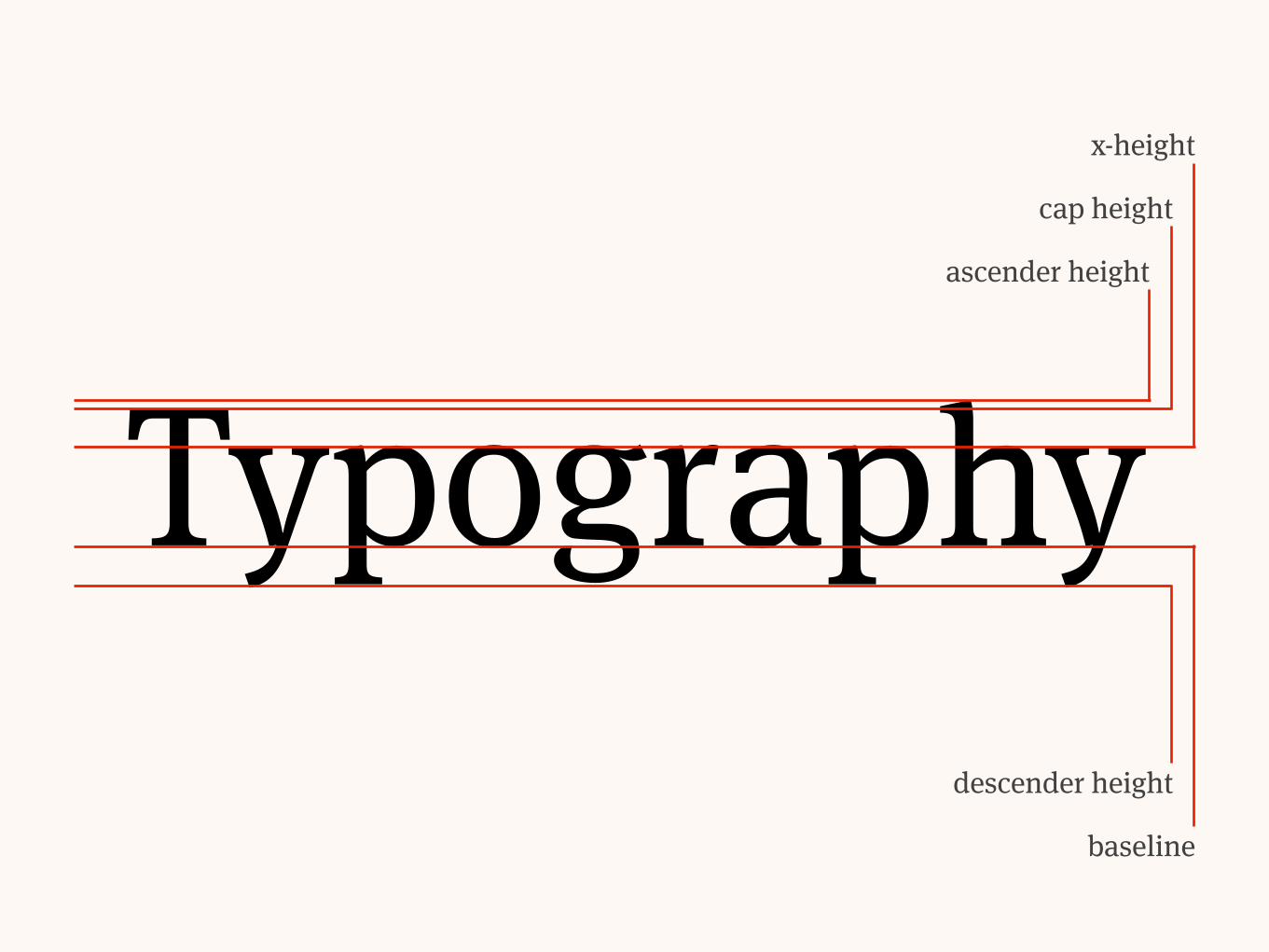
Typographybaseline
descender height
x-height
cap height
ascender height

Typography

T
y
p
o
g
r
a
p
h
y

Basics
Units

Physical units

To deal with physical units, you can’t rely on a screen.

pt picas millimetres inches
12 1 4.22 1/6

A4 (29.7cm × 21.0cm)

Pixel (px)
To deal with screens, you must understand what are physical and reference pixels.

A physical pixel is a physical point on the display.

A reference pixel depends on the device, software and user settings.


A 16px font on a smartphone screen won’t have as many millimetres as on a desktop screen.


Change, test, use media queries, test again.
em unit (em)
“em” is a relative unit used since the movable types.

It represents a type’s full body size.

1 em

16px 1 em
margin-right: 1em;
16px

It’s always relative to its context’s font size.

.wrapper { font-size: 16px; }
.parent { font-size: 1.5em; }
.child { font-size: .5em; }

Root em unit (rem)

“rem” is like “em” but always relative to the root (html).

html { font-size: 16px; }
.wrapper { font-size: 12px; }
.parent { font-size: 1.5rem; }
.child { font-size: 0.5rem; }
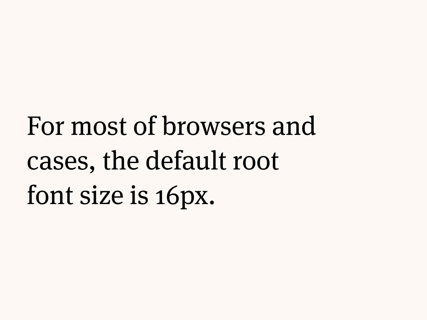
For most of browsers and cases, the default root font size is 16px.

html { font-size: 16px; }
.wrapper { font-size: 12px; }
.parent { font-size: 1.5rem; }
.child { font-size: 0.5rem; }

html { font-size: 100%; }
.wrapper { font-size: 12px; }
.parent { font-size: 1.5rem; }
.child { font-size: 0.5rem; }

Rhythm

The way you space your characters and text dictates how a person will read it.

Rhythm
Line height

Line height is the distance between each line of types.

The quick fox jumps over the dog
0 pixels
Meta Serif 102px/102px
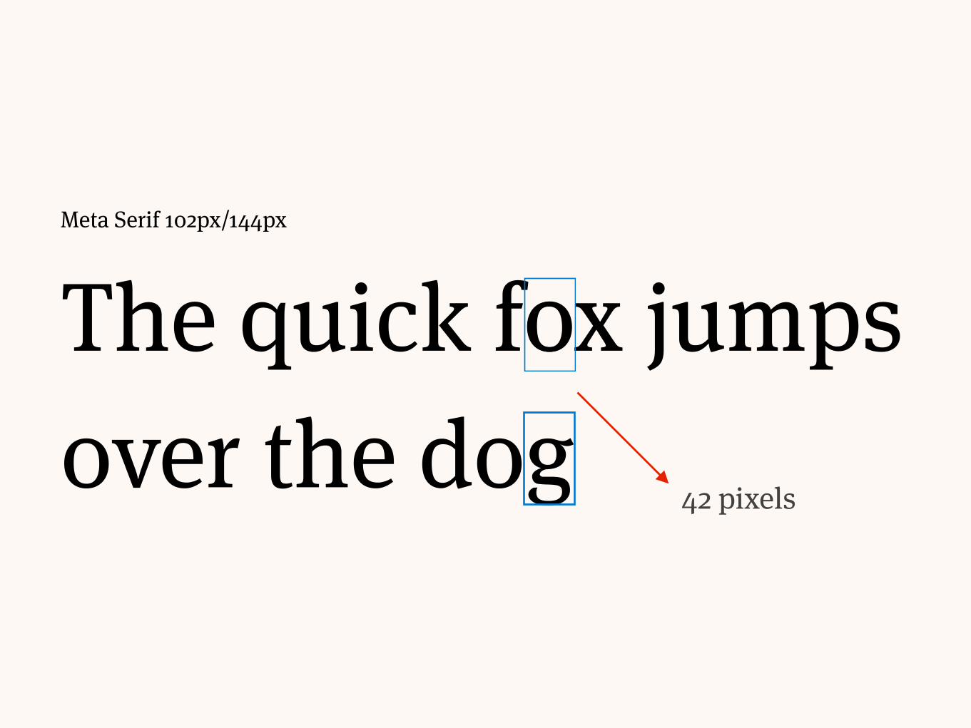
The quick fox jumps over the dog
Meta Serif 102px/144px
42 pixels

A low line height makes the text too difficult to read.

Helvetica 32px/32px
“The Guide says that the best drink in existence is the Pan Galactic Gargle Blaster. It says that the effect of a Pan Galactic Gargle Blaster is like having your brains smashed out by a slice of lemon wrapped round a large gold brick.”

A large line height makes the paragraph loose cohesion.

Helvetica 32px/96px
“The Guide says that the best drink in existence is the Pan
Galactic Gargle Blaster. It says that the effect of a Pan Galactic
Gargle Blaster is like having your brains smashed out by a slice
of lemon wrapped round a large gold brick.”
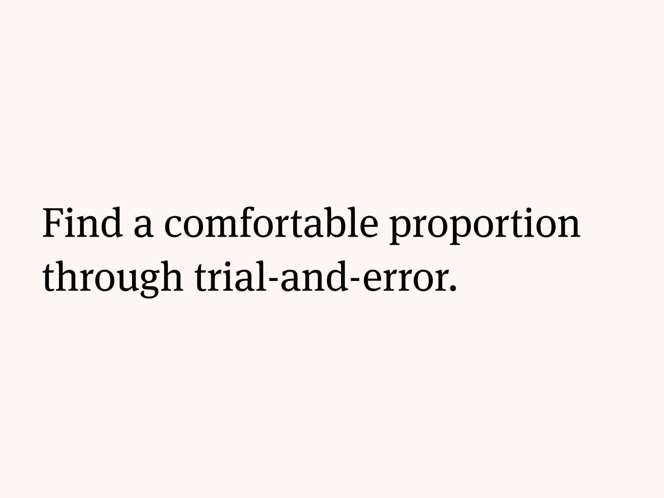
Find a comfortable proportion through trial-and-error.

Helvetica 32px/48px
“The Guide says that the best drink in existence is the Pan Galactic Gargle Blaster. It says that the effect of a Pan Galactic Gargle Blaster is like having your brains smashed out by a slice of lemon wrapped round a large gold brick.”
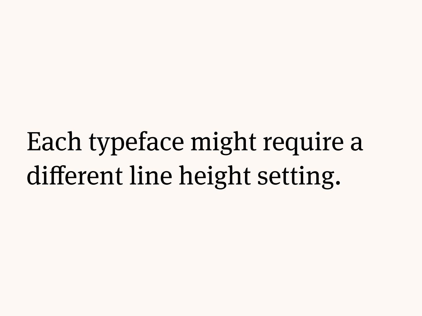
Each typeface might require a different line height setting.

Bembo 32px/48px
“The Guide says that the best drink in existence is the Pan Galactic
Gargle Blaster. It says that the effect of a Pan Galactic Gargle Blaster is
like having your brains smashed out by a slice of lemon wrapped
round a large gold brick.”
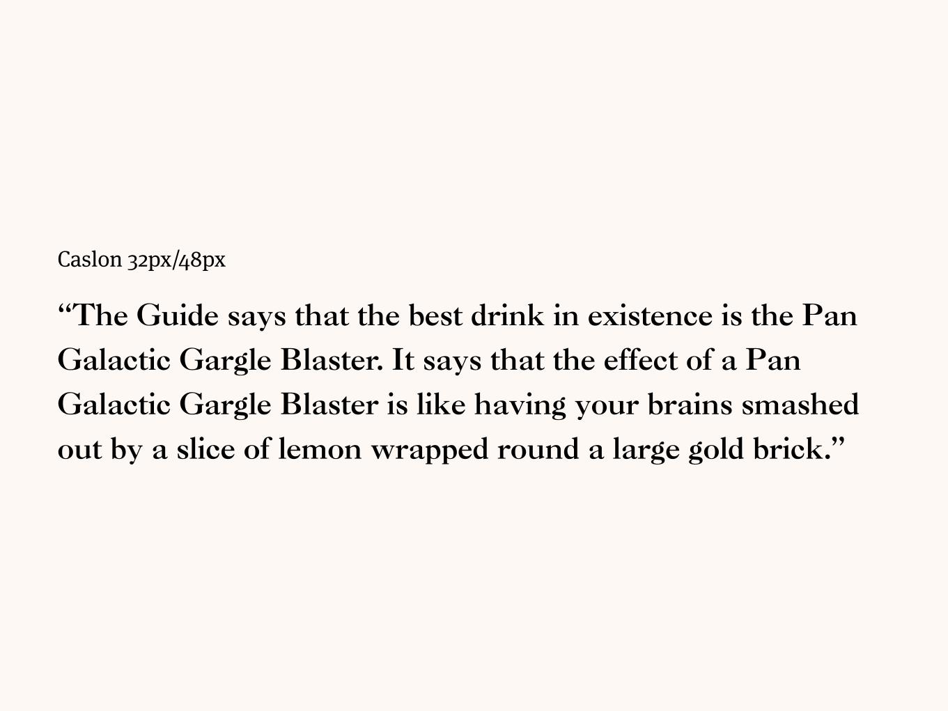
Caslon 32px/48px
“The Guide says that the best drink in existence is the Pan
Galactic Gargle Blaster. It says that the effect of a Pan
Galactic Gargle Blaster is like having your brains smashed
out by a slice of lemon wrapped round a large gold brick.”

Rhythm
Baseline

Use a consistent vertical proportion by following a baseline.
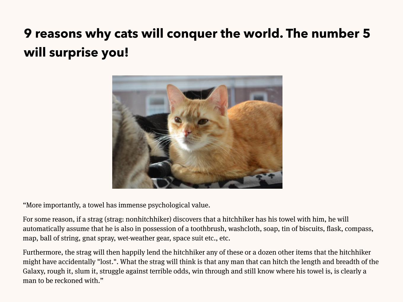
9 reasons why cats will conquer the world. The number 5 will surprise you!
“More importantly, a towel has immense psychological value.
For some reason, if a strag (strag: nonhitchhiker) discovers that a hitchhiker has his towel with him, he will automatically assume that he is also in possession of a toothbrush, washcloth, soap, tin of biscuits, flask, compass, map, ball of string, gnat spray, wet-weather gear, space suit etc., etc.
Furthermore, the strag will then happily lend the hitchhiker any of these or a dozen other items that the hitchhiker might have accidentally "lost.". What the strag will think is that any man that can hitch the length and breadth of the Galaxy, rough it, slum it, struggle against terrible odds, win through and still know where his towel is, is clearly a man to be reckoned with.”

Choose a line height for a baseline, and make all vertical values derive from it.

/* baseline = 24px */
body { font-size: 16px; line-height: 24px; /* baseline */ }
.article-title { font-size: 32px; line-height: 48px; /* 2 × baseline */ }
.article-excerpt { font-size: 18px; line-height: 24px; /* baseline */ }
img { max-height: 312px; /* 13 × baseline */ }
p { margin-bottom: 12px; /* 0.5 × baseline */ }

If you pre-process your CSS, you ensure a consistent typography using variables.

// _variables.scss
$base-font-size: 16px; $baseline: 24px;
// On your project:
body { font-size: $base-font-size; line-height: ($baseline/$base-font-size); // 1.5 }
.article-title { font-size: 2*$base-font-size; line-height: 2*$baseline; }
.article-excerpt { font-size: 18px; line-height: $baseline; }
img { max-height: 13*$baseline; }
p { margin-bottom: 0.5*$baseline; }

Be aware that each browser has its own baseline.

Rhythm
Letter spacing/tracking

Letter spacing is the whitespace between each single type.

Typography

Typographyletter-spacing: 10px;
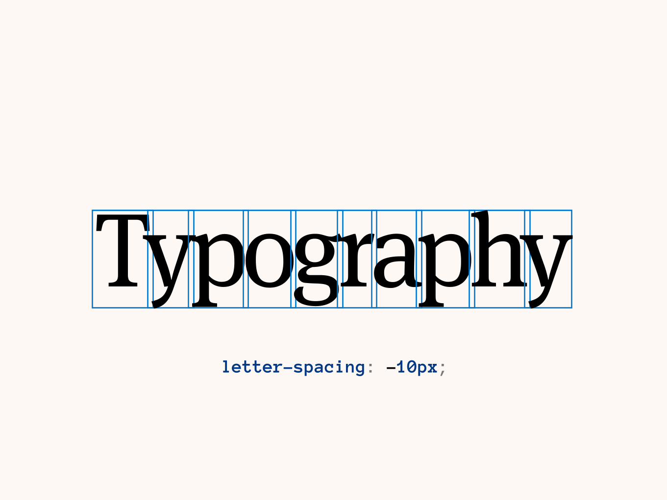
Typographyletter-spacing: -10px;

The use of letter-spacing is recommended for titles only.

Epic Movie Title

Epic Movie Title

Rhythm
Kerning

Kerning is a fine-tuning between specific pairs of characters.

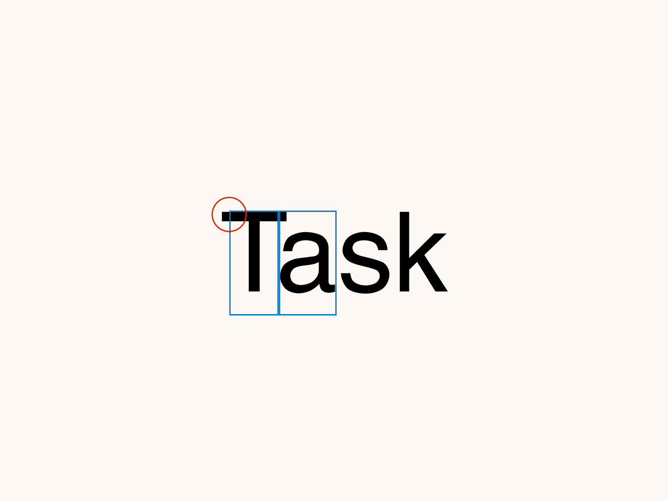
Task

The browser default is automatically enabling/disabling it.


.kerning { font-kerning: normal; }
32+ 34+ 7+ 10+

Rhythm
Text indentation

You can manipulate the text’s indentation, which applies to its first line.

More importantly, a towel has immense psychological value.
For some reason, if a strag (strag: nonhitchhiker) discovers that a hitchhiker has his towel with him, he will automatically assume that he is also in possession of a toothbrush, washcloth, soap, tin of biscuits, flask, compass, map, ball of string, gnat spray, wet-weather gear, space suit etc., etc.
Furthermore, the strag will then happily lend the hitchhiker any of these or a dozen other items that the hitchhiker might have accidentally "lost.". What the strag will think is that any man that can hitch the length and breadth of the Galaxy, rough it, slum it, struggle against terrible odds, win through and still know where his towel is, is clearly a man to be reckoned with.
.post p { text-indent: 2em; }
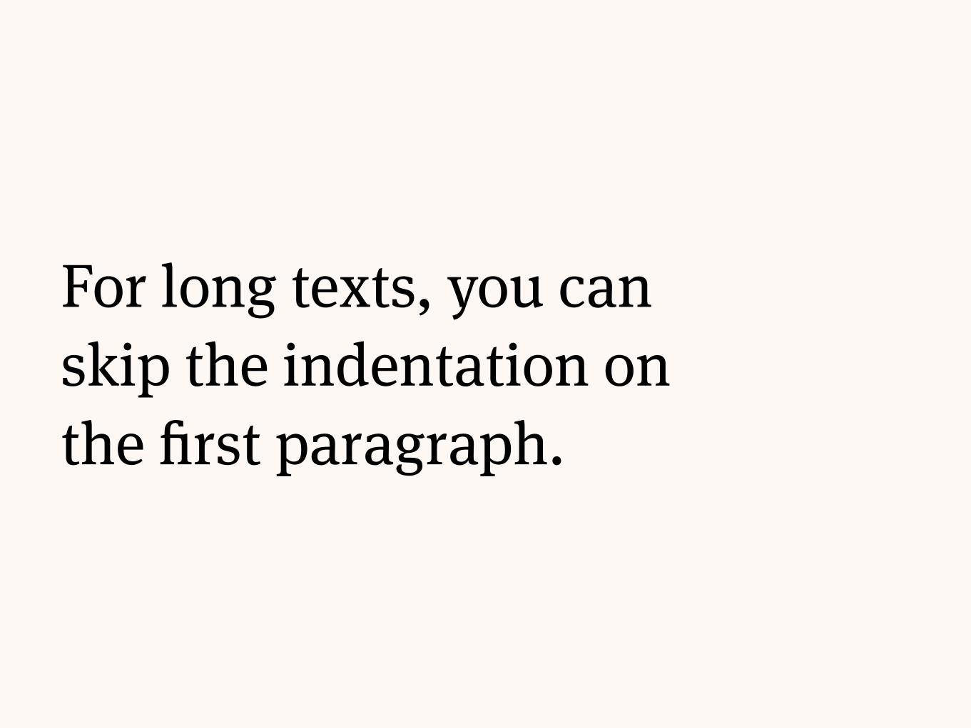
For long texts, you can skip the indentation on the first paragraph.

More importantly, a towel has immense psychological value.
For some reason, if a strag (strag: nonhitchhiker) discovers that a hitchhiker has his towel with him, he will automatically assume that he is also in possession of a toothbrush, washcloth, soap, tin of biscuits, flask, compass, map, ball of string, gnat spray, wet-weather gear, space suit etc., etc.
Furthermore, the strag will then happily lend the hitchhiker any of these or a dozen other items that the hitchhiker might have accidentally "lost.". What the strag will think is that any man that can hitch the length and breadth of the Galaxy, rough it, slum it, struggle against terrible odds, win through and still know where his towel is, is clearly a man to be reckoned with.
.post p { text-indent: 2em; }
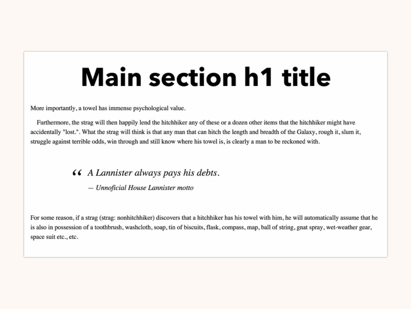
.post p:first-of-type { text-indent: 0; }

More importantly, a towel has immense psychological value.
For some reason, if a strag (strag: nonhitchhiker) discovers that a hitchhiker has his towel with him, he will automatically assume that he is also in possession of a toothbrush, washcloth, soap, tin of biscuits, flask, compass, map, ball of string, gnat spray, wet-weather gear, space suit etc., etc.
Furthermore, the strag will then happily lend the hitchhiker any of these or a dozen other items that the hitchhiker might have accidentally "lost.". What the strag will think is that any man that can hitch the length and breadth of the Galaxy, rough it, slum it, struggle against terrible odds, win through and still know where his towel is, is clearly a man to be reckoned with.
.post p + p { text-indent: 2em; }

Text styling

You can use CSS rules to properly style your content, like a well-authored book.

Styling
Titles & subtitles

Keep a clear hierarchy by using different font sizes, type faces and variants.


Styling
Quotes

A quote block can be highlighted with margins and pseudo-elements.

blockquote { margin: 2em 6em; font-size: 24px; line-height: 1.5; font-style: italic; position: relative; }
blockquote:before { content: "“"; position: absolute; left: -.75em; top: 0; font-size: 2.66em; line-height: 1; }
blockquote .author { font-size: .75em; line-height: 1.77; }

Styling
Elevated caps
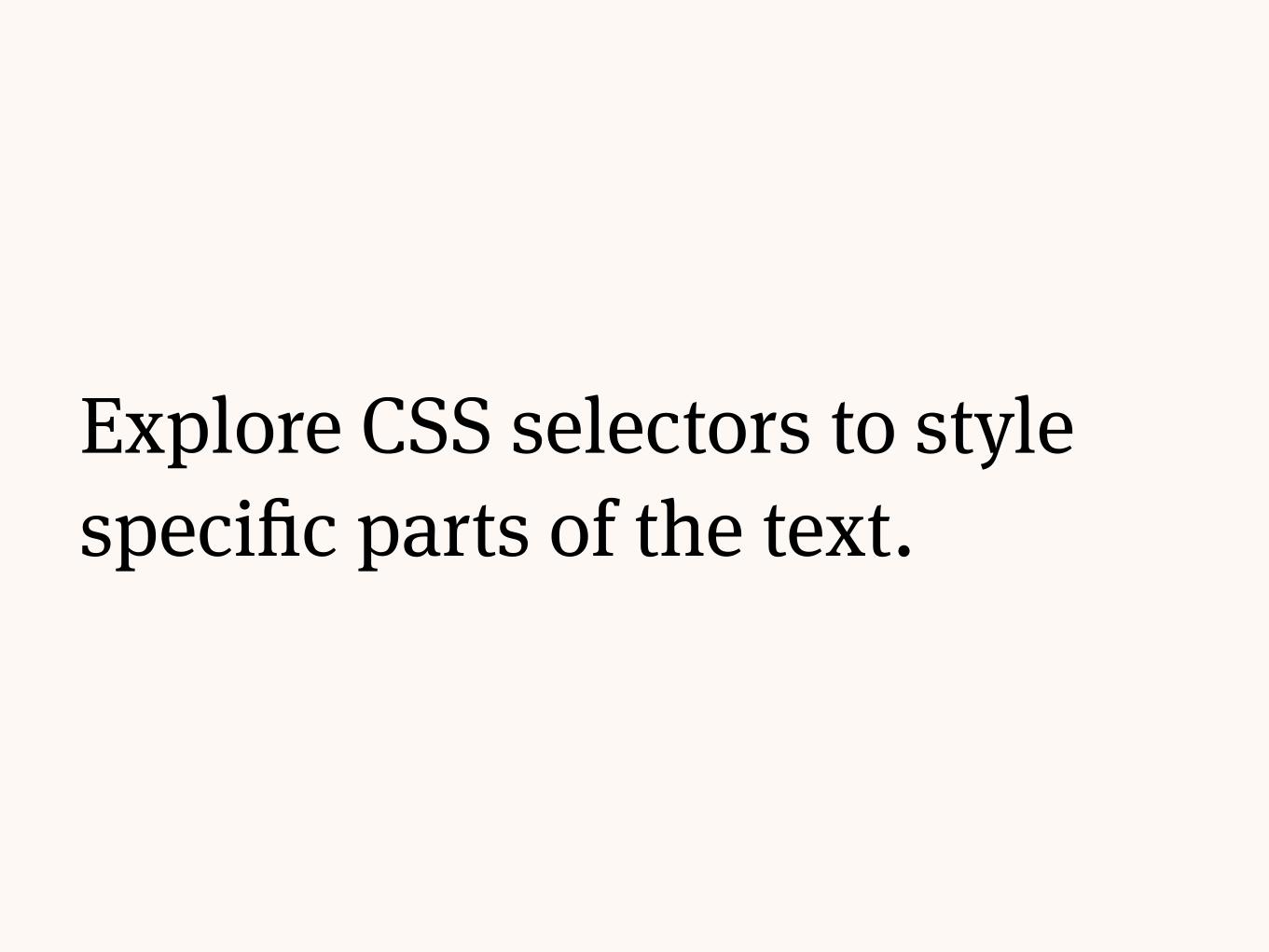
Explore CSS selectors to style specific parts of the text.

.post p:first-of-type:first-letter { font-size: 4.5em; }

Styling
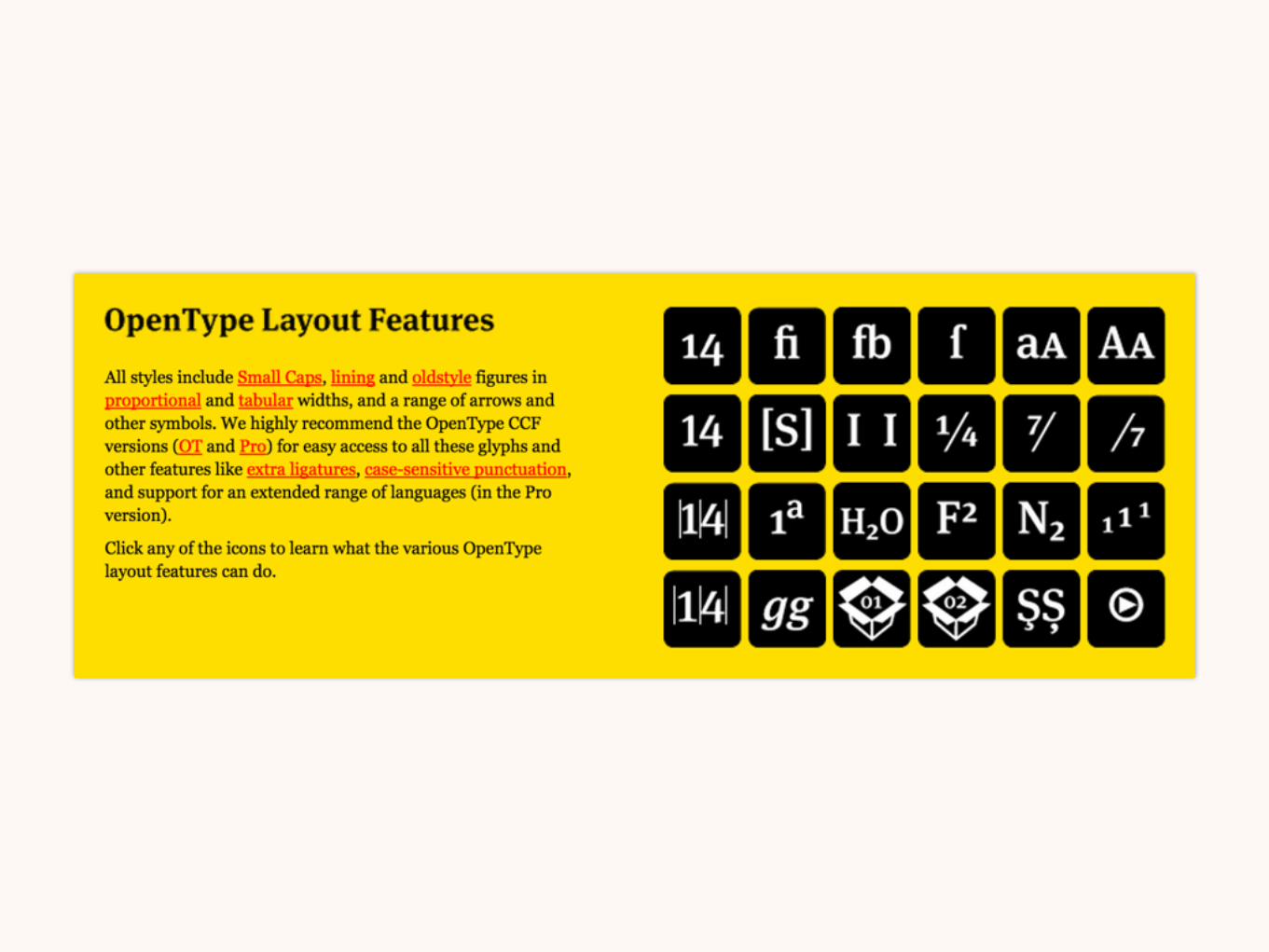
OpenType

OpenType fonts provide features to control and tweak the styles of your text.


.my-class { font-variant-caps: small-caps; -moz-font-feature-settings: "smcp"; -ms-font-feature-settings: "smcp"; -webkit-font-feature-settings: "smcp"; font-feature-settings: "smcp"; }
33+ 4+ 10+

Composition

Composition
Grids and column sizes

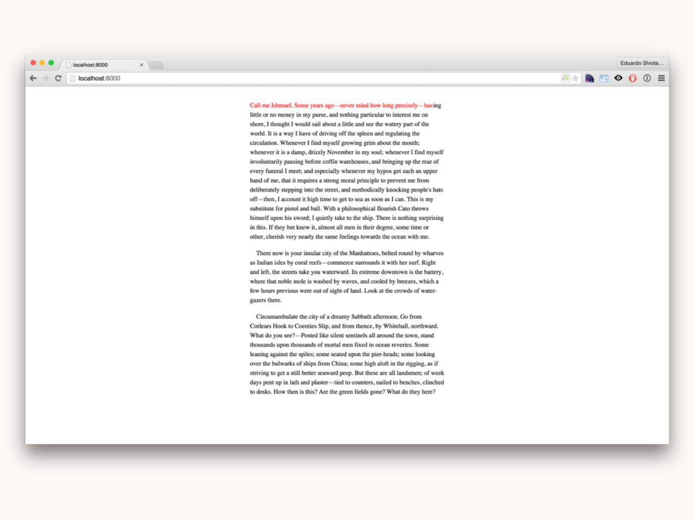
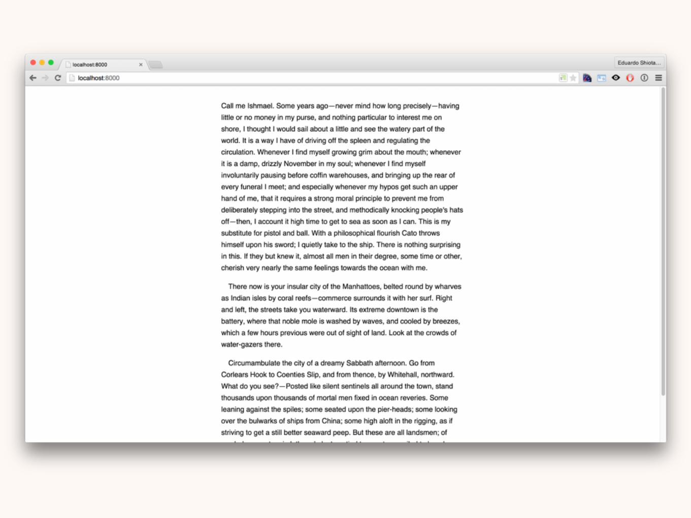
The text should have an ideal line length.


A line should have between 60 and 70 characters.

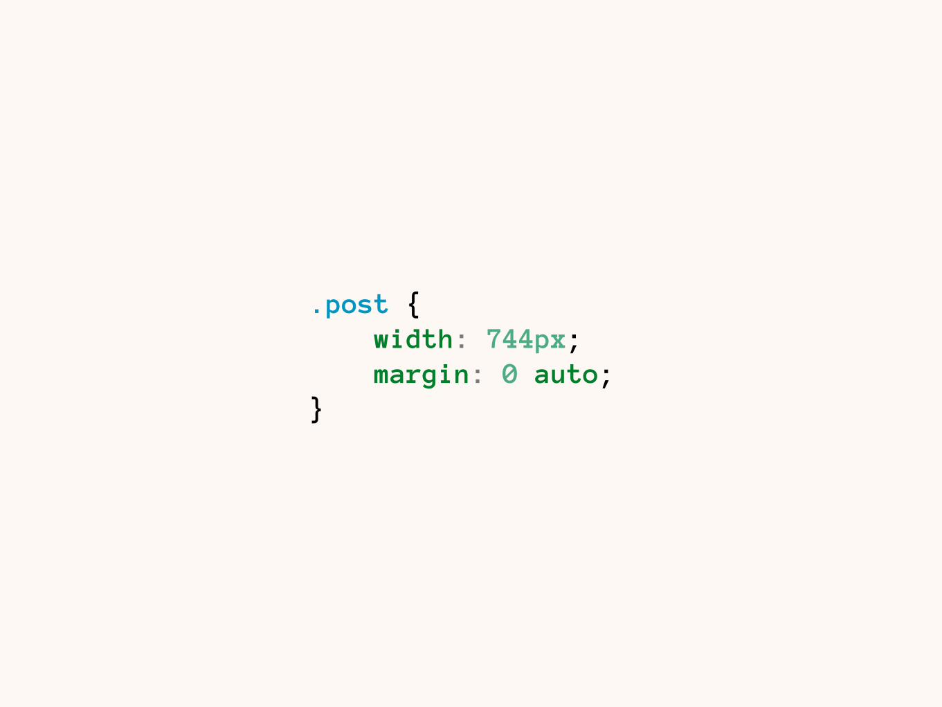
.post { width: 744px; margin: 0 auto; }


The column size should respond to font size changes.


The use of em-based column width might solve the problem.

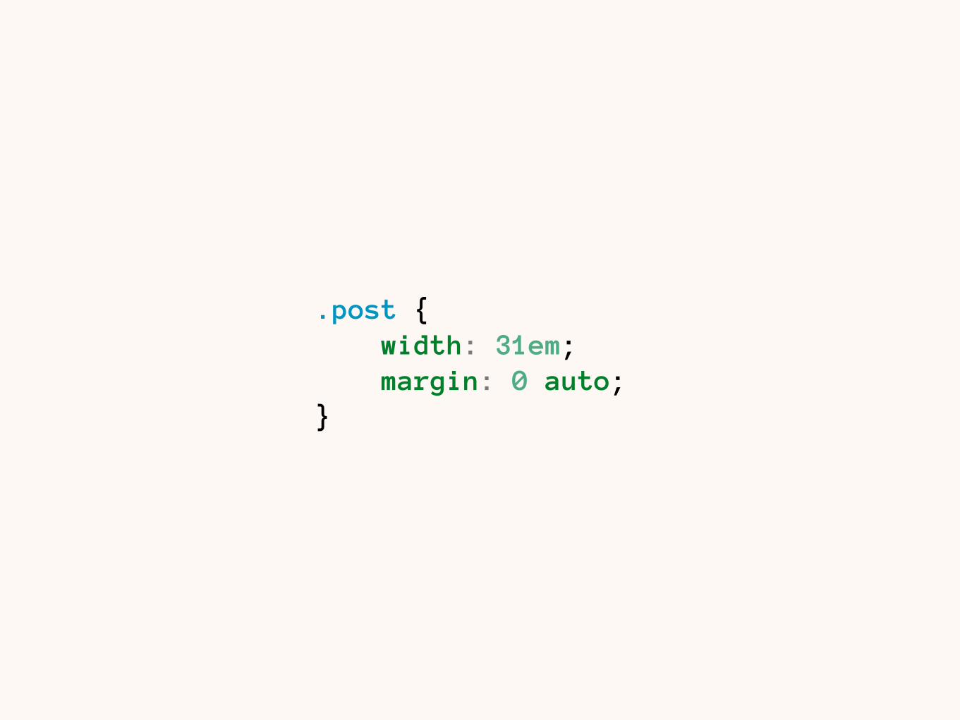
.post { width: 31em; margin: 0 auto; }

Rendering

Rendering
Anti-aliasing and hinting

Font shapes are vectors that are rasterised to be displayed on pixels.

Hinting is a manual work of tweaking sub-pixels to maintain a font’s identity and legibility on screen.
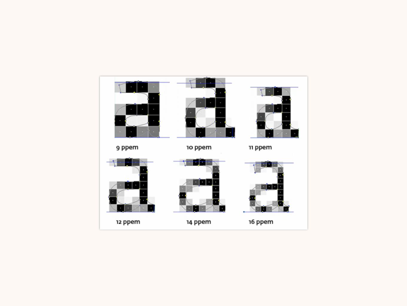


Anti-aliasing is an algorithm used to smooth edges.

Each OS and browsers have a different anti-aliasing and hinting setting.

OS + Browser Hinting and AA
Win XP — IE6–8 GDI Grayscale
Win XP — IE6–8 ClearType GCI ClearType
IE9+ DirectWrite
Win XP Chrome GDI ClearType
Win XP Firefox GDI ClearType
Win 7+ Chrome 37+ DirectWrite
Win 7+ Firefox Depends?
OS X CoreText, ignores hinting
* Based on a lot of Google searches, might not be accurate

Test. On. Every. Browser.

Choosing

Choosing
Sources

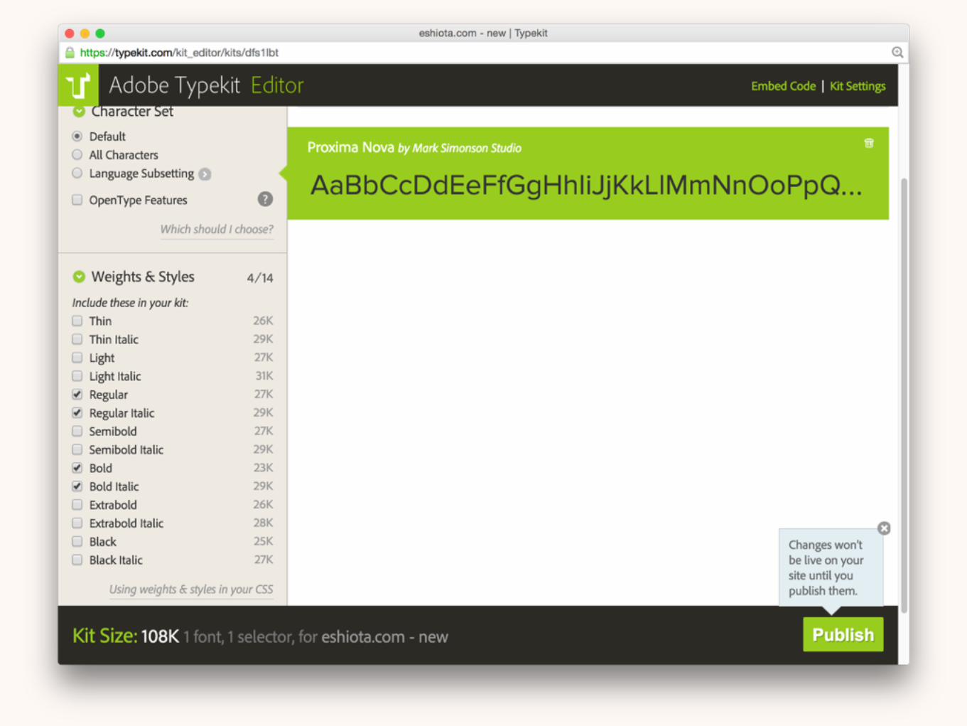
Choose a reliable source for your font.


The font must have a proper unicode table, kerning, hinting etc.

Also check for language support, webfont license, OpenType features.


Fonts are expensive for a reason.

Choosing
Personalities

Each typeface has a story and a personality, choose one that match yours.

The quick brown fox jumps over the lazy dog.Bembo — based in engravings from 1495, renaissance style, readable in small font sizes.

The quick brown fox jumps over the lazy dog.Helvetica — Symbol of the Modern Design, is readable, international and neutral.

The quick brown fox jumps over the lazy dog.
Museo — The modern, geometric shapes and the rounded, slab serifs give a strong personality to this type.

Serifs have a refined look, need less line height values, and help maintaining a cohesive text.


Sans serifs have a modern look, and increased legibility on screens.

Start simple, with a readable body typeface.
Then format titles and subtitles using different weights and styles.

Choose a second typeface for titles if needed. Avoid going further than that.


Choosing
Performance

Each font size is extra data that must be downloaded.


Measure the impact of each added typeface.

You’ll have to choose between speed and non-FOUC.

Avoid loading custom typefaces on mobile devices.

I Typography

We’ve only scratched the surface.

We are the craftspeople of the web.


We should keep our roots in place.


Further reading: The Elements of Typographic Style Robert Bringhurst EN: http://www.amazon.com/Elements-Typographic-Style-Robert-Bringhurst/dp/0881791326 PT-BR: http://editora.cosacnaify.com.br/ObraSinopse/11584/Elementos-do-estilo-tipogr%C3%A1fico---vers%C3%A3o-30.aspx
Thinking with Type Ellen Lupton EN: http://www.amazon.com/Thinking-Type-2nd-revised-expanded/dp/1568989695 PT-BR: http://editora.cosacnaify.com.br/ObraSinopse/1875/Pensar-com-tipos---2%C2%BA-edi%C3%A7%C3%A3o-%28Previs%C3%A3o-de-envio-a-partir-de-200415%29.aspx
Type on Screen Ellen Lupton EN: http://www.amazon.com/Type-Screen-Critical-Designers-Developers/dp/161689170X
On Web Typography Jason Santa Maria EN: http://abookapart.com/products/on-web-typography
Type and Typography Baines & Haslam EN: http://www.amazon.co.uk/Type-Typography-Portfolio-Phil-Baines/dp/1856694372

Thanks! twitter.com/shiota github.com/eshiota slideshare.net/eshiota [email protected]
Related Documents