Welcome message from author
This document is posted to help you gain knowledge. Please leave a comment to let me know what you think about it! Share it to your friends and learn new things together.
Transcript


AMSTERDAM • BOSTON • HEIDELBERG • LONDON • NEW YORK • OXFORD
PARIS • SAN DIEGO • SAN FRANCISCO • SINGAPORE • SYDNEY • TOKYO
Focal Press is an imprint of Elsevier
Focal Press is an imprint of Elsevier
Linacre House, Jordan Hill, Oxford OX2 8DP, UK
30 Corporate Drive, Suite 400, Burlington, MA 01803, USA
First edition 2009
Copyright © 2009, 3DTotal.com. Published by Elsevier Ltd. All rights reserved
The right of 3DTotal.com to be identifi ed as the author of this work has been asserted in accordance with the Copyright, Designs and Patents Act 1988
No part of this publication may be reproduced or transmitted in any form or by any means, electronic or mechanical, including photocopying,
recording, or any information storage and retrieval system, without permission in writing from the publisher. Details on how to seek permission, further
information about the Publisher’s permissions policies and our arrangement with organizations such as the Copyright Clearance Center and the
Copyright Licensing Agency, can be found at our website: www.elsevier.com/permissions
This book and the individual contributions contained in it are protected under copyright by the Publisher (other than as may be noted herein).
Notices
Knowledge and best practice in this fi eld are constantly changing. As new research and experience broaden our understanding, changes in research
methods, professional practices, or medical treatment may become necessary.
Practitioners and researchers must always rely on their own experience and knowledge in evaluating and using any information, methods,
compounds, or experiments described herein. In using such information or methods they should be mindful of their own safety and the safety of
others, including parties for whom they have a professional responsibility.
To the fullest extent of the law, neither the Publisher nor the authors, contributors, or editors, assume any liability for any injury and/or damage to
persons or property as a matter of products liability, negligence or otherwise, or from any use or operation of any methods, products, instructions, or
ideas contained in the material herein.
British Library Cataloguing in Publication Data
Digital painting techniques : practical techniques of
digital art masters.
1. Digital art.
I. 3DTotal.com (Firm)
776-dc22
Library of Congress Control Number: 2009931733
ISBN: 978-0-240-52174-9
Printed and bound in China
09 10 11 12 13 11 10 9 8 7 6 5 4 3 2 1
For information on all Focal Press publications
visit our website at www.focalpress.com
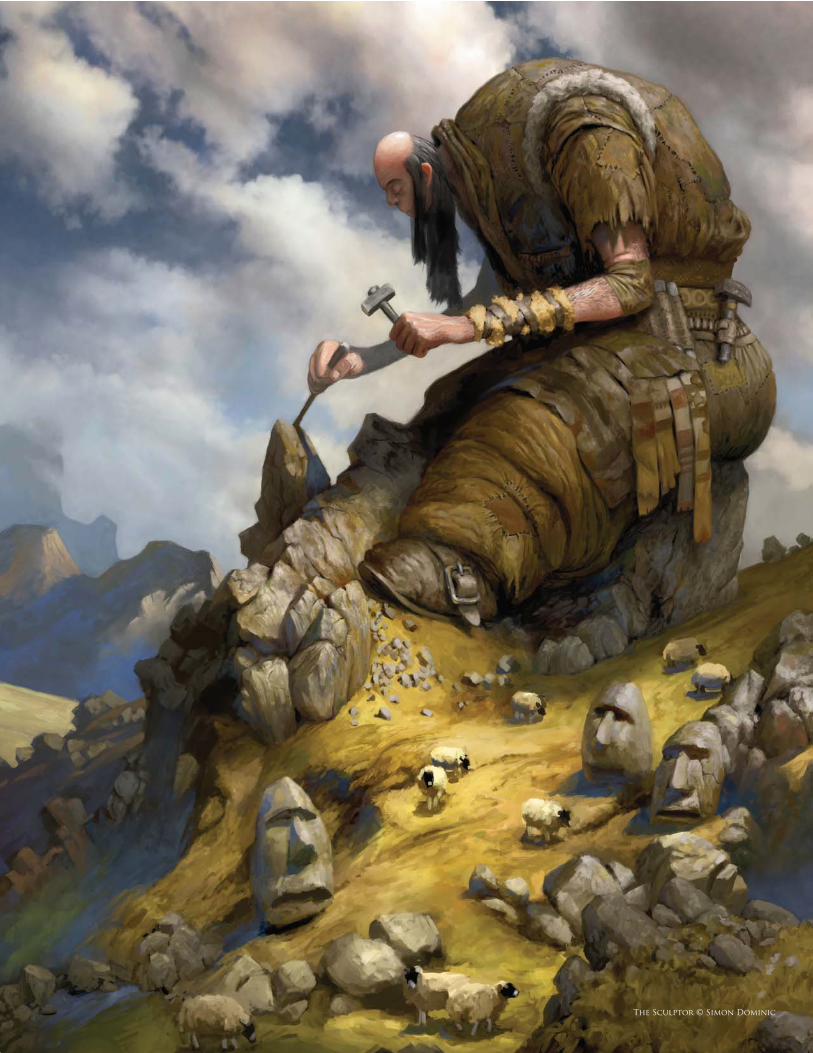
The Sculptor © Simon Dominic
c o n t e n t s
Chapter 01 – Custom Brushes
Chapter 03 – Matte Painting
Chapter 04 – Creatures
12
16
20
26
30
34
Organic Custom Brushes from Ink, Water and Salt Experiments
Brian Recktenwald
How to Create Brushes from Animal Textures
Carlos Cabrera
Custom Brushes
Daarken
Creating Custom Brushes to Save Time
Marc Brunet
Custom Brushes for Skin
Mélanie Delon
Creating a Brush from Scratch in Photoshop
Mike Corriero
Tornado Moving Towards Farmhouse
Carlos Cabrera
Steam-Powered Mechanical Destroyer
Daniel Ljunggren
Alien Hot Air Balloons
Emrah Elmasli
Alien Hot Air Balloons
Nathaniel West
Forest Fire Levente Peterffy
Ship Hit by Torpedo Levente Peterffy
Once a Thriving City, Now Deserted and Taken Over by Vegetation
Serg Souleiman
The Making of “Renaissance”
Marco Bauriedel
The Making of “Finding Unknown Kadath”
Sergey Musin
Season Change: A Winter Scene Matte Painting
Tiberius Viris
Pyrotechnics: Fire and Smoke
Tiberius Viris
Matte Painting Tips and Tricks Tiberius Viris
The Making of “Bird Catcher”
Matt Dixon
Creature Concept Design 101
Mike Corriero
Creature Design for Low Atmospheric Conditions
Pascal Raimbault
Painting Fur
Richard Tilbury
Painting Animal Eyes
Stephanie R. Loftis
Chapter 02 – Speed Painting40
44
48
50
54
58
62
68
74
78
84
88
94
100
112
118
122
c o n t e n t s
Chapter 05 – Humans
Chapter 06 – Environments
Chapter 07 – Sci-fi & Fantasy
Chapter 08 – Complete Projects
The Gallery
128
132
136
144
148
160
166
170
174
178
182
186
192
198
204
218
226
232
240
248
How to Paint Blonde and Red Hair Anne Pogoda
How to Paint Luscious Lips Anne Pogoda
Male Portrait Daarken
Painting Realistic Skin Emrah Elmasli
The Human Face Nykolai Aleksander
Painting the Human Eye Richard Tilbury
Sandstorm
Carlos Cabrera
Twister
Carlos Cabrera
Rainstorm
Carlos Cabrera
Snowstorm
Carlos Cabrera
Heat Waves
Carlos Cabrera
“Another Rainy Day ”: Painting a Cityscape
Daarken
Painting a Water Surface/Waves
Richard Tilbury
Painting Armor: European Knight Daarken
Planets and Starfields
Chee Ming Wong
The Making of “Pier Duty”Graven Tung
The Making of “Funfair” Daniela Uhlig
Creating a 2D Image from scratch David Revoy
The Making of “Keep A Sharp Eye” Ron Crabb
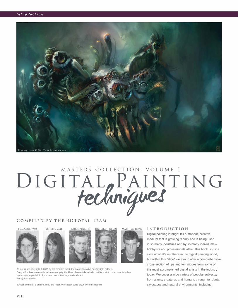
I n t r o d u c t i o n
viii
All works are copyright © 2009 by the credited artist, their representative or copyright holders.
Every effort has been made to locate copyright holders of materials included in this book in order to obtain their
permission to publish it. If you need to contact us, the details are:
3DTotal.com Ltd, 1 Shaw Street, 3rd Floor, Worcester, WR1 3QQ, United Kingdom
C o m p i l e d b y t h e 3 D T o ta l T e a m
Chris PerrinsLynette Clee Richard TilburyTom Greenway I n t r o d u c t i o n
Digital painting is huge! It’s a modern, creative
medium that is growing rapidly and is being used
in so many industries and by so many individuals –
hobbyists and professionals alike. This book is just a
slice of what’s out there in the digital painting world,
but within this “slice” we aim to offer a comprehensive
cross-section of tips and techniques from some of
the most accomplished digital artists in the industry
today. We cover a wide variety of popular subjects,
from aliens, creatures and humans through to robots,
cityscapes and natural environments, including
Matthew Lewis
Terra-stoma © Dr. Chee Ming Wong
I n t r o d u c t i o n
ix
F r e e R e s o u r c e s
Some of our Digital Painting Techniques tutorial artists
have kindly supplied, where appropriate and possible,
free resources to accompany their tutorials for you to
download to follow along with their teachings. You will fi nd
free custom brushes donated by Carlos Cabrera, Mélanie
Delon, Mike Corriero, Daarken and Nykolai Aleksander,
and on top of these 3DTotal are also providing a base
painting to accompany some of our environment tutorials
by Carlos Cabrera, as well as a photo (plate) for the
matte painting tutorials by Tiberius Viris.
All you need to do to access these free resources is to
visit the new 3DTotal micro site at www.focalpress.com/
digitalartmasters, go to the Books section, and there you
will fi nd information on how to download the fi les. Simply
look out for the “free resources” logo on articles within
this book that have fi les for you to download from
www.focalpress.com/digitalartmasters!
weather effects and many more. The styles we cover
vary from speed painting, offering a more traditional
impressionistic style, through to setting up the many
custom brushes that can provide precise, technical and
often time-saving techniques.
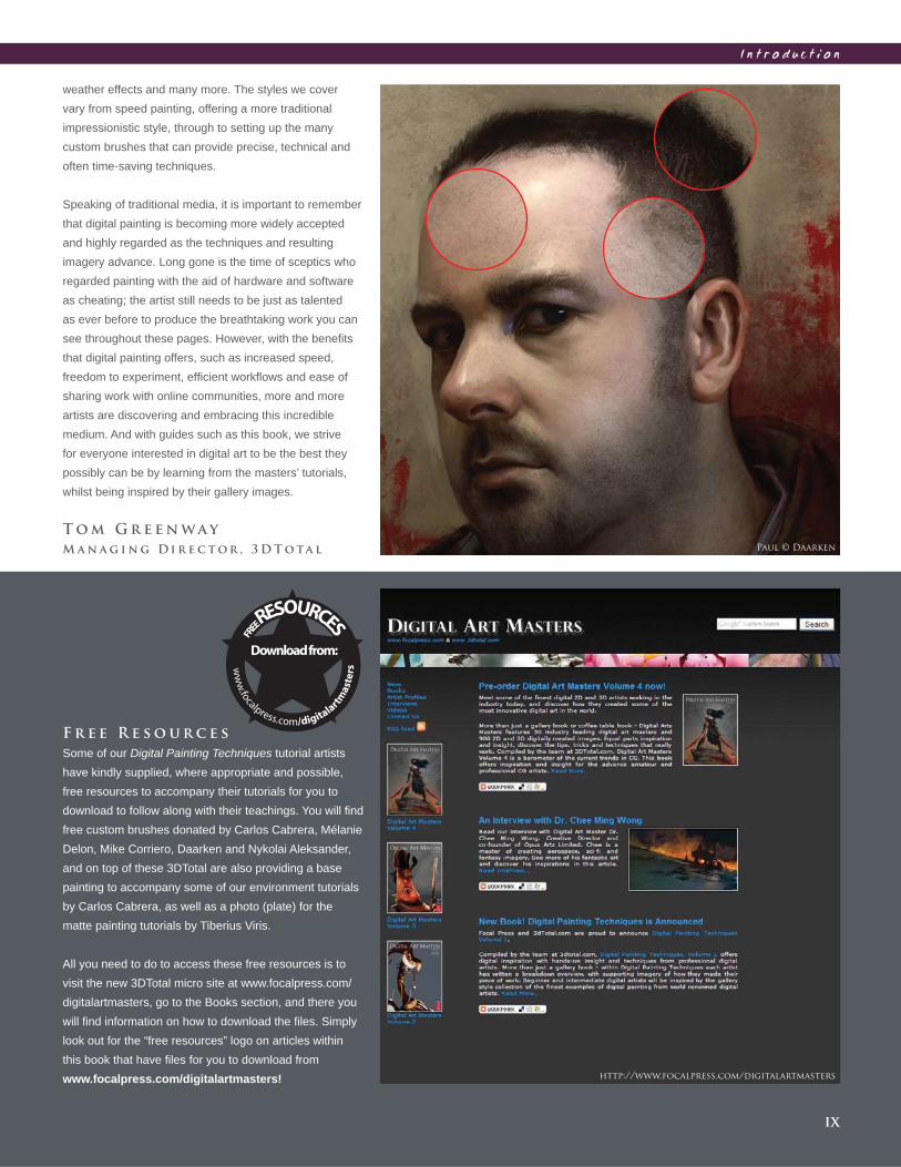
Speaking of traditional media, it is important to remember
that digital painting is becoming more widely accepted
and highly regarded as the techniques and resulting
imagery advance. Long gone is the time of sceptics who
regarded painting with the aid of hardware and software
as cheating; the artist still needs to be just as talented
as ever before to produce the breathtaking work you can
see throughout these pages. However, with the benefi ts
that digital painting offers, such as increased speed,
freedom to experiment, effi cient workfl ows and ease of
sharing work with online communities, more and more
artists are discovering and embracing this incredible
medium. And with guides such as this book, we strive
for everyone interested in digital art to be the best they
possibly can be by learning from the masters’ tutorials,
whilst being inspired by their gallery images.
T o m G r e e n w a y
M a n a g i n g D i r e c t o r , 3 D T o ta l Paul © Daarken
http://www.focalpress.com/digitalartmasters

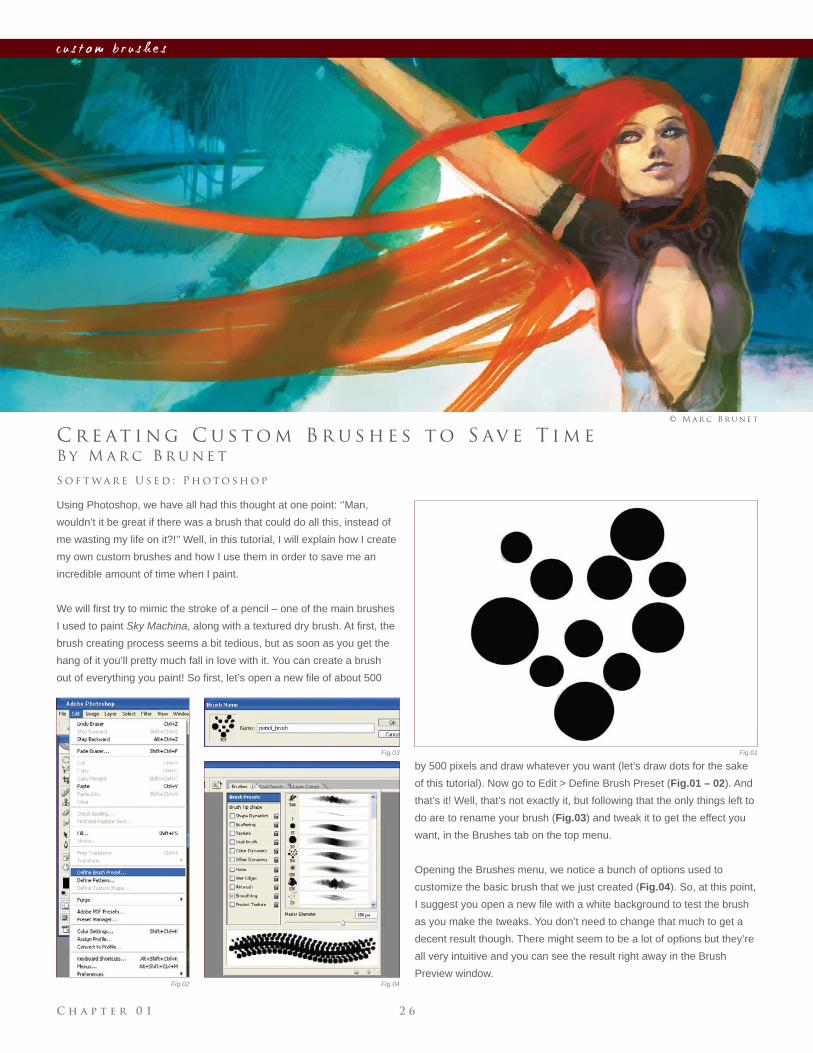
S k y M a c h i n a © M a r c B r u n e t
Any artist will tell you that the link between their thoughts and ideas
and the actual paintings they produce are the tools they wield. From a
traditional standpoint these have been the canvas and in particular the
brushes. These are no less important in a digital context; the increasing
array of brushes available and the freedom to create customized
versions is paramount to the quality of digital painting today. This chapter
provides an insight into the value of using custom brushes, and shows
how they can be created from scratch and tailored to suit your subject
matter.
c u s t o m b r u s h e s
C h a p t e r 0 1 1 2
c u s t o m b r u s h e s
Fig.01
Fig.02
B y B r i a n R e c k t e n wa l d
O r g a n i c C u s t o m B r u s h e s f r o m I n k ,
I n t r o d u c t i o n
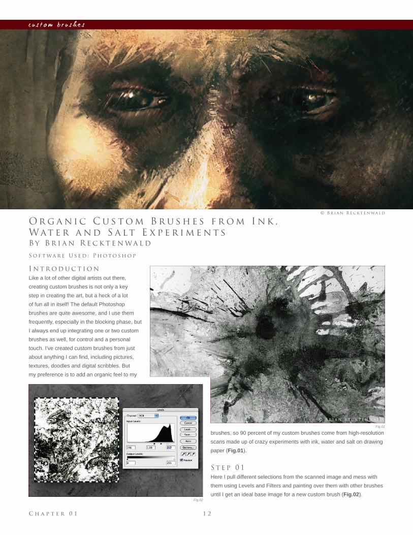
Like a lot of other digital artists out there,
creating custom brushes is not only a key
step in creating the art, but a heck of a lot
of fun all in itself! The default Photoshop
brushes are quite awesome, and I use them
frequently, especially in the blocking phase, but
I always end up integrating one or two custom
brushes as well, for control and a personal
touch. I’ve created custom brushes from just
about anything I can fi nd, including pictures,
textures, doodles and digital scribbles. But
my preference is to add an organic feel to my
S o f t wa r e U s e d : P h o t o s h o p
© B r i a n R e c k t e n wa l d
Wat e r a n d S a lt E x p e r i m e n t s
brushes, so 90 percent of my custom brushes come from high-resolution
scans made up of crazy experiments with ink, water and salt on drawing
paper (Fig.01).
S t e p 0 1
Here I pull different selections from the scanned image and mess with
them using Levels and Filters and painting over them with other brushes
until I get an ideal base image for a new custom brush (Fig.02).
© B r i a n R e c k t e n wa l d
C h a p t e r 0 11 3
c u s t o m b r u s h e s
Fig.03
Fig.04
Fig.05 Fig.06
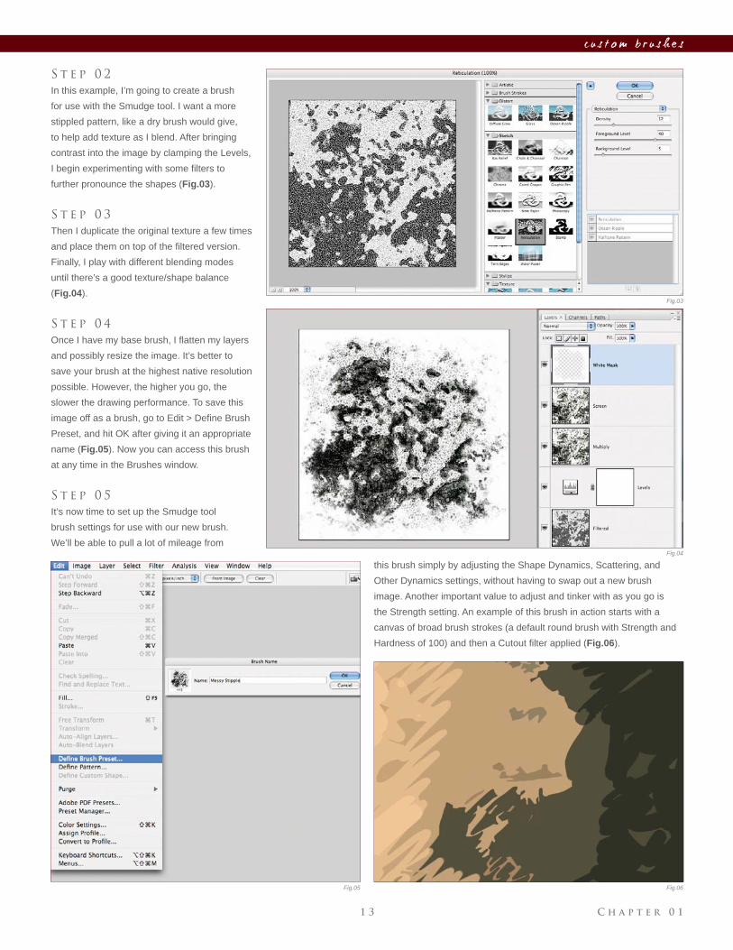
S t e p 0 2
In this example, I’m going to create a brush
for use with the Smudge tool. I want a more
stippled pattern, like a dry brush would give,
to help add texture as I blend. After bringing
contrast into the image by clamping the Levels,
I begin experimenting with some fi lters to
further pronounce the shapes (Fig.03).
S t e p 0 3
Then I duplicate the original texture a few times
and place them on top of the fi ltered version.
Finally, I play with different blending modes
until there’s a good texture/shape balance
(Fig.04).
S t e p 0 4
Once I have my base brush, I fl atten my layers
and possibly resize the image. It’s better to
save your brush at the highest native resolution
possible. However, the higher you go, the
slower the drawing performance. To save this
image off as a brush, go to Edit > Defi ne Brush
Preset, and hit OK after giving it an appropriate
name (Fig.05). Now you can access this brush
at any time in the Brushes window.
S t e p 0 5
It’s now time to set up the Smudge tool
brush settings for use with our new brush.
We’ll be able to pull a lot of mileage from
this brush simply by adjusting the Shape Dynamics, Scattering, and
Other Dynamics settings, without having to swap out a new brush
image. Another important value to adjust and tinker with as you go is
the Strength setting. An example of this brush in action starts with a
canvas of broad brush strokes (a default round brush with Strength and
Hardness of 100) and then a Cutout fi lter applied (Fig.06).
C h a p t e r 0 1 1 4
c u s t o m b r u s h e s
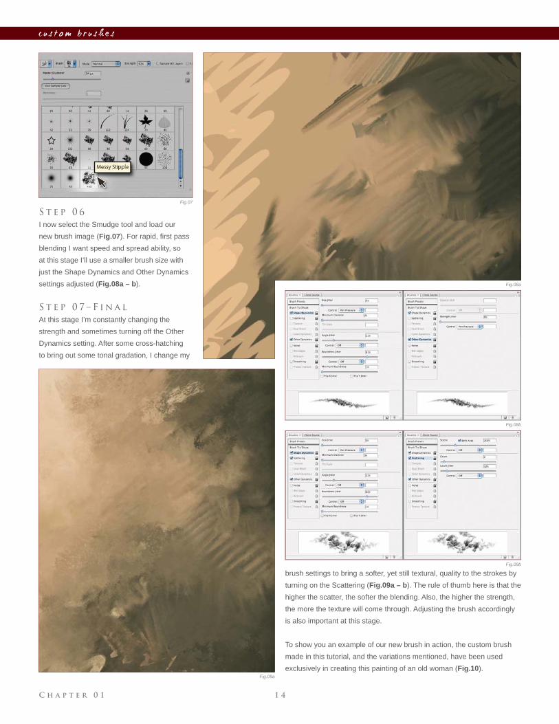
S t e p 0 6
I now select the Smudge tool and load our
new brush image (Fig.07). For rapid, fi rst pass
blending I want speed and spread ability, so
at this stage I’ll use a smaller brush size with
just the Shape Dynamics and Other Dynamics
settings adjusted (Fig.08a – b).
S t e p 0 7 – F i n a l
At this stage I’m constantly changing the
strength and sometimes turning off the Other
Dynamics setting. After some cross-hatching
to bring out some tonal gradation, I change my
brush settings to bring a softer, yet still textural, quality to the strokes by
turning on the Scattering (Fig.09a – b). The rule of thumb here is that the
higher the scatter, the softer the blending. Also, the higher the strength,
the more the texture will come through. Adjusting the brush accordingly
is also important at this stage.
To show you an example of our new brush in action, the custom brush
made in this tutorial, and the variations mentioned, have been used
exclusively in creating this painting of an old woman (Fig.10).
Fig.07
Fig.08a
Fig.08b
Fig.09a
Fig.09b
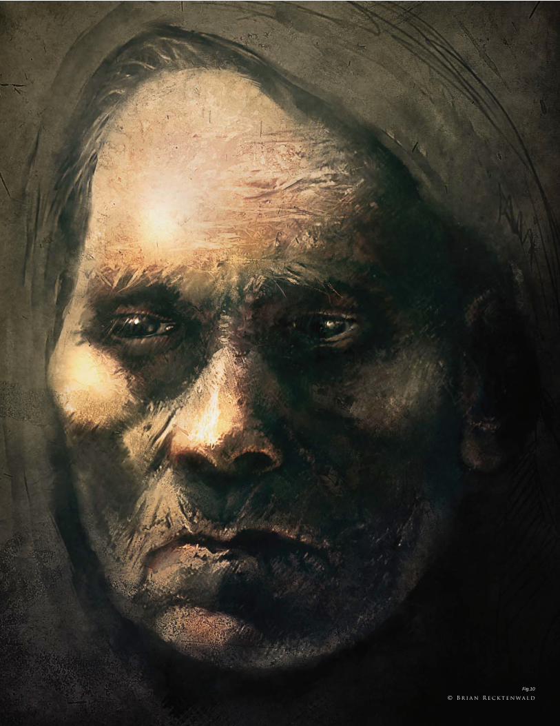
Fig.10
© B r i a n R e c k t e n wa l d
C h a p t e r 0 1 1 6
c u s t o m b r u s h e s
B y C a r l o s C a b r e r a
H o w t o C r e at e B r u s h e s f r o m A n i m a l T e x t u r e s
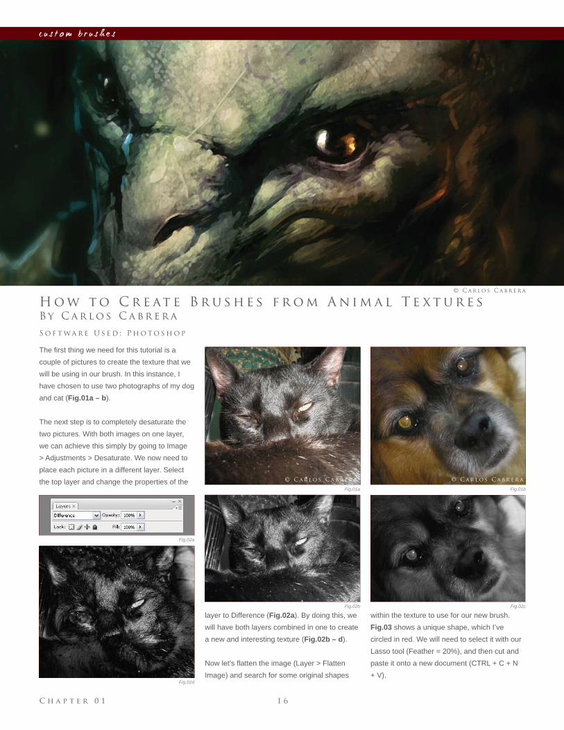
The fi rst thing we need for this tutorial is a
couple of pictures to create the texture that we
will be using in our brush. In this instance, I
have chosen to use two photographs of my dog
and cat (Fig.01a – b).
The next step is to completely desaturate the
two pictures. With both images on one layer,
we can achieve this simply by going to Image
> Adjustments > Desaturate. We now need to
place each picture in a different layer. Select
the top layer and change the properties of the
S o f t wa r e U s e d : P h o t o s h o p
© C a r l o s C a b r e r a
layer to Difference (Fig.02a). By doing this, we
will have both layers combined in one to create
a new and interesting texture (Fig.02b – d).
Now let’s fl atten the image (Layer > Flatten
Image) and search for some original shapes
within the texture to use for our new brush.
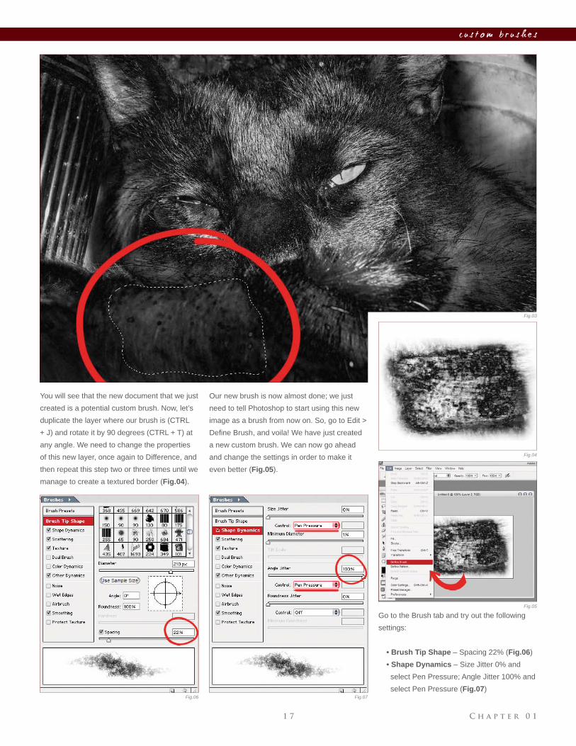
Fig.03 shows a unique shape, which I’ve
circled in red. We will need to select it with our
Lasso tool (Feather = 20%), and then cut and
paste it onto a new document (CTRL + C + N
+ V).
Fig.02a
Fig.01a Fig.01b
Fig.02b Fig.02c
Fig.02d
© C a r l o s C a b r e r a© C a r l o s C a b r e r a
C h a p t e r 0 11 7
c u s t o m b r u s h e s
You will see that the new document that we just
created is a potential custom brush. Now, let’s
duplicate the layer where our brush is (CTRL
+ J) and rotate it by 90 degrees (CTRL + T) at
any angle. We need to change the properties
of this new layer, once again to Difference, and
then repeat this step two or three times until we
manage to create a textured border (Fig.04).
Go to the Brush tab and try out the following
settings:
• Brush Tip Shape – Spacing 22% (Fig.06)
• Shape Dynamics – Size Jitter 0% and
select Pen Pressure; Angle Jitter 100% and
select Pen Pressure (Fig.07)
Our new brush is now almost done; we just
need to tell Photoshop to start using this new
image as a brush from now on. So, go to Edit >
Defi ne Brush, and voila! We have just created
a new custom brush. We can now go ahead
and change the settings in order to make it
even better (Fig.05).
Fig.03
Fig.04
Fig.05
Fig.06 Fig.07
C h a p t e r 0 1 1 8
c u s t o m b r u s h e s
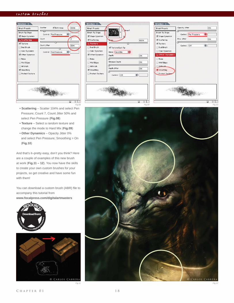
• Scattering – Scatter 104% and select Pen
Pressure; Count 7, Count Jitter 50% and
select Pen Pressure (Fig.08)
• Texture – Select a random texture and
change the mode to Hard Mix (Fig.09)
• Other Dynamics – Opacity Jitter 0%
and select Pen Pressure; Smoothing > On
(Fig.10)
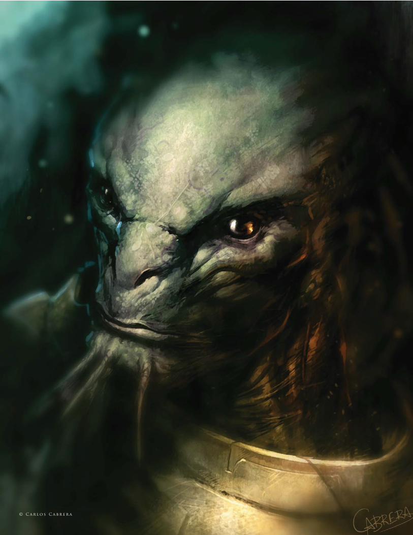
And that’s it–pretty easy, don’t you think? Here
are a couple of examples of this new brush
at work (Fig.11 – 12). You now have the skills
to create your own custom brushes for your
projects, so get creative and have some fun
with them!
You can download a custom brush (ABR) fi le to
accompany this tutorial from
www.focalpress.com/digitalartmasters
Fig.08 Fig.09 Fig.10
Fig.11 Fig.12
© C a r l o s C a b r e r a© C a r l o s C a b r e r a
© C a r l o s C a b r e r a
C h a p t e r 0 1 2 0
c u s t o m b r u s h e s
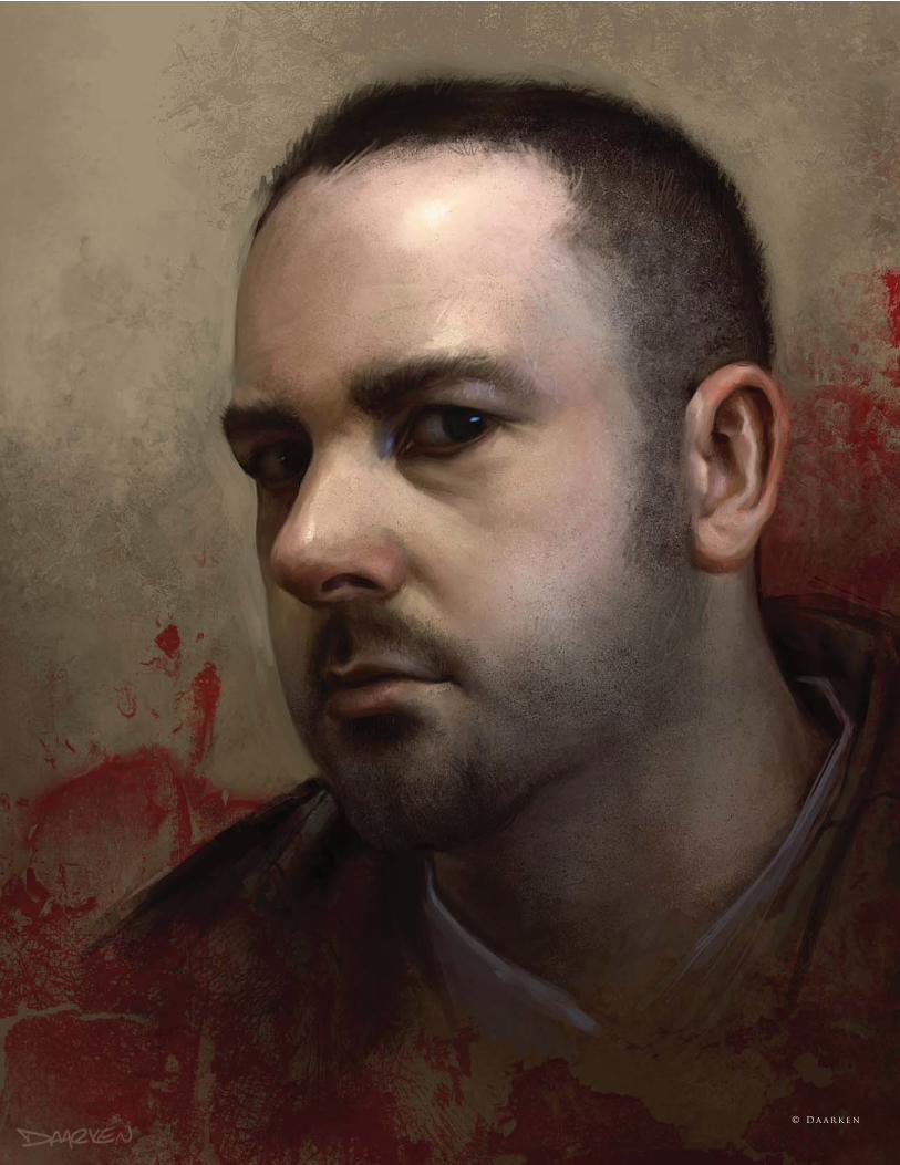
B y D a a r k e n
C u s t o m B r u s h e s
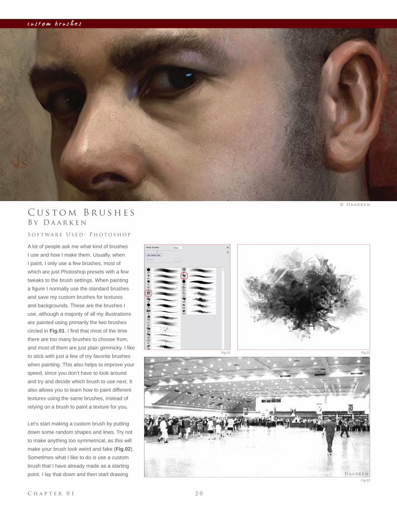
A lot of people ask me what kind of brushes
I use and how I make them. Usually, when
I paint, I only use a few brushes, most of
which are just Photoshop presets with a few
tweaks to the brush settings. When painting
a fi gure I normally use the standard brushes
and save my custom brushes for textures
and backgrounds. These are the brushes I
use, although a majority of all my illustrations
are painted using primarily the two brushes
circled in Fig.01. I fi nd that most of the time
there are too many brushes to choose from,
and most of them are just plain gimmicky. I like
to stick with just a few of my favorite brushes
when painting. This also helps to improve your
speed, since you don’t have to look around
and try and decide which brush to use next. It
also allows you to learn how to paint different
textures using the same brushes, instead of
relying on a brush to paint a texture for you.
Let’s start making a custom brush by putting
down some random shapes and lines. Try not
to make anything too symmetrical, as this will
make your brush look weird and fake (Fig.02).
Sometimes what I like to do is use a custom
brush that I have already made as a starting
point. I lay that down and then start drawing
S o f t wa r e U s e d : P h o t o s h o p
© D a a r k e n
Fig.01 Fig.02
Fig.03
D a a r k e n
C h a p t e r 0 12 1
c u s t o m b r u s h e s
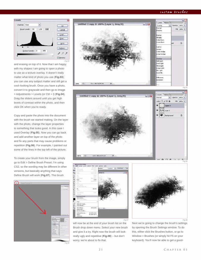
and erasing on top of it. Now that I am happy
with my shapes I am going to open a photo
to use as a texture overlay. It doesn’t really
matter what kind of photo you use (Fig.03);
you can use any subject matter and still get a
cool–looking brush. Once you have a photo,
convert it to grayscale and then go to Image
> Adjustments > Levels (or Ctrl + l) (Fig.04).
Drag the sliders around until you get high
levels of contrast within the photo, and then
click OK when you’re ready.
Copy and paste the photo into the document
with the brush we started making. On the layer
with the photo, change the layer properties
to something that looks good. In this case I
used Overlay (Fig.05). Now you can go back
and add another layer on top of the photo
and fi x any parts that may cause problems or
repetition (Fig.06). For example, I painted out
some of the lines in the top left of the picture.
To create your brush from the image, simply
go to Edit > Defi ne Brush Preset; I’m using
CS2, so the wording may be different in other
versions, but basically anything that says
Defi ne Brush will work (Fig.07). This brush
will now be at the end of your brush list on the
Brush drop down menu. Select your new brush
and give it a try. Right now the brush will look
really ugly and repetitive (Fig.08) – but don’t
worry, we’re about to fi x that.
Next we’re going to change the brush’s settings
by opening the Brush Settings window. To do
this, either click the Brushes button, or go to
Window > Brushes (or simply hit F5 on your
keyboard). You’ll now be able to get a good-
Fig.04
Fig.05
Fig.06
Fig.07 Fig.08
Fig.09
C h a p t e r 0 1 2 2
c u s t o m b r u s h e s
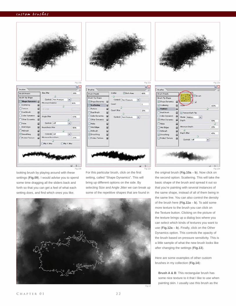
the original brush (Fig.10a – b). Now click on
the second option: Scattering. This will take the
basic shape of the brush and spread it out so
that you’re painting with several instances of
the same shape, instead of all of them being in
the same line. You can also control the density
of the brush here (Fig.11a – b). To add some
more texture to the brush you can click on
the Texture button. Clicking on the picture of
the texture brings up a dialog box where you
can select which kinds of textures you want to
use (Fig.12a – b). Finally, click on the Other
Dynamics option. This controls the opacity of
the brush based on pressure sensitivity. This is
a little sample of what the new brush looks like
after changing the settings (Fig.13).
Here are some examples of other custom
brushes in my collection (Fig.14):
Brush A & B: This rectangular brush has
some nice texture to it that I like to use when
painting skin. I usually use this brush as the
looking brush by playing around with these
settings (Fig.09). I would advise you to spend
some time dragging all the sliders back and
forth so that you can get a feel of what each
setting does, and fi nd which ones you like.
For this particular brush, click on the fi rst
setting, called “Shape Dynamics”. This will
bring up different options on the side. By
selecting Size and Angle Jitter we can break up
some of the repetitive shapes that are found in
Fig.10a Fig.11a
Fig.13
Fig.10b Fig.11b
Fig.12a
Fig.12b
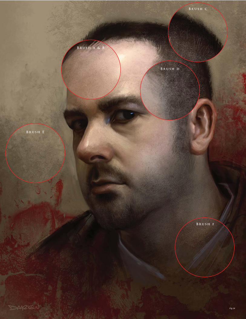
Fig.14
B r u s h a & B
B r u s h c
B r u s h d
B r u s h E
B r u s h f
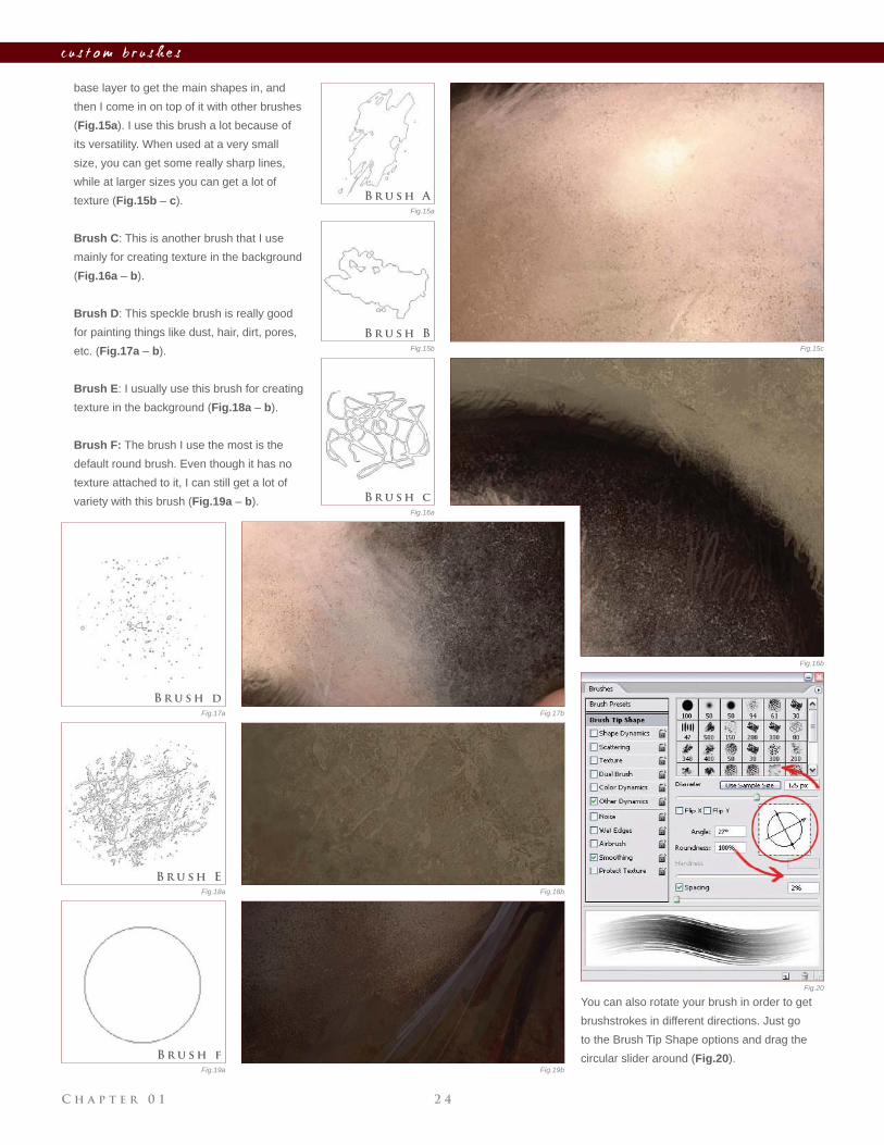
C h a p t e r 0 1 2 4
c u s t o m b r u s h e s
base layer to get the main shapes in, and
then I come in on top of it with other brushes
(Fig.15a). I use this brush a lot because of
its versatility. When used at a very small
size, you can get some really sharp lines,
while at larger sizes you can get a lot of
texture (Fig.15b – c).
Brush C: This is another brush that I use
mainly for creating texture in the background
(Fig.16a – b).
Brush D: This speckle brush is really good
for painting things like dust, hair, dirt, pores,
etc. (Fig.17a – b).
Brush E: I usually use this brush for creating
texture in the background (Fig.18a – b).
Brush F: The brush I use the most is the
default round brush. Even though it has no
texture attached to it, I can still get a lot of
variety with this brush (Fig.19a – b).
Fig.15b
Fig.16a
Fig.17a
Fig.18a
Fig.19a
Fig.20
Fig.15c
Fig.16b
Fig.15a
Fig.17b
Fig.18b
Fig.19b
You can also rotate your brush in order to get
brushstrokes in different directions. Just go
to the Brush Tip Shape options and drag the
circular slider around (Fig.20).
B r u s h A
B r u s h c
B r u s h d
B r u s h E
B r u s h f
B r u s h B
© D a a r k e n
C h a p t e r 0 1 2 6
c u s t o m b r u s h e s
Fig.01
Fig.02
Fig.03
Fig.04
B y M a r c B r u n e t
C r e at i n g C u s t o m B r u s h e s t o S av e T i m e
Using Photoshop, we have all had this thought at one point: ‘’Man,
wouldn’t it be great if there was a brush that could do all this, instead of
me wasting my life on it?!’’ Well, in this tutorial, I will explain how I create
my own custom brushes and how I use them in order to save me an
incredible amount of time when I paint.
We will fi rst try to mimic the stroke of a pencil – one of the main brushes
I used to paint Sky Machina, along with a textured dry brush. At fi rst, the
brush creating process seems a bit tedious, but as soon as you get the
hang of it you’ll pretty much fall in love with it. You can create a brush
out of everything you paint! So fi rst, let’s open a new fi le of about 500
S o f t wa r e U s e d : P h o t o s h o p
© M a r c B r u n e t
by 500 pixels and draw whatever you want (let’s draw dots for the sake
of this tutorial). Now go to Edit > Defi ne Brush Preset (Fig.01 – 02). And
that’s it! Well, that’s not exactly it, but following that the only things left to
do are to rename your brush (Fig.03) and tweak it to get the effect you
want, in the Brushes tab on the top menu.
Opening the Brushes menu, we notice a bunch of options used to
customize the basic brush that we just created (Fig.04). So, at this point,
I suggest you open a new fi le with a white background to test the brush
as you make the tweaks. You don’t need to change that much to get a
decent result though. There might seem to be a lot of options but they’re
all very intuitive and you can see the result right away in the Brush
Preview window.
C h a p t e r 0 12 7
c u s t o m b r u s h e s
Fig.05 Fig.06 Fig.07
Fig.08
Fig.09
Fig.10
Fig.11
Fig.12 Fig.13
Fig.14 Fig.15
O pa c i t y D y n a m i c s O f f
O pa c i t y D y n a m i c s O n
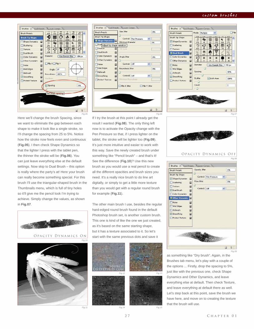
Here we’ll change the brush Spacing, since
we want to eliminate the gap between each
shape to make it look like a single stroke, so
I’ll change the spacing from 25 to 5%. Notice
how the stroke now feels even and continuous
(Fig.05). I then check Shape Dynamics so
that the lighter I press with the tablet pen,
the thinner the stroke will be (Fig.06). You
can just leave everything else at the default
settings. Now skip to Dual Brush – this option
is really where the party’s at! Here your brush
can really become something special. For this
brush I’ll use the triangular-shaped brush in the
Thumbnails menu, which is full of tiny holes
so it’ll give me the pencil look I’m trying to
achieve. Simply change the values, as shown
in Fig.07.
If I try the brush at this point I already get the
result I wanted (Fig.08). The only thing left
now is to activate the Opacity change with the
Pen Pressure so that, if I press lighter on the
tablet, the stroke will be lighter too (Fig.09).
It’s just more intuitive and easier to work with
this way. Save the newly created brush under
something like “Pencil brush” – and that’s it!
See the difference (Fig.10)? Use this new
brush as you would use a real pencil to create
all the different opacities and brush sizes you
need. It’s a really nice brush to do line art
digitally, or simply to get a little more texture
than you would get with a regular round brush
for example (Fig.11).
The other main brush I use, besides the regular
hard-edged round brush found in the default
Photoshop brush set, is another custom brush.
This one is kind of like the one we just created,
as it’s based on the same starting shape,
but it has a texture associated to it. So let’s
start with the same previous dots and save it
as something like “Dry brush”. Again, in the
Brushes tab menu, let’s play with a couple of
the options ... Firstly, drop the spacing to 5%,
just like with the previous one, check Shape
Dynamics and Other Dynamics, and leave
everything else at default. Then check Texture,
and leave everything at default there as well.
Let’s step back at this point, save the brush we
have here, and move on to creating the texture
that the brush will use.
Source:
CGTextures.com
C h a p t e r 0 1 2 8
c u s t o m b r u s h e s
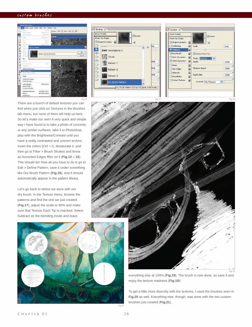
There are a bunch of default textures you can
fi nd when you click on Textures in the Brushes
tab menu, but none of them will help us here.
So let’s make our own! A very quick and simple
way I have found is to take a photo of concrete,
or any similar surfaces, take it to Photoshop,
play with the Brightness/Contrast until you
have a really contrasted and uneven texture,
invert the colors (Ctrl + I), desaturate it, and
then go to Filter > Brush Strokes and throw
an Accented Edges fi lter on it (Fig.12 – 15).
This should do! Now all you have to do is go to
Edit > Defi ne Pattern, save it under something
like Dry Brush Pattern (Fig.16), and it should
automatically appear in the pattern library.
Let’s go back to where we were with our
dry brush. In the Texture menu, browse the
patterns and fi nd the one we just created
(Fig.17), adjust the scale to 60% and make
sure that Texture Each Tip is checked. Select
Subtract as the blending mode and leave
everything else at 100% (Fig.18). The brush is now done, so save it and
enjoy the texture madness (Fig.19)!
To get a little more diversity with the textures, I used the brushes seen in
Fig.20 as well. Everything else, though, was done with the two custom
brushes just created (Fig.21).
Fig.16 Fig.17 Fig.18
Fig.19
Fig.20
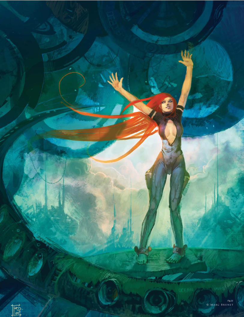
Fig.21
© M a r c B r u n e t
C h a p t e r 0 1 3 0
c u s t o m b r u s h e s
B y M é l a n i e D e l o n
C u s t o m B r u s h e s f o r S k i n
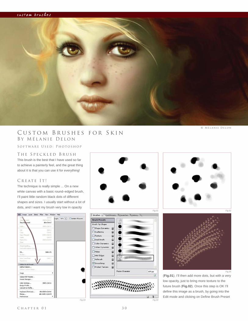
T h e S p e c k l e d B r u s h
This brush is the best that I have used so far
to achieve a painterly feel, and the great thing
about it is that you can use it for everything!
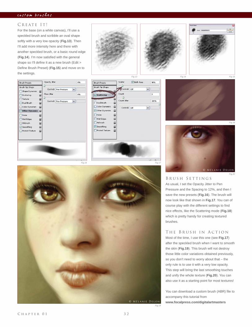
C r e at e I t !
The technique is really simple ... On a new
white canvas with a basic round–edged brush,
I’ll paint little random black dots of different
shapes and sizes. I usually start without a lot of
dots, and I want my brush very low in opacity
S o f t wa r e U s e d : P h o t o s h o p
© M é l a n i e D e l o n
Fig.01 Fig.02
Fig.03 Fig.04
Fig.05
(Fig.01). I’ll then add more dots, but with a very
low opacity, just to bring more texture to the
future brush (Fig.02). Once this step is OK I’ll
defi ne this image as a brush, by going into the
Edit mode and clicking on Defi ne Brush Preset
C h a p t e r 0 13 1
c u s t o m b r u s h e s
(Fig.03), and then clicking OK in the pop-up.
Now I have my new brush in the list, ready to
be used.
B r u s h S e t t i n g s
Now the fun part begins ... As you can see
(Fig.04), this brush is basically unusable as
it is (Fig.05), so I now have to tweak it. For
this, I go into the brushes palette where I set
the control setting under the Opacity Jitter to
Pen Pressure (Fig.06) and the Spacing to 6%
(Fig.07). The settings are now OK, and this
new brush looks much better (Fig.08) so I’ll
save it (Fig.09).
You can make different versions of the same
brush, some with more dots or less – just
try them! It’s good to have several speckled
brushes and combine them to create a great
texture.
T h e B r u s h i n A c t i o n
Now, how to use it ... This kind of brush is
good when you need to bring texture and color
variation; you can use it to bring life to a base
done with a basic round edge (Fig.10), to paint
hair (Fig.11), or to paint fabric (Fig.12). This
brush can be used for unlimited purposes!
T h e “ S m o o t h -
T e x t u r e d ” B r u s h
This one is a kind of hybrid brush; it’s a mix of
a basic round edge and a speckled brush, so
let’s see how to create it.
Fig.06 Fig.07
Fig.08 Fig.09
Fig.10 Fig.11 Fig.12
© M é l a n i e D e l o n © M é l a n i e D e l o n © M é l a n i e D e l o n
C h a p t e r 0 1 3 2
c u s t o m b r u s h e s
C r e at e I t !
For the base (on a white canvas), I’ll use a
speckled brush and scribble an oval shape
softly with a very low opacity (Fig.13). Then
I’ll add more intensity here and there with
another speckled brush, or a basic round edge
(Fig.14). I’m now satisfi ed with the general
shape so I’ll defi ne it as a new brush (Edit >
Defi ne Brush Preset) (Fig.15) and move on to
the settings.
B r u s h S e t t i n g s
As usual, I set the Opacity Jitter to Pen
Pressure and the Spacing to 12%, and then I
save the new presets (Fig.16). The brush will
now look like that shown in Fig.17. You can of
course play with the different settings to fi nd
nice effects, like the Scattering mode (Fig.18)
which is pretty handy for creating textured
brushes.
T h e B r u s h i n A c t i o n
Most of the time, I use this one (see Fig.17)
after the speckled brush when I want to smooth
the skin (Fig.19). This brush will not destroy
those little color variations obtained previously,
so you don’t need to worry about that – the
only rule is to use it with a very low opacity.
This step will bring the last smoothing touches
and unify the whole texture (Fig.20). You can
also use it as a starting point for most textures!
You can download a custom brush (ABR) fi le to
accompany this tutorial from
www.focalpress.com/digitalartmasters
Fig.16 Fig.17
Fig.13 Fig.14 Fig.15
Fig.18
Fig.19
Fig.20
© M é l a n i e D e l o n
© M é l a n i e D e l o n
C h a p t e r 0 13 3
c u s t o m b r u s h e s
© M é l a n i e D e l o n
C h a p t e r 0 1 3 4
c u s t o m b r u s h e s
Fig.01
Fig.02 Fig.03
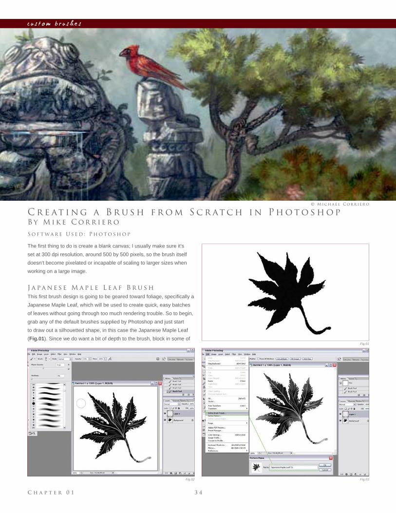
B y M i k e C o r r i e r o
C r e at i n g a B r u s h f r o m S c r at c h i n P h o t o s h o p
The fi rst thing to do is create a blank canvas; I usually make sure it’s
set at 300 dpi resolution, around 500 by 500 pixels, so the brush itself
doesn’t become pixelated or incapable of scaling to larger sizes when
working on a large image.
J a pa n e s e M a p l e L e a f B r u s h
This fi rst brush design is going to be geared toward foliage, specifi cally a
Japanese Maple Leaf, which will be used to create quick, easy batches
of leaves without going through too much rendering trouble. So to begin,
grab any of the default brushes supplied by Photoshop and just start
to draw out a silhouetted shape, in this case the Japanese Maple Leaf
(Fig.01). Since we do want a bit of depth to the brush, block in some of
S o f t wa r e U s e d : P h o t o s h o p
© M i c h a e l C o r r i e r o
C h a p t e r 0 13 5
c u s t o m b r u s h e s
Fig.04
Fig.05 Fig.06
Fig.07
D e f a u lt
O t h e r D y n a m i c s S h a p e D y n a m i c s
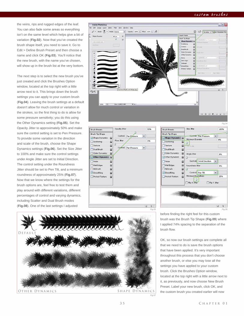
the veins, rips and rugged edges of the leaf.
You can also fade some areas so everything
isn’t on the same level which helps give a bit of
variation (Fig.02). Now that you’ve created the
brush shape itself, you need to save it. Go to
Edit > Defi ne Brush Preset and then choose a
name and click OK (Fig.03). You’ll notice that
the new brush, with the name you’ve chosen,
will show up in the brush list at the very bottom.
The next step is to select the new brush you’ve
just created and click the Brushes Option
window, located at the top right with a little
arrow next to it. This brings down the brush
settings you can apply to your custom brush
(Fig.04). Leaving the brush settings at a default
doesn’t allow for much control or variation in
the strokes, so the fi rst thing to do is allow for
some pressure sensitivity; you do this using
the Other Dynamics setting (Fig.05). Set the
Opacity Jitter to approximately 50% and make
sure the control setting is set to Pen Pressure.
To provide some variation in the direction
and scale of the brush, choose the Shape
Dynamics settings (Fig.06). Set the Size Jitter
to 100% and make sure the control settings
under Angle Jitter are set to Initial Direction.
The control setting under the Roundness
Jitter should be set to Pen Tilt, and a minimum
roundness of approximately 25% (Fig.07).
Now that we know where the settings for the
brush options are, feel free to test them and
play around with different variations, different
percentages of control and varying dynamics,
including Scatter and Dual Brush modes
(Fig.08). One of the last settings I adjusted
before fi nding the right feel for this custom
brush was the Brush Tip Shape (Fig.09) where
I applied 74% spacing to the separation of the
brush fl ow.
OK, so now our brush settings are complete all
that we need to do is save the brush options
that have been applied. It’s very important
throughout this process that you don’t choose
another brush, or else you may lose all the
settings you have applied to your custom
brush. Click the Brushes Option window,
located at the top right with a little arrow next to
it, as previously, and now choose New Brush
Preset. Label your new brush, click OK, and
the custom brush you created earlier will now
C h a p t e r 0 1 3 6
c u s t o m b r u s h e s
be saved with the new settings you’ve applied, and located at the bottom
of your brush list (Fig.10).
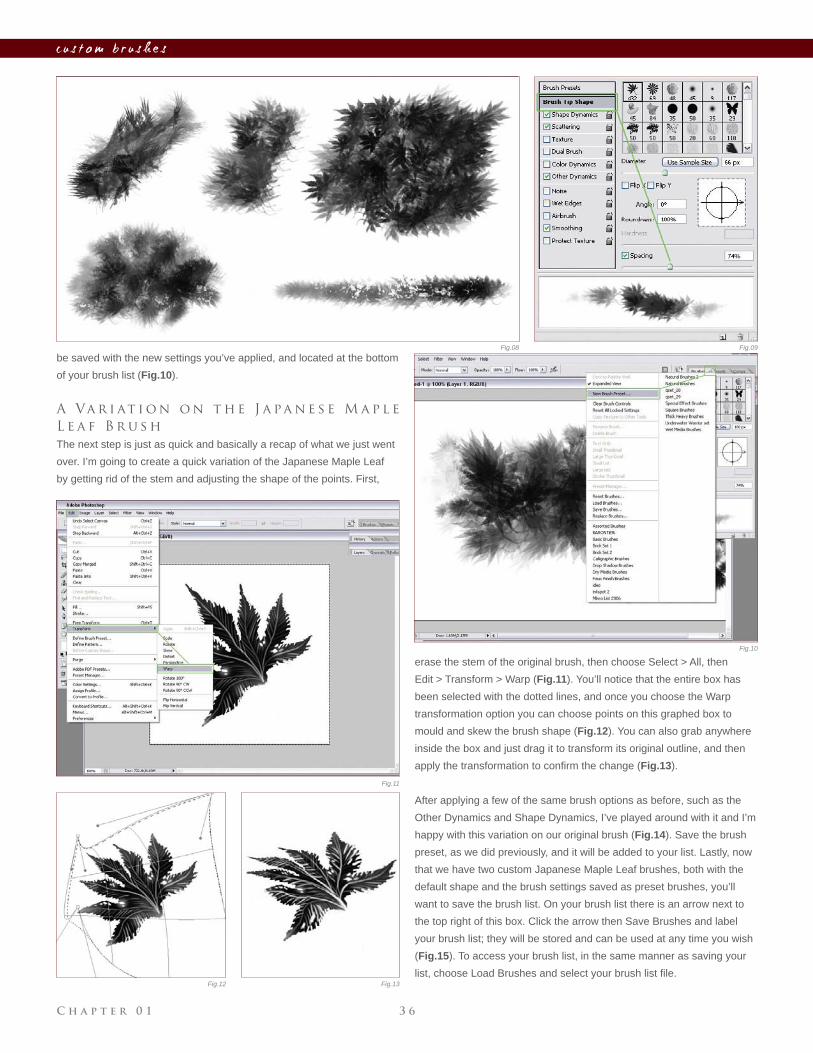
A Va r i at i o n o n t h e J a pa n e s e M a p l e
L e a f B r u s h
The next step is just as quick and basically a recap of what we just went
over. I’m going to create a quick variation of the Japanese Maple Leaf
by getting rid of the stem and adjusting the shape of the points. First,
erase the stem of the original brush, then choose Select > All, then
Edit > Transform > Warp (Fig.11). You’ll notice that the entire box has
been selected with the dotted lines, and once you choose the Warp
transformation option you can choose points on this graphed box to
mould and skew the brush shape (Fig.12). You can also grab anywhere
inside the box and just drag it to transform its original outline, and then
apply the transformation to confi rm the change (Fig.13).
After applying a few of the same brush options as before, such as the
Other Dynamics and Shape Dynamics, I’ve played around with it and I’m
happy with this variation on our original brush (Fig.14). Save the brush
preset, as we did previously, and it will be added to your list. Lastly, now
that we have two custom Japanese Maple Leaf brushes, both with the
default shape and the brush settings saved as preset brushes, you’ll
want to save the brush list. On your brush list there is an arrow next to
the top right of this box. Click the arrow then Save Brushes and label
your brush list; they will be stored and can be used at any time you wish
(Fig.15). To access your brush list, in the same manner as saving your
list, choose Load Brushes and select your brush list fi le.
Fig.08 Fig.09
Fig.10
Fig.11
Fig.12 Fig.13
C h a p t e r 0 13 7
c u s t o m b r u s h e s
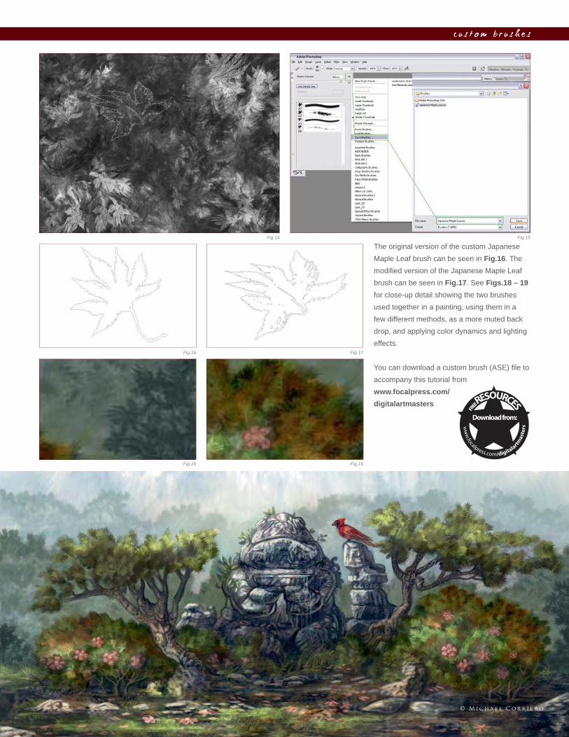
The original version of the custom Japanese
Maple Leaf brush can be seen in Fig.16. The
modifi ed version of the Japanese Maple Leaf
brush can be seen in Fig.17. See Figs.18 – 19
for close-up detail showing the two brushes
used together in a painting, using them in a
few different methods, as a more muted back
drop, and applying color dynamics and lighting
effects.
You can download a custom brush (ASE) fi le to
accompany this tutorial from
www.focalpress.com/
digitalartmasters
Fig.14 Fig.15
Fig.16 Fig.17
Fig.18 Fig.19
© M i c h a e l C o r r i e r o
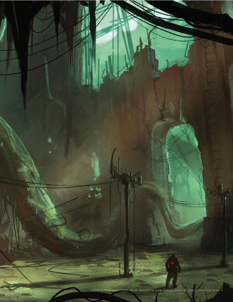
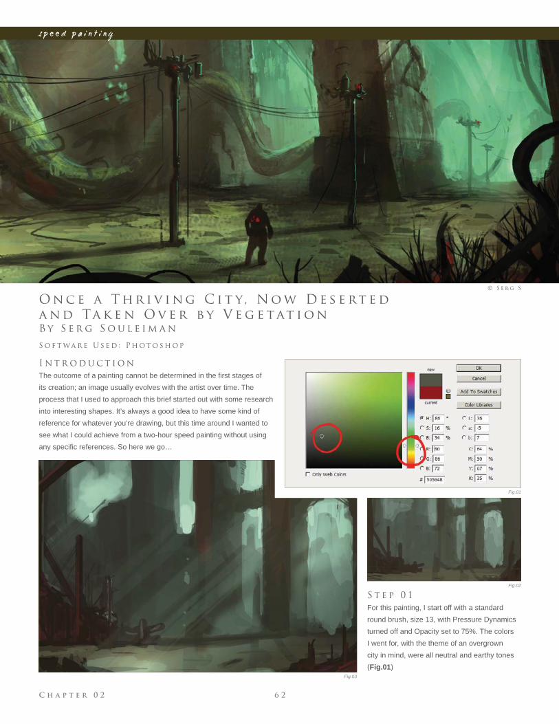
O n c e a T h r i v i n g C i t y, N o w D e s e rt e d a n d Ta k e n O v e r b y V e g e tat i o n © S e r g S
In any creative process the task of preliminary work and sketching is a
proven way to explore ideas before committing to the fi nal piece.
Speed painting has become common practice within digital painting
and allows artists to experiment with core themes such as color, mood,
lighting and composition. In an industry with an ever-quickening pace,
this type of painting has carved a niche for itself within the CG sector and
has become widely accepted as an effective way of communicating key
ideas before any details are evolved. What follows are some different
approaches to tackling a similar problem, but each demonstrating the
importance of speed painting in establishing the structural devices
behind most paintings.
s p e e d p a i n t i n g
C h a p t e r 0 2 4 0
s p e e d p a i n t i n g
B y C a r l o s C a b r e r a
T o r n a d o M o v i n g T o wa r d s F a r m h o u s e
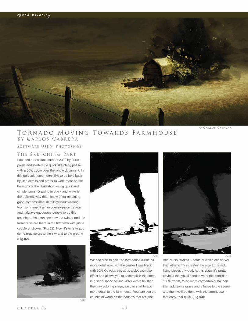
T h e S k e t c h i n g Pa rt
I opened a new document of 2000 by 3000
pixels and started the quick sketching phase
with a 50% zoom over the whole document. In
this particular step I don’t like to be held back
by little details and prefer to work more on the
harmony of the illustration, using quick and
simple forms. Drawing in black and white is
the quickest way that I know of for obtaining
good compositional details without wasting
too much time; it almost develops on its own
and I always encourage people to try this
technique. You can see how the twister and the
farmhouse are there in the fi rst view with just a
couple of strokes (Fig.01). Now it’s time to add
some gray colors to the sky and to the ground
(Fig.02).
S o f t wa r e U s e d : P h o t o s h o p
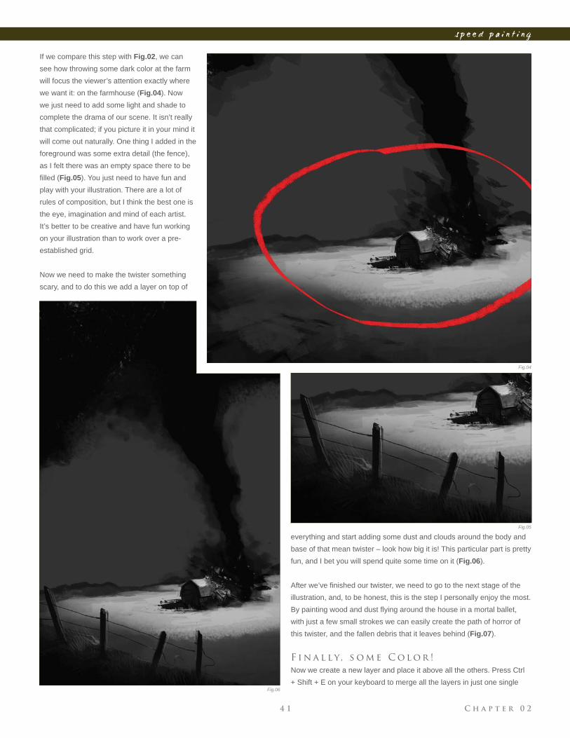
We can start to give the farmhouse a little bit
more detail now. For the twister I use black
with 50% Opacity; this adds a cloud/smoke
effect and allows you to accomplish the effect
in a short space of time. After we’ve fi nished
the gray coloring stage, we can start to add
more detail to the farmhouse. You can see the
chunks of wood on the house’s roof are just
little brush strokes – some of which are darker
than others. This creates the effect of small,
fl ying pieces of wood. At this stage it’s pretty
obvious that you’ll need to work the details in
100% zoom, to be more comfortable. We can
then add some grass and a fence to the scene,
and then we’ll be done with the farmhouse –
that easy, that quick (Fig.03)!
© C a r l o s C a b r e r a
Fig.01 Fig.02
Fig.03
C h a p t e r 0 24 1
s p e e d p a i n t i n g
If we compare this step with Fig.02, we can
see how throwing some dark color at the farm
will focus the viewer’s attention exactly where
we want it: on the farmhouse (Fig.04). Now
we just need to add some light and shade to
complete the drama of our scene. It isn’t really
that complicated; if you picture it in your mind it
will come out naturally. One thing I added in the
foreground was some extra detail (the fence),
as I felt there was an empty space there to be
fi lled (Fig.05). You just need to have fun and
play with your illustration. There are a lot of
rules of composition, but I think the best one is
the eye, imagination and mind of each artist.
It’s better to be creative and have fun working
on your illustration than to work over a pre-
established grid.
Now we need to make the twister something
scary, and to do this we add a layer on top of
everything and start adding some dust and clouds around the body and
base of that mean twister – look how big it is! This particular part is pretty
fun, and I bet you will spend quite some time on it (Fig.06).
After we’ve fi nished our twister, we need to go to the next stage of the
illustration, and, to be honest, this is the step I personally enjoy the most.
By painting wood and dust fl ying around the house in a mortal ballet,
with just a few small strokes we can easily create the path of horror of
this twister, and the fallen debris that it leaves behind (Fig.07).
F i n a l l y, s o m e C o l o r !
Now we create a new layer and place it above all the others. Press Ctrl
+ Shift + E on your keyboard to merge all the layers in just one single
Fig.04
Fig.05
Fig.06
C h a p t e r 0 2 4 2
s p e e d p a i n t i n g
layer, and then rename this layer “color”. After
this, we press Ctrl + U and the Hue window
should pop up. We need to check the Colorize
checkbox (it will be unchecked by default), and
then set the values to Hue: 54, Saturation: 25,
and Lightness: 0 (zero) (Fig.08). With these
values we will get a nice sepia brown color that
we can use for our illustration. We’re almost
there now!
The initial grayscale painting technique used
with this illustration is often used by artists to
clear our minds from the color of our subjects,
and to cut straight to the chase. On the other
hand it’s also good practice to upgrade our
rendering skills, and so it’s very useful either
way.
We now create another layer, above all the
existing ones, and paint over the farm and the
fl oor with all the colors that you can see added
in Fig.09. We switch the layer to Overlay
and leave everything at 100%. By doing this
we change the fl oor tint and the farm tint,
and fi nally we have given our illustration a
new variety of color and contrast. Lastly, we
just need to have some fun applying the last
touches, and then we’re done (Fig.10).
Fig.07
Fig.08
Fig.09
C h a p t e r 0 24 3
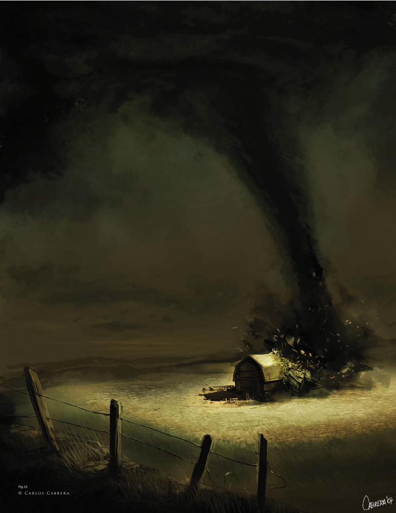
s p e e d p a i n t i n g
© C a r l o s C a b r e r a
Fig.10
C h a p t e r 0 2 4 4
s p e e d p a i n t i n g
B y D a n i e l L j u n g g r e n
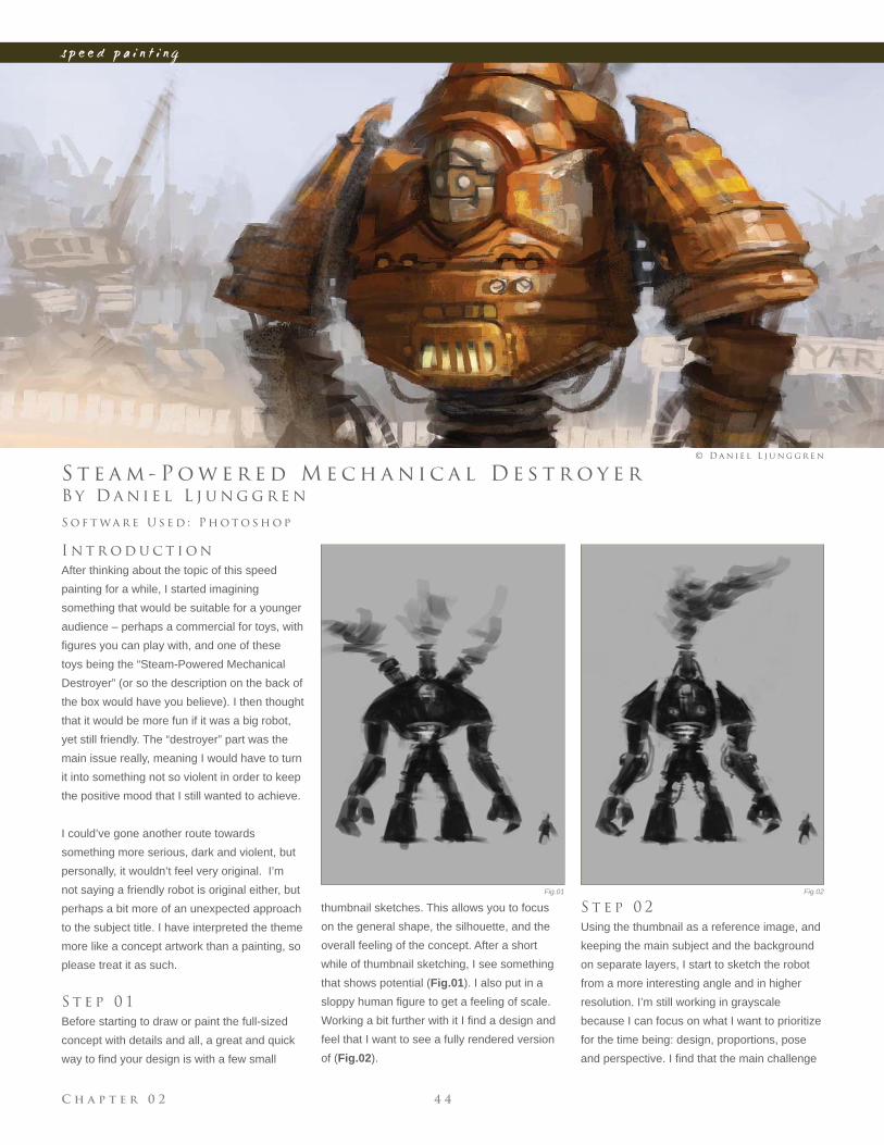
S t e a m - P o w e r e d M e c h a n i c a l D e s t r o y e r
I n t r o d u c t i o n
After thinking about the topic of this speed
painting for a while, I started imagining
something that would be suitable for a younger
audience – perhaps a commercial for toys, with
fi gures you can play with, and one of these
toys being the “Steam-Powered Mechanical
Destroyer” (or so the description on the back of
the box would have you believe). I then thought
that it would be more fun if it was a big robot,
yet still friendly. The “destroyer” part was the
main issue really, meaning I would have to turn
it into something not so violent in order to keep
the positive mood that I still wanted to achieve.
I could’ve gone another route towards
something more serious, dark and violent, but
personally, it wouldn’t feel very original. I’m
not saying a friendly robot is original either, but
perhaps a bit more of an unexpected approach
to the subject title. I have interpreted the theme
more like a concept artwork than a painting, so
please treat it as such.
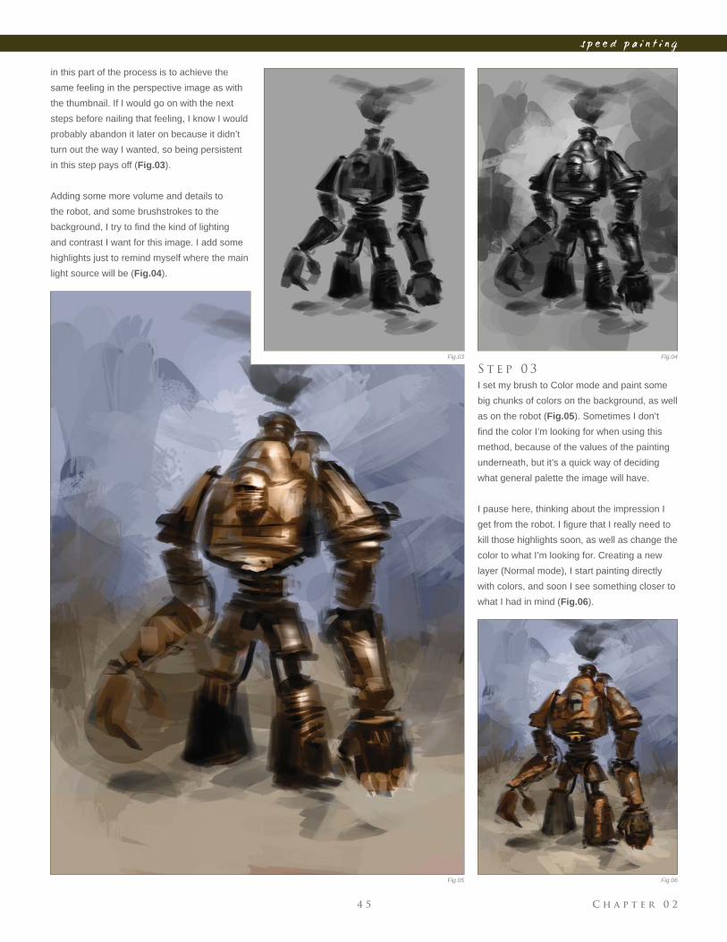
S t e p 0 1
Before starting to draw or paint the full-sized
concept with details and all, a great and quick
way to fi nd your design is with a few small
S o f t wa r e U s e d : P h o t o s h o p
© D a n i e l L j u n g g r e n
thumbnail sketches. This allows you to focus
on the general shape, the silhouette, and the
overall feeling of the concept. After a short
while of thumbnail sketching, I see something
that shows potential (Fig.01). I also put in a
sloppy human fi gure to get a feeling of scale.
Working a bit further with it I fi nd a design and
feel that I want to see a fully rendered version
of (Fig.02).
S t e p 0 2
Using the thumbnail as a reference image, and
keeping the main subject and the background
on separate layers, I start to sketch the robot
from a more interesting angle and in higher
resolution. I’m still working in grayscale
because I can focus on what I want to prioritize
for the time being: design, proportions, pose
and perspective. I fi nd that the main challenge
Fig.01 Fig.02
C h a p t e r 0 24 5
s p e e d p a i n t i n g
Fig.03 Fig.04
Fig.05 Fig.06
in this part of the process is to achieve the
same feeling in the perspective image as with
the thumbnail. If I would go on with the next
steps before nailing that feeling, I know I would
probably abandon it later on because it didn’t
turn out the way I wanted, so being persistent
in this step pays off (Fig.03).
Adding some more volume and details to
the robot, and some brushstrokes to the
background, I try to fi nd the kind of lighting
and contrast I want for this image. I add some
highlights just to remind myself where the main
light source will be (Fig.04).
S t e p 0 3
I set my brush to Color mode and paint some
big chunks of colors on the background, as well
as on the robot (Fig.05). Sometimes I don’t
fi nd the color I’m looking for when using this
method, because of the values of the painting
underneath, but it’s a quick way of deciding
what general palette the image will have.
I pause here, thinking about the impression I
get from the robot. I fi gure that I really need to
kill those highlights soon, as well as change the
color to what I’m looking for. Creating a new
layer (Normal mode), I start painting directly
with colors, and soon I see something closer to
what I had in mind (Fig.06).
C h a p t e r 0 2 4 6
s p e e d p a i n t i n g
S t e p 0 4
While developing the concept for this robot I
came up with the idea of having it working in
a junkyard, where he would be “the destroyer”
of metal scraps. This would go well with the
overall positive feel I was trying to achieve,
and the background would be where I could
suggest this (Fig.07).
S t e p 0 5
During the previous steps I wasn’t quite sure
what to make of the robot’s left arm and hand,
but as I tried a few shapes I knew it would gain
visual interest instead of having two similar
arms. After a few quick designs I decide to go
for some kind of drill (this makes the robot fi t
better with the description of “destroyer”, too).
With that done, I feel ready to start working on
more detailed shapes and textures (Fig.08).
Moving on to adding more details and
rendering (Fig.09), here I’m trying to make it
look a bit more realistic; removing a lot of the
black from the underlying sketch, as well as
thinking of cast shadows and bounce lights
from the ground. I put a few strokes on his
head as well, trying to fi gure out what I want
that part to be like.
I do some more work on the background now,
making the sky clearer and redesigning some
of his fi rebox and chimneys on his back, as
well as giving a warmer ground. I still wasn’t
sure at this stage what to make of his head
(Fig.10).
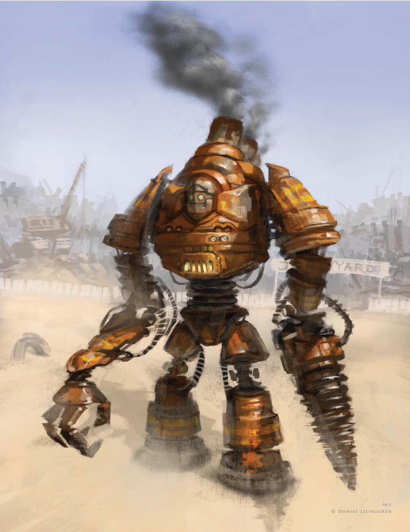
S t e p 0 6 – F i n a l
Finally I approach the face of the robot. I
considered having the robot being driven by a
man for a while (with the head as the cockpit),
but with the current scale of things I had trouble
making the chauffeur read clearly, so I dropped
that idea and went for a kind robot face
instead. This also helps strengthen the overall
positive feel. I put down some more work into
the fi rebox, showing more clearly that it is
something that could open and hold burning
coal. Background details are also added here,
as well as some stripes on the robot – and then
he’s done (Fig.11).
Fig.07
Fig.08
Fig.09 Fig.10
C h a p t e r 0 24 7
s p e e d p a i n t i n g
Fig.11
© D a n i e l L j u n g g r e n
C h a p t e r 0 2 4 8
s p e e d p a i n t i n g
Fig.01
Fig.02
B y E m r a h E l m a s l i
A l i e n H o t A i r B a l l o o n s
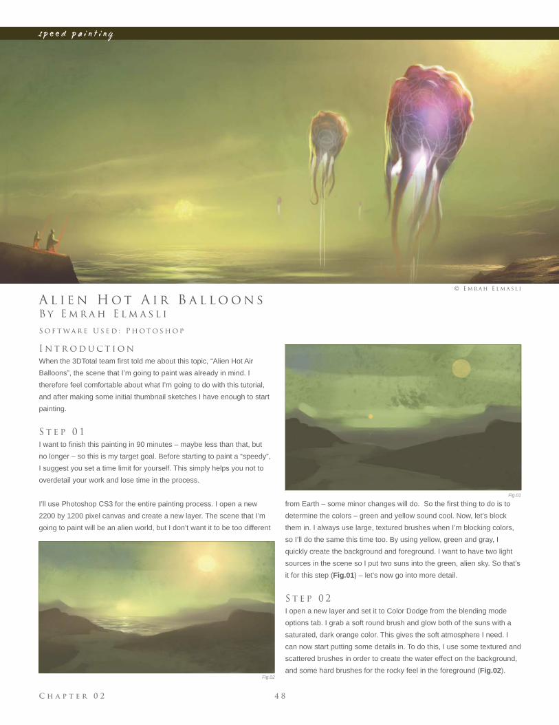
I n t r o d u c t i o n
When the 3DTotal team fi rst told me about this topic, “Alien Hot Air
Balloons”, the scene that I’m going to paint was already in mind. I
therefore feel comfortable about what I’m going to do with this tutorial,
and after making some initial thumbnail sketches I have enough to start
painting.
S t e p 0 1
I want to fi nish this painting in 90 minutes – maybe less than that, but
no longer – so this is my target goal. Before starting to paint a “speedy”,
I suggest you set a time limit for yourself. This simply helps you not to
overdetail your work and lose time in the process.
I’ll use Photoshop CS3 for the entire painting process. I open a new
2200 by 1200 pixel canvas and create a new layer. The scene that I’m
going to paint will be an alien world, but I don’t want it to be too different
S o f t wa r e U s e d : P h o t o s h o p
© E m r a h E l m a s l i
from Earth – some minor changes will do. So the fi rst thing to do is to
determine the colors – green and yellow sound cool. Now, let’s block
them in. I always use large, textured brushes when I’m blocking colors,
so I’ll do the same this time too. By using yellow, green and gray, I
quickly create the background and foreground. I want to have two light
sources in the scene so I put two suns into the green, alien sky. So that’s
it for this step (Fig.01) – let’s now go into more detail.
S t e p 0 2
I open a new layer and set it to Color Dodge from the blending mode
options tab. I grab a soft round brush and glow both of the suns with a
saturated, dark orange color. This gives the soft atmosphere I need. I
can now start putting some details in. To do this, I use some textured and
scattered brushes in order to create the water effect on the background,
and some hard brushes for the rocky feel in the foreground (Fig.02).
C h a p t e r 0 24 9
s p e e d p a i n t i n g
Fig.03
Fig.04
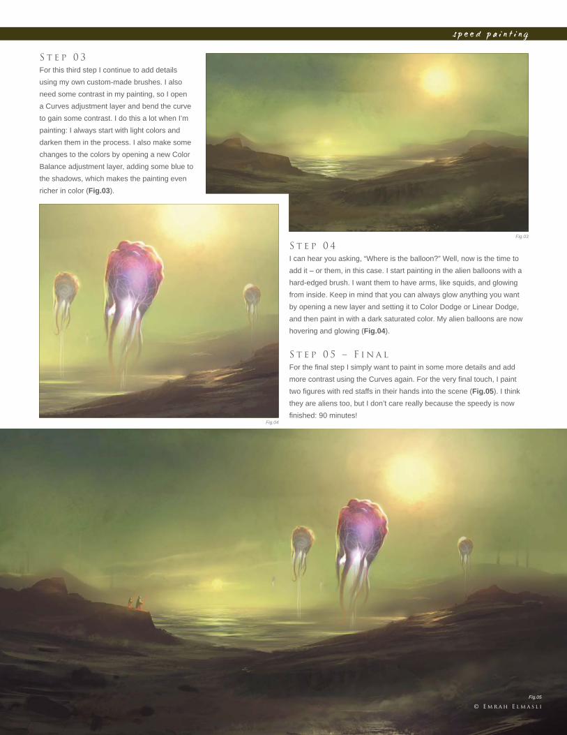
S t e p 0 3
For this third step I continue to add details
using my own custom-made brushes. I also
need some contrast in my painting, so I open
a Curves adjustment layer and bend the curve
to gain some contrast. I do this a lot when I’m
painting: I always start with light colors and
darken them in the process. I also make some
changes to the colors by opening a new Color
Balance adjustment layer, adding some blue to
the shadows, which makes the painting even
richer in color (Fig.03).
S t e p 0 4
I can hear you asking, “Where is the balloon?” Well, now is the time to
add it – or them, in this case. I start painting in the alien balloons with a
hard-edged brush. I want them to have arms, like squids, and glowing
from inside. Keep in mind that you can always glow anything you want
by opening a new layer and setting it to Color Dodge or Linear Dodge,
and then paint in with a dark saturated color. My alien balloons are now
hovering and glowing (Fig.04).
S t e p 0 5 – F i n a l
For the fi nal step I simply want to paint in some more details and add
more contrast using the Curves again. For the very fi nal touch, I paint
two fi gures with red staffs in their hands into the scene (Fig.05). I think
they are aliens too, but I don’t care really because the speedy is now
fi nished: 90 minutes!
© E m r a h E l m a s l i
Fig.05
C h a p t e r 0 2 5 0
s p e e d p a i n t i n g
Fig.01
Fig.02
Fig.03
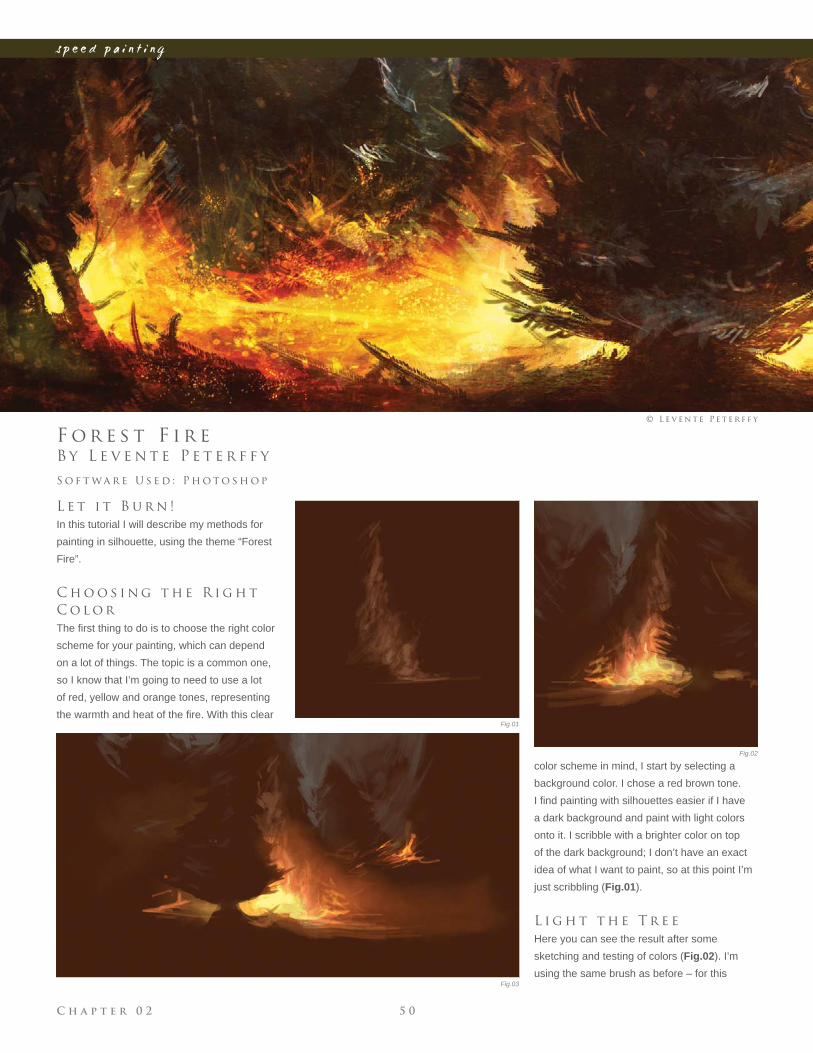
B y L e v e n t e P e t e r f f y
F o r e s t F i r e
L e t i t B u r n !
In this tutorial I will describe my methods for
painting in silhouette, using the theme “Forest
Fire”.
C h o o s i n g t h e R i g h t
C o l o r
The fi rst thing to do is to choose the right color
scheme for your painting, which can depend
on a lot of things. The topic is a common one,
so I know that I’m going to need to use a lot
of red, yellow and orange tones, representing
the warmth and heat of the fi re. With this clear
S o f t wa r e U s e d : P h o t o s h o p
© L e v e n t e P e t e r f f y
color scheme in mind, I start by selecting a
background color. I chose a red brown tone.
I fi nd painting with silhouettes easier if I have
a dark background and paint with light colors
onto it. I scribble with a brighter color on top
of the dark background; I don’t have an exact
idea of what I want to paint, so at this point I’m
just scribbling (Fig.01).
L i g h t t h e T r e e
Here you can see the result after some
sketching and testing of colors (Fig.02). I’m
using the same brush as before – for this
C h a p t e r 0 25 1
s p e e d p a i n t i n g
Fig.04
Fig.05a
Fig.05b
Fig.06
Fig.07
fi rst phase of the painting it’s a rough brush,
suitable for sketching. When sketching in
silhouette, it’s always important to paint whilst
fi rst always considering the light, and secondly
the shapes created. For example, I paint the
light around the tree and not just the tree itself,
as this is a fast way of painting when both light
and shape are established. I’m bearing in mind
here that I need a dark background, and a
lighter color on the brush I’m using.
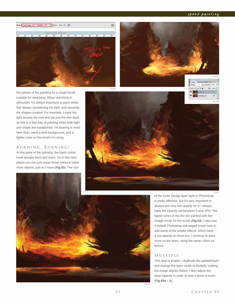
B u r n i n g , B u r n i n g !
At this point of the painting, the basic colors
have already been laid down. So in this next
phase you can just reuse those colors to paint
more objects, just as I have (Fig.03). The use
of the Color Dodge layer style in Photoshop
is pretty effective, but it’s very important to
always use very low opacity on it; I always
have the Opacity set between 5 and 15%. The
lighter tones in the fi re are painted with the
Dodge mode for the brush (Fig.04). I also use
a default Photoshop soft-edged brush here to
add some of the smoke effects, which have
a low opacity on them too. I continue to paint
more on the trees, using the same colors as
before.
M u lt i p l y
This step is simple: I duplicate the painted layer
and change the layer mode to Multiply, making
the image slightly darker. I also adjust the
layer Opacity in order to tone it down a touch
(Fig.05a – b).
C h a p t e r 0 2 5 2
s p e e d p a i n t i n g
T h e L a k e
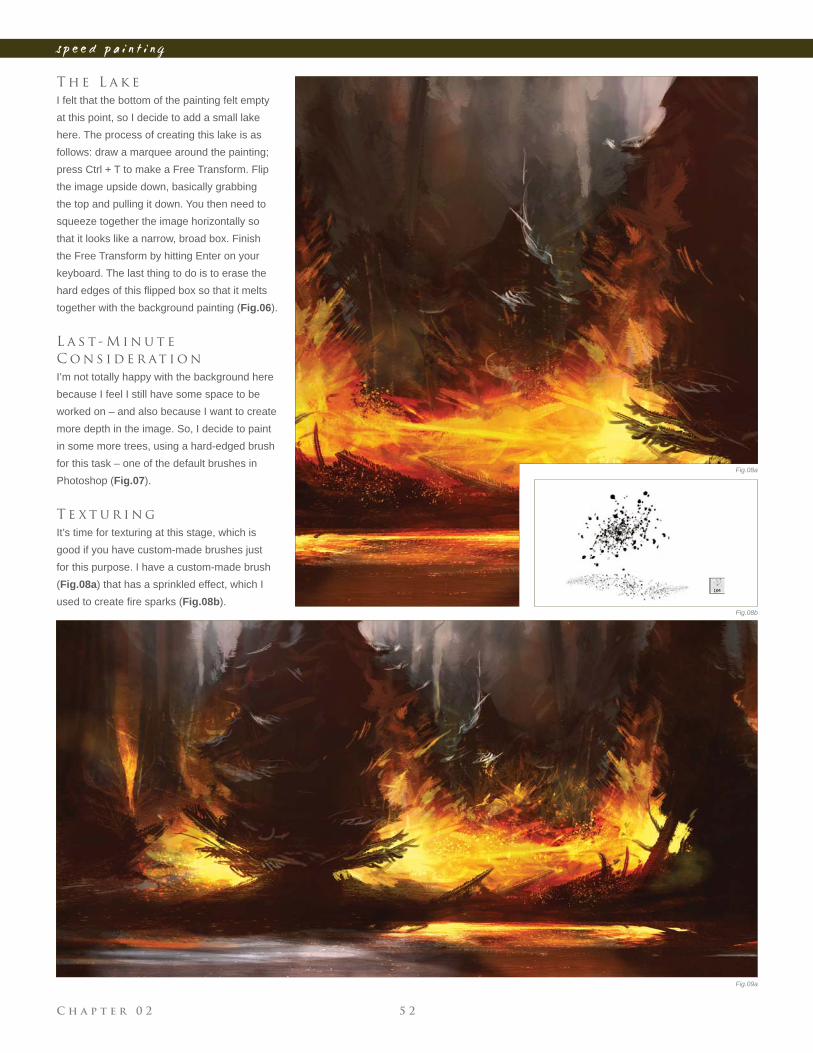
I felt that the bottom of the painting felt empty
at this point, so I decide to add a small lake
here. The process of creating this lake is as
follows: draw a marquee around the painting;
press Ctrl + T to make a Free Transform. Flip
the image upside down, basically grabbing
the top and pulling it down. You then need to
squeeze together the image horizontally so
that it looks like a narrow, broad box. Finish
the Free Transform by hitting Enter on your
keyboard. The last thing to do is to erase the
hard edges of this fl ipped box so that it melts
together with the background painting (Fig.06).
L a s t - M i n u t e
C o n s i d e r at i o n
I’m not totally happy with the background here
because I feel I still have some space to be
worked on – and also because I want to create
more depth in the image. So, I decide to paint
in some more trees, using a hard-edged brush
for this task – one of the default brushes in
Photoshop (Fig.07).
T e x t u r i n g
It’s time for texturing at this stage, which is
good if you have custom-made brushes just
for this purpose. I have a custom-made brush
(Fig.08a) that has a sprinkled effect, which I
used to create fi re sparks (Fig.08b).
Fig.08a
Fig.08b
Fig.09a
C h a p t e r 0 25 3
s p e e d p a i n t i n g
F i n a l T o u c h e s
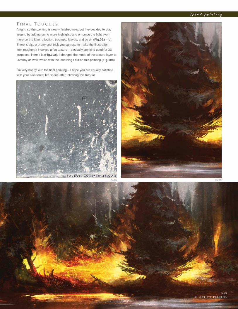
Alright, so the painting is nearly fi nished now, but I’ve decided to play
around by adding some more highlights and enhance the light even
more on the lake refl ection, treetops, leaves, and so on (Fig.09a – b).
There is also a pretty cool trick you can use to make the illustration
look rougher: it involves a fl at texture – basically any kind used for 3D
purposes. Here it is (Fig.10a). I changed the mode of the texture layer to
Overlay as well, which was the last thing I did on this painting (Fig.10b).
I’m very happy with the fi nal painting – I hope you are equally satisfi ed
with your own forest fi re scene after following this tutorial.
Fig.09bFig.10a
Fig.10b
© L e v e n t e P e t e r f f y
S o u r c e : C G T e x t u r e s . c o m
C h a p t e r 0 2 5 4
s p e e d p a i n t i n g
Fig.01
Fig.02
B y L e v e n t e P e t e r f f y
S h i p H i t b y T o r p e d o
I n t r o d u c t i o n
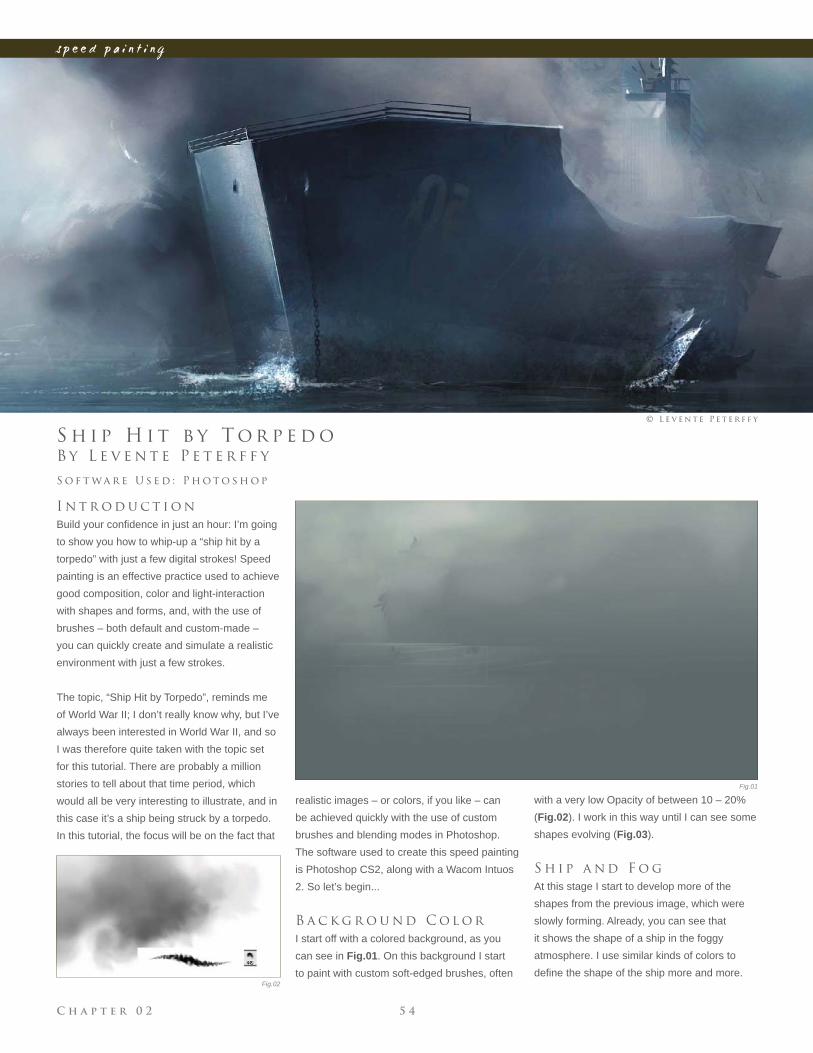
Build your confi dence in just an hour: I’m going
to show you how to whip-up a “ship hit by a
torpedo” with just a few digital strokes! Speed
painting is an effective practice used to achieve
good composition, color and light-interaction
with shapes and forms, and, with the use of
brushes – both default and custom-made –
you can quickly create and simulate a realistic
environment with just a few strokes.
The topic, “Ship Hit by Torpedo”, reminds me
of World War II; I don’t really know why, but I’ve
always been interested in World War II, and so
I was therefore quite taken with the topic set
for this tutorial. There are probably a million
stories to tell about that time period, which
would all be very interesting to illustrate, and in
this case it’s a ship being struck by a torpedo.
In this tutorial, the focus will be on the fact that
S o f t wa r e U s e d : P h o t o s h o p
© L e v e n t e P e t e r f f y
realistic images – or colors, if you like – can
be achieved quickly with the use of custom
brushes and blending modes in Photoshop.
The software used to create this speed painting
is Photoshop CS2, along with a Wacom Intuos
2. So let’s begin...
B a c k g r o u n d C o l o r
I start off with a colored background, as you
can see in Fig.01. On this background I start
to paint with custom soft-edged brushes, often
with a very low Opacity of between 10 – 20%
(Fig.02). I work in this way until I can see some
shapes evolving (Fig.03).
S h i p a n d F o g
At this stage I start to develop more of the
shapes from the previous image, which were
slowly forming. Already, you can see that
it shows the shape of a ship in the foggy
atmosphere. I use similar kinds of colors to
defi ne the shape of the ship more and more.
C h a p t e r 0 25 5
s p e e d p a i n t i n g
Fig.03
Fig.04Fig.05
Fig.06
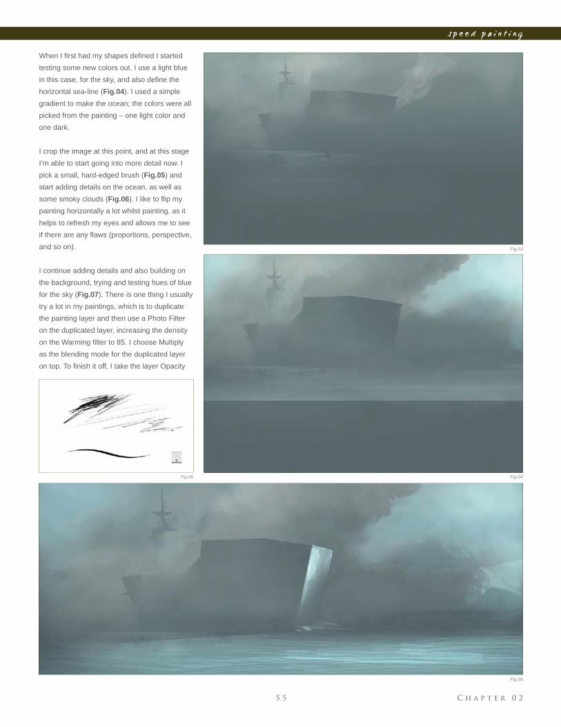
When I fi rst had my shapes defi ned I started
testing some new colors out. I use a light blue
in this case, for the sky, and also defi ne the
horizontal sea-line (Fig.04). I used a simple
gradient to make the ocean; the colors were all
picked from the painting – one light color and
one dark.
I crop the image at this point, and at this stage
I’m able to start going into more detail now. I
pick a small, hard-edged brush (Fig.05) and
start adding details on the ocean, as well as
some smoky clouds (Fig.06). I like to fl ip my
painting horizontally a lot whilst painting, as it
helps to refresh my eyes and allows me to see
if there are any fl aws (proportions, perspective,
and so on).
I continue adding details and also building on
the background, trying and testing hues of blue
for the sky (Fig.07). There is one thing I usually
try a lot in my paintings, which is to duplicate
the painting layer and then use a Photo Filter
on the duplicated layer, increasing the density
on the Warming fi lter to 85. I choose Multiply
as the blending mode for the duplicated layer
on top. To fi nish it off, I take the layer Opacity
C h a p t e r 0 2 5 6
s p e e d p a i n t i n g
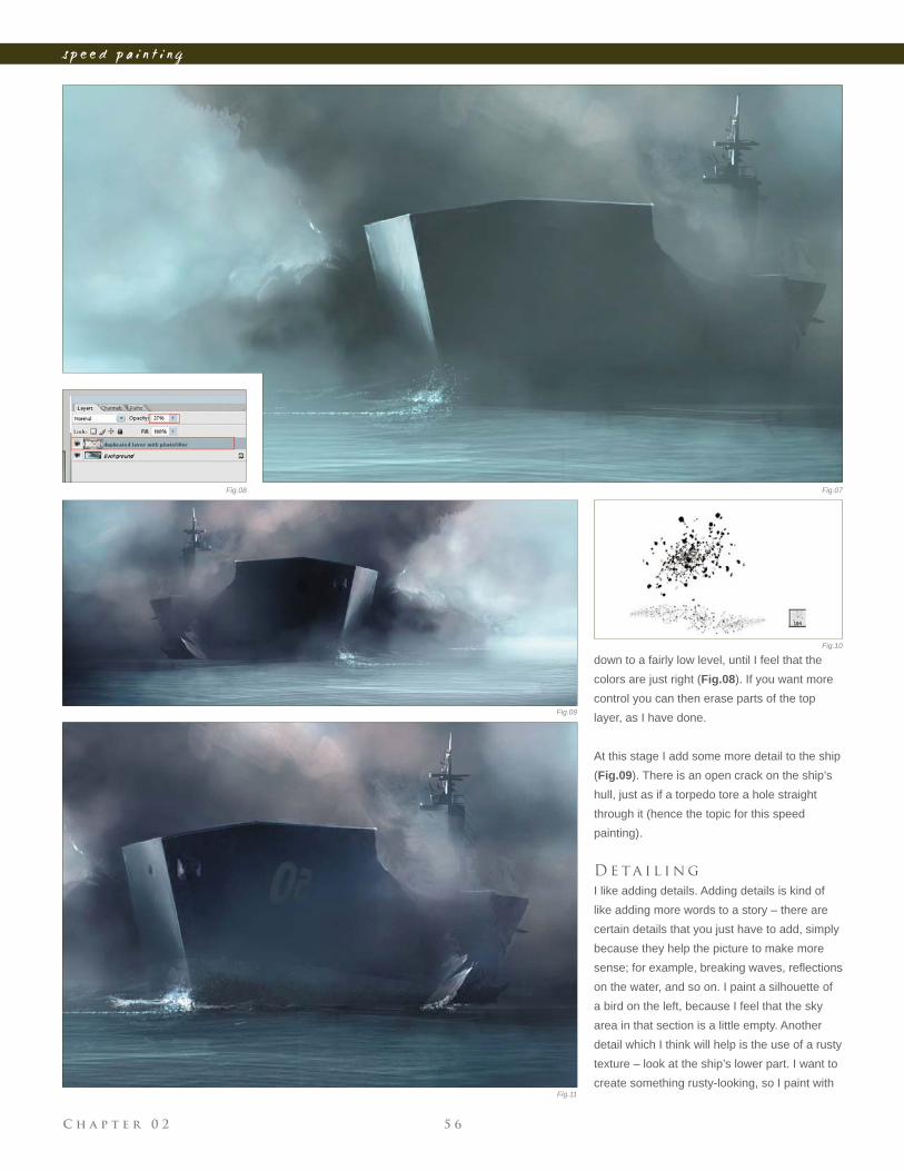
down to a fairly low level, until I feel that the
colors are just right (Fig.08). If you want more
control you can then erase parts of the top
layer, as I have done.
At this stage I add some more detail to the ship
(Fig.09). There is an open crack on the ship’s
hull, just as if a torpedo tore a hole straight
through it (hence the topic for this speed
painting).
D e ta i l i n g
I like adding details. Adding details is kind of
like adding more words to a story – there are
certain details that you just have to add, simply
because they help the picture to make more
sense; for example, breaking waves, refl ections
on the water, and so on. I paint a silhouette of
a bird on the left, because I feel that the sky
area in that section is a little empty. Another
detail which I think will help is the use of a rusty
texture – look at the ship’s lower part. I want to
create something rusty-looking, so I paint with
Fig.07Fig.08
Fig.09
Fig.10
Fig.11
C h a p t e r 0 25 7
s p e e d p a i n t i n g
a custom-made brush, which slightly resembles
rust (Fig.10 – 11). I also continue adding more
brushstrokes to the smoke (Fig.12).
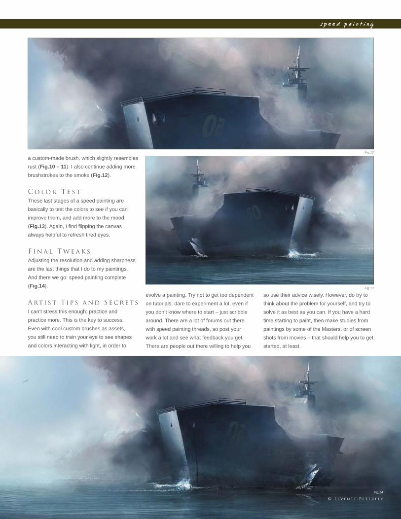
C o l o r T e s t
These last stages of a speed painting are
basically to test the colors to see if you can
improve them, and add more to the mood
(Fig.13). Again, I fi nd fl ipping the canvas
always helpful to refresh tired eyes.
F i n a l T w e a k s
Adjusting the resolution and adding sharpness
are the last things that I do to my paintings.
And there we go: speed painting complete
(Fig.14).
A rt i s t T ip s a nd S e c r e t s
I can’t stress this enough: practice and
practice more. This is the key to success.
Even with cool custom brushes as assets,
you still need to train your eye to see shapes
and colors interacting with light, in order to
evolve a painting. Try not to get too dependent
on tutorials; dare to experiment a lot, even if
you don’t know where to start – just scribble
around. There are a lot of forums out there
with speed painting threads, so post your
work a lot and see what feedback you get.
There are people out there willing to help you
so use their advice wisely. However, do try to
think about the problem for yourself, and try to
solve it as best as you can. If you have a hard
time starting to paint, then make studies from
paintings by some of the Masters, or of screen
shots from movies – that should help you to get
started, at least.
Fig.12
Fig.13
Fig.14
© L e v e n t e P e t e r f f y
C h a p t e r 0 2 5 8
s p e e d p a i n t i n g
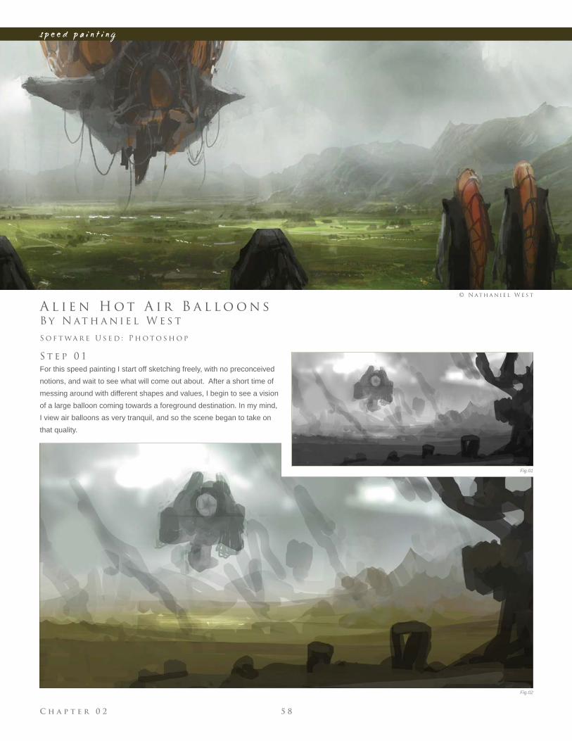
B y N at h a n i e l W e s t
A l i e n H o t A i r B a l l o o n s
S t e p 0 1
For this speed painting I start off sketching freely, with no preconceived
notions, and wait to see what will come out about. After a short time of
messing around with different shapes and values, I begin to see a vision
of a large balloon coming towards a foreground destination. In my mind,
I view air balloons as very tranquil, and so the scene began to take on
that quality.
S o f t wa r e U s e d : P h o t o s h o p
© N at h a n i e l W e s t
Fig.01
Fig.02
C h a p t e r 0 25 9
s p e e d p a i n t i n g
Fig.03
Fig.04
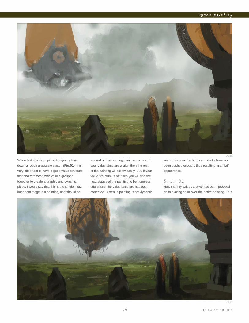
When fi rst starting a piece I begin by laying
down a rough grayscale sketch (Fig.01). It is
very important to have a good value structure
fi rst and foremost, with values grouped
together to create a graphic and dynamic
piece. I would say that this is the single most
important stage in a painting, and should be
simply because the lights and darks have not
been pushed enough, thus resulting in a “fl at”
appearance.
S t e p 0 2
Now that my values are worked out, I proceed
on to glazing color over the entire painting. This
worked out before beginning with color. If
your value structure works, then the rest
of the painting will follow easily. But, if your
value structure is off, then you will fi nd the
next stages of the painting to be hopeless
efforts until the value structure has been
corrected. Often, a painting is not dynamic
C h a p t e r 0 2 6 0
s p e e d p a i n t i n g
can be subtle or extreme, but either way I glaze
the whole painting with one color to keep the
palette unifi ed. I then begin to add additional
color variations and levels of saturation to
develop the piece further. I’m always careful
to maintain the value structure throughout this
stage of the painting process (Fig.02).
S t e p 0 3
With the overall palette of the painting
established, I can now begin to further develop
some details. I add in the balloon portion of the
hot air balloon, and then mirror it with the same
color and shape in the upper right corner. I also
add a couple of fi gures and decide to give them
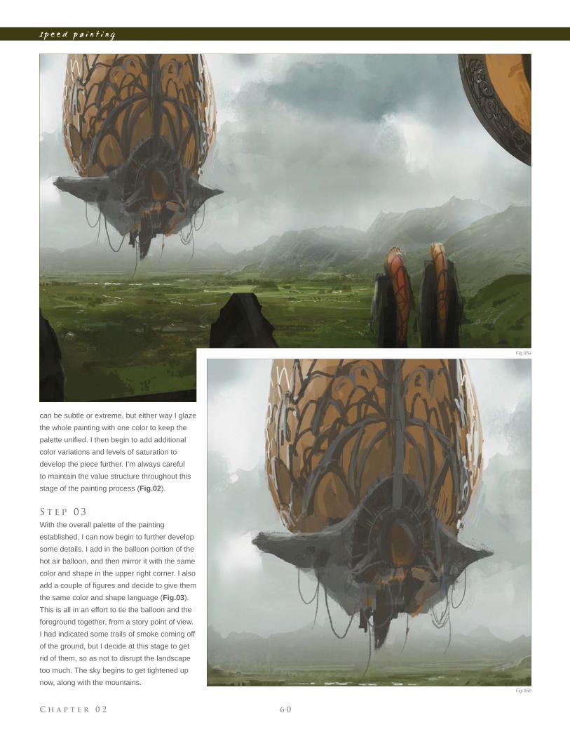
the same color and shape language (Fig.03).
This is all in an effort to tie the balloon and the
foreground together, from a story point of view.
I had indicated some trails of smoke coming off
of the ground, but I decide at this stage to get
rid of them, so as not to disrupt the landscape
too much. The sky begins to get tightened up
now, along with the mountains. Fig.05b
Fig.05a
C h a p t e r 0 26 1
s p e e d p a i n t i n g
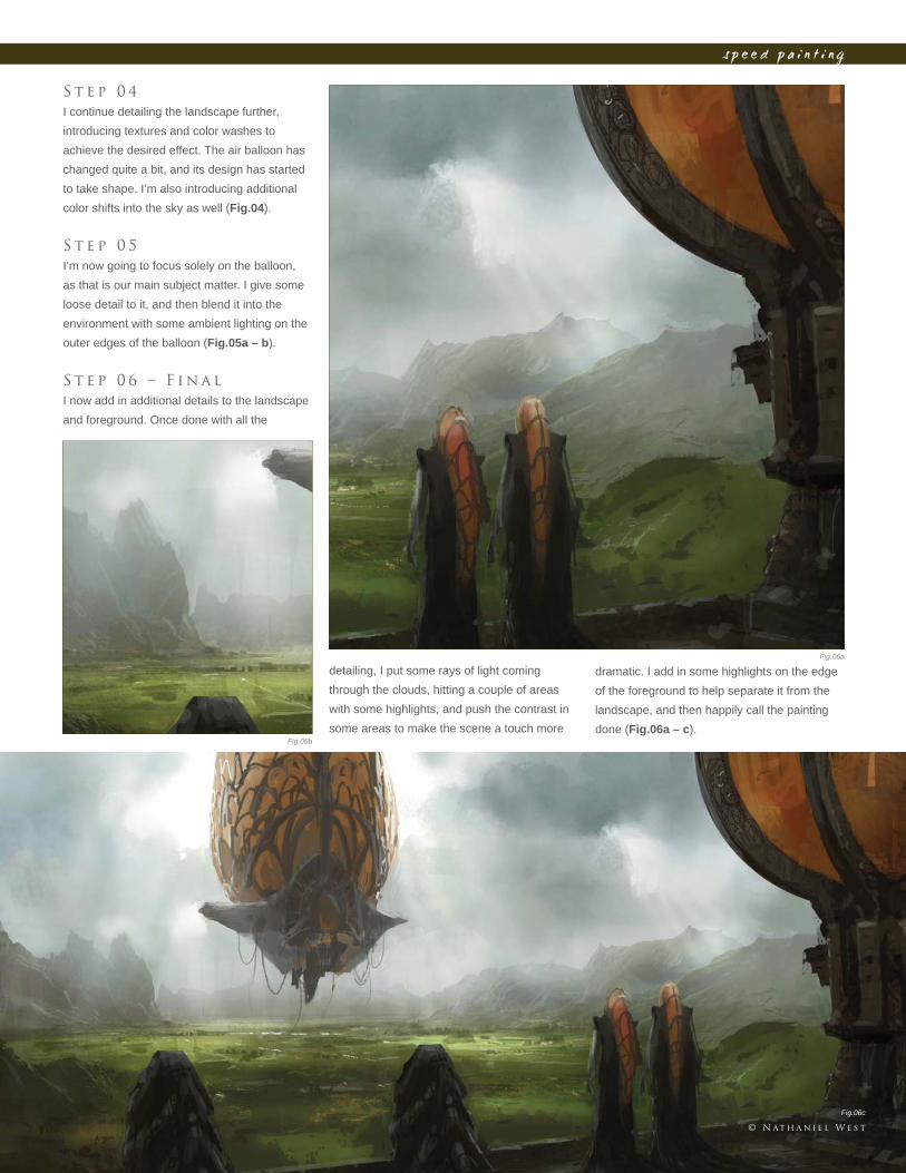
S t e p 0 4
I continue detailing the landscape further,
introducing textures and color washes to
achieve the desired effect. The air balloon has
changed quite a bit, and its design has started
to take shape. I’m also introducing additional
color shifts into the sky as well (Fig.04).
S t e p 0 5
I’m now going to focus solely on the balloon,
as that is our main subject matter. I give some
loose detail to it, and then blend it into the
environment with some ambient lighting on the
outer edges of the balloon (Fig.05a – b).
S t e p 0 6 – F i n a l
I now add in additional details to the landscape
and foreground. Once done with all the
detailing, I put some rays of light coming
through the clouds, hitting a couple of areas
with some highlights, and push the contrast in
some areas to make the scene a touch more
dramatic. I add in some highlights on the edge
of the foreground to help separate it from the
landscape, and then happily call the painting
done (Fig.06a – c).Fig.06b
Fig.06a
Fig.06c
© N at h a n i e l W e s t
C h a p t e r 0 2 6 2
s p e e d p a i n t i n g
Fig.01
Fig.02
Fig.03
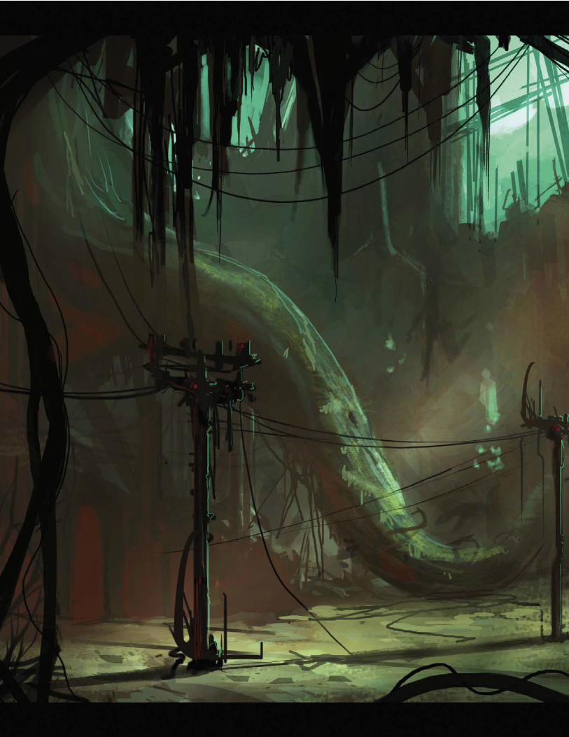
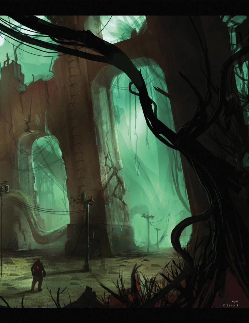
B y S e r g S o u l e i m a n
O n c e a T h r i v i n g C i t y, N o w D e s e rt e d
I n t r o d u c t i o n
The outcome of a painting cannot be determined in the fi rst stages of
its creation; an image usually evolves with the artist over time. The
process that I used to approach this brief started out with some research
into interesting shapes. It’s always a good idea to have some kind of
reference for whatever you’re drawing, but this time around I wanted to
see what I could achieve from a two-hour speed painting without using
any specifi c references. So here we go…
S o f t wa r e U s e d : P h o t o s h o p
© S e r g S
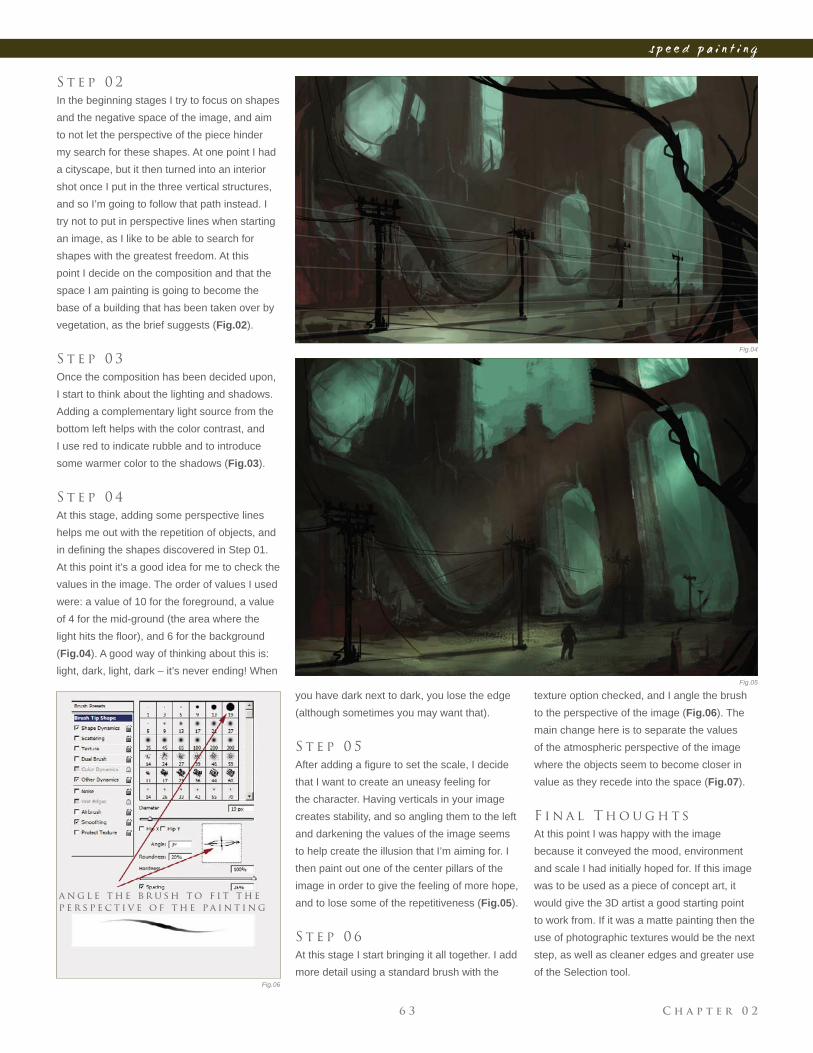
S t e p 0 1
For this painting, I start off with a standard
round brush, size 13, with Pressure Dynamics
turned off and Opacity set to 75%. The colors
I went for, with the theme of an overgrown
city in mind, were all neutral and earthy tones
(Fig.01)
a n d Ta k e n O v e r b y V e g e tat i o n
C h a p t e r 0 26 3
s p e e d p a i n t i n g
Fig.04
Fig.05
Fig.06
S t e p 0 2
In the beginning stages I try to focus on shapes
and the negative space of the image, and aim
to not let the perspective of the piece hinder
my search for these shapes. At one point I had
a cityscape, but it then turned into an interior
shot once I put in the three vertical structures,
and so I’m going to follow that path instead. I
try not to put in perspective lines when starting
an image, as I like to be able to search for
shapes with the greatest freedom. At this
point I decide on the composition and that the
space I am painting is going to become the
base of a building that has been taken over by
vegetation, as the brief suggests (Fig.02).
S t e p 0 3
Once the composition has been decided upon,
I start to think about the lighting and shadows.
Adding a complementary light source from the
bottom left helps with the color contrast, and
I use red to indicate rubble and to introduce
some warmer color to the shadows (Fig.03).
S t e p 0 4
At this stage, adding some perspective lines
helps me out with the repetition of objects, and
in defi ning the shapes discovered in Step 01.
At this point it’s a good idea for me to check the
values in the image. The order of values I used
were: a value of 10 for the foreground, a value
of 4 for the mid-ground (the area where the
light hits the fl oor), and 6 for the background
(Fig.04). A good way of thinking about this is:
light, dark, light, dark – it’s never ending! When
you have dark next to dark, you lose the edge
(although sometimes you may want that).
S t e p 0 5
After adding a fi gure to set the scale, I decide
that I want to create an uneasy feeling for
the character. Having verticals in your image
creates stability, and so angling them to the left
and darkening the values of the image seems
to help create the illusion that I’m aiming for. I
then paint out one of the center pillars of the
image in order to give the feeling of more hope,
and to lose some of the repetitiveness (Fig.05).
S t e p 0 6
At this stage I start bringing it all together. I add
more detail using a standard brush with the
texture option checked, and I angle the brush
to the perspective of the image (Fig.06). The
main change here is to separate the values
of the atmospheric perspective of the image
where the objects seem to become closer in
value as they recede into the space (Fig.07).
F i n a l T h o u g h t s
At this point I was happy with the image
because it conveyed the mood, environment
and scale I had initially hoped for. If this image
was to be used as a piece of concept art, it
would give the 3D artist a good starting point
to work from. If it was a matte painting then the
use of photographic textures would be the next
step, as well as cleaner edges and greater use
of the Selection tool.
a n g l e t h e b r u s h t o f i t t h e
p e r s p e c t i v e o f t h e pa i n t i n g
C h a p t e r 0 2 6 4
s p e e d p a i n t i n g
C h a p t e r 0 26 5
s p e e d p a i n t i n g
Fig.07
© S e r g S
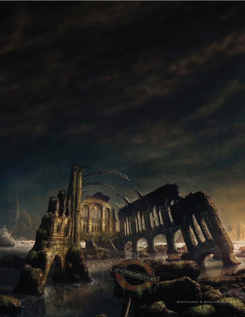
R e n a i s s a n c e © M a r c o B a u r i e d e l
What was once a traditional art form has now adapted to become a
purely digital practice. This very particular discipline allows fi lm makers
to create scenes that would prove either too expensive or impossible to
fi lm, and has become one of the staple ingredients in this industry. This
chapter looks at the techniques behind matte painting and explores the
value of photography and painting skills to seamlessly blend two distinct
attitudes.
m a t t e p a i n t i n g
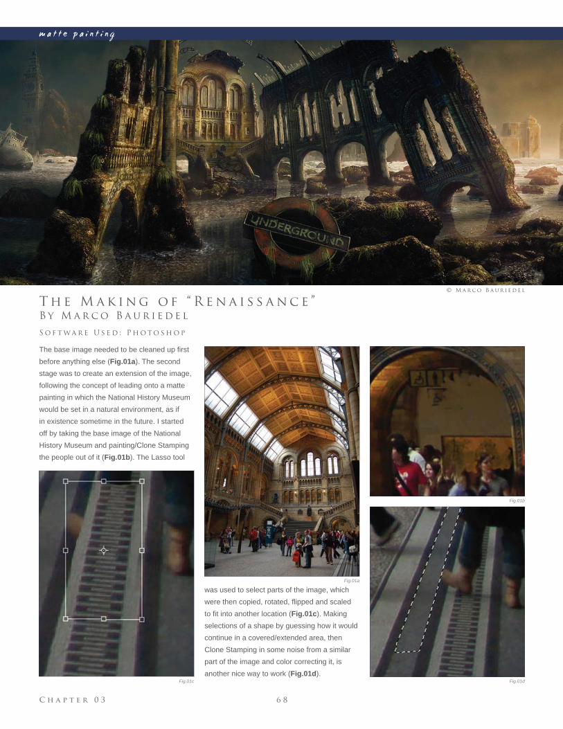
C h a p t e r 0 3 6 8
m a t t e p a i n t i n g
Fig.01a
Fig.01b
Fig.01dFig.01c
B y M a r c o B a u r i e d e l
T h e M a k i n g o f “ R e n a i s s a n c e ”
The base image needed to be cleaned up fi rst
before anything else (Fig.01a). The second
stage was to create an extension of the image,
following the concept of leading onto a matte
painting in which the National History Museum
would be set in a natural environment, as if
in existence sometime in the future. I started
off by taking the base image of the National
History Museum and painting/Clone Stamping
the people out of it (Fig.01b). The Lasso tool
S o f t wa r e U s e d : P h o t o s h o p
© M a r c o B a u r i e d e l
was used to select parts of the image, which
were then copied, rotated, fl ipped and scaled
to fi t into another location (Fig.01c). Making
selections of a shape by guessing how it would
continue in a covered/extended area, then
Clone Stamping in some noise from a similar
part of the image and color correcting it, is
another nice way to work (Fig.01d).
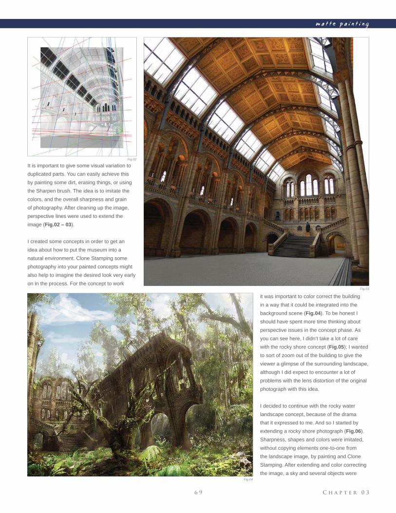
C h a p t e r 0 36 9
m a t t e p a i n t i n g
Fig.02
Fig.03
Fig.04
It is important to give some visual variation to
duplicated parts. You can easily achieve this
by painting some dirt, erasing things, or using
the Sharpen brush. The idea is to imitate the
colors, and the overall sharpness and grain
of photography. After cleaning up the image,
perspective lines were used to extend the
image (Fig.02 – 03).
I created some concepts in order to get an
idea about how to put the museum into a
natural environment. Clone Stamping some
photography into your painted concepts might
also help to imagine the desired look very early
on in the process. For the concept to work
it was important to color correct the building
in a way that it could be integrated into the
background scene (Fig.04). To be honest I
should have spent more time thinking about
perspective issues in the concept phase. As
you can see here, I didn’t take a lot of care
with the rocky shore concept (Fig.05); I wanted
to sort of zoom out of the building to give the
viewer a glimpse of the surrounding landscape,
although I did expect to encounter a lot of
problems with the lens distortion of the original
photograph with this idea.
I decided to continue with the rocky water
landscape concept, because of the drama
that it expressed to me. And so I started by
extending a rocky shore photograph (Fig.06).
Sharpness, shapes and colors were imitated,
without copying elements one-to-one from
the landscape image, by painting and Clone
Stamping. After extending and color correcting
the image, a sky and several objects were
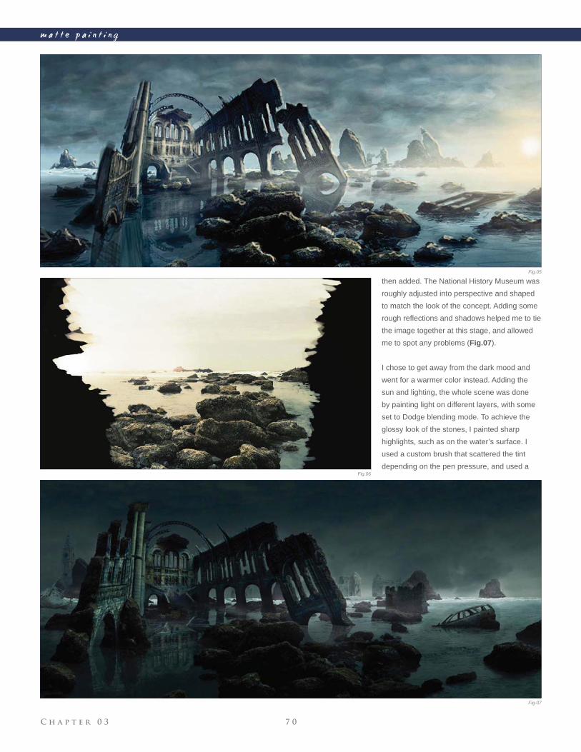
C h a p t e r 0 3 7 0
m a t t e p a i n t i n g
then added. The National History Museum was
roughly adjusted into perspective and shaped
to match the look of the concept. Adding some
rough refl ections and shadows helped me to tie
the image together at this stage, and allowed
me to spot any problems (Fig.07).
I chose to get away from the dark mood and
went for a warmer color instead. Adding the
sun and lighting, the whole scene was done
by painting light on different layers, with some
set to Dodge blending mode. To achieve the
glossy look of the stones, I painted sharp
highlights, such as on the water’s surface. I
used a custom brush that scattered the tint
depending on the pen pressure, and used a
Fig.05
Fig.06
Fig.07
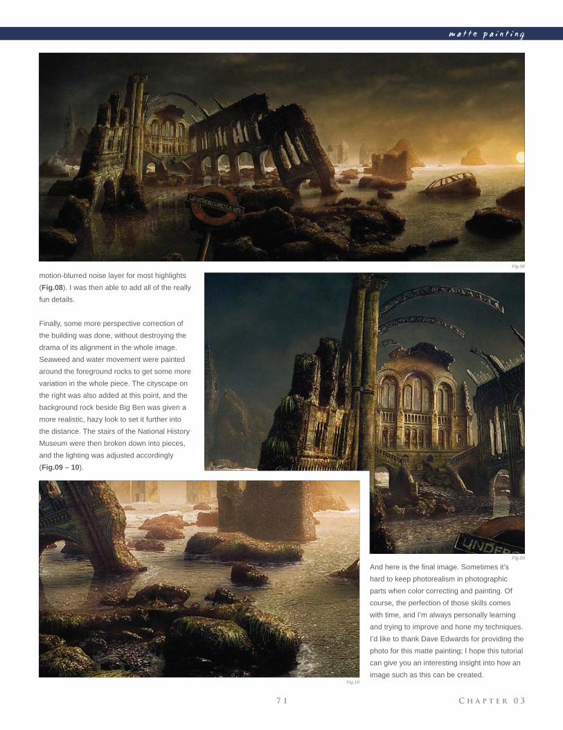
C h a p t e r 0 37 1
m a t t e p a i n t i n g
motion-blurred noise layer for most highlights
(Fig.08). I was then able to add all of the really
fun details.
Finally, some more perspective correction of
the building was done, without destroying the
drama of its alignment in the whole image.
Seaweed and water movement were painted
around the foreground rocks to get some more
variation in the whole piece. The cityscape on
the right was also added at this point, and the
background rock beside Big Ben was given a
more realistic, hazy look to set it further into
the distance. The stairs of the National History
Museum were then broken down into pieces,
and the lighting was adjusted accordingly
(Fig.09 – 10).
And here is the fi nal image. Sometimes it’s
hard to keep photorealism in photographic
parts when color correcting and painting. Of
course, the perfection of those skills comes
with time, and I’m always personally learning
and trying to improve and hone my techniques.
I’d like to thank Dave Edwards for providing the
photo for this matte painting; I hope this tutorial
can give you an interesting insight into how an
image such as this can be created.
Fig.08
Fig.09
Fig.10
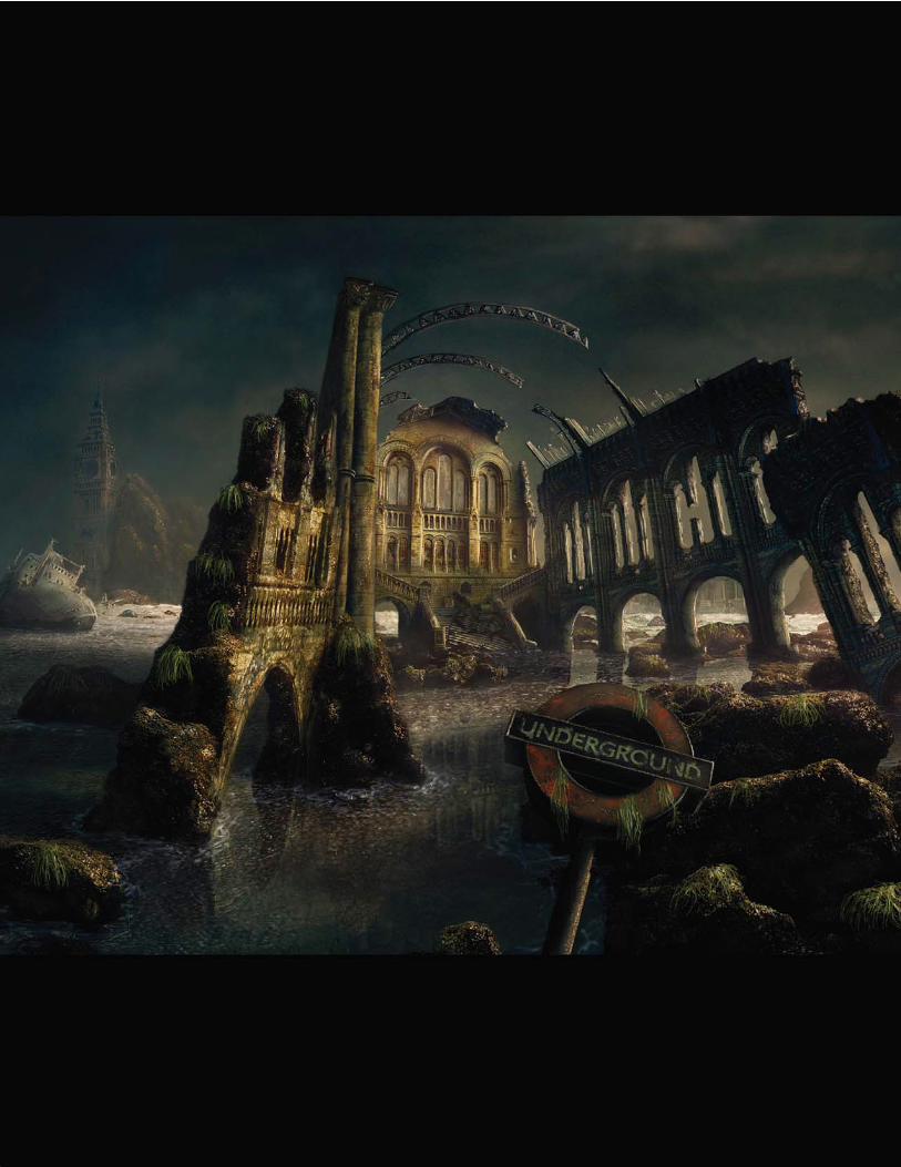
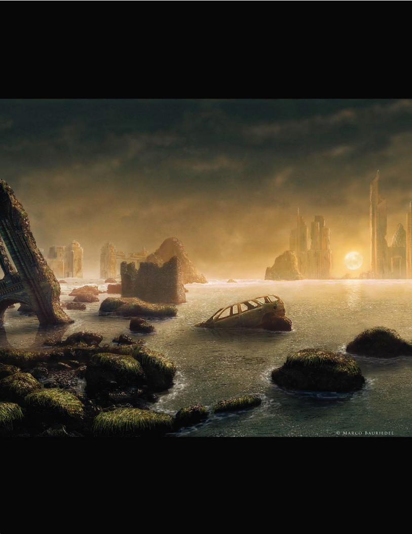
© M a r c o B a u r i e d e l
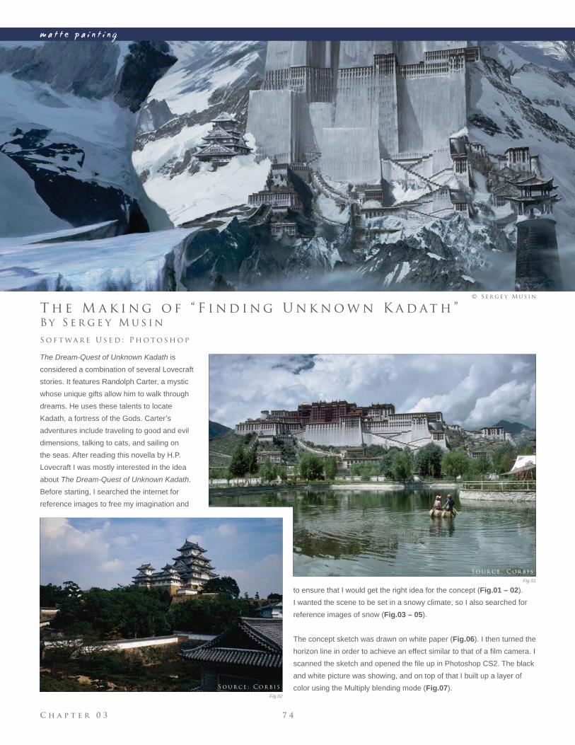
C h a p t e r 0 3 7 4
m a t t e p a i n t i n g
Fig.01
Fig.02
B y S e r g e y M u s i n
T h e M a k i n g o f “ F i n d i n g U n k n o w n K a d at h ”
The Dream-Quest of Unknown Kadath is
considered a combination of several Lovecraft
stories. It features Randolph Carter, a mystic
whose unique gifts allow him to walk through
dreams. He uses these talents to locate
Kadath, a fortress of the Gods. Carter’s
adventures include traveling to good and evil
dimensions, talking to cats, and sailing on
the seas. After reading this novella by H.P.
Lovecraft I was mostly interested in the idea
about The Dream-Quest of Unknown Kadath.
Before starting, I searched the internet for
reference images to free my imagination and
S o f t wa r e U s e d : P h o t o s h o p
© S e r g e y M u s i n
to ensure that I would get the right idea for the concept (Fig.01 – 02).
I wanted the scene to be set in a snowy climate, so I also searched for
reference images of snow (Fig.03 – 05).
The concept sketch was drawn on white paper (Fig.06). I then turned the
horizon line in order to achieve an effect similar to that of a fi lm camera. I
scanned the sketch and opened the fi le up in Photoshop CS2. The black
and white picture was showing, and on top of that I built up a layer of
color using the Multiply blending mode (Fig.07).
S o u r c e : C o r b i s
S o u r c e : C o r b i s
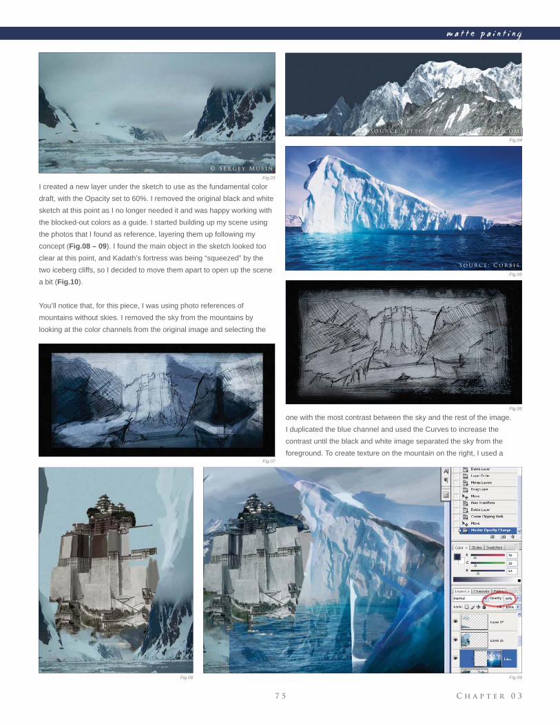
C h a p t e r 0 37 5
m a t t e p a i n t i n g
Fig.03
Fig.04
Fig.05
Fig.06
Fig.07
Fig.08 Fig.09
I created a new layer under the sketch to use as the fundamental color
draft, with the Opacity set to 60%. I removed the original black and white
sketch at this point as I no longer needed it and was happy working with
the blocked-out colors as a guide. I started building up my scene using
the photos that I found as reference, layering them up following my
concept (Fig.08 – 09). I found the main object in the sketch looked too
clear at this point, and Kadath’s fortress was being “squeezed” by the
two iceberg cliffs, so I decided to move them apart to open up the scene
a bit (Fig.10).
You’ll notice that, for this piece, I was using photo references of
mountains without skies. I removed the sky from the mountains by
looking at the color channels from the original image and selecting the
one with the most contrast between the sky and the rest of the image.
I duplicated the blue channel and used the Curves to increase the
contrast until the black and white image separated the sky from the
foreground. To create texture on the mountain on the right, I used a
S o u r c e : C o r b i s
© S e r g e y M u s i n
Fig.04
S o u r c e : h t t p : / / w w w. w pa n o r a m a . c o m
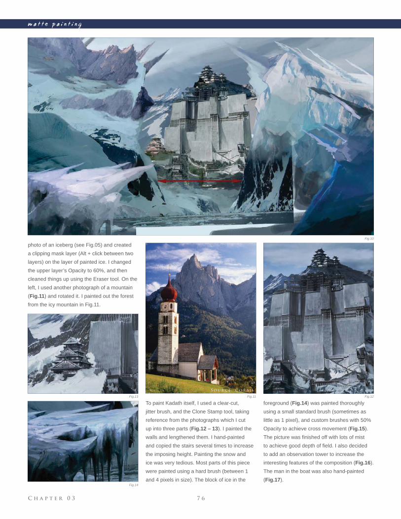
C h a p t e r 0 3 7 6
m a t t e p a i n t i n g
photo of an iceberg (see Fig.05) and created
a clipping mask layer (Alt + click between two
layers) on the layer of painted ice. I changed
the upper layer’s Opacity to 60%, and then
cleaned things up using the Eraser tool. On the
left, I used another photograph of a mountain
(Fig.11) and rotated it. I painted out the forest
from the icy mountain in Fig.11.
To paint Kadath itself, I used a clear-cut,
jitter brush, and the Clone Stamp tool, taking
reference from the photographs which I cut
up into three parts (Fig.12 – 13). I painted the
walls and lengthened them. I hand-painted
and copied the stairs several times to increase
the imposing height. Painting the snow and
ice was very tedious. Most parts of this piece
were painted using a hard brush (between 1
and 4 pixels in size). The block of ice in the
foreground (Fig.14) was painted thoroughly
using a small standard brush (sometimes as
little as 1 pixel), and custom brushes with 50%
Opacity to achieve cross movement (Fig.15).
The picture was fi nished off with lots of mist
to achieve good depth of fi eld. I also decided
to add an observation tower to increase the
interesting features of the composition (Fig.16).
The man in the boat was also hand-painted
(Fig.17).
Fig.10
Fig.11 Fig.12Fig.13
Fig.14
S o u r c e : C o r b i s
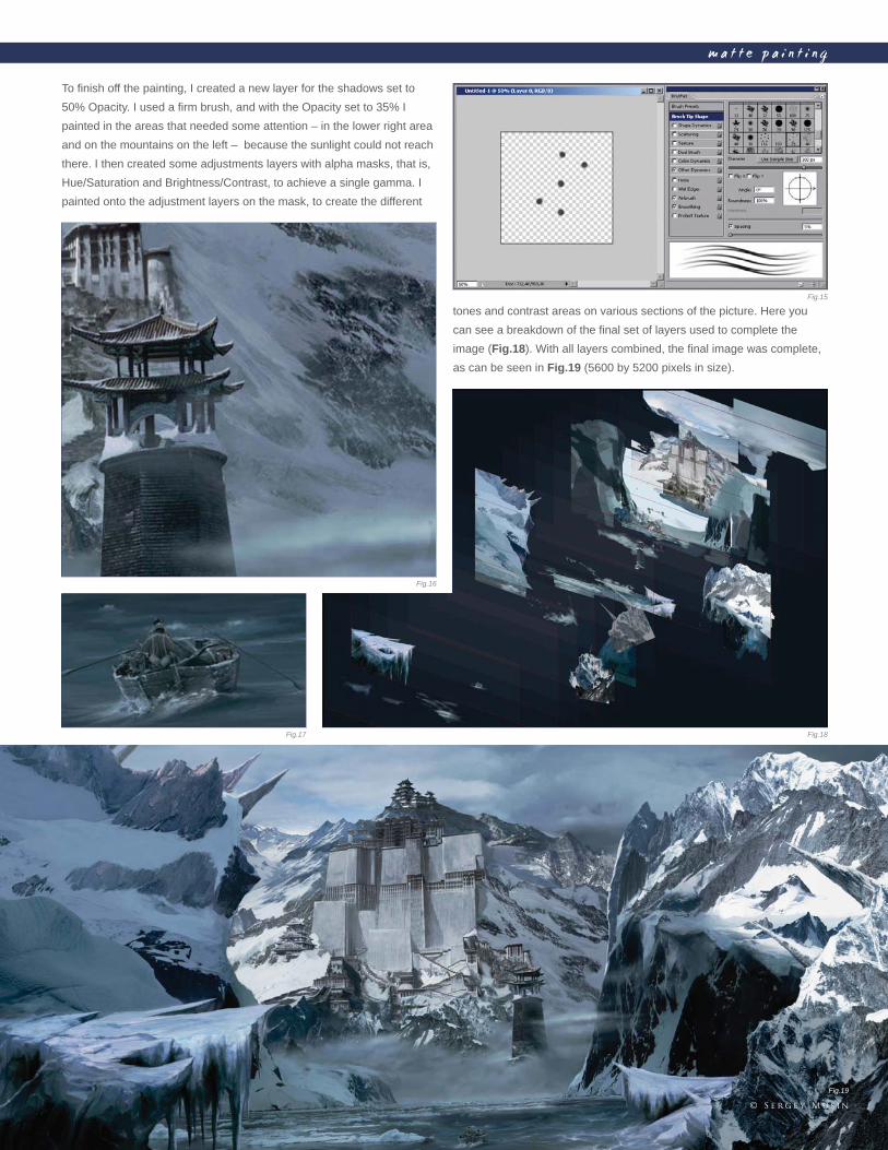
C h a p t e r 0 37 7
m a t t e p a i n t i n g
To fi nish off the painting, I created a new layer for the shadows set to
50% Opacity. I used a fi rm brush, and with the Opacity set to 35% I
painted in the areas that needed some attention – in the lower right area
and on the mountains on the left – because the sunlight could not reach
there. I then created some adjustments layers with alpha masks, that is,
Hue/Saturation and Brightness/Contrast, to achieve a single gamma. I
painted onto the adjustment layers on the mask, to create the different
tones and contrast areas on various sections of the picture. Here you
can see a breakdown of the fi nal set of layers used to complete the
image (Fig.18). With all layers combined, the fi nal image was complete,
as can be seen in Fig.19 (5600 by 5200 pixels in size).
Fig.15
Fig.16
Fig.17 Fig.18
Fig.19
© S e r g e y M u s i n
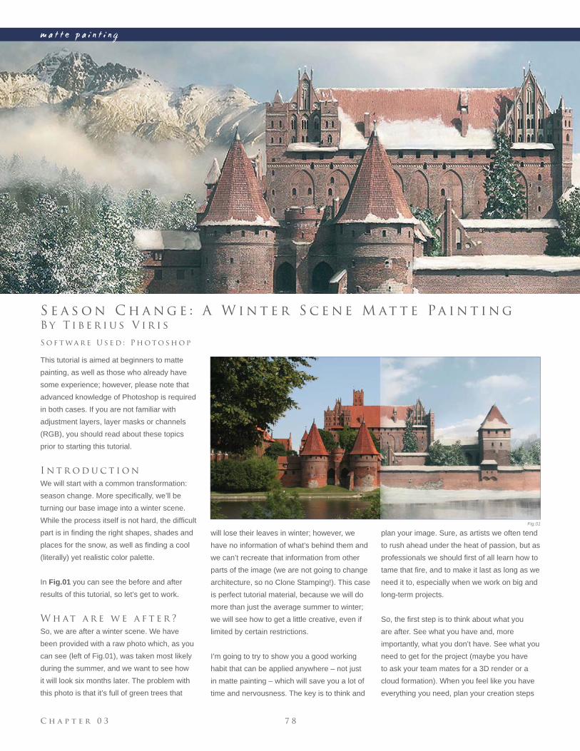
C h a p t e r 0 3 7 8
m a t t e p a i n t i n g
Fig.01
B y T i b e r i u s V i r i s
S e a s o n C h a n g e : A W i n t e r S c e n e M at t e Pa i n t i n g
This tutorial is aimed at beginners to matte
painting, as well as those who already have
some experience; however, please note that
advanced knowledge of Photoshop is required
in both cases. If you are not familiar with
adjustment layers, layer masks or channels
(RGB), you should read about these topics
prior to starting this tutorial.
I n t r o d u c t i o n
We will start with a common transformation:
season change. More specifi cally, we’ll be
turning our base image into a winter scene.
While the process itself is not hard, the diffi cult
part is in fi nding the right shapes, shades and
places for the snow, as well as fi nding a cool
(literally) yet realistic color palette.
In Fig.01 you can see the before and after
results of this tutorial, so let’s get to work.
W h at a r e w e a f t e r ?
So, we are after a winter scene. We have
been provided with a raw photo which, as you
can see (left of Fig.01), was taken most likely
during the summer, and we want to see how
it will look six months later. The problem with
this photo is that it’s full of green trees that
S o f t wa r e U s e d : P h o t o s h o p
plan your image. Sure, as artists we often tend
to rush ahead under the heat of passion, but as
professionals we should fi rst of all learn how to
tame that fi re, and to make it last as long as we
need it to, especially when we work on big and
long-term projects.
So, the fi rst step is to think about what you
are after. See what you have and, more
importantly, what you don’t have. See what you
need to get for the project (maybe you have
to ask your team mates for a 3D render or a
cloud formation). When you feel like you have
everything you need, plan your creation steps
will lose their leaves in winter; however, we
have no information of what’s behind them and
we can’t recreate that information from other
parts of the image (we are not going to change
architecture, so no Clone Stamping!). This case
is perfect tutorial material, because we will do
more than just the average summer to winter;
we will see how to get a little creative, even if
limited by certain restrictions.
I’m going to try to show you a good working
habit that can be applied anywhere – not just
in matte painting – which will save you a lot of
time and nervousness. The key is to think and
C h a p t e r 0 37 9
m a t t e p a i n t i n g
Fig.02 Fig.03
Fig.04
so that you don’t work chaotically and lose
precious time.
In this case, we are after a summer-to-winter
transition. We have a raw photo (see left
of Fig.01) which shouldn’t be altered too
much in terms of elements, so this is pretty
straightforward as far as material is concerned.
So let’s plan out the creation steps and see
what we are supposed to do. Let’s say we have
two major restrictions:
• We must not make major alterations to the
castle architecture
• We should keep the size and placement
of all the major elements (such as the river,
position of the trees, and so on).
So with all this in mind, I’ll start by planning the
steps I will need to take:
• Firstly, I should begin by changing the color
palette into a colder, less saturated one. I
also want to reduce the contrast
• I want to “move” this castle to somewhere
in the mountains, which will contribute to
the overall cold feel and will give more
depth. So for this next step, I will need
to replace the sky and the background,
and add some nice mountain peaks. I will
also want to remove the large tree in the
foreground on the left
• I should consider recreating the mid-
areas, especially the group of trees on the
left and right of the castle. I should also
connect these areas with the background,
probably with an in-between forest and
some mist. This is a process often referred
to as “surgery”
• Then it’s time to adjust the front lake/river,
give it a frosty look, paint some snow over
As for reducing the contrast, there are tons of
ways of doing this, amongst which are: using
a Curves adjustment layer; using a Brightness/
Contrast layer and reducing the contrast (not
as accurate as Levels/Curves); using layer
transitions, and so on. (I always use Curves
and Color Balance adjustment layers to create
moods because, from my experience, it creates
better results than using just one of them
alone.)
M o v e t h e H u e s t o wa r d s
C o l d e r Va l u e s
This is generally done with a Color Balance
adjustment layer using a combination of Cyan/
Blue sliders, where needed. The amount
and size depends on the hues of your base
image. In Fig.03 you can see my values for
the shadow part. Note that the values are quite
small, but they produce very visible effects,
so don’t go too wild. Also note that while this
effect is applied to the entire image, it alters the
hue by keeping the contrast with its neighbors,
which means that for low values the effect is
subtle and suitable for in-detail hue changes.
Don’t forget that if you have more areas which
need different adjustments, you can use
several layers and paint into their mask.
C h a n g e t h e O v e r a l l M o o d
w i t h a C u r v e s A d j u s t m e n t
L ay e r
We will use the red channel of a Curves
adjustment layer to pull the levels towards
Cyan. Some people prefer to use just Color
Balance, whilst others will tell you anything
but Curves is wrong. However, I have found
that using both (with smaller intensities)
produces much better results. In the end,
it doesn’t matter what tool you use as long
as you produce good results, so feel free to
experiment (Fig.04).
it and then paint some snow in front of the
castle
• When all this is done we should start
painting in the snow on the castle itself;
fi rstly on the basic parts, then onto the
more obscure/hidden parts
• After I’m done with the snow painting I
should refi ne the atmosphere and light. I
don’t like the fact that the original plate is
so uniformly lit, so I’ll want to change that
as well.
B a s i c S t e p s
In any matte painting, the key is to work with
many layers and use adjustment layers for
transformation in order to achieve a lot of
fl exibility. By painting the layer’s mask, you
can select which areas to affect and you can
discard/modify any layer at any time.
Everything begins with the preparation of our
working area. In this case we are going for
a cold atmosphere, yet not too overcast, so
we must do a series of adjustments, amongst
which will involve reducing the contrast and
desaturating and moving the hues towards
colder values, like cyan and blue. Depending
on your base image, it might take some time
to create the proper feel, so have patience and
experiment with various adjustment layers.
There’s no recipe for this, but I’ll try to point out
the most important changes that you should
make:
R e d u c e t h e S at u r at i o n &
C o n t r a s t
This is usually done with a Hue/Saturation
adjustment layer; in our case I’ve used -26
for Saturation (Fig.02) and I’ve also slightly
increased the brightness. You can also use
this layer to shift the hues a little, but don’t go
too wild – a plus/minus 4 maximum will do.
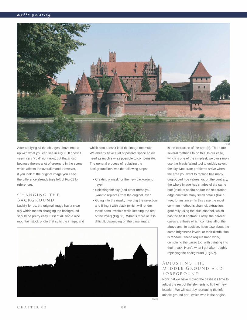
C h a p t e r 0 3 8 0
m a t t e p a i n t i n g
After applying all the changes I have ended
up with what you can see in Fig05. It doesn’t
seem very “cold” right now, but that’s just
because there’s a lot of greenery in the scene
which affects the overall mood. However,
if you look at the original image you’ll see
the difference already (see left of Fig.01 for
reference).
C h a n g i n g t h e
B a c k g r o u n d
Luckily for us, the original image has a clear
sky which means changing the background
should be pretty easy. First of all, fi nd a nice
mountain stock photo that suits the image, and
which also doesn’t load the image too much.
We already have a lot of positive space so we
need as much sky as possible to compensate.
The general process of replacing the
background involves the following steps:
• Creating a mask for the new background
layer
• Selecting the sky (and other areas you
want to replace) from the original layer
• Going into the mask, inverting the selection
and fi lling it with black (which will render
those parts invisible while keeping the rest
of the layer) (Fig.06). What is more or less
diffi cult, depending on the base image,
is the extraction of the area(s). There are
several methods to do this. In our case,
which is one of the simplest, we can simply
use the Magic Wand tool to quickly select
the sky. Moderate problems arrive when
the area you want to replace has many
ungrouped hue values, or, on the contrary,
the whole image has shades of the same
hue (think of sepia) and/or the separation
edge contains many small details (like a
tree, for instance). In this case the most
common method is channel, extraction,
generally using the blue channel, which
has the best contrast. Lastly, the hardest
cases are those which combine all of the
above and, in addition, have also about the
same brightness levels, or their distribution
is random. These require hand work,
combining the Lasso tool with painting into
their mask. Here’s what I get after roughly
replacing the background (Fig.07).
A d j u s t i n g t h e
M i d d l e G r o u n d a n d
F o r e g r o u n d
Now that we have moved the castle it’s time to
adjust the rest of the elements to fi t their new
location. We will start by recreating the left
middle-ground part, which was in the original
Fig.05
Fig.06
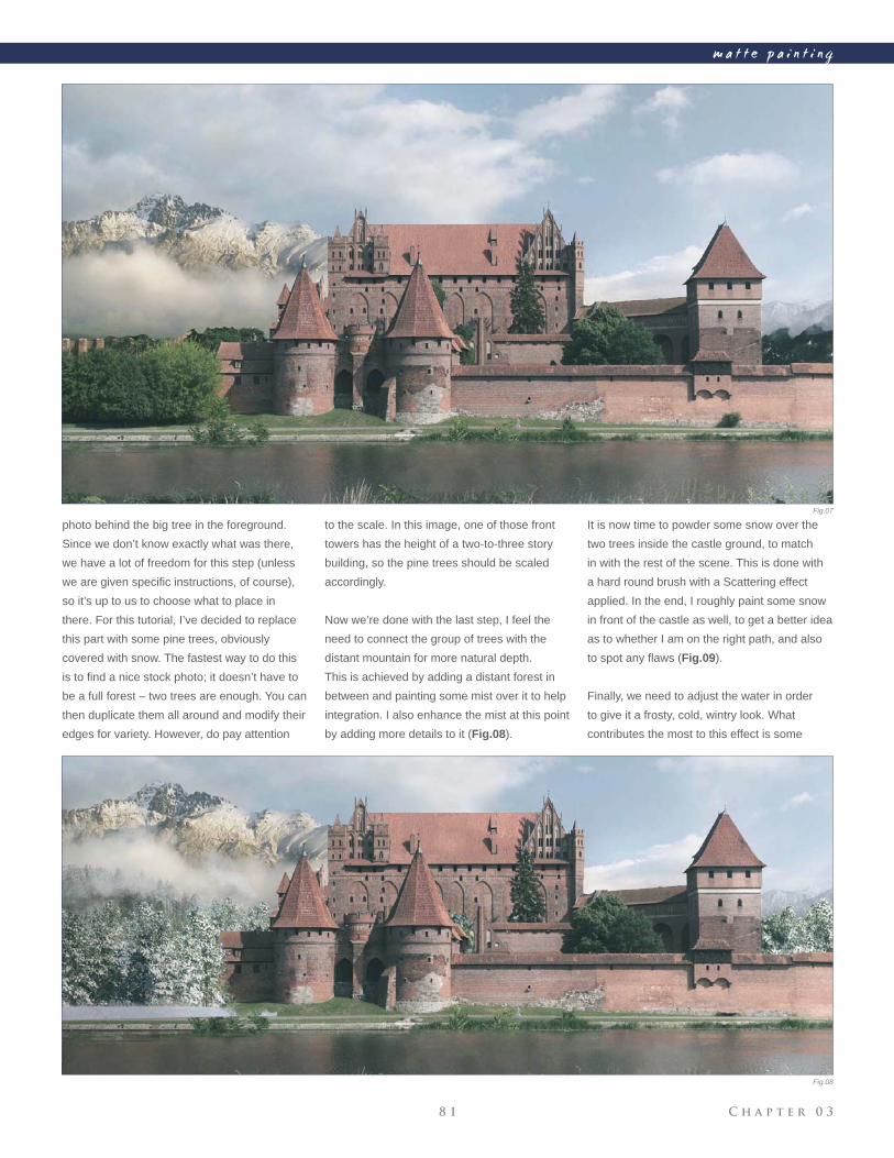
C h a p t e r 0 38 1
m a t t e p a i n t i n g
Fig.08
photo behind the big tree in the foreground.
Since we don’t know exactly what was there,
we have a lot of freedom for this step (unless
we are given specifi c instructions, of course),
so it’s up to us to choose what to place in
there. For this tutorial, I’ve decided to replace
this part with some pine trees, obviously
covered with snow. The fastest way to do this
is to fi nd a nice stock photo; it doesn’t have to
be a full forest – two trees are enough. You can
then duplicate them all around and modify their
edges for variety. However, do pay attention
to the scale. In this image, one of those front
towers has the height of a two-to-three story
building, so the pine trees should be scaled
accordingly.
Now we’re done with the last step, I feel the
need to connect the group of trees with the
distant mountain for more natural depth.
This is achieved by adding a distant forest in
between and painting some mist over it to help
integration. I also enhance the mist at this point
by adding more details to it (Fig.08).
It is now time to powder some snow over the
two trees inside the castle ground, to match
in with the rest of the scene. This is done with
a hard round brush with a Scattering effect
applied. In the end, I roughly paint some snow
in front of the castle as well, to get a better idea
as to whether I am on the right path, and also
to spot any fl aws (Fig.09).
Finally, we need to adjust the water in order
to give it a frosty, cold, wintry look. What
contributes the most to this effect is some
Fig.07
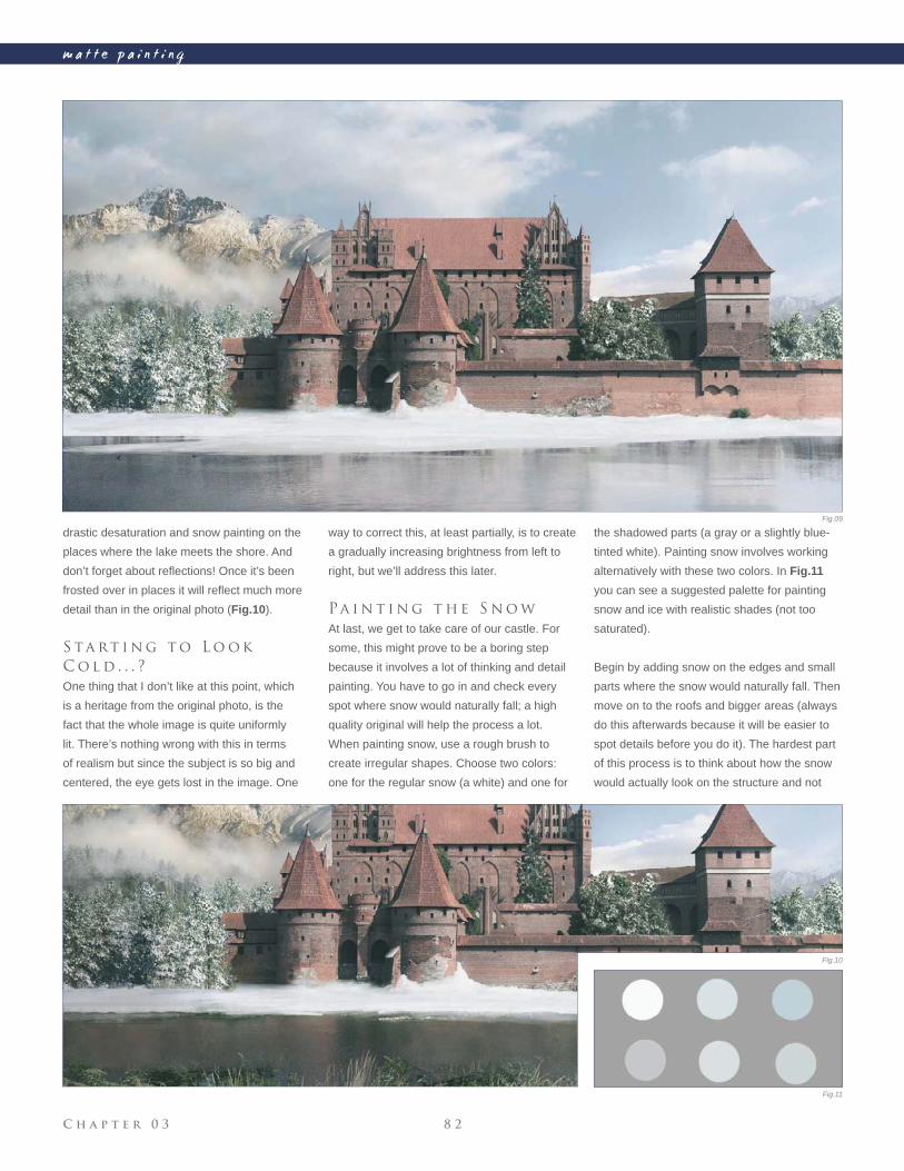
C h a p t e r 0 3 8 2
m a t t e p a i n t i n g
drastic desaturation and snow painting on the
places where the lake meets the shore. And
don’t forget about refl ections! Once it’s been
frosted over in places it will refl ect much more
detail than in the original photo (Fig.10).
S ta rt i n g t o L o o k
C o l d . . . ?
One thing that I don’t like at this point, which
is a heritage from the original photo, is the
fact that the whole image is quite uniformly
lit. There’s nothing wrong with this in terms
of realism but since the subject is so big and
centered, the eye gets lost in the image. One
way to correct this, at least partially, is to create
a gradually increasing brightness from left to
right, but we’ll address this later.
Pa i n t i n g t h e S n o w
At last, we get to take care of our castle. For
some, this might prove to be a boring step
because it involves a lot of thinking and detail
painting. You have to go in and check every
spot where snow would naturally fall; a high
quality original will help the process a lot.
When painting snow, use a rough brush to
create irregular shapes. Choose two colors:
one for the regular snow (a white) and one for
the shadowed parts (a gray or a slightly blue-
tinted white). Painting snow involves working
alternatively with these two colors. In Fig.11
you can see a suggested palette for painting
snow and ice with realistic shades (not too
saturated).
Begin by adding snow on the edges and small
parts where the snow would naturally fall. Then
move on to the roofs and bigger areas (always
do this afterwards because it will be easier to
spot details before you do it). The hardest part
of this process is to think about how the snow
would actually look on the structure and not
Fig.09
Fig.10
Fig.11
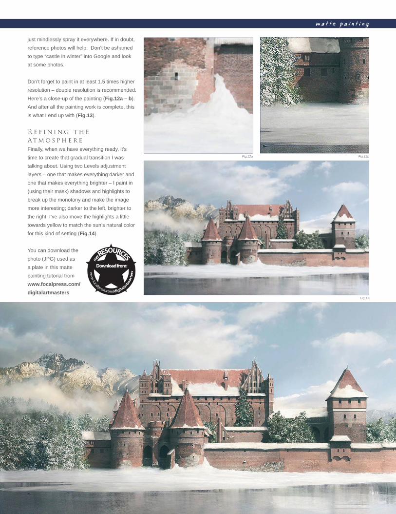
C h a p t e r 0 38 3
m a t t e p a i n t i n g
just mindlessly spray it everywhere. If in doubt,
reference photos will help. Don’t be ashamed
to type “castle in winter” into Google and look
at some photos.
Don’t forget to paint in at least 1.5 times higher
resolution – double resolution is recommended.
Here’s a close-up of the painting (Fig.12a – b).
And after all the painting work is complete, this
is what I end up with (Fig.13).
R e f i n i n g t h e
At m o s p h e r e
Finally, when we have everything ready, it’s
time to create that gradual transition I was
talking about. Using two Levels adjustment
layers – one that makes everything darker and
one that makes everything brighter – I paint in
(using their mask) shadows and highlights to
break up the monotony and make the image
more interesting; darker to the left, brighter to
the right. I’ve also move the highlights a little
towards yellow to match the sun’s natural color
for this kind of setting (Fig.14).
You can download the
photo (JPG) used as
a plate in this matte
painting tutorial from
www.focalpress.com/
digitalartmasters
Fig.12a Fig.12b
Fig.13
Fig.14
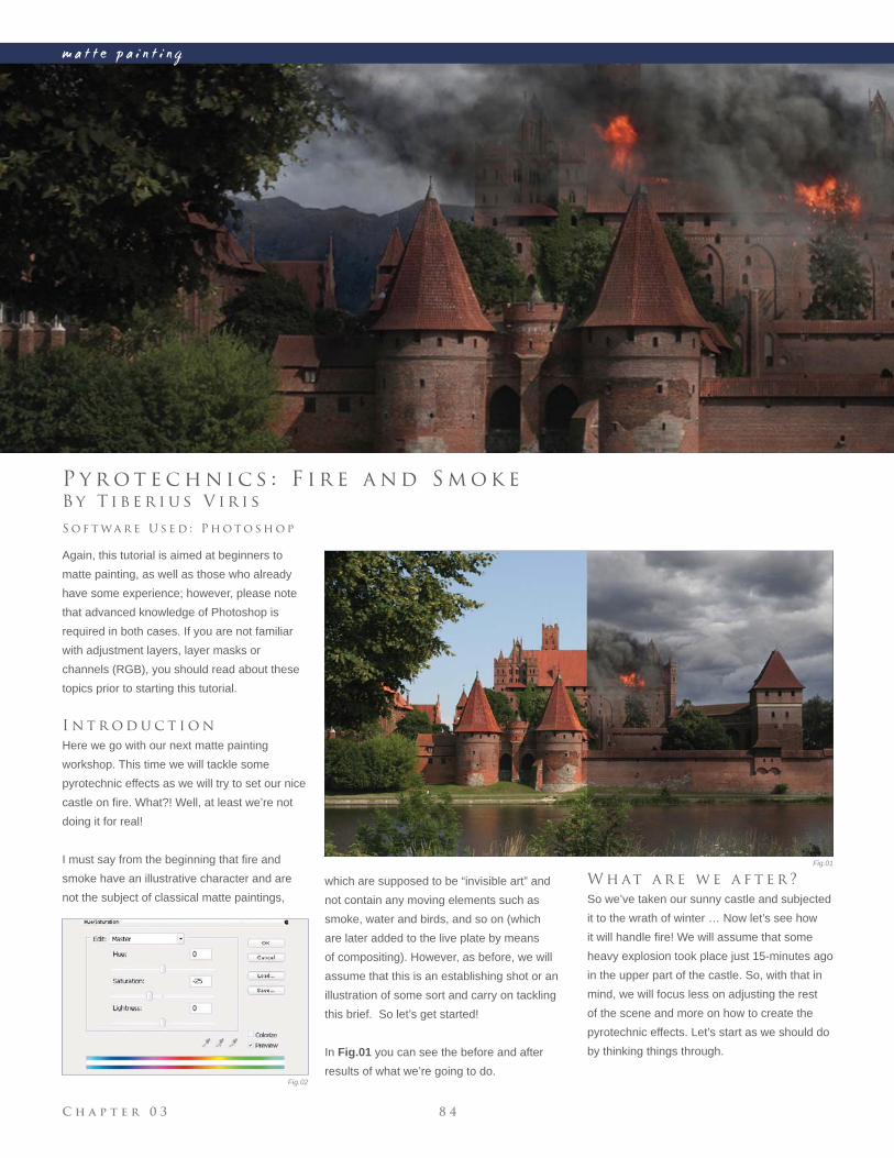
C h a p t e r 0 3 8 4
m a t t e p a i n t i n g
Fig.01
Fig.02
B y T i b e r i u s V i r i s
P y r o t e c h n i c s : F i r e a n d S m o k e
Again, this tutorial is aimed at beginners to
matte painting, as well as those who already
have some experience; however, please note
that advanced knowledge of Photoshop is
required in both cases. If you are not familiar
with adjustment layers, layer masks or
channels (RGB), you should read about these
topics prior to starting this tutorial.
I n t r o d u c t i o n
Here we go with our next matte painting
workshop. This time we will tackle some
pyrotechnic effects as we will try to set our nice
castle on fi re. What?! Well, at least we’re not
doing it for real!
I must say from the beginning that fi re and
smoke have an illustrative character and are
not the subject of classical matte paintings,
S o f t wa r e U s e d : P h o t o s h o p
which are supposed to be “invisible art” and
not contain any moving elements such as
smoke, water and birds, and so on (which
are later added to the live plate by means
of compositing). However, as before, we will
assume that this is an establishing shot or an
illustration of some sort and carry on tackling
this brief. So let’s get started!
In Fig.01 you can see the before and after
results of what we’re going to do.
W h at a r e w e a f t e r ?
So we’ve taken our sunny castle and subjected
it to the wrath of winter … Now let’s see how
it will handle fi re! We will assume that some
heavy explosion took place just 15-minutes ago
in the upper part of the castle. So, with that in
mind, we will focus less on adjusting the rest
of the scene and more on how to create the
pyrotechnic effects. Let’s start as we should do
by thinking things through.
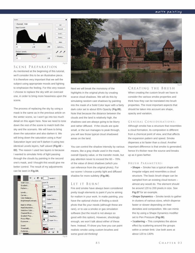
C h a p t e r 0 38 5
m a t t e p a i n t i n g
Fig.03
Fig.04
Fig.05
S c e n e P r e pa r at i o n
As mentioned at the beginning of this tutorial,
we’ll consider this to be an illustrative piece.
It is therefore very important that we sell the
subject using appropriate moods and lighting
to emphasize the feeling. For this very reason
I choose to replace the sky with an overcast
one, in order to bring more heaviness upon the
scene.
The process of replacing the sky by using a
mask is the same as in the previous article on
the winter scene, so I won’t go into too much
detail on this again here. Now we need to tone
down the rest of the scene to match both the
sky and the scenario. We will have to bring
down the saturation and also darken it. We
will bring down the saturation using a Hue/
Saturation layer and we’ll darken it using two
identical Levels layers, half valued (Fig.02 –
03). The reason I used two layers is because
I wanted to simulate hints of light passing
through the clouds by painting in the second
one’s mask, and I thought this would give me
better control. The result of my adjustments
can be seen in Fig.04.
Next we will break the monotony of the
highlights in the original photo by creating
scarce cloud shadows. We will do this by
simulating random cast shadows by painting
into the mask of a Solid Color layer with a fairly
dark color set to about 65% Opacity (Fig.05).
Note that because the distance between the
clouds and the land is relatively high, the
shadows cast are always going to be blurry
and rather diffused. If the clouds are quite
small, or the sun manages to peak through,
you will see those typical cloud shadowed
areas on the land.
You can control the shadow intensity by various
means, like a gray shade used in the mask,
overall Opacity value, or the transfer mode, but
pay attention never to exceed the 60 – 70%
of the value of direct shadows (which you
can reference from the original photo). For
our scene I choose a pretty light and diffused
shadow for more subtlety (Fig.06).
L e t i t B u r n !
Fire and smoke have always been considered
pretty tough elements to paint if you’re aiming
for realism in your work. In matte painting, you
have the optional choice of fi nding a stock
photo that fi ts your needs (although these are
rare), or to use a smoke or gas simulation
software (but the result is not always so
good with this option). However, shockingly
enough, we won’t talk about either of these
here. Instead, I’ll show you how you can paint
realistic smoke using custom brushes and
some good old thinking!
C r e at i n g t h e B r u s h
When creating the custom brush we have to
consider the various smoke properties and
think how they can be translated into brush
properties. The most important aspects that
should be taken into account are shape,
opacity and variation.
G e n e r a l C o n s i d e r at i o n s :
Although smoke has a structure that resembles
a cloud formation, its composition is different
from a chemical point of view, and that affects
the expansion pattern and speed. Smoke
disperses a lot faster than a cloud. Another
important difference is that smoke is generated;
hence it’s thicker near the source and breaks
up as it goes farther.
B r u s h Pa r a m e t e r s :
• Shape – Smoke has a typical shape with
irregular edges and resembles a cloud
structure. The basic brush shape can be
sampled from an existing cloud texture –
almost any would do. The element should
be around 120 to 200 pixels in size. See
Fig.07 for an example.
• Shape Dynamics – Smoke tends to gather
in clusters of various sizes, which disperse
faster or slower depending on their
densities and composition. We can mimic
this by using a Shape Dynamics modifi er
set to Pen Pressure (Fig.08).
• Scattering – This completes the above
effect by scattering around the groups
within a certain limit. Use both axes at
about 120 to 130%
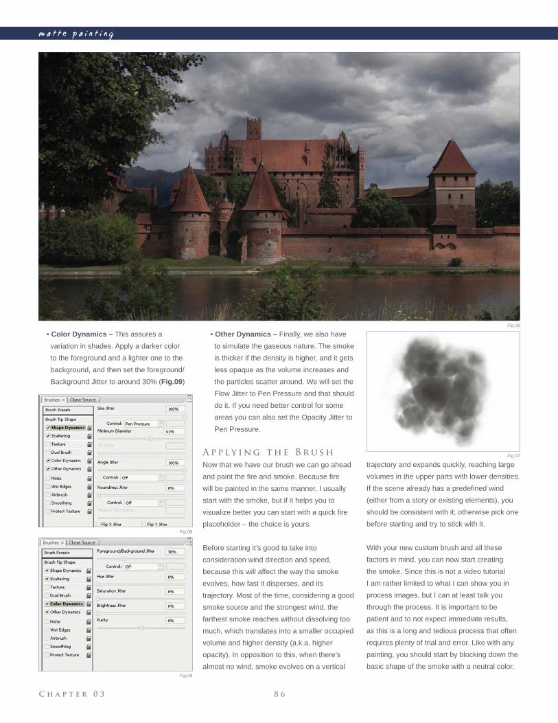
C h a p t e r 0 3 8 6
m a t t e p a i n t i n g
• Color Dynamics – This assures a
variation in shades. Apply a darker color
to the foreground and a lighter one to the
background, and then set the foreground/
Background Jitter to around 30% (Fig.09)
• Other Dynamics – Finally, we also have
to simulate the gaseous nature. The smoke
is thicker if the density is higher, and it gets
less opaque as the volume increases and
the particles scatter around. We will set the
Flow Jitter to Pen Pressure and that should
do it. If you need better control for some
areas you can also set the Opacity Jitter to
Pen Pressure.
A p p l y i n g t h e B r u s h
Now that we have our brush we can go ahead
and paint the fi re and smoke. Because fi re
will be painted in the same manner, I usually
start with the smoke, but if it helps you to
visualize better you can start with a quick fi re
placeholder – the choice is yours.
Before starting it’s good to take into
consideration wind direction and speed,
because this will affect the way the smoke
evolves, how fast it disperses, and its
trajectory. Most of the time, considering a good
smoke source and the strongest wind, the
farthest smoke reaches without dissolving too
much, which translates into a smaller occupied
volume and higher density (a.k.a. higher
opacity). In opposition to this, when there’s
almost no wind, smoke evolves on a vertical
trajectory and expands quickly, reaching large
volumes in the upper parts with lower densities.
If the scene already has a predefi ned wind
(either from a story or existing elements), you
should be consistent with it; otherwise pick one
before starting and try to stick with it.
With your new custom brush and all these
factors in mind, you can now start creating
the smoke. Since this is not a video tutorial
I am rather limited to what I can show you in
process images, but I can at least talk you
through the process. It is important to be
patient and to not expect immediate results,
as this is a long and tedious process that often
requires plenty of trial and error. Like with any
painting, you should start by blocking down the
basic shape of the smoke with a neutral color.
Fig.06
Fig.07
Fig.08
Fig.09
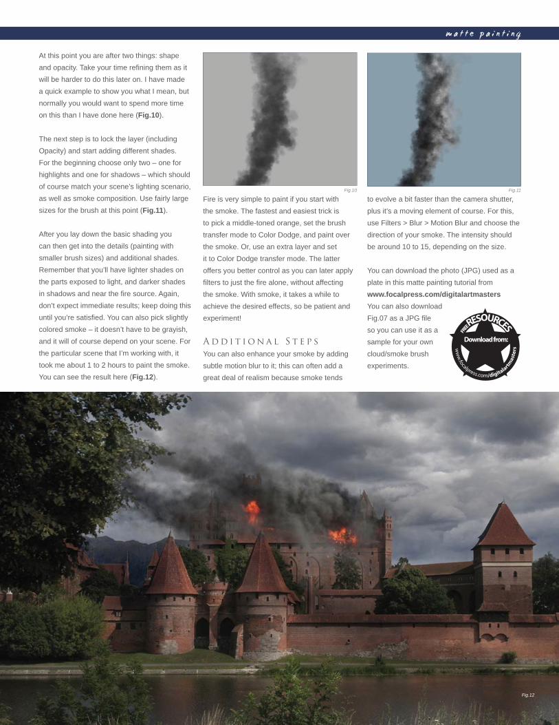
C h a p t e r 0 38 7
m a t t e p a i n t i n g
At this point you are after two things: shape
and opacity. Take your time refi ning them as it
will be harder to do this later on. I have made
a quick example to show you what I mean, but
normally you would want to spend more time
on this than I have done here (Fig.10).
The next step is to lock the layer (including
Opacity) and start adding different shades.
For the beginning choose only two – one for
highlights and one for shadows – which should
of course match your scene’s lighting scenario,
as well as smoke composition. Use fairly large
sizes for the brush at this point (Fig.11).
After you lay down the basic shading you
can then get into the details (painting with
smaller brush sizes) and additional shades.
Remember that you’ll have lighter shades on
the parts exposed to light, and darker shades
in shadows and near the fi re source. Again,
don’t expect immediate results; keep doing this
until you’re satisfi ed. You can also pick slightly
colored smoke – it doesn’t have to be grayish,
and it will of course depend on your scene. For
the particular scene that I’m working with, it
took me about 1 to 2 hours to paint the smoke.
You can see the result here (Fig.12).
Fire is very simple to paint if you start with
the smoke. The fastest and easiest trick is
to pick a middle-toned orange, set the brush
transfer mode to Color Dodge, and paint over
the smoke. Or, use an extra layer and set
it to Color Dodge transfer mode. The latter
offers you better control as you can later apply
fi lters to just the fi re alone, without affecting
the smoke. With smoke, it takes a while to
achieve the desired effects, so be patient and
experiment!
A d d i t i o n a l S t e p s
You can also enhance your smoke by adding
subtle motion blur to it; this can often add a
great deal of realism because smoke tends
to evolve a bit faster than the camera shutter,
plus it’s a moving element of course. For this,
use Filters > Blur > Motion Blur and choose the
direction of your smoke. The intensity should
be around 10 to 15, depending on the size.
You can download the photo (JPG) used as a
plate in this matte painting tutorial from
www.focalpress.com/digitalartmasters
You can also download
Fig.07 as a JPG fi le
so you can use it as a
sample for your own
cloud/smoke brush
experiments.
Fig.10 Fig.11
Fig.12
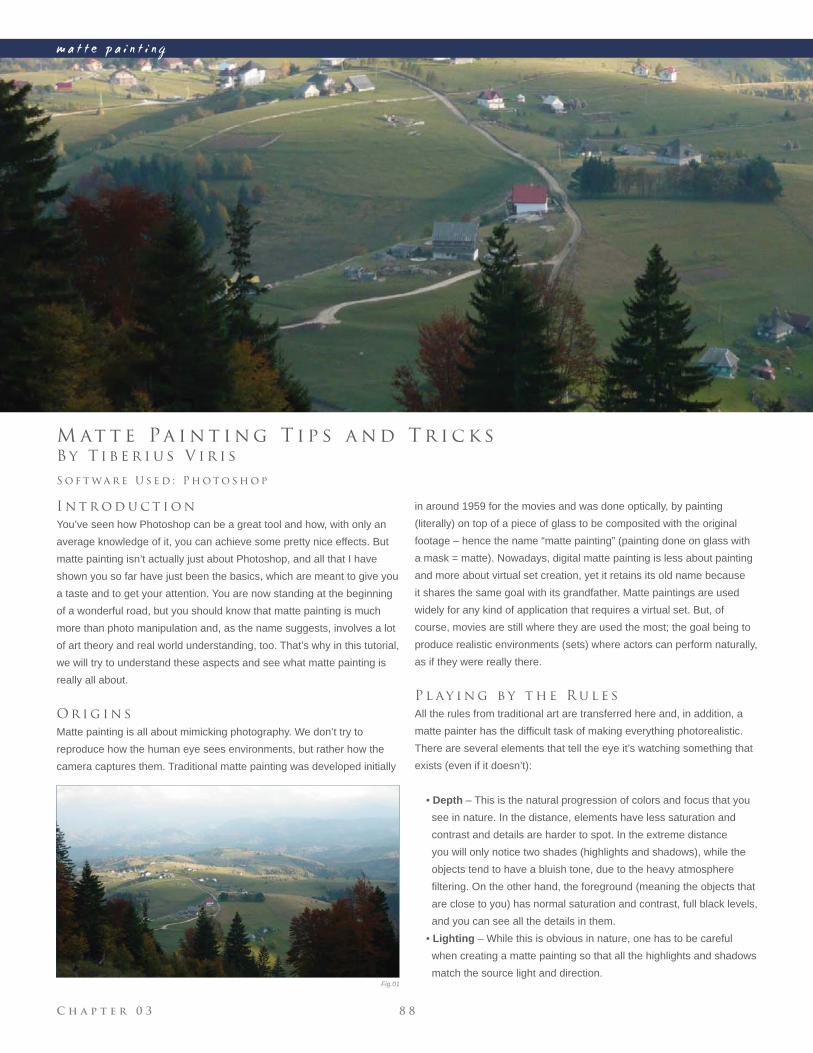
C h a p t e r 0 3 8 8
m a t t e p a i n t i n g
Fig.01
B y T i b e r i u s V i r i s
M at t e Pa i n t i n g T i p s a n d T r i c k s
I n t r o d u c t i o n
You’ve seen how Photoshop can be a great tool and how, with only an
average knowledge of it, you can achieve some pretty nice effects. But
matte painting isn’t actually just about Photoshop, and all that I have
shown you so far have just been the basics, which are meant to give you
a taste and to get your attention. You are now standing at the beginning
of a wonderful road, but you should know that matte painting is much
more than photo manipulation and, as the name suggests, involves a lot
of art theory and real world understanding, too. That’s why in this tutorial,
we will try to understand these aspects and see what matte painting is
really all about.
O r i g i n s
Matte painting is all about mimicking photography. We don’t try to
reproduce how the human eye sees environments, but rather how the
camera captures them. Traditional matte painting was developed initially
S o f t wa r e U s e d : P h o t o s h o p
in around 1959 for the movies and was done optically, by painting
(literally) on top of a piece of glass to be composited with the original
footage – hence the name “matte painting” (painting done on glass with
a mask = matte). Nowadays, digital matte painting is less about painting
and more about virtual set creation, yet it retains its old name because
it shares the same goal with its grandfather. Matte paintings are used
widely for any kind of application that requires a virtual set. But, of
course, movies are still where they are used the most; the goal being to
produce realistic environments (sets) where actors can perform naturally,
as if they were really there.
P l ay i n g b y t h e R u l e s
All the rules from traditional art are transferred here and, in addition, a
matte painter has the diffi cult task of making everything photorealistic.
There are several elements that tell the eye it’s watching something that
exists (even if it doesn’t):
• Depth – This is the natural progression of colors and focus that you
see in nature. In the distance, elements have less saturation and
contrast and details are harder to spot. In the extreme distance
you will only notice two shades (highlights and shadows), while the
objects tend to have a bluish tone, due to the heavy atmosphere
fi ltering. On the other hand, the foreground (meaning the objects that
are close to you) has normal saturation and contrast, full black levels,
and you can see all the details in them.
• Lighting – While this is obvious in nature, one has to be careful
when creating a matte painting so that all the highlights and shadows
match the source light and direction.
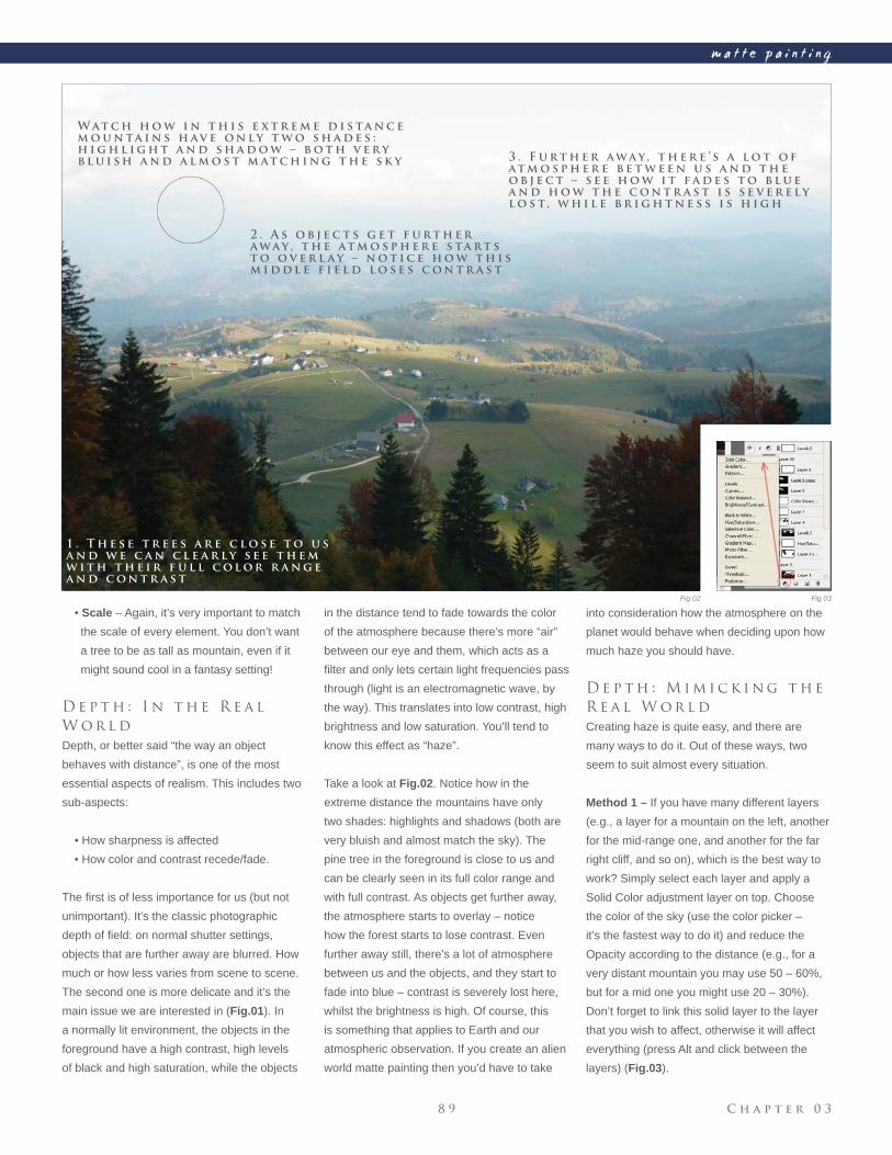
C h a p t e r 0 38 9
m a t t e p a i n t i n g
Fig.02 Fig.03
• Scale – Again, it’s very important to match
the scale of every element. You don’t want
a tree to be as tall as mountain, even if it
might sound cool in a fantasy setting!
D e p t h : I n t h e R e a l
W o r l d
Depth, or better said “the way an object
behaves with distance”, is one of the most
essential aspects of realism. This includes two
sub-aspects:
• How sharpness is affected
• How color and contrast recede/fade.
The fi rst is of less importance for us (but not
unimportant). It’s the classic photographic
depth of fi eld: on normal shutter settings,
objects that are further away are blurred. How
much or how less varies from scene to scene.
The second one is more delicate and it’s the
main issue we are interested in (Fig.01). In
a normally lit environment, the objects in the
foreground have a high contrast, high levels
of black and high saturation, while the objects
in the distance tend to fade towards the color
of the atmosphere because there’s more “air”
between our eye and them, which acts as a
fi lter and only lets certain light frequencies pass
through (light is an electromagnetic wave, by
the way). This translates into low contrast, high
brightness and low saturation. You’ll tend to
know this effect as “haze”.
Take a look at Fig.02. Notice how in the
extreme distance the mountains have only
two shades: highlights and shadows (both are
very bluish and almost match the sky). The
pine tree in the foreground is close to us and
can be clearly seen in its full color range and
with full contrast. As objects get further away,
the atmosphere starts to overlay – notice
how the forest starts to lose contrast. Even
further away still, there’s a lot of atmosphere
between us and the objects, and they start to
fade into blue – contrast is severely lost here,
whilst the brightness is high. Of course, this
is something that applies to Earth and our
atmospheric observation. If you create an alien
world matte painting then you’d have to take
into consideration how the atmosphere on the
planet would behave when deciding upon how
much haze you should have.
D e p t h : M i m i c k i n g t h e
R e a l W o r l d
Creating haze is quite easy, and there are
many ways to do it. Out of these ways, two
seem to suit almost every situation.
Method 1 – If you have many different layers
(e.g., a layer for a mountain on the left, another
for the mid-range one, and another for the far
right cliff, and so on), which is the best way to
work? Simply select each layer and apply a
Solid Color adjustment layer on top. Choose
the color of the sky (use the color picker –
it’s the fastest way to do it) and reduce the
Opacity according to the distance (e.g., for a
very distant mountain you may use 50 – 60%,
but for a mid one you might use 20 – 30%).
Don’t forget to link this solid layer to the layer
that you wish to affect, otherwise it will affect
everything (press Alt and click between the
layers) (Fig.03).
W at c h h o w i n t h i s e x t r e m e d i s ta n c e
m o u n ta i n s h av e o n l y t w o s h a d e s :
h i g h l i g h t a n d s h a d o w – b o t h v e r y
b l u i s h a n d a l m o s t m at c h i n g t h e s k y
2 . A s o b j e c t s g e t f u r t h e r
a w a y , t h e at m o s p h e r e s ta r t s
t o o v e r l a y – n o t i c e h o w t h i s
m i d d l e f i e l d l o s e s c o n t r a s t
3 . F u r t h e r a w a y , t h e r e ’ s a l o t o f
at m o s p h e r e b e t w e e n u s a n d t h e
o b j e c t – s e e h o w i t f a d e s t o b l u e
a n d h o w t h e c o n t r a s t i s s e v e r e l y
l o s t, w h i l e b r i g h t n e s s i s h i g h
1 . T h e s e t r e e s a r e c l o s e t o u s
a n d w e c a n c l e a r l y s e e t h e m
w i t h t h e i r f u l l c o l o r r a n g e
a n d c o n t r a s t
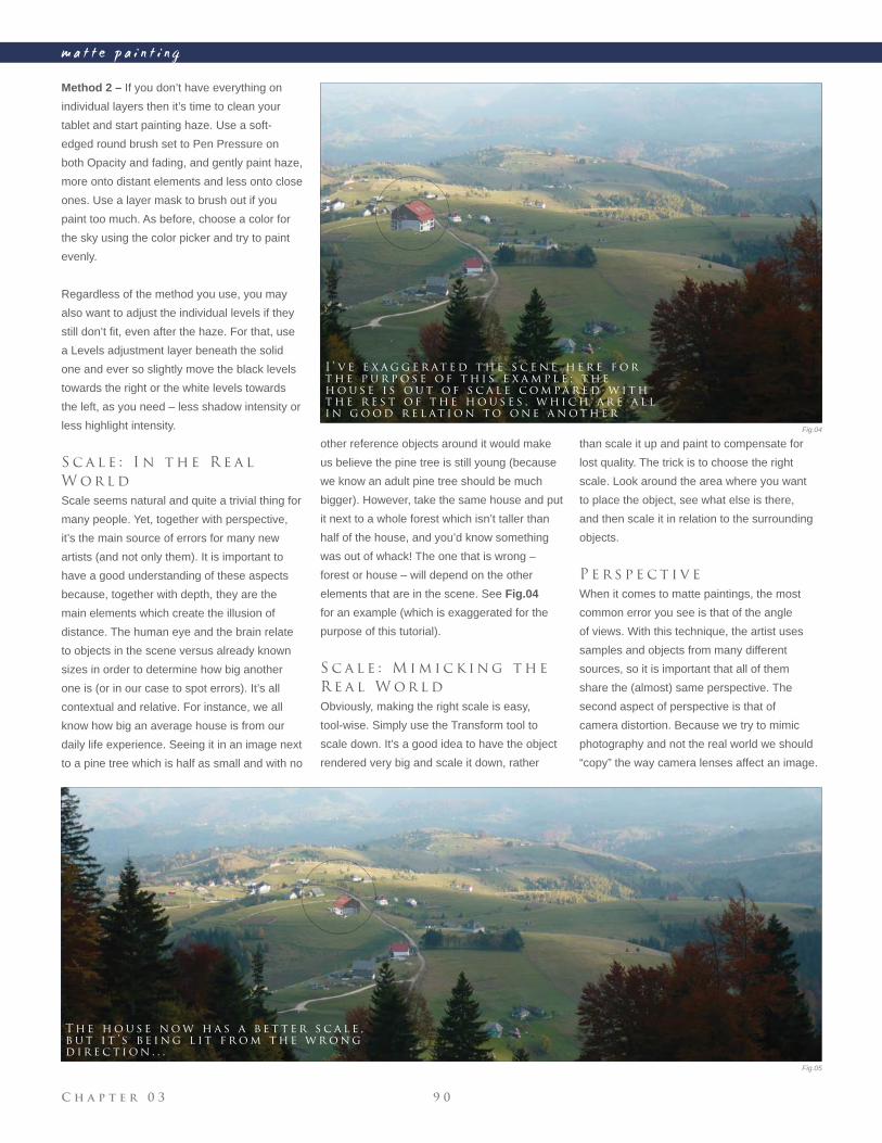
C h a p t e r 0 3 9 0
m a t t e p a i n t i n g
Method 2 – If you don’t have everything on
individual layers then it’s time to clean your
tablet and start painting haze. Use a soft-
edged round brush set to Pen Pressure on
both Opacity and fading, and gently paint haze,
more onto distant elements and less onto close
ones. Use a layer mask to brush out if you
paint too much. As before, choose a color for
the sky using the color picker and try to paint
evenly.
Regardless of the method you use, you may
also want to adjust the individual levels if they
still don’t fi t, even after the haze. For that, use
a Levels adjustment layer beneath the solid
one and ever so slightly move the black levels
towards the right or the white levels towards
the left, as you need – less shadow intensity or
less highlight intensity.
S c a l e : I n t h e R e a l
W o r l d
Scale seems natural and quite a trivial thing for
many people. Yet, together with perspective,
it’s the main source of errors for many new
artists (and not only them). It is important to
have a good understanding of these aspects
because, together with depth, they are the
main elements which create the illusion of
distance. The human eye and the brain relate
to objects in the scene versus already known
sizes in order to determine how big another
one is (or in our case to spot errors). It’s all
contextual and relative. For instance, we all
know how big an average house is from our
daily life experience. Seeing it in an image next
to a pine tree which is half as small and with no
other reference objects around it would make
us believe the pine tree is still young (because
we know an adult pine tree should be much
bigger). However, take the same house and put
it next to a whole forest which isn’t taller than
half of the house, and you’d know something
was out of whack! The one that is wrong –
forest or house – will depend on the other
elements that are in the scene. See Fig.04
for an example (which is exaggerated for the
purpose of this tutorial).
S c a l e : M i m i c k i n g t h e
R e a l W o r l d
Obviously, making the right scale is easy,
tool-wise. Simply use the Transform tool to
scale down. It’s a good idea to have the object
rendered very big and scale it down, rather
than scale it up and paint to compensate for
lost quality. The trick is to choose the right
scale. Look around the area where you want
to place the object, see what else is there,
and then scale it in relation to the surrounding
objects.
P e r s p e c t i v e
When it comes to matte paintings, the most
common error you see is that of the angle
of views. With this technique, the artist uses
samples and objects from many different
sources, so it is important that all of them
share the (almost) same perspective. The
second aspect of perspective is that of
camera distortion. Because we try to mimic
photography and not the real world we should
“copy” the way camera lenses affect an image.
I ’ v e e x a g g e r at e d t h e s c e n e h e r e f o r
t h e p u r p o s e o f t h i s e x a m p l e ; t h e
h o u s e i s o u t o f s c a l e c o m pa r e d w i t h
t h e r e s t o f t h e h o u s e s , w h i c h a r e a l l
i n g o o d r e l at i o n t o o n e a n o t h e r
T h e h o u s e n o w h a s a b e t t e r s c a l e ,
b u t i t ’ s b e i n g l i t f r o m t h e w r o n g
d i r e c t i o n . . .
Fig.04
Fig.05
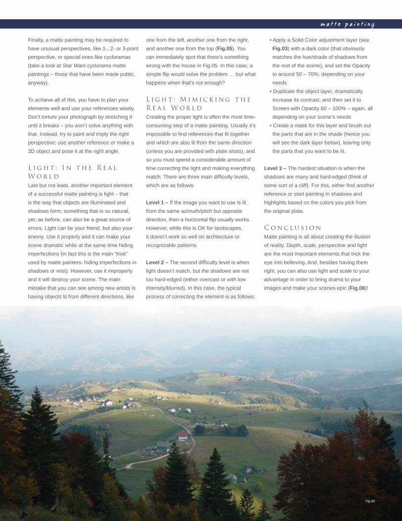
C h a p t e r 0 39 1
m a t t e p a i n t i n g
Finally, a matte painting may be required to
have unusual perspectives, like 1-, 2- or 3-point
perspective, or special ones like cycloramas
(take a look at Star Wars cyclorama matte
paintings – those that have been made public,
anyway).
To achieve all of this, you have to plan your
elements well and use your references wisely.
Don’t torture your photograph by stretching it
until it breaks – you won’t solve anything with
that. Instead, try to paint and imply the right
perspective; use another reference or make a
3D object and pose it at the right angle.
L i g h t : I n t h e R e a l
W o r l d
Last but not least, another important element
of a successful matte painting is light – that
is the way that objects are illuminated and
shadows form; something that is so natural,
yet, as before, can also be a great source of
errors. Light can be your friend, but also your
enemy. Use it properly and it can make your
scene dramatic while at the same time hiding
imperfections (in fact this is the main “trick”
used by matte painters: hiding imperfections in
shadows or mist). However, use it improperly
and it will destroy your scene. The main
mistake that you can see among new artists is
having objects lit from different directions, like
• Apply a Solid Color adjustment layer (see
Fig.03) with a dark color (that obviously
matches the hue/shade of shadows from
the rest of the scene), and set the Opacity
to around 50 – 70%, depending on your
needs
• Duplicate the object layer, dramatically
increase its contrast, and then set it to
Screen with Opacity 60 – 100% – again, all
depending on your scene’s needs
• Create a mask for this layer and brush out
the parts that are in the shade (hence you
will see the dark layer below), leaving only
the parts that you want to be lit.
Level 3 – The hardest situation is when the
shadows are many and hard-edged (think of
some sort of a cliff). For this, either fi nd another
reference or start painting in shadows and
highlights based on the colors you pick from
the original plate.
C o n c l u s i o n
Matte painting is all about creating the illusion
of reality. Depth, scale, perspective and light
are the most important elements that trick the
eye into believing. And, besides having them
right, you can also use light and scale to your
advantage in order to bring drama to your
images and make your scenes epic (Fig.06)!
one from the left, another one from the right,
and another one from the top (Fig.05). You
can immediately spot that there’s something
wrong with the house in Fig.05. In this case, a
simple fl ip would solve the problem … but what
happens when that’s not enough?
L i g h t : M i m i c k i n g t h e
R e a l W o r l d
Creating the proper light is often the most time-
consuming step of a matte painting. Usually it’s
impossible to fi nd references that fi t together
and which are also lit from the same direction
(unless you are provided with plate shots), and
so you must spend a considerable amount of
time correcting the light and making everything
match. There are three main diffi culty levels,
which are as follows:
Level 1 – If the image you want to use is lit
from the same azimuth/pitch but opposite
direction, then a horizontal fl ip usually works.
However, while this is OK for landscapes,
it doesn’t work so well on architecture or
recognizable patterns.
Level 2 – The second diffi culty level is when
light doesn’t match, but the shadows are not
too hard-edged (either overcast or with low
intensity/blurred). In this case, the typical
process of correcting the element is as follows:
Fig.06
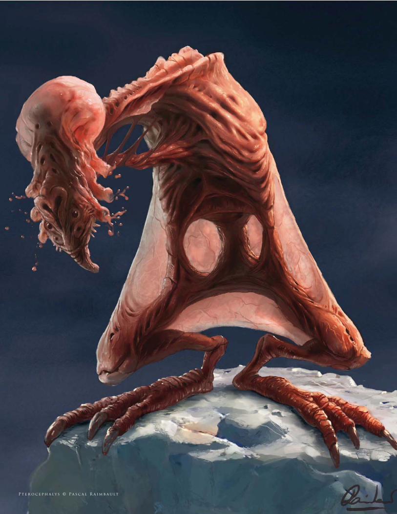
P t e r o c e p h a l y s © Pa s c a l R a i m b a u lt
Similar to being an environment artist, many fi nd themselves dedicating
their time to character and creature design which involves a very differ-
ent set of skills, namely knowledge of anatomy. Creature design forms a
huge part of many projects stretching from video games to fi lm and TV,
and covers both animals existing in the real world through to aliens –
think of fi lms such as Jumanji and the Star Wars saga. This chapter will
offer a vision of the issues to consider not only when painting animals
but also in the creation of original designs.
c r e a t u r e s
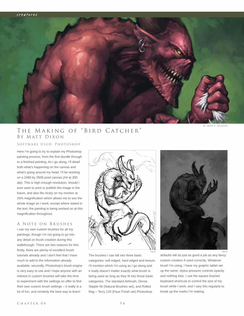
C h a p t e r 0 4 9 4
c r e a t u r e s
Fig.01 Fig.02
B y M at t D i x o n
T h e M a k i n g o f “ B i r d C at c h e r ”
Here I’m going to try to explain my Photoshop
painting process, from the fi rst doodle through
to a fi nished painting. As I go along, I’ll detail
both what’s happening on the canvas and
what’s going around my head. I’ll be working
on a 2480 by 3508 pixel canvas (A4 at 300
dpi). This is high enough resolution, should I
ever want to print or publish the image in the
future, and also fi ts nicely on my monitor at
25% magnifi cation which allows me to see the
whole image as I work; except where stated in
the text, the painting is being worked on at this
magnifi cation throughout.
A N o t e o n B r u s h e s
I use my own custom brushes for all my
paintings, though I’m not going to go into
any detail on brush creation during this
walkthrough. There are two reasons for this:
fi rstly, there are plenty of excellent brush
tutorials already and I don’t feel that I have
much to add to the information already
available; secondly, Photoshop’s brush engine
is very easy to use and I hope anyone with an
interest in custom brushes will take the time
to experiment with the settings on offer to fi nd
their own custom brush settings – it really is a
lot of fun, and certainly the best way to learn!
S o f t wa r e U s e d : P h o t o s h o p
© M at t D i x o n
The brushes I use fall into three basic
categories: soft edged, hard edged and texture.
I’ll mention which I’m using as I go along and
it really doesn’t matter exactly what brush is
being used as long as they fi t into those basic
categories. The standard Airbrush, Dense
Stipple 56 (Natural Brushes set), and Rolled
Rag – Terry 120 (Faux Finish set) Photoshop
defaults will do just as good a job as any fancy
custom creation if used correctly. Whatever
brush I’m using, I have my graphic tablet set
up the same; stylus pressure controls opacity
and nothing else. I use the square bracket
keyboard shortcuts to control the size of my
brush while I work, and I vary this regularly to
break up the marks I’m making.
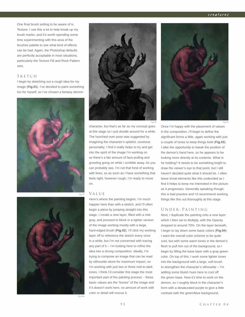
C h a p t e r 0 49 5
c r e a t u r e s
character, but that’s as far as my concept goes
at this stage so I just doodle around for a while.
The hunched-over pose was suggested by
imagining the character’s spiteful, covetous
personality; I fi nd it really helps to try and get
into the spirit of the image I’m working on
so there’s a fair amount of face-pulling and
growling going on while I scribble away. As you
can probably see, I’m not that fond of working
with lines, so as soon as I have something that
feels right, however rough, I’m ready to move
on.
Va l u e
Here’s where the painting begins. I’m much
happier here than with a sketch, and I’ll often
begin a piece by jumping straight into this
stage. I create a new layer, fi lled with a mid-
gray, and proceed to block in a tighter version
of the image working mostly with a large,
hard-edged brush (Fig.02). I’ll click my working
layer off to reference the sketch every once
in a while, but I’m not concerned with tracing
any part of it – I’m looking here to refi ne the
idea into a strong composition. Ideally, I’m
trying to compose an image that can be read
by silhouette alone for maximum impact, so
I’m working with just two or three mid-to-dark
tones. I think I’d consider this stage the most
important part of the painting process – these
basic values are the “bones” of the image and
if it doesn’t work here, no amount of work with
color or detail will rescue it.
Fig.03 Fig.04
Fig.05
Fig.06a
One fi nal brush setting to be aware of is
Texture. I use this a lot to help break up my
brush marks, and it’s worth spending some
time experimenting with this area of the
brushes palette to see what kind of effects
can be had. Again, the Photoshop defaults
are perfectly acceptable in most situations,
particularly the Texture Fill and Rock Pattern
sets.
S k e t c h
I begin by sketching out a rough idea for my
image (Fig.01). I’ve decided to paint something
fun for myself, so I’ve chosen a fantasy demon
Once I’m happy with the placement of values
in the composition, I’ll begin to defi ne the
signifi cant forms a little, again working with just
a couple of tones to keep things bold (Fig.03).
I take the opportunity to tweak the position of
the demon’s hand here, so he appears to be
looking more directly at its contents. What is
he holding? It needs to be something bright to
draw the viewer’s eye to that point, but I still
haven’t decided quite what it should be. I often
leave trivial elements like this undecided as I
fi nd it helps to keep me interested in the picture
as it progresses. Generally speaking though,
this is bad practice and I’d recommend working
things like this out thoroughly at this stage.
U n d e r - Pa i n t i n g
Next, I duplicate the painting onto a new layer
which I then set to Multiply, with the Opacity
dropped to around 70%. On the layer beneath,
I begin to lay down some basic colors (Fig.04).
I want the overall color scheme to be quite
cool, but with some warm tones in the demon’s
fl esh to pull him out of the background, so I
begin by fi lling the base layer with a gray-green
color. On top of this, I work some lighter tones
into the background with a large, soft brush
to strengthen the character’s silhouette – I’m
adding some bluish hues here to cool off
the green base. Now it’s time to work on the
demon, so I roughly block in the character’s
form with a desaturated purple to give a little
contrast with the green/blue background,
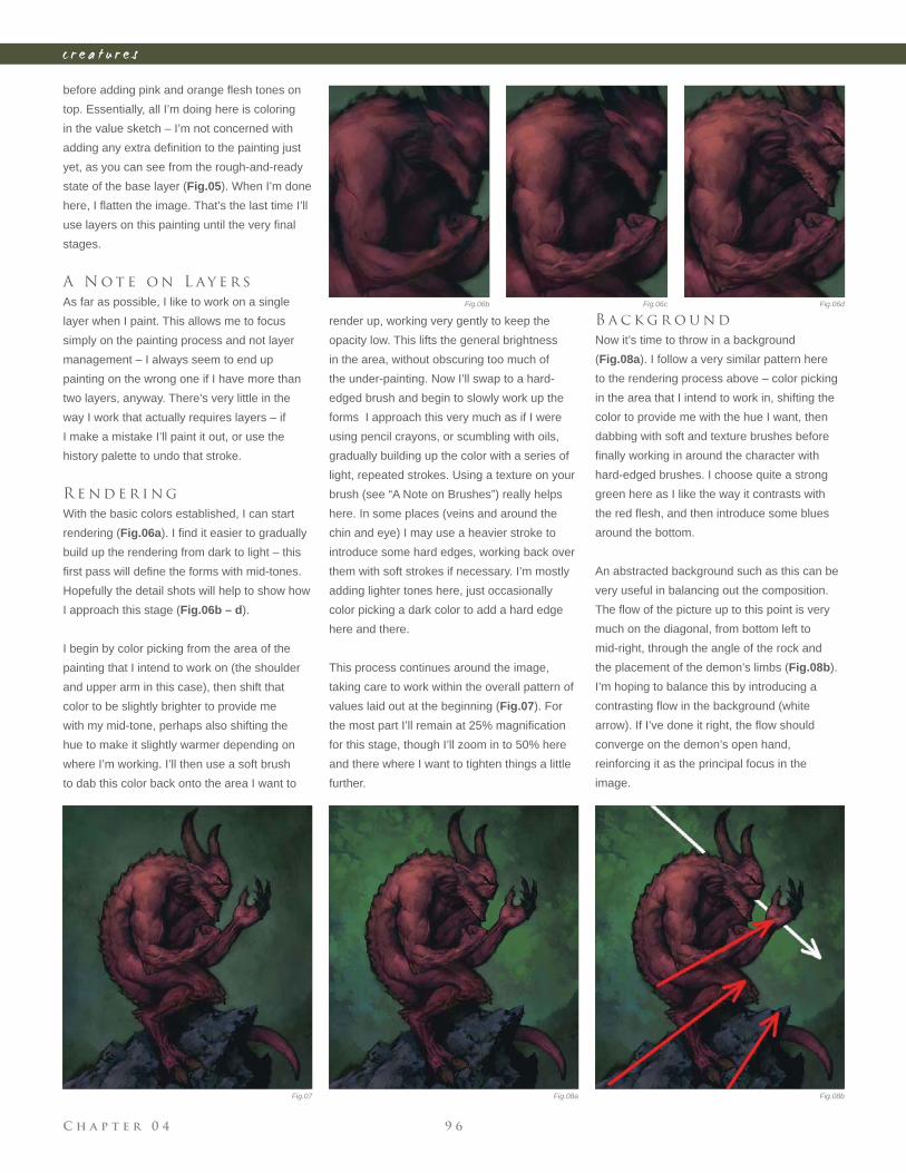
C h a p t e r 0 4 9 6
c r e a t u r e s
before adding pink and orange fl esh tones on
top. Essentially, all I’m doing here is coloring
in the value sketch – I’m not concerned with
adding any extra defi nition to the painting just
yet, as you can see from the rough-and-ready
state of the base layer (Fig.05). When I’m done
here, I fl atten the image. That’s the last time I’ll
use layers on this painting until the very fi nal
stages.
A N o t e o n L ay e r s
As far as possible, I like to work on a single
layer when I paint. This allows me to focus
simply on the painting process and not layer
management – I always seem to end up
painting on the wrong one if I have more than
two layers, anyway. There’s very little in the
way I work that actually requires layers – if
I make a mistake I’ll paint it out, or use the
history palette to undo that stroke.
R e n d e r i n g
With the basic colors established, I can start
rendering (Fig.06a). I fi nd it easier to gradually
build up the rendering from dark to light – this
fi rst pass will defi ne the forms with mid-tones.
Hopefully the detail shots will help to show how
I approach this stage (Fig.06b – d).
I begin by color picking from the area of the
painting that I intend to work on (the shoulder
and upper arm in this case), then shift that
color to be slightly brighter to provide me
with my mid-tone, perhaps also shifting the
hue to make it slightly warmer depending on
where I’m working. I’ll then use a soft brush
to dab this color back onto the area I want to
render up, working very gently to keep the
opacity low. This lifts the general brightness
in the area, without obscuring too much of
the under-painting. Now I’ll swap to a hard-
edged brush and begin to slowly work up the
forms I approach this very much as if I were
using pencil crayons, or scumbling with oils,
gradually building up the color with a series of
light, repeated strokes. Using a texture on your
brush (see “A Note on Brushes”) really helps
here. In some places (veins and around the
chin and eye) I may use a heavier stroke to
introduce some hard edges, working back over
them with soft strokes if necessary. I’m mostly
adding lighter tones here, just occasionally
color picking a dark color to add a hard edge
here and there.
This process continues around the image,
taking care to work within the overall pattern of
values laid out at the beginning (Fig.07). For
the most part I’ll remain at 25% magnifi cation
for this stage, though I’ll zoom in to 50% here
and there where I want to tighten things a little
further.
B a c k g r o u n d
Now it’s time to throw in a background
(Fig.08a). I follow a very similar pattern here
to the rendering process above – color picking
in the area that I intend to work in, shifting the
color to provide me with the hue I want, then
dabbing with soft and texture brushes before
fi nally working in around the character with
hard-edged brushes. I choose quite a strong
green here as I like the way it contrasts with
the red fl esh, and then introduce some blues
around the bottom.
An abstracted background such as this can be
very useful in balancing out the composition.
The fl ow of the picture up to this point is very
much on the diagonal, from bottom left to
mid-right, through the angle of the rock and
the placement of the demon’s limbs (Fig.08b).
I’m hoping to balance this by introducing a
contrasting fl ow in the background (white
arrow). If I’ve done it right, the fl ow should
converge on the demon’s open hand,
reinforcing it as the principal focus in the
image.
Fig.07
Fig.06b Fig.06c Fig.06d
Fig.08a Fig.08b
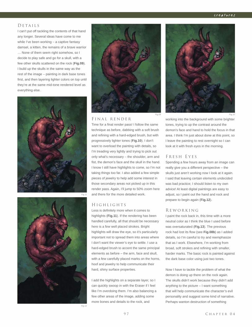
C h a p t e r 0 49 7
c r e a t u r e s
D e ta i l s
I can’t put off tackling the contents of that hand
any longer. Several ideas have come to me
while I’ve been working – a captive fantasy
damsel, a kitten, the remains of a brave warrior
… None of them seem right somehow, so I
decide to play safe and go for a skull, with a
few other skulls scattered on the rock (Fig.09).
I build up the skulls in the same way as the
rest of the image – painting in dark base tones
fi rst, and then layering lighter colors on top until
they’re at the same mid-tone rendered level as
everything else.
F i n a l r e n d e r
Time for a fi nal render pass! I follow the same
technique as before, dabbing with a soft brush
and refi ning with a hard-edged brush, but with
progressively lighter tones (Fig.10). I don’t
want to overload the painting with details, so
I’m treading very lightly and trying to pick out
only what’s necessary – the shoulder, arm and
fi st, the demon’s face and the skull in the hand.
I know I still have highlights to come, so I’m not
taking things too far. I also added a few simple
pieces of jewelry to help add some interest in
those secondary areas not picked up in this
render pass. Again, I’ll jump to 50% zoom here
and there for the more detailed work.
H i g h l i g h t s
Less is defi nitely more when it comes to
highlights (Fig.11). If the rendering has been
handled carefully, all that should be necessary
here is a few well placed strokes. Bright
highlights will draw the eye, so it’s particularly
important not to spread them into areas where
I don’t want the viewer’s eye to settle. I use a
hard-edged brush to accent the same principal
elements as before – the arm, face and skull,
with a few carefully placed marks on the horns,
hoof and jewelry to help communicate their
hard, shiny surface properties.
I add the highlights on a separate layer, so I
can quickly swoop in with the Eraser if I feel
like I’m overdoing them. I’m also balancing a
few other areas of the image, adding some
more bones and details to the rock, and
working into the background with some brighter
tones, trying to up the contrast around the
demon’s face and hand to hold the focus in that
area. I think I’m just about done at this point, so
I leave the painting to rest overnight so I can
look at it with fresh eyes in the morning.
F r e s h E y e s
Spending a few hours away from an image can
really give you a different perspective – the
skulls just aren’t working now I look at it again.
I said that leaving certain elements undecided
was bad practice; I should listen to my own
advice! At least digital paintings are easy to
adjust, so I paint out the hand and rock and
prepare to begin again (Fig.12).
R e w o r k i n g
I paint the rock back in, this time with a more
neutral color as I think the blue I used before
was oversaturated (Fig.13). The previous
rock had lost its fl ow (see Fig.08b) as I added
details, so I’m careful to try and reemphasize
that as I work. Elsewhere, I’m working from
broad, soft strokes and refi ning with smaller,
harder marks. The basic rock is painted against
the dark base color using just two tones.
Now I have to tackle the problem of what the
demon is doing up there on the rock again.
The skulls didn’t work because they didn’t add
anything to the picture – I want something
that will help communicate the character’s evil
personality and suggest some kind of narrative.
Perhaps wanton destruction of something
Fig.09 Fig.10
Fig.11
Fig.12
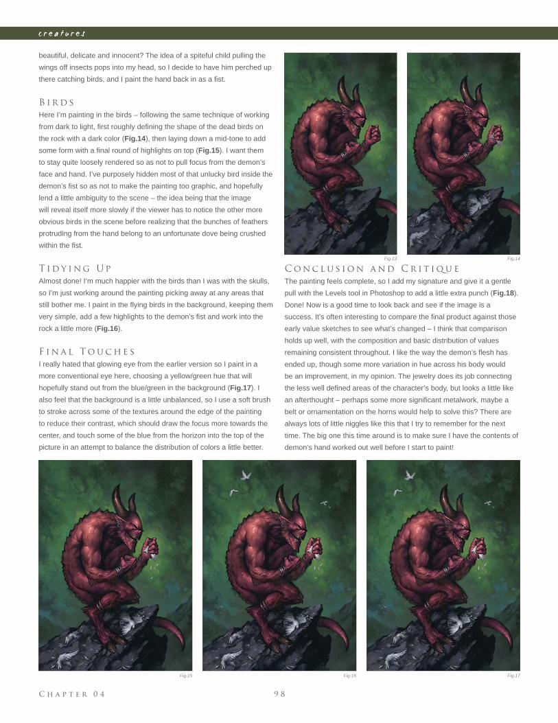
C h a p t e r 0 4 9 8
c r e a t u r e s
beautiful, delicate and innocent? The idea of a spiteful child pulling the
wings off insects pops into my head, so I decide to have him perched up
there catching birds, and I paint the hand back in as a fi st.
B i r d s
Here I’m painting in the birds – following the same technique of working
from dark to light, fi rst roughly defi ning the shape of the dead birds on
the rock with a dark color (Fig.14), then laying down a mid-tone to add
some form with a fi nal round of highlights on top (Fig.15). I want them
to stay quite loosely rendered so as not to pull focus from the demon’s
face and hand. I’ve purposely hidden most of that unlucky bird inside the
demon’s fi st so as not to make the painting too graphic, and hopefully
lend a little ambiguity to the scene – the idea being that the image
will reveal itself more slowly if the viewer has to notice the other more
obvious birds in the scene before realizing that the bunches of feathers
protruding from the hand belong to an unfortunate dove being crushed
within the fi st.
T i d y i n g U p
Almost done! I’m much happier with the birds than I was with the skulls,
so I’m just working around the painting picking away at any areas that
still bother me. I paint in the fl ying birds in the background, keeping them
very simple, add a few highlights to the demon’s fi st and work into the
rock a little more (Fig.16).
F i n a l T o u c h e s
I really hated that glowing eye from the earlier version so I paint in a
more conventional eye here, choosing a yellow/green hue that will
hopefully stand out from the blue/green in the background (Fig.17). I
also feel that the background is a little unbalanced, so I use a soft brush
to stroke across some of the textures around the edge of the painting
to reduce their contrast, which should draw the focus more towards the
center, and touch some of the blue from the horizon into the top of the
picture in an attempt to balance the distribution of colors a little better.
C o n c l u s i o n a n d C r i t i q u e
The painting feels complete, so I add my signature and give it a gentle
pull with the Levels tool in Photoshop to add a little extra punch (Fig.18).
Done! Now is a good time to look back and see if the image is a
success. It’s often interesting to compare the fi nal product against those
early value sketches to see what’s changed – I think that comparison
holds up well, with the composition and basic distribution of values
remaining consistent throughout. I like the way the demon’s fl esh has
ended up, though some more variation in hue across his body would
be an improvement, in my opinion. The jewelry does its job connecting
the less well defi ned areas of the character’s body, but looks a little like
an afterthought – perhaps some more signifi cant metalwork, maybe a
belt or ornamentation on the horns would help to solve this? There are
always lots of little niggles like this that I try to remember for the next
time. The big one this time around is to make sure I have the contents of
demon’s hand worked out well before I start to paint!
Fig.13 Fig.14
Fig.15 Fig.16 Fig.17
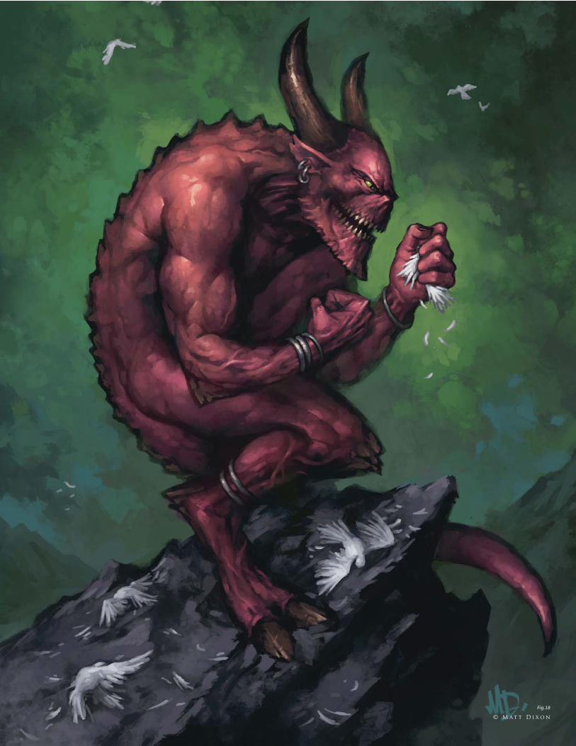
Fig.18
© M at t D i x o n
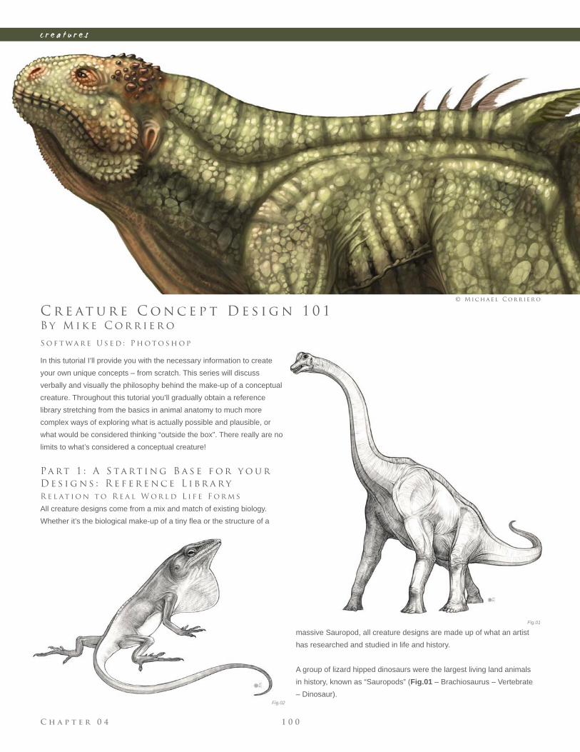
C h a p t e r 0 4 1 0 0
c r e a t u r e s
Fig.01
Fig.02
B y M i k e C o r r i e r o
C r e at u r e C o n c e p t D e s i g n 1 0 1
In this tutorial I’ll provide you with the necessary information to create
your own unique concepts – from scratch. This series will discuss
verbally and visually the philosophy behind the make-up of a conceptual
creature. Throughout this tutorial you’ll gradually obtain a reference
library stretching from the basics in animal anatomy to much more
complex ways of exploring what is actually possible and plausible, or
what would be considered thinking “outside the box”. There really are no
limits to what’s considered a conceptual creature!
Pa rt 1 : A S ta rt i n g B a s e f o r y o u r
D e s i g n s : R e f e r e n c e L i b r a r y
R e l at i o n t o R e a l W o r l d L i f e F o r m s
All creature designs come from a mix and match of existing biology.
Whether it’s the biological make-up of a tiny fl ea or the structure of a
S o f t wa r e U s e d : P h o t o s h o p
© M i c h a e l C o r r i e r o
massive Sauropod, all creature designs are made up of what an artist
has researched and studied in life and history.
A group of lizard hipped dinosaurs were the largest living land animals
in history, known as “Sauropods” (Fig.01 – Brachiosaurus – Vertebrate
– Dinosaur).
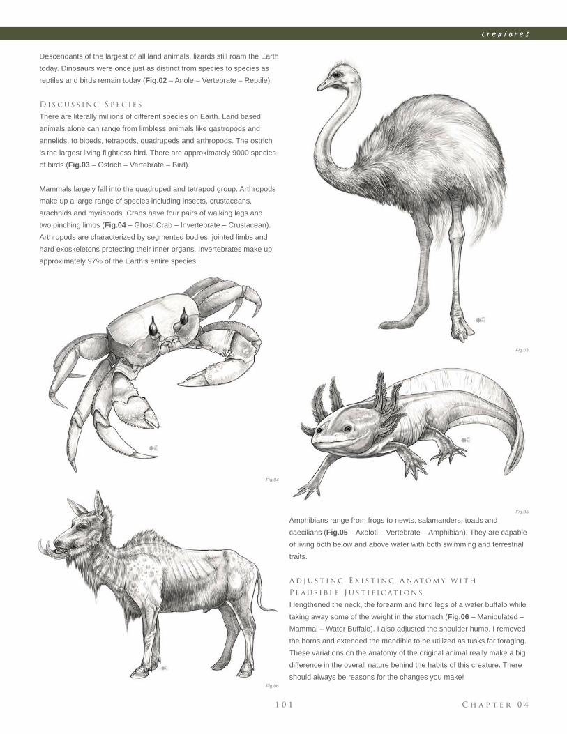
C h a p t e r 0 41 0 1
c r e a t u r e s
Fig.03
Fig.04
Fig.05
Fig.06
Descendants of the largest of all land animals, lizards still roam the Earth
today. Dinosaurs were once just as distinct from species to species as
reptiles and birds remain today (Fig.02 – Anole – Vertebrate – Reptile).
D i s c u s s i n g S p e c i e s
There are literally millions of different species on Earth. Land based
animals alone can range from limbless animals like gastropods and
annelids, to bipeds, tetrapods, quadrupeds and arthropods. The ostrich
is the largest living fl ightless bird. There are approximately 9000 species
of birds (Fig.03 – Ostrich – Vertebrate – Bird).
Mammals largely fall into the quadruped and tetrapod group. Arthropods
make up a large range of species including insects, crustaceans,
arachnids and myriapods. Crabs have four pairs of walking legs and
two pinching limbs (Fig.04 – Ghost Crab – Invertebrate – Crustacean).
Arthropods are characterized by segmented bodies, jointed limbs and
hard exoskeletons protecting their inner organs. Invertebrates make up
approximately 97% of the Earth’s entire species!
Amphibians range from frogs to newts, salamanders, toads and
caecilians (Fig.05 – Axolotl – Vertebrate – Amphibian). They are capable
of living both below and above water with both swimming and terrestrial
traits.
A d j u s t i n g E x i s t i n g A n at o m y w i t h
P l a u s i b l e J u s t i f i c at i o n s
I lengthened the neck, the forearm and hind legs of a water buffalo while
taking away some of the weight in the stomach (Fig.06 – Manipulated –
Mammal – Water Buffalo). I also adjusted the shoulder hump. I removed
the horns and extended the mandible to be utilized as tusks for foraging.
These variations on the anatomy of the original animal really make a big
difference in the overall nature behind the habits of this creature. There
should always be reasons for the changes you make!
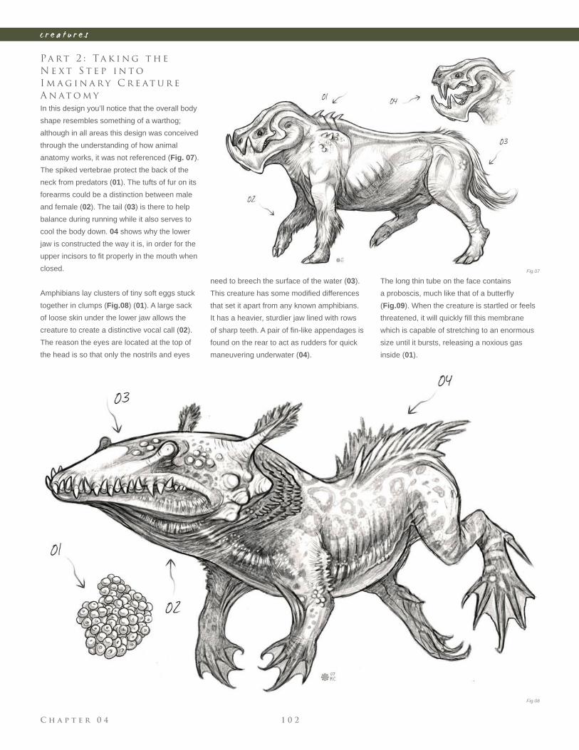
C h a p t e r 0 4 1 0 2
c r e a t u r e s
Pa rt 2 : Ta k i n g t h e
N e x t S t e p i n t o
I m a g i n a r y C r e at u r e
A n at o m y
In this design you’ll notice that the overall body
shape resembles something of a warthog;
although in all areas this design was conceived
through the understanding of how animal
anatomy works, it was not referenced (Fig. 07).
The spiked vertebrae protect the back of the
neck from predators (01). The tufts of fur on its
forearms could be a distinction between male
and female (02). The tail (03) is there to help
balance during running while it also serves to
cool the body down. 04 shows why the lower
jaw is constructed the way it is, in order for the
upper incisors to fi t properly in the mouth when
closed.
Amphibians lay clusters of tiny soft eggs stuck
together in clumps (Fig.08) (01). A large sack
of loose skin under the lower jaw allows the
creature to create a distinctive vocal call (02).
The reason the eyes are located at the top of
the head is so that only the nostrils and eyes
need to breech the surface of the water (03).
This creature has some modifi ed differences
that set it apart from any known amphibians.
It has a heavier, sturdier jaw lined with rows
of sharp teeth. A pair of fi n-like appendages is
found on the rear to act as rudders for quick
maneuvering underwater (04).
The long thin tube on the face contains
a proboscis, much like that of a butterfl y
(Fig.09). When the creature is startled or feels
threatened, it will quickly fi ll this membrane
which is capable of stretching to an enormous
size until it bursts, releasing a noxious gas
inside (01).
Fig.07
Fig.08
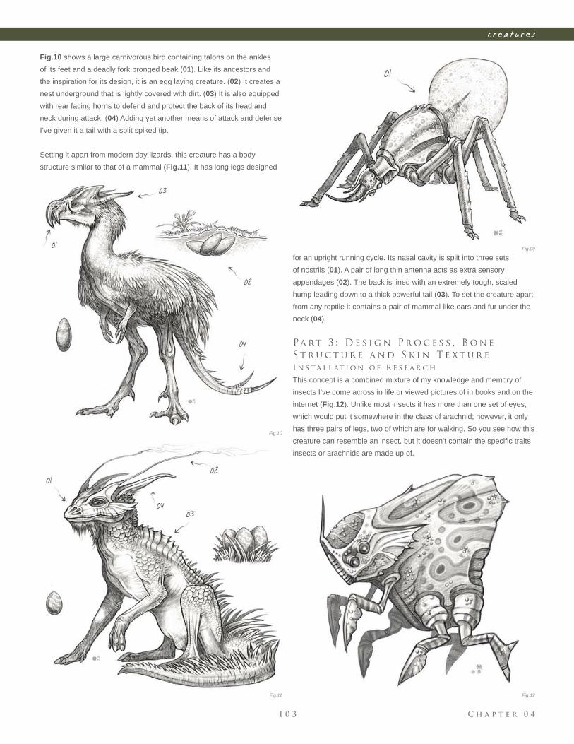
C h a p t e r 0 41 0 3
c r e a t u r e s
Fig.10 shows a large carnivorous bird containing talons on the ankles
of its feet and a deadly fork pronged beak (01). Like its ancestors and
the inspiration for its design, it is an egg laying creature. (02) It creates a
nest underground that is lightly covered with dirt. (03) It is also equipped
with rear facing horns to defend and protect the back of its head and
neck during attack. (04) Adding yet another means of attack and defense
I’ve given it a tail with a split spiked tip.
Setting it apart from modern day lizards, this creature has a body
structure similar to that of a mammal (Fig.11). It has long legs designed
for an upright running cycle. Its nasal cavity is split into three sets
of nostrils (01). A pair of long thin antenna acts as extra sensory
appendages (02). The back is lined with an extremely tough, scaled
hump leading down to a thick powerful tail (03). To set the creature apart
from any reptile it contains a pair of mammal-like ears and fur under the
neck (04).
Pa rt 3 : D e s i g n P r o c e s s , B o n e
S t r u c t u r e a n d S k i n T e x t u r e
I n s ta l l at i o n o f R e s e a r c h
This concept is a combined mixture of my knowledge and memory of
insects I’ve come across in life or viewed pictures of in books and on the
internet (Fig.12). Unlike most insects it has more than one set of eyes,
which would put it somewhere in the class of arachnid; however, it only
has three pairs of legs, two of which are for walking. So you see how this
creature can resemble an insect, but it doesn’t contain the specifi c traits
insects or arachnids are made up of.
Fig.09
Fig.10
Fig.11 Fig.12
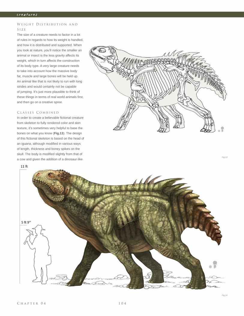
C h a p t e r 0 4 1 0 4
c r e a t u r e s
W e i g h t D i s t r i b u t i o n a n d
S i z e
The size of a creature needs to factor in a lot
of rules in regards to how its weight is handled,
and how it is distributed and supported. When
you look at nature, you’ll notice the smaller an
animal or insect is the less gravity affects its
weight, which in turn affects the construction
of its body type. A very large creature needs
to take into account how the massive body
fat, muscle and large bones will be held up.
An animal like that is not likely to run with long
strides and would certainly not be capable
of jumping. It’s just more plausible to think of
these things in terms of real world animals fi rst,
and then go on a creative spree.
C l a s s e s C o m b i n e d
In order to create a believable fi ctional creature
from skeleton to fully rendered color and skin
texture, it’s sometimes very helpful to base the
bones on what you know (Fig.13). The design
of this fi ctional skeleton is based on the head of
an iguana, although modifi ed in various ways
of length, thickness and boney spikes on the
skull. The body is modifi ed slightly from that of
a cow and given the addition of a dinosaur-like Fig.13
Fig.14
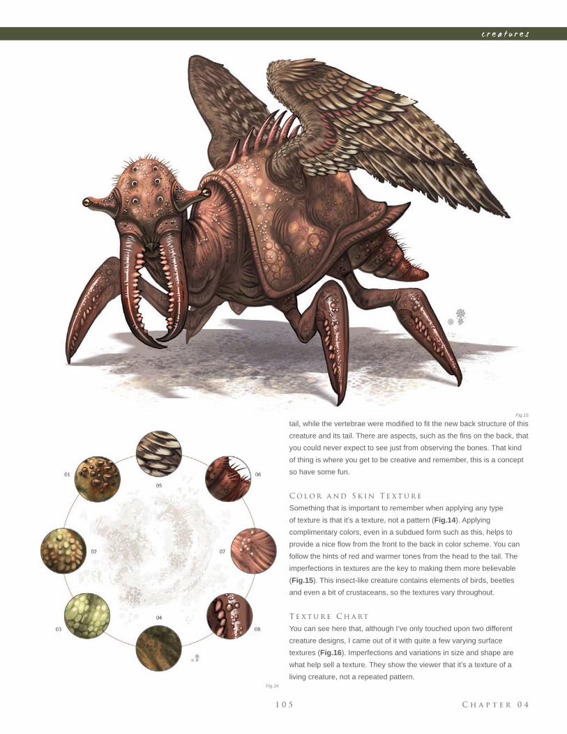
C h a p t e r 0 41 0 5
c r e a t u r e s
tail, while the vertebrae were modifi ed to fi t the new back structure of this
creature and its tail. There are aspects, such as the fi ns on the back, that
you could never expect to see just from observing the bones. That kind
of thing is where you get to be creative and remember, this is a concept
so have some fun.
C o l o r a n d S k i n T e x t u r e
Something that is important to remember when applying any type
of texture is that it’s a texture, not a pattern (Fig.14). Applying
complimentary colors, even in a subdued form such as this, helps to
provide a nice fl ow from the front to the back in color scheme. You can
follow the hints of red and warmer tones from the head to the tail. The
imperfections in textures are the key to making them more believable
(Fig.15). This insect-like creature contains elements of birds, beetles
and even a bit of crustaceans, so the textures vary throughout.
T e x t u r e C h a rt
You can see here that, although I’ve only touched upon two different
creature designs, I came out of it with quite a few varying surface
textures (Fig.16). Imperfections and variations in size and shape are
what help sell a texture. They show the viewer that it’s a texture of a
living creature, not a repeated pattern.
Fig.15
Fig.16
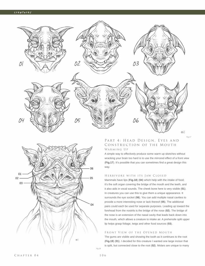
C h a p t e r 0 4 1 0 6
c r e a t u r e s
Pa rt 4 : H e a d D e s i g n , E y e s a n d
C o n s t r u c t i o n o f t h e M o u t h
Wa r m i n g U p
A simple way to effectively produce some warm up sketches without
wracking your brain too hard is to use the mirrored effect of a front view
(Fig.17). It’s possible that you can sometimes fi nd a great design this
way.
H e r b i v o r e w i t h i t s J aw C l o s e d
Mammals have lips (Fig.18) (04) which help with the intake of food;
it’s the soft organ covering the bridge of the mouth and the teeth, and
it also aids in vocal sounds. The cheek bone here is very visible (01).
In creatures you can use this to give them a unique appearance. It
surrounds the eye socket (06). You can add multiple nasal cavities to
provide a more interesting nose or lack thereof (05). The additional
pairs could each be used for separate purposes. Leading up toward the
forehead from the nostrils is the bridge of the nose (02). The bridge of
the nose is an extension of the nasal cavity that leads back down into
the mouth, which allows a creature to intake air. A prehensile split upper
lip helps grasp foliage, twigs and other food sources (03).
F r o n t V i e w o f t h e O p e n e d M o u t h
The gums are visible and showing the tooth as it continues to the root
(Fig.19) (01). I decided for this creature I wanted one large incisor that
is split, but connected close to the root (02). Molars are unique to many
Fig.17
Fig.18
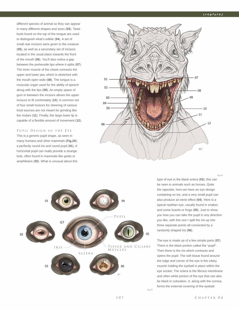
C h a p t e r 0 41 0 7
c r e a t u r e s
Fig.19
Fig.20
different species of animal so they can appear
in many different shapes and sizes (03). Taste
buds found on the top of the tongue are used
to distinguish what’s edible (04). A set of
small rear incisors were given to the creature
(05), as well as a secondary set of incisors
located in the usual place towards the front
of the mouth (06). You’ll also notice a gap
between the prehensile lips where it splits (07).
The inner muscle of the cheek connects the
upper and lower jaw, which is stretched with
the mouth open wide (08). The tongue is a
muscular organ used for the ability of speech
along with the lips (09). An empty space of
gum in between the incisors allows the upper
incisors to fi t comfortably (10). A common set
of four small incisors for sheering of various
food sources are not meant for grinding like
the molars (11). Finally, the large lower lip is
capable of a fl exible amount of movement (12).
P u p i l D e s i g n o f t h e E y e
This is a generic pupil shape, as seen in
many humans and other mammals (Fig.20):
a perfectly round iris and round pupil (01). A
horizontal pupil can really provide a strange
look, often found in mammals like goats or
amphibians (02). What is unusual about this
T i s s u e a n d C i l i a r y
M u s c l e s
P u p i l
S c l e r a
I r i s
type of eye is the black sclera (03); this can
be seen in animals such as horses. Quite
the opposite, here we have an eye design
containing no iris, and a very small pupil can
also produce an eerie effect (04). Here is a
typical reptilian eye, usually found in snakes
and some lizards or frogs (05). Just to show
you how you can take the pupil in any direction
you like, with this one I split the iris up into
three separate points all connected by a
randomly shaped iris (06).
The eye is made up of a few simple parts (07).
There is the black portion called the “pupil”.
Then there is the iris which contracts and
opens the pupil. The soft tissue found around
the edge and corner of the eye is the ciliary
muscle holding the eyeball in place within the
eye socket. The sclera is the fi brous membrane
and often white portion of the eye that can also
be black in coloration. It, along with the cornea,
forms the external covering of the eyeball.
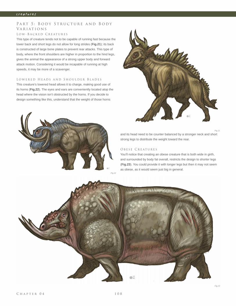
C h a p t e r 0 4 1 0 8
c r e a t u r e s
Pa rt 5 : B o d y S t r u c t u r e a n d B o d y
Va r i at i o n s
L o w - B a c k e d C r e at u r e s
This type of creature tends not to be capable of running fast because the
lower back and short legs do not allow for long strides (Fig.21); its back
is constructed of large bone plates to prevent rear attacks. This type of
body, where the front shoulders are higher in proportion to the hind legs,
gives the animal the appearance of a strong upper body and forward
attack motion. Considering it would be incapable of running at high
speeds, it may be more of a scavenger.
L o w e r e d H e a d s a n d S h o u l d e r B l a d e s
This creature’s lowered head allows it to charge, making good use of
its horns (Fig.22). The eyes and ears are conveniently located atop the
head where the vision isn’t obstructed by the horns. If you decide to
design something like this, understand that the weight of those horns
and its head need to be counter balanced by a stronger neck and short
strong legs to distribute the weight toward the rear.
O b e s e C r e at u r e s
You’ll notice that creating an obese creature that is both wide in girth,
and surrounded by body fat overall, restricts the design to shorter legs
(Fig.23). You could provide it with longer legs but then it may not seem
as obese, as it would seem just big in general.
Fig.21
Fig.22
Fig.23
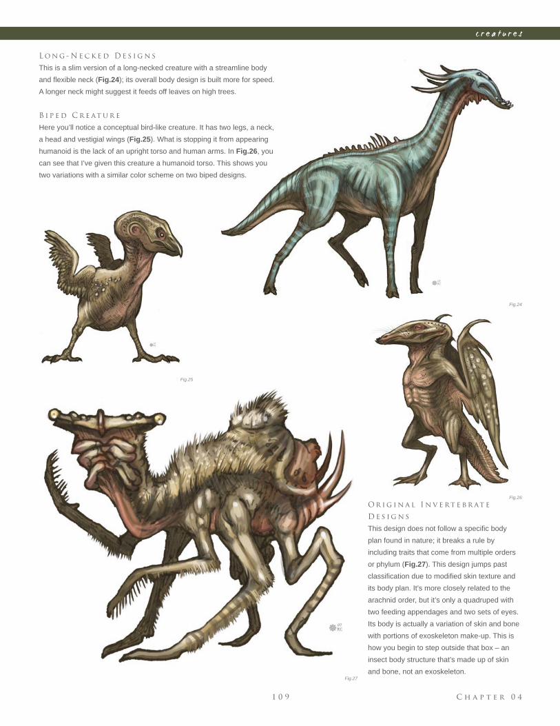
C h a p t e r 0 41 0 9
c r e a t u r e s
L o n g - N e c k e d D e s i g n s
This is a slim version of a long-necked creature with a streamline body
and fl exible neck (Fig.24); its overall body design is built more for speed.
A longer neck might suggest it feeds off leaves on high trees.
B i p e d C r e at u r e
Here you’ll notice a conceptual bird-like creature. It has two legs, a neck,
a head and vestigial wings (Fig.25). What is stopping it from appearing
humanoid is the lack of an upright torso and human arms. In Fig.26, you
can see that I’ve given this creature a humanoid torso. This shows you
two variations with a similar color scheme on two biped designs.
O r i g i n a l I n v e rt e b r at e
D e s i g n s
This design does not follow a specifi c body
plan found in nature; it breaks a rule by
including traits that come from multiple orders
or phylum (Fig.27). This design jumps past
classifi cation due to modifi ed skin texture and
its body plan. It’s more closely related to the
arachnid order, but it’s only a quadruped with
two feeding appendages and two sets of eyes.
Its body is actually a variation of skin and bone
with portions of exoskeleton make-up. This is
how you begin to step outside that box – an
insect body structure that’s made up of skin
and bone, not an exoskeleton.
Fig.24
Fig.25
Fig.26
Fig.27
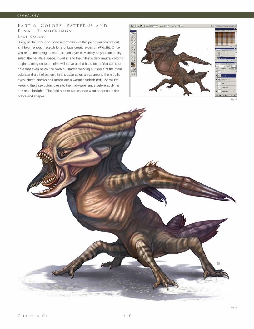
C h a p t e r 0 4 1 1 0
c r e a t u r e s
Pa rt 6 : C o l o r s , Pat t e r n s a n d
F i n a l R e n d e r i n g s
B a s e C o l o r
Using all the prior discussed information, at this point you can set out
and begin a rough sketch for a unique creature design (Fig.28). Once
you refi ne the design, set the sketch layer to Multiply so you can easily
select the negative space, invert it, and then fi ll in a dark neutral color to
begin painting on top of (this will serve as the base tone). You can see
here that even below the sketch I started working out some of the main
colors and a bit of pattern. In this base color, areas around the mouth,
eyes, chest, elbows and armpit are a warmer pinkish red. Overall I’m
keeping the base colors close to the mid-value range before applying
any real highlights. The light source can change what happens to the
colors and shapes.Fig.28
Fig.29
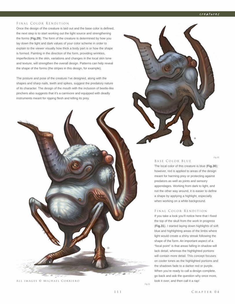
C h a p t e r 0 41 1 1
c r e a t u r e s
F i n a l C o l o r R e n d i t i o n
Once the design of the creature is laid out and the base color is defi ned,
the next step is to start working out the light source and strengthening
the forms (Fig.29). The form of the creature is determined by how you
lay down the light and dark values of your color scheme in order to
explain to the viewer visually how thick a body part is or how the shape
is formed. Painting in the direction of the form, providing wrinkles,
imperfections in the skin, variations and changes in the local skin tone
and texture, will strengthen the overall design. Patterns can help reveal
the shape of the forms (the stripes in this design, for example).
The posture and pose of the creature I’ve designed, along with the
shapes and sharp nails, teeth and spikes, suggest the predatory nature
of its character. The design of the mouth with the inclusion of beetle-like
pinchers also suggests that it’s a carnivore and equipped with deadly
instruments meant for ripping fl esh and killing its prey.
B a s e C o l o r B l u e
The local color of this creature is blue (Fig.30);
however, red is applied to areas of the design
meant for harming prey or protecting against
predators as well as joints and sensory
appendages. Working from dark to light, and
not the other way around, it is easier to defi ne
a shape by applying a highlight, especially
when working on a white background.
F i n a l C o l o r R e n d i t i o n
If you take a look you’ll notice here that I fi xed
the top of the skull from the work in progress
(Fig.31). I started laying down highlights of soft
blue and highlighting areas of the limbs where
light would create a shiny streak following the
shape of the form. An important aspect of a
“focal point” is that areas falling in shadow will
lack detail, whereas the highlighted portions
will contain more detail. This concept focuses
on cooler tones as the highlighted portions and
the shadows fade to a darker red or purple.
When you’re ready to call a design complete,
go back and ask the question why once more,
look it over, and then call it a rap!
Fig.30
Fig.31
A l l i m a g e s © M i c h a e l C o r r i e r o
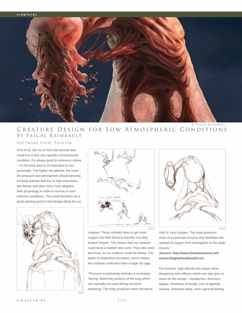
C h a p t e r 0 4 1 1 2
c r e a t u r e s
Fig.01a Fig.01b
Fig.02
B y Pa s c a l R a i m b a u lt
C r e at u r e D e s i g n f o r L o w At m o s p h e r i c C o n d i t i o n s
First of all, let’s try to fi nd real animals that
could live in this very specifi c environmental
condition. It’s always good to reference nature
– it’s the best source of inspiration to me,
personally. The higher the altitude, the lower
the pressure and atmosphere should become.
Existing animals that live in high mountains,
like llamas and deer mice, have adapted
their physiology in order to survive in such
extreme conditions. This could therefore be a
good starting point to fi nd design ideas for our
S o f t wa r e U s e d : Pa i n t e r
© Pa s c a l R a i m b a u lt
creature. These animals have to get more
oxygen into their blood to transfer it to their
bodies’ tissues. This means that our creature
could have a reddish skin color. They also need
less food, so our creature could be skinny. The
depth of respiration increases, which means
the creature could also have a large rib cage.
“Pressure in pulmonary arteries is increased,
‘forcing’ blood into portions of the lung which
are normally not used during sea level
breathing. The body produces more red blood
cells to carry oxygen. The body produces
more of a particular enzyme that facilitates the
release of oxygen from hemoglobin to the body
tissues.”
(Source: http://www.himadventures.net/
articles/highaltitudehealth.txt)
For humans, high altitude can cause some
dangerous side effects, which can also give us
ideas for the design – headaches, dizziness,
fatigue, shortness of breath, loss of appetite,
nausea, disturbed sleep, and a general feeling
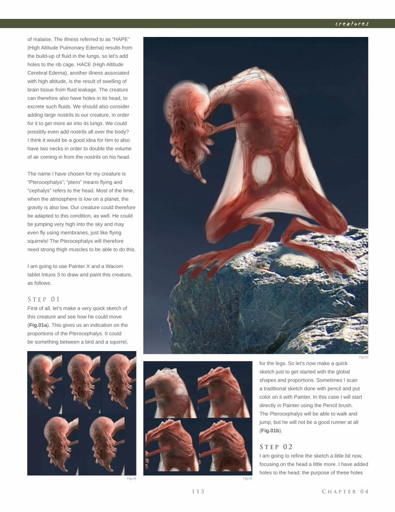
C h a p t e r 0 41 1 3
c r e a t u r e s
Fig.03
Fig.04 Fig.05
of malaise. The illness referred to as “HAPE”
(High Altitude Pulmonary Edema) results from
the build-up of fl uid in the lungs, so let’s add
holes to the rib cage. HACE (High Altitude
Cerebral Edema), another illness associated
with high altitude, is the result of swelling of
brain tissue from fl uid leakage. The creature
can therefore also have holes in its head, to
excrete such fl uids. We should also consider
adding large nostrils to our creature, in order
for it to get more air into its lungs. We could
possibly even add nostrils all over the body?
I think it would be a good idea for him to also
have two necks in order to double the volume
of air coming in from the nostrils on his head.
The name I have chosen for my creature is
“Pterocephalys”; “ptero” means fl ying and
“cephalys” refers to the head. Most of the time,
when the atmosphere is low on a planet, the
gravity is also low. Our creature could therefore
be adapted to this condition, as well. He could
be jumping very high into the sky and may
even fl y using membranes, just like fl ying
squirrels! The Pterocephalys will therefore
need strong thigh muscles to be able to do this.
I am going to use Painter X and a Wacom
tablet Intuos 3 to draw and paint this creature,
as follows.
S t e p 0 1
First of all, let’s make a very quick sketch of
this creature and see how he could move
(Fig.01a). This gives us an indication on the
proportions of the Pterocephalys. It could
be something between a bird and a squirrel,
for the legs. So let’s now make a quick
sketch just to get started with the global
shapes and proportions. Sometimes I scan
a traditional sketch done with pencil and put
color on it with Painter. In this case I will start
directly in Painter using the Pencil brush.
The Pterocephalys will be able to walk and
jump, but he will not be a good runner at all
(Fig.01b).
S t e p 0 2
I am going to refi ne the sketch a little bit now,
focusing on the head a little more. I have added
holes to the head; the purpose of these holes
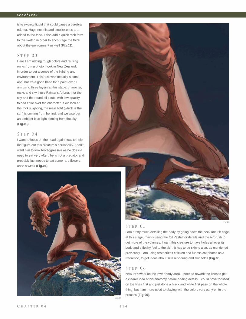
C h a p t e r 0 4 1 1 4
c r e a t u r e s
is to excrete liquid that could cause a cerebral
edema. Huge nostrils and smaller ones are
added to the face. I also add a quick rock form
to the sketch in order to encourage me think
about the environment as well (Fig.02).
S t e p 0 3
Here I am adding rough colors and reusing
rocks from a photo I took in New Zealand,
in order to get a sense of the lighting and
environment. This rock was actually a small
one, but it’s a good base for a paint-over. I
am using three layers at this stage: character,
rocks and sky. I use Painter’s Airbrush for the
sky and the round oil pastel with low opacity
to add color over the character. If we look at
the rock’s lighting, the main light (which is the
sun) is coming from behind, and we also get
an ambient blue light coming from the sky
(Fig.03).
S t e p 0 4
I want to focus on the head again now, to help
me fi gure out this creature’s personality. I don’t
want him to look too aggressive as he doesn’t
need to eat very often; he is not a predator and
probably just needs to eat some rare fl owers
once a week (Fig.04).
S t e p 0 5
I am pretty much detailing the body by going down the neck and rib cage
at this stage, mainly using the Oil Pastel for details and the Airbrush to
get more of the volumes. I want this creature to have holes all over its
body and a fl eshy feel to the skin. It has to be skinny also, as mentioned
previously. I am using featherless chicken and furless cat photos as a
reference, to get ideas about skin rendering and skin folds (Fig.05).
S t e p 0 6
Now let’s work on the lower body area. I need to rework the lines to get
a clearer idea of his anatomy before adding details. I could have focused
on the lines fi rst and just done a black and white fi rst pass on the whole
thing, but I am more used to playing with the colors very early on in the
process (Fig.06).
Fig.06
Fig.07
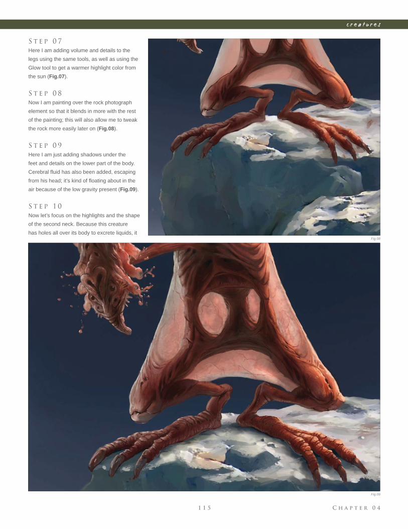
C h a p t e r 0 41 1 5
c r e a t u r e s
S t e p 0 7
Here I am adding volume and details to the
legs using the same tools, as well as using the
Glow tool to get a warmer highlight color from
the sun (Fig.07).
S t e p 0 8
Now I am painting over the rock photograph
element so that it blends in more with the rest
of the painting; this will also allow me to tweak
the rock more easily later on (Fig.08).
S t e p 0 9
Here I am just adding shadows under the
feet and details on the lower part of the body.
Cerebral fl uid has also been added, escaping
from his head; it’s kind of fl oating about in the
air because of the low gravity present (Fig.09).
S t e p 1 0
Now let’s focus on the highlights and the shape
of the second neck. Because this creature
has holes all over its body to excrete liquids, it Fig.08
Fig.09
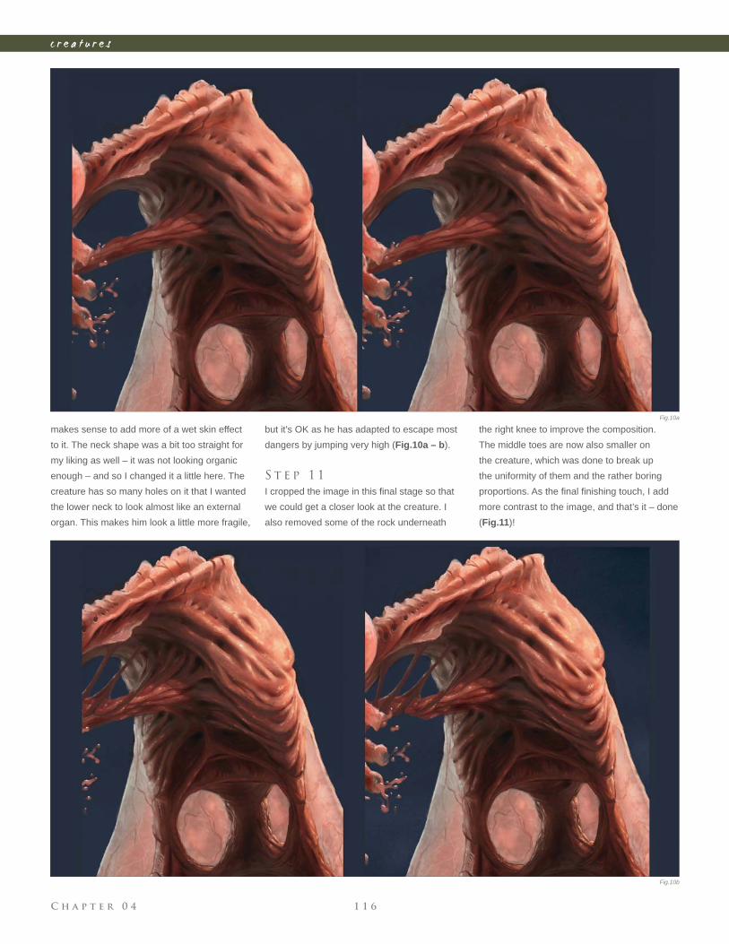
C h a p t e r 0 4 1 1 6
c r e a t u r e s
makes sense to add more of a wet skin effect
to it. The neck shape was a bit too straight for
my liking as well – it was not looking organic
enough – and so I changed it a little here. The
creature has so many holes on it that I wanted
the lower neck to look almost like an external
organ. This makes him look a little more fragile,
but it’s OK as he has adapted to escape most
dangers by jumping very high (Fig.10a – b).
S t e p 1 1
I cropped the image in this fi nal stage so that
we could get a closer look at the creature. I
also removed some of the rock underneath
the right knee to improve the composition.
The middle toes are now also smaller on
the creature, which was done to break up
the uniformity of them and the rather boring
proportions. As the fi nal fi nishing touch, I add
more contrast to the image, and that’s it – done
(Fig.11)!
Fig.10a
Fig.10b
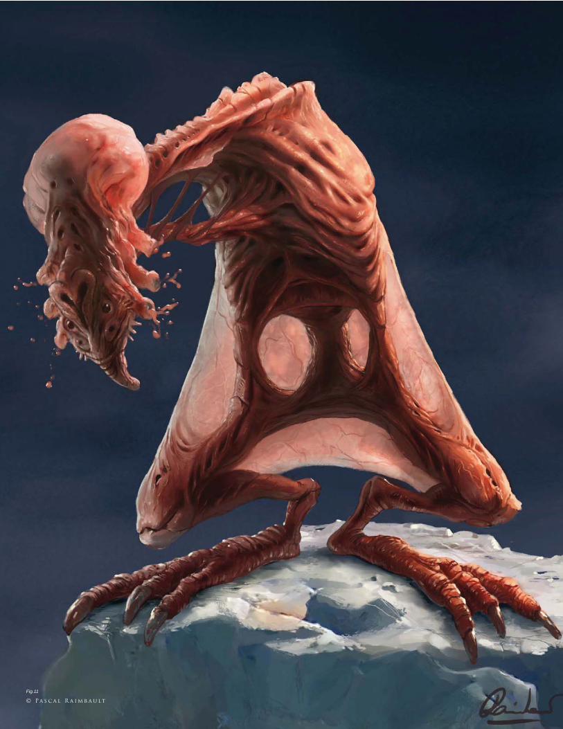
© Pa s c a l R a i m b a u lt
Fig.11
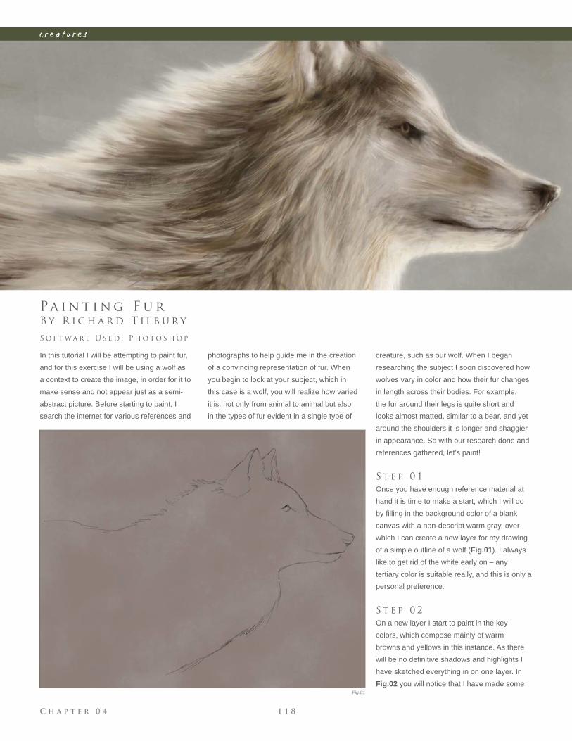
C h a p t e r 0 4 1 1 8
c r e a t u r e s
Fig.01
B y R i c h a r d T i l b u r y
Pa i n t i n g F u r
In this tutorial I will be attempting to paint fur,
and for this exercise I will be using a wolf as
a context to create the image, in order for it to
make sense and not appear just as a semi-
abstract picture. Before starting to paint, I
search the internet for various references and
S o f t wa r e U s e d : P h o t o s h o p
photographs to help guide me in the creation
of a convincing representation of fur. When
you begin to look at your subject, which in
this case is a wolf, you will realize how varied
it is, not only from animal to animal but also
in the types of fur evident in a single type of
creature, such as our wolf. When I began
researching the subject I soon discovered how
wolves vary in color and how their fur changes
in length across their bodies. For example,
the fur around their legs is quite short and
looks almost matted, similar to a bear, and yet
around the shoulders it is longer and shaggier
in appearance. So with our research done and
references gathered, let’s paint!
S t e p 0 1
Once you have enough reference material at
hand it is time to make a start, which I will do
by fi lling in the background color of a blank
canvas with a non-descript warm gray, over
which I can create a new layer for my drawing
of a simple outline of a wolf (Fig.01). I always
like to get rid of the white early on – any
tertiary color is suitable really, and this is only a
personal preference.
S t e p 0 2
On a new layer I start to paint in the key
colors, which compose mainly of warm
browns and yellows in this instance. As there
will be no defi nitive shadows and highlights I
have sketched everything in on one layer. In
Fig.02 you will notice that I have made some
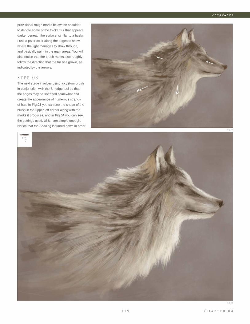
C h a p t e r 0 41 1 9
c r e a t u r e s
Fig.02
Fig.03
provisional rough marks below the shoulder
to denote some of the thicker fur that appears
darker beneath the surface, similar to a husky.
I use a paler color along the edges to show
where the light manages to show through,
and basically paint in the main areas. You will
also notice that the brush marks also roughly
follow the direction that the fur has grown, as
indicated by the arrows.
S t e p 0 3
The next stage involves using a custom brush
in conjunction with the Smudge tool so that
the edges may be softened somewhat and
create the appearance of numerous strands
of hair. In Fig.03 you can see the shape of the
brush in the upper left corner along with the
marks it produces, and in Fig.04 you can see
the settings used, which are simple enough.
Notice that the Spacing is turned down in order
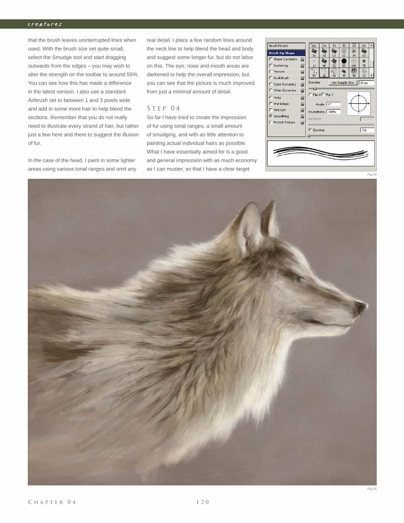
C h a p t e r 0 4 1 2 0
c r e a t u r e s
that the brush leaves uninterrupted lines when
used. With the brush size set quite small,
select the Smudge tool and start dragging
outwards from the edges – you may wish to
alter the strength on the toolbar to around 55%.
You can see how this has made a difference
in the latest version. I also use a standard
Airbrush set to between 1 and 3 pixels wide
and add in some more hair to help blend the
sections. Remember that you do not really
need to illustrate every strand of hair, but rather
just a few here and there to suggest the illusion
of fur.
In the case of the head, I paint in some lighter
areas using various tonal ranges and omit any
real detail. I place a few random lines around
the neck line to help blend the head and body
and suggest some longer fur, but do not labor
on this. The eye, nose and mouth areas are
darkened to help the overall impression, but
you can see that the picture is much improved
from just a minimal amount of detail.
S t e p 0 4
So far I have tried to create the impression
of fur using tonal ranges, a small amount
of smudging, and with as little attention to
painting actual individual hairs as possible.
What I have essentially aimed for is a good
and general impression with as much economy
as I can muster, so that I have a clear target Fig.04
Fig.05
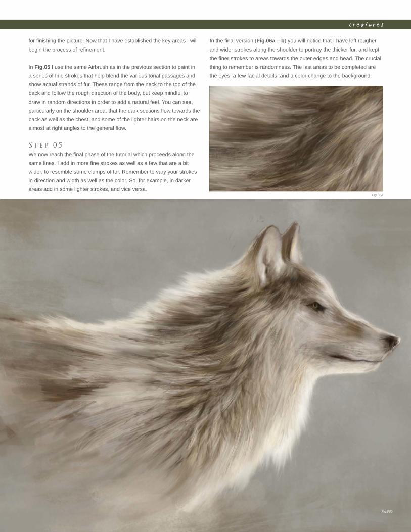
C h a p t e r 0 41 2 1
c r e a t u r e s
for fi nishing the picture. Now that I have established the key areas I will
begin the process of refi nement.
In Fig.05 I use the same Airbrush as in the previous section to paint in
a series of fi ne strokes that help blend the various tonal passages and
show actual strands of fur. These range from the neck to the top of the
back and follow the rough direction of the body, but keep mindful to
draw in random directions in order to add a natural feel. You can see,
particularly on the shoulder area, that the dark sections fl ow towards the
back as well as the chest, and some of the lighter hairs on the neck are
almost at right angles to the general fl ow.
S t e p 0 5
We now reach the fi nal phase of the tutorial which proceeds along the
same lines. I add in more fi ne strokes as well as a few that are a bit
wider, to resemble some clumps of fur. Remember to vary your strokes
in direction and width as well as the color. So, for example, in darker
areas add in some lighter strokes, and vice versa.
In the fi nal version (Fig.06a – b) you will notice that I have left rougher
and wider strokes along the shoulder to portray the thicker fur, and kept
the fi ner strokes to areas towards the outer edges and head. The crucial
thing to remember is randomness. The last areas to be completed are
the eyes, a few facial details, and a color change to the background.
Fig.06b
Fig.06a
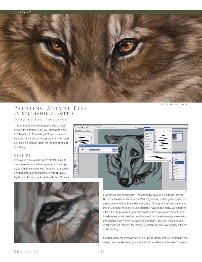
C h a p t e r 0 4 1 2 2
c r e a t u r e s
B y S t e p h a n i e R . L o f t i s
Pa i n t i n g A n i m a l E y e s
This is a tutorial for coloring/painting animal
eyes in Photoshop 7, but you should be able
to follow it with Photoshop CS and most other
versions of PS and similar programs. I will also
be using a graphics tablet for the pen pressure
sensitivity.
S t e p 0 1
It’s always nice to start with a sketch. I like to
use a neutral colored background and a large
black brush to sketch with, keeping the sketch
and background on separate layers (Fig.01).
My brush of choice is the Airbrush Pen Opacity
S o f t wa r e U s e d : P h o t o s h o p
© S t e p h a n i e L o f t i s
Flow brush that comes with Photoshop by default. I like to go into the
Brushes Presets and check the Wet Edges box, as this gives the brush
a nice watery effect that is easy to blend. Throughout this tutorial this is
the only brush I’m going to use, though I have made many variations of
it for different purposes (you may want to save variations made to your
brush as separate brushes, so that you don’t have to always mess with
the settings every time you want to use them). You don’t want to paint
in 100% brush Opacity; the pressure sensitivity and low opacity will help
with blending.
I tend to draw my eyes as sort of an upside-down, obtuse triangular-type
shape, and I make them generally all black with a small outline of where
Fig.01
Fig.02
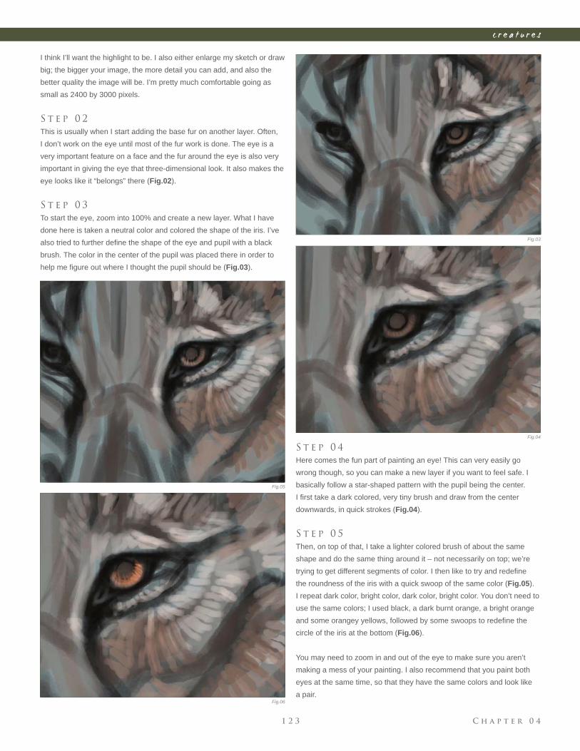
C h a p t e r 0 41 2 3
c r e a t u r e s
Fig.03
Fig.04
Fig.05
Fig.06
I think I’ll want the highlight to be. I also either enlarge my sketch or draw
big; the bigger your image, the more detail you can add, and also the
better quality the image will be. I’m pretty much comfortable going as
small as 2400 by 3000 pixels.
S t e p 0 2
This is usually when I start adding the base fur on another layer. Often,
I don’t work on the eye until most of the fur work is done. The eye is a
very important feature on a face and the fur around the eye is also very
important in giving the eye that three-dimensional look. It also makes the
eye looks like it “belongs” there (Fig.02).
S t e p 0 3
To start the eye, zoom into 100% and create a new layer. What I have
done here is taken a neutral color and colored the shape of the iris. I’ve
also tried to further defi ne the shape of the eye and pupil with a black
brush. The color in the center of the pupil was placed there in order to
help me fi gure out where I thought the pupil should be (Fig.03).
S t e p 0 4
Here comes the fun part of painting an eye! This can very easily go
wrong though, so you can make a new layer if you want to feel safe. I
basically follow a star-shaped pattern with the pupil being the center.
I fi rst take a dark colored, very tiny brush and draw from the center
downwards, in quick strokes (Fig.04).
S t e p 0 5
Then, on top of that, I take a lighter colored brush of about the same
shape and do the same thing around it – not necessarily on top; we’re
trying to get different segments of color. I then like to try and redefi ne
the roundness of the iris with a quick swoop of the same color (Fig.05).
I repeat dark color, bright color, dark color, bright color. You don’t need to
use the same colors; I used black, a dark burnt orange, a bright orange
and some orangey yellows, followed by some swoops to redefi ne the
circle of the iris at the bottom (Fig.06).
You may need to zoom in and out of the eye to make sure you aren’t
making a mess of your painting. I also recommend that you paint both
eyes at the same time, so that they have the same colors and look like
a pair.
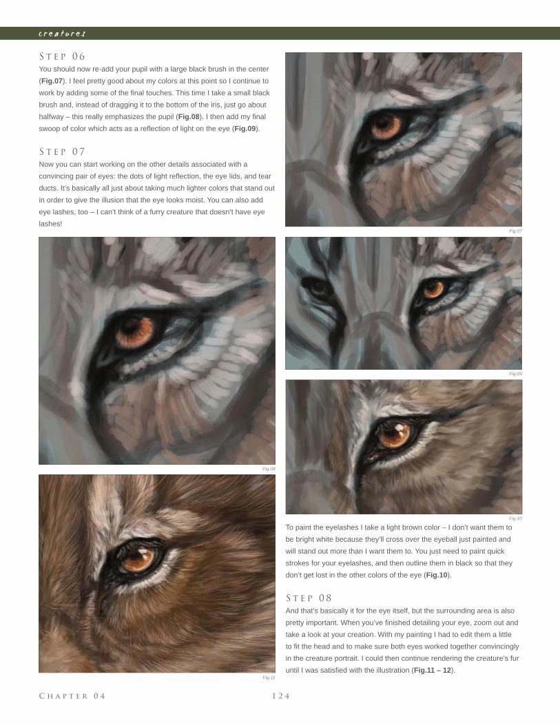
C h a p t e r 0 4 1 2 4
c r e a t u r e s
S t e p 0 6
You should now re-add your pupil with a large black brush in the center
(Fig.07). I feel pretty good about my colors at this point so I continue to
work by adding some of the fi nal touches. This time I take a small black
brush and, instead of dragging it to the bottom of the iris, just go about
halfway – this really emphasizes the pupil (Fig.08). I then add my fi nal
swoop of color which acts as a refl ection of light on the eye (Fig.09).
S t e p 0 7
Now you can start working on the other details associated with a
convincing pair of eyes: the dots of light refl ection, the eye lids, and tear
ducts. It’s basically all just about taking much lighter colors that stand out
in order to give the illusion that the eye looks moist. You can also add
eye lashes, too – I can’t think of a furry creature that doesn’t have eye
lashes!
To paint the eyelashes I take a light brown color – I don’t want them to
be bright white because they’ll cross over the eyeball just painted and
will stand out more than I want them to. You just need to paint quick
strokes for your eyelashes, and then outline them in black so that they
don’t get lost in the other colors of the eye (Fig.10).
S t e p 0 8
And that’s basically it for the eye itself, but the surrounding area is also
pretty important. When you’ve fi nished detailing your eye, zoom out and
take a look at your creation. With my painting I had to edit them a little
to fi t the head and to make sure both eyes worked together convincingly
in the creature portrait. I could then continue rendering the creature’s fur
until I was satisfi ed with the illustration (Fig.11 – 12).Fig.11
Fig.07
Fig.08
Fig.09
Fig.10
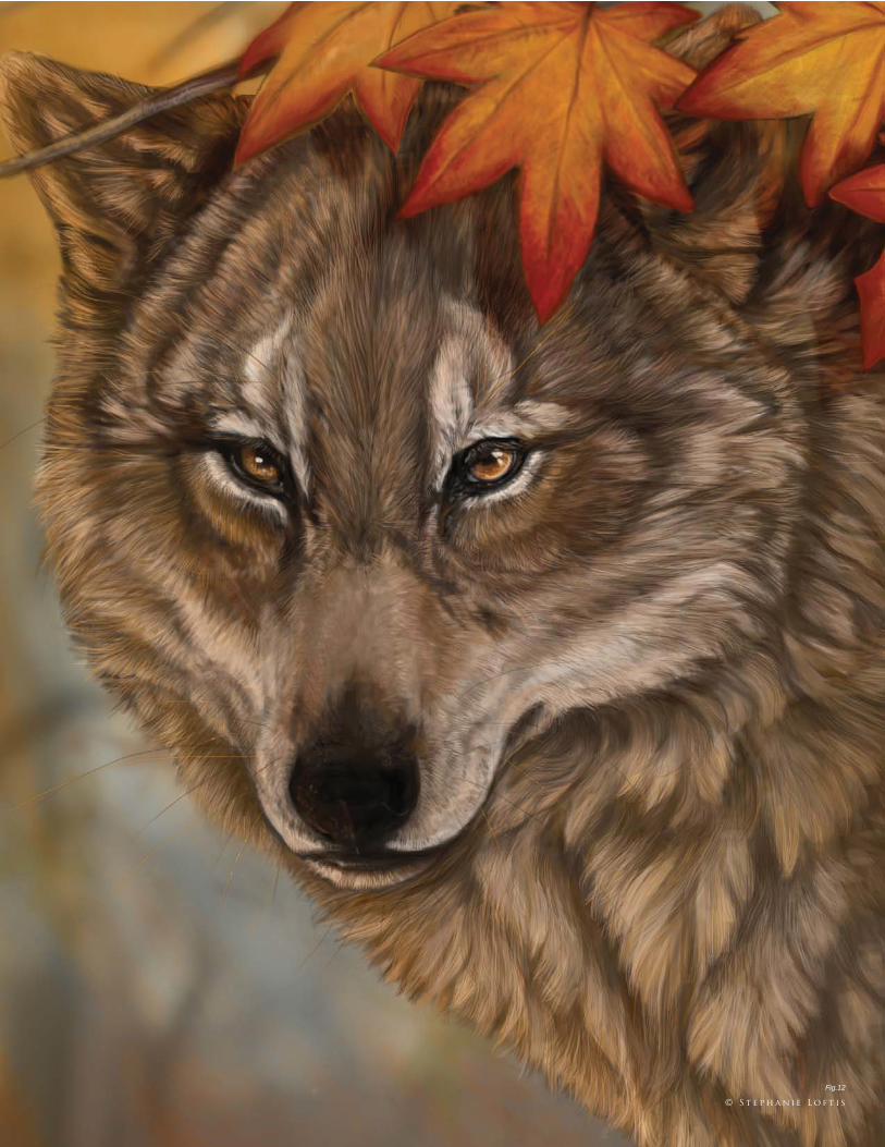
C h a p t e r 0 41 2 5
c r e a t u r e s
Fig.12
© S t e p h a n i e L o f t i s
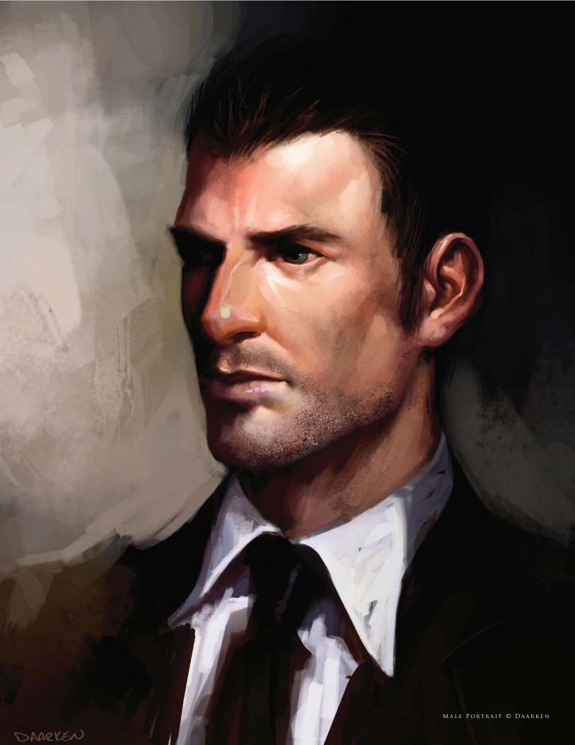
M a l e P o rt r a i t © D a a r k e n
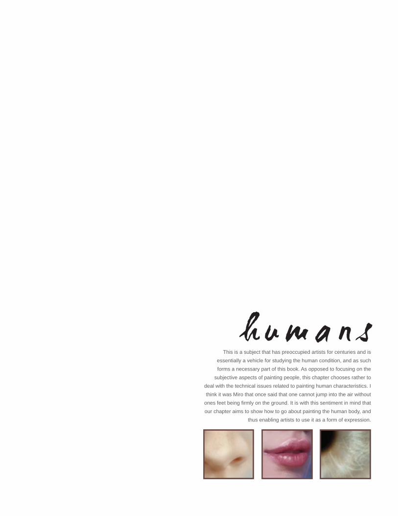
This is a subject that has preoccupied artists for centuries and is
essentially a vehicle for studying the human condition, and as such
forms a necessary part of this book. As opposed to focusing on the
subjective aspects of painting people, this chapter chooses rather to
deal with the technical issues related to painting human characteristics. I
think it was Miro that once said that one cannot jump into the air without
ones feet being fi rmly on the ground. It is with this sentiment in mind that
our chapter aims to show how to go about painting the human body, and
thus enabling artists to use it as a form of expression.
h u m a n s
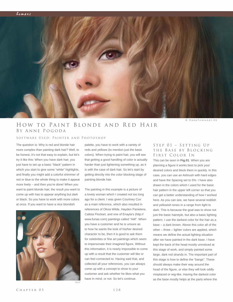
C h a p t e r 0 5 1 2 8
h u m a n s
Fig.01
B y A n n e P o g o d a
H o w t o Pa i n t B l o n d e a n d R e d H a i r
The question is: Why is red and blonde hair
more complex than painting dark hair? Well, to
be honest, it’s not that easy to explain, but let’s
try it like this: When you have dark hair, you
just have to set up a basic “black” pattern in
which you start to give some “white” highlights,
and fi nally you might add a colorful shimmer of
red or blue to the whole thing to make it appear
more lively – and then you’re done! When you
want to paint blonde hair, the result you want to
come up with has to appear anything but dark
or black. So you have to work with more colors
at once. If you want to have a nice blondish
S o f t wa r e U s e d : Pa i n t e r a n d P h o t o s h o p
© D a r k T o w n A rt. D e
S t e p 0 1 – S e t t i n g U p
t h e B a s e b y B l o c k i n g
F i r s t C o l o r I n
This can be seen in Fig.01. When you are
planning a fi gure it works best to pick your
desired colors and block them in quickly. In this
case, you can use an Airbrush with hard edges
and have the Spacing set to 5%. I have also
drawn in the colors which I used for the basic
hair pattern in the upper left corner so that you
can get a better understanding of how I worked
here. As you can see, we have several reddish
and yellowish tones in a range from light to
dark. This is because the goal was to show not
just the basic hairstyle, but also a basic lighting
pattern. I use the darkest color for the hair as a
base – a dark brown. Above this color all of the
other – three – lighter colors are applied, which
means we defi ne the actual lighting situation
after we have painted in the dark base. I have
kept the back of the head mostly unnoticed at
this stage of work, and simply painted some
large, dark red strands in. The important part of
this stage is how to defi ne the “bangs”. These
should always make their way around the
head of the fi gure, or else they will look oddly
misplaced or wig-like. Having the darkest color
as the base mostly helps at the parts where the
palette, you have to work with a variety of
reds and yellows (to mention just the basic
colors). When trying to paint hair, you will see
that getting a good handling of color is actually
harder than just lightening something up, as it
is with the case of dark hair. So let’s start by
getting directly into the color blocking stage of
painting blonde hair.
The painting in this example is a picture of
a lovely woman which I created not too long
ago for a client. I was given Courtney Cox
as a main reference, which also resulted in
references of Olivia Wilde, Hayden Panietere,
Calista Flockart, and one of Enayla’s (http://
www.furiae.com) paintings called “Ailil”. When
you have a customer and he is unsure as
to how he wants the look of his/her desired
character to be, then it is good to ask them
for celebrities or fi ne art paintings which seem
to impersonate their imagined fi gure. Without
this information, it is nearly impossible to come
up with a result that the customer will like or
can feel connected to. Having said that, and
collected all your references, you can always
come up with a concept to show to your
customer and ask whether he likes what you
have in mind, or not. So let’s continue.
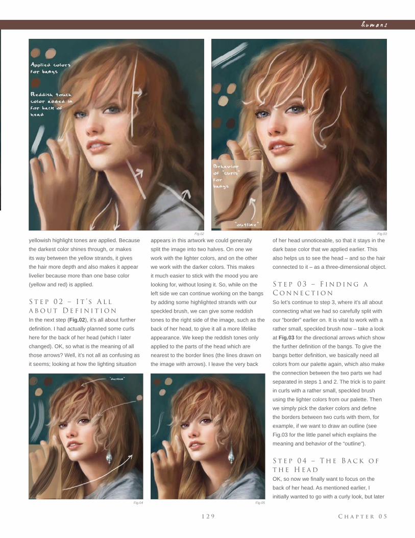
C h a p t e r 0 51 2 9
h u m a n s
Fig.02 Fig.03
Fig.04 Fig.05
yellowish highlight tones are applied. Because
the darkest color shines through, or makes
its way between the yellow strands, it gives
the hair more depth and also makes it appear
livelier because more than one base color
(yellow and red) is applied.
S t e p 0 2 – I t ’ s A l l
a b o u t D e f i n i t i o n
In the next step (Fig.02), it’s all about further
defi nition. I had actually planned some curls
here for the back of her head (which I later
changed). OK, so what is the meaning of all
those arrows? Well, it’s not all as confusing as
it seems; looking at how the lighting situation
appears in this artwork we could generally
split the image into two halves. On one we
work with the lighter colors, and on the other
we work with the darker colors. This makes
it much easier to stick with the mood you are
looking for, without losing it. So, while on the
left side we can continue working on the bangs
by adding some highlighted strands with our
speckled brush, we can give some reddish
tones to the right side of the image, such as the
back of her head, to give it all a more lifelike
appearance. We keep the reddish tones only
applied to the parts of the head which are
nearest to the border lines (the lines drawn on
the image with arrows). I leave the very back
of her head unnoticeable, so that it stays in the
dark base color that we applied earlier. This
also helps us to see the head – and so the hair
connected to it – as a three-dimensional object.
S t e p 0 3 – F i n d i n g a
C o n n e c t i o n
So let’s continue to step 3, where it’s all about
connecting what we had so carefully split with
our “border” earlier on. It is vital to work with a
rather small, speckled brush now – take a look
at Fig.03 for the directional arrows which show
the further defi nition of the bangs. To give the
bangs better defi nition, we basically need all
colors from our palette again, which also make
the connection between the two parts we had
separated in steps 1 and 2. The trick is to paint
in curls with a rather small, speckled brush
using the lighter colors from our palette. Then
we simply pick the darker colors and defi ne
the borders between two curls with them, for
example, if we want to draw an outline (see
Fig.03 for the little panel which explains the
meaning and behavior of the “outline”).
S t e p 0 4 – T h e B a c k o f
t h e H e a d
OK, so now we fi nally want to focus on the
back of her head. As mentioned earlier, I
initially wanted to go with a curly look, but later
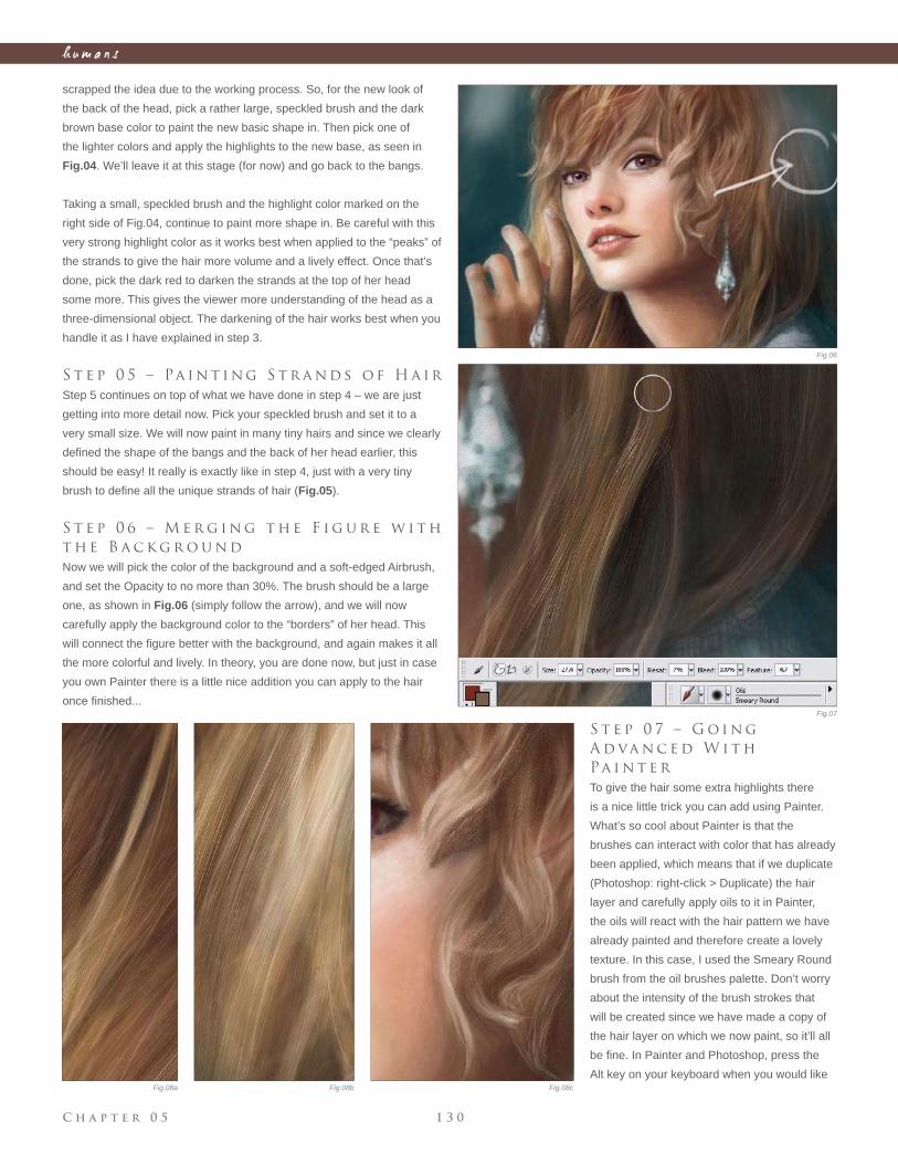
C h a p t e r 0 5 1 3 0
h u m a n s
scrapped the idea due to the working process. So, for the new look of
the back of the head, pick a rather large, speckled brush and the dark
brown base color to paint the new basic shape in. Then pick one of
the lighter colors and apply the highlights to the new base, as seen in
Fig.04. We’ll leave it at this stage (for now) and go back to the bangs.
Taking a small, speckled brush and the highlight color marked on the
right side of Fig.04, continue to paint more shape in. Be careful with this
very strong highlight color as it works best when applied to the “peaks” of
the strands to give the hair more volume and a lively effect. Once that’s
done, pick the dark red to darken the strands at the top of her head
some more. This gives the viewer more understanding of the head as a
three-dimensional object. The darkening of the hair works best when you
handle it as I have explained in step 3.
S t e p 0 5 – Pa i n t i n g S t r a n d s o f H a i r
Step 5 continues on top of what we have done in step 4 – we are just
getting into more detail now. Pick your speckled brush and set it to a
very small size. We will now paint in many tiny hairs and since we clearly
defi ned the shape of the bangs and the back of her head earlier, this
should be easy! It really is exactly like in step 4, just with a very tiny
brush to defi ne all the unique strands of hair (Fig.05).
S t e p 0 6 – M e r g i n g t h e F i g u r e w i t h
t h e B a c k g r o u n d
Now we will pick the color of the background and a soft-edged Airbrush,
and set the Opacity to no more than 30%. The brush should be a large
one, as shown in Fig.06 (simply follow the arrow), and we will now
carefully apply the background color to the “borders” of her head. This
will connect the fi gure better with the background, and again makes it all
the more colorful and lively. In theory, you are done now, but just in case
you own Painter there is a little nice addition you can apply to the hair
once fi nished...
S t e p 0 7 – G o i n g
A d va n c e d W i t h
Pa i n t e r
To give the hair some extra highlights there
is a nice little trick you can add using Painter.
What’s so cool about Painter is that the
brushes can interact with color that has already
been applied, which means that if we duplicate
(Photoshop: right-click > Duplicate) the hair
layer and carefully apply oils to it in Painter,
the oils will react with the hair pattern we have
already painted and therefore create a lovely
texture. In this case, I used the Smeary Round
brush from the oil brushes palette. Don’t worry
about the intensity of the brush strokes that
will be created since we have made a copy of
the hair layer on which we now paint, so it’ll all
be fi ne. In Painter and Photoshop, press the
Alt key on your keyboard when you would like
Fig.06
Fig.07
Fig.08a Fig.08b Fig.08c
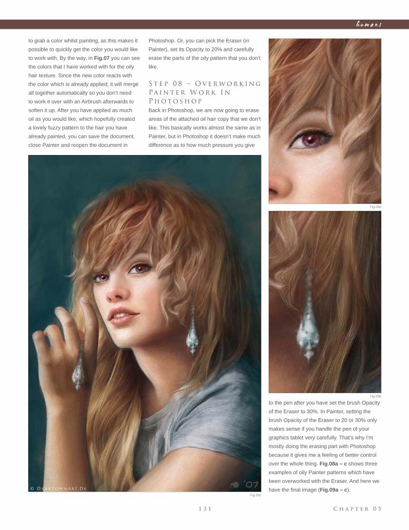
C h a p t e r 0 51 3 1
h u m a n s
to grab a color whilst painting, as this makes it
possible to quickly get the color you would like
to work with. By the way, in Fig.07 you can see
the colors that I have worked with for the oily
hair texture. Since the new color reacts with
the color which is already applied, it will merge
all together automatically so you don’t need
to work it over with an Airbrush afterwards to
soften it up. After you have applied as much
oil as you would like, which hopefully created
a lovely fuzzy pattern to the hair you have
already painted, you can save the document,
close Painter and reopen the document in
Photoshop. Or, you can pick the Eraser (in
Painter), set its Opacity to 20% and carefully
erase the parts of the oily pattern that you don’t
like.
S t e p 0 8 – O v e r w o r k i n g
Pa i n t e r W o r k I n
P h o t o s h o p
Back in Photoshop, we are now going to erase
areas of the attached oil hair copy that we don’t
like. This basically works almost the same as in
Painter, but in Photoshop it doesn’t make much
difference as to how much pressure you give
to the pen after you have set the brush Opacity
of the Eraser to 30%. In Painter, setting the
brush Opacity of the Eraser to 20 or 30% only
makes sense if you handle the pen of your
graphics tablet very carefully. That’s why I’m
mostly doing the erasing part with Photoshop
because it gives me a feeling of better control
over the whole thing. Fig.08a – c shows three
examples of oily Painter patterns which have
been overworked with the Eraser. And here we
have the fi nal image (Fig.09a – c).
Fig.09a
Fig.09b
Fig.09c
© D a r k T o w n A rt. D e
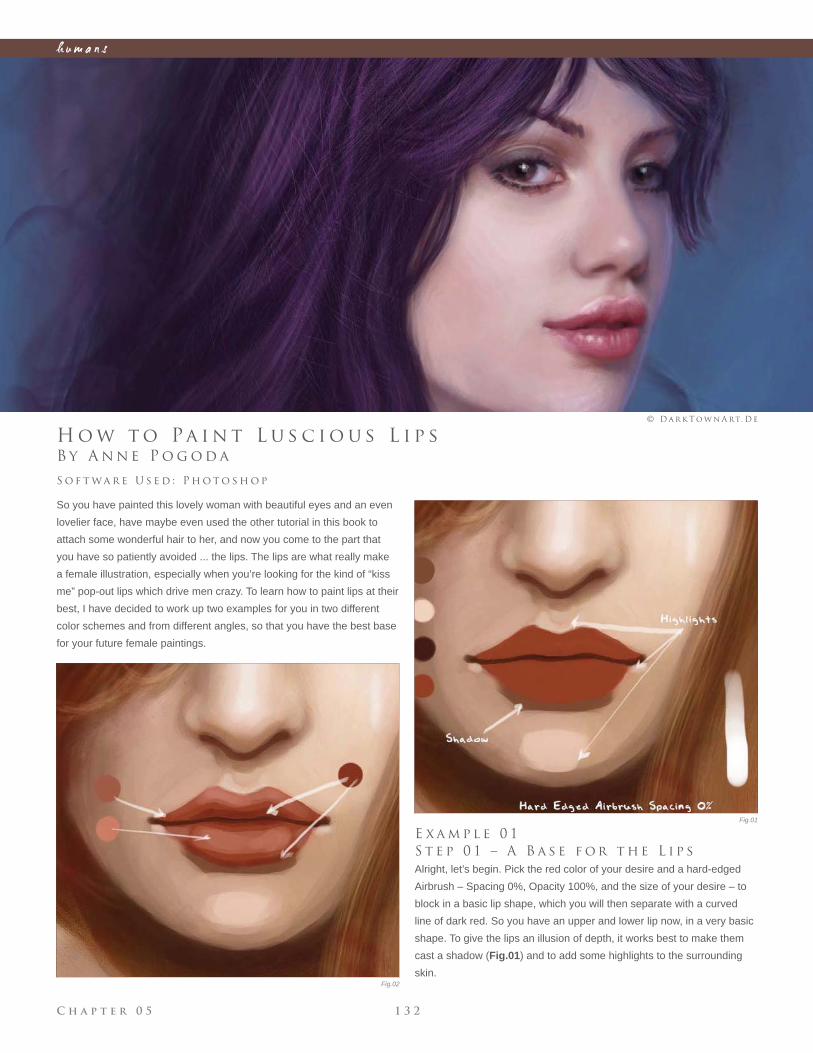
C h a p t e r 0 5 1 3 2
h u m a n s
Fig.01
Fig.02
B y A n n e P o g o d a
H o w t o Pa i n t L u s c i o u s L i p s
So you have painted this lovely woman with beautiful eyes and an even
lovelier face, have maybe even used the other tutorial in this book to
attach some wonderful hair to her, and now you come to the part that
you have so patiently avoided ... the lips. The lips are what really make
a female illustration, especially when you’re looking for the kind of “kiss
me” pop-out lips which drive men crazy. To learn how to paint lips at their
best, I have decided to work up two examples for you in two different
color schemes and from different angles, so that you have the best base
for your future female paintings.
S o f t wa r e U s e d : P h o t o s h o p
© D a r k T o w n A rt. D e
E x a m p l e 0 1
S t e p 0 1 – A B a s e f o r t h e L i p s
Alright, let’s begin. Pick the red color of your desire and a hard-edged
Airbrush – Spacing 0%, Opacity 100%, and the size of your desire – to
block in a basic lip shape, which you will then separate with a curved
line of dark red. So you have an upper and lower lip now, in a very basic
shape. To give the lips an illusion of depth, it works best to make them
cast a shadow (Fig.01) and to add some highlights to the surrounding
skin.
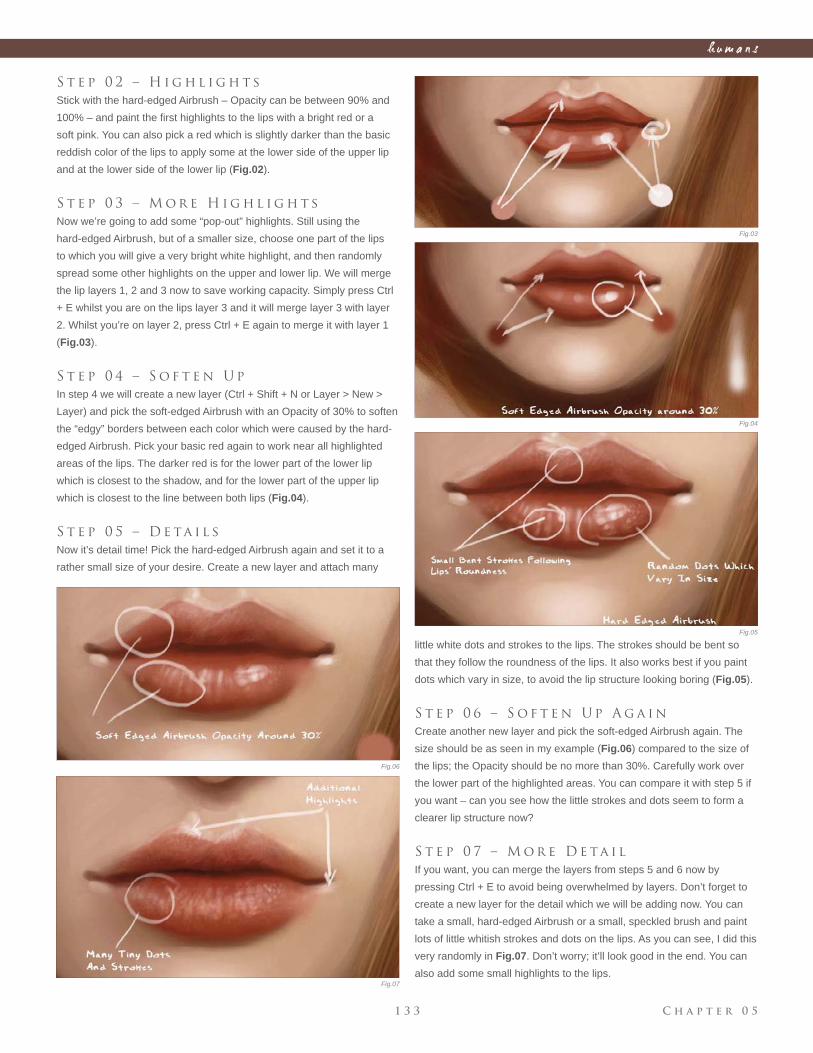
C h a p t e r 0 51 3 3
h u m a n s
little white dots and strokes to the lips. The strokes should be bent so
that they follow the roundness of the lips. It also works best if you paint
dots which vary in size, to avoid the lip structure looking boring (Fig.05).
S t e p 0 6 – S o f t e n U p A g a i n
Create another new layer and pick the soft-edged Airbrush again. The
size should be as seen in my example (Fig.06) compared to the size of
the lips; the Opacity should be no more than 30%. Carefully work over
the lower part of the highlighted areas. You can compare it with step 5 if
you want – can you see how the little strokes and dots seem to form a
clearer lip structure now?
S t e p 0 7 – M o r e D e ta i l
If you want, you can merge the layers from steps 5 and 6 now by
pressing Ctrl + E to avoid being overwhelmed by layers. Don’t forget to
create a new layer for the detail which we will be adding now. You can
take a small, hard-edged Airbrush or a small, speckled brush and paint
lots of little whitish strokes and dots on the lips. As you can see, I did this
very randomly in Fig.07. Don’t worry; it’ll look good in the end. You can
also add some small highlights to the lips.
Fig.03
Fig.04
Fig.05
Fig.06
S t e p 0 2 – H i g h l i g h t s
Stick with the hard-edged Airbrush – Opacity can be between 90% and
100% – and paint the fi rst highlights to the lips with a bright red or a
soft pink. You can also pick a red which is slightly darker than the basic
reddish color of the lips to apply some at the lower side of the upper lip
and at the lower side of the lower lip (Fig.02).
S t e p 0 3 – M o r e H i g h l i g h t s
Now we’re going to add some “pop-out” highlights. Still using the
hard-edged Airbrush, but of a smaller size, choose one part of the lips
to which you will give a very bright white highlight, and then randomly
spread some other highlights on the upper and lower lip. We will merge
the lip layers 1, 2 and 3 now to save working capacity. Simply press Ctrl
+ E whilst you are on the lips layer 3 and it will merge layer 3 with layer
2. Whilst you’re on layer 2, press Ctrl + E again to merge it with layer 1
(Fig.03).
S t e p 0 4 – S o f t e n U p
In step 4 we will create a new layer (Ctrl + Shift + N or Layer > New >
Layer) and pick the soft-edged Airbrush with an Opacity of 30% to soften
the “edgy” borders between each color which were caused by the hard-
edged Airbrush. Pick your basic red again to work near all highlighted
areas of the lips. The darker red is for the lower part of the lower lip
which is closest to the shadow, and for the lower part of the upper lip
which is closest to the line between both lips (Fig.04).
S t e p 0 5 – D e ta i l s
Now it’s detail time! Pick the hard-edged Airbrush again and set it to a
rather small size of your desire. Create a new layer and attach many
Fig.07
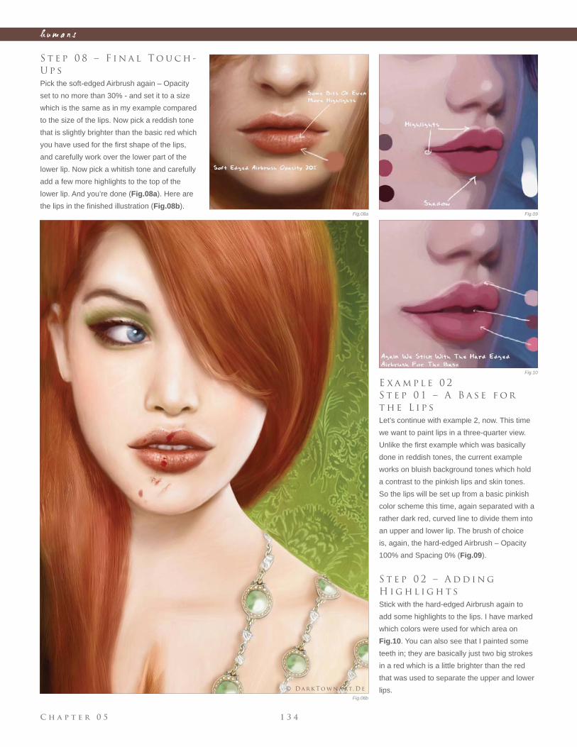
C h a p t e r 0 5 1 3 4
h u m a n s
E x a m p l e 0 2
S t e p 0 1 – A B a s e f o r
t h e L i p s
Let’s continue with example 2, now. This time
we want to paint lips in a three-quarter view.
Unlike the fi rst example which was basically
done in reddish tones, the current example
works on bluish background tones which hold
a contrast to the pinkish lips and skin tones.
So the lips will be set up from a basic pinkish
color scheme this time, again separated with a
rather dark red, curved line to divide them into
an upper and lower lip. The brush of choice
is, again, the hard-edged Airbrush – Opacity
100% and Spacing 0% (Fig.09).
S t e p 0 2 – A d d i n g
H i g h l i g h t s
Stick with the hard-edged Airbrush again to
add some highlights to the lips. I have marked
which colors were used for which area on
Fig.10. You can also see that I painted some
teeth in; they are basically just two big strokes
in a red which is a little brighter than the red
that was used to separate the upper and lower
lips.
Fig.08a
Fig.08b
Fig.09
Fig.10
S t e p 0 8 – F i n a l T o u c h -
U p s
Pick the soft-edged Airbrush again – Opacity
set to no more than 30% - and set it to a size
which is the same as in my example compared
to the size of the lips. Now pick a reddish tone
that is slightly brighter than the basic red which
you have used for the fi rst shape of the lips,
and carefully work over the lower part of the
lower lip. Now pick a whitish tone and carefully
add a few more highlights to the top of the
lower lip. And you’re done (Fig.08a). Here are
the lips in the fi nished illustration (Fig.08b).
© D a r k T o w n A rt. D e
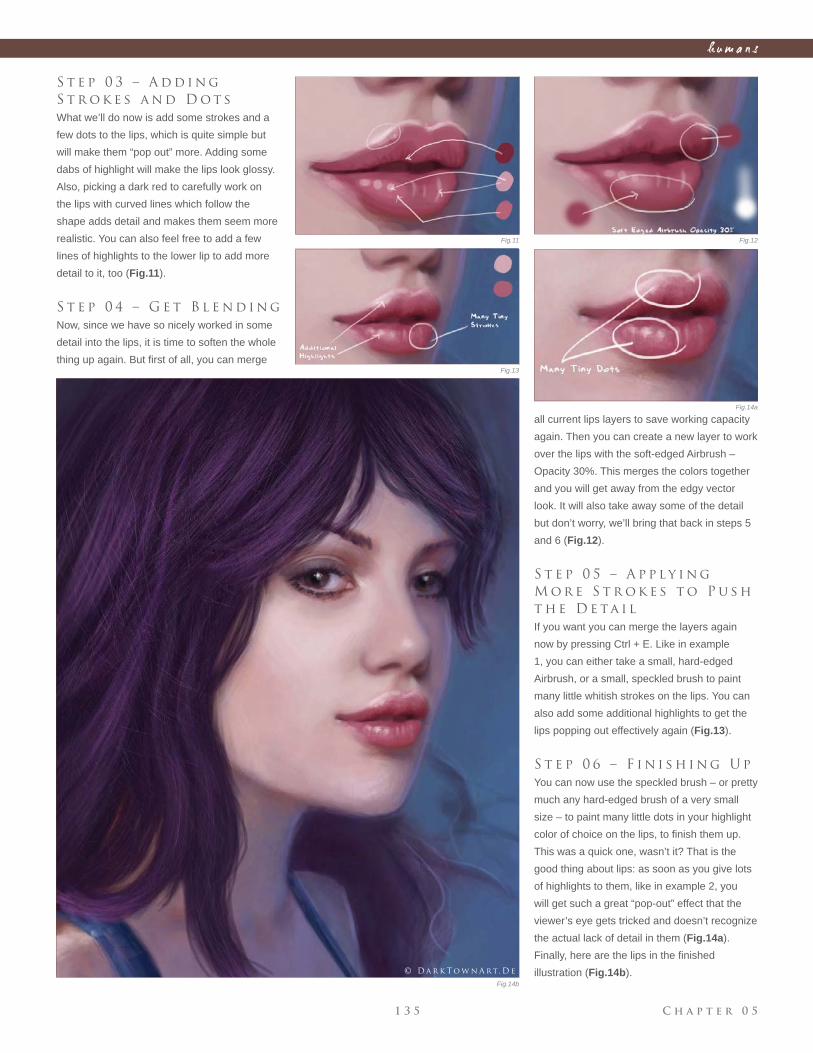
C h a p t e r 0 51 3 5
h u m a n s
S t e p 0 3 – A d d i n g
S t r o k e s a n d D o t s
What we’ll do now is add some strokes and a
few dots to the lips, which is quite simple but
will make them “pop out” more. Adding some
dabs of highlight will make the lips look glossy.
Also, picking a dark red to carefully work on
the lips with curved lines which follow the
shape adds detail and makes them seem more
realistic. You can also feel free to add a few
lines of highlights to the lower lip to add more
detail to it, too (Fig.11).
S t e p 0 4 – G e t B l e n d i n g
Now, since we have so nicely worked in some
detail into the lips, it is time to soften the whole
thing up again. But fi rst of all, you can merge
all current lips layers to save working capacity
again. Then you can create a new layer to work
over the lips with the soft-edged Airbrush –
Opacity 30%. This merges the colors together
and you will get away from the edgy vector
look. It will also take away some of the detail
but don’t worry, we’ll bring that back in steps 5
and 6 (Fig.12).
S t e p 0 5 – A p p l y i n g
M o r e S t r o k e s t o P u s h
t h e D e ta i l
If you want you can merge the layers again
now by pressing Ctrl + E. Like in example
1, you can either take a small, hard-edged
Airbrush, or a small, speckled brush to paint
many little whitish strokes on the lips. You can
also add some additional highlights to get the
lips popping out effectively again (Fig.13).
S t e p 0 6 – F i n i s h i n g U p
You can now use the speckled brush – or pretty
much any hard-edged brush of a very small
size – to paint many little dots in your highlight
color of choice on the lips, to fi nish them up.
This was a quick one, wasn’t it? That is the
good thing about lips: as soon as you give lots
of highlights to them, like in example 2, you
will get such a great “pop-out” effect that the
viewer’s eye gets tricked and doesn’t recognize
the actual lack of detail in them (Fig.14a).
Finally, here are the lips in the fi nished
illustration (Fig.14b).
Fig.11 Fig.12
Fig.13
Fig.14a
Fig.14b
© D a r k T o w n A rt. D e
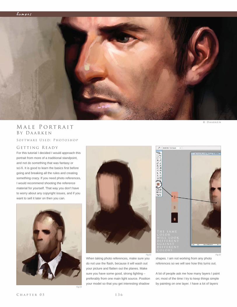
C h a p t e r 0 5 1 3 6
h u m a n s
Fig.01 Fig.02
Fig.03
B y D a a r k e n
M a l e P o rt r a i t
G e t t i n g R e a d y
For this tutorial I decided I would approach this
portrait from more of a traditional standpoint,
and not do something that was fantasy or
sci-fi . It is good to learn the basics fi rst before
going and breaking all the rules and creating
something crazy. If you need photo references,
I would recommend shooting the reference
material for yourself. That way you don’t have
to worry about any copyright issues, and if you
want to sell it later on then you can.
S o f t wa r e U s e d : P h o t o s h o p
© D a a r k e n
When taking photo references, make sure you
do not use the fl ash, because it will wash out
your picture and fl atten out the planes. Make
sure you have some good, strong lighting –
preferably from one main light source. Position
your model so that you get interesting shadow
shapes. I am not working from any photo
references so we will see how this turns out.
A lot of people ask me how many layers I paint
on; most of the time I try to keep things simple
by painting on one layer. I have a lot of layers
T h e s a m e
c o l o r
w i l l l o o k
d i f f e r e n t
a g a i n s t
d i f f e r e n t
c o l o r s
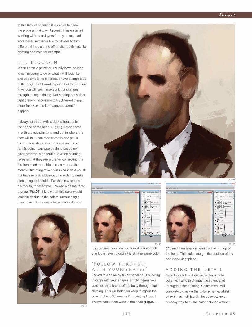
C h a p t e r 0 51 3 7
h u m a n s
Fig.04
Fig.05
Fig.06 Fig.07
in this tutorial because it is easier to show
the process that way. Recently I have started
working with more layers for my conceptual
work because clients like to be able to turn
different things on and off or change things, like
clothing and hair, for example.
T h e B l o c k - I n
When I start a painting I usually have no idea
what I’m going to do or what it will look like,
and this time is no different. I have a basic idea
of the angle that I want to paint, but that’s about
it. As you will see, I make a lot of changes
throughout my painting. Not starting out with a
tight drawing allows me to try different things
more freely and to let “happy accidents”
happen.
I always start out with a dark silhouette for
the shape of the head (Fig.01). I then come
in with a basic skin tone and put in where the
face will be. I can then come in and put in
the shadow shapes for the eyes and nose.
At this point I can also begin to set up my
color scheme. A general rule when painting
faces is that they are more yellow around the
forehead and more blue/green around the
mouth. One thing to keep in mind is that you do
not have to pick a blue color in order to make
something look bluish. For the area around
his mouth, for example, I picked a desaturated
orange (Fig.02). I knew that this color would
look bluish due to the colors surrounding it.
If you place the same color against different
backgrounds you can see how different each
one looks, even though it is still the same color.
“ F o l l o w t h r o u g h
w i t h y o u r s h a p e s ”
I heard this so many times at school. Following
through with your shapes simply means you
continue the shapes of the body through their
clothing. This will help you keep things in the
correct place. Whenever I’m painting faces I
always paint them without their hair (Fig.03 –
05), and then later on paint the hair on top of
the head. This helps me get the position of the
hair in the right place.
A d d i n g t h e D e ta i l
Even though I start out with a basic color
scheme, I tend to change the colors a lot
throughout the painting. Sometimes I will
completely change the color scheme, whilst
other times I will just fi x the color balance.
An easy way to fi x the color balance without
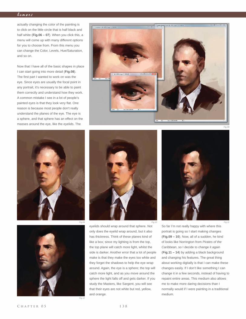
C h a p t e r 0 5 1 3 8
h u m a n s
actually changing the color of the painting is
to click on the little circle that is half black and
half white (Fig.06 – 07). When you click this, a
menu will come up with many different options
for you to choose from. From this menu you
can change the Color, Levels, Hue/Saturation,
and so on.
Now that I have all of the basic shapes in place
I can start going into more detail (Fig.08).
The fi rst part I wanted to work on was the
eye. Since eyes are usually the focal point in
any portrait, it’s necessary to be able to paint
them correctly and understand how they work.
A common mistake I see in a lot of people’s
painted eyes is that they look very fl at. One
reason is because most people don’t really
understand the planes of the eye. The eye is
a sphere, and that sphere has an effect on the
masses around the eye, like the eyelids. The
eyelids should wrap around that sphere. Not
only does the eyelid wrap around, but it also
has thickness. Think of these planes kind of
like a box; since my lighting is from the top,
the top plane will catch more light, whilst the
side is darker. Another error that a lot of people
make is that they make the eyes too white and
they forget the shadows to help the eye wrap
around. Again, the eye is a sphere; the top will
catch more light, and as you move around the
sphere the light falls off and gets darker. If you
study the Masters, like Sargent, you will see
that their eyes are not white but red, yellow,
and orange.
So far I’m not really happy with where this
portrait is going so I start making changes
(Fig.09 – 10). Now, all of a sudden, he kind
of looks like Norrington from Pirates of the
Caribbean, so I decide to change it again
(Fig.11 – 14) by adding a black background
and changing his features. The great thing
about working digitally is that I can make these
changes easily. If I don’t like something I can
change it in a few seconds, instead of having to
repaint entire areas. This medium also allows
me to make more daring decisions than I
normally would if I were painting in a traditional
medium.
Fig.08
Fig.09 Fig.10 Fig.11
Fig.12
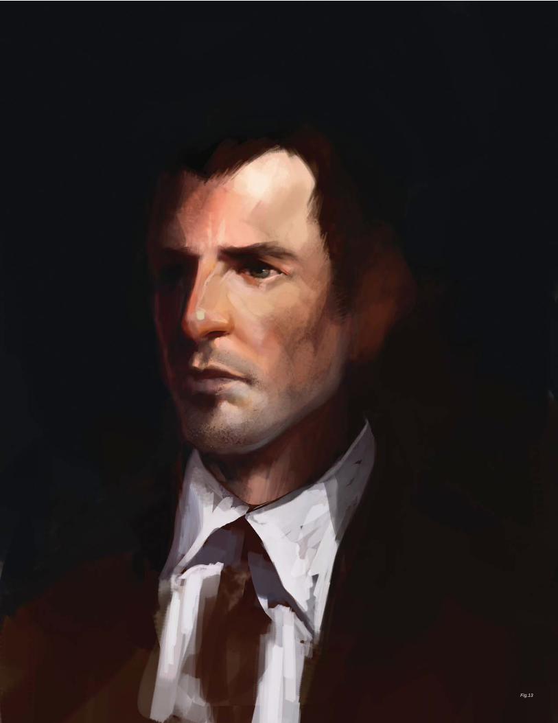
Fig.13
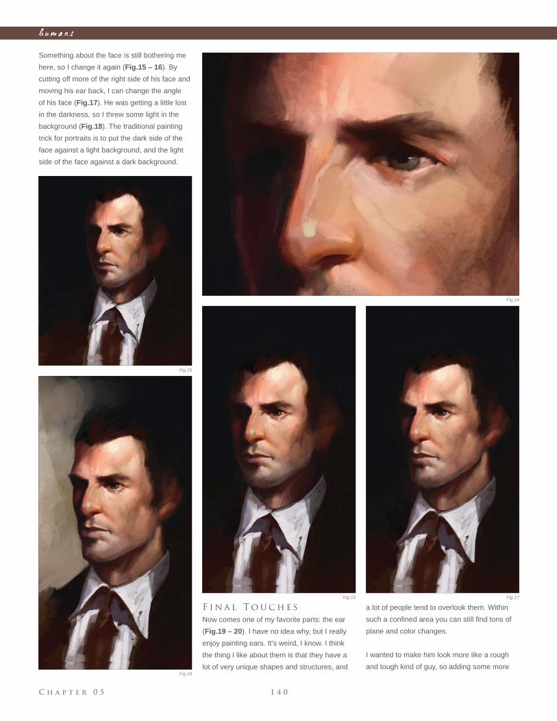
C h a p t e r 0 5 1 4 0
h u m a n s
Something about the face is still bothering me
here, so I change it again (Fig.15 – 16). By
cutting off more of the right side of his face and
moving his ear back, I can change the angle
of his face (Fig.17). He was getting a little lost
in the darkness, so I threw some light in the
background (Fig.18). The traditional painting
trick for portraits is to put the dark side of the
face against a light background, and the light
side of the face against a dark background.
F i n a l T o u c h e s
Now comes one of my favorite parts: the ear
(Fig.19 – 20). I have no idea why, but I really
enjoy painting ears. It’s weird, I know. I think
the thing I like about them is that they have a
lot of very unique shapes and structures, and
a lot of people tend to overlook them. Within
such a confi ned area you can still fi nd tons of
plane and color changes.
I wanted to make him look more like a rough
and tough kind of guy, so adding some more
Fig.14
Fig.15
Fig.16 Fig.17
Fig.18
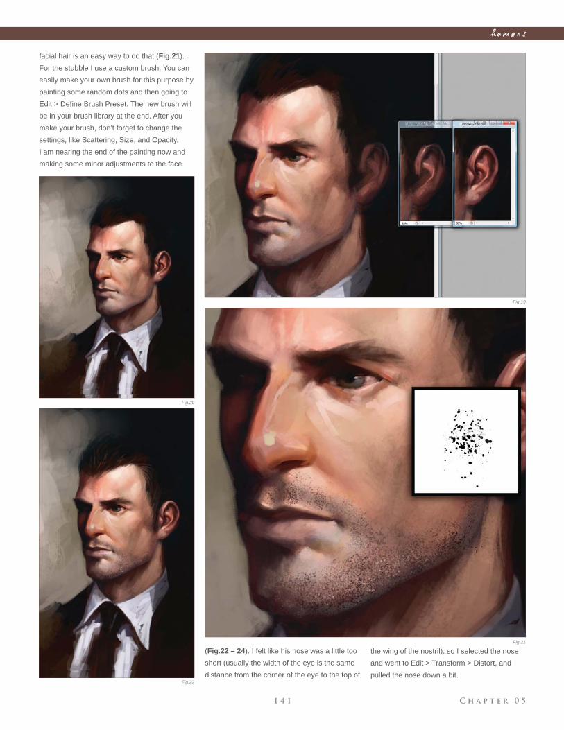
C h a p t e r 0 51 4 1
h u m a n s
facial hair is an easy way to do that (Fig.21).
For the stubble I use a custom brush. You can
easily make your own brush for this purpose by
painting some random dots and then going to
Edit > Defi ne Brush Preset. The new brush will
be in your brush library at the end. After you
make your brush, don’t forget to change the
settings, like Scattering, Size, and Opacity.
I am nearing the end of the painting now and
making some minor adjustments to the face
(Fig.22 – 24). I felt like his nose was a little too
short (usually the width of the eye is the same
distance from the corner of the eye to the top of
the wing of the nostril), so I selected the nose
and went to Edit > Transform > Distort, and
pulled the nose down a bit.
Fig.19
Fig.20
Fig.21
Fig.22
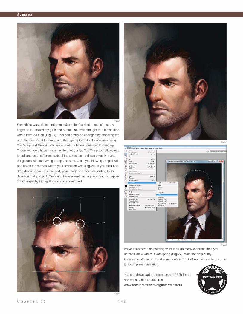
C h a p t e r 0 5 1 4 2
h u m a n s
Something was still bothering me about the face but I couldn’t put my
fi nger on it. I asked my girlfriend about it and she thought that his hairline
was a little too high (Fig.25). This can easily be changed by selecting the
area that you want to move, and then going to Edit > Transform > Warp.
The Warp and Distort tools are one of the hidden gems of Photoshop.
These two tools have made my life a lot easier. The Warp tool allows you
to pull and push different parts of the selection, and can actually make
things turn without having to repaint them. Once you hit Warp, a grid will
pop up on the screen where your selection was (Fig.26). If you click and
drag different points of the grid, your image will move according to the
direction that you pull. Once you have everything in place, you can apply
the changes by hitting Enter on your keyboard.
As you can see, this painting went through many different changes
before I knew where it was going (Fig.27). With the help of my
knowledge of anatomy and some tools in Photoshop, I was able to come
to a complete illustration.
You can download a custom brush (ABR) fi le to
accompany this tutorial from
www.focalpress.com/digitalartmasters
Fig.23
Fig.24
Fig.25
Fig.26
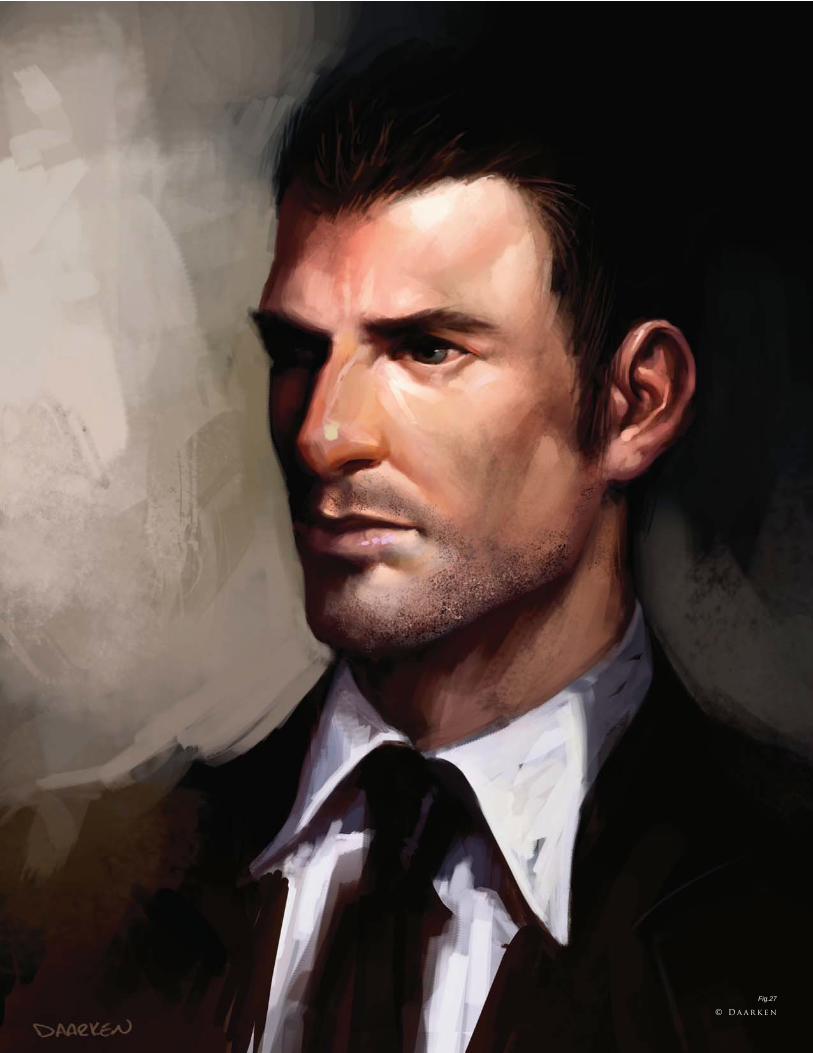
Fig.27
© D a a r k e n
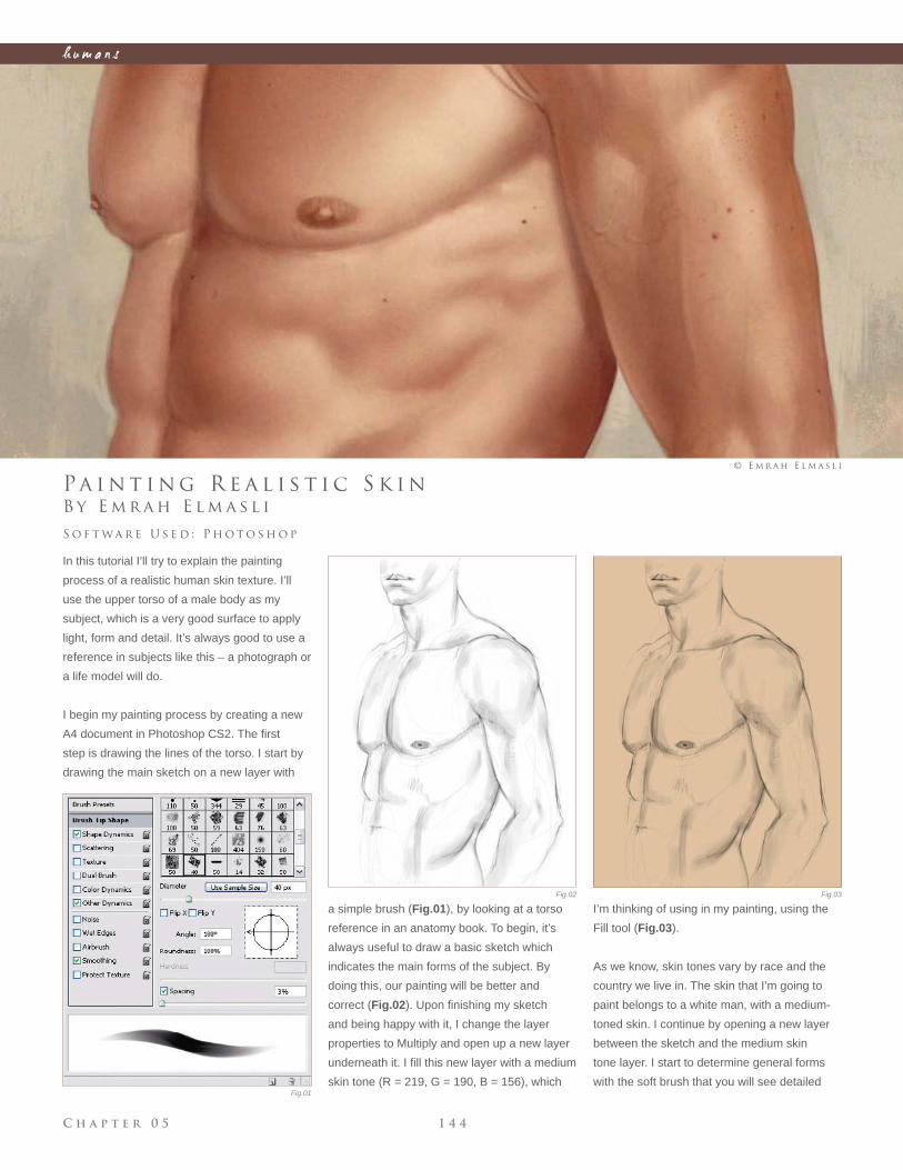
C h a p t e r 0 5 1 4 4
h u m a n s
Fig.01
Fig.02 Fig.03
B y E m r a h E l m a s l i
Pa i n t i n g R e a l i s t i c S k i n
In this tutorial I’ll try to explain the painting
process of a realistic human skin texture. I’ll
use the upper torso of a male body as my
subject, which is a very good surface to apply
light, form and detail. It’s always good to use a
reference in subjects like this – a photograph or
a life model will do.
I begin my painting process by creating a new
A4 document in Photoshop CS2. The fi rst
step is drawing the lines of the torso. I start by
drawing the main sketch on a new layer with
S o f t wa r e U s e d : P h o t o s h o p
© E m r a h E l m a s l i
a simple brush (Fig.01), by looking at a torso
reference in an anatomy book. To begin, it’s
always useful to draw a basic sketch which
indicates the main forms of the subject. By
doing this, our painting will be better and
correct (Fig.02). Upon fi nishing my sketch
and being happy with it, I change the layer
properties to Multiply and open up a new layer
underneath it. I fi ll this new layer with a medium
skin tone (R = 219, G = 190, B = 156), which
I’m thinking of using in my painting, using the
Fill tool (Fig.03).
As we know, skin tones vary by race and the
country we live in. The skin that I’m going to
paint belongs to a white man, with a medium-
toned skin. I continue by opening a new layer
between the sketch and the medium skin
tone layer. I start to determine general forms
with the soft brush that you will see detailed
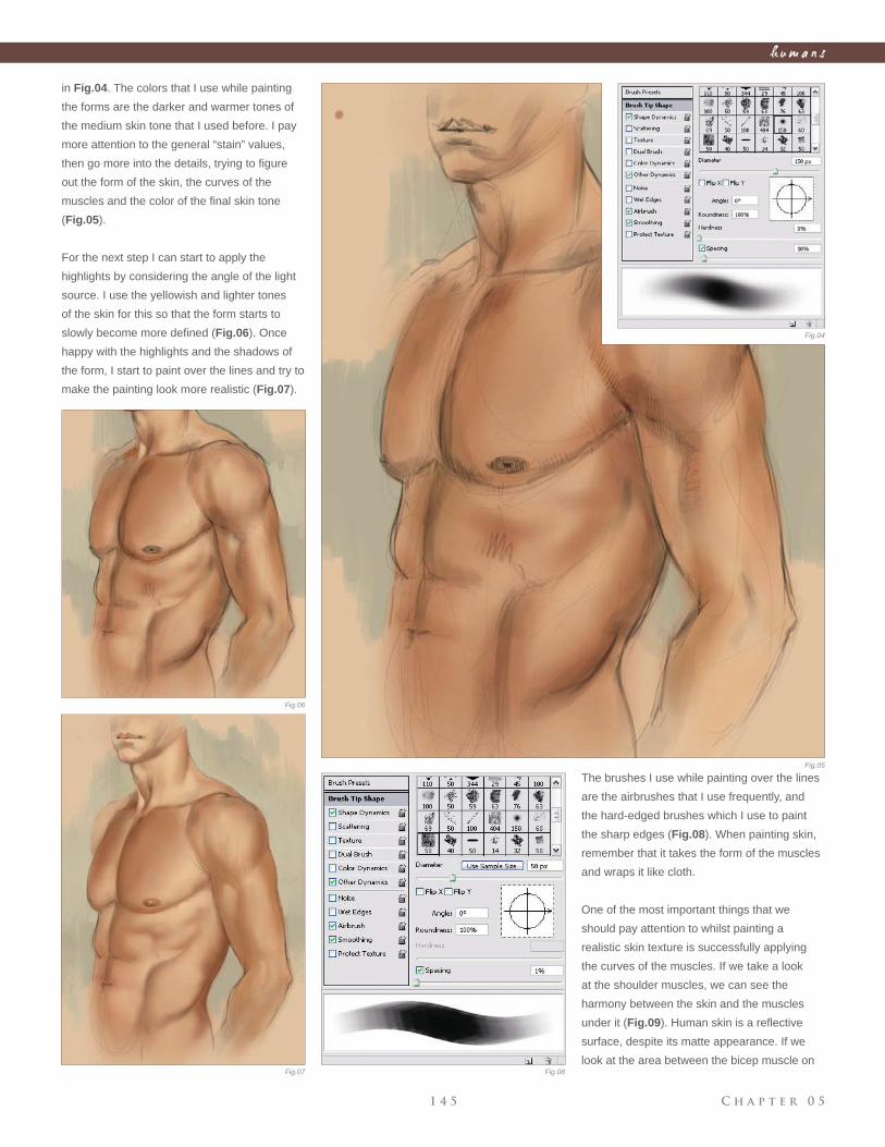
C h a p t e r 0 51 4 5
h u m a n s
Fig.04
Fig.05
Fig.06
Fig.07 Fig.08
in Fig.04. The colors that I use while painting
the forms are the darker and warmer tones of
the medium skin tone that I used before. I pay
more attention to the general “stain” values,
then go more into the details, trying to fi gure
out the form of the skin, the curves of the
muscles and the color of the fi nal skin tone
(Fig.05).
For the next step I can start to apply the
highlights by considering the angle of the light
source. I use the yellowish and lighter tones
of the skin for this so that the form starts to
slowly become more defi ned (Fig.06). Once
happy with the highlights and the shadows of
the form, I start to paint over the lines and try to
make the painting look more realistic (Fig.07).
The brushes I use while painting over the lines
are the airbrushes that I use frequently, and
the hard-edged brushes which I use to paint
the sharp edges (Fig.08). When painting skin,
remember that it takes the form of the muscles
and wraps it like cloth.
One of the most important things that we
should pay attention to whilst painting a
realistic skin texture is successfully applying
the curves of the muscles. If we take a look
at the shoulder muscles, we can see the
harmony between the skin and the muscles
under it (Fig.09). Human skin is a refl ective
surface, despite its matte appearance. If we
look at the area between the bicep muscle on
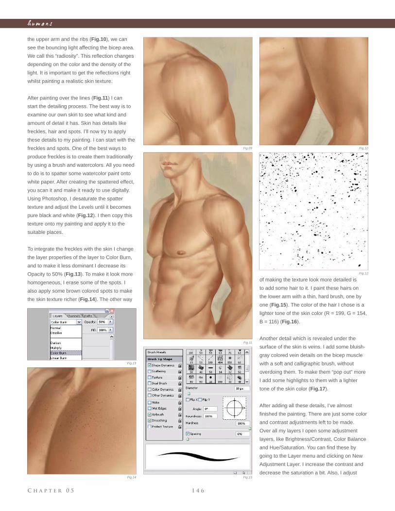
C h a p t e r 0 5 1 4 6
h u m a n s
the upper arm and the ribs (Fig.10), we can
see the bouncing light affecting the bicep area.
We call this “radiosity”. This refl ection changes
depending on the color and the density of the
light. It is important to get the refl ections right
whilst painting a realistic skin texture.
After painting over the lines (Fig.11) I can
start the detailing process. The best way is to
examine our own skin to see what kind and
amount of detail it has. Skin has details like
freckles, hair and spots. I’ll now try to apply
these details to my painting. I can start with the
freckles and spots. One of the best ways to
produce freckles is to create them traditionally
by using a brush and watercolors. All you need
to do is to spatter some watercolor paint onto
white paper. After creating the spattered effect,
you scan it and make it ready to use digitally.
Using Photoshop, I desaturate the spatter
texture and adjust the Levels until it becomes
pure black and white (Fig.12). I then copy this
texture onto my painting and apply it to the
suitable places.
To integrate the freckles with the skin I change
the layer properties of the layer to Color Burn,
and to make it less dominant I decrease its
Opacity to 50% (Fig.13). To make it look more
homogeneous, I erase some of the spots. I
also apply some brown colored spots to make
the skin texture richer (Fig.14). The other way
of making the texture look more detailed is
to add some hair to it. I paint these hairs on
the lower arm with a thin, hard brush, one by
one (Fig.15). The color of the hair I chose is a
lighter tone of the skin color (R = 199, G = 154,
B = 116) (Fig.16).
Another detail which is revealed under the
surface of the skin is veins. I add some bluish-
gray colored vein details on the bicep muscle
with a soft and calligraphic brush, without
overdoing them. To make them “pop out” more
I add some highlights to them with a lighter
tone of the skin color (Fig.17).
After adding all these details, I’ve almost
fi nished the painting. There are just some color
and contrast adjustments left to be made.
Over all my layers I open some adjustment
layers, like Brightness/Contrast, Color Balance
and Hue/Saturation. You can fi nd these by
going to the Layer menu and clicking on New
Adjustment Layer. I increase the contrast and
decrease the saturation a bit. Also, I adjust
Fig.09 Fig.10
Fig.11
Fig.12
Fig.13
Fig.14 Fig.15
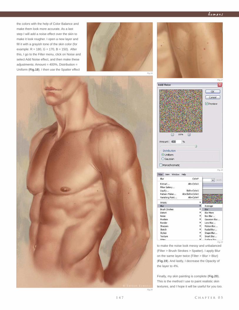
C h a p t e r 0 51 4 7
h u m a n s
the colors with the help of Color Balance and
make them look more accurate. As a last
step I will add a noise effect over the skin to
make it look rougher. I open a new layer and
fi ll it with a grayish tone of the skin color (for
example: R = 180, G = 170, B = 150). After
this, I go to the Filter menu, click on Noise and
select Add Noise effect, and then make these
adjustments: Amount = 400%, Distribution =
Uniform (Fig.18). I then use the Spatter effect
to make the noise look messy and unbalanced
(Filter > Brush Strokes > Spatter). I apply Blur
on the same layer twice (Filter > Blur > Blur)
(Fig.19). And lastly, I decrease the Opacity of
the layer to 4%.
Finally, my skin painting is complete (Fig.20).
This is the method I use to paint realistic skin
textures, and I hope it will be useful for you too.
Fig.16
Fig.17
Fig.18
Fig.19
Fig.20
© E m r a h E l m a s l i
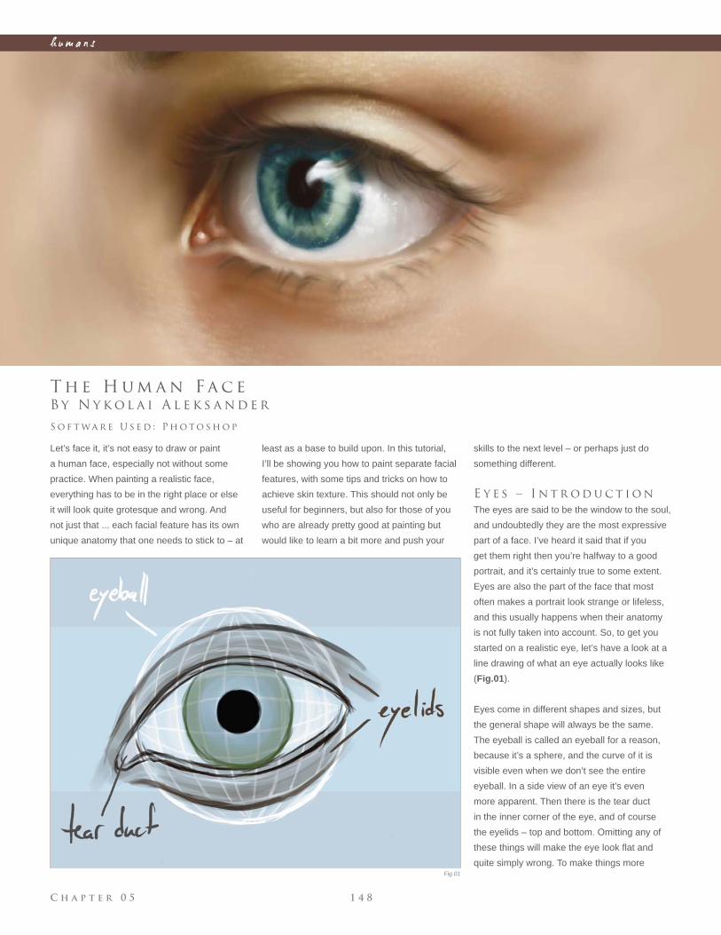
C h a p t e r 0 5 1 4 8
h u m a n s
Fig.01
B y N y k o l a i A l e k s a n d e r
T h e H u m a n F a c e
Let’s face it, it’s not easy to draw or paint
a human face, especially not without some
practice. When painting a realistic face,
everything has to be in the right place or else
it will look quite grotesque and wrong. And
not just that ... each facial feature has its own
unique anatomy that one needs to stick to – at
S o f t wa r e U s e d : P h o t o s h o p
least as a base to build upon. In this tutorial,
I’ll be showing you how to paint separate facial
features, with some tips and tricks on how to
achieve skin texture. This should not only be
useful for beginners, but also for those of you
who are already pretty good at painting but
would like to learn a bit more and push your
skills to the next level – or perhaps just do
something different.
E y e s – I n t r o d u c t i o n
The eyes are said to be the window to the soul,
and undoubtedly they are the most expressive
part of a face. I’ve heard it said that if you
get them right then you’re halfway to a good
portrait, and it’s certainly true to some extent.
Eyes are also the part of the face that most
often makes a portrait look strange or lifeless,
and this usually happens when their anatomy
is not fully taken into account. So, to get you
started on a realistic eye, let’s have a look at a
line drawing of what an eye actually looks like
(Fig.01).
Eyes come in different shapes and sizes, but
the general shape will always be the same.
The eyeball is called an eyeball for a reason,
because it’s a sphere, and the curve of it is
visible even when we don’t see the entire
eyeball. In a side view of an eye it’s even
more apparent. Then there is the tear duct
in the inner corner of the eye, and of course
the eyelids – top and bottom. Omitting any of
these things will make the eye look fl at and
quite simply wrong. To make things more
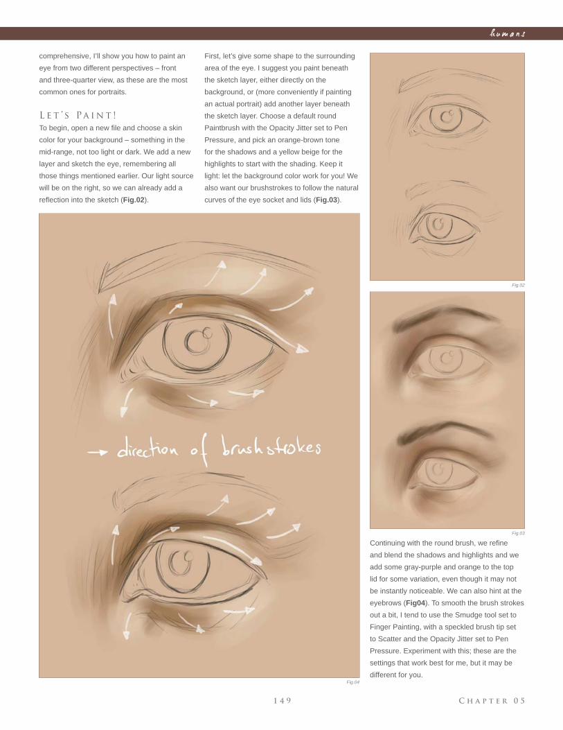
C h a p t e r 0 51 4 9
h u m a n s
Fig.02
Fig.03
Fig.04
comprehensive, I’ll show you how to paint an
eye from two different perspectives – front
and three-quarter view, as these are the most
common ones for portraits.
L e t ’ s Pa i n t !
To begin, open a new fi le and choose a skin
color for your background – something in the
mid-range, not too light or dark. We add a new
layer and sketch the eye, remembering all
those things mentioned earlier. Our light source
will be on the right, so we can already add a
refl ection into the sketch (Fig.02).
Continuing with the round brush, we refi ne
and blend the shadows and highlights and we
add some gray-purple and orange to the top
lid for some variation, even though it may not
be instantly noticeable. We can also hint at the
eyebrows (Fig04). To smooth the brush strokes
out a bit, I tend to use the Smudge tool set to
Finger Painting, with a speckled brush tip set
to Scatter and the Opacity Jitter set to Pen
Pressure. Experiment with this; these are the
settings that work best for me, but it may be
different for you.
First, let’s give some shape to the surrounding
area of the eye. I suggest you paint beneath
the sketch layer, either directly on the
background, or (more conveniently if painting
an actual portrait) add another layer beneath
the sketch layer. Choose a default round
Paintbrush with the Opacity Jitter set to Pen
Pressure, and pick an orange-brown tone
for the shadows and a yellow beige for the
highlights to start with the shading. Keep it
light: let the background color work for you! We
also want our brushstrokes to follow the natural
curves of the eye socket and lids (Fig.03).
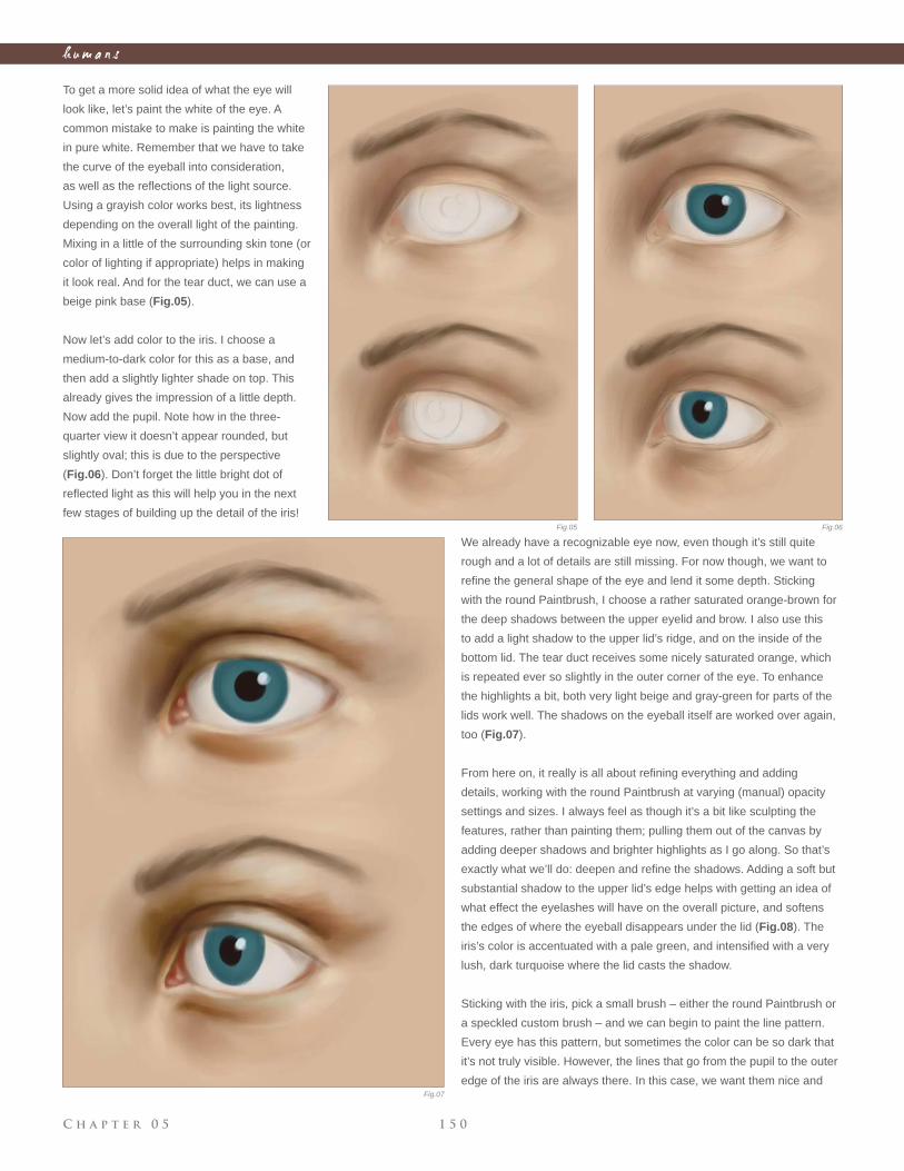
C h a p t e r 0 5 1 5 0
h u m a n s
To get a more solid idea of what the eye will
look like, let’s paint the white of the eye. A
common mistake to make is painting the white
in pure white. Remember that we have to take
the curve of the eyeball into consideration,
as well as the refl ections of the light source.
Using a grayish color works best, its lightness
depending on the overall light of the painting.
Mixing in a little of the surrounding skin tone (or
color of lighting if appropriate) helps in making
it look real. And for the tear duct, we can use a
beige pink base (Fig.05).
Now let’s add color to the iris. I choose a
medium-to-dark color for this as a base, and
then add a slightly lighter shade on top. This
already gives the impression of a little depth.
Now add the pupil. Note how in the three-
quarter view it doesn’t appear rounded, but
slightly oval; this is due to the perspective
(Fig.06). Don’t forget the little bright dot of
refl ected light as this will help you in the next
few stages of building up the detail of the iris!
We already have a recognizable eye now, even though it’s still quite
rough and a lot of details are still missing. For now though, we want to
refi ne the general shape of the eye and lend it some depth. Sticking
with the round Paintbrush, I choose a rather saturated orange-brown for
the deep shadows between the upper eyelid and brow. I also use this
to add a light shadow to the upper lid’s ridge, and on the inside of the
bottom lid. The tear duct receives some nicely saturated orange, which
is repeated ever so slightly in the outer corner of the eye. To enhance
the highlights a bit, both very light beige and gray-green for parts of the
lids work well. The shadows on the eyeball itself are worked over again,
too (Fig.07).
From here on, it really is all about refi ning everything and adding
details, working with the round Paintbrush at varying (manual) opacity
settings and sizes. I always feel as though it’s a bit like sculpting the
features, rather than painting them; pulling them out of the canvas by
adding deeper shadows and brighter highlights as I go along. So that’s
exactly what we’ll do: deepen and refi ne the shadows. Adding a soft but
substantial shadow to the upper lid’s edge helps with getting an idea of
what effect the eyelashes will have on the overall picture, and softens
the edges of where the eyeball disappears under the lid (Fig.08). The
iris’s color is accentuated with a pale green, and intensifi ed with a very
lush, dark turquoise where the lid casts the shadow.
Sticking with the iris, pick a small brush – either the round Paintbrush or
a speckled custom brush – and we can begin to paint the line pattern.
Every eye has this pattern, but sometimes the color can be so dark that
it’s not truly visible. However, the lines that go from the pupil to the outer
edge of the iris are always there. In this case, we want them nice and
Fig.05 Fig.06
Fig.07
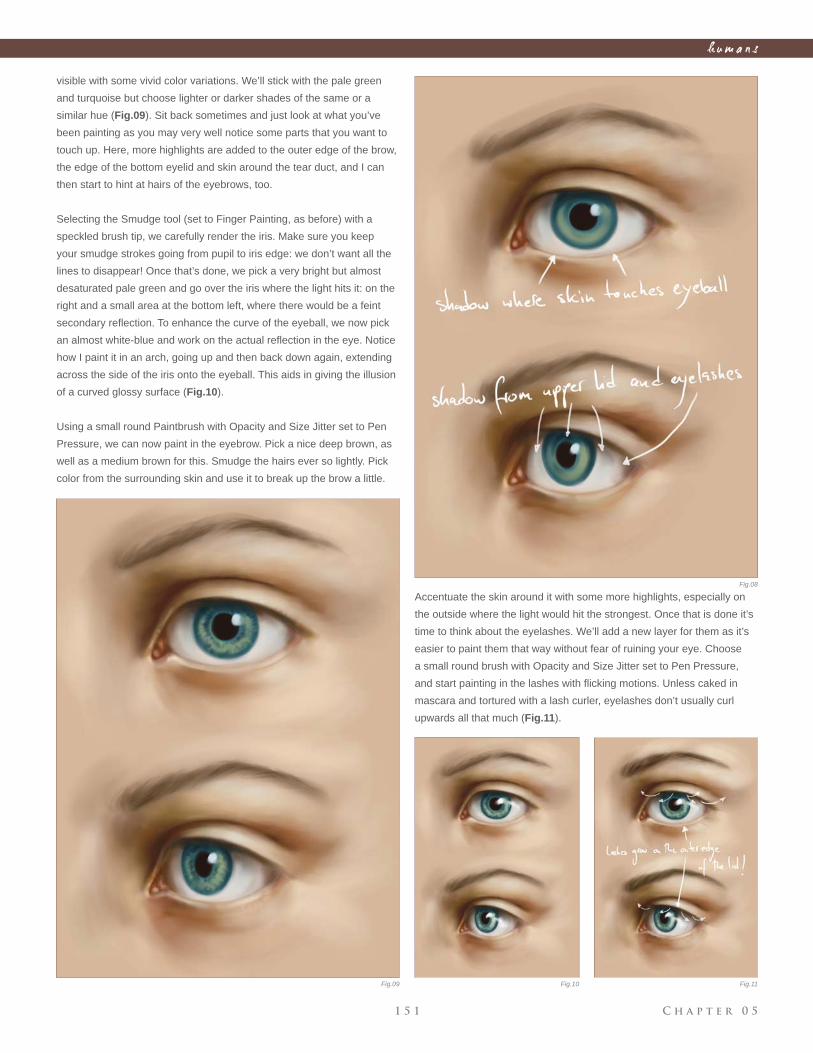
C h a p t e r 0 51 5 1
h u m a n s
visible with some vivid color variations. We’ll stick with the pale green
and turquoise but choose lighter or darker shades of the same or a
similar hue (Fig.09). Sit back sometimes and just look at what you’ve
been painting as you may very well notice some parts that you want to
touch up. Here, more highlights are added to the outer edge of the brow,
the edge of the bottom eyelid and skin around the tear duct, and I can
then start to hint at hairs of the eyebrows, too.
Selecting the Smudge tool (set to Finger Painting, as before) with a
speckled brush tip, we carefully render the iris. Make sure you keep
your smudge strokes going from pupil to iris edge: we don’t want all the
lines to disappear! Once that’s done, we pick a very bright but almost
desaturated pale green and go over the iris where the light hits it: on the
right and a small area at the bottom left, where there would be a feint
secondary refl ection. To enhance the curve of the eyeball, we now pick
an almost white-blue and work on the actual refl ection in the eye. Notice
how I paint it in an arch, going up and then back down again, extending
across the side of the iris onto the eyeball. This aids in giving the illusion
of a curved glossy surface (Fig.10).
Using a small round Paintbrush with Opacity and Size Jitter set to Pen
Pressure, we can now paint in the eyebrow. Pick a nice deep brown, as
well as a medium brown for this. Smudge the hairs ever so lightly. Pick
color from the surrounding skin and use it to break up the brow a little.
Accentuate the skin around it with some more highlights, especially on
the outside where the light would hit the strongest. Once that is done it’s
time to think about the eyelashes. We’ll add a new layer for them as it’s
easier to paint them that way without fear of ruining your eye. Choose
a small round brush with Opacity and Size Jitter set to Pen Pressure,
and start painting in the lashes with fl icking motions. Unless caked in
mascara and tortured with a lash curler, eyelashes don’t usually curl
upwards all that much (Fig.11).
Fig.08
Fig.09 Fig.10 Fig.11
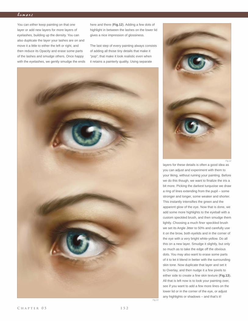
C h a p t e r 0 5 1 5 2
h u m a n s
You can either keep painting on that one
layer or add new layers for more layers of
eyelashes, building up the density. You can
also duplicate the layer your lashes are on and
move it a little to either the left or right, and
then reduce its Opacity and erase some parts
of the lashes and smudge others. Once happy
with the eyelashes, we gently smudge the ends
here and there (Fig.12). Adding a few dots of
highlight in between the lashes on the lower lid
gives a nice impression of glossiness.
The last step of every painting always consists
of adding all those tiny details that make it
“pop”; that make it look realistic even when
it retains a painterly quality. Using separate
layers for these details is often a good idea as
you can adjust and experiment with them to
your liking, without ruining your painting. Before
we do this though, we want to fi nalize the iris a
bit more. Picking the darkest turquoise we draw
a ring of lines extending from the pupil – some
stronger and longer, some weaker and shorter.
This instantly intensifi es the green and the
apparent glow of the eye. Now that is done, we
add some more highlights to the eyeball with a
custom speckled brush, and then smudge them
lightly. Choosing a much fi ner speckled brush
we set its Angle Jitter to 50% and carefully use
it on the brow, both eyelids and in the corner of
the eye with a very bright white-yellow. Do all
this on a new layer. Smudge it slightly, but only
so much as to take the edge off the obvious
dots. You may also want to erase some parts
of it to let it blend in better with the surrounding
skin tone. Now duplicate that layer and set it
to Overlay, and then nudge it a few pixels to
either side to create a fi ne skin texture (Fig.13).
All that is left now is to look your painting over,
see if you want to add a few more lines on the
lower lid or in the corner of the eye, or adjust
any highlights or shadows – and that’s it!
Fig.12
Fig.13
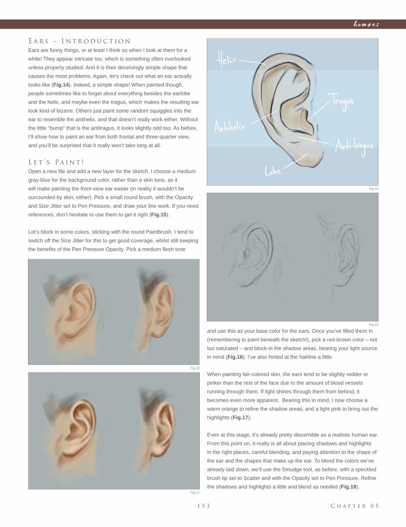
C h a p t e r 0 51 5 3
h u m a n s
E a r s – I n t r o d u c t i o n
Ears are funny things, or at least I think so when I look at them for a
while! They appear intricate too, which is something often overlooked
unless properly studied. And it is their deceivingly simple shape that
causes the most problems. Again, let’s check out what an ear actually
looks like (Fig.14). Indeed, a simple shape! When painted though,
people sometimes like to forget about everything besides the earlobe
and the helix, and maybe even the tragus, which makes the resulting ear
look kind of bizarre. Others just paint some random squiggles into the
ear to resemble the antihelix, and that doesn’t really work either. Without
the little “bump” that is the antitragus, it looks slightly odd too. As before,
I’ll show how to paint an ear from both frontal and three-quarter view,
and you’ll be surprised that it really won’t take long at all.
L e t ’ s Pa i n t !
Open a new fi le and add a new layer for the sketch. I choose a medium
gray-blue for the background color, rather than a skin tone, as it
will make painting the front-view ear easier (in reality it wouldn’t be
surrounded by skin, either). Pick a small round brush, with the Opacity
and Size Jitter set to Pen Pressure, and draw your line work. If you need
references, don’t hesitate to use them to get it right (Fig.15).
Let’s block in some colors, sticking with the round Paintbrush. I tend to
switch off the Size Jitter for this to get good coverage, whilst still keeping
the benefi ts of the Pen Pressure Opacity. Pick a medium fl esh tone
and use this as your base color for the ears. Once you’ve fi lled them in
(remembering to paint beneath the sketch!), pick a red-brown color – not
too saturated – and block-in the shadow areas, bearing your light source
in mind (Fig.16). I’ve also hinted at the hairline a little.
When painting fair-colored skin, the ears tend to be slightly redder or
pinker than the rest of the face due to the amount of blood vessels
running through them. If light shines through them from behind, it
becomes even more apparent. Bearing this in mind, I now choose a
warm orange to refi ne the shadow areas, and a light pink to bring out the
highlights (Fig.17).
Even at this stage, it’s already pretty discernible as a realistic human ear.
From this point on, it really is all about placing shadows and highlights
in the right places, careful blending, and paying attention to the shape of
the ear and the shapes that make up the ear. To blend the colors we’ve
already laid down, we’ll use the Smudge tool, as before, with a speckled
brush tip set to Scatter and with the Opacity set to Pen Pressure. Refi ne
the shadows and highlights a little and blend as needed (Fig.18).
Fig.14
Fig.15
Fig.16
Fig.17
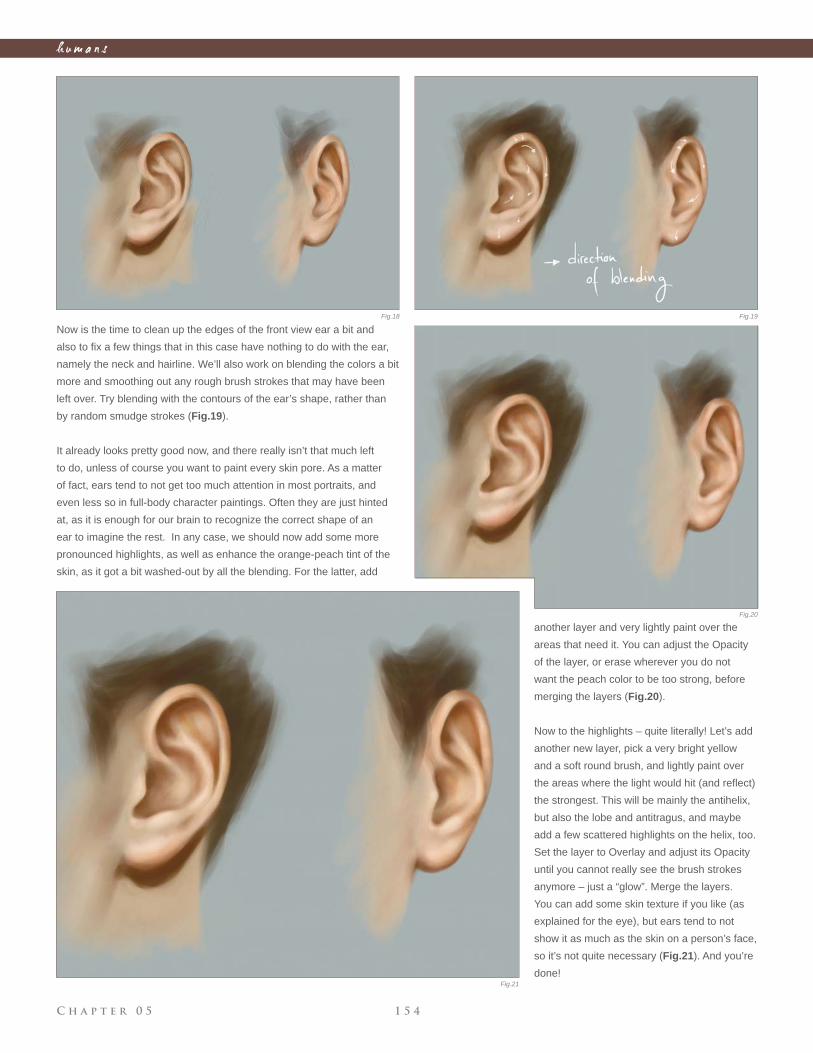
C h a p t e r 0 5 1 5 4
h u m a n s
Now is the time to clean up the edges of the front view ear a bit and
also to fi x a few things that in this case have nothing to do with the ear,
namely the neck and hairline. We’ll also work on blending the colors a bit
more and smoothing out any rough brush strokes that may have been
left over. Try blending with the contours of the ear’s shape, rather than
by random smudge strokes (Fig.19).
It already looks pretty good now, and there really isn’t that much left
to do, unless of course you want to paint every skin pore. As a matter
of fact, ears tend to not get too much attention in most portraits, and
even less so in full-body character paintings. Often they are just hinted
at, as it is enough for our brain to recognize the correct shape of an
ear to imagine the rest. In any case, we should now add some more
pronounced highlights, as well as enhance the orange-peach tint of the
skin, as it got a bit washed-out by all the blending. For the latter, add
another layer and very lightly paint over the
areas that need it. You can adjust the Opacity
of the layer, or erase wherever you do not
want the peach color to be too strong, before
merging the layers (Fig.20).
Now to the highlights – quite literally! Let’s add
another new layer, pick a very bright yellow
and a soft round brush, and lightly paint over
the areas where the light would hit (and refl ect)
the strongest. This will be mainly the antihelix,
but also the lobe and antitragus, and maybe
add a few scattered highlights on the helix, too.
Set the layer to Overlay and adjust its Opacity
until you cannot really see the brush strokes
anymore – just a “glow”. Merge the layers.
You can add some skin texture if you like (as
explained for the eye), but ears tend to not
show it as much as the skin on a person’s face,
so it’s not quite necessary (Fig.21). And you’re
done!
Fig.18 Fig.19
Fig.20
Fig.21
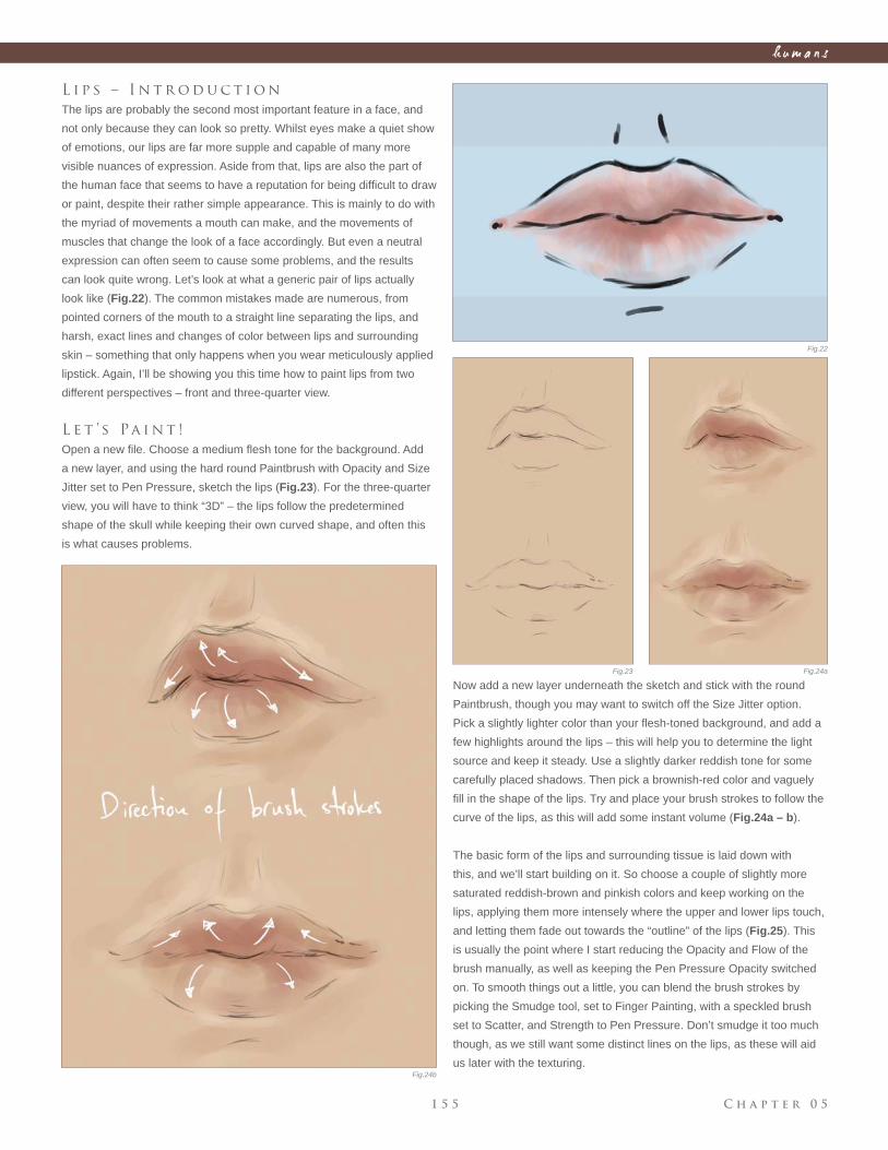
C h a p t e r 0 51 5 5
h u m a n s
L i p s – I n t r o d u c t i o n
The lips are probably the second most important feature in a face, and
not only because they can look so pretty. Whilst eyes make a quiet show
of emotions, our lips are far more supple and capable of many more
visible nuances of expression. Aside from that, lips are also the part of
the human face that seems to have a reputation for being diffi cult to draw
or paint, despite their rather simple appearance. This is mainly to do with
the myriad of movements a mouth can make, and the movements of
muscles that change the look of a face accordingly. But even a neutral
expression can often seem to cause some problems, and the results
can look quite wrong. Let’s look at what a generic pair of lips actually
look like (Fig.22). The common mistakes made are numerous, from
pointed corners of the mouth to a straight line separating the lips, and
harsh, exact lines and changes of color between lips and surrounding
skin – something that only happens when you wear meticulously applied
lipstick. Again, I’ll be showing you this time how to paint lips from two
different perspectives – front and three-quarter view.
L e t ’ s Pa i n t !
Open a new fi le. Choose a medium fl esh tone for the background. Add
a new layer, and using the hard round Paintbrush with Opacity and Size
Jitter set to Pen Pressure, sketch the lips (Fig.23). For the three-quarter
view, you will have to think “3D” – the lips follow the predetermined
shape of the skull while keeping their own curved shape, and often this
is what causes problems.
Now add a new layer underneath the sketch and stick with the round
Paintbrush, though you may want to switch off the Size Jitter option.
Pick a slightly lighter color than your fl esh-toned background, and add a
few highlights around the lips – this will help you to determine the light
source and keep it steady. Use a slightly darker reddish tone for some
carefully placed shadows. Then pick a brownish-red color and vaguely
fi ll in the shape of the lips. Try and place your brush strokes to follow the
curve of the lips, as this will add some instant volume (Fig.24a – b).
The basic form of the lips and surrounding tissue is laid down with
this, and we’ll start building on it. So choose a couple of slightly more
saturated reddish-brown and pinkish colors and keep working on the
lips, applying them more intensely where the upper and lower lips touch,
and letting them fade out towards the “outline” of the lips (Fig.25). This
is usually the point where I start reducing the Opacity and Flow of the
brush manually, as well as keeping the Pen Pressure Opacity switched
on. To smooth things out a little, you can blend the brush strokes by
picking the Smudge tool, set to Finger Painting, with a speckled brush
set to Scatter, and Strength to Pen Pressure. Don’t smudge it too much
though, as we still want some distinct lines on the lips, as these will aid
us later with the texturing.
Fig.22
Fig.23 Fig.24a
Fig.24b
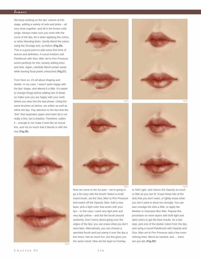
C h a p t e r 0 5 1 5 6
h u m a n s
We keep working on the lips’ volume at this
stage, adding a variety of reds and pinks – all
very close together, and all in the brown color
range. Always make sure you work with the
curve of the lips, be it when applying the colors,
or when blending them. Gently blend the colors
using the Smudge tool, as before (Fig.26).
This is a good point to add some fi rst hints of
texture and defi nition. A round medium soft
Paintbrush with Size Jitter set to Pen Pressure
works perfectly for this, loosely adding lines
and dots. Again, carefully blend certain areas
while leaving focal points untouched (Fig.27).
From here on, it’s all about shaping and
details. In my case, I wasn’t quite happy with
the lips’ shape, and altered it a little. It’s easier
to change things before adding lots of detail,
so make sure you are happy with your work
before you dive into the last phase. Using the
same brushes as before, we soften as well as
refi ne the lips. Pay attention to the fact that the
“line” that separates upper and lower lip is not
really a line, but a shadow. Therefore, soften
it – enough to not make it look like an actual
line, and not so much that it blends in with the
rest (Fig.28).
Now we come to the fun part – we’re going to
go a bit crazy with the brush! Select a small
round brush, set the Size Jitter to Pen Pressure
and switch off the Opacity Jitter. Add a new
layer, pick a light color that works with your
lips – in this case I used very light pink and
very light yellow – and dot the brush around
randomly. Don’t worry about going over the
edges of the lips; you can erase what you don’t
want later. Alternatively, you can choose a
speckled brush and just stamp it over the lips a
few times. Not as much fun, but this gives you
the same result. Now set the layer to Overlay
or Soft Light, and reduce the Opacity as much
or little as you see fi t. Erase those bits of the
dots that you don’t want, or lightly erase what
you don’t want to show too strongly. You can
also smudge the dots a little, or apply the
Median or Gaussian Blur fi lter. Repeat this
procedure on more layers with both light and
dark colors to get the best results. As a last
step, pick one of the darker colors from the lips,
and using a round Paintbrush with Opacity and
Size Jitter set to Pen Pressure add a few more
refi ning lines. Blend as needed, and … there
are you lips (Fig.29)!
Fig.25 Fig.26
Fig.27 Fig.28
Fig.29
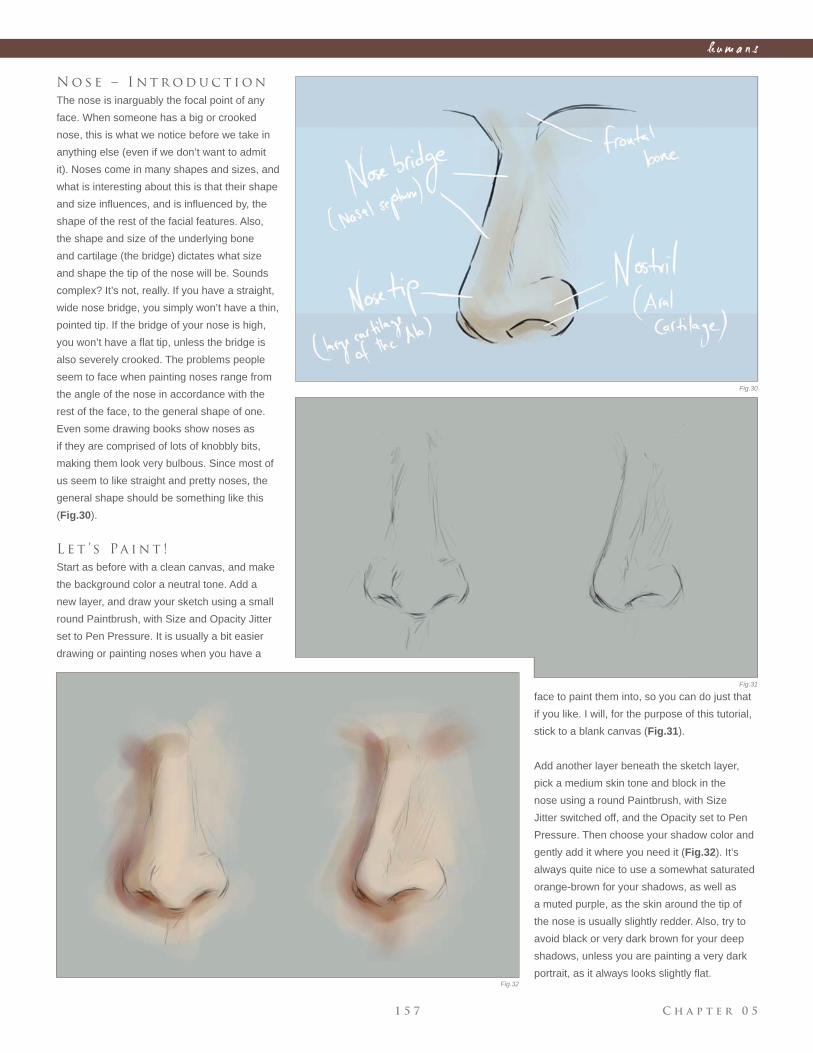
C h a p t e r 0 51 5 7
h u m a n s
N o s e – I n t r o d u c t i o n
The nose is inarguably the focal point of any
face. When someone has a big or crooked
nose, this is what we notice before we take in
anything else (even if we don’t want to admit
it). Noses come in many shapes and sizes, and
what is interesting about this is that their shape
and size infl uences, and is infl uenced by, the
shape of the rest of the facial features. Also,
the shape and size of the underlying bone
and cartilage (the bridge) dictates what size
and shape the tip of the nose will be. Sounds
complex? It’s not, really. If you have a straight,
wide nose bridge, you simply won’t have a thin,
pointed tip. If the bridge of your nose is high,
you won’t have a fl at tip, unless the bridge is
also severely crooked. The problems people
seem to face when painting noses range from
the angle of the nose in accordance with the
rest of the face, to the general shape of one.
Even some drawing books show noses as
if they are comprised of lots of knobbly bits,
making them look very bulbous. Since most of
us seem to like straight and pretty noses, the
general shape should be something like this
(Fig.30).
L e t ’ s Pa i n t !
Start as before with a clean canvas, and make
the background color a neutral tone. Add a
new layer, and draw your sketch using a small
round Paintbrush, with Size and Opacity Jitter
set to Pen Pressure. It is usually a bit easier
drawing or painting noses when you have a
face to paint them into, so you can do just that
if you like. I will, for the purpose of this tutorial,
stick to a blank canvas (Fig.31).
Add another layer beneath the sketch layer,
pick a medium skin tone and block in the
nose using a round Paintbrush, with Size
Jitter switched off, and the Opacity set to Pen
Pressure. Then choose your shadow color and
gently add it where you need it (Fig.32). It’s
always quite nice to use a somewhat saturated
orange-brown for your shadows, as well as
a muted purple, as the skin around the tip of
the nose is usually slightly redder. Also, try to
avoid black or very dark brown for your deep
shadows, unless you are painting a very dark
portrait, as it always looks slightly fl at.
Fig.30
Fig.31
Fig.32
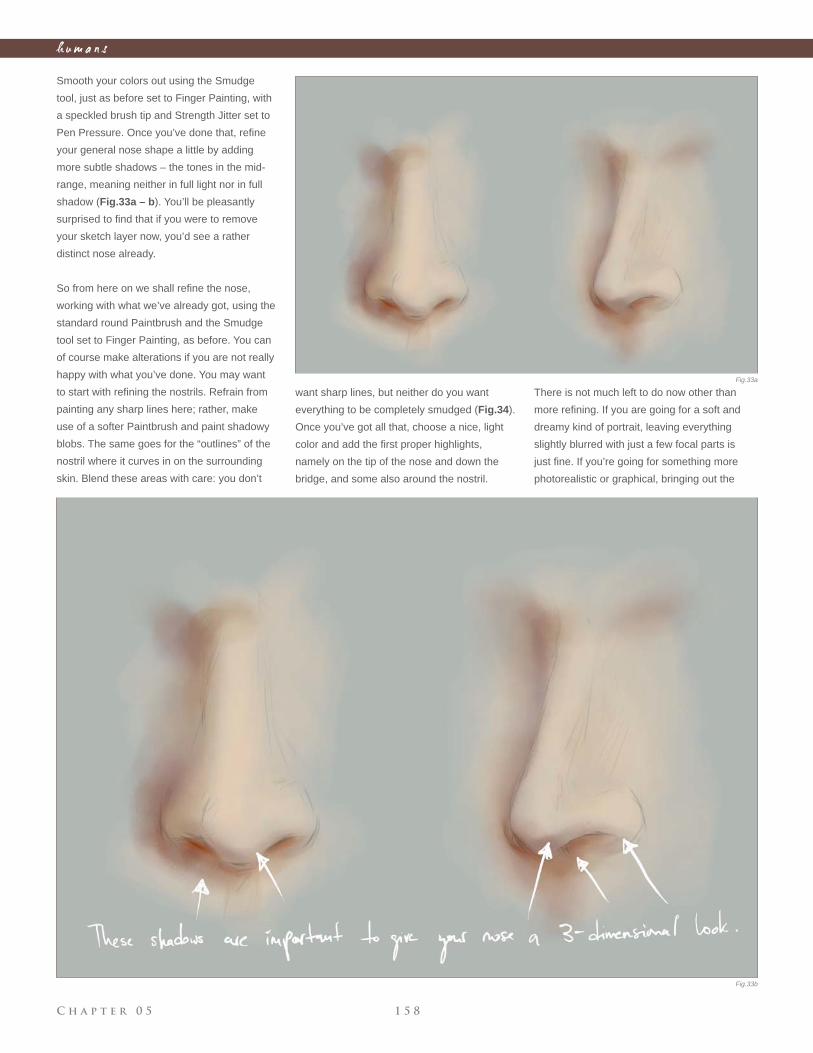
C h a p t e r 0 5 1 5 8
h u m a n s
Smooth your colors out using the Smudge
tool, just as before set to Finger Painting, with
a speckled brush tip and Strength Jitter set to
Pen Pressure. Once you’ve done that, refi ne
your general nose shape a little by adding
more subtle shadows – the tones in the mid-
range, meaning neither in full light nor in full
shadow (Fig.33a – b). You’ll be pleasantly
surprised to fi nd that if you were to remove
your sketch layer now, you’d see a rather
distinct nose already.
So from here on we shall refi ne the nose,
working with what we’ve already got, using the
standard round Paintbrush and the Smudge
tool set to Finger Painting, as before. You can
of course make alterations if you are not really
happy with what you’ve done. You may want
to start with refi ning the nostrils. Refrain from
painting any sharp lines here; rather, make
use of a softer Paintbrush and paint shadowy
blobs. The same goes for the “outlines” of the
nostril where it curves in on the surrounding
skin. Blend these areas with care: you don’t
want sharp lines, but neither do you want
everything to be completely smudged (Fig.34).
Once you’ve got all that, choose a nice, light
color and add the fi rst proper highlights,
namely on the tip of the nose and down the
bridge, and some also around the nostril.
There is not much left to do now other than
more refi ning. If you are going for a soft and
dreamy kind of portrait, leaving everything
slightly blurred with just a few focal parts is
just fi ne. If you’re going for something more
photorealistic or graphical, bringing out the
Fig.33a
Fig.33b
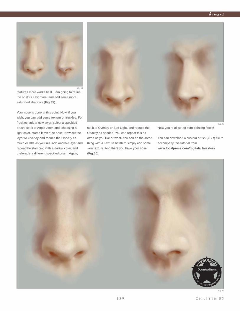
C h a p t e r 0 51 5 9
h u m a n s
features more works best. I am going to refi ne
the nostrils a bit more, and add some more
saturated shadows (Fig.35).
Your nose is done at this point. Now, if you
wish, you can add some texture or freckles. For
freckles, add a new layer, select a speckled
brush, set it to Angle Jitter, and, choosing a
light color, stamp it over the nose. Now set the
layer to Overlay and reduce the Opacity as
much or little as you like. Add another layer and
repeat the stamping with a darker color, and
preferably a different speckled brush. Again,
set it to Overlay or Soft Light, and reduce the
Opacity as needed. You can repeat this as
often as you like or want. You can do the same
thing with a Texture brush to simply add some
skin texture. And there you have your nose
(Fig.36).
Now you’re all set to start painting faces!
You can download a custom brush (ABR) fi le to
accompany this tutorial from
www.focalpress.com/digitalartmasters
Fig.34
Fig.35
Fig.36
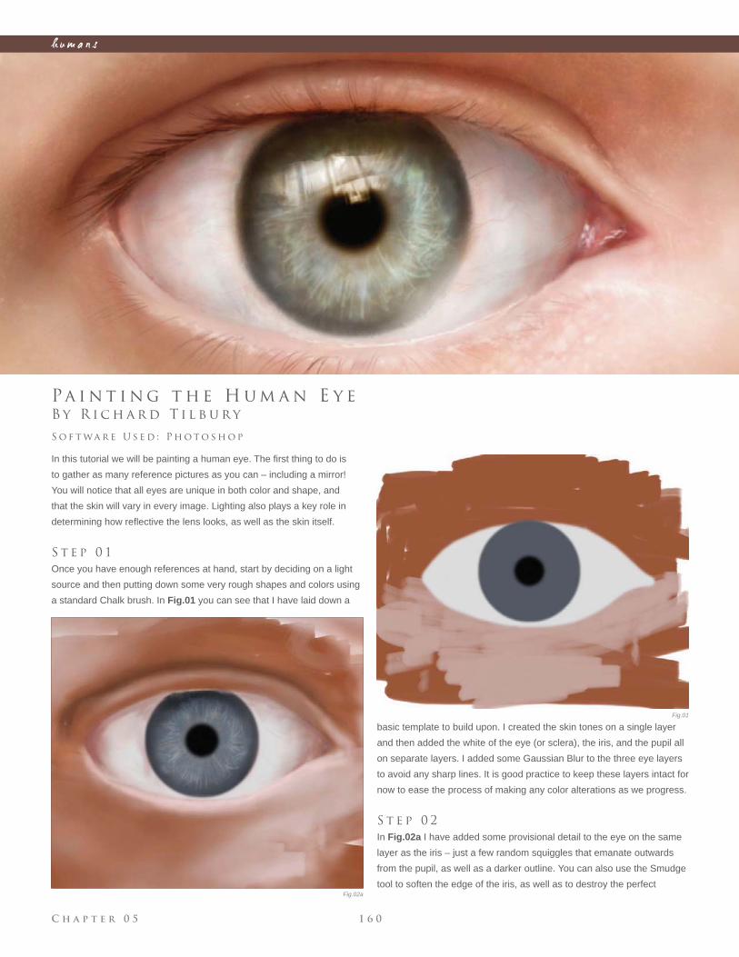
C h a p t e r 0 5 1 6 0
h u m a n s
Fig.01
Fig.02a
B y R i c h a r d T i l b u r y
Pa i n t i n g t h e H u m a n E y e
In this tutorial we will be painting a human eye. The fi rst thing to do is
to gather as many reference pictures as you can – including a mirror!
You will notice that all eyes are unique in both color and shape, and
that the skin will vary in every image. Lighting also plays a key role in
determining how refl ective the lens looks, as well as the skin itself.
S t e p 0 1
Once you have enough references at hand, start by deciding on a light
source and then putting down some very rough shapes and colors using
a standard Chalk brush. In Fig.01 you can see that I have laid down a
S o f t wa r e U s e d : P h o t o s h o p
basic template to build upon. I created the skin tones on a single layer
and then added the white of the eye (or sclera), the iris, and the pupil all
on separate layers. I added some Gaussian Blur to the three eye layers
to avoid any sharp lines. It is good practice to keep these layers intact for
now to ease the process of making any color alterations as we progress.
S t e p 0 2
In Fig.02a I have added some provisional detail to the eye on the same
layer as the iris – just a few random squiggles that emanate outwards
from the pupil, as well as a darker outline. You can also use the Smudge
tool to soften the edge of the iris, as well as to destroy the perfect
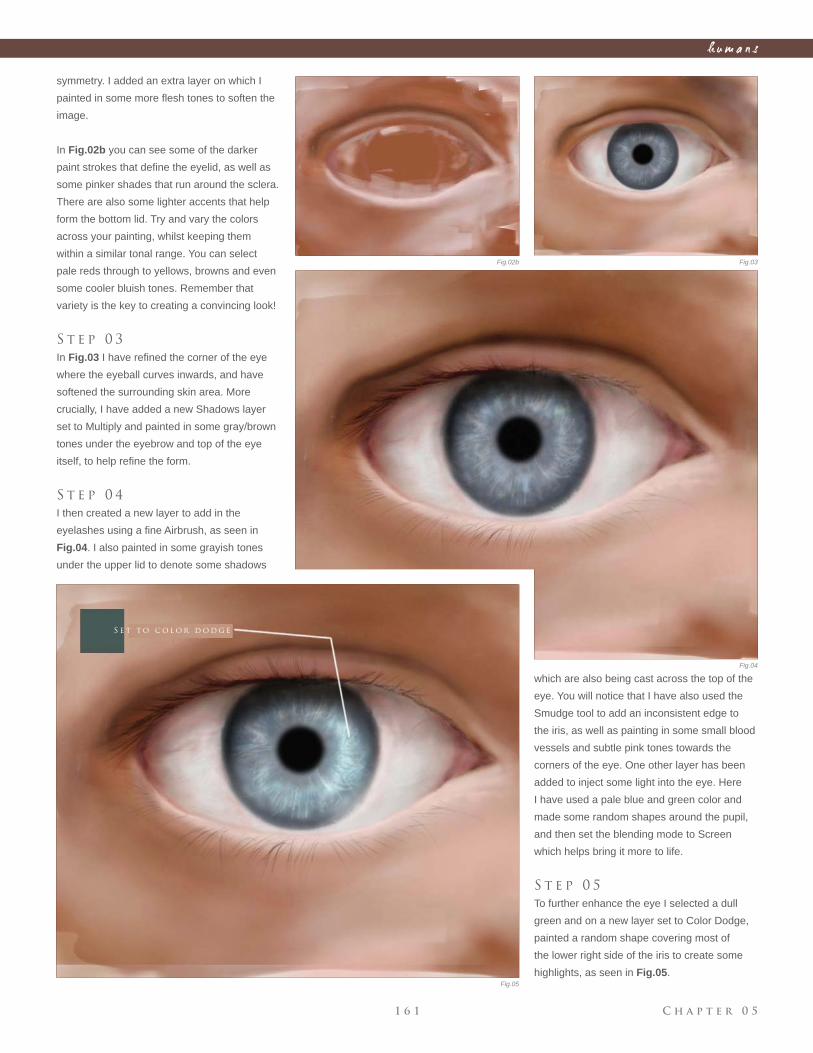
C h a p t e r 0 51 6 1
h u m a n s
Fig.02b Fig.03
Fig.04
Fig.05
symmetry. I added an extra layer on which I
painted in some more fl esh tones to soften the
image.
In Fig.02b you can see some of the darker
paint strokes that defi ne the eyelid, as well as
some pinker shades that run around the sclera.
There are also some lighter accents that help
form the bottom lid. Try and vary the colors
across your painting, whilst keeping them
within a similar tonal range. You can select
pale reds through to yellows, browns and even
some cooler bluish tones. Remember that
variety is the key to creating a convincing look!
S t e p 0 3
In Fig.03 I have refi ned the corner of the eye
where the eyeball curves inwards, and have
softened the surrounding skin area. More
crucially, I have added a new Shadows layer
set to Multiply and painted in some gray/brown
tones under the eyebrow and top of the eye
itself, to help refi ne the form.
S t e p 0 4
I then created a new layer to add in the
eyelashes using a fi ne Airbrush, as seen in
Fig.04. I also painted in some grayish tones
under the upper lid to denote some shadows
which are also being cast across the top of the
eye. You will notice that I have also used the
Smudge tool to add an inconsistent edge to
the iris, as well as painting in some small blood
vessels and subtle pink tones towards the
corners of the eye. One other layer has been
added to inject some light into the eye. Here
I have used a pale blue and green color and
made some random shapes around the pupil,
and then set the blending mode to Screen
which helps bring it more to life.
S t e p 0 5
To further enhance the eye I selected a dull
green and on a new layer set to Color Dodge,
painted a random shape covering most of
the lower right side of the iris to create some
highlights, as seen in Fig.05.
S e t t o c o l o r d o d g e
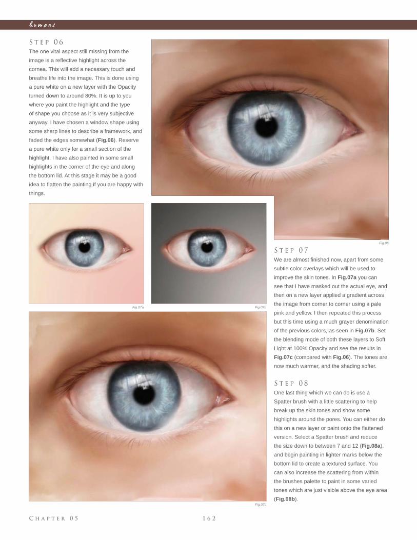
C h a p t e r 0 5 1 6 2
h u m a n s
S t e p 0 6
The one vital aspect still missing from the
image is a refl ective highlight across the
cornea. This will add a necessary touch and
breathe life into the image. This is done using
a pure white on a new layer with the Opacity
turned down to around 80%. It is up to you
where you paint the highlight and the type
of shape you choose as it is very subjective
anyway. I have chosen a window shape using
some sharp lines to describe a framework, and
faded the edges somewhat (Fig.06). Reserve
a pure white only for a small section of the
highlight. I have also painted in some small
highlights in the corner of the eye and along
the bottom lid. At this stage it may be a good
idea to fl atten the painting if you are happy with
things.
S t e p 0 7
We are almost fi nished now, apart from some
subtle color overlays which will be used to
improve the skin tones. In Fig.07a you can
see that I have masked out the actual eye, and
then on a new layer applied a gradient across
the image from corner to corner using a pale
pink and yellow. I then repeated this process
but this time using a much grayer denomination
of the previous colors, as seen in Fig.07b. Set
the blending mode of both these layers to Soft
Light at 100% Opacity and see the results in
Fig.07c (compared with Fig.06). The tones are
now much warmer, and the shading softer.
S t e p 0 8
One last thing which we can do is use a
Spatter brush with a little scattering to help
break up the skin tones and show some
highlights around the pores. You can either do
this on a new layer or paint onto the fl attened
version. Select a Spatter brush and reduce
the size down to between 7 and 12 (Fig.08a),
and begin painting in lighter marks below the
bottom lid to create a textured surface. You
can also increase the scattering from within
the brushes palette to paint in some varied
tones which are just visible above the eye area
(Fig.08b).
Fig.06
Fig.07a Fig.07b
Fig.07c
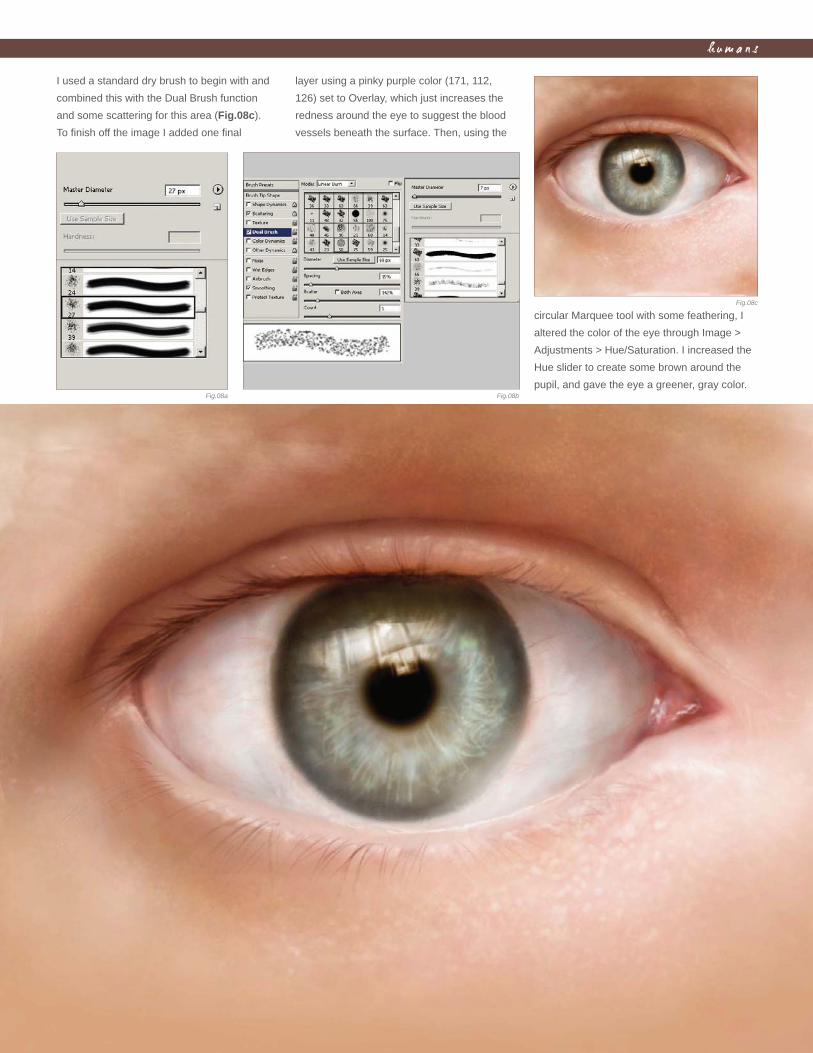
C h a p t e r 0 51 6 3
h u m a n s
I used a standard dry brush to begin with and
combined this with the Dual Brush function
and some scattering for this area (Fig.08c).
To fi nish off the image I added one fi nal
layer using a pinky purple color (171, 112,
126) set to Overlay, which just increases the
redness around the eye to suggest the blood
vessels beneath the surface. Then, using the
circular Marquee tool with some feathering, I
altered the color of the eye through Image >
Adjustments > Hue/Saturation. I increased the
Hue slider to create some brown around the
pupil, and gave the eye a greener, gray color.Fig.08a Fig.08b
Fig.08c
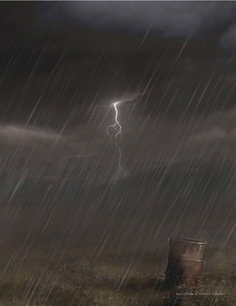
R a i n s t o r m © C a r l o s C a b r e r a

In today’s world of ever-increased specialization, many artists have
adopted roles specifi c to certain areas of expertise. One of these is an
environment artist, and, as well as creating original designs, it often
involves adjusting an established scene and creating variations.
This chapter looks primarily at how a base image can be manipulated to
refl ect different weather conditions, and shows how the same scene can
be transformed dramatically to convey a diverse range of moods.
e n v i r o n m e n t s
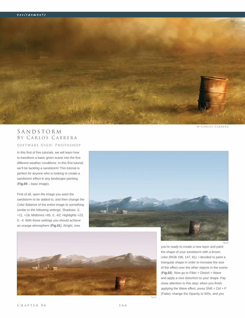
C h a p t e r 0 6 1 6 6
e n v i r o n m e n t s
Fig.00
Fig.01
B y C a r l o s C a b r e r a
S a n d s t o r m
In this fi rst of fi ve tutorials, we will learn how
to transform a basic given scene into the fi ve
different weather conditions. In this fi rst tutorial
we’ll be tackling a sandstorm! This tutorial is
perfect for anyone who is looking to create a
sandstorm effect in any landscape painting
(Fig.00 – base image).
First of all, open the image you want the
sandstorm to be added to, and then change the
Color Balance of the entire image to something
similar to the following settings: Shadows -2,
+11, +18; Midtones +85, 0, -62; Highlights +23,
0, -4. With these settings you should achieve
an orange atmosphere (Fig.01). Alright, now
S o f t wa r e U s e d : P h o t o s h o p
© C a r l o s C a b r e r a
you’re ready to create a new layer and paint
the shape of your sandstorm with a brown
color (RGB 196, 147, 81). I decided to paint a
triangular shape in order to increase the size
of the effect over the other objects in the scene
(Fig.02). Now go to Filter > Distort > Wave
and apply a nice distortion to your shape. Pay
close attention to this step; when you fi nish
applying the Wave effect, press Shift + Ctrl + F
(Fade), change the Opacity to 50%, and you
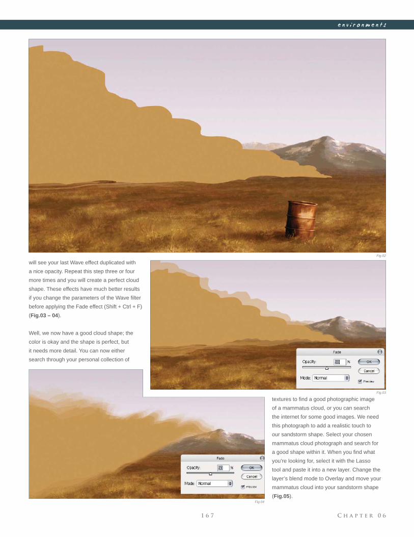
C h a p t e r 0 61 6 7
e n v i r o n m e n t s
will see your last Wave effect duplicated with
a nice opacity. Repeat this step three or four
more times and you will create a perfect cloud
shape. These effects have much better results
if you change the parameters of the Wave fi lter
before applying the Fade effect (Shift + Ctrl + F)
(Fig.03 – 04).
Well, we now have a good cloud shape; the
color is okay and the shape is perfect, but
it needs more detail. You can now either
search through your personal collection of
Fig.02
Fig.03
Fig.04
textures to fi nd a good photographic image
of a mammatus cloud, or you can search
the internet for some good images. We need
this photograph to add a realistic touch to
our sandstorm shape. Select your chosen
mammatus cloud photograph and search for
a good shape within it. When you fi nd what
you’re looking for, select it with the Lasso
tool and paste it into a new layer. Change the
layer’s blend mode to Overlay and move your
mammatus cloud into your sandstorm shape
(Fig.05).
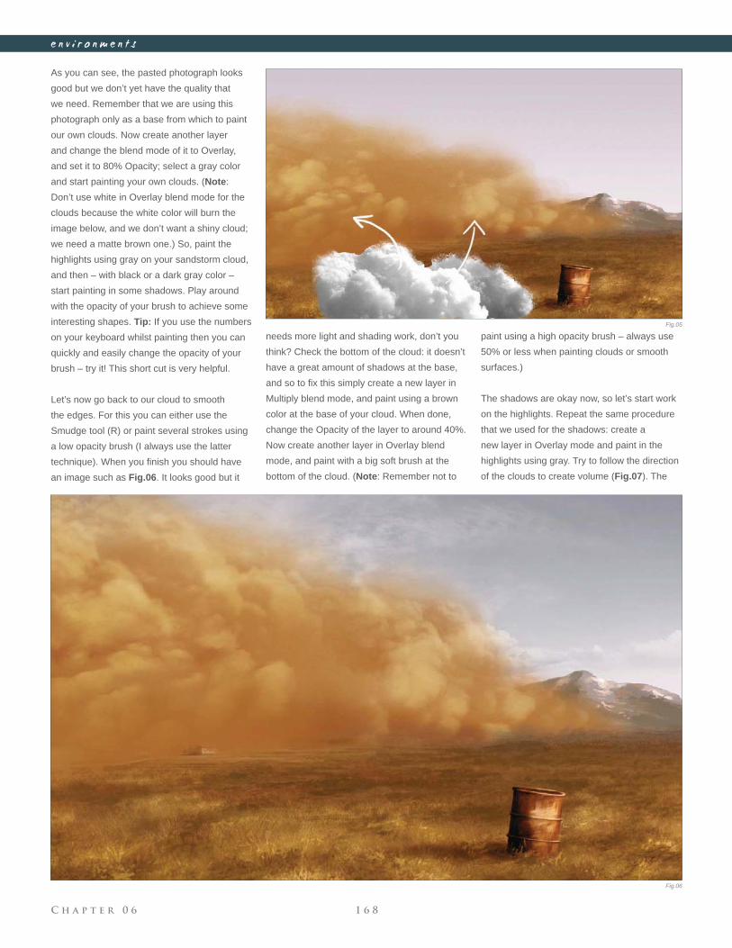
C h a p t e r 0 6 1 6 8
e n v i r o n m e n t s
As you can see, the pasted photograph looks
good but we don’t yet have the quality that
we need. Remember that we are using this
photograph only as a base from which to paint
our own clouds. Now create another layer
and change the blend mode of it to Overlay,
and set it to 80% Opacity; select a gray color
and start painting your own clouds. (Note:
Don’t use white in Overlay blend mode for the
clouds because the white color will burn the
image below, and we don’t want a shiny cloud;
we need a matte brown one.) So, paint the
highlights using gray on your sandstorm cloud,
and then – with black or a dark gray color –
start painting in some shadows. Play around
with the opacity of your brush to achieve some
interesting shapes. Tip: If you use the numbers
on your keyboard whilst painting then you can
quickly and easily change the opacity of your
brush – try it! This short cut is very helpful.
Let’s now go back to our cloud to smooth
the edges. For this you can either use the
Smudge tool (R) or paint several strokes using
a low opacity brush (I always use the latter
technique). When you fi nish you should have
an image such as Fig.06. It looks good but it
needs more light and shading work, don’t you
think? Check the bottom of the cloud: it doesn’t
have a great amount of shadows at the base,
and so to fi x this simply create a new layer in
Multiply blend mode, and paint using a brown
color at the base of your cloud. When done,
change the Opacity of the layer to around 40%.
Now create another layer in Overlay blend
mode, and paint with a big soft brush at the
bottom of the cloud. (Note: Remember not to
paint using a high opacity brush – always use
50% or less when painting clouds or smooth
surfaces.)
The shadows are okay now, so let’s start work
on the highlights. Repeat the same procedure
that we used for the shadows: create a
new layer in Overlay mode and paint in the
highlights using gray. Try to follow the direction
of the clouds to create volume (Fig.07). The
Fig.05
Fig.06
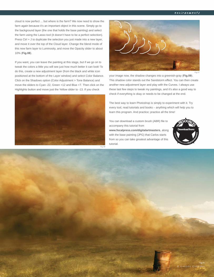
C h a p t e r 0 61 6 9
e n v i r o n m e n t s
cloud is now perfect ... but where is the farm? We now need to show the
farm again because it’s an important object in this scene. Simply go to
the background layer (the one that holds the base painting) and select
the farm using the Lasso tool (it doesn’t have to be a perfect selection).
Press Ctrl + J to duplicate the selection you just made into a new layer,
and move it over the top of the Cloud layer. Change the blend mode of
this new farm layer to Luminosity, and move the Opacity slider to about
10% (Fig.08).
If you want, you can leave the painting at this stage, but if we go on to
tweak the colors a little you will see just how much better it can look! To
do this, create a new adjustment layer (from the black and white icon
positioned at the bottom of the Layer window) and select Color Balance.
Click on the Shadows option (Color Adjustment > Tone Balance) and
move the sliders to Cyan -22, Green +12 and Blue +7. Then click on the
Highlights button and move just the Yellow slider to -13. If you check
your image now, the shadow changes into a greenish-gray (Fig.09).
This shadow color stands out the Sandstorm effect. You can then create
another new adjustment layer and play with the Curves. I always use
these last few steps to tweak my paintings, and it’s also a good way to
check if everything is okay or needs to be changed at the end.
The best way to learn Photoshop is simply to experiment with it. Try
every tool, read tutorials and books – anything which will help you to
learn this program. And practice; practice all the time!
You can download a custom brush (ABR) fi le to
accompany this tutorial from
www.focalpress.com/digitalartmasters, along
with the base painting (JPG) that Carlos starts
from so you can take greatest advantage of this
tutorial.
Fig.07
Fig.08
Fig.09
© C a r l o s C a b r e r a
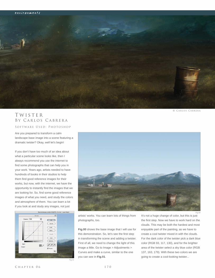
C h a p t e r 0 6 1 7 0
e n v i r o n m e n t s
Fig.00
Fig.01
B y C a r l o s C a b r e r a
T w i s t e r
Are you prepared to transform a calm
landscape base image into a scene featuring a
dramatic twister? Okay, well let’s begin!
If you don’t have too much of an idea about
what a particular scene looks like, then I
always recommend you use the internet to
fi nd some photographs that can help you in
your work. Years ago, artists needed to have
hundreds of books in their studios to help
them fi nd good reference images for their
works, but now, with the internet, we have the
opportunity to instantly fi nd the images that we
are looking for. So, fi nd some good reference
images of what you need, and study the colors
and atmosphere of them. You can learn a lot
if you look at and study any images, not just
S o f t wa r e U s e d : P h o t o s h o p
© C a r l o s C a b r e r a
artists’ works. You can learn lots of things from
photographs, too.
Fig.00 shows the base image that I will use for
this demonstration. So, let’s see the fi rst step
in transforming the scene and adding a twister.
First of all, we need to change the light of this
image a little. Go to Image > Adjustments >
Curves and make a curve, similar to the one
you can see in Fig.01.
It’s not a huge change of color, but this is just
the fi rst step. Now we have to work hard on the
clouds. This may be both the hardest and most
enjoyable part of the painting, as we have to
create a cool twister mixed in with the clouds.
For the dark color of the twister pick a dark blue
color (RGB 93, 117, 130), and for the brighter
area of the twister select a sky blue color (RGB
137, 163, 179). With these two colors we are
going to create a cool-looking twister...
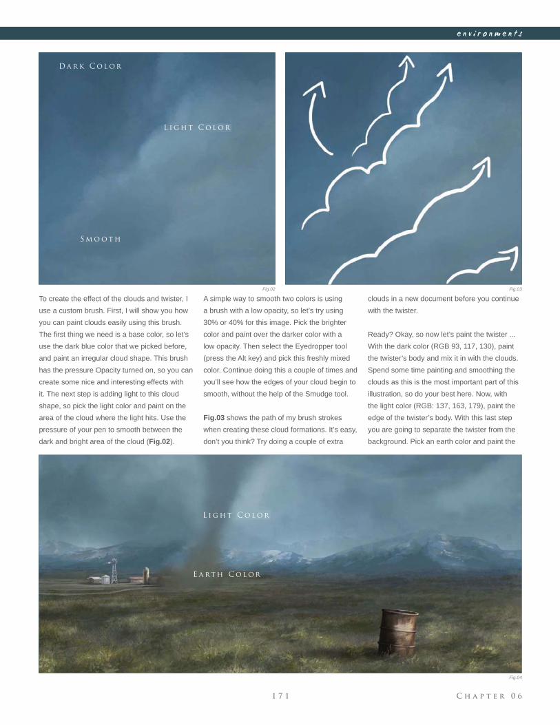
C h a p t e r 0 61 7 1
e n v i r o n m e n t s
Fig.02 Fig.03
Fig.04
To create the effect of the clouds and twister, I
use a custom brush. First, I will show you how
you can paint clouds easily using this brush.
The fi rst thing we need is a base color, so let’s
use the dark blue color that we picked before,
and paint an irregular cloud shape. This brush
has the pressure Opacity turned on, so you can
create some nice and interesting effects with
it. The next step is adding light to this cloud
shape, so pick the light color and paint on the
area of the cloud where the light hits. Use the
pressure of your pen to smooth between the
dark and bright area of the cloud (Fig.02).
A simple way to smooth two colors is using
a brush with a low opacity, so let’s try using
30% or 40% for this image. Pick the brighter
color and paint over the darker color with a
low opacity. Then select the Eyedropper tool
(press the Alt key) and pick this freshly mixed
color. Continue doing this a couple of times and
you’ll see how the edges of your cloud begin to
smooth, without the help of the Smudge tool.
Fig.03 shows the path of my brush strokes
when creating these cloud formations. It’s easy,
don’t you think? Try doing a couple of extra
clouds in a new document before you continue
with the twister.
Ready? Okay, so now let’s paint the twister ...
With the dark color (RGB 93, 117, 130), paint
the twister’s body and mix it in with the clouds.
Spend some time painting and smoothing the
clouds as this is the most important part of this
illustration, so do your best here. Now, with
the light color (RGB: 137, 163, 179), paint the
edge of the twister’s body. With this last step
you are going to separate the twister from the
background. Pick an earth color and paint the
D a r k C o l o r
L i g h t C o l o r
L i g h t C o l o r
E a rt h C o l o r
S m o o t h
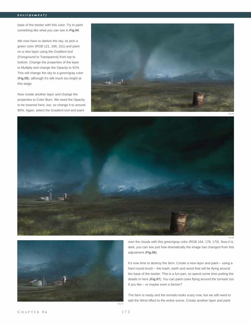
C h a p t e r 0 6 1 7 2
e n v i r o n m e n t s
base of the twister with this color. Try to paint
something like what you can see in Fig.04.
We now have to darken the sky, so pick a
green color (RGB 121, 166, 151) and paint
on a new layer using the Gradient tool
(Foreground to Transparent) from top to
bottom. Change the properties of the layer
to Multiply and change the Opacity to 91%.
This will change the sky to a green/gray color
(Fig.05), although it’s still much too bright at
this stage.
Now create another layer and change the
properties to Color Burn. We need the Opacity
to be lowered here, too, so change it to around
80%. Again, select the Gradient tool and paint
over the clouds with this green/gray color (RGB 164, 178, 170). Now it is
dark; you can see just how dramatically the image has changed from this
adjustment (Fig.06).
It’s now time to destroy the farm. Create a new layer and paint – using a
hard round brush – the trash, earth and wood that will be fl ying around
the base of the twister. This is a fun part, so spend some time putting the
details in here (Fig.07). You can paint cows fl ying around the tornado too
if you like – or maybe even a farmer?
The farm is ready and the tornado looks scary now, but we still need to
add the Wind effect to the entire scene. Create another layer and paint
Fig.05
Fig.06
Fig.07
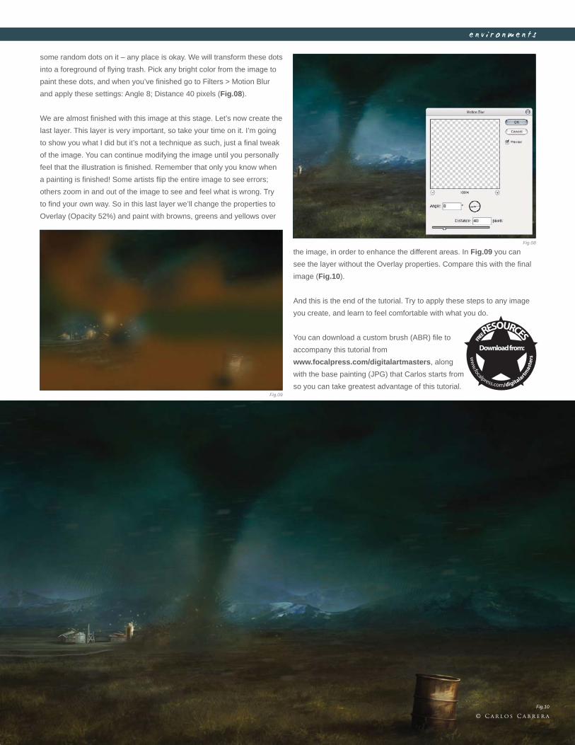
C h a p t e r 0 61 7 3
e n v i r o n m e n t s
some random dots on it – any place is okay. We will transform these dots
into a foreground of fl ying trash. Pick any bright color from the image to
paint these dots, and when you’ve fi nished go to Filters > Motion Blur
and apply these settings: Angle 8; Distance 40 pixels (Fig.08).
We are almost fi nished with this image at this stage. Let’s now create the
last layer. This layer is very important, so take your time on it. I’m going
to show you what I did but it’s not a technique as such, just a fi nal tweak
of the image. You can continue modifying the image until you personally
feel that the illustration is fi nished. Remember that only you know when
a painting is fi nished! Some artists fl ip the entire image to see errors;
others zoom in and out of the image to see and feel what is wrong. Try
to fi nd your own way. So in this last layer we’ll change the properties to
Overlay (Opacity 52%) and paint with browns, greens and yellows over
the image, in order to enhance the different areas. In Fig.09 you can
see the layer without the Overlay properties. Compare this with the fi nal
image (Fig.10).
And this is the end of the tutorial. Try to apply these steps to any image
you create, and learn to feel comfortable with what you do.
You can download a custom brush (ABR) fi le to
accompany this tutorial from
www.focalpress.com/digitalartmasters, along
with the base painting (JPG) that Carlos starts from
so you can take greatest advantage of this tutorial.
Fig.08
Fig.09
Fig.10
© C a r l o s C a b r e r a
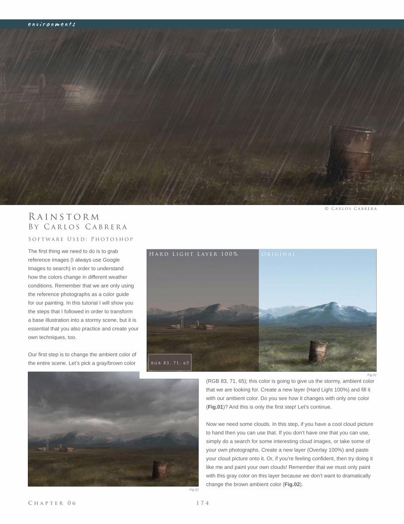
C h a p t e r 0 6 1 7 4
e n v i r o n m e n t s
Fig.01
Fig.02
B y C a r l o s C a b r e r a
R a i n s t o r m
The fi rst thing we need to do is to grab
reference images (I always use Google
Images to search) in order to understand
how the colors change in different weather
conditions. Remember that we are only using
the reference photographs as a color guide
for our painting. In this tutorial I will show you
the steps that I followed in order to transform
a base illustration into a stormy scene, but it is
essential that you also practice and create your
own techniques, too.
Our fi rst step is to change the ambient color of
the entire scene. Let’s pick a gray/brown color
S o f t wa r e U s e d : P h o t o s h o p
© C a r l o s C a b r e r a
(RGB 83, 71, 65); this color is going to give us the stormy, ambient color
that we are looking for. Create a new layer (Hard Light 100%) and fi ll it
with our ambient color. Do you see how it changes with only one color
(Fig.01)? And this is only the fi rst step! Let’s continue.
Now we need some clouds. In this step, if you have a cool cloud picture
to hand then you can use that. If you don’t have one that you can use,
simply do a search for some interesting cloud images, or take some of
your own photographs. Create a new layer (Overlay 100%) and paste
your cloud picture onto it. Or, if you’re feeling confi dent, then try doing it
like me and paint your own clouds! Remember that we must only paint
with this gray color on this layer because we don’t want to dramatically
change the brown ambient color (Fig.02).
H a r d L i g h t L ay e r 1 0 0 % O r i g i n a l
r g b 8 3 , 7 1 , 6 5
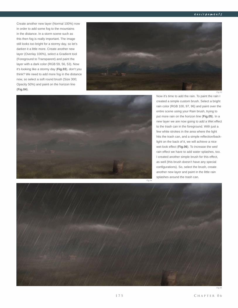
C h a p t e r 0 61 7 5
e n v i r o n m e n t s
Fig.03
Fig.04
Fig.05
Create another new layer (Normal 100%) now
in order to add some fog to the mountains
in the distance. In a storm scene such as
this then fog is really important. The image
still looks too bright for a stormy day, so let’s
darken it a little more. Create another new
layer (Overlay 100%), select a Gradient tool
(Foreground to Transparent) and paint the
layer with a dark color (RGB 59, 56, 53). Now
it’s looking like a stormy day (Fig.03), don’t you
think? We need to add more fog in the distance
now, so select a soft round brush (Size 300;
Opacity 50%) and paint on the horizon line
(Fig.04).
Now it’s time to add the rain. To paint the rain I
created a simple custom brush. Select a bright
rain color (RGB 100, 97, 96) and paint over the
entire scene using your Rain brush, trying to
put more rain on the horizon line (Fig.05). In a
new layer we are now going to add a Wet effect
to the trash can in the foreground. With just a
few white strokes in the area where the light
hits the trash can, and a simple refl ection/back-
light on the back of it, we will achieve a nice
wet-look effect (Fig.06). To increase the wet/
rain effect we have to add water splashes, too.
I created another simple brush for this effect,
as well (this brush doesn’t have any special
confi gurations). So, select the brush, create
another new layer and paint in the little rain
splashes around the trash can.
C h a p t e r 0 6 1 7 6
e n v i r o n m e n t s
We still need to add the refl ection from the farm
and the trash can over our wet fl oor. This step
is very important so pay attention here. Create
a new layer and merge the visible layers (Shift
+ Ctrl + Alt + E). Now you have all the painting
in one unique layer, but you can still see that
other layers are there, too. Select the farm
and the trash can with the Lasso tool, (Ctrl +
J), and we will automatically obtain a copy of
our selection in a new layer (Fig.07). Now go
to Edit > Transform > Flip Vertical, move the
duplicates below the original farm and trash
can, and erase the edges with a soft round
brush. You should obtain a similar result to
what can be seen in Fig.08. To increase the
refl ection, change the layer properties to Overlay; this will create the
Refl ection effect on the fl oor.
Let’s now add our lightning to this storm scene. First of all, we have to
darken the top of our painting a little more, because the lightning needs
some contrast. Create another new layer, pick a darker color (RGB
65, 61, 59) and paint again using the Gradient tool over this new layer.
Change the properties of the layer to Overlay and reduce the Opacity
to 50%. Now we can easily paint a couple of highlights over this dark
sky. To create the lightning in this storm you’ll have to paint an irregular
shape in a bright color; you can then smooth the top of the lightning, as
if it is coming from inside the clouds (Fig.09). Create another new layer
(Normal) and add the fi rst lightning glow (yes, we will add another one in
just a couple of minutes) with a soft round brush. To increase the Light
effect, add a refl ection to the base of the clouds. Create an Overlay layer
and paint the second glow Effect with white over the lightning. You can
see the difference of some lightning with a glow and without in Fig.10.
H i g h l i g h t s
S m o o t h
I r r e g u l a r S h a p e
R e f l e c t i o n s / B a c k l i g h t
S e l e c t t h e F a r m a n d t h e t r a s h C a n
Fig.06
Fig.07
Fig.08
Fig.09
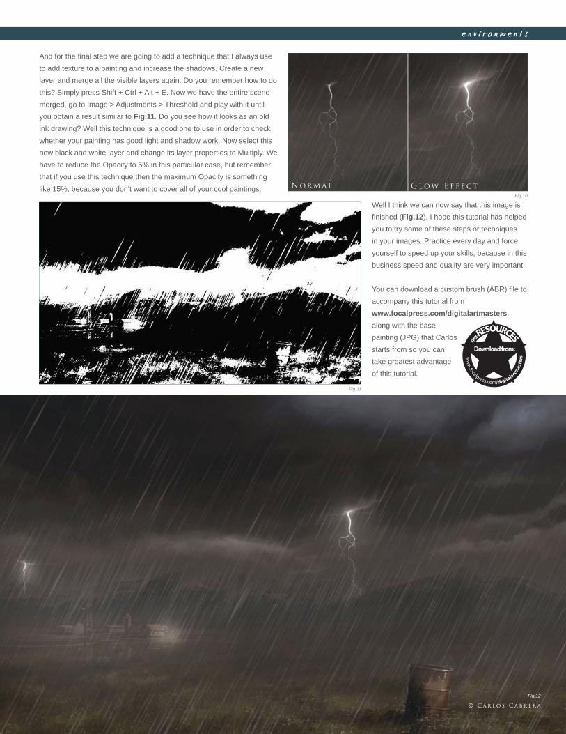
C h a p t e r 0 61 7 7
e n v i r o n m e n t s
And for the fi nal step we are going to add a technique that I always use
to add texture to a painting and increase the shadows. Create a new
layer and merge all the visible layers again. Do you remember how to do
this? Simply press Shift + Ctrl + Alt + E. Now we have the entire scene
merged, go to Image > Adjustments > Threshold and play with it until
you obtain a result similar to Fig.11. Do you see how it looks as an old
ink drawing? Well this technique is a good one to use in order to check
whether your painting has good light and shadow work. Now select this
new black and white layer and change its layer properties to Multiply. We
have to reduce the Opacity to 5% in this particular case, but remember
that if you use this technique then the maximum Opacity is something
like 15%, because you don’t want to cover all of your cool paintings. N o r m a l G l o w E f f e c t
Fig.10
Fig.11
Fig.12
Well I think we can now say that this image is
fi nished (Fig.12). I hope this tutorial has helped
you to try some of these steps or techniques
in your images. Practice every day and force
yourself to speed up your skills, because in this
business speed and quality are very important!
You can download a custom brush (ABR) fi le to
accompany this tutorial from
www.focalpress.com/digitalartmasters,
along with the base
painting (JPG) that Carlos
starts from so you can
take greatest advantage
of this tutorial.
© C a r l o s C a b r e r a
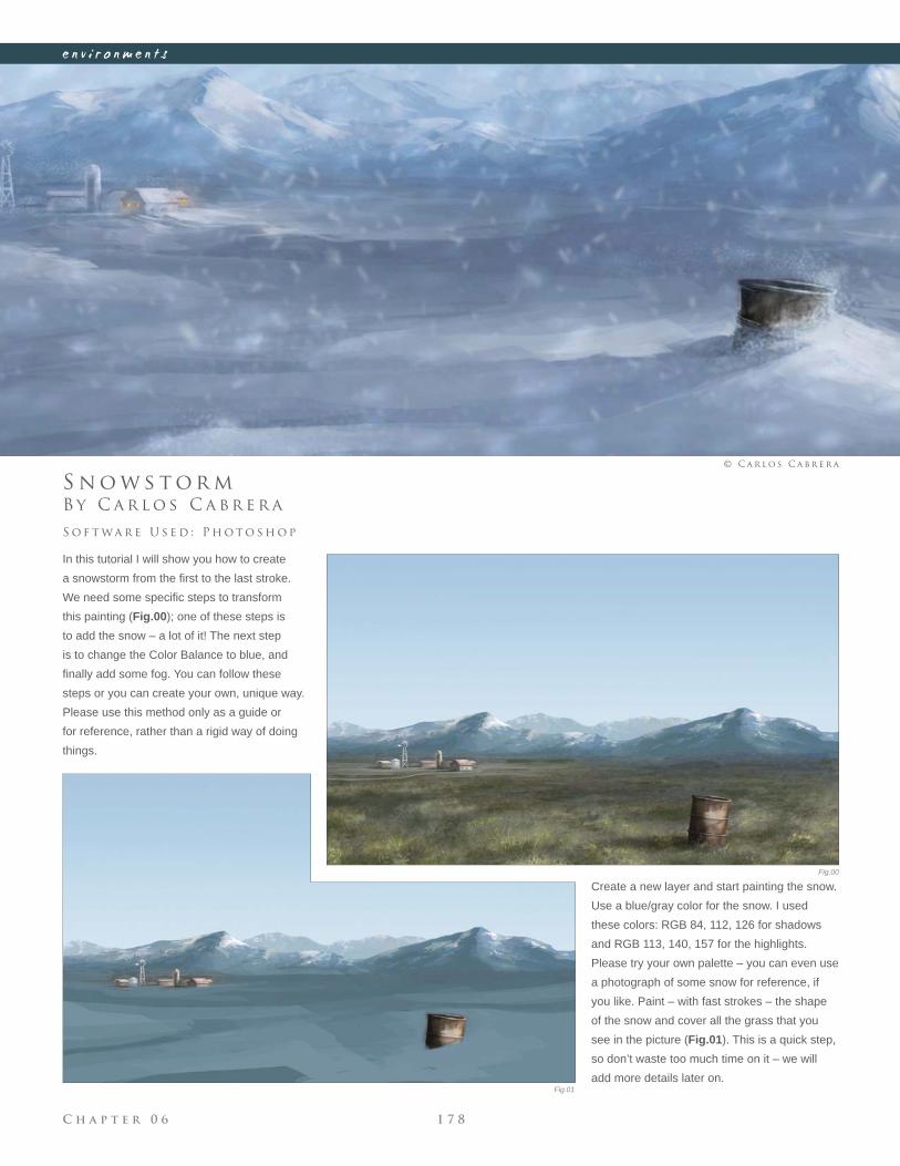
C h a p t e r 0 6 1 7 8
e n v i r o n m e n t s
Fig.00
Fig.01
B y C a r l o s C a b r e r a
S n o w s t o r m
In this tutorial I will show you how to create
a snowstorm from the fi rst to the last stroke.
We need some specifi c steps to transform
this painting (Fig.00); one of these steps is
to add the snow – a lot of it! The next step
is to change the Color Balance to blue, and
fi nally add some fog. You can follow these
steps or you can create your own, unique way.
Please use this method only as a guide or
for reference, rather than a rigid way of doing
things.
S o f t wa r e U s e d : P h o t o s h o p
© C a r l o s C a b r e r a
Create a new layer and start painting the snow.
Use a blue/gray color for the snow. I used
these colors: RGB 84, 112, 126 for shadows
and RGB 113, 140, 157 for the highlights.
Please try your own palette – you can even use
a photograph of some snow for reference, if
you like. Paint – with fast strokes – the shape
of the snow and cover all the grass that you
see in the picture (Fig.01). This is a quick step,
so don’t waste too much time on it – we will
add more details later on.
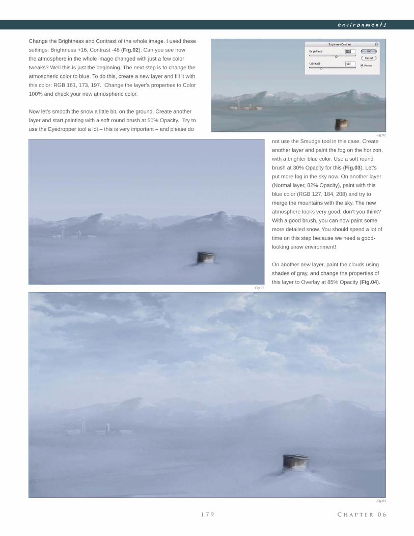
C h a p t e r 0 61 7 9
e n v i r o n m e n t s
Fig.02
Fig.03
Fig.04
Change the Brightness and Contrast of the whole image. I used these
settings: Brightness +16, Contrast -48 (Fig.02). Can you see how
the atmosphere in the whole image changed with just a few color
tweaks? Well this is just the beginning. The next step is to change the
atmospheric color to blue. To do this, create a new layer and fi ll it with
this color: RGB 161, 173, 197. Change the layer’s properties to Color
100% and check your new atmospheric color.
Now let’s smooth the snow a little bit, on the ground. Create another
layer and start painting with a soft round brush at 50% Opacity. Try to
use the Eyedropper tool a lot – this is very important – and please do
not use the Smudge tool in this case. Create
another layer and paint the fog on the horizon,
with a brighter blue color. Use a soft round
brush at 30% Opacity for this (Fig.03). Let’s
put more fog in the sky now. On another layer
(Normal layer, 82% Opacity), paint with this
blue color (RGB 127, 184, 208) and try to
merge the mountains with the sky. The new
atmosphere looks very good, don’t you think?
With a good brush, you can now paint some
more detailed snow. You should spend a lot of
time on this step because we need a good-
looking snow environment!
On another new layer, paint the clouds using
shades of gray, and change the properties of
this layer to Overlay at 85% Opacity (Fig.04).
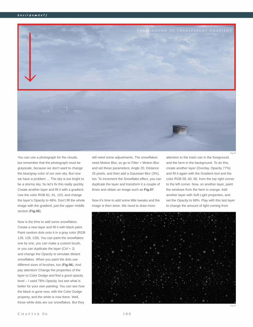
C h a p t e r 0 6 1 8 0
e n v i r o n m e n t s
You can use a photograph for the clouds,
but remember that the photograph must be
grayscale, because we don’t want to change
the blue/gray color of our own sky. But now
we have a problem … The sky is too bright to
be a stormy sky. So let’s fi x this really quickly.
Create another layer and fi ll it with a gradient.
Use the color RGB 81, 91, 103, and change
the layer’s Opacity to 48%. Don’t fi ll the whole
image with the gradient, just the upper middle
section (Fig.05).
Now is the time to add some snowfl akes.
Create a new layer and fi ll it with black paint.
Paint random dots onto it in a gray color (RGB
128, 128, 128). You can paint the snowfl akes
one by one, you can make a custom brush,
or you can duplicate the layer (Ctrl + J)
and change the Opacity to simulate distant
snowfl akes. When you paint the dots use
different sizes of brushes, too (Fig.06). And
pay attention! Change the properties of the
layer to Color Dodge and fi nd a good opacity
level – I used 78% Opacity, but see what is
better for your own painting. You can see how
the black is gone now, with the Color Dodge
property, and the white is now there. Well,
those white dots are our snowfl akes. But they
still need some adjustments. The snowfl akes
need Motion Blur, so go to Filter > Motion Blur
and set these parameters: Angle 20, Distance
25 pixels, and then add a Gaussian Blur (3%),
too. To increment the Snowfl ake effect, you can
duplicate the layer and transform it a couple of
times and obtain an image such as Fig.07.
Now it’s time to add some little tweaks and the
image is then done. We need to draw more
attention to the trash can in the foreground,
and the farm in the background. To do this,
create another layer (Overlay, Opacity 77%)
and fi ll it again with the Gradient tool and the
color RGB 58, 60, 66, from the top right corner
to the left corner. Now, on another layer, paint
the windows from the farm in orange. Add
another layer with Soft Light properties, and
set the Opacity to 68%. Play with this last layer
to change the amount of light coming from
F o r e g r o u n d t o T r a n s pa r e n t G r a d i e n t
Fig.05
Fig.06
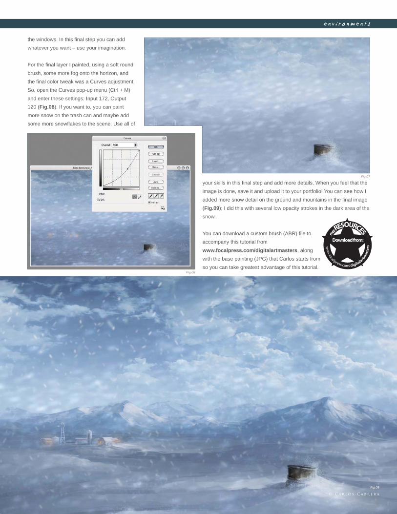
C h a p t e r 0 61 8 1
e n v i r o n m e n t s
the windows. In this fi nal step you can add
whatever you want – use your imagination.
For the fi nal layer I painted, using a soft round
brush, some more fog onto the horizon, and
the fi nal color tweak was a Curves adjustment.
So, open the Curves pop-up menu (Ctrl + M)
and enter these settings: Input 172, Output
120 (Fig.08). If you want to, you can paint
more snow on the trash can and maybe add
some more snowfl akes to the scene. Use all of
your skills in this fi nal step and add more details. When you feel that the
image is done, save it and upload it to your portfolio! You can see how I
added more snow detail on the ground and mountains in the fi nal image
(Fig.09); I did this with several low opacity strokes in the dark area of the
snow.
You can download a custom brush (ABR) fi le to
accompany this tutorial from
www.focalpress.com/digitalartmasters, along
with the base painting (JPG) that Carlos starts from
so you can take greatest advantage of this tutorial.
Fig.07
Fig.08
Fig.09
© C a r l o s C a b r e r a
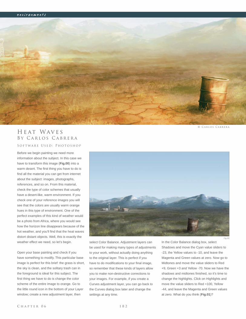
C h a p t e r 0 6 1 8 2
e n v i r o n m e n t s
Fig.00
B y C a r l o s C a b r e r a
H e at Wav e s
Before we begin painting we need more
information about the subject. In this case we
have to transform this image (Fig.00) into a
warm desert. The fi rst thing you have to do is
fi nd all the material you can get from internet
about the subject: images, photographs,
references, and so on. From this material,
check the type of color schemes that usually
have a desert-like, warm environment. If you
check one of your reference images you will
see that the colors are usually warm orange
hues in this type of environment. One of the
perfect examples of this kind of weather would
be a photo from Africa, where you would see
how the horizon line disappears because of the
hot weather, and you’ll fi nd that the heat waves
distort distant objects. Well, this is exactly the
weather effect we need, so let’s begin.
Open your base painting and check if you
have something to modify. This particular base
image is perfect for this brief: the grass is short,
the sky is clean, and the solitary trash can in
the foreground is ideal for this subject. The
fi rst thing we have to do is change the color
scheme of the entire image to orange. Go to
the little round icon in the bottom of your Layer
window; create a new adjustment layer, then
S o f t wa r e U s e d : P h o t o s h o p
© C a r l o s C a b r e r a
select Color Balance. Adjustment layers can
be used for making many types of adjustments
to your work, without actually doing anything
to the original layer. This is perfect if you
have to do modifi cations to your fi nal image,
so remember that these kinds of layers allow
you to make non-destructive corrections to
your images. For example, if you create a
Curves adjustment layer, you can go back to
the Curves dialog box later and change the
settings at any time.
In the Color Balance dialog box, select
Shadows and move the Cyan value sliders to
-23, the Yellow values to -10, and leave the
Magenta and Green values at zero. Now go to
Midtones and move the value sliders to Red
+9, Green +3 and Yellow -70. Now we have the
shadows and midtones fi nished, so it’s time to
change the highlights. Click on Highlights and
move the value sliders to Red +100, Yellow
-44, and leave the Magenta and Green values
at zero. What do you think (Fig.01)?
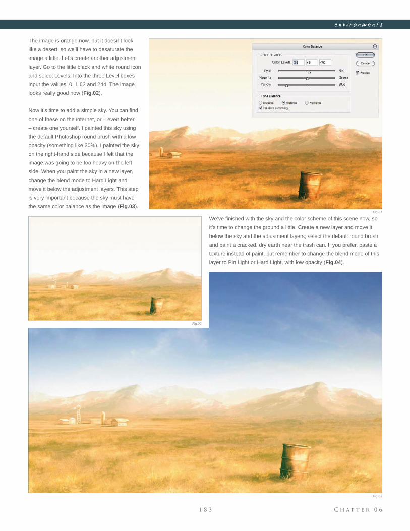
C h a p t e r 0 61 8 3
e n v i r o n m e n t s
Fig.01
Fig.02
Fig.03
The image is orange now, but it doesn’t look
like a desert, so we’ll have to desaturate the
image a little. Let’s create another adjustment
layer. Go to the little black and white round icon
and select Levels. Into the three Level boxes
input the values: 0, 1.62 and 244. The image
looks really good now (Fig.02).
Now it’s time to add a simple sky. You can fi nd
one of these on the internet, or – even better
– create one yourself. I painted this sky using
the default Photoshop round brush with a low
opacity (something like 30%). I painted the sky
on the right-hand side because I felt that the
image was going to be too heavy on the left
side. When you paint the sky in a new layer,
change the blend mode to Hard Light and
move it below the adjustment layers. This step
is very important because the sky must have
the same color balance as the image (Fig.03).
We’ve fi nished with the sky and the color scheme of this scene now, so
it’s time to change the ground a little. Create a new layer and move it
below the sky and the adjustment layers; select the default round brush
and paint a cracked, dry earth near the trash can. If you prefer, paste a
texture instead of paint, but remember to change the blend mode of this
layer to Pin Light or Hard Light, with low opacity (Fig.04).
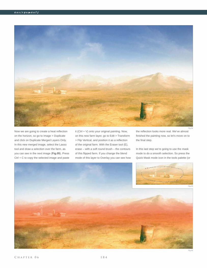
C h a p t e r 0 6 1 8 4
e n v i r o n m e n t s
Now we are going to create a heat refl ection
on the horizon, so go to Image > Duplicate
and click on Duplicate Merged Layers Only.
In this new merged image, select the Lasso
tool and draw a selection over the farm, as
you can see in the next image (Fig.05). Press
Ctrl + C to copy the selected image and paste
it (Ctrl + V) onto your original painting. Now,
on this new farm layer, go to Edit > Transform
> Flip Vertical, and position it as a refl ection
of the original farm. With the Eraser tool (E),
erase – with a soft round brush – the contours
of this fl ipped farm. If you change the blend
mode of this layer to Overlay you can see how
Fig.04
Fig.05
Fig.06
the refl ection looks more real. We’ve almost
fi nished the painting now, so let’s move on to
the fi nal step.
In this last step we’re going to use the mask
mode to do a smooth selection. So press the
Quick Mask mode icon in the tools palette (or
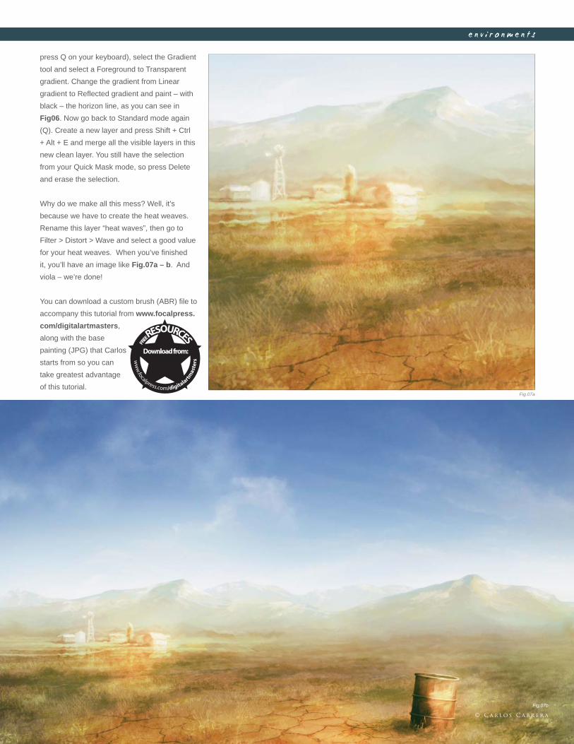
C h a p t e r 0 61 8 5
e n v i r o n m e n t s
press Q on your keyboard), select the Gradient
tool and select a Foreground to Transparent
gradient. Change the gradient from Linear
gradient to Refl ected gradient and paint – with
black – the horizon line, as you can see in
Fig06. Now go back to Standard mode again
(Q). Create a new layer and press Shift + Ctrl
+ Alt + E and merge all the visible layers in this
new clean layer. You still have the selection
from your Quick Mask mode, so press Delete
and erase the selection.
Why do we make all this mess? Well, it’s
because we have to create the heat weaves.
Rename this layer “heat waves”, then go to
Filter > Distort > Wave and select a good value
for your heat weaves. When you’ve fi nished
it, you’ll have an image like Fig.07a – b. And
viola – we’re done!
You can download a custom brush (ABR) fi le to
accompany this tutorial from www.focalpress.
com/digitalartmasters,
along with the base
painting (JPG) that Carlos
starts from so you can
take greatest advantage
of this tutorial.Fig.07a
Fig.07b
© C a r l o s C a b r e r a
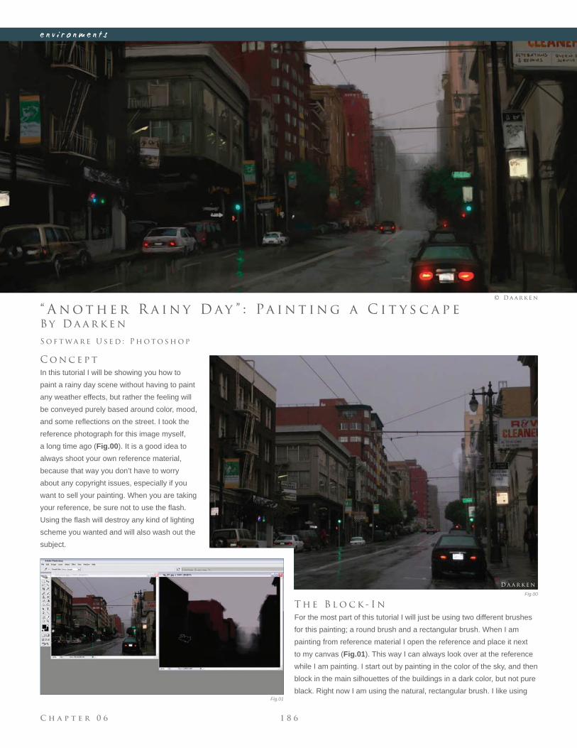
C h a p t e r 0 6 1 8 6
e n v i r o n m e n t s
Fig.01
Fig.00
B y D a a r k e n
“ A n o t h e r R a i n y D ay ” : Pa i n t i n g a C i t y s c a p e
C o n c e p t
In this tutorial I will be showing you how to
paint a rainy day scene without having to paint
any weather effects, but rather the feeling will
be conveyed purely based around color, mood,
and some refl ections on the street. I took the
reference photograph for this image myself,
a long time ago (Fig.00). It is a good idea to
always shoot your own reference material,
because that way you don’t have to worry
about any copyright issues, especially if you
want to sell your painting. When you are taking
your reference, be sure not to use the fl ash.
Using the fl ash will destroy any kind of lighting
scheme you wanted and will also wash out the
subject.
S o f t wa r e U s e d : P h o t o s h o p
© D a a r k e n
T h e B l o c k - I n
For the most part of this tutorial I will just be using two different brushes
for this painting; a round brush and a rectangular brush. When I am
painting from reference material I open the reference and place it next
to my canvas (Fig.01). This way I can always look over at the reference
while I am painting. I start out by painting in the color of the sky, and then
block in the main silhouettes of the buildings in a dark color, but not pure
black. Right now I am using the natural, rectangular brush. I like using
D a a r k e n
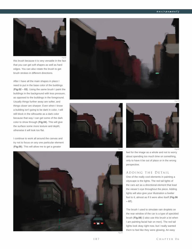
C h a p t e r 0 61 8 7
e n v i r o n m e n t s
Fig.02
Fig.03
Fig.04 Fig.05
Fig.06
this brush because it is very versatile in the fact
that you can get soft shapes as well as hard
edges. You can also rotate the brush to get
brush strokes in different directions.
After I have all the main shapes in place I
need to put in the base color of the buildings
(Fig.02 – 03). Using the same brush I paint the
buildings in the background with less pressure,
as opposed to the buildings in the foreground.
Usually things further away are softer, and
things closer are sharper. Even when I know
a building isn’t going to be dark in color, I will
still block in the silhouette as a dark color
because that way I can get some of the dark
color to show through (Fig.04). This will give
the surface some more texture and depth;
otherwise it will look too fl at.
I continue to work all around the canvas and
try not to focus on any one particular element
(Fig.05). This will allow me to get a greater
feel for the image as a whole and not to worry
about spending too much time on something,
only to have it be out of place or in the wrong
perspective.
A d d i n g t h e D e ta i l
One of the really cool elements in painting a
cityscape is the lights. The red tail lights of
the cars act as a directional element that lead
the viewer’s eye throughout the piece. Adding
lights will also give your illustration a livelier
feel to it, almost as if it were alive itself (Fig.06
– 07).
The brush I used to simulate rain droplets on
the rear window of the car is a type of speckled
brush (Fig.08) (I also use this brush a lot when
I am painting facial hair on men). The red tail
lights look okay right now, but I really wanted
them to feel like they were glowing. An easy
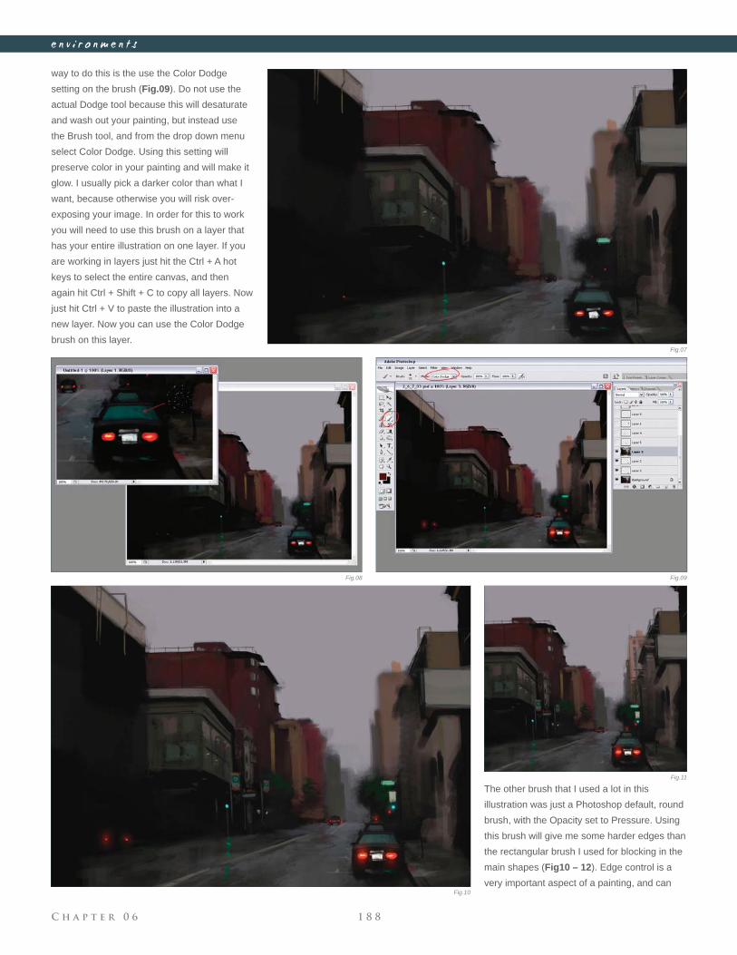
C h a p t e r 0 6 1 8 8
e n v i r o n m e n t s
way to do this is the use the Color Dodge
setting on the brush (Fig.09). Do not use the
actual Dodge tool because this will desaturate
and wash out your painting, but instead use
the Brush tool, and from the drop down menu
select Color Dodge. Using this setting will
preserve color in your painting and will make it
glow. I usually pick a darker color than what I
want, because otherwise you will risk over-
exposing your image. In order for this to work
you will need to use this brush on a layer that
has your entire illustration on one layer. If you
are working in layers just hit the Ctrl + A hot
keys to select the entire canvas, and then
again hit Ctrl + Shift + C to copy all layers. Now
just hit Ctrl + V to paste the illustration into a
new layer. Now you can use the Color Dodge
brush on this layer.
The other brush that I used a lot in this
illustration was just a Photoshop default, round
brush, with the Opacity set to Pressure. Using
this brush will give me some harder edges than
the rectangular brush I used for blocking in the
main shapes (Fig10 – 12). Edge control is a
very important aspect of a painting, and can
Fig.07
Fig.08 Fig.09
Fig.10
Fig.11
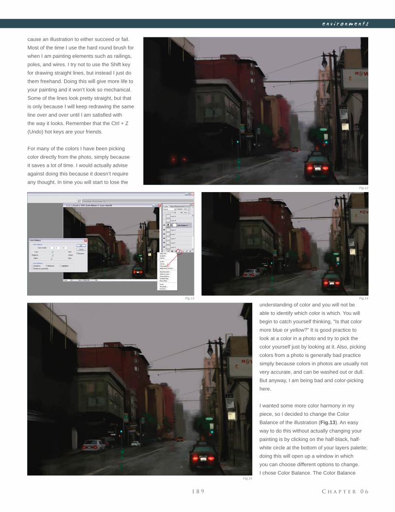
C h a p t e r 0 61 8 9
e n v i r o n m e n t s
cause an illustration to either succeed or fail.
Most of the time I use the hard round brush for
when I am painting elements such as railings,
poles, and wires. I try not to use the Shift key
for drawing straight lines, but instead I just do
them freehand. Doing this will give more life to
your painting and it won’t look so mechanical.
Some of the lines look pretty straight, but that
is only because I will keep redrawing the same
line over and over until I am satisfi ed with
the way it looks. Remember that the Ctrl + Z
(Undo) hot keys are your friends.
For many of the colors I have been picking
color directly from the photo, simply because
it saves a lot of time. I would actually advise
against doing this because it doesn’t require
any thought. In time you will start to lose the
understanding of color and you will not be
able to identify which color is which. You will
begin to catch yourself thinking, “Is that color
more blue or yellow?” It is good practice to
look at a color in a photo and try to pick the
color yourself just by looking at it. Also, picking
colors from a photo is generally bad practice
simply because colors in photos are usually not
very accurate, and can be washed out or dull.
But anyway, I am being bad and color-picking
here.
I wanted some more color harmony in my
piece, so I decided to change the Color
Balance of the illustration (Fig.13). An easy
way to do this without actually changing your
painting is by clicking on the half-black, half-
white circle at the bottom of your layers palette;
doing this will open up a window in which
you can choose different options to change.
I chose Color Balance. The Color Balance
Fig.12
Fig.13 Fig.14
Fig.15
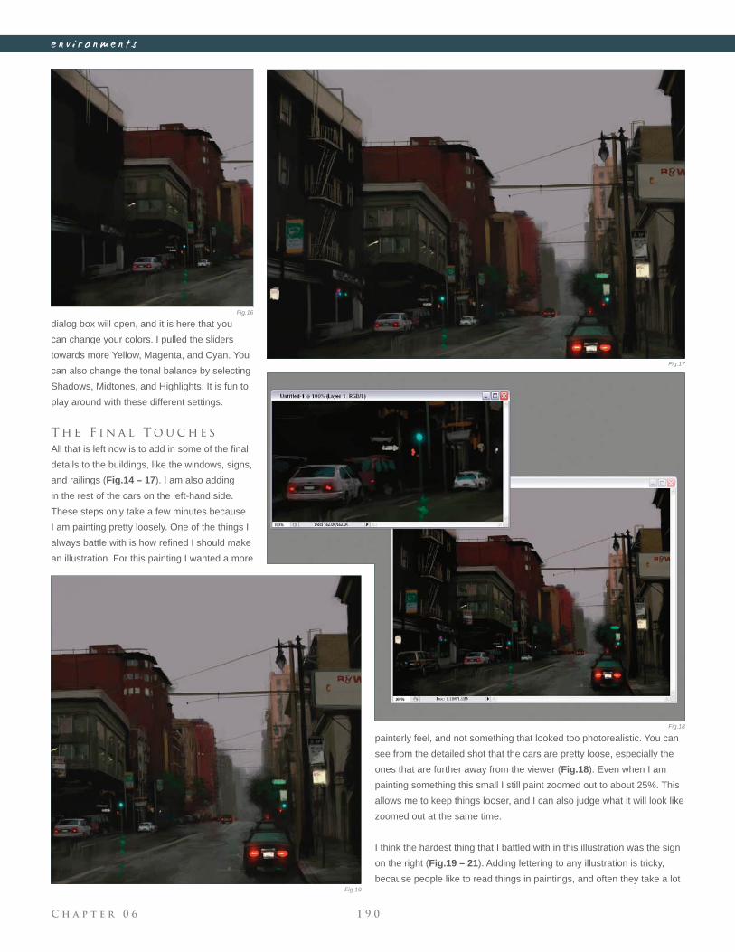
C h a p t e r 0 6 1 9 0
e n v i r o n m e n t s
dialog box will open, and it is here that you
can change your colors. I pulled the sliders
towards more Yellow, Magenta, and Cyan. You
can also change the tonal balance by selecting
Shadows, Midtones, and Highlights. It is fun to
play around with these different settings.
T h e F i n a l T o u c h e s
All that is left now is to add in some of the fi nal
details to the buildings, like the windows, signs,
and railings (Fig.14 – 17). I am also adding
in the rest of the cars on the left-hand side.
These steps only take a few minutes because
I am painting pretty loosely. One of the things I
always battle with is how refi ned I should make
an illustration. For this painting I wanted a more
painterly feel, and not something that looked too photorealistic. You can
see from the detailed shot that the cars are pretty loose, especially the
ones that are further away from the viewer (Fig.18). Even when I am
painting something this small I still paint zoomed out to about 25%. This
allows me to keep things looser, and I can also judge what it will look like
zoomed out at the same time.
I think the hardest thing that I battled with in this illustration was the sign
on the right (Fig.19 – 21). Adding lettering to any illustration is tricky,
because people like to read things in paintings, and often they take a lot
Fig.16
Fig.17
Fig.18
Fig.19
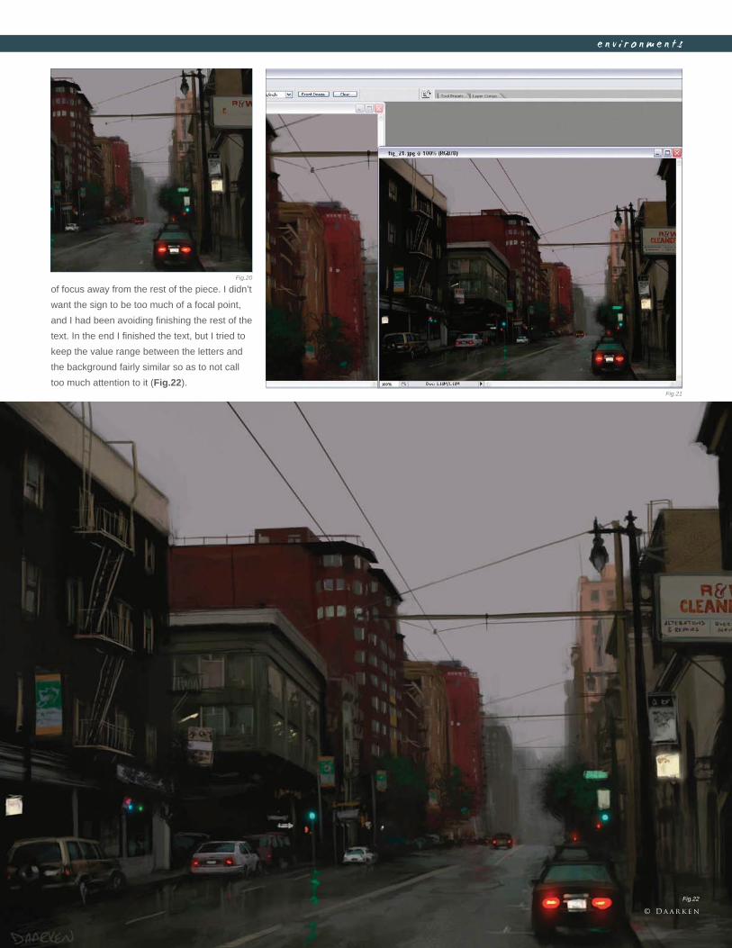
C h a p t e r 0 61 9 1
e n v i r o n m e n t s
of focus away from the rest of the piece. I didn’t
want the sign to be too much of a focal point,
and I had been avoiding fi nishing the rest of the
text. In the end I fi nished the text, but I tried to
keep the value range between the letters and
the background fairly similar so as to not call
too much attention to it (Fig.22).
Fig.20
Fig.21
Fig.22
© D a a r k e n
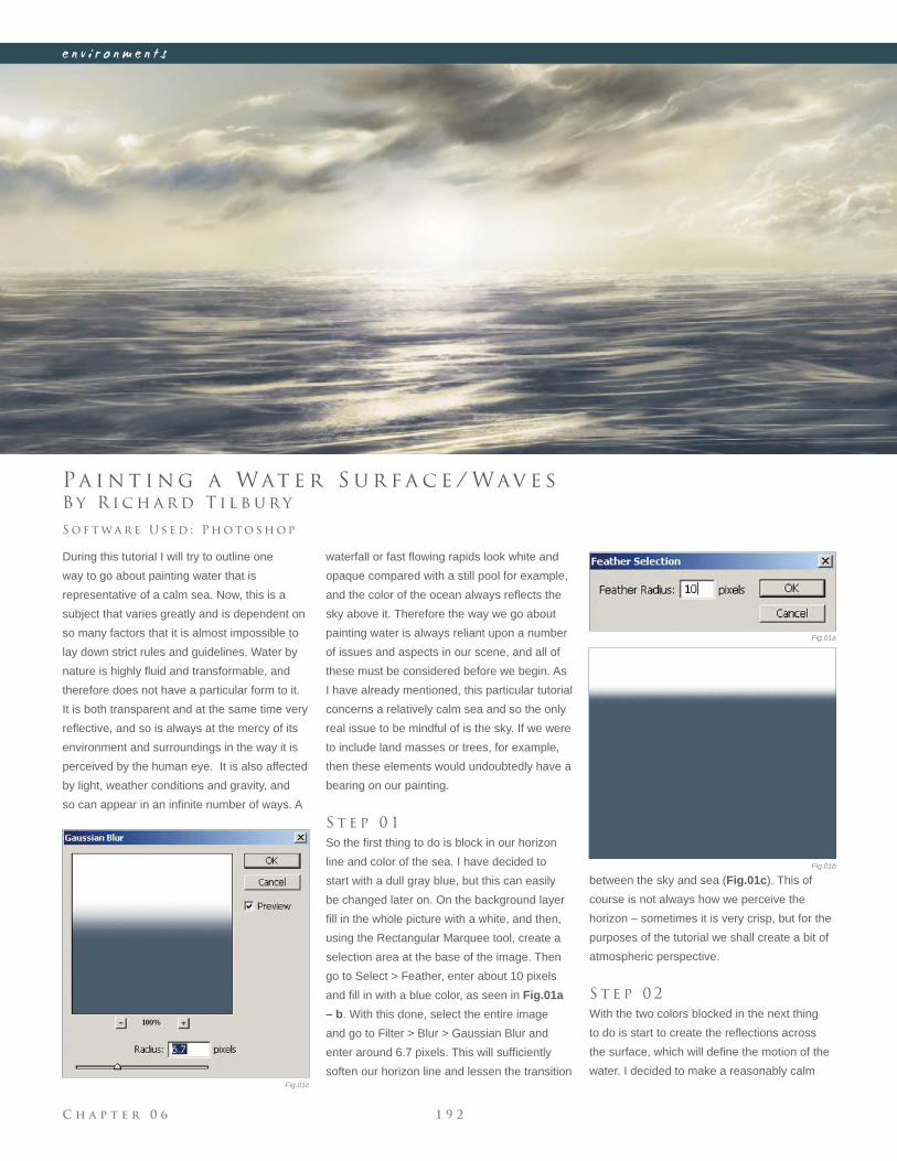
C h a p t e r 0 6 1 9 2
e n v i r o n m e n t s
Fig.01a
Fig.01b
Fig.01c
B y R i c h a r d T i l b u r y
Pa i n t i n g a Wat e r S u r f a c e / Wav e s
During this tutorial I will try to outline one
way to go about painting water that is
representative of a calm sea. Now, this is a
subject that varies greatly and is dependent on
so many factors that it is almost impossible to
lay down strict rules and guidelines. Water by
nature is highly fl uid and transformable, and
therefore does not have a particular form to it.
It is both transparent and at the same time very
refl ective, and so is always at the mercy of its
environment and surroundings in the way it is
perceived by the human eye. It is also affected
by light, weather conditions and gravity, and
so can appear in an infi nite number of ways. A
S o f t wa r e U s e d : P h o t o s h o p
waterfall or fast fl owing rapids look white and
opaque compared with a still pool for example,
and the color of the ocean always refl ects the
sky above it. Therefore the way we go about
painting water is always reliant upon a number
of issues and aspects in our scene, and all of
these must be considered before we begin. As
I have already mentioned, this particular tutorial
concerns a relatively calm sea and so the only
real issue to be mindful of is the sky. If we were
to include land masses or trees, for example,
then these elements would undoubtedly have a
bearing on our painting.
S t e p 0 1
So the fi rst thing to do is block in our horizon
line and color of the sea. I have decided to
start with a dull gray blue, but this can easily
be changed later on. On the background layer
fi ll in the whole picture with a white, and then,
using the Rectangular Marquee tool, create a
selection area at the base of the image. Then
go to Select > Feather, enter about 10 pixels
and fi ll in with a blue color, as seen in Fig.01a
– b. With this done, select the entire image
and go to Filter > Blur > Gaussian Blur and
enter around 6.7 pixels. This will suffi ciently
soften our horizon line and lessen the transition
between the sky and sea (Fig.01c). This of
course is not always how we perceive the
horizon – sometimes it is very crisp, but for the
purposes of the tutorial we shall create a bit of
atmospheric perspective.
S t e p 0 2
With the two colors blocked in the next thing
to do is start to create the refl ections across
the surface, which will defi ne the motion of the
water. I decided to make a reasonably calm
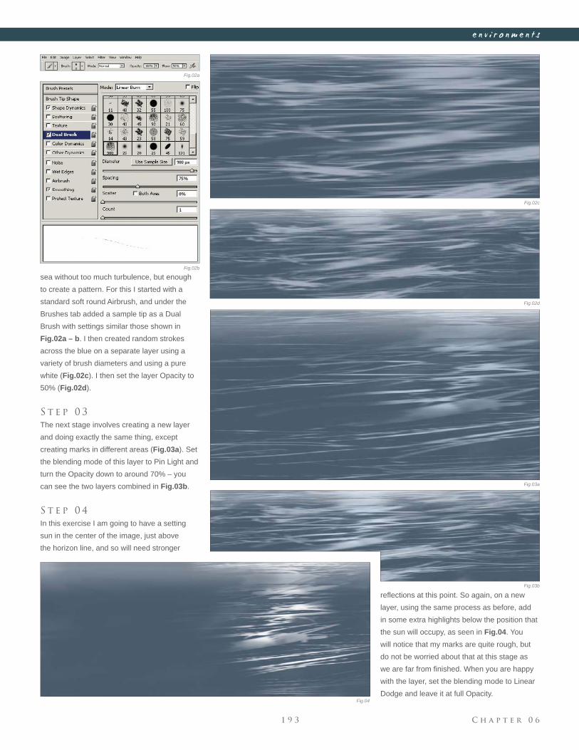
C h a p t e r 0 61 9 3
e n v i r o n m e n t s
Fig.02a
Fig.02c
Fig.02d
Fig.02b
Fig.03a
Fig.03b
Fig.04
sea without too much turbulence, but enough
to create a pattern. For this I started with a
standard soft round Airbrush, and under the
Brushes tab added a sample tip as a Dual
Brush with settings similar those shown in
Fig.02a – b. I then created random strokes
across the blue on a separate layer using a
variety of brush diameters and using a pure
white (Fig.02c). I then set the layer Opacity to
50% (Fig.02d).
S t e p 0 3
The next stage involves creating a new layer
and doing exactly the same thing, except
creating marks in different areas (Fig.03a). Set
the blending mode of this layer to Pin Light and
turn the Opacity down to around 70% – you
can see the two layers combined in Fig.03b.
S t e p 0 4
In this exercise I am going to have a setting
sun in the center of the image, just above
the horizon line, and so will need stronger
refl ections at this point. So again, on a new
layer, using the same process as before, add
in some extra highlights below the position that
the sun will occupy, as seen in Fig.04. You
will notice that my marks are quite rough, but
do not be worried about that at this stage as
we are far from fi nished. When you are happy
with the layer, set the blending mode to Linear
Dodge and leave it at full Opacity.
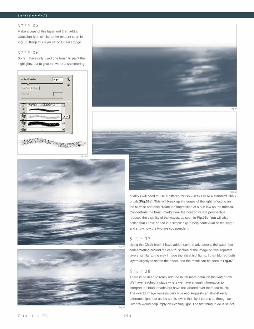
C h a p t e r 0 6 1 9 4
e n v i r o n m e n t s
S t e p 0 5
Make a copy of this layer and then add a
Gaussian Blur, similar to the amount seen in
Fig.05. Keep this layer set to Linear Dodge.
S t e p 0 6
So far I have only used one brush to paint the
highlights, but to give the water a shimmering
quality I will need to use a different brush – in this case a standard Chalk
brush (Fig.06a). This will break up the edges of the light refl ecting on
the surface and help create the impression of a sun low on the horizon.
Concentrate the brush marks near the horizon where perspective
reduces the visibility of the waves, as seen in Fig.06b. You will also
notice that I have added in a simple sky to help contextualize the water
and show how the two are codependent.
S t e p 0 7
Using the Chalk brush I have added some marks across the water, but
concentrating around the central section of the image on two separate
layers, similar to the way I made the initial highlights. I then blurred both
layers slightly to soften the effect, and the result can be seen in Fig.07.
S t e p 0 8
There is no need to really add too much more detail on the water now.
We have reached a stage where we have enough information to
interpret the brush marks but have not labored over them too much.
The overall image remains very blue and suggests an almost early
afternoon light, but as the sun is low in the sky it seems as though an
Overlay would help imply an evening light. The fi rst thing to do is select
Fig.05
Fig.06a
Fig.06b
Fig.07
Fig.08
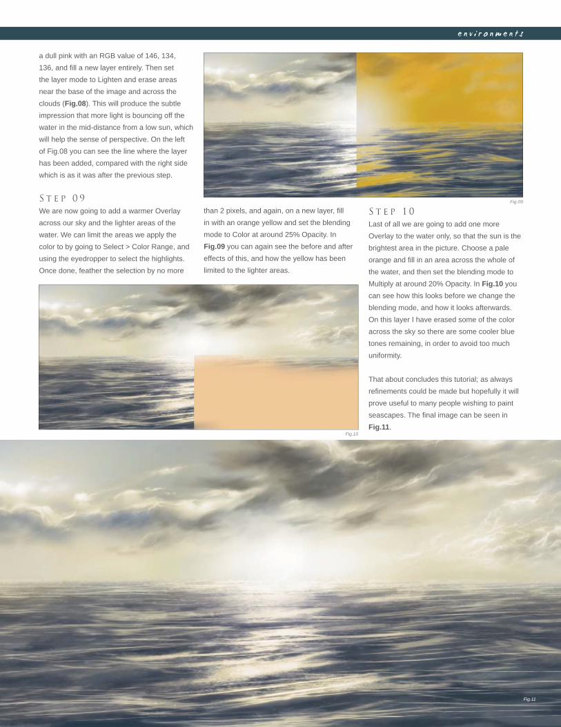
C h a p t e r 0 61 9 5
e n v i r o n m e n t s
a dull pink with an RGB value of 146, 134,
136, and fi ll a new layer entirely. Then set
the layer mode to Lighten and erase areas
near the base of the image and across the
clouds (Fig.08). This will produce the subtle
impression that more light is bouncing off the
water in the mid-distance from a low sun, which
will help the sense of perspective. On the left
of Fig.08 you can see the line where the layer
has been added, compared with the right side
which is as it was after the previous step.
S t e p 0 9
We are now going to add a warmer Overlay
across our sky and the lighter areas of the
water. We can limit the areas we apply the
color to by going to Select > Color Range, and
using the eyedropper to select the highlights.
Once done, feather the selection by no more
than 2 pixels, and again, on a new layer, fi ll
in with an orange yellow and set the blending
mode to Color at around 25% Opacity. In
Fig.09 you can again see the before and after
effects of this, and how the yellow has been
limited to the lighter areas.
S t e p 1 0
Last of all we are going to add one more
Overlay to the water only, so that the sun is the
brightest area in the picture. Choose a pale
orange and fi ll in an area across the whole of
the water, and then set the blending mode to
Multiply at around 20% Opacity. In Fig.10 you
can see how this looks before we change the
blending mode, and how it looks afterwards.
On this layer I have erased some of the color
across the sky so there are some cooler blue
tones remaining, in order to avoid too much
uniformity.
That about concludes this tutorial; as always
refi nements could be made but hopefully it will
prove useful to many people wishing to paint
seascapes. The fi nal image can be seen in
Fig.11.
Fig.09
Fig.10
Fig.11

E u r o p e a n K n i g h t © D a a r k e n
These subjects are two of the most popular themes explored by modern
digital artists today, and together form a large proportion of popular
artwork adorning desktops around the globe. More than any subjects,
these two allow an expansive base for creative freedom, and thus have
attracted and inspired many artists who have become well respected
within this fi eld. Over the next few pages we take a look at how three
very different artists approach varying subjects and exploit their tools to
good effect. Ranging from the ancient through to the futuristic, we see
how each has been inspired by this genre to produce imaginative pieces.
s c i - f i & f a n t a s y
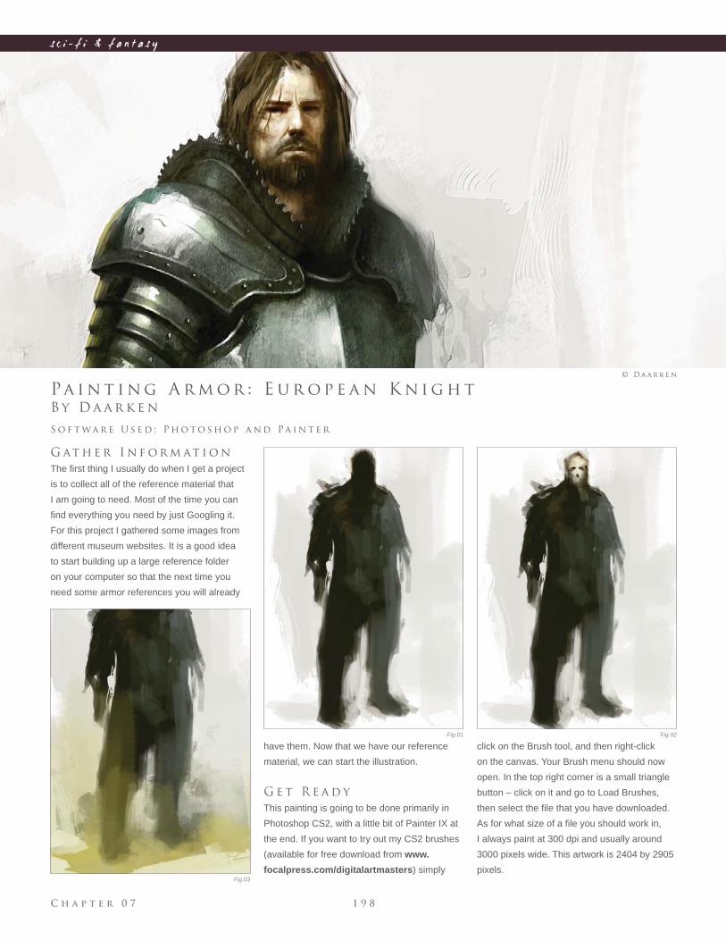
C h a p t e r 0 7 1 9 8
s c i - f i & f a n t a s y
Fig.01 Fig.02
Fig.03
B y D a a r k e n
Pa i n t i n g A r m o r : E u r o p e a n K n i g h t
G at h e r I n f o r m at i o n
The fi rst thing I usually do when I get a project
is to collect all of the reference material that
I am going to need. Most of the time you can
fi nd everything you need by just Googling it.
For this project I gathered some images from
different museum websites. It is a good idea
to start building up a large reference folder
on your computer so that the next time you
need some armor references you will already
S o f t wa r e U s e d : P h o t o s h o p a n d Pa i n t e r
© D a a r k e n
have them. Now that we have our reference
material, we can start the illustration.
G e t R e a d y
This painting is going to be done primarily in
Photoshop CS2, with a little bit of Painter IX at
the end. If you want to try out my CS2 brushes
(available for free download from www.
focalpress.com/digitalartmasters) simply
click on the Brush tool, and then right-click
on the canvas. Your Brush menu should now
open. In the top right corner is a small triangle
button – click on it and go to Load Brushes,
then select the fi le that you have downloaded.
As for what size of a fi le you should work in,
I always paint at 300 dpi and usually around
3000 pixels wide. This artwork is 2404 by 2905
pixels.
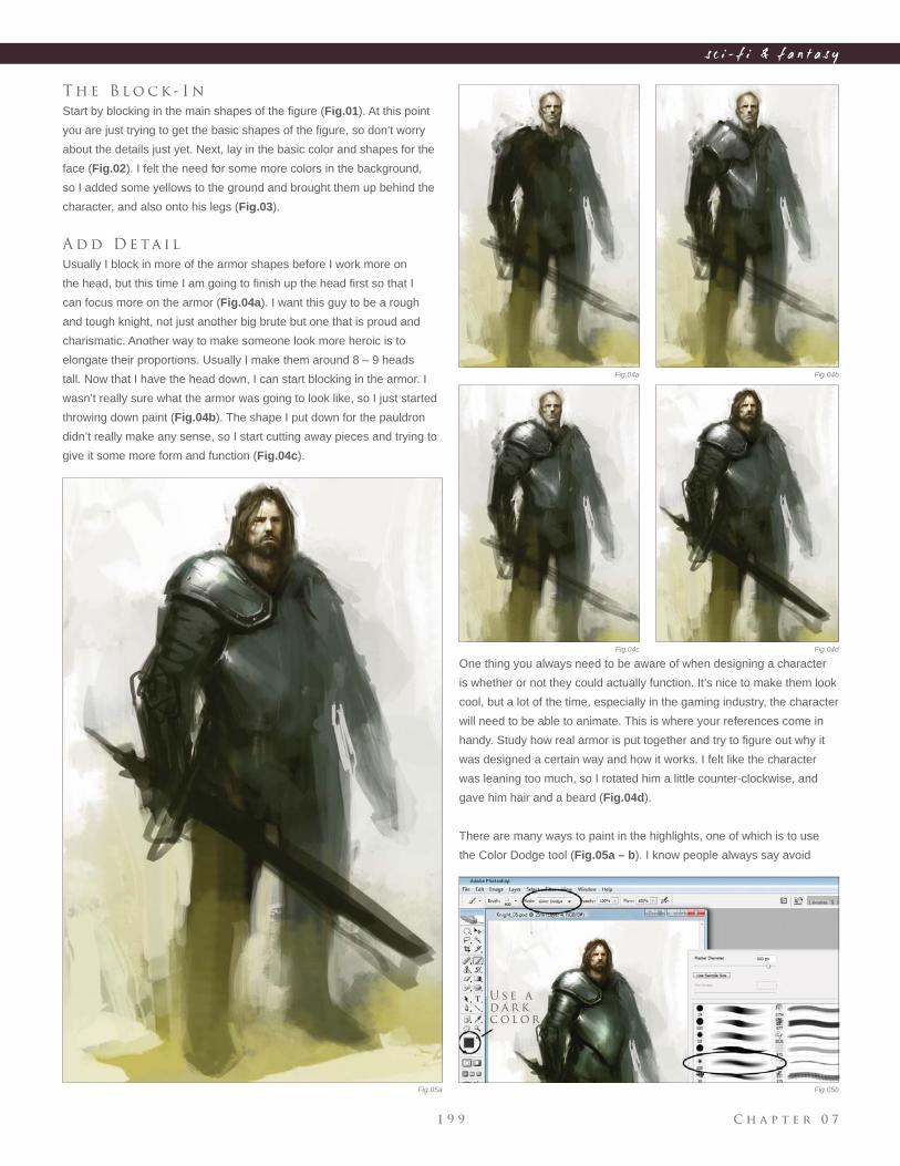
C h a p t e r 0 71 9 9
s c i - f i & f a n t a s y
Fig.04a
Fig.04c
Fig.04b
Fig.04d
Fig.05a Fig.05b
T h e B l o c k - I n
Start by blocking in the main shapes of the fi gure (Fig.01). At this point
you are just trying to get the basic shapes of the fi gure, so don’t worry
about the details just yet. Next, lay in the basic color and shapes for the
face (Fig.02). I felt the need for some more colors in the background,
so I added some yellows to the ground and brought them up behind the
character, and also onto his legs (Fig.03).
A d d D e ta i l
Usually I block in more of the armor shapes before I work more on
the head, but this time I am going to fi nish up the head fi rst so that I
can focus more on the armor (Fig.04a). I want this guy to be a rough
and tough knight, not just another big brute but one that is proud and
charismatic. Another way to make someone look more heroic is to
elongate their proportions. Usually I make them around 8 – 9 heads
tall. Now that I have the head down, I can start blocking in the armor. I
wasn’t really sure what the armor was going to look like, so I just started
throwing down paint (Fig.04b). The shape I put down for the pauldron
didn’t really make any sense, so I start cutting away pieces and trying to
give it some more form and function (Fig.04c).
One thing you always need to be aware of when designing a character
is whether or not they could actually function. It’s nice to make them look
cool, but a lot of the time, especially in the gaming industry, the character
will need to be able to animate. This is where your references come in
handy. Study how real armor is put together and try to fi gure out why it
was designed a certain way and how it works. I felt like the character
was leaning too much, so I rotated him a little counter-clockwise, and
gave him hair and a beard (Fig.04d).
There are many ways to paint in the highlights, one of which is to use
the Color Dodge tool (Fig.05a – b). I know people always say avoid
U s e a
d a r k
c o l o r
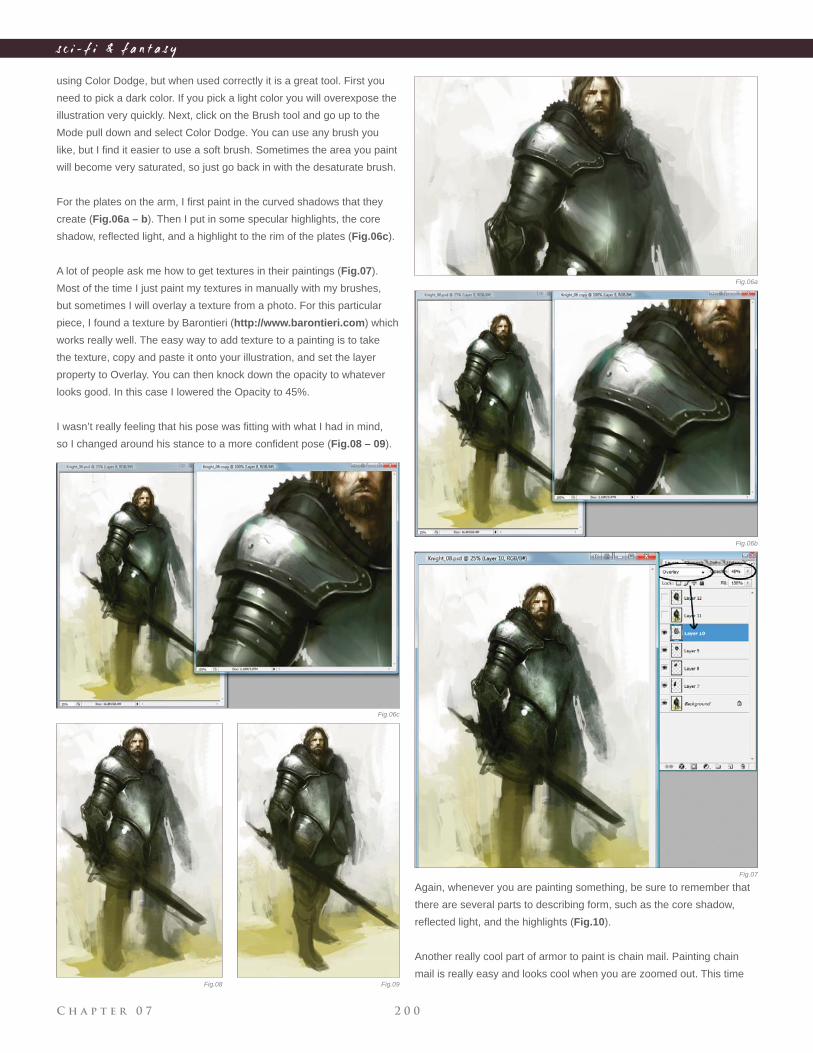
C h a p t e r 0 7 2 0 0
s c i - f i & f a n t a s y
using Color Dodge, but when used correctly it is a great tool. First you
need to pick a dark color. If you pick a light color you will overexpose the
illustration very quickly. Next, click on the Brush tool and go up to the
Mode pull down and select Color Dodge. You can use any brush you
like, but I fi nd it easier to use a soft brush. Sometimes the area you paint
will become very saturated, so just go back in with the desaturate brush.
For the plates on the arm, I fi rst paint in the curved shadows that they
create (Fig.06a – b). Then I put in some specular highlights, the core
shadow, refl ected light, and a highlight to the rim of the plates (Fig.06c).
A lot of people ask me how to get textures in their paintings (Fig.07).
Most of the time I just paint my textures in manually with my brushes,
but sometimes I will overlay a texture from a photo. For this particular
piece, I found a texture by Barontieri (http://www.barontieri.com) which
works really well. The easy way to add texture to a painting is to take
the texture, copy and paste it onto your illustration, and set the layer
property to Overlay. You can then knock down the opacity to whatever
looks good. In this case I lowered the Opacity to 45%.
I wasn’t really feeling that his pose was fi tting with what I had in mind,
so I changed around his stance to a more confi dent pose (Fig.08 – 09).
Again, whenever you are painting something, be sure to remember that
there are several parts to describing form, such as the core shadow,
refl ected light, and the highlights (Fig.10).
Another really cool part of armor to paint is chain mail. Painting chain
mail is really easy and looks cool when you are zoomed out. This time
Fig.06a
Fig.06b
Fig.06c
Fig.07
Fig.08 Fig.09
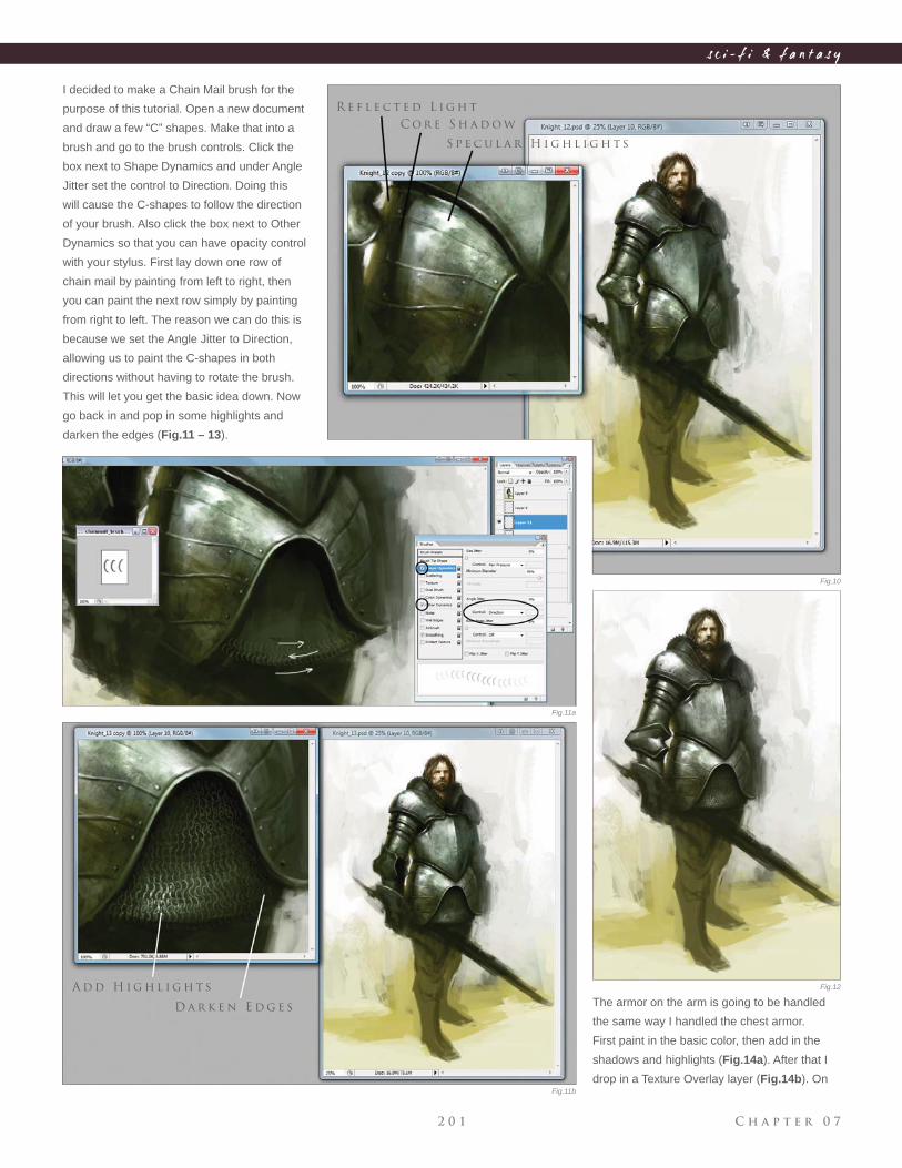
C h a p t e r 0 72 0 1
s c i - f i & f a n t a s y
I decided to make a Chain Mail brush for the
purpose of this tutorial. Open a new document
and draw a few “C” shapes. Make that into a
brush and go to the brush controls. Click the
box next to Shape Dynamics and under Angle
Jitter set the control to Direction. Doing this
will cause the C-shapes to follow the direction
of your brush. Also click the box next to Other
Dynamics so that you can have opacity control
with your stylus. First lay down one row of
chain mail by painting from left to right, then
you can paint the next row simply by painting
from right to left. The reason we can do this is
because we set the Angle Jitter to Direction,
allowing us to paint the C-shapes in both
directions without having to rotate the brush.
This will let you get the basic idea down. Now
go back in and pop in some highlights and
darken the edges (Fig.11 – 13).
R e f l e c t e d L i g h t
C o r e S h a d o w
S p e c u l a r H i g h l i g h t s
A d d H i g h l i g h t s
D a r k e n E d g e sThe armor on the arm is going to be handled
the same way I handled the chest armor.
First paint in the basic color, then add in the
shadows and highlights (Fig.14a). After that I
drop in a Texture Overlay layer (Fig.14b). On
Fig.10
Fig.11b
Fig.11a
Fig.12
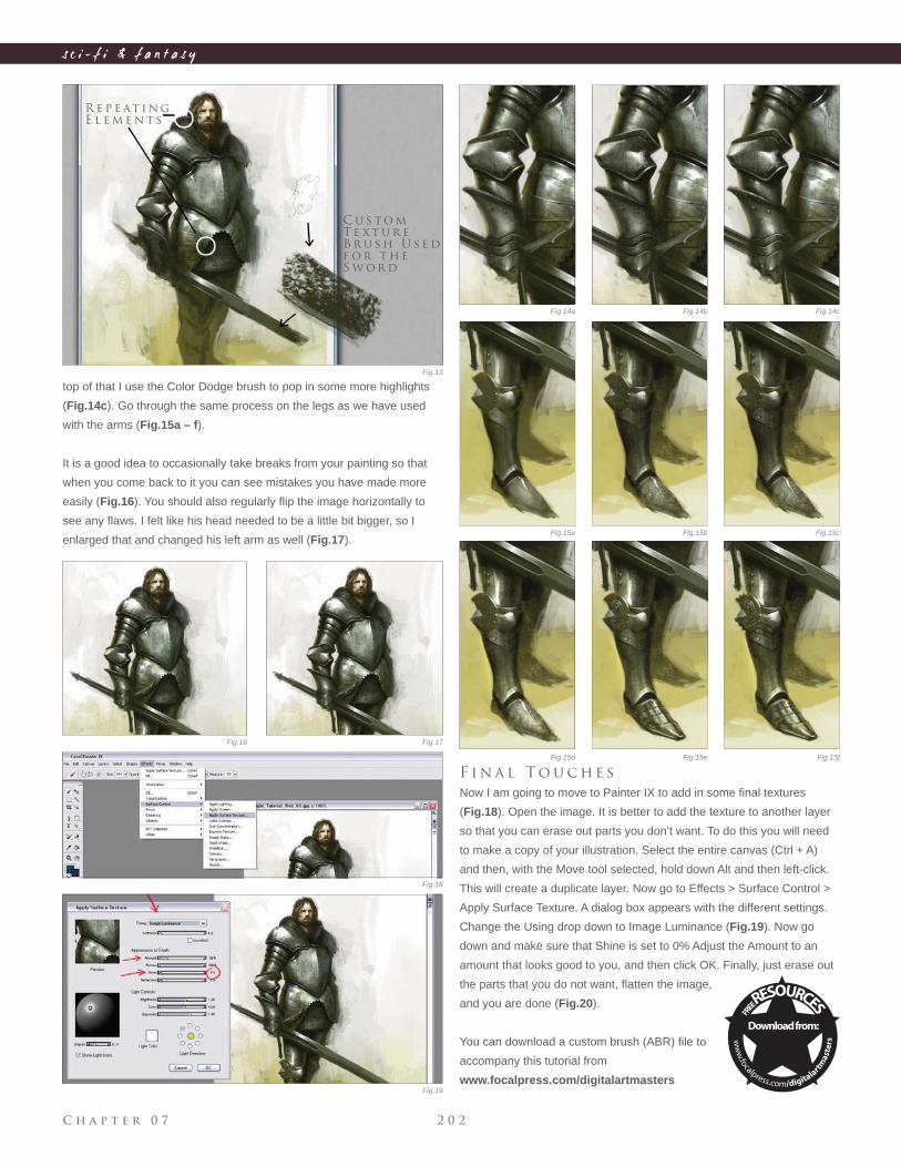
C h a p t e r 0 7 2 0 2
s c i - f i & f a n t a s y
top of that I use the Color Dodge brush to pop in some more highlights
(Fig.14c). Go through the same process on the legs as we have used
with the arms (Fig.15a – f).
It is a good idea to occasionally take breaks from your painting so that
when you come back to it you can see mistakes you have made more
easily (Fig.16). You should also regularly fl ip the image horizontally to
see any fl aws. I felt like his head needed to be a little bit bigger, so I
enlarged that and changed his left arm as well (Fig.17).
R e p e at i n g
E l e m e n t s
C u s t o m
T e x t u r e
B r u s h U s e d
f o r t h e
S w o r d
Fig.13
Fig.16 Fig.17
Fig.18
Fig.19
Fig.14a Fig.14b Fig.14c
F i n a l T o u c h e s
Now I am going to move to Painter IX to add in some fi nal textures
(Fig.18). Open the image. It is better to add the texture to another layer
so that you can erase out parts you don’t want. To do this you will need
to make a copy of your illustration. Select the entire canvas (Ctrl + A)
and then, with the Move tool selected, hold down Alt and then left-click.
This will create a duplicate layer. Now go to Effects > Surface Control >
Apply Surface Texture. A dialog box appears with the different settings.
Change the Using drop down to Image Luminance (Fig.19). Now go
down and make sure that Shine is set to 0% Adjust the Amount to an
amount that looks good to you, and then click OK. Finally, just erase out
the parts that you do not want, fl atten the image,
and you are done (Fig.20).
You can download a custom brush (ABR) fi le to
accompany this tutorial from
www.focalpress.com/digitalartmasters
Fig.15a
Fig.15d Fig.15e Fig.15f
Fig.15b Fig.15c
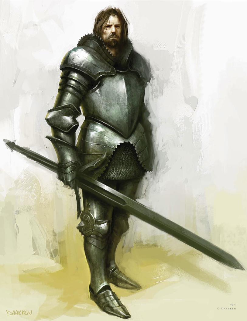
Fig.20
© D a a r k e n
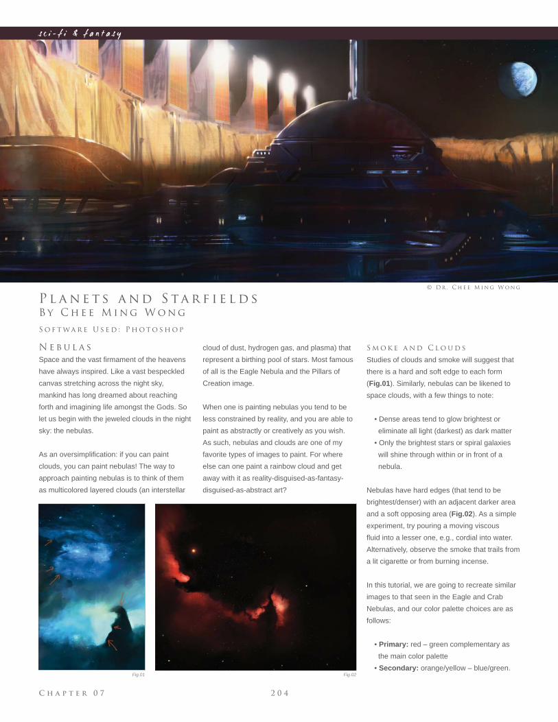
C h a p t e r 0 7 2 0 4
s c i - f i & f a n t a s y
B y C h e e M i n g W o n g
P l a n e t s a n d S ta r f i e l d s
N e b u l a s
Space and the vast fi rmament of the heavens
have always inspired. Like a vast bespeckled
canvas stretching across the night sky,
mankind has long dreamed about reaching
forth and imagining life amongst the Gods. So
let us begin with the jeweled clouds in the night
sky: the nebulas.
As an oversimplifi cation: if you can paint
clouds, you can paint nebulas! The way to
approach painting nebulas is to think of them
as multicolored layered clouds (an interstellar
S o f t wa r e U s e d : P h o t o s h o p
© D r . C h e e M i n g W o n g
cloud of dust, hydrogen gas, and plasma) that
represent a birthing pool of stars. Most famous
of all is the Eagle Nebula and the Pillars of
Creation image.
When one is painting nebulas you tend to be
less constrained by reality, and you are able to
paint as abstractly or creatively as you wish.
As such, nebulas and clouds are one of my
favorite types of images to paint. For where
else can one paint a rainbow cloud and get
away with it as reality-disguised-as-fantasy-
disguised-as-abstract art?
S m o k e a n d C l o u d s
Studies of clouds and smoke will suggest that
there is a hard and soft edge to each form
(Fig.01). Similarly, nebulas can be likened to
space clouds, with a few things to note:
• Dense areas tend to glow brightest or
eliminate all light (darkest) as dark matter
• Only the brightest stars or spiral galaxies
will shine through within or in front of a
nebula.
Nebulas have hard edges (that tend to be
brightest/denser) with an adjacent darker area
and a soft opposing area (Fig.02). As a simple
experiment, try pouring a moving viscous
fl uid into a lesser one, e.g., cordial into water.
Alternatively, observe the smoke that trails from
a lit cigarette or from burning incense.
In this tutorial, we are going to recreate similar
images to that seen in the Eagle and Crab
Nebulas, and our color palette choices are as
follows:
• Primary: red – green complementary as
the main color palette
• Secondary: orange/yellow – blue/green. Fig.01 Fig.02
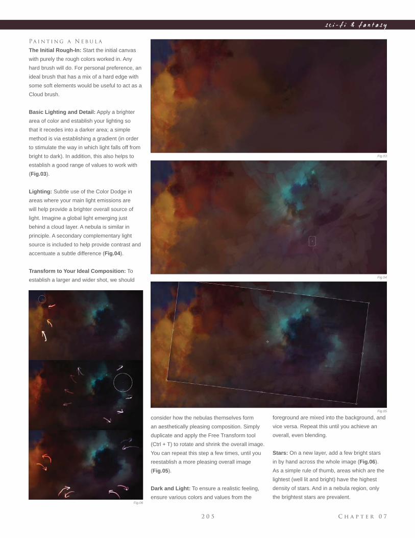
C h a p t e r 0 72 0 5
s c i - f i & f a n t a s y
Pa i n t i n g a N e b u l a
The Initial Rough-In: Start the initial canvas
with purely the rough colors worked in. Any
hard brush will do. For personal preference, an
ideal brush that has a mix of a hard edge with
some soft elements would be useful to act as a
Cloud brush.
Basic Lighting and Detail: Apply a brighter
area of color and establish your lighting so
that it recedes into a darker area; a simple
method is via establishing a gradient (in order
to stimulate the way in which light falls off from
bright to dark). In addition, this also helps to
establish a good range of values to work with
(Fig.03).
Lighting: Subtle use of the Color Dodge in
areas where your main light emissions are
will help provide a brighter overall source of
light. Imagine a global light emerging just
behind a cloud layer. A nebula is similar in
principle. A secondary complementary light
source is included to help provide contrast and
accentuate a subtle difference (Fig.04).
Transform to Your Ideal Composition: To
establish a larger and wider shot, we should
consider how the nebulas themselves form
an aesthetically pleasing composition. Simply
duplicate and apply the Free Transform tool
(Ctrl + T) to rotate and shrink the overall image.
You can repeat this step a few times, until you
reestablish a more pleasing overall image
(Fig.05).
Dark and Light: To ensure a realistic feeling,
ensure various colors and values from the
foreground are mixed into the background, and
vice versa. Repeat this until you achieve an
overall, even blending.
Stars: On a new layer, add a few bright stars
in by hand across the whole image (Fig.06).
As a simple rule of thumb, areas which are the
lightest (well lit and bright) have the highest
density of stars. And in a nebula region, only
the brightest stars are prevalent.
Fig.03
Fig.04
Fig.05
Fig.06
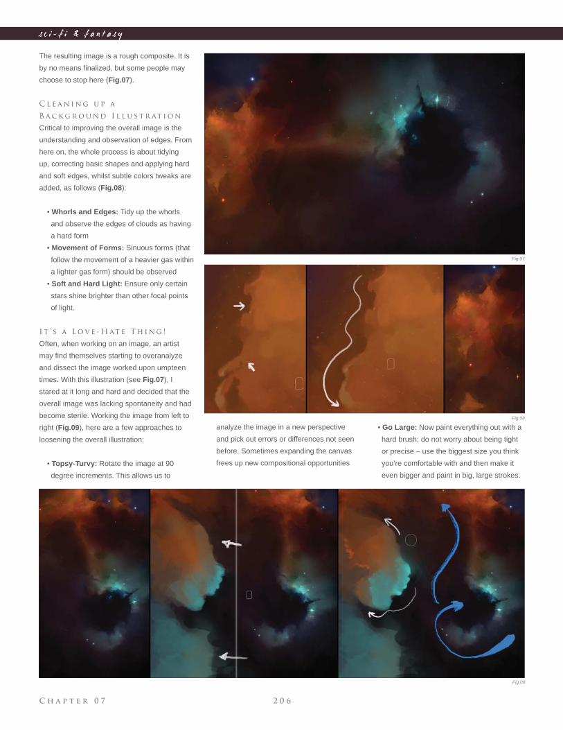
C h a p t e r 0 7 2 0 6
s c i - f i & f a n t a s y
The resulting image is a rough composite. It is
by no means fi nalized, but some people may
choose to stop here (Fig.07).
C l e a n i n g u p a
B a c k g r o u n d I l l u s t r at i o n
Critical to improving the overall image is the
understanding and observation of edges. From
here on, the whole process is about tidying
up, correcting basic shapes and applying hard
and soft edges, whilst subtle colors tweaks are
added, as follows (Fig.08):
• Whorls and Edges: Tidy up the whorls
and observe the edges of clouds as having
a hard form
• Movement of Forms: Sinuous forms (that
follow the movement of a heavier gas within
a lighter gas form) should be observed
• Soft and Hard Light: Ensure only certain
stars shine brighter than other focal points
of light.
I t ’ s a L o v e - H at e T h i n g !
Often, when working on an image, an artist
may fi nd themselves starting to overanalyze
and dissect the image worked upon umpteen
times. With this illustration (see Fig.07), I
stared at it long and hard and decided that the
overall image was lacking spontaneity and had
become sterile. Working the image from left to
right (Fig.09), here are a few approaches to
loosening the overall illustration:
• Topsy-Turvy: Rotate the image at 90
degree increments. This allows us to
analyze the image in a new perspective
and pick out errors or differences not seen
before. Sometimes expanding the canvas
frees up new compositional opportunities
• Go Large: Now paint everything out with a
hard brush; do not worry about being tight
or precise – use the biggest size you think
you’re comfortable with and then make it
even bigger and paint in big, large strokes.
Fig.07
Fig.08
Fig.09
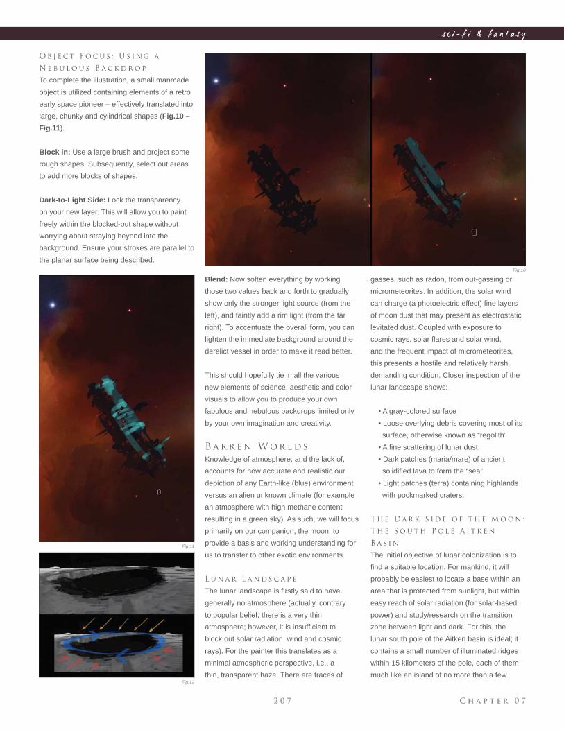
C h a p t e r 0 72 0 7
s c i - f i & f a n t a s y
Blend: Now soften everything by working
those two values back and forth to gradually
show only the stronger light source (from the
left), and faintly add a rim light (from the far
right). To accentuate the overall form, you can
lighten the immediate background around the
derelict vessel in order to make it read better.
This should hopefully tie in all the various
new elements of science, aesthetic and color
visuals to allow you to produce your own
fabulous and nebulous backdrops limited only
by your own imagination and creativity.
B a r r e n W o r l d s
Knowledge of atmosphere, and the lack of,
accounts for how accurate and realistic our
depiction of any Earth-like (blue) environment
versus an alien unknown climate (for example
an atmosphere with high methane content
resulting in a green sky). As such, we will focus
primarily on our companion, the moon, to
provide a basis and working understanding for
us to transfer to other exotic environments.
L u n a r L a n d s c a p e
The lunar landscape is fi rstly said to have
generally no atmosphere (actually, contrary
to popular belief, there is a very thin
atmosphere; however, it is insuffi cient to
block out solar radiation, wind and cosmic
rays). For the painter this translates as a
minimal atmospheric perspective, i.e., a
thin, transparent haze. There are traces of
O b j e c t F o c u s : U s i n g a
N e b u l o u s B a c k d r o p
To complete the illustration, a small manmade
object is utilized containing elements of a retro
early space pioneer – effectively translated into
large, chunky and cylindrical shapes (Fig.10 –
Fig.11).
Block in: Use a large brush and project some
rough shapes. Subsequently, select out areas
to add more blocks of shapes.
Dark-to-Light Side: Lock the transparency
on your new layer. This will allow you to paint
freely within the blocked-out shape without
worrying about straying beyond into the
background. Ensure your strokes are parallel to
the planar surface being described.
gasses, such as radon, from out-gassing or
micrometeorites. In addition, the solar wind
can charge (a photoelectric effect) fi ne layers
of moon dust that may present as electrostatic
levitated dust. Coupled with exposure to
cosmic rays, solar fl ares and solar wind,
and the frequent impact of micrometeorites,
this presents a hostile and relatively harsh,
demanding condition. Closer inspection of the
lunar landscape shows:
• A gray-colored surface
• Loose overlying debris covering most of its
surface, otherwise known as “regolith”
• A fi ne scattering of lunar dust
• Dark patches (maria/mare) of ancient
solidifi ed lava to form the “sea”
• Light patches (terra) containing highlands
with pockmarked craters.
T h e D a r k S i d e o f t h e M o o n :
T h e S o u t h P o l e A i t k e n
B a s i n
The initial objective of lunar colonization is to
fi nd a suitable location. For mankind, it will
probably be easiest to locate a base within an
area that is protected from sunlight, but within
easy reach of solar radiation (for solar-based
power) and study/research on the transition
zone between light and dark. For this, the
lunar south pole of the Aitken basin is ideal; it
contains a small number of illuminated ridges
within 15 kilometers of the pole, each of them
much like an island of no more than a few
Fig.10
Fig.11
Fig.12
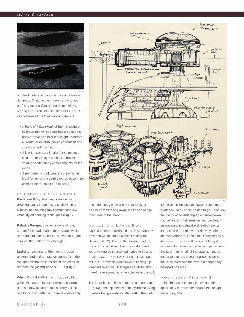
C h a p t e r 0 7 2 0 8
s c i - f i & f a n t a s y
hundred meters across in an ocean of eternal
darkness. Of particular interest is the almost
perfectly circular Shackleton crater, which
NASA plans to colonize in the near future. The
key features of the Shackleton crater are:
• A band of PELs (Peak of Eternal Light) on
its crater rim which describes a point on a
body eternally bathed in sunlight, therefore
allowing for external power generation and
studies of solar activity
• A low-temperature interior functions as a
cold trap that may capture and freeze
volatile sheds during comet impacts on the
moon
• A permanently dark central core which is
ideal for building a semi-covered base in (to
account for radiation and exposure).
Pa i n t i n g a L u n a r C r at e r
Bleak and Gray: Painting craters is an
excellent study in defi ning a shallow, fairly
elliptical shape using low contrast, and low
value styled painting techniques (Fig.12).
Relative Perspective: As a general rule,
craters form oval-shaped depressions which
are more circular nearer the viewer and more
elliptical the further away they get.
Lighting: Lighting (of the moon) is quite
uniform, and in this instance comes from the
top right, hitting the inner rim of the crater to
recreate the (bright) band of PELs (Fig.13).
Why a Dark Side?: In contrast, everything
within the crater rim is otherwise a uniform
dark shadow (as the moon is tidally locked in
relation to the Earth; i.e., there is always only
center of the Shackleton crater. Each cubicle
is interlocked by short, sealed rings. I also took
the liberty of considering an external power
source/reactor that relies on He3 Deuterium
fusion, assuming that the shielded reactor
cores on the far right were relatively safe. In
the main quarters, habitation is serviced by a
dome-like structure with a central lift system
to connect all levels of the base together. And
fi nally, on the far left of the drawing, both a
research and advanced propulsions works
unit is coupled with the external hangar bay/
transport bay area.
M o o n B a s e : V e r s i o n 2
Using the base schematics, we use this
opportunity to refi ne the moon base design
further (Fig.15).
one side facing the Earth permanently, and
all other areas facing away are known as the
“dark side of the moon”).
B u i l d i n g a L u n a r B a s e
Once a base is established, the key economy
provided will be lunar colonists mining for
Helium 3 (He3). Used within fusion reactors,
this is an alternative, cheap, abundant and
lucrative energy source (estimated to be a net
profi t of $300 – 400 USD billion per 100 tons
of He3). Extraction would involve heating up
lunar soil to above 600 degrees Celsius and
therefore evaporating other volatiles in the soil.
The lunar base is fl eshed out on pen and paper
(Fig.14). It is depicted as semi-cylindrical living
quarters being slowly installed within the dark
Fig.13
Fig.14
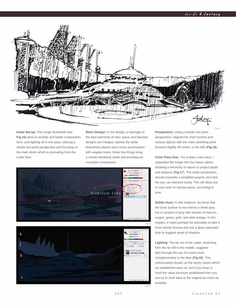
C h a p t e r 0 72 0 9
s c i - f i & f a n t a s y
Initial Set-up: This rough thumbnail (see
Fig.15) aims to simplify and tackle composition,
form, and lighting all in one pass, utilizing a
simple two-point perspective and focusing on
the main dome which is protruding from the
crater fl oor.
H o r i z o n L i n e
Perspective: Using a simple one-point
perspective I aligned the main horizon and
various objects with the main vanishing point
(located slightly off center, to the left) (Fig.16).
Color Pass One: For a basic color pass, I
separated the image into four basic values,
showing a hierarchy of values to project depth
and distance (Fig.17). The initial composition
should resemble a simplifi ed graphic shot that
the eye can interpret easily. This will allow you
to now work on various areas, according to
tone.
Subtle Hues: In this instance, we know that
the lunar surface is not entirely a bleak gray,
but is variants of gray with streaks of maroon,
copper, green, gold, and dark orange. In this
respect, it might perhaps be advisable to take a
more artistic license and use a deep saturated
blue to suggest areas of shadow.
Lighting: The far rim of the crater, stretching
from the far left to the middle, suggests
light through the use of a warm tone,
complementary to the blue (Fig.18). This
unfortunately breaks up the lovely values which
we established early on, but if you keep in
mind the value structure established then you
can try to work back to the original as much as
possible.
Retro Design: In the design, a marriage of
the best elements of retro space and futuristic
designs are merged, namely the white
featureless planes and curves accentuated
with angular tones; these few things bring
a certain familiarity whilst still providing an
evocative composition.
Fig.15
Fig.16
Fig.17
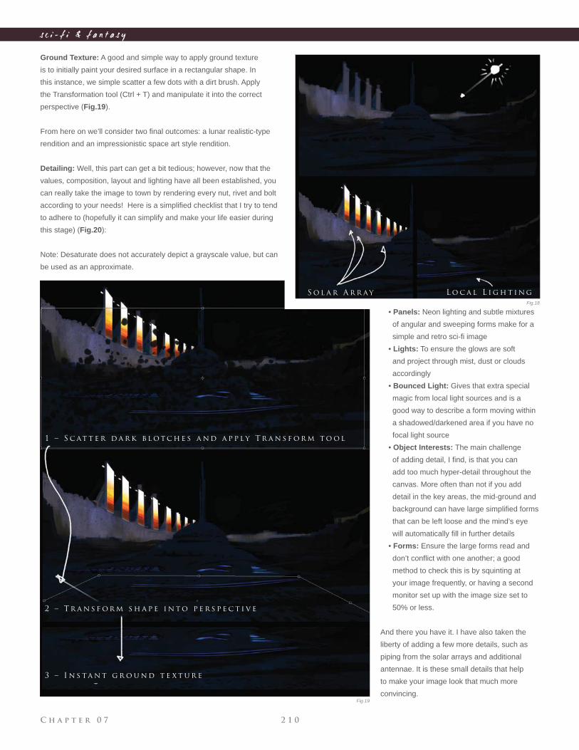
C h a p t e r 0 7 2 1 0
s c i - f i & f a n t a s y
Ground Texture: A good and simple way to apply ground texture
is to initially paint your desired surface in a rectangular shape. In
this instance, we simple scatter a few dots with a dirt brush. Apply
the Transformation tool (Ctrl + T) and manipulate it into the correct
perspective (Fig.19).
From here on we’ll consider two fi nal outcomes: a lunar realistic-type
rendition and an impressionistic space art style rendition.
Detailing: Well, this part can get a bit tedious; however, now that the
values, composition, layout and lighting have all been established, you
can really take the image to town by rendering every nut, rivet and bolt
according to your needs! Here is a simplifi ed checklist that I try to tend
to adhere to (hopefully it can simplify and make your life easier during
this stage) (Fig.20):
Note: Desaturate does not accurately depict a grayscale value, but can
be used as an approximate.
• Panels: Neon lighting and subtle mixtures
of angular and sweeping forms make for a
simple and retro sci-fi image
• Lights: To ensure the glows are soft
and project through mist, dust or clouds
accordingly
• Bounced Light: Gives that extra special
magic from local light sources and is a
good way to describe a form moving within
a shadowed/darkened area if you have no
focal light source
• Object Interests: The main challenge
of adding detail, I fi nd, is that you can
add too much hyper-detail throughout the
canvas. More often than not if you add
detail in the key areas, the mid-ground and
background can have large simplifi ed forms
that can be left loose and the mind’s eye
will automatically fi ll in further details
• Forms: Ensure the large forms read and
don’t confl ict with one another; a good
method to check this is by squinting at
your image frequently, or having a second
monitor set up with the image size set to
50% or less.
And there you have it. I have also taken the
liberty of adding a few more details, such as
piping from the solar arrays and additional
antennae. It is these small details that help
to make your image look that much more
convincing.
1 – S c at t e r d a r k b l o t c h e s a n d a p p l y T r a n s f o r m t o o l
2 – T r a n s f o r m s h a p e i n t o p e r s p e c t i v e
3 – I n s ta n t g r o u n d t e x t u r e
S o l a r A r r ay L o c a l L i g h t i n g
Fig.18
Fig.19
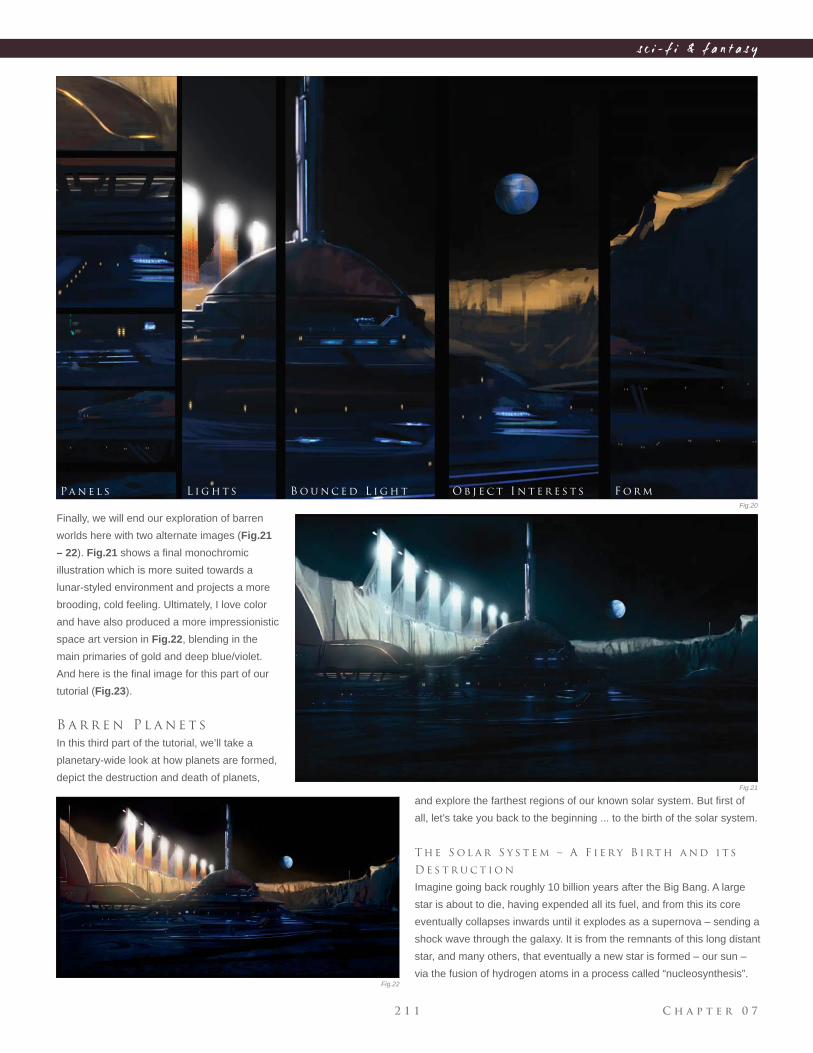
C h a p t e r 0 72 1 1
s c i - f i & f a n t a s y
Finally, we will end our exploration of barren
worlds here with two alternate images (Fig.21
– 22). Fig.21 shows a fi nal monochromic
illustration which is more suited towards a
lunar-styled environment and projects a more
brooding, cold feeling. Ultimately, I love color
and have also produced a more impressionistic
space art version in Fig.22, blending in the
main primaries of gold and deep blue/violet.
And here is the fi nal image for this part of our
tutorial (Fig.23).
B a r r e n P l a n e t s
In this third part of the tutorial, we’ll take a
planetary-wide look at how planets are formed,
depict the destruction and death of planets,
and explore the farthest regions of our known solar system. But fi rst of
all, let’s take you back to the beginning ... to the birth of the solar system.
T h e S o l a r S y s t e m – A F i e r y B i rt h a n d i t s
D e s t r u c t i o n
Imagine going back roughly 10 billion years after the Big Bang. A large
star is about to die, having expended all its fuel, and from this its core
eventually collapses inwards until it explodes as a supernova – sending a
shock wave through the galaxy. It is from the remnants of this long distant
star, and many others, that eventually a new star is formed – our sun –
via the fusion of hydrogen atoms in a process called “nucleosynthesis”.
Pa n e l s L i g h t s B o u n c e d L i g h t O b j e c t I n t e r e s t s F o r m
Fig.20
Fig.21
Fig.22
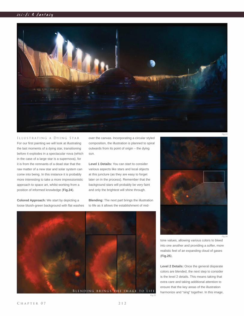
C h a p t e r 0 7 2 1 2
s c i - f i & f a n t a s y
I l l u s t r at i n g a D y i n g S ta r
For our fi rst painting we will look at illustrating
the last moments of a dying star, transitioning
before it explodes in a spectacular nova (which
in the case of a large star is a supernova), for
it is from the remnants of a dead star that the
raw matter of a new star and solar system can
come into being. In this instance it is probably
more interesting to take a more impressionistic
approach to space art, whilst working from a
position of informed knowledge (Fig.24).
Colored Approach: We start by depicting a
loose bluish-green background with fl at washes
tone values, allowing various colors to bleed
into one another and providing a softer, more
realistic feel of an expanding cloud of gases
(Fig.25).
Level 2 Details: Once the general disparate
colors are blended, the next step to consider
is the level 2 details. This means taking that
extra care and taking additional attention to
ensure that the key areas of the illustration
harmonize and “sing” together. In this image,
over the canvas. Incorporating a circular styled
composition, the illustration is planned to spiral
outwards from its point of origin – the dying
sun.
Level 1 Details: You can start to consider
various aspects like stars and local objects
at this juncture (as they are easy to forget
later on in the process). Remember that the
background stars will probably be very faint
and only the brightest will shine through.
Blending: The next part brings the illustration
to life as it allows the establishment of mid-
B l e n d i n g b r i n g s t h e i m a g e t o l i f e
Fig.23
Fig.24
Fig.25
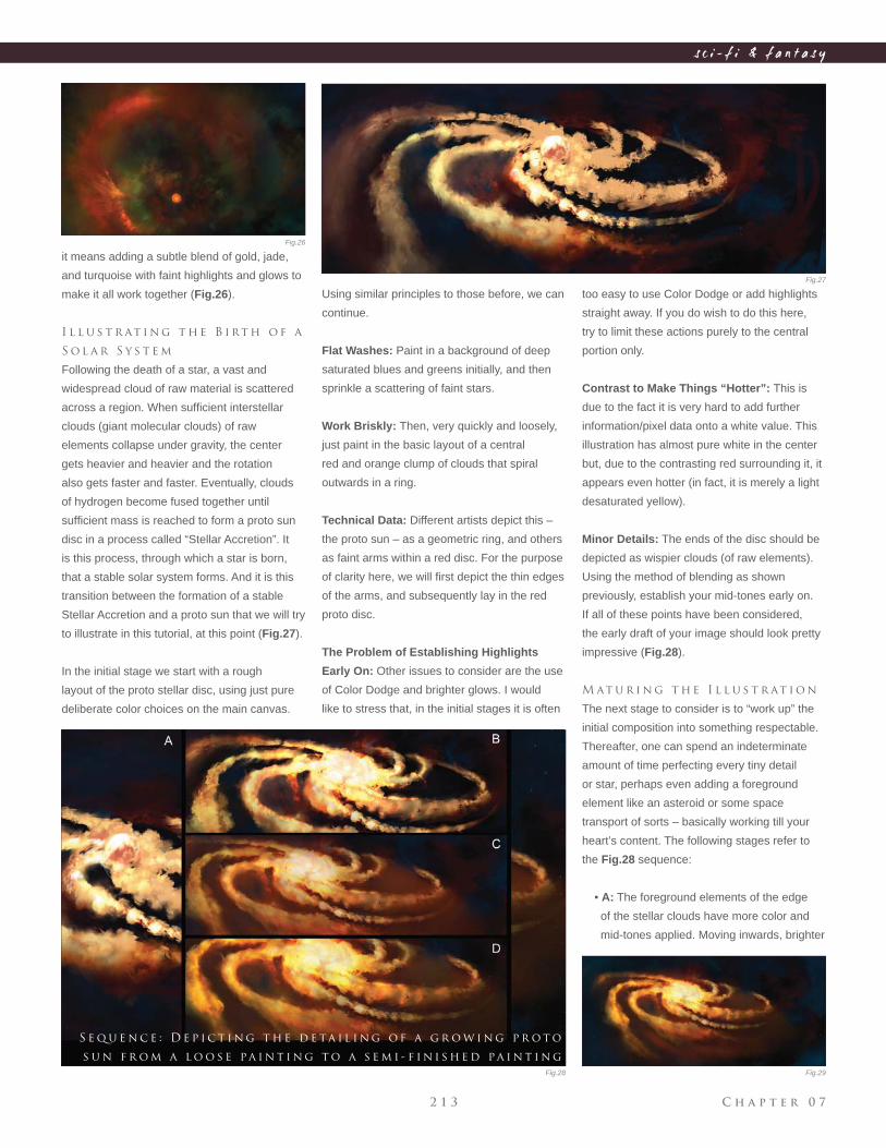
C h a p t e r 0 72 1 3
s c i - f i & f a n t a s y
it means adding a subtle blend of gold, jade,
and turquoise with faint highlights and glows to
make it all work together (Fig.26).
I l l u s t r at i n g t h e B i rt h o f a
S o l a r S y s t e m
Following the death of a star, a vast and
widespread cloud of raw material is scattered
across a region. When suffi cient interstellar
clouds (giant molecular clouds) of raw
elements collapse under gravity, the center
gets heavier and heavier and the rotation
also gets faster and faster. Eventually, clouds
of hydrogen become fused together until
suffi cient mass is reached to form a proto sun
disc in a process called “Stellar Accretion”. It
is this process, through which a star is born,
that a stable solar system forms. And it is this
transition between the formation of a stable
Stellar Accretion and a proto sun that we will try
to illustrate in this tutorial, at this point (Fig.27).
In the initial stage we start with a rough
layout of the proto stellar disc, using just pure
deliberate color choices on the main canvas.
too easy to use Color Dodge or add highlights
straight away. If you do wish to do this here,
try to limit these actions purely to the central
portion only.
Contrast to Make Things “Hotter”: This is
due to the fact it is very hard to add further
information/pixel data onto a white value. This
illustration has almost pure white in the center
but, due to the contrasting red surrounding it, it
appears even hotter (in fact, it is merely a light
desaturated yellow).
Minor Details: The ends of the disc should be
depicted as wispier clouds (of raw elements).
Using the method of blending as shown
previously, establish your mid-tones early on.
If all of these points have been considered,
the early draft of your image should look pretty
impressive (Fig.28).
M at u r i n g t h e I l l u s t r at i o n
The next stage to consider is to “work up” the
initial composition into something respectable.
Thereafter, one can spend an indeterminate
amount of time perfecting every tiny detail
or star, perhaps even adding a foreground
element like an asteroid or some space
transport of sorts – basically working till your
heart’s content. The following stages refer to
the Fig.28 sequence:
• A: The foreground elements of the edge
of the stellar clouds have more color and
mid-tones applied. Moving inwards, brighter
S e q u e n c e : D e p i c t i n g t h e d e ta i l i n g o f a g r o w i n g p r o t o
s u n f r o m a l o o s e pa i n t i n g t o a s e m i - f i n i s h e d pa i n t i n g
Using similar principles to those before, we can
continue.
Flat Washes: Paint in a background of deep
saturated blues and greens initially, and then
sprinkle a scattering of faint stars.
Work Briskly: Then, very quickly and loosely,
just paint in the basic layout of a central
red and orange clump of clouds that spiral
outwards in a ring.
Technical Data: Different artists depict this –
the proto sun – as a geometric ring, and others
as faint arms within a red disc. For the purpose
of clarity here, we will fi rst depict the thin edges
of the arms, and subsequently lay in the red
proto disc.
The Problem of Establishing Highlights
Early On: Other issues to consider are the use
of Color Dodge and brighter glows. I would
like to stress that, in the initial stages it is often
Fig.26
Fig.27
Fig.28 Fig.29
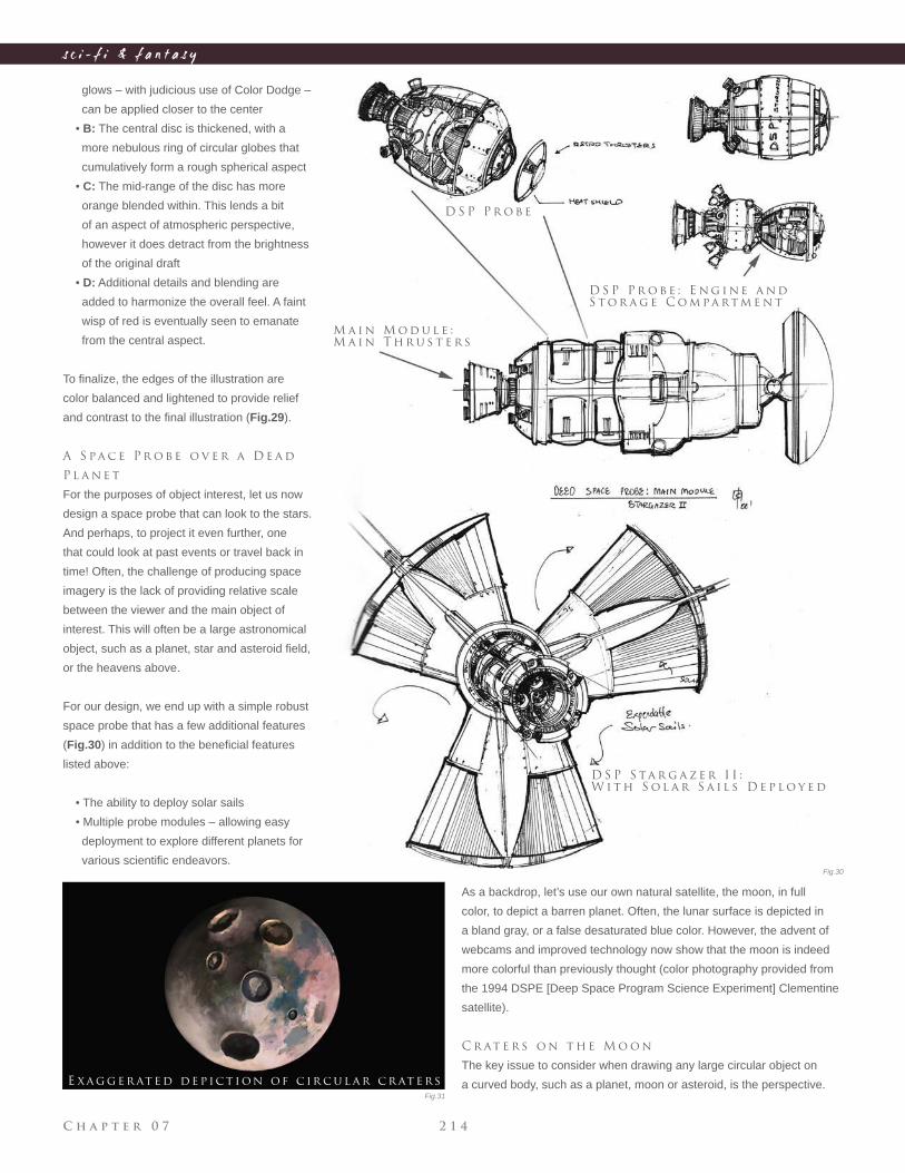
C h a p t e r 0 7 2 1 4
s c i - f i & f a n t a s y
glows – with judicious use of Color Dodge –
can be applied closer to the center
• B: The central disc is thickened, with a
more nebulous ring of circular globes that
cumulatively form a rough spherical aspect
• C: The mid-range of the disc has more
orange blended within. This lends a bit
of an aspect of atmospheric perspective,
however it does detract from the brightness
of the original draft
• D: Additional details and blending are
added to harmonize the overall feel. A faint
wisp of red is eventually seen to emanate
from the central aspect.
To fi nalize, the edges of the illustration are
color balanced and lightened to provide relief
and contrast to the fi nal illustration (Fig.29).
A S pa c e P r o b e o v e r a D e a d
P l a n e t
For the purposes of object interest, let us now
design a space probe that can look to the stars.
And perhaps, to project it even further, one
that could look at past events or travel back in
time! Often, the challenge of producing space
imagery is the lack of providing relative scale
between the viewer and the main object of
interest. This will often be a large astronomical
object, such as a planet, star and asteroid fi eld,
or the heavens above.
For our design, we end up with a simple robust
space probe that has a few additional features
(Fig.30) in addition to the benefi cial features
listed above:
• The ability to deploy solar sails
• Multiple probe modules – allowing easy
deployment to explore different planets for
various scientifi c endeavors.
E xa g g e r at e d de p ic t ion of c ir c u l a r c r at e rs
M a i n M o d u l e :
M a i n T h r u s t e r s
D S P P r o b e
D S P P r o b e : E n g i n e a n d
S t o r a g e C o m pa rt m e n t
D S P S ta r g a z e r I I :
W i t h S o l a r S a i l s D e p l o y e d
As a backdrop, let’s use our own natural satellite, the moon, in full
color, to depict a barren planet. Often, the lunar surface is depicted in
a bland gray, or a false desaturated blue color. However, the advent of
webcams and improved technology now show that the moon is indeed
more colorful than previously thought (color photography provided from
the 1994 DSPE [Deep Space Program Science Experiment] Clementine
satellite).
C r at e r s o n t h e M o o n
The key issue to consider when drawing any large circular object on
a curved body, such as a planet, moon or asteroid, is the perspective.
Fig.30
Fig.31
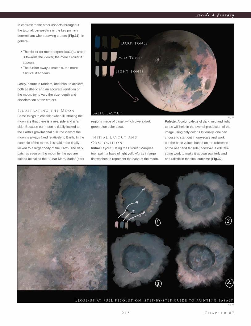
C h a p t e r 0 72 1 5
s c i - f i & f a n t a s y
In contrast to the other aspects throughout
the tutorial, perspective is the key primary
determinant when drawing craters (Fig.31). In
general:
• The closer (or more perpendicular) a crater
is towards the viewer, the more circular it
appears
• The further away a crater is, the more
elliptical it appears.
Lastly, nature is random, and thus, to achieve
both aesthetic and an accurate rendition of
the moon, try to vary the size, depth and
discoloration of the craters.
I l l u s t r at i n g t h e M o o n
Some things to consider when illustrating the
moon are that there is a nearside and a far
side. Because our moon is tidally locked to
the Earth’s gravitational pull, the view of the
moon is always fi xed relatively to Earth. In the
example of the moon, it is said to be tidally
locked to a larger body of the Earth. The dark
patches seen on the moon by the eye are
said to be called the “Lunar Mare/Maria” (dark
regions made of basalt which give a dark
green-blue color cast).
I n i t i a l L ay o u t a n d
C o m p o s i t i o n
Initial Layout: Using the Circular Marquee
tool, paint a base of light yellow/gray in large
fl at washes to represent the base of the moon.
Palette: A color palette of dark, mid and light
tones will help in the overall production of the
image using only color. Optionally, one can
choose to start out in grayscale and work
out the base values based on the reference
of the near and far side; however, it will take
some work to make it appear painterly and
naturalistic in the fi nal outcome (Fig.32).
Da r k Tone s
M id - Tone s
L ig h t Tone s
B a s ic L ayo u t
C lo se - u p at f u l l r e s ol u t ion : s t e p - by - s t e p g u ide to pa in t ing b a s a lt
Fig.32
Fig.33
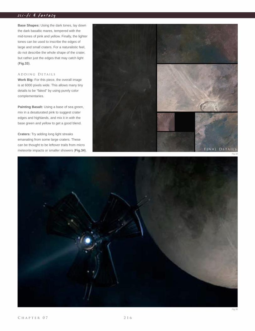
C h a p t e r 0 7 2 1 6
s c i - f i & f a n t a s y
Base Shapes: Using the dark tones, lay down
the dark basaltic mares, tempered with the
mid-tones of pink and yellow. Finally, the lighter
tones can be used to inscribe the edges of
large and small craters. For a naturalistic feel,
do not describe the whole shape of the crater,
but rather just the edges that may catch light
(Fig.33).
A d d i n g D e ta i l s
Work Big: For this piece, the overall image
is at 6000 pixels wide. This allows many tiny
details to be “faked” by using purely color
complementaries.
Painting Basalt: Using a base of sea green,
mix in a desaturated pink to suggest crater
edges and highlands, and mix it in with the
base green and yellow to get a good blend.
Craters: Try adding long light streaks
emanating from some large craters. These
can be thought to be leftover trails from micro
meteorite impacts or smaller showers (Fig.34). F i n a l D e ta i l s
Fig.34
Fig.35
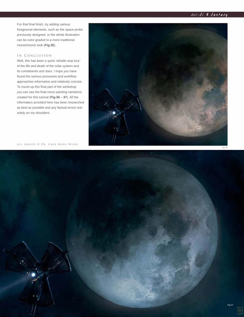
C h a p t e r 0 72 1 7
s c i - f i & f a n t a s y
For that fi nal fi nish, try adding various
foreground elements, such as the space probe
previously designed, or the whole illustration
can be color-graded to a more traditional
monochromic look (Fig.35).
I n C o n c l u s i o n
Well, this has been a quick ‘whistle stop tour’
of the life and death of the solar system and
its constituents and stars. I hope you have
found the various processes and workfl ow
approaches informative and relatively concise.
To round up this fi nal part of the workshop
you can see the fi nal moon painting variations
created for this tutorial (Fig.36 – 37). All the
information provided here has been researched
as best as possible and any factual errors rest
solely on my shoulders.
A l l I m a g e s © D r . C h e e M i n g W o n g
Fig.36
Fig.37
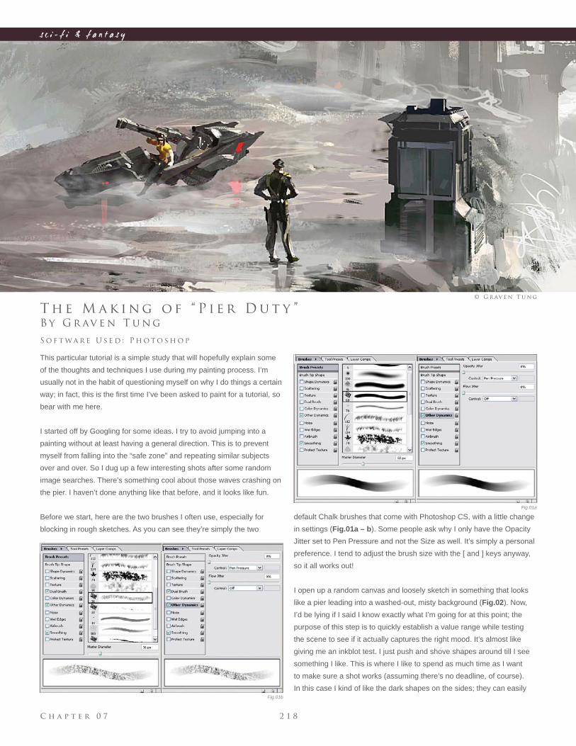
C h a p t e r 0 7 2 1 8
s c i - f i & f a n t a s y
Fig.01a
Fig.01b
B y G r av e n T u n g
T h e M a k i n g o f “ P i e r D u t y ”
This particular tutorial is a simple study that will hopefully explain some
of the thoughts and techniques I use during my painting process. I’m
usually not in the habit of questioning myself on why I do things a certain
way; in fact, this is the fi rst time I’ve been asked to paint for a tutorial, so
bear with me here.
I started off by Googling for some ideas. I try to avoid jumping into a
painting without at least having a general direction. This is to prevent
myself from falling into the “safe zone” and repeating similar subjects
over and over. So I dug up a few interesting shots after some random
image searches. There’s something cool about those waves crashing on
the pier. I haven’t done anything like that before, and it looks like fun.
Before we start, here are the two brushes I often use, especially for
blocking in rough sketches. As you can see they’re simply the two
S o f t wa r e U s e d : P h o t o s h o p
© G r av e n T u n g
default Chalk brushes that come with Photoshop CS, with a little change
in settings (Fig.01a – b). Some people ask why I only have the Opacity
Jitter set to Pen Pressure and not the Size as well. It’s simply a personal
preference. I tend to adjust the brush size with the [ and ] keys anyway,
so it all works out!
I open up a random canvas and loosely sketch in something that looks
like a pier leading into a washed-out, misty background (Fig.02). Now,
I’d be lying if I said I know exactly what I’m going for at this point; the
purpose of this step is to quickly establish a value range while testing
the scene to see if it actually captures the right mood. It’s almost like
giving me an inkblot test. I just push and shove shapes around till I see
something I like. This is where I like to spend as much time as I want
to make sure a shot works (assuming there’s no deadline, of course).
In this case I kind of like the dark shapes on the sides; they can easily
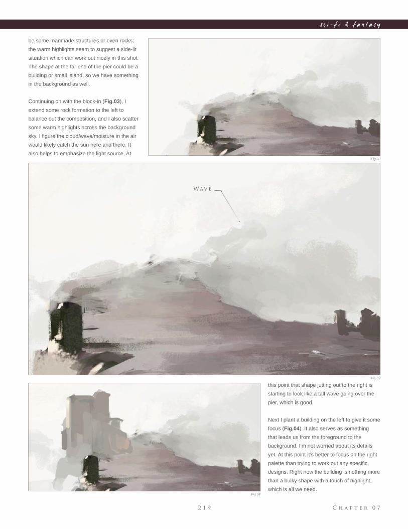
C h a p t e r 0 72 1 9
s c i - f i & f a n t a s y
Fig.02
Fig.03
Fig.04
be some manmade structures or even rocks;
the warm highlights seem to suggest a side-lit
situation which can work out nicely in this shot.
The shape at the far end of the pier could be a
building or small island, so we have something
in the background as well.
Continuing on with the block-in (Fig.03), I
extend some rock formation to the left to
balance out the composition, and I also scatter
some warm highlights across the background
sky. I fi gure the cloud/wave/moisture in the air
would likely catch the sun here and there. It
also helps to emphasize the light source. At
this point that shape jutting out to the right is
starting to look like a tall wave going over the
pier, which is good.
Next I plant a building on the left to give it some
focus (Fig.04). It also serves as something
that leads us from the foreground to the
background. I’m not worried about its details
yet. At this point it’s better to focus on the right
palette than trying to work out any specifi c
designs. Right now the building is nothing more
than a bulky shape with a touch of highlight,
which is all we need.
Wav e
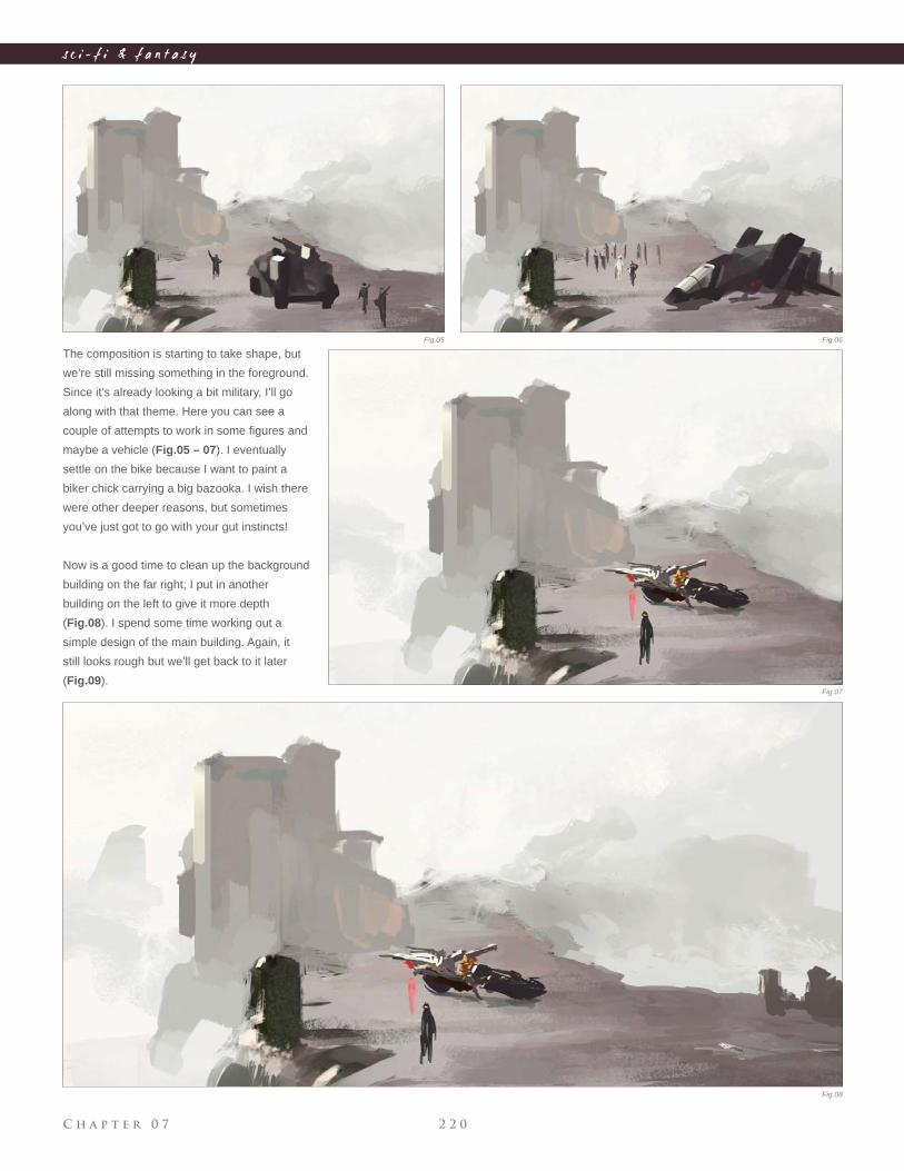
C h a p t e r 0 7 2 2 0
s c i - f i & f a n t a s y
The composition is starting to take shape, but
we’re still missing something in the foreground.
Since it’s already looking a bit military, I’ll go
along with that theme. Here you can see a
couple of attempts to work in some fi gures and
maybe a vehicle (Fig.05 – 07). I eventually
settle on the bike because I want to paint a
biker chick carrying a big bazooka. I wish there
were other deeper reasons, but sometimes
you’ve just got to go with your gut instincts!
Now is a good time to clean up the background
building on the far right; I put in another
building on the left to give it more depth
(Fig.08). I spend some time working out a
simple design of the main building. Again, it
still looks rough but we’ll get back to it later
(Fig.09).
Fig.05 Fig.06
Fig.07
Fig.08
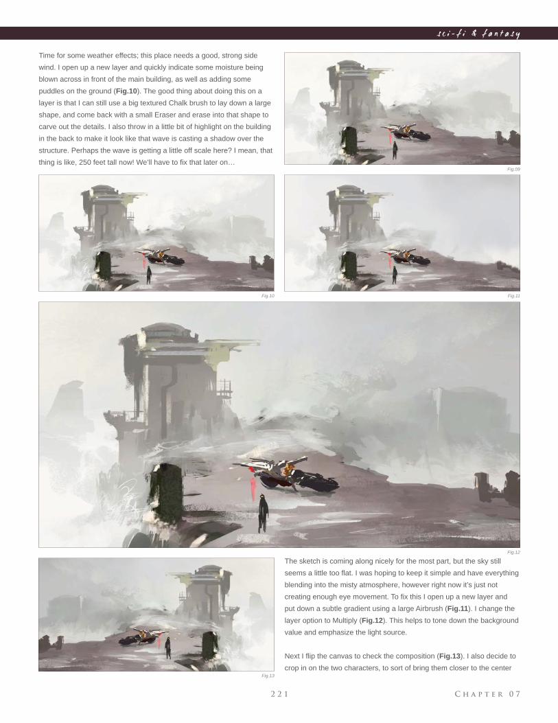
C h a p t e r 0 72 2 1
s c i - f i & f a n t a s y
Time for some weather effects; this place needs a good, strong side
wind. I open up a new layer and quickly indicate some moisture being
blown across in front of the main building, as well as adding some
puddles on the ground (Fig.10). The good thing about doing this on a
layer is that I can still use a big textured Chalk brush to lay down a large
shape, and come back with a small Eraser and erase into that shape to
carve out the details. I also throw in a little bit of highlight on the building
in the back to make it look like that wave is casting a shadow over the
structure. Perhaps the wave is getting a little off scale here? I mean, that
thing is like, 250 feet tall now! We’ll have to fi x that later on…
The sketch is coming along nicely for the most part, but the sky still
seems a little too fl at. I was hoping to keep it simple and have everything
blending into the misty atmosphere, however right now it’s just not
creating enough eye movement. To fi x this I open up a new layer and
put down a subtle gradient using a large Airbrush (Fig.11). I change the
layer option to Multiply (Fig.12). This helps to tone down the background
value and emphasize the light source.
Next I fl ip the canvas to check the composition (Fig.13). I also decide to
crop in on the two characters, to sort of bring them closer to the center
Fig.09
Fig.10 Fig.11
Fig.12
Fig.13
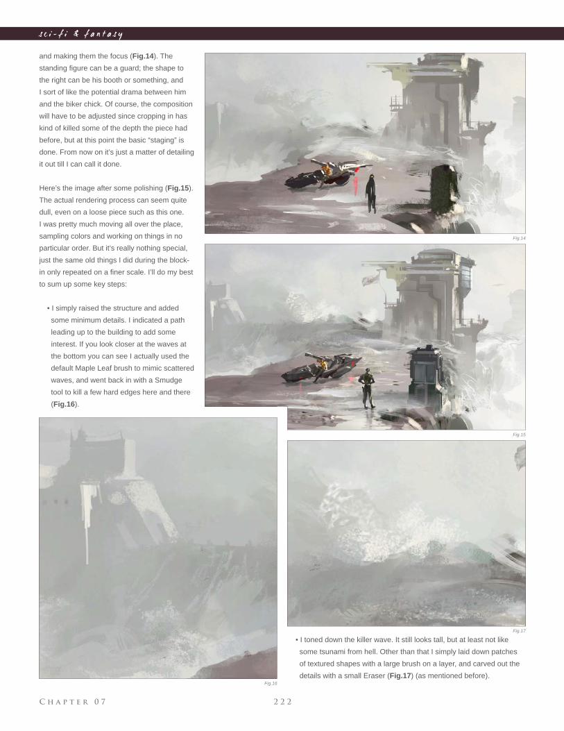
C h a p t e r 0 7 2 2 2
s c i - f i & f a n t a s y
and making them the focus (Fig.14). The
standing fi gure can be a guard; the shape to
the right can be his booth or something, and
I sort of like the potential drama between him
and the biker chick. Of course, the composition
will have to be adjusted since cropping in has
kind of killed some of the depth the piece had
before, but at this point the basic “staging” is
done. From now on it’s just a matter of detailing
it out till I can call it done.
Here’s the image after some polishing (Fig.15).
The actual rendering process can seem quite
dull, even on a loose piece such as this one.
I was pretty much moving all over the place,
sampling colors and working on things in no
particular order. But it’s really nothing special,
just the same old things I did during the block-
in only repeated on a fi ner scale. I’ll do my best
to sum up some key steps:
• I simply raised the structure and added
some minimum details. I indicated a path
leading up to the building to add some
interest. If you look closer at the waves at
the bottom you can see I actually used the
default Maple Leaf brush to mimic scattered
waves, and went back in with a Smudge
tool to kill a few hard edges here and there
(Fig.16).
• I toned down the killer wave. It still looks tall, but at least not like
some tsunami from hell. Other than that I simply laid down patches
of textured shapes with a large brush on a layer, and carved out the
details with a small Eraser (Fig.17) (as mentioned before).
Fig.14
Fig.15
Fig.16
Fig.17
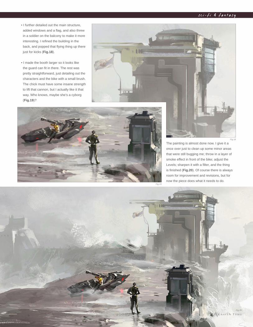
C h a p t e r 0 72 2 3
s c i - f i & f a n t a s y
• I further detailed out the main structure,
added windows and a fl ag, and also threw
in a soldier on the balcony to make it more
interesting. I refi ned the building in the
back, and popped that fl ying thing up there
just for kicks (Fig.18).
• I made the booth larger so it looks like
the guard can fi t in there. The rest was
pretty straightforward, just detailing out the
characters and the bike with a small brush.
The chick must have some insane strength
to lift that cannon, but I actually like it that
way. Who knows, maybe she’s a cyborg
(Fig.19)?
The painting is almost done now. I give it a
once over just to clean up some minor areas
that were still bugging me; throw in a layer of
smoke effect in front of the bike; adjust the
Levels; sharpen it with a fi lter, and the thing
is fi nished (Fig.20). Of course there is always
room for improvement and revisions, but for
now the piece does what it needs to do.
Fig.18
Fig.19
Fig.20
© G r av e n T u n g
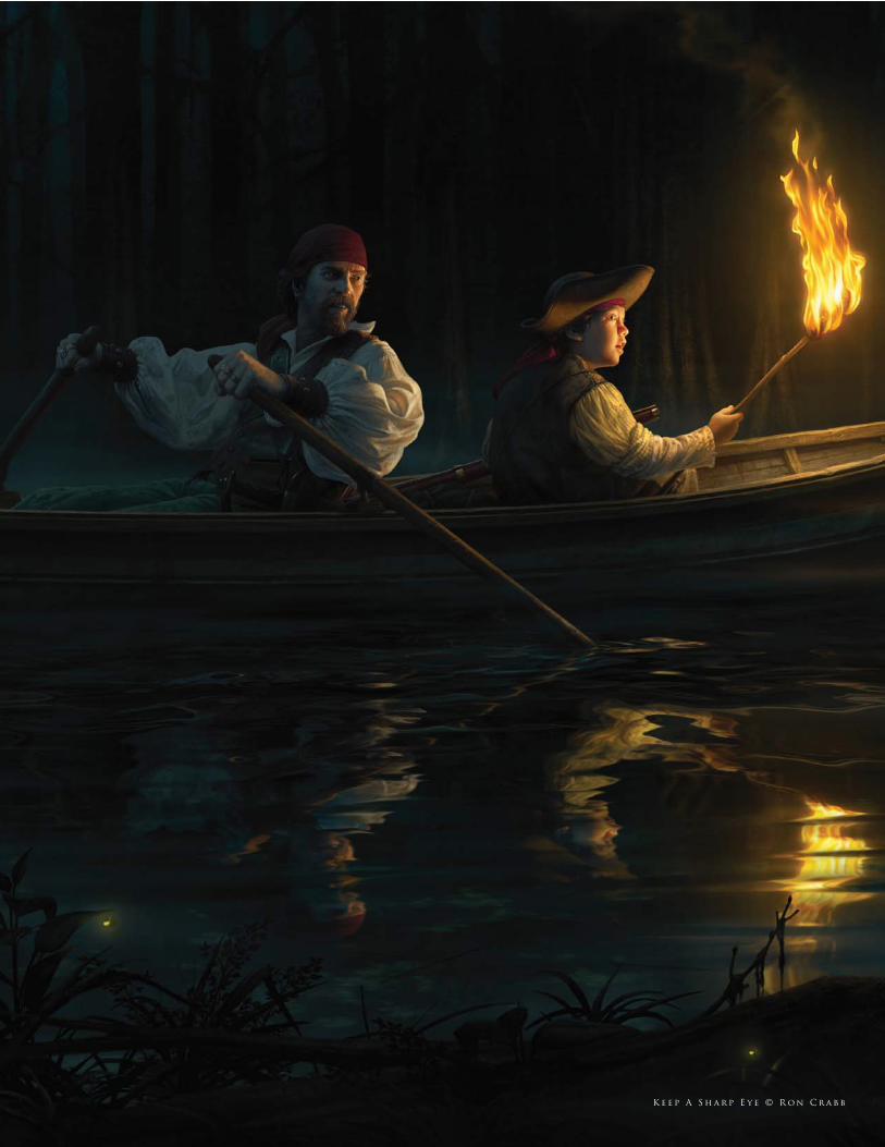
K e e p A S h a r p E y e © R o n C r a b b
This part of the book is perhaps the overture to what has preceded, and
allows a glimpse into the thought process and creative approach behind
three artists. Each addresses the human condition in diverse ways and
hopefully, through comparing the different stylistic approaches, we will
gain an insight into both the technical and emotive aspects that run
through their work.
c o m p l e t e p r o j e c t s
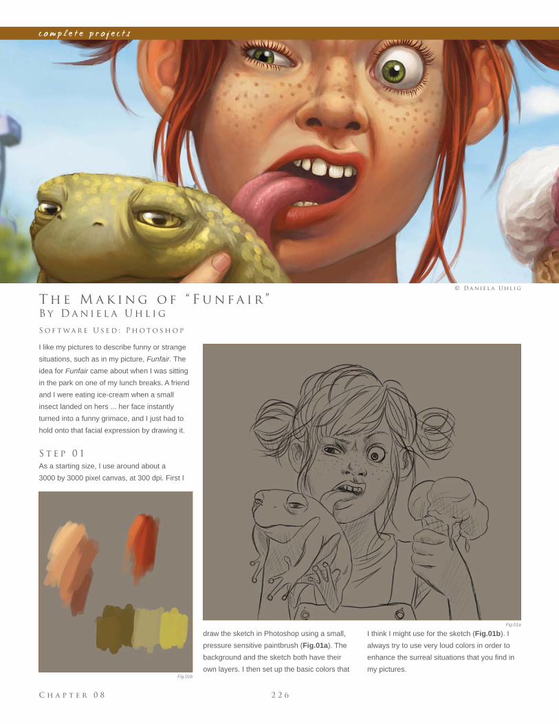
C h a p t e r 0 8 2 2 6
c o m p l e t e p r o j e c t s
Fig.01a
Fig.01b
B y D a n i e l a U h l i g
T h e M a k i n g o f “ F u n f a i r ”
I like my pictures to describe funny or strange
situations, such as in my picture, Funfair. The
idea for Funfair came about when I was sitting
in the park on one of my lunch breaks. A friend
and I were eating ice-cream when a small
insect landed on hers ... her face instantly
turned into a funny grimace, and I just had to
hold onto that facial expression by drawing it.
S t e p 0 1
As a starting size, I use around about a
3000 by 3000 pixel canvas, at 300 dpi. First I
S o f t wa r e U s e d : P h o t o s h o p
© D a n i e l a U h l i g
draw the sketch in Photoshop using a small,
pressure sensitive paintbrush (Fig.01a). The
background and the sketch both have their
own layers. I then set up the basic colors that
I think I might use for the sketch (Fig.01b). I
always try to use very loud colors in order to
enhance the surreal situations that you fi nd in
my pictures.
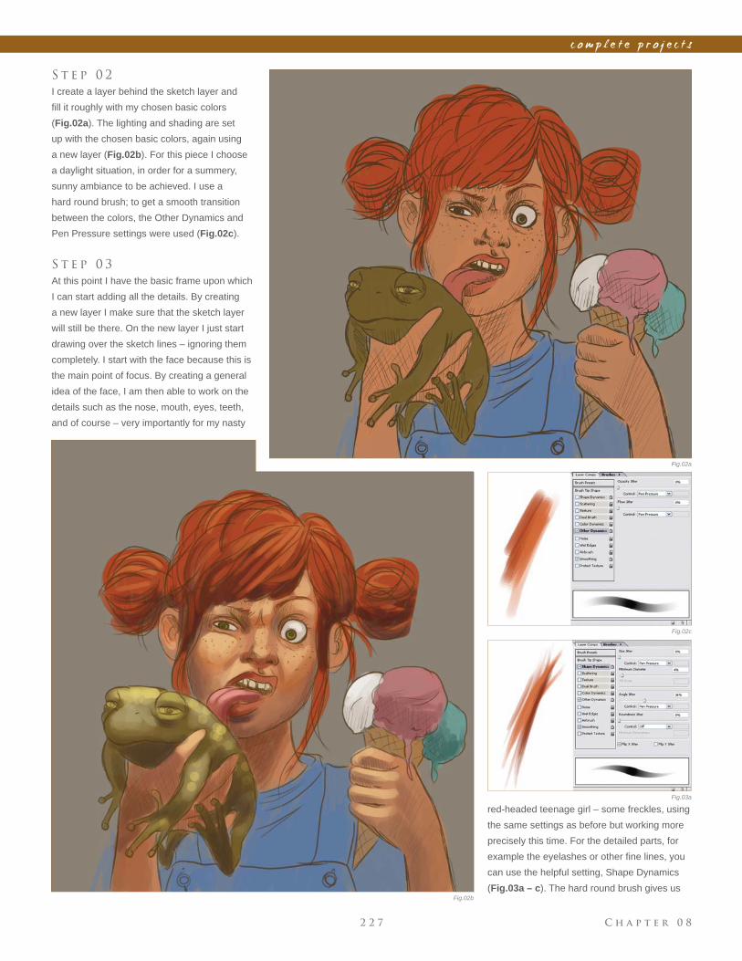
C h a p t e r 0 82 2 7
c o m p l e t e p r o j e c t s
Fig.02a
Fig.02b
Fig.02c
S t e p 0 2
I create a layer behind the sketch layer and
fi ll it roughly with my chosen basic colors
(Fig.02a). The lighting and shading are set
up with the chosen basic colors, again using
a new layer (Fig.02b). For this piece I choose
a daylight situation, in order for a summery,
sunny ambiance to be achieved. I use a
hard round brush; to get a smooth transition
between the colors, the Other Dynamics and
Pen Pressure settings were used (Fig.02c).
S t e p 0 3
At this point I have the basic frame upon which
I can start adding all the details. By creating
a new layer I make sure that the sketch layer
will still be there. On the new layer I just start
drawing over the sketch lines – ignoring them
completely. I start with the face because this is
the main point of focus. By creating a general
idea of the face, I am then able to work on the
details such as the nose, mouth, eyes, teeth,
and of course – very importantly for my nasty
red-headed teenage girl – some freckles, using
the same settings as before but working more
precisely this time. For the detailed parts, for
example the eyelashes or other fi ne lines, you
can use the helpful setting, Shape Dynamics
(Fig.03a – c). The hard round brush gives us
Fig.03a
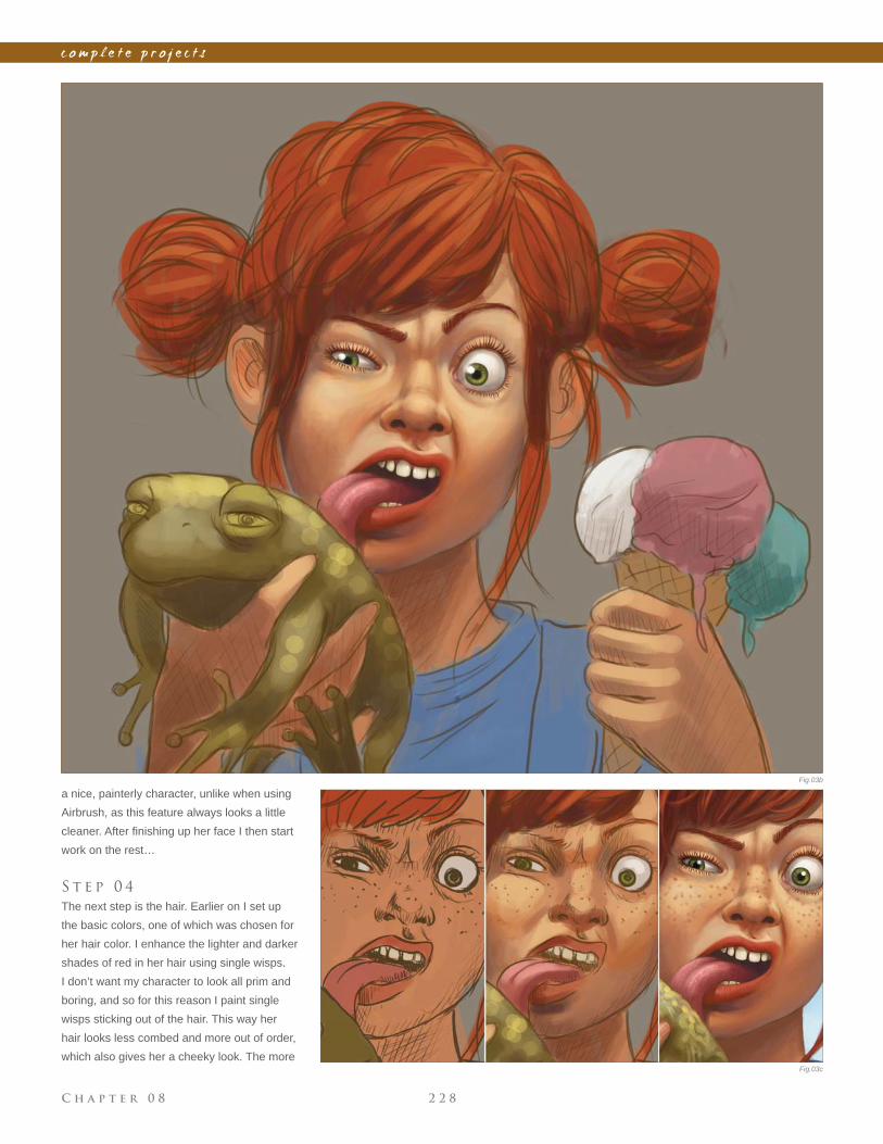
C h a p t e r 0 8 2 2 8
c o m p l e t e p r o j e c t s
Fig.03b
Fig.03c
a nice, painterly character, unlike when using
Airbrush, as this feature always looks a little
cleaner. After fi nishing up her face I then start
work on the rest…
S t e p 0 4
The next step is the hair. Earlier on I set up
the basic colors, one of which was chosen for
her hair color. I enhance the lighter and darker
shades of red in her hair using single wisps.
I don’t want my character to look all prim and
boring, and so for this reason I paint single
wisps sticking out of the hair. This way her
hair looks less combed and more out of order,
which also gives her a cheeky look. The more
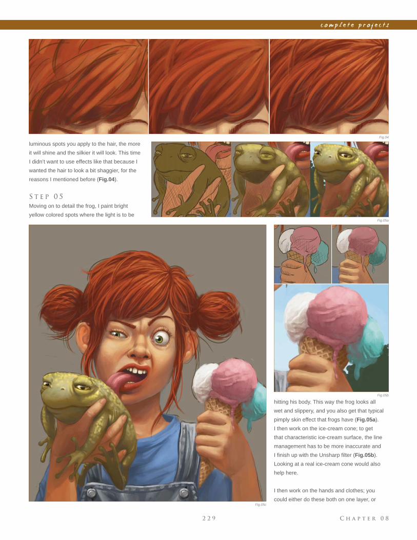
C h a p t e r 0 82 2 9
c o m p l e t e p r o j e c t s
Fig.05a
Fig.05b
Fig.05c
luminous spots you apply to the hair, the more
it will shine and the silkier it will look. This time
I didn’t want to use effects like that because I
wanted the hair to look a bit shaggier, for the
reasons I mentioned before (Fig.04).
S t e p 0 5
Moving on to detail the frog, I paint bright
yellow colored spots where the light is to be
Fig.04
hitting his body. This way the frog looks all
wet and slippery, and you also get that typical
pimply skin effect that frogs have (Fig.05a).
I then work on the ice-cream cone; to get
that characteristic ice-cream surface, the line
management has to be more inaccurate and
I fi nish up with the Unsharp fi lter (Fig.05b).
Looking at a real ice-cream cone would also
help here.
I then work on the hands and clothes; you
could either do these both on one layer, or
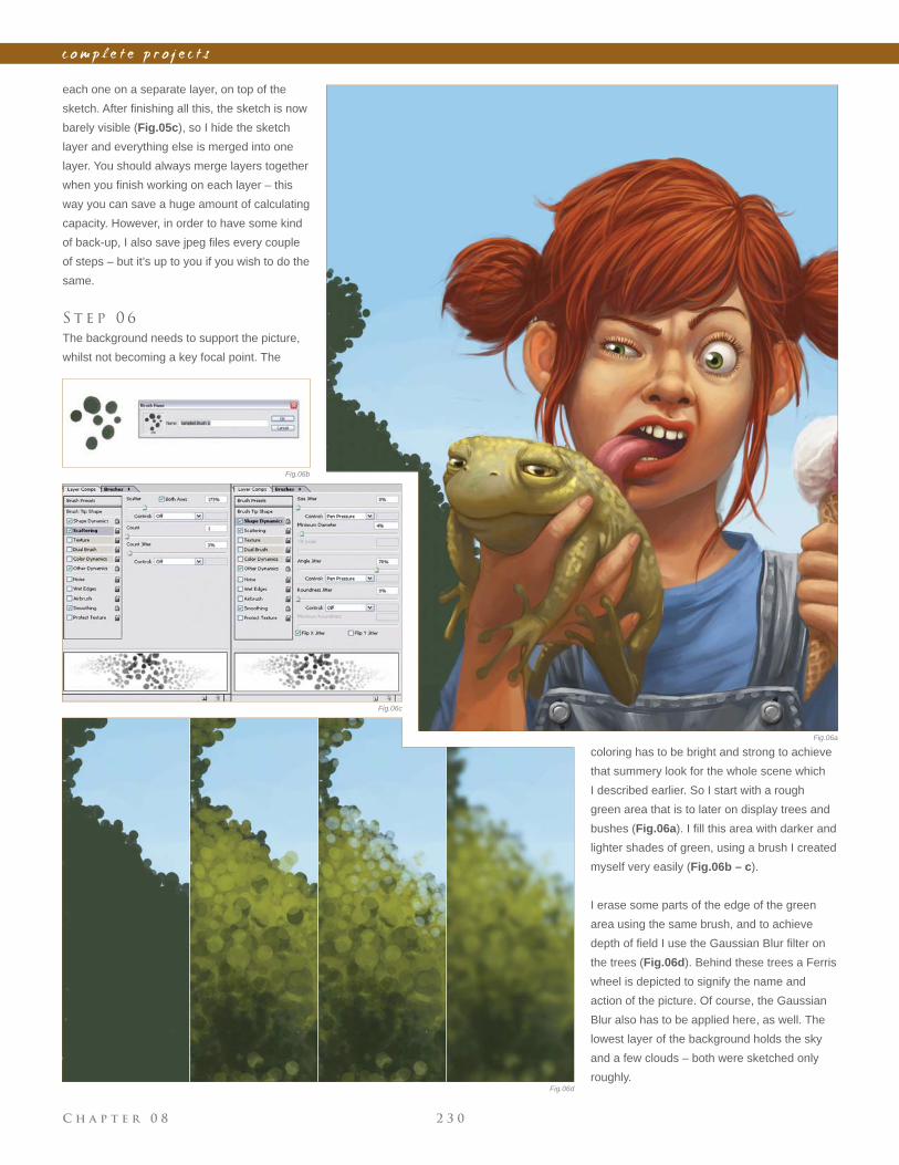
C h a p t e r 0 8 2 3 0
c o m p l e t e p r o j e c t s
coloring has to be bright and strong to achieve
that summery look for the whole scene which
I described earlier. So I start with a rough
green area that is to later on display trees and
bushes (Fig.06a). I fi ll this area with darker and
lighter shades of green, using a brush I created
myself very easily (Fig.06b – c).
I erase some parts of the edge of the green
area using the same brush, and to achieve
depth of fi eld I use the Gaussian Blur fi lter on
the trees (Fig.06d). Behind these trees a Ferris
wheel is depicted to signify the name and
action of the picture. Of course, the Gaussian
Blur also has to be applied here, as well. The
lowest layer of the background holds the sky
and a few clouds – both were sketched only
roughly.
each one on a separate layer, on top of the
sketch. After fi nishing all this, the sketch is now
barely visible (Fig.05c), so I hide the sketch
layer and everything else is merged into one
layer. You should always merge layers together
when you fi nish working on each layer – this
way you can save a huge amount of calculating
capacity. However, in order to have some kind
of back-up, I also save jpeg fi les every couple
of steps – but it’s up to you if you wish to do the
same.
S t e p 0 6
The background needs to support the picture,
whilst not becoming a key focal point. The
Fig.06b
Fig.06a
Fig.06d
Fig.06c
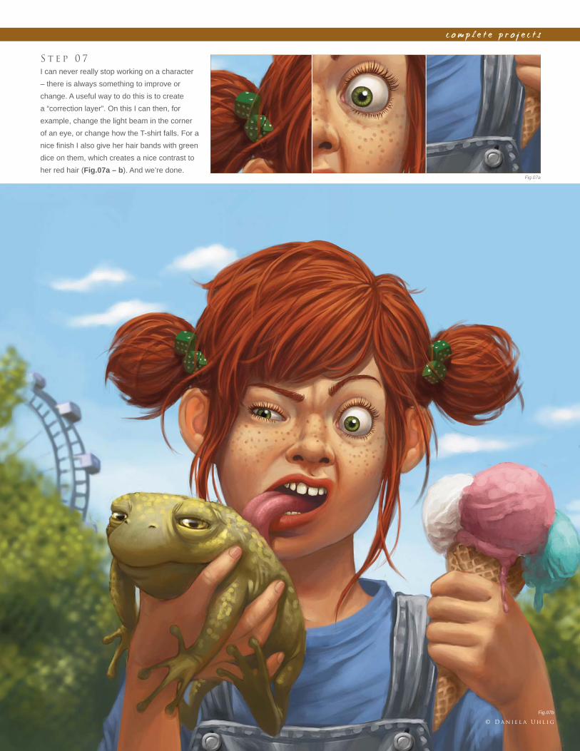
C h a p t e r 0 82 3 1
c o m p l e t e p r o j e c t s
S t e p 0 7
I can never really stop working on a character
– there is always something to improve or
change. A useful way to do this is to create
a “correction layer”. On this I can then, for
example, change the light beam in the corner
of an eye, or change how the T-shirt falls. For a
nice fi nish I also give her hair bands with green
dice on them, which creates a nice contrast to
her red hair (Fig.07a – b). And we’re done.Fig.07a
Fig.07b
© D a n i e l a U h l i g
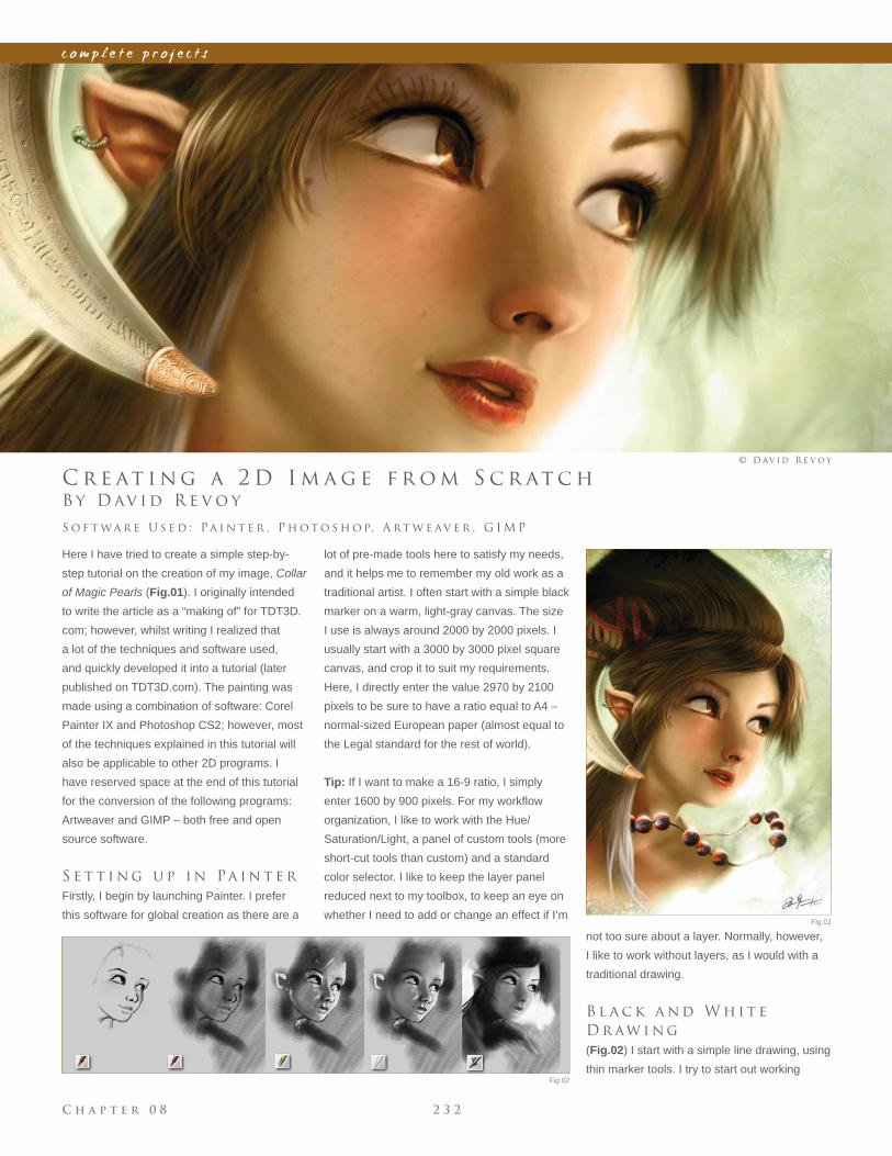
C h a p t e r 0 8 2 3 2
c o m p l e t e p r o j e c t s
Fig.01
Fig.02
B y D av i d R e v o y
C r e at i n g a 2 D I m a g e f r o m S c r at c h
Here I have tried to create a simple step-by-
step tutorial on the creation of my image, Collar
of Magic Pearls (Fig.01). I originally intended
to write the article as a “making of” for TDT3D.
com; however, whilst writing I realized that
a lot of the techniques and software used,
and quickly developed it into a tutorial (later
published on TDT3D.com). The painting was
made using a combination of software: Corel
Painter IX and Photoshop CS2; however, most
of the techniques explained in this tutorial will
also be applicable to other 2D programs. I
have reserved space at the end of this tutorial
for the conversion of the following programs:
Artweaver and GIMP – both free and open
source software.
S e t t i n g u p i n Pa i n t e r
Firstly, I begin by launching Painter. I prefer
this software for global creation as there are a
S o f t wa r e U s e d : Pa i n t e r , P h o t o s h o p, A rt w e av e r , G I M P
© D av i d R e v o y
lot of pre-made tools here to satisfy my needs,
and it helps me to remember my old work as a
traditional artist. I often start with a simple black
marker on a warm, light-gray canvas. The size
I use is always around 2000 by 2000 pixels. I
usually start with a 3000 by 3000 pixel square
canvas, and crop it to suit my requirements.
Here, I directly enter the value 2970 by 2100
pixels to be sure to have a ratio equal to A4 –
normal-sized European paper (almost equal to
the Legal standard for the rest of world).
Tip: If I want to make a 16-9 ratio, I simply
enter 1600 by 900 pixels. For my workfl ow
organization, I like to work with the Hue/
Saturation/Light, a panel of custom tools (more
short-cut tools than custom) and a standard
color selector. I like to keep the layer panel
reduced next to my toolbox, to keep an eye on
whether I need to add or change an effect if I’m
not too sure about a layer. Normally, however,
I like to work without layers, as I would with a
traditional drawing.
B l a c k a n d W h i t e
D r aw i n g
(Fig.02) I start with a simple line drawing, using
thin marker tools. I try to start out working
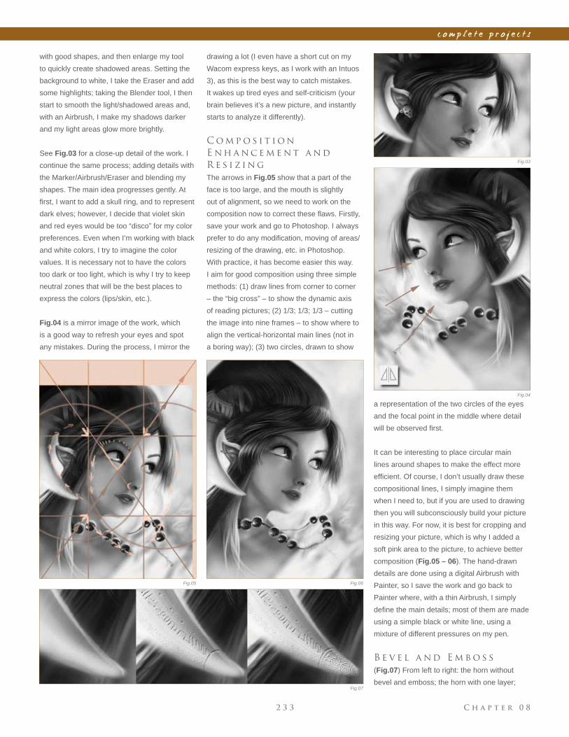
C h a p t e r 0 82 3 3
c o m p l e t e p r o j e c t s
drawing a lot (I even have a short cut on my
Wacom express keys, as I work with an Intuos
3), as this is the best way to catch mistakes.
It wakes up tired eyes and self-criticism (your
brain believes it’s a new picture, and instantly
starts to analyze it differently).
C o m p o s i t i o n
E n h a n c e m e n t a n d
R e s i z i n g
The arrows in Fig.05 show that a part of the
face is too large, and the mouth is slightly
out of alignment, so we need to work on the
composition now to correct these fl aws. Firstly,
save your work and go to Photoshop. I always
prefer to do any modifi cation, moving of areas/
resizing of the drawing, etc. in Photoshop.
With practice, it has become easier this way.
I aim for good composition using three simple
methods: (1) draw lines from corner to corner
– the “big cross” – to show the dynamic axis
of reading pictures; (2) 1/3; 1/3; 1/3 – cutting
the image into nine frames – to show where to
align the vertical-horizontal main lines (not in
a boring way); (3) two circles, drawn to show
Fig.03
Fig.04
Fig.05 Fig.06
Fig.07
with good shapes, and then enlarge my tool
to quickly create shadowed areas. Setting the
background to white, I take the Eraser and add
some highlights; taking the Blender tool, I then
start to smooth the light/shadowed areas and,
with an Airbrush, I make my shadows darker
and my light areas glow more brightly.
See Fig.03 for a close-up detail of the work. I
continue the same process; adding details with
the Marker/Airbrush/Eraser and blending my
shapes. The main idea progresses gently. At
fi rst, I want to add a skull ring, and to represent
dark elves; however, I decide that violet skin
and red eyes would be too “disco” for my color
preferences. Even when I’m working with black
and white colors, I try to imagine the color
values. It is necessary not to have the colors
too dark or too light, which is why I try to keep
neutral zones that will be the best places to
express the colors (lips/skin, etc.).
Fig.04 is a mirror image of the work, which
is a good way to refresh your eyes and spot
any mistakes. During the process, I mirror the
a representation of the two circles of the eyes
and the focal point in the middle where detail
will be observed fi rst.
It can be interesting to place circular main
lines around shapes to make the effect more
effi cient. Of course, I don’t usually draw these
compositional lines, I simply imagine them
when I need to, but if you are used to drawing
then you will subconsciously build your picture
in this way. For now, it is best for cropping and
resizing your picture, which is why I added a
soft pink area to the picture, to achieve better
composition (Fig.05 – 06). The hand-drawn
details are done using a digital Airbrush with
Painter, so I save the work and go back to
Painter where, with a thin Airbrush, I simply
defi ne the main details; most of them are made
using a simple black or white line, using a
mixture of different pressures on my pen.
B e v e l a n d E m b o s s
(Fig.07) From left to right: the horn without
bevel and emboss; the horn with one layer;
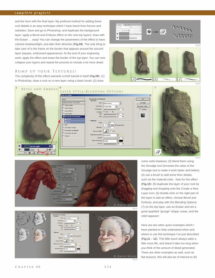
C h a p t e r 0 8 2 3 4
c o m p l e t e p r o j e c t s
and the horn with the fi nal layer. My prefered method for adding these
cool details is an easy technique which I have learnt from forums and
websites: Save and go to Photoshop, and duplicate the background
layer; apply a Bevel and Emboss effect on the new top layers; draw with
the Eraser … easy! You can change the parameters of the effect to have
colored shadows/light, and alter their direction (Fig.08). The only thing to
take care of is the frame on the border that appears around the second
layer (square, embossed appearance). At the end of your engraving
work, apply the effect and erase the border of the top layer. You can now
collapse your layers and repeat the process to include a lot more detail.
B u m p u p y o u r T e x t u r e s !
The complexity of this effect warrants a brief tutorial in itself (Fig.09): (1)
in Photoshop, draw a rock on a new layer using a basic brush; (2) draw
L ay e r S t y l e > B l e n d i n g O p t i o n sB e v e l a n d E m b o s s
C r e at e a N e w L ay e r
some solid shadows; (3) blend them using
the Smudge tool (increase the value of the
Smudge tool to make it work faster and better);
(4) use a brush to add some fi ner details,
such as the material color. Now for the effect
(Fig.10): (5) duplicate the layer of your rock by
dragging and dropping onto the Create a New
Layer icon; (6) double-click on the right part of
the layer to add an effect, choose Bevel and
Emboss, and play with the Blending Options;
(7) on the top layer, use an Eraser and set a
good sparkled “grunge” shape; erase, and the
relief appears!
Here are two other quick examples which I
have painted to help understand when and
where to use this technique I’ve just described
(Fig.11 – 12). This little touch always adds a
little more life, and doesn’t take too long when
you think of the amount of detail generated.
There are other examples as well, such as
fl at textures; this will also be of interest to 3D
Fig.08
Fig.09
Fig.10
Fig.11
Fig.12
© D av i d R e v o y
© D av i d R e v o y
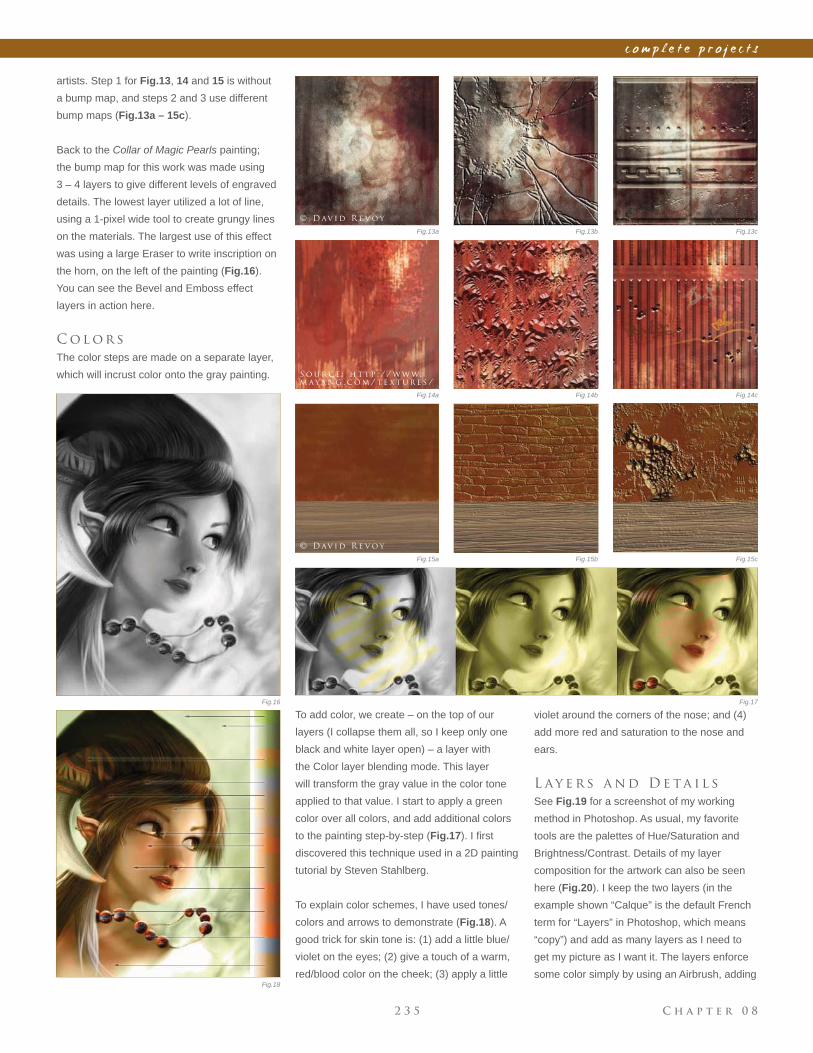
C h a p t e r 0 82 3 5
c o m p l e t e p r o j e c t s
artists. Step 1 for Fig.13, 14 and 15 is without
a bump map, and steps 2 and 3 use different
bump maps (Fig.13a – 15c).
Back to the Collar of Magic Pearls painting;
the bump map for this work was made using
3 – 4 layers to give different levels of engraved
details. The lowest layer utilized a lot of line,
using a 1-pixel wide tool to create grungy lines
on the materials. The largest use of this effect
was using a large Eraser to write inscription on
the horn, on the left of the painting (Fig.16).
You can see the Bevel and Emboss effect
layers in action here.
C o l o r s
The color steps are made on a separate layer,
which will incrust color onto the gray painting.
To add color, we create – on the top of our
layers (I collapse them all, so I keep only one
black and white layer open) – a layer with
the Color layer blending mode. This layer
will transform the gray value in the color tone
applied to that value. I start to apply a green
color over all colors, and add additional colors
to the painting step-by-step (Fig.17). I fi rst
discovered this technique used in a 2D painting
tutorial by Steven Stahlberg.
To explain color schemes, I have used tones/
colors and arrows to demonstrate (Fig.18). A
good trick for skin tone is: (1) add a little blue/
violet on the eyes; (2) give a touch of a warm,
red/blood color on the cheek; (3) apply a little
violet around the corners of the nose; and (4)
add more red and saturation to the nose and
ears.
L ay e r s a n d D e ta i l s
See Fig.19 for a screenshot of my working
method in Photoshop. As usual, my favorite
tools are the palettes of Hue/Saturation and
Brightness/Contrast. Details of my layer
composition for the artwork can also be seen
here (Fig.20). I keep the two layers (in the
example shown “Calque” is the default French
term for “Layers” in Photoshop, which means
“copy”) and add as many layers as I need to
get my picture as I want it. The layers enforce
some color simply by using an Airbrush, adding
Fig.13a
Fig.14a
Fig.15a
Fig.13b
Fig.14b
Fig.15b
Fig.13c
Fig.14c
Fig.15c
Fig.16 Fig.17
Fig.18
© D av i d R e v o y
S o u r c e : h t t p : / / w w w.
m aya n g . c o m / t e x t u r e s /
© D av i d R e v o y
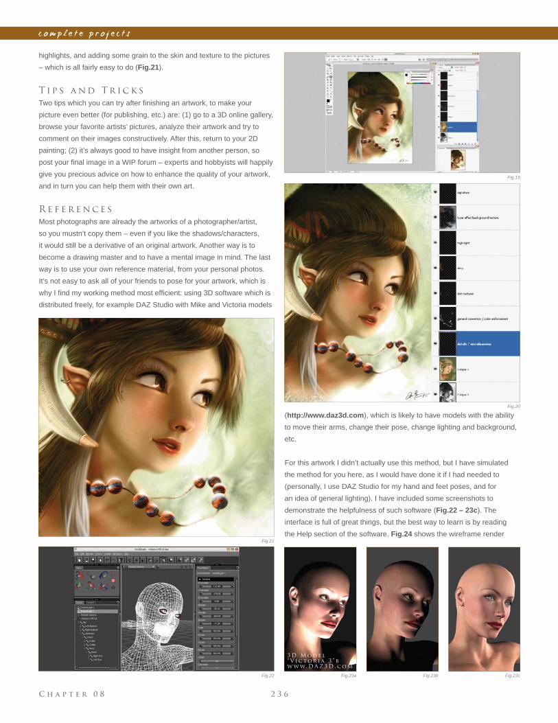
C h a p t e r 0 8 2 3 6
c o m p l e t e p r o j e c t s
highlights, and adding some grain to the skin and texture to the pictures
– which is all fairly easy to do (Fig.21).
T i p s a n d T r i c k s
Two tips which you can try after fi nishing an artwork, to make your
picture even better (for publishing, etc.) are: (1) go to a 3D online gallery,
browse your favorite artists’ pictures, analyze their artwork and try to
comment on their images constructively. After this, return to your 2D
painting; (2) it’s always good to have insight from another person, so
post your fi nal image in a WIP forum – experts and hobbyists will happily
give you precious advice on how to enhance the quality of your artwork,
and in turn you can help them with their own art.
R e f e r e n c e s
Most photographs are already the artworks of a photographer/artist,
so you mustn’t copy them – even if you like the shadows/characters,
it would still be a derivative of an original artwork. Another way is to
become a drawing master and to have a mental image in mind. The last
way is to use your own reference material, from your personal photos.
It’s not easy to ask all of your friends to pose for your artwork, which is
why I fi nd my working method most effi cient: using 3D software which is
distributed freely, for example DAZ Studio with Mike and Victoria models
(http://www.daz3d.com), which is likely to have models with the ability
to move their arms, change their pose, change lighting and background,
etc.
For this artwork I didn’t actually use this method, but I have simulated
the method for you here, as I would have done it if I had needed to
(personally, I use DAZ Studio for my hand and feet poses, and for
an idea of general lighting). I have included some screenshots to
demonstrate the helpfulness of such software (Fig.22 – 23c). The
interface is full of great things, but the best way to learn is by reading
the Help section of the software. Fig.24 shows the wireframe render
Fig.19
Fig.20
Fig.21
Fig.23a Fig.23cFig.23bFig.22
3 D M o d e l
“ V i c t o r i a 3 ” b y
w w w. D A Z 3 D . c o m
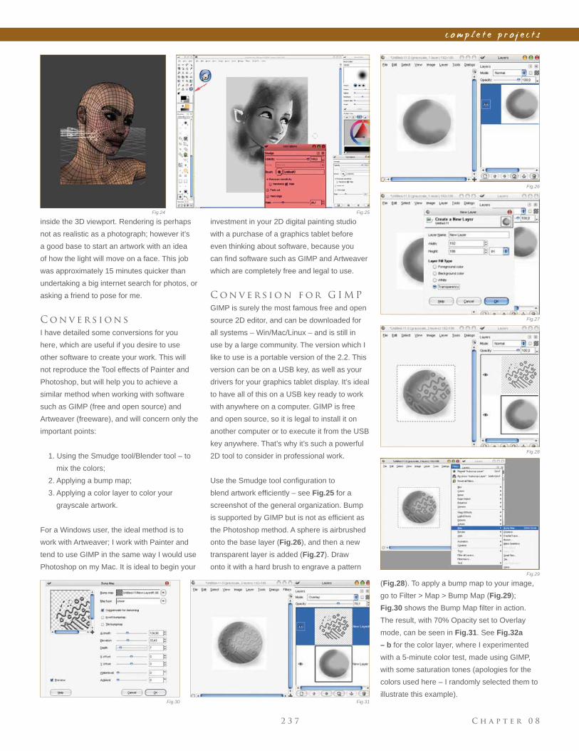
C h a p t e r 0 82 3 7
c o m p l e t e p r o j e c t s
inside the 3D viewport. Rendering is perhaps
not as realistic as a photograph; however it’s
a good base to start an artwork with an idea
of how the light will move on a face. This job
was approximately 15 minutes quicker than
undertaking a big internet search for photos, or
asking a friend to pose for me.
C o n v e r s i o n s
I have detailed some conversions for you
here, which are useful if you desire to use
other software to create your work. This will
not reproduce the Tool effects of Painter and
Photoshop, but will help you to achieve a
similar method when working with software
such as GIMP (free and open source) and
Artweaver (freeware), and will concern only the
important points:
1. Using the Smudge tool/Blender tool – to
mix the colors;
2. Applying a bump map;
3. Applying a color layer to color your
grayscale artwork.
For a Windows user, the ideal method is to
work with Artweaver; I work with Painter and
tend to use GIMP in the same way I would use
Photoshop on my Mac. It is ideal to begin your
Fig.24 Fig.25
Fig.26
Fig.27
Fig.28
Fig.29
investment in your 2D digital painting studio
with a purchase of a graphics tablet before
even thinking about software, because you
can fi nd software such as GIMP and Artweaver
which are completely free and legal to use.
C o n v e r s i o n f o r G I M P
GIMP is surely the most famous free and open
source 2D editor, and can be downloaded for
all systems – Win/Mac/Linux – and is still in
use by a large community. The version which I
like to use is a portable version of the 2.2. This
version can be on a USB key, as well as your
drivers for your graphics tablet display. It’s ideal
to have all of this on a USB key ready to work
with anywhere on a computer. GIMP is free
and open source, so it is legal to install it on
another computer or to execute it from the USB
key anywhere. That’s why it’s such a powerful
2D tool to consider in professional work.
Use the Smudge tool confi guration to
blend artwork effi ciently – see Fig.25 for a
screenshot of the general organization. Bump
is supported by GIMP but is not as effi cient as
the Photoshop method. A sphere is airbrushed
onto the base layer (Fig.26), and then a new
transparent layer is added (Fig.27). Draw
onto it with a hard brush to engrave a pattern
(Fig.28). To apply a bump map to your image,
go to Filter > Map > Bump Map (Fig.29);
Fig.30 shows the Bump Map fi lter in action.
The result, with 70% Opacity set to Overlay
mode, can be seen in Fig.31. See Fig.32a
– b for the color layer, where I experimented
with a 5-minute color test, made using GIMP,
with some saturation tones (apologies for the
colors used here – I randomly selected them to
illustrate this example). Fig.30 Fig.31
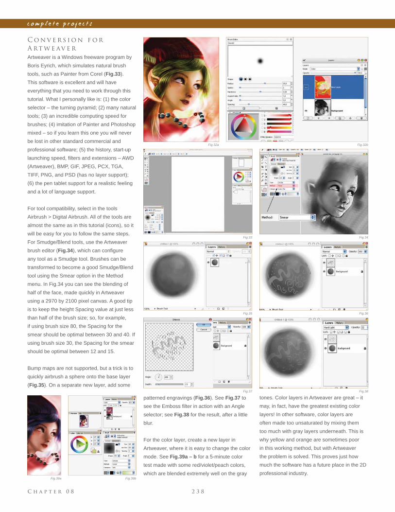
C h a p t e r 0 8 2 3 8
c o m p l e t e p r o j e c t s
patterned engravings (Fig.36). See Fig.37 to
see the Emboss fi lter in action with an Angle
selector; see Fig.38 for the result, after a little
blur.
For the color layer, create a new layer in
Artweaver, where it is easy to change the color
mode. See Fig.39a – b for a 5-minute color
test made with some red/violet/peach colors,
which are blended extremely well on the gray
C o n v e r s i o n f o r
A rt w e av e r
Artweaver is a Windows freeware program by
Boris Eyrich, which simulates natural brush
tools, such as Painter from Corel (Fig.33).
This software is excellent and will have
everything that you need to work through this
tutorial. What I personally like is: (1) the color
selector – the turning pyramid; (2) many natural
tools; (3) an incredible computing speed for
brushes; (4) imitation of Painter and Photoshop
mixed – so if you learn this one you will never
be lost in other standard commercial and
professional software; (5) the history, start-up
launching speed, fi lters and extensions – AWD
(Artweaver), BMP, GIF, JPEG, PCX, TGA,
TIFF, PNG, and PSD (has no layer support);
(6) the pen tablet support for a realistic feeling
and a lot of language support.
For tool compatibility, select in the tools
Airbrush > Digital Airbrush. All of the tools are
almost the same as in this tutorial (icons), so it
will be easy for you to follow the same steps.
For Smudge/Blend tools, use the Artweaver
brush editor (Fig.34), which can confi gure
any tool as a Smudge tool. Brushes can be
transformed to become a good Smudge/Blend
tool using the Smear option in the Method
menu. In Fig.34 you can see the blending of
half of the face, made quickly in Artweaver
using a 2970 by 2100 pixel canvas. A good tip
is to keep the height Spacing value at just less
than half of the brush size; so, for example,
if using brush size 80, the Spacing for the
smear should be optimal between 30 and 40. If
using brush size 30, the Spacing for the smear
should be optimal between 12 and 15.
Bump maps are not supported, but a trick is to
quickly airbrush a sphere onto the base layer
(Fig.35). On a separate new layer, add some
tones. Color layers in Artweaver are great – it
may, in fact, have the greatest existing color
layers! In other software, color layers are
often made too unsaturated by mixing them
too much with gray layers underneath. This is
why yellow and orange are sometimes poor
in this working method, but with Artweaver
the problem is solved. This proves just how
much the software has a future place in the 2D
professional industry.
Fig.33 Fig.34
Fig.35
Fig.37 Fig.38
Fig.36
Fig.32a Fig.32b
Fig.39a Fig.39b
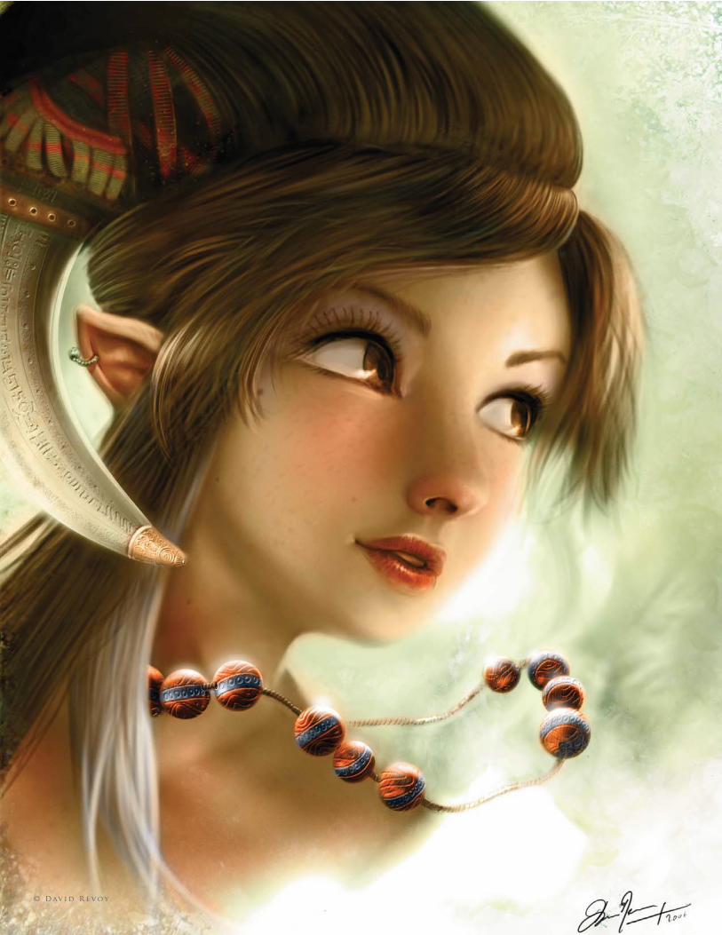
C h a p t e r 0 82 3 9
c o m p l e t e p r o j e c t s
© D av i d R e v o y
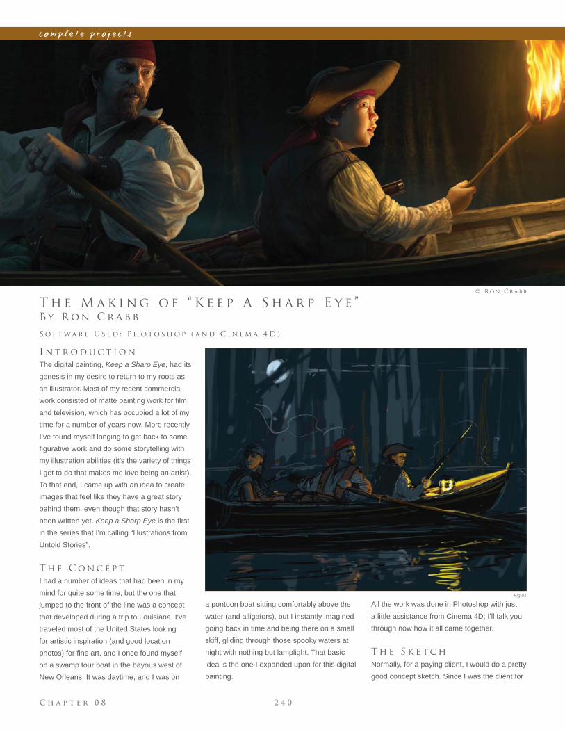
C h a p t e r 0 8 2 4 0
c o m p l e t e p r o j e c t s
Fig.01
B y R o n C r a b b
T h e M a k i n g o f “ K e e p A S h a r p E y e ”
I n t r o d u c t i o n
The digital painting, Keep a Sharp Eye, had its
genesis in my desire to return to my roots as
an illustrator. Most of my recent commercial
work consisted of matte painting work for fi lm
and television, which has occupied a lot of my
time for a number of years now. More recently
I’ve found myself longing to get back to some
fi gurative work and do some storytelling with
my illustration abilities (it’s the variety of things
I get to do that makes me love being an artist).
To that end, I came up with an idea to create
images that feel like they have a great story
behind them, even though that story hasn’t
been written yet. Keep a Sharp Eye is the fi rst
in the series that I’m calling “Illustrations from
Untold Stories”.
T h e C o n c e p t
I had a number of ideas that had been in my
mind for quite some time, but the one that
jumped to the front of the line was a concept
that developed during a trip to Louisiana. I‘ve
traveled most of the United States looking
for artistic inspiration (and good location
photos) for fi ne art, and I once found myself
on a swamp tour boat in the bayous west of
New Orleans. It was daytime, and I was on
S o f t wa r e U s e d : P h o t o s h o p ( a n d C i n e m a 4 D )
© R o n C r a b b
a pontoon boat sitting comfortably above the
water (and alligators), but I instantly imagined
going back in time and being there on a small
skiff, gliding through those spooky waters at
night with nothing but lamplight. That basic
idea is the one I expanded upon for this digital
painting.
All the work was done in Photoshop with just
a little assistance from Cinema 4D; I’ll talk you
through now how it all came together.
T h e S k e t c h
Normally, for a paying client, I would do a pretty
good concept sketch. Since I was the client for
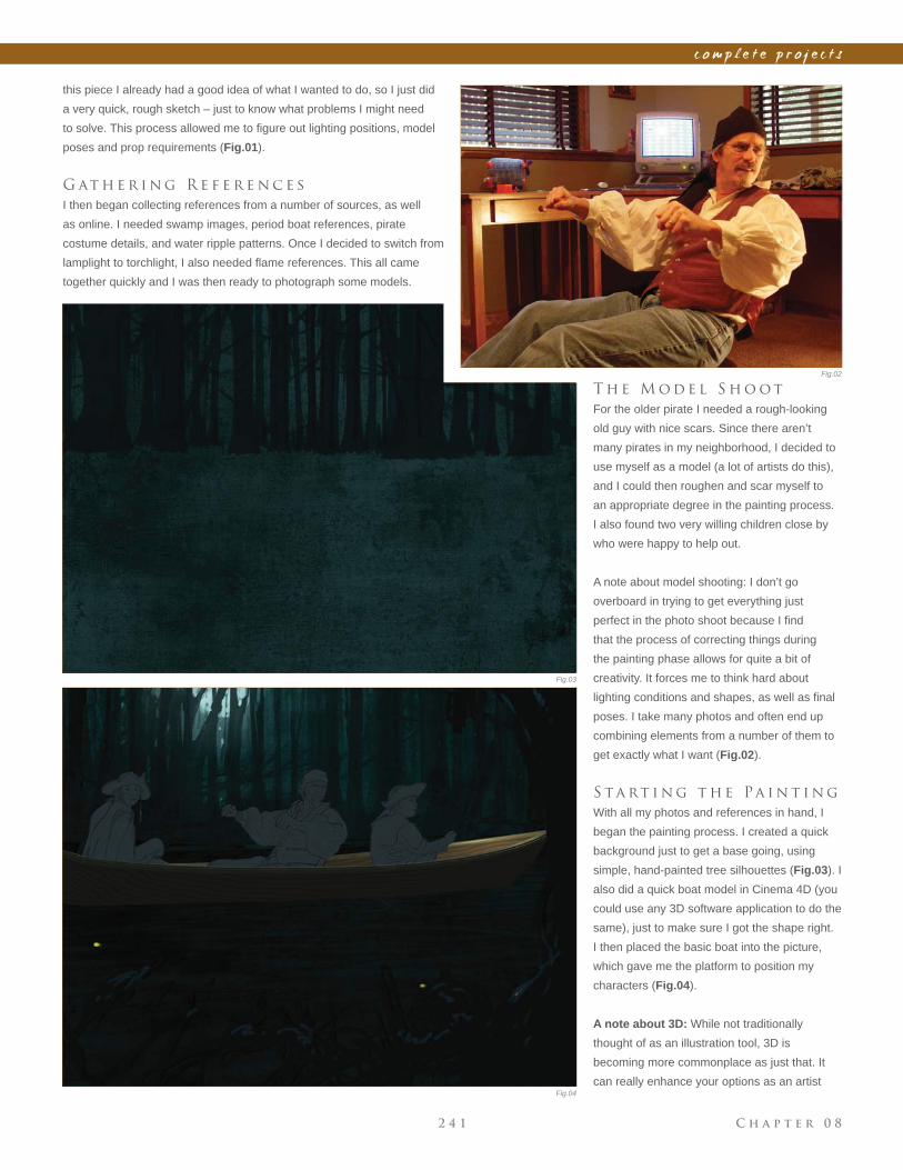
C h a p t e r 0 82 4 1
c o m p l e t e p r o j e c t s
Fig.02
Fig.03
Fig.04
this piece I already had a good idea of what I wanted to do, so I just did
a very quick, rough sketch – just to know what problems I might need
to solve. This process allowed me to fi gure out lighting positions, model
poses and prop requirements (Fig.01).
G at h e r i n g R e f e r e n c e s
I then began collecting references from a number of sources, as well
as online. I needed swamp images, period boat references, pirate
costume details, and water ripple patterns. Once I decided to switch from
lamplight to torchlight, I also needed fl ame references. This all came
together quickly and I was then ready to photograph some models.
T h e M o d e l S h o o t
For the older pirate I needed a rough-looking
old guy with nice scars. Since there aren’t
many pirates in my neighborhood, I decided to
use myself as a model (a lot of artists do this),
and I could then roughen and scar myself to
an appropriate degree in the painting process.
I also found two very willing children close by
who were happy to help out.
A note about model shooting: I don’t go
overboard in trying to get everything just
perfect in the photo shoot because I fi nd
that the process of correcting things during
the painting phase allows for quite a bit of
creativity. It forces me to think hard about
lighting conditions and shapes, as well as fi nal
poses. I take many photos and often end up
combining elements from a number of them to
get exactly what I want (Fig.02).
S ta rt i n g t h e Pa i n t i n g
With all my photos and references in hand, I
began the painting process. I created a quick
background just to get a base going, using
simple, hand-painted tree silhouettes (Fig.03). I
also did a quick boat model in Cinema 4D (you
could use any 3D software application to do the
same), just to make sure I got the shape right.
I then placed the basic boat into the picture,
which gave me the platform to position my
characters (Fig.04).
A note about 3D: While not traditionally
thought of as an illustration tool, 3D is
becoming more commonplace as just that. It
can really enhance your options as an artist
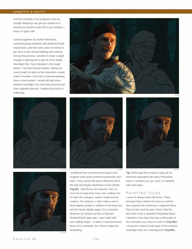
C h a p t e r 0 8 2 4 2
c o m p l e t e p r o j e c t s
and fuel creativity. Free programs such as
Google SketchUp can get you started on it,
should you decide to add 3D to your toolbox. I
know I’m glad I did!
I pieced together my model references,
combining body positions with preferred facial
expressions, and did some color correcting to
get close to the desired lighting and coloring.
During this process I decided to make a slight
change in lighting and to get rid of the bright
moonlight that I had indicated in the rough
sketch. I felt that having it darker, without an
overly bright rim light on the characters, would
make it moodier; more like a classical painting
than a movie poster. I would still add some
ambient moonlight, but much less pronounced
than originally planned. I wanted that torch to
really pop.
I positioned the corrected photo layers and
roughed some quick positioning sketches over
them. I then moved the photo reference off to
the side and began sketching in more details
(Fig.05). I did this for two reasons: one, it’s
more fun to draw than trace; two, it allows me
to make the changes I want to make and be
creative. For instance, I often make a man’s
head slightly smaller in relation to his body size
and his hands slightly larger. It’s a common
illustrator tip I picked up from a Norman
Rockwell book ages ago. I also make kids’
eyes slightly larger – it adds to expressiveness.
None of it is dramatic, but I think it helps the
storytelling.
Fig.05
Fig.06a Fig.06cFig.06b
Fig.06d
Tip: All through this process I keep all my
elements separated into many Photoshop
layers. I combine as I go, once I’m satisfi ed
with each layer.
Pa i n t i n g F a c e s
I seem to always start with faces. That’s
because that is where the story is, and the
rest supports the mood that is captured there.
Plus it’s the most fun part. Once I had the
line work in (as a separate Photoshop layer),
I painted a new layer that was a silhouette of
the characters as a base to work on (Fig.06a).
I chose the medium level value of the ambient
moonlight color as a starting point (Fig.06b).
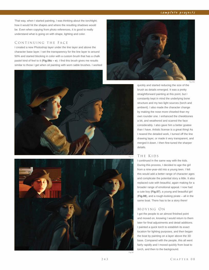
C h a p t e r 0 82 4 3
c o m p l e t e p r o j e c t s
That way, when I started painting, I was thinking about the torchlight;
how it would hit the shapes and where the resulting shadows would
be. Even when copying from photo references, it is good to really
understand what is going on with shape, lighting and color.
C o n t i n u i n g t h e F a c e
I created a new Photoshop layer under the line layer and above the
character base layer. I set the transparency for the line layer to around
50% and started blocking in color with a custom brush that has a chalk
pastel kind of feel to it (Fig.06c – e). I fi nd this brush gives me results
similar to those I get when oil painting with worn sable brushes. I worked
quickly and started reducing the size of the
brush as details emerged. It was a pretty
straightforward painting at this point, but I
constantly kept in mind the underlying bone
structure and my two light sources (torch and
ambient). I also made the character change
by making the nose more chiseled than my
own rounder one. I enhanced the cheekbones
a bit, and weathered and scarred the face
considerably. I also gave him a better goatee
than I have. Artistic license is a great thing! As
I neared the detailed work, I turned off the line
drawing layer, or made it very transparent, and
merged it down. I then fi ne-tuned the sharper
details.
T h e K i d s
I continued in the same way with the kids.
During this process, I decided to age the girl
from a nine-year-old into a young teen. I felt
this would add a better range of character ages
and complicate the potential story a little. It also
replaced cute with beautiful, again making for a
broader range of emotional appeal. I now had
a cute boy (Fig.07), a young and beautiful girl
(Fig.08), and a rough-looking pirate – all in the
same boat. There has to be a story there!
M o v i n g O n
I got the people to an almost fi nished point
and moved on, knowing I would return to them
later for fi nal adjustments and detail additions.
I painted a quick torch to establish its exact
location for lighting purposes, and then began
the boat by painting on a layer above the 3D
base. Compared with the people, this all went
fairly rapidly and I moved quickly from boat to
torch, and then to the background.
Fig.06e
Fig.07
Fig.08
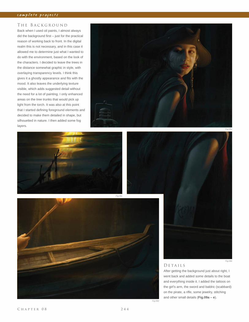
C h a p t e r 0 8 2 4 4
c o m p l e t e p r o j e c t s
D e ta i l s
After getting the background just about right, I
went back and added some details to the boat
and everything inside it. I added the tattoos on
the girl’s arm, the sword and baldric (scabbard)
on the pirate, a rifl e, some jewelry, stitching
and other small details (Fig.09a – e).
T h e B a c k g r o u n d
Back when I used oil paints, I almost always
did the background fi rst – just for the practical
reason of working back to front. In the digital
realm this is not necessary, and in this case it
allowed me to determine just what I wanted to
do with the environment, based on the look of
the characters. I decided to leave the trees in
the distance somewhat graphic in style, with
overlaying transparency levels. I think this
gives it a ghostly appearance and fi ts with the
mood. It also leaves the underlying texture
visible, which adds suggested detail without
the need for a lot of painting. I only enhanced
areas on the tree trunks that would pick up
light from the torch. It was also at this point
that I started defi ning foreground elements and
decided to make them detailed in shape, but
silhouetted in nature. I then added some fog
layers.Fig.09a
Fig.09b
Fig.09d
Fig.09c
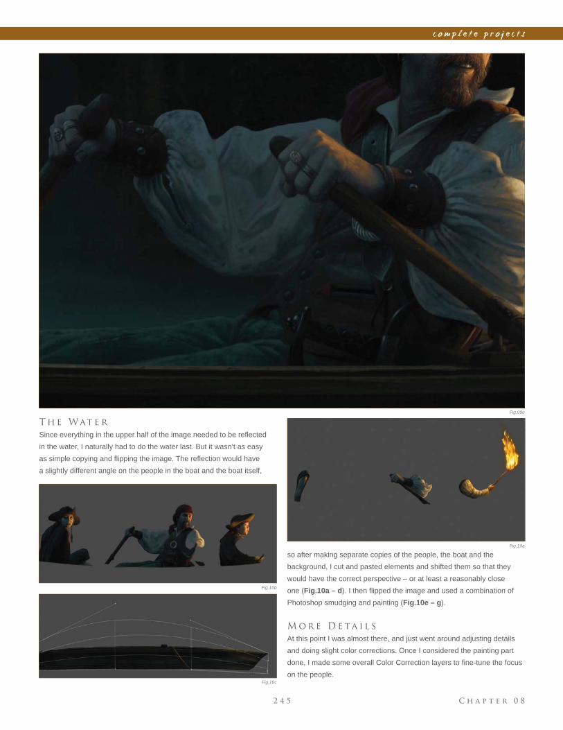
C h a p t e r 0 82 4 5
c o m p l e t e p r o j e c t s
T h e Wat e r
Since everything in the upper half of the image needed to be refl ected
in the water, I naturally had to do the water last. But it wasn’t as easy
as simple copying and fl ipping the image. The refl ection would have
a slightly different angle on the people in the boat and the boat itself,
Fig.09e
Fig.10a
Fig.10b
Fig.10c
so after making separate copies of the people, the boat and the
background, I cut and pasted elements and shifted them so that they
would have the correct perspective – or at least a reasonably close
one (Fig.10a – d). I then fl ipped the image and used a combination of
Photoshop smudging and painting (Fig.10e – g).
M o r e D e ta i l s
At this point I was almost there, and just went around adjusting details
and doing slight color corrections. Once I considered the painting part
done, I made some overall Color Correction layers to fi ne-tune the focus
on the people.
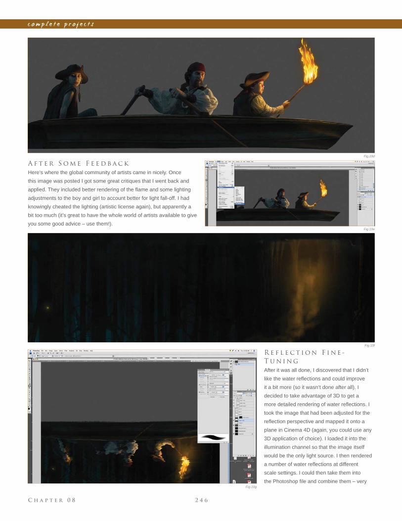
C h a p t e r 0 8 2 4 6
c o m p l e t e p r o j e c t s
A f t e r S o m e F e e d b a c k
Here’s where the global community of artists came in nicely. Once
this image was posted I got some great critiques that I went back and
applied. They included better rendering of the fl ame and some lighting
adjustments to the boy and girl to account better for light fall-off. I had
knowingly cheated the lighting (artistic license again), but apparently a
bit too much (it’s great to have the whole world of artists available to give
you some good advice – use them!).
R e f l e c t i o n F i n e -
T u n i n g
After it was all done, I discovered that I didn’t
like the water refl ections and could improve
it a bit more (so it wasn’t done after all). I
decided to take advantage of 3D to get a
more detailed rendering of water refl ections. I
took the image that had been adjusted for the
refl ection perspective and mapped it onto a
plane in Cinema 4D (again, you could use any
3D application of choice). I loaded it into the
illumination channel so that the image itself
would be the only light source. I then rendered
a number of water refl ections at different
scale settings. I could then take them into
the Photoshop fi le and combine them – very
Fig.10e
Fig.10f
Fig.10g
Fig.10d
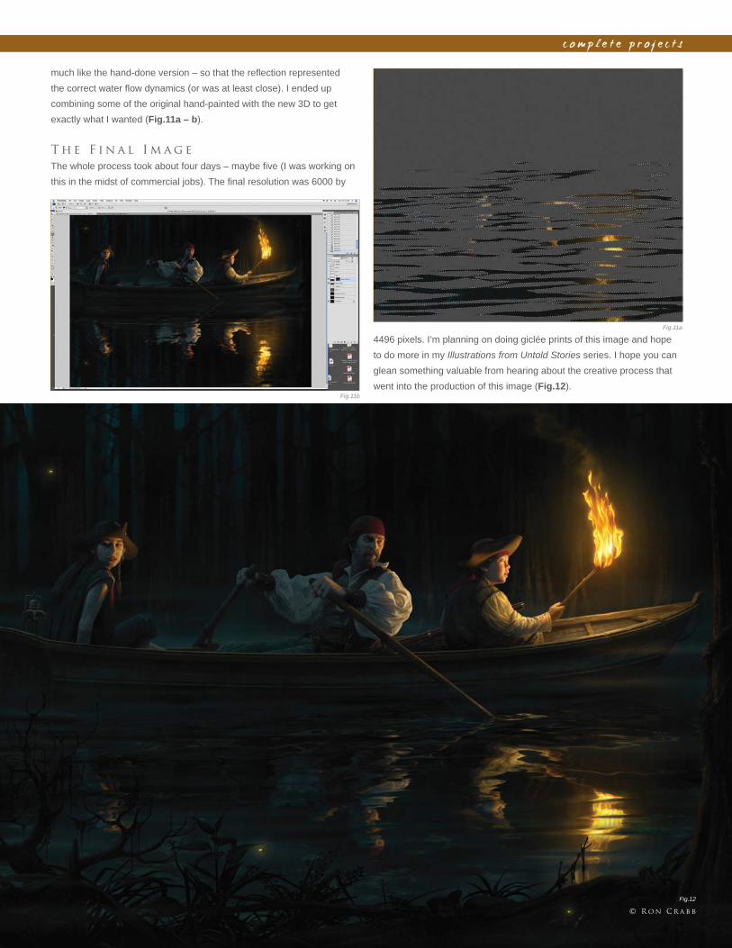
C h a p t e r 0 82 4 7
c o m p l e t e p r o j e c t s
much like the hand-done version – so that the refl ection represented
the correct water fl ow dynamics (or was at least close). I ended up
combining some of the original hand-painted with the new 3D to get
exactly what I wanted (Fig.11a – b).
T h e F i n a l I m a g e
The whole process took about four days – maybe fi ve (I was working on
this in the midst of commercial jobs). The fi nal resolution was 6000 by
Fig.11a
Fig.11b
Fig.12
4496 pixels. I’m planning on doing giclée prints of this image and hope
to do more in my Illustrations from Untold Stories series. I hope you can
glean something valuable from hearing about the creative process that
went into the production of this image (Fig.12).
© R o n C r a b b

t h e g a l l e r y
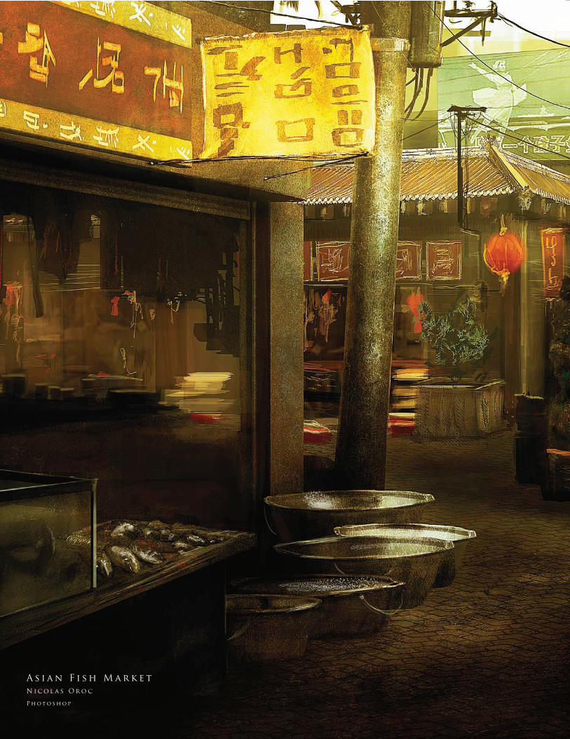
2 5 0
A s i a n F i s h M a r k e t
N i c o l a s O r o c
P h o t o s h o p
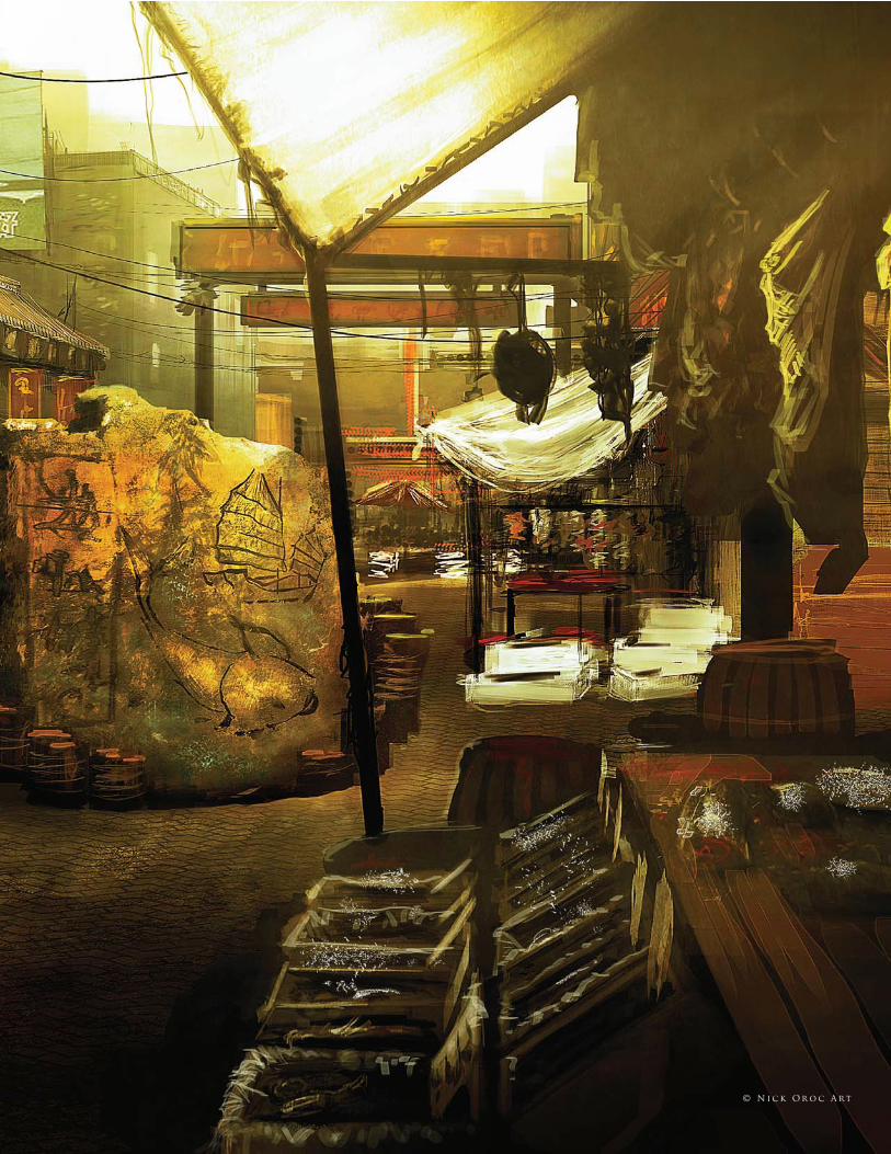
2 5 1© N i c k O r o c A rt
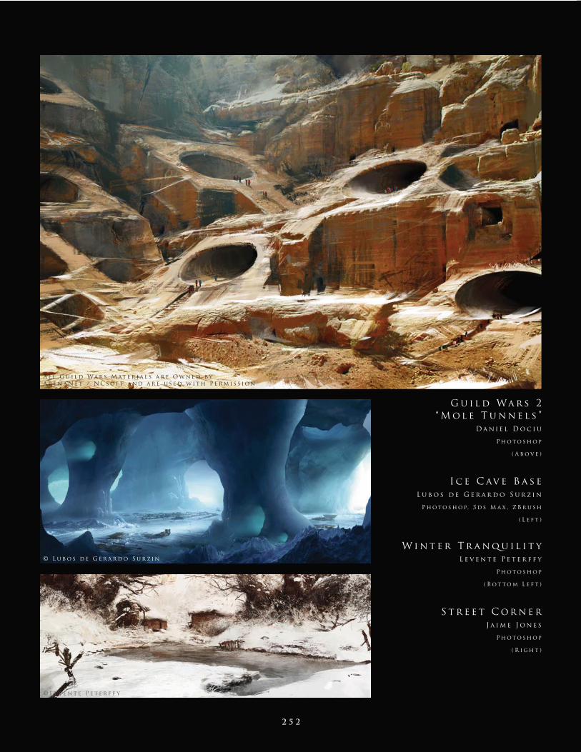
2 5 2
I c e C av e B a s e
L u b o s d e G e r a r d o S u r z i n
P h o t o s h o p, 3 d s M a x , Z B r u s h
( L e f t )
S t r e e t C o r n e r
J a i m e J o n e s
P h o t o s h o p
( R i g h t )
W i n t e r T r a n q u i l i t y
L e v e n t e P e t e r f f y
P h o t o s h o p
( B o t t o m L e f t )
G u i l d Wa r s 2
“ M o l e T u n n e l s ”
D a n i e l D o c i u
P h o t o s h o p
( A b o v e )
A l l G u i l d Wa r s M at e r i a l s a r e O w n e d b y
A r e n a N e t / N C s o f t a n d a r e u s e d w i t h P e r m i s s i o n
© L u b o s d e G e r a r d o S u r z i n
© L e v e n t e P e t e r f f y
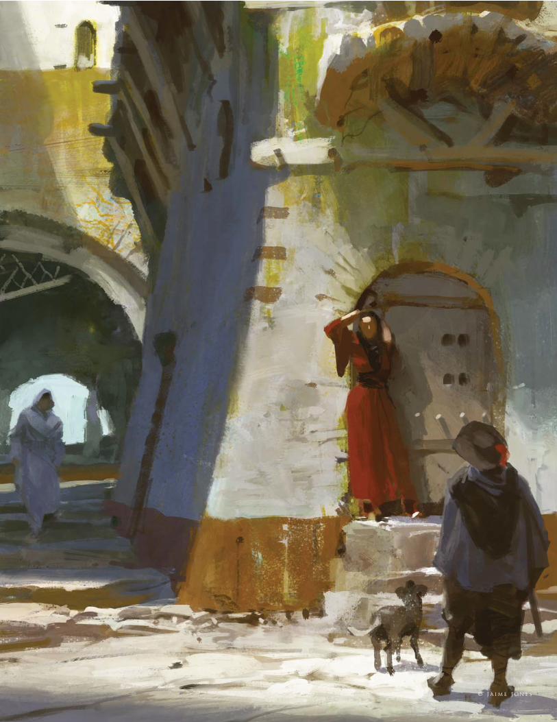
2 5 3 © J a i m e J o n e s
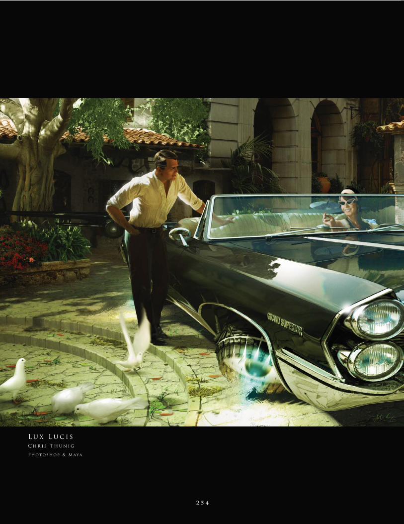
2 5 4
L u x L u c i s
C h r i s T h u n i g
P h o t o s h o p & M aya
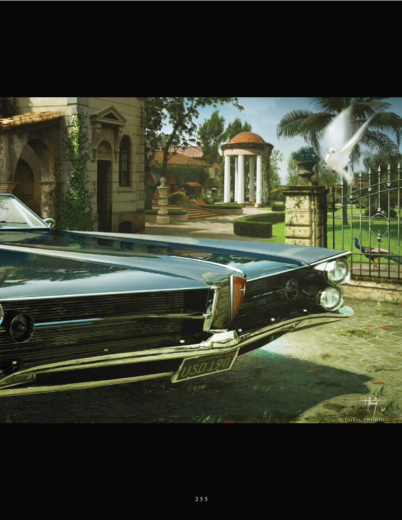
2 5 5
© C h r i s T h u n i g
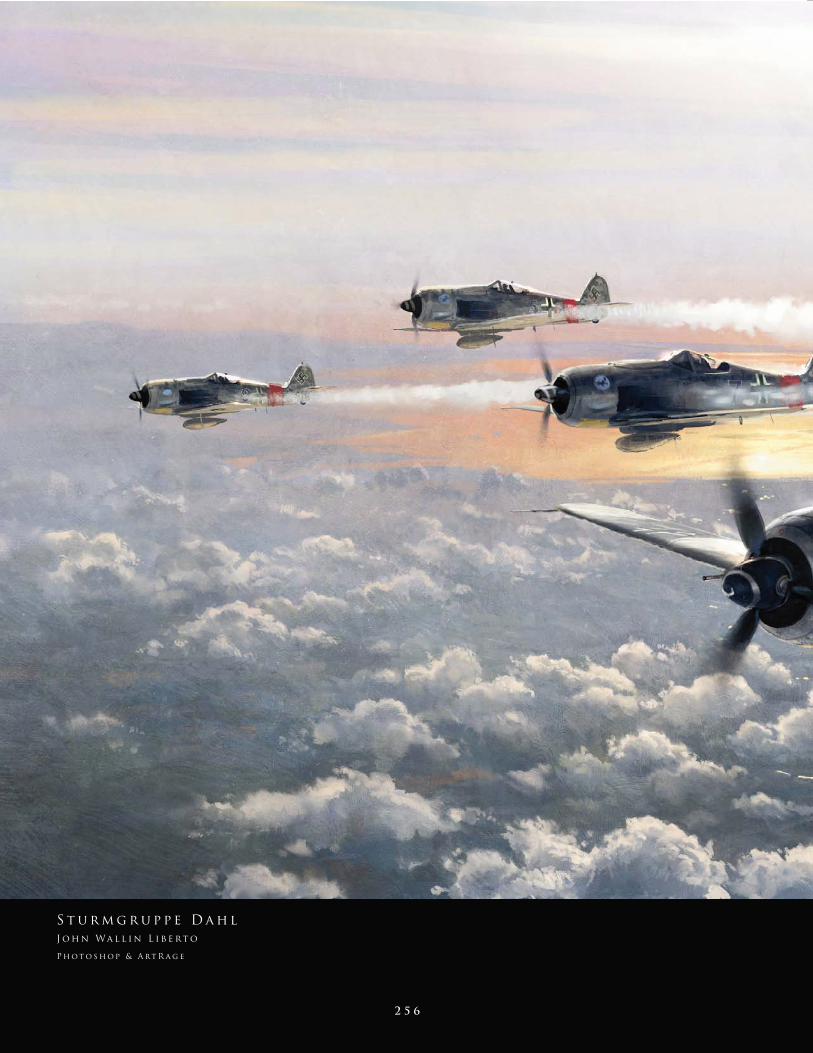
2 5 6
S t u r m g r u p p e D a h l
J o h n Wa l l i n L i b e rt o
P h o t o s h o p & A rt R a g e
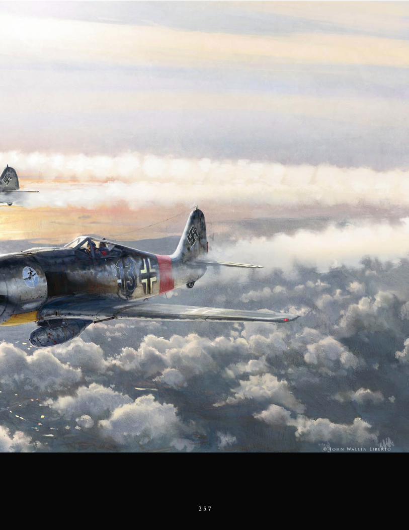
2 5 7
© J o h n Wa l l i n L i b e rt o
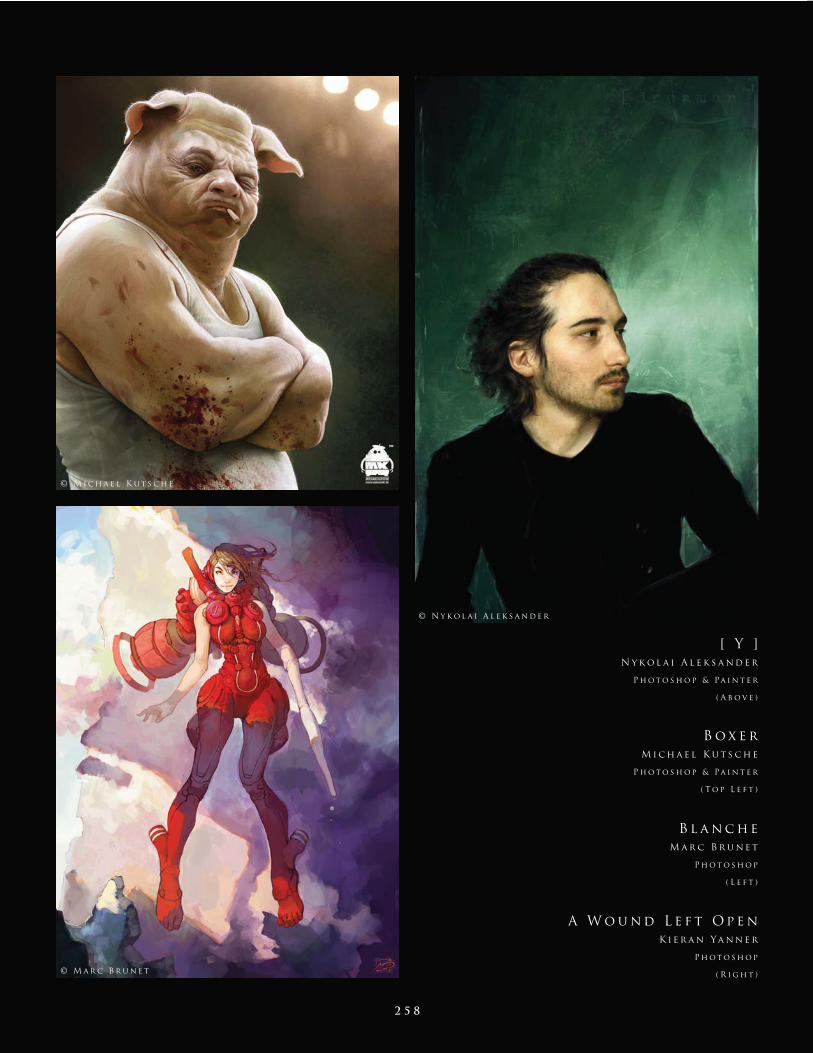
2 5 8
[ Y ]
N y k o l a i A l e k s a n d e r
P h o t o s h o p & Pa i n t e r
( A b o v e )
A W o u n d L e f t O p e n
K i e r a n Ya n n e r
P h o t o s h o p
( R i g h t )
B l a n c h e
M a r c B r u n e t
P h o t o s h o p
( L e f t )
B o x e r
M i c h a e l K u t s c h e
P h o t o s h o p & Pa i n t e r
( T o p L e f t )
© M i c h a e l K u t s c h e
© N y k o l a i A l e k s a n d e r
© M a r c B r u n e t
2 5 9 © K i e r a n Ya n n e r
2 6 0© M a rta D a h l i g
2 6 1
J u d i t h
M a rta D a h l i g
P h o t o s h o p
2 6 2 © C a r l o s C a b r e r a
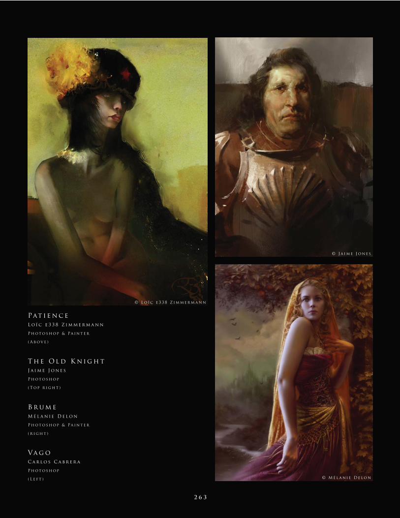
2 6 3
Va g o
C a r l o s C a b r e r a
P h o t o s h o p
( L e f t )
Pat i e n c e
L o ï c e 3 3 8 Z i m m e r m a n n
P h o t o s h o p & Pa i n t e r
( A b o v e )
T h e O l d K n i g h t
J a i m e J o n e s
P h o t o s h o p
( T o p r i g h t )
B r u m e
M é l a n i e D e l o n
P h o t o s h o p & Pa i n t e r
( r i g h t )
© J a i m e J o n e s
© M é l a n i e D e l o n
© L o ï c e 3 3 8 Z i m m e r m a n n
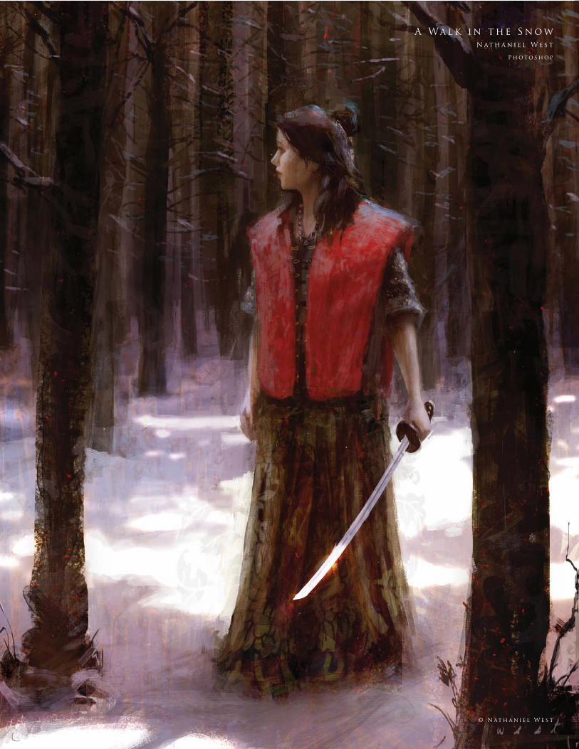
2 6 4
A Wa l k i n t h e S n o w
N at h a n i e l W e s t
P h o t o s h o p
© N at h a n i e l W e s t
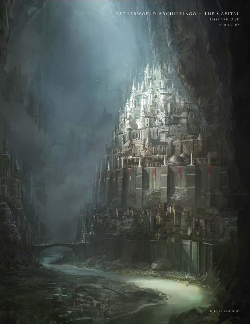
2 6 5 © J e s s e va n D i j k
N e t h e r w o r l d A r c h i p e l a g o – T h e C a p i ta l
J e s s e va n D i j k
P h o t o s h o p
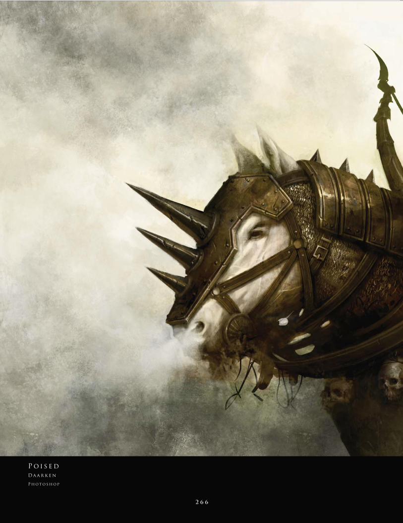
2 6 6
P o i s e d
D a a r k e n
P h o t o s h o p
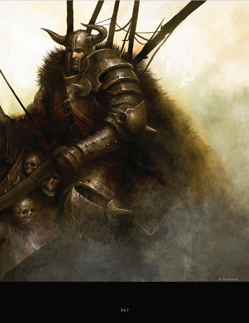
2 6 7
© D a a r k e n
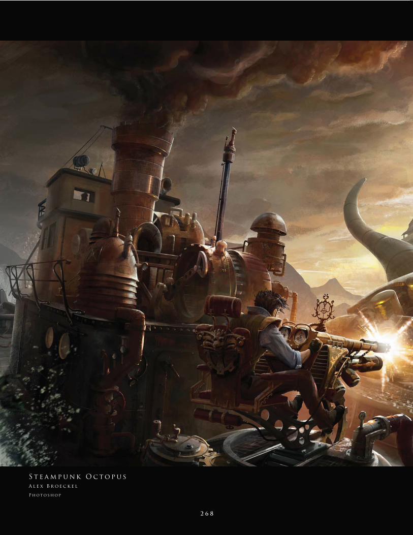
2 6 8
S t e a m p u n k O c t o p u s
A l e x B r o e c k e l
P h o t o s h o p
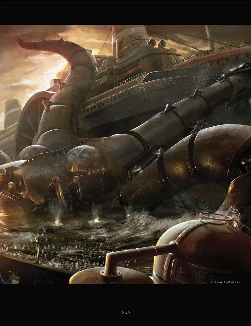
2 6 9
© A l e x B r o e c k e l
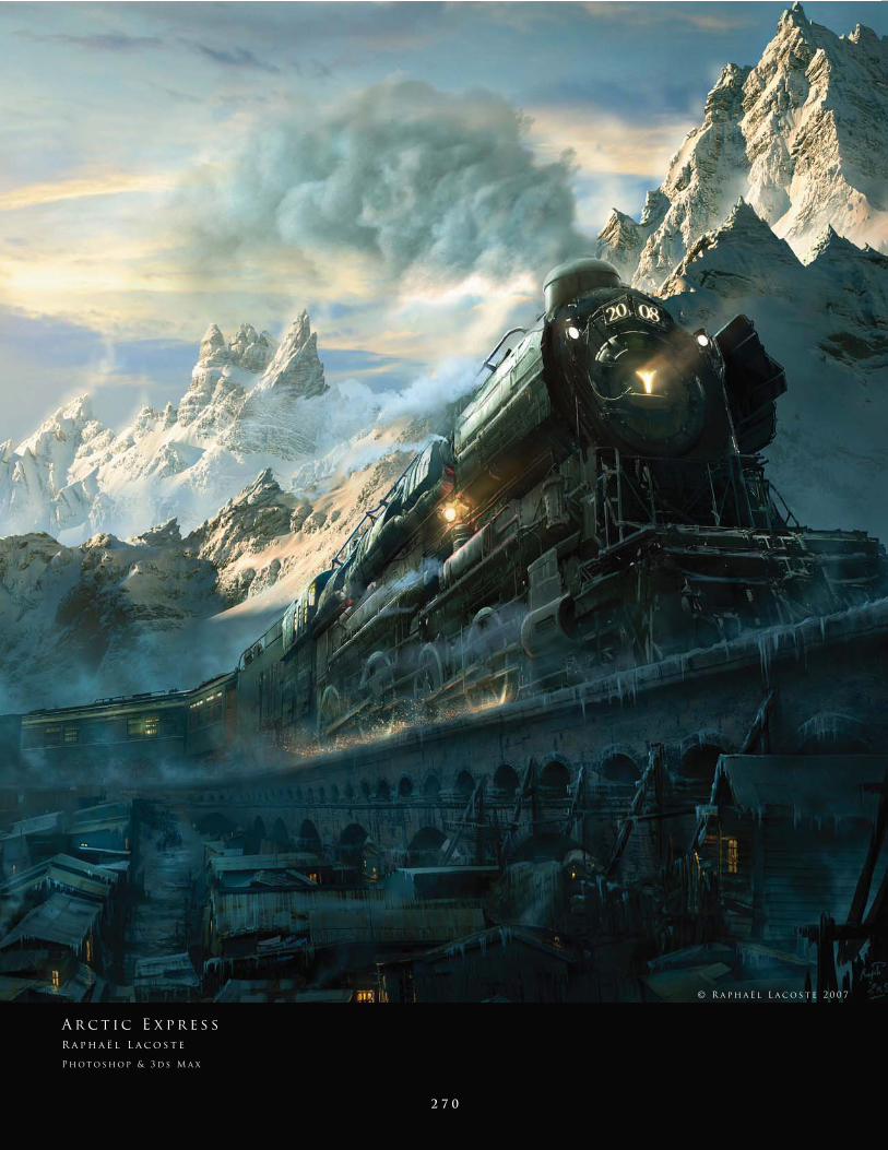
2 7 0
A r c t i c E x p r e s s
R a p h a ë l L a c o s t e
P h o t o s h o p & 3 d s M a x
© R a p h a ë l L a c o s t e 2 0 0 7
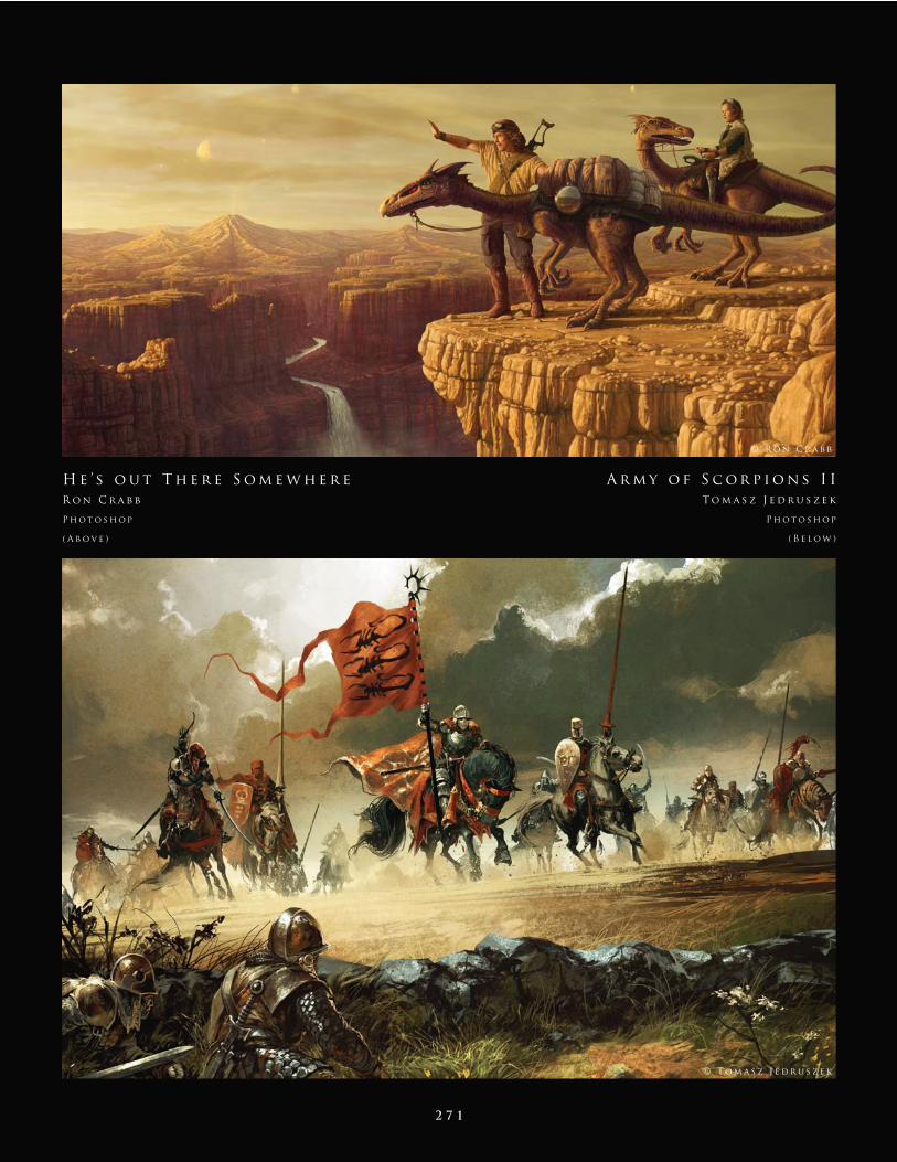
2 7 1
H e ’ s o u t T h e r e S o m e w h e r e
R o n C r a b b
P h o t o s h o p
( A b o v e )
A r m y o f S c o r p i o n s I I
T o m a s z J e d r u s z e k
P h o t o s h o p
( B e l o w )
© R o n C r a b b
© T o m a s z J e d r u s z e k
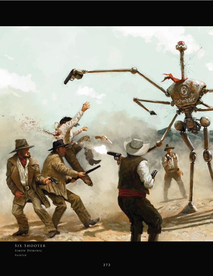
2 7 2
S i x S h o o t e r
S i m o n D o m i n i c
Pa i n t e r
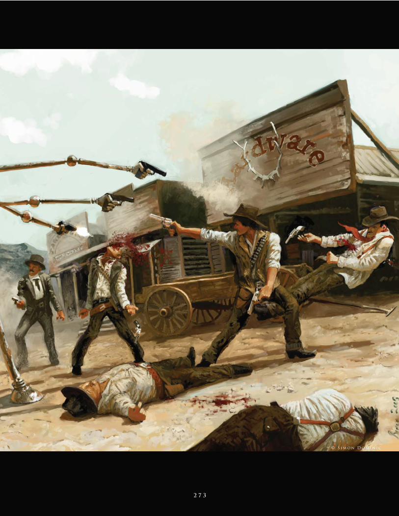
2 7 3
© S i m o n D o m i n i c
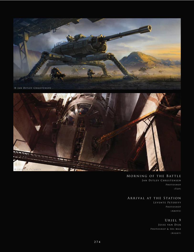
2 7 4
A r r i va l at t h e S tat i o n
L e v e n t e P e t e r f f y
P h o t o s h o p
( A b o v e )
U r i e l 9
J e s s e va n D i j k
P h o t o s h o p & 3 d s M a x
( r i g h t )
© J a n D i t l e v C h r i s t e n s e n
M o r n i n g o f t h e B at t l e
J a n D i t l e v C h r i s t e n s e n
P h o t o s h o p
( T o p )
© L e v e n t e P e t e r f f y
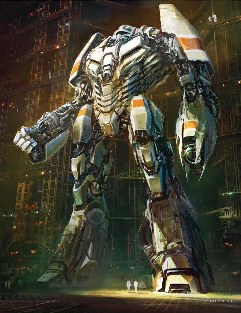
2 7 5 © J e s s e va n D i j k
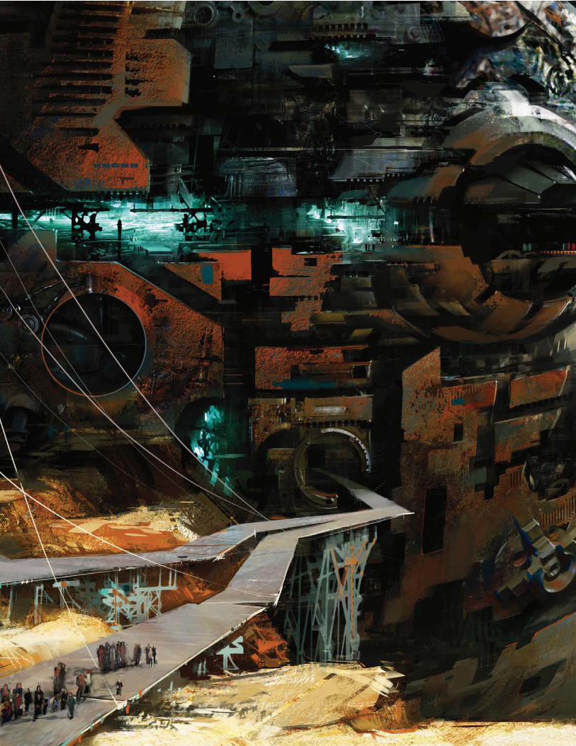
2 7 6
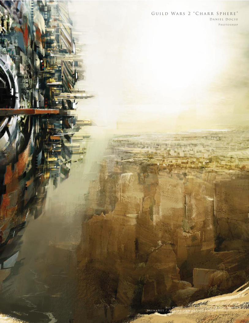
2 7 7
G u i l d Wa r s 2 “ C h a r r S p h e r e ”
D a n i e l D o c i u
P h o t o s h o p
A l l G u i l d Wa r s M at e r i a l s a r e O w n e d b y
A r e n a N e t / N C s o f t a n d a r e u s e d w i t h P e r m i s s i o n
2 7 8
T e r r a - s t o m a
D r . C h e e M i n g W o n g
P h o t o s h o p
( B e l o w )
T h e S c u l p t o r
S i m o n D o m i n i c
Pa i n t e r
( R i g h t )
A n g e l
T o m a s z J e d r u s z e k
P h o t o s h o p
( A b o v e )
© T o m a s z J e d r u s z e k
© D r . C h e e M i n g W o n g
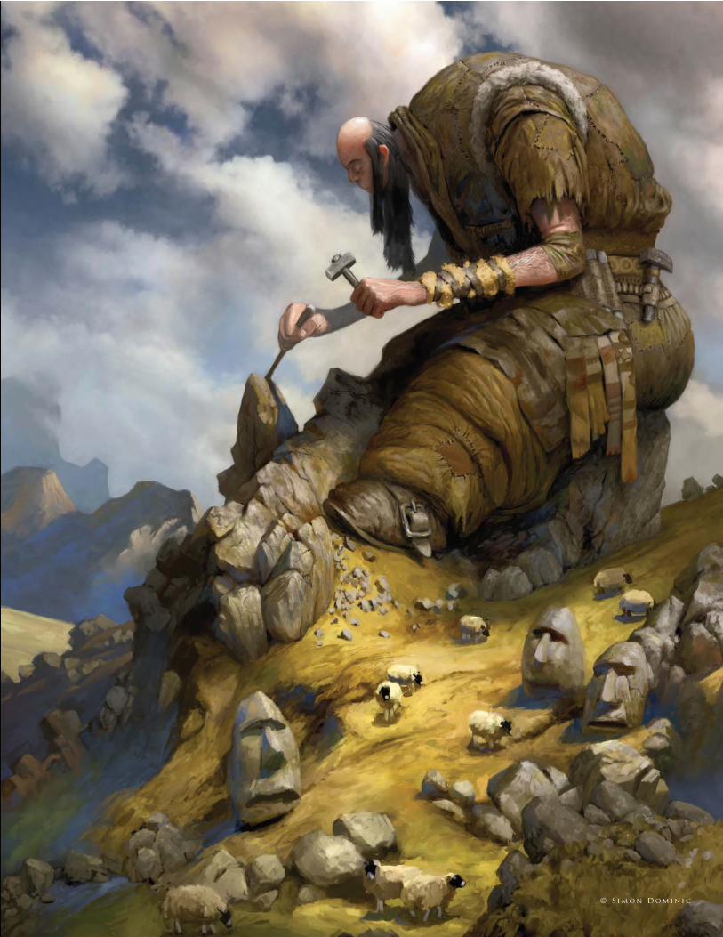
2 7 9 © S i m o n D o m i n i c
2 8 0
A c t i v i s t 2 3 ( W i t h M R O R o b o t i c S u i t )
K a i S pa n n u t h
P h o t o s h o p
2 8 1 © K a i S pa n n u t h
T h e T u t o r i a l A rt i s t s
Brian
Recktenwald
http://barproductions.com
Carlos
Cabrera
http://www.carloscabrera.com.ar
Chee
Ming Wong
http://www.opusartz.com
Daniel
Ljunggren
http://darylart.com
Daniela
Uhlig
http://www.du-artwork.de
David
Revoy
http://www.davidrevoy.com
Anne
Pogoda
http://www.darktownart.de
Emrah
Elmasli
http://www.emrahelmasli.com
Graven
Tung
http://www.artofgt.com
Marc
Brunet
http://bluefl ey.cghub.com
http://bluefl ey.cgsociety.org/gallery
Levente
Peterffy
http://www.leventep.com
Marco
Bauriedel
http://www.marcobauriedel.com
Matt
Dixon
http://mattdixon.co.uk
Mike
Corriero
http://www.mikecorriero.com
Mélanie
Delon
http://www.melaniedelon.com
Nathaniel
West
http://nathanielwest.net
Nykolai
Aleksander
http://www.admemento.com
Pascal
Raimbault
http://pascalr.cgsociety.org/gallery
Richard
Tilbury
http://www.richardtilburyart.com
Ron
Crabb
http://www.crabbdigital.com
Serg
Souleiman
http://www.artofserg.com
Sergey
Musin
http://www.samfx.com
Stephanie
R. Loftis
http://daisy7.deviantart.com
Daarken
http://www.daarken.com
Tiberius
Viris
http://www.tiberius-viris.com
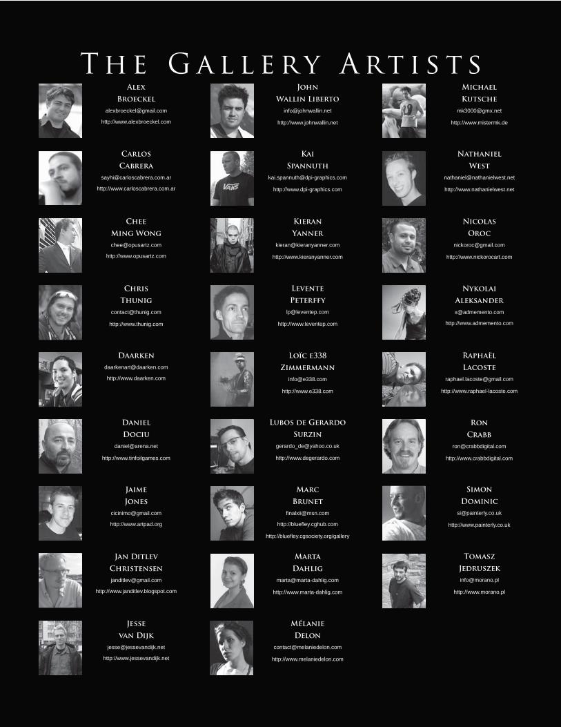
Carlos
Cabrera
http://www.carloscabrera.com.ar
Chee
Ming Wong
http://www.opusartz.com
Chris
Thunig
http://www.thunig.com
Daniel
Dociu
http://www.tinfoilgames.com
Jaime
Jones
http://www.artpad.org
Jan Ditlev
Christensen
http://www.janditlev.blogspot.com
Alex
Broeckel
http://www.alexbroeckel.com
Jesse
van Dijk
http://www.jessevandijk.net
John
Wallin Liberto
http://www.johnwallin.net
Kieran
Yanner
http://www.kieranyanner.com
Kai
Spannuth
http://www.dpi-graphics.com
Loïc e338
Zimmermann
http://www.e338.com
Lubos de Gerardo
Surzin
http://www.degerardo.com
Levente
Peterffy
http://www.leventep.com
Marc
Brunet
http://bluefl ey.cghub.com
http://bluefl ey.cgsociety.org/gallery
Marta
Dahlig
http://www.marta-dahlig.com
Mélanie
Delon
http://www.melaniedelon.com
Michael
Kutsche
http://www.mistermk.de
Nathaniel
West
http://www.nathanielwest.net
Nicolas
Oroc
http://www.nickorocart.com
Nykolai
Aleksander
http://www.admemento.com
Raphaël
Lacoste
http://www.raphael-lacoste.com
Daarken
http://www.daarken.com
T h e G a l l e r y A rt i s t s
Ron
Crabb
http://www.crabbdigital.com
Simon
Dominic
http://www.painterly.co.uk
Tomasz
Jedruszek
http://www.morano.pl

2 8 4
i n d e x
matte painting, 69–70, 76–7, 82, 85–7
sci-fi /fantasy, 198, 200–2, 205, 218
speed painting, 48–52, 54–5, 57, 62–3
Bump maps, 234–5, 237
Cabrera, Carlos, 16–19, 40–3, 166–85, 262–3
Camera distortion, 90–1
Chain mail, 200–1
Channel extraction, 80
Christensen, Jan Ditlev, 274
Cinema 4D software, 240–1, 246
Cityscapes, 186–91
Clipping mask layers, 76
Clone stamping, 68–9, 76
Cloud effects, 85, 167–71, 174, 176, 179–80,
204, 213–14
Cold-value hues, 79
Color:
complete projects, 226, 228–30, 233, 235,
238
creature design, 95–6, 105, 110–11, 114,
118–19, 123–4
environments, 166, 169–72, 174, 178–9,
182, 186–92
human fi gures, 128–34, 137–8, 145–7,
150–3, 155–8, 161–3
matte painting, 75, 79, 82, 86
sci-fi /fantasy, 199, 204–5, 207–9, 211–12,
215
speed painting, 41–2, 45, 48–51, 54–5, 57,
59–60, 62–3
Color Balance, 189–90
Color Correction, 68–9, 71, 242, 245
Color Dodge setting, 87, 188, 199–200, 202
Compositional methods, 233
Concept creatures, 100–11
Contrast adjustments, 79, 146–7, 213
Correction layers, 231
Corriero, Mike, 34–7, 100–11
Crabb, Ron, 240–7, 271
Craters of Moon, 208, 214–16
Creatures, 16–19, 93–125, 229
Cropping in fi gures, 221–2
Curves adjustment, 49, 79–80
Custom brushes, 11–37
see also Brushes
Daarken, 20–5, 136–43, 186–91, 198–203,
266–7
Dahlig, Marta, 260–1
Darkness effects, 40–1, 50, 85, 172, 180,
205–8
Defi nition, hair, 129
Delon, Mélanie, 30–3, 263
Depth, 88, 89–90, 150
Desaturation of images, 16, 28
Detailing:
complete projects, 227, 235–6, 244–5
creature design, 97
environments, 82, 181, 187–90
human fi gures, 133, 135, 137–8, 146, 152,
156
sci-fi /fantasy, 199–202, 205, 210, 212–13,
216–17, 222–3
speed painting, 46, 55, 56–7, 61
Dijk, Jesse van, 265, 274–5
Distance see Backgrounds; Depth
Distort tool, 142, 166
Dixon, Matt, 94–9
Dociu, Daniel, 252, 277
Dodge tool, 51, 188
Dominic, Simon, 272–3, 278–9
Dots, 135, 173, 180
Drawing see Sketching
Dual Brush option, 27, 35
Duplicating layers, 55–6
Ears, 140, 153–4
Edge control, 188–9, 206
Elmasli, Emrah, 48–50, 144–7
Emboss effect, 233–5
Environments, 74–7, 79, 81–3, 165–95,
204–17
Eyebrows, 149, 151
Eyedropper tool, 179
Eyelashes, 124, 151–2, 161
Eyes, 98, 106–7, 122–5, 138, 148–52, 160–3
Faces, 46, 128–43, 148–61, 226–7, 235–6,
242–3
Fantasy images, 197–223
Female portraits, 128–35
Fire effects, 50–3, 84–7
Flat washes, 213
Flattening images, 16
Flipping images, 55, 57, 91, 202
Fog effects, 54–6, 175, 179
“Following through” shapes, 137
2D images, 232–9
3D software, 236–7, 241–2, 246–7
Adjustment layers, 77, 79–80, 83, 89–90,
146–7, 182–3
Airbrushes, 94, 114, 120–2, 128, 130, 132–5,
145, 233
Aleksander, Nykolai, 148–59, 258
Anatomy, 93, 100–3, 114, 142, 144, 148
Angle of views, 90
Animals, 16–19, 93–125, 229
Armor, 198–203
Artweaver software, 232, 237, 238
Backgrounds:
creature design, 96, 122
environments, 187
human fi gures, 130, 138, 140, 226, 230,
244
matte painting, 80, 88–9
sci-fi /fantasy, 206–7, 219–21
speed painting, 46, 48, 50, 52, 54–5, 63
Barren environments, 207, 211
Basalt, 215–16
Base colors, 110–11, 132, 134, 187
Bauriedel, Marco, 68–73
Bevel and Emboss effect, 233–5
Biped creatures, 101, 109
Birds, 94–9, 101, 103
Black and white sketching, 40–1, 74–5, 232–3
see also Grayscale techniques
Blending:
environments, 168, 173, 183–4, 194–5
human lips, 135, 156
spacescapes, 207, 212
speed painting, 48, 54–5
Blocking in color, 128–9, 137, 153, 186–7, 199,
207
Blonde hair, 128–31
Bone structure, creatures, 103–5
Bounced light, 210–11
Broeckel, Alex, 268–9
Brunet, Marc, 26–9, 258
Brushes, 11–37, 227–8, 230, 238, 243
animals, 16–19, 94–6, 114, 119–22
environments, 168, 171, 175, 179–80,
186–9, 193–4
human fi gures, 129–35, 141, 145–6,
149–52, 155–6, 162–3
2 8 5
i n d e x
Multiply layer mode, 51, 55
Muscles, 145–6
Musin, Sergey, 74–7
Nebulas, 204–7
Neck design, 109, 115–16, 154
Noise effects, 147
Noses/nostrils, 103, 106, 113–14, 141, 157–9
Obese creatures, 108
Oil brushes, 130–1
Opacities:
brushes, 22, 27, 30, 32, 51, 87, 131, 133–4
environments, 168, 172, 177, 180–1
Organic custom brushes, 12–15
Oroc, Nicolas, 250
Other Dynamics setting, 13–14, 18, 22, 27, 35,
86
Overlay mode, 42, 53, 168, 173, 184, 194–5
Painter software, 112–17, 128–31, 198–203,
232–9
Patterns, 110–11
Pen Pressure setting, 27, 31–2, 35, 86
Perspective, 44–5, 63, 69, 71, 90–1, 208–9,
214–15, 245
Peterffy, Levente, 50–3, 54–7, 252, 274
Photo references see Reference materials
Photoshop:
7.0, 16–19, 40–3, 122–5
brushes, 12–37, 51–2, 188
creature design, 94–111, 118–25
CS, 132–5, 218
CS2, 20–5, 30–3, 54–7, 198–203
CS3, 48–50
environments, 166–95
human fi gures, 128–63, 226–47
matte painting, 68–91
sci-fi /fantasy, 198–223
speed painting, 40–65
Planets, 204–17
Planning images, 78–9
Pogoda, Anne, 128–35
“Pop out” lips, 132, 133, 135
Pupils (eyes), 107, 123–4, 150, 160
Quick mask mode, 184–5
“Radiosity”, 146
Foregrounds:
environments, 187
matte painting, 80–2, 88–9
sci-fi /fantasy, 213–14, 217, 219–20
speed painting, 48, 60–1, 63
Forms, sci-fi , 210–11
Freckles, 146, 159, 227
Fur, creatures, 118–21, 123
Futuristic design see Sci-fi
GIMP software, 232, 237
Glazing color, 59–60
Glow effects, 49, 176, 187–8
Google Images, 174
Graphics tablets, 94, 122
Grayscale techniques, 42, 44, 59
see also Black and white sketching
Ground textures, 210
Hair, 128–31, 137, 141–2, 146, 153–4, 228–9,
231
Hand-painting scenes, 76
Hard-edged brushes, 94, 96, 132–5, 145,
227–8
Hard light, 206
Haze effects, 89–90
Head design, 106–8, 113–14, 120, 129–30,
199, 202
see also Faces
Heat effects, 182–5, 213
High altitude effects, 112–13
Highlights:
creatures, 97, 111, 115–16
environments, 168–9, 176, 182, 193–4
humans, 130, 132–5, 145, 150, 152–4, 155,
158, 161–2
matte painting, 70–1, 83, 87–9
sci-fi /fantasy, 199–202, 213, 219
speed painting, 45, 61
Horizon line, 192, 194
Hues, 79, 209
Human fi gures, 63, 127–63, 198–203, 221–3,
226–47
Ink experiments, brushes, 12–15
Insects, 101, 103, 109
Internet research see Reference materials
Iris (eyes), 107, 123–4, 150–2, 160–1
Japanese Maple Leaf brush, 34–7
Jaws, creatures, 102, 106–7
Jedruszek, Tomasz, 271, 278
Jones, Jaime, 252–3, 263
Kutsche, Michael, 258
Lacoste, Raphaël, 270
Lakes, 52–3
Layering:
complete projects, 226–7, 229–32, 235–6,
238, 242–4
creature design, 95, 96, 118
environments, 167–8, 173–7, 182–3, 188,
193, 195
human fi gures, 135–7, 144, 146–7, 152
matte painting, 74–7, 79–80, 83, 87, 89–90
speed painting, 41–2, 51–3, 55–6
Levels adjustment layers, 83, 90
Liberto, John Wallin, 256–7
Light:
creature design, 97, 110–11, 115–16, 119,
124
environments, 168–71, 176, 182, 186,
187–8, 193–5
faces (human), 128, 138, 149–50, 153–5,
160–1
human fi gures, 136, 140, 145–6, 158, 227,
242–4, 246
matte painting, 70–1, 82–3, 85, 87–9, 91
sci-fi /fantasy, 199–202, 205–7, 208–11, 219,
221
speed painting, 41, 45, 48, 50–1, 53, 61, 63
Lips, 106–7, 132–5, 155–6
Lizards, 100–1, 103
Ljunggren, Daniel, 44–7
Loftis, Stephanie R., 122–5
Lunar landscape, 207–11, 214–17
Male portraits, 136–43
Mammals, 101, 103, 106–7
Masking, 76–7, 80, 85, 184–5
Matte painting, 67–91
Merging layers, 230
Mirror images, 233
Model shooting, 241
Moonscapes, 207–11, 214–17
Motion blur, 87, 180
Mouth construction, 106–7

2 8 6
i n d e x
Raimbault, Pascal, 112–17
Rain effects, 174–7, 186–91
Resizing images, 233
Recktenwald, Brian, 12–15
Red hair, 128–31, 228–9, 231
Reference materials:
creature design, 100–1, 103, 112, 114, 118
environments, 167–8, 170, 174, 182, 186
human fi gures, 128, 136, 144, 160, 236–7,
241–2
matte painting, 74–5, 83, 91
sci-fi /fantasy, 198–9, 218
speed painting, 44, 62
Refl ections:
environments, 82, 175–6, 184, 192–3
human fi gures, 146, 150, 162, 245–7
Rendering, 42, 44, 46, 96–7, 110–11, 222,
236–7, 246
Revoy, David, 232–9
Reworking designs, 97–8
Robots, 44–7
Rotating images, 206
Rough-ins, 205, 209
Round brushes, 24, 27, 62, 149–50, 186
Rust effects, 56–7
Salt experiments, brushes, 12–15
Sandstorm effects, 166–9
Saturation reduction, 79, 85
Scale, 81, 89–90, 214, 221
Scattering, brushes, 14, 18, 22, 32, 35, 85,
162–3
Sci-fi , 197–223
Sclera (eyes), 107, 160–1
Seascapes, 192–5
Season change effects, 78–83
Shadows:
creature design, 111
environments, 168–9, 177, 182
human fi gures, 132–3, 150–1, 153, 156–9
matte painting, 85, 87–9, 91
speed painting, 41, 63
Shape Dynamics setting, 13–14, 17, 22, 27,
35, 85, 227
Shape parameters, brushes, 85, 86–7
Sharpen brush, 69
Ship images, 54–7
Signs, cityscapes, 190–1
Silhouettes, 50–1, 56
Sketching:
creature design, 95, 113–14, 122
human fi gures, 144, 149, 226–7, 230,
232–3, 240–2
matte painting, 74–5
speed painting, 40–1, 44, 51, 58–9
Skin:
creatures, 103–5, 114, 116
custom brushes, 22–4, 30–3
humans, 137, 144–7, 152, 154, 159–60,
162, 235–6
Sky effects, 80, 85, 172, 180, 183
Smoke effects, 84–7, 204
Smooth-textured brush, 31–2
Smudge tool, 151, 153, 155–6, 158, 160–1,
234
Artweaver software, 238
custom brushes, 13–14, 119–20
GIMP software, 237
Snow scenes, 74–7, 79, 81–3, 178–81
Soft-edged brushes, 94, 96, 133–4
Soft light, 206
Software conversions, 237–8
Solar systems, 211–13
Souleiman, Serg, 62–5
Spacescapes, 204–17
Spannuth, Kai, 280–1
Speckled brushes, 24, 30–2, 129–30, 135, 187
Speed painting, 39–65, 67
Stars, 205, 211–13
Storm scenes, 166–9, 174–81
Strands of hair, 130
Strength settings, brushes, 13
Sunset effect, 193–5
Surzin, Lubos de Gerardo, 252
“Surgery”, 79
Teeth, 102, 106–7, 134
Texture:
creature design, 103–5
custom brushes, 16–20, 22, 24, 27–8, 31–2,
52, 94–6
environments, 177
human fi gures, 144–7, 159, 234–6
sci-fi /fantasy, 200, 202, 210
speed painting, 48, 52–3, 56–7
Thumbnail sketching, 44
Thunig, Chris, 254–5
Tilbury, Richard, 118–21, 160–3, 192–5
Tornado images, 40–3, 170–3
Transparency, layers, 243–4
Tung, Graven, 218–23
Twister images, 40–3, 170–3
Uhlig, Daniela, 226–31
Under-painting, 95–6
Value structure, 59–60, 63, 95, 98, 205, 209,
218
Veins in skin, 146
Viris, Tiberius, 78–91
Warp tool, 36, 142
Water effects, 69–71, 81–2, 175, 192–5, 245–7
Water experiments, brushes, 12–15
Wave effects, 166–7, 192–5, 218–19, 221–2
Weather conditions, 165–91, 221
West, Nathaniel, 58–61, 264
Whorls, 206
Wind effects, 86, 172–3, 221
Winter scenes, 78–83
Wong, Chee Ming, 204–17, 278
Yanner, Kieran, 258–9
Zimmermann, Loïc e338, 263
Title of section 287
Related Documents