Graphic Narrative Evaluation Lauren Pyne

Digital graphics evaluation pro forma
Aug 08, 2015
Welcome message from author
This document is posted to help you gain knowledge. Please leave a comment to let me know what you think about it! Share it to your friends and learn new things together.
Transcript

Graphic Narrative Evaluation
Lauren Pyne

Does your final product reflect your original intentions?
My original plan I was going to have 14 pages, I decided against this as I would not have enough time. I cut and rearranged a few of the scenes to make the book shorter. I also was originally going to overlay the text over the image, I found that it was too difficult to read so I chose to put the text on a separate page. I thought about adding some small illustrations to some of the text pages that had less text to fill the page and keep the child interested.I planned it use the rotoscope technique for the backgrounds and the shape technique for the characters. I found that rotoscoping was a much quicker production method and it allowed me to make the characters more detailed.
I think that the changes I have made will make the book a lot better, its not too long and I was able to complete all the necessary pages in detail instead of rushing to finish more pages. I had to rearrange the pages to make sure that the pages still made sense. I think by overlaying the text I has allowed me more space for the drawings on the page instead of having to worry about a plain space where the text can go. By using the rotoscoping technique, it has improved he overall look of the book because both the characters and the background are the same style. I didn’t make many changes to the flat plans so the digital images look extremely similar to the original drawings and storyboards. I kept the character design the same and just improved them slightly. It has also saved me a lot of time because the shape technique is very time consuming. It is also easier to add detail and create a style for the books illustrations.
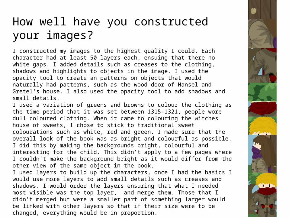
How well have you constructed your images?
I constructed my images to the highest quality I could. Each character had at least 50 layers each, ensuing that there no white gaps. I added details such as creases to the clothing, shadows and highlights to objects in the image. I used the opacity tool to create an patterns on objects that would naturally had patterns, such as the wood door of Hansel and Gretel's house. I also used the opacity tool to add shadows and small details.I used a variation of greens and browns to colour the clothing as the time period that it was set between 1315-1321, people wore dull coloured clothing. When it came to colouring the witches house of sweets, I chose to stick to traditional sweet colourations such as white, red and green. I made sure that the overall look of the book was as bright and colourful as possible. I did this by making the backgrounds bright, colourful and interesting for the child. This didn’t apply to a few pages where I couldn’t make the background bright as it would differ from the other view of the same object in the book.I used layers to build up the characters, once I had the basics I would use more layers to add small details such as creases and shadows. I would order the layers ensuring that what I needed most visible was the top layer, and merge them. Those that I didn’t merged but were a smaller part of something larger would be linked with other layers so that if their size were to be changed, everything would be in proportion. I tried to make the book as colourful and bright as possible to keep the child interested. As the characters clothes were dull coloured due to the era the story was originally set in, I decided to give them bright scarf's, a red one for Hansel, and a purple one for Gretel. I also gave Hansel short blonde hair. These features would also help the child decipher which character was which when in a difficult view of the characters. I mostly used the opacity tool to create texture and colour to keep the child interested.

How well have you used text to anchor your imagesFor my story I had to tailor the story and the language towards the age group that the book is aimed at. I found that due to the quite young age range, it was more difficult to select the language used so that they could read it and understand what it meant if they were reading without aid of an adult. I decided to separate the text and the image and put them on separate pages as I found that the text was too difficult to read when laid over the image. It also helped when illustrating as I didn’t have to worry about where the text would go and if it would be readable if overlaying a busy part of the image. I used a Helvetica font as it was very clear and readable and would be easy for a child to read. I also chose the font size as 14pt as it is not too small as well as clear and readable.I think that the language is suitable for the older part of my age range (more towards age 7), I think the younger ages would need assistance for a few words but not too many. This allows them to learn challenging words but still be able to read the book on their own. I set the text so that I was central to the page, spread throughout the page and separated small chunks of text to make it easier for the child to read it. I made sure that the separation was enough so that it was easier to read. I also made all speech in bold so that it was easier for the child to tell when they were speaking. I used some wording on page 10 on the illustration to show that the Witch was screaming. I did this for effect and to make the illustration more intriguing for the child. I used the warp tool to make it look like it was coming from her and getting louder by slowly enlarging the text.

Is your product suitable for your audience?
• Reference your proposal• Give an audience profile and describe
suitability in reference to contentI chose the age range between 5 and 7 years old. I think that my product is suitable to my audience as this age
range, the child can read but still needs a few more challenging words for them to improve their reading skills. To improve I could make the language simpler but this wouldn’t help challenge the child and help their reading skills progress.
I think to make the product better suited I think I could have changed the storyline a bit so that the Witch was locked up instead of being pushed into the fire.
• However, story includes Gretel pushing the witch into a fire, presented in a suitable way. • Could change it to just locking her up • Product could have a larger page size for larger images• Product could have more pages as they often have more than 25 pages• More illustrations on text pages• Page numbers
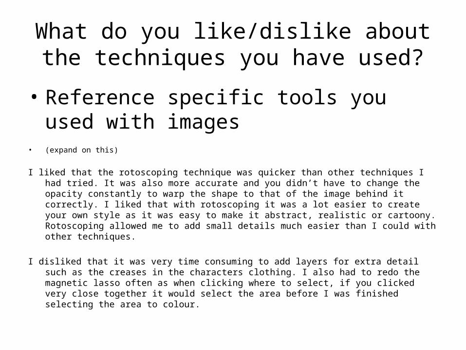
What do you like/dislike about the techniques you have used?
• Reference specific tools you used with images• (expand on this)
I liked that the rotoscoping technique was quicker than other techniques I had tried. It was also more accurate and you didn’t have to change the opacity constantly to warp the shape to that of the image behind it correctly. I liked that with rotoscoping it was a lot easier to create your own style as it was easy to make it abstract, realistic or cartoony. Rotoscoping allowed me to add small details much easier than I could with other techniques.
I disliked that it was very time consuming to add layers for extra detail such as the creases in the characters clothing. I also had to redo the magnetic lasso often as when clicking where to select, if you clicked very close together it would select the area before I was finished selecting the area to colour.

What do you like/dislike about how your final product looks?
• Some inconsistancies with the quality of the characters
• Like the style.I liked the style that I was ale to develop for the book, but I found that there were inconsistencies with
the quality of the characters. Mostly I struggled with Gretel on page 7, and with the stepmother and father on page 3. Some of the inconsistencies include Hansel's pocket on his coat. On page 9 it is not there, but on page 2 it is.

Why did you include the content you used?
• Images, design? Most relivent • fonts, serif font, easier to read• effects, opacity for effect of shadows• Colours, relevant to the time period the story
was set in

What signs, symbols or codes have your used in your work?
• Choices of colour, style, locations, character design and tone all give additional meaning to your work.
• Witch black & grey (evil)• Rupees old currency (LoZ xD)

What representations can be found in your work?
• How are men, women or children shown in your work? Does your work feature different ages, races, social groups or religions? Does a lack of any variety of character types create its own representation?
• No religion, social groups ect• Different age ranges

What style have you employed in your products?
• Discuss influences/ existing products• What visual style does your work have and
why did you choose it?
• My own drawings influenced the characters• Existing candy houses gave ideas for whitches
house• No idea / last question

What were the strengths and weaknesses of the pre-production and planning
• How did the planning and research help• How well did you manage your time• Reference specific examples
• It gave ideas on how to present the characters and scenes
• I planned to manage time but the image took too long to make

Historical and cultural context
• How does your work compare to what has come before? What other similar products have existed in the past? What current products exist?
• Old books• books with the same design – 1
found• most older ones drawn or painted

Peer Feedback
• Summarise peer feedback and discuss– Responses you agree with– Responses you disagree with
Related Documents