Graphic Narrative Evaluation

Digital graphics evaluation pro forma
Aug 06, 2015
Welcome message from author
This document is posted to help you gain knowledge. Please leave a comment to let me know what you think about it! Share it to your friends and learn new things together.
Transcript
Graphic Narrative Evaluation

Does your final product reflect your original intentions?
For my final product I remade Goldilocks and The Three Bears, I talked about this story a little bit on my mind map I made but at that time it was not going to be my first option because I didn’t think about it straight away, instead I was either going to remake Hansel and Gretel or The Three Little Pigs because I thought about how much detail I could get to illustrate if I chose those stories. It was at the last minute I thought about the Goldilocks and The Three Bears story. This shows that the strength of my planning wasn’t very good because I kept on changing my mind about what story I wanted do, I also changed my mind a bit when deciding what illustration technique I was going to use, at first my initial decision was to do a comic book effect throughout my book, but then I realised that that technique would show too much of the original image I used and so there could be copyright issues. Another illustration technique I was going to use was the shape task technique, this is probably one of the more creative options but it takes a lot of time and is not as accurate as rotoscoping, which is the technique I finally decided to use. My initial plans for the text stayed the same throughout the project because I was always going to use a big font size because it would be easier for my target audience, that is why I didn’t write that much on each page as well. I used the same font as I said I would in my text mood board. I used the same page dimensions I said I would in my proposal, I also said that my book would be 20 pages long in my proposal but instead the book turned out to be 32 pages long. I kept the same story as I said I would in my proposal and made it with my target audience in mind.

Mind Map
Finished Product

How well have you constructed your images?
I used the roto scope tool in Photoshop to create most of my images, I also used shapes for the trees and other little details. My images follow the same style throughout my book, I used bright colours because my target audience is quite young so they will be more intrigued by bold, eye catching colours than dull, plain colours. I haven't used any textures in my images, this is because of the age my target audience is, which is from 2-5 years old so I don’t want the images to be too difficult or complicated to look at. I tried to make my images as bright as I can because my target audience will probably be more interested in the pictures and not the text. I think I have done well with making my images have the same style, there aren’t any pages that are noticeably different from the others, each image has the same bold colours and simple designs. Overall I feel that my images are well constructed with the target audience in mind because of the simplicity of the pictures and the bright colours that could attract the audience into reading the book.

This is an example of one of the scenes in my book, the colours are bright and bold, there also isn’t much going on in the background or foreground.

How well have you used text to anchor your images
I think that my text and my images link together well, there isn’t any confusion when you look at an image after reading the text that goes with it. I think this is because I planned what I was going to write first so then I had an idea on what my images should look like and what details and objects should be in the image. I used a font that I downloaded from DaFont because it looks like it links with the story and the genre the book is in but is still easy to read to most people, including my target audience. I made the background the text is on a different colour to white, this is because it makes the text easier to read and makes the page easier to look at as well, I also did this because after doing my book research I noticed that many other authors and illustrators did it as well. Overall I think I anchored my images and text together pretty well, mainly because of pre-production planning, if I were to improve any page it would be the first page because the image doesn’t link up with the text completely accurately.

The text says how Goldilocks is walking around a house she finds.
The image shows Goldilocks walking towards the house like what happens in the text.

Is your product suitable for your audience?
I made the book with my target audience in mind. In my proposal I mentioned that the the preferable age for my target audience is 2-5 years old however this is quite flexible. Another restriction is the language, because I have written the book in English meaning that only English speaking countries like England, USA and Australia will be able to read it, unless it is translated, other than that there are not any restrictions on who my target audience is, the book doesn’t steer towards any gender, race or religion. It is also suitable for all classes, I did this because I don’t want to single out anyone, and if I were to put this on the market I want everyone to be able to buy it, therefore making more money. My book is suitable for my audience because I used simple English language and images in my book meaning that it easier for my target audience to read it and look at the pictures because they are quite young, and will most likely speak English. Even though the main character in the story is a girl I have tried to make the book suitable for both genders by not saying anything in the book that could push it to one gender and not the other. I handled the race and religion situation the same way by not mentioning anything to do with different races or religions.

This is my proposal I made before production but after planning, it states who my target audience is and how I will try to make my book suitable for them.

What do you like/dislike about the techniques you have used?
When creating my images I mainly just used the roto scope tool, this is because I enjoyed using it more than the other tools in previous projects I have done in Photoshop because its more accurate and it is also quicker plus the end results look better and more like a professional cartoon than the other tools like using shapes. The roto scope tool is normally easy to use, it allows you to accurately draw around sharp and pointy edges as well as smooth edges too. Another tool I used is the shape tool, this allows your images to look unique and incredibly creative by using the warp tool with it. The problem with shape tasking is that its quite a slow process and it can get quite frustrating, that’s why I only used it for small details and some background images like the trees in the first few scenes.

This is an image taken from my book, I chose this image as an example because even though most of it was drawn using the roto scope tool, some other parts of it were drawn with shapes and warped like the trees in the background. Other parts of the image were painted using the paint brush tool like the grass on the floor.
What do you like/dislike about how your final product looks?
I like my final product because it is the best I could do whilst making it suitable enough for my target audience, I also like how there isn’t any shading or textures meaning that the images are quite simple but at the same time you can understand what is going on in the picture. I like the font I chose and the size of the font as well because its curly and different, I like the font size because its fairly large and takes up a good bit of space on each page plus it is easy to read. What I dislike about my final products are that they look like I have not put too much effort into them, this will make people think that the overall quality of the book is not as good as it could’ve been. Overall I think that the final product/book looks simple but I know that that was the style I was going for because of my target audience, who are only young so they might get confused over detailed drawings.
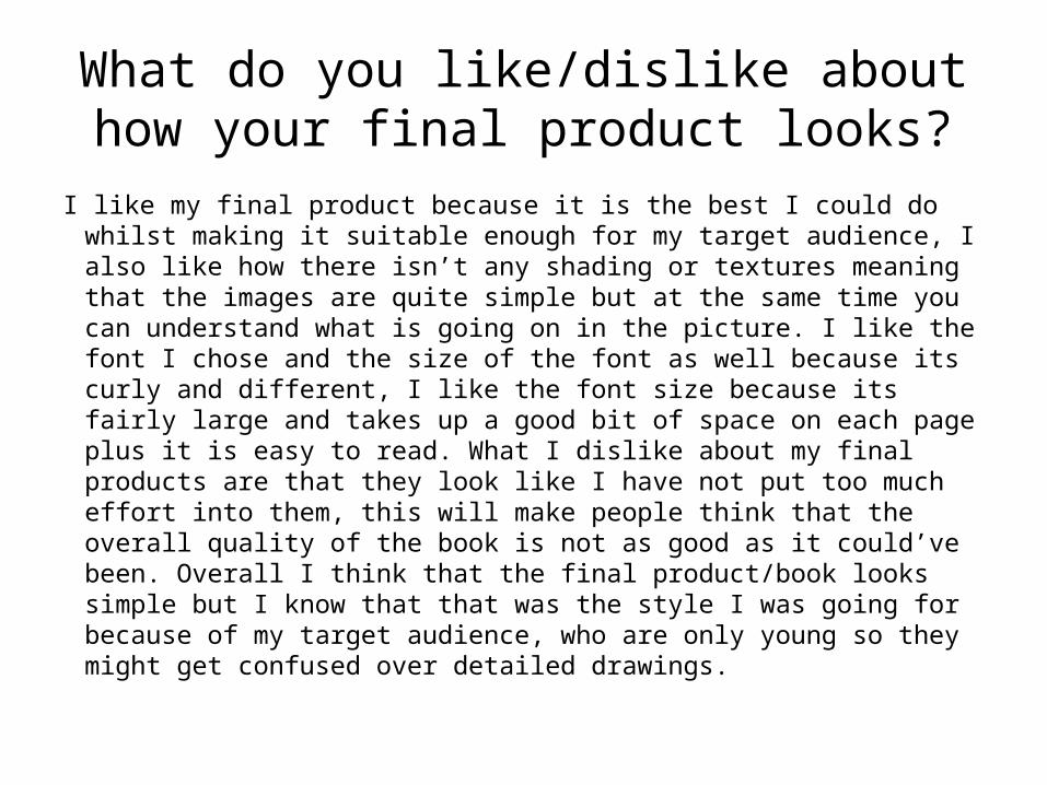
The image on the right is an example of how simple my images are, but you can still understand what's happening, especially if you read the text which goes along with it. The text which is on the right shows that its quite easy to read because of the pink background making it easier on the eyes, and showing that it is easily readable even though it’s a curly font.

Why did you include the content you used?
I roto scoped over images of people or objects I found on the internet that I thought I could use in my book because of the stance they’re in or the fact they can be used perfectly in my book, for example the chairs in a few of the scenes in the middle of my book were put there because they link with the story and they also match the details of the ones in the original script. Without the images I used the pictures would not work with the text or the story as a whole. I didn’t put any text in the images but the font I used for the story was chosen because of how easy it is to read, and because it looks like it can be used in a lot of fairy tale stories and other children's books I looked at during my research. I used the paint brush tool to add texture to the ground in the first few scenes of the book, I also used the stroke tool to create a border for the window in a lot of frames that are in the book. I used bright and bold colours so that it would grab the reader’s and the audience’s attention, whilst keeping them intrigued as they keep on reading.

This photo is an example of a photo where I used multiple images from the internet as a guide for drawing some objects like Goldilocks, and the chair.

What signs, symbols or codes have your used in your work?
I used bright and light colours to set a happy mood in my book, this is because the mood of the book might affect the mood of the reader. The mood of my book is mostly positive as well so using bright colours will help show it. I used the background images as a way to set the mood, in the first scene Goldilocks is lost in a forest which leaves mystery with the reader. In one scene I made Goldilocks’ face up close in the image so the reader can tell what her facial expression, I like this scene because its slightly different from the others in the way that it’s the only close up of a main character in the book.

I chose this image as an example because this is an image I talked about in the previous slide, it makes the reader shocked to see Goldilocks from a different angle from what they are used to seeing in the book, shocked like Goldilocks is when she breaks the chair.

What representations can be found in your work?
I have stuck with the original characters from the original story and I have not made any comments that could possibly be derogative to any race, sex or religion. The original characters are Goldilocks who is usually depicted as a young female Caucasian so I have made my Goldilocks like the rest, Father Bear and Mother Bear who are always the same in every adaption of the story. I have decided to make Baby Bear a boy because that way there will be an equal amount of male characters and female characters. A representation about bears could be created because of how they are living as a family like humans.

I chose this photo because it has all the characters from the book in it, two male characters being Father Bear and Baby Bear plus two female characters being Mother Bear and Goldilocks.

What style have you employed in your products?
I used the pictures I found during research whilst I was planning as examples of what I want my final product to look like. A lot of the pictures I found were bright and looked like they had either been drawn but mostly roto scoped. There wasn’t an exact illustrator that influenced but just the idea of simple images I found in many children’s books on the internet or through research in general were the ones that influenced me because they were the type of images used in books targeted at people aged between 2-5 years old like my book. I also chose to use the roto scope tool because it’s the tool I found the easiest to use but also the most flexible. I didn’t concentrate on making small details in the images as they could be distracting or take the audiences eyes off the main part of the image.
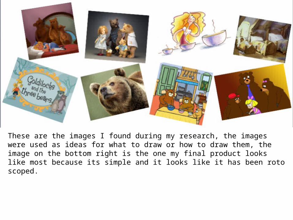
These are the images I found during my research, the images were used as ideas for what to draw or how to draw them, the image on the bottom right is the one my final product looks like most because its simple and it looks like it has been roto scoped.

What were the strengths and weaknesses of the pre-production and planning
The planning I did helped a lot because it enabled me to narrow down most of the options I had so I didn’t spend too much time thinking about other opportunities I could do during production. By creating my mind map I explored a lot of possible fairy tales and folks tales, illustration techniques, and font sizes and decided on which ones to go for. I used my mood boards to explore different ways that other illustrators have drawn and used computer assisted design to create their images, I also used the mood boards as a way to decide what font I was going to use for my book. The negative side about my planning is that I did not put in as much detail as I could have which means I still had to make certain features of my book up during production. My time was managed well because for most of my production time I was well ahead of schedule and so I used the rest of production time improving my pages to make them look better.

This shows all the planning I did, there is a lot more I could’ve written for my mind map because there wasn’t enough detail in it for me to go through the whole production process without making something up on the spot.

Historical and cultural context
The first variation of the novel there wasn’t a Goldilocks but instead an old woman who was described as being foul mouthed and dirty. It was only in later variations where the character Goldilocks was introduced, this was probably because this way it would be more child friendly. My book is the version with Goldilocks in it because it is more child friendly. I did not base any of my drawings from the images I found during my research I just used the images for help on what illustration technique to use. However the Goldilocks and the Three Bears story is quite popular and many versions of it have been made in the past by other authors and illustrators.

This image shows that I have chosen to make my book following the new more child friendly story that follows a girl instead of an old foul-mouthed woman through her adventures in the bears’ house.
Related Documents