The sparkle attracts the eye and draws you in to look at the digipak. The glowing name of the artist also drags you in but represents the name and when people go into a shop and you see her name glowing they will be attracted to buy because they know from her reputation that it’s a great album. The artist herself being in the center of the screen to show that the album is about her. The name of the album under the the name of the artist shows that its important to know the album name but now way near as important as the artist as you can tell from the size of the font, and how bright it is. This is very important because you can see the name of the cover but its very shadowed by Ellie Goulding’s hair is being blown by the wind. This symbolizes that this album is a fresh take on the music industry. You could also see it as her songs will become as common as the wind. The artist wearing white to symbolize purity is another point witch stands out on the digipak. Digipak analysis by Jack Sherman Her eyes are closed to show that she is feeling her music and is very passionate about it.

Digipak/cd cover analyses
Aug 09, 2015
Welcome message from author
This document is posted to help you gain knowledge. Please leave a comment to let me know what you think about it! Share it to your friends and learn new things together.
Transcript
The sparkle attracts the eye and draws you in to look at the digipak.
The glowing name of the artist also drags you in but represents the name and when people go into a shop and you see her name glowing they will be attracted to buy because they know from her reputation that it’s a great album.
The artist herself being in the center of the screen to show that the album is about her.
The name of the album under the the name of the artist shows that its important to know the album name but now way near as important as the artist as you can tell from the size of the font, and how bright it is. This is very important because you can see the name of the cover but its very shadowed by the artist.
Ellie Goulding’s hair is being blown by the wind. This symbolizes that this album is a fresh take on the music industry. You could also see it as her songs will become as common as the wind.
The artist wearing white to symbolize purity is another point witch stands out on the digipak.
Digipak analysis by Jack Sherman
Her eyes are closed to show that she is feeling her music and is very passionate about it.
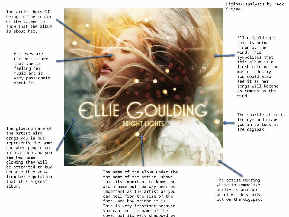
The bands name in a clear and visible place. This is to make sure that this is what people look at and as we all read from the top left hand side its usually the first place people look unless their eyes are being drawn to the center of the page.
The three heads are a complicated and eyes caching mix. As you can tell the largest head witch makes up the photo is the main singer of the script. As he is the largest he comes out as the most important. The other two are the drummer and the guitarist. These two people are the same size. Therefore basing them on the same importance. The way that the designer has meshed them all together is great because it shows unity and team work. This is great to see this from the viewers perspective. This is because it shows a strong band that wont split. It could also be interpreted by saying that the songs they sing about are tangled between their three lives and they have been through similar circumstances.
The blank canvas back makes the center image stand out more. This is great because is emphasizes the image and is very eye catching.
This is their album name. It’s the second biggest image on the page. Therefore making the image stand out and draw people in. Its great because its simplistic and original because its just a hash tag three. It could also reflect to loads of other things. Such as there are three main people in the band and they are the ones you see in the photo.
Here is the only direct mode of address you can see. This attracts you to the center of the image because its very eye catching.
There is also a since of symmetry in the imagine. Therefore representing that they are all equivalent to each other.
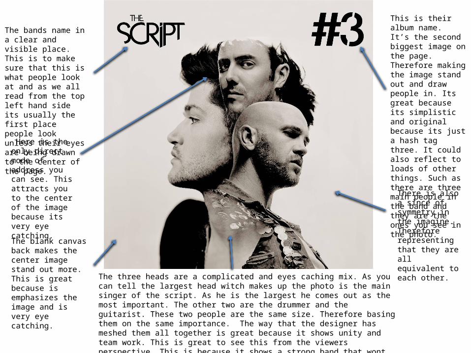
The Centre of the screen shows three casets with the name of the album. Also tells you it features Ed Sheeran. The imagery reflects the title. It is symbolic of the “old school feel” .
The image is slap bang right in the middle of the digipak. This shows symmetry and is eye catching to the audience because of this.
The main artists name is at the top. However its small but because of its simplistic font and color it some how reads class and is still very attractive to the viewer.
The plain back ground emphasizes the image in the center and the artists name.
The CD retro look is great because its not something you see on the front of a gidipak in the 21 century. This makes it stand out.
Related Documents


![APPLE/UNIVERSAL MUSIC 006007538172.. PLEASE … CD Beatles.pdf · – WITH THE BEATLES [Re-Mastered] ... with the WHITE ALBUM CD. Tri-fold digipak . Title: Modern Jazz Quartett Author:](https://static.cupdf.com/doc/110x72/5b02ff8a7f8b9a2e228bc049/appleuniversal-music-006007538172-please-cd-beatlespdf-with-the-beatles.jpg)