DIGIPAK DECONSTRUCTIONS

Digipak Deconstructions
Aug 04, 2015
Welcome message from author
This document is posted to help you gain knowledge. Please leave a comment to let me know what you think about it! Share it to your friends and learn new things together.
Transcript

DIGIPAK DECONSTRUCTIONS

ROYAL BLOOD
This is the digipak for Royal Blood’s 2014 album - ‘Royal Blood’. There was only 2 sides to this digipak as it was just a cd sleeve rather than a case.
The main image on the front odes not link to the name of the album, but it is a very unique, and appealing image that the audience will find
interesting. Although it doesn’t link to the album name, the same artist was used for 3 singles the band brought out previously to the album, with similar, unique images. On the back of the digipak it keeps with the same
colour scheme of just using black and white. On the back it gives information on the track names, a bar code, copyright information, and production company information. It has a very simple look that looks
professional and effective.

ECHOES SILENCE PATIENCE & GRACE
This is the digipak for Foo Fighter’s 2007 album - ‘Echoes Silence Patience & Grace’. Compared to the previous digipak, the colour scheme is a lot
more vintage and rustic, compared to the black and white. This is the kind of look I will try and use in my digipak, it has a very rock feel, it reminds
me of the things like: denim, leather, rust, rat rods. Its kind of like the steam punk genre. I like this effect, I think it looks good and the audience
will enjoy it. Like the other cover it has a list of the track names, a bar code, details about the production company and copyright info. However
on this digipak, the tracks are numbered as well.
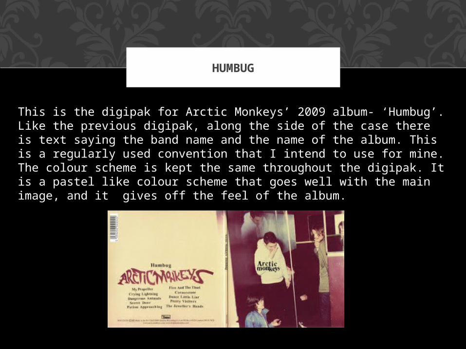
HUMBUG
This is the digipak for Arctic Monkeys’ 2009 album- ‘Humbug’. Like the previous digipak, along the side of the case there is text saying the band name and the name of the album. This is a regularly used convention that I intend to use for mine. The colour scheme is kept the same throughout the digipak. It is a pastel like colour scheme that goes well with the main image, and it gives off the feel of the album.
Related Documents