Digipak Analysis By Theresa Kuhn

Welcome message from author
This document is posted to help you gain knowledge. Please leave a comment to let me know what you think about it! Share it to your friends and learn new things together.
Transcript

Digipak AnalysisBy Theresa Kuhn

When gathering ideas for my own digipak
that will coincide with my magazine
advertisement and music video, I thought I
would analyse some existing digipaks. These
gave me ideas as to the appearance of the
product, and understand forms and
conventions to make it functional and
professional. I analysed two existing and
contrasting genres of music to get an idea of
possibilities of design.
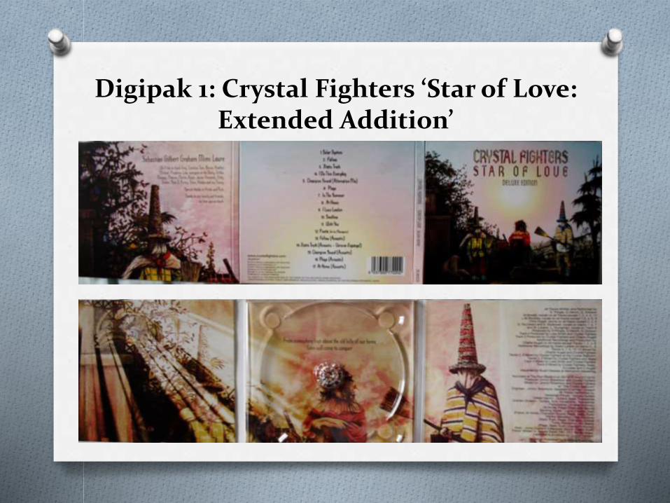
Digipak 1: Crystal Fighters ‘Star of Love: Extended Addition’

This digipak is ‘Star of Love: Deluxe Edition’,
Crystal Fighters debut album which indulges in
mixes of genres of Basque folk, electronic and
dubstep. It was released by the English-Spanish
band in 2011 through their label Zirkulo, after the
release of the normal CD in October 2010. The
Deluxe Edition includes 4 extra acoustic tracks
and an added bonus track.

The front panel displays artwork by John Stark, displaying themes of their Basque sounds. Both outfits the masked figures are wearing as well as some of the objects present around the figures are connotation to traditions of these indigenous ethnic groups. There is a girl present in the middle of these figures, looking away from the front as if to hide her expression. Another figure is visible on the left side of the image, slumped to the floor with a cloth covering them. This cover gives question to its audience as to what is going on here, whether the three main figures and the one on the floor are representative of the bands members or just introducing fans to the culture of their music. It appears to be set upon a hill amongst tropical trees that again associates to the region this ethnic group inhabits located around the western end of the Pyrenees Mountains. All the colours within the image are very vibrant; again portraying the Spanish culture this is based upon and conveys the vibrant uplifting music they create. The lack of revealing their identity could also relate to the lack of one specific genre they choose to influence their music, with no particular instruments except a tambourine visible to their audiences. This awe and mystery in appearance is what intrigues their audiences into their obscure uplifting sounds that are listed centrally on the middle section on the front panel. The typography of this and the main title is consistent throughout the cover, displaying writing that appears as if hand drawn with pen and ink. This rustic approach of font again relates with the Basques traditions of writing, therefore giving fans an in depth introduction to the styles and sounds this music brings. It also makes the short editorial on the left side feel more personal, as if it were handwritten by the band that only entices the fans further into thinking this Deluxe edition of the CD is personal to them. Record label information contrasts with this to show formality and structure to the rest of the CD, as if to prove this is a professional CD case.

The inside three panels display a zoomed in version of the front panel, but this time a variation to the left side with what appears light coming through a window as if through a churches stain glass window. This relates to the name of the album and the quote of lyrics hidden behind the CD compartment, as if to say the light is like the star of love coming from ‘high above the old hills of our home’ flooding the rest of the image. Apart from the quote the rest of the writing to the right is a clear sans serif font that shows the formality and structure within the music making, bearing the facts just to inform rather than entertain. The colours contain more of a pinky glow within the case, as if the warmth from the star of love is concealed between the walls of the digipak case.

As a promotion to their music, this
digipak is very successful in showing the
types of genres present on the track as
well as mystery with other sounds they
include. A clear house design is
consistently used throughout the whole
case that adds creativity but formality at
the same time, that doesn’t drag attention
away from the main music.

The digipak is a very important feature in establishing the artist and their music as a brand that audiences can recognize. In relation to other albums they have released, crystal fighters maintains a band identity through their constant portrayal of traditional artwork relating to their Basque sounds. All albums display detailed imagery and traditional pattern that reflects the bands complexity in genre to which an audience can recognize, with more possibility of fans being subconsciously drawn to a new album release by this same artist. This constant identity is favourable to audiences as it becomes iconography to which fans can then recognize as their work.
Brand Identity

Digipak 2: Caro Emerald ‘The Shocking Miss Emerald’

This digipak is ‘The Shocking Miss
Emerald’, the second studio album by
Dutch singer Caro Emerald. It was
released in May 2013 through Grandmono
Records and Dramatico and contains
genres of jazz pop and tango. The album
contains 14 tracks with a hidden track at
the end.
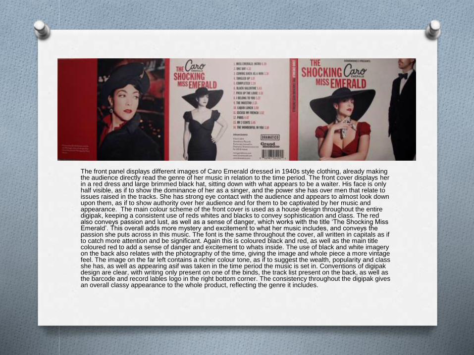
The front panel displays different images of Caro Emerald dressed in 1940s style clothing, already making the audience directly read the genre of her music in relation to the time period. The front cover displays her in a red dress and large brimmed black hat, sitting down with what appears to be a waiter. His face is only half visible, as if to show the dominance of her as a singer, and the power she has over men that relate to issues raised in the tracks. She has strong eye contact with the audience and appears to almost look down upon them, as if to show authority over her audience and for them to be captivated by her music and appearance. The main colour scheme of the front cover is used as a house design throughout the entire digipak, keeping a consistent use of reds whites and blacks to convey sophistication and class. The red also conveys passion and lust, as well as a sense of danger, which works with the title ‘The Shocking Miss Emerald’. This overall adds more mystery and excitement to what her music includes, and conveys the passion she puts across in this music. The font is the same throughout the cover, all written in capitals as if to catch more attention and be significant. Again this is coloured black and red, as well as the main title coloured red to add a sense of danger and excitement to whats inside. The use of black and white imagery on the back also relates with the photography of the time, giving the image and whole piece a more vintage feel. The image on the far left contains a richer colour tone, as if to suggest the wealth, popularity and class she has, as well as appearing asif was taken in the time period the music is set in. Conventions of digipak design are clear, with writing only present on one of the binds, the track list present on the back, as well as the barcode and record lables logo in the right bottom corner. The consistency throughout the digipak gives an overall classy appearance to the whole product, reflecting the genre it includes.

The inside panels continue this house design with the same colour scheme of black, white and red, again to emphasise the class and sophistication this music's connotes itself with. The absence of writing within gives more focus to the main singer, as if no words are needed to explain the style and substance of her music. Also the three black and white images on the far right section show images as if she was photographed by the paparazzi, in a way exaggerating her popularity and appearing like an iconic figure of the 1940s. It could also appear to pictures the fans themselves might take of her, giving a personal photo collection that fans would appreciate and find more valuable than just the normal CD. The image on the far left shows her in Paris, looking off from a bridge with suitcase and luxury clothing, again like the image on the reverse side, to convey her class and sophistication, in a city of love which relates to the topics of her music. The design of the CD itself is consistent with the house design of the digipak, using the same typography and logos on the rest of the cover. The fact that the CD also appears like an old record is almost nostalgic to the way this genre of music was originally played, sending her fans back in time to relive the classic sounds through a product that connotes the trends of the time.

Brand Identity
Across Caro Emeralds work, a clear brand identity is sustained that makes audiences gain recognition in her work and be drawn immediately to new releases. In both albums she’s released, red is a significant feature of style, either featuring in her outfit or as a general design. They reinforce the passion and lust she sings about, as well as adding to the danger and mystery of this figure that appears to have stepped out of the 1940s. The logo of her name is also repeated across albums, giving an identifiable logo fans can recognise and associate with her work. Moreover the same font is used in every album, letting the artist become recognised for that style of font without her actual presence in the image. Her style is also consistent in every album, showing her love for 1940s and appearing like a Hollywood singer of the past. All these elements make fans more recognisable to her work, therefore her self promotion giving her audiences an album to watch out for.

With these design inspirations and
conventions in mind, I feel I have more
knowledge to create a digipak that not only
fits the track, but is identifiable as the genre
of the band I have created a music video for.
I want my audiences to be able to read the
cover and recognise the genre I have
chosen, as well as work with the sounds the
bands deliver.

O Font
O Colour (polysomic)
O Space
O Amount of info
O Positioning/use of image
Related Documents