Digi-pak Ideologies. After my research I created my own ideas for a digi-pak for our artist ‘M.Ria’ the digi-paks contain consistency and offer the same colour scheme/pattern that the magazine adverts contain.

Welcome message from author
This document is posted to help you gain knowledge. Please leave a comment to let me know what you think about it! Share it to your friends and learn new things together.
Transcript
Digi-pak Ideologies.
After my research I created my own ideas for a digi-pak for our artist ‘M.Ria’ the digi-paks contain consistency and offer the same colour scheme/pattern that the magazine adverts contain.
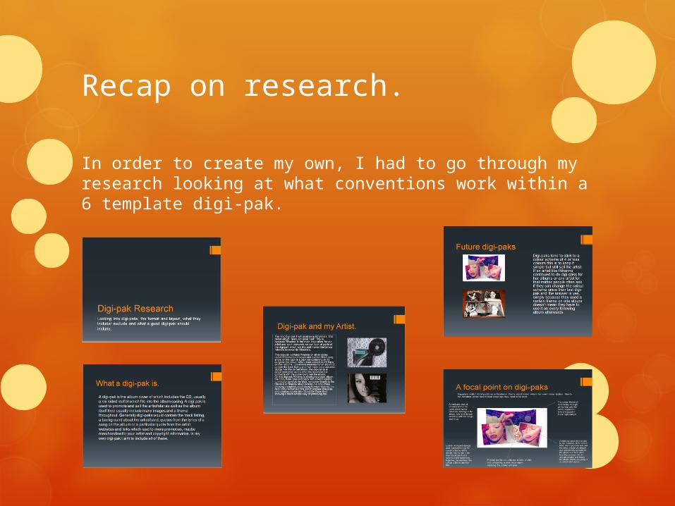
Recap on research.
In order to create my own, I had to go through my research looking at what conventions work within a 6 template digi-pak.
My ideas
These all come from a range of concepts, inspiration and interpretation from the magazine adverts and other places. My digi-paks include:
Pictures of my artist.
A setting/location or a theme.
Track listing.
CD.
Background of the artist.
Some of my digi-paks don’t include these as the advanced ones which I thought had the most potential could be taken forward to do further editing on, some of the ideas are simplistic however some are complex.
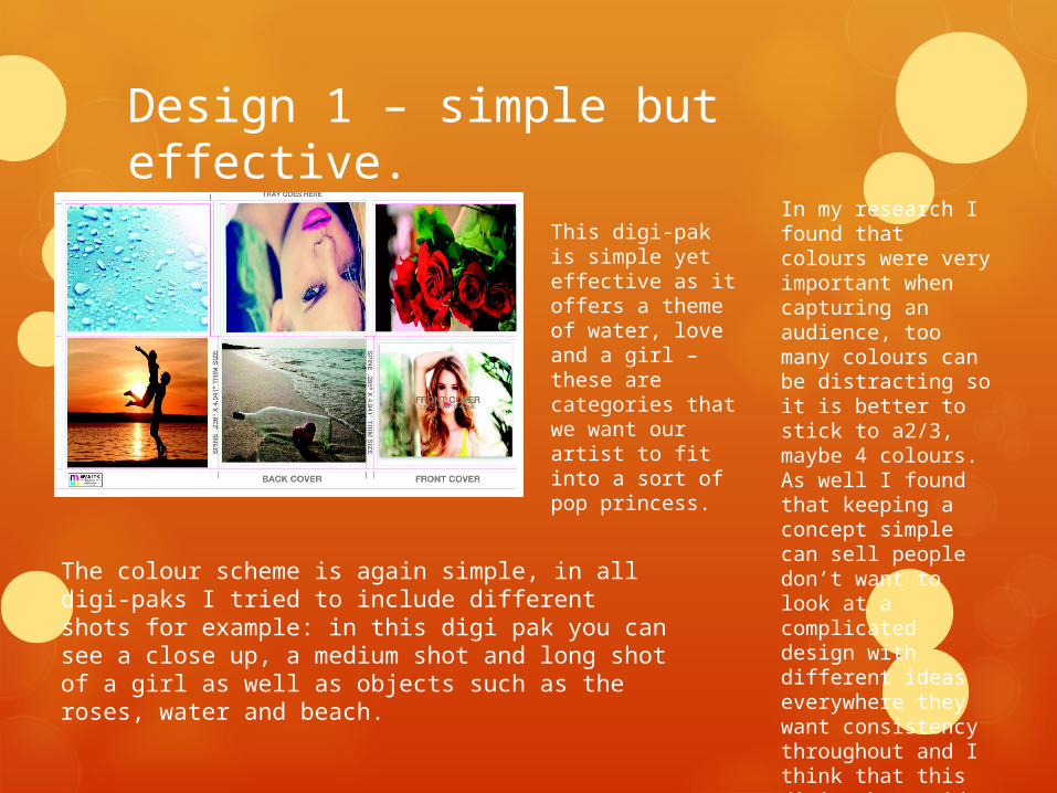
Design 1 – simple but effective.
This digi-pak is simple yet effective as it offers a theme of water, love and a girl – these are categories that we want our artist to fit into a sort of pop princess.
The colour scheme is again simple, in all digi-paks I tried to include different shots for example: in this digi pak you can see a close up, a medium shot and long shot of a girl as well as objects such as the roses, water and beach.
In my research I found that colours were very important when capturing an audience, too many colours can be distracting so it is better to stick to a2/3, maybe 4 colours. As well I found that keeping a concept simple can sell people don’t want to look at a complicated design with different ideas everywhere they want consistency throughout and I think that this digi-pak provides that.
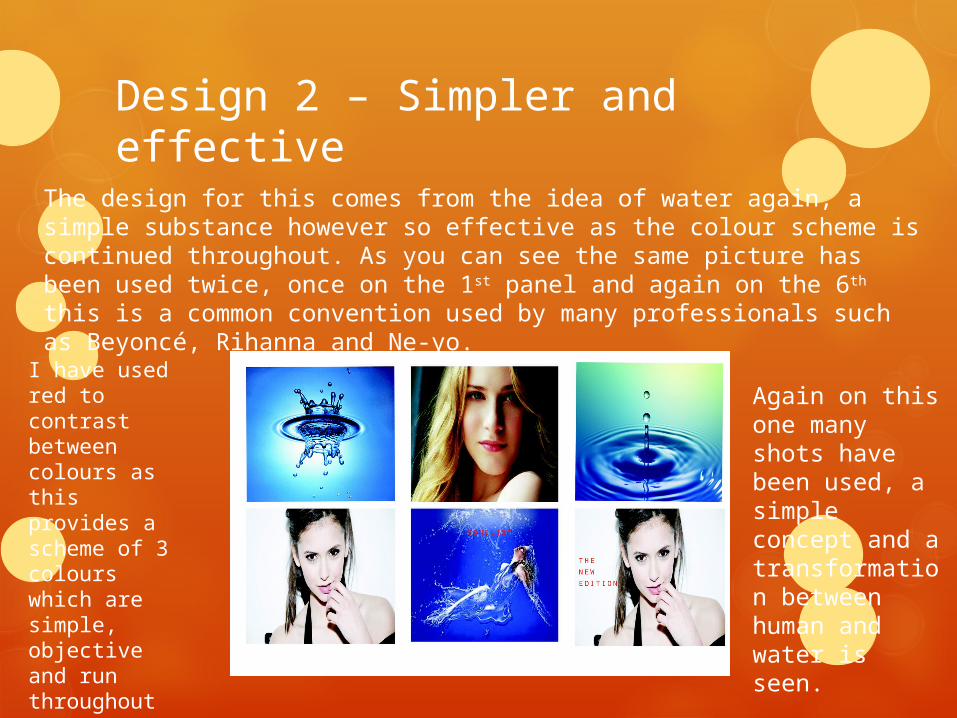
Design 2 – Simpler and effective
The design for this comes from the idea of water again, a simple substance however so effective as the colour scheme is continued throughout. As you can see the same picture has been used twice, once on the 1st panel and again on the 6th this is a common convention used by many professionals such as Beyoncé, Rihanna and Ne-yo.
I have used red to contrast between colours as this provides a scheme of 3 colours which are simple, objective and run throughout the panels.
Again on this one many shots have been used, a simple concept and a transformation between human and water is seen.
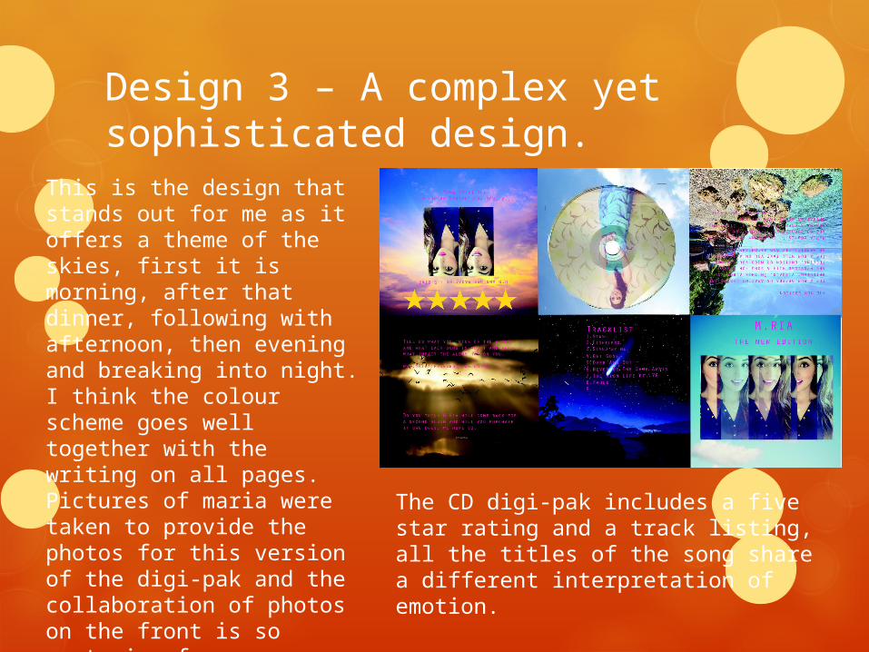
Design 3 – A complex yet sophisticated design.
This is the design that stands out for me as it offers a theme of the skies, first it is morning, after that dinner, following with afternoon, then evening and breaking into night. I think the colour scheme goes well together with the writing on all pages. Pictures of maria were taken to provide the photos for this version of the digi-pak and the collaboration of photos on the front is so capturing for an audience, background about the artist is included on the second panel.
The CD digi-pak includes a five star rating and a track listing, all the titles of the song share a different interpretation of emotion.
Related Documents