Development of an Arabic Continuous Text Near Acuity Chart by Balsam Alabdulkader A thesis presented to the University of Waterloo in fulfillment of the thesis requirement for the degree of Doctor of Philosophy in Vision Science Waterloo, Ontario, Canada, 2017 ©Balsam Alabdulkader 2017

Welcome message from author
This document is posted to help you gain knowledge. Please leave a comment to let me know what you think about it! Share it to your friends and learn new things together.
Transcript
Development of an Arabic Continuous
Text Near Acuity Chart
by
Balsam Alabdulkader
A thesis
presented to the University of Waterloo
in fulfillment of the
thesis requirement for the degree of
Doctor of Philosophy
in
Vision Science
Waterloo, Ontario, Canada, 2017
©Balsam Alabdulkader 2017
ii
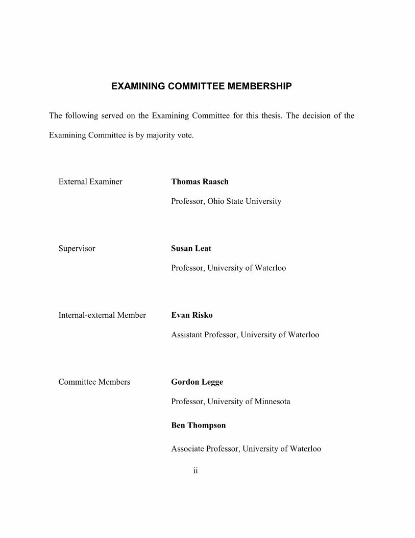
EXAMINING COMMITTEE MEMBERSHIP
The following served on the Examining Committee for this thesis. The decision of the
Examining Committee is by majority vote.
External Examiner Thomas Raasch
Professor, Ohio State University
Supervisor Susan Leat
Professor, University of Waterloo
Internal-external Member Evan Risko
Assistant Professor, University of Waterloo
Committee Members Gordon Legge
Professor, University of Minnesota
Ben Thompson
Associate Professor, University of Waterloo

iii
AUTHOR'S DECLARATION
I hereby declare that I am the sole author of this thesis. This is a true copy of the thesis,
including any required final revisions, as accepted by my examiners.
I understand that my thesis may be made electronically available to the public.
iv
ABSTRACT
Purpose: Near visual acuity is an essential measurement during an oculo-visual assessment.
Continuous text near visual acuity charts measure reading acuity and other aspects of reading
performance. Arabic is ranked as the fourth spoken language globally. Yet, there are no
standardized continuous text near visual acuity charts in Arabic. The aims of this study are to
create and compose a large pool of standardized sentences, to validate these sentences in
children and adults and choose a final set with equal readability to use in the development of a
standardized Arabic continuous text reading chart, and then to design and validate the first
standardized Arabic continuous text near visual acuity chart, the Balsam Alabdulkader-Leat
(BAL) chart.
Methods: Initially, 90 Arabic pairs of sentences were created for use in constructing a chart
with similar layout to the Colenbrander chart. They were created following accepted criteria
for creating sentences for near visual acuity charts. They had the same grade level of difficulty
and physical length. Fifty-three Arabic-speaking adults and sixteen children were recruited to
validate the sentences. Reading speed in correct words per minute (CWPM) and standard
length words per minute (SLWPM) were measured and errors were counted. Elimination
criteria based on reading speed and errors made in each sentence pair were applied to exclude
sentence pairs with more outlying characteristics, and to select the final group of sentence
v
pairs. The final sub-set of validated sentences was used in the construction of three versions of
the BAL chart.
Eighty-six bilingual adults with normal vision aged 15 to 59 years were recruited to validate
the charts. Reading acuity and reading speed in standard words per minute were measured for
the three versions of the BAL chart and three English charts (MNREAD, Colenbrander, and
Radner charts). The Arabic version of the IReST chart was used to test the validity of the BAL
chart in measuring reading speed. ANOVA was used to compare reading acuity and reading
speed in standard words per minute. Bland-Altman plots were used to analyze agreement
between the charts. Normal visual acuity (0.00 logMAR) was calibrated for the BAL chart
with linear regression between the reading acuity of the BAL chart against reading acuity
measured with the MNREAD and the Radner charts.
Results: Forty-five sentence pairs were selected according to the elimination criteria. For
adults, the average reading speed for the final sentences was 166 CWPM and 187 SLWPM
and the average number of errors per sentence pair was 0.21. Childrens’ average reading speed
for the final group of sentences was 61 CWPM and 64 SLWPM. Their average error rate was
1.71. The Cronbach’s alpha for the final set of sentence pairs in CWPM and SLWPM was
0.986 for adults and 0.996 for children, showing that the final sentences had very good internal
consistency.
vi
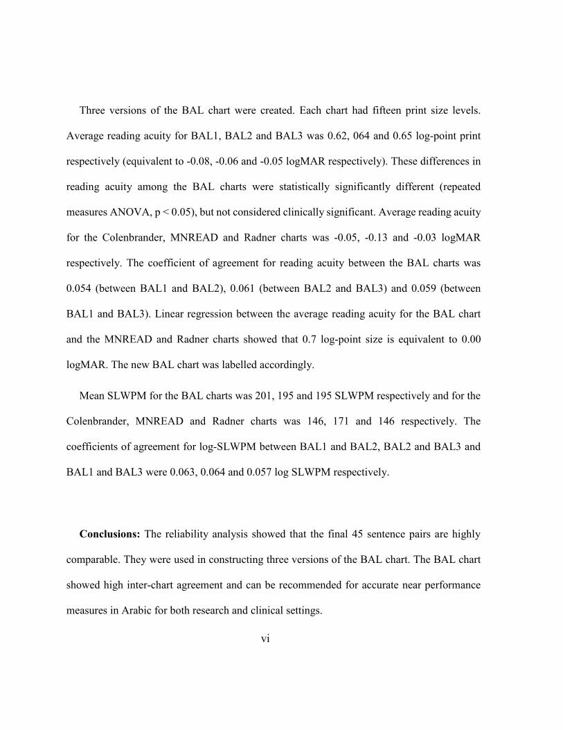
Three versions of the BAL chart were created. Each chart had fifteen print size levels.
Average reading acuity for BAL1, BAL2 and BAL3 was 0.62, 064 and 0.65 log-point print
respectively (equivalent to -0.08, -0.06 and -0.05 logMAR respectively). These differences in
reading acuity among the BAL charts were statistically significantly different (repeated
measures ANOVA, p < 0.05), but not considered clinically significant. Average reading acuity
for the Colenbrander, MNREAD and Radner charts was -0.05, -0.13 and -0.03 logMAR
respectively. The coefficient of agreement for reading acuity between the BAL charts was
0.054 (between BAL1 and BAL2), 0.061 (between BAL2 and BAL3) and 0.059 (between
BAL1 and BAL3). Linear regression between the average reading acuity for the BAL chart
and the MNREAD and Radner charts showed that 0.7 log-point size is equivalent to 0.00
logMAR. The new BAL chart was labelled accordingly.
Mean SLWPM for the BAL charts was 201, 195 and 195 SLWPM respectively and for the
Colenbrander, MNREAD and Radner charts was 146, 171 and 146 respectively. The
coefficients of agreement for log-SLWPM between BAL1 and BAL2, BAL2 and BAL3 and
BAL1 and BAL3 were 0.063, 0.064 and 0.057 log SLWPM respectively.
Conclusions: The reliability analysis showed that the final 45 sentence pairs are highly
comparable. They were used in constructing three versions of the BAL chart. The BAL chart
showed high inter-chart agreement and can be recommended for accurate near performance
measures in Arabic for both research and clinical settings.
vii
ACKNOWLEDGEMENTS
To all of those who were there along the way, I thank you. You are the reason I had the
courage to finish this project. Specifically, however, some special souls helped make it all
possible.
To start, I would like to thank my supervisor, Dr. Susan Leat, for her guidance, advice
and my professional development so far. Over the last eight years, I learned everything
about research from you. Thank you for believing in my idea that I was truly passionate
about, for giving me the support and advice I needed, and for encouraging me in times of
doubt when I thought this project nearly impossible. I would also like to thank my
committee members, Dr. Gordon Legge and Dr. Ben Thompson; thank you for all your
support, understanding, and insightful comments on this project. You have helped to make
this project better.
I would like to thank Ms. Majda Alsumai and Dr. Khalid Jamous for their help in
arranging for my data collection in Saudi Arabia. Ms. Alsumai, thank you for arranging
the recruitment of children at Altarbiya Alislamiya Schools and for facilitating all the many
administrative tasks associated with this work. Dr. Jamous, thank you for offering me your
support as well as a place to work, before you even knew me. Without the help of both of
you, this project will not be possible. To my friend colleague and big brother, Dr. Fahad

viii
Almoqbel, thank you for all your support, guidance, friendship and most importantly
listening during hard times.
To my friends Dr. Derek Ho, Dr. Ian Erkelens and Dr. Varadharajan Jayakumar,
thank you for the valuable discussions. I have enjoyed our exchanges and time together. I
thank every one of you for listening and putting in the effort to understand how Arabic is
written and read. Your insights and support have always enriched my ideas.
I would like to make special mention of the Vermeyden family, especially Anne and
Pim Vermyden. Words cannot express how thankful I am to you all. Thank you for your
friendship throughout the years, for making me part of your family, and all the fun times
we have had together. Jeanette Vermeyden and Aad Vermeyden, thank you for giving
me advice and support when I needed it. I feel truly honored that you have considered and
treated me as one of your own children.
Last but not least, to my sisters Shahd Alabdulkader and Norah Alabdulkader, and
to my best friends Abrar Alduraibi and Madawi Aldhwayan, thank you for listening and
encouraging me during this journey. Without your love and support none of my success
would have been possible.
ix
DEDICATION
إهداء
دعائكم ودعمكم الدائم لي سبب نجاحيإلى والدّي....
To my parents, your prayers and continuous encouragement is the reason for my
success
x
TABLE OF CONTENTS
Examining Committee Membership ............................................................................... ii
AUTHOR'S DECLARATION ....................................................................................... iii
Abstract.............................................................................................................................. iv
Acknowledgements ......................................................................................................... vii
Dedication .......................................................................................................................... ix
Table of Contents ............................................................................................................... x
List of Figures.................................................................................................................. xiv
List of Tables ..................................................................................................................... ii
Chapter 1 INTRODUCTION ........................................................................................... 1
1.1 Visual acuity .......................................................................................................... 1
1.1.1 Distance acuity charts ..................................................................................... 2
1.1.1.1 Snellen acuity............................................................................................ 2
1.1.1.2 Modern distance letter acuity charts ......................................................... 3
1.1.1.3 Letter and symbol distance acuity charts .................................................. 5
1.1.2 Near visual acuity ............................................................................................ 6
1.1.2.1 Early continuous text charts...................................................................... 7
1.1.2.2 Unrelated near word charts ....................................................................... 7
1.1.2.3 Continuous text near acuity charts ............................................................ 8
1.1.2.3.1 Criteria for designing continuous text near acuity charts .................. 9
1.2 Font types and characteristics .............................................................................. 12
1.3 Print size .............................................................................................................. 13
1.3.1 The x-height .................................................................................................... 13
1.3.2 Point size ....................................................................................................... 14
1.3.3 Sloan M-unit.................................................................................................. 15
1.4 Reading performance ........................................................................................... 16
xi
1.4.1 Reading speed............................................................................................... 16
1.4.2 Reading acuity .............................................................................................. 18
1.4.3 Critical print size .......................................................................................... 18
1.5 Standardized continuous text near acuity charts in English ............................... 19
1.5.1 The Minnesota low-vision reading test (MNREAD chart) .......................... 20
1.5.2 Colenbrander chart ....................................................................................... 22
1.5.3 Radner chart ................................................................................................. 24
1.6 The International Reading texts (IReST) ............................................................ 26
1.7 Charts in languages other than English ............................................................... 26
1.7.1 The Turkish MNREAD chart ....................................................................... 27
1.7.2 The Greek MNREAD chart .......................................................................... 28
1.7.3 The Persian near reading chart ..................................................................... 29
1.8 Arabic acuity charts ............................................................................................ 31
1.9 Arabic language .................................................................................................. 35
1.9.1 Typography .................................................................................................. 38
1.9.1.1 Ligatures ................................................................................................ 39
1.9.1.2 Kashidas ................................................................................................. 40
1.10 Reading in English and Arabic ......................................................................... 40
Chapter 2 RATIONALE AND AIMS OF THE STUDY ............................................ 43
2.1 Rationale ............................................................................................................. 43
2.2 Aims of the study ................................................................................................ 45
Chapter 3 CHOICE OF TYPEFACE ........................................................................... 47
3.1 Introduction ......................................................................................................... 47
3.2 Procedure ............................................................................................................ 48
Chapter 4 TOWARD DEVELOPING A STANDARDIZED ARABIC
CONTINUOUS TEXT READING CHART ................................................................ 53
4.1 Summary ............................................................................................................. 53
4.2 Introduction ......................................................................................................... 54
xii
4.3 Methods ............................................................................................................... 57
4.3.1 Choice of typeface......................................................................................... 57
4.3.2 Creating a set of sentences with high reliability ........................................... 59
4.4 Participants .......................................................................................................... 62
4.5 Procedure ............................................................................................................. 63
4.6 Data analysis ........................................................................................................ 64
4.6.1 Correct words per minute (CWPM) .............................................................. 65
4.6.2 Correct standard length words per minute (SLWPM) .................................. 65
4.6.3 Selecting sentences with similar readability characteristics ......................... 66
4.7 Results .................................................................................................................. 68
4.8 Discussion ............................................................................................................ 73
4.8.1 Developing the new charts ............................................................................ 77
4.9 Conclusions .......................................................................................................... 79
4.10 Disclosure .......................................................................................................... 79
4.11 Acknowledgments ............................................................................................. 80
Chapter 5 LAYOUT AND SPACING ........................................................................... 81
5.1 General chart layout ............................................................................................. 81
5.1 Print sizes ............................................................................................................. 81
5.2 Spacing ................................................................................................................ 86
5.2.1 Spacing between the lines of the same font size ........................................... 86
5.2.2 Spacing between font size levels .................................................................. 87
Chapter 6 A STANDARDIZED ARABIC READING ACUITY CHART: THE BAL
CHART ............................................................................................................................. 89
6.1 Summary .............................................................................................................. 89
6.2 Introduction .......................................................................................................... 90
6.3 Methods ............................................................................................................... 92
6.3.1 Chart design and layout ................................................................................. 92
6.3.2 Spacing .......................................................................................................... 94
xiii
6.3.2.1 Spacing between the lines ...................................................................... 94
6.3.3 Creation of the chart ..................................................................................... 95
6.4 Participants .......................................................................................................... 96
6.5 Experimental procedure ...................................................................................... 96
6.6 Data analysis ....................................................................................................... 98
6.7 Results ............................................................................................................... 100
6.7.1 Reading acuity ............................................................................................ 101
6.7.2 Reading speed............................................................................................. 102
6.7.3 Critical print size ........................................................................................ 105
6.8 Calibrating the chart .......................................................................................... 107
6.9 Discussion ......................................................................................................... 108
6.10 Conclusions ..................................................................................................... 116
6.11 Acknowledgments........................................................................................... 117
Chapter 7 GENERAL DISCUSSION AND CONCLUSIONS ................................. 118
7.1 Discussion .......................................................................................................... 118
7.2 Conclusion ........................................................................................................ 126
7.3 Future work ....................................................................................................... 127
Letters of Copyright Permissions ................................................................................ 128
Bibliography .................................................................................................................. 136
xiv
LIST OF FIGURES
Figure 1.1. A graphical demonstration of serifs. .............................................................. 13
Figure 1.2. How the x-height is measured in Roman letters............................................. 14
Figure 1.3. An example of a typical reading speed curve. CPS is the critical print size. . 17
Figure 1.4. The MNREAD chart. ..................................................................................... 20
Figure 1.5. The Colenbrander chart. ................................................................................. 23
Figure 1.6. The Radner chart. ........................................................................................... 24
Figure 1.7. The change of letter shape with position in the word..................................... 36
Figure 1.8. Different Arabic letters that share the same shape, but different
configurations of diacritical dots. ...................................................................................... 37
Figure 1.9. Different Arabic fonts showing varying levels of ligatures for the same four
letters. ................................................................................................................................. 39
Figure 1.10. Kashidas. ...................................................................................................... 40
Figure 3.1. Comparison between MS Word font and newspaper font. ............................ 49
Figure 3.2. Text taken from an Arabic newspaper showing poor quality print. ............... 50
Figure 3.3. Superimposing two MS Word fonts. .............................................................. 52
Figure 4.1. Demonstration of Arabic typeface characteristics.......................................... 58
Figure 4.2. Example of a pair of sentences. ...................................................................... 61
Figure 4.3. Mean reading speed (log units) for each sentence pair (adults). .................... 69
Figure 4.4. Histograms of mean number of errors and maximum number of errors for
each sentence pair (adults) ................................................................................................. 70
Figure 4.5. SLWPM (log units) for children for the final set of 45 sentence pairs using all
exclusion criteria. ............................................................................................................... 71
Figure 4.6. Histograms of the final set of 45 sentence pairs (children). ........................... 72
Figure 4.7. Chart layout with candidate sentences. .......................................................... 78
xv
Figure 5.1. Measuring the physical size of different font size levels............................... 84
Figure 5.2. Measurement of between lines spacing for the same font size...................... 87
Figure 5.3. Measurement of spacing between different font levels. ................................ 88
Figure 6.1. Example of the layout of the BAL chart........................................................ 93
Figure 6.2. Reading speed in standard length words per minute (SLWPM) plotted as a
function of print size for the three versions of the BAL chart. ....................................... 100
Figure 6.3. Bland-Altman plots of reading acuity between different versions of the BAL
chart. ................................................................................................................................ 102
Figure 6.4. Bland-Altman plots of reading speed in log-standard length words per minute
between different versions of the BAL chart. ................................................................. 104
Figure 6.5. Bland-Altman plot for reading speed in log-standard length words per minute
(SLWPM). ....................................................................................................................... 105
Figure 6.6. Bland-Altman plots of the critical print size (CPS) in log-point among
different versions of the BAL chart. ............................................................................... 106
Figure 6.7. Scattergrams of mean reading acuity measured with the BAL chart (log-point
size) plotted against A. reading acuity of the MNREAD chart (logMAR), with linear
regression line plotted. B. reading acuity of the Radner chart (logMAR). ..................... 108
ii
LIST OF TABLES
Table 1. Data of the final 45 sentence pairs (based on adult and child data) .................... 72
Table 2. Reading acuity measured with the different charts ........................................... 101
Table 3. Reading speed in SLWPM measured with the different charts ........................ 103
1
Chapter 1
INTRODUCTION
1.1 Visual acuity
Visual acuity (VA) is defined as the ability of the eye to detect details. It is often the
first measurement that is carried out in any eye examination. Visual acuity is a
straightforward and quick routine measurement that, if reduced, may be an indicator of the
presence of ocular disease or uncorrected refractive error. It is used to assess the
progression of certain diseases and to monitor the efficacy of prescribed medications.1
Visual acuity is commonly divided into four categories as follows: 1) detection acuity,
which is the ability of a patient or participant to detect the presence or absence of a
particular target, for example, the patient is asked to detect a dot or line 2) resolution acuity,
which is the ability of a person to resolve features of a stimulus such as grating acuity in
preferential looking tests2 and 3) recognition acuity is when a subject is asked to recognize
and name or match a particular symbol or letter such as using letter charts to measure VA.
Recognition acuity is the type of VA most often used in measuring visual acuity clinically.2
4) hyperacuity, which is a measure of the limit of spatial vision or differences in position
between two stimuli e.g. tests of alignment of two stimuli and steroacuity.2,3
2
1.1.1 Distance acuity charts
1.1.1.1 Snellen acuity
Herman Snellen4 introduced his first optotypes in 1862. Optotypes are usually upper
case letters of high contrast. They are designed such that for the 6/6 (20/20) line each detail
subtends 1 minute of arc of visual angle at the eye. The angular size is determined from the
physical size of print and the viewing distance.5 It is measured in min of arc or degrees of
visual angle, and it is used for calibrating the chart print sizes. The overall size of an
optotype is five times the size of the detail. For example, each limb of the optotype subtends
1 minute of arc at the eye, and the overall size of an “E” is 5 min of arc. This calculation
ensures that at the 6/6 line each letter size subtends 5 min of arc at the testing distance of
the chart. The rest of the print sizes are calibrated based on this calculation. On VA charts,
as the letters become smaller their details become finer.
The goal of the test is to find the point at which the observer is no longer able to detect
the details of the optotypes and therefore no longer able to recognize them accurately.
Snellen’s original chart was one of the first charts used to measure distance visual acuity
(DVA). Snellen’s chart spread widely as he defined “the acuteness of vision”6 or what it is
known today as the Snellen fraction to describe the angular size of optotypes as:
Test distance
Distance at which the letter detail subtends 1 minute of arc
3
Snellen’s fraction is used to calculate the minimum angle of resolution (MAR) which is
the angle of the just resolved detail (limbs in the case of an E optotype) subtended at the
eye.3 Adults’ normal visual acuity is defined as being able to at least read the 6/6 line (the
one on which each detail of the letter subtends 1´) at 6 meters. One of the advantages of
using Snellen’s fraction is the ease of converting it to MAR. The MAR is the reciprocal of
the Snellen fraction.3
1.1.1.2 Modern distance letter acuity charts
Snellen’s original chart was used for many decades, but has recently received criticism
as the letters on the chart are not equally legible, step sizes are not uniform throughout the
chart and the optotypes are not evenly spaced.7,8 In Snellen’s original chart, there are more
letters per row at the bottom of the chart compared to letters on rows at the top of the chart.
This made the letters at the bottom of the chart harder to resolve because of the closely
proximate surrounding contours (crowding phenomenon).3 Also, it made the task different
on different rows i.e. it is easier to guess one letter correctly compared to six letters. Using
Snellen’s chart at different testing distances significantly affects the VA score.8 Green7
originally suggested that letter size progression should follow a logarithmic progression of
10√10 (equal to 1.2589 or 0.1 log unit).
In 1976, Bailey and Lovie8 developed the famous Bailey-Lovie chart. They set up a
series of principles to overcome the disadvantages of the Snellen chart that were reported
4
by Green7 and summarized in a review by Bennett.9 Bailey and Lovies’ fundamental
principles8 were: almost identical letter legibility, an equal number of optotypes per row,
spacing between optotypes proportional to the optotype size, a logarithmic scale between
letter sizes (usually 0.1 log steps), and proportional spacing between rows so as to control
crowding. Ten letters were adopted from the recommendations by the British Standard
Institution (D, E, F, N, H, P, R, U, V, Z).10,11 They were non-serif letters constructed on a
5 by 4 framework.8 The chart was labeled in the logarithm of the angle of resolution
(logMAR) as well as in Snellen’s fraction. Today, Bailey and Lovies’ principles are still
used.
In 1982, Ferris et al.12 developed the Early Treatment Diabetic Retinopathy Study chart
(EDTRS chart). The EDTRS chart incorporated the same principles of the Bailey-Lovie
but used the ten Sloan letters13 (C, D, H, K, N, O, R, S, V, Z),10,11 rather than British
standard letters, for testing at 4 meters. Sloan letters are constructed on 5 by 5 frame work.
As each line on a logMAR chart has the same number of letters (five letters) and 0.1
logMAR size increments, visual acuity can be scored by what is called the by-letter
method.12 It is considered a precise method to score VA as it gives each letter on the chart
an equal weight.12,14 To calculate the credit of each letter, the step size is divided by the
number of letters on each row. For Bailey-Lovie and EDTRS charts there are five letters
for each 0.1 log step. This makes each letter on the chart worth 0.02 logMAR. For example,
5
if a patient is able to read all the letters on 0.7 line his/her VA would be 0.7 logMAR. If
s/he is able to read the 0.7 line and two extra letters from the 0.6 line, his/her VA would be
0.66 logMAR. In other words, the final logMAR score is based on the total number of all
the letters that are read throughout the chart. Scoring by the by-letter method has shown
good test-retest reliability1,15 and is widely used in research settings.
The Bailey-Lovie and EDTRS charts are considered the gold standard charts in
measuring DVA. Currently, a large number of DVA charts have been developed using
Bailey-Lovie design principles. Currently, DVA can be measured using a large variety of
charts that use letters, numbers, symbols or pictures and are based on these principles.
Almost all of them are designed according to the principles of the Bailey-Lovie or ETDRS
charts and according to the recommended standards of developing a visual acuity chart.16
This made measuring DVA a more standardized, precise and repeatable test.
1.1.1.3 Letter and symbol distance acuity charts
Distance visual acuity charts are available in a variety of single optotypes. Each type of
distance chart has some advantages and disadvantages. Charts that use symbols/pictures or
Tumbling Es have the potential advantage of being used to test children or adults with
literacy difficulties. They involve less language barrier and so can be used anywhere
around the world. In that sense they are universal. However, one disadvantage of using
these charts is the higher probability of guessing, as they use a limited number of
6
orientations/pictures/symbols (4 symbols in Lea symbols chart) compared to most letter
charts. The likelihood of guessing is lower in letter charts. As there are 26 letters in the
English alphabet, the probability of guessing is 1 in 26. This is true even for those charts
that use a limited selection of 10 letters, as the patient is not usually aware that only a few
letters of the alphabet are used in the chart.10 If the patient knew that there are only ten
letters on the chart, the probability of guessing will be higher (1 in 10), but this is still lower
than for the symbol and tumbling E charts. Snellen charts are easy to explain to the patients
and need minimal instructions.17 They are quick and easy to administer by clinicians. On
the other hand, letter charts can only be used with people who are literate in the languages
that use Roman letters.
1.1.2 Near visual acuity
Near charts which use single letters or symbols follow the same design principles of
distance letter acuity charts and are known as reduced Snellen charts. One of the main
differences, obviously, is testing distance. The standard reading distance for near testing is
within arm’s length which is estimated to be 40 cm or 16 inches. There are a wide variety
of commercially-available near logarithmic charts such as Landolt C, EDTRS, Sloan,
Tumbling “E”, numbers, Patti pics and Lea symbols. Some of them are designed for
particular age groups and/or require minimum education/reading level. As these charts use
single optotypes, they are simply a repetition of optotype acuity, but at near, which will
7
help to detect differences in defocus between distance and near, but do not give any other
additional functional information.
1.1.2.1 Early continuous text charts
Historically, reading continuous text has been used for many decades as a functional
way of assessing near acuity and providing patients with a near spectacle correction for
reading. In 1854, Eduard Jaeger published the first edition of his “Test-Types”.18 His book
contained sentences that ranged from N1 to N20. Jaeger believed that using continuous text
sentences is the best method to evaluate functional vision as it reflects a daily activity of
the people at the time (reading newspapers).18 Snellen also developed a reading test which
had sentences that decrease in size.6 However, these early charts were not standardized and
suffered from similar disadvantages as the original Snellen chart.
1.1.2.2 Unrelated near word charts
Modern near acuity charts are also based on the same logarithmic design principles as
distance visual acuity charts.8,16 In 1980, Bailey and Lovie19 developed their logarithmic
progression unrelated-words near acuity chart. Bailey and Lovie19 reported that using
continuous text allowed patients to guess some words that they could not see, by using
context. Continuous text, thus, tended to overestimate near acuity and that individual’s
reading skill affects the resultant reading acuity if continuous text charts are used. Bailey
8
and Lovie argued that the use of unrelated words to measure near acuity is a better predictor
of reading ability compared to using continuous text. They suggested that using unrelated
words is more reliable in measuring near acuity and reading efficiency than continuous text
charts, and so they introduced the first unrelated word near visual acuity chart.19 They
selected words of different lengths to be distributed throughout their chart. They used 3, 7
and 10-letters words with no apparent syntactic associations. This was to reduce the
possibility of guessing. There were seventeen print size levels. Each row had a total of six
words: two 4-letter words, two 7-letter words, and two 10-letter words. However, on the
largest six rows there were fewer words per row to control the physical size of the chart.
According to Bailey,10 unrelated word charts is more of an estimate of how a person can
see (visual acuity) rather than his/her reading ability.
1.1.2.3 Continuous text near acuity charts
Reading is a complex task that is based on several skills and not limited to having good
visual acuity. Reading requires a combination of cognitive capabilities (vocabulary,
language and reading skills), sensory abilities (good visual acuity and contrast sensitivity),
and motor abilities (eye movements).20 Many scholars20–22 have reported that using
continuous text near acuity charts takes into account visual and cognitive factors20 which
make them better tools in measuring near performance because they are more related to
everyday reading materials. Continuous text near visual acuity charts are used to evaluate
9
reading performance using measures of reading speed, reading acuity and critical print size
(described below in section 1.4.3 Critical print size).20 Continuous text charts use sentences
or paragraphs in a descending sequence of print sizes. The length of sentences/short
paragraphs varies from chart to chart. As sentences or paragraphs which are equally
difficult (readability) are more challenging to compose compared to single letters/symbols,
criteria have been established for developing these texts. Continuous text charts are
preferable for testing near reading ability as they represent every day reading materials20,22
and take into account several non-visual factors.
One advantage of using continuous text near visual acuity charts is to evaluate reading
performance by plotting reading speed curves and calculating reading performance
measures (see description in section 1.4 Reading performance below). On the other hand,
they have to be developed in each different language in order to be relevant for different
populations.
1.1.2.3.1 Criteria for designing continuous text near acuity charts
Although some of the same criteria for developing DVA charts can be applied,
developing continuous text near charts is more difficult compared to single optotypes
charts, or even charts with unrelated words, as there are more factors to consider. As words
are being used, there will be a combination of lower case letters, with a variety of letter
heights, as some letters have ascenders or descenders.20 This compares with distance letter
10
charts in which block capital letters are used.16 Sentences produce the issues of text
difficulty, spacing between same-font lines and between font levels, and crowding. Below
are some of the well-established accepted criteria for developing continuous text near
acuity charts,16,17,20,22,23 which mirror the criteria for distance VA charts with some extra
criteria for continuous text charts:
Proportional spacing and the use of a commonly used font in print e.g. “Times new
Roman”. It has been reported that different typefaces are not equally legible20,24
Spacing between consecutive lines (same size) should be higher than the overall height
of the largest letters
Logarithmic scale with 0.1 log step size
Accents should be used if they naturally occurred in the text
Same spatial layout or same physical length of sentences throughout the chart
Same number of characters at each print size level
Composing sentences
Sentences should be unpredictable and unrelated in their meaning i.e. no theme
or story-line
The use of common phrases or famous sayings should be avoided
No use of proper nouns or hyphenated words
No use of words with regional spellings or regional meanings
11
Simple vocabulary using high occurrence words. It is suggested that it should
be at a grade 3 level (i.e. for approximately 8 years old)
Frequent repetition of concrete words should be eliminated
Maximum length of a word is ten letters
Awkward tongue twister words that are difficult to say should be avoided
Avoid inverted commas for spoken words
Equal readability (internal consistency) among the sentences
To avoid repetition of reading the same sentences for multiple testing, it is preferable to
have two versions of the chart for right eye and left eye testing or pre and post treatments.
More versions can be helpful if additional testing of both eyes is needed or when a patient
needs multiple tests during research studies. It is imperative in continuous text chart design
to eliminate all context effects such as level of difficulty and spacing between successive
lines. This ensures that vision is the only parameter affecting the resulting near
performance.
Most commercially available continuous text near acuity charts were designed to follow
the main design principles such as using a logarithmic scale and proportional spacing
between print size levels. They differ in some of the details and the ways they have been
developed.
12
1.2 Font types and characteristics
A fixed-width font, also called fixed-pitch or monospaced font or non-proportional font,
is where the horizontal space of characters is the same regardless of the letter’s width.
Courier font is an example of a fixed-width font. This means that “m” occupies the same
horizontal space as “i”. By contrast, a proportionally spaced font (also termed proportional-
pitch or variable width) refers to fonts where the horizontal width of characters is
proportional to their widths such as the Times New Roman font.5,20 Another important
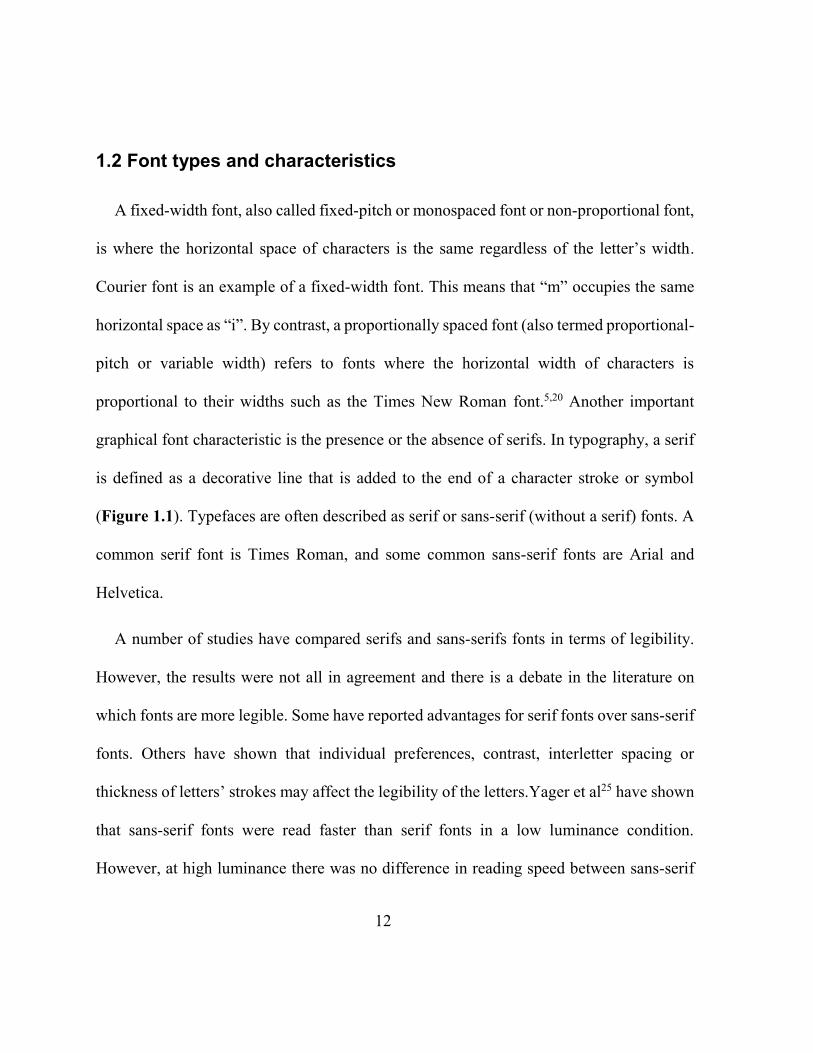
graphical font characteristic is the presence or the absence of serifs. In typography, a serif
is defined as a decorative line that is added to the end of a character stroke or symbol
(Figure 1.1). Typefaces are often described as serif or sans-serif (without a serif) fonts. A
common serif font is Times Roman, and some common sans-serif fonts are Arial and
Helvetica.
A number of studies have compared serifs and sans-serifs fonts in terms of legibility.
However, the results were not all in agreement and there is a debate in the literature on
which fonts are more legible. Some have reported advantages for serif fonts over sans-serif
fonts. Others have shown that individual preferences, contrast, interletter spacing or
thickness of letters’ strokes may affect the legibility of the letters.Yager et al25 have shown
that sans-serif fonts were read faster than serif fonts in a low luminance condition.
However, at high luminance there was no difference in reading speed between sans-serif
13
vs serif fonts. A study by Arditi found that serifs in serif fonts enhance legibility and
therefore, increase readability compared to sans-serif fonts.26
Figure 1.1. A graphical demonstration of serifs.
The specific choice of font may also have an effect on the legibility of letters. In a study
by Mansfield et al.,24 reading speed, reading acuity and critical print size were compared
using a proportionally spaced font (Times) and a fixed width font (Courier) for normal and
low vision participants. They showed that higher maximum reading speed was achieved
for subjects with normal vision using Times font. However, for participants with low
vision, Courier font had advantages over Times in reading acuity, CPS and reading speed.
1.3 Print size
1.3.1 The x-height
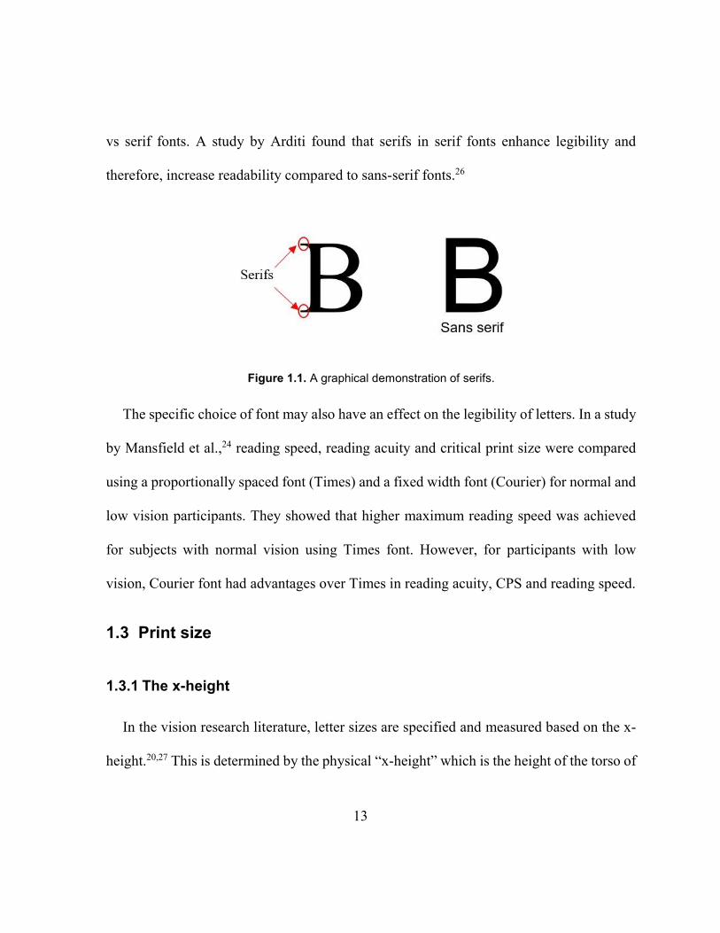
In the vision research literature, letter sizes are specified and measured based on the x-
height.20,27 This is determined by the physical “x-height” which is the height of the torso of
14
lowercase letters or the height of lowercase “x” in millimeters.5,28 The x-height in Roman
letters is measured from the base-line to the x-line (Figure 1.2).5
Figure 1.2. How the x-height is measured in Roman letters.
The x-height is a physical measure that can be measured by a ruler or an equivalent
device in units such as millimeters, centimeters or inches.20 It has been used to measure the
height of lowercase letters in continuous text charts or the height of optotypes in charts that
use symbols or uppercase letters.20 In regards to visual acuity charts, the x-height is used
to calculate the angular size of optotypes and a 1 M or 6/6 equivalent letter is one for which
the x-height subtends 5 min or arc, which is considered equivalent to a distance acuity of
6/6.
1.3.2 Point size
The point size (pt) is the smallest unit of measure in typography. Point size has had
different definitions that have changed over the centuries with differences in different
countries.5 Historically, point size was used to describe the height of the metal body of the
15
block used in typesetting. Nowadays, digital PostScript point is used and it is defined as 1
72
inch which is approximately 0.353 mm for Roman letters.5 Point size is used in commercial
word-processing softwares and is based on the measure of the total body size. Body size is
defined as the distance from the highest ascender to the lowest descender.5 Point size can
be calculated from the physical measure of the x-height for Roman letters, for a particular
font, as there is a known relationship between the body size and the x-height.5
In visual measurements, most of vision related sizes are based on or linked to the x-
height and/or point size which is the physical size of letters. If the x-height (physical size)
of a letter and the reading distance are known, the visual angle in degrees can be
calculated.5 Size in visual angle can be converted to decimal acuity, MAR (min-arc),
logMAR, Sloan M and Snellen denominator.20 This made designing charts, defining sizes
and converting to various size notations in Roman letters straight forward.
1.3.3 Sloan M-unit
The Sloan M unit is defined as the physical size of a letter which subtends 5 min arc at
1 meter, thus based on the Snellen principle, the detail subtend 1 min arc.17,20 M size is
usually used to indicate near visual acuity, although it is the denominator of the Snellen
fraction in meters. It can be reported as a Snellen fraction as m
M where the numerator
specifies the reading distance in meters and the denominator is the M size print.17
16
1.4 Reading performance
Legge et al.20,29 studied and introduced reading performance measures that describe near
vision ability in a series of papers, “The Psychophysics of Reading”, summarized in his
book.20 Legge et al.20 classified reading performance by three main measurements: reading
acuity, reading speed and critical print size (CPS). He introduced the reading speed curve
by plotting reading speed as a function of print size. He also described methods to calculate
reading acuity, reading speed and the CPS.20
1.4.1 Reading speed
Reading speed in its general form is the number of words that can be read in a given
time. Correct reading speed or reading rate is the number of correct words read in a minute
i.e. not counting words with errors. Legge et al.20 showed that in a typical reading speed
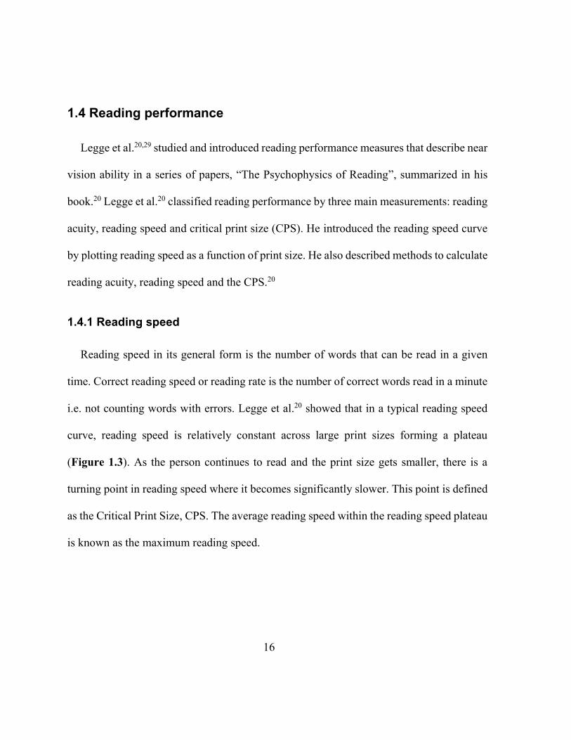
curve, reading speed is relatively constant across large print sizes forming a plateau
(Figure 1.3). As the person continues to read and the print size gets smaller, there is a
turning point in reading speed where it becomes significantly slower. This point is defined
as the Critical Print Size, CPS. The average reading speed within the reading speed plateau
is known as the maximum reading speed.
17
Figure 1.3. An example of a typical reading speed curve. CPS is the critical print size.
Reading speed is significantly affected by the difficulty level of the reading material30,31
or reading task.20 Carver30,31 suggested that the difficulty of text depends on the mean word
length, where reading passages with shorter words are easier/faster compared with text
with longer words. Carver has also suggested that reading speed should be measured in
“standard-length words” per minute. The standard word is described as the average word
length in a given language. He defined the standard word length in English to be six
characters. Many researchers24,30,31 have used standard length words per minute (SLWPM)
in measuring reading speed. This is because using SLWPM helps to reduce the variability
18
in measuring reading speed that could occur from different word lengths in various
sentences.20
1.4.2 Reading acuity
The smallest print size that a person can read correctly or mostly correctly is defined as
reading acuity. A more accurate way of measuring reading acuity (or reading threshold) is
to take into account the number of errors that have been made at each print size level.20
This is similar to the “by-letter” method that is used in measuring distance visual acuity.12,20
The step size is divided by the number of words on each print size level so that each word
in the sentence has a weight. This means that as the number of errors increases, the final
reading acuity decreases. Reading acuity (RA) is calculated as follows:20
RA = smallest size attempted + (# of errors x 0.1
# of words per level)
Reading acuity measurement using this method, where the number of errors is counted,
is considered a more precise method than taking the acuity as the smallest sentence that the
patient can read correctly.20
1.4.3 Critical print size
The critical print size (CPS) in a reading speed curve is the smallest print size on the
reading plateau. It is taken as the print size that allows the person to read with his/her
maximum, or near maximum, reading speed.20 CPS is useful to use when estimating the
19
optimal magnification for low vision patients.24 Several methods can be used to determine
CPS. For patients with normal vision, it is relatively easy to determine the CPS from the
reading speed curve by eye. A commonly used method to calculate CPS is to take the
average reading speed of points that fall on the reading speed plateau and then ensure that
other reading speed points are within 1.96 x SD the mean reading speed plateau.20,32 Some
researchers have used curve fitting methods to calculate CPS.33,34 As CPS is the smallest
print size that allows reading with maximum speed, an eye care professional can
personalize prescribed magnification for every patient for optimal reading. CPS can also
be used to calculate the ideal acuity reserve. The ideal acuity reserve is a ratio that is
calculated as the difference between acuity threshold, and CPS (in log scale) or the ratio of
the CPS and threshold in linear scale.35 The optimum acuity reserve can be used to estimate
the required magnification so that the patient is reading at their own optimum acuity
reserve, with the minimum amount of magnification.
1.5 Standardized continuous text near acuity charts in English
Clinicians can choose from a large variety of commercial charts. The choice depends on
the type of patients they usually see and the usual measures they perform in their clinics. It
is recommended that at least a combination of a letter, symbol/picture, and continuous text
charts should be available in any eye-clinic to be able to test most patients and a variety of
near skills.
20
1.5.1 The Minnesota low-vision reading test (MNREAD chart)
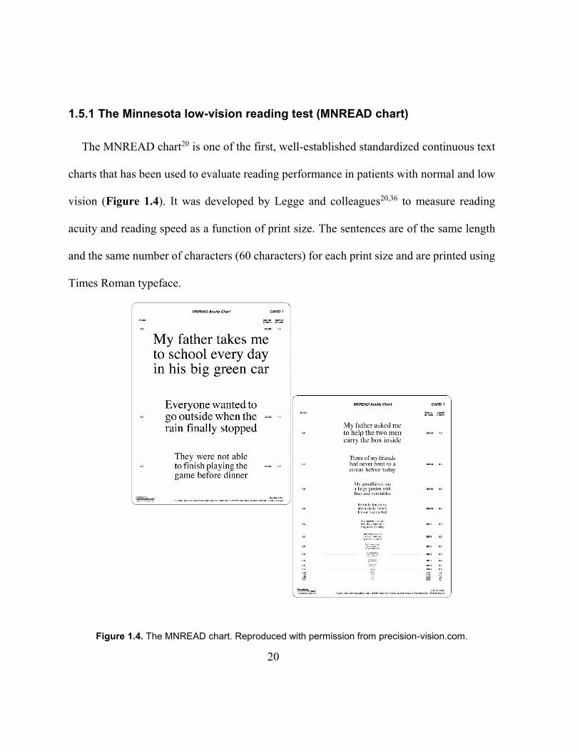
The MNREAD chart20 is one of the first, well-established standardized continuous text
charts that has been used to evaluate reading performance in patients with normal and low
vision (Figure 1.4). It was developed by Legge and colleagues20,36 to measure reading
acuity and reading speed as a function of print size. The sentences are of the same length
and the same number of characters (60 characters) for each print size and are printed using
Times Roman typeface.
Figure 1.4. The MNREAD chart. Reproduced with permission from precision-vision.com.
21
In addition, the sentences’ level of difficulty is the same throughout the chart. The
construction of the MNREAD sentences followed strict criteria for sentence composition
(see 1.1.2.3.1 Criteria for designing continuous text near acuity charts). Candidate
sentences were tested with adults with normal vision in a pilot study to ensure the sentences
were equal in the reading time and to eliminate sentences with higher than average reading
time.20
The MNREAD chart is available in two contrast polarities (black on white and white on
black) and has nineteen levels of descending print sizes which range from 1.3 to -0.5
logMAR (corresponding to 8.00 to 0.13 M). The range of sizes was chosen as follows: the
smallest print size is lower than the threshold of people with normal sight, and the largest
print size was selected to be practical for printing the chart and is large enough to test most
patients with low vision. Each print size level has one sentence that is printed on three lines
and consists of sixty characters. Standard word length in English is defined as six
characters.30,31 Thus each sentence on the MNREAD chart consists of ten standard-length
words which is convenient for scoring. Spaces between letters are included in the character
count. The MNREAD chart is printed in Times Roman serif proportionally spaced font,
which is representative of daily reading materials, being a commonly used font in English
print. The “x” height was used to define and specify the print size of the MNREAD chart.20
For Latin alphabets, the lower case “x” or “o” is used as it does not have an ascender or a
22
descender. The level of difficulty of the MNREAD sentences is low as the vocabulary was
selected from high-frequency words of grade three reading material.20 The MNREAD chart
was designed for testing at the standard reading distance of 40 cm. It is labeled with M
notation, logMAR, and Snellen acuity. The MNREAD was the first chart used to plot
reading speed curves and to extrapolate reading performance measurements (maximum
reading speed, critical print size and reading acuity). The MNREAD chart has become a
gold standard reading chart that has been used in many research studies and has been
translated into several languages.37–41
1.5.2 Colenbrander chart
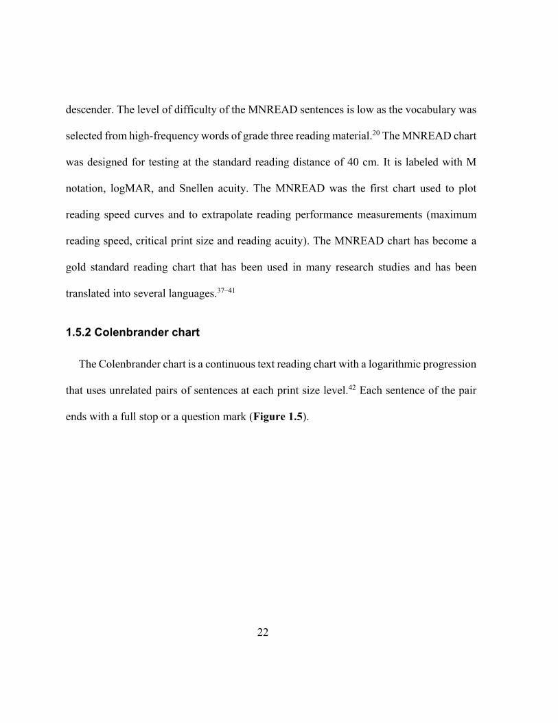
The Colenbrander chart is a continuous text reading chart with a logarithmic progression
that uses unrelated pairs of sentences at each print size level.42 Each sentence of the pair
ends with a full stop or a question mark (Figure 1.5).
23
Figure 1.5. The Colenbrander chart. Reproduced with permission from precision-vision.com.
The sentences were developed with the same number of characters per print-size level
(88 characters including spaces). It has fourteen print sizes that range from 6.30 M to 0.32
M in Times Roman typeface. The sentences were created to be of the same number of
characters, and they were tested for grade level after creation. They were found to be of
grade 4 +/- 3 months level of difficulty (Colenbrander, personal communication). The
sentences in the Colenbrander chart are shorter (each sentence of the pair is 44 characters)
than the MNREAD sentences (60 characters). However, since there is a pair of sentences
so that each print size level has 88 characters which is similar to length of MNREAD and
the Radner (83-88 characters) charts, so they also can be considered valid for measuring
reading performance (reading speed, reading acuity and CPS). The Colenbrander chart is
also commercially available in other languages.
24
1.5.3 Radner chart
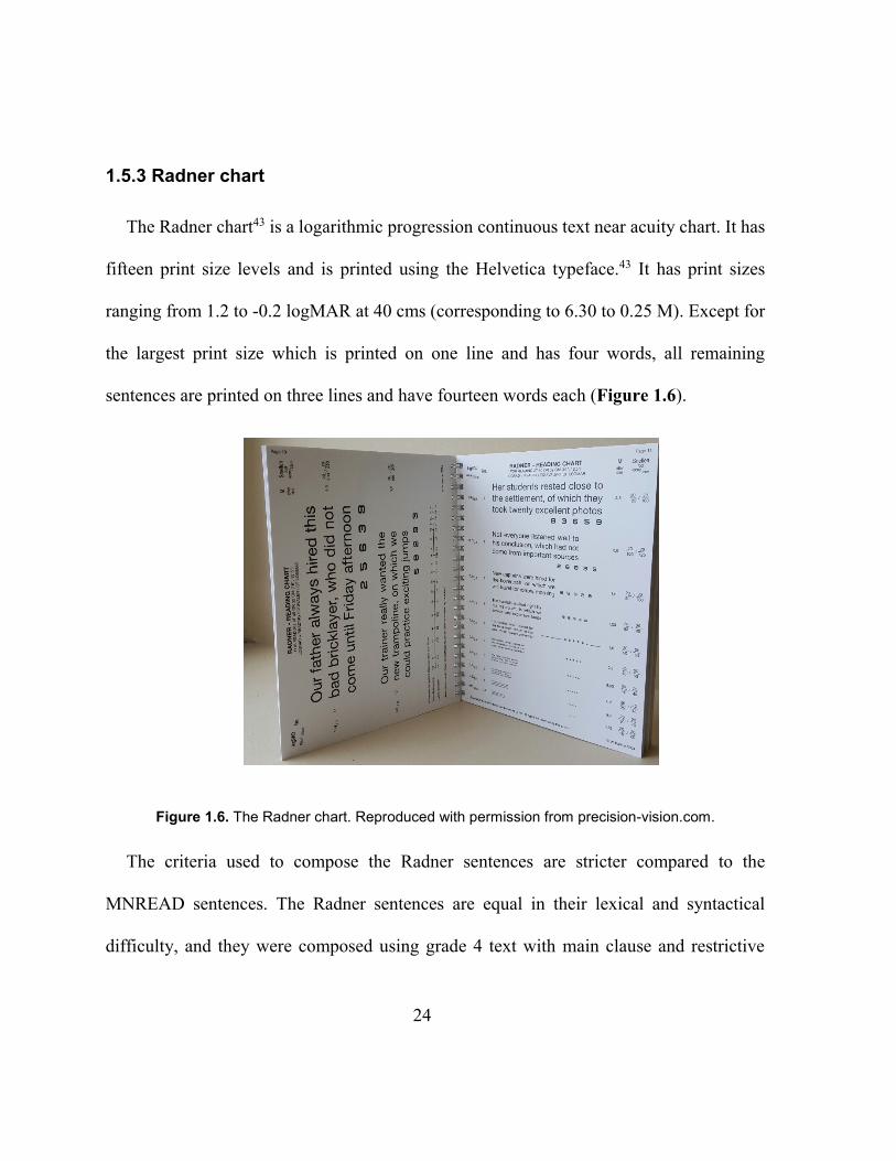
The Radner chart43 is a logarithmic progression continuous text near acuity chart. It has
fifteen print size levels and is printed using the Helvetica typeface.43 It has print sizes
ranging from 1.2 to -0.2 logMAR at 40 cms (corresponding to 6.30 to 0.25 M). Except for
the largest print size which is printed on one line and has four words, all remaining
sentences are printed on three lines and have fourteen words each (Figure 1.6).
Figure 1.6. The Radner chart. Reproduced with permission from precision-vision.com.
The criteria used to compose the Radner sentences are stricter compared to the
MNREAD sentences. The Radner sentences are equal in their lexical and syntactical
difficulty, and they were composed using grade 4 text with main clause and restrictive
25
relative clauses to ensure the ease of reading by adults.43 In addition, they were equal in
the use of parts of speech and the number and length of words on each line, the position of
the words and the grammatical difficulty.43,44 They used a formulaic approach e.g. each
sentence had words of the same parts of speech in the same order. Radner aimed to make
his sentences as comparable as possible by following these criteria. Initially, 34 sentences
were created and tested. Twenty-eight sentences of high internal consistency in measuring
reading speed were selected to construct the English Radner chart.43 These 28 short
sentences were validated by recruiting adults and measuring their reading speed. The
reading speed of the sentences was comapred with long paragraphs.43 Radner reported high
reliabilty among the sentences in measuring reading speed. It is noteworthy that Radner
only tested the original 34 sentences that were developed, found 28 to be highly
comparable, and used them in the commercially-available Radner charts. The sentences are
grade 4 level of difficulty and are printed in Helvetica43 which is a sans-serif font. It is
designed for testing at 25 or 40 cm. The Radner chart is labeled with logMAR notation,
Snellen, and decimal acuity. The sentences are equal in the number of words (14
words/sentence) rather than the number of characters. As Radner sentences are long
enough, they can be used to measure reading performance (reading speed, CPS, and
reading acuity). Currently, the Radner chart is considered a standardized chart that has been
used in many studies. The Radner chart is available in several languages,43,45–50 and all have
been developed based on the same criteria and design with some language modifications.43
26
1.6 The International Reading texts (IReST)
The IReST charts have been developed in twenty-one different languages with the
intention to compare reading speed across different languages and for use in research
studies in which reading speed is an important measure.51,52 These charts are designed with
ten texts of one print size (0.4 logMAR, 1M). The IReST chart measures reading speed
rather than reading acuity. The original IReST texts were composed in German and were
then translated into the other languages.52 The texts are grade 6 level of difficulty printed
in Times New Roman font. The IReST chart can be used to estimate reading speed for long
passages but cannot be used to calculate CPS and reading acuity. As the IReST chart
measures a particular aspect of reading (reading speed), it cannot be directly compared with
other acuity charts.
1.7 Charts in languages other than English
Standardized charts have been developed in many languages following the standard
procedures described above for developing acuity charts.16 For letter acuity charts using
letters other than Roman letters, the challenges are to choose letters with similar legibility
and to define spacing between letters. As for languages using Roman letters, developing
continuous text charts is also more challenging compared to single letter charts. Yet it is
important to develop these charts so that reliable measurements of reading performance
27
can be obtained in a person’s own language and so standardized continuous text near acuity
charts have been developed in many languages.36–41,44–49,53
Firstly the size of the font has to be specified. Most languages use Roman letters or have
an “x” letter which makes it easy to define the size notations. Some languages (like
Turkish) have extra letters to meet the language’s special phonetic requirements. The Greek
language uses the Cyrillic alphabet, but both the Turkish and the Greek languages, and
most other languages (where standardized charts are available) also have the “x” or “o”
letters which can be used to standardized the size. The Chinese and Japanese languages do
not use Roman letters. However, Chinese and Japanese characters can be fitted into an
equal square area,41 which can be used to define the height of the characters and in defining
spacing. Although this can be specified internally within the chart, to the author’s
knowledge, how these measures relate to visual acuity measured with Roman letters has
not been studied.
Secondly, the construction of the sentences should be developed according to the criteria
mentioned above (see 1.1.2.3.1 Criteria for designing continuous text near acuity charts).
Below is a description of some continuous text charts in languages other than English.
1.7.1 The Turkish MNREAD chart
The Turkish language uses the same Roman alphabet with seven extra letters. The
Turkish39 MNREAD chart was developed based on the design principle of the original
28
English MNREAD chart. A pool of sentences was composed from grade 3 school books
and the sentences were evaluated by linguists for grammatical accuracy. Adult and child
participants were recruited to read the new chart and two longer texts. Elimination criteria
based on reading speed and number of errors were applied. Sentences with high variability
of reading speed and number of errors were excluded. The final set of sentences which all
gave a similar average reading speed were chosen to develop the Turkish MNREAD chart.
The results also demonstrated that the reading speed of those sentences was highly
correlated with reading longer texts. The authors concluded that the newly designed chart
is valid in measuring reading speed in Turkish.39
1.7.2 The Greek MNREAD chart
The Greek alphabet is formed from Cyrillic script. Similar to English, the Greek
alphabet has “o” and “x” which is used to define size notations. The Greek38 version of the
MNREAD chart is based on the basic MNREAD design principles. As with the Turkish
version, a large pool of sentences were composed from school books for children of seven
and eight years and they were evaluated by Greek language teachers. The sentences were
assessed by recruiting children and adults. Elimination criteria was used to exclude
sentences with high variability in reading speed and number of errors. The final set of
sentences was chosen to give the highest coefficient of repeatability in visual acuity and
reading speed.
29
The Turkish MNREAD, Greek MNREAD and the UiTM-Mrw Malay53 charts all used
school books to initially compose a pool of sentences of a certain grade level. Grammar
and sentence structure were then evaluated by language experts or teachers. In the Turkish
and Greek MNREAD charts, a pool of sentences was created according to the criteria for
developing sentences and tested in children and adults.38,39 Average reading speed and
numner of errors were used as the outcome measure for selecting sentences. Lastly, the
final group of sentences were chosen based on reading speed data of children and adults to
ensure that the sentences are valid in testing children and adults. Those sentences were
used to construct the final version of charts.
1.7.3 The Persian near reading chart
Jafarzadehpur et al.54 developed two near charts in Farsi. The charts were designed
similar to the design of two English charts (Richmond Products Inc (No. 11968R) and
Bernell vocational near test card (Item # BC1196670). New texts were composed to be
used in the development of these charts. The charts were printed in two different “famous”
Persian fonts. Font size ranges were the same for the two charts and ranged from 2 M to
0.4 M. Adult participants were recruited to read the two Persian charts and compare the
results with the Richmond Products Inc English chart. Near visual acuity was measured
with and without a positive cylindrical lens (+2.00DC x 90) for the three charts. The
outcome measures were near visual acuity (MAR) and reading speed (seconds). Kappa
30
sensitivity and specificity was used to measure the agreement between the charts. For
visual acuity, the authors reported kappa coefficient of 61.1% between the Persian charts
with good correlations between Persian chart 1 and the English chart (0.824), and Persian
2 and the English chart (0.817). They also reported a sensitivity of 97.5% and specificity
of 55.6% compared to the English chart. So despite different fonts, the two Persion charts
give a similar measure.
Some major points in the design of the Persian chart have not been taken into account
as it was based on the design of the Richmond Products Inc English chart. The choice of
Richmond Products Inc is a concern as it does not appear to conform to the criteria for a
standard chart in English. Some obvious non-standard design principles are 1) the spatial
layout of the text is not uniform throughout the chart. 2) the number of characters on each
print size level in not uniform. 3) the print sizes’ range might have a floor effect and
underestimate near visual acuity as the smallest print size is 0.4 M. 4) the physical length
of the sentences is not the same for the different font size levels. 5) there are relatively long
words that are longer than 10 letters e.g. there is a 16 letter word. 6) the use of hyphened
words, commas, semicolons and quotation marks. As the new Persian charts were based
on the design of the Richmond Products Inc in English, they lack most of the standard chart
design features.
31
The Persian language uses the same alphabet as the Arabic language with four extra
letters. The Arabic alphabet is very different from Roman letters. X-height is used in
languages that utilize Roman letters to specify font size notations. The authors54 did not
discuss how the size of the Arabic letters was defined. They reported that “VA results were
converted to minimal angle of resolution (MAR)” however, it is unclear what font size
notation they used in printing the text initially. Defining the font size is a major
consideration in order to be able to evaluate the chart, to compare it with another language,
and to recommend it for clinical use. In addition, the texts they used in constructing the
new charts were not tested for equal readability and their grade level of difficulty is
unknown.
1.8 Arabic acuity charts
Between 1968 and 1999, there have been attempts to design several DVA charts and
four NVA charts in Arabic. However, none of these charts is commercially available at
present. In 1968, Emarah55 designed the first DVA chart in Arabic, using Snellen’s design.
A unique Arabic font was used to construct Arabic letters on a 5 x 5 framework. In the
same year, Al-salem56 suggested a design for a near chart in Arabic that would incorporate
passages from Arabic literature. He recommended nine print-size levels, ranging from 48
to 6 point size (pt). It is unclear if the chart was ever produced. Al-Samarrai57 designed
distance and near single letter Arabic charts using a different font than the ones used
32
previously. He claimed that his charts overcame the large step sizes in the Emarah and Al-
Salem charts. He reported that the differences between size levels in the previous charts
were not uniform with the largest gap between the smallest two levels. He developed his
charts using a wider range of print sizes with a more accurate geometric grading. The near
chart was 1 17th⁄ of the distance chart and the print ranged from 60 to 3 pt with twelve size
levels. In 1994, Al-Khattabi and Oduntan58 published a paper on their Arabic DVA chart
for low vision examinations. They reported that the large print in previous charts was not
sufficient in size or quantity to evaluate patients with low vision. Their chart used Snellen’s
notation and single letters with thirteen print sizes, ranging from 20/600 to 20/80 (6/180 to
6/24). In addition, they arranged some of the rows so as to form short Arabic words (2-3
letters). Although the Arabic language requires cursive writing only, short, simple words
with unconnected letters can be read. The authors claimed that this design would help in
evaluating several forms of impaired vision.
Two years later, Oduntan59 designed a near single-letter Arabic chart using a logarithmic
progression. He chose ten Arabic letters that could be constructed on a 5 x 5 grid. The
legibility of each letter and row was measured. The chart was designed for testing patients
with low vision at 40 cm, and the print size ranged from 1.4 to 0.5 logMAR. Al-Mufarrej
et al.60 described a single letter DVA logMAR chart. In their chart, they used twelve Arabic
letters that could be constructed on a 5 x 5 unit framework. Solid horizontal and vertical
33
lines were added at the end of each row and the top of the chart. They suggested that those
lines would control contour interactions. Oduntan and Al-Abdulmunem61 designed a
logarithmic progression single letter NVA chart. They compared their threshold values
with the values that were obtained using a “Bailey and Lovie reduced acuity chart”. The
chart was designed for testing at 40 cm, and the print ranged from 0.8 to -0.1 logMAR.
Oduntan and Briggs,62 made the most recent attempt at developing an Arabic chart, which
allowed a matching response. They chose an Arabic letter that looks like an E and could
be displayed in one of four orientations so that the patient could indicate the orientation, as
they would for a tumbling E. The letter was constructed on a 5 x 5 grid. It was a logarithmic
DVA chart for testing at 4 m and had fourteen print size levels (range 1.0 to -0.3 logMAR).
Certain problems are associated with the design of these historical Arabic acuity charts.
The older charts55–58 were based on the original Snellen’s design and spacing, which has
been proven inaccurate for measuring VA.8,14,16 The later logarithmic single letter DVA
charts followed the recommended design of visual acuity charts.59–61 The studies described
the rationale behind measuring the legibility of the selected letters and the combination of
the letters in each row.59–61 However, it is unclear how the twelve letters initially were
chosen from the twenty-eight letters of the Arabic alphabet. There is no report in the vision
science Arabic literature comparing the legibility among the subset of letters, although
Oduntan, Al-Mufarrej et al, and Oduntan and Al-abdulmunem did compare the legibility
34
of each row and/or their chosen letters. In addition, the font used in the charts is commonly
not stated or is a font not used in regular print, although this is also the case for Snellen,
Bailey-Lovie and ETDRS charts. Studies have shown that the choice of font in visual acuity
charts plays a major role in legibility where some fonts might be easier to read than
others.24–26,63 Some of the fonts in the older Arabic charts are described as sans-serif fonts
and were chosen for their sharp edges, which allowed the letters to fit into a 5 x 5 square,
similar to a Roman Snellen letter.58–61 To the author’s knowledge, none of them are
commercially available.
There is only one study in the literature of a continuous text near acuity chart in Arabic
by Al-Salem.56 In the proposed design Al-Salem56 did not follow the major recommended
standardization design criteria. The passages chosen were famous sayings with repeated
words in some of them. This means that the observer’s recollection of the sayings would
influence the result. The difficulty level of the passages is unknown, which might have
made the level of literacy a factor in the resulting acuity. Thus, they may not be suitable
for testing people with a low reading level or children.
Thus there seems to be a lack of good standardized acuity charts in Arabic. This may be
less of a problem for DVA, as DVA can be measured using symbol or number charts. For
distance VA, the simple ability to resolve angular detail is sufficient for refraction and
disease detection. However, continuous text near reading acuity charts have to be
35
developed and validated in many world languages, since this more complex function must
be measured in a task that is familiar and relevant to the individual patient.
1.9 Arabic language
The Arabic language belongs the Semitic group of languages which include
Amharic, Aramaic, and Hebrew.64 Arabic’s origins predate Islam, with the earliest written
evidence for the language dating to the seventh century BCE. Beginning in the seventh
century CE, the language was codified and developed alongside the rise of the Islamic
empires, becoming the standard language for administration, science and scholarship.64 As
of 2017, Arabic is ranked as the 4th most spoken language globally in terms of the number
of first language speakers, as it is spoken by 295 million people in 57 countries.65 There
are numerous Arabic colloquial dialects in different Arabic speaking countries, and they
differ profoundly in grammar, vocabulary, and sounds. Some differences between dialects
can be very challenging, even for native Arabic speakers. However, all Arabic-speaking
countries can understand Modern Standard Arabic (al-lughah al-ʻArabīyah al-fuṣḥá),
which is a form of Classical Arabic. Modern Standard Arabic is the standard used in books,
newspapers, education, broadcast communication and official governmental documents.
Arabic script is very different from many Latin-based languages. It is written and read
from right to left in a cursive style with no capital letters or hyphenated words. Arabic
script is a bi-directional script as numerals are read from left to right.66 There are twenty-
36
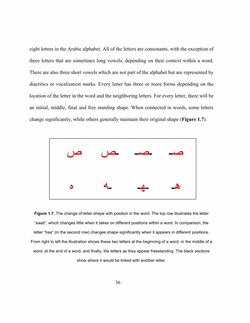
eight letters in the Arabic alphabet. All of the letters are consonants, with the exception of
three letters that are sometimes long vowels, depending on their context within a word.
There are also three short vowels which are not part of the alphabet but are represented by
diacritics or vocalization marks. Every letter has three or more forms depending on the
location of the letter in the word and the neighboring letters. For every letter, there will be
an initial, middle, final and free standing shape. When connected in words, some letters
change significantly, while others generally maintain their original shape (Figure 1.7).
Figure 1.7. The change of letter shape with position in the word. The top row illustrates the letter
“saad”, which changes little when it takes on different positions within a word. In comparison, the
letter “haa” (in the second row) changes shape significantly when it appears in different positions.
From right to left the illustration shows these two letters at the beginning of a word, in the middle of a
word, at the end of a word, and finally, the letters as they appear freestanding. The black sections
show where it would be linked with another letter.
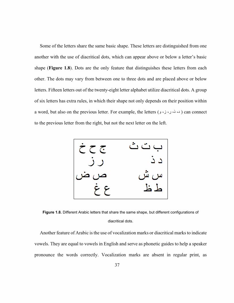
37
Some of the letters share the same basic shape. These letters are distinguished from one
another with the use of diacritical dots, which can appear above or below a letter’s basic
shape (Figure 1.8). Dots are the only feature that distinguishes these letters from each
other. The dots may vary from between one to three dots and are placed above or below
letters. Fifteen letters out of the twenty-eight letter alphabet utilize diacritical dots. A group
of six letters has extra rules, in which their shape not only depends on their position within
a word, but also on the previous letter. For example, the letters ( و ز، ر، د، ذ، ) can connect
to the previous letter from the right, but not the next letter on the left.
Figure 1.8. Different Arabic letters that share the same shape, but different configurations of
diacritical dots.
Another feature of Arabic is the use of vocalization marks or diacritical marks to indicate
vowels. They are equal to vowels in English and serve as phonetic guides to help a speaker
pronounce the words correctly. Vocalization marks are absent in regular print, as
38
experienced readers can easily read unvocalized text with the correct pronunciation, just
by relying on contextual cues. Vocalization marks are used as learning aids for children,
for people studying Arabic as a second language, in poetry, dictionaries and religious
passages where it is critical to read with the correct pronunciation. These diacritical marks,
which indicate vowels, are written above or below letters. Vocalized text (using the
vocalization marks) is called shallow orthography while un-vocalized text for advanced
readers is considered deep orthography. Homographs, which are words that are visually
and orthographically homographic,67 are very common in Arabic. Homographs are words
with different pronunciations and meanings which are only differentiated by diacritical
marks.68 Without these diacritical marks, Arabic homographs can be very challenging even
for skilled readers.67
1.9.1 Typography
There is a large selection of Arabic fonts. Some of them are artistic and not used in
regular print. Some font characteristics will appear in some fonts but not others. Those
characteristics may make it harder to read the text, especially for children or inexperienced
readers. It is imperative to select a font according to what it will be used for. Kashidas and
ligatures are the font characteristics that appear most frequently.
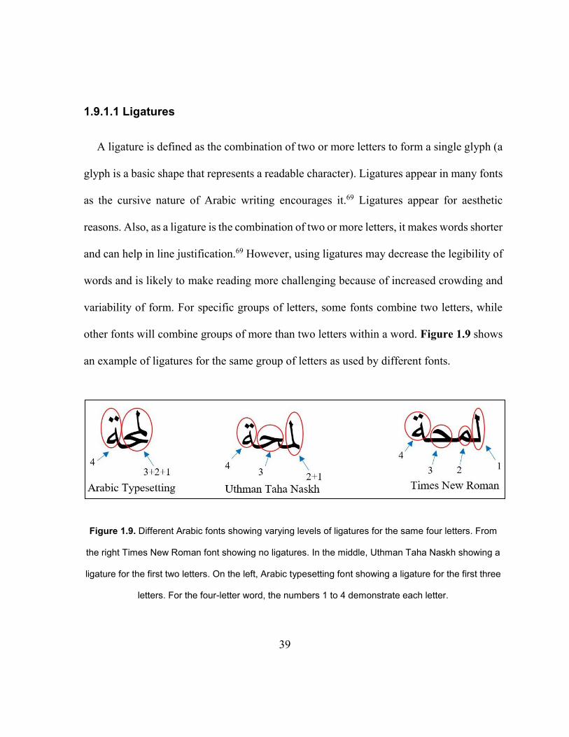
39
1.9.1.1 Ligatures
A ligature is defined as the combination of two or more letters to form a single glyph (a
glyph is a basic shape that represents a readable character). Ligatures appear in many fonts
as the cursive nature of Arabic writing encourages it.69 Ligatures appear for aesthetic
reasons. Also, as a ligature is the combination of two or more letters, it makes words shorter
and can help in line justification.69 However, using ligatures may decrease the legibility of
words and is likely to make reading more challenging because of increased crowding and
variability of form. For specific groups of letters, some fonts combine two letters, while
other fonts will combine groups of more than two letters within a word. Figure 1.9 shows
an example of ligatures for the same group of letters as used by different fonts.
Figure 1.9. Different Arabic fonts showing varying levels of ligatures for the same four letters. From
the right Times New Roman font showing no ligatures. In the middle, Uthman Taha Naskh showing a
ligature for the first two letters. On the left, Arabic typesetting font showing a ligature for the first three
letters. For the four-letter word, the numbers 1 to 4 demonstrate each letter.
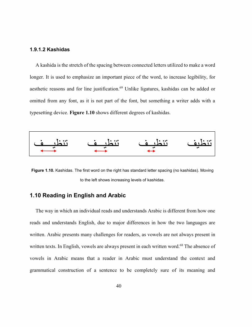
40
1.9.1.2 Kashidas
A kashida is the stretch of the spacing between connected letters utilized to make a word
longer. It is used to emphasize an important piece of the word, to increase legibility, for
aesthetic reasons and for line justification.69 Unlike ligatures, kashidas can be added or
omitted from any font, as it is not part of the font, but something a writer adds with a
typesetting device. Figure 1.10 shows different degrees of kashidas.
Figure 1.10. Kashidas. The first word on the right has standard letter spacing (no kashidas). Moving
to the left shows increasing levels of kashidas.
1.10 Reading in English and Arabic
The way in which an individual reads and understands Arabic is different from how one
reads and understands English, due to major differences in how the two languages are
written. Arabic presents many challenges for readers, as vowels are not always present in
written texts. In English, vowels are always present in each written word.68 The absence of
vowels in Arabic means that a reader in Arabic must understand the context and
grammatical construction of a sentence to be completely sure of its meaning and
41
pronunciation, while an English reader does not necessarily need this context in order to
decode the text, although they do require these skills for good comprehension, which is a
part of reading.68 Every Arabic speaker speaks two languages: the area-specific dialect for
daily verbal communication and formal Arabic which all Arabic speakers use for reading
and writing. Thus a complete knowledge or well-educated understanding of the Arabic
language demands knowledge of both Modern Standard Arabic (FusHa) and at least one
colloquial dialect of Arabic. The variances between FusHa and various colloquial Arabic
dialects include both differences in vocabulary and syntax (the typical arrangement of
words to create clauses, phrases, and/or sentences). Thus, although one language, Arabic
is considered diglossic (where there are two distinct standards in use for one language, or
where two dialects are utilized by one language).
English presents different challenges to reading. For instance, in English grapheme-
phoneme correspondence is not always predictable. Vocalized Arabic, in comparison, is
consistent in this respect as only one phoneme can be assigned to any grapheme. English
also presents difficulties for readers due to the existence of heterographic homophones
(words which are pronounced identically but are spelled differently), for example ‘sent’
and ‘cent’. On the other hand, vocalized Arabic does not have heterographic
homophones.68 Also, vocalized Arabic does not contain any heterophonic homographs
(where words with different meanings or pronunciations that are spelled identically),

42
whereas English certainly does.68 An example of a heterophonic homograph in English is
‘will read’ and ‘has read’. It is important to note that unvocalized Arabic contains many
heterophonic homographs while vocalized Arabic does not. While English presents some
challenges to readers, written Arabic’s cognitively and visually demanding nature may
result in slower reading speeds in comparison to English and a variety of other languages.67
43
Chapter 2
RATIONALE AND AIMS OF THE STUDY
2.1 Rationale
Distance visual acuity is the best-known and most commonly used measure of visual
function. It is a historical measure that is carried out in almost every eye examination.
Reading acuity measurement (visual acuity for text or words) is important in assessing a
patient’s reading performance. Although there is a good correlation between distance letter
acuity and word or text acuity,24,70,71 they are not equal.24,70–72 Reading acuity is critical in
assessing patients’ near performance as it indicates the limit for reading small print.
Reading acuity is also used to estimate the required magnification for reading tasks.
Word reading charts are available in many languages. Arabic is ranked as the fourth
spoken language (in number of first language speakers) as it is spoken in 57 different
countries globally, with 295 million native speakers.65 Arabic is also the language of the
Quran which is the holy book of Islam. Therefore it plays an important role for more than
1.6 billion Muslims worldwide.73 Despite the large number of Arabic speakers worldwide;
there is no standard Arabic reading acuity chart. There have been some attempts to develop
Arabic distance and near visual acuity charts55–62 but none of them has been produced or is
commercially available. In addition, none of the charts described in section 1.8 meets the
accepted criteria and therefore is not ideal for clinical use.
44
Many clinicians rely on the Tumbling E chart as is it suitable for children and people
who are illiterate. The IReST15 charts have just become available in Arabic. These measure
reading speed only for people with normal vision and were primarily developed for
research settings, and comparing reading speeds in different languages. There has been one
attempt to develop a continuous text near chart in Arabic, by al-Salem.56 However, his chart
is not ideal as the sentences that were used in his chart were taken from Arabic literature.
In addition, the smallest print size that was used was 6 pt which may underestimate
patients’ near VA.
Given the lack of a standardized reading acuity chart in Arabic and the importance of
using standardized charts in clinical and research settings, this study was designed with the
following objectives:
1. Decide on the optimum font for use in a continuous text chart in Arabic
2. Develop candidate sentences according to the criteria for designing continuous text
near acuity charts (equal grade level and length in terms of characters)
3. Test and validate the sentences for equal readability in children and adult participants
and choose a sub-set of sentences with equal readability to construct the final charts
4. Construct charts based on the currently accepted design criteria
5. Validate the charts for within-chart reliability based on reading acuity and reading
speed
6. Validate the charts by comparison with Arabic charts based on reading speed
45
7. Calibrate the Arabic charts for “normal” visual acuity (0.00 logMAR) against English
charts
The long-term goal is to make the newly designed Arabic reading acuity chart
commercially available for clinical and research settings. It is expected to be widely used
in Arabic-speaking countries.
2.2 Aims of the study
1. A preliminary study investigated the choice of the optimum font to be used in the
construction of chart (Chapter 3)
2. The aim of the first main study was to develop a large number of candidate sentences
according to the accepted criteria for designing continuous text near acuity charts.
Then, the reading speed and reading acuity of sentences were tested in children and
adults. Statistical analysis was conducted to eliminate outlier sentences with higher or
lower, or more variable, readability, and a final group of 45 sentences was selected to
be used in the construction of three versions of the Balsam Alabdulkader-Leat chart
(BAL) according to current design principles (Chapter 4).
3. Having selected the sentences, a second developmental study was to construct the
charts in terms of print sizes, line spacing and inter-level spacing (Chapter 5).
4. The second main study measured and compared reading acuity, CPS and reading speed
using the three versions of BAL chart (to determine reliability). The visual acuity
46
results were compared with two English charts (MNREAD, and Radner) to calibrate
for normal visual acuity in Arabic compared to English. Reading speed was compared
with the IReST Arabic chart to validate the BAL chart for reading speed (Chapter 6).
Both studies were cross-sectional studies in which participants read the candidate
sentences (study 1) or read down the Arabic and English charts (study 2).
47
Chapter 3
CHOICE OF TYPEFACE
3.1 Introduction
The selection of typeface or font is the first decision to make in creating a visual acuity
chart. Many studies have investigated and compared specific fonts’ characteristics such as
the presence and absence of serifs, or the use of proportionally spaced fonts over fixed
spaced fonts.24–26 Some of those characteristics studied with consideration to the legibility
and readability of the text (see 1.2 Font types and characteristics). For visual acuity
measurements using continuous text charts, all parameters, including typeface, spacing,
chart contrast, optotype legibility and level of difficulty of sentences, must be controlled
as they might affect the resulting acuity. This control ensures that poor acuity is due to
vision not any other factors (as long as the patient can read competently with larger print).
Many scholars19,20,56 have reported that the most-commonly used font in a language would
be the optimal choice of font for use in a visual acuity chart. That is, they recommended
the font that is used in everyday printing materials in a particular language, e.g., books,
newspapers, magazines, government documents, etc. A simple, less ornate, font would also
be desirable.
Arabic is the official language in 57 countries,65 and some fonts are more commonly
used in some countries than others. A large number of historical artistic fonts are still used
48
in printing the Quran, poetry and literature books. Those fonts cannot be used in designing
visual acuity charts because of the extensive use of ligatures and kashidas. A ligature is
defined as the combination of two or more letters to form a single glyph (see 1.9.1.1
Ligatures). The use of ligatures in visual acuity charts is undesirable, as they may increase
crowding and decrease legibility, especially in small font sizes. In addition, distinguishing
letters will be challenging for patients with low vision or children who might not be familiar
with ligatures.
To the author’s knowledge, there are no published data on the most commonly used font
in Arabic speaking countries. Therefore, an investigation of the most commonly used font
in Arabic printed materials was carried out by examining thirteen newspapers and two
magazines from ten different Arabic speaking countries. These fonts were then matched to
the nearest Arabic font in Microsoft (MS) Word©.
3.2 Procedure
A chosen text from different newspapers was typed in Arabic (MS) Word using the font
that appeared closest to each newspaper’s font. An attempt was then made to superimpose
this copy against the newspaper text. This was done by holding the two pages against bright
light, so that they were transilluminated and so that both prints could be seen. The
newspapers’ fonts could not be directly matched with (MS) Word fonts, and so this method
was abandoned for the following reasons: firstly, between-line spacing and justification in
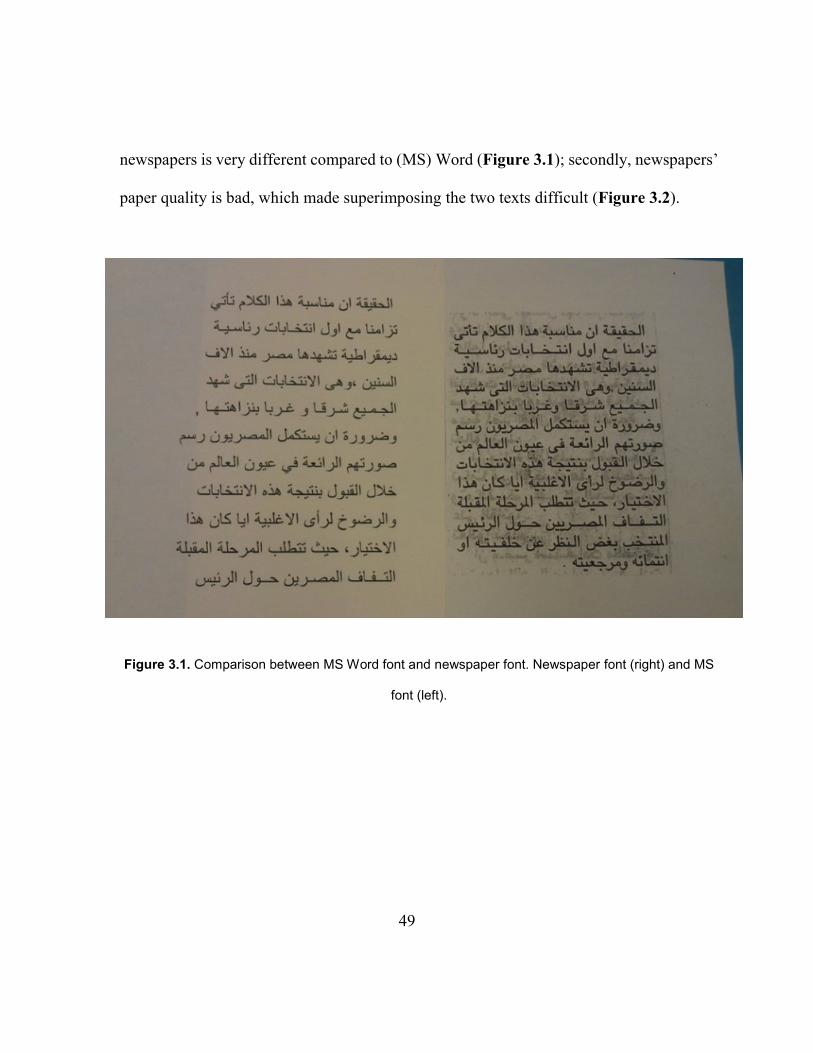
49
newspapers is very different compared to (MS) Word (Figure 3.1); secondly, newspapers’
paper quality is bad, which made superimposing the two texts difficult (Figure 3.2).
Figure 3.1. Comparison between MS Word font and newspaper font. Newspaper font (right) and MS
font (left).
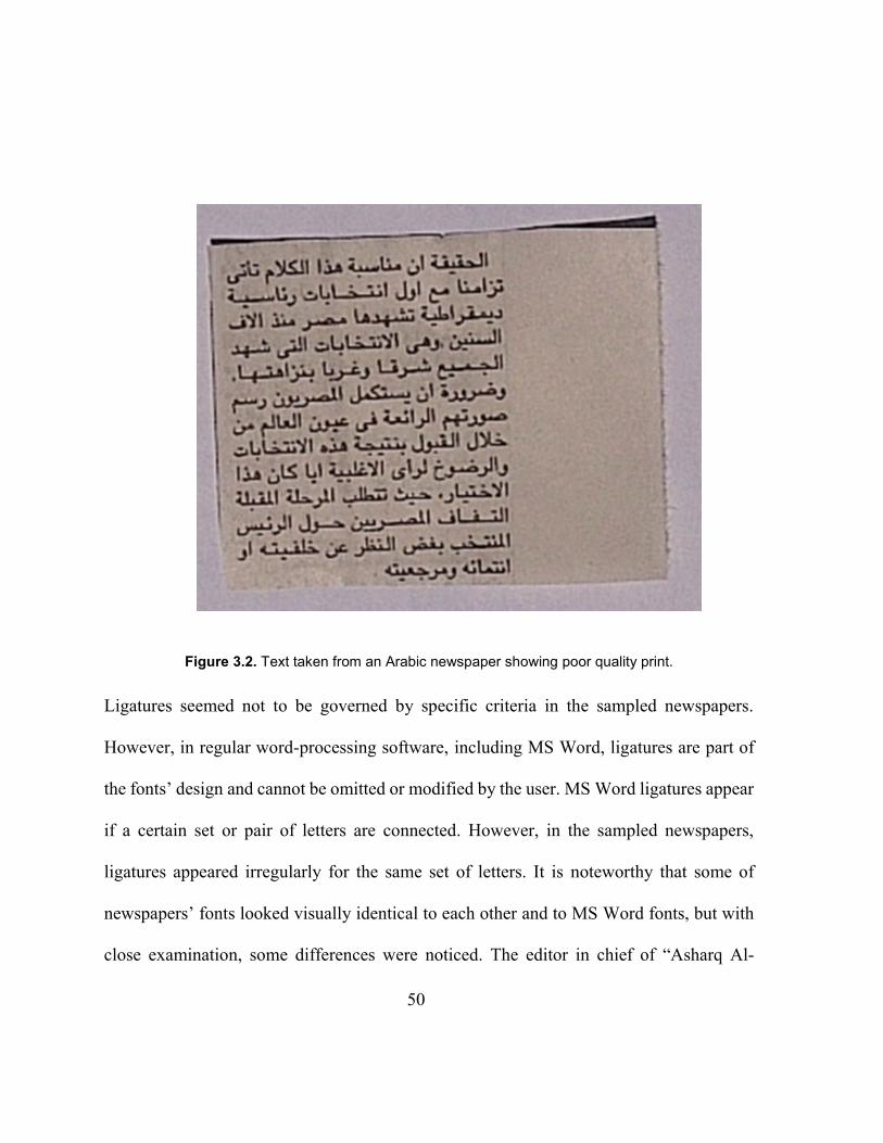
50
Figure 3.2. Text taken from an Arabic newspaper showing poor quality print.
Ligatures seemed not to be governed by specific criteria in the sampled newspapers.
However, in regular word-processing software, including MS Word, ligatures are part of
the fonts’ design and cannot be omitted or modified by the user. MS Word ligatures appear
if a certain set or pair of letters are connected. However, in the sampled newspapers,
ligatures appeared irregularly for the same set of letters. It is noteworthy that some of
newspapers’ fonts looked visually identical to each other and to MS Word fonts, but with
close examination, some differences were noticed. The editor in chief of “Asharq Al-
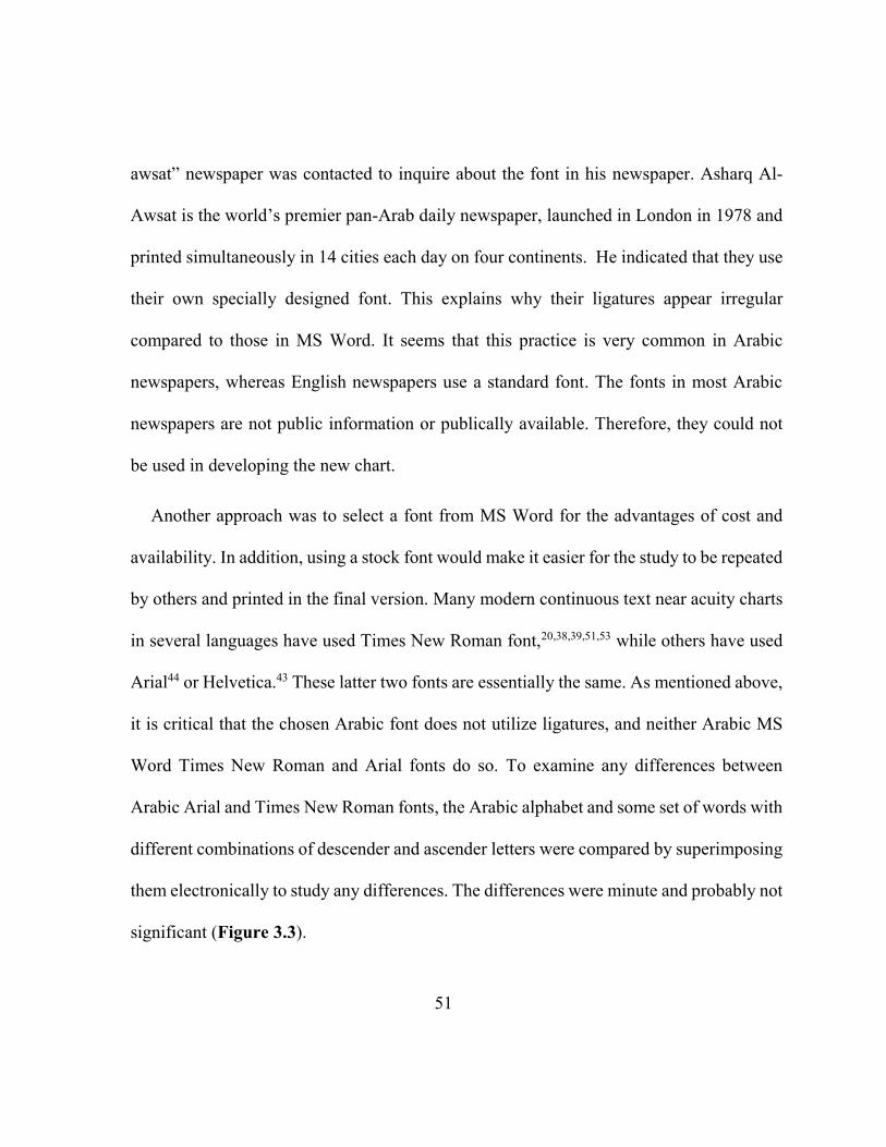
51
awsat” newspaper was contacted to inquire about the font in his newspaper. Asharq Al-
Awsat is the world’s premier pan-Arab daily newspaper, launched in London in 1978 and
printed simultaneously in 14 cities each day on four continents. He indicated that they use
their own specially designed font. This explains why their ligatures appear irregular
compared to those in MS Word. It seems that this practice is very common in Arabic
newspapers, whereas English newspapers use a standard font. The fonts in most Arabic
newspapers are not public information or publically available. Therefore, they could not
be used in developing the new chart.
Another approach was to select a font from MS Word for the advantages of cost and
availability. In addition, using a stock font would make it easier for the study to be repeated
by others and printed in the final version. Many modern continuous text near acuity charts
in several languages have used Times New Roman font,20,38,39,51,53 while others have used
Arial44 or Helvetica.43 These latter two fonts are essentially the same. As mentioned above,
it is critical that the chosen Arabic font does not utilize ligatures, and neither Arabic MS
Word Times New Roman and Arial fonts do so. To examine any differences between
Arabic Arial and Times New Roman fonts, the Arabic alphabet and some set of words with
different combinations of descender and ascender letters were compared by superimposing
them electronically to study any differences. The differences were minute and probably not
significant (Figure 3.3).
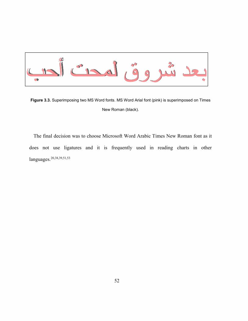
52
Figure 3.3. Superimposing two MS Word fonts. MS Word Arial font (pink) is superimposed on Times
New Roman (black).
The final decision was to choose Microsoft Word Arabic Times New Roman font as it
does not use ligatures and it is frequently used in reading charts in other
languages.20,38,39,51,53
53
Chapter 4
TOWARD DEVELOPING A STANDARDIZED ARABIC CONTINUOUS
TEXT READING CHART
4.1 Summary
Purpose: Near visual acuity is an essential measurement during an oculo-visual
assessment. Short duration continuous text reading charts measure reading acuity and other
aspects of reading performance. There is no standardized version of such chart in Arabic.
The aim of this study is to create sentences of equal readability to use in the development
of a standardized Arabic continuous text reading chart.
Methods: Initially, 109 Arabic pairs of sentences were created for use in constructing a
chart with similar layout to the Colenbrander chart. They were created to have the same
grade level of difficulty and physical length. Fifty-three adults and sixteen children were
recruited to validate the sentences. Reading speed in correct words per minute (CWPM)
and standard length words per minute (SLWPM) was measured and errors were counted.
Criteria based on reading speed and errors made in each sentence pair were used to exclude
sentence pairs with more outlying characteristics, and to select the final group of sentence
pairs.
54
Results: Forty-five sentence pairs were selected according to the elimination criteria.
For adults, the average reading speed for the final sentences was 166 CWPM and 187
SLWPM and the average number of errors per sentence pair was 0.21. Childrens’ average
reading speed for the final group of sentences was 61 CWPM and 72 SLWPM. Their
average error rate was 1.71.
Conclusions: The reliability analysis showed that the final 45 sentence pairs are highly
comparable. They will be used in constructing an Arabic short duration continuous text
reading chart.
4.2 Introduction
Reading is essential in modern life and is the most common rehabilitation goal for
people with low vision.74 Inability to read significantly affects quality of life and so aspects
of reading are usually included in vision-related quality of life measures.75–78 Reading
acuity measurement (acuity for text or words) is important in assessing a patient’s reading
performance20 and in understanding the impact of eye disease.79–81 Although there is a good
correlation between distance letter acuity and word or text acuity,24,70,71 they are not
equal,70,72,82 and word or text reading acuity is more related to everyday reading tasks.21,22
Charts using short duration continuous text are considered a better representation of a
person’s vision for everyday reading than charts using unrelated words21,22 as reading short
duration sentences includes cognitive and visual factors, e.g. effects of context and
55
crowding.20 They quickly assess a patient’s near reading acuity and can also measure
maximum reading speed and critical print size (the smallest print to achieve maximum or
near maximum reading speed).20 These measures indicate the potential for reading small
print fluently, and are used to estimate the required magnification for reading in patients
with low vision. The use of standardized sentences and layout is important, so that the print
size is the only parameter that affects the threshold, and not variability in the text difficulty
or crowding effects, so as to ensure reliable and repeated results.14,16,38,44
The concept of using standardized sentences of equal length and difficulty was first
introduced by Legge and co-workers in 1993 and developed into the MNREAD charts.36
Radner et al43 developed the concept further, creating sentences which were equal in terms
of lexical and syntactical difficulty, word length and positioning of words within the
sentence. Continuous text reading charts are now available in many languages.38,39,44,45,48,51–
53 Arabic is ranked as the fifth spoken language (in number of first language speakers) and
is spoken in 60 different countries globally, with approximately 237 million native
speakers.83 Despite this there is no short duration standardized Arabic reading acuity chart.
There have been a number of attempts to develop Arabic distance and near letter visual
acuity charts,57–62 but none of them have been produced or are commercially available. The
lack of standardized continuous text reading charts has made the use of non-standardized
charts very common. These are either created and printed by clinicians or freely distributed
56
by eye-care companies for advertisement purposes. These charts use sentences that have
not been developed according to the recommendations for standardized reading acuity
charts8,16,20,22 and they have not been tested for reliability and repeatability. It is important
that chart variables, such as text typeface, text difficulty, and text length should be equal
for different acuity levels so that comparable results are given with different versions of
the chart. The one standardized reading chart in Arabic is the IReST texts,51 but this is
primarily a measure of reading speed rather than reading acuity. It is composed of
paragraphs of text in one size of print.
Reading charts are available in different types. They differ in their design (i.e. unrelated
words, mixed contrast, long passages)19,42,51,52 and test purposes (reading comprehension,
silent reading).84,85 The ultimate purpose is the development of the first standardized short
duration continuous text near reading charts in Arabic. This type of chart is commonly
used, is easily administered clinically and gives results which are related to daily reading
material.20 The final layout was chosen to be similar to the Colenbrander charts which uses
pairs of equal length sentences in a logarithmic size progression. Although his sentences
were created based on certain criteria (e.g. words no longer than 10 letters), they were not
formally tested for difficulty of reading. Retrospectively, they were found to be of grade 4
difficulty (Colenbrander, personal communication). There are two approaches to the
development of standardized sentences. Either sentences are generated that are matched
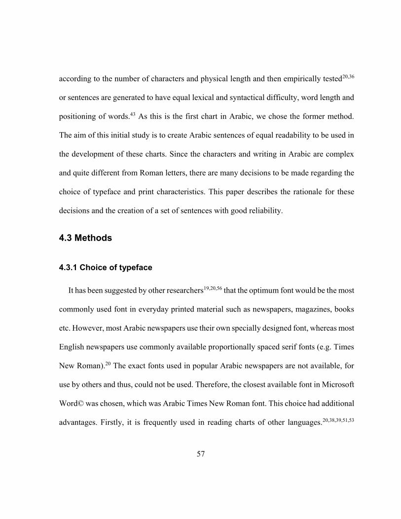
57
according to the number of characters and physical length and then empirically tested20,36
or sentences are generated to have equal lexical and syntactical difficulty, word length and
positioning of words.43 As this is the first chart in Arabic, we chose the former method.
The aim of this initial study is to create Arabic sentences of equal readability to be used in
the development of these charts. Since the characters and writing in Arabic are complex
and quite different from Roman letters, there are many decisions to be made regarding the
choice of typeface and print characteristics. This paper describes the rationale for these
decisions and the creation of a set of sentences with good reliability.
4.3 Methods
4.3.1 Choice of typeface
It has been suggested by other researchers19,20,56 that the optimum font would be the most
commonly used font in everyday printed material such as newspapers, magazines, books
etc. However, most Arabic newspapers use their own specially designed font, whereas most
English newspapers use commonly available proportionally spaced serif fonts (e.g. Times
New Roman).20 The exact fonts used in popular Arabic newspapers are not available, for
use by others and thus, could not be used. Therefore, the closest available font in Microsoft
Word© was chosen, which was Arabic Times New Roman font. This choice had additional
advantages. Firstly, it is frequently used in reading charts of other languages.20,38,39,51,53
58
Secondly, Arabic Times New Roman font in Microsoft Word© does not use ligatures,
which are specific Arabic font characteristics. A ligature is used when more than one
character is joined to form a single glyph (a readable character or shape) (Figure 4.1) and
they cannot be eliminated. The use of a ligature could affect the readability, as it changes
the shape and height of a word and may cause more crowding, especially in small font sizes
and for people with low vision. Thirdly, it has been shown that Arabic Times New Roman
results in enhanced reading performance compared to Courier.63
Figure 4.1. Demonstration of Arabic typeface characteristics. A. A sample of a five-letter word (which
means community) in Times New Roman font. The numbers 1-5 indicate each letter. B. The same
word with a ligature using Arabic Typesetting font.
59
A second decision was not to use vocalization marks, as they are absent in everyday
materials ,86,87 like newspapers. Experienced readers fluently read unvocalized text by
using contextual clues.87 Vocalization marks are usually used to clarify the pronunciation
of certain words. They are commonly used as learning aids for children and beginner
readers, in dictionaries and some literary materials,87 in poetry86 and the Quran, where it is
imperative to avoid misreading. However, general readability improves without
vocalization marks when in conjunction with the simplest font.86
4.3.2 Creating a set of sentences with high reliability
The ultimate goal is to produce three versions of Arabic continuous text near visual
acuity chart, so that repeated testing is possible (e.g. binocularly and monocularly). The
charts will be developed to be similar in design to the Colenbrander near acuity charts, in
which each font size has a pair of unrelated sentences designed to be of the same length
and difficulty, with the same number of characters including spaces and ending with a full
stop or question mark. For the Arabic chart, it is planned that each chart will have fifteen
pairs of pairs of sentences in a logarithmic progression of decreasing print size. Ultimately,
forty-five pairs of sentences are needed to produce the three different charts. Candidate
sentences were initially developed by BA based on the content and the vocabulary of grade
three Arabic schoolbooks and with the help of two Egyptian Arabic school teachers. The
sentences in each pair were independent of each other in their semantic content and were
60
designed so that each is printed on a separate line. They were created at approximately the
same level of difficulty, the exact same physical length, and the same number of characters
with spaces for each pair of sentences (102 characters). The number of words in each pair
ranged from 16 to 22 and no words had more than ten letters (Figure 4.2). Two sample
sentences in Arabic with their English translation can be seen in Figure 4.2. The sentences
were then checked by three Arabic language specialists from Saudi Arabia for grammatical
and sentence structure accuracy. Lastly, the sentences were sent to three other readers, from
Libya, Egypt and Morocco to check that the sentences did not contain cultural inaccuracies
in these countries. The use of people from several Arabic countries ensured that the
sentences are understandable across different Arabic countries and cultures.
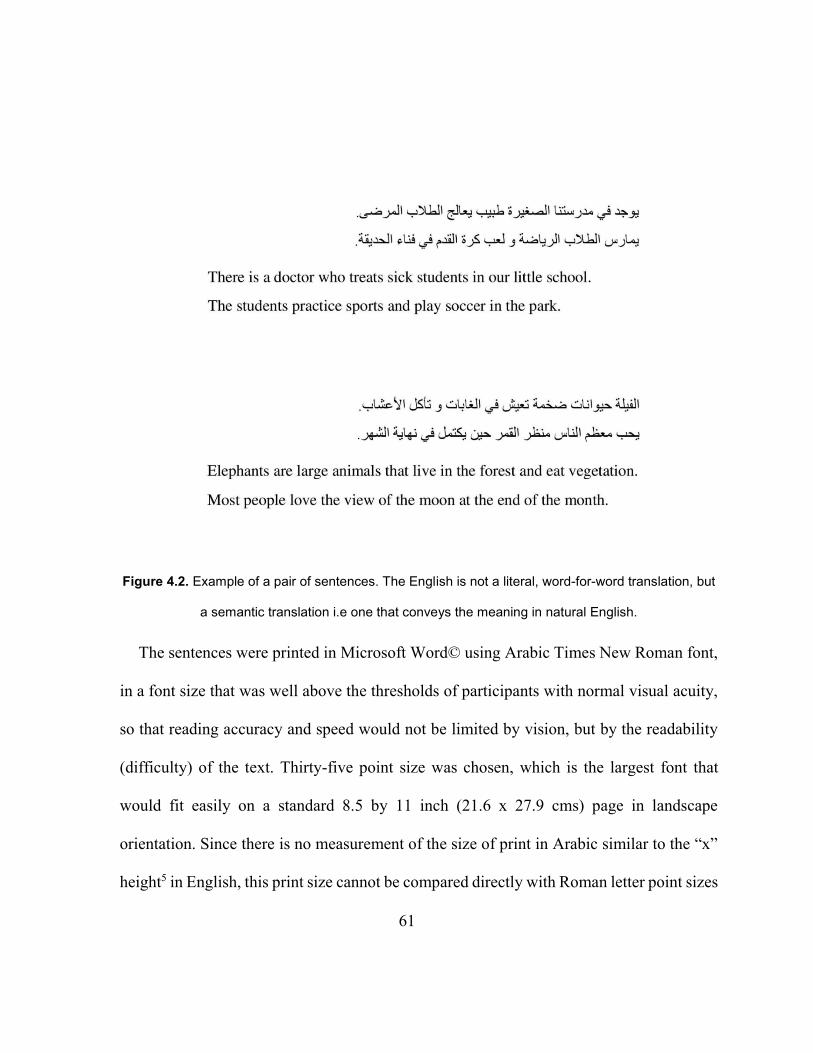
61
Figure 4.2. Example of a pair of sentences. The English is not a literal, word-for-word translation, but
a semantic translation i.e one that conveys the meaning in natural English.
The sentences were printed in Microsoft Word© using Arabic Times New Roman font,
in a font size that was well above the thresholds of participants with normal visual acuity,
so that reading accuracy and speed would not be limited by vision, but by the readability
(difficulty) of the text. Thirty-five point size was chosen, which is the largest font that
would fit easily on a standard 8.5 by 11 inch (21.6 x 27.9 cms) page in landscape
orientation. Since there is no measurement of the size of print in Arabic similar to the “x”
height5 in English, this print size cannot be compared directly with Roman letter point sizes
62
or x heights. However, in the current study this lack of clear comparison is not expected to
have an impact, as the print size was not varied. All the sentences were printed in this
chosen size and of the same font. Determining an equivalent of the “x” height will be the
subject of future studies. Each pair of sentences was printed in landscape orientation at the
center of a 8.5 x 11 inch separate page using 1.15 line spacing and all pages were inserted
in a binder folder. The folder was supported on a wooden reading stand to easily display
the sentences. A standard reading distance of 40 cm was used for adults and 30 cm for
children. A thread measuring 30 or 40 cm was attached on the side of the stand to measure
the exact reading distance and was used to frequently check the reading distance and to
keep it constant.
4.4 Participants
The sample consisted of 69 native Arabic speakers from twelve different countries.
Snowball sampling was used to recruit fifty-three adults from the University of Waterloo
and from the city of Riyadh in Saudi Arabia. The inclusion criteria were being a fluent
Arabic speaker, VA 6/7.5 or better (with habitual correction) and no known eye disease.
The adult participants were aged from 18 to 60 years (mean 31.1) and included 31 males
and 22 females. In terms of their education, 41% had completed high school, 29% had
completed first post-secondary studies, and 30% of the participants had completed post-
63
graduate studies. For the child sample, seven male and nine female grade three participants
were recruited.
Distance visual acuity was measured binocularly using an EDTRS logMAR chart (for
those who could recognize Roman letters) or a LEA Symbols® Massachusetts Flip Chart
at 3 m (for those who did not know Roman letters). Near visual acuity was measured using
a Sloan Letter Near Vision Card or a Lea symbols® near vision card at 40 cm.
Grade three students were recruited from Altarbiya Alislamiya Schools in Riyadh, Saudi
Arabia. The inclusion criteria were as follows: age 7 to 8 years (grade three), fluent Arabic
speaker, no known learning or reading disability or special needs, no Autism or behavioral
issues as reported by the parents. Distance visual acuity was measured binocularly using
the LEA Symbols® Massachusetts Flip Chart at 3 m and near visual acuity was measured
with Lea symbols® near vision card at 40 cm.
4.5 Procedure
The luminance of the paper was set to be ≈130 cd/m2. Participants’ ocular and general
health history was recorded.
The order of the sentence pairs was randomized for each participant and all participants
were videotaped while reading the sentences. Participants were instructed to read aloud as
fast as possible without sacrificing accuracy but not to worry if they did make an error i.e.
64
they were encouraged to keep reading even if they realized they had made an error. To
familiarize participants with the reading procedure, they began by reading three
demonstration pairs of sentences. Flipping pages was performed by the examiner to control
the reading distance and the presentation. The number of errors for each sentence pair was
recorded for each participant. The time taken to read each pair of sentences and the number
of errors were determined after the reading session by reviewing the participants’ videos.
This allowed an accurate calculation of the speed in “correct words per minute” (CWPM,
see below).
The study was approved and received full ethics clearance from the Office of Research
Ethics, University of Waterloo. All participants gave their written informed consent prior
to participation in the study.
4.6 Data analysis
Nineteen sentence pairs were eliminated before carrying out any formal analysis. This
is because a large number of participants made several errors while reading them because
of the text flow or stumbled because of difficulties in pronunciation and/or commented that
the sentences did not make good sense. For the remaining ninety sentence pairs, the
maximum and mean number of errors and the standard deviation of errors were calculated
for each sentence pair. The following measures of reading speed were calculated for each
participant for each of the 90 remaining sentence pairs.
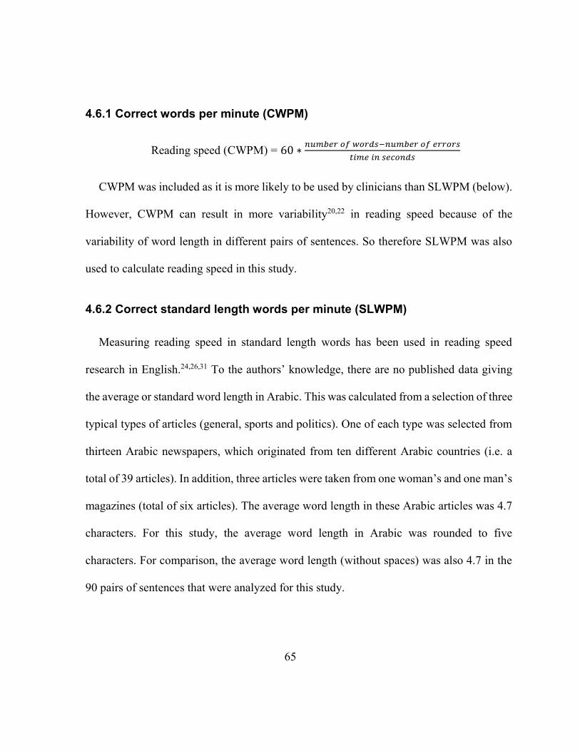
65
4.6.1 Correct words per minute (CWPM)
Reading speed (CWPM) = 60 ∗𝑛𝑢𝑚𝑏𝑒𝑟 𝑜𝑓 𝑤𝑜𝑟𝑑𝑠−𝑛𝑢𝑚𝑏𝑒𝑟 𝑜𝑓 𝑒𝑟𝑟𝑜𝑟𝑠
𝑡𝑖𝑚𝑒 𝑖𝑛 𝑠𝑒𝑐𝑜𝑛𝑑𝑠
CWPM was included as it is more likely to be used by clinicians than SLWPM (below).
However, CWPM can result in more variability20,22 in reading speed because of the
variability of word length in different pairs of sentences. So therefore SLWPM was also
used to calculate reading speed in this study.
4.6.2 Correct standard length words per minute (SLWPM)
Measuring reading speed in standard length words has been used in reading speed
research in English.24,26,31 To the authors’ knowledge, there are no published data giving
the average or standard word length in Arabic. This was calculated from a selection of three
typical types of articles (general, sports and politics). One of each type was selected from
thirteen Arabic newspapers, which originated from ten different Arabic countries (i.e. a
total of 39 articles). In addition, three articles were taken from one woman’s and one man’s
magazines (total of six articles). The average word length in these Arabic articles was 4.7
characters. For this study, the average word length in Arabic was rounded to five
characters. For comparison, the average word length (without spaces) was also 4.7 in the
90 pairs of sentences that were analyzed for this study.
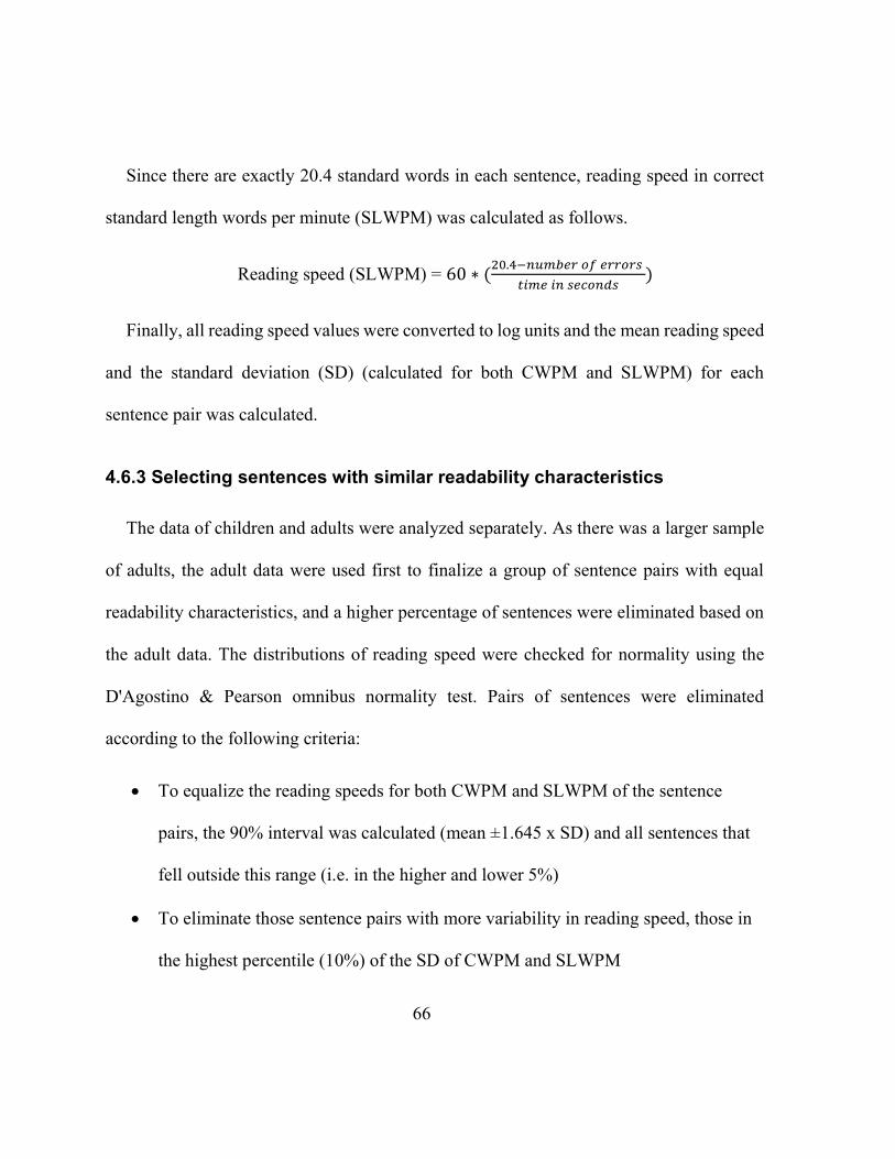
66
Since there are exactly 20.4 standard words in each sentence, reading speed in correct
standard length words per minute (SLWPM) was calculated as follows.
Reading speed (SLWPM) = 60 ∗ (20.4−𝑛𝑢𝑚𝑏𝑒𝑟 𝑜𝑓 𝑒𝑟𝑟𝑜𝑟𝑠
𝑡𝑖𝑚𝑒 𝑖𝑛 𝑠𝑒𝑐𝑜𝑛𝑑𝑠)
Finally, all reading speed values were converted to log units and the mean reading speed
and the standard deviation (SD) (calculated for both CWPM and SLWPM) for each
sentence pair was calculated.
4.6.3 Selecting sentences with similar readability characteristics
The data of children and adults were analyzed separately. As there was a larger sample
of adults, the adult data were used first to finalize a group of sentence pairs with equal
readability characteristics, and a higher percentage of sentences were eliminated based on
the adult data. The distributions of reading speed were checked for normality using the
D'Agostino & Pearson omnibus normality test. Pairs of sentences were eliminated
according to the following criteria:
To equalize the reading speeds for both CWPM and SLWPM of the sentence
pairs, the 90% interval was calculated (mean ±1.645 x SD) and all sentences that
fell outside this range (i.e. in the higher and lower 5%)
To eliminate those sentence pairs with more variability in reading speed, those in
the highest percentile (10%) of the SD of CWPM and SLWPM
67
To eliminate those sentence pairs which gave more errors, those in the highest
percentile of the mean number of errors
To eliminate those sentence pairs with more variability in errors, those with the
highest percentile of the SD of errors
To eliminate those which gave higher errors, sentence pairs in the highest
percentile (to the nearest integer) of the maximum number of errors
Sentence pairs were eliminated in a two-step process. Firstly, each criterion was applied
separately, and the results were reviewed to ensure that these eliminations would not result
in too many sentence pairs being eliminated from the total. This was not the case and so
then all the criteria were applied and any sentence pair that met any of the above criteria
for the adult data were eliminated. At this first step 35 sentences were eliminated.
Secondly, based on the remaining sentences, a similar analysis was performed using the
child data to eliminate any obvious outliers. The 95% interval for SLWPM was calculated
(mean ±1.96 x SD) and pairs of sentences that fell outside this range (in the highest and
lowest 2.5%) were eliminated. Additionally, pairs of sentences which gave the highest
percentile of the mean number of errors and the highest percentile of the maximum number
of errors were eliminated.
The Cronbach’s alpha coefficient was calculated for the final set of sentence pairs to
determine inter-item (sentence pair) consistency/reliability.
68
4.7 Results
Adults’ distance and near visual acuity ranged between -0.18 to 0.12 (mean -0.11
logMAR) and -0.28 to 0.10 logMAR (mean -0.09 logMAR) respectively. The childrens’
distance and near visual acuity ranged between -0.10 to 0.20 (mean 0.01) and -0.12 to 0.10
logMAR (mean 0.02) respectively.
For the adult data, the distributions of the two measures of reading speed were both
normally distributed (p=0.87 for CWPM and p=0.36 for SLWPM). Thirty-five sentences
were eliminated after applying all the elimination criteria on the adult data. The results of
the elimination process for adults is shown in Figure 4.3 which shows reading speed of
adults for all 90 sentence pairs before and after elimination according to all elimination
criteria. Figure 4.4 show histograms of the mean number of errors for adults for each
sentence pair and the maximum number of errors for each sentence pair.
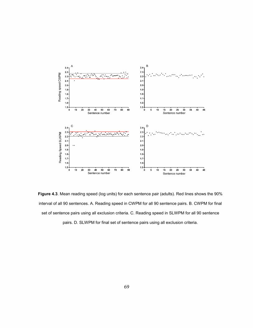
69
Figure 4.3. Mean reading speed (log units) for each sentence pair (adults). Red lines shows the 90%
interval of all 90 sentences. A. Reading speed in CWPM for all 90 sentence pairs. B. CWPM for final
set of sentence pairs using all exclusion criteria. C. Reading speed in SLWPM for all 90 sentence
pairs. D. SLWPM for final set of sentence pairs using all exclusion criteria.
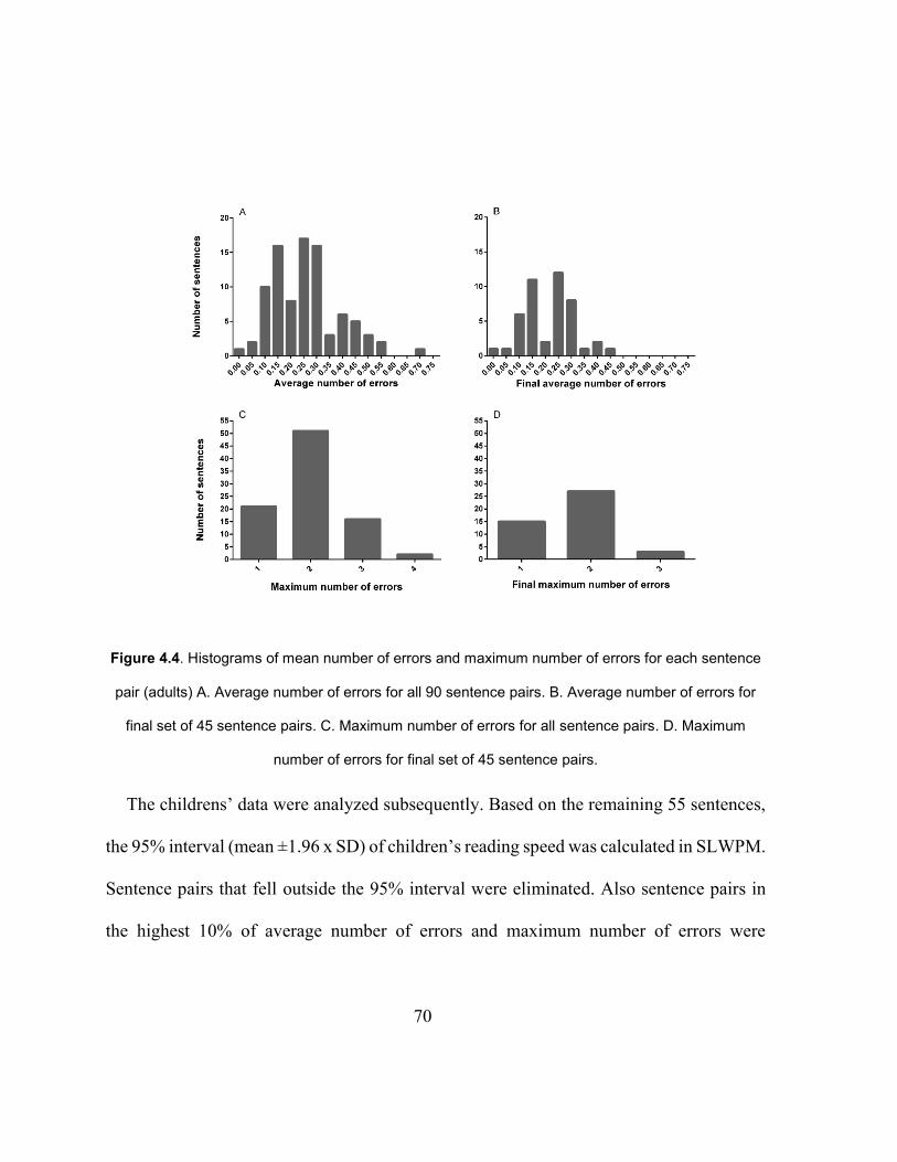
70
Figure 4.4. Histograms of mean number of errors and maximum number of errors for each sentence
pair (adults) A. Average number of errors for all 90 sentence pairs. B. Average number of errors for
final set of 45 sentence pairs. C. Maximum number of errors for all sentence pairs. D. Maximum
number of errors for final set of 45 sentence pairs.
The childrens’ data were analyzed subsequently. Based on the remaining 55 sentences,
the 95% interval (mean ±1.96 x SD) of children’s reading speed was calculated in SLWPM.
Sentence pairs that fell outside the 95% interval were eliminated. Also sentence pairs in
the highest 10% of average number of errors and maximum number of errors were
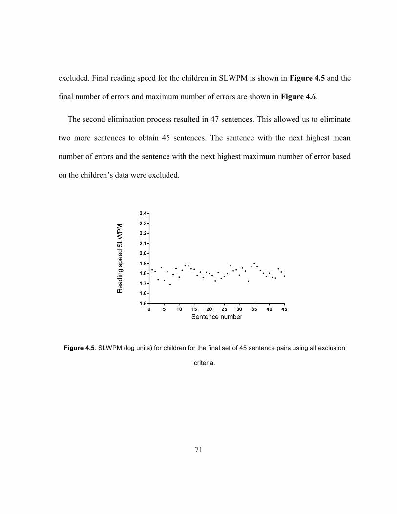
71
excluded. Final reading speed for the children in SLWPM is shown in Figure 4.5 and the
final number of errors and maximum number of errors are shown in Figure 4.6.
The second elimination process resulted in 47 sentences. This allowed us to eliminate
two more sentences to obtain 45 sentences. The sentence with the next highest mean
number of errors and the sentence with the next highest maximum number of error based
on the children’s data were excluded.
Figure 4.5. SLWPM (log units) for children for the final set of 45 sentence pairs using all exclusion
criteria.
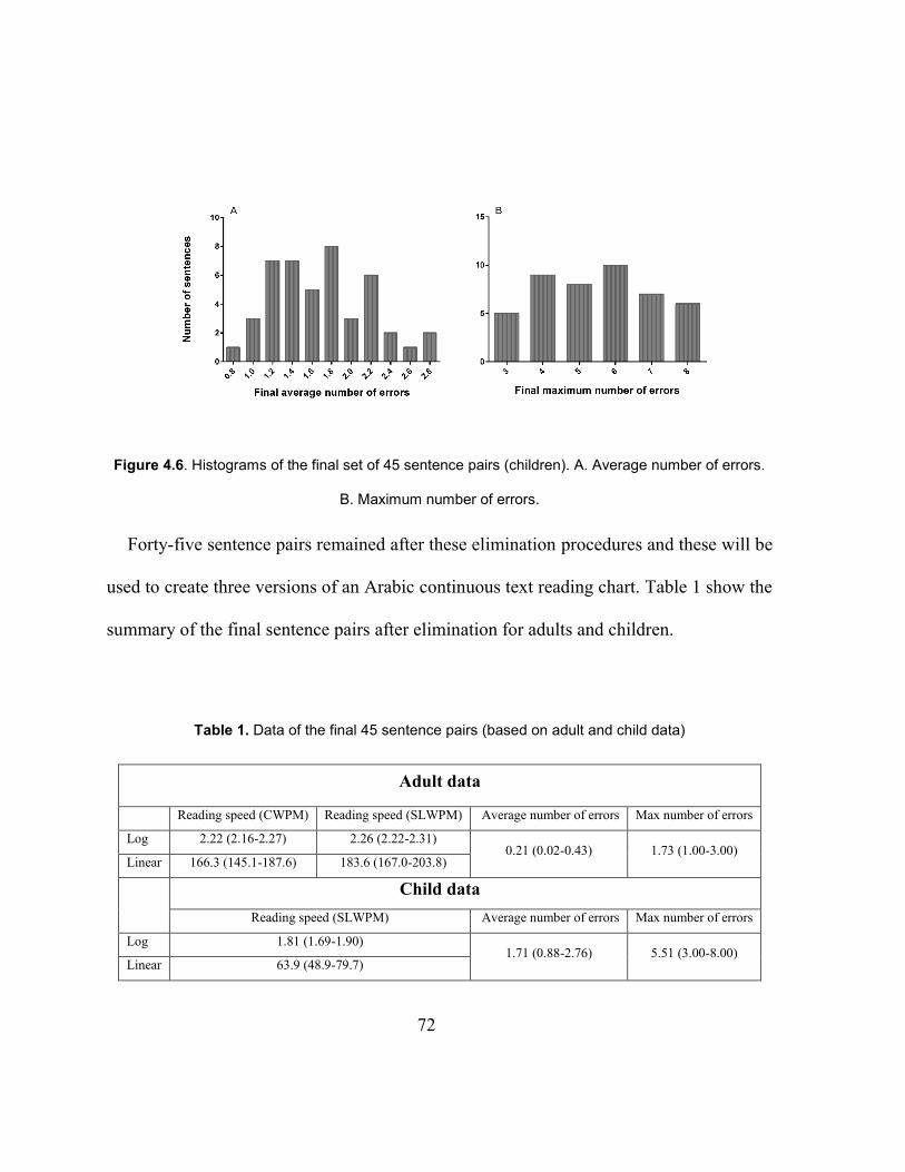
72
Figure 4.6. Histograms of the final set of 45 sentence pairs (children). A. Average number of errors.
B. Maximum number of errors.
Forty-five sentence pairs remained after these elimination procedures and these will be
used to create three versions of an Arabic continuous text reading chart. Table 1 show the
summary of the final sentence pairs after elimination for adults and children.
Table 1. Data of the final 45 sentence pairs (based on adult and child data)
Adult data
Reading speed (CWPM) Reading speed (SLWPM) Average number of errors Max number of errors
Log 2.22 (2.16-2.27) 2.26 (2.22-2.31) 0.21 (0.02-0.43) 1.73 (1.00-3.00)
Linear 166.3 (145.1-187.6) 183.6 (167.0-203.8)
Child data
Reading speed (SLWPM) Average number of errors Max number of errors
Log 1.81 (1.69-1.90) 1.71 (0.88-2.76) 5.51 (3.00-8.00)
Linear 63.9 (48.9-79.7)
73
The Cronbach’s alpha coefficient was calculated to support that the final set of sentence
pairs were reliable to be used in the construction of the new Arabic reading charts. The
Cronbach’s alpha for the final set of sentence pairs in CWPM and SLWPM was 0.986 for
adults and 0.996 for children.
The average reading speed (CWPM) of adult participants ranged from 117.7 to 252.4
(mean 166.4 ± 34.3) and for children this ranged from 20.5 to 103.6 (mean 60.6 ± 27.9).
4.8 Discussion
The aim of this study was to create Arabic sentences of equal difficulty to be used in the
development of the first standardized Arabic short duration continuous text reading acuity
charts. The charts will be designed to measure near visual acuity as well as reading speed,
critical print size and reading acuity for children and adults. It is intended that each chart
will have fifteen descending print sizes in a logarithmic progression, which will allow print
that is large enough to measure near visual acuity in patients with low vision.
The sentences were tested with 35 point size (pt) print, which may sound large in the
context of Roman print. However, Arabic is approximately 2x smaller than Roman print
(i.e. 35 point in Arabic appears smaller than 35 point in Roman print) so when this is taken
into account, the print size is not abnormally large. Additionally, preliminary data showed
74
that reading speed for 35 point print in Arabic is within the range of print sizes that gives
maximum reading speed. These preliminary findings indicate that using 35 point print for
testing sentences did not introduced a ceiling effect for reading speed.
So far, standardized continuous text charts are available in nineteen languages, or more.
Most of these languages use Roman script. Recently, researchers have developed the
IReST text charts51 which are standardized long passage reading charts available in
seventeen different languages, including Arabic. These charts are designed with one print
size only (1 M) to measure and assess reading speed and compare it across different
languages. The developers based the texts for different languages on the original German
IReST chart, with modifications for language differences i.e. they did not create new text
for each language.52 They have reported differences in text length across languages due to
differences between alphabetic and non-alphabetic languages.51 Many scholars22,38,39 hold
the view that direct translation of sentences from an existing standardized chart to a
different language is often impractical and not ideal because each language has specific
orthographic differences. Grammar, spelling, average word length, word breaks,
hyphenation, and the use of vocalization marks are all different and all make direct
translation difficult. The Turkish language uses the same Roman characters as English,
plus seven extra letters that are modified to meet the unique phonetic requirements of the
language. In Greek the differently formed Cyrillic alphabet is used. In comparison, Arabic
75
uses a completely different alphabet. Unlike Roman characters, where letters are written
individually from left to right, Arabic is written from right to left in a cursive style only.
These factors make translation inappropriate in the development of consistent sentences.
In order to achieve uniformity in the total number of characters and physical length on the
line, new sentences have to be composed for some languages.38,39
Therefore, in the present study we developed new sentences in Arabic, which were
composed following the layout of the Colenbrander chart. The present study utilized
methodologies similar to other studies in the creation and testing of sentences.22,38,39 It is a
common practice to use schoolbooks to create sentences of a certain grade level. This
approach was used for the Greek MNREAD chart,38 MNREAD Turkish chart39 and UiTM-
Mrw Malay chart.53 Language experts were consulted to verify the correctness of grammar
and sentence structures in these charts38,39,51,52 and lay readers also checked for cultural
differences.
Videotaping was chosen as a more accurate method of timing to measure reading speed
than the use of a stopwatch. A number of previous studies44,46,88,89 have based their reading
speed measurements on video or audiotape records, which reduces variability in reading
speed measurements compared to the use of a stopwatch, as the measurement is done after
the reading session.22 Rubin90 identified several factors, including examiner reaction time
in timing each sentence, false starts, and the habit of self-correcting errors by readers,

76
which may affect reading speed measurement precision and repeatability with a stopwatch.
In addition, the decision about errors must be made in real time and cannot be re-checked,
as it can with videotaping. Brussee et al.22 and Rubin90 discussed how the number of
examiners/raters used in a study and their training may contribute to the variability of the
reading measurement. In the current study, only one examiner (BA) carried out reading
sessions and reading speed calculations from recorded videos.
Adults38,44,45,48,51–53 of varying educational levels and grade 3 children38,39 were recruited
to measure the reliability of the sentences, so that the charts can be used for people with
reading ability of grade 3 upwards. The Cronbach alpha of the sentence pairs in the present
study was 0.99 for both adults and children. This compares very favorably to the study by
Radner et al,44 in which the calculated Cronbach alpha coefficient was 0.98 for short
German sentences, which were used to construct the German Radner reading charts.
The adults’ average reading speed in CWPM obtained in the current study ranged
between 118 to 252 (mean 166 ± 34). The only other study which gives reading speed for
Arabic reading test charts is the study by the IReST group,51 which reported an average
reading speed in WPM of 138 ± 20, which is similar to the current study. This similarity is
despite differences such as the grade level of text (the IReST used a higher grade level),
the size of the print (IReST used 1 M) and the fact that IReST did not take errors into
account. Alsaiari and Azmi91 reported an average Arabic reading speed for University
77
students reading passages without vocalization marks of 164.27 ± 7.57 WPM and 128.98
SD ± 5.47 for two different Arabic fonts, which is similar to the reported reading speed
here.
These results indicate that reading speed for Arabic may be slower on average than for
English. This difference was reported by the IReST group,51 reading speed in words per
minute in Arabic was lower compared to English and compared to all other alphabetic
languages that they measured. In fact English resulted in the highest reading speed of all
the languages when measured in WPM (228 ± 30 wpm in English compared to 138 ± 20
wpm in Arabic).
In the current study, children’s reading speeds in CWPM ranged between 20 to 104
(mean 61 ± 28). The only comparable data is that of Hussien,92 which showed a median
oral reading rate of 90 WPM in 6th grade children. The obvious reason for the higher
reading rate in Husseins’s study is the higher grade levels of the children (6th versus 3rd
grade readers). However, comparing reading speeds between different studies must be
interpreted with caution. Testing methods and procedures play a large role on the resulting
average reading speed, and may explain the differences in the results.22
4.8.1 Developing the new charts
Prototypes of the final charts were printed on 11 by 14 inches sheets, which is a similar
overall size to the MNREAD chart. They were printed in landscape orientation to
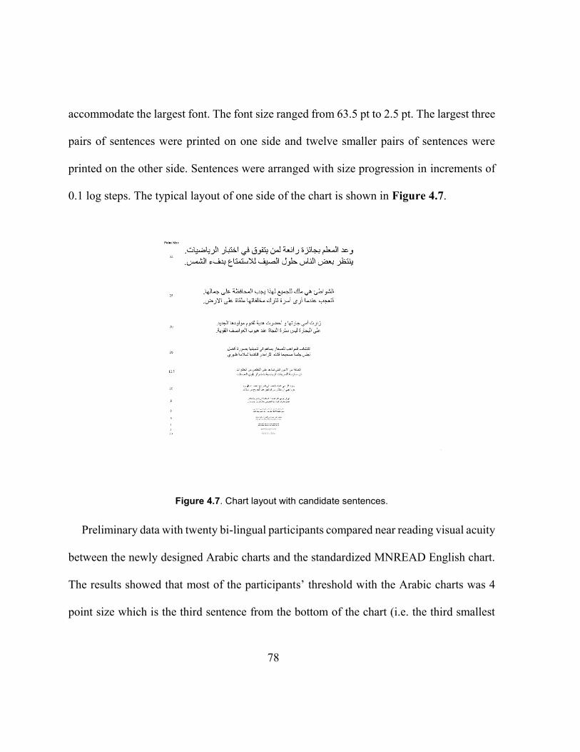
78
accommodate the largest font. The font size ranged from 63.5 pt to 2.5 pt. The largest three
pairs of sentences were printed on one side and twelve smaller pairs of sentences were
printed on the other side. Sentences were arranged with size progression in increments of
0.1 log steps. The typical layout of one side of the chart is shown in Figure 4.7.
Figure 4.7. Chart layout with candidate sentences.
Preliminary data with twenty bi-lingual participants compared near reading visual acuity
between the newly designed Arabic charts and the standardized MNREAD English chart.
The results showed that most of the participants’ threshold with the Arabic charts was 4
point size which is the third sentence from the bottom of the chart (i.e. the third smallest
79
size). This gives two levels below the acuity level of almost all participants. This similar
to the MNREAD chart with which the reading acuity of most participants was -0.1 logMAR
which is the fifth sentence from the bottom of the chart. Note that the MNREAD chart has
19 size levels compared to 15 levels on the newly designed Arabic charts. Thus the number
of supra-threshold levels of the Arabic chart will be 12 compared to 14 for the MNREAD,
ensuring that sufficiently supra-threshold print sizes are available to measure a threshold
in patients with low vision.
4.9 Conclusions
The current study developed and determined the reliability of a group of forty-five
sentence pairs which have similar readability to one another and which will be used to
create short duration Arabic continuous text reading charts. We have also presented data
on reading speeds for Arabic text for both adults and children.
4.10 Disclosure
The authors report no conflicts of interest and have no proprietary interest in any of the
materials mentioned in this article.
80
4.11 Acknowledgments
We would like to thank Dr. Mosa Alawees, Hamada Ahmed and Fateh Talluge for their
help in sentence creation. Dr. Mohammed Almulla and Dr. Sulaiman Alayuni for their
grammatical revision of the sentences. Majeda Alsumai for her assistance in recruiting
participants from Altarbiya Alislamiya Schools. Also, we would like to thank Professor
Gordon Legge for his valuable advice and support. This research was funded by King Saud
University, Saudi Arabia.
81
Chapter 5
LAYOUT AND SPACING
5.1 General chart layout
It has been established that standardized visual acuity charts should be designed in a
logarithmic scale with 0.1 logMAR step size between print size levels.8,16 The layout of the
new Arabic chart was designed to be similar to the design of the Colenbrander chart. This
was chosen because it was more feasible for Arabic than the MNREAD layout. The
Colenbrander design is arranged so that a pair of unrelated sentences is used for each print
size level and each sentence ends with a full stop or question mark. As the Colenbrander
sentences are longer than the MNREAD sentences, it was easier to manipulate the text to
make them exactly the same length using the Colenbrander format. In addition, it was
easier to match two lines in length than three lines (MNREAD sentences’ style). Arabic
letters are curvier than Roman letters. Therefore, it was easier to equate them for physical
length at the end of the sentence when it ends with a full stop. The following sections
describe the rationale for the chart layout, print size levels, and spacing.
5.1 Print sizes
The only measurement of size for Arabic print is point size. Size notation in Arabic
cannot be based on the x-height, as for Roman letters, as there is no x-height in Arabic.
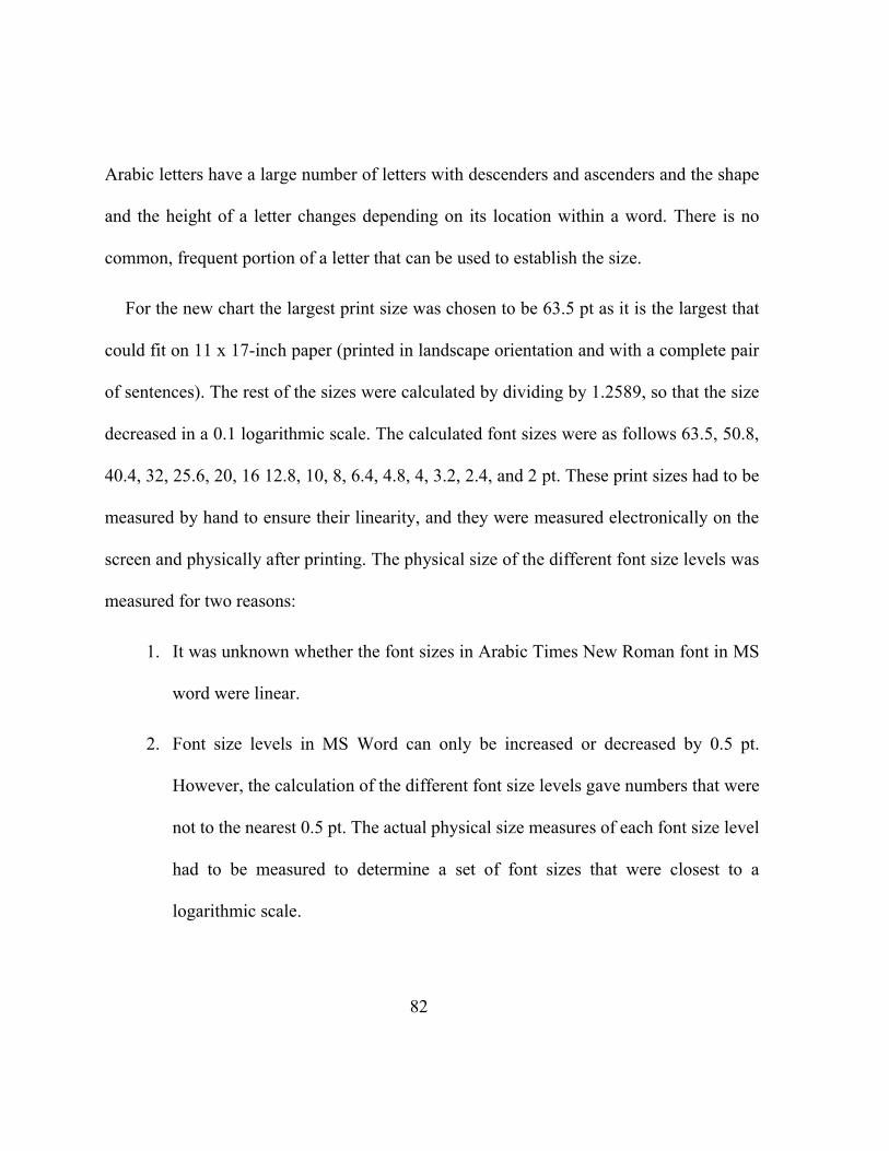
82
Arabic letters have a large number of letters with descenders and ascenders and the shape
and the height of a letter changes depending on its location within a word. There is no
common, frequent portion of a letter that can be used to establish the size.
For the new chart the largest print size was chosen to be 63.5 pt as it is the largest that
could fit on 11 x 17-inch paper (printed in landscape orientation and with a complete pair
of sentences). The rest of the sizes were calculated by dividing by 1.2589, so that the size
decreased in a 0.1 logarithmic scale. The calculated font sizes were as follows 63.5, 50.8,
40.4, 32, 25.6, 20, 16 12.8, 10, 8, 6.4, 4.8, 4, 3.2, 2.4, and 2 pt. These print sizes had to be
measured by hand to ensure their linearity, and they were measured electronically on the
screen and physically after printing. The physical size of the different font size levels was
measured for two reasons:
1. It was unknown whether the font sizes in Arabic Times New Roman font in MS
word were linear.
2. Font size levels in MS Word can only be increased or decreased by 0.5 pt.
However, the calculation of the different font size levels gave numbers that were
not to the nearest 0.5 pt. The actual physical size measures of each font size level
had to be measured to determine a set of font sizes that were closest to a
logarithmic scale.
83
The physical size of font size levels was compared by measuring horizontally across a
test sentence, from one identified point to another. The same sentence was printed in all
calculated font size levels. It was also printed 0.5 pt bigger and smaller when the calculated
print size differed from the MS Words standard step size of 0.5 pt. This was done to find
the closest font size to a logarithmic scale. For example, the next calculated font size after
63.5 pt is 50.8 pt. Thus, the sentence was printed in 51 and 50.5 pt to compare the physical
font size and offer a choice closest to a log scale.
The physical length of the sentence on a monitor was measured in MS Word by placing
a line horizontally across it. The sentence’s first and last letter was Alef "ا" , to make it easier
to determine the beginning and the end of the sentence. Thus, it was not a meaningful
collection of words, and the last word was not a real word (Figure 5.1); but this did enable
an accurate measurement of size for comparison across all printed font sizes. MS Word
was practical for measuring the exact length of the sentence, as an electronic line could be
fitted exactly on Alef at the beginning and end of the sentence. In addition, the MS Word
electronic magnifying tool was used for small print sizes. MS Word gives the exact length
of the fitted line which corresponded to the physical length of the measured sentence.
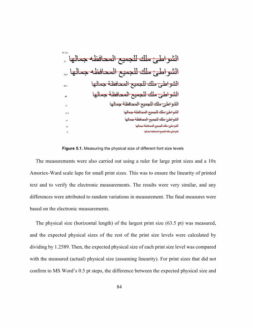
84
Figure 5.1. Measuring the physical size of different font size levels
The measurements were also carried out using a ruler for large print sizes and a 10x
Amoriex-Ward scale lupe for small print sizes. This was to ensure the linearity of printed
text and to verify the electronic measurements. The results were very similar, and any
differences were attributed to random variations in measurement. The final measures were
based on the electronic measurements.
The physical size (horizontal length) of the largest print size (63.5 pt) was measured,
and the expected physical sizes of the rest of the print size levels were calculated by
dividing by 1.2589. Then, the expected physical size of each print size level was compared
with the measured (actual) physical size (assuming linearity). For print sizes that did not
confirm to MS Word’s 0.5 pt steps, the difference between the expected physical size and
85
the measured physical size was calculated. The font size that gave the smaller difference
from the expected physical measurement (that is, the closest to it) was chosen as it would
be closer to the calculated log scale.
This testing showed that font sizes in Arabic Times New Roman MS Word are generally
linear. This fact was true for all chosen print sizes except one. The closest font sizes to the
calculated size of 12.8 pt were 12.5 or 13 pt. The physical measurement of size 12.5 was
closer to the expected physical size and that what was used for this level of print size.
To ensure that the smallest print size on the chart meets the minimum sample density
limit,29 an approximate calculation of the resolution in dots per character height was carried
out. This calculation was challenging because of two reasons: 1) there is no x-height in
Arabic, 2) there are 103 height variations of the twenty-eight Arabic alphabet because the
height and shape of each letter changes according to its location within the word. A
measurement of all these possible heights was done in the 72 pt and the average calculated
and scaled for 2 pt. Since the printer’s resolution was known (2400 x 1200), the resolution
in dots per character height for 2 pt on the Arabic chart was estimated as 37.44 dots per
character. This results is similar to the resolution of the same size on the MNREAD chart
(20 dots per x-height) and adequate for 2pt to be read.20
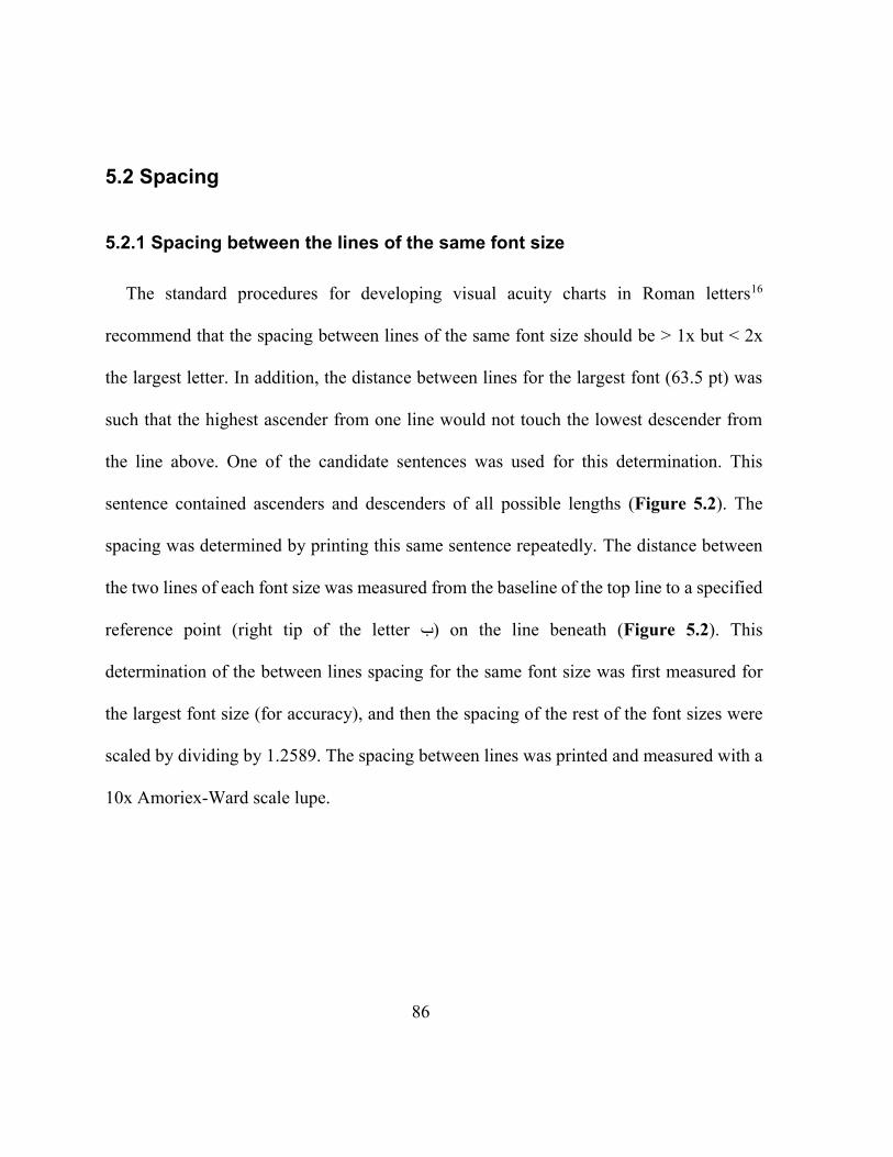
86
5.2 Spacing
5.2.1 Spacing between the lines of the same font size
The standard procedures for developing visual acuity charts in Roman letters16
recommend that the spacing between lines of the same font size should be > 1x but < 2x
the largest letter. In addition, the distance between lines for the largest font (63.5 pt) was
such that the highest ascender from one line would not touch the lowest descender from
the line above. One of the candidate sentences was used for this determination. This
sentence contained ascenders and descenders of all possible lengths (Figure 5.2). The
spacing was determined by printing this same sentence repeatedly. The distance between
the two lines of each font size was measured from the baseline of the top line to a specified
reference point (right tip of the letter ب) on the line beneath (Figure 5.2). This
determination of the between lines spacing for the same font size was first measured for
the largest font size (for accuracy), and then the spacing of the rest of the font sizes were
scaled by dividing by 1.2589. The spacing between lines was printed and measured with a
10x Amoriex-Ward scale lupe.
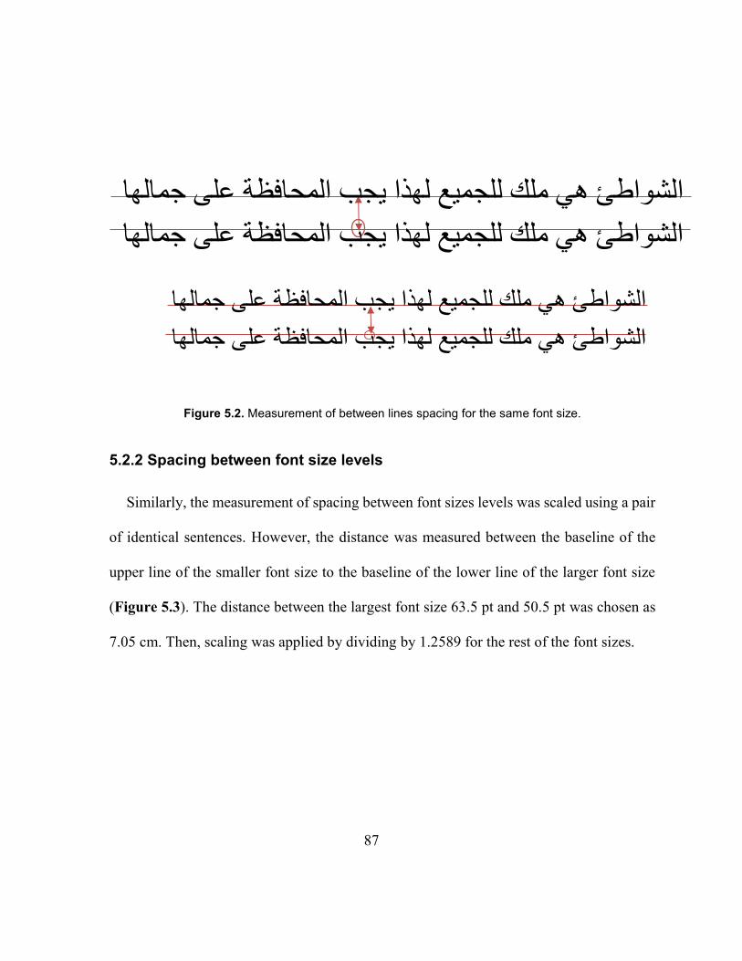
87
Figure 5.2. Measurement of between lines spacing for the same font size.
5.2.2 Spacing between font size levels
Similarly, the measurement of spacing between font sizes levels was scaled using a pair
of identical sentences. However, the distance was measured between the baseline of the
upper line of the smaller font size to the baseline of the lower line of the larger font size
(Figure 5.3). The distance between the largest font size 63.5 pt and 50.5 pt was chosen as
7.05 cm. Then, scaling was applied by dividing by 1.2589 for the rest of the font sizes.
لهذا يجب المحافظة على جمالهاالشواطئ هي ملك للجميع
الشواطئ هي ملك للجميع لهذا يجب المحافظة على جمالها
الشواطئ هي ملك للجميع لهذا يجب المحافظة على جمالها
الشواطئ هي ملك للجميع لهذا يجب المحافظة على جمالها
88
Figure 5.3. Measurement of spacing between different font levels.
الشواطئ هي ملك للجميع لهذا يجب المحافظة على جمالها
الشواطئ هي ملك للجميع لهذا يجب المحافظة على جمالها
يجب المحافظة على جمالهاالشواطئ هي ملك للجميع لهذا
الشواطئ هي ملك للجميع لهذا يجب المحافظة على جمالها
89
Chapter 6
A STANDARDIZED ARABIC READING ACUITY CHART: THE BAL
CHART
6.1 Summary
Purpose: The aim of this study is to develop and validate the first standardized Arabic
continuous text near visual acuity chart, the Balsam Alabdulkader-Leat (BAL) chart.
Methods: Three versions of the BAL chart were created from previously validated
sentences. Reading acuity (RA) and reading speed in standard words per minute (SLWPM)
were measured for 3 versions of the BAL chart and 3 English charts (MNREAD,
Colenbrander, and Radner) for 86 bilingual adults with normal vision aged 15 to 59 years.
RA and SLWPM were compared using ANOVA. To analyze agreement between the
charts, Bland-Altman plots were used. Normal visual acuity (0.00 logMAR) was calibrated
for the BAL chart with linear regression analysis.
Results: Average RA for BAL1, BAL2 and BAL3 was 0.62, 0.64 and 0.65 log-point
print respectively, which was statistically significantly different (repeated measures
ANOVA, p < 0.05), but not considered clinically significant. Differences in RA between
the three English charts were also significant (p < 0.05). The coefficient of agreement for
RA between the BAL charts was 0.054 (between 1 and 2), 0.061 (between 2 and 3) and
90
0.059 (between 1 and 3). Linear regression between the average RA for the BAL chart and
the MNREAD and Radner charts showed that 0.7 log-point size at 40 cm is equivalent to
0.00 logMAR at 40 cm and the new BAL chart was labelled accordingly. Mean SLWPM
for the BAL charts was 201, 195 and 195 SLWPM respectively and for the Colenbrander,
MNREAD and Radner charts was 146, 171 and 146 respectively. The coefficients of
agreement for log-SLWPM between BAL1 and BAL2, BAL2 and BAL3 and BAL1 and
BAL3 were 0.063, 0.064 and 0.057 log SLWPM respectively.
Conclusion: The BAL chart showed high inter-chart agreement. It is recommended for
accurate near performance measures in Arabic for both research and clinical settings.
6.2 Introduction
Visual acuity is a fundamental component of an eye examination and is used to assess
vision, to monitor the progress of a disease and to evaluate the effectiveness of prescribed
treatment.39 Routine eye examination in a clinical, or a research setting, involves measuring
near, as well as distance, visual acuity. Good near acuity is essential for reading, which is
related to quality of life.75,77,78 While distance visual acuity is typically carried out with
single optotype charts, reading performance is not well characterized with single optotypes.
Continuous text near acuity charts are preferable in testing reading performance as they
take into account visual and cognitive factors i.e. effects of context and crowding20 and
because text reflects everyday reading material.21,22 Continuous text charts allow measures
91
of reading speed, reading acuity and critical print size (the smallest print size that allows
reading with maximum reading speed).20 For any measure of visual acuity, standardized
charts should be used to ensure reliable results.14,16
Although, Arabic is currently ranked as the fourth language in terms of the number of
first-language speakers65 there are no standardized near acuity charts in Arabic, and this
deficiency makes current near acuity measurements unreliable. The use of diverse non-
standardized charts across different clinics within a particular country, or across different
Arabic speaking countries, increases the variability of acuity measurements. This means
that a person’s acuity threshold varies according to the clinic and/or the chart that was used
in the eye examination.
The lack of a standardized Arabic chart for distance acuity is less problematic. Distance
acuity charts do not have to be available in every language, as charts with symbols or
numbers can be used which are universal. Testing near reading performance must be in the
spoken language of the patient to ensure valid results. Standardized charts are available in
more than 17 different languages.36,38–41,44–49,53,54 Most of these languages use Roman letters
which make it easier to define the size notations. Arabic is more complex as Arabic letters
are very different, and more variable in height than Roman letters.
Standardized continuous text near acuity charts are developed according to established
criteria to control factors such as font, text difficulty, and step size.20 These criteria are used
92
to make sure that the only measured parameter is vision. For example, the MNREAD chart
is a well-developed continuous text standardized chart in English.36 It consists of sentences
of an equal number of characters and lines at each acuity level in a descending logarithmic
progression, with the same grade level of difficulty throughout.
The purpose of this research is to develop the first standardized Arabic continuous text
near visual acuity chart, the Balsam Alabdulkader-Leat (BAL) chart, to test the reliability
and to validate the chart.
6.3 Methods
6.3.1 Chart design and layout
The choice of typeface was the first consideration before developing sentences and
printing the chart. Researchers19,20 have suggested using the most commonly used font in
print for any specific language. It was also decided to use an Arabic font that does not use
ligatures, as these would lead to more complexity and crowding. A ligature is the
combination of two or more letters to form a single glyph32 which is part of the font desgin
and cannot be omitted by the user. Vocalization marks are absent in regular printed
materials such as newspapers. Arabic Times New Roman was therefore chosen, as it is one
of the most commonly used fonts in Arabic and it does not include ligatures. For more
detail about these choices, see the previous paper.32
93
The layout was chosen to be similar to the Colenbrander chart42 where each print size
level has a pair of unrelated sentences of equal number of characters and physical length.
In our previous study,32 we described the development and validation of Arabic sentences
of equal readability i.e. sentences that have the same physical length, grade level (grade 3)
and difficulty in terms of reading speed and number of errors. Ninety sentences were
created following accepted criteria for standardization.5,8,27,28 Each sentence pair had 102
characters including spaces and punctuation characters.32 The sentences were tested on
adults and children, and 45 sentences were selected which were shown to be highly
comparable. These were employed in the construction of the BAL chart (Figure 6.1).
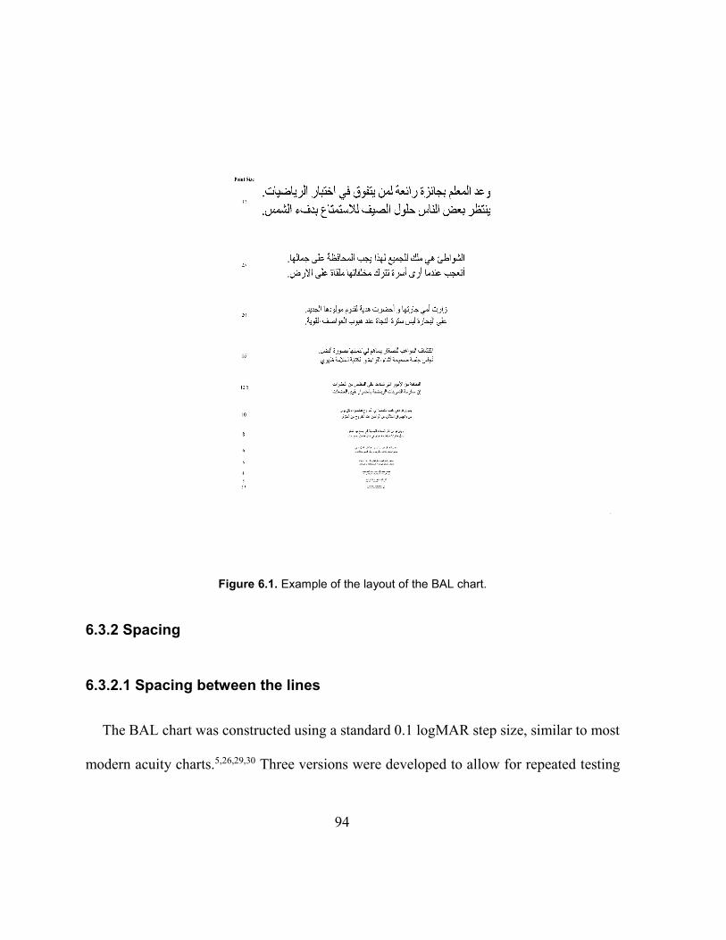
94
Figure 6.1. Example of the layout of the BAL chart.
6.3.2 Spacing
6.3.2.1 Spacing between the lines
The BAL chart was constructed using a standard 0.1 logMAR step size, similar to most
modern acuity charts.5,26,29,30 Three versions were developed to allow for repeated testing
95
(e.g. testing right eye, left eye and binocular acuity). We followed the standard procedures
for developing visual acuity charts in Roman letters,16 which recommend that the spacing
between lines of the same font size should be > 1x but < 2x the largest letter. For the Arabic
charts, we also ensured that the distance between lines was such that the highest ascender
from one line would not touch the lowest descender from the line above. This between-
lines spacing of the same font size was scaled by 1.2589 for every print size from the
smallest to the largest print size. The spacing between different font sizes was also scaled
by 1.2589 from the smallest to the largest print size and was accurately controlled with the
use of text boxes, rather than using the spacing function in Microsoft Word.
6.3.3 Creation of the chart
The 45 validated sentences were randomly distributed between size levels and between
the three versions of the chart. Each version of the chart had 15 print size levels in 0.1
logarithmic steps. The print size was defined in Arabic point size, which was measured and
confirmed to be linear when printed. The print sizes ranged from 63.5 to 2.5 point.
Prototype charts were printed using Xerox WorkCentre 7556 with a resolution of 2400 dpi.
They were printed in “Microsoft Word” Arabic Times New Roman font on 43 cm x 28 cm
high-quality paper. More detail about the chart design and layout was reported previously.32
96
6.4 Participants
Adult participants (N=86) were recruited by snowball sampling using social media
(WhatsApp and Path). The sessions took place at Splendid Optical Center in Riyadh, Saudi
Arabia. Participants aged from 15 to 59 years (mean 26 ± 6.4). The inclusion criteria were:
being a bilingual fluent speaker of Arabic and English, binocular distance visual acuity
20/25 (0.10 logMAR) or better and no known eye disease.
The study was reviewed by and received ethics clearance through a University of
Waterloo Research Ethics Committee. All participants gave their written informed consent
prior to participation in the study.
6.5 Experimental procedure
Ocular and general health history were recorded. Distance visual acuity was measured
using LEA Symbols Massachusetts Flip Chart at 3 m. Near visual acuity was measured
using Sloan Letter Near Vision Card at 40 cm. All participants were native Arabic speakers.
To ensure fluency in English, reading speed was measured using a 112 word paragraph
(grade 6). Participants were excluded if they took longer than one minute to read the
English text.
Binocular reading performance (reading speed and near reading acuity) was measured
with six different reading acuity charts in Arabic and English. The English charts were the
97
Colenbrander, MNREAD, and Radner charts. The Arabic charts were three different
versions of the Balsam Alabdulkader-Leat chart (BAL1, BAL2, and BAL3). The order of
the charts was randomized for every participant. Reading speed in Arabic was then
measured with the Arabic version of the IReST chart, which has print in one size equal to
1 M print. The IReST chart was always the last chart to be read as it has a different format,
measuring reading speed, rather than reading visual acuity. It was included to validate the
reading speed of the new Arabic charts. A standard reading distance of 40 cm was used for
all charts. The charts were placed on reading stand, and a thread of 40 cm was attached to
it to measure the distance and keep it constant. The luminance from the paper was at least
130 cd/m2. To familiarize the participant with the procedure, the session started with a
demonstration trial using a demonstration version of the BAL chart. This was created using
the sentences which were originally created as candidate sentences, but were excluded from
the final 45 selected sentences as they varied in their reading speed and number of errors.32
Each chart was covered, and the participant was asked to read as soon as the examiner
removed the cover. Starting from the largest, they were instructed to read the sentences one
after the other as fast as possible without sacrificing accuracy and without stopping in
between, so that they had no opportunity to pre-read the following the sentence. If they
made an error, they were asked not to correct themselves and to continue reading. The
number of errors for each sentence was noted in number of characters. For accurate reading
performance measurement, all reading sessions were audio-taped. Reading speed analysis
98
was carried out after the reading sessions, from participants’ audio-recordings. GoldWave
Inc software was used to play the audio-recordings and to calculate the reading time of
participants. This program allows users to play audio recordings at reduced speed, while
also displaying visuals of the sound waves. This method increases the data’s accuracy as it
permits the researcher to record exactly when the participant starts and stops reading.
6.6 Data analysis
Outcome measures were reading acuity, maximum reading speed in standard length
words per minute (SLWPM), and the critical print size (CPS).
Maximum reading speed was the average of reading speed of the points that fell within
the reading speed plateau, including the critical print size and larger (Figure 6.2). The
critical print size was defined as the smallest print that resulted in a reading speed within
0.1 log reading speed of the average reading speed of the plateau41 or that was higher or
equal to the lowest reading speed in the plateau (for example, if there was another point
within the reading speed plateau that was lower than 0.1 below the average).
Reading speed (SLWPM) = 60 * (# of standard words - (
# of errors in characters
standard word length )
time in seconds)
The number of standard length words at each font size depended on the chart. The
number of characters for a standard length word is six in English30,31 and five in Arabic.32
99
These values were used to calculate the number of standard length words for each of the
charts.
Reading acuity was calculated as20,24
Smallest size attempted + ( # of errors in characters
standard word length ) *
0.1
# of standard words per level)
Statistical analysis was performed using Graphpad Prism 7 for Windows, Microsoft
Excel 2013. One-way repeated measures analysis of variance (ANOVA) and Bland-
Altman93 plots were used to evaluate the 95% limits of agreement between different charts.
Linear regression was used to predict the equivalent of normal vision (0.00 logMAR) in
Arabic point size. A p-value of < 0.05 was considered statistically significant.
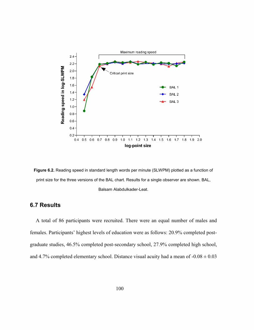
100
Figure 6.2. Reading speed in standard length words per minute (SLWPM) plotted as a function of
print size for the three versions of the BAL chart. Results for a single observer are shown. BAL,
Balsam Alabdulkader-Leat.
6.7 Results
A total of 86 participants were recruited. There were an equal number of males and
females. Participants’ highest levels of education were as follows: 20.9% completed post-
graduate studies, 46.5% completed post-secondary school, 27.9% completed high school,
and 4.7% completed elementary school. Distance visual acuity had a mean of -0.08 ± 0.03
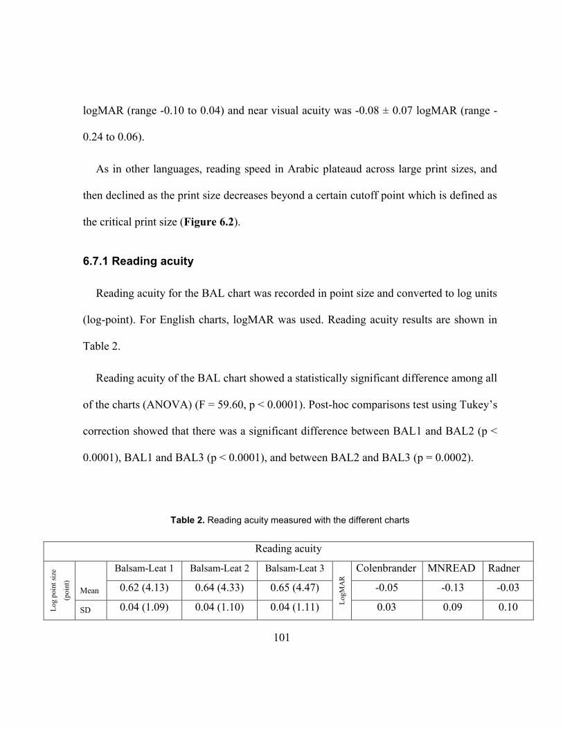
101
logMAR (range -0.10 to 0.04) and near visual acuity was -0.08 ± 0.07 logMAR (range -
0.24 to 0.06).
As in other languages, reading speed in Arabic plateaud across large print sizes, and
then declined as the print size decreases beyond a certain cutoff point which is defined as
the critical print size (Figure 6.2).
6.7.1 Reading acuity
Reading acuity for the BAL chart was recorded in point size and converted to log units
(log-point). For English charts, logMAR was used. Reading acuity results are shown in
Table 2.
Reading acuity of the BAL chart showed a statistically significant difference among all
of the charts (ANOVA) (F = 59.60, p < 0.0001). Post-hoc comparisons test using Tukey’s
correction showed that there was a significant difference between BAL1 and BAL2 (p <
0.0001), BAL1 and BAL3 (p < 0.0001), and between BAL2 and BAL3 (p = 0.0002).
Table 2. Reading acuity measured with the different charts
Reading acuity
Log
poin
t si
ze
(poin
t)
Mean
Balsam-Leat 1 Balsam-Leat 2 Balsam-Leat 3
Log
MA
R
Colenbrander MNREAD Radner
0.62 (4.13) 0.64 (4.33) 0.65 (4.47) -0.05 -0.13 -0.03
SD 0.04 (1.09) 0.04 (1.10) 0.04 (1.11) 0.03 0.09 0.10
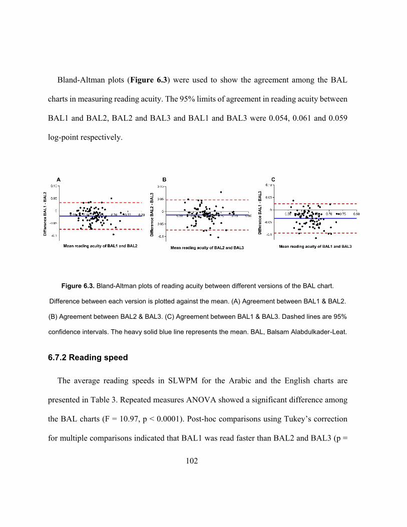
102
Bland-Altman plots (Figure 6.3) were used to show the agreement among the BAL
charts in measuring reading acuity. The 95% limits of agreement in reading acuity between
BAL1 and BAL2, BAL2 and BAL3 and BAL1 and BAL3 were 0.054, 0.061 and 0.059
log-point respectively.
Figure 6.3. Bland-Altman plots of reading acuity between different versions of the BAL chart.
Difference between each version is plotted against the mean. (A) Agreement between BAL1 & BAL2.
(B) Agreement between BAL2 & BAL3. (C) Agreement between BAL1 & BAL3. Dashed lines are 95%
confidence intervals. The heavy solid blue line represents the mean. BAL, Balsam Alabdulkader-Leat.
6.7.2 Reading speed
The average reading speeds in SLWPM for the Arabic and the English charts are
presented in Table 3. Repeated measures ANOVA showed a significant difference among
the BAL charts (F = 10.97, p < 0.0001). Post-hoc comparisons using Tukey’s correction
for multiple comparisons indicated that BAL1 was read faster than BAL2 and BAL3 (p =
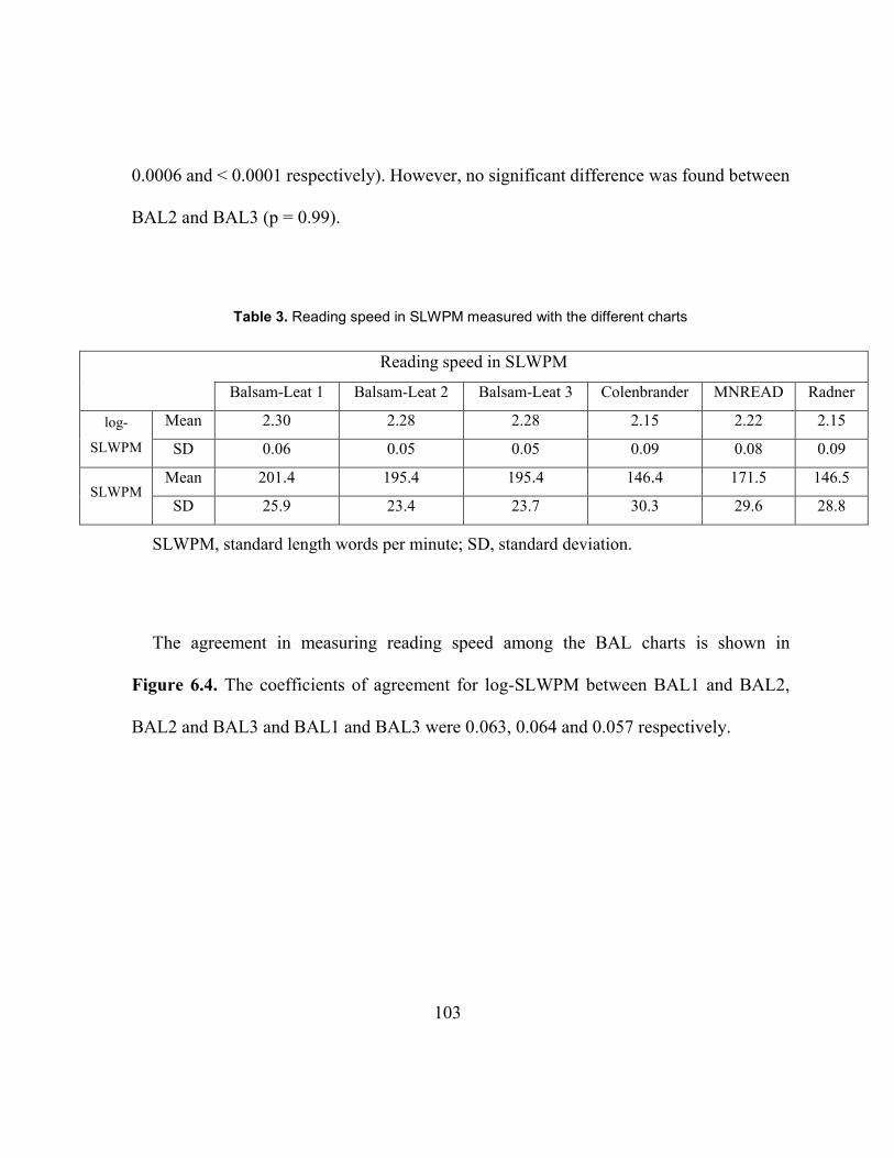
103
0.0006 and < 0.0001 respectively). However, no significant difference was found between
BAL2 and BAL3 (p = 0.99).
Table 3. Reading speed in SLWPM measured with the different charts
Reading speed in SLWPM
Balsam-Leat 1 Balsam-Leat 2 Balsam-Leat 3 Colenbrander MNREAD Radner
log-
SLWPM
Mean 2.30 2.28 2.28 2.15 2.22 2.15
SD 0.06 0.05 0.05 0.09 0.08 0.09
SLWPM Mean .201 4 195.4 .195 4 .146 4 171.5 146.5
SD 25.9 23.4 23.7 30.3 29.6 28.8
SLWPM, standard length words per minute; SD, standard deviation.
The agreement in measuring reading speed among the BAL charts is shown in
Figure 6.4. The coefficients of agreement for log-SLWPM between BAL1 and BAL2,
BAL2 and BAL3 and BAL1 and BAL3 were 0.063, 0.064 and 0.057 respectively.
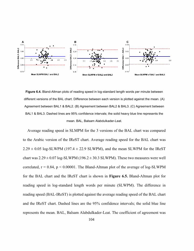
104
Figure 6.4. Bland-Altman plots of reading speed in log-standard length words per minute between
different versions of the BAL chart. Difference between each version is plotted against the mean. (A)
Agreement between BAL1 & BAL2. (B) Agreement between BAL2 & BAL3. (C) Agreement between
BAL1 & BAL3. Dashed lines are 95% confidence intervals; the solid heavy blue line represents the
mean. BAL, Balsam Alabdulkader-Leat.
Average reading speed in SLMPM for the 3 versions of the BAL chart was compared
to the Arabic version of the IReST chart. Average reading speed for the BAL chart was
2.29 ± 0.05 log-SLWPM (197.4 ± 22.9 SLWPM), and the mean SLWPM for the IReST
chart was 2.29 ± 0.07 log-SLWPM (196.2 ± 30.3 SLWPM). These two measures were well
correlated, r = 0.84, p < 0.00001. The Bland-Altman plot of the average of log-SLWPM
for the BAL chart and the IReST chart is shown in Figure 6.5. Bland-Altman plot for
reading speed in log-standard length words per minute (SLWPM). The difference in
reading speed (BAL-IReST) is plotted against the average reading speed of the BAL chart
and the IReST chart. Dashed lines are the 95% confidence intervals; the solid blue line
represents the mean. BAL, Balsam Alabdulkader-Leat. The coefficient of agreement was
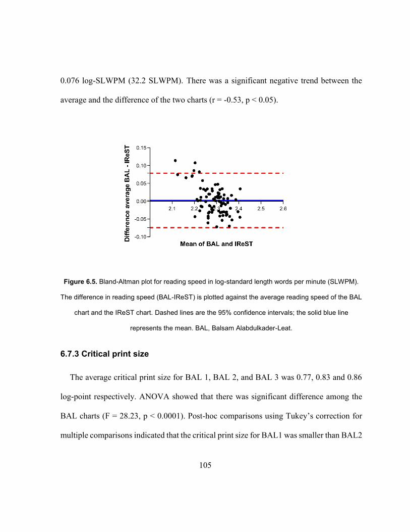
105
0.076 log-SLWPM (32.2 SLWPM). There was a significant negative trend between the
average and the difference of the two charts (r = -0.53, p < 0.05).
Figure 6.5. Bland-Altman plot for reading speed in log-standard length words per minute (SLWPM).
The difference in reading speed (BAL-IReST) is plotted against the average reading speed of the BAL
chart and the IReST chart. Dashed lines are the 95% confidence intervals; the solid blue line
represents the mean. BAL, Balsam Alabdulkader-Leat.
6.7.3 Critical print size
The average critical print size for BAL 1, BAL 2, and BAL 3 was 0.77, 0.83 and 0.86
log-point respectively. ANOVA showed that there was significant difference among the
BAL charts (F = 28.23, p < 0.0001). Post-hoc comparisons using Tukey’s correction for
multiple comparisons indicated that the critical print size for BAL1 was smaller than BAL2
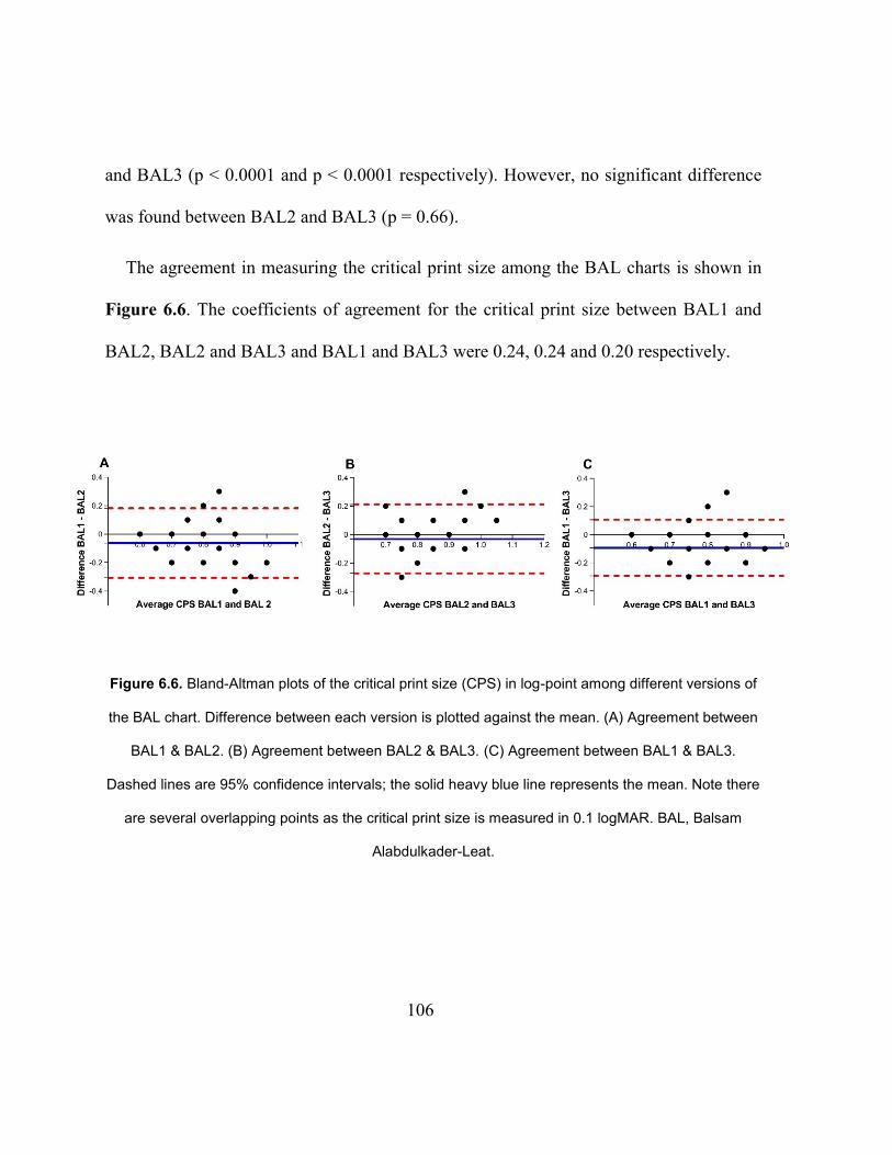
106
and BAL3 (p < 0.0001 and p < 0.0001 respectively). However, no significant difference
was found between BAL2 and BAL3 (p = 0.66).
The agreement in measuring the critical print size among the BAL charts is shown in
Figure 6.6. The coefficients of agreement for the critical print size between BAL1 and
BAL2, BAL2 and BAL3 and BAL1 and BAL3 were 0.24, 0.24 and 0.20 respectively.
Figure 6.6. Bland-Altman plots of the critical print size (CPS) in log-point among different versions of
the BAL chart. Difference between each version is plotted against the mean. (A) Agreement between
BAL1 & BAL2. (B) Agreement between BAL2 & BAL3. (C) Agreement between BAL1 & BAL3.
Dashed lines are 95% confidence intervals; the solid heavy blue line represents the mean. Note there
are several overlapping points as the critical print size is measured in 0.1 logMAR. BAL, Balsam
Alabdulkader-Leat.
107
6.8 Calibrating the chart
In order to label the BAL chart in terms of equivalent logMAR in English, a linear
regression between the average reading acuity of the BAL chart in the log-point was plotted
against reading acuity measured with the MNREAD chart in logMAR (Figure 6.7 – A)
and the Radner chart in logMAR (Figure 6.7 – B). From the regression equations, the
equivalent of 0.00 logMAR i.e. “normal” visual acuity, was calculated in log-point from
the MNREAD and Radner charts and was found to be 0.67 ± 0.005 log-point and 0.64 ±
0.003 log-point respectively (when the chart is held at 40 cm). The slopes of the regression
lines were 0.28 [CI 0.209, 0.346] and 0.25 [CI 0.181, 0.317] for the MNREAD and Radner
charts respectively. To ensure that the regression line intercepts and slopes were not
affected by any “floor” effect at the high acuity levels, due to printing resolution, the
regression was repeated after removing data from people with acuity in the highest two
levels (best acuities) in Arabic and the highest level in English. The intercepts and slopes
were not significantly changed. Normal visual acuity in Arabic log-point was calculated as
the average of the Radner and the MNREAD charts which is equal to 0.655 log-point which
was rounded to 0.7 log-point (5 point). The rest of the chart was labeled in 0.1 log steps
going smaller and larger. This makes the range of print sizes for the BAL chart to be from
1.1 to -0.3 logMAR when used at 40 cm. Participants’ average reading acuity using the
BAL chart was equivalent to -0.07 logMAR.
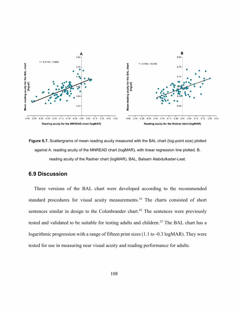
108
Figure 6.7. Scattergrams of mean reading acuity measured with the BAL chart (log-point size) plotted
against A. reading acuity of the MNREAD chart (logMAR), with linear regression line plotted. B.
reading acuity of the Radner chart (logMAR). BAL, Balsam Alabdulkader-Leat.
6.9 Discussion
Three versions of the BAL chart were developed according to the recommended
standard procedures for visual acuity measurements.16 The charts consisted of short
sentences similar in design to the Colenbrander chart.42 The sentences were previously
tested and validated to be suitable for testing adults and children.32 The BAL chart has a
logarithmic progression with a range of fifteen print sizes (1.1 to -0.3 logMAR). They were
tested for use in measuring near visual acuity and reading performance for adults.
109
A strength of the current study was the use of audio-recording to increase the accuracy
of timing to determine reading speed. Audio recordings are more repeatable than timing
with a stopwatch and decrease the variability of the measurement.22,94 There are limitations
in other studies that used a stop-watch90,95 which may affect the repeatability of the reading
speed measurement. When using a stopwatch to time reading speed, there is often a delay
in the reaction time of the researcher (when starting and stopping the timer). In this study,
reading time was calculated to the closest 0.01 second using GoldWave software. Other
studies mentioned variations due to number of examiners/raters,22,94 but in the present
study, all analyses of reading speed were done by one examiner, BA.
It is noteworthy that reading speed in Arabic followed the same typical reading speed
curve that is found in other languages.20,39,40 Reading speed plateaud across large print
sizes, and then declined as the print size decreased beyond the cutoff point which is defined
as the critical print size.
Reading acuity for the BAL chart was calculated and recorded in the log of the point
size, as point print is the only currently available measurement of print size in Arabic.
Reading acuity in Arabic recorded in log-point cannot be directly compared with the
acuities in English recorded in logMAR. LogMAR and other measures of print size are
based on the x-height5 of Roman letters. Therefore, we used an empirical method for
equating Arabic point to logMAR. The MNREAD and the Radner charts were chosen for
110
this comparison and not the Colenbrander as the Colenbrander chart demonstrated a floor
effect and underestimated participants’ visual acuity. The linear regression analysis
showed that the equivalent of 0.00 logMAR for the MNREAD and Radner charts were an
average of 0.655 which is equal to 0.7 log-point (5 point) at 40 cm. Since the sizes of the
BAL chart were physically scaled in 0.1 log steps, the rest of the chart was labeled in 0.1
logMAR steps based on that point of equivalence. Interestingly, the Arabic IReST chart
print size was compared with BAL print sizes. A letter from the Arabic alphabet (Alef) was
chosen for this comparison. Alef measured 2.2 mm on the 0.4 logMAR line of the BAL
chart (1 M on English charts) and 2.3 mm on the IReST chart (labelled as 1 M). These
similar measurements support the final labeling of the BAL chart but they need to be
interpreted with caution as it is unclear how the print size in the Arabic version of the
IReST chart was determined.
The relationship between log-point and logMAR shown in Figure 6.7 is linear, but it is
not a 1:1 relationship as would be expected, since reading acuity depends on the ability to
resolve the critical features in letters, so the same decrease in acuity would be expected to
affect Arabic and English similarly. Yet, the current study showed a slope that was
significantly less than 1. This does seem to be a robust finding as it was similar for the
MNREAD and Radner charts (slope of 0.28 and 0.25 respectively). Currently, there is no
definitive explanation of this finding, but it may be related to the fact that reading Arabic
111
seems to involve a different strategy than reading English. Arabic without vocalization
marks has many “heterophonic homographs” (words that are identical in spelling but
different in pronunciation and meaning). As many as every third word can be a
homograph.96 Thus understanding the context and grammatical construction is essential to
be completely sure of meaning and pronunciation in Arabic. In English, a reader does not
necessarily need this context in order to decode each word, although they do require these
skills for good comprehension.68 This major difference between Arabic and English means
that Arabic readers rely more on context compared to English readers.96 This may impact
how readers use visual information. The critical information may be different in the two
languages, with Arabic possibly requiring a more complex use of visual information and
relying on factors other than resolution. Although there is a large body of information on
the critical information needed to read English, there is little known regarding Arabic. This,
and how reading visual acuity in Arabic is associated with distance visual acuity, would be
an interesting area for future study.
The average reading acuity of this sample of participants for the BAL chart was 0.63
log- point at 40 cm (0.07 less than 0.7 log-point, which was equivalent to 0.00 logMAR)
and so is equivalent to -0.07 logMAR. This confirms that reading acuity measured with the
BAL chart is comparable to the average reading acuity measured with the Colenbrander,
MNREAD and Radner charts, which was -0.05, -0.13 and -0.03 logMAR respectively.
112
Although ANOVA showed that there was a statistically significant difference in reading
acuity among the different versions of the BAL chart, these differences are not clinically
significant.72 The maximum difference between any pair of charts in reading acuity was
0.03 log-point which is less than one line on a logMAR chart.
ANOVA showed that reading speeds measured with the three versions of the BAL chart
were statistically significantly different, but these differences would not be considered
clinically significant. The largest difference, which was between BAL1 and BAL3, was
0.02 log-SLWPM (6 SLWPM) and the coefficients of agreement were of the order of 0.06
log SLWPM, which is less than one line on a logMAR chart. There was good agreement
between average reading speed for the BAL chart in the present study which was 197.38
SLWPM and the reading speed measured in our previous study (187 SLWPM).32
There were some differences among the English charts in reading speed and reading
acuity. Although, all of them are logarithmic continuous text acuity charts, they have some
major differences in their designs such as typeface, the range of print sizes and the criteria
used for sentences creation and the degree to which the sentences were tested for equal
readability. These differences could explain the variations in the reading performance
results.97
In the current study, good validity of the BAL chart was demonstrated by very similar
average reading speed measured with the BAL and the IReST charts (197 ± 23 and 196 ±
113
30 respectively) and a high correlation between the two (r = 0.84). The coefficient of
agreement between the BAL chart and the IReST chart was 0.076 log-SLWPM (32.2
SWLPM), see Figure 6.5. However, the significant negative slope implies that slower
readers read the BAL chart faster compared to the IReST chart. This is likely because the
text of the IReST chart has a higher difficulty level compared to the BAL (grade 6 vs grade
3). These findings indicate good overall agreement despite the IReST chart having a longer
length of text and the higher grade level. This correlation between the BAL chart and the
IReST chart is better than that reported by Radner et al43 where reading speed between
short sentences and longer paragraphs was compared (r = 0.76). Also, it is better than that
found when the validity of the Turkish39 MNREAD was tested against a paragraph from a
newspaper (r = 0.62) or a journal article (r = 0.74). The good agreement in the present study
is despite the fact that reading speed for the IReST chart might be expected to be slower
because it uses grade six level text, whereas the BAL chart uses grade three, and that the
Arabic IReST texts were translated from the original German IReST texts.51 Many
scholars1,7,16,24 suggest it is better to compose novel texts for different languages in order
to allow for orthographic differences. Alternatively, studies1,30,42 have shown that reading
speed for passages is higher or similar to reading short sentences. However, the comparison
between the BAL chart in our study and the results of the IReST Arabic charts in
Trauzettel-Klosinski et al.51 must be interpreted with caution due to differences in reading
speed calculation. In the current study, reading speed for all charts took into account the
114
number of errors that were made, but errors were not included in the reading speed analysis
in the Arabic IReST study.51
It is interesting to compare reading speed in different languages. In the present study,
BAL reading speed (197.0 ± 23 SLWPM) was higher than MNREAD reading speed (172
± 30 SLWPM) and the other English charts. In contrast, Trauzettel-Klosinski et al.51
compared reading speed in 17 different languages and reported that Arabic had the slowest
reading speed across all languages. They suggested that it was due to the absence or partial
absence of written vowels.51 As described above, Arabic has a cognitively and visually
demanding nature which may result in slower reading speeds in comparison to English and
a variety of other languages. Likewise, Cheung et al,41 suggested that recognizing stroke
configuration in the Chinese language may explain the slower reading speeds found in
Chinese (when compared to other languages). In the IReST study, however, different
participant groups were reading each language, which may cause differences. In the present
study, the same participants read English and Arabic. Although the participants were
chosen to be fluent in both languages, some of them may have been more fluent in Arabic.
Buari et al53 compared reading speed using the UiTM Malay reading chart with both the
MNREAD and the Colenbrander charts. Reading speed for the Colenbrander and
MNREAD charts was 194 wpm and 196 wpm respectively which are higher than the results
of the current study (146 and 172 SLWPM respectively). In the Buari et al53 study, actual
115
correct words were counted, and not standard length words, which accounts for some
difference in the results. Recently, Calabr`ese et al97 published baseline data for reading
performance measurements using the MNREAD chart. They evaluated the results for
several age groups, different examiners, and different testing locations. They showed that
reading speed becomes stable at an age range from 16 to 40 years at 200 ± 25 wpm which
was higher than the current study (172 SLWPM). In their study97 they calculated the
reading speed in standard length words, but it appears that they counted errors of actual
words, rather than calculated as standard word length (i.e. based on numbers of incorrect
characters). As they suggested, some dissimilarity might be accounted for by these
methodological factors.
The coefficient of agreement between the BAL charts for reading acuity was 0.06
logMAR (corresponding to slightly more than half a line) and for reading speed was 0.06
log-SLWPM (corresponding to 28 SLWPM). This level of agreement compares favorably
with other studies and charts.19,35,43 Subramanian and Pardhan95 measured the repeatability
for the English MNREAD charts. The coefficient of repeatability was found to be ± 0.05
logMAR for reading acuity and ± 8.6 wpm for reading speed. The results obtained from
the current study are better than the coefficient of agreement reported for the Swedish
chart49 which was 0.1 logMAR or less for reading acuity and 23 wpm for maximum reading
speed. Cheung et al.41 recently developed a new Chinese chart for children and found a
116
coefficient of agreement between different versions of the chart of ± 0.15 logMAR for
reading acuity and ± 0.11 log-wpm (37 wpm) for maximum reading speed. There is some
evidence100–102 suggesting that children have lower reading speed and larger individual
variability compared to adults, which could result in poorer repeatability.
The coefficient of agreement between the BAL charts for the critical print size was 0.23
log-point. This is higher than that found by Subramanian and Pardhan for the MNREAD
charts95 (± 0.12 logMAR). It is not certain why this difference exists. It might be due to
differences in calculation methods (which is not totally specified in their paper) or because
their participant sample is more uniform (University students and all with visual acuity 6/6
or better). Or there may be some differences in Arabic and English. This could be an area
for future study. However, it does imply that the BAL charts are more reliable for
measuring reading acuity and reading speed than critical print size.
6.10 Conclusions
The three versions of the BAL chart have been validated and showed high inter-chart
agreement indicating that they can be recommended for clinical and research use. The BAL
chart is the first Arabic standardized continuous text near visual acuity chart and will make
a very useful addition to the assessment of near reading performance in Arabic-speaking
countries, as it is convenient and easy to use by clinicians.
117
6.11 Acknowledgments
This study is funded by King Saud University, Saudi Arabia. The authors would like to
thank Dr. Khalid Jamous for his help in recruiting participants in Riyadh, Saudi Arabia.
We also thank Dr. Gordon Legge for his valuable comments.
The authors have an interest in the potential commercialization of these charts.
118
Chapter 7
GENERAL DISCUSSION AND CONCLUSIONS
7.1 Discussion
The assessment of near visual acuity and reading performance is an essential step in
assessing near performance and requires the use of a standardized continuous text near
visual acuity chart to ensure reliable and repeated results. Such charts are available in many
languages but not in Arabic even though it is ranked the fourth in the world’s spoken
language based on the number of first language speakers. There are no standardized
continuous text charts in Arabic, which has made the use of unstandardized charts very
common. Some of the unstandardized charts have been created and printed by clinicians
for use in their clinics. However, the vast majority of unstandardized charts that are used
regularly in clinics are freely distributed by eye-care companies for advertisement
purposes. Neither type of chart has been developed according to standardized procedures,
and have not been tested for reliability. The use of unstandardized chart increases the
variability of visual acuity measurements, as the results depend on the chart in use by a
particular clinic within a specific country and therefore would not be repeatable across
different locations or Arabic-speaking countries. This inconsistency in measurements may
cause problems on the individual patient level for example when patients are seen by
different health professionals and on the organizational level for example, the WHO which
119
needs standardized measurements in tracking health phenomena across different regions.
The work detailed in this thesis was motivated with the aim of developing a standardized
continuous text near visual acuity chart for near acuity measurement for the assessment of
near reading performance in Arabic-speaking countries. Within the course of this thesis,
the rationale and the major decisions in the development of the new chart; The Balsam
Alabdulkader-Leat chart (BAL) have been discussed in detail.
The major challenge in this study was the large number of questions left unaddressed in
the literature on the visual aspects of reading in Arabic. What are the visual requirements
for reading in Arabic? What are the effects of Arabic fonts on the legibility of letters and
words? What is the most frequently used typeface in Arabic print, and is it the most legible?
What is the average reading speed for adults and children with normal vision in Arabic?
How does the visual process of reading Arabic work? What is the equivalent of the x-
height? How are print sizes defined?
In contrast, readability and what affects reading in English has been studied extensively.
Legge has published numerous studies about the psychophysics of reading in people with
normal and low vision and summarized them in his book.20 This knownledge made the
development of visual acuity charts in languages that use Roman letters easier, as letter
sizes can be defined by using the x-height. Arabic is a Semitic language that uses a different
120
alphabet, which made every decision in developing the BAL chart a new challenge because
of the lack of information.
The importance of the choice of typeface (Chapter 3) has been studied and discussed in
the literature. Different typefaces with different characteristics may affect the legibility of
letters.24–26 Thus, the choice of typeface may ultimately affect the resulting visual acuity
measurements and reading speed. This fact made the choice of typeface an important first
step in designing the BAL chart. Many scholars have reported that the most commonly
used font in a language would be the optimal choice of typeface for the use in a visual
acuity chart. That is the font that is used in everyday printing materials (newspapers,
books). To the author’s knowledge, the legibility of Arabic typefaces and the most
commonly used typeface in Arabic has not been studied or reported. Another challenge
was the utilization of ligatures in Arabic script. Ligatures may cause crowding, which can
significantly affect visual acuity. An investigation and comparison between different
newspaper fonts and Microsoft Word fonts was carried out. Microsoft Word fonts were
chosen as they are available to Microsoft users, which would make this study easily
repeatable by others. A method of superimposing Microsoft fonts against newspaper fonts
against bright light was attempted. Direct comparison between the two fonts was not
possible as the paper quality of the newspaper was poor, and between-line spacing and
justification of newspapers are very different. As a result, this method was abandoned.
121
Initially, Times New Roman and Arial fonts were chosen as they do not use ligatures.
What is surprising is that Arabic Times New Roman and Arial fonts in Arabic Microsoft
Word were visually almost identical. It is known that the major difference between the two
fonts in English is that Arial is a sans-serif font, whereas Time New Roman is a serif font.
However, both fonts in Arabic have serifs! A formal comparison between the two fonts in
Arabic by superimposing them against each other electronically, was carried out. The
differences were minute and probably not significant. The final decision was to use Times
New Roman font as it does not utilize ligatures, it is commonly used in Arabic and it has
been used in other reading acuity charts in several languages.
Standardized sentences are required for continuous text near acuity charts. There is now
a body of literature showing how the sentences should be developed according to well-
established criteria. Then, they have to be tested for equal readability. Some major
decisions were made in creating and composing sentences for the BAL chart (Chapter 4).
One of the methods suggested to create sentences is to compose them from lists of the most
frequent words used in school books of a specific grade. To the author’s knowledge, this
information was not available in Arabic. The final decision was to compose sentences that
are inspired by grade 3 school books from different Arabic-speaking countries. Then, the
composed sentences were reviewed by Arabic language experts and the final pool of
sentences was tested and validated by recruiting grade 3 children. Another concern at the
122
stage of composing sentences was the use vocalization marks. Vocalization marks in
Arabic can be compared to accents in other languages. For creating text for visual acuity
charts, one possibility would be to use accents where they naturally appear in text.20
Instead, it was decided to use unvocalized text because vocalization marks are absent in
regular everyday reading materials. In addition, the use of vocalization marks may increase
crowding. One of the challenges as a result of this decision was the need to avoid a common
grammatical case called (منصوب). The closest thing to this in English is the genitive case
where a noun modifies another noun. This grammatical case was avoided as using it would
require the use of vocalization marks.
A large pool of candidate sentences was composed according to the accepted criteria
(Section 1.1.2.3.1) and tested in children and adults with normal vision. Elimination criteria
were established to exclude sentences with a high variability in reading speed and high
number of errors. The final sub-set of the sentences had equal readability and was chosen
as the sentences were highly comparable. Those sentences were used in the construction of
three versions of the BAL chart. It is interesting to note that two measures of reading speed
(CWPM and SLWPM) were determined. The results showed that there was no difference
in the variability pf reading speed between these two measures.
The next step was the layout of the sentences on the chart. Spacing between lines of the
same level and spacing between print size levels followed the recommend logarithmic scale
123
for standardized visual acuity charts. The method of defining spacing was discussed
in Chapter 5. As Arabic letters have various heights, it was imperative to ensure that the
highest ascender from one line does not touch the lowest descender from the line above
and vice versa.
The validation of BAL chart was discussed in Chapter 6. Reading speed and reading
acuity were compared between the three versions of the BAL charts. Bland-Altman plots
were used to test the agreement between the three versions of the BAL charts. The
coefficients of agreement between the different versions of BAL charts in reading acuity
and reading speed were calculated and showed good inter-chart agreement. This agreement
is similar to that for standardized charts in other languages. In addition, reading speed with
the BAL chart was compared with the Arabic version of the IReST chart to validate the
BAL charts in terms of measuring reading speed. Furthermore, a linear regression plot of
the average reading acuity measured with the BAL chart against the reading acuity
measured with MNREAD and Radner charts was used to calibrate normal acuity in Arabic
print size (0.00 logMAR). This calibration was used to label the rest of the chart
accordingly. So that future charts can be printed in the same print size, rather than
undertaking this empirical calibration again, and to create a standard, the height of the Alef
letter was measured. The 50 pt Alef measured 10.08 mm from the top tip to the bottom (ا)
tip, and 5 pt and other size levels can be scaled from this.
124
Arabic newspapers’ print size was compared with BAL print sizes as an additional
evaluation of the final print size labeling of the chart. A letter from the Arabic alphabet
(Alef) was chosen for this comparison. Alef’s length was measured in four different
newspapers and it varied between the different newspapers and within each newspaper.
Generally, it was larger on the front and back pages, and at the beginning of the different
sections within the newspaper. Alef’s length ranged between 1.9 to 2.2 mm with an average
of 2.1 mm. On the BAL chart, Alef measured 2.2 mm on the 0.4 logMAR line (0.4 logMAR
is equivalent to 1M at 40 cm). This is similar to English newspapers’ print size. A note of
caution is due here since print size in Roman letters is measured by the x-height whereas
in Arabic a similar measurement cannot be done. This comparison was an estimation of
Arabic newspapers print size to provide some support of similarity between Arabic letters
and Roman letters.
One unanticipated finding was that the relationship between reading in Arabic and
English was not 1:1. This was shown by the shallow slopes of reading acuity with the BAL
chart against the MNREAD chart (Figure 6.7 - A), and between the BAL chart and the
Radner chart (Figure 6.7 - B). As the same association between the BAL chart and the
MNREAD and Radner charts was found, this result seems to be a consistent, robust finding.
Furthermore, the same slope was found when the highest acuity points were removed,
which might have been influenced by a floor effect for the smallest print sizes. The reason
125
for this finding is not clear, but it may be related to the different reading strategies used in
Arabic and English. Arabic readers rely more on context compared to English readers as
reading in English can be undertaken word by word. Although the effect of context was
equated to be equal down the BAL chart (by choosing sentences of equal readability), it
was not eliminated. Reading acuity measurement takes into account the number of errors
made, so as print size gets smaller one can guess some words correctly when reading
English text. However, in reading Arabic, as the print gets smaller, if one cannot read/guess
the first word or two, it becomes very challenging to read the rest of the sentence. This is
true for Arabic without vocalization marks (which was used for the BAL chart) as
“heterophonic homographs” are very common. As many as every third word in a passage
can be a homograph.96
Reading Arabic and reading English seems to involve different cognitive processes with
various uses of complex visual information, and the critical information in the script seems
to be different and used differently. The process seems to be more “global” in Arabic and
“local” in English, so it is hard to predict how they relate as they are different languages
with different scripts. To the author’s knowledge, the relationship between reading English
and other languages that do not use Roman letters has not been evaluated in a similar way.
Chinese and Japanese languages are considered non-alphabetical languages and do not use
Roman letters. However, Chinese and Japanese characters can be fitted into an equal square
126
area and this can be used to specify the print size. Therefore, similar comparisons in these
languages have not been done to specify print size. What causes this difference in the slope
is yet to be determined. At present, there is very little research on reading in Arabic and
how it responds to blur, reduced information content, reduced contrast, etc., in contrast to
the large body of research on English.29,34,35,103 This knowledge gap is obviously a potential
area of research.
The BAL chart can play a major role in assessing patients with low vision as it has a
wide range of print sizes (largest print size is 1.1 logMAR). In addition, the logarithmic
scale of the BAL chart allows testing at non-standard testing distances as the ratio between
the adjacent sentences is the same regardless of the viewing distance. Using a shorter
viewing distance will shift the range of print size to a higher range (viewing at 10 cm will
make the largest print size 1.7 logMAR). The logarithmic scale also allows accurate
calculation of magnification. For example, 3 lines difference on the chart between the
measured and the goal print size is always a factor of 2x.
7.2 Conclusion
The BAL chart was created using well accepted principles and was shown to have good
agreement for measuring visual acuity and reading speed. The BAL chart is expected to be
used in assessing reading performance in Arabic-speaking countries as it is quick,
convenient, and easy to use by clinicians.
127
7.3 Future work
The work of this thesis is the first of its kind. Many aspects of reading Arabic text are
not known and have yet to be studied. Research questions that could be asked include the
following. What is the effect of reduced contrast, reduced information, and blur in reading
Arabic? What are the visual reading requirements in Arabic? How much acuity reserve is
needed? In future investigations, it might be possible to use a single letter chart in Arabic
and compare it with the BAL chart. Such a study could explain the role of context in reading
Arabic and could explain the shallow slope that was found in this study. However, the
challenge would be that there are no commercially-available single letter near acuity charts
in Arabic. Another study could look at critical information in reading Arabic. In addition,
a number of possible future studies could be carried out to establish the role and pattern of
eye movements in reading in Arabic. Currently, it is unknown whether both the length of
saccades and the duration of fixations are the same for readers of Arabic and readers in
English. Reading unvocalized text in Arabic relies on context, which might make the cycle
of saccades and fixations very different compared to that of English. Eye movements in
reading Arabic is a new area that has to be investigated, and such studies might also help
to explain why reading speed in Arabic is slower compared to that in 17 other languages.51
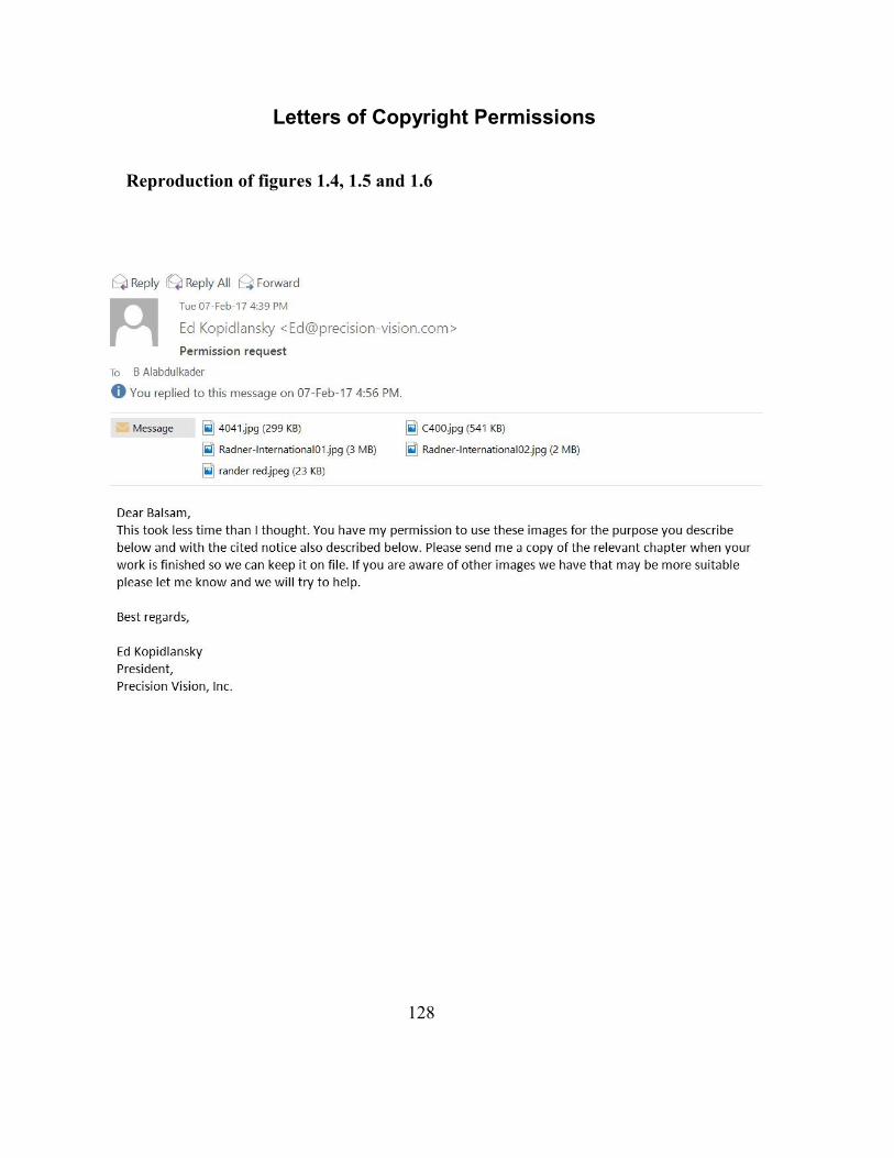
128
Letters of Copyright Permissions
Reproduction of figures 1.4, 1.5 and 1.6
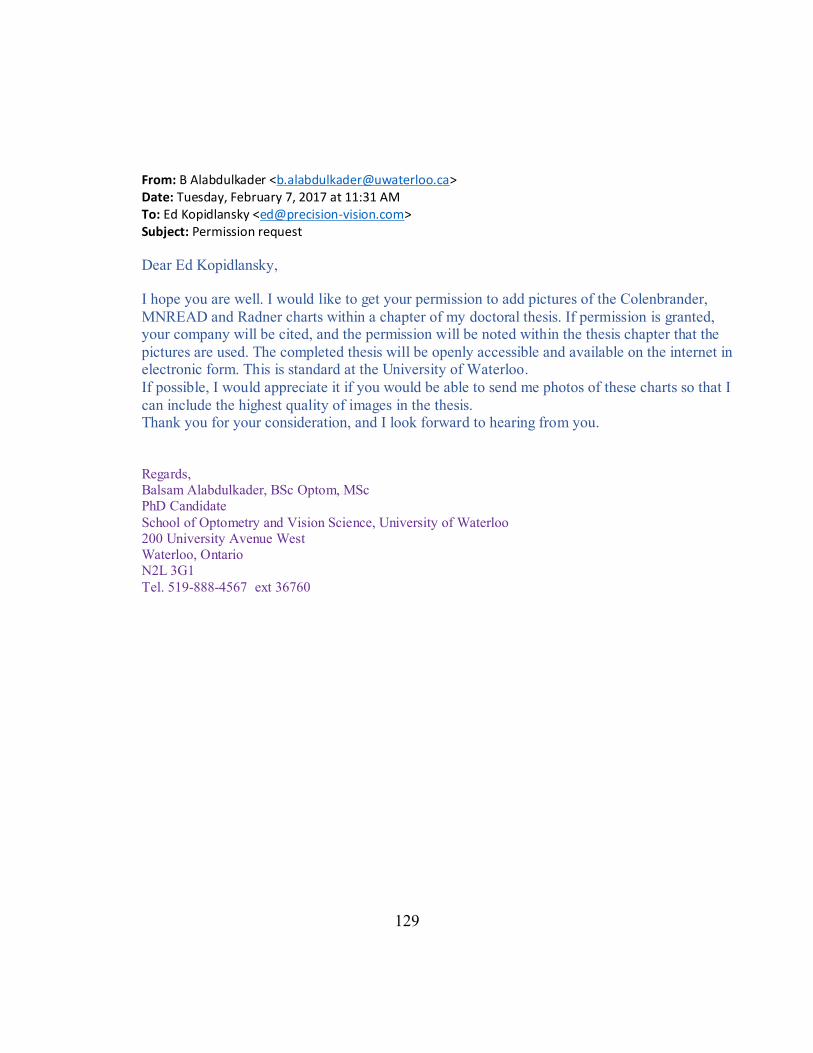
129
From: B Alabdulkader <[email protected]> Date: Tuesday, February 7, 2017 at 11:31 AM To: Ed Kopidlansky <[email protected]> Subject: Permission request
Dear Ed Kopidlansky, I hope you are well. I would like to get your permission to add pictures of the Colenbrander,
MNREAD and Radner charts within a chapter of my doctoral thesis. If permission is granted, your company will be cited, and the permission will be noted within the thesis chapter that the
pictures are used. The completed thesis will be openly accessible and available on the internet in electronic form. This is standard at the University of Waterloo.
If possible, I would appreciate it if you would be able to send me photos of these charts so that I
can include the highest quality of images in the thesis. Thank you for your consideration, and I look forward to hearing from you. Regards, Balsam Alabdulkader, BSc Optom, MSc PhD Candidate
School of Optometry and Vision Science, University of Waterloo 200 University Avenue West Waterloo, Ontario N2L 3G1
Tel. 519-888-4567 ext 36760
130
Sharing manuscript for chapter 4
TOWARD DEVELOPING A STANDARDIZED ARABIC CONTINUOUS TEXT
READING CHART
Balsam Alabdulkader*, Susan Jennifer Leat
School of Optometry and Vision Science, University of Waterloo
This chapter has been published as follows:
Alabdulkader B, Leat SJ. Toward developing a standardized Arabic continuous text
reading chart. J Optom 2017;10:84-94
© 2017. This manuscript version is made available under the CC-BY-NC-ND 4.0 license
http://creativecommons.org/licenses/by-nc-nd/4.0/
Author Concept/Design Acquisition of Data Analysis Write up/Publication
Alabdulkader
Leat
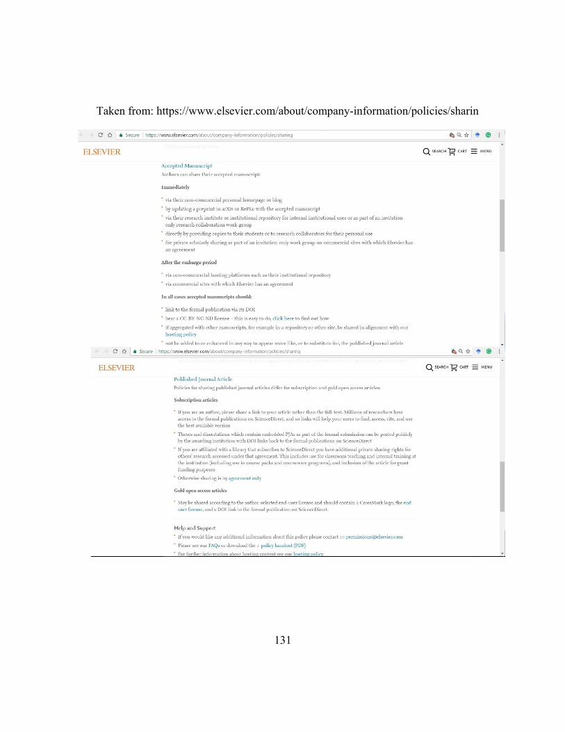
131
Taken from: https://www.elsevier.com/about/company-information/policies/sharin
132
Reproduction of chapter 6
A STANDARDIZED ARABIC READING ACUITY CHART: THE BAL CHART
Balsam Alabdulkader*, Susan Jennifer Leat
School of Optometry and Vision Science, University of Waterloo
“Reproduced with permission from: Alabdulkader B, Leat SJ. A standardized Arabic
reading acuity chart: The BAL Chart. Optom Vis Sci 2017;94: submitted. ©The American
Academy of Optometry 2017.”
Author Concept/Design Acquisition of Data Analysis Write up/Publication
Alabdulkader
Leat
133
From: OVS [mailto:[email protected]] Sent: Thursday, January 12, 2017 12:36 PM To: B Alabdulkader <[email protected]> Subject: RE: OVS16417 permission to reproduce in thesis granted Hi Balsam, Permission is granted to reproduce your article, currently under revision, in our thesis. Please see the conditions you must follow below. Please also add the following statement to the reproduced article (you can update it if/when your submission is accepted/published): “Reproduced with permission from: Alabdulkader B, Leat SJ. A standardized Arabic reading acuity chart: The BAL Chart. Optom Vis Sci 2017;94:submitted. ©The American Academy of Optometry 2017.” Please let me know if you have any other questions. Best wishes, Kurt ************************************************** Optometry and Vision Science Kurt A. Zadnik, Managing Editor The Ohio State University, College of Optometry 338 West 10th Avenue Columbus, OH 43210 Tel: (614) 292-4942; Fax: (614) 292-4949; e-mail: [email protected] http://ovs.edmgr.com **************************************************
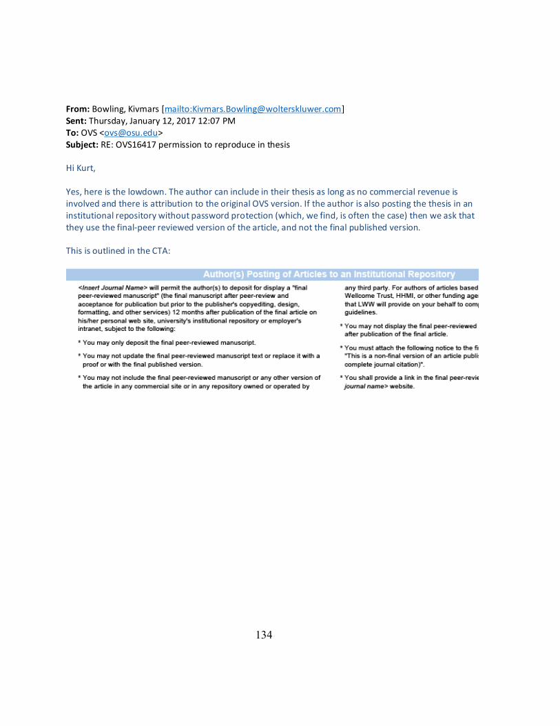
134
From: Bowling, Kivmars [mailto:[email protected]] Sent: Thursday, January 12, 2017 12:07 PM To: OVS <[email protected]> Subject: RE: OVS16417 permission to reproduce in thesis Hi Kurt, Yes, here is the lowdown. The author can include in their thesis as long as no commercial revenue is involved and there is attribution to the original OVS version. If the author is also posting the thesis in an institutional repository without password protection (which, we find, is often the case) then we ask that they use the final-peer reviewed version of the article, and not the final published version. This is outlined in the CTA:
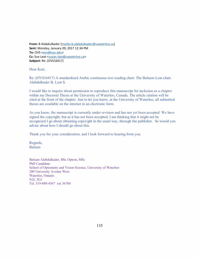
135
From: B Alabdulkader [mailto:[email protected]] Sent: Monday, January 09, 2017 12:34 PM To: OVS <[email protected]> Cc: Sue Leat <[email protected]> Subject: Re: (OVS16417)
Dear Kurt,
Re: )OVS16417) A standardized Arabic continuous text reading chart: The Balsam-Leat chart.
Alabdulkader B, Leat S.
I would like to inquire about permission to reproduce this manuscript for inclusion as a chapter
within my Doctoral Thesis at the University of Waterloo, Canada. The article citation will be cited at the front of the chapter. Just to let you know, at the University of Waterloo, all submitted
theses are available on the internet in an electronic form.
As you know, the manuscript is currently under revision and has not yet been accepted. We have
signed the copyright, but as it has not been accepted, I am thinking that it might not be recognized I go about obtaining copyright in the usual way, through the publisher. So would you
advise about how I should go about this.
Thank you for your consideration, and I look forward to hearing from you.
Regards,
Balsam
Balsam Alabdulkader, BSc Optom, MSc
PhD Candidate
School of Optometry and Vision Science, University of Waterloo
200 University Avenue West
Waterloo, Ontario
N2L 3G1
Tel. 519-888-4567 ext 36760
136
Bibliography
1. Vanden Bosch M, Wall M. Visual acuity scored by the letter-by-letter or probit methods
has lower retest variability than the line assignment method. Eye 1997;11:411–7.
2. Leat S, Shute R, Westall C. Assessing Children’s Vision: A Handbook. Oxford; Boston:
Butterworth-Heinemann; 1999.
3. Schwartz S. Visual Perception a Clinical Orientation. fourth. New York, NY: McGraw-
Hill; 2009.
4. Snellen H. Letterproeven Tot Bepaling Der Gezigtsscherpte. Utrecht: P. W. van de
weijer; 1862.
5. Legge G, Bigelow C. Does print size matter for reading? A review of findings from
vision science and typography. J Vis 2011;11:1–22.
6. Snellen H. Test-Types for the Determination of the Acuteness of Vision. Utrecht: P. W.
van de weijer; 1862.
7. Green J. Notes on the clinical determination of the acuteness of vision, including the
construction and gradation of optotypes, and on systems of notation. Trans Am
Ophthalmol Soc 1905:644–54.
8. Bailey I, Lovie J. New design principles for visual acuity letter charts. Am J Optom
Physiol Opt 1976;53:740–5.
137
9. Bennett A. Ophthalmic test types. A review of previous work and discussions on some
controversial questions. Br J Physiol Opt 1965;22:238–71.
10. Benjamin W. Borish’s Clinical Refraction. 2nd ed. Oxford: Butterworth-Heinemann;
2006.
11. Raasch T, Bailey I, Bullimore M. Repeatability of visual acuity measurement. Optom
Vis Sci 1998;75:342–8.
12. Ferris III F, Bresnick G, Bailey I. New visual acuity charts for clinical research. Am J
Ophthalmol 1982;94:91–6.
13. Sloan L. New test charts for the measurement of visual acuity at far and near distances.
Am J Ophthalmol 1959;48:807–13.
14. Ferris F, Bailey I. Standardizing the measurement of visual acuity for clinical research
studies: Guidelines from the Eye Care Technology Forum. Ophthalmology
1996;103:181–2.
15. Bailey I, Bullimore M, Raasch TW, Taylor HR. Clinical grading and the effects of
scaling. Invest Ophthalmol Vis Sci 1991;32:422–32.
16. National Reseach Committee on Vision. Recommended standards procedures for the
clinical measurements and specification of visual acuity. Adv Ophthalmol
1980;41:103–48.
17. Colenbrander A. Visual acuity measurement standard. Ital J Ophthalmol 1988:1–15.
138
18. Runge P. Eduard Jaeger’s Test-Types (Schrift-Scalen) and the historical development
of vision tests. Trans Am Ophthalmol Soc 2000;98:375–438.
19. Bailey I, Lovie J. The design and use of a new near-vision chart. Am J Optom Physiol
Opt 1980;57:378–87.
20. Legge G. Psychophysics of Reading in Normal and Low Vision. Mahwah, NJ:
Lawrence Erlbaum; 2007.
21. Ahn S, Legge G, Luebker A. Printed cards for measuring low-vision reading speed.
Vision Res 1995;35:1939–44.
22. Brussee T, Nispen R, Rens G. Measurement properties of continuous text reading
performance tests. Ophthalmic Physiol Opt 2014;34:636–57.
23. Brussee T, van Nispen R, Klerkx E, Knol D, van Rens G. Comparison of reading
performance tests concerning difficulty of sentences and paragraphs and their reliability.
Ophthalmic Physiol Opt 2015;35:324–35.
24. Mansfield J, Legge G, Bane M. Psychophysics of reading. XV: Font effects in normal
and low vision. Invest Ophthalmol Vis Sci 1996;37:1492–501.
25. Yager D, Aquilante K, Plass R. High and low luminance letters, acuity reserve, and font
effects on reading speed. Vision Res 1998;38:2527–31.
26. Arditi A, Cho J. Serifs and font legibility. Vision Res 2005;45:2926–33.
27. Rubin G, Feely M, Perera S, Ekstrom K, Williamson E. The effect of font and line width
139
on reading speed in people with mild to moderate vision loss. Ophthalmic Physiol Opt
2006;26:545–54.
28. Bernard M, Chaparro B, Mills M, Halcomb C. Comparing the effects of text size and
format on the readibility of computer-displayed Times New Roman and Arial text. Int J
Hum Comput Stud 2003;59:823–35.
29. Legge G, Pelli D, Rubin G, Schleske M. Psychophysics of reading-I. Normal vision.
Vision Res 1985;25:239–52.
30. Carver R. Word Length, prose difficulty, and reading rate. J Lit Res 1976;8:193–204.
31. Carver R. Reading Rate : A Review of Research and Theory. San Diego, CA: Academic
Press; 1990.
32. Alabdulkader B, Leat SJ. Toward developing a standardized Arabic continuous text
reading chart. J Optom 2017;10:84-94
33. Cheung S, Kallie C, Legge G, Cheong A. Nonlinear mixed-effects modeling of
MNREAD data. Invest Ophthalmol Vis Sci 2008;49:828–35.
34. Chung S, Mansfield J, Legge G. Psychophysics of reading. XVIII. The effect of print
size on reading speed in normal peripheral vision. Vision Res 1998;38:2949–62.
35. Whittaker S, Lovie-Kitchin J. Visual requirements for reading. Optom Vis Sci
1993;70:54–65.
36. Mansfield J, Ahn S, Legge G, Luebker A. A new reading-acuity chart for normal and
140
low vision. Ophthalmic Vis Opt Assess Vis Syst Tech Dig 1993;3:232–235.
37. Oda , Mansfield J, Legge G. MNREAD-J: new reading acuity charts for prescribing low
vision aids. In: Proceedings of the 7th Annual Meeting of the Japanese Association of
Rehabilitation for the Visually Impaired. Vol ; 1998:27–8.
38. Mataftsi A, Bourtoulamaiou A, Haidich A, Antoniadis A, Kilintzis V, Tsinopoulos I,
Dimitrakos S. Development and validation of the Greek version of the MNREAD acuity
chart. Clin Exp Optom 2013;96:25–31.
39. Idil ŞA, Çalişkan D, Idil N. Development and validation of the Turkish version of the
MNREAD visual acuity charts. Turkish J Med Sci 2011;41:565–70.
40. de Castro C, Kallie C, Solamão S. Development and validation of the MNREAD reading
acuity chart in Portuguese. Arq Bras Oftalmol 2005;68:777–83.
41. Cheung J, Liu D, Lam C, Cheong A. Development and validation of a new Chinese
reading chart for children. Ophthalmic Physiol Opt 2015;35:514–21.
42. Colenbrander A, Fletcher DC. The mixed contrast reading card, a new screening test for
contrast sensitivity. In: Jones S, Rubin G, Hamlin D, eds. International Congress Series.
Vol 1282. London, United kingdom: Elsevier International Congress Series; 2005:492–
7.
43. Radner W, Diendorfer G. English sentence optotypes for measuring reading acuity and
speed - the English version of the Radner reading charts. Graefe’s Arch Clin Exp
141
Ophthalmol 2014;252:1297–303.
44. Radner W, Obermayer W, Richter-Mueksch S, Willinger U, Velikay-Parel M,
Eisenwort B. The validity and reliability of short German sentences for measuring
reading speed. Graefe’s Arch Clin Exp Ophthalmol 2002;240:461–7.
45. Alió J, Radner W, Plaza-Puche A, Ortiz D, Neipp M, Quiles M, Rodríguez-Marín J.
Design of short Spanish sentences for measuring reading performance: Radner-Vissum
test. J Cataract Refract Surg 2008;34:638–42.
46. Maaijwee K, Mulder P, Radner W, Van Meurs J, Meurs J. Reliability testing of the
Dutch version of the Radner reading charts. Optom Vis Sci 2008;85:353–8.
47. Munch I, Jørgensen A-H, Radner W. The Danish version of the Radner reading chart:
design and empirical testing of sentence optotypes in subjects of varying educational
background. Acta Ophthalmol 2015;94:182–6.
48. Calossi A, Boccardo L, Fossetti A, Radner W. Design of short Italian sentences to assess
near vision performance. J Optom 2014;7:203–9.
49. Thaung J, Olseke K, Ahl J, Sjöstrand J. Reliability of a standardized test in Swedish for
evaluation of reading performance in healthy eyes. Interchart and test-retest analyses.
Acta Ophthalmol 2014;92:557–62.
50. Rosa A, Farinha C, Radner W, Diendorfer G, Loureiro M, Murta J. Development of the
Portuguese version of a standardized reading test : the Radner-Coimbra Charts. Arq
142
Bras Oftalmol 2016;79:238–42.
51. Trauzettel-Klosinski S, Dietz K. Standardized assessment of reading performance: the
new International reading speed texts IReST. Invest Ophthalmol Vis Sci 2012;53:5452–
61.
52. Hahn G, Penka D, Gehrlich C, Messias A, Weismann M, Hyvärinen L, Leinonen M,
Feely M, Rubin G, Dauxerre C, Vital-Durand F, Featherston S, Dietz K, Trauzettel-
Klosinski S. New standardised texts for assessing reading performance in four European
languages. Br J Ophthalmol 2006;90:480–4.
53. Buari N, Chen A-H, Musa N. Comparison of reading speed with 3 different log-scaled
reading charts. J Optom 2014;7:210–6.
54. Jafarzadehpur E, Hashemi H, Abdollahinia T, Norouzirad R, Yekta A,
Ostadimoghaddam H, Khabazkhoob M. Design and validation of Persian near reading
card: A pilot study. Iran J Ophthalmol 2013;25:216–21.
55. Emarah M. Arabic test types. Br J Ophthalmol 1968;52:489–91.
56. Al-Salem M. Arabic reading types. Br J Ophthalmol 1986;70:314–6.
57. Al-Samarrai A. Modified Arabic test chart for near and far vision. Med Princ Pract
1989;1:170–3.
58. Al-Khattabi S, Oduntan A. Arabic visual acuity chart for low vision examination.
Ophthalmic Physiol Opt 1994;14:314–6.
143
59. Oduntan A. Arabic near test chart for partially sighted patients. Ophthalmic Physiol Opt
1996;16:450–2.
60. Al-Mufarrej M, Abo-Hiemed F, Oduntan A. A new Arabic distance visual acuity chart.
Optom Vis Sci 1996;73:59–61.
61. Oduntan A, Al-Abdulmunem M. Design of an Arabic near visual acuity chart.
Ophthalmic Physiol Opt 1997;17:158–60.
62. Oduntan A, Briggs S. An Arabic letter distance visual acuity test chart for young
children and illiterate adults. Ophthalmic Physiol Opt 1999;19:431–7.
63. Alotaibi A. The effect of font size and type on reading performance with Arabic words
in normally sighted and simulated cataract subjects. Clin Exp Optom 2007;90:203–6.
64. Ryding K. A Reference Grammar of Modern Standard Arabic. Cambridge: Cambridge
University Press; 2005.
65. Simons G, Fennig C. Ethnologue: Languages of the World. 20th ed. Dallas, Texas: SIL
International; 2017.
66. Abifares H. Arabic Typography a Comprehensive Source Book. London: Saqi Books;
2001.
67. Abu-rabia S. Reading Arabic texts : Effects of text type , reader type and vowelization.
Read Writ An Interdiscip J 1998;10:105–19.
68. Taouka T, Coltheart M. The cognitive processes involved in learning to read in Arabic.
144
Read Writ 2004;17:27–57.
69. Jamal M, Benatia E. Arabic text justification. In: TUGboat. Vol 27. ; 2006:137–46.
70. Cacho I, Dickinson C, Smith H, Harper R. Clinical impairment measures and reading
performance in a large age-related macular degeneration group. Optom Vis Sci
2010;87:344–9.
71. Alabdulkader B, Leat S. Do reading additions improve reading in pre-presbyopes with
low vision? Optom Vis Sci 2012;89:1327–35.
72. Lovie-Kitchin J, Brown B. Repeatability and intercorrelations of standard vision tests
as a function of age. Optom Vis Sci 2000;77:412–20.
73. Center P. The Future of the Global Muslim Population. Glob Relig Landsc 2011.
74. Elliott D, Trukolo-Ilic M, Strong J, Pace R, Plotkin A, Bevers P. Demographic
characteristics of the vision-disabled elderly. Invest Ophthalmol Vis Sci 1997;38:2566–
75.
75. Hazel C, Petre K, Armstrong R, Benson M, Frost N. Visual function and subjective
quality of life compared in subjects with acquired macular disease. Invest Ophthalmol
Vis Sci 2000;41:1309–15.
76. Cahill M, Banks A, Stinnett S, Toth C. Vision-related quality of life in patients with
bilateral severe age-related macular degeneration. Ophthalmology 2005;112:152–8.
77. Frost N, Sparrow J, Durant J, Donovan J, Peters T, Brookes S. Development of a
145
questionnaire for measurement of vision-related quality of life. Ophthalmic Epidemiol
1998;5:185–210.
78. Mangione C, Lee P, Gutierrez P, Spritzer K, Berry S. Development of the 25-item
National Eye Institute visual function questionnaire. Arch Ophthalmol 2014;119:1050–
8.
79. Richter-Mueksch S, Stur M, Stifter E, Radner W. Differences in reading performance
of patients with Drusen maculopathy and subretinal fibrosis after CNV. Graefe’s Arch
Clin Exp Ophthalmol 2006;244:154–62.
80. Stifter E, Burggasser G, Hirmann E, Thaler A, Radner W. Evaluating reading acuity
and speed in children with microstrabismic amblyopia using a standardized reading
chart system. Graefe’s Arch Clin Exp Ophthalmol 2005;243:1228–35.
81. Stifter E, Sacu S, Weghaupt H, König F, Richter-Müksch S, Thaler A, Velikay-Parel
M, Radner W. Reading performance depending on the type of cataract and its
predictability on the visual outcome. J Cataract Refract Surg 2004;30:1259–67.
82. Ahn S, Legge G. Psychophysics of reading XIII- Predictors of magnifier-aided reading
speed in low vision. Vision Res 1995;35:1931–8.
83. Lewis M, Gary F, Charles D. Ethnologue: Languages of the World, Seventeenth Edition.
Dallas, Texas: SIL International; 2014.
84. Waston G, Wright V, Long S, De L’Anue W. A low vision reading comprehension test.
146
J Vis Impair Blind 1996;90:486–94.
85. Ramulu P, Swenor B, Jefferys J, Rubin G. Description and validation of a test to
evaluate sustained silent reading. Invest Ophthalmol Vis Sci 2013;54:673–80.
86. Chahine N (dissertation). Reading Arabic : legibility studies for the Arabic script.
Leiden: Leiden University; 2012.
87. Abu-Rabia S, Sammour R. Spelling errors’ analysis of regular and Dyslexic bilingual
Arabic-English students. Open J Mod Linguist 2013;3:58–68.
88. Subramanian A, Pardhan S. Repeatability of reading ability indices in subjects with
impaired vision. Invest Ophthalmol Vis Sci 2009;50:3643–7.
89. Burggraaff M, van Nispen R, Hoek S, Knol D, van Rens G. Feasibility of the Radner
reading charts in low-vision patients. Graefe’s Arch Clin Exp Ophthalmol
2010;248:1631–7.
90. Rubin G. Measuring reading performance. Vision Res 2013;90:43–51.
91. Azmi A, Alsaiari A. A calligraphic based scheme to justify Arabic text improving
readability and comprehension. Comput Human Behav 2014;39:177–86.
92. Hussien A. The indicating factors of oral reading fluency of monolingual and bilingual
children in Egypt. Int Educ Stud 2014;7:75–90.
93. Bland J, Altman D. Statistical methods for assessing agreement between two methods
of clinical measurement. Lancet 1986;1:307–10.
147
94. Patel P, Chen F, da Cruz L, Rubin G, Tufail A. Test-retest variability of reading
performance metrics using MNREAD in patients with age-related macular
degeneration. Invest Ophthalmol Vis Sci 2011;52:3854–9.
95. Subramanian A, Pardhan S. The repeatability of MNREAD acuity charts and variability
at different test distances. Optom Vis Sci 2006;83:572–6.
96. Abu-Rabia S. Reading in Arabic orthography: the effect of vowels and context on
reading accuracy of poor and skilled native Arabic readers in reading paragraphs,
sentences, and isolated words. Read Writ 1997;26:465–82.
97. Calabrèse A, Cheong A, Cheung S-H, He Y, Kwon M, Mansfield J, Subramanian A,
Yu D, Legge G. Baseline MNREAD measures for normally sighted subjects from
childhood to old age. Investig Opthalmology Vis Sci 2016;57:3836.
98. Altpeter E, Marx T, Nguyen N, Naumann A, Trauzettel-Klosinski S. Measurement of
reading speed with standardized texts: a comparison of single sentences and paragraphs.
Graefe’s Arch Clin Exp Ophthalmol 2015;253:1369–75.
99. Virgili G, Cordaro C, Bigoni A, Crovato S, Cecchini P, Menchini U. Reading acuity in
children: evaluation and reliability using MNREAD charts. Invest Ophthalmol Vis Sci
2004;45:3349–54.
100. Lovie-Kitchin J, Bevan J, Hein B. Reading performance in children with low vision.
Clin Exp Optom 2001;84:148–54.
148
101. Kwon M, Legge G, Dubbels B. Developmental changes in the visual span for reading.
Vision Res 2007;47:2889–900.
102. Cheong A, Legge G, Liu L. Validation of a new Chinese reading-acuity chart for clinical
research. Optom Vis Sci 2012:E-Abstract: 125172.
103. Legge G, Rubin G, Luebker A. Psychophysics of reading-V. The role of contrast in
normal vision. Vis Res 1987;27:1165–77.
Related Documents