Developing a Cooperative Data Cleaning Tool Master’s thesis in Engineering Mathematics and Computational Science DEVOSMITA CHATTERJEE Department of Engineering Mathematics and Computational Science CHALMERS UNIVERSITY OF TECHNOLOGY Gothenburg, Sweden 2021

Welcome message from author
This document is posted to help you gain knowledge. Please leave a comment to let me know what you think about it! Share it to your friends and learn new things together.
Transcript

DF
Developing a Cooperative Data Cleaning ToolMaster’s thesis in Engineering Mathematics and Computational Science
DEVOSMITA CHATTERJEE
Department of Engineering Mathematics and Computational ScienceCHALMERS UNIVERSITY OF TECHNOLOGYGothenburg, Sweden 2021


Master’s thesis 2021
Developing a Cooperative Data Cleaning Tool
DEVOSMITA CHATTERJEE
DF
Department of Mathematical SciencesDivision of Applied Mathematics and Statistics
Chalmers University of TechnologyGothenburg, Sweden 2021
Developing a Cooperative Data Cleaning ToolDEVOSMITA CHATTERJEE
© DEVOSMITA CHATTERJEE, 2021.
Industrial Supervisor: Sven Ahlinder, Volvo Group Trucks TechnologyAcademic Supervisor: Anton Johansson, Chalmers University of TechnologyExaminer: Serik Sagitov, Chalmers University of Technology
Master’s Thesis 2021Department of Mathematical SciencesDivision of Applied Mathematics and StatisticsChalmers University of TechnologySE-412 96 GothenburgTelephone +46 31 772 1000
Cover: DataCleaningTool Application Logo.
Typeset in LATEX, template by David FriskGothenburg, Sweden 2021
iv

Developing a Cooperative Data Cleaning ToolDEVOSMITA CHATTERJEEDepartment of Mathematical SciencesChalmers University of Technology
AbstractPresently, large amount of data generated by organizations drives their business decisions. Thedata is usually inconsistent, inaccurate and incomplete. Poor data quality may lead to incorrectdecisions for the organizations and hence, negatively affect them. Thus, high quality data is ofutmost priority to draw good and valid business decisions and strategies. Data cleaning is theultimate way to solve the data quality issues. But, data cleaning is really a time consumingtask. Thus, tools which can help with the task are needed. This demands data cleaning tools forsystematically examining data for errors and automatically cleaning them using algorithms. Thesedata cleaning tools helps organizations save time and increase their efficiency.In this thesis, we develop a cooperative, free and open source data cleaning standalone application‘DataCleaningTool’ in order to achieve the task of data cleaning. This tool is able to identify thepotential data problems and report results such that the users can take informed decisions to cleandata effectively.
Keywords: Data Cleaning, Noisy Data, Missing Data, MissForest Method, Outliers, Data Trans-formation, Interactive Data Visualization.
v

AcknowledgementsFirstly, I would like to express my sincere gratitude to my industrial supervisor, Sven Ahlinder,for his invaluable support and encouragement throughout the project. His enthusiasm about theproject motivated me a lot. I would also like to thank Lena Jansson for warmly welcoming meinto her team in Volvo. Special thanks to Klara Jansson, Electromobility Group, Volvo for helpfuldiscussions during the course of the thesis. I have thoroughly enjoyed all morning and afternooncoffee breaks, lunch talks, and interesting discussions in Volvo Powertrain department.
I would like to thank Anton Johansson, my academic supervisor, for enthusiastically supportingmy work and answering my questions. He always gave me constructive feedback and helped me insetting priorities. I would also like to thank Serik Sagitov for being my examiner.
Lastly, I would like to thank my parents, my in-laws and my husband for all the support.
Devosmita Chatterjee, Gothenburg, September 2020
vii


Contents
List of Figures xiii
List of Tables xviii
List of Algorithms xx
1 Introduction 11.1 Background . . . . . . . . . . . . . . . . . . . . . . . . . . . . . . . . . . . . . . . . 11.2 Scope . . . . . . . . . . . . . . . . . . . . . . . . . . . . . . . . . . . . . . . . . . . 21.3 Existing Data Cleaning Tools . . . . . . . . . . . . . . . . . . . . . . . . . . . . . . 31.4 Thesis Outline . . . . . . . . . . . . . . . . . . . . . . . . . . . . . . . . . . . . . . 5
2 Data Problems and their Cleaning Approaches 72.1 Data Cleaning . . . . . . . . . . . . . . . . . . . . . . . . . . . . . . . . . . . . . . 72.2 Data Type Discovery . . . . . . . . . . . . . . . . . . . . . . . . . . . . . . . . . . . 9
2.2.1 Data Types . . . . . . . . . . . . . . . . . . . . . . . . . . . . . . . . . . . . 92.2.2 Data Type Conversion Methods . . . . . . . . . . . . . . . . . . . . . . . . 10
2.3 Missing Data Handling . . . . . . . . . . . . . . . . . . . . . . . . . . . . . . . . . . 122.3.1 Missing Data Mechanisms . . . . . . . . . . . . . . . . . . . . . . . . . . . . 122.3.2 Missing Data Handling Techniques . . . . . . . . . . . . . . . . . . . . . . . 14
2.4 Outlier Detection . . . . . . . . . . . . . . . . . . . . . . . . . . . . . . . . . . . . . 212.4.1 Outliers . . . . . . . . . . . . . . . . . . . . . . . . . . . . . . . . . . . . . . 212.4.2 Outlier Detection Methods . . . . . . . . . . . . . . . . . . . . . . . . . . . 232.4.3 Outlier Handling Techniques . . . . . . . . . . . . . . . . . . . . . . . . . . 28
2.5 Data Transformation . . . . . . . . . . . . . . . . . . . . . . . . . . . . . . . . . . . 282.5.1 Standardization . . . . . . . . . . . . . . . . . . . . . . . . . . . . . . . . . . 292.5.2 Normalization . . . . . . . . . . . . . . . . . . . . . . . . . . . . . . . . . . . 292.5.3 Logarithm Transformation . . . . . . . . . . . . . . . . . . . . . . . . . . . . 292.5.4 Exponential Transformation . . . . . . . . . . . . . . . . . . . . . . . . . . . 292.5.5 Square root Transformation . . . . . . . . . . . . . . . . . . . . . . . . . . . 292.5.6 Inverse Transformation . . . . . . . . . . . . . . . . . . . . . . . . . . . . . 29
2.6 Data Visualization techniques . . . . . . . . . . . . . . . . . . . . . . . . . . . . . . 302.6.1 Histogram . . . . . . . . . . . . . . . . . . . . . . . . . . . . . . . . . . . . . 302.6.2 Bar Chart . . . . . . . . . . . . . . . . . . . . . . . . . . . . . . . . . . . . . 302.6.3 Box Plot . . . . . . . . . . . . . . . . . . . . . . . . . . . . . . . . . . . . . 312.6.4 Missingness Map . . . . . . . . . . . . . . . . . . . . . . . . . . . . . . . . . 322.6.5 Line Graph . . . . . . . . . . . . . . . . . . . . . . . . . . . . . . . . . . . . 33
3 Methods 353.1 Current Data . . . . . . . . . . . . . . . . . . . . . . . . . . . . . . . . . . . . . . . 363.2 Data Properties . . . . . . . . . . . . . . . . . . . . . . . . . . . . . . . . . . . . . . 373.3 Numerical Features . . . . . . . . . . . . . . . . . . . . . . . . . . . . . . . . . . . . 383.4 Datetime Features . . . . . . . . . . . . . . . . . . . . . . . . . . . . . . . . . . . . 393.5 Text Features . . . . . . . . . . . . . . . . . . . . . . . . . . . . . . . . . . . . . . . 40
ix
Contents
3.6 Imputation . . . . . . . . . . . . . . . . . . . . . . . . . . . . . . . . . . . . . . . . 413.7 Data Transformation . . . . . . . . . . . . . . . . . . . . . . . . . . . . . . . . . . . 423.8 Save Data . . . . . . . . . . . . . . . . . . . . . . . . . . . . . . . . . . . . . . . . . 433.9 Results . . . . . . . . . . . . . . . . . . . . . . . . . . . . . . . . . . . . . . . . . . . 44
4 Results and Discussion 454.1 Performance Analysis of the MissForest Method . . . . . . . . . . . . . . . . . . . . 45
4.1.1 Continuous Data . . . . . . . . . . . . . . . . . . . . . . . . . . . . . . . . . 454.1.2 Categorical Data . . . . . . . . . . . . . . . . . . . . . . . . . . . . . . . . . 464.1.3 Mixed-Type Data . . . . . . . . . . . . . . . . . . . . . . . . . . . . . . . . 47
4.2 Performance Analysis of the Outlier Detection Methods . . . . . . . . . . . . . . . 504.2.1 Leverage . . . . . . . . . . . . . . . . . . . . . . . . . . . . . . . . . . . . . . 504.2.2 Local Outlier Factor . . . . . . . . . . . . . . . . . . . . . . . . . . . . . . . 504.2.3 DBSCAN . . . . . . . . . . . . . . . . . . . . . . . . . . . . . . . . . . . . . 51
4.3 Demo . . . . . . . . . . . . . . . . . . . . . . . . . . . . . . . . . . . . . . . . . . . 524.3.1 Load data . . . . . . . . . . . . . . . . . . . . . . . . . . . . . . . . . . . . . 534.3.2 Show statistical information . . . . . . . . . . . . . . . . . . . . . . . . . . . 544.3.3 Detect and rectify incorrect id data type . . . . . . . . . . . . . . . . . . . . 564.3.4 Detect and unify inconsistent capitalization of feature names . . . . . . . . 574.3.5 Set cross-field validation constraint and remove irrelevant observations . . . 584.3.6 Set range constraint and remove irrelevant observations . . . . . . . . . . . 594.3.7 Label encoding . . . . . . . . . . . . . . . . . . . . . . . . . . . . . . . . . . 604.3.8 One-hot encoding . . . . . . . . . . . . . . . . . . . . . . . . . . . . . . . . . 614.3.9 Drop feature with large number of missing observations . . . . . . . . . . . 624.3.10 Illustrate and impute missing observations . . . . . . . . . . . . . . . . . . . 634.3.11 Transform numerical features . . . . . . . . . . . . . . . . . . . . . . . . . . 644.3.12 Interactive data visualizations . . . . . . . . . . . . . . . . . . . . . . . . . . 65
5 Conclusion 675.1 Contributions . . . . . . . . . . . . . . . . . . . . . . . . . . . . . . . . . . . . . . . 675.2 Future Work . . . . . . . . . . . . . . . . . . . . . . . . . . . . . . . . . . . . . . . 67
Bibliography 69
A Appendix A: Performance Analysis of MissForest Method I
B Appendix B: Complete Demo IIIB.1 Import Data with Features in Columns Button . . . . . . . . . . . . . . . . . . . . VIIIB.2 Current Data Widget . . . . . . . . . . . . . . . . . . . . . . . . . . . . . . . . . . IXB.3 Data Properties Widget . . . . . . . . . . . . . . . . . . . . . . . . . . . . . . . . . X
B.3.1 Id Button . . . . . . . . . . . . . . . . . . . . . . . . . . . . . . . . . . . . . XIB.3.2 Feature Names Button . . . . . . . . . . . . . . . . . . . . . . . . . . . . . . XIVB.3.3 Change Case Button . . . . . . . . . . . . . . . . . . . . . . . . . . . . . . . XVIIB.3.4 Remove Extra Space Button . . . . . . . . . . . . . . . . . . . . . . . . . . XXIB.3.5 Delete Rows Button . . . . . . . . . . . . . . . . . . . . . . . . . . . . . . . XXIXB.3.6 Sort Features Button . . . . . . . . . . . . . . . . . . . . . . . . . . . . . . . XXXIIB.3.7 Delete Feature Button . . . . . . . . . . . . . . . . . . . . . . . . . . . . . . XXXIV
B.4 Numerical Features Widget . . . . . . . . . . . . . . . . . . . . . . . . . . . . . . . XXXVIIB.4.1 Numerical Feature Cell Selection Button . . . . . . . . . . . . . . . . . . . . XXXVIIIB.4.2 Remove Observations Button . . . . . . . . . . . . . . . . . . . . . . . . . . XLB.4.3 Delete Rows Button . . . . . . . . . . . . . . . . . . . . . . . . . . . . . . . XLIII
B.5 Datetime Features Widget . . . . . . . . . . . . . . . . . . . . . . . . . . . . . . . . XLVIB.5.1 Datetime Feature Cell Selection Button . . . . . . . . . . . . . . . . . . . . XLVIIB.5.2 Convert To Excel DATEVALUE Button . . . . . . . . . . . . . . . . . . . . XLIXB.5.3 Change Format Button . . . . . . . . . . . . . . . . . . . . . . . . . . . . . LB.5.4 Remove Observations Button . . . . . . . . . . . . . . . . . . . . . . . . . . LIIIB.5.5 Delete Rows Button . . . . . . . . . . . . . . . . . . . . . . . . . . . . . . . LIV
x

Contents
B.6 Text Features Widget . . . . . . . . . . . . . . . . . . . . . . . . . . . . . . . . . . LVIIB.6.1 Select Similar Categories Button . . . . . . . . . . . . . . . . . . . . . . . . LVIIIB.6.2 Text Feature Cell Selection Button . . . . . . . . . . . . . . . . . . . . . . . LXIB.6.3 Label Encoding Button . . . . . . . . . . . . . . . . . . . . . . . . . . . . . LXIIIB.6.4 One Hot Encoding Button . . . . . . . . . . . . . . . . . . . . . . . . . . . . LXVIB.6.5 Remove Observations Button . . . . . . . . . . . . . . . . . . . . . . . . . . LXXB.6.6 Delete Rows Button . . . . . . . . . . . . . . . . . . . . . . . . . . . . . . . LXX
B.7 Imputation Widget . . . . . . . . . . . . . . . . . . . . . . . . . . . . . . . . . . . . LXXIB.7.1 Delete Feature Button . . . . . . . . . . . . . . . . . . . . . . . . . . . . . . LXXIIB.7.2 Impute Button . . . . . . . . . . . . . . . . . . . . . . . . . . . . . . . . . . LXXV
B.8 Data Transformation Widget . . . . . . . . . . . . . . . . . . . . . . . . . . . . . . LXXVIIB.8.1 Transform Button . . . . . . . . . . . . . . . . . . . . . . . . . . . . . . . . LXXVIII
B.9 Save Data . . . . . . . . . . . . . . . . . . . . . . . . . . . . . . . . . . . . . . . . . LXXXIB.9.1 Save Button . . . . . . . . . . . . . . . . . . . . . . . . . . . . . . . . . . . . LXXXII
B.10 Results . . . . . . . . . . . . . . . . . . . . . . . . . . . . . . . . . . . . . . . . . . . LXXXVB.10.1 Generate Report Button . . . . . . . . . . . . . . . . . . . . . . . . . . . . . LXXXVI
B.11 Other Attributes . . . . . . . . . . . . . . . . . . . . . . . . . . . . . . . . . . . . . LXXXIXB.11.1 Resize Button . . . . . . . . . . . . . . . . . . . . . . . . . . . . . . . . . . . LXXXIXB.11.2 Undo Button . . . . . . . . . . . . . . . . . . . . . . . . . . . . . . . . . . . LXXXIXB.11.3 Help Button . . . . . . . . . . . . . . . . . . . . . . . . . . . . . . . . . . . LXXXIX
xi

Contents
xii
List of Figures
2.1 The iterative nature of the data cleaning process. Each double sided arrow indicatesthe relation between the different steps of the process. . . . . . . . . . . . . . . . . 7
2.2 The hierarchical structure of the data types. . . . . . . . . . . . . . . . . . . . . . . 102.3 Label encoding of categorical data. After applying label encoding to ’safety’ feature,
the four categories of the feature - ’low’, ’medium’, ’high’ and ’very high’ are assignedvalues from 0 to 3. . . . . . . . . . . . . . . . . . . . . . . . . . . . . . . . . . . . . 10
2.4 One-hot encoding of categorical data. After applying one-hot encoding to ‘language’feature, the feature is split into four dummy variable columns, one for each category.If the first observation of the ‘language’ feature is ‘English’, then after one-hotencoding, the first observation of the ‘English’ feature is ‘1’ and that of the ‘French’,the ‘German’ and the ‘Spanish’ features are ‘0’. . . . . . . . . . . . . . . . . . . . . 11
2.5 An example dataset explaining three missing data mechanisms - MCAR, MAR andMNAR obtained from [25]. The data shows house sparrow population that containsinformation on badge size ‘Badge’ and age ‘Age’ of 10 male sparrows. . . . . . . . 13
2.6 Types of missing data and the corresponding missing data mechanisms. . . . . . . 142.7 Listwise deletion of missing data. The students with id 2 and id 4 are completely
removed from the data because the students do not have complete data for all thefeatures. . . . . . . . . . . . . . . . . . . . . . . . . . . . . . . . . . . . . . . . . . . 14
2.8 Pairwise deletion of missing data. The student with id 2 is omitted from any analysesusing ‘Science Marks’ and the student with id 4 is omitted from any analyses using‘Gender’, but they are not omitted from analyses for which the student has completedata. . . . . . . . . . . . . . . . . . . . . . . . . . . . . . . . . . . . . . . . . . . . . 15
2.9 Dropping feature of missing data. The ‘English Marks’ feature is deleted sincemajority of the observations is missing in ‘English Marks’ feature. . . . . . . . . . 15
2.10 Mean imputation of missing data. The missing value (third value) of ‘English Marks’feature is replaced by the mean of the observed values that is 92. Again, the missingvalues (second and fourth values) of ‘Science Marks’ feature are replaced by themean of the observed values that is 84. . . . . . . . . . . . . . . . . . . . . . . . . . 16
2.11 Median imputation of missing data. The missing value (third value) of ‘EnglishMarks’ feature is replaced by the median of the observed values that is 92. Again,the missing values (second and fourth values) of ‘Science Marks’ feature are replacedby the median of the observed values that is 85. . . . . . . . . . . . . . . . . . . . . 17
2.12 Mode imputation of missing data. The missing value (fourth value) of ’Gender’column is replaced by the most frequently occurring value that is ‘Male’. . . . . . 17
2.13 Random Forests. From [31]. Adapted with permission. . . . . . . . . . . . . . . . . 182.14 A schematic flowchart of the MissForest method. . . . . . . . . . . . . . . . . . . . 202.15 Comparison of runtimes between different imputation methods. From [14]. Adapted
with permission. . . . . . . . . . . . . . . . . . . . . . . . . . . . . . . . . . . . . . 212.16 Global outlier. This is an example which shows the evaluation of sales performance
scores based on sales target achieved of employees of an organization. An employeeis a global outlier marked in red color if the employee gets a low score even afterachieving a high sales target. . . . . . . . . . . . . . . . . . . . . . . . . . . . . . . 22
xiii

List of Figures
2.17 Contextual outlier. This is an example of contextual outlier which shows the suddenincrease in systolic blood pressure marked in red color arising outside of a high bloodpressure period such as exercise session or running. . . . . . . . . . . . . . . . . . . 22
2.18 Collective outliers.This is an example which shows collective outliers marked in redcolor in an human electrocardiogram output corresponding to an Atrial PrematureContraction. . . . . . . . . . . . . . . . . . . . . . . . . . . . . . . . . . . . . . . . . 23
2.19 Different outlier detection modes depending on the availability of labels in a dataset.From [33]. CC-BY. . . . . . . . . . . . . . . . . . . . . . . . . . . . . . . . . . . . . 24
2.20 Z-score. . . . . . . . . . . . . . . . . . . . . . . . . . . . . . . . . . . . . . . . . . . 252.21 A schematic flowchart of the DBSCAN method. . . . . . . . . . . . . . . . . . . . . 282.22 Histogram. . . . . . . . . . . . . . . . . . . . . . . . . . . . . . . . . . . . . . . . . 302.23 Bar Chart. . . . . . . . . . . . . . . . . . . . . . . . . . . . . . . . . . . . . . . . . 302.24 Boxplot. . . . . . . . . . . . . . . . . . . . . . . . . . . . . . . . . . . . . . . . . . . 312.25 Box plot showing the skewness of a dataset. . . . . . . . . . . . . . . . . . . . . . . 322.26 Missingness Map. . . . . . . . . . . . . . . . . . . . . . . . . . . . . . . . . . . . . . 322.27 Line Graph. . . . . . . . . . . . . . . . . . . . . . . . . . . . . . . . . . . . . . . . . 33
3.1 DataCleaningTool. . . . . . . . . . . . . . . . . . . . . . . . . . . . . . . . . . . . . 353.2 Current Data Widget. . . . . . . . . . . . . . . . . . . . . . . . . . . . . . . . . . . 363.3 Data Properties Widget. . . . . . . . . . . . . . . . . . . . . . . . . . . . . . . . . . 373.4 Numerical Features Widget. . . . . . . . . . . . . . . . . . . . . . . . . . . . . . . . 383.5 Datetime Features Widget. . . . . . . . . . . . . . . . . . . . . . . . . . . . . . . . 393.6 Text Features Widget. . . . . . . . . . . . . . . . . . . . . . . . . . . . . . . . . . . 403.7 Imputation Widget. . . . . . . . . . . . . . . . . . . . . . . . . . . . . . . . . . . . 413.8 Data Transformation Widget. . . . . . . . . . . . . . . . . . . . . . . . . . . . . . . 423.9 Save Data Widget. . . . . . . . . . . . . . . . . . . . . . . . . . . . . . . . . . . . . 433.10 Results Widget. . . . . . . . . . . . . . . . . . . . . . . . . . . . . . . . . . . . . . . 44
4.1 short . . . . . . . . . . . . . . . . . . . . . . . . . . . . . . . . . . . . . . . . . . . . 464.2 short . . . . . . . . . . . . . . . . . . . . . . . . . . . . . . . . . . . . . . . . . . . . 474.3 short . . . . . . . . . . . . . . . . . . . . . . . . . . . . . . . . . . . . . . . . . . . . 494.4 Step 1. Click Import Data with Features in Columns button. . . . . . . . . . . . . 534.5 Step 2. Import Data with Features in Columns button in use turns grey in color
and an open dialog box appears. Browse for an input file. . . . . . . . . . . . . . . 534.6 Step 3. Import Data with Features in Columns button returns back to its original
color once it completes its task. The full path of the selected file is displayed andthe file is loaded. . . . . . . . . . . . . . . . . . . . . . . . . . . . . . . . . . . . . . 53
4.7 Statistical information of the example data is displayed in the Data Properties widget. 544.8 Descriptive statistics of numerical features is displayed in the Numerical Features
widget. . . . . . . . . . . . . . . . . . . . . . . . . . . . . . . . . . . . . . . . . . . . 544.9 Descriptive statistics of datetime features is displayed in the Datetime Features widget. 554.10 Descriptive statistics of text features is displayed in the Text Features widget. . . . 554.11 Step 1. Select a feature from numerical or datetime or text list box. Click Id button. 564.12 Step 2. The selected numerical or datetime or text feature becomes id feature. . . 564.13 Step 1. Select case from dropdown menu. Click Feature Names button. . . . . . . 574.14 Step 2. Check that the feature names have consistent capitalization. . . . . . . . . 574.15 Step 1. Set constraint from Less or Greater Than Feature Edit dropdown menu. . 584.16 Step 2. Click Remove Observations button to replace irrelevant by missing. . . . . 584.17 Step 1. Set maximum ‘Mean_Age’ as 45 from maximum slider or Max Edit box. . 594.18 Step 2. Click Delete Rows button to delete rows containing irrelevant observations.
The updated histogram of the selected feature appears on the left side of widget. . 594.19 Step 1. Select categorical feature from Feature column of the text features descrip-
tive statistics table. Click Label Encoding button. . . . . . . . . . . . . . . . . . . 604.20 Step 2. Check that the text feature is label encoded in Current Data widget. . . . 60
xiv
List of Figures
4.21 Step 1. Select categorical feature from Feature column of the text features descrip-tive statistics table. Select an option from dropdown menu. Click One Hot Encodingbutton. . . . . . . . . . . . . . . . . . . . . . . . . . . . . . . . . . . . . . . . . . . 61
4.22 Step 2. Check that the text feature is one hot encoded in Current Data widget. . . 614.23 Step 1. Select a feature from Feature column of missing observations percentage
table. Click Delete Feature button. . . . . . . . . . . . . . . . . . . . . . . . . . . . 624.24 Step 2. Check that the selected feature is deleted. . . . . . . . . . . . . . . . . . . 624.25 Step 1. Click Impute button. . . . . . . . . . . . . . . . . . . . . . . . . . . . . . . 634.26 Step 2. Check that the missing observations are imputed. . . . . . . . . . . . . . . 634.27 Step 1. Select numerical features from Select Numerical Features list box. Click
Transform button. . . . . . . . . . . . . . . . . . . . . . . . . . . . . . . . . . . . . 644.28 Step 2. Check that the numerical feature is transformed by histogram display. . . 644.29 Step 1. Click Sort Features button. . . . . . . . . . . . . . . . . . . . . . . . . . . . 654.30 Step 2. Check that the plots are sorted by increasing percentage of missing obser-
vations. . . . . . . . . . . . . . . . . . . . . . . . . . . . . . . . . . . . . . . . . . . 654.31 Step 1. Select maximum of the selected feature from maximum slider. . . . . . . . 664.32 Step 2. Check that the maximum of the selected feature is edited in Max Edit box.
Click Delete Rows button. . . . . . . . . . . . . . . . . . . . . . . . . . . . . . . . . 66
B.1 DataCleaningTool. . . . . . . . . . . . . . . . . . . . . . . . . . . . . . . . . . . . . VIB.2 Step 1. Import Data with Features in Columns Button . . . . . . . . . . . . . . . . VIIIB.3 Step 2. Import Data with Features in Columns Button . . . . . . . . . . . . . . . . VIIIB.4 Step 3. Import Data with Features in Columns Button . . . . . . . . . . . . . . . . VIIIB.5 Current Data Widget. . . . . . . . . . . . . . . . . . . . . . . . . . . . . . . . . . . IXB.6 Data Properties Widget. . . . . . . . . . . . . . . . . . . . . . . . . . . . . . . . . . XB.7 Step 1. Id Button . . . . . . . . . . . . . . . . . . . . . . . . . . . . . . . . . . . . . XIB.8 Step 2. Id Button . . . . . . . . . . . . . . . . . . . . . . . . . . . . . . . . . . . . . XIIB.9 Step 3. Id Button . . . . . . . . . . . . . . . . . . . . . . . . . . . . . . . . . . . . . XIIB.10 Step 4. Id Button . . . . . . . . . . . . . . . . . . . . . . . . . . . . . . . . . . . . . XIIIB.11 Step 1. Feature Names Button . . . . . . . . . . . . . . . . . . . . . . . . . . . . . XIVB.12 Step 2. Feature Names Button . . . . . . . . . . . . . . . . . . . . . . . . . . . . . XVB.13 Step 3. Feature Names Button . . . . . . . . . . . . . . . . . . . . . . . . . . . . . XVB.14 Step 4. Feature Names Button . . . . . . . . . . . . . . . . . . . . . . . . . . . . . XVIB.15 Step 5. Feature Names Button . . . . . . . . . . . . . . . . . . . . . . . . . . . . . XVIB.16 Step 1. Change Case Button . . . . . . . . . . . . . . . . . . . . . . . . . . . . . . XVIIB.17 Step 2. Change Case Button . . . . . . . . . . . . . . . . . . . . . . . . . . . . . . XVIIIB.18 Step 3. Change Case Button . . . . . . . . . . . . . . . . . . . . . . . . . . . . . . XVIIIB.19 Step 4. Change Case Button . . . . . . . . . . . . . . . . . . . . . . . . . . . . . . XIXB.20 Step 5. Change Case Button . . . . . . . . . . . . . . . . . . . . . . . . . . . . . . XIXB.21 Step 6. Change Case Button . . . . . . . . . . . . . . . . . . . . . . . . . . . . . . XXB.22 Step 7. Change Case Button . . . . . . . . . . . . . . . . . . . . . . . . . . . . . . XXB.23 Step 1. Remove Extra Space Button . . . . . . . . . . . . . . . . . . . . . . . . . . XXIB.24 Step 2. Remove Extra Space Button . . . . . . . . . . . . . . . . . . . . . . . . . . XXIIB.25 Step 3. Remove Extra Space Button . . . . . . . . . . . . . . . . . . . . . . . . . . XXIIB.26 Step 4. Remove Extra Space Button . . . . . . . . . . . . . . . . . . . . . . . . . . XXIIIB.27 Step 5. Remove Extra Space Button . . . . . . . . . . . . . . . . . . . . . . . . . . XXIIIB.28 Step 6. Remove Extra Space Button . . . . . . . . . . . . . . . . . . . . . . . . . . XXIVB.29 Step 7. Remove Extra Space Button . . . . . . . . . . . . . . . . . . . . . . . . . . XXIVB.30 Step 1. Remove Extra Space Button . . . . . . . . . . . . . . . . . . . . . . . . . . XXVB.31 Step 2. Remove Extra Space Button . . . . . . . . . . . . . . . . . . . . . . . . . . XXVB.32 Step 3. Remove Extra Space Button . . . . . . . . . . . . . . . . . . . . . . . . . . XXVIB.33 Step 4. Remove Extra Space Button . . . . . . . . . . . . . . . . . . . . . . . . . . XXVIB.34 Step 5. Remove Extra Space Button . . . . . . . . . . . . . . . . . . . . . . . . . . XXVIIB.35 Step 6. Remove Extra Space Button . . . . . . . . . . . . . . . . . . . . . . . . . . XXVIIB.36 Step 7. Remove Extra Space Button . . . . . . . . . . . . . . . . . . . . . . . . . . XXVIIIB.37 Step 1. Delete Rows Button . . . . . . . . . . . . . . . . . . . . . . . . . . . . . . . XXIX
xv

List of Figures
B.38 Step 2. Delete Rows Button . . . . . . . . . . . . . . . . . . . . . . . . . . . . . . . XXXB.39 Step 3. Delete Rows Button . . . . . . . . . . . . . . . . . . . . . . . . . . . . . . . XXXB.40 Step 4. Delete Rows Button . . . . . . . . . . . . . . . . . . . . . . . . . . . . . . . XXXIB.41 Step 1. Sort Features Button . . . . . . . . . . . . . . . . . . . . . . . . . . . . . . XXXIIB.42 Step 2. Sort Features Button . . . . . . . . . . . . . . . . . . . . . . . . . . . . . . XXXIIB.43 Step 3. Sort Features Button . . . . . . . . . . . . . . . . . . . . . . . . . . . . . . XXXIIIB.44 Step 1. Delete Feature Button . . . . . . . . . . . . . . . . . . . . . . . . . . . . . XXXIVB.45 Step 2. Delete Feature Button . . . . . . . . . . . . . . . . . . . . . . . . . . . . . XXXVB.46 Step 3. Delete Feature Button . . . . . . . . . . . . . . . . . . . . . . . . . . . . . XXXVB.47 Step 4. Delete Feature Button . . . . . . . . . . . . . . . . . . . . . . . . . . . . . XXXVIB.48 Numerical Features Widget. . . . . . . . . . . . . . . . . . . . . . . . . . . . . . . . XXXVIIB.49 Step 1. Numerical Feature Cell Selection Button . . . . . . . . . . . . . . . . . . . XXXVIIIB.50 Step 2. Numerical Feature Cell Selection Button . . . . . . . . . . . . . . . . . . . XXXIXB.51 Step 1. Remove Observations Button . . . . . . . . . . . . . . . . . . . . . . . . . . XLB.52 Step 2. Remove Observations Button . . . . . . . . . . . . . . . . . . . . . . . . . . XLIB.53 Step 3. Remove Observations Button . . . . . . . . . . . . . . . . . . . . . . . . . . XLIB.54 Step 4. Remove Observations Button . . . . . . . . . . . . . . . . . . . . . . . . . . XLIIB.55 Step 1. Delete Rows Button . . . . . . . . . . . . . . . . . . . . . . . . . . . . . . . XLIIIB.56 Step 2. Delete Rows Button . . . . . . . . . . . . . . . . . . . . . . . . . . . . . . . XLIVB.57 Step 3. Delete Rows Button . . . . . . . . . . . . . . . . . . . . . . . . . . . . . . . XLIVB.58 Step 4. Delete Rows Button . . . . . . . . . . . . . . . . . . . . . . . . . . . . . . . XLVB.59 Step 5. Delete Rows Button . . . . . . . . . . . . . . . . . . . . . . . . . . . . . . . XLVB.60 Datetime Features Widget. . . . . . . . . . . . . . . . . . . . . . . . . . . . . . . . XLVIB.61 Step 1. Datetime Feature Cell Selection Button . . . . . . . . . . . . . . . . . . . . XLVIIB.62 Step 2. Datetime Feature Cell Selection Button . . . . . . . . . . . . . . . . . . . . XLVIIIB.63 Step 1. Change Format Button . . . . . . . . . . . . . . . . . . . . . . . . . . . . . LB.64 Step 2. Change Format Button . . . . . . . . . . . . . . . . . . . . . . . . . . . . . LIB.65 Step 3. Change Format Button . . . . . . . . . . . . . . . . . . . . . . . . . . . . . LIB.66 Step 4. Change Format Button . . . . . . . . . . . . . . . . . . . . . . . . . . . . . LIIB.67 Step 5. Change Format Button . . . . . . . . . . . . . . . . . . . . . . . . . . . . . LIIB.68 Step 1. Delete Rows Button . . . . . . . . . . . . . . . . . . . . . . . . . . . . . . . LIVB.69 Step 2. Delete Rows Button . . . . . . . . . . . . . . . . . . . . . . . . . . . . . . . LVB.70 Step 3. Delete Rows Button . . . . . . . . . . . . . . . . . . . . . . . . . . . . . . . LVB.71 Step 4. Delete Rows Button . . . . . . . . . . . . . . . . . . . . . . . . . . . . . . . LVIB.72 Text Features Widget. . . . . . . . . . . . . . . . . . . . . . . . . . . . . . . . . . . LVIIB.73 Step 1. Select Similar Categories Button . . . . . . . . . . . . . . . . . . . . . . . . LVIIIB.74 Step 2. Select Similar Categories Button . . . . . . . . . . . . . . . . . . . . . . . . LIXB.75 Step 3. Select Similar Categories Button . . . . . . . . . . . . . . . . . . . . . . . . LIXB.76 Step 4. Select Similar Categories Button . . . . . . . . . . . . . . . . . . . . . . . . LXB.77 Step 5. Select Similar Categories Button . . . . . . . . . . . . . . . . . . . . . . . . LXB.78 Step 1. Text Feature Cell Selection Button . . . . . . . . . . . . . . . . . . . . . . LXIB.79 Step 2. Text Feature Cell Selection Button . . . . . . . . . . . . . . . . . . . . . . LXIIB.80 Step 3. Text Feature Cell Selection Button . . . . . . . . . . . . . . . . . . . . . . LXIIB.81 Step 1. Label Encoding Button . . . . . . . . . . . . . . . . . . . . . . . . . . . . . LXIIIB.82 Step 2. Label Encoding Button . . . . . . . . . . . . . . . . . . . . . . . . . . . . . LXIVB.83 Step 3. Label Encoding Button . . . . . . . . . . . . . . . . . . . . . . . . . . . . . LXIVB.84 Step 4. Label Encoding Button . . . . . . . . . . . . . . . . . . . . . . . . . . . . . LXVB.85 Step 5. Label Encoding Button . . . . . . . . . . . . . . . . . . . . . . . . . . . . . LXVB.86 Step 1. One Hot Encoding Button . . . . . . . . . . . . . . . . . . . . . . . . . . . LXVIB.87 Step 2. One Hot Encoding Button . . . . . . . . . . . . . . . . . . . . . . . . . . . LXVIIB.88 Step 3. One Hot Encoding Button . . . . . . . . . . . . . . . . . . . . . . . . . . . LXVIIB.89 Step 4. One Hot Encoding Button . . . . . . . . . . . . . . . . . . . . . . . . . . . LXVIIIB.90 Step 5. One Hot Encoding Button . . . . . . . . . . . . . . . . . . . . . . . . . . . LXVIIIB.91 Step 6. One Hot Encoding Button . . . . . . . . . . . . . . . . . . . . . . . . . . . LXIXB.92 Imputation Widget. . . . . . . . . . . . . . . . . . . . . . . . . . . . . . . . . . . . LXXIB.93 Step 1. Delete Feature Button . . . . . . . . . . . . . . . . . . . . . . . . . . . . . LXXII
xvi
List of Figures
B.94 Step 2. Delete Feature Button . . . . . . . . . . . . . . . . . . . . . . . . . . . . . LXXIIIB.95 Step 3. Delete Feature Button . . . . . . . . . . . . . . . . . . . . . . . . . . . . . LXXIIIB.96 Step 4. Delete Feature Button . . . . . . . . . . . . . . . . . . . . . . . . . . . . . LXXIVB.97 Step 1. Impute Button . . . . . . . . . . . . . . . . . . . . . . . . . . . . . . . . . . LXXVB.98 Step 2. Impute Button . . . . . . . . . . . . . . . . . . . . . . . . . . . . . . . . . . LXXVIB.99 Step 3. Impute Button . . . . . . . . . . . . . . . . . . . . . . . . . . . . . . . . . . LXXVIB.100Data Transformation Widget. . . . . . . . . . . . . . . . . . . . . . . . . . . . . . . LXXVIIB.101Step 1. Transform Button . . . . . . . . . . . . . . . . . . . . . . . . . . . . . . . . LXXVIIIB.102Step 2. Transform Button . . . . . . . . . . . . . . . . . . . . . . . . . . . . . . . . LXXIXB.103Step 3. Transform Button . . . . . . . . . . . . . . . . . . . . . . . . . . . . . . . . LXXIXB.104Step 4. Transform Button . . . . . . . . . . . . . . . . . . . . . . . . . . . . . . . . LXXXB.105Step 5. Transform Button . . . . . . . . . . . . . . . . . . . . . . . . . . . . . . . . LXXXB.106Save Data Widget. . . . . . . . . . . . . . . . . . . . . . . . . . . . . . . . . . . . . LXXXIB.107Step 1. Save Button . . . . . . . . . . . . . . . . . . . . . . . . . . . . . . . . . . . LXXXIIB.108Step 2. Save Button . . . . . . . . . . . . . . . . . . . . . . . . . . . . . . . . . . . LXXXIIIB.109Step 3. Save Button . . . . . . . . . . . . . . . . . . . . . . . . . . . . . . . . . . . LXXXIIIB.110Step 4. Save Button . . . . . . . . . . . . . . . . . . . . . . . . . . . . . . . . . . . LXXXIVB.111Results Widget. . . . . . . . . . . . . . . . . . . . . . . . . . . . . . . . . . . . . . . LXXXVB.112Step 1. Generate Report Button . . . . . . . . . . . . . . . . . . . . . . . . . . . . LXXXVIB.113Step 2. Generate Report Button . . . . . . . . . . . . . . . . . . . . . . . . . . . . LXXXVIIB.114Step 3. Generate Report Button . . . . . . . . . . . . . . . . . . . . . . . . . . . . LXXXVIIB.115Step 4. Generate Report Button . . . . . . . . . . . . . . . . . . . . . . . . . . . . LXXXVIII
xvii

List of Figures
xviii

List of Tables
1.1 The table represents the comparison between data cleaning tools. . . . . . . . . . . 4
4.1 The table represents the comparison of accuracy percentages of leverage with dif-ferent datasets. . . . . . . . . . . . . . . . . . . . . . . . . . . . . . . . . . . . . . . 50
4.2 The table represents the comparison of accuracy percentages of local outlier factorwith different datasets. . . . . . . . . . . . . . . . . . . . . . . . . . . . . . . . . . . 50
4.3 The table represents the comparison of accuracy percentages of DBSCAN with dif-ferent datasets. . . . . . . . . . . . . . . . . . . . . . . . . . . . . . . . . . . . . . . 51
A.1 The table represents the comparison of NRSME values for datasets of differentsizes with different percentages of missing values. The empty cells represent thatcomputation is not feasible due to high missing data percentage. . . . . . . . . . . I
A.2 The table represents the comparison of PEC values for datasets of different sizes withdifferent percentages of missing values. The empty cells represent that computationis not feasible due to high missing data percentage. . . . . . . . . . . . . . . . . . . I
A.3 The table represents the comparison of NRSME values for continuous datasets ofdifferent sizes with different percentages of missing values. The empty cells representthat computation is not feasible due to high missing data percentage. . . . . . . . II
A.4 The table represents the comparison of PEC values for datasets of different sizes withdifferent percentages of missing values. The empty cells represent that computationis not feasible due to high missing data percentage. . . . . . . . . . . . . . . . . . . II
xix

List of Tables
xx

List of Algorithms
1 MissForest algorithm . . . . . . . . . . . . . . . . . . . . . . . . . . . . . . . . . . . 192 DBSCAN algorithm . . . . . . . . . . . . . . . . . . . . . . . . . . . . . . . . . . . . 27
xxi

List of Algorithms
xxii

1Introduction
Understanding and organizing data effectively is a crucial component for the success of modern dayorganizations, especially today with the advent of the what is known as the “Big Data” era. Theterm “Big Data” was first introduced by Roger Magoulas from O’Reilly media in 2005 [1], in orderto define a large amount of data that traditional data management techniques cannot manage dueto the complexity and size of the data. The organizations need to understand the four V’s of bigdata- Volume, Velocity, Variety and Veracity [2] in order to develop tools to manage data and turnit into valuable insights.
• Volume refers to the large amount of data generated by organizations. This requires organi-zations to address challenges in storing and analyzing such large amount of data.
• Velocity refers to the time in which data can be processed. Data is most effective whenanalysed in real time rather than storing it in a database to be analyzed later. This isbecause ongoing analysis allows for the immediate application of findings for improvementof services.
• Variety refers to the broad range of different kinds of data being generated that come fromdifferent sources. In the present world, data comes not only from computers but also fromother devices such as smartphones. Data can not only be in a structured way that fits atable but also in an unstructured way such as tweets, online comments, photos and videosin social media.
• Veracity refers to the reliability of data that is being analyzed. Data must be cleaned, current,and of high quality and reliability before it is analyzed to make right business decisions forthe organizations.
The real world data is dirty and data cleaning offers a better data quality hence ensuring the aspectof data veracity.In this thesis, we are concerned with the task of data cleaning. A tool is developed to offercooperative support to users to clean data effortlessly. In Section 1.1, we introduce the basicbackground of the thesis project. In Section 1.2, we present the main objective of the data cleaningtool. Section 1.3 presents an overview of some existing data cleaning tools. The further outline ofthis thesis is described in Section 1.4.
1.1 Background
Engineers at “Powertrain Strategic Development” department, Volvo Group Trucks Technologydevelop new innovative powertrains for the trucks of the future. Data analysis is needed to correctlydefine and size the different components of the future powertrains. The most time consuming partis to prepare the data for analysis. The foremost approach for preparing data is to clean it whichrequires identification of the errors in the data. Data cleaning helps to improve the quality of thedata. However, it is a daunting task to go through manually such large number of datasets foridentifying the errors. Thus, tools which can help with the task are needed. This demands datacleaning tools. Nowadays, data cleaning tools have become more predominant in analytics drivenorganisations, that systematically examine data for errors using algorithms. These data cleaningtools help organizations save time and increase their efficiency. Such kind of tools are therefore ofgreat interest to Volvo.
1

1. Introduction
1.2 ScopeThe primary idea of the thesis is to develop a cooperative tool instead of a black box. The thesisis aimed at developing a user friendly, free and open source standalone application named ‘Data-CleaningTool’ to support data cleaning in a cooperative way. The tool motivates and illustratesits suggestions at every stage of the data cleaning process. Thereafter, the data scientists at Volvowill use the tool for data cleaning before analysing the data.DataCleaningTool is designed to be cooperative which means
• No Black Box– DataCleaningTool is not a black box which means that it does not produce any result
without understanding how it works.• User cooperative
– The primary concern is the users who take decisions at every stage of data cleaning.• User friendly
– DataCleaningTool is easy to install. App installation is the first thing users need to do,so it is better to be a friendly process, otherwise users are going to be afraid to use theapplication.
– DataCleaningTool is a clean graphical user interface which allows users to immediatelystart using the application.
– DataCleaningTool is provided with a user manual. The user manual presents an overviewof the application’s attributes and gives step-by-step instructions for performing a vari-ety of tasks.
• Standalone– DataCleaningTool is a standalone application created from Matlab functions so that it
can be used to run Matlab compiled program on computers that do not have Matlabinstalled.
• Freeware– DataCleaningTool is a freeware application so that it can be distributed, downloaded,
installed and used at no monetary cost.• Open source
– DataCleaningTool is a open source application so that programmers have access to acomputer program’s source code to improve the program by adding attributes to it orfixing different parts of the program.
• Code free– DataCleaningTool provides a code free environment to users. This implies that the user
performs tasks without writing code.• Illustrates possible data problems.
– DataCleaningTool displays input data in table format which represents the structuralerrors.
– DataCleaningTool shows statistical information about the data.– DataCleaningTool contains visualization techniques for identifying noisy data, missing
data and outliers.– DataCleaningTool contains visual methods for exploring data transformations.
• Addresses different data problems.– Each button aims to clean data by resolving inconsistencies, smoothing noisy data,
removing outliers or filling in missing observations.• Helps the user to take informed decisions
– All widgets’ information gets updated automatically after each activity.– DataCleaningTool displays both information messages and error messages.
• Provides interactive data visualizations– DataCleaningTool enables users to explore and manipulate various aspects of graphical
representation of data by clicking on a button or moving a slider.The general idea of DataCleaningTool is to provide the following code free assistances to users toclean data effectively. However, the user makes the final decision.
• Automated Display of Data and Statistical Information of Data– Display data in table format.
2

1. Introduction
– Show data properties.– Show descriptive statistics of numerical, text and datetime features.
• Automated Data Type Discovery– Discover basic statistical data types such as numerical, text and datetime.
• Removal of Unwanted Data– Identify irrelevant observations which do not fit the specific problem that the user is
trying to solve.– Replace an irrelevant observation with a missing observation.– Drop any row with an irrelevant observation.
• Outlier Detection– Illustrate possible outliers.– Replace an outlier with a missing observation.– Drop any row with an outlier.
• Missing Data Handling– Illustrate missing observations.– Drop rows with missing observations.– Drop features with missing observations.– Fill in missing observations.
• Data Transformation– Transform numerical features.– Illustrate transformed numerical features.
• Data Visualization– Histogram for plotting a numerical feature.– Bar chart for plotting a categorical feature.– Box plot for graphing a numerical feature by categories of a categorical feature.– Missingness plot for visualizing missing observations.– Line graph for plotting the missing observations percentage of each feature.
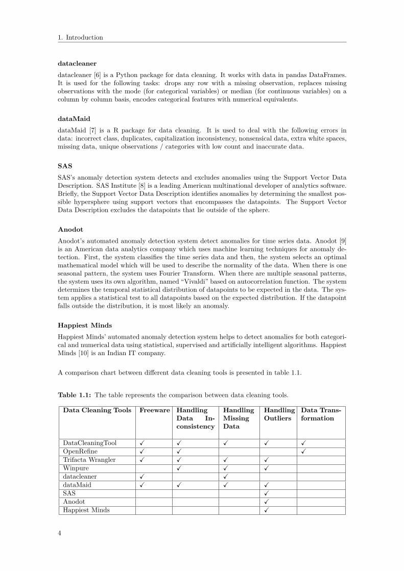
1.3 Existing Data Cleaning ToolsData cleaning is a process for removing incomplete, incorrect or inaccurate parts of data from atable or a database and then replacing, modifying or deleting the dirty data. Data cleaning toolshelp in keeping the data consistent and clean to let the users analyse data to make more informeddecision visually as well as statistically. There are many data cleaning tools that provide datacleaning services such as duplicate eradication and ensuring accuracy but only few tools focus oncleaning different types of data errors or anomalies such as noisy data, missing data and outliers.Few of these tools are free, while others are priced with free trial. In this section, we give anoverview of some powerful code free tools which are capable of providing user assistance for datacleaning.
OpenRefineOpenRefine [3] formerly known as Google Refine, is an open source powerful data cleaning tool.It helps to prepare messy data by cleaning it, transforming it from one format into another andextending it with web services.
Trifacta WranglerTrifacta Wrangler [4] is an interactive tool for data cleaning and transformation. It is used to cleanand prepare messy, real world data quickly and accurately for analysis. The data can be exportedfor use in Excel, R, Tableau and Protovis.
WinpureWinpure [5] is a good data quality software. It tackles problems such as inaccurate data andduplicate data and cleans the database of duplicate data, bad entries and incorrect information.
3
1. Introduction
datacleanerdatacleaner [6] is a Python package for data cleaning. It works with data in pandas DataFrames.It is used for the following tasks: drops any row with a missing observation, replaces missingobservations with the mode (for categorical variables) or median (for continuous variables) on acolumn by column basis, encodes categorical features with numerical equivalents.
dataMaiddataMaid [7] is a R package for data cleaning. It is used to deal with the following errors indata: incorrect class, duplicates, capitalization inconsistency, nonsensical data, extra white spaces,missing data, unique observations / categories with low count and inaccurate data.
SASSAS’s anomaly detection system detects and excludes anomalies using the Support Vector DataDescription. SAS Institute [8] is a leading American multinational developer of analytics software.Briefly, the Support Vector Data Description identifies anomalies by determining the smallest pos-sible hypersphere using support vectors that encompasses the datapoints. The Support VectorData Description excludes the datapoints that lie outside of the sphere.
AnodotAnodot’s automated anomaly detection system detect anomalies for time series data. Anodot [9]is an American data analytics company which uses machine learning techniques for anomaly de-tection. First, the system classifies the time series data and then, the system selects an optimalmathematical model which will be used to describe the normality of the data. When there is oneseasonal pattern, the system uses Fourier Transform. When there are multiple seasonal patterns,the system uses its own algorithm, named “Vivaldi” based on autocorrelation function. The systemdetermines the temporal statistical distribution of datapoints to be expected in the data. The sys-tem applies a statistical test to all datapoints based on the expected distribution. If the datapointfalls outside the distribution, it is most likely an anomaly.
Happiest MindsHappiest Minds’ automated anomaly detection system helps to detect anomalies for both categori-cal and numerical data using statistical, supervised and artificially intelligent algorithms. HappiestMinds [10] is an Indian IT company.
A comparison chart between different data cleaning tools is presented in table 1.1.
Table 1.1: The table represents the comparison between data cleaning tools.
Data Cleaning Tools Freeware HandlingData In-consistency
HandlingMissingData
HandlingOutliers
Data Trans-formation
DataCleaningTool X X X X XOpenRefine X X XTrifacta Wrangler X X X XWinpure X X Xdatacleaner X XdataMaid X X X XSAS XAnodot XHappiest Minds X
4

1. Introduction
1.4 Thesis OutlineThe thesis is structured as follows: Chapter 2 demonstrates the background knowledge of datacleaning. Common data problems and corresponding data cleaning techniques are investigated.Chapter 3 explains our data cleaning approach to address common data problems which assistsusers to clean data in a cooperative way. In Chapter 4, the results of a performance analysis of themissForest method and the different outlier detection methods are discussed and a demo versionof our data cleaning tool is presented. Lastly, Chapter 5 wraps up the thesis and presents thepossible improvements for future work.
5

1. Introduction
6

2Data Problems and their Cleaning
Approaches
This chapter provides the background theory regarding data cleaning. Section 2.1 states theconcept of data cleaning. In Sections 2.2, 2.3, 2.4, 2.5 the major data problems in raw data areexplored and the corresponding state-of-the art data cleaning techniques are described. Differentdata visualization techniques are presented in Section 2.6.
2.1 Data CleaningNowadays, it is becoming easier for organizations to store and acquire large amounts of data. Ma-chine learning can learn and make predictions on the data to facilitate improved decision makingand richer analytics. However, the problem is that the real world data almost never come in a cleanway and poor data quality can lead to incorrect decisions and unreliable analysis. As a result, rawdata needs to be preprocessed before being able to proceed with training machine learning models.The preprocessing task which aims to deal with data problems is called data cleaning.
Data cleaning is a three-step iterative process - clean data ←→ reduce data ←→ transform datathat proceeds until the data is in its most useful form to the user as shown in figure 2.1.
Clean Data
Reduce DataTransform Data
Figure 2.1: The iterative nature of the data cleaning process. Each double sided arrow indicatesthe relation between the different steps of the process.
The iterative steps of data cleaning are• Clean data is the process of cleaning the data, such as noisy data and outliers.• Reduce data is the process of reducing the data in volume, such as numerosity reduction and
dimensionality reduction if the dataset is too large or high dimensional and unmanageableand the reduced data produces almost the same analytical results.
• Transform data is the process of transforming the data into useful forms, such as logarithmictransformation for data mining to statistically measure it.
7

2. Data Problems and their Cleaning Approaches
We introduce the major data problems [11] and the possible approaches to fix them.
Formatting Errors• Example: Misspellings.• Possible Approach: Use Microsoft Word’s spell checker [12].
Inconsistent feature names or columns• Example: Feature names or columns have inconsistent capitalizations.• Possible Approach: Use uppercase or lowercase characters.
Typographical errors• Example: Extra white spaces.• Possible Approach: Remove extra white spaces.
Duplicate data• Example: Duplicate columns or rows.• Possible Approach: Remove extra columns or rows.
Incorrect data type• Example: Numerical instead of string entries.• Possible Approach: Set data type constraint.
Nonsensical data• Example: Age = -1.• Possible Approach: Set range constraint to variable - Age ≥ 0.
Extrapolation errors• Example: A model of glacial retreat: V = 100 − 2t where V = volume of ice, t = time
variable, and t = 0 AD. If we extrapolate to earlier than t = 0, then ice volume becomesbigger. Mathematically, we can extrapolate back in time but then the ice volume of theglacier would exceed the total volume of the earth which is absurd.
• Possible Approach: Set range constraint to variable - t ≥ 0.Systematic errors
• Example: A poorly calibrated thermometer would result in measured values that are consis-tently too high.
• Possible Approach: No solution to the problem.Truncation error
• Example: Difference between the actual value (2.99792458 × 10⁸) and the truncated valueup to two decimals (2.99 ×10⁸).
• Possible Approach: Use long format [13].Time stamp errors
• Example: The first failure time can show time prior to when the electric vehicles wereproduced if the vehicle clock has not been correctly set.
• Possible Approach: Set cross-field validation constraint to variable - first failure time of avehicle > time when the vehicle was produced.
Fault code count• Example: Fault codes are codes stored by the on-board computer diagnostic system that
notify about a particular problem area found in the car. Fault code count starts only whena problem is detected in the car. Sometimes although an issue is notified, fault code count= 0.
• Possible Approach: Set range constraint to variable - fault code count > 0.Missing data
• Example: NaN.• Possible Approach: Imputation using MissForest method. [14].
Sparse data• Example: Columns that are infrequently populated.• Possible Approach: Non negative matrix factorization for non-negative sparse data [15].
Spurious correlations• Example: US spending on science, space, and technology highly correlates with suicides by
hanging, strangulation, and suffocation in US.• Possible Approach: Additive noise method, information geometric causal inference [16].
8
2. Data Problems and their Cleaning Approaches
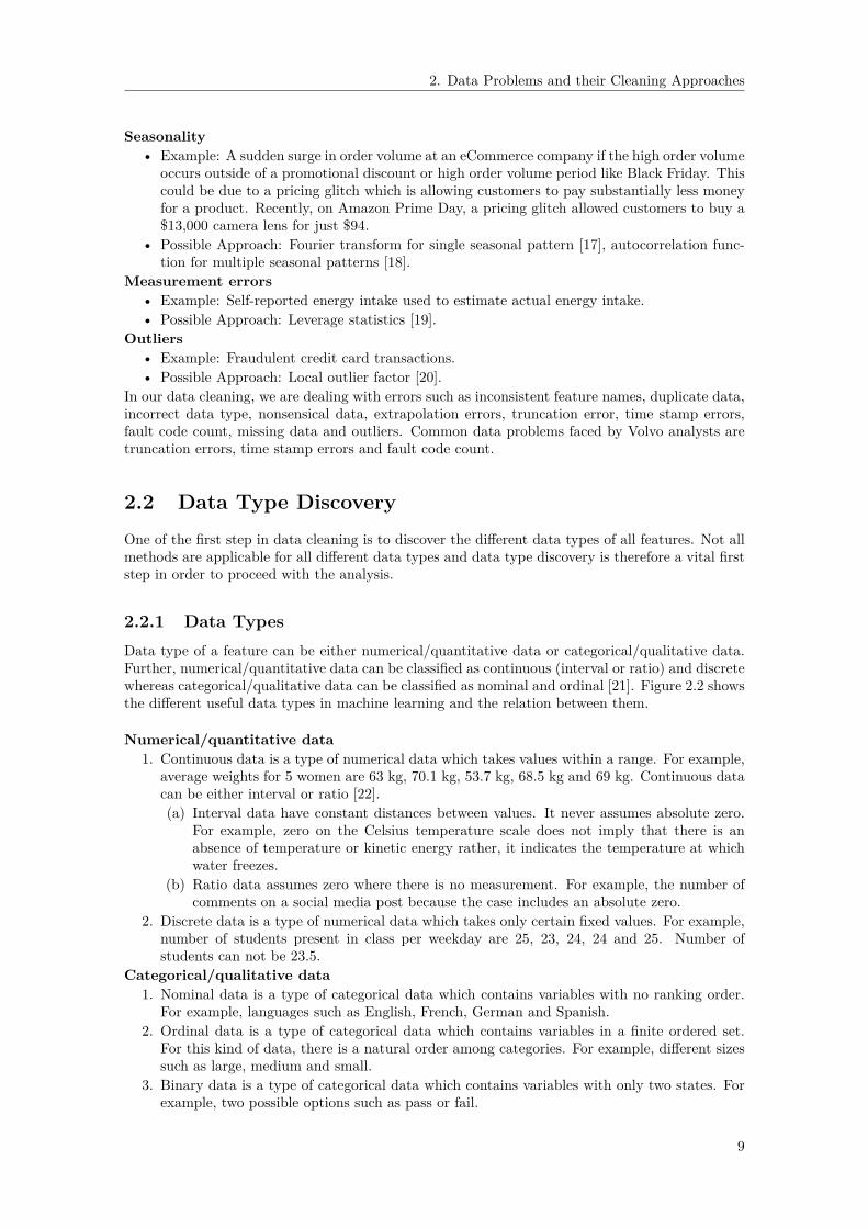
Seasonality• Example: A sudden surge in order volume at an eCommerce company if the high order volume
occurs outside of a promotional discount or high order volume period like Black Friday. Thiscould be due to a pricing glitch which is allowing customers to pay substantially less moneyfor a product. Recently, on Amazon Prime Day, a pricing glitch allowed customers to buy a$13,000 camera lens for just $94.
• Possible Approach: Fourier transform for single seasonal pattern [17], autocorrelation func-tion for multiple seasonal patterns [18].
Measurement errors• Example: Self-reported energy intake used to estimate actual energy intake.• Possible Approach: Leverage statistics [19].
Outliers• Example: Fraudulent credit card transactions.• Possible Approach: Local outlier factor [20].
In our data cleaning, we are dealing with errors such as inconsistent feature names, duplicate data,incorrect data type, nonsensical data, extrapolation errors, truncation error, time stamp errors,fault code count, missing data and outliers. Common data problems faced by Volvo analysts aretruncation errors, time stamp errors and fault code count.
2.2 Data Type DiscoveryOne of the first step in data cleaning is to discover the different data types of all features. Not allmethods are applicable for all different data types and data type discovery is therefore a vital firststep in order to proceed with the analysis.
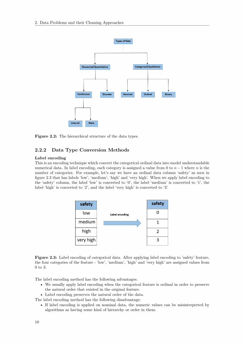
2.2.1 Data TypesData type of a feature can be either numerical/quantitative data or categorical/qualitative data.Further, numerical/quantitative data can be classified as continuous (interval or ratio) and discretewhereas categorical/qualitative data can be classified as nominal and ordinal [21]. Figure 2.2 showsthe different useful data types in machine learning and the relation between them.
Numerical/quantitative data1. Continuous data is a type of numerical data which takes values within a range. For example,
average weights for 5 women are 63 kg, 70.1 kg, 53.7 kg, 68.5 kg and 69 kg. Continuous datacan be either interval or ratio [22].(a) Interval data have constant distances between values. It never assumes absolute zero.
For example, zero on the Celsius temperature scale does not imply that there is anabsence of temperature or kinetic energy rather, it indicates the temperature at whichwater freezes.
(b) Ratio data assumes zero where there is no measurement. For example, the number ofcomments on a social media post because the case includes an absolute zero.
2. Discrete data is a type of numerical data which takes only certain fixed values. For example,number of students present in class per weekday are 25, 23, 24, 24 and 25. Number ofstudents can not be 23.5.
Categorical/qualitative data1. Nominal data is a type of categorical data which contains variables with no ranking order.
For example, languages such as English, French, German and Spanish.2. Ordinal data is a type of categorical data which contains variables in a finite ordered set.
For this kind of data, there is a natural order among categories. For example, different sizessuch as large, medium and small.
3. Binary data is a type of categorical data which contains variables with only two states. Forexample, two possible options such as pass or fail.
9
2. Data Problems and their Cleaning Approaches
Figure 2.2: The hierarchical structure of the data types.
2.2.2 Data Type Conversion MethodsLabel encodingThis is an encoding technique which convert the categorical ordinal data into model understandablenumerical data. In label encoding, each category is assigned a value from 0 to n− 1 where n is thenumber of categories. For example, let’s say we have an ordinal data column ‘safety’ as seen infigure 2.3 that has labels ‘low’, ‘medium’, ‘high’ and ‘very high’. When we apply label encoding tothe ‘safety’ column, the label ‘low’ is converted to ‘0’, the label ‘medium’ is converted to ‘1’, thelabel ‘high’ is converted to ‘2’, and the label ‘very high’ is converted to ‘3’.
Figure 2.3: Label encoding of categorical data. After applying label encoding to ’safety’ feature,the four categories of the feature - ’low’, ’medium’, ’high’ and ’very high’ are assigned values from0 to 3.
The label encoding method has the following advantages:• We usually apply label encoding when the categorical feature is ordinal in order to preserve
the natural order that existed in the original feature.• Label encoding preserves the natural order of the data.
The label encoding method has the following disadvantage:• If label encoding is applied on nominal data, the numeric values can be misinterpreted by
algorithms as having some kind of hierarchy or order in them.
10

2. Data Problems and their Cleaning Approaches
One-hot encodingThis is an encoding approach which splits the categorical nominal data into multiple dummy vari-ables [23]. If a categorical feature has n values, then one-hot encoding splits it into n dummyvariable columns which takes only two quantitative values 1 and 0 in the presence and absence ofthe respective value. For example, let’s say we have a nominal data column ‘language’ as seen in fig-ure 2.4 that has labels ‘English’, ‘French’, ‘German’ and ‘Spanish’. When one-hot encoding is done,the ‘language’ column is split into four new columns, one for each language. If the first columnvalue of the ‘language’ column is ‘English’, then after one-hot encoding, the first column value ofthe ‘English’ column is ‘1’ and that of the ‘French’, the ‘German’ and the ‘Spanish’ columns are ‘0’.
Figure 2.4: One-hot encoding of categorical data. After applying one-hot encoding to ‘language’feature, the feature is split into four dummy variable columns, one for each category. If the firstobservation of the ‘language’ feature is ‘English’, then after one-hot encoding, the first observationof the ‘English’ feature is ‘1’ and that of the ‘French’, the ‘German’ and the ‘Spanish’ features are‘0’.
One-hot encoding results in dummy variable trap. Dummy variable trap is a scenario where theindependent variables are highly correlated and one variable can be predicted from the remainingvariables. Thus, dummy variable trap leads to the problem of perfect multicollinearity. Multi-collinearity is a phenomenon in which two or more independent variables are highly correlatedwith one another in a multiple regression model. Perfect multicollinearity means that the corre-lation between two independent variables is equal to 1 or −1. In case of perfect multicollinearity,ordinary least squares can not calculate regression coefficients. So the recommendation is to usen− 1 columns for multiple linear regression and logistic regression, and n columns for all kinds ofsubspace regression such as singular value decomposition.Let X be a categorical feature with n categories {X1, X2, · · · , Xn−1, Xn}. After one-hot encodingof X, the following holds
X1 +X2 + · · ·+Xn−1 +Xn = 1. (2.1)Then the multivariate regression model
Y = β0 + β1X1 + β2X2 + · · ·+ βn−1Xn−1 + βnXn (2.2)
can be written as
Y = β0 + β1X1 + β2X2 + · · ·+ βn−1Xn−1 + βn(1−X1 −X2 − · · · −Xn−1)
=⇒ Y = (β0 + βn) + (β1 − βn)X1 + (β2 − βn)X2 + · · ·+ (βn−1 − βn)Xn−1
=⇒ Y = C0 + C1X1 + C2X2 + · · ·+ Cn−1Xn−1 (2.3)where C0 = β0 + βn, C1 = β1 − βn, C2 = β2 − βn and Cn−1 = βn−1 − βn.Thus, categorical feature with n categories is transformed to n− 1 dummy features to avoid mul-ticollinearity.
11
2. Data Problems and their Cleaning Approaches
The one-hot encoding method has the following advantages:• We usually apply one-hot encoding when the categorical feature is nominal.• The result of one-hot encoding is binary rather than ordinal that lies in an orthogonal vector
space.The one-hot encoding method has the following disadvantages:
• One-hot encoding can be effectively applied only when the number of categorical features isfew.
• One-hot encoding can lead to high memory consumption if the number of categorical featuresin the dataset is huge or the number of categories of a categorical feature is large.
2.3 Missing Data HandlingMissing data means that one or more observations are missing generally denoted by NaN, NaT or‘ ’. This often occurs due to improper data collection, lack of data, or data entry errors. This canlead to drastic conclusions which can affect negatively the decisions.
2.3.1 Missing Data MechanismsThere are two important types of missing data known as ignorable and non-ignorable [24]. Ignorablemissing data is where the probability that a datapoint will be missing is independent of its valuewhereas non-ignorable missing data is where the probability that a datapoint will be missing isdependent on its value.Missing Data Mechanism [25] describes the relationship between the missing data and the valuesof the variables of the data that is integrated with missing data. Let X be a n × p data matrixwhere Xi = {Xi,1, · · · , Xi,p} is the ith row of X. Let Xobs and Xmis denote the observed andthe missing parts of the complete data X = {Xobs, Xmis}, respectively. Let M be the missingnessmatrix which indicates whether the corresponding location in X is missing (1) or observed (0) suchthat
Mij ={
1 if Xij is missing,0 otherwise.
(2.4)
The missing data mechanism is characterized by the probability distribution of M given X [26],P (M | X,φ), where φ is a vector of unknown parameters describing the relationship betweenmissingness matrix, M and the complete data, X. Missing data mechanisms can be classified intothree kinds - Missing Completely at Random (MCAR), Missing at Random (MAR) and MissingNot at Random (MNAR). Figure 2.5 shows the dataset of house sparrow population that containsinformation on badge size (Badge) and age (Age) of 10 male sparrows, and on the three missingdata mechanisms in the context of the specific data [25].
Missing Completely at RandomMissing Completely at Random is a random process such that there is no relationship betweenthe propensity of a value to be missing and the values of the variables (observed and missing).Mathematically, the probability that a variable value is missing does not depend on the missingdata or the observed data and is given by
P (M | X,φ) = P (M | φ) ∀X,φ. (2.5)
For example, the variable Age(MCAR) in figure 2.5 is missing completely at random because themissing data on Age is not related to the observed variable, Badge.
Missing at RandomMissing at Random is a predictable process such that there is a relationship between the propensityof a value to be missing and the observed data, but not the missing data. Mathematically, theprobability that a variable value is missing depends on the observed data but not on the missingdata and is given by
P (M | X,φ) = P (M | Xobs, φ) ∀Xmis, φ. (2.6)
12

2. Data Problems and their Cleaning Approaches
For example, the variable Age(MAR) in figure 2.5 is missing at random because the missing valuesare associated with the smallest three values of the observed variable, Badge. Thus the probabilityof a value being missing increases with lower observed badge sizes.
Missing Not at RandomMissing Not at Random is an unpredictable process such that there is a relationship between thepropensity of a value to be missing and the missing data. Mathematically, the probability that avariable value is missing depends on the missing data and is given by
P (M | X,φ) = P (M | Xobs, Xmis, φ) ∀φ. (2.7)
For example, the variable Age(MNAR) in figure 2.5 is missing not at random because the threemissing values are 4-year old birds and older sparrows tend to have larger badge sizes. Such ascenario is possible if a study on this sparrow population started 3 years ago, and we do not knowthe exact age of older birds.
Figure 2.5: An example dataset explaining three missing data mechanisms - MCAR, MAR andMNAR obtained from [25]. The data shows house sparrow population that contains informationon badge size ‘Badge’ and age ‘Age’ of 10 male sparrows.
The missing data mechanism should be identified since it is important for choosing the approachto deal with missing data. Ignorability is an important concept in missing data mechanism whichrefers to whether we can ignore the way in which data is missing when we delete or impute missingdata. MCAR and MAR are ignorable while MNAR is non-ignorable. In case of MCAR, deletionand in case of MAR, imputation do not require that we make assumptions about how the data ismissing. On the other hand, MNAR missingness requires such assumptions to build a model tofill in missing values such as in maximum likelihood estimation method [27]. The different missingdata types are illustrated in figure 2.6.
13
2. Data Problems and their Cleaning Approaches
Figure 2.6: Types of missing data and the corresponding missing data mechanisms.
2.3.2 Missing Data Handling TechniquesThe following techniques for dealing with missing data are investigated.
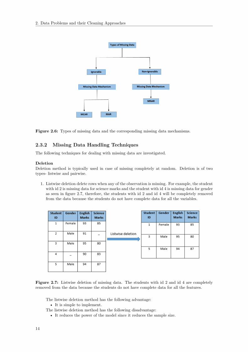
DeletionDeletion method is typically used in case of missing completely at random. Deletion is of twotypes- listwise and pairwise.
1. Listwise deletion delete rows when any of the observation is missing. For example, the studentwith id 2 is missing data for science marks and the student with id 4 is missing data for genderas seen in figure 2.7, therefore, the students with id 2 and id 4 will be completely removedfrom the data because the students do not have complete data for all the variables.
Figure 2.7: Listwise deletion of missing data. The students with id 2 and id 4 are completelyremoved from the data because the students do not have complete data for all the features.
The listwise deletion method has the following advantage:• It is simple to implement.
The listwise deletion method has the following disadvantage:• It reduces the power of the model since it reduces the sample size.
14

2. Data Problems and their Cleaning Approaches
2. Pairwise deletion do not delete a row completely rather, it omits rows based on the featuresincluded in the analysis. For example, the student with id 2 will be omitted from any analysesusing science marks and the student with id 4 will be omitted from any analyses using gender,but they will not be omitted from analyses for which the student has complete data.
Figure 2.8: Pairwise deletion of missing data. The student with id 2 is omitted from any analysesusing ‘Science Marks’ and the student with id 4 is omitted from any analyses using ‘Gender’, butthey are not omitted from analyses for which the student has complete data.
The pairwise deletion method has the following advantage:• It keeps all cases available for analysis thus increasing the statistical power in the anal-
ysis.The pairwise deletion method has the following disadvantage:
• It uses different sample sizes for different variables.Dropping FeaturesIf a large amount of observations is missing in a feature, then we can delete the feature from thedata. It needs to be checked if there is an improvement of the model performance after deletion offeature. This should be the last option. For example, 4 out of 5 observations as seen in figure 2.9are missing in English marks feature so we need to delete the English marks feature.
Figure 2.9: Dropping feature of missing data. The ‘English Marks’ feature is deleted sincemajority of the observations is missing in ‘English Marks’ feature.
The dropping features method has the following advantage:• It is easy to use.
The dropping features method has the following disadvantage:• The deleted feature is not anymore available for analysis.
15

2. Data Problems and their Cleaning Approaches
ImputationIn an ideal scenario, data is perfect without any missing data. But perfect datasets are rarelyfound in scientific, engineering, medical and other fields. Methods used for analysis of big dataoften depend on the whole dataset. Missing data imputation is a solution to the problem. Missingdata imputation is a method of replacing the missing values with estimated ones. Imputationmethod is typically used when the nature of missing data is missing at random. Most of themissing data imputation handling methods are restricted to coping with only one data type eithercontinuous or categorical. Some methods can also handle mixed data types. Most commonly usedimputation methods include mean, median, mode and missForest imputation methods.
1. Mean imputation is a method in which the missing value of a certain variable is replacedby the mean of the available values of the variable. If the size of the available values of avariable is n, then the missing value of the variable is replaced by the value
x =∑ni=1 xin
. (2.8)
For example, the missing value (third value) of ‘English Marks’ column as seen in figure 2.10is replaced by the mean of the remaining values that is 92. Again, the missing values (secondand fourth values) of ‘Science Marks’ column as seen in figure 2.10 are replaced by the meanof the remaining values that is 84.
Figure 2.10: Mean imputation of missing data. The missing value (third value) of ‘EnglishMarks’ feature is replaced by the mean of the observed values that is 92. Again, the missing values(second and fourth values) of ‘Science Marks’ feature are replaced by the mean of the observedvalues that is 84.
The mean imputation method has the following advantage:• It is fast.• It works well with small numerical data.• It is generally used when the variable is normally distributed or in particular does not
have any skewness.The mean imputation method has the following disadvantage:
• It reduces the original variance of the data.• The co-variance with the remaining variables is distorted within the data.
2. Median imputation is a method in which the missing value of a certain variable is replacedby the median of the available values of the variable. If the size of the available values of avariable n is odd, then the missing value of the variable is replaced by the value at positionn+1
2median(x) = xn+1
2. (2.9)
If the size of the available values of a variable n is even, then the missing value of the variableis replaced by the average of values at positions n
2 and n2 + 1
median(x) =xn
2+ xn
2 +1
2 (2.10)
16

2. Data Problems and their Cleaning Approaches
For example, the missing value (third value) of ‘English Marks’ column as seen in figure2.11 is replaced by the median of the remaining values that is 92. Again, the missing values(second and fourth values) of ‘Science Marks’ column as seen in figure 2.11 are replaced bythe median of the remaining values that is 85.
Figure 2.11: Median imputation of missing data. The missing value (third value) of ‘EnglishMarks’ feature is replaced by the median of the observed values that is 92. Again, the missingvalues (second and fourth values) of ‘Science Marks’ feature are replaced by the median of theobserved values that is 85.
The median imputation method has the following advantage:• It is fast.• It works well with small numerical data.• It is used when dealing with skewed data or heteroscedasticity.
The median imputation method has the following disadvantage:• It reduces the original variance of the data.
3. Mode imputation is a method in which the missing value of a certain variable is replacedby the most frequent value of the variable. For example, the missing value (fourth value)of ’Gender’ column as seen in figure 2.12 is replaced by the most frequently occurring valuethat is ‘Male’.
Figure 2.12: Mode imputation of missing data. The missing value (fourth value) of ’Gender’column is replaced by the most frequently occurring value that is ‘Male’.
The mode imputation method has the following advantage:• It is fast.• It works well with categorical data.• It is used when dealing with skewed data or heteroscedasticity.
The mode imputation method has the following disadvantage:• It reduces the original variance of the data.
17
2. Data Problems and their Cleaning Approaches
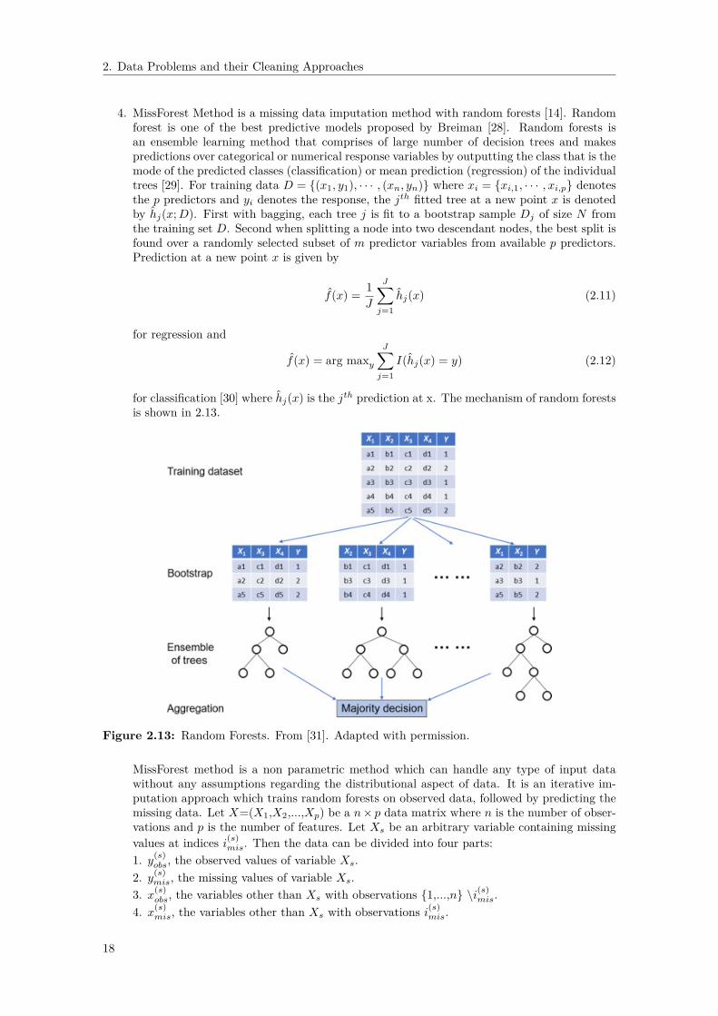
4. MissForest Method is a missing data imputation method with random forests [14]. Randomforest is one of the best predictive models proposed by Breiman [28]. Random forests isan ensemble learning method that comprises of large number of decision trees and makespredictions over categorical or numerical response variables by outputting the class that is themode of the predicted classes (classification) or mean prediction (regression) of the individualtrees [29]. For training data D = {(x1, y1), · · · , (xn, yn)} where xi = {xi,1, · · · , xi,p} denotesthe p predictors and yi denotes the response, the jth fitted tree at a new point x is denotedby hj(x;D). First with bagging, each tree j is fit to a bootstrap sample Dj of size N fromthe training set D. Second when splitting a node into two descendant nodes, the best split isfound over a randomly selected subset of m predictor variables from available p predictors.Prediction at a new point x is given by
f(x) = 1J
J∑j=1
hj(x) (2.11)
for regression and
f(x) = arg maxyJ∑j=1
I(hj(x) = y) (2.12)
for classification [30] where hj(x) is the jth prediction at x. The mechanism of random forestsis shown in 2.13.
Figure 2.13: Random Forests. From [31]. Adapted with permission.
MissForest method is a non parametric method which can handle any type of input datawithout any assumptions regarding the distributional aspect of data. It is an iterative im-putation approach which trains random forests on observed data, followed by predicting themissing data. Let X=(X1,X2,...,Xp) be a n× p data matrix where n is the number of obser-vations and p is the number of features. Let Xs be an arbitrary variable containing missingvalues at indices i(s)
mis. Then the data can be divided into four parts:1. y(s)
obs, the observed values of variable Xs.2. y(s)
mis, the missing values of variable Xs.3. x(s)
obs, the variables other than Xs with observations {1,...,n} \i(s)mis.
4. x(s)mis, the variables other than Xs with observations i(s)
mis.
18
2. Data Problems and their Cleaning Approaches
MissForest imputes missing values as follows: in the beginning, make an initial guess for themissing values in X using some imputation method. Then, sort the features Xs, s = 1, · · · , pin ascending order with respect to the amount of missing values. Starting with the featurethat has the least missing values, for each variable Xs, the missing values are imputed byfirst training an RF with response y(s)
obs and predictors x(s)obs and then, predicting the missing
values y(s)mis by applying the trained RF to x(s)
mis. The imputation procedure is repeated untila stopping criterion is met. The stopping criterion is fulfilled when the difference betweenthe present imputed data matrix and the previous data matrix increases for the first timewith respect to both numerical and categorical variable types. The difference for the set ofnumerical variables C is defined as
∆C =∑j∈C(Ximp
new,j −Ximpold,j)2∑
j∈C(Ximpnew,j)2
(2.13)
and for the set of categorical variables S as
∆S =
∑j∈S
∑ni=1 IXimp
new,j6=Ximp
old,j
Tmis(2.14)
where Ximpold is the previously imputed matrix, Ximp
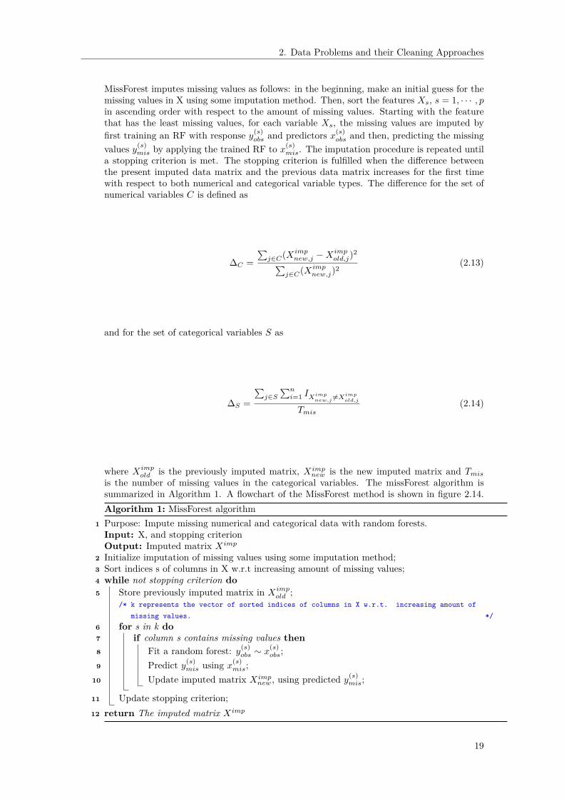
new is the new imputed matrix and Tmisis the number of missing values in the categorical variables. The missForest algorithm issummarized in Algorithm 1. A flowchart of the MissForest method is shown in figure 2.14.Algorithm 1: MissForest algorithm
1 Purpose: Impute missing numerical and categorical data with random forests.Input: X, and stopping criterionOutput: Imputed matrix Ximp
2 Initialize imputation of missing values using some imputation method;3 Sort indices s of columns in X w.r.t increasing amount of missing values;4 while not stopping criterion do5 Store previously imputed matrix in Ximp
old ;/* k represents the vector of sorted indices of columns in X w.r.t. increasing amount of
missing values. */6 for s in k do7 if column s contains missing values then8 Fit a random forest: y(s)
obs ∼ x(s)obs;
9 Predict y(s)mis using x(s)
mis;10 Update imputed matrix Ximp
new, using predicted y(s)mis;
11 Update stopping criterion;12 return The imputed matrix Ximp
19
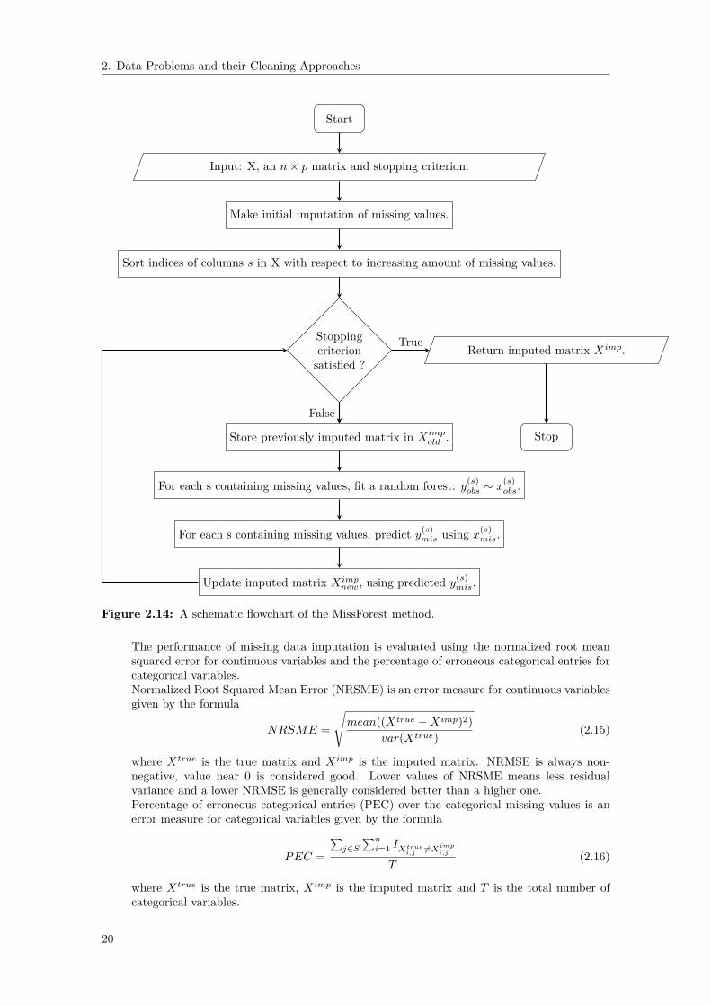
2. Data Problems and their Cleaning Approaches
Start
Input: X, an n× p matrix and stopping criterion.
Make initial imputation of missing values.
Sort indices of columns s in X with respect to increasing amount of missing values.
Stoppingcriterionsatisfied ?
Return imputed matrix Ximp.
Store previously imputed matrix in Ximpold .
For each s containing missing values, fit a random forest: y(s)obs ∼ x
(s)obs.
For each s containing missing values, predict y(s)mis using x(s)
mis.
Update imputed matrix Ximpnew, using predicted y(s)
mis.
Stop
False
True
Figure 2.14: A schematic flowchart of the MissForest method.
The performance of missing data imputation is evaluated using the normalized root meansquared error for continuous variables and the percentage of erroneous categorical entries forcategorical variables.Normalized Root Squared Mean Error (NRSME) is an error measure for continuous variablesgiven by the formula
NRSME =
√mean((Xtrue −Ximp)2)
var(Xtrue) (2.15)
where Xtrue is the true matrix and Ximp is the imputed matrix. NRMSE is always non-negative, value near 0 is considered good. Lower values of NRSME means less residualvariance and a lower NRMSE is generally considered better than a higher one.Percentage of erroneous categorical entries (PEC) over the categorical missing values is anerror measure for categorical variables given by the formula
PEC =
∑j∈S
∑ni=1 IXtrue
i,j6=Ximp
i,j
T(2.16)
where Xtrue is the true matrix, Ximp is the imputed matrix and T is the total number ofcategorical variables.
20
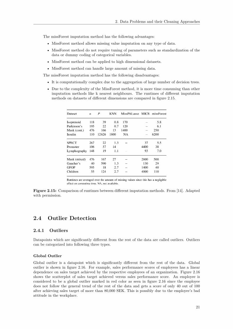
2. Data Problems and their Cleaning Approaches
The missForest imputation method has the following advantages:
• MissForest method allows missing value imputation on any type of data.
• MissForest method do not require tuning of parameters such as standardization of thedata or dummy coding of categorical variables.
• MissForest method can be applied to high dimensional datasets.
• MissForest method can handle large amount of missing data.
The missForest imputation method has the following disadvantages:
• It is computationally complex due to the aggregation of large number of decision trees.
• Due to the complexity of the MissForest method, it is more time consuming than otherimputation methods like k nearest neighbours. The runtimes of different imputationmethods on datasets of different dimensions are compared in figure 2.15.
Figure 2.15: Comparison of runtimes between different imputation methods. From [14]. Adaptedwith permission.
2.4 Outlier Detection
2.4.1 Outliers
Datapoints which are significantly different from the rest of the data are called outliers. Outlierscan be categorized into following three types.
Global OutlierGlobal outlier is a datapoint which is significantly different from the rest of the data. Globaloutlier is shown in figure 2.16. For example, sales performance scores of employees has a lineardependence on sales target achieved by the respective employees of an organization. Figure 2.16shows the scatterplot of sales target achieved versus sales performance score. An employee isconsidered to be a global outlier marked in red color as seen in figure 2.16 since the employeedoes not follow the general trend of the rest of the data and gets a score of only 40 out of 100after achieving sales target of more than 80,000 SEK. This is possibly due to the employee’s badattitude in the workplace.
21

2. Data Problems and their Cleaning Approaches
Figure 2.16: Global outlier. This is an example which shows the evaluation of sales performancescores based on sales target achieved of employees of an organization. An employee is a globaloutlier marked in red color if the employee gets a low score even after achieving a high sales target.
Contextual Outlier.Contextual Outlier is a datapoint which is significantly different in a specific context. Contextualoutlier is shown in figure 2.17. For example, normal systolic blood pressure is 120. During exercisein the morning 08:00-12:00, systolic blood pressure usually increases to 140. But if the suddenincrease in systolic blood pressure occurs outside of a high blood pressure period such as exercisesession or running, especially during night 20:00-24:00, then it is considered to be a contextualoutlier marked in red color as seen in figure 2.17. Here the context is high blood pressure period.This could be due to serious health problems such as heart attack and stroke.
Figure 2.17: Contextual outlier. This is an example of contextual outlier which shows thesudden increase in systolic blood pressure marked in red color arising outside of a high bloodpressure period such as exercise session or running.
22

2. Data Problems and their Cleaning Approaches
Collective Outliers
Collective Outliers is a collection of datapoints which is significantly different from the rest of thedata. Collective outliers are shown in figure 2.18. For example, a human electrocardiogram output.The red region denotes collective outliers because the low values exist for an abnormally long timecorresponding to an Atrial Premature Contraction. The low value itself is not an outlier but itssuccessive occurrence for long time is an outlier.
Figure 2.18: Collective outliers.This is an example which shows collective outliers marked in redcolor in an human electrocardiogram output corresponding to an Atrial Premature Contraction.
2.4.2 Outlier Detection Methods
Based on the extent to which the labels are available in a dataset, outlier detection methods canoperate in one of the following three modes [32].
Supervised outlier detection
Supervised Anomaly Detection describes a setup which comprises of both fully labeled trainingand test datasets and involves training a classifier. This scenario is very similar to traditionalsupervised classification algorithms except that classes in supervised anomaly detection are highlyunbalanced.
Semi-supervised outlier detection
Semi-supervised anomaly detection constructs a model from outlier-free normal training datasetand then deviations in the test data from the normal model are used to detect outliers.
Unsupervised outlier detection
Unsupervised anomaly detection is the most adaptable setup which does not require any labels.The idea is that unsupervised outlier detection methods score the data entirely based on theintrinsic properties of the dataset such as distance and density.
Different outlier detection modes are shown in figure 2.19.
23

2. Data Problems and their Cleaning Approaches
Figure 2.19: Different outlier detection modes depending on the availability of labels in a dataset.From [33]. CC-BY.
When given a random raw dataset, we hardly have any information about the data. The assump-tions of supervised anomaly detection that the data is normally distributed and outliers are labeledcorrectly are rarely satisfied. Again, data almost never come in a clean way, which also restricts theuse of semi-supervised anomaly detection. Therefore, unsupervised anomaly detection algorithmsseem to be the more reasonable choice. The output of an outlier detection algorithm [34] can beof two types:
1. Outlier Scores: Scoring techniques assign an outlier score to each instance in the test datadepending on the degree to which that instance is considered an outlier. Thus the output ofsuch techniques is a ranked list of outliers. It allows an analyst to choose a domain specificthreshold to select the most relevant anomalies. For example, local outlier factor (LOF) andlocal distance-based outlier detection approach (LDOF) are scoring techniques.
2. Binary Labels: Labeling techniques assign a binary label (normal or anomalous) to eachinstance in the test data. It do not directly allow the analysts to make a choice, although thiscan be controlled indirectly through parameter choices within each technique. For example,z-score and Tukeys Method (box plot) are labeling techniques.
We will discuss the most used outlier detection methods.
Z-scoreZ-score can quantify the abnormal behaviour of a datapoint when the data distribution is gaussian.Z-score is a numerical measurement which indicates how far the value of the datapoint is from itsmean for a specific feature. Z-score is expressed as
Z = X − µσ
(2.17)
where µ is the mean and σ is the standard deviation of feature X. In particular, z-score measuresexactly how many standard deviations below or above the population mean a datapoint is. If adatapoint is a certain number of standard deviations away from the mean, then the datapoint isconsidered an outlier. Default threshold value for finding outliers are z-scores of ±3 from zero. Forthe normal distribution as seen from figure 2.20, one standard deviation from the mean (dark blueregion) accounts for about 68% of data , two standard deviations from the mean (medium anddark blue region) account for about 95% of data, while three standard deviations (light, medium,and dark blue region) account for about 99.7% of data. Datapoints outside the three standarddeviations are identified as outliers. However, z-score can fail to detect outliers if the outliers are
24

2. Data Problems and their Cleaning Approaches
extreme because the extreme outliers increase the standard deviation.
Figure 2.20: Z-score.
The z-score has the following advantages:• Z-score takes into account both the mean value and the variability in a set of scores.• Z-score can be used to compare scores that are from different normal distributions.
The z-score has the following disadvantage:• Z-score always assumes normal data distribution. If this assumption is not met, then the
scores cannot be interpreted as a standard proportion of the distribution. Let’s say if thedata distribution is skewed, then the area within one standard deviation to the left of meanis not equal to the area within one standard deviation to the right of mean.
• It is only suitable to use in a low dimensional feature space, in a small to medium sizeddataset.
LeverageLeverage statistics is an outlier detection method for linear regression model. Leverage statisticsis a regression diagnostic on how far the datapoint is from the remaining datapoints.Let y = {y1, y2, · · · , yn} be a n× 1 vector of dependent variables, β = {β0, β1} be the 2× 1 vectorof regression parameters and, ε = {ε1, ε2, · · · , εn} be the n× 1 vector of errors.
We construct a n × 2 design matrix X as
1 x11 x2...
...1 xn
. Then the simple linear regression is written
asyi = β0 + β1xi + εi, i = 1, · · · , n (2.18)
⇒ Y = Xβ + ε. (2.19)
The above formulation can be generalized to multiple linear regression with predictor variables
x1, · · · , xp−1. We construct a n × p design matrix X as
1 x11 x12 · · · x1p−11 x21 x22 · · · x2p−1...
...1 xn1 xn2 · · · xnp−1
. Then the
multiple linear regression is written as
yi = β0 + β1xi1 + · · ·+ βpxip−1 + εi, i = 1, · · · , n (2.20)
25

2. Data Problems and their Cleaning Approaches
⇒ Y = Xβ + ε. (2.21)
We use Least Squares to fit a model to the data {xi, yi}ni=1 where xi = {xi1, · · · , xip−1}. We definethe cost function or modelling criterion as
Q(β) = (y −Xβ)′(y −Xβ). (2.22)
Our aim is to find the regression parameters by minimizing the criterion.Taking derivatives with respect to β, and setting these to zero, we get
dQ
dβ= −2X ′(y −Xβ) (2.23)
⇒ (X ′X)β = X ′y (2.24)
⇒ β = (X ′X)−1X ′y. (2.25)
The fitted values can be written asy = Xβ. (2.26)
y = X(X ′X)−1X ′y. (2.27)
The n × n matrix X(X ′X)−1X ′ is called the Hat matrix. The Hat matrix is usually denoted byH. H is also called the projection matrix since it inputs data y and projects it in a plane spannedby X such that
y = Hy (2.28)
⇒
y1y2...yn
=
h11 h12 · · · h1p−1h21 h22 · · · h2p−1...
...hn1 hn2 · · · hnp−1
y1y2...yn
(2.29)
The amount an observation contributes to its own fitted value, is called the leverage. The leveragevalues [19] are the diagonal elements of the Hat matrix H defined by
hii = xi(X ′X)−1x′i, i = 1, · · · , n (2.30)
where xi is the i-th row in X.Since H is symmetric and idempotent (H2 = H), we get
hii = h2ii +
∑j 6=i
h2ij (2.31)
⇒ 0 ≤ hii ≤ 1. (2.32)
Also, we show that eigenvalues of H are either 0 or 1. Let v be an eigenvector of H associated witheigenvalue λ. Then
Hv = λv. (2.33)
Multiplying the equation by H, we obtain
H2v = λHv. (2.34)
Since H2 = H and Hv = λv,Hv = λ2v. (2.35)
Then,λ2 = λ (2.36)
⇒ λ = 0, 1. (2.37)
26

2. Data Problems and their Cleaning Approaches
Since eigenvalues of H are either 0 or 1 and the number of non-zero eigenvalues is equal to therank of the matrix. Then, rank(H) = rank(X) = p and hence trace(H) = p. Therefore, averagesize of hat diagonal h is given by
h =∑hiin
= trace(H)n
= p
n. (2.38)
Leverage threshold is the threshold where, if a datapoint has a larger leverage, we consider it as anoutlier. Leverage threshold is generally considered to be greater than 2h that is, hii > 2h = 2 pn .The threshold is not applicable when 2 pn > 1.
DBSCANDensity-based spatial clustering of applications with noise (DBSCAN) is a density based clusteringmethod. Given a dataset, it groups together the points in clusters which are in high density regionswhereas the other points are marked as noise.Let eps represents how close the datapoints should be to each other to be a part of a clusterand minPts denotes the minimum number of datapoints to form a dense region. The larger thedataset, the larger the value of minPts should be chosen. The value for eps is chosen by using a k(= minPts)-Nearest Neighbor graph.A point is a core point if it has at least minPts points within eps distance. A point is a borderpoint if it has less than minPts points within eps distance but is in the neighborhood of a corepoint. A point is considered to be outlier if it is neither a core point nor a border point.A point q is directly density reachable from a point p if the point q is within distance ε from corepoint p. A point q is density reachable from p if there are a set of core points leading from p toq. The DBSCAN algorithm is summarized in Algorithm 2. A flowchart of the DBSCAN methodis shown in figure 2.21.Algorithm 2: DBSCAN algorithm
1 Purpose: Groups together the datapoints in clusters which are in high density regionsmarking the other points as noise.Input: D, a dataset, eps, and minPtsOutput: Datapoints in clusters.
2 for each datapoint P belonging to the dataset D do3 Retrieve all datapoints density reachable from P with respect to eps and minPts;4 if P is a core point then5 A cluster is formed;6 if P is a border point then7 No point is density reachable from P;8 if P is neither a core point nor a border point then9 Mark P as noise;
10 return The clusters
The DBSCAN has the following advantages:• Works well when data distribution is not known.• Effective if the feature space is multidimensional.• It detects clusters of complex shapes.• The number of clusters is not an input parameter.
The DBSCAN has the following disadvantages:• The data need to be scaled accordingly. Otherwise, choosing a meaningful distance threshold
is difficult.• DBSCAN is sensitive to clustering parameters eps, minPts but selecting such optimal pa-
rameters can be difficult.
27

2. Data Problems and their Cleaning Approaches
Start
Input: D, a dataset, eps, and minPts.
For each datapoint P ∈ D, retrieve all datapoints which are within the ε- neighborhood of P, Nε(P )
If P is a core point, a cluster is formed.
If P is a border point, no point is density reachable from P.
If P is neither a core point nor a border point, P is considered as noise point.
Datapoints in clusters.
Stop
Figure 2.21: A schematic flowchart of the DBSCAN method.
Local Outlier FactorLocal outlier factor (LOF) is a powerful outlier detection method [35]. We also consider the methodlocal outlier factor in our experiments.
2.4.3 Outlier Handling TechniquesThe following techniques for dealing with outliers are examined.
Removal of ObservationsIf there is an outlier or few outliers that may be due to some mistake in the data, then we cantreat it as a missing value and impute a new value using some imputation method.
Feature deletionIf there are many outliers in a variable or if we do not need a variable, we can simply delete thevariable.
TransformationTransformation of data is an approach to find true outliers by using a transformed data rather thanthe data itself. The variation caused by outliers can be reduced by taking the natural logarithmof a value or changing a value into percentile.
2.5 Data TransformationData transformation is a method of applying a mathematical function to the data. Transformationis done for the ease of comparison and interpretation.
28

2. Data Problems and their Cleaning Approaches
2.5.1 StandardizationStandardization, also known as z-score is a scaling method which rescales each feature aroundmean 0 with standard deviation 1. Standardization is defined as
Z = X − µσ
(2.39)
where µ is the mean and σ is the standard deviation of each feature X. Standardization is importantwhen the features have different units and the method we use assumes that the data distributionis normal such as regression. The dummy features should not be standardized because afterstandardization, they are hard to interpret.
2.5.2 NormalizationNormalization is another scaling method which rescales each feature between values 0 and 1.Normalization is defined as
Z = X −Xmin
Xmax −Xmin(2.40)
where Xmin and Xmax are the minimum and maximum of each feature X, respectively. Normaliza-tion is important when the features have different scales and the method we use does not assumeanything about the data distribution such as k-nearest neighbors and neural networks.
2.5.3 Logarithm TransformationLogarithmic transformation is a transformation method which replaces each variable by its loga-rithmic value. Logarithmic transformation is defined as
Z = log(X) (2.41)
where X is each variable in the data. Commonly used logarithmic transformations are logarithmbase 10, logarithm base 2 and natural logarithm. Logarithmic transformation is useful whentransforming highly positive skewed data into a more normalized one.
2.5.4 Exponential TransformationExponential transformation is a transformation method which replaces each variable by its expo-nential value. Exponential transformation is defined as
Z = exp(X) (2.42)
where X is each variable in the data. Exponential transformation is useful when transformingskewed distributions into symmetric normal-like distributions.
2.5.5 Square root TransformationSquare root transformation is a transformation method which replaces each variable by its squareroot value. Square root transformation is defined as
Z =√X (2.43)
where X is each variable in the data. Square root transformation is useful when transformingnonnegative skewed data into a more normalized one.
2.5.6 Inverse TransformationInverse transformation is a transformation method which replaces each variable by its inverse value.Inverse transformation is defined as
Z = X−1 (2.44)where X is each variable in the data. Inverse transformation is needed when transforming extremelyskewed data into less skewed data.
29
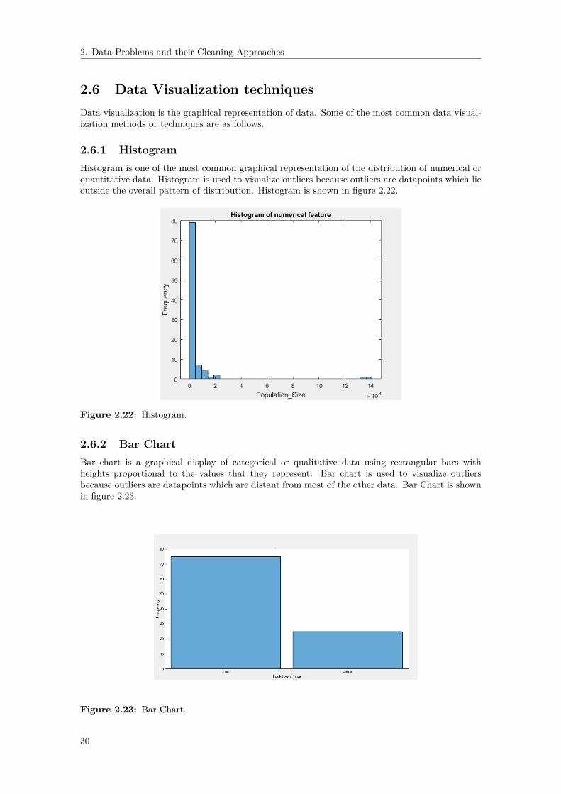
2. Data Problems and their Cleaning Approaches
2.6 Data Visualization techniquesData visualization is the graphical representation of data. Some of the most common data visual-ization methods or techniques are as follows.
2.6.1 HistogramHistogram is one of the most common graphical representation of the distribution of numerical orquantitative data. Histogram is used to visualize outliers because outliers are datapoints which lieoutside the overall pattern of distribution. Histogram is shown in figure 2.22.
Figure 2.22: Histogram.
2.6.2 Bar ChartBar chart is a graphical display of categorical or qualitative data using rectangular bars withheights proportional to the values that they represent. Bar chart is used to visualize outliersbecause outliers are datapoints which are distant from most of the other data. Bar Chart is shownin figure 2.23.
Figure 2.23: Bar Chart.
30

2. Data Problems and their Cleaning Approaches
2.6.3 Box Plot
A box plot is a visual representation of the distribution of numerical data through quartiles. Itdisplays the data distribution based on a five point summary (minimum, first quartile, median,third quartile, and maximum).
• Median (Q2/50th Percentile): The midpoint of the data.• First quartile (Q1/25th Percentile): The datapoint below which the lower 25% of the data
are contained.• Third quartile (Q3/75th Percentile): The datapoint above which the upper 25% of the data
are contained.• InterQuartile Range(IQR = Q3-Q1): The range of datapoints between the lower (Q1) and
upper (Q3) quartiles.• Maximum (Q3+1.5*IQR): The largest datapoint excluding outliers.• Minimum (Q1–1.5*IQR): The smallest datapoint excluding outliers.
The whisker corresponds to approximately ± 2.7 standard deviation and 99.3 percent coverage ifthe data is normally distributed.Box plot can handle extremely large datasets easily. Box plot is used to visualize outliers which aremarked as individual points distant from the other datapoint. If a datapoint is below minimumor above maximum, then it is identified as an outlier. The red points in figure 2.24 are marked asoutliers.
Figure 2.24: Boxplot.
Box plot can show the skewness of a dataset which is seen in figure 2.25. Box plot is used to show ifa dataset is symmetrically distributed or skewed. The distribution is symmetric when the medianis in the middle of the box and the whiskers are about the same on both sides of the box. Thedistribution is positively skewed or right skewed when the median is closer to the bottom of thebox and the whisker is shorter on the lower end of the box. The distribution is negatively skewedor left skewed when the median is closer to the top of the box and the whisker is shorter on theupper end of the box.The whisker lengths are different in skewed distributions because the distance 1.5*IQR is used indetermining the threshold so as to decide if a point is an outlier or not, but then a line is drawnto the point that is closest to being an outlier, but is within distance 1.5*IQR.
31

2. Data Problems and their Cleaning Approaches
Figure 2.25: Box plot showing the skewness of a dataset.
2.6.4 Missingness Map
Missingness map is a plot showing where missingness occurs in the data. Missingness map is shownin figure 2.26.
Figure 2.26: Missingness Map.
32
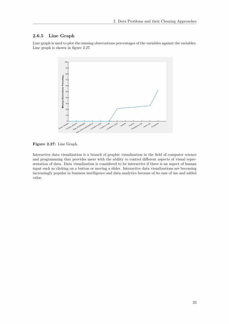
2. Data Problems and their Cleaning Approaches
2.6.5 Line GraphLine graph is used to plot the missing observations percentages of the variables against the variables.Line graph is shown in figure 2.27.
Figure 2.27: Line Graph.
Interactive data visualization is a branch of graphic visualization in the field of computer scienceand programming that provides users with the ability to control different aspects of visual repre-sentation of data. Data visualization is considered to be interactive if there is an aspect of humaninput such as clicking on a button or moving a slider. Interactive data visualizations are becomingincreasingly popular in business intelligence and data analytics because of its ease of use and addedvalue.
33

2. Data Problems and their Cleaning Approaches
34

3Methods
In this thesis, we developed a data cleaning application which can recommend data cleaning ap-proaches according to the specific characteristics of the given dataset. DataCleaningTool is a userfriendly open source data cleaning standalone application. DataCleaningTool is shown in figure3.1. A few key ideas guided the construction process of the tool.
1. It identifies and solves reasonable number of data problems.2. It should be easy and intuitive to use.3. It should display all the information in a clear and concise manner.4. It is code free.5. It provides assistance to users at every stage of data cleaning.
The major data problems encountered by DataCleaningTool are as follows.• Truncation errors such as numbers truncated to certain decimal places.• Incorrect data type such as numerical instead of id entries.• Structural errors such as typographical errors.• Duplicate data such as duplicate rows and columns.• Nonsensical data such as absurd or unusual values.• Extrapolation errors such as extrapolating a trend back in time.• Missing observations such as missing numerical or datetime or text values.• Outliers such as observations that fall outside the overall pattern of a distribution.
In this chapter, we present the methodologies for designing the tool. Sections 3.1-3.9 demonstratethe various widgets and their respective powerful code free data cleaning mechanisms.
Figure 3.1: DataCleaningTool.
35

3. Methods
3.1 Current DataThe Current Data widget displays the input data in table format. The Current Data widget isshown in figure 3.2. The properties of the Current Data widget are as follows.
• The widget shows the presence of round off errors in numerical features.• The widget shows the presence of inconsistent capitalization of feature names and features.• The widget shows the existence of extra whitespaces in text features.• Default datetime format is ‘dd-MMM-yyyy HH:mm:ss‘ for datetime features.• The widget shows the presence of missing numerical observations represented by NaNs.• The widget shows the presence of missing datetime observations represented by NaTs.• The widget shows the presence of missing text observations represented by empty strings.• The updated table can be visualized after each activity since the widget gets updated ac-
cordingly.
Figure 3.2: Current Data Widget.
36
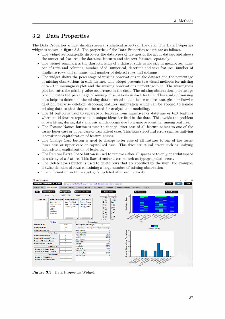
3. Methods
3.2 Data PropertiesThe Data Properties widget displays several statistical aspects of the data. The Data Propertieswidget is shown in figure 3.3. The properties of the Data Properties widget are as follows.
• The widget automatically discovers the datatypes of features of the input dataset and showsthe numerical features, the datetime features and the text features separately.
• The widget summarizes the characteristics of a dataset such as file size in megabytes, num-ber of rows and columns, number of id, numerical, datetime and text features, number ofduplicate rows and columns, and number of deleted rows and columns.
• The widget shows the percentage of missing observations in the dataset and the percentageof missing observations in each feature. The widget presents two visual methods for missingdata - the missingness plot and the missing observations percentage plot. The missingnessplot indicates the missing value occurrence in the data. The missing observations percentageplot indicates the percentage of missing observations in each feature. This study of missingdata helps to determine the missing data mechanism and hence choose strategies like listwisedeletion, pairwise deletion, dropping features, imputation which can be applied to handlemissing data so that they can be used for analysis and modelling.
• The Id button is used to separate id features from numerical or datetime or text featureswhere an id feature represents a unique identifier field in the data. This avoids the problemof overfitting during data analysis which occurs due to a unique identifier among features.
• The Feature Names button is used to change letter case of all feature names to one of thecases- lower case or upper case or capitalized case. This fixes structural errors such as unifyinginconsistent capitalization of feature names.
• The Change Case button is used to change letter case of all features to one of the cases-lower case or upper case or capitalized case. This fixes structural errors such as unifyinginconsistent capitalization of features.
• The Remove Extra Space button is used to remove either all spaces or to only one whitespacein a string of a feature. This fixes structural errors such as typographical errors.
• The Delete Rows button is used to delete rows that are specified by the user. For example,listwise deletion of rows containing a large number of missing observations.
• The information in the widget gets updated after each activity.
Figure 3.3: Data Properties Widget.
37

3. Methods
3.3 Numerical FeaturesThe Numerical Features widget displays statistical description of the numerical data. The Numer-ical Features widget is shown in figure 3.4. The properties of the Numerical Features widget areas follows.
• The widget shows the descriptive statistics of each numerical feature of the data such asminimum observation and maximum observation of the feature. Descriptive statistics of afeature gives a quantitative description of a feature.
• The widget shows the duplicate observations present in each numerical feature and the miss-ing observations percentage of each numerical feature. Duplicate observation can be an errorin the data and could possibly influence later analyses of the data.
• Cross-field validation constraint and range constraint can be set in the widget. This resultsin removal of unwanted numerical observations.
• The Remove Observations button replaces unwanted numerical observations by missing val-ues.
• The Delete Rows button deletes rows with unwanted numerical observations.• Histogram of the selected numerical feature can be visualized in the widget. This is an outlier
visualization technique.• The statistical information of the numerical data in the widget gets updated after each
activity.
Figure 3.4: Numerical Features Widget.
38

3. Methods
3.4 Datetime FeaturesThe Datetime Features widget displays statistical description of the datetime data. The DatetimeFeatures widget is shown in figure 3.5. The properties of the Datetime Features widget are asfollows.
• The widget shows the descriptive statistics of each datetime feature of the data such asminimum observation and maximum observation of the feature.
• The widget also shows the missing observations percentage of each datetime feature.• The Convert To Excel DATEVALUE button converts datetime to Excel serial date number.• Datetime format can be changed.• Constraint and Range can be reset in the widget for each datetime feature. This will result
in some unwanted datetime observations.• The Remove Observations button replaces unwanted datetime observations by missing values.• The Delete Rows button deletes rows with unwanted datetime observations.• Histogram of the selected datetime feature can be visualized in the widget. This is an outlier
visualization technique.• The statistical information of the datetime data in the widget gets updated after each activity.
Figure 3.5: Datetime Features Widget.
39

3. Methods
3.5 Text FeaturesThe Text Features widget displays statistical description of the text data. The Text Featureswidget is shown in figure 3.6. The properties of the Text Features widget are as follows.
• The widget shows the descriptive statistics of each text feature of the data such as categoriesand categories count of the feature.
• The widget also shows the missing observations percentage of each text feature.• The Select Similar Categories button replaces categories with similar ones.• The Label Encoding button assigns each category of a categorical feature a value from 0 ton− 1 where n is the number of categories. Note that label encoding is an encoding approachusually for handling ordinal categorical features.
• The One-Hot Encoding Button button transforms n categories to either n or n − 1 dummyvariables for a categorical feature. Note that one-hot encoding is an encoding approachusually for handling nominal categorical features.
• The Remove Observations button replaces outliers by missing values.• The Delete Rows button deletes rows with outliers.• Histogram of the selected text feature can be visualized in the widget. This is an outlier
visualization technique.• Boxplot of the selected numerical feature versus the text feature can be visualized in the
widget. This is another outlier visualization technique.• The statistical information of the text data in the widget gets updated after each activity.
Figure 3.6: Text Features Widget.
40
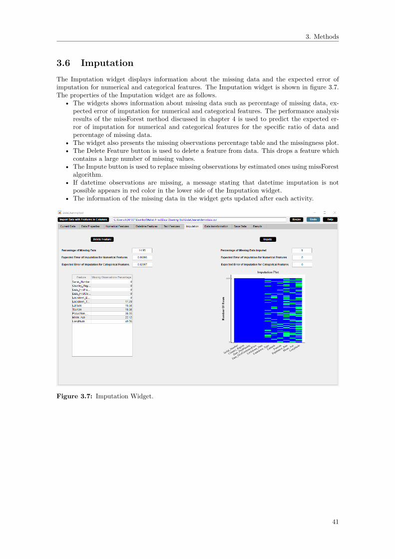
3. Methods
3.6 ImputationThe Imputation widget displays information about the missing data and the expected error ofimputation for numerical and categorical features. The Imputation widget is shown in figure 3.7.The properties of the Imputation widget are as follows.
• The widgets shows information about missing data such as percentage of missing data, ex-pected error of imputation for numerical and categorical features. The performance analysisresults of the missForest method discussed in chapter 4 is used to predict the expected er-ror of imputation for numerical and categorical features for the specific ratio of data andpercentage of missing data.
• The widget also presents the missing observations percentage table and the missingness plot.• The Delete Feature button is used to delete a feature from data. This drops a feature which
contains a large number of missing values.• The Impute button is used to replace missing observations by estimated ones using missForest
algorithm.• If datetime observations are missing, a message stating that datetime imputation is not
possible appears in red color in the lower side of the Imputation widget.• The information of the missing data in the widget gets updated after each activity.
Figure 3.7: Imputation Widget.
41

3. Methods
3.7 Data TransformationThe Data Transformation widget displays the numerical features of the data on which data trans-formation can only be applied. The Data Transformation widget is shown in figure 3.8. Theproperties of the Data Transformation widget are as follows.
• The widget presents the numerical features of the data.• The Transform button is used to standardize or normalize or logarithm or exponential or
squareroot or inverse transform the selected numerical features. Here ’mean 0 and standarddeviation’ represents standardize, ’between 0 and 1’ represents normalize, ’ln’ representsnatural logarithm transform, ’log10’ represents logarithm base 10 transform, ’log2’ representslogarithm base 2 transform, ’exp’ represents natural exponential transform, ’sqrt’ representssquareroot transform and ’reciprocal’ represents inverse transform.
• Histogram of the transformed numerical feature can be visualized in the widget. This is anoutlier visualization technique.
• A message regarding the percentage increase in missing data due to data transformationappears in red color in the lower side of the Data Transformation widget.
• The numerical features of the data in the widget gets updated after each activity.
Figure 3.8: Data Transformation Widget.
42

3. Methods
3.8 Save DataThe Save Data widget displays the full paths of the saved files. The Save Data widget is shown infigure 3.9. The properties of the Save Data widget are as follows.
• The widget saves data in csv or xlsx format after data cleaning.• Data can be saved for multiple times after each activity.• The full paths of the saved files are displayed.
Figure 3.9: Save Data Widget.
43
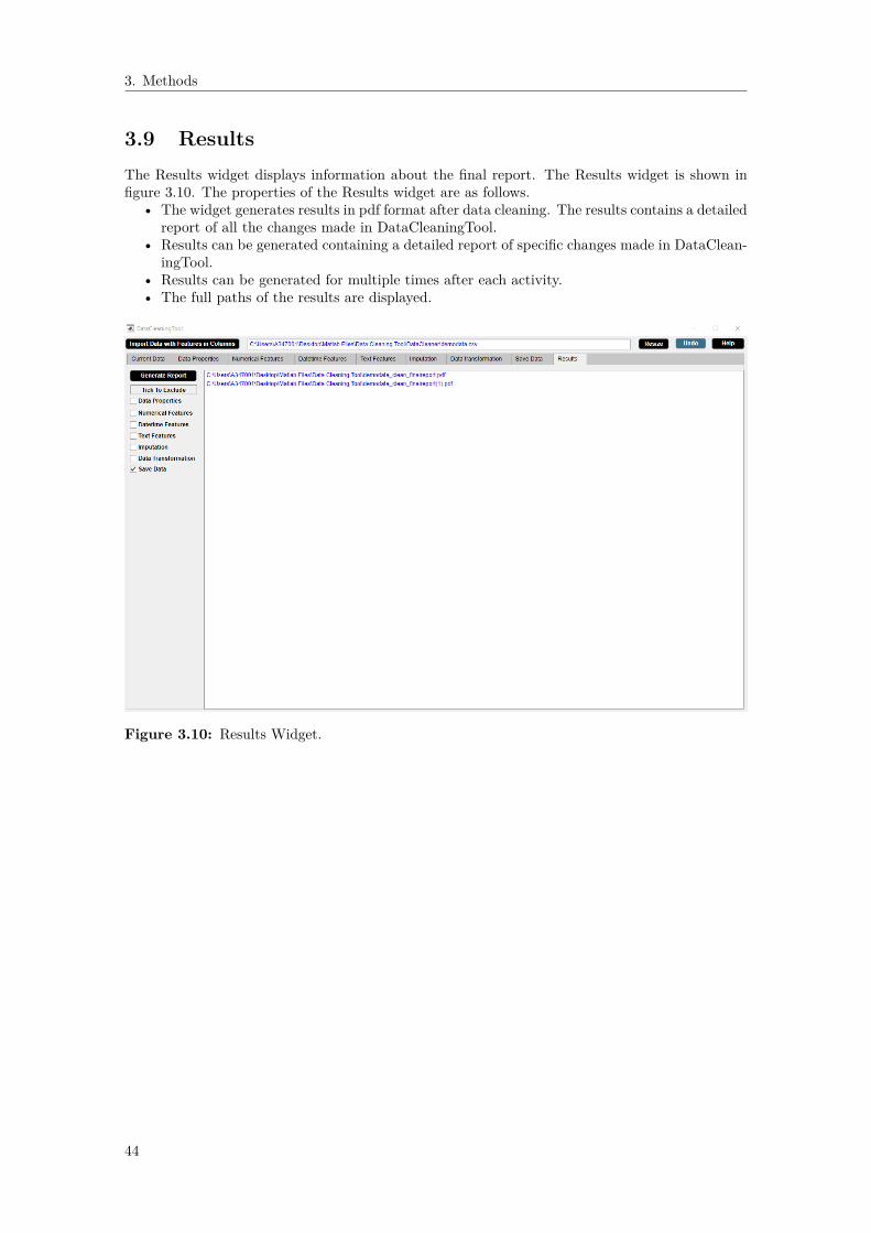
3. Methods
3.9 ResultsThe Results widget displays information about the final report. The Results widget is shown infigure 3.10. The properties of the Results widget are as follows.
• The widget generates results in pdf format after data cleaning. The results contains a detailedreport of all the changes made in DataCleaningTool.
• Results can be generated containing a detailed report of specific changes made in DataClean-ingTool.
• Results can be generated for multiple times after each activity.• The full paths of the results are displayed.
Figure 3.10: Results Widget.
44

4Results and Discussion
The results are discussed in chapter 4. In Section 4.1, the performance analysis of the missForestmethod is studied. The analysis is done in order to get an idea of how well the method works.The results of the analysis also provide the basis for the recommendation that the user receiveswhen they try to impute missing values. Section 4.2 presents the performance analysis of differentmultivariate outlier detection methods. However, none of the multivariate outlier detection meth-ods are implemented in DataCleaningTool due to time constraint. Section 4.3 presents a demo ofDataCleaningTool. This basically demonstrates the results of the methods as described in Chapter3.
4.1 Performance Analysis of the MissForest Method
The performance of the missForest method is analysed using the automobile dataset [36]. Theautomobile dataset describes the relation between different car attributes and car price. Thedifferent n× p dimensional datasets used in the study are acquired by selecting random subsets ofthe automobile dataset. Here n is the number of observations and p is the number of features.
4.1.1 Continuous DataIn the section, we focus on continuous data only. Here all features are numeric. We examine thefollowing three cases:
Case A: Overdetermined where number of observations is greater than number offeatures in the dataset, n >> p
• Dataset I (n = 8p, n = 120, p = 15): The dataset consists of 120 observations and 15features.
• Dataset II (n = 2p, n = 30, p = 15): The dataset consists of 30 observations and 15 features.
Case B: Equal where number of observations is equal to number of features in thedataset, n = p
• Dataset III (n = p, n = 15, p = 15): The dataset consists of 15 observations and 15 features.
Case C: Underdetermined where number of observations is less than number of fea-tures in the dataset, p >> n
• Dataset IV (n = 0.5p, n = 7, p = 15): The dataset consists of 7 observations and 15 features.
We perform error analysis by plotting different percentages of missing data versus their respectiveaverage NRSME for the continuous datasets I-IV. The plots are shown in figure 4.1. The averageNRSME values are presented in table A.1 which can be found in appendix A. The performance ofthe missForest method for continuous data only is discussed as follows.
– The missForest imputation method does not converge at > 90%, > 80%, > 70%, > 50% ofmissing data for datasets I, II, III and IV respectively.
45

4. Results and Discussion
– The general trend as seen in figure 4.1 shows that there is a linear relationship between theaverage NRSME and the percentage of missing data. The average NRSME value increaseswith increase in percentage of missing data.
– The performance of missForest method on different datasets is compared as follows:Dataset I > Dataset II > Dataset III > Dataset IV.
– The missForest method performs best for the overdetermined case.
Figure 4.1: Figures show the plots of average NRSME over different percentages of missingdata for continuous datasets I-IV. Asterisk represents average NRSME and vertical line representsstandard deviation of average NRSME calculated for each percentage of missing data after 5 runs.
4.1.2 Categorical DataIn the section, we focus on categorical data only. Here all 9 features are categorical. We investigatethe following three cases:
Case A: Overdetermined where number of observations is greater than number offea-tures in the dataset, n >> p
• Dataset V (n = 8p, n = 72, p = 9): The dataset consists of 72 observations and 9 features.• Dataset VI (n = 2p, n = 18, p = 9): The dataset consists of 18 observations and 9 features.
Case B: Equal where number of observations is equal to number of features in thedataset, n = p
• Dataset VII (n = p, n = 9, p = 9): The dataset consists of 9 observations and 9 features.
Case C: Underdetermined where number of observations is less than number of fea-tures in the dataset, p >> n
• Dataset VIII (n = 0.5p, n = 4, p = 9): The dataset consists of 4 observations and 9 features.
46
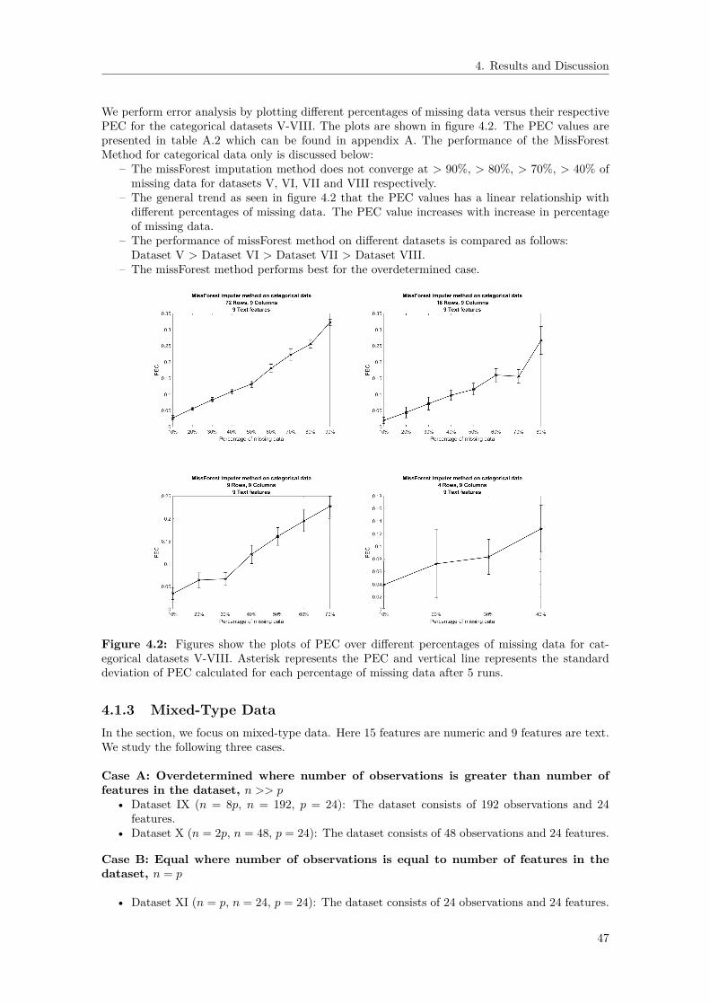
4. Results and Discussion
We perform error analysis by plotting different percentages of missing data versus their respectivePEC for the categorical datasets V-VIII. The plots are shown in figure 4.2. The PEC values arepresented in table A.2 which can be found in appendix A. The performance of the MissForestMethod for categorical data only is discussed below:
– The missForest imputation method does not converge at > 90%, > 80%, > 70%, > 40% ofmissing data for datasets V, VI, VII and VIII respectively.
– The general trend as seen in figure 4.2 that the PEC values has a linear relationship withdifferent percentages of missing data. The PEC value increases with increase in percentageof missing data.
– The performance of missForest method on different datasets is compared as follows:Dataset V > Dataset VI > Dataset VII > Dataset VIII.
– The missForest method performs best for the overdetermined case.
Figure 4.2: Figures show the plots of PEC over different percentages of missing data for cat-egorical datasets V-VIII. Asterisk represents the PEC and vertical line represents the standarddeviation of PEC calculated for each percentage of missing data after 5 runs.
4.1.3 Mixed-Type DataIn the section, we focus on mixed-type data. Here 15 features are numeric and 9 features are text.We study the following three cases.
Case A: Overdetermined where number of observations is greater than number offeatures in the dataset, n >> p
• Dataset IX (n = 8p, n = 192, p = 24): The dataset consists of 192 observations and 24features.
• Dataset X (n = 2p, n = 48, p = 24): The dataset consists of 48 observations and 24 features.
Case B: Equal where number of observations is equal to number of features in thedataset, n = p
• Dataset XI (n = p, n = 24, p = 24): The dataset consists of 24 observations and 24 features.
47

4. Results and Discussion
Case C: Underdetermined where number of observations is less than number of fea-tures in the dataset, p >> n
• Dataset XII (n = 0.5p, n = 12, p = 24): The dataset consists of 12 observations and 24features.
We perform error analysis by plotting different percentages of missing data versus their respectiveaverage NRSME and PEC for the mixed type datasets IX-XII. The plots are shown in figure4.3. The average NRSME values and the PEC values are presented in table A.3 and table A.4,respectively which can be found in appendix A. The performance of the MissForest Method formixed type of data is discussed below.
– The missForest imputation method does not converge at > 90%, > 90%, > 80%, > 70% ofmissing data for mixed type datasets IX, X, XI and XII respectively.
– The general trend as seen in figure 4.2 that the average NRSME values and the PEC valueshas a linear relationship with different percentages of missing data. The average NRSMEvalue and the PEC value increases with increase in percentage of missing data.
– The results of the comparison of different datasets are seen in figures A.3 and A.4. ThemissForest method performs as follows: Dataset IX > Dataset X > Dataset XI > DatasetXII.
– The missForest method performs best for the overdetermined case.
– The MissForest method works well for any type of data. Particularly, it can handle bothcontinuous and categorical data at the same time.
– There is no need for prior scaling of data to perform the MissForest method.
– The imputation method performs well for underdetermined case (n = 0.5p). This impliesthat the MissForest method can handle high dimensional data.
– For mixed type data, the imputation method does not converge at > 90% of missing datafor overdetermined system (n = 8p & n = 2p), whereas the imputation method does notconverge at > 80% of missing data for equal system (n = p) and > 60% of missing data forunderdetermined system (n = 0.5p). This shows that the MissForest method can performimputation for large amount of missing observations in the data.
– From our analysis, we see the trend that both NRMSE and PEC increases with increasingpercentage of missing data. The MissForest algorithm is less biased than other imputationmethods since it is based on random forests. Random forests consider multiple trees andeach tree is trained on a subset of data and the final outcome depends on all the trees whichreduces the biasedness of the method.
– Although the MissForest method can handle missing data very well, it is computationallycomplex due to the large number of decision trees joined together. Due to the complexityof the MissForest method, it is much more time consuming than other imputation methods.The comparison of runtimes of several imputation methods is given in figure 2.15.
48

4. Results and Discussion
Figure 4.3: Left figures show the plots of average NRSME over different percentages of missingdata while right figures show the plots of PEC over different percentages of missing data for datasetsIX-XII. Asterisks represent the average NRSME or PEC and vertical lines represent the standarddeviation of average NRSME or PEC calculated for each percentage of missing data after 5 runs.
49

4. Results and Discussion
4.2 Performance Analysis of the Outlier Detection Methods
We analyse the performance of different outlier detection methods such as leverage, local outlierfactor and DBSCAN. Unfortunately, the results of this analysis are not incorporated in the finaltool because of the limited time. The evaluation is performed on various outlier detection datasetsobtained from [37]. These outlier detection datasets are of different dimensions. These datasetsare labeled data for training and validation of outlier detection methods. Each datapoint of thesedatasets is labeled as true outlier or inlier by a specific outlier detection method.For each outlier detection method studied here, we calculate outlier accuracy, inlier accuracy andtotal accuracy for these datasets. Outlier accuracy is defined as the percentage of accuracy betweentrue outliers and outliers labeled by an outlier detection method in an outlier detection dataset.Inlier accuracy is defined as the percentage of accuracy between true inliers and inliers labeledby an outlier detection method in an outlier detection dataset. Total accuracy is defined as thepercentage of accuracy between true labels and labels marked by an outlier detection method inan outlier detection dataset.
4.2.1 Leverage
The accuracy percentages of leverage method for different datasets are presented in table 4.1.
Table 4.1: The table represents the comparison of accuracy percentages of leverage with differentdatasets.
Accuracy percentage Parameter LeverageOutlier Detection Datasets Threshold Outlier Inlier Total
Accuracy Accuracy AccuracySpeech (3686,400) (1.65%) 0.2170 (2p/n) 0 100 98.35Thyroid (3772,6) (2.5%) 0.0032 (2p/n) 54.84 94.54 93.56Cardio (1831,21) (9.6%) 0.0229 (2p/n) 38.07 95.71 90.17Arrhythmia (452,274) (15%) 0.9093 (1.5p/n) 0 100 85.40Satellite (6435,36) (32%) 0.0112 (2p/n) 18.66 97.23 72.37Ionosphere(351,33) (36%) 0.1880 (2p/n) 53.17 100 83.19
4.2.2 Local Outlier Factor
The accuracy percentages of local outlier factor method for different datasets are presented in table4.2.
Table 4.2: The table represents the comparison of accuracy percentages of local outlier factorwith different datasets.
Accuracy percentage Parameter Local Outlier FactorOutlier Detection Datasets Threshold Outlier Inlier Total
Accuracy Accuracy AccuracySpeech (3686,400) (1.65%) 0.9835 quantile 1.64 98.35 96.74Thyroid (3772,6) (2.5%) 0.975 quantile 24.73 98.07 96.26Cardio (1831,21) (9.6%) 0.904 quantile 17.05 91.18 84.05Arrhythmia (452,274) (15%) 0.85 quantile 50 90.93 84.96Satellite (6435,36) (32%) 0.68 quantile 42.39 72.81 63.19Ionosphere(351,33) (36%) 0.64 quantile 73.81 85.33 81.20
50
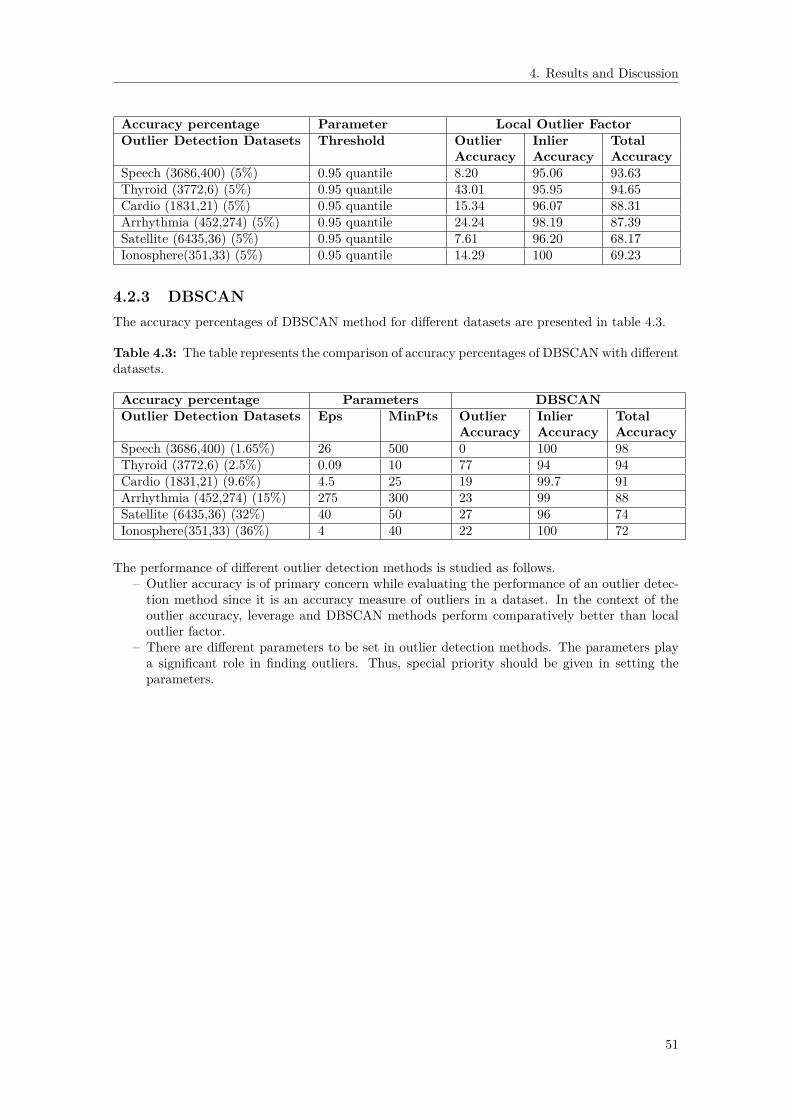
4. Results and Discussion
Accuracy percentage Parameter Local Outlier FactorOutlier Detection Datasets Threshold Outlier Inlier Total
Accuracy Accuracy AccuracySpeech (3686,400) (5%) 0.95 quantile 8.20 95.06 93.63Thyroid (3772,6) (5%) 0.95 quantile 43.01 95.95 94.65Cardio (1831,21) (5%) 0.95 quantile 15.34 96.07 88.31Arrhythmia (452,274) (5%) 0.95 quantile 24.24 98.19 87.39Satellite (6435,36) (5%) 0.95 quantile 7.61 96.20 68.17Ionosphere(351,33) (5%) 0.95 quantile 14.29 100 69.23
4.2.3 DBSCANThe accuracy percentages of DBSCAN method for different datasets are presented in table 4.3.
Table 4.3: The table represents the comparison of accuracy percentages of DBSCAN with differentdatasets.
Accuracy percentage Parameters DBSCANOutlier Detection Datasets Eps MinPts Outlier Inlier Total
Accuracy Accuracy AccuracySpeech (3686,400) (1.65%) 26 500 0 100 98Thyroid (3772,6) (2.5%) 0.09 10 77 94 94Cardio (1831,21) (9.6%) 4.5 25 19 99.7 91Arrhythmia (452,274) (15%) 275 300 23 99 88Satellite (6435,36) (32%) 40 50 27 96 74Ionosphere(351,33) (36%) 4 40 22 100 72
The performance of different outlier detection methods is studied as follows.– Outlier accuracy is of primary concern while evaluating the performance of an outlier detec-tion method since it is an accuracy measure of outliers in a dataset. In the context of theoutlier accuracy, leverage and DBSCAN methods perform comparatively better than localoutlier factor.
– There are different parameters to be set in outlier detection methods. The parameters playa significant role in finding outliers. Thus, special priority should be given in setting theparameters.
51

4. Results and Discussion
4.3 DemoDataCleaningTool is a user friendly, free and open source data cleaning standalone applicationdeveloped using Matlab App Designer 2018b version. DataCleaningTool app installation file canbe found in the github repository [38]. The Matlab code can be accessed from github repository [39].DataCleaningTool is a data cleaning application which consists of multiple widgets and buttons.The properties of DataCleaningTool are
• DataCleaningTool always opens in a full screen mode. The application can be resized to areduced size.
• Each widget provides specific statistical information about the data.• Each button aims to clean data by resolving inconsistencies, smoothing noisy data, identifying
outliers, removing outliers or filling in missing observations.• Each widget gets updated accordingly after each activity.• All buttons are black in color. Pressing a button each time changes the button color from
black to grey color and then again to black. The button remains grey in color until itcompletes its specific task and all widgets gets updated accordingly.
• Pressing any button turns the Undo button to blue color. The Undo button remains blue incolor until last activity can be undone.
• Sliders and their corresponding edit boxes are interdependable.• User can find help in using DataCleaningTool.
We demonstrate the DataCleaningTool using an example dataset ‘demodata.csv’. The exampledataset is obtained by tweaking the coronavirus dataset [40]. The example dataset is of dimension127× 12. The example dataset consists of the following features.
1. Serial_Number: Unique identifier to a country.2. Country_Region: Name of the country.3. Population_Size: Size of the population of the country.4. tourism: Number of international arrivals in the country.5. Date_FirstFatality: Date of the first fatality in the country.6. Date_FirstConfirmedCase: Date of the first confirmed case in the country.7. Latitude: Geographic coordinate of the country.8. Longtitude: Geographic coordinate of the country.9. mean_Age: Mean age of the population of the country.10. Lockdown_Date: Date of the lockdown in the country.11. Lockdown_Type: Level of the lockdown (full or partial) in the country.12. Country_Code: Geographical code representing the country.
Using the example dataset, we will show how to clean a statistical dataset using DataCleaning-Tool developed in this thesis. The complete demo can be found in appendix B. First we wish tounderstand our data by doing a descriptive statistics analysis of our dataset. In Descriptive Statis-tics, we are describing and summarizing our data, either through numerical calculations or graphs.Secondly we distinguish id feature ‘Serial_Number’ from other numerical features. Next we detectinconsistent capitalization of feature names such as ‘Serial_Number’, ‘Country_Region’, ‘Popula-tion_Size’, ‘tourism’, ‘Date_FirstFatality’, ‘Date_FirstConfirmedCase’, ‘Latitude’, ‘Longtitude’,‘mean_Age’, ‘Lockdown_Date’, ‘Lockdown_Type’, ‘Country_Code’ and unify inconsistent capi-talization of feature names. Then we wish to extract data for the countries whose ‘Population_Size’is greater than ‘Tourism’. So we set cross-field validation constraint to remove irrelevant observa-tions. Then we wish to extract data for the countries whose maximum ‘Mean_Age’ is 45. So weset the range constraint to remove irrelevant observations. We delete feature ‘Longitude’ since itcontains a large percentage of missing observations. We illustrate missing observations by miss-ingness plot and impute missing observations using missForest method. Lastly, we log transformthe numerical feature ‘Population_Size’ which makes the feature less skewed.
52

4. Results and Discussion
4.3.1 Load dataThe first step is to load the example data ‘demodata.csv’. We use Import Data with Featuresin Columns button to load the example data. We browse for the input file. The full path ofthe selected file is displayed and the file is loaded. Figures 4.4-4.6 illustrate how to load data inDataCleaningTool.
Figure 4.4: Step 1. Click Import Data with Features in Columns button.
Figure 4.5: Step 2. Import Data with Features in Columns button in use turns grey in color andan open dialog box appears. Browse for an input file.
Figure 4.6: Step 3. Import Data with Features in Columns button returns back to its originalcolor once it completes its task. The full path of the selected file is displayed and the file is loaded.
53

4. Results and Discussion
4.3.2 Show statistical informationFigure 4.7 shows the statistical information of the example data. Figures 4.8-4.10 shows thedescriptive statistics of the numerical, the datetime and the text features respectively.
Figure 4.7: Statistical information of the example data is displayed in the Data Properties widget.
Figure 4.8: Descriptive statistics of numerical features is displayed in the Numerical Featureswidget.
54

4. Results and Discussion
Figure 4.9: Descriptive statistics of datetime features is displayed in the Datetime Featureswidget.
Figure 4.10: Descriptive statistics of text features is displayed in the Text Features widget.
55
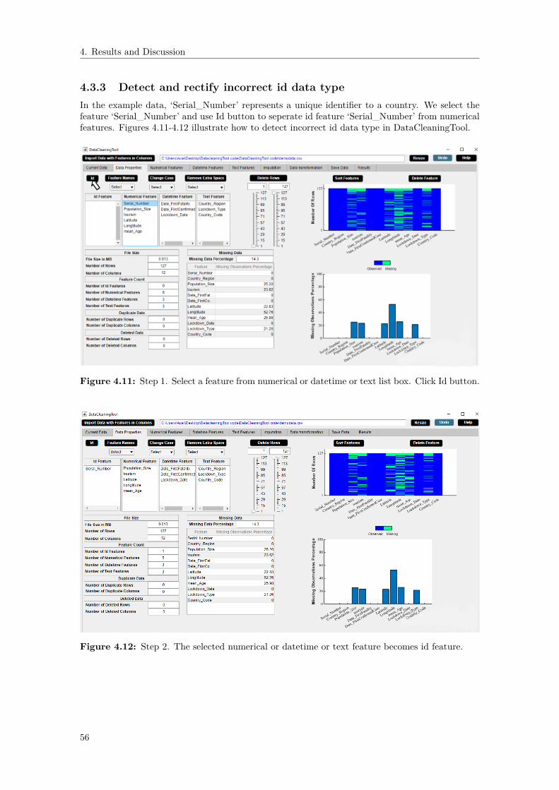
4. Results and Discussion
4.3.3 Detect and rectify incorrect id data typeIn the example data, ‘Serial_Number’ represents a unique identifier to a country. We select thefeature ‘Serial_Number’ and use Id button to seperate id feature ‘Serial_Number’ from numericalfeatures. Figures 4.11-4.12 illustrate how to detect incorrect id data type in DataCleaningTool.
Figure 4.11: Step 1. Select a feature from numerical or datetime or text list box. Click Id button.
Figure 4.12: Step 2. The selected numerical or datetime or text feature becomes id feature.
56

4. Results and Discussion
4.3.4 Detect and unify inconsistent capitalization of feature namesIn the example data, the feature names ‘tourism’, ‘mean_Age’ have inconsistent capitalization. Weuse Feature Names button to capitalize each feature name so as to unify inconsistent capitalization.Figures 4.13-4.14 illustrate how to detect inconsistent feature names in DataCleaningTool.
Figure 4.13: Step 1. Select case from dropdown menu. Click Feature Names button.
Figure 4.14: Step 2. Check that the feature names have consistent capitalization.
57

4. Results and Discussion
4.3.5 Set cross-field validation constraint and remove irrelevant obser-vations
We use Remove Observations button to extract data for the countries whose ‘Population_Size’ isgreater than ‘Tourism’. Figures 4.15-4.16 illustrate how to set constraint in DataCleaningTool.
Figure 4.15: Step 1. Set constraint from Less or Greater Than Feature Edit dropdown menu.
Figure 4.16: Step 2. Click Remove Observations button to replace irrelevant by missing.
58

4. Results and Discussion
4.3.6 Set range constraint and remove irrelevant observationsWe use Delete Rows button to extract data for the countries whose maximum ‘Mean_Age’ ofpopulation is 45. Figures 4.31-4.32 illustrate how to set range constraint in DataCleaningTool.
Figure 4.17: Step 1. Set maximum ‘Mean_Age’ as 45 from maximum slider or Max Edit box.
Figure 4.18: Step 2. Click Delete Rows button to delete rows containing irrelevant observations.The updated histogram of the selected feature appears on the left side of widget.
59

4. Results and Discussion
4.3.7 Label encodingWe use Label Encoding button to label encode the categorical feature ‘Lockdown_Type’. Figures4.19-4.20 illustrate how to label encode a categorical feature in DataCleaningTool.
Figure 4.19: Step 1. Select categorical feature from Feature column of the text features descrip-tive statistics table. Click Label Encoding button.
Figure 4.20: Step 2. Check that the text feature is label encoded in Current Data widget.
60

4. Results and Discussion
4.3.8 One-hot encodingWe use One Hot Encoding button to one hot encode the categorical feature ‘Country_Region’.Figures 4.21-4.22 illustrate how to one hot encode a categorical feature in DataCleaningTool.
Figure 4.21: Step 1. Select categorical feature from Feature column of the text features descrip-tive statistics table. Select an option from dropdown menu. Click One Hot Encoding button.
Figure 4.22: Step 2. Check that the text feature is one hot encoded in Current Data widget.
61

4. Results and Discussion
4.3.9 Drop feature with large number of missing observationsWe use Delete Feature button to drop ‘Longitude’ feature which has a large number of missingvalues. Figures 4.23-4.24 illustrate how to drop a feature in DataCleaningTool.
Figure 4.23: Step 1. Select a feature from Feature column of missing observations percentagetable. Click Delete Feature button.
Figure 4.24: Step 2. Check that the selected feature is deleted.
62

4. Results and Discussion
4.3.10 Illustrate and impute missing observationsWe use Impute button to impute missing values in the example data using missForest method.Figures 4.25-4.26 illustrate how to impute missing observations in DataCleaningTool.
Figure 4.25: Step 1. Click Impute button.
Figure 4.26: Step 2. Check that the missing observations are imputed.
63

4. Results and Discussion
4.3.11 Transform numerical featuresWe use Transform button to logarithmize ‘Population_Size’ in the example data. Figures 4.27-4.28illustrate how to transform numerical features in DataCleaningTool.
Figure 4.27: Step 1. Select numerical features from Select Numerical Features list box. ClickTransform button.
Figure 4.28: Step 2. Check that the numerical feature is transformed by histogram display.
64

4. Results and Discussion
4.3.12 Interactive data visualizationsWe wish to sort features in plots according to increasing percentage of missing observations. Figures4.29-4.30 illustrate how to operate on plots in DataCleaningTool by clicking a button.
Figure 4.29: Step 1. Click Sort Features button.
Figure 4.30: Step 2. Check that the plots are sorted by increasing percentage of missing obser-vations.
65
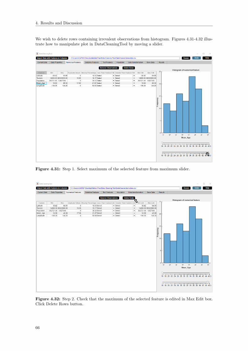
4. Results and Discussion
We wish to delete rows containing irrevalent observations from histogram. Figures 4.31-4.32 illus-trate how to manipulate plot in DataCleaningTool by moving a slider.
Figure 4.31: Step 1. Select maximum of the selected feature from maximum slider.
Figure 4.32: Step 2. Check that the maximum of the selected feature is edited in Max Edit box.Click Delete Rows button.
66

5Conclusion
Data cleaning is a necessary step in data-driven analytics. Different data cleaning tasks targetdifferent data problems. In this thesis, we support the process of data cleaning. To support thestudy, the main outcome of the thesis work is the development of a user cooperative data cleaningtool. The chapter discusses two aspects of the thesis work. In Section 5.1, the contributions aresummarized and in Section 5.2, the future directions of the work are discussed.
5.1 ContributionsDataCleaningTool is a user friendly standalone application that offers multiple data cleaning ap-proaches in one platform. As compared to existing data cleaning tools, DataCleaningTool isdesigned with the following core competencies.
• The tool is not a black box.• It is simple to use.• It assists users in each step of cleaning data.• It solves data inconsistency.• It tackles noisy data.• It performs missing data imputation for both continuous and categorical data at the same
time using missForest algorithm.• It deals with outliers.• It provides interactive data visualization techniques.• It is a free and open source software.
5.2 Future WorkData cleaning involves a wide variety of cleaning tasks to detect and solve data problems and sothere are many aspects one can focus on. Although DataCleaningTool tries to fix as many dataproblems as possible, there remains much room for improvement. Some of the aspects need to befocused are as follows.
• Automated Display of Data and Statistical Information of Data– In case of large volume of data, DataCleaningTool runs slow and it takes time to display
the whole data. Thus, dealing with high volume data can be a future work. SinceDataCleaningTool is a Matlab based application, one can generate a Matlab script toautomatically connect to a SQL database, run an SQL query, and perform data cleaningon the imported data.
• Automated Data Type Discovery– We can automatically discover three basic data types such as numerical, text and date-
time in DataCleaningTool. In future, one can discover further classification of datatypes such as ordinal and interval in DataCleaningTool.
• Removal of Unwanted Data– In DataCleaningTool, we can identify and remove unwanted data such as irrelevant
observations which do not fit the specific problem to be solved by the user. Althoughwe calculate the number of duplicate rows and columns in the data, we can not identify
67

5. Conclusion
and remove them in DataCleaningTool. In future, the task of identifying and removingduplicates can be implemented in DataCleaningTool.
• Outlier Detection– We only consider univariate outlier detection method in DataCleaningTool. Although
we examined the performance of different multivariate outlier detection methods suchas leverage, local outlier factor and DBSCAN, the methods are not implemented inDataCleaningTool owing to time constraints. A further project can be performed toexplore the different multivariate outlier detection methods in DataCleaningTool.
• Missing Data Handling– We implement missForest method to impute missing values for mixed type data in Dat-
aCleaningTool. We also predict the performance of the missForest imputation methodusing the normalized root mean squared error for continuous data and the percentageof erroneous categorical entries for categorical data. In our tool, we do not impute date-time values. A further work can be done to implement the task of imputing datetimefeatures in DataCleaningTool.
• Data Transformation– Common data transformations such as standardization, normalization, logarithm, ex-
ponential, square root and inverse are implemented in DataCleaningTool. There aremultiple other mathematical functions that the values of a specific numerical featurecan be transformed such that they are most suitable for the algorithm being used. Forfuture work, it can be implemented in DataCleaningTool that the user can choose anymathematical function to transform a numerical feature accordingly.
• Data Visualization– We provide various interactive data visualization techniques so that the user can directly
operate on the visualization to explore what they want. However, the data visualiza-tion techniques used in DataCleaningTool are univariate which helps to understandeach feature of the data separately. Therefore, in future multivariate data visualizationmethods such scatter plot, heatmap and parallel coordinates plot can be implementedin DataCleaningTool for visualizing and analyzing high dimensional data..
• Further development– Another issue that is left to explore is the issue of multicollinearity. Multicollinearity
is a serious issue in statistical learning models such as regression because it underminesthe statistical significance of an independent variable.
– The primary task of DataCleaningTool is data cleaning. In future, the data cleaningtask can be extended to data analysis.
68

Bibliography
[1] Gali Halevi and Henk Moed. The evolution of big data as a research and scientific topic:Overview of the literature. Research Trends, 30:3–6, 01 2012.
[2] Mircea Trifu and Mihaela Laura Ivan. Big data : present and future big data : present andfuture. 2014.
[3] Openrefine [internet]. openrefine.org. 2020 [cited 7 september 2020]. available from: https://openrefine.org/.
[4] Data wrangler [internet]. vis.stanford.edu. 2020 [cited 7 september 2020]. available from: http://vis.stanford.edu/wrangler/.
[5] Winpure [internet]. winpure.com. 2020 [cited 7 september 2020]. available from: https://winpure.com/.
[6] rhiever/datacleaner [internet]. github. 2020 [cited 7 september 2020]. available from: https://github.com/rhiever/datacleaner.
[7] ekstroem/datamaid [internet]. github. 2020 [cited 7 september 2020]. available from: https://github.com/ekstroem/dataMaid.
[8] Sas [internet]. documentation.sas.com. 2020 [cited 7 september 2020]. available from: https://documentation.sas.com/.
[9] Time series data anomaly detection: A closer look [internet]. anodot. 2020[cited 7 september 2020]. available from: https://www.anodot.com/blog/closer-look-time-series-anomaly-detection/.
[10] Anomaly detection - happiest minds [internet]. solutions. 2020 [cited 7 september 2020]. avail-able from: https://www.happiestminds.com/solutions/anomaly-detection/.
[11] Won Kim, Byoung-Ju Choi, Eui Hong, Soo-Kyung Kim, and Doheon Lee. A taxonomy ofdirty data. Data Min. Knowl. Discov., 7:81–99, 01 2003.
[12] How to use spell checker with matlab? - matlab answers - matlab central [internet].in.mathworks.com. 2020 [cited 7 september 2020]. available from: https://in.mathworks.com/matlabcentral/answers/231219-how-to-use-spell-checker-with-matlab.
[13] Set command window output display format - matlab format [internet]. mathworks.com. 2020[cited 7 september 2020]. available from: https://www.mathworks.com/help/matlab/ref/format.html.
[14] Daniel J. Stekhoven and Peter Bühlmann. Missforest - non-parametric missing value imputa-tion for mixed-type data. Bioinformatics, 28 1:112–8, 2012.
[15] Keigo Kimura and Tetsuya Yoshida. Non-negative matrix factorization with sparse features.pages 324–329, 11 2011.
[16] Joris M. Mooij, Jonas Peters, Dominik Janzing, Jakob Zscheischler, and Bernhard Schölkopf.Distinguishing cause from effect using observational data: methods and benchmarks. CoRR,abs/1412.3773, 2014.
[17] Aryana Jackson and Seán Lacey. The discrete fourier transformation for seasonality andanomaly detection on an application to rare data. ahead-of-print, 05 2020.
[18] Z.M. Nopiah, A. Lennie, S. Abdullah, M.Z. Nuawi, A.Z. Nuryazmin, and M.N. Baharin. Theuse of autocorrelation function in the seasonality analysis for fatigue strain data. Journal ofAsian Scientific Research, 2(11):782–788, 2012.
[19] David C. Hoaglin and Roy E. Welsch. The hat matrix in regression and anova. 1978.[20] Vijayakumar Veeramani, Nallam Divya, P. Sarojini, and K. Sonika. Isolation forest and local
outlier factor for credit card fraud detection system. 04 2020.
69

Bibliography
[21] Joseph Dettori and Daniel Norvell. The anatomy of data. Global Spine Journal,8:219256821774699, 01 2018.
[22] Nicholas Matthews. Measurement, Levels of. 01 2017.[23] G. Darlington. Dummy Variables. 07 2005.[24] Norazian Mohamed Noor. Roles of imputation methods for filling the missing values: A
review. Advances in Environmental Biology, 7:3861–3869, 01 2013.[25] Shinichi Nakagawa. Chapter 4 missing data : mechanisms , methods , andmessages. 2015.[26] Donald B. Rubin. Inference and missing data. Biometrika, 63(3):581–592, 1976.[27] Sutthipong Meeyai. Logistic regression with missing data: A comparison of handling methods,
and effects of percent missing values. Journal of Traffic and Logistics Engineering, 2016.[28] Leo Breiman. Random Forests. Machine Learning, 45(1):5–32, 2001.[29] Celine Vens. Random Forest, pages 1812–1813. Springer New York, New York, NY, 2013.[30] Adele Cutler, David Cutler, and John Stevens. Random Forests, volume 45, pages 157–176.
01 2011.[31] Chapter 9 - noninvasive fracture characterization based on the classification of sonic wave
travel times. In Siddharth Misra, Hao Li, and Jiabo He, editors, Machine Learning for Sub-surface Characterization, pages 243 – 287. Gulf Professional Publishing, 2020.
[32] Varun Chandola, Arindam Banerjee, and Vipin Kumar. Anomaly detection: A survey. ACMComput. Surv., 41(3), July 2009.
[33] Markus Goldstein and Seiichi Uchida. A comparative evaluation of unsupervised anomalydetection algorithms for multivariate data. PLoS ONE, 11, 2016.
[34] Charu C. Aggarwal. Outlier Analysis. Springer Publishing Company, Incorporated, 2ndedition, 2016.
[35] Markus M. Breunig, Hans-Peter Kriegel, Raymond T. Ng, and Jörg Sander. Lof: Identi-fying density-based local outliers. In Proceedings of the 2000 ACM SIGMOD InternationalConference on Management of Data, SIGMOD ’00, page 93–104, New York, NY, USA, 2000.Association for Computing Machinery.
[36] Auto data car price prediction regression [internet]. kaggle.com. 2020 [cited 17september 2020]. available from: https://www.kaggle.com/thorgodofthunder/auto-data-car-price-prediction-regression.
[37] Shebuti Rayana. ODDS Library. http://odds.cs.stonybrook.edu. Stony Brook, NY: StonyBrook University, Department of Computer Science, 2016.
[38] Devosmita Chatterjee. DataCleaningTool. https://github.com/devosmitachatterjee2018/DataCleaningTool/tree/main/Standalone%20Desktop%20App, 2021.
[39] Devosmita Chatterjee. DataCleaningTool. https://github.com/devosmitachatterjee2018/DataCleaningTool, 2021.
[40] Covid-19 useful features by country [internet]. kaggle.com. 2020 [cited 9 september 2020]. avail-able from: https://www.kaggle.com/ishivinal/covid19-useful-features-by-country.
[41] Standard score [internet]. en.wikipedia.org. 2020 [cited 14 september 2020]. available from:https://en.wikipedia.org/wiki/Standard_score.
70

AAppendix A: Performance
Analysis of MissForest Method
Table A.1: The table represents the comparison of NRSME values for datasets of different sizeswith different percentages of missing values. The empty cells represent that computation is notfeasible due to high missing data percentage.
NRSME Percentage of missing dataNature ofdata
10% 20% 30% 40% 50% 60% 70% 80% 90%
Overdeterminedn = 120, p = 15n = 8p
0.1297 0.1957 0.2629 0.3307 0.4006 0.4886 0.5919 0.7462 0.9394
Overdeterminedn = 48, p = 15n = 2p
0.1588 0.2558 0.3692 0.4427 0.5371 0.6637 0.8100 0.9751 -
Equal 0.2076 0.3434 0.5057 0.6191 0.7450 0.8105 0.9387 - -n = 24, p = 15n = pUnderdeterminedn = 12, p = 15n = 0.5p
0.2319 0.4173 0.5012 0.6034 0.7781 - - - -
Table A.2: The table represents the comparison of PEC values for datasets of different sizes withdifferent percentages of missing values. The empty cells represent that computation is not feasibledue to high missing data percentage.
PEC Percentage of missing dataNature ofdata
10% 20% 30% 40% 50% 60% 70% 80% 90%
Overdeterminedn = 72, p = 9
0.0278 0.0552 0.0830 0.1086 0.1315 0.1802 0.2228 0.2549 0.3225
n = 8pOverdeterminedn = 18, p = 9
0.0198 0.0444 0.0716 0.0975 0.1160 0.1593 0.1556 0.2667 -
n = 2pEqual 0.0346 0.0642 0.0667 0.1210 0.1605 0.1951 0.2272 - -n = 9, p = 9n = pUnderdeterminedn = 4, p = 9
0.0389 0.0722 0.0833 0.1278 - - - - -
n = 0.5p
I

A. Appendix A: Performance Analysis of MissForest Method
Table A.3: The table represents the comparison of NRSME values for continuous datasets ofdifferent sizes with different percentages of missing values. The empty cells represent that compu-tation is not feasible due to high missing data percentage.
NRSME Percentage of missing dataNature ofdata
10% 20% 30% 40% 50% 60% 70% 80% 90%
Overdeterminedn = 192, p = 24n = 8p
0.1760 0.2400 0.3119 0.3773 0.4339 0.5055 0.6097 0.7026 0.9060
Overdeterminedn = 48, p = 24n = 2p
0.1662 0.2759 0.3194 0.4057 0.5084 0.5952 0.7122 0.8802 1.0429
Equal 0.1920 0.1879 0.3350 0.2766 0.5758 0.6796 0.9322 0.9764 -n = 24, p = 24n = pUnderdeterminedn = 12, p = 24n = 0.5p
0.1034 0.3924 0.5625 0.5808 0.8146 0.7004 0.8986 - -
Table A.4: The table represents the comparison of PEC values for datasets of different sizes withdifferent percentages of missing values. The empty cells represent that computation is not feasibledue to high missing data percentage.
PEC Percentage of missing dataNature ofdata
10% 20% 30% 40% 50% 60% 70% 80% 90%
Overdeterminedn = 192, p = 24n = 8p
0.0192 0.0448 0.0638 0.1008 0.1311 0.1539 0.2134 0.2567 0.3338
Overdeterminedn = 48, p = 24n = 2p
0.0231 0.0449 0.0769 0.0870 0.1222 0.1620 0.2019 0.2444 0.2972
Equal 0.0194 0.0398 0.0722 0.0806 0.1426 0.1769 0.2454 0.3120 -n = 24, p = 24n = pUnderdeterminedn = 12, p = 24n = 0.5p
0.0278 0.0481 0.0815 0.1333 0.1500 0.2704 0.2352 - -
II

BAppendix B: Complete Demo
OverviewPresently, large amount of data generated by organizations drives its business decisions. Thedata is usually inconsistent, inaccurate and incomplete. Poor data quality may lead to incorrectdecisions for the organizations and hence, negatively affect organizations. Thus, high quality datais of utmost priority to use the data effectively. Data cleaning is the ultimate way to solve the dataquality issues. But, data cleaning is really a time consuming task. Thus, tools which can help withthe task are needed. This demands data cleaning tools for systematically examining data for errorsand automatically cleaning them using algorithms. These data cleaning tools help organizationssave time and increase their efficiency.DataCleaningTool is a user friendly, free and open source data cleaning standalone applicationdeveloped to achieve the task of data cleaning in a cooperative way. This application is able toidentify the potential data problems and report results and recommendations such that users canclean data effectively with its assistance. The major data problems encountered by DataCleaning-Tool and the possible approaches to fix them are as follows.
Incorrect data type• Example: Numerical instead of string entries.• Possible Approach: Set data type constraint.
Inconsistent feature names or columns• Example: Feature names or columns have inconsistent capitalizations.• Possible Approach: Use uppercase or lowercase characters.
Typographical errors• Example: Extra white spaces.• Possible Approach: Remove extra white spaces.
Nonsensical data• Example: Age = -1.• Possible Approach: Set range constraint to variable - Age ≥ 0.
Extrapolation errors• Example: A model of glacial retreat: V = 100 − 2t where V = volume of ice, t = time
variable, and t = 0 AD. If we extrapolate to earlier than t = 0, then ice volume becomesbigger. Mathematically, we can extrapolate back in time but then the ice volume of theglacier would exceed the total volume of the earth which is absurd.
• Possible Approach: Set range constraint to variable - t ≥ 0.Truncation error (Volvo)
• Example: Difference between the actual value (2.99792458 × 10⁸) and the truncated valueup to two decimals (2.99 ×10⁸).
• Possible Approach: Use long format [13].Time stamp errors (Volvo)
• Example: The first failure time can show time prior to when the electric vehicles wereproduced if the vehicle clock has not been correctly set.
• Possible Approach: Set cross field validation constraint to variable - first failure time of avehicle > time when the vehicle was produced.
Fault code count (Volvo)
III

B. Appendix B: Complete Demo
• Example: Fault codes stored by the on-board computer diagnostic system notify about aproblem found in the car. Sometimes although an issue is notified, failure count = 0.
• Possible Approach: Set range constraint to variable - Failure count > 0.Missing data
• Example: NaN or ‘ ’.• Possible Approach: Imputation using MissForest method. [14].
Outliers• Example: Fraudulent credit card transactions.• Possible Approach: Z-score [41].
IV

B. Appendix B: Complete Demo
App InstallationDataCleaningTool is a standalone application that can run on Windows platform. DataClean-ingTool is a standalone application created from Matlab functions so that it can be used to runMatlab compiled program on computers that do not have Matlab installed. The Matlab CompilerRuntime enables to run standalone application compiled within Matlab. The DataCleaningToolapp installation package is already provided with Matlab Compiler Runtime. The following stepsshow how to install DataCleaningTool application.
• Open app installation folder ‘Standalone Desktop App’.• There are three folders ‘for_redistribution’, ‘for_redistribution_files_only’, ‘for_testing’
present in the folder ‘Standalone Desktop App’. Open ‘for_redistribution’ folder.• Install ‘DataCleaningTool.exe’ file from ‘for_redistribution’ folder.• Click Finish.
V

B. Appendix B: Complete Demo
Getting StartedDataCleaningTool is a data cleaning application which consists of multiple widgets and buttons.DataCleaningTool is shown in figure B.1. The properties of DataCleaningTool are
• DataCleaningTool always opens in a full screen mode. The application can be resized to areduced size.
• Each widget provides specific statistical information about the data.• Each button aims to clean data by resolving inconsistencies, smoothing noisy data, identifying
outliers, removing outliers or filling in missing observations.• All buttons are black in color. Pressing a button each time changes the button color from
black to grey color and then again to black. The button remains grey in color until itcompletes its specific task and all widgets gets updated accordingly.
• Pressing any button turns the Undo button to blue color. The Undo button remains blue incolor until last activity can be undone.
• Sliders and their corresponding edit boxes are interdependable.• User can find help in using DataCleaningTool.
Figure B.1: DataCleaningTool.
We demonstrate the DataCleaningTool using an example dataset ‘demodata.csv’. The exampledataset is obtained by tweaking the coronavirus dataset [40]. The example dataset is of dimension127× 12. The example dataset consists of the following features.
1. Serial_Number: Unique identifier to a country.2. Country_Region: Name of the country.3. Population_Size: Size of the population of the country.4. tourism: Number of international arrivals in the country.5. Date_FirstFatality: Date of the first fatality in the country.6. Date_FirstConfirmedCase: Date of the first confirmed case in the country.7. Latitude: Geographic coordinate of the country.8. Longtitude: Geographic coordinate of the country.9. mean_Age: Mean age of the population of the country.10. Lockdown_Date: Date of the lockdown in the country.11. Lockdown_Type: Level of the lockdown (full or partial) in the country.
VI

B. Appendix B: Complete Demo
12. Country_Code: Geographical code representing the country.Using the example dataset, we will show the steps how to clean data using the DataCleaningTool.
VII
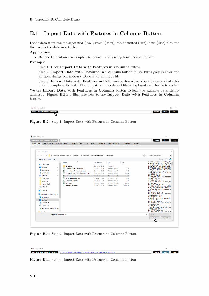
B. Appendix B: Complete Demo
B.1 Import Data with Features in Columns Button
Loads data from comma-separated (.csv), Excel (.xlsx), tab-delimited (.txt), data (.dat) files andthen reads the data into table.Application
• Reduce truncation errors upto 15 decimal places using long decimal format.Example
Step 1: Click Import Data with Features in Columns button.Step 2: Import Data with Features in Columns button in use turns grey in color andan open dialog box appears. Browse for an input file.Step 3: Import Data with Features in Columns button returns back to its original coloronce it completes its task. The full path of the selected file is displayed and the file is loaded.
We use Import Data with Features in Columns button to load the example data ‘demo-data.csv’. Figures B.2-B.4 illustrate how to use Import Data with Features in Columnsbutton.
Figure B.2: Step 1. Import Data with Features in Columns Button
Figure B.3: Step 2. Import Data with Features in Columns Button
Figure B.4: Step 3. Import Data with Features in Columns Button
VIII
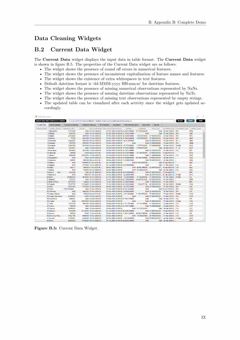
B. Appendix B: Complete Demo
Data Cleaning Widgets
B.2 Current Data WidgetThe Current Data widget displays the input data in table format. The Current Data widgetis shown in figure B.5. The properties of the Current Data widget are as follows.
• The widget shows the presence of round off errors in numerical features.• The widget shows the presence of inconsistent capitalization of feature names and features.• The widget shows the existence of extra whitespaces in text features.• Default datetime format is ‘dd-MMM-yyyy HH:mm:ss’ for datetime features.• The widget shows the presence of missing numerical observations represented by NaNs.• The widget shows the presence of missing datetime observations represented by NaTs.• The widget shows the presence of missing text observations represented by empty strings.• The updated table can be visualized after each activity since the widget gets updated ac-
cordingly.
Figure B.5: Current Data Widget.
IX

B. Appendix B: Complete Demo
B.3 Data Properties WidgetThe Data Properties widget displays several statistical aspects of the data. The Data Propertieswidget is shown in figure B.6. The properties of the Data Properties widget are as follows.
• The widget automatically discovers the datatypes of features of the input data set and showsthe numerical features, the datetime features and the text features separately.
• The widget summarizes the characteristics of a data set such as file size in megabytes, num-ber of rows and columns, number of id, numerical, datetime and text features, number ofduplicate rows and columns, and number of deleted rows and columns.
• The widget shows the percentage of missing observations in the data set and the percentageof missing observations in each feature. The widget presents two visual methods for missingdata - the missingness plot and the missing observations percentage plot. The missingnessplot indicates the missing value occurence in the data. The missing observations percentageplot indicates the percentage of missing observations in each feature. This study of missingdata helps to determine the missing data mechanism and hence choose strategies like listwisedeletion, pairwise deletion, dropping features, imputation which can be applied to handlemissing data so that they can be used for analysis and modelling.
• The information in the widget gets updated after each activity.
Figure B.6: Data Properties Widget.
X

B. Appendix B: Complete Demo
B.3.1 Id ButtonSeparates id features from numerical or datetime or text features. Here id feature represents aunique identifier field in the data.Application
• Avoid overfitting problem which occurs due to a unique identifier among features.Example
Step 1: Select a feature from Numerical Feature or Datetime Feature or Text Featurelist box in the Data Properties widget.Step 2: Click Id button.Step 3: Id button in use turns grey in color.Step 4: Id button returns back to its original color once it completes its task.
In the example data, Serial_Number represents unique identifier to a country. We use Id buttonto seperate id feature ‘Serial_Number’ from numerical features. Figures B.7-B.10 illustrate howto use Id button.
Figure B.7: Step 1. Id Button
XI

B. Appendix B: Complete Demo
Figure B.8: Step 2. Id Button
Figure B.9: Step 3. Id Button
XII
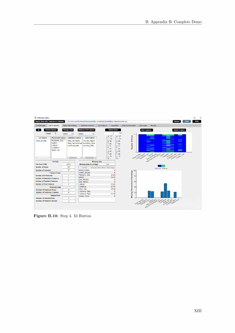
B. Appendix B: Complete Demo
Figure B.10: Step 4. Id Button
XIII

B. Appendix B: Complete Demo
B.3.2 Feature Names ButtonChanges letter case of all feature names to one of the cases - lower case or upper case or capitalizedcase.Application
• Fix structural errors such as unify inconsistent capitalization of feature names.Example
Step 1: Check if there is any inconsistency in feature names capitalization.Step 2: Select case from Feature Names dropdown menu.Step 3: Click Feature Names button.Step 4: Feature Names button in use turns grey in color.Step 5: Feature Names button returns back to its original color once it completes its task.
In the example data, the feature names ‘Serial_Number’, ‘Country_Region’, ‘Population_Size’,‘tourism’, ‘Date_F- irstFatality’, ‘Date_FirstConfirmedCase’, ‘Latitude’, ‘Longtitude’, ‘mean_Age’,‘Lockdown_Date’, ‘Lockdown_T- ype’, and ‘Country_Code’ have inconsistent capitalization. Weuse Feature Names button to capitalize first letter of each feature name so as to unify incon-sistent capitalization of feature names. Figures B.11-B.15 illustrate how to use Feature Namesbutton.
Figure B.11: Step 1. Feature Names Button
XIV

B. Appendix B: Complete Demo
Figure B.12: Step 2. Feature Names Button
Figure B.13: Step 3. Feature Names Button
XV
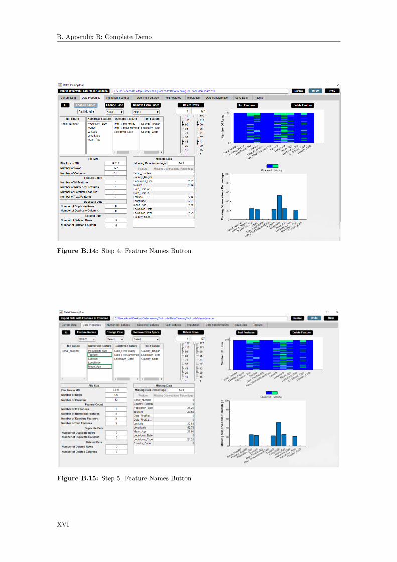
B. Appendix B: Complete Demo
Figure B.14: Step 4. Feature Names Button
Figure B.15: Step 5. Feature Names Button
XVI
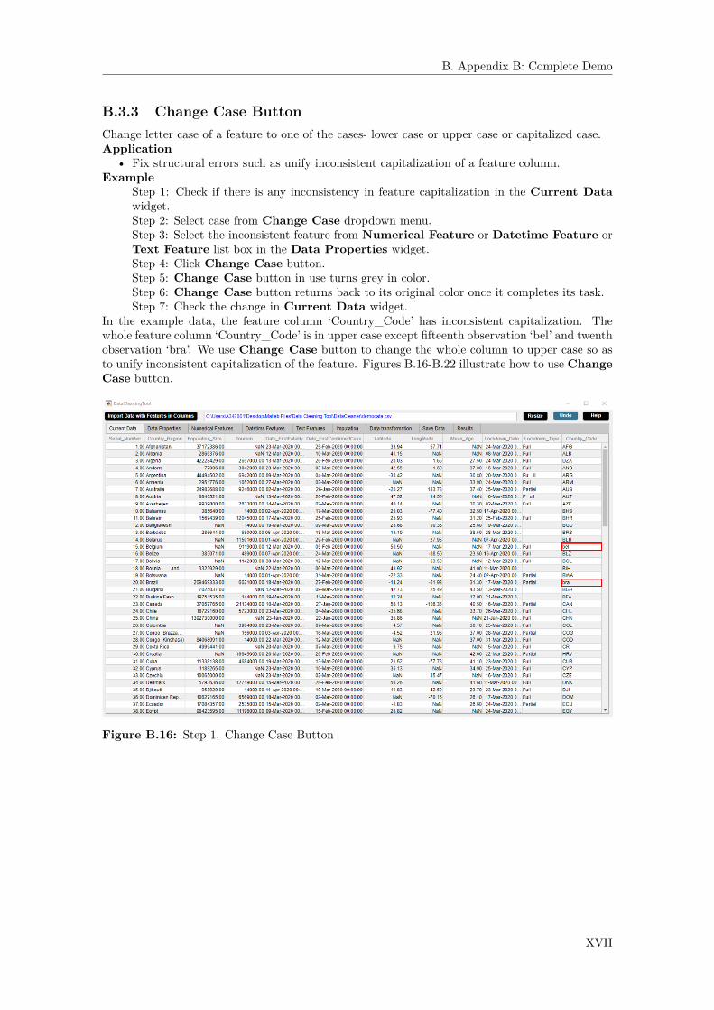
B. Appendix B: Complete Demo
B.3.3 Change Case ButtonChange letter case of a feature to one of the cases- lower case or upper case or capitalized case.Application
• Fix structural errors such as unify inconsistent capitalization of a feature column.Example
Step 1: Check if there is any inconsistency in feature capitalization in the Current Datawidget.Step 2: Select case from Change Case dropdown menu.Step 3: Select the inconsistent feature from Numerical Feature or Datetime Feature orText Feature list box in the Data Properties widget.Step 4: Click Change Case button.Step 5: Change Case button in use turns grey in color.Step 6: Change Case button returns back to its original color once it completes its task.Step 7: Check the change in Current Data widget.
In the example data, the feature column ‘Country_Code’ has inconsistent capitalization. Thewhole feature column ‘Country_Code’ is in upper case except fifteenth observation ‘bel’ and twenthobservation ‘bra’. We use Change Case button to change the whole column to upper case so asto unify inconsistent capitalization of the feature. Figures B.16-B.22 illustrate how to use ChangeCase button.
Figure B.16: Step 1. Change Case Button
XVII

B. Appendix B: Complete Demo
Figure B.17: Step 2. Change Case Button
Figure B.18: Step 3. Change Case Button
XVIII
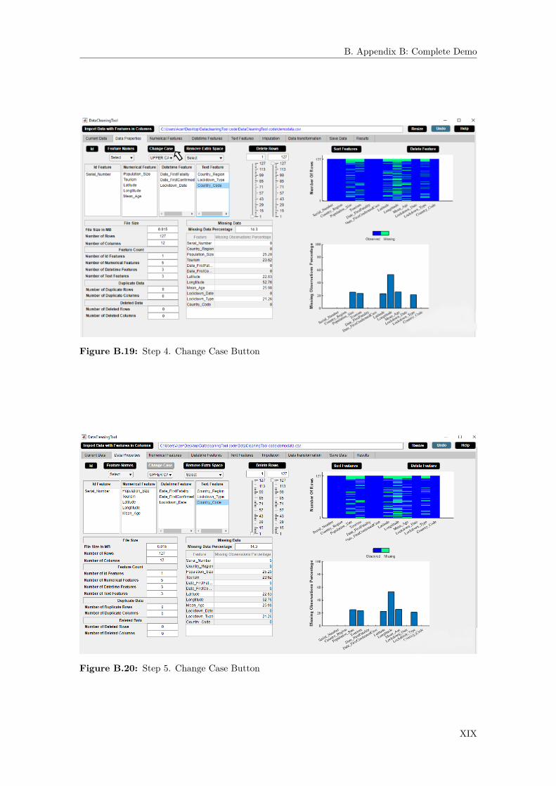
B. Appendix B: Complete Demo
Figure B.19: Step 4. Change Case Button
Figure B.20: Step 5. Change Case Button
XIX

B. Appendix B: Complete Demo
Figure B.21: Step 6. Change Case Button
Figure B.22: Step 7. Change Case Button
XX

B. Appendix B: Complete Demo
B.3.4 Remove Extra Space ButtonRemoves either all spaces or to only one whitespace in a string of a feature.Application
• Fix structural errors such as typographical errors.Example
Step 1: Check if there is any extra space in a feature in the Current Data widget.Step 2: Select any one option from Remove Extra Space dropdown menu.Step 3: Select the feature from Numerical Features or Datetime Features or TextFeatures list box in the Data Properties widget.Step 4: Click Remove Extra Space button.Step 5: Remove Extra Space button in use turns grey in color.Step 6: Remove Extra Space button returns back to its original color once it completesits task.Step 7: Check the change in Current Data widget.
In the example data, the feature ’Lockdown_type’ is either ’Full’ or ’Partial’. The fifth and eighthobservations in feature column ’Country_Code’ are ’Fu ll’ and ’F ull’. We use Remove ExtraSpace button to remove all spaces in the whole column. Figures B.23-B.29 illustrate how to useRemove Extra Space button.
Figure B.23: Step 1. Remove Extra Space Button
XXI

B. Appendix B: Complete Demo
Figure B.24: Step 2. Remove Extra Space Button
Figure B.25: Step 3. Remove Extra Space Button
XXII

B. Appendix B: Complete Demo
Figure B.26: Step 4. Remove Extra Space Button
Figure B.27: Step 5. Remove Extra Space Button
XXIII
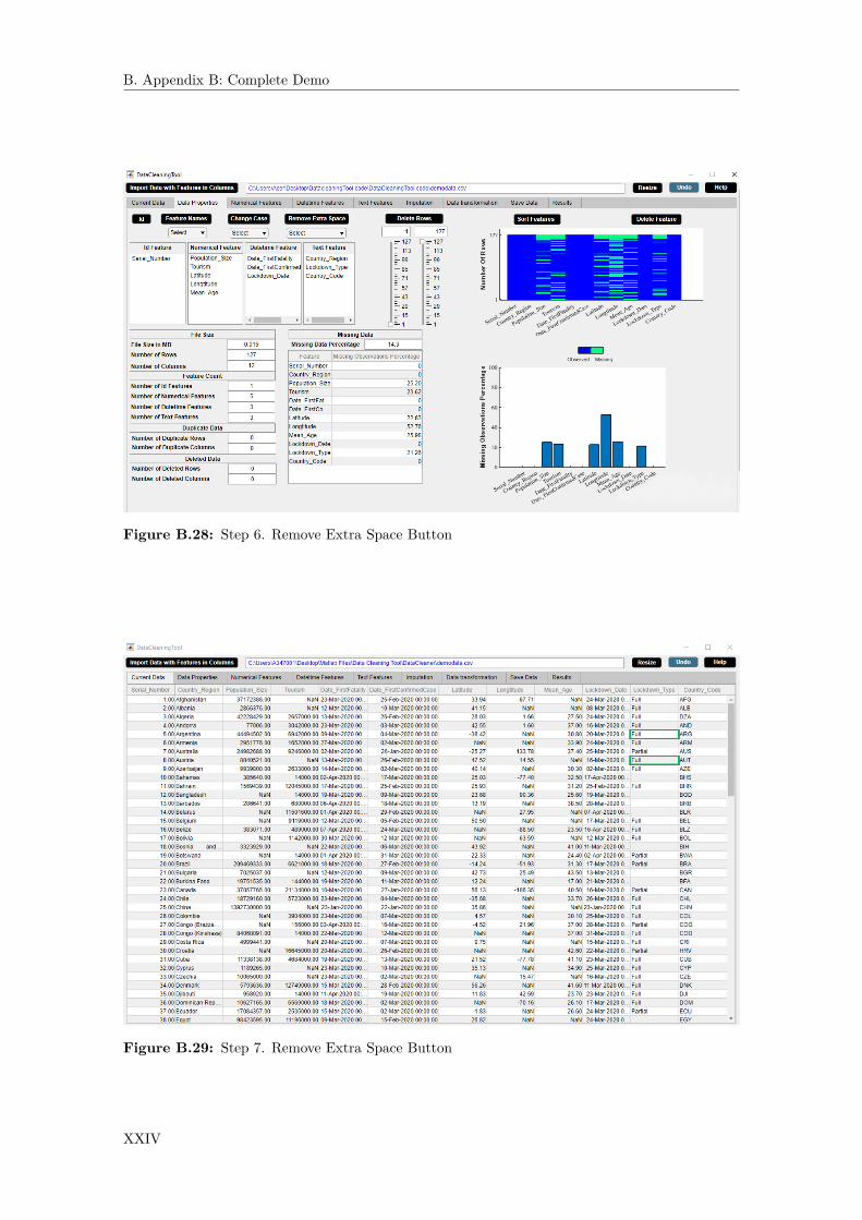
B. Appendix B: Complete Demo
Figure B.28: Step 6. Remove Extra Space Button
Figure B.29: Step 7. Remove Extra Space Button
XXIV

B. Appendix B: Complete Demo
Again, the eighteenth observation of the feature ‘Country_region’ is ‘Bosnia and Herzegovina’.We use Remove Extra Space button to remove to single white space in the whole column.Figures B.30-B.36 illustrate how to use Remove Extra Space button to remove to single whitespace.
Figure B.30: Step 1. Remove Extra Space Button
Figure B.31: Step 2. Remove Extra Space Button
XXV
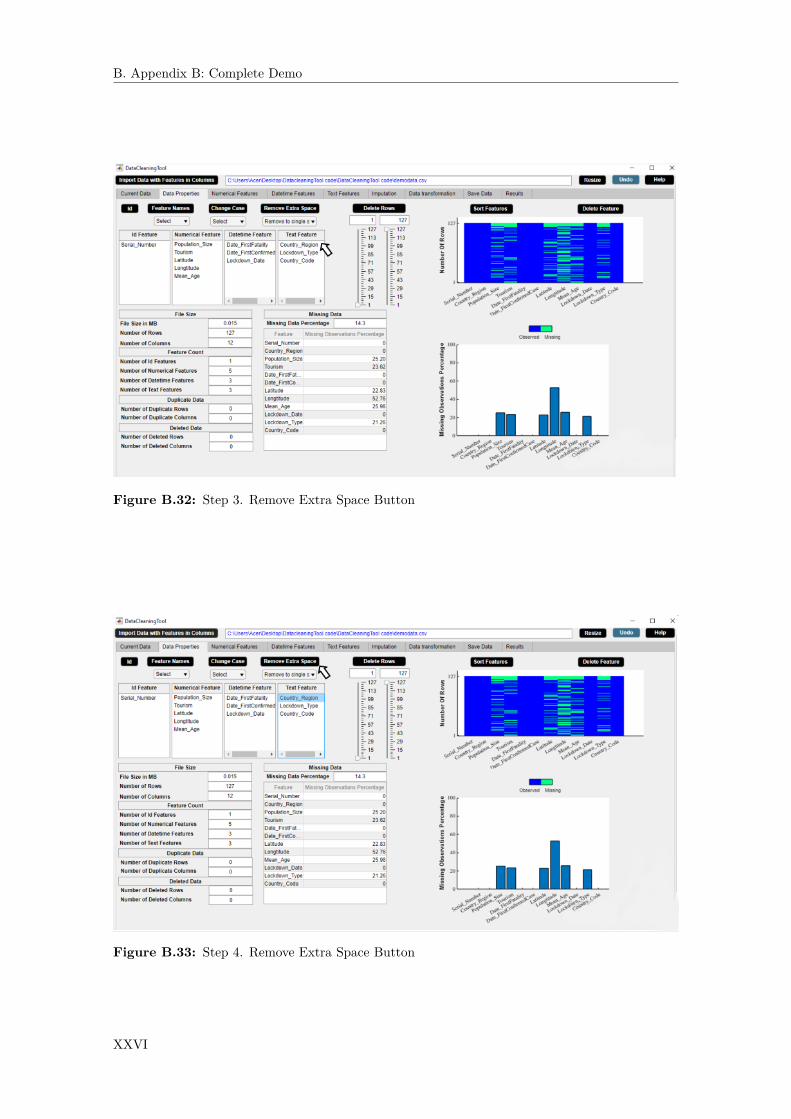
B. Appendix B: Complete Demo
Figure B.32: Step 3. Remove Extra Space Button
Figure B.33: Step 4. Remove Extra Space Button
XXVI

B. Appendix B: Complete Demo
Figure B.34: Step 5. Remove Extra Space Button
Figure B.35: Step 6. Remove Extra Space Button
XXVII

B. Appendix B: Complete Demo
Figure B.36: Step 7. Remove Extra Space Button
XXVIII

B. Appendix B: Complete Demo
B.3.5 Delete Rows ButtonDeletes rows from data.Application
• Delete rows containing a large number of missing observations.Example
Step 1: Select minimum row number from minimum slider and maximum row number frommaximum slider.Step 2: Click Delete Rows button.Step 3: Delete Rows button in use turns grey in color.Step 4: Delete Rows button returns back to its original color once it completes its task.
The example data contains a large number of missing values in the last 7 rows. We use DeleteRows button to delete the last 7 rows of the data. Figures B.37-B.40 illustrate how to use DeleteRows button.
Figure B.37: Step 1. Delete Rows Button
XXIX

B. Appendix B: Complete Demo
Figure B.38: Step 2. Delete Rows Button
Figure B.39: Step 3. Delete Rows Button
XXX

B. Appendix B: Complete Demo
Figure B.40: Step 4. Delete Rows Button
XXXI
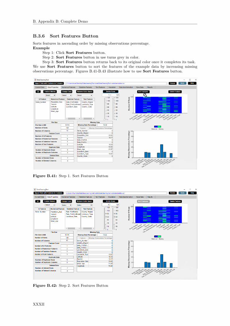
B. Appendix B: Complete Demo
B.3.6 Sort Features ButtonSorts features in ascending order by missing observations percentage.Example
Step 1: Click Sort Features button.Step 2: Sort Features button in use turns grey in color.Step 3: Sort Features button returns back to its original color once it completes its task.
We use Sort Features button to sort the features of the example data by increasing missingobservations percentage. Figures B.41-B.43 illustrate how to use Sort Features button.
Figure B.41: Step 1. Sort Features Button
Figure B.42: Step 2. Sort Features Button
XXXII

B. Appendix B: Complete Demo
Figure B.43: Step 3. Sort Features Button
XXXIII

B. Appendix B: Complete Demo
B.3.7 Delete Feature ButtonDelete a feature from data.Application
• Delete an unwanted or irrelevant feature.• Delete a feature containing a large number of missing observations.
ExampleStep 1: Select a feature from Feature column of missing observations percentage table.Step 2: Click Delete Feature button.Step 3: Delete Feature button in use turns grey in color.Step 4: Delete Feature button returns back to its original color once it completes its task.
From a data analyst’s point of view, ‘Country_Code’ is an irrelevant feature in the example data.We use Delete Feature button to delete ‘Country_Code’ feature. Figures B.44-B.47 illustratehow to use Delete Feature button.
Figure B.44: Step 1. Delete Feature Button
XXXIV

B. Appendix B: Complete Demo
Figure B.45: Step 2. Delete Feature Button
Figure B.46: Step 3. Delete Feature Button
XXXV
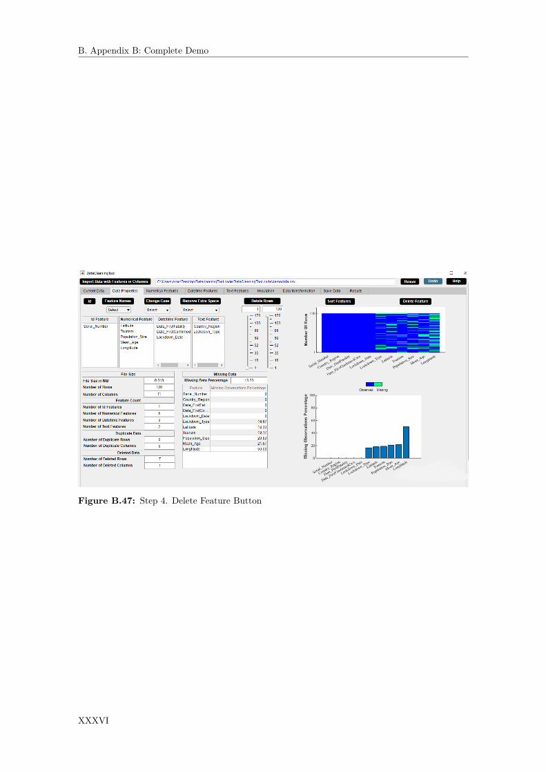
B. Appendix B: Complete Demo
Figure B.47: Step 4. Delete Feature Button
XXXVI

B. Appendix B: Complete Demo
B.4 Numerical Features WidgetThe Numerical Features widget displays statistical description of the numerical data. The Numer-ical Features widget is shown in figure B.48. The properties of the Numerical Features widget areas follows.
• The widget shows the descriptive statistics of each numerical feature of the data such asminimum observation and maximum observation of the feature. Descriptive statistics of afeature gives a quantitative description of a feature.
• The widget shows the duplicate observations present in each numerical feature and the miss-ing observations percentage of each numerical feature. Duplicate observation can be an errorin the data and could possibly influence later analyses of the data.
• Cross validation constraint and range constraint can be set in the widget. This will result insome unwanted numerical observations.
• The statistical information of the numerical data in the widget gets updated after eachactivity.
Figure B.48: Numerical Features Widget.
XXXVII

B. Appendix B: Complete Demo
B.4.1 Numerical Feature Cell Selection ButtonDisplays histogram of a numerical feature.Application
• Outlier visualization technique.Example
Step 1: Select a numerical feature from Feature column of the numerical features descriptivestatistics table.Step 2: A histogram of the selected numerical feature appears in the right side of the Nu-merical Features widget and the sliders get updated accordingly.
We use Numerical Feature Cell Selection button to visualize the histogram of ‘Popula-tion_Size’ feature. Figures B.49-B.50 illustrate how to use Numerical Feature Cell Selectionbutton.
Figure B.49: Step 1. Numerical Feature Cell Selection Button
XXXVIII
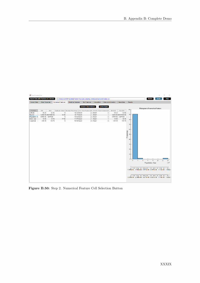
B. Appendix B: Complete Demo
Figure B.50: Step 2. Numerical Feature Cell Selection Button
XXXIX

B. Appendix B: Complete Demo
B.4.2 Remove Observations ButtonReplaces unwanted numerical observations by missing values.Application
• Removes unwanted or irrelevant observations.Example
Step 1: Choose constraint from Less Than Feature Edit dropdown menu or GreaterThan Feature Edit dropdown menu orMin Edit box orMax Edit box in theNumericalFeatures widget.Step 2: Click Remove Observations button.Step 3: Remove Observations button in use turns grey in color.Step 4: Remove Observations button returns back to its original color once it completesits task.
We wish to prepare the data for analysis for the countries whose ‘Population_Size’ is greaterthan ‘tourism’. We use Remove Observations button to extract data for the countries whose‘Population_Size’ is greater than ‘Tourism’. Figures B.51-B.54 illustrate how to use RemoveObservations button.
Figure B.51: Step 1. Remove Observations Button
XL

B. Appendix B: Complete Demo
Figure B.52: Step 2. Remove Observations Button
Figure B.53: Step 3. Remove Observations Button
XLI

B. Appendix B: Complete Demo
Figure B.54: Step 4. Remove Observations Button
XLII

B. Appendix B: Complete Demo
B.4.3 Delete Rows ButtonDeletes rows with unwanted numerical observations.Application
• Delete unwanted or irrelevant rows.• Delete rows containing a large number of missing observations.
ExampleStep 1: Select a numerical feature from Feature column of the numerical features descriptivestatistics table.Step 2: A histogram of the selected numerical feature appears in the right side of the Nu-merical Features widget and the sliders get updated accordingly. Choose constraint fromLess Than Feature Edit dropdown menu or Greater Than Feature Edit dropdownmenu or Min Edit box or Max Edit box of the numerical features descriptive statisticstable in the Numerical Features widget. Also, minimum value and maximum value canbe selected from sliders.Step 3: Click Delete Rows button.Step 4: Delete Rows button in use turns grey in color.Step 5: Delete Rows button returns back to its original color once it completes its task.
We wish to prepare the data for analysis for the countries whose maximum ‘Mean_age’ is 45. Weuse Delete Rows button to extract data for the countries whose maximum ‘Mean_age’ is 45.Figures B.55-B.59 illustrate how to use Delete Rows button.
Figure B.55: Step 1. Delete Rows Button
XLIII

B. Appendix B: Complete Demo
Figure B.56: Step 2. Delete Rows Button
Figure B.57: Step 3. Delete Rows Button
XLIV

B. Appendix B: Complete Demo
Figure B.58: Step 4. Delete Rows Button
Figure B.59: Step 5. Delete Rows Button
XLV

B. Appendix B: Complete Demo
B.5 Datetime Features WidgetThe Datetime Features widget displays statistical description of the datetime data. The DatetimeFeatures widget is shown in figure B.60. The properties of the Datetime Features widget are asfollows.
• The widget shows the descriptive statistics of each datetime feature of the data such asminimum observation and maximum observation of the feature.
• The widget also shows the missing observations percentage of each datetime feature.• Datetime format can be changed.• Cross validation constraint and range constraint can be set in the widget for each datetime
feature. This will result in some unwanted datetime observations.• The statistical information of the datetime data in the widget gets updated after each activity.
Figure B.60: Datetime Features Widget.
XLVI
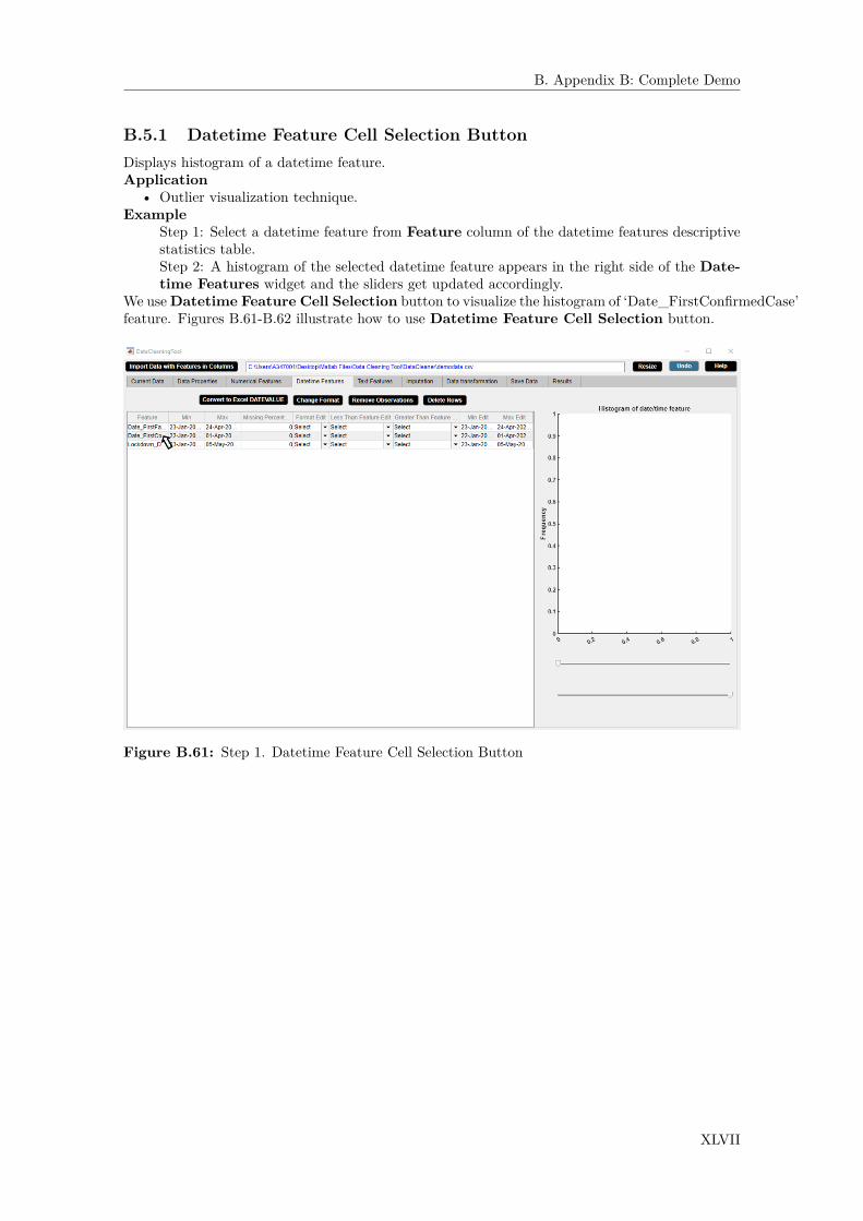
B. Appendix B: Complete Demo
B.5.1 Datetime Feature Cell Selection ButtonDisplays histogram of a datetime feature.Application
• Outlier visualization technique.Example
Step 1: Select a datetime feature from Feature column of the datetime features descriptivestatistics table.Step 2: A histogram of the selected datetime feature appears in the right side of the Date-time Features widget and the sliders get updated accordingly.
We useDatetime Feature Cell Selection button to visualize the histogram of ‘Date_FirstConfirmedCase’feature. Figures B.61-B.62 illustrate how to use Datetime Feature Cell Selection button.
Figure B.61: Step 1. Datetime Feature Cell Selection Button
XLVII

B. Appendix B: Complete Demo
Figure B.62: Step 2. Datetime Feature Cell Selection Button
XLVIII

B. Appendix B: Complete Demo
B.5.2 Convert To Excel DATEVALUE ButtonConverts datetime to Excel DATEVALUE. First it transforms datetime to Matlab serial datenumber and then to Excel serial date number. MATLAB date numbers start from January 1,0000 A.D., and hence there is a difference of 693960 relative to the Excel date system which usesJanuary 1, 1900, as starting point.
XLIX

B. Appendix B: Complete Demo
B.5.3 Change Format ButtonChanges datetime format.Example
Step 1: Select a datetime format from Format Edit dropdown menu of the datetime featuresdescriptive statistics table.Step 2: Click Change Format button.Step 3: Change Format button in use turns grey in color.Step 4: Change Format button returns back to its original color once it completes its task.Step 5: Check the datetime format in the Current Data widget.
We use Change Format button to change the datetime format of all the datetime features to‘yyyy-MM-dd HH:mm:ss’. Figures B.63-B.67 illustrate how to use Change Format button.
Figure B.63: Step 1. Change Format Button
L

B. Appendix B: Complete Demo
Figure B.64: Step 2. Change Format Button
Figure B.65: Step 3. Change Format Button
LI

B. Appendix B: Complete Demo
Figure B.66: Step 4. Change Format Button
Figure B.67: Step 5. Change Format Button
LII

B. Appendix B: Complete Demo
B.5.4 Remove Observations ButtonReplaces unwanted datetime observations by missing values.Application
• Remove unwanted or irrelevant observations.
LIII

B. Appendix B: Complete Demo
B.5.5 Delete Rows ButtonDeletes rows with unwanted datetime observations.Application
• Delete unwanted or irrelevant rows.• Delete rows containing a large number of missing observations.
ExampleStep 1: Choose constraint from Less Than Feature Edit dropdown menu or GreaterThan Feature Edit dropdown menu or Min Edit box or Max Edit box of the datetimefeatures descriptive statistics table in the Datetime Features widget.Step 2: Click Delete Rows button.Step 3: Delete Rows button in use turns grey in color.Step 4: Delete Rows button returns back to its original color once it completes its task.
We wish to prepare the data for analysis for the countries whose ‘Date_FirstConfirmedCase’ is lessthan ‘Date_FirstFatality’. We use Delete Rows button to extract data for the countries whose‘Date_FirstConfirmed- Case’ is less than ‘Date_FirstFatality’. Figures B.68-B.71 illustrate howto use Delete Rows button.
Figure B.68: Step 1. Delete Rows Button
LIV
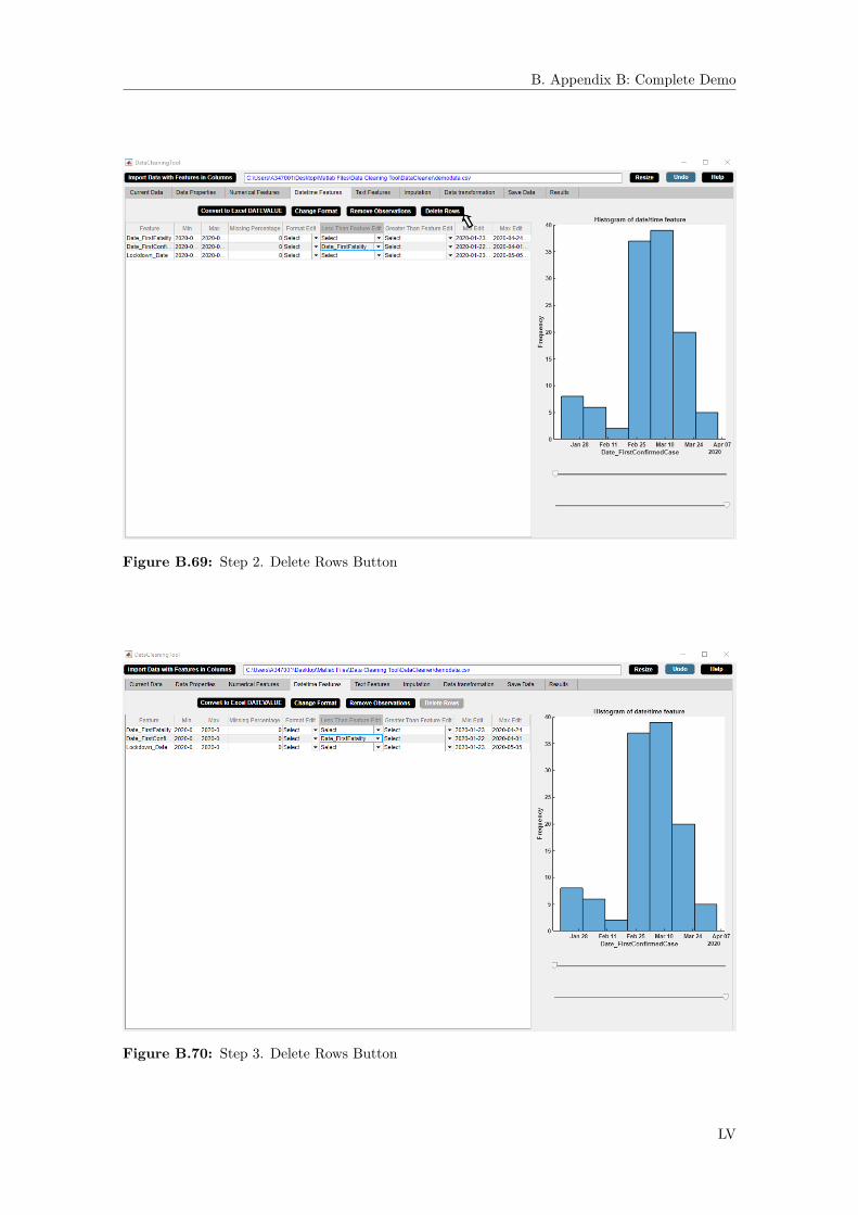
B. Appendix B: Complete Demo
Figure B.69: Step 2. Delete Rows Button
Figure B.70: Step 3. Delete Rows Button
LV

B. Appendix B: Complete Demo
Figure B.71: Step 4. Delete Rows Button
LVI
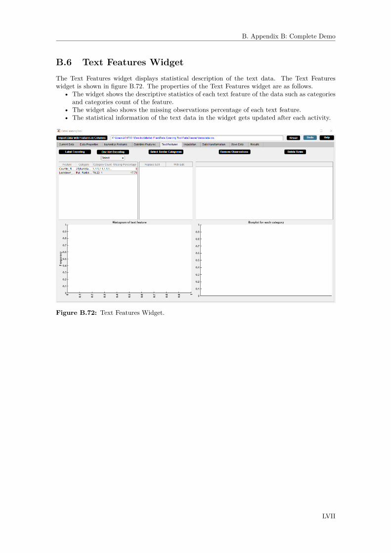
B. Appendix B: Complete Demo
B.6 Text Features WidgetThe Text Features widget displays statistical description of the text data. The Text Featureswidget is shown in figure B.72. The properties of the Text Features widget are as follows.
• The widget shows the descriptive statistics of each text feature of the data such as categoriesand categories count of the feature.
• The widget also shows the missing observations percentage of each text feature.• The statistical information of the text data in the widget gets updated after each activity.
Figure B.72: Text Features Widget.
LVII

B. Appendix B: Complete Demo
B.6.1 Select Similar Categories ButtonReplaces categories with similar ones.Example
Step 1: Select a text feature from feature column of the text features descriptive statisticstable.Step 2: Select similar category from With Edit dropdown menu.Step 3: Click Select Similar Categories button.Step 4: Select Similar Categories button in use turns grey in color.Step 5: Select Similar Categories button returns back to its original color once it com-pletes its task.
We use Select Similar Categories button to refer ‘Total’ as ‘Full’ in the example data. FiguresB.73-B.77 illustrate how to use Select Similar Categories button.
Figure B.73: Step 1. Select Similar Categories Button
LVIII

B. Appendix B: Complete Demo
Figure B.74: Step 2. Select Similar Categories Button
Figure B.75: Step 3. Select Similar Categories Button
LIX
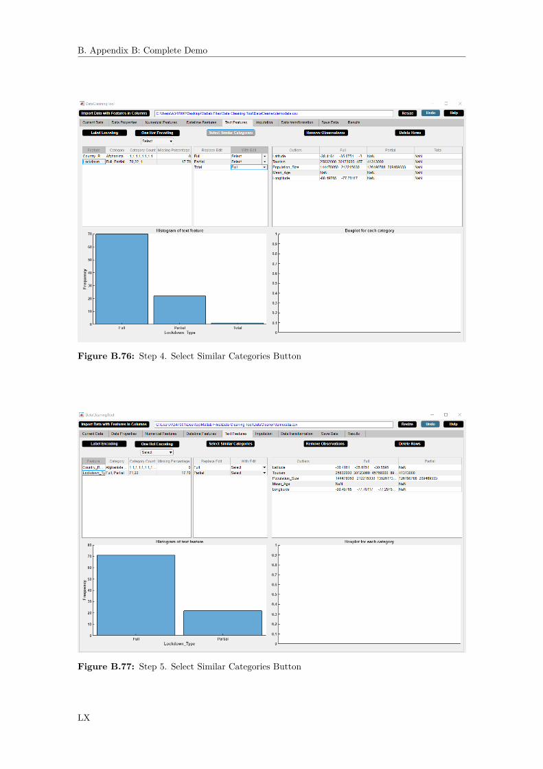
B. Appendix B: Complete Demo
Figure B.76: Step 4. Select Similar Categories Button
Figure B.77: Step 5. Select Similar Categories Button
LX

B. Appendix B: Complete Demo
B.6.2 Text Feature Cell Selection ButtonDisplays histogram of a text feature.Application
• Outlier visualization technique.Example
Step 1: Select a text feature from Feature column of the text features descriptive statisticstable.Step 2: A histogram of the selected text feature appears in the lower left side of the TextFeatures widget. Select a numerical feature from Outliers column of the right hand sidetable.Step 3: A box plot of the selected numerical feature versus the selected text feature appearsin the lower right side of the Text Features widget.
We use Text Feature Cell Selection button to visualize the histogram of ‘Lockdown_Type’feature and the box plot of ‘Mean_Age’ versus ‘Lockdown_Type’. It can be seen from the his-togram of ‘Lockdown_Type’ that there are more countries with ‘Full’ lockdown rather than with‘Partial’ lockdown. It can be seen from the box plot of ‘Mean_Age’ versus ‘Lockdown_Type’ that‘Mean_Age’ of the population is larger for the countries with ‘Full’ lockdown rather than for thecountries with ‘Partial’ lockdown. Figures B.78-B.80 illustrate how to use Text Feature CellSelection button.
Figure B.78: Step 1. Text Feature Cell Selection Button
LXI

B. Appendix B: Complete Demo
Figure B.79: Step 2. Text Feature Cell Selection Button
Figure B.80: Step 3. Text Feature Cell Selection Button
LXII

B. Appendix B: Complete Demo
B.6.3 Label Encoding ButtonAssigns each category of a categorical feature a value from 0 to n-1 where n is the number of cat-egories. Note that label encoding is an encoding approach usually for handling ordinal categoricalfeatures.Example
Step 1: Select a categorical feature from Feature column of the text features descriptivestatistics table.Step 2: Click Label Encoding button.Step 3: Label Encoding button in use turns grey in color.Step 4: Label Encoding button returns back to its original color once it completes its task.Step 5: Check the change in Current Data widget.
We use Label Encoding button if we wish to label encode the categorical feature ‘Lockdown_Type’.Figures B.81-B.85 illustrate how to use Label Encoding button.
Figure B.81: Step 1. Label Encoding Button
LXIII

B. Appendix B: Complete Demo
Figure B.82: Step 2. Label Encoding Button
Figure B.83: Step 3. Label Encoding Button
LXIV

B. Appendix B: Complete Demo
Figure B.84: Step 4. Label Encoding Button
Figure B.85: Step 5. Label Encoding Button
LXV
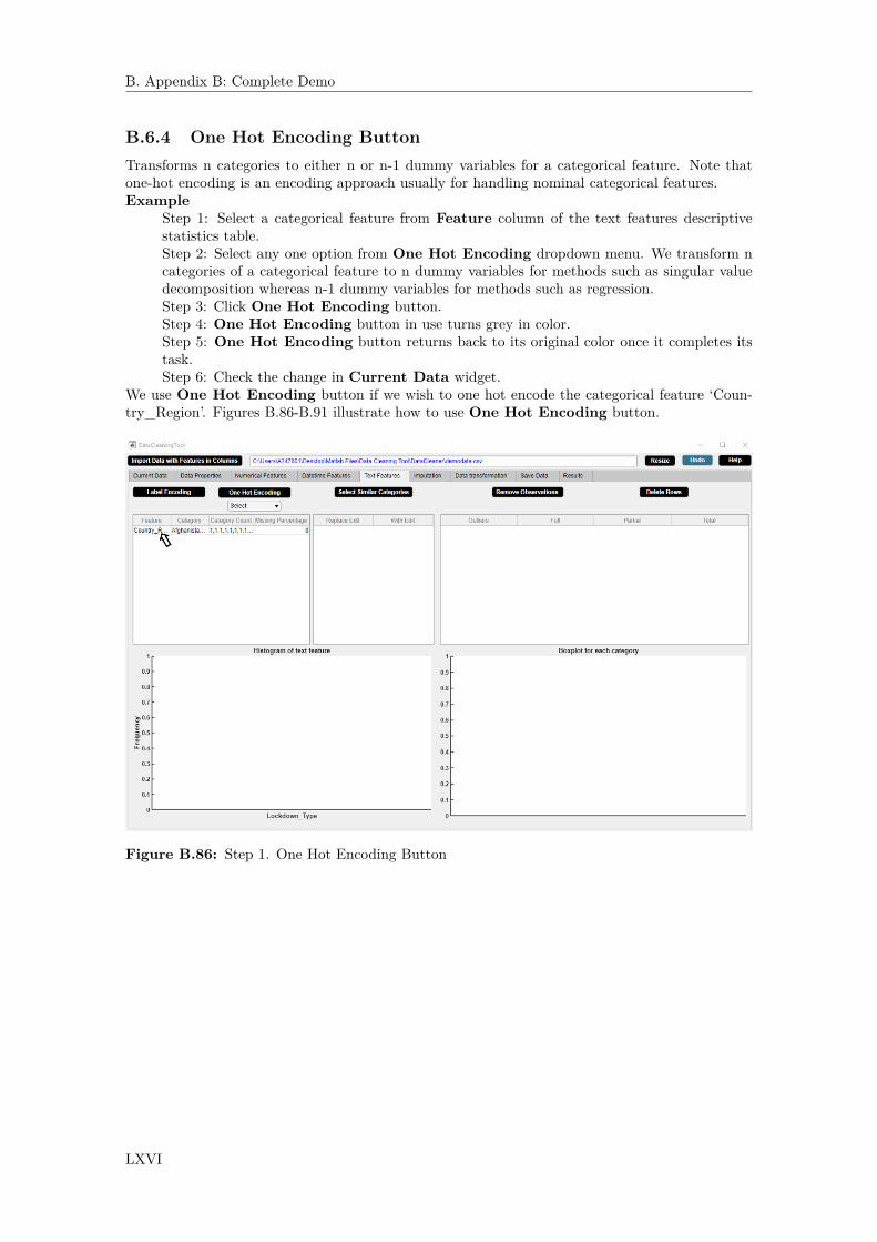
B. Appendix B: Complete Demo
B.6.4 One Hot Encoding ButtonTransforms n categories to either n or n-1 dummy variables for a categorical feature. Note thatone-hot encoding is an encoding approach usually for handling nominal categorical features.Example
Step 1: Select a categorical feature from Feature column of the text features descriptivestatistics table.Step 2: Select any one option from One Hot Encoding dropdown menu. We transform ncategories of a categorical feature to n dummy variables for methods such as singular valuedecomposition whereas n-1 dummy variables for methods such as regression.Step 3: Click One Hot Encoding button.Step 4: One Hot Encoding button in use turns grey in color.Step 5: One Hot Encoding button returns back to its original color once it completes itstask.Step 6: Check the change in Current Data widget.
We use One Hot Encoding button if we wish to one hot encode the categorical feature ‘Coun-try_Region’. Figures B.86-B.91 illustrate how to use One Hot Encoding button.
Figure B.86: Step 1. One Hot Encoding Button
LXVI

B. Appendix B: Complete Demo
Figure B.87: Step 2. One Hot Encoding Button
Figure B.88: Step 3. One Hot Encoding Button
LXVII

B. Appendix B: Complete Demo
Figure B.89: Step 4. One Hot Encoding Button
Figure B.90: Step 5. One Hot Encoding Button
LXVIII
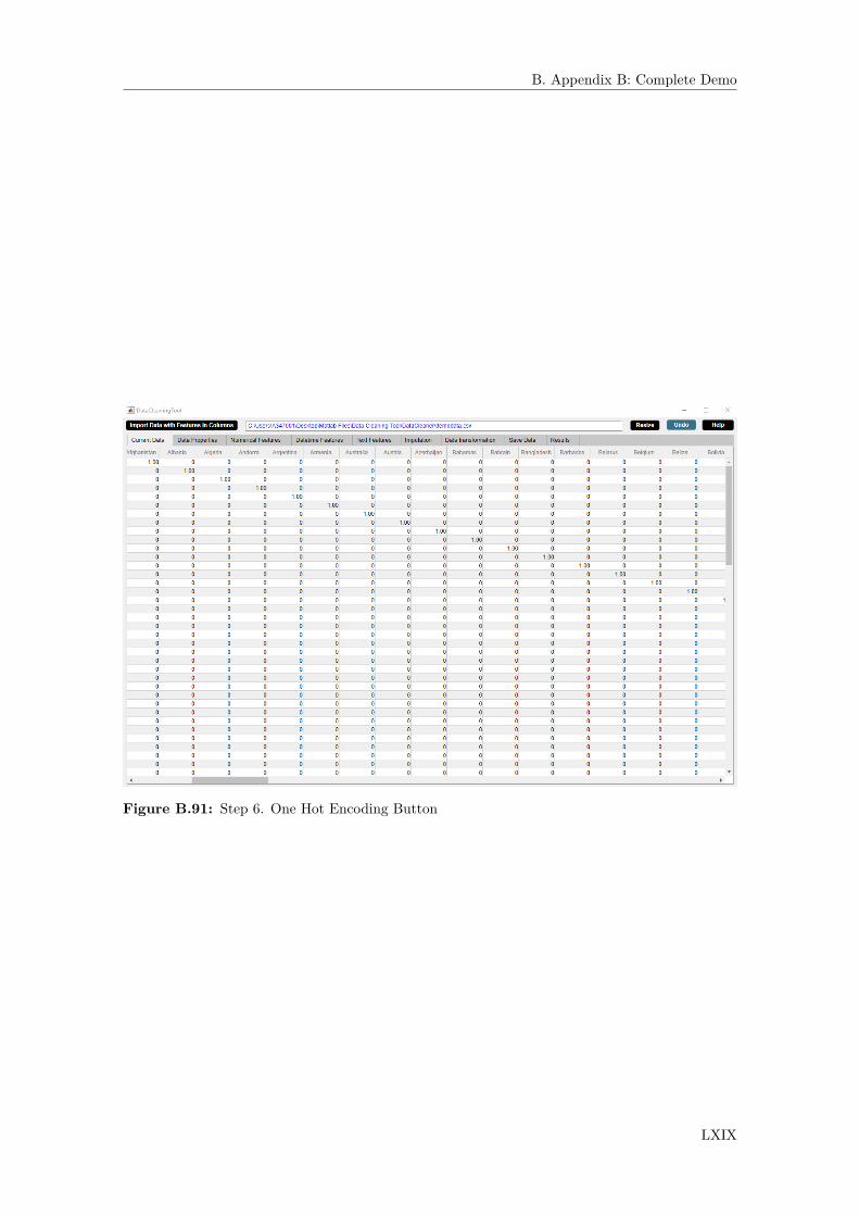
B. Appendix B: Complete Demo
Figure B.91: Step 6. One Hot Encoding Button
LXIX

B. Appendix B: Complete Demo
B.6.5 Remove Observations ButtonReplaces outliers by missing values.Application
• Removes outliers.
B.6.6 Delete Rows ButtonDeletes rows with outliers.Application
• Deletes rows containing outliers.
LXX

B. Appendix B: Complete Demo
B.7 Imputation WidgetThe Imputation widget displays information about the missing data and the expected error ofimputation for numerical and categorical features. The Imputation widget is shown in figure B.92.The properties of the Imputation widget are as follows.
• The widgets shows information about missing data such as percentage of missing data, ex-pected error of imputation for numerical and categorical features. The performance analysisresults of the missForest method discussed in chapter 4 is used to predict the expected er-ror of imputation for numerical and categorical features for the specific ratio of data andpercentage of missing data.
• The widget also presents the missing observations percentage table and the missingness plot.• If datetime observations are missing, a message stating that datetime imputation is possible
appears in red color in the lower side of the Imputation widget.• The information of the missing data in the widget gets updated after each activity.
Figure B.92: Imputation Widget.
LXXI
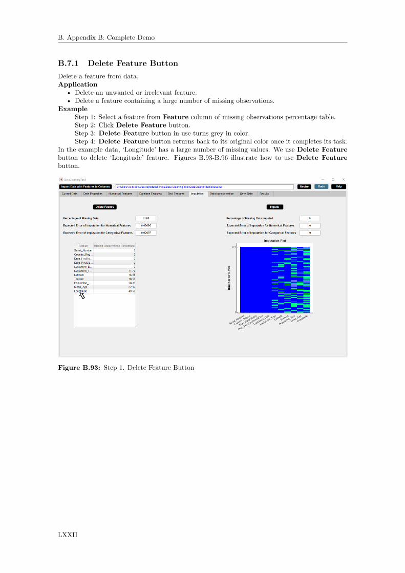
B. Appendix B: Complete Demo
B.7.1 Delete Feature ButtonDelete a feature from data.Application
• Delete an unwanted or irrelevant feature.• Delete a feature containing a large number of missing observations.
ExampleStep 1: Select a feature from Feature column of missing observations percentage table.Step 2: Click Delete Feature button.Step 3: Delete Feature button in use turns grey in color.Step 4: Delete Feature button returns back to its original color once it completes its task.
In the example data, ‘Longitude’ has a large number of missing values. We use Delete Featurebutton to delete ‘Longitude’ feature. Figures B.93-B.96 illustrate how to use Delete Featurebutton.
Figure B.93: Step 1. Delete Feature Button
LXXII

B. Appendix B: Complete Demo
Figure B.94: Step 2. Delete Feature Button
Figure B.95: Step 3. Delete Feature Button
LXXIII

B. Appendix B: Complete Demo
Figure B.96: Step 4. Delete Feature Button
LXXIV
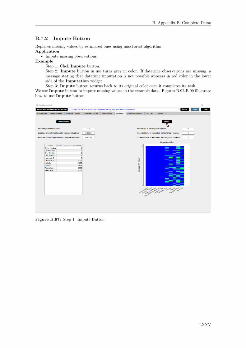
B. Appendix B: Complete Demo
B.7.2 Impute ButtonReplaces missing values by estimated ones using missForest algorithm.Application
• Impute missing observations.Example
Step 1: Click Impute button.Step 2: Impute button in use turns grey in color. If datetime observations are missing, amessage stating that datetime imputation is not possible appears in red color in the lowerside of the Imputation widget.Step 3: Impute button returns back to its original color once it completes its task.
We use Impute button to impute missing values in the example data. Figures B.97-B.99 illustratehow to use Impute button.
Figure B.97: Step 1. Impute Button
LXXV

B. Appendix B: Complete Demo
Figure B.98: Step 2. Impute Button
Figure B.99: Step 3. Impute Button
LXXVI
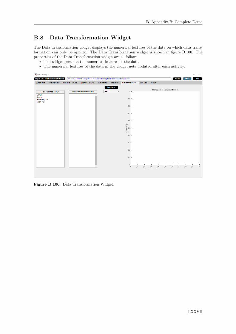
B. Appendix B: Complete Demo
B.8 Data Transformation WidgetThe Data Transformation widget displays the numerical features of the data on which data trans-formation can only be applied. The Data Transformation widget is shown in figure B.100. Theproperties of the Data Transformation widget are as follows.
• The widget presents the numerical features of the data.• The numerical features of the data in the widget gets updated after each activity.
Figure B.100: Data Transformation Widget.
LXXVII
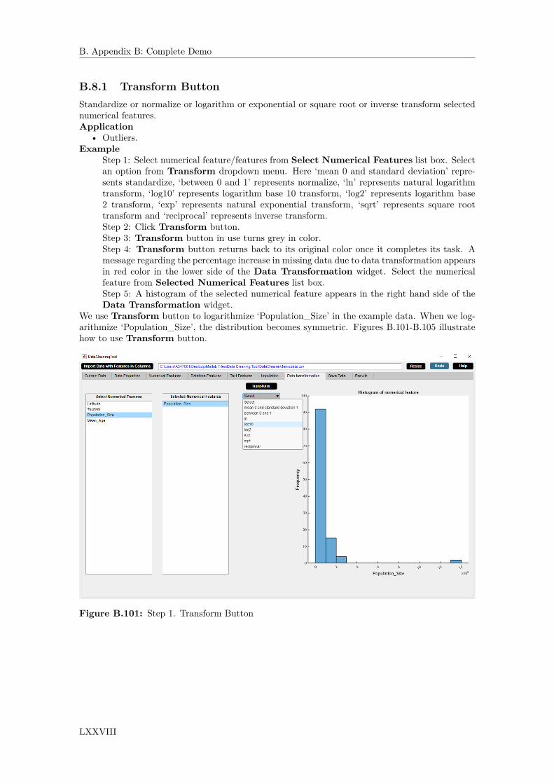
B. Appendix B: Complete Demo
B.8.1 Transform ButtonStandardize or normalize or logarithm or exponential or square root or inverse transform selectednumerical features.Application
• Outliers.Example
Step 1: Select numerical feature/features from Select Numerical Features list box. Selectan option from Transform dropdown menu. Here ‘mean 0 and standard deviation’ repre-sents standardize, ‘between 0 and 1’ represents normalize, ‘ln’ represents natural logarithmtransform, ‘log10’ represents logarithm base 10 transform, ‘log2’ represents logarithm base2 transform, ‘exp’ represents natural exponential transform, ‘sqrt’ represents square roottransform and ‘reciprocal’ represents inverse transform.Step 2: Click Transform button.Step 3: Transform button in use turns grey in color.Step 4: Transform button returns back to its original color once it completes its task. Amessage regarding the percentage increase in missing data due to data transformation appearsin red color in the lower side of the Data Transformation widget. Select the numericalfeature from Selected Numerical Features list box.Step 5: A histogram of the selected numerical feature appears in the right hand side of theData Transformation widget.
We use Transform button to logarithmize ‘Population_Size’ in the example data. When we log-arithmize ‘Population_Size’, the distribution becomes symmetric. Figures B.101-B.105 illustratehow to use Transform button.
Figure B.101: Step 1. Transform Button
LXXVIII

B. Appendix B: Complete Demo
Figure B.102: Step 2. Transform Button
Figure B.103: Step 3. Transform Button
LXXIX

B. Appendix B: Complete Demo
Figure B.104: Step 4. Transform Button
Figure B.105: Step 5. Transform Button
LXXX

B. Appendix B: Complete Demo
B.9 Save DataThe Save Data widget displays the full paths of the saved files. The Save Data widget is shown infigure B.106. The properties of the Save Data widget are as follows.
• The widget saves data in csv or xlsx format after data cleaning.• Data can be saved for multiple times after each activity.• The full paths of the saved files are displayed.
Figure B.106: Save Data Widget.
LXXXI

B. Appendix B: Complete Demo
B.9.1 Save ButtonSaves as comma-separated (.csv) or Excel (.xlsx) file.Example
Step 1: Click Save button.Step 2: Save button in use turns grey in color.Step 3: Save button returns back to its original color once it completes its task.
We use Save button to save the example data in csv format. Figures B.107-B.110 illustrate howto use Save button.
Figure B.107: Step 1. Save Button
LXXXII

B. Appendix B: Complete Demo
Figure B.108: Step 2. Save Button
Figure B.109: Step 3. Save Button
LXXXIII

B. Appendix B: Complete Demo
Figure B.110: Step 4. Save Button
LXXXIV

B. Appendix B: Complete Demo
B.10 ResultsThe Results widget displays information about the final report. The Results widget is shown infigure B.111. The properties of the Results widget are as follows.
• The widget generates results in pdf format after data cleaning. The results contains a detailedreport of all the changes made in DataCleaningTool.
• Results can be generated containing a detailed report of specific changes made in DataClean-ingTool.
• Results can be generated for multiple times after each activity.• The full paths of the results are displayed.
Figure B.111: Results Widget.
LXXXV

B. Appendix B: Complete Demo
B.10.1 Generate Report ButtonGenerate pdf file containing results.Example
Step 1: Click Generate Report button.Step 2: Generate Report button in use turns grey in color.Step 3: Generate Report button returns back to its original color once it completes itstask.
We use Generate Report button to save the example data in csv format. Figures B.112-B.115illustrate how to use Generate Report button.
Figure B.112: Step 1. Generate Report Button
LXXXVI
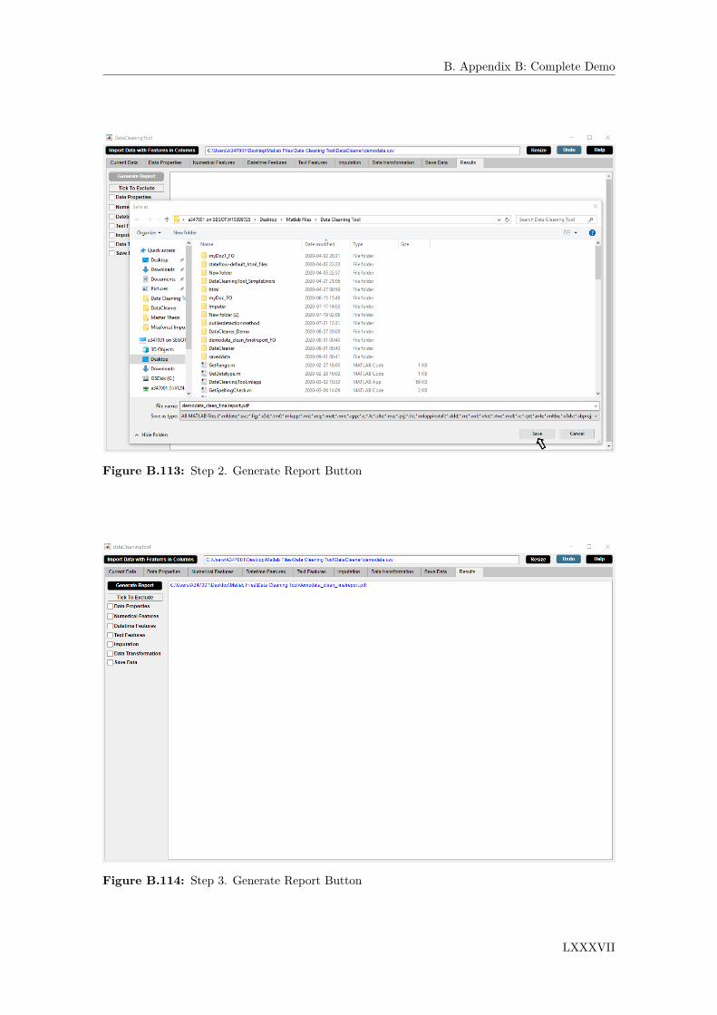
B. Appendix B: Complete Demo
Figure B.113: Step 2. Generate Report Button
Figure B.114: Step 3. Generate Report Button
LXXXVII
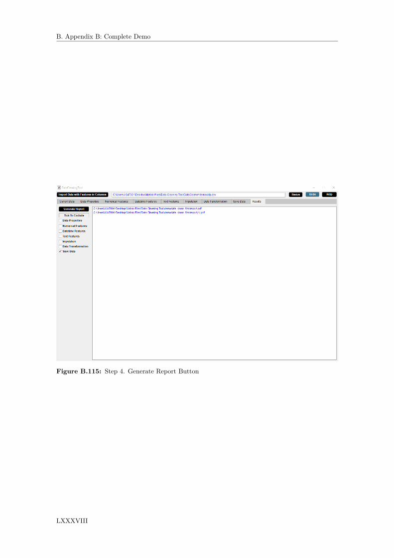
B. Appendix B: Complete Demo
Figure B.115: Step 4. Generate Report Button
LXXXVIII

B. Appendix B: Complete Demo
B.11 Other AttributesOther attributes include the following three buttons which are present in the upper right side ofthe DataCleaningTool B.1.
B.11.1 Resize ButtonResizes the DataCleaningTool to a reduced size.
B.11.2 Undo ButtonPerforms the last activity and all the widgets get updated accordingly.
B.11.3 Help ButtonGenerates user manual of DataCleaningTool in pdf format.
LXXXIX
Related Documents