Detailed Analysis Cover Page The cover of this issue of Kerrang! magazine uses bright colours such as red and yellow throughout to make it eye catching for the reader and to grab their attention. The font is very bold and capitalised also to grab the readers attention, this also represents the genre of rock. The masthead is in capital, The cover image is the main focus of the front page and it is even placed on top of the masthead. This is because it is the cover image that the reader is going to see first and if it is a band that they like it will convince them to buy the issue more. This shows that it is the cover image and not There are a number of different features on the cover of the magazine such as puffs and a skyline. This is to persuade the reader to buy the issue by giving them an idea of what

Welcome message from author
This document is posted to help you gain knowledge. Please leave a comment to let me know what you think about it! Share it to your friends and learn new things together.
Transcript

Detailed Analysis
Cover Page
The cover of this issue of Kerrang! magazine uses bright colours such as red and yellow throughout to make it eye catching for the reader and to grab their attention. The font is very bold and capitalised also to grab the readers attention, this also represents the genre of rock. The masthead is in capital, yellow, cracked letters and this gives connotations of loudness linking in with the genre of the magazine (rock).
The cover image is the main focus of the front page and it is even placed on top of the masthead. This is because it is the cover image that the reader is going to see first and if it is a band that they like it will convince them to buy the issue more. This shows that it is the cover image and not the name of the magazine that is going to be selling the issue.
There are a number of different features on the cover of the magazine such as puffs and a skyline. This is to persuade the reader to buy the issue by giving them an idea of what is going to be featured inside of the magazine.
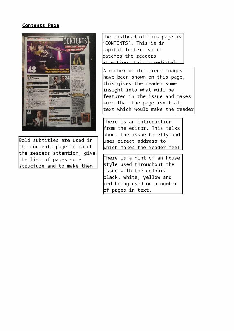
Contents Page
The masthead of this page is ‘CONTENTS’. This is in capital letters so it catches the readers attention, this immediately tells the reader that they are reading the contents page.
A number of different images have been shown on this page, this gives the reader some insight into what will be featured in the issue and makes sure that the page isn’t all text which would make the reader lose interest. Images catch the readers attention because it is the first thing that they will look at.
There is an introduction from the editor. This talks about the issue briefly and uses direct address to which makes the reader feel like this is being told directly to them.
Bold subtitles are used in the contents page to catch the readers attention, give the list of pages some structure and to make them easier to read and understand.
There is a hint of an house style used throughout the issue with the colours black, white, yellow and red being used on a number of pages in text, backgrounds etc.

Double Page Spread
The masthead of this double page spread stands out very well because it is in bold capital letters which catch the readers attention. It is also on top of a dynamite explosion style shape which stands out to the reader.
The main image spans across both pages and immediately catches the readers attention. it shows them who the article on the right hand side will be about.
The article down the right of the double paged spread has a very simple structure making it easier for the reader to understand and read.
In the top left of the double page spread there is an introduction which also gives the reader an incline into who/what the article is going to be about.
The register of this issue is both formal and informal because it is trying to tell the reader information, therefore it needs to be easy to read and understand, but also informal because there is a lot of casual language within the issue which gives the impression of the reader be talked to (direct address).
Related Documents