Gold-Tooled Bookbindings And Contemporary Collectables. 1500 – 1800. Chapter 5: Designs based on Semy Patterns By Ian Andrews 144

Welcome message from author
This document is posted to help you gain knowledge. Please leave a comment to let me know what you think about it! Share it to your friends and learn new things together.
Transcript
Gold-TooledBookbindings
AndContemporaryCollectables.1500 – 1800.
Chapter 5: Designs based on SemyPatterns
By Ian Andrews
144

146
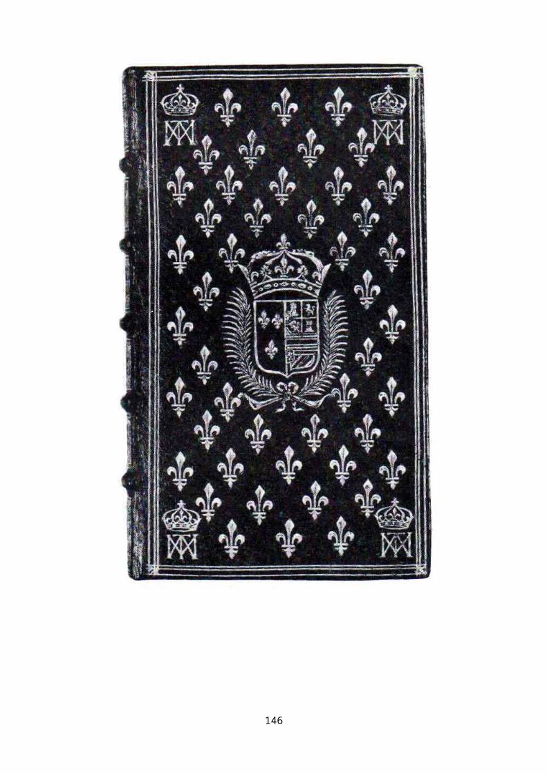
Figure 1. Brébeuf, Entretiens solitaires ou Prières et Méditations pieuses.1660.
The arms and monograms are those of Marie-Thérèse who was
married to Louis XIV in June 1660.
Designs based on Semy PatternsDesigns consisting of the repeated use of a single motif are
commonly referred to as ‘semy’ patterns.i This term has proved
to be a convenient descriptor for gold designs of this type on
bookbindings, though it originates from heraldry, where it
involves some specific strictures. While the nature of the
motifs is not prescribed, their arrangement, patterning and
contribution to the construction of the overall design are of
great importance. Designs of this type are usually based on
the repetition of two or more motifs. However, the late
sixteenth century French binding, shown in Figure 1, is an
example of how a large number of repetitions of a single
ornamental motif, in this case a fleur-de-lys, precisely arranged,
creates a striking visual impact.
It is the purpose of this section to explore the nature of
designs on bindings where a large area of the cover is filled
with a distribution of small motifs, and to examine the degree
to which the formal heraldic term can be applied to them.
Attention will be given to the number and forms of the motifs,
the regularity of their positioning, the expectation of
alignment perfection, and the issue of ‘defacement’ in order
to accommodate other features of the overall decoration.147
As the Occurrence Charts show, semy-style designs as a feature
of the gold decoration on book covers appeared quite suddenly
around the mid-sixteenth century, and were particularly
popular in the third quarter of the sixteenth and the second
quarter of the seventeenth. Those of the earlier period are
usually of the semy-de-lys form, in which the ornamental motif is
a fleur-de-lys, whereas other types of motif are more usual in
later versions. Semy designs, other than semy-de-lys versions,
first appear in the decade before the mid-sixteenth century
and continue in vogue until towards the end of the first
quarter of the seventeenth, after which their usage declines
until the end of the third quarter. The earlier forms were
based on dots but by the middle of the third quarter of the
sixteenth century these designs were more frequently based on
other types of small motif, such as stars and rosettes.
Number and Form
The formal heraldic definition does not impose any limitation
either on the shape or the number of the motifs employed to
develop the semy pattern, the essential requirement being that
they are distributed in such a way as to suggest a section
taken from an infinite array of such motifs. In this sense,
the quincunx, centre-and-corners, design on Brant’s, The Shyppe
of Fooles, (see Borders chapter), could be argued to be a semy
148
design, in that it is composed of five, precisely placed,
identical motifs. On the other hand, a careful arrangement of
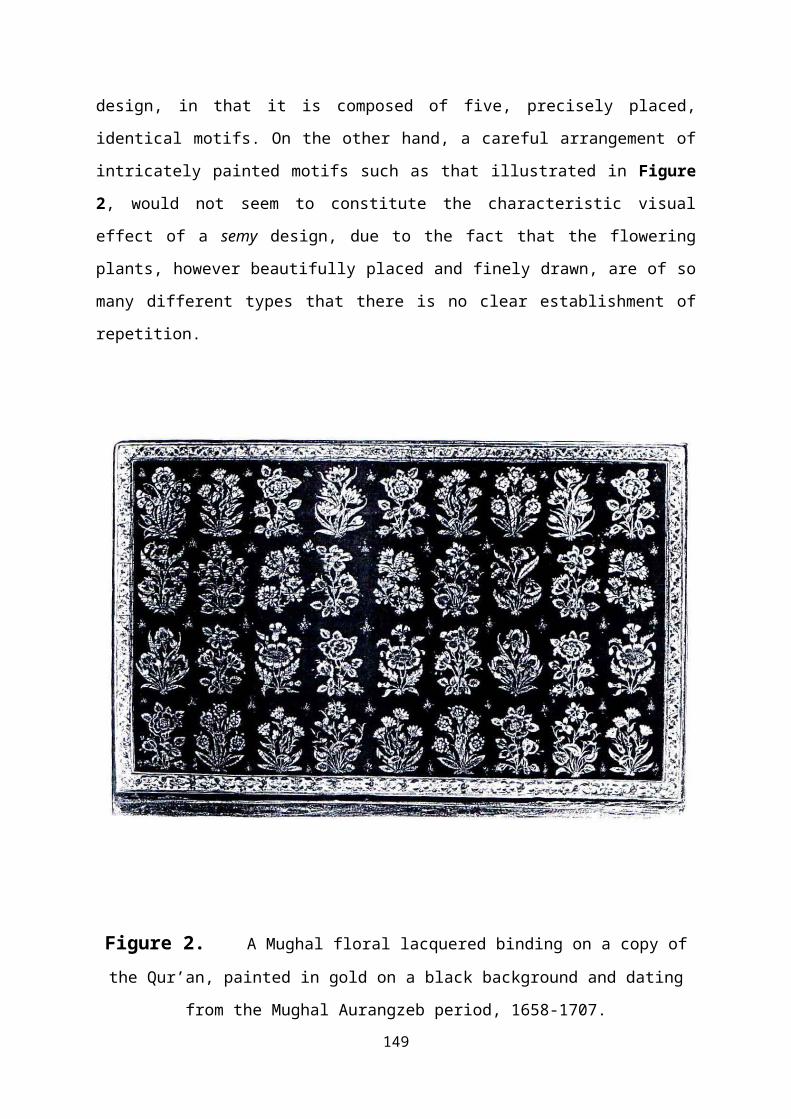
intricately painted motifs such as that illustrated in Figure
2, would not seem to constitute the characteristic visual
effect of a semy design, due to the fact that the flowering
plants, however beautifully placed and finely drawn, are of so
many different types that there is no clear establishment of
repetition.
Figure 2. A Mughal floral lacquered binding on a copy ofthe Qur’an, painted in gold on a black background and dating
from the Mughal Aurangzeb period, 1658-1707.149
In general terms, a sufficient number of motifs are needed in
order to define the requisite rows, columns and diagonals of
the semy structure. However, semy designs on bindings made for
royal patrons in the late sixteenth and early seventeenth
centuries are often extremely extensive and include very large
numbers of motifs. A binding made for Henry IV of France,
displays a pattern composed of over eight hundred motifs,
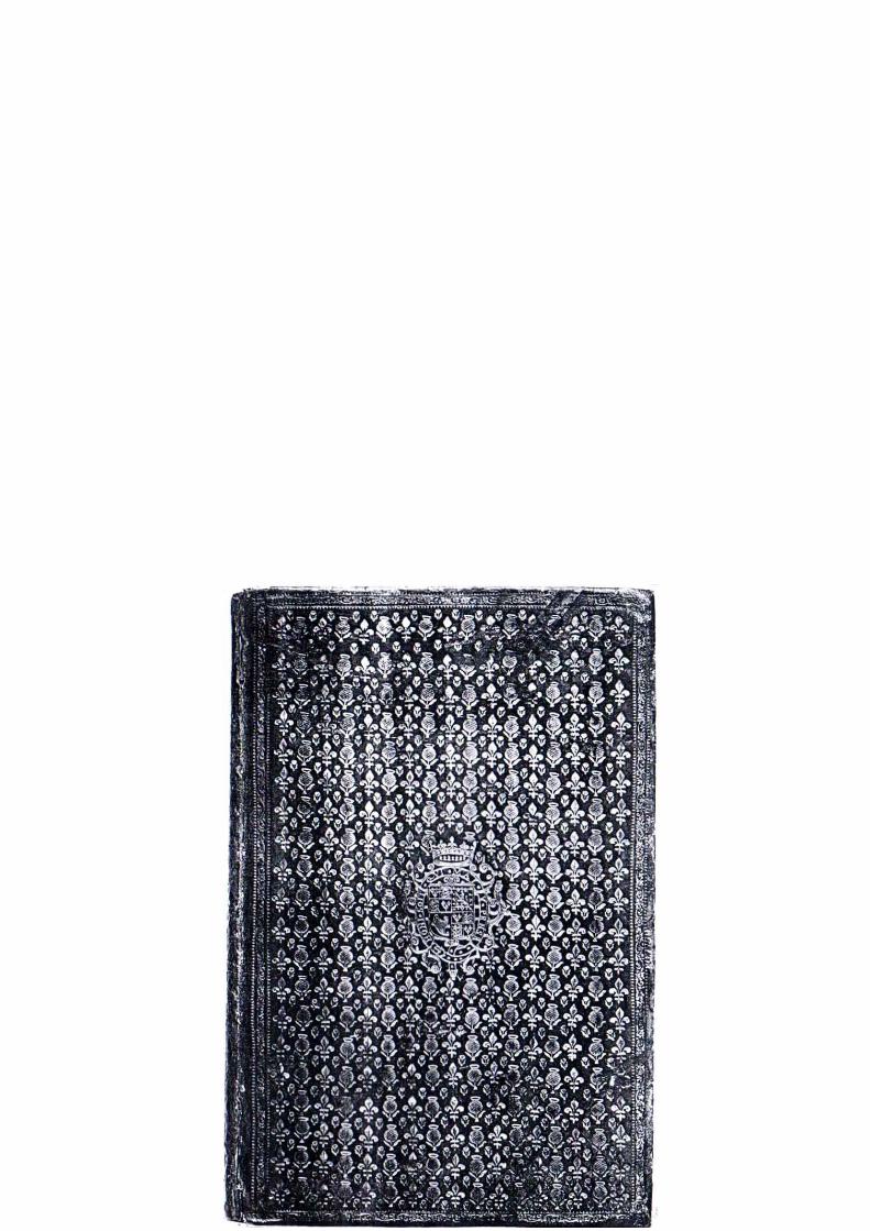
while the copy of Ptolemaeus, Claudius Figure 3, bound for the
English King Charles I, when still Prince of Wales, has
nearly seven hundred. In the case of the latter, the design
area is so closely packed with motifs that precision of
alignment is lost, resulting in a space so densely filled that
the motifs are almost in contact with each other. The dominant
motif of the thistle tends visually to establish the vertical
rows of that plant as the essential feature of the design,
thereby preventing the establishment, whether intentionally or
not, of a semy structure. Similarly, the obscuring of any
possible semy pattern is shown in Figure 4, where the fieldbetween the central arms and the corner pieces is filled with
a dense carpet of daisy flowers. Though ostensibly a semy
design, the complete absence of clear alignment leaves more
the impression of a firework display than of a precisely laid
out pattern. Such extensive use of repeated motifs in close-
packed arrangements, but without the precise alignment that
define formally strict semy patterns, is typical of the first
quarter of the seventeenth century.
150
151
Figure 3. Ptolomaeus Claudius bound for Charles I while still
prince of Wales. Charles was created Prince of Wales in 1616
and became king in 1625. The semy pattern is based on an
alternating arrangement of thistles and fleur-de-lys with a
small additional plant motif between them. The semy effect is
lost due to the dominance of the thistle and the design seems
to have been reduced to vertical columns of thistles.
152
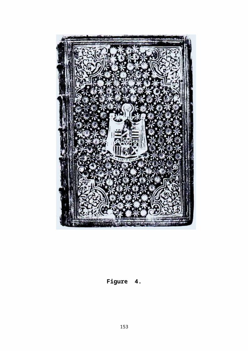
Figure 4.
153
Regularity of positioning
Alignment and Spacing
Whereas it is common to observe that the motifs in a semy
pattern are neatly aligned along the horizontal and vertical
axes, it is apparent from the designs produced by the Eves
atelier in Paris that precision of alignment along the
diagonals of the pattern is the feature that most convincingly
conveys the perfection of semy draughtsmanship. To convey the
impression that the motifs are aligned along the diagonals it
appears to have been necessary to establish clear channels
between the motifs, and where these exist, the crispness of
the pattern is readily apparent.
If diagonal symmetry is paramount, it could be expected that
the linear structures resulting from duplication of the saltire
or lozenge, produced by joining the mid-points of each side of a
bordering frame, would come within the category of semy
designs. Such an array of small compartments certainly has the
requisite symmetry, but lacks the essential ornamental
features. If, instead, the same form of construction were to
be achieved using a collection of individual diamond-shaped
tiles, neatly arranged over the design area, with spaces
preserved between them, the result would effectively be a semy
pattern.
154
Furthermore, if the semy-de-lys pattern of Figure 6 is viewed at
‘glancing incidence,’ that is when held flat at eye-level, the
fleur-de-lys motifs appear as if transformed into diamond
lozenges. This experiment makes apparent the similarity
between the fleur-de-lys shape and a diamond lozenge, and perhaps
reveals why designs based on this motif are the most
geometrically precise of all the semy patterns on
bookbindings. Comparably precise semy designs have been
produced using the three-tongued flame of the French Order of
St Esprit, which embodies the essential diamond-shaped
outline. However in designs in which the binder has attempted
to combine the diamond lattice with the semy by placing a
small motif at the centre of each compartment, as, for
example, in Figure 7, the diamond lattice tends to appear so
dominant that the semy effect is not apparent.
155
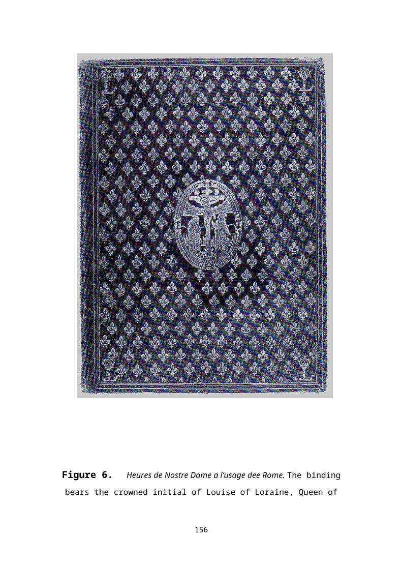
Figure 6. Heures de Nostre Dame a l’usage dee Rome. The binding
bears the crowned initial of Louise of Loraine, Queen of
156
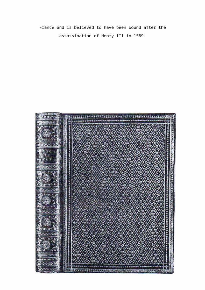
France and is believed to have been bound after the
assassination of Henry III in 1589.
157
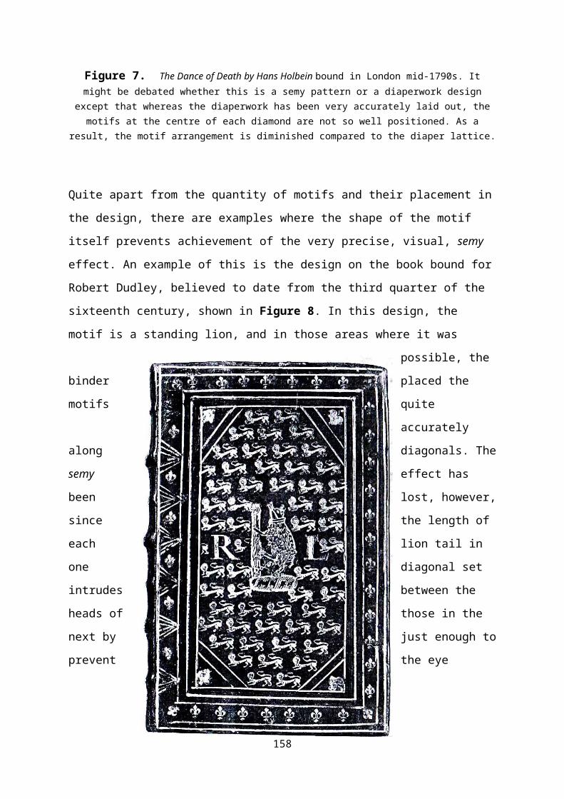
Figure 7. The Dance of Death by Hans Holbein bound in London mid-1790s. Itmight be debated whether this is a semy pattern or a diaperwork design
except that whereas the diaperwork has been very accurately laid out, themotifs at the centre of each diamond are not so well positioned. As a
result, the motif arrangement is diminished compared to the diaper lattice.
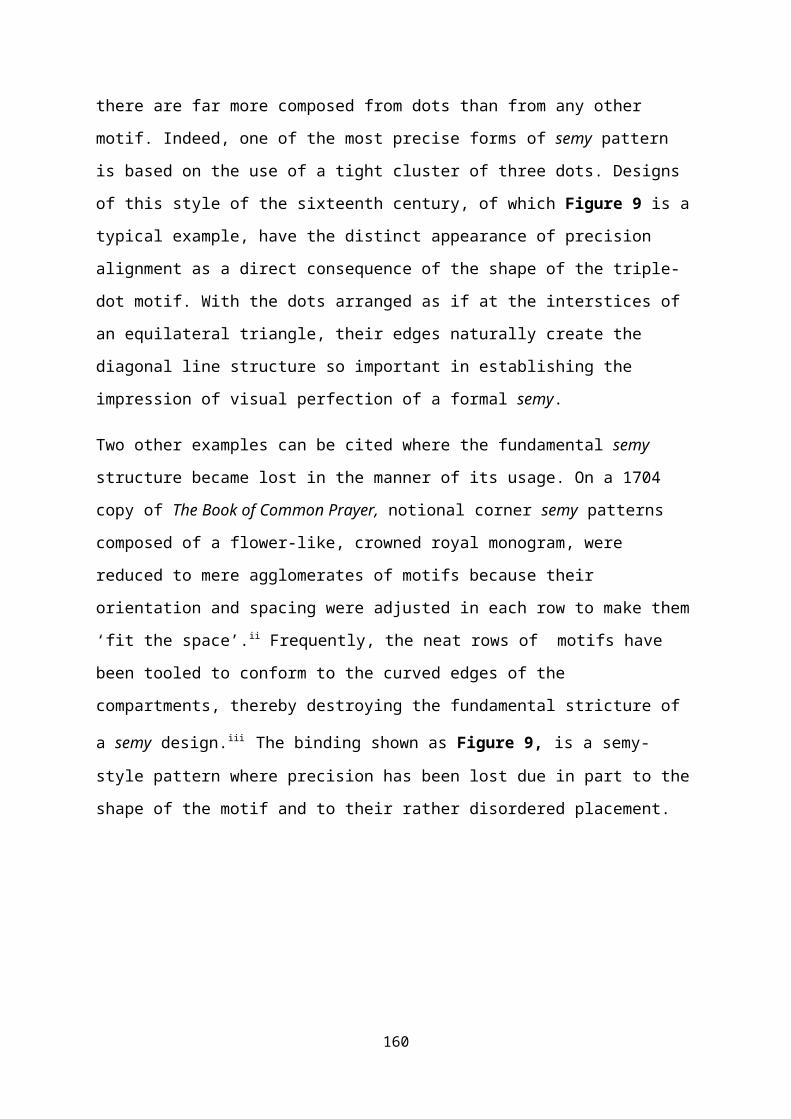
Quite apart from the quantity of motifs and their placement in
the design, there are examples where the shape of the motif
itself prevents achievement of the very precise, visual, semy
effect. An example of this is the design on the book bound for
Robert Dudley, believed to date from the third quarter of the
sixteenth century, shown in Figure 8. In this design, the
motif is a standing lion, and in those areas where it was
possible, the
binder placed the
motifs quite
accurately
along diagonals. The
semy effect has
been lost, however,
since the length of
each lion tail in
one diagonal set
intrudes between the
heads of those in the
next by just enough to
prevent the eye
158

perceiving the clear channel that should have been created
between them.
Figure 8. An English binding of Pedacius Dioscorides, de medicinali
material, for Robert Dudley, Earl of Leicester, 1532-88.
Amongst motifs employed in the construction of semy designs,
dots might not be thought of as particularly ornamental, yet
159
there are far more composed from dots than from any other
motif. Indeed, one of the most precise forms of semy pattern
is based on the use of a tight cluster of three dots. Designs
of this style of the sixteenth century, of which Figure 9 is a
typical example, have the distinct appearance of precision
alignment as a direct consequence of the shape of the triple-
dot motif. With the dots arranged as if at the interstices of
an equilateral triangle, their edges naturally create the
diagonal line structure so important in establishing the
impression of visual perfection of a formal semy.
Two other examples can be cited where the fundamental semy
structure became lost in the manner of its usage. On a 1704
copy of The Book of Common Prayer, notional corner semy patterns
composed of a flower-like, crowned royal monogram, were
reduced to mere agglomerates of motifs because their
orientation and spacing were adjusted in each row to make them
‘fit the space’.ii Frequently, the neat rows of motifs have
been tooled to conform to the curved edges of the
compartments, thereby destroying the fundamental stricture of
a semy design.iii The binding shown as Figure 9, is a semy-style pattern where precision has been lost due in part to the
shape of the motif and to their rather disordered placement.
160
161
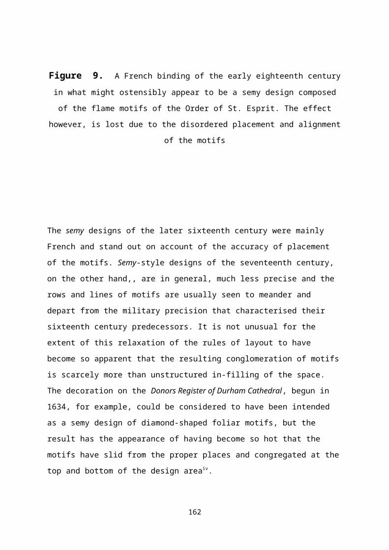
Figure 9. A French binding of the early eighteenth centuryin what might ostensibly appear to be a semy design composed
of the flame motifs of the Order of St. Esprit. The effect
however, is lost due to the disordered placement and alignment
of the motifs
The semy designs of the later sixteenth century were mainly
French and stand out on account of the accuracy of placement
of the motifs. Semy-style designs of the seventeenth century,
on the other hand,, are in general, much less precise and the
rows and lines of motifs are usually seen to meander and
depart from the military precision that characterised their
sixteenth century predecessors. It is not unusual for the
extent of this relaxation of the rules of layout to have
become so apparent that the resulting conglomeration of motifs
is scarcely more than unstructured in-filling of the space.
The decoration on the Donors Register of Durham Cathedral, begun in
1634, for example, could be considered to have been intended
as a semy design of diamond-shaped foliar motifs, but the
result has the appearance of having become so hot that the
motifs have slid from the proper places and congregated at the
top and bottom of the design areaiv.
162
163
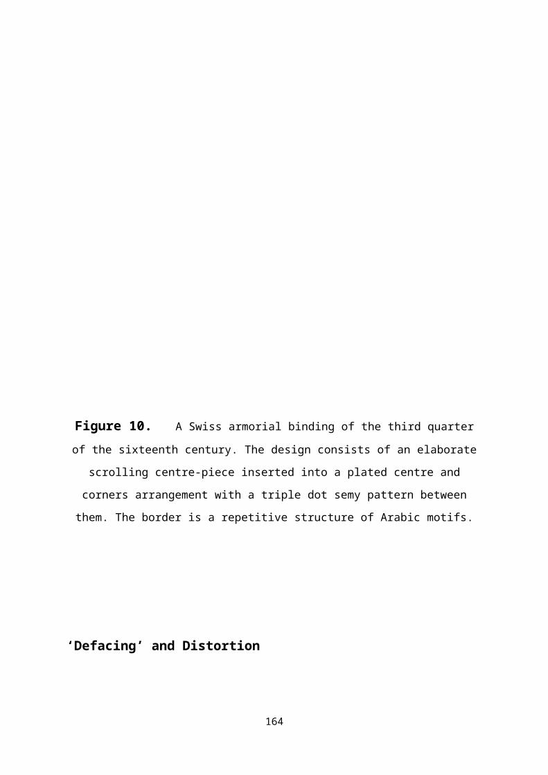
Figure 10. A Swiss armorial binding of the third quarterof the sixteenth century. The design consists of an elaborate
scrolling centre-piece inserted into a plated centre and
corners arrangement with a triple dot semy pattern between
them. The border is a repetitive structure of Arabic motifs.
‘Defacing’ and Distortion
164
It has been stated that the ideal form of semy pattern, based
on heraldic usage, is a section seemingly cut from an infinite
array of repeated motifs. Accordingly, at the edges, and where
other features are introduced in the central part of the
design, it is to be expected that part-forms of the motif
would be apparent and necessary to complete the design. In
heraldic terms, this is referred to as ‘defacing’. The idea
that the array of motifs could be positioned around the
central medallion, for example, would not be permissible. If a
binder were to achieve comparable perfection, he would require
a collection of tools enabling him to impress whatever
fraction of the semy motif might be required. This would
clearly have been impractical on grounds of expense, and
because each tool had to be individually cut by hand. Part-
forms of tooled impressions are visible at the sides of Figure
8 and the bottom of Figure 6. While on a very small number of
bindings the binder has been able to avail himself of a
patron’s largesse, more often it is clear that he has
attempted to achieve the required part-form by impressing the
central medallion on top of those of the semy motifs.
On other bindings a trompe l’oeil ruse was employed using special
insertions to give the appearance of the semy pattern
continuing beneath a border. This involved the addition of
shallow, triangular ornaments along the inner edge of the
border, as in Figure 11, which convincingly conveys the
impression that a complete ‘defaced’ semy has been achieved.
165
166
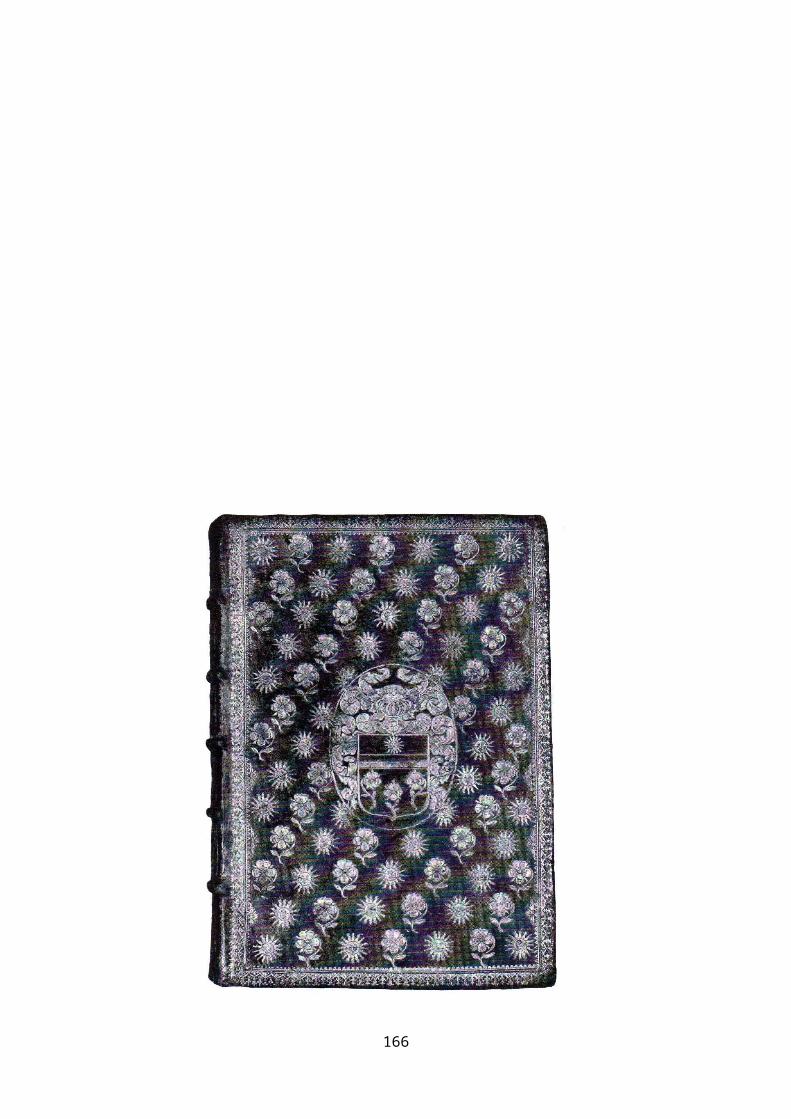
Figure 11 . Debucourt, Aquarelle originale pour Héro et Léandre. The semy
design includes a set of shallow inserts around the border
which produces the trompe l’oeil illusion that the semy pattern is
‘defaced’ when it actually is not.
The usual practice, however, seems to have been to distort the
arrangement of motifs in the vicinity of a central medallion,
or similar insertion, to give the impression that the feature
was embedded within the semy pattern. In every case, even when
placement of the motifs appears to conform to the ideal
layout, when the design is held at eye-level, and the observer
looks along the diagonals of the pattern, it will be readily
apparent how far the binder has had to distort the semy to
incorporate the inserted features. Figure 10, is an example of
a seventeenth-century semy design, in which the motifs appear
to have been correctly placed and to have been defaced
suitably around the border edging, yet when viewed at glancing
incidence, the degree of distortion introduced by the binder
to embed the central medallion is quite surprising. The design
on Platine’s Les Généalogies (included as Figure 10, in the chapter
on Fan Designs), is an example of the extent of the problem a
binder could face in this respect: thirteen large liturgical
fans, each having seventeen spokes had to be inserted into a
semy design of fleur-de-lys and crowned-Ls in an alternating array
twenty-four motifs wide by thirty high.
167
Variants
Although the range of design variants within the category of
semys is comparatively small, two are particularly
significant. Both are French and specific to the late
sixteenth century. One is associated with the Confrerie de la
Mort in the 1580s and characterised by the prevalence of tear
drops, crossed bones and death’s head motifs while the other,
bound for the Order of Saint Esprit between 1585 and 1598, is
an array of ellipses with floral motif centres, emphasising
the emblems of the Order Those of the Confrerie de la Mort are
also frequently referred to as Penitential bindings and are
characterised by their stark, funereal simplicity, whereas the
Saint Esprit bindings are altogether more joyous, with the
focus of each elliptical frame emphasising the floral and
other emblems of the Order.
Bindings of the Order of Saint Esprit
The Order of Saint Esprit was founded by Henri III to
celebrate his accession to the throne of France in 1578 ,
and became the highest of the French chivalric orders.
Bindings with this style of semy design, are characterised by
an array of closely-packed elliptical frames, usually
embellished with pen flecks, or, on occasion, ‘ovales de feuillages’.
Within these frames, are depicted a variety of floral and
other motifs, including plant-forms with acorns, thistle and
other flowers, monograms, a heart pierced with an arrow, a
smiling sun, and a diving bird that was the symbol of the
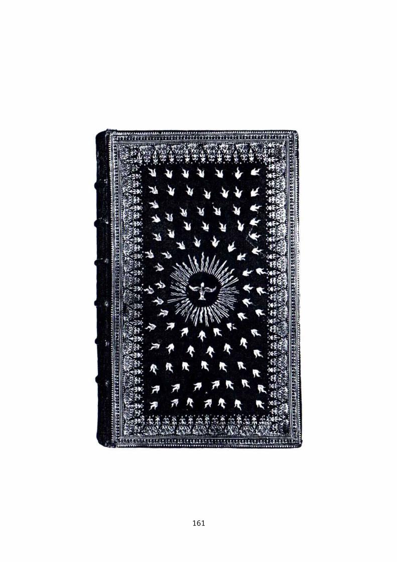
Order. Figure 12.168
Although this semy design is particularly associated with the
books of the Order, it was not necessarily entirely unique to
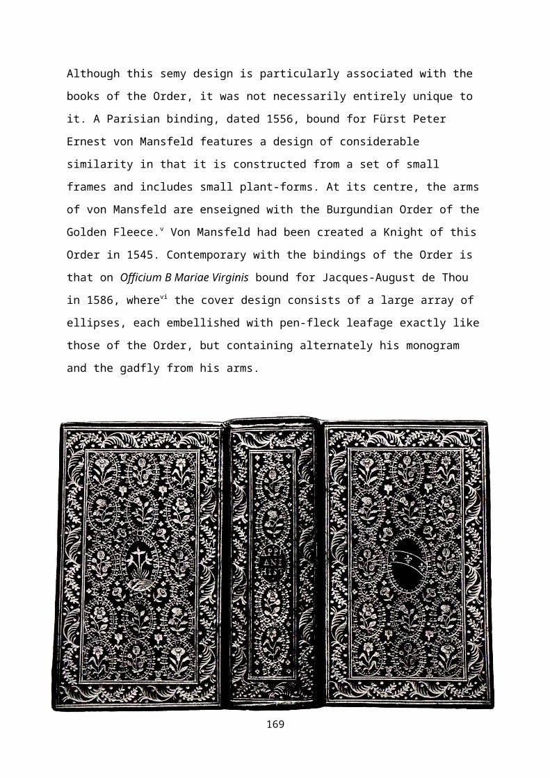
it. A Parisian binding, dated 1556, bound for Fürst Peter
Ernest von Mansfeld features a design of considerable
similarity in that it is constructed from a set of small
frames and includes small plant-forms. At its centre, the arms
of von Mansfeld are enseigned with the Burgundian Order of the
Golden Fleece.v Von Mansfeld had been created a Knight of this
Order in 1545. Contemporary with the bindings of the Order is
that on Officium B Mariae Virginis bound for Jacques-August de Thou
in 1586, wherevi the cover design consists of a large array of
ellipses, each embellished with pen-fleck leafage exactly like
those of the Order, but containing alternately his monogram
and the gadfly from his arms.
169
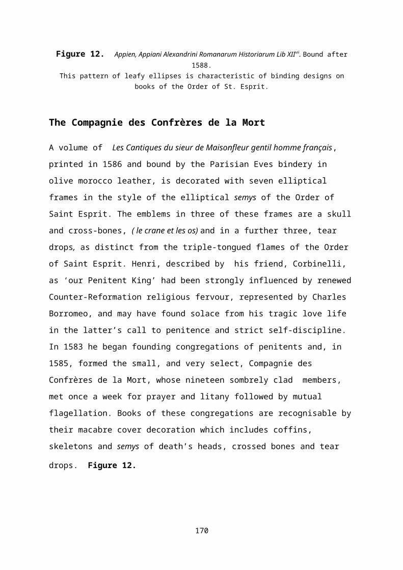
Figure 12. Appien, Appiani Alexandrini Romanarum Historiarum Lib XIIvii. Bound after1588.
This pattern of leafy ellipses is characteristic of binding designs onbooks of the Order of St. Esprit.
The Compagnie des Confrères de la Mort
A volume of Les Cantiques du sieur de Maisonfleur gentil homme français,
printed in 1586 and bound by the Parisian Eves bindery in
olive morocco leather, is decorated with seven elliptical
frames in the style of the elliptical semys of the Order of
Saint Esprit. The emblems in three of these frames are a skull
and cross-bones, ( le crane et les os) and in a further three, tear
drops, as distinct from the triple-tongued flames of the Order
of Saint Esprit. Henri, described by his friend, Corbinelli,
as ‘our Penitent King’ had been strongly influenced by renewed
Counter-Reformation religious fervour, represented by Charles
Borromeo, and may have found solace from his tragic love life
in the latter’s call to penitence and strict self-discipline.
In 1583 he began founding congregations of penitents and, in
1585, formed the small, and very select, Compagnie des
Confrères de la Mort, whose nineteen sombrely clad members,
met once a week for prayer and litany followed by mutual
flagellation. Books of these congregations are recognisable by
their macabre cover decoration which includes coffins,
skeletons and semys of death’s heads, crossed bones and tear
drops. Figure 12.
170
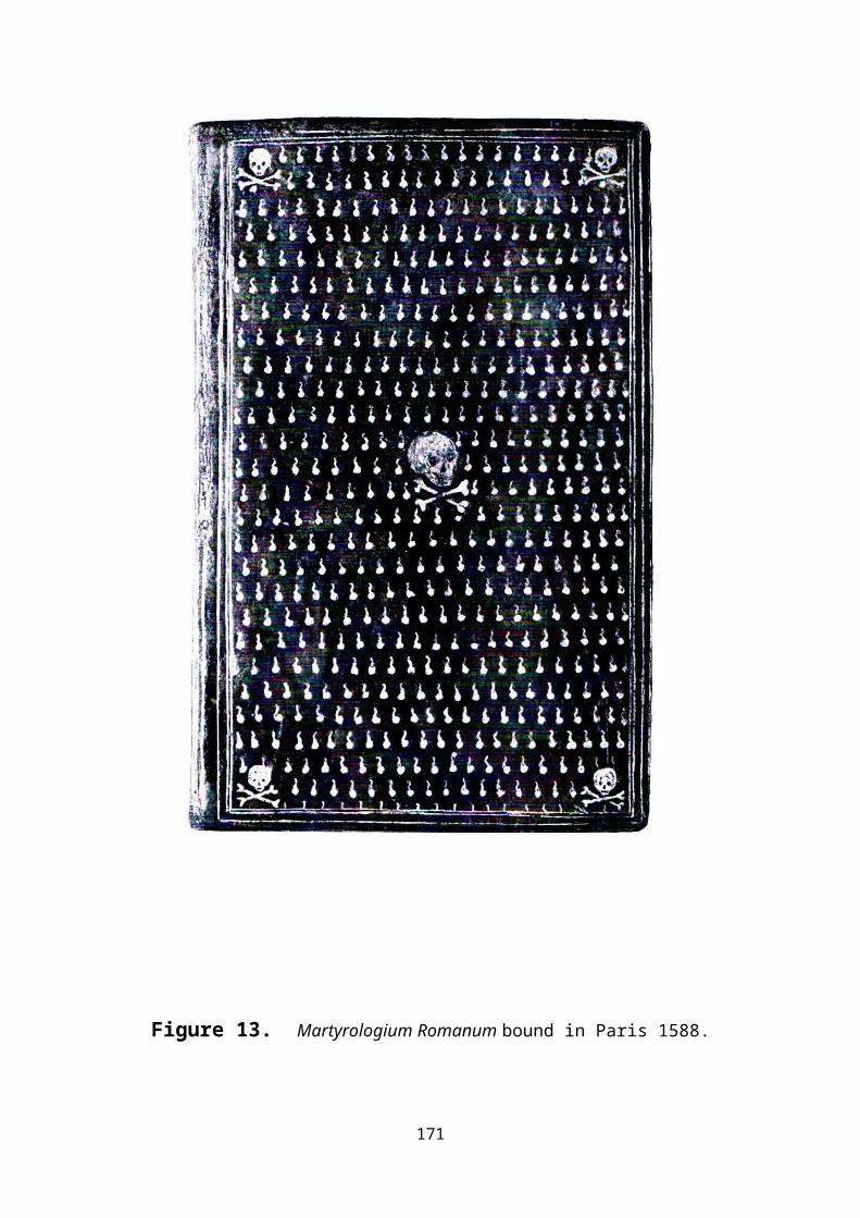
Figure 13. Martyrologium Romanum bound in Paris 1588.
171
Dotting
A tool for producing a minute, round, solid gold disc on a
leather bookbinding consists of no more than a length of round
metal stock, suitably mounted in a wooden handle. Arrays of
tiny gold dots, produced by a simple tool made from a length
of round metal stock, mounted in a wooden handle, are commonly
seen on books bound between the early sixteenth and late
eighteenth centuries. The nature of their usage and
arrangement varies considerably: while the essential feature
of a semy pattern, as we have seen, is that the array of
motifs is equally spaced and well-aligned, the term, pointille,
is used to describe decorative goldwork where the elements of
the pattern are composed entirely of a series of dots. There
are also many examples of the use of extensive areas of gold
dots on bookbindings which neither constitute a pattern
element nor conform to a regular array, and may therefore be
classified as random dotting.
Pointillé
The essence of a decorative pattern in this style is that,
although it consists of a series of curving lines, each linear
element is actually composed from a series of tiny dots.
Statistical studies appear to indicate that it is a decorative
ornament occurring particularly on books bound in France
around the middle of the seventeenth century, and, more
generally, on bindings of the eighteenth century, between the
late first quarter and the mid-fourth quarter. Nixon
considered that a binding in the characteristic ‘Primitive 172
Fanfare’ style, associated with de Piques, in which the
tooling was broken into a series of short dashed lines, should
be considered to be a fore-runner to the pointillé style,viii while
Quaritch associated the style with Le Gascon, who he
considered first employed extensive patterns of extremely
small gold dots on his bindings from around 1625. He commented
that while these were initially used as an accessory to the
main decoration, they very rapidly became the principal part
of the design and, accordingly, Quaritch placed Le Gascon
among the great inventive masters of the art.ix Additionally,
he claimed that usage of the pointillé style in France diminished
after about 1660, its last major exponent being Boyet, in
whose family the technique remained extant until around 1730.
173
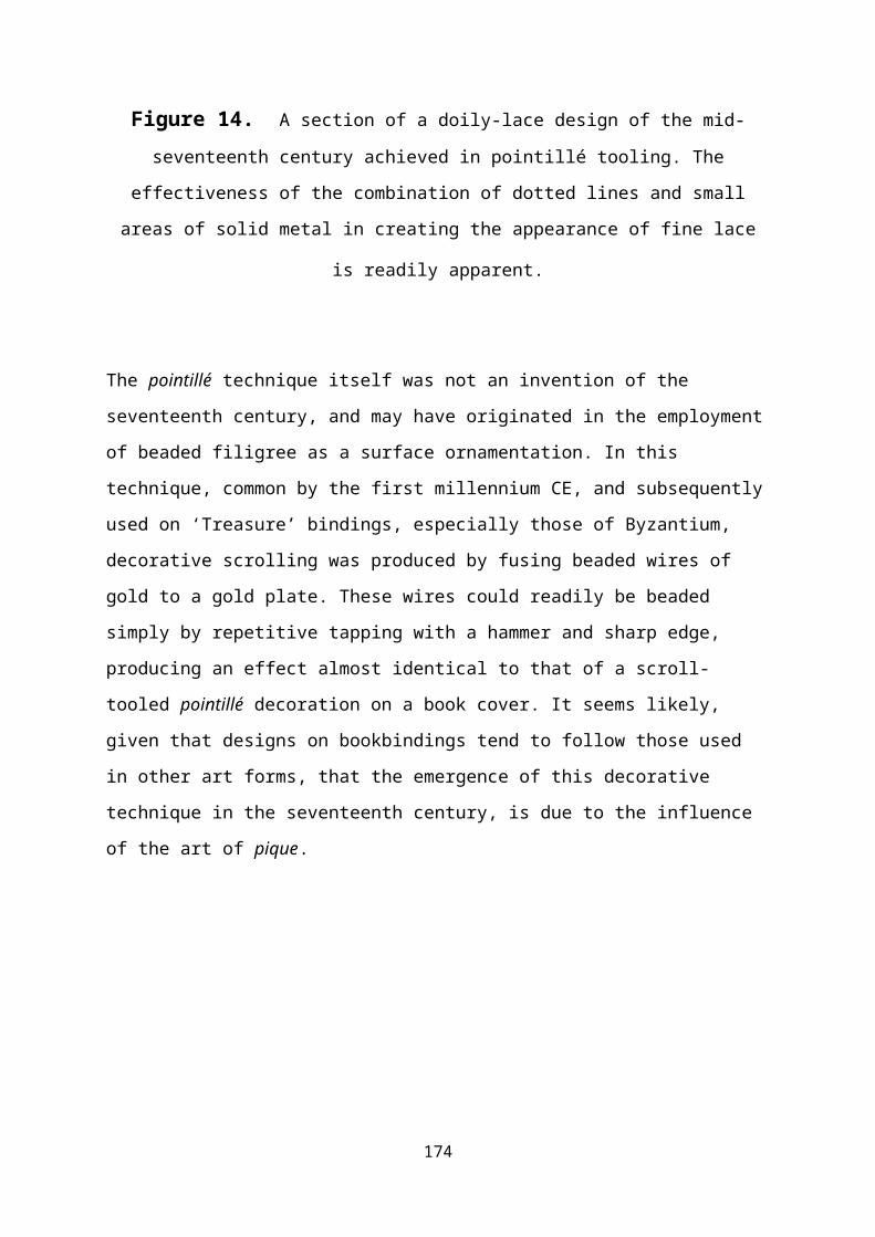
Figure 14. A section of a doily-lace design of the mid-seventeenth century achieved in pointillé tooling. The
effectiveness of the combination of dotted lines and small
areas of solid metal in creating the appearance of fine lace
is readily apparent.
The pointillé technique itself was not an invention of the
seventeenth century, and may have originated in the employment
of beaded filigree as a surface ornamentation. In this
technique, common by the first millennium CE, and subsequently
used on ‘Treasure’ bindings, especially those of Byzantium,
decorative scrolling was produced by fusing beaded wires of
gold to a gold plate. These wires could readily be beaded
simply by repetitive tapping with a hammer and sharp edge,
producing an effect almost identical to that of a scroll-
tooled pointillé decoration on a book cover. It seems likely,
given that designs on bookbindings tend to follow those used
in other art forms, that the emergence of this decorative
technique in the seventeenth century, is due to the influence
of the art of pique.
174
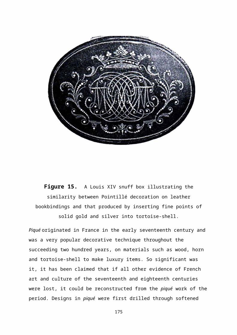
Figure 15. A Louis XIV snuff box illustrating thesimilarity between Pointillé decoration on leather
bookbindings and that produced by inserting fine points of
solid gold and silver into tortoise-shell.
Piqué originated in France in the early seventeenth century and
was a very popular decorative technique throughout the
succeeding two hundred years, on materials such as wood, horn
and tortoise-shell to make luxury items. So significant was
it, it has been claimed that if all other evidence of French
art and culture of the seventeenth and eighteenth centuries
were lost, it could be reconstructed from the piqué work of the
period. Designs in piqué were first drilled through softened
175
ivory or tortoise-shell and then ‘pricked in’ with gold and
silver points,x producing a very similar visual appearance of
dotted scrolls to those achieved in pointille work. In the time
of Louis XIII, pique designs consisted of inset points of gold
or silver, whereas by the reign of the next monarch, it was
the practice to include metal strips, and, by the late
seventeenth century, shaped items of mother-of-pearl, such as
birds and flowers began to be included into what became known
as piqué posé designs, which became more widely used during the
eighteenth century.
It is first worth considering the scale of the task binders
took on when they chose to incorporate large areas of dotting
in a cover design. In the pointillé technique, established motifs
such as the sea-shell spiral, which were previously impressed
as smooth, curving forms, were, instead, achieved as a string
of gold dots. It might be assumes that the binder constructed
each scrolling form free-hand merely by the careful placement
of each succeeding dot in relation to those already impressed,
but the meticulous regularity and smoothness of such shapes
suggests that some additional aid was used. It is likely,
therefore, that either the dotting was done individually, by
hand, with the dots being placed into a shallow blind
impression made previously using a standard motif tool, or ,
alternatively, it is possible that the standard tools could
themselves have been modified, by sawing and filing, to
convert their surface into a profile more like a saw blade,
which, when impressed, would leave a series of dots. This
latter technique, however, was unlikely to succeed, since the
176
mechanics are such that gold would almost certainly be bonded
to the leather between the points.
Random dots
Unstructured distributions of dotting are observed on many
bindings from the early sixteenth to the late eighteenth
centuries. The Occurrence Charts show that their use appears
to have been particularly popular around the middle of the
sixteenth century, and again at the end of the third quarter.
It became the practice for areas of a design that would
otherwise have been devoid of decoration to be sprinkled with
gold dots. As for example in Figure 15. When the dots are
larger, such decorative infilling has been described as
‘snowflake,’ while some examples of the use of small dots are
so densely packed that they almost appear to be uniformly
gilded. Study of these dotted areas under a microscope shows
that the placement of dots tends to conform to the edges of
the space they are filling, which indicates they were tooled,
one by one, by hand. This technique is likely to have been
adopted by bookbinders from its use on memorial brasses, known
as manière cribléexi. The use of intensive dotting to establish a
background is also seen on bindings of the cuir cisélé, carved
leather style that has been particularly associated with
German binders. The technique had also been in use from the
fifteenth century in illuminations and prints, in which
certain parts embellished with gold dotting are described as,
‘dotted prints.’xii
177
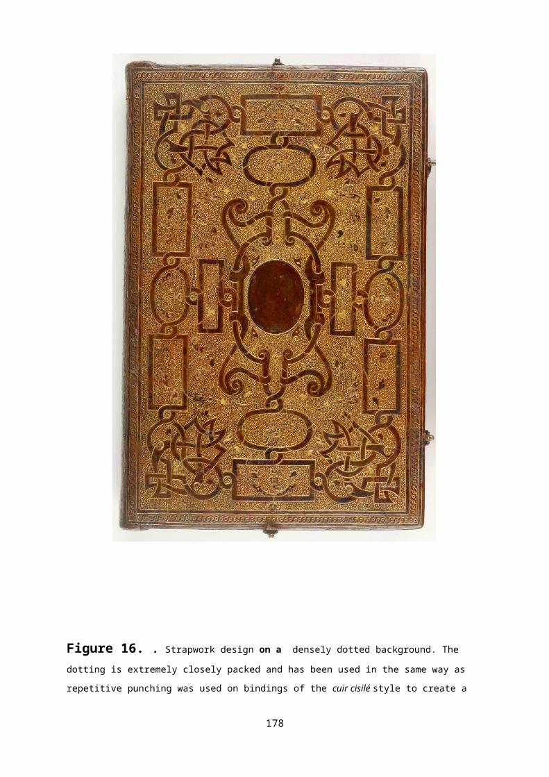
Figure 16. . Strapwork design on a densely dotted background. The dotting is extremely closely packed and has been used in the same way as
repetitive punching was used on bindings of the cuir cisilé style to create a
178
ground foil to the design. The technique was also a standard procedure on
memorial brasses for the same purpose. The dots may be seen to have been
placed to follow the outlines of the design elements and thereafter just
placed to fill the intervening space as uniformly as possible
179
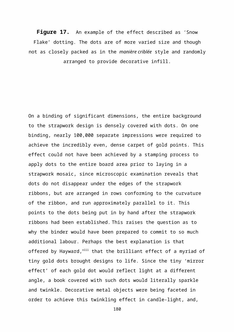
Figure 17. An example of the effect described as ‘SnowFlake’ dotting. The dots are of more varied size and though
not as closely packed as in the manière criblée style and randomly
arranged to provide decorative infill.
On a binding of significant dimensions, the entire background
to the strapwork design is densely covered with dots. On one
binding, nearly 100,000 separate impressions were required to
achieve the incredibly even, dense carpet of gold points. This
effect could not have been achieved by a stamping process to
apply dots to the entire board area prior to laying in a
strapwork mosaic, since microscopic examination reveals that
dots do not disappear under the edges of the strapwork
ribbons, but are arranged in rows conforming to the curvature
of the ribbon, and run approximately parallel to it. This
points to the dots being put in by hand after the strapwork
ribbons had been established. This raises the question as to
why the binder would have been prepared to commit to so much
additional labour. Perhaps the best explanation is that
offered by Hayward,xiii that the brilliant effect of a myriad of
tiny gold dots brought designs to life. Since the tiny ‘mirror
effect’ of each gold dot would reflect light at a different
angle, a book covered with such dots would literally sparkle
and twinkle. Decorative metal objects were being faceted in
order to achieve this twinkling effect in candle-light, and, 180
by the late seventeenth century, the availability of brighter
lighting demanded closer imitation of gemstones to maximise
this effect.
In parallel with the usage of dots to form semy-type patterns
and decorative in-filling, a more free-style usage of small
motifs, such as a ring or a star,appears on bindings starting
around the mid-1540s. In contrast to the main parts of the
design, these tiny rings appear to have been inserted, almost
perhaps as an after-thought, to enhance the goldwork, and to
ornament areas of the main design that might otherwise have
looked rather empty. The distribution of these tiny motifs
might best be described as having been sprinkled over the main
parts of the design, or as‘floaters’ within it. Ring floaters
are most noticeable on bindings of the third quarter of the
seventeenth century, at the turn of the century and especially
around the middle of the eighteenth, while rosettes and stars
appear to have been especially popular throughout the second
half of the seventeenth century, and for most of the
eighteenth. The usage of all these motifs appears
predominantly on English and French bindings, with only rarer
appearances on Dutch and Italian ones. In the seventeenth
century, floating rings appear around twice as often on
English bindings as on French, whereas the reverse is true of
the eighteenth.
181
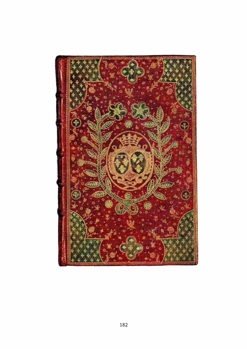
182

Figure 18. Office de la Quinzaine de Pasque, Paris 1739. A centre and
corners design with semy-de-lys patterns in the corner pieces
and with the background area between the corners and centre
enhanced with a variety of small floating motifs.
183

184

i In heraldic definition the term is considered to be synonymous with, Aspersed, Poudré, Powdered, Replenished, Semé, Strewed and Strewn.ii Pearson D Provenance Research Fig 4.19iii Sothebys’ Catalogue of, Fine Continental Books and Manuscripts, Science and Medicine, London5th December 1991 item 255 p105.iv Pearson D A Durham Binding of 1634, The Book Collector vol 43(4) Winter 1994 p553-55.v Sotheby’s Catalogue of Fine Continental Books, London 5th December 1991 item 172.vi Sotheby’s Catalogue of Fine Continental Books, London 5th December 1991 item 172.vii Catalogue for the sale of the Bibliothèque René Descamps-Scrive pt I, LéopoldCarteret, Paris 1925. Pl 6, p5viii Nixon H M Twelve Centuries of Bookbinding p254.ix Quaritch B. p. xix Piqué – How to do it Antique Collector p133……………xi Trevick Maniere Criblee. P44 fig 48 ex on 3741 of 1539 on infillxii Dotted Print Antique Collector 1938.xiii Hayward J.F. (1949) French Books - The National Book League Exhibition Apollo p12-14.
Related Documents