Welcome message from author
This document is posted to help you gain knowledge. Please leave a comment to let me know what you think about it! Share it to your friends and learn new things together.
Transcript


Twitter Bootstrap
&
jQuery Mobile

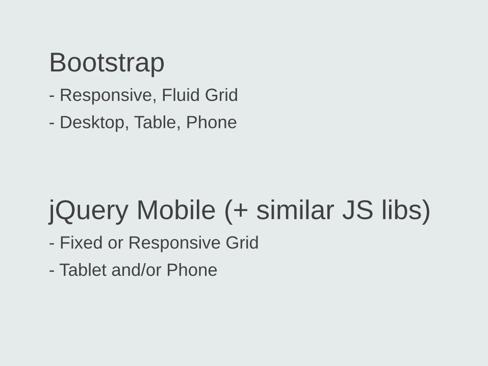
Bootstrap - Responsive, Fluid Grid - Desktop, Table, Phone
jQuery Mobile (+ similar JS libs) - Fixed or Responsive Grid - Tablet and/or Phone
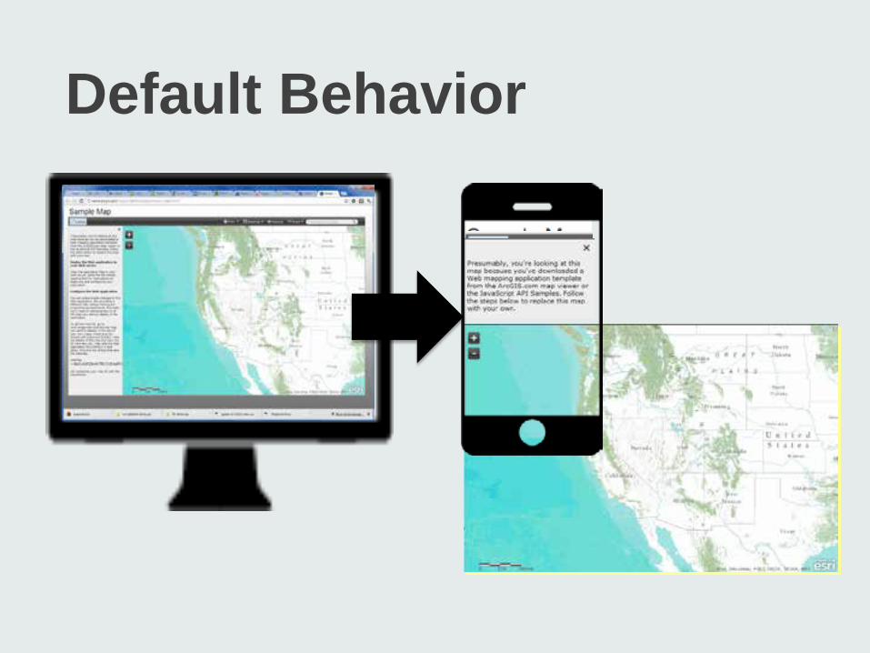
Default Behavior
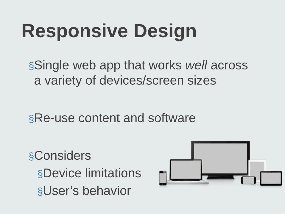
Responsive Design §Single web app that works well across a variety of devices/screen sizes §Re-use content and software §Considers §Device limitations §User’s behavior
Responsive Design Components
1. Fluid Grid System 2. Media Queries 3. HTML5, CSS & JavaScript
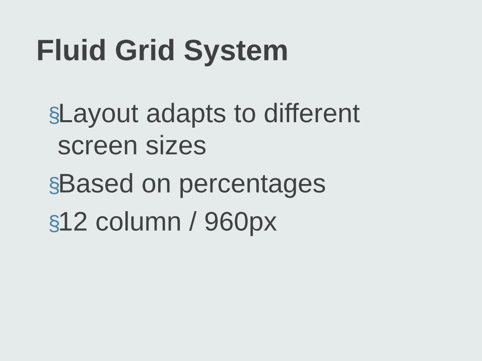
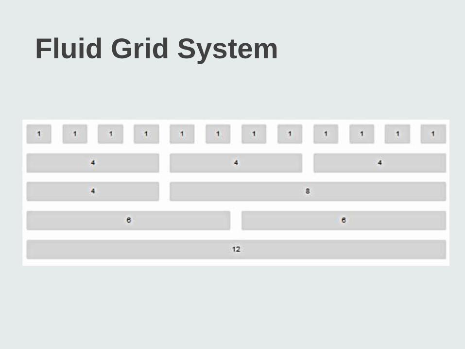
Fluid Grid System
§Layout adapts to different screen sizes §Based on percentages §12 column / 960px
Fluid Grid System
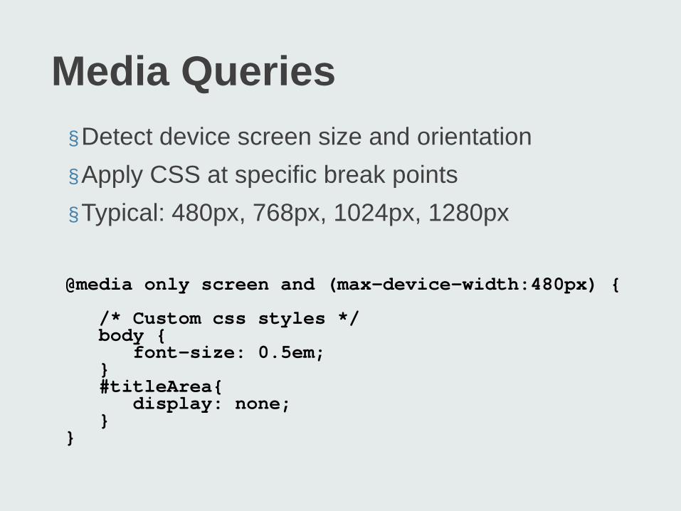
Media Queries §Detect device screen size and orientation §Apply CSS at specific break points §Typical: 480px, 768px, 1024px, 1280px @media only screen and (max-device-width:480px) {
/* Custom css styles */ body { font-size: 0.5em; } #titleArea{ display: none; } }

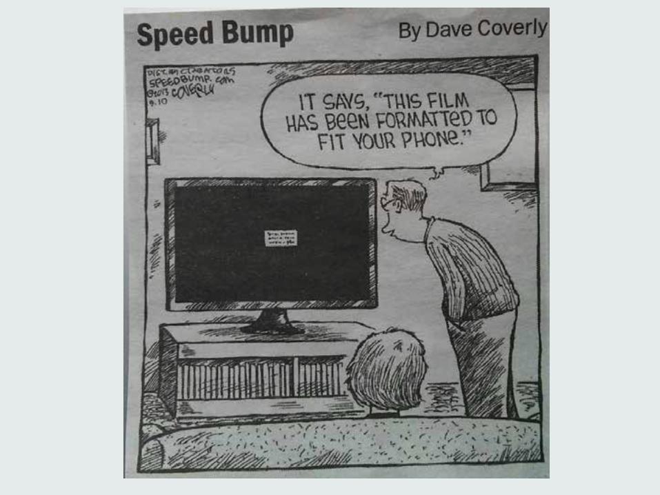
How does responsive work?
map
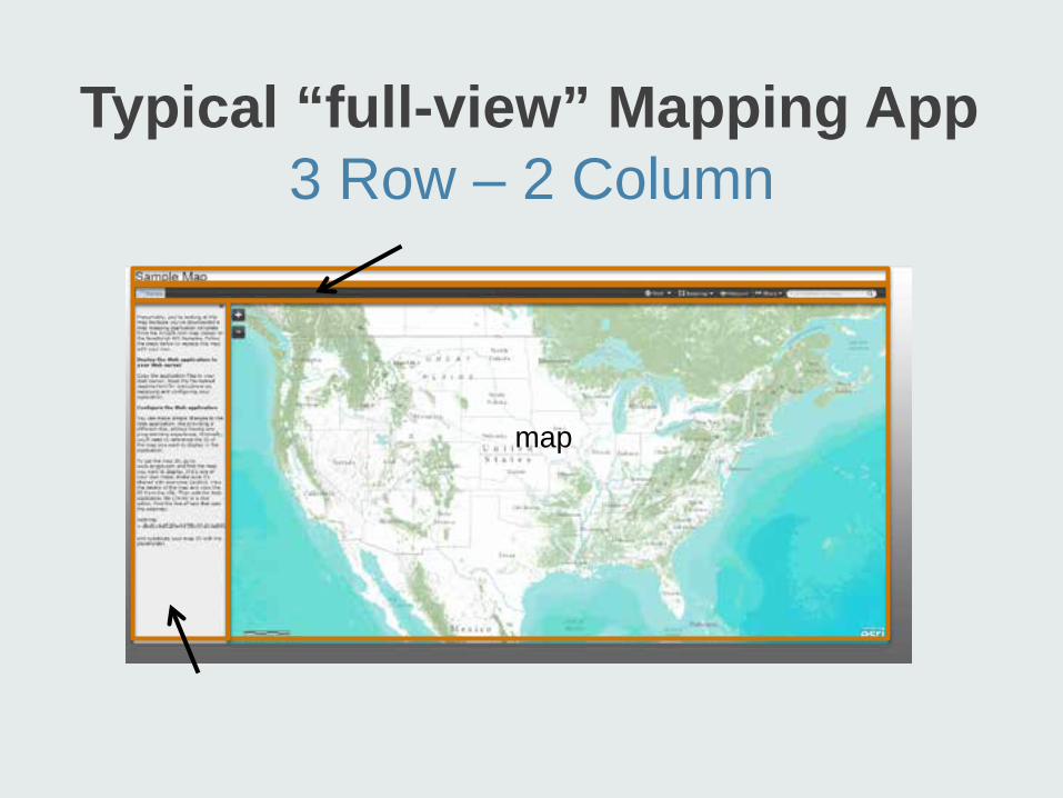
Typical “full-view” Mapping App 3 Row – 2 Column
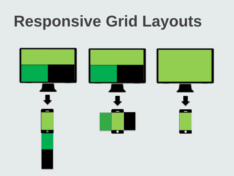
Responsive Grid Layouts
Vertical Stacking
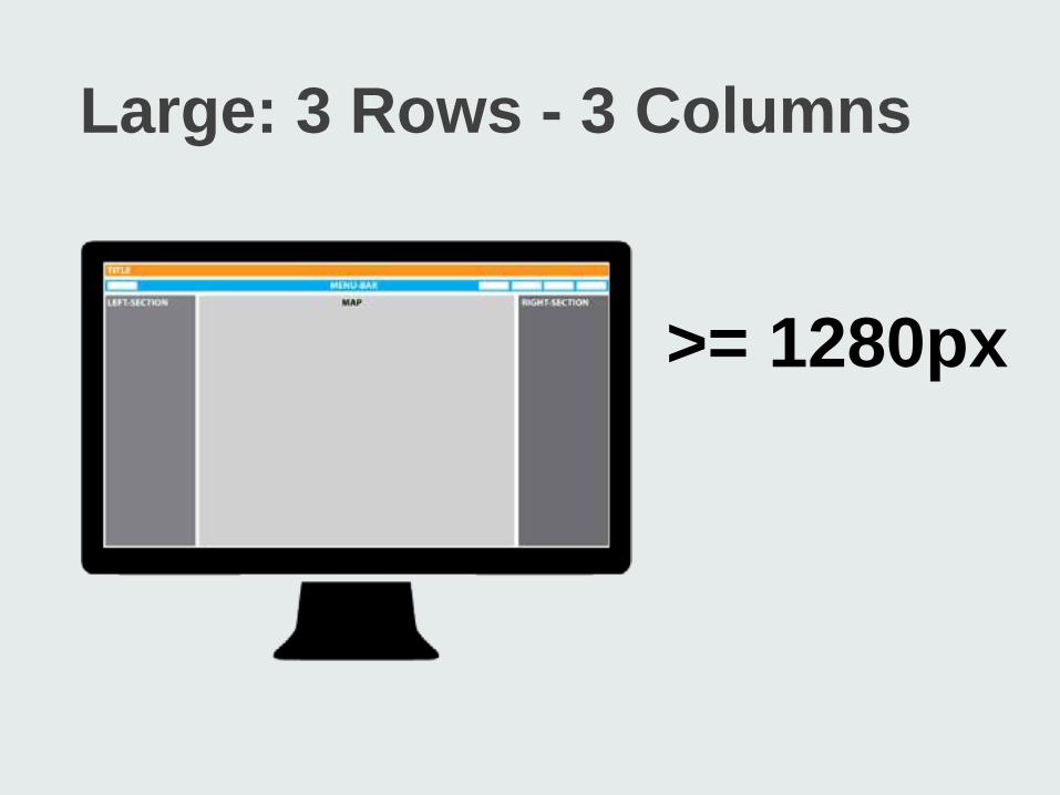
Large: 3 Rows - 3 Columns
>= 1280px
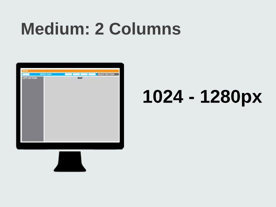
Medium: 2 Columns
1024 - 1280px
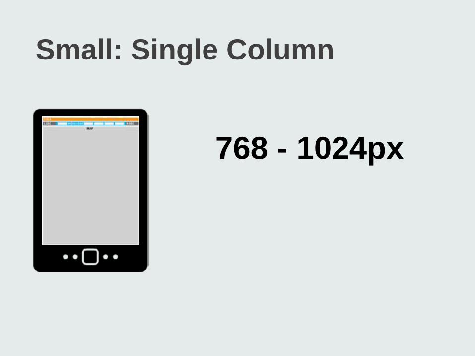
Small: Single Column
768 - 1024px
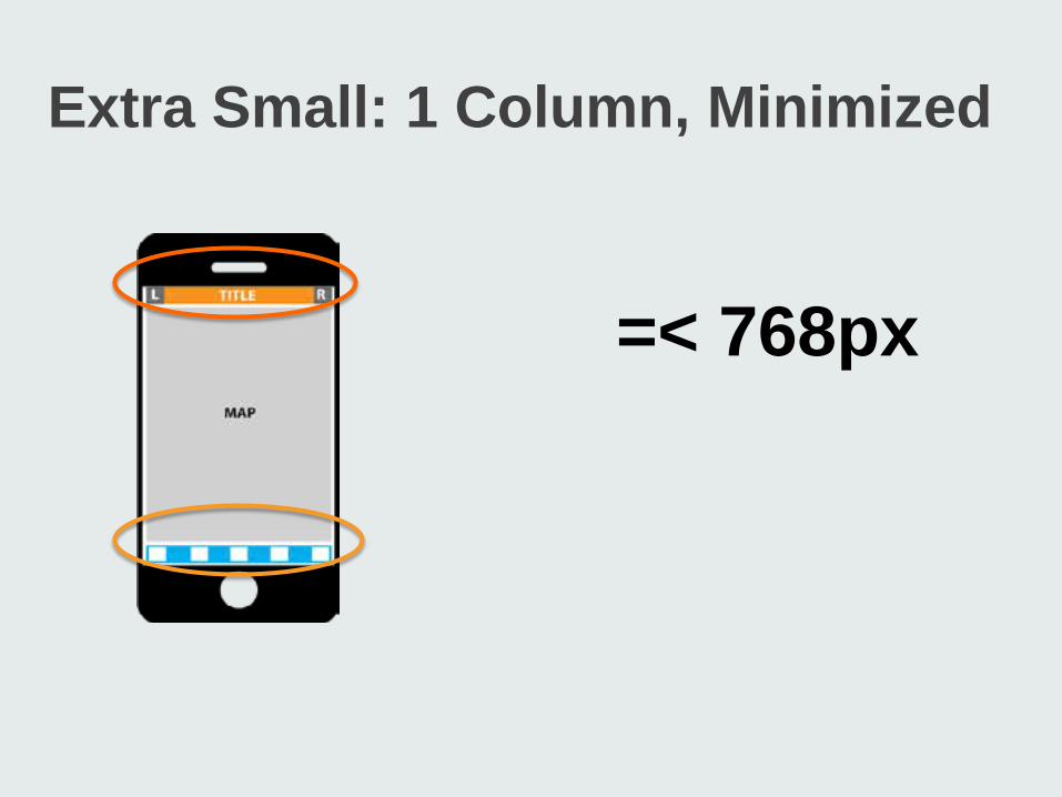
Extra Small: 1 Column, Minimized
=< 768px
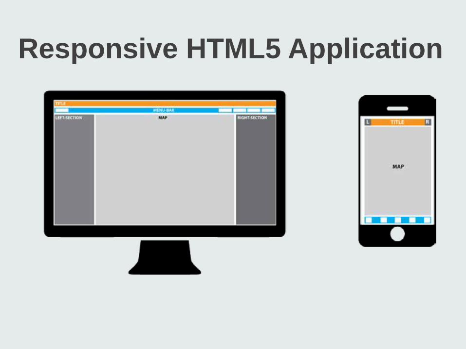
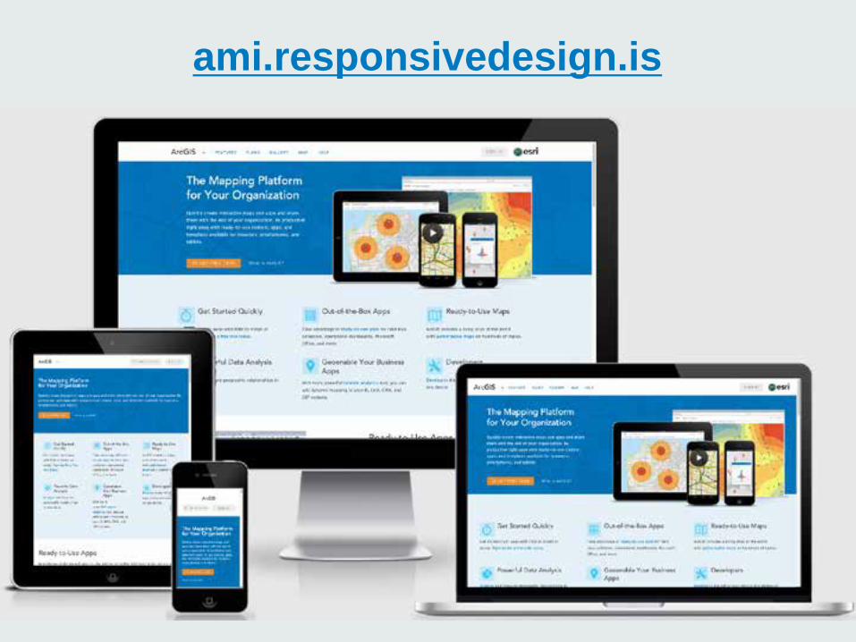
Responsive HTML5 Application
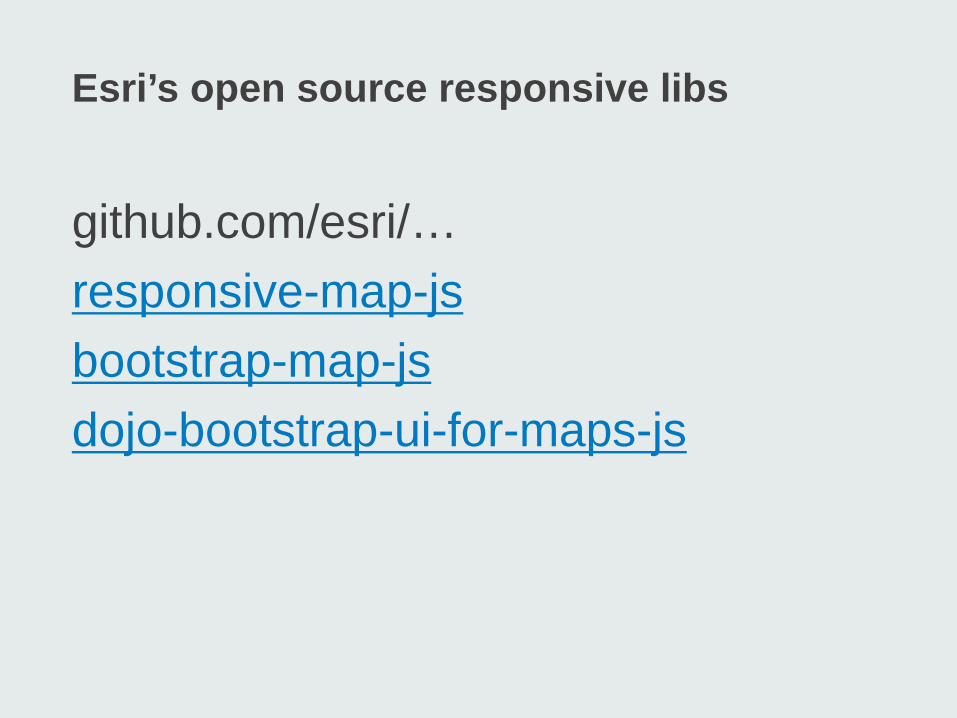
Esri’s open source responsive libs
github.com/esri/… responsive-map-js bootstrap-map-js dojo-bootstrap-ui-for-maps-js
Responsive Web Frameworks
§Bootstrap 3 §Foundation 3 §Skeleton §YAML 4 §jQuery Mobile Responsive Grid
Bootstrap-map-js
§Bootstrap ver 3 framework §Responsive map §Resize and re-center §Pop-ups, widgets §Touch §CSS Styles
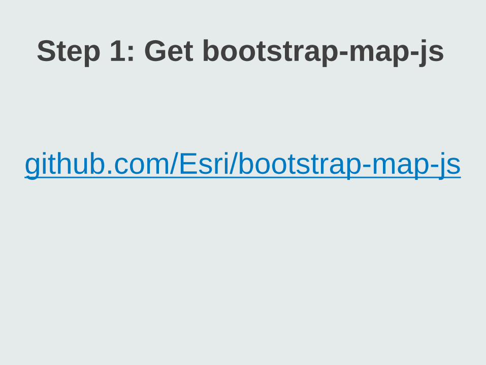
Step 1: Get bootstrap-map-js
github.com/Esri/bootstrap-map-js
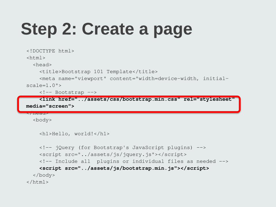
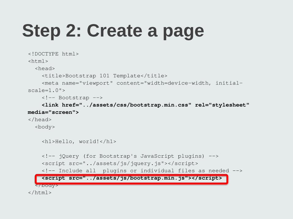
Step 2: Create a page <!DOCTYPE html> <html> <head> <title>Bootstrap 101 Template</title> <meta name="viewport" content="width=device-width, initial-scale=1.0"> <!-- Bootstrap --> <link href="../assets/css/bootstrap.min.css" rel="stylesheet" media="screen"> </head> <body> <h1>Hello, world!</h1> <!-- jQuery (for Bootstrap's JavaScript plugins) --> <script src="../assets/js/jquery.js"></script> <!-- Include all plugins or individual files as needed --> <script src="../assets/js/bootstrap.min.js"></script> </body> </html>
Step 2: Create a page <!DOCTYPE html> <html> <head> <title>Bootstrap 101 Template</title> <meta name="viewport" content="width=device-width, initial-scale=1.0"> <!-- Bootstrap --> <link href="../assets/css/bootstrap.min.css" rel="stylesheet" media="screen"> </head> <body> <h1>Hello, world!</h1> <!-- jQuery (for Bootstrap's JavaScript plugins) --> <script src="../assets/js/jquery.js"></script> <!-- Include all plugins or individual files as needed --> <script src="../assets/js/bootstrap.min.js"></script> </body> </html>
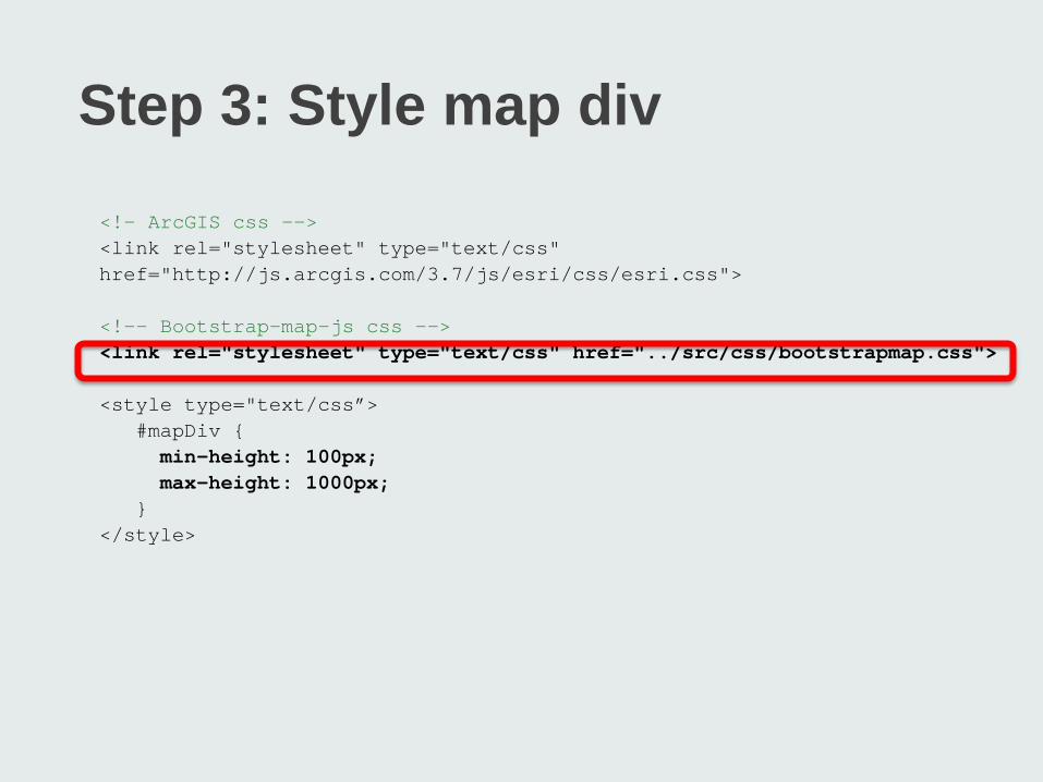
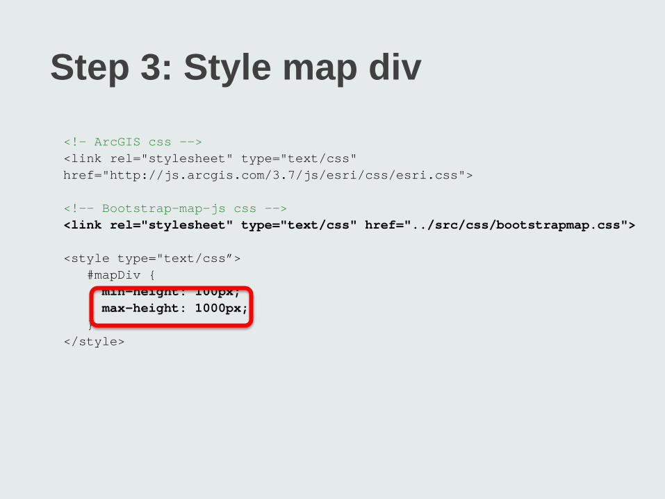
Step 3: Style map div
<!– ArcGIS css --> <link rel="stylesheet" type="text/css" href="http://js.arcgis.com/3.7/js/esri/css/esri.css"> <!-- Bootstrap-map-js css --> <link rel="stylesheet" type="text/css" href="../src/css/bootstrapmap.css"> <style type="text/css”> #mapDiv { min-height: 100px; max-height: 1000px; } </style>
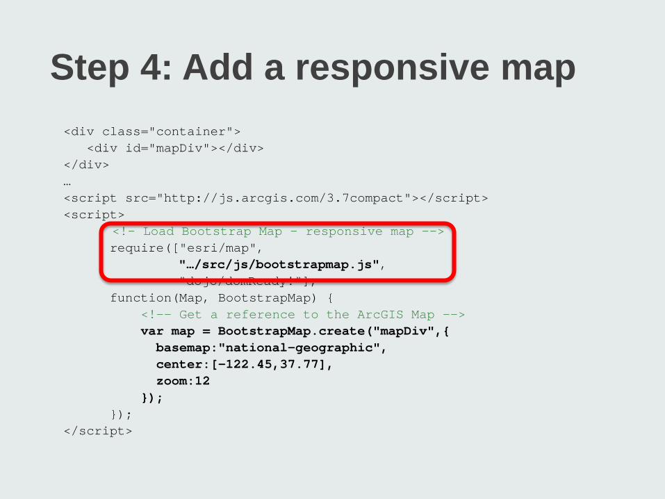
Step 4: Add a responsive map <div class="container"> <div id="mapDiv"></div> </div> … <script src="http://js.arcgis.com/3.7compact"></script> <script> <!– Load Bootstrap Map – responsive map --> require(["esri/map", "…/src/js/bootstrapmap.js", "dojo/domReady!"], function(Map, BootstrapMap) { <!-- Get a reference to the ArcGIS Map --> var map = BootstrapMap.create("mapDiv",{ basemap:"national-geographic", center:[-122.45,37.77], zoom:12 }); }); </script>
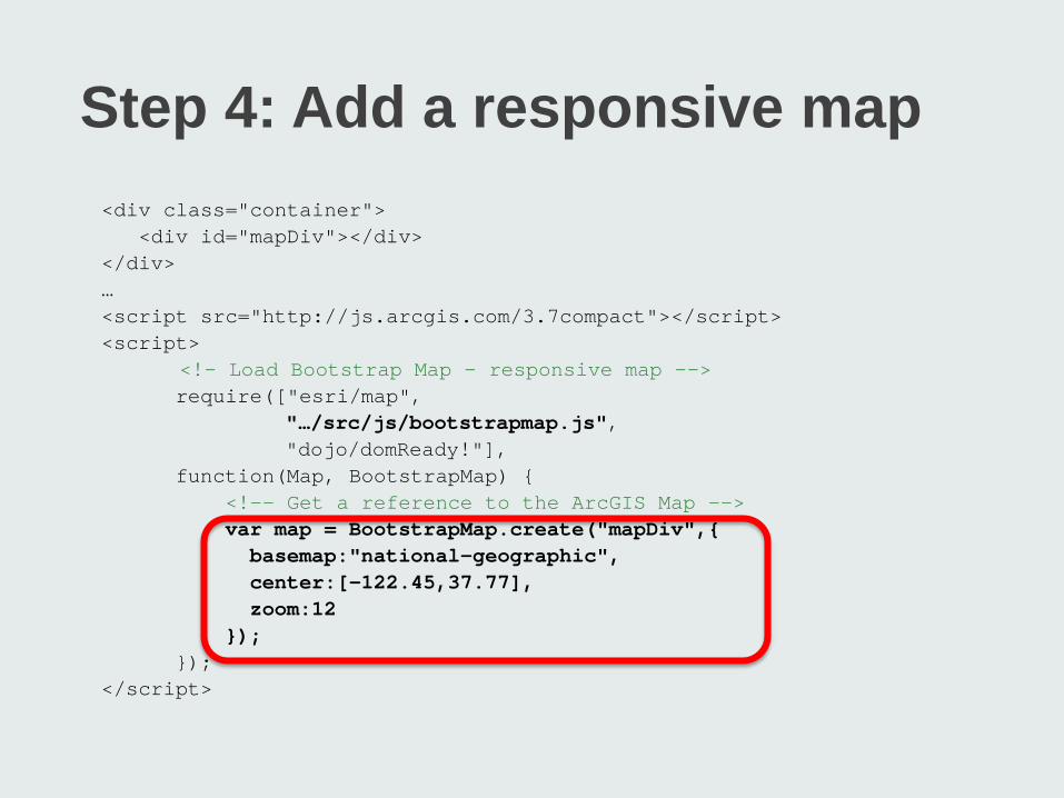
Step 4: Add a responsive map <div class="container"> <div id="mapDiv"></div> </div> … <script src="http://js.arcgis.com/3.7compact"></script> <script> <!– Load Bootstrap Map – responsive map --> require(["esri/map", "…/src/js/bootstrapmap.js", "dojo/domReady!"], function(Map, BootstrapMap) { <!-- Get a reference to the ArcGIS Map --> var map = BootstrapMap.create("mapDiv",{ basemap:"national-geographic", center:[-122.45,37.77], zoom:12 }); }); </script>

A quick look inside…
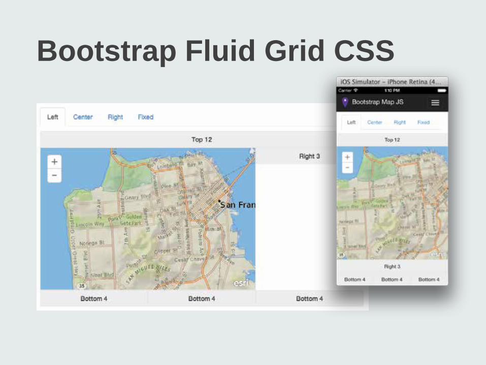
Bootstrap Fluid Grid CSS
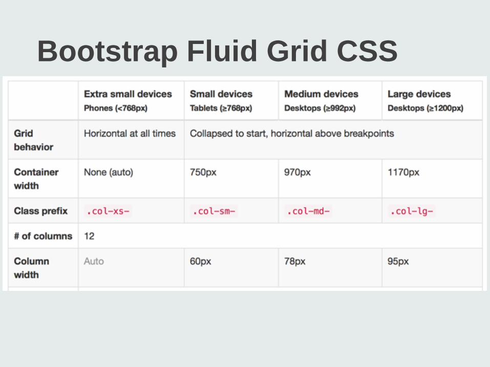
Bootstrap Fluid Grid CSS
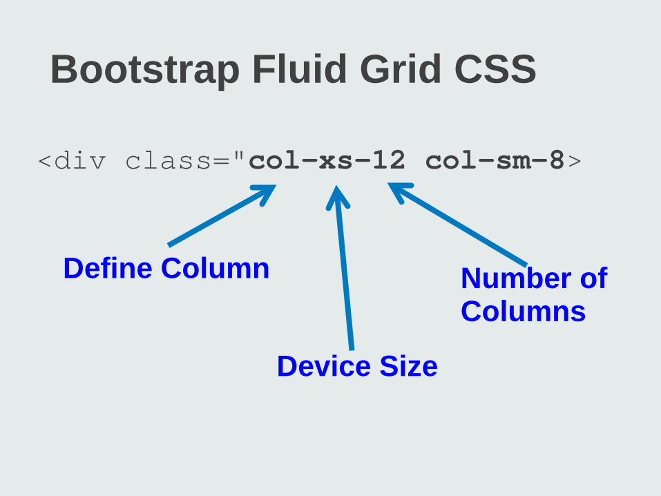
<div class="col-xs-12 col-sm-8>
Define Column
Device Size
Number of Columns
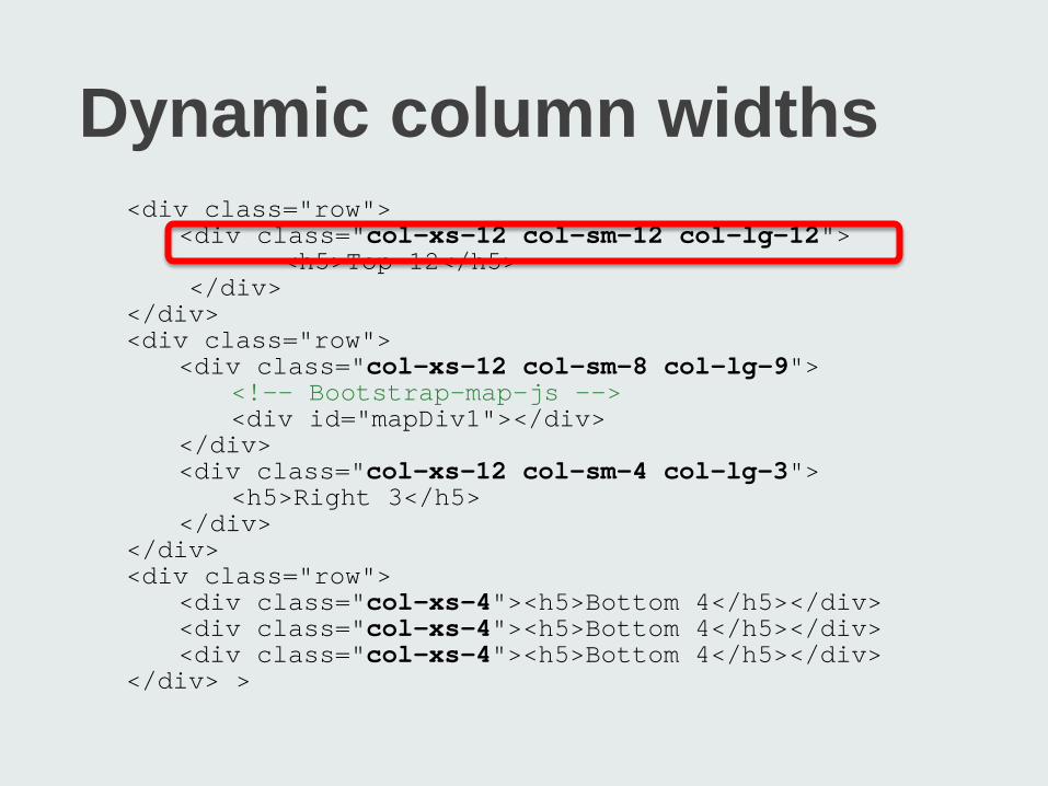
<div class="row"> <div class="col-xs-12 col-sm-12 col-lg-12"> <h5>Top 12</h5> </div> </div> <div class="row"> <div class="col-xs-12 col-sm-8 col-lg-9"> <!-- Bootstrap-map-js --> <div id="mapDiv1"></div> </div> <div class="col-xs-12 col-sm-4 col-lg-3"> <h5>Right 3</h5> </div> </div> <div class="row"> <div class="col-xs-4"><h5>Bottom 4</h5></div> <div class="col-xs-4"><h5>Bottom 4</h5></div> <div class="col-xs-4"><h5>Bottom 4</h5></div> </div> >
Dynamic column widths
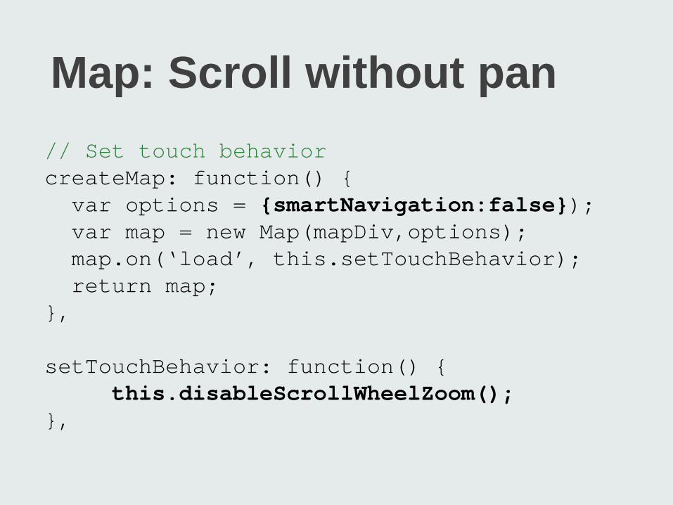
Map: Scroll without pan // Set touch behavior createMap: function() { var options = {smartNavigation:false}); var map = new Map(mapDiv,options); map.on(‘load’, this.setTouchBehavior); return map; }, setTouchBehavior: function() { this.disableScrollWheelZoom(); },
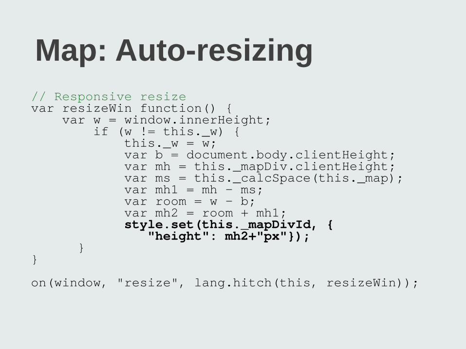
Map: Auto-resizing // Responsive resize var resizeWin function() { var w = window.innerHeight; if (w != this._w) { this._w = w; var b = document.body.clientHeight; var mh = this._mapDiv.clientHeight; var ms = this._calcSpace(this._map); var mh1 = mh - ms; var room = w - b; var mh2 = room + mh1; style.set(this._mapDivId, { "height": mh2+"px"}); } } on(window, "resize", lang.hitch(this, resizeWin));
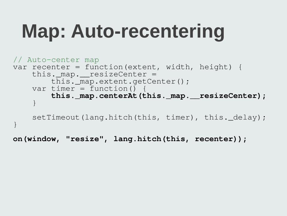
Map: Auto-recentering // Auto-center map var recenter = function(extent, width, height) { this._map.__resizeCenter = this._map.extent.getCenter(); var timer = function() { this._map.centerAt(this._map.__resizeCenter); } setTimeout(lang.hitch(this, timer), this._delay); } on(window, "resize", lang.hitch(this, recenter));
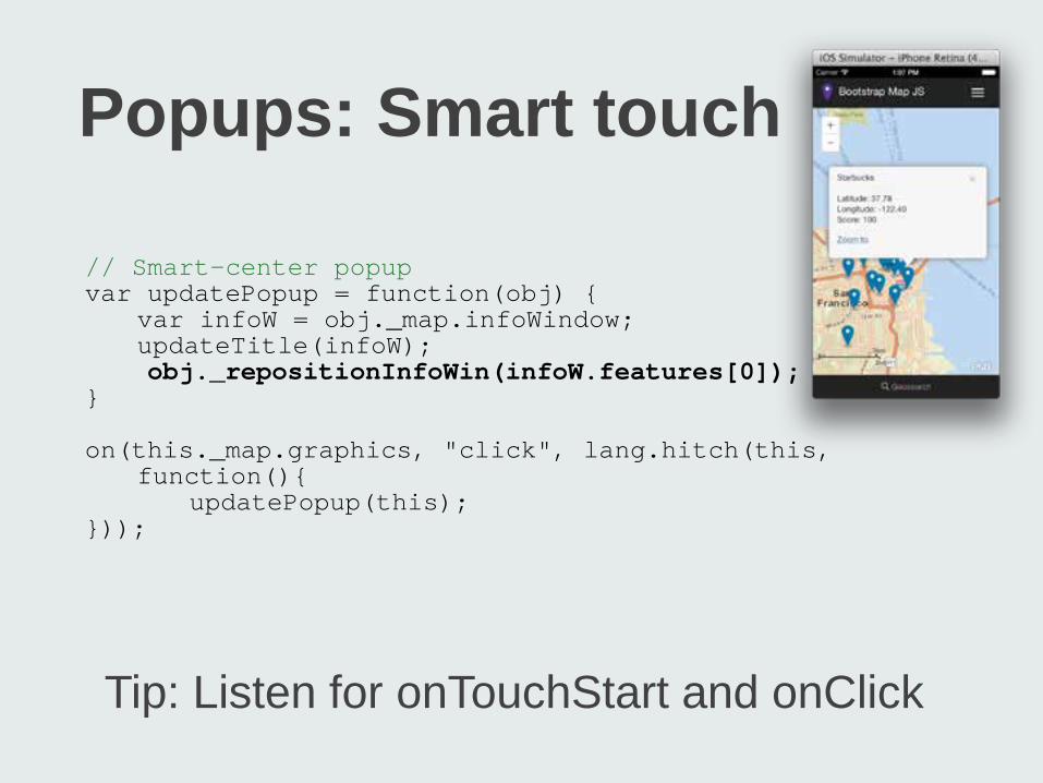
Tip: Listen for onTouchStart and onClick
Popups: Smart touch // Smart-center popup var updatePopup = function(obj) { var infoW = obj._map.infoWindow; updateTitle(infoW); obj._repositionInfoWin(infoW.features[0]); } on(this._map.graphics, "click", lang.hitch(this, function(){ updatePopup(this); }));
Other Tips and Tricks
§Watch for .container CSS §Remove all :hover states §Listen for onTouchStart and click to avoid 300ms delay


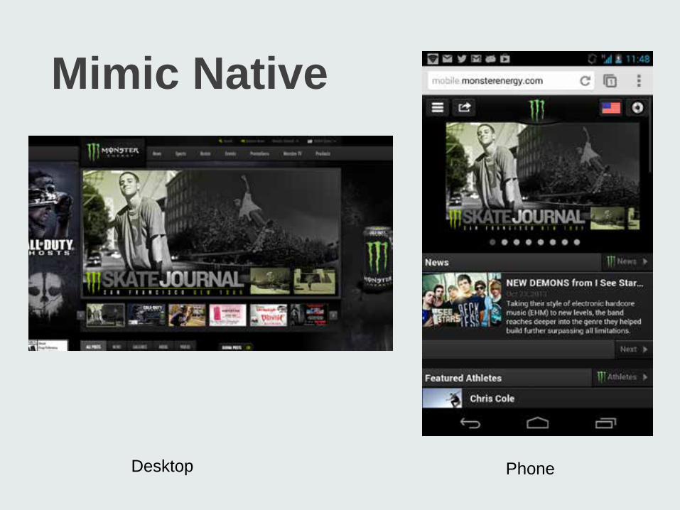
jQuery Mobile
Mimics native look, feel and behavior Mimics native development patterns Cross-platform Use with PhoneGap and Titanium

PhoneGap + jQuery
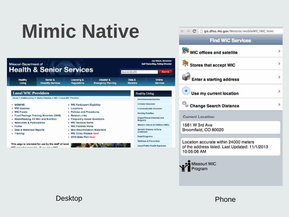
Mimic Native
Desktop Phone
Mimic Native
Desktop Phone
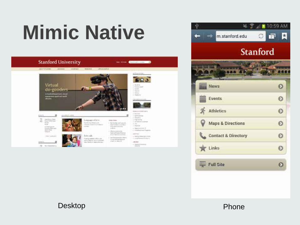
Mimic Native
Desktop Phone
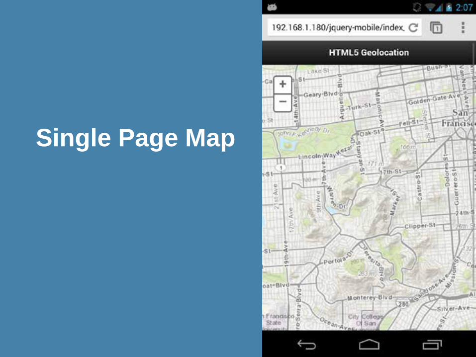
Single Page View
Page structure Apply CSS, roles and themes
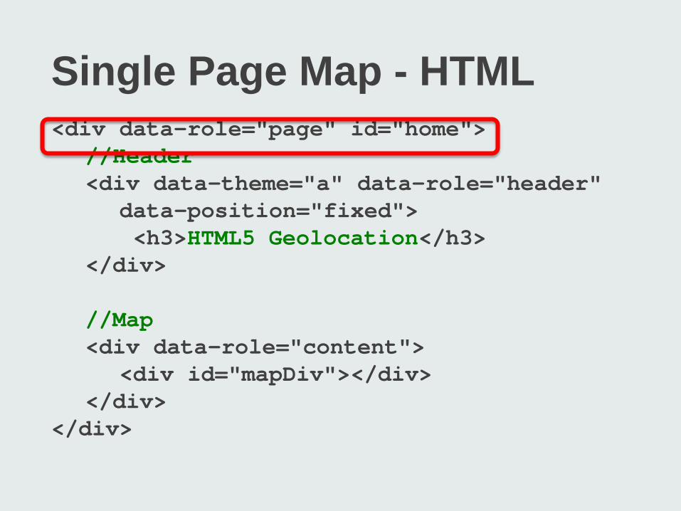
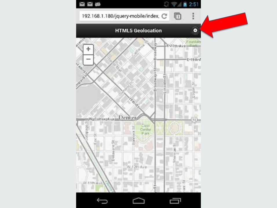
Single Page Map - HTML <div data-role="page" id="home"> //Header <div data-theme="a" data-role="header" data-position="fixed"> <h3>HTML5 Geolocation</h3> </div> //Map <div data-role="content"> <div id="mapDiv"></div> </div> </div>
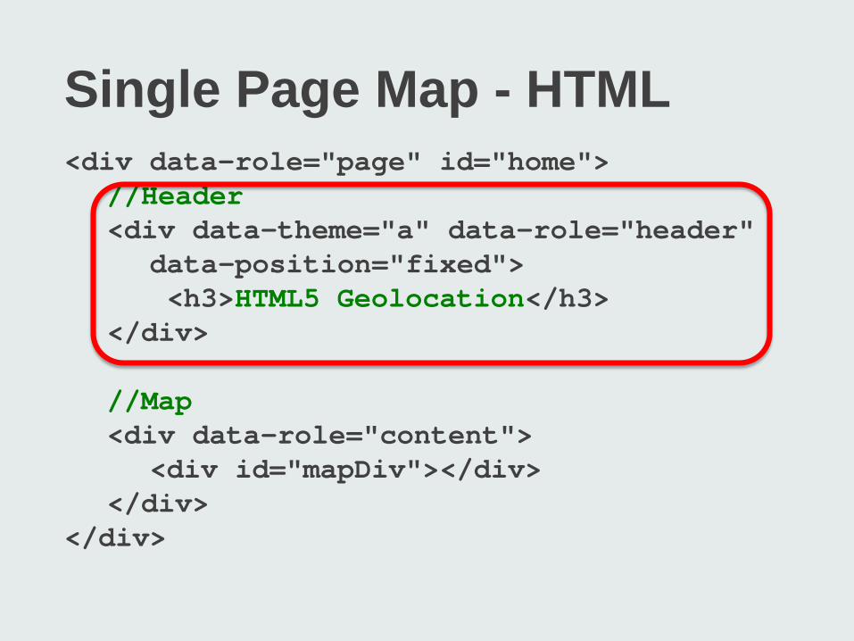
Single Page Map - HTML <div data-role="page" id="home"> //Header <div data-theme="a" data-role="header" data-position="fixed"> <h3>HTML5 Geolocation</h3> </div> //Map <div data-role="content"> <div id="mapDiv"></div> </div> </div>
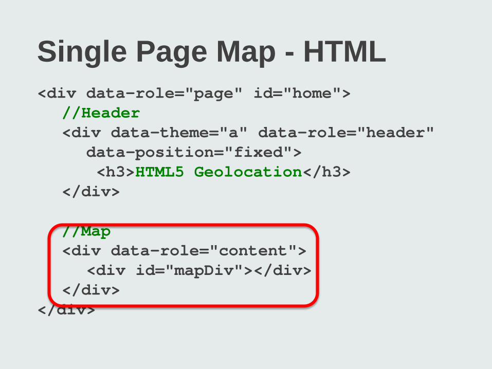
Single Page Map - HTML <div data-role="page" id="home"> //Header <div data-theme="a" data-role="header" data-position="fixed"> <h3>HTML5 Geolocation</h3> </div> //Map <div data-role="content"> <div id="mapDiv"></div> </div> </div>
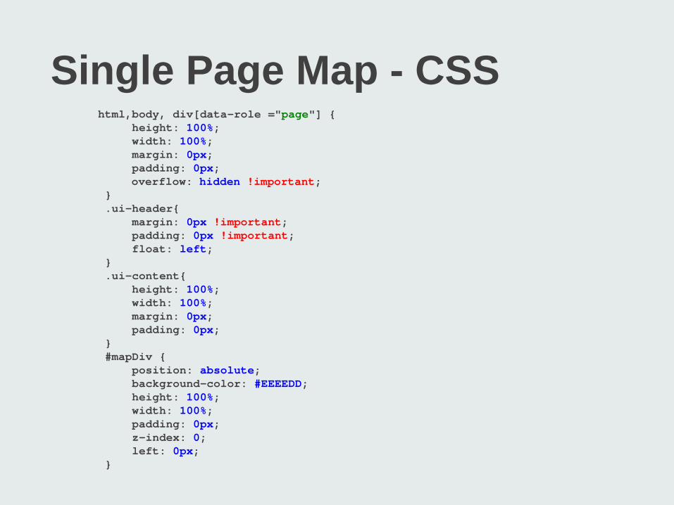
Single Page Map - CSS html,body, div[data-role ="page"] { height: 100%; width: 100%; margin: 0px; padding: 0px; overflow: hidden !important; } .ui-header{ margin: 0px !important; padding: 0px !important; float: left; } .ui-content{ height: 100%; width: 100%; margin: 0px; padding: 0px; } #mapDiv { position: absolute; background-color: #EEEEDD; height: 100%; width: 100%; padding: 0px; z-index: 0; left: 0px; }
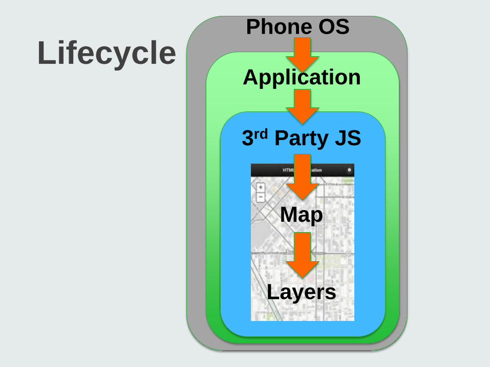
Lifecycle Application
3rd Party JS
Map
Layers
Phone OS
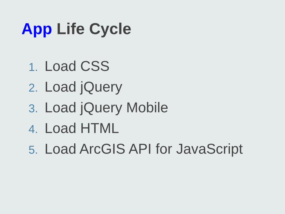
App Life Cycle
1. Load CSS 2. Load jQuery 3. Load jQuery Mobile 4. Load HTML 5. Load ArcGIS API for JavaScript
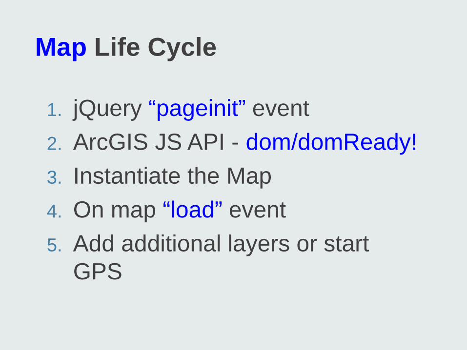
Map Life Cycle
1. jQuery “pageinit” event 2. ArcGIS JS API - dom/domReady! 3. Instantiate the Map 4. On map “load” event 5. Add additional layers or start
GPS
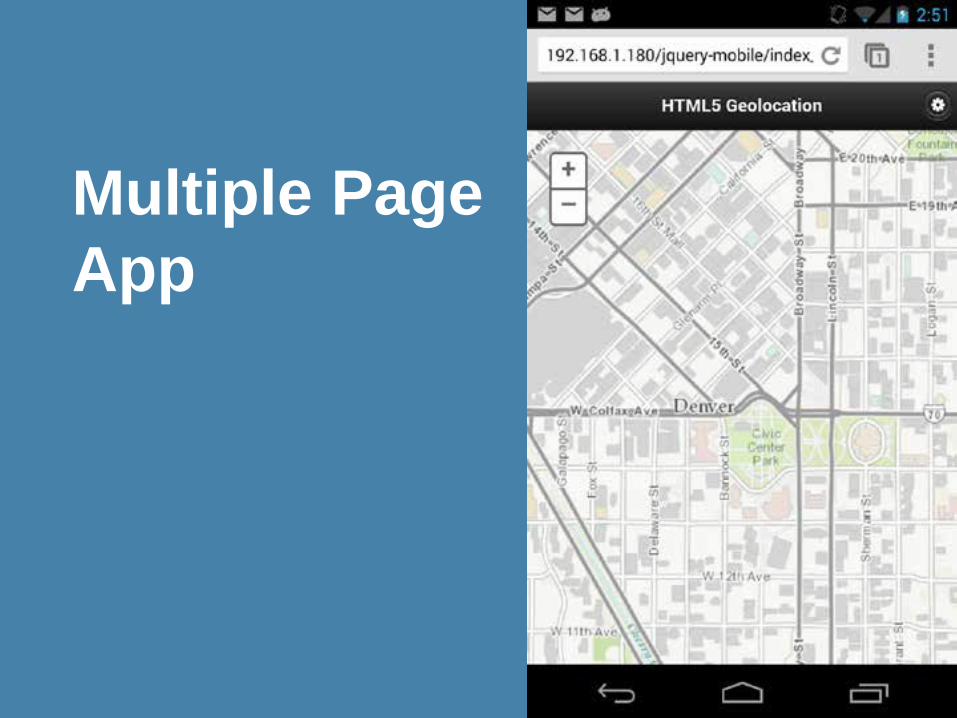
Multiple Page App
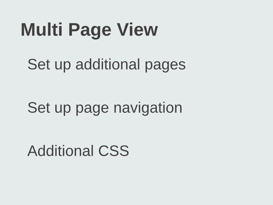
Multi Page View
Set up additional pages
Set up page navigation Additional CSS
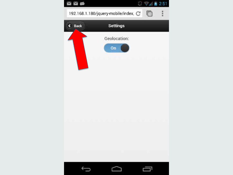
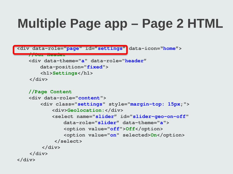
Multiple Page app – Page 2 HTML <div data-role="page" id=”settings” data-icon=“home”> //Our Header <div data-theme="a" data-role="header” data-position="fixed"> <h1>Settings</h1> </div> //Page Content <div data-role="content"> <div class="settings" style="margin-top: 15px;"> <div>Geolocation:</div> <select name="slider” id="slider-geo-on-off" data-role="slider” data-theme="a"> <option value="off">Off</option> <option value="on" selected>On</option> </select> </div> </div> </div>
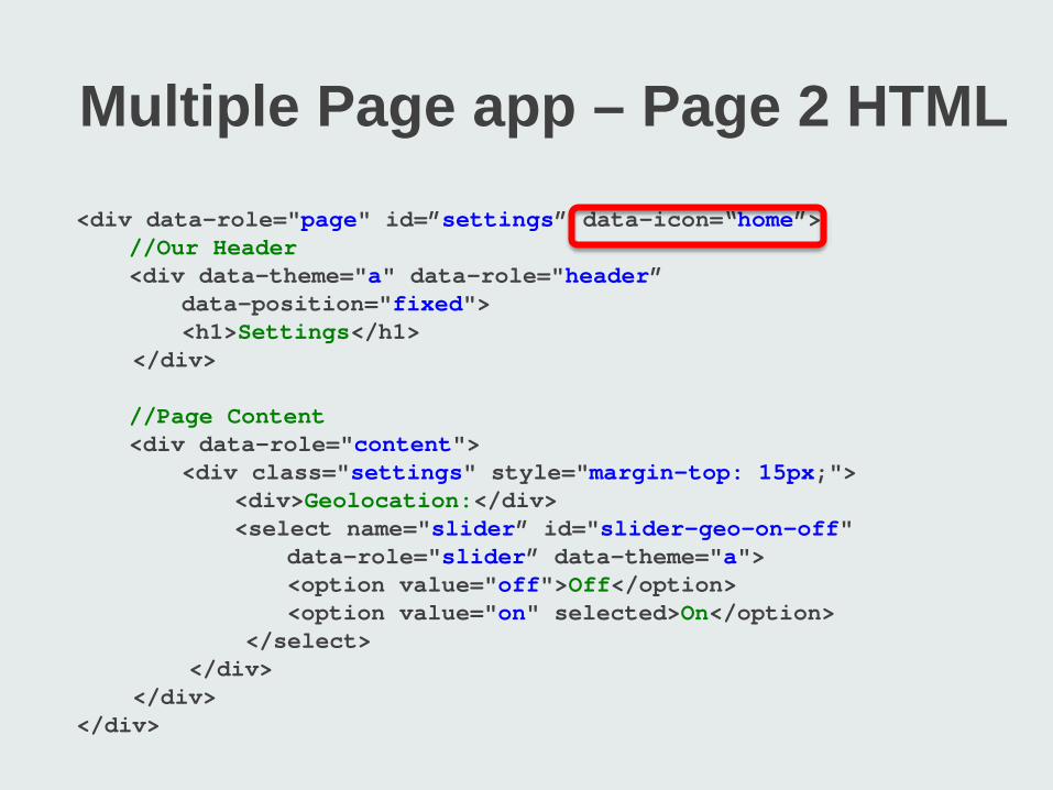
Multiple Page app – Page 2 HTML <div data-role="page" id=”settings” data-icon=“home”> //Our Header <div data-theme="a" data-role="header” data-position="fixed"> <h1>Settings</h1> </div> //Page Content <div data-role="content"> <div class="settings" style="margin-top: 15px;"> <div>Geolocation:</div> <select name="slider” id="slider-geo-on-off" data-role="slider” data-theme="a"> <option value="off">Off</option> <option value="on" selected>On</option> </select> </div> </div> </div>
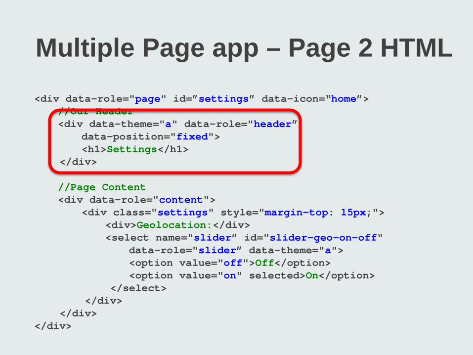
Multiple Page app – Page 2 HTML <div data-role="page" id=”settings” data-icon=“home”> //Our Header <div data-theme="a" data-role="header” data-position="fixed"> <h1>Settings</h1> </div> //Page Content <div data-role="content"> <div class="settings" style="margin-top: 15px;"> <div>Geolocation:</div> <select name="slider” id="slider-geo-on-off" data-role="slider” data-theme="a"> <option value="off">Off</option> <option value="on" selected>On</option> </select> </div> </div> </div>
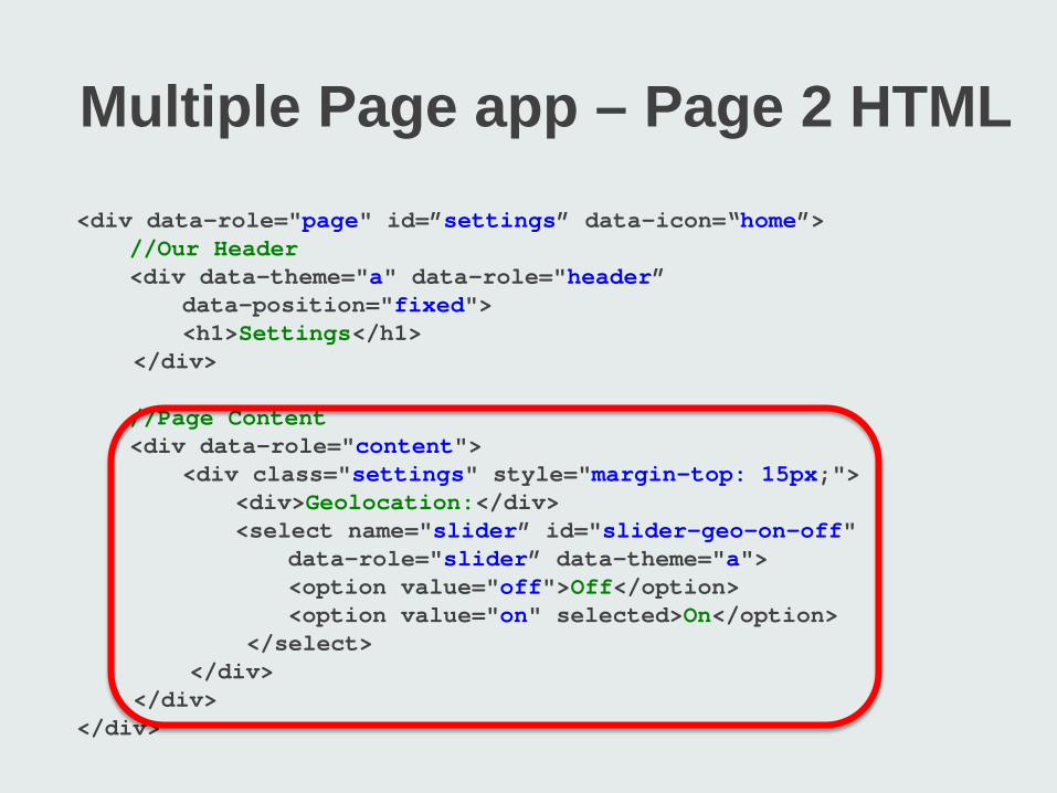
Multiple Page app – Page 2 HTML <div data-role="page" id=”settings” data-icon=“home”> //Our Header <div data-theme="a" data-role="header” data-position="fixed"> <h1>Settings</h1> </div> //Page Content <div data-role="content"> <div class="settings" style="margin-top: 15px;"> <div>Geolocation:</div> <select name="slider” id="slider-geo-on-off" data-role="slider” data-theme="a"> <option value="off">Off</option> <option value="on" selected>On</option> </select> </div> </div> </div>
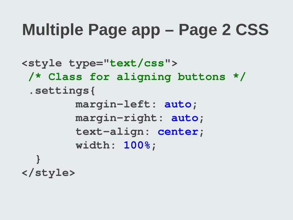
Multiple Page app – Page 2 CSS
<style type="text/css"> /* Class for aligning buttons */ .settings{ margin-left: auto; margin-right: auto; text-align: center; width: 100%; } </style>
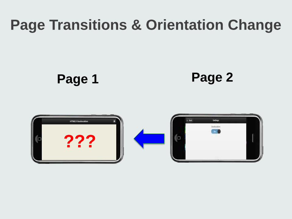
Page Transitions & Orientation Change
Page and orientation life cycle Map destruction & resizing
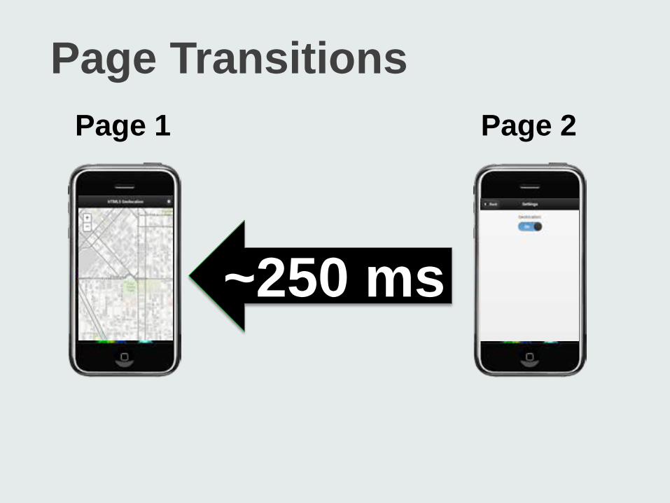
Page Transitions Page 1 Page 2
~250 ms
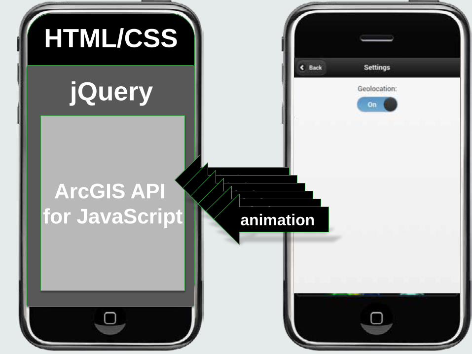
ArcGIS API for JavaScript
jQuery
HTML/CSS
~250 ms ~250 ms ~250 ms ~250 ms ~250 ms animation
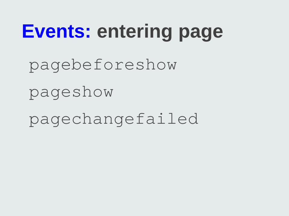
Events: entering page pagebeforeshow
pageshow
pagechangefailed
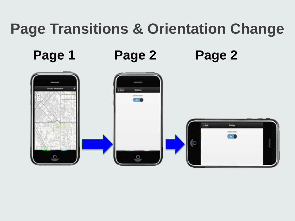
Page Transitions & Orientation Change
Page 1 Page 2 Page 2
Page Transitions & Orientation Change
Page 2 Page 1
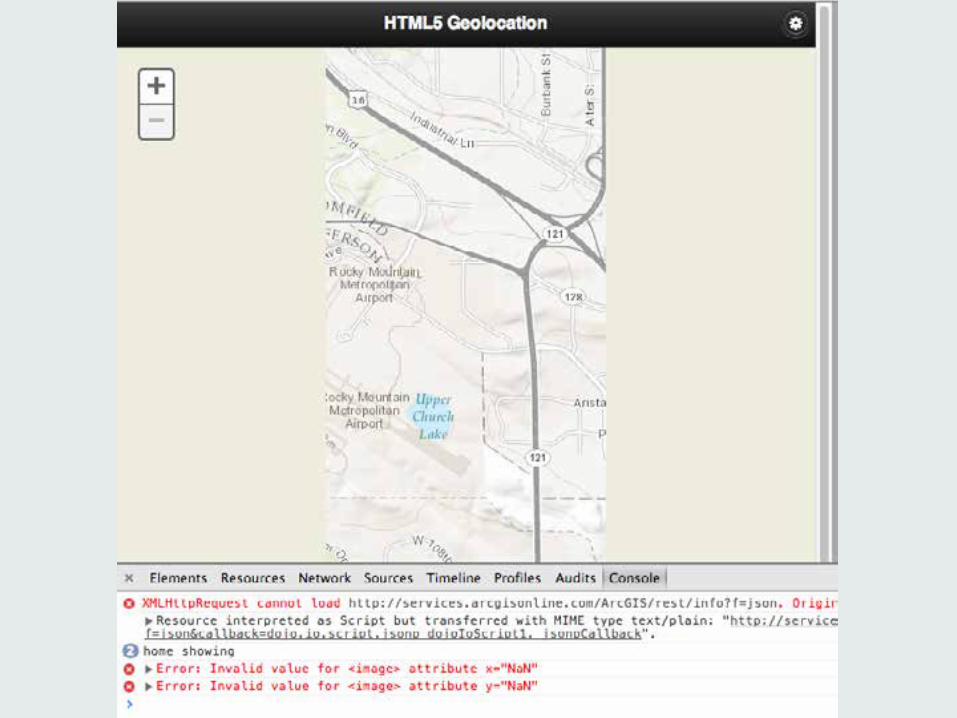
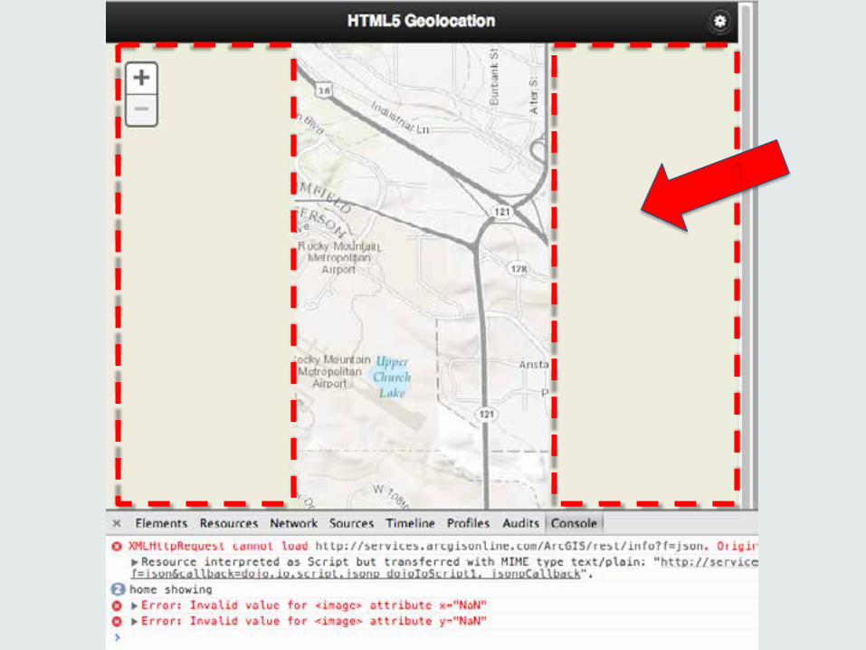
???
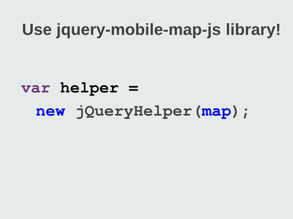
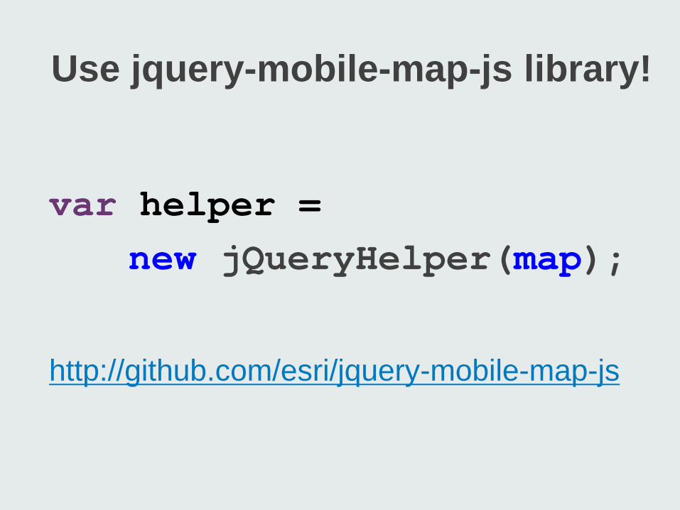
Use jquery-mobile-map-js library!
var helper = new jQueryHelper(map);
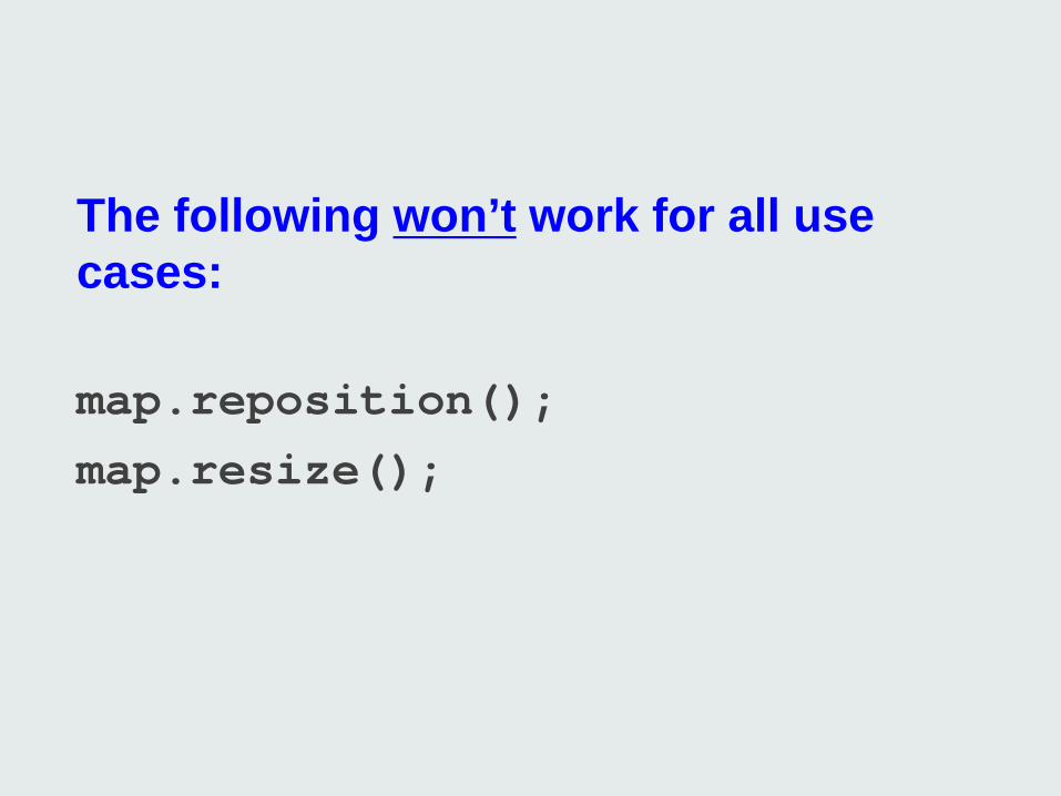
The following won’t work for all use cases: map.reposition(); map.resize();
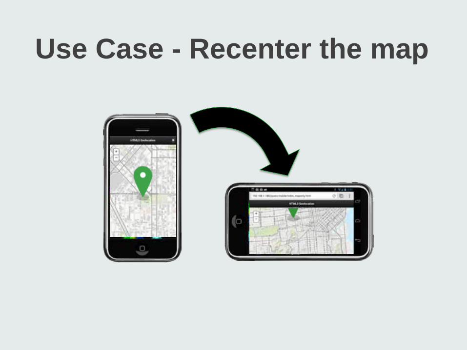
Use Case - Recenter the map
Use jquery-mobile-map-js library!
var helper = new jQueryHelper(map);
http://github.com/esri/jquery-mobile-map-js
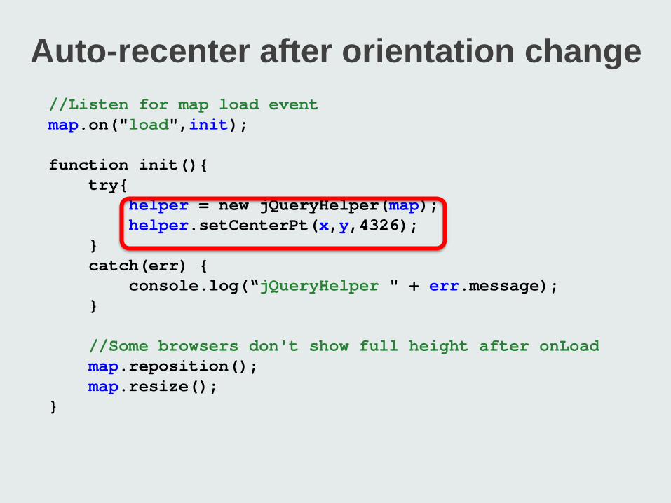
Auto-recenter after orientation change //Listen for map load event map.on("load",init); function init(){ try{ helper = new jQueryHelper(map); helper.setCenterPt(x,y,4326); } catch(err) { console.log(“jQueryHelper " + err.message); } //Some browsers don't show full height after onLoad map.reposition(); map.resize(); }
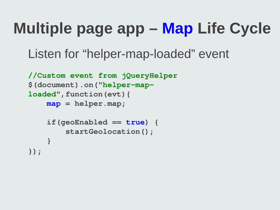
Multiple page app – Map Life Cycle Listen for “helper-map-loaded” event //Custom event from jQueryHelper $(document).on("helper-map-loaded",function(evt){ map = helper.map; if(geoEnabled == true) { startGeolocation(); } });
Working with GPS
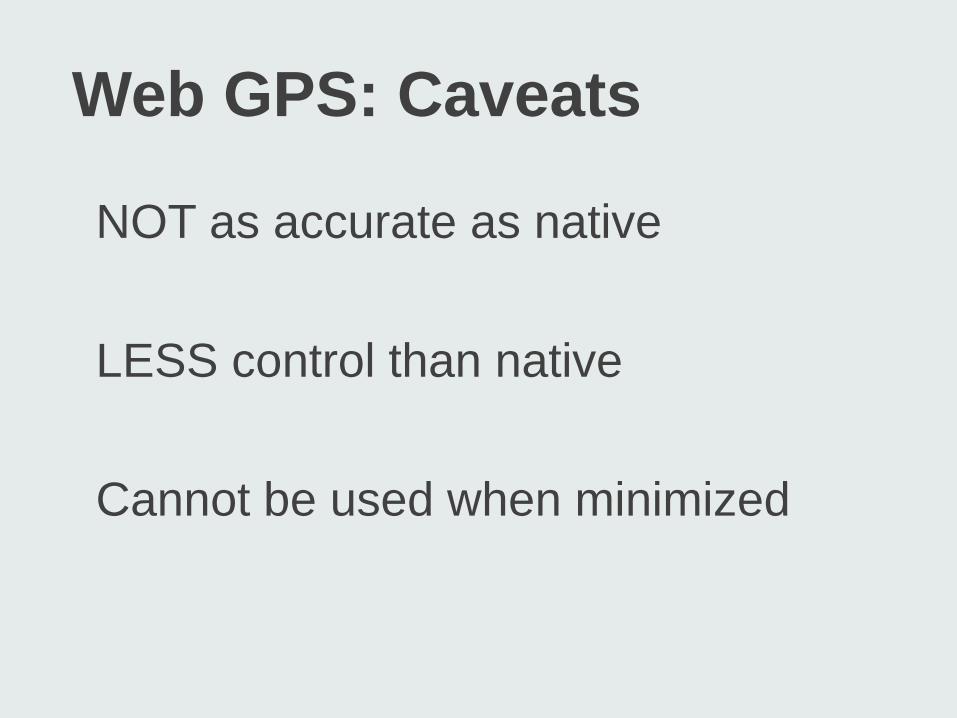
Web GPS: Caveats
NOT as accurate as native LESS control than native Cannot be used when minimized
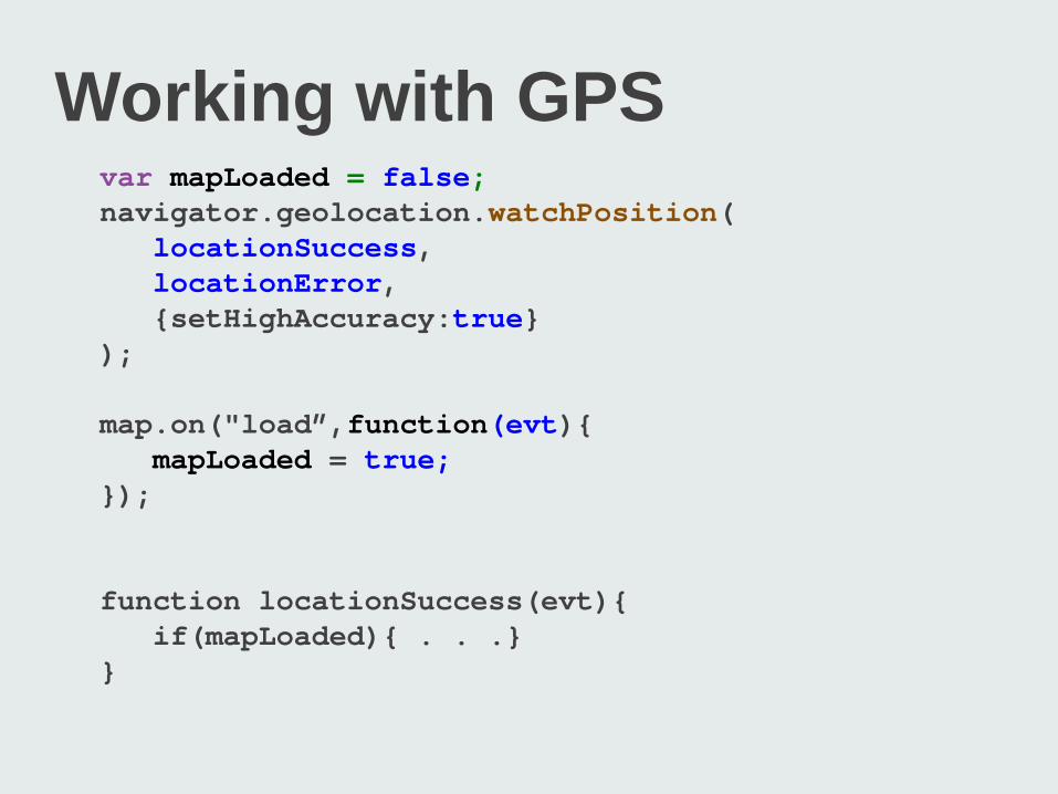
Working with GPS var mapLoaded = false; navigator.geolocation.watchPosition( locationSuccess, locationError, {setHighAccuracy:true} ); map.on("load”,function(evt){ mapLoaded = true; }); function locationSuccess(evt){ if(mapLoaded){ . . .} }
GPS Best Practices
When viewing non-map pages - Do not write points to map - Cache points in localStorage
GPS Best Practices
When returning to map page - “helper-map-loaded” event - Turn GPS back on - Recenter map - Write cache points to map
Responsive Wrap up §Single web app that works well across a variety of devices/screen sizes §Re-use content and software §Considers §Device limitations §User’s behavior

jQuery wrap up Mimic native behavior Gives more control over life cycle Combined w/ PhoneGap on Google Play and App Store

Addt’l Resources
andygup.net/web-mobile jquerymobile.com getbootstrap.com

Questions? Andy Gup Developer Evangelist [email protected] www.andygup.net github.com/andygup @agup

Related Documents