Design Portfolio Robin Lynch-Woodley March 09, 2015

Welcome message from author
This document is posted to help you gain knowledge. Please leave a comment to let me know what you think about it! Share it to your friends and learn new things together.
Transcript

Design Portfolio
Robin Lynch-WoodleyMarch 09, 2015

Effort/Reward Good
This is easily recognized As Coke but alsoIs very creative.

Effort/Reward Good
This is a verySimple and clearDesign. It would Be great for a Coffee shop.

Effort/Reward Bad

Effort/Reward Bad
This design is hardTo read and isn’t clear.

ThemeGood

ThemeGood
This design is The perfect useOf a font. It Says ghosts withoutEven trying.

ThemeBad
This design is confusing because it saysDental, but there is a waiter dressed veryFormally with a tooth on the tray. It doesn’tTell you anything about the company and Would not make me want to call them for my Dentistry needs.

ThemeBad
There is so Much wrong With this design.The colors are horrible And it isn’t clear what You are supposed to Get from looking at the Poster.

Picture WordsGood
I love how the Words mimic whatThey represent. For example, the Mustard is yellow.

Picture WordsGood
I love this camera. It is everything I loveAbout photography In words.

Picture WordsBad
This picture for the “o” in rolling is horrible. It is a terribleGraphic and it isn’t clear at all.

Picture WordsBad
I like the ideaOf using a fabricFloral design for The word floral, but It is hard to read. Could have been betterWith a darker outline.
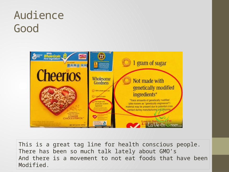
AudienceGood
This is a great tag line for health conscious people. There has been so much talk lately about GMO’s And there is a movement to not eat foods that have beenModified.

AudienceGood
This is a great ad to targetPeople who want to protectThe environment by using cleanEnergy options.

AudienceBad
This is a terrible logoBecause a watermelonAnd IT doesn’t go together at all.

AudienceBad
This flyer is veryConfusing. The redHeart is in contrastTo the evil kitty faceAnd the masked manWith a glove seems a Bit extreme.

Visual ContextGood
This is a great design. I love theHand reaching down and the fourLittle hands reaching up.

Visual ContextGood
I love this design. The face to the left isPleasant and the one To the right is angry. This makes me want toPick up this book to learnMore.

Visual ContextBad
This is too busy and Isn’t clear what I am supposedTo get from it. The cat face isPleasant but the circles make it too busy and cluttered.

Visual ContextBad

EmbellishmentGood
This is greatBecause it is easyTo read and is very clear.It would also be good forSomeone who wasn’t familiarWith the different types of Coffees.

EmbellishmentGood
I like the clouds and sky behind the quote. It just adds to the overallFeel of the design.
The fancy instruments makes it look and feel fancier than normal.

EmbellishmentBad
It might just be me, but the word doesn’t go with the fancyWriting and embellishment.

EmbellishmentBad

ProximityGood
This is well balancedAnd the everythingIs in good proximity.

ProximityGood
There are clear columns of information.It is easy to navigate and locate the information.

ProximityBad
This is just too busy andIsn’t aligned correctly. This poster is a good start But could be great withA few tweaks.

ProximityBad

AlignmentGood
This is the perfect silhouette for A jazz festival poster.

AlignmentGood

AlignmentBad
This paper has alignments thatAre all over the place. It would Be much better with consistent Alignment.

AlignmentBad
I found this and had to include it.Not having everything line up isThe definition of bad alignment.

RepetitionGood

RepetitionGood
The use of the bananas with the gorilla is a very nice touch.

RepetitionBad
This repetition is not Working well. The ideaOf this pattern is good inTheory but it doesn’t work.

RepetitionBad
The use of repeating colors in this design is too busy and doesn’t work.

ContrastGood
The use of black and greenIs really great. I like how it Is split half and half.

ContrastGood
The use of black and grey in this ad is a nice contrast. It is easy to look at and looks very professional.

ContrastBad
The use of the gold and yellow tones with purpleDo not contrast well.

ContrastBad
There isn’t much contrastBetween the backgroundAnd the font. I think the Design has to potential toBe amazing with a little work.

EmphasisGood
The emphasis is on the shapes in the ad. It is good Because they want you to be able to look at it andBe able to dream up what you want.

EmphasisGood
There is a good balanceBetween the top and bottom. There is a lot going on in thisDesign.

EmphasisBad
The emphasis is on the fist coming out from the top of a Shirt. It is very odd and doesn’t have a clear message.

EmphasisBad
This is a logo gone very wrong. Even though it is supposed to beA dentist office, it turned out to be a Suggestive and somewhat sexual logo.

ColorGood

Color Good
The use of color in this designIs fantastic. The brown in the Middle is very coffee like. The White is cup like and looks goodWith the background.

Color Bad
This is hard to look at and hurts my eyes. Using both colorsThat are bright isn’t good practice. If the font was white insteadOf blue, it would be much easier to read.

Color Bad
There is so much wrong with this design, but the colors doNothing to add to the overall design. It isn’t good colors for A sports bar and it lacks professionalism.

StyleGood
This is a great exampleOf style. It is well put Together and flows nicely. The touch of Color is subtle and really helps with the Overall design.

StyleGood
These cups are a goodExample of style. TheyAre aligned and easy toUnderstand. There is Color but not too much.

Style Bad
This is an example of style gone wrong. The use of the An illustration for a letter is a failure.

StyleBad
This is just horrible style. The colors are awful andThe green guy is ridiculous.

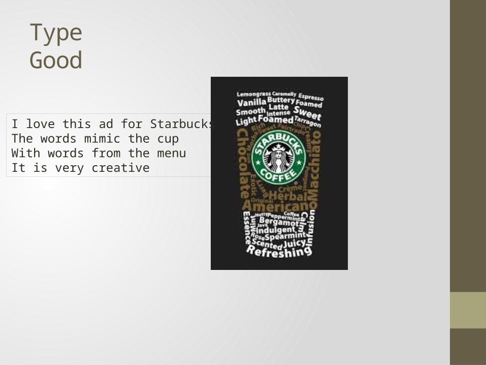
TypeGood
This is a good example of type. The fonts are easy to Read and are really clear. The blue and white reallyStand out on the dark grey.
TypeGood
I love this ad for StarbucksThe words mimic the cup With words from the menuIt is very creative

TypeBad
Font matters
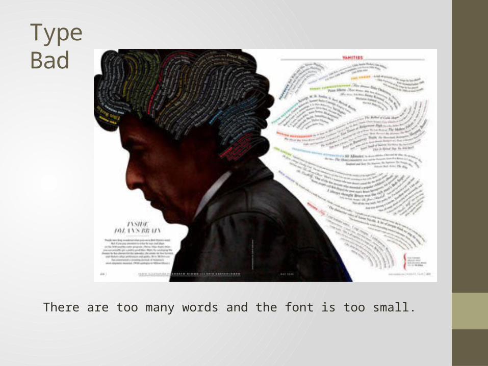
Type Bad
There are too many words and the font is too small.
Related Documents