#DataVizInSixWeeks Copyright Anne Stevens Design

Welcome message from author
This document is posted to help you gain knowledge. Please leave a comment to let me know what you think about it! Share it to your friends and learn new things together.
Transcript
#DataVizInSixWeeksCopyright Anne Stevens
Design
#DataVizInSixWeeksCopyright Anne Stevens
Week One
What is data visualization? Historical context
Week Four
Design issues & best practices
Week Two
Visualization typesWeek Five
Big data, data management
Week Three
Perception and cognitionWeek Six
Synthesis
Data Viz In Six WeeksAn Introduction to Visual Analytics course taught at OCAD University, Toronto
By Anne Stevens

#DataVizInSixWeeksCopyright Anne Stevens
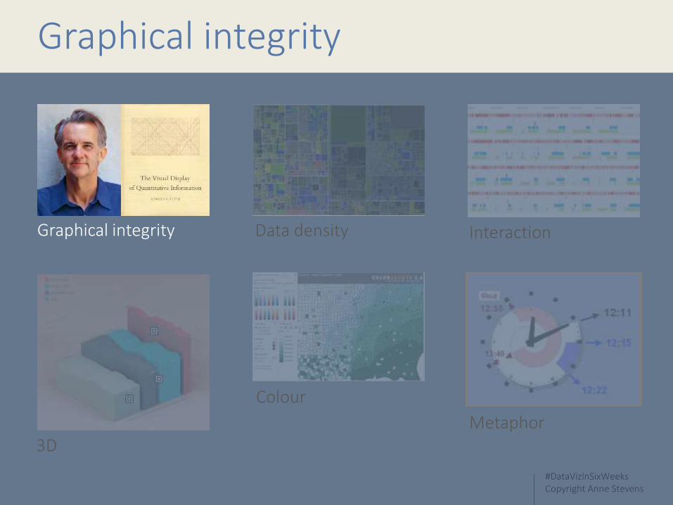
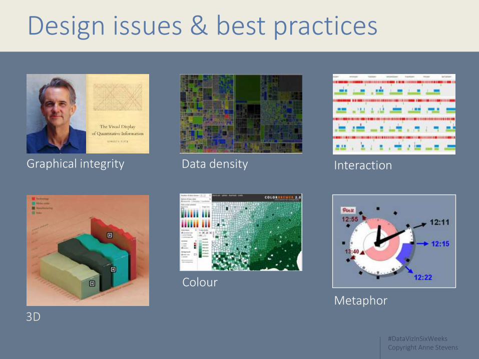
Design issues & best practices
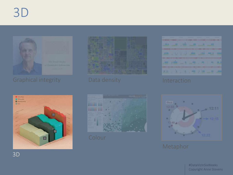
3D
Graphical integrity Data density Interaction
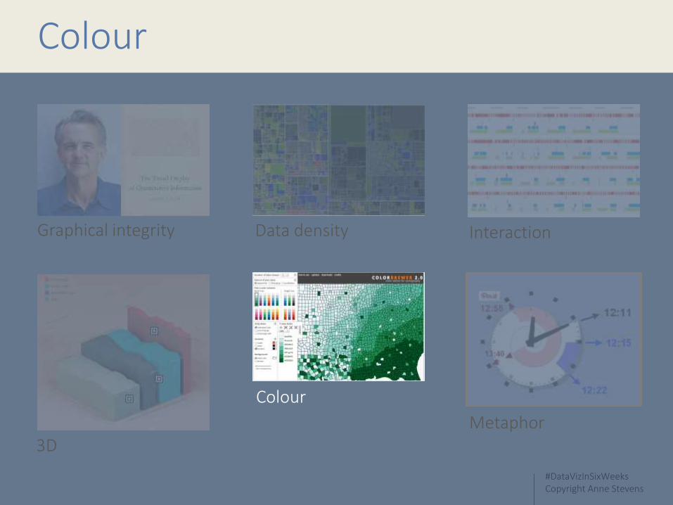
Colour
Metaphor
#DataVizInSixWeeksCopyright Anne Stevens
Graphical integrity
3D
Graphical integrity Data density Interaction
Colour
Metaphor
#DataVizInSixWeeksCopyright Anne Stevens
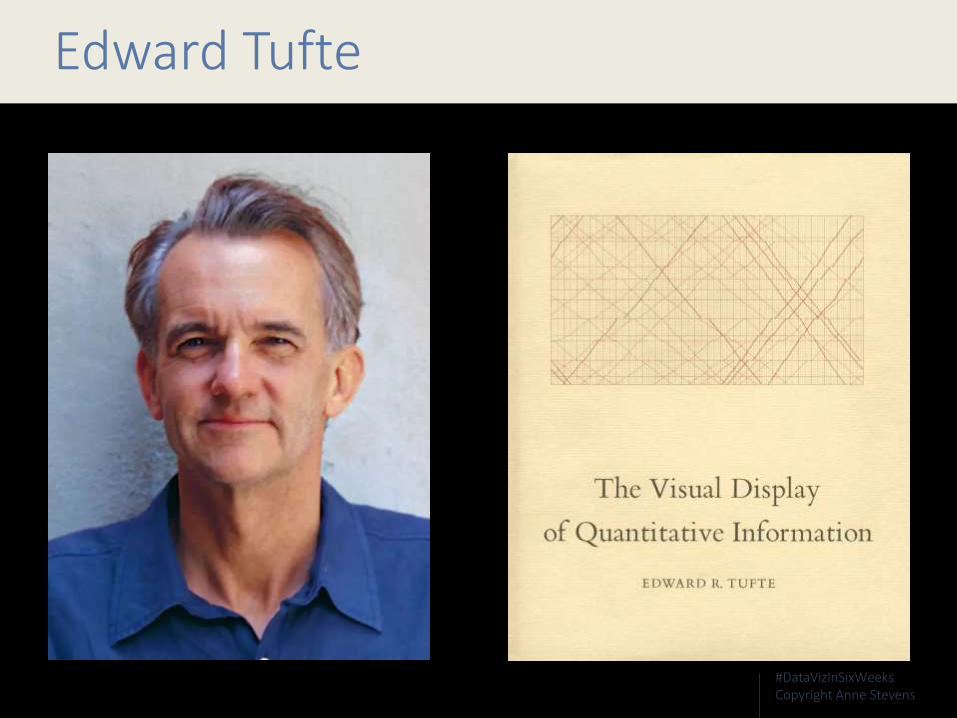
Edward Tufte

#DataVizInSixWeeksCopyright Anne Stevens
The representation of numbers, as physically measured on the surface of the graphic itself, should be directly proportional to the quantities represented.
(Edward Tufte)

#DataVizInSixWeeksCopyright Anne Stevens
The Lie Factor
Lie Factor =Size of effect in data
Size of effect shown in graphic

#DataVizInSixWeeksCopyright Anne Stevens
Lie Factor =18.0
27.5 – 18.0x 100% = 53%
#DataVizInSixWeeksCopyright Anne Stevens
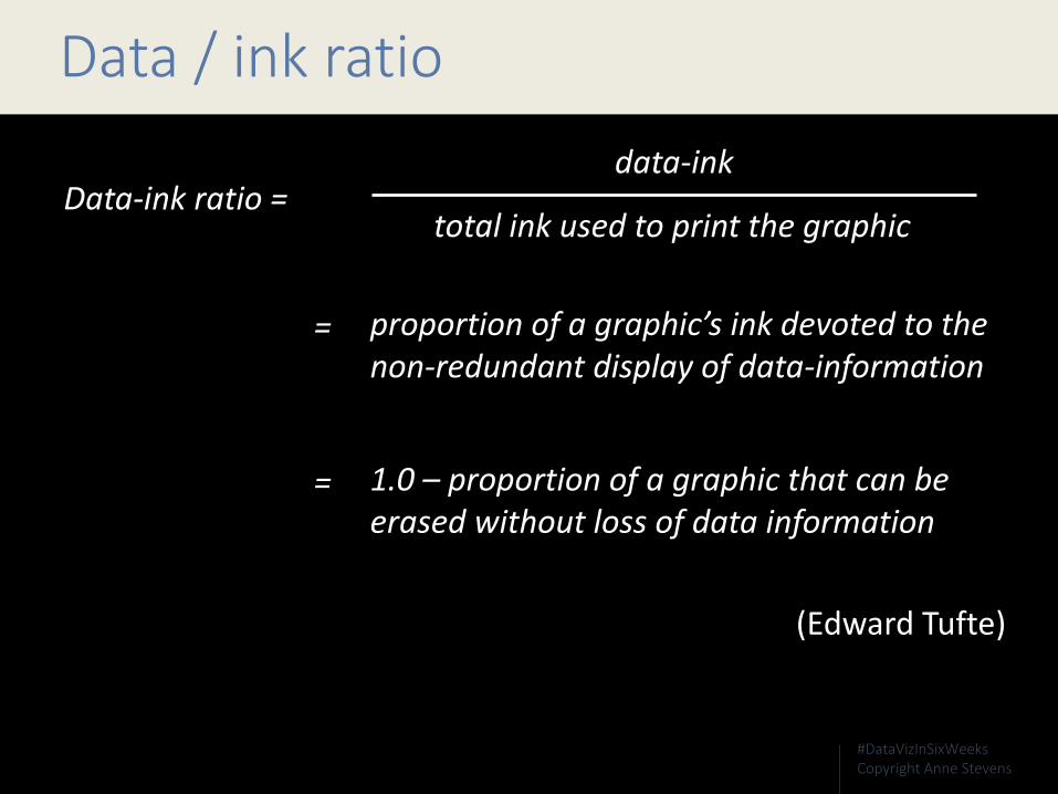
Data / ink ratio
Data-ink ratio =total ink used to print the graphic
data-ink
proportion of a graphic’s ink devoted to the non-redundant display of data-information
=
1.0 – proportion of a graphic that can be erased without loss of data information
(Edward Tufte)
=

#DataVizInSixWeeksCopyright Anne Stevens
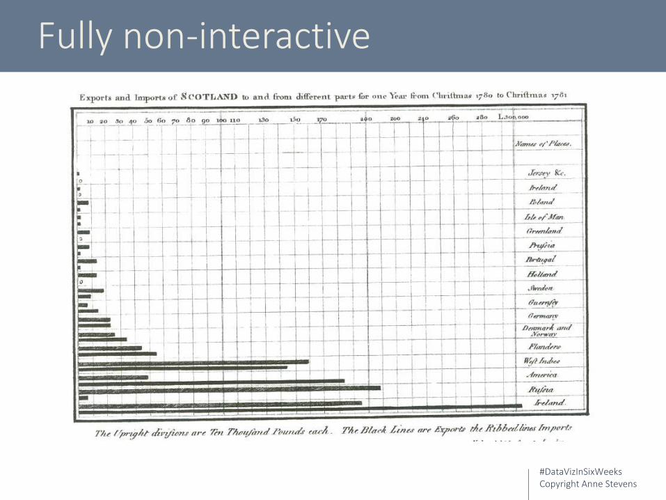
William PlayfairScottish Imports and Exports
#DataVizInSixWeeksCopyright Anne Stevens
Edward TufteThe Visual Display of Quantitative Information

#DataVizInSixWeeksCopyright Anne Stevens
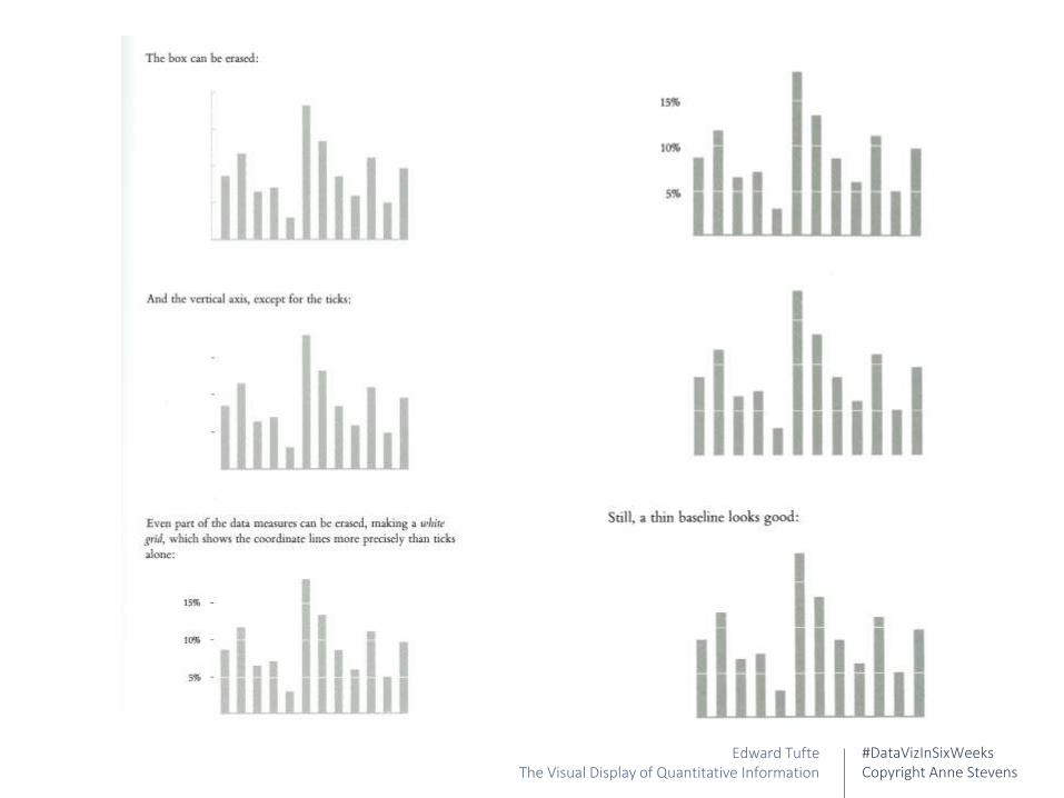
Edward TufteThe Visual Display of Quantitative Information

#DataVizInSixWeeksCopyright Anne Stevens
Edward TufteThe Visual Display of Quantitative Information
#DataVizInSixWeeksCopyright Anne Stevens
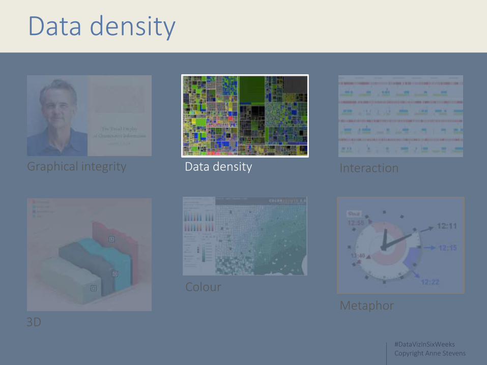
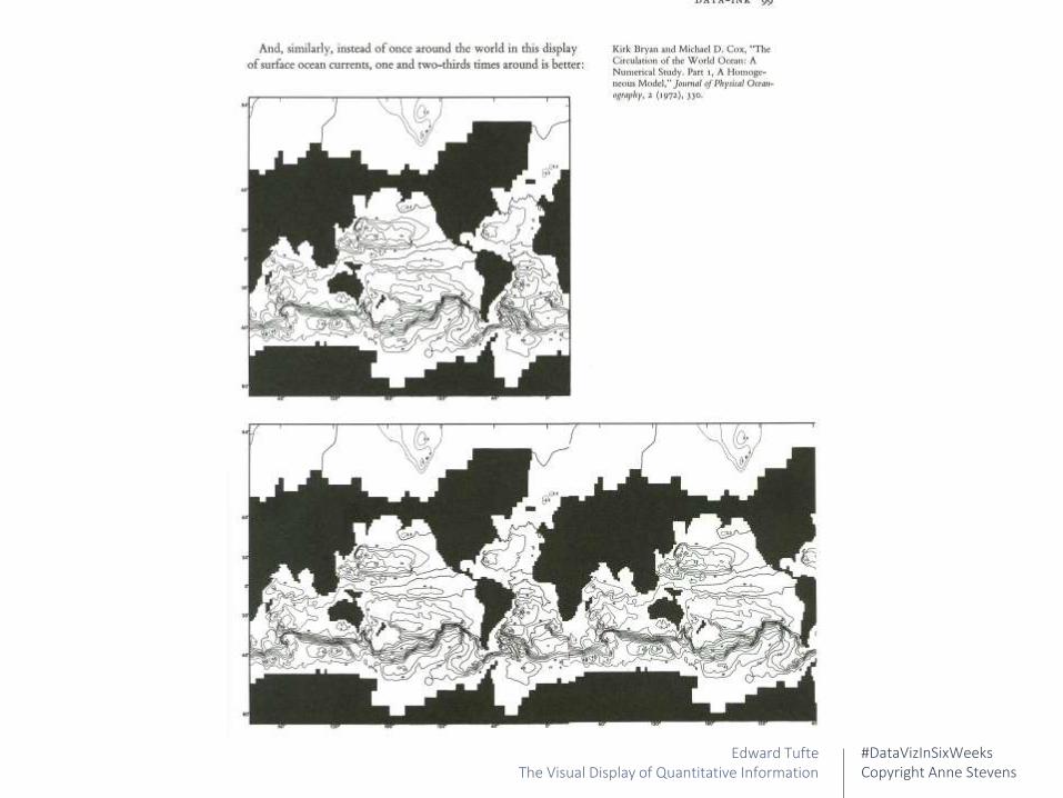
Data density
3D
Graphical integrity Data density Interaction
Colour
Metaphor

#DataVizInSixWeeksCopyright Anne Stevens
Context is king
Edward TufteThe Visual Display of Quantitative Information
#DataVizInSixWeeksCopyright Anne Stevens
Edward TufteThe Visual Display of Quantitative Information
#DataVizInSixWeeksCopyright Anne Stevens
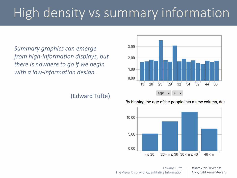
High density vs summary information
Edward TufteThe Visual Display of Quantitative Information
Summary graphics can emerge from high-information displays, but there is nowhere to go if we begin with a low-information design.
(Edward Tufte)
#DataVizInSixWeeksCopyright Anne Stevens
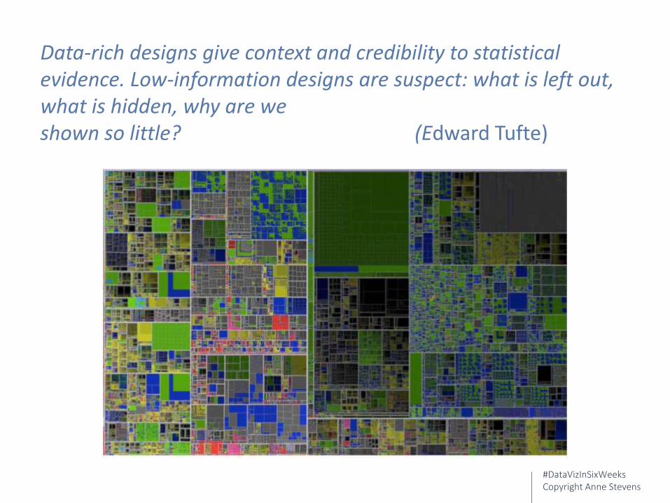
Data-rich designs give context and credibility to statistical evidence. Low-information designs are suspect: what is left out, what is hidden, why are we shown so little? (Edward Tufte)

#DataVizInSixWeeksCopyright Anne Stevens
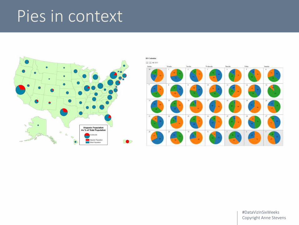
Pies – very low density
#DataVizInSixWeeksCopyright Anne Stevens
Pies in context

#DataVizInSixWeeksCopyright Anne Stevens
Interaction
3D
Graphical integrity Data density Interaction
Colour
Metaphor
#DataVizInSixWeeksCopyright Anne Stevens
Fully non-interactive
#DataVizInSixWeeksCopyright Anne Stevens

#DataVizInSixWeeksCopyright Anne Stevens
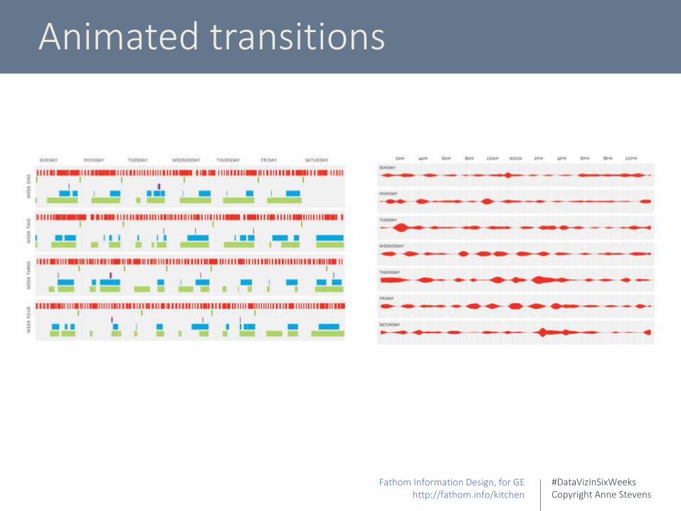
Filter lists vs. animated transitions

#DataVizInSixWeeksCopyright Anne Stevens
#DataVizInSixWeeksCopyright Anne Stevens
Animated transitions
Fathom Information Design, for GEhttp://fathom.info/kitchen
#DataVizInSixWeeksCopyright Anne Stevens
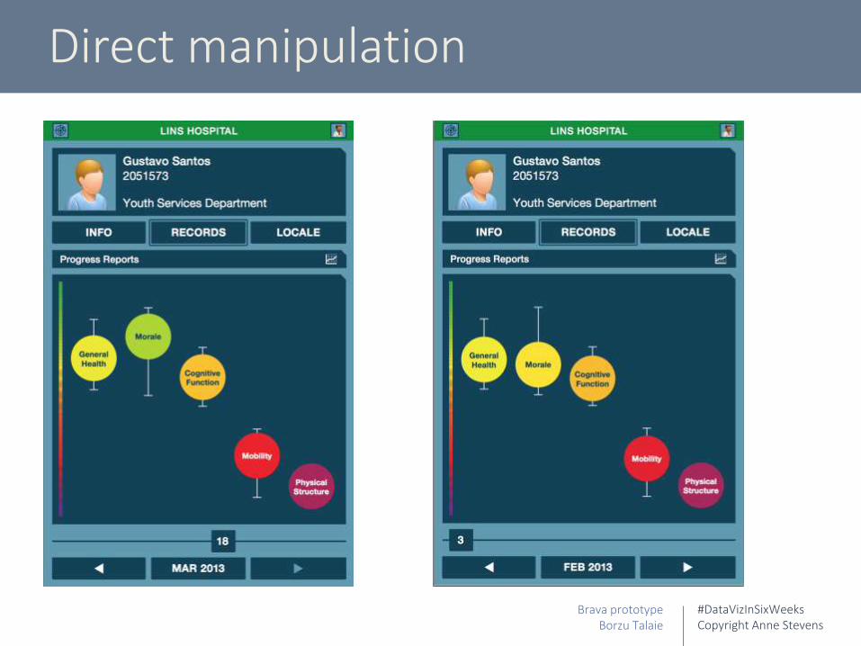
Direct manipulation
Brava prototypeBorzu Talaie

#DataVizInSixWeeksCopyright Anne Stevens

#DataVizInSixWeeksCopyright Anne Stevens
getkinetica.com
http://vimeo.com/channels/datavisualization/88702738

#DataVizInSixWeeksCopyright Anne Stevens
The Bertifier
Charles Perin. The Bertifierbertifier.com
#DataVizInSixWeeksCopyright Anne Stevens
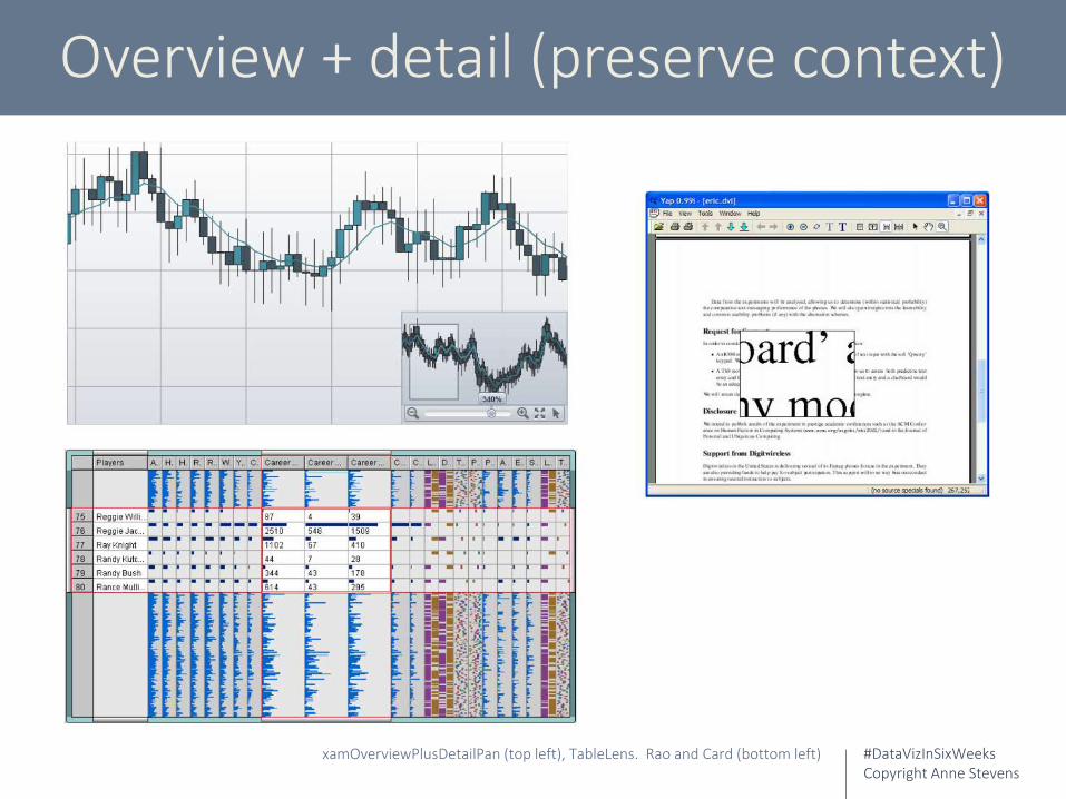
Overview + detail (preserve context)
xamOverviewPlusDetailPan (top left), TableLens. Rao and Card (bottom left)
#DataVizInSixWeeksCopyright Anne Stevens
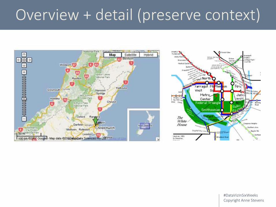
Overview + detail (preserve context)

#DataVizInSixWeeksCopyright Anne Stevens
Movement: activity & context

#DataVizInSixWeeksCopyright Anne Stevens
Lev Manovich
Lev Manovich et al. Cultural Analytics – Mark Rothko Paintingsyoutube.com/watch?v=-YlT1qFhJhk
#DataVizInSixWeeksCopyright Anne Stevens
3D
3D
Graphical integrity Data density Interaction
Colour
Metaphor
#DataVizInSixWeeksCopyright Anne Stevens
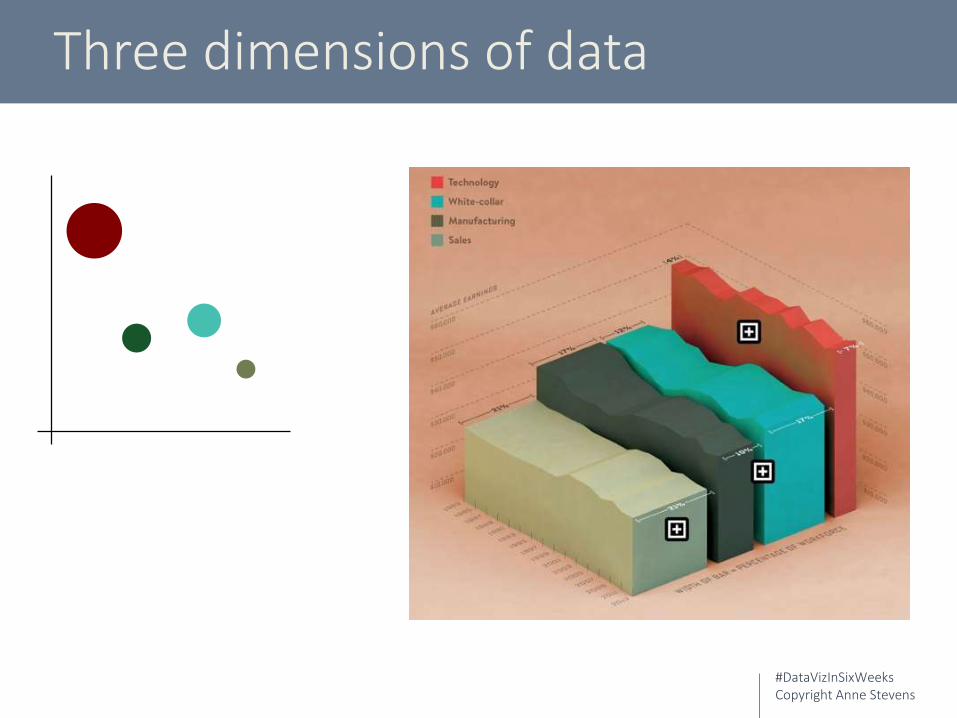
Three dimensions of data
#DataVizInSixWeeksCopyright Anne Stevens
Colour
3D
Graphical integrity Data density Interaction
Colour
Metaphor
#DataVizInSixWeeksCopyright Anne Stevens
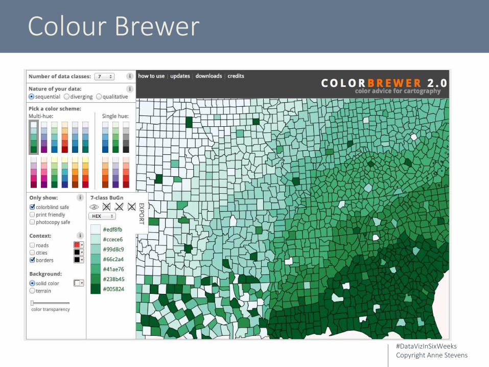
Colour Brewer
#DataVizInSixWeeksCopyright Anne Stevens
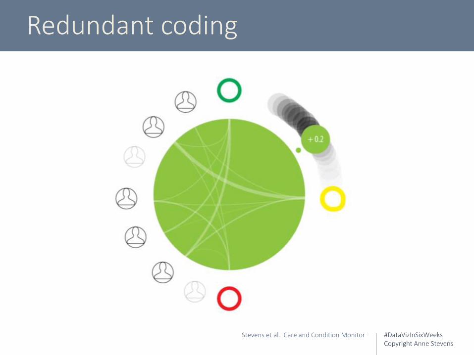
Redundant coding
Stevens et al. Care and Condition Monitor
#DataVizInSixWeeksCopyright Anne Stevens
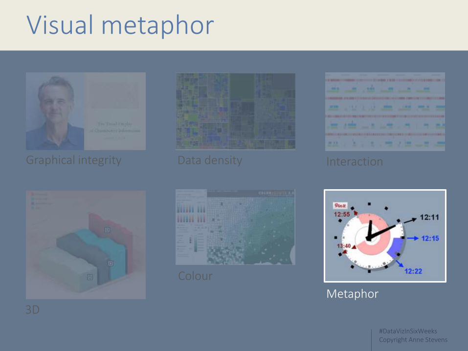
Visual metaphor
3D
Graphical integrity Data density Interaction
Colour
Metaphor

#DataVizInSixWeeksCopyright Anne Stevens
Metaphor theory
Fundamental spatial metaphors Up, down
Fast, slow
Inside, outside
Warm, cold
Complex metaphors are built on simpler metaphors
#DataVizInSixWeeksCopyright Anne Stevens
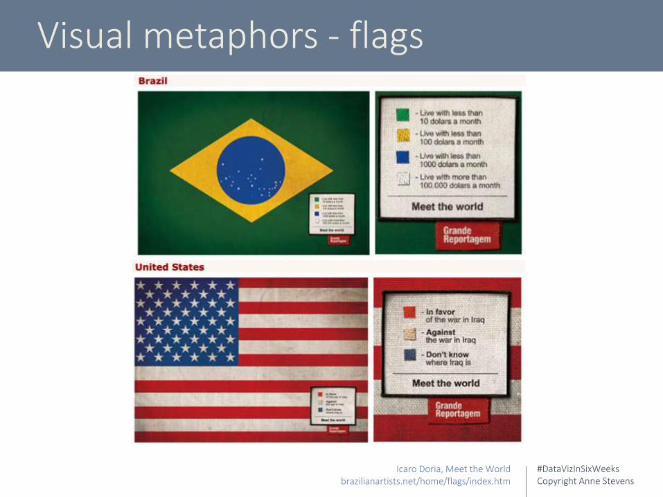
Visual metaphors - flags
Icaro Doria, Meet the Worldbrazilianartists.net/home/flags/index.htm

#DataVizInSixWeeksCopyright Anne Stevens
Visual metaphors
#DataVizInSixWeeksCopyright Anne Stevens
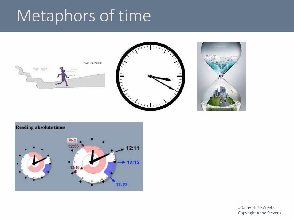
Metaphors of time

#DataVizInSixWeeksCopyright Anne Stevens
Metaphors of buildings
Luisa Bufardeci, Ground Planlouisabufardeci.net/pages/groundPlan/gp.html

#DataVizInSixWeeksCopyright Anne Stevens
Metaphors of technology
#DataVizInSixWeeksCopyright Anne Stevens
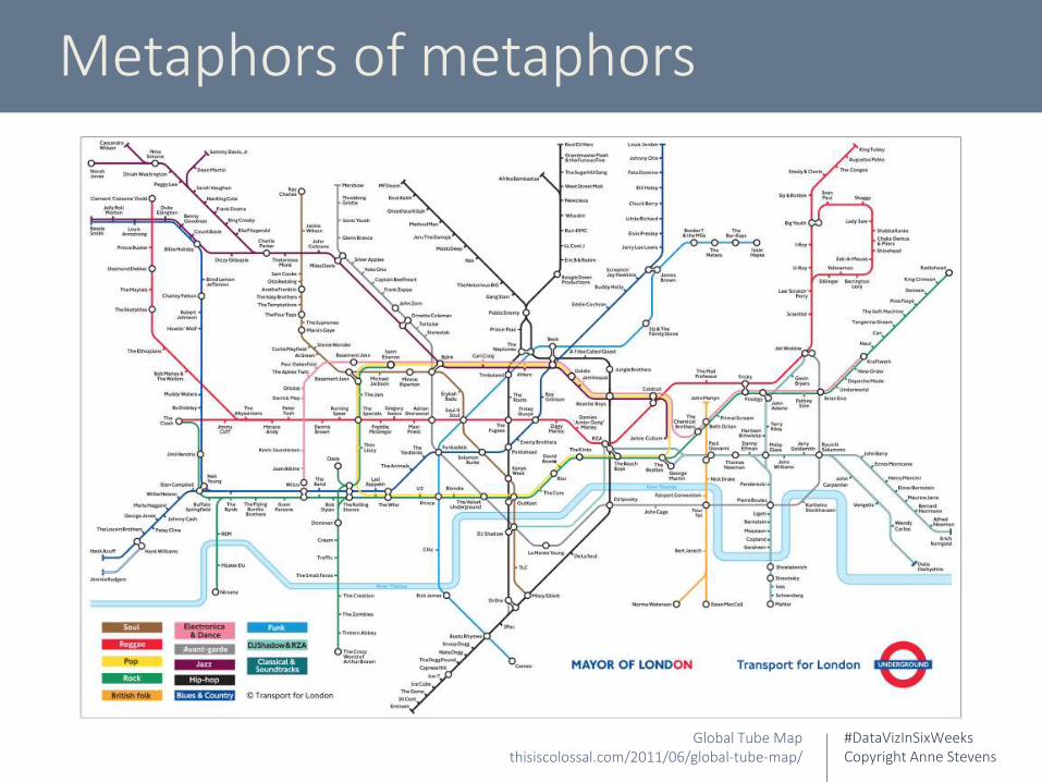
Metaphors of metaphors
Global Tube Mapthisiscolossal.com/2011/06/global-tube-map/
#DataVizInSixWeeksCopyright Anne Stevens
Design issues & best practices
3D
Graphical integrity Data density Interaction
Colour
Metaphor

#DataVizInSixWeeksCopyright Anne Stevens
Week One
What is data visualization? Historical context
Week Four
Design issues & best practices
Week Two
Visualization typesWeek Five
Big data, data management
Week Three
Perception and cognitionWeek Six
Synthesis
Data Viz In Six WeeksAn Introduction to Visual Analytics course taught at OCAD University, Toronto
By Anne Stevens
stevensanne.com
stevensanne.com/blog/
@3_ring_binder
Related Documents