DATA VISUALIZATION WITH TABLEAU RAUL CHOQUE LARRAURI Pie Map with Axis, Heat Map, Donut Pie Chart, Funnel Chart, Radial Bar Chart, Tree Map, Unit Chart, Sankey, Sankey Ranking, Divergent Chart, Bar Map, Waffle, Rings, Radial Stacker Bar, Polygon Map and Bubble Map

Welcome message from author
This document is posted to help you gain knowledge. Please leave a comment to let me know what you think about it! Share it to your friends and learn new things together.
Transcript

DATA VISUALIZATION
WITH TABLEAU
RAUL CHOQUE LARRAURI
Pie Map with Axis, Heat Map, Donut Pie Chart, Funnel Chart, Radial
Bar Chart, Tree Map, Unit Chart, Sankey, Sankey Ranking, Divergent
Chart, Bar Map, Waffle, Rings, Radial Stacker Bar, Polygon Map and
Bubble Map

1 DATA VISUALIZATION WITH TABLEAU RAUL CHOQUE LARRAURI
RAUL CHOQUE LARRAURI
DATA
VISUALIZATION
WITH TABLEAU

2 DATA VISUALIZATION WITH TABLEAU RAUL CHOQUE LARRAURI
RAUL CHOQUE LARRAURI
Postdoctoral studies in Humanitarian Action from Groningen University in The
Netherlands; Doctor in Education from National University of San Marcos of Peru;
Master in Communication and Education from University of Barcelona in Spain; Master
in Social Project and Program Management from University Cayetano Heredia of Peru;
Bachelor degree in Mathematics Education from National University of San Marcos of
Peru.
He is a professional with more than 15 years of experience working in different
national and international organizations in Peru, Spain, The Netherlands and The
United States of America.
In his professional experience, he has implemented the use of information systems and
data visualization in different programs and projects using different tools, among them
Tableau. He implemented the Balanced Scorecard in organizations as an information
system for key performance indicators.
E-mail: [email protected]
Public Profile in Tableau:
https://public.tableau.com/profile/raul.choque#!/

3 DATA VISUALIZATION WITH TABLEAU RAUL CHOQUE LARRAURI
DATA VISUALIZATION WITH TABLEAU First Edition. Lima, August 2017. © Raúl Choque Larrauri © Ediciones Murrup E.I.R.L. 2017 Calle Loma de Las Magnolias 171, Santiago de Surco, Lima 33, Peru [email protected] Made Legal Deposit in Peru 2017-09876. National Library of Peru All rights reserved. No part of the material protected by this copyright notice may be reproduced or utilized in any form or by any means, electronic or mechanical, including photocopying, recording, or by any information and storage retrievals system, without written permission from the copyright owner.

4 DATA VISUALIZATION WITH TABLEAU RAUL CHOQUE LARRAURI
INDEX
I. Presentation……………………………………………………………….. 05
II. History of Data Visualization………………………………………… 06
III. Steps for Data Visualization…………………………………………. 11
IV. Source Data……………………………………………………………….. 12
V. Data Format……………………………………………………………….. 14
VI. Specific Shapes…………………………………………………………… 14
1. Pie Map with Axis………………………………………………….. 15
2. Heat Map……………………………………………………………… 18
3. Donut Pie Chart…………………………………………………….. 20
4. Funnel Chart………………………………………………………….. 23
5. Radial Bar Chart…………………………………………………….. 28
6. Tree Map……………………………………………………………….. 36
7. Unit Chart……………………………………………………………… 40
8. Sankey…………………………………………………………………. 47
9. Sankey Ranking……………………………………………………… 60
10. Divergent Chart………………………………………………………. 65
11. Bar Map………………………………………………………………….. 68
12. Waffle Chart………………………………………………………………… 71
13. Rings………………………………………………………………………. 76
14. Radial Stacked Bar……………………………………………………. 84
15. Polygon Map……………………………………………………………. 100
16. Bubble Map……………………………………………………………… 106
17. Timeline Map…………………………………………………………… 110
VII. References ………………………………………………………………….. 113

5 DATA VISUALIZATION WITH TABLEAU RAUL CHOQUE LARRAURI
I. PRESENTATION
DATA VISUALIZATION WITH TABLEAU Data visualization is a science, where the objective is to communicate information, using graphics, infographics and shapes about any topic or area. Nowadays, we have a lot of information, especially on the Internet, so it is necessary to systematize and organize the information to share with everyone. Data visualization allows us to know trends, correlations, projection, statistics, etc., using different tools for understanding any aspect or information in different areas or topics According to the report of “Digital 2017” produced by We Are Social and Hootsuite, we currently have 3.77 billion global internet users, equaling 50% of penetration; 2.80 billion global social media users, equaling 37% of penetration and 4.92 billion global mobile users, equaling 66% of penetration. So we are living in an interconnected society where the systematization and organization of the information are very important. In this new era, we need to share information and for this purpose it is necessary to use new tools with the goal of showing information in shapes or infographics. Also, nowadays 500 million Tweets are sent each day; 3.6 billion Facebook messages are posted daily, 40 million Tweets are shared each day and according The Radacati Group 205 billion emails are sent each day. In this new context we need to know how information can be shared using tools and techniques, where readers can understand this information. There are different tools to share information, but there is a special tool called Tableau, which is very easy to use and we can develop skills to use this tool very quickly. The data visualization needs skills, so in this manual you can learn how you can develop a graphic presentation of your information. In this manual we are showing the most specialized kind of shapes for data visualization such as Pie Map with Axis, Heat Map, Donut Pie Chart, Funnel Chart, Radial Bar Chart, Tree Map, Unit Chart, Sankey, Sankey Ranking, Divergent Chart, Bar Map, Waffle, Rings, Radial Stacker Bar, Polygon Map and Bubble Map. For the use of this manual it is necessary to know the basic knowledge of Tableau. This manual was elaborated with specific examples and the aim is that each person understands how to build a shape using Tableau.

6 DATA VISUALIZATION WITH TABLEAU RAUL CHOQUE LARRAURI
II. HISTORY OF DATA VISUALIZATION In the history of the humanity, there were different authors and specialists that developed different shapes or initiatives in data visualization. In this part we show these authors and shapes that are very important to know. The graphic called “Exports and Imports to and from Denmark & Norway from 1700 to 1780”, was created by William Playfair. This author is considered the father of information design. This author is the inventor of the pie chart, the bar graph, and the line graph. These are statistics graphics that we use every day in all areas. In this graphic the author presents gridlines to mark the years and the number of exports and imports. This is the first area chart in the history.
Exports and Imports to and from Denmark & Norway from 1700 to 1780 (William Playfair, 1786).
Source: https://www.digitalstudies.org/ojs/index.php/digital_studies/article/viewFile/305/439/2592
This line chart illustrates the total amount (In Pound Sterling) of imports and exports between England and the Dano-Norwegian Kingdom from 1700 to 1780. Each unit on X-axis represents a period of ten years whereas a unit on Y-axis equals £ 10,000. The
imports to England are represented by a yellow line and the exports are represented by red line. The shading shows the interaction between two amounts each year – red showing a balance against England and yellow showing a balance against Denmark-Norway.
7 DATA VISUALIZATION WITH TABLEAU RAUL CHOQUE LARRAURI
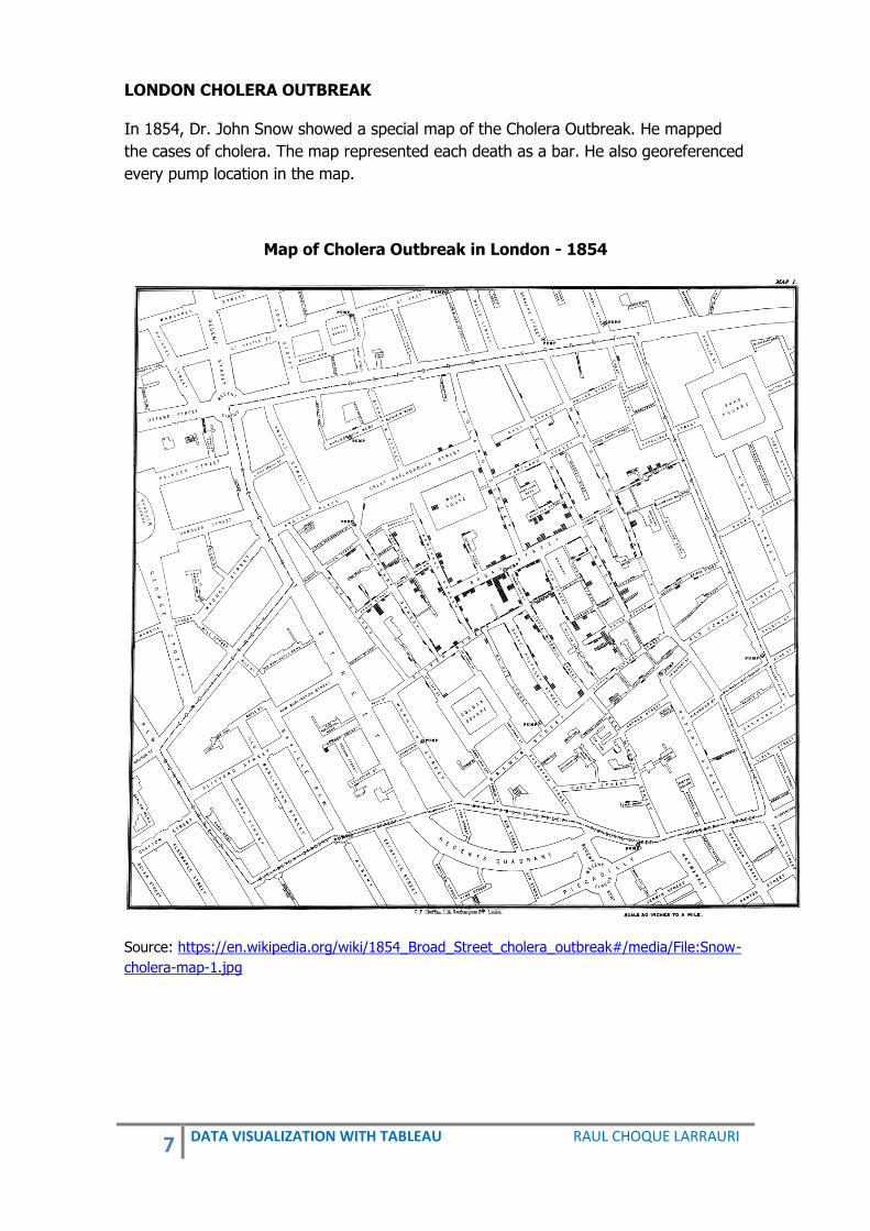
LONDON CHOLERA OUTBREAK In 1854, Dr. John Snow showed a special map of the Cholera Outbreak. He mapped
the cases of cholera. The map represented each death as a bar. He also georeferenced
every pump location in the map.
Map of Cholera Outbreak in London - 1854
Source: https://en.wikipedia.org/wiki/1854_Broad_Street_cholera_outbreak#/media/File:Snow-
cholera-map-1.jpg

8 DATA VISUALIZATION WITH TABLEAU RAUL CHOQUE LARRAURI
MAP OF NAPOLEON´S DISASTROUS RUSSIAN CAMPAIGN OF 1812. Author: Charles Minard - 1869
Source: https://en.wikipedia.org/wiki/Charles_Joseph_Minard#/media/File:Minard.png
The graphic is notable for its representation in two dimensions of six types of data: the number of Napoleon's troops; distance; temperature; the latitude and longitude; direction of travel; and location relative to specific dates. The numbers of men present are represented by the widths of the coloured zones at a rate of one millimetre per ten thousand men; these are also written beside the zones. Orange designates men moving into Russia, black those on retreat. This is a Sankey graphic.

9 DATA VISUALIZATION WITH TABLEAU RAUL CHOQUE LARRAURI
HEAT MAP The heat maps are tables or spreadsheets that have colors instead of numbers. The color of each cell or rectangle corresponds to the magnitude of the cell amount. Toussaint Loua in his statistical atlas of the population of Paris in 1873 used a shaded matrix to display and summarize the characteristics of 20 districts in Paris. The characteristics that were shown are national origin, professions, social classes, age, etc. using a color scale ranging from white (low) through yellow and blue to red (high).
General Graphic of Statistical Atlas of the Population of Paris - 1873
Source: http://www.sci.utah.edu/~kpotter/Library/Papers/wilkinson:2009:HCHM/wilkinson_2009_HCHM
_01.png

10 DATA VISUALIZATION WITH TABLEAU RAUL CHOQUE LARRAURI
PIE MAP Charles Minard, Paris 1858. The map was developed using pie charts to represent the cattle sent from all around France for consumption in Paris.
Cattle sent to Paris - 1858
Source: https://www.pinterest.com/pin/112027109452289534

11 DATA VISUALIZATION WITH TABLEAU RAUL CHOQUE LARRAURI
NEW ERA
Nobel Prizes and Laureates 1901 – 2012
Source: Lupi, Giogia. 2012. "Nobel prizes and laureates 1901-2012." Flickr. Accessed June 23,
2017. https://www.flickr.com/photos/accurat/8249052633/in/set-72157632185046466
III. STEPS FOR DATA VISUALIZATION There are five main steps that we should know and apply in the elaboration of data analysis:
1. OBJECTIVE. It is necessary to have a clear objective about the data that we need to communicate.
2. KNOW THE DATA. It is necessary to know what data we have now. What are the variables that we are using, what is the information on x-axis and y-axis for building the shape? What is the correlation between variables? etc.
3. MESSAGE of the visualization. We mean that it is necessary to have the clear message of the information for the target audience.
4. DESIGN. It is necessary to use the color, size, labels, shapes, scales, size, etc., to present the information.
5. SHARE the information through different media such as social networks.

12 DATA VISUALIZATION WITH TABLEAU RAUL CHOQUE LARRAURI
IV. SOURCE DATA:
Source Information Link
The World Bank - World Development Indicators - Statistical Capacity Indicators - Education Statistics – All Indicators - Health Nutrition and Population Statistics
http://databank.worldbank.org/data/home.aspx
Inter Parliamentary Union
- Women in National Parliaments - Statistical data from 1997
http://www.ipu.org/wmn-e/classif.htm
Scimago Journal & Country Rank
- Journal Rankings - Country Rankings
http://www.scimagojr.com/countryrank.php
Institute of International Education (Open Doors Data Portal)
- International students and scholars in the United States
- American students studying abroad for academic credit
https://www.iie.org/Research-and-Insights/Open-Doors/Data/
Institute for Health Metrics and Evaluation
- Policy reports of Health - Country Profiles of Health
http://www.healthdata.org/policy-report/financing-global-health-2016-development-assistance-public-and-private-health-spending
Worldmeters - World Population - Government & Economics - Society & Media - Environment, Food, Water, Energy and Health
http://www.worldometers.info/
Data OKFN - Government - Social - Economics
http://data.okfn.org/data/core/population
OECD Organization for Economic Cooperation and Development
- Social - Economic - Demographic
http://stats.oecd.org/
Global Health Observatory
- Health - Profile in Health of Countries
http://www.who.int/gho/database/en/

13 DATA VISUALIZATION WITH TABLEAU RAUL CHOQUE LARRAURI
Source Information Link
The International Organization of Motor Vehicle Manufactures
- World Motor Vehicle Production - Information by country and type
http://www.oica.net/category/production-statistics/
Centers for Disease Control and Prevention
- Health
https://www.cdc.gov/datastatistics/index.html
Inter-American Development Bank
- Economics - Development
https://data.iadb.org/
United Nations Data - Data in different areas http://data.un.org/
United Nations Population Division
- Population - Age composition of the population
https://esa.un.org/unpd/wpp/
NCD Risk Factor Collaboration (NCD-RisC)
- Non-communicable diseases http://www.ncdrisc.org/
United Nations Development Program
- Human Development Data http://hdr.undp.org/en/data
INEI PERU - Population http://www.inei.gob.pe/biblioteca-virtual/publicaciones-digitales/
Canadian Institute for Health Information
- Health https://www.cihi.ca/en
Public Health Informatics Institute
- Health http://www.phii.org/
Data UNESCO - Education http://data.uis.unesco.org/
FAO DATA - Food and Agriculture http://www.fao.org/faostat/en/#home
14 DATA VISUALIZATION WITH TABLEAU RAUL CHOQUE LARRAURI
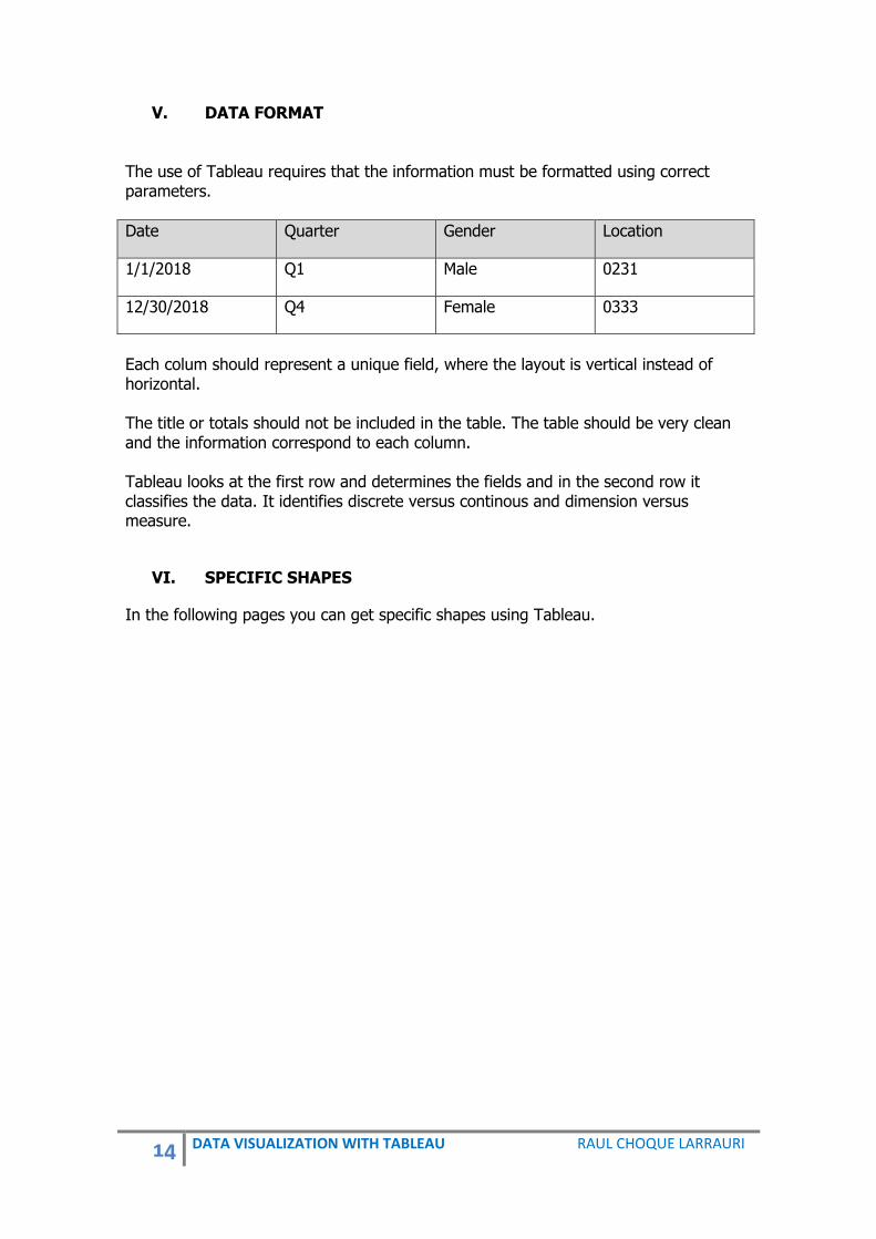
V. DATA FORMAT The use of Tableau requires that the information must be formatted using correct parameters.
Date Quarter Gender Location
1/1/2018 Q1 Male 0231
12/30/2018 Q4 Female 0333
Each colum should represent a unique field, where the layout is vertical instead of horizontal. The title or totals should not be included in the table. The table should be very clean and the information correspond to each column. Tableau looks at the first row and determines the fields and in the second row it classifies the data. It identifies discrete versus continous and dimension versus measure.
VI. SPECIFIC SHAPES
In the following pages you can get specific shapes using Tableau.
15 DATA VISUALIZATION WITH TABLEAU RAUL CHOQUE LARRAURI
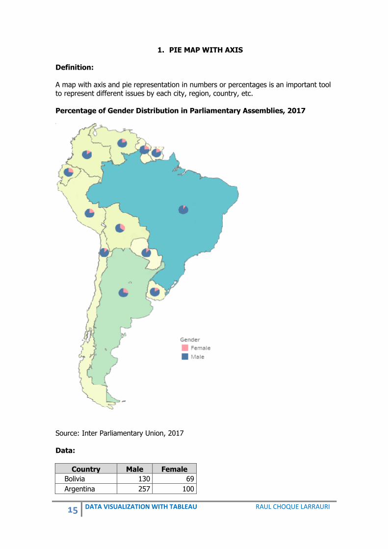
1. PIE MAP WITH AXIS Definition: A map with axis and pie representation in numbers or percentages is an important tool to represent different issues by each city, region, country, etc. Percentage of Gender Distribution in Parliamentary Assemblies, 2017
Source: Inter Parliamentary Union, 2017 Data:
Country Male Female
Bolivia 130 69
Argentina 257 100

16 DATA VISUALIZATION WITH TABLEAU RAUL CHOQUE LARRAURI
Country Male Female
Ecuador 137 52
Peru 130 36
Venezuela 167 37
Uruguay 99 20
Colombia 166 31
Chile 120 19
Paraguay 80 11
Brazil 513 55
Guyana 69 22
Suriname 51 13
The data can be downloaded from:
http://blog.pucp.edu.pe/blog/raulchoque/wp-content/uploads/sites/905/2017/08/PieMap.xlsx Steps to create a Pie Map with percentages: Step 1: In Tableau, open a new workbook and connect to the file. Step 2: In Dimensions search the dimension that correspond to the Geographical role (i.e. airport, area code U.S., city, Congressional District U.S., country/region, county, NUTS Europe, state/province, ZIP Code/Postcode or create one that you need). In this dimension activate the geographic role. Step 3: From Dimensions, drag the data with Geographical role to view area. Step 4: From Measures, drag Longitude to Columns. So, we should have two identical map views. Step 5: There are now three drop-downs on the marks card that are the following: one for each map view, and one for both views that is represented by all. These are three separate marks cards that you can use to control the visual detail for each of the map views. It is important to know that if you are using a mark card this will be bold. Step 6: Work first with the Left Map, so click the Longitude (generated) above on marks card. It will be bold. Step 7: From Measures, drag the measure that is working to Color. Step 8: Right-click on above Longitude (generated) from the marks card and edit below in pill SUM Color which should change to Continuous. Step 9: We should work with right map, so click Longitude (generated) tabs below on marks card. It will be bold. Step 10: Change the marks type. Click the mark type-down and selected “Pie” from “Automatic” on marks card.

17 DATA VISUALIZATION WITH TABLEAU RAUL CHOQUE LARRAURI
Step 11: Drag the Category from the Dimensions area under the data pane and place it on the “Color” on the marks card. Step 12: From Measures, drag the measure that is working to Label. Step 13: Right-click on Longitude (generated) from the marks card and edit in pill Label SUM which should change to continuous. Step 14: From Measures, drag the measure that is working to Angle. Step 15: You can change the size of the Pie. Step 16: On columns shelf, on right longitude click and mark double axis. CHANGE THE NUMBER TO PERCENTAGE IN PIE Step 1: Right-click on pill Label SUM (Number…. ) of marks card. Step 2: Click on ∆ Symbol. Select Add Table Calculation, where you should choose Percent of Total in Calculating Type. After you should choose Compute Using Specific Dimensions and sort order: specific dimensions. Step 3: Click in Compute Using and click on correct dimension. Step 4: On the map right click and choose Format. Choose percentage of total SUM and % with or decimal places.
18 DATA VISUALIZATION WITH TABLEAU RAUL CHOQUE LARRAURI
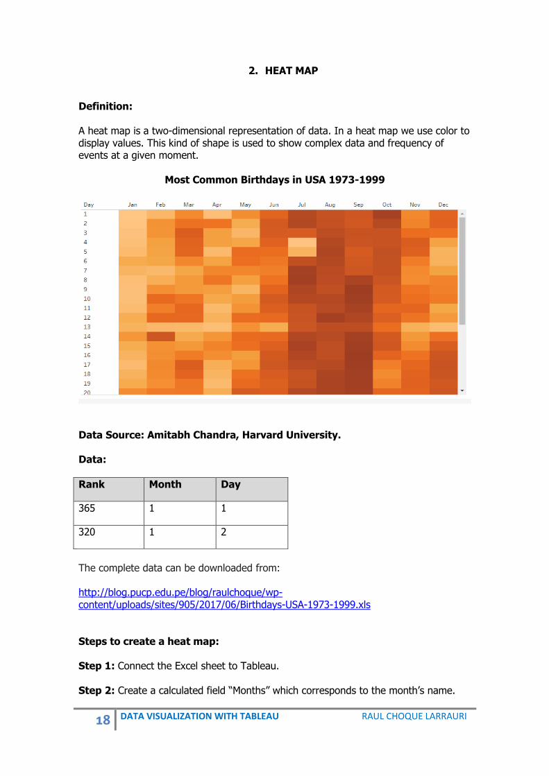
2. HEAT MAP
Definition: A heat map is a two-dimensional representation of data. In a heat map we use color to display values. This kind of shape is used to show complex data and frequency of events at a given moment.
Most Common Birthdays in USA 1973-1999
Data Source: Amitabh Chandra, Harvard University. Data:
Rank Month Day
365 1 1
320 1 2
The complete data can be downloaded from: http://blog.pucp.edu.pe/blog/raulchoque/wp-content/uploads/sites/905/2017/06/Birthdays-USA-1973-1999.xls Steps to create a heat map: Step 1: Connect the Excel sheet to Tableau. Step 2: Create a calculated field “Months” which corresponds to the month’s name.

19 DATA VISUALIZATION WITH TABLEAU RAUL CHOQUE LARRAURI
Name: Months If [Month] = 1 then “Jan” ELSEIF [Month] = 2 then “Feb” ELSIEF [Month] = 3 then “Mar” ELSIEF [Month] = 4 then “Apr” ELSIEF [Month] = 5 then “May” ELSIEF [Month] = 6 then “Jun” ELSIEF [Month] = 7 then “Jul” ELSIEF [Month] = 8 then “Aug” ELSIEF [Month] = 9 then “Sep” ELSIEF [Month] = 10 then “Oct” ELSIEF [Month] = 11 then “Nov” ELSIEF [Month] = 12 then “Dec” END Step 3: Convert the dimension Day to Discrete. Step 4: From Dimensions, drag Months to Columns. Step 5: From Dimensions, drag Day to Rows. Step 6: Change the marks type to Square from Automatic. Step 7: From Measures, drag Rank to Color. Step 8: Double click on Color to bring up the edit colors dialog box. Change the color from Green to any color. Mark reversed. Click on Apply and then ok. Conclusion The 16th day of September is ranked first, meaning the maximum number of babies were born on 16 September.

20 DATA VISUALIZATION WITH TABLEAU RAUL CHOQUE LARRAURI
3. DONUT PIE CHART Definition: A Donut Pie Chart is a tool that shows the relationship of parts to a whole. A Donut Pie Chart has an area of the center cut out. In the blank center you can display information. You can define the radius hole to any size you need.
Data:
Country Gender Year 2017 Year 2010
Bolivia Male 130 97
Argentina Male 257 158
Ecuador Male 137 84
Peru Male 130 87
Venezuela Male 167 137
Uruguay Male 99 84
Colombia Male 166 145
Chile Male 120 103
Paraguay Male 80 70
Brazil Male 513 469
Guyana Male 69 49
Suriname Male 51 46
Bolivia Female 69 33
Argentina Female 100 99
Ecuador Female 52 40
Peru Female 36 33

21 DATA VISUALIZATION WITH TABLEAU RAUL CHOQUE LARRAURI
Country Gender Year 2017 Year 2010
Venezuela Female 37 28
Uruguay Female 20 15
Colombia Female 31 21
Chile Female 19 17
Paraguay Female 11 10
Brazil Female 55 44
Guyana Female 22 21
Suriname Female 13 5
The data can be downloaded from: http://blog.pucp.edu.pe/blog/raulchoque/wp-content/uploads/sites/905/2017/08/Donut.xlsx Steps to create a donut chart: Step 1: In Data Source, in columns, select all columns with the information Year 2017 and Year 2010 using Ctrl. Step 2: Once all columns with information of Years 2010 and 2017 have been selected, right-click on Year 2010 and select Pivot. Step 3: From Measures, drag Number of records to Columns two times. Step 4: Click-right on Number of records on Columns and change to the Attribute in the two Numbers of records. Step 5: On right Number of records of the Column, click-right and select Dual Axis. Step 6: The shape is displayed on the entire Screen. Step 7: In all mark on Marks card change the marks type to Pie from Automatic. Step 8: On the second mark on Marks card select size and put it small, after this in color you can select white. Step 9: On the first mark, from Dimensions, drag Gender to Color. Step 10: On the first mark, from Measures, drag Number of representatives to Size. Step 11: On the first mark, from Measures, drag Number of representatives to Label. Step 12: On the first mark, from Measures, drag Number of representatives to Angle. Step 13: On the second mark, from Measures, drag Number of representatives to Label.

22 DATA VISUALIZATION WITH TABLEAU RAUL CHOQUE LARRAURI
Step 14: On the first mark, in pill Label: Number of representatives, click right and select Edit Table Calculation, in Calculation Type select Percent of Total, Table (across).
Step 15: From Dimensions, drag Years to Columns. Step 16: In pills of Columns and Rows, unselect Show Header.

23 DATA VISUALIZATION WITH TABLEAU RAUL CHOQUE LARRAURI
4. FUNNEL CHART Definition: A funnel chart represents the stages in any process and shows the progress in each stage or also the comparison between actions or process.
Number of Applicants and Selected in National University of Engineering Peru 2009-2016
Source: Statistics Office UNI, 2017. Data:
Faculty Career Condition Year of Process
Number of People
Architecture Architecture Applicant 2009-I 406
Architecture Architecture Applicant 2009-II 344
Architecture Architecture Applicant 2010-I 557
Architecture Architecture Applicant 2010-II 410
Architecture Architecture Applicant 2011-I 607
Architecture Architecture Applicant 2011-II 476
Architecture Architecture Applicant 2012-I 690
Architecture Architecture Applicant 2012-II 485
Architecture Architecture Applicant 2013-I 644
Architecture Architecture Applicant 2013-II 509
Architecture Architecture Applicant 2014-I 618
Architecture Architecture Applicant 2014-II 450
Architecture Architecture Applicant 2015-I 586
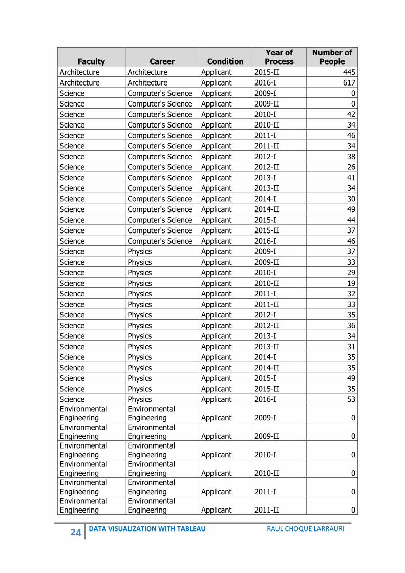
24 DATA VISUALIZATION WITH TABLEAU RAUL CHOQUE LARRAURI
Faculty Career Condition Year of Process
Number of People
Architecture Architecture Applicant 2015-II 445
Architecture Architecture Applicant 2016-I 617
Science Computer's Science Applicant 2009-I 0
Science Computer's Science Applicant 2009-II 0
Science Computer's Science Applicant 2010-I 42
Science Computer's Science Applicant 2010-II 34
Science Computer's Science Applicant 2011-I 46
Science Computer's Science Applicant 2011-II 34
Science Computer's Science Applicant 2012-I 38
Science Computer's Science Applicant 2012-II 26
Science Computer's Science Applicant 2013-I 41
Science Computer's Science Applicant 2013-II 34
Science Computer's Science Applicant 2014-I 30
Science Computer's Science Applicant 2014-II 49
Science Computer's Science Applicant 2015-I 44
Science Computer's Science Applicant 2015-II 37
Science Computer's Science Applicant 2016-I 46
Science Physics Applicant 2009-I 37
Science Physics Applicant 2009-II 33
Science Physics Applicant 2010-I 29
Science Physics Applicant 2010-II 19
Science Physics Applicant 2011-I 32
Science Physics Applicant 2011-II 33
Science Physics Applicant 2012-I 35
Science Physics Applicant 2012-II 36
Science Physics Applicant 2013-I 34
Science Physics Applicant 2013-II 31
Science Physics Applicant 2014-I 35
Science Physics Applicant 2014-II 35
Science Physics Applicant 2015-I 49
Science Physics Applicant 2015-II 35
Science Physics Applicant 2016-I 53
Environmental Engineering
Environmental Engineering Applicant 2009-I 0
Environmental Engineering
Environmental Engineering Applicant 2009-II 0
Environmental Engineering
Environmental Engineering Applicant 2010-I 0
Environmental Engineering
Environmental Engineering Applicant 2010-II 0
Environmental Engineering
Environmental Engineering Applicant 2011-I 0
Environmental Engineering
Environmental Engineering Applicant 2011-II 0

25 DATA VISUALIZATION WITH TABLEAU RAUL CHOQUE LARRAURI
Faculty Career Condition Year of Process
Number of People
Environmental Engineering
Environmental Engineering Applicant 2012-I 150
Environmental Engineering
Environmental Engineering Applicant 2012-II 134
Environmental Engineering
Environmental Engineering Applicant 2013-I 217
Environmental Engineering
Environmental Engineering Applicant 2013-II 170
Environmental Engineering
Environmental Engineering Applicant 2014-I 217
Environmental Engineering
Environmental Engineering Applicant 2014-II 154
Environmental Engineering
Environmental Engineering Applicant 2015-I 204
Environmental Engineering
Environmental Engineering Applicant 2015-II 127
Environmental Engineering
Environmental Engineering Applicant 2016-I 207
Civil Engineering Civil Engineering Applicant 2009-I 1280
Civil Engineering Civil Engineering Applicant 2009-II 971
Civil Engineering Civil Engineering Applicant 2010-I 1689
Civil Engineering Civil Engineering Applicant 2010-II 1183
Civil Engineering Civil Engineering Applicant 2011-I 1957
Civil Engineering Civil Engineering Applicant 2011-II 1292
Civil Engineering Civil Engineering Applicant 2012-I 1923
Civil Engineering Civil Engineering Applicant 2012-II 1427
Civil Engineering Civil Engineering Applicant 2013-I 1994
Civil Engineering Civil Engineering Applicant 2013-II 1489
Civil Engineering Civil Engineering Applicant 2014-I 1933
Civil Engineering Civil Engineering Applicant 2014-II 1279
Civil Engineering Civil Engineering Applicant 2015-I 1667
Civil Engineering Civil Engineering Applicant 2015-II 1248
Civil Engineering Civil Engineering Applicant 2016-I 1655
Environmental Engineering
Industrial Security Engineering Applicant 2009-I 63
Environmental Engineering
Industrial Security Engineering Applicant 2009-II 59
Environmental Engineering
Industrial Security Engineering Applicant 2010-I 88
Source: Statistics Office UNI, 2017. The complete data can be downloaded from: http://blog.pucp.edu.pe/blog/raulchoque/wp-content/uploads/sites/905/2017/06/Statistics-UNI.xlsx

26 DATA VISUALIZATION WITH TABLEAU RAUL CHOQUE LARRAURI
Steps to create a Funnel Chart: Step 1: Connect the Excel sheet to Tableau. Step 2: From Measures, drag Number of persons to Columns two times. Step 3: From Dimensions, drag Careers to Rows. Step 4: On Rows in Careers pill, click-right and select Sort, there select Sort order Descending and sort by Field: Number of people.
Step 5: On the left shape, click-right on the axis information below and select Edit Axis, where in Scale select Reversed.

27 DATA VISUALIZATION WITH TABLEAU RAUL CHOQUE LARRAURI
Step 6: On the second mark, from Measures, drag Number of People to Label. Step 7: On the second mark, from Dimensions, drag Condition to Color. Step 8: In all mark on Marks card change the marks type to Area from Automatic. Step 9: From Dimensions, drag Year of process to Filters. Step 10: Edit axis, color, label, etc.
28 DATA VISUALIZATION WITH TABLEAU RAUL CHOQUE LARRAURI
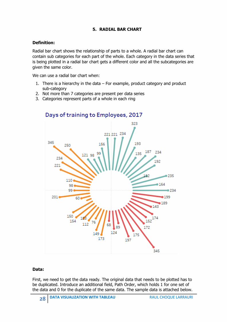
5. RADIAL BAR CHART
Definition:
Radial bar chart shows the relationship of parts to a whole. A radial bar chart can
contain sub categories for each part of the whole. Each category in the data series that
is being plotted in a radial bar chart gets a different color and all the subcategories are
given the same color.
We can use a radial bar chart when:
1. There is a hierarchy in the data – For example, product category and product sub-category
2. Not more than 7 categories are present per data series 3. Categories represent parts of a whole in each ring
Data: First, we need to get the data ready. The original data that needs to be plotted has to be duplicated. Introduce an additional field, Path Order, which holds 1 for one set of the data and 0 for the duplicate of the same data. The sample data is attached below.

29 DATA VISUALIZATION WITH TABLEAU RAUL CHOQUE LARRAURI
We need the database with the following information.
Category Path Order
Product ID
Row ID
Value
Professional 0 1 1 0
Professional 0 2 2 0
Professional 0 3 3 0
Professional 0 4 4 0
Professional 0 5 5 0
Professional 0 6 6 0
Professional 0 7 7 0
Professional 0 8 8 0
Professional 0 9 9 0
Professional 0 10 10 0
Professional 0 11 11 0
Professional 0 12 12 0
Professional 0 13 13 0
Professional 0 14 14 0
Professional 0 15 15 0
Professional 0 16 16 0
Professional 0 17 17 0
Technical 0 18 18 0
Technical 0 19 19 0
Technical 0 20 20 0
Technical 0 21 21 0
Technical 0 22 22 0
Technical 0 23 23 0
Technical 0 24 24 0
Technical 0 25 25 0
Technical 0 26 26 0
Technical 0 27 27 0
Technical 0 28 28 0
Technical 0 29 29 0
Auxiliary 0 30 30 0
Auxiliary 0 31 31 0
Auxiliary 0 32 32 0
Auxiliary 0 33 33 0
Auxiliary 0 34 34 0
Auxiliary 0 35 35 0
Auxiliary 0 36 36 0
Auxiliary 0 37 37 0
Auxiliary 0 38 38 0

30 DATA VISUALIZATION WITH TABLEAU RAUL CHOQUE LARRAURI
Category Path Order
Product ID
Row ID
Value
Auxiliary 0 39 39 0
Auxiliary 0 40 40 0
Auxiliary 0 41 41 0
Auxiliary 0 42 42 0
Auxiliary 0 43 43 0
Auxiliary 0 44 44 0
Auxiliary 0 45 45 0
Auxiliary 0 46 46 0
Professional 1 1 1 250
Professional 1 2 2 345
Professional 1 3 3 234
Professional 1 4 4 221
Professional 1 5 5 110
Professional 1 6 6 98
Professional 1 7 7 99
Professional 1 8 8 201
Professional 1 9 9 60
Professional 1 10 10 30
Professional 1 11 11 150
Professional 1 12 12 154
Professional 1 13 13 123
Professional 1 14 14 112
Professional 1 15 15 76
Professional 1 16 16 149
Professional 1 17 17 173
Technical 1 18 18 68
Technical 1 19 19 124
Technical 1 20 20 89
Technical 1 21 21 197
Technical 1 22 22 175
Technical 1 23 23 345
Technical 1 24 24 172
Technical 1 25 25 152
Technical 1 26 26 174
Technical 1 27 27 143
Technical 1 28 28 189
Technical 1 29 29 199
Auxiliary 1 30 30 234
Auxiliary 1 31 31 164

31 DATA VISUALIZATION WITH TABLEAU RAUL CHOQUE LARRAURI
Category Path Order
Product ID
Row ID
Value
Auxiliary 1 32 32 235
Auxiliary 1 33 33 112
Auxiliary 1 34 34 192
Auxiliary 1 35 35 234
Auxiliary 1 36 36 187
Auxiliary 1 37 37 135
Auxiliary 1 38 38 193
Auxiliary 1 39 39 323
Auxiliary 1 40 40 234
Auxiliary 1 41 41 221
Auxiliary 1 42 42 221
Auxiliary 1 43 43 156
Auxiliary 1 44 44 99
Auxiliary 1 45 45 98
Auxiliary 1 46 46 121
The data can be downloaded from: http://blog.pucp.edu.pe/blog/raulchoque/wp-content/uploads/sites/905/2017/08/RadialBar.xlsx Steps to create a Radial Bar Chart: Step 1: Create the following Calculated Fields: Name: Calculation1 IIF([Path Order]=1,[Value],NULL) Name: RADIAL_FIELD [Value] Name: RADIAL_ANGLE (INDEX()-1) * (1/WINDOW_COUNT(COUNT([RADIAL_FIELD]))) * 2 * PI()
32 DATA VISUALIZATION WITH TABLEAU RAUL CHOQUE LARRAURI
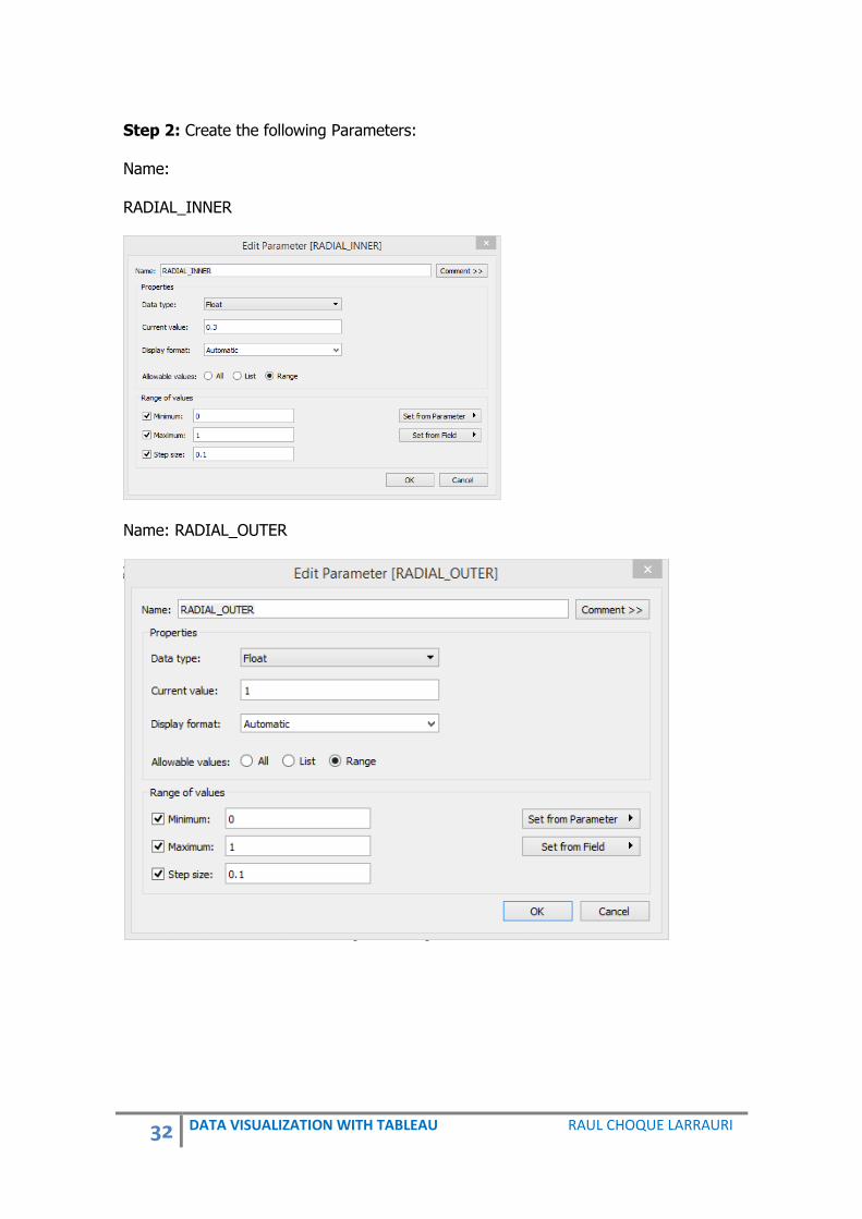
Step 2: Create the following Parameters: Name: RADIAL_INNER
Name: RADIAL_OUTER

33 DATA VISUALIZATION WITH TABLEAU RAUL CHOQUE LARRAURI
Name: RADIAL_SELECTIVE_LABEL_THRESHOLD
Step 3: Create the following calculated fields: Name: RADIAL_NORMALISED_LENGTH [RADIAL_INNER] + IIF(ATTR([Path Order]) = 0 , 0 , SUM([RADIAL_FIELD])/WINDOW_MAX(SUM([RADIAL_FIELD])) * ([RADIAL_OUTER]-[RADIAL_INNER])) //[RADIAL_OUTER] Name: RADIAL_SELECTIVE_LABEL IIF(SUM([RADIAL_FIELD])>[RADIAL_SELECTIVE_LABEL_THRESHOLD], SUM([RADIAL_FIELD]), NULL) RADIAL_X [RADIAL_NORMALISED_LENGTH] * COS([RADIAL_ANGLE]) RADIAL_Y [RADIAL_NORMALISED_LENGTH] * SIN([RADIAL_ANGLE]) Step 4: From Measures, drag RADIAL_X to Columns. Step 5: From Measures, drag RADIAL_Y to Rows. Step 6: In Measures we need to combine the “Category” and “Product ID” fields to create a combined field on which we can perform all the calculations. Click Category then Ctrl+Click item and right-click and select Combine Field. Step 7: From Dimensions, drag Category to Color. Step 8: From Dimensions, drag Category & Product ID to Detail. Step 9: In the Marks choose Line.

34 DATA VISUALIZATION WITH TABLEAU RAUL CHOQUE LARRAURI
Step 10: From Dimensions, drag Path Order to Path. Right-click and change to Dimension. Step 11: From Dimensions, drag Product ID to Tooltip. Step 12: From Dimensions, drag RADIAL_SELECTIVE_LABEL to Label. Step 13: From Measures, drag Calculation 1 to Label. Step 14: Right click on RADIAL_X in Columns, and select Compute Using combined. Step 15: Right click on RADIAL_Y in Rows, and select Compute Using combined. Step 16: In Parameter RADIAL_INNER right-click and select Show Parameter Control. In RADIAL_INNER select 0.3 or other that you need. Step 17: Edit the Axes so that the range is fixed from -1 to 1. Step 18: We can change the size of the bars, on the circle, by changing the size slider on the Marks card. Format the chart to remove the Gridlines and zero lines. Also you can drag from Dimensions Category to Filters and right-click to show filters. With Filters Name: RADIAL_FIELD CASE [RADIAL_FIELD_USE] WHEN "Sales" THEN [Sales] WHEN "Profit" THEN [Profit] END PARAMETER

35 DATA VISUALIZATION WITH TABLEAU RAUL CHOQUE LARRAURI
RADIAL_FIELD_USE Click-right and select Show Parameter Control
Name: RADIAL_SELECTIVE_LABEL
IIF(SUM([RADIAL_FIELD])>[RADIAL_SELECTIVE_LABEL_THRESHOLD],
SUM([RADIAL_FIELD]), NULL)

36 DATA VISUALIZATION WITH TABLEAU RAUL CHOQUE LARRAURI
6. TREE MAP Definition: A Tree Map is a method for displaying hierarchical data using rectangles. Each category is assigned a rectangular area with its subcategory rectangles inside of it. The area of a Tree Map is displayed in proportion to the quantity that is assigned to the category and the other quantities within the same parent category in a part to whole relationship. The area of the parent category is the total of its subcategories. The way rectangles are divided and ordered into sub-rectangles in the shape. A Tree Map is a great tool comparing the proportions between categories via their size.
Population by countries 1960 – 2016
Source: World Bank, 2017. Data:
Year 2012 Year 2013 Year 2014 Year 2015 Year 2016 Country Region
102577 103187 103795 104341 104822 Aruba The Americas
30696958 31731688 32758020 33736494 34656032 Afghanistan Asia
25096150 25998340 26920466 27859305 28813463 Angola Africa
2900401 2895092 2889104 2880703 2876101 Albania Europe
82431 80788 79223 78014 77281 Andorra Europe
8900453 9006263 9070867 9154302 9269612
United Arab
Emirates Middle East
42096739 42539925 42981515 43417765 43847430 Argentina The Americas
2881922 2893509 2906220 2916950 2924816 Armenia Asia

37 DATA VISUALIZATION WITH TABLEAU RAUL CHOQUE LARRAURI
Year 2012 Year 2013 Year 2014 Year 2015 Year 2016 Country Region
55230 55307 55437 55537 55599
American
Samoa Oceania
96777 97824 98875 99923 100963
Antigua and
Barbuda The Americas
22728254 23117353 23460694 23789338 24127159 Australia Oceania
8429991 8479375 8541575 8633169 8747358 Austria Europe
9295784 9416801 9535079 9649341 9762274 Azerbaijan Asia
9319710 9600186 9891790 10199270 10524117 Burundi Africa
11128246 11182817 11209057 11274196 11348159 Belgium Europe
9729160 10004451 10286712 10575952 10872298 Benin Africa
16571216 17072723 17585977 18110624 18646433 Burkina Faso Africa
155727053 157571292 159405279 161200886 162951560 Bangladesh Asia
7305888 7265115 7223938 7177991 7127822 Bulgaria Europe
1300217 1315411 1336397 1371855 1425171 Bahrain Middle East
The complete data can be downloaded from: http://blog.pucp.edu.pe/blog/raulchoque/wp-content/uploads/sites/905/2017/08/2016.xlsx Steps to create a Tree Map: Step 1: Connect the Excel sheet to Tableau. Step 2: Pivot the data. In Data Source, select all columns with population by year using Ctrl.
Step 3: Once all columns with population by year have been selected, click the drop-down arrow next to the columns name, and then select Pivot. New columns replace the original columns that we selected to create the pivot.
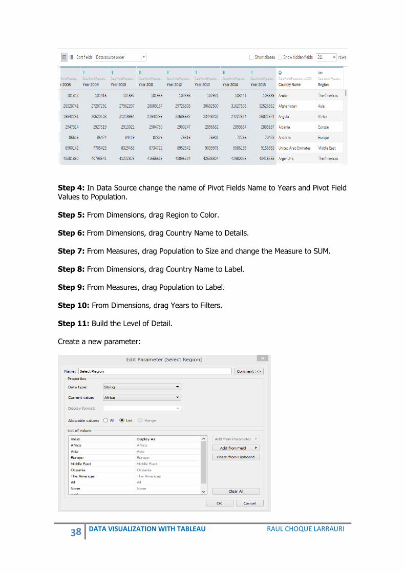
38 DATA VISUALIZATION WITH TABLEAU RAUL CHOQUE LARRAURI
Step 4: In Data Source change the name of Pivot Fields Name to Years and Pivot Field Values to Population. Step 5: From Dimensions, drag Region to Color. Step 6: From Dimensions, drag Country Name to Details. Step 7: From Measures, drag Population to Size and change the Measure to SUM. Step 8: From Dimensions, drag Country Name to Label. Step 9: From Measures, drag Population to Label. Step 10: From Dimensions, drag Years to Filters. Step 11: Build the Level of Detail. Create a new parameter:
39 DATA VISUALIZATION WITH TABLEAU RAUL CHOQUE LARRAURI
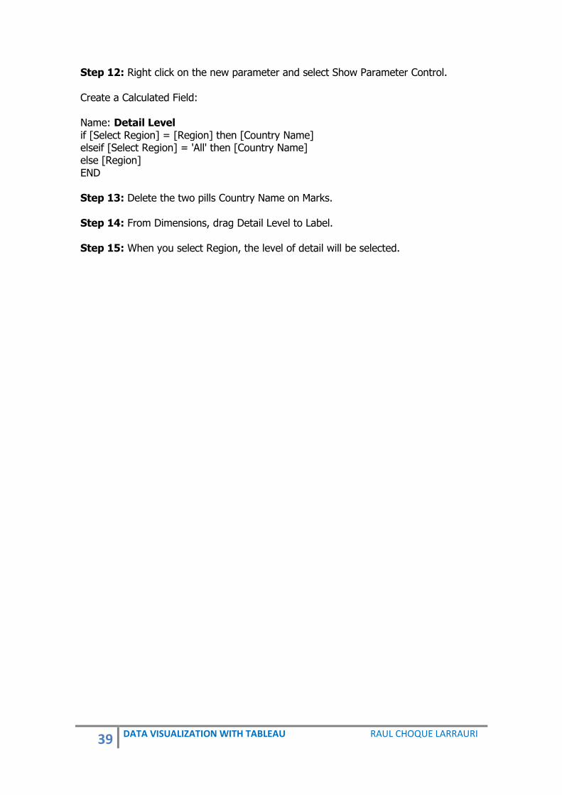
Step 12: Right click on the new parameter and select Show Parameter Control. Create a Calculated Field: Name: Detail Level if [Select Region] = [Region] then [Country Name] elseif [Select Region] = 'All' then [Country Name] else [Region] END Step 13: Delete the two pills Country Name on Marks. Step 14: From Dimensions, drag Detail Level to Label. Step 15: When you select Region, the level of detail will be selected.

40 DATA VISUALIZATION WITH TABLEAU RAUL CHOQUE LARRAURI
7. UNIT CHART
Definition: Unit charts or pictograms charts display each unit of measure as a single mark or symbol.
Type of Professor at the University
Data:
Position Department
Assistant Professor Department of Economics
Associate Professor Department of Economics
Assistant Professor Department of Economics
Associate Professor Department of Economics
Associate Professor Department of Economics
Professor Department of Economics
Professor Department of Economics
Professor Department of Economics
Professor Department of Economics
Associate Professor Department of Economics
Associate Professor Department of Economics
Associate Professor Department of Economics
Professor Department of Economics
Associate Professor Department of Economics
Assistant Professor Department of Economics
Assistant Professor Department of Economics
Associate Professor Department of Marketing

41 DATA VISUALIZATION WITH TABLEAU RAUL CHOQUE LARRAURI
Position Department
Associate Professor Department of Marketing
Associate Professor Department of Marketing
Assistant Professor Department of Marketing
Assistant Professor Department of Marketing
Assistant Professor Department of Marketing
Assistant Professor Department of Marketing
Assistant Professor Department of Marketing
Assistant Professor Department of Marketing
Assistant Professor Department of Marketing
Associate Professor Department of Marketing
Associate Professor Department of Marketing
Associate Professor Department of Marketing
Associate Professor Department of Marketing
Associate Professor Department of Marketing
Professor Department of Marketing
Professor Department of Marketing
Associate Professor Department of Marketing
Assistant Professor Department of Marketing
Associate Professor Department of Marketing
Associate Professor Department of Tourism
Assistant Professor Department of Tourism
Associate Professor Department of Tourism
Assistant Professor Department of Tourism
Assistant Professor Department of Tourism
Associate Professor Department of Tourism
Associate Professor Department of Tourism
Associate Professor Department of Tourism
Assistant Professor Department of Tourism
Assistant Professor Department of Tourism
Associate Professor Department of Tourism
Assistant Professor Department of Journalism
Assistant Professor Department of Journalism
Associate Professor Department of Journalism
Associate Professor Department of Journalism
Associate Professor Department of Journalism
Associate Professor Department of Journalism
Professor Department of Journalism
Professor Department of Journalism
Professor Department of Journalism
Associate Professor Department of Journalism
Associate Professor Department of Journalism
Professor Department of Journalism
Professor Department of Journalism

42 DATA VISUALIZATION WITH TABLEAU RAUL CHOQUE LARRAURI
Position Department
Associate Professor Department of Journalism
Associate Professor Department of Journalism
Professor Department of Journalism
Professor Department of Journalism
Professor Department of Nutrition
Professor Department of Nutrition
Assistant Professor Department of Nutrition
Assistant Professor Department of Nutrition
Assistant Professor Department of Nutrition
Professor Department of Nutrition
Professor Department of Nutrition
Professor Department of Nutrition
Professor Department of Nutrition
Professor Department of Nutrition
Associate Professor Department of Nutrition
Associate Professor Department of Nutrition
Associate Professor Department of Nutrition
Assistant Professor Department of Nutrition
Assistant Professor Department of Nutrition
Professor Department of Nursing
Associate Professor Department of Nursing
Associate Professor Department of Nursing
Professor Department of Nursing
Professor Department of Nursing
Assistant Professor Department of Nursing
Associate Professor Department of Nursing
Professor Department of Nursing
Associate Professor Department of Nursing
Assistant Professor Department of Nursing
Associate Professor Department of Nursing
Associate Professor Department of Nursing
Associate Professor Department of Nursing
Associate Professor Department of Nursing
Associate Professor Department of Nursing
Professor Department of Nursing
Professor Department of Nursing
Assistant Professor Department of Nursing
Assistant Professor Department of Nursing
Assistant Professor Department of Statistics
Assistant Professor Department of Statistics
Assistant Professor Department of Statistics
Assistant Professor Department of Statistics
Associate Professor Department of Statistics

43 DATA VISUALIZATION WITH TABLEAU RAUL CHOQUE LARRAURI
Position Department
Assistant Professor Department of Statistics
Assistant Professor Department of Statistics
Assistant Professor Department of Statistics
Assistant Professor Department of Statistics
Assistant Professor Department of Statistics
Associate Professor Department of Statistics
Associate Professor Department of Statistics
Professor Department of Statistics
Professor Department of Statistics
Professor Department of Statistics
Assistant Professor Department of Statistics
Assistant Professor Department of Statistics
Assistant Professor Department of Statistics
Associate Professor Department of Statistics
Associate Professor Department of Statistics
Assistant Professor Department of Chemistry
Associate Professor Department of Chemistry
Assistant Professor Department of Chemistry
Associate Professor Department of Chemistry
Associate Professor Department of Chemistry
Professor Department of Chemistry
Professor Department of Chemistry
Professor Department of Chemistry
Professor Department of Chemistry
Associate Professor Department of Chemistry
Associate Professor Department of Chemistry
Associate Professor Department of Chemistry
Professor Department of Chemistry
Associate Professor Department of Chemistry
Assistant Professor Department of Chemistry
Assistant Professor Department of Chemistry
Associate Professor Department of Chemistry
Associate Professor Department of Chemistry
Associate Professor Department of Entomology
Assistant Professor Department of Entomology
Assistant Professor Department of Entomology
Assistant Professor Department of Entomology
Assistant Professor Department of Entomology
Assistant Professor Department of Entomology
Assistant Professor Department of Entomology
Assistant Professor Department of Entomology
Associate Professor Department of Entomology
Associate Professor Department of Entomology

44 DATA VISUALIZATION WITH TABLEAU RAUL CHOQUE LARRAURI
Position Department
Associate Professor Department of Entomology
Associate Professor Department of Entomology
Associate Professor Department of Entomology
Professor Department of Entomology
Professor Department of Entomology
Associate Professor Department of Entomology
Assistant Professor Department of Entomology
Associate Professor Department of Entomology
Associate Professor Department of History
Assistant Professor Department of History
Associate Professor Department of History
Assistant Professor Department of History
Assistant Professor Department of History
Associate Professor Department of History
Associate Professor Department of History
Associate Professor Department of History
Assistant Professor Department of History
Assistant Professor Department of History
Associate Professor Department of History
Assistant Professor Department of History
Assistant Professor Department of History
Associate Professor Department of History
Associate Professor Department of English
Associate Professor Department of English
Associate Professor Department of English
Professor Department of English
Professor Department of English
Professor Department of English
Associate Professor Department of English
Associate Professor Department of English
Professor Department of English
Professor Department of English
Associate Professor Department of English
Associate Professor Department of English
Professor Department of English
Professor Department of English
Professor Department of English
Professor Department of English
Assistant Professor Department of English
Assistant Professor Department of English
Assistant Professor Department of English
Professor Department of English
Professor Department of Physiology
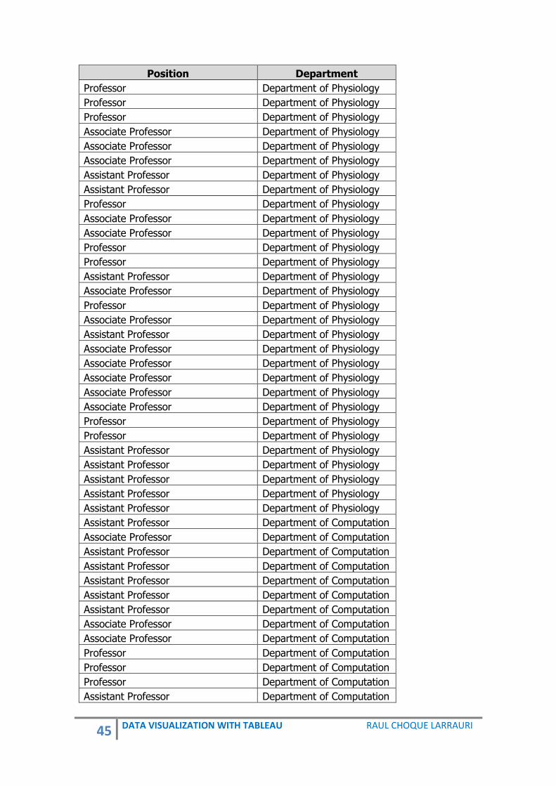
45 DATA VISUALIZATION WITH TABLEAU RAUL CHOQUE LARRAURI
Position Department
Professor Department of Physiology
Professor Department of Physiology
Professor Department of Physiology
Associate Professor Department of Physiology
Associate Professor Department of Physiology
Associate Professor Department of Physiology
Assistant Professor Department of Physiology
Assistant Professor Department of Physiology
Professor Department of Physiology
Associate Professor Department of Physiology
Associate Professor Department of Physiology
Professor Department of Physiology
Professor Department of Physiology
Assistant Professor Department of Physiology
Associate Professor Department of Physiology
Professor Department of Physiology
Associate Professor Department of Physiology
Assistant Professor Department of Physiology
Associate Professor Department of Physiology
Associate Professor Department of Physiology
Associate Professor Department of Physiology
Associate Professor Department of Physiology
Associate Professor Department of Physiology
Professor Department of Physiology
Professor Department of Physiology
Assistant Professor Department of Physiology
Assistant Professor Department of Physiology
Assistant Professor Department of Physiology
Assistant Professor Department of Physiology
Assistant Professor Department of Physiology
Assistant Professor Department of Computation
Associate Professor Department of Computation
Assistant Professor Department of Computation
Assistant Professor Department of Computation
Assistant Professor Department of Computation
Assistant Professor Department of Computation
Assistant Professor Department of Computation
Associate Professor Department of Computation
Associate Professor Department of Computation
Professor Department of Computation
Professor Department of Computation
Professor Department of Computation
Assistant Professor Department of Computation

46 DATA VISUALIZATION WITH TABLEAU RAUL CHOQUE LARRAURI
Position Department
Assistant Professor Department of Computation
Assistant Professor Department of Computation
Associate Professor Department of Computation
Associate Professor Department of Computation
The data can be downloaded from: http://blog.pucp.edu.pe/blog/raulchoque/wp-content/uploads/sites/905/2017/08/UnitChart.xlsx Steps to create a Unit Chart:
1. Step 1: From Dimensions, drag Department to Rows.
2. Step 2: Create a calculated field called #Staff. This field should be fixed to Department and Position, so that it is not affected by the data fields used in the view.
Name: #Staff { FIXED [Department]: COUNT([Position])}
3. Step 3: From Dimensions, drag #Staff, to the right of Department on Rows. In this step by default, this creates a bar chart.
4. Step 4: Right-click on the SUM(#Staff) in Rows, and select Discrete to display it as text instead of a bar chart.
5. Step 5: Change the mark of the view to Circle.
6. Step 6: From Dimensions, drag Position to Color.
7. Step 7: From Measures, drag Number of Records to Details. This will create a circle for each person in the university.
8. Step 8: Click the Analysis menu and uncheck Aggregate Measures.
9. Step 9: Click on the drop-down arrow beside the color legend again. This time choose Edit colors according to your preferences.
10. Step 10: Manually reorder the Position color by dragging the names in the correct order.

47 DATA VISUALIZATION WITH TABLEAU RAUL CHOQUE LARRAURI
8. SANKEY
Definition A Sankey shape is a specific type of flow diagram. In this kind of shape the width of the arrows is shown proportionally to the flow quantity. This diagram puts a visual emphasis on the major transfer or flows within a system. We use Sankey chart to present a relationship of two or more situations.
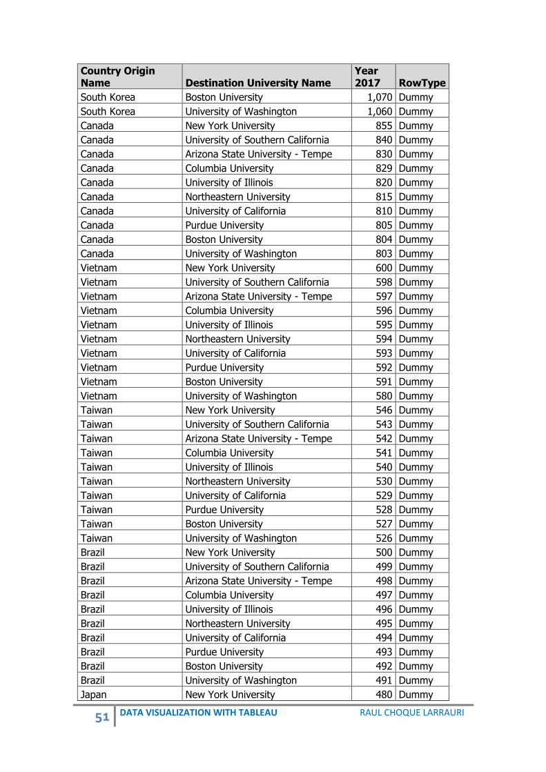
Data:
Country Origin Name Destination University Name
Year 2017 RowType
China New York University 5,438 Real
China University of Southern California 4,234 Real
China Arizona State University - Tempe 4,321 Real
China Columbia University 3,876 Real
China University of Illinois 3,567 Real
China Northeastern University 3,453 Real
China University of California 3,450 Real
China Purdue University 3,300 Real
China Boston University 3,200 Real

48 DATA VISUALIZATION WITH TABLEAU RAUL CHOQUE LARRAURI
Country Origin Name Destination University Name
Year 2017 RowType
China University of Washington 3,100 Real
India New York University 2,616 Real
India University of Southern California 2,600 Real
India Arizona State University - Tempe 2,545 Real
India Columbia University 2,345 Real
India University of Illinois 2,300 Real
India Northeastern University 2,290 Real
India University of California 2,280 Real
India Purdue University 2,270 Real
India Boston University 2,260 Real
India University of Washington 2,250 Real
Saudi Arabia New York University 1,500 Real
Saudi Arabia University of Southern California 1,490 Real
Saudi Arabia Arizona State University - Tempe 1,480 Real
Saudi Arabia Columbia University 1,470 Real
Saudi Arabia University of Illinois 1,460 Real
Saudi Arabia Northeastern University 1,450 Real
Saudi Arabia University of California 1,440 Real
Saudi Arabia Purdue University 1,430 Real
Saudi Arabia Boston University 1,420 Real
Saudi Arabia University of Washington 1,410 Real
South Korea New York University 1,146 Real
South Korea University of Southern California 1,140 Real
South Korea Arizona State University - Tempe 1,130 Real
South Korea Columbia University 1,120 Real
South Korea University of Illinois 1,110 Real
South Korea Northeastern University 1,100 Real
South Korea University of California 1,090 Real
South Korea Purdue University 1,080 Real
South Korea Boston University 1,070 Real
South Korea University of Washington 1,060 Real
Canada New York University 855 Real
Canada University of Southern California 840 Real
Canada Arizona State University - Tempe 830 Real
Canada Columbia University 829 Real
Canada University of Illinois 820 Real
Canada Northeastern University 815 Real
Canada University of California 810 Real
Canada Purdue University 805 Real
Canada Boston University 804 Real
Canada University of Washington 803 Real
Vietnam New York University 600 Real
Vietnam University of Southern California 598 Real

49 DATA VISUALIZATION WITH TABLEAU RAUL CHOQUE LARRAURI
Country Origin Name Destination University Name
Year 2017 RowType
Vietnam Arizona State University - Tempe 597 Real
Vietnam Columbia University 596 Real
Vietnam University of Illinois 595 Real
Vietnam Northeastern University 594 Real
Vietnam University of California 593 Real
Vietnam Purdue University 592 Real
Vietnam Boston University 591 Real
Vietnam University of Washington 580 Real
Taiwan New York University 546 Real
Taiwan University of Southern California 543 Real
Taiwan Arizona State University - Tempe 542 Real
Taiwan Columbia University 541 Real
Taiwan University of Illinois 540 Real
Taiwan Northeastern University 530 Real
Taiwan University of California 529 Real
Taiwan Purdue University 528 Real
Taiwan Boston University 527 Real
Taiwan University of Washington 526 Real
Brazil New York University 500 Real
Brazil University of Southern California 499 Real
Brazil Arizona State University - Tempe 498 Real
Brazil Columbia University 497 Real
Brazil University of Illinois 496 Real
Brazil Northeastern University 495 Real
Brazil University of California 494 Real
Brazil Purdue University 493 Real
Brazil Boston University 492 Real
Brazil University of Washington 491 Real
Japan New York University 480 Real
Japan University of Southern California 470 Real
Japan Arizona State University - Tempe 465 Real
Japan Columbia University 460 Real
Japan University of Illinois 459 Real
Japan Northeastern University 548 Real
Japan University of California 546 Real
Japan Purdue University 455 Real
Japan Boston University 454 Real
Japan University of Washington 453 Real
Mexico New York University 452 Real
Mexico University of Southern California 451 Real
Mexico Arizona State University - Tempe 450 Real
Mexico Columbia University 449 Real
Mexico University of Illinois 448 Real

50 DATA VISUALIZATION WITH TABLEAU RAUL CHOQUE LARRAURI
Country Origin Name Destination University Name
Year 2017 RowType
Mexico Northeastern University 447 Real
Mexico University of California 446 Real
Mexico Purdue University 445 Real
Mexico Boston University 443 Real
Mexico University of Washington 442 Real
China New York University 5,438 Dummy
China University of Southern California 4,234 Dummy
China Arizona State University - Tempe 4,321 Dummy
China Columbia University 3,876 Dummy
China University of Illinois 3,567 Dummy
China Northeastern University 3,453 Dummy
China University of California 3,450 Dummy
China Purdue University 3,300 Dummy
China Boston University 3,200 Dummy
China University of Washington 3,100 Dummy
India New York University 2,616 Dummy
India University of Southern California 2,600 Dummy
India Arizona State University - Tempe 2,545 Dummy
India Columbia University 2,345 Dummy
India University of Illinois 2,300 Dummy
India Northeastern University 2,290 Dummy
India University of California 2,280 Dummy
India Purdue University 2,270 Dummy
India Boston University 2,260 Dummy
India University of Washington 2,250 Dummy
Saudi Arabia New York University 1,500 Dummy
Saudi Arabia University of Southern California 1,490 Dummy
Saudi Arabia Arizona State University - Tempe 1,480 Dummy
Saudi Arabia Columbia University 1,470 Dummy
Saudi Arabia University of Illinois 1,460 Dummy
Saudi Arabia Northeastern University 1,450 Dummy
Saudi Arabia University of California 1,440 Dummy
Saudi Arabia Purdue University 1,430 Dummy
Saudi Arabia Boston University 1,420 Dummy
Saudi Arabia University of Washington 1,410 Dummy
South Korea New York University 1,146 Dummy
South Korea University of Southern California 1,140 Dummy
South Korea Arizona State University - Tempe 1,130 Dummy
South Korea Columbia University 1,120 Dummy
South Korea University of Illinois 1,110 Dummy
South Korea Northeastern University 1,100 Dummy
South Korea University of California 1,090 Dummy
South Korea Purdue University 1,080 Dummy
51 DATA VISUALIZATION WITH TABLEAU RAUL CHOQUE LARRAURI
Country Origin Name Destination University Name
Year 2017 RowType
South Korea Boston University 1,070 Dummy
South Korea University of Washington 1,060 Dummy
Canada New York University 855 Dummy
Canada University of Southern California 840 Dummy
Canada Arizona State University - Tempe 830 Dummy
Canada Columbia University 829 Dummy
Canada University of Illinois 820 Dummy
Canada Northeastern University 815 Dummy
Canada University of California 810 Dummy
Canada Purdue University 805 Dummy
Canada Boston University 804 Dummy
Canada University of Washington 803 Dummy
Vietnam New York University 600 Dummy
Vietnam University of Southern California 598 Dummy
Vietnam Arizona State University - Tempe 597 Dummy
Vietnam Columbia University 596 Dummy
Vietnam University of Illinois 595 Dummy
Vietnam Northeastern University 594 Dummy
Vietnam University of California 593 Dummy
Vietnam Purdue University 592 Dummy
Vietnam Boston University 591 Dummy
Vietnam University of Washington 580 Dummy
Taiwan New York University 546 Dummy
Taiwan University of Southern California 543 Dummy
Taiwan Arizona State University - Tempe 542 Dummy
Taiwan Columbia University 541 Dummy
Taiwan University of Illinois 540 Dummy
Taiwan Northeastern University 530 Dummy
Taiwan University of California 529 Dummy
Taiwan Purdue University 528 Dummy
Taiwan Boston University 527 Dummy
Taiwan University of Washington 526 Dummy
Brazil New York University 500 Dummy
Brazil University of Southern California 499 Dummy
Brazil Arizona State University - Tempe 498 Dummy
Brazil Columbia University 497 Dummy
Brazil University of Illinois 496 Dummy
Brazil Northeastern University 495 Dummy
Brazil University of California 494 Dummy
Brazil Purdue University 493 Dummy
Brazil Boston University 492 Dummy
Brazil University of Washington 491 Dummy
Japan New York University 480 Dummy

52 DATA VISUALIZATION WITH TABLEAU RAUL CHOQUE LARRAURI
Country Origin Name Destination University Name
Year 2017 RowType
Japan University of Southern California 470 Dummy
Japan Arizona State University - Tempe 465 Dummy
Japan Columbia University 460 Dummy
Japan University of Illinois 459 Dummy
Japan Northeastern University 548 Dummy
Japan University of California 546 Dummy
Japan Purdue University 455 Dummy
Japan Boston University 454 Dummy
Japan University of Washington 453 Dummy
Mexico New York University 452 Dummy
Mexico University of Southern California 451 Dummy
Mexico Arizona State University - Tempe 450 Dummy
Mexico Columbia University 449 Dummy
Mexico University of Illinois 448 Dummy
Mexico Northeastern University 447 Dummy
Mexico University of California 446 Dummy
Mexico Purdue University 445 Dummy
Mexico Boston University 443 Dummy
Mexico University of Washington 442 Dummy
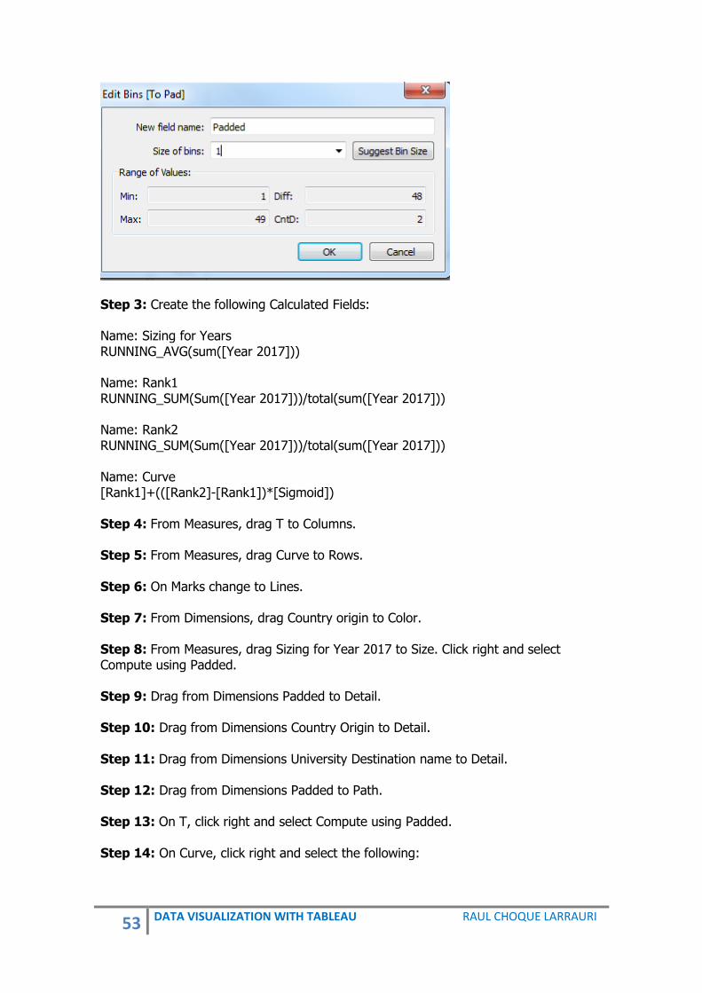
This data is only an example. The numbers are just a projection. The data can be downloaded from: http://blog.pucp.edu.pe/blog/raulchoque/wp-content/uploads/sites/905/2017/08/Sankey.xlsx Steps to Create a Sankey Chart: Step 1: Create the following Calculated Fields: Name: T (INDEX()-25)/4 Name: Sigmoid 1/(1+EXP(1)^-[T]) Name: To Pad if [RowType]="Real" then 1 else 49 end Step 2: Create a Bins of To Pad. Click right on To Pad and select Bins. Name: Padded
53 DATA VISUALIZATION WITH TABLEAU RAUL CHOQUE LARRAURI
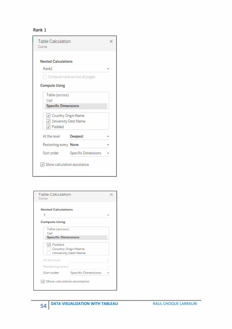
Step 3: Create the following Calculated Fields: Name: Sizing for Years RUNNING_AVG(sum([Year 2017])) Name: Rank1 RUNNING_SUM(Sum([Year 2017]))/total(sum([Year 2017])) Name: Rank2 RUNNING_SUM(Sum([Year 2017]))/total(sum([Year 2017])) Name: Curve [Rank1]+(([Rank2]-[Rank1])*[Sigmoid]) Step 4: From Measures, drag T to Columns. Step 5: From Measures, drag Curve to Rows. Step 6: On Marks change to Lines. Step 7: From Dimensions, drag Country origin to Color. Step 8: From Measures, drag Sizing for Year 2017 to Size. Click right and select Compute using Padded. Step 9: Drag from Dimensions Padded to Detail. Step 10: Drag from Dimensions Country Origin to Detail. Step 11: Drag from Dimensions University Destination name to Detail. Step 12: Drag from Dimensions Padded to Path. Step 13: On T, click right and select Compute using Padded. Step 14: On Curve, click right and select the following:
54 DATA VISUALIZATION WITH TABLEAU RAUL CHOQUE LARRAURI
Rank 1

55 DATA VISUALIZATION WITH TABLEAU RAUL CHOQUE LARRAURI
Rank 2
Step 15: On the Marks Card we should have the following actions:
Step 16: Edit Axis Curve 0 to 1 and Reversed. Edit Axis T -5, 5. On T and Curve click right and select No Show Header.

56 DATA VISUALIZATION WITH TABLEAU RAUL CHOQUE LARRAURI
Step 17: In other sheet, create a segment reference of Country of Origin. From Measures, drag Year 2017 to Rows. From Dimensions, drag Country Origin to Color and Country Origin to Label. From Measures, drag Year 2017 to Rows.
Step 18: In other sheet, create a segment reference of University of Destination. From Measures, drag University Destination to Rows. From Dimensions, drag University Destination to Color and University Destination to Label. From Measures, drag Year 2017 to Rows.

57 DATA VISUALIZATION WITH TABLEAU RAUL CHOQUE LARRAURI
Step 19: Relation in a Dashboard of segment reference and Sankey. Click on Dashboard and select Actions. In Add Action select Highlight.

58 DATA VISUALIZATION WITH TABLEAU RAUL CHOQUE LARRAURI
Steps to make this shape with Filters: The data can be downloaded from: http://blog.pucp.edu.pe/blog/raulchoque/wp-content/uploads/sites/905/2017/06/Data-Book-Sankey.xlsx Create a Parameter:
Create the following Calculated Fields: Name: Years17-21 CASE [Parameters].[Years] WHEN '2017' THEN SUM([Year 2017]) WHEN '2018' THEN SUM([Year 2018]) WHEN '2019' THEN SUM([Year 2019]) WHEN '2020' THEN SUM([Year 2020]) WHEN '2021' THEN SUM([Year 2021]) END Name: Rank1 RUNNING_SUM([ Years 17-21])/TOTAL([ Years 17-21]) Name: Rank2 RUNNING_SUM([ Years 17-21])/TOTAL([ Years 17-21])
Name: Curve [Rank1]+(([Rank2] - [Rank1])*[Sigmoid]) Name: Path Size RUNNING_AVG([ Years 17-21]) Gender to Filter Show Parameter Control

59 DATA VISUALIZATION WITH TABLEAU RAUL CHOQUE LARRAURI
The steps should be the same as that in the simple kind. Path Size using Padded.

60 DATA VISUALIZATION WITH TABLEAU RAUL CHOQUE LARRAURI
9. SANKEY RANKING
Definition: This is a kind of Sankey shape, where you can show the ranking and relationship of different situations.
Data: REGIONAL COMPETITIVINES PERU 2015 – 2016
Rank Region Year
1 Lima 2015
1 Lima 2016
2 Moquegua 2015
2 Moquegua 2016
3 Arequipa 2015
3 Arequipa 2016
4 Ica 2015

61 DATA VISUALIZATION WITH TABLEAU RAUL CHOQUE LARRAURI
Rank Region Year
4 Ica 2016
5 Tacna 2015
5 Tacna 2016
6 Madre de Dios 2015
6 Madre de Dios 2016
7 Tumbes 2015
7 Tumbes 2016
8 Cusco 2015
10 Cusco 2016
9 Lambayeque 2015
8 Lambayeque 2016
10 La Libertad 2015
9 La Libertad 2016
11 Ancash 2015
11 Ancash 2016
12 Piura 2015
13 Piura 2016
13 Junin 2015
12 Junin 2016
14 San Martin 2015
14 San Martin 2016
15 Apurimac 2015
16 Apurimac 2016
16 Ayacucho 2015
17 Ayacucho 2016
17 Amazonas 2015
21 Amazonas 2016
18 Ucayali 2015
15 Ucayali 2016
19 Huancavelica 2015
19 Huancavelica 2016
20 Cerro de Pasco 2015
18 Cerro de Pasco 2016
21 Huanuco 2015
20 Huanuco 2016
22 Puno 2015
22 Puno 2016
23 Cajamarca 2015
24 Cajamarca 2016
24 Loreto 2015
23 Loreto 2016
The data can be downloaded from:
62 DATA VISUALIZATION WITH TABLEAU RAUL CHOQUE LARRAURI
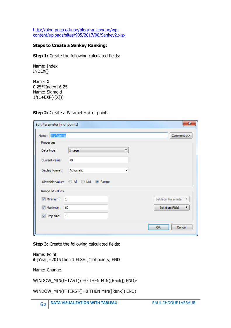
http://blog.pucp.edu.pe/blog/raulchoque/wp-content/uploads/sites/905/2017/08/Sankey2.xlsx Steps to Create a Sankey Ranking: Step 1: Create the following calculated fields: Name: Index INDEX() Name: X 0.25*[Index]-6.25 Name: Sigmoid 1/(1+EXP(-[X])) Step 2: Create a Parameter # of points
Step 3: Create the following calculated fields: Name: Point if [Year]=2015 then 1 ELSE [# of points] END Name: Change
WINDOW_MIN(IF LAST() =0 THEN MIN([Rank]) END)-
WINDOW_MIN(IF FIRST()=0 THEN MIN([Rank]) END)

63 DATA VISUALIZATION WITH TABLEAU RAUL CHOQUE LARRAURI
Name: Curve WINDOW_MIN(IF FIRST()=0 THEN MIN([Rank]) END)+[Sigmoid]*[Change] Step 4: Create a Padded of Point
Step 5: From Measures, drag X to Columns shelf. Step 6: From Measures, drag Curve to Columns shelf. Step 7: From Measures, drag Change to Color. Step 8: In Marks change to Line. Step 9: From Dimensions, drag Padded to Path. Step 10: From Measures, drag Rank to Label. Step 11: From Dimensions, drag Region to Label. Step 12: From Measures, drag Index to Detail. Step 13: In Change, Index, X and Curve click-right and select computing using Padded. Step 14: Edix Axis Curve, as Reversed and Axis X as -12, 12. Step 15: Edit Label, in Marks to Label as Line Ends and in Label Appearance <SUM(Rank)>.<Region> Step 16: In X and Curve deselect Show Header.

64 DATA VISUALIZATION WITH TABLEAU RAUL CHOQUE LARRAURI

65 DATA VISUALIZATION WITH TABLEAU RAUL CHOQUE LARRAURI
10. DIVERGENT CHART Definition: A divergent chart is a tool which can be used to that can:
- Present two associated measures. - Compared side by side. - Visualize age demographics data. - Visualize gender distribution.
Gender Distribution in South America, 2017
Data: Country Name Gender
2012 [YR2012]
2013 [YR2013]
2014 [YR2014]
2015 [YR2015]
2016 [YR2016]
Argentina Female 21503116 21727725 21951299 22172053 22389000
Argentina Male 20592108 20810579 21028727 21244702 21458000
Bolivia Female 5109041 5190255 5271901 5353990 5437000
Bolivia Male 5129721 5209676 5289986 5370715 5452000
Brazil Female 102776771 103754885 104713195 105646790 106555000
Brazil Male 99624813 100504492 101364703 102200738 103013000
Chile Female 8812057 8906407 9000209 9093072 9185000
Chile Male 8576380 8669426 8762438 8855069 8947000
Colombia Female 23779628 24020812 24255888 24485169 24709000
Colombia Male 23101390 23321551 23535505 23743535 23946000
Ecuador Female 7707253 7829381 7951388 8073299 8195000
Ecuador Male 7712240 7831931 7951528 8071064 8190000
Peru Female 15091888 15296074 15500829 15703562 15903000
Peru Male 15066880 15269387 15472319 15673108 15871000
Uruguay Female 1758478 1763941 1769468 1775156 1781000
Uruguay Male 1638275 1644028 1650048 1656399 1663000
Venezuela, RB Female 14967959 15187536 15405120 15620882 15835000

66 DATA VISUALIZATION WITH TABLEAU RAUL CHOQUE LARRAURI
Venezuela, RB Male 14886279 15088509 15288707 15487201 15684000
Paraguay Female 3141711 3184123 3226980 3269997 3313000
Paraguay Male 3237451 3281546 3325538 3369126 3412000
Guyana Female 378483 379366 380401 381586 383000
Guyana Male 379927 381667 383492 385499 388000
Suriname Female 263538 266050 268511 270937 273000
Suriname Male 264997 267400 269737 272038 274000
Source: World Bank, 2017. The data can be downloaded from: http://blog.pucp.edu.pe/blog/raulchoque/wp-content/uploads/sites/905/2017/08/Gender.xlsx Steps to create a divergent chart Step 1: Connect the data to Tableau. We will compare gender by countries. Step 2: Pivot the data of Years. Change name in Pivot to Years and Population. Step 3: Create the following calculated fields: Name: Male IF [Gender] = 'Male' THEN [Population] END Name: Female IF [Gender] = 'Female' THEN [Population] END Step 4: From Measures, drag Male and Female to Columns. Step 5: From Dimensions, drag Country name to Rows. Step 6: Below Format, select Sort Country name descending by Female. Step 7: Below of female shape in view, click right and select Edit Axis. Click Reversed and ok.
67 DATA VISUALIZATION WITH TABLEAU RAUL CHOQUE LARRAURI
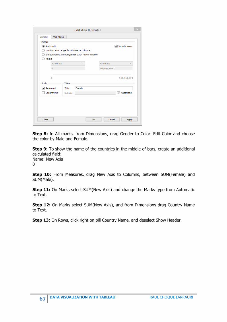
Step 8: In All marks, from Dimensions, drag Gender to Color. Edit Color and choose the color by Male and Female. Step 9: To show the name of the countries in the middle of bars, create an additional calculated field: Name: New Axis 0 Step 10: From Measures, drag New Axis to Columns, between SUM(Female) and SUM(Male). Step 11: On Marks select SUM(New Axis) and change the Marks type from Automatic to Text. Step 12: On Marks select SUM(New Axis), and from Dimensions drag Country Name to Text. Step 13: On Rows, click right on pill Country Name, and deselect Show Header.

68 DATA VISUALIZATION WITH TABLEAU RAUL CHOQUE LARRAURI
11. BAR MAP Definition: This is a representation of a bar in different maps. You can show everything visually. It is very good showing for comparative information.
Gender Representation Parliament South America, 2017

69 DATA VISUALIZATION WITH TABLEAU RAUL CHOQUE LARRAURI
Data:
Country Male Female
Bolivia 130 69
Argentina 257 100
Ecuador 137 52
Peru 130 36
Venezuela 167 37
Uruguay 99 20
Colombia 166 31
Chile 120 19
Paraguay 80 11
Brazil 513 55
Guyana 69 22
Suriname 51 13
The data can be downloaded from:
http://blog.pucp.edu.pe/blog/raulchoque/wp-
content/uploads/sites/905/2017/08/BarMap.xlsx
Procedures to create a bar map
Step 1: Create Calculated Fields for the Bars Name: Calculation Male IF [Gender]= "Male" THEN [Number] END Name: Calculation Female IF [Gender]= "Female" THEN [Number] END Name: % BAR MALE LEFT ("██████████", ROUND(SUM([Calculation Male])/SUM([Number])*10,0)) Name: % BAR FEMALE LEFT ("██████████", ROUND(SUM([Calculation Female])/SUM([Number])*10,0)) Step 2: Build the Map Double click Country. This will put Longitude on Columns and Latitude on Rows. Step 3: Change the Marks dropdown box to Text. Step 4: Drag your new Bars fields to Text; % Female Bars, % Male Bars

70 DATA VISUALIZATION WITH TABLEAU RAUL CHOQUE LARRAURI
Step 5: Click Size and make the size as small as possible. You now have 2 bars on your map representing the % of gender. Step 6: Format the Text for the Bars Horizontal bar chart on a map: Click on Text and select the alignment dropdown. Set Horizontal Alignment to Left. Click on the three dots ... to edit the text box. Select all of the text and set the font to size 8. Highlight each row in the text box and change the color to the color you want the bars to be in the bar chart. Vertical bar chart on a map: For vertical bars we simply adjust the text alignment. Click on Text and select the alignment dropdown. Set Text Alignment to Up. Set Vertical Alignment to Bottom. Stacked bar chart on a map: For stacked bars, simply put all of the labels on the same line and adjust the text to normal or up for either horizontal or vertical stacked bars.

71 DATA VISUALIZATION WITH TABLEAU RAUL CHOQUE LARRAURI
12. WAFFLE CHART This is a shape to display the percentage of information that is complete. This is an important tool to display KPIs, and comparative information.
Data:
Rows Columns Percentage
1 1 1%
1 2 2%
1 3 3%
1 4 4%
1 5 5%
1 6 6%
1 7 7%
1 8 8%
1 9 9%
1 10 10%
2 1 11%
2 2 12%
2 3 13%
2 4 14%
2 5 15%
2 6 16%
2 7 17%

72 DATA VISUALIZATION WITH TABLEAU RAUL CHOQUE LARRAURI
Rows Columns Percentage
2 8 18%
2 9 19%
2 10 20%
3 1 21%
3 2 22%
3 3 23%
3 4 24%
3 5 25%
3 6 26%
3 7 27%
3 8 28%
3 9 29%
3 10 30%
4 1 31%
4 2 32%
4 3 33%
4 4 34%
4 5 35%
4 6 36%
4 7 37%
4 8 38%
4 9 39%
4 10 40%
5 1 41%
5 2 42%
5 3 43%
5 4 44%
5 5 45%
5 6 46%
5 7 47%
5 8 48%
5 9 49%
5 10 50%
6 1 51%
6 2 52%
6 3 53%
6 4 54%
6 5 55%
6 6 56%
6 7 57%
6 8 58%
6 9 59%
6 10 60%
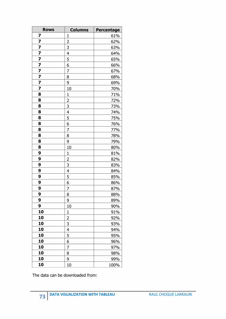
73 DATA VISUALIZATION WITH TABLEAU RAUL CHOQUE LARRAURI
Rows Columns Percentage
7 1 61%
7 2 62%
7 3 63%
7 4 64%
7 5 65%
7 6 66%
7 7 67%
7 8 68%
7 9 69%
7 10 70%
8 1 71%
8 2 72%
8 3 73%
8 4 74%
8 5 75%
8 6 76%
8 7 77%
8 8 78%
8 9 79%
8 10 80%
9 1 81%
9 2 82%
9 3 83%
9 4 84%
9 5 85%
9 6 86%
9 7 87%
9 8 88%
9 9 89%
9 10 90%
10 1 91%
10 2 92%
10 3 93%
10 4 94%
10 5 95%
10 6 96%
10 7 97%
10 8 98%
10 9 99%
10 10 100%
The data can be downloaded from:

74 DATA VISUALIZATION WITH TABLEAU RAUL CHOQUE LARRAURI
http://blog.pucp.edu.pe/blog/raulchoque/wp-content/uploads/sites/905/2017/08/Waffle1.xlsx Steps to create a Waffle chart: Step 1: From Measures, drag Columns to Dimensions and Rows to Dimensions. Step 2: From Dimensions, drag Columns to Columns and Rows to Rows. Step 3: From Measures, drag Percentage to Text. Step 4: In Measures select Percentage, click right and select Default Properties, Number Format, Percentage, and decimal places 0. Step 5: Sort Rows descending by Percentage. Step 6: Select in Data, New data Source. (In this step select the data with the information that will be presented in percentage)
Country Gender % Representatives
Bolivia Female 35%
Argentina Female 28%
Ecuador Female 28%
Peru Female 22%
Venezuela Female 18%
Uruguay Female 17%
Colombia Female 16%
Chile Female 14%
Paraguay Female 12%
Brazil Female 10%
Guyana Female 24%
Suriname Female 20%
Bolivia Male 65%
Argentina Male 72%
Ecuador Male 72%
Peru Male 78%
Venezuela Male 82%
Uruguay Male 83%
Colombia Male 84%
Chile Male 86%
Paraguay Male 88%
Brazil Male 90%
Guyana Male 76%
Suriname Male 80%

75 DATA VISUALIZATION WITH TABLEAU RAUL CHOQUE LARRAURI
The data can be downloaded from: http://blog.pucp.edu.pe/blog/raulchoque/wp-content/uploads/sites/905/2017/08/Waffle2.xlsx Step 7: In Data select Sheet 1 (Waffle Chart) Step 8: Create a Calculated Field: Name: Box to Color SUM(([Sheet1 (Parliamentary)].[% Representatives]))>= SUM([Percentage]) Step 9: From Measures, drag Box to Color Step 10: Drag off the pill Percentage Step 11: Size to Max and in Color apply color to borders Step 12: In Columns, double click and add AVG (1) Step 13: Drag Columns for less size Step 14: Untick Show Header from Column, Row and AVG Step 15: In Data Select Sheet 1 (Parliamentary) Step 16: From Dimensions, drag Country and Gender to Filters Step 17: From Measures, drag % Representatives to Detail Step 18: In a Square, click right and select Annotate and Mark Step 19: Only Select <Hoja1 (Parliamentary).SUM(% Representatives)>. This will be very big. Step 20: In Measures, select % Representatives, click right and select Default Properties, Number Format, Percentage, Decimal places: 0 Step 21: In the number of %, click right and select Format. Set shading and line to none and drag the number to the center Step 22: In data pane, click right and select Format. Format Borders and select Sheet, Column Divider and Row Divider.

76 DATA VISUALIZATION WITH TABLEAU RAUL CHOQUE LARRAURI
13. RINGS Definition: This is an important shape where you can show the comparison of data, about of different situations using rings.
Data:
Name Path Value
Medicine 1 40
Architecture 1 20
Engineering 1 18
Education 1 12
Communication 1 10
Medicine 270 40
Architecture 270 20
Engineering 270 18
Education 270 12
Communication 270 10

77 DATA VISUALIZATION WITH TABLEAU RAUL CHOQUE LARRAURI
The data can be downloaded from: http://blog.pucp.edu.pe/blog/raulchoque/wp-content/uploads/sites/905/2017/08/Rings.xlsx Steps to create a Rings shape Step 1: Create a Path Bin of Path
Step 2: Create the following Calculated Fields: Name: Index INDEX()-1 Name: PI PI Name: Max Value WINDOW_MAX(SUM([Value])) Name: Value (Windows Sum) WINDOW_MAX(SUM([Value])) Name: Step Size [Value (Windows Sum)]/ [Max Value] Name: Rank RANK_UNIQUE([Value (Windows Sum)], 'asc') Name: Y SIN([Index])+[PI]/180*[Step Size]*[Rank] Name: X COS([Index]*[PI])/180*[Step Size]*[Rank] Step 3: From Dimensions, drag Name to Color

78 DATA VISUALIZATION WITH TABLEAU RAUL CHOQUE LARRAURI
Step 4: From Measures, drag Value (Windows Sum) to Label
Step 5: From Dimensions, drag Name to Label
Step 6: Set the Marks Type to Line
Step 7: From Dimensions, drag Path (bin) to Path
Step 7: From Measures, drag Y to Columns
Step 8: From Measures, drag X to Rows
Step 9: Click right on Y and X, and select Table Calculation……..
For INDEX

79 DATA VISUALIZATION WITH TABLEAU RAUL CHOQUE LARRAURI
For PI
For Value (Windows Sum)

80 DATA VISUALIZATION WITH TABLEAU RAUL CHOQUE LARRAURI
For Max Value
For Rank

81 DATA VISUALIZATION WITH TABLEAU RAUL CHOQUE LARRAURI
In X for INDEX
For PI

82 DATA VISUALIZATION WITH TABLEAU RAUL CHOQUE LARRAURI
For Value(Windows Sum)
For Max Value

83 DATA VISUALIZATION WITH TABLEAU RAUL CHOQUE LARRAURI
For Rank

84 DATA VISUALIZATION WITH TABLEAU RAUL CHOQUE LARRAURI
14. RADIAL STACKED BAR1 Definition A Radial Stacked Bar is a shape that shows the relationship of categories and subcategories. In this kind of shape you can display the bar chart as absolute values, or as a percent of each segment. This is ideal for comparing the total amount across each segment bar.
Academic Production by Type of Professor at the University, 2017
Data:
Position Department Path Order Articles
Professor Accounting 5 10
Associate Professor Accounting 5 40
Assistant Professor Accounting 5 30
Professor Aerospace Engineering 5 200
Associate Professor Aerospace Engineering 5 100
Assistant Professor Aerospace Engineering 5 50
Professor Agricultural 5 600
Associate Professor Agricultural 5 670
Assistant Professor Agricultural 5 890
1 Adapted fromf Ryan Rowland.

85 DATA VISUALIZATION WITH TABLEAU RAUL CHOQUE LARRAURI
Position Department Path Order Articles
Professor American Studies 5 121
Associate Professor American Studies 5 122
Assistant Professor American Studies 5 100
Professor Anthropology 5 32
Associate Professor Anthropology 5 32
Assistant Professor Anthropology 5 34
Professor Arabic Studies 5 23
Associate Professor Arabic Studies 5 22
Assistant Professor Arabic Studies 5 3
Professor Architecture 5 345
Associate Professor Architecture 5 434
Assistant Professor Architecture 5 345
Professor Art 5 3
Associate Professor Art 5 56
Assistant Professor Art 5 76
Professor Astronomy 5 456
Associate Professor Astronomy 5 456
Assistant Professor Astronomy 5 323
Professor Biochemistry 5 342
Associate Professor Biochemistry 5 342
Assistant Professor Biochemistry 5 321
Professor Bioengineering 5 324
Associate Professor Bioengineering 5 322
Assistant Professor Bioengineering 5 234
Professor Biological Sciences 5 123
Associate Professor Biological Sciences 5 123
Assistant Professor Biological Sciences 5 234
Professor Biophycis 5 212
Associate Professor Biophycis 5 213
Assistant Professor Biophycis 5 214
Professor Business 5 456
Associate Professor Business 5 657
Assistant Professor Business 5 657
Professor Chemical 5 345
Associate Professor Chemical 5 343
Assistant Professor Chemical 5 323
Professor Civil Engineering 5 800
Associate Professor Civil Engineering 5 900
Assistant Professor Civil Engineering 5 980
Professor Environmental Engineering 5 980
Associate Professor Environmental Engineering 5 990
Assistant Professor Environmental Engineering 5 980
Professor Classics 5 23

86 DATA VISUALIZATION WITH TABLEAU RAUL CHOQUE LARRAURI
Position Department Path Order Articles
Associate Professor Classics 5 45
Assistant Professor Classics 5 67
Professor Communication 5 900
Associate Professor Communication 5 900
Assistant Professor Communication 5 800
Professor Comparative Literature 5 34
Associate Professor Comparative Literature 5 56
Assistant Professor Comparative Literature 5 78
Professor Computer Science 5 678
Associate Professor Computer Science 5 678
Assistant Professor Computer Science 5 656
Professor Economics 5 456
Associate Professor Economics 5 456
Assistant Professor Economics 5 657
Professor Education 5 456
Associate Professor Education 5 345
Assistant Professor Education 5 234
Professor Higher Education 5 567
Associate Professor Higher Education 5 567
Assistant Professor Higher Education 5 656
Professor Electrical Engineering 5 456
Associate Professor Electrical Engineering 5 345
Assistant Professor Electrical Engineering 5 345
Professor Computer Engineering 5 234
Associate Professor Computer Engineering 5 345
Assistant Professor Computer Engineering 5 345
Professor English Language 5 23
Associate Professor English Language 5 24
Assistant Professor English Language 5 56
Professor Literature 5 45
Associate Professor Literature 5 67
Assistant Professor Literature 5 66
Professor Entomology 5 678
Associate Professor Entomology 5 666
Assistant Professor Entomology 5 699
Professor Epidemiology and Biostatistics 5 567
Associate Professor Epidemiology and Biostatistics 5 890
Assistant Professor Epidemiology and Biostatistics 5 900
Professor Family Science 5 789
Associate Professor Family Science 5 890

87 DATA VISUALIZATION WITH TABLEAU RAUL CHOQUE LARRAURI
Position Department Path Order Articles
Assistant Professor Family Science 5 900
Professor Finance 5 78
Associate Professor Finance 5 67
Assistant Professor Finance 5 98
Professor Geography 5 67
Associate Professor Geography 5 89
Assistant Professor Geography 5 89
Professor Geology 5 345
Associate Professor Geology 5 345
Assistant Professor Geology 5 323
Professor Government and Politics 5 345
Associate Professor Government and Politics 5 456
Assistant Professor Government and Politics 5 789
Professor Health Services 5 678
Associate Professor Health Services 5 999
Assistant Professor Health Services 5 900
Professor History 5 567
Associate Professor History 5 567
Assistant Professor History 5 879
Professor Human Development 5 657
Associate Professor Human Development 5 657
Assistant Professor Human Development 5 879
Professor Journalism 5 567
Associate Professor Journalism 5 567
Assistant Professor Journalism 5 456
Professor Linguistics 5 34
Associate Professor Linguistics 5 56
Assistant Professor Linguistics 5 78
Professor Logistics 5 65
Associate Professor Logistics 5 78
Assistant Professor Logistics 5 90
Professor Management and Organization 5 990
Associate Professor Management and Organization 5 990
Assistant Professor Management and Organization 5 989
Professor Marketing 5 890
Associate Professor Marketing 5 980
Assistant Professor Marketing 5 980
Professor Philoshophy 5 76
Associate Professor Philoshophy 5 87
Assistant Professor Philoshophy 5 89

88 DATA VISUALIZATION WITH TABLEAU RAUL CHOQUE LARRAURI
Position Department Path Order Articles
Professor Psychology 5 789
Associate Professor Psychology 5 890
Assistant Professor Psychology 5 999
Professor Statistics 5 555
Associate Professor Statistics 5 567
Assistant Professor Statistics 5 657
Professor Teaching and Learning 5 656
Associate Professor Teaching and Learning 5 566
Assistant Professor Teaching and Learning 5 677
Professor Urban Studies 5 565
Associate Professor Urban Studies 5 555
Assistant Professor Urban Studies 5 555
Professor Women´s Studies 5 121
Associate Professor Women´s Studies 5 123
Assistant Professor Women´s Studies 5 123
The data can be downloaded from: http://blog.pucp.edu.pe/blog/raulchoque/wp-content/uploads/sites/905/2017/08/RadialStacked.xlsx Steps to create a Radial Stacked Bar Step 1: Create the following Parameters. Name: bar_method

89 DATA VISUALIZATION WITH TABLEAU RAUL CHOQUE LARRAURI
Name: bar_spacing
Name: r_inner
Name: r_outer

90 DATA VISUALIZATION WITH TABLEAU RAUL CHOQUE LARRAURI
Step 2: Create the following Calculated Fields: Name: radial_segment [Department] Name: radial_partition [Position] Name: index_pathorder index() Step 3: Edit PathOrder (bin), select PathOrder on Measures, click right and select Create, after select Bins.
Step 4: Create the following Calculated Fields: index_pathorder index() index_segment index() value_field if [PathOrder] = 1 then 0 else [Articles] end value_partition window_sum(sum([value_field])) value_segment WINDOW_SUM(sum([value_field])) value_segment_max WINDOW_MAX([value_segment]) value_limit case [bar_method] when true then [value_segment_max] else [value_segment] end

91 DATA VISUALIZATION WITH TABLEAU RAUL CHOQUE LARRAURI
partition_size IF([index_pathorder]=2 or [index_pathorder]=3) THEN RUNNING_SUM([value_partition])/[value_limit] else (RUNNING_SUM([value_partition])-[value_partition]) / [value_limit] end radial_length [r_inner] + ([partition_size]* ([r_outer]-[r_inner])) radial_angle - IF([index_pathorder]=3 or [index_pathorder]=4) THEN [index_segment] +1 - [bar_spacing] else [index_segment] + [bar_spacing] end * (1/window_max([index_segment])) * 2 * 3.14159265359 + (3.14159265359/2) plot_x [radial_length] * COS([radial_angle]) plot_y [radial_length] * SIN([radial_angle]) Step 5: From Measures, drag plot_x to Columns. Step 6: From Measures, drag plot_y to Rows. Step 7: From Dimensions, drag radial_partition to Color. Step 8: From Dimensions, drag radial_segment to Detail. Step 9: On Marks change Automatic to Polygon. Step 10: From Dimensions, drag PathOrder (bin) to Path. Step 11: From Measures, drag value_partition to Tooltip. On value_partition on Marks, click right and select Compute using PathOrder (bin). Step 12: From Measures, drag value_segment to Tooltip. On value_segment on Marks, click right and select Table Calculation.
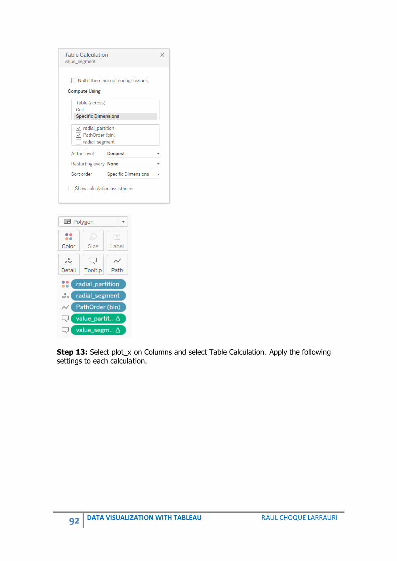
92 DATA VISUALIZATION WITH TABLEAU RAUL CHOQUE LARRAURI
Step 13: Select plot_x on Columns and select Table Calculation. Apply the following settings to each calculation.

93 DATA VISUALIZATION WITH TABLEAU RAUL CHOQUE LARRAURI
partition_size
index_pathorder

94 DATA VISUALIZATION WITH TABLEAU RAUL CHOQUE LARRAURI
value_partition
value_segment_max

95 DATA VISUALIZATION WITH TABLEAU RAUL CHOQUE LARRAURI
value_segment
radial_angle

96 DATA VISUALIZATION WITH TABLEAU RAUL CHOQUE LARRAURI
index_segment
Step 14: Select plot_y on Rows and select Table Calculation. Apply the following settings to each calculation. partition_size

97 DATA VISUALIZATION WITH TABLEAU RAUL CHOQUE LARRAURI
index_pathorder
value_partition

98 DATA VISUALIZATION WITH TABLEAU RAUL CHOQUE LARRAURI
value_segment_max
value_segment

99 DATA VISUALIZATION WITH TABLEAU RAUL CHOQUE LARRAURI
radial_angle
index_segment
Step 15: Edit Color, size, etc.

100 DATA VISUALIZATION WITH TABLEAU RAUL CHOQUE LARRAURI
15. POLYGON MAP Definition: Tableau has many great built-in geographic areas available for mapping data of different countries, regions, etc. If you have a special geographic area and this is not available, you can draw maps of any area type using custom shapes with Tableau. To use a polygon map you need to add the polygon ID and grouping ID to details and the sequenced point ID to path in order to display your own custom group map. It is important to have the Latitude and Longitude to build this kind of map.
National Parks of England
Data:
Latitude Longitude
Number
of Records Park Name Point ID Polygon ID
51.860969 -2.952126 1 Brecon Beacons National Park 1 12
51.844296 -2.961753 1 Brecon Beacons National Park 2 12
51.840803 -2.980047 1 Brecon Beacons National Park 3 12
51.834348 -2.98402 1 Brecon Beacons National Park 4 12
51.833385 -2.988128 1 Brecon Beacons National Park 5 12

101 DATA VISUALIZATION WITH TABLEAU RAUL CHOQUE LARRAURI
Latitude Longitude
Number of
Records Park Name Point ID Polygon ID
51.842197 -3.000822 1 Brecon Beacons National Park 6 12
51.842494 -3.01297 1 Brecon Beacons National Park 7 12
51.837835 -3.01649 1 Brecon Beacons National Park 8 12
51.833499 -3.026243 1 Brecon Beacons National Park 9 12
51.833958 -3.041385 1 Brecon Beacons National Park 10 12
51.829612 -3.045979 1 Brecon Beacons National Park 11 12
51.822979 -3.03589 1 Brecon Beacons National Park 12 12
51.814602 -3.042365 1 Brecon Beacons National Park 13 12
51.800782 -3.026342 1 Brecon Beacons National Park 14 12
51.786901 -3.017214 1 Brecon Beacons National Park 15 12
51.779679 -3.014982 1 Brecon Beacons National Park 16 12
51.776479 -3.020081 1 Brecon Beacons National Park 17 12
51.774664 -3.009948 1 Brecon Beacons National Park 18 12
51.766726 -3.002402 1 Brecon Beacons National Park 19 12
51.760509 -3.003192 1 Brecon Beacons National Park 20 12
51.760973 -2.995889 1 Brecon Beacons National Park 21 12
51.756526 -2.997975 1 Brecon Beacons National Park 22 12
51.742026 -2.99188 1 Brecon Beacons National Park 23 12
51.737429 -2.99307 1 Brecon Beacons National Park 24 12
51.733759 -2.988795 1 Brecon Beacons National Park 25 12
51.729046 -2.99848 1 Brecon Beacons National Park 26 12
51.732023 -3.003079 1 Brecon Beacons National Park 27 12
51.731849 -3.008231 1 Brecon Beacons National Park 28 12
The complete data can be downloaded from: http://blog.pucp.edu.pe/blog/raulchoque/wp-content/uploads/sites/905/2017/07/Parks-in-England.xls Steps to create a Polygon Map: Step 1: In Measures, change Latitude to geographical role of Latitude and change Longitude to geographical role of Longitude. Step 2: From Measures, drag Latitude to Rows. Step 3: From Measures, drag Longitude to Columns. Step 4: On the right select Symbol map on Show me. Step 5: On Marks Card, change from Automatic to Polygon. Step 6: From Dimensions, drag Point Id to Path.

102 DATA VISUALIZATION WITH TABLEAU RAUL CHOQUE LARRAURI
Step 7: From Dimensions, drag Polygon Id to Details. Step 8: From Dimensions, drag Park Name to Color. DISTRICTS OF PERU
50 Districts with high Poverty in Peru, 2013
Source: INEI, 2015.
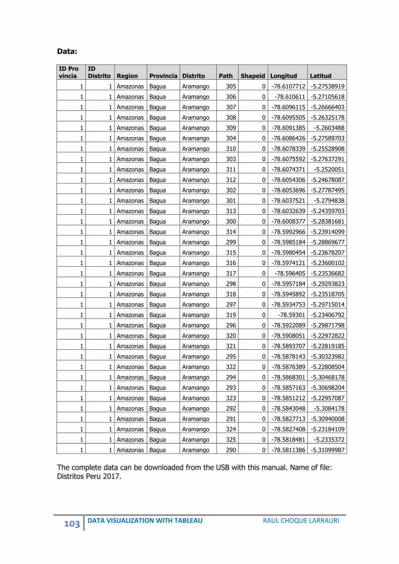
103 DATA VISUALIZATION WITH TABLEAU RAUL CHOQUE LARRAURI
Data: ID Pro vincia
ID Distrito Region Provincia Distrito Path Shapeid Longitud Latitud
1 1 Amazonas Bagua Aramango 305 0 -78.6107712 -5.27538919
1 1 Amazonas Bagua Aramango 306 0 -78.610611 -5.27105618
1 1 Amazonas Bagua Aramango 307 0 -78.6096115 -5.26666403
1 1 Amazonas Bagua Aramango 308 0 -78.6095505 -5.26325178
1 1 Amazonas Bagua Aramango 309 0 -78.6091385 -5.2603488
1 1 Amazonas Bagua Aramango 304 0 -78.6086426 -5.27589703
1 1 Amazonas Bagua Aramango 310 0 -78.6078339 -5.25528908
1 1 Amazonas Bagua Aramango 303 0 -78.6075592 -5.27637291
1 1 Amazonas Bagua Aramango 311 0 -78.6074371 -5.2520051
1 1 Amazonas Bagua Aramango 312 0 -78.6054306 -5.24678087
1 1 Amazonas Bagua Aramango 302 0 -78.6053696 -5.27787495
1 1 Amazonas Bagua Aramango 301 0 -78.6037521 -5.2794838
1 1 Amazonas Bagua Aramango 313 0 -78.6032639 -5.24359703
1 1 Amazonas Bagua Aramango 300 0 -78.6008377 -5.28381681
1 1 Amazonas Bagua Aramango 314 0 -78.5992966 -5.23914099
1 1 Amazonas Bagua Aramango 299 0 -78.5985184 -5.28869677
1 1 Amazonas Bagua Aramango 315 0 -78.5980454 -5.23678207
1 1 Amazonas Bagua Aramango 316 0 -78.5974121 -5.23600102
1 1 Amazonas Bagua Aramango 317 0 -78.596405 -5.23536682
1 1 Amazonas Bagua Aramango 298 0 -78.5957184 -5.29293823
1 1 Amazonas Bagua Aramango 318 0 -78.5945892 -5.23518705
1 1 Amazonas Bagua Aramango 297 0 -78.5934753 -5.29715014
1 1 Amazonas Bagua Aramango 319 0 -78.59301 -5.23406792
1 1 Amazonas Bagua Aramango 296 0 -78.5922089 -5.29871798
1 1 Amazonas Bagua Aramango 320 0 -78.5908051 -5.22972822
1 1 Amazonas Bagua Aramango 321 0 -78.5893707 -5.22819185
1 1 Amazonas Bagua Aramango 295 0 -78.5878143 -5.30323982
1 1 Amazonas Bagua Aramango 322 0 -78.5876389 -5.22808504
1 1 Amazonas Bagua Aramango 294 0 -78.5868301 -5.30468178
1 1 Amazonas Bagua Aramango 293 0 -78.5857163 -5.30698204
1 1 Amazonas Bagua Aramango 323 0 -78.5851212 -5.22957087
1 1 Amazonas Bagua Aramango 292 0 -78.5843048 -5.3084178
1 1 Amazonas Bagua Aramango 291 0 -78.5827713 -5.30940008
1 1 Amazonas Bagua Aramango 324 0 -78.5827408 -5.23184109
1 1 Amazonas Bagua Aramango 325 0 -78.5818481 -5.2335372
1 1 Amazonas Bagua Aramango 290 0 -78.5811386 -5.31099987
The complete data can be downloaded from the USB with this manual. Name of file: Distritos Peru 2017.

104 DATA VISUALIZATION WITH TABLEAU RAUL CHOQUE LARRAURI
Steps to create a Polygon Map of Districts of Peru: Step 1: In Measures, change Latitude to geographical role of Latitude and change Longitude to geographical role of Longitude. Step 2: From Measures, drag Latitude to Rows. Step 3: From Measures, drag Longitude to Columns. Step 4: On the right select Symbol map on Show me. Step 5: On Marks Card, change from Automatic to Polygon. Step 6: From Measures, drag Path to Dimensions on Data panel. Step 7: From Measures, drag Shapeid to Dimensions on Data panel. Step 8: From Dimensions, drag Path to Path. Step 9: From Dimensions, drag Shapeid to Details. Step 10: From Dimensions, drag Distrito to Details. Step 11: On Data, select New Data Source. Step 12: Connect the file Distritos Listos para Trabajar 2017. This file can be downloaded from: http://blog.pucp.edu.pe/blog/raulchoque/wp-content/uploads/sites/905/2017/07/Lista-de-Distritos-para-Trabajar-2017.xlsx Step 13: On Data, select Edit Relationships. After select Custom. Select Add and Distrito and Distrito.

105 DATA VISUALIZATION WITH TABLEAU RAUL CHOQUE LARRAURI
Step 14: From Dimensions, drag % Poverty inf. to Color Step 15: Edit Color.

106 DATA VISUALIZATION WITH TABLEAU RAUL CHOQUE LARRAURI
16. BUBBLE MAP Definition: A Bubble Map is also called as a cartogram where X and Y values are effectively latitude and longitude coordinates representing a geographic location. The size of the bubble represents a dimension in which you can see the difference of values.
Poverty in the districts of Peru 2013

107 DATA VISUALIZATION WITH TABLEAU RAUL CHOQUE LARRAURI
DATA:
UBIGEO REGION PROVINCIA DISTRITO LONGITUDE LATITUDE
080914 CUSCO LA CONVENCION MEGANTONI -72.85891839680 -11.75113205110
050511 AYACUCHO LA MAR ORONCCOY -73.39260962730 -13.34632732810
100609 HUANUCO LEONCIO PRADO PUEBLO NUEVO -76.00136850600 -9.08219785100
090723 HUANCAVELICA TAYACAJA SANTIAGO DE TUCUMA -74.88695871460 -12.31756644470
080601 CUSCO CANCHIS SICUANI -71.10360856780 -14.25101722550
021601 ANCASH POMABAMBA POMABAMBA -77.50652631100 -8.79036933173
120132 JUNIN HUANCAYO SAÐO -75.24688436900 -11.95061794300
220509 SAN MARTIN LAMAS SHANAO -76.57787779750 -6.40809472213
120401 JUNIN JAUJA JAUJA -75.49113778860 -11.77408558210
081003 CUSCO PARURO CCAPI -72.01942537000 -13.86068101050
211202 PUNO SANDIA CUYOCUYO -69.55766801260 -14.52381411750
080708 CUSCO CHUMBIVILCAS VELILLE -71.84916363230 -14.54900438300
080603 CUSCO CANCHIS COMBAPATA -71.33414332930 -14.08814277380
090310 HUANCAVELICA ANGARAES SAN ANTONIO DE ANTAPARCO -74.43066764800 -13.06552118610
030611 APURIMAC CHINCHEROS LOS CHANKAS -73.79139393500 -13.39015278580
230111 TACNA TACNA LA YARADA LOS PALOS -70.43903952990 -18.20042568870
100608 HUANUCO LEONCIO PRADO CASTILLO GRANDE -76.03797690950 -9.20807808980
100113 HUANUCO HUANUCO SAN PABLO DE PILLAO -75.93844952930 -9.70775509298
140303 LAMBAYEQUE LAMBAYEQUE ILLIMO -79.85336718840 -6.46959393046
050412 AYACUCHO HUANTA CHACA -74.19154679020 -12.78355805830
090721 HUANCAVELICA TAYACAJA ROBLE -74.45786236890 -12.23602889300
030609 APURIMAC CHINCHEROS ROCCHACC -73.61722684630 -13.45556625850
120201 JUNIN CONCEPCION CONCEPCION -75.31351516210 -11.91246163990
220709 SAN MARTIN PICOTA TINGO DE PONASA -76.21211615710 -6.97034231205
210502 PUNO EL COLLAO CAPAZO -69.70201677170 -17.10984949450
030610 APURIMAC CHINCHEROS EL PORVENIR -73.55513974520 -13.39771964050
080403 CUSCO CALCA LAMAY -71.88108823920 -13.32206092520
250105 UCAYALI CORONEL PORTILLO YARINACOCHA -74.65669894630 -8.24849719008
100104 HUANUCO HUANUCO CHURUBAMBA -76.26573305080 -9.68525551846
030602 APURIMAC CHINCHEROS ANCO_HUALLO -73.66927131380 -13.54429951600
140119 LAMBAYEQUE CHICLAYO PUCALA -79.51372121560 -6.79463043191
090302 HUANCAVELICA ANGARAES ANCHONGA -74.70603847080 -12.88732407000
050407 AYACUCHO HUANTA SIVIA -73.99644831790 -12.60382286630
211103 PUNO SAN ROMAN CABANILLAS -70.62245736020 -15.85336848990
100103 HUANUCO HUANUCO CHINCHAO -76.11071465710 -9.61537834385
030215 APURIMAC ANDAHUAYLAS SANTA MARIA DE CHICMO -73.54626986790 -13.66115711730
050403 AYACUCHO HUANTA HUAMANGUILLA -74.15894644920 -12.99265488410

108 DATA VISUALIZATION WITH TABLEAU RAUL CHOQUE LARRAURI
UBIGEO REGION PROVINCIA DISTRITO LONGITUDE LATITUDE
060111 CAJAMARCA CAJAMARCA NAMORA -78.28407584660 -7.18436407264
090705 HUANCAVELICA TAYACAJA COLCABAMBA -74.70044588510 -12.38509631690
090119 HUANCAVELICA HUANCAVELICA HUANDO -75.01360791020 -12.62728459290
080205 CUSCO ACOMAYO POMACANCHI -71.62389796800 -14.05363713590
220912 SAN MARTIN SAN MARTIN SAN ANTONIO -76.38208966240 -6.39934333867
120402 JUNIN JAUJA ACOLLA -75.56756529840 -11.66266253430
120902 JUNIN CHUPACA AHUAC -75.35155460830 -12.08199942490
080408 CUSCO CALCA YANATILE -72.10508603500 -12.79569713170
090502 HUANCAVELICA CHURCAMPA ANCO -74.56305371900 -12.64353334730
140302 LAMBAYEQUE LAMBAYEQUE CHOCHOPE -79.61358993100 -6.15523258480
211203 PUNO SANDIA LIMBANI -69.60744228130 -13.77844864310
021003 ANCASH HUARI CAJAY -77.13140973350 -9.25703065067
010510 AMAZONAS LUYA LUYA VIEJO -78.11680994070 -6.11249523254
030218 APURIMAC ANDAHUAYLAS TURPO -73.47220652330 -13.79059514300
081205 CUSCO QUISPICANCHI CCATCA -71.50577025840 -13.60038809860
120413 JUNIN JAUJA LEONOR ORDOÐEZ -75.43138729660 -11.86913306650
220105 SAN MARTIN MOYOBAMBA SORITOR -77.05414251640 -6.27274272661
100105 HUANUCO HUANUCO MARGOS -76.53319332780 -10.06324028680
010706 AMAZONAS UTCUBAMBA LONYA GRANDE -78.41068051110 -6.06348043759
211001 PUNO SAN ANTONIO DE PUTINA PUTINA -69.83448632370 -14.70916613040
250107 UCAYALI CORONEL PORTILLO MANANTAY -74.50916082430 -8.53844581264
050114 AYACUCHO HUAMANGA VINCHOS -74.45646620900 -13.30628293970
050112 AYACUCHO HUAMANGA SOCOS -74.28442711310 -13.26145680390
051101 AYACUCHO VILCAS HUAMAN VILCAS HUAMAN -73.89632122070 -13.65570147430
080401 CUSCO CALCA CALCA -71.95777704860 -13.26872231420
010522 AMAZONAS LUYA TINGO -77.94352618720 -6.38686436807
120501 JUNIN JUNIN JUNIN -76.01192355670 -11.18881438240
The complete data can be downloaded from: http://blog.pucp.edu.pe/blog/raulchoque/wp-content/uploads/sites/905/2017/08/Distritos-Peru-2017.xlsx Steps to create a Bubble Map: Step 1: In Measures, change Latitude to geographical role of Latitude and change Longitude to geographical role of Longitude. Step 2: From Measures, drag Latitude to Rows. Step 3: From Measures, drag Longitude to Columns. Step 4: On the right select Symbol map on Show me. Step 5: In Dimensions, select Distrito and change to Geographical role of County.

109 DATA VISUALIZATION WITH TABLEAU RAUL CHOQUE LARRAURI
Step 6: From Dimensions, drag Distrito to Details. Step 7: In Dimensions, select Pobreza, right click and select Change Data Type and select Number (decimal) Step 8: From Dimensions, drag Pobreza to Color. Right click and select Dimension, Continuous. Step 9: Edit color, size of the bubble.

110 DATA VISUALIZATION WITH TABLEAU RAUL CHOQUE LARRAURI
17. TIMELINE MAP Definition: This kind of map is about chronological events or information about any theme, which is show in a map of the World, region or country.
Internet users per 100 People 1990-2015
Source: World Bank, 2017. Data:
Country Name Country Code
2010 [YR2010]
2011 [YR2011]
2012 [YR2012]
2013 [YR2013]
2014 [YR2014]
2015 [YR2015]
Aruba ABW 62 69 74 78.9 83.78 88.66123
Afghanistan AFG 4 5 5.454545 5.9 7 8.26
Angola AGO 2.8 3.1 6.5 8.9 10.2 12.4
Albania ALB 45 49 54.65596 57.2 60.1 63.25293
Andorra AND 81 81 86.43442 94 95.9 96.91
Arab World ARB 24.53578 26.54999 29.9543 32.3499 36.00713 39.94832
United Arab Emirates ARE 68 78 84.99999 88 90.4 91.24341
Argentina ARG 45 51 55.8 59.9 64.7 69.40092
Armenia ARM 25 32 37.5 41.9 54.62281 58.24933
Antigua and Barbuda ATG 47 52 58 63.4 64 65.2
Australia AUS 76 79.4877 79 83.4535 84 84.56052
Austria AUT 75.17 78.73999 80.02999 80.6188 81 83.9263
Azerbaijan AZE 46 50 54.2 73 75.00002 77
Burundi BDI 1 1.11 1.22 1.264218 1.38 4.866224

111 DATA VISUALIZATION WITH TABLEAU RAUL CHOQUE LARRAURI
Country Name Country Code
2010 [YR2010]
2011 [YR2011]
2012 [YR2012]
2013 [YR2013]
2014 [YR2014]
2015 [YR2015]
Belgium BEL 75 81.61 80.71999 82.1702 85 85.0529
Benin BEN 3.13 4.148323 4.5 4.9 6 6.787703
Burkina Faso BFA 2.4 3 3.725035 9.1 9.4 11.38765
Bangladesh BGD 3.7 4.5 5 6.63 13.9 14.4
Bulgaria BGR 46.23 47.97999 51.89999 53.0615 55.49 56.6563
Bahrain BHR 55 76.99997 88 90.00004 90.50313 93.4783
Bahamas, The BHS 43 65 71.7482 72 76.92 78
The complete data can be downloaded from: http://blog.pucp.edu.pe/blog/raulchoque/wp-content/uploads/sites/905/2017/08/Internet.xlsx Steps to create a Timeline Map: Step 1: Connect the Excel sheet to Tableau. Step 2: Pivot the data. In Data Source, select all columns with Internet users per 100 people using Ctrl.
Step 3: Once all columns with Internet users per 100 people have been selected, click the drop-down arrow next to the columns name, and then select Pivot. New columns replace the original columns that we selected to create the pivot.
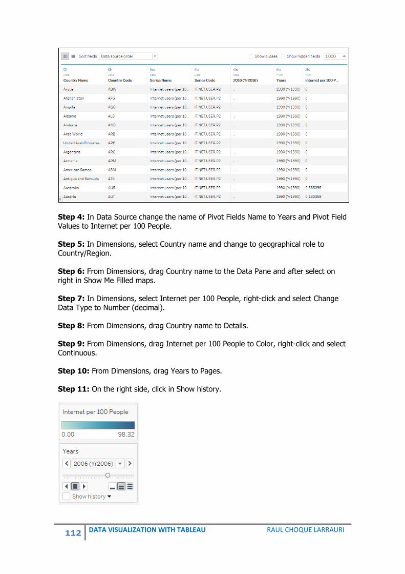
112 DATA VISUALIZATION WITH TABLEAU RAUL CHOQUE LARRAURI
Step 4: In Data Source change the name of Pivot Fields Name to Years and Pivot Field Values to Internet per 100 People. Step 5: In Dimensions, select Country name and change to geographical role to Country/Region. Step 6: From Dimensions, drag Country name to the Data Pane and after select on right in Show Me Filled maps. Step 7: In Dimensions, select Internet per 100 People, right-click and select Change Data Type to Number (decimal). Step 8: From Dimensions, drag Country name to Details. Step 9: From Dimensions, drag Internet per 100 People to Color, right-click and select Continuous. Step 10: From Dimensions, drag Years to Pages. Step 11: On the right side, click in Show history.
113 DATA VISUALIZATION WITH TABLEAU RAUL CHOQUE LARRAURI
VII. REFERENCES Acharya, Seema and Chellappan, Subhashini. PRO TABLEAU. India. Apress 2017. Dabney, Alan and Klein, Grady. THE CARTOON INTRODUCTION TO STATISTICS. FSGBOOKS.COM. USA, 2013. Harris, Robert. INFORMATION GRAPHICS. A COMPREHENSIVE ILLUSTRATED REFERENCE. Oxford University Press. USA, 1999. Institute for Health Metrics and Evaluation. University of Washington. FINANCING GLOBAL HEALTH 2016. USA, 2017. Johnson, Steven. THE GHOST MAP. Riverhead Books. USA, 2007. Li Carrillo, Víctor. LA “GESTALPYCHOLOGIE” Y EL CONCEPTO DE ESTRUCTURA. Revista Venezolana de Filosofía. Número 8. Caracas 1978. Tufte, Edward. THE VISUAL DISPLAY OF QUANTITATIVE INFORMATION. Second Edition. Graphics Press LLC. USA, 2007.

114 DATA VISUALIZATION WITH TABLEAU RAUL CHOQUE LARRAURI
DATA VISUALIZATION WITH TABLEAU Data visualization is a science, where the objective is to communicate information, using graphics, infographics and shapes about any topic or area. Nowadays, we have a lot of information, especially on the Internet, so it is necessary to systematize and organize the information to share with everyone.
Population of the World, 2016
Source: World Bank, 2017.
Related Documents