Data visualization Basic design principles and types David Hoksza http://siret.cz/hoksza

Welcome message from author
This document is posted to help you gain knowledge. Please leave a comment to let me know what you think about it! Share it to your friends and learn new things together.
Transcript
Data visualizationBasic design principles and types
David Hoksza
http://siret.cz/hoksza
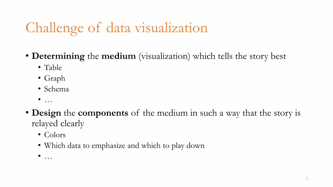
Challenge of data visualization
• Determining the medium (visualization) which tells the story best• Table
• Graph
• Schema
• …
• Design the components of the medium in such a way that the story is relayed clearly• Colors
• Which data to emphasize and which to play down
• …
2
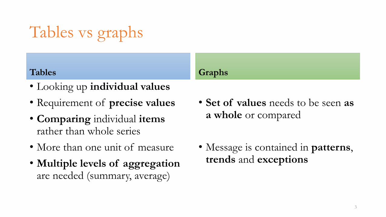
Tables vs graphs
Tables
• Looking up individual values
• Requirement of precise values
• Comparing individual itemsrather than whole series
• More than one unit of measure
• Multiple levels of aggregation are needed (summary, average)
Graphs
• Set of values needs to be seen asa whole or compared
• Message is contained in patterns, trends and exceptions
3
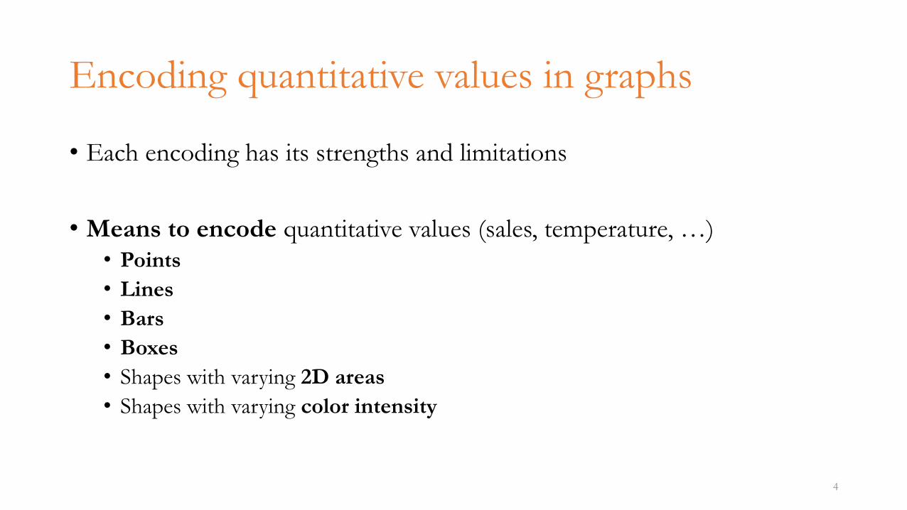
Encoding quantitative values in graphs
• Each encoding has its strengths and limitations
• Means to encode quantitative values (sales, temperature, …)• Points
• Lines
• Bars
• Boxes
• Shapes with varying 2D areas
• Shapes with varying color intensity
4
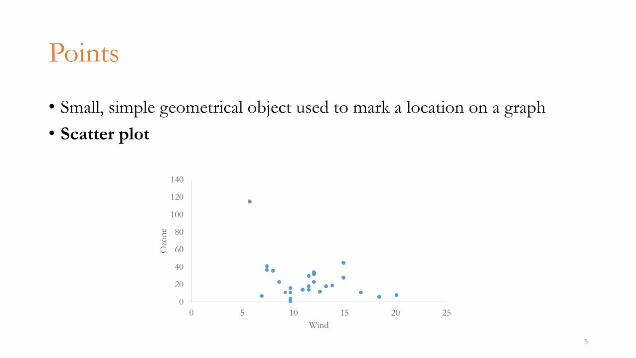
Points
• Small, simple geometrical object used to mark a location on a graph
• Scatter plot
5
0
20
40
60
80
100
120
140
0 5 10 15 20 25
Ozo
ne
Wind
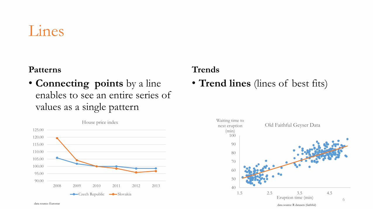
Lines
Patterns
• Connecting points by a line enables to see an entire series of values as a single pattern
Trends
• Trend lines (lines of best fits)
6
90.00
95.00
100.00
105.00
110.00
115.00
120.00
125.00
2008 2009 2010 2011 2012 2013
House price index
Czech Republic Slovakia
40
50
60
70
80
90
100
1.5 2.5 3.5 4.5
Waiting time to next eruption
(min)
Eruption time (min)
Old Faithful Geyser Data
data source: Eurostat data source: R datasets (faithful)
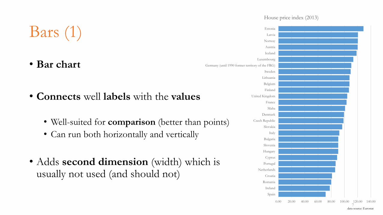
Bars (1)
• Bar chart
• Connects well labels with the values
• Well-suited for comparison (better than points)
• Can run both horizontally and vertically
• Adds second dimension (width) which is usually not used (and should not)
70.00 20.00 40.00 60.00 80.00 100.00 120.00 140.00
Spain
Ireland
Romania
Croatia
Netherlands
Portugal
Cyprus
Hungary
Slovenia
Bulgaria
Italy
Slovakia
Czech Republic
Denmark
Malta
France
United Kingdom
Finland
Belgium
Lithuania
Sweden
Germany (until 1990 former territory of the FRG)
Luxembourg
Iceland
Austria
Norway
Latvia
Estonia
House price index (2013)
data source: Eurostat
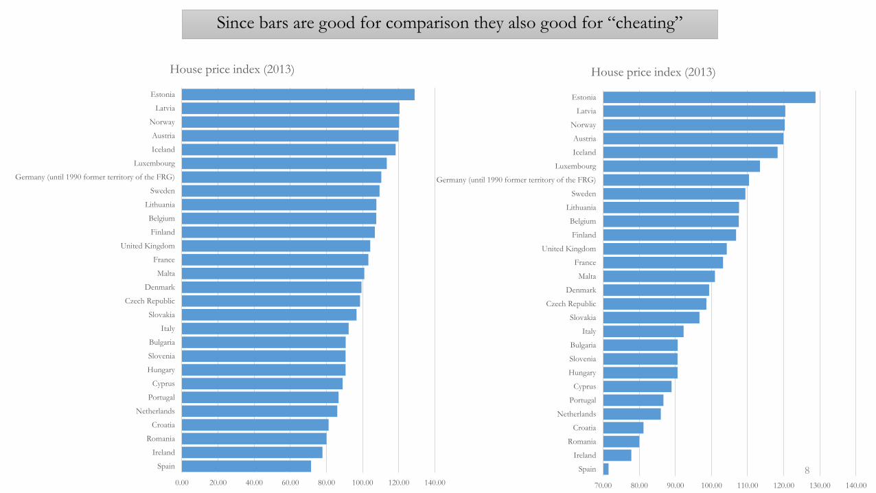
Since bars are good for comparison they also good for “cheating”
8
70.00 80.00 90.00 100.00 110.00 120.00 130.00 140.00
Spain
Ireland
Romania
Croatia
Netherlands
Portugal
Cyprus
Hungary
Slovenia
Bulgaria
Italy
Slovakia
Czech Republic
Denmark
Malta
France
United Kingdom
Finland
Belgium
Lithuania
Sweden
Germany (until 1990 former territory of the FRG)
Luxembourg
Iceland
Austria
Norway
Latvia
Estonia
House price index (2013)
0.00 20.00 40.00 60.00 80.00 100.00 120.00 140.00
Spain
Ireland
Romania
Croatia
Netherlands
Portugal
Cyprus
Hungary
Slovenia
Bulgaria
Italy
Slovakia
Czech Republic
Denmark
Malta
France
United Kingdom
Finland
Belgium
Lithuania
Sweden
Germany (until 1990 former territory of the FRG)
Luxembourg
Iceland
Austria
Norway
Latvia
Estonia
House price index (2013)
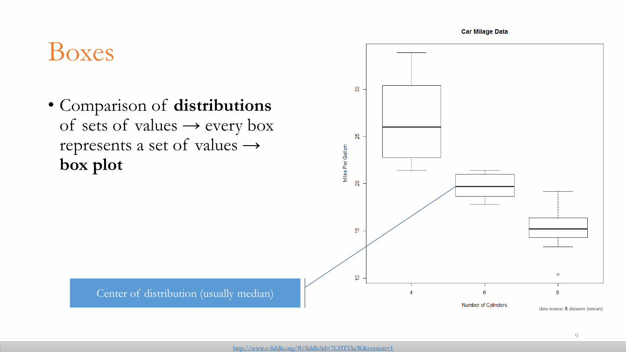
Boxes
• Comparison of distributions of sets of values → every box represents a set of values → box plot
9
Center of distribution (usually median)
http://www.r-fiddle.org/#/fiddle?id=7CHTVkeW&version=1
data source: R datasets (mtcars)
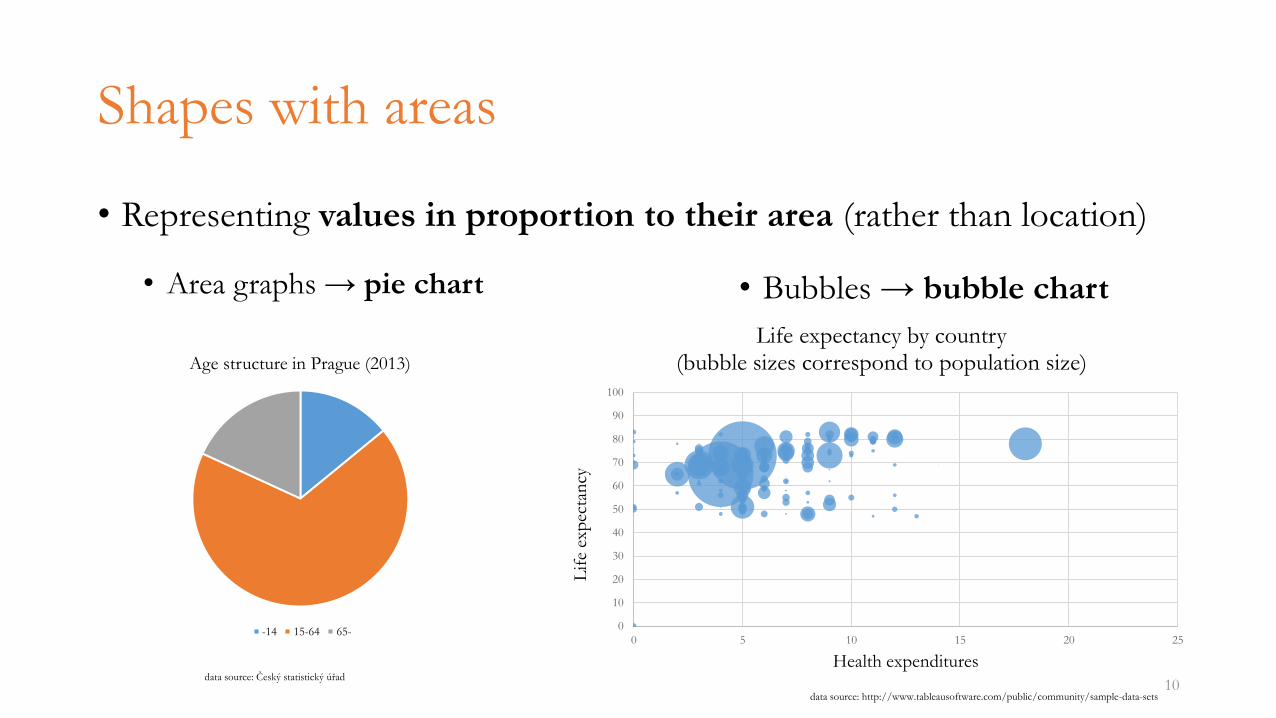
Shapes with areas
• Representing values in proportion to their area (rather than location)
10
Age structure in Prague (2013)
-14 15-64 65-
• Bubbles → bubble chart
data source: Český statistický úřad
0
10
20
30
40
50
60
70
80
90
100
0 5 10 15 20 25
Lif
e ex
pec
tan
cy
Health expenditures
Life expectancy by country(bubble sizes correspond to population size)
data source: http://www.tableausoftware.com/public/community/sample-data-sets
• Area graphs → pie chart
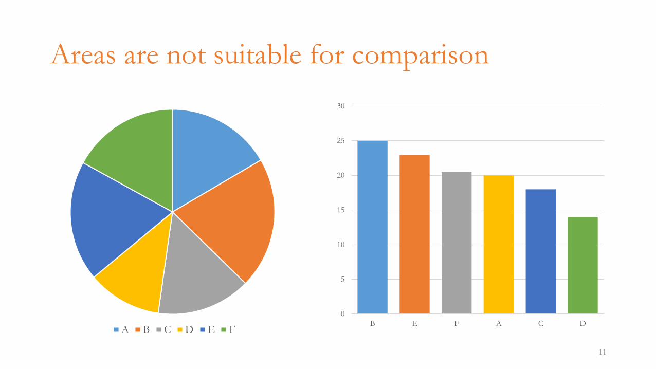
Areas are not suitable for comparison
0
5
10
15
20
25
30
B E F A C D
11
A B C D E F
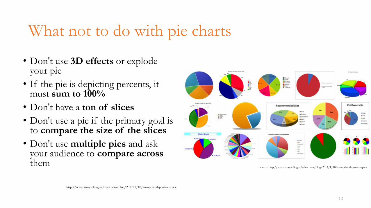
What not to do with pie charts
• Don't use 3D effects or explode your pie
• If the pie is depicting percents, it must sum to 100%
• Don't have a ton of slices
• Don't use a pie if the primary goal is to compare the size of the slices
• Don't use multiple pies and ask your audience to compare across them
http://www.storytellingwithdata.com/blog/2017/1/10/an-updated-post-on-pies
12
source: http://www.storytellingwithdata.com/blog/2017/1/10/an-updated-post-on-pies
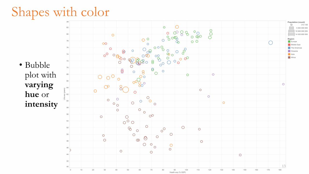
Shapes with color
• Bubble plot with varyinghue or intensity
13
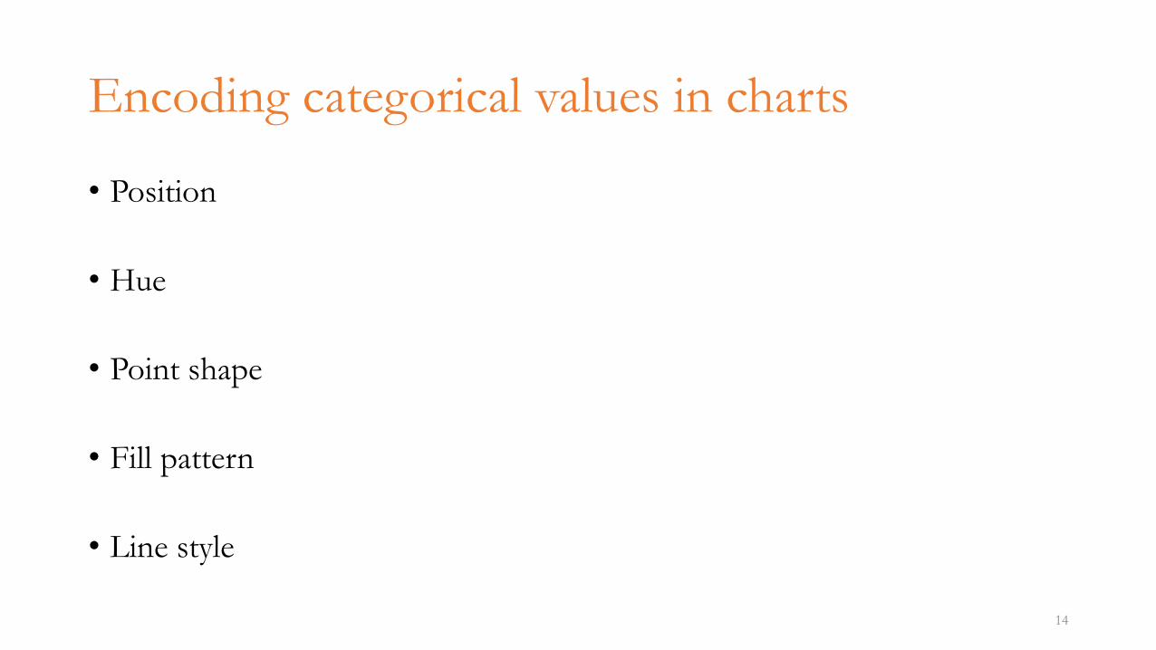
Encoding categorical values in charts
• Position
• Hue
• Point shape
• Fill pattern
• Line style
14
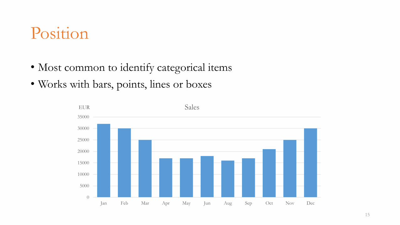
Position
• Most common to identify categorical items
• Works with bars, points, lines or boxes
15
0
5000
10000
15000
20000
25000
30000
35000
Jan Feb Mar Apr May Jun Aug Sep Oct Nov Dec
EUR Sales
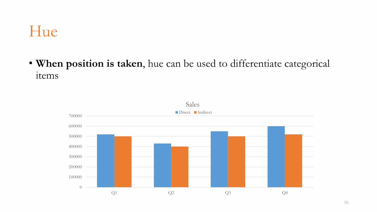
Hue
• When position is taken, hue can be used to differentiate categorical items
16
0
100000
200000
300000
400000
500000
600000
700000
Q1 Q2 Q3 Q4
SalesDirect Indirect
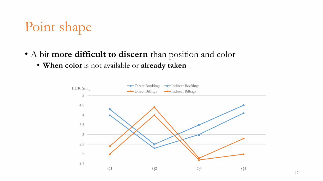
Point shape
• A bit more difficult to discern than position and color• When color is not available or already taken
17
1.5
2
2.5
3
3.5
4
4.5
5
Q1 Q2 Q3 Q4
EUR (mil.)Direct Bookings Indirect Bookings
Direct Billings Indirect Billings
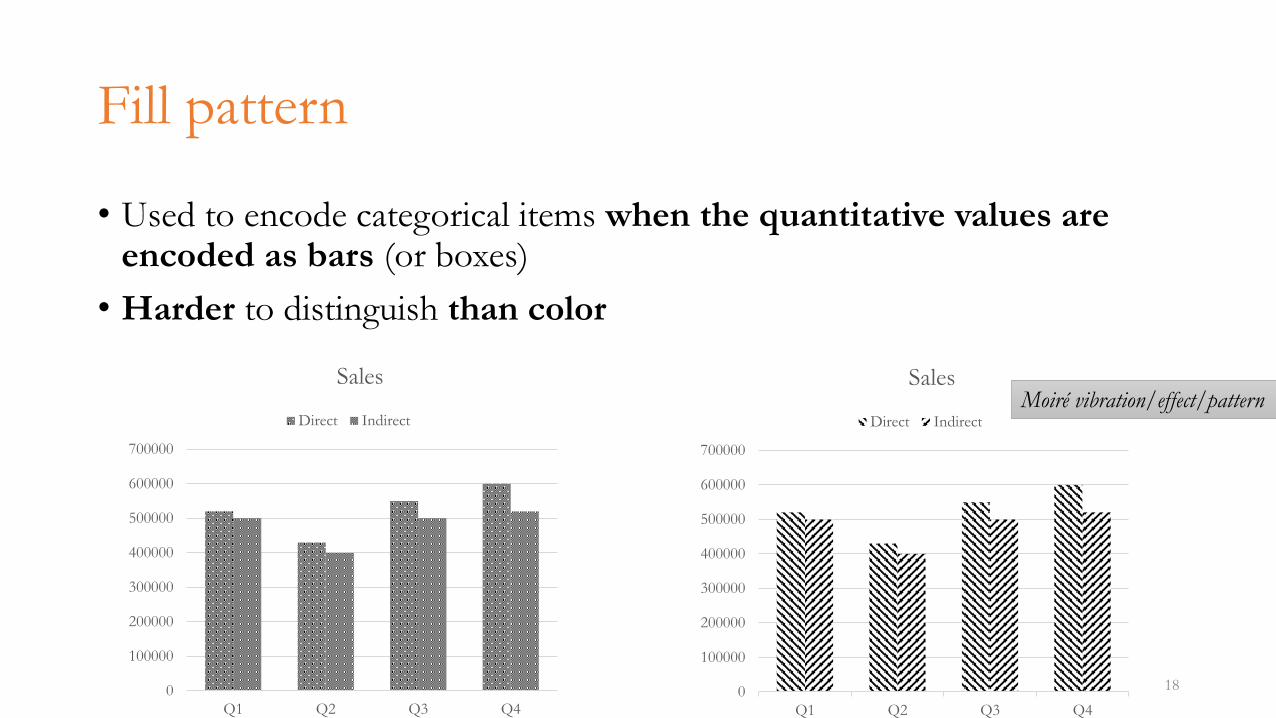
Fill pattern
• Used to encode categorical items when the quantitative values are encoded as bars (or boxes)
• Harder to distinguish than color
180
100000
200000
300000
400000
500000
600000
700000
Q1 Q2 Q3 Q4
Sales
Direct Indirect
0
100000
200000
300000
400000
500000
600000
700000
Q1 Q2 Q3 Q4
Sales
Direct Indirect
Moiré vibration/effect/pattern
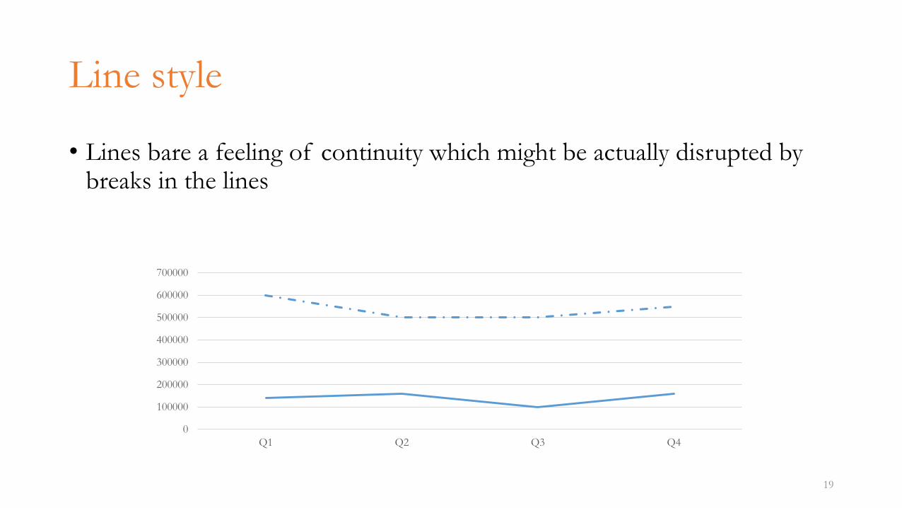
Line style
• Lines bare a feeling of continuity which might be actually disrupted by breaks in the lines
19
0
100000
200000
300000
400000
500000
600000
700000
Q1 Q2 Q3 Q4
Relationships in graphs
• Shaping relationships of quantitative information
• Different types of graphs are suitable for communicating different types of quantitative relationships
20
• Time series
• Ranking
• Part-to-whole
• Deviation
• Distribution
• Correlation
• Geospatial relation
• Nominal comparison
Time series
• Series of quantitative values featuring how an attribute changes in time
• Captures patterns and trends
• Quantitative messages involving time series usually include words like• change, rise, increase, fluctuate, grow, decline, decrease, trend
21
Time series design (1)
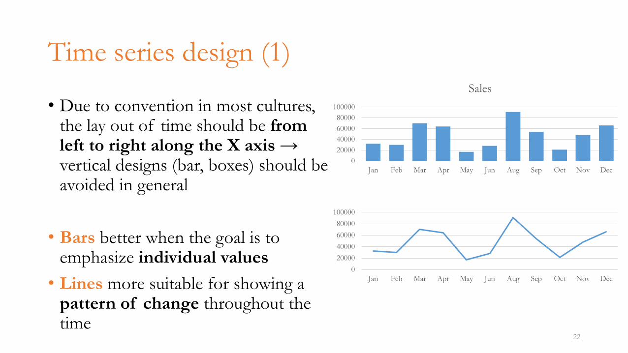
• Due to convention in most cultures, the lay out of time should be from left to right along the X axis → vertical designs (bar, boxes) should be avoided in general
• Bars better when the goal is to emphasize individual values
• Lines more suitable for showing a pattern of change throughout the time
22
0
20000
40000
60000
80000
100000
Jan Feb Mar Apr May Jun Aug Sep Oct Nov Dec
Sales
0
20000
40000
60000
80000
100000
Jan Feb Mar Apr May Jun Aug Sep Oct Nov Dec
Time series design (2)
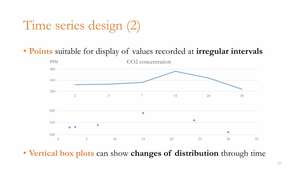
• Points suitable for display of values recorded at irregular intervals
• Vertical box plots can show changes of distribution through time23
360
410
460
2 3 7 15 24 30
PPM CO2 concentration
360
410
460
0 5 10 15 20 25 30 35
Ranking
• Also called item comparison
• Display of how set of quantitative values relate to each other sequentially
• Sorted by size
• Quantitative messages involving ranking usually include words like• larger than, smaller than, equal to, greater than, less than
24
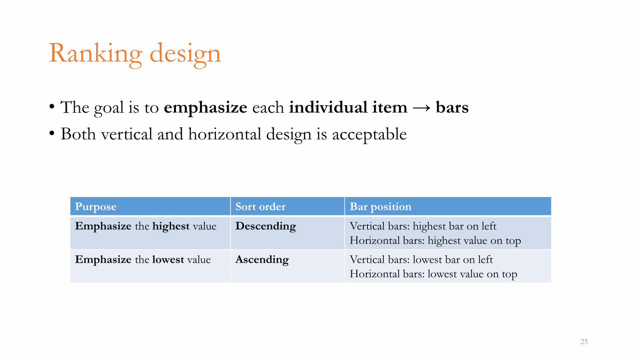
Ranking design
• The goal is to emphasize each individual item → bars
• Both vertical and horizontal design is acceptable
25
Purpose Sort order Bar position
Emphasize the highest value Descending Vertical bars: highest bar on left
Horizontal bars: highest value on top
Emphasize the lowest value Ascending Vertical bars: lowest bar on left
Horizontal bars: lowest value on top
26
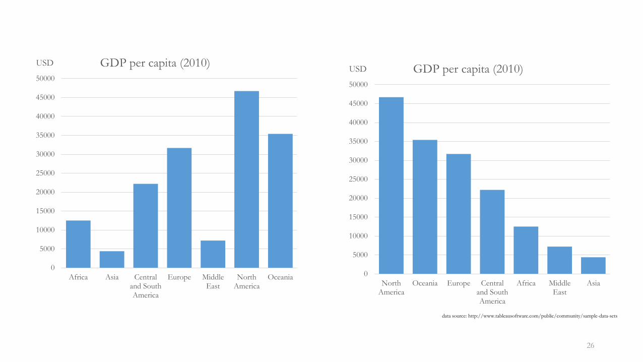
0
5000
10000
15000
20000
25000
30000
35000
40000
45000
50000
Africa Asia Centraland SouthAmerica
Europe MiddleEast
NorthAmerica
Oceania
USD GDP per capita (2010)
0
5000
10000
15000
20000
25000
30000
35000
40000
45000
50000
NorthAmerica
Oceania Europe Centraland SouthAmerica
Africa MiddleEast
Asia
USD GDP per capita (2010)
data source: http://www.tableausoftware.com/public/community/sample-data-sets
Part-to-whole
• Also called component comparison
• Display of how individual values (parts, components) make up a whole
• Percentages (sum up to 100%), rates (sum up to 1)
• Quantitative messages involving part-to-whole relationship usually include words like• rate, percent, share, accounts for N percent
27
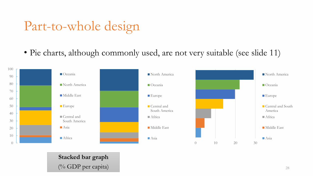
Part-to-whole design
• Pie charts, although commonly used, are not very suitable (see slide 11)
28
Stacked bar graph
(% GDP per capita)
0
10
20
30
40
50
60
70
80
90
100
Oceania
North America
Middle East
Europe
Central andSouth America
Asia
Africa
North America
Oceania
Europe
Central andSouth America
Africa
Middle East
Asia
0 10 20 30
North America
Oceania
Europe
Central and SouthAmerica
Africa
Middle East
Asia
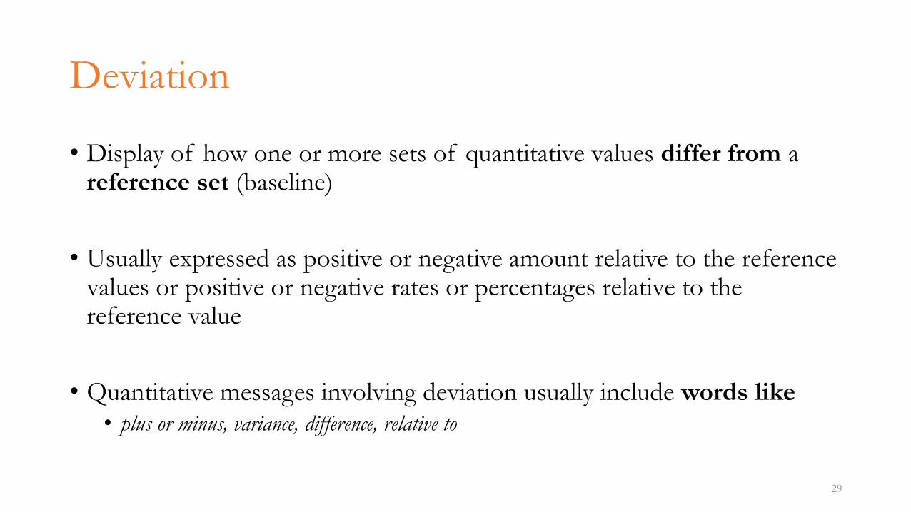
Deviation
• Display of how one or more sets of quantitative values differ from a reference set (baseline)
• Usually expressed as positive or negative amount relative to the reference values or positive or negative rates or percentages relative to the reference value
• Quantitative messages involving deviation usually include words like• plus or minus, variance, difference, relative to
29
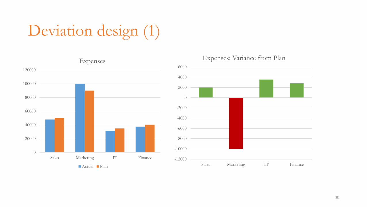
Deviation design (1)
30
0
20000
40000
60000
80000
100000
120000
Sales Marketing IT Finance
Expenses
Actual Plan
-12000
-10000
-8000
-6000
-4000
-2000
0
2000
4000
6000
Sales Marketing IT Finance
Expenses: Variance from Plan
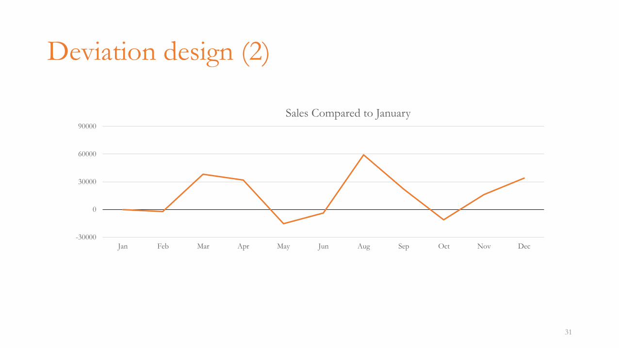
Deviation design (2)
31
-30000
0
30000
60000
90000
Jan Feb Mar Apr May Jun Aug Sep Oct Nov Dec
Sales Compared to January
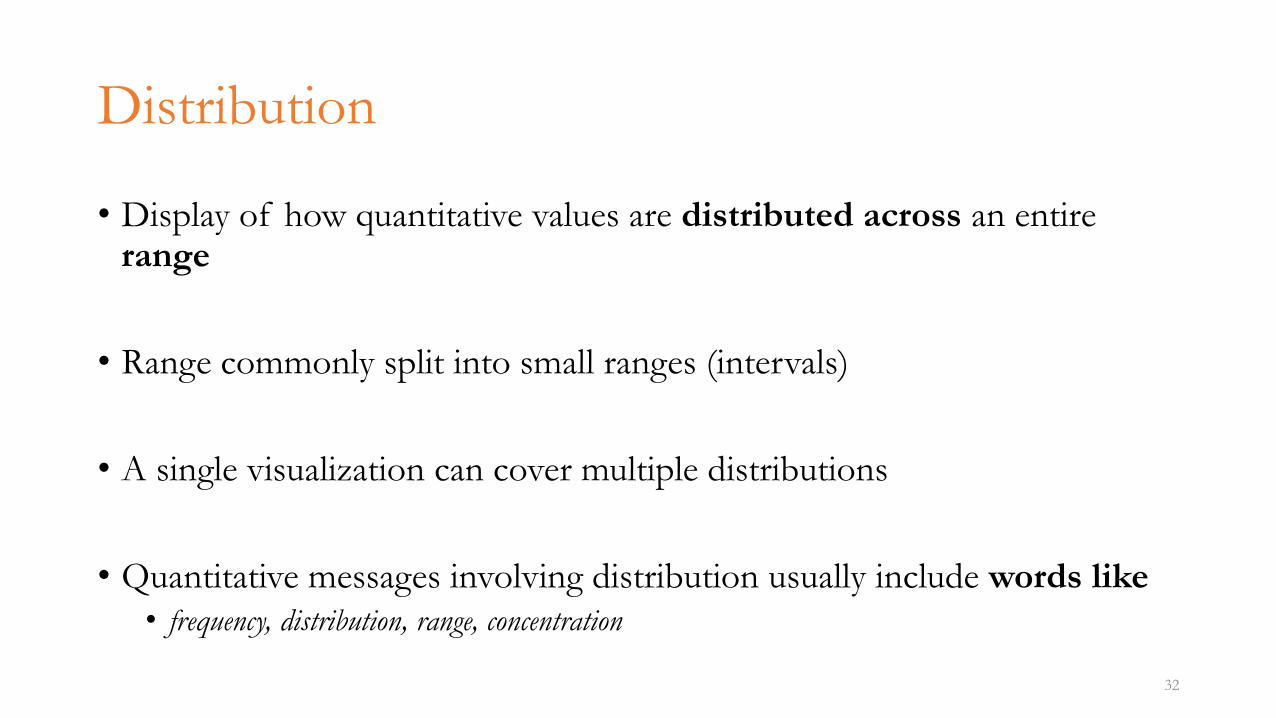
Distribution
• Display of how quantitative values are distributed across an entire range
• Range commonly split into small ranges (intervals)
• A single visualization can cover multiple distributions
• Quantitative messages involving distribution usually include words like• frequency, distribution, range, concentration
32
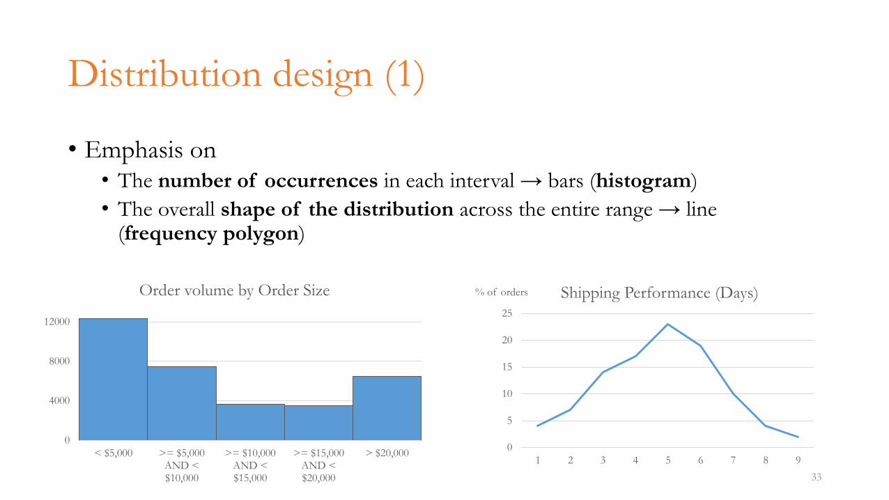
Distribution design (1)
• Emphasis on• The number of occurrences in each interval → bars (histogram)
• The overall shape of the distribution across the entire range → line (frequency polygon)
33
0
4000
8000
12000
< $5,000 >= $5,000AND <$10,000
>= $10,000AND <$15,000
>= $15,000AND <$20,000
> $20,000
Order volume by Order Size
0
5
10
15
20
25
1 2 3 4 5 6 7 8 9
% of orders Shipping Performance (Days)
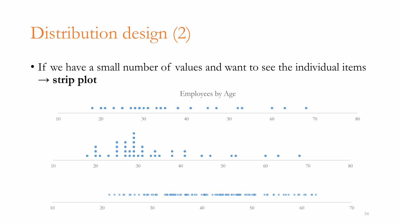
Distribution design (2)
• If we have a small number of values and want to see the individual items → strip plot
34
10 20 30 40 50 60 70 80
Employees by Age
10 20 30 40 50 60 70 80
10 20 30 40 50 60 70
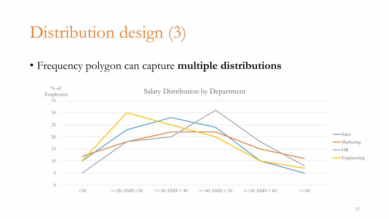
Distribution design (3)
• Frequency polygon can capture multiple distributions
35
0
5
10
15
20
25
30
35
<20 >=20 AND <30 >=30 AND < 40 >=40 AND < 50 >=50 AND < 60 >=60
% of Employees Salary Distribution by Department
Sales
Marketing
HR
Engineering
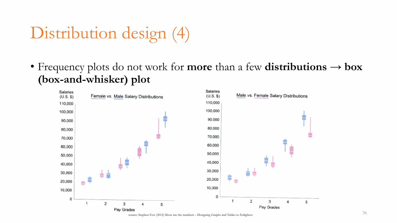
Distribution design (4)
• Frequency plots do not work for more than a few distributions → box(box-and-whisker) plot
36source: Stephen Few (2012) Show me the numbers – Designing Graphs and Tables to Enlighten
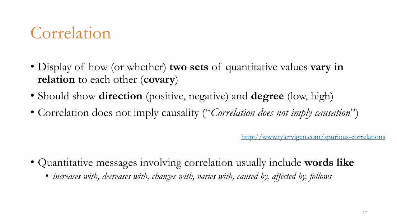
Correlation
• Display of how (or whether) two sets of quantitative values vary in relation to each other (covary)
• Should show direction (positive, negative) and degree (low, high)
• Correlation does not imply causality (“Correlation does not imply causation”)
• Quantitative messages involving correlation usually include words like• increases with, decreases with, changes with, varies with, caused by, affected by, follows
37
http://www.tylervigen.com/spurious-correlations
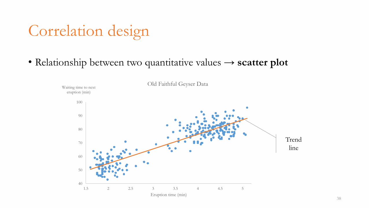
Correlation design
• Relationship between two quantitative values → scatter plot
38
40
50
60
70
80
90
100
1.5 2 2.5 3 3.5 4 4.5 5
Waiting time to next eruption (min)
Eruption time (min)
Old Faithful Geyser Data
Trend
line
Geospatial relationship
• Display where quantitative values are located (spatial relation)
• The spatial location is commonly geographic, but does not have to be (e.g. buildings plans)
• Quantitative messages involving geospatial relation include words like• geography, location, where, region, territory, country, state, city
39
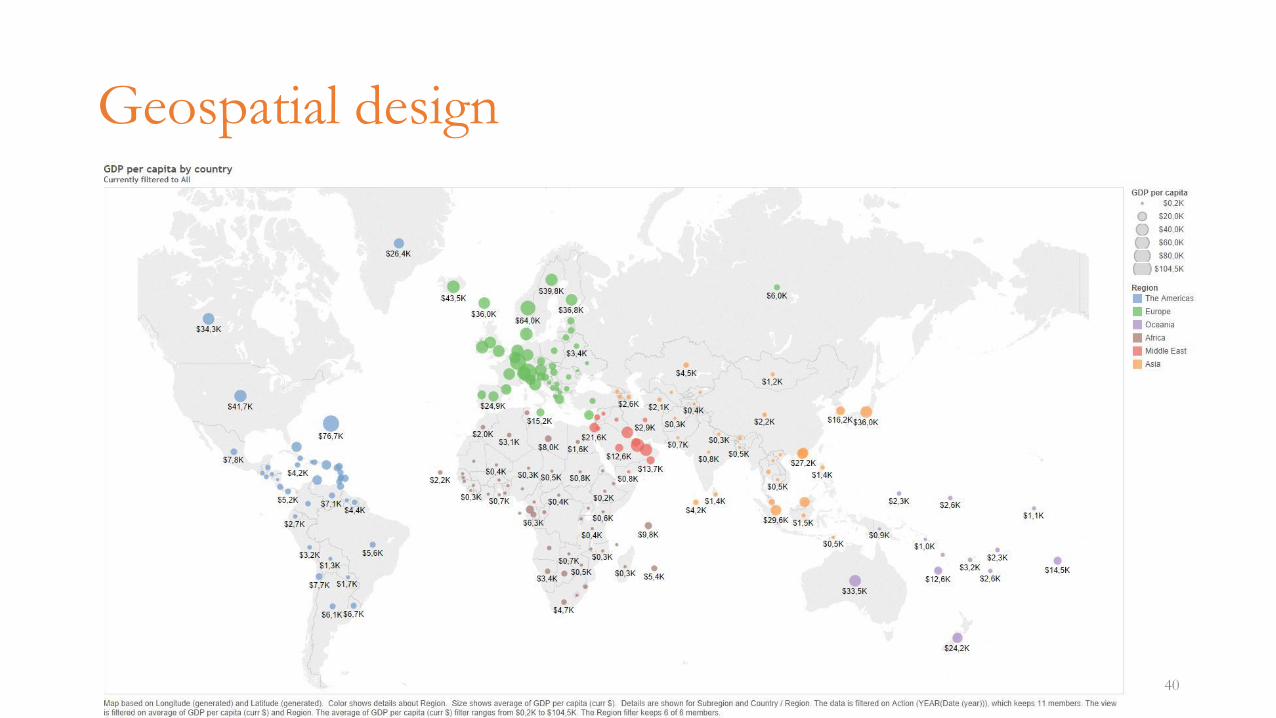
Geospatial design
40
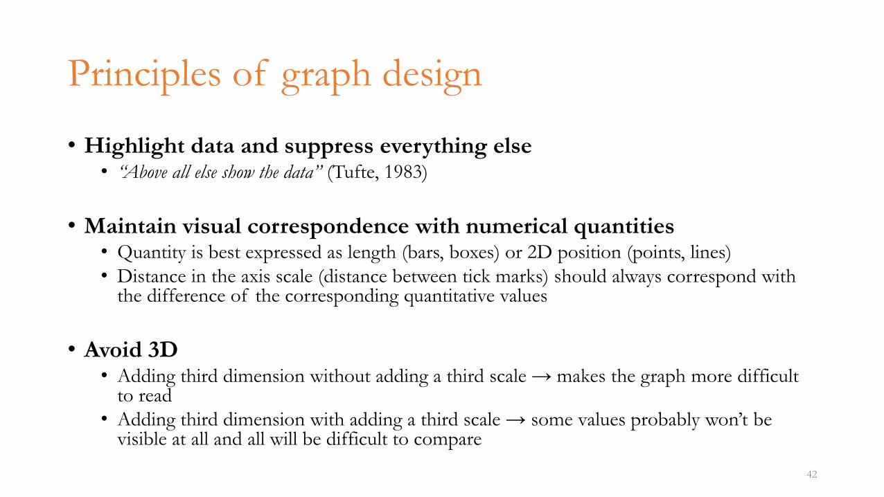
Principles of graph design
• Highlight data and suppress everything else• “Above all else show the data” (Tufte, 1983)
• Maintain visual correspondence with numerical quantities• Quantity is best expressed as length (bars, boxes) or 2D position (points, lines)
• Distance in the axis scale (distance between tick marks) should always correspond with the difference of the corresponding quantitative values
• Avoid 3D• Adding third dimension without adding a third scale → makes the graph more difficult
to read
• Adding third dimension with adding a third scale → some values probably won’t be visible at all and all will be difficult to compare
42
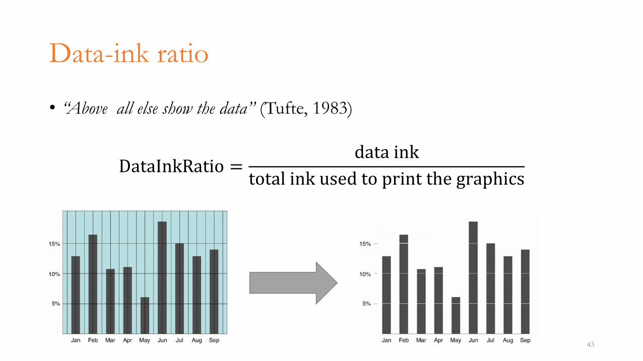
Data-ink ratio
• “Above all else show the data” (Tufte, 1983)
DataInkRatio =data ink
total ink used to print the graphics
43
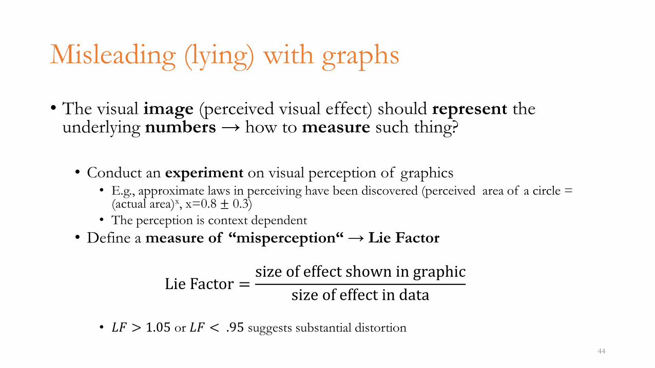
Misleading (lying) with graphs
• The visual image (perceived visual effect) should represent the underlying numbers → how to measure such thing?
• Conduct an experiment on visual perception of graphics• E.g., approximate laws in perceiving have been discovered (perceived area of a circle =
(actual area)x, x=0.8 ± 0.3)
• The perception is context dependent
• Define a measure of “misperception“ → Lie Factor
Lie Factor =size of effect shown in graphic
size of effect in data
• 𝐿𝐹 > 1.05 or 𝐿𝐹 < .95 suggests substantial distortion
44
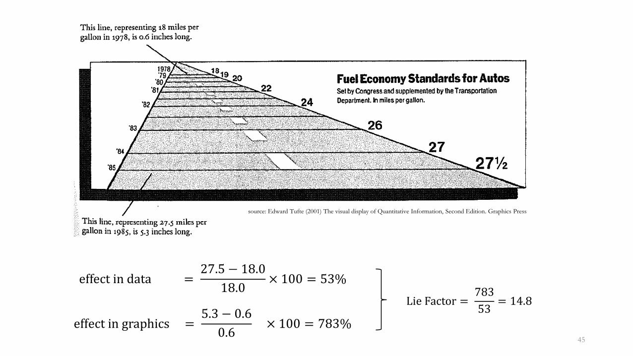
effect in data =27.5 − 18.0
18.0× 100 = 53%
effect in graphics =5.3 − 0.6
0.6× 100 = 783%
45
source: Edward Tufte (2001) The visual display of Quantitative Information, Second Edition. Graphics Press
Lie Factor =783
53= 14.8
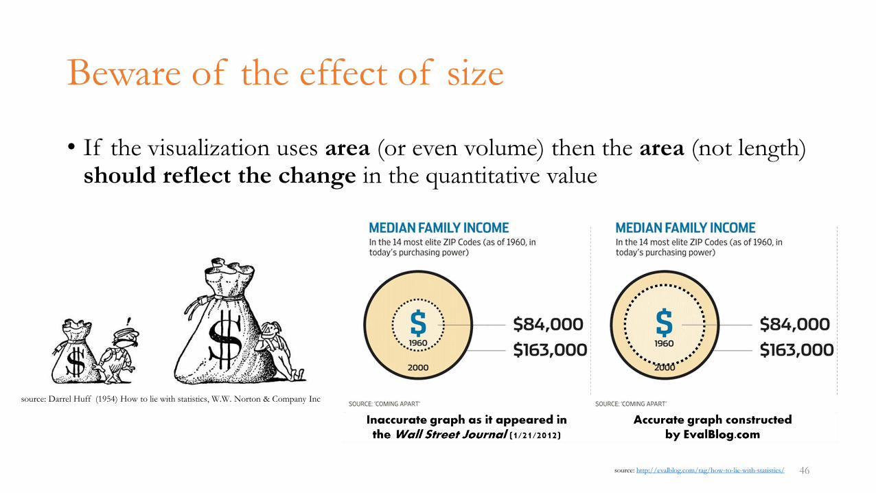
Beware of the effect of size
• If the visualization uses area (or even volume) then the area (not length) should reflect the change in the quantitative value
46
source: Darrel Huff (1954) How to lie with statistics, W.W. Norton & Company Inc
source: http://evalblog.com/tag/how-to-lie-with-statistics/
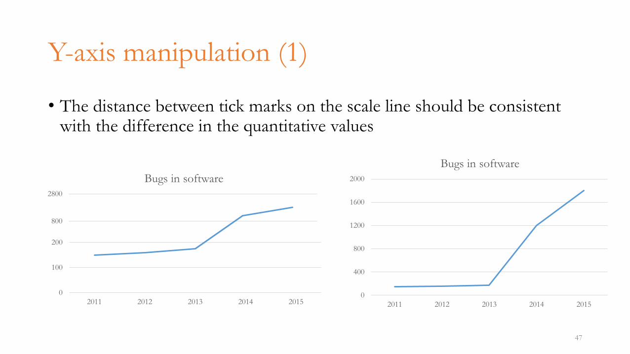
Y-axis manipulation (1)
47
• The distance between tick marks on the scale line should be consistent with the difference in the quantitative values
0
400
800
1200
1600
2000
2011 2012 2013 2014 2015
Bugs in software
0
100
200
2011 2012 2013 2014 2015
800
2800
Bugs in software
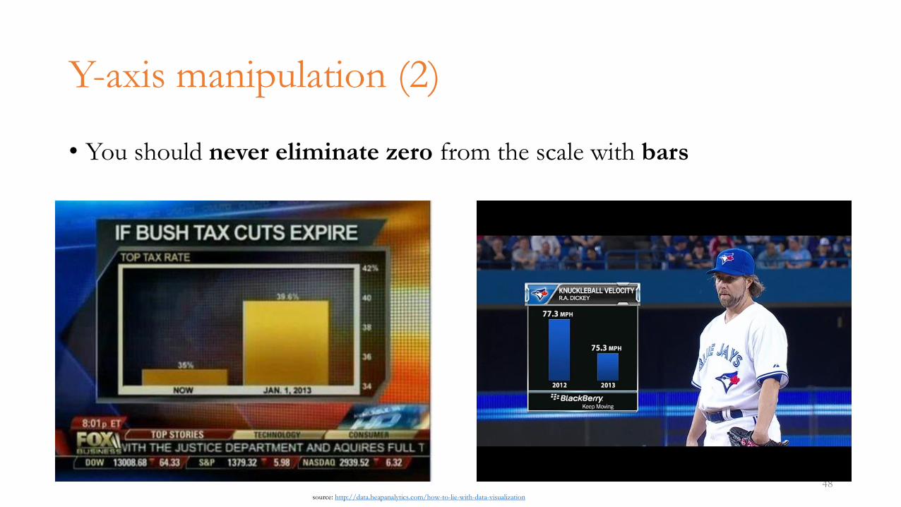
Y-axis manipulation (2)
• You should never eliminate zero from the scale with bars
48source: http://data.heapanalytics.com/how-to-lie-with-data-visualization
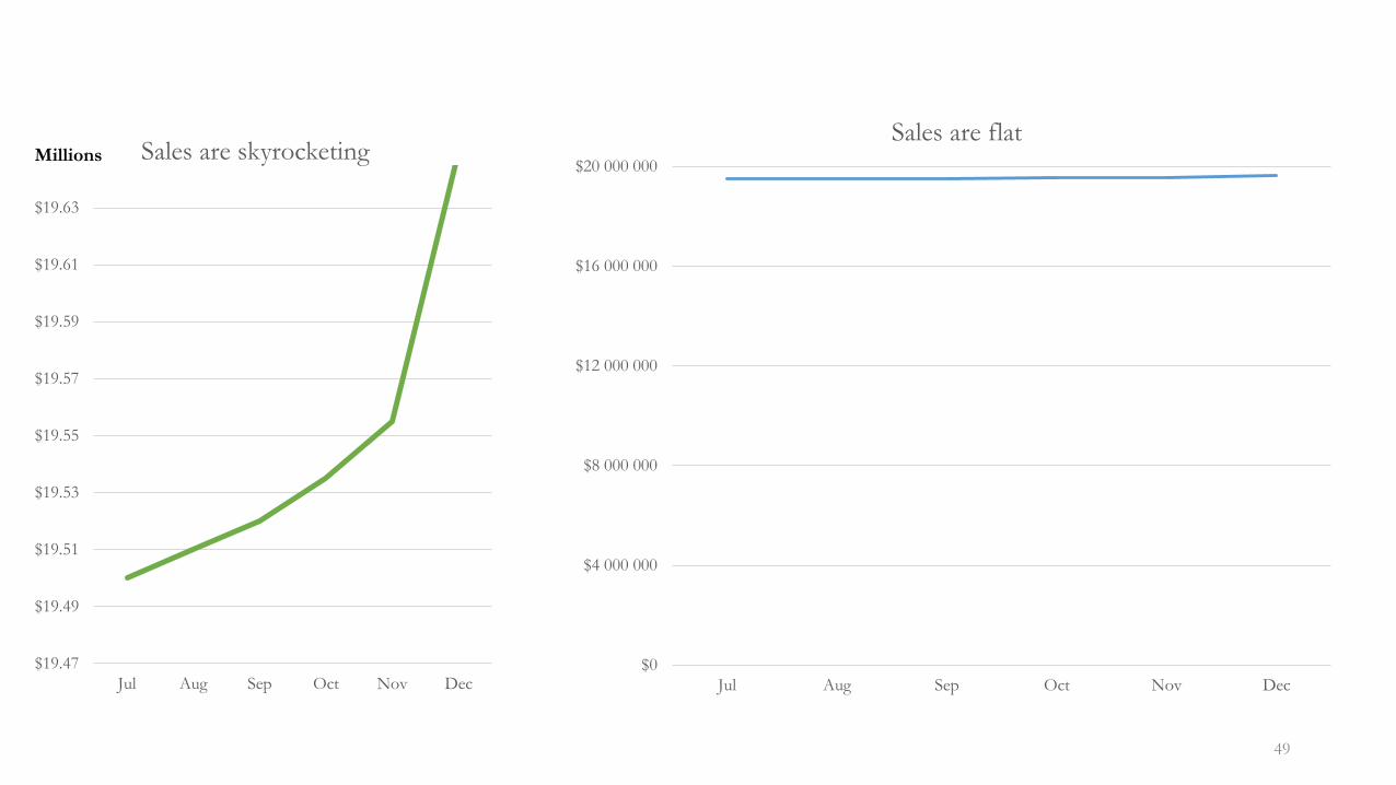
49
$0
$4 000 000
$8 000 000
$12 000 000
$16 000 000
$20 000 000
Jul Aug Sep Oct Nov Dec
Sales are flat
$19.47
$19.49
$19.51
$19.53
$19.55
$19.57
$19.59
$19.61
$19.63
Jul Aug Sep Oct Nov Dec
Millions Sales are skyrocketing
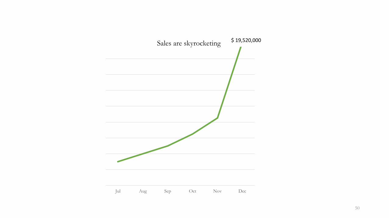
50
Jul Aug Sep Oct Nov Dec
Sales are skyrocketing$ 19,520,000
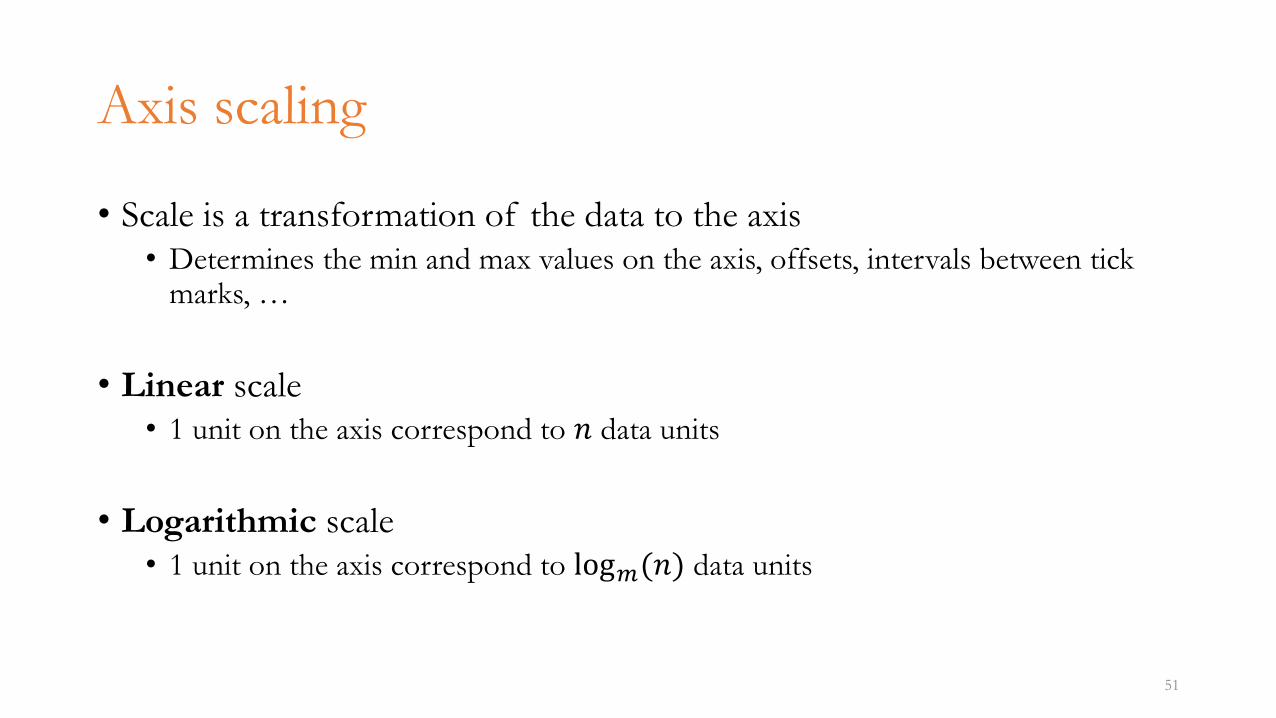
Axis scaling
• Scale is a transformation of the data to the axis• Determines the min and max values on the axis, offsets, intervals between tick
marks, …
• Linear scale• 1 unit on the axis correspond to 𝑛 data units
• Logarithmic scale• 1 unit on the axis correspond to log𝑚(𝑛) data units
51
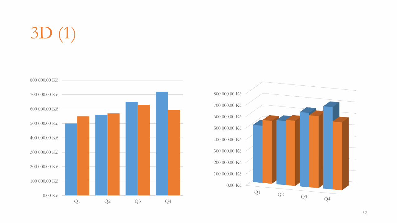
3D (1)
52
0.00 Kč
100 000.00 Kč
200 000.00 Kč
300 000.00 Kč
400 000.00 Kč
500 000.00 Kč
600 000.00 Kč
700 000.00 Kč
800 000.00 Kč
Q1 Q2 Q3 Q4
0.00 Kč
100 000.00 Kč
200 000.00 Kč
300 000.00 Kč
400 000.00 Kč
500 000.00 Kč
600 000.00 Kč
700 000.00 Kč
800 000.00 Kč
Q1 Q2 Q3 Q4
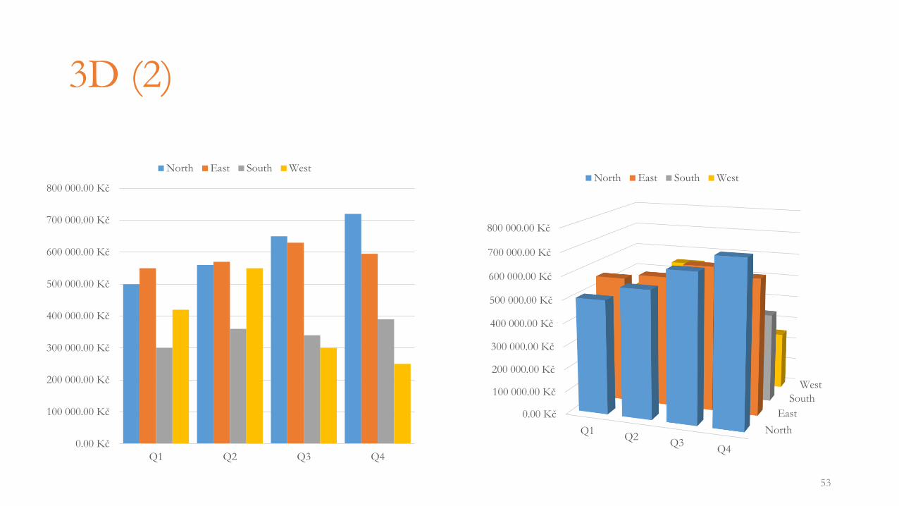
3D (2)
53
0.00 Kč
100 000.00 Kč
200 000.00 Kč
300 000.00 Kč
400 000.00 Kč
500 000.00 Kč
600 000.00 Kč
700 000.00 Kč
800 000.00 Kč
Q1 Q2 Q3 Q4
North East South West
North
East
South
West
0.00 Kč
100 000.00 Kč
200 000.00 Kč
300 000.00 Kč
400 000.00 Kč
500 000.00 Kč
600 000.00 Kč
700 000.00 Kč
800 000.00 Kč
Q1Q2
Q3Q4
North East South West
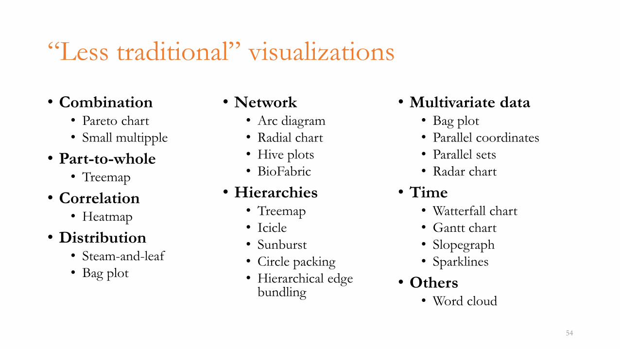
“Less traditional” visualizations
• Combination• Pareto chart
• Small multipple
• Part-to-whole• Treemap
• Correlation• Heatmap
• Distribution• Steam-and-leaf
• Bag plot
• Network• Arc diagram
• Radial chart
• Hive plots
• BioFabric
• Hierarchies• Treemap
• Icicle
• Sunburst
• Circle packing
• Hierarchical edge bundling
• Multivariate data• Bag plot
• Parallel coordinates
• Parallel sets
• Radar chart
• Time• Watterfall chart
• Gantt chart
• Slopegraph
• Sparklines
• Others• Word cloud
54
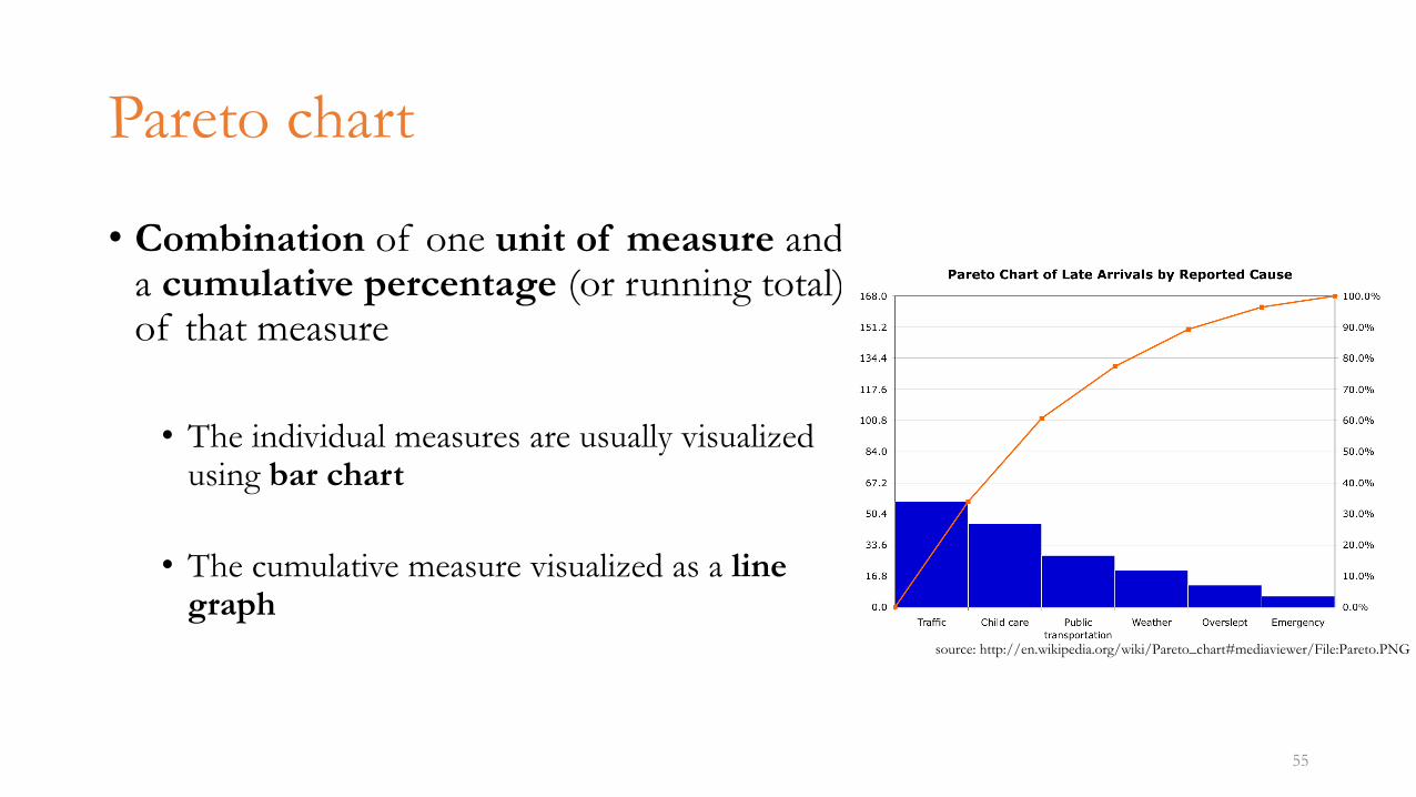
Pareto chart
• Combination of one unit of measure and a cumulative percentage (or running total) of that measure
• The individual measures are usually visualized using bar chart
• The cumulative measure visualized as a line graph
55
source: http://en.wikipedia.org/wiki/Pareto_chart#mediaviewer/File:Pareto.PNG
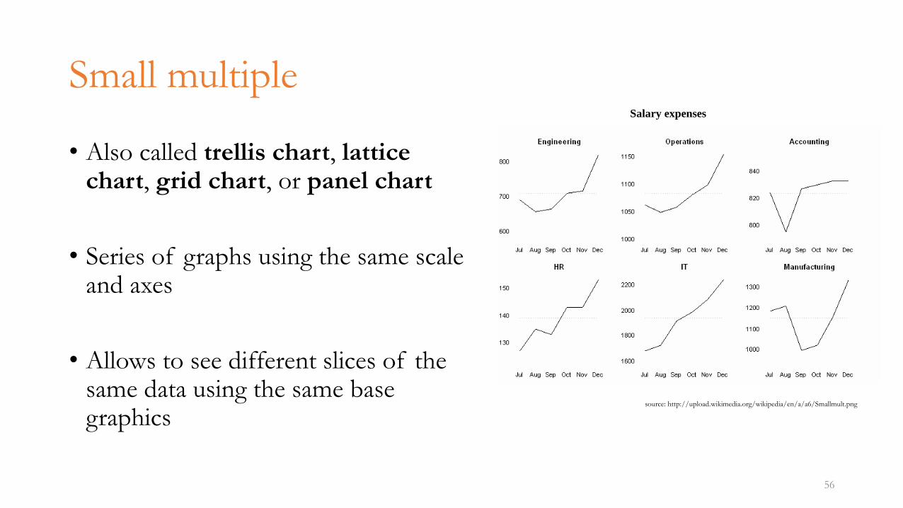
Small multiple
• Also called trellis chart, lattice chart, grid chart, or panel chart
• Series of graphs using the same scale and axes
• Allows to see different slices of the same data using the same base graphics
56
source: http://upload.wikimedia.org/wikipedia/en/a/a6/Smallmult.png
Salary expenses
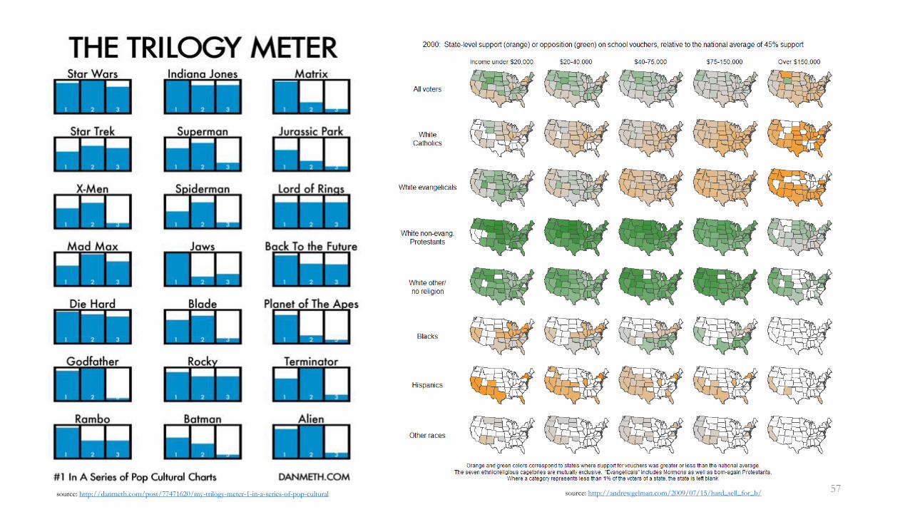
57source: http://danmeth.com/post/77471620/my-trilogy-meter-1-in-a-series-of-pop-cultural source: http://andrewgelman.com/2009/07/15/hard_sell_for_b/
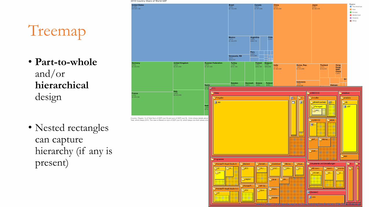
Treemap
• Part-to-wholeand/or hierarchicaldesign
• Nested rectangles can capture hierarchy (if any is present)
58
source: http://en.wikipedia.org/wiki/Treemapping#mediaviewer/File:Tree_Map.png
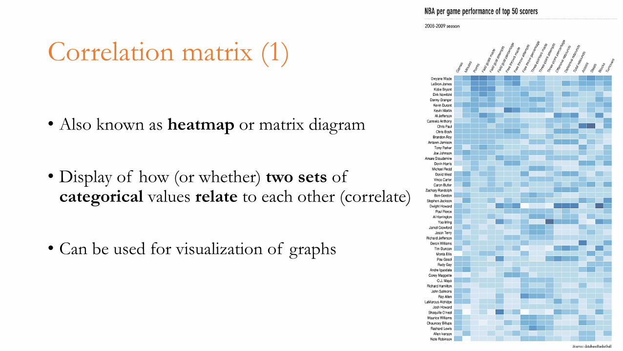
Correlation matrix (1)
• Also known as heatmap or matrix diagram
• Display of how (or whether) two sets of categorical values relate to each other (correlate)
• Can be used for visualization of graphs
59
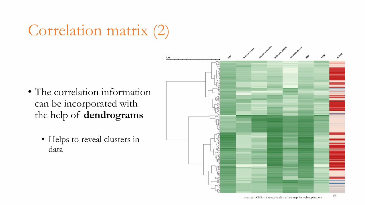
Correlation matrix (2)
• The correlation information can be incorporated with the help of dendrograms
• Helps to reveal clusters in data
60source: InCHlib - interactive cluster heatmap for web applications
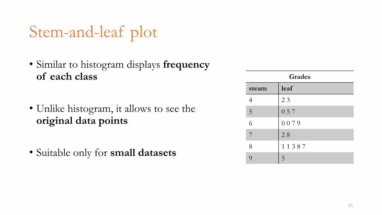
Stem-and-leaf plot
• Similar to histogram displays frequency of each class
• Unlike histogram, it allows to see the original data points
• Suitable only for small datasets
61
Grades
steam leaf
4 2 3
5 0 5 7
6 0 0 7 9
7 2 8
8 1 1 3 8 7
9 5
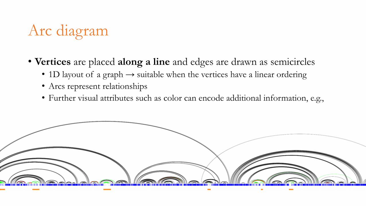
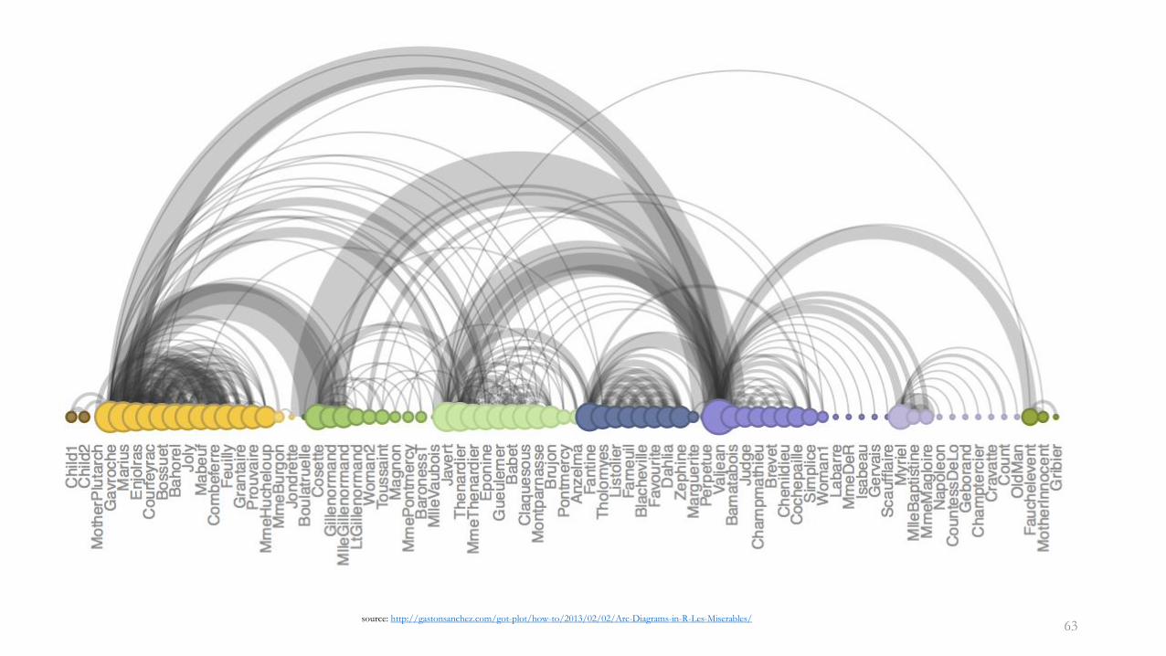
Arc diagram
• Vertices are placed along a line and edges are drawn as semicircles• 1D layout of a graph → suitable when the vertices have a linear ordering
• Arcs represent relationships
• Further visual attributes such as color can encode additional information, e.g., distance
62
63source: http://gastonsanchez.com/got-plot/how-to/2013/02/02/Arc-Diagrams-in-R-Les-Miserables/
64
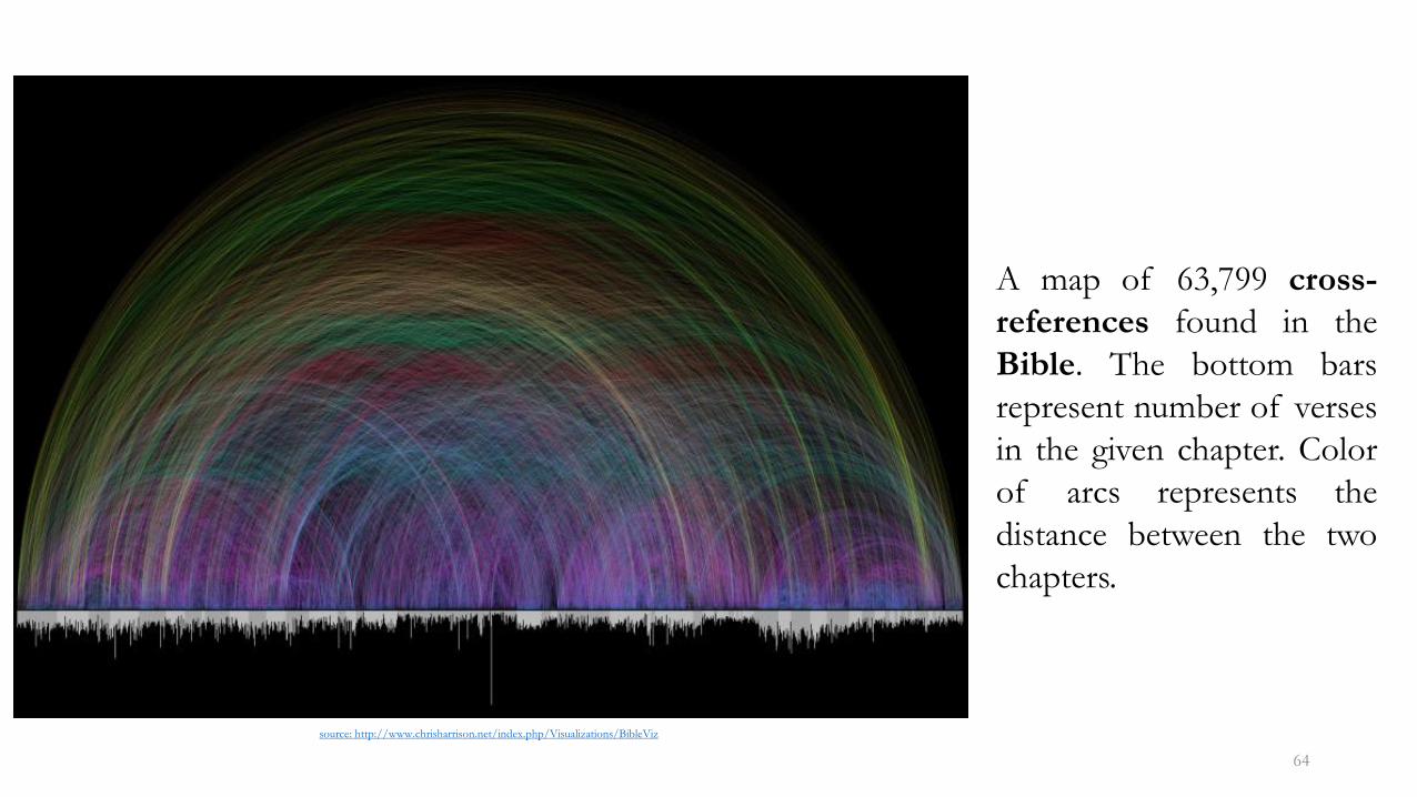
A map of 63,799 cross-
references found in the
Bible. The bottom bars
represent number of verses
in the given chapter. Color
of arcs represents the
distance between the two
chapters.
source: http://www.chrisharrison.net/index.php/Visualizations/BibleViz
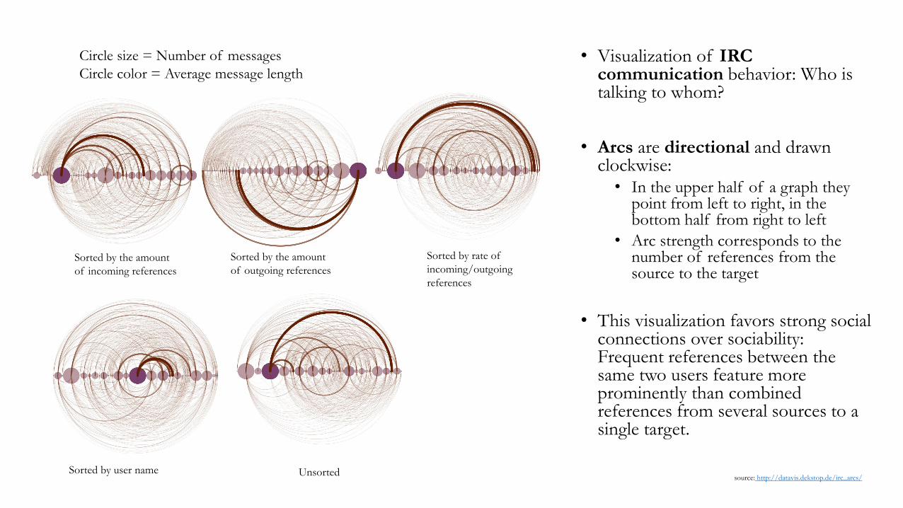
• Visualization of IRC communication behavior: Who is talking to whom?
• Arcs are directional and drawn clockwise: • In the upper half of a graph they
point from left to right, in the bottom half from right to left
• Arc strength corresponds to the number of references from the source to the target
• This visualization favors strong social connections over sociability: Frequent references between the same two users feature more prominently than combined references from several sources to a single target.
Sorted by the amount
of incoming references
Sorted by the amount
of outgoing references
Sorted by rate of
incoming/outgoing
references
Sorted by user name Unsorted
Circle size = Number of messages
Circle color = Average message length
source: http://datavis.dekstop.de/irc_arcs/
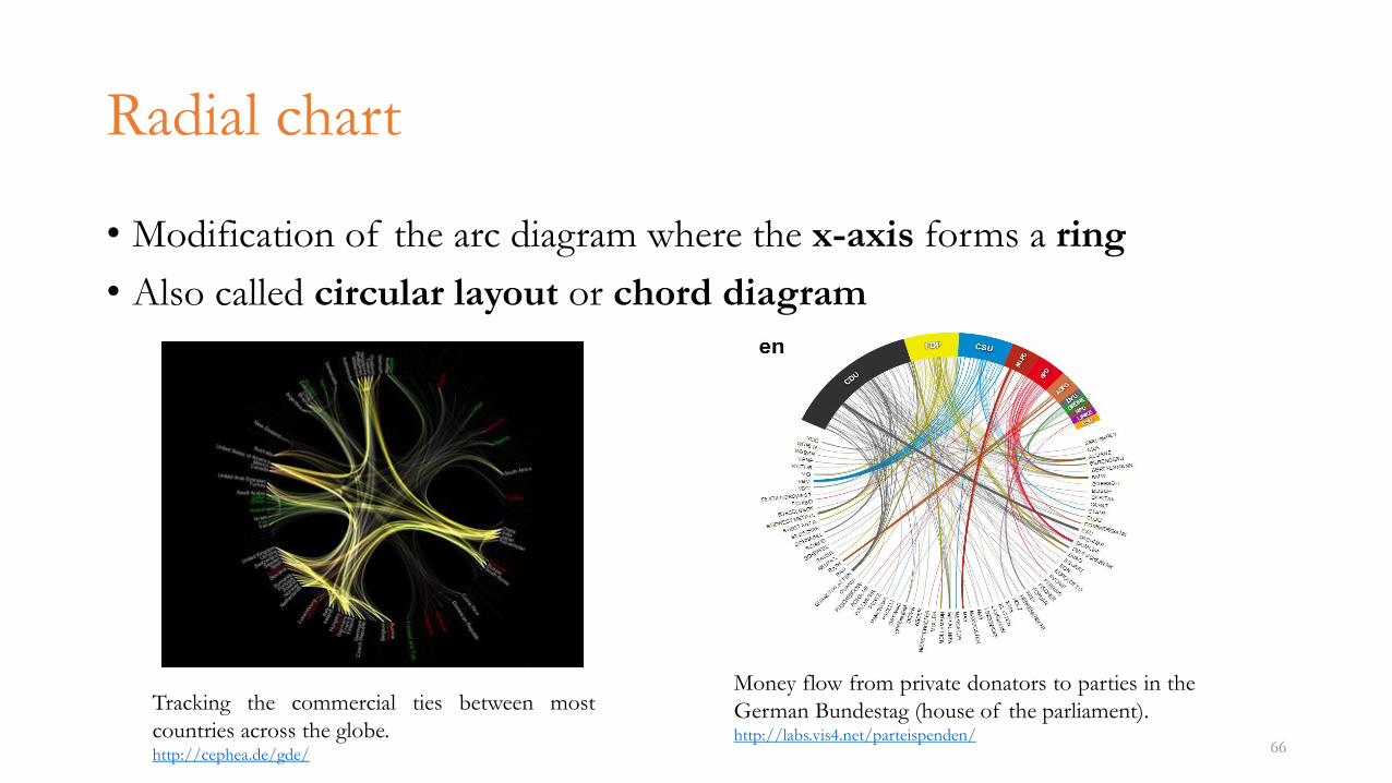
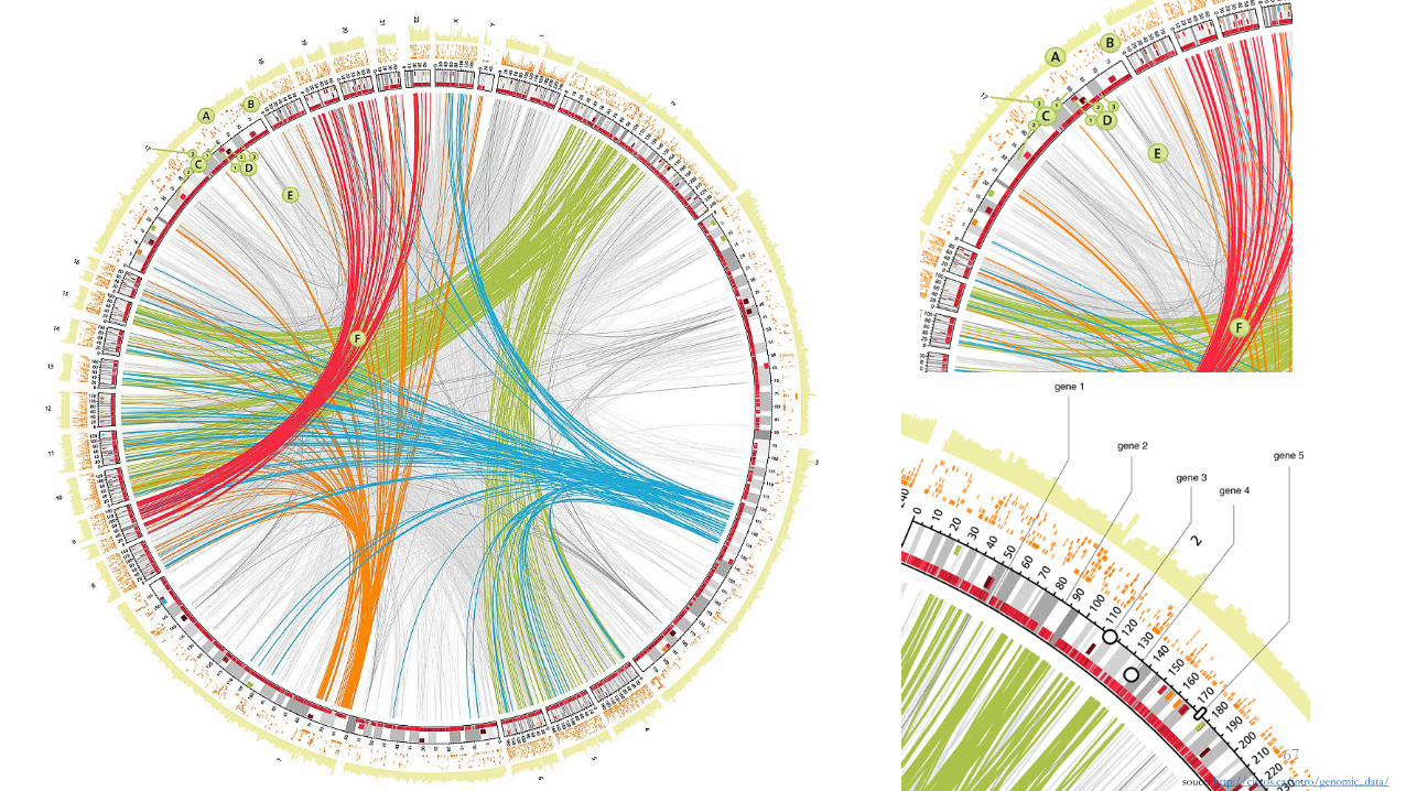
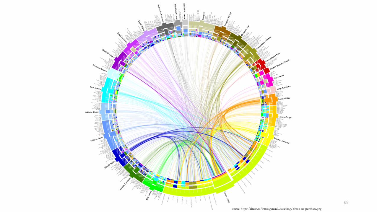
Radial chart
• Modification of the arc diagram where the x-axis forms a ring
• Also called circular layout or chord diagram
66
Tracking the commercial ties between most
countries across the globe.http://cephea.de/gde/
Money flow from private donators to parties in the
German Bundestag (house of the parliament).http://labs.vis4.net/parteispenden/
68
source: http://circos.ca/intro/general_data/img/circos-car-purchase.png
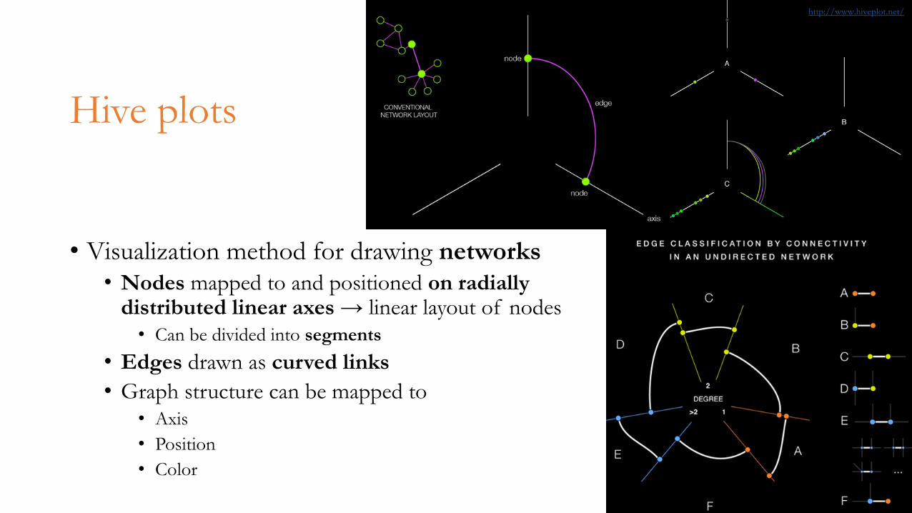
Hive plots
• Visualization method for drawing networks• Nodes mapped to and positioned on radially
distributed linear axes → linear layout of nodes
• Can be divided into segments
• Edges drawn as curved links
• Graph structure can be mapped to
• Axis
• Position
• Color69
http://www.hiveplot.net/
70
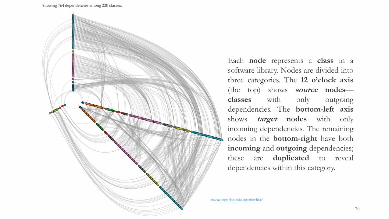
source: http://bost.ocks.org/mike/hive/
Each node represents a class in a
software library. Nodes are divided into
three categories. The 12 o’clock axis
(the top) shows source nodes—
classes with only outgoing
dependencies. The bottom-left axis
shows target nodes with only
incoming dependencies. The remaining
nodes in the bottom-right have both
incoming and outgoing dependencies;
these are duplicated to reveal
dependencies within this category.
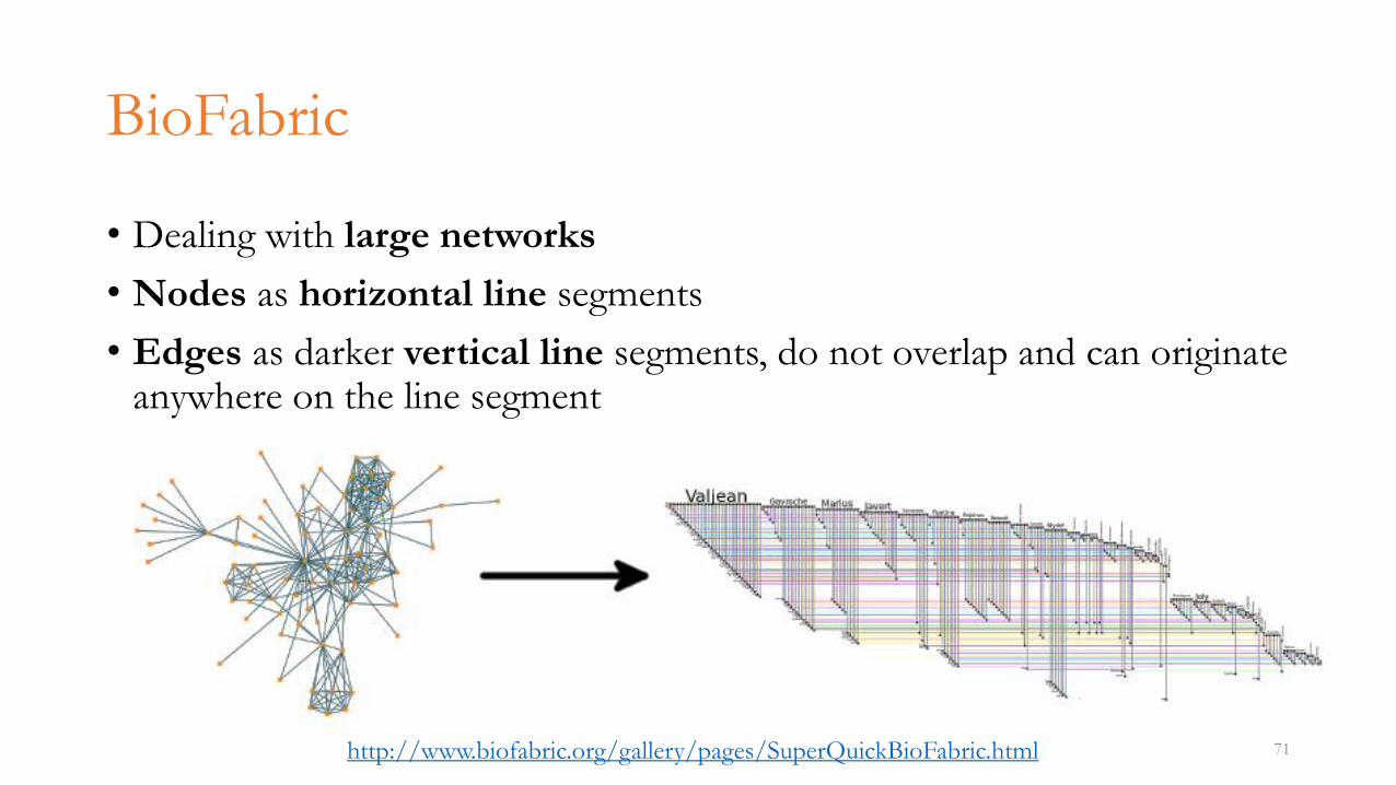
BioFabric
• Dealing with large networks
• Nodes as horizontal line segments
• Edges as darker vertical line segments, do not overlap and can originate anywhere on the line segment
71http://www.biofabric.org/gallery/pages/SuperQuickBioFabric.html
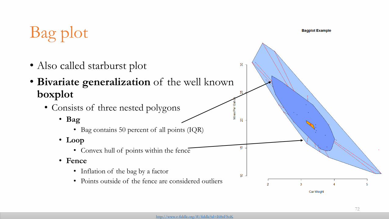
Bag plot
• Also called starburst plot
• Bivariate generalization of the well known boxplot • Consists of three nested polygons
• Bag
• Bag contains 50 percent of all points (IQR)
• Loop
• Convex hull of points within the fence
• Fence
• Inflation of the bag by a factor
• Points outside of the fence are considered outliers
72
http://www.r-fiddle.org/#/fiddle?id=I68nFSoK
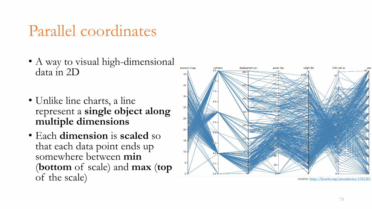
Parallel coordinates
• A way to visual high-dimensional data in 2D
• Unlike line charts, a line represent a single object along multiple dimensions
• Each dimension is scaled so that each data point ends up somewhere between min(bottom of scale) and max (topof the scale)
73
source: http://bl.ocks.org/jasondavies/1341281
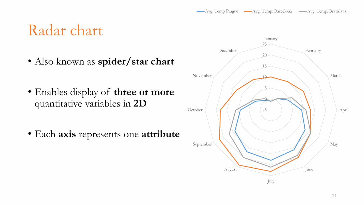
Radar chart
• Also known as spider/star chart
• Enables display of three or more quantitative variables in 2D
• Each axis represents one attribute
74
-5
0
5
10
15
20
25
January
February
March
April
May
June
July
August
September
October
November
December
Avg. Temp Prague Avg. Temp. Barcelona Avg. Temp. Bratislava
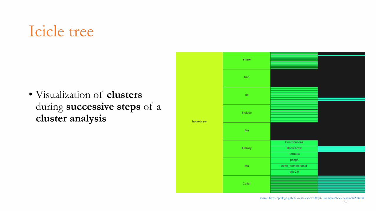
Icicle tree
• Visualization of clustersduring successive steps of a cluster analysis
75source: http://philogb.github.io/jit/static/v20/Jit/Examples/Icicle/example2.html#
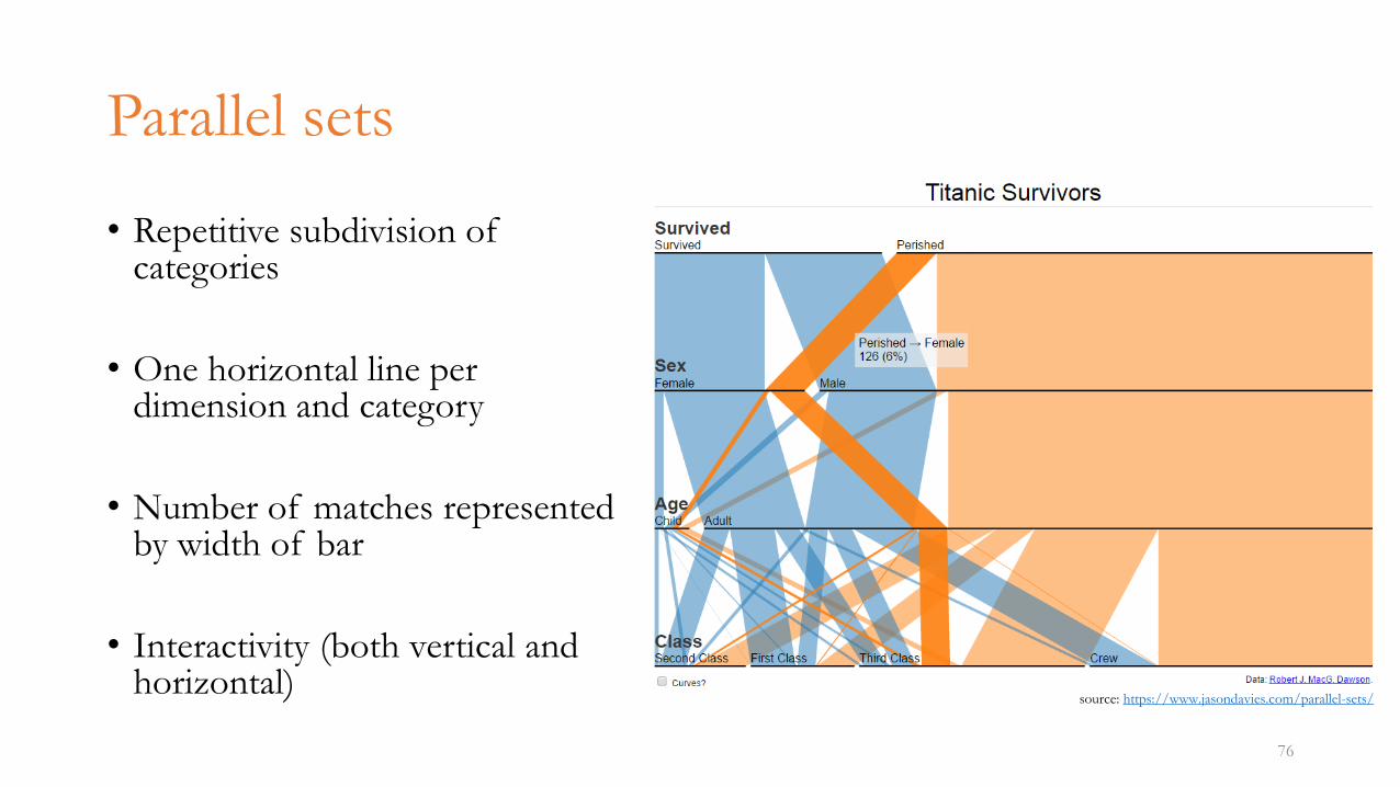
Parallel sets
• Repetitive subdivision of categories
• One horizontal line per dimension and category
• Number of matches represented by width of bar
• Interactivity (both vertical and horizontal)
76
source: https://www.jasondavies.com/parallel-sets/
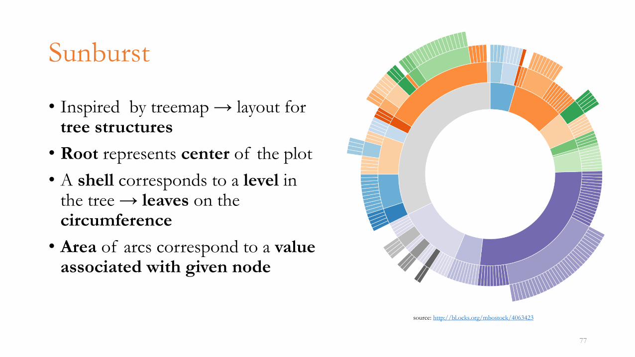
Sunburst
• Inspired by treemap → layout for tree structures
• Root represents center of the plot
• A shell corresponds to a level in the tree → leaves on the circumference
• Area of arcs correspond to a valueassociated with given node
77
source: http://bl.ocks.org/mbostock/4063423
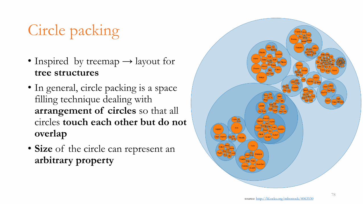
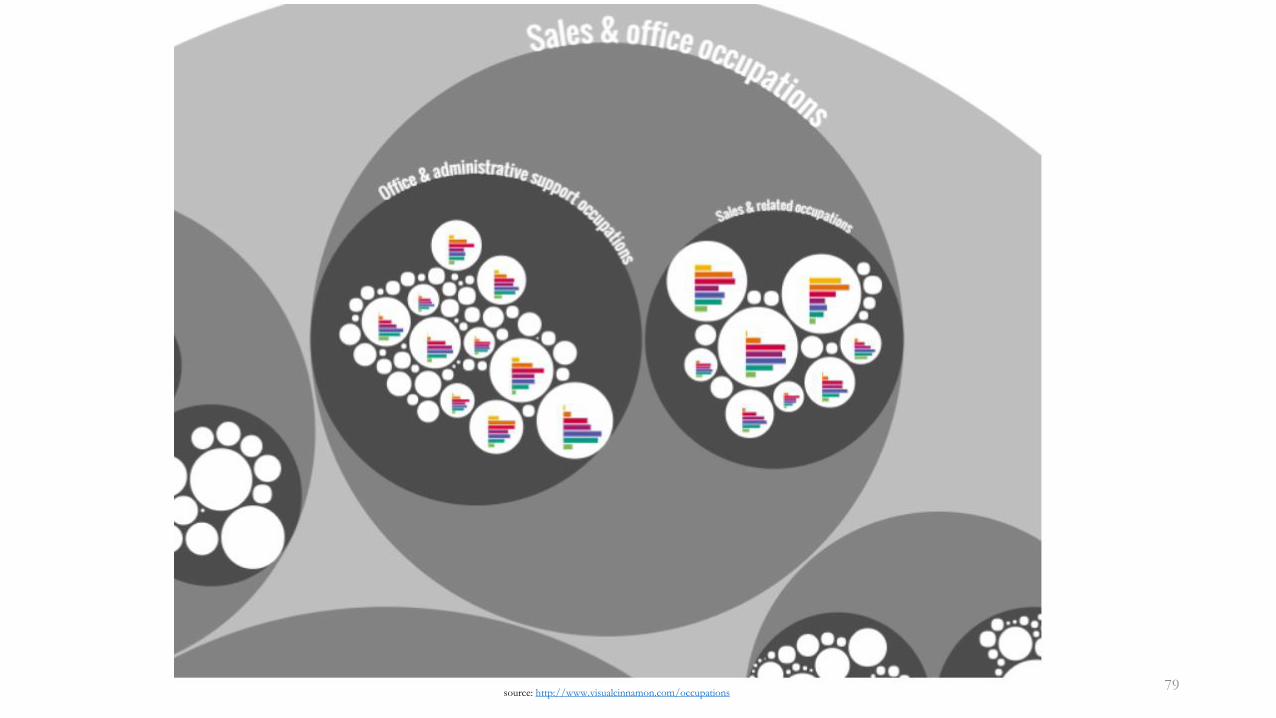
Circle packing
• Inspired by treemap → layout for tree structures
• In general, circle packing is a space filling technique dealing with arrangement of circles so that all circles touch each other but do not overlap
• Size of the circle can represent an arbitrary property
78source: http://bl.ocks.org/mbostock/4063530
Hierarchical edge bundling
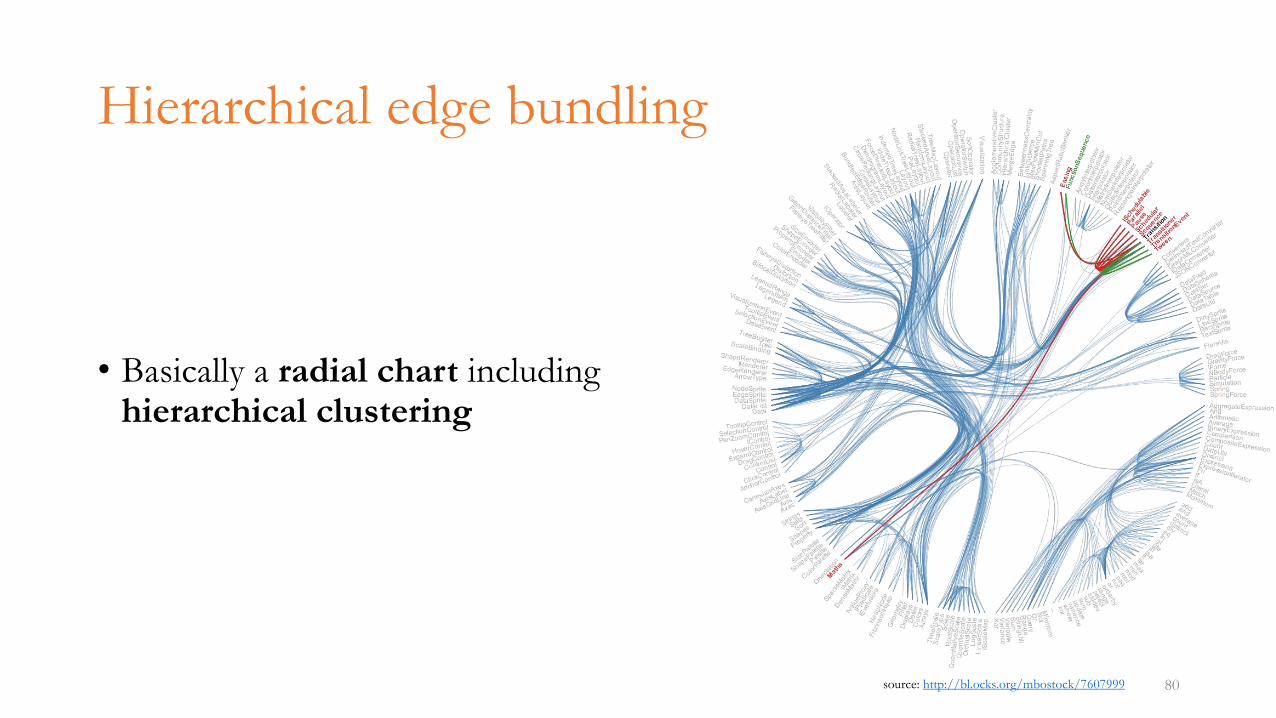
• Basically a radial chart including hierarchical clustering
80source: http://bl.ocks.org/mbostock/7607999
Waterfall chart
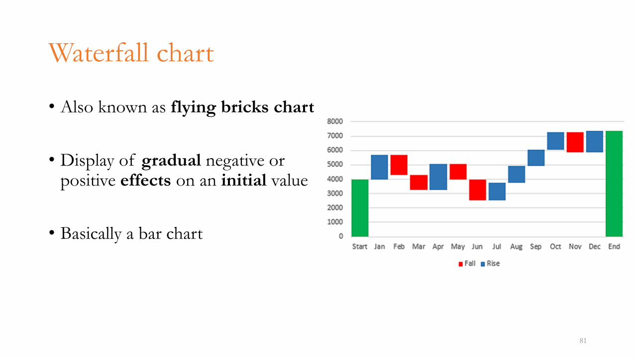
• Also known as flying bricks chart
• Display of gradual negative or positive effects on an initial value
• Basically a bar chart
81
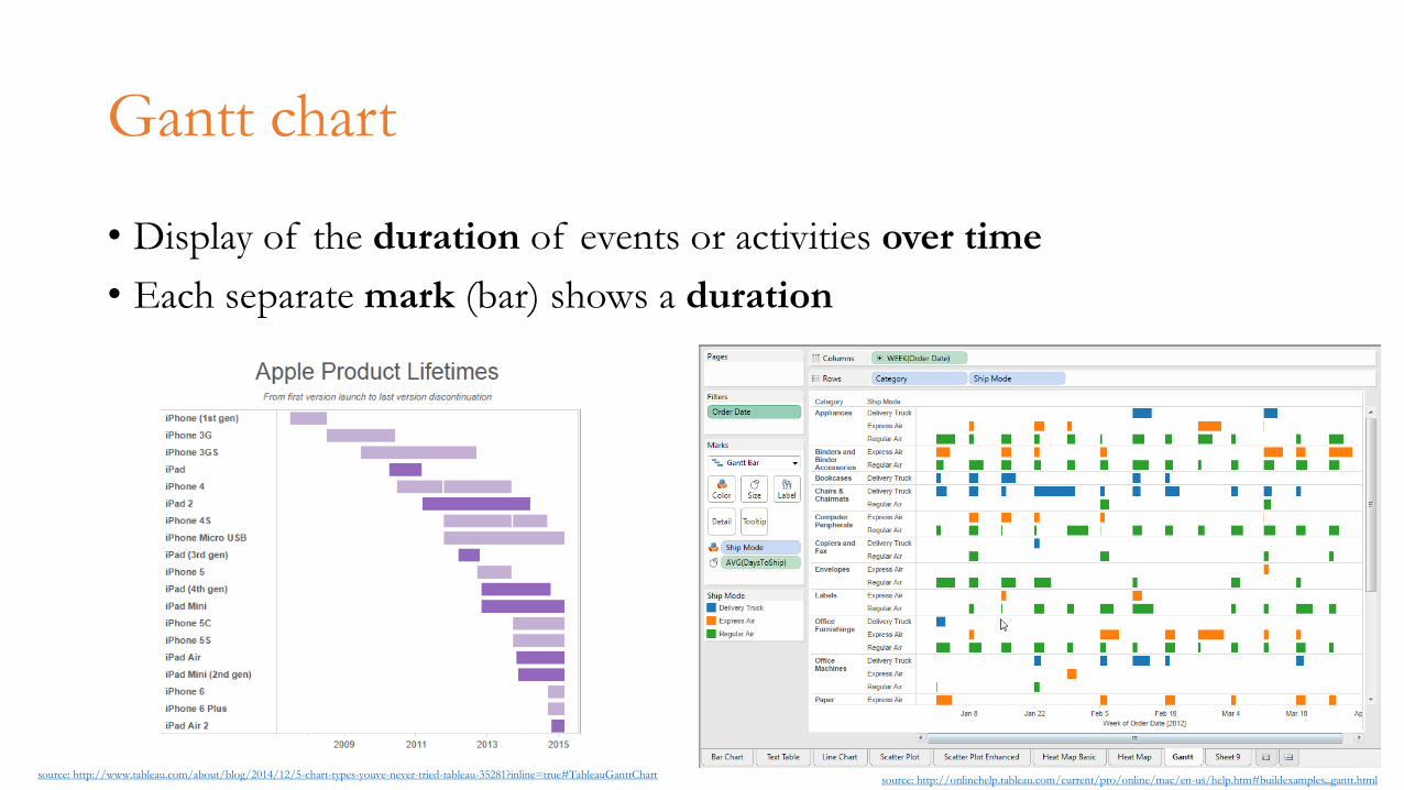
Gantt chart
• Display of the duration of events or activities over time
• Each separate mark (bar) shows a duration
82source: http://www.tableau.com/about/blog/2014/12/5-chart-types-youve-never-tried-tableau-35281?inline=true#TableauGanttChart
source: http://onlinehelp.tableau.com/current/pro/online/mac/en-us/help.htm#buildexamples_gantt.html
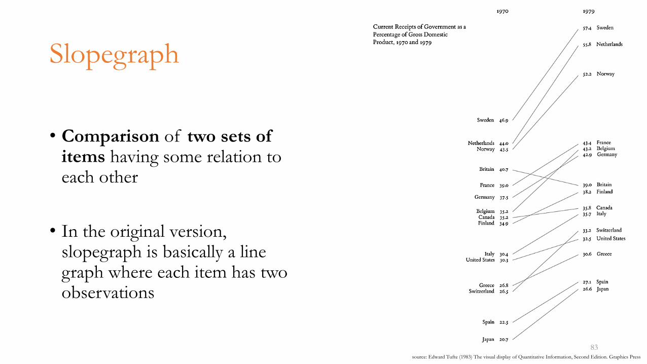
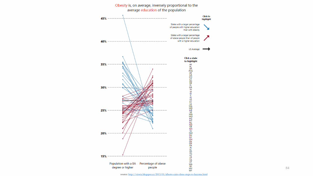
Slopegraph
• Comparison of two sets of items having some relation to each other
• In the original version, slopegraph is basically a line graph where each item has two observations
83source: Edward Tufte (1983) The visual display of Quantitative Information, Second Edition. Graphics Press
84
source: http://vizwiz.blogspot.cz/2013/01/alberto-cairo-three-steps-to-become.html
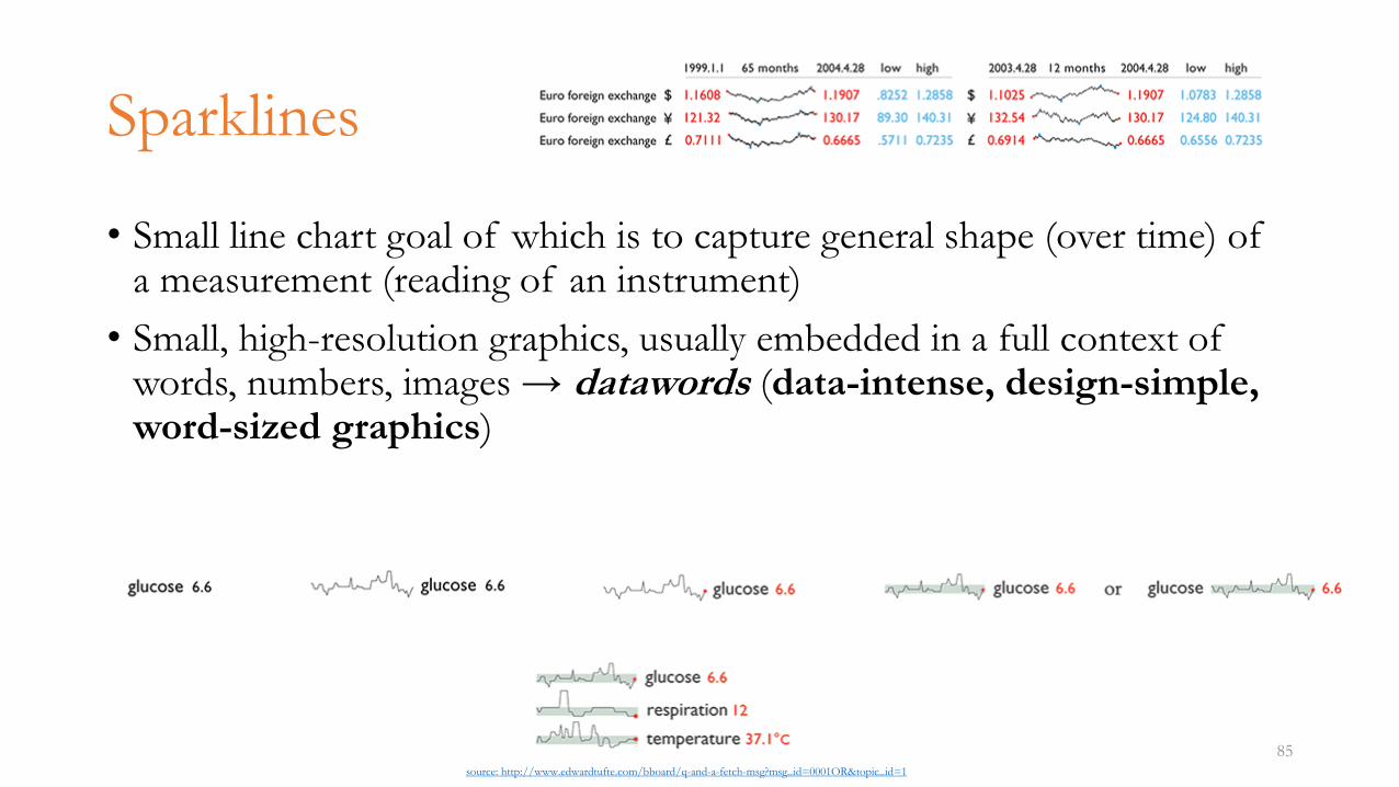
Sparklines
• Small line chart goal of which is to capture general shape (over time) of a measurement (reading of an instrument)
• Small, high-resolution graphics, usually embedded in a full context of words, numbers, images → datawords (data-intense, design-simple, word-sized graphics)
85source: http://www.edwardtufte.com/bboard/q-and-a-fetch-msg?msg_id=0001OR&topic_id=1
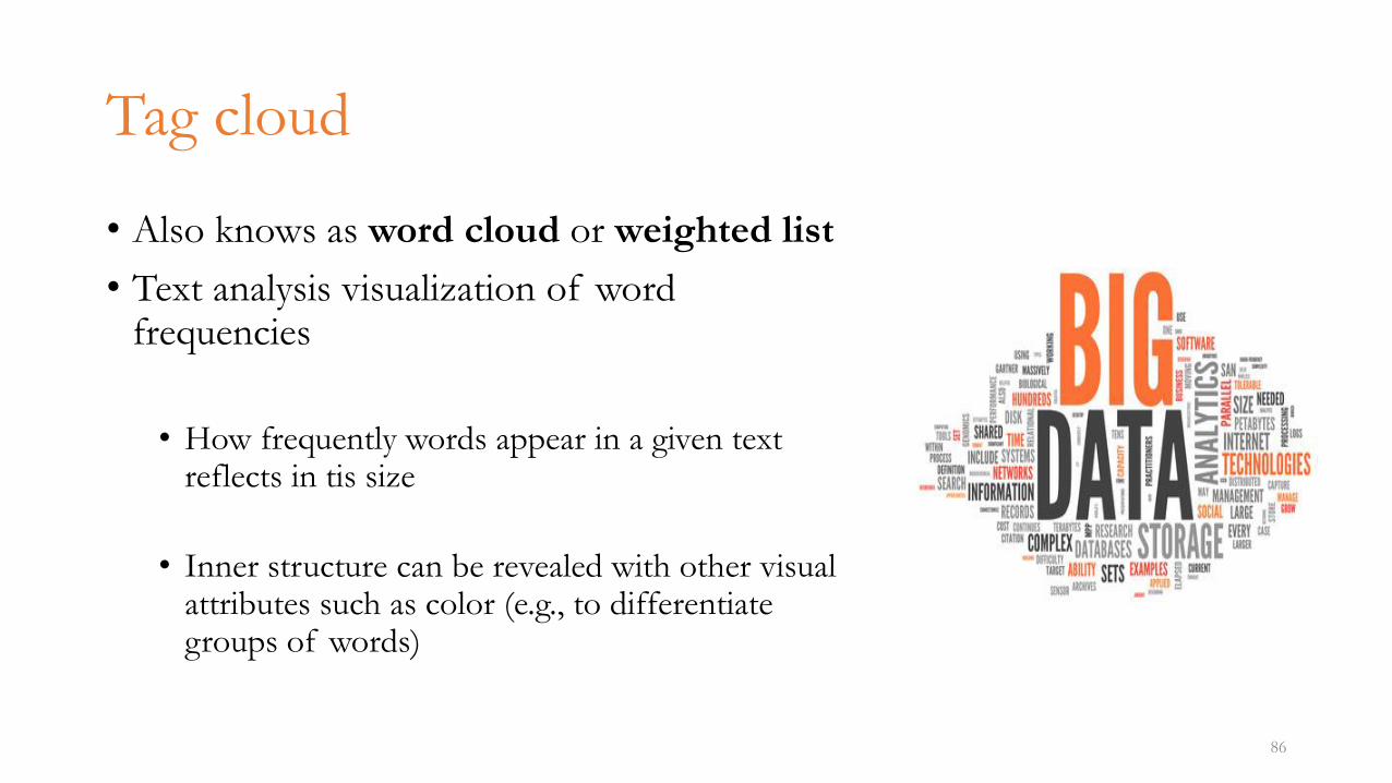
Tag cloud
• Also knows as word cloud or weighted list
• Text analysis visualization of word frequencies
• How frequently words appear in a given text reflects in tis size
• Inner structure can be revealed with other visual attributes such as color (e.g., to differentiate groups of words)
86
Literature
• Stephen Few (2012) Show me the numbers – Designing Graphs and Tables to Enlighten
• Edward Tufte (2001) The visual display of Quantitative Information, Second Edition. Graphics Press
• Gene Zelazny (2001) Say It with charts
87
Related Documents