Martijn Tennekes Jan van der Laan, Edwin de Jonge, Jessica Solcer, Alex Priem Data Visualization in Official Statistics

Welcome message from author
This document is posted to help you gain knowledge. Please leave a comment to let me know what you think about it! Share it to your friends and learn new things together.
Transcript

Martijn Tennekes Jan van der Laan, Edwin de Jonge, Jessica Solcer, Alex Priem
Data Visualization in Official
Statistics

Statistics Netherlands / CBS
- Creates and publishes official statistics on economics,
demographics, health care and others.
- Since 1899
- Website: www.cbs.nl
2

Types of data
3
1. Survey data = data collected by CBS
with questionnaires
2. Admin data = administrative (register) data
collected by third parties such
as the Tax Office
3. Big data = machine generated data of events
caused by human activity
3 Mobile phones Road sensors Social media

Current output
StatLine: a large database (http://statline.cbs.nl)
– More than one billion (109) facts in more than 3000 stand-alone tables
– Output statistics contain uncertainty: published only rarely
A few interactive visualizations (www.cbs.nl)

StatMine
– Interactive visual analysis layer on top of StatLine
– Target population: Policy makers, Journalists, Citizens,
Enterprises, Economists, Social scientists, Historicians, etc
– Goals:
‐ Facts should be presented visually and interactively
‐ Users should be able to combine tables
‐ Present uncertainty understandable to users
– StatMine will soon be available in public
5
StatMine 0.2 6
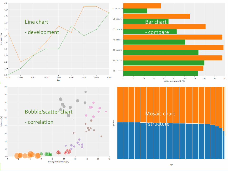
Bar chart
- compare
Line chart
- development
Bubble/scatter chart
- correlation
Mosaic chart
- structure

Uncertainty research – line chart types
7

Uncertainty research – bar chart types
Chisel chart
Cigarette chart
8

Uncertainty research - user study results
Showing uncertainty improves validity of user statements Line chart: - With point estimate: ribbon - Without point estimate: error bars Bar chart: - With point estimate: chisel/cigarette
- Although users prefer bar chart with error bars - Without point estimate: chisel/cigarette Users appreciate uncertainty intervals and are able to interpret graphs with uncertainty intervals. Reference: Laan, D. van der, Jonge, E. de, Solcer, J. (2015), Effect of Displaying Uncertainty in Line and Bar charts – Presentation and Interpretation, Proceedings IVAPP 2015, Berlin.
9

Visualization of Large Datasets
Goal: to empower data analysts with visual tools to explore
(large) raw datasets, and to examine the data during
statistical processes.
Software:
– R
– Python
– Javascript d3
10

Tableplot
11
Dutch Virtual Census, 2011 test file
R-package tabplot

Tableplot
12 Structural Business Statistics: raw survey data (sorted by turnover)
R-package tabplot

Tableplot
13 Structural Business Statistics: edited survey data (sorted by turnover)
R-package tabplot

Tableplot
14
How representative is our survey sample? Analysis of demographics when sorted by calibration weight
R-package tabplot

Treemap
15
R-package treemap
Structural Business Statistics: aggregated by economic activity

Heatmap
16
R-package ggplot2
Mobile phone metadata (raw): number of unique devices

Heatmap
17
Python + HTML/Javascript
Interactive tool to analyse income data

Small multiples
18
Analysis of Daytime Population estimates based on mobile phone metadata
R-package ggplot2

Thematic Maps
19
R-package tmap
Interchange with traffic sensors

Thematic Maps
20
R-package tmap
@ useR! 2015 Thursday 13:00
Population density
R package tmap: • Layered maps
• Polygons • Lines • Points • Raster
• ggplot2 style • small multiples • Open Street Map

Thematic Maps
21
R-package tmap
@ useR! 2015 Thursday 13:00
The relation between metropolitan areas and income class

Thematic Maps
22
R-package tmap
@ useR! 2015 Thursday 13:00
Global land cover (urban areas accentuated with dot map)

Maps
23
Interactive tool to analyse traffic on Dutch highways
Python + HTML/Javascript

Summary
– Data visualization is essential in Official Statistics for
‐ Exploring new data sources
‐ Analysing new deliveries of existing data sources
‐ Analysing data throughout the statistical production process
‐ Presenting the data (to collegues, policy makers, and the
general public)
– Need for
‐ Visualization of confidence intervals
‐ Interactive data exploration tools
‐ Big data visualization
24
Related Documents