Data Visualization, Dashboards, and Evidence Use in Schools: Data Collaborative Workshop Perspectives of Educators, Researchers, and Data Scientists Edited by Alex J. Bowers

Welcome message from author
This document is posted to help you gain knowledge. Please leave a comment to let me know what you think about it! Share it to your friends and learn new things together.
Transcript

Data Visualization, Dashboards, and Evidence Use in Schools: Data Collaborative Workshop Perspectives of Educators, Researchers, and Data Scientists
Edited by Alex J. Bowers

This page left intentionally blank

Data Visualization, Dashboards, and Evidence Use in Schools:
Data Collaborative Workshop Perspectives
of Educators, Researchers, and Data Scientists
Edited by:
Alex J. Bowers
Teachers College, Columbia University

The publication of this book is made possible by a grant from the National Science
Foundation (NSF) (NSF# 1560720).
Any opinions, findings, and conclusions or recommendations are those of the authors and
do not necessarily reflect the views of funding agency.
Bowers, A.J. (Ed.). (2021). Data Visualization, Dashboards, and Evidence Use in
Schools: Data Collaborative Workshop Perspectives of Educators, Researchers, and
Data Scientists. Teachers College, Columbia University. New York, NY.
Cover illustration and design: Alex J. Bowers
Creative Commons License CC BY NC ND
https://creativecommons.org/licenses/by-nc-nd/4.0/
All authors, 2021
Some rights reserved. Without limiting the rights under copyright reserved above, any
part of this book may be reproduced, stored in or introduced into a retrieval system, or
transmitted, in any form or by any means (electronic, mechanical, photocopying,
recording or otherwise).

CONTENTS
About the Book……………………………………………………….. ix
Acknowledgements…………………………………………………… x
SECTION I Education Data Analytics Collaborative Workshop Organization
and Studying the Event Itself
1 Introduction: Dashboards, Data Use, and Decision-making: A Data
Collaborative Workshop Bringing Together Educators and Data
Scientists ……………………………………………………… 1
Alex J. Bowers
2 Planning, Organizing, and Orchestrating the Education Data
Collaborative Workshop ……………………………………… 37
Alex J. Bowers
3 NSF Education Data Analytics Collaborative Workshop: How
Educators and Data Scientists Meet and Create Data Visualizations
………………………………………………………………… 68
Seulgi Kang and Alex J. Bowers
4 Expanding the Design Space of Data and Action in Education: What
Co-designing with Educators Reveal about Current Possibilities and
Limitations ……………………………………………………. 85
Ha Nguyen, Fabio Campos, and June Ahn
5 Challenges and Successes in Education Leadership Data Analytics
Collaboration: A Text Analysis of Participant Perspectives …. 110
Karin Gegenheimer

6 Understanding Workshop Participant Movement Through a Temporal
Cluster Analysis ………………………………………………. 121
Chad Coleman, Lauren Lutz-Coleman, Joshua Coleman, Alex J.
Bowers
7 Data Driven Instructional Systems: 2030 …………………….. 149
Richard Halverson
SECTION II Data Collaborative Workshop Participant Datasprint Team
Chapters
8 Look Who’s Talking - Facilitating Data Conversations that Match
Data Visualizations with Educators’ Needs …………………. 161
Meador Pratt
9 A Meeting of Three Interconnected Worlds: Reimaging Data for
Practitioners ………………………………………………….. 177
Wanda Toledo
10 Building on Each Other’s Strengths: Reflections from an Education
Data Scientist on Designing Actionable Data Tools at the 2019 NSF
Data Collaborative …………………………………………… 183
Nicolas D’Amico
11 Using Data to Pair Students and Teachers for Enhanced Collaborative
Growth ……………………………………………………….. 195
Mohammed Omar Rasheed Khan
12 Team Arrow’s Path to Trust and Value: Getting the Right Data for the
Right Task to the Right Person at the Right Time …………… 207
Aaron Hawn
13 Educational Data Workshop: What Does Success Look Like and How
to Realize It …………………………………………………… 218
Burcu Pekcan

14 Data Science in Schools – Where, How, and What ………….. 235
Sunmin Lee
15 Direct Data Dashboard ……………………………………….. 244
Melissa O’Geary and Laura Smith
16 Pedagogy-driven Data: Aligning Data Collection, Analysis, and Use
with Learning We Value ……………………………………… 257
Louisa Rosenheck
17 Collaborative Data Visualization: A Process for Improving Data Use
in Schools ……………………………………………………... 266
Elizabeth Adams, Amy Trojanowski, Jeffery Davis, Fernando
Agramonte, Leslie Hazle Bussey, and AnneMarie Giarrizzo, Andrew
Krumm
18 An Open-Ended Data Collaborative (Imagined) ……………… 281
Fred Cohen
19 Let Data Work ………………………………………………… 289
Yi Chen
20 When in Rome…………………………………………………. 299
Kerry Dunne
21 Responding Positively to Creative Packaging of Information ... 310
Robert Feihel
22 Say Farewell to Dusty Data! ………………………………….. 330
Josh McPherson
23 Linking Data to Empower Meaningful Action ……………….. 341
Leslie Duffy and Anthony Mignella
24 The Components of a Successful Transdisciplinary Workshop:
Rapport, Focus, and Impact …………………………………… 350
Elizabeth C. Monroe

25 Moving the Conversation Forward for the Way Educators Would Like
to View and Interpret Educational Data ………………………. 366
Byron Ramirez
SECTION III Tools and Research for Data Analysis in Schooling
Organizations
26 Data Viz in R with ggplot2: From Practical to Beautiful Visualizations
…………………………………………………………………. 380
Tara Chiatovich
27 Predicting High School students’ performance with Early Warning
Systems: A Theoretical Framework …………………………… 402
Tommaso Agasisti and Marta Cannistrà
28 A Complex Systems Network Approach to Assessing
Classroom/Teacher-level Baseline Outcome Dependence and Peer
Effects in Clustered Randomized Control Trials ……………… 417
Manuel S. González Canché

About the Book
Educators globally are continually encouraged to use data to inform
instructional improvement in schools, yet while there have been many recent
innovations in data visualization and data science, educators are rarely
included in dashboard co-design. On December 5 and 6, 2019, the Education
Data Analytics Collaborative Workshop was held at Teachers College,
Columbia University in New York City with approximately 80 participants.
This workshop was part of the final phase of the collaborative National
Science Foundation funded research project (#1560720) "Building
Community and Capacity for Data-Intensive Evidence-Based Decision
Making in Schools and Districts", a research practice partnership (RPP) on
data use and evidence-based improvement cycles in collaboration with Nassau
County Long Island BOCES (Board of Cooperative Education Services) and
their 56 school districts in Nassau County Long Island, New York, USA. This
edited book details the results from the workshop through 28 chapters from
authors who were attendees, including educators, data scientists, and
researchers. We aimed to achieve three goals through a collaborative
workshop: (a) to bring educators together with data scientists in collaborative
co-design to build conversation, workflows, visualizations, and pilot code; (b)
to train educators and data scientists around data use in schools using the
current data systems available and focusing on educator problems of practice;
and (c) to publish open-access code as well as educator perceptions of this
intersection of data use, visualization, and education data science to inform
evidence-based improvement cycles for instructional improvement in schools.

Acknowledgements
This book represents the culmination and final phase of the National Science
Foundation grant funded collaborative research project titled Building
Community and Capacity for Data-Intensive Evidence-Based Decision
Making in Schools and Districts (NSF #1560720). I thank the NSF for funding
this project. As a multi-year collaboration between Teachers College,
Columbia University and the Nassau Board of Cooperative Services (BOCES)
in Nassau County Long Island New York, I want to thank the Nassau BOCES
administration, management, and staff for their long-term vision, tireless work
and commitment to this project, and thought-partnership throughout the
collaboration including Valerie D’Aguanno, Meador Pratt, Jeff Davis,
Elizabeth Young, Robert Feihel, and Byron Ramirez. I also want to thank the
administrators and teachers from across the many Nassau County school
districts who participated in this project and the workshop discussed
throughout this book.
This book discusses the outcomes from the 2019 Education Data Analytics
Collaborative Workshop, which could have only happened through the hard
work of the planning team in the Education Leadership Data Analytics
(ELDA) research group at Teachers College, Columbia University (TC). I
thank Seulgi Kang for her many months of hard work organizing and
managing the logistics of the event, and Kenneth Graves for co-designing, co-
orchestrating, and co-leading the workshop. I also thank the many members
of the ELDA research group who volunteered to help out before, during, and
after the workshop in making sure it was a successful event, including
Luronne Vaval, Megan Duff, Sarah Weeks, and Burcu Pekcan. Beyond the
ELDA group, I also want to thank Andrew Krumm for being a great thought-
partner and his contributions to the design of the workshop. I also thank the
Smith Learning Theater staff at Teachers College, Columbia University, for
their guidance and hard work throughout the planning and delivery of the
workshop, including Abdul Malik Muftau and Andrew Visser.

I thank each of the chapter authors throughout this book for their
contributions to the workshop and the book.
I thank each of the speakers at the workshop who offered their time and
ideas to help create a deep and rewarding experience throughout the
workshop including:
June Ahn
Horatio Blackman
Richard Halverson
Leslie Hazel Bussey
Jo Beth Jimerson
Andrew Krumm
Jeffery Young
I also thank the Data Collaborative Fellows who were selected to attend the
event as data scientists, researchers, and data visualization expo presenters,
including:
Elizabeth Adams
Tommaso Agasisti
Mark Blitz
Fabio Campos
Yi Chen
Tara Chiatovich
Chad Coleman
Nicholas D’Amico
Karin Gegenheimer
Manuel S. González Canché
Aaron Hawn
Mohammed Omar Rasheed Khan
Charles Lang
Sunmin Lee
Elizabeth Monroe
Ha Nguyen
Lousia Rosenheck
Yi Zhang
Alex J. Bowers, 2021
SECTION I Education Data Analytics Collaborative Workshop
Organization and Studying the Event Itself

Data Visualization, Dashboards, and Evidence Use in Schools 2
Bowers, 2021
CHAPTER 1
Introduction: Dashboards, Data Use, and Decision-making:
A Data Collaborative Workshop Bringing Together Educators and Data Scientists
Alex J. Bowers
Teachers College, Columbia University
Introduction1
This edited book volume is about bringing educators who do the important
work of using evidence and data to inform their daily practice in schools
together with data scientists, data dashboard researchers, and industry experts,
to collaboratively build visualizations and computer code that addresses the
data use issues that teachers and administrators say are the issues that matter
most to them, issues that address their central problems with data visualization
in their practice. Schools and districts are inundated with data, as not only do
they collect state assessment data and data to report for policy, such as student
attendance, discipline, and graduation data, but schools collect ever increasing
amounts of data including interim assessments, socio-emotional behavioral
data, and more recently, education technology and automated tutoring system
data, in addition to data such as grades, student extra-curricular activity
participation and much more. Research and policy encourage teachers and
administrators to use these growing sets of data in their practice to motivate
and inform instructional improvement, such as through “plan-do-study-act”
Data Visualization, Dashboards, and Evidence Use in Schools
2021, Authors. Creative Commons License CC BY NC ND

Data Visualization, Dashboards, and Evidence Use in Schools 3
Bowers, 2021
cycles, data-driven decision making, and evidence-based improvement
cycles. Over the last decade especially, data warehouse and data dashboard
systems have come to the fore as a central technology to help organize and
visualize these ever-growing amounts of data to help teachers and
administrators do this work. Yet, research to date has shown that on average,
teachers and administrators rarely use data dashboards in their daily work.
Unsurprisingly then, while individual case studies suggest the potential of data
dashboard use in school improvement, recent large-scale research has to date
shown little impact of dashboard and instructional data use on school
improvement and teacher practice.
The central motivation for the project that the chapter authors
throughout this book speak to is the observation that data scientists and data
dashboard designers rarely engage in in-depth discussions with educators
around what data and visualizations would be most useful to the daily practice
of educators in schools. Fewer still are examples of data scientists
collaborating together with educators to focus on the data visualization needs
of those educators to create the digital tools and visualizations that educators
collaboratively design with data scientists. Through the generous funding of
the National Science Foundation (NSF #1560720 Building Community and
Capacity for Data-Intensive Evidence-Based Decision Making in Schools and
Districts) and a multi-year collaboration between educators, data scientists,
and education researchers, the contributing authors throughout this book
reflect on the issues, successes, and challenges of data use in schools that
surfaced from their participation at the 2019 Data Collaborative Workshop,
held at the Smith Learning Theater, at Teachers College, Columbia University
in New York City, USA. Chapter authors include teachers and administrators,
county-level data analysts who manage and run the shared data warehouse
across 56 school districts in Nassau County Long Island New York, national-
level data scientists, education researchers, and data dashboard experts.
The 2019 Data Collaborative Workshop was designed to create an
interactive design-based experience where over two days, educators were
matched to national-level data scientists into what we termed “datasprint”
teams. Importantly, about half of the event attendees were educators,
including teachers and school and district administrators. The eleven
datasprint teams (each less than 10 people) heard from a variety of education
researchers and data scientists (who were also participants), and had the
opportunity to experience multiple cutting-edge education data dashboard
solutions, and then worked collaboratively using an iterative set of design-
based protocols to build data visualizations together (Reimann, 2011;
Sedlmair, Meyer, & Munzner, 2012) in open source code using the data

Data Visualization, Dashboards, and Evidence Use in Schools 4
Bowers, 2021
formats currently available in the educators’ central county-level instructional
data warehouse provided through the Nassau Board of Cooperative Education
Services (Nassau BOCES). The event organizers collected a range of data,
from pre-event and post-event surveys, to participatory location tracking and
attention data collected in the Learning Theater, to pictures and video from
the event, to the written artifacts including contributions, drawings, code,
visualizations, and notes from the participants. Participants were invited to
contribute chapters to this edited book volume reflecting on the issues
surfaced throughout the event that they found most compelling to discuss that
relates to their practice as educators, administrators, researchers, and data
scientists. Thus, this book represents an attempt to capture current conceptions
of educators and data scientists around the successes and challenges of
visualizing and using data in schools through data dashboard technologies.
Much of the previous research in this domain focuses either exclusively on
educators, or data scientists – rarely offering opportunities for collaborative
work and reflection on co-design opportunities.
The chapters throughout this volume are organized into three parts of
Part 1) chapters on research and practice in data use, collaboration, and
visualization, including an overview of the design of the data collaborative
event; Part 2) chapters from datasprint teams, representing the reflections on
the collaborative work from the multiple perspectives of educators, data
scientists, and education researchers; and Part 3) research papers focusing on
important issues in data use in education surfaced through the discussions at
the Data Collaborative Workshop.
Across the chapters, there are three main conclusions from the multiple
authors who attended the workshop. First, the work of data use in schools is
part of the ongoing practice of educators, yet having the opportunity to discuss
the issues of data use is an important and formative experience in thinking
about and designing possible solutions at the classroom, school, and district
level collaboratively between educators who understand their data needs, data
scientists who understand what data are available, how it is stored and can be
organized through the database, and how to create data visualizations using
open source code, and education researchers who understand the broader
issues of data use and education policy and the issues of how to bring together
needs from classroom to policy. Second, while the participants agree that data
use in schools is an important domain to pursue, there are a broad range of
perspectives about what the focus should be for data use, how to leverage the
technologies and data that are available, and how best to support the work of
teachers in instructional improvement through useful data dashboard
improvements. And third, there is a disconnect between what educators want

Data Visualization, Dashboards, and Evidence Use in Schools 5
Bowers, 2021
and what data scientists can create. Throughout the event, data scientists
reported that while they could create quite elaborate and interactive
visualizations that they thought addressed a central issue for the educators,
teachers and administrators continually noted that they were not looking for
fancy visualizations, but rather they wanted to discuss what data were most
important for their current problems of practice, and how they could access
useful summaries, metrics, comparisons, and visualizations that help support
actions and next steps for instructional and organizational improvement. Thus,
across the chapters, the authors provide a thoughtful discussion of these
issues, and together, point to multiple next steps for this work at the
intersection of data use, data visualization, data science, and evidence-based
improvement cycles in schools.
Data Visualization, Dashboards, and Evidence Use in Schools
For decades across the US, teachers, and school and district
administrators have been encouraged through recommendations from policy,
research, and practice to continually use data and evidence to help inform
instructional decisions and improvement throughout their work, with calls and
attention to data use and data driven decision-making increasing especially
over the last 20 years (Boudett, City, & Murnane, 2013; Datnow, Choi, Park,
& St. John, 2018; Farley-Ripple & Buttram, 2015; Grabarek & Kallemeyn,
2020; Halverson, 2010; Mandinach & Schildkamp, 2021; Marsh, 2012; Piety,
2013; Schildkamp, 2019; Schildkamp, Poortman, Luyten, & Ebbeler, 2017;
Wachen, Harrison, & Cohen-Vogel, 2018). To serve these data needs, a
parallel set of research, policy, funding, and recommendations has generated
data systems not only for policy reporting for accountability but with the
purpose in mind to also inform teacher and administrator instructional
decisions and student interventions to promote increased student learning,
student persistence, and overall positive outcomes, systems which include
instructional data warehouses (IDWs), data dashboards, and data visualization
systems which provide ever increasing amounts of information to
stakeholders (Agasisti & Bowers, 2017; Ahn, Campos, Hays, & Digiacomo,
2019; Bowers, 2021; Bowers, Bang, Pan, & Graves, 2019; Coburn & Turner,
2011, 2012; Krumm & Bowers, in press; Krumm, Means, & Bienkowski,
2018; Lacefield & Applegate, 2018; Streifer & Schumann, 2005; Wayman &
Stringfield, 2006).
Evidence-based School Improvement Cycles

Data Visualization, Dashboards, and Evidence Use in Schools 6
Bowers, 2021
In the logic model of data driven decision making and evidence-based
improvement cycles in schools (see Figure 1.1), these data system resources
feed into a continuous improvement cycle that starts with the data, data which
is then organized, filtered, and analyzed to generate information, which
combined with teacher and administrator expertise generates knowledge that
is applied to a response and action which leads to outcomes which then
feedback with new data for subsequent iterations of the “plan-do-study-act”
model of organizational improvement in schools (Bowers & Krumm, in press;
Coburn & Turner, 2012; Ikemoto & Marsh, 2007; Jimerson, Garry, Poortman,
& Schildkamp, in press; Mandinach, Honey, Light, & Brunner, 2008; Marsh,
2012; Schildkamp, Poortman, & Handelzalts, 2016; Shakman, Wogan,
Rodriguez, Boyce, & Shaver, 2020; Wayman, Wilkerson, Cho, Mandinach,
& Supovitz, 2016). In recent years, school districts across the US are
purchasing increasing amounts of data system technology to aid in this work,
including instructional data warehouse (IDW) server systems to store the data,
and importantly for data use in schools, data dashboard and data visualization
systems intended to help organize and display the data across students,
classrooms, and schools, with the goal to inform teacher and administrator
decision making so that they are able to make more informed decisions on
instructional interventions and instructional and organizational improvement
(Ahn et al., 2019; CDSPP, 2014; Farley-Ripple, Jennings, & Jennings, 2021;
Knoop-van Campen & Molenaar, 2020; Tanes, Arnold, King, & Remnet,
2011; Tyler, 2013).
Figure 1.1 provides this logic model of data use in schools, adapting the
work of multiple authors (Bowers, 2021; Bowers & Krumm, in press;
Mandinach et al., 2008; Mandinach & Schildkamp, 2021; Marsh, 2012;
Schildkamp et al., 2017; Schildkamp et al., 2016). Much of the research on
data use in education has focused within the dashed section of Figure 1.1,
detailing how educators can engage in the collaborative work in evidence-
based improvement cycles of turning data and visualizations into information,
knowledge, and action through collaboratively and iteratively discussing the
data as it pertains to the work of teachers in their classrooms, the inferences
the teachers together draw from that data, and what the teachers together
decide they should change in their practice, and how they will measure the
effect of those changes over time. Less attention has been paid in the research
to the issues of data capture and collection, database organization and use, and
data visualization and dashboard construction (Bowers, 2021; Bowers &
Krumm, in press; Krumm & Bowers, in press). This is problematic, as without
informative and useful data visualizations and dashboards it is difficult to

Data Visualization, Dashboards, and Evidence Use in Schools 7
Bowers, 2021
Figure 1.1: Logic model of data use in schools.
understand how teachers and administrators would then be able to put these
analytics to use in their data discussions. Note also in Figure 1.1, that the
multiple arrows from outcomes as well as data collection and capture
represent the point that often, data and evidence skip the data collection and
capture phase, are not represented in the database or data dashboards, and
perhaps receive only minimal organization and summarizing (Vanlommel &
Schildkamp, 2019).
Research on Data and Dashboard Usefulness in Schools
However, despite this rich set of research on data use practices in
schools, the research to date has shown mixed or little to no impact of these
data use, dashboard, and visualization recommendations on actual teacher
practice. In a recent narrative review of 39 individual data use studies,
including quantitative, qualitative, and mixed methods studies, the authors
conclude that 15 of the studies found positive effects of data use, while the
majority of studies found either mixed results (10 studies) or no relationship
(14 studies) between data use and instructional improvement (Grabarek &
Kallemeyn, 2020). In a different study focusing on the interaction of educators
with the data system, examining one large school district with about 65,000
students, 670 teachers, and 73 schools, researchers coded each click in the
data warehouse for if it was related to instruction (“instructional clicks”),
Database
Information
Knowledge
Response &
Action
OutcomesData Captured
& Collected
Organization &
Visualization
Teacher and administrator
collaborative data practices

Data Visualization, Dashboards, and Evidence Use in Schools 8
Bowers, 2021
finding no relationship with elementary or junior high math, or junior high
reading over three years (Wayman, Shaw, & Cho, 2017). In a recent study
examining the popular NWEA MAP interim assessment product, researchers
examined clickstream logfile data of educators working in the data dashboard
from across 20 schools in 5 districts, finding that “overall engagement with
the system was fairly infrequent… In general, educators logged on to each
report only a few times per year and utilized only a few of the reports
available.” (p.110) (Farley-Ripple et al., 2021). Indeed, recent randomized
controlled experimental research in the US focusing specifically on teacher
data use (Gleason et al., 2019) as well as early warning systems and indicators
for at risk students have found little to no effect on overall student progress
(Faria et al., 2017; Mac Iver, Stein, Davis, Balfanz, & Fox, 2019).
Why Are Data Dashboards Not Used More Often by Educators?
Recent research suggests five main reasons for this lack of positive
findings of data use and dashboards in schools. First, while data use is a topic
that is espoused almost universally by educators across schooling systems in
the 21st century, actual time, attention and discussions around instructional
data on individual teacher practices and student outcomes continue to be rare
(Dever & Lash, 2013; Meyers, Moon, Patrick, Brighton, & Hayes, in press)
with common planning time often devoted instead to discussing student
behavior issues or planning special events among the multiple and varied
pressing issues that schools confront on a daily basis. Second, teachers
continually note across the data use research that the data available in
databases and dashboards focus mostly on standardized test scores,
attendance, and demographics, which are the data reported for policy
compliance (Bloom-Weltman & King, 2019), little of which they say is
relevant to their daily practice in their classrooms (Brocato, Willis, & Dechert,
2014; Cosner, 2014; Jimerson & Wayman, 2015; Riehl, Earle, Nagarajan,
Schwitzman, & Vernikoff, 2018). And so rather, third, teachers continually
report that the data most relevant to their practice are the data that are closest
to their daily work in the classroom, including formative assessments, in-class
assignments and homework, and periodic interim assessments (Farley-Ripple
et al., 2021; Jennings & Jennings, 2020; Reeves, Wei, & Hamilton, in press;
Wilkerson, Klute, Peery, & Liu, 2021).
Fourth, another hypothesis is that little attention has been focused on
the first step in the data use process of translating data from databases and
data collection routines to actionable visualizations (Bowers, 2010; Bowers et
al., 2019; Bowers & Krumm, in press; Krumm & Bowers, in press). While the
research widely acknowledges a long history of the positive perception of data

Data Visualization, Dashboards, and Evidence Use in Schools 9
Bowers, 2021
visualization by teachers to help enhance their teaching and student learning
(Klerkx, Verbert, & Duval, 2014), for many schools today, data visualization
takes place through the work of the principal, the data team, or the “data
person”, usually in Microsoft Excel, with a focus on descriptive bar charts, in
which on one or two days a year these charts are provided to teachers as the
extent of the data analysis (what I term “bar graph day”) with some form of
general discussion on the implications by teachers and administrators, and
then the school returns to similar charts and discussion the following year
(Bowers, Shoho, & Barnett, 2014; Meyers et al., in press; Selwyn, Pangrazio,
& Cumbo, in press). While useful in describing and disaggregating data across
groups and time in schools (Bernhardt, 2013), descriptive bar charts generated
in an ad hoc manner by busy professionals, who have a staggering array of
duties and calls for their attention on a daily basis, can only go so far in helping
uncover instructional issues that teachers can act on (Bowers, 2017). One
reason for this level of data analysis and visualization is the traditional lack of
attention to data analytics, data science, and data visualization in school
leadership preparation programs and training (Bowers, 2017; Bowers et al.,
2019).
This is not to say that bar charts are the issue, as bar charts are well-
known for their interpretability and the accuracy of inferences for
comparisons in the research on data displays and cognition (Heer & Bostock,
2010; Munzner, 2014), and in a recent review of education dashboards across
K-12 and higher education for both teachers and learners, the data
visualization most often used was a bar chart (Schwendimann et al., 2017).
Rather, as noted across the research on data use, this work is not a one-time
or rare event, but rather effective data use practices include regular ongoing
discussions by the teaching faculty, facilitated by school leaders, but
ultimately owned and conducted, as the work of teachers, for the work of
teachers, to inform their daily instructional challenges focusing on the content
they are teaching and the results of assessments and inferences for their
students (Gerzon, 2015; Hoogland et al., 2016; Jimerson et al., in press;
Popham, 2010).
Fifth, recent innovations in data analytics and visualizations have begun
to make their way into schools through the myriad sets of data dashboards
connected to these database systems (Michaeli, Kroparo, & Hershkovitz,
2020). Yet, as also noted above, there is little evidence to date that teachers
and administrators not only use these dashboards, but that they are effective
in informing instructional improvement and the work of teachers and
administrators in schools (Bowers & Krumm, in press; Farley-Ripple et al.,
2021). In reading across this literature, it is striking that while the dashboards

Data Visualization, Dashboards, and Evidence Use in Schools 10
Bowers, 2021
and visualizations are well-intentioned, the research from the data use side is
quite one-sided, as the data visualizations and dashboards are either treated as
the given tools that are already on-site or selected at some previous time
before the research began. Alternatively from the dashboards side of the
research, there is little justification or inclusion of teachers or administrators
in the design or evaluation of the visualizations and dashboards themselves
(Schwendimann et al., 2017). Lacking from much of this work is the inclusion
of teachers and administrators in the co-design of these important
visualizations and dashboards that are intended to help with their work in
schools. Indeed, as noted in learning analytics, the research on data
dashboards in education suggests that not only is the evidence of effectiveness
of dashboards weak (Jivet, Scheffel, Specht, & Drachsler, 2018), but that “the
value of teacher dashboards may depend on the degree to which they have
been involved in co-designing them (Holstein, McLaren, & Aleven, 2017)”
(p.74) (Echeverria et al., 2018).
Bringing Educators and Data Scientists Together to Build Actionable
Data Visualizations
Co-design between educators and data scientists is an important
requirement in data visualization, as the collaboration between researchers
and educators in the design and implementation of dashboards hinges on the
usefulness of the design to the actual work and practice of the educators and
administrators (Bowers & Krumm, in press; Cober, Tan, Slotta, So, &
Könings, 2015; Matuk, Gerard, Lim-Breitbart, & Linn, 2016; Roschelle &
Penuel, 2006). Indeed, as stated over 40 years ago, this issue of the lack of the
perspective of teachers and school administrators in the design of information
management systems was captured well by Clemson (1978) in the journal
Educational Administration Quarterly in referring to school administrators
and their management of the school using data management, visualization,
and data modeling systems to build models and inform decision making:
Attempting explicitly to model an educational system is difficult
because educational processes are both exceedingly complicated and
very poorly understood. Most attempts at modeling are further
hampered by the fact that invariably mathematical techniques and
programming languages are used that have technical requirements that
are so exacting that the manager is excluded from meaningful
participation. Two serious consequences can result. The manager may
not understand the model, and, therefore, even if it were a good model,
[they are] unlikely to use it. Further, by excluding the manager from the

Data Visualization, Dashboards, and Evidence Use in Schools 11
Bowers, 2021
model-building process, the model will not be tested against the
manager’s own store of experience with the situation. This is
tantamount to saying that the model will not reflect the political realities
that are crucially important to the manager. Therefore, in terms of the
manager’s needs, the model will not be a good model. (p.22) (Clemson,
1978).
And so it goes today, almost half a century later for data use and data
dashboards in schools, as the school administrator, and indeed, the teachers
and their potential collaborative data use practices have seemingly been left
out of the conversation in the design and implementation of data dashboard
systems. In one of the few reviews of dashboard systems to date which
includes both data dashboards aimed at teacher data use as well as learning
analytics and intelligent tutoring dashboards aimed at students, out of 55
research articles on education dashboards examined, only 15 (27%) provided
information on evaluations of the dashboards in authentic settings in which
the dashboard was shown to stakeholders and data gathered about their real
use (Schwendimann et al., 2017).
The core issue at hand then, is that missing from the research to date
are examples and exemplars of a) data visualizations and dashboard designs
that are co-designed by educators and data analysts, b) visualizations that
would take advantage of the data that exists within current education data
systems and warehouses, c) are responsive to the research on analysis,
visualization, human-computer interaction, and dashboard design, and d)
center the perspectives and the work of educators as co-developers of the
visualizations as the intended users. Thus, at the intersection of data use,
evidence-based improvement cycles, and data visualization and dashboards,
there is a deep need to bring together the expertise of both data visualization
and dashboard design, and teacher, school and district administrator
experience, in co-design processes which aim to identify 1) data that are
actionable and useful to the daily work of teachers and administrators, 2) data
that are available in the data warehouse, and 3) data visualization designs that
address teacher and administrator problems of practice.
Building on this research, as the logic model provided in Figure 1.1
above describes the process of data use in schools across the data use research
and practice literature, the dashed region is the area of focus for much of this
literature, focusing on helping teachers and administrators build collaborative
conversations around evidence and data, as the core of the work is ultimately
human-centered and focused on building trust and positive relationships
between the adults in a school as a learning organization. To date, much of

Data Visualization, Dashboards, and Evidence Use in Schools 12
Bowers, 2021
the work on understanding positive data use practices in schools has
understandably focused on these collaborative data practices represented in
the dashed box of Figure 1. Much less attention has been devoted to how data
are captured and collected, the extent to which some school data flows into
databases (attendance, state test data, demographics) while much of the actual
data generated daily in schools (such as classroom formative assessments and
individual student-student and student-teacher interactions) are informally or
ad hoc collected or not collected in a systematic way at all.
A Data First Task Wrangling Model to Iteratively Develop Data
Visualization Tools
Yet, these issues in data use and data visualization are not unique to
education. As noted in the broader data visualization in organizations research
and summarized by Crisan and Munzner (2019):
The visualization research literature assumes that experts have an
understanding of these data and intend to derive actionable insights
through exploratory visual analyses (EVA) (Battle & Heer, 2019).
However, domain experts who need to integrate and analyze
heterogeneous data are becoming increasingly overwhelmed by the
complexity and heterogeneity of their data, in addition to its volume.
(p.1) (Crisan & Munzner, 2019).
Thus, Munzner and colleagues have suggested the “four-layer model” (Meyer,
Sedlmair, & Munzner, 2012; Meyer, Sedlmair, Quinan, & Munzner, 2015;
Munzner, 2009) for visual information and dashboard design to inform
organizational decision making in which each of the following are
successively nested within the next of 1) domain characterization on the
outside broadest layer, 2) data and task abstraction and design, 3) encoding
visualization interaction technology (design and prototyping visualizations),
and 4) algorithm design to automate the visualization nested within at the
lowest layer. This framework provides an attractive means to separate and
plan for the tasks of bringing together educators and data visualization
designers and coders to help focus the work on the problems of practice in the
organization, and represents the central framework that helped guide the
design of the Data Collaborative Workshop discussed throughout this book.
Importantly for educator data use, this line of work also considers the
constraints around the possibilities of visualizations, as policy and data
availability place constraints on what is possible, regardless of what the data

Data Visualization, Dashboards, and Evidence Use in Schools 13
Bowers, 2021
users and data visualization designers and coders come up with (Crisan,
Gardy, & Munzner, 2016).
Within this space of exploratory visual analytic processes of bringing
together domain experts to create visualizations that address their problems of
practice, these authors have built a “data first” design framework (Oppermann
& Munzner, 2020), which starts with “data reconnaissance” and “task
wrangling” (Crisan & Munzner, 2019). As summarized in Figure 1.2,
historically, design methodologies focus first on defining the task then moving
to data and visualization to address the issues of the task. Yet, as these authors
argue, the amount of data within organizations and the ambiguity of the tasks
and possibilities of what can be learned from and acted on from that data are
core problems for domain experts at the start of the design process (Crisan &
Munzner, 2019). The tasks, given the data, are not crisp. They are instead
fuzzy. Thus, when domain experts only have a fuzzy conceptualization of the
task and what data and visualizations might be possible have not yet been
explored, then a core recommendation is to start instead by centering the
domain experts and the data, beginning with what Crisan and Munzner (2019)
term is “fog and friction” through which domain experts first explore the
possibilities in the data (acquire), create visualizations to understand the scope
and possibilities of the data (view), which leads to relating the visualizations
and understanding of the data to a possible set of tasks defined by the domain
experts (assess), and then the process motivates the domain experts to
iteratively find new data to address the new questions uncovered through the
process (pursue) as the domain experts gain clarity on the task (Crisan &
Munzner, 2019). Thus, rather than a data organization and visualization
process, this work is a task clarity process. As summarized in Figure 1.2, this
process thus puts the domain experts (people) and the data at the center of the
process with the goal of moving from fuzzy conceptions of the task to crisp
conceptions of the task, and as a byproduct, visualizations and encodings are
created that inform the task using the data that are at the center of domain
experts’ discussions.

Data Visualization, Dashboards, and Evidence Use in Schools 14
Bowers, 2021
Figure 1.2: A simplified summary adapted from the Crisan and Munzner
(2019) tasks focused model. The traditional visualization process model (left)
starts with data scientists defining a task, creating a visualization (termed
embeddings in Crisan and Munzner, 2019), piloting the visualization with
domain experts for usability, and then accessing and applying the
visualization to datasets, which then feeds back on informing future tasks.
Conversely, the task wrangling design process (right) assumes that the
visualization tasks are ill defined and so starts by centering the people and the
data to build pilot visualizations to understand the data and visualizations and
how they relate to domain experts’ challenges through acquire, view, and
assess. This leads to pursuing different forms of data to continue the process
and in turn through iterative cycles the goal is for the process to help domain
experts move from a fuzzy conceptualization of the visualization task to a
crisper conceptualization.
A Data Collaborative Workshop Event
In the present project of the Data Collaborative Workshop, we drew on these
“data first” principles to inform the design of the two day event, as by bringing
together educators and data scientists for a co-design event, each as domain
experts bringing a wealth of experience in their respective domains, our goal
was to create datasprint groups that understandably start with a fuzzy
conceptualization of the task, and so instead would begin with the data and
domain experts exploring the possibilities, which through iterative rounds of
discussions during the workshop, would advance and articulate task
wrangling, building from fuzzy task conceptualizations to crisp, and generate
visualizations given the data that is available within the current instructional
Data
People
Visualization
TasksAcquire Assess
View
Pursue
Tasks
Tasks
Visualization
People
Data
Traditional design process Task Wrangling Design Process

Data Visualization, Dashboards, and Evidence Use in Schools 15
Bowers, 2021
data warehouse for the districts. Importantly, the collaborative workshop was
designed to bring educators and data scientists together as equal partners and
domain experts such that rather than the data scientists creating a visualization
or dashboard and placing it in schools (with the same expected minimal
impacts noted above in the current research), as a co-design process the goal
was to center the work of educators and their data use needs and combine that
knowledge with the data scientist’s visualization and coding expertise to pilot
new visualizations that may begin to address important issues that matter to
teachers and administrators.
Education Leadership Data Analytics (ELDA)
Recently, this work that is at the center of the intersection of facilitating
educators’ use of data to inform evidence-based improvement cycles,
combined with the work of data scientists to help organize and visualize the
data, has been termed “Education Leadership Data Analytics” (ELDA)
(Bowers et al., 2019). As noted in this work:
Education Leadership Data Analytics (ELDA) practitioners work
collaboratively with schooling system leaders and teachers to analyze,
pattern, and visualize previously unknown patterns and information
from the vast sets of data collected by schooling organizations, and then
integrate findings in easy to understand language and digital tools into
collaborative and community building evidence-based improvement
cycles with stakeholders (p.8) (Bowers et al., 2019).
Thus, in designing the Data Collaborative Workshop, we conceptualized this
work as Education Leadership Data Analytics (ELDA), working at the
intersection of teacher and school leadership, evidence-based improvement
cycles, and data science, in an effort to surface the challenges and successes
of educators’ data use through collaboratively building data visualizations
using available data formats from their data warehouse, and partnering
educators with education data scientists and education researchers.
Central Themes of the Book
Throughout the chapters in this edited volume, teachers, administrators, data
scientists, and education researchers each speak to these multiple and
overlapping aspects of the work of data use, data visualization in dashboards

Data Visualization, Dashboards, and Evidence Use in Schools 16
Bowers, 2021
and instructional data warehouses, and how to apply this expertise to these
issues of:
• Task wrangling and data use organization in schools
• Visualization tools and technologies
• Data constraints and availability
• Addressing the issues of educator daily data needs
• Making data dashboards useful and actionable
• Informing the broader conversation on data use and data dashboards
• Innovating with data visualizations to address educator data use needs.
Thus, this project and ultimately this book brings together these multiple
perspectives throughout the chapters.
This book is the final phase of a National Science Foundation (NSF)
funded collaboration (NSF #1560720) between the Nassau County Long
Island Board of Cooperative Services (Nassau BOCES) and the 56 school
districts which they serve, and Teachers College, Columbia University (TC),
specifically my research group at TC (the Bowers Education Leadership Data
Analytics Research Group). Nassau BOCES is the central data warehouse and
professional development office for the 56 school districts of Nassau County
Long Island in the state of New York, just to the east of New York City,
serving about 200,000 students and 20,000 professional staff across a wide
variety of district contexts. TC, located in New York City, is the oldest and
largest graduate school of education in the United States, and has a long
history of research and innovation in teaching, K-12 school administration
and leadership, data analytics, and innovative collaborative design spaces,
such as the Smith Learning Theater in which the Data Collaborative
Workshop event was held in 2019. The NSF grant, titled Building Community
and Capacity for Data-Intensive Evidence-Based Decision Making in Schools
and Districts was awarded in 2016 and consisted of a three-phase
collaborative project between Nassau BOCES and TC as detailed in Figure
1.3.

Data Visualization, Dashboards, and Evidence Use in Schools 17
Bowers, 2021
Figure 1.3: The three-phase NSF (#1560720) funded project Building
Community and Capacity for Data-Intensive Evidence-Based Decision
Making in Schools.
In Phase 1 of the collaborative project, we surveyed almost 5,000 educators
across Nassau County to understand what they say about data use practices in
their schools, using the Teacher Data Use Survey (TDUS) from the US
Department of Education (Wayman et al., 2016), which we followed-up with
40 in-person qualitative interviews of educators on their perceptions and
practices around data use. In Phase 2, we examined the patterns of educator
clicks in the Instructional Data Warehouse (IDW) to gain a better
understanding of not only when educators use the IDW dashboard system, but
what seems to be of interest given the range of available data and
visualizations available. At the time of writing of this book, the research
NSF Grant
Awarded2016
2017
2018
2019
Teacher
Data Use
Survey
(TDUS)
Instructional
Data Warehouse
(IDW)
Participant
responses and
mini-chapters
(this book)
Nassau
BOCESTeachers College
Columbia University
National Science
Foundation
Phase 1
Phase 2
Phase 3
Educator
Data Use
Interviews
Clickstream
logfile
analysis
NSF Education Data Analytics
Collaborative Workshop
Data Visualization, Dashboards, and Evidence Use in Schools 18
Bowers, 2021
journal articles on phases 1 and 2 are in process. We focus here in this book
on Phase 3.
In Phase 3 of the project, as discussed in subsequent chapters of this
book, in December of 2019 we brought together teachers, school and district
administrators, and Nassau BOCES IDW and professional development staff,
with data scientists and education researchers in the TC Smith Learning
Theater over two days, matching participants into 11 separate datasprint
teams. We drew on the research discussed above to design the event to provide
a space for educators, data scientists, and education researchers to collaborate
on the design and piloting of data visualizations that address the problems of
practice articulated by the educators. The data scientists were provided the
data file formats from the IDW before the event, and could code in real time
in collaboration with the educators to iteratively design and display data
visualizations. Throughout the event, participants heard from a variety of data
use and data visualization researchers and industry experts, who were also
participants on datasprint teams, and were provided a range of opportunities
to network, share innovations, and surface and discuss issues that matter to
their work in schools. In Chapter 2, I discuss the design of the Data
Collaborative Workshop and the affordances provided through the Smith
Learning Theater in detail. This type of collaborative opportunity rarely
happens in the education data use and dashboard field, and our goal here in
Phase 3 in this book was to provide the perspectives from across a wide range
of the workshop participants, in an attempt to capture their insights,
perspectives, and thoughts on how this work can inform data visualization,
data dashboards, and ultimately data use and evidence-based improvement
cycles in schools. After the conclusion of the event, we invited all participants
to write a “mini-chapter” about their perspectives that were informed through
the Data Collaborative Workshop, either individually or in teams, and we
were thrilled to received 25 separate chapters. These chapters throughout this
book, along with chapters from the event organizers including myself,
represent the breadth of expertise represented at the workshop, from teachers,
school and district administrators, Nassau BOCES staff, education
researchers, and data scientists, including multiple data dashboard experts
from both the educator perspective and the industry and research perspective.
Part I: Education Data Analytics Collaborative Workshop Organization
and Studying the Event Itself
This book represents a unique opportunity to hear from the people
doing this work of data visualization and education, in each of the different
domains, from the classroom to the dashboard and multiple perspectives in

Data Visualization, Dashboards, and Evidence Use in Schools 19
Bowers, 2021
between. This book is organized into three parts. In Part 1 we focus on the
Data Collaborative Workshop event, in which through the pre-event survey,
post-event survey, and the range of multi-modal data collected through the
instrumented space of the Learning Theater, chapter authors work to capture
summaries and analysis of the multiple perspectives from the attendees on
data use in schools, the challenges and successes of data visualization, and
how to inform data visualization and dashboard development in the future.
Following this introduction chapter 1, and the overview, design, and
orchestration of the workshop in chapter 2, then in chapter 3 Seulgi Kang
provides a summary and discussion of the multiple job roles and perspectives
of the attendees, their evaluation of the workshop, as well as a summary of
participant perspectives on data visualization in dashboards and schools
organized by job role. Ha Nguyen, Fabio Campos, and June Ahn in chapter 4
provide an analysis of the data collected during the workshop as an
opportunity to explore a co-design participative event and how the
perspectives of attendees inform the work of data visualization, especially as
these authors are able to write from their perspective as national-level applied
data visualization researchers. They find through an in-depth analysis of the
data from the workshop that while there is a strong appetite for visualizing
and putting into action types of data beyond the data usually represented in
IDWs, efforts throughout the workshop gravitated through necessity towards
the constraints of the data available within the IDW, thus focusing on test
scores, test item analysis, attendance, behavior, and the like. Using correlated
topic modeling automated text data mining techniques, Karin Gegenheimer in
chapter 5 analyzes the long-form essay responses of participants from the pre-
event and post-event surveys, focusing on clustering the responses of
attendees around their perspectives on their challenges and successes of using
data and evidence in schools, and how those perspectives may have changed
or been informed through the workshop. She found that in general, educators
focused on what to do with data, while researchers and data scientists focused
on data quality and the unique opportunity to collaborate with practitioners,
together underscoring the importance of co-design events that bring these two
groups together around a shared purpose.
The Smith Learning Theater at TC is a large instrumented and
technology-rich open event space that includes not only a variety of tools to
facilitate collaborative participant interaction, such as a variety of marker
boards, seating arrangement, tables, and partitions, but it also integrates an
array of tools for projection of individual computer screens on most surfaces
in the space (each team projected the data scientist’s screen in real-time as
they live coded), and includes individual location tracking (with consent)

Data Visualization, Dashboards, and Evidence Use in Schools 20
Bowers, 2021
through the use of a chip on a lanyard for each participant. In chapter 6, led
by Chad Coleman, the authors analyzed this novel location tracking data as
evidence of not only where participants were in the Learning Theater space
throughout the event, but also analyzed the data as a proxy representing the
attention of individuals. These authors analyzed the moment-by-moment
movement of individuals throughout the second day of the event,
summarizing the physical coherence of teams over time within the space in an
effort to understand how this data can be helpful in designing collaborative
co-design events, and how this data suggests which teams had higher
coherence based on this unique location data.
In the final chapter of Part 1, chapter 7, Richard Halverson, as the
keynote speaker on the first day of the event, provides a look towards the
future of data use in schools from a systems-level perspective. In today’s
education data systems, much of the data collected is designed to be reported
up the system for policy use, and so it is unsurprising that data use dashboards
and interventions have not been shown to be particularly effective. However,
in looking to the future, Halverson envisions the growing use of personalized
learning systems and data systems that more authentically engage teachers
and administrators, and that the data throughout the system will flow in more
deliberate and informative ways between learners and educators and educators
and the system. This evolution of education data systems will then create
school agency with data as regular data-driven work between students and
teachers, and teachers and administrators takes place in ways that educators
and learners alike value and find useful in their daily work in schools.
Part II: Data Collaborative Workshop Participant Datasprint Team
Chapters
Part 2 of this book turns to the perspectives from the datasprint teams
themselves. Across the eleven datasprint teams, authors represent each team’s
perspective, and for multiple datasprint teams, individual and collaborative
groups of authors contributed more than one individual chapter from different
and informative perspectives, including teachers, administrators, data
strategists, data scientists, and education researchers. Each datasprint team
was named with a symbol to make wayfinding in the Learning Theater
simpler, including (mirroring the order of the chapters through this book, with
many chapters from different individual perspectives from the same team):
Cube, Arrow, Chevron, Circle, Cylinder, Diamond, Hexagon, Pentagon,
Square, Star, and Triangle. How these datasprint teams were organized is
described in Chapter 2. Throughout the event, we were purposeful in working
to build the datasprint teams’ identities as a team, and so throughout each

Data Visualization, Dashboards, and Evidence Use in Schools 21
Bowers, 2021
chapter in Part 2, authors refer to their specific datasprint teams by symbol
name, and the collaborative work that took place therein.
In the lead chapter for Part 2, chapter 8, Meador Pratt, as the central
administrator at Nassau BOCES and collaborative partner on this multi-year
NSF funded project, provides an in-depth discussion of the foundations of this
project, the background for Nassau BOCES and their work with the IDW and
their partner districts, the discussions and work to generate the visualization
from his datasprint team during the workshop, and importantly, how the
Nassau BOCES team then took their reflections from the project and the Data
Collaborative Workshop and built processes to continue this work beyond
Phase 3 of the grant. While Nassau BOCES has an iterative cycle of dashboard
design with their district partners, their own data has shown that many
educators throughout the system are unaware of the tools within the IDW that
could help inform decision making. Pratt outlines a strong three group
typology of data conversations from the perspective of the people who do this
work daily in bridging between the IDW, visualization design, and educator
data needs, while addressing issues of policy and data reporting required by
local and state agencies: 1) Informative data conversations – showing what’s
available; 2) Inquiry data conversations – collaborating with teachers,
administrators, and the IDW team; 3) Elevated data conversations – includes
the data scientist and builds additional capacity towards what may be possible.
Throughout the chapter, he provides a deep discussion of the decision
structure for how to generate a useful visualization for teachers, given the
domain expertise of the datasprint team, and exemplars on how to pilot the
work generated from the Data Collaborative Workshop in actual data systems
moving forward.
Building on these perspectives, in chapter 9 Wanda Toledo provides a
detailed discussion of the work of data use and the datasprint team from her
perspective as a school principal. Speaking to the design of the workshop and
the work of the datasprint team, she notes that the work combined research
and practice in ways that helped to generate pilot analyses and visualizations
that speak directly to data use problems for educators. Toledo offers a clear
set of questions that guide the attention of school leaders when they dig into
data, as well as the central tensions of how to share this information with
teachers to inform their work. Through this work, the data visualization
centers the strengths of the school, while addressing the “why?” question and
allowing educators to drill down into different aspects of the data to surface
current challenges.
From his work as an education data scientist working in school districts
nationally, in chapter 10 Nicholas D’Amico notes how traditionally in this

Data Visualization, Dashboards, and Evidence Use in Schools 22
Bowers, 2021
work, data scientists lack the subject-level and school management expertise
that is needed to drive the usefulness of data visualizations, and thus this work
must be collaborative and team-centered. D’Amico articulates three main
topics when it comes to doing the local and embedded work of ELDA in
school districts, in that one must be aware of the multiple discrete and
overlapping skills and traits needed for a successful group, which is different
from the process of how to arrive at key questions and problems, and then the
need for a defined process to design visualizations with specific metrics that
inform educator work. These issues speak directly to the issues of task
wrangling with data first strategies noted above. D’Amico notes specific
recommendations for leading an iterative design process in school districts to
do this work, which includes leveraging the work streams that are already
present in the organization to build on current successes, skills, and
workflows, using exemplars from outside the organization as a useful means
to accelerate the progress of the team, and to be purposeful about creating
different and engaging professional development and training addresses core
issues for the project from multiple directions and lenses.
For the IDW and central dashboard for Nassau BOCES and its partner
district, the BOCES at the time of this project used the IBM Cognos system
as one of its main dashboard and data organization systems. As a product
manager for IBM Cognos Analytics, in chapter 11 Mohammed Omar Rasheed
Khan provides a chapter in which he discusses a perspective which has rarely
been provided in the research on data use in schools, namely that of the data
dashboard vendor and industry, as a domain expert and participant in the co-
design Data Collaborative Workshop. Khan provides valuable insights into
current technologies in data use and dashboard systems for organizations, and
how they relate to work in schools. Throughout, he makes a compelling
argument that through the increasing usefulness and accessibility of data
exploration tools and technologies, these tools empower the non-technical
user to iterate faster through creating their own unique dashboards and reports,
and identify patterns and insights that have previously gone unnoticed. In the
chapter, he then demonstrates an example of how this work looks in practice,
providing example code in open source software, and reflections on how to
generate actionable data visualizations using current digital tools and datasets
in school districts.
Aaron Hawn, a data scientist and researcher in learning analytics,
discusses in chapter 12 the work of collaborative dashboard and data use
design through first starting with data usefulness and usability, the need to
pull multiple data resources together to allow the user to see across different
data types, how to take action with data as the next step, and the central

Data Visualization, Dashboards, and Evidence Use in Schools 23
Bowers, 2021
importance of building a culture of data use around actionable data
dashboards. Hawn provides a focus on the central issue that while users want
all of the data in one place, different users (teachers, principals,
superintendents) across different times (fall, spring, summer) will need many
different dashboard solutions, recognizing that questions and data needs are
dynamic over time in schools. Hawn walks the reader through the intriguing
idea of a data dashboard calendar, tailoring and personalizing reports to time
of year and job role, and then provides actionable and concrete ideas on user
interface design and dashboard layout identified through the datasprint team
conversations and Data Collaborative Workshop feedback from across the
event.
In chapter 13, Burcu Pekcan, as a teacher and graduate research student,
discusses the work of her datasprint team and the Data Collaborative
Workshop from the perspective of useful and actionable teacher professional
development. Pekcan centers the research on professional development and
professional learning communities, and discusses how data use and data
visualization collaboration, as experienced during the workshop, can inform
this important teacher development work in schools. Key to this work is the
domain expertise of teachers and how the collaborative work as professional
development leverages the deep knowledge and experiences of teachers as
equal collaborators, as through integrating the types of visualizations piloted
during the workshop into teacher practice, student learning may be improved.
Sunmin Lee, in the same datasprint team at the event, in chapter 14 discusses
these facets of the work in her chapter through the lens of an education data
scientist, noting that throughout the Data Collaborative Workshop, data
scientists were asked to work in real-time in collaboration with educators and
researchers, live coding, and receiving feedback and iterative development
ideas in real-time. Traditionally, this is not how data scientists operate. Rather,
the work usually entails rounds of gathering information on user needs,
building visualizations, then testing these with users, providing independent
amounts of time for each stage. Throughout her chapter, Lee provides a
detailed description of this work as a data scientist in collaboration with
educators, and the challenges and successes of learning from data together as
domain experts in an iterative and collaborative process. Lee makes a
compelling case for data science to be more tightly coupled with the work of
educators in schools.
In chapter 15, Melissa O’Geary, a district director of data, assessment,
and administrative services, and Laura Smith, who is a reading specialist in
the same district, propose the “direct data dashboard (DDD)”. In their model,
an ideal data dashboard provides an explorable and useable tool that is user-

Data Visualization, Dashboards, and Evidence Use in Schools 24
Bowers, 2021
friendly to teachers and administrators, easily accessed, and used both to
modify and inform real-time instructional changes by teachers, as well as
long-term analysis for the organization and community. Providing their deep
experiences as educators using data to inform instruction, the chapter outlines
the needed components and facilitative tools that would help educators use
data in their practice, especially given the practical realities of the everyday
work of teaching and student learning. A central important contribution is the
emphasis placed throughout the chapter on the experiences of teachers, and
how their questions and daily practice can provide actionable directions for
dashboard design and implementation. Concurrently, Louisa Rosenheck, as a
researcher and data scientist, builds on these ideas in chapter 16, discussing in
her chapter how the data collected in schools and displayed in dashboards
often does not represent the data that educators are most interested in, and thus
the deep, personal, and human-centric work of teaching and learning is not
represented in the available data. Rosenheck notes the centrality of the co-
design process for building actionable data dashboards, and discusses the
central points of the need to diversify the different types of data available to
teachers while concurrently building tools and analytics that are able to handle
a broader set of data that teachers are interested in. This work thus builds
capacity for data use with teachers, integrates data with personal relationships
and the knowledge they generate, and empowers students and families
through data and tools.
The datasprint team “Team Cylinder” coauthored chapter 17 as a team
to reflect on their collaborative experience with data use, visualization, and
the workshop, as educators, data strategists, data scientists, and researchers,
including coauthors Elizabeth Adams, Amy Trojanowski, Jeffrey Davis,
Fernando Agramonte, Andrew Krumm, Leslie Hazle Bussey, and AnnMarie
Giarrizzo. Their chapter represents a deep dive into collaborative data
visualization and co-design, representing an intriguing set of possibilities
represented through their work. Throughout the chapter, the datasprint team
walks the reader through the details of the process that the team followed to
first understand their shared questions given the data and time available, then
how they iterated through multiple visualizations and data summaries as they
worked collaboratively towards understanding issues of student chronic
absence and how it relates to student achievement. Through detailing and
surfacing the issues with this collaborative work throughout the workshop, the
team became much crisper and clearer on the question, task, and the
possibilities for visualization and action in schools. A central component of
the chapter is the benefit of the work of collaborative co-design visualization
between educators, data scientists, and researchers, as the work not only pilots

Data Visualization, Dashboards, and Evidence Use in Schools 25
Bowers, 2021
data analysis and visualizations, but just as importantly builds community and
capacity for all involved.
Fred Cohen, as perhaps the most experienced educator and leader at the
event, with an illustrious 50 plus year career in education including teaching,
the principalship, and as a deputy superintendent, brings keen insights in
chapter 18 to the challenges and successes of dashboard and data visualization
co-design between educators and data scientists. Throughout his career,
Cohen has helped pioneer and instill the usefulness of data and evidence in
the work of teaching and leading across Nassau County districts and schools.
Throughout the chapter, he provides three concrete “what if” scenarios,
focusing first on the successes and benefits surfaced throughout the event, but
then expanding on the challenges posed, through using specific data
visualizations that were built and piloted during the Data Collaborative
Workshop. In the first what if scenario, he imagines what might happen if the
two-day workshop were in fact a long-running practice of constant
collaboration between educators and data scientists, which could result in ever
more interactive, detailed, and importantly, responsive data visualizations that
meet the needs of educators. Second, Cohen reflects on the idea of “data
currency” in that for data, such as graduation data, how “current” the data are
is as important for its usefulness as what the data are. Third, Cohen highlights
his frustration with the dual findings that multiple individual educators across
the districts he works with are fabulous users of the IDW and dashboards, yet
the data also show that few educators actually do use the dashboards. Cohen
concludes by wondering what might be possible if the data were both more
tailored to specific teacher questions, and were provided to them on a regular
basis in truly accessible ways.
Yi Chen, as a data scientist participant, provides a deep set of
perspectives in chapter 19 on his work as a data scientist within his datasprint
team at the event, providing a glimpse into the co-design process from the
data scientist and coding visualization perspective. Through his chapter Chen
demonstrates through visualizations and included code in R, how the
visualization for the datasprint team developed through a process of analyzing
the trends in the data and combining this with educators’ questions to be able
to see how student achievement flows over time through grade levels,
providing the ability to identify specific student trends over time that are
informative for teacher practice. Through the interplay of data, collaborative
co-design, code, and iterative visualizations, Chen details the depth of the
process along with the successes and challenges throughout the multiple
iterations to get to a final visualization that takes advantage of the power of
the visualization software and the data scientist, through developing a

Data Visualization, Dashboards, and Evidence Use in Schools 26
Bowers, 2021
visualization that addresses the questions and data use and design issues
articulated by educators.
As a principal, Kerry Dunne in chapter 20 provides an in-depth look at
the use of data in her school, and how throughout the work of educators in the
organization, their focus on specific questions and data helps drive
instructional improvement. Dunne provides the step-by-step process to first
focus attention on questions and data that are available and actionable, and
then the specifics on how the school iterates on these questions and data to get
to next steps. The chapter is a fascinating look inside this difficult work,
providing actionable details that are useful beyond the walls of one specific
school. Importantly, Dunne walks the reader through specific innovations that
could be possible through more informative data visualizations, such as the
conversations motivated from the workshop, and then details step-by-step
how a school could go about using this data for specific instructional
interventions. From the principal’s perspective, the chapter provides a rare
and important look that brings students, teachers, data, and action together to
address core questions that are individualized to student needs in specific
subjects, relying on the data systems that can help inform this work.
While there is a need throughout the data use literature in education to
further highlight the perspectives and voices of both educators and data
scientists, Robert Feihel in chapter 21 provides the even rarer perspective of
the IDW project manager in which he details his work of data collection,
management, and operations. Throughout the chapter, Feihel provides the
unique perspective of the difficult and detailed work of raw data collection,
management, and organization throughout his work in the IDW. The theme of
the chapter focuses on “properly representing” data, as often, given the broad
diversity of options for visualization of data for use by educators, the
visualization represents the data in some form, but is not useful to the
organization. This is oftentimes due to the lack of acknowledging the data
users’ needs and their journey in the system. For example, reviewing a long
list of possible data organization and visualization options within the IDW is
not very helpful in addressing specific user data needs to help them take action
with the data, as often there are paradoxically too many reports to choose from
(too much) and not enough information to understand the details of how to
generate the report and what it can do to answer useful organizational
questions (too little). Throughout the chapter, Feihel then applies these
concepts and issues to the work of the datasprint team from the Data
Collaborative Workshop, detailing the specific actions and iterations of the
team to collaboratively build useful visualizations. Importantly, Feihel
provides the details of the sequence of how the team built and iterated on their
Data Visualization, Dashboards, and Evidence Use in Schools 27
Bowers, 2021
visualizations, from the ideas generated during discussions at the workshop,
hand drawn mock-ups, first iterations, and a final visualization. Throughout
the chapter, Feihel provides a deep and compelling narrative that concludes
from the perspective of the people who manage and organize the data system
itself, that for data visualizations to be useful for educators, that the two
central keys to success are simplicity and feedback.
In chapter 22, Josh McPherson, a school principal, dives deeply into the
iterative work of his datasprint team during the Data Collaborative Workshop,
noting that together, the team agreed that dusty data sitting in folders unused
(electronic or otherwise), is an issue across schooling organizations. But what
to do about it? Throughout his chapter, McPherson weaves together his deep
experiences as a teacher and administrator in using data and evidence in his
practice with the step-by-step iterative work of the datasprint team during the
workshop. Often, educator data practitioners will use conditional formatting
in Excel or Google Sheets to organize and examine data. Yet, through the
collaborative datasprint teamwork, the team discussed and piloted
visualizations, such as a tree map, to help them address their questions for
turning the data into action. Importantly, the team piloted and created an
interactive visualization that individualizes the data view that can be toggled
by teachers, providing insight into the learning standards that they are most
focused on with their students. An important innovation is the idea to link
teachers together within the visualization from beyond the walls of a specific
school, helping teachers find mentors and colleagues who have had success
with students in similar communities around the same learning standards that
they are currently teaching. In this way, the datasprint team not only piloted a
visualization, but a recommendation and mentorship system which if
implemented, could help connect teachers in real-time around their current
instructional needs. Thus, throughout the chapter, McPherson details how
through this work, data visualizations can help move teachers from passive
participants in data visualization, to active contributors, moving the teacher to
the center of the data use experience, providing actionable information as well
as connections and networking to build capacity and relationships.
In chapter 23, Leslie Duffy, a district Coordinator of Computer
Services, and Anthony Mignella, an Assistant Superintendent of Instruction,
provide a detailed discussion of their work in their district in visualizing
school and student data through their dashboards to make it relevant for
educator practice. The chapter offers a window into the process of how
districts can organize and summarize the many streams of data for specific
users, here with a special emphasis on counselors. As one example, Duffy and
Mignella highlight the district’s “Performance Map” and early warning
Data Visualization, Dashboards, and Evidence Use in Schools 28
Bowers, 2021
system in which counselors are able to visualize student course taking and
pinpoint where students may be at-risk so that they can offer supports to help
students graduate on time. In another example, they highlight the types of data
that they build into dashboards and visual displays for school data use, which
has helped deepen the data discussions throughout their schools between
administrators and teachers. Throughout the chapter, Duffy and Mignella
emphasize the importance of data being up-to-date, easy to access, and
provide insights through the design of the visualization. Building on these
perspectives, Elizabeth Monroe, who was a data scientist in the same team,
team Star, details in chapter 24 the work of the datasprint team during the Data
Collaborative Workshop from the data scientist’s perspective, focusing on
developing team rapport, focus, and impact to create meaningful work.
Monroe details the specific steps taken by the team throughout the event,
building from the initial icebreaker activities, to specifics in which datasprint
team members were able to bring together multiple ideas around data and
coding needs for stakeholders, specifically in autogenerating a letter template
that schools could customize to help communicate with parents and students.
Integral to the process was that Monroe not only shared her code with the
team, but they began the work of learning the R coding language together
through this implementation, as the data scientist helped the educators load
the open source software on their computers and begin to customize the letter
through the R code themselves. Monroe provides the final results and R code
in the chapter, noting that through both live coding in the datasprint team, but
also importantly establishing rapport early on in the process, the team together
was able to build code collaboratively, learning from each other, as they
customized the output given the user needs noted throughout the event.
Byron Ramirez, Programmer Analyst at Nassau BOCES, in chapter 25
walks the reader through a richly detailed description of the work of datasprint
team Triangle. Ramirez provides a depth of detail for this type of co-design
collaborative team work that is rarely found in the research, starting from the
beginning and noting how the team aligned around a shared interest in science
instruction. In combination with chapter 2 of this book volume, Ramirez’s
chapter provides the fine-grained details of each step of the two-day Data
Collaborative Workshop, through the lens of team Triangle and their
collaborative work to build a data visualization that addressed the issues
discussed and built together over their time together. For those looking to
replicate the experience in some way, this chapter provides a fantastic view
into the work. To conclude the chapter, Ramirez takes on the issue of what is
being asked for when the organization decides to design a dashboard. This is
a central theme that authors throughout the book discuss, and here Ramirez

Data Visualization, Dashboards, and Evidence Use in Schools 29
Bowers, 2021
draws out the theme to summarize how to bridge this gap from ideas and
solutions to data dashboards that engage practitioners and help them in their
work, in which the central recommendations include a strong role for iterative
and continuous stakeholder engagement throughout in the design and
implementation process.
Part III: Tools and Research for Data Analysis in Schooling
Organizations
At the center of data use is data visualization. Tara Chiatovich, a data
scientist, provides an introduction and excellent guide to data visualization for
school data users using the powerful and accessible ggplot2 R statistical
software package in chapter 26. Chiatovich’s aim is to provide actionable
examples to get school data users up and running quickly with ggplot2, so that
anyone can start to visualize their data using one of the most popular and
useful tools for data visualization in open source code. In her chapter, she
provides a complete walkthrough and guide for how to get started, from
installing and getting setup, to then examples with some of the most frequently
used types of visualizations in schools, including bar charts, histograms, and
scatterplots. Data examples come from the data used throughout the Data
Collaborative Workshop event, providing useful background details for how
many of the data scientists across the datasprint teams built and displayed the
data visualizations from across the event. Importantly for this event, the
chapter also represents a core tutorial for the data scientists, as Chiatovich
presented much of the content from the chapter on the first evening of the
workshop event as a tutorial to help all of the data analysts, data scientists,
and researchers learn more about data visualization in R to help them generate
ideas and code for the second day of the Data Collaborative Workshop.
Chiatovich starts first with the minimal code to get up and running and then
expands to more fancy code, walking the reader through each step to go from
the first steps of data visualization of first making ugly but useful charts to
start, and then moving to more beautiful charts. Throughout, she also provides
her reflections on her work as a data scientist with school leaders on the types
of data visualization that work, and importantly, the work flow for data
visualization that can help move schools towards more effective data use. The
chapter is an excellent resource for educators, school and district leaders, and
data analysts on the foundations for data visualization with actionable code
and recommendations from an expert data scientist.
In chapter 27, Tommaso Agasisti and Marta Cannistrà, as education
researchers and data scientists, discuss the central issues currently in research
and practice in data use and early warning systems (EWS) for applying

Data Visualization, Dashboards, and Evidence Use in Schools 30
Bowers, 2021
learning analytics, education data mining, and machine learning techniques to
understanding and positively intervening in the student journey through
school to promote persistence. A core issue throughout the current research
on EWS and at-risk prediction is that often many of the statistical models and
machine learning algorithms see each year, event, and datapoint for students
as independent, yet as Agasisti and Cannistrà discuss, this is not the case as
the educational process is cumulative, and so more accurate education
outcome prediction and EWS’s must take this into account. Throughout the
chapter they detail a new theoretical model, building on the past research and
practice, focusing on the work of the data analyst and the usefulness and
accuracy of the predictions that leverage the deep sets of data collected
throughout the system, both the static data that are collected once or
infrequently, and the dynamic data that is updated continually, each of which
are built into current EWSs to help inform school practitioner decision
making.
In the final chapter, Manuel González Canché examines the issue of
randomized controlled experiments in schools and teacher assignment to
treatment or control conditions using a complex systems network approach.
He discusses the reality of these types of experiments in schools, and how
often the composition of the groups in such experiments change over time.
For example, participants may join the treatment group because teachers heard
the treatment was being offered and they would like to join, or administrators
assigning students to the treatment group outside of the experimental protocol
because they think the students need more help, each of which results in the
group inclusion not being random. González Canché discusses throughout the
chapter that this issue can be addressed from the start of such experiments by
using a complex systems network approach. This approach uses network
analysis with students and teachers as the nodes, estimates peer effects to
understand and visualize the non-random clustering of students and teachers
within such experiments. Throughout, González Canché provides an example
worked through with the full R code for the complex systems network
approach, which represents an actionable guide for researchers and
practitioners looking to address this important clustering issue in baseline
comparisons for these types of school-based experiments.

Data Visualization, Dashboards, and Evidence Use in Schools 31
Bowers, 2021
References:
Agasisti, T., & Bowers, A. J. (2017). Data Analytics and Decision-Making in Education:
Towards the Educational Data Scientist as a Key Actor in Schools and Higher
Education Institutions. In G. Johnes, J. Johnes, T. Agasisti, & L. López-Torres
(Eds.), Handbook on the Economics of Education (pp. 184-210). Cheltenham, UK:
Edward Elgar Publishing. https://doi.org/10.7916/D8PR95T2
Ahn, J., Campos, F., Hays, M., & Digiacomo, D. (2019). Designing in Context: Reaching
Beyond Usability in Learning Analytics Dashboard Design. Journal of Learning
Analytics, 6(2), 70-85. https://doi.org/10.18608/jla.2019.62.5
Battle, L., & Heer, J. (2019). Characterizing Exploratory Visual Analysis: A Literature
Review and Evaluation of Analytic Provenance in Tableau. Computer Graphics
Forum, 38(3), 145-159. doi:https://doi.org/10.1111/cgf.13678
Bernhardt, V. (2013). Data analysis for continuous school improvement (3 ed.). New York:
Routledge.
Bloom-Weltman, J., & King, K. (2019). Statewide Longitudinal Data Systems (SLDS)
Survey Analysis. Washington, DC: https://nces.ed.gov/pubs2020/2020157.pdf
Boudett, K. P., City, E. A., & Murnane, R. J. (2013). Data Wise: Revised and Expanded
Edition: A Step-by-Step Guide to Using Assessment Results to Improve Teaching
and Learning. Revised and Expanded Edition. Cambridge, MA: Harvard Education
Press.
Bowers, A. J. (2010). Analyzing the longitudinal K-12 grading histories of entire cohorts
of students: Grades, data driven decision making, dropping out and hierarchical
cluster analysis. Practical Assessment Research and Evaluation, 15(7), 1-18.
http://pareonline.net/pdf/v15n7.pdf
Bowers, A. J. (2017). Quantitative Research Methods Training in Education Leadership
and Administration Preparation Programs as Disciplined Inquiry for Building
School Improvement Capacity. Journal of Research on Leadership Education,
12(1), 72 - 96. doi:10.1177/1942775116659462
Bowers, A. J. (2021). Early Warning Systems and Indicators of Dropping Out of Upper
Secondary School: The Emerging Role of Digital Technologies. In OECD Digital
Education Outlook 2021: Pushing the Frontiers with Artificial Intelligence,
Blockchain and Robots. Paris, France: Organisation for Economic Co-Operation
and Development (OECD) Publishing. https://doi.org/10.1787/589b283f-en
Bowers, A. J., Bang, A., Pan, Y., & Graves, K. E. (2019). Education Leadership Data
Analytics (ELDA): A White Paper Report on the 2018 ELDA Summit.
https://doi.org/10.7916/d8-31a0-pt97
Bowers, A. J., & Krumm, A. E. (in press). Supporting the Initial Work of Evidence-Based
Improvement Cycles Through a Data-Intensive Partnership. Information and
Learning Sciences.
Bowers, A. J., Shoho, A. R., & Barnett, B. G. (2014). Considering the Use of Data by
School Leaders for Decision Making. In A. J. Bowers, A. R. Shoho, & B. G. Barnett
(Eds.), Using Data in Schools to Inform Leadership and Decision Making (pp. 1-
16). Charlotte, NC: Information Age Publishing.
Brocato, K., Willis, C., & Dechert, K. (2014). Longitudinal Data Use: Ideas for District,
Building, and Classroom Leaders In A. J. Bowers, A. R. Shoho, & B. G. Barnett
Data Visualization, Dashboards, and Evidence Use in Schools 32
Bowers, 2021
(Eds.), Using Data in Schools to Inform Leadership and Decision Making (pp. 97-
120). Charlotte, NC: Information Age Publishing.
CDSPP. (2014). Using Data Science to Improve High-School and College Outcomes.
http://dspplab.com/education-research/
Clemson, B. (1978). Beyond Management Information Systems. Educational
Administration Quarterly, 14(3), 13-38. doi:doi:10.1177/0013161X7801400305
Cober, R., Tan, E., Slotta, J., So, H.-J., & Könings, K. D. (2015). Teachers as participatory
designers: two case studies with technology-enhanced learning environments.
Instructional Science, 43(2), 203-228. doi:10.1007/s11251-014-9339-0
Coburn, C. E., & Turner, E. O. (2011). Research on Data Use: A Framework and Analysis.
Measurement: Interdisciplinary Research and Perspectives, 9(4), 173-206.
doi:10.1080/15366367.2011.626729
Coburn, C. E., & Turner, E. O. (2012). The Practice of Data Use: An Introduction.
American Journal of Education, 118(2), 99-111. doi:10.1086/663272
Cosner, S. (2014). Strengthening Collaborative Practices in Schools: The Need to Cultivate
Development Perspectives and Diagnostic Approaches. In A. J. Bowers, A. R.
Shoho, & B. G. Barnett (Eds.), Using Data in Schools to Inform Leadership and
Decision Making. Charlotte, NC: Information Age Publishing.
Crisan, A., Gardy, J. L., & Munzner, T. (2016). On Regulatory and Organizational
Constraints in Visualization Design and Evaluation. Paper presented at the
Proceedings of the Sixth Workshop on Beyond Time and Errors on Novel
Evaluation Methods for Visualization, Baltimore, MD, USA.
https://doi.org/10.1145/2993901.2993911
Crisan, A., & Munzner, T. (2019, 20-25 Oct. 2019). Uncovering Data Landscapes through
Data Reconnaissance and Task Wrangling. Paper presented at the 2019 IEEE
Visualization Conference (VIS).
Datnow, A., Choi, B., Park, V., & St. John, E. (2018). Teacher Talk About Student Ability
and Achievement in the Era of Data-Driven Decision Making. Teachers College
Record, 120(4). http://www.tcrecord.org/Content.asp?ContentId=22039
Dever, R., & Lash, M. J. (2013). Using Common Planning Time to Foster Professional
Learning. Middle School Journal, 45(1), 12-17.
doi:10.1080/00940771.2013.11461877
Echeverria, V., Martinez-Maldonado, R., Shum, S. B., Chiluiza, K., Granda, R., & Conati,
C. (2018). Exploratory versus Explanatory Visual Learning Analytics: Driving
Teachers’ Attention through Educational Data Storytelling. The Journal of
Learning Analytics, 5(3), 72-97. doi:10.1145/3170358.3170380
Faria, A.-M., Sorensen, N., Heppen, J., Bowdon, J., Taylor, S., Eisner, R., & Foster, S.
(2017). Getting students on track for graduation: Impacts of the Early Warning
Intervention and Monitoring System after one year. Washington, DC:
https://ies.ed.gov/ncee/edlabs/projects/project.asp?projectID=388
Farley-Ripple, E. N., & Buttram, J. L. (2015). The Development of Capacity for Data Use:
The Role of Teacher Networks in an Elementary School. Teachers College Record,
117(4), 1-34. http://www.tcrecord.org/Content.asp?ContentId=17852
Farley-Ripple, E. N., Jennings, A., & Jennings, A. B. (2021). Tools of the trade: a look at
educators’ use of assessment systems. School Effectiveness and School
Improvement, 32(1), 96-117. doi:10.1080/09243453.2020.1777171
Data Visualization, Dashboards, and Evidence Use in Schools 33
Bowers, 2021
Gerzon, N. (2015). Structuring Professional Learning to Develop a Culture of Data Use:
Aligning Knowledge From the Field and Research Findings. Teachers College
Record, 117(4), 1-28. http://www.tcrecord.org/Content.asp?ContentId=17854
Gleason, P., Crissey, S., Chojnacki, G., Zukiewicz, M., Silva, T., Costelloe, S., & O’Reilly,
F. (2019). Evaluation of Support for Using Student Data to Inform Teachers’
Instruction (NCEE 2019-4008). Washington, DC:
https://eric.ed.gov/?id=ED598641
Grabarek, J., & Kallemeyn, L. M. (2020). Does Teacher Data Use Lead to Improved
Student Achievement? A Review of the Empirical Evidence. Teachers College
Record, 122(12). https://www.tcrecord.org/Content.asp?ContentId=23506
Halverson, R. (2010). School formative feedback systems. Peabody Journal of Education,
85(2), 130-146. doi: 10.1080/0161956100368527
Heer, J., & Bostock, M. (2010). Crowdsourcing graphical perception: using mechanical
turk to assess visualization design. Paper presented at the Proceedings of the
SIGCHI Conference on Human Factors in Computing Systems, Atlanta, Georgia,
USA. https://doi.org/10.1145/1753326.1753357
Holstein, K., McLaren, B. M., & Aleven, V. (2017). Intelligent tutors as teachers' aides:
exploring teacher needs for real-time analytics in blended classrooms. Paper
presented at the Proceedings of the Seventh International Learning Analytics
& Knowledge Conference, Vancouver, British Columbia, Canada.
https://doi.org/10.1145/3027385.3027451
Hoogland, I., Schildkamp, K., van der Kleij, F., Heitink, M., Kippers, W., Veldkamp, B.,
& Dijkstra, A. M. (2016). Prerequisites for data-based decision making in the
classroom: Research evidence and practical illustrations. Teaching and Teacher
Education, 60, 377-386. doi:https://doi.org/10.1016/j.tate.2016.07.012
Ikemoto, G. S., & Marsh, J. A. (2007). Cutting through the "data-driven" mantra: Different
conceptions of data-driven decision making. In P. A. Moss (Ed.), Evidence and
decision making: The 106th yearbook of the National Society for the Study of
Education, Part 1 (pp. 105-131). Malden, Mass: Blackwell Publishing.
Jennings, A. S., & Jennings, A. B. (2020). Comprehensive and Superficial Data Users: A
Convergent Mixed Methods Study of Teachers’ Practice of Interim Assessment
Data Use. Teachers College Record, 122(12).
https://www.tcrecord.org/Content.asp?ContentId=23503
Jimerson, J. B., Garry, V., Poortman, C. L., & Schildkamp, K. (in press). Implementation
of a collaborative data use model in a United States context. Studies in Educational
Evaluation, 100866. doi:10.1016/j.stueduc.2020.100866
Jimerson, J. B., & Wayman, J. C. (2015). Professional Learning for Using Data: Examining
Teacher Needs and Supports. Teachers College Record, 117(4), 1-36.
http://www.tcrecord.org/Content.asp?ContentId=17855
Jivet, I., Scheffel, M., Specht, M., & Drachsler, H. (2018). License to evaluate: preparing
learning analytics dashboards for educational practice. Paper presented at the
Proceedings of the 8th International Conference on Learning Analytics and
Knowledge, Sydney, New South Wales, Australia.
https://doi.org/10.1145/3170358.3170421
Klerkx, J., Verbert, K., & Duval, E. (2014). Enhancing Learning with Visualization
Techniques. In J. M. Spector, M. D. Merrill, J. Elen, & M. J. Bishop (Eds.),

Data Visualization, Dashboards, and Evidence Use in Schools 34
Bowers, 2021
Handbook of Research on Educational Communications and Technology (pp. 791-
807). New York, NY: Springer New York.
Knoop-van Campen, C., & Molenaar, I. (2020). How Teachers Integrate Dashboards into
Their Feedback Practices. Frontline Learning Research, 8(4), 37-51.
https://journals.sfu.ca/flr/index.php/journal/article/view/641
Krumm, A. E., & Bowers, A. J. (in press). Data Intensive Improvement. In D. J. Peurach,
J. L. Russell, L. Cohen-Vogel, & W. R. Penuel (Eds.), Handbook on Improvement
Focused Educational Research. Lanham, MD: Rowman & Littlefield.
Krumm, A. E., Means, B., & Bienkowski, M. (2018). Learning Analytics Goes to School:
A Collaborative Approach to Improving Education. New York: Routledge.
Lacefield, W. E., & Applegate, E. B. (2018). Data Visualization in Public Education:
Longitudinal Student-, Intervention-, School-, and District-Level Performance
Modeling. Paper presented at the Annual meeting of the American Educational
Research Association, New York, NY.
Mac Iver, M. A., Stein, M. L., Davis, M. H., Balfanz, R. W., & Fox, J. H. (2019). An
Efficacy Study of a Ninth-Grade Early Warning Indicator Intervention. Journal of
Research on Educational Effectiveness, 12(3), 363-390.
doi:10.1080/19345747.2019.1615156
Mandinach, E. B., Honey, M., Light, D., & Brunner, C. (2008). A Conceptual Framework
for Data-Driven Decision Making. In E. B. Mandinach & M. Honey (Eds.), Data-
Driven School Improvement: Linking Data and Learning (pp. 13-31). New York:
Teachers College Press.
Mandinach, E. B., & Schildkamp, K. (2021). Misconceptions about data-based decision
making in education: An exploration of the literature. Studies in Educational
Evaluation, 69. doi:10.1016/j.stueduc.2020.100842
Marsh, J. A. (2012). Interventions Promoting Educators’ Use of Data: Research Insights
and Gaps. Teachers College Record, 114(11), 1-48.
Matuk, C., Gerard, L., Lim-Breitbart, J., & Linn, M. (2016). Gathering Requirements for
Teacher Tools: Strategies for Empowering Teachers Through Co-Design. Journal
of Science Teacher Education, 27(1), 79-110. doi:10.1007/s10972-016-9459-2
Meyer, M., Sedlmair, M., & Munzner, T. (2012). The four-level nested model revisited:
blocks and guidelines. Paper presented at the Proceedings of the 2012 BELIV
Workshop: Beyond Time and Errors - Novel Evaluation Methods for Visualization,
Seattle, Washington, USA. https://doi.org/10.1145/2442576.2442587
Meyer, M., Sedlmair, M., Quinan, P. S., & Munzner, T. (2015). The nested blocks and
guidelines model. Information Visualization, 14(3), 234-249.
doi:10.1177/1473871613510429
Meyers, C. V., Moon, T. R., Patrick, J., Brighton, C. M., & Hayes, L. (in press). Data use
processes in rural schools: management structures undermining leadership
opportunities and instructional change. School Effectiveness and School
Improvement, 1-20. doi:10.1080/09243453.2021.1923533
Michaeli, S., Kroparo, D., & Hershkovitz, A. (2020). Teachers’ Use of Education
Dashboards and Professional Growth. The International Review of Research in
Open and Distributed Learning, 21(4), 61-78. doi:10.19173/irrodl.v21i4.4663

Data Visualization, Dashboards, and Evidence Use in Schools 35
Bowers, 2021
Munzner, T. (2009). A Nested Model for Visualization Design and Validation. IEEE
Transactions on Visualization and Computer Graphics, 15(6), 921-928.
doi:10.1109/TVCG.2009.111
Munzner, T. (2014). Visualization analysis and design: CRC press.
Oppermann, M., & Munzner, T. (2020, 25-30 Oct. 2020). Data-First Visualization Design
Studies. Paper presented at the 2020 IEEE Workshop on Evaluation and Beyond -
Methodological Approaches to Visualization (BELIV).
Piety, P. J. (2013). Assessing the educational data movement. New York, NY: Teachers
College Press.
Popham, W. J. (2010). Chapter 2: Validity - Assessment's Cornerstone. In Everything
school leaders need to know about assessment (pp. 17-39). Thousand Oaks, CA:
Corwin.
Reeves, T. D., Wei, D., & Hamilton, V. (in press). In-Service Teacher Access to and Use
of Non-Academic Data for Decision Making. The Educational Forum, 1-22.
doi:10.1080/00131725.2020.1869358
Reimann, P. (2011). Design-Based Research. In L. Markauskaite, P. Freebody, & J. Irwin
(Eds.), Methodological Choice and Design: Scholarship, Policy and Practice in
Social and Educational Research (pp. 37-50). Dordrecht: Springer Netherlands.
Riehl, C., Earle, H., Nagarajan, P., Schwitzman, T. E., & Vernikoff, L. (2018). Following
the path of greatest persistence: Sensemaking, data use, and everyday practice of
teaching. In N. Barnes & H. Fives (Eds.), Cases of Teachers' Data Use (pp. 30-43).
New York: Routledge.
Roschelle, J., & Penuel, W. R. (2006). Co-design of innovations with teachers: definition
and dynamics. Paper presented at the Proceedings of the 7th international
conference on learning sciences, Bloomington, Indiana.
https://dl.acm.org/doi/abs/10.5555/1150034.1150122
Schildkamp, K. (2019). Data-based decision-making for school improvement: Research
insights and gaps. Educational Research, 61(3), 257-273.
doi:10.1080/00131881.2019.1625716
Schildkamp, K., Poortman, C., Luyten, H., & Ebbeler, J. (2017). Factors promoting and
hindering data-based decision making in schools. School Effectiveness and School
Improvement, 28(2), 242-258. doi:10.1080/09243453.2016.1256901
Schildkamp, K., Poortman, C. L., & Handelzalts, A. (2016). Data teams for school
improvement. School Effectiveness and School Improvement, 27(2), 228-254.
doi:10.1080/09243453.2015.1056192
Schwendimann, B. A., Rodríguez-Triana, M. J., Vozniuk, A., Prieto, L. P., Boroujeni, M.
S., Holzer, A., . . . Dillenbourg, P. (2017). Perceiving Learning at a Glance: A
Systematic Literature Review of Learning Dashboard Research. IEEE Transactions
on Learning Technologies, 10(1), 30-41. doi:10.1109/tlt.2016.2599522
Sedlmair, M., Meyer, M., & Munzner, T. (2012). Design Study Methodology: Reflections
from the Trenches and the Stacks. IEEE Transactions on Visualization and
Computer Graphics, 18(12), 2431-2440. doi:10.1109/TVCG.2012.213
Selwyn, N., Pangrazio, L., & Cumbo, B. (in press). Attending to data: Exploring the use of
attendance data within the datafied school. Research in Education, 0(0),
0034523720984200. doi:10.1177/0034523720984200

Data Visualization, Dashboards, and Evidence Use in Schools 36
Bowers, 2021
Shakman, K., Wogan, D., Rodriguez, S., Boyce, J., & Shaver, D. (2020). Continuous
Improvement in Education: A Toolkit for Schools and Districts (REL 2021 014).
https://ies.ed.gov/pubsearch/pubsinfo.asp?pubid=REL2021014
Streifer, P. A., & Schumann, J. A. (2005). Using data mining to identify actionable
information: Breaking new ground in data-driven decision making. Journal of
Education for Students Placed at Risk, 10(3), 281-293.
doi:10.1207/s15327671espr1003_4
Tanes, Z., Arnold, K. E., King, A. S., & Remnet, M. A. (2011). Using Signals for
appropriate feedback: Perceptions and practices. Computers & Education, 57(4),
2414-2422. doi:http://dx.doi.org/10.1016/j.compedu.2011.05.016
Tyler, J. H. (2013). If you build it will they come? Teachers' online use of student
performance data. Education Finance and Policy, 8(2), 168-207.
Vanlommel, K., & Schildkamp, K. (2019). How Do Teachers Make Sense of Data in the
Context of High-Stakes Decision Making? American Educational Research
Journal, 56(3), 792-821. doi:10.3102/0002831218803891
Wachen, J., Harrison, C., & Cohen-Vogel, L. (2018). Data Use as Instructional Reform:
Exploring Educators’ Reports of Classroom Practice. Leadership and Policy in
Schools, 17(2), 296-325. doi:10.1080/15700763.2016.1278244
Wayman, J. C., Shaw, S., & Cho, V. (2017). Longitudinal Effects of Teacher Use of a
Computer Data System on Student Achievement. AERA Open, 3(1),
https://doi.org/10.1177/2332858416685534
Wayman, J. C., & Stringfield, S. (2006). Technology-supported involvement of entire
faculties in examination of student data for instructional improvement. American
Journal of Education, 112(4), 549-571.
Wayman, J. C., Wilkerson, S. B., Cho, V., Mandinach, E. B., & Supovitz, J. A. (2016).
Guide to using the Teacher Data Use Survey. Washington, DC:
http://ies.ed.gov/ncee/edlabs/regions/appalachia/pdf/REL_2017166.pdf
Wilkerson, S. B., Klute, M., Peery, B., & Liu, J. (2021). How Nebraska teachers use and
perceive summative, interim, and formative data (REL 2021–054).
Washington,DC:
https://ies.ed.gov/ncee/edlabs/projects/project.asp?projectID=5683

Data Visualization, Dashboards, and Evidence Use in Schools 37
Bowers, 2021
CHAPTER 2
Planning, Organizing, and Orchestrating the
Education Data Collaborative Workshop
Alex J. Bowers Teachers College, Columbia University
Abstract1
This chapter details the motivation, structure, and design of the two-day
Education Data Analytics Collaborative Workshop held in the Smith Learning
Theater at Teachers College, Columbia University in New York City, on
December 5 and 6, 2019. This workshop brought together teachers, school
and district administrators, district and county-level data analysts, education
researchers, education data scientists, and education data dashboard
developers. As the final phase of a multi-year National Science Foundation
(NSF) funded (NSF #1560720 Building Community and Capacity for Data-
Intensive Evidence-Based Decision Making in Schools and Districts)
collaboration between the Nassau County Long Island New York Board of
Cooperative Services (Nassau BOCES) and the 56 school districts which they
serve, and Teachers College, Columbia University, the Education Data
Analytics Collaborative Workshop was designed to bring educators and data
scientists together to inform data use, data visualization, and data dashboard
practice in schools in new and innovative ways by providing the rare
opportunity for educators to work collaboratively in real time together with
data scientists and data visualization experts to create data visualizations that
address the needs and current problems of practice of teachers using the data
Data Visualization, Dashboards, and Evidence Use in Schools
2021, Authors. Creative Commons License CC BY NC ND

Data Visualization, Dashboards, and Evidence Use in Schools 38
Bowers, 2021
that are available in current Instructional Data Warehouses (IDWs). This
workshop was intentionally orchestrated around the recommendations of
teacher co-design and iterative design-based collaborative research. The
design of the workshop included novel uses of automated text analysis to
cluster 77 participants into 11 individual “datasprint” teams based on pre-
event survey long-form essay responses, partnering educators with data
scientists and researchers based on a shared language of data use and data
visualization. The workshop was structured so that over the two days each
datasprint team would engage in multiple iterative rounds of collaboration to
analyze and visualize mock data from the educators’ IDW to generate data
visualizations that address issues of teacher and administrator data use
practice. This chapter details the event planning, orchestration, workshop
design, and data visualization final results. Specifics include datasprint team
creation and member matching, introduction activities to generate
conversations, quick-talk “cabana” speakers providing data use research ideas
across teams in a condensed time format, team ideation clustering and
convergence, a data visualization “expo” to expose participants to a large
variety of visualization ideas, participatory location tracking in the event
space, a “journey/traveler” protocol to provide cross-team interactions and
exchange of ideas, the final data visualizations designed and generated from
event, and a summary of the post-event satisfaction survey responses of
workshop participants.
Purpose and Background
Data use, evidence-based practice, and organizational improvement cycles are
core practices by teachers and administrators in today’s schooling systems, as
schools collect a wide range of data across students, classrooms, and schools
(Agasisti & Bowers, 2017; Boudett, City, & Murnane, 2013; Halverson, 2010;
Krumm, Means, & Bienkowski, 2018; Mandinach & Schildkamp, 2021;
Marsh, 2012). A large amount of this data is collected and organized through
district Instructional Data Warehouses (IDWs) and visualized using data
displays, visualizations, and dashboards to inform data driven decision
making (Bowers, 2021b; Bowers & Krumm, in press). Data use research
shows that teachers continually use data from their daily formative and
summative practices in deep and productive ways (Gerzon, 2015). Yet, as
noted in chapter 1 of this book volume (Bowers, 2021a), when focusing at the
school-level for overall organizational improvement, while research on
systematic school data use to date suggests a strong promise of data use for

Data Visualization, Dashboards, and Evidence Use in Schools 39
Bowers, 2021
instructional improvement, much of the research demonstrates that the
potential of data use in schools is as yet unmet (Grabarek & Kallemeyn, 2020).
For example, this research has shown for Instructional Data Warehouses
(IDWs), and data dashboards specifically, that despite a broad diversity of
types of data and visualizations within district dashboards, teachers and
administrators rarely use these resources to inform decision making
conversations in schools (Bowers, 2021b; Farley-Ripple, Jennings, &
Jennings, 2021; Wayman, Shaw, & Cho, 2017), as educators note that the data
represented in the dashboards either are not timely or relevant enough for their
daily practice, or that the visualizations and data do not address their problems
of practice and data use needs in their schools (Brocato, Willis, & Dechert,
2014; Reeves, Wei, & Hamilton, in press; Riehl, Earle, Nagarajan,
Schwitzman, & Vernikoff, 2018; Wachen, Harrison, & Cohen-Vogel, 2018;
Wilkerson, Klute, Peery, & Liu, 2021). Concurrently, research that has
focused on education data science, learning analytics, and education data
dashboard and visualization design indicates that educators are rarely
involved in the design or evaluation of the visualization and dashboard prior
to the launch of the tool (Schwendimann et al., 2017).
Thus, together, this literature points to four main issues in education
data use and data visualization of 1) that teachers and administrators rarely
make use of the full potential of data visualization and dashboard systems, yet
2) teachers and administrators note that dashboard systems usually either do
not have the data they are looking for, or do not organize and display the
information they need in an accessible and timely format, while concurrently
3) data visualization and dashboard specialists rarely take into account the
data needs of educators or collaboratively design visualizations with teachers
and administrators as equal partners before marketing and deploying the data
product to schools, and so 4) it is then unsurprising that the research on data
visualization and educator dashboard use beyond specific exemplar cases has
to date shown little relationship on average with school instructional
improvement. Thus, there is presently a deep need in school data use research,
theory, practice, and policy to bring educators and data scientists together
around these issues. For example, teachers and administrators partnering in
successful and useful collaborative design with data scientists and data
visualization researchers to co-design these digital tools have the potential to
inform the research and design of data visualization to make these tools be
more effective and useful for the daily work of educators (see Chapter 1 this
book, Bowers).
The purpose of the Education Data Analytics Collaborative Workshop
was to bring together teachers, school and district administrators, district data
Data Visualization, Dashboards, and Evidence Use in Schools 40
Bowers, 2021
warehouse and professional development experts, data scientists, and
education researchers to collaboratively design, iterate, and build novel data
visualizations together during a two-day workshop. Held on December 5 and
6 of 2019 in the Smith Learning Theater at Teachers College, Columbia
University, the Education Data Analytics Collaborative Workshop
represented the final phase of a multi-year National Science Foundation (NSF
#1560720) funded collaboration between the Nassau County Board of
Cooperative Services (Nassau BOCES) Long Island New York, and the 56
school districts which they serve, and the Education Leadership Data
Analytics (ELDA) research group at Teachers College, Columbia University
(TC). In this chapter I detail the design and orchestration of the Education
Data Analytics Collaborative Workshop. Subsequent chapters in this book
provide details from the data collected throughout the workshop and from the
pre- and post-event surveys, as well as the individual and team discussions of
the work of the datasprint teams from throughout the event. This chapter is
organized into three main sections:
1) The intention to create a collaborative co-design opportunity to bring
teachers and administrators together with data scientists and researchers as
partners to build data visualizations together that address educator practice.
2) The planning, design, and orchestration of the datasprint teams and the
workshop to include structured opportunities for collaboration across all
participants.
3) The final data visualizations from the datasprint teams and summaries
from the post-event satisfaction survey.
A Collaborative Co-design Workshop
The design for the Education Data Analytics Collaborative Workshop was
developed in collaboration with Nassau BOCES and informed through a
combination of both the previous experiences of the Education Leadership
Data Analytics (ELDA) research group at TC and the research on design-
based and co-design iterative collaborative professional development
opportunities in five main ways. First, the Education Data Analytics
Collaborative Workshop was the final phase of a long-term NSF funded
collaboration between the data analysts, researchers, professional
development coordinators, and administrators in Nassau BOCES and TC. The
overall collaboration and grant funded project are discussed further in this
book from both the TC (Chapter 1, Bowers) and Nassau BOCES perspectives
(Chapter 8, Pratt). As a research-practice partnership (Coburn & Penuel, 2016;

Data Visualization, Dashboards, and Evidence Use in Schools 41
Bowers, 2021
Farley-Ripple, May, Karpyn, Tilley, & McDonough, 2018) this work included
many meetings over multiple years between the key personnel in each
organization to build on each other’s needs and ideas, especially for the
workshop as the final phase of the grant funded project. These collaborative
conversations formed the primary foundation of the work and the articulated
needs of Nassau BOCES and the districts.
Second, the Education Data Analytics Collaborative Workshop built on
what the TC researchers had learned from an event hosted a year earlier, the
2018 Education Leadership Data Analytics (ELDA) Summit (Bowers, Bang,
Pan, & Graves, 2019). The ELDA Summit, held at Teachers College,
Columbia University in June of 2018, was an open invitation event in which
over 120 participants attended a variety of sessions, including a pre-event
research project poster session, keynote talks, and an interactive afternoon in
the Smith Learning Theater at TC in which multiple “quick-talk” speakers
gave ten minute talks on data use, visualization, data science, data ethics, and
data management, and attendees participated in design-based collaborative
groups in which they discussed the central issues at the intersection of
education leadership, evidence-based improvement cycles, and data science.
Participant responses to these activities culminated in a white paper report
published in 2019 (Bowers et al., 2019) in which Education Leadership Data
Analytics was defined as follows:
Education Leadership Data Analytics (ELDA) practitioners work
collaboratively with schooling system leaders and teachers to analyze,
pattern, and visualize previously unknown patterns and information
from the vast sets of data collected by schooling organizations, and then
integrate findings in easy to understand language and digital tools into
collaborative and community building evidence-based improvement
cycles with stakeholders (p.8) (Bowers et al., 2019)
This definition builds on the research on data science in education, and the
potential that recent innovations across the big data, data science, machine
learning, and learning analytics fields have for informing educator and
administrator decision making and evidence-based instructional improvement
(Agasisti & Bowers, 2017; Bienkowski, Feng, & Means, 2012; Bowers, 2017,
2021a; Fischer et al., 2020; Krumm & Bowers, in press; Krumm et al., 2018;
Piety, Hickey, & Bishop, 2014; Piety & Pea, 2018). Yet, despite the potential
of ELDA, participants also noted significant challenges, in which chief among
these was the need for the central role of the voice and experiences of
educators in the design and implementation of this data analytic work in

Data Visualization, Dashboards, and Evidence Use in Schools 42
Bowers, 2021
schools. Indeed, participants noted that the vast majority of attendees at the
ELDA 2018 Summit were researchers, not practicing K-12 educators or
administrators. Thus, one goal for the subsequent 2019 Education Data
Analytics Collaborative Workshop was to ensure that the majority of
participants were teachers and school and district administrators, centering the
voices and expertise of educators in the work of data use, data analysis, and
data visualization in schools.
Third, given the research on data visualization and design noted above
and discussed throughout Chapter 1 in this book (Bowers), especially for data
dashboard use by teachers and administrators, we recognized that current data
visualization practice for school data dashboards is problematically focused
on a step-by-step set of assumptions. Summarized well in Crisan and Munzner
(2019) from their work on data landscapes and task wrangling from human-
computer interaction, data visualization, and design-based research (Crisan,
Gardy, & Munzner, 2016; Crisan & Munzner, 2019; Meyer, Sedlmair, &
Munzner, 2012; Meyer, Sedlmair, Quinan, & Munzner, 2015; Oppermann &
Munzner, 2020) this work takes a “data first” design perspective that is
collaborative, participatory, and centers the work of data visualization around
the seeming paradox of not focusing on the visualization as the primary
outcome, but rather understanding the task that can be informed through
working to collaboratively organize and visualize the data. In this process,
data visualizations and digital tools emerge as secondary products from the
iterative cycles of this task wrangling work, in which in each collaborative
iterative cycle the task moves from a fuzzy conceptualization to crisp, and
data visualizations and tools become more defined and eventually automated
into dashboard-style systems to address the now more crisply defined task.
Here I summarize this research into two models: 1) visualization-as-
outcome, and 2) task-clarity-as-outcome. Building from this growing set of
research across the data science, education data use, and data visualization
literatures, I posit here that one reason why education data dashboards and
visualization use in schools have perhaps been shown to date to be mostly
unrelated to school instructional improvement is that data visualization
traditionally in education uses the visualization-as-outcome model, which I
summarize as:
1. A dashboard or visualization is requested from management, or a request
is submitted from a specific individual school, district, administrator, or
teacher, oftentimes the power users.
2. The data analyst identifies what data are available.

Data Visualization, Dashboards, and Evidence Use in Schools 43
Bowers, 2021
3. The data analyst decides on a visualization strategy and builds the code
and visualization.
4. The visualization is then implemented in the IDW and dashboard system
as another à la carte option among the many already available.
5. Educators are potentially notified.
6. Data are rarely collected on the extent to which the new visualization is
used.
7. Repeat
This visualization-as-outcome model thus is designed to produce a data
visualization, dashboard, data organization, or summary, as the outcome.
Importantly, this process assumes the task as given and known. Yet, as noted
above, the research suggests that often the issue at hand is that the tasks
themselves are unclear and fuzzy (Crisan & Munzner, 2019), and rather the
visualization is secondary to the work of gaining clarity on the task: the task-
clarity-as-outcome model. Thus, in comparison to the visualization-as-
outcome model, the task-clarity-as-outcome model can be summarized as:
1. Bring educators and data analysts together as collaborative partners to
iteratively discuss current teacher and administrator problems of practice.
2. Write down and organize the conclusions of the discussions and
collaboratively decide on the priority of the issues noted that relate directly
to educator practice, including the voices of educators and data analysts as
equal partners.
3. Iteratively discuss what data are needed to address these issues given data
availability, data constraints, and the current data formats in the database,
centering the perspective of both the educators and data analysts.
4. Iteratively and collaboratively design, build, and code visualizations to
address the issues identified.
5. Repeat.
Thus, in the task-clarity-as-outcome model, the tasks that educators and data
analysts are confronted with become the issues that are iteratively and
collaboratively discussed. The data visualizations and code are secondary. In
effect, in a task-clarity-as-outcome model, the data visualizations are iterative,
intermediate, temporary, and drafts early in the process. Gaining clarity on the
task is the outcome. Usable visualizations are secondary to the process, as
through the discussions of the issues, tasks, and then the work to attempt to
visualize the data available given the discussions between the practitioners
and data analysts, the tasks gain clarity as iterative rounds of visualizations
are created. From the perspective of Crisan and Munzner (2019), the final

Data Visualization, Dashboards, and Evidence Use in Schools 44
Bowers, 2021
code and deployment of the visualization into a dashboard system come after
an iterative process such as this, as the visualization only fits the task once the
there is alignment between task clarity, the data available, the needs of the
end-users, and the data visualization and dashboard system. Thus, our design
of the Education Data Analytics Collaborative Workshop drew on these ideas
of the task-clarity-as-outcome model in which rather than start with the data
and ask how can we visualize it, and then ask how teachers could use this
visualization for specific tasks, the intention of the design of the workshop
was to focus datasprint teams on the question of what is the task that educators
identify as a current problem of practice in their work and what visualization
will help us understand the task and what we need to do as an organization to
address the identified problem of practice.
The fourth design component of the Education Data Analytics
Collaborative Workshop that informed our planning was a focus on
intentional co-design processes throughout the workshop. As noted from the
research in learning analytics on the lack of evidence of the effectiveness of
data dashboards (Holstein, McLaren, & Aleven, 2017), “the value of teacher
dashboards may depend on the degree to which they [teachers] have been
involved in co-designing them” (p.74) (Echeverria et al., 2018). We drew on
the research on co-design in education (Brandt, 2006; Matuk, Gerard, Lim-
Breitbart, & Linn, 2016; Muller & Kuhn, 1993; Roschelle, Penuel, &
Shechtman, 2006) to inform our planning and orchestration of the workshop.
The literature on co-design with teachers as participatory designers notes the
following as important considerations:
From the literature, we can derive two conditions that support teachers
as participatory designers: providing scaffolds to support teachers
throughout the design process and emphasizing contextual knowledge.
Brandt (2006) contends that in order to succeed, the participatory
design process must be carefully orchestrated. This means that the
process needs to be highly-facilitated such that teachers are presented
with a clear set of objectives, activities, and milestones, with their role
being clearly specified and supported (Roschelle et al., 2006). Muller
and Kuhn (1993) also underscore the need for scaffolds—putting in
place activities that befit specific contexts and needs, such as contextual
inquiry for design, and collaborative prototyping and evaluation.
(p.207) (Cober, Tan, Slotta, So, & Könings, 2015)
For the planning and orchestration of the workshop, as detailed below, we
drew on these recommendations for co-design to: 1) center educators

Data Visualization, Dashboards, and Evidence Use in Schools 45
Bowers, 2021
throughout the workshop as experts emphasizing their contextual knowledge,
2) provide scaffolding and a highly-facilitated process, and 3) infuse the event
throughout with clear objectives and activities that continued to center teacher
and administrator expertise and contextual knowledge throughout the iterative
and collaborative prototyping of new visualizations.
This scaffolding and facilitation also extended to the data scientists and
researcher participants in the workshop. We asked the data scientists to do
quite a bit of work, from examining, collating, and organizing the data, to
participating in the co-design discussions and activities throughout the
workshop, and to be the data visualization and coding expert in the datasprint
team. This required data scientists to live code from their laptops on projected
screens for their datasprint team and everyone in the Learning Theater to see
throughout the event. Additionally, the education researchers invited to
participate and speak during the event, who were also members of datasprint
teams, brought a wealth of knowledge on data use and data visualization in
schools. Their expertise was also a needed resource for each of the datasprint
teams, as well as across the teams for all participants at the event. To provide
additional scaffolding and facilitation for the data scientists and researchers,
as noted below, at the end of Day 1 of the workshop, we included an end-of-
day Collaborative Coding Workshop, in which multiple data scientists
provided tutorials on different ways to code and display visualizations,
providing data scientists and researchers across the datasprint teams with
ideas and actionable code for them to use immediately on Day 2, as well as
provide networking and professional development for the data scientists and
researcher attendees.
And fifth, a final design goal was to build into the event intentional
cross-team collaboration and information sharing. Often, when placed into a
working team environment for an extended workshop such as this one, a
participant can feel isolated to just their assigned team, and cut off from the
larger conversation from across the event. Additionally, given the wealth of
expertise across the attendees we worked to structure the design and pacing
of the workshop to hopefully maximize the amount of interactions across
groups, the invited researchers, and data visualization experts, while at the
same time providing time for the datasprint teams to work to discuss real-
world problems of practice in schools with data, and then build visualizations
and code to address those issues. As will be detailed below, multiple aspects
of the Learning Theater itself enabled the work of the datasprint teams as well
as cross-team collaboration and information sharing.

Data Visualization, Dashboards, and Evidence Use in Schools 46
Bowers, 2021
The Smith Learning Theater at Teachers College, Columbia University
The Education Data Analytics Collaborative Workshop was held at the
Smith Learning Theater at Teachers College, Columbia University. The
Learning Theater is a 6,000 square foot multimodal event space, which
includes a wide range of collaboration, display, and data tools. For the
Education Data Analytics Collaborative Workshop, the design of the space
first included the eleven datasprint team locations. Each datasprint team was
named with a geometric symbol including Cube, Arrow, Chevron, Circle,
Cylinder, Diamond, Hexagon, Pentagon, Square, Star, and Triangle. Each
team had a central set of movable tables, chairs, whiteboard, and supplies such
as markers, sticky notes, paper, and the like. Importantly, each team also had
a portable projector to display any team member’s laptop onto the whiteboard.
The Learning Theater also includes large projection displays along all of the
outer walls as well as a full suite of high-resolution studio-quality camera
equipment and personnel. To provide an opportunity for teams to see into the
work of other teams throughout the event, the Learning Theater staff worked
throughout the event using a roving camera crew to display and highlight the
work of individual teams onto the large projection screens. Thus, all datasprint
teams could look up to see what at least one other team was working on at any
one time, with the intention this would allow team members to bring in ideas
from other teams in real time. The Learning Theater also includes many large-
format digital screens, which were used in each of the below described
“cabana” and “expo” activities to provide individual presenters their own
screen to plug into to display a presentation or visualization from their
computer to a small group. And finally, the Learning Theater also includes
participatory real-time location tracking through a “Quuppa” system. The
Quuppa chips are small RFID devices (about the size of a nametag or badge)
clipped to lanyards, in which each participant’s location in the Learning
Theater is recorded every few seconds, and projected (as dots on a map of the
space) providing a novel set of data on attendee location, attention, and
movement throughout an event. Importantly for Learning Theater events, for
all participants consent for data collection, filming, and the use of the location
tracking system is obtained before attendees enter the event space. For a more
detailed discussion and an analysis of this data collected during the workshop,
please see the chapter in this book by Coleman et al. (chapter 6).

Data Visualization, Dashboards, and Evidence Use in Schools 47
Bowers, 2021
Education Data Analytics Collaborative Workshop Event Planning
Initial Meetings and Participant Recruitment
Given the many different participants and intentional structure and
orchestration of the co-design and collaborative aspects of the event, there
were multiple stages required for the pre-event, event, and post-event
planning structure and sequence. Figure 2.1 provides an overview of the
sequence and timing of events that we followed to prepare for the workshop
in December of 2019. Building on the long-term collaboration between
Nassau BOCES and TC, discussions on the workshop and specifics for pre-
event planning in collaboration with the Learning Theater staff began in July
and August of 2019. Additionally, in July and August, we launched national-
level application and recruitment for multiple data scientists and data
visualization experts in education to attend the event. The goal of national-
level recruitment was to provide an opportunity for a wider range of education
data scientists and researchers to apply to attend and participate in the event
outside the planning team’s immediate network. Then towards the end of
summer and early fall, Nassau BOCES worked to recruit teachers and
administrators from specific districts, requesting district superintendents to
attend the event themselves (or appoint a representative), and to nominate a
principal and a teacher from the district to attend. In addition, the planning
team individually invited multiple national-level education data use and
visualization researchers. We also invited a representative from the IBM
Cognos team to participate, as the IBM Cognos platform was the foundational
IDW and dashboard platform used by Nassau BOCES at the time. These
efforts around participant recruitment yield 77 total participants, over 40 of
which (more than half) were teachers or school or district administrators (for
more information, see Chapter 3, Kang and Bowers).
Pre-event Survey and Datasprint Team Construction
As the date for the workshop neared, we wanted to group participants
into datasprint teams based on how similar their perceptions of their own
challenges and successes were around data use and data visualization in the
K-12 schooling organizations they work with, for educators, data scientists,
and researchers. Our aim was to create teams with six to seven members in
which two of the members were data scientists or researchers, ensuring that
each team had a member who had experience visualizing data through coding
in the R or Python open source statistical software programs. To learn more
about our participants, as shown in Figure 2.1, throughout October and
November, we provided an online pre-event survey to first gather information
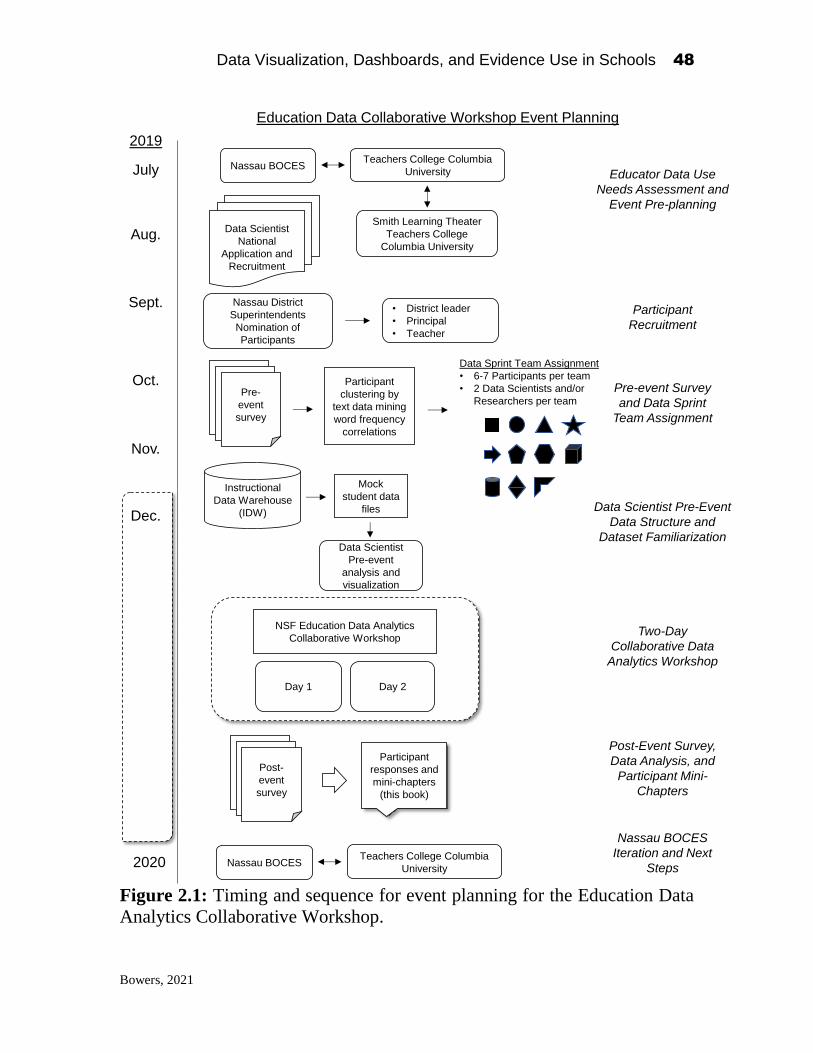
Data Visualization, Dashboards, and Evidence Use in Schools 48
Bowers, 2021
Figure 2.1: Timing and sequence for event planning for the Education Data
Analytics Collaborative Workshop.
Educator Data Use
Needs Assessment and
Event Pre-planning
July
Sept.
Nov.
Dec.
Pre-
event
survey
Instructional
Data Warehouse
(IDW)
Participant
responses and
mini-chapters
(this book)
Nassau BOCESTeachers College Columbia
University
Nassau District
Superintendents
Nomination of
Participants
Participant
Recruitment
Pre-event Survey
and Data Sprint
Team Assignment
Two-Day
Collaborative Data
Analytics Workshop
Data Scientist
National
Application and
Recruitment
Mock
student data
files
NSF Education Data Analytics
Collaborative Workshop
• District leader
• Principal
• Teacher
Smith Learning Theater
Teachers College
Columbia University
Data Sprint Team Assignment
• 6-7 Participants per team
• 2 Data Scientists and/or
Researchers per team
Aug.
Oct.
Data Scientist
Pre-event
analysis and
visualization
Participant
clustering by
text data mining
word frequency
correlations
Education Data Collaborative Workshop Event Planning
2019
Day 1 Day 2
Post-
event
survey
Nassau BOCESTeachers College Columbia
University2020
Data Scientist Pre-Event
Data Structure and
Dataset Familiarization
Post-Event Survey,
Data Analysis, and
Participant Mini-
Chapters
Nassau BOCES
Iteration and Next
Steps

Data Visualization, Dashboards, and Evidence Use in Schools 49
Bowers, 2021
for name badges, current job roles, and information for catering preferences.
Importantly, we also wanted to learn about participants’ perceptions on data
use and data visualization. To do so we included the following three open-
ended long-form essay questions in the pre-event survey, adapting data use
and data system questions from the previous research noted above, of which
the first is adapted directly from Brocato et al. (2014):
• What components of a longitudinal data system are needed to best meet
the needs of superintendents, principals, and teacher leaders?
• What challenges and successes have you experienced using data and
evidence in your practices in schools/districts?
• Thinking about data and evidence that are available in your current
systems, how could the data visualization and evidence be improved? How
would these improvements help you?
To match participants into datasprint teams, we used text data mining
for the matching process based on the similarity and word frequency
correlations across participant responses to these three questions on the pre-
event survey. We relied on our previous research in education leadership,
school finance, and learning analytics for the models (Bowers & Chen, 2015;
Slater, Baker, Almeda, Bowers, & Heffernan, 2017; Wang, Bowers, & Fikis,
2017). We first concatenated each participant’s responses to the open-ended
pre-event survey questions to generate one “document” per participant. Text
data mining, specifically correlated topic modeling (CTM) used here, is a data
mining technique which takes as input a sparse words by document matrix,
and generates as the output a topics by documents and topics by words matrix.
Importantly for our use here, a correlated topic model is a probability model,
so rather than classify documents into a specific latent topic, each document
is given a probability. This method has been shown previously to work well
to empirically create collaborative online discussion board groups based on
participant word correlation frequency patterns (Bowers, Pekcan, & Pan,
2021). Following these recommendations, we used these probabilities to map
participants into a two-dimensional space using multidimensional scaling to
identify similar clusters of word correlation frequencies. These clusters of
participant response similarity were then used to create the datasprint teams,
assigning each participant to one unique datasprint team based on each
individual’s shared common language with others in the team from the survey.
Creating a Shared Data File for the Workshop
In anticipating the work of the datasprint groups, we wanted to provide
the teams with a consistent set of data that 1) included a broad variety of data

Data Visualization, Dashboards, and Evidence Use in Schools 50
Bowers, 2021
that is available in the IDW, and 2) that the data file formats match the current
IDW so that code generated on them during the workshop could potentially
be used by the districts and Nassau BOCES. To generate this dataset, the
Nassau BOCES staff worked throughout the months preceding the workshop
to create a fake mock dataset that included realistic IDW data in the file
formats that match the IDW data structures. The types of data in the mock
dataset included for example multiple years of linked student attendance,
standardized test scores, and how the scores relate to district and state
benchmarks. This mock dataset was then sent to the data scientists a few days
before the event to give them an opportunity before the event to examine the
structure of the data and types of data available for the workshop.
The Workshop and Post-Event Follow-ups
We held the Education Data Analytics Collaborative Workshop over
two days, which I describe in detail in the below sections. As summarized in
Figure 2.1, after the workshop, we followed up with a post-event survey,
asking participants to provide feedback on their satisfaction with multiple
aspects of the event, as well as returning to the three long-form essay questions
from the pre-event survey. Importantly, we also asked participants if they
would be willing to write a chapter for this present edited book, and we
received 25 chapters from 33 authors/co-authors, representing educators,
Nassau BOCES data administrators, data scientists, and researchers (see
Chapter 1 Bowers, and Chapter 3 Kang and Bowers, this book). During the
chapter writing process, we also offered authors the opportunity to analyze the
de-identified data from the pre-event and post-event surveys, which resulted
in multiple authors analyzing the data in their chapters in this book, including
among others: Kang and Bowers (chapter 3); Nguyen, Campos and Ahn
(chapter 4); and Gegenheimer (chapter 5). Following the Education Data
Analytics Collaborative Workshop, while the grant funded project was
concluding, Nassau BOCES and TC continued to discuss the outcomes from
the workshop, and as detailed in chapter 8 by Meador Pratt, Nassau BOCES
has continued to advance their data visualization and IDW systems given the
discussions and outcomes from across the project and especially from the
workshop.
The Education Data Analytics Collaborative Workshop Structure and
Orchestration
Figure 2.2 details the structure and pacing of the Education Data
Analytics Collaborative Workshop for day 1 and day 2. The workshop opened
on the morning of day 1 with participants registering at check-in with their

Data Visualization, Dashboards, and Evidence Use in Schools 51
Bowers, 2021
name badge including the
symbol for their upcoming
datasprint team. As attendees
then entered the Learning
Theater, they were asked to
find their name on the large
central display. The display
contained the two-
dimensional plot of the multi-
dimensional scaling of the correlated text mining results (discussed above),
with each participant’s name on the plot (rather than a dot). In this way, each
participant saw their name in relation to all other attendees plotted into a two-
dimensional rectangle, which we mapped to the rectangle of the Learning
Theater space itself. We split the figure into multiple “countries” by drawing
dashed lines between the clusters, and we asked participants to find their name
on the plot which corresponded to an area in the Learning Theater, then gather
in that area and discuss with people near them issues of data visualization and
data use in their work. Thus, where each person was standing related directly
to the text mining results, such that the other people nearby already shared a
common language about data and data visualization due to the clustering from
the word correlation frequency algorithm mapping. Even if an attendee did
not know anyone at the event, the goal with this process was to ensure that the
people around them already had a shared common language, which would
hopefully kickstart conversations. The intention with this starting structure
was to center the educators in the space as the experts, while providing an
icebreaker activity and networking opportunity for participants to meet each
other and begin discussing data visualization right from the start. Participants
were then asked to look at their name badge and then go to their datasprint
team area in the Learning Theater, and we then proceeded with introductions
and initial discussions within teams returning them to the questions from the
pre-event survey. Throughout the morning we emphasized three main goals
of the two-day collaborative workshop of:
1. Build capacity and knowledge around the data and data visualizations that
teachers and administrators need to help inform instructional
improvement.
2. Network with educators, data scientists, and education researchers to
inform practice, tools, and research.
Data Visualization, Dashboards, and Evidence Use in Schools 52
Bowers, 2021
3. Create analysis, visualizations, tools, and conversations that help all of us
improve data use and data visualization to address your needs in schools.
The lunch speaker was Professor Richard Halverson from the University of
Wisconsin-Madison who provided a talk that discussed not only the current
research and evidence on data use and data systems, but a look to the future
and where data systems may be going next (see chapter 7 this book,
Halverson).
The afternoon of day 1 then transitioned to what we termed “cabana
quick talks”. As we had invited eight national-level education researchers to
speak to their research on data use and data visualization, we wanted to
provide them the space to give a 10-minute talk with 5 minutes for questions.
However, to hear from each speaker with questions and transitions would not
only use a large amount of the time for day 1, but would mean that everyone
in the workshop would be mostly passively listening for two hours, rather than
discussing, collaborating, and networking which is recommended given the
co-design literature discussed above. To create an active and engaging
session, on the ends of the Learning Theater we set up eight small “cabanas”
(four on one end of the space, four on the opposite end) for 8 to 10 people to
stand or sit, with a large screen for each presenter to display a presentation.
Each cabana was labeled with a nature symbol: moon, sun, mountain, cloud,
flower, wave, tree, lighting. The cabana quick-talk speakers were asked to
temporarily leave their datasprint team area and prepare their cabana space
during the lunch speaker. Each datasprint team table then had a stack of cards,
each with one of the symbols printed on it. The purpose of the cabana quick
talks was presented as:
Cabana Quick-Talk Purpose: To learn more about different applications
of data use and data visualizations in order to inform instructional
improvement and capacity building in schools. The central question:
How do we make data visualizations compelling to help build
collaboration between and evidence use by teachers and
administrators?
We asked each datasprint team member to pick a cabana symbol card at
random and then attend that quick talk. Team members then returned to their
datasprint teams. Once back to their datasprint teams, participants were asked
to write their thoughts about what they noticed and wondered from the quick
talks on individual sticky notes, and then go around the table and discuss one
of their notes each. We then repeated this activity a second time with

Data Visualization, Dashboards, and Evidence Use in Schools 53
Bowers, 2021
Figure 2.2: Day 1 and Day 2 Workshop and Orchestration (continued on
following page)
Morning
Smith Learning Theater
Teachers College
Columbia University
Afternoon
Education Data Analytics Collaborative Workshop
Day 1
Participants find
their name on the
“map” of participants
and gather in that
area of their
Learning Theater
Find another person
in your “country”.Discuss issues of
data visualization
and data use in your
work
Participants move to
one of 11 Assigned
Data Sprint team
locations in Learning
Theater
Collaborative team introduction discussions:
• Challenges & Successes with data use
• What are the most useful components of
a longitudinal data system for teachers,
principals, and superintendents?
“Cabana” data use
expert quick-talks.
Each team sends 1-2
representatives. 10
min quick-talk, 5 min
Q&A.
Second round,
“Cabana” data use
expert quick-talks,
attend different
groups
Data Sprint team
discussions on what
we learned
Lunch seminar speaker: Professor Richard Halverson, University of Wisconsin-Madison
Clustering
reflections on
Cabana quick-talks
Priorities vs.
Possibilities graphing
and discussion
Priority
Possibility
Data Analytics and Coding Workshop.
Data scientists informally present “how to” analytics in R and Python to share open
code and resources
Evening
Open event with
educators as the
experts, talking to
each other as the
first thing as they
enter and explore
the space, while
networking
Goal:
Data Sprint groups
start by talking with
each other and
surfacing their
challenges and
opportunities with
data in their work
Hear about national-
level research on
current issues in
data use in schools
Eight quick talks yet
all teams send one
representative to
each Cabana, then
return and discuss
so that new
information is
shared in a brief
amount of time.
Teams organize and
cluster their thoughts,
name the issues, then
rank by priority versus
possibility, picking one
team consensus issue
for a central focus for
Day 2 analytics
Top issue
selected and
summarized,
shared with all
teams
Fresh from team
discussions, data
scientists have an
opportunity to
collaborate together
on code and
visualizations
Map and
Space
Data
Sprint
Team
Intro
Cabana
Quick
Talks
Priority
vs.
Possibility
Collaborative
Coding
Workshop

Data Visualization, Dashboards, and Evidence Use in Schools 54
Bowers, 2021
Figure 2.2: Day 1 and Day 2 Workshop and Orchestration (continued from
previous page)
Morning
Education Data Analytics Collaborative WorkshopDay 2 Goal:
Capture participant
location as a proxy of
attention while publicly
displaying what is
being recorded so
participants can see
their data.
Teams hear from
data managers for
the county so as to
ground their ideas for
the Data Sprint team
on what data are
actually available
today in what format.
Each attendee
receives location
tracking “Quuppa
chip” on a lanyard
on sign in
Anonymous dot “map” of
participant locations
displayed continuously in
Learning Theater on
screen throughout the day
Data used to
understand participant
attention and flow
throughout the day
Attendees encouraged to
explore and discuss each
visualization as they please
with Expo presenters
Provide opportunities
for participants to
engage with and
explore current
innovations in data
visualization as
exemplars to build on
for their Data Sprint
teams.
Networking for Expo presenters
and participants. Expo stations
include the Nassau BOCES data
visualization and dashboard that
the educators have access to, as
well as IBM Cognos among many
others which is the system for the
BOCES.
Eight invited Expo
presenters in education
data visualization and
dashboards provided
large screen and room
for 10 attendees in
“expo” format in the
Learning Theater
Data Visualization and Dashboard Expo:
Nassau BOCES
presentation on the data
and data files available
for analysis and
visualization
Data file format matches
the current data system
for the BOCES
Mock data files include a range of
available data types for analysis,
including state test scores,
attendance and demographics,
linked to state standards and
benchmarks.
Afternoon
Who, What, When Where:
Data Sprint Teams are
asked to focus their
discussion on these
questions:
Data Visualization plan should focus on two of the four of:
• Who do you need to focus on to address your question?
• What (variables, demographics, scores) do you need to focus on?
• When (what timeframe) should this question address?
• Where do you need to focus on to address the question?
Provide an
opportunity for teams
to discuss specifics for
the data visualization
design given the data
available and their
central focus
question.
Data Sprint Working Session in the 11 assigned Data Sprint Teams:
• Purpose: Data scientists and educators work iteratively in a
structured format to draft and build visualizations with data that
addresses the central focus questions of each team.
• Each team should start by drawing out their visualizations on the
blank sheets of paper provided.
• Keep in mind the core questions:
• How do these visualizations help practice?
• How do we help make this data more useful for practice?
Working Lunch
Using the previous
discussions, ideas,
and drawing, data
scientists live code
and work with
educators to create
data visualizations to
address the Data
Sprint team focus
question.
Journey/Travelers:
While each Data Sprint team
continues to work, one educator
at a time from each team
reports to “Basecamp” to
“Journey” to another Data
Sprint team.
At Basecamp, each Traveler
receives a “backpack” with a
clipboard, notepad, sticky
notes, and pens, then selects
one other Data Sprint team to
travel to and learn about their
visualization and process.
Travelers return to Basecamp
after 10 mins., write summary
notes and post to the
Basecamp “Journey-Wall”.
Repeat with different Travelers
four times.
Provide opportunity
for teams to receive
feedback from other
teams during the
design and coding
process, and cross-
pollenate ideas
between teams, as
well as additional
networking.
Share-out of Data Visualization:
Each team shares their central
question and their data
visualization solution.
Team
Galleries
Gallery walk:
Each visualization is displayed
on separate displays
throughout the Learning
Theater. Participants review
each visualization.
Final Tally:
Participants remove their
Quuppa location tracking
device and leave it on the table
in front of the visualization that
“you feel would be most useful
for teacher and administrator
practice”.
All participants have
an opportunity to see
each visualization
product. Then as a
rough metric, the final
tally of tracking
devices provides a
sense which were the
most popular.
Data
Vis
Expo
Data file
structure &
content
Team
Data
Sprint
Who
What
When
Where
Quuppa
devices
Journey
Travelers

Data Visualization, Dashboards, and Evidence Use in Schools 55
Bowers, 2021
everyone attending a different
cabana quick talk. Through this
process, rather than two hours of
speakers with a passive audience, in
one hour, at least two people from
each datasprint team heard from
each quick-talk speaker, and all
teams had a representative attend all
of the quick-talks, plus the cabana
quick talk speakers themselves were
members of individual datasprint
teams. Participants were active,
moving about the Learning Theater space (an important consideration as this
was the activity right after lunch), and importantly, they were provided time
(although brief) to individually digest what they heard, begin to think about
applications and understandings, and then voice those thoughts in
collaboration with their datasprint team, beginning the co-design process.
Following the cabana
quick talks and a break,
datasprint teams were then asked
to cluster and discuss their ideas
on their sticky notes, working to
organize the thoughts and ideas
from the team into larger clusters
on each team’s individual
whiteboard. Teams were asked to
create names for the different
clusters, identifying the central issues, questions, and ideas around issues of
data visualization and data use in schools that the datasprint team together
were discussing. Teams were then asked to rank these clusters in two
dimensions, priority and
possibility, from 1 (low) to 5
(high) and plot them on their
whiteboard. Priority meaning
what ideas are the most urgent,
versus possibility meaning
which ideas are the most
tractable and do-able. Teams
were then asked to select their
top issue from the priority

Data Visualization, Dashboards, and Evidence Use in Schools 56
Bowers, 2021
versus possibility rankings, and list these in a shared online resource, in which
all teams could review. Throughout the chapters in this book, authors from
the workshop provide pictures of this important whiteboard work, which is a
useful representation of the iterative ideation and co-design process within
each team, rarely captured and discussed by participants in the research and
practice literature in education data use and visualization.
Day 1 then concluded
with the data analytics coding
workshop, in which the
educators could attend if they
choose to, and the data scientists
and education researchers were
provided an opportunity to share
ideas around coding and
visualization, especially using
the mock dataset, as a means to
provide professional development, networking, and preparation for the data
visualization coding required for day 2.
For day 2 of the Education Data Analytics Collaborative Workshop,
participants entered the Learning Theater and received a Quuppa location
tracking device on a lanyard. We projected a map of the Learning Theater
throughout the entire day with each participant as a dot for where their Quuppa
chip was, to provide a level of transparency on what location data was being
tracked throughout the data. Please see chapter 6 of this book by Coleman et
al. for a detailed analysis of the location tracking data throughout the event.
Day 2 of the workshop then opened with the “data visualization expo” in
which participants entered the space to find that each of the cabana quick-talk
locations from the previous day now had presentations from the data scientists
and education researcher visualization experts on large format displays
demonstrating a wide range of specific individual data dashboards and
visualizations. For example, the Nassau BOCES team presented the data
visualizations and dashboard that were currently available across their
districts, while at a different location, a representative from IBM Cognos
presented the upcoming new iterations of the system which was used by
Nassau BOCES (for further discussion see Chapter 8, Pratt, and Chapter 11,
Khan). The data dashboard representations extended beyond IBM Cognos as
well, with data visualization expo presentations from a wide range of
examples and perspectives, many of which are discussed throughout the
chapters in this book. We termed this part of the workshop as an “expo” as we
did not ask the presenters to stick to a talk with slides, but rather to display an

Data Visualization, Dashboards, and Evidence Use in Schools 57
Bowers, 2021
interactive dashboard or visualization, and we asked participants to tour the
Learning Theater to experience each of the different visualizations and ask
any questions they had, as well as network with the expo presenters and others
from the previous day. The intention of the data visualization expo was to start
day 2 building on the work of the previous day through providing a semi-
structured activity that gave participants a strong sense of agency in what they
wanted to engage in, many examples of current innovations in data dashboard
visualizations in education to prime datasprint team ideas for the rest of the
day, and an opportunity for the expo presenters, who were also datasprint team
members, to demonstrate the potential of the visualizations and their work that
they had been describing from the previous day’s activities in their teams.
Day 2 of the workshop then proceeded with a presentation by Jeff
Davis, a senior manager at Nassau BOCES and the central contact for the
workshop on the mock dataset from the IDW for use throughout the event.
This presentation detailed the specifics of what data were available in the
dataset and the data file formats, providing attendees the specifics on data
availability and data structure to help facilitate the datasprint team discussions
around possibilities and coding for their data visualizations that they would
be working towards in the afternoon session. After a break we then asked the
datasprint teams to engage in a discussion in which they returned to their work
from the previous day which we had left up as they had left it over night from
day 1 on the whiteboards in their datasprint team space. We asked them to
take into consideration the data format and availability that had just been
presented for what was available in the mock datafiles, and that they should
discuss the following to start to get specific for their planned data visualization
given the possibility and priority question identified on day 1, discussing the
following four questions:
1. Who do you need to focus on to address your question?
2. What (variables, demographics, scores) do you need to focus on?
3. When (what timeframe) should this question address?
4. Where do you need to focus on to address the question?
These sets of questions were intended to help the datasprint teams become
much more specific in their discussions and plans for iterating on a possible
data visualization.
Day 2 of the workshop then transitioned to a working lunch and the
afternoon coding and visualization session, in which teams were provided the
following prompts to help guide their work to generate visualizations and
code:

Data Visualization, Dashboards, and Evidence Use in Schools 58
Bowers, 2021
• Purpose: Data scientists and educators work iteratively in a structured
format to draft and build visualizations with data that addresses the central
focus questions of each team.
• Each team should start by drawing out their visualizations on the blank
sheets of paper provided.
• Keep in mind the core questions:
o How do these visualizations help practice?
o How do we help make this data more useful for practice?
As noted above, one issue with workshops such as this in which teams
are created and asked to work together over an extended time is the potential
for isolation within the team. Our goal in the workshop was to have the
datasprint teams work collaboratively both within and across the teams.
Additionally, we knew that the afternoon session would be quite intensive for
the data scientists as they were live coding and analyzing the datasets, and so
we wanted to provide an opportunity for additional cross-team discussions,
networking, and idea generation, as well as provide feedback to each
datasprint team as they worked on their visualizations. This was the intention
then of the afternoon “Journey/Travelers” protocol. In 20-minute rounds we
asked one datasprint team member from each of the eleven teams, who was
not a data scientist, to “report to basecamp”. The basecamp was set up to one
side of the Learning Theater, with a “backpack” of journeying supplies that
included a clipboard, note cards and sticky notes, and pens. We asked each
person who reported to basecamp to select a datasprint team that was not their
own, and “journey” to that team. We also asked each datasprint team to
appoint a facilitator who would meet and discuss with the journeyer.
Discussions at the datasprint teams were to take 10 minutes, and we gave the
following prompts for journeyers to ask to start the discussion:
• Can you tell me about how you have gone from your priority statement to
the work you are doing now?
• What data elements have been important for your discussion?
• How do you see the visualization you are working on helpful for teacher
or administrator practice?
After these discussions we then asked the journeyers to return to basecamp,
and summarize their thoughts on three large sticky notes, keeping in mind the
question “Based on your work with data in schools, in what ways does this
team’s visualizations inform practice?”. We then placed these notes on a very
large set of whiteboards, clustering the notes by datasprint team symbol. We
then repeated the process multiple times. In this way, datasprint teams were

Data Visualization, Dashboards, and Evidence Use in Schools 59
Bowers, 2021
visited by multiple other participants, increasing the networking and
collaboration across teams, and the information sharing possible, and at the
same time building a series of reflections on each team’s ongoing work.
The Education Data Analytics Collaborative Workshop concluded with
datasprint teams each sharing out their visualization. Each team had a few
minutes to present their visualization, and the camera crew in the Learning
Theater helped to capture and display each visualization and speaker, and
display the information for all participants to see and hear. Participants were
then provided time for a gallery walk to review each of the visualizations, as
each team was asked to display the visualization onto the eleven different
datasprint team whiteboards such that attendees could walk around and view
the different solutions. We then asked each attendee to remove their Quuppa
chip and place it at the datasprint team location in response to the question for
which visualization “you feel would be most useful for teacher and
administrator practice”. This final process thus provided an opportunity for all
attendees to see the work across all of the datasprint teams as well as affirm
the most popular presentations.
Education Data Analytics Collaborative Workshop Outcomes
In this section I provide a selection of the outcomes from the Education Data
Analytics Collaborative Workshop. In the chapters in the rest of Part I of this
book as well as throughout the book, the authors analyze and discuss both the
data generated from the workshop as well as specifics around the
visualizations created within each of their datasprint teams. Figure 2.3
provides the final summary visualizations for each of the eleven datasprint
teams, with visualizations in the upper part of the figure perceived generally
as more popular by participants. An issue during the end of the workshop was
that given the limited amount of time available for the presentations (just a
few minutes) participant perceptions of each visualization may have depended
largely on the presentation itself, rather than the specifics of the visualization,
as in the final gallery walk, while participants could look at the displayed
visualization, there was little time for additional questions or interactivity as
we ended the workshop.

Data Visualization, Dashboards, and Evidence Use in Schools 60
Bowers, 2021
Figure 2.3: Final presented data visualizations from each Education Data
Analytics Collaborative Workshop datasprint team. Visualizations in the
upper part of the figure were generally perceived as more popular.

Data Visualization, Dashboards, and Evidence Use in Schools 61
Bowers, 2021
Throughout this book, chapter authors discuss each of these
visualizations in Figure 2.3 in the following chapters:
Pentagon: Chapters 8, 18, 21
Cube: Chapters 4, 8, 9, 10, 11
Hexagon: Chapter 19
Arrow: Chapter 12
Star: Chapters 23, 24
Cylinder: Chapter 17
Triangle: Chapter 25
Diamond: Chapter 18
Circle: Chapters 8, 15
Chevron: Chapters 13, 14
Square: Chapters 4, 22
In Figure 2.4, I summarize the average responses to the post-event
satisfaction survey. Overall, (Figure 2.4 top) participant satisfaction was on
average above expectations across the different parts of each of the day 1 and
2 activities with the day 1 keynote lunch seminar and day 2 activities as the
highest rated. Given the intention to center the work and voices of educators
throughout the event, the middle section of Figure 2.4 shows that the educator
attendees rated the event on average somewhat higher than the data scientist
and researcher attendees, although none of the differences were statistically
significantly different. To examine the extent that the event informed
participant ideas in these domains as well as extended their networks, the
bottom panel of Figure 2.4 shows that participants on average agreed that they
identified at least one new idea to use in their work and met at least one other
person who they may follow-up with after the event.

Data Visualization, Dashboards, and Evidence Use in Schools 62
Bowers, 2021
Figure 2.4: Summary averages of participant post-event satisfaction.
Well above Expectations
Above Expectations
Met Expectations
Below Expectations
Well below Expectations
How well did each session that you attended meet your expectations?
How well did each session that you attended meet your expectations?
Well above
Above
Met
Below
Well belowWell above
Above
Met
Below
Well belowWell above
Above
Met
Below
Well below
I identified at least one new idea, theme, theory, or technique that I plan to use in my practice
Strongly agree
Agree
Disagree
Strongly disagree
I met at least one other person who I may follow-up with in this field
Strongly agree
Agree
Disagree
Strongly disagree

Data Visualization, Dashboards, and Evidence Use in Schools 63
Bowers, 2021
Final Reflections:
As the principal investigator on this grant project, I was very
enthusiastic about this final phase of the project and the Education Data
Analytics Collaborative Workshop. The workshop provided a rare
opportunity to bring together educators, administrators, data scientists, and
researchers, and get them talking about the data visualization and dashboard
work that is important to the daily practice of teachers and school and district
leaders. From the post-event survey, as well as the response to the opportunity
for workshop participants to contribute chapters to this book, I believe the
workshop was a success. Yet, as detailed by the many authors in the following
evocative chapters, there is much exciting work to be done in the effort to
create data visualizations and data dashboards that address the needs of
teachers and administrators. Working to build opportunities to bring together
educators, data scientists, and researchers has great potential to deeply inform
the work of each group, as we build capacity and experience in data
visualization that can inform evidence-based improvement cycles and
instructional improvement in schools. I look forward to future research
continuing to capture the perspectives of each of these important groups of
professionals, and further refine and improve data visualization research in
education across schools and communities.
Returning to the above discussion of the task-clarity-as-outcome model
in which the data visualizations generated from an iterative co-design process
are secondary to the work of moving organizational tasks from fuzzy to crisp,
gaining clarity throughout the process, the chapters throughout this book from
the participants represent an attempt to capture this task-clarity-as-outcome
model work. The visualizations generated from the datasprint teams are useful
outcomes themselves, especially as multiple subsequent chapters here from
participants discuss the detailed ways in which the visualizations and analyses
can be used next in their practice. Additionally, together the chapters
throughout this book from the many participants provide an exploration of the
task of data use in schools, from the perspectives of the main stakeholders in
the process, including educators, data scientists, researchers, and the central
data management staff, here from Nassau BOCES as well as IBM Cognos.
Taken together, the chapters throughout this book provide a deep description
of practitioners working to gain clarity around the task of visualizing and
using data in schools from the data that currently is available in IDWs. While
I argue that it is too early in the domain to come to definitive conclusions
about these tasks, the rich discussion of those tasks from multiple perspectives
throughout the chapters in this book and how they relate directly to the

Data Visualization, Dashboards, and Evidence Use in Schools 64
Bowers, 2021
practical issues of doing data visualization and data use work in schooling
organizations open an exciting and new window into this task clarity process
on the journey towards more effective and informative data use in education.
References:
Agasisti, T., & Bowers, A. J. (2017). Data Analytics and Decision-Making in Education:
Towards the Educational Data Scientist as a Key Actor in Schools and Higher
Education Institutions. In G. Johnes, J. Johnes, T. Agasisti, & L. López-Torres
(Eds.), Handbook on the Economics of Education (pp. 184-210). Cheltenham, UK:
Edward Elgar Publishing. https://doi.org/10.7916/D8PR95T2
Bienkowski, M., Feng, M., & Means, B. (2012). Enhancing Teaching and Learning
Through Educational Data Mining and Learning Analytics: An Issue Brief.
Washington, DC: http://www.ed.gov/edblogs/technology/files/2012/03/edm-la-
brief.pdf
Boudett, K. P., City, E. A., & Murnane, R. J. (2013). Data Wise: Revised and Expanded
Edition: A Step-by-Step Guide to Using Assessment Results to Improve Teaching
and Learning. Revised and Expanded Edition. Cambridge, MA: Harvard Education
Press.
Bowers, A. J. (2017). Quantitative Research Methods Training in Education Leadership
and Administration Preparation Programs as Disciplined Inquiry for Building
School Improvement Capacity. Journal of Research on Leadership Education,
12(1), 72 - 96. https://doi.org/10.1177/1942775116659462
Bowers, A. J. (2021a). Dashboards, Data Use, and Decision-making – A Data
Collaborative Workshop Bringing Together Educators and Data Scientists. In A. J.
Bowers (Ed.), Data Visualization, Dashboards, and Evidence Use in Schools: Data
Collaborative Workshop Perspectives of Educators, Researchers, and Data
Scientists. New York, NY: Teachers College, Columbia Unviersity.
Bowers, A. J. (2021b). Early Warning Systems and Indicators of Dropping Out of Upper
Secondary School: The Emerging Role of Digital Technologies. In OECD Digital
Education Outlook 2021: Pushing the Frontiers with Artificial Intelligence,
Blockchain and Robots. Paris, France: Organisation for Economic Co-Operation
and Development (OECD) Publishing. https://doi.org/10.1787/589b283f-en
Bowers, A. J., Bang, A., Pan, Y., & Graves, K. E. (2019). Education Leadership Data
Analytics (ELDA): A White Paper Report on the 2018 ELDA Summit.
https://doi.org/10.7916/d8-31a0-pt97
Bowers, A. J., & Chen, J. (2015). Ask and Ye Shall Receive? Automated Text Mining of
Michigan Capital Facility Finance Bond Election Proposals to Identify which
Topics are Associated with Bond Passage and Voter Turnout. Journal of Education
Finance, 41(2), 164-196.
Bowers, A. J., & Krumm, A. E. (in press). Supporting the Initial Work of Evidence-Based
Improvement Cycles Through a Data-Intensive Partnership. Information and
Learning Sciences.
Bowers, A. J., Pekcan, B., & Pan, Y. (2021). Grouping Online Education Leadership
Professional Development Discussion Board Participants using Automated Text

Data Visualization, Dashboards, and Evidence Use in Schools 65
Bowers, 2021
Data Mining. Paper presented at the Annual meeting of the University Council for
Educational Administration, Columbus OH.
Brandt, E. (2006). Designing exploratory design games: a framework for participation in
Participatory Design? Paper presented at the Proceedings of the ninth conference
on Participatory design: Expanding boundaries in design - Volume 1, Trento, Italy.
https://doi.org/10.1145/1147261.1147271
Brocato, K., Willis, C., & Dechert, K. (2014). Longitudinal Data Use: Ideas for District,
Building, and Classroom Leaders In A. J. Bowers, A. R. Shoho, & B. G. Barnett
(Eds.), Using Data in Schools to Inform Leadership and Decision Making (pp. 97-
120). Charlotte, NC: Information Age Publishing.
Cober, R., Tan, E., Slotta, J., So, H.-J., & Könings, K. D. (2015). Teachers as participatory
designers: two case studies with technology-enhanced learning environments.
Instructional Science, 43(2), 203-228. doi:10.1007/s11251-014-9339-0
Coburn, C. E., & Penuel, W. R. (2016). Research–Practice Partnerships in Education:
Outcomes, Dynamics and Open Questions. Educational Researcher, 45(1), 48-54.
https://doi.org/10.3102/0013189X16631750
Crisan, A., Gardy, J. L., & Munzner, T. (2016). On Regulatory and Organizational
Constraints in Visualization Design and Evaluation. Paper presented at the
Proceedings of the Sixth Workshop on Beyond Time and Errors on Novel
Evaluation Methods for Visualization, Baltimore, MD, USA.
https://doi.org/10.1145/2993901.2993911
Crisan, A., & Munzner, T. (2019, 20-25 Oct. 2019). Uncovering Data Landscapes through
Data Reconnaissance and Task Wrangling. Paper presented at the 2019 IEEE
Visualization Conference (VIS).
Echeverria, V., Martinez-Maldonado, R., Shum, S. B., Chiluiza, K., Granda, R., & Conati,
C. (2018). Exploratory versus Explanatory Visual Learning Analytics: Driving
Teachers’ Attention through Educational Data Storytelling. The Journal of
Learning Analytics, 5(3), 72-97. https://doi.org/10.1145/3170358.3170380
Farley-Ripple, E. N., Jennings, A., & Jennings, A. B. (2021). Tools of the trade: a look at
educators’ use of assessment systems. School Effectiveness and School
Improvement, 32(1), 96-117. https://doi.org/10.1080/09243453.2020.1777171
Farley-Ripple, E. N., May, H., Karpyn, A., Tilley, K., & McDonough, K. (2018).
Rethinking Connections Between Research and Practice in Education: A
Conceptual Framework. Educational Researcher, 47(4), 235-245.
https://doi.org/10.3102/0013189x18761042
Fischer, C., Pardos, Z. A., Baker, R. S., Williams, J. J., Smyth, P., Yu, R., . . . Warschauer,
M. (2020). Mining Big Data in Education: Affordances and Challenges. Review of
Research in Education, 44(1), 130-160.
https://doi.org/10.3102/0091732x20903304
Gerzon, N. (2015). Structuring Professional Learning to Develop a Culture of Data Use:
Aligning Knowledge From the Field and Research Findings. Teachers College
Record, 117(4), 1-28. http://www.tcrecord.org/Content.asp?ContentId=17854
Grabarek, J., & Kallemeyn, L. M. (2020). Does Teacher Data Use Lead to Improved
Student Achievement? A Review of the Empirical Evidence. Teachers College
Record, 122(12). https://www.tcrecord.org/Content.asp?ContentId=23506
Data Visualization, Dashboards, and Evidence Use in Schools 66
Bowers, 2021
Halverson, R. (2010). School formative feedback systems. Peabody Journal of Education,
85(2), 130-146. https://doi.org/10.1080/0161956100368527
Holstein, K., McLaren, B. M., & Aleven, V. (2017). Intelligent tutors as teachers' aides:
exploring teacher needs for real-time analytics in blended classrooms. Paper
presented at the Proceedings of the Seventh International Learning Analytics
& Knowledge Conference, Vancouver, British Columbia, Canada.
https://doi.org/10.1145/3027385.3027451
Krumm, A. E., & Bowers, A. J. (in press). Data-intensive improvement: The intersection
of data science and improvement science. In D. J. Peurach, J. L. Russell, L. Cohen-
Vogel, & W. R. Penuel (Eds.), Handbook on Improvement Focused Educational
Research. Lanham, MD: Rowman & Littlefield.
Krumm, A. E., Means, B., & Bienkowski, M. (2018). Learning Analytics Goes to School:
A Collaborative Approach to Improving Education. New York: Routledge.
Mandinach, E. B., & Schildkamp, K. (2021). Misconceptions about data-based decision
making in education: An exploration of the literature. Studies in Educational
Evaluation, 69. https://doi.org/10.1016/j.stueduc.2020.100842
Marsh, J. A. (2012). Interventions Promoting Educators’ Use of Data: Research Insights
and Gaps. Teachers College Record, 114(11), 1-48.
Matuk, C., Gerard, L., Lim-Breitbart, J., & Linn, M. (2016). Gathering Requirements for
Teacher Tools: Strategies for Empowering Teachers Through Co-Design. Journal
of Science Teacher Education, 27(1), 79-110. https://doi.org/10.1007/s10972-016-
9459-2
Meyer, M., Sedlmair, M., & Munzner, T. (2012). The four-level nested model revisited:
blocks and guidelines. Paper presented at the Proceedings of the 2012 BELIV
Workshop: Beyond Time and Errors - Novel Evaluation Methods for Visualization,
Seattle, Washington, USA. https://doi.org/10.1145/2442576.2442587
Meyer, M., Sedlmair, M., Quinan, P. S., & Munzner, T. (2015). The nested blocks and
guidelines model. Information Visualization, 14(3), 234-249.
https://doi.org/10.1177/1473871613510429
Muller, M. J., & Kuhn, S. (1993). Special issue on participatory design. Communications
of the ACM, 36(6), 24-28.
Oppermann, M., & Munzner, T. (2020, 25-30 Oct. 2020). Data-First Visualization Design
Studies. Paper presented at the 2020 IEEE Workshop on Evaluation and Beyond -
Methodological Approaches to Visualization (BELIV).
Piety, P. J., Hickey, D. T., & Bishop, M. (2014). Educational data sciences: Framing
emergent practices for analytics of learning, organizations, and systems. Paper
presented at the Proceedings of the Fourth International Conference on Learning
Analytics and Knowledge.
Piety, P. J., & Pea, R. D. (2018). Understanding Learning Analytics Across Practices. In
D. Niemi, R. D. Pea, & B. Saxberg (Eds.), Learning Analytics in Education (Vol.
215-232). Charlotte, NC: Information Age Publishing.
Reeves, T. D., Wei, D., & Hamilton, V. (in press). In-Service Teacher Access to and Use
of Non-Academic Data for Decision Making. The Educational Forum, 1-22.
https://doi.org/10.1080/00131725.2020.1869358
Riehl, C., Earle, H., Nagarajan, P., Schwitzman, T. E., & Vernikoff, L. (2018). Following
the path of greatest persistence: Sensemaking, data use, and everyday practice of

Data Visualization, Dashboards, and Evidence Use in Schools 67
Bowers, 2021
teaching. In N. Barnes & H. Fives (Eds.), Cases of Teachers' Data Use (pp. 30-43).
New York: Routledge.
Roschelle, J., Penuel, W. R., & Shechtman, N. (2006). Co-design of innovations with
teachers: definition and dynamics. Paper presented at the Proceedings of the 7th
international conference on learning sciences, Bloomington, Indiana.
https://dl.acm.org/doi/abs/10.5555/1150034.1150122
Schwendimann, B. A., Rodríguez-Triana, M. J., Vozniuk, A., Prieto, L. P., Boroujeni, M.
S., Holzer, A., . . . Dillenbourg, P. (2017). Perceiving Learning at a Glance: A
Systematic Literature Review of Learning Dashboard Research. IEEE Transactions
on Learning Technologies, 10(1), 30-41. https://doi.org/10.1109/tlt.2016.2599522
Slater, S., Baker, R., Almeda, M. V., Bowers, A., & Heffernan, N. (2017). Using
correlational topic modeling for automated topic identification in intelligent
tutoring systems. Paper presented at the Proceedings of the Seventh International
Learning Analytics & Knowledge Conference, Vancouver, British Columbia,
Canada.
Wachen, J., Harrison, C., & Cohen-Vogel, L. (2018). Data Use as Instructional Reform:
Exploring Educators’ Reports of Classroom Practice. Leadership and Policy in
Schools, 17(2), 296-325. https://doi.org/10.1080/15700763.2016.1278244
Wang, Y., Bowers, A. J., & Fikis, D. J. (2017). Automated Text Data Mining Analysis of
Five Decades of Educational Leadership Research Literature:Probabilistic Topic
Modeling of EAQ Articles From 1965 to 2014. Educational Administration
Quarterly, 53(2), 289-323. https://doi.org/10.1177/0013161x16660585
Wayman, J. C., Shaw, S., & Cho, V. (2017). Longitudinal Effects of Teacher Use of a
Computer Data System on Student Achievement. AERA Open, 3(1).
https://doi.org/10.1177/2332858416685534
Wilkerson, S. B., Klute, M., Peery, B., & Liu, J. (2021). How Nebraska teachers use and
perceive summative, interim, and formative data (REL 2021–054). Washington,
DC: https://ies.ed.gov/ncee/edlabs/projects/project.asp?projectID=5683

Data Visualization, Dashboards, and Evidence Use in Schools 68
Kang & Bowers, 2021
CHAPTER 3
NSF Education Data Analytics Collaborative Workshop: How Educators and Data Scientists
Meet and Create Data Visualizations
Seulgi Kang
Teachers College, Columbia University
Alex J. Bowers Teachers College, Columbia University
Workshop Overview1
On December 5 and 6, 2019, the National Science Foundation (NSF)
Education Data Analytics Collaborative Workshop was held at Teachers
College, Columbia University in New York City. Approximately 80
participants from New York and beyond gathered for a two-day workshop.
This workshop was a part of the final phase of the collaborative NSF
funded research project (NSF #1560720) "Building Community and
Capacity for Data-Intensive Evidence-Based Decision Making in Schools
and Districts", a collaborative partnership on data use and evidence-based
improvement cycles in collaboration with Nassau County Long Island
BOCES (Board of Cooperative Education Services) (Nassau BOCES) and
their 56 school districts in Nassau County Long Island, New York.
The workshop was the final third phase of the three-phase
collaborative NSF project. In phase 1, about 5,000 surveys were collected
on educator data use practices across the districts, as well as 40 in-person
Data Visualization, Dashboards, and Evidence Use in Schools
2021, Authors. Creative Commons License CC BY NC ND

Data Visualization, Dashboards, and Evidence Use in Schools 69
Kang & Bowers, 2021
interviews with educators, working to understand what educators say they
need in their data use practices in schools. In phase 2, researchers analyzed
hundreds of thousands of rows of clickstream logfile data of educator
clicks in BOCES Instructional Data Warehouse (IDW) to understand what
data is accessed and when. In this final phase 3 of the project, we aimed to
achieve three goals through a collaborative workshop: (a) to bring Nassau
County leaders and educators together with data scientists, to build
collaborative conversations, workflows, visualizations, and pilot code; (b)
to train Nassau County’s educators around data use using the current data
system available to them; and (c) to publish open-accessed R code as well
as educator perceptions of this intersection of data use and education data
science to inform future work around data dashboards, data visualization,
data use, and evidence-based improvement cycles for instructional
improvement in schools.
The ELDA Summit 2018 and NSF Education Data Analytics
Collaborative Workshop
As a final phase of the NSF grant, this collaborative workshop built on the
Education Leadership Data Analytics (ELDA) Summit 2018, an initial
workshop conducted in 2018 to expand the discussion on Education
Leadership Data Analytics (ELDA) (Bowers et al., 2019). As the capstone
event of the NSF grant collaborative project, the 2019 NSF Education Data
Analytics Collaborative Workshop combined together the aspects from the
2018 meeting and new learnings and collaborative opportunities around the
goal of enhancing evidence-based decision making in schools. Thus, it is
important to understand what aspects the ELDA Summit 2018 brought into
the NSF grant project.
The ELDA Summit 2018 gathered 120 researchers and practitioners
at Teachers College, Columbia University in New York City on June 7 and
8 of 2018. The summit succeeded in bringing experts from three fields –
education leadership, data and evidence use in schools, and data analytics
and data science, where the importance of evidence-based decision making
in schools is on the rise (Bowers et al., 2019).
To sum up the main takeaways from the 2018 summit, the attendees
of that meeting agreed on a strong academic training system specifically
for education data practitioners, a firm network to connect three domains
of ELDA – 1) Education Leadership, 2) Data Science and Data Analytics,
and 3) Evidence-Based Improvement Cycles, as well as on issues with data
privacy. However, the central issue that surfaced from the ELDA Summit
2018 was the need for a greater role of the voices of teachers and
administrators along with building stronger partnerships between

Data Visualization, Dashboards, and Evidence Use in Schools 70
Kang & Bowers, 2021
practitioners (educators and administrators) and researchers (data scientists
and education researchers) in order to support the use of data analytics and
data dashboards within schools (Bowers et al. 2019).
This call for centering the voices of practitioners became one of the
main goals for the 2019 meeting and reconfirmed ELDA’s aim to bring
practitioners and researchers together for the final phase of the NSF project.
Thus, building on the work from 2018, the 2019 NSF collaborative
workshop was built around a two-day event, focusing mainly on
facilitating interactions between practitioners and researchers in each
“datasprint team” in which data scientists were partnered with 5-6
educators over the two days.
To build robust participation, we first recruited education data
scientists by posting a call in summer of 2019 for education data scientists
to apply to participate, which yielded about 30 data scientist and education
researcher participants. To invite education practitioners to the workshop,
Nassau BOCES sent an invitation to specific districts in the county,
requesting that each school district superintendent recommend one teacher,
one building administrator, and one district administrator to participate.
Organization of the Workshop
In a pre-event survey sent to nominated attendees a few weeks before the
event, we collected short essay-style answers to questions that could help
the ELDA team build datasprint teams according to the similar interests or
perspectives of participants. The questions were:
⚫ What challenges and successes have you experienced using data and
evidence in your practices in schools/districts?
⚫ What components of a longitudinal data system are needed to best meet
the needs of superintendents, principals, and teacher leaders? This
question was drawn from previous surveys on data use from these three
different educator roles by Brocato, Willis, and Detchert (2014).
⚫ In thinking about data and evidence that are available in your current
systems, how could the data visualization and evidence be improved?
How would these improvements help you?
Datasprint Team Member Analysis: How We Designed Teams
Once we received the responses from the participants on the pre-event
survey, we were able to estimate the final count of participants and create
11 teams with an average of 7 participants, including for each datasprint

Data Visualization, Dashboards, and Evidence Use in Schools 71
Kang & Bowers, 2021
team: 3-5 practitioners (educators and administrators) and 3-4 researchers
(data scientists and education researchers). Figure 3.1 details these
distributions for each team.
Figure 3.1. Education Data Analytics Collaborative Workshop Datasprint
Team Member Analysis; Mean (Educators= 2.00) (Administrators = 1.55)
(Data Scientists = 1.91) (Researchers = 1.45)
For the team member analysis in the Figure 3.1, we used four
categories: educators, administrators, data scientists, and researchers. The
category for each participant was assigned based on the participant’s
response on the job title question in the pre-event survey. Educators are
those who are working in schools and/or working with students, such as
teachers, data coordinators, assessment directors, subject directors and
technology directors. Administrators include either building administrators
or district administrators, such as assistant principals, principals, assistant
superintendents, and superintendents. Data Scientists are those who have
data analytic skills and work in Nassau BOCES, higher education
institutions, or the private sector; this category includes occupations like
statisticians, data developers, data scientists, and project managers. Lastly,
Researchers are education researchers whose main institutional affiliations
are universities. This category mostly consists of professors, Ph.D. students,
researchers, or graduate students. Note that there is certainly a gray area
between data scientists and researchers since the assignment to the
category was solely based on each participant’s response to their job titles
and employers. However, we believe that this does not interrupt our main
0
1
2
3
4
5
6
7
8
9
1 2 3 4 5 6 7 8 9 10 11
# o
f P
arti
cip
ants
Datasprint Team (deidentifiable)
NSF Education Data Analytics Collaborative Workshop
Datasprint Team Member Analysis
Educators
(Teachers,
Program Managers)
Administrators
(Building, District)
Data Scientists
(BOCES, Private Sectors)
Researchers
(Univerisity)

Data Visualization, Dashboards, and Evidence Use in Schools 72
Kang & Bowers, 2021
analysis to demonstrate that there was a fairly equal proportion of
practitioners (about 40 educators and administrators) and researchers
(about 40 data scientists and education researchers).
After the workshop event, in a post-event survey, we also asked
participants to identify themselves in two different ways; we asked them to
select which applies to themselves among the three options – educator, data
scientist, and researcher (see Figure 3.2) , and also, we asked them to select
all that applies to identify themselves from more detailed descriptions of
their usual positions (see Figure 3.3). Both Figure 3.2 and 3.3 demonstrate
that a majority of the participants were educators (including teachers and
administrators), which is attributable to the strong partnership and central
role of Nassau BOCES and administrators and teachers from across Nassau
County throughout the NSF collaborative grant.
Figure 3.2. Education Data Analytics Collaborative Workshop Post-event
Survey self-identifier data analysis; Question: I attended the workshop as
a… Select one.

Data Visualization, Dashboards, and Evidence Use in Schools 73
Kang & Bowers, 2021
Figure 3.3. Education Data Analytics Collaborative Workshop Post-event
Survey self-identifier data analysis; Question: “I am a …. Select all that
apply”.
Was the Workshop a Success?
The 2019 NSF Education Data Analytics Collaborative Workshop was
particularly successful in engaging all participants during the two-day
workshop. On the first day of the event, the final count of participants was
77. Since more than half of participants were practitioners from Nassau
County, Long Island New York, most of them had to take a train to
commute each of the two days of the event. Despite the point that this
required one train trip and one subway trip to be present both days, the final
count for the second day was slightly more than day one. Moreover, the
response rate on the post-event survey for feedback and further research
opportunities was 95%. Furthermore, 58% of post-event survey
participants noted that they were interested in contributing to the present
publication with a mini-chapter, of which 33 in total contributed across the
range of co-authored chapters, providing their reflections on the outcomes
of their datasprint teams and the visualizations (see Table 3.1).

Data Visualization, Dashboards, and Evidence Use in Schools 74
Kang & Bowers, 2021
Table 3.1. Education Data Analytics Collaborative Workshop
Participation Analysis. Pre-event Event Post-event
Type
Invited
Completed
Informed
Consent
Participated
12/5
(Day 1)
Participated
12/6
(Day 2)
Completed
Post-event
Survey
Joined
Next
Step
Count 115 86 77 78 74 33
Percentage
(#/total)
74.8%
(86/115)
89.5%
(77/86)
90.7%
(78/86)
95.5%
(74/77.5*)
44.6%
(33/74)
*: the number is a mean number of the first- and second-day participants.
Findings from the Workshop
In this section, we present recurring features that the participants
mentioned in the post-event survey about their experiences during the
workshop.
The Best Sessions that Meet Participants’ Needs
We asked the participants the question “How well does each session that
you attended meet your expectations?” to understand whether each session
meets the expectations of the participants. There were in total five sessions,
divided by the first day and the second day, as well as by morning and
afternoon, with a special keynote lunch with Professor Richard Halverson
from the University of Wisconsin - Madison on the first day.
Overall, the participants showed a high satisfaction by rating the
entire workshop an average of 4.23 out of 5 on a five-point Likert scale of
1 = very dissatisfied to 5 = very satisfied. Among the five sessions, however,
the participants were most satisfied with the Day 1 Keynote Lunch
presentation by Richard Halverson. This was an hour-long session during
the lunch on the first day, a presentation successfully engaging both
practitioners and researchers.
The Day 2 Afternoon session ranked as the next most satisfying
session. This session includes a “Basecamp Journey” during the datasprint
team collaborations. On the second day, the afternoon session was devoted
to analyzing the dataset and building a data visualization according to each
team’s priority and possibility call. While the data scientists and education
researchers were working on creating visualizations, educators and

Data Visualization, Dashboards, and Evidence Use in Schools 75
Kang & Bowers, 2021
administrators had opportunities to “journey” around the event to visit with
and learn from other teams and provide their thoughts and written feedback
so that other teams could receive feedback from outside of their team and
compare to what other datasprint teams were generating. This ability to
“journey” briefly between datasprint teams to check-in with other teams
and share ideas helped to create deeper cross-team conversations.
During the journey activity, one educator or administrator from
each datasprint team first checked in at “Basecamp” to pick up a “backpack”
that consisted of a clipboard, sticky notes, pens, and paper, they received
instructions for their 10 minutes, and then selected from each team
randomly to pick a “destination” among the ten other different teams. We
then asked the educators/administrators who remained in their datasprint
teams to welcome travelers and share the team’s working process – how,
why, and what they are visualizing. There were 3 minutes for explanation
and 2 minutes for a short question and answer. After traveling to the other
team, travelers returned back to the “Basecamp” and were asked to provide
written statements about either questions or opinions regarding the team
they visited. Each traveler did this at least two or three rounds to different
teams. We aimed to have three travelers visit three different teams, so that
one datasprint team collectively saw what nine other different datasprint
teams were doing. We planned this activity for about 45 minutes, but it took
slightly more than an hour to wrap up this activity. In another section of the
post-event survey, we did spot some feedback that the participants would
prefer to have more time in certain sessions and have more conversations
outside their own datasprint team. However, participants still appreciated
the second day’s afternoon session, and this offers an important implication
on how the workshop succeeded in involving all participants who had
different levels of knowledge and expertise in data science.
The Best Presentations that Stood out to Participants as the Most
Useful
Including Halverson’s keynote speech on the Day 1, the workshop offered
a great group of leading data scientists and education researchers to join
and share their upfront works in data visualizations. The participants were
able to be exposed to their works during what we termed the “Cabana”
session in Day 1 and “Expos” session in the Day 2.
We used the word “Cabana” for helping participants visualize how
the multi mini-presentation session on Day 1 would be structured. Our goal
with the Cabanas session was to provide an opportunity for participants to
hear from the invited national data experts in brief “quick talks” of 10
minutes for a presentation on their research and work, and 5 minutes
question and answer. However, with eight quick-talks having all speakers

Data Visualization, Dashboards, and Evidence Use in Schools 76
Kang & Bowers, 2021
talk for 10 minutes to the entire set of participants would have taken a large
amount of the limited time. Yet, we wanted each datasprint team to hear
from each of the data experts so that each team could incorporate the wide
variety of perspectives on data use in schools from our invited speakers.
Thus, the Cabanas. Each quick-talk speaker was provided a space around
the event space to host about 8-10 people (seated or standing) and a large
monitor so that they could present slides. We labeled each Cabana with
nature symbols, such as tree, mountain, wave, sun, moon, etc. These
symbols were printed on pieces of paper about the size of playing cards
and at each datasprint team table, we asked each person to pick up a nature
symbol. As there were eight symbols and about eight people at each of the
11 datasprint team tables, this made for groups of about 10 to attend each
Cabana quick-talk. We asked attendees to gather at their selected nature
symbol, and then commenced with the quick-talks at each Cabana, and then
repeated with a different selection of symbols by the participants, mixing
up the Cabana attendee groups. Datasprint teams were then provided time
to discuss what they heard, noticed, wondered, and learned from the
Cabanas to inform their conversations on useful data visualizations for
education decision making.
At the start of Day 2, the workshop started with the “Expo”.
Different from the Cabanas in which the quick-talks speakers were mostly
education researchers speaking to their findings on data use in schools, the
Expo provided space for about 10 data visualization demos and
presentations, and attendees on the second morning entered the event space
and were able to walk freely from one kiosk to the next. Presenters were
provided a large monitor to present their data visualizations, and presenters
ranged from education researchers who provided data visualizations and
dashboards, to the Nassau BOCES administration and their IDW
dashboard, as well IBM’s Cognos dashboard (the dashboard system used
by Nassau County) among multiple others. Importantly, just as with the
Cabana quick-talks, the Expo presenters were all attendees and members
of datasprint groups themselves. The Expo session thus provided additional
opportunities for interaction between the presenters and the participants
since there was no “presentation time” set for the Expo session, but rather
an hour-long timeline roughly.
Through the post-event survey’s question “For the presentations
that you heard or participated in, what stood out to you as the most useful
for your practice?”, we were also able to find which presentations during
the two-day workshop that the participants found the most useful for their
practice. We created a word cloud via Qualtrics to find the most common
word in the short-essay answers. In order to answer the question with more
precision, we excluded generic words to answer the question, such as the
word ‘data’, ‘student’, ‘teacher’, and ‘school’. Also, we exclude the words

Data Visualization, Dashboards, and Evidence Use in Schools 77
Kang & Bowers, 2021
that the question itself includes, such as the word ‘useful’ and
‘presentation’. This rule for exclusion in the word cloud is continued
throughout this chapter.
*: this word cloud excluded the words: data, teacher, student, school, useful, and presentation.
Figure 3.4. Education Data Analytics Collaborative Workshop Post-event
Survey Presentation Analysis; A word cloud created by Qualtrics*.
There was no consensus among the participants’ opinions since the
workshop included broad diversity of different types of stakeholders,
whose views are very distinctive from each other. Throughout the
individual answers to this question on the post-event survey, each
presenter’s name was represented and participants were quite excited about
the work they discussed. By analyzing the word cloud in Figure 3.4, three
presentations appear to stand out to the participants: 1) Halverson’s
Connected Learning Model and Education for 2030; 2) IBM’s newest
version of Cognos Analytics Dashboard; and 3) participants’ interest in the
Nassau BOCES Instructional Data Warehouse (IDW). These interests
highlight areas for future work in bringing together data scientists and
education practitioners around data visualization, data science, and ELDA.
Participant responses that captured these perspectives across multiple
responses included:
What was most useful to me was the message that establishing trust
is a critical factor in encouraging people to use and interpret data
successfully. – Teacher participant
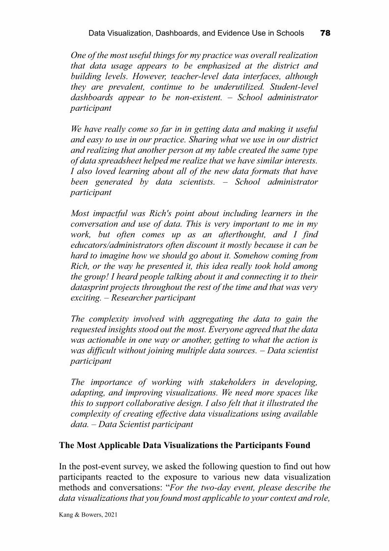
Data Visualization, Dashboards, and Evidence Use in Schools 78
Kang & Bowers, 2021
One of the most useful things for my practice was overall realization
that data usage appears to be emphasized at the district and
building levels. However, teacher-level data interfaces, although
they are prevalent, continue to be underutilized. Student-level
dashboards appear to be non-existent. – School administrator
participant
We have really come so far in in getting data and making it useful
and easy to use in our practice. Sharing what we use in our district
and realizing that another person at my table created the same type
of data spreadsheet helped me realize that we have similar interests.
I also loved learning about all of the new data formats that have
been generated by data scientists. – School administrator
participant
Most impactful was Rich's point about including learners in the
conversation and use of data. This is very important to me in my
work, but often comes up as an afterthought, and I find
educators/administrators often discount it mostly because it can be
hard to imagine how we should go about it. Somehow coming from
Rich, or the way he presented it, this idea really took hold among
the group! I heard people talking about it and connecting it to their
datasprint projects throughout the rest of the time and that was very
exciting. – Researcher participant
The complexity involved with aggregating the data to gain the
requested insights stood out the most. Everyone agreed that the data
was actionable in one way or another, getting to what the action is
was difficult without joining multiple data sources. – Data scientist
participant
The importance of working with stakeholders in developing,
adapting, and improving visualizations. We need more spaces like
this to support collaborative design. I also felt that it illustrated the
complexity of creating effective data visualizations using available
data. – Data Scientist participant
The Most Applicable Data Visualizations the Participants Found
In the post-event survey, we asked the following question to find out how
participants reacted to the exposure to various new data visualization
methods and conversations: “For the two-day event, please describe the
data visualizations that you found most applicable to your context and role,

Data Visualization, Dashboards, and Evidence Use in Schools 79
Kang & Bowers, 2021
and why.” With short-essay type answers, we again created a word cloud
for a visualization. Note that we exclude some generic words (‘data’,
‘teacher’, ‘student’), as well as the words that the question itself includes
(‘visualize’, ‘applicable’, and ‘found’).
*: this word cloud excluded the words: data, teacher, student, visualize, applicable, and found.
Figure 3.5. Education Data Analytics Collaborative Workshop Post-event
Survey Data Visualization Analysis; A word cloud created by Qualtrics*.
Figure 3.5 is a word cloud that describes the most frequent words in the
participants’ responses, and we found that the word “standard” appeared
the most and was frequently combined with words such as “group”, “test”,
and “year”.
These words imply three data visualizations that the participants
found useful: (a) grouped standards for/by teachers – item analysis
visualizations (b) multi-year GAP standard report and (c) non-standardized
test data visualizations. A central finding from the answer to this question
is that the most applicable data visualizations that participants found useful
were not complex, but rather visualized the needed information in a simple
and straightforward manner around the standards.
Participant responses that captured these perspectives across multiple
responses included:
As a reading specialist, the visualization comparing reading level
data with state testing data clearly shows teachers breakdowns in
student learning and areas that they could focus on for student

Data Visualization, Dashboards, and Evidence Use in Schools 80
Kang & Bowers, 2021
improvement. – Teacher participant
I found the visualizations that had specific information related to
student data the most applicable. In my role, I want to know where
my students’ strengths are what I can teach them next to grow. I
liked seeing the specific standards and itemized analysis
visualizations. – Teacher participant
As a high school science teacher, I found the visualization our data
sprint team made to be the most applicable. It takes the wrong
answer analysis data that BOCES already has and presents it in an
efficient and useful way for teachers and administrators to use. –
Teacher participant
We discussed visualizations that would help teachers make
immediate changes to classroom instruction – School administrator
participant
Data visualizations are critical in the work that we do to ensure that
we are positively impacting teaching and learning. Actually, data
visualizations that link to more in depth data so that we can drill
down from a wide view to individual student is truly impactful and
useful. This allows for true discussions focused around teaching and
learning based on concrete evidence. – District administrator
participant
The data visualizations that are most applicable to my context and
role are, in all honesty, all of the data visualizations. I am
currently in the processes of trying to create a dashboard that will
encapsulate a lot of the ideas from the NSF conference we just
attended. – Researcher participant
Simple is the best. Although I know many types of visualizations as
a data scientist, I found that during the workshop that
teachers/administrators prefer to have a simple visualization (e.g.
bar chart) so that they can interpret immediately. – Data scientist
participant
Even though I have been using heatmaps at my work for almost two
years, I still find that heatmap is the most useful visualization,
especially at the data exploration analysis stage. Because it
provides you an overall full picture of the data that you are
interested in. In Heatmaps, you can inspect the correlation between

Data Visualization, Dashboards, and Evidence Use in Schools 81
Kang & Bowers, 2021
the rows as well as the columns. – Data scientist participant
The Most Important Components of a Longitudinal Data System
The Post-event survey continued with the open-ended question, “What
components of a longitudinal data system are needed to best meet the needs
of superintendents, principals, and teacher leaders”. This question was
drawn from a previous survey study by Brocato, Willis, and Dechert (2014).
As a reflection on the two-day event, this question effectively sums up the
needs of practitioners and the perceptions of researchers on educator data
needs, based on the collaborative conversations they had within their
datasprint teams during the two day workshop. We also created a word
cloud of the most frequent words from the responses, excluding words that
are either generic or appeared in the question itself.
*: this word cloud excluded the words: data, teacher, student, system, longitudinal, and information.
Figure 3.6. Education Data Analytics Collaborative Workshop Post-event
Survey Longitudinal Data Components Analysis; A word cloud created by
Qualtrics*.
Figure 3.6 depicts the needs of practitioners looking for information in their
longitudinal data systems. The most common words the participants
responded with were “attendance”, “assessment”, and “demography”. It
once again re-emphasizes that education practitioners have a range of data
needs across a wide variety of data types. Overall, there was a frequent call
for longitudinal student data in nearly all aspects, not just standardized test
scores, which is easy to access, visualize, and use to take action.
Additionally, another frequent call from the participants was the need for

Data Visualization, Dashboards, and Evidence Use in Schools 82
Kang & Bowers, 2021
implementing a constant scale of assessment test scores. If the test scores
are only applicable and interpretable in one school or district at certain time
only, it becomes difficult to then use that dataset beyond that single context.
Participant responses that captured these perspectives across multiple
responses included:
Tracking student attendance, academic performance, teacher
performance, comparing student demographics, and ensuring that
all students are on track to meet given requirements – Teacher
participant
From what I heard over the course of the two-day conference,
Nassau BOCES has all of the data that we need, it is just a matter
of better visualizing it and put it to better use. A common theme on
Day 2 was absenteeism. It seems that, longitudinally, all
stakeholders would be better served if they have attendance
numbers juxtaposed against student assessment scores. – Teacher
participant
An easily accessed longer term picture would help greatly. Not just
results. Teacher comments, attendance, behavior issues would be
some types of information that would be helpful. – Teacher
participant
Student historical data, assessment historical data, one stop
shopping. Communal yet confidential access – School administrator
participant
Ease of access, ability to customize, drawing data from multiple
sources – School administrator participant
Reports need to be easy to access. The reports need to be meaningful
to instruction AND actionable. Data visualizations are crucial to
teachers' understanding of and implementation of data into their
instructional practices. – School administrator participant
Showing the crosswalks from New York State within the system so
that all stakeholders can see where the standard is coming from and
where it is going – District administrator participant
An additional focus that emerged was the need to integrate other
non-outcome measures (instructional quality or practices) plus
formative rather than summative data (results from teacher created

Data Visualization, Dashboards, and Evidence Use in Schools 83
Kang & Bowers, 2021
assessments for example). This would help with the data relevance
need. – District administrator participant
My main takeaway from what educators were saying, is that more
immediately, the different data repositories just need to work
together!! – Researcher participant
The data system should paint a full picture of each student -
achievement, absences, tardiness, supports and interventions,
parental engagement… All elements of a child's being, performance,
and needs should be tracked longitudinally to help give educators a
full picture of who the child is and what the child needs to succeed.
– Researcher participant
During the workshop, I learned that there were some gaps in having
a consolidated data collection system from the school level (i.e.
school information system) which can be stored efficiently in IDW.
Many schools were struggling with getting data in order to populate
indicators. – Data scientist participant
Conclusion
The NSF Education Data Analytics Collaborative Workshop provided
useful insights on collaboration around data visualization for evidence-
based improvement cycles. The Education Leadership Data Analytics
(ELDA) team hopes this chapter brings readers insights on how we
organized actual workshop to bring both practitioners and researchers
together. Also, we hope that readers will recognize how to utilize the
different types of workshop activities and the pre- and post-event surveys
to understand how participants and the outcomes are affected by the
organization of the workshop.
This final phase of the NSF funded research project (NSF #1560720)
"Building Community and Capacity for Data-Intensive Evidence-Based
Decision Making in Schools and Districts" was successfully completed
with the generous support from the National Science Foundation, Teachers
College, Columbia University and Smith Learning Theater at Teachers
College, Columbia University. We also want to express our gratitude again
to the staff from Nassau BOCES and the educators from Nassau County
Long Island New York, who passionately participated in the workshop and
expanded the conversations about education leadership data analytics.
Lastly, we thank every data scientist and education researcher, including
our own ELDA team members, who showed so much affection to the

Data Visualization, Dashboards, and Evidence Use in Schools 84
Kang & Bowers, 2021
success of this project and gladly shared their expertise during the two-day
workshop.
References:
Bowers, A. J., Bang, A., Pan, Y., & Graves, K. E. (2019). Education Leadership Data
Analytics (ELDA): A White Paper Report on the 2018 ELDA Summit.
https://doi.org/10.7916/d8-31a0-pt97
Brocato, K., Willis, C., & Dechert, K. (2014). Longitudinal Data Use: Ideas for District,
Building, and Classroom Leaders. In A. J. Bowers, A. R. Shoho, & B. G. Barnett
(Eds.), Using Data in Schools to Inform Leadership and Decision Making (pp.
97-120). Charlotte, NC: Information Age Publishing.
Data Visualization, Dashboards, and Evidence Use in Schools 85
Nguyen, Campos, & Ahn, 2021
CHAPTER 4
Expanding the Design Space of Data and Action in Education: What Co-designing with Educators
Reveal about Current Possibilities and Limitations
Ha Nguyen
University of California-Irvine
Fabio Campos
New York University
June Ahn
University of California-Irvine
1
What might happen if we invite educators, researchers, and data scientists to
co-design data visualizations together? Educators possess certain mental
models or values of the goals and applications of data visualizations. These
mental models have direct implications for data collection, analyses, and
design (Friedman et al., 2008). For example, educators or designers who value
accountability may focus their designs and interpretations on standard data
found in student information systems, such as grades and attendance.
Conversely, mental models that emphasize local contexts may guide the
designers towards other data sources, such as formative assessments and
student experiences (Ahn et al., 2019; Farrell & Marsh, 2016b). Surveying the
Data Visualization, Dashboards, and Evidence Use in Schools
2021, Authors. Creative Commons License CC BY NC ND

Data Visualization, Dashboards, and Evidence Use in Schools 86
Nguyen, Campos, & Ahn, 2021
mental models that educators associate with data and visualizations is integral
to designing data systems.
In the following chapter, we explore how the ideas that educators, data
scientists, and visualization designers may hold, greatly inform the types of
data visualizations that are ultimately designed for education data. We
illustrate this process by documenting a co-design event that included
different stakeholders in a K-12 school system: administrators, educators, data
scientists, and researchers. The co-design experience took place in a National
Science Foundation (NSF) sponsored workshop, where participants formed
design teams to create scalable data visualizations that may drive school
improvement. As participants in the workshop, we had the unique opportunity
to observe how different education stakeholders perceived data, what they
valued in educational data visualizations, and how varied propositions
towards data related to the co-designed artifacts. We were able to use data
such as participant surveys and design artifacts from the workshop to inform
our analyses.
Our analyses of the NSF workshop were theoretically informed by two
bodies of work: data-driven decision-making (DDDM) and human-centered
design (HCD). The DDDM literature provides insights into how educators
perceive and use multiple types of data to guide different instructional
decisions (Means et al., 2011). The HCD field highlights the need to explore
users’ values in collaborative design practices (Friedman et al., 2008;
Norman, 2014). We then describe the co-design process at the NSF workshop,
from which we glean insights about how mental models of data may relate to
the design focus in the prototypes of the participating teams.
We found that most of the participants in the workshop mentioned the
use of standardized test scores or student demographics as their default models
of what education data could be. However, educators also recognized the
importance of formative data sources, such as classroom-based exit tickets or
surveys of student engagement, in deriving instructional decisions. We
highlight the distinction between standardized-administrative, and formative-
implementation data because these data types have different implications for
decision-making. For example, prior research has established that use of
formative, implementation data relates to substantial, meaningful shifts in
instruction, whereas standardized and administrative data typically motivate

Data Visualization, Dashboards, and Evidence Use in Schools 87
Nguyen, Campos, & Ahn, 2021
educators to reteach content, without adjustment of instructional delivery
(Farrell & Marsh, 2016b).
In this chapter, we term the two data genres as: SAD (Standardized,
Administrative Decision-making) and FIT (Formative, Implementation, and
Teaching). Interestingly, although educators in the design workshop
mentioned valuing FIT data substantially, we observed that most of the design
teams defaulted to SAD data in terms of their final design ideas for education
data visualizations. This finding illuminates a key tension, where education
stakeholders might envision wider uses for educational data but naturally
move back towards using existing mental models of standardized or
administrative data only in their data systems.
To illustrate how this tension can play out in practice, we documented
two teams from the workshop and compared their design approaches and
artifacts. One team’s prototype represented an emphasis on SAD data,
whereas the other uniquely focused on FIT data. We found that the goal-
oriented design notes in the latter team reflected the values of multiple
stakeholders and may have pushed their designs beyond default notions of
SAD data. This finding illustrates that the designers should consider the
diverse stakeholders and their mental models of data use when developing
data visualizations. Articulating the underlying needs of educators helps
designers to target specific action for instructional improvement.
Theoretical Framework
Data Types: Beyond Standardized Data (It's Not Just Assessment!)
Educators incorporate multiple data types into instructional decision-making
(Wayman & Stringfield, 2006). The historical focus on accountability
emphasizes the use of standardized assessment, attendance, or demographics
data, which “sum up” students’ performance over substantive periods of time
(e.g., quarter, semester, academic year). We term these summative,
standardized data forms as Standardized and Administrative Decision-making
(SAD). SAD data that psychometricians have carefully designed and
validated are appropriate for evaluating learning in a summative manner
(Stiggins, 2004). Thus, SAD data are common in the evaluation and grouping

Data Visualization, Dashboards, and Evidence Use in Schools 88
Nguyen, Campos, & Ahn, 2021
of students, teachers, and schools by demographics or proficiency levels
(Marsh et al., 2006).
However, SAD data are far from enough to inform instructional
decisions (Farrell & Marsh, 2016a; Farrell & Marsh, 2016b; Shapiro &
Wardrip, 2019; Stiggins, 2004; Wardrip & Herman, 2018). Educators also
report frequent use of formative data, such as iterative classroom assessments
and student surveys (Datnow & Park, 2018; Farrell & Marsh, 2016b). We
name these formative data Formative, Implementation and Teaching (FIT).
Educators typically leverage FIT data to ground instructional decisions in
more comprehensive and timely understanding of student learning (Farrell &
Marsh, 2016b; Wardrip & Herman, 2018). For example, Wardrip and Herman
(2018) observe that teacher groups who engage in year-long data discussions
call on both student test performance and data on student behaviors, social
relationships, engagement, and emotion. While teachers may start a data
discussion by citing students’ academic assessment, they regularly draw on
formative data sources to contextualize the learning outcomes and decide on
instructional decisions. Wardrip and Herman’s (2018) work illustrates that
reliance on only SAD data may not fully inform educators’ decision-making.
What Actions do Data Provoke?
Educators’ responses to data vary: educators can change what they are
teaching, by tracking student progress to reteach content, “teach to the test”,
or adjust a curriculum sequence (Datnow et al., 2012; Marsh et al., 2006).
Educators can also change how they are teaching, by shifting pedagogical
strategies (Farrell & Marsh, 2016b). The latter outcome (i.e., reflections on
instruction and changing “how”, not just “what” to teach) is a common goal
in data-driven decision-making, but researchers observe that teachers
typically do not change any instructional practices at all after looking at data
(Farrell & Marsh, 2016a).
We highlight the distinction between SAD and FIT data because they
embody different perceptions of data use, which subsequently influence how
educators interpret and employ data for instructional decisions (Bertrand &
Marsh, 2015; Datnow et al., 2012). Educators may associate SAD data with
assessment of learning, and FIT data with assessment for learning. While
assessment of learning emphasizes accountability, ranking, or certifying

Data Visualization, Dashboards, and Evidence Use in Schools 89
Nguyen, Campos, & Ahn, 2021
purposes, assessment for learning focuses on informing the next instructional
moves that an educator might make (Black et al., 2004). School practices
become assessment for learning “when the evidence is actually used to adapt
the teaching work to meet learning needs" (Black et al., 2004; p. 10).
The extant literature highlights the implications of SAD and FIT data
for educators’ sensemaking and use of data for evaluating or informing
instruction. Understanding the factors that may influence educators’
perceptions of SAD versus FIT data types is an important facet in designing
data systems, particularly in selecting which data to process and how to
visualize different data streams. We provide an overview of several key
factors in the next section.
What Factors Shape Perceptions of Data Use?
Data Format. An explanation for why different types of data may induce
different responses is that the data format shapes teachers’ interpretations, and
subsequently, their instructional responses. A first facet is the ways in which
the data are designed and collected: whether locally at the school and
classroom levels, with quicker turn-around time (i.e., FIT data), or externally
at the state levels, over large periods of time (i.e., SAD data; Farrell & Marsh,
2016b). Educators may gravitate towards local FIT data forms when they want
insights about immediate student learning. Conversely, educators may turn to
SAD data when they need predictive indicators of future performance on
standardized tests (Young & Kim, 2010).
A second facet is the level of data aggregation for analyses: individual
students, classrooms, grades, or schools. SAD data forms often aggregate
student learning outcomes by demographics and proficiency levels. This
student grouping likely motivates educators to replicate those classifications
in practice (Farrell & Marsh, 2016b). Meanwhile, FIT data may provide more
in-depth insights about individual students’ knowledge and reasoning,
prompting teachers to adjust instruction for individual students (Black et al.,
2004).
Stakeholders. Different stakeholders in the K-12 education system
(i.e., district personnel, principals, teachers) have varied focus for data types
and use (Ikemoto & Marsh, 2007; Kerr et al., 2006). To illustrate, Anderson
et al. (2010) observe that district and school administrators tend to cite SAD

Data Visualization, Dashboards, and Evidence Use in Schools 90
Nguyen, Campos, & Ahn, 2021
data forms such as standardized tests, attendance, graduation rates, as SAD
data forms allow administrators to make decisions about targeting and
resource allocation. Meanwhile, teachers may perceive SAD assessments as
lacking validity or alignment with instructional visions, in turn relying on FIT
data forms such as evidence of student work (Coburn & Talbert, 2006; Coburn
& Turner, 2012; Kerr et al., 2006).
Work Routines. The social, institutional, and political contexts for data
practices are also central to understanding how educators adopt data for
meaningful action (Coburn & Turner, 2011; Farrell & Marsh, 2016a; Kerr et
al., 2006; Wardrip & Herman, 2018). Interactions with other educators who
possess different visions for data use may lead to alternative decisions of
which data to focus on, with varied implications for data-driven action
(Coburn & Turner, 2012). In schools that value high-stakes standards,
teachers who focus on raising accountability, most often engage with SAD
data from a specific student population (Wardrip & Herman, 2018). However,
presentations of data in ways that invite sensemaking, as opposed to dictating
certain types of interpretations or imposing a feeling that the educators were
being monitored, may yield productive discourse about classroom processes
(Ahn et al., 2019).
In sum, several factors may influence the mental models we associate
with data and uses for data: data types (e.g., SAD versus FIT), framing of the
data (e.g., for learning or of learning), stakeholders (e.g., district personnel,
school administrators, or teacher), and the contexts in which data practices are
situated. What happens if multiple mental models of data use interact, as
in the case of our collaborative data workshop?
Collaborative Design of Data Visualizations
To gain insights into the relation between mental models and co-designed data
visualizations for education, we turn to the literature on human-centered
design, particularly the notions of “value sensitive design” (Friedman et al.,
2008) and “mental models” (Norman, 1983, 2014).
Users bring inherent values of how a design should work when
interacting with the interface. Values such as cooperation, privacy, and

Data Visualization, Dashboards, and Evidence Use in Schools 91
Nguyen, Campos, & Ahn, 2021
participation must be accounted for in design to anticipate users’ interaction
(Friedman et al., 2008). Co-designing with users thus provides the opportunity
to glean information about users’ values and find better ways to design tools
and systems that are sensitive to these values.
Designers and users also develop different mental models, or beliefs
about the design and its use (Norman, 2014). Designers create a roadmap
between the action the design may induce, the mode of interactions, and the
design format. Meanwhile, users base their predictions about how the designs
would operate in practice on their mental models and plan their interaction
with the designs accordingly. A challenge for designers is to incorporate
users’ mental models into developing interfaces: “novice” designers rely only
on surface-level features, while “expert” designers articulate the underlying
design needs of the users and expand their design thinking to solve those core
needs. For example, in creating data visualizations for K-12 systems, instead
of focusing only on visualization types, designers should clearly define the
range of decisions educators will make based on the visualizations, and then
decide on the appropriate data format, visualization forms, and modes of data
analysis and manipulation.
The data collaborative workshop that we participated in presented an
opportunity to document how educators engaged in the co-design process of
data visualizations. Throughout the workshop, educators voiced their ideas
about how to foster data-driven decision-making and prototyped different
designs. We analyzed what data types educators naturally gravitated towards,
the levels at which they chose to visualize the data, the target audience for the
designs, and the designs’ intended outcomes. This analysis helped us imply
the values and mental models that educators brought to the design task.
Capturing the values that educators embraced and the interactions they
expected for different types of data and designs illuminated promising
directions for data visualizations to incorporate educators’ workflow. The
following questions guide our analyses:
RQ1. To what extent are educators aware of and value different data types?
RQ2. To what extent does this positioning relate to the prototypes that were
created across teams?

Data Visualization, Dashboards, and Evidence Use in Schools 92
Nguyen, Campos, & Ahn, 2021
Method
Study Setting & Participants
Our analysis drew from a unique, two-day collaborative workshop (NSF
Grant 1560720). The goal of the workshop was to develop prototype data
visualizations with educators and gather ideas for how data could be more
usefully designed to inform their practice. The workshop included a range of
activities for educators to discuss their current approach to data practices, what
they deemed as lacking in current data warehouses, and their priorities and
concerns in applying analytics to educational data. These discussions led to
co-design sessions that spanned both days of the workshop (approximately 6
hours in total). Throughout the workshop, participants worked in teams of six
or seven to develop prototypes in code, data visualizations from statistical
software, or visual mockups that reflected their priorities and concerns in
applying data to education decision-making. Each team had representatives
from different stakeholders in a K-12 school system: administrators,
educators, data scientists, and researchers.
The workshop organizers invited 75 participants (12 district
administrators, 10 school administrators, 18 teachers and coaches, 21 data
scientists, and 14 researchers). About 50.0% of the participants were female,
70.7% identified as white, 16.0% Asian, 9.3% Hispanic or Latinx, 2.7% Black
or African American, and 1.3% Native Hawaiian or other Pacific Islander.
Data Sources
Pre-event survey. Prior to the workshop, participants had the opportunity to
fill in an electronic survey on their attitudes towards and applications of data
use and data visualization in educational contexts. The survey items captured
the current practices educators had with data and their desired interactions
with education data systems. In particular, the survey included three
questions:
1. What challenges and successes have you experienced using data and
evidence in your practices in schools/districts?
2. What components of a longitudinal data system are needed to best meet
the needs of superintendents, principals, and teacher leaders?

Data Visualization, Dashboards, and Evidence Use in Schools 93
Nguyen, Campos, & Ahn, 2021
3. In thinking about data and evidence that are available in your systems, how
could the data visualization and evidence be improved? How would these
improvements help you?
Design Artifacts. Throughout the workshop, participants worked in
teams to develop their prototypes on paper and with digital tools (e.g.,
statistics software, analytics platforms, or visual wireframing software). The
teams produced post-it notes and design artifacts on whiteboards throughout
their design sessions, as well as final code and mockups. We analyzed these
design artifacts to understand the guiding questions and design approaches to
the prototypes.
Analytical Strategy
RQ1. Examining the types of data educators interact with and the action they
intend to make with data helps us to infer the values educators associate with
data routines. Consequently, we engaged in an open coding process of the pre-
workshop survey responses to generate descriptive codes for the data types
that educators were most familiar with and their ideas for how to use data. We
created the codes at this stage directly from the responses. For example, a
response such as “Our current challenge revolves around effective
intervention and progress monitoring … I need longitudinal sub-skill
tracking.” resulted in one code for data type (i.e., “sub-skill tracking”) and one
code for action intent (i.e., “progress monitoring”). After the initial coding
phase, we found that codes grouped into two clusters: SAD data consist of
standardized assessment, demographics, attendance, and FIT data encompass
formative assessment, behavioral data, and student survey.
To gain insights into what educators planned to use data for, we also
refined action intent into subcodes (Table 4.1 provides exemplary answers).
General Improvement refers to instances where educators mentioned use of
data for improvement, without specifying the use cases. Progress Monitoring
alludes to tracking student progress or learning outcomes during the year or
across grade levels. Comparison was applied when educators gauged their
students’ performance against other classes, schools, or districts. Grouping
refers to the clustering of students by performance or demographics.
Instructional Shift is when educators explicitly stated the use of data to adjust

Data Visualization, Dashboards, and Evidence Use in Schools 94
Nguyen, Campos, & Ahn, 2021
their teaching practices. Finally, No Action is when there was no explicit
action intent associated with the data.
To examine the extent to which values for data use may differ by
educational stakeholders, we compared the results per professional role (e.g.,
teachers/coaches, school administrators, district leaders). We also calculated
the code co-occurrences of data types and intended action, per professional
role. We provide these statistics as well as examples from the responses to
illustrate the nuances in educators’ perceptions of data use across roles.
Table 4.1
Coding Scheme for Action Intent
Code Definition Example
General Improvement Intent towards improvement; no
specific use case
“Helping teachers and learners to think about
how data can support their practices.”
Progress Monitoring Tracking progress “Using various reports from our IDW and our
own internal data reports we have increased our
4-year graduation rate from 90% to 97%.”
Comparison Compare across classes,
schools, districts, states
“It’s also important to have the ability for
teachers to compare their data with other teachers
in the same school, then same district, then same
county, then same state, then nationwide.”
Grouping Cluster students by
performance or demographics
“... demographic data within districts to see how
each population is performing.”
Instructional Shift Explicit data use for practices “While teaching Regents Chemistry, I was able to
use low performance data on specific questions to
guide my instruction the following years.”
No Action No explicit action intent “Challenges are to align multiple data sources.”
RQ2. To explore the persistence of educators’ mental models, we
coded for which data types the teams chose to visualize (i.e., SAD or FIT),
and the intended action that the teams associated with their designs (e.g.,
progress monitoring, grouping, instructional shift). In addition, we examined
the consistency of teams’ design mental models, that is, the coherence
between data types, intended action, and the target user groups and design
features (Norman, 2014). Thus, we included a code for aggregation level (i.e.,
the level at which users can interact with the data in the visualizations, such
Data Visualization, Dashboards, and Evidence Use in Schools 95
Nguyen, Campos, & Ahn, 2021
as student, classroom, school, or district level) and a code for intended
stakeholders (i.e., potential users of the designs, such as administrators,
principals, teachers, or students). Together, codes for data types, intended
action, aggregation level, and intended stakeholders in the final prototypes
helped us explore how educators’ diverse values and mental models related to
their final designed prototypes.
We performed descriptive analyses of code occurrences in each
dimension: data types, data aggregation level, intended stakeholders, and
action intent. We discuss the main themes that emerged across teams to
illuminate the types of data, action, and stakeholders involved in the team
prototypes.
The final prototypes reveal insights about the values that educators
place on certain data, but do not shed light on the design process. To illustrate
how teams constructed their design models and arrived at their final
prototypes, we elaborate on two cases. The first case represents the majority
of the designs, with a focus on SAD data. The second case is the only team
that employed data beyond SAD, with a unique, explicit call for instructional
shifts.
Analyses draw from teams’ post-it notes and white board discussions
at two phases of the design processes: wondering (when the teams set out to
talk about their priorities/ concerns in data and data visualizations) and the
final prototypes (reflection about what should be prioritized in the
visualizations they developed). We selected these additional data sources
because they were written by individual team members reflecting on data use
and visualizations. The notes provide deeper insights into team members’
mental models. Similar to the analyses of team prototypes, we coded the post-
it and whiteboard notes for data types, data aggregation level, stakeholders,
and intended actions. We compared the four dimensions between the notes
and the final prototypes to explore how mental models of data practices among
team members prior to and during collaborative design may be related to the
design process.

Data Visualization, Dashboards, and Evidence Use in Schools 96
Nguyen, Campos, & Ahn, 2021
Findings
What might happen if we bring together educators across a K-12 education
system to create data visualizations? Overall, we found that educators
recognized the importance of FIT data when brainstorming future data
systems, but defaulted to SAD data when it came to design ideas.
These findings suggest that educators may have different mental
models for the types of data that generate instructional improvement versus
the data types to visualize. This implication is important for design-
researchers because designs that do not match with educators’ values may
not promote meaningful adoption. We unpack these findings and describe an
illustrative case where educators’ values and designs were coherently linked
to make a potential impact on education practice.
RQ1. Data Types and Intended Action
Finding 1. Most educators readily mentioned use of data for decision-
making and frequently cited use of SAD assessment. We found that
educators across the board valued data for improvement (Figure 4.1; panel A).
All district administrators, 80.0% of the school administrators, and 94.4% of
teachers and instructional coaches mentioned an intent to use data for
improving instruction.
The most common action intent were general intent for instructional
improvement (14 occurrences), instructional shift (11 occurrences), and
progress monitoring (10 occurrences; see Table 4.2). A response was counted
as expressing general intent if the participant mentioned some use of data,
with a general description for “meeting student needs” or “informing
instruction” and no concrete action. Instances of progress monitoring included
tracking cohort growth and comparisons over time of assessment results.
Finally, codes for instructional shift captured instances where educators use
data to guide teaching practices. Examples include “use low performance data
on specific questions to guide my instruction the following years.” or “modify
instruction in small group settings based on student needs”.

Data Visualization, Dashboards, and Evidence Use in Schools 97
Nguyen, Campos, & Ahn, 2021
Table 4.2
Action Intent by Professional Roles
District
administrator
(n = 12)
School
administrator
(n = 10)
Teacher/coaches
(n = 18)
Total
(n = 40)
General Intent 6 6 2 14
Instructional Shift 1 0 10 11
Progress Monitoring 2 1 7 10
No Action 3 3 0 6
Comparison 3 0 0 3
Grouping 0 1 2 3
Figure 4.1
Action Intent and Data Types by Professional Roles
We noted that FIT data only appeared in a small proportion of the
survey responses (33.30% for district administrators, 20.00% for school
administrators, and 22.20% for teachers and instructional coaches (Figure 4.1;
panel B). The most frequent FIT data types mentioned were formative
assessments (overall, 16 occurrences), followed by surveys of student
attitudes, social emotion, and future plans (2 occurrences). Table 4.3 presents
summary statistics for data types.

Data Visualization, Dashboards, and Evidence Use in Schools 98
Nguyen, Campos, & Ahn, 2021
Table 4.3
Data Types Mentioned by Professional Roles
District admin
(n = 12)
School admin
(n = 10)
Teacher/coaches
(n = 18)
Total
(n = 40)
SAD/assessment 8 7 10 25
SAD/demographics 1 0 1 2
SAD/attendance 0 1 0 1
FIT/assessment 5 3 8 16
FIT/survey 1 0 1 2
FIT/behavioral 0 0 1 1
Finding 2. Different data types may relate to different action intent.
We analyzed the co-occurrences of data types and action intent by
professional roles. We found differences in the associations between data
types and action intent. Figure 2 illustrates these differences by visualizing
the code co-occurrences by roles (blue: district administrators; gray: school
administrators; yellow: teachers and instructional coaches).
In general, the co-occurrence for SAD assessments and general
improvement intent was the most prevalent relation that emerged for district
and school administrators. For example, a district superintendent mentioned
“using comparative data information to drive school instruction” when
reflecting on her current data practices. There were six occurrences when
educators mentioned data use but did not associate use with any action intent,
as seen in the answers by district and school administrators. For example, the
participants mentioned different data types (e.g., state standards, third-party
assessments), but did not link these data to any use towards decision-making.

Data Visualization, Dashboards, and Evidence Use in Schools 99
Nguyen, Campos, & Ahn, 2021
Figure 4.2
Data Types and Subtypes, by Action Intent and Professional Roles
Meanwhile, teachers and coaches frequently mentioned SAD and FIT
assessment data for progress monitoring and instructional adjustments. The
two data types (SAD and FIT) often appeared in the same response,
suggesting that educators relied on both types in decision-making. For
example, a literacy coach mentioned the use of school documentation of
students’ reading and writing behaviors, together with district reading
assessment and school assessment, to analyze student performance:
We are working on using the data collected versus just getting a "score."
When looking across our data from year to year, we can focus on
specific students and also see how different grade levels perform. This
year, we are focusing on looking across multiple assessments to see
how they correlate and how to manage all the different assessment
information.

Data Visualization, Dashboards, and Evidence Use in Schools 100
Nguyen, Campos, & Ahn, 2021
In this response, the coach referred to triangulating different data sources (i.e.,
“looking across assessments”) to compare performance data across grade
levels and track specific students’ performance over time. Later in her
response, the coach mentioned that looking across assessments allowed her
school to examine the success of different literacy interventions and adjust
instruction accordingly.
We also noted that several coaches and teachers tied data to specific use
cases of instructional adjustment. Take the following response from a
Chemistry teacher as an example.
Successes: Each year we look at our GAP report and see how the
students scored on each of the 85 questions on the Regents Exam. I
look at the questions the students answered most incorrectly and I alter
how I teach that topic (or those topics) the following year.
Challenges: Personally, what I should be doing is using more data
during the course of the school year. Use evidence from tests/quizzes
on what topics need more time and which ones can be quickened.
The teacher cited the use of SAD assessments to identify gaps and adjust
instruction (i.e., “alter how I teach that topic”). He also recognized the use of
FIT data, such as tests and quizzes during the school year, to derive insights
for instruction. However, the teacher admitted challenges in incorporating FIT
data into his current workflow.
In sum, the pre-survey responses illuminated two key findings.
Although SAD data were prevalent in educators’ responses, educators also
cited FIT data – most frequently formative assessment – as another source to
glean insights about student learning progress and instructional improvement.
We also noted variation in the action intent associated with data types across
professional roles. Teachers and coaches were more likely to report using data
to monitor progress of learning interventions and adjust instruction, whereas
school and district leaders more frequently referred to data use for general
improvement, without concrete use cases.

Data Visualization, Dashboards, and Evidence Use in Schools 101
Nguyen, Campos, & Ahn, 2021
RQ2. What Mental Models were Prevalent in the Data Visualization
Prototypes?
We analyzed the prototypes (code, mockups, presentations) of all teams to
infer their mental models around data use. In particular, we examined the data
types, the levels of data analyses, the stakeholders that the prototypes were
geared towards, and the action intent that were part of each prototype (Figure
4.3). These elements provide insights into the data format and desired
outcomes for data-driven action in each team.
Finding 3. SAD assessment was the predominant data type in all
prototypes. We found that the prototypes in all teams used standardized state
performance. Other forms of SAD data such as attendance, demographics, and
location (e.g., geomap) were complementary to the standardized assessment
data. Design teams most often aggregated their data at the state level to
visualize whether student performance met accountability standards.
Finding 4. Action intent for the prototypes tended to be limited.
Team notes indicated that most of the prototypes were geared towards
teachers and instructional coaches. However, few prototypes had explicit
implications for instructional adjustments. The most common action intent
that users derived from the data visualization prototypes were progress
monitoring (e.g., “examine growth over the years” or “compare student
performance against state standards”) and grouping (e.g., “increase enrolment
of student subgroups”).
We found that only two teams developed prototypes with stated action
intent for teachers, as indicated in the teams’ notes. Team Cylinder
(pseudonym) explicitly stated a goal for teachers to compare students’
performance against state standards to “support planning or personalize
learning”. Another exception was Team Square. Team Square’s dashboard
identified teachers who performed well according to state standards and
included information about teacher contact, class demographics and location
in the same interface (Figure 4.4). Teachers could use the dashboard to
identify other educators with similar work contexts and share experiences and
resources, with the goal to improve instruction.
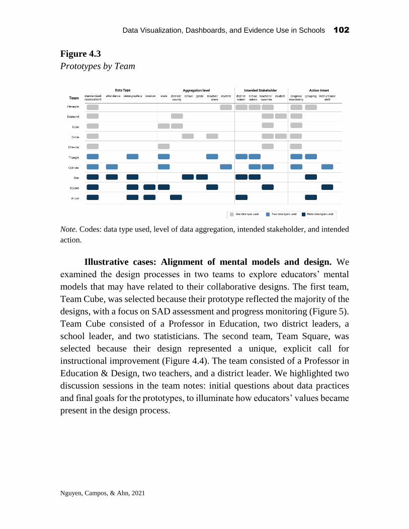
Data Visualization, Dashboards, and Evidence Use in Schools 102
Nguyen, Campos, & Ahn, 2021
Figure 4.3
Prototypes by Team
Note. Codes: data type used, level of data aggregation, intended stakeholder, and intended
action.
Illustrative cases: Alignment of mental models and design. We
examined the design processes in two teams to explore educators’ mental
models that may have related to their collaborative designs. The first team,
Team Cube, was selected because their prototype reflected the majority of the
designs, with a focus on SAD assessment and progress monitoring (Figure 5).
Team Cube consisted of a Professor in Education, two district leaders, a
school leader, and two statisticians. The second team, Team Square, was
selected because their design represented a unique, explicit call for
instructional improvement (Figure 4.4). The team consisted of a Professor in
Education & Design, two teachers, and a district leader. We highlighted two
discussion sessions in the team notes: initial questions about data practices
and final goals for the prototypes, to illuminate how educators’ values became
present in the design process.

Data Visualization, Dashboards, and Evidence Use in Schools 103
Nguyen, Campos, & Ahn, 2021
Figure 4.4
Team Square’s Prototype
Note. The goal of the dashboard is for teachers to share instructional insights and
resources. The left panel shows state-level Math standards. The right panel includes the
contact information of a teacher who shows instructional improvement over time (i.e.,
increasing percentage of students who performed at or above proficient in state testing)
and shares similar work contexts (i.e., student demographics).
Initial discussion on data practices. The notes in Team Cube mostly
centered around data use by different stakeholders -- administrators, teachers,
and students. Team members posed questions about how to integrate FIT data
sources, namely a school climate survey and student exit tickets, in valid and
meaningful ways to improve practices. Whiteboard notes reveal that the team
discussion later shifted to data access and customization, particularly the
ability to aggregate and disaggregate data for comparison across educational
systems (e.g., state, district, school, class).
The practical application of data also emerged in Team Square’s notes,
with a similar focus on data access and data sources. However, a difference
from Team Cube was several post-it notes that focused on fostering a
collaborative culture around data use for reflection and sharing of practices.
For example, at least two team members wondered about the impact of
psychological safety (i.e., the feeling that one’s ideas are welcome) on data
sharing and the impact of collaborative settings and team composition on
psychological safety. We also observed more attention to specific
implementation practices in Team Square. For example, within data use, there
were specific suggestions for comparing individual students with similar

Data Visualization, Dashboards, and Evidence Use in Schools 104
Nguyen, Campos, & Ahn, 2021
demographics across schools, performance levels, and standards, in ways that
could inform instruction versus just comparing or monitoring.
To sum up, we found that although the two teams shared the premise
around facilitating data use across education systems, the team discussions
diverged. Team Cube’s notes highlighted a specific feature (i.e., data
customization) for comparison across school settings, while team Square’s
notes focused on a goal (i.e., finding ways to foster collaborative data use for
teachers).
Prototype goals. The final prototypes reflected the focal features in
team discussion: comparison versus collaboration. Team Cube noted the
question that guided their design in the team’s final notes: “To what extent
can we identify specific areas of instructional strengths and needs?”. The team
identified three goals for their design: (1) ease of use; (2) relevance of data;
and (3) pathway to instructional intervention. To answer their guiding
question, the team visualized student standardized test performance from one
grade level and highlighted the three strongest and weakest areas for growth
(Figure 4.5). The design also incorporated aggregating data by levels, such as
making comparisons across school, district, and county. As noted in our prior
analyses, this focus on making comparisons across the system was a central
point in Team Cube’s discussion leading to the prototype.
Meanwhile, Team Square identified their design’s aim as: “sharing of
data promotes professional growth and collaboration” for “teacher
empowerment”. The design question was: “How can we share state
assessments and standards-based scores to help teachers connect and share
best practices with each other?” The final design (Figure 4.4) was consistent
with these goals. Similar to Team Cube, Team Square’s prototype employed
student assessment in alignment with state standards. However, Team
Square’s design also included teacher information and classroom
demographics, such that practitioners could identify and reach out to those
with similar teaching contexts in order to share instructional insights that
might work across similar situations that teachers faced.
Even though both Team Cube and Team Square employed student state
test scores, the final designs differed in data types, design features, and the
design’s action intent. Only Team Square incorporated additional data
sources, namely student demographics and teacher information, into their

Data Visualization, Dashboards, and Evidence Use in Schools 105
Nguyen, Campos, & Ahn, 2021
design. Whereas Team Cube’s design was centered around data
customization, Team Square’s prototype focused on teacher networking. We
conjectured that the different focal points in team conversations might have
shifted their designs towards different directions: one that focused on
comparison and progress monitoring/tracking, and one that added a layer of
communication and collaboration. Finally, for action intent, we observed that
Team Square appeared to have a more concrete goal for teacher empowerment
between the initial discussion and final prototype. Although Team Cube
aimed for their prototype to serve as a pathway to instructional intervention,
the team’s notes and designs did not explicitly state ways in which educators
may achieve this vision.
Figure 4.5
Team Cube’s Prototype
Note. The purpose of the visualization is to identify specific areas of instructional
strengths and needs. The visualization presents a longitudinal, aggregate view of the
school’s performance in different content areas in state standardized testing. The side-by-
side bars allow for comparison of performance across school, district, and county level.

Data Visualization, Dashboards, and Evidence Use in Schools 106
Nguyen, Campos, & Ahn, 2021
Discussion
Understanding the mental models that educators hold and the interactions they
expect for different data forms and designs illuminates new directions for data
visualizations for school improvement. Our analyses of educators’
perceptions about data use and their co-designed artifacts gave us a window
into the values and mental models educators brought to the design task. We
found that the majority of educators readily mentioned use of data for
decision-making and frequently cited use of SAD assessment in current
practices. We observed that educators most often cited use of SAD data for
general improvement intent (without concrete applications), progress
monitoring, and grouping students by demographics and performance.
Conversely, educators most often associated concrete implications for
instructional shifts with FIT data. These patterns align with prior research on
data-driven decision-making that standardized information may not be the
most useful for devising tangible plans for instructional improvement (Farrell
& Marsh, 2016b).
We also observed variation in the association between data types and
intended action by professional roles. District and school administrators
appeared to associate SAD data use with no action, or with general intent for
school improvement and no concrete action. Meanwhile, teachers and coaches
were more likely to cite specific examples of using SAD and FIT assessment
data for instructional adjustments. This finding suggests that data systems that
only focus on one data type may overlook the expertise and practices that
educators in different roles bring into instructional decision-making. In
particular, data systems that focus on accountability and standardized,
administrative data forms may not be as relevant for instructional coaches and
teachers in school improvement efforts.
Our findings have implications for the design of dashboards and data
systems for educators in different professional roles. Results illuminate the
need to (re)consider the types of data that may be valued and considered worth
collecting, processing, and visualizing in data systems for educators across the
K-12 system. In addition to considering levels of aggregation and
customization, representations should include data sources and annotations
that resonate with educators’ practices. Educators are more likely to employ

Data Visualization, Dashboards, and Evidence Use in Schools 107
Nguyen, Campos, & Ahn, 2021
data for instruction when they see data as relevant and contextually grounded,
as opposed to feeling that data are externally imposed for accountability
(Coburn & Turner, 2011; Farrell & Marsh, 2016b).
In analyzing the teams’ final prototypes, we observed parallels between
educators’ preconceptions of data practices and the prototypes they created.
In particular, we found a strong focus on assessment data for monitoring/
tracking progress and grouping students. Analyses of the team notes indicated
that educators were not necessarily unaware of the need to incorporate into
their designs additional, FIT data sources such as students’ behaviors and
school engagement. Yet, none of the prototypes leveraged these data sources.
Instead, all designs drew from SAD assessment data, and a few leveraged
other SAD data forms such as demographics and attendance. We note that the
types of questions we could ask from these visualizations of standardized
assessments by groups or standards tend to be limited.
We also want to note that the design teams in this chapter worked under
the constraint of data access and time. However, our illustrative case of Team
Square suggests that other types of visualizations and actions are possible.
What distinguishes Team Square from other teams appears to be a coherent
link between their initial values for data use, desired outcomes, and final
prototypes. The team’s design used student demographics data not for
evaluation and monitoring, but for networking and professional development.
Team Square’s illustrative case suggests an interesting conjecture, that
prompting participants to take a step back and articulate how their designs
serve data-driven, targeted educational practices may help to surface other
purposes for data visualizations beyond progress monitoring or comparing
students. In addition, if we want to shift participants’ mental models for
incorporating FIT data forms into data systems, we could also ask them to
articulate a finer link between data and action, for example, shifting from “I
use student exit tickets to adjust instruction” to “This exit ticket helps me
determine whether students understand a new task”.
Conclusion
This chapter contributes to our understanding of how educators value
and act on data. Co-designing with diverse stakeholders can help us reveal the

Data Visualization, Dashboards, and Evidence Use in Schools 108
Nguyen, Campos, & Ahn, 2021
types of mental models that educators, researchers, and data scientists bring
to educational data. Our experience in an NSF-sponsored, co-design
workshop offered windows into how we can expand our imagination for what
data systems to design and use for instructional improvement. Articulating
how designs serve data-driven educational practices may help to uncover new
ideas for data visualizations beyond Standardized and Administrative
Decision-making (SAD) paradigms.
References
Ahn, J., Campos, F., Hays, M., & Digiacomo, D. (2019). Designing in Context: Reaching
Beyond Usability in Learning Analytics Dashboard Design. Journal of Learning
Analytics, 6(2), 70–85. https://doi.org/10.18608/jla.2019.62.5
Anderson, S., Leithwood, K., & Strauss, T. (2010). Leading data use in schools:
Organizational conditions and practices at the school and district levels. Leadership
and Policy in Schools, 9(3), 292–327. https://doi.org/10.1080/15700761003731492
Bertrand, M., & Marsh, J. A. (2015). Teachers’ Sensemaking of Data and Implications for
Equity. American Educational Research Journal, 52(5), 861–893.
https://doi.org/10.3102/0002831215599251
Black, P., Harrison, C., Lee, C., Marshall, B., & Wiliam, D. (2004). Working inside the
Black Box: Assessment for Learning in the Classroom. Phi Delta Kappan, 86(1), 8–
21. https://doi.org/10.1177/003172170408600105
Coburn, C. E., & Talbert, J. E. (2006). Conceptions of Evidence Use in School Districts:
Mapping the Terrain. American Journal of Education, 112(4), 469–495.
https://doi.org/10.1086/505056
Coburn, C. E., & Turner, E. O. (2011). Research on Data Use: A Framework and
Analysis. Measurement: Interdisciplinary Research & Perspective, 9(4), 173–206.
https://doi.org/10.1080/15366367.2011.626729
Coburn, C. E., & Turner, E. O. (2012). The Practice of Data Use: An Introduction.
American Journal of Education, 118(2), 99–111. https://doi.org/10.1086/663272
Datnow, A., & Park, V. (2018). Opening or closing doors for students? Equity and data
use in schools. Journal of Educational Change, 19(2), 131–152.
https://doi.org/10.1007/s10833-018-9323-6
Datnow, A., Park, V., & Kennedy-Lewis, B. (2012). High school teachers' use of data to
inform instruction. Journal of Education for Students placed at Risk (JESPAR),
17(4), 247-265.

Data Visualization, Dashboards, and Evidence Use in Schools 109
Nguyen, Campos, & Ahn, 2021
Farrell, C. C., & Marsh, J. A. (2016a). Contributing conditions: A qualitative comparative
analysis of teachers’ instructional responses to data. Teaching and Teacher
Education, 60, 398–412. https://doi.org/10.1016/J.TATE.2016.07.010
Farrell, C. C., & Marsh, J. A. (2016b). Metrics Matter: How Properties and Perceptions of
Data Shape Teachers’ Instructional Responses. Educational Administration
Quarterly, 52(3), 423–462. https://doi.org/10.1177/0013161X16638429
Friedman, B., Kahn, P. H., & Borning, A. (2008). Value sensitive design and information
systems. The handbook of information and computer ethics, 69-101.
Ikemoto, G. S., & Marsh, J. A. (2007). Cutting Through the “Data-Driven” Mantra:
Different Conceptions of Data-Driven Decision Making. Center on Education
Policy.
Kerr, K. A., Marsh, J. A., Ikemoto, G. S., Darilek, H., & Barney, H. (2006). Strategies to
Promote Data Use for Instructional Improvement: Actions, Outcomes, and Lessons
from Three Urban Districts. American Journal of Education, 112(4), 496–520.
https://doi.org/10.1086/505057
Marsh, J. A., Pane, J. F., & Hamilton, L. S. (2006). Making sense of data-driven decision
making in education: Evidence from recent RAND research.
Means, B., Chen, E., DeBarger, A., & Padilla, C. (2011). Teachers’ Ability to Use Data to
Inform Instruction: Challenges and Supports. Office of Planning, Evaluation and
Policy Development, US Department of Education.
Norman, D. A. (1983). Design rules based on analyses of human error. Communications
of the ACM, 26(4), 254-258.
Norman, D. A. (2014). Some observations on mental models. In Mental models (pp. 15-
22). Psychology Press.
Shapiro, R. B., & Wardrip, P. S. (2019). Teachers Reasoning About Students’
Understanding: Teachers Learning Formative Instruction by Design. Journal of
Formative Design in Learning, 3(1), 16–26. https://doi.org/10.1007/s41686-019-
00026-1
Stiggins, R. (2004). New assessment beliefs for a new school mission. Phi Delta Kappan,
86(1), 22-27.
Wardrip, P. S., & Herman, P. (2018). ‘We’re keeping on top of the students’: making
sense of test data with more informal data in a grade-level instructional team.
Teacher Development, 22(1), 31–50.
https://doi.org/10.1080/13664530.2017.1308428
Wayman, J. C., & Stringfield, S. (2006). Data Use for School Improvement: School
Practices and Research Perspectives. American Journal of Education, 112(4), 463–
468. https://doi.org/10.1086/505055
Young, V. M., & Kim, D. H. (2010). Using Assessments for Instructional Improvement:
A Literature Review. Education Policy Analysis Archives, 18, 19.
https://doi.org/10.14507/epaa.v18n19.2010

Data Visualization, Dashboards, and Evidence Use in Schools 110
Gegenheimer. 2021
CHAPTER 5
Challenges and Successes in Education
Leadership Data Analytics Collaboration: A Text Analysis of Participant Perspectives
Karin Gegenheimer Vanderbilt University
An Introduction to Education Leadership Data Analytics1
Since the Institute of Education Sciences was founded in 2002, educators,
practitioners, and policymakers have increasingly come to the understanding
that research should play a stronger role in education reform and
improvement. Collaboration between education practitioners and researchers
is essential to improve educational outcomes. To achieve collaborative
systems that are meaningful and effective, researchers must focus on problems
that are immediately relevant to practitioners, and practitioners must be able
to access and interpret research. Research is often out of sync with the needs
of educators, as the research process moves slowly, and the nature of data
collection and analysis necessarily implies that research occurs retroactively.
Similarly, researchers are not always interested in the same questions that
plague educators, creating a disconnect between the evidence that is available
and the evidence that teachers, school leaders, and district administrators
need.
Research practice partnerships (RPP) seek to bridge the divide between
research and practice. RPPs are “long-term, mutualistic collaborations
between practitioners and researchers that are intentionally organized to
Data Visualization, Dashboards, and Evidence Use in Schools
2021, Authors. Creative Commons License CC BY NC ND

Data Visualization, Dashboards, and Evidence Use in Schools 111
Gegenheimer. 2021
investigate problems of practice and solutions for improving district
outcomes” (Coburn & Penuel, 2016). The idea behind RPPs is that researchers
and practitioners work together to understand and analyze problems that are
specifically relevant to the district or state that the RPP serves. Coburn &
Penuel (2016) identify three types of RPPs: (1) research alliances, which
typically include partnerships between research organizations and districts or
state education agencies; (2) design research, focused on curriculum and
instructional materials; and (3) networked improvement communities, which
concentrate on policy implementation and scaling up.
An emerging area within research practice partnerships is education
leadership data analytics (ELDA). Bowers and colleagues (2019) define
ELDA as the “intersection of education leadership, the use of evidence-based
improvement cycles in schools to promote instructional improvement, and
education data science.” The idea is very much in line with the research
practice partnership vision: researchers and data scientists work
collaboratively with schools and districts to explore and analyze relevant data
(which is often collected and housed by the schools and districts themselves),
and then create written reports or digital interfaces that are easily accessible
and interpretable to practitioners. Through ongoing collaboration, ELDA
provides a structure to support data use and evidence-based improvement
cycles in schools.
Research practice partnerships like ELDA that specifically focus on
data use in schools are certainly relevant, given the increasing use of data in
all aspects of K-12 schooling. Accountability reforms such as No Child Left
Behind and Race to the Top created space for and normalized the broad use
of data and data driven instruction in K-12 schools. Schools and districts
collect data on a wide variety of outcomes – student test scores, disciplinary
measures, attendance – and rely on these data to make important decisions
about school processes (Coburn & Turner, 2011; Farley-Ripple & Buttram,
2015; Marsh & Farrell, 2015; Spillane, 2012). School leaders use student-
level data to assign students to classes, and classes to teachers. Within classes,
teachers use student-level data to create seating charts, to decide which
students will receive individualized instruction in small-group settings, and to
pair students for group work. As a former teacher, data-driven decision
making characterized every aspect of my practice. Analyzing students’ exit
tickets was a daily routine, as I would use those data to inform the next day’s
lesson. When I was lesson planning, I would look at data from the previous
year to help identify common student misconceptions and potential strategies
to address them. Using data as part of my instructional practice was so routine

Data Visualization, Dashboards, and Evidence Use in Schools 112
Gegenheimer. 2021
that it is hard for me to imagine what it would have been like to teach any
other way.
The use of data in schools opens the education field to emerging
partnerships between practitioners, researchers, and data scientists to work
together to create systems and structures that support effective data-driven
instruction and, more broadly, evidence-based improvement cycles. There is
still more work to be done in this area. In a report summarizing the first ELDA
summit in 2018, Bowers et al. (2019) concluded that ELDA researchers and
practitioners need more opportunities for joint capacity building. In a post-
event survey, participants ranked capacity building, conceptualized as
“developing and fostering effective and ethical partnerships between
researchers and practitioners in order to use data to drive quality education”
as the biggest priority for future work in ELDA. Capacity building received a
score of 4.09 on the priority scale, where responses were scored on a 1-5
likert-type scale in which one is lowest priority and five is highest priority.
The need for more capacity building was also reflected in participants’
responses to the following reflection question: Given the sessions you
attended at the ELDA summit as well as your own experiences, to you, what
are the central ideas, issues, and challenges in the domain of ELDA? where
the most common responses revolved around “developing, growing, refining,
and incentivizing feedback loops between researchers and practitioners in the
use of data analytics for instructional improvement” (Bowers et al., 2019).
However, in the same post-event survey following the 2018 ELDA
summit, participants noted concerns with the challenges of sustained
collaboration among researchers and practitioners: they ranked capacity
building as a 3.35 for possibility (again ranked on a 1-5 likert-type scale,
where one is least possible and five is most possible), much lower than its
score of 4.09 on the priority scale (Bowers et al., 2019). Taken together, the
2018 event realized a strong demand for collaborative work in ELDA, while
simultaneously acknowledging that bridging the fields of education
leadership, education data science, and evidence-based improvement cycles
remains a challenge.
The 2019 Education Data Analytics Collaborative Workshop
The 2019 National Science Foundation Education Data Analytics
Collaborative Workshop seemingly answered this call by offering a two-day
datasprint workshop in which ELDA researchers, practitioners, and data
scientists would work together in teams to (a) understand and prioritize
educators’ data use needs, and (b) address these needs by building

Data Visualization, Dashboards, and Evidence Use in Schools 113
Gegenheimer. 2021
visualizations and data dashboards, which could then be used in schools and
districts. This workshop provided a unique opportunity for ELDA capacity
building – the collaborative work experience that practitioners and researchers
need.
I attended the 2019 workshop as a data scientist. Though many
participants had attended the 2018 summit a year prior, this event was my first
collaborative ELDA event. When I first learned of the workshop, I was
immediately interested. The event would bring together educators and
researchers (in academia and in industry) and would focus on collaborative
learning and relationship building. It seemed like a unique opportunity to learn
from and work alongside professionals outside of my immediate network, and
importantly, to hear from teachers and school leaders about their data needs.
During the two-day datasprint workshop, participants were grouped
into teams, and each team was tasked with identifying a data priority in
schools and building a prototype to address the selected priority. Importantly,
each team included at least one practitioner, researcher, and data scientist. The
workshop’s organization and purpose necessitated the expertise of each
participant’s role, which created an engaging and productive environment in
which participants were able to both learn and teach.
In my team, I observed that practitioners, researchers, and data
scientists each approached the datasprint work in distinctly different ways.
For instance, practitioners, which included teachers, school leaders, and
district administrators, were most often focused on solving immediate
problems – data availability and data accessibility. Researchers tended to
think about how best to understand a given issue or problem, and the data
scientists were often concerned with the feasibility of a potential solution.
These patterns are not surprising, given the unique purpose of each
participant’s work. Yet it was interesting to observe how our individual
thought processes contributed, and sometimes inhibited, our team’s success.
Even in a space specifically designed for ELDA collaboration, collaboration
is challenging. The constraints and work processes that practitioners,
researchers, and data scientists face in their own work do not necessarily align,
which led participants to approach tasks from different lens and with different
aims.
I began to think more about what makes collaboration successful. What
can we learn from this two-day workshop about successful collaboration? In
what ways does it help us identify areas for improvement? To better
understand how practitioners, researchers, and data scientists approach ELDA
collaboration differently, I analyzed participants’ open-ended pre- and post-
survey responses. Specifically, I used the deidentified open-ended survey
Data Visualization, Dashboards, and Evidence Use in Schools 114
Gegenheimer. 2021
response data to classify participants’ responses to the following pre- and
post-event survey questions:
(1) Pre-event: What challenges and successes have you experienced using
data and evidence in your practices in schools/districts?
(2) Post-event: What challenges and successes have you experienced using
data and evidence in your practices in schools/districts and how does the
experience of the two-day event inform this?
Correlated Topic Modeling using Deidentified Survey Data
Responses to the pre- and post-event surveys were linked to participants’
background information, including their professional title, which I used to
construct participant role as practitioner, researcher, or data scientist. I note
that the event participants are certainly not representative of all practitioners,
all educators, or all data scientists, and I do not generalize beyond those
participants who attended the 2019 event and responded to the pre- and post-
surveys. The purpose of this exercise is simply to better understand the
different perspectives of ELDA practitioners, researchers, and data scientists,
and examine the extent to which an event like the NSF Education Data
Analytics Collaborative Workshop can provide a space for structured and
sustained partnership in the field.
I used correlated topic modeling, a natural language processing (NLP)
technique, to uncover the latent topic structure of the survey responses, by
participant role. Machine learning methods like NLP present promising
applications in education-related research, as they allow for the systematic
processing of qualitative data at a scale and speed that was previously
impossible. Because the nature of qualitative methods emphasizes human
processing, a typical qualitative analysis – while rich in nuance and depth –
often lacks generalizability. It is simply impracticable to hand-code a sample
size large enough to be representative of a distinct population. Data scientists
in machine learning, however, have focused on the automation of these human
processes such that they are almost infinitely scalable and consistent. Once an
algorithm is created and trained, it is able to efficiently code information from
complex raw data, and to scale up is only a matter of increased computer
processing time. In addition, the automated nature of algorithmic processing
ensures that results are absent of research subjectivity or human bias.
Because I am interested in differences between responses by participant
role, I ran separate topic models for the pre- and post-survey questions for
each type of participant: practitioner, researcher, and data scientist. In other
Data Visualization, Dashboards, and Evidence Use in Schools 115
Gegenheimer. 2021
words, I defined my corpora by survey question and participant role. I
therefore constructed six separate corpora (two survey questions by three
participant roles) and used these corpora as the basis for my topic models.
I used Latent Dirichlet Allocation (LDA), a type of unsupervised
correlated topic model that empirically identifies unobservable groups, or
topics, in text data (Blei, Ng, & Jordan, 2003; Bowers & Pan, 2019). The
intuition here is that any given text document, such as an open-ended survey
response, is composed of a set of topics. Though the topics are unobservable
(i.e., one would need to read the document to identify them), they can be
empirically identified from the combination of words in the document. LDA
follows the “bag of words” framework, which supposes that a text document
is made up of a bag of words, and that the presence of a given word, or given
set of words, in the document can be attributed to a latent topic in the
document’s structure. Importantly, LDA allows topics to be correlated with
one another, such that multiple topics can share the same words. For example,
the combination of words “data,” “analysis,” and “use” could be attributed to
a topic on collaborative data use in schools and data fairness and ethical
considerations – though the presence of the same set of words would not
contribute to separate topic identification. In short, LDA analysis identifies
the topics that generate the unique combination of words in text documents.
LDA returns the estimated topic groupings, high frequency words
associated with each topic, and the probabilities of each document (in this
case, survey response) being associated with the identified topics. I used this
information to label and conceptualize the topics, first using the high
frequency words to generate a “first pass” topic label, then reading through
the open-ended survey response to validate or modify the topic labels. To
ensure the accuracy of my topic labels, I read survey responses until the topics
were “saturated,” i.e., until additional survey responses provided no more
information about the already defined topics.
Results
Table 5.1 shows the topic structures of participants’ open-ended responses in
the pre-event survey, by participant role. There are noticeable differences in
the topics across practitioners, researchers, and data scientists. Practitioners’
responses underscore their focus on what to do with data. Practitioners
described successes with data driven instruction and using data to ensure all
students’ needs are met, while noting various challenges related to the
technical aspects of data use in schools. For instance, practitioners described
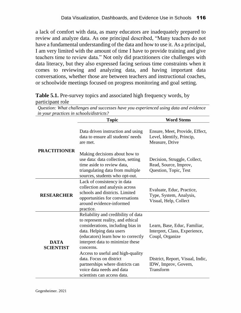
Data Visualization, Dashboards, and Evidence Use in Schools 116
Gegenheimer. 2021
a lack of comfort with data, as many educators are inadequately prepared to
review and analyze data. As one principal described, “Many teachers do not
have a fundamental understanding of the data and how to use it. As a principal,
I am very limited with the amount of time I have to provide training and give
teachers time to review data.” Not only did practitioners cite challenges with
data literacy, but they also expressed facing serious time constraints when it
comes to reviewing and analyzing data, and having important data
conversations, whether those are between teachers and instructional coaches,
or schoolwide meetings focused on progress monitoring and goal setting.
Table 5.1. Pre-survey topics and associated high frequency words, by
participant role Question: What challenges and successes have you experienced using data and evidence
in your practices in schools/districts?
Topic Word Stems
PRACTITIONER
Data driven instruction and using
data to ensure all students' needs
are met.
Ensure, Meet, Provide, Effect,
Level, Identify, Princip,
Measure, Drive
Making decisions about how to
use data: data collection, setting
time aside to review data,
triangulating data from multiple
sources, students who opt-out.
Decision, Struggle, Collect,
Read, Source, Improv,
Question, Topic, Test
RESEARCHER
Lack of consistency in data
collection and analysis across
schools and districts. Limited
opportunities for conversations
around evidence-informed
practice.
Evaluate, Educ, Practice,
Type, System, Analysis,
Visual, Help, Collect
DATA
SCIENTIST
Reliability and credibility of data
to represent reality, and ethical
considerations, including bias in
data. Helping data users
(educators) learn how to correctly
interpret data to minimize these
concerns.
Learn, Base, Educ, Familiar,
Interpret, Class, Experience,
Coupl, Organize
Access to useful and high-quality
data. Focus on district
partnerships where districts can
voice data needs and data
scientists can access data.
District, Report, Visual, Indic,
IDW, Improv, Govern,
Transform

Data Visualization, Dashboards, and Evidence Use in Schools 117
Gegenheimer. 2021
In contrast, researchers’ responses centered on data quality and
opportunity for collaboration with practitioners. Data quality was a main
concern for researchers, as many described facing data inconsistencies (i.e.,
consistent identifiers and measures) across schools and districts, which makes
it difficult for analysts to make useful comparisons across schools within
districts, or across districts and states. One graduate student suggested that
“we need a centralized or standardized data collecting system throughout
districts or even further.” Researchers also expressed a want for more
opportunities to share their work with educators and to help practitioners
“think about how data can support their practices.”
Data scientists described concerns with data credibility and data
quality. A main challenge in the work of data scientists is convincing
educators (or other relevant stakeholders without technical knowledge) that
data matters, and as one data scientist succinctly noted, “trust in [artificial
intelligence] remains to be a consistent challenge within educational settings.”
Like researchers, data scientists also commented on the quality of data
collected by schools and districts and suggested that district partnerships
focused on data sharing could improve some of issues around data quality and
ease of use.
Table 5.2 shows the topic structure of participants’ responses in the
post-event survey. The post-event survey question similarly probes
participants’ perceived challenges and successes with data, though it
additionally inquires how the two-day workshop informed these perceived
challenges and successes. Within participant roles (practitioner, researcher,
and data scientist), the topic structures are thematically similar to those of the
pre-event survey, with an apparent emphasis on data visualizations. For
instance, practitioner responses in the post-event survey were, again, focused
on educators’ data literacy, though data literacy more narrowly defined as
educators’ ability to navigate and interpret their schools’ and districts’ data
dashboards. Researchers and data scientists again discussed issues with data
quality and the absence of educator perspective in their work. However, both
groups discussed coming away from the ELDA workshop with a better
understanding of the types of data visualizations that are most useful for
educators: “The biggest challenge as a data scientist using educational data is
to identify what kind of analysis that will be helpful for teachers. [This] two-
day workshop (especially the data-sprint) exercise was extremely useful in
that sense, since I was able to learn thinking from an [educator’s] perspective.”
For researchers and data scientists, the utility of the datasprint workshop
underscores the importance of designing and implementing formal structures

Data Visualization, Dashboards, and Evidence Use in Schools 118
Gegenheimer. 2021
to facilitate collaboration and information sharing between practitioners and
research scientists.
Table 5.2. Post-survey topics and associated high frequency words, by participant
profession
Question: What challenges and successes have you experienced using data and
evidence in your practices in schools/districts and how does the experience of the two-
day event inform this?
Topic Word Stems
PRACTITIONER
Building capacity around the
data structures/dashboards
that the district has
implemented
Discuss, Analysis, Biggest,
Help, Dashboard, Item,
Implement, Improv, Structure
Being able to navigate and
synthesize data from various
platforms to create a cohesive
narrative that teachers can
easily transfer to classroom
practice
Inform, School, Create, Easi,
Develop, Plan, Reflect, Collect,
Account
RESEARCHER
Data visualizations that are
comprehensive and
comprehensible for educators
Question, Visual, System, Type,
Effect, Time, Comprehension,
Limit
Lack of consensus on what
type of data and analyses are
helpful; researchers don't
know what practitioners need,
and often the interests of
researchers diverge from what
is useful to practitioners
Evaluate, Educ, Practice, Type,
System, Analysis, Visual, Help,
Collect
DATA
SCIENTIST
Data accessibility for research
and getting user (educator)
buy-in
Research, User, Dataset,
Complex, Context, Depart,
Encount
What data visualizations are
most useful to practitioners,
given lack of experience with
classroom support. How to
identify changes to make
based on the data
Experi, Identify, Support,
Access, Collect, Limit, Change
Data Visualization, Dashboards, and Evidence Use in Schools 119
Gegenheimer. 2021
Discussion
The 2019 Education Data Analytics Collaborative Workshop offered a rare
and important opportunity for practitioners, researchers, and data scientists
across the country to think, learn, and build together in a two-day dataspint
design. The event responded to the need for joint capacity building in the field
of ELDA, a necessary opportunity to advance our collective understanding
and use of data in schools. As a data scientist participant, working on a team
with practitioners taught me how to identify and approach problems from an
educator’s perspective, which has in turn influenced how I approach my own
work. I left the event with a renewed sense of inspiration and motivation to
inform my research with the needs of practitioners – and some new code for
data visualizations!
I also left the event convinced that we need more opportunities for this type
of collaborative work, and results from the text analysis of participant survey
responses support this instinct. While educators look for more opportunities
to increase their data literacy skills and learn how to effectively use the data
dashboards and visualizations supplied by their schools and districts,
researchers and data scientists seek occasions to engage with educators about
data-driven instruction and data use in schools, broadly. Not only do we need
more collaborative events like this one, we also need formal systems, like
professional organizations and networks, that facilitate collaboration across
ELDA professions by creating opportunities for sustained relationships and
partnerships. Future work in the field of ELDA must include designing,
developing, and sustaining meaningful opportunities for ongoing
conversation and collaborative work that cuts across the research and practice
divide.
References
Blei, D. M., Ng, A. Y., & Jordan, M. I. (2003). Latent dirichlet allocation. Journal of
machine Learning research, 3(Jan), 993-1022.
Bowers, A.J., Bang, A., Pan, Y., Graves, K.E. (2019) Education Leadership Data
Analytics (ELDA): A White Paper Report on the 2018 ELDA Summit. Teachers
College, Columbia University: New York, NY. USA
Bowers, A.J., and Pan, Y. (2019) R Markdown for textmining example. Personal
Communication.

Data Visualization, Dashboards, and Evidence Use in Schools 120
Gegenheimer. 2021
Coburn, C. E., & Penuel, W. R. (2016). Research–Practice Partnerships in Education:
Outcomes, Dynamics, and Open Questions. Educational Researcher, 45(1), 48–
54.
Coburn, C. E., & Turner, E. O. (2011). Research on Data Use: A Framework and
Analysis. Measurement: Interdisciplinary Research and Perspectives, 9(4), 173-
206.
Farley-Ripple, E., & Buttram, J. (2015). The development of capacity for data use: The
role of teacher networks in an elementary school. Teachers College
Record, 117(4), 1-34.
Marsh, J. A., & Farrell, C. C. (2015). How leaders can support teachers with data-driven
decision making: A framework for understanding capacity building. Educational
Management Administration & Leadership, 43(2), 269-289.
Spillane, J. P. (2012). Data in Practice: Conceptualizing the Data-Based Decision-Making
Phenomena. American Journal of Education, 118(2), 113-141.

Data Visualization, Dashboards, and Evidence Use in Schools 121
Coleman et al., 2021
CHAPTER 6
Understanding Workshop Participant Movement
Through a Temporal Cluster Analysis
Chad Coleman Teachers College, Columbia University
Lauren Lutz-Coleman
Teachers College, Columbia University
Joshua Coleman Teachers College, Columbia University
Alex J. Bowers
Teachers College, Columbia University
Abstract1
Multi-modal learning analytics is an actively growing area of educational
research. New forms of modal learning data aggregated across multiple
sources has created innovative research opportunities within the learning
science community. One area of this research focuses on the application of
spatial-temporal analysis of movement data. In this paper, we use participant
movement data collected during an NSF grant-funded workshop at Teachers
College Columbia University. The data from this workshop was analyzed
using the Pythagorean theorem distance measure to determine the proximity
of team members to their team’s centroid throughout the workshop’s
scheduled structured and unstructured activities. An Analysis of Variance was
Data Visualization, Dashboards, and Evidence Use in Schools
2021, Authors. Creative Commons License CC BY NC ND

Data Visualization, Dashboards, and Evidence Use in Schools 122
Coleman et al., 2021
then applied to the distances to determine if was any significance in distances
between teams or within structured or unstructured scheduled activities.
Results indicate there is a significant difference in mean distances. While
physical closeness does not imply participant interaction, looking at trends
across groups’ spatial positionings can determine if and when opportunities to
collaborate occurred. Work in this field has the potential to inform how
learners respond to collaborative exercises and events, with the potential to
even determine how scheduled events and curricula are designed.
Background
The first author of this book chapter, Chad Coleman, attended an NSF grant-
funded workshop intended for school district employees (such as
superintendents, administrators, and teachers). The purpose of this two-day
workshop was to bring together educators and administrators from the Nassau
County, Long Island New York Board of Cooperative Educational Services
(BOCES) and educational technology industry data scientists to better
understand the needs around education data, with the final outcome of the
workshop consisting of a data sprint and visualization prototype built using
BOCES real-world education data. Coleman attended as a data scientist to
provide guidance into how school districts’ data can be harnessed and
presented in meaningful ways, with the overall goal being to help schools use
existing data to prototype data visualizations. By participating in this
workshop initiative, Coleman gained access to data on the participants’
physical locations over the course of the day-long workshop. In this chapter,
he and his coauthors analyze the participants’ movements and positions to
better understand the opportunities of spatio-temporal data analysis with
collaborative learning environments.
Through this experience, Coleman observed that when presented with
opportunities to interact and network with individuals from other educational
institutions, participants typically opted to seek out others with the same role
or job title as them. Data scientists often interacted with other data scientists,
superintendents met with other superintendents, and so on. Based on these
observations, Coleman and his coauthors became interested in understanding
more about the value of measuring participation movement, interactions, and
distance. This experience prompted him to look for significance in their trends
of their positioning data. Through his attendance at this workshop, Coleman
also gained insight into the extent to which educators’ knowledge and
familiarity with how to analyze data collected in educational settings may

Data Visualization, Dashboards, and Evidence Use in Schools 123
Coleman et al., 2021
vary; such insight will likely guide future papers and work intended for
individuals working within K-12 learning environments.
Introduction
Many educational institutions invite participants to engage in self-guided
movement, exploration, and teamwork as part of the learning process (Cohen,
1986). Activities in this style, which range from group projects to browsing
“gallery exhibits” or other “informal learning...set-up[s],” typically are
designed to provide learners with heightened ownership over their learning,
as well as with greater opportunities to collaborate (Ortiz-Vasquez et al.,
2017). These approaches, which are rooted in the educational theory of
constructivism, are designed to “hold learners in their zone of proximal
development” (Driscoll, 2005). These environments also utilize an approach
that recognizes the importance of the process undertaken to solve a task rather
than a more traditional evaluation of student ability as measured by a terminal
assessment. Additionally, communication patterns of students involved in
constructivist activities can present insights into learner affect states (Worsley
& Blikstein, 2013). However, the immediate or direct value of these activities
has historically proven difficult for educators to determine as the activities
occur, given how fluid and varied learners’ actions and behaviors are during
these experiences (Blikstein & Worsley, 2016).
Educational technologies that rely on social constructivist and
communities of practice theories consist of a group of people who have a
shared purpose or interest meeting and working together regularly to achieve
a goal, elevate performance, and enrich knowledge(Hodson & Hodson, 1998).
Through recognizing the role that the learner’s community plays in the
learning process, communal constructivism is an approach to learning in
which learners not only construct their own knowledge, but are also actively
engaged in the process of constructing knowledge for their learning
community by interacting with the environment. The method often involves
the use of existing knowledge and the creation of new meanings and new ways
of representing these meanings (Rafaeli & Kent, 2015).
Emerging educational technology platforms that utilize game based,
virtualized, and immersive elements provide substantive sources of data to
profile learners on their engagement, preferences, and trends with educational
content (Blikstein, 2013). The growing use of mobile and wearable
technologies, or devices that monitor the physical attributes of an individual,
such as affect states, yield additional data sources, and ultimately extend the

Data Visualization, Dashboards, and Evidence Use in Schools 124
Coleman et al., 2021
opportunities to broaden knowledge about learner interactions during
instructional events (D’Mello, 2013; Lee, 2013).
Combined analysis using data from multiple sources, such as location,
time, and interactions among learners during a specific lesson, can be
conducted to identify social and relational connections among peers. These
new approaches are intended to create a more realistic understanding of
learners within their physical environmental context (Eagle & Pentland,
2006). Analytical methods that accommodate large volumes of data, such as
clustering learners by types of content interaction, result in new, more
accurate predictive models accounting for variances within and between
group achievement (Cerezo, Sánchez-Santillán, Paule-Ruiz & Núñez, 2016).
What is Multimodal Learning Analytics?
More recently, technology has opened avenues to enable learning
analytics approaches to capture more comprehensive data on learners than
educators have been able to gather in the past (Blikstein, 2013). This progress
has sparked a new sub-field within learning research, often referred to as
multimodal learning analytics. Multimodal learning analytics involves
gathering and analyzing data that educators or conference leaders ordinarily
would not be able to gather due to its collection either being too time-
consuming or potentially even impossible for a single person to gather and
examine. Blikstein & Worsley (2016) determine that these “techniques could
yield novel methods that generate distinctive insights into what happens when
students create unique solution paths to problems, interact with peers, and act
in both the physical and digital worlds” (p. 222).
With multimodal learning analytics, researchers could combine insights
on learners’ text production, speech, handwriting, movements, posture,
gestures, eye gaze, and/or affective state (Blikstein & Worsley, 2016). As one
likely can surmise, this range of data is too extensive for an individual to
collect while also teaching and assisting participants, especially during
activities where learners engage in self-guided movement and exploration
(Worsley, 2012). While the body of knowledge continues to grow in the field
of multimodal learning analytics, in both the insights driven from this
research, the data, and technology to conduct the analysis, understanding
learner behavior is an active area of continued exploration (Ochoa, 2017).
Combining non-traditional forms of learner data has shown promise
through the application of multimodal learning analytics, with significant
results in both measuring and comparing behavior related to student learning
strategies using data collected on speech, gesture, and electro-dermal
activation (Worsley & Blikstein, 2015). Additionally, video data on social

Data Visualization, Dashboards, and Evidence Use in Schools 125
Coleman et al., 2021
actions has been used to catalog and measure participants' observations to
identify and measure behavior (Andrade, Delandshere & Danish, 2016). More
recently, incorporation of spatial movement data in combination with existing
traditional multimodal learning analytic sources has enabled researchers with
the capacity to continue exploring research related to cognitive learning
patterns among students (Schneider & Blikstein, 2015).
Related Work
Spatio-temporal data analysis has been utilized in a wide range of
scientific domains focusing on understanding behavior (Dobra,, Williams, &
Eagle, 2015; Versichele, Neutens, Delafontaine & Van de Weghe, 2012; Cao,
Wang, Hwang, Padmanabhan, Zhang & Soltani, 2015). Engineering research
has used this type of data to understand occupant movement throughout office
facilities which has led to advancements in energy system design for improved
building energy performance (Salimi, Liu, & Hammad, 2019). Ecologists
have utilized data collected from animal tracking devices to understand
migratory patterns in human-dominated landscapes to inform conservation or
wildlife management (Oriol-Cotterill, Macdonald, Valeix, Ekwanga & Frank
2015), and urban planners have leveraged vehicle movement data to inform
the design of more efficient road infrastructure planning (Hasan, Schneider,
Ukkusuri, & González, 2013). Through advancements of tracking technology,
a wealth of new, highly accurate data has paved the way for movement
behavioral analysis in both micro and macro contexts (Worsley, 2014),
leading to the educational research community now recognizing new
opportunities in understanding learner learning behavior within learning
contexts.
One area of interest that has emerged among researchers reviewing data
on constructivist learning environments is the participants’ physical locations
during collaborative or exploratory activities. Recently, researchers have
endeavored to use temporal spatial data to infer participants’ membership
within groups, the location of groups within learning spaces, and the degree
of dispersal between group members (Ortiz-Vasquez et al., 2017). In a
separate study, researchers assessed if the style of furniture present in a
learning space altered the behaviors of individuals during collaborative tasks,
with the findings suggesting that seated arrangements led to more time spent
working in groups than standing-height furniture (Healion et al., 2017).
Recent studies examining the implication of indoor positioning systems
revealed several practical implementations of the technology, such as
replacing existing tracking systems to reduce research costs or enhancing
existing products to improve capabilities (Luimula & Skarli 2014; Huo,

Data Visualization, Dashboards, and Evidence Use in Schools 126
Coleman et al., 2021
Wang, Paredes, Villanueva, Cao & Ramani 2018). Modern indoor positioning
systems, like the Quuppa Intelligent Locating System™
(https://quuppa.com/), combine an array of trackers fixed throughout a room
with wearable smart tags to monitor movement. Low Energy Bluetooth
technology contained in these systems have been found to be a highly reliable
alternative for tracking natural movement when compared to conventional,
more laborious, methods (Colino, Garcia-Unanue, Sanchez-Sanchez, Calvo-
Monera, Leon, Carvalho, ... & Navandar, 2019). Experimental learning
spaces, such as the Smith Learning Center Theater at the Gottesman Libraries
at Teachers College, Columbia University, incorporate these systems in their
infrastructure to support research activities (Lan, Chae, Nantwi & Natriello,
2019). However, these systems appear to be a rarity in education beyond
cutting-edge learning environments.
Tracking physical movements of students in learning environments has
led to greater insights into what is happening in the classroom with hope to
improve affordances and supports related to group work (Healion, Russell,
Cukurova & Spikol, 2017) by uncovering with features of collaborative
student group work are predictive of team success (Spikol, Ruffaldi, Landolfi
& Cukurova, 2017). While there is continued interest in this type of learning
analytics, there exists a substantial gap of knowledge in this area of
multimodal learning analytics, with some researchers declaring a call to action
for improved analysis of temporal data within educational learning systems
(Knight, Wise & Chen, 2017; Lan, Chae, Nantwi & Natriello, 2019).
Methods
Research supports that temporal spatial data is one area of learning analytics
research that presents new opportunities for understanding how individuals
interact within educational or collaborative settings. While there is evidence
to support this claim, this field is still in its infancy, presenting us the
opportunity to contribute to the body of knowledge by analyzing spatio-
temporal data in new contexts. Based on this rationale, we were interested in
understanding if there are any significant differences between group spatio-
temporal data when collected during a collaborative workshop. In this paper,
we seek to answer the following questions:
RQ1: Are there any significant differences between groups in team
composition in terms of participant distances?
Data Visualization, Dashboards, and Evidence Use in Schools 127
Coleman et al., 2021
RQ2: Are there any significant differences in team composition during
different structured or unstructured events throughout the day?
We hope that by conducting this analysis, we can support the inclusion
of temporal spatial data within future learning analytics research by showing
that there are significant differences in physical movement data collected on
participants during a collaborative workshop. While this analysis does not
include any additional learning data to measure the impact or importance this
distance has on participant performance, we hope that our results can still
provide evidence to support the rationale for future research conducted within
the multimodal learning analytics domain.
Data Preparation
Spatial data used for this analysis was collected during a National
Science Foundation (NSF) funded Education Data Analytics Collaborative
Workshop hosted at the collaborative learning space within the Smith
Learning Center - Teachers College, Columbia University (NSF, 2019). The
purpose of this two-day workshop was to bring together educators and
administrators from the Nassau County, Long Island New York Board of
Cooperative Educational Services (BOCES) and educational technology
industry data scientists with the goal to better understand the needs around
education data, with the final outcome of the workshop consisting of a data
sprint and visualization prototype built using BOCES real-world education
data.
The workshop consisted of a total of 72 participants, who were
designated the specific roles of Educator/Teacher, Administrator or Data
Scientist based on their work experience. The participants were then split into
11 smaller teams, with each team consisting of at least one participant
representing each role. Teams were then provided the same de-identified
sample dataset extracted from the BOCES educational data warehouse and
presented with a challenge to work collaboratively as a team to build
visualizations and educational data dashboards that best address the needs of
the many audiences within the educational system. The table below provides
a description of the participant team assignments.

Data Visualization, Dashboards, and Evidence Use in Schools 128
Coleman et al., 2021
Table 6.1: Team Roles and Team Size
Team Name
Participant Role
Administrator Data
Scientist
Educator Staff Total
Arrow 2 3 1 1 7
Chevron 1 3 2 1 7
Circle 2 2 1 1 6
Cube 2 1 0 1 4
Cylinder 2 3 1 1 7
Diamond 1 2 2 1 6
Hexagon 1 3 3 0 7
Pentagon 2 1 3 1 7
Square 1 1 4 1 7
Star 1 2 2 2 7
Triangle 1 3 2 1 7
Total 16 24 21 11 72
Movement position data was collected in the form of x and y coordinate
JSON log files using Bluetooth tracking devices (Quuppa) that participants
were asked to wear throughout the duration of the second workshop day (NSF,
2019). These devices reported the current participants’ position within the
workshop space at regular intervals, with an accuracy of 0.1 meters. The initial
number of records collected throughout the day totaled 3,372,372 movement
observations, with the first observation occurring at 08:18:39 AM and the last
recorded observation of the day occurring at 04:13:31 PM. The image below
provides a sequence of the participant movement within each hour over time.
A link to the full sequences can be found under the image, highlight
participant (at varying speeds) using all available observations.
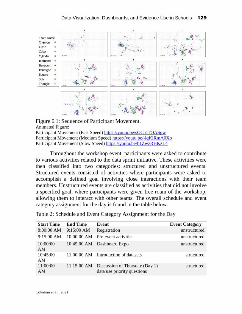
Data Visualization, Dashboards, and Evidence Use in Schools 129
Coleman et al., 2021
Figure 6.1: Sequence of Participant Movement. Animated Figure:
Participant Movement (Fast Speed) https://youtu.be/sOC-dTOASgw
Participant Movement (Medium Speed) https://youtu.be/-iqKlRmA0Xo
Participant Movement (Slow Speed) https://youtu.be/h1ZwzRHKzL4
Throughout the workshop event, participants were asked to contribute
to various activities related to the data sprint initiative. These activities were
then classified into two categories: structured and unstructured events.
Structured events consisted of activities where participants were asked to
accomplish a defined goal involving close interactions with their team
members. Unstructured events are classified as activities that did not involve
a specified goal, where participants were given free roam of the workshop,
allowing them to interact with other teams. The overall schedule and event
category assignment for the day is found in the table below.
Table 2: Schedule and Event Category Assignment for the Day
Start Time End Time Event Event Category
8:00:00 AM 9:15:00 AM Registration unstructured
9:15:00 AM 10:00:00 AM Pre-event activities unstructured
10:00:00
AM
10:45:00 AM Dashboard Expo unstructured
10:45:00
AM
11:00:00 AM Introduction of datasets structured
11:00:00
AM
11:15:00 AM Discussion of Thursday (Day 1)
data use priority questions
structured

Data Visualization, Dashboards, and Evidence Use in Schools 130
Coleman et al., 2021
11:15:00
AM
12:00:00 PM Datasprint working session structured
12:00:00
PM
1:00:00 PM Working Lunch (Lunch provided) unstructured
1:00:00 PM 1:15:00 PM Quick break for work, life, and
email checks
unstructured
1:15:00 PM 2:15:00 PM Datasprint continues structured
2:15:00 PM 2:30:00 PM Coffee break unstructured
2:30:00 PM 3:45:00 PM Final shared discussion and
viewing of data sprint
structured
3:45:00 PM 4:15:00 PM Conclusion and next steps structured
To understand if there were any significant differences in how teams
functioned throughout the day, we first calculated a moving centroid between
all members of a team within each minute time block. Calculating a centroid
within each time block, as opposed to identifying a centroid based on the
location of the teams assigned work table location enabled us to account for
any collective movement that may have occurred throughout the day. For
example, during the scheduled lunch hour, we will be able to see if
participants grouped together, even if they opted to eat at an alternative
location within the room. If we limited our analysis to the teams’ distances
from the work tables, these insights would have been lost. The centroid points
were calculated as:
We then needed to calculate the individual participant distance from
each team centroid. This was accomplished by using the Pythagorean
Theorem distance formula, a commonly used distance measure used to
compute distance between two points of spatial data (Tay, Hsu, Lim, & Yap,
2003). This resulted in a data set containing, at the minute level, an individual
participant’s location, their team’s centroid for that time block, and the
participant’s distance to that centroid. The last step was to then take an average
of the individual participant distance from the team within each minute time
block to create the final data for analysis. This was accomplished using the
following calculation:

Data Visualization, Dashboards, and Evidence Use in Schools 131
Coleman et al., 2021
Figure 6.2 below provides an example of this distance calculation in
practice.
Figure 6.2: Example of distance calculation in practice
The resulting data set contained a minute level time stamp, a category
assignment for that specific point in time (categorized as either structured or
unstructured), and the average distance for all the team members recorded
within that minute time frame, measured in meters. Figure 6.3 shows the
average distance from each centroid, for each team over time.

Data Visualization, Dashboards, and Evidence Use in Schools 132
Coleman et al., 2021
Figure 6.3: Average Distance of Teams within Scheduled Activity

Data Visualization, Dashboards, and Evidence Use in Schools 133
Coleman et al., 2021
Analysis
A factorial design two-way Analysis of Variance (ANOVA) was then
conducted on the average distance for each team within each structured or
unstructured event. Using an ANOVA, we can test the main effect of each
independent variable. In this case, we are testing main effect of team (whether
the average distance throughout the day differed based on the subjects' team
assignment, ignoring the effects of the event category) and the main effect of
the event category (whether distances differed based on the event category,
ignoring the effects of subjects' team).
Figure 6.4: Interaction Plot of Team Distances within Activity Category
Specifically, average distances were analyzed with a 2 (Team) x 2
(Event Category) mixed-model ANOVA. The main effect of team assignment
on average distance was significant, F(1,9) = 69.68, p < .001 and the main
effect of event category on distances was also significant F(1,1) = 100.977, p
<.001. In order to interpret the interaction of the main effects, a post-hoc
pairwise comparison was conducted using Tukey’s Honest Significant Test
(HSD) to determine where the significance occurred within the ANOVA. We
conducted pairwise comparisons on the team, the time block, and the

Data Visualization, Dashboards, and Evidence Use in Schools 134
Coleman et al., 2021
interaction between the team and the time block. The table below shows the
findings of the team pairwise comparisons.
Results (Appendix Table 1) of the pairwise team comparison found
significant differences between multiple team group pairs. Team Chevron
showed a significant difference in team member distance between five other
teams: Circle, Cylinder, Hexagon, Pentagon and Square (p < 0.05). Circle
pairwise comparisons found differences in distance between all other teams
in the analysis (p < 0.05). Cube showed one significant difference in distance
with team Square (p < 0.05), Cylinder showing a significant difference in
distances between teams Square and Star (p < 0.05), Diamond showing a
significant differences in distance between team Square (p < 05), Hexagon
showing a significant difference in distances between team Square (p < 0.05),
Pentagon showing a significant difference with team Square (p < 0.05), and
Square showing significant differences in distances between teams Star and
Triangle (p < 0.05). The Tukey HSD test (Appendix Table 2) showed that the
effects of the structured and unstructured activity categories differed
significantly in average team distance (p < 0.05).
Discussion
One particularly interesting finding from our results was the behavior
of two teams, Square and Circle, when comparing distances between
structured and unstructured event categories. While all the other teams in the
workshop showed the expected behavior of spreading out during unstructured
activities and coming closer together during structured activities, the Square
and Circle teams had the opposite behavior, with their participant distance
actually shrinking during unstructured events and spreading out further during
structured events. While our data does not enable us to understand the reason
for this behavior, it presents an interesting opportunity for future multimodal
data analysis to see if this type of behavior impacts the performance of the
participants and their ability to meet any of the objectives defined during the
workshop.
Limitations
Our analysis encountered several limitations. Due to technical issues
encountered during the workshop, 12 participants did not have matching
records for their tracking devices, leading them to not have any reported
location data. This was likely caused by the tracking devices not being
charged or turned on during the workshop. The impact of this issue was

Data Visualization, Dashboards, and Evidence Use in Schools 135
Coleman et al., 2021
significant to team Arrow, which had 5 of their 7 members not report any data,
requiring us to remove this team completely from the analysis. The rest of the
missing devices were evenly distributed across the other teams, with Square
and Diamond missing data from 2 devices, and Chevron, Cube, and Star only
missing one device within their team. This issue further reduced our study
sample down to 60 total participants, spread across 10 total teams.
Additionally, the technological instruments utilized within this analysis
collected data in an inconsistent fashion, with some of the participant devices
reporting back several location observations within a single second, while
others may have only recorded data twice within a minute. To address this
inconsistency, we reduced the granularity of the data by taking the timestamps
recorded in the log file and then rounding them to the nearest minute. We then
averaged the x and y position data within each minute for each participant,
reducing the initial number of records collected throughout the day from
3,372,372 millisecond level observations to 4,760-minute level average
position observations.
Lastly, our analysis excludes any factors that could be used to measure
participant performance throughout the workshop. Initially, we experimented
with including participant voting data as the participants were asked to vote
on which visualization they liked the most by placing their movement tracker
on the table of the team they wanted to vote for, but due to the aforementioned
technical issues we encountered during the data collection, the sample size
became too small to determine any significant differences in voting patterns
or correlations between distance and vote.
Conclusion and Future Work
In summation, this analysis reveals the opportunities of spatio-temporal
data analysis in determining difference of in team interactions within a
collaborative workshop context. Given that this analysis focused on analyzing
a single data source (movement data), we are limited in our capacity to
conduct any meaningful causal analysis on what occurred during these
interactions, as we are lacking additional data needed to extract these insights,
these findings support the need for continued research. Future analysis could
be improved by the inclusion of audio recorder devices to determine team
sentiment (Worsley, 2012), or by creating an assessment to determine the
impact that team closeness has on the overall performance of the participants
during the workshop (Cerezo, Sánchez-Santillán, Paule-Ruiz & Núñez, 2016).
Improving awareness of if or how learners communicate with one another can
Data Visualization, Dashboards, and Evidence Use in Schools 136
Coleman et al., 2021
be used to evaluate the efficacy of group projects of other collaborative work,
especially in formal education settings.
Within the field of K-12 education, utilizing data garnered from
multimodal approaches to learning analytics will present new opportunities
for analysis. Evidence-based understanding of student/learner interactions can
greatly impact how educators and administrators establish designs and
practices for classrooms (Healion et al., 2017; Ortiz-Vasquez et al., 2017).
Armed with this data, administrators, educators, and other school stakeholders
may be able to make more informed decisions than they used to make when
they were limited to common forms of data such as exam scores, attendance
data, and observable behavior to understand learners-- which supports the
notion of continued close work between data scientists and educational
institutions (Agasisti & Bowers, 2017). Further, educational policymakers
will be able to develop better plans for management of educational institutions
on a larger scale, such as on a district, state, or national level (Bowers et al.,
2019). Regional policies that are grounded in data analysis can unite many
schools to incorporate research-based educational initiatives into their
classrooms.
Although most applicable to classroom or collaborative learning
environments (Healion et al., 2017), the same approaches soon may be applied
to informal learning spaces, such as libraries, museums, and after-school
centers (Ortiz-Vasquez et al., 2017). When implemented in these settings,
multimodal approaches to learning analytics can impact learners of all ages.
References
Agasisti, T., Bowers, A.J. (2017). Data Analytics and Decision-Making in Education:
Towards the Educational Data Scientist as a Key Actor in Schools and Higher
Education Institutions. In Johnes, G., Johnes, J., Agasisti, T., López-Torres, L.
(Eds.) Handbook of Contemporary Education Economics (p.184-210).
Cheltenham, UK: Edward Elgar Publishing. ISBN: 978-1-78536-906-3
http://www.e-elgar.com/shop/handbook-of-contemporaryeducation-economics
Andrade, A., Delandshere, G., & Danish, J. A. (2016). Using Multimodal Learning
Analytics to Model Student Behaviour: A Systematic Analysis of Behavioural
Framing. Journal of Learning Analytics, 3(2), 282-306.
Blikstein, P. (2013, April). Multimodal learning analytics. In Proceedings of the third
international conference on learning analytics and knowledge (pp. 102-106).
Blikstein, P. & Worsley, M. (2016). Multimodal learning analytics and education data
mining: Using computational technologies to measure complex learning tasks.
Journal of Learning Analytics, 3(2), 220–238.
http://dx.doi.org/10.18608/jla.2016.32.11

Data Visualization, Dashboards, and Evidence Use in Schools 137
Coleman et al., 2021
Bowers, A.J., Bang, A., Pan, Y., Graves, K.E. (2019). Education Leadership Data
Analytics (ELDA): A White Paper Report on the 2018 ELDA Summit. Teachers
College, Columbia University: New York, NY. USA
Cao, G., Wang, S., Hwang, M., Padmanabhan, A., Zhang, Z., & Soltani, K. (2015). A
scalable framework for spatiotemporal analysis of location-based social media
data. Computers, Environment and Urban Systems, 51, 70-82.
Colino, E., Garcia-Unanue, J., Sanchez-Sanchez, J., Calvo-Monera, J., Leon, M.,
Carvalho, M. J., ... & Navandar, A. (2019). Validity and reliability of a
commercially available indoor tracking system to assess distance and time in
court-based sports. Frontiers in psychology, 10.
Dobra, A., Williams, N. E., & Eagle, N. (2015). Spatiotemporal detection of unusual
human population behavior using mobile phone data. PloS one, 10(3).
Hasan, S., Schneider, C. M., Ukkusuri, S. V., & González, M. C. (2013). Spatiotemporal
patterns of urban human mobility. Journal of Statistical Physics, 151(1-2), 304-
318.
Healion, D., Russell, S., Cukurova, M., & Spikol, D. (2017, March). Tracing physical
movement during practice-based learning through multimodal learning analytics.
In Proceedings of the Seventh International Learning Analytics & Knowledge
Conference (pp. 588-589).
Hodson, D., & Hodson, J. (1998). From constructivism to social constructivism: A
Vygotskian perspective on teaching and learning science. School science review,
79(289), 33-41.
Lan, C., Chae, H., Nantwi G., & Natriello, G. (2019). Real-time locating system in
innovative learning spaces. Transitions 2018: Continuing the conversation,
Proceedings of international symposia for graduate and early career researchers
in Australasia, Europe and North America, pp. 1 - 231
Huo, K., Wang, T., Paredes, L., Villanueva, A. M., Cao, Y., & Ramani, K. (2018,
October). Synchronizar: Instant synchronization for spontaneous and spatial
collaborations in augmented reality. In Proceedings of the 31st Annual ACM
Symposium on User Interface Software and Technology (pp. 19-30).
Imms, W; Mahat, M, Transitions 2018: Continuing the conversation, Proceedings of
international symposia for graduate and early career researchers in Australasia,
Europe and North America, 2019, pp. 1 - 231
Knight, S., Wise, A. F., & Chen, B. (2017). Time for change: Why learning analytics
needs temporal analysis. Journal of Learning Analytics, 4(3), 7-17.
Luimula, M., & Skarli, K. (2014). Game Development Projects–From Idea Generation to
Startup Activities. In Proceedings of the International Conference on Engineering
Education, June (pp. 2-7).
NSF (2019), December 5th-6th. Education Data Analytics Collaborative Workshop.
Teachers College, Columbia University. New York, NY. Retrieved from
https://sites.google.com/tc.columbia.edu/nsf-edac-workshop-2019/home
Oriol-Cotterill, A., Macdonald, D. W., Valeix, M., Ekwanga, S., & Frank, L. G. (2015).
Spatiotemporal patterns of lion space use in a human-dominated landscape.
Animal Behaviour, 101, 27-39.
Ortiz-Vasquez, A., Liu, X., Lan, C., Chae, H., & Natriello, G. (2017). Cluster analysis of
real time location data- An application of Gaussian Mixture Models. Proceedings

Data Visualization, Dashboards, and Evidence Use in Schools 138
Coleman et al., 2021
of the 10th International Conference of Educational Data Mining, 360-361.
Retrieved from
http://educationaldatamining.org/EDM2017/proc_files/papers/paper_70.pdf
Ochoa, X. (2017). Multimodal learning analytics. The Handbook of Learning Analytics,
1, 129-141.
Salimi, S., Liu, Z., & Hammad, A. (2019). Occupancy prediction model for open-plan
offices using real-time location system and inhomogeneous Markov chain.
Building and Environment, 152, 1-16.
Schneider, B., & Blikstein, P. (2015). Unraveling students’ interaction around a tangible
interface using multimodal learning analytics. Journal of Educational Data
Mining, 7(3), 89-116.
Spikol, D., Ruffaldi, E., Landolfi, L., & Cukurova, M. (2017, July). Estimation of success
in collaborative learning based on multimodal learning analytics features. In 2017
IEEE 17th International Conference on Advanced Learning Technologies
(ICALT) (pp. 269-273). IEEE.
Tay, S. C., Hsu, W., Lim, K. H., & Yap, L. C. (2003, July). Spatial data mining:
Clustering of hot spots and pattern recognition. In IGARSS 2003. 2003 IEEE
International Geoscience and Remote Sensing Symposium. Proceedings (IEEE
Cat. No. 03CH37477) (Vol. 6, pp. 3685-3687). IEEE.
Versichele, M., Neutens, T., Delafontaine, M., & Van de Weghe, N. (2012). The use of
Bluetooth for analysing spatiotemporal dynamics of human movement at mass
events: A case study of the Ghent Festivities. Applied Geography, 32(2), 208-220.
Ward, M. P. (2007). Spatio-temporal analysis of infectious disease outbreaks in
veterinary medicine: clusters, hotspots and foci. Vet Ital, 43(3), 559-570.
Worsley, M. (2014, November). Multimodal learning analytics as a tool for bridging
learning theory and complex learning behaviors. In Proceedings of the 2014 ACM
workshop on Multimodal Learning Analytics Workshop and Grand Challenge
(pp. 1-4).
Worsley, M. (2012, October). Multimodal learning analytics: enabling the future of
learning through multimodal data analysis and interfaces. In Proceedings of the
14th ACM international conference on Multimodal interaction (pp. 353-356).
Worsley, M., & Blikstein, P. (2015, March). Leveraging multimodal learning analytics to
differentiate student learning strategies. In Proceedings of the Fifth international
conference on learning analytics and knowledge (pp. 360-367).

Data Visualization, Dashboards, and Evidence Use in Schools 139
Coleman et al., 2021
Appendix A: Results of Tukey HSD Team Pairwise Comparisons Table 3: Results of Team Pairwise Comparisons
Contrast Estimate SE T Ratio P Value
Chevron - Circle -1.919 0.167 -11.456 <.001
Chevron - Cube -0.524 0.169 -3.096 0.061
Chevron - Cylinder -0.708 0.167 -4.228 0.001
Chevron - Diamond -0.467 0.167 -2.785 0.142
Chevron - Hexagon -0.562 0.168 -3.352 0.028
Chevron - Pentagon -0.578 0.167 -3.448 0.020
Chevron - Square -3.241 0.167 -19.350 <.001
Chevron - Star -0.112 0.168 -0.668 1.000
Chevron - Triangle -0.415 0.167 -2.477 0.281
Circle - Cube 1.395 0.169 8.244 <.001
Circle - Cylinder 1.211 0.167 7.227 <.001
Circle - Diamond 1.452 0.167 8.671 <.001
Circle - Hexagon 1.357 0.168 8.092 <.001
Circle - Pentagon 1.341 0.167 8.008 <.001
Circle - Square -1.322 0.167 -7.894 <.001
Circle - Star 1.807 0.168 10.781 <.001
Circle - Triangle 1.504 0.167 8.979 <.001
Cube - Cylinder -0.184 0.169 -1.090 0.986
Cube - Diamond 0.057 0.169 0.339 1.000
Cube - Hexagon -0.038 0.169 -0.226 1.000
Cube - Pentagon -0.054 0.169 -0.317 1.000
Cube - Square -2.717 0.169 -16.058 <.001
Cube - Star 0.412 0.169 2.432 0.307
Cube - Triangle 0.109 0.169 0.644 1.000
Cylinder - Diamond 0.242 0.167 1.443 0.914
Cylinder - Hexagon 0.146 0.168 0.872 0.997
Cylinder - Pentagon 0.131 0.167 0.781 0.999
Cylinder - Square -2.533 0.167 -15.122 <.001
Cylinder - Star 0.596 0.168 3.558 0.014
Cylinder - Triangle 0.293 0.167 1.751 0.766
Diamond - Hexagon -0.096 0.168 -0.570 1.000
Diamond - Pentagon -0.111 0.167 -0.663 1.000
Diamond - Square -2.775 0.167 -16.565 <.001
Diamond - Star 0.354 0.168 2.115 0.517
Diamond - Triangle 0.052 0.167 0.308 1.000
Hexagon - Pentagon -0.015 0.168 -0.092 1.000
Hexagon - Square -2.679 0.168 -15.978 <.001
Hexagon - Star 0.450 0.168 2.682 0.181

Data Visualization, Dashboards, and Evidence Use in Schools 140
Coleman et al., 2021
Hexagon - Triangle 0.147 0.168 0.877 0.997
Pentagon - Square -2.664 0.167 -15.902 <.001
Pentagon - Star 0.465 0.168 2.778 0.144
Pentagon - Triangle 0.163 0.167 0.971 0.994
Square - Star 3.129 0.168 18.671 <.001
Square - Triangle 2.826 0.167 16.873 <.001
Star - Triangle -0.303 0.168 -1.807 0.731
Appendix B: Results of Tukey HSD Time Block Pairwise Comparisons
Table 4: Results of Time Block pairwise comparisons
Contrast Estimate SE T Ratio P Value
Structured - Unstructured -0.757 0.075 -10.078 <.001
Data Visualization, Dashboards, and Evidence Use in Schools 141
Coleman et al., 2021
Appendix C: Code for Analysis
Function to Clean Quuppa JSON Log Files ###### Load Dependencies
library(jsonlite)
library(lubridate)
library(dplyr)
library(tidyr)
library(stringr)
library(rgl)
options(scipen = 999) # Disable scientific notation
#######################
### function parse JSON
#######################
# Description:
# cleaning function to load all Quuppa log files stored in a supplied
folder
# location. The function allows for two arguments, the first is the
path to the
# folder, and the second is the time interval. Quuppa data is measured
at the
# milisecond level, the time interval argument rounds the time stamp to
a
# specified intervale and only retains the first record within that
time unique
# time stamp. This can greatly reduce the data size over long periods
of time.
# The time interval value is appended to the csv file produces by the
function.
# Possible time interval options avilable are:
# clean_quuppa_data(x, ".5s")
# clean_quuppa_data(x, "sec")
# clean_quuppa_data(x, "second")
# clean_quuppa_data(x, "minute")
# clean_quuppa_data(x, "5 mins")
# clean_quuppa_data(x, "hour")
# clean_quuppa_data(x, "2 hours")
# clean_quuppa_data(x, "day")
# clean_quuppa_data(x, "week")
# clean_quuppa_data(x, "month")
# clean_quuppa_data(x, "bimonth")
# clean_quuppa_data(x, "quarter") == clean_quuppa_data(x, "3 months")
# clean_quuppa_data(x, "halfyear")
# clean_quuppa_data(x, "year")
# Example of use: Parses all files in path to one second intervals and
stores as
# unified csv in Quuppa folder.
# quuppa_path <- "/Users/chad/Documents/Quuppa"

Data Visualization, Dashboards, and Evidence Use in Schools 142
Coleman et al., 2021
# clean_quuppa_data(quuppa_path, "second")
# Expected output:
/Users/chad/Documents/Quuppa/cleaned_quuppa_second_time_interval.csv
clean_quuppa_data <- function(quuppa_directory, time_intervals){
files <- list.files(quuppa_path, pattern = '.log')
total <- length(files)
pb <- txtProgressBar(min = 0, max = total, style = 3)
quuppa_df <- data.frame() # create an empty list
for (i in 1:total) {
print(paste("Parsing file:", files[[i]]))
raw <- readLines(paste0(quuppa_path, "/", files[[i]])) # read log
file
raw <- raw[-(1:4)] # ignore first 4 lines of log file
json <- grep("^/\\* [0-9]* \\*/", raw, value = TRUE, invert = TRUE)
# get rid of the "/* 0 */" lines
n <- length(json)
json[-n] <- gsub("^}$", "},", json[-n]) # add missing comma after }
json <- c("[", json, "]") # add brakets at the beginning and end
df <- fromJSON(json)
df$date <- as_datetime(df$positionTS/1000, tz="EST") # convert unix
epoch time to datetime
df$date <- round_date(df$date, time_intervals) # Round to 5 second
intervals
df$date <- format(df$date, format='%Y-%m-%d %H:%M:%S') # specify
formate
df$position <- gsub("\\c|\\(|\\)", "", df$position) # remove
unwanted characters from position field
df$smoothedPosition <- gsub("\\c|\\(|\\)", "", df$smoothedPosition)
# remove unwanted characters from position field
df <- df %>%
separate(position, c("X", "Y", "Z"), ",") %>% # split position
coordinates to seperate columns
separate(smoothedPosition, c("sX", "sY", "sZ"), ",") # split
position coordinates to seperate columns
df$X <- as.numeric(df$X) # convert to numeric
df$Y <- as.numeric(df$Y) # convert to numeric
df$sX <- as.numeric(df$sX) # convert to numeric
df$sY <- as.numeric(df$sY) # convert to numeric
df <- df %>%
select(name, X, Y, sX, sY, date) # drop unwanted columns
quuppa_df <- rbind(quuppa_df,df) # append data to final frame
Sys.sleep(0.1)
# update progress bar
setTxtProgressBar(pb, i)}
close(pb)
write.csv(quuppa_df, # write final frame to csv
paste0(quuppa_directory, "/cleaned_quuppa_",
time_intervals, "_time_intervals.csv"), row.names = FALSE)
print(paste0("Saving data to: ", quuppa_directory,
"/cleaned_quuppa_", time_intervals, "_time_interval.csv"))
}

Data Visualization, Dashboards, and Evidence Use in Schools 143
Coleman et al., 2021
Calculate Centroid and Team Member Distance by Time Point library(lubridate)
library(dplyr)
distance_data <- data.frame() # create an empty list
teams <- unique(as.character(df$Team)) # create list of teams
dates <- unique(df$date_by_minute) # create list of time stamps
for (j in dates){
for (i in teams){
timeframe <- j
team_name <- i
df2 <- df %>%
filter(date_by_minute == j)
df2 <- df2 %>%
filter(Team == i)
m <- cbind(df2$sX, df2$sY)
cnt <- c(mean(m[,1]),mean(m[,2]))
mean_distance <- mean(apply(m,1,function(x,cnt) {(sqrt((x[1] -
cnt[1])^2+(x[2]-cnt[2])^2))},cnt))
cnt <- as.data.frame(cnt)
x_center <- cnt[1,]
y_center <- cnt[2,]
distance_data <- rbind(distance_data, data.frame(team_name,
timeframe, x_center, y_center, mean_distance))
}
}
distance_data$timeframe <- as_datetime(distance_data$timeframe,
tz="EST") # specify formate
distance_data$timeframe <- as.POSIXct(paste(distance_data$timeframe),
format = "%Y-%m-%d %H:%M:%S", tz = "EST")
Plot Figures and Images library(scales)
library(ggplot2)
library(gganimate)
library(magick)
library(tidyverse)
library(lubridate)
library(RColorBrewer)
### Load Cleaned Data
df <- read.csv("...\\cleaned_quuppa_1s_time_intervals.csv") # Load
cleaned time
attendees <- read.csv("...\\NSF Education Data.csv") # load participant
data
### Gather PII Boolean into groups
pii <- attendees %>%
mutate(Quupa.ID = ï..Quupa.ID) %>%

Data Visualization, Dashboards, and Evidence Use in Schools 144
Coleman et al., 2021
select(Quupa.ID, Team, Educator, Teacher, Building.Administrator,
District..Administrator, BOCES..Staff, Data.Scientist) %>%
gather(Type,j,-Quupa.ID, -Team) %>%
filter(j==1) %>%
select(-j)
# specify formats
df$date <- as.POSIXct(paste(df$date), format = "%Y-%m-%d %H:%M:%S", tz
= "EST")
pii$Quupa.ID <- as.character(pii$Quupa.ID)
df$name <- as.character(df$name)
### Merge PII to DF
df <- inner_join(df, pii, c("name" = "Quupa.ID"))
df1 <- df %>%
group_by(name, Team, Type, date) %>%
summarise(X = round(mean(X),2),
Y = round(mean(Y),2),
sX = round(mean(sX),2),
sY = round(mean(sY),2)) %>%
arrange(date) %>%
mutate(Group = if_else(Type == 'Educator' | Type == 'Teacher',
'Educator', 'Other'))
df1$date_by_minute <- round_date(df1$date, 'minute')
distance_data <- data.frame() # create an empty list
teams <- unique(as.character(df1$Team))
dates <- unique(df1$date_by_minute)
for (j in dates){
for (i in teams){
timeframe <- j
team_name <- i
df2 <- df1 %>%
filter(date_by_minute == j)
df2 <- df2 %>%
filter(Team == i)
m <- cbind(df2$sX, df2$sY)
cnt <- c(mean(m[,1]),mean(m[,2]))
mean_distance <- mean(apply(m,1,function(x,cnt) {(sqrt((x[1] -
cnt[1])^2+(x[2]-cnt[2])^2))},cnt))
cnt <- as.data.frame(cnt)
x_center <- cnt[1,]
y_center <- cnt[2,]
distance_data <- rbind(distance_data, data.frame(team_name,
timeframe, x_center, y_center, mean_distance))
}
}
distance_data$timeframe <- as_datetime(distance_data$timeframe,
tz="EST") # specify formate
distance_data$timeframe <- as.POSIXct(paste(distance_data$timeframe),
format = "%Y-%m-%d %H:%M:%S", tz = "EST")
distance_data <- distance_data %>%

Data Visualization, Dashboards, and Evidence Use in Schools 145
Coleman et al., 2021
filter(team_name != 'Arrow') # Drop arrow fram data due to high
missing >=5
# write_csv(distance_data, 'team_distance_data_by_minute.csv')
#### Static Plot
p <- ggplot(distance_data[!is.na(distance_data$mean_distance),],
aes(timeframe, mean_distance, group = team_name, color = team_name)) +
geom_line() +
scale_color_viridis_d() +
labs(title = 'Average Distance of Team Members from Team Centroid',
x = "Time of Day",
y = "Average Distance (Meters)") +
facet_wrap(~team_name, nrow = 11) +
theme_bw() +
theme(plot.title = element_text(hjust = 0.5),
legend.position = "none",
axis.text.x = element_text(angle = 45, hjust = 1))
p <- p + scale_x_datetime(labels = date_format("%H:%M", tz = 'EST'),
date_breaks = "1 hours")
# Plot Figure
p
########### Animated Line Plot
library(ggplot2)
library(gganimate)
library(hrbrthemes)
plotData <- distance_data[!is.na(distance_data$mean_distance),]
plotData$hourTime <-round_date(round_date(plotData$timeframe, '15
mins')) # Round time stamp to 15 minute intervals
plotData2 <- plotData %>%
group_by(team_name, hourTime) %>%
summarise(averageMeanDistance = mean(mean_distance))
# Line Plot
plot <- plotData2 %>%
ggplot(aes(hourTime, averageMeanDistance, group = team_name, color =
team_name)) +
geom_line() +
geom_point() +
scale_color_viridis_d() +
ggtitle('Average Distance of Team Members from \n Team Centroid Over
Time') +
theme_ipsum() +
ylab("Average Distance (Meters)") +
xlab("Time of Day") +
labs(color='Team Name') +
theme(plot.title = element_text(hjust = 0.5),
legend.position = "right",
axis.text.x = element_text(angle = 45, hjust = 1)) +
scale_x_datetime(labels = date_format("%H:%M", tz = 'EST'),
date_breaks = "30 mins") +

Data Visualization, Dashboards, and Evidence Use in Schools 146
Coleman et al., 2021
transition_reveal(hourTime)
animate(plot, fps = 10, width = 800, height = 600) # Plot Figure
# Save at gif:
anim_save("line_plot.gif")
# Animated Bar Plot
plotData3 <- plotData2 %>%
group_by(hourTime) %>%
mutate(max.value = max(averageMeanDistance)) %>%
ungroup() %>%
mutate(text = case_when(hourTime == '2019-12-06 08:15:00' ~ "8:00 AM
- 9:15 AM \n Registration",
hourTime == '2019-12-06 08:30:00' ~ "8:00 AM
- 9:15 AM \n Registration",
hourTime == '2019-12-06 08:45:00' ~ "8:00 AM
- 9:15 AM \n Registration",
hourTime == '2019-12-06 09:00:00' ~ "8:00 AM
- 9:15 AM \n Registration",
hourTime == '2019-12-06 09:15:00' ~ "8:00 AM
- 9:15 AM \n Registration",
hourTime == '2019-12-06 09:30:00' ~ "9:15 AM
- 10:00 AM \n Pre-event activities",
hourTime == '2019-12-06 09:45:00' ~ "9:15 AM
- 10:00 AM \n Pre-event activities",
hourTime == '2019-12-06 10:00:00' ~ "9:15 AM
- 10:00 AM \n Pre-event activities",
hourTime == '2019-12-06 10:15:00' ~ "10:00 AM
- 10:45 AM \n Dashboard Expo",
hourTime == '2019-12-06 10:30:00' ~ "10:00 AM
- 10:45 AM \n Dashboard Expo",
hourTime == '2019-12-06 10:45:00' ~ "10:00 AM
- 10:45 AM \n Dashboard Expo",
hourTime == '2019-12-06 11:00:00' ~ "10:45 AM
- 11:00 AM \n Introduction of datasets",
hourTime == '2019-12-06 11:15:00' ~ "11:00 AM
- 11:15 AM \n Discussion of Thursday (Day 1) data use priority
questions",
hourTime == '2019-12-06 11:30:00' ~ "11:15 AM
- 12:00 PM \n Datasprint working session",
hourTime == '2019-12-06 11:45:00' ~ "11:15 AM
- 12:00 PM \n Datasprint working session",
hourTime == '2019-12-06 12:00:00' ~ "11:15 AM
- 12:00 PM \n Datasprint working session",
hourTime == '2019-12-06 12:15:00' ~ "12:00 PM
- 1:00 PM \n Working Lunch (Lunch provided)",
hourTime == '2019-12-06 12:30:00' ~ "12:00 PM
- 1:00 PM \n Working Lunch (Lunch provided)",
hourTime == '2019-12-06 12:45:00' ~ "12:00 PM
- 1:00 PM \n Working Lunch (Lunch provided)",
hourTime == '2019-12-06 13:00:00' ~ "12:00 PM
- 1:00 PM \n Working Lunch (Lunch provided)",
hourTime == '2019-12-06 13:15:00' ~ "1:00 PM
- 1:15 PM \n Quickbreak for work, life, and email checks",
Data Visualization, Dashboards, and Evidence Use in Schools 147
Coleman et al., 2021
hourTime == '2019-12-06 13:30:00' ~ "1:15 PM
- 2:15 PM \n Datasprint continues",
hourTime == '2019-12-06 13:45:00' ~ "1:15 PM
- 2:15 PM \n Datasprint continues",
hourTime == '2019-12-06 14:00:00' ~ "1:15 PM
- 2:15 PM \n Datasprint continues",
hourTime == '2019-12-06 14:15:00' ~ "1:15 PM
- 2:15 PM \n Datasprint continues",
hourTime == '2019-12-06 14:30:00' ~ "2:15 PM
- 2:30 PM \n Coffee break",
hourTime == '2019-12-06 14:45:00' ~ "2:30 PM
- 3:45 PM \n Final shared discussion and viewing of data sprint",
hourTime == '2019-12-06 15:00:00' ~ "2:30 PM
- 3:45 PM \n Final shared discussion and viewing of data sprint",
hourTime == '2019-12-06 15:15:00' ~ "2:30 PM
- 3:45 PM \n Final shared discussion and viewing of data sprint",
hourTime == '2019-12-06 15:30:00' ~ "2:30 PM
- 3:45 PM \n Final shared discussion and viewing of data sprint",
hourTime == '2019-12-06 15:45:00' ~ "2:30 PM
- 3:45 PM \n Final shared discussion and viewing of data sprint",
hourTime == '2019-12-06 16:00:00' ~ "3:45 PM
- 4:15 PM \n Conclusion and next steps",
hourTime == '2019-12-06 16:15:00' ~ "3:45 PM
- 4:15 PM \n Conclusion and next steps",
hourTime == '2019-12-06 16:30:00' ~ "3:45 PM
- 4:15 PM \n Conclusion and next steps"))
plotData4 <- plotData3 %>%
group_by(team_name, text) %>%
summarise(averageMeanDistance = round(mean(averageMeanDistance), 2),
hourTime = mean(hourTime)) %>%
ungroup() %>%
group_by(text) %>%
arrange(averageMeanDistance, .by_group = TRUE) %>%
mutate(ordering = row_number()) %>%
mutate(max.value = max(averageMeanDistance))
plot2 <- plotData4 %>%
ggplot(aes(x = ordering, y = averageMeanDistance)) +
geom_col(aes(fill = team_name)) +
geom_blank(aes(y = max.value)) +
#scale_color_viridis_d() +
ggtitle('Average Distance of Team Members from \n Team Centroid
Within Activity') +
labs(fill='Team Name') +
geom_text(aes(y = max.value / 2, label = text), x = -1, check_overlap
= TRUE) +
coord_flip(clip = "off") +
theme_bw() +
theme(plot.title = element_text(hjust = 0.5),
legend.position = "right",
axis.title = element_blank(),
axis.ticks = element_blank(),
axis.text = element_blank(),
plot.margin = unit(c(1, 1, 8, 1), "cm")) +

Data Visualization, Dashboards, and Evidence Use in Schools 148
Coleman et al., 2021
geom_text(aes(label=as.character(averageMeanDistance)), hjust=1.6,
color="black", size=3.5) +
transition_states(hourTime, transition_length = 2, state_length = 2)
+
view_follow(fixed_x = TRUE)
# Plot Figure
animate(plot2, fps = 10, width = 800, height = 400)
# Save at gif:
anim_save("bar_plot.gif")

Data Visualization, Dashboards, and Evidence Use in Schools 149
Halverson, 2021
CHAPTER 7
Data Driven Instructional Systems: 2030
Richard Halverson
University of Wisconsin-Madison
1
Digital data tools and practices are now ubiquitous in US schools. All public
schools collect data on student performance and outcomes and seek to use
these data to reflect upon and adjust practices of teaching and learning.
Educators are increasingly comfortable using student information systems,
learning management systems, computer-adaptive testing and curriculum
programs, and digital learning resources in their daily work. Leaders use data
from local, state and national data systems to plan, implement and evaluate
initiatives and roles. Using digital data systems has become a prerequisite for
participation in contemporary schools. Taken together, these digital tools
constitute data-driven instructional systems in schools. (Halverson, et. al.
2007)
Data-driven formative feedback in response to failure is a key principle
of learning theory. Successful learning depends on receiving clear feedback
on authentic attempts at explanation, then trying again with a new hypothesis
in an iterative cycle of inquiry (Kapur, 2015). Paul Black and Dylan Wiliam
(1998) initially framed effective formative feedback in terms of an oral or
written dialogue with learners. In recent years, digital data plays an
increasingly important role in providing contextual feedback in learning (Gee
2003). Digital and dialogic data, customized to respond to the activities of
Data Visualization, Dashboards, and Evidence Use in Schools
2021, Authors. Creative Commons License CC BY NC ND

Data Visualization, Dashboards, and Evidence Use in Schools 150
Halverson, 2021
learners, has become the prevailing model for how formative feedback can
guide learning at scale.
Data-driven decision making tacitly depends on these features of good
learning theory in the design of information systems. However, in most school
information systems, data are generated from the activities of students, but for
educators and system leaders. In other words, data systems in schools can be
formative for the learning of educators but are largely irrelevant to the
activities of students. Data collected from student activities provided feedback
to learners at the system governance level to guide reforms across the district.
In this chapter, I trace how data systems have become so important in
our schools and argue that the role that data will play in our schools is about
to undergo a significant expansion. I consider the recent evolution of data-
driven instructional systems in schools from the perspective of “who is the
learner”, or in other words, whose learning is the data constructed to support.
In the first stage, guided by NCLB, data systems were constructed to support
learning for policy makers, state and district leaders outside the school context
(Hamilton, et. al., 2009). In the second stage, guided by ESSA, school
principals and teachers became learners in a system that used student
outcomes to assess and guide their performance. The next frontier, the third
stage, of this evolution will be the integration of student into school data-
driven instructional systems. In the early stages, federal accountability
policies and market forced sparked the creation of systems were student data
were used to support learning for system leaders and educations.
I will argue that in the third stage, new movements such as personalized
learning will push schools to embrace a new range of student-centered data
practices for teaching and learning. By 2030, data-driven instructional
systems in schools will continue to evolve through hybrid practices and
technologies that will allow policy makers, school leaders, educators, and now
students to access and use information that not only documents overall
educational quality but also supports the day-to-day practices of their learning.
Stage 0: Data-Driven Instructional System Pre-NCLB
Digital data systems have revolutionized 21st century schools. It is sometimes
hard to see just how significant this recent transformation has been. 20th
century schools dealt with data driven decision making in entirely different
ways. Famously characterized as loosely-coupled systems, 20th century
teachers taught largely how and what they wanted to teach with little
interference except when their classroom control broke down. The role of
school leaders was to control access to who got into schools (admissions and
hiring) and created a safe and responsive school environment around

Data Visualization, Dashboards, and Evidence Use in Schools 151
Halverson, 2021
classrooms (Halverson & Kelley, 2017). Teachers were largely responsible
for improving the quality of their own work through their choices of
professional development.
Of course, 20th century educators always collected data related to their
work, but, for the most part, these data were collected locally, stored in files
and in gradebooks, with limited ability to share. Teachers built lo-tech systems
that assembled information on student work to assign grades; leaders
developed similar systems to collect grades into transcripts. School office staff
often developed rudimentary financial and administrative tools, often
designed around Excel sheets, that tracked relevant transactions. While
district and state level offices began to invest in more more complex digital
finance and planning technologies, local educators had to rely on analog
systems to guide their work.
Figure 7.1: In the NCLB era, data transfers from the student level to the
system leader level
Stage 1: Data Systems in the early NCLB Era (Figure 7.1)
The landscape of data-driven instructional practices shifted with the No Child
Left Behind Act of 2002. NCLB required all public schools to use the results
of student standardized tests to assess school quality. Disaggregated test
scores that demonstrated gaps in achievement outcomes were made public in
every state, and schools that could not improve test scores received were
designated in need of improvement.
NCLB data systems were intended to support local educators
(Hanushek & Raymond, 2001), but were actually designed to support the
learning of policymakers, school and district leaders, researchers and
community members. In part, this design resulted from the rhythm of
standardized testing where students were tested in the fall semester, but the

Data Visualization, Dashboards, and Evidence Use in Schools 152
Halverson, 2021
scores did not arrive until the following spring. The untimely reception of the
scores meant that educators were always designing to adjust practices that had
already happened with students who had already moved on (Stecher,
Hamilton & Gonzalez, 2003).
However, district leaders and policy makers learned to use these data
to support decisions about school closure and reconstitution and to
reallocation of resources. Test score data proved valuable to researchers who
learned the value of sharing a common kind of outcome data to support new
forms of research at scale. From the community perspective, realtors learned
to point homebuyers toward NCLB data to enhance decision making on where
to live and local community leaders began to promote their schools with test
scores and demographic information (Barnum & LeMee, 2019).
Stage 2: Creating the capacity for educators to learn from data.
The universal press to adjust instructional practice to improve test scores
resulted in a number of structural and practical changes in schools (Fuhrman
& Elmore, 2004). Even though standardized test scores provided ambiguous
information to support specific program improvements, many schools
engaged in a variety of reforms to create the capacity for data-driven
improvement. Many schools increased instructional time in math and
language arts and test preparation time and cut extra-curricular and arts
programs (Crocco & Costigan, 2008).
Figure 7.2: In the ESSA era, schools develop data pathways from students
and educators to inform the work of both system leaders and educators
By 2010, most school systems in the country had now purchased school
information systems, school finance systems and were beginning to buy

Data Visualization, Dashboards, and Evidence Use in Schools 153
Halverson, 2021
learning management systems, and to design web-based communication
platforms (Means, Padilla & Gallagher, 2010). An entire research-industrial
complex emerged to designate a list of interventions known to improve test
scores across contexts (Burch, 2009). The rush toward data technology
purchases created new positions for instructional leadership as technology
support shifted from fixing printers to leading data-driven decision-making
tools. Schools across the country invested in benchmark assessment systems,
such as the ACUITY, MAP and STAR tools, that gave educators immediate
feedback on student learning progress. Operationalizing these investments to
improve practice called for a new form of literacy for educators who were
increasingly expected to make instructional decisions based on outcome
measures (Green, et. al. 2015).
The Every Student Succeeds Act of 2015 (ESSA) pushed for test-based
accountability for principal and teachers. Schools began to prioritize data to
improve teaching by including teachers as data-driven learners (as well as
system leaders) (Figure 2). These new data practices invited educators to
create data-driven systems to diagnose and address student progress in
academics (through Response to Intervention (RtI) strategies) and in behavior
(through Positive Behavioral Interventions and Support (PBIS) strategies).
These initiatives inducted teachers into the new data process that provided
feedback for classroom practices.2 Teachers are now expected to work with
school leaders to generate and use data in continuous improvement cycles
(Schildkamp, 2019). These kinds of data are now nearly universally collected
and shared by data technologies to facilitate the learning of adults as a new
core capacity of schooling.
Stage 3: Integrating students as users into school data practices
As we move forward in the new decade, the frontier for development of data-
driven capacity is for students as learners (Figure 3). NCLB and ESSA
policies have resulted in data driven instructional systems that give support
for teachers, leaders and decision-makers to learn from student demographic,
assessment and achievement data. However, the lack of attention for data-
driven formative feedback at the student level is an obvious gap in the design
of systems that have been developed to assess the practices around student
learning, but not to support student learning itself.
2 Of course, teachers have always been data-driven learners. Teaching is defined by the development and use of low-fi, analog information systems on daily student achievement and interaction, including tools like quizzes, gradebooks, observations and homework. The difference introduced by ESSA was to shift the focus of where teachers get the relevant data from ad hoc, classroom based informal data systems to system-wide technology systems.
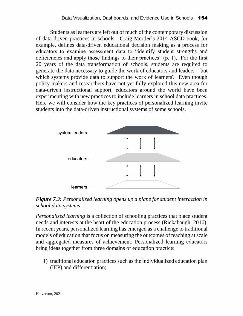
Data Visualization, Dashboards, and Evidence Use in Schools 154
Halverson, 2021
Students as learners are left out of much of the contemporary discussion
of data-driven practices in schools. Craig Mertler’s 2014 ASCD book, for
example, defines data-driven educational decision making as a process for
educators to examine assessment data to “identify student strengths and
deficiencies and apply those findings to their practices” (p. 1). For the first
20 years of the data transformation of schools, students are required to
generate the data necessary to guide the work of educators and leaders – but
which systems provide data to support the work of learners? Even though
policy makers and researchers have not yet fully explored this new area for
data-driven instructional support, educators around the world have been
experimenting with new practices to include learners in school data practices.
Here we will consider how the key practices of personalized learning invite
students into the data-driven instructional systems of some schools.
Figure 7.3: Personalized learning opens up a plane for student interaction in
school data systems
Personalized learning is a collection of schooling practices that place student
needs and interests at the heart of the education process (Rickabaugh, 2016).
In recent years, personalized learning has emerged as a challenge to traditional
models of education that focus on measuring the outcomes of teaching at scale
and aggregated measures of achievement. Personalized learning educators
bring ideas together from three domains of education practice:
1) traditional education practices such as the individualized education plan
(IEP) and differentiation;

Data Visualization, Dashboards, and Evidence Use in Schools 155
Halverson, 2021
2) progressive education practices such as interest- and project-based
learning; and
3) new approaches to standards-based instructional practices enabled by
data and new media technologies.
Although there are well-defined approaches to personalized learning (e.g.
Summit Learning), the variety of components in many programs reflect a
more eclectic spirit of grass-roots innovation. Some personalized learning
schools focus on technologies and practices designed to improve student test
scores, while other schools emphasize community engagement and new
media production. In spirit, though, personalized learning educators seem to
agree that their approaches
challenge traditional school designs by moving away from a teacher
leading the whole class in a common lesson. Instead, each student
can follow an optimal learning path and pace through a mix of
instructional methods, including individual- and small-group time
with teachers, group projects, and instructional software. (Childress
& Benson, 2014 p. 34)
The recent work of my research group has focused on identifying some of
the shared features of personalized learning as practiced in American public
schools (Halverson, et. al, 2015). Our research involved studying dozens of
educators and students at over 20 self-identified personalized learning
schools. We found that personalized learning educators work to:
• Create a culture of agency in schools by working with students to
collaboratively control the pace, place, content, goals and social
configuration of learning.
• Engage in regular, data-driven consultation with students, centered
around teacher-student conferring, to collaboratively develop learning
relationships, and assessments.
• Develop unique socio-technical ecologies composed of learning
management, computer adaptive curriculum and assessment, and new
media production tools collected to support local pedagogical priorities.

Data Visualization, Dashboards, and Evidence Use in Schools 156
Halverson, 2021
These kinds of practices open up a plane of authentic student involvement of
data-driven instructional practices and likely will change how teachers
interact with data as well. (Figure 3).
The socio-technical systems developed to support personalized
learning are the foundation for students to become key actors in the school’s
data-driven instructional system. Developing a culture of agency, for
example, invites teachers to co-develop learning plans and assessments with
students. Students use learning management tools to select and sequence
learning activities and to track their own progress through performance-based
assessments. Learning management systems provide a data-rich environment
that reshapes teaching practices in response to student choices and cultivates
student ability to use the same kinds of resources available to teachers to plan
and assess their own learning.
Some schools develop learning management systems on their own out
of the ubiquitous Google Classroom GSuite tools. For example, one school in
our study built a shared Learner Pathway Google Sheet for each student. This
student-curated spreadsheet was used to plan instruction from Kindergarten
through 8th grade. It included relevant context standards, a menu of learning
activities necessary to meet standards, and links to assessments that allowed
learners to demonstrate mastery. The Learner Pathways spreadsheet served as
the link between the classroom and parents and came to replace the school
report card. Another school developed a customized project management
system that allowed students to form groups around shared projects, invited
students to choose and document learning standards, and built shared project
timelines. The shared timelines became the framework for educators to
engage in the projects and to intervene when necessary (Kallio & Halverson,
2020). These learning management systems have successfully created shared
data pools for teachers and students to coordinate and evaluate their work in
personalized learning schools.
Conferring practices are another area where personalized learning
illustrates new possibilities for integrating student voice and choice into
school data systems. The conferring practices in personalized learning schools
served a variety of functions – they helped educators get to know learner needs
and interests, they guided the development and review of learning plans, and
they allowed for student demonstration of mastery (Halverson, et. al, 2015).
Educators spoke about how conferring helped to build learning relationships
with each student through discussing data from a variety of sources.
Conferring gives a new student-centered role for data tools such as benchmark
assessments. One high school we studied used MAP testing to provide an
Data Visualization, Dashboards, and Evidence Use in Schools 157
Halverson, 2021
independent measure of student progress in a computer-adaptive math
curriculum. Teachers met regularly with students to use these kinds of data to
track learning progress in the Google-based learning management system.
Personalized learning conferring practices help schools convert outcomes data
into formative information students can use to guide their work.
Personalized learning models are currently in the experimental stage in
school districts across the country. The lack of a standard definition of
personalized learning reflects a movement in the process of transforming into
a collection of interventions as educators and learners test which practices
result in better outcomes. My argument is not that all schools should embrace
personalized learning, but rather that these cutting-edge schools can open up
new possibilities for how to engage students in the data-driven instructional
systems that have dominated the recent history of public school innovations.
Conclusion
Like all other institutions, schools moved into the 21st century by
implementing technologies to generate and use data for decision-making. I
have argued that the initial uses of these technologies in schools was to inform
the decision-making of policy makers and system leaders far from the
classrooms that generated the data. In the early stages of the accountability
movement, the data from these systems was formative for those outside the
classroom, but experienced as irrelevant for those closest to the practices of
teaching and learning. In the second decade of the 21st century, teachers have
been increasingly included into the data-driven instructional systems of
schools as the information that guides their practice, through initiatives such
as RtI and PBIS, made student demographic and performance data actionable
for planning and assessing teaching practices. In the next decade, we will see
school data-systems (finally) develop systems to invite students to use system
data to guide their own learning. The advent of personalized learning signals
are one example of how these new systems might be configured to support
student data use. Once students are integrated into school data-driven
instructional practices, we can look forward to a new era of instructional
practices guided by data-rich formative feedback for leaders, teachers and
learners as a promising pathway toward improving outcomes for all students
at scale.

Data Visualization, Dashboards, and Evidence Use in Schools 158
Halverson, 2021
References
Barnum, M & LeMee, G. L. (Dec. 5, 2019). Looking for a home? You’ve seen
GreatSchools ratings. Here’s how they nudge families toward schools with fewer
black and Hispanic students. Chalkbeat.
https://www.chalkbeat.org/2019/12/5/21121858/looking-for-a-home-you-ve-seen-
greatschools-ratings-here-s-how-they-nudge-families-toward-schools-wi
Burch, P. (2009). Hidden markets: The new education privatization. London: Routledge,
Taylor & Francis.
Crocco, M.S. & Costigan, A.T. (2007). The narrowing of curriculum and pedagogy in the
age of accountability: Urban educators speak out. Urban Education 42 (6), 512-535.
Fuhrman, S. & Elmore, R. (Eds.) (2004). Redesigning school accountability systems for
education. New York, NY: Teachers College Press.
Gee, J. P. (2003). What video games have to teach us about learning and literacy. New
York, NY: Palgrave Macmillan.
Green, J., Schmitt-Wilson, S., Versland, T., Kelting-Gibson, L. & Nollmeyer, G. (2016).
Teachers and Data Literacy: A Blueprint for Professional Development to Foster Data
Driven Decision Making. Journal of Continuing Education and Professional
Development. 10.7726/ jcepd.2016.1002.
Hamilton, L., Halverson, R., Jackson, S., Mandinach, E., Supovitz, J., & Wayman, J.
(2009). Using student achievement data to support instructional decision making
(NCEE 2009-4067). Washington, DC: National Center for Education Evaluation and
Regional Assistance, Institute of Education Sciences, U.S. Department of Education.
Retrieved from http://ies.ed.gov/ncee/wwc/publications/practiceguides/
Halverson, R., Grigg, J., Prichett, R., & Thomas, C. (2007). The new instructional
leadership: Creating data-driven instructional systems in schools. Journal of School
Leadership, 17(2), 159–193.
Halverson, R.R., Barnicle, A., Hackett, S., Rawat, T., Rutledge, J., Kallio, J., ... &
Mertes, J. (2015). Personalization in Practice: Observations from the Field. WCER
Working Paper No. 2015-8. Wisconsin Center for Education Research
Halverson, R. & Kelley, C. E. (2017). Mapping leadership: The tasks that matter in
school improvement. Jossey-Bass: San Francisco CA.
Kallio, J. & Halverson, R. (in press). Distributed Leadership for Personalized Learning.
Journal of Research on Technology in Education.
Kapur, M. (2015) Learning from productive failure, Learning: Research and
Practice, 1:1, 51-65, DOI: 10.1080/23735082.2015.1002195
Mathewson, T. E. (July 26, 2018). State tests don’t have to be disconnected from
classroom practice. The Hechinger Report. https://hechingerreport.org/state-tests-
dont-have-to-be-disconnected-from-classroom-practice/
Means, B. Padilla, G. & Gallagher, L. (2010) Use of Education Data at the Local Level
from Accountability to Instructional Improvement U.S. Department of Education,
Office of Planning, Evaluation, and Policy Development, Washington, D.C.
Mertler, C. (2014) The data-driven classroom: How do I use student data to improve my
instruction. ASCD.
Rickabaugh, J. (2016). Tapping the Power of Personalized Learning: A Roadmap for
School Leaders. ASCD Press: Arlington, VA.

Data Visualization, Dashboards, and Evidence Use in Schools 159
Halverson, 2021
Schildkamp, K. (2019) Data-based decision-making for school improvement: Research
insights and gaps, Educational Research, 61:3, 257
273, DOI: 10.1080/00131881.2019.1625716
Stecher, B. M., Hamilton, L.S. & Gonzalez, G. C. (2003). Working Smarter to Leave No
Child Behind: Practical Insights for School Leaders. Santa Monica, CA: RAND
Corporation. https://www.rand.org/pubs/white_papers/WP138.html.

SECTION II Data Collaborative Workshop Participant Datasprint
Team Chapters

Data Visualization, Dashboards, and Evidence Use in Schools 161
Pratt, 2021
CHAPTER 8
Look Who’s Talking - Facilitating Data
Conversations that Match Data Visualizations
with Educators’ Needs
Meador Pratt
Supervisor, Instructional Data Warehouse
Nassau BOCES
Introduction1
As educators, how do we talk about data? More importantly, do educators
receive data in a form that is easily digestible and ready to be analyzed in a
meaningful way? In some instances, educators access data and need to spend
a great deal of time manipulating the data into a form they can make sense of.
At other times, data are provided in readily accessible reports and dashboards
which are easy to understand but may be missing key data points that would
greatly enhance their value. In yet other instances, data are presented in a
manner that is fully embraced by educators who rely on such data reports to
do their important work in schools. This leads us to another question: Who
creates the data reports for educators and how do those report writers know
what the educators need? In this chapter, I will share my experiences
regarding the data conversations that take place between Nassau County
educators and those who are responsible for creating the data reports that they
Data Visualization, Dashboards, and Evidence Use in Schools
2021, Authors. Creative Commons License CC BY NC ND
Data Visualization, Dashboards, and Evidence Use in Schools 162
Pratt, 2021
use. In the context of the NSF Data Collaborative, we now have the
opportunity to enrich the nature of these data conversations for the future.
I have a unique perspective to share on this topic as a former public
school teacher and administrator for twenty-five years before assuming my
current role as supervisor of the Instructional Data Warehouse (IDW) at
Nassau BOCES for the past six years. During the two-day NSF Data
Collaborative event held at Teachers College, Dr. Bowers prefaced the work
we were about to begin in our datasprint teams by highlighting that “this work
is not about data – it is about relationships.” Though I have been heavily
involved as a partner throughout all phases of this NSF grant with Dr. Bowers
over the past four years, and though I knew this to be the impetus for the grant
with “Building Community and Capacity” as the first four words in its title, it
was not until it was stated so plainly, in this forum, that this really clicked
with me. It truly is not about the data and all about relationships.
Background – What is the IDW?
Before proceeding, it will be useful for the reader to understand what the
Nassau BOCES Instructional Data Warehouse is and how it functions. In the
context of student data, Nassau BOCES serves as a Regional Information
Center (RIC) for fifty-six public school districts in Nassau County on Long
Island just to the east of New York City. The public school districts, as
required by New York State, submit student data to the Nassau BOCES RIC
which in turn loads the data to the New York State Education Department via
the Student Information Repository System (SIRS). This collection of data
from school districts is known simply as the Data Warehouse and is supported
by a team of state reporting professionals at the Nassau BOCES RIC that assist
district personnel in uploading their data accurately and on time – quite a
challenge given the volume of data that must be reported and the strict
timelines that must be followed. The Instructional Data Warehouse (IDW)
represents another arm of the Nassau BOCES RIC in which the data are
repackaged into data reports and dashboards using a variety of visualizations
in the IBM Cognos Analytics platform that are made available for school
district personnel. Within our IDW team, we have two groups – the IDW
report writing team, and the IDW professional development team. The report
writing team is a brilliant technical team of four programmers that creates all

Data Visualization, Dashboards, and Evidence Use in Schools 163
Pratt, 2021
of the IDW reports and dashboards but do not have any experience as public
school educators. In contrast, the IDW professional development team
consists of former school administrators who couldn’t code their way out of a
paper bag but are very knowledgeable about how to interpret these
visualizations and how they should be used by educators. Together, these two
groups work together to make decisions about what visualizations are needed,
to create the reports and dashboards, and to inform educators about the use of
these visualizations.
Data Conversations in Nassau County
As I interact with school educators in a variety of contexts to share with them
what data reports are available through the IDW, I will often say “we do not
look to the data to give us the answers - we look to the data to help us to ask
the right questions.” I cannot recall where the seed of that quote came from,
but I picked it up along the way at some point in my career and it stuck with
me. This is but one example of how we frame our data conversations - the
way that we as educators talk about using data. Within our IDW team,
questions that arise from our internal conversations between our IDW report
writers and our IDW professional developers are many and range from “Is
anyone actually using this report? Does it need to be updated?” to “Which
new visualization do we move ahead with first? What do our districts need?”
We are fortunate that our professional development team has the educational
background to inform such decisions and they do receive feedback from
district personnel as they present workshops in a variety of formats to Nassau
County educators. Yet, when it comes to the frequency of use of the IDW,
the data show dramatic differences between districts. As a result, our informal
conversations with IDW users tend to be isolated conversations that may
involve few or perhaps only one of the 56 school districts that we serve. This
leads to further questions: “How can we at the IDW engage in dialogue with
school leaders in a more systematic way?” “How can we be sure that we
provide them with what they need?” The need for more intentional data
conversations is certainly in order.
Before we consider how we can arrive at facilitating more meaningful
conversations surrounding data, it is useful to review the nature of the types
of data conversations that have been already occurring in Nassau County.

Data Visualization, Dashboards, and Evidence Use in Schools 164
Pratt, 2021
These conversations are the result of the interactions of the IDW professional
development team with educators in a variety of forums as detailed in the next
few paragraphs.
Three times per year we hold user group meetings to inform Nassau
County educators of the newest IDW reports that our report writers have
developed. These two-hour meetings typically consist of presentations by
members of the IDW team and on several occasions have included
presentations made by IDW users from our component districts to highlight
how they have been using the IDW data reports and dashboards. Starting in
the fall of 2017, we renamed these meetings “Bullseye Meetings” to reflect
that we were targeting our focus in the meeting to a subset of our users such
as “High School Administrators” as we found it had become difficult to
engage the entire audience by presenting on a wide range of reports such that
each person attending would be sure to leave the meeting with at least one or
two useful take aways. That is, elementary school administrators have little
interest in our SAT and Diploma Type reports, and high school administrators
are not very interested in our Performance Level Change reports that compare
student state assessment results for Math from grade 4 to grade 5, for example.
Even with our more targeted delivery of information through “Bullseye
Meetings”, the nature of these meetings has continued to be that of a series of
presenters providing information to an audience of IDW users. On occasion,
conversations have arisen from these meetings that have led to improvements
in the IDW. One that comes to mind is when we invited representatives from
a high achieving school district in the fall of 2018 to present on their use of
our most frequently used report – the Gap report - which compares student
performance on state test item response data to a county benchmark thereby
examining the performance “gap” between a small group of students in one
school and all of the students in Nassau County – this will be described in
more detail later on. This conversation led to the development of a new
version of the Gap report that allows district personnel to examine Gap data
over multiple years.
Another type of professional development that we offer involves
district visits. Districts can schedule a half-day session to review their IDW
data with their administrative team led by an IDW trainer. Through these
district visits, we provide an overview of many of our IDW reports and take a
closer look at the data for identified areas of interest for that district. Just as
indicated above for our Bullseye Meetings, further conversations have been

Data Visualization, Dashboards, and Evidence Use in Schools 165
Pratt, 2021
sparked that have led to substantial improvements in the IDW. In the fall of
2017, I was doing an in-district IDW training in a school district which led to
questions about our Regents Maximum Score Report which was a report to
help school personnel easily identify each student’s highest score on the New
York State Regents examinations required for graduation. While this was seen
as a useful report and was in use by the district, there were critical pieces of
information missing from the report such as student disability status and
English proficiency status that school counselors would need to have in order
to determine graduation requirement status. This conversation led to a
collaboration with the Assistant Superintendents consortium of Nassau
County which involved the creation of a focus group to review the report in
its current form and to recommend changes which resulted in the publication
of two new versions of the report – the Regents Maximum Scores Download,
and the Regents Maximum Scores Dashboard. The focus group that came
together for this very productive conversation consisted of fifteen people
representing seven districts and three members of the IDW team. After
meeting on three occasions, this focus group had accomplished its goal and
we were pleased to share these two new reports with our users across Nassau
County which was very well received. We had a similar conversation, albeit
much smaller in scale, that arose from the Nassau County Superintendents
organization early in 2019 that led to the development of the Initial College
Enrollment Outcomes report which allows districts to track the outcomes of
their high school graduates who attended a particular college based on
National Student Clearinghouse data. These examples of conversations
between district level users and the IDW team, though powerful, are relatively
infrequent and occur very much in an ad-hoc fashion. In the context of this
discussion of data conversations I find myself asking, ‘how can we make these
types of conversations the rule rather than the exception?’
In addition to our in-district training sessions and our Bullseye
Meetings, we offer hands-on training sessions to small groups throughout the
year to targeted audiences of teachers, administrators, and school counselors.
Very often, the conversations that occur in these sessions reflect our users
interest in using data, the competing agendas and lack of time that keep them
from using data, and revelations of what reports are available in the IDW of
which they were not previously aware. It is always rewarding to see one of
our workshop participants get excited about the data visualizations that we
have available but at the same time it can be frustrating to see dedicated

Data Visualization, Dashboards, and Evidence Use in Schools 166
Pratt, 2021
educators who were not previously aware of what IDW tools they have had
available.
The last type of conversations that we engage in with school leaders
surrounds the Data Wise approach to utilizing instructional data. We offer a
Data Wise (https://datawise.gse.harvard.edu/) professional development
course to school level teams as well as a follow up version of the course, Data
Wise 2.0, to continue to offer support to participating schools. These courses
require a substantial commitment from each building level team as they are
run over the course of the school year (not to mention the extensive
preparation work for our IDW professional development team). While there
is a significant amount of time spent during this course on Data Wise on
concepts and protocols, we have learned through experience to structure this
professional development to maximize the amount of time that school leaders
are engaged in conversations about data and focusing on how to extend that
conversation within their schools beyond their Data Wise teams. These are
also powerful data conversation, albeit to a relatively limited audience
consisting of data teams from just a handful of schools.
In reflecting upon all of these conversations about data that our IDW
team is involved in, it strikes me that these conversations fall into two broad
categories. The first category I would describe as informative data
conversations – conversations in which we of the Instructional Data
Warehouse advise and answer questions about the data reports and dashboards
that we have available for educators and how to best utilize and interpret these
data visualizations. Informative data conversations are critically important for
our users – they allow educators in our region to understand how to get the
most bang for their buck out of the data reporting service we provide. The
second category of conversations that we have are inquiry data conversations
– conversations in which we actively collaborate with Nassau County
educators to create new data visualizations. These conversations are much
more engaging in that, unlike our informative conversations, these inquiry
conversations are two-sided with Nassau County educators and the Nassau
BOCES IDW team truly working collaboratively to identify the data needs of
school leaders and to meet those needs with a thorough understanding of the
available data sets and the myriad of other technical factors that affect the
creation of reports. Oft times, the devil is in the details.

Data Visualization, Dashboards, and Evidence Use in Schools 167
Pratt, 2021
Data Conversations at the NSF Data Collaborative
The unique opportunity afforded to all of us attending the NSF Data
Collaborative Fellowship was to extend our inquiry conversations over the
course of this dedicated two-day event to a whole new level of what I might
call elevated conversations. By infusing data scientists from outside of Nassau
County into the mix of these conversations, the inquiry conversations that we
were able to engage in at this event brought us to an entirely different level.
Through the datasprint teams (each identified by a shape), we were all able to
learn from each other and create new data visualizations in real time – in
particular, there were three datasprint teams that engaged in these elevated
conversations that have already resulted in changes being made in the IDW
and have led to follow-up inquiry conversations since. In the next section, I
will focus on the work of three of the datasprint teams: pentagon, cube, and
circle. The cube and pentagon teams’ work each resulted in a re-imagining of
two of our most frequently used reports – the Gap report and the WASA
report. The work of the circle team has sparked conversation regarding what
data are available to districts as opposed to what data are available to Nassau
BOCES which is more limited and how we might be able to bridge this gap.
As I work with educators, I am continually touting the power and
necessity of the Gap report and the WASA report. In trainings, I will often
say, “If I were on a sinking ship, I would get my family in the lifeboat, and
then grab the Gap and WASA reports before I hop in the lifeboat myself.” The
Gap report provides the user with an item by item breakdown of student
performance on state assessments by comparing the performance of a group
of students (by district, school, or classroom) against a county-wide
benchmark. I will often pose the question to workshop participants, “50% of
the students got question number 4 correct – what does that tell us?” After
the appropriate wait time, and fielding responses from the participants I will
emphasize that by itself this data point tells us “absolutely nothing!” I will
then go on to highlight that we need a basis of comparison to make sense of
the 50% success rate on this question. If 90% of the students in Nassau
County got this question correct, then it will lead me in a much different
direction than if only 30% of the students in the county answered correctly.
The Gap report makes exactly this comparison as shown below:

Data Visualization, Dashboards, and Evidence Use in Schools 168
Pratt, 2021
The question that naturally follows from the Gap report regarding
multiple choice questions is “If the students chose the wrong answer, what
wrong answer did they choose?” Hence, we have the Wrong Answer
Summary Analysis (WASA) report which answers this question. Note that for
question 16, the WASA report reveals that Response 3 was the correct answer
highlighted in green (with 60% of the students) and that Response 1 was a
distractor for this question with 20% of the students choosing this response.
In both reports, the user can click on the blue question link within the report
to view the actual test item and gain some further insight into student
responses.
Being that these two reports are so important for our users going back
to the early days of the IDW, it never dawned on me to look for ways to
improve upon them. When I arrived at the NSF Data Collaborative, I was
expecting to be collaborating on creating new reports, not re-examining our
existing reports - that was all about to change. These two reports are so much
a part of what we do in the IDW, I suddenly felt like the fish that is not aware
of the water in which it lives.

Data Visualization, Dashboards, and Evidence Use in Schools 169
Pratt, 2021
Team Cube: Re-imagining the Gap Report
I was fortunate to be a member of Team Cube. On this team, we decided to
work with the mock data set provided to create a new version of the Gap report
that would make it very easy to identify instructional strengths and target areas
of improvement at the teacher level over multiple years in a single report. This
represented a current need expressed by our IDW users so I was pleased to
see the direction this group was going. The opportunity to develop this
prototype with a Cognos programmer on our team resulted in a very
productive brainstorming session. Within our limited time frame, we were
able to come up with the following visualized version of the Gap report which
grouped test items by curricular domain thus revealing areas of strength as
well as areas of needed improvement. While the existing Gap report provides
the same information after some manipulation, the benefits of having this in a
readily digestible form served the needs expressed by the educators in this
group.
Team Pentagon: Re-imagining the WASA Report
Team Pentagon came to a conclusion very similar to Team Cube regarding
the development of a data visualization that would allow users to see at a
glance which question items on a state assessment had the most significant
distractors that would lead to better understanding of student strengths and
deficits. Once again, the information provided in this version of the report is
the same as the original WASA but presented in a manner that makes it much

Data Visualization, Dashboards, and Evidence Use in Schools 170
Pratt, 2021
easier to see which test items had the most significant distractors. The green
bars in the positive direction indicate correct responses while the stacked bars
going below the x-axis indicate the number of incorrect responses for each
question.
Team Circle: Re-imagining Available Data
Team Circle took an entirely different approach as compared to Pentagon and
Cube in that this group decided to not be restricted by the mock data set
provided to all teams. Rather, this team chose to work with another actual
data set of Fountas and Pinnell data provided by one of their team members.
To me, this highlighted an ongoing issue that hampers our ability to create
IDW reports that school personnel want and need for data that is available
within districts but not available to the Nassau BOCES RIC as such data are
not reported to the state. Team Circle’s determination to use an additional data

Data Visualization, Dashboards, and Evidence Use in Schools 171
Pratt, 2021
source, along with new capabilities of Cognos as presented in the Data Expo
earlier that day certainly got me and other members of the IDW team thinking
about how we could accommodate the needs of educators to create
visualizations for data sets that are not available regionally.
Continuing the Data Conversation
At the end of this two-day event I recognized the need to continue the rich
data conversations that we had just started. The NSF Data Collaborative was
a huge undertaking – the culminating professional development event of a
four-year grant partnership between Teachers College and Nassau BOCES.
This was supposed to be the end – I could now see that it was, in fact, a new
beginning. This was an opportunity to approach our Nassau County data
conversations moving forward with a new found commitment to engage in
more inquiry conversations that systematically bring together those who
create the data visualizations with those who use them to make decisions for
the benefit of students.

Data Visualization, Dashboards, and Evidence Use in Schools 172
Pratt, 2021
Upon return to Nassau BOCES, as a team we continued the
conversation internally at first with a debrief of our team of eleven who
attended the NSF Data Collaborative. We prioritized what we took away from
this experience and we arrived at three conclusions. First, we recognized the
need to continue the inquiry data conversations that we had engaged in with
the sixteen participating districts at this event and to extend these
conversations to include all of the fifty-six districts that we serve in Nassau
County. Second, we came to realize that not only did we need to move ahead
with creating new reports with visualizations, but that we really needed to
examine the visualizations in existing reports to provide educators with tools
that make data analysis as user friendly as possible. Finally, we determined
the need for additional support for our Cognos report writers in the form of
targeted and on-site training to be done in-house with a Cognos expert that
can address our needs.
Nassau BOCES team reconvenes the week after the NSF Data Collaborative
So we rolled up our sleeves and got to work with the very first task
being to upgrade our version of Cognos 11.1.0 to Cognos 11.1.4. This was
critical for the purpose of leveraging additional Cognos visualizations and
especially to explore the possibility of providing district designated “power
users” to upload their own data sets and to then create their own data
visualizations to be shared within their own district (inspired by the work of
Team Circle). Within a month, this transition to the new version of Cognos
was complete. During this time, our team also dug into the work of creating
a teacher version of the Multi-year Gap report (based upon the work of Team
Cube), and a new visualization for the WASA report (based upon the work of

Data Visualization, Dashboards, and Evidence Use in Schools 173
Pratt, 2021
Team Pentagon). However, based upon our experience from the NSF Data
Collaborative, we knew that the creation of these visualizations would not be
the end of our work – it was time to go back to the educators in the field to get
their input.
Before proceeding with the teacher version of the multi-year Gap, we
reached out to four NSF Data Fellows coming from two districts to discuss
the development of this data report. This focus group came together for a
meeting in January to give the educators an opportunity to advise the IDW
team on what aspects of these data would be most important. Included in this
conversation were some of the data problems that arise in a multi-year report
such as teachers changing schools within a district, teacher name changes, and
the like. This was a helpful first step in further developing a new visualization
for the multi-year Gap report.
Looking back, it was a tall order to ask educators with very busy
schedules to attend the two-day event in December, especially with an
extended commute for both days. However, the feedback from those who
attended was so positive that we decided to cancel our February Bullseye
Meeting – which typically involves an informative data conversation. Instead,
we decided to invite all of the NSF Data Collaborative Fellows back for an
afternoon session at Nassau BOCES so that we could continue the inquiry
conversations from December and receive feedback from the educators in the
field regarding the work that we have done so far and the direction that we are
heading. On February 11, 2020 we were so excited to see more than half of
the district participants return for this follow-up session! Using a very similar
format to the NSF Data Collaborative, we designated participants into groups
named as countries (rather than shapes) to engage them in small group
dialogue with regard to the work done on our new versions of the Gap and
WASA, as well as the prospect of being able to upload their own data sets to
create custom dashboards. We collected their feedback and have used that
feedback to make key changes that we would not likely have thought of on
our own. Some highlights of this feedback were to give the user the option of
what columns to include or exclude on the Gap report, to filter the new WASA
visualization by state learning standard, and to provide users with templates
of data files that they could use to upload for customized reports. The power
of engaging our IDW team members in purposeful inquiry conversations with
our end users has proven to be a valuable strategy that we look to expand upon
moving forward.

Data Visualization, Dashboards, and Evidence Use in Schools 174
Pratt, 2021
During this February follow-up meeting, we highlighted our IDW
version of the re-imagined WASA report that grew out of Team Pentagon’s
work. This visualization is slightly different than what Team Pentagon
created with each response item having its own color regardless of whether
the answer is correct or incorrect. The correct response is indicated above the
x-axis with the distractor items being displayed below. One data point that
was missing in this new visualization from our original WASA report was the
regional percent correct which is critically important to have a basis of
comparison as discussed previously. This proved to not be a possibility in this
version of Cognos, so we created a second visualization of the Gap report to
appear directly below the visualization for the WASA which would provide
the user with this information at a glance. Additionally, on the basis of our
follow-up meeting, we also allowed for the user to be able filter this report by
curriculum standards which further simplifies the analysis for the user. In the
end we had actually created a combined Gap/WASA visualization which
allows for much quicker analysis by our end users.

Data Visualization, Dashboards, and Evidence Use in Schools 175
Pratt, 2021
Data Conversations for the Future
So how do we proceed from here? We know what types of conversations we
want to have moving forward – but how do we do so in a manner that draws
in more of our IDW users? How do we do so in a manner that is respectful of
limited time for educators with tight schedules? These are the questions that
we find that we as the IDW team are asking ourselves as we look ahead and
as indicated earlier, it is all about asking the right questions. We still need to
have our informative data conversations – educators need to know what data
visualizations they have available and how to use them. But what we need to
do better is to develop a structure such that our inquiry data conversations are
no longer ad-hoc events but that they become a part of our systemic practice.
We will continue to meet with this core group of NSF Data Collaborative
Fellows and reunite from time to time but more importantly, we will be calling
on them to invite their colleagues from other districts into the conversation.
The days of creating IDW visualizations without district input are over – it
may take a little extra effort on our end to accomplish this and I would have
to conclude at this time that this will become a priority moving forward.

Data Visualization, Dashboards, and Evidence Use in Schools 176
Pratt, 2021
In conclusion, I am compelled to refer to Dr. Steven Covey’s analogy
of ‘sharpening the saw’ - habit number seven in The 7 Habits of Highly
Effective People. Simply put, Covey states “We must never become too busy
sawing to take time to sharpen the saw.” The power of the inquiry data
conversations presented here I truly see as our opportunity to take a little extra
time to sharpen the saw. Our talented staff of IDW report writers spend a great
deal of time cutting down trees. It is only right to give them a sharp blade to
use. Saws need to be sharpened continually to be effective tools. The inquiry
data conversations discussed in this chapter are our sharpening tools. We
know how we will be proceeding with our IDW team and the districts that we
serve in Nassau County - we will be sharpening our saw by purposefully
engaging school personnel in the process of developing visualizations
collaboratively through inquiry data conversations. The question remains for
other organizations to consider in this context, is “how can my organization
sharpen the saw?”
Data Visualization, Dashboards, and Evidence Use in Schools 177
Toledo, 2021
CHAPTER 9
A Meeting of Three Interconnected Worlds:
Reimaging Data for Practitioners
Wanda Toledo, Ph.D. Principal
Drexel Avenue School Westbury Union Free School District
1
July marks the end of one school year and the preparation for the upcoming
school year. Building administrators wait with baited breath for the release
of the state assessment scores so that student placements, class assignments
and AIS schedules can be adjusted and finalized. August arrives and the work
of deciphering the multiple pages of data, based on a single point of measure,
begins. Questions that a building principal seeks to answer immediately
include: How did my students compare to other students in our district? to
others in New York State and in Nassau County? Are we closing the
achievement gap? As the building leader, a more critical task is to decide how
I am going to share this information with others in a manner that makes sense,
in a comprehensive way that speaks to successes to be celebrated and actions
to be taken. The one page summary presented by the media is a superficial
cliff note that, in and of itself, gives us incomplete, unusable information. So,
the journey of poring through pages and pages of scores begins so that data
are disaggregated to generate “notices” and “wonders” about growth and
challenge areas based on grade level, ethnicity, gender, economic status, etc.
Additional questions emerge: For which state standards did we demonstrate
growth? Which standards represent key strands that are still an area of
concern? Did students in some classes demonstrate mastery in targeted state Data Visualization, Dashboards, and Evidence Use in Schools
2021, Authors. Creative Commons License CC BY NC ND

Data Visualization, Dashboards, and Evidence Use in Schools 178
Toledo, 2021
standards while others struggled? How do the findings from this single point
of measure compare to benchmarks and other assessments? More
importantly, how do I share this information in a meaningful way with the
professionals who have the power to act upon it? How can this be done
without spending countless hours clicking through multiple reports and slides
to get to the bottom line—how can these data inform my instructional
practice? Who can assist us so that data be consolidated and accessed easily
in a visual format?
This was the precise question posed to us by Dr. Bowers at the NSF
Education Data Analytics Collaborative Workshop at Teachers College.
Educators, administrators, data scientists and researchers were placed in teams
to discuss how to visualize data to make it a pragmatic and accessible tool for
the practitioner. It was a collaborative effort, a “one stop shop” working
experience, where professionals from different areas in the United States and
Canada gathered to discuss the content and design of educational data reports.
Teams consisted of researchers, data scientists and multi-tiered educators
(central office and building level administrators, and classroom teachers). I
was fortunate enough to be a member of Team Cube, which consisted of a
building principal, a superintendent, a BOCES data administrator and two
data scientists.
After learning about our backgrounds, the members of Team Cube
formulated our guiding or essential question, “To what extent can we identify
specific areas of instructional strengths and needs?” We examined a variety
of visualization designs such as scatter plots, line graphs, pie charts, etc. and
decided that our choice of visualization would have to conform to the
following criteria: ease of use, relevance of data, and pathway to instructional
intervention. “Ease of use” questions that we considered included: How
many clicks before accessing the data “picture?” How can we create a picture
that is worth a thousand words, or 5 data pages, in a snapshot? “Relevance of
data” discussions focused on the number of years of data that should be readily
accessible as well as item analysis considerations and gap reports. Finally,
“pathway to instruction intervention” discussions, the ultimate purpose for
developing this tool, focused on effective instructional strategies and tools that
professionals can replicate. Other considerations our team discussed were
student access to data with the goal of student ownership of their learning.
The tentative answers to the questions emerged. Team Cube decided
to focus on the Algebra Regents. We wanted to identify the top strengths per
school within the district and county over the past 3 years (see Figure 9.1).
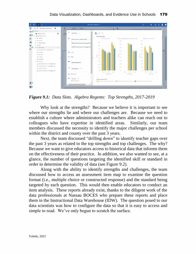
Data Visualization, Dashboards, and Evidence Use in Schools 179
Toledo, 2021
Figure 9.1: Data Slots. Algebra Regents: Top Strengths, 2017-2019
Why look at the strengths? Because we believe it is important to see
where our strengths lie and where our challenges are. Because we need to
establish a culture where administrators and teachers alike can reach out to
colleagues who have expertise in identified areas. Similarly, our team
members discussed the necessity to identify the major challenges per school
within the district and county over the past 3 years.
Next, the team discussed “drilling down” to identify teacher gaps over
the past 3 years as related to the top strengths and top challenges. The why?
Because we want to give educators access to historical data that informs them
on the effectiveness of their practice. In addition, we also wanted to see, at a
glance, the number of questions targeting the identified skill or standard in
order to determine the validity of data (see Figure 9.2).
Along with the ability to identify strengths and challenges, the team
discussed how to access an assessment item map to examine the question
format (i.e., multiple choice or constructed response) and the standard being
targeted by each question. This would then enable educators to conduct an
item analysis. These reports already exist, thanks to the diligent work of the
data professionals at Nassau BOCES who prepare these reports and place
them in the Instructional Data Warehouse (IDW). The question posed to our
data scientists was how to configure the data so that it is easy to access and
simple to read. We’ve only begun to scratch the surface.

Data Visualization, Dashboards, and Evidence Use in Schools 180
Toledo, 2021
Figure 9.2. Gap Teacher Dashboard
The NSF Education Data Analytics Collaborative Workshop at
Teachers College was an invaluable experience. It was a venue where
researchers, data scientists and district wide, building level and classroom
educators sat together to share ideas aimed at promoting the effective and
consistent use of data to inform and drive decisions that impact the academic
success of our students. Hearing the different perspectives and practices of
professionals from across and outside the United States, from those who work
in the field of education and those whose expertise is in research and data
coding was an eye-opening experience. It was the marriage between research
and practice. Having the researchers and data scientists listen to the voices of
the practitioners, having the practitioners express their concerns and their
needs made for a rich exchange of ideas in this Think Tank. As a result of
these rich conversations, the data scientists began to create the visualizations
the team had discussed. They created, displayed their work and modified it
based on our immediate feedback.
This was just the beginning, the springboard, of a partnership
representing the future field of Educational Leadership Data Analytics
(ELDA). “Education Leadership Data Analytics (ELDA) is an emerging
domain that is centered at the intersection of education leadership, the use of
evidence-based improvement cycles in schools to promote instructional
improvement, and education data science” (Bowers, Bang, Pan, & Graves,
2019). As a building principal who oversees the data trends in my school and
a member of the Superintendent’s Cabinet who examines the patterns in
scores based on disaggregated data, I recognize the dire need for the ongoing
collaboration among educational leadership, educational data scientists and
educational researchers if we are to make effective use of the data. Without
Strengths
Top Strengths
Building Functions Interpreting Categorical & Quantitative Data Trigonometric Functions
67% 67%
62%
54%
58% 57%
88%
81%
71%
0%
10%
20%
30%
40%
50%
60%
70%
80%
90%
Valu
es
2017 2018 2019
School Year
82%80%
78%
58% 59% 59%
0%
10%
20%
30%
40%
50%
60%
70%
80%
90%
Valu
es
2017 2018 2019
School Year
70%
59%
54%
73%70%
55%
0%
10%
20%
30%
40%
50%
60%
70%
80%
90%
Valu
es
2017 2018 2019
School Year
Percent Correct / Average Poin… District Percent Correct / Avera… COUNTY Percent Correct / Av…
1Number of Items

Data Visualization, Dashboards, and Evidence Use in Schools 181
Toledo, 2021
the ability to make informed decisions based on the data, we run the risk of
having students take assessments for the sake of having scores reported in the
newspaper—the antithesis of the true purpose of assessments.
After designing a possible template (see Figures 9.1 & 9.2), our team
received feedback from other teams who participated in the NSF Education
Data Analytics Collaborative Workshop. The comments from our
counterparts in other groups revealed that our proposed visualization has the
promise of resulting in reflective and introspective educator practices and
systemic change (see Table 9.1).
Table 9.1. Basecamp Written Data/Feedback
The two days of intensive work left our team members wanting for
more. It confirmed our sentiments that time is of the essence if we want to
see the impact of data analysis on instructional practices. Several members
from the Long Island team reconvened a few months later to discuss how to
make this data visualization a reality.
July is now only two months away. This is the time where principals
and district level administrators wait for the state assessment results. Except
this summer, we will not be receiving any new data due to the coronavirus
pandemic. How will students be placed in classes? What data will be used?
I have decided to keep students together in their classes and move the classes
Teachers can improve on a year-to-year basis using the visualization.
Administrators can use visualization to understand what a teacher(s) need to be more productive.
Visualizations can identify leaders as bright spots and can use them to guide other teachers.
Teachers can narrow down based on standards by year.
The group is working on a teacher dashboard for the GAP reports.
Will give a 3-year analysis at a glance.
Item analysis for broader topic areas and identify key ideas greater than standards. Questions around key ideas. The data visualization will represent and calculate teacher/building/district with a dotted line representation the country average.
How do we identify specific areas of instructional strengths and weaknesses: - district discipline - 3 years period of practices and area of improvement - country comparison by foci (ie. Finance). Goal is to identify 3 areas of strengths / 3 areas of improvement (focus area)
Quick view of strength areas. Hypothesize as to the why: - researches need to be lathed - raises questions - validities teachers strengths - check in the item level
Data Visualization, Dashboards, and Evidence Use in Schools 182
Toledo, 2021
up as a whole. Those classes were created based on academic, behavioral and
social-emotional data. But that data, as we know, is now dated. Other
variables will need to be considered. Benchmarks will need to be
administered and analyzed upon our return if we are to address the COVID
slide that the majority of our students will experience. Teachers and
administrators will need to have an “at-a-glance” view of test results to
identify skills and standards in need of attention. We will need to look at
attendance information, distance-learning data (e.g., How often did students
connect with their teachers? How often did they complete their assignments?
Did they understand the tasks assigned?) and health statistics. We are at a
critical juncture where we can safely predict that blended learning will be our
“new normal.” Making data visual will be essential to ensure its effective use.
References:
Bowers, A.J., Bang, A., Pan, Y., Graves, K.E. (2019) Education Leadership Data Analytics
(ELDA): A White Paper Report on the 2018 ELDA Summit. Teachers College, Columbia
University: New York, NY. https://doi.org/10.7916/d8-31a0-pt97

Data Visualization, Dashboards, and Evidence Use in Schools 183
D’Amico, 2021
CHAPTER 10
Building on each other’s strengths:
Reflections from an education data scientist on
designing actionable data tools at the 2019 NSF
Data Collaborative
Nicholas D’Amico
Executive Director of School Performance
Cleveland Metropolitan School District
Introduction1
Educational agencies, particularly in the K12 sector, are increasingly
seeking and utilizing data scientists to help their organizations make sense of
the copious amounts of data at their disposal. While there seems to be
widespread agreement on the usefulness of data professionals in education,
organizations struggle to effectively utilize their talents. Data professionals
arrive in the educational sector with varied talents including deep
methodological training in statistics, research design, and/or data visualization
(Bowers et al. 2019). However, many (this author included) lack deep
experience in instructional design, the science of learning, and/or school
management. On the other side of the coin are education leaders that are
experts in designing rigorous, high quality lessons and managing teams of
teachers, but lack a conception of the possibilities and complexities of data
Data Visualization, Dashboards, and Evidence Use in Schools
2021, Authors. Creative Commons License CC BY NC ND

Data Visualization, Dashboards, and Evidence Use in Schools 184
D’Amico, 2021
analytics. The result is educational data scientists that do not understand how
to create data tools to help educators and educational leaders that do not
understand the tools data scientists possess to assist with educational decision
making.
The 2019 National Science Foundation (NSF) Data Collaborative
Event was a bold initiative designed to create the conditions for these different
individuals to successfully collaborate with each other. The event brought
together a diverse collection of data scientists, technologists, academics, and
education administrators and practitioners to participate in a two-day data
sprint. Teams articulated numerous educational questions and created
analyses and visualizations to help educators on the ground answer those
questions. While a rewarding experience for those able to participate, the
intent is that we can broadly share our learning from these two days as a model
for other educational agencies across the country. An extension of this work
would be for participants or others to build out their own data sprint like teams
in local organizations to improve data driven decision making and
improvement.
But, acknowledging the need to work together is easier than actually
implementing effective collaboration. I will share my reflections on what
happened during this event to create productive collaboration between two
sets of colleagues with deep, but not always overlapping, expertise:
educational data scientists and education leaders/practitioners. There are
three inter-related topics that education professionals should consider in
standing up their own local teams devoted to Education Data Leadership
Analytics (ELDA): 1) the necessary traits for a successful group, 2) the
process for arriving at a key question or problem, and 3) the process to design
metrics and visuals to assist practitioners. In will discuss each of these topics
in detail, sharing what worked well in my own data sprint team. I will end by
sharing the experiences I have had, both positive and negative, establishing
and working in a collaborative ELDA team in my own district.
Necessary traits of a collaborative work group focused on data use
One of the reasons the NSF Data Collaborative meeting was so successful was
the thought put into selecting participants and dividing them into data sprint
groups. The organizers ensured that each data sprint team had a diversity of
members from different functional areas (educational leaders / practitioners
and data analytics experts) and different backgrounds (school based

Data Visualization, Dashboards, and Evidence Use in Schools 185
D’Amico, 2021
experience in addition to statistical/research based experience) united by a
common commitment to inquiry and using data.
As education organizations consider setting up similar groups, they
should expect variation in the specific organizational roles that serve in the
group. For example, during the NSF Data Collaborative, I was paired with a
superintendent from a small district who takes a significant role in thinking
about school and classroom instructional data. In contrast, in my own large
urban district with thousands of students, our superintendent does not have
the bandwidth to be involved in conversations related to detailed school and
classroom data. The critical consideration is not in what specific
organizational roles help with this work, but rather in ensuring a diversity in
the functions, backgrounds, and perspectives of individuals. This diversity
allows group members to build off of each other’s strengths and ideas,
compensating for the knowledge any one individual might lack.
The importance of the beliefs and soft skills of members cannot be
understated. When all group members commonly think that data can be used
to drive actions that improve results for students, energy and time does not
have to be expended convincing others of the value or purpose of the group.
Rather, for those that might be skeptical of the utility of such a group, they
can more easily be convinced by the successful execution of a visualization
or analysis the helps guide the actions of school leaders.
The other traits that were common among our group members, but not
necessarily selected for by the organizers, were humility and a willingness to
listen. Successful collaborative work requires individual members to admit
the limits of their own knowledge and openly listen to the perspectives and
ideas of others. The benefits of the group’s diversity are lost if there are a few
dominant individuals that push the conversation and agenda. An ability to
listen to other perspectives and recognize the value in them helps lead to a
stronger final product.
As I mentioned, the participants of the Data Collaborative Event
benefited from the work of the organizers to ensure the best conditions for
collaboration existed. Other educational organizations starting this work will
need to exercise their own thoughtful reflection to create effective
collaborative groups within their own contexts. I will suggest some potential
strategies later, as I discuss how I have engaged in this work in my own school
district.

Data Visualization, Dashboards, and Evidence Use in Schools 186
D’Amico, 2021
Articulating guiding values, a key data question, and expected actions
Educational data scientists are fortunate to have extensive data sets at their
fingers. An effect of the focus on education accountability is that local and
state educational agencies are required to track and report on students’
demographic characteristics, assessment scores, behavior incidences,
attendance, with repeated measures over time for each student (Piety 2013).
This wealth of data also poses a problem. Superintendents, principals, and
teachers are left with a jumble of data points and signals, unsure of what to
watch and how individual pieces of data might be combined to uncover
otherwise unseen insights. Data scientists are left wondering which analyses
or visuals to prioritize as the most impactful for school and central office
based educators.
One of the most important tasks of an ELDA group is to identify and
prioritize the specific data related questions that will most benefit the
organization. As part of the data sprint, groups followed a protocol to generate
potential ideas sparked from existing data, categorize the ideas into themes,
and then rank the themes along the dimensions of possibility and priority. The
data we had available to use was student performance results on New York
state assessments for schools with data in the Nassau Board of Cooperative
Education Services (BOCES) data warehouse.
This process isn’t the only way narrowing can happen and the best
approach to take will depend on the context of your organization and its
maturity in using data. Some questions might naturally arise from issues that
have been observed in classrooms. Other questions might emerge based on
summary analyses that have been previously performed. Regardless of the
mechanics of a process, from my experience, the key factors in successfully
identifying and prioritizing a data question are establishing guiding principles
for the work and practicing shared leadership.
Our group agreed on three principles to guide our work: ease of use,
relevant data, and a connection to instructional intervention. All three
principles forced us to consider the perspective of the intended user as we
developed our question. Our answer would need to be intuitive for users,
include data that connects to users’ day to day work, and helps drive users to
actions that improved instruction for students. The third principle also
centered our work on the core mission of educational agencies: improving
instruction and educational outcomes for students. While there are lots of
interesting ways to look at and analyze data, if the results didn’t help drive
improvements in how we could serve students, then they would be of limited

Data Visualization, Dashboards, and Evidence Use in Schools 187
D’Amico, 2021
use. As we thought about the priority of different topics and questions, those
that aligned with our principles scored the highest.
I previously discussed the necessary beliefs and traits of group
members that would help groups succeed in their collaboration. These traits
are important because they help create shared purpose, group social support,
and voice for group members. These are the necessary conditions for shared
leadership to take place and for individuals of such diverse backgrounds to
build off each other’s expertise (Carson et al. 2007, Rath & Conchie 2008).
Shared leadership is the idea that rather than a single leader directing all of
the activities of other group members, leadership is a rotating role. Rather than
competing to exert influence over others, group members recognize the times
when they should follow the lead and expertise of others, while also being
comfortable to assert their own leadership when appropriate to their expertise.
Given the guiding principles we had established, I allowed the members
with instructional expertise to take the lead in articulating potential questions
to be answered by the available data. They are the group members with the
greatest experience in delivering instruction to students and positioned closest
to end users that will utilize the tools we build. Following their lead does not
mean disengaging from the conversation. I worked to better understand the
perspective of the education leaders by asking questions to clarify any
misconceptions I had and to help them hone and refine the questions they put
forward.
Education data scientists are used to taking general questions from
internal and external stakeholders and obtaining the necessary details that
make it possible to go from question to answer with the available data. At this
point, data scientists should begin pushing education leaders to consider who
would use this data, the best level of aggregation for the data, and over what
timespan the data should cover. In this manner, our group was able to go from
a broad comment on the need to understand standard level assessment data to
a more specific question of “How can we help teachers and principals identify
specific areas of instructional strength and weakness?”
Given one of our guiding principles was to inform instructional
practices and interventions, we continually thought of what actions we wanted
principals and teachers to be able to take based on the answer to our question.
The goal was to identify for individual teachers the key ideas in the standards
where their students have historically performed well in addition to the areas
where their students have been the weakest. Teachers would review the data
at the start of the year to help them identify and replicate the instructional
techniques they use in their areas of strength while directing their attention to
the standard key ideas where they will need to revise their lesson plans and

Data Visualization, Dashboards, and Evidence Use in Schools 188
D’Amico, 2021
strategies. Principals would review the data to understand what supports they
would need to give to individual teachers and identify any schoolwide patterns
that might inform general professional development needs.
Iteratively designing metrics and visuals to support actions
The previous stage was very much driven by educational leaders and
practitioners. Once we had agreed on a question and the associated actions we
hoped users could take, the data scientists began to exert leadership. This stage
would require decisions on how to define strengths and weaknesses, how to
best visualize the data, and how to structure the data to achieve the
visualizations needed. Given their expertise, this is where education data
scientists are positioned to lead by explaining different analytic options and
visuals to other members of the group and soliciting feedback. The guiding
principles remain an anchor at this stage, helping to focus our attention on
some options over others. The educational practitioners in the group also
helped push our thinking in considering what data and summarization was
most relevant and easiest to understand for users.
This is where an iterative design process proved most helpful for our
group. The data scientists would establish initial design options aligned with
the guiding principles. The options would be presented to educational
practitioners for either feedback or to decide between different options.
Utilizing this type of feedback loop helps keep the analysis and visual design
responsive to the needs and thoughts of our target users. It also ensures that
data scientists do not go too far down a pathway that does not meet the needs
of users and could require significant amounts of work to be redone. The
amount of time taken between design and feedback is up to individual groups.
To shorten the amount of time between design and feedback, our group
drafted potential designs for quick feedback and adjustments. Examples of
these drafts are shown in Picture 10.1. Each graph would show a standard
key idea (collecting multiple individual standards) from a state assessment
and the percentage of correct responses related to that key idea across all
students tied to a teacher. In effect, our visual displays the percentage of
correct responses in a key idea. In our discussions, we decided it would be
helpful to show multiple years of data at once and to create comparisons
between a teacher’s performance in an area with school and county wide
aggregate data.

Data Visualization, Dashboards, and Evidence Use in Schools 189
D’Amico, 2021
Picture 10.1: Examples of visual design drafts
These changes went toward improving the instructional decisions that
could be made from the data. Principals could identify the teachers that were
standouts in their school or county. These teachers could then help model best
practices for others. The visual also encouraged a growth mindset for all
teachers. Even if examining their strengths, teachers would be able to identify
room for improvement if their strongest areas still lagged behind the aggregate
performance in their school or county.
As our group thought about the visuals, we simultaneously grappled
with how to best define strengths and weaknesses. Our intuition was that we
did not want to leave the interpretation of a strength or weakness up to the
user, as this would make using the data more difficult and create
inconsistencies in how users considered their data. These concerns were
confirmed via feedback from the educational leaders in our group. The final
metric we designed to determine the strengths and weaknesses, while simple,
achieved our goal.
For each teacher and subject, we averaged the total percentage of
correct answers in each standard key idea across all three years of data that
were available. These averages were then ranked, with the top three areas for
a teacher identified as their relative strengths and the bottom three areas
identified as their relative weaknesses. There are certainly more sophisticated
techniques we could have used to identify strengths and weaknesses. For
example, we might have estimated a model that predicted each student’s
performance and then measured the extent to which a teacher’s students
exceeded or lagged behind these expectations. Our decision to use a simple
average was a result of our guiding principles. Based on feedback from our
educational leaders and practitioners it was clear that teachers often looked at
the percentage of correct responses by individual standard or key idea. Our
goal with this project was not to get teachers and principals looking at

Data Visualization, Dashboards, and Evidence Use in Schools 190
D’Amico, 2021
different data, but instead to provide structure and consistency in how they
interpret and use the data.
To structure the data to work in the visualization, we merged the flags
for areas of strength and weakness into a file with student performance
aggregated by school year, teacher, subject, and standard key idea. This data
structure allowed us to create slicers in our visualization so that an individual
teacher could be selected and the data displayed would shift to the strengths
and weaknesses of the selected teacher. This again went toward ease of use,
allowing users to focus on the specific person of interest, rather than having
to view graphs for multiple people at once.
Picture 10.2: Final Visualization

Data Visualization, Dashboards, and Evidence Use in Schools 191
D’Amico, 2021
The final visualizations we created are in Picture 2. There are many
possible extensions for others looking to build from this initial work. One
direction our team considered but ran out of time to implement was error bars
to help users in comparing their performance to school and county
performance. Currently, the visual relies on the users themselves to make the
decision when they are significantly above or below other groups. Assisting
with this interpretation would further improve the ease of use for the visual.
Replicating ELDA groups in other organizations: advantages and
challenges
Working collaboratively and creating our final visual was made easier by the
planning and preparation of the team at Columbia University that organized
the event. While our visual was shared and commented on by other
participants, it did not have to face the scrutiny and adoption of our targeted
user group. As others hopefully start collaborative data work in their home
organizations, they will be faced with issues and challenges that did not exist
in the more controlled setting of the event. Since participating in the event, I
have been working in a cross-functional district team to provide leadership
and guidance around using data. While our group would make no claim to
being an exemplar of implementation of this work, we have learned a number
of lessons that extend the insights from the event.
Take advantage of work streams that already exist
Simply setting up a cross-functional group to give guidance on the
analysis and use of data can be a challenge. True collaboration requires a
significant investment of time and energy from participants and for many
educational organizations, staff are already handling multiple roles and
responsibilities. Even if colleagues agree with the value of such a group, they
might be reluctant to participate and to add yet another meeting to their
calendar with associated to-dos. In my experience, one avenue around such
objections is to place such a group in the context of other work that is already
happening.
In Cleveland, our data experts had already been working to revise the
roles and responsibilities associated with our data driven cycle of
improvement. This included specifying what data was available, what
analyses would be released and when, and our expectations for how others
could use this data. Parallel to this, experts in our curriculum and instruction
team had been creating decision trees that outline the different instructional

Data Visualization, Dashboards, and Evidence Use in Schools 192
D’Amico, 2021
strategies teachers could use, depending on where students were at. There was
clear overlap between the two pieces of work, with both intended to initiate
changes in instructional practice in response to data. Bringing these two
groups together to align efforts as part of a unified data leadership group was
made easier since it did not involve extra work, but rather an alignment and
enhancement of each of our individual pieces of work. Strong relationships
between individuals in the group and chief level encouragement for this
alignment further helped.
Examples from others can accelerate your progress but only to a point
In Cleveland, the data we used to align the work of our team was the
standard level results from our state assessments. Our question was: “How
could standard level results for the district influence the supports and
professional development that need to be provided?” This work was not
dissimilar from the work of my own and many other datasprint teams during
the ELDA 2019 Collaborative event. I shared and used a number of things I
had learned at the event with the rest of the group.
Building off of the work and efforts of other organizations and districts
is an easy way to accelerate progress in your own organization. Rather than
feeling the need to re-invent the wheel, collaboration and sharing between
organizations is itself an example of iterative design that can lead to better
data tools. As organizations focused on learning and teaching, we should not
fear this type of sharing. However, we also must recognize that building off
of external models can only bring our internal efforts so far.
Organization specific context is relevant in successfully implementing
an initiative, including efforts to use data for continuous improvement.
Organizations should not expect to simply take an idea off of the shelf and
implement it as is. Internal stakeholders will need to be provided opportunities
to provide feedback, helping them to have a stake in the decision. When it
comes to data work specifically, there are additional considerations.
For example, while shared code can help organizations, there are also
limits to its usefulness. With many states giving different assessments, there
is not always consistency in what information districts are provided and
certainly no consistency in the format. As an example, in Ohio, while teachers
can access a report showing how their students performed on individual items
and standards, no district level report for all teachers is available. Since
districts only get a file with the of how all students in the district performed
on individual items and standards, our we are stuck with an analysis at a
district level, rather than the teacher level analysis that was completed with
data from New York. Due to these challenges, our own district’s use of

Data Visualization, Dashboards, and Evidence Use in Schools 193
D’Amico, 2021
standard level data aims to inform the types of district supports and
interventions that are available, based on the content strands that we
consistently show weakness in as a district.
Additionally, the proliferation of numerous education technology tools
(including assessment platforms, student information systems, learning
management systems, etc.) means that data often is not similarly structured
across districts, unless common systems are used. As a result, code cannot
necessarily be shared and immediately work, but will require revisions from
local data scientists. As a result, as data scientists produce their code with an
eye toward sharing it more broadly, they will need to devote effort to writing
code as flexibly as possible. This means allowing other users an easy way to
define the schema of their own data and feed these different schemas into
algorithms or analyses.
Have a multi-modal plan for training and professional development
Finally, groups will need to think through how to prepare stakeholders
to use any data tools that are created. This is why articulating expected actions
based on the data is as important of a piece as specifying the question. These
use cases form the learning goals for any training plan and help inform the
different activities that need to be designed. Just as with students, the learning
should involve a gradual release where the use is modeled for all participants,
participants practice the skills together in small groups, and finally
participants practice the skills independently. These learning experiences need
to be engaging and interactive. Also, when the actions are tied to work that
participants already have to do, it is easier for them to make connections
between how the tool can help them do their work, rather than feel like an
addition to their work.
Besides designing engaging learning opportunities, organizations will
likely face challenges in simply arranging time for the learning. As we used
our data in Cleveland to identify the supports and training needed to improve
in our specific areas of weakness, we have struggled to think through the
mechanism to train teachers in the use of these supports. Especially in a
system our size, we cannot necessarily expect to reach all teachers with an in-
person training. As we and others develop our data tools, we must think about
multi-modal learning opportunities that include in-person sessions, online
group sessions, and on-demand tutorials to answer questions for users as they
arise.
Data Visualization, Dashboards, and Evidence Use in Schools 194
D’Amico, 2021
Conclusion
Data driven continuous improvement cycles continue to have significant
promise for positively altering education outcomes for students. As the
organizers of the NSF Data Collaborative argue, delivering on this promise
requires providing greater opportunities for education leaders and data
scientists to collaborate at national meetings and to receive training in a
number of core competencies. The 2019 Data Collaborative also provides a
framework for education professionals to accelerate their own data practices,
even if they cannot travel to a national conference or event.
I experienced the power of iterative design to help my individual team
build a stronger data visualization. Having more and more groups convene
collaborative ELDA groups is a continuation of this iterative design and
identifying the necessary conditions for data scientists and education
practitioners to collaborate. The key to unlocking this learning will be to
contingent on us professionals communicating with each other and working
to create more opportunities for experts involved in this work to convene and
share their experiences. Just as I have attempted to share my insights to this
work, I hope the readers of this article will consider their own next steps to
engage in this work and to share, at any level (local, state, nationally) their
learning from it.
References
Bowers, A.J., Bang, A., Pan, Y., Graves, K.E. (2019) Education Leadership Data Analytics
(ELDA): A White Paper Report on the 2018 ELDA Summit. Teachers College,
Columbia University: New York, NY
Carson, J. B; Tesluk, P. E.; Marrone, J. A. (2007). "Shared leadership in team: An
investigation of antecedent conditions and performance". Academy of
Management Journal. 50 (5): 1217–1234
Piety, P. J. (2013). Assessing the educational data movement. New York, NY: Teachers
College Press
Rath, T. and Conchie, B. (2008). Strengths Based Leadership: Great Leaders, Teams, and
Why People Follow. New York, NY: Gallup Press

Data Visualization, Dashboards, and Evidence Use in Schools 195
Khan, 2021
CHAPTER 11
Using data to pair students and teachers for
enhanced collaborative growth
Mohammed Omar Rasheed Khan
Advisory Offering Manager
IBM Cognos Analytics
Introduction to the event1
National Science Foundation’s Education Data Analytics Collaborative
Workshop was a 2-day event held on Dec 5 – 6, 2019, at Columbia
University’s Teachers College in New York. These two days were packed
with discussions and hands-on activities to see how we can improve the
integration of analytics in all schools under the region’s district school board.
We had access to real de-identified data and several school principals,
superintendents, administrators, data scientists and thought leaders from the
education analytics area. We all gathered under the same roof to tackle the
challenge of infusing analytics into the education systems to improve student
performance.
We were divided into diverse groups to facilitate cross-sharing of
information and skills and were given the task of brainstorming the needs of
an educator. Once identified, we had to iteratively code and build
visualizations that would help fulfil that need. We also had several thought
leaders from the industry, such as Prof. Richard Halverson, who gave a very
Data Visualization, Dashboards, and Evidence Use in Schools
2021, Authors. Creative Commons License CC BY NC ND

Data Visualization, Dashboards, and Evidence Use in Schools 196
Khan, 2021
insightful keynote speech. Multiple other speakers presented on various topics
related to education analytics and gave demos of their products. This really
enriched the workshop and gave us many takeaway lessons to reflect on and
implement as we went back to work the next day.
I attended the event as an Advisory Offering Manager for IBM Cognos
Analytics, a business intelligence (BI) tool familiar to many educators as the
Nassau BOCES have their Instructional Data Warehouse (IDW) reports
designed in Cognos Analytics. As the Offering Manager (commonly known
as Product Manager), I drive the implementation of new features centered
around customer feedback and innovation. This event was a perfect
opportunity to learn how educators use Cognos Analytics, the roadblocks they
are facing, and how we can help solve them. I gave a presentation on the latest
innovations from the lab, including relevant topics such as Cognos’s artificial
intelligence (AI) assistant, forecasting and the new interactive dashboards. It
was great to see the excitement around all the unique possibilities for unbiased
data discovery and exploration that will be possible when the BOCES IDW
adapts the latest version of Cognos Analytics.
Overall, it was incredible to see so many educators taking an active part
in enabling analytics at their institutions. The event was planned and executed
thoughtfully and purposefully. I am confident the results from it have been
and will keep driving the education analytics field forward. Several attendees,
including myself, walked out having learnt a lot of new information and with
concrete action items for changes we wanted to implement based on what we
learned. Effectively, resulting in a more data-driven education for our students
who will be the leaders of the next generation.
Industry outlook
In the industrial age, the more physical hard work a person would do, the
higher he/she would get paid. In the 21st century, in the 4th industrial
revolution, this is no longer the case. Technology has disrupted many
industries, from supply chain to health care to finance and many more. Data
analytics is one of those disruptive technologies. In this information age, a
person can get ahead by simply uncovering insights from his/her data. A

Data Visualization, Dashboards, and Evidence Use in Schools 197
Khan, 2021
person no longer needs to work physically hard to achieve more; he/she can
work smarter based on insights from data analytics and can achieve higher
success.
Several industries have tremendously leaped forward through analytics
and data visualization. The education sector is rapidly adopting analytics and
is yet to unlock its full potential. This is certainly something we hope to
achieve, and workshops such as this help us get one step closer towards that
goal.
Over the years in the data analytics industry, we have seen an increase
in the adoption of self-service analytics. More and more non-technical users
can now create their own interactive dashboards and reports with their data
and have started using analytics to make their decisions. They like the ability
to slice and dice their data, filter it as they like, and explore it to unearth hidden
insights.
Looking ahead, AI in analytics will be changing the game. We started
seeing increased integration of AI in analytical tools, which increased the
potential for unbiased data discovery and has accelerated the process of
creating analytical assets. An example of this is the AI assistant in Cognos
Analytics. Through natural language understanding (NLU), natural language
processing (NLP) and natural language generation (NLG), the AI assistant can
communicate with users in natural language. Any user can generate a full-
fledged dashboard just by saying “Create Dashboard”. Features like this lower
the barrier to entry for analytics. Users with minimal to no technical training
can start exploring their data and can build their own dashboards and reports.
AI will also help increase the adoption of data analytics in all industries,
including education. It is only a matter of time when we will be speaking with
our devices for analytics, just like we do today with smart assistants by saying
“Hey Google” or “Hey Siri”. Teachers, Principals, Superintendents and soon
enough, students will be interacting with their data, asking questions and
getting answers in natural language.
The unprecedented COVID-19 pandemic accelerated the adoption of
technology in many schools. Previously, this adoption might have taken
several years. Many schools adopted digital teaching platforms in order to
continue teaching. One of the direct benefits of this is the higher number of
student-specific data points we can now easily collect. We can then use these

Data Visualization, Dashboards, and Evidence Use in Schools 198
Khan, 2021
to create more robust data visualizations, informing and helping schools
improve their method of education. The future of education analytics has just
been accelerated, and it has a lot of potential.
Visualizing a data-driven strategy for pairing the best teachers with
students for enhanced collaborative growth (our solution)
Why - the key question we wanted to answer was to what extent/how can we
help teachers and principals identify specific instructional areas of strength
and weaknesses. As we started out, one of our top priorities was to make sure
the visualizations we ideate are easy to understand, are actionable for teachers
and can have a direct impact on students.
Who - our primary target audience for the dashboard was teachers and
principals. However, superintendents, assistant superintendents, and
department chairs can also benefit from this dashboard.
When – the visualization is most valuable at the time of curriculum planning,
during the start of each academic year, or during teacher reviews. The
dashboard can show comparisons for the past three years. Based on the data
available, the number of years can be increased or decreased.
What - we created an interactive dashboard with clustered column
visualizations that show a particular teachers’ top 3 subjects of strengths and
weaknesses. This dashboard can further drill down to a report with more
details as needed. The dashboard can also be filtered to select different
teachers and question types (MC vs CR). Figure 1 below shows how this looks
like in a Cognos Analytics dashboard. This dashboard can further drill-down
to a report with more details as needed.
How – the data used is already available today in the IDW. After applying
some transformations through R, the data is visualized in a dashboard. A
teacher or principal will have access to an interactive dashboard where they
can perform their analysis.
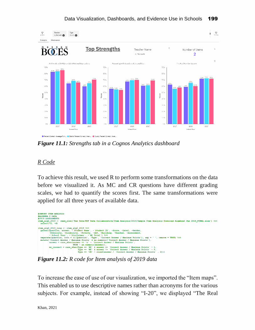
Data Visualization, Dashboards, and Evidence Use in Schools 199
Khan, 2021
Figure 11.1: Strengths tab in a Cognos Analytics dashboard
R Code
To achieve this result, we used R to perform some transformations on the data
before we visualized it. As MC and CR questions have different grading
scales, we had to quantify the scores first. The same transformations were
applied for all three years of available data.
Figure 11.2: R code for Item analysis of 2019 data
To increase the ease of use of our visualization, we imported the “Item maps”.
This enabled us to use descriptive names rather than acronyms for the various
subjects. For example, instead of showing “I-20”, we displayed “The Real

Data Visualization, Dashboards, and Evidence Use in Schools 200
Khan, 2021
Number System”. This significantly increased the ease of use of our
dashboard, making them easier to read and adopt for teachers and principals.
Figure 11.3: R code for joining “Item analysis” with the “Item map”
In order to create a comparison, we also aggregated the data at the district and
county levels.
Figure 11.4: R code for aggregating data at the district level
Finally, all the separate files proceeded by all the transformations were
packaged into one .csv file for visualizing in Cognos Analytics.
Figure 11.5: R code for packaging files and the transformations applied into
one .csv file for visualization

Data Visualization, Dashboards, and Evidence Use in Schools 201
Khan, 2021
Dashboard Design
Figure 11.6: Data slots in a Cognos Analytics dashboard
We uploaded the .csv into Cognos Analytics 11.1.7 and designed a dashboard
on top of it. We created two tabs, one for strengths and one for weaknesses.
We also added the “Teacher” and question “Type” columns in the “All tabs”
filter. This would allow us to filter on the teacher and question type we want
for both tabs at the same time. For branding and giving it a more personal feel,
we added the Nassau BOCES logo on the top left of the dashboard. On the top
right, we displayed the number of items that were accounted for to render the
visualization below.
A column visualization was chosen for simplicity, primarily due to its
ability to show clustered comparisons very effectively. The test subject name
is shown on top of each respective visualization. The y-axis of the
visualization shows the percentage of marks students received; “Percent
Correct/Average Points” – for the selected teachers’ average, “District Percent
Correct/Average Points” – for the district average, and “County Percent
Correct/Average Points” – for the county average. The x-axis of the
visualization shows these KPIs across the past three school years. We used
different colours to differentiate between the three KPIs.
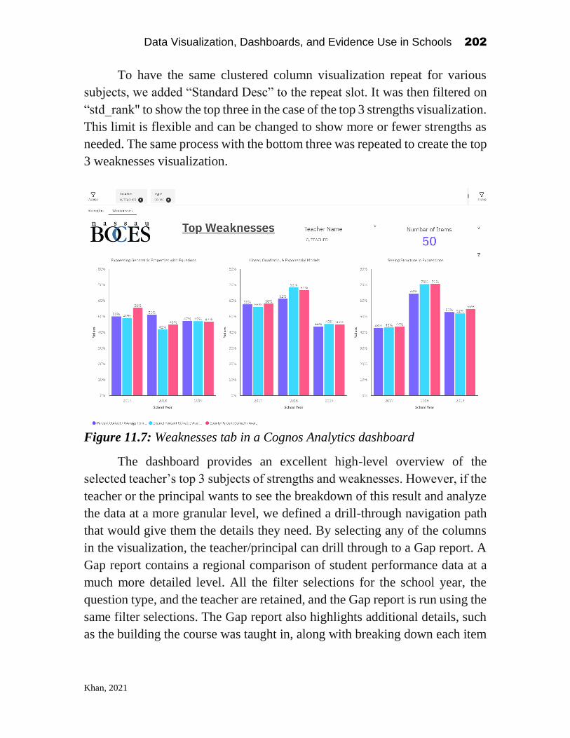
Data Visualization, Dashboards, and Evidence Use in Schools 202
Khan, 2021
To have the same clustered column visualization repeat for various
subjects, we added “Standard Desc” to the repeat slot. It was then filtered on
“std_rank" to show the top three in the case of the top 3 strengths visualization.
This limit is flexible and can be changed to show more or fewer strengths as
needed. The same process with the bottom three was repeated to create the top
3 weaknesses visualization.
Figure 11.7: Weaknesses tab in a Cognos Analytics dashboard
The dashboard provides an excellent high-level overview of the
selected teacher’s top 3 subjects of strengths and weaknesses. However, if the
teacher or the principal wants to see the breakdown of this result and analyze
the data at a more granular level, we defined a drill-through navigation path
that would give them the details they need. By selecting any of the columns
in the visualization, the teacher/principal can drill through to a Gap report. A
Gap report contains a regional comparison of student performance data at a
much more detailed level. All the filter selections for the school year, the
question type, and the teacher are retained, and the Gap report is run using the
same filter selections. The Gap report also highlights additional details, such
as the building the course was taught in, along with breaking down each item

Data Visualization, Dashboards, and Evidence Use in Schools 203
Khan, 2021
into more granular detail. An example of this report can be seen below in
Figure 11.8.
Figure 11.8: Gap report with additional details
Application and benefits
For the post-event survey question: “For the two-day event, please describe
the data visualizations that you found most applicable to your context and role,
and why.”, one of the attendees replied saying that “The visualization of the
top three strengths and weaknesses as reflected in a Gap report for state
assessments. This was most valuable because it helped us to identify how we
can provide the user with further assistance in examining Gap reports over
time.”
The quote very concisely captures how educators can use this visualization
today to improve the Gap report experience. Here are some more practical
applications:

Data Visualization, Dashboards, and Evidence Use in Schools 204
Khan, 2021
1) Cultivate collaborative learning through pairing and mentorship – as we
can identify the top strengths and weaknesses of teachers, this opens up
great potential for teachers to grow professionally and learn directly from
experts. For example: if we identify teacher A as an expert in a subject,
and teacher B is weak in that subject, they can be paired. Teacher A could
mentor teacher B through discussions, sharing tips and tricks, shadowing
in class, and more. Teacher B can significantly accelerate his/her learning
and can greatly benefit from Teacher A’s experience. Teacher A could be
getting help for his/her weak areas from another teacher as well; it is a
circular cycle. This mentorship can occur within the same school, within
the district or even across the county. This cycle will collaboratively raise
the education quality standard of the school, district, and county’s teaching
community.
2) Track growth of a teacher in particular subjects – as we have test score
percentiles for several years, we can track how a teacher improved over
the years compared to his/her score percentiles from previous school
years. If we notice growth, this could be used as one of the KPIs used to
promote teachers. If we notice no growth or a decline, this is an indicator,
and it would be a great time to have a conversation on what we can do to
help the teacher grow in that subject.
3) Selecting the best fit substitute teacher – if a teacher is absent for a day or
a semester, picking another teacher to teach the subject will be
substantially easier. The principal or the department chair making the
decision can look at their teacher roster, find who is available, and select
the best teacher to teach the subject based on this visualization. This data-
driven selection will ensure the students will get the best quality education
from their new teacher and that the teacher will enjoy teaching what they
are comfortable with. It is a win-win for the students, teachers and the
principal as well.
4) Higher quality content development for new courses – if we need to select
a teacher to teach a new course, or if we need to select one teacher to record
content for an online course, we can find the best teacher to do so based on

Data Visualization, Dashboards, and Evidence Use in Schools 205
Khan, 2021
the same criteria mentioned above. The principal or the department chair
making the decision can look at their teacher roster, find who is available,
and select the best teacher to teach the subject based on this visualization.
5) Create a balanced and holistic teaching roster, even while hiring – it is
crucial for a school to have at least one expert teacher per subject. If all the
teachers of a school are experts at teaching one or two subjects and there
are no strong teachers to teach some of the other subjects, it affects the
students’ quality of education. The principal or department chair can use
this visualization to identify which subjects are strong and which subjects
are weak in their school. They can work with other schools to balance their
teaching roster through pairing and mentorship. Additionally, they can hire
new teachers accordingly to balance things out. Having this visualization
helps identify which strengths to look for while hiring.
6) Strive for excellence through competition – as a teacher can compare where
he/she stands compared to the percentiles of the district and the county,
this visualization can be used as a tool to inspire and motivate teachers to
push beyond the limits and aim higher. To encourage them to grow and be
the best they can be in the district and the county.
As can be seen from the many use cases above, this is a simple yet powerful
visualization that is timely, actionable and specific.
Conclusion
Teachers, principals, and educators are busy professionals who play a major
role in our societies’ success. To ensure we empower them with the best
insights, we need to ensure we provide them with accurate and actionable data
visualizations. The National Science Foundation’s Education Data Analytics
Collaborative Workshop helped spark insightful discussions and brought
together thought leaders from the education sector, seeking to brainstorm
visualizations that can address the several educator data use needs.

Data Visualization, Dashboards, and Evidence Use in Schools 206
Khan, 2021
As a result of collaborating with a diverse group of educators, we were
able to create an interactive dashboard that showcased a teacher’s top 3
subjects of strengths and weaknesses. The dashboard user, for example, a
principal, can filter to focus on a teacher he/she wants. It empowers them with
test score percentile comparisons of that teacher, the district’s percentile and
the county’s percentile for the past three years. We can use this data
visualization to answer several key questions, including how teachers and
principals can identify specific instructional areas of strength and weaknesses
to cultivate growth through mentorship, select the most capable teacher for
teaching a course, and strive for excellence by competing throughout the
county.
To enhance this dashboard, having historical data for more than a few
years can help us with tracking growth over a more extended period, and as
well, would empower us to do forecasting to project the growth for the
upcoming years. Using the latest version of the analytics tool, in this case,
Cognos Analytics would also help the users take advantage of the latest and
greatest features they already have access to.
Looking ahead, an actionable and timely data visualization such as this
one can really help accelerate the growth of numerous teachers, consequently
raising the education quality our students will be able to benefit from.
Additionally, as the unprecedented COVID-19 pandemic accelerated the
adoption of technology in many schools, we will be able to collect a higher
number of data points than we could previously. We can then use them to
create more insightful data visualizations. The future of education analytics
has just been accelerated, and it is very promising.

Data Visualization, Dashboards, and Evidence Use in Schools 207
Hawn, 2021
CHAPTER 12
Team Arrow’s Path to Trust and Value:
Getting the Right Data for the Right Task to the
Right Person at the Right Time
Aaron Hawn
Penn Center for Learning Analytics University of Pennsylvania
1
Like other data sprint teams at the 2019 NSF Education Data Analytics
Collaborative Workshop, Team Arrow spent two engaged and enthusiastic days
at Teachers College, Columbia University thinking, talking, and designing for
educational data use. Unlike some other more responsible and diligent teams,
Team Arrow may have cut a few corners along the way to completing several of
the “suggested” data sprint activities. We may have used the provided data set a
bit less and left the workshop with fewer (if any) lines of usable code. Yet,
somehow, in a shocking upset (especially to us), Team Arrow’s work together,
at the end of the workshop, received the most votes of confidence from fellow
attendees. While most teams admirably drilled down on the dataset, working
through the details of engaging visualizations, we were drawn to the big picture,
designing for educational data use through the lens of value, trust, and the full
range of a community’s needs, tasks, and roles.
There were six members of Team Arrow. We included a reading specialist,
an elementary-school principal, and an assistant superintendent (each from a
separate district in Nassau County), along with a Regional Information Center
Data Visualization, Dashboards, and Evidence Use in Schools
2021, Authors. Creative Commons License CC BY NC ND

Data Visualization, Dashboards, and Evidence Use in Schools 208
Hawn, 2021
supervisor for the whole of Nassau County, one Ivy League professor of Data
Science, one rather distinguished professor of Educational leadership, and the
current author, a recent PhD graduate from Teachers College and a member of
the team organizing the event.
From the very first icebreaker, led by Dr. Bowers and Dr. Graves, Team
Arrow hit it off. Conversation was loud and lively. We were excited to have a
full range of stakeholders at the table (from teacher to principal to superintendent
to countywide data manager to data scientists and researchers), and we were all
invested in doing the best we could with the time we had: we wanted to find and
fix obstacles, to take advantage of our different vantage points on schools, and to
move forward the creation and use of evidence for the sake of students and their
learning.
Exploring Together
We started strong, with our initial brainstorming sessions homing in on
five themes. We were concerned about (1) Data Use, Data Usefulness, and Data
Usability. During an earlier session on Day 1 of the workshop, I had shared
visualizations of how teachers and principals used the Nassau BOCES data
warehouse over time. Two of these visualizations seemed to resonate with the
team and to frame our work over the next day. One visualization, in particular,
showed the peaks and valleys of how educators accessed online student data
throughout the school year (Figure 12.1), with large spikes in use aligning with
state testing events, but otherwise much lower levels of online activity. One
member of the team referred to these low-activity periods as “Data Deserts.” In
Team Arrow, we were not content with Data Deserts. We asked, “What is the
best way to make data relevant all the time?”
The second visualization showed usage in the system for more than 180
reports in the data warehouse. This visualization made clear that while a small
subset of reports had extensive use by school leaders and teachers, the vast
majority showed little to no use over the course of the school year. I wonder now
whether these two images, viewed together, oriented the team towards a common,
paradoxical problem of data use in schools: Educators love data; they have access
to a lot of data (more than 180 reports in this system alone); yet we have Data
Deserts. While a wealth of information is contained in report after report, only a
small fraction of that information is being used and only during a few key weeks
of the school year. From this paradox, I think, followed the inter-related, hard-to-
pull-apart questions of our first theme--Are the data being used? Are they usable?
Are they useful?

Data Visualization, Dashboards, and Evidence Use in Schools 209
Hawn, 2021
While we, as educators, were clearly not there yet, we wanted the answer
to all these questions to be “Yes.”
Figure 12.1. Weekly Usage of the Nassau BOCES Instructional Data Warehouse
for Administrators and Teachers
Next, we turned to the problems of integration. If the data were not yet
useful, perhaps this was because they were too siloed, too disconnected, and
unable to present the bigger picture or narrative of a class, a school, or a district.
If siloes were the problem, then integrating different sources of information might
be one way to make our information more valuable. We decided that the Nassau
BOCES data warehouse needed to integrate with other systems. And we wanted
those systems to integrate with even more, other systems. We wondered, perhaps
naively, how the creators of edtech platforms might integrate on their own
initiative. We asked, “How do they get the opportunity to integrate their data?”
However, reading this question after the fact, it seems to assume that edtech
companies are dying to integrate their student information as much as users want
Team Arrow
We see GAPS!
No more Data Deserts!

Data Visualization, Dashboards, and Evidence Use in Schools 210
Hawn, 2021
to see it integrated and that they only fail to do so because of unseen forces
holding the data apart. That may not be the way the industry works.
We wanted modular data dashboards of “other” data sources. “Other,” I
think we meant, than standardized testing. We wanted longitudinal views,
clickable for depth and detail. We decided that (2) We want it all altogether.
Then, once it was all together, we needed to take (3) Next Steps and
Actions with Data. We recognized that Data’s usefulness and analysis are time
specific—“Is this data useful now?” had to be asked and the answer attended to.
Will teachers have enough information from these reports to make informed
changes? If not, why were we sharing them? Do these reports help identify next
steps? Most do not. Does that mean that the information on its own is not worth
sharing? Could we see student achievement on a continuum of past, present, and
future? What would a picture of that future achievement look like? Usefulness
and Next Steps were contextual, we thought. Schools are different and need
different things. What was useful to one school would not be useful to another.
Lastly, we thought about trust. Even if we were able to deliver for
educators the most useful possible information and the clearest possible next
steps, without a trusting (4) Building Climate and Culture, data use was going
nowhere. We wondered what best practices were out there for embedding data
analytics in school culture. We wondered about the role that principals play, how
their leadership could enhance or deter the use of evidence. How principals might
act to integrate Data Teams with other mission-critical, school-based teams (and
why weren’t those teams using data too?). Even with a supportive principal,
though, we thought that having access to data (even access provided by
impressive looking dashboards) was never enough for the community. Access
alone showed little impact on how evidence was used to make classroom-, or
building-level decisions. Making sense of information takes time and motivation,
and we wondered if teachers had enough of either (or even if they should). Would
we rather have an ELA teacher take their few spare moments to work on an
inspiring new unit, to reach out to a disengaged student, or to pick up a few new
tricks in Google Sheets? In any case, we were suspicious that mere access to
information would do much to change behavior.
The antidote, we thought, was the power of protocols and structures in
schools. If data access and awareness could somehow connect to schools’
community and climate, perhaps through every day (or every week) practices and
protocols, then evidence might have a fighting chance to make a difference. And
perhaps this understanding that community was the key was why we took a
different path on day two of our data sprint. We considered the available dataset
of state testing results, and a data scientist in the group worked magic in R to
layer state test scores and community demographics over each other in a

Data Visualization, Dashboards, and Evidence Use in Schools 211
Hawn, 2021
fascinating map of Nassau County. At the same time, though, it seemed clear that
building better visualizations for state testing data alone might not move the
needle far enough in building the community’s trust in information or motivating
the action from evidence that we wanted to see. We had big thinkers on our team,
and we wanted to think about big obstacles. What was keeping the data apart?
How could we bring it together? How could we create trust and drive action?
In discussions across the table, we began to suspect that a key to supporting
educator action was to put front and center how many different and specific
education actions (plural) there really were. We fully acknowledged that
educators have different roles and perform different tasks and that even the same
educator makes different decisions at different times of the year. Prioritizing this
variation across roles, tasks, and time put us on the path to the next stage of our
thinking. We decided that we wanted to design a platform that would “give the
right data, to the right person, for the right task, at the right time.” To design this
system, we would start from the place of practitioners’ needs and we would build
trust in information by delivering value.
Designing Together
With our four key themes in hand:
(1) Data Use/Data Usefulness/Data Usability.
(2) We want it all altogether.
(3) Next Steps and Actions with Data.
(4) Building Climate and Culture
We came up with a guiding question for our work:
How do we bring together data in one place and make it easily accessible AND
usable for a wide range of stakeholders?
In order to bring together multiple data sources into one view, we naturally
started thinking about dashboards. Drawing on work in their district, one member
of the team shared a dashboard targeted at Guidance Counselors that brought
together metrics on grades, attendance, and discipline in one view. This was a
great start, but we wanted more: more metrics, more information, more
audiences. We wanted “The Mother of all Dashboards”.
However, as we kept adding functions and metrics to the “Mother of all
Dashboards”, we were reminded of the 180+ reports in the Nassau BOCES data
warehouse, most of which were only viewed a few times over the course of the
year. Probably, we thought, if sharing more reports does not cause educators to
use more reports, then cramming more widgets onto a dashboard will not lead to
better, or even more frequent, use of information. We wondered, would it really

Data Visualization, Dashboards, and Evidence Use in Schools 212
Hawn, 2021
be one dashboard, after all, or many personalized dashboards, with educators
seeing the information most relevant to their work at the time of the school year
when it was most relevant (and not seeing the information that was not). As
Figure 12.2 suggests, in the next iteration of our idea, each educator would access
a role-specific dashboard, containing a shifting set of information, that depended
on their needs at that moment in the school year. During the data sprint, we started
calling this idea “Seasonal Dashboards”.
Figure 12.2. Team Arrow Final Presentation Slide, “ Or, Many Dashboards”
To make our seasonal dashboards a reality, we would need several things:
• We would need funding and a willing pilot district.
• We would need a process for gathering feedback about which activities
were critical for which educators at different times of the year. Some key
information could be easily obtained, through prescribed reporting or
budget timelines. Other information might be inferred by looking at how
educators used reports in the current data warehouse over the course of the
year. But, to fully understand these demands, we would need to talk to
teachers, principals, specialists, guidance counselors, and superintendents
(and maybe even one day students and parents).
• We would need a method for selecting the most important information for
viewing at different times of the year, a kind of calendar analysis for
ranking the priority of key events at different weeks in the school year.
• Most technically, but critically important, we would need automated
access to a wide range of student information systems and other online
applications. To build sustainable seasonal dashboards, we would need
better connectivity to a wide range of specialized online applications,

Data Visualization, Dashboards, and Evidence Use in Schools 213
Hawn, 2021
where the metrics that we badly wanted to bring together were all siloed
separately away.2
We would need all these things, but that day we started with the expertise at
the table, drafting out a calendar of what we saw as critical and common activities
over the school year. Instead of starting with the data, we started with the
decisions, a bit of backward design for data use. In our remaining half day of
work, we did not finish our brainstorm, but I include a slightly cleaned up version
(Table 12.1) to paint a clearer picture of the kinds of information we saw making
their way onto the seasonal dashboard.
As we got closer to our final presentations, members of each team were asked
to take a tour of the room, checking in with different groups and then leaving
written feedback at “basecamp” about what they had seen on their journey. While
we did not have access to this feedback while we worked, it was exciting to see
in retrospect, how travelers from other groups understood and appreciated the
concepts we were working towards, leaving comments like:
• “They will be putting all data into one place for all stakeholders -
superintendent, assistant superintendent, principal, assistant principal,
teachers, students, and parents.”
• “Identify different stakeholders: superintendents to teachers; present
relevant data to all throughout the year; data may change during year.”
• “Each stakeholder [gets] what data each needs; attendance, behavior,
testing, assessments, standards - benchmarks”
2 At this point in our conversation, I must report that Team Arrow significantly digressed.
We began to understand more clearly how obstacles to data integration were going to be
the most critical set of obstacles we had to overcome. With a superintendent, a Regional
Information Center (RIC) supervisor, edtech experts, and practitioners all at the same table,
we allowed ourselves a deep dive into the myriad structural obstacles our seasonal
dashboards would run up against. As we tried to understand these critical issues, we moved
past the task of designing a usable visualization and well into the domain of business
models, procurement cycles, education politics and policy, and APIs.
Was it possible? Could Nassau BOCES and the RIC somehow leverage their
networks, their working groups, their internal expertise, and their regional purchasing
power to create data sharing agreements and common data delivery protocols that would
connect vendors, districts, and the BOCES itself. As we talked, we realized that schools
were bringing information together for staff in ad hoc Google sheets, but lacked consistent
technical expertise; districts were building their own, more elaborate, dashboard systems,
but lacked capacity and leverage with vendors. So, perhaps the solution did lie with the
regional, the countywide organization, the BOCES and the RICs, that were small enough
to represent and respond to their communities, but still large enough to advocate for
sustainable solutions to data integration?
But we digressed.

Data Visualization, Dashboards, and Evidence Use in Schools 214
Hawn, 2021
Table 12.1 Monthly Adaptive Dashboard, Calendar Brainstorm by Team Arrow
Student
(Learner-level)
Content-Specific
Teacher
(Classroom-level)
Principal
(Building-level)
Superintendent
(District-level)
July Advanced Placement Testing Reports
Year-end student
data
Staff performance
review
August State Testing Results
Student
Profile/Portfolio:
Achievement Scores
Services received
Writing Samples
Enrollment information:
summary, details on demand, changes by
subgroup
Updates and Information on entering
students
Classroom-level Profiles:
Achievement levels, ELL, IEP, 504,
Behavior
Task-specific
Student Profile for
rapid placement of
students in classes
September NWEA MAP fall results: (at student, class, grade, building, and district levels)
Benchmark I testing results: ELA and math
(performance on state standards by grade-level for principals and superintendents)
Student interest
surveys
Chronic absence summary indicators:
weekly and ongoing
Decision support
dashboard for
chronic absence:
history, student
achievement
October Instructional reading levels Tailored report for
data team and RTI
meetings
Tailored report on
RTI progress
monitoring
November Tailored report for parent-teacher conferences
December Trimester student
reports
(Where applicable)
January NWEA MAP winter results
Benchmark II testing results: ELA and math
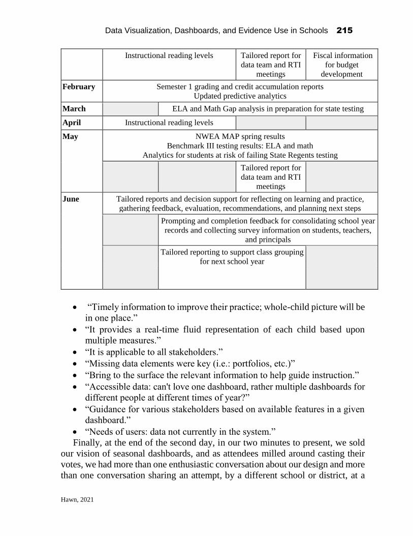
Data Visualization, Dashboards, and Evidence Use in Schools 215
Hawn, 2021
Instructional reading levels Tailored report for
data team and RTI
meetings
Fiscal information
for budget
development
February Semester 1 grading and credit accumulation reports
Updated predictive analytics
March ELA and Math Gap analysis in preparation for state testing
April Instructional reading levels
May NWEA MAP spring results
Benchmark III testing results: ELA and math
Analytics for students at risk of failing State Regents testing
Tailored report for
data team and RTI
meetings
June Tailored reports and decision support for reflecting on learning and practice,
gathering feedback, evaluation, recommendations, and planning next steps
Prompting and completion feedback for consolidating school year
records and collecting survey information on students, teachers,
and principals
Tailored reporting to support class grouping
for next school year
• “Timely information to improve their practice; whole-child picture will be
in one place.”
• “It provides a real-time fluid representation of each child based upon
multiple measures.”
• “It is applicable to all stakeholders.”
• “Missing data elements were key (i.e.: portfolios, etc.)”
• “Bring to the surface the relevant information to help guide instruction.”
• “Accessible data: can't love one dashboard, rather multiple dashboards for
different people at different times of year?”
• “Guidance for various stakeholders based on available features in a given
dashboard.”
• “Needs of users: data not currently in the system.”
Finally, at the end of the second day, in our two minutes to present, we sold
our vision of seasonal dashboards, and as attendees milled around casting their
votes, we had more than one enthusiastic conversation about our design and more
than one conversation sharing an attempt, by a different school or district, at a

Data Visualization, Dashboards, and Evidence Use in Schools 216
Hawn, 2021
similar idea. One superintendent from another district described how they had
created their own seasonal dashboard by simply embedding a list of linked reports
within a calendar of the year.
Taking Team Arrow’s work one small step further, I have included a
mockup in Figure 12.3 of one principal’s view of a seasonal dashboard. While
the range of widgets in this mockup is limited to the kinds of student information
discussed by Team Arrow during the workshop, it is easy to imagine additional
layers of information drawn from student and staff surveys, from students’
homework and classwork behaviors, from students’ usage of online systems,
from geographic and demographic information associated with schools’
locations, or even knowledge of teachers’ instructional methods.
Figure 12.3. Adaptive Modular, “Seasonal” Dashboard Mock-up
While Team Arrow may have approached its work at the NSF Collaborative
Workshop at a more macro-level than some other teams, we demonstrated, I
think, the potential of this new style of collaborative analytics workshop. We
explored and clarified solutions to challenges that educators face in accessing and
using information, particularly as they integrate and harness new sources of data.
With innovations in data science, business informatics, and recommender
systems continuing to trickle slowly down to everyday use in education, we at

Data Visualization, Dashboards, and Evidence Use in Schools 217
Hawn, 2021
Team Arrow look forward to someone stealing our idea and making it a reality.
After all, when one stock trader sits down to buy or sell equities, they can have
at their fingertips vast amounts of integrated metrics, sentiment analysis, and up-
to-the-minute, targeted content. When a teacher, principal, or superintendent
prepares to make a decision with lasting impact on children’s lives, we hope that
soon they will be able to access the information they need with half the ease,
confidence, and completeness. In the meantime, we look forward to the next
iteration of the Data Analytics Collaborative Workshop to refine our aim, stay on
target, and follow instructions just bit better (all puns intended).

Data Visualization, Dashboards, and Evidence Use in Schools 218
Pekcan, 2021
CHAPTER 13
Educational Data Workshop: What Does Success Look Like and How to Realize It
Burcu Pekcan
Teachers College, Columbia University
Introduction1
Data is a critical part of educational practices in schools to prepare
students for future success. Education data use can have a transformative
power on teaching and student outcomes. Schools collect a huge amount of
data both quantitative and qualitative with the intention of maximizing student
learning. Data can inform education practitioners about student needs and
provide opportunities for the schools to evaluate their educational practices so
they can augment student achievement. But how close are we to our goal in
educating all our students equitably? Are we using data effectively in our
schools? What type of information can inform our daily practice? Which data
tools inform us best in our contexts to calibrate our practices for maximal
impact on our student outcomes? Research shows that despite the willingness
to actively use data, most teachers and principals have limited access to data
and limited data analysis skills (Datnow et al., 2007), lack the knowledge and
skills for how to use data for instruction (Marsh, 2012), lack the proficiency
in triangulating data to make effective evidence-based decisions (Vanlommel,
& Schildkamp 2019), and schools have difficulty executing effective data use
practices (Ebbeler et al., 2016). As the amount of data collected increases,
Data Visualization, Dashboards, and Evidence Use in Schools
2021, Authors. Creative Commons License CC BY NC ND

Data Visualization, Dashboards, and Evidence Use in Schools 219
Pekcan, 2021
there is a growing need for professional learning to address the data use needs
of educators at each level of the educational organizations.
Professional Development (PD) activities around data use are essential
investments. PD help reinforce capacity building in schools to make effective
use of data. In their study which investigated how four high-achieving
elementary schools use data for their instructional decisions, Datnow, Park
and Wohlstetter (2007) emphasized the importance of investing in PD on data-
informed instruction. They showcased that professional development was
effective in building the capacity of educators in the schools they studied.
They suggested that training on data use alone is not enough, but the principals
and teachers should seek to integrate data use into regular evidence-based
improvement cycles.
The NSF Education Data Analytics Collaborative Workshop was one
forum for training and arming educators with data capable of enhancing their
practice. They describe their goal as:
“Currently across K-12 education, schools and districts are
investing in Instructional Data Warehouses (IDW) and School
Information Systems (SIS) in an effort to provide actionable
information for educators to inform evidence-based practice and
decision-making. Yet, across research and practice, much work
remains to understand the types of data to display that are most
helpful to teacher, principal, and central office decision making,
as well as what types of data dashboards, visualizations, and UX
best serve the needs of schooling communities. This work
requires insights from both educators in schools as well as the
current work of education data scientists working at the
intersection of research and practice. As part of a larger National
Science Foundation funded project, we are gathering educators
and education data scientists together for an exciting interactive
two-day event to learn together through a datasprint design-based
collaborative workshop. The goal of the event is to work to
understand the needs of educators around education data and data
dashboards, and then iteratively build prototype visualizations
and code together to help address educator data use needs across
the system.” (Bowers, 2019)
I participated in this NSF workshop as a teacher and researcher. The
usual PD in education is more directed rather than collaborative, making this
an engaging experience where teachers could provide input directly into the

Data Visualization, Dashboards, and Evidence Use in Schools 220
Pekcan, 2021
goals of the PD session. Before elaborating on my participation in this forum
however, I would like to focus on how data use can affect educator practice
and then discuss a model for evaluating PD. This model is important because
it highlights the main goals that educators should strive for as they invest their
time and resources for professional growth.
How can data change instruction?
Our nation and schools are home to a diverse body of students with
different needs. Representing the very communities they live in, students
come from different backgrounds and bring with them different combinations
of preparedness before they can meet national standards on their way to
becoming productive members of our society. Data, data use and evidence-
based practices can be leveraged to allocate educational resources effectively
and to improve student outcomes. Yet, it is often a challenging task to
distinguish data which educators really need. Furthermore, schools often keep
data in many formats. Teacher observations for example are often stored in a
paper format in an administrative office, while most student data might be
found in various electronic databases or even online portals. Integrating these
data sources and making holistic inferences about students becomes an
arduous task. Vanlommel and Schildkamp (2019) found that teachers do not
triangulate data extensively. According to the “Teachers Know Best” report
prepared by Bill and Melinda Gates Foundation (2015), there is a great need
to have longitudinal data systems which portrays student growth over time as
well as mechanisms that allow students to track their performance. Such
systems can even forecast future growth trajectories and pinpoint challenges
in each student’s learning so that instruction can be personalized. Another
research team identified managing and prioritizing data as one area of
improvement (Datnow et al., 2007). In their study, teachers indicated their
desire for a data management tool that can present various types of
information in an organized way and present longitudinal data of a student’s
progress.
A vital need is to have user-friendly tools and visualizations when
working with data. Stakeholders with different proficiency levels with data
should be able to access the data easily and be able to make sense of data.
Georgia’s Information Tunnel (GIS) is one example of a user-friendly
longitudinal data system that promotes evidence-based decision making in
schools (Data Quality Campaign, 2020). For example, Figure 13.1 was
inspired by a visualization based on GIS which shows student absences for

Data Visualization, Dashboards, and Evidence Use in Schools 221
Pekcan, 2021
one student over time. Seeing the trend over time arms teachers with context
that they otherwise would have missed – there was a dramatic spike in
absences between 2008 and 2009. Observing individual student trajectories in
such detail gives educators one more tool to better understand their students.
Notice how simple the graphic is too – the main takeaway can be deduced
almost instantly. The GIS system prides itself on putting such actionable data
in the hands of teachers.
Figure 13.1. Visualization showing student absences overtime
Through the linked state level resources to district data, the teachers,
principals, district leaders, and parents gain information relevant to their roles
such as identifying best practices or observing each student’s growth to ensure
student achievement (Data Quality Campaign, 2020). On the other hand, new
assessment technologies such as computer-adaptive tests measure the student
learning through adapting questions’ difficulty level based on student’s
answers. It provides prompt academic information on student learning; which
standards are mastered and where the gaps are so that the teachers can tailor
their instruction according to the student’s needs.
My experience as a teacher has taught me that educators are inundated
with many ideas that could conceivably improve their practice. This is
especially true in regard to data use or technologies centered on educational
data. Keeping data practices learner-focused is essential if its transformative
power is to be effectively harnessed. At its very best, data use in education
can bring together a school community as they develop a common
understanding about their shared educational challenges and successes. It

Data Visualization, Dashboards, and Evidence Use in Schools 222
Pekcan, 2021
breeds accountability and clarity as to where a school community sits. These
ideals are embodied in DuFour et al.’s (2004) notion of a PLC. Lin (2017)
observes that “A PLC explores how an organization can be built around the
virtues of collaboration, collective inquiry, and continuous improvement, and
argues that such organizations are vital for a revival in education” (Lin, 2017,
p.1). Creating a self-sustaining culture of inquiry around routine data use to
improve students’ educational outcomes is an ideal worth striving for.
Education stakeholders increasingly use different types of data to
improve educational systems, experiences and outcomes (Campbell & Levin,
2009). Education data takes different forms from student demographics, to
testing outcomes and student behaviors, as well as informal observations.
When educators agree on clear expectations of what their students should
know, they can gather the reliable and valid data to track progress towards the
key learning milestones. Schildkamp (2017) calls this a “sense-making
process” where the educators use their own experience, understanding,
knowledge and expertise when integrating the data points.
Based on this evidence the educator makes educational decisions,
through whether personalizing instruction or adjusting the learning
environment and experiences to keep the student on track for success. Such
activities include setting goals for the student, creating action plans for
individual students, reteaching the topics that students did not grasp,
implementing small group interventions and scaffolding the activities, and
challenging the students who show mastery of content (Schildkamp et al.,
2017). Data use in schools can improve student learning when the needs of
students inform lesson plans (Campbell & Levin, 2009).
PD can address the data-use gaps
Under the No Child Left Behind Act of 2001, and now ESSA, the states,
districts, and schools are held accountable for the achievement of the students
they serve (U.S. Department of Education, 2019). This elevated the use of
data in schools rapidly, but for accountability reasons. While the elevation of
data use has continued since the 1990s, the motives have shifted from
accountability reasons toward a greater emphasis on accelerating student
growth. Some limitations hinder teachers’ effective use of data however.
Many educators and administrators at both school and district levels still lack
adequate data literacy and training to use what is often an overwhelming
amount of data in a meaningful way. Lacking an intuitive and easy method
for retrieving or visualizing data to guide practice exacerbates this issue. The

Data Visualization, Dashboards, and Evidence Use in Schools 223
Pekcan, 2021
GIS example from above is the exception to the usual chaotic manner that
schools store and make access available to their data. At their best, school or
district level data systems can facilitate or direct ongoing professional
development and create evidence-based data inquiry cycles.
Datnow et. al (2007) studied four high-achieving school systems that
adopted effective data-driven decision-making practices. Those systems
started with setting goals for student learning framed by established system-
wide norms for data use and promoting the mutual accountability between
educators at all levels of the system. They invested in an informative and easy-
to-use data system which provided them information on students for multiple
dimensions. They built a support system where educators that are competent
with the data analysis were designated to provide help. With continuous
professional development and clear data protocols educators were supported
in their use of data. These data-use accelerated students learning (Datnow et
al., 2017). The authors emphasized the importance of investing in PD on data-
informed instruction and concluded that an ongoing professional development
had an important role for building capacity around data use and data
management systems in all schools they observed.
Other research found evidence on the positive effects of PD on data use.
Schildkamp and Kuiper (2010) stated that training the teachers on how to turn
data into evidence-based decisions is necessary. Staman et al. (2014) studied
the effects of professional development on the attitudes, knowledge and skills
required for data-driven decision making. They found that PD was effective
to increase the knowledge and skills of teachers, principals and coaches on
how to interpret the output of the system. Hoogland et. al (2016) clarifies that
while professional development is crucial to teachers’ competence for the
analysis, interpretation, and use of data, it is essential to develop teachers’
skills in the use of data systems. Since there is a wide-spread need for data
literacy among the educators, teaching the basic knowledge in data use is
usually the main goal in data PD efforts. However, the trend switched from a
one-shot PD model to an ongoing engagement in data use practices. This
initiates a culture of inquiry supported by relevant data use and enhances
teacher knowledge through collaboration and support. Both PD and
professional learning communities seek to build skills that can be used in an
ongoing manner in their practice as educators. However, the most important
factor for quality PD is whether it retains a learner-focused emphasis. Student
achievement is mediated by teacher practices, so a training which improves
teacher practices can trickle down and improve student outcomes.

Data Visualization, Dashboards, and Evidence Use in Schools 224
Pekcan, 2021
What does good Professional Development look like?
PD is an intentional process that aims to improve student outcomes by
systematically improving some part of the educational process for students
(Guskey, 2000). It cannot be stressed enough that PD should primarily strive
to improve student outcomes. Successful PD efforts recognize that the link
between PD and student outcomes must be mediated by some change in the
educational process, whether it is a change in instruction, curriculum,
pedagogical strategies, textbooks, or school policies. Guskey and Sparks’
(1996) model shows how the connection between PD and student outcomes
ultimately depends on how educators and administrators adapt their practices.
Their model is useful for clarifying what a successful data-driven workshop
meetup between educators and data scientists looks like, bearing in mind that
a data workshop is a form of PD that educators can receive.
Guskey and Sparks’ model posits that the quality of PD is affected by
factors which they group into three broad categories: content characteristics,
process variables, and context characteristics. Guskey (2000) describes the
content characteristics as the “what” of professional development. This factor
outlines the knowledge and skills that lie at the heart of a PD effort. Process
variables refer to the “how” of PD. They clarify the format, organization and
planned activities. Context characteristics delineate the “who,” “when,”
“where,” and “why” of a PD endeavor. In the context of a data-based
workshop, the who can be agents from a range of different levels of the
education process, including teachers, administrators, principals, district
officials and data scientists. These three factors serve as the input into a PD
session, and they are key in laying the groundwork for high quality
professional development (Guskey, 2000). The essential feature of Guskey
and Sparks’ model is that high quality PD by itself does not directly influence
student outcomes; PD only indirectly affects student outcomes through other
causal mechanisms. In the third column of their model, there are three indirect
mechanisms for how PD can ultimately affect student outcomes.
The most obvious and widely discussed is through a change in teacher
practices, be they gains in pedagogical or content knowledge, classroom
management techniques, or through integrating data use into their practice.
Guskey (2000) writes “teacher knowledge and practices are the most
immediate and most significant outcomes of any PD effort. They are also the
primary factor influencing the relationship between PD and improvements in
student learning” (p. 75). Few would contest this claim. The Guskey and
Sparks’ model also identifies school administrators practices as another
mechanism for affecting changes in student outcomes. While administrators

Data Visualization, Dashboards, and Evidence Use in Schools 225
Pekcan, 2021
do not typically directly affect student learning, Guskey (2000) cites two
examples of how they indirectly affect students. On the one hand,
administrators interact with teachers on a daily basis, whether it’s through
supervision, coaching, evaluation or supporting teachers with various ad hoc
requests (Deal & Peterson, 1994). On the other hand, administrators have a
direct hand in shaping school policies. This includes school organization,
assessment, textbooks, discipline, attendance, grading practices and the
provision of extracurricular activities (Guskey, 2000). Administrators
therefore can do much to affect the climate or culture of a school community,
which can have a large effect on student outcomes. Lastly, the model also
suggests that parents are an important stakeholder in the education process.
Keeping parents involved in their children’s development and school
activities can improve student learning and motivation. While parents do not
directly receive PD, their involvement can be affected by teachers,
administrators, and the wider school climate.
In the fourth and final column of their model, Guskey and Sparks
(1996) place improved student learning outcomes. Again, this placement
emphasizes that the ultimate goal of PD in education should always come back
to how it affects student. Student gains can be demonstrated in a number of
ways. Most typically, schools are interested in gains in student achievement
as measured by assessment scores, standardized tests, or portfolio evaluations.
However, other measures like student attitudes, attendance, homework
completion, behavioral indicators, can also be relevant. These gains can be
evaluated on an individual level or at the class or school level. When looking
at the school level, schoolwide enrollment in honors classes, participation in
school or extracurricular activities, or participation in honor societies may be
considered (Guskey, 2000). The relevant learning outcomes ultimately
depend on the goals and nature of the PD and the participants in that PD.
Guskey (2000) acknowledges that there are some missing mediators in the
pathway from PD to student outcomes. In the context of the present chapter
for example, school principals and district officials are absent from their
model. Even so, the important aspect of their model is the understanding that
gains in student achievement must be mediated by some change in the
educational process. This change can affect any stakeholder in the educational
process, including teachers, administrators, principals, or even parents. To
bring the focus back to workshops centering on data use, Monroe (this
volume) provides an excellent example of how such a PD setting can
ultimately affect student outcomes through indirect changes in the educational
process.

Data Visualization, Dashboards, and Evidence Use in Schools 226
Pekcan, 2021
Writing about a workshop that brought together data scientists and
educators from other levels of the educational process, Monroe (this volume)
discusses how the stakeholders reached a consensus about building a tool to
address student truancy issues. The challenges posed by truancy are well
documented, so the buy-in was there and a clear objective for the workshop
quickly developed: to build a data tool that could automatically generate
letters addressed to parents explaining the extent of their child’s truancy
problem. This tool was based in the R environment and was quickly developed
and completed within the workshop. All educators brought back with them a
tangible tool to help assuage the truancy issue. This time-saving tool for
administrators tasked with reaching out to parents could serve as an important
step in developing a wider plan to combat truancy and has a strong chance to
improve a student’s attendance record. Viewed from the vantage point of
Guskey and Sparks’ (1996) model then, the mediating pathways from the PD
workshop toward affecting student outcomes is clear. Administrators can
effortlessly notify parents of their child’s truancy issues. If the parents are able
to motivate their child to attend school, then student-teacher contact time is
increased. Theoretically, this should improve student learning.
Setting goals for a data workshop
Is success necessarily the same for all participants in a workshop
(teacher, principal, district officials, etc.) as they have different
foci and different needs?
This interesting question can, in part, be answered qualitatively based
on some research and on my experiences in the NSF Data Collaborative
Workshop. Data workshops aim to give educators data tools to understand the
whole picture of student learning, both where they came from and where they
need to go. Such workshops present training opportunities which exemplify
best practices for the use of educational data. Do all educators need the same
tools and data to understand where their students are and what they need to
flourish? Not necessarily. Broccato, Willis, and Dichert (2014) paint a picture
of how needs at different levels of the educational system differ. They asked
education practitioners at different levels of the system (e.g., teachers,
principals and superintendents) what information about students or schools
would be most useful for carrying their roles in the educational system. They
also asked what the ideal longitudinal data tool would provide to teachers to
help them make better decisions. Superintendents wanted to have information

Data Visualization, Dashboards, and Evidence Use in Schools 227
Pekcan, 2021
on a wide range of information about individual student to teacher and
comparative data for schools (Broccato et al., 2014). For principals, student
and teacher achievement information was perceived to be the most helpful
information. Teachers focused specifically on their own students and classes
and desired a state-wide longitudinal data system where they could see data
over time and be able to compare. The responses showed overlaps as well as
unique differences between the needs of stakeholders at different levels. This
suggests that the attendees of a data workshop, as diverse as they can be, might
have very different needs depending on which part of the education process
they come from.
The NSF Education Data Analytics Collaborative created the space for
educational leaders at different levels of the school system and data scientists
to collaborate in creating informative data visualizations that will help
educators best serve the students. Given the wider audience in attendance in
this particular workshop, “success” in affecting student outcomes looks quite
different depending on whether one is a teacher, principal, superintendents, or
administrator. A key motivation behind our collaboration was to understand
the data needs of the educators at each organizational level including types of
data, data tools and to explore and be explicit about these different needs.
While all educators seek to improve student outcomes, a teacher, principal,
and administrator meet this end goal in very different ways. The way these
actors harness data therefore should reflect how their position is likely to
mediate the link between a data workshop and student learning.
A data sprint team design was used to enhance the interactions and
exchange of ideas. A data sprint team can be thought of as teams which are
made up of teachers, coaches, administrators, researchers, and data scientists.
Coming from different levels of the educational process then, teams were
formed of members with varying perceptions around the use of educational
data. For example, educators from the district level focused on how student
learning could be meaningfully compared across schools. Teachers
emphasized (1) data that captures each learner’s mastery of common core
learning standards, (2) how to increase teacher access to school-wide data, (3)
how data can inform instruction, (4) how data can be used to visualize student
learning trajectories over time, and (5) how training can be tailored to
specifically address effective data use. The researchers in the group were
interested in expanding the use of evidence-driven practices, narrowing their
attention to those efforts which directly improve student outcomes. They
wanted to bridge the gap between the scientific research community and
education practitioners. While the viewpoints of each educator reflected their
own position within the educational system, everyone acknowledged that

Data Visualization, Dashboards, and Evidence Use in Schools 228
Pekcan, 2021
effective data use would mean different things for educators with different
roles within the system. But of course, creating a comprehensive dashboard
to address all of these concerns simultaneously is not possible or even
necessary.
Figure 13.3. Team Chevron scatterplot showing the priority and possibility
of themes around data use
To help build a consensus around the use of educational data, in team
Chevron we centered our conversations around data usage, collaboration, data
security, data quality, and visualizations. We then mapped each of these
themes onto a scatterplot to compare the relative priorities and possibilities as
shown in Figure 13.3. We went through intense discussions, weighing the
tradeoffs and our debates on data priorities and possibilities shaped/resulted
in our question of interest that would help us best serve our students with the
data in hand. These discussions raised our awareness about different points
that were new to us seeing from another stakeholder’s view and why it is
important. We developed a shared language about our collective viewpoints
about what was the most important for us to know about our students. We also
had to weigh what was possible to create in a short data workshop. It was very
eye-opening to hear each member’s different perspectives about which ones

Data Visualization, Dashboards, and Evidence Use in Schools 229
Pekcan, 2021
of these ideas are most urgent and applicable to integrate in the evidence-
based practices in schools that we are part of and how to do it. The data
scientist supported us in focusing on the most actionable suggestions. One
aspect of effective PDs that is suggested by Darling-Hammond et al. (2017)
is the provision of expert support and coaching. Having the expertise of data
scientists can help educators understand what is and is not possible in a
visualization. This made the experience more realistic and kept the
discussions pragmatic. After exchanging ideas, we came to a shared
consensus and generated a question that would guide us in our work to address
the needs of the students we work with through a data visualization. NSF
Education Data Analytics Collaborative Workshop was a unique event in how
it brought together educators at all levels in an intellectually and physically
engaging way. Hunzicker (2011) argued that teachers benefit from PD when
they are engaged in discussions, simulations, visual representations, and
problem-solving exercises that are relevant to their contexts and their students.
In the end, a consensus formed around the essential goal of advancing
student learning. Specifically, in creating a data visualization that would best
address the needs of our students, our guiding question was: “To what extent
can teachers use data to explore student achievement by standard to help
improve instruction?” With this question in mind, we aimed to build a
visualization that could give us information on the math performance of 5th
graders on three common core math standards. As Guskey’s model highlights,
the intention of the NSF data collaborative was to ultimately impact student
outcomes.
Our Visualization to Invigorate Change in Practice and Student
Outcomes
Our data scientist coded and helped create the visualization displayed
in Figure 13.4. The mastery for each standard was determined by a correct
response to a diagnostic question designed to measure mastery of the
corresponding standard.2 For example, for standard “5.MD.5b” which relates
to “Geometric Measurement: Understand Concepts of Volume and Relate
Volume to Multiplication and to Addition”, a student was asked to find the
volume of a rectangular prism. The snapshot provided in Figure 13.4 shows
one time point where mastery was assessed for these three points.
2 From a measurement point of view, a single question is not considered sufficient for measuring mastery
(Chatterji, 2003). But we had to work with the data that we had in the allotted amount of time.
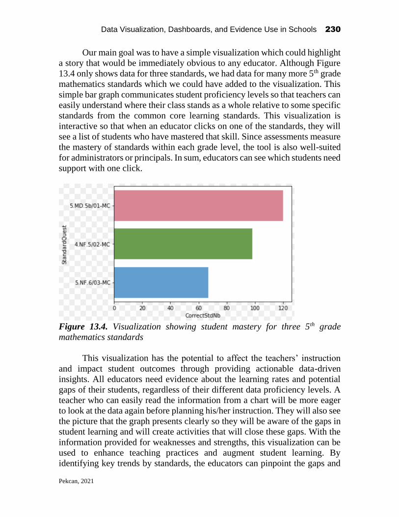
Data Visualization, Dashboards, and Evidence Use in Schools 230
Pekcan, 2021
Our main goal was to have a simple visualization which could highlight
a story that would be immediately obvious to any educator. Although Figure
13.4 only shows data for three standards, we had data for many more 5th grade
mathematics standards which we could have added to the visualization. This
simple bar graph communicates student proficiency levels so that teachers can
easily understand where their class stands as a whole relative to some specific
standards from the common core learning standards. This visualization is
interactive so that when an educator clicks on one of the standards, they will
see a list of students who have mastered that skill. Since assessments measure
the mastery of standards within each grade level, the tool is also well-suited
for administrators or principals. In sum, educators can see which students need
support with one click.
Figure 13.4. Visualization showing student mastery for three 5th grade
mathematics standards
This visualization has the potential to affect the teachers’ instruction
and impact student outcomes through providing actionable data-driven
insights. All educators need evidence about the learning rates and potential
gaps of their students, regardless of their different data proficiency levels. A
teacher who can easily read the information from a chart will be more eager
to look at the data again before planning his/her instruction. They will also see
the picture that the graph presents clearly so they will be aware of the gaps in
student learning and will create activities that will close these gaps. With the
information provided for weaknesses and strengths, this visualization can be
used to enhance teaching practices and augment student learning. By
identifying key trends by standards, the educators can pinpoint the gaps and

Data Visualization, Dashboards, and Evidence Use in Schools 231
Pekcan, 2021
roots of the problems. This will help narrow gaps in student learning and allow
teachers and administrators to take timely actions and tailor instruction to
individual learners. Action plans highlighting learning gaps can facilitate the
allocation of resources in an effective way. This increases the efficiency of
teaching practices, which are a key mediator in improving student outcomes.
Goertz (1997) states that school level data can be used to address equality,
adequacy, and efficiency and that school-level educational outcome measures
show the efficiency of an educational organization.
Not all students are at the same performance level and it is important
for teachers to know where their students are, what they need, and the best
practices to address their needs. Using a visualization like the one we created
can also provide opportunities for building capacity around data in schools.
Teachers can provide quick interventions to help students catch up with their
peers. If this is a school-wide trend, then staff can collaborate around data and
develop a common language to identify the issue and then adapt their methods
and strategies. By taking a time series approach, they can even identify when
the gaps developed and perhaps address the root causes of these trends. Such
practice makes schools operate like professional learning communities where
continuous improvement becomes the norm (DuFour, DuFour, Eaker and
Karhanek, 2004).
The visualization approach shown in Figure 4 can allow teachers and
admin to see the students with the highest achievement and identify the
teaching practices in those classrooms and share these best practices that
teachers learn from each other to improve their students’ success. Moreover,
this type of visualization will help involve teachers in high-evidence low-
inference discussions and will strengthen the collaboration among teachers in
honest and trusting conversations to evidence-based data inquiry cycles
(Bowers et al, 2019). Teachers will decide on next steps for their instruction
and these evidence-based decisions can best serve students as long as the
educators ask the right questions depending on their context and use the right
data.
Concluding remarks
It is more urgent than ever to educate our students well academically
and emotionally for ensuring a just nation and world. It is very urgent that we
as educators gain the adequate skills to make the most powerful educational
decisions based on evidence to accelerate student growth. Teachers are in the
front lines fighting to change a student’s life by equipping them with adequate
Data Visualization, Dashboards, and Evidence Use in Schools 232
Pekcan, 2021
competencies. This makes them well positioned for enhancing student
perceptions, understandings, beliefs, attitudes, and tolerances. Data use is
critical for our education system to operate on facts when shaping the future
of our students. This is particularly needed in today’s world that suffers from
pandemics, global crises, unjust institutions, and leaders that ignore what data
says. This chapter shed light on the importance of stakeholders collaborating
to find the tools that can best serve their needs to drive change in their
students’ growth.
Being inspired by Guskey’s (2016) model for evaluating the
effectiveness of Professional Development in education, I believe that data
workshops should be student-focused in the sense that the design of the
activities should yield meaningful impacts on students through the pathway
of altering the practices of teachers, administrators, or district officials. This
is, after all, the reason that educators go to work each day, and the reason that
many of them became educators in the first place. A successful data workshop
then should create the opportunity for the teachers to link the workshop
contents back to student contexts, since teachers are present in the students’
environment on a daily basis. The workshop content should help teachers
meet the distinctive needs of their students through offering a context-based
design of activities.
One important aspect of data workshops should be the participation of
actors from different levels of the educational organization. Sharing and
listening to a variety of perspectives that reflect particular roles in the same
system such as teachers, leaders, data scientists and researchers allows for
deep understanding of the contexts and a consensus in determining priorities
and possibilities. This active participation helps build the culture of expert
support where the expertise is shared to build on the current knowledge. This
is a powerful way that can bring change to perspectives, beliefs, and attitudes
of the educators who then may reflect this change into their daily data
practices or development of the data tools. While the necessity of participation
of educators at each level of the system cannot be ignored, I strongly believe
that the teachers have to have the biggest input in the process since they have
the clearest mediating pathway for linking PD to student outcomes. As I
mentioned before, teachers have the first-hand impact on student
achievement, therefore, they have the most knowledge on which levers to pull
in the most powerful ways to accelerate learning. If we are striving for better
student outcomes through strengthening our fact-based practices in
educational settings, it is imperative for data workshops to address teachers’
diverse demands.
Data Visualization, Dashboards, and Evidence Use in Schools 233
Pekcan, 2021
Of course, we cannot ignore the importance of data scientists in data
workshops. Their technical skillset makes them well-suited for specifying and
reaching an achievable outcome. School systems rely on their expertise and
skills to answer difficult questions. Their work influences how teachers
perceive student progress. The perception of the teacher might change
depending on the dashboards they use. But this is a two-way street. Educators
are on the front lines and intimately involved with guiding students, so their
input in directing and framing the energies of data scientist cannot be
overstated. It is the teachers who knows the students most closely and the
ways that can impact student learning to the highest extent.
Evidence-based educational practices are key to enhancing students’
human capital. Effective data workshops can be the platform in which
educators collaboratively find the tools that can greatly benefit them in
making evidence-based decisions and transforming student outcomes.
References
Bill & Melinda Gates Foundation. (2014). Teachers Know Best: Teachers' Views on
Professional Development. ERIC Clearinghouse.
Brocato, K., Willis, C., Dechert, K., Bowers, A. J., Shoho, A. R., & Barnett, B. G.
(2014). Longitudinal data use: Ideas for district, building, and classroom leaders.
In Using data in schools to inform leadership and decision making (pp. 97-120).
Information Age Publishing.
Campbell, C., & Levin, B. (2009). Using data to support educational
improvement. Educational Assessment, Evaluation and Accountability (formerly:
Journal of Personnel Evaluation in Education), 21(1), 47.
Chatterji, M. (2003). Designing and using tools for educational assessment. Allyn &
Bacon.
Darling-Hammond, L., Hyler, M. E., & Gardner, M. (2017). Effective teacher
professional development.
Data Quality Campaign, Data Systems That Work (2020), retrieved from
https://dataqualitycampaign.org/topic/data-systems-that-work/
Datnow, A., Park, V., & Wohlstetter, P. (2007). Achieving with data: How high
performing districts use data to improve instruction for elementary school
students. Los Angeles, CA: Center on Educational Governance, USC Rossier
School of Education.
Deal, T. E., & Peterson, K. D. (1994). The Leadership Paradox: Balancing Logic and
Artistry in Schools. Jossey-Bass Education Series. Jossey-Bass, Inc., Publishers,
350 Sansome Street, San Francisco, CA 94104. For sales outside US: Maxwell
Macmillan, International Publishing Group, 866 Third Ave., New York, NY
10022.
DuFour, R., DuFour, R. B., Eaker, R. E., & Karhanek, G. (2004). Whatever it takes: How
professional learning communities respond when kids don't learn.

Data Visualization, Dashboards, and Evidence Use in Schools 234
Pekcan, 2021
Ebbeler, J., Poortman, C. L., Schildkamp, K., & Pieters, J. M. (2016). Effects of a data
use intervention on educators’ use of knowledge and skills. Studies in educational
evaluation, 48, 19-31.
Goertz, M. E. (1997). The challenges of collecting school-based data. Journal of
education finance, 22(3), 291-302.
Guskey, T. R., & Sparks, D. (1996). Exploring the relationship between staff
development and improvements in student learning. Journal of staff
development, 17(4), 34-38.
Guskey, T. R. (2000). Evaluating professional development. Corwin press.
Hoogland, I., Schildkamp, K., Van der Kleij, F., Heitink, M., Kippers, W., Veldkamp, B.,
& Dijkstra, A. M. (2016). Prerequisites for data-based decision making in the
classroom: Research evidence and practical illustrations. Teaching and teacher
education, 60, 377-386.
Hunzicker, J. (2011). Effective professional development for teachers: A
checklist. Professional development in education, 37(2), 177-179.
Lin, A. (2017). Professional Learning Communities: Can the American Education
System face modern challenges with age-old solutions? SMRT Research Series, 1
Marsh, J. A. (2012). Interventions promoting educators’ use of data: Research insights
and gaps. Teachers College Record, 114(11), 1-48.
Monroe, E. (2020). The Components of a Successful Transdisciplinary Workshop:
Rapport, Focus, and Impact.
Moore, R., & Shaw, T. (2017). Teachers’ use of data: An executive summary.
NSF Education Data Analytics Collaborative Workshop
https://sites.google.com/tc.columbia.edu/nsf-edac-workshop-2019/home
Schildkamp, K., & Kuiper, W. (2010). Data-informed curriculum reform: Which data,
what purposes, and promoting and hindering factors. Teaching and teacher
education, 26(3), 482-496.
Schildkamp, K., Poortman, C., Luyten, H., & Ebbeler, J. (2017). Factors promoting and
hindering data-based decision making in schools. School effectiveness and school
improvement, 28(2), 242-258.
Staman, L., Visscher, A. J., & Luyten, H. (2014). The effects of professional
development on the attitudes, knowledge and skills for data-driven decision
making. Studies in Educational Evaluation, 42, 79-90.
U.S. Department of Education, Using Data to Influence Classroom Decisions (PDF)
www2.ed.gov/teachers/nclbguide/datadriven.pdf
Vanlommel, K., & Schildkamp, K. (2019). How Do Teachers Make Sense of Data in the
Context of High-Stakes Decision Making? American educational research
journal, 56(3), 792-821.

Data Visualization, Dashboards, and Evidence Use in Schools 235
Lee, 2021
CHAPTER 14
Data Science in Schools: Where, How, and What
Sunmin Lee Learning Analytics, Teachers College, Columbia University
Background1
As a current Data Scientist working in the professional world, I perform
various technical tasks using data to derive meaningful stories. That includes
a wide scope of work such as extracting transactional raw data from the
client’s database, transforming it into meaningful information like Key
Performance Indicators (KPIs), developing machine learning models, and
deploying it into the production environment by building visualizations and
dashboards using business intelligence tools. The sector and data that I mostly
deal with are education and health in international development. I have an
academic background in Statistics, Mathematics, Economics, Learning
Analytics, and Computer Science (on-going) dreaming to develop a real
Artificial Intelligence (AI) in the education sector one day. Hence, when I
received the invitation from Dr. Bowers to participate in the NSF data
collaborative event as an educational data scientist expecting to perform data
science tasks on the spot, my first reaction was, literary, “What? Real-time?”.
Usually, data scientists’ work requires a time commitment to deliver the
findings from data. That could be due to time consumption in testing and
choosing best models, appropriate visualizations, familiarity with the tools,
etc., but mostly, it takes enormous time to digest and clean the data and discuss
the research question with the client, i.e. “what do you want to know?”.
Data Visualization, Dashboards, and Evidence Use in Schools
2021, Authors. Creative Commons License CC BY NC ND

Data Visualization, Dashboards, and Evidence Use in Schools 236
Lee, 2021
With the excitement and ambiguity in mind, the D-day reached. I was
assigned to the group called “Chevron” where we had a fantastic combination
of experts from the field. Such as leaders from Nassau county BOCES sharing
rich experiences providing insights on warehouse data; a renowned scholar
who provided in-depth background ideas, bridging the school’s demand and
supply from the real world, and practitioners from schools who were great
resources sharing what kind of research questions that they had in the usual
daily life using data collected from learning management systems and beyond.
During the two days of the workshop, this amazing group collaborated
successfully, gathering ideas, sharing questions, understandings and
challenging each other. As a data scientist, it was my big privilege working
with these people as well, since in the real world there were not many chances
to learn what is required from practitioners.
Data science practice during the event
Where did we start?
One of the main objectives of the event given to participants was to perform
a data science practice with real data retrieved from the Nassau BOCES data
warehouse. To do so, there were several discussions that participants as a
group had to go through. First and foremost, we had to identify what kind of
data-driven questions that we would like to answer. For instance, some
practitioners were curious about how students’ absenteeism data correlates to
student’s performance data on assessments. Other practitioners were
wondering how data can help in improving the school environment.
Depending on which beneficiaries you were in (e.g. teachers, principals,
superintendents, etc.), ideas and suggestions varied. In the initial stage of the
talk, there were a lot of back and forth discussions since for me as a data
scientist, it was important to assess and evaluate the questions promptly and
provide feedback to teammates whether those are possible to deliver with the
given data in a limited time. In the same sense, I was also assisting in what
kind of data we received for this task and what types of analysis are doable.
Finding an appropriate research question process took a significant amount of
discussions and thoughts but finally, we came up with an agreement to explore
“to what extent can teachers use longitudinal data to explore student’s
achievement by standard?”.
How did we find the answers?
Once we set up the question, the next step was to examine how we can find
that answer with the available resources. In contrast to the initial discussion,

Data Visualization, Dashboards, and Evidence Use in Schools 237
Lee, 2021
this process was mainly led by a data scientist who has the most knowledge
and experiences in manipulating and presenting data. However, it was not
only the data scientist’s work since I was the last person in the group who was
actually understanding the background of the BOCES data warehouse while
other teammates already had some sort of experience. We started to dig more
into the datasets together, identifying what kind of information do we have
and trimming down the unnecessary information. During the process, we were
able to narrow down more details with the research question such as “what
grade should we use?”, “what subject of assessment to analyze?”, “how
effectively can we present those findings?”, etc.
Especially, with the guidance from Dr. Bowers’ research resources, our
group was very excited about choosing the visualization to tell our stories. At
first, everyone was fascinated by a variety of possible visualizations. We were
being imaginative like little kids who just received the Christmas present
drawing charts in the white paper examining whether our variables can fit,
and findings can be visually represented well. Yet, the fancier the
visualization looked, we found that it was more difficult to share the stories
clearly. Of course, if someone spends time and is willing to understand what
the picture is saying, that would work. But we wanted something simple and
strong that everyone without technical knowledge can understand. This was
particularly emphasized by our group practitioners who were actually working
at schools on a daily basis since for students, teachers, and administrators, not
many people can commit time to study the result if it is not intuitive due to
the other bulk of duties. Eventually, we decided to go for a simple bar graph
which is common but apparent.
The last procedure of the data science practice was coding, one of the
crucial competencies that makes data scientists unique. For this exercise, I
used an object-oriented programming language called “Python” in the Jupyter
notebook environment, which is widely used for data scientists along with
“R”. Based on the discussions that I had with the group, I started importing
relevant dependencies (e.g. packages for the data frame, visualizations, etc.)
and cleaning data. This process was very tricky (and I assume all data
scientists in this event felt the same!) since our group task was not using the
variables given in the dataset but creating a new feature by joining different
datasets. The datasets were also not cleaned which needed a lot of manual
manipulation in a short amount of time. But finally, I was able to deliver the
expected bar graph.
What did we learn from data?
Figure 14.1 shows visualization during the planning process and after the
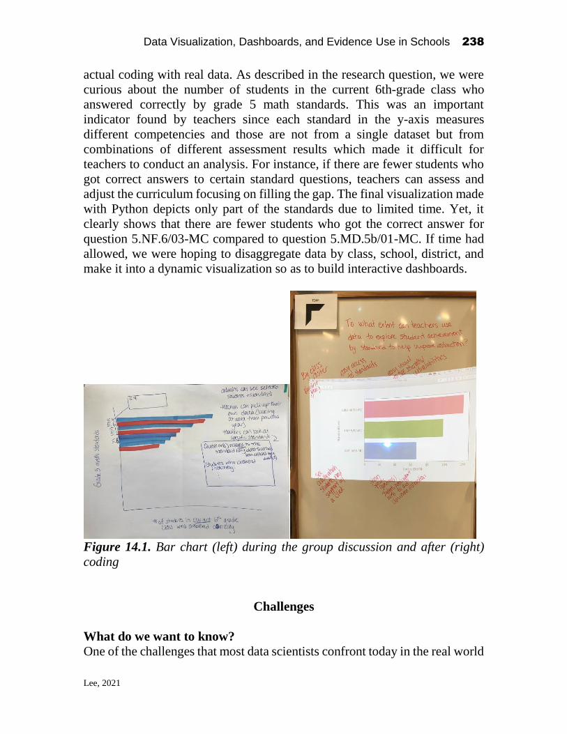
Data Visualization, Dashboards, and Evidence Use in Schools 238
Lee, 2021
actual coding with real data. As described in the research question, we were
curious about the number of students in the current 6th-grade class who
answered correctly by grade 5 math standards. This was an important
indicator found by teachers since each standard in the y-axis measures
different competencies and those are not from a single dataset but from
combinations of different assessment results which made it difficult for
teachers to conduct an analysis. For instance, if there are fewer students who
got correct answers to certain standard questions, teachers can assess and
adjust the curriculum focusing on filling the gap. The final visualization made
with Python depicts only part of the standards due to limited time. Yet, it
clearly shows that there are fewer students who got the correct answer for
question 5.NF.6/03-MC compared to question 5.MD.5b/01-MC. If time had
allowed, we were hoping to disaggregate data by class, school, district, and
make it into a dynamic visualization so as to build interactive dashboards.
Figure 14.1. Bar chart (left) during the group discussion and after (right)
coding
Challenges
What do we want to know?
One of the challenges that most data scientists confront today in the real world
Data Visualization, Dashboards, and Evidence Use in Schools 239
Lee, 2021
is to communicate with the beneficiaries (e.g. clients, senior managers,
colleagues, etc.) and find out what do we want to learn. This question is more
obvious and relatively easy to answer if the target is clear. For instance, in the
business world, one might want to know how we can optimize the product
line that will affect profit using available data. A data scientist will discuss
with various professionals including marketers, engineers, decision-makers,
etc. to find out where to retrieve data, how to clean and transform it into
meaningful information and visualize it to senior managers for their insights.
During the exercise in the NSF event, I was very impressed by our colleagues
in learning how many brilliant ideas that they had on data analysis. Principals
and superintendents were curious about finding the evidence in improving the
school and teaching environment. Teachers were full of thoughts referring to
their practical experiences in elevating student’s learning. Yet, although we
were able to bring up many ideas, it was not easy to come up with one
consensus agreement since the significance of questions varied between
stakeholders.
How can we get that?
During the event, the key difference that I found from the business world that
made educators2 reluctant to conduct in-depth data analysis to improve their
tasks is that there were not many channels that teachers/principals can use to
retrieve raw data. For instance, for the business corporations (or any
organizations that possess mature data infrastructures), if a data scientist
agreed on one research question, he/she consults with the data engineers and
finds out where they can get the data. However, in the normal school
environment, unless teachers/principals put in much effort to find out where
and what kind of data the school IT team stores, it is very time-consuming and
challenging to turn this into action due to other busy duties. In our group
discussion as well, it was surprising to see how school stakeholders are
disconnected from the BOCES data warehouse except for the researchers
from higher education. Teachers knew that school and district administrators
were collecting data. But they were not aware of where is that data going and
how can they request to receive it afterward.
How to do it? What is Data Science?
According to the Harvard Business Review (Davenport and D.J., 2012), a data
scientist is identified as “the sexiest job of the 21st century”. No wonder, the
salary of data scientists is one of the top tiers that many young graduates
2 Note: Educators here applies to non-tertiary levels such as elementary, middle, and high schools.

Data Visualization, Dashboards, and Evidence Use in Schools 240
Lee, 2021
would like to enter. Likewise, the technical skills that the industry is expecting
from data scientists are high and demanding. Maybe that’s why a lot of people
are intimidated and feeling new to data science. But actually, this is not true.
Data science is not a new area. Perhaps it’s a new area for those people who
didn’t have statistical data analysis or business intelligence techniques (e.g.
building data-driven dashboards with KPIs) background in the past. However,
if you were already doing this work, it is not that much different from what
traditional data analysts were doing except for the fact that the volume and
structure of data are somewhat more complicated. Due to this, there is a need
to have some data engineering skills (e.g. knowledge in database and
programming language). Once you receive data, the preliminary analysis
process (i.e. exploratory data analysis) and developing models are the same
(or pretty much similar by the fact that the engineering side is using pre-
defined algorithms). In that sense, the NSF data science event was an excellent
opportunity for professional data scientists to learn how educators are
responding to this new regime.
First and foremost, I would like to know how educators were reacting
to coding. The biggest difference between traditional statisticians and data
scientists in terms of conducting an analysis is programming skills. Most
social science analysts widely use programs such as SPSS, which has an
intuitive Graphical User Interface (GUI) that makes statistics fairly easy to
use. However, as data have become more complex, the open-source tools that
do not require a license, such as R and Python, are gaining the spotlight in
data science since everyone can contribute and share code, and develop and
contribute to open code libraries. Yet, this does not mean that traditional
statisticians do not code. There is quite a bit of coding required with more
sophisticated tools such as SPSS (using syntax), STATA, SAS, etc.
To understand how educators are familiar with the data science world
in our group, I was introducing what kind of work data scientists are doing in
the field, what kind of skills are required, and how to do these things through
demonstrating the coding process using live coding. Although it was true that
most of my colleagues in my group were not exposed to Python or R coding
before this event, they were attentive and open to new learning. Furthermore,
the good thing was most of the participants were familiar or somewhat
familiar with basic statistics that they need to perform for their analysis. It was
just a matter of the “method” (i.e. which analysis tool) that they decide to
choose to deliver the data-driven stories.
Data Science for whom?
When all groups finalized and shared data science exercises during the event,

Data Visualization, Dashboards, and Evidence Use in Schools 241
Lee, 2021
there was an important lesson that we learned. Who is this data science for?
Data science results are highly related to research/business questions that
audiences want to know using their data. Although choosing the right
visualization to effectively tell the results are also an important aspect to
consider, the most crucial thing in the data science projects is whether this
research question is helpful for analysts, decision-makers, and the
organizations. In that sense, the scope of data science questions can be wide.
Selecting an appropriate question that will fulfill the requests of the
beneficiaries is very important.
Lessons learned and the next step
Reiterating the appreciation to Teachers College, Columbia University Dr.
Alex Bowers and his research team, Nassau county BOCES team, and all
participants contributed to organizing this fantastic event on data science in
education, I believe this was a huge stepping stone for everyone in the
education sector allowing us to learn more about data science at schools.
Considering the current reality that most data science professionals are
working in an industry where they can access strong data infrastructures due
to their high demand, it was a good opportunity for data scientists to meet
educators on the spot and interact together.
Through the event, first I’ve learned that it is crucial to advocate and
introduce the concept of data science at the school level. It does not have to
be fancy showing flowerlike visualizations, complicated coding, and inferring
that data science is intimidating or some special thing that only mathematical
aliens can perform. Rather, there should be a perception that thanks to
technology, there are many open source libraries and automatic machine
learning tools that users can easily access. The most important thing here is to
have basic competency in knowing how you can build data-driven research
questions and whether you can interpret the results. The middle process can
be helped in various ways, such as data scientists performing, using auto
processing tools, etc. Those basic competencies can be learned in many ways
such as taking capacity building training from higher education, enrolling in
courses from free MOOCs provided by renowned institutions, or jumping into
the field directly improving from mistakes. There is no one answer. Bowers,
Bang, Pan, and Graves (2019) found in their 2018 Education Leadership Data
Analytics (ELDA) summit that “the domain and market are ripe for more
capacity building offerings for teachers, leaders, central office staff, and
researchers throughout education”. Yet the current offerings from the market
are not perfect covering all three aspects of ELDA, which are “education
leadership, evidence-based improvement cycles, and data science”. As a data

Data Visualization, Dashboards, and Evidence Use in Schools 242
Lee, 2021
professional working in the education sector for several years, this is very true.
Unfortunately, there is a lack of leadership in the education sector recognizing
the importance of data use. Although there is training on data science for
executives, there are not many courses for school leadership that assist in
understanding why and how data can improve the education environment.
This could be due to many reasons but at most, I found that the misperception
toward data science for non-technical people especially in the education sector
is the toughest climbing segment of this journey.
The second lesson learned that I want to stress is the urgency of
establishing communication channels between stakeholders and data
scientists. Realistically speaking, not all teachers and educators can be data
scientists. Not everyone needs to have those skills unless it is required for
daily tasks. However, during the group work at this event, I realized that
educators are eager to share their data-driven ideas and turn them into reality.
Yet, they were just not sure where to start, who to speak with, and how to do
it. This is one of the big challenges that most organizations have where they
are not equipped with effective data processing infrastructure. Unless it is a
special type of school such as charter schools where the organization can
afford professional data analysts/scientists dedicated to doing data work for
teachers and principals, in reality, it is indeed difficult to secure data
professionals in the regular public schools. But if there is something in
between, for instance, researchers from higher education, data experts from
nonprofit organizations who can bridge the gap, who listens and delivers on a
school’s request, there then is much less of a burden expected for educators to
perform data science tasks. The only thing they need is the minimum
competency that they can share ideas for the research questions and
understand and use the delivered results. This also does not require
researching all schools in a country since most of the questions (of course not
all!) will be repetitive and one can generalize those at some point. In that
regard, conducting more research with public schools’ educators and learning
what teachers, principals, superintendents, and other school stakeholders need
in terms of using data is a most urgent matter. Bowers, Bang, Pan, and Graves
(2019) echo the same emphasizing the “central need of building capacity,
tools, datasets, and networks of researchers and practitioners”. Unless the
schools and teachers are using tailored methods (e.g. assessment that is
conducted only in certain districts), the big picture and analysis methodologies
will be pretty much the same. Establishing a strong community sharing mutual
interests can happen in education as well.

Data Visualization, Dashboards, and Evidence Use in Schools 243
Lee, 2021
References
Bowers, A.J., Bang, A., Pan, Y., Graves, K.E. (2019) Education Leadership Data
Analytics (ELDA): A White Paper Report on the 2018 ELDA Summit. Teachers
College, Columbia University: New York, NY. USA
Davenport, T. H., & Patil, D. J. (2012). Data scientist. Harvard business review, 90(5),
70-76.
Data Visualization, Dashboards, and Evidence Use in Schools 244
O’Geary & Smith, 2021
CHAPTER 15
Direct Data Dashboard
Melissa O’Geary
Director of Data, Assessment, and Administrative Services
Oceanside School District
Laura Smith
Reading Specialist
Oceanside School District
About the Authors1
Melissa O’Geary is the Director of Data, Assessment, and Administrative
Services for the Oceanside School District. She has worked in multiple roles
including Technology Coordinator, IT Specialist, Supervisor of Learning
Teaching and Assessment, and as a Google for Education Trainer. She
currently works closely with the Oceanside administration on the data needs
of the district. When she is not computing numbers, she is most likely
spending time with her family and her King Charles Cavalier dog, Andy. You
can visit her on Twitter @mogeary.
Melissa recognized the importance of data in schools while she was
working in a small parochial school. At the time, while she was teaching
technology, New York State began to require schools to report student
demographic information to the state. This soon became Melissa’s
Data Visualization, Dashboards, and Evidence Use in Schools
2021, Authors. Creative Commons License CC BY NC ND

Data Visualization, Dashboards, and Evidence Use in Schools 245
O’Geary & Smith, 2021
responsibility. In addition, some software programs began to use data to help
inform instruction. Since teachers were not yet comfortable with how to
utilize this new information, they looked to her for support and training. As
time went on and New York state and other instructional programs required
more information from schools, Melissa continued her career with various
data analysis positions.
Laura Smith is a Reading Specialist in the Oceanside School District.
She has worked in multiple roles including classroom teacher, middle school
ELA teacher, and as a special education/IEP teacher. She currently teaches
Reading Recovery and AIS reading to students in grades first through sixth at
Boardman Elementary School. When she is not in her classroom, you can find
Laura spending family time with her husband, two teenagers, and Keys, the
dog. You can visit her on Twitter @LSmithOSD.
Her first realization of data-informed instruction was in the late 1990s
when she was trained in the Reading Recovery program. In a Reading
Recovery lesson, data is continuously collected. The teacher adapts the
teaching prompts to build upon what the child already knows to advance
his/her learning. It is a constructivist approach to learning. A “Running
Record” assessment is given each day and analyzed to decide which teaching
decisions will be made for the following lesson. “As children learn to read
and write, their processing systems are changing as they make new links and
learn more each time they read or write. Close and careful observations inform
teachers about changes in a child’s literacy behaviors over brief periods. Daily
recording of behaviors enables teachers to make helpful teaching moves.”
(“Early Literacy Learning” 2018)
Laura realized how imperative it is to diagnose and monitor students
using various assessments and diagnostic tools to determine eligibility for
additional academic support. Identified students require careful and
systematic monitoring techniques to determine the effectiveness of any new
program. Through her data collection and analysis, she recognized that data
was often missing, incomplete, or inconsistent. She realized that for data to be
valuable, it must first and foremost be accurate and purposeful. There is much
to be learned with careful examination of this data, particularly in informing
future decision making and planning for students.
Melissa and Laura met as colleagues at the Oceanside School District.
Along with another district administrator, they joined up to work on a
common goal to rebuild current data practices. The three came together for
the NSF Data Collaborative Workshop at Teachers College, Columbia
University eager to hear multiple perspectives on how data is being collected,
used, and shared amongst various stakeholders. Upon arrival, all participants

Data Visualization, Dashboards, and Evidence Use in Schools 246
O’Geary & Smith, 2021
were placed in different groups with representatives from various positions.
The groups were tasked with creating an answer to a data problem that would
be of use to a school district. This mini-chapter focuses on Direct Data
Dashboard, which was an idea that one of the groups developed around the
question: How can a district connect all shareholders in successful use of data?
Our Goal
The Direct Data Dashboard explores having usable, pertinent student data on
a user-friendly platform, which teachers and administrators could easily
access remotely. This data would be modified in real-time and used to drive
instruction while tracking student growth and progress. School and state
assessments would also be analyzed, compared, and measured over time to
glean valuable data for all district stakeholders.
When conducted properly, using data to inform teaching practice is one
of the most effective ways to help students achieve success. Data-driven
instruction involves changing a school’s focus from “what was taught” to
“what was learned.” “Being data-driven is an admirable goal. Just because a
school collects data, however, does not mean the data are being used to
improve student achievement.” (Marzano, 2003, p. 56)
Over the past two decades, districts are extremely concerned with the
required data that the State and Federal government are asking for, that the
real purpose for data collection is often lost. This is widely due to the amount
of publicly available educational data, such as No Child Left Behind (NCLB)
and Every Student Succeeds Act (ESSA), that is accessible on state-run data
systems on the internet and drives funding and accountability statuses. In
addition, all the time that is being spent collecting this information for the
State and Federal government, oftentimes school districts do not have the staff
or resources to dive into data that may be used to drive student instruction.
From a teacher’s standpoint, data analysis began through the use of the
Response to Intervention (RTI) process, which was introduced as a method to
help identify students with specific learning disabilities. As school districts
went to the three-tier model of school support, the need for data to back up
the academic and behavioral interventions that were implemented was
evident. According to the RTI Action Network (2020), “universal screening
and progress monitoring provide information about a student’s learning rate
and level of achievement, both individually and in comparison with the peer
group. These data are then used when determining which students need closer
monitoring or intervention. Throughout the RTI process, student progress is
Data Visualization, Dashboards, and Evidence Use in Schools 247
O’Geary & Smith, 2021
monitored frequently to examine student achievement and gauge the
effectiveness of the curriculum. Decisions made regarding students’
instructional needs are based on multiple data points taken in context over
time.”
School districts need to recognize the importance of data to drive
instructional decisions and have a comprehensive understanding of a district
and/or school’s progress and growth. This is not an easy task and takes a great
deal of work to achieve this goal. When working towards this objective, it is
essential to get all stakeholders to understand the importance of data and how
it can help within the classroom or the school.
The first, and perhaps the most important group, to whom this message
needs to be conveyed, is the teachers. According to Steele and Parker Boudett
(2009), “schools that explore data and take action collaboratively provide the
most fertile soil in which a culture of improvement can take root and flourish.”
Teachers must know that administration also realizes that while data is a
useful tool, it is not the only element considered when making major
decisions. Teachers often fear that assessment data both on an individual and
grade level will impact their evaluations, reputations, and the students they
teach. Additionally, they do not recognize the value of a complete data set for
the purpose of informing instruction and curriculum planning. This concern
needs to change and, therefore, school administrators must create a positive
school climate through additional professional development.
School district and building administrators must have a clear
understanding of what they are looking for and that the data presented is a fair
representation of this end goal. For example, if one does not have a large
enough sample to study, or if the conditions of the data collected are not
standardized, the study is not valid. As mentioned earlier, data is a useful tool;
however, it is not the only element considered when making major decisions.
Exam scores and standardized test results only tell the knowledge level of the
students. It is important to dig deeper to understand the “why” and “how” of
the situation. There are extenuating circumstances that may affect a student’s
ability to perform on these assessments.
Reading is a human activity—the glue, the bridge, the vehicle that
connects students to themselves and other worlds, whether formatted digitally
or in print (Goodman, Fries, & Strauss, 2016). This is why teachers need to
be involved in the process of creating and building a data-driven culture.
Another very necessary factor is the parent and teacher buy-in of the particular
assessment. Training, support from program developers, support from staff
members, administrator buy-in, and control over classroom implementation

Data Visualization, Dashboards, and Evidence Use in Schools 248
O’Geary & Smith, 2021
were stronger and more constant predictors of teacher buy-in to a school
reform program (Turnbull, 2002).
Set-up Data Facilitators and Data Teams
To achieve this buy-in, it is critical that more training is available for all
stakeholders involved. According to the Center for Teaching Quality, Ferriter
(2018) explains that “if you want teachers to invest time and energy and effort
into a change initiative, you have to first prove to them that the change you
are championing is important — for students and teachers. Teachers buy into
change efforts that they believe are doable.” Proper training sessions would
allow teachers to learn how to analyze data on their school, their grade level,
and their students. This, along with discussions about areas of strength and
need, and which areas should be focused on will help build a data-driven
culture. In addition, this hands-on learning with data about the students helps
teachers become interested and invested from the beginning (Ordóñez-
Feliciano, 2017).
To facilitate these trainings and as a support system, districts need to
implement a data facilitator and data teams. The data facilitator should serve
as a liaison between the district office and the schools to use data effectively
to make decisions. The Hanover Research (2017) states that a data facilitator
should also “organize school-based data teams, lead practitioners in a
collaborative inquiry process, help interpret data, and educate staff on using
data to improve instructional practices and student achievement.”(p.6)
In addition to a data facilitator, districts should establish data teams at
each building consisting of leaders who will assist teachers and get them
excited about data. Ideally, these leaders need to be comfortable with data and
effective in conveying information to other teachers. They need to be skilled
collaborators and have a basic knowledge of school data and assessments as
well as being able to demonstrate leadership in instructional improvements
(Hanover 2017 p. 8).
According to the Massachusetts Department of Elementary and Secondary
Education’s District Data Team Toolkit (2018), a data team should fulfill five
essential functions: Vision and Policy Management; Data Management;
Inquiry, Analysis, and Action; Professional Development; and
Communication and Monitoring.

Data Visualization, Dashboards, and Evidence Use in Schools 249
O’Geary & Smith, 2021
● Vision and Policy Management -
○ Create and articulate the vision
○ Set and model expectations through the sharing of successes and
challenges from their classroom and/ or at a school level
○ Implement and uphold policies for data use in the district
○ Collaborate to examine data from an equality perspective
○ Consult research to investigate programs, causes, and best
practices
● Data Management -
○ Collect and analyze a variety of types of school data
○ Identify student learning problems, variety of causes, generate
solutions, and monitor and achieve results for students
○ Engage a broader group of stakeholders to gain their input,
involvement, and commitment
○ Manage data infrastructure
○ Access and design meaningful data displays
● Inquiry, Analysis, and Action -
○ Develop focusing questions and analyze data
○ Adapt common assessment instruments
○ Create a data-supported action plan to make district-wide
decisions about curriculum, staffing, resources, and professional
development
○ Collaborate with other school or district initiatives and leaders
● Professional Development -
○ Provide training to support district personnel to develop their
knowledge and skills in data literacy inquiry, pedagogical
content knowledge, cultural proficiency, and leadership
● Communication and Monitoring -
○ Communicate with key stakeholders district-level focus
questions and findings throughout the district
○ Monitor the school-level use of data, as well as create goals and
action plans to identify trends and patterns
○ Oversee the implementation of the plan and/or help implement
instructional improvements in a classroom, grade, course, etc.

Data Visualization, Dashboards, and Evidence Use in Schools 250
O’Geary & Smith, 2021
The data team’s goal is to build a culture of inquiry to promote systemic data
use. This will help lead the rest of the school in data-informed decision-
making and establish systems and policies to inventory, collect, and
disseminate data. The members will continue to manage ongoing professional
development and support of resource needs.
Professional Development
High-quality professional development strategies are essential to schools.
Having more effective and more engaging professional development models
available is important. All stakeholders should have opportunities that
provide them with time for practice, research, and reflection. Unfortunately,
most of the staff have little input in this process. In particular, with regard to
the data, many of the players have little control over the types of data that are
being collected and wish there were other options. By increasing building and
district training programs in data literacy, the goal is to create a trusting culture
in which teachers can collaborate and use evidence to improve and help to
drive instruction (Bowers, et al. 2019 p. 9).
However, there can be many challenges to providing professional
development. First and foremost, the people involved must feel that they are
respected and that the training is a valuable use of their time. Pressures of
daily commitments and responsibilities may limit the time that they are
willing to dedicate to learning new tasks (Post 2010 p. 6-7). According to the
Data Quality Campaign’s (DQC), in a survey of seven hundred and sixty two
(762) teachers in grades kindergarten through twelve, fifty-seven percent
(57%) of the them responded that time was the biggest roadblock stopping
them from studying student data. More than forty percent (40%) of these
teachers placed the responsibility of creating this time to analyze student data
on principals and other district leaders (Jacobson 2020).
Also, there must be practical opportunities to practice what has been
taught and positive affirmations should follow these efforts. If they do not
view this information as useful or helpful, it is not likely that it will be used;
regardless if it has been learned (Post 2010 p. 8). The Data Quality
Campaign’s (DQC) survey of more than eight thousand teachers indicated that
only about one third reported that they had participated in some type of
professional development on how to use this data. Those participants said that
learning how to use data to plan for future instruction was most useful to them
(Jacobson 2020).

Data Visualization, Dashboards, and Evidence Use in Schools 251
O’Geary & Smith, 2021
Another challenge that some teachers face is the fact that either there
are too little or too much data. For some teachers who work in a grade level
or subject area (such as early elementary and advanced high school grades) or
teach certain subjects (such as social studies, music, science, or physical
education) for which student achievement data are not readily available
(Hamilton 2009 p. 16). However, on the contrary, some teachers feel that
there was too much data to go through and it was not all useful or relevant;
especially if the data needed was not available to them promptly (Jacobson
2020). As Schmoker states, it is important that data analysis not “result in
overload and fragmentation; it shouldn't prevent teams of teachers from
setting and knowing their own goals and from staying focused on key areas
for improvement. Instead of overloading teachers, let's give them the data they
need to conduct powerful, focused analyses and to generate a sustained stream
of results for students.” (Schmoker 2003)
All of these challenges, as well as many others can be addressed by
administrators taking the time to understand teachers’ hesitations or emotional
anxieties around change. They need to work with their staff to find a balance
between pushing innovation and getting support. (Chatlani 2017). As
Turnbull (2002) indicates, teachers are much more likely to buy-in to school
reform when different factors are in place. These include administrator buy-
in, adequate training and resources, support from program developers and
other staff members, and the ability to decide what (if any) changes are
needed.
Data Warehouse
It is interesting to think about student data from different perspectives. A
student might be the lowest in a teacher’s class, but the highest in another
teacher’s remedial group for that grade level. That same student may be
outperforming his/her grade-level peers from another teacher’s class in the
same school building. That is why it is so important to have data that is
standardized or normed, because, in high achieving districts, a low achieving
child in the class may be an average student in another setting. Conversely,
in a low achieving school, a high achieving child may only be average, or even
behind in another district.
For this reason superintendents and principals have different data
needs. They are interested in multiple factors, including teacher and student
growth rates, attendance, demographics, etc. They are examining this data for
multiple reasons: to keep highly effective teachers, to identify trends in

Data Visualization, Dashboards, and Evidence Use in Schools 252
O’Geary & Smith, 2021
attendance and achievement compared with districts in the region, to
determine allocation of budget and finances, and many other factors.
Administrators can access data from a variety of sources.
One example of a tremendous data source is Nassau Boces Instructional
Data Warehouse (IDW). The IDW gives us a wide variety of reports including
NYS assessments, demographic information, teacher reports, etc. It also
compares a district's data with others in our region. This data can be
downloaded for further disaggregation and can be saved and/or printed as
needed (Pratt 2020). Many teachers and administrators use the various
features of IDW to study and analyze assessments to help improve pedagogy,
but yet many others, unfortunately, do not for many reasons. Some believe
that the value and quality of the NYS assessments have diminished since the
adoption of Common Core.
Results from a 2015 survey of more than one thousand five hundred
National Education Association members teaching the third through twelfth
grades in ELA and mathematics, who are required to be tested under No Child
Left Behind, indicate that seventy percent of these educators do not believe
their primary state assessment is developmentally appropriate for their
students (Walker 2016). In addition, in many districts, the data is not a fair
representation of the students due to the number of opt-outs. There is very
little research or empirical data to explain what motivates parents to opt their
children out of assessments, but many feel that it is a statement in opposition
to the Common Core State Standards and aligned assessments. The sheer
multitude of tests and test prep occurring in schools and a reaction to teachers'
concerns about the overreliance of student test scores in their evaluations
could be a cause for this concern.
As states rolled out new assessments aligned to college and career
readiness standards in Spring 2015, the number of students opting out of the
tests was on the rise. Reports indicated that fifty percent of students in New
York State opted out of state assessments, with some districts reporting opt-
outs as high as seventy to eighty percent. An August 2015 editorial in the New
York Times reported this amount to quadruple the number from 2014 "and by
far the highest opt-out rate for any state." (Opt-Out Policies for Student
Participation in Standardized Assessments 2018)
Another issue that arose was the fact that NYS does not release the
assessment data promptly. Oftentimes, when teachers were asked to analyze
data, it was on the previous year's student, as well as the previous year's state
assessment. Some staff did not find it useful to them at that time. However,
there are many ways that this information could be very useful for teachers.
For example, by studying previous standardized test scores, one can glean
Data Visualization, Dashboards, and Evidence Use in Schools 253
O’Geary & Smith, 2021
valuable information about the level of student proficiency from previous
years. This could help inform how the teacher creates groups within the
classroom, seating arrangements, and also how instruction can be
differentiated. Learning can be adjusted as new information is learned about
the child (Alber 2017). Teachers can also reflect upon their current teaching
practices and identify learning roadblocks that are affecting the scores of their
students. In addition, administrators and teachers can detect what is missing
from their current curriculum and must be supplemented through other
resources to meet state standards.
One System -Oceanside’s Direct Data Dashboard (DDD)
In the Oceanside School District, data study has become the main focus to
learn how to use data to inform instruction to best meet students’ needs. The
district uses various forms of data to inform and make many building and
district level decisions, such as its decisions for Response to Intervention,
curriculum program adoption, and staffing decisions. Also, in 2019 the district
took the steps to invest in a Data Specialist.
Once conversations began, it was evident that Oceanside needed to
create meaningful change and appeal to the teachers to get them excited about
the proposal. It was clear that teachers wanted more detailed information
about the students in their current class. As Brocado, Willis & Dechert (2014
p.5), stated in paper Longitudinal school data use: Ideas for district, building,
and classroom leaders, ninety-six percent (96%) of teachers were
overwhelmingly interested in data that pertained to students in their class. In
particular, teachers want their main focus to be on student achievement data
not other irrelevant data.
Knowing this demand, at the NSF Data Collaborative Workshop at
Teachers College, Columbia University, we came together to create a single
system, which we are calling Direct Data Dashboard (DDD), where teachers
can access relevant data for their students, which is updated in real-time.
Building off the Instructional Data Warehouse system, which was created by
Nassau BOCES, we realized that the state assessment data was not enough for
teachers, especially with the large opt-out rates on Long Island. The new
DDD system will include local testing measures such as Fountas and Pinnell
testing, Fundations assessments, and even student portfolios as the system
grows. Long term comparisons will be available to analyze data correlations
between state testing and reading levels, attendance and performance, effects

Data Visualization, Dashboards, and Evidence Use in Schools 254
O’Geary & Smith, 2021
of intervention and frequency, etc. This will help in determining RTI needs,
program effectiveness, and student rate of progress.
Figure 15.1: Mock visualization for the new Direct Data Dashboard (DDD)
As teachers progress and become more proficient in data analysis, the
intention is that the new DDD system could be tailored by teachers to include
their formative assessments and classroom assignments/projects. This
dashboard would offer information necessary to provide high-quality,
corrective instruction to remedy any of the learning errors identified. This
allows teachers to tweak instruction and develop alternative techniques to
present instructional concepts. The dashboard will also offer features that
include opportunities to involve students in the process. As students become
more involved with personal goal setting and learn how to monitor and track
their progress, they develop student agency, which helps to propel their
learning forward (Ryerse 2019).
In summary, assessments are a necessary component in any educational
program. However, the way we use information from these assessments can
transform the way we approach educational practice. An increased focus must
be placed on helping teachers understand the reasoning for dissecting the data
and learning about how and why their students fall short in particular areas.
With purposeful reflection and ongoing professional development and
support, instruction can be modified to better meet the needs of all students

Data Visualization, Dashboards, and Evidence Use in Schools 255
O’Geary & Smith, 2021
(Guskey 2003). The NSF Data Collaborative Workshop reinvigorated our
desire to dive deeper into the data needs of our district. We look forward to
continuing our work with Nassau BOCES and Teachers College, Columbia
University to make the new DDD system come to life.
References:
Hanover Research (2017) Best Practices for Data Facilitators and Data Teams.
Massachusetts Department of Elementary and Secondary Education (2018) District Data
Team Toolkit.
Reading Recovery Council of North America (2018) Early Literacy Learning.
https://readingrecovery.org/reading-recovery/teaching-children/early-literacy-
learning.
NASSP (2018) Opt-Out Policies for Student Participation in Standardized Assessments.
NASSP: National Association of Secondary School Principals,
https://www.nassp.org/policy-advocacy-center/nassp-position-statements/opt-out-
policies-for-student-participation-in-standardized-assessments/
Alber, R. (2017) 3 Ways Student Data Can Inform Your Teaching.” Edutopia, George
Lucas Educational Foundation, https://www.edutopia.org/blog/using-student-data-
inform-teaching-rebecca-alber
Bambrick-Santoyo, P. (2010) Driven by Data: a Practical Guide for School Leaders.
Jossey-Bass.
Bowers, A.J, et al. (2019) Education Leadership Data Analytics (ELDA): A White Paper
Report on the 2018 ELDA Summit. Teachers College, Columbia University.
Brocato, K., Willis, C., & Dechert, K. (2014). Longitudinal school data use: Ideas for
district, building, and classroom leaders. In A. Bowers, A. Shoho, & B. Barnett
(Eds.), Using data in schools to inform leadership and decision making (pp. 97-
120). Charlotte, NC: Information Age Publishing.
Chatlani, S. (2017) How Administrators Can Get Teacher Buy-in on Change Initiatives.
Education Dive. https://www.educationdive.com/news/how-administrators-can-
get-teacher-buy-in-on-change-initiatives/446550/
Clay, M. M. (2001). Change over time in children’s literacy development. Portsmouth,
NH: Heinemann.
Ferriter, B (2016) Three Tips for Building Teacher Buy In. Center for Teaching Quality.
https://www.teachingquality.org/three-tips-for-building-teacher-buy-in/
Goodman, K. S., Fries, P., & Strauss, S. (2016). Reading—The grand illusion: How and
why people make sense of print. New York, NY: Routledge.
Gorski, D. (2020) What Is RTI? What Is Response to Intervention (RTI)? RTI Action
Network. https://www.rtinetwork.org/learn/what/whatisrti
Guskey, T. R. (2003) How Classroom Assessments Improve Learning. Educational
Leadership: Data: Using Data to Improve Student Achievement, vol. 60, no. 5,
pp. 6–11.

Data Visualization, Dashboards, and Evidence Use in Schools 256
O’Geary & Smith, 2021
Hamilton, L (2009) Using Student Achievement Data to Support Instructional Decision
Making. Institute of Education Sciences: National Center for Education
Evaluation and Regional Assistance.
Jacobson, L. (2018) Survey: More than Half of Teachers Say They Don't Have Enough
Time to Dig into Data. Education Dive.
https://www.educationdive.com/news/survey-more-than-half-of-teachers-say-
they-dont-have-enough-time-to-dig-i/532008/
Marzano, R.J.(2003) Using Data: Two Wrongs and a Right. Educational Leadership:
Using Data to Improve Student Achievement, vol. 60, no. 5, Feb. 2003, pp. 56–60.
Ordóñez-Feliciano, P. (2017) How to Create a Data-Driven School Culture. NAESP:
Communicator, vol. 41, no. 2.
Post, H. W. (2010) Teaching Adults: What Every Trainer Needs to Know About Adult
Learning Styles. Teaching Adults: What Every Trainer Needs to Know About
Adult Learning Styles, Family Advocacy and Support Training (FAST) Project a
Project of PACER Center, 2010.
Pratt, M. (2020) Instructional Data Warehouse (IDW) / Overview. Instructional Data
Warehouse (IDW) / Overview. https://www.nassauboces.org/idw
Ryerse, M. (2018) The Student Role in Formative Assessment: A Practitioner's Guide.
Getting Smart. https://www.gettingsmart.com/2018/01/the-student-role-in-
formative-assessment-how-i-know-practitioner-guide/
Schmoker, M. (2003) First Things First: Demystifying Data Analysis. Phi Delta Kappan.
vol. 60, no. 5.
Steele , J.L; Parker Boudett, K.. (2009) The Collaborative Advantage. Educational
Leadership: Data: Now What?, vol. 66, no. 4.
Turnbull, B. (2002) Teacher Participation and Buy-in: Implications for School Reform
Initiatives.” Learning Environments Research, vol. 5, p. 235–252.
https://doi.org/10.1023/A:1021981622041
Walker, T. (2016) Survey: 70 Percent Of Educators Say State Assessments Not
Developmentally Appropriate. News and Features from the National Education
Association, 16 Feb. 2016.
Data Visualization, Dashboards, and Evidence Use in Schools 257
Rosenheck, 2021
CHAPTER 16
Pedagogy-driven Data: Aligning Data Collection,
Analysis, and Use with Learning We Value
Louisa Rosenheck Associate Director and Creative Lead
MIT Playful Journey Lab
1
Educational data is being collected and used on large scales, for purposes such
as data-driven instruction at the classroom level, and data-driven decision
making at higher levels. Increasingly, schools are implementing improvement
cycles based on that evidence, which is an important practice. But what drives
the data collection and analysis in the first place? Who decides what types of
data should be collected? How are methods of analysis aligned with what
teachers and administrators really value about their students’ learning?
Pedagogy is at the heart of how we teach, and therefore pedagogy should drive
data collection, analysis, and use. Data-driven pedagogy is an important goal,
but to get there we need pedagogy-driven data. In this chapter, I will describe
the idea of pedagogy-driven data, pointing out disconnects related to current
data systems, and how we might move toward closer alignment with
pedagogical goals. These ideas have come out of the 2019 Education Data
Analytics Collaborative Workshop at Teachers College, and are based on the
conversations and collaborative designs created among teachers,
administrators, researchers, and data scientists there.
Well-designed technology can support learning that is open-ended and
student-centered. One of the affordances of digital learning of course is that
Data Visualization, Dashboards, and Evidence Use in Schools
2021, Authors. Creative Commons License CC BY NC ND

Data Visualization, Dashboards, and Evidence Use in Schools 258
Rosenheck, 2021
we have the ability to collect very detailed activity data. But this data is not
being collected in ways that provide the most useful insights into student
learning, nor is it being taken advantage of in truly meaningful and humanistic
ways (Chatti et al., 2014). The data we collect should reflect the pedagogy and
the learning objectives we value. To prepare for a rapidly changing future,
education will need to move away from rote learning and procedural skills, to
value more of the process, as well as a wider variety of human skills (Ouellette
et al., 2020). Integrated approaches like project-based learning, inquiry
learning, and collaborative learning are often seen as a better fit for preparing
students for a rapidly changing future (Parker and Thomsen, 2019). These
types of learning activities can also generate data, but don’t fit into most of
our current assessments and data collection methods, which tend to be
multiple choice questions where everyone tries the same set of problems, or
written work scored by a strict rubric. If the data we collect isn’t generated by
the types of learning we care most about, then it won’t be able to point us in
the direction we want to go.
Similarly, the analysis of the data we collect should be aligned with
what we think deep learning looks like. Beyond knowing how many questions
a student got right, and how long it took them to complete something, we want
learning analytics and data mining results to recognize students’ unique ways
of thinking, and pull out patterns of progress across skills and standards. The
sophisticated methods of analysis available should be able to paint a picture
of students as humans, not simply as demographics and statistics. Data
analysis should be applied in more creative ways, and those methods need to
be designed based on the way we believe learning happens, which is embodied
in the pedagogies we use.
Finally, the ways we convey the results of educational data analysis
should feed back into the pedagogies driving the data system. If results are
communicated once a year, and teachers are planning for each unit based on
months old data, that design does not reflect a dynamic process of learning
and growth. Similarly, if teachers are inundated with scores and subscores for
each student but don’t have a way of exploring and making their own meaning
out of the data, it’s hard for them to curate personalized learning opportunities.
The experience of engaging with data must be thoughtfully designed and
aligned to pedagogical goals for it to best inform teaching and policy decisions,
and to be interpretable and meaningful for users (Jivet et al., 2018). To achieve
this, all aspects of the data design process should be aligned with the pedagogy
and learning objectives we value, including data generation and collection,
data analysis, and communication of insights coming out of the data.

Data Visualization, Dashboards, and Evidence Use in Schools 259
Rosenheck, 2021
What does current data collection, analysis, and communication look
like? First of all, the educational data we collect often doesn’t match what we
value, or the questions we really want to answer for our students and our
schools. A lot of assessment data comes from high-stakes testing, which we
know does not measure the human skills that will be necessary for an ever-
changing job landscape. At the same time, a lot of rich process data around
skills like social interactions and problem solving goes uncollected. As a
result, insights from learning analytics often don’t align with teachers’ needs
(Mor, Ferguson, & Wasson, 2015). Second of all, there is a disconnect
between data analytics and on-the-ground educators (Piety, 2019). The
professional data scientists themselves, as well as the techniques and
algorithms they use, struggle to connect with the teachers and coaches who
need to make sense of the data to inform their practice on a daily basis
(Agasisti and Bowers, 2017). There is a lot of room for improvement when it
comes to humanistic uses of learning data for decision-making at the
classroom level and evidence-based improvement at the student and teacher
levels (Wise and Vytasek, 2017).
These disconnects became evident during the 2019 Education Data
Analytics Collaborative Workshop at Teachers College. At this event, data
scientists and researchers came together with teachers and administrators from
across the Nassau BOCES. In mixed groups participants used the Instructional
Data Warehouse (IDW) as a central artifact to discuss purposes of the data
and goals for data analysis. They then co-designed and prototyped data
visualizations to explore insights coming out of a sample dataset. Educators
had a chance to share their ideas about how they wanted the data to work for
them, and data scientists got their hands on the data to rapidly prototype actual
visualizations. As more of a data designer than a data scientist, I tend to look
at the bigger picture, questioning how the data fits into the ecosystem of
learners, teachers, and schools, and noticing what’s not there as well as what
is. This perspective influenced some interesting observations and
conversations in my codesign group, which I will share here.
To begin with, the data available in the IDW itself sets the stage for the
conversations and data visualizations to be had during the workshop. It
contains scores from state ELA and math assessments, Regents exams, and
standardized assessments for English language learners. It also includes
demographic data and attendance data. There is no doubt that these are
valuable data which can be used to understand the progress of a school or
district. However, it is quite limiting in conveying many of the important skills
students may be building, and in describing their overall learning experience
at school. Certainly not everything the Nassau schools are doing in their

Data Visualization, Dashboards, and Evidence Use in Schools 260
Rosenheck, 2021
classrooms are focused on traditional curriculum, or working through
problems that have one right answer. In my conversations with educators at
the workshop, participants were eager to share about their exciting
personalized learning or project-based learning initiatives. These experiences
are not reflected in the IDW data, which is no surprise given that we don’t yet
have scalable assessments for them, and yet the IDW is what school and
district-level decisions are based on.
In many cases, educators’ requests and perceived needs around data
types and data systems seem to amplify this disconnect. Because these are the
types of data available, and which educators are asked to work with, their
focus on potential improvements still center on standardized test data and
technical functionality. At an initial brainstorm session prompted by the
question of what schools’ needs are in regards to education data, teachers’
most immediate issues were around datasets and data systems working
together. They wanted to be able to get everything in one place, and to be able
to correlate it to get actionable insights. In the post-survey administered to
participants after the data workshop event, several comments match these
pressing needs. For example, one district administrator said, “A Longitudinal
data system would be most effective if the data needed could be pulled from
multiple data points.” In addition, one of the teachers felt that, “The key issue
that needs to be addressed is that the data needs to be brought together in a
single place. This has been a serious challenge and will continue to be.” The
frustration of some of these concrete barriers to use are real, yet at times they
also pull focus away from deeper questions about alignment with learning
objectives and the need for more diverse types of data.
That deeper thinking about what data is being fed into the system is
harder to engage in for educators who have immediate data demands, and who
haven’t yet seen examples of more diverse types of data. The experience of
my own small group during the data sprint activity is an example of this. In
the initial brainstorm phase, we had ideas about how data could push
pedagogy further. We talked about the types of “human skills” we all value,
and what we hope students experience in school—things like creative thinking,
problem solving, and taking initiative. One example we brainstormed was
around what kinds of data visualizations could map evidence of these skills to
the types of teaching going on in a school. With this data, building
administrators could better understand the pedagogies that successfully build
desired skills in their particular student population, and use that information
to support more teachers to shift their practice in more student-centered
directions. This blue sky vision is all well and good, but when it came time to
create a functional dataviz prototype, the team defaulted back to standardized

Data Visualization, Dashboards, and Evidence Use in Schools 261
Rosenheck, 2021
test data, choosing to focus on literacy skills instead. Tasked with creating a
working prototype, we had to base it on the data we had access to. And in the
limited time we had, there wasn’t enough time to really think through how
data about human skills and different types of classroom pedagogy could be
collected. In one sense, this situation was circumstantial based on the time and
dataset provided during the workshop. However, I would argue that this
closely mirrors the real world of education, in which standardized test data is
in fact what we have to work with, and in which resources are quite limited
and don’t often afford the opportunity for big picture thinking and innovation.
Despite these limiting circumstances and a lack of really diverse
examples of data use, the survey did surface a few comments from participants
starting to think in the direction of more pedagogy-driven data. One teacher
responded, “An easily accessed longer term picture would help greatly. Not
just results. Teacher comments, attendance, behavior issues would be some
types of information that would be helpful.” Another suggested, “It would
help to have more data representing students that are not meeting standards.
We often have standardized test scores and reading levels, but it would be
helpful to have other types of data such as demographic information,
formative test scores, student & parent input, and information about the
teacher and attempts to remediate as well.” The idea of including teacher
comments and actions, behavior records, formative assessment information,
and student and family voices as additional types of data in a repository along
with the more standardized results data is an exciting one, as it would provide
a more comprehensive picture of student learning based on the pedagogies
being utilized. A district administrator commented on timing and the
importance of collecting ongoing relevant data, saying, “Our current systems
provide responsive results, and in the case of State Assessments, an ‘autopsy’
approach. We need systems that provide us live daily data to support learners
in our current classes. The end of year results help us to inform teacher
practice more than they help us to support student learning. The system I
envision will do both with fidelity.” This call for more of a living data
repository makes the point that to support learning goals, data needs to be
more closely aligned with the student experience, which is not currently the
case. Even with these great ideas about how to get deeper insights from data,
there is also a sense of this being an insurmountable undertaking, as one
school administrator pointed out that “Seamless integration of a wide range
of data sources would be ideal. However, this is a huge, nearly impossible
request.” This sentiment is completely understandable and also helps explain
why there weren’t more ideas of this nature coming from educators during the
workshop. Teachers and schools are already tasked with too much and when
Data Visualization, Dashboards, and Evidence Use in Schools 262
Rosenheck, 2021
it comes to data, many have to focus on what they can do with what they
already have access to. For this reason, researchers and data scientists will
play an important role in imagining how pedagogy-driven data can be
designed and implemented.
What do we need to do to move in that direction—to explore how
education data can be better aligned with pedagogy, and to experiment with
how to analyze and convey insights from diverse types of data? Based on
conversations and ideas that emerged from the collaborative data workshop,
as well as work being done in other research groups and organizations, I
suggest the following set of considerations to help us connect data repositories
and dashboards with what educators and learners value.
Expand ideas about what data looks like and what it’s for. Education data
doesn’t have to primarily consist of standardized test scores or even other
outcomes. It can include information from ongoing classroom assessments,
process data from open-ended digital environments, or notes on in-person
observations. It can be qualitative, and can come from anyone involved in the
learning process. For example the Edsight tool created by Ahn et al. (2019)
periodically asks students to reflect on their learning from the day’s lesson,
generating quantitative information that captures student voice. A variety of
types of data together could be used not simply to determine where a student
is along a linear path, but to tailor their learning experiences in terms of which
pedagogies work best for them.
Codesign with educators and creatives. Interdisciplinary teams are a key
ingredient to expanding what education data can do for us (Roschelle, Penuel,
and Schectman, 2006). Educators bring the perspective of what information
they need and how they make decisions for their students, while education
researchers may have a bigger picture vision of the pedagogy and can focus
the group’s values. Data scientists are essential as they bring the learning
analytics methods and tools, while graphic designers or interaction designers
can add new perspectives on creating data visualizations that are customizable
and interactive. In order to build tools that work with what and how we really
want to learn, all of these inputs are needed.
Build systems and methods of analysis that support diverse data types.
It’s hard to imagine putting weekly classroom assessment data into a system
built for yearly testing results, or sticking student reflection data onto
numerical test scores. But systems can be designed to be flexible, and data
scientists can come up with ways to quantify aspects of the qualitative data
Data Visualization, Dashboards, and Evidence Use in Schools 263
Rosenheck, 2021
and make meaning out of common themes across data types. Creating these
systems will require us to envision how we want to use the data before we
build the technology, rather than adding new ideas onto tools made for a more
conventional purpose.
Increase data literacy for educators. Making sense of complex types of data,
and connecting the results to one’s own students and teaching methods is no
simple task. Interpreting insights from a dataset and applying them to a
specific context in order to make decisions requires a certain level of
“pedagogical data literacy” (Mandinach, 2012). Looking at process data and
aligning it to intended pedagogy is much less straightforward than seeing
which students scored below a certain cutoff. To meaningfully engage with
these tools, educators will need the opportunity and support to build their data
literacy skills.
Combine data with knowledge of personal relationships. Teachers know
their students best and can “ground-truth” digital data by combining it with
their own observations and what they know about students through personal
relationships. For example, game analytics can shed light on the complex
behavior patterns of students, but can’t reveal for sure what students were
thinking as they solved a puzzle. Teachers might probe a student’s thinking
or ask them to explain their strategy, or they might know something about a
student’s past experience with the game or concept that affects the
interpretation of the data. Personal connections are what make data insights
meaningful in the context of a classroom, and good data design can bring the
two sources of information closer together.
Empower students and families. Students should be empowered to take
charge of their own data, having a say in how they represent their work and
how that data is used (Collins and Halverson, 2018). Data that is connected to
day to day learning experiences may give students a stronger feeling of agency
than once a year testing, and involving them in the interpretation of the data
and the setting of learning goals based on it could support their overall
learning. With data that tells a story about a learner’s experience more
holistically, families can also be involved in the meaning making process.
This could take the form of collaborative data reviews at student-led
conferences, where students pull out salient insights about their data, discuss
what they think is accurate and what isn’t, and together set goals for their
learning that can continue to be monitored and adjusted.

Data Visualization, Dashboards, and Evidence Use in Schools 264
Rosenheck, 2021
This list is by no means a clear-cut guide to how to build a pedagogy-
driven data warehouse solution. I don’t believe such a guide can exist, because
at the heart of this concept is personalized, context-specific data that describes
unique experiences of learning. Rather, this is intended to be the beginning of
a set of considerations and approaches that we should use to design data
systems that are aligned with pedagogical goals. The intentional design of
these systems must apply to all three main components: the data being
collected about students and their learning, the methods of analysis that
combine diverse types of data and make meaning out of them, and the
communication tools such as data visualizations that convey insights to
teachers, students, and other stakeholders. The way these systems are
currently designed aligns with a more content-focused, teacher-centered
pedagogy. As long as that is the case, the insights coming out of the data will
not be able to inform student-centered teaching. As schools begin exciting
initiatives around project-based learning units, in-school makerspaces, and
other student-driven learning modalities, we need data that will support
teacher practice by working in concert with data on core math and reading
standards. As a field, we will need to get creative about how we collect,
analyze, and use education data, and we will have to increase data literacy and
collaborate with diverse partners to do it. If we prioritize alignment with
pedagogies and learning objectives we really value, we can use data to deepen
learning and support teachers and students in the ways each of them needs.
References
Agasisti, T., & Bowers, A. J. (2017). 9. Data analytics and decision making in education:
Towards the educational data Scientist as a key actor in schools and higher
education institutions. In Handbook of contemporary education economics (p.
184). Edward Elgar Publishing.
Ahn, J., Campos, F., Hays, M., & DiGiacomo, D. (2019). Designing in Context:
Reaching beyond Usability in Learning Analytics Dashboard Design. Journal of
Learning Analytics, 6(2), 70-85.
Chatti, M. A., Lukarov, V., Thüs, H., Muslim, A., Yousef, A. M. F., Wahid, U., &
Schroeder, U. (2014). Learning analytics: Challenges and future research
directions. eleed, 10(1).
Collins, A., & Halverson, R. (2018). Rethinking education in the age of technology: The
digital revolution and schooling in America. Teachers College Press.
Jivet, I., Scheffel, M., Specht, M., & Drachsler, H. (2018, March). License to evaluate:
Preparing learning analytics dashboards for educational practice. In Proceedings
of the 8th International Conference on Learning Analytics and Knowledge (pp.
31-40).

Data Visualization, Dashboards, and Evidence Use in Schools 265
Rosenheck, 2021
Mandinach, E. B. (2012). A perfect time for data use: Using data-driven decision making
to inform practice. Educational Psychologist, 47(2), 71-85.
Mor, Y., Ferguson, R., & Wasson, B. (2015). Editorial: Learning design, teacher
inquiry into student learning and learning analytics: A call for action. British
Journal of Educational Technology, 46(2), 221–229.
https://doi.org/10.1111/bjet.12273
Ouellette, K., Clochard-Bossuet, A., Young, S., & Westerman, G. (2020). Human Skills:
From Conversations to Convergence. Abdul Latif Jameel World Education Lab,
MIT. https://jwel.mit.edu/sites/mit-
jwel/files/assets/files/human_skills_workshop_report_20200304_final.pdf
Parker, R., & Thomsen, B. S. (2019). Learning through play at school. The LEGO
Foundation, Billund.
Piety, P. J. (2019). Components, Infrastructures, and Capacity: The Quest for the Impact
of Actionable Data Use on P–20 Educator Practice. Review of Research in
Education, 43(1), 394-421.
Roschelle, J., Penuel, W., & Shechtman, N. (2006). Co-design of innovations with
teachers: Definition and dynamics.
Wise, A. F., & Vytasek, J. (2017). Learning analytics implementation design. Handbook
of learning analytics, 151-160.

Data Visualization, Dashboards, and Evidence Use in Schools 266
Adams et al., 2021
CHAPTER 17
Collaborative Data Visualization:
A Process for Improving Data Use in Schools
Elizabeth Adams
Southern Methodist University
Amy Trojanowski
Mineola Union Free School District
Jeffrey Davis
Nassau BOCES
Fernando Agramonte
Principal, Westbury Middle School
Leslie Hazle Bussey
CEO/Executive Director, GLISI
AnnMarie Giarrizzo
Franklin Square Union Free School District
Andrew Krumm
University of Michigan 1
Data Visualization, Dashboards, and Evidence Use in Schools
2021, Authors. Creative Commons License CC BY NC ND

Data Visualization, Dashboards, and Evidence Use in Schools 267
Adams et al., 2021
Evidence-based improvement cycles that inform instructional practice
typically rely on collaboration between leaders of educational systems and
data scientists whereby data scientists wrangle data, prepare visualizations,
and develop models for leaders and staff to inform the instructional decisions
made during improvement cycles (Krumm, Means, & Bienkowski, 2018).
Unfortunately, school staff and data scientists typically work in isolation of
one another, resulting in disjointed improvement cycles where the
visualizations provided to school staff do not always meet their unique and
contextualized needs. Without access to wrangling, visualization, and
modeling expertise, school staff must develop their own data products, which
can take time away from leaders’ and staff members’ primary responsibilities.
The purpose of this mini-chapter is to describe our experience engaging
in a collaborative data visualization process, which we used to propose a
three-step iterative process to guide others interested in engaging similar
work. Our goal in reflecting on our collective experience is to concretely
describe one way in which practitioners and data scientists can come together
to jointly analyze and take action on data. During the first step (prework), we
identified a focal problem space and specific research question. During the
second step (analysis), we collaboratively generated a data visualization
related to the specific research question. During the third step (reporting), we
collaboratively translated the information presented in the visualization to
knowledge through a discussion of next steps and instructional action steps.
We outline this process in this chapter. A main goal of this work was to
promote community-building and shared ownership of data visualizations in
education, with the ultimate goal of promoting equity in schools focused on
underserved populations.
Process for Collaborative Data Visualization
Step 1: Prework
A critical first step to engaging in collaborative data analytics and
visualization is ensuring that the appropriate voices are part of the process,
and that structures are established that clearly define how each voice is needed
for success. Our team consisted of seven team members, each of whom
brought a unique perspective reflective of the Education Leadership Data
Analytics (ELDA) model for quantitative research methods training in
education, which includes definitions for the roles of Practicing
Administrator, Educational Quantitative Analyst, Research Specialist and

Data Visualization, Dashboards, and Evidence Use in Schools 268
Adams et al., 2021
Education Data Scientist (Bowers, 2017). More specifically, our team
included:
• Two team members who are administrators at Middle Schools in
Nassau County (Amy and Fernando).
• One team member who is an elementary school teacher (AnnMarie).
• One team member who is a school district consultant specializing in
continuous improvement in K-12 schools (Leslie).
• One team member who is a data strategist with Nassau BOCES, a
public educational organization that provides shared educational
programs and services to school districts in Nassau County (Jeff).
• One team member who is a research specialist working in a university
setting (Beth).
• One team member who is a data scientist, also working in a university
setting (Andy).
The diversity in backgrounds and perspectives represented during
discussions allowed for shared understanding of goals and rich discussion
focused on the utility of various data visualizations. Though our backgrounds
and perspectives were diverse, we learned that our group was established
based on similarities in responses to a pre-conference survey. This grouping
strategy helped establish instant rapport and a genuine interest in learning
more about our teammates in search for common themes in our philosophies,
beliefs, and practices related to teaching and learning, instructional leadership,
improvement cycles, and data analytics. We engaged in protocols to facilitate
discussion, build trust and ultimately develop a shared goal. For example, we
engaged in an activity focused on mapping our life trajectory in three main
steps using one chart paper. We described our selected three main steps to the
group, discussed similarities, and asked questions. Our trajectories intersected
in the middle of the chart paper with all of us engaged in the important work
of collaborative data visualization.
After engaging in community-building protocols, we spent the largest
amount of time (approximately ⅔ of our time together) discussing and
identifying a specific focal problem for the next steps, analysis, and reporting.
Our team was careful in our identification of the purpose and research
questions to ensure that the utility of our work privileged those closest to the
work – namely, those who worked directly with students including the
teachers and school administrators in our group. We discussed the risks of
data visualizations that are beautiful but not actionable and reached collective
agreement before moving forward that it was important to us as a group to
generate insights that could be directly helpful to teachers in planning
instruction, or administrators in creating supportive conditions for teachers to
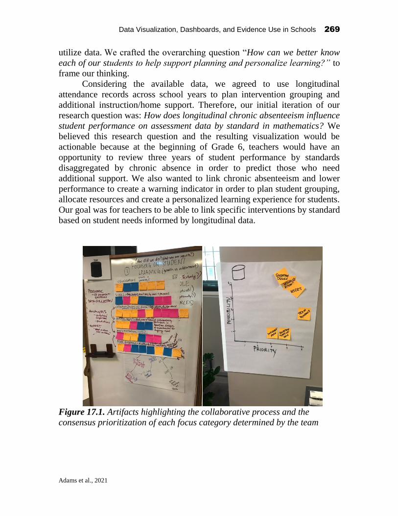
Data Visualization, Dashboards, and Evidence Use in Schools 269
Adams et al., 2021
utilize data. We crafted the overarching question “How can we better know
each of our students to help support planning and personalize learning?” to
frame our thinking.
Considering the available data, we agreed to use longitudinal
attendance records across school years to plan intervention grouping and
additional instruction/home support. Therefore, our initial iteration of our
research question was: How does longitudinal chronic absenteeism influence
student performance on assessment data by standard in mathematics? We
believed this research question and the resulting visualization would be
actionable because at the beginning of Grade 6, teachers would have an
opportunity to review three years of student performance by standards
disaggregated by chronic absence in order to predict those who need
additional support. We also wanted to link chronic absenteeism and lower
performance to create a warning indicator in order to plan student grouping,
allocate resources and create a personalized learning experience for students.
Our goal was for teachers to be able to link specific interventions by standard
based on student needs informed by longitudinal data.
Figure 17.1. Artifacts highlighting the collaborative process and the
consensus prioritization of each focus category determined by the team

Data Visualization, Dashboards, and Evidence Use in Schools 270
Adams et al., 2021
Step 2: Analysis
The second step of the collaborative data visualization process focused on
analyzing existing data. During this step, we planned and tested visualizations
using existing data to address the target research question. The resulting data
visualizations evolved during our time together. This process could have
easily continued for another day or two. The first step (pre-work and
identification of a research question) was critical; we believe that this step
could have only happened collaboratively after establishing trust. However,
we also believe that data analysis could have occurred without all team
members at the table at the same time. We took advantage of the fact that we
were together. One way that we did this was several team members
brainstormed visualizations that would appropriately address the research
question. The data scientist simultaneously and rapidly wrote code to analyze
the data and propose visualizations. The process of writing code and
generating visualizations during the workshop was quick and not polished.
For this reason, the visualizations included in this chapter are the actual draft
visualizations developed during our group work and are not final products.
The data scientist spent considerable time prior to the workshop
cleaning and organizing these data, as well as testing visualizations in a freely
and publicly available statistical package called R. This was critically
important to our work, as without a deep understanding of the data structure,
writing code for cleaning and analysis requires extensive time. As one
example of how we could explore these data, the data scientist created a heat
map visualization that clustered students (rows) and standards (columns)
based on the whether a student got 100% of the items associated with that
standard correct across 3rd, 4th, and 5th grades. This visual illustrated where
students demonstrated gaps in performance (i.e., signified by predominantly
gray columns) and whether there were patterns, by student, in terms of
standards that clusters of students struggled with. To provide a different view
on students’ performances by standard, we plotted student percent of items
correct for each standard across Grades 3 through 5. This figure did not
account for absences, which was central to our research question, yet these
two figures helped us in developing a better mental model of students’
academic performance over time and how we might later tie missing school
with missing instruction related to specific standards. In addition, we
determined that given the number of standards and the fact that standards
changed across grade levels, we wanted to focus on the content domain in
mathematics rather than at the standard level (i.e., geometry, measurement
and data, numbers base ten, numbers fractions, and operations and algebra).

Data Visualization, Dashboards, and Evidence Use in Schools 271
Adams et al., 2021
Figure 17.2. Cluster Analysis and Heatmap of Performances by Standard in
Grades 3 through 5
Figure 17.3. Percent of Items Correct by Standard in Grades 3 through 5
Going back to our original idea, we wanted to understand how we could
better identify the needs of each student to help support planning and
personalize learning. We refined our research question to: How does
longitudinal chronic absenteeism influence students’ performance on
assessment data by mathematics standards across Grades 3 through 5?
Because our intervention would be at the student level, we decided to examine
individual students’ chronic absence pattern. We defined chronic absence as

Data Visualization, Dashboards, and Evidence Use in Schools 272
Adams et al., 2021
missing 10 or more days of school. The third chart in Figure 17.4 represents
a single student across three years, mapping their performance (% correct) on
specific domains. This specific student was not chronically absent in Grades
3 or 5, but was chronically absent in Grade 4 (0=not chronically absent and
1=chronically absent under student identification number). The resulting
figure shows that this student may have some gaps from Grade 4 in their
understanding of Measurement and Data as well as Numbers Base-Ten. This
example student might benefit from interventions focused on these areas if
gaps are identified using a universal screener or progress monitoring tool.
Despite the fact that it appears this student achieved proficiency in these
domains in Grade 5, Grade 4 standards emphasize critical foundational
knowledge related to these domains that this student may have missed.
Figure 17.4. Percent Correct by Domain and Chronic Absence Pattern for a
Student in Grades 3 through 5
Note: G: Geometry, MD: Measurement and Data, NBT: Numbers Base Ten,
NF: Numbers Fractions, and OA: Operations and Algebra
Following the third visualization, in part because time was running short, we
moved on the third and final step, reporting.
Step 3: Reporting
One of the main goals of this work was to promote equity in education. From
a district administrative perspective, we wanted to inform laser-like allocation
of resources where the stakes were highest and the resources were scarcest.

Data Visualization, Dashboards, and Evidence Use in Schools 273
Adams et al., 2021
The chart above indicates that this student’s chronic absenteeism had the
greatest influence on their learning and retention of three math content
domains: measurement and data, numbers base ten, numbers fractions. The
value to instructional leaders will come from matching student attendance
data to the course pacing guide. If the content domains where the student
struggled were taught during the times when they were absent, then we can
identify a direct correlation between their poor performance on the
aforementioned domains and their chronic absenteeism. However, if an
analysis of the course pacing guide compared to when this child was absent
do not align with the areas where they struggled, then poor performance
cannot be attributed to chronic absenteeism and a deeper dive into the
instructional and assessment practices of the critical skills emphasized in this
grade would be necessary. The goal would be to identify areas where we can
allocate additional resources in order to build capacity and support student
learning. Ultimately, this could be used by classroom teachers to inform the
instructional strategies that would best meet the needs of their students. This
could be reviewed at the individual, class or grade level to reveal patterns,
effectively group students and allocate funding to additional targeted
interventions in efforts to promote student growth and achievement. We
discussed the possibilities for the visualization to inform an early warning
system that would use real time data to identify students who were absent and
in which mathematical domains they needed support.
What We Learned
Through collaborative visualization involving both school staff and analysts,
visualization of unknown patterns serves as a community-building tool that
encourages engagement in improvement cycles. Through this process,
analysts are empowered to see how their work immediately informs practice
and student outcomes. School staff are empowered through their involvement
in the data visualization process with access to the visualizations they need.
In addition, data literacy capacity is cultivated for educators and
administrators, contributing to a recognition of the affordances and limitations
of data. This brand of analytics focused on collaboration and community-
building contributes to shared goals and mutual trust across groups who
usually work in isolation of one another. Researchers typically involve end
users (i.e., school staff) at the back end of this process after generating
example visualizations based on what they believe school staff need to know.
Researchers usually collect feedback on the visualization and reporting tools

Data Visualization, Dashboards, and Evidence Use in Schools 274
Adams et al., 2021
through cognitive interviews or other forms of systematic feedback like
surveys (Huff & Goodman, 2007). Recent frameworks for score reporting
encourage analysts to engage end users early and often in the process of
developing and interpreting visualizations (MacIver, Anderson, Costa, &
Evers, 2014). This type of collaboration is important for several reasons.
Involving end users early in the process of visualization promotes shared
meaning and ownership of visualizations. In addition, the needs of school staff
are often highly contextualized based on their unique settings. District and
school administration, as well as teachers, have specific, important research
questions about their students. For example, teachers might wonder if a
specific intervention is more or less effective than another form of instruction.
To address this, an analyst might add a student grouping feature within the
visualization interface so teachers can group students and compare progress
across time. When analysts develop visualizations with school staff’s
feedback and needs at the forefront, the resulting visualizations have vast
application for improving instructional outcomes.
Incorporating Multiple Sources of Evidence
Community-building is critically important to ensuring successful integration
of improvement cycles and collaborative data visualization. If school staff are
not part of the data visualization process on the front end, then visualizations
that challenge current practices may be dismissed. During our discussions, we
frequently encountered situations where we wanted to collect or integrate
additional data sources (e.g., focused on socio-emotional learning or progress
monitoring). One way to build a culture around data literacy is to integrate
additional data that teachers or schools collect into the data visualizations.
This integration of additional sources of evidence is only possible when
school staff are involved on the front end of data visualization. The analyst or
data scientist should work with school staff to support systematic data
collection efforts that: (a) minimize bias in those data, and (b) integrate easily
into existing databases (e.g., formatted as an Excel or .csv file with students’
unique ID).
The incorporation of teacher-collected data with state and local
assessment data recognizes teachers’ current efforts and instructional
practices, increasing shared ownership and applicability of the visualizations.
This extension of the work described in this chapter builds data capacity
within schools and supports a culture of continuous improvement. Once a
culture of continuous improvement exists and teachers view data and the
resulting visualizations as valuable, we can safely introduce in-depth data

Data Visualization, Dashboards, and Evidence Use in Schools 275
Adams et al., 2021
analytics and mitigate the risk that end users will reject analytics that
challenge long held beliefs about instructional practices.
Changing the Status Quo in Data Visualization
This brand of “messy” collaborative analytic work is not always comfortable
or typical for data scientists. Similarly, it is not always typical or comfortable
for school staff to engage in collaborative data visualization as described in
this mini-chapter. We need structures and systems in place to support those
who engage in this work. This mini-chapter offers one such structure. In
addition, we need systems to support collaboration around data visualization.
For example, how do schools get access to a data scientist? We were afforded
two days in the Data Collaborative Workshop to engage in this work without
interruption. However, this is far from typical from how we engage in our
work outside of the collaborative workshop. There is a need to move the status
quo toward collaboration that is reflective of the Data Collaborative
Workshop. To encourage this process, we recommend encouraging data
scientists to engage in this work through competitive grants and calls from
top-tier journals highlighting this brand of collaboration. Another idea is to
encourage competitive conferences and consortiums where teams of analysts
and school staff can present their collaborative data visualizations. These
types of opportunities allow data scientists and educators to share resources,
ideas, and information.
Transparency in Analysis
During data analysis, data scientists make several decisions about criteria for
inclusion in visualizations. Educators need to be a part of these discussions or
at the very least have access to the interpretable code or decision rules about
who is included and why. This type of open-source access to visualizations
and their code further builds trust and increases the likelihood that
visualizations will meet the needs of educators. This necessitates a transition
from a focus on data visualization for accountability purposes to an emphasis
on data visualization for instructional improvement. For example, during our
process, we collaboratively determined a cut point for chronic absenteeism.
Making this decision rule with the individuals who would be using the data
contributed to the applicability for informing meaningful instructional change.
Data Visualization, Dashboards, and Evidence Use in Schools 276
Adams et al., 2021
Limitations
One of the challenges we had with identifying a specific focal problem was
the limited dataset we had available to us. In order to protect personally
identifiable information (PII), we could not use live district data. Instead, we
had access to a restricted data set containing predominantly New York State
assessment data for an anonymized sample of students. This limited dataset
not only constrained what questions we could pose, but what data we had
available to report.
In addition, time constraints also made it more difficult to quickly code
and re-organize the data for meaningful analysis. For example, as we began
analyzing the item analysis data, we realized that test items across grades did
not belong to the same learning standards. What we needed was a field that
grouped standards across grades into a higher-level domain, which was not
available. Fortunately, the data scientist on our team quickly authored code
to address this limitation.
There were other issues, however, that just could not be addressed in
such a short amount of time. One major issue was the lack of an item difficulty
benchmark in our dataset. NYS Assessments are standards-referenced tests
where students are classified into one of five performance levels for high
school Regents examinations in English and Math, or one of four performance
levels for all other assessments. It is important to note that not all questions
are designed to be of the same difficulty, since they are meant to differentiate
students at each performance level. Assessment questions that are meant to
distinguish mastery level are naturally more difficult than those meant to
identify basic knowledge of a specific learning standard. As such, it is
important to not simply compare the percentage of correct responses among
each question without first creating a "difficulty index" for each question
based on a larger population of test-takers. Due to time restraints, the reports
that we began to design at the NSF Data Collaborative did not take question
difficulty into consideration.
Considerations for sharing reports among many districts
One major question was how would we be able to deliver these reports to a
wider audience? In Nassau County, we have fifty-six individual districts,
often with fifty-six individual wants and needs. How can we be sure that our
designs will work for most, if not all of our districts? In addition, Nassau
County public school districts do not store data in a unified student
information system (SIS). Districts are free to use any SIS they choose, and

Data Visualization, Dashboards, and Evidence Use in Schools 277
Adams et al., 2021
currently have chosen products from five different vendors. Multiple SISs
can mean that we don’t always get the same data from all districts. For
example, will all districts report attendance data, and in the same way?
Other questions we had regarding the delivery of reports to a wider
audience:
• How do we enforce security so that an individual school or district only
has access to their data?
• How do we provide comparisons to other districts while still
maintaining confidentiality?
• Will static “one-size-fits-all” charts be sufficient, or should we look into
creating more interactive “one-size-fits-many” visualizations?
• How do we roll out R-coded reports when local expertise in R does not
presently exist in districts?
• How do we create reports that are both eye-catching reports and easy
for users to understand?
• What skills and competencies do district and school leaders need to
facilitate generative dialog that informs practice?
• In what ways can data visualizations be leveraged differently from
other data forms to build psychological safety among teachers and
school leaders, instead of the common use of data to blame or shame
teachers?
Next Steps
Leveraging the Nassau BOCES Instructional Data Warehouse
Nassau County public school districts already have access to an existing
shared reporting system that can address some of these needs. The Nassau
BOCES Instructional Data Warehouse (IDW) provides users with reports and
dashboards designed in IBM’s Cognos Analytics business intelligence
platform. The reporting model maintains both role-level security
(superintendent access vs. principal access vs. teacher access) and row-level
security (making sure each district only sees their student data). This allows
districts to work with data that are directly relevant to them, while protecting
PII by limiting data access to authorized personnel only.
Although data security is essential, districts still need a way to compare
their data to others. As mentioned earlier, not all test questions are created
equally in terms of difficulty. How can we tell from the graphs we created
which questions/standards students really struggled with if some are much
Data Visualization, Dashboards, and Evidence Use in Schools 278
Adams et al., 2021
more difficult than others? While we can’t directly compare multiple districts,
we can create benchmarks based on all Nassau County districts combined.
Because the IDW houses data for all fifty-six districts, we can provide
aggregate, comparative analysis in our reports while still maintaining district
confidentiality.
Nassau BOCES also employs staff who are proficient in data modeling
and report/dashboard design using Cognos. We thought it would make more
sense to convert the algorithms and reports that were designed in R Studio
into Cognos and leverage the resources we already have in-house. Not only
can we create static “one-click” reports for novice users, but we can also take
advantage of Cognos’ interactive features (sorting, filtering, grouping,
summarizing) that will allow more advanced users to customize their data
exploration.
Conclusion
Stay Out of Silos
We have all attended many workshops. We make connections with incredible
people, discuss great ideas, and learn about new tools and techniques only to
go back to doing the same things we’ve always done once we get back to face
the immediate reality of our everyday responsibilities. Often, we get so busy
that we move on to other projects and these reports never get to see the light
of day. If we are lucky the reports do get written, but we miss the mark due
to our tendencies to code independently (sometimes at 3am) without any
further collaboration. We need to ensure that the feedback-loop remains
intact.
Continue the Momentum Generated by the NSF Data Collaborative
Nassau BOCES will be scheduling future working group sessions modeled
after the NSF Data Collaborative. These sessions will bring together various
district stakeholders and data strategists where we can spend additional time
making sure that we:
• Pose the right questions
• Have access to the right data
• Produce visualizations that are user friendly
• Increase the data literacy of educators at different levels
• Expand the technical skills of end users and coders alike.

Data Visualization, Dashboards, and Evidence Use in Schools 279
Adams et al., 2021
Nassau BOCES will provide training to end users to help them become
more comfortable with available visualizations and data analysis tools. It is
important that we help our most novice users become more comfortable with
our Cognos reporting environment and data analysis in general. A greater
comfort level will hopefully encourage further engagement. We also want to
help our more seasoned district users become “power users” by introducing
advanced techniques such as the ability to analyze their own data. Lastly, we
need to help our data strategists increase their proficiency in other coding
platforms such as R and Python. This will increase the ability to collaborate
and share code with other data scientists. In addition, Nassau BOCES can
take advantage of Jupyter Notebooks, which integrate R and Python code with
Cognos Analytics.
Invest in Building Social-Emotional Competencies of School and District
Leaders
While it may seem disconnected from the technical analysis of data to develop
stronger social-emotional competencies of school leaders, it is a critical
precursor if our ultimate end is for data usage to translate into experimentation
with new action in the classroom or schoolhouse. Even with clear data that
point to clear implications for action, it is possible – even probable – that
teachers will not take the quantum leap in implementing something different
outside of a school culture of belonging and learning. Patti, Senge, Madrazo
& Stern (2015) identified four critical leader social-emotional competencies
that leaders can exercise and practice to create ripe conditions for data analysis
to seamlessly translate into cycles of trial, error, adaptation, refinement and
ultimately, student success. Specifically, leaders’ skill in engaging in
meaningful conversations, building generative relationships, crafting open
questions, and systems thinking that helps build connections between data
insights and broader purposes of the school are vital companions to the
technical skills needed to collect and analyze data.
Invest in Building Capacity of Data Literacy of Educators
With emphasis placed on the integration of instructional technologies,
educators have access to more data than ever before. This includes but is not
limited to IDW, NYS mandated assessments, locally determined measures,
teacher administered tasks and data generated from applications/ web-based
platforms. While this affords increased opportunities for personalized learning
experiences for students and provides information to impact systemic change
through inquiry based improvement cycles, it also requires a commitment to
building capacity for data literacy of educators at all levels. District Level

Data Visualization, Dashboards, and Evidence Use in Schools 280
Adams et al., 2021
Administrators must seek out partnerships with developers, data scientists and
universities in efforts to prioritize data into actionable visualizations housed
within a user-friendly data management system. Building Level
Administrators must create structures such as Professional Learning
Communities (PLCs) where teachers assume leadership roles to guide subject
matter and grade level teams through evidence-based inquiry cycles using
protocols that promote observation, application and revision. Classroom
teachers must be trained to identify bias, communicate the relationship
between variables and interpret visualizations in efforts to predict trends and
influence instructional decisions. Our experience engaging in collaborative
data analytics and visualization further revealed the need for and the
importance of educator input. Next steps require that the educator is provided
a platform upon which to contribute and that educational leadership invests in
the technical development of this voice.
References
Bowers, A. J. (2017). Quantitative research methods training in education leadership and
administration preparation programs as disciplined inquiry for building school
improvement capacity. Journal of Research on Leadership Education, 12(1), 72 -
96.
Krumm, A. E., Means, B., & Bienkowski, M. (2018). Learning analytics goes to school:
A collaborative approach to improving education. New York: Routledge.
Huff, K., & Goodman, D. P. (2007). The demand for cognitive diagnostic assessment. In
J. P. Leighton & M. J. Gierl (Eds.), Cognitive diagnostic assessment for education:
Theory and applications (pp. 19–60). Cambridge, United Kingdom: Cambridge
University Press.
MacIver, R., Anderson, N., Costa, A., & Evers, A. (2014). Validity of interpretation: A
user validity perspective beyond the test score. International Journal of Selection
and Assessment, 22(2), 149–164.

Data Visualization, Dashboards, and Evidence Use in Schools 281
Cohen, 2021
CHAPTER 18
An Open-Ended Data Collaborative (Imagined)
Fred Cohen
Nassau BOCES
Introduction and Background1
The Columbia University Teachers College Data Collaborative offered a
hands-on experience for teams of professionals who regularly gather, process,
present, and analyze school data. What a unique experience! As a former high
school principal and Deputy Superintendent of schools, I never before had the
opportunity to see a talented coder turn my crude chart drawings and
explanations into a visual reality. Even better was the opportunity to have a
team from the ranks of teachers, administrators, researchers and “techies”
critique and improve that visual presentation.
My own background began as a high school English and reading
teacher. Later, as a department chairperson and high school principal, I
became eager to show teachers how their classroom teaching related to test
results and school grades. Then, as a district administrator responsible for five
secondary schools, I began to develop data analytics to improve instructional
practices. Finally, in my final year as Deputy Superintendent, Nassau BOCES
Data Visualization, Dashboards, and Evidence Use in Schools
2021, Authors. Creative Commons License CC BY NC ND

Data Visualization, Dashboards, and Evidence Use in Schools 282
Cohen, 2021
began to create a data warehouse which housed test data and presented its data
in a format called cubes.
In practice, the cubes were intriguing but not helpful in my role as a
central office administrator. I was about to retire and accept a position at a
local college, and I advised BOCES that my district would likely not
participate in the data warehouse service in the future. They suggested,
instead, that I work as a consultant to the warehouse for the following year
and help turn the data gathered into productive teaching tools. I am now in the
middle of my 18th one-year contract, serving BOCES as a consultant.
What I have learned (and I hope to portray in BOCES reports and
dashboards) is that by tracking longitudinal progress, comparing results to
Nassau County benchmarks, and disaggregating results to the teacher level,
teachers can gain insight into improving their practice. Nassau BOCES was
among the first to produce “gap” reports at the question level and companion
wrong answer analyses. And, to this day, Nassau BOCES is the only data
resource that provides districts and teachers with comparative results on
Advanced Placement participation and performance, with a detailed test by
test analysis.
So, it was with eager anticipation that I attended this collaborative
workshop at Columbia’s Teachers College. As impressed as I was, I was oddly
disappointed. Why did the collaboration have to end? So, I engaged in a
thought experiment. Imagine the entire Nassau County professional staff
(teachers, administrators, and support personnel in all 56 districts), as a single
entity, collaborating without any time limitation. And then, why not add the
Teachers College Collaborative experts to the mix! The following is what
might occur in the immediate, short-term, and long-term future. Before
presenting these three imagined scenarios, let me help set the stage by offering
a brief and hopefully instructive diversion about the “I notice, I wonder”
protocol.
Using the “I Notice, I wonder” Protocol as an Operational Device
The “I notice, I wonder” protocol is an effective exercise in citing important
data points (“I notice”) and then postulating conjectures (“I wonder”)
concerning those data points. A basic but highly imaginative (and
exaggerated) example might look like this. You “notice” an odd light in the
night sky approaching rapidly in an unusual manner. You then “wonder,”
what might that light be? Your “wonderings” range from the mundane—your
neighbor’s son playing with his drone, to the far more expansive—a space

Data Visualization, Dashboards, and Evidence Use in Schools 283
Cohen, 2021
ship from a distant world with benign creatures looking to question you in
detail about important details of your home planet.
Why not apply the same expansive and optimistic vision to some of the
intriguing presentations and scenarios exhibited at the NSF Data
Collaborative Workshop! What if, in fact, the workshop was not a two-day
workshop but an unlimited one where participants had full and open-ended
access to the talents, abilities, and data resources present at the Thursday and
Friday sessions. What might occur if we could have an open-ended chat with
experts who could answer our questions or even write code at our behest! And
how responsive might we be to district needs if we could get instant feedback
from all districts present at the collaborative and even from others in those
districts not present so we might thereby survey their needs and desires
concerning data!
In this manner, my “what-ifs,” might be turned into full-fledged
programs, reports, and actions instead of just wonderings. Before flying to
the moon, someone had to imagine it, then envision it, then plan it in detail,
and finally build a working model. For these wonderings, I simply skip the
middle steps and turn some of the imaginings into three fully realized
products—one short term, one intermediate-term, and, for the last one, clearly
a dream for the distant future.
“What-if” Scenario Number 1—I noticed the elegant redesign of the Nassau
BOCES Wrong Answer Summary report. I wondered if that initial
prototype presented could be improved to display all the information shown
in BOCES’ original table while still exhibiting the elegant visuals of the clever
prototype. Shown below is a segment of the original BOCES table.

Data Visualization, Dashboards, and Evidence Use in Schools 284
Cohen, 2021
The strength of this report is that it clearly displays, for each multiple-choice
question, the correct answer, the number and percent of students who chose
each incorrect answer, an extended description of the skill tested, and the
percent correct for the Nassau County region. Finally, the user can click on
each question number to see the printed question.
Now view the prototype proposed at the Collaborative.
Its visual appeal is obvious as is the incorporation of most of the data on the
original table. What is missing, however, is the regional benchmark for
Nassau County which shows whether the district underperformed or excelled
on that test item. Also missing is a full description of the skill tested, and,
finally, the prototype lists only the number of students not the percentage.

Data Visualization, Dashboards, and Evidence Use in Schools 285
Cohen, 2021
Imagine what could be done if the collaboration continued. First, we
could change each column on the chart to indicate “percent correct” and
allow the user to hover over the bar to see “number.” Then, we could add a
colored dot on (or beyond) the green columns to indicate the percent correct
for the region. We could allow hovering over the abbreviation of the Skill
Tested to reveal the full skill description. And, since the collaboration is
open-ended, we could then test the efficacy of the report by releasing a beta
version and soliciting comments from users. In the final stage, county, district,
school, and teacher level versions would be available so all users could
compare their own results to the other benchmarks.
In this “What-if” Scenario, the prototype visual above is so fully
realized that some could likely complete the project without benefit of the
original creative team from the Collaborative. The result might be somewhat
different from the originators’ intent, but it might be equally effective. So, in
the end, these wonderings could have been converted to reality without much
of a stretch. “What-if” Scenario Number 2, however, requires us to stretch our
imagination somewhat further.
“What-if” Scenario Number 2—One of the hopes and dreams expressed at
the Data Collaborative is that some of the data available in the Nassau BOCES
Instructional Data Warehouse (called the “IDW”) are not sufficiently current.
There are actually two currency issues. The first, which will not be addressed

Data Visualization, Dashboards, and Evidence Use in Schools 286
Cohen, 2021
here, is that the IDW includes mainly yearly test data and does not include
ongoing daily or interim testing, homework, or attendance.
But for the data already included in the IDW, some say that users still
must wait too long before seeing test data. Oddly, the reason for the delay is
rarely Nassau BOCES turnaround time. Rather, it is the lag time in NYSED
releasing key data fields or the result of districts delaying the upload of their
own data. The IDW is always prepared to turn out reports almost immediately
after data is received. Other factors can also affect reporting turnaround time
such as the format of the data that is made available by NYSED. Once these
data are made available, however, the IDW produces reports that typically add
a county benchmark which is the key comparison needed to add context to
district, school, and teacher level data.
A powerful example of data currency occurs with high school
graduation data. What could be more important to a district than comparing
graduation rates for the types of diplomas earned? How does my district
compare to other districts in the county? The IDW developed a dramatic
graph (and accompanying table not shown) allowing comparisons to Nassau
County and NY State benchmarks and encouraging, as well, comparisons to
any district in the county. Look at the visual below.
The graph lists the home district first, then compares county and state averages
in the second and third columns. But the graph also offers the inclusion of any
(or all) districts in Nassau County allowing for a quick comparison to any
district chosen, thereby allowing the user to view “like” districts or even
“reach” districts.

Data Visualization, Dashboards, and Evidence Use in Schools 287
Cohen, 2021
Unfortunately, the data shown is not for the most recent graduating
class. As of this writing (December 2019) New York State Ed is not expected
to release June 2019 graduation results until January 2020 at the earliest. How
can districts plan, or even measure their progress compared to other districts,
when comparative graduation data is not released until the second semester of
the following school year?
Is it not appropriate to wonder how much more effective it would be to
share more current data? If our Data Collaborative were both ongoing and
universal in scope (all districts included), we could share unofficial,
preliminary, June graduation rates as soon as we calculate them and apply
any insights gleaned by September instead of waiting for the following
January when the year is half over. Oddly enough, there is another high school
graduation report which NYSED uses for accountability. This report can be
quite punitive if drop-out rates are high, yet the accountability data published
in January 2020 is actually for the 2018 graduating class, and accountability
data for the 2019 graduating class will not be published until 2021.
BOCES, in theory, gathers data from districts and uploads such data to
the state for processing and distribution to the public. But an ongoing Data
Collaborative could short-circuit this process and get preliminary data to
districts with the immediacy needed to be truly useful. Responding to district
needs in timely fashion is essential for real improvement to occur. It is fully
recognized that accountability data must be checked and verified if it is to
serve its intended purpose, but the immediacy of an instant feedback loop
would be helpful to many analysts.
“What-if” Scenario Number 3—The greatest frustration, by far, in attending
the collaborative was to see how magnificently some of our users have utilized
the IDW while surveys show (and experience proves) that many others use
the IDW with only varied and limited levels of frequency and effectiveness.
So, I wonder how a universal (all districts included) and ongoing Data
Cooperative might be utilized to push relevant data to the right users and
ensure their timely use.
I wonder what would happen if every teacher woke up one day and
found a corresponding Gap, Item Analysis, and Wrong Answer report,
with subgroup disaggregations included, in his or her mailbox (whether
literal or electronic). Does anyone doubt that classroom instruction would be
improved? Although this may seem like a distant dream, the IDW currently
does offer Gap reports, Wrong Answer reports, Item Analysis reports and
Data Visualization, Dashboards, and Evidence Use in Schools 288
Cohen, 2021
more to every teacher giving a state test. We also can provide the subgroup
make-up of every classroom and the subgroup components for Nassau County
benchmarks too. Currently, though, we fear that some mailboxes are not
being checked, and mail is left unopened despite the fact that the data are
available and delivery is possible through the IDW.
And I wonder how much more effective guidance counselors could be
if they reviewed the available college tracking reports which show the
success rates of their students (disaggregated by college). Who received a
four-year degree, who received a two-year degree, and who did not? How did
district college graduation rates compare to Nassau County graduation rates
over the past decade and beyond? Which colleges provided the highest
success rates for our students? All these data (and far more) are in the IDW
now, if only all counselors would simply “pick up their mail” and review
all reports currently available.
Finally, I wonder what my own contribution to my students’
instructional welfare might have been if I had access to the teacher reports
described and to the Advanced Placement and graduation reports noted when
I was a central Office administrator. At every level of instruction, a universal
ongoing Data Cooperative would allow and encourage responses and
collaborations never before imagined.
Summary
Alas, these are just the musings of an aging educator in the middle of the 54th
year of a varied career in education. When I look at the difference between
today’s reality and my wonderings, I feel a sense of disappointment. But when
I reflect on what the Nassau BOCES IDW has accomplished since its
inception in 2001, and especially the innovations displayed by the Teachers
College Data Cooperative, I am more than encouraged. The flying saucer
hasn’t landed yet, but I can see that odd flashing light just above the horizon.

Data Visualization, Dashboards, and Evidence Use in Schools 289
Chen, 2021
CHAPTER 19
Let Data Work
Yi Chen Teachers College, Columbia University
Abstract1
How will education reinvest itself to respond to the megatrends (e.g.,
Artificial Intelligence and Big Data) that are shaping the future of our society
and educate learners (especially, K-12 students) in Generation Z? Attempts to
understand, apply, and develop data science techniques in education has a
long history, but practical efforts to reduce the disconnectedness between
educators and data scientists are limited. On the one hand, educators rely more
on the information from data for more evidence-based, adaptive, and accurate
decision-making. On the other hand, new technologies that data science per
se are not "silver bullets" to addressing long-standing dilemmas in school.
Consequently, there is a strong need for bridge this gap and help the
educational data practitioners to build the evidence-based improvement cycles
in reality. To illustrate, I will present my experience during the NSF
collaborative workshop from a data scientist perspective. The purpose of this
chapter is to provide a summary of the outcomes from the group collaboration
in this workshop.
Keywords: Educational Data Science, Evidence-based Improvement Cycles,
Data-driven Decision Making.
Data Visualization, Dashboards, and Evidence Use in Schools
2021, Authors. Creative Commons License CC BY NC ND

Data Visualization, Dashboards, and Evidence Use in Schools 290
Chen, 2021
The NSF data collaborative workshop is a two-day event, which aims at
exploring the opportunities in building community and capacity for data-
intensive evidence-based decision making in schools and districts. The event
is held at Teachers College Columbia University with the support from the
Nassau Board of Cooperative Education Services (BOCES) as part of the
National Science Foundation (NSF DGE # 1560720). I participated in this
event as an educational data scientist and researcher. My previous educational
projects involve the recommendation system on higher education digital
learning platforms, educational and psychological measurement of large-scale
assessment data, and social network analysis of digital learning platforms.
In general, this event benefited me in terms of a) learning how the data
are used across districts and schools in Nasus County as a real case, and b)
collaborating with the educators, data scientists, and researchers from to
explore the innovation of data analysis techniques and, in particular,
visualization tools to improve instructions. In this mini-chapter, present my
experience during the NSF collaborative workshop. In the next section, I will
introduce our team members and identify the distinct perspectives that
educators and data scientists have when looking at educational data science.
Then, I will summarize what we think useful data science should be in
education and what is limited in reality. Finally, I will introduce the two data
visualization examples that we explore during the event as a possible
innovation for the instruments.
Who are we?
During the event, I was a member of team Hexagon in the NSF collaborative
workshop, which is made up of educators (teachers and principals) from
Nassau County Long Island New York, education researchers, and data
scientists. All of us, to some extent, do data science for daily decision-making
and expect to improve educational data science in reality. At the same time,
the interdisciplinary backgrounds of our team members make us think about
educational data analysis from a different perspective.
Educators pay attention to the practical usefulness of school data. They
ask: what data should we collect and use (in particular, beyond the cognitive
assessment records)? What information should principals, teachers, and other
stack-holders receive? And whether they will use these data differently? They
all appreciate the importance of data use while disagreeing on what data
should be most accessible, useful, and informative. They all willing to see

Data Visualization, Dashboards, and Evidence Use in Schools 291
Chen, 2021
more comprehensive and dynamic data sets available in the future while feel
stressed of analyzing these data set.
For data science and researchers, we focus on demand and problem-
solving. We ask: what is the structure of the data we have (longitudinal or
cross-sectional, single-level, or hierarchical)? What information can be
collected and saved in reality (e.g., school climate, students’ emotional
education, and community culture)? Can the system be “gamed”? How much
do we know about the validity and reliability of these data and analyses? How
can we avoid psychological safety and privacy issues? Do we ask the right
questions when we use the data? We care about the potentials and risks when
we apply data science to education and desire feedback from practitioners.
What is the educational data science we need?
The field of education is already in the midst of data transformation, and
schools are inundated with an increasing amount of both qualitative (e.g.,
course evaluation survey) and quantitative (e.g., standardized tests assessment
like SAT) data (Bowers, Shoho, & Barnett, 2014). These data include but are
not limited to the assessment data (e.g., traditional teacher-assigned course
grade), multidimensional performance measurement (e.g., the quick course
feedback data in edsight.io), demographic and health information of students,
staff, and faculties. With the development of data collection and data storage
technology, we can access even more data in education than ever before.
However, data in education also bring more challenges. All the data we
are collecting from school and students comes from different platforms, under
different data manipulation processes, and be measured using different
methodologies. Most of the counties in the United States do not have a
standardized, dynamic, and user-friendly database system until today.
Consequently, it comes difficult to set up a standard in terms of data use and
even to combine the data from different sources together for a specific
research purpose.
Meanwhile, the information that we can get from data is not ideal to
fulfill our expectations. Many useful data (in particular daily data at the
classroom level) in practice are missing or hard to collect. For example,
teachers need the data about the students’ emotional or psychological status
to help the individual students in learning. Similarly, teachers and parents are
disconnected so that students’ data beyond the classroom are still limited.
Consequently, any decision-making based on these data is prone to bias in
data collection, analysis algorithms, and interpretations.
Data Visualization, Dashboards, and Evidence Use in Schools 292
Chen, 2021
Last but not least, other issues like privacy and security are also becoming
nonignorable. For example, the FBI found that schools across the country lack
funding to provide and maintain adequate security, and most student data
disclosures are caused by human errors. Even though, “data for good” is
becoming one of the most fundamental consensuses among data scientists (in
particular in the field of education), we lack precision from the perspectives
of technical practitioners and other participants involved to identify where we
can do better and how.
Fortunately, BOCES already provides the teachers and administrates in
Nassau County with a longitudinal database, which incorporated a wide range
of information related to students, teachers, and schools. The data that makes
me most surprised is the students’ item response (both the key and the
alternatives students select in reality) are each exam. Detailed information like
this opens the opportunities for many advanced psychometric analyses (e.g.,
cognitive diagnostics modeling and item response theory). Except for the
educational researchers and data scientists, these data may also be beneficial
for educators for evidence-based improvement cycles.
However, there are still many unsolved issues. The problems
educational data practitioners in Nassau County are facing can be summarized
as three main points. Firstly, the data dashboard cannot support more
personalized data analysis purposes. For example, the teacher pays more
attention to the individual summary. At the same time, the principal may care
more about the longitudinal improvement of the overall performance for a
class or a grade. Since educators may lack the skills to manipulate the data
quickly, this vital information is hard to access for them. Second, there are
limited visualization tools available in the system. Educators are not sensitive
to the raw numbers showing in the table. Instead, they rely on visualization to
reduce the unnecessary load of understanding. All educators in my team are
very willing to learn the logic and skill of display. At the same time, I also
feel that these analyses will be too time-consuming. Finally, the summary and
report are basic. Most teachers and principals know about their students and
schools. If the system can only provide basic a data summary, they cannot get
extra insights from the database, which could have an immediate impact on
their daily practice. In review, how to make the data quickly to use and access
is the most critical “late mile” problem.

Data Visualization, Dashboards, and Evidence Use in Schools 293
Chen, 2021
Let data work
During the whole workshop, our team explores two primary data set: given
data set which extracts were downloaded directly from the Nassau BOCES
Instructional Data Warehouse, and the real classroom data from one of my
team members. In this section, I will work the reader through the process of
how we manipulate, analyze, and visualize the data in R.
During the NSF workshop, we are provided with a sample of real data
from the Nassau County system without students’ indicators. Three types of
data are offers: item analysis data (which incorporated all question and answer
choices made by individual students on a single assessment as well as some
student demographical data), item map data (which contains the information
about learning standards for each question on a single evaluation), and student
assessment summary data (contains total scores on specific assessments for
an individual student). Except for the student assessment summary data, all
the other data are saved separately in a different year and different tests.
Figure 19.1
Item analysis data provides opportunities for psychometrics analysis of
assessment. The most straightforward usage of these data set for teachers

Data Visualization, Dashboards, and Evidence Use in Schools 294
Chen, 2021
could identify the total score distribution of examinees and find the most
difficult items for each student. However, many other more advanced
techniques are also available for item analysis. For example, item response
theory (IRT) can be used for identifying the latent students’ ability, item
difficulty, and item discrimination. The scale measured by IRT also provides
a more robust analysis than the single test score. In terms of student
assessment summary data, principals may want to identify the most influential
background variables for students’ performance. Consequently, regression
analysis can be used. For example, when we set the total score as the
dependent variable and make students’ gender, ethnicity, and teacher
independent variables. The code is showing in the first two lines in Plot 1.
Based on the coefficient, we can see some teachers have a significantly
positive effect, which indicates the importance of teachers in their
performance.
Another issue that is frequently mentioned by my team members is the
difficulty of manipulating data set by themselves. Most of the time, they rely
on the summary report automatically created in the system. However, they
cannot easily map, combine, and transfer the data set. As an example, I will
illustrate how I combine the data from a different data file in item analysis
under a separate folder together to create a summary of all students and all
exams into one table. The basic idea is to create an empty data frame (named
“year_data”), go through all folders named by the year, get all the file names
under each folder (list.files), open these files one by one, select the variables
(e.g., demographic information and total score), and finally merge these data
into the data frame we created.
library(readxl)
year_data <- data.frame()
for (y in c("2017","2018","2019")){
element <- c('Files/Item Analysis/', y , '/')
folder_name <- gsub(", ","",toString(element))
file_name <- list.files(folder_name)
for (file in file_name){
filename <- paste0(folder_name,file,sep = "")
temp <- read_excel(filename)
temp <- temp[temp$Score!=999,]
year_data <- rbind(year_data,temp[,1:17]) } }
Similarly, I also showed my team members how to use the R package
`dplyr` for manipulating the data set. For example, we can use the following
code to identify the student with ID equals 000001055 and list all the

Data Visualization, Dashboards, and Evidence Use in Schools 295
Chen, 2021
formation about how many total scores it makes in which assessment in which
year.
year_data %>% filter (`Student ID`=="000001055") %>%
select(c(`Assessment`,`School Year`,`MC Total`))
I recognize that the data analysis R needs practice, even though it seems
to be straightforward. Many educators without coding skills are not able to
spend too much time coding and debugging every day. Consequently, the data
dashboard could and should be more flexible and user-friendly to them with
the only simple so that users only need to click and drag to get all the data and
analysis they need. However, there are many data manipulation, analyses, and
visualization we can apply to the same data set. The question is, what is the
analysis that is most useful and important? Facing these issues, we decide to
narrow down our discussion into two practical use cases, when teachers and
principals benefit more if we can visualize it. The two questions are: 1) how
can we identify the struggling students in the assessment quickly? 2) how can
we see the longitudinal improvement of students across different grades?
My team members shared two real datasets in one class with me for
visualization. These two datasets are the assessment scores of students from
the same class in two consecutive school years (Grade 3 and Grade 4). For
each year, the students’ ID, score, and level are provided. To solve the first
questions, we use the single scatter plot with the following code. We add three
threshold scoreline in dark green (score = 629, level 3 and level 4), green
(score = 602, level 2 and level 3), and red (score = 582, level 1 and level 2).
ggplot(data=Student_Assessment_Scores_Teacher_Interface) +
geom_point(aes(x=`Performance Level` ,y=Score)) +
geom_hline(yintercept=582, linetype="dashed", color = "red") +
geom_hline(yintercept=602, linetype="dashed", color = "green") +
geom_hline(yintercept=629, linetype="dashed", color = "green4") +
geom_text(aes(x=`Performance Level` ,y=Score,label=`Student
ID`),hjust=0, vjust=0)+
theme(axis.text=element_text(size=10, face="bold"),
axis.title=element_text(size=10,face="bold"),
legend.text =element_text(size=1),
legend.title =element_text(size=10),
legend.key.size = unit(1, "cm"))+
labs(x ="Score", y = "Level")
Figure 19.2 shows the result of this code. Based on the feedback from my
team members, they think this visualization is helpful since they can easily
focus their attention on the students right below the threshold line. The
students above the dark green line (level 4) are good students who are

Data Visualization, Dashboards, and Evidence Use in Schools 296
Chen, 2021
expected to perform well in the future. The students below the green line are
the students who may perform badly all the time. However, the student with
ID 4260460 is right on the green line is the student that teachers may need to
pay more attention. Perhaps with more support, this student can move into
higher scores under level 3. Similarly, student with ID 4280392 is also the
student that teacher can help most in level 3 since it has the highest possibility
to move into level 4. We can also think about map the student in level 4
together with the student in level 2 to make a study group, so that good
performance students can share their learning strategies and help the student
with low performance. In this example, we can clearly see how the
visualization of scores can help the teachers make the decision about how to
allocate their support in the limited school time. However, the conventional
score destruction plot does not indicate the threshold score across different
levels. Consequently, teachers cannot identify the struggling student directly.
To solve the second question, we need a longitudinal visualization of
students’ improvement. The most straightforward plot that is widely used in
data science for this purpose is called an alluvial plot. There are many tools to
make this plot. In this example, we use the R package ggalluvial.
Figure 19.2. Visualization of Score on each Level
library(ggalluvial)
#install.packages('ggalluvial')
ggplot(new,aes(x = Grade, stratum = Level, alluvium = StudentID,
fill = Level, label = Grade)) +

Data Visualization, Dashboards, and Evidence Use in Schools 297
Chen, 2021
scale_fill_brewer(type = "qual", palette = "Set2") +
geom_flow(stat = "alluvium", lode.guidance = "frontback",
color = "darkgray") +geom_stratum() +
theme(legend.position = "bottom") +
ggtitle("student performance level from one grade to another") +
geom_text(x=1, y=30, label="Scatter plot")+
annotate("text", x = 1.9, y = 4.75, label = "004270025")
As we can see from Figure 19.3, most students improved to a higher
level from Grade 3 to Grade 4. This plot can give a direct insight into the
overall change of student performance in a class for principals. There is one
student who used to be located in level 4L became level 4H now. Teachers
may want to know how this student keeps improving its performance
consistently and what is the excellent experience it can share with other
students. We also can quickly see the first-year English language learning
student adjusted to the new environment and get level 4 in the next year.
However, there is one student with ID 004270025 whose performance moved
down from level 4L into 3H when all the other students are improving or at
least staying at the same level. Teachers may need to figure out why this
student did not perform well and pay more attention to this student before it
is too late. Longitudinal data perhaps is the most critical data in K12
education, which helps us to track the development of kids. However, most
data set does not provide the visualization or analysis for this type of data
since it is much more complicated than the cross-sectional data.
We have to recognize that R is not the only tool for visualization and
data analysis. Probably, even not the best. During the event, we also tried
Tableau, which is an interactive and straightforward visualization tool without
requiring users to code. However, this tool is not free and had a limitation in
data manipulation. Python is another popular choice for many data scientists,
which is dominant in terms of statistical machine learning and data
manipulation. However, it may be harder for educators to use. Consequently,
data scientists need to provide a more interactive, user-friendly, and dynamic
data dashboard to the practitioners for personalized use, so that data that we
collect in education can play a much more powerful impact.

Data Visualization, Dashboards, and Evidence Use in Schools 298
Chen, 2021
Figure 19.3. Longitudinal visualization of student performance
Summary
It is always helpful for educational practitioners to master some core skills in
data science and apply them to their work. On the other hand, data scientists
and data system providers should also pay more attention to the data users and
give them more options and guidance. “Simply inserting technology into
classrooms and schools without considering how the contexts for learning
need to change will likely fail” (Collins &Halverson 2018; p. 140). The
fundamental problems practitioners in education face are nothing new: they
may still lack the background, ability, and support to make use of data.
Consequently, data scientists and educators should work collaboratively to
develop the techniques that, indeed, in the end, benefit the students. We need
more collaborative learning opportunities like this NSF workshop.
References Bowers, A.J., Shoho, A.R., Barnett, B.G (2014) Considering Use of Data by School Leders
for Decision Making – An Introduction. In A.J. Bowers, A.R. Shoho, B. G. Barnett
(Eds.) Using Data in Schools to Inform Leadership and Decision Making (p.1-16).
Charlotte, NC: Information Age Publishing Inc.
Collins, A., & Halverson, R. (2018). Rethinking Education in the Age of Technology: The
Digital Revolution and Schooling in America. New York and London: Teachers
College Press.

Data Visualization, Dashboards, and Evidence Use in Schools 299
Dunne, 2021
CHAPTER 20
When in Rome…
Kerry Dunne
McVey Elementary School
East Meadow Union Free School District
1
All roads lead to Rome; in a school, Rome is in the Principal’s Office. From
the HVAC system to security, budget, transportation, community relations
and accountability reports, the Principalship is a smorgasbord of
responsibility, and each day the list grows. Yet, the Principal is ultimately the
principal teacher in a school (as it was originally defined in the 1800s) as well
as the leader relative to the success of school and its students. As such, he/she
is charged with managing both the plant and its people, but also cultivating
culture, celebrating strengths, diagnosing weaknesses, ionizing a vision,
paving the path for progress and providing the professional development
necessary for charting a course in the right direction. In the sea of mandates,
changing demographics, turbulent economics, strained family situations,
learned pessimism and a mental health crisis, positively impacting the life
trajectory of children who are counting on us to do so is truly daunting. So
what do you do? With whom? When? Why? How?
Data has some answers. (I’ve heard ShopRite does too, but I cannot confirm
that ☺)
1Data Visualization, Dashboards, and Evidence Use in Schools
2021, Authors. Creative Commons License CC BY NC ND

Data Visualization, Dashboards, and Evidence Use in Schools 300
Dunne, 2021
Said the Home Depot to do-it-yourselfers, “You can do it, we can help. In
“Rome” that translates to, “You must do it, data can help.” Credible data and
the effective use of such is tantamount to the efficient use of myriad resources,
most notably time; it sheds light on best practices and reduces the anguish of
ambiguity. Thus seizing any chance to grow as a data consumer represents an
imperative investment of time in that it stands to exponentially save same
futuristically. So, an invitation to turn in the circles of impassioned data
scientists, researchers, professors, fellow educators and assorted professionals
spanning the globe while immersed in collegial discovery could equate with
a utopian opportunity.
Enter the NSF Data Collaborative Fellowship.
And so it goes…..when a collection of brilliant minds comes together, expect
a masterpiece. The NSF Data Collaborative at Columbia University was
evidence of such, as the aforementioned utopian opportunity came to fruition
therein. As a Principal, time away from my school can increase stress by at
least a factor of 2 upon return, so choosing to be out of school is a rarity and
two consecutive days, unheard of. Participating in this 2-day workshop
however, was one of those extraordinary events that warranted roaming
outside of Rome and proved to be both humbling and prolific. Rather than
compounding stress, it provided instant return on the investment, paying off
in dividends upon completion. The coagulation of the multifaceted realm of
educational data that took place at this summit of sorts, was not only inspiring,
but potentially groundbreaking. It changed mindsets and started
conversations (which are ongoing). The “datasprint teams” brainstormed and
revolutionized. Their results: masterpieces in promulgating brilliance
pertaining to educational data in both theory and practice. Now, when in
Rome, the Romans can do more.
The following is the story of how an elementary school has formidably
embraced data as told from my perspective, the Principal of said school. It
seeks to identify we what have done, how we have done it and how the NSF
Data Collaborative has already improved the lives of almost 800 children in
the suburbs of Long Island.

Data Visualization, Dashboards, and Evidence Use in Schools 301
Dunne, 2021
The McVey Way
Rome for me is in McVey Elementary School of the East Meadow Union Free
School District. McVey is home to approximately 770 children in grades
Kindergarten through fifth. We also offer a modified Pre-Kindergarten
program, which serves scores of additional children. McVey is a true melting
pot of youngsters from twenty-six different countries spanning four continents
speaking seventeen different languages. Approximately 50 % of the student
body is bilingual and 30% come from poverty. Since 2012, McVey’s
enrollment has increased by 21% and students of poverty by 70%, but so has
the school’s performance:
ELA Math
2013 2019 2013 2019
Proficiency 56% 83% 77% 95%
Level 4 17% 41% 34% 72%
The following is a partial summary of “The McVey Way” of employing
instructional data in the most efficient and effective manner. The underlying
assumptions inherent in the following approaches are that in every classroom,
the teachers are the “main event” and that the quality of any school is only
equal to the quality of instruction for all children in all arenas, collective
responsibility/teamwork is the norm and that our ultimate goal is virtuosity,
that if we do the common uncommonly well, our children will make the
uncommon, common. That is to say that we believe that if we understand the
simple nature of excellence (that it has no finish line and does not
discriminate) we can defy the normative correlation of socioeconomics and
academic achievement and that our school will function as a microcosm of
the distal portion of the bell curve defining academic achievement.
But it certainly is a jungle out there!
1. Lions, Tigers and Hares?
In gazing out in great wisdom, mindful of the tigers lurking in their solitary
demesne, but as a streak, seemingly overwhelming if not insurmountable with
a multitude of cubs relying on their lead, what is a lion to do? Such is the

Data Visualization, Dashboards, and Evidence Use in Schools 302
Dunne, 2021
scene in our classrooms. Curriculum, technology, mandates, standards,
achievement, growth, data, etc. all provide separate but equal stressors that
intermingle and coalesce while students’ life trajectories at stake. What’s a
teacher to do? Answer: spare a hare.
2. The Power of Rabbits
If you chase two rabbits, both will escape, adage that both clarifies and
accelerates progress. At McVey, we think in terms of rabbits. We pick a
rabbit and chase it until we catch it. Then we pick the next one, etc. while
spiraling back to their predecessors. The mandates and standards dictate the
habitat, the data identifies the rabbit, the curriculum creates a geo-fence and
the teacher navigates the strategic course. It is that simple.
When looking at a data set, it is easy to get caught up in any number of
points it may illustrate or attempt to identify. In fact, doing so can cause
analysis paralysis, which is contrary to progress and may completely hinder
growth, especially if it is contradictory to itself or specifically leads to
ambiguity. For example, proficiency in a single standard in third grade ELA
requires a wealth of skills. Take ELA standard 3R3, “In literary texts, describe
character traits, motivations or feelings, drawing on specific details from the
text” OR, “In informational texts, describe the relationship among series of
events, ideas, concepts or steps in a text, using language that pertains to time,
sequence and cause/effect.” So, if the data suggests a weakness in 3R3, what’s
the plan? Should you tackle cause/effect as it relates to a timeline or study the
development of grit in a protagonist? Maybe both. Perhaps neither. Was
either of those the cause of the weakness or was it rooted elsewhere. Since
the standards build on themselves, they assume a level of competence in those
that underpin them. Perhaps the youngsters did not understand the way that
the question was asked or the vocabulary contained therein, or, just could not
decode with fluency. Thus, proficiency in standard 3R3 assumes proficiency
in the RF (Reading Foundational Skills) L (Language Standards) and both
3R1 (“develop and answer questions to locate relevant and specific details in
a text to support an answer or inference”) and 3R2 (“Determine a theme or
central idea and explain how it is supported by key details; summarize the
text”). In order to understand the relationship of a series of events in text,
you need to be able to make an inference, which requires that you
locate…..which all began with successful decoding. Where do you start and
how do you know if you are in the right race? Answer: Chase a bare hare.

Data Visualization, Dashboards, and Evidence Use in Schools 303
Dunne, 2021
3. Bare Hares
So much to cover, so little time, the battle cry of many a teacher. And it is
true! So what do you do? Let’s take a look at 3R3 again. With a modicum
of effort, we tease out the hare; just a few exit tickets later and the chase is on
for our first rabbit. After discerning whether the weakness is pertaining to an
understanding of a particular genre, which can be quickly determined based
upon other similar tasks, we start simple.
Let’s play it out. Ask yourself:
1. Did they understand the question?
a. Find out – ask the same question about a topic they are
familiar with.
i. If they can answer it, great, it is not the question,
perhaps the skill - move to next exit ticket
1. What skill (not standard) is this question
assessing?
2. Have they performed similarly on other such
assessments of this skill?
a. If yes, great…..what are the requirements
for success in this skill?
b. Are they proficient at those?
i. Stop at the most concrete deficit,
the bare hare ….that is your
rabbit….chase it….catch
it….repeat.
ii. If they cannot answer it, great, catch that rabbit…
1. What did they not understand?
a. Find out – use the same question stem or
question word for a topic they are
familiar with? For example, do they
understand the difference between why
and how questions? (A why question
should have a because-style answer,
whereas a how question should have a
process-based answer).
b. Are they proficient at those?........
i. Stop at the most concrete deficit,
the bare hare ….that is your

Data Visualization, Dashboards, and Evidence Use in Schools 304
Dunne, 2021
rabbit….chase it….catch
it….repeat.
The growth process has commenced; the chase is on.
4. Bright Spots
The first step to solving a problem is admitting you have one. The second
step, find your bright spots. What does that mean? Contrary to convention,
catching a rabbit does not mean studying its nuances and features, but rather
those of the chaser. Focusing on the rabbit is a problems based
approach…..the rabbit is fast and agile…... Focusing on the chaser is
solutions based…I am stronger to my left than my right, I am a better sprinter
than distance runner, etc. Find what you are good at and grow those attributes.
It is that simple. Grow your bright spots. Positive Psychology yields positive
results. Likewise, find what your students are good at and build on that
strength.
Let’s play it out.
Students do poorly on a math assessment, in fact, the results are abysmal on
most test items, but they are all showing their work. What do you do? Where
do you start? The bright spot here is their effort. It indicates that they want
to work hard and are putting forth a strong effort. Great! Select 2 -3 problems
from the assessment and study their work. Is it their computation or process
that derails them? Was it a reading issue? Vocabulary? Grow their strength:
1. They can compute, but the process is marred.
a. Potential courses of action
i. Use their strength in computation to solidify the
process.
1. Student as Teacher. Give them an assessment
addressing the skill with the teacher’s answers
provided wherein the students are tasked with
proving correctness, or, finding errors in the
process.

Data Visualization, Dashboards, and Evidence Use in Schools 305
Dunne, 2021
2. Magic Boards – Next Step Diagnostics (a quick
way to glean the necessary data):
a. The teacher begins a problem filling in
some information
b. The students complete the next step as a
diagnostic (all students write on their
magic board and on the command,
display for the teacher by holding it up.)
c. Continue until misconception or
misunderstanding is revealed
5. Catch of the Day
Again, if you chase two rabbits, both will escape, but, the opportunity of
catching one, is losing the other. Alas, everything that we do is an opportunity
cost. If we are teaching sentence structure in ELA on Tuesday, we are not
teaching a multitude of other skills in ELA that day. Thus, it is imperative
that the rabbits we chase are those that have the greatest overall return on
investment. Connected learning is a potential avenue for getting the best
“bang for your buck” in each lesson ensuring that the catch of the day is more
of an octopus rather than a trout. In this way, the impact of the conquest is
multifaceted; catching rabbits that are in a hole is helpful, but not nearly as
efficient as those that serve to clarify the jungle.
The NSF Data Collaborative
At McVey, these strategies and others like them have helped us “cut to the
chase”, pun intended, and realize growth at accelerated rates. We are able to
problem solve and make the instructional modifications in real time, based on
daily student performance. However, larger data sets and spiraled
assessments often take longer to evaluate. Likewise, assessments that address
a multitude of skills, can require much greater analysis. Moreover, when
attempting to triangulate, compare cohort to cohort on a particular assessment
or looking at a growth trajectory of a particular cohort over time, the data can
be not only cumbersome, but the variety of visual representations that they
exist within, can significantly hinder progress and as mentioned earlier, even
cause analysis paralysis. And so we dream of better ways and better days of
chasing rabbits. In short, the experience with my Datasprint team added

Data Visualization, Dashboards, and Evidence Use in Schools 306
Dunne, 2021
dimension to this rabbit economy in both more efficiently identifying and
chasing the grandest rabbits.
PC (Post-Collaborative)
…..Imagine a platform in which any data set can be exported to and
instantaneously converted into a visual that is familiar, user friendly and
universally applicable. Now imagine a data set that speaks to metacognition
too. What if the data included qualitative measures relative to student
perceptions? It’s the equivalent of metacognitive Amazon Prime of “one stop
shopping.” If a tool fabricated by Team Pentagon during our sessions could
be accessible to schools at the teacher level, the speed at which progress is
realized could be increased exponentially. Any data set could be uploaded and
converted into a visually pleasing diagram for growth-minded next steps.
Teachers would be able to instantly chunk their results and chase a rabbit.
Furthermore, if data relative to metacognition, in other words, what students
perceived as “sticky” (those things that had the greatest impact on their
learning during the lesson) was combined with the numbers related to
achievement, the growth potential in each lesson could be further maximized.
Greater efficiency helps everyone, most importantly, the students.
Henceforth, until such time that a perfect platform exists, PC we have been
working on streamlining our data sets to look as similar to each other as is
possible.
Feature’s Features
In addition to the data representation, the team at Columbia University in
concert with the wizards at Nassau BOCES started conversations that have
sparked greater conversations by presenting data through a metacognitive lens
and taking it a step beyond triangulation in an integrated, connected fashion.
Thus, they ignited inquiry in areas previously dormant. That has played out
at McVey. For example, the youngsters at McVey are ostensibly adept at
using text features in informational text (85% accurate overall in the standard
that addresses this skill). However, their results relative to character traits is
more scattered; they tend to understand such, but recently tanked on a question
in this area asking them to identify the “features” of a particular character.
Upon further metacognitive style inquiry, we discovered their prowess in
using features in informational text was a relative strength as it exists in a
bubble; “feature” as a word was learned in a tunnel, as a single concept - text
features in informational text.

Data Visualization, Dashboards, and Evidence Use in Schools 307
Dunne, 2021
Prior to the NSF Data Collaborative, an anomaly such as this would have been
addressed by adding this word to our Tier 2 Academic Vocabulary list and
started using the word as often as possible in a multitude of venues and subject
areas. This strategy has been effective with other similar examples of this
kind of abberation such as words like context as it relates to the use of context
clues in ELA or “the difference” in math pertaining to subtraction. PC, we
have a new perspective. Rather than being reactive to the data that exposes
issues and attempting to generalize the word or concept, we are seeking
metacognitive data to clarify our data, AND, being proactive by searching for
other such perhaps tunnel taught “rabbits” (skills, concepts or even words) to
chase. The unique thing about a rabbit of this nature is that it can be very
elusive requiring constant patrol as in one venue he/she may have been caught,
but it may hop freely elsewhere in the jungle. Consistent with the McVey
Way, we’ve given this rabbit a snazzy name, Feature Rabbit (a play on Peter
Rabbit with the anomaly that describes its characteristics) to make it more fun.
We look for Feature Rabbit and we seek each Feature Rabbit’s features (we
just say Feature’s features….corny but fun.) The NSF Data Collaborative
sparked this “Feature” hunt as it put metacognition in a whole new spotlight
for us.
Let’s play it out:
When learning new concepts in math, we try to move our children from the
concrete, to a pictorial representation and finally the numerical (abstract). As
such, primary classrooms are equipped with counting cubes, rekenreks, ten
frames, etc. Daily diagnostic data suggests the youngsters can use these tools
effectively, can draw pictures of circles to represent numbers and solve basic
number sentences. Great! But, as they continue to soar in mathematics, in
the fifth grade, they struggle immensely with understanding fractions as they
relate to decimals. Not great! BC (before the NSF Collaborative), we would
have worked the problem in 5th grade and likely mitigated it (which may not
have included garnering conceptual understanding, but nonetheless fostered
correctness). This year we have tried something else as follows:
1. We asked ourselves, what are Feature’s features?
a. What is the concrete of this?
b. What are the underpinning skills?
i. What is their success rate therein?

Data Visualization, Dashboards, and Evidence Use in Schools 308
Dunne, 2021
c. Could they identify with ten frames that 6 full frames of 100
is 60/100? (Yes.)
i. Could that be reduced to 6/10 using the ten frame?
(They had a difficult time with this, but eventually
saw it.)
ii. And then converted to .6? (NO)
• (As described earlier, when chasing a
rabbit when a “No” is realized, we stop
and chase…..this time, PC, through
metacognition.)
2. We investigated the manifestation of Feature Rabbit’s features (the
disconnect between fractions, decimals and now in light of how it
applies to something they’ve seemingly mastered, and the basis of
an understanding of base ten, the ten frame by asking more
questions:
a. Do they understand that if they got 6 out of 10 questions
correct on a test that the number 60% at the top represents
the fraction 6/10? (YES)
b. Do they understand that a food advertised as 100% Natural
means that it is all natural? What about 75% less fat?
(YES)
c. Can they convert either? (NO)
3. We thought about it.
4. We asked ourselves more questions.
a. If they understand the 6/10 is .6 and 60%, why can’t they
work backward with 75%?
i. Can a first grader reverse the process – see an
equation represented in a ten frame and create a word
problem from it? Yes and No. Yes with numbers to
ten, NO with numbers greater than ten. (And, in
general, they selected items that were round. The
“number one answer on the board” was followed by
cupcakes and munchkins.)
b. Why can they create problems to 10, but not beyond?
c. Is our concrete, concrete or concrete enough?
i. Is the ten frame concrete?
ii. Are the counting cubes concrete?
iii. Where else in the universe do ten frames exist?
iv. If not, what is?

Data Visualization, Dashboards, and Evidence Use in Schools 309
Dunne, 2021
v. Where else in the universe do counting cubes exist?
(Unlike most Legos, counting cubes can be added to
on all 6 sides.)
vi. What would be more efficient?
We are in the process of modifying the concrete starting with kindergarten
and seeking new ways to create concrete learning in fractions.
Thus, PC, we may prevent the decimal/fraction gap and other gaps from
developing through proaction. If we catch this Feature Rabbit, now defined
as the concrete portion of our math lessons, and grow that as a bright spot, we
may be able to avoid several rabbit chases in the future, which really means
creating more efficient and meaningful learning experiences for our children.
Conclusion
The NSF Data Collaborative was a monumental event. There is a reason for
the debate of whether a degree in education should be a BA or a BS; it is both.
Thus, combining art and science in favor of student growth through its
measure of such, data, makes sense. The NSF Data Collaborative did just that
and will hopefully cause the genesis of many a rabbit farm. For us, using
analogies helps eliminate the emotional baggage or feelings of professional
inadequacy or competition that can erupt when analyzing data, and
conversely, works to stimulate both empathic comradery and commonality of
purpose. In this way, we can maximize objectivity, collegiality and
teamwork. Plus, it’s fun to talk about rabbits, cerebral to strategize their
capture and rewarding to conquer them. PC, we are taking our process to a
new level, enhancing The McVey Way and hopefully making Rome feel less
like a rabbit hole.
Data Visualization, Dashboards, and Evidence Use in Schools 310
Feihel, 2021
CHAPTER 21
Responding Positively to Creative Packaging of
Information
Robert Feihel
Senior Project Manager
Nassau BOCES Regional Information Center
Selling Information1
Teaching is selling information. No matter who the audience, from children
to adults, the process of teaching is really packaging information into
interesting units that are more than informational; they must compel the
student to want and look for more. We often remember our best teachers as
storytellers who would draw us into their lessons. In reality, the teacher was
the package. In today’s world, especially as we experience the online
presentations forced on us by this virus situation, the packaging become even
more important. I think you will see from my reflections on this study that
teachers are also students that respond positively to creative packaging of
information, and in this case digital information.
My most recent career experience was selling technology. Without
minimizing the importance of teacher training, I hope you will see that the
skills and tools used in several other professions in which I participated are
quite applicable to teaching and to the packaging of information.
Fundamentally, I believe that simplicity and graphical communication is key Data Visualization, Dashboards, and Evidence Use in Schools
2021, Authors. Creative Commons License CC BY NC ND

Data Visualization, Dashboards, and Evidence Use in Schools 311
Feihel, 2021
to effective learning and the “package” that is either embraced or rejected. In
addition, I believe multiple sources of feedback: digital, written, or even
verbal are the keys to constant improvement, just as good teachers hone their
lessons with experience in front of a class. Finally, the equation is all about
“time.” Our whole society is driven to delivering our messages in the shortest
slivers of time. It frowns on using extensive amounts of it for anything, and
reinforces the view using ever-smaller sound bites. Hence, our patience and
attention spans are diminishing from this relentless, fever-pitched
communication we receive each day. This further emphasizes the importance
of packaging information to meet the almost hyperactive characteristics of the
student.
I had the fortunate opportunity to play a role in the development of Alex
Bowers’ National Science Foundation program, researching the role of data
in the design and delivery of classroom curriculum. I have to believe the
results of this study were less about understanding how teachers use data, and
more about how they want to receive it; neatly, graphically packaged in
convenient forms they can use to better understand their students’ progress.
The second lesson demonstrated by this study was the use of feedback, the
importance of closing the loop on a process to improve the quality of the
product being delivered.
The first basic lesson reinforced by Alex’s study is to believe my
intuition and be willing to share and collaborate. My years of experience in
previous roles have provided extensive, empirical knowledge that enhance
intuition, and have provided me with extensive understanding of peoples’
behavior interacting with technology. It is my objective to take this
opportunity to share some of the interrelated experiences from my careers,
along with the experiences from our data sprint meeting in NYC to offer some
insights into how they influenced the results of my group’s collaboration.
My perspective on the National Science Foundation study is
significantly different than most of the participants, since my career
background is very different. My training is in electrical engineering, and
began with software development for automotive test equipment utilizing
previous experience as a technician in a General Motors dealership.
My unique knowledge of the two disciplines drew me into a short career
in teaching automotive electronics and finally participating on a curriculum
development team for the New York State Department of Motor Vehicles in
which we developed training programs and documentation addressing the role
electronics plays in reducing exhaust emissions. The ultimate goal being to
reduce vehicle related air pollution initially in the New York metropolitan
area, and subsequently to states throughout New England.

Data Visualization, Dashboards, and Evidence Use in Schools 312
Feihel, 2021
Ultimately, my career morphed into supporting the sales of computer
systems and applications to various industries from automotive to banking in
which I provided training to customers prior to, and after the sale. Technical
sales training with larger, successful technology vendors includes a variety of
disciplines ranging from basic presentation skills to classes bordering on
behavioral psychology. It often focuses on how customers relate to
salespeople, their peers, technology and software. It encourages observation
of peoples’ learning process, how they accept new ideas, and how they change
their work behavior to adapt technology in their daily routine. In many ways
it incorporates the skills of a diplomat and a lobbyist as decisions to
incorporate new data systems and their associated new procedures can meet
with great resistance. They have to be gracefully introduced to the workplace
to get acceptance and support.
I joined Nassau BOCES five years ago after leaving a career in
technical sales with what is now Dell Corporation. My role with Dell, and
several software and hardware vendors before that, was in presales technical
support as a Systems Engineer. Presales engineers are typically paired up with
account executives who work together to develop new business. Dependent
upon the nature of the product, the position is often focused on introducing
new technology and business methods to the workplace. The skills needed to
be successful are teaching, lobbying, project management and, most
importantly, listening. The foundation of knowledge for this position is broad,
yet requires detailed knowledge of digital computers, networking and
application software including database technology.
In sales, communication is the key skill for success. Potential
purchasers can have extremely different levels of understanding. In addition,
they often speak very different technical languages depending on their areas
of expertise. This is a crucial lesson for teaching, knowing and being able to
speak to the audience at multiple levels. Often, all of these different skillsets
and personalities have to come together to decide on a purchase. The ability
to communicate at all levels and to have each member understand the
technical lingo unique to them is crucial to success. You have to draw them
into conversation, learn about their businesses quickly and identify the
problems important to them that your product can solve. You have to deliver
your targeted, “packaged” message expediently and confidently to make them
feel you have the knowledge and resources to fix their problems. Finally, you
have to teach them how to use your product to achieve the results they expect.
Delivering data to educators is no different. It is exactly what was
demonstrated by this study with the teachers doing the package designs.

Data Visualization, Dashboards, and Evidence Use in Schools 313
Feihel, 2021
Nassau BOCES hired me due directly to my presales experience. The
position was opened to bridge a communication gap between
hardware/network technicians and the instructional data warehouse software
developers. My job is to understand the needs of the development team and
communicate them properly to the hardware team, along with helping the
developers understand the functional limitations of the systems they use. This
communication between the two departments was very strained, primarily due
to the vernacular of the two disciplines, hence a good reason to open the
position to a person of my experience.
Since starting with BOCES, I chose not to interject my ideas into the
plans and designs of the development team. I have been invited to nearly every
department meeting, not so much as a contributor, but as an observer to learn
their needs and direction so that I can plan for their technical support. Initially,
I provided system documentation, then operating system support expanding
finally into application support. Having limited experience with the numerous
acronyms, testing programs, demographic classifications and reports, along
with virtually no academic training in delivering lessons, I believed that I
really had nothing to contribute beyond that.
My Role
Nassau BOCES primary information delivery system is a web-based product
called Cognos provided by IBM. It had been in use for several years before I
joined and was as much a mystery to the people using it as it was to me. Unless
changes were introduced, the product was extremely stable. It was for this
reason the product had not been upgraded in years, which is also a reason why
its presentation features were quite limited. As I developed plans to perform
up-grades, I had to learn all its underlying components and configuration
information of the product. I was actually quite surprised to find out how
sophisticated the product actually was. Most importantly, I found it had an
accounting system that, when switched on, would write a database entry every
time a report was used. The basic entry included the name of the report being
called, a session number and a time stamp. As I explored this database further,
I found a wealth of additional metadata pertaining to login accounts that
allowed me to make school district identifications when joined with the user
directory system.
The data in its raw form didn’t have a lot of meaning. However, it
contained information that allowed me to link, group and sort it into reports
that could help me determine reporting patterns and application usage, such

Data Visualization, Dashboards, and Evidence Use in Schools 314
Feihel, 2021
as how often a report is used and when. When I was invited to Alex’s first
meeting with the IDW team, assuming my standard role of “fly on the wall,”
I realized this might be of value to him and offered it. It took me several weeks
to get all the proper linking in place but in the end, I managed to identify
complete sessions with all their related transactions in sequence. This data
turned out to be the basis for the click-stream study the results of which were
presented at subsequent meetings. The only additional information added was
to categorize the reports using meaningful labels to provide more insight into
the nature of the activity. The four significant categories were: Assessment
Aggregate, Assessment Fact, Assessment Response and College Tracking.
These categories could be associated with the actual report names for more
detail. This initial role in the project was my entry point, and the reason I
continued to play a role in the program.
Feedback
My perception of the study is based on the concept of feed-back. That is
creating a product (or process), running it to see initial results, then using
various forms of return information to improve it. Feedback is crucial to
improvement and is used extensively in automotive applications. It is the
constant feedback supplied by the sensors in our vehicles that is allowing
vehicles to make huge leaps in functionality, from better gas mileage to self-
driving.
It is extremely important to collect metadata associated with a system’s
usage to see how changes in design and placement of information affect the
behavior of its users. Passively collected data is a truthful source of
information about a system’s use. Simple stats can help put into perspective
the popularity, and to some extent the behavior, of the user population. It can
help prioritize development projects, determine the value of certain content to
different levels of educators and the role they play in acquiring information
about their teaching environment. The metadata from the instructional data
warehouse was the primary source for behavioral data that was analyzed to
help determine and verify the perceptions and misconceptions conveyed in the
surveys used for NSF study.
Passively collected feedback is certainly helpful to understand users’
areas of interest and to some extent their needs. However, we can see from
my earlier discussion the design of the information system may be influencing
their activity, and if they can’t find what they want, we never learn their actual
needs at all.
Data Visualization, Dashboards, and Evidence Use in Schools 315
Feihel, 2021
The data sprint meeting was truly a breakthrough in this area for two reasons.
The first is, it helped identify the specific wishes of the educators themselves.
Second, it emphasized the importance of packaging graphical representations
to our development team. Graphics have the ability to help users evaluate
relationships more easily and quickly. With the activity filled schedules of
most educators, the ability to evaluate “properly represented” information
quickly is crucial to its adoption.
The reason I call out “properly represented” is because there are so
many places where valid information can be misleading, even to the person
developing the presentation. It is extremely important that developer know the
nature and history of the data on which they are reporting. In the collaboration,
the knowledge came from the educators, while the presentation form came
from the data scientist.
Collaboration is the key to evaluating actively collected feedback.
Numerous individual requests will come from districts for reports they will
tell you are crucial to their operation. However, after many hours of
development time, the reports may be used by one person, or extremely
infrequently or not at all, wasting resources that could have been put to better
use. This study did a good job of seeding ideas with educators and developing
a collaborative environment that produced valuable visualizations concisely
communicating summarizations, comparisons and anomalies. The following
discussion should shed some light on how this process developed, and things
that can be done to ensure its value is not lost.
First observations
Going back to the mid 1980’s business software applications did not use
graphics. All data acquisition and presentation were done using the equivalent
of black and white text. Often, companies like IBM would design and program
a single function key to display a form on the screen to receive information
from the operator. One of the most popular applications of this technology
was used by the airline industry. If you can imagine the screen was a big index
card that displayed traveler information, and the only method of entering
information was to use arrow keys to move around the screen where the
operator would type over the existing information in the designated field.
Imagine an index card that could be repeatedly changed. Once the form was
updated pressing the enter key would return the whole form to electronic
storage.

Data Visualization, Dashboards, and Evidence Use in Schools 316
Feihel, 2021
The industry matured. More manufacturers entered the market and new
strategies were implemented for data entry. One in particular comes to mind
with an operating system developed by AT&T in conjunction with UC
Berkley called Unix. Unix was designed to work across slower speed wide
area networks and much of what they developed is still in use today. It had a
mature history but, was only being introduced for commercial use since it
became stable and at a much lower cost. It also allowed the use of multiple
vendors’ hardware.
To access a desired function, the operator would enter the number of a
desired menu selection and may even be dropped into multiple submenus.
Operators would become extremely proficient at navigating these menus,
often not looking at the machine, but simply hitting the sequence of numbered
menu selections to get to their desired function. However, on occasion, a
missed key would send them off to some completely unexplored location
forcing them to carefully read the menu selections until they found where they
went astray. This would cause frustration and needless to say, would add to
the fatigue of the day.
A simple fix was introduced to assist in the navigation process. That
was to make the menus appear significantly different on the screen by
changing their position and/or size. This was the first step toward using
graphics to ease access. The operators could quickly identify their locations
and navigate appropriately without reading a word on the screen. They could
simply glance at the visual pattern on the screen and make a selection from
rote.
This was the first place I noticed changes in design would make
interaction more expedient and less frustrating. By making distinct changes
between menus the operator could more quickly identify the desired menu and
return to it quickly without resorting to the “start over” method. In this case,
displaying each menu on different areas of the screen was enough. The lesson
learned: people rely more on visual patterns to identify virtual locations than
they do on reading text. What’s more, reading though lists of textual menu
entries for infrequently used reports was reason enough to put off the task in
many cases. In presales training, there was a theory that was curiously
“promoted” and sometimes practiced that said: to influence a behavior it was
more effective to eliminate all obstacles to its use than to promote it through
advertising and training. It was the called force-field theory.
The whole force-field theory could be applied again as desktop PC’s
started to displace centralized systems during that same time period. The ease
of windows graphical displays and the ability to run applications locally
eliminated begging datacenter personnel to provide needed business

Data Visualization, Dashboards, and Evidence Use in Schools 317
Feihel, 2021
information. The downside of this strategy was the limited storage capacity of
the desktop machines. The result was the loss of access to the larger datasets
that, when analyzed, could provide better insight into user behavior. In
addition, all the locally stored data presented extreme security risks. Sample
force-field diagram:
Force Field Diagram
Reduced usage - Force Field Data Use in Education - Increased Usage
Pertinent data is several levels deep
Data is not most current
Data does not address my needs (class marks)
Can’t remember what report I used the last time
Tedious to determine anomalies
Mouse over icons with output description
Increase data refresh rates
Provide additional focused training
Use tiles representing the printed output
Publish newsletters and announcements
Setup online workshops
Add online video training and help
Flatten directory menus use icons
Multiple user ID’s and passwords
Too many reports to choose from
Changing user behavior
Since the development of graphical interfaces and supporting technology,
such as websites and browsers, users have become to completely dependent
on graphics and icons to navigate to desired applications. And, if applying
force-field theory is valid, it becomes obvious that users’ behavior can be
easily manipulated by changing graphical design. Add to this another
marketing lesson gleaned from graphics training, users’ eyes follow typical
patterns as they scan written pages, generally stopping or veering from lines
demarking separate areas of text, in addition to trailing off for a final look on
the lower right corner of the page. In printed material this is considered to be
the most valuable advertising location on the written page. While I have less
recent information about how users scan web pages, I do know that some
industry trends have been impacted by the placement of articles on a popular
web-based, technical publication. One publisher actually claimed they had no
standard order for article placement, but when an article was placed at the

Data Visualization, Dashboards, and Evidence Use in Schools 318
Feihel, 2021
beginning of the list on their monthly newsletter, they found a noticeable
influence in technical trends and discussions reflected in other data sources.
So, what does this all mean to the process of educational data
presentation and analysis? Reporting systems need to consider that they can
change the behavior of the end user by adjusting their design. They can
increase or decrease usage by reducing obstacles and providing designs that
convey greater amounts of pertinent information in a single presentation. They
should utilize the computational power of the system to analyze and display
the parameters of normal ranges and other useful information that helps
reduce the study time needed to evaluate a report and determine which
students need attention.
The NYC meeting
The final meeting is the focus of my interest. The truth is, there was so much
information exchanged, it could have run another half a day to digest, but only
after the real work was done. The process of forming, storming, norming, and
performing could have used a follow-up for refining and evaluation.
To begin, the meeting opened with what I would describe as a seeding
and orientation operation. It was the process of communicating the work
already done, introducing creative ideas and setting goals for the event. I
believe this is an important step but, strangely the one least consciously
retained. Key presentations and phrases that had significant meaning to me
could be easily recalled but, overall it was necessary to review the pictures of
the event and presentations to recall. I don’t think this diminishes its value,
however. It was the foundation for what was to come, a key to the forming
process and probably a good lead into the storming process, that awkward
time when you are getting to know your team and build trust. I associate the
storming process with the initial exchange of experience after the introduction
process. For me, I took this opportunity to affirm my intentions and
expectations for the meeting and emphasize my limited experience as an
educator. I found myself starting to play a “project manager” role, working to
identify a goal and a strategy for our task. We verbally explored options based
on the information available to us.
The storming process included another interesting phenomenon. It
provided time to discuss daily and weekly needs, things like reports that could
be shared at multiple levels from superintendents to students and parents.
These points were reinforced by one keynote presentation exploring the
concept of a grassroots distribution of information to students to generate

Data Visualization, Dashboards, and Evidence Use in Schools 319
Feihel, 2021
more interest at all levels. This concept helped us to set a goal of creating a
culture of using data to enhance classroom results at all levels of the process
from superintendent to the individual student. This goal set the standard for
the graphic we designed for our “Wrong answer analysis.”
Our Data Sprint Team – Pentagon
Our group, named Pentagon, consisted of a graduate student, a teacher, an
ELA chairperson, an assistant principal and a principal, as well as me and a
data scientist named Josh. I introduced myself as a project manager
representing the IDW development team with the intention of listening to and
learning from them in an effort understand what information they find
important to effectively deliver classroom training.
Consistent with my earlier point of view, I did not believe at the time
of the NYC meeting that I had anything to contribute. I was a bit apprehensive
about the role I was expected to play. I assumed that I was invited somewhat
out of courtesy or simply in case questions came up about the data collection
process-- I would be available to respond. I also thought there would be more
discussion of the results of the survey and the actual use of the IDW. I could
not see myself playing a role until I actually attended and saw the focus of the
whole event, the graphical representation of instructional data.
I have played no role in the design of existing IDW presentations since
the system had been in place for several years before I joined the Nassau
BOCES team. In addition, the subject matter was not my bailiwick, and the
people that developed the system were highly trained professionals, many
with years of teaching experience. I accepted the existing system as the
industry standard and made no attempt to inject my opinions. I find the
numerous tables of detailed information, along with the constantly changing
acronyms tedious and time consuming to review and understand. And it
appears I was not alone. BOCES in-house instructors began to hear the same
general message from the districts that are their primary end users. Pressure
was starting to mount to modernize the system with a “Teacher Interface” or
“Teacher dashboard.”

Data Visualization, Dashboards, and Evidence Use in Schools 320
Feihel, 2021
As a project manager one of my roles is to conduct brainstorming
sessions with the intention of extracting ideas from participants in a group.
We had done this internally with our IDW instructors and the development
team a couple of years ago, but I had never done it with actual frontline
educators. I decided to assume this role at the NYC meeting. I stated to the
team that they are the experts, I was here to as an observer and I intended to
take their suggestions back to be considered for use. As a general rule, the
project manager is not supposed to actually participate in the brainstorming
process in order to avoid creating biases or missing key inputs. As software
designer, I could not help breaking the rules.

Data Visualization, Dashboards, and Evidence Use in Schools 321
Feihel, 2021
In the IDW internal meetings, BOCES IDW instructors provided
detailed feedback from their training sessions about the requests they would
hear from the districts. The general messages included ease of navigation,
more up-to-date information (real-time), and better ways to quickly analyze
performance and troubleshoot anonymities. I heard the very same requests
from my team at the NYC meeting. In addition, a discussion with a key district
administrator prior to the start of the meeting, and a message in the keynote
presentation about creating a more grassroots strategy as an incentive for
teachers to use data, or at least be more aware of the power of this information,
contributed to a team-goal of producing a presentation format that could be
shared (considering appropriate filters), from the superintendent all the way
down to the class or even at the student level. Prior to the official event, in a
conversation with a principal, it was explained to me that he would run IDW
reports and summarize the reports to be shared and discussed with his
teachers. The teachers were always receptive to the information, but would
generally not make much effort to retrieve them on their own. The
conversation actually ended with the final, unanswered question: “what if the
reports were available to the students?”
Expectations Seeds and Results
Seeding can be an important tool to spurring new ideas. In sales we often
found that customers could not describe what they wanted. The term we
applied to this was: “I will know it when I see it.” For the original inhouse
BOCES meetings, I put together a few slides to get some feedback from the
IDW team as part of the brainstorming session. I had reviewed the ideas with
the department director in advance to test their validity before I suggested
them to the group. Her positive feedback encouraged me to follow through.
That first meeting took place more than two years ago. The results had only a
very small influence on the IDW where they placed some large icons on a
home page they called a “teacher-dashboard” that represented some of the
more popular reports. It became a key component and starting point of the
IDW reporting system. It became known as the “teacher interface” and much
effort has been made to maintain and update it, even as new versions of the
development system reduce its original value.
My seed ideas were introduced only to the IDW team at our internal
brain-storming session trying to graphically represent the relative
performance of a class or cohort compared to county benchmarks. Growth is
an important area of interest at two levels, one for the individual students, to

Data Visualization, Dashboards, and Evidence Use in Schools 322
Feihel, 2021
see that each is progressing according to expectations. The second is the
general performance of teachers. Single reports should never be used as
conclusive proof of performance, but administrators familiar with the actual
environment may be able to evaluate patterns or anomalies that can be
emulated by others to improve methods or identify individuals that need
assistance. We are currently doing extensive work with third party data
sources, particularly NWEA to present this information on the IDW with the
added value of regents-grades, other New York State test results and county
benchmarks. This was an area of particular interest to the Pentagon group.
However, understanding the nature of the sample data available to us, we
chose to focus on question evaluation.
Limitations in the currently used development tools make it difficult to
produce many of the presentations proposed, although plans are in the works
to upgrade development tools that utilize the new designs. One of the key
values of the seed design, which was not commonly available, is presenting a
third dimension on a single x/y graph representing that dimension with various
size diameters of circles. The newest version of our development system is
incorporating these capabilities and can even use auxiliary servers to develop
portions of more complicated presentations not supported by the native
software.
I did not bring my designs to the NYC meeting. However, I began to
describe from memory the general concept I had put together for the IDW
development team, and did a couple paper sketches, which had mixed reviews
until we came across item analysis. Keeping in mind that our available
randomized data set was very limited, and we had no growth information at
all, a logical choice for our visualization was “Item Analysis.” In fact, as I
mentioned earlier, the item analysis data contained the only unaltered content
in the sample data set that could reflect actual, real-world results since all the
other sources were an extraction of multiple districts and anonymized to
prevent any possibility of identification. Because of this, any patterns or
correlations in the other datasets might have less real-world value.
This is where the collaboration took off and the experience of the team
really demonstrated its value. A rudimentary sketch of the ball distribution
exploded into a discussion with contributions from every team member. One
team member in particular, penciled a sketch of the basic bi-directional
(negative & positive data divided by the X axis). The team added new ideas
to provide a more detailed summary on a single visual presentation, and
excitement about the visualization began to mount. Josh struggled to find a
tool that would deliver the requested results. The limits of more than one
software development system were thoroughly tested. I have to congratulate

Data Visualization, Dashboards, and Evidence Use in Schools 323
Feihel, 2021
Josh for the skill he demonstrated adding new attributes and labels as the ideas
popped.
As the team’s development process progressed, we continued to remind
ourselves of the goal to produce a visual presentation that would have value
at all levels and become the standard reference tool for quickly identifying
anomalies in test responses. The product could effectively identify teaching
strengths, weaknesses and trends. It singled out questions that needed
evaluation for poor wording, vocabulary or even exclusion from lesson plans.
I think our focus helped significantly to refine the final product and was
consistent with establishing a visual presentation of data as a communication
device, which underlines our goal of establishing a data culture. The IDW
development team has embraced the design and is currently working to
publish it on the data warehouse.
The final graphic had a bit of special meaning to me. In some ways it was a
validation of my original ideas, even though it was significantly enhanced
with the knowledge and experience of our team members. It was so well
received that it was like getting a new product to sell, which I did, to everyone
who would listen. I am so pleased to see that the IDW development team came
back and immediately started work on its development. I feel a bit proud that
I played a role in the contribution.
In my opinion we are just scratching the surface. I believe that reporting
systems need to do more than just regurgitate facts. Using the enormous
amounts of raw data available, these systems should provide guidelines
projecting levels of variance based on the larger population (i.e. “80% of the
population missed by 3%”, etc.). In addition, my experience indicates that
wording and selection of vocabulary words in test questions is a crucial
element in understanding if students are truly knowledgeable of the subject.
Written math questions can just as easily be a test of language skills as they
are of math. I would like to see a correlation report based on the number of
times certain vocabulary words show up in highly missed questions. This is
where more work can and should be done to assist educators by uncovering
less intuitive information.
The seeding slides follow with the final result of the team’s
collaboration. I am still in awe of the creativity and detail my team
incorporated into the single final slide “Item Level Performance”.
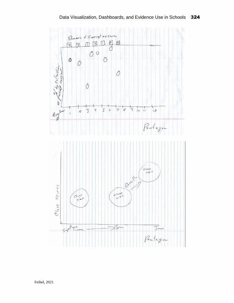
Data Visualization, Dashboards, and Evidence Use in Schools 324
Feihel, 2021

Data Visualization, Dashboards, and Evidence Use in Schools 325
Feihel, 2021

Data Visualization, Dashboards, and Evidence Use in Schools 326
Feihel, 2021

Data Visualization, Dashboards, and Evidence Use in Schools 327
Feihel, 2021
The result of the collaboration, “Item Level Performance” (above), has
the capacity to convey an enormous amount of information concisely, without
having to hunt through tables of numbers. It is a single graphic presentation,
in which the reader can quickly see the distribution of results for a given
population. With currently available presentation tools, the population can be
easily modified to meet the reader’s level of interest—student to
superintendent. It meets the goal of quickly identifying patterns that can
provide insight into characteristics, such as particularly difficult questions,
areas of teaching strength or weakness, or even skipped or missing teaching
material. Most importantly, the emphasis placed on representing data
graphically is key to promoting its use, which is the single greatest contributor
to providing feedback for improvement.
Final Comments
All teams need coaches. Coaches provide the feedback that is crucial to not
only improvement, but also the maintenance of procedure. From golf pro to
football coach, the information provided about our performance and

Data Visualization, Dashboards, and Evidence Use in Schools 328
Feihel, 2021
suggestions for improvement is essential to every process in which we
participate. What is more, the more forms of feedback we receive, the more
influence it has on results. Coaches can verbally guide us, but a video of our
performance can have much greater impact. Vendors we deal with today have
implemented rating systems for their products and services to improve
performance in an effort to set themselves apart from their competition; it
appears they work, or they would likely be abandoned very quickly. Many of
us use them religiously to help us choose products on a regular basis. Surveys
are vendor’s coaches and provide the information they need to improve.
Needless to say they would be foolish to ignore them.
Education should be no different. Educators need coaches as well. We
all hope to be the best at what we do and provide the best product in our power.
The key is knowing when we are attaining our goal and making it as easy as
possible to maintain that goal. This is what this Nation Science Foundation
study accomplished. First, it took the crucial steps to collect and organize the
information needed to support its mission. Secondly, it provided an initial
coaching in the form of feedback from its surveys and studies that helped
educators recognize areas in need of improvement and uncovered some
misconceptions. Then, it released its first valuable product in the form of a
workshop, a process that has already been adopted into Nassau BOCES
instruction and development process.
So, what are the valuable features of this product? Two things that are
crucial to success: simplicity and feedback. The need for simplicity was
echoed by every member of our team. Simplicity and packaging of the product
is crucial to its adoption, since our behavior is often based on limited time and
“the path of least resistance.” The meeting procedures coached the
participants about the options available to them for presenting data important
to achieving their goals. It demonstrated the power of graphics in presentation
of data. It enlightened everyone as to the interest of educators in receiving
their information in forms that are easily digestible, and that provide greater
insight into the actual meaning of results. More importantly, it provided
feedback to the information providers. Providers learned what information is
really important to educators to help them do their best. It emphasized the
value of keeping things simple, as well as highly informative. It was not
limiting the amount of data presented, only the clarity of its graphical
presentation. There can be no doubt that this meeting provided valuable
coaching to the information providers that was quickly adopted and is
currently being refined. However, this should not be the end. This should be
a lesson that continues into the future providing instruction to newcomers and
Data Visualization, Dashboards, and Evidence Use in Schools 329
Feihel, 2021
veterans a like. Admittedly, the study’s value and success greatly exceeded
my expectations.
I have to congratulate the team on an outstanding job of communication
and cooperation. I have to say I came away from the experience proud to say
that I contributed to a project that was almost completely outside the realm of
my experience and provided me with a sense of commitment to delivering the
enhancements that came to light in this session.
Thank you, Alex Bowers, for the opportunity. It was truly enlightening.

Data Visualization, Dashboards, and Evidence Use in Schools 330
McPherson, 2021
CHAPTER 22
Say Farewell to Dusty Data!
Josh McPherson
Principal WS Boardman Elementary School
Oceanside School District
Introduction1
As a proponent and practitioner of effective data usage in the field of educa-
tion, I have strived throughout my career to help my colleagues harness the
potential of meaningful student assessment data. I’ve devoted countless hours
to taking raw data, often in the form of monochromatic Excel spreadsheets,
and transforming them into user-friendly visualizations that help the data
come to life. This has been my self-assigned charge since I was a classroom
teacher, back when I also wore the hat of a school data specialist. Now, as an
administrator, I’ve continued to help my colleagues access and understand
data in a way that promotes collaboration and progressive change. My cre-
dentials in this field consist of a handful of graduate level courses related to
the subject and the opportunity to work with several skilled Excel wizards
early in my teaching career. Beyond those experiences, my expanding
knowledge base has been driven by the guiding belief that success in any field
cannot be met without an understanding of key data. And yet, although I am
a cheerleader, practitioner and believer in the field of educational data science,
I resolutely identify as a novice and a perpetual learner. This self-categoriza-
tion was pleasantly reinforced recently when I was given the opportunity to
Data Visualization, Dashboards, and Evidence Use in Schools
2021, Authors. Creative Commons License CC BY NC ND

Data Visualization, Dashboards, and Evidence Use in Schools 331
McPherson, 2021
attend the NSF Education Data Analytics Collaborative Workshop in Decem-
ber of 2019. As I write this chapter six month later, the multitude of ideas,
wonderings and questions sparked by that workshop continue to maintain
their original vibrance and relevance. Most of us are familiar with the old
adage, “You don’t know what you don’t know.” Having this opportunity to
pull back the curtain surrounding the arguably nascent field of educational
data science, I now have a much better understanding of what I don’t know.
This unique opportunity provided an unprecedented context in which to share
ideas and learn from a diverse collection of data practitioners, including other
educators and data scientists. This confluence of stakeholders was no doubt
a rare occurrence. Prior to participating in this two-day think tank, I had al-
ready embraced the belief that data visualizations hold untapped potential for
teacher efficacy, efficiency and effectiveness in the classroom. However, this
event broadened my understanding of what meaningful visualizations in the
world of education could look like, and subsequently, their potential impact
on student achievement. I commend Dr. Bowers and his team for organizing
and executing such a memorable event. The format and focus of this event
signified a critical ingredient to the successful understanding and application
of data in the field of education. That ingredient is collaboration.
The Parlance of Our Times
As I write this paper, I realize the importance of establishing a glossary that
provides further clarity and nuance regarding seemingly generic terms. I hope
that by taking the time up front to elaborate on each of these terms, I am able
to establish a common vernacular between myself and you, the reader.
The Workshop - the NSF Education two-day workshop that took place on
December 5-6, 2019 at Columbia University’s Teachers College. It is im-
portant to note that even though the term “the workshop” connotes a brief
interactive professional experience, this two-day metacognitive expedition
into the current theories, practices and innovations in the field of educational
data science was no perfunctory exercise. Rather, it was the kind of experi-
ence that left me cognitively exhausted, and at the same time, professionally
inspired to steward change in my school, district and beyond. There were
approximately 70 participants in the workshop. The list of participants in-
cluded, but was not limited to, teachers, instructional coaches, principals, su-
perintendents and data scientists.

Data Visualization, Dashboards, and Evidence Use in Schools 332
McPherson, 2021
The Space - As an educator, I never underestimate the importance of physical
space. The way a classroom is organized plays a critical role in student en-
gagement, productivity and class climate. The workshop took place in the
Smith Learning Theater at Teachers College. This space was quite unique.
Whiteboards, SmartBoards, interactive televisions, wireless microphones,
sticky notes, open-concept seating, beacons that projected real-time location
mapping; these became much more than the sum of their parts over the course
of the workshop. They became tools to foster creativity, collaboration, in-
quisitiveness and more. Ideas were immediately transported out of the ether,
into reality. Data and feedback were generated fluidly, unfettered by typical
constraints. This was my first introduction to the Smith Learning Theater. As
a Teachers College alumnus, I was quite perplexed when I stepped off the
elevator on the top floor of the library and was confronted by such an awe-
inspiring space, the existence of which was previously unknown to me. I was
only slightly crestfallen when I learned that it was created several years after
my matriculation. At the same time, I was slightly relieved that its existence
had not been an oblivious oversight on my part.
Team Square - At the beginning of the workshop, participants were assigned
to specific “datasprint” teams, each represented by a randomly chosen shape.
Our team’s logo was the square, undoubtedly a coveted identifier in a room
of data practitioners. In the true spirit of the workshop, the composition of
each group was not determined at random. Rather, pre-event survey results
were used to group individuals based on their interests. Based on our team’s
shared vision and general productivity, it is safe to say that a great deal of data
mining went into the creation of these groups. The data worked. Each team
included one data scientist, tasked with helping to bring ideas to life through
the magic of R-coding.
Team Projects - All groups were asked to create a visualization to represent
a given data set. This data set was anonymized NYS assessment results. The
collection of projects created during this workshop was vast. Some groups
honed in on dashboards aimed toward helping district-level administrators
support schools. Still, others developed visualizations that reimagined stand-
ard item analysis reports. These projects were as varied as the diverse cross-
section of individuals attending the workshop.
The Given Assessment/Data Set - As stated, during the NSF workshop, our
data set was anonymized NYS assessment results. This data was compiled by
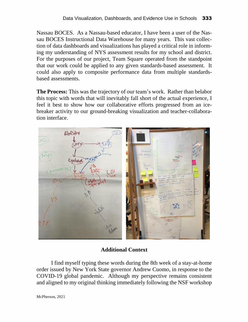
Data Visualization, Dashboards, and Evidence Use in Schools 333
McPherson, 2021
Nassau BOCES. As a Nassau-based educator, I have been a user of the Nas-
sau BOCES Instructional Data Warehouse for many years. This vast collec-
tion of data dashboards and visualizations has played a critical role in inform-
ing my understanding of NYS assessment results for my school and district.
For the purposes of our project, Team Square operated from the standpoint
that our work could be applied to any given standards-based assessment. It
could also apply to composite performance data from multiple standards-
based assessments.
The Process: This was the trajectory of our team’s work. Rather than belabor
this topic with words that will inevitably fall short of the actual experience, I
feel it best to show how our collaborative efforts progressed from an ice-
breaker activity to our ground-breaking visualization and teacher-collabora-
tion interface.
Additional Context
I find myself typing these words during the 8th week of a stay-at-home
order issued by New York State governor Andrew Cuomo, in response to the
COVID-19 global pandemic. Although my perspective remains consistent
and aligned to my original thinking immediately following the NSF workshop

Data Visualization, Dashboards, and Evidence Use in Schools 334
McPherson, 2021
in December, it has been further sharpened by the current unpredictable land-
scape of education. This bears no tangible weight on the content of my words,
but rather the tone of voice they emulate. Currently, education in my state
and many others, has shifted entirely to an online interface. The remaining
weeks of the school year will conclude in the same fashion. It is hard to pre-
dict what September will look like. Effective use of data is arguably more
important than ever. Time is limited for students and their families as they
work to complete assignments at home. When we return to the classroom,
time will continue to be a limited resource as we strive to reduce the gaps in
education that have occurred due to the challenges and limitations of at-home
instruction.
Team Square: Part 1
The work of my group, Team Square, centered around the notion of collabo-
ration. In my professional practice, I’ve strived to establish systems and
norms to bring data out of the shadows of solitary classrooms, where they
often reside. In each school I’ve worked in, there have been different chal-
lenges that have impacted the pace of progress towards the optimization of
these systems and norms. Regardless of challenges that have inevitably arisen
when promoting the sharing of data amongst colleagues, I’ve always viewed
this plight as a prerequisite for success. Without question, I brought this per-
spective to the table from the first moment our team sat down to share ideas
and brainstorm a direction for our culminating project. I was pleasantly sur-
prised to see that my new teammates immediately shared this outlook, despite
our varied backgrounds and professional roles. Our team was comprised of
teachers from varied grade levels, a data scientist and myself, an administra-
tor. Despite our diverse backgrounds and educational experiences, our con-
versation quickly centered around the value of connecting educators, as a
means to transform data into action.
Our collective experiences guided our conversation toward a phenom-
enon we had all seen play out all too often. This phenomenon was one in
which the elaborate spreadsheets, graphs, charts and tables summarizing stu-
dent assessment data were relegated to dusty binders and equally dusty desk-
top folders, rarely seeing the light-of-day. The prevalence of this phenomenon
varied amongst classrooms, schools and districts. In some settings, where
data-based decision-making was valued, this dusty data phenomenon was the
exception. However, in too many educational settings, it was the norm. The
Data Visualization, Dashboards, and Evidence Use in Schools 335
McPherson, 2021
question of why this phenomenon exists in so many schools became an essen-
tial beacon that guided our work. One theory was that time is a limited com-
modity for all educators. If data are not represented in a user-friendly format,
they are swiftly shuttled to the aforementioned dusty realms. Another theory
to explain unused data, arguably a precursor to all others, is a lack of confi-
dence in the initial data source. This could be a result of many different fac-
tors, including but not limited to obsolete data or inaccurate testing measures
and more. Adaptive testing is one method for counteracting this type of dis-
trust for data. Anchoring assessments in standards and including qualified
educators in the assessment development process are also effectives ways to
instill trust in data. Even though all assessments are not created equal, for the
purposes of our endeavor, Team Square consciously embraced the assumption
that the data sources for our project were relevant and valid. This is some-
times necessary for academic endeavors that aim to pinpoint specific varia-
bles.
In alignment with the focus of the two-day workshop, we thoroughly
discussed the types of visualizations we were most familiar with and their
accompanying shortcomings. As a data practitioner, conditional formatting
in Excel and Google Sheets, along with various basic statistical functions,
have been my primary means of representing data for myself and my col-
leagues. It was at this time that our team’s data scientist’s contributions be-
came invaluable. He quickly educated the rest of the team about the appar-
ently limitless compendium of data visualizations. Our team ultimately de-
cided that a tree map would be a simple visualization that could be used to
represent state assessment data. The space allocated to each section of a tree
map corresponds to its relative value. Below is our visualization.

Data Visualization, Dashboards, and Evidence Use in Schools 336
McPherson, 2021
Included in each rectangle is a learning standard and the number of pos-
sible teacher connections. These standards represent the weakest areas of per-
formance for a teacher on a given assessment. It is important to note that the
ideal, real-world version of this tool would not only compile the weakest
standards. It would allow an educator to also toggle to view the highest per-
forming standards. In this way, the tree map becomes an “at-a-glance” teacher
profile. An essential disclaimer to mention is that no solitary assessment can
or should be used to determine teacher effectiveness. It is also important to
note that this particular tool was designed for teachers, not administrators.
However, it could be easily scaled up to present building and district-level
data for administrators.
Team Square: Part 2
The first goal of our tree map was to streamline the data analysis process. We
aimed to provide teachers with a clear representation of the most relevant data
points for the given assessment. This spacial representation can quickly be
analyzed to identify essential information. In the example above, math stand-
ards 4.NF.C.6 and 5.MD.C.5b would be the lowest-performing standards for

Data Visualization, Dashboards, and Evidence Use in Schools 337
McPherson, 2021
this class. An exploration into the source of this deficiency could reveal some
innocuous rationale that requires no further investigation. For example, these
standards could be two that are scheduled to be taught during the 6 weeks
remaining in the school year, after the administration of this, the given exam.
However, if in fact these standards were taught with the goal of mastery, time
must be devoted to further understanding this deficiency. This at-a-glance
visual representation of standards-based performance becomes a springboard
for next steps. For our team, the most logical next step was collaboration.
Without it, the potential for this data to remain inert and unused is too great.
There is no doubt that some educators could take this dashboard and make
meaningful revisions to daily instruction, without being given the chance to
collaborate with others. However, most teachers would benefit from the op-
portunity to tap into the broader pedagogical knowledge base when develop-
ing action plans to improve student performance in these target standards. The
next stage of our project speaks to the benefits of collaboration and collegial
inquiry when turning this data into action.
Team Square: Part 3

Data Visualization, Dashboards, and Evidence Use in Schools 338
McPherson, 2021
Above is the second stage of our visualization. Although it is a shell, absent
of code and authentic user data, we feel is still conveys a clear vision. In
practice, once a teacher identifies a target standard in their personalized tree
map, they would be transported to this screen. This is a connection dashboard.
The circles at the top represent teachers who have demonstrated proficiency
in teaching the selected standard. These featured educators would have pre-
viously opted into this data sharing system. With a click, the user would have
access to mentors beyond their school and district. Teachers would not be
limited to learning just from the colleague teaching in the classroom next door.
Once the user selects a potential mentor, that individual’s profile would pop-
ulate the bottom half of the screen. This profile includes a longitudinal sum-
mary of that potential mentor/collaborator’s performance over multiple years.
Class demographics, along with a compatibility rating, would also optimize
the matching process. In addition, contact information would be readily avail-
able. This dashboard would aim to combat the “accident of geography” and
connect teachers throughout a region, state, country and beyond. Of course,
norms and protocols would have to be developed to ensure that participants
on both ends of this interface understand how best to maximize the potential
for a successful outcome. This project represents the precipice of meaningful
professional discourse that is unbound by the limitations of physical space.
Once again, as I write this in the current educational, health and political con-
texts, I realize the indelible relevance and need for such a tool.
When creating this hypothetical tool, we thoroughly discussed many of
the logistical challenges that would come about when launching such a lofty
dashboard. However, at its core, it speaks to the value of using data to connect
educators. It represents an archetypal climate in which teachers feel comfort-
able reaching out to colleagues to ask questions, share best practices and
acknowledge what they don’t know.
Project Summary
At the core of our project is our collective effort to combat some of the afore-
mentioned challenges that impact data usage in schools. Dusty data does not
have to be the norm. To accomplish such a shift, we aimed to first represent
data in a user-friendly format that promoted teacher efficacy while removing
initial barriers to the data analysis process. In my experience, teacher buy-in
relies on a delicate balance. At one end of the spectrum is simply telling
teachers the conclusions that have been drawn about their student assessment
data. In this scenario, an administrator, coach or teacher leader would have

Data Visualization, Dashboards, and Evidence Use in Schools 339
McPherson, 2021
previously done the heavy lifting needed to analyze the data. This approach
places teachers in the passenger seat. Although this may seem enticing to
some educators, a top down-approach can drastically affect teacher efficacy.
By being passive participants in the data analysis process, teachers would miss
the opportunity to internalize the skills needed to manage data and truly un-
derstand the needs of their students. When this task is outsourced, it no longer
becomes a teacher’s responsibility. Relinquishing this key stage of the data
analysis process can have detrimental effects on all other stages, including the
development and implementation of action plans. At the other end of the
spectrum is burdening teachers with raw data that requires them to spend
hours and hours just trying to transform it into a usable format. It takes years
to develop the skills needed to manipulate data in this raw format. We must
find a balance in between these two extremes to truly impact teacher efficacy
in the field of data usage. Keeping this in mind, our team selected a visuali-
zation that simplifies the space between viewing and understanding data. It
is important that this space exist to empower teachers to own their data. How-
ever, we shouldn’t try eliminate this space entirely in an effort to help teach-
ers. The correct balance for any teacher or teacher team will vary. Selecting
the best visualization to represent the given data is a critical way to empower
teachers. Once data is represented in a way that can spark discourse and in-
quiry, collaboration ensures that the best possible theories and action plans
can be developed to promote student achievement. For teachers who are not
fortunate enough to be part of strong professional learning communities, our
project could be used to drastically expand their professional sphere to include
colleagues from distant locales. It could also be used to help existing profes-
sional learning communities evolve in their practices surrounding data usage.
A multitude of arguments can be made regarding challenges that may
arise if a project like ours actually came to fruition in the real world. Regard-
less of these potential hurdles, our work as a team and our broader participa-
tion in the workshop is living proof of the type of ideas and solutions that can
arise when time and space are provided for professionals in the field of edu-
cation to collaborate.
Data in the Days of Covid-19
My current reality consists of students learning solely at home. In my district,
our teachers use Google Classroom to organize instructional materials and
communicate with students. Google Meet sessions simulate in-person class
discussions. Although this format presents a slew of logistical challenges,

Data Visualization, Dashboards, and Evidence Use in Schools 340
McPherson, 2021
teachers have accelerated their own learning in the field of online instruction.
They continue to deliver targeted lessons and provide an invaluable forum for
students to connect with our school community. In this new and likely tem-
porary paradigm, data matters. For online instruction to be relevant and en-
gaging to students, it must be informed by standards, students’ academic
needs and their interests. Otherwise, we run the risk of stunting students’ ac-
ademic, social and emotional growth. Our current instructional format will
no doubt give way to some iteration that more clearly mimics our traditional
system for education. I cannot predict exactly what that will look like or when
it will manifest, especially since education policy makers and elected officials
express their own uncertainty on this subject. Some proposed models include
a hybrid approach that consists of learning at home for some and traditional,
in-person learning for others. Truncated school days have also come up as a
possibility. Variance in instructional formats may even exist in the the same
school or district, depending on how public safety protocols unfold through-
out the next year. Whether the current learning at home model endures or
evolves into something else, teachers must use data more effectively than ever
before. The opportunity gaps that existed for some of our learners prior to this
crisis will widen during this period of learning at home. Socioeconomic dis-
parities, along with the new demands on families struggling to make a living
while still supporting students at home will create new challenges that can
only be solved by intentional instructional decisions that are informed by data.
This has always been the case. However, in our current context, our accepta-
ble margin for error has been reduced drastically. Objective data and collabo-
ration are prerequisites for success.
Josh McPherson is currently the principal of WS Boardman Elementary
School in Oceanside, NY.

Data Visualization, Dashboards, and Evidence Use in Schools 341
Duffy & Mignella, 2021
CHAPTER 23
Linking Data to Empower Meaningful Action
Leslie Duffy
Coordinator of Computer Services Baldwin Union Free School District
Anthony Mignella
Assistant Superintendent of Instruction Baldwin Union Free School District
1
The cost of dropping out of high school continues to be a concern for school
districts across the nation. As we know, adults who dropped out are more
likely to be unemployed, have poor health, live in poverty, and be on public
assistance. This strain affects their health and social relations, leading to lower
life expectancies and higher family dissolution rates, as well as incarceration
rates many times higher than those of graduates. In contrast, high school
graduates earn 50 to 100 percent more in lifetime income, providing
additional revenues to communities and government. Why is this still the case
when across school districts in the US and globally, schools are inundated
with increasing amounts of data (Bowers, Shoho, & Barnett, 2014; Halverson,
2014; Mandinach, Friedman, & Gummer, 2015; Wayman, Shaw, & Cho,
2017).
This chapter will explore how a school district can use data to empower
meaningful actions and increase the graduation rates of all students.
Data Visualization, Dashboards, and Evidence Use in Schools
2021, Authors. Creative Commons License CC BY NC ND

Data Visualization, Dashboards, and Evidence Use in Schools 342
Duffy & Mignella, 2021
Demographics
Baldwin USFD is a community which celebrates its diversity! According to
suburbanstats.org, 48% of community is Caucasian, 34% is Black or African
American, 20% is Hispanic or Latino, 4% are Asian, 3% are two or more
races, and 8% are some other race other than those previously listed. As you
can see from the diagram 1 below, Baldwin High School is a majority minority
school comprised of 50% African American students, 27% Hispanic students,
17% Caucasian students, 4% Asian students, 3% two or more races. Over the
past 5 years, we have seen a growth in Hispanic students and an increase in
economically disadvantaged students.
Figure 23.1: Demographics
Methods
To ensure success of all subgroups, we actively monitor trends in student
enrollment, demographics, and numerous indicators such as academic trends,
attendance trends, and discipline trends by subgroup.
Data Visualization, Dashboards, and Evidence Use in Schools 343
Duffy & Mignella, 2021
The continual process of running, exporting and analyzing reports from
several different data sources is both time and labor intensive and often
completed in isolation and primarily for State Reporting purposes (ESSA) by
the person responsible for state reporting. The leadership team at Baldwin
UFSD has recognized that in order to ensure equity, success, and
inclusiveness for all student subgroups, critical and current data needs to be
brought together and reviewed regularly by building and district stakeholders.
Data is actionable when it is current, insightful, visual and easy to access by
the end user.
Thus, the district has made a commitment to maximize the data
reporting tools of our SIS and explore the use of innovative data analytics and
data visualization applications.
In addition, we have strategically built time into staff members schedule
to regularly review the data and use it to inform and empower decision
making.
As noted in the EDLA Summit Report 2018 Report (Bowers, Bang,
Pan, & Graves, 2019), through these evidence- based improvement cycles,
teachers and leaders can work together to build capacity throughout their
organization to leverage these new types of data and analytics as a means to
build collaboration, trust, and capacity to improve instruction for each student,
and across the organization. This is the methodology used by the Baldwin
UFSD leadership team and has helped Baldwin High School to be named as
a Recognition School by New York State in 2018-2019 and in 2019-2020
under ESSA accountability measures.
Several years ago, the district activated the Performance Map module
offered in our Student Information System (SIS). A performance map
provides a HS Guidance counselor with a visual on students’ course, credit
and assessment progress towards graduation. Before turning on the
Performance Maps, all courses in the SIS had to be verified against the current
and historical high school course catalogs. Additionally, in order for the
performance map module to work, all courses needed to be aligned to the
appropriate subject, department and correct state course code. Implementing
Performance Maps right through the SIS, was a low-cost way to empower
counselors with current and important student information through a easy to
use data visualization (Figure 23.2). Counselors now rely on various
Performance Maps to easily monitor student progress and quickly take action
as necessary. Our work on implementing Performance Maps has been
extremely helpful and has since inspired the creation of an Early Warning
System (EWS). Another live data visualization used to help identify and take

Data Visualization, Dashboards, and Evidence Use in Schools 344
Duffy & Mignella, 2021
action on at-risk students (Figure 23.3). Example of the Performance Map
and EWS are below.
Figure 23.2: Performance Map
Figure 23.3: EWS in SIS
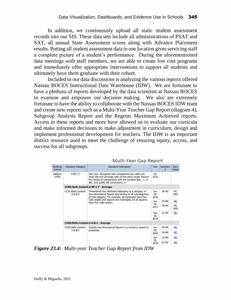
Data Visualization, Dashboards, and Evidence Use in Schools 345
Duffy & Mignella, 2021
In addition, we continuously upload all static student assessment
records into our SIS. These data sets include all administrations of PSAT and
SAT, all annual State Assessment scores along with Advance Placement
results. Putting all student assessment data in one location gives servicing staff
a complete picture of a student’s performance. During the aforementioned
data meetings with staff members, we are able to create low cost programs
and immediately offer appropriate interventions to support all students and
ultimately have them graduate with their cohort.
Included in our data discussions is analyzing the various reports offered
Nassau BOCES Instructional Data Warehouse (IDW). We are fortunate to
have a plethora of reports developed by the data scientists at Nassau BOCES
to examine and empower our decision making. We also are extremely
fortunate to have the ability to collaborate with the Nassau BOCES IDW team
and create new reports such as a Multi-Year Teacher Gap Report (diagram 4),
Subgroup Analysis Report and the Regents Maximum Achieved reports.
Access to these reports and more have allowed us to evaluate our curricula
and make informed decisions to make adjustment in curriculum, design and
implement professional development for teachers. The IDW is an important
district resource used to meet the challenge of ensuring equity, access, and
success for all subgroups.
Figure 23.4: Multi-year Teacher Gap Report from IDW
Data Visualization, Dashboards, and Evidence Use in Schools 346
Duffy & Mignella, 2021
Data discussions have become part of the culture in Baldwin UFSD.
Each building/department has established embedded time to review data
during their meetings to make informed decisions to better support students.
The school year started with building administration presenting their
building goals to the Superintendent and each goal is justified with data
(S.M.A.R.T Goals). The building administration also present the goals to
their faculties. Each department established their departmental specific goals
which supports the building goals. The teachers also reflect and craft their
own goals which are aligned and support the department goals as well as their
own areas desired or needed growth. The goals are revisited throughout the
school year during reflection meetings and data is used during these
conversations to make informed decisions/adjustments so as a district, we
meet our goals.
Another example of the data discussions in our schools can be seen in
the secondary level. In the secondary schools, teachers are asked to keep their
gradebooks updated weekly and provide either a progress report or report card
every five weeks. The administration, counselors and teachers review the
academic performance reports from the gradebook and Projected Final
Average (PFAs) calculations every five weeks. Intervention plans are then
put into place for students with a failing PFA and student progress is
monitored closely.
At the elementary level, grade level teams and RtI teams meet weekly
with the building administrator to review progress of each student. At these
meeting, the teachers and administrator review multiple data points to
determine the progress of each student, select the relevant research-based
intervention, plan and implement the intervention plans and then monitor
examine intervention is working.
These are just some examples of how we have strategically created a
continuous cycle of improvement with various stake holders and used data to
inform meaningful actions
Results
The results of using the methodology mentioned above and triangulation of
Leadership, Data Scientists, and key staff (ie: teachers, counselors) is
impressive. Figure 23.5 shows the 4 Year Graduation Outcomes as of August
2019 for Baldwin SHS in comparison to Nassau County, Suffolk County, New
York City, and New York State.

Data Visualization, Dashboards, and Evidence Use in Schools 347
Duffy & Mignella, 2021
Figure 23. 5: 4 Year Outcomes as of August 2019
In addition, we are proud to note the following:
• 6% increase in 4-year graduation rate outcomes as of August 2015-
2019 (7% increase in 4-year graduation rate outcomes as of June 2015-
2019) despite a growing economically disadvantaged population.
• No achievement gap between subgroups
• Baldwin High School was named as a Recognition School by New
York State in 2018-2019 and in 2019-2020 under ESSA accountability
measures.
Lessons Learned:
While participating at the NSF Collaborative, we chose to work on another
way to streamline the movement of key student level data in order to aid in
the success of all students. Under ESSA accountability rules, all districts must
meet assigned standards of student absenteeism. Also, our datasprint team
aligned to the district goal to ensure timely graduation of all students as
students who are chronically absent are at risk of meeting graduation
requirements. The district team collaborated with a data scientist to engineer
an R code scheme to pull student daily attendance from the data set already
Data Visualization, Dashboards, and Evidence Use in Schools 348
Duffy & Mignella, 2021
reported to the state, merge it with local student household information and
produce a letter to parents alerting them with actual student attendance details
and explaining the importance of student attendance. It was hoped that the R
program produced would replace the repetitive district work of periodically
pulling data from two data sources, compiling it to produce a mail merge to
inform parents. The team wanted the program to be something which could
be actually implemented, appreciated and easily run by building principals.
Other lessons learned during Baldwin’s practices and refinements on using
data to make informed, meaningful decisions and actions is it is:
• It is vital to have an engaging, rigorous, relevant and vertically aligned
curriculum that is aligned to state standards. Analyzing the right data
can help ensure that your curriculum is aligned to state standards.
• Moving some high school courses to 8th grade can help propel students
to a successful freshman year of high school.
• Several low-cost interventions such as 9th grade academic teaming,
credit recovery programs, and modifying the master schedule to drive
instructional initiatives can successfully increase graduation rates.
• Schools need to make sure their courses are mapped to the proper
departments in their SIS.
• Job embedded, explicit professional development is important. This
professional development has to cover pedagogy, curriculum
development, and using data to inform decision making (continuous
improvement cycle models)
• Identifying at-risk students early is key to supporting them to graduate
with their cohort.
• Creating a dashboard with visualizations of the reports saves time in
preparing the reports and more time to hold data discussions using the
reports.
Conclusion
When stakeholders (leadership, data scientists, and staff) are brought together
regularly to examine data and develop reports that can be used to inform and
empower meaningful action, students across all subgroups can be successful
and graduate from high school with their cohort thereby reducing the drop-
out rate. This was reinforced during the NSF Collaborative Summit work we
were fortunate to participate in with Dr. Bowers and his team. Baldwin UFSD
looks forward to the continued collaboration with the IDW data scientist team

Data Visualization, Dashboards, and Evidence Use in Schools 349
Duffy & Mignella, 2021
from Nassau BOCES. We are also continually looking to improve our own
data discussion and will utilize lessons learned from the NSF Summit and
continue to focus on improving data visualizations to help improve the quality
of our data discussions and thereby further empowering our actions and
decisions.
We hope that investments in setting up data rules, data flows, data
systems, and a master dashboard will save time in producing the repots so
more time can be spent on holding more data discussions and engaging in
continuous cycle of improvement discussions using the reports and
visualizations. The district seeks to use innovative advanced analytic
technologies to work smarter and more efficiently and continue to propel all
students to success.
References:
Bowers, A. J., Bang, A., Pan, Y., & Graves, K. E. (2019). Education Leadership Data
Analytics (ELDA): A White Paper Report on the 2018 ELDA Summit.
https://doi.org/10.7916/d8-31a0-pt97
Bowers, A. J., Shoho, A. R., & Barnett, B. G. (2014). Considering the Use of Data by
School Leaders for Decision Making. In A. J. Bowers, A. R. Shoho, & B. G. Barnett
(Eds.), Using Data in Schools to Inform Leadership and Decision Making (pp. 1-
16). Charlotte, NC: Information Age Publishing.
Halverson, R. (2014). Data-Driven Leadership for Learning in the Age of Accountability.
In A. J. Bowers, A. R. Shoho, & B. G. Barnett (Eds.), Using Data in Schools to
Inform Leadership and Decision Making (pp. 255-267). Charlotte, NC: Information
Age Publishing.
Mandinach, E. B., Friedman, J. M., & Gummer, E. S. (2015). How Can Schools of
Education Help to Build Educators’ Capacity to Use Data? A Systemic View of the
Issue. Teachers College Record, 117(4), 1-50.
http://www.tcrecord.org/library/abstract.asp?contentid=17850
Wayman, J. C., Shaw, S., & Cho, V. (2017). Longitudinal Effects of Teacher Use of a
Computer Data System on Student Achievement. AERA Open, 3(1).
https://doi.org/10.1177/2332858416685534
Data Visualization, Dashboards, and Evidence Use in Schools 350
Monroe, 2021
CHAPTER 24
The Components of a Successful
Transdisciplinary Workshop: Rapport, Focus, and Impact
Elizabeth C. Monroe
Teachers College, Columbia University
Abstract1
A surfeit of data are collected in the American educational system, but there
is a shortage of educators who know how to analyze the data to convert them
into action. One way to help bridge this gap between researchers and
educators is to host transdisciplinary education workshops, in which
researcher data scientists and educators work together to explore a dataset.
Transdisciplinary group work, however, can be challenging because the group
members bring different perspectives from their different backgrounds. I have
participated as a data scientist at two transdisciplinary conferences and
identified three key components for a successful workshop - rapport, focus,
and impact. Rapport refers to the establishment of mutual understanding and
respect that facilitate open communication between two people. It sets the tone
for the whole workshop. Focus, defined as intense concentration on a single
thing, affords the structure necessary to make progress on a specific problem
in a short time period. Impact, defined as a major effect on something,
involves creating the foundation so your efforts at the workshop will extend
past the workshop itself. The existence of these three key components can
Data Visualization, Dashboards, and Evidence Use in Schools
2021, Authors. Creative Commons License CC BY NC ND

Data Visualization, Dashboards, and Evidence Use in Schools 351
Monroe, 2021
help ensure the productive collaboration of a trandisciplinary workshop
group.
Keywords: trandisciplinary, rapport, focus, impact, workshop
Background
A surfeit of data are collected in the American educational system, but there
is a shortage of educators who know how to convert these data into action
(Bowers et al., 2019). Currently, education researchers analyze data, and
administrators use data to demonstrate compliance, but the researchers and
administrators have yet to come together to regularly use data to inspire
innovative action that could improve and revolutionize educational practices
(Boser & McDaniels, 2018). Developing a capacity for applied data analytics
in educators and researchers, and communication on the topic between the
two groups, could be greatly beneficial (Bowers et al., 2019). Researchers’
work could be more impactful if they knew educators’ questions and
educators could take more meaningful action if they knew of applicable
researchers’ work (Bowers et al., 2019).
Leaders in the field of education research believe that regularly hosting
transdisciplinary education workshops could help educators and researchers
meet at the intersections of their respective fields (Bowers et al., 2019; Gray,
2008). In these workshops, educators are grouped with experts in data science
research and together they discuss challenges in education and analyze
education data to come up with solutions (Boser & McDaniels, 2018; Bowers
et al., 2019). These workshops can be quite impactful, as noted by a
participant from a workshop recently held in New York, who said, “Our 2-
day session served as evidence that the challenges can be met when
practitioners meet with data scientists and researchers to share what is needed
in the field” (NSF Education Data Analytics Collaborative Workshop, 2019).
However, although often leading to novel discoveries that improve practice,
these workshops can be very costly, making it important to ensure a successful
workshop.
Analysis
Transdisciplinary Group Work
I have participated as a data scientist at two transdisciplinary workshops. My
first workshop was outside of San Francisco, California. For two days, I

Data Visualization, Dashboards, and Evidence Use in Schools 352
Monroe, 2021
worked with other data scientists and several educators from a California
charter school system to analyze the clickstream data of students completing
online coursework. My second workshop was in New York City, New York;
myself and other data scientists worked for two days with educators from a
Long Island school district to inspect students’ standardized test scores and
attendance data. For both workshops, the first day focused on icebreakers and
ideation. The icebreakers helped group members, a diverse mix of educators
and data scientists, get to know a little about each other, and the ideation
prompted group members to select an idea they wanted to explore in the data.
The second day at both workshops focused on coding to actively explore the
data and to produce findings that the educators could use to take action.
The ultimate goal of both workshops was to maximize the two days of
collaborative work to provide the educators with information they could use
to improve their practice, and ideally, to generate momentum for a larger
project the educators could undertake based on their workshop experience. To
develop meaningful work with a group in two days is challenging. The type
of transdisciplinary research being conducted at these workshops is especially
challenging because misunderstandings and disagreements are more likely to
happen in transdisciplinary groups (Gray, 2008). Members of
transdisciplinary groups come from different backgrounds with different
perspectives, which can lead to dissonance, but it is important for such
dissonance to not dominate or impede the ability of the group to accomplish
its goals.
Satisfaction with group members’ interaction generally leads to a more
impactful outcome. An analysis of 67 post-workshop survey responses (NSF
Education Data Analytics Collaborative Workshop, 2019) revealed a
significant correlation (r(65) = 0.33, p = .006) between how satisfied
participants were with how their group worked together and whether the
participants had at least one take-way from the workshop that they would use
in their practice (see Appendix A for the variables’ descriptive statistics). This
correlation is not only statistically significant, but can also be interpreted as a
moderate effect size (Cohen, 1988), suggesting that harmonious group work
is important for a workshop to be impactful, and therefore, successful.
Harmonious collaboration and meaningful work are possible for a
transdisciplinary group that is committed to having rapport, focus, and impact.
Rapport is imperative for the group members to effectively collaborate. Focus
is key for not over committing, and impact is required for having the
workshop’s results extend past the workshop itself.

Data Visualization, Dashboards, and Evidence Use in Schools 353
Monroe, 2021
Rapport
Rapport refers to the establishment of mutual understanding and respect that
facilitates open communication between two people (rapport, 2020). It sets
the tone for the entirety of the workshop; for example, one workshop
participant stated that, “We grew in our relationship with one another which
[was] critical to establishing a trusting environment to support data use” (NSF
Education Data Analytics Collaborative Workshop, 2019). Rapport is
especially important for collaboration among people from different
disciplines because such people view problems differently and come with
different pre-conceived notions (Gray, 2008). Therefore, to successfully
address a problem together, they must be open to listening to each other and
learning from each other (Lydon & King, 2009; Wilson & Ryan, 2013).
The development of rapport can be characterized by four dimensions.
First, the data scientists and educators need to enter with a positive disposition
and belief in the value of the workshop (Buskist & Saville, 2001). Second,
they must respect each other as experts in their fields (Buskist & Saville,
2001). Third, they must be committed to ensuring a smooth, collaborative
working relationship for the duration of the workshop (Buskist & Saville,
2001; Patton et al., 2015). Fourth, they need to acknowledge each other’s roles
in the group – educators should lead the generation of research questions and
the explanation of findings, and data scientists should lead the execution and
interpretation of analyses and visualizations used to generate insights (Buskist
& Saville, 2001; Gray, 2008). You must plant these seeds of rapport before
group members can begin engaging in research together, and you can use the
following three methods to help facilitate the development of rapport among
group members.
First, school districts should be thoughtful about who they send to
workshops and the workshop host should be careful to invite data scientists
who can easily collaborate with people from other fields. Specifically,
organizers of these workshops should look to have attendees who are open to
different perspectives, strong verbal communicators, and upbeat. Openness to
different perspectives is important for facilitating group work (Gray, 2008).
My diverse background, spanning archaeology, education, and data science,
has helped me understand the perspectives of group members from different
fields at these workshops. Strong verbal communication is important for
sharing ideas across disciplines (Gray, 2008). I make sure to understand my
group members’ thoughts by asking questions, rather than filling the gaps in
my understanding with assumptions, which can lead to disagreements.
Positivity is important for quickly garnering rapport because smiling helps
others feel comfortable around you and positivity motivates group members

Data Visualization, Dashboards, and Evidence Use in Schools 354
Monroe, 2021
to engage in the workshop (Buskist & Saville, 2001; Tickle-Degnen &
Rosenthal, 1990). Whenever I introduce myself at these workshops, I always
make sure to give a big smile, a strong hand-shake, and to express my
excitement for the work on which we are about to embark.
Second, workshop organizers should group together attendees with
similar perspectives. Even though attendees come from different fields, they
may still share similar perspectives about the larger topic of education data
science. This similarity should be used to inform groupings because people
are more likely to like those who they perceive to be similar to them (Morry,
2007). For example, mimicry, producing similarity in behavior, facilitates the
development of rapport because the two people involved will sense the
similarity in behavior, making them feel more comfortable with each other
(Duffy & Chartrand, 2015). The host at my most recent workshop ran a topic
model on the pre-workshop survey text responses and used the similarity in
topics to group attendees, ensuring some level of similarity among group
members.
Third, opening the workshop with icebreakers can efficiently help
group members get to know each other. Organized activities, like icebreakers,
are most effective in this type of setting because they provide attendees with
a time-bounded structure around which to center their personal introductions.
Icebreakers may feel awkward, or be difficult for some group members, but it
is worth encouraging all group members to participate because they can be a
bonding experience. An icebreaker presents each group member with the
opportunity to introduce themself, guarding against the establishment of
power differentials (Gray, 2008) and giving the group members a shared
experience in which to anchor the start of the development of their rapport.
The host at my most recent workshop had each of us draw a map on the board
showing how we ended up at that workshop in three stops. Others then drew
a line through shared stops, when they told their path to the workshop. I
recommend this icebreaker in particular because it not only encouraged group
members to share their backgrounds, but also encouraged shared experiences
to be identified, both of which help breed a sense of familiarity among group
members (Guéguen & Martin, 2009; Sprecher et al., 2012).
Focus
Focus, referring to concentrated effort (focus, 2020), is the next important
component for a successful workshop. Once the seeds of rapport have
germinated, group members can comfortably discuss their questions of the
workshop data and decide what they want to spend the rest of the workshop
exploring (Patton et al., 2015). A participant at a recent workshop provided

Data Visualization, Dashboards, and Evidence Use in Schools 355
Monroe, 2021
evidence of the growth of focus from established rapport when they explained,
“The collaboration with our assigned team members was an incredible
experience. We were able to really hash out some different ideas to eventually
find a best path to present to our Data Scientists to explore/create” (NSF
Education Data Analytics Collaborative Workshop, 2019). As stated by this
participant, the collaboration/rapport enabled the group members to focus,
“to…hash out…ideas to…find a best path.” These workshops only last a
limited amount of time, and this temporal constraint requires attendees to hone
in on a small, well-defined task that is within their skill sets, to make sure the
workshop time is used most effectively (Gray, 2008).
The task chosen to be focused on must be small and well-defined
because the human brain cannot multi-task – it cannot tackle a problem from
different angles at once. A poorly defined task leads to confusion, with group
members trying to address the problem from different angles, with no clear
direction, ultimately achieving nothing (Nakamura & Csikszentmihalyi,
2014; Rosen, 2008). Clearly defined parameters allow group members to
know the starting point for the task and the desired end point for the task. This
elucidated linearity gives group members a clear path to follow. It also allows
them to track their progress, which gives them immediate feedback that in
turn motivates them to continue to forge ahead with their work (Eisenberger
et al., 2005; Nakamura & Csikszentmihalyi, 2014).
Additionally, the task must be within the group members’ preexisting
skill sets. Having the agreed-upon task be within group members’ skill sets
makes sure that the process to reach the end point is well understood and
means the group members can reasonably estimate how long the task will
take. Knowing how long the task will take is important for knowing that the
task can be accomplished within the workshop time period, and thus, avoiding
demotivation by committing to too large a task (Eisenberger et al., 2005;
Nakamura & Csikszentmihalyi, 2014).
Focus affords the necessary structure for making progress on a specific
problem in a short time period, but it is not necessarily easy to accomplish.
The datasets provided at these workshops can be rife with information and
lead to a seemingly infinite number of questions. From my workshop
experiences, however, I have identified a few practices that can help achieve
the necessary level of focus for a successful workshop.
First, in advance of the workshop, make workshop attendees aware of
the data with which they will be working. Specifically list each variable and
its description and encourage attendees to begin thinking about what they
would like to learn or generate from these data a few days prior to the
workshop. Before entering either of my previous workshops, I was sent not

Data Visualization, Dashboards, and Evidence Use in Schools 356
Monroe, 2021
only the datasets in advance, but also documentation describing those
datasets, so I could enter the workshop prepared with a comprehensive
understanding of the data and what questions educators may have of the data.
Second, both data scientists and educators should, in advance of the
workshop, gather information to help them at the workshop. Data scientists
should gather code for a small group of analyses and visualizations that can
be reliably completed within a short period of time. These
analyses/visualizations should have a short run time, require limited data
preparation, and be easy to explain to a non-technical audience. The need for
ease of explanation is especially important because educators should be able
to readily interpret the analytical output. Educators should reflect on their
practices and noticings in the field of education and select those thoughts that
are most salient to the workshop dataset (Darling-Hammond & McLaughlin,
2011; Patton et al., 2015; Stoll et al., 2012). They should then write down their
selected ideas, or questions about problems they experience, and be prepared
to share them with their group members. At the workshops I have attended,
the groups with educators who came prepared with thoughts on their practice
seemed to be the best at identifying a focused issue to address. Also, prior to
attending workshops, I collect the code for a couple of visualizations and
descriptive statistics that could be meaningfully applied to a variety of
datasets. I primarily focus on descriptive data exploration because descriptive
methods often run more quickly and are usually easier to explain, while
yielding meaningful output.
Third, all the group members should understand and support the goal
of the selected task. A well-articulated goal is important for making sure that
all group members know what they are working toward, and buy-in is
important for feeling motivated to work towards that goal (Buskist & Saville,
2001; Rosen, 2008). At the most recent conference I attended, we addressed
a well-known problem in the education field and clearly articulated a single
piece of it to tackle at the conference. All group members agreed that
absenteeism was a serious problem and that writing letters notifying family
members of truancy was necessary, but time-consuming. Therefore, we
agreed that writing code to automatically customize letters based on students’
attendance data would help the educators send letters home regarding
absenteeism and give them back time which they could then use to develop
other methods for tackling truancy.
Impact
Impact, referring to a major effect on something, is the final component
of a successful workshop, and is the byproduct of the two prior components

Data Visualization, Dashboards, and Evidence Use in Schools 357
Monroe, 2021
(impact, 2020). Rapport allows group members to identify and work on a
focused problem; and a focused problem lays the foundation for impactful
work that can extend past the bounds of the workshop. Work that is the fruit
of rapport and focus, but confined to just the days of the workshop, is
ultimately meaningless - it also must have an impactful outcome, extending
past the workshop, to be meaningful (Patton et al., 2015; Stoll et al., 2012).
To foster impactful work, group members should not try to produce
totally complete work, or even work meaningful in its own right, in the two-
day period, but should build the foundation necessary to spur action that could
lead to profoundly meaningful work outside the bounds of the workshop
(Boser & McDaniels, 2018). For example, one participant said “This
workshop offered potential elixirs for some of these local ‘ailments’ and
certainly generated plenty of food for thought” (NSF Education Data
Analytics Collaborative Workshop, 2019), and another participant said, “I
intend on bringing strategies back for [professional development] with my
teacher teams” (NSF Education Data Analytics Collaborative Workshop,
2019). Such comments reflect the idea that impact includes spurring future
actions. Therefore, impact does not mean a perfectly completed product is
built and ready to go within the two days of the workshop, rather it means that
the work accomplished during the workshop inspires educators to think
differently, or take action, after the workshop (Patton et al., 2015; Stoll et al.,
2012). Impact is hard to achieve within a short time period, but it is vital to
the value of these workshops and is evidence of a successful workshop (Patton
et al., 2015; Stoll et al., 2012). I analyzed the behavior of group members with
impactful work at the conferences I attended and identified a few key
behaviors that made impactful work more attainable.
First, you should link the issue on which your group is focusing to a
real-world outcome (Agasisti & Bowers, 2017; Stoll et al., 2012). Consider
how the work you are doing at the workshop could ultimately change how an
educator thinks or acts at their job after the workshop (Darling-Hammond &
McLaughlin, 2011; Patton et al., 2015). Make sure that the workshop work is
not an isolated creation with no association to the real-world and is just being
completed for the sake of being completed. Educators leaving the workshop
should feel that they have something tangible to use to inform their practice
in the field and that they have information they now want to take back and
share with their colleagues at work. At the most recent workshop I attended,
we knew that truancy was a problem and that sending letters home was a first
step to combating it; therefore, an automatic letter generator would directly
link to this real-world problem and would use data to help address this
problem in a more scalable fashion.

Data Visualization, Dashboards, and Evidence Use in Schools 358
Monroe, 2021
Second, identify the minimum amount of work that you must complete
during the workshop to set the stage for the desired outcome to occur. Put all
your effort into setting up a framework that can be used/built on outside the
confines of the workshop. Time at these workshops is very limited and the
datasets will not necessarily have all the variables needed for a complete
analysis, so you need to make sure that you build a complete foundation for
the educators to use after the workshop (Patton et al., 2015). When creating
the letter generator I knew that we did not have the complete set of variables
needed to fully customize the letters; therefore, I focused my efforts on
building a representative R code function (R Core Team, 2017) that the
educators could take back with them and build on, using all the data they
needed.
Third, the data scientists must teach the educators how to use their code
and interpret its output, and educators must make sure to learn from the data
scientists how to run the code and interpret the output. This exchange of
information is imperative for the educators to continue the work after the
workshop (Darling-Hammond & McLaughlin, 2011). The data scientists must
be careful to include the educators in their analytical work along the way to
make sure that the educators are learning the process and feeling included in
the work (Darling-Hammond & McLaughlin, 2011; Lydon & King, 2009). As
a data scientist at these workshops, I gave the educators updates when I was
at pivotal intervals in the code generation and made sure to code in the
language in which all the educators were at least somewhat familiar. I used R
(R Core Team, 2017) at both of my previous workshops because it was both
a language I knew and with which the educators were familiar.
Discussion:
Working collaboratively as a transdisciplinary group to produce meaningful
work in a two-day time period is no easy feat. Collaborative group work can
be challenging. Working with group members from other disciplines is even
more likely to lead to disagreements, and producing meaningful work in two
days, approximately 16 hours, can be difficult under any circumstance.
Bringing all these factors together makes it especially challenging to have a
successful transdisciplinary workshop. If a group is committed to having
rapport, focus, and impact; however, success is possible.
At my most recent workshop, my group members and I were committed
to having rapport, focus, and impact, and we produced meaningful work. To
develop rapport, we fully engaged in the icebreaker. On a white board, each

Data Visualization, Dashboards, and Evidence Use in Schools 359
Monroe, 2021
of us sketched three icons, connected with a line to a central icon, to
demonstrate three events in our life that led us to the workshop. While drawing
the icons, each of us explained their meaning and how they led us to the
workshop. Some group members had more straightforward paths, while others
had paths with unexpected twists and turns, others had funny stories to share,
and excitement always followed the identification of a shared event.
Regardless of the type of path followed, however, all were fun to hear about
and elicited dialogue among us. Each of us learned something about the
others, creating a sense of belonging and helping us to see the group as a
community. Taking an interest in each other’s experiences helped foster a
sense of camaraderie among us, making it easy for us to transition into a
discussion of the workshop data and consider the different approaches we
could take to explore the data.
After the icebreaker, we launched into a discussion of the workshop
data and focused in on a particular problem and a particular dataset we could
use to help resolve that problem. Upon learning about the types of variables
in an attendance dataset, the educators asked about using the variables to
automate the creation of letters regarding absenteeism. The educators had
entered the workshop with a good understanding of the problem of truancy
and knew that it should be more effectively addressed because attending class
is a crucial step in helping students learn. The educators already knew the
types of students at risk of truancy, the threshold of absences at which it would
become impossible for a student to graduate, and that sending letters home to
notify household members of students’ absences was the first step to
combatting truancy. The manual creation of these letters, however, was very
tedious and time consuming; therefore, we decided to focus on creating a tool
that would automatically generate these letters to empower the educators to
address this well-known issue in a more scalable fashion.
I worked with the educators to create a letter generator they could use
and build off after the workshop. First, I wrote the code to generate a single
document with an example sentence that drew on variables from the dataset.
Then, I paused at this key juncture in the coding process and showed the
educators the code. This short piece of code afforded them the opportunity to
easily see how the code could generate a letter. At this time, I set up the
educators’ computers with R and shared the code with them, so they could
begin learning how to customize the content of the letter. I showed them the
functionalities needed for customizing the letter, including how to load the
data, call variables, and how to run the code. Then to give them the
opportunity to use these new skills, I asked them to insert into the code the
text they typically use in truancy letters. As they played with customizing the

Data Visualization, Dashboards, and Evidence Use in Schools 360
Monroe, 2021
letter content, I generalized the code to extend past a single case and included
explanatory comments for the educators to reference in the future. This
breakdown of the workload afforded the educators the opportunity to
meaningfully contribute to the code by creating the content of the letter and
experiment with coding in a “safe space,” where they could easily ask me and
the other data scientists for help.
Ultimately, we produced a letter generator that could save educators
hours of work (See Appendix B & C for the code and example letter). For
example, if you spend 15 minutes on each letter, you send out letters three
times a year, and you send them to 20 students each time, you spend 15 hours
composing letters to notify families of students’ truancy. With the code,
however, a letter can be generated in less than one second, so less than 1
minute would be needed to compose all the letters for one whole year. This
code then gives back educators around 15 hours to engage in other activities.
One of the educators was so inspired after running the letter generator code in
R, she signed up for an R class; therefore, the educators left with not only code
to automatically generate letters, but also with the motivation to learn a new
skill.
Conclusion
Transdisciplinary workshops can be impactful if well executed, but they are
costly to implement; therefore, you should employ the three key components,
rapport, focus, and impact to get the most out of these workshops. First, set
the stage so all attendees can easily establish rapport with their group
members. Second, make sure that each group works on a focused, well-
defined task. Third, make sure that the focused task is linked to a real-world
outcome so it will have an impact extending past the bounds of the workshop.
If all three of these factors are in place at the workshop, it should have a
meaningful influence on the practice of educators and spur the dissemination
of education data science outside the realm of the workshop itself.
References:
Agasisti, T., & Bowers, A.J. (2017). Data analytics and decision- making in
education: Towards the educational data scientist as a key actor in schools and
higher education institutions. In Johnes, G., Johnes, J., Agasisti, T., & López-
Torres, L. (Eds.), Handbook of Contemporary Education Economics (pp. 184-
210). Cheltenham, UK: Edward Elgar Publishing.
Boser, U., & McDaniels, A. (2018). Addressing the gap between education research and
practice: The need for state education capacity centers. Center for American

Data Visualization, Dashboards, and Evidence Use in Schools 361
Monroe, 2021
Progress. https://www.americanprogress.org/issues/education-k-
12/reports/2018/06/20/452225/addressing-gap-education-research-practice/
Bowers, A.J., Bang, A., Pan, Y., & Graves, K. E. (2019). Education leadership data
analytics (ELDA): A white Paper Report on the 2018 ELDA Summit [White
paper]. Teachers College, Columbia University: New York, NY.
Buskist, W., & Saville, B. (2001). Rapport-building: Creating positive emotional contexts
for enhancing teaching and learning. Association for Psychological Science
Observer, 14(3). Retrieved from
https://www.psychologicalscience.org/teaching/tips/tips_0301.html
Cohen, J. (1988). Statistical power analysis for the behavioral sciences (2nd edition).
Lawrence Erlbaum Associates, Publishers.
Darling-Hammond, L., & McLaughlin, M. W. (2011). Policies that support professional
development in an era of reform. Phi delta kappan, 92(6), 81-92.
Duffy, K. A., & Chartrand, T. L. (2015). The extravert advantage: How and when
extraverts build rapport with other people. Association for Psychological Science,
26(11), 1-8. doi:10.1177/0956797615600890
Eisenberger, R., Jones, J. R., Stinglhamber, F., Shanock, L., & Randall, A. T. (2005).
Flow experiences at work: For high need achievers alone? Journal of
Organizational Behavior, 26, 755-775. doi:10.1002/job.337
focus. 2020. In Merriam-Webster.com. Retrieved January 20, 2020, from
https://www.merriam-webster.com/dictionary/focus
Gray, B. (2008). Enhancing transdisciplinary research through collaborative leadership.
American Journal of Preventive Medicine, 35(2S), S124 – S132.
doi:10.1016/j.amepre.2008.03.037
Guéguen, N., & Martin, A. (2009). Incidental similarity facilitates behavioral mimicry.
Social Psychology, 40(2), 88-92. doi: 10.1027/1864-9335.40.2.88
impact. 2020. In Merriam-Webster.com. Retrieved January 20, 2020, from
https://www.merriam-webster.com/dictionary/impact
Lydon, S., & King, C. (2009). Can a single, short continuing professional development
workshop cause change in the classroom? Professional Development in
Education, 35(1), 63-82. doi:10.1080/13674580802264746
Morry, M. M. (2007). The attraction–similarity hypothesis among cross-sex friends:
Relationship satisfaction, perceived similarities, and self-serving perceptions.
Journal of Social and Personal Relationships, 24(1), 117-138. doi:
10.1177/0265407507072615
Nakamura, J., & Csikszentmihalyi, M. (2014). The concept of flow. In Csikszentmihalyi,
M. (Ed.), Flow and the foundations of positive psychology (pp. 239-263).
Dordrecht, Netherlands: Springer Netherlands.
NSF Education Data Analytics Collaborative Workshop. (2019). Post-event Survey_NSF
Education Data Analytics Collaborative Workshop 2019 deidentified (Version
No. 1) [Data set]. New York City, NY: NSF Education Data Analytics
Collaborative Workshop.
Patton, K., Parker, M., & Tannehill, D. (2015). Helping teachers help themselves:
Professional development that makes a difference. NASSP bulletin, 99(1), 26-42.
doi: 10.1177/0192636515576040

Data Visualization, Dashboards, and Evidence Use in Schools 362
Monroe, 2021
R Core Team (2017). R: A language and environment for statistical computing. R
Foundation for Statistical Computing, Vienna, Austria. Retrieved from
https://www.R-project.org/
rapport. 2020. In Merriam-Webster.com . Retrieved January 20, 2020, from
https://www.merriam-webster.com/dictionary/rapport
Rosen, C. (2008). The myth of multitasking. The new atlantis: A journal of technology &
society, 20, 105-110.
Sprecher, S., Treger, S., & Wondra, J. D. (2012). Effects of self-disclosure role on liking,
closeness, and other impressions in get-acquainted interactions. Journal of Social
and Personal Relationships, 30(4), 497-514. doi: 10.1177/0265407512459033
Stoll, L., Harris, A., & Handscomb, G. (2012). Great professional development which
leads to great pedagogy: Nine claims from research. National College for School
Leadership, Nottingham, England. Retrieved from
https://assets.publishing.service.gov.uk/government/uploads/system/uploads/attac
hment_data/file/335707/Great-professional-development-which-leads-to-great-
pedagogy-nine-claims-from-research.pdf
Tickle-Degnen, L., & Rosenthal, R. (1990). The nature of rapport and its nonverbal
correlates. Psychological Inquiry, 1(4), 285-293.
https://doi.org/10.1207/s15327965pli0104_1
Wilson, J. H., & Ryan, R. G. (2013). Professor-student rapport scale: Six items predict
student outcomes. Society for the Teaching of Psychology, 00(0), 1-4. doi:
10.1177/0098628312475033
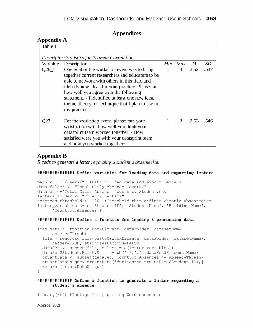
Data Visualization, Dashboards, and Evidence Use in Schools 363
Monroe, 2021
Appendices
Appendix A Table 1
Descriptive Statistics for Pearson Correlation
Variable Description Min Max M SD
Q26_1 One goal of the workshop event was to bring
together current researchers and educators to be
able to network with others in this field and
identify new ideas for your practice. Please rate
how well you agree with the following
statement. - I identified at least one new idea,
theme, theory, or technique that I plan to use in
my practice.
1 3 2.52 .587
Q27_1 For the workshop event, please rate your
satisfaction with how well you think your
datasprint team worked together. - How
satisfied were you with your datasprint team
and how you worked together?
1 3 2.63 .546
Appendix B R code to generate a letter regarding a student’s absenteeism
############### Define variables for loading data and exporting letters
path <- "C:/Users/" #Path to load data and export letters
data_folder <- "Total Daily Absence Counts/"
dataset <-"Total Daily Absence Counts by Student.csv"
letters_folder <- "Truancy Letters"
absences_threshold <- 100 #Threshold that defines chronic absenteeism
letter_variables <- c('Student.ID', 'Student.Name', 'Building.Name',
'Count.of.Absences')
############### Define a function for loading & processing data
load_data <- function(workDirPath, dataFolder, datasetName,
absenceThresh) {
file = read.csv(file=paste0(workDirPath, dataFolder, datasetName),
header=TRUE, stringsAsFactors=FALSE)
dataSet <- subset(file, select = c(letter_variables))
dataSet$Student.First.Name <-sub('.*,','',dataSet$Student.Name)
truantData <- subset(dataSet, Count.of.Absences >= absenceThresh)
truantDataUnique<-truantData[!duplicated(truantData$Student.ID),]
return (truantDataUnique)
}
############## Define a function to generate a letter regarding a
student's absence
library(rtf) #Package for exporting Word documents

Data Visualization, Dashboards, and Evidence Use in Schools 364
Monroe, 2021
generate_letter <- function (studentID, dataset){
select_student <- subset(dataset, Student.ID == studentID) #Extract
the student of interest
message <- paste0(select_student$Building.Name, "\n\n To the
Parent/Guardian of",
select_student$Student.First.Name,",\n\n ",
" Please be aware the New York State Department of
Education Student Information Repository System collects
attendance and punctuality data on all students in order to
generate a list of chronically absent students, as well as
students who are at risk of being chronically absent. It is
imperative for students to arrive at school on time so they
are present for the beginning of the instructional day.
Please note that our day at ",
select_student$Building.Name, " begins at 8:40 a.m., and it
is crucial that students are in their classrooms at this
time.\n\n",
"To date this school
year,",select_student$Student.First.Name, " has missed ",
select_student$Count.of.Absences, " days.\n\n In
an effort to maximize the instructional day, please make
every effort to ensure that your child comes to school
daily in a timely manner. Consistent attendance and
punctuality is crucial to students' success in school. I
thank you for your support in this important matter.
\n\n Sincerely, \n\n\n\n PRINCIPAL'S NAME\n Principal
\n\n\n\n\n cc: Student Folder\n Health Office\n School
Social Worker")
fileName <- paste0("Student Absence Letter - id ",
select_student[1,1],".doc")
rtffile <- RTF(fileName) #Name the document to be exported
addParagraph(rtffile, message) #Insert the message into the document
done(rtffile)
}
## Generate letters for all students whose absence count exceeds the
given threshold
absence_data <- load_data(path, data_folder, dataset,
absences_threshold)
#Create folder for storing letters and reset working directory to it
dir.create(file.path(path, letters_folder), showWarnings = FALSE)
setwd(file.path(path, letters_folder))
truant_students <- absence_data[,1]
for (i in truant_students){
stuId <- i
generate_letter(stuId, absence_data)
}

Data Visualization, Dashboards, and Evidence Use in Schools 365
Monroe, 2021
Appendix C Example exported letter
BUILDING NAME
To the Parent/Guardian of STUDENT,
Please be aware the New York State Department of Education Student
Information Repository System collects attendance and punctuality data on all students
in order to generate a list of chronically absent students, as well as students who are at
risk of being chronically absent. It is imperative for students to arrive at school on
time so they are present for the beginning of the instructional day. Please note that our
day at BUILDING NAME begins at 8:40 a.m., and it is crucial that students are in their
classrooms at this time.
To date this school year, STUDENT has missed 109 days.
In an effort to maximize the instructional day, please make every effort to ensure
that your child comes to school daily in a timely manner. Consistent attendance and
punctuality is crucial to students' success in school. I thank you for your support in this
important matter.
Sincerely,
PRINCIPAL'S NAME
Principal
cc: Student Folder
Health Office
School Social Worker

Data Visualization, Dashboards, and Evidence Use in Schools 366
Ramirez, 2021
CHAPTER 25
Moving the Conversation Forward for the Way
Educators Would Like to View and Interpret
Educational Data
Byron Ramirez
Programmer Analyst
Nassau BOCES
Abstract1
The purpose of my mini chapter is to discuss the notion of moving the
conversation forward, for the way users, which consist of Superintendents,
principals, teachers, and students, would like to view/interpret their
educational data, based on the National Science Foundation (NSF) workshop
held in early December of 2019. As a programmer analyst, for Nassau Boces,
I am working on creating data tools, dashboards, that will display
visualizations based on educational data for the county/districts that Nassau
County Board of Cooperative Educational Services (Nassau Boces) works
with. Educational data is data that corresponds to the county, district, schools,
teachers, students, and any other factors that can affect them. Such factors
can be tied to poverty, location(city), disabilities, language barriers, and many
others. As a person walking fresh into the educational industry there are many
Data Visualization, Dashboards, and Evidence Use in Schools
2021, Authors. Creative Commons License CC BY NC ND
Data Visualization, Dashboards, and Evidence Use in Schools 367
Ramirez, 2021
ideas that I can have for how to interpret data. However, the biggest challenge
is creating visualizations that are usable/interpretable. Solving this issue
entails having users voice what they would like to be presented with and how.
As a data analyst/scientist I can present data in ways that won’t be
interpretable to many users unless they go through training. District officials
and teachers are busy running schools and teaching that they don’t have the
time to do training on visualizations. Thus, the issue at hand is making the
visualizations as interpretable as possible, at a glance, for users, because of
their daily activities. The best way to do this is to reach out to the users and
ask what they want to see on a dashboard or visualization.
Keywords: Boces, District, data, officials, NSF
Background
My background is in computer science, pertaining to software
development/engineering. Currently, I am a Programmer Analyst for Nassau
Boces (Boces), for the Instructional Data Warehouse (IDW). At Boces we
handle school data that pertains to the county of Nassau. The information
stems from school districts, school buildings, teachers, students, and much
more. Before coming to Boces, I was a Software Developer/Engineer for an
insurance company. Making the jump from an insurance agency to an
educational agency was huge, for me. This, however, was a challenge that I
was very excited to take on. Being part of this industry provides a method to
give back to the community. Hopefully, providing a better understanding on
how to handle information, or read it.
I was brought on to Boces to find a way to extract data and present the
findings in visualizations. Data must be presentable in a way, such that,
district officials will be able to interpret. This happens to be one of the main
issues, at hand. The data that is being brought into the IDW stems from
multiple Student Information Systems (SIS), also known as Student
Management Systems (SMS). The SISs are used directly by school
districts/schools. They provide a means, for Boces, to retrieve data from them.
Once this data is migrated, over to us, we process it and create reports.
Processing data can be extensive causing reports to idle until processing is
done. SIS data is not always readily available, to us here at Boces. Therefore,
I have been working on a system where data can be extracted from the SISs,
as soon as it is available within a district/school. This makes the processing

Data Visualization, Dashboards, and Evidence Use in Schools 368
Ramirez, 2021
faster, won’t have to wait for data migration, and we can now work on creating
reports and visualizations.
The trouble, that arises, with visualizations is being asked for a
dashboard to present them. What type of dashboard is being asked for? What
visualizations do users want to see? How will they access this? Are they going
to require training? These are some of the questions that come up when trying
to create a dashboard for school districts, schools, and teachers.
NSF Workshop Summary
Firstly, thanks to the organization of Alex Bowers, from the Teachers College,
Columbia University, and Meador Pratt, from Nassau Boces, along with the
help of many other organizations the workshop was able to take place and be
a huge success. Planning a two-day event and sticking to schedule can get
challenging. Especially when many folks travelled from far to attend the
workshop. However, it was this resolve to make it to the workshop and the
participation from everyone that made this event a huge success.
The NSF Education Data Analytics Collaborative Workshop was the
final event of the NSF funded research project (NSF #1560720) “Building
Community and Capacity for Data-intensive Evidence-Based Decision
Making in Schools and Districts”. This research project is a collaborative
partnership on data use and evidence-based improvement cycles in
collaboration with Nassau Boces.
The purpose of this workshop was to bring data scientists/analysts,
district officials, teachers, principals, superintendents, and Nassau Boces IDW
team together to discuss data in schools. All that attended the event were split
up into teams. The teams were organized by filling out a pre-event survey.
The discussion of data deals with how the data is used in schools, currently,
as well as how officials would like to see the data that they are providing, to
the IDW. For instance, from an initial discussion with an elementary school
teacher, at the workshop, there is no way for assessing young elementary
school students using early literacy assessments because data is not being
uploaded to any data management system. The data is only available to the
teachers because they upload them to their own personal files without
uploading them, or having the ability to, anywhere that is accessible by the
IDW. If data that was being stored personally were viewable, about how a
student performs when they start being assessed, it would be easier to evaluate
them over time. Currently evaluation does not start until students start taking
New York State (NYS) Assessments. If the data before students start testing

Data Visualization, Dashboards, and Evidence Use in Schools 369
Ramirez, 2021
were available and measures can be taken to evaluate correlations, if any,
between early literacy and NYS Assessments, there could potentially be an
influence to store early education performance into data systems. From
walking into the workshop and speaking with my fellow peers, before even
getting to the notion of what was going to happen throughout the two-day
event, it became clear that there is a want for better management systems and
dashboards to help in assessing students with an explanation of what a user
would like to see. This made me eager to listen carefully, and see, to where
the workshop would lead.
Day One
The first day of the conference started with getting to meet the teams that we
were assigned. I was in team Triangle. Introductions were handled by stating
how we arrived at the NSF workshop, see figure one below. The way we
arrived at the NSF conference was based on key events, from the past. We
were asked to use three events from our past that guided us to NSF, on this
day. It seemed, everyone in my team had a scientific background. Whether
it was biology, chemistry, or computer science we all shared an interest in
science. During these introductions we were discussing our backgrounds and
how they shaped the events that led us all to being on the same team. At this
point I let my teammates know that I am not a data expert on educational data
and was hoping to understand more about what school officials wanted to
view using data. As well as was going on within the school districts that may
impact the data being used. Apart from this, I would be able help in
summarizing ideas and help lead discussions. As I have an understanding as
to how the data would come into IDW. Doing so helps the team stay on track
with our tasks and finding solutions.
Once done, with introductions, workshops were set around the
conference floor. The workshops were informationals, including data driven
visualizations, on what field experts examined. The examinations were from
close observation, and/or data mining, within educational settings from
kindergarten to twelfth grade (K-12). The teams then split up to attend the
workshops. No two team members were at the same workshop, at the same
time. The purpose was to share what each team member learned with their
teammates. A few rounds of attending workshops was done. After each
round, the teams gathered to makes Post It Notes. Post its were used to
organize them into groups. Organizations of the notes was based on the
content of the notes. Note content would stem from a variety of topics, as
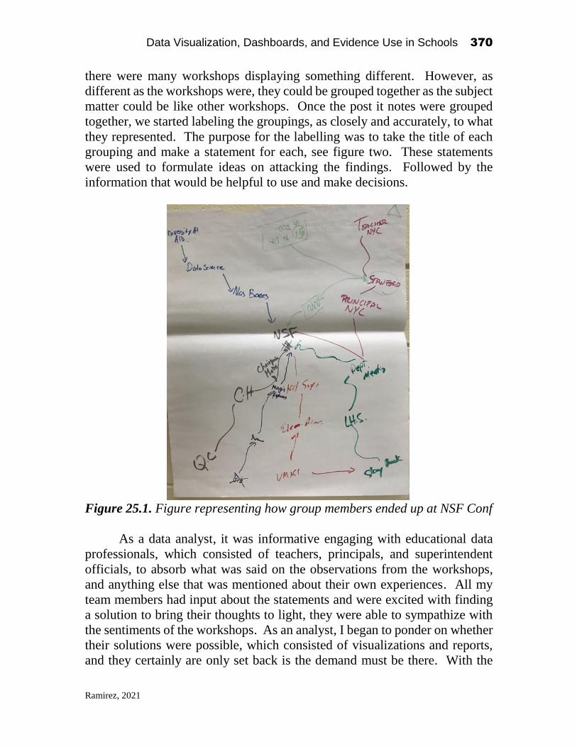
Data Visualization, Dashboards, and Evidence Use in Schools 370
Ramirez, 2021
there were many workshops displaying something different. However, as
different as the workshops were, they could be grouped together as the subject
matter could be like other workshops. Once the post it notes were grouped
together, we started labeling the groupings, as closely and accurately, to what
they represented. The purpose for the labelling was to take the title of each
grouping and make a statement for each, see figure two. These statements
were used to formulate ideas on attacking the findings. Followed by the
information that would be helpful to use and make decisions.
Figure 25.1. Figure representing how group members ended up at NSF Conf
As a data analyst, it was informative engaging with educational data
professionals, which consisted of teachers, principals, and superintendent
officials, to absorb what was said on the observations from the workshops,
and anything else that was mentioned about their own experiences. All my
team members had input about the statements and were excited with finding
a solution to bring their thoughts to light, they were able to sympathize with
the sentiments of the workshops. As an analyst, I began to ponder on whether
their solutions were possible, which consisted of visualizations and reports,
and they certainly are only set back is the demand must be there. With the

Data Visualization, Dashboards, and Evidence Use in Schools 371
Ramirez, 2021
demand there must be an explanation as to how the thoughts were to be carried
out. From experience, I produce what is being asked for. The issue that arises
is that I may create something far from what is being asked, or something that
is not understandable, or readable by an everyday user. Going back to what
was stated previously this would cause more training sessions needed and
more reminders on how the visualizations work. This leads to users being
overwhelmed and driven away from using data visualizations. Instead they
find them confusing and unflattering. Eventually, leading back to asking for
more visualizations later when the originals fall on the back burner.
Figure 25.2. Represents grouping and statements of post its
Continuing with the statements was an analysis on how feasible it was
to produce what the statements were indicating. This was handled by
“Possible vs Probable”, a way to act on the statements in question, see figure
two. Done by assigning a point system to possible and probable, each
category was out of five points, with one being the least possible/probable and
five being the most possible/probable. Being that possible vs probable
scenarios would come down to how it would be managed within Boces, later
on the statements and thoughts may have gotten picked up by Boces, I was
able to steer the team with how possible and probable the statements, or
scenarios, created from statements, were to be implemented. If you look

Data Visualization, Dashboards, and Evidence Use in Schools 372
Ramirez, 2021
closely in figure two you will be able to find that the sections have their
possibility and probability rating. Factors that were taken to decide the ratings
were based on the availability of data for each statement/section and the
urgency of pursuing a solution. I let my teammates understand how each
statement could be handled, by the IDW, seeing as most want to be using the
IDW for their data access. Working with the IDW, I understand what can be
achievable, compared to what is not. There are scenarios that are both
possible and probable, if we have direct access in the IDW. Points were
assigned to the statements and plotted on a chart, see figure three. The purpose
for this was to visualize where each statement stacked up against one another.
This helped in selecting a point to use to continue working with.
Figure 25.3. Priority vs Possibility based on Figure 25.2.
Now, having selected a point, Teacher Data, to work with, for the
continuation of the conference, we tackled the next and last part of the day.
We selected to utilize “Teacher Data” because this was the highest priority
and most possible means to work with. Looking at what the IDW stores this
seemed like the best option. There wouldn’t be a huge turnaround time from
the IDW to the user, given that we can work with data that we already have
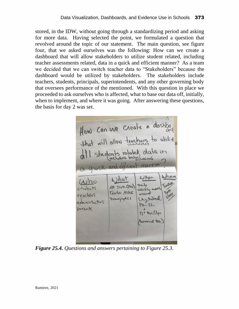
Data Visualization, Dashboards, and Evidence Use in Schools 373
Ramirez, 2021
stored, in the IDW, without going through a standardizing period and asking
for more data. Having selected the point, we formulated a question that
revolved around the topic of our statement. The main question, see figure
four, that we asked ourselves was the following: How can we create a
dashboard that will allow stakeholders to utilize student related, including
teacher assessments related, data in a quick and efficient manner? As a team
we decided that we can switch teacher data to “Stakeholders” because the
dashboard would be utilized by stakeholders. The stakeholders include
teachers, students, principals, superintendents, and any other governing body
that oversees performance of the mentioned. With this question in place we
proceeded to ask ourselves who is affected, what to base our data off, initially,
when to implement, and where it was going. After answering these questions,
the basis for day 2 was set.
Figure 25.4. Questions and answers pertaining to Figure 25.3.

Data Visualization, Dashboards, and Evidence Use in Schools 374
Ramirez, 2021
Day Two
Day two started with going around the conference floor and viewing
workshops about educational data that was available to data experts. The
workshops presented visualizations and reports that could be recreated for use
within schools, based on the data that was being used. As well as data driven
tools that may be helpful within classrooms or school districts. There were
visualizations, in my opinion, that seemed difficult to understand. The tools,
however, were very interesting. As a data analyst, I use data manipulation
tools with my own work. It was informative how many tools can be used for
creating dashboards. There are limitations to each tool, although working
within the limitations of each tool then wonderful visualizations or dashboards
can be created, as were shown across the conference floor. After the
workshop sessions, attendees gathered back with their teams from the day
before.
Once together, a data set was presented, by Jeff Davis, Nassau Boces
IDW, to the conference that could have been used for the activity of the day.
The data set was anonymized student/teacher/school data. The anonymization
of the data was done by Davis, his team, and I. The groups were to take the
data set, or any data that was willingly shared by team members, as their own
data, which would not be anonymized, they had to authorize this, and tackle
the question from day one. In our case, we were to tackle how to use
student/teacher data and create a visualization that would represent the case
and answers of our question. To create the visualization, we had a data
scientist on the team, that was assigned to us, take our ideas and turn them
into visualizations to present to the other groups. From the perspective of the
data scientist, I was eager to hear how the teachers, superintendents, and
principals wanted to convey data and what data they wanted to present
because later I can turn back around to the team I work with, Boces IDW, and
start planning for what is being asked. To answer the question with a
visualization we decided to use the data set that was provided by the IDW, as
it contained information on teachers and students. A component of the data
set that was given, was analysis on how students performed on test standards
and questions, commonly known in the IDW as the wrong answer analysis
report and referred to as the Wasa. Now, a system that would allow teachers
the ability to assess their own students was thought of. This would enhance
the data by having a system that would allow teachers the ability to assess
students and cross examine them with data already in the IDW. The analysis
for student progress on a standard can be graphed on a bar chart. On the same
bar chart, analysis on student performance from an assessment is plotted as a
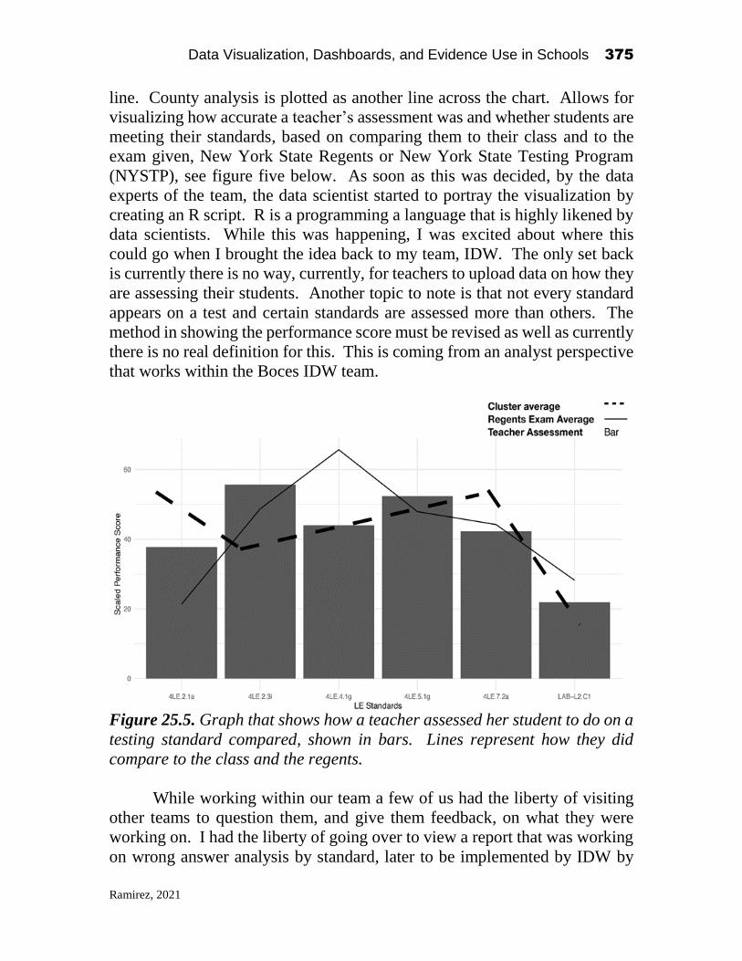
Data Visualization, Dashboards, and Evidence Use in Schools 375
Ramirez, 2021
line. County analysis is plotted as another line across the chart. Allows for
visualizing how accurate a teacher’s assessment was and whether students are
meeting their standards, based on comparing them to their class and to the
exam given, New York State Regents or New York State Testing Program
(NYSTP), see figure five below. As soon as this was decided, by the data
experts of the team, the data scientist started to portray the visualization by
creating an R script. R is a programming a language that is highly likened by
data scientists. While this was happening, I was excited about where this
could go when I brought the idea back to my team, IDW. The only set back
is currently there is no way, currently, for teachers to upload data on how they
are assessing their students. Another topic to note is that not every standard
appears on a test and certain standards are assessed more than others. The
method in showing the performance score must be revised as well as currently
there is no real definition for this. This is coming from an analyst perspective
that works within the Boces IDW team.
Figure 25.5. Graph that shows how a teacher assessed her student to do on a
testing standard compared, shown in bars. Lines represent how they did
compare to the class and the regents.
While working within our team a few of us had the liberty of visiting
other teams to question them, and give them feedback, on what they were
working on. I had the liberty of going over to view a report that was working
on wrong answer analysis by standard, later to be implemented by IDW by

Data Visualization, Dashboards, and Evidence Use in Schools 376
Ramirez, 2021
question. The idea of the visualization was to take the Wasa and turn it into a
visualization. This was done by showing how many people scored correctly
on a standard and how many scored poorly on the standard, each
representation was based on multiple choice questions and answer chosen,
shown using bar graphs. The graph spanned negative to positive where the
positive was the count of students that scored correctly with the bar
representing the answer choice and the negative were stacks of blocks that
counted students that didn’t score correctly. This can prove to be a great way
to quickly analyze an exam within districts as the visualization will show you
clearly which questions scored better in, or worse, and what answer students
were selecting to follow up on instruction to better the questions students got
wrong.
After traveling around the room, we came back to our teams and
prepared for a one-minute sales pitch as to why our visualizations should be
implemented. I don’t feel this was enough time to thoroughly express what
the data was conveying or give an understanding as to what was being
presented. One-minute is little time for presenting a visualization that was
created in a few hours. Metrics could not be understood, and the messages
were hard to convey for each visualization. Although, some visualizations
did have a huge impact and were simpler to understand, if the data was
readable and properly labeled. Once all the teams were done with the sales
pitches, everyone in attendance went around the room and placed a key fob
on the team table one perceived to have the greatest impact from the sales
pitches.
Final Remarks
As the two-day conference ended, I began thinking about the impact the
conference had. As a data analyst/scientist for Nassau Boces I began to
wonder how this conference could go further. At Boces I have been tasked
with creating visualizations and dashboards for school districts within Nassau
County, New York. The major setback is when asked for a dashboard what
exactly is being asked? I am constantly questioning the goal of what I am
creating. Many times, I create a visualization that I think will be impactful,
only to find that the data was not conveyed in the best method. Meaning that
the visualizations were hard to understand for personnel that understand the
data being worked with. Part of this is due to not putting myself in other
people’s shoes. I have had training to read many visualizations while others
have not had that liberty. Working in schools there isn’t time to learn

Data Visualization, Dashboards, and Evidence Use in Schools 377
Ramirez, 2021
something new, as curriculum is already extensive and ever expanding.
Meaning school personnel must spend a lot of time already doing their
immediate tasks. Therefore, creating a dashboard that is only readable by me,
and maybe a few others is not ideal. User’s will be discouraged to use the
dashboard because of not having the proper training. Which brings up the
following: as analysts should we be given data and just be told to create a
dashboard without knowing what a user wants? I don’t think so. The data
scientist in my team didn’t even start creating a visualization until he
understood what the team was asking for. Once understanding the goal then
execution was possible. Creating a dashboard without understanding the goal
may lead to many not wanting to use our dashboards because there is a chance
I, or anyone, misses the mark on what was expected. First glances at a
dashboard a user may not find what they are viewing appealing or will need
very thorough training of what they are looking at.
The conference brought data users together and were able to express
what they wanted to see within a dashboard or visualization, which was
fantastic. At this point analysts are sitting with the users and asking questions
of what the result should be for a visualization and how it is to be viewed.
This will have little difficulty in understanding what is being displayed. To
me being able to understand what a user wants is essential in delivering a
product. The idea is to make the user happy and wanting more. This allows
for user friendliness and pushing of the dashboard onto their peers because
most of the time success, and use of a product, comes from word of mouth
and usability.
The idea from here is to come up with solutions to bridge the gap when
delivering dashboards. A district or school asked for a dashboard? Let’s set
up a meeting with them to properly ask what it is that they wish to see, before
we present the wrong data, which will lead to not continuing discussions.
Users also must start asking, and pushing, for the ability to upload data that is
not yet loadable to the IDW, for processing. Many times, users have personal
markings they want to visualize but can’t because there is no way for them to
access the data online. It’s great they want to use more of our tools to be able
to do so, there just needs a push for this to be implemented and then worked
upon.
There must be “townhall” meetings at least once a month, quarter, every
six months, or every year to bring to light what users would like to see and
what their priorities are. Doing this in a group makes it more engaging
because everyone is in accordance with what is happening and have an
understanding about what the goals will be while their thoughts on
visualizations are being worked on. This idea of working out the goals is the
Data Visualization, Dashboards, and Evidence Use in Schools 378
Ramirez, 2021
same concept as what is possible and the priority for each goal. At Boces we
want to provide, to the best of our ability, what we can with the data that we
have. If we have a means of securing data from another source and understand
what is being desired, then we can provide that as well. After we can provide
modifications to adjust. We need to start bringing people in and expanding
the conversation.
The conference hosted about seventy school officials, we need to
expand this and make it more known what we are doing and what others would
like to see. Only then will we be able to have an impact with big data in
schools and provide to the best of our ability a standard that can be used by
all school districts within Nassau County. At Boces we held a follow up
meeting to the conference and quite a few attendees from the conference were
present. We need to keep doing so and bringing the people together.
Education is too important to isolate the educators they need to be brought in
together and figure out means of how we can help them. We are on the right
track and must keep pushing forward.

SECTION III
Tools and Research for Data Analysis in Schooling
Organizations

Data Visualization, Dashboards, and Evidence Use in Schools 380
Chiatovich, 2021
CHAPTER 26
Data Viz in R with ggplot2:
From Practical to Beautiful Visualizations
Tara Chiatovich
Panorama Education
1
In my role as Research and Data Scientist at Panorama Education, an
education technology company, I constantly create data visualizations during
all phases of analysis—from first peeks at data to understand what cleaning
tasks lay before me, to final visualizations that communicate complex insights
to an audience, and all of the in-betweens. My go-to tool for these
visualizations is ggplot2. The package ggplot2 in R is a powerful and flexible
tool for data visualization, yet its syntax can be unnecessarily complicated.
This chapter will serve three purposes:
1. Un-complicate ggplot2 for new users;
2. Allow more advanced users to layer additional information and add
beauty to their visualizations; and
3. Show the thought process for engaging with new education data,
especially in regards to identifying and resolving problems with the
data.
The third aim is especially important for educational data scientists. Prior
to joining Panorama, I spent two years as a Data Specialist in a school district.
Data Visualization, Dashboards, and Evidence Use in Schools
2021, Authors. Creative Commons License CC BY NC ND
Data Visualization, Dashboards, and Evidence Use in Schools 381
Chiatovich, 2021
That time taught me just how messy education data can be, and unlike the
datasets that a statistics professor shares, there is typically no codebook to tell
you how the data are formatted or what information each variable gives. All
of that insight has to come directly from the data. Now I work with data from
multiple districts, and the complexity (and sources of confusion) appear many
times over. Data visualizations of course communicate findings to an
audience, but they also allow the data to communicate with you, the
educational data scientist, so that you know what data you have, their
limitations, and how you can best put them to use in your analyses.
For each type of visualization, I share the code used to create a plain
version (using minimal code) and fancier versions (using additional lines of
code). Importantly, the plain versions may be lesser versions than the fancy
versions of the visualizations but nevertheless offer valuable insights about
the data.
This chapter will start with syntax for installing and loading tidyverse (of
which ggplot2 is a part). It will then describe the data used in all the
visualizations. After these introductory sections, it will get to the main point
of the chapter, which is creating plots through ggplot2. Specifically, it will
cover:
• Bar charts;
• Histograms; and
• Scatterplots.
Admittedly, there are many, many more types of graphs that educational data
scientists would want to create. The specific examples below may only serve
to whet your appetite! For that reason, I end with additional resources and
advice for continuing your ggplot2 journey.
Installing and loading tidyverse (which includes ggplot2)
The package ggplot2 is part of the tidyverse suite of packages. Before we can
use any of the tidyverse packages, we must install and load them, as shown
by the syntax below.
# Install the tidyverse suite of packages if not already installed
install.packages("tidyverse", dependencies = TRUE)
# Load tidyverse
library(tidyverse)

Data Visualization, Dashboards, and Evidence Use in Schools 382
Chiatovich, 2021
Description of the data
All participants in the NSF Collaborative Data Workshop received a series of
data files that contained mostly authentic educational data from actual
districts, though some variables were changed to protect student anonymity.
The fact that the data were mostly authentic makes this entire chapter more
useful because we can use ggplot to discover problems with the data and likely
solutions based on my knowledge of education data. I will use just one data
file that contains scores for assessments and refer to it in my code as
assessment_data. Below is a description of each variable used or examined in
this chapter as provided to us for the workshop, edited for brevity:
1. School.Year: The year the assessment was taken
2. STUDENT_ID: The local district student ID
3. Building: The name of the school building where the student is
enrolled
4. Test.Subject: The subject area being tested (ELA, Mathematics, etc.)
5. STANDARD_ACHIEVED: Indicates the performance level
description for students with valid scores
6. RAW_SCORE: Raw, un-scaled score (not available for all
assessments)
7. SCALE_SCORE: The final, scaled score (not available for all
assessments)
Here is a snapshot of the data to make clear what each variable gives:
I acknowledge that the variable names are a hodgepodge of uppercase
and lowercase letters, periods, and underscores. Renaming is relatively simple
in R, but I elected to leave these variable names untouched for greater

Data Visualization, Dashboards, and Evidence Use in Schools 383
Chiatovich, 2021
consistency with other chapters in this book, which used the same data files
from the NSF Collaborative Data Workshop.
Understanding the anatomy of a gpplot object through bar charts
When creating a visualization through ggplot (or a ggplot object), you need to
specify three "parts":
1. The dataset, which here is called assessment_data;
2. The variable to use as the x-axis (and the y-axis if applicable);
3. The "geom" type, which tells R the type of graph you are creating (e.g.,
scatterplot, bar chart).
Everything else is icing on the cake! So if you can feel confident specifying
those three components, you can make great use of what ggplot2 has to offer.
Plain bar chart
In this first example, we will make a very plain bar chart of the number of
students with assessment scores in each Test.Subject across values of
School.Year.
# In the line below, we name the chart and specify the dataset to use
bar_chart_plain <- ggplot(data = assessment_data,
# Test.Subject as the x-axis gives one bar
# per Test.Subject
aes(x = Test.Subject)) +
# Specifying a bar chart
geom_bar()
We've created the bar chart with the above code and saved it under the name
bar_chart_simple, but it doesn't show up in your R plots window until you call
up its name, as shown below.
# Calling up the bar chart by name to make it appear
bar_chart_plain

Data Visualization, Dashboards, and Evidence Use in Schools 384
Chiatovich, 2021
The above clearly tells me that both Global Studies and Social Studies are
rarely-assessed subjects. Any statistical models I might build would suffer
from having such a limited number of students with Global Studies and Social
Studies scores. I would filter these subject areas out as part of the data cleaning
process due to the small number of students with assessments in them and
instead concentrate on ELA, mathematics, and possibly science.
Bar chart with color and custom labels
Now let's add color to the bars, labels to our axes and legend, and a title to
show how providing a bit of extra code in ggplot2 can provide wonderful
returns on your investment.
# Name the bar chart and specify to use assessment_data for it
bar_chart_color <- ggplot(data = assessment_data,
# We give the x-axis column;
# "fill" colors bars by Test.Subject
aes(x = Test.Subject,
fill = Test.Subject)) +
# Specifying a bar chart
geom_bar() +
# Adding a title and specific labels for the axes and the legend

Data Visualization, Dashboards, and Evidence Use in Schools 385
Chiatovich, 2021
labs(title = "Count of tests in each subject area across school years",
# Below"fill" is what labels the legend
x = "Subject",
y = "Number of tests",
fill = "Test subject")
# Calling up our bar chart with colors by name to make it appear
bar_chart_color
The above adds some clarity and, well, color to our plain bar chart, but it does
not add any additional insight. When I see such small numbers for Global
Studies and Social Studies, I wonder whether we have a variable in our data
to help explain it. Could it have anything to do with which individual school
students attend and what subject areas are given priority for assessments in
those schools?
Grouped bar chart
To find out, we can create one final bar chart, but this time where color reflects
the school building students attend (the Building variable). This is an example
of a grouped bar chart.

Data Visualization, Dashboards, and Evidence Use in Schools 386
Chiatovich, 2021
# First line is as before, with new name for the ggplot2 object
# but specifying the same assessment_data
bar_chart_grouped <- ggplot(data = assessment_data,
# The x-axis is also the same, but fill
# is set so that color reflects Building
aes(x = Test.Subject,
fill = Building)) +
# Specifying a grouped bar chart with position_dodge
# Note that the combination of posistion_dodge and
# (preserve = "single") makes it so that all bars will
# have the same width, even with only one Building
# represented for a subject area
geom_bar(position = position_dodge(preserve = "single")) +
# Adding a title and specific labels for the axes and the legend
labs(title = "Count of tests in each subject area across school years",
x = "Subject",
y = "Number of tests",
fill = "School building")
# Calling up our grouped bar chart to make it appear
bar_chart_grouped
We now have a better understanding of why the numbers are so low for
Global Studies and Social Studies. Only one school, the high school, has
assessment scores in these subject areas.

Data Visualization, Dashboards, and Evidence Use in Schools 387
Chiatovich, 2021
If you are new to ggplot2, you may not recognize it, but the code for
the above plot makes clear how lucky we are to live in an internet age. While
initially drafting code for this plot, I used the following line to make the
visualization a grouped bar chart:
geom_bar(position = "dodge")
This line of code is typically what I use for grouped bar charts. But,
after seeing the plot, I was dissatisfied with it because that line of code resulted
in very wide bars for Global Studies and Social Studies, which were taking up
all the space for the five schools. I wanted the bars to have constant width,
whether one school or all five had assessment scores for the given subject
area. A quick search in Google sent me to this page where Stack Overflow
(2018, August 7) user aosmith provided the answer:
geom_bar(position = position_dodge(preserve = "single"))
You may notice the lack of quotes following "position =", which is
unlike the alternate line of code from above. Even as someone who loves and
relies on ggplot2, I admit that this tweak to the code to produce the desired
result is not something I would ever guess on my own or am likely to even
remember two months from now. The lesson is, if there's something you don't
like about your plot, use a search engine to come up with example code that
will provide a workaround.
Histograms and a crash course in dplyr for data manipulation
When I was first starting out in ggplot2, I took an online course that
showed me the basics, and I was instantly discouraged. Why? The problem
wasn't the ggplot2 syntax per se. Instead, it was everything I had to do to my
data to get them in a format that would allow me to create the plots I wanted.
I have no solution to this problem except to encourage you to master the basics
of dplyr, the package in R that is all about managing your data. I love dplyr,
and though I am asking a lot for you to learn the basics of it alongside ggplot2,
at the very least, dplyr's syntax is pretty intuitive. Note that I'm not going to
show you all you need to know to move forward with dplyr; I'm only going to
show you enough to make the visualizations for this chapter. Fortunately, R
for data science: Import, tidy, transform, visualize, and model data (Wickham

Data Visualization, Dashboards, and Evidence Use in Schools 388
Chiatovich, 2021
& Grolemund, 2016) is a free ebook with a chapter devoted entirely to dplyr
and data manipulation: Chapter 5: Data Transformation.
At first, we'll use dplyr to accomplish a simple aim. When calling up
the data to create our ggplot2 histogram, we'll filter to keep only rows where
the value of Test.Subject is Mathematics, ensuring that all scores are math
scores. We can accomplish this filtering without having to save a separate
dataset in R thanks to piping, which is important to understand.
This symbol in R %>% (made with the keyboard shortcut Shift +
control + M on a Mac) is piping, and it "pipes" the object from the previous
line into the new line. So, for example, imagine you want to use a function of
this general format:
function(data_for_function, specifics_of_function)
Piping in this case would work like this:
data_for_function %>%
function(specifics_of_function)
The piping "pipes" the data frame from the above line and places it as the first
object inside of the parentheses for the function. In ggplot2, piping is
incredibly helpful because it allows us to tweak the data for the plot without
having to go through the trouble of creating several different datasets that we
save under a myriad of different names. Not only does saving datasets clutter
up your R session and use up memory, it also has the annoying habit of
pausing your workflow as you struggle to think of yet another name to
distinguish your 16th dataset from your very similar 15th dataset. The
following example will help drive home how handy the combination of piping
and some basic dplyr code is when creating data visualizations in ggplot2.
Plain histogram
Below is code for a plain histogram showing scores for math assessments only
(thanks to filtering in dplyr).
# Plain histogram of math assessment scores
histogram_plain <- ggplot(data = assessment_data %>%
# Filtering to have only one
# Test.Subject (Mathematics)
filter(Test.Subject == "Mathematics"),
# Specifying SCALE_SCORE as the column to
# display and having color reflect height
# (the count of scores)

Data Visualization, Dashboards, and Evidence Use in Schools 389
Chiatovich, 2021
aes(x = SCALE_SCORE)) +
# Specifying histogram for the viz
geom_histogram() +
# Making nicer labels
labs(x = "Scale scores in mathematics",
y = "Count of scores",
title = "Histogram of math scale scores")
# Calling up the histogram
histogram_plain
Note that the plain version of the plot contains extra lines of code to
make nicer labels. Although nicer labels aren't strictly necessary, from now
on, every plot will feature clear labels because labelling is important for
understanding what the plot shows us.
Here is how our plain histogram looks:
The above makes clear why I rely on histograms when understanding a
new dataset. We clearly have a problem with our math SCALE_SCORE
values. We see a chunk of scores that range from about 200 to about 400 and
a larger chunk of scores (as evidenced by the higher bars in the histogram)
ranging from about 550 to about 650. Additionally, a very few number of
scores are under 150. I see this pattern and immediately think about what
could be causing it. Did the school district switch which math assessment it
gave students partway through the three years of data? Are students therefore

Data Visualization, Dashboards, and Evidence Use in Schools 390
Chiatovich, 2021
taking different assessments on different scales (with different minimum and
maximum scores possible)? To find out, let's make use of paneling in ggplot2.
Histogram to show how paneling works in ggplot2
Paneling in ggplot2 allows us to have multiple plots side by side or stacked
on top of each other or even in a grid without having to recreate the code for
each data viz. I want to panel by year because I have a hunch that the
assessment changed from one year to the next, resulting in the pattern that we
saw above. I also want to specify the bin width (the width of each bar in the
histogram) to have that detail constant across the panels. Finally, I'll have the
color of the bars reflect the count. Although doing so does not offer any
additional information (since we can see from the height of the bars alone
what the count is), it does give us another way to identify differences in count
while making the histogram more visually appealing (inspired by this blog
post; Burchell & Vargas Sepúlveda, 2016, February 28).
# Making our histogram with paneling by year where color reflects count
histogram_paneled <- ggplot(data = assessment_data %>%
# Filtering to have only one
# Test.Subject (Mathematics)
filter(Test.Subject == "Mathematics"),
# Specifying SCALE_SCORE as the column to
# display and having color reflect height
# (the count of scores)
aes(x = SCALE_SCORE,
fill = ..count..)) +
# Specifying histogram for the viz and setting the binwidth
# (width of each bar making up the histogram) to 10
geom_histogram(binwidth = 10) +
# Creating separate panels on top of each other by value of School.Year
# The dir = "v" part of the code stacks the panels vertically
facet_wrap( ~ School.Year, dir = "v") +
# Making nicer labels, adding a title
labs(x = "Scale scores by year in mathematics",
y = "Count of students",
fill = "Count of students",
title = "Histogram of math scale scores by school year")
# Calling up our paneled histogram
histogram_paneled
Here is the resulting histogram:

Data Visualization, Dashboards, and Evidence Use in Schools 391
Chiatovich, 2021
This data visualization shows that the scale of the math assessment
scores differs by years and thus supports my hunch that this school district
changed from one math assessment in the 2016-2017 school year to a different
math assessment for subsequent years. Regarding the very few scores that are
under 150, the problem appears across all years. An inspection of the data
reveals that some rows have raw scores and scale scores that differ whereas
some have identical scores for the two types:
Thus, as evidenced by the paneled histogram above and the snapshot of the
data, some rows appear to have erroneous values of SCALE_SCORE, and we
can identify which rows those are by checking whether the RAW_SCORE
and SCALE_SCORE values are equal to each other. I will filter out these rows
in remaining data visualizations of SCALE_SCORE.

Data Visualization, Dashboards, and Evidence Use in Schools 392
Chiatovich, 2021
Histogram with vertical line for the mean
I see some next steps for our work with histograms. District leaders often want
to know the trend for assessment scores. Are scores improving from one year
to the next? Are they staying the same? Are they decreasing? We also want to
do some filtering, dropping any cases where the raw score is equal to the scale
score and excluding scores from the 2016-2017 school year since they are on
a different scale. (Obviously, an upward or downward trend is only
meaningful if students' performance on an assessment changed, not if the
assessment itself and its possible scores changed.) We can highlight the trend
from 2017-2018 to 2018-2019 by adding vertical lines to our histogram that
show the mean score for each year. Doing so will require more work in dplyr.
We start by storing the means of math assessment scores by year for
2017-2018 and 2018-2019. This part is strictly in dplyr, and we save it as its
own R object so that we can refer to it in the code we write to create the
paneled histogram.
# Store the means for SCALE_SCORE by year
means_by_year <- assessment_data %>%
# In the graph below, we will filter our data to only have Mathematics
# and leave out the 2016-2017 school year as well as any rows
# where the scale score equals the raw score. We do the same
# filtering here to ensure means match the data for the histogram.
filter(Test.Subject == "Mathematics" &
School.Year != "2016/2017" &
SCALE_SCORE != RAW_SCORE) %>%
# Selecting only the variables needed to calculate mean by year
dplyr::select(School.Year, SCALE_SCORE) %>%
# Grouping by School.Year to get separate means by year
group_by(School.Year) %>%
# Storing mean in the variable scale_score_mean
summarize(scale_score_mean = mean(SCALE_SCORE, na.rm = TRUE))
Now that we have our means, we can use very similar code as before but
leaving out the 2016-2017 school year and layering vertical lines for the mean
for each year on top of their respective histogram panels.
# Making paneled histogram with vertical lines showing mean by year
histogram_w_mean_lines <- ggplot(data = assessment_data %>%
# Filter our data to only have
# Mathematics and leave out the 2016-2017
# school year plus any rows where the
# scale score equals the raw score
filter(Test.Subject == "Mathematics" &
School.Year != "2016/2017" &
SCALE_SCORE != RAW_SCORE),
# Specifying SCALE_SCORE as the column to

Data Visualization, Dashboards, and Evidence Use in Schools 393
Chiatovich, 2021
# display and having color reflect height
# (the count of scores)
aes(x = SCALE_SCORE,
fill = ..count..)) +
# Specifying histogram for the viz and setting the binwidth to 5
geom_histogram(binwidth = 5) +
# Putting the means stored in scale_score_means as vertical lines over
histogram
geom_vline(data = means_by_year,
mapping = aes(xintercept = scale_score_mean)) +
# Creating separate panels on top of each other by value of School.Year
facet_wrap(~ School.Year, dir = "v") +
# Making nicer labels
labs(x = "Scale scores by year in mathematics",
y = "Count of students",
fill = "Count of students",
title = "Histogram of math scale scores by school year",
subtitle = "Vertical line gives mean scale score by year")
# Calling up our histogram with mean lines
histogram_w_mean_lines
The above visualization allows for easy comparison of the mean math
assessment score across the 2017-2018 and 2018-2019 school years. We see
practically no change from one year to the next in mean scores, showing that
on average, scores held pretty steady in these schools across the two years.

Data Visualization, Dashboards, and Evidence Use in Schools 394
Chiatovich, 2021
Scatterplots and reshaping data in dplyr
Let's continue with the exploration we've done above, focusing on math
SCALE_SCORE values for the 2017-2018 and 2018-2019 school year, but
now we want to examine these scores not overall by year but instead for each
student. We will do so with a scatterplot, which is a key data visualization to
examine before calculating associations between two variables.
This time, we will use dplyr to reshape our data. The assessment data
are in long format, with students having one row per year. To create the
scatterplots, we will put the data into wide format, with one column for each
year giving the student's value of SCALE_SCORE in math for the specified
year. After viewing the data, I discovered a few students who had more than
one math assessment score for a single year because, for example, they took
an algebra assessment and a geometry assessment. To solve this problem, we
will also deduplicate the data before creating the scatterplots. Both reshaping
and deduplicating data are tasks I perform nearly every time I work with a
new dataset, so learning the syntax for both in dplyr will prove valuable.
For the scatterplot examples, we will take a different approach to
working with our data. Instead of filtering, deduplicating, and reshaping in the
same way whenever we use the ggplot command, we will save our filtered,
deduplicated, and reshaped data as a separate dataset in R, much in the same
way that we saved the means by year above. Then we can use this new dataset
anytime we create a data visualization with ggplot2.
# Filtering, deduplicating, and reshaping the data
math_data_wide <- assessment_data %>%
# Keeping only math scores and excluding the 2016-2017
# school year and cases where scale and raw scores
# are equal
filter(Test.Subject == "Mathematics" &
School.Year != "2016/2017" &
SCALE_SCORE != RAW_SCORE) %>%
# Deduplicating the data to have only one row
# per student ID per year
distinct(STUDENT_ID, School.Year, Test.Subject,
# This keep_all option tells R to keep all
# variables, not only the ones named above
.keep_all = TRUE) %>%
# Making one column for each school year,
# where the values are from SCALE_SCORE
pivot_wider(names_from = School.Year,
id_cols = c(STUDENT_ID, level_change),
values_from = SCALE_SCORE) %>%
# Dropping rows with NA values in any column
drop_na()

Data Visualization, Dashboards, and Evidence Use in Schools 395
Chiatovich, 2021
Note that the use of the distinct command above is a haphazard way of
getting rid of duplicates. In the case of duplicates by STUDENT_ID and
School.Year, R will keep the first row and discard subsequent rows. Typically,
one would want to have a set rule for which duplicated row to keep (e.g., the
row with the highest score, the row with the most recent date). Here, we
proceed by eliminating duplicates based on just their order in the data set for
efficiency, but I advise first conducting a careful exploration of the data and
if possible discussing with stakeholders to make an informed decision about
how to deduplicate data when analyzing educational data in the real world.
The data now look like this:
A couple of points about the above data are worth noting. First, we do
not have any NA (or missing) values because I used the drop_na() command
in dplyr to exclude them from the dataset. Dropping missing values results in
us having considerably fewer students in this dataset than we did in the dataset
for the last histogram above. That's because younger students in our sample
may not have been in a high enough grade level in 2017-2018 to take the
assessments, and any graduating seniors in 2017-2018 would not be in school

Data Visualization, Dashboards, and Evidence Use in Schools 396
Chiatovich, 2021
in 2018-2019 to take the assessments for that year. Relatedly, the data in the
scatterplot that we will create are not the same as the data in the last histogram
above because any student with missing math scores for either year will drop
out of the scatterplot.
The second point to note about the data is that only the variables
specified in the pivot_wider statement appear. There are ways to keep all
variables when using pivot_wider (such as by omitting the id_cols option).
However, do so with caution as you may end up with data where every row is
missing scores for either the 2017/2018 variable or the 2018/2019 variable,
making it impossible to create a scatterplot from the data. (If that sentence is
hard to interpret, try using pivot_wider without the id_cols option on your
own data and observe the results!)
Finally, I have a new variable—level_change—that reflects whether
students' standard level achieved on their math score went up, down, or stayed
the same from 2017-2018 to 2018-2019. This variable is based on the
STANDARD_ACHIEVED variable that categorizes assessment scores as
low performance, high performance, or other levels in between. My time in a
school district taught me that the standard level achieved on an assessment,
and whether it is improving or decreasing from one year to the next, is
something that district leaders really care about. It took a decent amount of
code to create and so is beyond the scope of our dplyr lessons. But this serves
as another plug for building your dplyr skills since they will expand what you
are able to show with your data visualizations (as demonstrated by the second
scatterplot below).
Plain scatterplot
Let's use this new dataset to create a plain scatterplot.
scatter_plot_plain <- ggplot(data = math_data_wide,
# Specifying 2017/2018 for the x-axis
# and 2018/2019 for the y-axis
# Notice the backticks (`)
aes(x = `2017/2018`,
y = `2018/2019`)) +
# Here, geom_point() makes the graph into a scatterplot
geom_point() +
# Specifying title, x-axis label, and y-axis label
labs(title = "Scatterplot of 2017-2018 and 2018-2019 math scale scores",
x = "2017-2018 math scores",
y = "2018-2019 math scores")
Data Visualization, Dashboards, and Evidence Use in Schools 397
Chiatovich, 2021
Before calling up the scatterplot and sharing how it looks, I want to
make clear why the backticks (` located on the same key as ~) in the aes
statement are necessary. When we reshaped the data, we used the values for
School.Year — 2017/2018 and 2018/2019 — as the basis for the new
variables. These values then became the variable names. But in R, 2017/2018
and 2018/2019 are also ratios; in other words, they are numbers that R should
evaluate that come out to be very close to 1. We need backticks around
2017/2018 and 2018/2019 to make clear that they are variables in the dataset
and not one number divided by another number. In fact, any variable that starts
with a character other than a letter needs a backtick when referring to it in
code. I know about this quirk when referring to variables with atypical names,
but there was a time when I did not and had trouble figuring out why I was
getting an error message. R has many quirks like this, so it's a given that
people who are new to R can feel frustrated. To that, I say that I feel your pain,
and searching Stack Overflow (n.d.) for the exact error message you are
getting can provide relief. You can read more about the type of dataset in R
that allows atypical names—called a tibble—in this chapter of R for data
science: Import, tidy, transform, visualize, and model data (Wickham &
Grolemund, 2016).
Now that we have that detail settled, let's inspect our scatterplot.
# Calling up the name of our scatterplot to display it
scatter_plot_plain
Here is the scatterplot:

Data Visualization, Dashboards, and Evidence Use in Schools 398
Chiatovich, 2021
The scatterplot looks much as we would expect. We see a fairly strong
correlation between math scores for the two academic years, and they appear
to be linearly related in that a straight line better conforms to the shape of the
points than a curve. Unlike the paneled histograms above, this scatterplot
makes clear that, overall, students who earned high scores in 2017-2018 also
tended to earn similarly high scores in 2018-2019, and the same is true for
students who earned low scores. Although we might have assumed this to be
true by looking at the very similarly-shaped histograms across the two years,
only the scatterplot can confirm it by helping us see each individual student's
score for both years.
Scatterplot with semi-transparent points colored by category
Another trick we will learn with scatterplots is how to make each point semi-
transparent so that we can see when multiple points overlap. We will also
make use of the level_change variable I created to color each point according
to whether students' standard assessed level increased, decreased, or stayed
the same and provide a visual cue for how common each of the three
categories is. The following code accomplishes both these aims.
# Same scatterplot as before but with color by level_change
# and semi-transparent points
scatter_plot_color <- ggplot(data = math_data_wide,

Data Visualization, Dashboards, and Evidence Use in Schools 399
Chiatovich, 2021
# Specifying 2017/2018 for the x-axis
# 2018/2019 for the y-axis
aes(x = `2017/2018`,
y = `2018/2019`,
color = level_change)) +
# Here, geom_point() makes the graph into a scatterplot, and alpha
# makes each point semi-transparent, which allows us to see when
# points are on top of each other
geom_point(alpha = 0.5) +
# Specifying title, x-axis label, y-axis label, and legend ("color")
# label
labs(title = "Scatterplot of 2017-2018 and 2018-2019 math scale scores",
x = "2017-2018 math scores",
y = "2018-2019 math scores",
# The \n in the label below puts everything that follows it
# onto a new line
color = "Level change from\n2017-2018 to 2018-2019")
# Calling up our new graph by name to display it
scatter_plot_color
Here is the end result:
The above scatterplot shows how making the points semi-transparent helps us
understand the data, with more density in the mid-range of scores for both
years as evidenced by the darker colors for the (overlapping) points. We also
gain new insights from the colors of the points, which show us that similar
numbers of students decreased as increased one or more levels but that the
largest group was students with no change in level.

Data Visualization, Dashboards, and Evidence Use in Schools 400
Chiatovich, 2021
Resources and advice for continuing your ggplot2 journey
By now, I hope that you feel at the very least equipped to explore your data
with ggplot2. But I of course couldn't blame you if you are passive-
aggressively making a long list of all that I did not cover and wondering how
you will bridge the gap in your knowledge. An excellent resource put together
by the makers of ggplot2 is this website (tidyverse, n.d.).
Under the heading "Layer: geoms", you will find succinct information
on which "geom" creates which type of visualization (e.g., geom_boxplot()
and geom_dotplot() for, you guessed it, boxplots and dotplots, respectively).
Use these geoms to branch out well beyond the handful of plot types we
created here. You can keep reading this reference for all kinds of variations
on the more advanced plots demoed above.
Another compact source of guidance on ggplot2 is this cheat sheet
(Grolemund, 2019). Users wishing for more explanation along with code
examples can turn to the aforementioned R for data science: Import, tidy,
transform, visualize, and model data (Wickham & Grolemund, 2016). It has
a chapter on ggplot2 that you can access here.
One reason why ggplot2 is my go-to tool for data visualizations is that
I am confident I can create exactly the plot I want, even as my vision for how
the end product should look goes through a thousand tiny and increasingly
nit-picky changes based on what I discover through earlier plots. What is the
source of my confidence? Certainly not my vast stores of knowledge. Rather,
it's my ability to hit on the right search terms combined with my patience to
repeat this process for each individual change I want to make with my plot. I
may not be able to find complete code for the plot I want to make, but I am
very likely to find a snippet of code that shows me how I can override ggplot's
default of ordering categories alphabetically and instead have them ordered
from least to greatest. And with that small discovery plus another dozen or so
more, I can create the data visualization of my dreams.
But the other reason I use ggplot2 near constantly is that minimal code
can give me plain but useful data visualizations. I make plain plots—even
ugly plots—all the time! When an ugly plot tells me what I need to know
about my data, I save the fussy additions of nicer colors, clearer labels, and
reference lines showing trends for data visualizations that other people will
see. Because unlike statistical models where all are "wrong" but "some are
useful" (Box, Luceno, & del Carmen Paniagua-Quinones, 2011, p. 61), I
Data Visualization, Dashboards, and Evidence Use in Schools 401
Chiatovich, 2021
would argue that some data visualizations are beautiful, but all data
visualizations are useful. So go make some useful data visualizations!
References
Box, G. E., Luceno, A., & del Carmen Paniagua-Quinones, M. (2011). Statistical control
by monitoring and adjustment (Vol. 700). John Wiley & Sons.
Burchell, J. & Vargas Sepúlveda, M. (2016, February 28). Creating plots in R using
ggplot2 - part 7:histograms. Retrieved from https://t-
redactyl.io/blog/2016/02/creating-plots-in-r-using-ggplot2-part-7-histograms.html
Grolemund, G. (2019). Data visualization with ggplot2::Cheat sheet. Retrieved from
https://github.com/rstudio/cheatsheets/blob/master/data-visualization-2.1.pdf
Stack Overflow (n.d.) Retrieved from stackoverflow.com
Stack Overflow (2018, August 7). Consistent width for geom_bar in the event of missing
data [answer by user aosmith]. Retrieved from
https://stackoverflow.com/questions/11020437/consistent-width-for-geom-bar-in-the-
event-of-missing-data
tidyverse (n.d.) ggplot2 Reference. Retrieved from
https://ggplot2.tidyverse.org/reference/
Wickham, H., & Grolemund, G. (2016). R for data science: Import, tidy, transform,
visualize, and model data. O'Reilly Media, Inc. Retrieved from https://r4ds.had.co.nz/

Data Visualization, Dashboards, and Evidence Use in Schools 402
Agasisti & Cannistrà, 2021
CHAPTER 27
Predicting High School students’ performance
with Early Warning Systems: a theoretical
framework
Tommaso Agasisti
Politecnico di Milano School of Management
Marta Cannistrà
Politecnico di Milano School of Management
Abstract1
Principals and teachers struggle with the problem of identifying students
at-risk and talented ones early in their educational career, with the purpose
of suggesting them the adequate resources and interventions for succeed.
Learning Analytics is the new discipline that attempts to provide empirical
evidence about the factors that positively affect students’ performance, in
a personalized and data-driven way. Specifically, Early Warning Systems
(EWSs) are becoming a popular tool for this aim, holding the promise to
predict students’ success and risk early in their educational journey. The
existing academic literature is mostly focused on proposing the best
algorithms for prediction, but less attention is paid to the theoretical
foundations of the empirical models. This chapter attempts filling this gap,
by proposing a theoretical model which can complement and guide the
efforts directed towards the empirical modelling. The framework is based
on considering the educational process like a cumulative one, in which
Data Visualization, Dashboards, and Evidence Use in Schools
2021, Authors. Creative Commons License CC BY NC ND

Data Visualization, Dashboards, and Evidence Use in Schools 403
Agasisti & Cannistrà, 2021
each stage in the educational career affects the subsequent ones. The ability
to properly describe such process and to collect sufficient and reliable data
is crucial for the success of EWS in formulating accurate predictions. In
addition, we claim for the use of findings obtained from EWS for designing
(personalized) remedial education interventions for at-risk students and
honor programs for talented ones.
Keywords: Learning Analytics, Early Warning System, remedial
education, talented students
Introduction
As a part of common research agenda, I (Tommaso) has been invited by
my friend and colleague prof. Alex Bowers to attend the NSF Education
Data Analytics Collaborative Workshop, held on December 2019 in New
York City. As the attendance of the 2018 ELDA (Education Leadership
Data Analytics) Summit the year before, the 2019 Workshop has been a
great experience, in which I had the opportunity to see how my friends in
Teachers College, Columbia University, are developing their research
effort int the field of data analytics for supporting key decision-makers in
the educational domain. Actively taking part to the work of datasprint
teams, I understood how similar the challenges are, for practitioners –
teachers and principals – and scholars, between the two sides of the
Atlantic Ocean.
In Italy, the research group that I coordinate at Politecnico di Milano
(PoliMi) School of Management works on several projects related to Data
Analytics in education. Specifically, the research team develops initiatives
to support school principals and teachers to use administrative data and
evaluation registers for making better-informed decisions. In so doing, we
list a number of relevant topics which are a priority for current Italian
school managers, from (i) the use of data for continuous improvement (ii)
to understanding factors correlated with students’ success. These and many
others are the main questions that the NSF Collaborative Workshop
intended answering, with leveraging the potential advantages of the
Learning Analytics techniques and approaches. Working with the people
who attended the NSF Collaborative Workshop helped me to focus more
on one of the research team’s specialty.
Since when I attended the 2018 ELDA Summit, the interest of the
PoliMi’s research group moved towards the use of data for creating Early
Warning Systems (EWSs), with the aim of detecting at-risk students early
in their educational path. The educational policy idea is that by identifying

Data Visualization, Dashboards, and Evidence Use in Schools 404
Agasisti & Cannistrà, 2021
these students early, it would be possible to help them through tutoring,
remedial courses and/or other supporting initiatives. As the 2019 NSF
Collaborative Workshop demonstrated, this issue is of central interest also
in the context of US K-12 education, thus I decided to develop a chapter
dealing with this topic.
The chapter has been written together with Marta Cannistrà, who
collaborates in the PoliMi’s research group with the primary responsibility
of managing projects related with the use EWSs in schools and
universities. Marta and I agreed on the necessity to develop a theoretical
framework for EWSs, which are too often confined to a purely empirical
perspective. This chapter is our contribution to this field.
1. Motivation – predicting (or analyzing) students’ performance is
important
Over the last years, governments point out the importance of a quality
education for all students worldwide. Anyway, despite the considerable
efforts spent to improve access and participation, 262 million children and
youth aged 6 to 17 were still out of school in 2017, and more than half of
children and adolescents are not meeting minimum proficiency standards
in reading and mathematics (UN 2019). To point out this challenge, the
2019’s Sustainable Development Goals underlined the need to “ensure
inclusive and equitable quality education and promote lifelong learning
opportunities for all” (objective #4). United Nations also indicates
technologies as the major source of opportunity to assure this goal’s
achievement.
To stress the importance of guaranteeing education for all, the latest
edition of the Commission's Education and Training Monitor (2019) shows
that, despite national education systems are becoming more inclusive and
effective, still the students’ educational attainment largely depends on their
socio-economic backgrounds. This aspect underlines, once again, the
necessity to refocus efforts to improve learning outcomes especially for
marginalized people in vulnerable settings and belonging to minorities.
The Report finds out that 10.6% of young people in EU are “early leavers”
from education and training, so they have never obtained a secondary
school degree. A further worrying aspect is that no progress is registered
over the past two years about this indicator. Individuals who leave
education before obtaining an upper secondary qualification struggle with
lower employment rates, even the risk of being unemployed or becoming
inactive while peers are attending school. Education is included among the
indexes for better life developed by OECD (2015). In particular, obtaining
a good education greatly improves the likelihood of finding a job and

Data Visualization, Dashboards, and Evidence Use in Schools 405
Agasisti & Cannistrà, 2021
earning enough money to have a good quality of life. Highly educated
individuals are less affected by unemployment trends, typically because
educational attainment makes an individual more attractive in the
workforce. Lifetime earnings also increase with each level of education
attained.
To respond to this threat, EU policy interventions include improving
data collection and monitoring, strengthening teachers’ capacities,
education and career guidance, also supporting re-entry of early leavers
(UNESCO, 2017). In this vein, a more structured use of data analyses and
policy evaluation is considered as a key to the success of interventions
aiming at reducing the achievement gap between advantaged and
disadvantaged students.
A robust body of academic research confirms the importance of
reducing the dropout rates, i.e. percentage of early leavers in the education
system. As also underlined by EU Commission, the risk of experiencing
unemployment or unstable careers (and consequently becoming a public
cost for society) is higher for early leavers (Rumberger & Lamb, 2003,
Prause & Dooley, 1997). In particular, the consequence of dropout
phenomenon in high school can be different, both at individual and system
level (De Witte & Rogge, 2013); people may face higher unemployment
risks (Solga, 2002) and increasing health problems (Groot & van den
Brink, 2007). At an aggregate (collective) level, there are higher costs for
society with greater risk of criminality (Lochner & Moretti, 2004), less
social cohesion (Milligan et al., 2004) or a lower rate of economic growth
(Hanushek & Wößmann, 2007).
In this challenging context, detecting students at-risk of dropping out
as early as possible will give institutions and schools the opportunity of
setting out remedial interventions, with large potential benefits in the long
run. This problem can be rooted in the emerging field of Learning
Analytics (LA), which can be defined as “ (…) the measurement,
collection, analysis and reporting of data about learners and their
contexts, for purposes of understanding and optimising learning and the
environments in which it occurs”2. Specifically, for the context described
in this chapter, the exploitation of new technological development in the
field of predictive analytics and Early Warning Systems (hereafter, EWS)
holds the promise to improve the fight against dropout rates in schools.
As a data analytics process, the main aim of using such technique is to
provide powerful insights to the decision-makers, for assuming their
decisions in the most informed way. The prediction of students’
performance allows institutions and schools management to set clearer
2 This formal definition of Learning Analytics has been formulated in the 1st Conference of Learning
Analytics (2011), see here for more details: https://www.solaresearch.org/about/what-is-learning-
analytics/.

Data Visualization, Dashboards, and Evidence Use in Schools 406
Agasisti & Cannistrà, 2021
objectives regarding the learning outcomes (Heppen & Therriault, 2008),
as well as discussing practical strategies and interventions for reducing the
risk of dropout for individuals and groups of students.
The present chapter provides a short overview of the existing
literature dealing with the implementation of predictive analytics in
secondary schools. The main purpose is to give a general guidance to
researchers and practitioners when developing Early Warning Systems.
Meanwhile, we propose a theoretical framework for developing an
adequate list of indicators to be used in the analysis and to interpret the
results.
The chapter is organized as follows. After this introduction, section §2
contains a brief literature review about Early Warning Systems; section §3
develops our theoretical framework about the components of an adequate
EWS; section §4 concludes with some practical indication about how using
the results obtained through an EWS, in a policy and managerial
perspective.
2. Early Warning Systems in secondary education: a (brief)
literature review
The discussion about the use of analytics for predicting students’
performance and accompany remedial programs stem from the traditional
attention to the serious problem of dropout. Academic research on
secondary-school students’ dropout can be classified in two categories
(Finn, J. D. 1989). On one hand, empirical studies define and estimate
dropout rates with ever-increasing precision and examine the factors
associated with dropout of individual students, including race,
socioeconomic status (SES), school ability and performance or school
characteristics (Christle et al., 2007, Allensworth & Easton, 2007, Bowers,
2010). On the other hand, papers, articles and reports describe the efforts
and interventions to prevent students from leaving school (Dynarski et al.,
2008, Balfanz et al. 2007, Mac Iver, 2011). In fact, simply identifying at-
risk students does not alleviate the risk these students face. EWSs to make
an impact and prevent students from dropping out, school districts must
tailor intervention and prevention efforts based on the data (Pinkus 2008).
The present chapter provides some insights about the first stream of this
literature, although it also suggests some reflections about how handling
remedial interventions in an effective way, leveraging data analytics.
Indeed, we can consider the two research streams as sequential: the outputs
produced by the analyses of dropouts functioning as the key information
source when setting the remedial interventions. We define this two-steps
process as Early Warning System (EWS). Commonly, the use of EWS is

Data Visualization, Dashboards, and Evidence Use in Schools 407
Agasisti & Cannistrà, 2021
related to diverse fields of applications where detection is important – as,
for example, military attacks, conflict prevention, economical/banking
crisis, environment disasters/hazards, human and animal epidemics, and so
on. In the educational domain, an EWS consists of a set of procedures and
instruments for (i) early detection of indicators of students at risk of
dropping out and, in a second moment, (ii) the implementation of
appropriate interventions to make them stay in school (Heppen &
Therriault, 2008). Early warning indicators are used for early identification
and intervention with students to help them get back on track and meet
major educational milestones, such as on-time graduation and college and
career readiness (Blumenthal, 2016b). Detecting these indicators or factors
is really difficult because there is no single reason why students drop out:
it is a multi-factorial problem. Consequently, the second step of EWS
needs to take into consideration that at-risk students are not a homogenous
group, therefore policy makers need to design specific interventions to
efficiently target them (Sansone 2019). Surely, the policy and managerial
attention of decision-makers towards planning and implementing remedial
interventions needs to target disadvantaged and at-risk students. These
interventions must be effective in order to get students back on track:
attending regularly, filling their prior educational gaps, behaving well, and
passing their courses (Mac Iver et al., 2019). The first recommendation in
the IES (Institute of Education Sciences) Practice Guide on Preventing
Dropout in Secondary Schools is to “(…) Monitor the progress of all
students, and proactively intervene when students show early signs of
attendance, behavior, or academic problems” (Rumberger et al., 2017). In
this vein, it must be emphasized that identifying students at risk of
dropping out by using an EWS is only the first step in addressing the issue
of school dropout (Márquez-Vera et al. 2015).
The literature which focuses on developing the empirical models for
predicting dropout is now more concentrated on the adoption of Machine
Learning (ML) techniques to implement new and well-performing
algorithms, which predict students’ outcome as early as possible. These
models allow identifying and prioritizing students for remedial
intervention assuring high prediction accuracy together with early timing.
In the remainder of this paragraph, we report and comment some academic
papers which specifically deal with the use of ML in the development of
Early Warning Systems; the main message emerging from this part is to
provide a state-of-the-art about the main methodologies and works related
to the emerging and consolidating field of EWSs. As can be clearly judged
in looking at the contributions listed here, the development of EWSs is
growing and is gradually applied in many different geographical contexts
and educational grades. Moreover, the underlying empirical models are
diversifying and, nowadays, they cover a wide range of statistical,

Data Visualization, Dashboards, and Evidence Use in Schools 408
Agasisti & Cannistrà, 2021
econometric and machine learning techniques. The Table 27.1 resumes the
key characteristics of selected academic articles about the prediction of at-
risk students in high school.
Table 27.1: A review of literature about Early Warning Systems in
secondary education
Papers’ title (authors, year and journal) Analytical
method
Years of
data Country
Grade
analyzed
Fernandes, E., Holanda, M., Victorino, M., Borges, V., Carvalho, R., & Van Erven, G. (2019).
Educational data mining: Predictive analysis of
academic performance of public school students in the capital of Brazil. Journal of Business Research,
94, 335-343.
Gradient
Boosting
Machine (GBM)
2015 and
2016 Brazil From 9th to 12th
Adelman, M., Haimovich, F., Ham, A., & Vazquez, E. (2018). Predicting school dropout with
administrative data: new evidence from Guatemala
and Honduras. Education Economics, 26(4), 356-372.
Logistic Regression
2009, 2010 and 2011
Guatemala
and
Honduras
5th, 6th, 7th, 8th and 9th grade
Sansone, D. (2019). Beyond early warning indicators: high school dropout and machine
learning. Oxford Bulletin of Economics and
Statistics, 81(2), 456-485.
Support Vector
Machine,
Boosted Regression and
Post-LASSO
2009 USA 9th grade
Aguiar, E., Lakkaraju, H., Bhanpuri, N., Miller, D., Yuhas, B., & Addison, K. L. (2015). Who, when,
and why: A machine learning approach to
prioritizing students at risk of not graduating high school on time. In Proceedings of the Fifth
International Conference on Learning Analytics
And Knowledge (pp. 93-102).
Random Forest
and Logistic Regression
From 2007
to 2013 USA
From 6th to 12th
grade
Márquez‐Vera, C., Cano, A., Romero, C., Noaman,
A. Y. M., Mousa Fardoun, H., & Ventura, S. (2016). Early dropout prediction using data mining: a case
study with high school students. Expert
Systems, 33(1), 107-124.
Support Vector
Machines,
Decision trees, Classification
rules and Naïve
Bayes Classifier
2012 Mexico 9th grade
Woods, C. S., Park, T., Hu, S., & Betrand Jones, T.
(2018). How high school coursework predicts
introductory college-level course success. Community College Review, 46(2), 176-
196.
Logistic
Regression 2014 USA 12th grade
Rebai, S., Yahia, F. B., & Essid, H. (2019). A graphically based machine learning approach to
predict secondary schools performance in
Tunisia. Socio-Economic Planning Sciences, 100724.
Regression
Tree (RT) and Random Forest
(RF)
2012 Tunisia 10th grade
Steinmayr, R., Weidinger, A. F., & Wigfield, A.
(2018). Does students’ grit predict their school
achievement above and beyond their personality, motivation, and engagement?. Contemporary
Educational Psychology, 53, 106-122.
Regression 2014, 2015
and 2016 Germany
10th, 11th and
12th grades
Sara, N. B., Halland, R., Igel, C., & Alstrup, S.
(2015). High-school dropout prediction using
machine learning: A Danish large-scale study. In ESANN 2015 proceedings, European Symposium
on Artificial Neural Networks, Computational
Intelligence (pp. 319-24).
Support Vector Machines
(SVM),
Classification Tree (CART),
Random Forest
(RF) and naïve Bayes classifier
2009 Denmark 9th grade
Data Visualization, Dashboards, and Evidence Use in Schools 409
Agasisti & Cannistrà, 2021
A clear element that emerges from the current literature about Early
Warning Systems is that analyses are fundamentally based on empirical
approach. It is glaring the lack of a common theoretical framework to drive
analysis and prediction. This lack of theoretical foundations is further
highlighted by the common settings given by a data-driven (DD) approach,
aiming at finding the best algorithm to predict student’s outcome. This DD
approach is not easily generalizable because is mostly dependent on data
availability (and specificity), which in turn will provide better or worse
algorithms’ predictions performance. In this chapter we innovate this field
of study by proposing a comprehensive theoretical framework. This
proposal should move the analysts and decision makers’ attention from
algorithms (which are, therefore) to information. We try to contextualize
the empirical analysis of the determinants of the students’ performance into
a student-specific process of skills’ formation. In this research-based light,
the theoretical framework proposed here gives the possibility to interpret
the results about students’ dropout taking into consideration their path,
experience and characteristics.
3. Proposal of a comprehensive theoretical framework for
developing EWS
The most relevant aspect underlined in this framework for EWSs is the
prevalent attention over the social, economic and educational determinants
of dropout, rather than algorithms. Specifically, the key indicators of Early
Warning Systems are grouped into macro-categories, with the specific aim
to tailor the analysis to different and heterogeneous contexts.
The theoretical framework poses its foundations on students’
educational journey, buying this approach from the seminal contribution
by Cunha & Heckmann (2007) – hereafter, C&H2007. In the authors’
work, the formation of individual skills (both cognitive and non-cognitive)
is the result of a process where investments, environments and genes are
jointly and simultaneously involved. These factors interact and influence
each other, to produce behaviors and abilities, which in turn are observed
and investigated by analysts and decision makers. As postulated by
C&H2007, the “technology” governing this process is multistage and
interrelated, so each period’s activities and results are influenced by the
previous ones and, in turn, influence the next ones. According to this view
inputs, investments and experience in each stage produce outputs, which
will be the inputs of next stages themselves.
For the purpose of our theoretical framework, specifically designed
for developing EWS, we consider the stages proposed by C&H2007 as

Data Visualization, Dashboards, and Evidence Use in Schools 410
Agasisti & Cannistrà, 2021
school cycles (see Figure 27.1): childhood, primary, middle school and
high school (K12) and university.
Figure 27.1: Key stages of the educational path, by educational steps
Childhood
(0 – 6 y.o)
Primary school
(6 – 10 y.o.)
Middle school
(10 – 13 y.o.)
High School
(13 – 18 y.o.)
University
(18 – 24 y.o.)
Note: The references ages are approximated and refer to the case of some specific countries (for example,
Italy). Source: authors’ elaboration
During each stage, it is possible to collect students-level information
related with their specific educational path, such as grades or school data,
and/or with personal and demographic information, for instance the
citizenship or family’s situation. Coherently with the dynamics of the
educational process, the time frame to which the information relates with
the individual’s stage is highly important to characterize the available
evidence about the student’s educational journey and timeline.
Starting from the assumption that process of skills’ formation is
multistage and interrelated, the milestone of the proposed framework relies
on the possibility to predict student’s dropout, considering blocks of
variables related to the educational timeline’s stages, in a sequential and
multivariate way. Educational data scientists may take into consideration
the value of each variable about the educational stage to predict students’
results at a given point of time. This perspective allows analysts to consider
students’ performance as the result of a process started time before and
with a specific trajectory. Further and most important, educational data
scientists may predict students’ outcome, in this case dropout, standing on
different points along the timeline/journey. It is empirically functional to
predict student’s outcome considering the evolution of her experience
stage by stage, adding blocks of additional variables at each point of time.
Consequently, this model is also well-featured for finding the optimal
moment to observe each student’s outcome, balancing between (i)
prediction accuracy – which normally improve when adding more
available information to the empirical models – and (ii) time to intervene.
The proposed framework aims at addressing the managerial challenge for
education: helping students deemed as at-risk the earliest moment possible.
From an operational standpoint, the informative picture about each
student’s educational career and experience is always limited and partial,
so a reduced view of the proposed theoretical framework is necessary to
contextualize it into real-world practice. Schools and institutions have an
incomplete outlook about student’s educational path, but at the same time

Data Visualization, Dashboards, and Evidence Use in Schools 411
Agasisti & Cannistrà, 2021
they have powerful and rich administrative databases. These repositories
of crucial data and information are collected for various purposes but can
be easily adapted and used for analyses in a Learning Analytics modality.
The schools’ databases normally contains two macro-types of variables: (i)
dynamic, such as information about academic career, collected on a
periodic basis during the schools’ years and across years; and (ii) static,
such as information related to previous educational stages and general
features of the individual (e.g. born year, gender, parents’ education level,
etc.).
A possible way of practically representing the students’ journey by
means of the available data in ordinary datasets, the reader can refer to the
Figure 27.2. Here it is represented the student’s timeline divided into the
“educational stages” the individual passes through. Since her birth, a
student’s data are stored in their timeline when they occur. For instance, at
birth the timeline is filled with data about parents and place and date of
born. When considering the school’s perspective, the student’s timeline is
reduced according to the information available and collected by such
institution. It is worth to consider the different types of data present into
the timeline. We propose to consider three blocks of features:
demographic, previous studies and actual career. The first type of
indicators refers to personal and family information, such as gender,
residency or family income, while the second one includes all the
information coming from the prior studies of student. The main
characteristic of these blocks of features is that are constant over time, so
they are considered static data. The third set of characteristics comprises
all the information collected during the school journey, such as grades,
absences or family notes. Since this typology constantly changes,
enriching student’s timeline week by week, it comprises all the dynamic
data. It is worth to mention how the timeline proceeds over time, according
to high school standpoint: for some students, it ends with degree, while for
some others with dropout.
Figure 27.2: The educational journey of the students – a theoretical scheme
Source: authors’ elaborations
Data Visualization, Dashboards, and Evidence Use in Schools 412
Agasisti & Cannistrà, 2021
Once the student’s profile and performance is complete with the
available information in the school’s database, educational data scientists
can position their point of observation along the timeline and predict future
educational outcome (e.g. degree vs. dropout). It is interesting to consider
the case of a dynamic modelling when high schools register students’ data
dynamically. In these circumstances, the analyst can “stand” on the first
educational stage and (with available information) make the prediction;
then, in a sequential manner, the analysis can move further on the second
stage and can make the second prediction with available information of
present and past stage. This process keeps going on until the end of the
timeline, so collecting predictions about students’ outcome based on an
increased (and cumulated) amount of information. Hence, decision-makers
and scientists are called to find the best position on the student’s
path/journey, which balances between prediction accuracy and earlier
momentum. Early Warning Systems can be used for the sake of the earliest
prediction (so to maximize the time to support students with remedial
interventions). However, intuitively the more information is available, the
more accurate is the prediction. Anyway, educational data scientists should
be interested in finding the right balance between the prediction accuracy
and the number of stages considered – interestingly, this is a typical
optimization problem. From a policy and managerial perspective, which
aims at improving the chances of all students to succeed, the timing of the
prediction is equally important to its accuracy. Indeed, it is preferable to
have the 85% of prediction accuracy at the beginning of the school period
(so there would be room for policy makers and school administrators to
intervene), rather than the 95% at the end of it when the margins for
affecting educational trajectories are more limited.
The main message provided through this framework is that (i)
theoretical foundations, (ii) information-driven empirical models together
with (iii) judgments about the timing of the academic results’ prediction
are the key components to designing and deploying a comprehensive Early
Warning System.
4. Some notes about practical employment of EWS results
The explicit purpose connected with the proposed theoretical framework
is the possible managerial use of the findings derived from Early Warning
Systems. As described in the previous sections, these systems can be
incredibly useful in supporting the decision-making process within schools
oriented towards student success. Such process is often not as structured
and systematic as it could and should be. It is important to underline that
human intelligence is normally in action, and teachers detect at-risk or
Data Visualization, Dashboards, and Evidence Use in Schools 413
Agasisti & Cannistrà, 2021
excellence students very early in the careers. The proposed models do not
aim at substituting this ability, but instead these systems allow supporting
and strengthening teachers’ intuitions, which are proved to be reliable
(Soland 2013). Complementarities are evident here. Indeed, even though
the ML algorithms act over objective data, teachers can qualitatively
evaluate student attitudes, behavior and effort that are not captured by the
statistical models (Soland 2013). In such perspective, we can state that the
ML and (artificial) intelligence can be integrated into the not-substitutable
human intelligence. An open issue related with the adoption of Learning
Analytics is that schools need to guarantee an adequate set of opportunities
for talented student as well. Facing this further challenge, similar tools
based on ML can be adopted, with a different perspective, i.e. detecting
and predicting high-achievers as soon as possible to formulate them some
attracting initiatives for exploiting their academic skills. This approach
would imply two strengths for each school. First, a real personalized
learning path can be enforced. Second, the method can allow schools and
institutions increasing their visibility and attractiveness for (potential)
high-performing pupils. While the use of EWS for contrasting dropout is
becoming popular, less experience is available for the application to detect
excellent/talented students early in their career.
A common consideration holds: besides the baseline main goal of
the analysis (which is the identification of poor or high achievers), the
exercise of prediction is only the first step for the development of a
complete Early Warning System, which needs to be complemented with
the setting of interventions specifically directed to the target population.
When considering the phenomenon of dropout, remedial education
interventions are the proposed solution for students deemed as at-risk by
the predictions. Hence, the practical implications concern mainly the
development “experiments” to find out the best way to help poor
performing students. In other words, the aim of such a second step deals
with the testing of different remediation intervention for assessing causal
effects of the program in place on the student’s educational improvements
(see the literature review in Marinelli et al., 2019). When targeting talented
students, principals and teachers have the responsibility to find key
(curricular and extracurricular) activities to empower them, for example
through specific “honor programs”, which stimulate their abilities and
skills towards more ambitious educational paths.
Summing up, this chapter deals with the definition of a common
ground of study, devoted to the development of the first step of an Early
Warning System: the theoretical framework to be applied for conducting
accurate predictions of students’ success or dropout risk. The theoretical
model proposed here aims at supporting the key managerial problem, i.e.
the detection of at-risk students, through a comprehensive perspective well

Data Visualization, Dashboards, and Evidence Use in Schools 414
Agasisti & Cannistrà, 2021
established in a conceptual framework. If traditional approaches focus on
the algorithms as the common ground of study, in the proposed model the
information brought by the single students is more relevant. The message
attached to the model moves from the context to the student, who is
observed in specific educational and personal path. The managerial
perspective is, in this sense, oriented towards finding more individual-
centered solutions to the educational offer and activity. This chapter starts
with formulating the problem of inclusivity and facing early leavers in
school, and presents the Early Warning System as a potential policy and
managerial response.
References
Adelman, M., Haimovich, F., Ham, A., & Vazquez, E. (2018). Predicting school
dropout with administrative data: new evidence from Guatemala and
Honduras. Education Economics, 26(4), 356-372.
Aguiar, E., Lakkaraju, H., Bhanpuri, N., Miller, D., Yuhas, B., & Addison, K. L. (2015,
March). Who, when, and why: A machine learning approach to prioritizing
students at risk of not graduating high school on time. In Proceedings of the
Fifth International Conference on Learning Analytics And Knowledge (pp. 93-
102).
Allensworth, E. M., & Easton, J. Q. (2007). What Matters for Staying On-Track and
Graduating in Chicago Public High Schools: A Close Look at Course Grades,
Failures, and Attendance in the Freshman Year. Research Report. Consortium
on Chicago School Research.
Balfanz, R., Herzog, L., & Mac Iver, D. J. (2007). Preventing student disengagement
and keeping students on the graduation path in urban middle-grades schools:
Early identification and effective interventions. Educational
Psychologist, 42(4), 223-235.
Blumenthal, D. (2016b, December 6). What is an early warning system? [Webinar].
Washington, DC: American Institutes for Research, Early Warning Systems in
Education. Retrieved from
http://www.earlywarningsystems.org/resources/what-is-an-early-warning-
system/
Bowers, A. J. (2010). Grades and graduation: A longitudinal risk perspective to identify
student dropouts. The Journal of Educational Research, 103(3), 191-207.
Christle, C. A., Jolivette, K., & Nelson, C. M. (2007). School characteristics related to
high school dropout rates. Remedial and Special Education, 28(6), 325-339.
Cunha, F., & Heckman, J. (2007). The technology of skill formation. American
Economic Review, 97(2), 31-47.
De Witte, K., & Rogge, N. (2013). Dropout from secondary education: all's well that
begins well. European Journal of Education, 48(1), 131-149.
Dynarski, M., Clarke, L., Cobb, B., Finn, J., Rumberger, R., & Smink, J. (2008).
Dropout prevention: A practice guide (NCEE 2008–4025). Washington, DC:
National Center for Education Evaluation and Regional Assistance, Institute of
Education Sciences, US Department of Education.

Data Visualization, Dashboards, and Evidence Use in Schools 415
Agasisti & Cannistrà, 2021
European Commission (2019). Education and Training – Monitor 2019. Retrieved from
https://ec.europa.eu/education/sites/education/files/document-library-
docs/volume-1-2019-education-and-training-monitor.pdf
Fernandes, E., Holanda, M., Victorino, M., Borges, V., Carvalho, R., & Van Erven, G.
(2019). Educational data mining: Predictive analysis of academic performance
of public school students in the capital of Brazil. Journal of Business
Research, 94, 335-343.
Finn, J. D. (1989). Withdrawing from school. Review of Educational Research, 59(2),
117-142.
Groot, W., & Van Den Brink, H. M. (2007). The health effects of education. Economics
of Education Review, 26(2), 186-200.
Hammarström, A., & Janlert, U. (2002). Early unemployment can contribute to adult
health problems: results from a longitudinal study of school leavers. Journal of
Epidemiology & Community Health, 56(8), 624-630.
Hansen, T. (2016). Evaluation of successful practices that lead to resiliency, grit, and
growth mindsets among at-risk students (Doctoral dissertation, Northwest
Nazarene University).
Hanushek, E. A., & Wößmann, L. (2007). The role of education quality for economic
growth. The World Bank.
Heppen, J. B., & Therriault, S. B. (2008). Developing Early Warning Systems to
Identify Potential High School Dropouts. Issue Brief. National High School
Center.
Lochner, L., & Moretti, E. (2004). The effect of education on crime: Evidence from
prison inmates, arrests, and self-reports. American Economic Review, 94(1),
155-189.
Mac Iver, M. A. (2011). The challenge of improving urban high school graduation
outcomes: Findings from a randomized study of dropout prevention
efforts. Journal of Education for Students Placed at Risk (JESPAR), 16(3), 167-
184.
Mac Iver, M. A., Stein, M. L., Davis, M. H., Balfanz, R. W. & Fox, J. H. (2019). An
Efficacy Study of a Ninth-Grade Early Warning Indicator Intervention, Journal
of Research on Educational Effectiveness, 12:3, 363-390.
Marinelli, H. Á., Berlinski, S., & Busso, M. (2019). Remedial Education. IDB Working
Papers Series, #1067.
Márquez‐Vera, C., Cano, A., Romero, C., Noaman, A. Y. M., Mousa Fardoun, H., &
Ventura, S. (2016). Early dropout prediction using data mining: a case study
with high school students. Expert Systems with Applications, 33(1), 107-124.
Milligan, K., Moretti, E., & Oreopoulos, P. (2004). Does education improve
citizenship? Evidence from the United States and the United Kingdom. Journal
of Public Economics, 88(9-10), 1667-1695.
OECD. (2015). How’s Life? 2015 measuring well-being. Paris: OECD Publishing.
Pinkus, L. (2008). Using early-warning data to improve graduation rates: Closing
cracks in the education system. Alliance for Excellent Education, 4, 2-14.
Prause, J., & Dooley, D. (1997). Effect of underemployment on school-leavers’ self-
esteem. Journal of Adolescence, 20(3), 243-260.
Rebai, S., Yahia, F. B., & Essid, H. (2019). A graphically based machine learning
approach to predict secondary schools performance in Tunisia. Socio-Economic
Planning Sciences, 100724.
Rumberger, R. W., Addis, H., Allensworth, E., Balfanz, R., Bruch, J., Dillon, E., ... &
Newman-Gonchar, R. (2017). Preventing Dropout in Secondary Schools.

Data Visualization, Dashboards, and Evidence Use in Schools 416
Agasisti & Cannistrà, 2021
Educator's Practice Guide. What Works Clearinghouse. NCEE 2017-
4028. What Works Clearinghouse.
Rumberger, R. W., & Lamb, S. P. (2003). The early employment and further education
experiences of high school dropouts: A comparative study of the United States
and Australia. Economics of Education Review, 22(4), 353-366.
Sansone, D. (2019). Beyond early warning indicators: high school dropout and machine
learning. Oxford Bulletin of Economics and Statistics, 81(2), 456-485.
Sara, N. B., Halland, R., Igel, C., & Alstrup, S. (2015). High-school dropout prediction
using machine learning: A Danish large-scale study. In ESANN 2015
proceedings, European Symposium on Artificial Neural Networks,
Computational Intelligence (pp. 319-24).
Soland, J. (2013) Predicting High School Graduation and College Enrollment:
Comparing Early Warning Indicator Data and Teacher Intuition, Journal of
Education for Students Placed at Risk 18:3-4, 233-262,
Solga, H. (2002). ‘Stigmatization by negative selection’: explaining less‐educated
people's decreasing employment opportunities. European Sociological
Review, 18(2), 159-178.
Steinmayr, R., Weidinger, A. F., & Wigfield, A. (2018). Does students’ grit predict
their school achievement above and beyond their personality, motivation, and
engagement?. Contemporary Educational Psychology, 53, 106-122.
UNESCO, A. (2017). A guide for ensuring inclusion and equity in education.
United Nations (2019). The Suistainable Development Goals Report. Retrieved from
https://unstats.un.org/sdgs/report/2019/The-Sustainable-Development-Goals-
Report-2019.pdf
Woods, C. S., Park, T., Hu, S., & Betrand Jones, T. (2018). How high school
coursework predicts introductory college-level course success. Community
College Review, 46(2), 176-196.

Data Visualization, Dashboards, and Evidence Use in Schools 417
González Canché, 2021
CHAPTER 28
A Complex Systems Network Approach to
Assessing Classroom/Teacher-level Baseline Outcome Dependence and Peer Effects in
Clustered Randomized Control Trials
Manuel S. González Canché Higher Education Division University of Pennsylvania
Abstract1
Well-executed random assignment to intervention and control conditions
along with individuals’ participation compliance are fundamental
prerequisites for eventually making causal claims based on the results of
randomized control trials. After forming intervention and control groups,
researchers usually test for baseline equivalence of participants’ pre-treatment
assignment outcomes. These tests are considered best practices when
measuring whether intervention and control groups look the same in their
observed and unobserved baseline characteristics. This study’s main assertion
is that violations of baseline equivalence are more prevalent than typically
captured by aggregated tests of participants’ baseline outcomes. Accordingly,
the study presents an analytic framework that relies on complex systems Data Visualization, Dashboards, and Evidence Use in Schools
2021, Authors. Creative Commons License CC BY NC ND
Data Visualization, Dashboards, and Evidence Use in Schools 418
González Canché, 2021
networks to comprehensively assess baseline equivalences of participants’
pre-treatment assignment outcomes considering their network-based
classroom/teacher-level pre-intervention performance, rather than comparing
their aggregated measures given treatment and control statuses. Additionally,
the analytic framework employed makes it possible to test for spillover
effects, or the influence of participants’ baseline performances on their peers’
post-intervention outcomes. This test is important because it can be used to
analyze the assumption that participants do not interfere with or affect each
other’s outcomes. The findings consistently indicate that traditional
aggregated tests of baseline equivalence fall short in detecting
classroom/teacher-level baseline outcome dependence, which violates the
goal of randomization and threatens causal claims. Moreover, multilevel
models confirm the presence of peer effects hence corroborating participants’
interference. The importance of peer effects prevailed even after controlling
for individual pre-intervention performance, which corroborates the need to
control for these effects over and above individual performance.
Introduction
Well-executed random assignment to intervention and control groups along
with individuals’ participation compliance are fundamental conditions for
making causal claims based on the results of randomized control trials (RCT)
(What Works Clearinghouse [WWC], 2018). After groups are formed and
participants agree to comply with their assigned intervention or control
statuses, researchers usually test for the baseline equivalence of their pre-
treatment assignment outcomes (e.g., pre-intervention math if the intervention
is assumed to affect math achievement). These tests are considered best
practices when measuring whether randomization and assignment compliance
were successful in the creation of intervention and control groups that look
the same in both their observed and, arguably, their unobserved baseline
characteristics. After meeting optimal conditions for baseline equivalence,
fidelity of implementation, and differential and total attrition measures,
researchers can be confident that any observed outcome differences may in
fact be due to participants' exposure to the intervention rather than to
unobserved or unmeasured factors (WWC, 2018). The main assertion of this
study is that in clustered RCTs (e.g., students nested within
teachers/classrooms), violations of baseline equivalence are more prevalent
than typically captured by aggregated tests of intervention and control
participants’ baseline outcomes “due to the dependency of student outcomes

Data Visualization, Dashboards, and Evidence Use in Schools 419
González Canché, 2021
within groups” (Schochet, 2008, p. 1). Accordingly, the purpose of this study
is to present an analytic framework that relies on complex systems networks
(Maroulis, Guimera, Petry, Stringer, Gomez, Amaral, & Wilensky, 2010) to
comprehensively assess baseline equivalences of participants’ pre-treatment
assignment outcomes based on their classroom/teacher-level pre-intervention
performance rather than on aggregated measures of treatment and control
statuses.
The use of a complex systems approach in this context is appropriate
considering that the resulting group formation based on both randomization
and the clustering procedures implemented, may be conceptualized and
operationalized as a system configured by numerous interactive elements
(e.g., peers nested within teachers, teachers nested within schools) that likely
impact the outcomes of individual units (Maroulis et al., 2010; Mitchell, 2006;
Schochet, 2008; Zeng, Shen, Zhou, Wu, Fan, Wang, & Stanley, 2017) over
and above intervention exposure. This interconnected and potentially
interdependent system limits the value of analyzing individual performance
under the assumption of isolation or non-interference to explain the
phenomenon under study.
The comprehensive and interconnected framework that guides complex
systems networks as an analytic approach makes it possible to test for peer
effects, or the influence of participants’ baseline performances on their peers’
post-intervention outcomes. This test is important because it makes it possible
to analyze the assumption that participants do not interfere with or affect each
other’s outcomes (Rubin, 1986, 1990). Non-interference also encompasses the
assumption of constant effect or the idea that the effect of a given treatment
on every unit is the same (unit Homogeneity) (Holland, 1986), implying that
there are not hidden versions of a given treatment and/or that peers may not
alter the effect of the intervention. Based on the inherent complexity that
accounting for interference and multiple treatment versions implies, designers
of analytic techniques made these assumptions more by convenience than
accuracy (Tilly, 2002). Nonetheless, complex systems networks provides a
straightforward framework to operationalize and measure these typically
untested assumptions using peer influence or peer effects.
In sum, considering that both classroom/teacher-level lack of baseline
equivalence and peer effects may impact outcome variation over and above
intervention effects, using complex systems networks to test for them is an
important advancement in the field. Operationalizing indicators of spillovers
not only makes it possible to measure whether spillover is taking place in
interventions but also to control for those effects when measuring
participants’ post-intervention outcomes.

Data Visualization, Dashboards, and Evidence Use in Schools 420
González Canché, 2021
The findings of this study indicate that, compared with the complex
systems network approach, traditional aggregated (or naïve) tests of baseline
equivalence fell short in detecting that clustered teacher-level configuration
of students was based on their pre-treatment achievement, which violated
baseline equivalence tenets. Moreover, multilevel models, confirmed the
presence of spillover effects in all the post-intervention outcomes analyzed.
In addition, interaction effects tested using multilevel models consistently
indicated that there were no moderation effects based on participants’
treatment status. This last finding indicates that peer effects as measured by
classmates’ performance was equally important in treatment and control
groups. Finally, the importance of spillover effects prevailed even after
controlling for individual pre-intervention performance, a finding that
corroborates the need to control for these effects over and above students’
individual performance.
Context
This study analyzes an RCT intervention following a cluster-level assignment
(as defined by WWC, 2018), wherein teachers were randomly assigned to a
treatment or control condition but the outcomes of interest were measured at
the student level. Based on this level of analysis, baseline equivalence
assessed whether students in the treatment and control conditions showed
similar pre-treatment performance levels “to determine whether the observed
effects of the intervention can be credibly said to be due solely to the
intervention’s effects on individuals, or whether changes in the composition
of individuals may also have affected the findings” (WWC, 2018, p. 19). The
composition of individuals is a key element to analyze when measuring
baseline equivalence because the causal inferences may be affected by
potential sorting of individuals across treatment and control conditions. In this
respect, traditional aggregated tests of baseline equivalence—that is, baseline
comparisons between treatment and control participants—may fall short in
capturing composition based on pre-intervention performance, which is the
argument of the present study.
Changes in group composition may be due to a “joiners” effects,
wherein according to WWC (2018), participants (or in the case of children,
their parents) decide or even request to join the intervention given the potential
benefits of participating in that program (e.g., betterment of outcomes).
Another possible source of changes in composition may be due to strategic or
administrative school-level decisions to form groups based on participants’

Data Visualization, Dashboards, and Evidence Use in Schools 421
González Canché, 2021
previous outcomes. In this latter scenario, administrators might assign
students to teachers in the treatment group as a way to maximize the benefits
associated with the intervention. That is, if an intervention is assumed to
improve English language arts, treatment assignment (at the teacher level)
may not be random; instead, administrators might assign students who “need
extra help” to teachers participating in the intervention. In either case (joiners
effects or administrative sorting), the nonrandom assignment mechanism may
translate into clustering students with more similar outcomes across treatment
and control conditions, which may bias the true effect of the intervention.
More importantly, and directly related to the focus of this study, these threats
to changes in composition may be more prevalent than accounted for by
traditional outcome baseline tests. If these tests ignore outcome clustering at
the teacher level, which also captures school-level effects (such as culture,
average student-body performance), such tests may incorrectly indicate that
baseline equivalence has been satisfied when in fact this result is simply a
function of the level of aggregation typically employed (i.e., treatment versus
control comparisons) that ignore these potential classroom/teacher- indicators
that may vary from school to school but remain relatively constant within
school over time.
This study’s main assertion is that after treatment and control groups
have been formed but before the intervention takes place, researchers can use
the complex systems network approach depicted herein to test whether
classroom/teacher-level composition or group formation procedures
successfully rendered groups in which participants' baseline outcomes are
truly independent of teacher assignment, over and above treatment condition.
Accordingly, this study provides an analytic framework to test for baseline
equivalence that moves beyond aggregated means based on treatment status.
This complex systems approach relies on “algorithms that facilitate network
characterizations of social context” (Maroulis et al., 2010, p. 39) and are
straightforward to implement. To meet this purpose the study relies on data
obtained from a clustered RCT, goal Efficacy and Replication funded by the
Institute of Education Sciences, wherein randomization resulted in aggregated
(i.e., treatment versus control) measures of baseline equivalence (see Table
1). However, as shown in Table 2, the use of complex systems networks
provided evidence of baseline outcome dependence based on teacher
assignment. The present study discusses the conditions required to obtain true
baseline equivalence using the method proposed with particular emphasis on
the steps required to model peer effects.

Data Visualization, Dashboards, and Evidence Use in Schools 422
González Canché, 2021
Research Questions:
1. Do aggregate tests of baseline standardized test scores indicate that
treatment and control participants are equivalent in these pre-
intervention outcomes?
2. Is there evidence of baseline outcome dependence given students
assignment to teachers, regardless of treatment and control status?
3. If there is evidence of baseline outcome dependence, are these
dependence issues more pronounced among treated students compared
to dependence issues observed among their control counterparts?
4. Is there evidence of peer effects wherein students’ performances are
affected by the performance of their peers assigned to a given teacher?
5. If there is evidence of peer effects, are these effects moderated by
treatment condition? If so, which group (treated or control) benefits the
most by the peers’ performance?
6. Do these peer effects disappear when controlling for students’ own pre-
treatment performance?
Intervention Procedures
The intervention implemented was defined as “Instructional Conversation”
(IC), a constructivist pedagogical system that seeks to make learning
meaningful and challenging to students through mastery of grade-level
content based on teacher-guided small-group discussions (Gay, 2010; Portes,
González Canché, Boada, & Whatley, 2018; Wlodkowski & Ginsberg, 1995).
In IC, teachers promote learning by using knowledge of their students’ lived
experiences to increase student engagement and motivation and mastery of a
high-quality curriculum (Ladson-Billings, 2009; Portes et al., 2018).
The IC for effective pedagogy was proposed by the Center for Research
on Excellence and Diversity in Education (CREDE) (Tharp & Gallimore,
1989). This pedagogy seeks to: facilitate learning through collaborative and
problem-based tasks, develop competence in language and academic
disciplines across the curriculum by making content meaningful based on the
interests and experiences of students’ families, and move students to their next
level of cognitive complexity or zone of proximal development, all of which
is implemented in small “conversation” groups (Ladson-Billings, 2009; Portes
et al., 2018; Tharp & Gallimore, 1989; Wlodkowski & Ginsberg, 1995).
Following this pedagogy, a typical and well implemented IC session
takes place as follows. Teachers lead ICs in small groups of three to seven

Data Visualization, Dashboards, and Evidence Use in Schools 423
González Canché, 2021
students. These sessions last about 20 minutes and have a clear instructional
goal, which can involve any subject matter. During these sessions, students
regulate their own speaking turns, and everyone is expected to contribute to
the discussion and mastery of the content. The main challenge that teachers
experience is monitoring the quality of the discussions and the accuracy of the
content being discussed. The IC allows for ongoing and real-time respectful
assessment and feedback, with the hope that students themselves will take the
lead in detecting incorrect statements and clarifying misconceptions.
Following the CREDE’s framework, the topics covered in the intervention
involved the disciplines of reading, science, math, and English language arts.
Before the efficacy of the intervention was measured, teachers who
were randomly selected to implement the IC pedagogy were trained for one
summer and subsequently coached for one academic year in how to create
classroom structures that support small group instruction. In addition, these
teachers were also trained to consider management strategies, such as
implementing rules and norms that guide students toward collaborative work
that does not depend on the teacher. Teachers also developed skills to design
activities for students that are collaborative in nature and that encourage and
require conversational exchange. The IC coaches (experts in this pedagogy)
observed teachers’ performance during training sessions and provided these
teachers with feedback as well as strategies for delivering clear instructions to
their students regarding active participation and discussion skills, including
approaches to respectfully disagree. All in all, teachers were trained to
facilitate ICs by keeping students focused on the goal of actively participating
in conversations. Notably, control teachers were also required to teach in
small group sessions (also including three to seven students per session) but
did not receive training in the IC pedagogy or its standards.
The data analyzed herein is the first that come from a clustered RCT
using the IC pedagogy. However, it is important to note that this study does
not assess the efficacy of the IC pedagogy on increasing student outcomes.
Such an assessment was conducted by Portes et al., (2018). Accordingly,
issues related to fidelity of implementation and attrition are not the focus of
this study either. Instead, this study uses standardized data obtained from that
clustered RCT to address questions pertaining to baseline equivalence and
potential peer effects observed within these small group interactions. The
analytic procedures presented here, focus on depicting the use of network
analyses under a complex systems approach—an approach that is not
completely absent in education research but has yet to be widely employed
(Maroulis et al., 2010).
Data Visualization, Dashboards, and Evidence Use in Schools 424
González Canché, 2021
Complex Systems Networks
There is no precise definition of complex systems (Mitchell, 2006; Zend et
al., 2017); instead, experts prefer to list their properties. These properties
include “nonlinearity; feedback; spontaneous order; robustness and lack of
central control; emergence; hierarchical organization; and numerosity” (Zend
et al., 2017, p. 4). The inherent difficulty that these properties imply for the
study of complex systems has led researchers to use network thinking and
network modeling for “dealing with complex systems in the real world”
(Mitchell, 2006, p. 1199). Network analysis and theory are particularly useful
for studying complex systems because they can be used both (a) to analyze
different types of relationships and communities interacting simultaneously
across the system and (b) to visualize the structure configuring the systems
being studied. Network thinking has been applied to the study of many
different types of complex systems, including the brain, cells and cellular
processes, the immune system, traffic and transportation systems, ant
colonies, and social systems such as schools and school districts (Maroulis,
2010; Mitchell, 2006; Zend et al., 2017).
According to Maroulis et al. (2010), schools and school districts can be
conceptualized as complex adaptive networks because their configuring parts
render patterns as a function of multilevel and concurrent interactions (e.g.,
students nested within teachers and peers influencing one another
simultaneously). They further argue that this conceptualization is promising
in our attempt to better understand decades-old issues and problems such as
achievement gaps and efficiency gains. The following section depicts the
essential components of a network and the analytical procedures used to
analyze this study’s data under a complex systems networks approach.
Networks and Peer Effects
A network is a collection of potentially interactive units. These units are
typically referred to as nodes or vertices (e.g., actors, participants, or entities
that may interact with one another), and the connections resulting from their
interactions are referred to as edges or links (Kolaczyk & Csárdi, 2014;
Mitchell, 2006; Wasserman & Faust, 1994). When these units and their
resulting connections are of the same type and hierarchy (e.g., students
interacting with other students in a classroom) they form a one-mode network.
When the units configuring the network are different (e.g., teachers ascribed
Data Visualization, Dashboards, and Evidence Use in Schools 425
González Canché, 2021
to different teacher organizations) or there are hierarchical relationships (e.g.,
students interacting with teachers), the resulting networks are referred to as
having two modes. The data analyzed in this study followed a two-mode
network, wherein the nodes are students and their assigned teachers.
The network conceptualization employed to identify peer effects can be
merged with multilevel or hierarchical analyses to account for students being
nested within teachers. Network thinking, however, capitalizes on the notion
that these common exposures (particularly the small group dynamics that IC
entails) facilitate interactions that may meaningfully impact students’
understandings and potentially their learning prospects over and above
intervention effects (this is true in both the IC and control groups based on the
small group interaction that this clustered RCT requires). From this
perspective, these meaningful interactions among peers may translate into
spillover or peer effects, wherein students may learn from one another through
their interactions. Accordingly, this complex and interactive learning process
benefits from students’ pre-intervention knowledge or their starting level of
cognitive complexity or zone of proximal development (as illustrated by
Vygotsky, 1978). That is, students’ individual level of competence pre-
intervention along with their peers’ prior achievement levels may as a whole
affect individual- as well as group-level comprehension given the quality of
the discussions based on students’ level of cognitive complexity. This
complex and interactive learning process may be reflected in significant gains
in individual academic performance as measured by standardized test scores.
Notably, since both the intervention and the control students were required to
meet in small groups, it is possible that these peer effects took place regardless
of treatment status.
Data and Methods
Data
All the data analyzed herein were taken from a clustered RCT pedagogical
intervention. Given that treatment and control teachers covered all disciplines,
the analyses include all available pre-treatment standardized test scores,
which include reading, science, math, and English language arts. These pre-
treatment scores are the fourth-grade standardized tests results of treatment
and control students. Given that the IC was implemented in fifth grade, the
models that include post-treatment scores as the outcomes of interest
correspond to these students’ fifth-grade standardized scores in the same
disciplines. Twenty schools from seven school districts participated in this

Data Visualization, Dashboards, and Evidence Use in Schools 426
González Canché, 2021
intervention. All districts included at least one treatment and one control
teacher; 11 schools had one teacher participating in the intervention, and the
remaining nine schools included up to three teachers. None of the multi-
teacher schools implemented only IC or only business as usual interventions.
Of the 29 teachers, 19 received training in the IC. This translated into 226
students participating in the IC and 171 in the business as usual group (with a
total of 397 students).
Methods
The first question posed in this study was addressed using traditional tests of
baseline equivalence based on mean differences in students’ fourth-grade
standardized scores by treatment and control statuses (i.e., their pre-
intervention indicators). The test of baseline independence measured at the
teacher-assignment level followed a complex system network approach. In
this approach researchers are interested in measuring whether participants’
baseline indicators, given their common exposure to a particular assignment,
were more similar to one another than what one should expect to observe by
random chance. Recall that in this case, students’ “common exposure” is their
assignment to a particular teacher. Conceptually speaking, a complex system
network approach is an important test because it assesses whether students'
baseline performance influenced their teacher assignment—either on purpose
or simply by capturing school-level average performance—and whether the
resulting group configuration may have driven post-treatment performance
over and above intervention effects. From an empirical point of view,
students’ baseline indicators (or their fourth-grade outcomes) should not
covary in relation to their common exposure to their fifth-grade teachers.
None of these students were exposed to a fifth-grade teacher during their
fourth-grade coursework. In addition, none of the participating school districts
followed cohort-based approaches, wherein groups of fourth-grade students
advanced together to become fifth-grade groups the subsequent academic
year. In synthesis, the use of the complex systems network approach provides
a systemic and comprehensive assessment of potential issues of sorting during
group formation as a function of students’ baseline outcomes that, in addition
to being robust to detecting autocorrelation issues, provides a visually
compelling depiction of the system being analyzed (as shown in Figures 1, 2,
3, 4, and 5).
From an analytic point of view, systematic and systemic covariance
between students’ assignment to a given teacher and their past performances
can be captured using a social dependence network approach. Mathematically
and statistically speaking, one can apply analytic techniques designed to

Data Visualization, Dashboards, and Evidence Use in Schools 427
González Canché, 2021
model dependence based on connections among units, such as in those
employed in geospatial and spatiotemporal analyses (Zend et al., 2017). This
is possible because both network analysis and spatial techniques rely on the
same notion of “matrix of influence” (Bivand, Pebesma, & Gomez Rubio,
2013). Conceptually, the main difference concerns context: In the latter the
connections are based on measures of physical distance among units, whereas
in the former connections are based on socially retrieved measures, such as
friendships, advice relationships, or even on common participation in a given
event. The data analyzed herein adhere to the final example. Students are
connected to one another given their sharing of a teacher. As stated above,
this network representation is referred to as a two-mode or adscription
network (Breiger, 1974) with dimensions (n, m), where n is the row dimension
of this rectangular matrix and m is the column dimension representing the
entities to which the rows are ascribed (i.e, n students ascribed to m teachers).
The matrix of influence can be retrieved from this rectangular matrix (called
𝑤 from now on) by multiplying the original adscription matrix 𝑤 times its
transposed version 𝑤𝑇 in the form
𝑤 ∗ 𝑤𝑇 = [(𝑛, 𝑚) ∗ (𝑚, 𝑛)] = (𝑛, 𝑛) (1)
The resulting matrix has dimension (𝑛, 𝑛), which contains n students in
the rows and n students in the columns, with intersections (𝑛𝑖 , 𝑛𝑗) = 1 if
students 𝑖 and 𝑗 shared a teacher or 0 if they did not. Accordingly, this matrix
can be referred to as wij. Following network analysis and matrix
multiplication principles (Breiger, 1974; Wasserman & Faust, 1994), the
diagonal of this wij matrix counts the number of teachers a given student has.
Given that no student has more than one teacher or no teacher, this diagonal
is a vector of 1s. In network and geospatial analyses, the diagonal in a matrix
of influence is set to zero to avoid self-selection. Finally, wij can be row-
normalized to apply conventional techniques to measure outcome
autocorrelation based on participants’ connections. This row-normalization
assumes that all units can be equally affected by their connections or that these
relationships take place among peers (Bivand et al., 2013).2 Once these
transformations are conducted, the matrix of influence can be used to address
the second question posed in this study, which tests whether students sharing
a teacher tended to have more similar baseline outcomes than expected by
random chance. This is accomplished with a technique called Moran’s I
2 Row normalization is accomplished by dividing each non-zero cell in a row vector by the total sum of
non-zero cells in such a row. This can be expressed as wij/𝑟𝑜𝑤𝑠𝑢𝑚𝑠(wij) as shown in the appendix.

Data Visualization, Dashboards, and Evidence Use in Schools 428
González Canché, 2021
(Bivand et al., 2013), which empirically tests three potential cases: the
outcomes were (a) randomly distributed (best case scenario from a clustered
RCT perspective), (b) more similar than expected under random assignment,
or (c) more dispersed than expected under random assignment.
Moran’s I
In this approach, individual mean departures are compared against the mean
departures of peers exposed to the same condition. Once more, in this case,
this common exposure is a function of sharing the same fifth-grade teacher.
More specifically, this analytic technique focuses on the social dependence of
variables given participants’ connections. The Moran’s I equation is
represented as follows
𝐼 =n
∑ ∑ wijnj=1
ni=1
∑ ∑ wij(yi−y̅)(yj−y̅)nj=1
ni=1
∑ (yi−y̅)2ni=1
, (2)
Equation (2) shows that Moran’s I is calculated as a ratio of the product of the
difference of the variable of interest measured at the individual level (yi) and
its social lag (yj or average performance on each student’s peers) from the
overall mean (y̅), with the cross-product of the difference between the variable
of interest from the overall mean, which is then adjusted for social weights
(wij) (Bivand et al., 2013). A significant value of I yields evidence of more
similarity in students’ baseline outcomes than expected under randomization.
Moran’s I is standardized to range from +1 to -1 (Bivand et al., 2013), with
positive values indicating that each individual group either systematically
performed above (high-performance students clustered with other high-
performance students) or below (low-performance students clustered with
other low-performance students) with respect to the overall mean (y̅).
The social lag (yj) represented in equation (2) is particularly relevant
for addressing peer effects because it is obtained as the mean value of all the
connections 𝑗 for individual 𝑖. For example, assume we observed the baseline
values of three students, with such values shown in parentheses as follows: A
(85), B (92), and C (87). Assume further that all these students are ascribed to
teacher T. The social lag for student A is the mean of its connections
[(92+87)/2]=89.5. For student B, the lagged value is [(85+87)/2]=86, and for
student C this value is [(85+92)/2]=88.5. Following a complex systems
network approach, this process can be repeated over all instances of students’
connections so that every participant has her/his own value and the lagged
value of her/his connections. Since baseline outcomes and socially-lagged

Data Visualization, Dashboards, and Evidence Use in Schools 429
González Canché, 2021
values retrieved from these baseline outcomes are contemporaneously
exogenous from the post-treatment outcomes, we can use these baseline-
lagged values as predictors of performance in the post-treatment outcomes to
capture peer effects or the potential interference of students on their peers’
performance, and vice versa. Going back to a previous discussion, these
socially-lagged indicators are capturing each student’s peers average pre-
intervention level of cognitive complexity or zone of proximal development
that is likely to impact the quality, complexity, and sophistication of the
discussions taking place in these small group interactions. As with any other
model, we can also include students’ own baseline performance to test
whether peer effects are robust to model specification and previous individual
performance (as indicated in the third research question).
Multilevel Specification
Multilevel models account for the nested structure of the data. The complex
systems network approach aligns with this modeling approach as the nesting
structure usually leads to violating the assumption of independence among
observations (Schochet, 2008). The main contributions of the present study
are (a) the added ability to measure violations of independence assumptions
at the group formation stage based on participants’ pre-intervention
performance, and (b) the prospects of measuring peer effects, which goes
beyond controlling for previous individual-level performance in a regression
model. From this perspective, and considering the nested data structure, post-
intervention analyses should also rely on multilevel modeling to further
account for the clustered nature of the data. The model specification employed
in this paper to address the third research question is
𝑌𝑖𝑡 = 𝛽0𝑡 + 𝛽1𝑡𝑋1𝑖𝑡 + 𝑒𝑖𝑡 (3)
The subscripts represent students 𝑖 nested within teachers 𝑡. 𝑋1 represents a
pre-treatment outcome of student 𝑖’s peers’ performance measured in fourth
grade (i.e., socially lagged indicators capturing peer effects, represented as yj
in equation (2)). Recall that 𝑌𝑖𝑡 was measured in fifth grade, or in the post-
intervention period. As standard, the intercept 𝛽0𝑡 is allowed to vary across
the 𝑡 classes in the form 𝛽0𝑡 = 𝛾00 + 𝜂0𝑡, wherein 𝜂0𝑡 is an error term
measured at the nesting level. The main assumption behind this modeling
approach is that the error term (𝑒𝑖𝑡) shown in equation (3) should be the model
residual after accounting for 𝜂0𝑡. Accordingly, 𝑒𝑖𝑡 should be independent and
identically distributed. If this is true, then the model residuals should be

Data Visualization, Dashboards, and Evidence Use in Schools 430
González Canché, 2021
independent of connections among individuals (or their common exposure to
a given teacher), and this assertion can be tested using Moran’s I. For this test
to be conducted, each student-level residual (𝑒𝑖𝑡) is recovered after
implementing a multilevel model, and these residuals are tested against
equation (2), replacing the 𝑦s in such an equation with model residuals. If this
test indicates that the Moran’s I is close to zero and nonsignificant, then the
multilevel approach successfully addressed outcome dependence based on
students’ common exposure to a given teacher. These tests are added to each
regression table presented in the row called “Moran’s I.” Finally, to address
questions 3(a) and 3(b), an interaction effect of intervention status with 𝑋1and
individual performance are added, respectively.
Findings
Baseline Equivalence
Table 28.1 addresses the first research question and contains the results of the
traditional tests for baseline equivalence across treatment and control groups.
Note that the results consistently indicated that student performance was
equivalent in the four standardized grade-level test scores measured. The
lowest probability value found was 0.29 in mathematics and it is clearly higher
than the 0.05 probability value accepted by convention in the social sciences.
Typically, these results would have satisfied concerns regarding group
configuration based on students’ pre-intervention performance.
The complex systems networks approach implemented in this study
allowed for the application of Moran’s I tests (summarized in Table 28.2) that
address the second research question. The results consistently show evidence
of pre-treatment outcome dependence based on teacher ascription. This result
provides enough evidence about student-teacher compositions based on
students’ pre-treatment outcomes as a possible source of variation over and
above intervention exposure. That is, it seems that mechanisms driving group
formation at the teacher level did not translate into baseline outcome
independence; rather, students are grouped with students who tended to
perform more similarly above and beyond random chance.
To gain more insight about the rationale followed in this complex
system network approach, let us represent these students’ outcomes in
network form where all of them are connected to one another but only through
their common exposure to a given teacher T or C, as shown in Figures 28.1,
2, 3, 4, and 5. In these figures T stands for treatment and C for control
conditions over all participating fifth-grade teachers. Figure 1 is analogous to
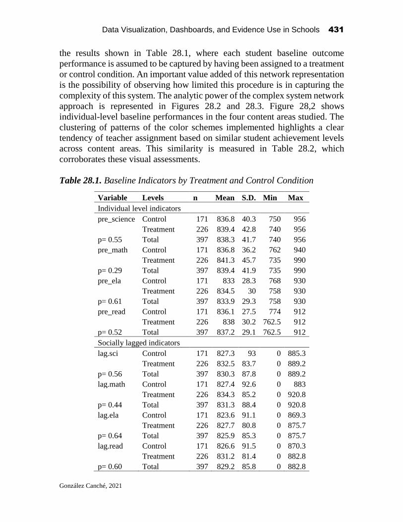
Data Visualization, Dashboards, and Evidence Use in Schools 431
González Canché, 2021
the results shown in Table 28.1, where each student baseline outcome
performance is assumed to be captured by having been assigned to a treatment
or control condition. An important value added of this network representation
is the possibility of observing how limited this procedure is in capturing the
complexity of this system. The analytic power of the complex system network
approach is represented in Figures 28.2 and 28.3. Figure 28,2 shows
individual-level baseline performances in the four content areas studied. The
clustering of patterns of the color schemes implemented highlights a clear
tendency of teacher assignment based on similar student achievement levels
across content areas. This similarity is measured in Table 28.2, which
corroborates these visual assessments.
Table 28.1. Baseline Indicators by Treatment and Control Condition
Variable Levels n Mean S.D. Min Max
Individual level indicators
pre_science Control 171 836.8 40.3 750 956
Treatment 226 839.4 42.8 740 956
p= 0.55 Total 397 838.3 41.7 740 956
pre_math Control 171 836.8 36.2 762 940
Treatment 226 841.3 45.7 735 990
p= 0.29 Total 397 839.4 41.9 735 990
pre_ela Control 171 833 28.3 768 930
Treatment 226 834.5 30 758 930
p= 0.61 Total 397 833.9 29.3 758 930
pre_read Control 171 836.1 27.5 774 912
Treatment 226 838 30.2 762.5 912
p= 0.52 Total 397 837.2 29.1 762.5 912
Socially lagged indicators
lag.sci Control 171 827.3 93 0 885.3
Treatment 226 832.5 83.7 0 889.2
p= 0.56 Total 397 830.3 87.8 0 889.2
lag.math Control 171 827.4 92.6 0 883
Treatment 226 834.3 85.2 0 920.8
p= 0.44 Total 397 831.3 88.4 0 920.8
lag.ela Control 171 823.6 91.1 0 869.3
Treatment 226 827.7 80.8 0 875.7
p= 0.64 Total 397 825.9 85.3 0 875.7
lag.read Control 171 826.6 91.5 0 870.3
Treatment 226 831.2 81.4 0 882.8
p= 0.60 Total 397 829.2 85.8 0 882.8

Data Visualization, Dashboards, and Evidence Use in Schools 432
González Canché, 2021
Table 28.2. Complex Systems Network Analysis of Baseline Performance
Given Teacher Assignment
Groups Variable
Moran's I
Expectation
Standard
Deviate
Prob. T
reat
men
t
and c
ontr
ol pre_science 0.34359 -0.0026 17.952 < 0.001
pre_math 0.39136 -0.0026 20.464 < 0.001
pre_ela 0.32441 -0.0026 16.977 < 0.001
pre_read 0.37125 -0.0026 19.388 < 0.001
Tre
atm
ent pre_science 0.38923 -0.0045 13.949 < 0.001
pre_math 0.43896 -0.0045 15.756 < 0.001
pre_ela 0.38421 -0.0045 13.794 < 0.001
pre_read 0.3919 -0.0045 14.044 < 0.001
Contr
ol pre_science 0.27327 -0.006 12 < 0.001
pre_math 0.28536 -0.006 12.534 < 0.001
pre_ela 0.23734 -0.006 10.354 < 0.001
pre_read 0.27627 -0.006 12.136 < 0.001
Under True Random assignment at the teacher level
Tre
atm
ent
and c
ontr
ol pre_science -0.0294 -0.0025 -1.3624 0.9135
pre_math -0.0185 -0.0025 -0.81 0.791
pre_ela -0.0099 -0.0025 -0.3747 0.646
pre_read 0.00026 -0.0025 0.14123 0.4438
Table 28.2 also contains complex system network analyses separated
by treatment and control statuses to address question 2(a). To reconcile these
analyses with Figure 28.2, one can test whether the issue of pre-treatment
outcome similarity is more pronounced in the treatment or control groups.
Table 28.2 consistently indicates that the group configuration issue is more
prevalent in the treatment groups than in the control groups configuration,
which is indicated by the magnitudes of the Moran’s I estimates. In short,
baseline performances are much more similar in treatment groups than in their
control counterparts. This higher similarity highlights a greater propensity
toward grouping more alike students across treatment teachers than among
their business as usual counterparts.
Figure 28.3 shows the lagged baselined values of each student i’s peers
j and is required to address the third research question. The information
contained in this figure is the predictor used in equation (3) to capture peer
effects after accounting for the nested data structure. To exemplify the
mechanism, let us consider the treated group located on the top left side of the
science sociograms in Figures 28.2 and 28.3. Note that these IC students show
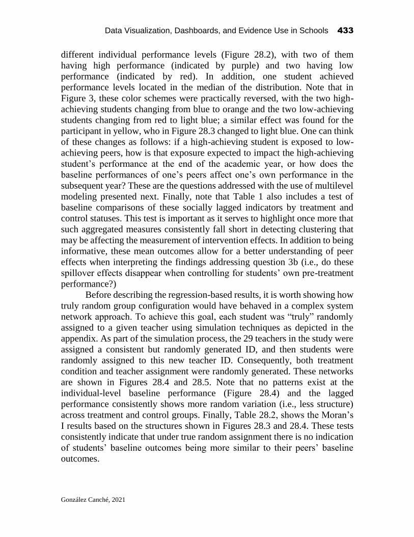
Data Visualization, Dashboards, and Evidence Use in Schools 433
González Canché, 2021
different individual performance levels (Figure 28.2), with two of them
having high performance (indicated by purple) and two having low
performance (indicated by red). In addition, one student achieved
performance levels located in the median of the distribution. Note that in
Figure 3, these color schemes were practically reversed, with the two high-
achieving students changing from blue to orange and the two low-achieving
students changing from red to light blue; a similar effect was found for the
participant in yellow, who in Figure 28.3 changed to light blue. One can think
of these changes as follows: if a high-achieving student is exposed to low-
achieving peers, how is that exposure expected to impact the high-achieving
student’s performance at the end of the academic year, or how does the
baseline performances of one’s peers affect one’s own performance in the
subsequent year? These are the questions addressed with the use of multilevel
modeling presented next. Finally, note that Table 1 also includes a test of
baseline comparisons of these socially lagged indicators by treatment and
control statuses. This test is important as it serves to highlight once more that
such aggregated measures consistently fall short in detecting clustering that
may be affecting the measurement of intervention effects. In addition to being
informative, these mean outcomes allow for a better understanding of peer
effects when interpreting the findings addressing question 3b (i.e., do these
spillover effects disappear when controlling for students’ own pre-treatment
performance?)
Before describing the regression-based results, it is worth showing how
truly random group configuration would have behaved in a complex system
network approach. To achieve this goal, each student was “truly” randomly
assigned to a given teacher using simulation techniques as depicted in the
appendix. As part of the simulation process, the 29 teachers in the study were
assigned a consistent but randomly generated ID, and then students were
randomly assigned to this new teacher ID. Consequently, both treatment
condition and teacher assignment were randomly generated. These networks
are shown in Figures 28.4 and 28.5. Note that no patterns exist at the
individual-level baseline performance (Figure 28.4) and the lagged
performance consistently shows more random variation (i.e., less structure)
across treatment and control groups. Finally, Table 28.2, shows the Moran’s
I results based on the structures shown in Figures 28.3 and 28.4. These tests
consistently indicate that under true random assignment there is no indication
of students’ baseline outcomes being more similar to their peers’ baseline
outcomes.
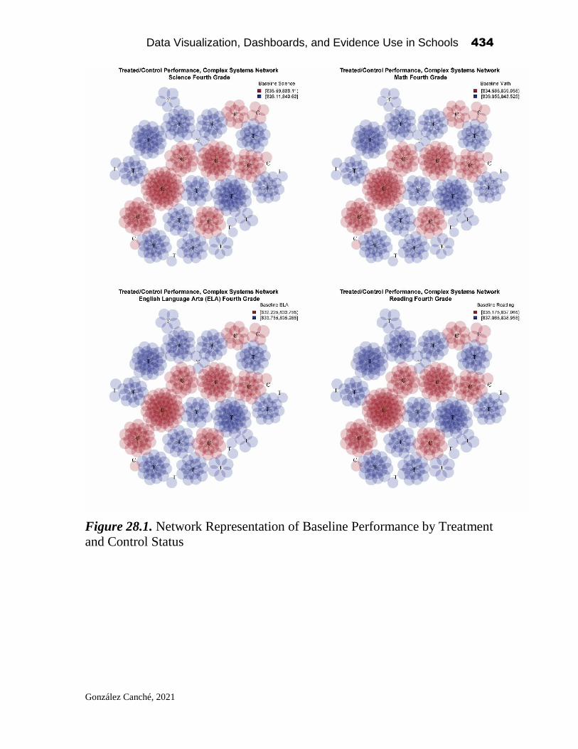
Data Visualization, Dashboards, and Evidence Use in Schools 434
González Canché, 2021
Figure 28.1. Network Representation of Baseline Performance by Treatment
and Control Status
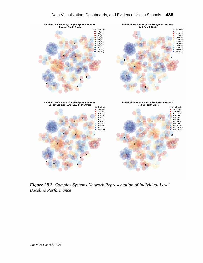
Data Visualization, Dashboards, and Evidence Use in Schools 435
González Canché, 2021
Figure 28.2. Complex Systems Network Representation of Individual Level
Baseline Performance

Data Visualization, Dashboards, and Evidence Use in Schools 436
González Canché, 2021
Figure 28.3. Complex Systems Network Representation of Socially Lagged
Baseline Peers’ Performance

Data Visualization, Dashboards, and Evidence Use in Schools 437
González Canché, 2021
Figure 28.4. Complex Systems Network Representation of Individual Level
Baseline Performance Under True Randomization

Data Visualization, Dashboards, and Evidence Use in Schools 438
González Canché, 2021
Figure 28.5. Complex Systems Network Representation of Socially Lagged
Baseline Peers’ Performance Under True Randomization
Regression-based Results
These results are presented in Tables 28.3, 28.4, and 28.5. Each table includes
a naïve OLS model, which ignores the nested structure of the data, along with
its multilevel specification. At the bottom of each model a Moran’s I test of
regression residuals (e_i and e_it for the OLS and multilevel models,
respectively) is also presented. Table 28.3 addresses question 3 regarding

Data Visualization, Dashboards, and Evidence Use in Schools 439
González Canché, 2021
evidence of peer effects. Table 28.4 addresses question 3(a) regarding
potential moderation of peer effects by treatment condition. Finally, Table
28.5 addresses question 3(b) concerning whether peer effects dissipated when
controlling for individual-level pre-intervention performance.
All the models contained in Table 28.3 consistently indicate the
presence of peer effects, wherein the baseline outcomes of a given student’s
peers significantly influenced her/his academic performance the subsequent
year. Although these findings are consistent across the OLS and multilevel
specifications, the magnitude of these coefficients is higher in the OLS
models. Note also that the residuals obtained in the OLS models (or e_i as
they ignore the subscript t) are still subject to dependence issues, which
suggests that the spillover effect coefficients shown are upwardly biased.
From this perspective, a more accurate depiction of the magnitude of
spillovers is found in the multilevel approaches, wherein all residuals (e_it)
behaved identically and independently distributed. From a practical point of
view, we can conclude that as one’s peers’ performance goes up in a given
subject area one’s own performance will also tend to increase. Figure 6a
presents the expected gains given the mean values of the lagged indicators
(peers’ performance) contained in Table 28.1. It is worth noting the expected
gains, which reach almost 60 standardized points in science and 33 points in
reading. Similar analyses can be conducted at differing levels of the
distributions shown in Figure 28.3, where these lagged indicators are
separated in quantiles.
Table 28.4 tests whether peer effects are moderated by the IC
intervention. The OLS models indicated that in all but one of the content areas,
IC students benefited more by the baseline achievement of their peers.
However, note once more that the residuals are autocorrelated, which
threatens the validity of these conclusions. The multilevel results corroborated
that there was no evidence to conclude that IC students benefited more than
their non-IC counterparts from their peer’s past performance across content
areas. Once more, these multilevel models’ residuals were not subjected to
dependence issues. Accordingly, these multilevel estimates are less biased
than the estimates obtained with the OLS models.
Finally, Table 28.5 controls for individual-level achievement and
spillover effects. In these models, two of the four OLS results show that
spillover effects remained significant even after controlling for individual
performance. Notably, these inferences remained true in the multilevel
approach (English language arts and science, p< 0.05). These latter findings
are important given that they suggest the need to control for peer effects
moving forward, even after controlling for individual pre-treatment
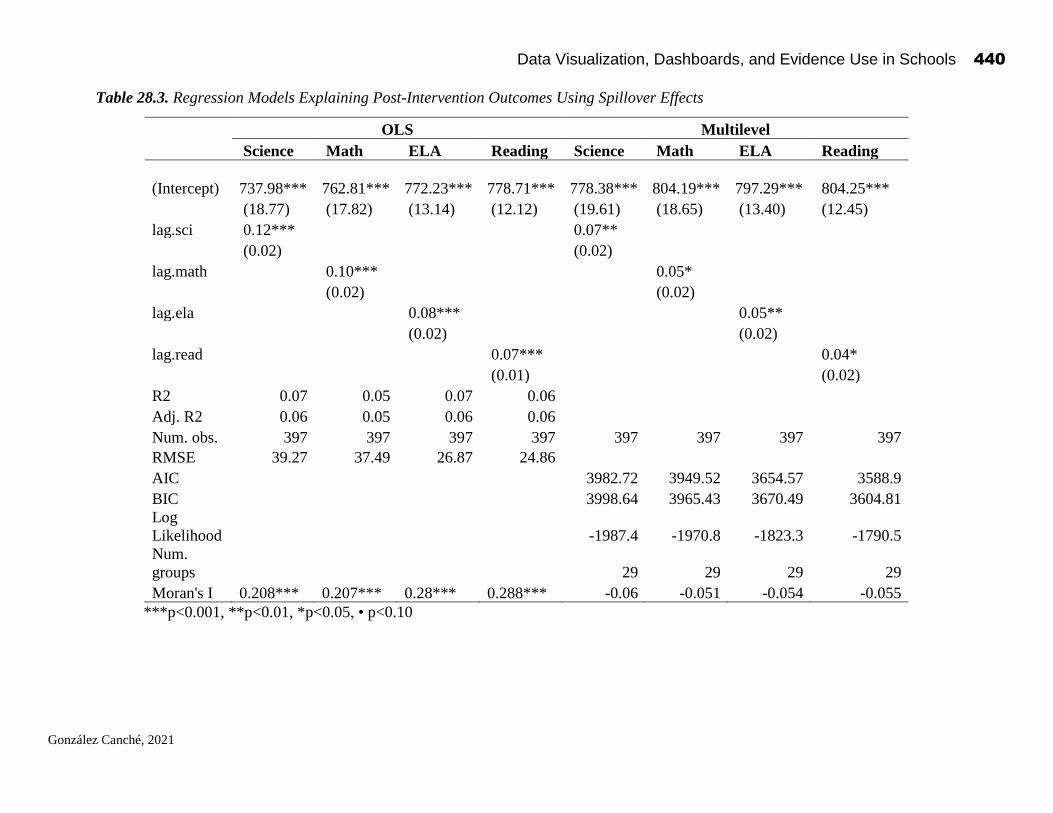
Data Visualization, Dashboards, and Evidence Use in Schools 440
González Canché, 2021
Table 28.3. Regression Models Explaining Post-Intervention Outcomes Using Spillover Effects
OLS Multilevel
Science Math ELA Reading Science Math ELA Reading
(Intercept)
737.98***
762.81***
772.23***
778.71***
778.38***
804.19***
797.29*** 804.25***
(18.77) (17.82) (13.14) (12.12) (19.61) (18.65) (13.40) (12.45)
lag.sci 0.12*** 0.07**
(0.02) (0.02)
lag.math 0.10*** 0.05*
(0.02) (0.02)
lag.ela 0.08*** 0.05**
(0.02) (0.02)
lag.read 0.07*** 0.04*
(0.01) (0.02)
R2 0.07 0.05 0.07 0.06
Adj. R2 0.06 0.05 0.06 0.06
Num. obs. 397 397 397 397 397 397 397 397
RMSE 39.27 37.49 26.87 24.86
AIC 3982.72 3949.52 3654.57 3588.9
BIC 3998.64 3965.43 3670.49 3604.81
Log
Likelihood -1987.4 -1970.8 -1823.3 -1790.5
Num.
groups 29 29 29 29
Moran's I 0.208*** 0.207*** 0.28*** 0.288*** -0.06 -0.051 -0.054 -0.055
***p<0.001, **p<0.01, *p<0.05, • p<0.10

Data Visualization, Dashboards, and Evidence Use in Schools 441
González Canché, 2021
Table 28.4. Regression Models Explaining Post-Intervention Outcomes Using Spillover Effects Interacted with IC participation
OLS Multilevel
Science Math ELA Reading Science Math ELA Reading
(Intercept)
779.06***
787.79***
796.21***
802.70***
797.84***
814.40***
812.19***
820.91***
(26.85) (25.84) (18.58) (17.21) (28.04) (26.63) (19.10) (17.75)
treat_teacher -79.14* -48.36 -46.55• -46.73• -37.84 -19.39 -29.39 -32.78
(37.41) (35.68) (26.07) (24.12) (39.41) (37.42) (26.95) (25.03)
lag.sci 0.07* 0.05
(0.03) (0.03)
treat_teacher:lag.sci 0.10* 0.04
(0.04) (0.05)
lag.math 0.07* 0.04
(0.03) (0.03)
treat_teacher:lag.math 0.05 0.01
(0.04) (0.05)
lag.ela 0.05* 0.03
(0.02) (0.02)
treat_teacher:lag.ela 0.06* 0.04
(0.03) (0.03)
lag.read 0.04• 0.02
(0.02) (0.02)
treat_teacher:lag.read 0.06* 0.04
(0.03) (0.03)
R2 0.08 0.06 0.09 0.07
Adj. R2 0.07 0.05 0.08 0.07
Num. obs. 397 397 397 397 397 397 397 397
RMSE 39.11 37.47 26.65 24.71
AIC 3983.67 3950.48 3656.67 3590.66
BIC 4007.51 3974.33 3680.51 3614.5
Log Likelihood -1985.83 -1969.24 -1822.33 -1789.33
Num. groups 29 29 29 29
Moran's I 0.194*** 0.201*** 0.265*** 0.277*** -0.06 -0.053 -0.056 -0.057
***p<0.001, **p<0.01, *p<0.05, • p<0.10

Data Visualization, Dashboards, and Evidence Use in Schools 442
González Canché, 2021
Table 28.5. Regression Models Explaining Post-Intervention Outcomes After Controlling for Individual level performance
OLS Multilevel
Science Math ELA Reading Science Math ELA Reading
(Intercept)
213.40***
276.17***
241.55***
310.89***
220.65***
270.12***
292.56***
244.44***
(27.66) (26.94) (26.24) (22.76) (30.84) (30.95) (28.88) (22.64)
pre_science 0.71*** 0.71***
(0.03) (0.04)
lag.sci 0.03• 0.03**
(0.02) (0.01)
pre_math 0.67*** 0.67***
(0.03) (0.04)
lag.math 0.01 0.01
(0.02) (0.01)
pre_ela 0.70*** 0.64***
(0.03) (0.04)
lag.ela 0.02* 0.02*
(0.01) (0.01)
pre_read 0.73*** 0.70***
(0.03) (0.03)
lag.read 0.00 0.00
(0.01) (0.01)
R2 0.57 0.54 0.57 0.70
Adj. R2 0.57 0.54 0.57 0.70
Num. obs. 397 397 397 397 397 397 397 397
RMSE 26.75 26.2 18.25 14.11
AIC 3719.87 3712.15 3433.2 3241.27
BIC 3739.75 3732.03 3453.09 3261.15
Log
Likelihood -1854.94 -1851.08 -1711.6 -1615.63
Num.
groups 29 29 29 29
Moran's I 0.136*** 0.112*** 0.082*** 0.164*** -0.048 -0.037 -0.038 -0.029
***p<0.001, **p<0.01, *p<0.05, • p<0.10

Data Visualization, Dashboards, and Evidence Use in Schools 443
González Canché, 2021
Figure 28.6a. Expected gains given peer effects without controlling for individual level
performance.
Figure 28.6b. Expected gains given peer effects after controlling for individual level
performance. Dark bars indicate not significant results at the 0.05 probability level.
achievement, by following the methodological procedures depicted in this
paper and shown in the appendix. Similar to the analyses discussed for Figure
6a, note that Figure 28.6b shows that both control and treatment participants’
individual post-treatment performance in science increased about 25
standardized points, on average, based on the influence of their peers’
performance, even after accounting for their individual-level baseline
performances. In the case of English language arts, the observed average gains
based on their peer effects were around 16 standardized points. The dark bars
in math and reading show no significant effects, as indicated in Table 28.5.
0
10
20
30
40
50
60
70
C O N T R O L T R E A T M E N T C O N T R O L T R E A T M E N T C O N T R O L T R E A T M E N T C O N T R O L T R E A T M E N T
L A G . S C I L A G . M A T H L A G . E L A L A G . R E A D
AVERAGE INDIVIDUAL GAINS GIVEN PEERS' PERFORMANCE, WITHOUT ACCOUNTING FOR
INDIVIDUAL ATTAINMENT (TABLE 3)
0
5
10
15
20
25
30
C O N T R O L T R E A T M E N T C O N T R O L T R E A T M E N T C O N T R O L T R E A T M E N T C O N T R O L T R E A T M E N T
L A G . S C I L A G . M A T H L A G . E L A L A G . R E A D
AVERAGE INDIVIDUAL GAINS GIVEN PEERS' PERFORMANCE, AFTER ACCOUNTING FOR
INDIVIDUAL ATTAINMENT (TABLE 5)

Data Visualization, Dashboards, and Evidence Use in Schools 444
González Canché, 2021
Discussion and Implications
The complex systems network approach employed in this study allows
researchers to capture a more comprehensive level of variation at a systemic
level. The case studied justifies the need to measure for potential
contamination at the student-teacher group formation stage, wherein
administrative decisions, parental involvement, or even mean school-level
achievement, may contribute to the potential clustering of students with more
similar baseline performances that what one should expect to observe by
random chance. This clustering in addition to potential self-selection, may not
only have driven such group formation, but more importantly may also affect
the treatment effect. This study argued that aggregated baseline comparisons
may not only mask factors affecting “joining” decisions but also, and as
importantly, the effects that peers have on their classmates resulting from such
decisions. Both factors are considered important threats to the efficacy of
randomization and its corresponding effect on potentially biasing causal
claims.
The method depicted is easy to follow and replicate and can be
conducted during the group formation stage to comprehensively assess group
baseline performance before the intervention is actually implemented. This is
possible as long as researchers have access to students’ pre-treatment
indicators at the group formation stage. Note, however, that the presence of
peer effects is not a negative finding per se, but rather researchers could start
capitalizing on these effects more systematically. For example, students who
may be academically struggling may benefit the most by regularly interacting
with their more academically “proficient” peers hence calling for a more
balanced diversity in achievement levels within each teacher-student group.
Although the discussion of what this more strategic group formation implies
for clustered RCTs goes beyond the scope of this study, such a group
formation could potentially balance each student-teacher group by academic
performance tertiles (e.g., x students from the bottom tertile, y students from
the meddle tertile, and z student from the upper tertile) to ensure the presence
of students interacting with higher achiever peers and vice versa. This balance,
in addition to diversifying the content and quality of the discussion and
arguably being more equitable, will contribute to reach Moran’s I values that
are closer to zero. However, and notably, the peer effects gains highlighted in
this study are not expected to disappear by following a more strategic group
formation approach, but rather may even be reinforced.
To reiterate, the presence of peer effects is not troublesome, what is
troubling is the assumption that peer effects are nonexistent as their omission

Data Visualization, Dashboards, and Evidence Use in Schools 445
González Canché, 2021
would continue to remain a problem of omitted variable bias given the
structure these indicators account for in the models. The complex systems
network framework depicted herein enables both testing for this assumption
and controlling for or modeling the magnitude of these effects. While the
models shown in Table 5 are meant to absorb the statistical power of peer
effects as predictors, this approach fell short in achieving this goal, a truly
remarkable finding that justifies the need to incorporate these effects in our
analytic frameworks.
To close, on a related note, it is worth mentioning that the procedures
and research questions presented in this study have been replicated with data
taken from a teacher professional development program that was conducted
in public and private kindergartens in the Greater Accra Region of Ghana (see
Wolf, Aber, Behrman, & Tsinigo, 2018). Such a professional development
program consisted of a cluster-randomized trial that included 240 schools, 444
teachers and 3,345 children with a mean age of 5.2 years. Clearly, such a study
has more statistical power than the study discussed here, and all models
measuring children indicators of school readiness (assessed in four domains:
early literacy, early numeracy, social-emotional skills, and executive
function) indicated that peer effects remained significant after controlling for
students’ own baseline performance in their same school readiness domains
measured pre-intervention. That data, however, are not yet publicly available
for inclusion in this study and this replication exercise was conducted simply
as a test of methodological external validity. The replication of the
conclusions reached in this paper with that other cluster-randomized trial is
considered remarkable as those data were collected in a different continent
and by another research team. Please note that all the coding schemes are
included in the appendix section for researchers to implement these
approaches with their own data.
Author Note
This research was supported by a grant from the Institute of Education
Sciences (R305A100670). Mailing address: 208 South 37th Street, Stiteler
Hall Room 207, Philadelphia, PA, 19104. Tel. 215-898-0332, email:

Data Visualization, Dashboards, and Evidence Use in Schools 446
González Canché, 2021
References
Bivand, R. S., Pebesma, E. J., Gomez-Rubio, V., & Pebesma, E. J. (2013). Applied spatial
data analysis with R (Vol. 747248717). New York: Springer.
Breiger, R. L. (1974). The duality of persons and groups. Social Forces, 53(2), 181–190.
Gay, G. (2010). Culturally responsive teaching: Theory, research, and practice. New
York, USA: Teachers College Press.
Holland, P. W. (1986). Statistics and causal inference. Journal of the American statistical
Association, 81(396), 945-960.
Kolaczyk, E. D., & Csárdi, G. (2014). Statistical analysis of network data with R (Vol. 65).
New York: Springer.
Ladson-Billings, G. (2009). The dreamkeepers: Successful teachers of African American
children. Hoboken, NJ, USA: John Wiley & Sons.
Maroulis, S., Guimera, R., Petry, H., Stringer, M. J., Gomez, L. M., Amaral, L. A., &
Wilensky, U. (2010). Complex systems view of educational policy research.
Science, 330(6000), 38–39.
Mitchell, M. (2006). Complex systems: Network thinking. Artificial Intelligence, 170(18),
1194–1212.
Portes, P. R., González Canché, M. S., Boada, D., & Whatley, M. E. (2018). Early
evaluation findings from the Instructional Conversation Study: Culturally
responsive teaching outcomes for diverse learners in elementary school. American
Educational Research Journal, 55(3), 488–531.
Rubin, D. B. (1986). Comment: Which ifs have causal answers. Journal of the American
Statistical Association, 81(396), 961–962.
Rubin, D. B. (1990). Formal mode of statistical inference for causal effects. Journal of
Statistical Planning and Inference, 25(3), 279–292.
Schochet, P. Z. (2008). The Late Pretest Problem in Randomized Control Trials of
Education Interventions. NCEE 2009-4033. National Center for Education
Evaluation and Regional Assistance.
Tharp, R. G., & Gallimore, R. (1989). Rousing schools to life. American Educator: The
Professional Journal of the American Federation of Teachers, 13(2), 20–25, 46–
52.
Tilly, C. (2002). Event catalogs as theories. Sociological Theory, 20(2), 248-254.
Vygotsky, L. (1978). Mind in society: The development of higher mental process.
Cambridge, MA: Harvard University Press.
Wasserman, S., & Faust, K. (1994). Social network analysis: Methods and applications
(Vol. 8). New York, NY, USA: Cambridge University Press.
Wlodkowski, R. J., & Ginsberg, M. B. (1995). A framework for culturally responsive
teaching. Educational Leadership, 53(1), 17–21.
What Works Clearinghouse. (2018). What Works Clearinghouse: Standards handbook,
Version 4.0. Washington, DC: US Department of Education.
https://ies.ed.gov/ncee/wwc/Docs/referenceresources/wwc_standards_handbook_
v4.pdf
Wolf, S., Aber, J. L., Behrman, J. R., & Tsinigo, E. (2018). Experimental Impacts of the
“Quality Preschool for Ghana” Interventions on Teacher Professional Well-being,

Data Visualization, Dashboards, and Evidence Use in Schools 447
González Canché, 2021
Classroom Quality, and Children’s School Readiness. Journal of Research on
Educational Effectiveness, 1-28.
Zeng, A., Shen, Z., Zhou, J., Wu, J., Fan, Y., Wang, Y., & Stanley, H. E. (2017). The
science of science: From the perspective of complex systems. Physics Reports, 714,
1–73.
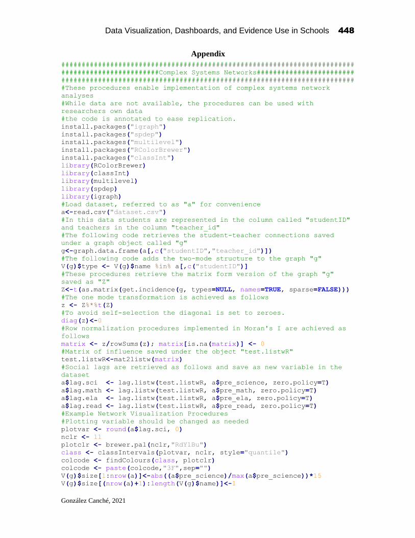
Data Visualization, Dashboards, and Evidence Use in Schools 448
González Canché, 2021
Appendix
########################################################################
########################Complex Systems Networks########################
########################################################################
#These procedures enable implementation of complex systems network
analyses
#While data are not available, the procedures can be used with
researchers own data
#the code is annotated to ease replication.
install.packages("igraph")
install.packages("spdep")
install.packages("multilevel")
install.packages("RColorBrewer")
install.packages("classInt")
library(RColorBrewer)
library(classInt)
library(multilevel)
library(spdep)
library(igraph)
#Load dataset, referred to as "a" for convenience
a<-read.csv("dataset.csv")
#In this data students are represented in the column called "studentID"
and teachers in the column "teacher_id"
#The following code retrieves the student-teacher connections saved
under a graph object called "g"
g<-graph.data.frame(a[,c("studentID","teacher_id")])
#The following code adds the two-mode structure to the graph "g"
V(g)$type <- V(g)$name %in% a[,c("studentID")]
#These procedures retrieve the matrix form version of the graph "g"
saved as "Z"
Z<-t(as.matrix(get.incidence(g, types=NULL, names=TRUE, sparse=FALSE)))
#The one mode transformation is achieved as follows
z <- Z%*%t(Z)
#To avoid self-selection the diagonal is set to zeroes.
diag(z)<-0
#Row normalization procedures implemented in Moran's I are achieved as
follows
matrix <- z/rowSums(z); matrix[is.na(matrix)] <- 0
#Matrix of influence saved under the object "test.listwR"
test.listwR<-mat2listw(matrix)
#Social lags are retrieved as follows and save as new variable in the
dataset
a$lag.sci <- lag.listw(test.listwR, a$pre_science, zero.policy=T)
a$lag.math <- lag.listw(test.listwR, a$pre_math, zero.policy=T)
a$lag.ela <- lag.listw(test.listwR, a$pre_ela, zero.policy=T)
a$lag.read <- lag.listw(test.listwR, a$pre_read, zero.policy=T)
#Example Network Visualization Procedures
#Plotting variable should be changed as needed
plotvar <- round(a$lag.sci, 0)
nclr <- 11
plotclr <- brewer.pal(nclr,"RdYlBu")
class <- classIntervals(plotvar, nclr, style="quantile")
colcode <- findColours(class, plotclr)
colcode <- paste(colcode,"3F",sep="")
V(g)$size[1:nrow(a)]<-abs((a$pre_science)/max(a$pre_science))*15
V(g)$size[(nrow(a)+1):length(V(g)$name)]<-1

Data Visualization, Dashboards, and Evidence Use in Schools 449
González Canché, 2021
plot(g, vertex.color=colcode, vertex.label=V(g)$label,
edge.arrow.size=.25, layout=l2)
colcode <- findColours(class, plotclr)
legend("topright", legend = names(attr(colcode, "table")), fill =
attr(colcode, "palette"), title="Baseline Science", cex=2, box.col=NA)
title(main="Group Performance, Complex Systems Network\n Science Fourth
Grade",cex.main=2.5)
###Procedures to achieve Figure 1
#Aggregation of means by treatment condition
sta<-aggregate(a$pre_science, list(a$IC), mean, na.rm = T)
#Matching these values to actual IC status (IC has values 1 or 0)
a$tlag.sci <- as.numeric(sta$x[match(a$IC,sta$Group.1)])
#The resulting aggregated values can be substituted as the plotting
# value in the visualization code above
#Code to generate true random assignment
set.seed(47)
a$randomID <- sample(x = c(1:length(table(a$teacher_id))), size =
nrow(a), replace = TRUE)
# To create a new graph with the random assignment we use the following:
gR<-graph.data.frame(a[,c("std","teacher_id")])
#The graph gR can then be transformed into a matrix of influence to
implement Moran's I as done above and illustrated next
V(gR)$type <- V(gR)$name %in% a[,c("studentID")] #this indicates we are
dealing with a two-mode network
table(V(gR)$type)
ZR<-t(as.matrix(get.incidence(gR, types=NULL, names=TRUE,
sparse=FALSE)))
dim(ZR)
zR <- ZR%*%t(ZR)
dim(zR)
diag(zR)<-0
matrixR <- zR/rowSums(zR)
matrixR[is.na(matrixR)] <-0
test.listwRR<-mat2listw(matrixR)
#Example of Moran's I procedures by content area
moran.test(a$pre_science, test.listwR, zero.policy=T)
#Example of Moran's I procedures by content area using the random
structure captured in "test.listwRR"
moran.test(a$pre_science, test.listwRR, zero.policy=T)
#Example OLS and spillovers
sciencenaive <- lm(formula = post_science ~ lag.sci, data =
data.frame(a))
#Example Science and spillovers
mscience <- lme(post_science ~ lag.sci, random= ~ 1|teacher_id, data= a,
control= list(opt="optim"))
#Example Science moderated by treatment (IC)
mscience.t <- lme(post_science ~ lag.sci * IC, random= ~ 1|teacher_id,
data= a, control=list(opt="optim"))
#Example Science controlling by individual level performance
mscience.i <- lme(post_science ~ lag.sci + pre_science, random= ~
1|teacher_id, data= a, control= list(opt="optim"))
#Regression residuals' dependence are tested as follows:
jNULL <- residuals(mscience); moran.test(jNULL,test.listwR,
zero.policy=TRUE)
########################################################################
Related Documents