Steven S. Skiena Steven S. Skiena 123 THE Data Science Design MANUAL Data Science Design TEXTS IN COMPUTER SCIENCE

Welcome message from author
This document is posted to help you gain knowledge. Please leave a comment to let me know what you think about it! Share it to your friends and learn new things together.
Transcript

Steven S. SkienaSteven S. Skiena
123
THE
Data Science Design MANUAL
Data Science Design
T E X T S I N C O M P U T E R S C I E N C E

Texts in Computer Science
Series editorsDavid GriesOrit HazzanFred B. Schneider

More information about this series at http://www.springer.com/series/3191

Steven S. Skiena
The Data Science DesignManual
123

Steven S. SkienaComputer Science DepartmentStony Brook UniversityStony Brook, NYUSA
ISSN 1868-0941 ISSN 1868-095X (electronic)Texts in Computer ScienceISBN 978-3-319-55443-3 ISBN 978-3-319-55444-0 (eBook)
Library of Congress Control Number: 2017943201
This book was advertised with a copyright holder in the name of the publisher in error, whereasthe author(s) holds the copyright.
© The Author(s) 2017This work is subject to copyright. All rights are reserved by the Publisher, whether the whole orpart of the material is concerned, specifically the rights of translation, reprinting, reuse ofillustrations, recitation, broadcasting, reproduction on microfilms or in any other physical way,and transmission or information storage and retrieval, electronic adaptation, computer software,or by similar or dissimilar methodology now known or hereafter developed.The use of general descriptive names, registered names, trademarks, service marks, etc. in thispublication does not imply, even in the absence of a specific statement, that such names areexempt from the relevant protective laws and regulations and therefore free for general use.The publisher, the authors and the editors are safe to assume that the advice and information inthis book are believed to be true and accurate at the date of publication. Neither the publisher northe authors or the editors give a warranty, express or implied, with respect to the materialcontained herein or for any errors or omissions that may have been made. The publisher remainsneutral with regard to jurisdictional claims in published maps and institutional affiliations.
Printed on acid-free paper
This Springer imprint is published by Springer NatureThe registered company is Springer International Publishing AGThe registered company address is: Gewerbestrasse 11, 6330 Cham, Switzerland
https://doi.org/10.1007/978-3-319-55444-0

Preface
Making sense of the world around us requires obtaining and analyzing data fromour environment. Several technology trends have recently collided, providingnew opportunities to apply our data analysis savvy to greater challenges thanever before.
Computer storage capacity has increased exponentially; indeed rememberinghas become so cheap that it is almost impossible to get computer systems to for-get. Sensing devices increasingly monitor everything that can be observed: videostreams, social media interactions, and the position of anything that moves.Cloud computing enables us to harness the power of massive numbers of ma-chines to manipulate this data. Indeed, hundreds of computers are summonedeach time you do a Google search, scrutinizing all of your previous activity justto decide which is the best ad to show you next.
The result of all this has been the birth of data science, a new field devotedto maximizing value from vast collections of information. As a discipline, datascience sits somewhere at the intersection of statistics, computer science, andmachine learning, but it is building a distinct heft and character of its own.This book serves as an introduction to data science, focusing on the skills andprinciples needed to build systems for collecting, analyzing, and interpretingdata.
My professional experience as a researcher and instructor convinces me thatone major challenge of data science is that it is considerably more subtle than itlooks. Any student who has ever computed their grade point average (GPA) canbe said to have done rudimentary statistics, just as drawing a simple scatter plotlets you add experience in data visualization to your resume. But meaningfullyanalyzing and interpreting data requires both technical expertise and wisdom.That so many people do these basics so badly provides my inspiration for writingthis book.
To the Reader
I have been gratified by the warm reception that my book The Algorithm DesignManual [Ski08] has received since its initial publication in 1997. It has beenrecognized as a unique guide to using algorithmic techniques to solve problemsthat often arise in practice. The book you are holding covers very differentmaterial, but with the same motivation.
v

vi
In particular, here I stress the following basic principles as fundamental tobecoming a good data scientist:
• Valuing doing the simple things right: Data science isn’t rocket science.Students and practitioners often get lost in technological space, pursuingthe most advanced machine learning methods, the newest open sourcesoftware libraries, or the glitziest visualization techniques. However, theheart of data science lies in doing the simple things right: understandingthe application domain, cleaning and integrating relevant data sources,and presenting your results clearly to others.
Simple doesn’t mean easy, however. Indeed it takes considerable insightand experience to ask the right questions, and sense whether you are mov-ing toward correct answers and actionable insights. I resist the temptationto drill deeply into clean, technical material here just because it is teach-able. There are plenty of other books which will cover the intricacies ofmachine learning algorithms or statistical hypothesis testing. My missionhere is to lay the groundwork of what really matters in analyzing data.
• Developing mathematical intuition: Data science rests on a foundation ofmathematics, particularly statistics and linear algebra. It is important tounderstand this material on an intuitive level: why these concepts weredeveloped, how they are useful, and when they work best. I illustrateoperations in linear algebra by presenting pictures of what happens tomatrices when you manipulate them, and statistical concepts by exam-ples and reducto ad absurdum arguments. My goal here is transplantingintuition into the reader.
But I strive to minimize the amount of formal mathematics used in pre-senting this material. Indeed, I will present exactly one formal proof inthis book, an incorrect proof where the associated theorem is obviouslyfalse. The moral here is not that mathematical rigor doesn’t matter, be-cause of course it does, but that genuine rigor is impossible until afterthere is comprehension.
• Think like a computer scientist, but act like a statistician: Data scienceprovides an umbrella linking computer scientists, statisticians, and domainspecialists. But each community has its own distinct styles of thinking andaction, which gets stamped into the souls of its members.
In this book, I emphasize approaches which come most naturally to com-puter scientists, particularly the algorithmic manipulation of data, the useof machine learning, and the mastery of scale. But I also seek to transmitthe core values of statistical reasoning: the need to understand the appli-cation domain, proper appreciation of the small, the quest for significance,and a hunger for exploration.
No discipline has a monopoly on the truth. The best data scientists incor-porate tools from multiple areas, and this book strives to be a relativelyneutral ground where rival philosophies can come to reason together.

vii
Equally important is what you will not find in this book. I do not emphasizeany particular language or suite of data analysis tools. Instead, this book pro-vides a high-level discussion of important design principles. I seek to operate ata conceptual level more than a technical one. The goal of this manual is to getyou going in the right direction as quickly as possible, with whatever softwaretools you find most accessible.
To the Instructor
This book covers enough material for an “Introduction to Data Science” courseat the undergraduate or early graduate student levels. I hope that the readerhas completed the equivalent of at least one programming course and has a bitof prior exposure to probability and statistics, but more is always better thanless.
I have made a full set of lecture slides for teaching this course available onlineat http://www.data-manual.com. Data resources for projects and assignmentsare also available there to aid the instructor. Further, I make available onlinevideo lectures using these slides to teach a full-semester data science course. Letme help teach your class, through the magic of the web!
Pedagogical features of this book include:
• War Stories: To provide a better perspective on how data science tech-niques apply to the real world, I include a collection of “war stories,” ortales from our experience with real problems. The moral of these stories isthat these methods are not just theory, but important tools to be pulledout and used as needed.
• False Starts: Most textbooks present methods as a fait accompli, ob-scuring the ideas involved in designing them, and the subtle reasons whyother approaches fail. The war stories illustrate my reasoning process oncertain applied problems, but I weave such coverage into the core materialas well.
• Take-Home Lessons: Highlighted “take-home” lesson boxes scatteredthrough each chapter emphasize the big-picture concepts to learn fromeach chapter.
• Homework Problems: I provide a wide range of exercises for home-work and self-study. Many are traditional exam-style problems, but thereare also larger-scale implementation challenges and smaller-scale inter-view questions, reflecting the questions students might encounter whensearching for a job. Degree of difficulty ratings have been assigned to allproblems.
In lieu of an answer key, a Solution Wiki has been set up, where solutions toall even numbered problems will be solicited by crowdsourcing. A similarsystem with my Algorithm Design Manual produced coherent solutions,

viii
or so I am told. As a matter of principle I refuse to look at them, so letthe buyer beware.
• Kaggle Challenges: Kaggle (www.kaggle.com) provides a forum for datascientists to compete in, featuring challenging real-world problems on fas-cinating data sets, and scoring to test how good your model is relative toother submissions. The exercises for each chapter include three relevantKaggle challenges, to serve as a source of inspiration, self-study, and datafor other projects and investigations.
• Data Science Television: Data science remains mysterious and eventhreatening to the broader public. The Quant Shop is an amateur takeon what a data science reality show should be like. Student teams tacklea diverse array of real-world prediction problems, and try to forecast theoutcome of future events. Check it out at http://www.quant-shop.com.
A series of eight 30-minute episodes has been prepared, each built arounda particular real-world prediction problem. Challenges include pricing artat an auction, picking the winner of the Miss Universe competition, andforecasting when celebrities are destined to die. For each, we observe as astudent team comes to grips with the problem, and learn along with themas they build a forecasting model. They make their predictions, and wewatch along with them to see if they are right or wrong.
In this book, The Quant Shop is used to provide concrete examples ofprediction challenges, to frame discussions of the data science modelingpipeline from data acquisition to evaluation. I hope you find them fun, andthat they will encourage you to conceive and take on your own modelingchallenges.
• Chapter Notes: Finally, each tutorial chapter concludes with a brief notessection, pointing readers to primary sources and additional references.
Dedication
My bright and loving daughters Bonnie and Abby are now full-blown teenagers,meaning that they don’t always process statistical evidence with as much alacrityas I would I desire. I dedicate this book to them, in the hope that their analysisskills improve to the point that they always just agree with me.
And I dedicate this book to my beautiful wife Renee, who agrees with meeven when she doesn’t agree with me, and loves me beyond the support of allcreditable evidence.
Acknowledgments
My list of people to thank is large enough that I have probably missed some.I will try to do enumerate them systematically to minimize omissions, but askthose I’ve unfairly neglected for absolution.

ix
First, I thank those who made concrete contributions to help me put thisbook together. Yeseul Lee served as an apprentice on this project, helping withfigures, exercises, and more during summer 2016 and beyond. You will seeevidence of her handiwork on almost every page, and I greatly appreciate herhelp and dedication. Aakriti Mittal and Jack Zheng also contributed to a fewof the figures.
Students in my Fall 2016 Introduction to Data Science course (CSE 519)helped to debug the manuscript, and they found plenty of things to debug. Iparticularly thank Rebecca Siford, who proposed over one hundred correctionson her own. Several data science friends/sages reviewed specific chapters forme, and I thank Anshul Gandhi, Yifan Hu, Klaus Mueller, Francesco Orabona,Andy Schwartz, and Charles Ward for their efforts here.
I thank all the Quant Shop students from Fall 2015 whose video and mod-eling efforts are so visibly on display. I particularly thank Jan (Dini) Diskin-Zimmerman, whose editing efforts went so far beyond the call of duty I felt likea felon for letting her do it.
My editors at Springer, Wayne Wheeler and Simon Rees, were a pleasure towork with as usual. I also thank all the production and marketing people whohelped get this book to you, including Adrian Pieron and Annette Anlauf.
Several exercises were originated by colleagues or inspired by other sources.Reconstructing the original sources years later can be challenging, but creditsfor each problem (to the best of my recollection) appear on the website.
Much of what I know about data science has been learned through workingwith other people. These include my Ph.D. students, particularly Rami al-Rfou,Mikhail Bautin, Haochen Chen, Yanqing Chen, Vivek Kulkarni, Levon Lloyd,Andrew Mehler, Bryan Perozzi, Yingtao Tian, Junting Ye, Wenbin Zhang, andpostdoc Charles Ward. I fondly remember all of my Lydia project mastersstudents over the years, and remind you that my prize offer to the first one whonames their daughter Lydia remains unclaimed. I thank my other collaboratorswith stories to tell, including Bruce Futcher, Justin Gardin, Arnout van de Rijt,and Oleksii Starov.
I remember all members of the General Sentiment/Canrock universe, partic-ularly Mark Fasciano, with whom I shared the start-up dream and experiencedwhat happens when data hits the real world. I thank my colleagues at YahooLabs/Research during my 2015–2016 sabbatical year, when much of this bookwas conceived. I single out Amanda Stent, who enabled me to be at Yahooduring that particularly difficult year in the company’s history. I learned valu-able things from other people who have taught related data science courses,including Andrew Ng and Hans-Peter Pfister, and thank them all for their help.
If you have a procedure with ten parameters, you probably missedsome.
– Alan Perlis

x
Caveat
It is traditional for the author to magnanimously accept the blame for whateverdeficiencies remain. I don’t. Any errors, deficiencies, or problems in this bookare somebody else’s fault, but I would appreciate knowing about them so as todetermine who is to blame.
Steven S. SkienaDepartment of Computer Science
Stony Brook UniversityStony Brook, NY 11794-2424
http://www.cs.stonybrook.edu/~skiena
[email protected] 2017

Contents
1 What is Data Science? 11.1 Computer Science, Data Science, and Real Science . . . . . . . . 21.2 Asking Interesting Questions from Data . . . . . . . . . . . . . . 4
1.2.1 The Baseball Encyclopedia . . . . . . . . . . . . . . . . . 51.2.2 The Internet Movie Database (IMDb) . . . . . . . . . . . 71.2.3 Google Ngrams . . . . . . . . . . . . . . . . . . . . . . . . 101.2.4 New York Taxi Records . . . . . . . . . . . . . . . . . . . 11
1.3 Properties of Data . . . . . . . . . . . . . . . . . . . . . . . . . . 141.3.1 Structured vs. Unstructured Data . . . . . . . . . . . . . 141.3.2 Quantitative vs. Categorical Data . . . . . . . . . . . . . 151.3.3 Big Data vs. Little Data . . . . . . . . . . . . . . . . . . . 15
1.4 Classification and Regression . . . . . . . . . . . . . . . . . . . . 161.5 Data Science Television: The Quant Shop . . . . . . . . . . . . . 17
1.5.1 Kaggle Challenges . . . . . . . . . . . . . . . . . . . . . . 191.6 About the War Stories . . . . . . . . . . . . . . . . . . . . . . . . 191.7 War Story: Answering the Right Question . . . . . . . . . . . . . 211.8 Chapter Notes . . . . . . . . . . . . . . . . . . . . . . . . . . . . 221.9 Exercises . . . . . . . . . . . . . . . . . . . . . . . . . . . . . . . 23
2 Mathematical Preliminaries 272.1 Probability . . . . . . . . . . . . . . . . . . . . . . . . . . . . . . 27
2.1.1 Probability vs. Statistics . . . . . . . . . . . . . . . . . . . 292.1.2 Compound Events and Independence . . . . . . . . . . . . 302.1.3 Conditional Probability . . . . . . . . . . . . . . . . . . . 312.1.4 Probability Distributions . . . . . . . . . . . . . . . . . . 32
2.2 Descriptive Statistics . . . . . . . . . . . . . . . . . . . . . . . . . 342.2.1 Centrality Measures . . . . . . . . . . . . . . . . . . . . . 342.2.2 Variability Measures . . . . . . . . . . . . . . . . . . . . . 362.2.3 Interpreting Variance . . . . . . . . . . . . . . . . . . . . 372.2.4 Characterizing Distributions . . . . . . . . . . . . . . . . 39
2.3 Correlation Analysis . . . . . . . . . . . . . . . . . . . . . . . . . 402.3.1 Correlation Coefficients: Pearson and Spearman Rank . . 412.3.2 The Power and Significance of Correlation . . . . . . . . . 432.3.3 Correlation Does Not Imply Causation! . . . . . . . . . . 45
xi

xii CONTENTS
2.3.4 Detecting Periodicities by Autocorrelation . . . . . . . . . 462.4 Logarithms . . . . . . . . . . . . . . . . . . . . . . . . . . . . . . 47
2.4.1 Logarithms and Multiplying Probabilities . . . . . . . . . 482.4.2 Logarithms and Ratios . . . . . . . . . . . . . . . . . . . . 482.4.3 Logarithms and Normalizing Skewed Distributions . . . . 49
2.5 War Story: Fitting Designer Genes . . . . . . . . . . . . . . . . . 502.6 Chapter Notes . . . . . . . . . . . . . . . . . . . . . . . . . . . . 522.7 Exercises . . . . . . . . . . . . . . . . . . . . . . . . . . . . . . . 53
3 Data Munging 573.1 Languages for Data Science . . . . . . . . . . . . . . . . . . . . . 57
3.1.1 The Importance of Notebook Environments . . . . . . . . 593.1.2 Standard Data Formats . . . . . . . . . . . . . . . . . . . 61
3.2 Collecting Data . . . . . . . . . . . . . . . . . . . . . . . . . . . . 643.2.1 Hunting . . . . . . . . . . . . . . . . . . . . . . . . . . . . 643.2.2 Scraping . . . . . . . . . . . . . . . . . . . . . . . . . . . . 673.2.3 Logging . . . . . . . . . . . . . . . . . . . . . . . . . . . . 68
3.3 Cleaning Data . . . . . . . . . . . . . . . . . . . . . . . . . . . . 693.3.1 Errors vs. Artifacts . . . . . . . . . . . . . . . . . . . . . 693.3.2 Data Compatibility . . . . . . . . . . . . . . . . . . . . . . 723.3.3 Dealing with Missing Values . . . . . . . . . . . . . . . . . 763.3.4 Outlier Detection . . . . . . . . . . . . . . . . . . . . . . . 78
3.4 War Story: Beating the Market . . . . . . . . . . . . . . . . . . . 793.5 Crowdsourcing . . . . . . . . . . . . . . . . . . . . . . . . . . . . 80
3.5.1 The Penny Demo . . . . . . . . . . . . . . . . . . . . . . . 813.5.2 When is the Crowd Wise? . . . . . . . . . . . . . . . . . . 823.5.3 Mechanisms for Aggregation . . . . . . . . . . . . . . . . 833.5.4 Crowdsourcing Services . . . . . . . . . . . . . . . . . . . 843.5.5 Gamification . . . . . . . . . . . . . . . . . . . . . . . . . 88
3.6 Chapter Notes . . . . . . . . . . . . . . . . . . . . . . . . . . . . 903.7 Exercises . . . . . . . . . . . . . . . . . . . . . . . . . . . . . . . 90
4 Scores and Rankings 954.1 The Body Mass Index (BMI) . . . . . . . . . . . . . . . . . . . . 964.2 Developing Scoring Systems . . . . . . . . . . . . . . . . . . . . . 99
4.2.1 Gold Standards and Proxies . . . . . . . . . . . . . . . . . 994.2.2 Scores vs. Rankings . . . . . . . . . . . . . . . . . . . . . 1004.2.3 Recognizing Good Scoring Functions . . . . . . . . . . . . 101
4.3 Z-scores and Normalization . . . . . . . . . . . . . . . . . . . . . 1034.4 Advanced Ranking Techniques . . . . . . . . . . . . . . . . . . . 104
4.4.1 Elo Rankings . . . . . . . . . . . . . . . . . . . . . . . . . 1044.4.2 Merging Rankings . . . . . . . . . . . . . . . . . . . . . . 1084.4.3 Digraph-based Rankings . . . . . . . . . . . . . . . . . . . 1094.4.4 PageRank . . . . . . . . . . . . . . . . . . . . . . . . . . . 111
4.5 War Story: Clyde’s Revenge . . . . . . . . . . . . . . . . . . . . . 1114.6 Arrow’s Impossibility Theorem . . . . . . . . . . . . . . . . . . . 114

CONTENTS xiii
4.7 War Story: Who’s Bigger? . . . . . . . . . . . . . . . . . . . . . . 1154.8 Chapter Notes . . . . . . . . . . . . . . . . . . . . . . . . . . . . 1184.9 Exercises . . . . . . . . . . . . . . . . . . . . . . . . . . . . . . . 119
5 Statistical Analysis 1215.1 Statistical Distributions . . . . . . . . . . . . . . . . . . . . . . . 122
5.1.1 The Binomial Distribution . . . . . . . . . . . . . . . . . . 1235.1.2 The Normal Distribution . . . . . . . . . . . . . . . . . . 1245.1.3 Implications of the Normal Distribution . . . . . . . . . . 1265.1.4 Poisson Distribution . . . . . . . . . . . . . . . . . . . . . 1275.1.5 Power Law Distributions . . . . . . . . . . . . . . . . . . . 129
5.2 Sampling from Distributions . . . . . . . . . . . . . . . . . . . . . 1325.2.1 Random Sampling beyond One Dimension . . . . . . . . . 133
5.3 Statistical Significance . . . . . . . . . . . . . . . . . . . . . . . . 1355.3.1 The Significance of Significance . . . . . . . . . . . . . . . 1355.3.2 The T-test: Comparing Population Means . . . . . . . . . 1375.3.3 The Kolmogorov-Smirnov Test . . . . . . . . . . . . . . . 1395.3.4 The Bonferroni Correction . . . . . . . . . . . . . . . . . . 1415.3.5 False Discovery Rate . . . . . . . . . . . . . . . . . . . . . 142
5.4 War Story: Discovering the Fountain of Youth? . . . . . . . . . . 1435.5 Permutation Tests and P-values . . . . . . . . . . . . . . . . . . . 145
5.5.1 Generating Random Permutations . . . . . . . . . . . . . 1475.5.2 DiMaggio’s Hitting Streak . . . . . . . . . . . . . . . . . . 148
5.6 Bayesian Reasoning . . . . . . . . . . . . . . . . . . . . . . . . . 1505.7 Chapter Notes . . . . . . . . . . . . . . . . . . . . . . . . . . . . 1515.8 Exercises . . . . . . . . . . . . . . . . . . . . . . . . . . . . . . . 151
6 Visualizing Data 1556.1 Exploratory Data Analysis . . . . . . . . . . . . . . . . . . . . . . 156
6.1.1 Confronting a New Data Set . . . . . . . . . . . . . . . . 1566.1.2 Summary Statistics and Anscombe’s Quartet . . . . . . . 1596.1.3 Visualization Tools . . . . . . . . . . . . . . . . . . . . . . 160
6.2 Developing a Visualization Aesthetic . . . . . . . . . . . . . . . . 1626.2.1 Maximizing Data-Ink Ratio . . . . . . . . . . . . . . . . . 1636.2.2 Minimizing the Lie Factor . . . . . . . . . . . . . . . . . . 1646.2.3 Minimizing Chartjunk . . . . . . . . . . . . . . . . . . . . 1656.2.4 Proper Scaling and Labeling . . . . . . . . . . . . . . . . 1676.2.5 Effective Use of Color and Shading . . . . . . . . . . . . . 1686.2.6 The Power of Repetition . . . . . . . . . . . . . . . . . . . 169
6.3 Chart Types . . . . . . . . . . . . . . . . . . . . . . . . . . . . . 1706.3.1 Tabular Data . . . . . . . . . . . . . . . . . . . . . . . . . 1706.3.2 Dot and Line Plots . . . . . . . . . . . . . . . . . . . . . . 1746.3.3 Scatter Plots . . . . . . . . . . . . . . . . . . . . . . . . . 1776.3.4 Bar Plots and Pie Charts . . . . . . . . . . . . . . . . . . 1796.3.5 Histograms . . . . . . . . . . . . . . . . . . . . . . . . . . 1836.3.6 Data Maps . . . . . . . . . . . . . . . . . . . . . . . . . . 187

xiv CONTENTS
6.4 Great Visualizations . . . . . . . . . . . . . . . . . . . . . . . . . 1896.4.1 Marey’s Train Schedule . . . . . . . . . . . . . . . . . . . 1896.4.2 Snow’s Cholera Map . . . . . . . . . . . . . . . . . . . . . 1916.4.3 New York’s Weather Year . . . . . . . . . . . . . . . . . . 192
6.5 Reading Graphs . . . . . . . . . . . . . . . . . . . . . . . . . . . . 1926.5.1 The Obscured Distribution . . . . . . . . . . . . . . . . . 1936.5.2 Overinterpreting Variance . . . . . . . . . . . . . . . . . . 193
6.6 Interactive Visualization . . . . . . . . . . . . . . . . . . . . . . . 1956.7 War Story: TextMapping the World . . . . . . . . . . . . . . . . 1966.8 Chapter Notes . . . . . . . . . . . . . . . . . . . . . . . . . . . . 1986.9 Exercises . . . . . . . . . . . . . . . . . . . . . . . . . . . . . . . 199
7 Mathematical Models 2017.1 Philosophies of Modeling . . . . . . . . . . . . . . . . . . . . . . . 201
7.1.1 Occam’s Razor . . . . . . . . . . . . . . . . . . . . . . . . 2017.1.2 Bias–Variance Trade-Offs . . . . . . . . . . . . . . . . . . 2027.1.3 What Would Nate Silver Do? . . . . . . . . . . . . . . . . 203
7.2 A Taxonomy of Models . . . . . . . . . . . . . . . . . . . . . . . 2057.2.1 Linear vs. Non-Linear Models . . . . . . . . . . . . . . . . 2067.2.2 Blackbox vs. Descriptive Models . . . . . . . . . . . . . . 2067.2.3 First-Principle vs. Data-Driven Models . . . . . . . . . . . 2077.2.4 Stochastic vs. Deterministic Models . . . . . . . . . . . . 2087.2.5 Flat vs. Hierarchical Models . . . . . . . . . . . . . . . . . 209
7.3 Baseline Models . . . . . . . . . . . . . . . . . . . . . . . . . . . . 2107.3.1 Baseline Models for Classification . . . . . . . . . . . . . . 2107.3.2 Baseline Models for Value Prediction . . . . . . . . . . . . 212
7.4 Evaluating Models . . . . . . . . . . . . . . . . . . . . . . . . . . 2127.4.1 Evaluating Classifiers . . . . . . . . . . . . . . . . . . . . 2137.4.2 Receiver-Operator Characteristic (ROC) Curves . . . . . 2187.4.3 Evaluating Multiclass Systems . . . . . . . . . . . . . . . 2197.4.4 Evaluating Value Prediction Models . . . . . . . . . . . . 221
7.5 Evaluation Environments . . . . . . . . . . . . . . . . . . . . . . 2247.5.1 Data Hygiene for Evaluation . . . . . . . . . . . . . . . . 2257.5.2 Amplifying Small Evaluation Sets . . . . . . . . . . . . . 226
7.6 War Story: 100% Accuracy . . . . . . . . . . . . . . . . . . . . . 2287.7 Simulation Models . . . . . . . . . . . . . . . . . . . . . . . . . . 2297.8 War Story: Calculated Bets . . . . . . . . . . . . . . . . . . . . . 2307.9 Chapter Notes . . . . . . . . . . . . . . . . . . . . . . . . . . . . 2337.10 Exercises . . . . . . . . . . . . . . . . . . . . . . . . . . . . . . . 234
8 Linear Algebra 2378.1 The Power of Linear Algebra . . . . . . . . . . . . . . . . . . . . 237
8.1.1 Interpreting Linear Algebraic Formulae . . . . . . . . . . 2388.1.2 Geometry and Vectors . . . . . . . . . . . . . . . . . . . . 240
8.2 Visualizing Matrix Operations . . . . . . . . . . . . . . . . . . . . 2418.2.1 Matrix Addition . . . . . . . . . . . . . . . . . . . . . . . 242

CONTENTS xv
8.2.2 Matrix Multiplication . . . . . . . . . . . . . . . . . . . . 2438.2.3 Applications of Matrix Multiplication . . . . . . . . . . . 2448.2.4 Identity Matrices and Inversion . . . . . . . . . . . . . . . 2488.2.5 Matrix Inversion and Linear Systems . . . . . . . . . . . . 2508.2.6 Matrix Rank . . . . . . . . . . . . . . . . . . . . . . . . . 251
8.3 Factoring Matrices . . . . . . . . . . . . . . . . . . . . . . . . . . 2528.3.1 Why Factor Feature Matrices? . . . . . . . . . . . . . . . 2528.3.2 LU Decomposition and Determinants . . . . . . . . . . . 254
8.4 Eigenvalues and Eigenvectors . . . . . . . . . . . . . . . . . . . . 2558.4.1 Properties of Eigenvalues . . . . . . . . . . . . . . . . . . 2558.4.2 Computing Eigenvalues . . . . . . . . . . . . . . . . . . . 256
8.5 Eigenvalue Decomposition . . . . . . . . . . . . . . . . . . . . . . 2578.5.1 Singular Value Decomposition . . . . . . . . . . . . . . . . 2588.5.2 Principal Components Analysis . . . . . . . . . . . . . . . 260
8.6 War Story: The Human Factors . . . . . . . . . . . . . . . . . . . 2628.7 Chapter Notes . . . . . . . . . . . . . . . . . . . . . . . . . . . . 2638.8 Exercises . . . . . . . . . . . . . . . . . . . . . . . . . . . . . . . 263
9 Linear and Logistic Regression 2679.1 Linear Regression . . . . . . . . . . . . . . . . . . . . . . . . . . . 268
9.1.1 Linear Regression and Duality . . . . . . . . . . . . . . . 2689.1.2 Error in Linear Regression . . . . . . . . . . . . . . . . . . 2699.1.3 Finding the Optimal Fit . . . . . . . . . . . . . . . . . . . 270
9.2 Better Regression Models . . . . . . . . . . . . . . . . . . . . . . 2729.2.1 Removing Outliers . . . . . . . . . . . . . . . . . . . . . . 2729.2.2 Fitting Non-Linear Functions . . . . . . . . . . . . . . . . 2739.2.3 Feature and Target Scaling . . . . . . . . . . . . . . . . . 2749.2.4 Dealing with Highly-Correlated Features . . . . . . . . . . 277
9.3 War Story: Taxi Deriver . . . . . . . . . . . . . . . . . . . . . . . 2779.4 Regression as Parameter Fitting . . . . . . . . . . . . . . . . . . 279
9.4.1 Convex Parameter Spaces . . . . . . . . . . . . . . . . . . 2809.4.2 Gradient Descent Search . . . . . . . . . . . . . . . . . . . 2819.4.3 What is the Right Learning Rate? . . . . . . . . . . . . . 2839.4.4 Stochastic Gradient Descent . . . . . . . . . . . . . . . . . 285
9.5 Simplifying Models through Regularization . . . . . . . . . . . . 2869.5.1 Ridge Regression . . . . . . . . . . . . . . . . . . . . . . . 2869.5.2 LASSO Regression . . . . . . . . . . . . . . . . . . . . . . 2879.5.3 Trade-Offs between Fit and Complexity . . . . . . . . . . 288
9.6 Classification and Logistic Regression . . . . . . . . . . . . . . . 2899.6.1 Regression for Classification . . . . . . . . . . . . . . . . . 2909.6.2 Decision Boundaries . . . . . . . . . . . . . . . . . . . . . 2919.6.3 Logistic Regression . . . . . . . . . . . . . . . . . . . . . . 292
9.7 Issues in Logistic Classification . . . . . . . . . . . . . . . . . . . 2959.7.1 Balanced Training Classes . . . . . . . . . . . . . . . . . . 2959.7.2 Multi-Class Classification . . . . . . . . . . . . . . . . . . 2979.7.3 Hierarchical Classification . . . . . . . . . . . . . . . . . . 298

xvi CONTENTS
9.7.4 Partition Functions and Multinomial Regression . . . . . 2999.8 Chapter Notes . . . . . . . . . . . . . . . . . . . . . . . . . . . . 3009.9 Exercises . . . . . . . . . . . . . . . . . . . . . . . . . . . . . . . 301
10 Distance and Network Methods 30310.1 Measuring Distances . . . . . . . . . . . . . . . . . . . . . . . . . 303
10.1.1 Distance Metrics . . . . . . . . . . . . . . . . . . . . . . . 30410.1.2 The Lk Distance Metric . . . . . . . . . . . . . . . . . . . 30510.1.3 Working in Higher Dimensions . . . . . . . . . . . . . . . 30710.1.4 Dimensional Egalitarianism . . . . . . . . . . . . . . . . . 30810.1.5 Points vs. Vectors . . . . . . . . . . . . . . . . . . . . . . 30910.1.6 Distances between Probability Distributions . . . . . . . . 310
10.2 Nearest Neighbor Classification . . . . . . . . . . . . . . . . . . . 31110.2.1 Seeking Good Analogies . . . . . . . . . . . . . . . . . . . 31210.2.2 k-Nearest Neighbors . . . . . . . . . . . . . . . . . . . . . 31310.2.3 Finding Nearest Neighbors . . . . . . . . . . . . . . . . . 31510.2.4 Locality Sensitive Hashing . . . . . . . . . . . . . . . . . . 317
10.3 Graphs, Networks, and Distances . . . . . . . . . . . . . . . . . . 31910.3.1 Weighted Graphs and Induced Networks . . . . . . . . . . 32010.3.2 Talking About Graphs . . . . . . . . . . . . . . . . . . . . 32110.3.3 Graph Theory . . . . . . . . . . . . . . . . . . . . . . . . 323
10.4 PageRank . . . . . . . . . . . . . . . . . . . . . . . . . . . . . . . 32510.5 Clustering . . . . . . . . . . . . . . . . . . . . . . . . . . . . . . . 327
10.5.1 k-means Clustering . . . . . . . . . . . . . . . . . . . . . . 33010.5.2 Agglomerative Clustering . . . . . . . . . . . . . . . . . . 33610.5.3 Comparing Clusterings . . . . . . . . . . . . . . . . . . . . 34110.5.4 Similarity Graphs and Cut-Based Clustering . . . . . . . 341
10.6 War Story: Cluster Bombing . . . . . . . . . . . . . . . . . . . . 34410.7 Chapter Notes . . . . . . . . . . . . . . . . . . . . . . . . . . . . 34510.8 Exercises . . . . . . . . . . . . . . . . . . . . . . . . . . . . . . . 346
11 Machine Learning 35111.1 Naive Bayes . . . . . . . . . . . . . . . . . . . . . . . . . . . . . . 354
11.1.1 Formulation . . . . . . . . . . . . . . . . . . . . . . . . . . 35411.1.2 Dealing with Zero Counts (Discounting) . . . . . . . . . . 356
11.2 Decision Tree Classifiers . . . . . . . . . . . . . . . . . . . . . . . 35711.2.1 Constructing Decision Trees . . . . . . . . . . . . . . . . . 35911.2.2 Realizing Exclusive Or . . . . . . . . . . . . . . . . . . . . 36111.2.3 Ensembles of Decision Trees . . . . . . . . . . . . . . . . . 362
11.3 Boosting and Ensemble Learning . . . . . . . . . . . . . . . . . . 36311.3.1 Voting with Classifiers . . . . . . . . . . . . . . . . . . . . 36311.3.2 Boosting Algorithms . . . . . . . . . . . . . . . . . . . . . 364
11.4 Support Vector Machines . . . . . . . . . . . . . . . . . . . . . . 36611.4.1 Linear SVMs . . . . . . . . . . . . . . . . . . . . . . . . . 36911.4.2 Non-linear SVMs . . . . . . . . . . . . . . . . . . . . . . . 36911.4.3 Kernels . . . . . . . . . . . . . . . . . . . . . . . . . . . . 371

CONTENTS xvii
11.5 Degrees of Supervision . . . . . . . . . . . . . . . . . . . . . . . . 37211.5.1 Supervised Learning . . . . . . . . . . . . . . . . . . . . . 37211.5.2 Unsupervised Learning . . . . . . . . . . . . . . . . . . . . 37211.5.3 Semi-supervised Learning . . . . . . . . . . . . . . . . . . 37411.5.4 Feature Engineering . . . . . . . . . . . . . . . . . . . . . 375
11.6 Deep Learning . . . . . . . . . . . . . . . . . . . . . . . . . . . . 37711.6.1 Networks and Depth . . . . . . . . . . . . . . . . . . . . . 37811.6.2 Backpropagation . . . . . . . . . . . . . . . . . . . . . . . 38211.6.3 Word and Graph Embeddings . . . . . . . . . . . . . . . . 383
11.7 War Story: The Name Game . . . . . . . . . . . . . . . . . . . . 38511.8 Chapter Notes . . . . . . . . . . . . . . . . . . . . . . . . . . . . 38711.9 Exercises . . . . . . . . . . . . . . . . . . . . . . . . . . . . . . . 388
12 Big Data: Achieving Scale 39112.1 What is Big Data? . . . . . . . . . . . . . . . . . . . . . . . . . . 392
12.1.1 Big Data as Bad Data . . . . . . . . . . . . . . . . . . . . 39212.1.2 The Three Vs . . . . . . . . . . . . . . . . . . . . . . . . . 394
12.2 War Story: Infrastructure Matters . . . . . . . . . . . . . . . . . 39512.3 Algorithmics for Big Data . . . . . . . . . . . . . . . . . . . . . . 397
12.3.1 Big Oh Analysis . . . . . . . . . . . . . . . . . . . . . . . 39712.3.2 Hashing . . . . . . . . . . . . . . . . . . . . . . . . . . . . 39912.3.3 Exploiting the Storage Hierarchy . . . . . . . . . . . . . . 40112.3.4 Streaming and Single-Pass Algorithms . . . . . . . . . . . 402
12.4 Filtering and Sampling . . . . . . . . . . . . . . . . . . . . . . . . 40312.4.1 Deterministic Sampling Algorithms . . . . . . . . . . . . . 40412.4.2 Randomized and Stream Sampling . . . . . . . . . . . . . 406
12.5 Parallelism . . . . . . . . . . . . . . . . . . . . . . . . . . . . . . 40612.5.1 One, Two, Many . . . . . . . . . . . . . . . . . . . . . . . 40712.5.2 Data Parallelism . . . . . . . . . . . . . . . . . . . . . . . 40912.5.3 Grid Search . . . . . . . . . . . . . . . . . . . . . . . . . . 40912.5.4 Cloud Computing Services . . . . . . . . . . . . . . . . . . 410
12.6 MapReduce . . . . . . . . . . . . . . . . . . . . . . . . . . . . . . 41012.6.1 Map-Reduce Programming . . . . . . . . . . . . . . . . . 41212.6.2 MapReduce under the Hood . . . . . . . . . . . . . . . . . 414
12.7 Societal and Ethical Implications . . . . . . . . . . . . . . . . . . 41612.8 Chapter Notes . . . . . . . . . . . . . . . . . . . . . . . . . . . . 41912.9 Exercises . . . . . . . . . . . . . . . . . . . . . . . . . . . . . . . 419
13 Coda 42313.1 Get a Job! . . . . . . . . . . . . . . . . . . . . . . . . . . . . . . . 42313.2 Go to Graduate School! . . . . . . . . . . . . . . . . . . . . . . . 42413.3 Professional Consulting Services . . . . . . . . . . . . . . . . . . 425
14 Bibliography 427

Chapter 1
What is Data Science?
The purpose of computing is insight, not numbers.
– Richard W. Hamming
What is data science? Like any emerging field, it hasn’t been completely definedyet, but you know enough about it to be interested or else you wouldn’t bereading this book.
I think of data science as lying at the intersection of computer science, statis-tics, and substantive application domains. From computer science comes ma-chine learning and high-performance computing technologies for dealing withscale. From statistics comes a long tradition of exploratory data analysis, sig-nificance testing, and visualization. From application domains in business andthe sciences comes challenges worthy of battle, and evaluation standards toassess when they have been adequately conquered.
But these are all well-established fields. Why data science, and why now? Isee three reasons for this sudden burst of activity:
• New technology makes it possible to capture, annotate, and store vastamounts of social media, logging, and sensor data. After you have amassedall this data, you begin to wonder what you can do with it.
• Computing advances make it possible to analyze data in novel ways and atever increasing scales. Cloud computing architectures give even the littleguy access to vast power when they need it. New approaches to machinelearning have lead to amazing advances in longstanding problems, likecomputer vision and natural language processing.
• Prominent technology companies (like Google and Facebook) and quan-titative hedge funds (like Renaissance Technologies and TwoSigma) haveproven the power of modern data analytics. Success stories applying datato such diverse areas as sports management (Moneyball [Lew04]) and elec-tion forecasting (Nate Silver [Sil12]) have served as role models to bringdata science to a large popular audience.
1© The Author(s) 2017S.S. Skiena, The Data Science Design Manual,Texts in Computer Science, https://doi.org/10.1007/978-3-319-55444-0_1

2 CHAPTER 1. WHAT IS DATA SCIENCE?
This introductory chapter has three missions. First, I will try to explain howgood data scientists think, and how this differs from the mindset of traditionalprogrammers and software developers. Second, we will look at data sets in termsof the potential for what they can be used for, and learn to ask the broaderquestions they are capable of answering. Finally, I introduce a collection ofdata analysis challenges that will be used throughout this book as motivatingexamples.
1.1 Computer Science, Data Science, and RealScience
Computer scientists, by nature, don’t respect data. They have traditionallybeen taught that the algorithm was the thing, and that data was just meat tobe passed through a sausage grinder.
So to qualify as an effective data scientist, you must first learn to think likea real scientist. Real scientists strive to understand the natural world, whichis a complicated and messy place. By contrast, computer scientists tend tobuild their own clean and organized virtual worlds and live comfortably withinthem. Scientists obsess about discovering things, while computer scientists in-vent rather than discover.
People’s mindsets strongly color how they think and act, causing misunder-standings when we try to communicate outside our tribes. So fundamental arethese biases that we are often unaware we have them. Examples of the culturaldifferences between computer science and real science include:
• Data vs. method centrism: Scientists are data driven, while computerscientists are algorithm driven. Real scientists spend enormous amountsof effort collecting data to answer their question of interest. They inventfancy measuring devices, stay up all night tending to experiments, anddevote most of their thinking to how to get the data they need.
By contrast, computer scientists obsess about methods: which algorithmis better than which other algorithm, which programming language is bestfor a job, which program is better than which other program. The detailsof the data set they are working on seem comparably unexciting.
• Concern about results: Real scientists care about answers. They analyzedata to discover something about how the world works. Good scientistscare about whether the results make sense, because they care about whatthe answers mean.
By contrast, bad computer scientists worry about producing plausible-looking numbers. As soon as the numbers stop looking grossly wrong,they are presumed to be right. This is because they are personally lessinvested in what can be learned from a computation, as opposed to gettingit done quickly and efficiently.

1.1. COMPUTER SCIENCE, DATA SCIENCE, AND REAL SCIENCE 3
• Robustness: Real scientists are comfortable with the idea that data haserrors. In general, computer scientists are not. Scientists think a lot aboutpossible sources of bias or error in their data, and how these possible prob-lems can effect the conclusions derived from them. Good programmers usestrong data-typing and parsing methodologies to guard against formattingerrors, but the concerns here are different.
Becoming aware that data can have errors is empowering. Computerscientists chant “garbage in, garbage out” as a defensive mantra to wardoff criticism, a way to say that’s not my job. Real scientists get closeenough to their data to smell it, giving it the sniff test to decide whetherit is likely to be garbage.
• Precision: Nothing is ever completely true or false in science, while every-thing is either true or false in computer science or mathematics.
Generally speaking, computer scientists are happy printing floating pointnumbers to as many digits as possible: 8/13 = 0.61538461538. Realscientists will use only two significant digits: 8/13 ≈ 0.62. Computerscientists care what a number is, while real scientists care what it means.
Aspiring data scientists must learn to think like real scientists. Your job isgoing to be to turn numbers into insight. It is important to understand the whyas much as the how.
To be fair, it benefits real scientists to think like data scientists as well. Newexperimental technologies enable measuring systems on vastly greater scale thanever possible before, through technologies like full-genome sequencing in biologyand full-sky telescope surveys in astronomy. With new breadth of view comesnew levels of vision.
Traditional hypothesis-driven science was based on asking specific questionsof the world and then generating the specific data needed to confirm or denyit. This is now augmented by data-driven science, which instead focuses ongenerating data on a previously unheard of scale or resolution, in the belief thatnew discoveries will come as soon as one is able to look at it. Both ways ofthinking will be important to us:
• Given a problem, what available data will help us answer it?
• Given a data set, what interesting problems can we apply it to?
There is another way to capture this basic distinction between software en-gineering and data science. It is that software developers are hired to buildsystems, while data scientists are hired to produce insights.
This may be a point of contention for some developers. There exist animportant class of engineers who wrangle the massive distributed infrastructuresnecessary to store and analyze, say, financial transaction or social media data

4 CHAPTER 1. WHAT IS DATA SCIENCE?
on a full Facebook or Twitter-level of scale. Indeed, I will devote Chapter 12to the distinctive challenges of big data infrastructures. These engineers arebuilding tools and systems to support data science, even though they may notpersonally mine the data they wrangle. Do they qualify as data scientists?
This is a fair question, one I will finesse a bit so as to maximize the poten-tial readership of this book. But I do believe that the better such engineersunderstand the full data analysis pipeline, the more likely they will be able tobuild powerful tools capable of providing important insights. A major goal ofthis book is providing big data engineers with the intellectual tools to think likebig data scientists.
1.2 Asking Interesting Questions from Data
Good data scientists develop an inherent curiosity about the world around them,particularly in the associated domains and applications they are working on.They enjoy talking shop with the people whose data they work with. They askthem questions: What is the coolest thing you have learned about this field?Why did you get interested in it? What do you hope to learn by analyzing yourdata set? Data scientists always ask questions.
Good data scientists have wide-ranging interests. They read the newspaperevery day to get a broader perspective on what is exciting. They understand thatthe world is an interesting place. Knowing a little something about everythingequips them to play in other people’s backyards. They are brave enough to getout of their comfort zones a bit, and driven to learn more once they get there.
Software developers are not really encouraged to ask questions, but datascientists are. We ask questions like:
• What things might you be able to learn from a given data set?
• What do you/your people really want to know about the world?
• What will it mean to you once you find out?
Computer scientists traditionally do not really appreciate data. Think aboutthe way algorithm performance is experimentally measured. Usually the pro-gram is run on “random data” to see how long it takes. They rarely even lookat the results of the computation, except to verify that it is correct and efficient.Since the “data” is meaningless, the results cannot be important. In contrast,real data sets are a scarce resource, which required hard work and imaginationto obtain.
Becoming a data scientist requires learning to ask questions about data, solet’s practice. Each of the subsections below will introduce an interesting dataset. After you understand what kind of information is available, try to comeup with, say, five interesting questions you might explore/answer with access tothis data set.

1.2. ASKING INTERESTING QUESTIONS FROM DATA 5
Figure 1.1: Statistical information on the performance of Babe Ruth can befound at http://www.baseball-reference.com.
The key is thinking broadly: the answers to big, general questions often lieburied in highly-specific data sets, which were by no means designed to containthem.
1.2.1 The Baseball Encyclopedia
Baseball has long had an outsized importance in the world of data science. Thissport has been called the national pastime of the United States; indeed, Frenchhistorian Jacques Barzun observed that “Whoever wants to know the heart andmind of America had better learn baseball.” I realize that many readers are notAmerican, and even those that are might be completely disinterested in sports.But stick with me for a while.
What makes baseball important to data science is its extensive statisticalrecord of play, dating back for well over a hundred years. Baseball is a sport ofdiscrete events: pitchers throw balls and batters try to hit them – that naturallylends itself to informative statistics. Fans get immersed in these statistics as chil-dren, building their intuition about the strengths and limitations of quantitativeanalysis. Some of these children grow up to become data scientists. Indeed, thesuccess of Brad Pitt’s statistically-minded baseball team in the movie Moneyballremains the American public’s most vivid contact with data science.
This historical baseball record is available at http://www.baseball-reference.com. There you will find complete statistical data on the performance of everyplayer who even stepped on the field. This includes summary statistics of eachseason’s batting, pitching, and fielding record, plus information about teams

6 CHAPTER 1. WHAT IS DATA SCIENCE?
Figure 1.2: Personal information on every major league baseball player is avail-able at http://www.baseball-reference.com.
and awards as shown in Figure 1.1.But more than just statistics, there is metadata on the life and careers of all
the people who have ever played major league baseball, as shown in Figure 1.2.We get the vital statistics of each player (height, weight, handedness) and theirlifespan (when/where they were born and died). We also get salary information(how much each player got paid every season) and transaction data (how didthey get to be the property of each team they played for).
Now, I realize that many of you do not have the slightest knowledge of orinterest in baseball. This sport is somewhat reminiscent of cricket, if that helps.But remember that as a data scientist, it is your job to be interested in theworld around you. Think of this as chance to learn something.
So what interesting questions can you answer with this baseball data set?Try to write down five questions before moving on. Don’t worry, I will wait herefor you to finish.
The most obvious types of questions to answer with this data are directlyrelated to baseball:
• How can we best measure an individual player’s skill or value?
• How fairly do trades between teams generally work out?
• What is the general trajectory of player’s performance level as they matureand age?
• To what extent does batting performance correlate with position played?For example, are outfielders really better hitters than infielders?
These are interesting questions. But even more interesting are questionsabout demographic and social issues. Almost 20,000 major league baseball play-

1.2. ASKING INTERESTING QUESTIONS FROM DATA 7
ers have taken the field over the past 150 years, providing a large, extensively-documented cohort of men who can serve as a proxy for even larger, less well-documented populations. Indeed, we can use this baseball player data to answerquestions like:
• Do left-handed people have shorter lifespans than right-handers? Handed-ness is not captured in most demographic data sets, but has been diligentlyassembled here. Indeed, analysis of this data set has been used to showthat right-handed people live longer than lefties [HC88]!
• How often do people return to live in the same place where they wereborn? Locations of birth and death have been extensively recorded in thisdata set. Further, almost all of these people played at least part of theircareer far from home, thus exposing them to the wider world at a criticaltime in their youth.
• Do player salaries generally reflect past, present, or future performance?
• To what extent have heights and weights been increasing in the populationat large?
There are two particular themes to be aware of here. First, the identifiersand reference tags (i.e. the metadata) often prove more interesting in a data setthan the stuff we are supposed to care about, here the statistical record of play.
Second is the idea of a statistical proxy, where you use the data set you haveto substitute for the one you really want. The data set of your dreams likelydoes not exist, or may be locked away behind a corporate wall even if it does.A good data scientist is a pragmatist, seeing what they can do with what theyhave instead of bemoaning what they cannot get their hands on.
1.2.2 The Internet Movie Database (IMDb)
Everybody loves the movies. The Internet Movie Database (IMDb) providescrowdsourced and curated data about all aspects of the motion picture industry,at www.imdb.com. IMDb currently contains data on over 3.3 million movies andTV programs. For each film, IMDb includes its title, running time, genres, dateof release, and a full list of cast and crew. There is financial data about eachproduction, including the budget for making the film and how well it did at thebox office.
Finally, there are extensive ratings for each film from viewers and critics.This rating data consists of scores on a zero to ten stars scale, cross-tabulatedinto averages by age and gender. Written reviews are often included, explainingwhy a particular critic awarded a given number of stars. There are also linksbetween films: for example, identifying which other films have been watchedmost often by viewers of It’s a Wonderful Life.
Every actor, director, producer, and crew member associated with a filmmerits an entry in IMDb, which now contains records on 6.5 million people.

8 CHAPTER 1. WHAT IS DATA SCIENCE?
Figure 1.3: Representative film data from the Internet Movie Database.
Figure 1.4: Representative actor data from the Internet Movie Database.

1.2. ASKING INTERESTING QUESTIONS FROM DATA 9
These happen to include my brother, cousin, and sister-in-law. Each actoris linked to every film they appeared in, with a description of their role andtheir ordering in the credits. Available data about each personality includesbirth/death dates, height, awards, and family relations.
So what kind of questions can you answer with this movie data?
Perhaps the most natural questions to ask IMDb involve identifying theextremes of movies and actors:
• Which actors appeared in the most films? Earned the most money? Ap-peared in the lowest rated films? Had the longest career or the shortestlifespan?
• What was the highest rated film each year, or the best in each genre?Which movies lost the most money, had the highest-powered casts, or gotthe least favorable reviews.
Then there are larger-scale questions one can ask about the nature of themotion picture business itself:
• How well does movie gross correlate with viewer ratings or awards? Docustomers instinctively flock to trash, or is virtue on the part of the cre-ative team properly rewarded?
• How do Hollywood movies compare to Bollywood movies, in terms of rat-ings, budget, and gross? Are American movies better received than foreignfilms, and how does this differ between U.S. and non-U.S. reviewers?
• What is the age distribution of actors and actresses in films? How muchyounger is the actress playing the wife, on average, than the actor playingthe husband? Has this disparity been increasing or decreasing with time?
• Live fast, die young, and leave a good-looking corpse? Do movie stars livelonger or shorter lives than bit players, or compared to the general public?
Assuming that people working together on a film get to know each other,the cast and crew data can be used to build a social network of the moviebusiness. What does the social network of actors look like? The Oracle ofBacon (https://oracleofbacon.org/) posits Kevin Bacon as the center ofthe Hollywood universe and generates the shortest path to Bacon from anyother actor. Other actors, like Samuel L. Jackson, prove even more central.
More critically, can we analyze this data to determine the probability thatsomeone will like a given movie? The technique of collaborative filtering findspeople who liked films that I also liked, and recommends other films that theyliked as good candidates for me. The 2007 Netflix Prize was a $1,000,000 com-petition to produce a ratings engine 10% better than the proprietary Netflixsystem. The ultimate winner of this prize (BellKor) used a variety of datasources and techniques, including the analysis of links [BK07].
10 CHAPTER 1. WHAT IS DATA SCIENCE?
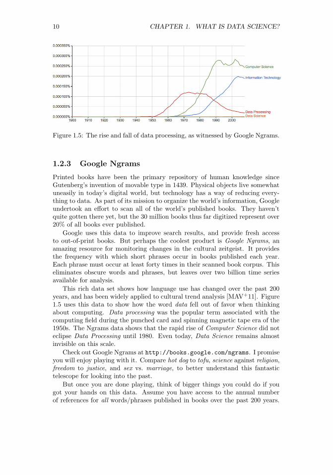
Figure 1.5: The rise and fall of data processing, as witnessed by Google Ngrams.
1.2.3 Google Ngrams
Printed books have been the primary repository of human knowledge sinceGutenberg’s invention of movable type in 1439. Physical objects live somewhatuneasily in today’s digital world, but technology has a way of reducing every-thing to data. As part of its mission to organize the world’s information, Googleundertook an effort to scan all of the world’s published books. They haven’tquite gotten there yet, but the 30 million books thus far digitized represent over20% of all books ever published.
Google uses this data to improve search results, and provide fresh accessto out-of-print books. But perhaps the coolest product is Google Ngrams, anamazing resource for monitoring changes in the cultural zeitgeist. It providesthe frequency with which short phrases occur in books published each year.Each phrase must occur at least forty times in their scanned book corpus. Thiseliminates obscure words and phrases, but leaves over two billion time seriesavailable for analysis.
This rich data set shows how language use has changed over the past 200years, and has been widely applied to cultural trend analysis [MAV+11]. Figure1.5 uses this data to show how the word data fell out of favor when thinkingabout computing. Data processing was the popular term associated with thecomputing field during the punched card and spinning magnetic tape era of the1950s. The Ngrams data shows that the rapid rise of Computer Science did noteclipse Data Processing until 1980. Even today, Data Science remains almostinvisible on this scale.
Check out Google Ngrams at http://books.google.com/ngrams. I promiseyou will enjoy playing with it. Compare hot dog to tofu, science against religion,freedom to justice, and sex vs. marriage, to better understand this fantastictelescope for looking into the past.
But once you are done playing, think of bigger things you could do if yougot your hands on this data. Assume you have access to the annual numberof references for all words/phrases published in books over the past 200 years.

1.2. ASKING INTERESTING QUESTIONS FROM DATA 11
Google makes this data freely available. So what are you going to do with it?
Observing the time series associated with particular words using the NgramsViewer is fun. But more sophisticated historical trends can be captured byaggregating multiple time series together. The following types of questionsseem particularly interesting to me:
• How has the amount of cursing changed over time? Use of the four-letter words I am most familiar with seem to have exploded since 1960,although it is perhaps less clear whether this reflects increased cussing orlower publication standards.
• How often do new words emerge and get popular? Do these words tendto stay in common usage, or rapidly fade away? Can we detect whenwords change meaning over time, like the transition of gay from happy tohomosexual?
• Have standards of spelling been improving or deteriorating with time,especially now that we have entered the era of automated spell check-ing? Rarely-occurring words that are only one character removed from acommonly-used word are likely candidates to be spelling errors (e.g. al-gorithm vs. algorthm). Aggregated over many different misspellings, aresuch errors increasing or decreasing?
You can also use this Ngrams corpus to build a language model that capturesthe meaning and usage of the words in a given language. We will discuss wordembeddings in Section 11.6.3, which are powerful tools for building languagemodels. Frequency counts reveal which words are most popular. The frequencyof word pairs appearing next to each other can be used to improve speechrecognition systems, helping to distinguish whether the speaker said that’s toobad or that’s to bad. These millions of books provide an ample data set to buildrepresentative models from.
1.2.4 New York Taxi Records
Every financial transaction today leaves a data trail behind it. Following thesepaths can lead to interesting insights.
Taxi cabs form an important part of the urban transportation network. Theyroam the streets of the city looking for customers, and then drive them to theirdestination for a fare proportional to the length of the trip. Each cab containsa metering device to calculate the cost of the trip as a function of time. Thismeter serves as a record keeping device, and a mechanism to ensure that thedriver charges the proper amount for each trip.
The taxi meters currently employed in New York cabs can do many thingsbeyond calculating fares. They act as credit card terminals, providing a way

12 CHAPTER 1. WHAT IS DATA SCIENCE?
Figure 1.6: Representative fields from the New York city taxi cab data: pick upand dropoff points, distances, and fares.
for customers to pay for rides without cash. They are integrated with globalpositioning systems (GPS), recording the exact location of every pickup anddrop off. And finally, since they are on a wireless network, these boxes cancommunicate all of this data back to a central server.
The result is a database documenting every single trip by all taxi cabs inone of the world’s greatest cities, a small portion of which is shown in Figure1.6. Because the New York Taxi and Limousine Commission is a public agency,its non-confidential data is available to all under the Freedom of InformationAct (FOA).
Every ride generates two records: one with data on the trip, the other withdetails of the fare. Each trip is keyed to the medallion (license) of each carcoupled with the identifier of each driver. For each trip, we get the time/dateof pickup and drop-off, as well as the GPS coordinates (longitude and latitude)of the starting location and destination. We do not get GPS data of the routethey traveled between these points, but to some extent that can be inferred bythe shortest path between them.
As for fare data, we get the metered cost of each trip, including tax, surchargeand tolls. It is traditional to pay the driver a tip for service, the amount of whichis also recorded in the data.
So I’m talking to you. This taxi data is readily available, with records ofover 80 million trips over the past several years. What are you going to do withit?
Any interesting data set can be used to answer questions on many differentscales. This taxi fare data can help us better understand the transportationindustry, but also how the city works and how we could make it work evenbetter. Natural questions with respect to the taxi industry include:

1.2. ASKING INTERESTING QUESTIONS FROM DATA 13
Figure 1.7: Which neighborhoods in New York city tip most generously? Therelatively remote outer boroughs of Brooklyn and Queens, where trips arelongest and supply is relatively scarce.
• How much money do drivers make each night, on average? What is thedistribution? Do drivers make more on sunny days or rainy days?
• Where are the best spots in the city for drivers to cruise, in order to pickup profitable fares? How does this vary at different times of the day?
• How far do drivers travel over the course of a night’s work? We can’tanswer this exactly using this data set, because it does not provide GPSdata of the route traveled between fares. But we do know the last placeof drop off, the next place of pickup, and how long it took to get betweenthem. Together, this should provide enough information to make a soundestimate.
• Which drivers take their unsuspecting out-of-town passengers for a “ride,”running up the meter on what should be a much shorter, cheaper trip?
• How much are drivers tipped, and why? Do faster drivers get tippedbetter? How do tipping rates vary by neighborhood, and is it the richneighborhoods or poor neighborhoods which prove more generous?
I will confess we did an analysis of this, which I will further describe inthe war story of Section 9.3. We found a variety of interesting patterns[SS15]. Figure 1.7 shows that Manhattanites are generally cheapskatesrelative to large swaths of Brooklyn, Queens, and Staten Island, wheretrips are longer and street cabs a rare but welcome sight.

14 CHAPTER 1. WHAT IS DATA SCIENCE?
But the bigger questions have to do with understanding transportation inthe city. We can use the taxi travel times as a sensor to measure the level oftraffic in the city at a fine level. How much slower is traffic during rush hourthan other times, and where are delays the worst? Identifying problem areas isthe first step to proposing solutions, by changing the timing patterns of trafficlights, running more buses, or creating high-occupancy only lanes.
Similarly we can use the taxi data to measure transportation flows acrossthe city. Where are people traveling to, at different times of the day? This tellsus much more than just congestion. By looking at the taxi data, we shouldbe able to see tourists going from hotels to attractions, executives from fancyneighborhoods to Wall Street, and drunks returning home from nightclubs aftera bender.
Data like this is essential to designing better transportation systems. It iswasteful for a single rider to travel from point a to point b when there is anotherrider at point a+ε who also wants to get there. Analysis of the taxi data enablesaccurate simulation of a ride sharing system, so we can accurately evaluate thedemands and cost reductions of such a service.
1.3 Properties of Data
This book is about techniques for analyzing data. But what is the underlyingstuff that we will be studying? This section provides a brief taxonomy of theproperties of data, so we can better appreciate and understand what we will beworking on.
1.3.1 Structured vs. Unstructured Data
Certain data sets are nicely structured, like the tables in a database or spread-sheet program. Others record information about the state of the world, but ina more heterogeneous way. Perhaps it is a large text corpus with images andlinks like Wikipedia, or the complicated mix of notes and test results appearingin personal medical records.
Generally speaking, this book will focus on dealing with structured data.Data is often represented by a matrix, where the rows of the matrix representdistinct items or records, and the columns represent distinct properties of theseitems. For example, a data set about U.S. cities might contain one row for eachcity, with columns representing features like state, population, and area.
When confronted with an unstructured data source, such as a collection oftweets from Twitter, our first step is generally to build a matrix to structureit. A bag of words model will construct a matrix with a row for each tweet, anda column for each frequently used vocabulary word. Matrix entry M [i, j] thendenotes the number of times tweet i contains word j. Such matrix formulationswill motivate our discussion of linear algebra, in Chapter 8.

1.3. PROPERTIES OF DATA 15
1.3.2 Quantitative vs. Categorical Data
Quantitative data consists of numerical values, like height and weight. Such datacan be incorporated directly into algebraic formulas and mathematical models,or displayed in conventional graphs and charts.
By contrast, categorical data consists of labels describing the properties ofthe objects under investigation, like gender, hair color, and occupation. Thisdescriptive information can be every bit as precise and meaningful as numericaldata, but it cannot be worked with using the same techniques.
Categorical data can usually be coded numerically. For example, gendermight be represented as male = 0 or female = 1. But things get more com-plicated when there are more than two characters per feature, especially whenthere is not an implicit order between them. We may be able to encode haircolors as numbers by assigning each shade a distinct value like gray hair = 0,red hair = 1, and blond hair = 2. However, we cannot really treat these val-ues as numbers, for anything other than simple identity testing. Does it makeany sense to talk about the maximum or minimum hair color? What is theinterpretation of my hair color minus your hair color?
Most of what we do in this book will revolve around numerical data. Butkeep an eye out for categorical features, and methods that work for them. Clas-sification and clustering methods can be thought of as generating categoricallabels from numerical data, and will be a primary focus in this book.
1.3.3 Big Data vs. Little Data
Data science has become conflated in the public eye with big data, the analysis ofmassive data sets resulting from computer logs and sensor devices. In principle,having more data is always better than having less, because you can alwaysthrow some of it away by sampling to get a smaller set if necessary.
Big data is an exciting phenomenon, and we will discuss it in Chapter 12. Butin practice, there are difficulties in working with large data sets. Throughoutthis book we will look at algorithms and best practices for analyzing data. Ingeneral, things get harder once the volume gets too large. The challenges of bigdata include:
• The analysis cycle time slows as data size grows: Computational opera-tions on data sets take longer as their volume increases. Small spreadsheetsprovide instantaneous response, allowing you to experiment and play whatif? But large spreadsheets can be slow and clumsy to work with, andmassive-enough data sets might take hours or days to get answers from.
Clever algorithms can permit amazing things to be done with big data,but staying small generally leads to faster analysis and exploration.
• Large data sets are complex to visualize: Plots with millions of points onthem are impossible to display on computer screens or printed images, letalone conceptually understand. How can we ever hope to really understandsomething we cannot see?

16 CHAPTER 1. WHAT IS DATA SCIENCE?
• Simple models do not require massive data to fit or evaluate: A typicaldata science task might be to make a decision (say, whether I should offerthis fellow life insurance?) on the basis of a small number of variables:say age, gender, height, weight, and the presence or absence of existingmedical conditions.
If I have this data on 1 million people with their associated life outcomes, Ishould be able to build a good general model of coverage risk. It probablywouldn’t help me build a substantially better model if I had this dataon hundreds of millions of people. The decision criteria on only a fewvariables (like age and martial status) cannot be too complex, and shouldbe robust over a large number of applicants. Any observation that is sosubtle it requires massive data to tease out will prove irrelevant to a largebusiness which is based on volume.
Big data is sometimes called bad data. It is often gathered as the by-productof a given system or procedure, instead of being purposefully collected to answeryour question at hand. The result is that we might have to go to heroic effortsto make sense of something just because we have it.
Consider the problem of getting a pulse on voter preferences among presi-dential candidates. The big data approach might analyze massive Twitter orFacebook feeds, interpreting clues to their opinions in the text. The small dataapproach might be to conduct a poll, asking a few hundred people this specificquestion and tabulating the results. Which procedure do you think will provemore accurate? The right data set is the one most directly relevant to the tasksat hand, not necessarily the biggest one.
Take-Home Lesson: Do not blindly aspire to analyze large data sets. Seek theright data to answer a given question, not necessarily the biggest thing you canget your hands on.
1.4 Classification and Regression
Two types of problems arise repeatedly in traditional data science and patternrecognition applications, the challenges of classification and regression. As thisbook has developed, I have pushed discussions of the algorithmic approachesto solving these problems toward the later chapters, so they can benefit from asolid understanding of core material in data munging, statistics, visualization,and mathematical modeling.
Still, I will mention issues related to classification and regression as theyarise, so it makes sense to pause here for a quick introduction to these problems,to help you recognize them when you see them.
• Classification: Often we seek to assign a label to an item from a discreteset of possibilities. Such problems as predicting the winner of a particular

1.5. DATA SCIENCE TELEVISION: THE QUANT SHOP 17
sporting contest (team A or team B?) or deciding the genre of a givenmovie (comedy, drama, or animation?) are classification problems, sinceeach entail selecting a label from the possible choices.
• Regression: Another common task is to forecast a given numerical quan-tity. Predicting a person’s weight or how much snow we will get this yearis a regression problem, where we forecast the future value of a numericalfunction in terms of previous values and other relevant features.
Perhaps the best way to see the intended distinction is to look at a varietyof data science problems and label (classify) them as regression or classification.Different algorithmic methods are used to solve these two types of problems,although the same questions can often be approached in either way:
• Will the price of a particular stock be higher or lower tomorrow? (classi-fication)
• What will the price of a particular stock be tomorrow? (regression)
• Is this person a good risk to sell an insurance policy to? (classification)
• How long do we expect this person to live? (regression)
Keep your eyes open for classification and regression problems as you en-counter them in your life, and in this book.
1.5 Data Science Television: The Quant Shop
I believe that hands-on experience is necessary to internalize basic principles.Thus when I teach data science, I like to give each student team an interestingbut messy forecasting challenge, and demand that they build and evaluate apredictive model for the task.
These forecasting challenges are associated with events where the studentsmust make testable predictions. They start from scratch: finding the relevantdata sets, building their own evaluation environments, and devising their model.Finally, I make them watch the event as it unfolds, so as to witness the vindi-cation or collapse of their prediction.
As an experiment, we documented the evolution of each group’s projecton video in Fall 2014. Professionally edited, this became The Quant Shop, atelevision-like data science series for a general audience. The eight episodes ofthis first season are available at http://www.quant-shop.com, and include:
• Finding Miss Universe – The annual Miss Universe competition aspiresto identify the most beautiful woman in the world. Can computationalmodels predict who will win a beauty contest? Is beauty just subjective,or can algorithms tell who is the fairest one of all?

18 CHAPTER 1. WHAT IS DATA SCIENCE?
• Modeling the Movies – The business of movie making involves a lot ofhigh-stakes data analysis. Can we build models to predict which film willgross the most on Christmas day? How about identifying which actorswill receive awards for their performance?
• Winning the Baby Pool – Birth weight is an important factor in assessingthe health of a newborn child. But how accurately can we predict junior’sweight before the actual birth? How can data clarify environmental risksto developing pregnancies?
• The Art of the Auction – The world’s most valuable artworks sell at auc-tions to the highest bidder. But can we predict how many millions aparticular J.W. Turner painting will sell for? Can computers develop anartistic sense of what’s worth buying?
• White Christmas – Weather forecasting is perhaps the most familiar do-main of predictive modeling. Short-term forecasts are generally accurate,but what about longer-term prediction? What places will wake up to asnowy Christmas this year? And can you tell one month in advance?
• Predicting the Playoffs – Sports events have winners and losers, and book-ies are happy to take your bets on the outcome of any match. How well canstatistics help predict which football team will win the Super Bowl? CanGoogle’s PageRank algorithm pick the winners on the field as accuratelyas it does on the web?
• The Ghoul Pool – Death comes to all men, but when? Can we applyactuarial models to celebrities, to decide who will be the next to die?Similar analysis underlies the workings of the life insurance industry, whereaccurate predictions of lifespan are necessary to set premiums which areboth sustainable and affordable.
Figure 1.8: Exciting scenes from data science television: The Quant Shop.

1.6. ABOUT THE WAR STORIES 19
• Playing the Market – Hedge fund quants get rich when guessing rightabout tomorrow’s prices, and poor when wrong. How accurately can wepredict future prices of gold and oil using histories of price data? Whatother information goes into building a successful price model?
I encourage you to watch some episodes of The Quant Shop in tandem withreading this book. We try to make it fun, although I am sure you will findplenty of things to cringe at. Each show runs for thirty minutes, and maybewill inspire you to tackle a prediction challenge of your own.
These programs will certainly give you more insight into these eight specificchallenges. I will use these projects throughout this book to illustrate importantlessons in how to do data science, both as positive and negative examples. Theseprojects provide a laboratory to see how intelligent but inexperienced people notwildly unlike yourself thought about a data science problem, and what happenedwhen they did.
1.5.1 Kaggle Challenges
Another source of inspiration are challenges from Kaggle (www.kaggle.com),which provides a competitive forum for data scientists. New challenges areposted on a regular basis, providing a problem definition, training data, anda scoring function over hidden evaluation data. A leader board displays thescores of the strongest competitors, so you can see how well your model stacksup in comparison with your opponents. The winners spill their modeling secretsduring post-contest interviews, to help you improve your modeling skills.
Performing well on Kaggle challenges is an excellent credential to put on yourresume to get a good job as a data scientist. Indeed, potential employers willtrack you down if you are a real Kaggle star. But the real reason to participateis that the problems are fun and inspiring, and practice helps make you a betterdata scientist.
The exercises at the end of each chapter point to expired Kaggle challenges,loosely connected to the material in that chapter. Be forewarned that Kaggleprovides a misleading glamorous view of data science as applied machine learn-ing, because it presents extremely well-defined problems with the hard workof data collection and cleaning already done for you. Still, I encourage you tocheck it out for inspiration, and as a source of data for new projects.
1.6 About the War Stories
Genius and wisdom are two distinct intellectual gifts. Genius shows in discover-ing the right answer, making imaginative mental leaps which overcome obstaclesand challenges. Wisdom shows in avoiding obstacles in the first place, providinga sense of direction or guiding light that keeps us moving soundly in the rightdirection.

20 CHAPTER 1. WHAT IS DATA SCIENCE?
Genius is manifested in technical strength and depth, the ability to see thingsand do things that other people cannot. In contrast, wisdom comes from ex-perience and general knowledge. It comes from listening to others. Wisdomcomes from humility, observing how often you have been wrong in the past andfiguring out why you were wrong, so as to better recognize future traps andavoid them.
Data science, like most things in life, benefits more from wisdom than fromgenius. In this book, I seek to pass on wisdom that I have accumulated the hardway through war stories, gleaned from a diverse set of projects I have workedon:
• Large-scale text analytics and NLP: My Data Science Laboratory at StonyBrook University works on a variety of projects in big data, including sen-timent analysis from social media, historical trends analysis, deep learningapproaches to natural language processing (NLP), and feature extractionfrom networks.
• Start-up companies: I served as co-founder and chief scientist to twodata analytics companies: General Sentiment and Thrivemetrics. GeneralSentiment analyzed large-scale text streams from news, blogs, and socialmedia to identify trends in the sentiment (positive or negative) associatedwith people, places, and things. Thrivemetrics applied this type of analysisto internal corporate communications, like email and messaging systems.
Neither of these ventures left me wealthy enough to forgo my royaltiesfrom this book, but they did provide me with experience on cloud-basedcomputing systems, and insight into how data is used in industry.
• Collaborating with real scientists: I have had several interesting collab-orations with biologists and social scientists, which helped shape my un-derstanding of the complexities of working with real data. Experimentaldata is horribly noisy and riddled with errors, yet you must do the bestyou can with what you have, in order to discover how the world works.
• Building gambling systems: A particularly amusing project was buildinga system to predict the results of jai-alai matches so we could bet on them,an experience recounted in my book Calculated Bets: Computers, Gam-bling, and Mathematical Modeling to Win [Ski01]. Our system relied onweb scraping for data collection, statistical analysis, simulation/modeling,and careful evaluation. We also have developed and evaluated predictivemodels for movie grosses [ZS09], stock prices [ZS10], and football games[HS10] using social media analysis.
• Ranking historical figures: By analyzing Wikipedia to extract meaningfulvariables on over 800,000 historical figures, we developed a scoring func-tion to rank them by their strength as historical memes. This rankingdoes a great job separating the greatest of the great (Jesus, Napoleon,Shakespeare, Mohammad, and Lincoln round out the top five) from lesser

1.7. WAR STORY: ANSWERING THE RIGHT QUESTION 21
mortals, and served as the basis for our book Who’s Bigger?: Where His-torical Figures Really Rank [SW13].
All this experience drives what I teach in this book, especially the tales thatI describe as war stories. Every one of these war stories is true. Of course, thestories improve somewhat in the retelling, and the dialogue has been punchedup to make them more interesting to read. However, I have tried to honestlytrace the process of going from a raw problem to a solution, so you can watchhow it unfolded.
1.7 War Story: Answering the Right Question
Our research group at Stony Brook University developed an NLP-based systemfor analyzing millions of news, blogs and social media messages, and reducingthis text to trends concerning all the entities under discussion. Counting thenumber of mentions each name receives in a text stream (volume) is easy, inprinciple. Determining whether the connotation of a particular reference ispositive or negative (sentiment analysis) is hard. But our system did a prettygood job, particularly when aggregated over many references.
This technology served as the foundation for a social media analysis companynamed General Sentiment. It was exciting living through a start-up starting up,facing the challenges of raising money, hiring staff, and developing new products.
But perhaps the biggest problem we faced was answering the right question.The General Sentiment system recorded trends about the sentiment and volumefor every person, place, and thing that was ever mentioned in news, blogs, andsocial media: over 20 million distinct entities. We monitored the reputations ofcelebrities and politicians. We monitored the fates of companies and products.We tracked the performance of sports teams, and the buzz about movies. Wecould do anything!
But it turns out that no one pays you to do anything. They pay you to dosomething, to solve a particular problem they have, or eliminate a specific painpoint in their business. Being able to do anything proves to be a terrible salesstrategy, because it requires you to find that need afresh for each and everycustomer.
Facebook didn’t open up to the world until September 2006. So when Gen-eral Sentiment started in 2008, we were at the very beginning of the social mediaera. We had lots of interest from major brands and advertising agencies whichknew that social media was ready to explode. They knew this newfangled thingwas important, and that they had to be there. They knew that proper analysisof social media data could give them fresh insights into what their customerswere thinking. But they didn’t know exactly what it was they really wanted toknow.
One aircraft engine manufacturer was very interested in learning how muchthe kids talked about them on Facebook. We had to break it to them gentlythat the answer was zero. Other potential customers demanded proof that we

22 CHAPTER 1. WHAT IS DATA SCIENCE?
were more accurate than the Nielsen television ratings. But of course, if youwanted Nielsen ratings then you should buy them from Nielsen. Our systemprovided different insights from a completely different world. But you had toknow what you wanted in order to use them.
We did manage to get substantial contracts from a very diverse group ofcustomers, including consumer brands like Toyota and Blackberry, governmentalorganizations like the Hawaii tourism office, and even the presidential campaignof Republican nominee Mitt Romney in 2012. Our analysts provided theminsights into a wide variety of business issues:
• What did people think about Hawaii? (Answer: they think it is a verynice place to visit.)
• How quickly would Toyota’s sentiment recover after news of serious brakeproblems in their cars? (Answer: about six months.)
• What did people think about Blackberry’s new phone models? (Answer:they liked the iPhone much better.)
• How quickly would Romney’s sentiment recover after insulting 47% of theelectorate in a recorded speech? (Answer: never.)
But each sale required entering a new universe, involving considerable effortand imagination on the part of our sales staff and research analysts. We nevermanaged to get two customers in the same industry, which would have let usbenefit from scale and accumulated wisdom.
Of course, the customer is always right. It was our fault that we could notexplain to them the best way to use our technology. The lesson here is that theworld will not beat a path to your door just for a new source of data. You mustbe able to supply the right questions before you can turn data into money.
1.8 Chapter Notes
The idea of using historical records from baseball players to establish that left-handers have shorter lifespans is due to Halpern and Coren [HC88, HC91],but their conclusion remains controversial. The percentage of left-handers inthe population has been rapidly growing, and the observed effects may be afunction of survivorship bias [McM04]. So lefties, hang in there! Full disclosure:I am one of you.
The discipline of quantitative baseball analysis is sometimes called sabermet-rics, and its leading light is a fellow named Bill James. I recommend buddingdata scientists read his Historical Baseball Abstract [Jam10] as an excellent ex-ample of how one turns numbers into knowledge and understanding. TimeMagazine once said of James: “Much of the joy of reading him comes from theextravagant spectacle of a first-rate mind wasting itself on baseball.” I thankhttp://sports-reference.com for permission to use images of their websitein this book. Ditto to Amazon, the owner of IMDb.

1.9. EXERCISES 23
The potential of ride-sharing systems in New York was studied by Santi et.al. [SRS+14], who showed that almost 95% of the trips could have been sharedwith no more than five minutes delay per trip.
The Lydia system for sentiment analysis is described in [GSS07]. Methodsto identify changes in word meaning through analysis of historical text corporalike Google Ngram are reported in [KARPS15].
1.9 Exercises
Identifying Data Sets
1-1. [3] Identify where interesting data sets relevant to the following domains can befound on the web:
(a) Books.
(b) Horse racing.
(c) Stock prices.
(d) Risks of diseases.
(e) Colleges and universities.
(f) Crime rates.
(g) Bird watching.
For each of these data sources, explain what you must do to turn this data intoa usable format on your computer for analysis.
1-2. [3] Propose relevant data sources for the following The Quant Shop predictionchallenges. Distinguish between sources of data that you are sure somebody musthave, and those where the data is clearly available to you.
(a) Miss Universe.
(b) Movie gross.
(c) Baby weight.
(d) Art auction price.
(e) White Christmas.
(f) Football champions.
(g) Ghoul pool.
(h) Gold/oil prices.
1-3. [3] Visit http://data.gov, and identify five data sets that sound interesting toyou. For each write a brief description, and propose three interesting things youmight do with them.
Asking Questions
1-4. [3] For each of the following data sources, propose three interesting questionsyou can answer by analyzing them:
(a) Credit card billing data.

24 CHAPTER 1. WHAT IS DATA SCIENCE?
(b) Click data from http://www.Amazon.com.
(c) White Pages residential/commercial telephone directory.
1-5. [5] Visit Entrez, the National Center for Biotechnology Information (NCBI)portal. Investigate what data sources are available, particularly the Pubmedand Genome resources. Propose three interesting projects to explore with eachof them.
1-6. [5] You would like to conduct an experiment to establish whether your friendsprefer the taste of regular Coke or Diet Coke. Briefly outline a design for sucha study.
1-7. [5] You would like to conduct an experiment to see whether students learn betterif they study without any music, with instrumental music, or with songs thathave lyrics. Briefly outline the design for such a study.
1-8. [5] Traditional polling operations like Gallup use a procedure called random digitdialing, which dials random strings of digits instead of picking phone numbersfrom the phone book. Suggest why such polls are conducted using random digitdialing.
Implementation Projects
1-9. [5] Write a program to scrape the best-seller rank for a book on Amazon.com.Use this to plot the rank of all of Skiena’s books over time. Which one of thesebooks should be the next item that you purchase? Do you have friends for whomthey would make a welcome and appropriate gift? :-)
1-10. [5] For your favorite sport (baseball, football, basketball, cricket, or soccer)identify a data set with the historical statistical records for all major partici-pants. Devise and implement a ranking system to identify the best player ateach position.
Interview Questions
1-11. [3] For each of the following questions: (1) produce a quick guess based only onyour understanding of the world, and then (2) use Google to find supportablenumbers to produce a more principled estimate from. How much did your twoestimates differ by?
(a) How many piano tuners are there in the entire world?
(b) How much does the ice in a hockey rink weigh?
(c) How many gas stations are there in the United States?
(d) How many people fly in and out of LaGuardia Airport every day?
(e) How many gallons of ice cream are sold in the United States each year?
(f) How many basketballs are purchased by the National Basketball Associa-tion (NBA) each year?
(g) How many fish are there in all the world’s oceans?
(h) How many people are flying in the air right now, all over the world?
(i) How many ping-pong balls can fit in a large commercial jet?
(j) How many miles of paved road are there in your favorite country?

1.9. EXERCISES 25
(k) How many dollar bills are sitting in the wallets of all people at Stony BrookUniversity?
(l) How many gallons of gasoline does a typical gas station sell per day?
(m) How many words are there in this book?
(n) How many cats live in New York city?
(o) How much would it cost to fill a typical car’s gas tank with Starbuck’scoffee?
(p) How much tea is there in China?
(q) How many checking accounts are there in the United States?
1-12. [3] What is the difference between regression and classification?
1-13. [8] How would you build a data-driven recommendation system? What are thelimitations of this approach?
1-14. [3] How did you become interested in data science?
1-15. [3] Do you think data science is an art or a science?
Kaggle Challenges
1-16. Who survived the shipwreck of the Titanic?
https://www.kaggle.com/c/titanic
1-17. Where is a particular taxi cab going?
https://www.kaggle.com/c/pkdd-15-predict-taxi-service-trajectory-i
1-18. How long will a given taxi trip take?
https://www.kaggle.com/c/pkdd-15-taxi-trip-time-prediction-ii

Chapter 2
Mathematical Preliminaries
A data scientist is someone who knows more statistics than a com-puter scientist and more computer science than a statistician.
– Josh Blumenstock
You must walk before you can run. Similarly, there is a certain level of mathe-matical maturity which is necessary before you should be trusted to do anythingmeaningful with numerical data.
In writing this book, I have assumed that the reader has had some degreeof exposure to probability and statistics, linear algebra, and continuous math-ematics. I have also assumed that they have probably forgotten most of it, orperhaps didn’t always see the forest (why things are important, and how to usethem) for the trees (all the details of definitions, proofs, and operations).
This chapter will try to refresh your understanding of certain basic math-ematical concepts. Follow along with me, and pull out your old textbooks ifnecessary for future reference. Deeper concepts will be introduced later in thebook when we need them.
2.1 Probability
Probability theory provides a formal framework for reasoning about the likeli-hood of events. Because it is a formal discipline, there are a thicket of associateddefinitions to instantiate exactly what we are reasoning about:
• An experiment is a procedure which yields one of a set of possible out-comes. As our ongoing example, consider the experiment of tossing twosix-sided dice, one red and one blue, with each face baring a distinct inte-ger {1, . . . , 6}.
• A sample space S is the set of possible outcomes of an experiment. In our
27© The Author(s) 2017S.S. Skiena, The Data Science Design Manual,Texts in Computer Science, https://doi.org/10.1007/978-3-319-55444-0_2

28 CHAPTER 2. MATHEMATICAL PRELIMINARIES
dice example, there are 36 possible outcomes, namely
S = {(1, 1), (1, 2), (1, 3), (1, 4), (1, 5), (1, 6), (2, 1), (2, 2), (2, 3), (2, 4), (2, 5), (2, 6),
(3, 1), (3, 2), (3, 3), (3, 4), (3, 5), (3, 6), (4, 1), (4, 2), (4, 3), (4, 4), (4, 5), (4, 6),
(5, 1), (5, 2), (5, 3), (5, 4), (5, 5), (5, 6), (6, 1), (6, 2), (6, 3), (6, 4), (6, 5), (6, 6)}.
• An event E is a specified subset of the outcomes of an experiment. Theevent that the sum of the dice equals 7 or 11 (the conditions to win atcraps on the first roll) is the subset
E = {(1, 6), (2, 5), (3, 4), (4, 3), (5, 2), (6, 1), (5, 6), (6, 5)}.
• The probability of an outcome s, denoted p(s) is a number with the twoproperties:
– For each outcome s in sample space S, 0 ≤ p(s) ≤ 1.
– The sum of probabilities of all outcomes adds to one:∑s∈S p(s) = 1.
If we assume two distinct fair dice, the probability p(s) = (1/6)× (1/6) =1/36 for all outcomes s ∈ S.
• The probability of an event E is the sum of the probabilities of the out-comes of the experiment. Thus
p(E) =∑s∈E
p(s).
An alternate formulation is in terms of the complement of the event E,the case when E does not occur. Then
P (E) = 1− P (E).
This is useful, because often it is easier to analyze P (E) than P (E) di-rectly.
• A random variable V is a numerical function on the outcomes of a proba-bility space. The function “sum the values of two dice” (V ((a, b)) = a+ b)produces an integer result between 2 and 12. This implies a probabil-ity distribution of the values of the random variable. The probabilityP (V (s) = 7) = 1/6, as previously shown, while P (V (s) = 12) = 1/36.
• The expected value of a random variable V defined on a sample space S,E(V ) is defined
E(V ) =∑s∈S
p(s) · V (s).
All this you have presumably seen before. But it provides the language wewill use to connect between probability and statistics. The data we see usuallycomes from measuring properties of observed events. The theory of probabilityand statistics provides the tools to analyze this data.

2.1. PROBABILITY 29
2.1.1 Probability vs. Statistics
Probability and statistics are related areas of mathematics which concern them-selves with analyzing the relative frequency of events. Still, there are funda-mental differences in the way they see the world:
• Probability deals with predicting the likelihood of future events, whilestatistics involves the analysis of the frequency of past events.
• Probability is primarily a theoretical branch of mathematics, which studiesthe consequences of mathematical definitions. Statistics is primarily anapplied branch of mathematics, which tries to make sense of observationsin the real world.
Both subjects are important, relevant, and useful. But they are different, andunderstanding the distinction is crucial in properly interpreting the relevanceof mathematical evidence. Many a gambler has gone to a cold and lonely gravefor failing to make the proper distinction between probability and statistics.
This distinction will perhaps become clearer if we trace the thought processof a mathematician encountering her first craps game:
• If this mathematician were a probabilist, she would see the dice and think“Six-sided dice? Each side of the dice is presumably equally likely to landface up. Now assuming that each face comes up with probability 1/6, Ican figure out what my chances are of crapping out.”
• If instead a statistician wandered by, she would see the dice and think“How do I know that they are not loaded? I’ll watch a while, and keeptrack of how often each number comes up. Then I can decide if my ob-servations are consistent with the assumption of equal-probability faces.Once I’m confident enough that the dice are fair, I’ll call a probabilist totell me how to bet.”
In summary, probability theory enables us to find the consequences of agiven ideal world, while statistical theory enables us to measure the extent towhich our world is ideal. This constant tension between theory and practice iswhy statisticians prove to be a tortured group of individuals compared with thehappy-go-lucky probabilists.
Modern probability theory first emerged from the dice tables of France in1654. Chevalier de Mere, a French nobleman, wondered whether the player orthe house had the advantage in a particular betting game.1 In the basic version,the player rolls four dice, and wins provided none of them are a 6. The housecollects on the even money bet if at least one 6 appears.
De Mere brought this problem to the attention of the French mathematiciansBlaise Pascal and Pierre de Fermat, most famous as the source of Fermat’s LastTheorem. Together, these men worked out the basics of probability theory,
1He really shouldn’t have wondered. The house always has the advantage.

30 CHAPTER 2. MATHEMATICAL PRELIMINARIES
A
S
A
S
A \ B
A B
S
A [ B
Figure 2.1: Venn diagrams illustrating set difference (left), intersection (middle),and union (right).
along the way establishing that the house wins this dice game with probabilityp = 1− (5/6)4 ≈ 0.517, where the probability p = 0.5 would denote a fair gamewhere the house wins exactly half the time.
2.1.2 Compound Events and Independence
We will be interested in complex events computed from simpler events A and Bon the same set of outcomes. Perhaps event A is that at least one of two dicebe an even number, while event B denotes rolling a total of either 7 or 11. Notethat there exist certain outcomes of A which are not outcomes of B, specifically
A−B = {(1, 2), (1, 4), (2, 1), (2, 2), (2, 3), (2, 4), (2, 6), (3, 2), (3, 6), (4, 1),
(4, 2), (4, 4), (4, 5), (4, 6), (5, 4), (6, 2), (6, 3), (6, 4), (6, 6)}.
This is the set difference operation. Observe that here B − A = {}, becauseevery pair adding to 7 or 11 must contain one odd and one even number.
The outcomes in common between both events A and B are called the in-tersection, denoted A ∩B. This can be written as
A ∩B = A− (S −B).
Outcomes which appear in either A or B are called the union, denoted A ∪ B.With the complement operation A = S−A, we get a rich language for combiningevents, shown in Figure 2.1. We can readily compute the probability of any ofthese sets by summing the probabilities of the outcomes in the defined sets.
The events A and B are independent if and only if
P (A ∩B) = P (A)× P (B).
This means that there is no special structure of outcomes shared between eventsA and B. Assuming that half of the students in my class are female, and halfthe students in my class are above average, we would expect that a quarter ofmy students are both female and above average if the events are independent.

2.1. PROBABILITY 31
Probability theorists love independent events, because it simplifies their cal-culations. But data scientists generally don’t. When building models to predictthe likelihood of some future event B, given knowledge of some previous eventA, we want as strong a dependence of B on A as possible.
Suppose I always use an umbrella if and only if it is raining. Assume thatthe probability it is raining here (event B) is, say, p = 1/5. This implies theprobability that I am carrying my umbrella (event A) is q = 1/5. But evenmore, if you know the state of the rain you know exactly whether I have myumbrella. These two events are perfectly correlated.
By contrast, suppose the events were independent. Then
P (A|B) =P (A ∩B)
P (B)=P (A)P (B)
P (B)= P (A)
and whether it is raining has absolutely no impact on whether I carry my pro-tective gear.
Correlations are the driving force behind predictive models, so we will discusshow to measure them and what they mean in Section 2.3.
2.1.3 Conditional Probability
When two events are correlated, there is a dependency between them whichmakes calculations more difficult. The conditional probability of A given B,P (A|B) is defined:
P (A|B) =P (A ∩B)
P (B)
Recall the dice rolling events from Section 2.1.2, namely:
• Event A is that at least one of two dice be an even number.
• Event B is the sum of the two dice is either a 7 or an 11.
Observe that P (A|B) = 1, because any roll summing to an odd value mustconsist of one even and one odd number. Thus A ∩ B = B, analogous to theumbrella case above. For P (B|A), note that P (A ∩ B) = 9/36 and P (A) =25/36, so P (B|A) = 9/25.
Conditional probability will be important to us, because we are interested inthe likelihood of an event A (perhaps that a particular piece of email is spam)as a function of some evidence B (perhaps the distribution of words within thedocument). Classification problems generally reduce to computing conditionalprobabilities, in one way or another.
Our primary tool to compute conditional probabilities will be Bayes theorem,which reverses the direction of the dependencies:
P (B|A) =P (A|B)P (B)
P (A)
Often it proves easier to compute probabilities in one direction than another, asin this problem. By Bayes theorem P (B|A) = (1·9/36)/(25/36) = 9/25, exactly

32 CHAPTER 2. MATHEMATICAL PRELIMINARIES
Figure 2.2: The probability density function (pdf) of the sum of two dice con-tains exactly the same information as the cumulative density function (cdf), butlooks very different.
what we got before. We will revisit Bayes theorem in Section 5.6, where it willestablish the foundations of computing probabilities in the face of evidence.
2.1.4 Probability Distributions
Random variables are numerical functions where the values are associated withprobabilities of occurrence. In our example where V (s) the sum of two tosseddice, the function produces an integer between 2 and 12. The probability of aparticular value V (s) = X is the sum of the probabilities of all the outcomeswhich add up to X.
Such random variables can be represented by their probability density func-tion, or pdf. This is a graph where the x-axis represents the range of valuesthe random variable can take on, and the y-axis denotes the probability of thatgiven value. Figure 2.2 (left) presents the pdf of the sum of two fair dice. Ob-serve that the peak at X = 7 corresponds to the most frequent dice total, witha probability of 1/6.
Such pdf plots have a strong relationship to histograms of data frequency,where the x-axis again represents the range of value, but y now represents theobserved frequency of exactly how many event occurrences were seen for eachgiven value X. Converting a histogram to a pdf can be done by dividing eachbucket by the total frequency over all buckets. The sum of the entries thenbecomes 1, so we get a probability distribution.
Histograms are statistical: they reflect actual observations of outcomes. Incontrast, pdfs are probabilistic: they represent the underlying chance that thenext observation will have value X. We often use the histogram of observationsh(x) in practice to estimate the probabilities2 by normalizing counts by the total
2A technique called discounting offers a better way to estimate the frequency of rare events,and will be discussed in Section 11.1.2.
2 3 4 5 6 7 8 9 10 11 12
Total on dice
0.00
0.02
0.04
0.06
0.08
0.10
0.12
0.14
0.16
0.18Probability
2 3 4 5 6 7 8 9 10 11 12
Total on dice
0.0
0.2
0.4
0.6
0.8
1.0
Probability
cdf

2.1. PROBABILITY 33
Figure 2.3: iPhone quarterly sales data presented as cumulative and incremental(quarterly) distributions. Which curve did Apple CEO Tim Cook choose topresent?
number of observations:
P (k = X) =h(k = X)∑x h(x = X)
There is another way to represent random variables which often proves use-ful, called a cumulative density function or cdf. The cdf is the running sum ofthe probabilities in the pdf; as a function of k, it reflects the probability thatX ≤ k instead of the probability that X = k. Figure 2.2 (right) shows thecdf of the dice sum distribution. The values increase monotonically from leftto right, because each term comes from adding a positive probability to theprevious total. The rightmost value is 1, because all outcomes produce a valueno greater than the maximum.
It is important to realize that the pdf P (V ) and cdf C(V ) of a given randomvariable V contain exactly the same information. We can move back and forthbetween them because:
P (k = X) = C(X ≤ k + δ)− C(X ≤ k),
where δ = 1 for integer distributions. The cdf is the running sum of the pdf, so
C(X ≤ k) =∑x≤k
P (X = x).
Just be aware of which distribution you are looking at. Cumulative distribu-tions always get higher as we move to the right, culminating with a probabilityof C(X ≤ ∞) = 1. By contrast, the total area under the curve of a pdf equals1, so the probability at any point in the distribution is generally substantiallyless.

34 CHAPTER 2. MATHEMATICAL PRELIMINARIES
An amusing example of the difference between cumulative and incrementaldistributions is shown in Figure 2.3. Both distributions show exactly the samedata on Apple iPhone sales, but which curve did Apple CEO Tim Cook choose topresent at a major shareholder event? The cumulative distribution (red) showsthat sales are exploding, right? But it presents a misleading view of growthrate, because incremental change is the derivative of this function, and hard tovisualize. Indeed, the sales-per-quarter plot (blue) shows that the rate of iPhonesales actually had declined for the last two periods before the presentation.
2.2 Descriptive Statistics
Descriptive statistics provide ways of capturing the properties of a given dataset or sample. They summarize observed data, and provide a language to talkabout it. Representing a group of elements by a new derived element, likemean, min, count, or sum reduces a large data set to a small summary statistic:aggregation as data reduction.
Such statistics can become features in their own right when taken over natu-ral groups or clusters in the full data set. There are two main types of descriptivestatistics:
• Central tendency measures, which capture the center around which thedata is distributed.
• Variation or variability measures, which describe the data spread, i.e. howfar the measurements lie from the center.
Together these statistics tell us an enormous amount about our distribution.
2.2.1 Centrality Measures
The first element of statistics we are exposed to in school are the basic centralitymeasures: mean, median, and mode. These are the right place to start whenthinking of a single number to characterize a data set.
• Mean: You are probably quite comfortable with the use of the arithmeticmean, where we sum values and divide by the number of observations:
µX =1
n
n∑i=1
xi
We can easily maintain the mean under a stream of insertions and dele-tions, by keeping the sum of values separate from the frequency count,and divide only on demand.
The mean is very meaningful to characterize symmetric distributions with-out outliers, like height and weight. That it is symmetric means the num-ber of items above the mean should be roughly the same as the number

2.2. DESCRIPTIVE STATISTICS 35
below. That it is without outliers means that the range of values is rea-sonably tight. Note that a single MAXINT creeping into an otherwisesound set of observations throws the mean wildly off. The median is acentrality measure which proves more appropriate with such ill-behaveddistributions.
• Geometric mean: The geometric mean is the nth root of the product of nvalues: (
n∏i=1
ai
)1/n
= n√a1a2 . . . an
The geometric mean is always less than or equal to the arithmetic mean.For example, the geometric mean of the sums of 36 dice rolls is 6.5201, asopposed to the arithmetic mean of 7. It is very sensitive to values nearzero. A single value of zero lays waste to the geometric mean: no matterwhat other values you have in your data, you end up with zero. This issomewhat analogous to having an outlier of ∞ in an arithmetic mean.
But geometric means prove their worth when averaging ratios. The ge-ometric mean of 1/2 and 2/1 is 1, whereas the mean is 1.25. There isless available “room” for ratios to be less than 1 than there is for ratiosabove 1, creating an asymmetry that the arithmetic mean overstates. Thegeometric mean is more meaningful in these cases, as is the arithmeticmean of the logarithms of the ratios.
• Median: The median is the exact middle value among a data set; just asmany elements lie above the median as below it. There is a quibble aboutwhat to take as the median when you have an even number of elements.You can take either one of the two central candidates: in any reasonabledata set these two values should be about the same. Indeed in the diceexample, both are 7.
A nice property of the median as so defined is that it must be a genuinevalue of the original data stream. There actually is someone of medianheight to you can point to as an example, but presumably no one in theworld is of exactly average height. You lose this property when you averagethe two center elements.
Which centrality measure is best for applications? The median typicallylies pretty close to the arithmetic mean in symmetrical distributions, butit is often interesting to see how far apart they are, and on which side ofthe mean the median lies.
The median generally proves to be a better statistic for skewed distribu-tions or data with outliers: like wealth and income. Bill Gates adds $250to the mean per capita wealth in the United States, but nothing to themedian. If he makes you personally feel richer, then go ahead and use themean. But the median is the more informative statistic here, as it will befor any power law distribution.

36 CHAPTER 2. MATHEMATICAL PRELIMINARIES
3000
P(H)
3000
1
Hours Hours
P(H)
0.01
Figure 2.4: Two distinct probability distributions with µ = 3000 for the lifespanof light bulbs: normal (left) and with zero variance (right).
• Mode: The mode is the most frequent element in the data set. This is 7in our ongoing dice example, because it occurs six times out of thirty-sixelements. Frankly, I’ve never seen the mode as providing much insightas centrality measure, because it often isn’t close to the center. Samplesmeasured over a large range should have very few repeated elements orcollisions at any particular value. This makes the mode a matter of hap-penstance. Indeed, the most frequently occurring elements often revealartifacts or anomalies in a data set, such as default values or error codesthat do not really represent elements of the underlying distribution.
The related concept of the peak in a frequency distribution (or histogram)is meaningful, but interesting peaks only get revealed through proper buck-eting. The current peak of the annual salary distribution in the UnitedStates lies between $30,000 and $40,000 per year, although the mode pre-sumably sits at zero.
2.2.2 Variability Measures
The most common measure of variability is the standard deviation σ, whichmeasures sum of squares differences between the individual elements and themean:
σ =
√∑ni=1(ai − a)2
n− 1
A related statistic, the variance V , is the square of the standard deviation,i.e. V = σ2. Sometimes it is more convenient to talk about variance thanstandard deviation, because the term is eight characters shorter. But theymeasure exactly the same thing.
As an example, consider the humble light bulb, which typically comes withan expected working life, say µ = 3000 hours, derived from some underlying dis-tribution shown in Figure 2.4. In a conventional bulb, the chance of it lastinglonger than µ is presumably about the same as that of it burning out quicker,and this degree of uncertainty is measured by σ. Alternately, imagine a “printer

2.2. DESCRIPTIVE STATISTICS 37
cartridge bulb,” where the evil manufacturer builds very robust bulbs, but in-cludes a counter so they can prevent it from ever glowing after 3000 hours ofuse. Here µ = 3000 and σ = 0. Both distributions have the same mean, butsubstantially different variance.
The sum of squares penalty in the formula for σ means that one outlier valued units from the mean contributes as much to the variance as d2 points eachone unit from the mean, so the variance is very sensitive to outliers.
An often confusing matter concerns the denominator in the formula for stan-dard deviation. Should we divide by n or n−1? The difference here is technical.The standard deviation of the full population divides by n, whereas the standarddeviation of the sample divides by n − 1. The issue is that sampling just onepoint tells us absolutely nothing about the underlying variance in any popu-lation, where it is perfectly reasonable to say there is zero variance in weightamong the population of a one-person island. But for reasonable-sized data setsn ≈ (n− 1), so it really doesn’t matter.
2.2.3 Interpreting Variance
Repeated observations of the same phenomenon do not always produce thesame results, due to random noise or error. Sampling errors result when ourobservations capture unrepresentative circumstances, like measuring rush hourtraffic on weekends as well as during the work week. Measurement errors reflectthe limits of precision inherent in any sensing device. The notion of signalto noise ratio captures the degree to which a series of observations reflects aquantity of interest as opposed to data variance. As data scientists, we careabout changes in the signal instead of the noise, and such variance often makesthis problem surprisingly difficult.
I think of variance as an inherent property of the universe, akin to the speedof light or the time-value of money. Each morning you weigh yourself on a scaleyou are guaranteed to get a different number, with changes reflecting when youlast ate (sampling error), the flatness of the floor, or the age of the scale (bothmeasurement error) as much as changes in your body mass (actual variation).So what is your real weight?
Every measured quantity is subject to some level of variance, but the phe-nomenon cuts much deeper than that. Much of what happens in the world isjust random fluctuations or arbitrary happenstance causing variance even whenthe situation is unchanged. Data scientists seek to explain the world throughdata, but distressingly often there is no real phenomena to explain, only a ghostcreated by variance. Examples include:
• The stock market: Consider the problem of measuring the relative “skill”of different stock market investors. We know that Warren Buffet is muchbetter at investing than we are. But very few professional investors proveconsistently better than others. Certain investment vehicles wildly out-perform the market in any given time period. However, the hot fund one
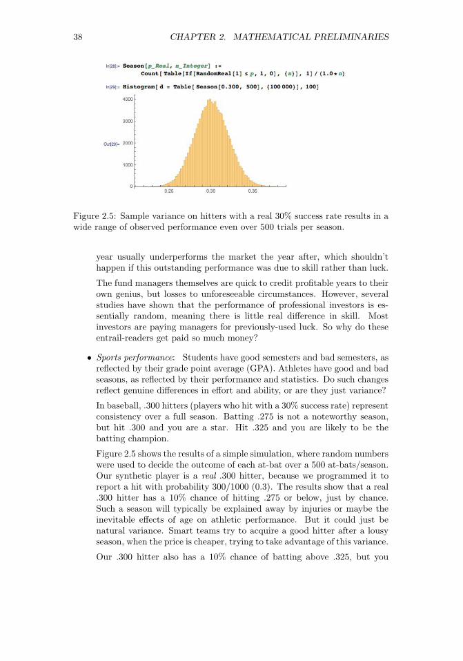
38 CHAPTER 2. MATHEMATICAL PRELIMINARIES
Figure 2.5: Sample variance on hitters with a real 30% success rate results in awide range of observed performance even over 500 trials per season.
year usually underperforms the market the year after, which shouldn’thappen if this outstanding performance was due to skill rather than luck.
The fund managers themselves are quick to credit profitable years to theirown genius, but losses to unforeseeable circumstances. However, severalstudies have shown that the performance of professional investors is es-sentially random, meaning there is little real difference in skill. Mostinvestors are paying managers for previously-used luck. So why do theseentrail-readers get paid so much money?
• Sports performance: Students have good semesters and bad semesters, asreflected by their grade point average (GPA). Athletes have good and badseasons, as reflected by their performance and statistics. Do such changesreflect genuine differences in effort and ability, or are they just variance?
In baseball, .300 hitters (players who hit with a 30% success rate) representconsistency over a full season. Batting .275 is not a noteworthy season,but hit .300 and you are a star. Hit .325 and you are likely to be thebatting champion.
Figure 2.5 shows the results of a simple simulation, where random numberswere used to decide the outcome of each at-bat over a 500 at-bats/season.Our synthetic player is a real .300 hitter, because we programmed it toreport a hit with probability 300/1000 (0.3). The results show that a real.300 hitter has a 10% chance of hitting .275 or below, just by chance.Such a season will typically be explained away by injuries or maybe theinevitable effects of age on athletic performance. But it could just benatural variance. Smart teams try to acquire a good hitter after a lousyseason, when the price is cheaper, trying to take advantage of this variance.
Our .300 hitter also has a 10% chance of batting above .325, but you

2.2. DESCRIPTIVE STATISTICS 39
can be pretty sure that they will ascribe such a breakout season to theirimproved conditioning or training methods instead of the fact they justgot lucky. Good or bad season, or lucky/unlucky: it is hard to tell thesignal from the noise.
• Model performance: As data scientists, we will typically develop and eval-uate several models for each predictive challenge. The models may rangefrom very simple to complex, and vary in their training conditions orparameters.
Typically the model with the best accuracy on the training corpus willbe paraded triumphantly before the world as the right one. But smalldifferences in the performance between models is likely explained by sim-ple variance rather than wisdom: which training/evaluation pairs wereselected, how well parameters were optimized, etc.
Remember this when it comes to training machine learning models. In-deed, when asked to choose between models with small performance dif-ferences between them, I am more likely to argue for the simplest modelthan the one with the highest score. Given a hundred people trying topredict heads and tails on a stream of coin tosses, one of them is guar-anteed to end up with the most right answers. But there is no reason tobelieve that this fellow has any better predictive powers than the rest ofus.
2.2.4 Characterizing Distributions
Distributions do not necessarily have much probability mass exactly at themean. Consider what your wealth would look like after you borrow $100 million,and then bet it all on an even money coin flip. Heads you are now $100 millionin clear, tails you are $100 million in hock. Your expected wealth is zero, butthis mean does not tell you much about the shape of your wealth distribution.
However, taken together the mean and standard deviation do a decent jobof characterizing any distribution. Even a relatively small amount of masspositioned far from the mean would add a lot to the standard deviation, so asmall value of σ implies the bulk of the mass must be near the mean.
To be precise, regardless of how your data is distributed, at least (1 −(1/k2))th of the mass must lie within ±k standard deviations of the mean.This means that at least 75% of all the data must lie within 2σ of the mean,and almost 89% within 3σ for any distribution.
We will see that even tighter bounds hold when we know the distribution iswell-behaved, like the Gaussian or normal distribution. But this is why it is agreat practice to report both µ and σ whenever you talk about averages. Theaverage height of adult women in the United States is 63.7±2.7 inches, meaningµ = 63.7 and σ = 2.7. The average temperature in Orlando, Fl is 60.3 degreesFahrenheit. However, there have been many more 100 degree days at DisneyWorld than 100 inch (8.33 foot) women visiting to enjoy them.

40 CHAPTER 2. MATHEMATICAL PRELIMINARIES
Take-Home Lesson: Report both the mean and standard deviation to charac-terize your distribution, written as µ± σ.
2.3 Correlation Analysis
Suppose we are given two variables x and y, represented by a sample of n pointsof the form (xi, yi), for 1 ≤ i ≤ n. We say that x and y are correlated when thevalue of x has some predictive power on the value of y.
The correlation coefficient r(X,Y ) is a statistic that measures the degreeto which Y is a function of X, and vice versa. The value of the correlationcoefficient ranges from −1 to 1, where 1 means fully correlated and 0 impliesno relation, or independent variables. Negative correlations imply that thevariables are anti-correlated, meaning that when X goes up, Y goes down.
Perfectly anti-correlated variables have a correlation of −1. Note that nega-tive correlations are just as good for predictive purposes as positive ones. Thatyou are less likely to be unemployed the more education you have is an exampleof a negative correlation, so the level of education can indeed help predict jobstatus. Correlations around 0 are useless for forecasting.
Observed correlations drives many of the predictive models we build in datascience. Representative strengths of correlations include:
• Are taller people more likely to remain lean? The observed correlationbetween height and BMI is r = −0.711, so height is indeed negativelycorrelated with body mass index (BMI).3
• Do standardized tests predict the performance of students in college? Theobserved correlation between SAT scores and freshmen GPA is r = 0.47,so yes, there is some degree of predictive power. But social economicstatus is just as strongly correlated with SAT scores (r = 0.42).4
• Does financial status affect health? The observed correlation betweenhousehold income and the prevalence of coronary artery disease is r =−0.717, so there is a strong negative correlation. So yes, the wealthieryou are, the lower your risk of having a heart attack.5
• Does smoking affect health? The observed correlation between a group’spropensity to smoke and their mortality rate is r = 0.716, so for G-d’ssake, don’t smoke.6
3https://onlinecourses.science.psu.edu/stat500/node/604https://research.collegeboard.org/sites/default/files/publications/2012/9/
researchreport-2009-1-socioeconomic-status-sat-freshman-gpa-analysis-data.pdf5http://www.ncbi.nlm.nih.gov/pmc/articles/PMC3457990/.6http://lib.stat.cmu.edu/DASL/Stories/SmokingandCancer.html.

2.3. CORRELATION ANALYSIS 41
• Do violent video games increase aggressive behavior? The observed cor-relation between play and violence is r = 0.19, so there is a weak butsignificant correlation.7
This section will introduce the primary measurements of correlation. Fur-ther, we study how to appropriately determine the strength and power of anyobserved correlation, to help us understand when the connections between vari-ables are real.
2.3.1 Correlation Coefficients: Pearson and Spearman Rank
In fact, there are two primary statistics used to measure correlation. Mercifully,both operate on the same −1 to 1 scale, although they measure somewhatdifferent things. These different statistics are appropriate in different situations,so you should be aware of both of them.
The Pearson Correlation Coefficient
The more prominent of the two statistics is Pearson correlation, defined as
r =
∑ni=1(Xi − X)(Yi − Y )√∑n
i=1(Xi − X)2
√∑ni=1(Yi − Y )2
=Cov(X,Y )
σ(X)σ(Y )
Let’s parse this equation. Suppose X and Y are strongly correlated. Thenwe would expect that when xi is greater than the mean X, then yi should bebigger than its mean Y . When xi is lower than its mean, yi should follow. Nowlook at the numerator. The sign of each term is positive when both values areabove (1× 1) or below (−1×−1) their respective means. The sign of each termis negative ((−1×1) or (1×−1)) if they move in opposite directions, suggestingnegative correlation. If X and Y were uncorrelated, then positive and negativeterms should occur with equal frequency, offsetting each other and driving thevalue to zero.
The numerator’s operation determining the sign of the correlation is so usefulthat we give it a name, covariance, computed:
Cov(X,Y ) =
n∑i=1
(Xi − X)(Yi − Y ).
Remember covariance: we will see it again in Section 8.2.3.The denominator of the Pearson formula reflects the amount of variance in
the two variables, as measured by their standard deviations. The covariancebetween X and Y potentially increases with the variance of these variables, andthis denominator is the magic amount to divide it by to bring correlation to a−1 to 1 scale.
7http://webspace.pugetsound.edu/facultypages/cjones/chidev/Paper/Articles/
Anderson-Aggression.pdf.

42 CHAPTER 2. MATHEMATICAL PRELIMINARIES
Figure 2.6: The function y = |x| does not have a linear model, but seems like itshould be easily fitted despite weak correlations.
The Spearman Rank Correlation Coefficient
The Pearson correlation coefficient defines the degree to which a linear predictorof the form y = m·x+b can fit the observed data. This generally does a good jobmeasuring the similarity between the variables, but it is possible to constructpathological examples where the correlation coefficient between X and Y is zero,yet Y is completely dependent on (and hence perfectly predictable from) X.
Consider points of the form (x, |x|), where x is uniformly (or symmetrically)sampled from the interval [−1, 1] as shown in Figure 2.6. The correlation willbe zero because for every point (x, x) there will be an offsetting point (−x, x),yet y = |x| is a perfect predictor. Pearson correlation measures how well thebest linear predictors can work, but says nothing about weirder functions likeabsolute value.
The Spearman rank correlation coefficient essentially counts the number ofpairs of input points which are out of order. Suppose that our data set containspoints (x1, y1) and (x2, y2) where x1 < x2 and y1 < y2. This is a vote thatthe values are positively correlated, whereas the vote would be for a negativecorrelation if y2 < y1.
Summing up over all pairs of points and normalizing properly gives us Spear-man rank correlation. Let rank(xi) be the rank position of xi in sorted orderamong all xi, so the rank of the smallest value is 1 and the largest value n. Then
ρ = 1− 6∑d2i
n(n2 − 1)
where di = rank(xi)− rank(yi).The relationship between our two coefficients is better delineated by the
example in Figure 2.7. In addition to giving high scores to non-linear butmonotonic functions, Spearman correlation is less sensitive to extreme outlierelements than Pearson. Let p = (x1, ymax) be the data point with largest value
−3 −2 −1 0 1 2 30.0
0.5
1.0
1.5
2.0
2.5
3.0
Spearman coefficient = -0.27Pearson coefficient = -0.17

2.3. CORRELATION ANALYSIS 43
Figure 2.7: A monotonic but not linear point set has a Spearman coefficientr = 1 even though it has no good linear fit (left). Highly-correlated sequencesare recognized by both coefficients (center), but the Pearson coefficient is muchmore sensitive to outliers (right).
of y in a given data set. Suppose we replace p with p′ = (x1,∞). The Pearsoncorrelation will go crazy, since the best fit now becomes the vertical line x = x1.But the Spearman correlation will be unchanged, since all the points were underp, just as they are now under p′.
2.3.2 The Power and Significance of Correlation
The correlation coefficient r reflects the degree to which x can be used to predicty in a given sample of points S. As |r| → 1, these predictions get better andbetter.
But the real question is how this correlation will hold up in the real world,outside the sample. Stronger correlations have larger |r|, but also involve sam-ples of enough points to be significant. There is a wry saying that if you wantto fit your data by a straight line, it is best to sample it at only two points.Your correlation becomes more impressive the more points it is based on.
The statistical limits in interpreting correlations are presented in Figure 2.8,based on strength and size:
• Strength of correlation: R2: The square of the sample correlation coef-ficient r2 estimates the fraction of the variance in Y explained by X ina simple linear regression. The correlation between height and weight isapproximately 0.8, meaning it explains about two thirds of the variance.
Figure 2.8 (left) shows how rapidly r2 decreases with r. There is a pro-found limit to how excited we should get about establishing a weak corre-lation. A correlation of 0.5 possesses only 25% of the maximum predictivepower, and a correlation of r = 0.1 only 1%. Thus the predictive value ofcorrelations decreases rapidly with r.
What do we mean by “explaining the variance”? Let f(x) = mx+c be the
0 1 2 3 4 5 60
1
2
3
4
5
6
Spearman coefficient = 1.0Pearson coefficient = 0.69
0.0 0.2 0.4 0.6 0.8 1.0−0.2
0.0
0.2
0.4
0.6
0.8
1.0
1.2
Spearman coefficient = 0.94Pearson coefficient = 0.94
0.0 0.2 0.4 0.6 0.8 1.0
0
1
2
3
4
5
Spearman coefficient = 0.94Pearson coefficient = 0.57

44 CHAPTER 2. MATHEMATICAL PRELIMINARIES
Figure 2.8: Limits in interpreting significance. The r2 value shows that weakcorrelations explain only a small fraction of the variance (left). The level of cor-relation necessary to be statistically significance decreases rapidly with samplesize n (right).
Figure 2.9: Plotting ri = yi − f(xi) shows that the residual values have lowervariance and mean zero. The original data points are on the left, with thecorresponding residuals on the right.
0.0 0.2 0.4 0.6 0.8 1.0
Absolute value of Pearson correlation
0.0
0.2
0.4
0.6
0.8
1.0
r2
0 50 100 150 200 250 300
Sample size
0.0
0.1
0.2
0.3
0.4
0.5
0.6
0.7
Pearson correlation
0.0 0.2 0.4 0.6 0.8 1.0
x
−0.6
−0.4
−0.2
0.0
0.2
0.4
0.6
y
0.0 0.2 0.4 0.6 0.8 1.0
x
−0.6
−0.4
−0.2
0.0
0.2
0.4
0.6
y -
f(x
)

2.3. CORRELATION ANALYSIS 45
predictive value of y from x, with the parameters m and c correspondingto the best possible fit. The residual values ri = yi−f(xi) will have meanzero, as shown in Figure 2.9. Further, the variance of the full data setV (Y ) should be much larger than V (r) if there is a good linear fit f(x).If x and y are perfectly correlated, there should be no residual error, andV (r) = 0. If x and y are totally uncorrelated, the fit should contributenothing, and V (y) ≈ V (r). Generally speaking, 1 − r2 = V (r)/V (y).
Consider Figure 2.9, showing a set of points (left) admitting a good linearfit, with correlation r = 0.94. The corresponding residuals ri = yi− f(xi)are plotted on the right. The variance of the y values on the left V (y) =0.056, substantially greater than the variance V (r) = 0.0065 on the right.Indeed,
1− r2 = 0.116←→ V (r)/V (y) = 0.116.
• Statistical significance: The statistical significance of a correlation dependsupon its sample size n as well as r. By tradition, we say that a correlationof n points is significant if there is an α ≤ 1/20 = 0.05 chance that wewould observe a correlation as strong as r in any random set of n points.
This is not a particularly strong standard. Even small correlations becomesignificant at the 0.05 level with large enough sample sizes, as shown inFigure 2.8 (right). A correlation of r = 0.1 becomes significant at α =0.05 around n = 300, even though such a factor explains only 1% of thevariance.
Weak but significant correlations can have value in big data models involvinglarge numbers of features. Any single feature/correlation might explain/predictonly small effects, but taken together a large number of weak but independentcorrelations may have strong predictive power. Maybe. We will discuss signifi-cance again in greater detail in Section 5.3.
2.3.3 Correlation Does Not Imply Causation!
You have heard this before: correlation does not imply causation:
• The number of police active in a precinct correlate strongly with the localcrime rate, but the police do not cause the crime.
• The amount of medicine people take correlates with the probability theyare sick, but the medicine does not cause the illness.
At best, the implication works only one way. But many observed correlationsare completely spurious, with neither variable having any real impact on theother.
Still, correlation implies causation is a common error in thinking, even amongthose who understand logical reasoning. Generally speaking, few statistical toolsare available to tease out whether A really causes B. We can conduct controlledexperiments, if we can manipulate one of the variables and watch the effect on
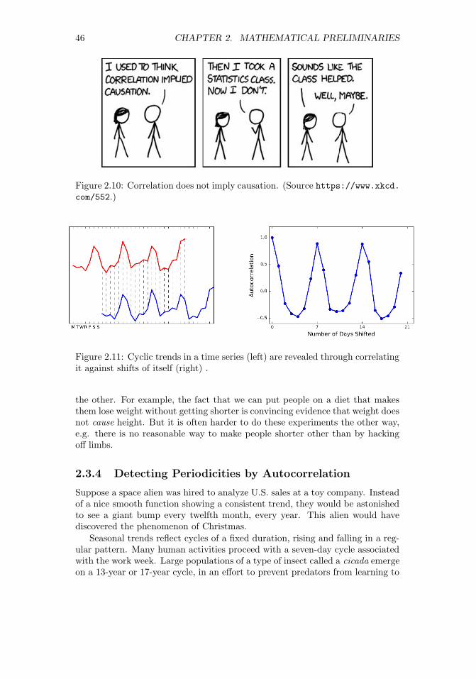
46 CHAPTER 2. MATHEMATICAL PRELIMINARIES
Figure 2.10: Correlation does not imply causation. (Source https://www.xkcd.com/552.)
Figure 2.11: Cyclic trends in a time series (left) are revealed through correlatingit against shifts of itself (right) .
the other. For example, the fact that we can put people on a diet that makesthem lose weight without getting shorter is convincing evidence that weight doesnot cause height. But it is often harder to do these experiments the other way,e.g. there is no reasonable way to make people shorter other than by hackingoff limbs.
2.3.4 Detecting Periodicities by Autocorrelation
Suppose a space alien was hired to analyze U.S. sales at a toy company. Insteadof a nice smooth function showing a consistent trend, they would be astonishedto see a giant bump every twelfth month, every year. This alien would havediscovered the phenomenon of Christmas.
Seasonal trends reflect cycles of a fixed duration, rising and falling in a reg-ular pattern. Many human activities proceed with a seven-day cycle associatedwith the work week. Large populations of a type of insect called a cicada emergeon a 13-year or 17-year cycle, in an effort to prevent predators from learning to

2.4. LOGARITHMS 47
eat them.How can we recognize such cyclic patterns in a sequence S? Suppose we
correlate the values of Si with Si+p, for all 1 ≤ i ≤ n−p. If the values are in syncfor a particular period length p, then this correlation with itself will be unusuallyhigh relative to other possible lag values. Comparing a sequence to itself is calledan autocorrelation, and the series of correlations for all 1 ≤ k ≤ n − 1 is calledthe autocorrelation function. Figure 2.11 presents a time series of daily sales,and the associated autocorrelation function for this data. The peak at a shift ofseven days (and every multiple of seven days) establishes that there is a weeklyperiodicity in sales: more stuff gets sold on weekends.
Autocorrelation is an important concept in predicting future events, becauseit means we can use previous observations as features in a model. The heuristicthat tomorrow’s weather will be similar to today’s is based on autocorrelation,with a lag of p = 1 days. Certainly we would expect such a model to bemore accurate than predictions made on weather data from six months ago (lagp = 180 days).
Generally speaking, the autocorrelation function for many quantities tendsto be highest for very short lags. This is why long-term predictions are less accu-rate than short-term forecasts: the autocorrelations are generally much weaker.But periodic cycles do sometimes stretch much longer. Indeed, a weather fore-cast based on a lag of p = 365 days will be much better than one of p = 180,because of seasonal effects.
Computing the full autocorrelation function requires calculating n−1 differ-ent correlations on points of the time series, which can get expensive for large n.Fortunately, there is an efficient algorithm based on the fast Fourier transform(FFT), which makes it possible to construct the autocorrelation function evenfor very long sequences.
2.4 Logarithms
The logarithm is the inverse exponential function y = bx, an equation that canbe rewritten as x = logb y. This definition is the same as saying that
blogb y = y.
Exponential functions grow at a very fast rate: consider b = {21, 22, 23, 24, . . .}.In contrast, logarithms grow a very slow rate: these are just the exponents ofthe previous series {1, 2, 3, 4, . . .}. They are associated with any process wherewe are repeatedly multiplying by some value of b, or repeatedly dividing by b.Just remember the definition:
y = logb x←→ by = x.
Logarithms are very useful things, and arise often in data analysis. HereI detail three important roles logarithms play in data science. Surprisingly,only one of them is related to the seven algorithmic applications of logarithms

48 CHAPTER 2. MATHEMATICAL PRELIMINARIES
I present in The Algorithm Design Manual [Ski08]. Logarithms are indeed veryuseful things.
2.4.1 Logarithms and Multiplying Probabilities
Logarithms were first invented as an aide to computation, by reducing the prob-lem of multiplication to that of addition. In particular, to compute the productp = x · y, we could compute the sum of the logarithms s = logb x + logb y andthen take the inverse of the logarithm (i.e. raising b to the sth power) to get p,because:
p = x · y = b(logb x+logb y).
This is the trick that powered the mechanical slide rules that geeks used in thedays before pocket calculators.
However, this idea remains important today, particularly when multiplyinglong chains of probabilities. Probabilities are small numbers. Thus multiplyinglong chains of probability yield very small numbers that govern the chances ofvery rare events. There are serious numerical stability problems with floatingpoint multiplication on real computers. Numerical errors will creep in, and willeventually overwhelm the true value of small-enough numbers.
Summing the logarithms of probabilities is much more numerically stablethan multiplying them, but yields an equivalent result because:
n∏i=1
pi = bP , where P =
n∑i=1
logb(pi).
We can raise our sum to an exponential if we need the real probability, butusually this is not necessary. When we just need to compare two probabilitiesto decide which one is larger we can safely stay in log world, because biggerlogarithms correspond to bigger probabilities.
There is one quirk to be aware of. Recall that the log2( 12 ) = −1. The
logarithms of probabilities are all negative numbers except for log(1) = 0. Thisis the reason why equations with logs of probabilities often feature negativesigns in strange places. Be on the lookout for them.
2.4.2 Logarithms and Ratios
Ratios are quantities of the form a/b. They occur often in data sets either aselementary features or values derived from feature pairs. Ratios naturally occurin normalizing data for conditions (i.e. weight after some treatment over theinitial weight) or time (i.e. today’s price over yesterday’s price).
But ratios behave differently when reflecting increases than decreases. Theratio 200/100 is 200% above baseline, but 100/200 is only 50% below despitebeing a similar magnitude change. Thus doing things like averaging ratios iscommitting a statistical sin. Do you really want a doubling followed by a halvingto average out as an increase, as opposed to a neutral change?

2.4. LOGARITHMS 49
Figure 2.12: Plotting ratios on a scale cramps the space allocated to small ratiosrelative to large ratios (left). Plotting the logarithms of ratios better representsthe underlying data (right).
One solution here would have been to use the geometric mean. But better istaking the logarithm of these ratios, so that they yield equal displacement, sincelog2 2 = 1 and log2(1/2) = −1. We get the extra bonus that a unit ratio mapsto zero, so positive and negative numbers correspond to improper and properratios, respectively.
A rookie mistake my students often make involves plotting the value of ratiosinstead of their logarithms. Figure 2.12 (left) is a graph from a student paper,showing the ratio of new score over old score on data over 24 hours (each reddot is the measurement for one hour) on four different data sets (each given arow). The solid black line shows the ratio of one, where both scores give thesame result. Now try to read this graph: it isn’t easy because the points on theleft side of the line are cramped together in a narrow strip. What jumps out atyou are the outliers. Certainly the new algorithm does terrible on 7UM917 inthe top row: that point all the way to the right is a real outlier.
Except that it isn’t. Now look at Figure 2.12 (right), where we plot thelogarithms of the ratios. The space devoted to left and right of the black linecan now be equal. And it shows that this point wasn’t really such an outlier atall. The magnitude of improvement of the leftmost points is much greater thanthat of the rightmost points. This plot reveals that new algorithm generallymakes things better, only because we are showing logs of ratios instead of theratios themselves.
2.4.3 Logarithms and Normalizing Skewed Distributions
Variables which follow symmetric, bell-shaped distributions tend to be nice asfeatures in models. They show substantial variation, so they can be used todiscriminate between things, but not over such a wide range that outliers areoverwhelming.
But not every distribution is symmetric. Consider the one in Figure 2.13
−3 −2 −1 0 1 2 3
6K448
6K9P5
7UM918
7UM917
0 2 4 6 8 10 12 14
6K448
6K9P5
7UM918
7UM917

50 CHAPTER 2. MATHEMATICAL PRELIMINARIES
Figure 2.13: Hitting a skewed data distribution (left) with a log often yields amore bell-shaped distribution (right).
(left). The tail on the right goes much further than the tail on the left. Andwe are destined to see far more lopsided distributions when we discuss powerlaws, in Section 5.1.5. Wealth is representative of such a distribution, wherethe poorest human has zero or perhaps negative wealth, the average person(optimistically) is in the thousands of dollars, and Bill Gates is pushing $100billion as of this writing.
We need a normalization to convert such distributions into something easierto deal with. To ring the bell of a power law distribution we need somethingnon-linear, that reduces large values to a disproportionate degree compared tomore modest values.
The logarithm is the transformation of choice for power law variables. Hityour long-tailed distribution with a log and often good things happen. Thedistribution in Figure 2.13 happened to be the log normal distribution, so takingthe logarithm yielded a perfect bell-curve on right. Taking the logarithm ofvariables with a power law distribution brings them more in line with traditionaldistributions. For example, as an upper-middle class professional, my wealth isroughly the same number of logs from my starving students as I am from BillGates!
Sometimes taking the logarithm proves too drastic a hit, and a less dramaticnon-linear transformation like the square root works better to normalize a dis-tribution. The acid test is to plot a frequency distribution of the transformedvalues and see if it looks bell-shaped: grossly-symmetric, with a bulge in themiddle. That is when you know you have the right function.
2.5 War Story: Fitting Designer Genes
The word bioinformatician is life science speak for “data scientist,” the prac-titioner of an emerging discipline which studies massive collections of DNAsequence data looking for patterns. Sequence data is very interesting to work
0.0 0.5 1.0 1.5 2.0 2.5 3.0 3.5 4.00.0
0.2
0.4
0.6
0.8
1.0
1.2
1.4Logarithmic scale
0 200 400 600 800 10000.0
0.2
0.4
0.6
0.8
1.0
1.2
1.4Linear scale

2.5. WAR STORY: FITTING DESIGNER GENES 51
with, and I have played bioinformatician in research projects since the verybeginnings of the human genome project.
DNA sequences are strings on the four letter alphabet {A,C,G, T}. Proteinsform the stuff that we are physically constructed from, and are composed ofstrings of 20 different types of molecular units, called amino acids. Genes arethe DNA sequences which describe exactly how to make specific proteins, withthe units each described by a triplet of {A,C,G, T}s called codons.
For our purposes, it suffices to know that there are a huge number of possibleDNA sequences describing genes which could code for any particular desiredprotein sequence. But only one of them is used. My biologist collaborators andI wanted to know why.
Originally, it was assumed that all of these different synonymous encodingswere essentially identical, but statistics performed on sequence data made itclear that certain codons are used more often than others. The biological con-clusion is that “codons matter,” and there are good biological reasons why thisshould be.
We became interested in whether “neighboring pairs of codon matter.” Per-haps certain pairs of triples are like oil and water, and hate to mix. Certainletter pairs in English have order preferences: you see the bigram gh far moreoften than hg. Maybe this is true of DNA as well? If so, there would be pairsof triples which should be underrepresented in DNA sequence data.
To test this, we needed a score comparing the number of times we actuallysee a particular triple (say x = CAT ) next to another particular triple (sayy = GAG) to what we would expect by chance. Let F (xy) be the frequencyof xy, number of times we actually see codon x followed by codon y in theDNA sequence database. These codons code for specific amino acids, say aand b respectively. For amino acid a, the probability that it will be coded byx is P (x) = F (x)/F (a), and similarly P (y) = F (y)/F (b). Then the expectednumber of times of seeing xy is
Expected(xy) =
(F (x)
F (a)
)(F (y)
F (b)
)F (ab)
Based on this, we can compute a codon pair score for any given hexamer xyas follows:
CPS(xy) = ln
(Observed(xy)
Expected(xy)
)= ln
F (xy)F (x)F (y)F (a)F (b)F (ab)
Taking the logarithm of this ratio produced very nice properties. Most im-
portantly, the sign of the score distinguished over-represented pairs from under-represented pairs. Because the magnitudes were symmetric (+1 was just asimpressive as −1) we could add or average these scores in a sensible way to givea score for each gene. We used these scores to design genes that should be badfor viruses, which gave an exciting new technology for making vaccines. See thechapter notes (Section 2.6) for more details.

52 CHAPTER 2. MATHEMATICAL PRELIMINARIES
Figure 2.14: Patterns in DNA sequences with the lowest codon pair scoresbecome obvious on inspection. When interpreted in-frame, the stop symbolTAG is substantially depleted (left). When interpreted in the other two frames,the most avoided patterns are all very low complexity, like runs of a single base(right)
Knowing that certain pairs of codons were bad did not explain why they werebad. But by computing two related scores (details unimportant) and sortingthe triplets based on them, as shown in Figure 2.14, certain patterns poppedout. Do you notice the patterns? All the bad sequences on the left containTAG, which turns out to be a special codon that tells the gene to stop. Andall the bad sequences on the right consist of C and G in very simple repetitivesequences. These explain biologically why patterns are avoided by evolution,meaning we discovered something very meaningful about life.
There are two take-home lessons from this story. First, developing numericalscoring functions which highlight specific aspects of items can be very usefulto reveal patterns. Indeed, Chapter 4 will focus on the development of suchsystems. Second, hitting such quantities with a logarithm can make them evenmore useful, enabling us to see the forest for the trees.
2.6 Chapter Notes
There are many excellent introductions to probability theory available, including[Tij12, BT08]. The same goes for elementary statistics, with good introductorytexts including [JWHT13, Whe13]. The brief history of probability theory inthis chapter is based on Weaver [Wea82].
In its strongest form, the efficient market hypothesis states that the stockmarket is essentially unpredictable using public information. My personal adviceis that you should invest in index funds that do not actively try to predict thedirection of the market. Malkiel’s A Random Walk Down Wall Street [Mal99]

2.7. EXERCISES 53
is an excellent introduction to such investment thinking.The Fast Fourier Transform (FFT) provides an O(n log n) time algorithm to
compute the full autocorrelation function of an n-element sequence, where thestraightforward computation of n correlations takes O(n2). Bracewell [Bra99]and Brigham [Bri88] are excellent introductions to Fourier transforms and theFFT. See also the exposition in Press et.al. [PFTV07].
The comic strip in Figure 2.10 comes from Randall Munroe’s webcomic xkcd,specifically https://xkcd.com/552, and is reprinted with permission.
The war story of Section 2.5 revolves around our work on how the phe-nomenon of codon pair bias affects gene translation. Figure 2.14 comes frommy collaborator Justin Gardin. See [CPS+08, MCP+10, Ski12] for discussionsof how we exploited codon pair bias to design vaccines for viral diseases likepolio and the flu.
2.7 Exercises
Probability
2-1. [3] Suppose that 80% of people like peanut butter, 89% like jelly, and 78% likeboth. Given that a randomly sampled person likes peanut butter, what is theprobability that she also likes jelly?
2-2. [3] Suppose that P (A) = 0.3 and P (B) = 0.7.
(a) Can you compute P (A and B) if you only know P (A) and P (B)?
(b) Assuming that events A and B arise from independent random processes:
• What is P (A and B)?
• What is P (A or B)?
• What is P (A|B)?
2-3. [3] Consider a game where your score is the maximum value from two dice.Compute the probability of each event from {1, . . . , 6}.
2-4. [8] Prove that the cumulative distribution function of the maximum of a pair ofvalues drawn from random variable X is the square of the original cumulativedistribution function of X.
2-5. [5] If two binary random variables X and Y are independent, are X (the com-plement of X) and Y also independent? Give a proof or a counterexample.
Statistics
2-6. [3] Compare each pair of distributions to decide which one has the greatermean and the greater standard deviation. You do not need to calculate theactual values of µ and σ, just how they compare with each other.
(a) i. 3, 5, 5, 5, 8, 11, 11, 11, 13.
ii. 3, 5, 5, 5, 8, 11, 11, 11, 20.
(b) i. −20, 0, 0, 0, 15, 25, 30, 30.
ii. −40, 0, 0, 0, 15, 25, 30, 30.

54 CHAPTER 2. MATHEMATICAL PRELIMINARIES
(c) i. 0, 2, 4, 6, 8, 10.
ii. 20, 22, 24, 26, 28, 30.
(d) i. 100, 200, 300, 400, 500.
ii. 0, 50, 300, 550, 600.
2-7. [3] Construct a probability distribution where none of the mass lies within oneσ of the mean.
2-8. [3] How does the arithmetic and geometric mean compare on random integers?
2-9. [3] Show that the arithmetic mean equals the geometric mean when all termsare the same.
Correlation Analysis
2-10. [3] True or false: a correlation coefficient of −0.9 indicates a stronger linearrelationship than a correlation coefficient of 0.5. Explain why.
2-11. [3] What would be the correlation coefficient between the annual salaries ofcollege and high school graduates at a given company, if for each possible jobtitle the college graduates always made:
(a) $5,000 more than high school grads?
(b) 25% more than high school grads?
(c) 15% less than high school grads?
2-12. [3] What would be the correlation between the ages of husbands and wives ifmen always married woman who were:
(a) Three years younger than themselves?
(b) Two years older than themselves?
(c) Half as old as themselves?
2-13. [5] Use data or literature found in a Google search to estimate/measure thestrength of the correlation between:
(a) Hits and walks scored for hitters in baseball.
(b) Hits and walks allowed by pitchers in baseball.
2-14. [5] Compute the Pearson and Spearman Rank correlations for uniformly drawnsamples of points (x, xk). How do these values change as a function of increasingk?
Logarithms
2-15. [3] Show that the logarithm of any number less than 1 is negative.
2-16. [3] Show that the logarithm of zero is undefined.
2-17. [5] Prove that
x · y = b(logb x+logb y)
2-18. [5] Prove the correctness of the formula for changing a base-b logarithm to base-a, that
loga(x) = logb(x)/ logb(a).

2.7. EXERCISES 55
Implementation Projects
2-19. [3] Find some interesting data sets, and compare how similar their means andmedians are. What are the distributions where the mean and median differ onthe most?
2-20. [3] Find some interesting data sets and search all pairs for interesting correla-tions. Perhaps start with what is available at http://www.data-manual.com/
data. What do you find?
Interview Questions
2-21. [3] What is the probability of getting exactly k heads on n tosses, where thecoin has a probability of p in coming up heads on each toss? What about k ormore heads?
2-22. [5] Suppose that the probability of getting a head on the ith toss of an ever-changing coin is f(i). How would you efficiently compute the probability ofgetting exactly k heads in n tosses?
2-23. [5] At halftime of a basketball game you are offered two possible challenges:
(a) Take three shots, and make at least two of them.
(b) Take eight shots, and make at least five of them.
Which challenge should you pick to have a better chance of winning the game?
2-24. [3] Tossing a coin ten times resulted in eight heads and two tails. How wouldyou analyze whether a coin is fair? What is the p-value?
2-25. [5] Given a stream of n numbers, show how to select one uniformly at randomusing only constant storage. What if you don’t know n in advance?
2-26. [5] A k-streak starts at toss i in a sequence of n coin flips when the outcome of theith flip and the next k − 1 flips are identical. For example, sequence HTTTHHcontains 2-streaks starting at the second, third, and fifth tosses. What are theexpected number of k-streaks that you will see in n tosses of a fair coin ?
2-27. [5] A person randomly types an eight-digit number into a pocket calculator.What is the probability that the number looks the same even if the calculatoris turned upside down?
2-28. [3] You play a dice rolling game where you have two choices:
(a) Roll the dice once and get rewarded with a prize equal to the outcomenumber (e.g, $3 for number “3”) and then stop the game.
(b) You can reject the first reward according to its outcome and roll the dicea second time, and get rewarded in the same way.
Which strategy should you choose to maximize your reward? That is, for whatoutcomes of the first roll should you chose to play the second game? What isthe statistical expectation of reward if you choose the second strategy?
2-29. [3] What is A/B testing and how does it work?
2-30. [3] What is the difference between statistical independence and correlation?
2-31. [3] We often say that correlation does not imply causation. What does thismean?

56 CHAPTER 2. MATHEMATICAL PRELIMINARIES
2-32. [5] What is the difference between a skewed distribution and a uniform one?
Kaggle Challenges
2-33. Cause–effect pairs: correlation vs. causation.
https://www.kaggle.com/c/cause-effect-pairs
2-34. Predict the next “random number” in a sequence.
https://www.kaggle.com/c/random-number-grand-challenge
2-35. Predict the fate of animals at a pet shelter.
https://www.kaggle.com/c/shelter-animal-outcomes

Chapter 3
Data Munging
On two occasions I have been asked, “Pray, Mr. Babbage, if you putinto the machine wrong figures, will the right answers come out?”. . . I am not able rightly to apprehend the kind of confusion of ideasthat could provoke such a question.
– Charles Babbage
Most data scientists spend much of their time cleaning and formatting data.The rest spend most of their time complaining that there is no data availableto do what they want to do.
In this chapter, we will work through some of the basic mechanics of com-puting with data. Not the high-faluting stuff like statistics or machine learning,but the grunt work of finding data and cleaning it that goes under the monikerof data munging.
While practical questions like “What is the best library or programminglanguage available?” are clearly important, the answers change so rapidly thata book like this one is the wrong place to address them. So I will stick at thelevel of general principles, instead of shaping this book around a particular setof software tools. Still, we will discuss the landscape of available resources inthis chapter: why they exist, what they do, and how best to use them.
The first step in any data science project is getting your hands on the rightdata. But this is often distressingly hard. This chapter will survey the richesthunting grounds for data resources, and then introduce techniques for cleaningwhat you kill. Wrangling your data so you that can safely analyze it is criticalfor meaningful results. As Babbage himself might have said more concisely,“garbage in, garbage out.”
3.1 Languages for Data Science
In theory, every sufficiently powerful programming language is capable of ex-pressing any algorithm worth computing. But in practice, certain programming
57© The Author(s) 2017S.S. Skiena, The Data Science Design Manual,Texts in Computer Science, https://doi.org/10.1007/978-3-319-55444-0_3
58 CHAPTER 3. DATA MUNGING
languages prove much better than others at specific tasks. Better here mightdenote easier for the programmer or perhaps more computationally efficient,depending upon the mission at hand.
The primary data science programming languages to be aware of are:
• Python: This is today’s bread-and-butter programming language for datascience. Python contains a variety of language features to make basicdata munging easier, like regular expressions. It is an interpreted lan-guage, making the development process quicker and enjoyable. Pythonis supported by an enormous variety of libraries, doing everything fromscraping to visualization to linear algebra and machine learning.
Perhaps the biggest strike against Python is efficiency: interpreted lan-guages cannot compete with compiled ones for speed. But Python compil-ers exist in a fashion, and support linking in efficient C/assembly languagelibraries for computationally-intensive tasks. Bottom line, Python shouldprobably be your primary tool in working through the material we presentin this book.
• Perl: This used to be the go to language for data munging on the web,before Python ate it for lunch. In the TIOBE programming language pop-ularity index (http://www.tiobe.com/tiobe-index), Python first ex-ceeded Perl in popularity in 2008 and hasn’t looked back. There are severalreasons for this, including stronger support for object-oriented program-ming and better available libraries, but the bottom line is that there arefew good reasons to start projects in Perl at this point. Don’t be surprisedif you encounter it in some legacy project, however.
• R: This is the programming language of statisticians, with the deepestlibraries available for data analysis and visualization. The data scienceworld is split between R and Python camps, with R perhaps more suit-able for exploration and Python better for production use. The style ofinteraction with R is somewhat of an acquired taste, so I encourage youto play with it a bit to see whether it feels natural to you.
Linkages exist between R and Python, so you can conveniently call Rlibrary functions in Python code. This provides access to advanced statis-tical methods, which may not be supported by the native Python libraries.
• Matlab: The Mat here stands for matrix, as Matlab is a language de-signed for the fast and efficient manipulation of matrices. As we will see,many machine learning algorithms reduce to operations on matrices, mak-ing Matlab a natural choice for engineers programming at a high-level ofabstraction.
Matlab is a proprietary system. However, much of its functionality isavailable in GNU Octave, an open-source alternative.

3.1. LANGUAGES FOR DATA SCIENCE 59
• Java and C/C++: These mainstream programming languages for thedevelopment of large systems are important in big data applications. Par-allel processing systems like Hadoop and Spark are based on Java andC++, respectively. If you are living in the world of distributed comput-ing, then you are living in a world of Java and C++ instead of the otherlanguages listed here.
• Mathematica/Wolfram Alpha: Mathematica is a proprietary system pro-viding computational support for all aspects of numerical and symbolicmathematics, built upon the less proprietary Wolfram programming lan-guage. It is the foundation of the Wolfram Alpha computational knowl-edge engine, which processes natural language-like queries through a mixof algorithms and pre-digested data sources. Check it out at http://www.wolframalpha.com.
I will confess a warm spot for Mathematica.1 It is what I tend to reachfor when I am doing a small data analysis or simulation, but cost hastraditionally put it out of the range of many users. The release of theWolfram language perhaps now opens it up to a wider community.
• Excel: Spreadsheet programs like Excel are powerful tools for exploratorydata analysis, such as playing with a given data set to see what it contains.They deserve our respect for such applications.
Full featured spreadsheet programs contain a surprising amount of hiddenfunctionality for power users. A student of mine who rose to become aMicrosoft executive told me that 25% of all new feature requests for Excelproposed functionality already present there. The special functions anddata manipulation features you want probably are in Excel if you lookhard enough, in the same way that a Python library for what you needprobably will be found if you search for it.
3.1.1 The Importance of Notebook Environments
The primary deliverable for a data science project should not be a program. Itshould not be a data set. It should not be the results of running the programon your data. It should not just be a written report.
The deliverable result of every data science project should be a computablenotebook tying together the code, data, computational results, and writtenanalysis of what you have learned in the process. Figure 3.1 presents an excerptfrom a Jupyter/IPython notebook, showing how it integrates code, graphics,and documentation into a descriptive document which can be executed like aprogram.
The reason this is so important is that computational results are the productof long chains of parameter selections and design decisions. This creates severalproblems that are solved by notebook computing environments:
1Full disclosure: I have known Stephen Wolfram for over thirty years. Indeed, we inventedthe iPad together [Bar10, MOR+88].

60 CHAPTER 3. DATA MUNGING
Figure 3.1: Jupyter/IPython notebooks tie together code, computational re-sults, and documentation.

3.1. LANGUAGES FOR DATA SCIENCE 61
• Computations need to be reproducible. We must be able to run the sameprograms again from scratch, and get exactly the same result. This meansthat data pipelines must be complete: taking raw input and producing thefinal output. It is terrible karma to start with a raw data set, do someprocessing, edit/format the data files by hand, and then do some moreprocessing – because what you did by hand cannot be readily done againon another data set, or undone after you realize that you may have goofedup.
• Computations must be tweakable. Often reconsideration or evaluation willprompt a change to one or more parameters or algorithms. This requiresrerunning the notebook to produce the new computation. There is nothingmore disheartening to be given a big data product without provenance andtold that this is the final result and you can’t change anything. A notebookis never finished until after the entire project is done.
• Data pipelines need to be documented. That notebooks permit you tointegrate text and visualizations with your code provides a powerful wayto communicate what you are doing and why, in ways that traditionalprogramming environments cannot match.
Take-Home Lesson: Use a notebook environment like IPython or Mathematicato build and report the results of any data science project.
3.1.2 Standard Data Formats
Data comes from all sorts of places, and in all kinds of formats. Which represen-tation is best depends upon who the ultimate consumer is. Charts and graphsare marvelous ways to convey the meaning of numerical data to people. Indeed,Chapter 6 will focus on techniques for visualizing data. But these pictures areessentially useless as a source of data to compute with. There is a long wayfrom printed maps to Google Maps.
The best computational data formats have several useful properties:
• They are easy for computers to parse: Data written in a useful format isdestined to be used again, elsewhere. Sophisticated data formats are oftensupported by APIs that govern technical details ensuring proper format.
• They are easy for people to read: Eyeballing data is an essential operationin many contexts. Which of the data files in this directory is the right onefor me to use? What do we know about the data fields in this file? Whatis the gross range of values for each particular field?
These use cases speak to the enormous value of being able to open a datafile in a text editor to look at it. Typically, this means presenting thedata in a human-readable text-encoded format, with records demarcatedby separate lines, and fields separated by delimiting symbols.

62 CHAPTER 3. DATA MUNGING
• They are widely used by other tools and systems: The urge to inventproprietary data standard beats firmly in the corporate heart, and mostsoftware developers would rather share a toothbrush than a file format.But these are impulses to be avoided. The power of data comes frommixing and matching it with other data resources, which is best facilitatedby using popular standard formats.
One property I have omitted from this list is conciseness, since it is generallynot a primary concern for most applications running on modern computingsystems. The quest to minimize data storage costs often works against othergoals. Cleverly packing multiple fields into the higher-order bits of integers savesspace, but at the cost of making it incompatible and unreadable.
General compression utilities like gzip prove amazingly good at removing theredundancy of human-friendly formatting. Disk prices are unbelievably cheap:as I write this you can buy a 4TB drive for about $100, meaning less than thecost of one hour of developer time wasted programming a tighter format. Unlessyou are operating at the scale of Facebook or Google, conciseness does not havenearly the importance you are liable to think it does.2
The most important data formats/representations to be aware of are dis-cussed below:
• CSV (comma separated value) files: These files provide the simplest, mostpopular format to exchange data between programs. That each line repre-sents a single record, with fields separated by commas, is obvious from in-spection. But subtleties revolve around special characters and text strings:what if your data about names contains a comma, like “Thurston Howell,Jr.” The csv format provides ways to escape code such characters so theyare not treated as delimiters, but it is messy. A better alternative is touse a rarer delimiter character, as in tsv or tab separated value files.
The best test of whether your csv file is properly formatted is whetherMicrosoft Excel or some other spreadsheet program can read it withouthassle. Make sure the results of every project pass this test as soon as thefirst csv file has been written, to avoid pain later.
• XML (eXtensible Markup Language): Structured but non-tabular dataare often written as text with annotations. The natural output of anamed-entity tagger for text wraps the relevant substrings of a text inbrackets denoting person, place, or thing. I am writing this book in La-Tex, a formatting language with bracketing commands positioned aroundmathematical expressions and italicized text. All webpages are written inHTML, the hypertext markup language which organizes documents usingbracketing commands like <b> and </b> to enclose bold faced text.
XML is a language for writing specifications of such markup languages. Aproper XML specification enables the user to parse any document comply-ing with the specification. Designing such specifications and fully adhering
2Indeed, my friends at Google assure me that they are often slovenly about space even atthe petabyte scale.

3.1. LANGUAGES FOR DATA SCIENCE 63
to them requires discipline, but is worthwhile. In the first version of ourLydia text analysis system, we wrote our markups in a “pseudo-XML,”read by ad hoc parsers that handled 99% of the documents correctly butbroke whenever we tried to extend them. After a painful switch to XML,everything worked more reliably and more efficiently, because we coulddeploy fast, open-source XML parsers to handle all the dirty work of en-forcing our specifications.
• SQL (structured query language) databases: Spreadsheets are naturallystructured around single tables of data. In contrast, relational databasesprove excellent for manipulating multiple distinct but related tables, usingSQL to provide a clunky but powerful query language.
Any reasonable database system imports and exports records as either csvor XML files, as well as an internal content dump. The internal represen-tation in databases is opaque, so it really isn’t accurate to describe themas a data format. Still, I emphasize them here because SQL databasesgenerally prove a better and more powerful solution than manipulatingmultiple data files in an ad hoc manner.
• JSON (JavaScript Object Notation): This is a format for transmitting dataobjects between programs. It is a natural way to communicate the state ofvariables/data structures from one system to another. This representationis basically a list of attribute-value pairs corresponding to variable/fieldnames, and the associated values:
{"employees":[
{"firstName":"John", "lastName":"Doe"},
{"firstName":"Anna", "lastName":"Smith"},
{"firstName":"Peter", "lastName":"Jones"}
]}
Because library functions that support reading and writing JSON objectsare readily available in all modern programming languages, it has becomea very convenient way to store data structures for later use. JSON objectsare human readable, but are quite cluttered-looking, representing arrays ofrecords compared to CSV files. Use them for complex structured objects,but not simple tables of data.
• Protocol buffers: These are a language/platform-neutral way of serializingstructured data for communications and storage across applications. Theyare essentially lighter weight versions of XML (where you define the formatof your structured data), designed to communicate small amounts of dataacross programs like JSON. This data format is used for much of the inter-machine communication at Google. Apache Thrift is a related standard,used at Facebook.
64 CHAPTER 3. DATA MUNGING
3.2 Collecting Data
The most critical issue in any data science or modeling project is finding theright data set. Identifying viable data sources is an art, one that revolves aroundthree basic questions:
• Who might actually have the data I need?
• Why might they decide to make it available to me?
• How can I get my hands on it?
In this section, we will explore the answers to these questions. We look atcommon sources of data, and what you are likely to be able to find and why.We then review the primary mechanisms for getting access, including APIs,scraping, and logging.
3.2.1 Hunting
Who has the data, and how can you get it? Some of the likely suspects arereviewed below.
Companies and Proprietary Data Sources
Large companies like Facebook, Google, Amazon, American Express, and BlueCross have amazing amounts of exciting data about users and transactions,data which could be used to improve how the world works. The problem is thatgetting outside access is usually impossible. Companies are reluctant to sharedata for two good reasons:
• Business issues, and the fear of helping their competition.
• Privacy issues, and the fear of offending their customers.
A heartwarming tale of what can happen with corporate data release oc-curred when AOL provided academics with a data set of millions of queries toits search engine, carefully stripped of identifying information. The first thingthe academics discovered was that the most frequently-entered queries were des-perate attempts to escape to other search engines like Google. This did nothingto increase public confidence in the quality of AOL search.
Their second discovery was that it proved much harder to anonymize searchqueries than had previously been suspected. Sure you can replace user nameswith id numbers, but it is not that hard to figure out who the guy on Long Islandrepeatedly querying Steven Skiena, Stony Brook, and https://twitter.com/
search?q=Skiena&src=sprv is. Indeed, as soon as it became publicized thatpeople’s identities had been revealed by this data release, the responsible partywas fired and the data set disappeared. User privacy is important, and ethicalissues around data science will be discussed in Section 12.7.

3.2. COLLECTING DATA 65
So don’t think you are going to sweet talk companies into releasing confiden-tial user data. However, many responsible companies like The New York Times,Twitter, Facebook, and Google do release certain data, typically by rate-limitedapplication program interfaces (APIs). They generally have two motives:
• Providing customers and third parties with data that can increase sales.For example, releasing data about query frequency and ad pricing canencourage more people to place ads on a given platform.
• It is generally better for the company to provide well-behaved APIs thanhaving cowboys repeatedly hammer and scrape their site.
So hunt for a public API before reading Section 3.2.2 on scraping. You won’tfind exactly the content or volume that you dream of, but probably somethingthat will suffice to get started. Be aware of limits and terms of use.
Other organizations do provide bulk downloads of interesting data for off-line analysis, as with the Google Ngrams, IMDb, and the taxi fare data setsdiscussed in Chapter 1. Large data sets often come with valuable metadata,such as book titles, image captions, and edit history, which can be re-purposedwith proper imagination.
Finally, most organizations have internal data sets of relevance to their busi-ness. As an employee, you should be able to get privileged access while youwork there. Be aware that companies have internal data access policies, so youwill still be subject to certain restrictions. Violating the terms of these policiesis an excellent way to become an ex-employee.
Government Data Sources
Collecting data is one of the important things that governments do. Indeed,the requirement that the United States conduct a census of its population ismandated by our constitution, and has been running on schedule every tenyears since 1790.
City, state, and federal governments have become increasingly committedto open data, to facilitate novel applications and improve how government canfulfill its mission. The website http://Data.gov is an initiative by the federalgovernment to centrally collect its data sources, and at last count points to over100,000 data sets!
Government data differs from industrial data in that, in principle, it belongsto the People. The Freedom of Information Act (FOI) enables any citizen tomake a formal request for any government document or data set. Such a requesttriggers a process to determine what can be released without compromising thenational interest or violating privacy.
State governments operate under fifty different sets of laws, so data that istightly held in one jurisdiction may be freely available in others. Major citieslike New York have larger data processing operations than many states, againwith restrictions that vary by location.

66 CHAPTER 3. DATA MUNGING
I recommend the following way of thinking about government records. Ifyou cannot find what you need online after some snooping around, figure outwhich agency is likely to have it. Make a friendly call to them to see if theycan help you find what you want. But if they stonewall you, feel free to try fora FOI act request. Preserving privacy is typically the biggest issue in decidingwhether a particular government data set can be released.
Academic Data Sets
There is a vast world of academic scholarship, covering all that humanity hasdeemed worth knowing. An increasing fraction of academic research involvesthe creation of large data sets. Many journals now require making source dataavailable to other researchers prior to publication. Expect to be able to findvast amounts of economic, medical, demographic, historical, and scientific dataif you look hard enough.
The key to finding these data sets is to track down the relevant papers.There is an academic literature on just about any topic of interest. GoogleScholar is the most accessible source of research publications. Search by topic,and perhaps “Open Science” or “data.” Research publications will typicallyprovide pointers to where its associated data can be found. If not, contactingthe author directly with a request should quickly yield the desired result.
The biggest catch with using published data sets is that someone else hasworked hard to analyze them before you got to them, so these previously minedsources may have been sucked dry of interesting new results. But bringing freshquestions to old data generally opens new possibilities.
Often interesting data science projects involve collaborations between re-searchers from different disciplines, such as the social and natural sciences.These people speak different languages than you do, and may seem intimidatingat first. But they often welcome collaboration, and once you get past the jargonit is usually possible to understand their issues on a reasonable level withoutspecialized study. Be assured that people from other disciplines are generallynot any smarter than you are.
Sweat Equity
Sometimes you will have to work for your data, instead of just taking it fromothers. Much historical data still exists only in books or other paper documents,thus requiring manual entry and curation. A graph or table might containinformation that we need, but it can be hard to get numbers from a graphiclocked in a PDF (portable document format) file.
I have observed that computationally-oriented people vastly over-estimatethe amount of effort it takes to do manual data entry. At one record per minute,you can easily enter 1,000 records in only two work days. Instead, computationalpeople tend to devote massive efforts trying to avoid such grunt work, likehunting in vain for optical character recognition (OCR) systems that don’t make

3.2. COLLECTING DATA 67
a mess of the file, or spending more time cleaning up a noisy scan than it wouldtake to just type it in again fresh.
A middle ground here comes in paying someone else to do the dirty work foryou. Crowdsourcing platforms like Amazon Turk and CrowdFlower enable youto pay for armies of people to help you extract data, or even collect it in thefirst place. Tasks requiring human annotation like labeling images or answeringsurveys are particularly good use of remote workers. Crowdsourcing will bediscussed in greater detail in Section 3.5.
Many amazing open data resources have been built up by teams of contrib-utors, like Wikipedia, Freebase, and IMDb. But there is an important conceptto remember: people generally work better when you pay them.
3.2.2 Scraping
Webpages often contain valuable text and numerical data, which we would liketo get our hands on. For example, in our project to build a gambling systemfor the sport of jai-alai, we needed to feed our system the results of yesterday’smatches and the schedule of what games were going on today. Our solutionwas to scrape the websites of jai-alai betting establishments, which posted thisinformation for their fans.
There are two distinct steps to make this happen, spidering and scraping:
• Spidering is the process of downloading the right set of pages for analysis.
• Scraping is the fine art of stripping this content from each page to prepareit for computational analysis.
The first thing to realize is that webpages are generally written in simple-to-understand formatting languages like HTML and/or JavaScript. Your browserknows these languages, and interprets the text of the webpage as a programto specify what to display. By calling a function that emulates/pretends tobe a web browser, your program can download any webpage and interpret thecontents for analysis.
Traditionally, scraping programs were site-specific scripts hacked up to lookfor particular HTML patterns flanking the content of interest. This exploited thefact that large numbers of pages on specific websites are generated by programsthemselves, and hence highly predictable in their format. But such scripts tendto be ugly and brittle, breaking whenever the target website tinkers with theinternal structure of its pages.
Today, libraries in languages like Python (see BeautifulSoup) make it easierto write robust spiders and scrapers. Indeed, someone else probably has alreadywritten a spider/scraper for every popular website and made it available onSourceForge or Github, so search before you code.
Certain spidering missions may be trivial, for example, hitting a single URL(uniform resource locator) at regular time intervals. Such patterns occur in mon-itoring, say, the sales rank of this book from its Amazon page. Somewhat moresophisticated approaches to spidering are based on the name regularity of the

68 CHAPTER 3. DATA MUNGING
underlying URLs. If all the pages on a site are specified by the date or productID number, for example http://www.amazon.com/gp/product/1107041376/,iterating through the entire range of interesting values becomes just a matterof counting.
The most advanced form of spidering is web crawling, where you systemat-ically traverse all outgoing links from a given root page, continuing recursivelyuntil you have visited every page on the target website. This is what Google doesin indexing the web. You can do it too, with enough patience and easy-to-findweb crawling libraries in Python.
Please understand that politeness limits how rapidly you should spider/crawla given website. It is considered bad form to hit a site more than once a second,and indeed best practices dictate that providers block access to the people whoare hammering them.
Every major website contains a terms of service document that restricts whatyou can legally do with any associated data. Generally speaking, most sites willleave you alone provided you don’t hammer them, and do not redistribute anydata you scrape. Understand that this is an observation, not a legal opinion.Indeed, read about the Aaron Schwartz case, where a well-known Internet fig-ure was brought up on serious criminal charges for violating terms of servicesin spidering/scraping journal articles, and literally hounded to death. If youare attempting a web-scraping project professionally, be sure that managementunderstands the terms of service before you get too creative with someone else’sproperty.
3.2.3 Logging
If you own a potential data source, treat it like you own it. Internal access toa web service, communications device, or laboratory instrument grants you theright and responsibility to log all activity for downstream analysis.
Amazing things can be done with ambient data collection from weblogsand sensing devices, soon destined to explode with the coming “Internet ofThings.” The accelerometers in cell phones can be used to measure the strengthof earthquakes, with the correlation of events within a region sufficient to filterout people driving on bumpy roads or leaving their phones in a clothes dryer.Monitoring the GPS data of a fleet of taxi cabs tracks traffic congestion oncity streets. Computational analysis of image and video streams opens thedoor to countless applications. Another cool idea is to use cameras as weatherinstruments, by looking at the color of the sky in the background of the millionsof photographs uploaded to photo sites daily.
The primary reason to instrument your system to collect data is becauseyou can. You might not know exactly what to do with it now, but any well-constructed data set is likely to become of value once it hits a certain criticalmass of size.
Current storage costs make clear just how low a barrier it is to instrument asystem. My local Costco is currently selling three terabyte disk drive for under$100, which is Big O of nothing. If each transaction record takes 1 kilobyte (one

3.3. CLEANING DATA 69
thousand characters), this device in principle has room for 3 billion records,roughly one for every two people on earth.
The important considerations in designing any logging system are:
• Build it to endure with limited maintenance. Set it and forget it, byprovisioning it with enough storage for unlimited expansion, and a backup.
• Store all fields of possible value, without going crazy.
• Use a human-readable format or transactions database, so you can un-derstand exactly what is in there when the time comes, months or yearslater, to sit down and analyze your data.
3.3 Cleaning Data
“Garbage in, garbage out” is the fundamental principle of data analysis. Theroad from raw data to a clean, analyzable data set can be a long one.
Many potential issues can arise in cleaning data for analysis. In this section,we discuss identifying processing artifacts and integrating diverse data sets. Ourfocus here is the processing before we do our real analysis, to make sure thatthe garbage never gets in in the first place.
Take-Home Lesson: Savvy painting restorers only do things to the original thatare reversible. They never do harm. Similarly, data cleaning is always doneon a copy of the original data, ideally by a pipeline that makes changes in asystematic and repeatable way.
3.3.1 Errors vs. Artifacts
Under ancient Jewish law, if a suspect on trial was unanimously found guiltyby all judges, then this suspect would be acquitted. The judges had noticedthat unanimous agreement often indicates the presence of a systemic error inthe judicial process. They reasoned that when something seems too good to betrue, a mistake has likely been made somewhere.
If we view data items as measurements about some aspect of the world,data errors represent information that is fundamentally lost in acquisition. TheGaussian noise blurring the resolution of our sensors represents error, precisionwhich has been permanently lost. The two hours of missing logs because theserver crashed represents data error: it is information which cannot be recon-structed again.
By contrast, artifacts are generally systematic problems arising from pro-cessing done to the raw information it was constructed from. The good news isthat processing artifacts can be corrected, so long as the original raw data setremains available. The bad news is that these artifacts must be detected beforethey can be corrected.
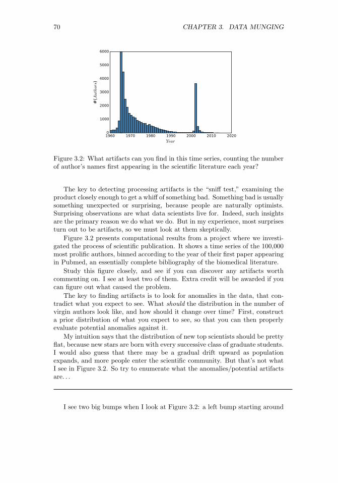
70 CHAPTER 3. DATA MUNGING
1960 1970 1980 1990 2000 2010 2020
Year
0
1000
2000
3000
4000
5000
6000
#(Authors)
Figure 3.2: What artifacts can you find in this time series, counting the numberof author’s names first appearing in the scientific literature each year?
The key to detecting processing artifacts is the “sniff test,” examining theproduct closely enough to get a whiff of something bad. Something bad is usuallysomething unexpected or surprising, because people are naturally optimists.Surprising observations are what data scientists live for. Indeed, such insightsare the primary reason we do what we do. But in my experience, most surprisesturn out to be artifacts, so we must look at them skeptically.
Figure 3.2 presents computational results from a project where we investi-gated the process of scientific publication. It shows a time series of the 100,000most prolific authors, binned according to the year of their first paper appearingin Pubmed, an essentially complete bibliography of the biomedical literature.
Study this figure closely, and see if you can discover any artifacts worthcommenting on. I see at least two of them. Extra credit will be awarded if youcan figure out what caused the problem.
The key to finding artifacts is to look for anomalies in the data, that con-tradict what you expect to see. What should the distribution in the number ofvirgin authors look like, and how should it change over time? First, constructa prior distribution of what you expect to see, so that you can then properlyevaluate potential anomalies against it.
My intuition says that the distribution of new top scientists should be prettyflat, because new stars are born with every successive class of graduate students.I would also guess that there may be a gradual drift upward as populationexpands, and more people enter the scientific community. But that’s not whatI see in Figure 3.2. So try to enumerate what the anomalies/potential artifactsare. . .
I see two big bumps when I look at Figure 3.2: a left bump starting around

3.3. CLEANING DATA 71
1960 1970 1980 1990 2000 2010 2020
Year
0
2000
4000
6000
8000
10000
#(Authors)
Figure 3.3: The cleaned data removes these artifacts, and the resulting distri-bution looks correct.
1965, and a peak which explodes in 2002. On reflection, the leftmost bumpmakes sense. This left peak occurs the year when Pubmed first started tosystematically collect bibliographic records. Although there is some very in-complete data from 1960–1964, most older scientists who had been publishingpapers for several years would “emerge” only with the start of systematic recordsin 1965. So this explains the left peak, which then settles down by 1970 to whatlooks like the flat distribution we expected.
But what about that giant 2002 peak? And the decline in new authors toalmost zero in the years which precede it? A similar decline is also visible tothe right of the big peak. Were all the world’s major scientists destined to beborn in 2002?
A careful inspection of the records in the big peak revealed the source ofthe anomaly: first names. In the early days of Pubmed, authors were identifiedby their initials and last names. But late in 2001, SS Skiena became Steven S.Skiena, so it looked like a new author emerging from the heavens.
But why the declines to nothingness to the left and right of this peak? Recallthat we limited this study to the 100,000 most prolific scientists. A scientificrock star emerging in 1998 would be unlikely to appear in this ranking becausetheir name was doomed to change a few years later, not leaving enough timeto accumulate a full career of papers. Similar things happen at the very rightof the distribution: newly created scientists in 2010 would never be able toachieve a full career’s work in only a couple of years. Both phenomena areneatly explained by this first name basis.
Cleaning this data to unify name references took us a few iterations to getright. Even after eliminating the 2002 peak, we still saw a substantial dip inprominent scientists starting their careers in the mid 1990s. This was becausemany people who had a great half career pre-first names and a second greathalf career post-first names did not rise to the threshold of a great full career

72 CHAPTER 3. DATA MUNGING
in either single period. Thus we had to match all the names in the full beforeidentifying who were the top 100,000 scientists.
Figure 3.3 shows our final distribution of authors, which matches the pla-tonic ideal of what we expected the distribution to be. Don’t be too quick torationalize away how your data looks coming out of the computer. My collabo-rators were at one point ready to write off the 2002 bump as due to increases inresearch funding or the creation of new scientific journals. Always be suspiciousof whether your data is clean enough to trust.
3.3.2 Data Compatibility
We say that a comparison of two items is “apples to apples” when it is fair com-parison, that the items involved are similar enough that they can be meaning-fully stood up against each other. In contrast, “apples to oranges” comparisonsare ultimately meaningless. For example:
• It makes no sense to compare weights of 123.5 against 78.9, when one isin pounds and the other is in kilograms.
• It makes no sense to directly compare the movie gross of Gone with theWind against that of Avatar, because 1939 dollars are 15.43 times morevaluable than 2009 dollars.
• It makes no sense to compare the price of gold at noon today in New Yorkand London, because the time zones are five hours off, and the pricesaffected by intervening events.
• It makes no sense to compare the stock price of Microsoft on February 17,2003 to that of February 18, 2003, because the intervening 2-for-1 stocksplit cut the price in half, but reflects no change in real value.
These types of data comparability issues arise whenever data sets are merged.Here I hope to show you how insidious such comparability issues can be, tosensitize you as to why you need to be aware of them. Further, for certainimportant classes of conversions I point to ways to deal with them.
Take-Home Lesson: Review the meaning of each of the fields in any data setyou work with. If you do not understand what’s in there down to the units ofmeasurement, there is no sensible way you can use it.
Unit Conversions
Quantifying observations in physical systems requires standard units of measure-ment. Unfortunately there exist many functionally equivalent but incompatiblesystems of measurement. My 12-year old daughter and I both weigh about 70,but one of us is in pounds and the other in kilograms.

3.3. CLEANING DATA 73
Disastrous things like rocket explosions happen when measurements are en-tered into computer systems using the wrong units of measurement. In par-ticular, NASA lost the $125 million Mars Climate Orbiter space mission onSeptember 23, 1999 due to a metric-to-English conversion issue.
Such problems are best addressed by selecting a single system of measure-ments and sticking to it. The metric system offers several advantages over thetraditional English system. In particular, individual measurements are naturallyexpressed as single decimal quantities (like 3.28 meters) instead of incomparablepairs of quantities (5 feet, 8 inches). This same issue arises in measuring angles(radians vs. degrees/seconds) and weight (kilograms vs. pounds/oz).
Sticking to the metric system does not by itself solve all comparability is-sues, since there is nothing to prevent you from mixing heights in meters andcentimeters. But it is a good start.
How can you defend yourself against incompatible units when merging datasets? Vigilance has to be your main weapon. Make sure that you know theintended units for each numerical column in your data set, and verify compat-ibility when merging. Any column which does not have an associated unit orobject type should immediately be suspect.
When merging records from diverse sources, it is an excellent practice tocreate a new “origin” or “source” field to identify where each record came from.This provides at least the hope that unit conversion mistakes can be correctedlater, by systematically operating on the records from the problematic source.
A partially-automated procedure to detect such problems can be devisedfrom statistical significance testing, to be discussed in Section 5.3. Suppose wewere to plot the frequencies of human heights in a merged data set of English(feet) and metric (meter) measurements. We would see one peak in the distri-bution around 1.8 and a second around 5.5. The existence of multiple peaks in adistribution should make us suspicious. The p-value resulting from significancetesting on the two input populations provides a rigorous measurement of thedegree to which our suspicions are validated.
Numerical Representation Conversions
Numerical features are the easiest to incorporate into mathematical models.Indeed, certain machine learning algorithms such as linear regression and sup-port vector machines work only with numerically-coded data. But even turningnumbers into numbers can be a subtle problem. Numerical fields might be rep-resented in different ways: as integers (123), as decimals (123.5), or even asfractions (123 1/2). Numbers can even be represented as text, requiring theconversion from “ten million” to 10000000 for numerical processing.
Numerical representation issues can take credit for destroying another rocketship. An Ariane 5 rocket launched at a cost of $500 million on June 4, 1996exploded forty seconds after lift-off, with the cause ultimately ascribed to anunsuccessful conversion of a 64-bit floating point number to a 16-bit integer.
The distinction between integers and floating point (real) numbers is impor-tant to maintain. Integers are counting numbers: quantities which are really

74 CHAPTER 3. DATA MUNGING
discrete should be represented as integers. Physically measured quantities arenever precisely quantified, because we live in a continuous world. Thus all mea-surements should be reported as real numbers. Integer approximations of realnumbers are sometimes used in a misbegotten attempt to save space. Don’t dothis: the quantification effects of rounding or truncation introduces artifacts.
In one particularly clumsy data set we encountered, baby weights were rep-resented as two integer fields (pounds and the remaining ounces). Much betterwould have been to combine them into a single decimal quantity.
Name Unification
Integrating records from two distinct data sets requires them to share a commonkey field. Names are frequently used as key fields, but they are often reportedinconsistently. Is Jose the same fellow as Jose? Such diacritic marks are bannedfrom the official birth records of several U.S. states, in an aggressive attempt toforce them to be consistent.
As another case in point, databases show my publications as authored by theCartesian product of my first (Steve, Steven, or S.), middle (Sol, S., or blank),and last (Skiena) names, allowing for nine different variations. And things getworse if we include misspellings. I can find myself on Google with a first nameof Stephen and last names of Skienna and Skeina.
Unifying records by key is a very ugly problem, which doesn’t have a magicbullet. This is exactly why ID numbers were invented, so use them as keys ifyou possibly can.
The best general technique is unification: doing simple text transformationsto reduce each name to a single canonical version. Converting all strings tolower case increases the number of (usually correct) collisions. Eliminatingmiddle names or at least reducing them to an abbreviation creates even morename matches/collisions, as does mapping first names to canonical versions (liketurning all Steves into Stevens).
Any such transformation runs the risk of creating Frankenstein-people, singlerecords assembled from multiple bodies. Applications differ in whether thegreater danger lies in merging too aggressively or too timidly. Figure out whereyour task sits on this spectrum and act accordingly.
An important concern in merging data sets is character code unification.Characters in text strings are assigned numerical representations, with the map-ping between symbols and number governed by the character code standard.Unfortunately, there are several different character code standards in commonusage, meaning that what you scrape from a webpage might not be in the samecharacter code as assumed by the system which will process it.
Historically, the good old 7-bit ASCII code standard was expanded to the8-bit IS0 8859-1 Latin alphabet code, which adds characters and punctuationmarks from several European languages. UTF-8 is an encoding of all Unicodecharacters using variable numbers of 8-bit blocks, which is backwards compatiblewith ASCII. It is the dominant encoding for web-pages, although other systemsremain in use.

3.3. CLEANING DATA 75
Correctly unifying character codes after merging is pretty much impossible.You must have the discipline to pick a single code as a standard, and check theencoding of each input file on preprocessing, converting it to the target beforefurther work.
Time/Date Unification
Data/time stamps are used to infer the relative order of events, and group eventsby relative simultaneity. Integrating event data from multiple sources requirescareful cleaning to ensure meaningful results.
First let us consider issues in measuring time. The clocks from two computersnever exactly agree, so precisely aligning logs from different systems requires amix of work and guesswork. There are also time zone issues when dealing withdata from different regions, as well as diversities in local rules governing changesin daylight saving time.
The right answer here is to align all time measurements to Coordinated Uni-versal Time (UTC), a modern standard subsuming the traditional GreenwichMean Time (GMT). A related standard is UNIX time, which reports an event’sprecise time in terms of the number of elapsed seconds since 00:00:00 UTC onThursday, January 1, 1970.
The Gregorian calendar is common throughout the technology world, al-though many other calendar systems are in use in different countries. Subtlealgorithms must be used to convert between calendar systems, as described in[RD01]. A bigger problem for date alignment concerns the proper interpretationof time zones and the international date line.
Time series unification is often complicated by the nature of the businesscalendar. Financial markets are closed on weekends and holidays, making forquestions of interpretation when you are correlating, say, stock prices to localtemperature. What is the right moment over the weekend to measure tempera-ture, so as to be consistent with other days of the week? Languages like Pythoncontain extensive libraries to deal with financial time series data to get issueslike this correct. Similar issues arise with monthly data, because months (andeven years) have different lengths.
Financial Unification
Money makes the world go round, which is why so many data science projectsrevolve around financial time series. But money can be dirty, so this datarequires cleaning.
One issue here is currency conversion, representing international prices usinga standardized financial unit. Currency exchange rates can vary by a few percentwithin a given day, so certain applications require time-sensitive conversions.Conversion rates are not truly standardized. Different markets will each havedifferent rates and spreads, the gap between buying and selling prices that coverthe cost of conversion.

76 CHAPTER 3. DATA MUNGING
The other important correction is for inflation. The time value of moneyimplies that a dollar today is (generally) more valuable than a dollar a yearfrom now, with interest rates providing the right way to discount future dollars.Inflation rates are estimated by tracking price changes over baskets of items,and provide a way to standardize the purchasing power of a dollar over time.
Using unadjusted prices in a model over non-trivial periods of time is justbegging for trouble. A group of my students once got very excited by thestrong correlation observed between stock prices and oil prices over a thirty-year period, and so tried to use stock prices in a commodity prediction model.But both goods were priced in dollars, without any adjustment as they inflated.The time series of prices of essentially any pair of items will correlate stronglyover time when you do not correct for inflation.
In fact, the most meaningful way to represent price changes over time isprobably not differences but returns, which normalize the difference by the initialprice:
ri =pi+1 − pi
pi
This is more analogous to a percentage change, with the advantage here thattaking the logarithm of this ratio becomes symmetric to gains and losses.
Financial time series contain many other subtleties which require cleaning.Many stocks give scheduled dividends to the shareholder on a particular dateevery year. Say, for example, that Microsoft will pay a $2.50 dividend on Jan-uary 16. If you own a share of Microsoft at the start of business that day, youreceive this check, so the value of the share then immediately drops by $2.50the moment after the dividend is issued. This price decline reflects no real lossto the shareholder, but properly cleaned data needs to factor the dividend intothe price of the stock. It is easy to imagine a model trained on uncorrectedprice data learning to sell stocks just prior to its issuing dividends, and feelingunjustly proud of itself for doing so.
3.3.3 Dealing with Missing Values
Not all data sets are complete. An important aspect of data cleaning is iden-tifying fields for which data isn’t there, and then properly compensating forthem:
• What is the year of death of a living person?
• What should you do with a survey question left blank, or filled with anobviously outlandish value?
• What is the relative frequency of events too rare to see in a limited-sizesample?
Numerical data sets expect a value for every element in a matrix. Settingmissing values to zero is tempting, but generally wrong, because there is alwayssome ambiguity as to whether these values should be interpreted as data or not.

3.3. CLEANING DATA 77
Is someone’s salary zero because he is unemployed, or did he just not answerthe question?
The danger with using nonsense values as not-data symbols is that theycan get misinterpreted as data when it comes time to build models. A linearregression model trained to predict salaries from age, education, and gender willhave trouble with people who refused to answer the question.
Using a value like −1 as a no-data symbol has exactly the same deficienciesas zero. Indeed, be like the mathematician who is afraid of negative numbers:stop at nothing to avoid them.
Take-Home Lesson: Separately maintain both the raw data and its cleanedversion. The raw data is the ground truth, and must be preserved intact forfuture analysis. The cleaned data may be improved using imputation to fill inmissing values. But keep raw data distinct from cleaned, so we can investigatedifferent approaches to guessing.
So how should we deal with missing values? The simplest approach is todrop all records containing missing values. This works just fine when it leavesenough training data, provided the missing values are absent for non-systematicreasons. If the people refusing to state their salary were generally those abovethe mean, dropping these records will lead to biased results.
But typically we want to make use of records with missing fields. It can bebetter to estimate or impute missing values, instead of leaving them blank. Weneed general methods for filling in missing values. Candidates include:
• Heuristic-based imputation: Given sufficient knowledge of the underlyingdomain, we should be able to make a reasonable guess for the value ofcertain fields. If I need to fill in a value for the year you will die, guessingbirth year+80 will prove about right on average, and a lot faster thanwaiting for the final answer.
• Mean value imputation: Using the mean value of a variable as a proxyfor missing values is generally sensible. First, adding more values withthe mean leaves the mean unchanged, so we do not bias our statistics bysuch imputation. Second, fields with mean values add a vanilla flavor tomost models, so they have a muted impact on any forecast made usingthe data.
But the mean might not be appropriate if there is a systematic reasonfor missing data. Suppose we used the mean death-year in Wikipedia toimpute the missing value for all living people. This would prove disastrous,with many people recorded as dying before they were actually born.
• Random value imputation: Another approach is to select a random valuefrom the column to replace the missing value. This would seem to set us upfor potentially lousy guesses, but that is actually the point. Repeatedlyselecting random values permits statistical evaluation of the impact ofimputation. If we run the model ten times with ten different imputed

78 CHAPTER 3. DATA MUNGING
values and get widely varying results, then we probably shouldn’t havemuch confidence in the model. This accuracy check is particularly valuablewhen there is a substantial fraction of values missing from the data set.
• Imputation by nearest neighbor: What if we identify the complete recordwhich matches most closely on all fields present, and use this nearestneighbor to infer the values of what is missing? Such predictions shouldbe more accurate than the mean, when there are systematic reasons toexplain variance among records.
This approach requires a distance function to identify the most similarrecords. Nearest neighbor methods are an important technique in datascience, and will be presented in greater detail in Section 10.2.
• Imputation by interpolation: More generally, we can use a method likelinear regression (see Section 9.1) to predict the values of the target col-umn, given the other fields in the record. Such models can be trained overfull records and then applied to those with missing values.
Using linear regression to predict missing values works best when there isonly one field missing per record. The potential danger here is creatingsignificant outliers through lousy predictions. Regression models can easilyturn an incomplete record into an outlier, by filling the missing fields inwith unusually high or low values. This would lead downstream analysisto focus more attention on the records with missing values, exactly theopposite of what we want to do.
Such concerns emphasize the importance of outlier detection, the final stepin the cleaning process that will be considered here.
3.3.4 Outlier Detection
Mistakes in data collection can easily produce outliers that can interfere withproper analysis. An interesting example concerns the largest dinosaur vertebraever discovered. Measured at 1500 millimeters, it implies an individual that was188 feet long. This is amazing, particularly because the second largest specimenever discovered comes in at only 122 feet.
The most likely explanation here (see [Gol16]) is that this giant fossil neveractually existed: it has been missing from the American Museum of NaturalHistory for over a hundred years. Perhaps the original measurement was takenon a conventionally-sized bone and the center two digits accidentally transposed,reducing the vertebra down to 1050 millimeters.
Outlier elements are often created by data entry mistakes, as apparently wasthe case here. They can also result from errors in scraping, say an irregularityin formatting causing a footnote number to be interpreted as a numerical value.Just because something is written down doesn’t make it correct. As with thedinosaur example, a single outlier element can lead to major misinterpretations.

3.4. WAR STORY: BEATING THE MARKET 79
General sanity checking requires looking at the largest and smallest valuesin each variable/column to see whether they are too far out of line. This canbest be done by plotting the frequency histogram and looking at the location ofthe extreme elements. Visual inspection can also confirm that the distributionlooks the way it should, typically bell-shaped.
In normally distributed data, the probability that a value is k standard de-viations from the mean decreases exponentially with k. This explains why thereare no 10-foot basketball players, and provides a sound threshold to identifyoutliers. Power law distributions are less easy to detect outliers in: there reallyis a Bill Gates worth over 10,000 times as much as the average individual.
It is too simple to just delete the rows containing outlier fields and moveon. Outliers often point to more systematic problems that one must deal with.Consider a data set of historical figures by lifespan. It is easy to finger thebiblical Methuselah (at 969 years) as an outlier, and remove him.
But it is better to figure out whether he is indicative of other figures that weshould consider removing. Observe that Methuselah had no firmly establishedbirth and death dates. Perhaps the published ages of anybody without datesshould be considered suspicious enough to prune. By contrast, the person withthe shortest lifespan in Wikipedia (John I, King of France) lived only five days.But his birth (November 15) and death (November 20) dates in 1316 convincesme that his lifespan was accurate.
3.4 War Story: Beating the Market
Every time we met, my graduate student Wenbin told me we were makingmoney. But he sounded less and less confident every time I asked.
Our Lydia sentiment analysis system took in massive text feeds of news andsocial media, reducing them to daily time series of frequency and sentimentfor the millions of different people, places, and organizations mentioned within.When somebody wins a sports championship, many articles get written describ-ing how great an athlete they are. But when this player then gets busted on drugcharges, the tone of the articles about them immediately changes. By keepingcount of the relative frequency of association with positive words (“victorious”)vs. negative words (“arrested”) in the text stream, we can construct sentimentsignals for any news-worthy entity.
Wenbin studied how sentiment signals could be used to predict future eventslike the gross for a given movie, in response to the quality of published reviewsor buzz. But he particularly wanted to use this data to play the stock market.Stocks move up and down according to news. A missed earnings report is badnews for a company, so the price goes down. Food and Drug Administration(FDA) approval of a new drug is great news for the company which owns it, sothe price goes up. If Wenbin could use our sentiment signal to predict futurestock prices, well, let’s just say I wouldn’t have to pay him as a research assistantanymore.
So he simulated a strategy of buying the stocks that showed the highest

80 CHAPTER 3. DATA MUNGING
sentiment in that day’s news, and then shorting those with the lowest sentiment.He got great results. “See,” he said. “We are making money.”
The numbers looked great, but I had one quibble. Using today’s news re-sults to predict current price movements wasn’t really fair, because the eventdescribed in the article may have already moved the price before we had anychance to read about it. Stock prices should react very quickly to importantnews.
So Wenbin simulated the strategy of buying stocks based on sentiment fromthe previous day’s news, to create a gap between the observed news and pricechanges. The return rate went down substantially, but was still positive. “See,”he said. “We are still making money.”
But I remained a little uncomfortable with this. Many economists believethat the financial markets are efficient, meaning that all public news is instantlyreflected in changing prices. Prices certainly changed in response to news, butyou would not be able to get in fast enough to exploit the information. We hadto remain skeptical enough to make sure there were no data/timing problemsthat could explain our results.
So I pressed Wenbin about exactly how he had performed his simulation. Hisstrategy bought and sold at the closing price every day. But that left sixteenhours until the next day’s open, plenty of time for the world to react to eventsthat happened while I slept. He switched his simulated purchase to the openingprice. Again, the return rate went down substantially, but was still positive.“See,” he said. “We are still making some money.”
But might there still be other artifacts in how we timed our data, givingus essentially tomorrow’s newspaper today? In good faith, we chased down allother possibilities we could think of, such as whether the published article datesreflected when they appeared instead of when they were written. After doingour best to be skeptical, his strategies still seemed to show positive returns fromnews sentiment.
Our paper on this analysis [ZS10] has been well received, and Wenbin hasgone on to be a successful quant, using sentiment among other signals to tradein the financial markets. But I remain slightly queasy about this result. Clean-ing our data to precisely time-stamp each news article was very difficult to docorrectly. Our system was originally designed to produce daily time series in abatch mode, so it is hard to be sure that we did everything right in the millionsof articles downloaded over several years to now perform finer-scale analysis.
The take-home lesson is that cleanliness is important when there is moneyon the line. Further, it is better to design a clean environment at the beginningof analysis instead of furiously washing up at the end.
3.5 Crowdsourcing
No single person has all the answers. Not even me. Much of what passes forwisdom is how we aggregate expertise, assembling opinions from the knowledgeand experience of others.

3.5. CROWDSOURCING 81
Figure 3.4: Guess how many pennies I have in this jar? (left) The correct answerwas determined using precise scientific methods (right).
Crowdsourcing harnesses the insights and labor from large numbers of peopletowards a common goal. It exploits the wisdom of crowds, that the collectiveknowledge of a group of people might well be greater than that of the smartestindividual among them.
This notion began with an ox. Francis Galton, a founder of statistical scienceand a relative of Charles Darwin, attended a local livestock fair in 1906. As partof the festivities, villagers were invited to guess the weight of this particular ox,with the person whose guess proved closest to the mark earning a prize. Almost800 participants took a whack at it. No one picked the actual weight of 1,178pounds, yet Galton observed that the average guess was amazingly close: 1,179pounds! Galton’s experiment suggests that for certain tasks one can get betterresults by involving a diverse collection of people, instead of just asking theexperts.
Crowdsourcing serves as an important source of data in building models, es-pecially for tasks associated with human perception. Humans remain the state-of-the-art system in natural language processing and computer vision, achievingthe highest level of performance. The best way to gather training data oftenrequires asking people to score a particular text or image. Doing this on a largeenough scale to build substantial training data typically requires a large numberof annotators, indeed a crowd.
Social media and other new technologies have made it easier to collect andaggregate opinions on a massive scale. But how can we separate the wisdom ofcrowds from the cries of the rabble?
3.5.1 The Penny Demo
Let’s start by performing a little wisdom of crowds experiment of our own.Figure 3.4 contains photos of a jar of pennies I accumulated in my office overmany years. How many pennies do I have in this jar? Make your own guessnow, because I am going to tell you the answer on the next page.

82 CHAPTER 3. DATA MUNGING
To get the right answer, I had my biologist-collaborator Justin Garden weighthe pennies on a precision laboratory scale. Dividing by the weight of a singlepenny gives the count. Justin can be seen diligently performing his task inFigure 3.4 (right).
So I ask again: how many pennies do you think I have in this jar? I performedthis experiment on students in my data science class. How will your answercompare to theirs?
I first asked eleven of my students to write their opinions on cards andquietly pass them up to me at the front of the room. Thus these guesses werecompletely independent of each other. The results, sorted for convenience, were:
537, 556, 600, 636, 1200, 1250, 2350, 3000, 5000, 11,000, 15,000.
I then wrote then wrote these numbers on the board, and computed somestatistics. The median of these guesses was 1250, with a mean of 3739. Infact, there were exactly 1879 pennies in the jar. The median score among mystudents was closer to the right amount than any single guess.
But before revealing the actual total, I then asked another dozen studentsto guess. The only difference was that this cohort had seen the guesses fromthe first set of students written on the board. Their choices were:
750, 750, 1000, 1000, 1000, 1250, 1400, 1770, 1800, 3500, 4000, 5000.
Exposing the cohort to other people’s guesses strongly conditioned the dis-tribution by eliminating all outliers: the minimum among the second group wasgreater than four of the previous guesses, and the maximum less than or equalto three of the previous round. Within this cohort, the median was 1325 andthe mean 1935. Both happen to be somewhat closer to the actual answer, butit is clear that group-think had settled in to make it happen.
Anchoring is the well-known cognitive bias that people’s judgments get ir-rationally fixated on the first number they hear. Car dealers exploit this all thetime, initially giving an inflated cost for the vehicle so that subsequent pricessound like a bargain.
I then did one final test before revealing the answer. I allowed my studentsto bid on the jar, meaning that they had to be confident enough to risk moneyon the result. This yielded exactly two bids from brave students, at 1500 and2000 pennies respectively. I pocketed $1.21 from the sucker with the high bid,but both proved quite close. This is not a surprise: people willing to bet theirown money on an event are, by definition, confident in their selection.
3.5.2 When is the Crowd Wise?
According to James Surowiecki in his book The Wisdom of Crowds [Sur05],crowds are wise when four conditions are satisfied:

3.5. CROWDSOURCING 83
• When the opinions are independent: Our experiment highlighted howeasy it is for a group to lapse into group-think. People naturally getinfluenced by others. If you want someone’s true opinion, you must askthem in isolation.
• When crowds are people with diverse knowledge and methods: Crowdsonly add information when there is disagreement. A committee composedof perfectly-correlated experts contributes nothing more than you couldlearn from any one of them. In the penny-guessing problem, some peopleestimated the volume of the container, while others gauged the sag of myarm as I lifted the heavy mass. Alternate approaches might have estimatedhow many pennies I could have accumulated in twenty years of occasionallyemptying my pockets, or recalled their own hoarding experiences.
• When the problem is in a domain that does not need specialized knowledge:I trust the consensus of the crowd in certain important decisions, likewhich type of car to buy or who should serve as the president of mycountry (gulp). But when it comes to deciding whether my tumor sampleis cancerous or benign, I will trust the word of one doctor over a cast of1,000 names drawn at random from the phone book.
Why? Because the question at hand benefits greatly from specializedknowledge and experience. There is a genuine reason why the doctorshould know more than all the others. For simpler perceptual tasks themob rules, but one must be careful not to ask the crowd something theyhave no way of knowing.
• Opinions can be fairly aggregated: The least useful part of any masssurvey form is the open response field “Tell us what you think!”. Theproblem here is that there is no way to combine these opinions to forma consensus, because different people have different issues and concerns.Perhaps these texts could be put into buckets by similarity, but this ishard to do effectively.
The most common use of such free-form responses are anecdotal. Peoplecherry-pick the most positive-sounding ones, then put them on a slide toimpress the boss.
Take-Home Lesson: Be an incomparable element on the partial order of life.Diverse, independent thinking contributes the most wisdom to the crowd.
3.5.3 Mechanisms for Aggregation
Collecting wisdom from a set of responses requires using the right aggrega-tion mechanism. For estimating numerical quantities, standard techniques likeplotting the frequency distribution and computing summary statistics are ap-propriate. Both the mean and median implicitly assume that the errors are

84 CHAPTER 3. DATA MUNGING
symmetrically distributed. A quick look at the shape of the distribution cangenerally confirm or reject that hypothesis.
The median is, generally speaking, a more appropriate choice than the meanin such aggregation problems. It reduces the influence of outliers, which is aparticular problem in the case of mass experiments where a certain fraction ofyour participants are likely to be bozos. On our penny guessing data, the meanproduced a ghastly over-estimate of 3739, which reduced to 2843 after removingthe largest and smallest guess, and then down to 2005 once trimming the twooutliers on each end (recall the correct answer was 1879).
Removing outliers is a very good strategy, but we may have other groundsto judge the reliability of our subjects, such as their performance on other testswhere we do know the answer. Taking a weighted average, where we give moreweight to the scores deemed more reliable, provides a way to take such confidencemeasures into account.
For classification problems, voting is the basic aggregation mechanism. TheCondorcet jury theorem justifies our faith in democracy. It states that if theprobability of each voter being correct on a given issue is p > 0.5, the probabilitythat a majority of the voters are correct (P (n)) is greater than p. In fact, it isexactly:
P (n) =
n∑i=(n+1)/2
(ni
)pi(1− p)n−i
Large voter counts give statistical validity even to highly contested elections.Suppose p = 0.51, meaning the forces of right are a bare majority. A jury of 101members would reach the correct decision 57% of the time, while P (1001) = 0.73and P (10001) = 0.9999. The probability of a correct decision approaches 1 asn→∞.
There are natural limitations to the power of electoral systems, however.Arrow’s impossibility theorem states that no electoral system for summing per-mutations of preferences as votes satisfies four natural conditions for the fairnessof an election. This will be discussed in Section 4.6, in the context of scores andrankings.
3.5.4 Crowdsourcing Services
Crowdsourcing services like Amazon Turk and CrowdFlower provide the oppor-tunity for you to hire large numbers of people to do small amounts of piecework.They help you to wrangle people, in order to create data for you to wrangle.
These crowdsourcing services maintain a large stable of freelance workers,serving as the middleman between them and potential employers. These work-ers, generally called Turkers, are provided with lists of available jobs and whatthey will pay, as shown in Figure 3.5. Employers generally have some ability tocontrol the location and credentials of who they hire, and the power to reject aworker’s efforts without pay, if they deem it inadequate. But statistics on em-ployers’ acceptance rates are published, and good workers are unlikely to laborfor bad actors.

3.5. CROWDSOURCING 85
Figure 3.5: Representative tasks on Mechanical Turk.
The tasks assigned to Turkers generally involve simple cognitive efforts thatcannot currently be performed well by computers. Good applications of Turkersinclude:
• Measuring aspects of human perception: Crowdsourcing systems pro-vide efficient ways to gather representative opinions on simple tasks. Onenice application was establishing linkages between colors in red-green-bluespace, and the names by which people typically identify them in a lan-guage. This is important to know when writing descriptions of productsand images.
So where is the boundary in color space between “blue” and “light blue,”or “robin’s egg blue” and “teal”? The right names are a function ofculture and convention, not physics. To find out, you must ask people,and crowdsourcing permits you to easily query hundreds or thousands ofdifferent people.
• Obtaining training data for machine learning classifiers: Our primaryinterest in crowdsourcing will be to produce human annotations that serveas training data. Many machine learning problems seek to do a particulartask “as well as people do.” Doing so requires a large number of traininginstances to establish what people did, when given the chance.
For example, suppose we sought to build a sentiment analysis system ca-pable of reading a written review and deciding whether its opinion of aproduct is favorable or unfavorable. We will need a large number of re-views labeled by annotators to serve as testing/training data. Further, weneed the same reviews labeled repeatedly by different annotators, so as to

86 CHAPTER 3. DATA MUNGING
identify any inter-annotator disagreements concerning the exact meaningof a text.
• Obtaining evaluation data for computer systems: A/B testing is a stan-dard method for optimizing user interfaces: show half of the judges versionA of a given system and the other half version B. Then test which groupdid better according to some metric. Turkers can provide feedback on howinteresting a given app is, or how well a new classifier is performing.
One of my grad students (Yanqing Chen) used CrowdFlower to evaluatea system he built to identify the most relevant Wikipedia category for aparticular entity. Which category better describes Barack Obama: Presi-dents of the United States or African-American Authors? For $200, he gotpeople to answer a total of 10,000 such multiple-choice questions, enoughfor him to properly evaluate his system.
• Putting humans into the machine: There still exist many cognitive tasksthat people do much better than machines. A cleverly-designed interfacecan supply user queries to people sitting inside the computer, waiting toserve those in need.
Suppose you wanted to build an app to help the visually impaired, enablingthe user to snap a picture and ask someone for help. Maybe they are intheir kitchen, and need someone to read the label on a can to them. Thisapp could call a Turker as a subroutine, to do such a task as it is needed.
Of course, these image-annotation pairs should be retained for future anal-ysis. They could serve as training data for a machine learning program totake the people out of the loop, as much as possible.
• Independent creative efforts: Crowdsourcing can be used to commissionlarge numbers of creative works on demand. You can order blog postsor articles on demand, or written product reviews both good and bad.Anything that you might imagine can be created, if you just specify whatyou want.
Here are two silly examples that I somehow find inspiring:
– The Sheep Market (http://www.thesheepmarket.com) commissioned10,000 drawings of sheep for pennies each. As a conceptual art piece,it tries to sell them to the highest bidder. What creative endeavorscan you think of that people will do for you at $0.25 a pop?
– Emoji Dick (http://www.emojidick.com) was a crowdsourced ef-fort to translate the great American novel Moby Dick completelyinto emoji images. Its creators partitioned the book into roughly10,000 parts, and farmed out each part to be translated by threeseparate Turkers. Other Turkers were hired to select the best one ofthese to be incorporated into the final book. Over 800 Turkers wereinvolved, with the total cost of $3,676 raised by the crowd-fundingsite Kickstarter.

3.5. CROWDSOURCING 87
• Economic/psychological experiments: Crowdsourcing has proven a boonto social scientists conducting experiments in behavioral economics andpsychology. Instead of bribing local undergraduates to participate in theirstudies, these investigators can now expand their subject pool to the entireworld. They get the power to harness larger populations, perform inde-pendent replications in different countries, and thus test whether there arecultural biases of their hypotheses.
There are many exciting tasks that can be profitably completed using crowd-sourcing. However, you are doomed to disappointment if you employ Turkersfor the wrong task, in the wrong way. Bad uses of crowdsourcing include:
• Any task that requires advanced training: Although every person possessesunique skills and expertise, crowdsourcing workers come with no specifictraining. They are designed to be treated as interchangeable parts. You donot establish a personal relationship with these workers, and any sensiblegig will be too short to allow for more than a few minutes training.
Tasks requiring specific technical skills are not reasonably crowdsourced.However, they might be reasonably subcontracted, in traditional longer-term arrangements.
• Any task you cannot specify clearly: You have no mechanism for back-and-forth communication with Turkers. Generally speaking, they have noway to ask you questions. Thus the system works only if you can specifyyour tasks clearly, concisely, and unambiguously.
This is much harder than it looks. Realize that you are trying to programpeople instead of computers, with all the attendant bugs associated with“do as I say” trumping “do what I mean.” Test your specifications outon local people before opening up your job to the masses, and then doa small test run on your crowdsourcing platform to evaluate how it goesbefore cutting loose with the bulk of your budget. You may be in forsome cultural surprises. Things that seem obvious to you might meansomething quite different to a worker halfway around the world.
• Any task where you cannot verify whether they are doing a good job: Turk-ers have a single motivation for taking on your piecework: they are tryingto convert their time into money as efficiently as possible. They are look-ing out for jobs offering the best buck for their bang, and the smartest oneswill seek to complete your task as quickly and thoughtlessly as possible.
Crowdsourcing platforms permit employers to withhold payment if thecontracted work is unacceptable. Taking advantage of this requires someefficient way to check the quality of the product. Perhaps you shouldask them to complete certain tasks where you already know the correctanswer. Perhaps you can compare their responses to that of other inde-pendent workers, and throw out their work if it disagrees too often fromthe consensus.

88 CHAPTER 3. DATA MUNGING
It is very important to employ some quality control mechanism. Somefraction of the available workers on any platform are bots, looking formultiple-choice tasks to attack through randomness. Others may be peo-ple with language skills wholly inadequate for the given task. You needto check and reject to avoid being a sucker.
However, you cannot fairly complain about results from poorly specifiedtasks. Rejecting too high a fraction of work will lower your reputation,with workers and the platform. It is particularly bad karma to refuse topay people but use their work product anyway.
• Any illegal task, or one too inhuman to subject people to: You are notallowed to ask a Turker to do something illegal or unethical. The clas-sic example is hiring someone to write bad reviews of your competitor’sproducts. Hiring a hit man makes you just as guilty of murder as the guywho fired the shots. Be aware that there are electronic trails that can befollowed from the public placement of your ad directly back to you.
People at educational and research institutions are held to a higher stan-dard than the law, through their institutional review board or IRB. TheIRB is a committee of researchers and administrative officials who mustapprove any research on human subjects before it is undertaken. Be-nign crowdsourcing applications such as the ones we have discussed areroutinely approved, after the researchers have undergone a short onlinetraining course to make sure they understand the rules.
Always realize that there is a person at the other end of the machine.Don’t assign them tasks that are offensive, degrading, privacy-violating,or too stressful. You will probably get better results out of your workersif you treat them like human beings.
Getting people to do your bidding requires proper incentives, not just clearinstructions. In life, you generally get what you pay for. Be aware of thecurrently prevailing minimum hourly wage in your country, and price your tasksaccordingly. This is not a legal requirement, but it is generally good business.
The sinister glow that comes from hiring workers at $0.50 per hour wearsoff quickly once you see the low quality of workers that your tasks attract. Youcan easily eat up all your savings by the need to rigorously correct their workproduct, perhaps by paying multiple workers do it repeatedly. Higher payingtasks find workers much more quickly, so be prepared to wait if you do not paythe prevailing rate. Bots and their functional equivalents are happier to acceptslave wages than the workers you really want to hire.
3.5.5 Gamification
There is an alternative to paying people to annotate or transcribe your data.Instead, make things so much fun that people will work for you for free!
Games with a purpose (GWAP) are systems which disguise data collectionas a game people want to play, or a task people themselves want done. With

3.5. CROWDSOURCING 89
the right combination of game, motive, and imagination, amazing things can bedone. Successful examples include:
• CAPTCHAs for optical character recognition (OCR): CAPTCHAs arethose distorted text images you frequently encounter when creating anaccount on the web. They demand that you type in the contents of textstrings shown in the image to prove that you are a human, thus enablingthem to deny access to bots and other programmed systems.
ReCAPTCHAs were invented to get useful data from the over 100 millionCAPTCHAs displayed each day. Two text strings are displayed in each,one of which the system checks in order to grant entry. The other rep-resents a hard case for an OCR system that is digitizing old books andnewspapers. The answers are mapped back to improve the digitization ofarchival documents, transcribing over 40 million words per day.
• Psychological/IQ testing in games/apps: Psychologists have establishedfive basic personality traits as important and reproducible aspects of per-sonality. Academic psychologists use multiple-choice personality tests tomeasure where individuals sit along personality scales for each of the bigfive traits: openness, conscientiousness, extroversion, agreeableness, andneuroticism.
By turning these surveys into game apps (“What are your personalitytraits?”) psychologists have gathered personality measurements on over75,000 different people, along with other data on preferences and behavior.This has created an enormous data set to study many interesting issuesin the psychology of personality.
• The FoldIt game for predicting protein structures: Predicting the struc-tures formed by protein molecules is one of the great computational chal-lenges in science. Despite many years of work, what makes a protein foldinto a particular shape is still not well understood.
FoldIt (https://fold.it) is a game challenging non-biologists to designprotein molecules that fold into a particular shape. Players are scored asto how closely their design approaches the given target, with the highestscoring players ranked on a leader board. Several scientific papers havebeen published on the strength of the winning designs.
The key to success here is making a game that is playable enough to becomepopular. This is much harder than it may appear. There are millions of freeapps in the app store, mostly games. Very few are ever tried by more thana few hundred people, which is nowhere near enough to be interesting from adata collection standpoint. Adding the extra constraint that the game generateinteresting scientific data while being playable makes this task even harder.
Motivational techniques should be used to improve playability. Keepingscore is an important part of any game, and the game should be designed so thatperformance increases rapidly at first, in order to hook the player. Progress bars

90 CHAPTER 3. DATA MUNGING
provide encouragement to reach the next level. Awarding badges and providingleader boards seen by others encourages greater efforts. Napoleon instituteda wide array of ribbons and decorations for his soldiers, observing that “it isamazing what men will do for a strip of cloth.”
The primary design principle of games such as FoldIt is to abstract thedomain technicality away, into the scoring function. The game is configuredso players need not really understand issues of molecular dynamics, just thatcertain changes make the scores go up while others make them go down. Theplayer will build their own intuition about the domain as they play, resulting indesigns which may never occur to experts skilled in the art.
3.6 Chapter Notes
The Charles Babbage quote from the start of this chapter is from his bookPassages from the Life of a Philosopher [Bab11]. I recommend Padua’s graphicnovel [Pad15] for an amusing but meaningful (albeit fictitious) introduction tohis work and relationship with Ada Lovelace.
Many books deal with hands-on practical matters of data wrangling in par-ticular programming languages. Particularly useful are the O’Reilly books fordata science in Python, including [Gru15, McK12].
The story of our jai-alai betting system, including the role of website scrap-ing, is reported in my book Calculated Bets [Ski01]. It is a quick and fun overviewof how to build simulation models for prediction, and will be the subject of thewar story of Section 7.8.
The failure of space missions due to numerical computing errors has beenwell chronicled in popular media. See Gleick [Gle96] and Stephenson et al.[SMB+99] for discussions of the Ariane 5 and Mars Climate Orbiter space mis-sions, respectively.
The clever idea of using accelerometers in cell phones to detect earthquakescomes from Faulkner et al. [FCH+14]. Representative studies of large sets ofFlickr images includes Kisilevich et al. [KKK+10].
Kittur [KCS08] reports on experiences with crowdsourcing user studies onAmazon Turk. Our use of CrowdFlower to identify appropriate descriptionsof historical figures was presented in [CPS15]. Methods for gamification ininstruction are discussed in [DDKN11, Kap12]. Recaptchas are introduced inVon Ahn, et al. [VAMM+08]. The large-scale collection of psychological traitdata via mobile apps is due to Kosinski, et al. [KSG13].
3.7 Exercises
Data Munging
3-1. [3] Spend two hours getting familiar with one of the following programminglanguages: Python, R, MatLab, Wolfram Alpha/Language. Then write a briefpaper with your impressions on its characteristics:

3.7. EXERCISES 91
• Expressibility.
• Runtime speed.
• Breadth of library functions.
• Programming environment.
• Suitability for algorithmically-intensive tasks.
• Suitability for general data munging tasks.
3-2. [5] Pick two of the primary data science programming languages, and writeprograms to solve the following tasks in both of them. Which language did youfind most suitable for each task?
(a) Hello World!
(b) Read numbers from a file, and print them out in sorted order.
(c) Read a text file, and count the total number of words.
(d) Read a text file, and count the total number of distinct words.
(e) Read a file of numbers, and plot a frequency histogram of them.
(f) Download a page from the web, and scrape it.
3-3. [3] Play around for a little while with Python, R, and Matlab. Which do youlike best? What are the strengths and weaknesses of each?
3-4. [5] Construct a data set of n human heights, with p% of them recording in En-glish (feet) and the rest with metric (meter) measurements. Use statistical teststo test whether this distribution is distinguishable from one properly recordedin meters. What is the boundary as a function of n and p where it becomesclear there is a problem?
Data Sources
3-5. [3] Find a table of storage prices over time. Analyze this data, and make aprojection about the cost/volume of data storage five years from now. Whatwill disk prices be in 25 or 50 years?
3-6. [5] For one or more of the following The Quant Shop challenges, find relevantdata sources and assess their quality:
• Miss Universe.
• Movie gross.
• Baby weight.
• Art auction price.
• Snow on Christmas.
• Super Bowl/college champion.
• Ghoul pool?
• Future gold/oil price?
Data Cleaning

92 CHAPTER 3. DATA MUNGING
3-7. [3] Find out what was weird about September 1752. What special steps mightthe data scientists of the day have had to take to normalize annual statistics?
3-8. [3] What types of outliers might you expect to occur in the following data sets:
(a) Student grades.
(b) Salary data.
(c) Lifespans in Wikipedia.
3-9. [3] A health sensor produces a stream of twenty different values, including bloodpressure, heart rate, and body temperature. Describe two or more techniquesyou could use to check whether the stream of data coming from the sensor isvalid.
Implementation Projects
3-10. [5] Implement a function that extracts the set of hashtags from a data frameof tweets. Hashtags begin with the “#” character and contain any combinationof upper and lowercase characters and digits. Assume the hashtag ends wherethere is a space or a punctuation mark, like a comma, semicolon, or period.
3-11. [5] The laws governing voter registration records differ from state to state in theUnited States. Identify one or more states with very lax rules, and see what youmust do to get your hands on the data. Hint: Florida.
Crowdsourcing
3-12. [5] Describe how crowdsourced workers might have been employed to help gatherdata for The Quant Shop challenges:
• Miss Universe.
• Movie gross.
• Baby weight.
• Art auction price.
• Snow on Christmas.
• Super Bowl/college champion.
• Ghoul pool.
• Future gold/oil price?:
3-13. [3] Suppose you are paying Turkers to read texts and annotate them based onthe underlying sentiment (positive or negative) that each passage conveys. Thisis an opinion task, but how can we algorithmically judge whether the Turker wasanswering in a random or arbitrary manner instead of doing their job seriously?
Interview Questions
3-14. [5] Suppose you built a system to predict stock prices. How would you evaluateit?
3-15. [5] In general, how would you screen for outliers, and what should you do if youfind one?
3-16. [3] Why does data cleaning play a vital role in analysis?

3.7. EXERCISES 93
3-17. [5] During analysis, how do you treat missing values?
3-18. [5] Explain selection bias. Why is it important? How can data managementprocedures like handling missing data make it worse?
3-19. [3] How do you efficiently scrape web data?
Kaggle Challenges
3-20. Partially sunny, with a chance of hashtags.
https://www.kaggle.com/c/crowdflower-weather-twitter
3-21. Predict end of day stock returns, without being deceived by noise.
https://www.kaggle.com/c/the-winton-stock-market-challenge
3-22. Data cleaning and the analysis of historical climate change.
https://www.kaggle.com/berkeleyearth/climate-change-earth-surface-temperature-data

Chapter 4
Scores and Rankings
Money is a scoreboard where you can rank how you’re doing againstother people.
– Mark Cuban
Scoring functions are measures that reduce multi-dimensional records to a singlevalue, highlighting some particular property of the data. A familiar exampleof scoring functions are those used to assign student grades in courses such asmine. Students can then be ranked (sorted) according to these numerical scores,and later assigned letter grades based on this order.
Grades are typically computed by functions over numerical features thatreflect student performance, such as the points awarded on each homework andexam. Each student receives a single combined score, often scaled between 0and 100. These scores typically come from a linear combination of the inputvariables, perhaps giving 8% weight to each of five homework assignments, and20% weight to each of three exams.
There are several things to observe about such grading rubrics, which wewill use as a model for more general scoring and ranking functions:
• Degree of arbitrariness: Every teacher/professor uses a different trade-offbetween homework scores and exams when judging their students. Someweigh the final exam more than all the other variables. Some normalizeeach value to 100 before averaging, while others convert each score to a Z-score. They all differ in philosophy, yet every teacher/professor is certainthat their grading system is the best way to do things.
• Lack of validation data: There is no gold standard informing instruc-tors of the “right” grade that their students should have received in thecourse. Students often complain that I should give them a better grade,but self-interest seems to lurk behind these requests more than objectiv-ity. Indeed, I rarely hear students recommend that I lower their grade.
95© The Author(s) 2017S.S. Skiena, The Data Science Design Manual,Texts in Computer Science, https://doi.org/10.1007/978-3-319-55444-0_4

96 CHAPTER 4. SCORES AND RANKINGS
Without objective feedback or standards to compare against, there is norigorous way for me to evaluate my grading system and improve it.
• General Robustness: And yet, despite using widely-disparate and totallyunvalidated approaches, different grading systems generally produce simi-lar results. Every school has a cohort of straight-A students who monopo-lize a sizable chunk of the top grades in each course. This couldn’t happenif all these different grading systems were arbitrarily ordering student per-formance. C students generally muddle along in the middle-to-lower tiersof the bulk of their classes, instead of alternating As and Fs on the wayto their final average. All grading systems are different, yet almost all aredefensible.
In this chapter, we will use scoring and ranking functions as our first forayinto data analysis. Not everybody loves them as much as I do. Scoring func-tions often seem arbitrary and ad hoc, and in the wrong hands can produceimpressive-looking numbers which are essentially meaningless. Because theireffectiveness generally cannot be validated, these techniques are not as scientif-ically sound as the statistical and machine learning methods we will present insubsequent chapters.
But I think it is important to appreciate scoring functions for what theyare: useful, heuristic ways to tease understanding from large data sets. Ascoring function is sometimes called a statistic, which lends it greater dignityand respect. We will introduce several methods for getting meaningful scoresfrom data.
4.1 The Body Mass Index (BMI)
Everybody loves to eat, and our modern world of plenty provides numerousopportunities for doing so. The result is that a sizable percentage of the popu-lation are above their optimal body weight. But how can you tell whether youare one of them?
The body mass index (BMI) is a score or statistic designed to capture whetheryour weight is under control. It is defined as
BMI =mass
height2
where mass is measured in kilograms and height in meters.As I write this, I am 68 inches tall (1.727 meters) and feeling slightly pudgy
at 150 lbs (68.0 kg). Thus my BMI is 68.0/(1.7272) = 22.8. This isn’t so terrible,however, because commonly accepted BMI ranges in the United States define:
• Underweight: below 18.5.
• Normal weight: from 18.5 to 25.
• Overweight: from 25 to 30.

4.1. THE BODY MASS INDEX (BMI) 97
Figure 4.1: Height–weight scatter plot, for 1000 representative Americans. Col-ors illustrate class labels in the BMI distribution.
• Obese: over 30.
Thus I am considered to be in normal range, with another dozen poundsto gain before I officially become overweight. Figure 4.1 plots where a repre-sentative group of Americans sit in height–weight space according to this scale.Each point in this scatter plot is a person, colored according to their weightclassification by BMI. Regions of seemingly solid color are so dense with peoplethat the dots overlap. Outlier points to the right correspond to the heaviestindividuals.
The BMI is an example of a very successful statistic/scoring function. Itis widely used and generally accepted, although some in the public health fieldquibble that better statistics are available.
The logic for the BMI is almost sound. The square of height should be pro-portional to area. But mass should grow proportional to the volume, not area,so why is it not mass/height3? Historically, BMI was designed to correlate withthe percentage of body fat in an individual, which is a much harder measure-ment to make than height and weight. Experiments with several simple scoringfunctions, including m/l and m/l3 revealed that BMI works best.
It is very interesting to look at BMI distributions for extreme populations.Consider professional athletes in American football (NFL) and basketball (NBA):
• Basketball players are notoriously tall individuals. They also have to runup and down the court all day, promoting superior fitness.
• American football players are notoriously heavy individuals. In particular,linemen exist only to block or move other linemen, thus placing a premiumon bulk.
Let’s look at some data. Figure 4.2 shows the BMI distributions of basketballand football players, by sport. And indeed, almost all of the basketball players
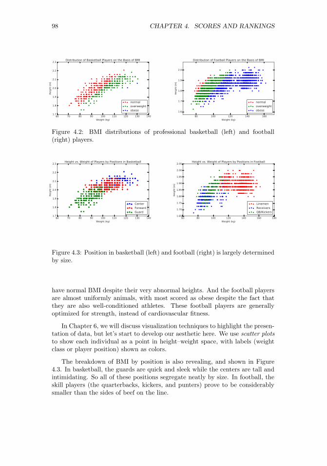
98 CHAPTER 4. SCORES AND RANKINGS
Figure 4.2: BMI distributions of professional basketball (left) and football(right) players.
Figure 4.3: Position in basketball (left) and football (right) is largely determinedby size.
have normal BMI despite their very abnormal heights. And the football playersare almost uniformly animals, with most scored as obese despite the fact thatthey are also well-conditioned athletes. These football players are generallyoptimized for strength, instead of cardiovascular fitness.
In Chapter 6, we will discuss visualization techniques to highlight the presen-tation of data, but let’s start to develop our aesthetic here. We use scatter plotsto show each individual as a point in height–weight space, with labels (weightclass or player position) shown as colors.
The breakdown of BMI by position is also revealing, and shown in Figure4.3. In basketball, the guards are quick and sleek while the centers are tall andintimidating. So all of these positions segregate neatly by size. In football, theskill players (the quarterbacks, kickers, and punters) prove to be considerablysmaller than the sides of beef on the line.
80 100 120 140 160
Weight (kg)
1.6
1.7
1.8
1.9
2.0
Heig
ht
(m)
Distribution of Football Players on the Basis of BMI
normal
overweight
obese
60 70 80 90 100 110 120 130 140
Weight (kg)
1.7
1.8
1.9
2.0
2.1
2.2
2.3
Heig
ht
(m)
Distribution of Basketball Players on the Basis of BMI
normal
overweight
obese
60 70 80 90 100 110 120 130 140
Weight (kg)
1.7
1.8
1.9
2.0
2.1
2.2
2.3
Heig
ht
(m)
Height vs. Weight of Players by Positions in Basketball
Center
Forward
Guard
60 80 100 120 140 160 180
Weight (kg)
1.65
1.70
1.75
1.80
1.85
1.90
1.95
2.00
2.05
Heig
ht
(m)
Height vs. Weight of Players by Positions in Football
Linemen
Receivers
QB/Kickers

4.2. DEVELOPING SCORING SYSTEMS 99
4.2 Developing Scoring Systems
Scores are functions that map the features of each entity to a numerical valueof merit. This section will look at the basic approaches for building effectivescoring systems, and evaluating them.
4.2.1 Gold Standards and Proxies
Historically, paper currencies were backed with gold, meaning that one paperdollar could always be traded in for $1 worth of gold. This was why we knewthat our money was worth more than the paper it was printed on.
In data science, a gold standard is a set of labels or answers that we trust tobe correct. In the original formulation of BMI, the gold standard was the bodyfat percentages carefully measured on a small number of subjects. Of course,such measurements are subject to some error, but by defining these values to bethe gold standard for fitness we accept them to be the right measure. In goldwe trust.
The presence of a gold standard provides a rigorous way to develop a goodscoring system. We can use curve-fitting technique like linear regression (to bediscussed in Section 9.1) to weigh the input features so as to best approximatethe “right answers” on the gold standard instances.
But it can be hard to find real gold standards. Proxies are easier-to-find datathat should correlate well with the desired but unobtainable ground truth. BMIwas designed to be a proxy for body fat percentages. It is easily computablefrom just height and weight, and does a pretty good job correlating with bodyfat. This means it is seldom necessary to test buoyancy in water tanks or “pinchan inch” with calipers, more intrusive measures that directly quantify the extentof an individual’s flab.
Suppose I wanted to improve the grading system I use for next year’s datascience course. I have student data from the previous year, meaning their scoreson homework and tests, but I don’t really have a gold standard on what gradesthese students deserved. I have only the grade I gave them, which is meaninglessif I am trying to improve the system.
I need a proxy for their unknown “real” course merit. A good candidate forthis might be each student’s cumulative GPA in their other courses. Generallyspeaking, student performance should be conserved across courses. If my scor-ing system hurts the GPA of the best students and helps the lower tier, I amprobably doing something wrong.
Proxies are particularly good when evaluating scoring/ranking systems. Inour book Who’s Bigger? [SW13] we used Wikipedia to rank historical figures by“significance.” We did not have any gold standard significance data measuringhow important these people really were. But we used several proxies to evaluatehow we were doing to keep us honest:
• The prices that collectors will pay for autographs from celebrities shouldgenerally correlate with the celebrity’s significance. The higher the pricepeople are willing to pay, the bigger the star.

100 CHAPTER 4. SCORES AND RANKINGS
• The statistics of how good a baseball player is should generally correlatewith the player’s significance. The better the athlete, the more importantthey are likely to be.
• Published rankings appearing in books and magazines list the top pres-idents, movie stars, singers, authors, etc. Presidents ranked higher byhistorians should generally be ranked higher by us. Such opinions, in ag-gregate, should generally correlate with the significance of these historicalfigures.
We will discuss the workings of our historical significance scores in greaterdetail in Section 4.7.
4.2.2 Scores vs. Rankings
Rankings are permutations ordering n entities by merit, generally constructed bysorting the output of some scoring system. Popular examples of rankings/ratingsystems include:
• Football/basketball top twenty: Press agencies generally rank the topcollege sports teams by aggregating the votes of coaches or sportswriters.Typically, each voter provides their own personal ranking of the top twentyteams, and each team gets awarded more points the higher they appearon the voter’s list. Summing up the points from each voter gives a totalscore for each team, and sorting these scores defines the ranking.
• University academic rankings: The magazine U.S News and World Reportpublishes annual rankings of the top American colleges and universities.Their methodology is proprietary and changes each year, presumably tomotivate people to buy the new rankings. But it is generally a scoreproduced from statistics like faculty/student ratio, acceptance ratio, thestandardized test scores of its students and applicants, and maybe theperformance of its football/basketball teams :-). Polls of academic expertsalso go into the mix.
• Google PageRank/search results: Every query to a search engine triggersa substantial amount of computation, implicitly ranking the relevance ofevery document on the web against the query. Documents are scored onthe basis of how well they match the text of the query, coupled with ratingsof the inherent quality of each page. The most famous page quality metrichere is PageRank, the network-centrality algorithm that will be reviewedin Section 10.4.
• Class rank: Most High Schools rank students according to their grades,with the top ranked student honored as class valedictorian. The scor-ing function underlying these rankings is typically grade-point average(GPA), where the contribution of each course is weighted by its numberof credits, and each possible letter grade is mapped to a number (typically

4.2. DEVELOPING SCORING SYSTEMS 101
A = 4.0). But there are natural variants: many schools choose to weighhonors courses more heavily than lightweight classes like gym, to reflectthe greater difficulty of getting good grades.
Generally speaking, sorting the results of a scoring system yields a numericalranking. But thinking the other way, each item’s ranking position (say, 493thout of 2196) yields a numerical score for the item as well.
Since scores and rankings are duals of each other, which provides a moremeaningful representation of the data? As in any comparison, the best answeris that it depends, on issues like:
• Will the numbers be presented in isolation? Rankings are good at pro-viding context for interpreting scores. As I write this, Stony Brook’sbasketball team ranks 111th among the nation’s 351 college teams, on thestrength of our RPI (ratings percentage index) of 39.18. Which numbergives you a better idea of whether we have a good or bad team, 111th or39.18?
• What is the underlying distribution of scores? By definition, the topranked entity has a better score than the second ranked one, but this tellsyou nothing about the magnitude of the difference between them. Arethey virtually tied, or is #1 crushing it?
Differences in rankings appear to be linear: the difference between 1 and 2seems the same as the difference between 111 and 112. But this is not gen-erally true in scoring systems. Indeed, small absolute scoring differencescan often yield big ranking differences.
• Do you care about the extremes or the middle? Well-designed scoring sys-tems often have a bell-shaped distribution. With the scores concentratedaround the mean, small differences in score can mean large differences inrank. In a normal distribution, increasing your score from the mean byone standard deviation (σ) moves you from the 50th percentile to the 84thpercentile. But the same sized change from 1σ to 2σ takes you only fromthe 84th to 92.5th percentile.
So when an organization slips from first to tenth, heads should roll. Butwhen Stony Brook’s team slides from 111th to 120th, it likely representsan insignificant difference in score and should be discounted. Rankingsare good at highlighting the very best and very worst entities among thegroup, but less so the differences near the median.
4.2.3 Recognizing Good Scoring Functions
Good scoring functions are good because they are easily interpretable and gen-erally believable. Here we review the properties of statistics which point in thesedirections:

102 CHAPTER 4. SCORES AND RANKINGS
• Easily computable: Good statistics can be easily described and presented.BMI is an excellent example: it contains only two parameters, and is eval-uated using only simple algebra. It was found as the result of a searchthrough all simple functional forms on a small number of easily obtained,relevant variables. It is an excellent exercise to brainstorm possible statis-tics from a given set of features on a data set you know well, for practice.
• Easily understandable: It should be clear from the description of thestatistics that the ranking is relevant to the question at hand. “Massadjusted by height” explains why BMI is associated with obesity. Clearlyexplaining the ideas behind your statistic is necessary for other people totrust it enough to use.
• Monotonic interpretations of variables: You should have a sense of howeach of the features used in your scoring function correlate with the ob-jective. Mass should correlate positively with BMI, because being heavyrequires that you weigh a lot. Height should correlate negatively, becausetall people naturally weigh more than short people.
Generally speaking, you are producing a scoring function without an ac-tual gold standard to compare against. This requires understanding whatyour variables mean, so your scoring function will properly correlate withthis mushy objective.
• Produces generally satisfying results on outliers: Ideally you know enoughabout certain individual points to have a sense of where they belong inany reasonable scoring system. If I am truly surprised by the identityof the top entities revealed by the scoring system, it probably is a bug,not a feature. When I compute the grades of the students in my courses,I already know the names of several stars and several bozos from theirquestions in class. If my computed grades do not grossly correspond tothese impressions, there is a potential bug that needs to be tracked down.
If the data items really are completely anonymous to you, you probablyshould spend some time getting to know your domain better. At the veryleast, construct artificial examples (“Superstar” and “Superdork”) withfeature values so that they should be near the top and bottom of theranking, and then see how they fit in with the real data.
• Uses systematically normalized variables: Variables drawn from bell-shaped distributions behave sensibly in scoring functions. There will beoutliers at the tails of either end which correspond to the best/worst items,plus a peak in the middle of items whose scores should all be relativelysimilar.
These normally-distributed variables should be turned into Z-scores (seeSection 4.3) before adding them together, so that all features have compa-rable means and variance. This reduces the scoring function’s dependenceon magic constants to adjust the weights, so no single feature has toodominant an impact on the results.

4.3. Z-SCORES AND NORMALIZATION 103
µ(B)
= 21.9 σ(B)
= 1.92µ(Z)
= 0 σ(Z)
= 1
B 19 22 24 20 23 19 21 24 24 23Z −1.51 0.05 1.09 −0.98 0.57 −1.51 −0.46 1.09 1.09 0.57
Figure 4.4: Taking the Z-scores of a set of values B normalizes them to havemean µ = 0 and σ = 1.
Generally speaking, summing up Z-scores using the correct signs (plus forpositively correlated variables and minus for negative correlations) withuniform weights will do roughly the right thing. A better function mightweigh these variables by importance, according to the strength of thecorrelation with the target. But it is unlikely to not make much difference.
• Breaks ties in meaningful ways: Ranking functions are of very limitedvalue when there are bunches of ties. Ranking the handiness of people byhow many fingers they have won’t be very revealing. There will be a veryselect group with twelve, a vast majority tied with ten, and then smallgroups of increasingly disabled accident victims until we get down to zero.
In general, scores should be real numbers over a healthy range, in order tominimize the likelihood of ties. Introducing secondary features to breakties is valuable, and makes sense provided these features also correlatewith the property you care about.
4.3 Z-scores and Normalization
An important principle of data science is that we must try to make it as easyas possible for our models to do the right thing. Machine learning techniqueslike linear regression purport to find the line optimally fitting to a given dataset. But it is critical to normalize all the different variables to make theirrange/distribution comparable before we try to use them to fit something.
Z-scores will be our primary method of normalization. The Z-score transformis computed:
Zi = (ai − µ)/σ
where µ is the mean of the distribution and σ the associated standard deviation.Z-scores transform arbitrary sets of variables to a uniform range. The Z-
scores of height measured in inches will be exactly the same as that of theheight measured in miles. The average value of a Z-score over all points is zero.Figure 4.4 shows a set of integers reduced to Z-scores. Values greater than themean become positive, while those less than the mean become negative. Thestandard deviation of the Z-scores is 1, so all distributions of Z-scores havesimilar properties.
Transforming values to Z-scores accomplishes two goals. First, they aid invisualizing patterns and correlations, by ensuring that all fields have an identical

104 CHAPTER 4. SCORES AND RANKINGS
mean (zero) and operate over a similar range. We understand that a Z-score of3.87 must represent basketball-player level height in a way that 79.8 does not,without familiarity with the measurement unit (say inches). Second, the useof Z-scores makes it easier on our machine learning algorithms, by making alldifferent features of a comparable scale.
In theory, performing a linear transformation like the Z-score doesn’t reallydo anything that most learning algorithms couldn’t figure out by themselves.These algorithms generally find the best coefficient to multiply each variablewith, which is free to be near σ if the algorithm really wants it to be.
However, the realities of numerical computation kick in here. Suppose wewere trying to build a linear model on two variables associated with U.S. cities,say, area in square miles and population. The first has a mean of about 5 and amax around 100. The second has a mean about 25,000 and a max of 8,000,000.For the two variables to have a similar effect on our model, we must divide thesecond variable by a factor of 100,000 or so.
This causes numerical precision problems, because a very small change in thevalue of the coefficient causes a very large change in how much the populationvariable dominates the model. Much better would be to have the variables begrossly the same scale and distribution range, so the issue is whether one featuregets weighted, say, twice as strongly as another.
Z-scores are best used on normally distributed variables, which, after all, arecompletely described by mean µ and standard deviation σ. But they work lesswell when the distribution is a power law. Consider the wealth distribution in theUnited States, which may have a mean of (say) $200,000, with a σ = $200, 000.The Z-score of $80 billion dollar Bill Gates would then be 4999, still an incredibleoutlier given the mean of zero.
Your biggest data analysis sins will come in using improperly normalizedvariables in your analysis. What can we do to bring Bill Gates down to size?We can hit him with a log, as we discussed in Section 2.4.
4.4 Advanced Ranking Techniques
Most bread-and-butter ranking tasks are solved by computing scores as linearcombinations of features, and then sorting them. In the absence of any goldstandard, these methods produce statistics which are often revealing and infor-mative.
That said, several powerful techniques have been developed to compute rank-ings from specific types of inputs: the results of paired comparisons, relationshipnetworks, and even assemblies of other rankings. We review these methods here,for inspiration.
4.4.1 Elo Rankings
Rankings are often formed by analyzing sequences of binary comparisons, whicharise naturally in competitions between entities:

4.4. ADVANCED RANKING TECHNIQUES 105
• Sports contest results: Typical sporting events, be they football games orchess matches, pit teams A and B against each other. Only one of themwill win. Thus each match is essentially a binary comparison of merit.
• Votes and polls: Knowledgeable individuals are often asked to compareoptions and decide which choice they think is better. In an election, thesecomparisons are called votes. A major component of certain universityrankings come from asking professors: which school is better, A or B?
In the movie The Social Network, Facebook’s Mark Zuckerberg is showngetting his start with FaceMash, a website showing viewers two faces andasking them to pick which one is more attractive. His site then ranked allthe faces from most to least attractive, based on these paired comparisons.
• Implicit comparisons: From the right vantage point, feature data can bemeaningfully interpreted as pairwise comparisons. Suppose a student hasbeen accepted by both universities A and B, but opts for A. This can betaken as an implicit vote that A is better than B.
What is the right way to interpret collections of such votes, especially wherethere are many candidates, and not all pairs of players face off against eachother? It isn’t reasonable to say the one with the most wins wins, because (a)they might have competed in more comparisons than other players, and (b) theymight have avoided strong opponents and beaten up only inferior competition.
The Elo system starts by rating all players, presumably equally, and thenincrementally adjusts each player’s score in response to the result of each match,according to the formula:
r′(A) = r(A) + k(SA − µA),
where
• r(A) and r′(A) represent the previous and updated scores for player A.
• k is a fixed parameter reflecting the maximum possible score adjustmentin response to a single match. A small value of k results in fairly staticrankings, while using too large a k will cause wild swings in ranking basedon the latest match.
• SA is the scoring result achieved by player A in the match under consid-eration. Typically, SA = 1 if A won, and SA = −1 if A lost.
• µA was the expected result for A when competing against B. If A hasexactly the same skill level as B, then presumably µA = 0. But supposethat A is a champion and B is a beginner or chump. Our expectation isthat A should almost certainly win in a head-to-head matchup, so µA > 0and is likely to be quite close to 1.

106 CHAPTER 4. SCORES AND RANKINGS
Figure 4.5: The shape of the logit function, for three different values for c.
All is clear here except how to determine µA. Given an estimate of theprobability that A beats B (PA>B), then
µA = 1 · PA>B + (−1) · (1− PA>B).
This win probability clearly depends on the magnitude of the skill differencebetween players A and B, which is exactly what is supposed to be measured bythe ranking system. Thus x = r(A)− r(B) represents this skill difference.
To complete the Elo ranking system, we need a way to take this real variablex and convert it to a meaningful probability. This is an important problem wewill repeatedly encounter in this book, solved by a bit of mathematics calledthe logit function.
The Logit Function
Suppose we want to take a real variable −∞ < x < ∞ and convert it to aprobability 0 ≤ p ≤ 1. There are many ways one might imagine doing this, buta particularly simple transformation is p = f(x), where
f(x) =1
1 + e−cx
The shape of the logit function f(x) is shown in Figure 4.5. Particularlynote the special cases at the mid and endpoints:
• When two players are of equal ability, x = 0, and f(0) = 1/2, reflects thatboth players have an equal probability of winning.
• When player A has a vast advantage, x → ∞, and f(∞) = 1, definingthat A is a lock to win the match.
−15 −10 −5 0 5 10 15
x
0.0
0.2
0.4
0.6
0.8
1.0
f(x)
c = 1
c = 0.2
c = 0.4
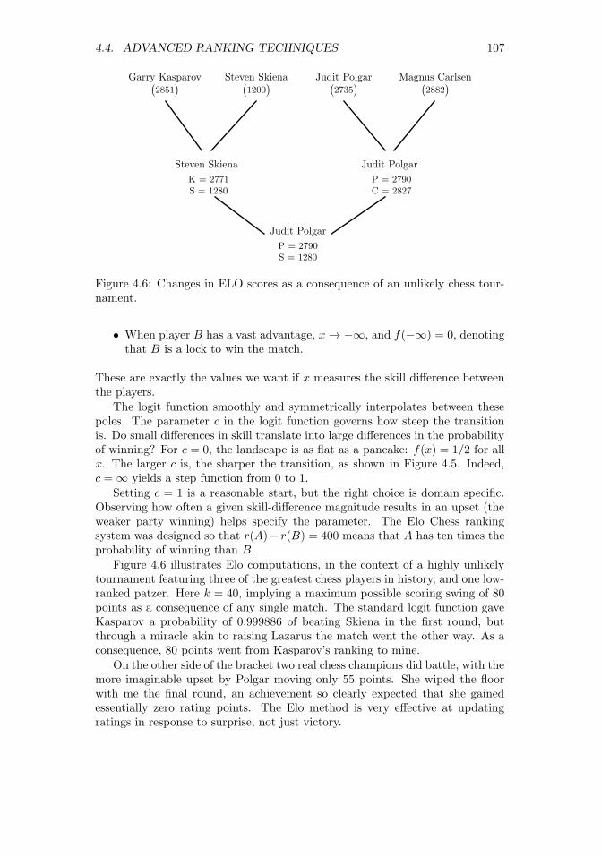
4.4. ADVANCED RANKING TECHNIQUES 107
Garry Kasparov(
2851)
Steven Skiena(
1200)
Judit Polgar Magnus Carlsen(
2735) (
2882)
Steven Skiena Judit Polgar
K = 2771
S = 1280
P = 2790
C = 2827
Judit Polgar
P = 2790
S = 1280
Figure 4.6: Changes in ELO scores as a consequence of an unlikely chess tour-nament.
• When player B has a vast advantage, x→ −∞, and f(−∞) = 0, denotingthat B is a lock to win the match.
These are exactly the values we want if x measures the skill difference betweenthe players.
The logit function smoothly and symmetrically interpolates between thesepoles. The parameter c in the logit function governs how steep the transitionis. Do small differences in skill translate into large differences in the probabilityof winning? For c = 0, the landscape is as flat as a pancake: f(x) = 1/2 for allx. The larger c is, the sharper the transition, as shown in Figure 4.5. Indeed,c =∞ yields a step function from 0 to 1.
Setting c = 1 is a reasonable start, but the right choice is domain specific.Observing how often a given skill-difference magnitude results in an upset (theweaker party winning) helps specify the parameter. The Elo Chess rankingsystem was designed so that r(A)− r(B) = 400 means that A has ten times theprobability of winning than B.
Figure 4.6 illustrates Elo computations, in the context of a highly unlikelytournament featuring three of the greatest chess players in history, and one low-ranked patzer. Here k = 40, implying a maximum possible scoring swing of 80points as a consequence of any single match. The standard logit function gaveKasparov a probability of 0.999886 of beating Skiena in the first round, butthrough a miracle akin to raising Lazarus the match went the other way. As aconsequence, 80 points went from Kasparov’s ranking to mine.
On the other side of the bracket two real chess champions did battle, with themore imaginable upset by Polgar moving only 55 points. She wiped the floorwith me the final round, an achievement so clearly expected that she gainedessentially zero rating points. The Elo method is very effective at updatingratings in response to surprise, not just victory.

108 CHAPTER 4. SCORES AND RANKINGS
1
2
3
4
5
A
C
B
D
E
B
A
C
D
E
A
B
C
E
D
A
B
D
C
E
A:
B:
C:
D:
E:
5
8
12
16
19
Figure 4.7: Borda’s method for constructing the consensus ranking of{A,B,C,D,E} from a set of four input rankings, using linear weights.
4.4.2 Merging Rankings
Any single numeric feature f , like height, can seed(n2
)pairwise comparisons
among n items, by testing whether f(A) > f(B) for each pair of items A andB. We could feed these pairs to the Elo method to obtain a ranking, but thiswould be a silly way to think about things. After all, the result of any suchanalysis would simply reflect the sorted order of f .
Integrating a collection of rankings by several different features makes for amore interesting problem, however. Here we interpret the sorted order of theith feature as defining a permutation Pi on the items of interest. We seek theconsensus permutation P , which somehow best reflects all of the componentpermutations P1, . . . , Pk.
This requires defining a distance function to measure the similarity betweentwo permutations. A similar issue arose in defining the Spearman rank corre-lation coefficient (see Section 2.3.1), where we compared two variables by themeasure of agreement in the relative order of the elements.1
Borda’s method creates a consensus ranking from multiple other rankings byusing a simple scoring system. In particular, we assign a cost or weight to eachof the n positions in the permutation. Then, for each of the n elements, we sumup the weights of its positions over all of the k input rankings. Sorting these nscores determines the final consensus ranking.
All is now clear except for the mapping between positions and costs. Thesimplest cost function assign i points for appearing in the ith position in eachpermutation, i.e. we sum up the ranks of the element over all permutations.This is what we do in the example of Figure 4.7. Item A gets 3 · 1 + 1 · 2 = 5points on the strength of appearing first in three rankings and second in one.Item C finishes with 12 points by finishing 2, 3, 3, and 4. The final consensusranking of {A,B,C,D,E} integrates all the votes from all input rankings, eventhough the consensus disagrees at least in part with all four input rankings.
But it is not clear that using linear weights represents the best choice,because it assumes uniform confidence in our accuracy to position elements
1Observe the difference between a similarity measure and a distance metric. In correlation,the scores get bigger as elements get more similar, while in a distance function the differencegoes to zero. Distance metrics will be discussed more thoroughly in Section 10.1.1.

4.4. ADVANCED RANKING TECHNIQUES 109
Figure 4.8: Equally-spaced values by the normal distribution are closer in themiddle than the ends, making appropriate weights for Borda’s method.
throughout the permutation. Typically, we will know the most about the mer-its of our top choices, but will be fairly fuzzy about exactly how those near themiddle order among themselves. If this is so, a better approach might be toaward more points for the distinction between 1st and 2nd than between 110thand 111th.
This type of weighting is implicitly performed by a bell-shaped curve. Sup-pose we sample n items at equal intervals from a normal distribution, as shownin Figure 4.8. Assigning these x values as the positional weights produces morespread at the highest and lowest ranks than the center. The tail regions reallyare as wide as they appear for these 50 equally-spaced points: recall that 95%of the probability mass sits within 2σ of the center.
Alternately, if our confidence is not symmetric, we could sample from thehalf-normal distribution, so the tail of our ranks is weighted by the peak ofthe normal distribution. This way, there is the greatest separation among thehighest-ranked elements, but little distinction among the elements of the tail.
Your choice of weighting function here is domain dependent, so pick one thatseems to do a good job on your problem. Identifying the very best cost functionturns out to be an ill-posed problem. And strange things happen when we tryto design the perfect election system, as will be shown in Section 4.6.
4.4.3 Digraph-based Rankings
Networks provide an alternate way to think about a set of votes of the form “Aranks ahead of B.” We can construct a directed graph/network where there isa vertex corresponding to each entity, and a directed edge (A,B) for each votethat A ranks ahead of B.
The optimal ranking would then be a permutation P of the vertices which

110 CHAPTER 4. SCORES AND RANKINGS
A
B C
D
E
A
B C
D
E
Figure 4.9: Consistently ordered preferences yield an acyclic graph or DAG(left). Inconsistent preferences result in directed cycles, which can be broken bydeleting small sets of carefully selected edges, here shown dashed (right).
violates the fewest number of edges, where edge (A,B) is violated if B comesbefore A in the final ranking permutation P .
If the votes were totally consistent, then this optimal permutation wouldviolate exactly zero edges. Indeed, this is the case when there are no directedcycles in the graph. A directed cycle like (A,C), (C,E), (E,A) representsan inherent contradiction to any rank order, because there will always be anunhappy edge no matter which order you choose.
A directed graph without cycles is called a directed acyclic graph or DAG.An alert reader with a bit of algorithms background will recall that findingthis optimal vertex order is called topologically sorting the DAG, which canbe performed efficiently in linear time. Figure 4.9 (left) is a DAG, and hasexactly two distinct orders consistent with the directed edges: {A,B,C,D,E}and {A,C,B,D,E}.
However, it is exceedingly unlikely that a real set of features or voters willall happen to be mutually consistent. The maximum acyclic subgraph problemseeks to find the smallest number of edges to delete to leave a DAG. Removingedge (E,A) suffices in Figure 4.9 (right). Unfortunately, the problem of findingthe best ranking here is NP-complete, meaning that no efficient algorithm existsfor finding the optimal solution.
But there are natural heuristics. A good clue as to where a vertex v belongsis the difference dv between its in-degree and its out-degree. When dv is highlynegative, it probably belongs near the front of the permutation, since it domi-nates many elements but is dominated by only a few. One can build a decentranking permutation by sorting the vertices according to these differences. Evenbetter is incrementally inserting the most negative (or most positive) vertex vinto its logical position, deleting the edges incident on v, and then adjusting thecounts before positioning the next best vertex.

4.5. WAR STORY: CLYDE’S REVENGE 111
4.4.4 PageRank
There is a different and more famous method to order the vertices in a networkby importance: the PageRank algorithm underpinning Google’s search engine.
The web is constructed of webpages, most of which contain links to otherwebpages. Your webpage linking to mine is an implicit endorsement that youthink my page is pretty good. If it is interpreted as a vote that “you think mypage is better than yours,” we can construct the network of links and treat itas a maximum acyclic-subgraph problem, discussed in the previous subsection.
But dominance isn’t really the right interpretation for links on the web.PageRank instead rewards vertices which have the most in-links to it: if allroads lead to Rome, Rome must be a fairly important place. Further, it weighsthese in-links by the strength of the source: a link to me from an importantpage should count for more than one from a spam site.
The details here are interesting, but I will defer a deeper discussion to Section10.4, when we discuss network analysis. However, I hope this brief introductionto PageRank helps you appreciate the following tale.
4.5 War Story: Clyde’s Revenge
During my sophomore year of high school, I had the idea of writing a program topredict the outcome of professional football games. I wasn’t all that interestedin football as a sport, but I observed several of my classmates betting theirlunch money on the outcome of the weekend football games. It seemed clear tome that writing a program which accurately predicted the outcome of footballgames could have significant value, and be a very cool thing to do besides.
In retrospect, the program I came up with now seems hopelessly crude. Myprogram would average the points scored by team x and the points allowed byteam y to predict the number of points x will score against y.
Px =((points scored by team x) + (points allowed by team y))
2× (games played)
Py =((points scored by team y) + (points allowed by team x))
2× (games played)
I would then adjust these numbers up or down in response to other factors,particularly home field advantage, round the numbers appropriately, and callwhat was left my predicted score for the game.
This computer program, Clyde, was my first attempt to build a scoringfunction for some aspect of the real world. It had a certain amount of logicgoing for it. Good teams score more points than they allow, while bad teamsallow more points than they score. If team x plays a team y which has given upa lot of points, then x should score more points against y than it does against

112 CHAPTER 4. SCORES AND RANKINGS
teams with better defenses. Similarly, the more points team x has scored againstthe rest of the league, the more points it is likely to score against y.
Of course, this crude model couldn’t capture all aspects of football reality.Suppose team x has been playing all stiffs thus far in the season, while team yhas been playing the best teams in the league. Team y might be a much betterteam than x even though its record so far is poor. This model also ignoresany injuries a team is suffering from, whether the weather is hot or cold, andwhether the team is hot or cold. It disregards all the factors that make sportsinherently unpredictable.
And yet, even such a simple model can do a reasonable job of predictingthe outcome of football games. If you compute the point averages as above,and give the home team an additional three points as a bonus, you will pickthe winner in almost two-thirds of all football games. Compare this to the evencruder model of flipping a coin, which predicts only half the games correctly.That was the first major lesson Clyde taught me:
Even crude mathematical models can have real predictive power.
As an audacious 16 year-old, I wrote to our local newspaper, The NewBrunswick Home News, explaining that I had a computer program to predictfootball game results and was ready to offer them the exclusive opportunity topublish my predictions each week. Remember that this was back in 1977, wellbefore personal computers had registered on the public consciousness. In thosedays, the idea of a high school kid actually using a computer had considerablegee-whiz novelty value. To appreciate how much times have changed, check outthe article the paper published about Clyde and I in Figure 4.10.
I got the job. Clyde predicted the outcome of each game in the 1977 NationalFootball League. As I recall, Clyde and I finished the season with the seeminglyimpressive record of 135–70. Each week, they would compare my predictionsagainst those of the newspaper’s sportswriters. As I recall, we all finished withina few games of each other, although most of the sportswriters finished withbetter records than the computer.
The Home News was so impressed by my work that they didn’t renew methe following season. However, Clyde’s picks for the 1978 season were publishedin the Philadelphia Inquirer, a much bigger newspaper. I didn’t have the col-umn to myself, though. Instead, the Inquirer included me among ten amateurand professional prognosticators, or touts. Each week we had to predict theoutcomes of four games against the point spread.
The point spread in football is a way of handicapping stronger teams forbetting purposes. The point spread is designed to make each game a 50/50proposition, and hence makes predicting the outcome of games much harder.
Clyde and I didn’t do very well against the spread during the 1978 NationalFootball League season, and neither did most of the other Philadelphia Inquirertouts. We predicted only 46% of our games correctly against the spread, aperformance good (or bad) enough to finish 7th out of the ten published prog-nosticators. Picking against the spread taught me a second major life lesson:

4.5. WAR STORY: CLYDE’S REVENGE 113
Figure 4.10: My first attempt at mathematical modeling.
114 CHAPTER 4. SCORES AND RANKINGS
Crude mathematical models do not have real predictive power whenthere is real money on the line.
So Clyde was not destined to revolutionize the world of football prognosti-cation. I pretty much forgot about it until I assigned the challenge of predictingthe Super Bowl as a project in my data science class. The team that got thejob was made up of students from India, meaning they knew much more aboutcricket than American football when they started.
Still, they rose to the challenge, becoming fans as they built a large dataset on the outcome of every professional and college game played over the pastten years. They did a logistic regression analysis over 142 different featuresincluding rushing, passing, and kicking yardage, time of possession, and numberof punts. They then proudly reported to me the accuracy of their model: correctpredictions on 51.52% of NFL games.
“What!” I screamed, “That’s terrible!” “Fifty percent is what you get byflipping a coin. Try averaging the points scored and yielded by the two teams,and give three points to the home team. How does that simple model do?”
On their data set, this Clyde-light model picked 59.02% of all games cor-rectly, much much better than their sophisticated-looking machine learningmodel. They had gotten lost in the mist of too many features, which werenot properly normalized, and built using statistics collected over too long ahistory to be representative of the current team composition. Eventually thestudents managed to come up with a PageRank-based model that did a littlebit better (60.61%), but Clyde did almost as well serving as a baseline model.
There are several important lessons here. First, garbage in, garbage out.If you don’t prepare a clean, properly normalized data set, the most advancedmachine learning algorithms can’t save you. Second, simple scores based on amodest amount of domain-specific knowledge can do surprisingly well. Further,they help keep you honest. Build and evaluate simple, understandable baselinesbefore you invest in more powerful approaches. Clyde going baseline left theirmachine learning model defenseless.
4.6 Arrow’s Impossibility Theorem
We have seen several approaches to construct rankings or scoring functions fromdata. If we have a gold standard reporting the “right” relative order for at leastsome of the entities, then this could be used to train or evaluate our scoringfunction to agree with these rankings to the greatest extent possible.
But without a gold standard, it can be shown that no best ranking systemexists. This is a consequence of Arrow’s impossibility theorem, which provesthat no election system for aggregating permutations of preferences satisfies thefollowing desirable and innocent-looking properties:
• The system should be complete, in that when asked to choose betweenalternatives A and B, it should say (1) A is preferred to B, (2) B ispreferred to A, or (3) there is equal preference between them.

4.7. WAR STORY: WHO’S BIGGER? 115
Voter Red Green Bluex 1 2 3y 2 3 1z 3 1 2
Figure 4.11: Preference rankings for colors highlighting the loss of transitivity.Red is preferred to green and green preferred to blue, yet blue is preferred tored.
• The results should be transitive, meaning if A is preferred to B, and B ispreferred to C, then A must be preferred to C.
• If every individual prefers A to B, then the system should prefer A to B.
• The system should not depend only upon the preferences of one individual,a dictator.
• The preference of A compared to B should be independent of preferencesfor any other alternatives, like C.
Figure 4.11 captures some of the flavor of Arrow’s theorem, and the non-transitive nature of “rock-paper-scissors” type ordering. It shows three voters(x, y, and z) ranking their preferences among colors. To establish the preferenceamong two colors a and b, a logical system might compare how many permuta-tions rank a before b as opposed to b before a. By this system, red is preferredto green by x and y, so red wins. Similarly, green is preferred to blue by x andz, so green wins. By transitivity, red should be preferred to blue by implicationon these results. Yet y and z, prefer blue to red, violating an inherent propertywe want our election system to preserve.
Arrow’s theorem is very surprising, but does it mean that we should give upon rankings as a tool for analyzing data? Of course not, no more than Arrow’stheorem means that we should give up on democracy. Traditional voting systemsbased on the idea that the majority rules generally do a good job of reflectingpopular preferences, once appropriately generalized to deal with large numbersof candidates. And the techniques in this chapter generally do a good job ofranking items in interesting and meaningful ways.
Take-Home Lesson: We do not seek correct rankings, because this is an ill-defined objective. Instead, we seek rankings that are useful and interesting.
4.7 War Story: Who’s Bigger?
My students sometimes tell me that I am history. I hope this isn’t true quiteyet, but I am very interested in history, as is my former postdoc Charles Ward.Charles and I got to chatting about who the most significant figures in history

116 CHAPTER 4. SCORES AND RANKINGS
were, and how you might measure this. Like most people, we found our answersin Wikipedia.
Wikipedia is an amazing thing, a distributed work product built by over100,000 authors which somehow maintains a generally sound standard of accu-racy and depth. Wikipedia captures an astonishing amount of human knowledgein an open and machine-readable form.
We set about using the English Wikipedia as a data source to base historicalrankings on. Our first step was to extract feature variables from each person’sWikipedia page that should clearly correlate with historical significance. Thisincluded features like:
• Length: Most significant historical figures should have longer Wikipediapages than lesser mortals. Thus article length in words provides a naturalfeature reflecting historical wattage, to at least some degree.
• Hits: The most significant figures have their Wikipedia pages read moreoften than others, because they are of greater interest to a larger numberof people. My Wikipedia page gets hit an average of twenty times per day,which is pretty cool. But Issac Newton’s page gets hit an average of 7700times per day, which is a hell of a lot better.
• PageRank: Significant historical figures interact with other significanthistorical figures, which get reflected as hyperlink references in Wikipediaarticles. This defines a directed graph where the vertices are articles, andthe directed edges hyperlinks. Computing the PageRank of this graph willmeasure the centrality of each historical figure, which correlates well withsignificance.
All told, we extracted six features for each historical figure. Next, we normal-ized these variables before aggregating, essentially by combining the underlyingrankings with normally-distributed weights, as suggested in Section 4.4.2. Weused a technique called statistical factor analysis related to principal componentanalysis (discussed in Section 8.5.2), to isolate two factors that explained mostof the variance in our data. A simple linear combination of these variables gaveus a scoring function, and we sorted the scores to determine our initial ranking,something we called fame.
The top twenty figures by our fame score are shown in Figure 4.12 (right).We studied these rankings and decided that it didn’t really capture what wewanted it to. The top twenty by fame included pop musicians like Madonnaand Michael Jackson, and three contemporary U.S. presidents. It was clear thatcontemporary figures ranked far higher than we thought they should: our scoringfunction was capturing current fame much more than historical significance.
Our solution was to decay the scores of contemporary figures to accountfor the passage of time. That a current celebrity gets a lot of Wikipedia hitsis impressive, but that we still care about someone who died 300 years ago ismuch more impressive. The top twenty figures after age correction are shownin Figure 4.12 (left).

4.7. WAR STORY: WHO’S BIGGER? 117
Signif Name
1 Jesus2 Napoleon3 William Shakespeare4 Muhammad5 Abraham Lincoln6 George Washington7 Adolf Hitler8 Aristotle9 Alexander the Great
10 Thomas Jefferson11 Henry VIII12 Elizabeth I13 Julius Caesar14 Charles Darwin15 Karl Marx16 Martin Luther17 Queen Victoria18 Joseph Stalin19 Theodore Roosevelt20 Albert Einstein
Fame Person
1 George W. Bush2 Barack Obama3 Jesus4 Adolf Hitler5 Ronald Reagan6 Bill Clinton7 Napoleon8 Michael Jackson9 W. Shakespeare10 Elvis Presley11 Muhammad12 Joseph Stalin13 Abraham Lincoln14 G. Washington15 Albert Einstein16 John F. Kennedy17 Elizabeth II18 John Paul II19 Madonna20 Britney Spears
Figure 4.12: The top 20 historical figures, ranked by significance (left) andcontemporary fame (right).
Now this was what we were looking for! We validated the rankings usingwhatever proxies for historical significance we could find: other published rank-ings, autograph prices, sports statistics, history textbooks, and Hall of Fameelection results. Our rankings showed a strong correlation against all of theseproxies.
Indeed, I think these rankings are wonderfully revealing. We wrote a bookdescribing all kinds of things that could be learned from them [SW13]. I proudlyencourage you to read it if you are interested in history and culture. The morewe studied these rankings, the more I was impressed in their general soundness.
That said, our published rankings did not meet with universal agreement.Far from it. Dozens of newspaper and magazine articles were published aboutour rankings, many quite hostile. Why didn’t people respect them, despite ourextensive validation? In retrospect, most of the flack we fielded came for threedifferent reasons:
• Differing implicit notions of significance: Our methods were designedto measure meme-strength, how successfully these historical figures werepropagating their names though history. But many readers thought ourmethods should capture notions of historical greatness. Who was mostimportant, in terms of changing the world? And do we mean world orjust the English-speaking world? How can there be no Chinese or Indian

118 CHAPTER 4. SCORES AND RANKINGS
figures on the list when they represent over 30% of the world’s population?
We must agree on what we are trying to measure before measuring it.Height is an excellent measure of size, but it does not do a good job ofcapturing obesity. However, height is very useful to select players for abasketball team.
• Outliers: Sniff tests are important to evaluating the results of an analysis.With respect to our rankings, this meant checking the placement of peoplewe knew, to confirm that they fell in reasonable places.
I felt great about our method’s ranking of the vast majority of historicalfigures. But there were a few people who our method ranked higher thanany reasonable person would, specifically President George W. Bush (36)and teenage TV star Hilary Duff (1626). One could look at these out-liers and dismiss the entire thing. But understand that we ranked almost850,000 historical figures, roughly the population of San Francisco. A fewcherry-picked bad examples must be put in the proper context.
• Pigeonhole constraints: Most reviewers saw only the rankings of our top100 figures, and they complained about exactly where we placed peopleand who didn’t make the cut. The women’s TV show The View com-plained we didn’t have enough women. I recall British articles complain-ing we had Winston Churchill (37) ranked too low, South African articlesthat thought we dissed Nelson Mandela (356), Chinese articles saying wedidn’t have enough Chinese, and even a Chilean magazine whining aboutthe absence of Chileans.
Some of this reflects cultural differences. These critics had a differentimplicit notion of significance than reflected by English Wikipedia. Butmuch of it reflects the fact that there are exactly one hundred places inthe top 100. Many of the figures they saw as missing were just slightlyoutside the visible horizon. For every new person we moved into the tophundred, we had to drop somebody else out. But readers almost neversuggested names that should be omitted, only those who had to be added.
What is the moral here? Try to anticipate the concerns of the audience foryour rankings. We were encouraged to explicitly call our measure meme-strengthinstead of significance. In retrospect, using this less-loaded name would havepermitted our readers to better appreciate what we were doing. We probablyalso should have discouraged readers from latching on to our top 100 rankings,and instead concentrate on relative orderings within groups of interest: whowere the top musicians, scientists, and artists? This might have proved lesscontroversial, better helping people build trust in what we were doing.
4.8 Chapter Notes
Langville and Meyer [LM12] provide a through introduction to most of theranking methods discussed here, including Elo and PageRank.

4.9. EXERCISES 119
One important topic not covered in this chapter is learning to rank methods,which exploit gold standard ranking data to train appropriate scoring functions.Such ground truth data is generally not available, but proxies can sometimes befound. When evaluating search engines, the observation that a user clicked the(say) fourth item presented to them can be interpreted as a vote that it shouldhave been higher ranked than the three placed above it. SVMrank [Joa02]presents a method for learning ranking functions from such data.
The heuristic proposed minimizing edge conflicts in a vertex order is dueto Eades et. al. [ELS93]. My presentation of Arrow’s impossibility theorem isbased on notes from Watkins [Wat16].
The war stories of this chapter were drawn very closely from my booksCalculated Bets and Who’s Bigger? Don’t sue me for self-plagiarism.
4.9 Exercises
Scores and Rankings
4-1. [3] Let X represent a random variable drawn from the normal distribution de-fined by µ = 2 and σ = 3. Suppose we observe X = 5.08. Find the Z-score of x,and determine how many standard deviations away from the mean that x is.
4-2. [3] What percentage of the standard normal distribution (µ = 0, σ = 1) is foundin each region?
(a) Z > 1.13.
(b) Z < 0.18.
(c) Z > 8.
(d) |Z| < 0.5.
4-3. [3] Amanda took the Graduate Record Examination (GRE), and scored 160 inverbal reasoning and 157 in quantitative reasoning. The mean score for verbalreasoning was 151 with a standard deviation of 7, compared with mean µ = 153and σ = 7.67 for quantitative reasoning. Assume that both distributions arenormal.
(a) What were Amanda’s Z-scores on these exam sections? Mark these scoreson a standard normal distribution curve.
(b) Which section did she do better on, relative to other students?
(c) Find her percentile scores for the two exams.
4-4. [3] Identify three successful and well-used scoring functions in areas of personalinterest to you. For each, explain what makes it a good scoring function andhow it is used by others.
4-5. [5] Find a data set on properties of one of the following classes of things:
(a) The countries of the world.
(b) Movies and movie stars.
(c) Sports stars.

120 CHAPTER 4. SCORES AND RANKINGS
(d) Universities.
Construct a sensible ranking function reflecting quality or popularity. How wellis this correlated with some external measure aiming at a similar result?
4-6. [5] Produce two substantially different but sensible scoring functions on the sameset of items. How different are the resulting rankings? Does the fact that bothhave to be sensible constrain rankings to be grossly similar?
4-7. [3] The scoring systems used by professional sports leagues to select the mostvaluable player award winner typically involves assigning positional weights topermutations specified by voters. What systems do they use in professionalbaseball, basketball, and football? Are they similar? Do you think they aresensible?
Implementation Projects
4-8. [5] Use Elo ratings to rank all the teams in a sport such as baseball, football,or basketball, which adjusts the rating in response to each new game outcome.How accurately do these Elo ratings predict the results of future contests?
4-9. [5] Evaluate the robustness of Borda’s method by applying k random swaps toeach of m distinct copies of the permutation p = {1, 2, . . . , n}. What is thethreshold where Borda’s method fails to reconstruct p, as a function of n, k,and m?
Interview Questions
4-10. [5] What makes a data set a gold standard?
4-11. [5] How can you test whether a new credit risk scoring model works?
4-12. [5] How would you forecast sales for a particular book, based on Amazon publicdata?
Kaggle Challenges
4-13. Rating chess players from game positions.
https://www.kaggle.com/c/chess
4-14. Develop a financial credit scoring system.
https://www.kaggle.com/c/GiveMeSomeCredit
4-15. Predict the salary of a job from its ad.
https://www.kaggle.com/c/job-salary-prediction

Chapter 5
Statistical Analysis
It is easy to lie with statistics, but easier to lie without them.
– Frederick Mosteller
I will confess that I have never had a truly satisfying conversation with a statis-tician. This is not completely for want of trying. Several times over the yearsI have taken problems of interest to statisticians, but always came back withanswers like “You can’t do it that way” or “But it’s not independent,” insteadof hearing “Here is the way you can handle it.”
To be fair, these statisticians generally did not appreciate talking with me,either. Statisticians have been thinking seriously about data for far longer thancomputer scientists, and have many powerful methods and ideas to show for it.In this chapter, I will introduce some of these important tools, like the definitionsof certain fundamental distributions and tests for statistical significance. Thischapter will also introduce Baysian analysis, a way to rigorously assess how newdata should affect our previous estimates of future events.
Population
SampleProbability
Inferential Statistics
Descriptive
Statistics
Figure 5.1: The central dogma of statistics: analysis of a small random sampleenables drawing rigorous inferences about the entire population.
121© The Author(s) 2017S.S. Skiena, The Data Science Design Manual,Texts in Computer Science, https://doi.org/10.1007/978-3-319-55444-0_5

122 CHAPTER 5. STATISTICAL ANALYSIS
Figure 5.1 illustrates the process of statistical reasoning. There is an un-derlying population of possible things that we can potentially observe. Only arelatively small subset of them are actually sampled, ideally at random, mean-ing that we can observe properties of the sampled items. Probability theorydescribes what properties our sample should have, given the properties of theunderlying population. But statistical inference works the other way, where wetry to deduce what the full population is like given analysis of the sample.
Ideally, we will learn to think like a statistician: enough so as to remainvigilant and guard against overinterpretation and error, while retaining ourconfidence to play with data and take it where it leads us.
5.1 Statistical Distributions
Every variable that we observe defines a particular frequency distribution, whichreflects how often each particular value arises. The unique properties of variableslike height, weight, and IQ are captured by their distributions. But the shapesof these distributions are themselves not unique: to a great extent, the world’srich variety of data appear only in a small number of classical forms.
These classical distributions have two nice properties: (1) they describeshapes of frequency distributions that arise often in practice, and (2) they canoften be described mathematically using closed-form expressions with very fewparameters. Once abstracted from specific data observations, they become prob-ability distributions, worthy of independent study.
Familiarity with the classical probability distributions is important. Theyarise often in practice, so you should be on the look out for them. They give usa vocabulary to talk about what our data looks like. We will review the mostimportant statistical distributions (binomial, normal, Poisson, and power law)in the sections to follow, emphasizing the properties that define their essentialcharacter.
Note that your observed data does not necessarily arise from a particulartheoretical distribution just because its shape is similar. Statistical tests canbe used to rigorously prove whether your experimentally-observed data reflectssamples drawn from a particular distribution.
But I am going to save you the trouble of actually running any of these tests.I will state with high confidence that your real-world data does not precisely fitany of the famous theoretical distributions.
Why is that? Understand that the world is a complicated place, which makesmeasuring it a messy process. Your observations will probably be drawn frommultiple sample populations, each of which has a somewhat different underlyingdistribution. Something funny generally happens at the tails of any observeddistribution: a sudden burst of unusually high or low values. Measurements willhave errors associated with them, sometimes in weird systematic ways.
But that said, understanding the basic distributions is indeed very impor-tant. Each classical distribution is classical for a reason. Understanding thesereasons tells you a lot about observed data, so they will be reviewed here.

5.1. STATISTICAL DISTRIBUTIONS 123
Figure 5.2: The binomial distribution can be used to model the distribution ofheads in 200 coin tosses with p = 0.5 (left), and the number of blown lightbulbsin 1000 events with failure probability p = 0.001 (right).
5.1.1 The Binomial Distribution
Consider an experiment consisting of identical, independent trials which havetwo possible outcomes P1 and P2, with the respective probabilities of p andq = (1−p). Perhaps your experiment is flipping fair coins, where the probabilityof heads (p = 0.5) is the same as getting tails (q = 0.5). Perhaps it is repeatedlyturning on a light switch, where the probability of suddenly discovering thatyou must change the bulb (p = 0.001) is much less than that of seeing the light(q = 0.999).
The binomial distribution reports the probability of getting exactly x P1
events in the course of n independent trials, in no particular order. Independenceis important here: we are assuming the probability of failure of a bulb has norelation to how many times it has previously been used. The pdf for the binomialdistribution is defined by:
P (X = x) =(nx
)px(1− p)(n−x)
There are several things to observe about the binomial distribution:
• It is discrete: Both arguments to the binomial distribution (n and x) mustbe integers. The smoothness of Figure 5.2 (left) is an illusion, becausen = 200 is fairly large. There is no way of getting 101.25 heads in 200coin tosses.
• You probably can explain the theory behind it: You first encountered thebinomial distribution in high school. Remember Pascal’s triangle? To endup with exactly x heads in n flips in a particular sequence occurs with
probability px(1− p)(n−x), for each of the(nx
)distinct flip sequences.
• It is sort of bell-shaped: For a fair coin (p = 0.5), the binomial distributionis perfectly symmetrical, with the mean in the middle. This is not true
70 80 90 100 110 120 130
X
0.00
0.01
0.02
0.03
0.04
0.05
0.06Pro
babili
tyThe Binomial Distribution of Coin Flips
0 1 2 3 4 5
X
0.00
0.05
0.10
0.15
0.20
0.25
0.30
0.35
0.40
Probability
The Binomial Distribution of Lightbulb Burnouts

124 CHAPTER 5. STATISTICAL ANALYSIS
Figure 5.3: The probability density function (pdf) of the normal distribution(left) with its corresponding cumulative density function (cdf) on right.
in the lightbulb case: if we only turn on the bulb n = 1000 times, themost likely number of failures will be zero. This rings just half the bellin Figure 5.2. That said, as n → ∞ we will get a symmetric distributionpeaking at the mean.
• It is defined using only two parameters: All we need are values of p andn to completely define a given binomial distribution.
Many things can be reasonably modeled by the binomial distribution. Recallthe variance in the performance of a p = 0.300 hitter discussed in Section 2.2.3.There the probability of getting a hit with each trial was p = 0.3, with n = 500trials per season. Thus the number of hits per season are drawn from a binomialdistribution.
Realizing that it was a binomial distribution meant that we really didn’t haveto use simulation to construct the distribution. Properties like the expectednumber of hits µ = np = 500 × 0.3 = 150 and its standard deviation σ =√npq =
√500× 0.3× 0.7 = 10.25 simply fall out of closed-form formulas that
you can look up when needed.
5.1.2 The Normal Distribution
A great many natural phenomenon are modeled by bell-shaped curves. Mea-sured characteristics like height, weight, lifespan, and IQ all fit the same basicscheme: the bulk of the values lie pretty close to the mean, the distribution issymmetric, and no value is too extreme. In the entire history of the world, therehas never been either a 12-foot-tall man or a 140-year-old woman.
The mother of all bell-shaped curves is the Gaussian or normal distribution,which is completely parameterized by its mean and standard deviation:
P (x) =1
σ√
2πe−(x−µ)2/2σ2

5.1. STATISTICAL DISTRIBUTIONS 125
Figure 5.3 shows the pdf and cdf of the normal distribution. There areseveral things to note:
• It is continuous: The arguments to the normal distribution (mean µ andstandard deviation σ) are free to arbitrary real numbers, with the loneconstraint that σ > 0.
• You probably can’t explain where it comes from: The normal distributionis a generalization of the binomial distribution, where n → ∞ and thedegree of concentration around the mean is specified by the parameter σ.Take your intuition here from the binomial distribution, and trust thatGauss got his calculations right: the great mathematician worked outthe normal distribution for his Ph.D. dissertation. Or consult any decentstatistics book if you are really curious to see where it comes from.
• It truly is bell-shaped: The Gaussian distribution is the platonic exam-ple of a bell-shaped curve. Because it operates on a continuous variable(like height) instead of a discrete count (say, the number of events) itis perfectly smooth. Because it goes infinitely in both directions, thereis no truncation of the tails at either end. The normal distribution is atheoretical construct, which helps explain this perfection.
• It is also defined using only two parameters: However, these are differentparameters than the binomial distribution! The normal distribution iscompletely defined by its central point (given by the mean µ) and itsspread (given by the standard deviation σ). They are the only knobs wecan use to tweak the distribution.
What’s Normal?
An amazing number of naturally-occurring phenomenon are modeled by thenormal distribution. Perhaps the most important one is measurement error.Every time you measure your weight on a bathroom scale, you will get a some-what different answer, even if your weight has not changed. Sometimes the scalewill read high and other times low, depending upon room temperature and thewarping of the floor. Small errors are more likely than big ones, and slightlyhigh is just as likely as slightly low. Experimental error is generally normallydistributed as Gaussian noise.
Physical phenomenon like height, weight, and lifespan all have bell-shapeddistributions, by similar arguments. Yet the claim that such distributions arenormal is usually made too casually, without precisely specifying the underlyingpopulation. Is human height normally distributed? Certainly not: men andwomen have different mean heights and associated distributions. Is male heightnormally distributed? Certainly not: by including children in the mix andshrinking senior citizens you again have the sum of several different underlyingdistributions. Is the height of adult males in the United States normal? No,probably not even then. There are non-trivial populations with growth disorders

126 CHAPTER 5. STATISTICAL ANALYSIS
Figure 5.4: The normal distribution implies tight bounds on the probability oflying far from the mean. 68% of the values must lie within one sigma of themean, and 95% within 2σ, and 99.7% within 3σ.
like dwarfism and acromegaly, that leave bunches of people substantially shorterand taller than could be explained by the normal distribution.
Perhaps the most famous bell-shaped but non-normal distribution is thatof daily returns (percentage price movements) in the financial markets. A bigmarket crash is defined by a large percentage price drop: on October 10, 1987,the Dow Jones average lost 22.61% of its value. Big stock market crashes occurwith much greater frequency than can be accurately modeled by the normal dis-tribution. Indeed, every substantial market crash wipes out a certain number ofquants who assumed normality, and inadequately insured against such extremeevents. It turns out that the logarithm of stock returns proves to be normallydistributed, resulting in a distribution with far fatter tails than normal.
Although we must remember that bell-shaped distributions are not alwaysnormal, making such an assumption is a reasonable way to start thinking in theabsence of better knowledge.
5.1.3 Implications of the Normal Distribution
Recall that the mean and standard deviation together always roughly charac-terize any frequency distribution, as discussed in Section 2.2.4. But they do aspectacularly good job of characterizing the normal distribution, because theydefine the normal distribution.
Figure 5.4 illustrates the famous 68%–95%–99% rule of the normal distribu-tion. Sixty-eight percent of the probability mass must lie within the region ±1σof the mean. Further, 95% of the probability is within 2σ, and 99.7% within3σ.
This means that values far from the mean (in terms of σ) are vanishinglyrare in any normally distributed variable. Indeed the term six sigma is used to

5.1. STATISTICAL DISTRIBUTIONS 127
connote quality standards so high that defects are incredibly rare events. Wewant plane crashes to be six sigma events. The probability of a 6σ event on thenormal distribution is approximately 2 parts per billion.
Intelligence as measured by IQ is normally distributed, with a mean of 100and standard deviation σ = 15. Thus 95% of the population lies within 2σ ofthe mean, from 70 to 130. This leaves only 2.5% of people with IQs above 130,and another 2.5% below 70. A total of 99.7% of the mass lies within 3σ of themean, i.e. people with IQs between 55 and 145.
So how smart is the smartest person in the world? If we assume a populationof 7 billion people, the probability of a randomly-selected person being smartestis approximately 1.43 × 10⁻¹⁰. This is about the same probability of a singlesample lying more than 6.5σ from the mean. Thus the smartest person in theworld should have an IQ of approximately 197.5, according to this reckoning.
The degree to which you accept this depends upon how strongly you believethat IQ really is normally distributed. Such models are usually in grave dangerof breaking down at the extremes. Indeed, by this model there is almost thesame probability of there being someone dumb enough to earn a negative scoreon an IQ test.
5.1.4 Poisson Distribution
The Poisson distribution measures the frequency of intervals between rare events.Suppose we model human lifespan by a sequence of daily events, where thereis a small but constant probability 1 − p that one happens to stop breathingtoday. A lifespan of exactly n days means successfully breathing for each ofthe first n− 1 days and then forever breaking the pattern on the nth day. Theprobability of living exactly n days is given by Pr(n) = pn−1(1 − p), yieldingan expected lifespan
µ =
∞∑k=0
k · Pr(k).
The Poisson distribution basically follows from this analysis, but takes amore convenient argument than p. Instead it is based on µ, the average value ofthe distribution. Since each p defines a particular value of µ, these parametersare in some sense equivalent, but the average is much easier to estimate ormeasure. The Poisson distribution yields the very simple closed form:
Pr(x) =e−µµx
x!
Once you start thinking the right way, many distributions begin to lookPoisson, because they represent intervals between rare events.
Recall the binomial distribution lightbulb model from the previous section.This made it easy to compute the expected number of changes in Figure 5.2(right), but not the lifespan distribution, which is Poisson. Figure 5.5 plots theassociated Poisson distribution for µ = 1/p = 1000, which shows that we should

128 CHAPTER 5. STATISTICAL ANALYSIS
Figure 5.5: The lifespan distribution of lightbulbs with an expected life of µ =1000 hours, as modeled by a Poisson distribution.
Figure 5.6: The observed fraction of families with x kids (isolated points) isaccurately modeled by Poisson distribution, defined by an average of µ = 2.2children per family (polyline).
expect almost all bulbs to glow for between 900 and 1100 hours before the dyingof the light.
Alternately, suppose we model the number of children by a process wherethe family keeps having children until after one too many tantrums, bake sales,or loads of laundry, a parent finally cracks. “That’s it! I’ve had enough of this.No more!”
Under such a model, family size should be modeled as a Poisson distribution,where every day there is a small but non-zero probability of a breakdown thatresults in shutting down the factory.
How well does the “I’ve had it” model work to predict family size? Thepolygonal line in Figure 5.6 represents the Poisson distribution with the param-eter λ = 2.2, meaning families have an average of 2.2 kids. The points representthe fraction of families with k children, drawn from the 2010 U.S. General Social
850 900 950 1000 1050 1100 1150
X
0.000
0.002
0.004
0.006
0.008
0.010
0.012
0.014
Probability
The Poisson Distribution for mu = 1000

5.1. STATISTICAL DISTRIBUTIONS 129
50 100 150 200 250 300
200000
400000
600000
1 5 10 50 100
1×10⁵
5×10⁵
1×10⁶
5×10⁶
1×10⁷
Figure 5.7: The population of U.S. cities by decreasing rank (left). On the rightis the same data, now including the very largest cities, but plotted on a log-logscale. That they sit on a line is indicative of a power law distribution.
Survey (GSS).
There is excellent agreement over all family sizes except k = 1, and frankly,my personal experience suggests there are more singleton kids than this dataset represents. Together, knowing just the mean and the formula for Poissondistribution enables us to construct a reasonable estimate of the real family-sizedistribution.
5.1.5 Power Law Distributions
Many data distributions exhibit much longer tails than could be possible underthe normal or Poisson distributions. Consider, for example, the population ofcities. There were exactly 297 U.S. cities in 2014 with populations greater than100,000 people, according to Wikipedia. The population of the kth largest city,for 1 ≤ k ≤ 297 is presented in Figure 5.7 (left). It shows that a relativelysmall number of cities have populations wildly dominating the rest. Indeed, theseventeen largest cities have populations so large they have been clipped off thisplot so that we can see the rest.
These cities have a mean population of 304,689, with a ghastly standarddeviation of 599,816. Something is wrong when the standard deviation is solarge relative to the mean. Under a normal distribution, 99.7% of the mass lieswithin 3σ of the mean, thus making it unlikely that any of these cities wouldhave a population above 2.1 million people. Yet Houston has a population of2.2 million people, and New York (at 8.4 million people) is more than 13σ abovethe mean! City populations are clearly not normally distributed. In fact, theyobserve a different distribution, called a power law.

130 CHAPTER 5. STATISTICAL ANALYSIS
For a given variable X defined by a power law distribution,
P (X = x) = cx−α
This is parameterized by two constants: the exponent α and normalizationconstant c.
Power law distributions require some thinking to properly parse. The totalprobability defined by this distribution is the area under the curve:
A =
∫ ∞x=−∞
cx−α = c
∫ ∞x=−∞
x−α
The particular value of A is defined by the parameters α and c. The normal-ization constant c is chosen specifically for a given α to make sure that A = 1,as demanded by the laws of probability. Other than that, c is of no particularimportance to us.
The real action happens with α. Note that when we double the value of theinput (from x to 2x), we decrease the probability by a factor of f = 2−α. Thislooks bad, but for any given α it is just a constant. So what the power law isreally saying is that the probability of a 2x-sized event is 2α times less frequentthan an x-sized event, for all x.
Personal wealth is well modeled by a power law, where f ≈ 0.2 = 1/5. Thismeans that over a large range, if Z people have x dollars, then Z/5 people have2x dollars. One fifth as many people have $200,000 than have $100,000. If thereare 625 people in the world worth $5 billion, then there should be approximately125 multi-billionaires each worth $10 billion. Further, there should be 25 super-billionaires each worth $20 billion, five hyper-billionaires at the $40 billion level,and finally a single Bill Gates worth $80 billion.
Power laws define the “80/20” rules which account for all the inequality ofour world: the observation that the top 20% of the A gets fully 80% of theB. Power laws tend to arise whenever the rich get richer, where there is anincreasing probability you will get more based on what you already have. Bigcities grow disproportionately large because more people are attracted to citieswhen they are big. Because of his wealth, Bill Gates gets access to much betterinvestment opportunities than I do, so his money grows faster than mine does.
Many distributions are defined by such preferential growth or attachmentmodels, including:
• Internet sites with x users: Websites get more popular because they havemore users. You are more likely to join Instagram or Facebook becauseyour friends have already joined Instagram or Facebook. Preferential at-tachment leads to a power law distribution.
• Words used with a relative frequency of x: There is a long tail of millionsof words like algorist or defenestrate1 that are rarely used in the English
1Defenestrate means “to throw someone out a window.”

5.1. STATISTICAL DISTRIBUTIONS 131
language. On the other hand, a small set of words like the are used wildlymore often than the rest.
Zipf’s law governs the distribution of word usage in natural languages, andstates that the kth most popular word (as measured by frequency rank)is used only 1/kth as frequently as the most popular word. To gauge howwell it works, consider the ranks of words based on frequencies from theEnglish Wikipedia below:
It should be convincing that frequency of use drops rapidly with rank:recall that grandmom is only a slang form of grandma, not the real McCoy.
Why is this a power law? A word of rank 2x has a frequency of F2x ∼F1/2x, compared to Fx ∼ F1/x. Thus halving the rank doubles the fre-quency, and this corresponds to the power law with α = 1.
What is the mechanism behind the evolution of languages that lead to thisdistribution? A plausible explanation is that people learn and use wordsbecause they hear other people using them. Any mechanism that favorsthe already popular leads to a power law.
• Frequency of earthquakes of magnitude x: The Richter scale for measuringthe strength of earthquakes is logarithmic, meaning a 5.3 quake is ten timesstronger than a 4.3 scale event. Adding one to the magnitude multipliesthe strength by a factor of ten.
With such a rapidly increasing scale it makes sense that bigger eventsare rarer than smaller ones. I cause a 0.02 magnitude quake every timeI flush a toilet. There are indeed billions of such events each day, butlarger quakes get increasingly rare with size. Whenever a quantity growsin a potentially unbounded manner but the likelihood it does diminishesexponentially, you get a power law. Data shows this is as true of the energyreleased by earthquakes as it is with the casualties of wars: mercifully thenumber of conflicts which kill x people decreases as a power law.
Learn to keep your eyes open for power law distributions. You will find themeverywhere in our unjust world. They are revealed by the following properties:
• Power laws show as straight lines on log value, log frequency plots: Checkout the graph of city populations in Figure 5.7 (right). Although there aresome gaps at the edges where data gets scarce, by and large the points lie
Rank Word Count1 the 25131726
110 even 415055212 men 177630312 least 132652412 police 99926514 quite 79205614 include 65764714 knowledge 57974816 set 50862916 doctor 46091
Rank Word Count1017 build 418902017 essential 218033018 sounds 138674018 boards 98115018 rage 73856019 occupied 58137020 continually 46508020 delay 38359021 delayed 323310021 glances 2767
Rank Word Count10021 glances 276720026 ecclesiastical 88130028 zero-sum 40540029 excluded 21850030 sympathizes 12460034 capon 7770023 fibs 4980039 conventionalized 3390079 grandmom 23100033 slum-dwellers 17
132 CHAPTER 5. STATISTICAL ANALYSIS
neatly on a line. This is the main characteristic of a power law. By theway, the slope of this line is determined by α, the constant defining theshape of the power law distribution.
• The mean does not make sense: Bill Gates alone adds about $250 to thewealth of the average person in the United States. This is weird. Under apower law distribution there is a very small but non-zero probability thatsomeone will have infinite wealth, so what does this do to the mean? Themedian does a much better job of capturing the bulk of such distributionsthan the observed mean.
• The standard deviation does not make sense: In a power law distribution,the standard deviation is typically as large or larger than the mean. Thismeans that the distribution is very poorly characterized by µ and σ, whilethe power law provides a very good description in terms of α and c.
• The distribution is scale invariant: Suppose we plotted the populationsof the 300th through 600th largest U.S. cities, instead of the top 300 asin Figure 5.7 (left). The shape would look very much the same, with thepopulation of the 300th largest city towering over the tail. Any exponentialfunction is scale invariant, because it looks the same at any resolution.This is a consequence of it being a straight line on a log-log plot: anysubrange is a straight line segment, which has the same parameters in itswindow as the full distribution.
Take-Home Lesson: Be on the lookout for power law distributions. They reflectthe inequalities of the world, which means that they are everywhere.
5.2 Sampling from Distributions
Sampling points from a given probability distribution is a common operation,one which it is pays to know how to do. Perhaps you need test data from a powerlaw distribution to run a simulation, or to verify that your program operatesunder extreme conditions. Testing whether your data in fact fits a particulardistribution requires something to compare it against, and that should generallybe properly-generated synthetic data drawn from the canonical distribution.
There is a general technique for sampling from any given probability distri-bution, called inverse transform sampling. Recall that we can move betweenthe probability density function P and the cumulative density function C byintegration and differentiation. We can move back and forth between thembecause:
P (k = X) = C ′(k) = C(X ≤ k + δ)− C(X ≤ k), and

5.2. SAMPLING FROM DISTRIBUTIONS 133
Figure 5.8: The inverse transform sampling method enables us to convert arandom number generated uniformly from [0, 1] (here 0.729) to a random sampledrawn from any distribution, given its cdf.
C(X ≤ k) =
∫ k
x=−∞P (X = x).
Suppose I want to sample a point from this possibly very complicated distri-bution. I can use a uniform random number generator to select a value p in theinterval [0, . . . , 1]. We can interpret p as a probability, and use it as an indexon the cumulative distribution C. Precisely, we report the exact value of x suchthat C(X ≤ x) = p.
Figure 5.8 illustrates the approach, here sampling from the normal distri-bution. Suppose p = 0.729 is the random number selected from our uniformgenerator. We return the x value such that y = 0.729, so x = 0.62 as per thiscdf.
If you are working with a popular probability distribution in a well-supportedlanguage like Python, there is almost certainly a library function to generaterandom samples already available. So look for the right library before you writeyour own.
5.2.1 Random Sampling beyond One Dimension
Correctly sampling from a given distribution becomes a very subtle problemonce you increase the number of dimensions. Consider the task of samplingpoints uniformly from within a circle. Think for a moment about how youmight do this before we proceed.

134 CHAPTER 5. STATISTICAL ANALYSIS
Figure 5.9: Randomly generating 10,000 points by angle-radius pairs clearlyoversamples near the origin of the circle (left). In contrast, Monte Carlo sam-pling generates points uniformly within the circle (right).
The clever among you may hit upon the idea of sampling the angle anddistance from the center independently. The angle that any sampled pointmust make with respect to the origin and positive x-axis varies between 0 and2π. The distance from the origin must be a value between 0 and r. Select thesecoordinates uniformly at random and you have a random point in the circle.
This method is clever, but wrong. Sure, any point so created must lie withinthe circle. But the points are not selected with uniform frequency. This methodwill generate points where half of them will lie within a distance of at most r/2from the center. But most of the area of the circle is farther from the centerthan that! Thus we will oversample near the origin, at the expense of the massnear the boundary. This is shown by Figure 5.9 (left), a plot of 10,000 pointsgenerated using this method.
A dumb technique that proves correct is Monte Carlo sampling. The x andy coordinates of every point in the circle range from −r to r, as do many pointsoutside the circle. Thus sampling these values uniformly at random gives usa point which lies in a bounding box of the circle, but not always within thecircle itself. This can be easily tested: is the distance from (x, y) to the origin
at most r, i.e. is√x2 + y2 ≤ r? If yes, we have found a random point in the
circle. If not, we toss it out and try again. Figure 5.9 (right) plots 10,000 pointsconstructed using this method: see how uniformly they cover the circle, withoutany obvious places of over- or under-sampling.
The efficiency here depends entirely upon the ratio of the desired regionvolume (the area of the circle) to the volume of the bounding box (the area ofa square). Since 78.5% of this bounded box is occupied by the circle, less thantwo trials on average suffice to find each new circle point.

5.3. STATISTICAL SIGNIFICANCE 135
Figure 5.10: Correlation vs. causation: the number of Computer Science Ph.Dsawarded each year in the United States strongly correlates with video/pinballarcade revenue. (from [Vig15])
5.3 Statistical Significance
Statisticians are largely concerned with whether observations on data are signifi-cant. Computational analysis will readily find a host of patterns and correlationsin any interesting data set. But does a particular correlation reflect a real phe-nomena, as opposed to just chance? In other words, when is an observationreally significant?
Sufficiently strong correlations on large data sets may seem to be “obviously”meaningful, but the issues are often quite subtle. For one thing, correlation doesnot imply causation. Figure 5.10 convincingly demonstrates that the volume ofadvanced study in computer science correlates with how much video games arebeing played. I’d like to think I have driven more people to algorithms thanNintendo, but maybe this is just the same thing? The graphs of such spuriouscorrelations literally fill a book [Vig15], and a very funny one at that.
The discipline of statistics comes into its own in making subtle distinctionsabout whether an observation is meaningful or not. The classical example comesfrom medical statistics, in determining the efficacy of drug treatments. A phar-maceutical company conducts an experiment comparing two drugs. Drug Acured 19 of 34 patients. Drug B cured 14 of 21 patients. Is drug B really betterthan drug A? FDA approval of new drugs can add or subtract billions from thevalue of drug companies. But can you be sure that a new drug represents a realimprovement? How do you tell?
5.3.1 The Significance of Significance
Statistical significance measures our confidence that there is a genuine differencebetween two given distributions. This is important. But statistical significancedoes not measure the importance or magnitude of this difference. For large

136 CHAPTER 5. STATISTICAL ANALYSIS
Figure 5.11: Pairs of normal distributions with the same variance, but decreasingdifference in their means from left to right. As the means get closer, the greateroverlap between the distributions makes it harder to tell them apart.
enough sample sizes, extremely small differences can register as highly significanton statistical tests.
For example, suppose I get suckered into betting tails on a coin which comesup heads 51% of the time, instead of the 50% we associate with a fair coin. After100 tosses of a fair coin, I would expect to see 51% or more heads 46.02% ofthe time, so I have absolutely no grounds for complaint when I do. After 1,000tosses, the probability of seeing at least 510 heads falls to 0.274. By 10,000tosses, the probability of seeing so many heads is only 0.0233, and I shouldstart to become suspicious of whether the coin is fair. After 100,000 tosses, theprobability of fairness will be down to 1.29× 10⁻¹⁰, so small that I must issuea formal complaint, even if I thought my opponent to be a gentleman.
But here is the thing. Although it is now crystal clear that I had been trickedinto using a biased coin, the consequences of this act are not substantial. Foralmost any issue in life worth flipping over, I would be willing to take the shortside of the coin, because the stakes are just not high enough. At $1 bet per flip,my expected loss even after 100,000 tosses would only be $1,000 bucks.
Significance tells you how unlikely it is that something is due to chance, butnot whether it is important. We really care about effect size, the magnitudeof difference between the two groups. We informally categorize a medium-leveleffect size as visible to the naked eye by a careful observer. On this scale, largeeffects pop out, and small effects are not completely trivial [SF12]. There areseveral statistics which try to measure the effect size, including:
• Cohen’s d: The importance of the difference between two means µ andµ′ depends on the absolute magnitude of the change, but also the naturalvariation of the distributions as measured by σ or σ′. This effect size canbe measured by:
d = (|µ− µ′|)/σ.
A reasonable threshold for a small effect size is > 0.2, medium effect > 0.5,and large effect size > 0.8.
• Pearson’s correlation coefficient r: Measures the degree of linear relation-ship between two variables, on a scale from −1 to 1. The thresholds foreffect sizes are comparable to the mean shift: small effects start at ±0.2,

5.3. STATISTICAL SIGNIFICANCE 137
Figure 5.12: Pairs of normal distributions with the same difference in theirmeans but increasing variance, from left to right. As the variance increases,there becomes greater overlap between the distributions, making it harder totell them apart.
medium effects about ±0.5, and large effect sizes require correlations of±0.8.
• The coefficient of variation r2: The square of the correlation coefficientreflects the proportion of the variance in one variable that is explained bythe other. The thresholds follow from squaring those above. Small effectsexplain at least 4% of the variance, medium effects ≥ 25% and large effectsizes at least 64%.
• Percentage of overlap: The area under any single probability distribu-tion is, by definition, 1. The area of intersection between two given dis-tributions is a good measure of their similarity, as shown in Figure 5.11.Identical distributions overlap 100%, while disjoint intervals overlap 0%.Reasonable thresholds are: for small effects 53% overlap, medium effects67% overlap, and large effect sizes 85% overlap.
Of course, any sizable effect which is not statistically significant is inherentlysuspect. The CS study vs. video game play correlation in Figure 5.10 was sohigh (r = 0.985) that the effect size would be huge, were the number of samplepoints and methodology sound enough to support the conclusion.
Take-Home Lesson: Statistical significance depends upon the number of sam-ples, while the effect size does not.
5.3.2 The T-test: Comparing Population Means
We have seen that large mean shifts between two populations suggest large effectsizes. But how many measurements do we need before we can safely believe thatthe phenomenon is real. Suppose we measure the IQs of twenty men and twentywomen. Does the data show that one group is smarter, on average? Certainlythe sample means will differ, at least a bit, but is this difference significant?
The t-test evaluates whether the population means of two samples are dif-ferent. This problem commonly arises in AB testing, associated with evaluating

138 CHAPTER 5. STATISTICAL ANALYSIS
whether a product change makes a difference in performance. Suppose you showone group of users version A, and another group version B. Further, supposeyou measure a system performance value for each user, such as the number oftimes they click on ads or the number of stars they give it when asked aboutthe experience. The t-test measures whether the observed difference betweenthe two groups is significant.
Two means differ significantly if:
• The mean difference is relatively large: This makes sense. One can con-clude that men weigh more than women on average fairly easily, becausethe effect size is so large. According to the Center for Disease Control2
the average American male weighed 195.5 pounds in 2010, whereas theaverage American woman weighted 166.2 pounds. This is huge. Provingthat a much more subtle difference, like IQ, is real requires much moreevidence to be equally convincing.
• The standard deviations are small enough: This also makes sense. It iseasy to convince yourself that men and women have, on average, the samenumber of fingers because the counts we observe are very tightly bunchedaround the mean: {10, 10, 10, 10, 9, 10 . . .}. The equal-finger count hypoth-esis would require much more evidence if the numbers jumped around alot. I would be reluctant to commit to a true distributional average ofµ = 10 if I what I observed was {3, 15, 6, 14, 17, 5}.
• The number of samples are large enough: This again makes sense. Themore data I see, the more solidly I become convinced that the sample willaccurately represent its underlying distribution. For example, men un-doubtedly have fewer fingers on average than women, as a consequence ofmore adventures with power tools.3 But it would require a very large num-ber of samples to observe and validate this relatively rare phenomenon.
The t-test starts by computing a test statistic on the two sets of observations.Welch’s t-statistic is defined as
t =x1 − x2√σ1
2
n1+ σ2
2
n2
where xi, σi, and ni are the mean, standard deviation, and population size ofsample i, respectively.
Let us parse this equation carefully. The numerator is the difference betweenthe means, so the bigger this difference, the bigger the value of the t-statistic.The standard deviations are in the denominator, so the smaller that σi is, thebigger the value of the t-statistic. If this is confusing, recall what happens whenyou divide x by a number approaching zero. Increasing the sample sizes ni
2http://www.cdc.gov/nchs/fastats/obesity-overweight.htm3This observation alone may be sufficient to resolve the gender–IQ relationship, without
the need for additional statistical evidence.

5.3. STATISTICAL SIGNIFICANCE 139
also makes the denominator smaller, so the larger ni is, the bigger the value ofthe t-statistic. In all cases, the factors that make us more confident in therebeing a real difference between the two distributions increases the value of thet-statistic.
Interpreting the meaning of a particular value of the t-statistic comes fromlooking up a number in an appropriate table. For a desired significance levelα and number of degrees of freedom (essentially the sample sizes), the tableentry specifies the value v that the t-statistic t must exceed. If t > v, then theobservation is significant to the α level.
Why Does This Work?
Statistical tests like the t-test often seem like voodoo to me, because we lookup a number from some magic table and treat it like gospel. The oracle hasspoken: the difference is significant! Of course there is real mathematics behindsignificance testing, but the derivation involves calculus and strange functions(like the gamma function Γ(n), a real numbered generalization of factorials).These complex calculations are why the convention arose to look things up in aprecomputed table, instead of computing it yourself.
You can find derivations of the relevant formulae in any good statistics book,if you are interested. These tests are based on ideas like random sampling. Wehave seen how the mean and standard deviation constrain the shape of anyunderlying probability distribution. Getting a sample average very far from themean implies bad luck. Randomly picking values several standard deviationsaway from the population mean is very unlikely, according to the theory. Thismakes it more likely that observing such a large difference is the result of drawingfrom a different distribution.
Much of the technicality here is a consequence of dealing with subtle phe-nomenon and small data sets. Historically, observed data was a very scarceresource, and it remains so in many situations. Recall our discussion of drugefficacy testing, where someone new must die for every single point we collect.The big data world you will likely inhabit generally features more observations(everybody visiting our webpage), lower stakes (do customers buy more whenyou show them a green background instead of a blue background?), and per-haps smaller effect sizes (how big an improvement do we really need to justifychanging the background color?).
5.3.3 The Kolmogorov-Smirnov Test
The t-test compares two samples drawn from presumably normal distribu-tions according to the distance between their respective means. Instead, theKolmogorov-Smirnov (KS) test compares the cumulative distribution functions(cdfs) of the two sample distributions and assesses how similar they are.
This is illustrated in Figure 5.13. The cdfs of the two different samples areplotted on the same chart. If the two samples are drawn from the same dis-tribution, the ranges of x values should largely overlap. Further, since both

140 CHAPTER 5. STATISTICAL ANALYSIS
Figure 5.13: The Kolmogorov-Smirnov test quantifies the difference betweentwo probability distributions by the maximum y-distance gap between the twocumulative distribution functions. On the left, two samples from the samenormal distribution. On the right, comparison of samples from uniform andnormal distributions drawn over the same x-range.
distributions are represented as cdfs, the y-axis represents cumulative probabil-ity from 0 to 1. Both functions increase monotonically from left to right, whereC(x) is the fraction of the sample ≤ x.
We seek to identify the value of x for which the associated y values of thetwo cdfs differ by as much as possible. The distance D(C1, C2) between thedistributions C1 and C2 is the difference of the y values at this critical x, formallystated as
D(C1, C2) = max−∞≤x≤∞
|C1(x)− C2(x)|
The more substantially that two sample distributions differ at some value,the more likely it is that they were drawn from different distributions. Figure5.13 (left) shows two independent samples from the same normal distribution.Note the resulting tiny gap between them. In contrast, Figure 5.13 (right)compares a sample drawn from a normal distribution against one drawn fromthe uniform distribution. The KS-test is not fooled: observe the big gaps nearthe tails, where we would expect to see it.
The KS-test compares the value of D(C1, C2) against a particular target,declaring that two distributions differ at the significance level of α when:
D(C1, C2) > c(α)
√n1 + n2
n1n2
where c(α) is a constant to look up in a table.The function of the sample sizes has some intuition behind it. Assume for
simplicity that both samples have the same size, n. Then√n1 + n2
n1n2=
√2n
n2=
√2
n

5.3. STATISTICAL SIGNIFICANCE 141
The quantity√n arises naturally in sampling problems, such as the standard
deviation of the binomial distribution. The expected difference between thenumber of heads and tails in n coin flips is on the order of
√n. In the context
of the KS-test, it similarly reflects the expected deviation when two samplesshould be considered the same. The KS-test reflects what is happening in themeat of the distribution, where a robust determination can be made.
I like the Kolmogorov-Smirnov test. It provides pictures of the distributionsthat I can understand, that identify the weakest point in the assumption thatthey are identical. This test has fewer technical assumptions and variants thanthe t-test, meaning we are less likely to make a mistake using it. And theKS-test can be applied to many problems, including testing whether points aredrawn from a normal distribution.
Normality Testing
When plotted, the normal distribution yields a bell-shaped curve. But not everybell-shaped distribution is normal, and it is sometimes important to know thedifference.
There exist specialized statistical tests for testing the normality of a givendistributional samples f1. But we can use the general KS-test to do the job,provided we can identify a meaningful f2 to compare f1 to.
This is exactly why I introduced random sampling methods in Section 5.2.Using the cumulative distribution method we described, statistically-sound ran-dom samples of n points can be drawn from any distribution that you knowthe cdf of, for any n. For f2, we should pick a meaningful number of points tocompare against. We can use n2 = n1, or perhaps a somewhat larger sampleif n1 is very small. We want to be sure that we are capturing the shape of thedesired distribution with our sample.
So if we construct our random sample for f2 from the normal distribution,the KS-test should not be able to distinguish f1 from f2 if f1 also comes froma normal distribution on the same µ and σ.
One word of caution. A sufficiently-sensitive statistical test will probablyreject the normality of just about any observed distribution. The normal distri-bution is an abstraction, and the world is a complicated place. But looking atthe plot of the KS-test shows you exactly where the deviations are happening.Are the tails too fat or too lean? Is the distribution skewed? With this under-standing, you can decide whether the differences are big enough to matter toyou.
5.3.4 The Bonferroni Correction
It has long been the convention in science to use α = 0.05 as the cutoff betweenstatistical significance and irrelevance. A statistical significance of 0.05 meansthere is a probability of 1/20 that this result would have come about purely bychance.

142 CHAPTER 5. STATISTICAL ANALYSIS
This is not an unreasonable standard when collecting data to test a chal-lenging hypothesis. Betting on a horse at 20 to 1 odds and winning your bet is anoteworthy accomplishment. Unless you simultaneously placed bets on millionsof other horses. Then bragging about the small number of 20-1 bets where youactually won would be misleading, to say the least.
Thus fishing expeditions which test millions of hypotheses must be heldto higher standards. This is the fallacy that created the strong but spuriouscorrelation between computer science Ph.Ds and video game activity in Figure5.10. It was discovered in the course of comparing thousands of time seriesagainst each other, and retaining only the most amusing-sounding pairs whichhappened to show a high correlation score.
The Bonferroni correction4 provides an important balance in weighing howmuch we trust an apparently significant statistical result. It speaks to the factthat how you found the correlation can be as important as the strength of thecorrelation itself. Someone who buys a million lottery tickets and wins once hasmuch less impressive mojo going than the fellow who buys a single ticket andwins.
The Bonferroni correction states that when testing n different hypothesessimultaneously, the resulting p-value must rise to a level of α/n, in order to beconsidered as significant at the α level.
As with any statistical test, there lurk many subtleties in properly applyingthe correction. But the big principle here is important to grasp. Computingpeople are particularly prone to running large-scale comparisons of all thingsagainst all things, or hunting for unusual outliers and patterns. After all, onceyou’ve written the analysis program, why not run it on all your data? Presentingonly the best, cherry-picked results makes it easy to fool other people. TheBonferroni correction is the way to prevent you from fooling yourself.
5.3.5 False Discovery Rate
The Bonferroni correction safeguards us from being too quick to accept the sig-nificance of a lone successful hypothesis among many trials. But often whenworking with large, high-dimensional data we are faced with a different prob-lem. Perhaps all m of the variables correlate (perhaps weakly) with the targetvariable. If n is large enough, many of these correlations will be statisticallysignificant. Have we really made so many important discoveries?
The Benjamini-Hochberg procedure for minimizing false discovery rate (FDR)procedure gives a very simple way to draw the cutoff between interesting anduninteresting variables based on significance. Sort the variables by the strengthof their p-value, so the more extreme variables lie on the left, and the leastsignificant variables on the right. Now consider the ith ranked variable in thisordering. We accept the significance of this variable at the α level if
∀ij=1 (pj ≤j
mα)
4I have always thought that “The Bonferroni Correction” would make a fabulous title foran action movie. Dwayne Johnson as Bonferroni?

5.4. WAR STORY: DISCOVERING THE FOUNTAIN OF YOUTH? 143
Figure 5.14: The Benjamini-Hochberg procedure minimizes false discovery rate,by accepting p-values only when pi ≤ αi/m. The blue curve shows the sorted p-values, and the diagonal defines the cutoff for when such a p-value is significant.
The situation is illustrated in Figure 5.14. The p-values are sorted in increas-ing order from left to right, as denoted by the irregular blue curve. If we wereaccepting all p-values less than α, we accept too many. This is why Bonferronideveloped his correction. But requiring all p-values to meet the standard of theBonferroni correction (where the curve crosses α/m) is too stringent.
The Benjamini-Hochberg procedure recognizes that if many values are reallysignificant to a certain standard, a certain fraction of them should be significantto a much higher standard. The diagonal line in Figure 5.14 appropriatelyenforces this level of quality control.
5.4 War Story: Discovering the Fountain of Youth?
It had been a beautiful wedding. We were very happy for Rachel and David, thebride and groom. I had eaten like a king, danced with my lovely wife, and wasenjoying a warm post-prime rib glow when it hit me that something was off. Ilooked around the room and did a double-take. Somehow, for the first time inmany years, I had become younger than most of the people in the crowd.
This may not seem like a big deal to you, but that is because you the readerprobably are younger than most people in many settings. But trust me, therewill come a time when you notice such things. I remember when I first realizedthat I had been attending college at the time when most of my students werebeing born. Then they started being born when I was in graduate school.Today’s college students were not only born after I became a professor, butafter I got tenure here. So how could I be younger than most of the people atthis wedding?
There were two possibilities. Either it was by chance that so many older

144 CHAPTER 5. STATISTICAL ANALYSIS
people entered the room, or there was a reason explaining this phenomenon,This is why statistical significance tests and p-values were invented, to aid indistinguishing something from nothing.
So what was the probability that I, then at age 54, would have been youngerthan most of the 251 people at Rachel’s wedding? According to Wolfram Al-pha (more precisely, the 2008–2012 American Community Survey five-year es-timates), there were 309.1 million people in the United States, of whom 77.1million were age 55 or older. Almost exactly 25% of the population is older thanI am as I write these words.
The probability that the majority of 251 randomly selected Americans wouldbe older than 55 years is thus given by:
p =
251∑i=126
(251i
)(1− .75)i(0.75)(251−i) = 8.98× 10⁻¹⁸
This probability is impossibly small, comparable to pulling a fair coin out ofyour pocket and having it come up heads 56 times in a row. This could not havebeen the result of a chance event. There had to be a reason why I was juniorto most of this crowd, and the answer wasn’t that I was getting any younger.
When I asked Rachel about it, she mentioned that, for budgetary reasons,they decided against inviting children to the wedding. This seemed like it couldbe a reasonable explanation. After all, this rule excluded 73.9 million peopleunder the age of eighteen from attending the wedding, thus saving billions ofdollars over what it would have cost to invite them all. The fraction f of peopleyounger than me who are not children works out to f = 1 − (77.1/(309.1 −73.9)) = 0.672. This is substantially larger than 0.5, however. The probabilityof my being younger than the median in a random sample drawn from thiscohort is:
p =
251∑i=126
(251i
)(1− .0672)i(0.672)(251−i) = 9.118× 10⁻⁹
Although this is much larger than the previous p-value, it is still impossiblysmall: akin to tossing off 27 straight heads on your fair coin. Just forbiddingchildren was not nearly powerful enough to make me young again.
I went back to Rachel and made her fess up. It turns out her mother had anunusually large number of cousins growing up, and she was exceptionally good atkeeping in touch with all of them. Recall Einstein’s Theory of Relativity, whereE = mc2 denotes that everyone is my mother’s cousin, twice removed. All ofthese cousins were invited to the wedding. With Rachel’s family outpopulatingthe groom’s unusually tiny clan, this cohort of senior cousins came to dominatethe dance floor.
Indeed, we can compute the number of the older-cousins (c) that must beinvited to yield a 50/50 chance that I would be younger than the median guest,assuming the rest of the 251 guests were selected at random. It turns out that

5.5. PERMUTATION TESTS AND P-VALUES 145
Figure 5.15: Permutation tests reveal the significance of the correlation betweengender and the height (left). A random assignment of gender to height (center)results in a substantially different distribution of outcomes when sorted (right),validating the significance of the original relationship.
c = 65 single cousins (or 32.5 married pairs) suffice, once the children have beenexcluded (f = 0.672).
The moral here is that it is important to compute the probability of anyinteresting observation before declaring it to be a miracle. Never stop with apartial explanation, if it does not reduce the surprise to plausible levels. Therelikely is a genuine phenomenon underlying any sufficiently rare event, and fer-reting out what it is makes data science exciting.
5.5 Permutation Tests and P-values
Traditional statistical significance tests prove quite effective at deciding whethertwo samples are in fact drawn from the same distribution. However, these testsmust be properly performed in order to do their job. Many standard tests havesubtleties like the issues of one- vs. two-sided tests, distributional assumptions,and more. Performing these tests correctly requires care and training.
Permutation tests allow a more general and computationally idiot-proof wayto establish significance. If your hypothesis is supported by the data, then

146 CHAPTER 5. STATISTICAL ANALYSIS
Figure 5.16: Permutation tests score significance by the position of the score onactual data against a distribution of scores produced by random permutations.A position on the extreme tail (left) is highly significant, but one within thebody of the distribution (left) is uninteresting.
randomly shuffled data sets should be less likely to support it. By conductingmany trials against randomized data, we can establish exactly how unusual thephenomenon is that you are testing for.
Consider Figure 5.15, where we denote the independent variable (gender:male or female) and dependent variable (say, height) using colors. The orig-inal outcome color distribution (left) looks starkly different between men andwomen, reflective of the genuine differences in height. But how unusual is thisdifference? We can construct a new data set by randomly assigning genderto the original outcome variables (center). Sorting within each group makesclear that the pseudo-male/female distribution of outcomes is now much morebalanced than in the original data (right). This demonstrates that gender wasindeed a significant factor in determining height, a conclusion we would cometo believe even more strongly after it happens again and again over 1,000 or1,000,000 trials.
The rank of the test statistic on the real data among the distribution ofstatistic values from random permutations determines the significance level orp-value. Figure 5.16 (left) shows what we are looking for. The real value lieson the very right of the distribution, attesting to significant. In the figure onright, the real value lies in the squishy middle of the distribution, suggesting noeffect.
Permutation tests require that you develop a statistic which reflects yourhypothesis about the data. The correlation coefficient is a reasonable choiceif you want to establish an important relationship between a specific pair ofvariables. Ideally the observed correlation in the real data will be stronger thanin any random permutation of it. To validate the gender–height connection,perhaps our statistic could be the difference in the average heights of men andwomen. Again, we hope this proves larger in the real data than in most randompermutations of it.
Be creative in your choice of statistic: the power of permutation tests is
9.2 9.4 9.6 9.8 10.0 10.2 10.4 10.6 10.80
5
10
15
20
25
30
35
40
9.2 9.4 9.6 9.8 10.0 10.2 10.4 10.6 10.80
5
10
15
20
25
30
35
40

5.5. PERMUTATION TESTS AND P-VALUES 147
that they can work with pretty much anything you can come up with to proveyour case. It is best if your statistic minimizes the chance of ties, since you arehonor-bound to count all ties against your hypothesis.
Take-Home Lesson: Permutation tests give you the probability of your datagiven your hypothesis, namely that the statistic will be an outlier compared tothe random sample distribution. This is not quite the same as proving yourhypothesis given the data, which is the traditional goal of statistical significancetesting. But it is much better than nothing.
The significance score or p-value of a permutation test depends upon howmany random tries are run. Always try to do at least 1,000 random trials, andmore if it is feasible. The more permutations you try, the more impressive yoursignificance p-value can be, at least up to a point. If the given input is in factthe best of all k! permutations, the most extreme p-value you can get is 1/k!,no matter how many random permutations you try. Oversampling will inflateyour denominator without increasing your true confidence one bit.
Take-Home Lesson: P-values are computed to increase your confidence that anobservation is real and interesting. This only works when you do the permuta-tion test honestly, by performing experiments that can provide a fair measureof surprise.
5.5.1 Generating Random Permutations
Generating random permutations is another important sampling problem thatpeople often botch up. The two algorithms below both use sequences of randomswaps to scramble up the initial permutation {1, 2, . . . , n}.
But ensuring that all n! permutations are generated uniformly at random isa tricky business. Indeed only one of these algorithms gets it right. Is it thisone,
for i = 1 to n do a[i] = i;for i = 1 to n− 1 do swap[a[i], a[Random[i, n]];
or is it this:
for i = 1 to n do a[i] = i;for i = 1 to n− 1 do swap[a[i], a[Random[1, n]];
Think about this carefully: the difference here is very subtle. It is so subtleyou might not even notice it in the code. The critical difference is the 1 or i inthe call to Random. One of these algorithms is right and one of these algorithmsis wrong. If you think you can tell, convincingly explain why one works and theother one doesn’t.
If you really must know, the first algorithm is the correct one. It picksa random element from 1 to n for the first position, then leaves it alone and

148 CHAPTER 5. STATISTICAL ANALYSIS
Figure 5.17: The generation frequency of all 4! = 24 permutations using twodifferent algorithms. Algorithm 1 generates them with uniform frequency, whilealgorithm 2 is substantially biased.
recurs on the rest. It generates permutations uniformly at random. The secondalgorithm gives certain elements a better chance to end up first, showing thatthe distribution is not uniform.
But if you can’t prove this theoretically, you can use the idea of a permu-tation test. Implement both of the algorithms, and perform 1,000,000 runs ofeach, constructing random permutations of, say, n = 4 elements. Count howoften each algorithm generates each one of the 4! = 24 distinct permutations.The results of such an experiment are shown in Figure 5.17. Algorithm 1 provesincredibly steady, with a standard deviation of 166.1 occurrences. In contrast,there is an eight-fold difference between the most and least frequent permuta-tions under algorithm 2, with σ = 20, 923.9.
The moral here is that random generation can be very subtle. And thatMonte Carlo-type experiments like permutation tests can eliminate the need forsubtle reasoning. Verify, then trust.
5.5.2 DiMaggio’s Hitting Streak
One of baseball’s most amazing records is Joe DiMaggio’s 56-game hittingstreak. The job of a batter is to get hits, and they receive perhaps four chancesevery game to get one. Even very good hitters often fail.
But back in 1941, Joe DiMaggio succeeded in getting hits in 56 straightgames, a truly amazing accomplishment. No player in the seventy-five yearssince then has come close to this record, nor any one before him.
But how unusual was such a long streak in the context of his career? DiMag-

5.5. PERMUTATION TESTS AND P-VALUES 149
Figure 5.18: The distribution of longest hitting streaks, over 100,000 simulatedcareers. DiMaggio’s actual 56-game hitting streak stands at the very tail of thisdistribution, thus demonstrating the difficulty of this feat.
gio played 1736 games, with 2214 hits in 6821 at bats. Thus he should get hitsin roughly 1 − (1 − (2214/6821))4 = 79.2% of his games with four at bats.What is the probability that someone with his skill level could manage such aconsecutive game streak in the course of their career?
For those of you tired of my baseball analogies, let’s put this in anothercontext. Suppose you are a student who averages a grade of 90 on tests. Youare a very good student to be sure, but not perfect. What are the chances youcould have a hot streak where you scored above 90 on ten straight tests? Whatabout twenty straight? Could you possibly ace 56 tests in a row?5 If such a longstreak happened, would that mean that you had taken your studies to anotherlevel, or did you just get lucky?
So when DiMaggio had his hitting streak, was it just an expected conse-quence of his undisputed skills and consistency, or did he just get lucky? Hewas one of the very best hitters of his or any time, an all-star every season ofhis thirteen-year career. But we also know that DiMaggio got lucky from timeto time. After all, he was married to the movie star Marilyn Monroe.
To resolve this question, we used random numbers to simulate when hegot hits over a synthetic “career” of 1736 games. Each game, the simulatedJoe received four chances to hit, and succeeded with a probability of p =(2214/6821) = 0.325. We could then identify the longest hitting streak overthe course of this simulated career. By simulating 100,000 DiMaggio careers,we get a frequency distribution of streaks that can put the rarity of his accom-plishment in context, getting a p-value in the process.
The results are shown in Figure 5.18. In only 44 of 100,000 simulated careers(p = 0.00044) did DiMaggio manage a streak of at least 56 games. Thus thelength is quite out of line with what would be expected from him. The second
5Not if you are taking one of my classes, I tell you.

150 CHAPTER 5. STATISTICAL ANALYSIS
Figure 5.19: Bayes’ Theorem in action.
longest streak of any major league hitter is only 44 games, so it is out of linewith everyone else as well. But he also once hit in 61 straight games at a lowerlevel of competition, so he seems to have had an extraordinary capacity forconsistency.
Hitting streaks can be thought of as runs between games without hits, and socan be modeled using a Poisson distribution. But Monte Carlo simulations pro-vide answers without detailed mathematics. Permutation tests give us insightwith minimal knowledge and intellectual effort.
5.6 Bayesian Reasoning
The conditional probability P (A|B) measures the likelihood of event A givenknowledge that event B has occurred. We will rely on conditional probabilitythroughout this book, because it lets us update our confidence in an event inresponse to fresh evidence, like observed data.
Bayes’ Theorem is an important tool for working with conditional probabil-ities, because it lets us turn the conditionals around:
P (A|B) =P (B|A)P (A)
P (B)
With Bayes theorem, we can convert the question of P (outcome|data) toP (data|outcome), which is often much easier to compute. In some sense, Bayes’theorem is just a consequence of algebra, but it leads to a different way ofthinking about probability.
Figure 5.19 illustrates Bayes’ theorem in action. The event space consists ofpicking one of four blocks. The complex events A and B represent sub-rangesof blocks, where P (A) = 3/4 and P (B) = 2/4 = 1/2. By counting blocks fromthe figure, we can see that P (A|B) = 1/2 and P (B|A) = 1/3. These also follow

5.7. CHAPTER NOTES 151
directly from Bayes’ theorem:
P (A|B) =P (B|A)P (A)
P (B)=
(1/3) · (3/4)
(1/2)= 1/2
P (B|A) =P (A|B)P (B)
P (A)=
(1/2) · (1/2)
(3/4)= 1/3
Bayesian reasoning reflects how a prior probability P (A) is updated to givethe posterior probability P (A|B) in the face of a new observation B, accordingto the ratio of the likelihood P (B|A) and the marginal probability P (B). Theprior probability P (A) reflects our initial assumption about the world, to berevised based on the additional evidence B.
Bayesian reasoning is an important way to look at the world. Walking intoRachel and David’s wedding, my prior assumption was that the age distributionwould reflect that of the world at large. But my confidence weakened with everyelderly cousin I encountered, until it finally crumbled.
We will use Bayesian reasoning to build classifiers in Section 11.1. But keepthis philosophy in mind as you analyze data. You should come to each task witha prior conception of what the answers should be, and then revise in accordancewith statistical evidence.
5.7 Chapter Notes
Every data scientist should take a good elementary statistics course. Represen-tative texts include Freedman [FPP07] and James et al. [JWHT13]. Wheelan[Whe13] is a gentler introduction, with Huff [Huf10] the classic treatise on howbest to lie with statistics.
Donoho [Don15] presents a fascinating history of data science from the van-tage point of a statistician. It makes an effective case that most of the majorprinciples of today’s data science were originally developed by statisticians, al-though they were not quickly embraced by the discipline at large. Modernstatisticians have begun having much more satisfying conversations with com-puter scientists on these matters as interests have mutually converged.
Vigen [Vig15] presents an amusing collection of spurious correlations drawnfrom a large number of interesting time series. Figure 5.10 is representative,and is reprinted with permission.
It has been demonstrated that the size of American families is reasonably wellfit by a Poisson distribution. In fact, an analysis of household size distributionsfrom 104 countries suggests that the “I’ve had enough” model works around theworld [JLSI99].
5.8 Exercises
Statistical Distributions

152 CHAPTER 5. STATISTICAL ANALYSIS
5-1. [5] Explain which distribution seems most appropriate for the following phe-nomenon: binomial, normal, Poisson, or power law?
(a) The number of leaves on a fully grown oak tree.
(b) The age at which people’s hair turns grey.
(c) The number of hairs on the heads of 20-year olds.
(d) The number of people who have been hit by lightning x times.
(e) The number of miles driven before your car needs a new transmission.
(f) The number of runs a batter will get, per cricket over.
(g) The number of leopard spots per square foot of leopard skin.
(h) The number of people with exactly x pennies sitting in drawers.
(i) The number of apps on people’s cell phones.
(j) The daily attendance in Skiena’s data science course.
5-2. [5] Explain which distribution seems most appropriate for the following TheQuant Shop phenomenon: binomial, normal, Poisson, or power law?
(a) The beauty of contestants at the Miss Universe contest.
(b) The gross of movies produced by Hollywood studios.
(c) The birth weight of babies.
(d) The price of art works at auction.
(e) The amount of snow New York will receive on Christmas.
(f) The number of teams that will win x games in a given football season.
(g) The lifespans of famous people.
(h) The daily price of gold over a given year.
5-3. [5] Assuming that the relevant distribution is normal, estimate the probabilityof the following events:
(a) That there will be 70 or more heads in the next hundred flips of a faircoin?
(b) That a randomly selected person will weight over 300 lbs?
5-4. [3] The average on a history exam was 85 out of 100 points, with a standarddeviation of 15. Was the distribution of the scores on this exam symmetric?If not, what shape would you expect this distribution to have? Explain yourreasoning.
5-5. [5] Facebook data shows that 50% of Facebook users have a hundred or morefriends. Further, the average user’s friend count is 190. What do these findingssay about the shape of the distribution of number of friends of Facebook users?
Significance Testing
5-6. [3] Which of the following events are likely independent and which are not?
(a) Coin tosses.

5.8. EXERCISES 153
(b) Basketball shots.
(c) Party success rates in presidential elections.
5-7. [5] The 2010 American Community Survey estimates that 47.1% of women aged15 years and over are married.
(a) Randomly select three women between these ages. What is the probabilitythat the third woman selected is the only one that is married?
(b) What is the probability that all three women are married?
(c) On average, how many women would you expect to sample before selectinga married woman? What is the standard deviation?
(d) If the proportion of married women was actually 30%, how many womenwould you expect to sample before selecting a married woman? What isthe standard deviation?
(e) Based on your answers to parts (c) and (d), how does decreasing the prob-ability of an event affect the mean and standard deviation of the wait timeuntil success?
Permutation Tests and P-values
5-8. [5] Prove that the permutation generation algorithm of page 147 generates per-mutations correctly, meaning uniformly at random.
5-9. [5] Obtain data on the heights of m men and w women.
(a) Use a t-test to establish the significance of whether the men are on averagetaller than the women.
(b) Perform a permutation test to establish the same thing: whether the menare on average taller than the women.
Implementation Projects
5-10. [5] In sporting events, good teams tend to come back and win. But is thisbecause they know how to win, or just because after a long-enough game thebetter team will generally prevail? Experiment with a random coin flip model,where the better team has a probability of p > 0.5 of outplaying the other overa single period.
For games of n periods, how often does the better team win, and how oftendoes it come from behind, for a given probability p? How does this compare tostatistics from real sports?
5-11. [8] February 2 is Groundhog Day in the United States, when it is said that sixmore weeks of winter follows if the groundhog sees its shadow. Taking whetherit is sunny on February 2 as a proxy for the groundhog’s input, is there anypredictive power to this tradition? Do a study based on weather records, andreport the accuracy of the beast’s forecasts along with its statistical significance
Interview Questions
5-12. [3] What is conditional probability?
5-13. [3] What is Bayes Theorem? And why is it useful in practice?

154 CHAPTER 5. STATISTICAL ANALYSIS
5-14. [8] How would you improve a spam detection algorithm that uses a naive Bayesclassifier?
5-15. [5] A coin is tossed ten times and the results are two tails and eight heads. Howcan you tell whether the coin is fair? What is the p-value for this result?
5-16. [8] Now suppose that ten coins are each tossed ten times, for a total of 100tosses. How would you test whether the coins are fair?
5-17. [8] An ant is placed on an infinitely long twig. The ant can move one stepbackward or one step forward with the same probability, during discrete timesteps. What is the probability that the ant will return to its starting point after2n steps?
5-18. [5] You are about to get on a plane to Seattle. Should you bring an umbrella?You call three random friends of yours who live there and ask each independentlywhether it is raining. Each of friends has a 2/3 chance of telling you the truthand a 1/3 chance of lying. All three friends tell you that it is raining. What isthe probability that it is actually raining in Seattle?
Kaggle Challenges
5-19. Decide whether a car bought at an auction is a bad buy.
https://www.kaggle.com/c/DontGetKicked
5-20. Forecast the demand of a product in a given week.
https://www.kaggle.com/c/grupo-bimbo-inventory-demand
5-21. How much rain we will get in the next hour?
https://www.kaggle.com/c/how-much-did-it-rain

Chapter 6
Visualizing Data
At their best, graphics are instruments for reasoning.
– Edward Tufte
Effective data visualization is an important aspect of data science, for at leastthree distinct reasons:
• Exploratory data analysis: What does your data really look like? Gettinga handle on what you are dealing with is the first step of any seriousanalysis. Plots and visualizations are the best way I know of to do this.
• Error detection: Did you do something stupid in your analysis? Feedingunvisualized data to any machine learning algorithm is asking for trouble.Problems with outlier points, insufficient cleaning, and erroneous assump-tions reveal themselves immediately when properly visualizing your data.Too often a summary statistic (77.8% accurate!) hides what your modelis really doing. Taking a good hard look what you are getting right vs.wrong is the first step to performing better.
• Communication: Can you present what you have learned effectively toothers? Meaningful results become actionable only after they are shared.Your success as a data scientist rests on convincing other people thatyou know what you are talking about. A picture is worth 1,000 words,especially when you are giving a presentation to a skeptical audience.
You have probably been making graphs and charts since grade school. Ubiq-uitous software makes it easy to create professional-looking images. So what isso hard about data visualization?
To answer, I offer a parable. A terrible incident during my youth concernedan attack on an ice skating champion. A thug hit her on the knee with a stick,hoping to knock her out of the upcoming Olympic games. Fortunately, he missedthe knee, and the skater went on to win the silver medal.
155© The Author(s) 2017S.S. Skiena, The Data Science Design Manual,Texts in Computer Science, https://doi.org/10.1007/978-3-319-55444-0_6
156 CHAPTER 6. VISUALIZING DATA
But upon getting to know his client, the thug’s lawyer came up with aninteresting defense. This crime, he said, was clearly too complex for his clientto have conceived on his own. This left an impression on me, for it meant thatI had underestimated the cognitive capacity necessary to rap someone on theleg with a stick.
My intended moral here is that many things are more complicated thanthey look. In particular, I speak of the problem of plotting data on a graph tocapture what it is saying. An amazingly high fraction of the charts I have seenin presentations are terrible, either conveying no message or misconveying whatthe data actually showed. Bad charts can have negative value, by leading youin the wrong direction.
In this section, we will come to understand the principles that make standardplot designs work, and show how they can be misleading if not properly used.From this experience, we will try to develop your sense of when graphs mightbe lying, and how you can construct better ones.
6.1 Exploratory Data Analysis
The advent of massive data sets is changing in the way science is done. Thetraditional scientific method is hypothesis driven. The researcher formulates atheory of how the world works, and then seeks to support or reject this hy-pothesis based on data. By contrast, data-driven science starts by assembling asubstantial data set, and then hunts for patterns that ideally will play the roleof hypotheses for future analysis.
Exploratory data analysis is the search for patterns and trends in a given dataset. Visualization techniques play an important part in this quest. Lookingcarefully at your data is important for several reasons, including identifyingmistakes in collection/processing, finding violations of statistical assumptions,and suggesting interesting hypotheses.
In this section, we will discuss how to go about doing exploratory dataanalysis, and what visualization brings to the table as part of the process.
6.1.1 Confronting a New Data Set
What should you do when encountering a new data set? This depends somewhatupon why you are interested in it in the first place, but the initial steps ofexploration prove almost application-independent.
Here are some basic steps that I encourage doing to get acquainted with anynew data set, which I illustrate in exploring the body measurement data setNHANES, available at https://www.statcrunch.com/app/index.php?dataid=1406047. This is tabular data, but the general principles here are applicable toa broader class of resources:
• Answer the basic questions: There are several things you should knowabout your data set before you even open the file. Ask questions like:

6.1. EXPLORATORY DATA ANALYSIS 157
– Who constructed this data set, when, and why? Understanding howyour data was obtained provides clues as to how relevant it is likelyto be, and whether we should trust it. It also points us to the rightpeople if we need to know more about the data’s origin or provenance.With a little digging, I discovered that it came from the NationalHealth and Nutrition Examination Survey 2009–2010, and who wasresponsible for posting it.
– How big is it? How rich is the data set in terms of the number of fieldsor columns? How large is it as measured by the number of records orrows? If it is too big to explore easily with interactive tools, extracta small sample and do your initial explorations on that. This dataset has 4978 records (2452 men and 2526 women), each with sevendata fields plus gender.
– What do the fields mean? Walk through each of the columns in yourdata set, and be sure you understand what they are. Which fields arenumerical or categorical? What units were the quantities measuredin? Which fields are IDs or descriptions, instead of data to com-pute with? A quick review shows that the lengths and weights herewere measured using the metric system, in centimeters and kilogramsrespectively.
• Look for familiar or interpretable records: I find it extremely valuable toget familiar with a few records, to the point where I know their names.Records are generally associated with a person, place, or thing that youalready have some knowledge about, so you can put it in context andevaluate the soundness of the data you have on it. But if not, find afew records of special interest to get to know, perhaps the ones with themaximum or minimum values of the most important field.
If familiar records do not exist, it sometimes pays to create them. Aclever developer of a medical records database told me that he had usedthe top 5000 historical names from Who’s Bigger to serve as patient nameswhile developing the product. This was a much more inspired idea thanmaking up artificial names like “Patient F1253.” They were fun enoughto encourage playing with the system, and memorable enough that outliercases could be flagged and reported: e.g. “There is something seriouslywrong with Franz Kafka.”
• Summary statistics: Look at the basic statistics of each column. Tukey’sfive number summary is a great start for numerical values, consisting ofthe extreme values (max and min), plus the median and quartile elements.
Applied to the components of our height/weight data set, we get:

158 CHAPTER 6. VISUALIZING DATA
Min 25% Median 75% MaxAge 241 418 584 748 959
Weight 32.4 67.2 78.8 92.6 218.2Height 140 160 167 175 204
Leg Length 23.7 35.7 38.4 41 55.5Arm Length 29.5 35.5 37.4 39.4 47.7
Arm Circumference 19.5 29.7 32.8 36.1 141.1Waist 59.1 87.5 97.95 108.3 172
This is very informative. First, what’s the deal that the median age is 584?Going back to the data, we learn that age is measured in months, meaningthe median is 48.67 years. Arm and leg length seem to have about the samemedian, but leg length has much greater variability. I never knew that.But suddenly I realize that people are more often described as long/shortlegged than long/short armed, so maybe this is why.
For categorical fields, like occupation, the analogous summary would be areport on how many different label types appear in the column, and whatthe three most popular categories are, with associated frequencies.
• Pairwise correlations: A matrix of correlation coefficients between allpairs of columns (or at least the columns against the dependent variablesof interest) gives you an inkling of how easy it will be to build a successfulmodel. Ideally, we will have several features which strongly correlate withthe outcome, while not strongly correlating with each other. Only onecolumn from a set of perfectly correlated features has any value, becauseall the other features are completely defined from any single column.
Leg Arm ArmAge Weight Height Length Length Circum Waist
Age 1.000Weight 0.017 1.000Height −0.105 0.443 1.000
Leg Len −0.268 0.238 0.745 1.000Arm Len 0.053 0.583 0.801 0.614 1.000Arm Circ 0.007 0.890 0.226 0.088 0.444 1.000
Waist 0.227 0.892 0.181 −0.029 0.402 0.820 1.000
These pairwise correlations are quite interesting. Why is height negativelycorrelated with age? The people here are all adults (241 months = 20.1years), so they are all fully grown. But the previous generation was shorterthan the people of today. Further, people shrink when they get older, sotogether this probably explains it. The strong correlation between weightand waist size (0.89) reflects an unfortunate truth about nature.
• Class breakdowns: Are there interesting ways to break things down bymajor categorical variables, like gender or location? Through summary

6.1. EXPLORATORY DATA ANALYSIS 159
Figure 6.1: The array of dot plots of variable pairs provides quick insight intothe distributions of data values and their correlations.
statistics, you can gauge whether there is a difference among the distribu-tions when conditioned on the category. Look especially where you thinkthere should be differences, based on your understanding of the data andapplication.
The correlations were generally similar by gender, but there were someinteresting differences. For example, the correlation between height andweight is stronger for men (0.443) than women (0.297).
• Plots of distributions: This chapter focuses on visualization techniquesfor data. Use the chart types we will discuss in Section 6.3 to eyeball thedistributions, looking for patterns and outliers. What is the general shapeof each distribution? Should the data be cleaned or transformed to makeit more bell-shaped?
Figure 6.1 shows the power of a grid of dot plots of different variables. Ata glance we see that there are no wild outliers, which pairs are correlated,and the nature of any trend lines. Armed with this single graphic, we arenow ready to apply this data set to whatever is the challenge at hand.
6.1.2 Summary Statistics and Anscombe’s Quartet
There are profound limits to how well you can understand data without visu-alization techniques. This is best depicted by Anscombe’s quartet: four two-dimensional data sets, each with eleven points and shown in Figure 6.2. All four

160 CHAPTER 6. VISUALIZING DATA
I II III IVx y x y x y x y
10.0 8.04 10.0 9.14 10.0 7.46 8.0 6.588.0 6.95 8.0 8.14 8.0 6.77 8.0 5.7613.0 7.58 13.0 8.74 13.0 12.74 8.0 7.719.0 8.81 9.0 8.77 9.0 7.11 8.0 8.8411.0 8.33 11.0 9.26 11.0 7.81 8.0 8.4714.0 9.96 14.0 8.10 14.0 8.84 8.0 7.046.0 7.24 6.0 6.13 6.0 6.08 8.0 5.254.0 4.26 4.0 3.10 4.0 5.39 19.0 12.5012.0 10.84 12.0 9.31 12.0 8.15 8.0 5.567.0 4.82 7.0 7.26 7.0 6.42 8.0 7.915.0 5.68 5.0 4.74 5.0 5.73 8.0 6.89
Mean 9.0 7.5 9.0 7.5 9.0 7.5 9.0 7.5Var. 10.0 3.75 10.0 3.75 10.0 3.75 10.0 3.75Corr. 0.816 0.816 0.816 0.816
Figure 6.2: Four data sets with identical statistical properties. What do theylook like?
data sets have identical means for the x and y values, identical variances for thex and y values, and the exact same correlation between the x and y values.
These data sets must all be pretty similar, right? Study the numbers for alittle while so you can get an idea of what they look like.
Got it? Now peak at the dot plots of these data sets in Figure 6.3. They alllook different, and tell substantially different stories. One trends linear, while asecond looks almost parabolic. Two others are almost perfectly linear modulooutliers, but with wildly different slopes.
The point here is that you can instantly appreciate these differences witha glance at the scatter plot. Even simple visualizations are powerful tools forunderstanding what is going on in a data set. Any sensible data scientist strivesto take full advantage of visualization techniques.
6.1.3 Visualization Tools
An extensive collection of software tools are available to support visualization.Generally speaking, visualization tasks fall into three categories, and the rightchoice of tools depends upon what your mission really is:
• Exploratory data analysis: Here we seek to perform quick, interactiveexplorations of a given data set. Spreadsheet programs like Excel andnotebook-based programming environments like iPython, R, and Mathe-matica are effective at building the standard plot types. The key here ishiding the complexity, so the plotting routines default to doing somethingreasonable but can be customized if necessary.

6.1. EXPLORATORY DATA ANALYSIS 161
Figure 6.3: Plots of the Ascombe quartet. These data sets are all dramaticallydifferent, even though they have identical summary statistics.
• Publication/presentation quality charts: Just because Excel is very pop-ular does not mean it produces the best possible graphs/plots. The bestvisualizations are an interaction between scientist and software, taking fulladvantage of the flexibility of a tool to maximize the information contentof the graphic.
Plotting libraries like MatPlotLib or Gnuplot support a host of optionsenabling your graph to look exactly like you want it to. The statistical lan-guage R has a very extensive library of data visualizations. Look throughcatalogs of the plot types supported by your favorite library, to help youfind the best representation for your data.
• Interactive visualization for external applications: Building dashboardsthat facilitate user interaction with proprietary data sets is a typical taskfor data science-oriented software engineers. The typical mission here isto build tools that support exploratory data analysis for less technically-skilled, more application-oriented personnel.
Such systems can be readily built in programming languages like Python,using standard plotting libraries. There is also a class of third-partysystems for building dashboards, like Tableau. These systems are pro-grammable at a higher-level than other tools, supporting particular inter-action paradigms and linked-views across distinct views of the data.

162 CHAPTER 6. VISUALIZING DATA
Figure 6.4: Which painting do you like better? Forming intelligent preferencesin art or visualizations depend upon having a distinctive visual aesthetic.
6.2 Developing a Visualization Aesthetic
Sensible appreciation of art or wine requires developing a particular taste oraesthetic. It isn’t so much about whether you like something, but figuring outwhy you like it. Art experts talk about the range of a painter’s palate, use oflight, or the energy/tension of a composition. Wine connoisseurs testify to thefragrance, body, acidity, and clarity of their favorite plonk, and how much oakor tannin it contains. They always have something better to say than “thattastes good.”
Distinguishing good/bad visualizations requires developing a design aes-thetic, and a vocabulary to talk about data representations. Figure 6.4 presentstwo famous landmarks in Western painting. Which one is better? This questionis meaningless without a sense of aesthetics and a vocabulary to describe it.
My visual aesthetic and vocabulary is largely derived from the books ofEdward Tufte [Tuf83, Tuf90, Tuf97]. He is an artist: indeed I once got to meethim at his former art gallery across from Chelsea Piers in Manhattan. He hasthought long and hard about what makes a chart or graph informative andbeautiful, basing a design aesthetic on the following principles:
• Maximize data-ink ratio: Your visualization is supposed to show off yourdata. So why is so much of what you see in charts the background grids,shading, and tic-marks?
• Minimize the lie factor: As a scientist, your data should reveal the truth,ideally the truth you want to see revealed. But are you being honest withyour audience, or using graphical devices that mislead them into seeingsomething that isn’t really there?
• Minimize chartjunk: Modern visualization software often adds cool visualeffects that have little to do with your data set. Is your graphic interestingbecause of your data, or in spite of it?
• Use proper scales and clear labeling: Accurate interpretation of data de-pends upon non-data elements like scale and labeling. Are your descriptive

6.2. DEVELOPING A VISUALIZATION AESTHETIC 163
Figure 6.5: Three-dimensional monoliths casting rendered shadows (l) may lookimpressive. But they really are just chartjunk, which serves to reduce the clarityand data-ink ratio from just showing the data (r).
materials optimized for clarity and precision?
• Make effective use of color: The human eye has the power to discriminatebetween small gradations in hue and color saturation. Are you using colorto highlight important properties of your data, or just to make an artisticstatement?
• Exploit the power of repetition: Arrays of similar graphics with differentbut related data elements provide a concise and powerful way to enablevisual comparisons. Are your chart multiples facilitating comparisons, ormerely redundant?
Each of these principles will be detailed in the subsections below.
6.2.1 Maximizing Data-Ink Ratio
In any graphic, some of the ink is used to represent the actual underlying data,while the rest is employed on graphic effects. Generally speaking, visualizationsshould focus on showing the data itself. We define the data-ink ratio to be:
Data-Ink Ratio =Data-Ink
Total ink used in graphic
Figure 6.5 presents average salary by gender (Bureau of Labor Statistics,2015), and helps clarify this notion. Which data representation do you pre-fer? The image on the left says “Cool, how did you make those shadows andthat three-dimensional perspective effect?” The image on the right says “Wow,women really are underpaid at all points on the income spectrum. But why isthe gap smallest for counselors?”
Maximizing the data-ink ratio lets the data talk, which is the entire pointof the visualization exercise in the first place. The flat perspective on the rightpermits a fairer comparison of the heights of the bars, so the males do not look

164 CHAPTER 6. VISUALIZING DATA
like pipsqueaks to the women. The colors do a nice job enabling us to compareapples-to-apples.
There are more extreme ways to increase the data-ink ratio. Why do weneed bars at all? The same information could be conveyed by plotting a pointof the appropriate height, and would clearly be an improvement were we plottingmuch more than the eight points shown here. Be aware that less can be morein visualizing data.
6.2.2 Minimizing the Lie Factor
A visualization seeks to tell a true story about what the data is saying. Thebaldest form of lie is to fudge your data, but it remains quite possible to reportyour data accurately, yet deliberately mislead your audience about what it issaying. Tufte defines the lie factor of a chart as:
lie factor =(size of an effect in the graphic)
(size of the effect in the data)
Graphical integrity requires minimizing this lie factor, by avoiding the tech-niques which tend to mislead. Bad practices include:
• Presenting means without variance: The data values {100, 100, 100, 100, 100}and {200, 0, 100, 200, 0} tell different stories, even though both means are100. If you cannot plot the actual points with the mean, at least showthe variance, to make clear the degree to which the mean reflects thedistribution.
• Presenting interpolations without the actual data: Regression lines andfitted curves are effective at communicating trends and simplifying largedata sets. But without showing the data points it is based on, it is im-possible to ascertain the quality of the fit.
• Distortions of scale: The aspect ratio of a figure can have a huge effect onhow we interpret what we are seeing. Figure 6.6 presents three renderingsof a given financial time series, identical except for the aspect ratio of thechart.
In the bottom rendering, the series looks flat: there is nothing to worryabout here. On the right, profits have fallen off a cliff: the sky is falling!The left corner plot presents a serious decline, but with signs of an autumnrebound.
Which plot is right? People are generally used to seeing plots presentedaccording to the Golden ratio, implying that the width should be about 1.6times the height. Give this shape to them, unless you have well-developedreasons why it is inappropriate. Psychologists inform us that 45 degreelines are the most readily interpretable, so avoid shapes that substantiallyamplify or mute lines from this objective.

6.2. DEVELOPING A VISUALIZATION AESTHETIC 165
Figure 6.6: Three renderings of the same financial time series. Which mostaccurately represents the situation?
• Eliminating tick labels from numerical axes: Even the worst scale dis-tortions can be completely concealed by not printing numerical referencelabels on axes. Only with the numerical scale markings can the actualdata values be reconstructed from the plot.
• Hide the origin point from the plot: The implicit assumption in mostgraphs is that the range of values on the y-axis goes from zero to ymax. Welose the ability to visually compare magnitudes if the y-range instead goesfrom ymin− ε to ymax. The largest value suddenly looks many times largerthan the smallest value, instead of being scaled to the proper proportion.
If Figure 6.5 (right) were drawn with a tight y-range [900, 2500], the mes-sage would be that counselors were starving, instead of earning salaries asclose to teachers as software developers are to pharmacists. Such decep-tions can be recognized provided the scales are marked on the axis, butare hard to catch.
Despite Tufte’s formula, the lie factor cannot be computed mechanically,because it requires understanding the agenda that is behind the distortion. Inreading any graph, it is important to know who produced it and why. Under-standing their agenda should sensitize you to potentially misleading messagesencoded in the graphic.
6.2.3 Minimizing Chartjunk
Extraneous visual elements distract from the message the data is trying to tell.In an exciting graphic, the data tells the story, not the chartjunk.
Feb Apr Jun Aug Oct
$9k
$10k
$11k
$12k
Feb Jun Oct
$9k
$10k
$11k
$12k
Jan Feb Mar Apr May Jun Jul Aug Sep Oct Nov Dec
$10k
$12k

166 CHAPTER 6. VISUALIZING DATA
Figure 6.7: A monthly time series of sales. How can we improve/simplify thisbar chart time series?
Figure 6.7 presents a monthly time series of sales at a company beginningto encounter bad times. The graphic in question is a bar plot, a perfectly soundway to represent time series data, and is drawn using conventional, perhapsdefault, options using a reasonable plotting package.
But can we simplify this plot by removing elements to make the data standout better? Think about this for a minute before peeking at Figure 6.8, whichpresents a series of four successive simplifications to this chart. The criticaloperations are:
• Jailbreak your data (upper left): Heavy grids imprison your data, by visu-ally dominating the contents. Often graphs can be improved by removingthe grid, or at least lightening it.
The potential value of the data grid is that it facilitates more preciseinterpretation of numerical quantities. Thus grids tend to be most usefulon plots with large numbers of values which may need to be accuratelyquoted. Light grids can adequately manage such tasks.
• Stop throwing shade (upper right): The colored background here con-tributes nothing to the interpretation of the graphic. Removing it in-creases the data-ink ratio, and makes it less obtrusive.
• Think outside the box (lower left): The bounding box does not reallycontribute information, particularly the upper and rightmost boundarieswhich do not define axes. Take them out, and let more air into your plots.
• Make missing ink work for you (lower right): The effect of the referencegrid can be recovered by removing lines from the bars instead of addingelements. This makes it easier to compare the magnitude of biggest num-bers, by focusing attention on big changes in the relatively small top piece,instead of small changes in the long bar.
Jan Feb Mar Apr May Jun Jul Aug Sep Oct Nov Dec0
2000
4000
6000
8000
10000
12000
14000

6.2. DEVELOPING A VISUALIZATION AESTHETIC 167
Figure 6.8: Four successive simplifications of Figure 6.7, by removing extraneousnon-data elements.
The architect Mies van der Rohe famously said that “less is more.” Remov-ing elements from plots often improves them far more than adding things. Makethis part of your graphical design philosophy.
6.2.4 Proper Scaling and Labeling
Deficiencies in scaling and labeling are the primary source of intentional or ac-cidental misinformation in graphs. Labels need to report the proper magnitudeof numbers, and scale needs to show these numbers to the right resolution, in away to facilitate comparison. Generally speaking, data should be scaled so asto fill the space allotted to it on the chart.
Reasonable people can differ as to whether to scale the axes over the fulltheoretical range of the variable, or cut it down to reflect only the observedvalues. But certain decisions are clearly unreasonable.
Figure 6.9 (left) was produced by a student of mine, presenting the cor-relation between two variables for almost a hundred languages. Because thecorrelation ranges between [−1, 1], he forced the plot to respect this interval.The vast sea of white in this plot captures only the notion that we might havedone better, by getting the correlation closer to 1.0. But the chart is otherwiseunreadable.
Figure 6.9 (right) presents exactly the same data, but with a truncated scale.Now we can see where there are increases in performance as we move from leftto right, and read off the score for any given language. Previously, the bars
Jan Feb Mar Apr May Jun Jul Aug Sep Oct Nov Dec0
2000
4000
6000
8000
10000
12000
14000
Jan Feb Mar Apr May Jun Jul Aug Sep Oct Nov Dec0
2000
4000
6000
8000
10000
12000
14000
Jan Feb Mar Apr May Jun Jul Aug Sep Oct Nov Dec0
2000
4000
6000
8000
10000
12000
14000
Jan Feb Mar Apr May Jun Jul Aug Sep Oct Nov Dec0
2000
4000
6000
8000
10000
12000
14000

168 CHAPTER 6. VISUALIZING DATA
Figure 6.9: Scaling over the maximum possible range (left) is silly when allit shows is white space. Better scaling permits more meaningful comparisons(right).
were so far removed from the labels that it was difficult to make the name–barcorrespondence at all.
The biggest sin of truncated scales comes when you do not show the wholeof each bar, so the length of the bar no longer reflects the relative value of thevariable. We show the y = 0 line here, helping the reader to know that each barmust be whole. Getting the data out of its prison grid would also have helped.
6.2.5 Effective Use of Color and Shading
Colors are increasingly assumed as part of any graphical communication. In-deed, I was pleased to learn that my publisher’s printing costs are now identicalfor color and black-and-white, so you the reader are not paying any more to seemy color graphics here.
Colors play two major roles in charts, namely marking class distinctions andencoding numerical values. Representing points of different types, clusters, orclasses with different colors encodes another layer of information on a conven-tional dot plot. This is a great idea when we are trying to establish the extentof differences in the data distribution across classes. The most critical thing isthat the classes be easily distinguishable from each other, by using bold primarycolors.
It is best when the colors are selected to have mnemonic values to link nat-urally to the class at hand. Losses should be printed in red ink, environmentalcauses associated with green, nations with their flag colors, and sports teamswith their jersey colors. Coloring points to represent males as blue and femalesas red offers a subtle clue to help the viewer interpret a scatter plot, as shownin Figure 9.17.
Selecting colors to represent a numerical scale is a more difficult problem.Rainbow color maps are perceptually non-linear, meaning it is not obvious toanyone whether purple lies before or after green. Thus while plotting numbers inrainbow colors groups similar numbers in similar colors, the relative magnitudesare imperceptible without explicitly referencing the color scale. Figure 6.10presents several color scales from Python’s MatPlotLib, for comparison.

6.2. DEVELOPING A VISUALIZATION AESTHETIC 169
Figure 6.10: Color scales from Python’s MatPlotLib, varying hue, saturation,and brightness. Rainbow color maps are perceptually non-linear, making itdifficult to recognize the magnitudes of differences.
Much better are color scales based on a varying either brightness or satura-tion. The brightness of a color is modulated by blending the hue with a shadeof gray, somewhere between white and black. Saturation is controlled by mixingin a fraction of gray, where 0 produces the pure hue, and 1 removes all color.
Another popular color scale features distinct positive/negative colors (say,blue and red, as in the seismic color scale of Figure 6.10) reflected around a whiteor gray center at zero. Thus hue tells the viewer the polarity of the number,while brightness/saturation reflects magnitude. Certain color scales are muchbetter for color-blind people, particularly those avoiding use of red and green.
As a general rule, large areas on plots should be shown with unsaturatedcolors. The converse is true for small regions, which stand out better withsaturated colors. Color systems are a surprisingly technical and complicatedmatter, which means that you should always use well established color scales,instead of inventing your own.
6.2.6 The Power of Repetition
Small multiple plots and tables are excellent ways to represent multivariate data.Recall the power of grids showing all bivariate distributions in Figure 6.1.
There are many applications of small multiple charts. We can use them tobreak down a distribution by classes, perhaps plotting separate but comparablecharts by region, gender, or time period. Arrays of plots facilitate comparisons:what has changed between different distributions.
Time series plots enable us to compare the same quantities at different cal-endar points. Even better is to compare multiple time series, either as lines onthe same plot, or multiple plots in a logical array reflecting their relationship.
Greens
gray
cool
spring
seismic
rainbow
gist_rainbow

170 CHAPTER 6. VISUALIZING DATA
6.3 Chart Types
In this section, we will survey the rationale behind the primary types of datavisualizations. For each chart, I present best practices for using them, andoutline the degrees of freedom you have to make your presentation as effectiveas possible.
Nothing says “Here’s a plot of some data” like a thoughtlessly-producedgraphic, created using the default settings of some software tool. My studentspresent me with such undigested data products way too often, and this sectionis somewhat of a personal reaction against it.
Take-Home Lesson: You have the power and responsibility to produce mean-ingful and interpretable presentations of your work. Effective visualizationinvolves an iterative process of looking at the data, deciding what story it istrying to tell, and then improving the display to tell the story better.
Figure 6.11 presents a handy decision tree to help select the right data rep-resentation, from Abela [Abe13]. The most important charts will be reviewedin this section, but use this tree to better understand why certain visualizationsare more appropriate in certain contexts. We need to produce the right plot fora given data set, not just the first thing that comes to mind.
6.3.1 Tabular Data
Tables of numbers can be beautiful things, and are very effective ways to presentdata. Although they may appear to lack the visual appeal of graphic presenta-tions, tables have several advantages over other representations, including:
• Representation of precision: The resolution of a number tells you some-thing about the process of how it was obtained: an average salary of$79,815 says something different than $80,000. Such subtleties are gener-ally lost on plots, but nakedly clear in numerical tables.
• Representation of scale: The digit lengths of numbers in a table can belikened to bar charts, on a logarithmic scale. Right-justifying numbersbest communicates order-of-magnitude differences, as (to a lesser extent)does scanning the leading digits of numbers in a column.
left center right1 1 110 10 10100 100 1001000 1000 1000
Left justifying numbers prevents such comparisons, so always be sure toright justify them.

6.3. CHART TYPES 171
ww
w.Ex
trem
ePre
sent
atio
n.co
m©
200
9A.
Abe
la —
a.v.a
bela
@gm
ail.c
om
Cha
rt S
ugge
stio
ns—
A Th
oug
ht-S
tart
erCir
cular
Area
Char
tLin
e Cha
rtCo
lumn C
hart
Line C
hart
Scat
ter Ch
art
3D Ar
ea Ch
art
Pie Ch
art
Water
fall C
hart
Stack
ed 10
0% Co
lumn C
hart
with
Subc
ompo
nent
sSta
cked
Area
Char
tSta
cked
100%
Area
Char
tSta
cked
Colum
n Cha
rtSta
cked
100%
Colum
n Cha
rt
Bubb
le Ch
art
Scat
ter Ch
art
Varia
ble W
idth
Colum
n Cha
rtTa
ble or
Table
with
Embe
dded
Char
tsBa
r Cha
rtCo
lumn C
hart
Colum
n Hist
ogra
m
Line H
istog
ram
Th re
eVa
riabl
es
Two
Varia
bles
Sing
leVa
riabl
e
Man
y Pe
riods
Few
Per
iods
Two
Varia
bles
Two
Varia
bles
Two
Varia
bles
per I
tem
per I
tem
per I
tem
Man
yM
any
Man
yC
ateg
orie
sC
ateg
orie
sC
ateg
orie
s
One
Var
iabl
e pe
r Ite
mO
ne V
aria
ble
per I
tem
One
Var
iabl
e pe
r Ite
mO
ne V
aria
ble
per I
tem
Am
ong
Item
sA
mon
g It
ems
Am
ong
Item
s
Wha
t wou
ld y
oulik
e to
show
?
Man
y It
ems
Man
y It
ems
Man
y It
ems Fe
w C
ateg
orie
sFe
w C
ateg
orie
sFe
w C
ateg
orie
sFew
Item
sFe
w It
ems
Few
Item
s
Man
y Pe
riods
Man
y Pe
riods
Man
y Pe
riods
Cyc
lical
Dat
aC
yclic
al D
ata
Cyc
lical
Dat
aC
yclic
al D
ata
Non
-Cyc
lical
Dat
aN
on-C
yclic
al D
ata
Non
-Cyc
lical
Dat
a
Few
Per
iods
Few
Per
iods
Few
Per
iods
Sing
le o
r Few
Cat
egor
ies
Sing
le o
r Few
Cat
egor
ies
Sing
le o
r Few
Cat
egor
ies
Sing
le o
r Few
Cat
egor
ies
Man
y C
ateg
orie
sM
any
Cat
egor
ies
Man
y C
ateg
orie
sM
any
Cat
egor
ies
Ove
r Tim
eO
ver T
ime
Ove
r Tim
e
Com
parison
Com
parison
Com
parison
Distribution
Distribution
Distribution
Few
Dat
aD
ata
Dat
aPo
ints
Man
yD
ata
Dat
aPo
ints
Two
Varia
bles
Varia
bles
Varia
bles
Th re
eVa
riabl
esVa
riabl
esVa
riabl
es
Relationship
Relationship
Relationship
Com
position
Com
position
Com
position Si
mpl
e Sh
are
Sim
ple
Shar
eSi
mpl
e Sh
are
of T
otal
of T
otal
of T
otal
Acc
umul
atio
n or
Acc
umul
atio
n or
Acc
umul
atio
n or
Subt
ract
ion
to T
otal
Subt
ract
ion
to T
otal
Subt
ract
ion
to T
otal
Com
pone
nts
Com
pone
nts
Com
pone
nts
Com
pone
nts
of C
ompo
nent
sof
Com
pone
nts
of C
ompo
nent
sof
Com
pone
nts
Stat
icSt
atic
Stat
ic
Onl
y R
elat
ive
Onl
y R
elat
ive
Onl
y R
elat
ive
Diff
eren
ces M
atte
rD
iff er
ence
s Mat
ter
Diff
eren
ces M
atte
rR
elat
ive
and
Abs
olut
e R
elat
ive
and
Abs
olut
e R
elat
ive
and
Abs
olut
e D
iff er
ence
s Mat
ter
Diff
eren
ces M
atte
rD
iff er
ence
s Mat
ter
Onl
y R
elat
ive
Onl
y R
elat
ive
Onl
y R
elat
ive
Onl
y R
elat
ive
Diff
eren
ces M
atte
rD
iff er
ence
s Mat
ter
Diff
eren
ces M
atte
rD
iff er
ence
s Mat
ter
Rel
ativ
e an
d A
bsol
ute
Rel
ativ
e an
d A
bsol
ute
Rel
ativ
e an
d A
bsol
ute
Diff
eren
ces M
atte
rD
iff er
ence
s Mat
ter
Diff
eren
ces M
atte
r
Cha
ngin
gC
hang
ing
Cha
ngin
gO
ver T
ime
Ove
r Tim
eO
ver T
ime
Figure 6.11: A clever decision tree to help identify the best visual representationfor representing data. Reprinted with permission from Abela [Abe13].

172 CHAPTER 6. VISUALIZING DATA
• Multivariate visualization: Geometry gets complicated to understandonce we move beyond two dimensions. But tables can remain manage-able even for large numbers of variables. Recall Babe Ruth’s baseballstatistics from Figure 1.1, a table of twenty-eight columns which is readilyinterpretable by any knowledgeable fan.
• Heterogeneous data: Tables generally are the best way to present a mixof numerical and categorical attributes, like text and labels. Glyphs likeemojis can even be used to represent the values of certain fields.
• Compactness: Tables are particularly useful for representing small num-bers of points. Two points in two dimensions can be drawn as a line, butwhy bother? A small table is generally better than a sparse visual.
Presenting tabular data seems simple to do (“just put it in a table”), akin torapping a leg with a stick. But subtleties go into producing the most informativetables. Best practices include:
• Order rows to invite comparison: You have the freedom to order the rowsin a table any way you want, so take advantage of it. Sorting the rowsaccording to the values of an important column is generally a good idea.Thus grouping the rows is valuable to facilitate comparison, by puttinglikes with likes.
Sorting by size or date can be more revealing than the name in manycontexts. Using a canonical order of the rows (say, lexicographic by name)can be helpful for looking up items by name, but this is generally not aconcern unless the table has many rows.
• Order columns to highlight importance, or pairwise relationships: Eyesdarting from left-to-right across the page cannot make effective visual com-parisons, but neighboring fields are easy to contrast. Generally speaking,columns should be organized to group similar fields, hiding the least im-portant ones on the right.
• Right-justify uniform-precision numbers: Visually comparing 3.1415 with39.2 in a table is a hopeless task: the bigger number has to look bigger.Best is to right justify them, and set all to be the same precision: 3.14 vs.39.20.
• Use emphasis, font, or color to highlight important entries: Markingthe extreme values in each column so they stand out reveals importantinformation at a glance. It is easy to overdo this, however, so strive forsubtlety.
• Avoid excessive-length column descriptors: White ribbons in tables aredistracting, and usually result from column labels that are longer than thevalues they represent. Use abbreviations or multiple-line word stacking tominimize the problem, and clarify any ambiguity in the caption attachedto the table.

6.3. CHART TYPES 173
To help illustrate these possible sins, here is a table recording six propertiesof fifteen different nations, with the row and column orders given at random.Do you see any possible ways of improving it?
Country Area Density Birthrate Population Mortality GDP
Russia 17075200 8.37 99.6 142893540 15.39 8900.0Mexico 1972550 54.47 92.2 107449525 20.91 9000.0Japan 377835 337.35 99.0 127463611 3.26 28200.0United Kingdom 244820 247.57 99.0 60609153 5.16 27700.0New Zealand 268680 15.17 99.0 4076140 5.85 21600.0Afghanistan 647500 47.96 36.0 31056997 163.07 700.0Israel 20770 305.83 95.4 6352117 7.03 19800.0United States 9631420 30.99 97.0 298444215 6.5 37800.0China 9596960 136.92 90.9 1313973713 24.18 5000.0Tajikistan 143100 51.16 99.4 7320815 110.76 1000.0Burma 678500 69.83 85.3 47382633 67.24 1800.0Tanzania 945087 39.62 78.2 37445392 98.54 600.0Tonga 748 153.33 98.5 114689 12.62 2200.0Germany 357021 230.86 99.0 82422299 4.16 27600.0Australia 7686850 2.64 100.0 20264082 4.69 29000.0
There are many possible orderings of the rows (countries). Sorting by anysingle column is an improvement over random, although we could also groupthem by region/continent. The order of the columns can be made more un-derstandable by putting like next to like. Finally, tricks like right-justifyingnumbers, removing uninformative digits, adding commas, and highlighting thebiggest value in each column makes the data easier to read:
BirthCountry Population Area Density Mortality GDP Rate
Afghanistan 31,056,997 647,500 47.96 163.07 700 36.0Australia 20,264,082 7,686,850 2.64 4.69 29,000 100.0Burma 47,382,633 678,500 69.83 67.24 1,800 85.3China 1,313,973,713 9,596,960 136.92 24.18 5,000 90.9Germany 82,422,299 357,021 230.86 4.16 27,600 99.0Israel 6,352,117 20,770 305.83 7.03 19,800 95.4Japan 127,463,611 377,835 337.35 3.26 28,200 99.0Mexico 107,449,525 1,972,550 54.47 20.91 9,000 92.2New Zealand 4,076,140 268,680 15.17 5.85 21,600 99.0Russia 142,893,540 17,075,200 8.37 15.39 8,900 99.6Tajikistan 7,320,815 143,100 51.16 110.76 1,000 99.4Tanzania 37,445,392 945,087 39.62 98.54 600 78.2Tonga 114,689 748 153.33 12.62 2,200 98.5United Kingdom 60,609,153 244,820 247.57 5.16 27,700 99.0United States 298,444,215 9,631,420 30.99 6.50 37,800 97.0

174 CHAPTER 6. VISUALIZING DATA
Figure 6.12: Many of the line chart styles that we have seen are supported byPython’s MatPlotLib package.
6.3.2 Dot and Line Plots
Dot and line plots are the most ubiquitous forms of data graphic, providing avisual representation of a function y = f(x) defined by a set of (x, y) points.Dot plots just show the data points, while line plots connect them or interpolateto define a continuous function f(x). Figure 6.12 shows several different stylesof line plots, varying in the degree of emphasis they give the points vs. theinterpolated curve. Advantages of line charts include:
• Interpolation and fitting: The interpolation curve derived from the pointsprovides a prediction for f(x) over the full range of possible x. This enablesus to sanity check or reference other values, and make explicit the trendsshown in the data.
Overlaying a fitted or smoothed curve on the same graph as the sourcedata is a very powerful combination. The fit provides a model explainingwhat the data says, while the actual points enable us to make an educatedjudgment of how well we trust the model.
• Dot plots: A great thing about line plots is that you don’t actually have toshow the line, resulting in a dot plot. Connecting points by line segments(polylines) proves misleading in many situations. If the function is onlydefined at integer points, or the x-values represent distinct conditions,then it makes no sense at all to interpolate between them.
Further, polylines dramatically swing out of their way to capture outliers,thus visually encouraging us to concentrate on exactly the points we shouldmost ignore. High frequency up-and-down movement distracts us from

6.3. CHART TYPES 175
seeing the broader trend, which is the primary reason for staring at achart.
Best practices with line charts include:
• Show data points, not just fits: It is generally important to show theactual data, instead of just the fitted or interpolated lines.
The key is to make sure that one does not overwhelm the other. Torepresent large numbers of points unobtrusively, we can (a) reduce thesize of the points, possibly to pinpricks, and/or (b) lighten the shade ofthe points so they sit in the background. Remember that there are fiftyshades of gray, and that subtlety is the key.
• Show the full variable range if possible: By default, most graphic softwareplots from xmin to xmax and ymin to ymax, where the mins and maxes aredefined over the input data values. But the logical min and max arecontext specific, and it can reduce the lie factor to show the full range.Counts should logically start from zero, not ymin.
But sometimes showing the full range is uninformative, by completelyflattening out the effect you are trying to illustrate. This was the case inFigure 6.9. One possible solution is to use a log scale for the axis, so as toembed a wider range of numbers in a space efficient way. But if you musttruncate the range, make clear what you are doing, by using axis labelswith tick marks, and clarifying any ambiguity in the associated caption.
• Admit uncertainty when plotting averages: The points appearing on a lineor dot plot are often obtained by averaging multiple observations. Theresulting mean better captures the distribution than any single observa-tion. But means have differing interpretations based on variance. Both{8.5, 11.0, 13.5, 7.0, 10.0} and {9.9, 9.6, 10.3, 10.1, 10.1} average to be 10.0,but the degree to which we trust them to be precise differs substantially.
There are several ways to confess the level of measurement uncertainty inour plots. My favorite simply plots all the underlying data values on thesame graph as the means, using the same x-value as the associated mean.These points will be visually unobtrusive relative to the heavier trend line,provided they are drawn as small dots and lightly shaded, but they arenow available for inspection and analysis.
A second approach plots the standard deviation σ around y as a whisker,showing the interval [y − σ, y + σ]. This interval representation is honest,denoting the range with 68% of the values under a normal distribution.Longer whiskers means you should be more suspicious of the accuracy ofthe means, while short whiskers implies greater precision.
Box plots concisely record the range and distribution of values at a pointwith a box. This box shows the range of values from the quartiles (25%and 75%), and is cut at the median (50th percentile). Typically whiskers

176 CHAPTER 6. VISUALIZING DATA
Figure 6.13: Box and whisker plots concisely show the range/quartiles (i.e.median and variance) of a distribution.
(hairs) are added to show the range of the highest and lowest values.Figure 6.13 shows a box-and-whisker plot of weight as a function of heightin a population sample. The median weight increases with height, butnot the maximum, because fewer points in the tallest bucket reduces thechance for an outlier maximum value.
Real scientists seem to love box-and-whisker plots, but I personally findthem to be overkill. If you really can’t represent the actual data points,perhaps just show the contour lines flanking your mean/median at the25th and 75th percentiles. This conveys exactly the same information asthe box in the box plot, with less chartjunk.
• Never connect points for categorical data: Suppose you measure somevariable (perhaps, median income) for several different classes (say, thefifty states, from Alabama to Wyoming). It might make sense to displaythis as a dot plot, with 1 ≤ x ≤ 50, but it would be silly and misleadingto connect the points. Why? Because there is no meaningful adjacencybetween state i and state i+1. Indeed, such graphs are better off thoughtof as bar charts, discussed in Section 6.3.4
Indeed, connecting points by polylines is very often chartjunk. Trend orfit lines are often more revealing and informative. Try to show the rawdata points themselves, albeit lightly and unobtrusively.
• Use color and hatching to distinguish lines/classes: Often we are facedrepresenting the same function f(x) drawn over two or more classes, per-haps income as a function of schooling, separately for men and women.
140 150 160 170 180 190 200
Height (cm)
0
20
40
60
80
100
120
140
160
Weight (kg)

6.3. CHART TYPES 177
Figure 6.14: Smaller dots on scatter plots (left) reveal more detail than thedefault dot size (right).
These are best handled by assigning distinct colors to the line/points foreach class. Line hatchings (dotted, dashed, solid, and bold) can also beused, but these are often harder to distinguish than colors, unless theoutput media is black and white. In practice, two to four such lines canbe distinguished on a single plot, before the visual collapses into a mess.To visualize a large number of groups, partition them into logical clustersand use multiple line plots, each with few enough lines to be uncluttered.
6.3.3 Scatter Plots
Massive data sets are a real challenge to present in an effective manner, becauselarge numbers of points easily overwhelm graphic representations, resulting inan image of the black ball of death. But when properly drawn, scatter plots arecapable of showing thousands of bivariate (two-dimensional) points in a clearunderstandable manner.
Scatter plots show the values of every (x, y) point in a given data set. Weused scatter plots in Section 4.1 to represent the body mass status of individualsby representing them as points in height–weight space. The color of each pointreflected their classification as normal, overweight, or obese. Best practicesassociated with scatter plots include:
• Scatter the right-sized dots: In the movie Oh G-d, George Burns as thecreator looks back on the avocado as his biggest mistake. Why? Becausehe made the pit too large. Most people’s biggest mistake with scatterplots is that they make the points too large.
The scatter plots in Figure 6.14 show the BMI distribution for over 1,000Americans, with two different sizes of dots. Observe how the smaller dotsshow finer structure, because they are less likely to overlap and obscureother data points.
Now we see a fine structure of a dense core, while still being able to detectthe light halo of outliers. The default dot size for most plotting programs

178 CHAPTER 6. VISUALIZING DATA
Figure 6.15: Overlapping dots can obscure scatter plots, particularly for largedata sets. Reducing the opacity of the dots (left) shows some of the fine struc-ture of the data (left). But a colored heatmap more dramatically reveals thedistribution of the points (right).
is appropriate for about fifty points. But for larger data sets, use smallerdots.
• Color or jiggle integer points before scatter-plotting them: Scatter plotsreveal grid patterns when the x and y values have integer values, becausethere are no smooth gradations between them. These scatter plots lookunnatural, but even worse tend to obscure data because often multiplepoints will share exactly the same coordinates.
There are two reasonable solutions. The first is to color each point basedon its frequency of occurrence. Such plots are called heatmaps, and concen-tration centers become readily visible provided that a sensible color scaleis used. Figure 6.15 shows a heatmap of height–weight data, which doesa much better job of revealing point concentrations than the associatedsimple dot plot.
A related idea is to reduce the opacity (equivalently, increase the trans-parency) of the points we scatter plot. By default, points are generallydrawn to be opaque, yielding a mass when there are overlapping points.But now suppose we permit these points to be lightly shaded and trans-parent. Now the overlapping points show up as darker than singletons,yielding a heatmap in multiple shades of gray.
The second approach is to add a small amount of random noise to eachpoint, to jiggle it within a sub-unit radius circle around its original po-sition. Now we will see the full multiplicity of points, and break thedistracting regularity of the grid.
• Project multivariate data down to two dimensions, or use arrays of pair-wise plots: Beings from our universe find it difficult to visualize data setsin four or more dimensions. Higher-dimensional data sets can often beprojected down to two dimensions before rendering them on scatter plots,using techniques such as principal component analysis and self-organizing

6.3. CHART TYPES 179
maps. A pretty example appears a few chapters ahead in Figure 11.16,where we project a hundred dimensions down to two, revealing a verycoherent view of this high-dimensional data set.
The good thing about such plots is that they can provide effective views ofthings we couldn’t otherwise see. The bad thing is that the two dimensionsno longer mean anything. More specifically, the new dimensions do nothave variable names that can convey meaning, because each of the two“new” dimensions encodes properties of all the original dimensions.
An alternative representation is to plot a grid or lattice of all pairwiseprojections, each showing just two of the original dimensions. This is awonderful way to get a sense of which pairs of dimensions correlate witheach other, as we showed in Figure 6.1.
• Three-dimensional-scatter plots help only when there is real structure toshow: TV news stories about data science always feature some researchergripping a three-dimensional point cloud and rotating it through space,striving for some important scientific insight. They never find it, becausethe view of a cloud from any given direction looks pretty much the sameas the view from any other direction. There generally isn’t a vantage pointwhere it suddenly becomes clear how the dimensions interact.
The exception is when the data was actually derived from structured three-dimensional objects, such as laser scans of a given scene. Most of thedata we encounter in data science doesn’t fit this description, so havelow expectations for interactive visualization. Use the grid of all two-dimensional projections technique, which essentially views the cloud fromall orthogonal directions.
• Bubble plots vary color and size to represent additional dimensions: Mod-ulating the color, shape, size, and shading of dots enables dot plots torepresent additional dimensions, on bubble plots. This generally worksbetter than plotting points in three dimensions.
Indeed Figure 6.16 neatly shows four dimensions (GDP, life expectancy,population, and geographic region) using x, y, size, and color, respectively.There is much to read into such a bubble chart: it clearly reveals thecorrelation between GDP and health (by the straight line fit, althoughnote that the x-values are not linearly-spaced), the new world is generallyricher than the old world, and that the biggest countries (China and India)generally sit in the middle of the pack. Certain rich but sick nations aredoing abysmally by their people (e.g. South Africa), while countries likeCuba and Vietnam seem to be punching above their weight.
6.3.4 Bar Plots and Pie Charts
Bar plots and pie charts are tools for presenting the relative proportions ofcategorical variables. Both work by partitioning a geometric whole, be it a

180 CHAPTER 6. VISUALIZING DATA
DATA
SOU
RCES—
INC
OM
E: World Bank’s G
DP per capita, PPP (20
11 international $). Income of Syria &
Cuba are G
apminder estim
ates. X-axis uses log-scale to make a doubling incom
e show sam
e distance on all levels. POPU
LATION
: Data from
UN
Population Division. LIFE EXPEC
TAN
CY: IH
ME G
BD-20
15, as of Oct 20
16.A
NIM
ATING
GR
APH
: Go to w
ww
.gapminder.org/tools to see how
this graph changed historically and compare 5
00
other indicators. LICEN
SE: O
ur charts are freely available under Creative C
omm
ons Attribution License. Please copy, share, m
odify, integrate and even sell them, as long as you m
ention: ”Based on a free chart from w
ww.gapm
inder.org”.
$1 00
0$2 0
00
$16 0
00
$4 00
0$8 0
00
$32 00
0$6
4 00
0$128 0
00
LEVEL 2
LEVEL 1
LEVEL 3
LEVEL 4
INC
OM
E LEVELS
50 6055 7065 8075 85
INCOME
POO
RRIC
H
version 15
apminder W
orld 2015
India
Japan
Indonesia
Spain
Vietnam
Ethiopia
CongoDem
. Rep.
Czech Rep.
South Africa
Sudan
Tanzania
Switzerland
Mali
Burkina Faso
Madagascar
Slovak Rep.
Uganda
Kenya
Norw
ay
Cam
eroon
Guinea
Ghana
Zimbabw
e
Niger
Cote d'Ivoire
Bosnia & Herz.
Senegal
Burundi
Rwanda
Moldova
Benin
Sierra Leone
Chad
Lao
Papua N. G
.
Malaw
i
Tajikistan
Togo
Maced F.
Dom
inican R.
Eritrea
Nicaragua
Liberia
Honduras
Congo, Rep.
Mauritania
Om
an
Trinidad & Tobago
Singapore
Gabon
Palestine
Guyana
Monten.
Luxembourg
Gam
bia
Fiji
Com
oros
EquatorialG
uinea
Kuwait
Solomon Isl.
Djibouti
Kiribati
Micronesia
Brunei
Seychelles
Mars. Isl.
Andorra
United Arab Em
.
Central African Rep.
Somalia
Guinea-Bissau
Mozam
bique
Afghanistan
Lesotho
Haiti
North Korea
Timor-Leste
Nepal
BangladeshKyrgyz Rep.
Cam
bodia
Swaziland
Pakistan
Nigeria
USA Saudi Arabia
Russia
Egypt
Philippines
Italy
FranceAustraliaSw
edenIreland
Netherlands
Germ
anyAustria
BelgiumD
enm.
UKFinl.
N. Zeal.
South KoreaSloven.
Greece
Portugal
IsraelM
altaC
yprus
Iceland
Algeria
Brazil Mexico
ArgentinaM
alaysia
Azerbaijan
Suriname
Belarus
Costa Rica
Maldives
South Sudan
Zambia
Vanuatu
Myanm
arSyria
Sao T & P
Uzbekistan
Tonga Samoa
Bolivia
Cape Verde
Georgia
Guatem
ala Bhutan
Ukraine
Belize
St.V&GG
renada
Morocco
Armenia
El SalvadorJam
aica
ParaguaySt. Lucia
Dom
inica
Ecuador
Sri Lanka AlbaniaTunisia
JordanColom
bia
Peru
SerbiaBarbados
Lebanon
Turkey
ThailandIran
VenezuelaBulgaria
Libya Mauritius
Romania
LatviaLithuania
Bahamas
Kazakhastan
Iraq
Nam
ibia
Mongolia
Uruguay
Croatia Panam
aC
uba
Chile
Poland
Hungary
Estonia
Antig.& B.
PuertoRico
Bahrain
Aruba
Angola
Qatar
Turkmenistan
Canada
Bermuda
Yemen
China
CO
LOR BY REG
ION
SIZE BY POPU
LATION
ww
w.gapm
inder.org
110
100
1 00
0m
illion
This graph compares
Life Expectancy & G
DP per capita
for all 182 nations recognized by the U
N.
a free fact-based worldview
HEA
LTH &
INC
OM
EO
F NATIO
NS
IN 20
15
HEALTHSICK HEALTHY
Life expectancy (years)
GD
P per capita ($ adjusted for price differences, PPP 2011)
Figure 6.16: Adding size and color to a scatter plot leads to natural four-dimensional visualizations, here illustrating properties of the world’s nations.Based on a free chart from http://www.gapminder.org.

6.3. CHART TYPES 181
Figure 6.17: Voter data from three U.S. presidential elections. Bar plots andpie charts display the frequency of proportion of categorical variables. Relativemagnitudes in a time series can be displayed by modulating the area of the lineor circle.
bar or a circle, into areas proportional to the frequency of each group. Bothelements are effective in multiples, to enable comparisons. Indeed, partitioningeach bar into pieces yields the stacked bar chart.
Figure 6.17 shows voter data from three years of U.S. presidential elections,presented as both pie and bar charts. The blue represents Democratic votes, thered Republican votes. The pies more clearly shows which side won each elections,but the bars show the Republican vote totals have stayed fairly constant whilethe Democrats were generally growing. Observe that these bars can be easilycompared because they are left-justified.
Certain critics get whipped into an almost religious fever against pie charts,because they take up more space than necessary and are generally harder toread and compare. But pie charts are arguably better for showing percentagesof totality. Many people seem to like them, so they are probably harmless insmall quantities. Best practices for bar plots and pie charts include:
• Directly label slices of the pie: Pie charts are often accompanied by legendkeys labeling what each color slice corresponds to. This is very distracting,because your eyes must move back and forth between the key and the pieto interpret this.
Much better is to label each slice directly, inside the slice or just beyondthe rim. This has a secondary benefit of discouraging the use of too manyslices, because slivers generally become uninterpretable. It helps to groupthe slivers into a single slice called other, and then perhaps present a
2004 2008 2012
20 40 60 80 100 120
Number of popular votes (million)
2004
2008
2012
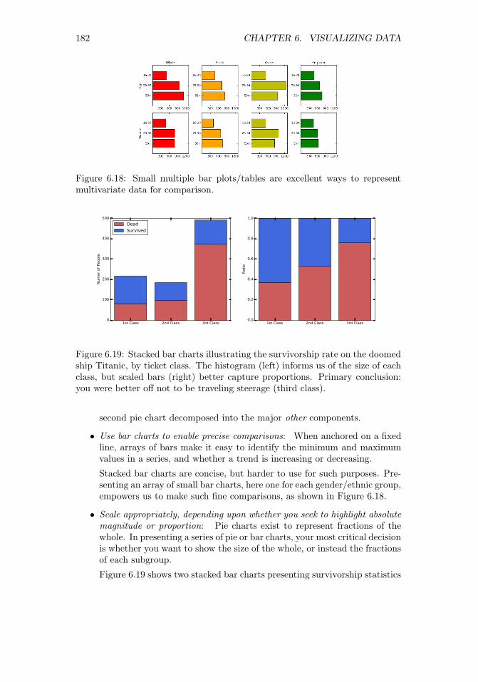
182 CHAPTER 6. VISUALIZING DATA
Figure 6.18: Small multiple bar plots/tables are excellent ways to representmultivariate data for comparison.
Figure 6.19: Stacked bar charts illustrating the survivorship rate on the doomedship Titanic, by ticket class. The histogram (left) informs us of the size of eachclass, but scaled bars (right) better capture proportions. Primary conclusion:you were better off not to be traveling steerage (third class).
second pie chart decomposed into the major other components.
• Use bar charts to enable precise comparisons: When anchored on a fixedline, arrays of bars make it easy to identify the minimum and maximumvalues in a series, and whether a trend is increasing or decreasing.
Stacked bar charts are concise, but harder to use for such purposes. Pre-senting an array of small bar charts, here one for each gender/ethnic group,empowers us to make such fine comparisons, as shown in Figure 6.18.
• Scale appropriately, depending upon whether you seek to highlight absolutemagnitude or proportion: Pie charts exist to represent fractions of thewhole. In presenting a series of pie or bar charts, your most critical decisionis whether you want to show the size of the whole, or instead the fractionsof each subgroup.
Figure 6.19 shows two stacked bar charts presenting survivorship statistics
1st Class 2nd Class 3rd Class0
100
200
300
400
500
Numer of People
Dead
Survived
1st Class 2nd Class 3rd Class0.0
0.2
0.4
0.6
0.8
1.0
Ratio

6.3. CHART TYPES 183
Figure 6.20: Pie charts of delegates to the 2016 Republican convention by can-didate. Which one is better and why?
on the doomed ship Titanic, reported by ticket class. The histogram (left)precisely records the sizes of each class and the resulting outcomes. Thechart with equal length bars (right) better captures how the mortality rateincreased for lower classes.
Pie charts can also be used to show changes in magnitude, by varying thearea of the circle defining the pie. But it is harder for the eye to calculatearea than length, making comparisons difficult. Modulating the radius toreflect magnitude instead of area is even more deceptive, because doublingthe radius of a circle multiplies the area by four.
Bad Pie Charts
Figure 6.20 shows two pie charts reporting the distribution of delegates to the2016 Republican convention, by candidate. The left pie is two-dimensional,while the chart on right has thick slices neatly separated to show off this depth.Which one is better at conveying the distribution of votes?
It should be clear that the three-dimensional effects and separation are purechartjunk, that only obscures the relationship between the size of the slices. Theactual data values disappeared as well, perhaps because there wasn’t enoughspace left for them after all those shadows. But why do we need a pie chart atall? A little table of labels/colors with an extra column with percentages wouldbe more concise and informative.
6.3.5 Histograms
The interesting properties of variables or features are defined by their underlyingfrequency distribution. Where is the peak of the distribution, and is the modenear the mean? Is the distribution symmetric or skewed? Where are the tails?Might it be bimodal, suggesting that the distribution is drawn from a mix oftwo or more underlying populations?

184 CHAPTER 6. VISUALIZING DATA
Figure 6.21: Time series of vote totals in U.S. presidential elections by party en-able us to see the changes in magnitude and distribution. Democrats are shownin blue, and Republicans in red. It is hard to visualize changes, particularly inthe middle layers of the stack.
Often we are faced with a large number of observations of a particular vari-able, and seek to plot a representation for them. Histograms are plots of theobserved frequency distributions. When the variable is defined over a largerange of possible values relative to the n observations, it is unlikely we will eversee any exact duplication. However, by partitioning the value range into an ap-propriate number of equal-width bins, we can accumulate different counts perbin, and approximate the underlying probability distribution.
The biggest issue in building a histogram is deciding on the right number ofbins to use. Too many bins, and there will be only a few points in even the mostpopular bucket. We turned to binning to solve exactly this problem in the firstplace. But use too few bins, and you won’t see enough detail to understand theshape of the distribution.
Figure 6.22 illustrates the consequences of bin size on the appearance of ahistogram. The plots in the top row bin 100,000 points from a normal distri-bution into ten, twenty, and fifty buckets respectively. There are enough pointsto fill fifty buckets, and the distribution on right looks beautiful. The plots inthe bottom row bin have only 100 points, so the thirty-bucket plot on right issparse and scraggy. Here seven bins (shown on the left) seems to produce themost representative plot.
It is impossible to give hard and fast rules to select the best bin count b forshowing off your data. Realize you will never be able to discriminate betweenmore than a hundred bins by eye, so this provides a logical upper bound. Ingeneral, I like to see an average of 10 to 50 points per bin to make thingssmooth, so b = dn/25e gives a reasonable first guess. But experiment withdifferent values of b, because the right bin count will work much better than theothers. You will know it when you see it.
1900 1920 1940 1960 1980 2000
Year
20k
40k
60k
80k
100k
120k
140k
Total Number of Votes
1900 1920 1940 1960 1980 2000
Year
20k
40k
60k
80k
100k
120k
140k
Total Number of Votes

6.3. CHART TYPES 185
Figure 6.22: Histograms of a given distribution can look wildly different de-pending on the number of bins. A large data set benefits from many bins (top).But the structure of a smaller data set is best shown when each bin a non-trivialnumber of element.
−6 −4 −2 0 2 4 60.00
0.05
0.10
0.15
0.20
0.25
0.30
0.35
−6 −4 −2 0 2 4 60.00
0.02
0.04
0.06
0.08
0.10
0.12
0.14
0.16
0.18
−6 −4 −2 0 2 4 60.00
0.01
0.02
0.03
0.04
0.05
0.06
0.07
0.08
−3 −2 −1 0 1 2 3 40.00
0.05
0.10
0.15
0.20
0.25
0.30
−3 −2 −1 0 1 2 3 40.00
0.02
0.04
0.06
0.08
0.10
0.12
0.14
−3 −2 −1 0 1 2 3 40.00
0.01
0.02
0.03
0.04
0.05
0.06
0.07
0.08
0.09

186 CHAPTER 6. VISUALIZING DATA
Figure 6.23: Dividing counts by the total yields a probability density plot, whichis more generally interpretable even though the shapes are identical.
Figure 6.24: Generally speaking, histograms are better for displaying peaks ina distribution, but cdfs are better for showing tails.
Best practices for histograms include:
• Turn your histogram into a pdf: Typically, we interpret our data asobservations that approximate the probability density function (pdf) ofan underlying random variable. If so, it becomes more interpretable tolabel the y-axis by the fraction of elements in each bucket, instead of thetotal count. This is particularly true in large data sets, where the bucketsare full enough that we are unconcerned about the exact level of support.
Figure 6.23 shows the same data, plotted on the right as a pdf instead of ahistogram. The shape is exactly the same in both plots: all that changesis the label on the y-axis. Yet the result is easier to interpret, because itis in terms of probabilities instead of counts.
• Consider the cdf: The cumulative density function (cdf) is the integral ofthe pdf, and the two functions contain exactly the same information. Soconsider using a cdf instead of a histogram to represent your distribution,

6.3. CHART TYPES 187
Figure 6.25: Maps summarizing the results of the 2012 U.S. presidential election.The recipient of each state’s electoral votes is effectively presented on a datamap (left), while a cartogram making the area of each state proportional tothe number of votes (right) better captures the magnitude of Obama’s victory.Source: Images from Wikipedia.
as shown in Figure 6.24.
One great thing about plotting the cdf is that it does not rely on a bincount parameter, so it presents a true, unadulterated view of your data.Recall how great the cdfs looked in the Kolmogorov-Smirnov test, Figure5.13. We draw a cdf as a line plot with n + 2 points for n observations.The first and last points are (xmin − ε, 0) and (xmax + ε, 1). We then sortthe observations to yield S = {s1, . . . , sn}, and plot (si, i/n) for all i.
Cumulative distributions require slightly more sophistication to read thanhistograms. The cdf is monotonically increasing, so there are no peaksin the distribution. Instead, the mode is marked by the longest verticalline segment. But cdfs are much better at highlighting the tails of adistribution. The reason is clear: the small counts at the tails are obscuredby the axis on a histogram, but accumulate into visible stuff in the cdf.
6.3.6 Data Maps
Maps use the spatial arrangement of regions to represent places, concepts, orthings. We have all mastered skills for navigating the world through maps, skillswhich translate into understanding related visualizations.
Traditional data maps use color or shading to highlight properties of theregions in the map. Figure 6.25 (left) colors each state according to whetherthey voted for Barack Obama (blue) or his opponent Mitt Romney (red) in the2012 U.S. presidential election. The map makes clear the country’s politicaldivisions. The northeast and west coasts are as solidly blue as the Midwest andsouth are red.

188 CHAPTER 6. VISUALIZING DATA
Figure 6.26: The periodic table maps the elements into logical groupings, re-flecting chemical properties. Source: http://sciencenotes.org
Maps are not limited to geographic regions. The most powerful map in thehistory of scientific visualization is chemistry’s periodic table of the elements.Connected regions show where the metals and Nobel gases reside, as well asspots where undiscovered elements had to lie. The periodic table is a map withenough detail to be repeatedly referenced by working chemists, yet is easilyunderstood by school children.
What gives the periodic table such power as a visualization?
• The map has a story to tell: Maps are valuable when they encode infor-mation worth referencing or assimilating. The periodic table is the rightvisualization of the elements because of the structure of electron shells,and their importance on chemical properties and bonding. The map bearsrepeated scrutiny because it has important things to tell us.
Data maps are fascinating, because breaking variables down by regionso often leads to interesting stories. Regions on maps generally reflectcultural, historical, economic, and linguistic continuities, so phenomenaderiving from any of these factors generally show themselves clearly ondata maps.
• Regions are contiguous, and adjacency means something: The continu-ity of regions in Figure 6.26 is reflected by its color scheme, groupingelements sharing similar properties, like the alkali metals and the Nobelgases. Two elements sitting next to each other usually means that theyshare something important in common.

6.4. GREAT VISUALIZATIONS 189
• The squares are big enough to see: A critical decision in canonizing theperiodic table was the placement of the Lanthanide (elements 57–71) andActinide metals (elements 89–103). They are conventionally presented asthe bottom two rows, but logically belong within the body of the table inthe unlabeled green squares.
However, the conventional rendering avoids two problems. To do it “right,”these elements would either be compressed into hopelessly thin slivers, orelse the table would need to become twice as wide to accommodate them.
• It is not too faithful to reality: Improving reality for the sake of bettermaps is a long and honorable tradition. Recall that the Mercator projec-tion distorts the size of landmasses near the poles (yes, Greenland, I amlooking at you) in order to preserve their shape.
Cartograms are maps distorted such that regions reflect some underlyingvariable, like population. Figure 6.25 (right) plots the electoral results of2012 on a map where the area of each state is proportional to its popu-lation/electoral votes. Only now does the magnitude of Obama’s victorybecome clear: those giant red Midwestern states shrink down to an ap-propriate size, yielding a map of more blue than red.
6.4 Great Visualizations
Developing your own visualization aesthetic gives you a language to talk aboutwhat you like and what you don’t like. I now encourage you to apply yourjudgment to assess the merits and demerits of certain charts and graphs.
In this section, we will look at a select group of classic visualizations whichI consider great. There are a large number of terrible graphics I would love tocontrast them against, but I was taught that it is not nice to make fun of people.
This is especially true when there are copyright restrictions over the use ofsuch images in a book like this. However, I strongly encourage you to visithttp://wtfviz.net/ to see a collection of startling charts and graphics. Manyare quite amusing, for reasons you should now be able to articulate using theideas in this chapter.
6.4.1 Marey’s Train Schedule
Tufte points to E.J. Marey’s railroad schedule as a landmark in graphical design.It is shown in Figure 6.27. The hours of the day are represented on the x-axis.Indeed, this rectangular plot is really a cylinder cut at 6AM and laid downflat. The y-axis represents all the stations on the Paris to Lyon line. Each linerepresents the route of a particular train, reporting where it should be at eachmoment in time.
Normal train schedules are tables, with a column for each train, a row foreach station, and entry (i, j) reporting the time train j arrives at station i. Suchtables are useful to tell us what time to arrive to catch our train. But Marey’s

190 CHAPTER 6. VISUALIZING DATA
Figure 6.27: Marey’s train schedule plots the position of each train as a functionof time.
design provides much more information. What else can you see here that youcannot with conventional time tables?
• How fast is the train moving? The slope of a line measures how steep itis. The faster the train, the greater the absolute slope. Slower trains aremarked by flatter lines, because they take more time to cover the givenground.
A special case here is identifying periods when the train is idling in thestation. At these times, the line is horizontal, indicating no movementdown the line.
• When do trains pass each other? The direction of a train is given by theslope of the associated line. Northbound trains have a positive slope, andsouthbound trains a negative slope. Two trains pass each other at theintersection points of two lines, letting passengers know when to look outthe window and wave.
• When is rush hour? There is a concentration of trains leaving both Parisand Lyon around 7PM, which tells me that must have been the mostpopular time to travel. The trip typically took around eleven hours, sothis must have been a sleeper train, where travelers would arrive at theirdestination bright and early the next day.
The departure times for trains at a station are also there, of course. Eachstation is marked by a horizontal line, so look for the time when trains crossyour station in the proper direction.

6.4. GREAT VISUALIZATIONS 191
Figure 6.28: Cholera deaths center around a pump on Broad street, revealingthe source of the epidemic.
My only quibble here is that it would have been even better with a lighterdata grid. Never imprison your data!
6.4.2 Snow’s Cholera Map
A particularly famous data map changed the course of medical history. Cholerawas a terrible disease which killed large numbers of people in 19th-century cities.The plague would come suddenly and strike people dead, with the cause amystery to the science of the day.
John Snow plotted cholera cases from an epidemic of 1854 on a street mapof London, hoping to see a pattern. Each dot in Figure 6.28 represented ahousehold struck with the disease. What do you see?
Snow noticed a cluster of the cases centered on Broad Street. Further, at thecenter of the cluster was a cross, denoting a well where the residents got theirdrinking water. The source of the epidemic was traced to the handle of a singlewater pump. They changed the handle, and suddenly people stopped gettingsick. This proved that cholera was an infectious disease caused by contaminatedwater, and pointed the way towards preventing it.

192 CHAPTER 6. VISUALIZING DATA
Figure 6.29: This weather year in review displays a clear story in over 2000numbers.
6.4.3 New York’s Weather Year
It is almost worth enduring a New York winter to see a particular graphic whichappears in The New York Times each January, summarizing the weather of theprevious year. Figure 6.29 presents an independent rendition of the same data,which captures why this chart is exciting. For every day of the year, we seethe high and low temperature plotted on a graph, along with historical data toput it in context: the average daily high and low, as well as the highest/lowesttemperatures ever recorded for that date.
What is so great about that? First, it shows 6 × 365 = 2190 numbers in acoherent manner, which facilitates comparisons on the sine curve of the seasons:
• We can tell when there were hot and cold spells, and how long they lasted.
• We can tell what days had big swings in temperature, and when the ther-mometer hardly moved at all.
• We can tell whether the weather was unusual this year. Was it an unusu-ally hot or cold year, or both? When were record high/lows set, and whendid they get close to setting them?
This single graphic is rich, clear, and informative. Be inspired by it.
6.5 Reading Graphs
What you see isn’t always what you get. I have seen many graphs brought tome by my students over the years. Some have been amazing, and most othersgood enough to get the job done.

6.5. READING GRAPHS 193
Figure 6.30: A dotplot of word frequency by rank. What do you see?
But I also repeatedly see plots with the same basic problems. In this section,for a few of my pet peeves, I present the original plot along with the way toremedy the problem. With experience, you should be able to identify thesekinds of problems just by looking at the initial plot.
6.5.1 The Obscured Distribution
Figure 6.30 portrays the frequency of 10,000 English words, sorted by frequency.It doesn’t look very exciting: all you can see is a single point at (1, 2.5). Whathappened, and how can you fix it?
If you stare at the figure long enough, you will see there are actually a lotmore points. But they all sit on the line y = 0, and overlap each other to theextent that they form an undifferentiated mass.
The alert reader will realize that this single point is in fact an outlier, withmagnitude so large as to shrink all other totals toward zero. A natural reactionwould delete the biggest point, but curiously the remaining points will lookmuch the same.
The problem is that this distribution is a power law, and plotting a powerlaw on a linear scale shows nothing. The key here is to plot it on log scale, as inFigure 6.31 (left). Now you can see the points, and the mapping from ranks tofrequency. Even better is plotting it on a log-log scale, as in Figure 6.31 (right).The straight line here confirms that we are dealing with a power law.
6.5.2 Overinterpreting Variance
In bioinformatics, one seeks to discover how life works by looking at data. Figure6.32 (left) presents a graph of the folding energy of genes as a function of theirlength. Look at this graph, and see if you can make a discovery.
It is pretty clear that something is going on in there. For gene lengths above1500, the plot starts jumping around, producing some very negative values. Did
0 20000 40000 60000 80000 100000 120000
Rank
0.0
0.5
1.0
1.5
2.0
2.5
3.0
Frequency
1e7

194 CHAPTER 6. VISUALIZING DATA
Figure 6.31: Frequency of 10,000 English words. Plotting the word frequencieson a log scale (left), or even better on a log-log scale reveals that it is power law(right).
Figure 6.32: Folding energy of genes as a function of their length. Mistak-ing variance for signal: the extreme values in the left figure are artifacts fromaveraging small numbers of samples.
0 20000 40000 60000 80000 100000 120000
Rank
101
102
103
104
105
106
107
108
Frequency
102 103 104
Rank
101
102
103
104
105
106
107
108
Frequency

6.6. INTERACTIVE VISUALIZATION 195
we just discover that energy varies inversely with gene length?No. We just overinterpreted variance. The first clue is that what looked
very steady starts to go haywire as the length increases. Most genes are veryshort in length. Thus the points on the right side of the left plot are based onvery little data. The average of a few points is not as robust as the average ofmany points. Indeed, a frequency plot of the number of genes by length (onright) shows that the counts drop off to nothing right where it starts jumping.
How could we fix it? The right thing to do here is to threshold the plot byonly showing the values with enough data support, perhaps at length 500 or abit more. Beyond that, we might bin them by length and take the average, inorder to prove that the jumping effect goes away.
6.6 Interactive Visualization
The charts and graphs we have discussed so far were all static images, designedto be studied by the viewer, but not manipulated. Interactive visualizationtechniques are becoming increasingly important for exploratory data analysis.
Mobile apps, notebooks, and webpages with interactive visualization widgetscan be especially effective in presenting data, and disseminating it to largeraudiences to explore. Providing viewers with the power to play with the actualdata helps ensure that the story presented by a graphic is the true and completestory.
If you are going to view your data online, it makes sense to do so usinginteractive widgets. These are generally extensions of the basic plots that wehave described in this chapter, with features like offering pop-ups with moreinformation when the user scrolls over points, or encouraging the user to changethe scale ranges with sliders.
There are few potential downsides to interactive visualization. First, it isharder to communicate exactly what you are seeing to others, compared withstatic images. They might not be seeing exactly the same thing as you. Screen-shots of interactive systems generally cannot compare to publication-qualitygraphics optimized on traditional systems. The problem with what you see iswhat you get (WYSIWYG) systems is that, generally, what you see is all youget. Interactive systems are best for exploration, not presentation.
There are also excesses which tend to arise in interactive visualization.Knobs and features get added because they can, but the visual effects theyadd can distract rather than add to the message. Rotating three-dimensionalpoint clouds always looks cool, but I find them hard to interpret and very seldomfind such views insightful.
Making data tell a story requires some insight into how to tell stories.Films and television represent the state-of-the-art in narrative presentation.Like them, the best interactive presentations show a narrative, such as movingthrough time or rifling through alternative hypotheses. For inspiration, I en-courage you to watch the late Han Rosling’s TED talk1 using animated bubble
1 https://www.ted.com/talks/hans_rosling_shows_the_best_stats_you_ve_ever_seen

196 CHAPTER 6. VISUALIZING DATA
Figure 6.33: The TextMap dashboard for Barack Obama, circa 2008.
charts to present the history of social and economic development for all theworld’s nations.
Recent trends in cloud-based visualization encourage you to upload yourdata to a site like Google Charts https://developers.google.com/chart/,so you can take advantage of interactive visualization tools and widgets thatthey provide. These tools produce very nice interactive plots, and are easy touse.
The possible sticking point is security, since you are giving your data to athird party. I hope and trust that the CIA analysts have access to their own in-house solutions which keep their data confidential. But feel free to experimentwith these tools in less sensitive situations.
6.7 War Story: TextMapping the World
My biggest experience in data visualization came as a result of our large scalenews/sentiment analysis system. TextMap presented a news analysis dashboard,for every entity whose name appeared in news articles of the time. BarackObama’s page is shown in Figure 6.33. Our dashboard was made up of a varietyof subcomponents:
• Reference time series: Here we reported how often the given entity ap-peared in the news, as a function of time. Spikes corresponded to moreimportant news events. Further, we partitioned these counts according

6.7. WAR STORY: TEXTMAPPING THE WORLD 197
to appearances in each section of the newspaper: news, sports, entertain-ment, or business.
• News sector distribution: This graph contains exactly the same data asin the reference time series, but presented as a stacked area plot to showthe fraction of entity references in each section of the paper. Obamaclearly presents as a news figure. But other people exhibited interestingtransitions, such as Arnold Schwarzenegger when he shifted from actingto politics.
• Sentiment analysis: Here we present a time series measuring the senti-ment of the entity, by presenting the normalized difference of the numberof positive news mentions to total references. Thus zero represented aneutral reputation, and we provided a central reference line to put theplacement into perspective. Here Obama’s sentiment ebbs and flows withevents, but generally stays on the right side of the line.
It was nice to see bad things happen to bad people, by watching their newssentiment drop. As I recall, the lowest news sentiment ever achieved wasby a mom who achieved notoriety by cyberbullying one of her daughter’ssocial rivals into committing suicide.
• Heatmap: Here we presented a data map showing the relative referencefrequency of the entity. Obama’s great red patch around Illinois is becausehe was serving as a senator from there at the time he first ran for president.Many classes entities showed strong regional biases, like sports figures andpoliticians, but less so entertainment figures like movie stars and singers.
• Juxtapositions and relational network: Our system built a network onnews entities, by linking two entities whenever they were mentioned inthe same article. The strength of this relationship could be measured bythe number of articles linking them together. The strongest of these asso-ciations are reported as juxtapositions, with their frequency and strengthshown by a bar chart on a logarithmic scale.
We have not really talked so far about network visualization, but thekey idea is to position vertices so neighbors are located near each other,meaning the edges are short. Stronger friendships are shown by thickerlines.
• Related articles: We provided links to representative news articles men-tioning the given entity.
One deficiency of our dashboard was that it was not interactive. In fact, itwas anti-interactive: the only animation was a gif of the world spinning forlornlyin the upper-left corner. Many of the plots we rendered required large amountsof data access from our clunky database, particularly the heatmap. Since itcould not be rendered interactively, we precomputed these maps offline andshowed them on demand.

198 CHAPTER 6. VISUALIZING DATA
After Mikhail updated our infrastructure (see the war story of Section 12.2),it became possible for us to support some interactive plots, particularly timeseries. We developed a new user interface called TextMap Access that let usersplay with our data.
But when General Sentiment licensed the technology, the first thing it dis-posed of was our user interface. It didn’t make sense to the business analystswho were our customers. It was too complicated. There is a substantial differ-ence between surface appeal and the real effectiveness of an interface for users.Look carefully at our TextMap dashboard: it had “What is this?” buttonsin several locations. This was a sign of weakness: if our graphics were reallyintuitive enough we would not have needed them.
Although I grumbled about the new interface, I was undoubtedly wrong.General Sentiment employed a bunch of analysts who used our system all daylong, and were available to talk to our developers. Presumably the interfaceevolved to serve them better. The best interfaces are built by a dialog betweendevelopers and users.
What are the take-home lessons from this experience? There is a lot I stillfind cool about this dashboard: the presentation was rich enough to really exposeinteresting things about how the world worked. But not everyone agreed. Dif-ferent customers preferred different interfaces, because they did different thingswith them.
One lesson here is the power of providing alternate views of the same data.The reference time series and news sector distribution were exactly the samedata, but provided quite different insights when presented in different ways.All songs are made from the same notes, but how you arrange them makes fordifferent kinds of music.
6.8 Chapter Notes
I strongly recommend Edward Tufte’s books [Tuf83, Tuf90, Tuf97] to anyoneinterested in the art of scientific visualization. You don’t even have to readthem. Just look at the pictures for effective contrasts between good and badgraphics, and plots that really convey stories in data.
Similarly good books on data visualization are Few [Few09] and far between.Interesting blogs about data visualization are http://flowingdata.com andhttp://viz.wtf. The first focuses on great visualizations, the second seekingout the disasters. The story of Snow’s cholera map is reported in Johnson[Joh07].
The chartjunk removal example from Section 6.2.3 was inspired by an ex-ample by Tim Bray at http://www.tbray.org. Anscombe’s quartet was firstpresented in [Ans73]. The basic architecture of our Lydia/TextMap news analy-sis system is reported in Lloyd et al. [LKS05], with additional papers describingheatmaps [MBL+06] and the Access user interface [BWPS10].

6.9. EXERCISES 199
6.9 Exercises
Exploratory Data Analysis
6-1. [5] Provide answers to the questions associated with the following data sets,available at http://www.data-manual.com/data.
(a) Analyze the movie data set. What is the range of movie gross in the UnitedStates? Which type of movies are most likely to succeed in the market?Comedy? PG-13? Drama?
(b) Analyze the Manhattan rolling sales data set. Where in Manhattan is themost/least expensive real estate located? What is the relationship betweensales price and gross square feet?
(c) Analyze the 2012 Olympic data set. What can you say about the relation-ship between a country’s population and the number of medals it wins?What can you say about the relationship between the ratio of female andmale counts and the GDP of that country?
(d) Analyze the GDP per capita data set. How do countries from Europe, Asia,and Africa compare in the rates of growth in GDP? When have countriesfaced substantial changes in GDP, and what historical events were likelymost responsible for it?
6-2. [3] For one or more of the data sets from http://www.data-manual.com/data,answer the following basic questions:
(a) Who constructed it, when, and why?
(b) How big is it?
(c) What do the fields mean?
(d) Identify a few familiar or interpretable records.
(e) Provide Tukey’s five number summary for each column.
(f) Construct a pairwise correlation matrix for each pair of columns.
(g) Construct a pairwise distribution plot for each interesting pair of columns.
Interpreting Visualizations
6-3. [5] Search your favorite news websites until you find ten interesting charts/plots,ideally half good and half bad. For each, please critique along the followingdimensions, using the vocabulary we have developed in this chapter:
(a) Does it do a good job or a bad job of presenting the data?
(b) Does the presentation appear to be biased, either deliberately or acciden-tally?
(c) Is there chartjunk in the figure?
(d) Are the axes labeled in a clear and informative way?
(e) Is the color used effectively?
(f) How can we make the graphic better?

200 CHAPTER 6. VISUALIZING DATA
6-4. [3] Visit http://www.wtfviz.net. Find five laughably bad visualizations, andexplain why they are both bad and amusing.
Creating Visualizations
6-5. [5] Construct a revealing visualization of some aspect of your favorite data set,using:
(a) A well-designed table.
(b) A dot and/or line plot.
(c) A scatter plot.
(d) A heatmap.
(e) A bar plot or pie chart.
(f) A histogram.
(g) A data map.
6-6. [5] Create ten different versions of line charts for a particular set of (x, y) points.Which ones are best and which ones worst? Explain why.
6-7. [3] Construct scatter plots for sets of 10, 100, 1000, and 10,000 points. Experi-ment with the point size to find the most revealing value for each data set.
6-8. [5] Experiment with different color scales to construct scatter plots for a par-ticular set of (x, y, z) points, where color is used to represent the z dimension.Which color schemes work best? Which are the worst? Explain why.
Implementation Projects
6-9. [5] Build an interactive exploration widget for your favorite data set, usingappropriate libraries and tools. Start simple, but be as creative as you want tobe.
6-10. [5] Create a data video/movie, by recording/filming an interactive data explo-ration. It should not be long, but how interesting/revealing can you make it?
Interview Questions
6-11. [3] Describe some good practices in data visualization?
6-12. [5] Explain Tufte’s concept of chart junk.
6-13. [8] How would you to determine whether the statistics published in an articleare either wrong or presented to support a biased view?
Kaggle Challenges
6-14. Analyze data from San Francisco Bay Area bike sharing.
https://www.kaggle.com/benhamner/sf-bay-area-bike-share
6-15. Predict whether West Nile virus is present in a given time and place.
https://www.kaggle.com/c/predict-west-nile-virus
6-16. What type of crime is most likely at a given time and place?
https://www.kaggle.com/c/sf-crime

Chapter 7
Mathematical Models
All models are wrong, but some models are useful.
– George Box
So far in this book, a variety of tools have been developed to manipulate andinterpret data. But we haven’t really dealt with modeling, which is the process ofencapsulating information into a tool which can forecast and make predictions.
Predictive models are structured around some idea of what causes futureevents to happen. Extrapolating from recent trends and observations assumesa world view that the future will be like the past. More sophisticated models,such as the laws of physics, provide principled notions of causation; fundamentalexplanations of why things happen.
This chapter will concentrate on designing and validating models. Effectivelyformulating models requires a detailed understanding of the space of possiblechoices.
Accurately evaluating the performance of a model can be surprisingly hard,but it is essential for knowing how to interpret the resulting predictions. Thebest forecasting system is not necessarily the most accurate one, but the modelwith the best sense of its boundaries and limitations.
7.1 Philosophies of Modeling
Engineers and scientists are often leery of the p-word (philosophy). But it paysto think in some fundamental way about what we are trying to do, and why.Recall that people turn to data scientists for wisdom, instead of programs.
In this section, we will turn to different ways of thinking about models tohelp shape the way we build them.
7.1.1 Occam’s Razor
Occam’s razor is the philosophical principle that “the simplest explanation is
201© The Author(s) 2017S.S. Skiena, The Data Science Design Manual,Texts in Computer Science, https://doi.org/10.1007/978-3-319-55444-0_7

202 CHAPTER 7. MATHEMATICAL MODELS
the best explanation.” According to William of Occam, a 13th-century theolo-gian, given two models or theories which do an equally accurate job of makingpredictions, we should opt for the simpler one as sounder and more robust. Itis more likely to be making the right decision for the right reasons.
Occam’s notion of simpler generally refers to reducing the number of assump-tions employed in developing the model. With respect to statistical modeling,Occam’s razor speaks to the need to minimize the parameter count of a model.Overfitting occurs when a model tries too hard to achieve accurate performanceon its training data. This happens when there are so many parameters that themodel can essentially memorize its training set, instead of generalizing appro-priately to minimize the effects of error and outliers.
Overfit models tend to perform extremely well on training data, but muchless accurately on independent test data. Invoking Occam’s razor requires thatwe have a meaningful way to evaluate how accurately our models are performing.
Simplicity is not an absolute virtue, when it leads to poor performance. Deeplearning is a powerful technique for building models with millions of parameters,which we will discuss in Section 11.6. Despite the danger of overfitting, thesemodels perform extremely well on a variety of complex tasks. Occam would havebeen suspicious of such models, but come to accept those that have substantiallymore predictive power than the alternatives.
Appreciate the inherent trade-off between accuracy and simplicity. It isalmost always possible to “improve” the performance of any model by kludging-on extra parameters and rules to govern exceptions. Complexity has a cost, asexplicitly captured in machine learning methods like LASSO/ridge regression.These techniques employ penalty functions to minimize the features used in themodel.
Take-Home Lesson: Accuracy is not the best metric to use in judging thequality of a model. Simpler models tend to be more robust and understandablethan complicated alternatives. Improved performance on specific tests is oftenmore attributable to variance or overfitting than insight.
7.1.2 Bias–Variance Trade-Offs
This tension between model complexity and performance shows up in the sta-tistical notion of the bias–variance trade-off:
• Bias is error from incorrect assumptions built into the model, such asrestricting an interpolating function to be linear instead of a higher-ordercurve.
• Variance is error from sensitivity to fluctuations in the training set. If ourtraining set contains sampling or measurement error, this noise introducesvariance into the resulting model.
Errors of bias produce underfit models. They do not fit the training data astightly as possible, were they allowed the freedom to do so. In popular discourse,

7.1. PHILOSOPHIES OF MODELING 203
I associate the word “bias” with prejudice, and the correspondence is fairly apt:an apriori assumption that one group is inferior to another will result in lessaccurate predictions than an unbiased one. Models that perform lousy on bothtraining and testing data are underfit.
Errors of variance result in overfit models: their quest for accuracy causesthem to mistake noise for signal, and they adjust so well to the training datathat noise leads them astray. Models that do much better on testing data thantraining data are overfit.1
Take-Home Lesson: Models based on first principles or assumptions are likelyto suffer from bias, while data-driven models are in greater danger of overfit-ting.
7.1.3 What Would Nate Silver Do?
Nate Silver is perhaps the most prominent public face of data science today. Aquantitative fellow who left a management consulting job to develop baseballforecasting methods, he rose to fame through his election forecast website http:
//www.fivethirtyeight.com. Here he used quantitative methods to analyzepoll results to predict the results of U.S. presidential elections. In the 2008election, he accurately called the winner of 49 of the 50 states, and improvedin 2012 to bag 50 out of 50. The results of the 2016 election proved a shockto just about everyone, but alone among public commentators Nate Silver hadidentified a substantial chance of Trump winning the electoral college whilelosing the popular vote. This indeed proved to be the case.
Silver wrote an excellent book The Signal and the Noise: Why so manypredictions fail – but some don’t [Sil12]. There he writes sensibly about state-of-the-art forecasting in several fields, including sports, weather and earthquakeprediction, and financial modeling. He outlines principles for effective modeling,including:
• Think probabilistically: Forecasts which make concrete statements areless meaningful than those that are inherently probabilistic. A forecastthat Trump has only 28.3% chance of winning is more meaningful thanone that categorically states that he will lose.
The real world is an uncertain place, and successful models recognize thisuncertainty. There are always a range of possible outcomes that can occurwith slight perturbations of reality, and this should be captured in yourmodel. Forecasts of numerical quantities should not be single numbers, butinstead report probability distributions. Specifying a standard deviationσ along with the mean prediction µ suffices to describe such a distribution,particularly if it is assumed to be normal.
1To complete this taxonomy, models that do better on testing data than the training dataare said to be cheating.

204 CHAPTER 7. MATHEMATICAL MODELS
Several of the machine learning techniques we will study naturally provideprobabilistic answers. Logistic regression provides a confidence along witheach classification it makes. Methods that vote among the labels of thek nearest neighbors define a natural confidence measure, based on theconsistency of the labels in the neighborhood. Collecting ten of elevenvotes for blue means something stronger than seven out of eleven.
• Change your forecast in response to new information: Live models aremuch more interesting than dead ones. A model is live if it is contin-ually updating predictions in response to new information. Building aninfrastructure that maintains a live model is more intricate than that of aone-off computation, but much more valuable.
Live models are more intellectually honest than dead ones. Fresh informa-tion should change the result of any forecast. Scientists should be open tochanging opinions in response to new data: indeed, this is what separatesscientists from hacks and trolls.
Dynamically-changing forecasts provide excellent opportunities to evalu-ate your model. Do they ultimately converge on the correct answer? Doesuncertainty diminish as the event approaches? Any live model should trackand display its predictions over time, so the viewer can gauge whetherchanges accurately reflected the impact of new information.
• Look for consensus: A good forecast comes from multiple distinct sourcesof evidence. Data should derive from as many different sources as possible.Ideally, multiple models should be built, each trying to predict the samething in different ways. You should have an opinion as to which model isthe best, but be concerned when it substantially differs from the herd.
Often third parties produce competing forecasts, which you can monitorand compare against. Being different doesn’t mean that you are wrong,but it does provide a reality check. Who has been doing better lately?What explains the differences in the forecast? Can your model be im-proved?
Google’s Flu Trends forecasting model predicted disease outbreaks bymonitoring key words on search: a surge in people looking for aspirin orfever might suggest that illness is spreading. Google’s forecasting modelproved quite consistent with the Center for Disease Control’s (CDC) statis-tics on actual flu cases for several years, until they embarrassingly wentastray.
The world changes. Among the changes was that Google’s search interfacebegan to suggest search queries in response to a user’s history. When of-fered the suggestion, many more people started searching for aspirin aftersearching for fever. And the old model suddenly wasn’t accurate any-more. Google’s sins lay in not monitoring its performance and adjustingover time.

7.2. A TAXONOMY OF MODELS 205
Certain machine learning methods explicitly strive for consensus. Boostingalgorithms combine large numbers of weak classifiers to produce a strongone. Ensemble decision tree methods build many independent classifiers,and vote among them to make the best decision. Such methods can havea robustness which eludes more single-track models.
• Employ Baysian reasoning: Bayes’ theorem has several interpretations,but perhaps most cogently provides a way to calculate how probabilitieschange in response to new evidence. When stated as
P (A|B) =P (B|A)P (A)
P (B)
it provides a way to calculate how the probability of event A changes inresponse to new evidence B.
Applying Bayes’ theorem requires a prior probability P (A), the likelihoodof event A before knowing the status of a particular event B. This mightbe the result of running a classifier to predict the status of A from otherfeatures, or background knowledge about event frequencies in a popula-tion. Without a good estimate for this prior, it is very difficult to knowhow seriously to take the classifier.
Suppose A is the event that person x is actually a terrorist, and B isthe result of a feature-based classifier that decides if x looks like a terror-ist. When trained/evaluated on a data set of 1,000 people, half of whomwere terrorists, the classifier achieved an enviable accuracy of, say, 90%.The classifier now says that Skiena looks like a terrorist. What is theprobability that Skiena really is a terrorist?
The key insight here is that the prior probability of “x is a terrorist” isreally, really low. If there are a hundred terrorists operating in the UnitedStates, then P (A) = 100/300, 000, 000 = 3.33 × 10⁻⁷. The probability ofthe terrorist detector saying yes, P (B) = 0.5, while the probability of thedetector being right when it says yes P (B|A) = 0.9. Multiplying this outgives a still very tiny probability that I am a bad guy,
P (A|B) =P (B|A)P (A)
P (B)=
(0.9)(3.33× 10⁻⁷)
(0.5)= 6× 10⁻⁷
although admittedly now greater than that of a random citizen.
Factoring in prior probabilities is essential to getting the right interpreta-tion from this classifier. Bayesian reasoning starts from the prior distribu-tion, then weighs further evidence by how strongly it should impact theprobability of the event.
7.2 A Taxonomy of Models
Models come in, well, many different models. Part of developing a philosophyof modeling is understanding your available degrees of freedom in design and

206 CHAPTER 7. MATHEMATICAL MODELS
implementation. In this section, we will look at model types along several differ-ent dimensions, reviewing the primary technical issues which arise to distinguisheach class.
7.2.1 Linear vs. Non-Linear Models
Linear models are governed by equations that weigh each feature variable by acoefficient reflecting its importance, and sum up these values to produce a score.Powerful machine learning techniques, such as linear regression, can be used toidentify the best possible coefficients to fit training data, yielding very effectivemodels.
But generally speaking, the world is not linear. Richer mathematical descrip-tions include higher-order polynomials, logarithms, and exponentials. Thesepermit models that fit training data much more tightly than linear functionscan. Generally speaking, it is much harder to find the best possible coefficientsto fit non-linear models. But we don’t have to find the best possible fit: deeplearning methods, based on neural networks, offer excellent performance despiteinherent difficulties in optimization.
Modeling cowboys often sneer in contempt at the simplicity of linear models.But linear models offer substantial benefits. They are readily understandable,generally defensible, easy to build, and avoid overfitting on modest-sized datasets. Occam’s razor tells us that “the simplest explanation is the best explana-tion.” I am generally happier with a robust linear model, yielding an accuracyof x%, than a complex non-linear beast only a few percentage points better onlimited testing data.
7.2.2 Blackbox vs. Descriptive Models
Black boxes are devices that do their job, but in some unknown manner. Stuffgoes in and stuff comes out, but how the sausage is made is completely impen-etrable to outsiders.
By contrast, we prefer models that are descriptive, meaning they providesome insight into why they are making their decisions. Theory-driven models aregenerally descriptive, because they are explicit implementations of a particularwell-developed theory. If you believe the theory, you have a reason to trust theunderlying model, and any resulting predictions.
Certain machine learning models prove less opaque than others. Linearregression models are descriptive, because one can see exactly which variablesreceive the most weight, and measure how much they contribute to the resultingprediction. Decision tree models enable you to follow the exact decision pathused to make a classification. “Our model denied you a home mortgage becauseyour income is less than $10,000 per year, you have greater than $50,000 incredit card debt, and you have been unemployed over the past year.”
But the unfortunate truth is that blackbox modeling techniques such asdeep learning can be extremely effective. Neural network models are generallycompletely opaque as to why they do what they do. Figure 7.1 makes this

7.2. A TAXONOMY OF MODELS 207
Figure 7.1: Synthetic images that are mistakenly recognized as objects by state-of-the-art Deep Learning neural networks, each with a confidence greater than99.6%. Source: [NYC15].
clear. It shows images which were very carefully constructed to fool state-of-the-art neural networks. They succeeded brilliantly. The networks in questionhad ≥ 99.6% confidence that they had found the right label for every image inFigure 7.1.
The scandal here is not that the network got the labels wrong on theseperverse images, for these recognizers are very impressive systems. Indeed, theywere much more accurate than dreamed possible only a year or two before. Theproblem is that the creators of these classifiers had no idea why their programsmade such terrible errors, or how they could prevent them in the future.
A similar story is told of a system built for the military to distinguish imagesof cars from trucks. It performed well in training, but disastrously in the field.Only later was it realized that the training images for cars were shot on a sunnyday and those of trucks on a cloudy day, so the system had learned to link thesky in the background with the class of the vehicle.
Tales like these highlight why visualizing the training data and using descrip-tive models can be so important. You must be convinced that your model hasthe information it needs to make the decisions you are asking of it, particularlyin situations where the stakes are high.
7.2.3 First-Principle vs. Data-Driven Models
First-principle models are based on a belief of how the system under investi-gation really works. It might be a theoretical explanation, like Newton’s lawsof motion. Such models can employ the full weight of classical mathematics:calculus, algebra, geometry, and more. The model might be a discrete eventsimulation, as will be discussed in Section 7.7. It might be seat-of-the-pantsreasoning from an understanding of the domain: voters are unhappy if theeconomy is bad, therefore variables which measure the state of the economyshould help us predict who will win the election.

208 CHAPTER 7. MATHEMATICAL MODELS
In contrast, data-driven models are based on observed correlations betweeninput parameters and outcome variables. The same basic model might be usedto predict tomorrow’s weather or the price of a given stock, differing only on thedata it was trained on. Machine learning methods make it possible to build aneffective model on a domain one knows nothing about, provided we are given agood enough training set.
Because this is a book on data science, you might infer that my heart liesmore on the side of data-driven models. But this isn’t really true. Data science isalso about science, and things that happen for understandable reasons. Modelswhich ignore this are doomed to fail embarrassingly in certain circumstances.
There is an alternate way to frame this discussion, however. Ad hoc modelsare built using domain-specific knowledge to guide their structure and design.These tend to be brittle in response to changing conditions, and difficult toapply to new tasks. In contrast, machine learning models for classificationand regression are general, because they employ no problem-specific ideas, onlyspecific data. Retrain the models on fresh data, and they adapt to changingconditions. Train them on a different data set, and they can do somethingcompletely different. By this rubric, general models sound much better than adhoc ones.
The truth is that the best models are a mixture of both theory and data. Itis important to understand your domain as deeply as possible, while using thebest data you can in order to fit and evaluate your models.
7.2.4 Stochastic vs. Deterministic Models
Demanding a single deterministic “prediction” from a model can be a fool’serrand. The world is a complex place of many realities, with events that gener-ally would not unfold in exactly the same way if time could be run over again.Good forecasting models incorporate such thinking, and produce probabilitydistributions over all possible events.
Stochastic is a fancy word meaning “randomly determined.” Techniquesthat explicitly build some notion of probability into the model include logisticregression and Monte Carlo simulation. It is important that your model observethe basic properties of probabilities, including:
• Each probability is a value between 0 and 1: Scores that are not con-strained to be in this range do not directly estimate probabilities. Thesolution is often to put the values through a logit function (see Section4.4.1) to turn them into probabilities in a principled way.
• That they must sum to 1: Independently generating values between 0and 1 does not mean that they together add up to a unit probability, overthe full event space. The solution here is to scale these values so thatthey do, by dividing each by the partition function. See Section 9.7.4.Alternately, rethink your model to understand why they didn’t add up inthe first place.

7.2. A TAXONOMY OF MODELS 209
• Rare events do not have probability zero: Any event that is possible musthave a greater than zero probability of occurrence. Discounting is a wayof evaluating the likelihood of unseen but possible events, and will bediscussed in Section 11.1.2.
Probabilities are a measure of humility about the accuracy of our model,and the uncertainty of a complex world. Models must be honest in what theydo and don’t know.
There are certain advantages of deterministic models, however. First-principlemodels often yield only one possible answer. Newton’s laws of motion will tellyou exactly how long a mass takes to fall a given distance.
That deterministic models always return the same answer helps greatly indebugging their implementation. This speaks to the need to optimize repeata-bility during model development. Fix the initial seed if you are using a randomnumber generator, so you can rerun it and get the same answer. Build a re-gression test suite for your model, so you can confirm that the answers remainidentical on a given input after program modifications.
7.2.5 Flat vs. Hierarchical Models
Interesting problems often exist on several different levels, each of which mayrequire independent submodels. Predicting the future price for a particularstock really should involve submodels for analyzing such separate issues as (a)the general state of the economy, (b) the company’s balance sheet, and (c) theperformance of other companies in its industrial sector.
Imposing a hierarchical structure on a model permits it to be built andevaluated in a logical and transparent way, instead of as a black box. Certainsubproblems lend themselves to theory-based, first-principle models, which canthen be used as features in a general data-driven model. Explicitly hierarchicalmodels are descriptive: one can trace a final decision back to the appropriatetop-level subproblem, and report how strongly it contributed to making theobserved result.
The first step to build a hierarchical model is explicitly decomposing ourproblem into subproblems. Typically these represent mechanisms governing theunderlying process being modeled. What should the model depend on? If dataand resources exist to make a principled submodel for each piece, great! Ifnot, it is OK to leave it as a null model or baseline, and explicitly describe theomission when documenting the results.
Deep learning models can be thought of as being both flat and hierarchical,at the same time. They are typically trained on large sets of unwashed data, sothere is no explicit definition of subproblems to guide the subprocess. Lookedat as a whole, the network does only one thing. But because they are built frommultiple nested layers (the deep in deep learning), these models presume thatthere are complex features there to be learned from the lower level inputs.
I am always reluctant to believe that machine learning models prove betterthan me at inferring the basic organizing principles in a domain that I un-

210 CHAPTER 7. MATHEMATICAL MODELS
derstand. Even when employing deep learning, it pays to sketch out a roughhierarchical structure that likely exists for your network to find. For example,any image processing network should generalize from patches of pixels to edges,and then from boundaries to sub-objects to scene analysis as we move to higherlayers. This influences the architecture of your network, and helps you validateit. Do you see evidence that your network is making the right decisions for theright reasons?
7.3 Baseline Models
A wise man once observed that a broken clock is right twice a day. As modelerswe strive to be better than this, but proving that we are requires some level ofrigorous evaluation.
The first step to assess the complexity of your task involves building baselinemodels: the simplest reasonable models that produce answers we can compareagainst. More sophisticated models should do better than baseline models, butverifying that they really do and, if so by how much, puts its performance intothe proper context.
Certain forecasting tasks are inherently harder than others. A simple base-line (“yes”) has proven very accurate in predicting whether the sun will risetomorrow. By contrast, you could get rich predicting whether the stock mar-ket will go up or down 51% of the time. Only after you decisively beat yourbaselines can your models really be deemed effective.
7.3.1 Baseline Models for Classification
There are two common tasks for data science models: classification and valueprediction. In classification tasks, we are given a small set of possible labelsfor any given item, like (spam or not spam), (man or woman), or (bicycle, car,or truck). We seek a system that will generate a label accurately describing aparticular instance of an email, person, or vehicle.
Representative baseline models for classification include:
• Uniform or random selection among labels: If you have absolutely noprior distribution on the objects, you might as well make an arbitraryselection using the broken watch method. Comparing your stock marketprediction model against random coin flips will go a long way to showinghow hard the problem is.
I think of such a blind classifier as the monkey, because it is like askingyour pet to make the decision for you. In a prediction problem with twentypossible labels or classes, doing substantially better than 5% is the firstevidence that you have some insight into the problem. You first have toshow me that you can beat the monkey before I start to trust you.
• The most common label appearing in the training data: A large trainingset usually provides some notion of a prior distribution on the classes.

7.3. BASELINE MODELS 211
Selecting the most frequent label is better than selecting them uniformlyor randomly. This is the theory behind the sun-will-rise-tomorrow baselinemodel.
• The most accurate single-feature model: Powerful models strive to exploitall the useful features present in a given data set. But it is valuable toknow what the best single feature can do. Building the best classifier ona single numerical feature x is easy: we are declaring that the item is inclass 1 if x ≥ t, and class 2 if otherwise. To find the best threshold t,we can test all n possible thresholds of the form ti = xi + ε, where xi isthe value of the feature in the ith of n training instances. Then select thethreshold which yields the most accurate classifier on your training data.
Occam’s razor deems the simplest model to be best. Only when yourcomplicated model beats all single-factor models does it start to be inter-esting.
• Somebody else’s model: Often we are not the first person to attempt aparticular task. Your company may have a legacy model that you arecharged with updating or revising. Perhaps a close variant of the problemhas been discussed in an academic paper, and maybe they even releasedtheir code on the web for you to experiment with.
One of two things can happen when you compare your model againstsomeone else’s work: either you beat them or you don’t. If you beatthem, you now have something worth bragging about. If you don’t, it isa chance to learn and improve. Why didn’t you win? The fact that youlost gives you certainty that your model can be improved, at least to thelevel of the other guy’s model.
• Clairvoyance: There are circumstances when even the best possible modelcannot theoretically reach 100% accuracy. Suppose that two data recordsare exactly the same in feature space, but with contradictory labels. Thereis no deterministic classifier that could ever get both of these problemsright, so we’re doomed to less than perfect performance. But the tighterupper bound from an optimally clairvoyant predictor might convince youthat your baseline model is better than you thought.
The need for better upper bounds often arises when your training data isthe result of a human annotation process, and multiple annotators evaluatethe same instances. We get inherent contradictions whenever two anno-tators disagree with each other. I’ve worked on problems where 86.6%correct was the highest possible score. This lowers expectations. A goodbit of life advice is to expect little from your fellow man, and realize youwill have to make do with a lot less than that.

212 CHAPTER 7. MATHEMATICAL MODELS
7.3.2 Baseline Models for Value Prediction
In value prediction problems, we are given a collection of feature-value pairs(fi, vi) to use to train a function F such that F (vi) = vi. Baseline models forvalue prediction problems follow from similar techniques to what were proposedfor classification, like:
• Mean or median: Just ignore the features, so you can always outputthe consensus value of the target. This proves to be quite an informativebaseline, because if you can’t substantially beat always guessing the mean,either you have the wrong features or are working on a hopeless task.
• Linear regression: We will thoroughly cover linear regression in Section9.1. But for now, it suffices to understand that this powerful but simple-to-use technique builds the best possible linear function for value predictionproblems. This baseline enables you to better judge the performance ofnon-linear models. If they do not perform substantially better than thelinear classifier, they are probably not worth the effort.
• Value of the previous point in time: Time series forecasting is a commontask, where we are charged with predicting the value f(tn, x) at timetn given feature set x and the observed values f ′(ti) for 1 ≤ i < n.But today’s weather is a good guess for whether it will rain tomorrow.Similarly, the value of the previous observed value f ′(tn−1) is a reasonableforecast for time f(tn). It is often surprisingly difficult to beat this baselinein practice.
Baseline models must be fair: they should be simple but not stupid. Youwant to present a target that you hope or expect to beat, but not a sittingduck. You should feel relieved when you beat your baseline, but not boastful orsmirking.
7.4 Evaluating Models
Congratulations! You have built a predictive model for classification or valueprediction. Now, how good is it?
This innocent-looking question does not have a simple answer. We willdetail the key technical issues in the sections below. But the informal sniff testis perhaps the most important criteria for evaluating a model. Do you reallybelieve that it is doing a good job on your training and testing instances?
The formal evaluations that will be detailed below reduce the performanceof a model down to a few summary statistics, aggregated over many instances.But many sins in a model can be hidden when you only interact with theseaggregate scores. You have no way of knowing whether there are bugs in yourimplementation or data normalization, resulting in poorer performance than itshould have. Perhaps you intermingled your training and test data, yieldingmuch better scores on your testbed than you deserve.

7.4. EVALUATING MODELS 213
Predicted ClassYes No
Actual Yes True Positives (TP) False Negatives (FN)Class No False Positives (FP) True Negatives (TN)
Figure 7.2: The confusion matrix for binary classifiers, defining different classesof correct and erroneous predictions.
To really know what is happening, you need to do a sniff test. My personalsniff test involves looking carefully at a few example instances where the modelgot it right, and a few where it got it wrong. The goal is to make sure thatI understand why the model got the results that it did. Ideally these will berecords whose “names” you understand, instances where you have some intuitionabout what the right answers should be as a result of exploratory data analysisor familiarity with the domain.
Take-Home Lesson: Too many data scientists only care about the evaluationstatistics of their models. But good scientists have an understanding of whetherthe errors they are making are defensible, serious, or irrelevant.
Another issue is your degree of surprise at the evaluated accuracy of themodel. Is it performing better or worse than you expected? How accurate doyou think you would be at the given task, if you had to use human judgment.
A related question is establishing a sense of how valuable it would be if themodel performed just a little better. An NLP task that classifies words correctlywith 95% accuracy makes a mistake roughly once every two to three sentences.Is this good enough? The better its current performance is, the harder it willbe to make further improvements.
But the best way to assess models involves out-of-sample predictions, resultson data that you never saw (or even better, did not exist) when you built themodel. Good performance on the data that you trained models on is verysuspect, because models can easily be overfit. Out of sample predictions arethe key to being honest, provided you have enough data and time to test them.This is why I had my Quant Shop students build models to make predictions offuture events, and then forced them to watch and see whether they were rightor not.
7.4.1 Evaluating Classifiers
Evaluating a classifier means measuring how accurately our predicted labelsmatch the gold standard labels in the evaluation set. For the common case oftwo distinct labels or classes (binary classification), we typically call the smallerand more interesting of the two classes as positive and the larger/other class asnegative. In a spam classification problem, the spam would typically be positiveand the ham (non-spam) would be negative. This labeling aims to ensure that

214 CHAPTER 7. MATHEMATICAL MODELS
Figure 7.3: What happens if we classify everyone of height ≥ 168 centimeters asmale? The four possible results in the confusion matrix reflect which instanceswere classified correctly (TP and TN) and which ones were not (FN and FP).
identifying the positives is at least as hard as identifying the negatives, althoughoften the test instances are selected so that the classes are of equal cardinality.
There are four possible results of what the classification model could doon any given instance, which defines the confusion matrix or contingency tableshown in Figure 7.2:
• True Positives (TP): Here our classifier labels a positive item as positive,resulting in a win for the classifier.
• True Negatives (TN): Here the classifier correctly determines that a mem-ber of the negative class deserves a negative label. Another win.
• False Positives (FP): The classifier mistakenly calls a negative item as apositive, resulting in a “type I” classification error.
• False Negatives (FN): The classifier mistakenly declares a positive itemas negative, resulting in a “type II” classification error.
Figure 7.3 illustrates where these result classes fall in separating two distri-butions (men and women), where the decision variable is height as measuredin centimeters. The classifier under evaluation labels everyone of height ≥ 168centimeters as male. The purple regions represent the intersection of both maleand female. These tails represent the incorrectly classified elements.
Accuracy, Precision, Recall, and F-Score
There are several different evaluation statistics which can be computed from thetrue/false positive/negative counts detailed above. The reason we need so manystatistics is that we must defend our classifier against two baseline opponents,the sharp and the monkey.

7.4. EVALUATING MODELS 215
The sharp is the opponent who knows what evaluation system we are using,and picks the baseline model which will do best according to it. The sharp willtry to make the evaluation statistic look bad, by achieving a high score with auseless classifier. That might mean declaring all items positive, or perhaps allnegative.
In contrast, the monkey randomly guesses on each instance. To interpret ourmodel’s performance, it is important to establish by how much it beats boththe sharp and the monkey.
The first statistic measures the accuracy of classifier, the ratio of the numberof correct predictions over total predictions. Thus:
accuracy =TP + TN
TP + TN + FN + FP
By multiplying such fractions by 100, we can get a percentage accuracy score.Accuracy is a sensible number which is relatively easy to explain, so it is
worth providing in any evaluation environment. How accurate is the monkey,when half of the instances are positive and half negative? The monkey wouldbe expected to achieve an accuracy of 50% by random guessing. The sameaccuracy of 50% would be achieved by the sharp, by always guessing positive,or (equivalently) always guessing negative. The sharp would get a different halfof the instances correct in each case.
Still, accuracy alone has limitations as an evaluation metric, particularlywhen the positive class is much smaller than the negative class. Consider thedevelopment of a classifier to diagnose whether a patient has cancer, wherethe positive class has the disease (i.e. tests positive) and the negative class ishealthy. The prior distribution is that the vast majority of people are healthy,so
p =|positive|
|positive|+ |negative|� 1
2
The expected accuracy of a fair-coin monkey would still be 0.5: it should getan average of half of the positives and half the negatives right. But the sharpwould declare everyone to be healthy, achieving an accuracy of 1 − p. Supposethat only 5% of the test takers really had the disease. The sharp could bragabout her accuracy of 95%, while simultaneously dooming all members of thediseased class to an early death.
Thus we need evaluation metrics that are more sensitive to getting the pos-itive class right. Precision measures how often this classifier is correct when itdares to say positive:
precision =TP
(TP + FP )
Achieving high precision is impossible for either a sharp or a monkey, becausethe fraction of positives (p = 0.05) is so low. If the classifier issues too manypositive labels, it is doomed to low precision because so many bullets misstheir mark, resulting in many false positives. But if the classifier is stingy withpositive labels, very few of them are likely to connect with the rare positive
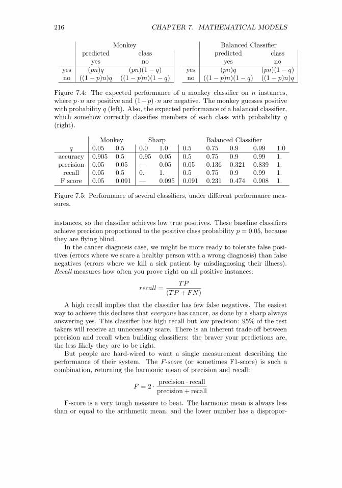
216 CHAPTER 7. MATHEMATICAL MODELS
Monkeypredicted class
yes noyes (pn)q (pn)(1− q)no ((1− p)n)q ((1− p)n)(1− q)
Balanced Classifierpredicted class
yes noyes (pn)q (pn)(1− q)no ((1− p)n)(1− q) ((1− p)n)q
Figure 7.4: The expected performance of a monkey classifier on n instances,where p ·n are positive and (1−p) ·n are negative. The monkey guesses positivewith probability q (left). Also, the expected performance of a balanced classifier,which somehow correctly classifies members of each class with probability q(right).
Monkey Sharp Balanced Classifierq 0.05 0.5 0.0 1.0 0.5 0.75 0.9 0.99 1.0
accuracy 0.905 0.5 0.95 0.05 0.5 0.75 0.9 0.99 1.precision 0.05 0.05 — 0.05 0.05 0.136 0.321 0.839 1.
recall 0.05 0.5 0. 1. 0.5 0.75 0.9 0.99 1.F score 0.05 0.091 — 0.095 0.091 0.231 0.474 0.908 1.
Figure 7.5: Performance of several classifiers, under different performance mea-sures.
instances, so the classifier achieves low true positives. These baseline classifiersachieve precision proportional to the positive class probability p = 0.05, becausethey are flying blind.
In the cancer diagnosis case, we might be more ready to tolerate false posi-tives (errors where we scare a healthy person with a wrong diagnosis) than falsenegatives (errors where we kill a sick patient by misdiagnosing their illness).Recall measures how often you prove right on all positive instances:
recall =TP
(TP + FN)
A high recall implies that the classifier has few false negatives. The easiestway to achieve this declares that everyone has cancer, as done by a sharp alwaysanswering yes. This classifier has high recall but low precision: 95% of the testtakers will receive an unnecessary scare. There is an inherent trade-off betweenprecision and recall when building classifiers: the braver your predictions are,the less likely they are to be right.
But people are hard-wired to want a single measurement describing theperformance of their system. The F-score (or sometimes F1-score) is such acombination, returning the harmonic mean of precision and recall:
F = 2 · precision · recall
precision + recall
F-score is a very tough measure to beat. The harmonic mean is always lessthan or equal to the arithmetic mean, and the lower number has a dispropor-

7.4. EVALUATING MODELS 217
tionate large effect. Achieving a high F-score requires both high recall and highprecision. None of our baseline classifiers manage a decent F-score despite highaccuracy and recall values, because their precision is too low.
The F-score and related evaluation metrics were developed to evaluate mean-ingful classifiers, not monkeys or sharps. To gain insight in how to interpretthem, let’s consider a class of magically balanced classifiers, which somehowshow equal accuracy on both positive and negative instances. This isn’t usuallythe case, but classifiers selected to achieve high F-scores must balance precisionand recall statistics, which means they must show decent performance on bothpositive and negative instances.
Figure 7.5 summarizes the performance of both baseline and balanced classi-fiers on our cancer detection problem, benchmarked on all four of our evaluationmetrics. The take away lessons are:
• Accuracy is a misleading statistic when the class sizes are substantiallydifferent: A baseline classifier mindlessly answering “no” for every in-stance achieved an accuracy of 95% on the cancer problem, better eventhan a balanced classifier that got 94% right on each class.
• Recall equals accuracy if and only if the classifiers are balanced: Goodthings happen when the accuracy for recognizing both classes is the same.This doesn’t happen automatically during training, when the class sizesare different. Indeed, this is one reason why it is generally a good practiceto have an equal number of positive and negative examples in your trainingset.
• High precision is very hard to achieve in unbalanced class sizes: Even abalanced classifier that gets 99% accuracy on both positive and negativeexamples cannot achieve a precision above 84% on the cancer problem.This is because there are twenty times more negative instances than pos-itive ones. The false positives from misclassifying the larger class at a 1%rate remains substantial against the background of 5% true positives.
• F-score does the best job of any single statistic, but all four work together todescribe the performance of a classifier: Is the precision of your classifiergreater than its recall? Then it is labeling too few instances as positives,and so perhaps you can tune it better. Is the recall higher than theprecision? Maybe we can improve the F-score by being less aggressive incalling positives. Is the accuracy far from the recall? Then our classifierisn’t very balanced. So check which side is doing worse, and how we mightbe able to fix it.
A useful trick to increase the precision of a model at the expense of recallis to give it the power to say “I don’t know.” Classifiers typically do better oneasy cases than hard ones, with the difficulty defined by how far the example isfrom being assigned the alternate label.
Defining a notion of confidence that your proposed classification is correct isthe key to when you should pass on a question. Only venture a guess when your

218 CHAPTER 7. MATHEMATICAL MODELS
Figure 7.6: The ROC curve helps us select the best threshold to use in a clas-sifier, by displaying the trade-off between true positives and false positive atevery possible setting. The monkey ROCs the main diagonal here.
confidence is above a given threshold. Patients whose test scores are near theboundary would generally prefer a diagnosis of “borderline result” to “you’vegot cancer,” particularly if the classifier is not really confident in its decision.
Our precision and recall statistics must be reconsidered to properly accom-modate the new indeterminate class. There is no need to change the precisionformula: we evaluate only on the instances we call positive. But the denom-inator for recall must explicitly account for all elements we refused to label.Assuming we are accurate in our confidence measures, precision will increase atthe expense of recall.
7.4.2 Receiver-Operator Characteristic (ROC) Curves
Many classifiers come with natural knobs that you can tweak to alter the trade-off between precision and recall. For example, consider systems which computea numerical score reflecting “in classness,” perhaps by assessing how much thegiven test sample looks like cancer. Certain samples will score more positivelythan others. But where do we draw the line between positive and negative?
If our “in classness” score is accurate, then it should generally be higher forpositive items than negative ones. The positive examples will define a differentscore distribution than the negative instances, as shown in Figure 7.6 (left).It would be great if these distributions were completely disjoint, because thenthere would be a score threshold t such that all instances with scores ≥ t arepositive and all < t are negative. This would define a perfect classifier.
But it is more likely that the two distributions will overlap, to at least somedegree, turning the problem of identifying the best threshold into a judgmentcall based on our relative distaste towards false positives and false negatives.
The Receiver Operating Characteristic (ROC) curve provides a visual repre-sentation of our complete space of options in putting together a classifier. Each

7.4. EVALUATING MODELS 219
point on this curve represents a particular classifier threshold, defined by itsfalse positive and false negative rates.2 These rates are in turn defined by thecount of errors divided by the total number of positives in the evaluation data,and perhaps multiplied by one hundred to turn into percentages.
Consider what happens as we sweep our threshold from left to right overthese distributions. Every time we pass over another example, we either increasethe number of true positives (if this example was positive) or false positives (ifthis example was in fact a negative). At the very left, we achieve true/falsepositive rates of 0%, since the classifier labeled nothing as positive at that cutoff.Moving as far to the right as possible, all examples will be labeled positively, andhence both rates become 100%. Each threshold in between defines a possibleclassifier, and the sweep defines a staircase curve in true/false positive rate spacetaking us from (0%,0%) to (100%,100%).
Suppose the score function was defined by a monkey, i.e. an arbitrary ran-dom value for each instance. Then as we sweep our threshold to the right, thelabel of the next example should be positive or negative with equal probability.Thus we are equally likely to increase our true positive rate as false, and theROC curve should cruise along the main diagonal.
Doing better than the monkey implies an ROC curve that lies above thediagonal. The best possible ROC curve shoots up immediately from (0%,0%)to (0%,100%), meaning it encounters all positive instances before any negativeones. It then steps to the right with each negative example, until it finallyreaches the upper right corner.
The area under the ROC curve (AUC) is often used as a statistic measuringthe quality of scoring function defining the classifier. The best possible ROCcurve has an area of 100%×100%→ 1, while the monkey’s triangle has an areaof 1/2. The closer the area is to 1, the better our classification function is.
7.4.3 Evaluating Multiclass Systems
Many classification problems are non-binary, meaning that they must decideamong more than two classes. Google News has separate sections for U.S. andworld news, plus business, entertainment, sports, health, science, and technol-ogy. Thus the article classifier which governs the behavior of this site mustassign each article a label from eight different classes.
The more possible class labels you have, the harder it is to get the classifi-cation right. The expected accuracy of a classification monkey with d labels is1/d, so the accuracy drops rapidly with increased class complexity.
This makes properly evaluating multiclass classifiers a challenge, because lowsuccess numbers get disheartening. A better statistic is the top-k success rate,which generalizes accuracy for some specific value of k ≥ 1. How often was theright label among the top k possibilities?
This measure is good, because it gives us partial credit for getting close tothe right answer. How close is good enough is defined by the parameter k. For
2The strange name for this beast is a legacy of its original application, in tuning theperformance of radar systems.

220 CHAPTER 7. MATHEMATICAL MODELS
1800 1820 1840 1860 1880 1900 1920 1940 1960 1980 2000
Predicted Time Period
20
00
19
80
19
60
19
40
19
20
19
00
18
80
18
60
18
40
18
20
18
00
Act
ual Tim
e P
eri
od
0.00 0.00 0.00 0.00 0.00 0.00 0.01 0.03 0.07 0.35 0.52
0.00 0.00 0.00 0.00 0.00 0.00 0.04 0.08 0.06 0.24 0.57
0.00 0.00 0.00 0.00 0.00 0.05 0.05 0.00 0.45 0.20 0.25
0.00 0.00 0.00 0.01 0.01 0.03 0.14 0.25 0.16 0.18 0.21
0.00 0.00 0.01 0.06 0.07 0.16 0.23 0.13 0.09 0.10 0.13
0.01 0.07 0.12 0.16 0.25 0.15 0.08 0.04 0.03 0.04 0.06
0.01 0.08 0.21 0.28 0.21 0.05 0.06 0.01 0.02 0.03 0.03
0.02 0.31 0.32 0.16 0.10 0.01 0.01 0.01 0.04 0.00 0.02
0.04 0.52 0.34 0.09 0.01 0.00 0.00 0.00 0.00 0.00 0.00
0.17 0.42 0.33 0.00 0.00 0.08 0.00 0.00 0.00 0.00 0.00
0.11 0.32 0.37 0.11 0.11 0.00 0.00 0.00 0.00 0.00 0.00
0.0
0.1
0.2
0.3
0.4
0.5
Figure 7.7: Confusion matrix for a document dating system: the main diagonalreflects accurate classification.
k = 1, this reduces to accuracy. For k = d, any possible label suffices, andthe success rate is 100% by definition. Typical values are 3, 5, or 10: highenough that a good classifier should achieve an accuracy above 50% and bevisibly better than the monkey. But not too much better, because an effectiveevaluation should leave us with substantial room to do better. In fact, it is agood practice to compute the top k rate for all k from 1 to d, or at least highenough that the task becomes easy.
An even more powerful evaluation tool is the confusion matrix C, a d × dmatrix where C[x, y] reports the number (or fraction) of instances of class xwhich get labeled as class y.
How do we read a confusion matrix, like the one shown in Figure 7.7? Itis taken from the evaluation environment we built to test a document datingclassifier, which analyzes texts to predict the period of authorship. Such docu-ment dating will be the ongoing example on evaluation through the rest of thischapter.
The most important feature is the main diagonal, C[i, i], which counts howmany (or what fraction of) items from class i were correctly labeled as class i.We hope for a heavy main diagonal in our matrix. Ours in a hard task, andFigure 7.7 shows a strong but not perfect main diagonal. There are severalplaces where documents are more frequently classified in the neighboring periodthan the correct one.
But the most interesting features of the confusion matrix are the large counts

7.4. EVALUATING MODELS 221
C[i, j] that do not lie along the main diagonal. These represent commonlyconfused classes. In our example, the matrix shows a distressingly high numberof documents (6%) from 1900 classified as 2000, when none are classified as1800. Such asymmetries suggest directions to improve the classifier.
There are two possible explanations for class confusions. The first is a bug inthe classifier, which means that we have to work harder to make it distinguish ifrom j. But the second involves humility, the realization that classes i and j mayoverlap to such a degree that it is ill-defined what the right answer should be.Maybe writing styles don’t really change that much over a twenty-year period?
In the Google News example, the lines between the science and technologycategories is very fuzzy. Where should an article about commercial space flightsgo? Google says science, but I say technology. Frequent confusion might suggestmerging the two categories, as they represent a difference without a distinction.
Sparse rows in the confusion matrix indicate classes poorly represented inthe training data, while sparse columns indicate labels which the classifier isreluctant to assign. Either indication is an argument that perhaps we shouldconsider abandoning this label, and merge the two similar categories.
The rows and columns of the confusion matrix provide analogous perfor-mance statistics to those of Section 7.4.1 for multiple classes, parameterized byclass. Precisioni is the fraction of all items declared class i that were in fact ofclass i:
precisioni = C[i, i]/
d∑j=1
C[j, i].
Recalli is the fraction of all members of class i that were correctly identified assuch:
recalli = C[i, i]/
d∑j=1
C[i, j].
7.4.4 Evaluating Value Prediction Models
Value prediction problems can be thought of as classification tasks, but overan infinite number of classes. However, there are more direct ways to evaluateregression systems, based on the distance between the predicted and actualvalues.
Error Statistics
For numerical values, error is a function of the difference between a forecast y′ =f(x) and the actual result y. Measuring the performance of a value predictionsystem involves two decisions: (1) fixing the specific individual error function,and (2) selecting the statistic to best represent the full error distribution.
The primary choices for the individual error function include:
• Absolute error: The value ∆ = y′ − y has the virtue of being simpleand symmetric, so the sign can distinguish the case where y′ > y from

222 CHAPTER 7. MATHEMATICAL MODELS
Figure 7.8: Error distribution histograms for random (left) and naive Bayesclassifiers predicting the year of authorship for documents (right).
y > y′. The problem comes in aggregating these values into a summarystatistic. Do offsetting errors like −1 and 1 mean that the system isperfect? Typically the absolute value of the error is taken to obliteratethe sign.
• Relative error: The absolute magnitude of error is meaningless without asense of the units involved. An absolute error of 1.2 in a person’s predictedheight is good if it is measured in millimeters, but terrible if measured inmiles.
Normalizing the error by the magnitude of the observation produces aunit-less quantity, which can be sensibly interpreted as a fraction or (mul-tiplied by 100%) as a percentage: ε = (y − y′)/y. Absolute error weighsinstances with larger values of y as more important than smaller ones, abias corrected when computing relative errors.
• Squared error: The value ∆2 = (y′ − y)2 is always positive, and hencethese values can be meaningfully summed. Large errors values contributedisproportionately to the total when squaring: ∆2 for ∆ = 2 is four timeslarger than ∆2 for ∆ = 1. Thus outliers can easily come to dominate theerror statistic in a large ensemble.
It is a very good idea to plot a histogram of the absolute error distributionfor any value predictor, as there is much you can learn from it. The distributionshould be symmetric, and centered around zero. It should be bell-shaped, mean-ing small errors are more common than big errors. And extreme outliers shouldbe rare. If any of the conditions are wrong, there is likely a simple way to im-prove the forecasting procedure. For example, if it is not centered around zero,adding an constant offset to all forecasts will improve the consensus results.
Figure 7.8 presents the absolute error distributions from two models for pre-dicting the year of authorship of documents from their word usage distribution.On the left, we see the error distribution for the monkey, randomly guessing a
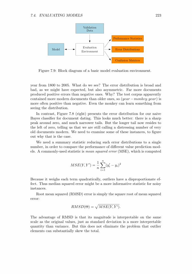
7.4. EVALUATING MODELS 223
Performance Statistics
Error Distributions
Confusion Matrices
Evaluation
EnvironmentModel
Validation
Data
Figure 7.9: Block diagram of a basic model evaluation environment.
year from 1800 to 2005. What do we see? The error distribution is broad andbad, as we might have expected, but also asymmetric. Far more documentsproduced positive errors than negative ones. Why? The test corpus apparentlycontained more modern documents than older ones, so (year−monkey year) ismore often positive than negative. Even the monkey can learn something fromseeing the distribution.
In contrast, Figure 7.8 (right) presents the error distribution for our naiveBayes classifier for document dating. This looks much better: there is a sharppeak around zero, and much narrower tails. But the longer tail now resides tothe left of zero, telling us that we are still calling a distressing number of veryold documents modern. We need to examine some of these instances, to figureout why that is the case.
We need a summary statistic reducing such error distributions to a singlenumber, in order to compare the performance of different value prediction mod-els. A commonly-used statistic is mean squared error (MSE), which is computed
MSE(Y, Y ′) =1
n
n∑i=1
(y′i − yi)2
Because it weighs each term quadratically, outliers have a disproportionate ef-fect. Thus median squared error might be a more informative statistic for noisyinstances.
Root mean squared (RMSD) error is simply the square root of mean squarederror:
RMSD(Θ) =√MSE(Y, Y ′).
The advantage of RMSD is that its magnitude is interpretable on the samescale as the original values, just as standard deviation is a more interpretablequantity than variance. But this does not eliminate the problem that outlierelements can substantially skew the total.

224 CHAPTER 7. MATHEMATICAL MODELS
Figure 7.10: Evaluation environment results for predicting the year of author-ship for documents, comparing the monkey (left) to a naive Bayes classifier(right).
7.5 Evaluation Environments
A substantial part of any data science project revolves around building a reason-able evaluation environment. In particular, you need a single-command programto run your model on the evaluation data, and produce plots/reports on its ef-fectiveness, as shown in Figure 7.9.
Why single command? If it is not easy to run, you won’t try it often enough.If the results are not easy to read and interpret, you will not glean enoughinformation to make it worth the effort.
The input to an evaluation environment is a set of instances with the associ-ated output results/labels, plus a model under test. The system runs the modelon each instance, compares each result against this gold standard, and outputssummary statistics and distribution plots showing the performance it achievedon this test set.
A good evaluation system has the following properties:
• It produces error distributions in addition to binary outcomes: how closeyour prediction was, not just whether it was right or wrong. Recall Figure7.8 for inspiration.
• It produces a report with multiple plots about several different input dis-tributions automatically, to read carefully at your leisure.
• It outputs the relevant summary statistics about performance, so you canquickly gauge quality. Are you doing better or worse than last time?
As an example, Figure 7.10 presents the output of our evaluation environ-ment for the two document-dating models presented in the previous section.Recall that the task is to predict the year of authorship of a given documentfrom word usage. What is worth noting?

7.5. EVALUATION ENVIRONMENTS 225
• Test sets broken down by type: Observe the the evaluation environmentpartitioned the inputs into nine separate subsets, some news and somefiction, and of lengths from 100 to 2000 words. Thus at a glance we couldsee separately how well we do on each.
• Logical progressions of difficulty: It is obviously harder to make agedetermination from shorter documents than longer ones. By separatingthe harder and smaller cases, we better understand our source of errors.We see a big improvement in naive Bayes as we move from 100 to 500words, but these gains saturate before 2000 words.
• Problem appropriate statistics: We did not print out every possible errormetric, only mean and median absolute error and accuracy (how often didwe get the year exactly right?). These are enough for us to see that newsis easier than fiction, that our model is much better than the monkey,and that our chances of identifying the actual year correctly (measured byaccuracy) are still too small for us to worry about.
This evaluation gives us the information we need to see how we are doing,without overwhelming us with numbers that we won’t ever really look at.
7.5.1 Data Hygiene for Evaluation
An evaluation is only meaningful when you don’t fool yourself. Terrible thingshappen when people evaluate their models in an undisciplined manner, losingthe distinction between training, testing, and evaluation data.
Upon taking position of a data set with the intention of building a predictivemodel, your first operation should be to partition the input into three parts:
• Training data: This is what you are completely free to play with. Useit to study the domain, and set the parameters of your model. Typicallyabout 60% of the full data set should be devoted to training.
• Testing data: Comprising about 20% of the full data set, this is whatyou use to evaluate how good your model is. Typically, people experimentwith multiple machine learning approaches or basic parameter settings,so testing enables you to establish the relative performance of all thesedifferent models for the same task.
Testing a model usually reveals that it isn’t performing as well as we wouldlike, thus triggering another cycle of design and refinement. Poor perfor-mance on test data relative to how it did on the training data suggests amodel which has been overfit.
• Evaluation data: The final 20% of the data should be set aside for arainy day: to confirm the performance of the final model right before itgoes into production. This works only if you never opened the evaluationdata until it was really needed.

226 CHAPTER 7. MATHEMATICAL MODELS
The reason to enforce these separations should be obvious. Students woulddo much better on examinations if they were granted access to the answer keyin advance, because they would know exactly what to study. But this wouldnot reflect how much they actually had learned. Keeping testing data separatefrom training enforces that the tests measure something important about whatthe model understands. And holding out the final evaluation data to use onlyafter the model gets stable ensures that the specifics of the test set have notleaked into the model through repeated testing iterations. The evaluation setserves as out-of-sample data to validate the final model.
In doing the original partitioning, you must be careful not to create unde-sirable artifacts, or destroy desirable ones. Simply partitioning the file in theorder it was given is dangerous, because any structural difference between thepopulations of the training and testing corpus means that the model will notperform as well as it should.
But suppose you were building a model to predict future stock prices. Itwould be dangerous to randomly select 60% of the samples over all historyas the training data, instead of all the samples over the first 60% of time.Why? Suppose your model “learned” which would be the up and down days inthe market from the training data, and then used this insight to make virtualpredictions for other stocks on these same days. This model would perform farbetter in testing than in practice. Proper sampling techniques are quite subtle,and discussed in Section 5.2.
It is essential to maintain the veil of ignorance over your evaluation data foras long as possible, because you spoil it as soon as you use it. Jokes are neverfunny the second time you hear them, after you already know the punchline. Ifyou do wear out the integrity of your testing and evaluation sets, the best solu-tion is to start from fresh, out-of-sample data, but this is not always available.Otherwise, randomly re-partition the full data set into fresh training, testing,and evaluation samples, and retrain all of your models from scratch to rebootthe process. But this should be recognized as an unhappy outcome.
7.5.2 Amplifying Small Evaluation Sets
The idea of rigidly partitioning the input into training, test, and evaluation setsmakes sense only on large enough data sets. Suppose you have 100,000 records atyour disposal. There isn’t going to be a qualitative difference between trainingon 60,000 records instead of 100,000, so it is better to facilitate a rigorousevaluation.
But what if you only have a few dozen examples? As of this writing, therehave been only 45 U.S. presidents, so any analysis you can do on them representsvery small sample statistics. New data points come very slowly, only once everyfour years or so. Similar issues arise in medical trials, which are very expensive torun, potentially yielding data on well under a hundred patients. Any applicationwhere we must pay for human annotation means that we will end up with lessdata for training than we might like.
What can you do when you cannot afford to give up a fraction of your data

7.5. EVALUATION ENVIRONMENTS 227
for testing? Cross-validation partitions the data into k equal-sized chunks, thentrains k distinct models. Model i is trained on the union of all blocks x 6= i,totaling (k − 1)/kth of the data, and tested on the held out ith block. Theaverage performance of these k classifiers stands in as the presumed accuracyfor the full model.
The extreme case here is leave one out cross-validation, where n distinctmodels are each trained on different sets of n−1 examples, to determine whetherthe classifier was good or not. This maximizes the amount of training data, whilestill leaving something to evaluate against.
A real advantage of cross validation is that it yields a standard deviationof performance, not only a mean. Each classifier trained on a particular subsetof the data will differ slightly from its peers. Further, the test data for eachclassifier will differ, resulting in different performance scores. Coupling the meanwith the standard deviation and assuming normality gives you a performancedistribution, and a better idea of how well to trust the results. This makescross-validation very much worth doing on large data sets as well, because youcan afford to make several partitions and retrain, thus increasing confidencethat your model is good.
Of the k models resulting from cross validation, which should you pick asyour final product? Perhaps you could use the one which performed best on itstesting quota. But a better alternative is to retrain on all the data and trustthat it will be at least as good as the less lavishly trained models. This is notideal, but if you can’t get enough data then you must do the best with whatyou’ve got.
Here are a few other ideas that can help to amplify small data sets fortraining and evaluation:
• Create negative examples from a prior distribution: Suppose one wantedto build a classifier to identify who would be qualified to be a candidatefor president. There are very few real examples of presidential candidates(positive instances), but presumably the elite pool is so small that a ran-dom person will almost certainly be unqualified. When positive examplesare rare, all others are very likely negative, and can be so labeled to providetraining data as necessary.
• Perturb real examples to create similar but synthetic ones: A useful trickto avoid overfitting creates new training instances by adding random noiseto distort labeled examples. We then preserve the original outcome labelwith the new instance.
For example, suppose we are trying to train an optical character recogni-tion (OCR) system to recognize the letters of some alphabet in scannedpages. An expensive human was originally given the task of labeling afew hundred images with the characters that were contained in them. Wecan amplify this to a few million images by adding noise at random, androtating/translating/dilating the region of interest. A classifier trained on

228 CHAPTER 7. MATHEMATICAL MODELS
this synthetic data should be far more robust than one restricted to theoriginal annotated data.
• Give partial credit when you can: When you have fewer training/testingexamples than you want, you must squeeze as much information from eachone as possible.
Suppose that our classifier outputs a value measuring its confidence in itsdecision, in addition to the proposed label. This confidence level givesus additional resolution with which to evaluate the classifier, beyond justwhether it got the label right. It is a bigger strike against the classifierwhen it gets a confident prediction wrong, than it is on an instance whereit thought the answer was a tossup. On a presidential-sized problem,I would trust a classifier that got 30 right and 15 wrong with accurateconfidence values much more than one with 32 right and 13 wrong, butwith confidence values all over the map.
7.6 War Story: 100% Accuracy
The two businessmen looked a little uncomfortable at the university, out ofplace with their dark blue suits to our shorts and sneakers. Call them Pabloand Juan. But they needed us to make their vision a reality.
“The business world still works on paper,” Pablo explained. He was the onein the darker suit. “We have a contract to digitize all of Wall Street’s financialdocuments that are still printed on paper. They will pay us a fortune to get acomputer to do the scanning. Right now they hire people to type each documentin three times, just to make sure they got it absolutely right.”
It sounded exciting, and they had the resources to make it happen. Butthere was one caveat. “Our system cannot make any errors. It can say ‘I don’tknow’ sometimes. But whenever it calls a letter it has to be 100% correct.”
“No problem.” I told them. “Just let me say I don’t know 100% of the time,and I can design a system to meet your specification.”
Pablo frowned. “But that will cost us a fortune. In the system we want tobuild, images of the I don’t knows will go to human operators for them to read.But we can’t afford to pay them to read everything.”
My colleagues and I agreed to take the job, and in time we developed areasonable OCR system from scratch. But one thing bothered me.
“These Wall Street guys who gave you the money are smart, aren’t they?,”I asked Pablo one day.
“Smart as a whip,” he answered.“Then how could they possibly believe it when you said you could build an
OCR system that was 100% accurate.”“Because they thought that I had done it before,” he said with a laugh.It seems that Pablo’s previous company had built a box that digitized price
data from the television monitors of the time. In this case, the letters wereexact patterns of bits, all written in exactly the same font and the same size.

7.7. SIMULATION MODELS 229
The TV signal was digital, too, with no error at all from imaging, imperfectly-formed blobs of printers ink, dark spots, or folds in the paper. It was trivialto test for an exact match between a perfect pattern of bits (the image) andanother perfect pattern of bits (the character in the device’s font), since there isno source of uncertainty. But this problem had nothing to do with OCR, evenif both involved reading letters.
Our reasonable OCR system did what it could with the business documentsit was given, but of course we couldn’t get to 100%. Eventually, the Wall Streetguys took their business back to the Philippines, where they paid three people totype in each document and voted two out of three if there was any disagreement.
We shifted direction and got into the business of reading handwritten surveyforms submitted by consumers, lured by the promise of grocery store coupons.This problem was harder, but the stakes not as high: they were paying us acrummy $0.22 a form and didn’t expect perfection. Our competition was anoperation that used prison labor to type in the data. We caught a break whenone of those prisoners sent a threatening letter to an address they found ona survey form, which then threw the business to us. But even our extensiveautomation couldn’t read these forms for less than $0.40 a pop, so the contractwent back to prison after we rolled belly up.
The fundamental lesson here is that no pattern recognition system for anyreasonable problem will bat 100% all the time. The only way never to be wrongis to never make a prediction. Careful evaluation is necessary to measure howwell your system is working and where it is making mistakes, in order to makethe system better.
7.7 Simulation Models
There is an important class of first-principle models which are not primarily datadriven, yet which prove very valuable for understanding widely diverse phenom-ena. Simulations are models that attempt to replicate real-world systems andprocesses, so we can observe and analyze their behavior.
Simulations are important for demonstrating the validity of our understand-ing of a system. A simple simulation which captures much of the behavioralcomplexity of a system must explain how it works, by Occam’s razor. Famousphysicist Richard Feynman said, “What I cannot create, I do not understand.”What you cannot simulate, and get some level of accuracy in the observed re-sults, you do not understand.
Monte Carlo simulations use random numbers to synthesize alternate reali-ties. Replicating an event millions of times under slightly perturbed conditionspermits us to generate a probability distribution on the set of outcomes. Thiswas the idea behind permutation tests for statistical significance. We also saw(in Section 5.5.2) that random coin flips could stand in for when a batter got hitsor made out, so we could simulate an arbitrary number of careers and observewhat happened over the course of them.
The key to building an effective Monte Carlo simulation is designing an

230 CHAPTER 7. MATHEMATICAL MODELS
appropriate discrete event model. A new random number is used by the modelto replicate each decision or event outcome. You may have to decide whetherto go left or go right in a transportation model, so flip a coin. A health orinsurance model may have to decide whether a particular patient will have aheart attack today, so flip an appropriately weighted coin. The price of a stockin a financial model can either go up or down at each tick, which again can bea coin flip. A basketball player will hit or miss a shot, with a likelihood thatdepends upon their shooting skill and the quality of their defender.
The accuracy of such a simulation rests on the probabilities that you assignto heads and tails. This governs how often each outcome occurs. Obviously, youare not restricted to using a fair coin, meaning 50/50. Instead, the probabilitiesneed to reflect assumptions of the likelihood of the event given the state of themodel. These parameters are often set using statistical analysis, by observingthe distribution of events as they occurred in the data. Part of the value ofMonte Carlo simulations is that they let us play with alternate realities, bychanging certain parameters and seeing what happens.
A critical aspect of effective simulation is evaluation. Programming errorsand modeling inadequacies are common enough that no simulation can be ac-cepted on faith. The key is to hold back one or more classes of observationsof the system from direct incorporation in your model. This provides behaviorthat is out of sample, so we can compare the distribution of results from thesimulation with these observations. If they don’t jibe, your simulation is justjive. Don’t let it go live.
7.8 War Story: Calculated Bets
Where there is gambling there is money, and where there is money there will bemodels. During our family trips to Florida as a kid, I developed a passion forthe sport of jai-alai. And, as I learned how to build mathematical models as agrown-up, I grew obsessed with developing a profitable betting system for thesport.
Jai-alai is a sport of Basque origin where opposing players or teams alternatehurling a ball against the wall and catching it, until one of them finally missesand loses the point. The throwing and catching is done with an enlarged basketor cesta, the ball or pelota is made of goat skin and hard rubber, and the wall is ofgranite or concrete; ingredients which lead to fast and exciting action capturedin Figure 7.11. In the United States, jai-alai is most associated with the stateof Florida, which permits gambling on the results of matches.
What makes jai-alai of particular interest is its unique and very peculiarscoring system. Each jai-alai match involves eight players, named 1 through 8to reflect their playing order. Each match starts with players 1 and 2 playing,and the rest of the players waiting patiently in line. All players start the gamewith zero points each. Each point in the match involves two players; one whowill win and one who will lose. The loser will go to the end of the line, whilethe winner will add to his point total and await the next point, until he has

7.8. WAR STORY: CALCULATED BETS 231
Figure 7.11: Jai-alai is a fast, exciting ball game like handball, but you can beton it.
accumulated enough points to claim the match.It was obvious to me, even as a kid, that this scoring system would not
be equally fair to all the different players. Starting early in the queue gave youmore chances to play, and even a kludge they added to double the value of pointslater in the match couldn’t perfectly fix it. But understanding the strength ofthese biases could give me an edge in betting.
My quest to build a betting system for jai-alai, started by simulating thisvery peculiar scoring system. A jai-alai match consists of a sequence of discreteevents, described by the following flow structure:
Initialize the current players to 1 and 2.Initialize the queue of players to {3, 4, 5, 6, 7, 8}.Initialize the point total for each player to zero.So long as the current winner has less than 7 points:
Pick a random number to decide who wins the next point.Add one (or if beyond the seventh point, two) to the
total of the simulated point winner.Put the simulated point loser at the end of the queue.Get the next player off the front of the queue.
End So long as.Identify the current point winner as the winner of the match.
The only step here which needs more elaboration is that of simulating apoint between two players. If the purpose of our simulation is to see how biasesin the scoring system affect the outcome of the match, it makes the most senseto consider the case in which all players are equally skillful. To give every playera 50/50 chance of winning each point he is involved in, we can flip a simulatedcoin to determine who wins and who loses.
I implemented the jai-alai simulation in my favorite programming language,and ran it on 1,000,000 jai-alai games. The simulation produced a table ofstatistics, telling me how often each betting outcome paid off, assuming that allthe players were equally skillful. Figure 7.12 reports the number of simulated

232 CHAPTER 7. MATHEMATICAL MODELS
Simulated ObservedPosition Wins % Wins Wins % Wins
1 162675 16.27% 1750 14.1%2 162963 16.30% 1813 14.6%3 139128 13.91% 1592 12.8%4 124455 12.45% 1425 11.5%5 101992 10.20% 1487 12.0%6 102703 10.27% 1541 12.4%7 88559 8.86% 1370 11.1%8 117525 11.75% 1405 11.3%
1,000,000 100.00% 12,383 100.0%
Figure 7.12: Win biases observed in the jai-alai simulations match well withresults observed in actual matches.
wins for each of the eight starting positions. What insights can we draw fromthis table?
• Positions 1 and 2 have a substantial advantage over the rest of the field.Either of the initial players are almost twice as likely to come first, second,or third than the poor shlub in position 7.
• Positions 1 and 2 win at essentially the same frequency. This is as itshould be, since both players start the game on the court instead of in thequeue. The fact that players 1 and 2 have very similar statistics increasesour confidence in the correctness of the simulation.
• Positions 1 and 2 do not have identical statistics because we simulated“only” one million games. If you flip a coin a million times, it almostcertainly won’t come up exactly half heads and half tails. However, theratio of heads to tails should keep getting closer to 50/50 the more coinswe flip.
The simulated gap between players 1 and 2 tells us something about thelimitations on the accuracy of our simulation. We shouldn’t trust anyconclusions which depends upon such small differences in the observedvalues.
To validate the accuracy of the simulation, we compared our results to statis-tics on the actual outcomes of over 12,000 jai-alai matches, also in Figure 7.12.The results basically agree with the simulation, subject to the limits of the smallsample size. Post positions 1 and 2 won most often in real matches, and position7 least often.
Now we knew the probability that each possible betting opportunity in jai-alai paid off. Were we now ready to start making money? Unfortunately not.

7.9. CHAPTER NOTES 233
Even though we have established that post position is a major factor in deter-mining the outcome of jai-alai matches, perhaps the dominant one, we still hadseveral hurdles to overcome before we could bet responsibly:
• The impact of player skills: Obviously, a good player is more likely to winthan a bad one, regardless of their post positions. It is clear that a bettermodel for predicting the outcome of jai-alai matches would factor relativeskills into the queuing model.
• The sophistication of the betting public: Many people had noticed theimpact of post-position bias before I did. Indeed, data analysis revealedthe jai-alai betting public had largely factored the effect of post positionin the odds. Fortunately for us, however, largely did not mean completely.
• The house cut – Frontons keep about 20% of the betting pool as the housepercentage, and thus we had to do much better then the average bettorjust to break even.
My simulation provided information on which outcomes were most likely. Itdid not by itself identify which are the best bets. A good bet depends both uponthe likelihood of the event occurring and the payoff when it occurs. Payoffs aredecided by the rest of the betting public. To find the best bets to make, we hadto work a lot harder:
• We had to analyze past match data to determine who were the better play-ers. Once we knew who was better, we could bias the simulated coin tossesin their favor, to make our simulation more accurate for each individualmatch.
• We had to analyze payoff data to build a model of other bettor’s prefer-ences. In jai-alai, you are betting against the public, so you need to beable to model their thinking in order to predict the payoffs for a particularbet.
• We had to model the impact of the house’s cut on the betting pool. Certainbets, which otherwise might have been profitable, go into the red whenyou factor in these costs.
The bottom line is that we did it, with 544% returns on our initial stake.The full story of our gambling system is reported in my book Calculated Bets[Ski01]. Check it out: I bet you will like it. It is fun reading about successfulmodels, but even more fun to build them.
7.9 Chapter Notes
Silver [Sil12] is an excellent introduction to the complexities of models andforecasting in a variety of domains. Textbooks on mathematical modeling issuesinclude Bender [Ben12] and Giordano [GFH13].

234 CHAPTER 7. MATHEMATICAL MODELS
The Google Flu Trends project is an excellent case study in both the powerand limitation of big data analysis. See Ginsberg et al. [GMP+09] for theoriginal description, and Lazer et al. [LKKV14] for a fascinating post-mortemon how it all went wrong.
Technical aspects of the OCR system presented in Section 7.6 is reported inSazaklis et. al. [SAMS97]. The work on year of authorship detection (and as-sociated evaluation environment example) is from my students Vivek Kulkarni,Parth Dandiwala, and Yingtao Tian [KTDS17].
7.10 Exercises
Properties of Models
7-1. [3] Quantum physics is much more complicated than Newtonian physics. Whichmodel passes the Occam’s Razor test, and why?
7-2. [5] Identify a set of models of interest. For each of these, decide which propertiesthese models have:
(a) Are they discrete or continuous?
(b) Are they linear or non-linear?
(c) Are they blackbox or descriptive?
(d) Are they general or ad hoc?
(e) Are they data driven or first principle?
7-3. [3] Give examples of first-principle and data-driven models used in practice.
7-4. [5] For one or more of the following The Quant Shop challenges, discuss whetherprincipled or data-driven models seem to be the more promising approach:
• Miss Universe.
• Movie gross.
• Baby weight.
• Art auction price.
• Snow on Christmas.
• Super Bowl/college champion.
• Ghoul pool.
• Future gold/oil price.
7-5. [5] For one or more of the following The Quant Shop challenges, partition thefull problem into subproblems that can be independently modeled:
• Miss Universe.
• Movie gross.
• Baby weight.
• Art auction price.

7.10. EXERCISES 235
• Snow on Christmas.
• Super Bowl/college champion.
• Ghoul pool.
• Future gold/oil price.
Evaluation Environments
7-6. [3] Suppose you build a classifier that answers yes on every possible input. Whatprecision and recall will this classifier achieve?
7-7. [3] Explain what precision and recall are. How do they relate to the ROC curve?
7-8. [5] Is it better to have too many false positives, or too many false negatives?Explain.
7-9. [5] Explain what overfitting is, and how you would control for it.
7-10. [5] Suppose f ≤ 1/2 is the fraction of positive elements in a classification. Whatis the probability p that the monkey should guess positive, as a function of f ,in order to maximize the specific evaluation metric below? Report both p andthe expected evaluation score the monkey achieves.
(a) Accuracy.
(b) Precision.
(c) Recall.
(d) F-score.
7-11. [5] What is cross-validation? How might we pick the right value of k for k-foldcross validation?
7-12. [8] How might we know whether we have collected enough data to train a model?
7-13. [5] Explain why we have training, test, and validation data sets and how theyare used effectively?
7-14. [5] Suppose we want to train a binary classifier where one class is very rare.Give an example of such a problem. How should we train this model? Whatmetrics should we use to measure performance?
7-15. [5] Propose baseline models for one or more of the following The Quant Shopchallenges:
• Miss Universe.
• Movie gross.
• Baby weight.
• Art auction price.
• Snow on Christmas.
• Super Bowl/college champion.
• Ghoul pool.
• Future gold/oil price.
Implementation Projects

236 CHAPTER 7. MATHEMATICAL MODELS
7-16. [5] Build a model to forecast the outcomes of one of the following types of betableevents, and rigorously analyze it through back testing:
(a) Sports like football, basketball, and horse racing.
(b) Pooled bets involving multiple events, like soccer pools or the NCAA bas-ketball tournament.
(c) Games of chance like particular lotteries, fantasy sports, and poker.
(d) Election forecasts for local and congressional elections.
(e) Stock or commodity price prediction/trading.
Rigorous testing will probably confirm that your models are not strong enoughfor profitable wagering, and this is 100% ok. Be honest: make sure that youare using fresh enough prices/odds to reflect betting opportunities which wouldstill be available at the time you place your simulated bet. To convince me thatyour model is in fact genuinely profitable, send me a cut of the money and thenI will believe you.
7-17. [5] Build a general model evaluation system in your favorite programming lan-guage, and set it up with the right data to assess models for a particular prob-lem. Your environment should report performance statistics, error distributionsand/or confusion matrices as appropriate.
Interview Questions
7-18. [3] Estimate prior probabilities for the following events:
(a) The sun will come up tomorrow.
(b) A major war involving your country will start over the next year.
(c) A newborn kid will live to be 100 years old.
(d) Today you will meet the person whom you will marry.
(e) The Chicago Cubs will win the World Series this year.
7-19. [5] What do we mean when we talk about the bias–variance trade-off?
7-20. [5] A test has a true positive rate of 100% and false positive rate of 5%. In thispopulation 1 out of 1000 people have the condition the test identifies. Given apositive test, what is the probability this person actually has the condition?
7-21. [5] Which is better: having good data or good models? And how do you definegood?
7-22. [3] What do you think about the idea of injecting noise into your data set totest the sensitivity of your models?
7-23. [5] How would you define and measure the predictive power of a metric?
Kaggle Challenges
7-24. Will a particular grant application be funded?
https://www.kaggle.com/c/unimelb
7-25. Who will win the NCAA basketball tournament?
https://www.kaggle.com/c/march-machine-learning-mania-2016
7-26. Predict the annual sales in a given restaurant.
https://www.kaggle.com/c/restaurant-revenue-prediction

Chapter 8
Linear Algebra
We often hear that mathematics consists mainly of “proving theo-rems.” Is a writer’s job mainly that of “writing sentences?”
– Gian-Carlo Rota
The data part of your data science project involves reducing all of the relevantinformation you can find into one or more data matrices, ideally as large as pos-sible. The rows of each matrix represent items or examples, while the columnsrepresent distinct features or attributes.
Linear algebra is the mathematics of matrices: the properties of arrange-ments of numbers and the operations that act on them. This makes it the lan-guage of data science. Many machine learning algorithms are best understoodthrough linear algebra. Indeed algorithms for problems like linear regressioncan be reduced to a single formula, multiplying the right chain of matrix prod-ucts to yield the desired results. Such algorithms can simultaneously be bothsimple and intimidating, trivial to implement and yet hard to make efficient androbust.
You presumably took a course in linear algebra at some point, but perhapshave forgotten much of it. Here I will review most of what you need to know:the basic operations on matrices, why they are useful, and how to build anintuition for what they do.
8.1 The Power of Linear Algebra
Why is linear algebra so powerful? It regulates how matrices work, and matricesare everywhere. Matrix representations of important objects include:
• Data: The most generally useful representation of numerical data setsare as n×m matrices. The n rows represent objects, items, or instances,while the m columns each represent distinct features or dimensions.
237© The Author(s) 2017S.S. Skiena, The Data Science Design Manual,Texts in Computer Science, https://doi.org/10.1007/978-3-319-55444-0_8
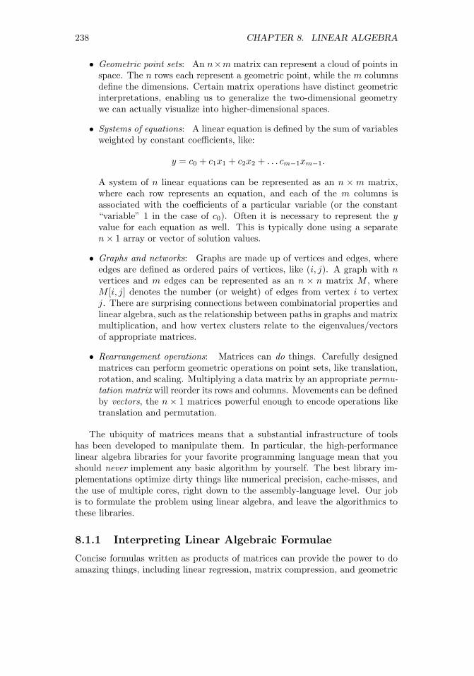
238 CHAPTER 8. LINEAR ALGEBRA
• Geometric point sets: An n×m matrix can represent a cloud of points inspace. The n rows each represent a geometric point, while the m columnsdefine the dimensions. Certain matrix operations have distinct geometricinterpretations, enabling us to generalize the two-dimensional geometrywe can actually visualize into higher-dimensional spaces.
• Systems of equations: A linear equation is defined by the sum of variablesweighted by constant coefficients, like:
y = c0 + c1x1 + c2x2 + . . . cm−1xm−1.
A system of n linear equations can be represented as an n × m matrix,where each row represents an equation, and each of the m columns isassociated with the coefficients of a particular variable (or the constant“variable” 1 in the case of c0). Often it is necessary to represent the yvalue for each equation as well. This is typically done using a separaten× 1 array or vector of solution values.
• Graphs and networks: Graphs are made up of vertices and edges, whereedges are defined as ordered pairs of vertices, like (i, j). A graph with nvertices and m edges can be represented as an n × n matrix M , whereM [i, j] denotes the number (or weight) of edges from vertex i to vertexj. There are surprising connections between combinatorial properties andlinear algebra, such as the relationship between paths in graphs and matrixmultiplication, and how vertex clusters relate to the eigenvalues/vectorsof appropriate matrices.
• Rearrangement operations: Matrices can do things. Carefully designedmatrices can perform geometric operations on point sets, like translation,rotation, and scaling. Multiplying a data matrix by an appropriate permu-tation matrix will reorder its rows and columns. Movements can be definedby vectors, the n × 1 matrices powerful enough to encode operations liketranslation and permutation.
The ubiquity of matrices means that a substantial infrastructure of toolshas been developed to manipulate them. In particular, the high-performancelinear algebra libraries for your favorite programming language mean that youshould never implement any basic algorithm by yourself. The best library im-plementations optimize dirty things like numerical precision, cache-misses, andthe use of multiple cores, right down to the assembly-language level. Our jobis to formulate the problem using linear algebra, and leave the algorithmics tothese libraries.
8.1.1 Interpreting Linear Algebraic Formulae
Concise formulas written as products of matrices can provide the power to doamazing things, including linear regression, matrix compression, and geometric

8.1. THE POWER OF LINEAR ALGEBRA 239
transformations. Algebraic substitution coupled with a rich set of identitiesyields elegant, mechanical ways to manipulate such formulas.
However, I find it very difficult to interpret such strings of operations inways that I really understand. For example, take the “algorithm” behind leastsquares linear regression, which is:
c = (ATA)−1AT b
where the n×m system is Ax = b and w is the vector of coefficients of the bestfitting line.
One reason why I find linear algebra challenging is the nomenclature. Thereare many different terms and concepts which must be grokked to really followwhat is going on. But a bigger problem is that most of the proofs are, forgood reason, algebraic. To my taste, algebraic proofs generally do not carryintuition about why things work the way they do. Algebraic proofs are easierto verify step-by-step in a mechanical way, rather than by understanding theideas behind the argument.
I will present only one formal proof in this text. And by design both thetheorem and the proof are incorrect.
Theorem 1. 2 = 1.
Proof.
a = b
a2 = ab
a2 − b2 = ab− b2
(a+ b)(a− b) = b(a− b)a+ b = b
2b = b
2 = 1
If you have never seen such a proof before, you might find it convincing,even though I trust you understand on a conceptual level that 2 6= 1. Eachline follows from the one before it, through direct algebraic substitution. Theproblem, as it turns out, comes when canceling (a − b), because we are in factdividing by zero.
What are the lessons from this proof? Proofs are about ideas, not justalgebraic manipulation. No idea means no proof. To understand linear algebra,your goal should be to first validate the simplest interesting case (typically twodimensions) in order to build intuition, and then try to imagine how it mightgeneralize to higher dimensions. There are always special cases to watch for, likedivision by zero. In linear algebra, these cases include dimensional mismatches

240 CHAPTER 8. LINEAR ALGEBRA
Figure 8.1: Points can be reduced to vectors on the unit sphere, plus magnitudes.
and singular (meaning non-invertible) matrices. The theory of linear algebraworks except when it doesn’t work, and it is better to think in terms of thecommon cases rather than the pathological ones.
8.1.2 Geometry and Vectors
There is a useful interpretation of “vectors,” meaning 1× d matrices, as vectorsin the geometric sense, meaning directed rays from the origin through a givenpoint in d dimensions.
Normalizing each such vector v to be of unit length (by dividing each coor-dinate by the distance from v to the origin) puts it on a d-dimensional sphere,as shown in Figure 8.1: a circle for points in the plane, a real sphere for d = 3,and some unvisualizable hypersphere for d ≥ 4.
This normalization proves a useful thing to do. The distances between pointsbecome angles between vectors, for the purposes of comparison. Two nearbypoints will define a small angle between them through the origin: small distancesimply small angles. Ignoring magnitudes is a form of scaling, making all pointsdirectly comparable.
The dot product is a useful operation reducing vectors to scalar quantities.The dot product of two length-n vectors A and B is defined:
A ·B =
n∑i=1
AiBi
We can use the dot product operation to compute the angle θ = 6 AOBbetween vectors A and B, where O is the origin:
cos(Θ) =A ·B||A|| ||B||
Let’s try to parse this formula. The ||V || symbol means “the length of V .”For unit vectors, this is, by definition, equal to 1. In general, it is the quantityby which we must divide V by to make it a unit vector.

8.2. VISUALIZING MATRIX OPERATIONS 241
Figure 8.2: The dot product of two vectors defines the cosine of the anglebetween them.
But what is the connection between dot product and angle? Consider thesimplest case of an angle defined between two rays, A at zero degrees andB = (x, y). Thus the unit ray is A = (1, 0). In this case, the dot productis 1 · x + 0 · y = x, which is exactly what cos(θ) should be if B is a unitvector. We can take it on faith that this generalizes for general B, and to higherdimensions.
So a smaller angle means closer points on the sphere. But there is anotherconnection between things we know. Recall the special cases of the cosine func-tion, here given in radians:
cos(0) = 1, cos(π/2) = 0, cos(π) = −1.
The values of the cosine function range from [−1, 1], exactly the same range asthat of the correlation coefficient. Further, the interpretation is the same: twoidentical vectors are perfectly correlated, while antipodal points are perfectlynegatively correlated. Orthogonal points/vectors (the case of Θ = π/2) have aslittle to do with each other as possible.
The cosine function is exactly the correlation of two mean-zero variables.For unit vectors, ||A|| = ||B|| = 1, so the angle between A and B is completelydefined by the dot product.
Take-Home Lesson: The dot product of two vectors measures similarity inexactly the same way as the Pearson correlation coefficient.
8.2 Visualizing Matrix Operations
I assume that you have had some previous exposure to the basic matrix opera-tions of transposition, multiplication, and inversion. This section is intended asa refresher, rather than an introduction.

242 CHAPTER 8. LINEAR ALGEBRA
Figure 8.3: Matrix image examples: Lincoln (left) and his memorial (right).The center image is a linear combination of left and right, for α = 0.5.
But to provide better intuition, I will represent matrices as images ratherthan numbers, so we can see what happens when we operate on them. Figure8.3 shows our primary matrix images: President Abraham Lincoln (left) andthe building which serves as his memorial (right). The former is a human face,while the latter contains particularly strong rows and columns.
Be aware that we will be quietly rescaling the matrix between each operation,so the absolute color does not matter. The interesting patterns come in thedifferences between light and dark, meaning the smallest and biggest numbersin the current matrix. Also, note that the origin element of the matrix M [1, 1]represents the upper left corner of the image.
8.2.1 Matrix Addition
Matrix addition is a simple operation: for matrices A and B, each of dimensionsn×m, C = A+B implies that:
Cij = Aij +Bij , for all 1 ≤ i ≤ n and 1 ≤ j ≤ m.
Scalar multiplication provides a way to change the weight of every elementin a matrix simultaneously, perhaps to normalize them. For any matrix A andnumber c, A′ = c ·A implies that
A′ij = cAij , for all 1 ≤ i ≤ n and 1 ≤ j ≤ m.
Combining matrix addition with scalar multiplication gives us the power toperform linear combinations of matrices. The formula α ·A+ (1−α) ·B enablesus to fade smoothly between A (for α = 1) and B (for α = 0), as shown inFigure 8.3. This provides a way to morph the images from A to B.
The transpose of a matrix M interchanges rows and columns, turning ana× b matrix into a b× a matrix MT , where
MTij = Mji for all 1 ≤ i ≤ n and 1 ≤ j ≤ m.
The transpose of a square matrix is a square matrix, so M and MT can safelybe added or multiplied together. More generally, the transpose is an operationthat is used to orient a matrix so it can be added to or multiplied by its target.

8.2. VISUALIZING MATRIX OPERATIONS 243
Figure 8.4: Lincoln (left) and its transposition (right). The sum of a matrixand its transposition is symmetric along its main diagonal (right).
The transpose of a matrix sort of “rotates” it by 180 degrees, so (AT )T = A.In the case of square matrices, adding a matrix to its transpose is symmetric,as shown in Figure 8.4 (right). The reason is clear: C = A+AT implies that
Cij = Aij +Aji = Cji.
8.2.2 Matrix Multiplication
Matrix multiplication is an aggregate version of the vector dot or inner product.Recall that for two n-element vectors, X and Y , the dot product X ·Y is defined:
X · Y =
n∑i=1
XiYi
Dot products measure how “in sync” the two vectors are. We have already seenthe dot product when computing the cosine distance and correlation coefficient.It is an operation that reduces a pair of vectors to a single number.
The matrix product XY T of these two vectors produces a 1 × 1 matrixcontaining the dot product X · Y . For general matrices, the product C = ABis defined by:
Cij =
k∑i=1
Aik ·Bkj
For this to work, A and B must share the same inner dimensions, implying thatif A is n × k then B must have dimensions k ×m. Each element of the n ×mproduct matrix C is a dot product of the ith row of A with the jth column ofB.
The most important properties of matrix multiplication are:
• It does not commute: Commutativity is the notation that order doesn’tmatter, that x · y = y · x. Although we take commutativity for grantedwhen multiplying integers, order does matter in matrix multiplication. Forany pair of non-square matrices A and B, at most one of either AB or BA

244 CHAPTER 8. LINEAR ALGEBRA
has compatible dimensions. But even square matrix multiplication doesnot commute, as shown by the products below:[
1 10 1
]·[1 11 0
]=
[2 11 0
]6=[1 11 0
]·[1 10 1
]=
[1 21 1
]and the covariance matrices of Figure 8.5.
• Matrix multiplication is associative: Associativity grants us the right toparenthesize as we wish, performing operations in the relative order thatwe choose. In computing the product ABC, we have a choice of two op-tions: (AB)C or A(BC). Longer chains of matrices permit even morefreedom, with the number of possible parenthesizations growing exponen-tially in the length of the chain. All of these will return the same answer,as demonstrated here:([
1 24 4
] [1 00 2
])[3 21 0
]=
[1 43 8
] [3 21 0
]=
[7 217 6
][1 23 4
]([1 00 2
] [3 21 0
])=
[1 23 4
] [3 22 0
]=
[7 217 6
]There are two primary reasons why associativity matters to us. In analgebraic sense, it enables us to identify neighboring pairs of matrices in achain and replace them according to an identity, if we have one. But theother issue is computational. The size of intermediate matrix products caneasily blow up in the middle. Suppose we seek to calculate ABCD, whereA is 1×n, B and C are n×n, and D is n×1. The product (AB)(CD) costsonly 2n2 + n operations, assuming the conventional nested-loop matrixmultiplication algorithm. In contrast, (A(BC))D weighs in at n3 +n2 +noperations.
The nested-loop matrix multiplication algorithm you were taught in highschool is trivially easy to program, and indeed appears on page 398. But don’tprogram it. Much faster and more numerically stable algorithms exist in thehighly optimized linear algebra libraries associated with your favorite program-ming language. Formulating your algorithms as matrix products on large arrays,instead of using ad hoc logic is counter-intuitive to most computer scientists.But this strategy can produce very big performance wins in practice.
8.2.3 Applications of Matrix Multiplication
On the face of it, matrix multiplication is an ungainly operation. When Iwas first exposed to linear algebra, I couldn’t understand why we couldn’t justmultiply the numbers on a pairwise basis, like matrix addition, and be donewith it.
The reason we care about matrix multiplication is that there are many thingswe can do with it. We will review these applications here.

8.2. VISUALIZING MATRIX OPERATIONS 245
Figure 8.5: The Lincoln memorial M (left) and its covariance matrices. The bigblock in the middle of M ·MT (center) results from the similarity of all rowsfrom the middle stripe of M . The tight grid pattern of MT ·M (right) reflectsthe regular pattern of the columns on the memorial building.
Covariance Matrices
Multiplying a matrix A by its transpose AT is a very common operation. Why?For one thing, we can multiply it: if A is an n × d matrix, then AT is a d ×n matrix. Thus it is always compatible to multiply AAT . They are equallycompatible to multiply the other way, i.e. ATA.
Both of these products have important interpretations. Suppose A is ann × d feature matrix, consisting of n rows representing items or points, and dcolumns representing the observed features of these items. Then:
• C = A · AT is an n × n matrix of dot products, measuring the “in sync-ness” among the points. In particular Cij is a measure of how similar itemi is to item j.
• D = AT ·A is a d×d matrix of dot products, measuring the “in sync-ness”among columns or features. Now Dij represents the similarity betweenfeature i and feature j.
These beasts are common enough to earn their own name, covariance ma-trices. This term comes up often in conversations among data scientists, soget comfortable with it. The covariance formula we gave when computing thecorrelation coefficient was
Cov(X,Y ) =n∑i=1
(Xi − X)(Yi − Y ).
so, strictly speaking, our beasts are covariance matrices only if the rows orcolumns of A have mean zero. But regardless, the magnitudes of the matrixproduct captures the degree to which the values of particular row or columnpairs move together.
Figure 8.5 presents the covariance matrices of the Lincoln memorial. Darkerspots define rows and columns in the image with the greatest similarity. Try tounderstand where the visible structures in these covariance matrices come from.

246 CHAPTER 8. LINEAR ALGEBRA
Figure 8.5 (center) presents M ·MT , the covariance matrix of the rows. Thebig dark box in the middle represents the large dot products resulting from anytwo rows cutting across all the memorial’s white columns. These bands of lightand dark are strongly correlated, and the intensely dark regions contribute toa large dot product. The light rows corresponding to the sky, pediment, andstairs are equally correlated and coherent, but lack the dark regions to maketheir dot products large enough.
The right image presents MT · M , which is the covariance matrix of thecolumns. All the pairs of matrix columns strongly correlate with each other,either positively or negatively, but the matrix columns through the white build-ing columns have low weight and hence a small dot product. Together, theydefine a checkerboard of alternating dark and light stripes.
Matrix Multiplication and Paths
Square matrices can be multiplied by themselves without transposition. Indeed,A2 = A × A is called the square of matrix A. More generally Ak is called thekth power of the matrix.
The powers of matrix A have a very natural interpretation, when A rep-resents the adjacency matrix of a graph or network. In an adjacency matrix,A[i, j] = 1 when (i, j) is an edge in the network. Otherwise, when i and j arenot direct neighbors, A[i, j] = 0.
For such 0/1 matrices, the product A2 yields the number of paths of lengthtwo in A. In particular:
A2[i, j] =
n∑k=1
A[i, k] ·A[k, j].
There is exactly one path of length two from i to j for every intermediate vertexk such that (i, k) and (k, j) are both edges in the graph. The sum of these pathcounts is computed by the dot product above.
But computing powers of matrices makes sense even for more general matri-ces. It simulates the effects of diffusion, spreading out the weight of each elementamong related elements. Such things happen in Google’s famous PageRank al-gorithm, and other iterative processes such as contagion spreading.
Matrix Multiplication and Permutations
Matrix multiplication is often used just to rearrange the order of the elementsin a particular matrix. Recall that high-performance matrix multiplication rou-tines are blindingly fast, enough so they can often perform such operations fasterthan ad hoc programming logic. They also provide a way to describe such op-erations in the notation of algebraic formulae, thus preserving compactness andreadability.
The most famous rearrangement matrix does nothing at all. The identitymatrix is an n × n matrix consisting of all zeros, except for the ones all along

8.2. VISUALIZING MATRIX OPERATIONS 247
P =
0 0 1 01 0 0 00 0 0 10 1 0 0
M =
11 12 13 1421 22 23 2431 32 33 3441 42 43 44
PM =
31 32 33 3411 12 13 1441 42 43 4421 22 23 24
Figure 8.6: Multiplying a matrix by a permutation matrix rearranges its rowsand columns.
Figure 8.7: Multiplying the Lincoln matrix M by the reverse permutation matrixr (center). The product r ·M flips Lincoln upside down (left), while M · r partshis hair on the other side of his head (right).
the main diagonal. For n = 4,
I =
1 0 0 00 1 0 00 0 1 00 0 0 1
Convince yourself that AI = IA = A, meaning that multiplication by theidentity matrix commutes.
Note that each row and column of I contains exactly one non-zero element.Matrices with this property are called permutation matrices, because the non-zero element in position (i, j) can be interpreted as meaning that element i isin position j of a permutation. For example, the permutation (2, 4, 3, 1) definesthe permutation matrix:
P(2431) =
0 0 0 11 0 0 00 0 1 00 1 0 0
Observe that the identity matrix corresponds to the permutation (1, 2, . . . , n).
The key point here is that we can multiply A by the appropriate permutationmatrix to rearrange the rows and columns, however we wish. Figure 8.7 showswhat happens when we multiply our image by a “reverse” permutation matrix

248 CHAPTER 8. LINEAR ALGEBRA
r, where the ones lie along the minor diagonal. Because matrix multiplication isnot generally commutative, we get different results for A · r and r ·A. Convinceyourself why.
Rotating Points in Space
Multiplying something by the right matrix can have magical properties. Wehave seen how a set of n points in the plane (i.e. two dimensions) can berepresented by an (n×2)-dimensional matrix S. Multiplying such points by theright matrix can yield natural geometric transformations.
The rotation matrix Rθ performs the transformation of rotating points aboutthe origin through an angle of θ. In two dimensions, Rθ is defined as
Rθ =
[cos(θ) − sin(θ)sin(θ) cos(θ)
]In particular, after the appropriate multiplication/rotation, point (x, y) goes to[
x′
y′
]= Rθ
[xy
]=
[x cos(θ)− y sin(θ)x sin(θ) + y cos(θ)
]For θ = 180◦ = π radians, cos(θ) = −1 and sin(θ) = 0, so this reduces to(−x,−y), doing the right thing by putting the point in the opposing quadrant.
For our (n×2)-dimensional point matrix S, we can use the transpose functionto orient the matrix appropriately. Check to confirm that
S′ = (RθST )T
does exactly what we want to do.Natural generalizations of Rθ exist to rotate points in arbitrary dimensions.
Further, arbitrary sequences of successive transformations can be realized bymultiplying chains of rotation, dilation, and reflection matrices, yielding a com-pact description of complex manipulations.
8.2.4 Identity Matrices and Inversion
Identity operations play a big role in algebraic structures. For numerical addi-tion, zero is the identity element, since 0 + x = x + 0 = x. The same role isplayed by one for multiplication, since 1 · x = x · 1 = x.
In matrix multiplication, the identity element is the identity matrix, with allones down the main diagonal. Multiplication by the identity matrix commutes,so IA = AI = A.
The inverse operation is about taking an element x down to its identityelement. For numerical addition, the inverse of x is (−x), because x+(−x) = 0.The inverse operation for multiplication is called division. We can invert anumber by multiplying it by its reciprocal, since x · (1/x) = 1.
People do not generally talk about dividing matrices. However, they veryfrequently go about inverting them. We say A−1 is the multiplicative inverse

8.2. VISUALIZING MATRIX OPERATIONS 249
Figure 8.8: The inverse of Lincoln does not look much like the man (left) butM · M−1 produces the identity matrix, modulo small non-zero terms due tonumerical precision issues.
of matrix A if A · A−1 = I, where I is the identity matrix. Inversion is animportant special case of division, since A · A−1 = I implies A−1 = I/A. Theyare in fact equivalent operations, because A/B = A ·B−1.
Figure 8.8 (left) shows the inverse of our Lincoln picture, which looks prettymuch like random noise. But multiplying it by the image yields the thin maindiagonal of the identity matrix, albeit superimposed on a background of numeri-cal error. Floating point computations are inherently imprecise, and algorithmslike inversion which perform repeated additions and multiplications often accu-mulate error in the process.
How can we compute the inverse of a matrix? A closed form exists for findingthe inverse A−1 of a 2× 2 matrix A, namely:
A−1 =
[a bc d
]−1
=1
ad− bc
[d −b−c a
]
More generally, there is an approach to inverting matrices by solving a linearsystem using Gaussian elimination.
Observe that this closed form for inversion divides by zero whenever theproducts of the diagonals are equal, i.e. ad = bc. This tells us that suchmatrices are not invertible or singular, meaning no inverse exists. Just as wecannot divide numbers by zero, we cannot invert singular matrices.
The matrices we can invert are called non-singular, and life is better whenour matrices have this property. The test of whether a matrix is invertible iswhether its determinant is not zero. For 2× 2 matrices, the determinant is thedifference between the product of its diagonals, exactly the denominator in theinversion formula.
Further, the determinant is only defined for square matrices, so only squarematricies are invertible. The cost of computing this determinant is O(n3), soit is expensive on large matricies, indeed as expensive as trying to invert thematrix itself using Gaussian elimination.

250 CHAPTER 8. LINEAR ALGEBRA
[A|I] =
6 4 1 1 0 010 7 2 0 1 05 3 1 0 0 1
=
1 1 0 1 0 −10 1 0 0 1 −25 3 1 0 0 1
=
1 0 0 1 −1 10 1 0 0 1 −25 3 1 0 0 1
=
1 0 0 1 −1 10 1 0 0 1 −20 0 1 −5 2 2
→ A−1 =
1 −1 10 1 −2−5 2 2
Figure 8.9: The inverse of a matrix can be computed by Gaussian elimination.
8.2.5 Matrix Inversion and Linear Systems
Linear equations are defined by the sum of variables weighted by constant co-efficients:
y = c0 + c1x1 + c2x2 + . . . cm−1xm−1.
Thus the coefficients defining a system of n linear equations can be representedas an n ×m matrix C. Here each row represents an equation, and each of them columns the coefficients of a distinct variable.
We can neatly evaluate all n of these equations on a particular m× 1 inputvector X, by multiplying C · X. The result will be an n × 1 vector, reportingthe value fi(X) for each of the n linear equations, 1 ≤ i ≤ n. The special casehere is the additive term c0. For proper interpretation, the associated columnin X should contain all ones.
If we generalize X to be an m × p matrix containing p distinct points, ourproduct C · x results in an n × p matrix, evaluating every point against everyequation in a single matrix multiplication.
But the primary operation on systems of n equations is to solve them, mean-ing to identify the X vector necessary to yield a target Y value for each equation.Give the n× 1 vector of solution values Y and coefficient matrix C, we seek Xsuch that C ·X = Y .
Matrix inversion can be used to solve linear systems. Multiplying both sidesof CX = Y by the inverse of C yields:
(C−1C)X = C−1Y −→ X = C−1Y.
Thus the system of equations can be solved by inverting C and then multiplyingC−1 by Y .
Gaussian elimination is another approach to solving linear systems, which Itrust you have seen before. Recall that it solves the equations by performingrow addition/subtraction operations to simplify the equation matrix C until itreduces to the identity matrix. This makes it trivial to read off the values of the

8.2. VISUALIZING MATRIX OPERATIONS 251
variables, since every equation has been reduced to the form Xi = Y ′i , where Y ′
is the result of applying these same row operations to the original target vectorY .
Computing the matrix inverse can be done in the same fashion, as shown inFigure 8.9. We perform row operations to simplify the coefficient matrix to theidentity matrix I in order to create the inverse. I think of this as the algorithmof Dorian Gray: the coefficient matrix C beautifies to the identity matrix, whilethe target I ages into the inverse.1
Therefore we can use matrix inversion to solve linear systems, and linearsystem solvers to invert matrices. Thus the two problems are in some senseequivalent. Computing the inverse makes it cheap to evaluate multiple Y vectorsfor a given system C, by reducing it to a single matrix multiplication. But thiscan be done even more efficiently with LU-decomposition, discussed in Section8.3.2. Gaussian elimination proves more numerically stable than inversion, andis generally the method of choice when solving linear systems.
8.2.6 Matrix Rank
A system of equations is properly determined when there are n linearly inde-pendent equations and n unknowns. For example, the linear system
2x1 + 1x2 = 5
3x1 − 2x2 = 4
is properly determined. The only solution is the point (x1 = 2, x2 = 1).In contrast, systems of equations are underdetermined if there are rows (equa-
tions) that can be expressed as linear combinations of other rows. The linearsystem
2x1 + 1x2 = 5
4x1 + 2x2 = 10
is underdetermined, because the second row is twice that of the first row. Itshould be clear that there is not enough information to solve an undeterminedsystem of linear equations.
The rank of a matrix measures the number of linearly independent rows. Ann× n matrix should be rank n for all operations to be properly defined on it.
The rank of the matrix can be computed by running Gaussian elimination.If it is underdetermined, then certain variables will disappear in the course ofrow-reduction operations. There is also a connection between underdeterminedsystems and singular matrices: recall that they were identified by having adeterminant of zero. That is why the difference in the cross product here (2 ·2− 4 · 1) equals zero.
1In Oscar Wilde’s novel The Picture of Dorian Gray, the protagonist remains beautiful,while his picture ages horribly over the years.

252 CHAPTER 8. LINEAR ALGEBRA
Feature matrices are often of lower rank than we might desire. Files ofexamples tend to contain duplicate entries, which would result in two rows ofthe matrix being identical. It is also quite possible for multiple columns to beequivalent: imagine each record as containing the height measured in both feetand meters, for example.
These things certainly happen, and are bad when they do. Certain algo-rithms on our Lincoln memorial image failed numerically. It turned out thatour 512× 512 image had a rank of only 508, so not all rows were linearly inde-pendent. To make it a full-rank matrix, you can add a small amount of randomnoise to each element, which will increase the rank without serious image dis-tortion. This kludge might get your data to pass through an algorithm withouta warning message, but it is indicative of numerical trouble to come.
Linear systems can be “almost” of lower rank, which results in a greaterdanger of precision loss due to numerical issues. This is formally captured by amatrix invariant called the condition number, which in the case of a linear systemmeasures how sensitive the value of X is to small changes of Y in Y = AX.
Be aware of the vagaries of numerical computation when evaluating yourresults. For example, it is a good practice to compute AX for any purportedsolution X, and see how well AX really compares to Y . In theory the differencewill be zero, but in practice you may be surprised how rough the calculationreally is.
8.3 Factoring Matrices
Factoring matrix A into matrices B and C represents a particular aspect ofdivision. We have seen that any non-singular matrix M has an inverse M−1,so the identity matrix I can be factored as I = MM−1. This proves thatsome matrices (like I) can be factored, and further that they might have manydistinct factorizations. In this case, every possible non-singular M defines adifferent factorization.
Matrix factorization is an important abstraction in data science, leadingto concise feature representations and ideas like topic modeling. It plays animportant part in solving linear systems, through special factorizations like LU-decomposition.
Unfortunately, finding such factorizations is problematic. Factoring integersis a hard problem, although that complexity goes away when you are allowedfloating point numbers. Factoring matrices proves harder: for a particular ma-trix, exact factorization may not be possible, particularly if we seek the factor-ization M = XY where X and Y have prescribed dimensions.
8.3.1 Why Factor Feature Matrices?
Many important machine learning algorithms can be viewed in terms of factoringa matrix. Suppose we are given an n ×m feature matrix A where, as per the

8.3. FACTORING MATRICES 253
. . . . . . . . . .
. . . . . . . . . .
. . . . . . . . . .
. . . . . . . . . .
. . . . . . . . . .
. . . . . . . . . .
. . . . . . . . . .
. . . . . . . . . .
. . . . . . . . . .. . .
. . . . . . . . . .
. . . . . . . . . .
. . . . . . . . . .
. . . . . . . . . .
. . . . . . . . . .
. . . . . . . . . .
. . .
. . .
. . .
. . .
. . .
. . .
. . .
. . .
. . .
. . .
. . .
. . .
. . . . . . . . . .
≈
Figure 8.10: Factoring a feature matrix A ≈ BC yields B as a more conciserepresentation of the items and C as a more concise representations of thefeatures AT .
usual convention, rows represent items/examples and columns represent featuresof the examples.
Now suppose that we can factor matrix A, meaning express it as the productA ≈ B ·C, where B is an n× k matrix and C a k ×m matrix. Presuming thatk < min(n,m), as shown in Figure 8.10, this is a good thing for several reasons:
• Together, B and C provide a compressed representation of matrix A: Fea-ture matrices are generally large, ungainly things to work with. Factoriza-tion provides a way to encode all the information of the large matrix intotwo smaller matrices, which together will be smaller than the original.
• B serves as a smaller feature matrix on the items, replacing A: Thefactor matrix B has n rows, just like the original matrix A. However, ithas substantially fewer columns, since k < m. This means that “most” ofthe information in A is now encoded in B. Fewer columns mean a smallermatrix, and less parameters to fit in any model built using these newfeatures. These more abstract features may also be of interest to otherapplications, as concise descriptions of the rows of the data set.
• CT serves as a small feature matrix on the features, replacing AT : Trans-posing the feature matrix turns columns/features into rows/items. Thefactor matrix CT has m rows and k columns of properties representingthem. In many cases, the m original “features” are worth modeling intheir own right.
Consider a representative example from text analysis. Perhaps we want torepresent n documents, each a tweet or other social message post, in termsof the vocabulary it uses. Each of our m features will correspond to a distinctvocabulary word, and A[i, j] will record how often vocabulary word wj (say, cat)appeared in message number i. The working vocabulary in English is large witha long tail, so perhaps we can restrict it to the m = 50, 000 most frequently usedwords. Most messages will be short, with no more than a few hundred words.Thus our feature matrix A will be very sparse, riddled with a huge number ofzeros.
Now suppose that we can factor A = BC, where the inner dimension k isrelatively small. Say k = 100. Now each post will be represented by a row of

254 CHAPTER 8. LINEAR ALGEBRA
B containing only a hundred numbers, instead of the full 50,000. This makesit much easier to compare the texts for similarity in a meaningful way. Thesek dimensions can be thought of as analogous to the “topics” in the documents,so all the posts about sports should light up a different set of topics than thoseabout relationships.
The matrix CT can now be thought of as containing a feature vector foreach of the vocabulary words. This is interesting. We would expect words thatapply in similar contexts to have similar topic vectors. Color words like yellowand red are likely to look fairly similar in topic space, while baseball and sexshould have quite distant relationships.
Note that this word–topic matrix is potentially useful in any problem seekingto use language as features. The connection with social message posts is largelygone, so it would be applicable to other domains like books and news. Indeed,such compressed word embeddings prove a very powerful tool in natural languageprocessing (NLP), as will be discussed in Section 11.6.3.
8.3.2 LU Decomposition and Determinants
LU decomposition is a particular matrix factorization which factors a squarematrix A into lower and upper triangular matrices L and U , such that A = L·U .
A matrix is triangular if it contains all zero terms either above or below themain diagonal. The lower triangular matrix L has all non-zero terms below themain diagonal. The other factor, U , is the upper triangular matrix. Since themain diagonal of L consists of all ones, we can pack the entire decompositioninto the same space as the original n× n matrix.
The primary value of LU decomposition is that it proves useful in solvinglinear systems AX = Y , particularly when solving multiple problems with thesame A but different Y . The matrix L is what results from clearing out allof the values above the main diagonal, via Gaussian elimination. Once in thistriangular form, the remaining equations can be directly simplified. The ma-trix U reflects what row operations have occurred in the course of building L.Simplifying U and applying L to Y requires less work than solving A fromscratch.
The other importance of LU decomposition is in yielding an algorithm tocompute the determinant of a matrix. The determinant of A is the product ofthe main diagonal elements of U . As we have seen, a determinant of zero meansthe matrix is not of full rank.
Figure 8.11 illustrates the LU decomposition of the Lincoln memorial. Thereis a distinct texture visible to the two triangular matrices. This particular LUdecomposition function (in Mathematica) took advantage of the fact that theequations in a system can be permuted with no loss of information. The samedoes not hold true for images, but we see accurate reconstructions of the whitecolumns of the memorial, albeit out of position.

8.4. EIGENVALUES AND EIGENVECTORS 255
Figure 8.11: The LU decomposition of the Lincoln memorial (left), with theproduct L · U (center). The rows of the LU matrix were permuted duringcalculation, but when properly ordered fully reconstructed the image (right).
8.4 Eigenvalues and Eigenvectors
Multiplying a vector U by a square matrix A can have the same effect as multi-plying it by a scalar l. Consider this pair of examples. Indeed, check them outby hand: [
−5 22 −2
]·[
2−1
]= −6
[2−1
][−5 22 −2
]·[12
]= −1
[12
]Both of these equalities feature products with the same 2 × 1 vector U on theleft as on the right. On one side U is multiplied by a matrix A, and on the otherby a scalar λ. In cases like this, when AU = λU , we say that λ is an eigenvalueof matrix A, and U is its associated eigenvector.
Such eigenvector–eigenvalue pairs are a curious thing. That the scalar λ cando the same thing to U as the entire matrix A tells us that they must be special.Together, the eigenvector U and eigenvalue λ must encode a lot of informationabout A.
Further, there are generally multiple such eigenvector–eigenvalue pairs forany matrix. Note that the second example above works on the same matrix A,but yields a different U and λ.
8.4.1 Properties of Eigenvalues
The theory of eigenvalues gets us deeper into the thicket of linear algebra than Iam prepared to do in this text. Generally speaking, however, we can summarizethe properties that will prove important to us:
• Each eigenvalue has an associated eigenvector. They always come in pairs.
• There are, in general, n eigenvector–eigenvalue pairs for every full rankn× n matrix.

256 CHAPTER 8. LINEAR ALGEBRA
• Every pair of eigenvectors of a symmetric matrix are mutually orthogonal,the same way that the x and y-axes in the plane are orthogonal. Twovectors are orthogonal if their dot product is zero. Observe that (0, 1) ·(1, 0) = 0, as does (2,−1) · (1, 2) = 0 from the previous example.
• The upshot from this is that eigenvectors can play the role of dimensionsor bases in some n-dimensional space. This opens up many geometric in-terpretations of matrices. In particular, any matrix can be encoded whereeach eigenvalue represents the magnitude of its associated eigenvector.
8.4.2 Computing Eigenvalues
The n distinct eigenvalues of a rank-n matrix can be found by factoring itscharacteristic equation. Start from the defining equality AU = λU . Convinceyourself that this remains unchanged when we multiply by the identity matrixI, so
AU = λIU → (A− λI)U = 0.
For our example matrix, we get
A− λI =
[−5− λ 2
2 −2− λ
]Note that our equality (A− λI)U = 0 remains true if we multiply vector U
by any scalar value c. This implies that there are an infinite number of solutions,and hence the linear system must be underdetermined.
In such a situation, the determinant of the matrix must be zero. With a2× 2 matrix, the determinant is just the cross product ad− bc, so
(−5− λ)(−2− λ)− 2 · 2 = λ2 + 7λ+ 6 = 0.
Solving for λ with the quadratic formula yields λ = −1 and λ = −6. Moregenerally, the determinant |A− λI| is a polynomial of degree n, and hence theroots of this characteristic equation define the eigenvalues of A.
The vector associated with any given eigenvalue can be computed by solvinga linear system. As per our example, we know that[
−5 22 −2
]·[u1
u2
]= λ
[u1
u2
]
for any eigenvalue λ and associated eigenvector U =
[u1
u2
]. Once we fix the
value of λ, we have a system of n equations and n unknowns, and thus can solvefor the values of U . For λ = −1,
−5u1 + 2u2 = −1u1 −→ −4u1 + 2u2 = 0
2u1 +−2u2 = −1u2 −→ 2u1 +−1u2 = 0
which has the solution u1 = 1, u2 = 2, yielding the associated eigenvector.

8.5. EIGENVALUE DECOMPOSITION 257
For λ = −6, we get
−5u1 + 2u2 = −6u1 −→ 1u1 + 2u2 = 0
2u1 +−2u2 = −6u2 −→ 2u1 + 4u2 = 0
This system is underdetermined, so u1 = 2, u2 = −1 and any constant multipleof this qualifies as an eigenvector. This makes sense: because U is on both sidesof the equality AU = λU , for any constant c, the vector U ′ = c · U equallysatisfies the definition.
Faster algorithms for eigenvalue/vector computations are based on a matrixfactorization approach called QR decomposition. Other algorithms try to avoidsolving the full linear system. For example, an alternate approach repeatedlyuses U ′ = (AU)/λ to compute better and better approximations to U until itconverges. When conditions are right, this can be much faster than solving thefull linear system.
The largest eigenvalues and their associated vectors are, generally speaking,more important that the rest. Why? Because they make a larger contributionto approximating the matrix A. Thus high-performance linear algebra systemsuse special routines for finding the k largest (and smallest) eigenvalues and theniterative methods to reconstruct the vectors for each.
8.5 Eigenvalue Decomposition
Any n × n symmetric matrix M can be decomposed into the sum of its neigenvector products. We call the n eigenpairs (λi, Ui), for 1 ≤ i ≤ n. Byconvention we sort by size, so λi ≥ λi−i for all i.
Since each eigenvector Ui is an n× 1 matrix, multiplying it by its transposeyields an n × n matrix product, UiUi
T . This has exactly the same dimensionsas the original matrix M . We can compute the linear combination of thesematrices weighted by its corresponding eigenvalue. In fact, this reconstructsthe original matrix, since:
M =
n∑i=1
λiUiUiT
This result holds only for symmetric matrices, so we cannot use it to encodeour image. But covariance matrices are always symmetric, and they encode thebasic features of each row and column of the matrix.
Thus the covariance matrix can be represented by its eigenvalue decompo-sition. This takes slightly more space than the initial matrix: n eigenvectors oflength n, plus n eigenvalues vs. the n(n + 1)/2 elements in the upper triangleof the symmetric matrix plus main diagonal.
However, by using only the vectors associated with the largest eigenvalueswe get a good approximation of the matrix. The smaller dimensions contributevery little to the matrix values, and so they can be excluded with little resultingerror. This dimension reduction method is very useful to produce smaller, moreeffective feature sets.

258 CHAPTER 8. LINEAR ALGEBRA
Figure 8.12: The Lincoln memorial’s biggest eigenvector suffices to capture muchof the detail of its covariance matrix.
Figure 8.13: Error in reconstructing the Lincoln memorial from the one, five,and fifty largest eigenvectors.
Figure 8.12 (left) shows the reconstruction of the Lincoln memorial’s covari-ance matrix M from its single largest eigenvector, i.e. U1 · UT1 , along with itsassociated error matrix M − U1 · UT1 . Even a single eigenvector does a veryrespectable job at reconstruction, restoring features like the large central block.
The plot in Figure 8.12 (right) shows that the errors occur in patchy regions,because more subtle detail requires additional vectors to encode. Figure 8.13shows the error plot when using the one, five, and fifty largest eigenvectors.The error regions get smaller as we reconstruct finer detail, and the magnitudeof the errors smaller. Realize that even fifty eigenvectors is less than 10% ofthe 512 necessary to restore a perfect matrix, but this suffices for a very goodapproximation.
8.5.1 Singular Value Decomposition
Eigenvalue decomposition is a very good thing. But it only works on symmetricmatrices. Singular value decomposition is a more general matrix factorizationapproach, that similarly reduces a matrix to the sum of other matrices definedby vectors.
The singular value decomposition of an n×m real matrix M factors it intothree matrices U , D, and V , with dimensions n× n, n×m, and m×m respec-

8.5. EIGENVALUE DECOMPOSITION 259
Figure 8.14: Singular value matrices in the decomposition of Lincoln, for 50singular values.
tively. This factorization is of the form2
M = UDV T
The center matrix D has the property that it is a diagonal matrix, meaning allnon-zero values lie on the main diagonal like the identity matrix I.
Don’t worry about how we find this factorization. Instead, let’s concentrateon what it means. The product U · D has the effect of multiplying U [i, j] byD[j, j], because all terms of D are zero except along the main diagonal. ThusD can be interpreted as measuring the relative importance of each column ofU , or through D · V T , the importance of each row of V T . These weight valuesof D are called the singular values of M .
Let X and Y be vectors, of dimensionality n×1 and 1×m, respectively. Thematrix outer product P = X
⊗Y is the n×m matrix where P [j, k] = X[j]Y [k].
The traditional matrix multiplication C = A ·B can be expressed as the sum ofthese outer products, namely:
C = A ·B =∑k
Ak⊗
BTk
where Ak is the vector defined by the kth column of A, and BTk is the vectordefined by the kth row of B.
Putting this together, matrix M can be expressed as the sum of outer prod-ucts of vectors resulting from the singular value decomposition, namely (UD)kand (V T )k for 1 ≤ k ≤ m. Further, the singular values D define how much con-tribution each outer product makes to M , so it suffices to take only the vectorsassociated with the largest singular values to get an approximation to M .
2Should M contain convex numbers, then this generalizes to M = UDV ∗, where V ∗ meansthe conjugate transpose of V .

260 CHAPTER 8. LINEAR ALGEBRA
Figure 8.15: Lincoln’s face reconstructed from 5 (left) and 50 (center) singularvalues, with the error for k = 50 (right).
Figure 8.14 (left) presents the vectors associated with the first fifty singularvalues of Lincoln’s face. If you look carefully, you can see how the first five toten vectors are considerably more blocky than subsequent ones, indicating thatthe early vectors rough out the basic structure of the matrix, with subsequentvectors adding greater detail. Figure 8.14 (right) shows how the mean squarederror between the matrix and its reconstruction shrinks as we add additionalvectors.
These effects become even more vivid when we look at the reconstructedimages themselves. Figure 8.15 (left) shows Lincoln’s face with only the fivestrongest vectors, which is less than 1% of what is available for perfect recon-struction. But even at this point you could pick him out of a police lineup.Figure 8.15 (center) demonstrates the greater detail when we include fifty vec-tors. This looks as good as the raw image in print, although the error plot(Figure 8.15 (right)) highlights the missing detail.
Take-Home Lesson: Singular value decomposition (SVD) is a powerful tech-nique to reduce the dimensionality of any feature matrix.
8.5.2 Principal Components Analysis
Principal components analysis (PCA) is a closely related technique for reducingthe dimensionality of data sets. Like SVD, we will define vectors to representthe data set. Like SVD, we will order them by successive importance, so we canreconstruct an approximate representation using few components. PCA andSVD are so closely related as to be indistinguishable for our purposes. They dothe same thing in the same way, but coming from different directions.
The principal components define the axes of an ellipsoid best fitting thepoints. The origin of this set of axes is the centroid of the points. PCA startsby identifying the direction to project the points on to so as to explain themaximum amount of variance. This is the line through the centroid that, insome sense, best fits the points, making it analogous to linear regression. Wecan then project each point onto this line, with this point of intersection defin-ing a particular position on the line relative to the centroid. These projected

8.5. EIGENVALUE DECOMPOSITION 261
Figure 8.16: PCA projects the black points onto orthogonal axis, rotated toyield the alternate representation in red (left). The values of each componentare given by projecting each point onto the appropriate axis (right).
positions now define the first dimension (or principal component) of our newrepresentation, as shown in Figure 8.16.
For each subsequent component, we seek the line lk, which is orthogonal toall previous lines and explains the largest amount of the remaining variance.That each dimension is orthogonal to each other means they act like coordinateaxes, establishing the connection to eigenvectors. Each subsequent dimension isprogressively less important than the ones before it, because we chose the mostpromising directions first. Later components contribute only progressively finerdetail, and hence we can stop once this is small enough.
Suppose that dimensions x and y are virtually identical. We would expectthat the regression line will project down to y = x on these two dimensions, sothey could then largely be replaced by a single dimension. PCA constructs newdimensions as linear combinations of the original ones, collapsing those whichare highly correlated into a lower-dimensional space. Statistical factor analysisis a technique which identifies the most important orthogonal dimensions (asmeasured by correlation) that explain the bulk of the variance.
Relatively few components suffice to capture the basic structure of the pointset. The residual that remains is likely to be noise, and is often better offremoved from the data. After dimension reduction via PCA (or SVD), weshould end up with cleaner data, not merely a smaller number of dimensions.
Take-Home Lesson: PCA and SVD are essentially two different approaches tocomputing the same thing. They should serve equally well as low-dimensionalapproximations of a feature matrix.

262 CHAPTER 8. LINEAR ALGEBRA
8.6 War Story: The Human Factors
I first came to be amazed by the power of dimension reduction methods likePCA and SVD in the course of our analysis of historical figures for our bookWho’s Bigger. Recall (from the war story of Section 4.7) how we analyzed thestructure and content of Wikipedia, ultimately extracting a half-dozen featureslike PageRank and article length for each of the 800,000+ articles about peoplein the English edition. This reduced each of these people to a six-dimensionalfeature vector, which we would analyze to judge their relative significance.
But things proved not as straightforward as we thought. Wildly differentpeople were ranked highest by each particular variable. It wasn’t clear how tointerpret them.
“There is so much variance and random noise in our features,” my co-authorCharles observed. “Let’s identify the major factors underlying these observedvariables that really show what is going on.”
Charles’ solution was factor analysis, which is a variant of PCA, which is inturn a variant of SVD. All of these techniques compress feature matrices into asmaller set of variables or factors, with the goal that these factors explain mostof the variance in the full feature matrix. We expected factor analysis wouldextract a single underlying factor defining individual significance. But instead,our input variables yielded two independent factors explaining the data. Bothexplained roughly equal proportions of the variance (31% and 28%), meaningthat these latent variables were approximately of equal importance. But thecool thing is what these factors showed.
Factors (or singular vectors, or principle components) are just linear combi-nations of the original input features. They don’t come with names attached tothem, so usually you would just describe them as Factor 1 and Factor 2. Butour two factors were so distinctive that Charles gave them the names gravitasand celebrity, and you can see why in Figure 8.17.
Our gravitas factor largely comes from (or “loads on,” in statistical par-lance) the two forms of PageRank. Gravitas seems to accurately capture no-tions of achievement-based recognition. In contrast, the celebrity factor loadsmore strongly on page hits, revisions, and article length. The celebrity fac-tor better captures the popular (some might say vulgar) notions of reputation.The wattage of singers, actors, and other entertainers are better measured bycelebrity then gravitas.
To get a feel for the distinction between gravitas and celebrity, compareour highest ranked figures for each factor, in Figure 8.17. The high gravitasfigures on the left are clearly old-fashioned heavyweights, people of stature andaccomplishment. They are philosophers, kings, and statesmen. Those nameslisted in Figure 8.17 (right) are such complete celebrities that the top four walkthis earth with only one name. They are professional wrestlers, actors, andsingers. It is quite telling that the only two figures here showing any gravitason our celebrity-gravitas meter are Britney Spears (1981– ) [566] and MichaelJackson (1958–2009) [136], both among the Platonic ideals of modern celebrity.
I find it amazing that these unsupervised methods were able to tease apart

8.7. CHAPTER NOTES 263
Figure 8.17: The gravitas and celebrity factors do an excellent job partitioningtwo types of famous people.
two distinct types of fame, without any labeled training examples or even apreconception of what they were looking for. The factors/vectors/componentssimply reflected what was there in the data to be found.
This celebrity-gravitas continuum serves as an instructive example of thepower of dimension reduction methods. All the factors/vectors/components allmust, by definition, be orthogonal to each other. This means that they eachmeasure different things, in a way that two correlated input variables do not.It pays to do some exploratory data analysis on your main components to tryto figure out what they really mean, in the context of your application. Thefactors are yours to name as you wish, just like a cat or a dog, so choose namesyou will be happy to live with.
8.7 Chapter Notes
There are many popular textbooks providing introductions to linear algebra, in-cluding [LLM15, Str11, Tuc88]. Klein [Kle13] presents an interesting introduc-tion to linear algebra for computer science, with an emphasis on programmingand applications like coding theory and computer graphics.
8.8 Exercises
Basic Linear Algebra
8-1. [3] Give a pair of square matrices A and B such that:
(a) AB = BA (it commutes).
(b) AB 6= BA (does not commute).

264 CHAPTER 8. LINEAR ALGEBRA
In general, matrix multiplication is not commutative.
8-2. [3] Prove that matrix addition is associative, i.e. that (A+B)+C = A+(B+C)for compatible matrices A, B and C.
8-3. [5] Prove that matrix multiplication is associative, i.e. that (AB)C = A(BC)for compatible matrices A, B and C.
8-4. [3] Prove that AB = BA, if A and B are diagonal matrices of the same order.
8-5. [5] Prove that if AC = CA and BC = CB, then
C(AB +BA) = (AB +BA)C.
8-6. [3] Are the matrices MMT and MTM square and symmetric? Explain.
8-7. [5] Prove that (A−1)−1 = A.
8-8. [5] Prove that (AT )−1 = (A−1)T for any non-singular matrix A.
8-9. [5] Is the LU factorization of a matrix unique? Justify your answer.
8-10. [3] Explain how to solve the matrix equation Ax = b?
8-11. [5] Show that if M is a square matrix which is not invertible, then either L orU in the LU-decomposition M = L · U has a zero in its diagonal.
Eigenvalues and Eigenvectors
8-12. [3] Let M =
[2 10 2
]. Find all eigenvalues of M . Does M have two linearly
independent eigenvectors?
8-13. [3] Prove that the eigenvalues of A and AT are identical.
8-14. [3] Prove that the eigenvalues of a diagonal matrix are equal to the diagonalelements.
8-15. [5] Suppose that matrix A has an eigenvector v with eigenvalue λ. Show that vis also an eigenvector for A2, and find the corresponding eigenvalue. How aboutfor Ak, for 2 ≤ k ≤ n?
8-16. [5] Suppose that A is an invertible matrix with eigenvector v. Show that v isalso an eigenvector for A−1 .
8-17. [8] Show that the eigenvalues of MMT are the same as that of MTM . Aretheir eigenvectors also the same?
Implementation Projects
8-18. [5] Compare the speed of a library function for matrix multiplication to yourown implementation of the nested loops algorithm.
• How much faster is the library on products of random n× n matricies, asa function of n as n gets large?
• What about the product of an n×m and m× n matrix, where n� m?
• By how much do you improve the performance of your implementation tocalculate C = A · B by first transposing B internally, so all dot productsare computed along rows of the matrices to improve cache performance?
8-19. [5] Implement Gaussian elimination for solving systems of equations, C ·X = Y .Compare your implementation against a popular library routine for:

8.8. EXERCISES 265
(a) Speed: How does the run time compare, for both dense and sparse coeffi-cient matrices?
(b) Accuracy: What are the size of the numerical residuals CX − Y , partic-ularly as the condition number of the matrix increases.
(c) Stability: Does your program crash on a singular matrix? What aboutalmost singular matrices, created by adding a little random noise to asingular matrix?
Interview Questions
8-20. [5] Why is vectorization considered a powerful method for optimizing numericalcode?
8-21. [3] What is singular value decomposition? What is a singular value? And whatis a singular vector?
8-22. [5] Explain the difference between “long” and “wide” format data. When mighteach arise in practice?
Kaggle Challenges
8-23. Tell what someone is looking at from analysis of their brain waves.
https://www.kaggle.com/c/decoding-the-human-brain
8-24. Decide whether a particular student will answer a given question correctly.
https://www.kaggle.com/c/WhatDoYouKnow
8-25. Identify mobile phone users from accelerometer data.
https://www.kaggle.com/c/accelerometer-biometric-competition

Chapter 9
Linear and LogisticRegression
An unsophisticated forecaster uses statistics as a drunken man useslamp posts – for support rather than illumination.
– Andrew Lang
Linear regression is the most representative “machine learning” method to buildmodels for value prediction and classification from training data. It offers astudy in contrasts:
• Linear regression has a beautiful theoretical foundation yet, in practice,this algebraic formulation is generally discarded in favor of faster, moreheuristic optimization.
• Linear regression models are, by definition, linear. This provides an op-portunity to witness the limitations of such models, as well as developclever techniques to generalize to other forms.
• Linear regression simultaneously encourages model building with hundredsof variables, and regularization techniques to ensure that most of them willget ignored.
Linear regression is a bread-and-butter modeling technique that should serveas your baseline approach to building data-driven models. These models aretypically easy to build, straightforward to interpret, and often do quite well inpractice. With enough skill and toil, more advanced machine learning techniquesmight yield better performance, but the possible payoff is often not worth theeffort. Build your linear regression models first, then decide whether it is worthworking harder to achieve better results.
267© The Author(s) 2017S.S. Skiena, The Data Science Design Manual,Texts in Computer Science, https://doi.org/10.1007/978-3-319-55444-0_9

268 CHAPTER 9. LINEAR AND LOGISTIC REGRESSION
Figure 9.1: Linear regression produces the line which best fits a set of points.
9.1 Linear Regression
Given a collection of n points, linear regression seeks to find the line which bestapproximates or fits the points, as shown in Figure 9.1. There are many reasonswhy we might want to do this. One class of goals involves simplification andcompression: we can replace a large set of noisy data points in the xy-planeby a tidy line that describes them, as shown in Figure 9.1. This regressionline is useful for visualization, by showing the underlying trend in the data andhighlighting the location and magnitude of outliers.
However, we will be most interested in regression as a method for value fore-casting. We can envision each observed point p = (x, y) to be the result of afunction y = f(x), where x represents the feature variables and y the indepen-dent target variable. Given a collection of n such points {p1, p2, . . . , pn}, weseek the f(x) which best explains these points. This function f(x) interpolatesor models the points, providing a way to estimate the value y′ associated withany possible x′, namely that y′ = f(x′).
9.1.1 Linear Regression and Duality
There is a connection between regression and solving linear equations, which isinteresting to explore. When solving linear systems, we seek the single pointthat lies on n given lines. In regression, we are instead given n points, andwe seek the line that lies on “all” points. There are two differences here: (a)the interchange of points for lines and (b) finding the best fit under constraintsverses a totally constrained problem (“all” vs. all).
The distinction between points and lines proves trivial, because they bothare really the same thing. In two-dimensional space, both points (s, t) and linesy = mx + b are defined by two parameters: {s, t} and {m, b}, respectively.Further, by an appropriate duality transformation, these lines are equivalent to

9.1. LINEAR REGRESSION 269
Figure 9.2: Points are equivalent to lines under a duality transform. The point(4, 8) in red (left) maps to the red line y = 4x − 8 on right. Both sets of threecollinear points on the left correspond to three lines passing through the samepoint on right.
points in another space. In particular, consider the transform that
(s, t)←→ y = sx− t.
Now any set of points that lie on a single line get mapped to a set of lines whichintersect a singular point – so finding a line that hits all of a set of points isalgorithmically the same thing as finding a point that hits all of a set of lines.
Figure 9.2 shows an example. The point of intersection in Figure 9.2 (left)is p = (4, 8), and it corresponds to the red line y = 4x − 8 on the right. Thisred point p is defined by the intersection of black and blue lines. In the dualspace, these lines turn into black and blue points lying on the red line. Threecollinear points on left (red with either two black or two blue) map to threelines passing through a common point on the right: one red and two of thesame color. This duality transformation reverses the roles of points and lines ina way that everything makes sense.
The big difference in defining linear regression is that we seek a line thatcomes as close as possible to hitting all the points. We must be careful aboutmeasuring error in the proper way in order to make this work.
9.1.2 Error in Linear Regression
The residual error of a fitted line f(x) is the difference between the predictedand actual values. As shown in Figure 9.3, for a particular feature vector xiand corresponding target value yi, the residual error ri is defined:
ri = yi − f(xi).
This is what we will care about, but note that it is not the only way thaterror might have been defined. The closest distance to the line is in fact defined

270 CHAPTER 9. LINEAR AND LOGISTIC REGRESSION
Figure 9.3: The residual error in least squares is the projection of yi − f(X)down to X, not the shortest distance between the line and the point.
by the perpendicular-bisector through the target point. But we are seeking toforecast the value of yi from xi, so the residual is the right notion of error forour purposes.
Least squares regression minimizes the sum of the squares of the residualsof all points. This metric has been chosen because (1) squaring the residualignores the signs of the errors, so positive and negative residuals do not offseteach other, and (2) it leads to a surprisingly nice closed form for finding thecoefficients of the best-fitting line.
9.1.3 Finding the Optimal Fit
Linear regression seeks the line y = f(x) which minimizes the sum of the squarederrors over all the training points, i.e. the coefficient vector w that minimizes
n∑i=1
(yi − f(xi))2, where f(x) = w0 +
m−1∑i=1
wixi
Suppose we are trying to fit a set of n points, each of which is m dimensional.The first m − 1 dimensions of each point is the feature vector (x1, . . . , xm−1),with the last value y = xm serving as the target or dependent variable.
We can encode these n feature vectors as an n × (m − 1) matrix. We canmake it an n×m matrix A by prepending a column of ones to the matrix. Thiscolumn can be thought of as a “constant” feature, one that when multiplied bythe appropriate coefficient becomes the y-intercept of the fitted line. Further,the n target values can be nicely represented in an n× 1 vector b.
The optimal regression line f(x) we seek is defined by an m × 1 vector ofcoefficients w = {w0, w1, . . . , wm−1}. Evaluating this function on these pointsis exactly the product A ·w, creating an n×1 vector of target value predictions.Thus (b−A · w) is the vector of residual values.

9.1. LINEAR REGRESSION 271
How can we find the coefficients of the best fitting line? The vector w isgiven by:
w = (ATA)−1AT b.
First, let’s grok this before we try to understand it. The dimensions of theterm on the right are
((m× n)(n×m))(m× n)(n× 1)→ (m× 1).
which exactly matches the dimensions of the target vector w, so that is good.Further, (ATA) defines the covariance matrix on the columns/features of thedata matrix, and inverting it is akin to solving a system of equations. The termAT b computes the dot products of the data values and the target values for eachof the m features, providing a measure of how correlated each feature is withthe target results. We don’t understand why this works yet, but it should beclear that this equation is made up of meaningful components.
Take-Home Lesson: That the least squares regression line is defined byw = (ATA)−1AT b means that solving regression problems reduces to invert-ing and multiplying matrices. This formula works fine for small matrices, butthe gradient descent algorithm (see Section 9.4) will prove more efficient inpractice.
Consider the case of a single variable x, where we seek the best-fitting lineof the form y = w0 + w1x. The slope of this line is given by
w1 =
n∑i=1
(xi − x)(yi − y)∑ni=1 (xi − x)
2 = rxyσxσy
with w0 = y − w1x, because of the nice observation that the best-fitting linepasses through (x, y).
The connection with the correlation coefficient (rxy) here is clear. If x wereuncorrelated with y (rxy = 0), then w1 should indeed be zero. Even if they wereperfectly correlated (rxy = 1), we must scale x to bring it into the right sizerange of y. This is the role of σy/σx.
Now, where does the linear regression formula come from? It should beclear that in the best-fitting line, we cannot change any of the coefficients wand hope to make a better fit. This means that the error vector (b − Aw) hasto be orthogonal with the vector associated with each variable xi, or else therewould be a way to change the coefficient to fit it better.
Orthogonal vectors have dot products of zero. Since the ith column of AT
has a zero dot product with the error vector, (AT )(b − Aw) = 0, where 0 is avector of all zeros. Straightforward algebra then yields
w = (ATA)−1AT b.

272 CHAPTER 9. LINEAR AND LOGISTIC REGRESSION
Figure 9.4: Removing outlier points (left) can result in much more meaningfulfits (right).
9.2 Better Regression Models
Given a matrix A of n points, each of m − 1 dimensions, and an n × 1 targetarray b, we can invert and multiply the appropriate matrices to get the desiredcoefficient matrix w. This defines a regression model. Done!
However, there are several steps one can take which can lead to better re-gression models. Some of these involve manipulating the input data to increasethe likelihood of an accurate model, but others require more conceptual issuesof what our model should look like.
9.2.1 Removing Outliers
Linear regression seeks the line y = f(x) which minimizes the sum of the squarederrors over all training points, i.e. the coefficient vector w that minimizes
n∑i=1
(yi − f(xi))2, where f(x) = w0 +
m−1∑i=1
wixi
Because of the quadratic weight of the residuals, outlying points can greatlyaffect the fit. A point at a distance 10 from its prediction has 100 times theimpact on training error than a point only 1 unit from the fitted line. One mightargue that this is appropriate, but it should be clear that outlier points have abig impact in the shape of the best-fitting line. This creates a problem whenthe outlier points reflect noise rather than signal, because the regression linegoes out of its way to accommodate the bad data instead of fitting the good.
We first encountered this problem back in Figure 6.3, with the Anscombequartet, a collection of four small data sets with identical summary statisticsand regression lines. Two of these point sets achieved their magic because ofsolitary outlier points. Remove the outliers, and the fit now goes through theheart of the data.

9.2. BETTER REGRESSION MODELS 273
Figure 9.4 shows the best-fitting regression line with (left) and without(right) an outlier point in the lower right. The fit on the right is much bet-ter: with an r2 of 0.917 without the outlier, compared to 0.548 with the outlier.
Therefore identifying outlying points and removing them in a principledway can yield a more robust fit. The simplest approach is to fit the entire set ofpoints, and then use the magnitude of the residual ri = (yi − f(xi))
2 to decidewhether point pi is an outlier. It is important to convince yourself that thesepoints really represent errors before deleting them, however. Otherwise you willbe left with an impressively linear fit that works well only on the examples youdidn’t delete.
9.2.2 Fitting Non-Linear Functions
Linear relationships are easier to understand than non-linear ones, and grosslyappropriate as a default assumption in the absence of better data. Many phe-nomena are linear in nature, with the dependent variable growing roughly pro-portionally with the input variables:
• Income grows roughly linearly with the amount of time worked.
• The price of a home grows roughly linearly with the size of the living areait contains.
• People’s weight increases roughly linearly with the amount of food eaten.
Linear regression does great when it tries to fit data that in fact has anunderlying linear relationship. But, generally speaking, no interesting functionis perfectly linear. Indeed, there is an old statistician’s rule that states if youwant a function to be linear, measure it at only two points.
We could greatly increase the repertoire of shapes we can model if we movebeyond linear functions. Linear regression fits lines, not high-order curves. Butwe can fit quadratics by adding an extra variable with the value x2 to our datamatrix, in addition to x. The model y = w0 +w1x+w2x
2 is quadratic, but notethat it is a linear function of its non-linear input values. We can fit arbitrarily-complex functions by adding the right higher-order variables to our data matrix,and forming linear combinations of them. We can fit arbitrary polynomials andexponentials/logarithms by explicitly including the right component variablesin our data matrix, such as
√x, lg(x), x3, and 1/x.
Extra features can also be used to capture non-linear interactions betweenpairs of input variables. The area of a rectangle A is computed length×width,meaning one cannot get an accurate approximation of A as a linear combinationof length and width. But, once we add an area feature to our data matrix, thisnon-linear interaction can be captured with a linear model.
However, explicit inclusion of all possible non-linear terms quickly becomesintractable. Adding all powers xi for 1 ≤ i ≤ k will blow up the data matrix by afactor of k. Including all product pairs among n variables is even worse, makingthe matrix n(n + 1)/2 times larger. One must be judicious about which non-linear terms to consider for a role in the model. Indeed, one of the advantages

274 CHAPTER 9. LINEAR AND LOGISTIC REGRESSION
Figure 9.5: Higher-order models (red) can lead to better fits than linear models(green).
of more powerful learning methods, like support vector machines, will be thatthey can incorporate non-linear terms without explicit enumeration.
9.2.3 Feature and Target Scaling
In principle, linear regression can find the best linear model fitting any data set.But we should do whatever we can to help it find the right model. This generallyinvolves preprocessing the data to optimize for expressibility, interpretability,and numerical stability. The issue here is that features which vary over widenumerical ranges require coefficients over similarly wide ranges to bring themtogether.
Suppose we wanted to build a model to predict the gross national productof countries in dollars, as a function of their population size x1 and literacy ratex2. Both factors seem like reasonable components of such a model. Indeed,both factors may well contribute equally to the amount of economic activity.But they operate on entirely different scales: national populations vary fromtens of thousands to over a billion people, while the fraction of people who canread is, by definition, between zero and one. One might imagine the resultingfitted model as looking somewhat like this:
GDP = $10, 000x1 + $10, 000, 000, 000, 000x2.
This is very bad, for several reasons:
• Unreadable coefficients: Quick, what is the coefficient of x2 in the aboveequation? It is hard for us to deal with the magnitude of such numbers(it is 10 trillion), and hard for us to tell which variable makes a moreimportant contribution to the result given their ranges. Is it x1 or x2?
• Numerical imprecision: Numerical optimization algorithms have troublewhen values range over many orders of magnitude. It isn’t just the fact

9.2. BETTER REGRESSION MODELS 275
that floating point numbers are represented by a finite number of bits.More important is that many machine learning algorithms get parame-terized by constants that must hold simultaneously for all variables. Forexample, using fixed step sizes in gradient descent search (to be discussedin Section 9.4.2) might cause it to wildly overshoot in certain directionswhile undershooting in others.
• Inappropriate formulations: The model given above to predict GDP issilly on the face of it. Suppose I decide to form my own country, whichwould have exactly one person in it, who could read. Do we really thinkthat Skienaland should have a GDP of $10,000,000,010,000?
A better model might be something like:
GDP = $20, 000x1x2
which can be interpreted as each of the x1 people creating wealth at arate modulated by their literacy. This generally requires seeding the datamatrix with the appropriate product terms. But there is a chance thatwith proper (logarithmic) target scaling, this model might fall directly outfrom linear regression.
We will now consider three different forms of scaling, which address thesedifferent types of problems.
Feature Scaling: Z-Scores
We have previously discussed Z-scores, which scale the values of each featureindividually, so that the mean is zero and the ranges are comparable. Let µ bethe mean value of the given feature, and σ the standard deviation. Then theZ-score of x is Z(x) = (x− µ)/σ.
Using Z-scores in regression addresses the question of interpretability. Sinceall features will have similar means and variances, the magnitude of the co-efficients will determine the relative importance of these factors towards theforecast. Indeed, in proper conditions, these coefficients will reflect the corre-lation coefficient of each variable with the target. Further, that these variablesnow range over the same magnitude simplifies the work for the optimizationalgorithm.
Sublinear Feature Scaling
Consider a linear model for predicting the number of years of education y thata child will receive as a function of household income. Education levels canvary between 0 and 12 + 4 + 5 = 19 years, since we consider up to the possiblecompletion of a Ph.D. A family’s income level x can vary between 0 and BillGates. But observe that no model of the form
y = w1x+ w0

276 CHAPTER 9. LINEAR AND LOGISTIC REGRESSION
can possibly give sensible answers for both my kids and Bill Gates’ kids. Thereal impact of income on education level is presumably at the lower end: childrenbelow the poverty line may not, on average, go beyond high school, while upper-middle-class kids generally go to college. But there is no way to capture this ina linearly-weighted variable without dooming the Gates children to hundreds orthousands of years at school.
An enormous gap between the largest/smallest and median values meansthat no coefficient can use the feature without blowup on big values. Incomelevel is power law distributed, and the Z-scores of such power law variablescan’t help, because they are just linear transformations. The key is to re-place/augment such features x with sublinear functions like log(x) and
√x.
Z-scores of these transformed variables will prove much more meaningful tobuild models from.
Sublinear Target Scaling
Small-scale variables need small-scale targets, in order to be realized using small-scale coefficients. Trying to predict GDP from Z-scored variables will requireenormously large coefficients. How else could you get to trillions of dollars froma linear combination of variables ranging from −3 to +3?
Perhaps scaling the target value from dollars to billions of dollars here wouldbe helpful, but there is a deeper problem. When your features are normally dis-tributed, you can only do a good job regressing to a similarly distributed target.Statistics like GDP are likely power law distributed: there are many small poorcountries compared to very few large rich ones. Any linear combination ofnormally-distributed variables cannot effectively realize a power law-distributedtarget.
The solution here is that trying to predict the logarithm (logc(y)) of a powerlaw target y is usually better than predicting y itself. Of course, the value cf(x)
can then be used to estimate y, but the potential now exists to make meaningfulpredictions over the full range of values. Hitting a power law function with alogarithm generally produces a better behaved, more normal distribution.
It also enables us to implicitly realize a broader range of functions. Supposethe “right” function to predict gross domestic product was in fact
GDP = $20, 000x1x2.
This could never be realized by linear regression without interaction variables.But observe that
log(GDP ) = log($20, 000x1x2) = log($20, 000) + log(x1) + log(x2).
Thus the logarithms of arbitrary interaction products could be realized, providedthe feature matrix contained the logs of the original input variables as well.

9.3. WAR STORY: TAXI DERIVER 277
9.2.4 Dealing with Highly-Correlated Features
A final pitfall we will discuss is the problem of highly-correlated features. It isgreat to have features that are highly correlated with the target: these enableus to build highly-predictive models. However, having multiple features whichare highly correlated with each other can be asking for trouble.
Suppose you have two perfectly-correlated features in your data matrix, saythe subject’s height in feet (x1) as well as their height in meters (x2). Since1 meter equals 3.28084 feet, these two variables are perfectly correlated. Buthaving both of these variables can’t really help our model, because adding aperfectly correlated feature provides no additional information to make predic-tions. If such duplicate features really had value for us, it would imply that wecould build increasingly accurate models simply by making additional copies ofcolumns from any data matrix!
But correlated features are harmful to models, not just neutral. Supposeour dependent variable is a function of height. Note that equally good modelscan be built dependent only on x1, or only on x2, or on any arbitrary linearcombination of x1 and x2. Which is the right model to report as the answer?
This is confusing, but even worse things can happen. The rows in the co-variance matrix will be mutually dependent, so computing w = (ATA)−1AT bnow requires inverting a singular matrix! Numerical methods for computing theregression are liable to fail.
The solution here is to identify feature pairs which correlate excessivelystrongly, by computing the appropriate covariance matrix. If they are lurking,you can eliminate either variable with little loss of power. Better is to elimi-nate these correlations entirely, by combining the features. This is one of theproblems solved by dimension reduction, using techniques like singular valuedecomposition that we discussed in Section 8.5.1.
9.3 War Story: Taxi Deriver
I am proud of many things in my life, but perhaps most so of being a NewYorker. I live in the most exciting city on earth, the true center of the universe.Astronomers, at least the good ones, will tell you that each new year startswhen the ball drops in Times Square, and then radiates out from New York atthe speed of light to the rest of the world.
New York cab drivers are respected around the world for their savvy andstreet smarts. It is customary to tip the driver for each ride, but there is noestablished tradition of how much that should be. In New York restaurants,the “right” amount to tip the waiter is to double the tax, but I am unaware ofany such heuristic for taxi tipping. My algorithm is to round up to the nearestdollar and then toss in a couple of bucks depending upon how fast he got methere. But I have always felt unsure. Am I a cheapskate? Or maybe a sucker?
The taxi data set discussed in Section 1.2.4 promised to hold the answer.It contained over 80 million records, with fields for date, time, pickup and

278 CHAPTER 9. LINEAR AND LOGISTIC REGRESSION
drop off locations, distance traveled, fare, and of course tip. Do people paydisproportionately for longer or shorter trips? Late at night or on weekends?Do others reward fast drivers like I do? It should all be there in the data.
My student, Oleksii Starov, rose to the challenge. We added appropriatefeatures to the data set to capture some of these notions. To explicitly captureconditions like late night and weekends, we set up binary indicator variables,where 1 would denote that the trip was late night and 0 at some other time ofday. The coefficients of our final regression equation was:
variable LR coefficient(intercept) 0.08370835duration 0.00000035distance 0.00000004
fare 0.17503086tolls 0.06267343
surcharge 0.01924337weekends −0.02823731
business day 0.06977724rush hour 0.01281997late night 0.04967453
# of passengers −0.00657358
The results here can be explained simply. Only one variable really matters:the fare on the meter. This model tips 17.5% of the total fare, with very minoradjustments for other things. A single parameter model tipping 18.3% of eachfare proved almost as accurate as the ten-factor model.
There were very strong correlations between the fare and both distance trav-eled (0.95) and trip duration (0.88), but both of these factors are part of theformula by which fares are calculated. These correlations with fare are so strongthat neither variable can contribute much additional information. To our disap-pointment, we couldn’t really tease out an influence of time of day or anythingelse, because these correlations were so weak.
A deeper look at the data revealed that every single tip in the databasewas charged to a credit card, as opposed to being paid by cash. Enteringthe tip amount into the meter after each cash transaction is tedious and timeconsuming, particularly when you are hustling to get as many fares as possibleon each 12 hour shift. Further, real New York cabbies are savvy and street-smartenough not to want to pay taxes on tips no one else knows about.
I always pay my fares with cash, but the people who pay by credit card areconfronted with a menu offering them the choice of what tip to leave. The dataclearly showed most of them mindlessly hitting the middle button, instead ofmodulating their choice to reflect the quality of service.
Using 80 million fare records to fit a simple linear regression on ten variablesis obscene overkill. Better use of this data would be to construct hundreds oreven thousands of different models, each designed for a particular class of trips.Perhaps we could build a separate model for trips between each pair of city zip

9.4. REGRESSION AS PARAMETER FITTING 279
codes. Indeed, recall our map of such tipping behavior, presented back in Figure1.7.
It took several minutes for the solver to find the best fit on such a large dataset, but that it finished at all meant some algorithm faster and more robustthan matrix inversion had to be involved. These algorithms view regression asa parameter fitting problem, as we will discuss in the next section.
9.4 Regression as Parameter Fitting
The closed form formula for linear regression, w = (ATA)−1AT b, is concise andelegant. However, it has some issues which make it suboptimal for computationin practice. Matrix inversion is slow for large systems, and prone to numericalinstability. Further, the formulation is brittle: the linear algebra magic here ishard to extend to more general optimization problems.
But there is an alternate way to formulate and solve linear regression prob-lems, which proves better in practice. This approach leads to faster algorithms,more robust numerics, and can be readily adapted to other learning algorithms.It models linear regression as a parameter fitting problem, and deploys searchalgorithms to find the best values that it can for these parameters.
For linear regression, we seek the line that best fits the points, over all pos-sible sets of coefficients. Specifically, we seek the line y = f(x) which minimizesthe sum of the squared errors over all training points, i.e. the coefficient vectorw that minimizes
n∑i=1
(yi − f(xi))2, where f(x) = w0 +
m−1∑i=1
wixi
For concreteness, let us start with the case where we are trying to modely as a linear function of a single variable or feature x, so y = f(x) meansy = w0 +w1x. To define our regression line, we seek the parameter pair (w0, w1)which minimizes error or cost or loss, namely the sum of squares deviationbetween the point values and the line.
Every possible pair of values for (w0, w1) will define some line, but we reallywant the values that minimize the error or loss function J(w0, w1), where
J(w0, w1) =1
2n
n∑i=1
(yi − f(xi))2
=1
2n
n∑i=1
(yi − (w0 + w1xi))2
The sum of squares errors should be clear, but where does the 1/(2n) comefrom? The 1/n turns this into an average error per row, and the 1/2 is acommon convention for technical reasons. But be clear that the 1/(2n) in noway effects the results of the optimization. This multiplier will be the same foreach (w0, w1) pair, and so has no say in which parameters get chosen.

280 CHAPTER 9. LINEAR AND LOGISTIC REGRESSION
Figure 9.6: The best possible regression line y = w1x (left) can be found byidentifying the w1 that minimizes the error of the fit, defined by the minima ofa convex function.
So how can we find the right values for w0 and w1? We might try a bunch ofrandom value pairs, and keep the one which scores best, i.e. with minimum lossJ(w0, w1). But it seems very unlikely to stumble on the best or even a decentsolution. To search more systematically, we will have to take advantage of aspecial property lurking within the loss function.
9.4.1 Convex Parameter Spaces
The upshot of the above discussion is that the loss function J(w0, w1) defines asurface in (w0, w1)-space, with our interest being in the point in this space withsmallest z value, where z = J(w0, w1).
Let’s start by making it even simpler, forcing our regression line to passthrough the origin by setting w0 = 0. This leaves us only one free parameter tofind, namely the slope of the line w1. Certain slopes will do a wildly better jobof fitting the points shown in Figure 9.6 (left) than others, with the line y = xclearly being the desired fit.
Figure 9.6 (right) shows how the fitting error (loss) varies with w1. Theinteresting thing is that the error function is shaped sort of like a parabola. Ithits a single minimum value at the bottom of the curve. The x-value of thisminimum point defines the best slope w1 for the regression line, which happensto be w1 = 1.
Any convex surface has exactly one local minima. Further, for any convexsearch space it is quite easy to find this minima: just keep walking in a downwarddirection until you hit it. From every point on the surface, we can take a smallstep to a nearby point on the surface. Some directions will take us up to a

9.4. REGRESSION AS PARAMETER FITTING 281
Figure 9.7: Linear regression defines a convex parameter space, where each pointrepresents a possible line, and the minimum point defines the best fitting line.
higher value, but others will take us down. Provided that we can identify whichstep will take us lower, we will move closer to the minima. And there always issuch direction, except when we are standing on the minimal point itself!
Figure 9.7 shows the surface we get for the full regression problem in (w0, w1)-space. The loss function J(w0, w1) looks like a bowl with a single smallest z-value, which defines the optimal values for the two parameters of the line. Thegreat thing is that this loss function J(w0, w1) is again convex, and indeed itremains convex for any linear regression problem in any number of dimensions.
How can we tell whether a given function is convex? Remember back to whenyou took calculus in one variable, x. You learned how to take the derivativef ′(x) of a function f(x), which corresponds to the value of the slope of thesurface of f(x) at every point. Whenever this derivative was zero, it meantthat you had hit some point of interest, be it a local maxima or a minima.Recall the second derivative f ′′(x), which was the derivative function of thederivative f ′(x). Depending upon the sign of this second derivative f ′′(x), youcould identify whether you hit a maxima or minima.
Bottom line: the analysis of such derivatives can tell us which functionsare and are not convex. We will not delve deeper here. But once it has beenestablished that our loss function is convex, we know that we can trust a proce-dure like gradient descent search, which gets us to the global optima by walkingdownward.
9.4.2 Gradient Descent Search
We can find the minima of a convex function simply by starting at an arbitrarypoint, and repeatedly walking in a downward direction. There is only one point

282 CHAPTER 9. LINEAR AND LOGISTIC REGRESSION
Figure 9.8: The tangent line approximates the derivative at a point.
where there is no way down: the global minima itself. And it is this point thatdefines the parameters of the best fitting regression line.
But how can we find a direction that leads us down the hill? Again, let’sconsider the single variable case first, so we seek the slope w1 of the best-fittingline where w0 = 0. Suppose our current slope candidate is x0. In this restrictiveone-dimensional setting, we can only move to the left or to the right. Try asmall step in each direction, i.e. the values x0 − ε and x0 + ε. If the valueof J(0, x0 − ε) < J(0, x0), then we should move to the left to go down. IfJ(0, x0 + ε) < J(0, x0), then we should move to the right. If neither is true,it means that we have no place to go to reduce J , so we must have found theminima.
The direction down at f(x0) is defined by the slope of the tangent line atthis point. A positive slope means that the minima must lie on the left, whilea negative slope puts it on the right. The magnitude of this slope describes thesteepness of this drop: by how much will J(0, x0 − ε) differ from J(0, x0)?
This slope can be approximated by finding the unique line which passesthrough points (x0, J(0, x0)) and (x0, J(0, x0− ε)), as shown in Figure 9.8. Thisis exactly what is done in computing the derivative, which at each point specifiesthe tangent to the curve.
As we move beyond one dimension, we gain the freedom to move in a greaterrange of directions. Diagonal moves let us cut across multiple dimensions atonce. But in principle, we can get the same effect by taking multiple steps, alongeach distinct dimension in an axis-oriented direction. Think of the Manhattanstreet grid, where we can get anywhere we want by moving in a combination ofnorth–south and east–west steps. Finding these directions requires computingthe partial derivative of the objective function along each dimension, namely:

9.4. REGRESSION AS PARAMETER FITTING 283
Gradient descent search in two dimensions
Repeat until convergence {
wt+10 := wt0 − α
∂
∂w0J(wt0, w
t1
)
wt+11 := wt1 − α
∂
∂w1J(wt0, w
t1
)}
Figure 9.9: Pseudocode for regression by gradient descent search. The variablet denotes the iteration number of the computation.
∂
∂wj=
2
∂wj
1
2n
n∑i=1
(f(xi)− bi)2
=2
∂wj
1
2n
n∑i=1
(w0 + (w1xi)− bi)2
But zig-zagging along dimensions seems slow and clumsy. Like Superman,we want to leap buildings in a single bound. The magnitude of the partialderivatives defines the steepness in each direction, and the resulting vector (saythree steps west for every one step north) defines the fastest way down fromthis point.
9.4.3 What is the Right Learning Rate?
The derivative of the loss function points us in the right direction to walk towardsthe minima, which specifies the parameters to solve our regression problem. Butit doesn’t tell us how far to walk. The value of this direction decreases withdistance. It is indeed true that the fastest way to drive to Miami from New Yorkis to head south, but at some point you will need more detailed instructions.
Gradient descent search operates in rounds: find the best direction, take astep, and then repeat until we hit the target. The size of our step is called thelearning rate, and it defines the speed with which we find the minima. Takingtiny baby steps and repeatedly consulting the map (i.e. partial derivatives) willindeed get us there, but only very slowly.
However, bigger isn’t always better. If the learning rate is too high, we mightjump past the minima, as shown in Figure 9.10 (right). This might mean slow

284 CHAPTER 9. LINEAR AND LOGISTIC REGRESSION
θ1 θ1
I(θ1) I(θ1)
Figure 9.10: The effect of learning rate/step size. Taking too small a step sizerequires many iterations to converge, while too large a step size causes us toovershoot the minima.
progress towards the hole as we bounce past it on each step, or even negativeprogress as we end up at a value of J(w) higher than where we were before.
In principle, we want a large learning rate at the beginning of our search, butone which decreases as we get closer to our goal. We need to monitor the valueof our loss function over the course of the optimization. If progress becomestoo slow, we can increase the step size by a multiplicative factor (say 3) or giveup: accepting the current parameter values for our fitting line as good enough.But if the value of J(w) increases, it means that we have overshot our goal.Thus our step size was too large, so we should decrease the learning rate by amultiplicative factor: say by 1/3.
The details of this are messy, heuristic, and ad hoc. But fortunately libraryfunctions for gradient descent search have built-in algorithms for adjusting thelearning rate. Presumably these algorithms have been highly tuned, and shouldgenerally do what they are supposed to do.
But the shape of the surface makes a big difference as to how successfullygradient descent search finds the global minimum. If our bowl-shaped surfacewas relatively flat, like a plate, the truly lowest point might be obscured by acloud of noise and numerical error. Even if we do eventually find the minima,it might take us a very long time to get there.
However, even worse things happen when our loss function is not convex,meaning there can be many local minima, as in Figure 9.11. Now this can’tbe the case for linear regression, but does happen for many other interestingmachine learning problems we will encounter.
Local optimization can easily get stuck in local minima for non-convex func-tions. Suppose we want to reach the top of a ski slope from our lodge in thevalley. If we start by walking up to the second floor of the lodge, we will gettrapped forever, unless there is some mechanism for taking steps backwards tofree us from the local optima. This is the value of search heuristics like sim-ulated annealing, which provides a way out of small local optima to keep usadvancing towards the global goal.

9.4. REGRESSION AS PARAMETER FITTING 285
Figure 9.11: Gradient descent search finds local minima for non-convex surfaces,but does not guarantee a globally optimum solution.
Take-Home Lesson: Gradient descent search remains useful in practice for non-convex optimization, although it no longer guarantees an optimal solution.Instead, we should start repeatedly from different initialization points, and usethe best local minima we find to define our solution.
9.4.4 Stochastic Gradient Descent
The algebraic definition of our loss function hides something very expensivegoing on:
∂
∂wj=
2
∂wj
1
2n
n∑i=1
(f(xi)− bi)2 =2
∂wj
1
2n
n∑i=1
(w0 + (w1xi)− bi)2
It’s that summation. To compute the best direction and rate of change foreach dimension j, we must cycle through all n of our training points. Evaluatingeach partial derivative takes time linear in the number of examples, for eachstep! For linear regression on our lavish taxicab data set, this means 80 millionsquared-difference computations just to identify the absolute best direction toadvance one step towards the goal.
This is madness. Instead, we can try an approximation that uses only a smallnumber of examples to estimate the derivative, and hopes that the resultingdirection indeed points down. On average it should, since every point willeventually get to vote on direction.
Stochastic gradient descent is an optimization approach based on samplinga small batch of training points, ideally at random, and using them to estimatethe derivative at our current position. The smaller the batch size we use, thefaster the evaluation is, although we should be more skeptical that the estimateddirection is correct. Optimizing the learning rate and the batch size for gradient

286 CHAPTER 9. LINEAR AND LOGISTIC REGRESSION
descent leads to very fast optimization for convex functions, with the detailsblessedly concealed by a call to a library function.
It can be expensive to make random choices at every step of the search. Bet-ter is to randomize the order of the training examples once, to avoid systematicartifacts in how they are presented, and then build our batches by simply march-ing down the list. This way we can insure that all n of our training instanceseventually do contribute to the search, ideally several times as we repeatedlysweep through all examples over the course of optimization.
9.5 Simplifying Models through Regularization
Linear regression is happy to determine the best possible linear fit to any collec-tion of n data points, each specified by m−1 independent variables and a giventarget value. But the “best” fit may not be what we really want.
The problem is this. Most of the m−1 possible features may be uncorrelatedwith the target, and thus have no real predictive power. Typically, these willshow as variables with small coefficients. However, the regression algorithmwill use these values to nudge the line so as to reduce least square error on thegiven training examples. Using noise (the uncorrelated variables) to fit noise(the residual left from a simple model on the genuinely correlated variables) isasking for trouble.
Representative here is our experience with the taxi tipping model, as detailedin the war story. The full regression model using ten variables had a meansquared error of 1.5448. The single-variable regression model operating onlyon fare did slightly worse, with an error of 1.5487. But this difference is justnoise. The single variable model is obviously better, by Occam’s or anybodyelse’s razor.
Other problems arise when using unconstrained regression. We have seenhow strongly correlated features introduce ambiguity into the model. If featuresA and B are perfectly correlated, using both yields the same accuracy as usingeither one, resulting in more complicated and less interpretable models.
Providing a rich set of features to regression is good, but remember that “thesimplest explanation is best.” The simplest explanation relies on the smallestnumber of variables that do a good job of modeling the data. Ideally our regres-sion would select the most important variables and fit them, but the objectivefunction we have discussed only tries to minimize sum of squares error. We needto change our objective function, through the magic of regularization.
9.5.1 Ridge Regression
Regularization is the trick of adding secondary terms to the objective functionto favor models that keep coefficients small. Suppose we generalize our lossfunction with a second set of terms that are a function of the coefficients, not

9.5. SIMPLIFYING MODELS THROUGH REGULARIZATION 287
the training data:
J(w) =1
2n
n∑i=1
(yi − f(xi))2 + λ
m∑j=1
w2j
In this formulation, we pay a penalty proportional to the sum of squaresof the coefficients used in the model. By squaring the coefficients, we ignoresign and focus on magnitude. The constant λ modulates the relative strengthof the regularization constraints. The higher λ is, the harder the optimizationwill work to reduce coefficient size, at the expense of increased residuals. Iteventually becomes more worthwhile to set the coefficient of an uncorrelatedvariable to zero, rather than use it to overfit the training set.
Penalizing the sum of squared coefficients, as in the loss function above, iscalled ridge regression or Tikhonov regularization. Assuming that the depen-dent variables have all been properly normalized to mean zero, their coefficientmagnitude is a measure of their value to the objective function.
How can we optimize the parameters for ridge regression? A natural exten-sion to the least squares formulation does the job. Let Γ be our n×n “coefficientweight penalty” matrix. For simplicity, let Γ = I, the identity matrix. The sum-of-squares loss function we seek to minimize then becomes
||Aw − b||2 + ||λΓw||2
The notation ||v|| denotes the norm of v, a distance function on a vector ormatrix. The norm of ||Γw||2 is exactly the sum of squares of the coefficientswhen Γ = I. Seen this way, the closed form to optimize for w is believable as
w = (ATA+ λΓTΓ)−1AT b.
Thus the normal form equation can be generalized to deal with regular-ization. But, alternately, we can compute the partial derivatives of this lossfunction and use gradient descent search to do the job faster on large matri-ces. In any case, library functions for ridge regression and its cousin LASSOregression will be readily available to use on your problem.
9.5.2 LASSO Regression
Ridge regression optimizes to select small coefficients. Because of sum-of-squarescost function, it particularly punishes the largest coefficients. This makes itgreat to avoid models of the form y = w0 + w1x1, where w0 is a large positivenumber and w1 an offsetting large negative number.
Although ridge regression is effective at reducing the magnitude of the co-efficients, this criteria does not really push them to zero and totally eliminatethe variable from the model. An alternate choice here is to try to minimize thesum of the absolute values of the coefficients, which is just as happy to drivedown the smallest coefficients as the big ones.

288 CHAPTER 9. LINEAR AND LOGISTIC REGRESSION
LASSO regression (for “Least Absolute Shrinkage and Selection Operator”)meets this criteria: minimizing the L1 metric on the coefficients instead of theL2 metric of ridge regression. With LASSO, we specify an explicit constraint tas to what the sum of the coefficients can be, and the optimization minimizesthe sum of squares error under this constraint:
J(w, t) =1
2n
n∑i=1
(yi − f(xi))2 subject to
m∑j=1
|wj | ≤ t.
Specifying a smaller value of t tightens the LASSO, further constraining themagnitudes of the coefficients w.
As an example of how LASSO zeros out small coefficients, observe what itdid to the taxi tipping model for a particular value of t:
variable LR coefficient LASSO(intercept) 0.08370835 0.079601141duration 0.00000035 0.00000035distance 0.00000004 0.00000004
fare 0.17503086 0.17804921tolls 0.06267343 0.00000000
surcharge 0.01924337 0.00000000weekends −0.02823731 0.00000000
business day 0.06977724 0.00000000rush hour 0.01281997 0.00000000late night 0.04967453 0.00000000
# of passengers −0.00657358 0.00000000
As you can see, LASSO zeroed out most of the coefficients, resulting ina simpler and more robust model, which fits the data almost as well as theunconstrained linear regression.
But why does LASSO actively drive coefficients to zero? It has to do withthe shape of the circle of the L1 metric. As we will see in Figure 10.2, theshape of the L1 circle (the collection of points equidistant from the origin) isnot round, but has vertices and lower-dimensional features like edges and faces.Constraining our coefficients w to lie on the surface of a radius-t L1 circle meansit is likely to hit one of these lower-dimensional features, meaning the unuseddimensions get zero coefficients.
Which works better, LASSO or ridge regression? The answer is that it de-pends. Both methods should be supported in your favorite optimization library,so try each of them and see what happens.
9.5.3 Trade-Offs between Fit and Complexity
How do we set the right value for our regularization parameter, be it λ ort? Using a small-enough λ or a large-enough t provides little penalty againstselecting the coefficients to minimize training error. By contrast, using a verylarge λ or very small t ensures small coefficients, even at the cost of substantial

9.6. CLASSIFICATION AND LOGISTIC REGRESSION 289
modeling error. Tuning these parameters enables us to seek the sweet spotbetween over and under-fitting.
By optimizing these models over a large range of values for the appropriateregularization parameter t, we get a graph of the evaluation error as a functionof t. A good fit to the training data with few/small parameters is more robustthan a slightly better fit with many parameters.
Managing this trade-off is largely a question of taste. However, several met-rics have been developed to help with model selection. Most prominent arethe Akaike Information Criteria (AIC) and the Baysian Information Criteria(BIC). We will not delve deeper than their names, so it is fair for you to think ofthese metrics as voodoo at this point. But your optimization/evaluation systemmay well output them for the fitted models they produce, providing a way tocompare models with different numbers of parameters.
Even though LASSO/ridge regression punishes coefficients based on magni-tude, they do not explicitly set them to zero if you want exactly k parameters.You must be the one to remove useless variables from your model. Automaticfeature-selection methods might decide to zero-out small coefficients, but ex-plicitly constructing models from all possible subsets of features is generallycomputationally infeasible.
The features to be removed first should be those with (a) small coefficients,(b) low correlation with the objective function, (c) high correlation with anotherfeature in the model, and (d) no obvious justifiable relationship with the target.For example, a famous study once showed a strong correlation between theU.S. gross national product and the annual volume of butter production inBangladesh. The sage modeler can reject this variable as ridiculous, in waysthat automated methods cannot.
9.6 Classification and Logistic Regression
We are often faced with the challenge of assigning items the right label accordingto a predefined set of classes:
• Is the vehicle in the image a car or a truck? Is a given tissue sampleindicative of cancer, or is it benign?
• Is a particular piece of email spam, or personalized content of interest tothe user?
• Social media analysis seeks to identify properties of people from associateddata. Is a given person male or female? Will they tend to vote Democrator Republican?
Classification is the problem of predicting the right label for a given inputrecord. The task differs from regression in that labels are discrete entities, notcontinuous function values. Trying to pick the right answer from two possibilitiesmight seem easier than forecasting open-ended quantities, but it is also a loteasier to get dinged for being wrong.

290 CHAPTER 9. LINEAR AND LOGISTIC REGRESSION
Figure 9.12: The optimal regression line cuts through the classes, even thougha perfect separator line (x = 0) exists.
In this section, approaches to building classification systems using linearregression will be developed, but this is just the beginning. Classification isa bread-and-butter problem in data science, and we will see several other ap-proaches over the next two chapters.
9.6.1 Regression for Classification
We can apply linear regression to classification problems by converting the classnames of training examples to numbers. For now, let’s restrict our attention totwo class problems, or binary classification. We will generalize this to multi-classproblems in Section 9.7.2.
Numbering these classes as 0/1 works fine for binary classifiers. By conven-tion, the “positive” class gets 0 and the “negative” one 1:
• male=0 / female=1
• democrat=0 / republican=1
• spam=1 / non-spam=0
• cancer=1 / benign=0
The negative/1 class generally denotes the rarer or more special case. Thereis no value judgment intended here by positive/negative: indeed, when theclasses are of equal size the choice is made arbitrarily.
We might consider training a regression line f(x) for our feature vector xwhere the target values are these 0/1 labels, as shown in Figure 9.12. Thereis some logic here. Instances similar to positive training examples should getlower scores than those closer to negative instances. We can threshold the valuereturned by f(x) to interpret it as a label: f(x) ≤ 0.5 means that x is positive.When f(x) > 0.5 we instead assign the negative label.

9.6. CLASSIFICATION AND LOGISTIC REGRESSION 291
X1
X2
X1
X2
Figure 9.13: A separating line partitions two classes in feature space (left).However, non-linear separators are better at fitting certain training sets (right).
But there are problems with this formulation. Suppose we add a numberof “very negative” examples to the training data. The regression line will tilttowards these examples, putting the correct classification of more marginal ex-amples at risk. This is unfortunate, because we would have already properlyclassified these very negative points, anyway. We really want the line to cutbetween the classes and serve as a border, instead of through these classes as ascorer.
9.6.2 Decision Boundaries
The right way to think about classification is as carving feature space intoregions, so that all the points within any given region are destined to be assignedthe same label. Regions are defined by their boundaries, so we want regressionto find separating lines instead of a fit.
Figure 9.13 (left) shows how training examples for binary classification can beviewed as colored points in feature space. Our hopes for accurate classificationrest on regional coherence among the points. This means that nearby pointstend to have similar labels, and that boundaries between regions tend to besharp instead of fuzzy.
Ideally, our two classes will be well-separated in feature space, so a line caneasily partition them. But more generally, there will be outliers. We need tojudge our classifier by the “purity” of the resulting separation, penalizing themisclassification of points which lie on the wrong side of the line.
Any set of points can be perfectly partitioned, if we design a complicated-enough boundary that swerves in and out to capture all instances with a givenlabel. See Figure 9.14. Such complicated separators usually reflect overfittingthe training set. Linear separators offer the virtue of simplicity and robustnessand, as we will see, can be effectively constructed using logistic regression.
More generally, we may be interested in non-linear but low-complexity de-cision boundaries, if they better separate the class boundaries. The ideal sep-

292 CHAPTER 9. LINEAR AND LOGISTIC REGRESSION
Figure 9.14: Linear classifiers cannot always separate two classes (left). How-ever, perfect separation achieved using complex boundaries usually reflects over-fitting more than insight (right).
Figure 9.15: The logit function maps a score to a probability.
arating curve in Figure 9.13 (right) is not a line, but a circle. However, it canbe found as a linear function of quadratic features like x2
1 and x1x2. We canuse logistic regression to find non-linear boundaries if the data matrix is seededwith non-linear features, as discussed in Section 9.2.2.
9.6.3 Logistic Regression
Recall the logit function f(x), which we introduced back in Section 4.4.1:
f(x) =1
1 + e−cx
This function takes as input a real value −∞ ≤ x ≤ ∞, and produces a valueranging over [0,1], i.e. a probability. Figure 9.15 plots the logit function f(x),which is a sigmoidal curve: flat at both sides but a steep rise in the middle.

9.6. CLASSIFICATION AND LOGISTIC REGRESSION 293
The shape of the logit function makes it particularly suited to the interpre-tation of classification boundaries. In particular, let x be a score that reflectsthe distance that a particular point p lies above/below or left/right of a line lseparating two classes. We want f(x) to measure the probability that p deservesa negative label.
The logit function maps scores into probabilities using only one parameter.The important cases are those at the midpoint and endpoints. Logit says thatf(0) = 1/2, meaning that the label of a point on the boundary is essentially acoin toss between the two possibilities. This is as it should be. More unam-biguous decisions can be made the greater our distance from this boundary, sof(∞) = 1 and f(−∞) = 0.
Our confidence as a function of distance is modulated by the scaling constantc. A value of c near zero makes for a very gradual transition from positive tonegative. In contrast, we can turn the logit into a staircase by assigning a largeenough value to c, meaning that small distances from the boundary translateinto large increases in confidence of classification.
We need three things to use the logit function effectively for classification:
• Extending f(x) beyond a single variable, to a full (m − 1)-dimensionalinput vector x.
• The threshold value t setting the midpoint of our score distribution (herezero).
• The value of the scaling constant c regulating the steepness of the transi-tion.
We can achieve all three by fitting a linear function h(x,w) to the data,where
h(x,w) = w0 +
m−1∑i=1
wi · xi
which can then be plugged into the logistic function to yield the classifier:
f(x) =1
1 + e−h(x,w)
Note that the coefficients of h(x,w) are rich enough to encode the threshold (t =w0) and steepness (c is essentially the average of w1 through wn−1) parameters.
The only remaining question is how to fit the coefficient vector w to thetraining data. Recall that we are given a zero/one class label yi for each inputvector xi, where 1 ≤ i ≤ n. We need a penalty function that ascribes appropriatecosts to returning f(xi) as the probability that the class yi is positive, i.e. yi = 1.
Let us first consider the case where yi really is 1. Ideally f(xi) = 1 in thiscase, so we want to penalize it for being smaller than 1. Indeed, we want topunish it aggressively when f(yi)→ 0, because that means that the classifier isstating that element i has little chance of being in class-1, when that actuallyis the case.

294 CHAPTER 9. LINEAR AND LOGISTIC REGRESSION
Figure 9.16: Cost penalties for positive (blue) and negative (right) elements.The penalty is zero if the correct label is assigned with probability 1, but in-creasing as a function of misplaced confidence.
The logarithmic function cost(xi, 1) = − log(f(xi)) turns out to be a goodpenalty function when yi = 1. Recall the definition of the logarithm (or inverseexponential function) from Section 2.4, namely that
y = logb x→ by = x.
As shown in Figure 9.16, log(1) = 0 for any reasonable base, so zero penalty ischarged when f(xi) = 1, which is as it should be for correctly identifying yi = 1.Since blogb x = x, log(x)→ −∞ as x→ 0. This makes cost(xi, 1) = − log(f(xi))an increasingly severe penalty the more we misclassify yi.
Now consider the case where yi = 0. We want to punish the classifier forhigh values of f(xi), i.e. more as f(xi)→ 1. A little reflection should convinceyou that the right penalty is now cost(xi, 0) = − log(1− f(xi)).
To tie these together, note what happens when we multiply cost(xi, 1) timesyi. There are only two possible values, namely yi = 0 or yi = 1. This has thedesired effect, because the penalty is zeroed out in the case where it does notapply. Similarly, multiplying by (1− yi) has the opposite effect: zeroing out thepenalty when yi = 1, and applying it when yi = 0. Multiplying the costs by theappropriate indicator variables enables us to define the loss function for logisticregression as an algebraic formula:
J(w) =1
n
n∑i=1
cost(f(xi, w), yi)
= − 1
n[
n∑i=1
yi log f(xi, w) + (1− yi) log(1− f(xi, w))]

9.7. ISSUES IN LOGISTIC CLASSIFICATION 295
Figure 9.17: The logistic regression classifier best separating men and womenin weight–height space. The red region contains 229 women and only 63 men,while the blue region contains 223 men to 65 women.
The wonderful thing about this loss function is that it is convex, meaningthat we can find the parameters w which best fit the training examples usinggradient descent. Thus we can use logistic regression to find the best linearseparator between two classes, providing a natural approach to binary classifi-cation.
9.7 Issues in Logistic Classification
There are several nuances to building effective classifiers, issues which are rel-evant both to logistic regression and the other machine learning methods thatwe will explore over the next two chapters. These include managing unbalancedclass sizes, multi-class classification, and constructing true probability distribu-tions from independent classifiers.
9.7.1 Balanced Training Classes
Consider the following classification problem, which is of great interest to lawenforcement agencies in any country. Given the data you have on a particularperson p, decide whether p is a terrorist or is no particular threat.
The quality of the data available to you will ultimately determine the ac-curacy of your classifier, but regardless, there is something about this problemthat makes it very hard. It is the fact that there are not enough terroristsavailable in the general population.

296 CHAPTER 9. LINEAR AND LOGISTIC REGRESSION
In the United States, we have been blessed with general peace and security.It would not surprise me if there were only 300 or so genuine terrorists in theentire country. In a country of 300 million people, this means that only one outof every million people are active terrorists.
There are two major consequences of this imbalance. The first is that anymeaningful classifier is doomed to have a lot of false positives. Even if ourclassifier proved correct an unheard of 99.999% of the time, it would classify3,000 innocent people as terrorists, ten times the number of bad guys we willcatch. Similar issues were discussed in Section 7.4.1, concerning precision andrecall.
But the second consequence of this imbalance is that there cannot be manyexamples of actual terrorists to train on. We might have tens of thousandsof innocent people to serve as positive/class-0 examples, but only a few dozenknown terrorists to be negative/class-1 training instances.
Consider what the logistic classifier is going to do in such an instance. Evenmisclassifying all of the terrorists as clean cannot contribute too much to theloss function, compared with the cost of how we treat the bigger class. It ismore likely to draw a separating line to clear everybody than go hunting forterrorists. The moral here is that it is generally best to use equal numbers ofpositive and negative examples.
But one class may be hard to find examples for. So what are our options toproduce a better classifier?
• Force balanced classes by discarding members of the bigger class: Thisis the simplest way to realize balanced training classes. It is perfectlyjustified if you have enough rare-class elements to build a respectableclassifier. By discarding the excess instances we don’t need, we create aharder problem that does not favor the majority class.
• Replicate elements of the smaller class, ideally with perturbation: A sim-ple way to get more training examples is to clone the terrorists, insertingperfect replicas of them into the training set under different names. Theserepeated examples do look like terrorists, after all, and adding enough ofthem will make the classes balanced.
This formulation is brittle, however. These identical data records mightcreate numerical instabilities, and certainly have a tendency towards over-fitting, since moving one extra real terrorist to the right side of the bound-ary moves all her clones as well. It might be better to add a certain amountof random noise to each cloned example, consistent with variance in thegeneral population. This makes the classifier work harder to find them,and thus minimizes overfitting.
• Weigh the rare training examples more heavily than instances of the biggerclass: The loss function for parameter optimization contains a separateterm for the error of each training instance. Adding a coefficient to ascribemore weight to the most important instances leaves a convex optimizationproblem, so it can still be optimized by stochastic gradient descent.

9.7. ISSUES IN LOGISTIC CLASSIFICATION 297
X2
X1
Binary classification
X2
X1
Multi-class classification
Figure 9.18: Multi-class classification problems are a generalization of binaryclassification.
The problem with all three of these solutions is that we bias the classifier, bychanging the underlying probability distribution. It is important for a classifierto know that terrorists are extremely rare in the general population, perhapsby specifying a Baysian prior distribution.
Of course the best solution would be to round up more training examplesfrom the rarer class, but that isn’t always possible. These three techniques areabout the best we can muster as an alternative.
9.7.2 Multi-Class Classification
Often classification tasks involve picking from more than two distinct labels.Consider the problem of identifying the genre of a given movie. Logical possi-bilities include drama, comedy, animation, action, documentary, and musical.
A natural but misguided approach to represent k-distinct classes would addclass numbers beyond 0/1. In a hair-color classification problem, perhaps wecould assign blond = 0, brown = 1, red = 2, black = 4, and so on until weexhaust human variation. Then we could perform a linear regression to predictclass number.
But this is generally a bad idea. Ordinal scales are defined by either increas-ing or decreasing values. Unless the ordering of your classes reflects an ordinalscale, the class numbering will be a meaningless target to regress against.
Consider the hair-color numbering above. Should red hair lie between brownand black (as currently defined), or between blond and brown? Is grey hair alighter shade of blond, say class −1, or is it an incomparable condition dueprincipally to aging? Presumably the features that contribute to grey hair (ageand the number of teen-age children) are completely orthogonal to those ofblond hair (hair salon exposure and Northern European ancestry). If so, thereis no way a linear regression system fitting hair color as a continuous variablewould be destined to separate these colors out from darker hair.
Certain sets of classes are properly defined by ordinal scales. For example,consider classes formed when people grade themselves on survey questions like“Skiena’s class is too much work” or “How many stars do you give this movie?”
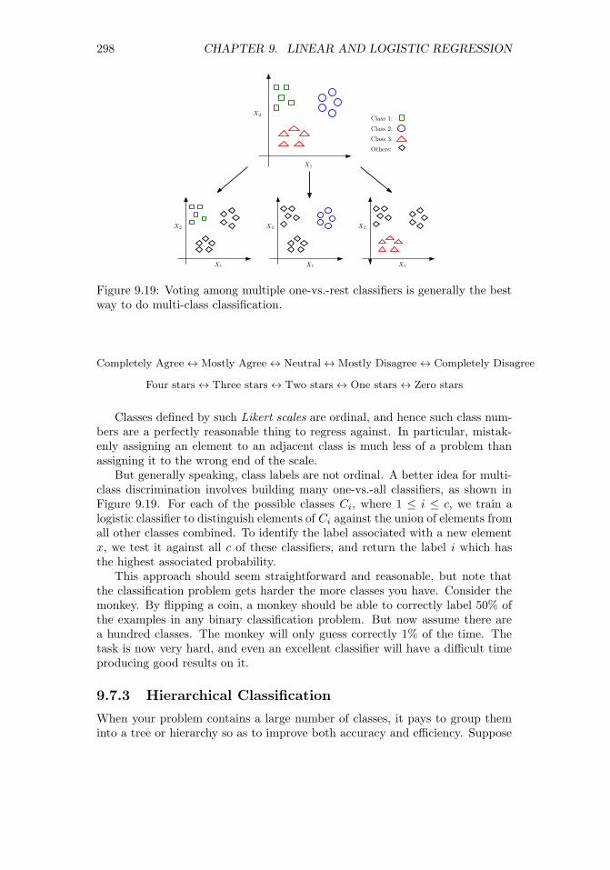
298 CHAPTER 9. LINEAR AND LOGISTIC REGRESSION
X2
X1
X2
X1
X2
X1
X2
X1
Class 1:
Class 2:
Class 3:
Others:
Figure 9.19: Voting among multiple one-vs.-rest classifiers is generally the bestway to do multi-class classification.
Completely Agree↔ Mostly Agree↔ Neutral↔ Mostly Disagree↔ Completely Disagree
Four stars↔ Three stars↔ Two stars↔ One stars↔ Zero stars
Classes defined by such Likert scales are ordinal, and hence such class num-bers are a perfectly reasonable thing to regress against. In particular, mistak-enly assigning an element to an adjacent class is much less of a problem thanassigning it to the wrong end of the scale.
But generally speaking, class labels are not ordinal. A better idea for multi-class discrimination involves building many one-vs.-all classifiers, as shown inFigure 9.19. For each of the possible classes Ci, where 1 ≤ i ≤ c, we train alogistic classifier to distinguish elements of Ci against the union of elements fromall other classes combined. To identify the label associated with a new elementx, we test it against all c of these classifiers, and return the label i which hasthe highest associated probability.
This approach should seem straightforward and reasonable, but note thatthe classification problem gets harder the more classes you have. Consider themonkey. By flipping a coin, a monkey should be able to correctly label 50% ofthe examples in any binary classification problem. But now assume there area hundred classes. The monkey will only guess correctly 1% of the time. Thetask is now very hard, and even an excellent classifier will have a difficult timeproducing good results on it.
9.7.3 Hierarchical Classification
When your problem contains a large number of classes, it pays to group theminto a tree or hierarchy so as to improve both accuracy and efficiency. Suppose

9.7. ISSUES IN LOGISTIC CLASSIFICATION 299
we built a binary tree, where each individual category is represented by a leafnode. Each internal node represents a classifier for distinguishing between theleft descendants and the right descendants.
To use this hierarchy to classify a new item x, we start at the root. Runningthe root classifier on x will specify it as belonging to either the left or rightsubtree. Moving down one level, we compare x with the new node’s classifierand keep recurring until we hit a leaf, which defines the label assigned to x.The time it takes is proportional to the height of the tree, ideally logarithmicin the number of classes c, instead of being linear in c if we explicitly compareagainst every class. Classifiers based on this approach are called decision trees,and will be discussed further in Section 11.2.
Ideally this hierarchy can be built from domain knowledge, ensuring thatcategories representing similar classes are grouped together. This has two ben-efits. First, it makes it more likely that misclassifications will still producelabels from similar classes. Second, it means that intermediate nodes can definehigher-order concepts, which can be more accurately recognized. Suppose thatthe one hundred categories in a image classification problem included “car,”“truck,” “boat,” and “bicycle”. When all of these categories are descendants ofan intermediate node called “vehicle,” we can interpret the path to this node asa lower-resolution, higher-accuracy classifier.
There is another, independent danger with classification that becomes moreacute as the number of classes grows. Members of certain classes (think “collegestudents”) are much more plentiful than others, like “rock stars.” The relativedisparity between the size of the largest and smallest classes typically growsalong with number of classes.
For this example, let’s agree that “rock stars” tend to be sullen, grungy-looking males, providing useful features for any classifier. However, only asmall fraction of sullen, grungy-looking males are rock stars, because there areextremely few people who have succeeded in this demanding profession. Clas-sification systems which do not have a proper sense of the prior distribution onlabels are doomed having many false positives, by assigning rare labels muchtoo frequently.
This is the heart of Baysian analysis: updating our current (prior) under-standing of the probability distribution in the face of new evidence. Here, theevidence is the result is from a classifier. If we incorporate a sound prior distri-bution into our reasoning, we can ensure that items require particularly strongevidence to be assigned to rare classes.
9.7.4 Partition Functions and Multinomial Regression
Recall that our preferred means of multi-class classification involved trainingindependent single-class vs. all logistic classifiers Fi(x), where 1 ≤ i ≤ c and cis the number of distinct labels. One minor issue remains. The probabilities weget from logistic regression aren’t really probabilities. Turning them into realprobabilities requires the idea of a partition function.

300 CHAPTER 9. LINEAR AND LOGISTIC REGRESSION
For any particular item x, summing up the “probabilities” over all possiblelabels for x should yield T = 1, where
T =
c∑i=1
Fi(x).
But should doesn’t mean is. All of these classifiers were trained independently,and hence there is nothing forcing them to sum to T = 1.
A solution is to divide all of these probabilities by the appropriate constant,namely F ′(x) = F (x)/T . This may sound like a kludge, because it is. But thisis essentially what physicists do when they talk about partition functions, whichserve as denominators turning something proportional to probabilities into realprobabilities.
Multinomial regression is a more principled method of training independentsingle-class vs. all classifiers, so that the probabilities work out right. Thisinvolves using the correct partition function for log odds ratios, which are com-puted with exponentials of the resulting values. More than this I will not say,but it is reasonable to look for a multinomial regression function in your favoritemachine learning library and see how it does when faced with a multi-class re-gression problem.
A related notion to the partition function arises in Baysian analysis. We areoften faced with a challenge of identifying the most likely item label, say A, asa function of evidence E. Recall that Bayes’ theorem states that
P (A|E) =P (E|A)P (A)
P (E)
Computing this as a real probability requires knowing the denominator P (E),which can be a murky thing to compute. But comparing P (A|E) to P (B|E) inorder to determine whether label A is more likely than label B does not requireknowing P (E), since it is the same in both expressions. Like a physicist, we canwaive it away, mumbling about the “partition function.”
9.8 Chapter Notes
Linear and logistic regression are standard topics in statistics and optimization.Textbooks on linear/logistic regression and its applications include [JWHT13,Wei05].
The treatment of the gradient descent approach to solving regression herewas inspired by Andrew Ng, as presented in his Coursera machine learningcourse. I strongly recommend his video lectures to those interested in a morethorough treatment of the subject.
The discovery that butter production in Bangladesh accurately forecastedthe S&P 500 stock index is due to Leinweber [Lei07]. Unfortunately, like mostspurious correlations it broke down immediately after its discovery, and nolonger has predictive power.
9.9. EXERCISES 301
9.9 Exercises
Linear Regression
9-1. [3] Construct an example on n ≥ 6 points where the optimal regression line isy = x, even though none of the input points lie directly on this line.
9-2. [3] Suppose we fit a regression line to predict the shelf life of an apple based onits weight. For a particular apple, we predict the shelf life to be 4.6 days. Theapples residual is −0.6 days. Did we over or under estimate the shelf-life of theapple? Explain your reasoning.
9-3. [3] Suppose we want to find the best-fitting function y = f(x) where y = w2x+wx. How can we use linear regression to find the best value of w?
9-4. [3] Suppose we have the opportunity to pick between using the best fittingmodel of the form y = f(x) where y = w2x or y = wx, for constant coefficientw. Which of these is more general, or are they identical?
9-5. [5] Explain what a long-tailed distribution is, and provide three examples of rel-evant phenomena that have long tails. Why are they important in classificationand regression problems?
9-6. [5] Using a linear algebra library/package, implement the closed form regressionsolver w = (ATA)−1AT b. How well does it perform, relative to an existingsolver?
9-7. [3] Establish the effect that different values for the constant c of the logit functionhave on the probability of classification being 0.01, 1, 2, and 10 units from theboundary.
Experiments with Linear Regression
9-8. [5] Experiment with the effects of fitting non-linear functions with linear regres-sion. For a given (x, y) data set, construct the best fitting line where the setof variables are {1, x, . . . , xk}, for a range of different k. Does the model getbetter or worse over the course of this process, both in terms of fitting error andgeneral robustness?
9-9. [5] Experiment with the effects of feature scaling in linear regression. For agiven data set with at least two features (dimensions), multiply all the valuesof one feature by 10k, for −10 ≤ k ≤ 10. Does this operation cause a loss ofnumerical accuracy in fitting?
9-10. [5] Experiment with the effects of highly correlated features in linear regression.For a given (x, y) data set, replicate the value of x with small but increasingamounts of random noise. What is returned when the new column is perfectlycorrelated with the original? What happens with increasing amounts of randomnoise?
9-11. [5] Experiment with the effects of outliers on linear regression. For a given (x, y)data set, construct the best fitting line. Repeatedly delete the point with thelargest residual, and refit. Is the sequence of predicted slopes relatively stablefor much of this process?
9-12. [5] Experiment with the effects of regularization on linear/logistic regression.For a given multi-dimensional data set, construct the best fitting line with (a)

302 CHAPTER 9. LINEAR AND LOGISTIC REGRESSION
no regularization, (b) ridge regression, and (c) LASSO regression; the latter twowith a range of constraint values. How does the accuracy of the model changeas we reduce the size and number of parameters?
Implementation Projects
9-13. [5] Use linear/logistic regression to build a model for one of the following TheQuant Shop challenges:
(a) Miss Universe.
(b) Movie gross.
(c) Baby weight.
(d) Art auction price.
(e) White Christmas.
(f) Football champions.
(g) Ghoul pool.
(h) Gold/oil prices.
9-14. [5] This story about predicting the results of the NCAA college basketballtournament is instructive:
http://www.nytimes.com/2015/03/22/opinion/sunday/making-march-madness-easy.
html.
Implement such a logistic regression classifier, and extend it to other sports likefootball.
Interview Questions
9-15. [8] Suppose we are training a model using stochastic gradient descent. How dowe know if we are converging to a solution?
9-16. [5] Do gradient descent methods always converge to the same point?
9-17. [5] What assumptions are required for linear regression? What if some of theseassumptions are violated?
9-18. [5] How do we train a logistic regression model? How do we interpret its coeffi-cients?
Kaggle Challenges
9-19. Identify what is being cooked, given the list of ingredients.
https://www.kaggle.com/c/whats-cooking
9-20. Which customers are satisfied with their bank?
https://www.kaggle.com/c/santander-customer-satisfaction
9-21. What does a worker need access to in order to do their job?
https://www.kaggle.com/c/amazon-employee-access-challenge

Chapter 10
Distance and NetworkMethods
When a measure becomes a target, it ceases to be a measure.
– Charles Goodhart (Goodhart’s Law)
An n × d data matrix, consisting of n examples/rows each defined by d fea-tures/columns, naturally defines a set of n points in a d-dimensional geometricspace. Interpreting examples as points in space provides a powerful way tothink about them – like the stars in the heavens. Which stars are the closestto our sun, i.e. our nearest neighbors? Galaxies are natural groupings of starsidentified by clustering the data. Which stars share the Milky Way with oursun?
There is a close connection between collections of points in space and verticesin networks. Often we build networks from geometric point sets, by connectingclose pairs of points by edges. Conversely, we can build point sets from networks,by embedding the vertices in space, so that pairs of connected vertices arelocated near each other in the embedding.
Several of the important problems on geometric data readily generalize tonetwork data, including nearest neighbor classification and clustering. Thuswe treat both topics together in this chapter, to better exploit the synergiesbetween them.
10.1 Measuring Distances
The most basic issue in the geometry of points p and q in d dimensions is howbest to measure the distance between them. It might not be obvious that thereis any issue here to speak of, since the traditional Euclidean metric is obviously
303© The Author(s) 2017S.S. Skiena, The Data Science Design Manual,Texts in Computer Science, https://doi.org/10.1007/978-3-319-55444-0_10

304 CHAPTER 10. DISTANCE AND NETWORK METHODS
how you measure distances. The Euclidean matrix defines
d(p, q) =
√√√√ d∑i=1
|pi − qi|2
But there are other reasonable notions of distance to consider. Indeed, whatis a distance metric? How does it differ from an arbitrary scoring function?
10.1.1 Distance Metrics
Distance measures most obviously differ from similarity scores, like the correla-tion coefficient, in their direction of growth. Distance measures get smaller asitems become more similar, while the converse is true of similarity functions.
There are certain useful mathematical properties we assume of any reason-able distance measure. We say a distance measure is a metric if it satisfies thefollowing properties:
• Positivity: d(x, y) ≥ 0 for all x and y.
• Identity: d(x, y) = 0 if and only if x = y.
• Symmetry: d(x, y) = d(y, x) for all x and y.
• Triangle inequality: d(x, y) ≤ d(x, z) + d(z, y) for all x, y, and z.
These properties are important for reasoning about data. Indeed, many algo-rithms work correctly only when the distance function is a metric.
The Euclidean distance is a metric, which is why these conditions seemso natural to us. However, other equally-natural similarity measures are notdistance metrics:
• Correlation coefficient: Fails positivity because it ranges from −1 to 1.Also fails identity, as the correlation of a sequence with itself is 1.
• Cosine similarity/dot product: Similar to correlation coefficient, it failspositivity and identity for the same reason.
• Travel times in a directed network: In a world with one-way streets, thedistance from x to y is not necessarily the same as the distance from y tox.
• Cheapest airfare: This often violates the triangle inequality, because thecheapest way to fly from x to y might well involve taking a detour throughz, due to bizarre airline pricing strategies.
By contrast, it is not immediately obvious that certain well-known distancefunctions are metrics, such as edit distance used in string matching. Instead ofmaking assumptions, prove or disprove each of the four basic properties, to besure you understand what you are working with.

10.1. MEASURING DISTANCES 305
Figure 10.1: Many different paths across a grid have equal Manhattan (L1)distance.
10.1.2 The Lk Distance Metric
The Euclidean distance is just a special case of a more general family of distancefunctions, known as the Lk distance metric or norm:
dk(p, q) = k
√√√√ d∑i=1
|pi − qi|k = (
d∑i=1
|pi − qi|k)1/k
The parameter k provides a way to trade off between the largest and the totaldimensional differences. The value for k can be any number between 1 and ∞,with particularly popular values including:
• Manhattan distance (k = 1): If we ignore exceptions like Broadway,all streets in Manhattan run east–west and all avenues north–south, thusdefining a regular grid. The distance between two locations is then thesum of this north–south difference and the east–west difference, since tallbuildings prevent any chance of shortcuts.
Similarly, the L1 or Manhattan distance is the total sum of the deviationsbetween the dimensions. Everything is linear, so a difference of 1 in eachof two dimensions is the same as a difference of 2 in only one dimension.Because we cannot take advantage of diagonal short-cuts, there are typi-cally many possible shortest paths between two points, as shown in Figure10.1.
• Euclidean distance (k = 2): This is the most popular distance metric,offering more weight to the largest dimensional deviation without over-whelming the lesser dimensions.
• Maximum component (k = ∞): As the value of k increases, smallerdimensional differences fade into irrelevance. If a > b, then ak � bk.Taking the kth root of ak + bk approaches a as bk/ak → 0.

306 CHAPTER 10. DISTANCE AND NETWORK METHODS
Figure 10.2: The shape of circles defining equal distances changes with k.
Consider the distance of points p1 = (2, 0) and p2 = (2, 1.99) from theorigin:
– For k = 1, the distances are 2 and 3.99, respectively.
– For k = 2, they are 2 and 2.82136.
– For k = 1000, they are 2 and 2.00001.
– For k =∞, they are 2 and 2.
The L∞ metric returns the largest single dimensional difference as thedistance.
We are comfortable with Euclidean distance because we live in a Euclideanworld. We believe in the truth of the Pythagorean theorem, that the sides ofa right triangle obey the relationship that a2 + b2 = c2. In the world of Lkdistances, the Pythagorean theorem would be ak + bk = ck.
We are similarly comfortable with the notion that circles are round. Recallthat a circle is defined as the collection of points which are at a distance r froman origin point p. Change the definition of distance, and you change the shapeof a circle.
The shape of an Lk “circle” governs which points are equal neighbors abouta center point p. Figure 10.2 illustrates how the shape evolves with k. UnderManhattan distance (k = 1), the circle looks like a diamond. For k = 2, it isthe round object we are familiar with. For k = ∞, this circle stretches out toan axis-oriented box.
There is smooth transition from the diamond to the box as we vary 1 ≤ k ≤∞. Selecting the value of k is equivalent to choosing which circle best fits ourdomain model. The distinctions here become particularly important in higherdimensional spaces: do we care about deviations in all dimensions, or primarilythe biggest ones?
Take-Home Lesson: Selecting the right value of k can have a significant effect onthe meaningfulness of your distance function, particularly in high-dimensionalspaces.

10.1. MEASURING DISTANCES 307
Taking the kth root of the sum of kth-power terms is necessary for theresulting “distance” values to satisfy the metric property. However, in manyapplications we will be only using the distances for comparison: testing whetherd(x, p) ≤ d(x, q) as opposed to using the values in formulas or isolation.
Because we take the absolute value of each dimensional distance before rais-ing it to the kth power, the summation within the distance function alwaysyields a positive value. The kth root/power function is monotonic, meaningthat for x, y, k ≥ 0
(x > y)→ (xk > yk).
Thus the order of distance comparison is unchanged if we do not take the kthroot of the summation. Avoiding the kth root calculation saves time, whichcan prove non-trivial when many distance computations are performed, as innearest neighbor search.
10.1.3 Working in Higher Dimensions
I personally have no geometric sense about higher-dimensional spaces, anythingwhere d > 3. Usually, the best we can do is to think about higher-dimensionalgeometries through linear algebra: the equations which govern our understand-ing of two/three-dimensional geometries readily generalize for arbitrary d, andthat is just the way things work.
We can develop some intuition about working with a higher-dimensional dataset through projection methods, which reduce the dimensionality to levels wecan understand. It is often helpful to visualize the two-dimensional projectionsof the data by ignoring the other d − 2 dimensions entirely, and instead studydot plots of dimensional pairs. Through dimension reduction methods like prin-ciple component analysis (see Section 8.5.2), we can combine highly correlatedfeatures to produce a cleaner representation. Of course, some details are lost inthe process: whether it is noise or nuance depends upon your interpretation.
It should be clear that as we increase the number of dimensions in our dataset, we are implicitly saying that each dimension is a less important part ofthe whole. In measuring the distance between two points in feature space,understand that large d means that there are more ways for points to be close(or far) from each other: we can imagine them being almost identical along alldimensions but one.
This makes the choice of distance metric most important in high-dimensionaldata spaces. Of course, we can always stick with L2 distance, which is a safeand standard choice. But if we want to reward points for being close on manydimensions, we prefer a metric leaning more towards L1. If instead things aresimilar when there are no single fields of gross dissimilarity, we perhaps shouldbe interested in something closer to L∞.
One way to think about this is whether we are more concerned about randomadded noise to our features, or exceptional events leading to large artifacts. L1
is undesirable in the former case, because the metric will add up the noisefrom all dimensions in the distance. But artifacts make L∞ suspect, because a

308 CHAPTER 10. DISTANCE AND NETWORK METHODS
substantial error in any single column will come to dominate the entire distancecalculation.
Take-Home Lesson: Use your freedom to select the best distance metric. Eval-uate how well different functions work to tease out the similarity of items inyour data set.
10.1.4 Dimensional Egalitarianism
The Lk distance metrics all implicitly weigh each dimension equally. It doesn’thave to be this way. Sometimes we come to a problem with a domain-specificunderstanding that certain features are more important for similarity than oth-ers. We can encode this information using a coefficient ci to specify a differentweight to each dimension:
dk(p, q) = k
√√√√ d∑i=1
ci|pi − qi|k = (
d∑i=1
ci|pi − qi|k)1/k
We can view the traditional Lk distance as a special case of this more generalformula, where ci = 1 for 1 ≤ i ≤ d. This dimension-weighted distance stillsatisfies the metric properties.
If you have ground-truth data about the desired distance between certainpairs of points, then you can use linear regression to fit the coefficients ci to bestmatch your training set. But, generally speaking, dimension-weighted distanceis often not a great idea. Unless you have a genuine reason to know that certaindimensions are more important than others, you are simply encoding your biasesinto the distance formula.
But much more serious biases creep in if you do not normalize your variablesbefore computing distances. Suppose we have a choice of reporting a distancein either meters or kilometers. The contribution of a 30 meter difference in thedistance function will either be 302 = 900 or 0.03=0.0009, literally a million-folddifference in weight.
The correct approach is to normalize the values of each dimension by Z-scores before computing your distance. Replace each value xi by its Z-scorez = (x− µi)/σi, where µi is the mean value of dimension i and σi its standarddeviation. Now the expected value of xi is zero for all dimensions, and thespread is tightly controlled if they were normally distributed to start with.More stringent efforts must be taken if a particular dimension is, say, power lawdistributed. Review Section 4.3 on normalization for relevant techniques, likefirst hitting it with a logarithm before computing the Z-score.
Take-Home Lesson: The most common use of dimension-weighted distancemetrics is as a kludge to mask the fact that you didn’t properly normalize yourdata. Don’t fall into this trap. Replace the original values by Z-scores beforecomputing distances, to ensure that all dimensions contribute equally to theresult.

10.1. MEASURING DISTANCES 309
10.1.5 Points vs. Vectors
Vectors and points are both defined by arrays of numbers, but they are concep-tually different beasts for representing items in feature space. Vectors decoupledirection from magnitude, and so can be thought of as defining points on thesurface of a unit sphere.
To see why this is important, consider the problem of identifying the nearestdocuments from word–topic counts. Suppose we have partitioned the vocabularyof English into n different subsets based on topics, so each vocabulary word sitsin exactly one of the topics. We can represent each article A as a bag of words, asa point p in n-dimensional space where pi equals the number of words appearingin article A that come from topic i.
If we want a long article on football to be close to a short article on football,the magnitude of this vector cannot matter, only its direction. Without nor-malization for length, all the tiny tweet-length documents will bunch up nearthe origin, instead of clustering semantically in topic space as we desire.
Norms are measures of vector magnitude, essentially distance functions in-volving only one point, because the second is taken to be the origin. Vectorsare essentially normalized points, where we divide the value of each dimensionof p by its L2-norm L2(p), which is the distance between p and the origin O:
L2(p) =
√√√√ n∑i=1
p2i
After such normalization, the length of each vector will be 1, turning it into apoint on the unit sphere about the origin.
We have several possible distance metrics to use in comparing pairs of vec-tors. The first class is defined by the Lk metrics, including Euclidean distance.This works because points on the surface of a sphere are still points in space.But we can perhaps more meaningfully consider the distance between two vec-tors in terms of the angle defined between them. We have seen that the cosinesimilarity between two points p and q is their dot product divided by theirL2-norms:
cos(p, q) =p · q||p|| ||q||
For previously normalized vectors, these norms equal 1, so all that matters isthe dot product.
The cosine function here is a similarity function, not a distance measure,because larger values mean higher similarity. Defining a cosine distance as1 − | cos(p, q)| does yield distance measure that satisfies three of the metricproperties, all but the triangle inequality. A true distance metric follows from

310 CHAPTER 10. DISTANCE AND NETWORK METHODS
angular distance, where
d(p, q) = 1− arccos(cos(p, q))
π
Here arccos() is the inverse cosine function cos−1(), and π is the largest anglerange in radians.
10.1.6 Distances between Probability Distributions
Recall the Kolmogorov-Smirnov test (Section 5.3.3), which enabled us to deter-mine whether two sets of samples were likely drawn from the same underlyingprobability distribution.
This suggests that we often need a way to compare a pair of distributions anddetermine a measure of similarity or distance between them. A typical appli-cation comes in measuring how closely one distribution approximates another,providing a way to identify the best of a set of possible models.
The distance measures that have been described for points could, in princi-ple, be applied to measure the similarity of two probability distributions P andQ over a given discrete variable range R.
Suppose that R can take on any of exactly d possible values, say R ={r1, . . . , rd}. Let pi (qi) denote the probability that X = ri under distribu-tion P (Q). Since P and Q are both probability distributions, we know that
d∑i=1
pi =
d∑i=1
qi = 1
The spectrum of pi and qi values for 1 ≤ i ≤ d can be thought of as d-dimensionalpoints representing P and Q, whose distance could be computed using the Eu-clidean metric.
Still, there are more specialized measures, which do a better job of assessingthe similarity of probability distributions. They are based on the information-theoretic notion of entropy, which defines a measure of uncertainty for the valueof a sample drawn from the distribution. This makes the concept mildly analo-gous to variance.
The entropy H(P ) of a probability distribution P is given by
H(P ) =
d∑i=1
pi log2(1
pi) = −
d∑i=1
pi log2(pi).
Like distance, entropy is always a non-negative quantity. The two sums abovediffer only in how they achieve it. Because pi is a probability, it is generally lessthan 1, and hence log(pi) is generally negative. Thus either taking the reciprocalof the probabilities before taking the log or negating each term suffices to makeH(P ) ≥ 0 for all P .
Entropy is a measure of uncertainty. Consider the distribution where p1 =1 and pi = 0, for 2 ≤ i ≤ d. This is like tossing a totally loaded die, so
10.2. NEAREST NEIGHBOR CLASSIFICATION 311
despite having d sides there is no uncertainty about the outcome. Sure enough,H(P ) = 0, because either pi or log2(1) zeros out every term in the summation.Now consider the distribution where qi = 1/d for 1 ≤ i ≤ d. This representsfair dice roll, the maximally uncertain distribution where H(Q) = log2(d) bits.
The flip side of uncertainty is information. The entropy H(P ) correspondsto how much information you learn after a sample from P is revealed. You learnnothing when someone tells you something you already know.
The standard distance measures on probability distributions are based onentropy and information theory. The Kullback-Leibler (KL) divergence measuresthe uncertainty gained or information lost when replacing distribution P withQ. Specifically,
KL(P ||Q) =d∑i=1
pi log2
piqi
Suppose P = Q. Then nothing should be gained or lost, and KL(P, P ) = 0because lg(1) = 0. But the worse a replacement Q is for P , the larger KL(P ||Q)gets, blowing up to ∞ when pi > qi = 0.
The KL divergence resembles a distance measure, but is not a metric, be-cause it is not symmetric (KL(P ||Q) 6= KL(Q||P )) and does not satisfies thetriangle inequality. However, it forms the basis of the Jensen-Shannon diver-gence JS(P,Q):
JS(P,Q) =1
2KL(P ||M) +
1
2KL(Q||M)
where the distribution M is the average of P and Q, i.e. mi = (pi + qi)/2.JS(P,Q) is clearly symmetric while preserving the other properties of KL
divergence. Further√JS(P,Q) magically satisfies the triangle inequality, turn-
ing it into a true metric. This is the right function to use for measuring thedistance between probability distributions.
10.2 Nearest Neighbor Classification
Distance functions grant us the ability to identify which points are closest toa given target. This provides great power, and is the engine behind nearestneighbor classification. Given a set of labeled training examples, we seek thetraining example which is most similar to an unlabeled point p, and then takethe class label for p from its nearest labeled neighbor.
The idea here is simple. We use the nearest labeled neighbor to a given querypoint q as its representative. If we are dealing with a classification problem, wewill assign q the same label as it nearest neighbor(s). If we are dealing with aregression problem, assign q the mean/median value of its nearest neighbor(s).These forecasts are readily defensible assuming (1) the feature space coherentlycaptures the properties of the elements in question, and (2) the distance functionmeaningfully recognizes similar rows/points when they are encountered.
The Bible exhorts us to love thy neighbor. There are three big advantagesto nearest neighbor methods for classification:

312 CHAPTER 10. DISTANCE AND NETWORK METHODS
Figure 10.3: The decision boundary of nearest-neighbor classifiers can be non-linear.
• Simplicity: Nearest neighbor methods are not rocket science; there is nomath here more intimidating than a distance metric. This is important,because it means we can know exactly what is going on and avoid beingthe victim of bugs or misconceptions.
• Interpretability: Studying the nearest-neighbors of a given query pointq explains exactly why the classifier made the decision it did. If youdisagree with this outcome, you can systematically debug things. Werethe neighboring points incorrectly labeled? Did your distance function failto pick out the items which were the logical peer group for q?
• Non-linearity: Nearest neighbor classifiers have decision boundaries whichare piecewise-linear, but can crinkle arbitrarily following the training ex-ample herd, as shown in Figure 10.3. From calculus we know that piecewise-linear functions approach smooth curves once the pieces get small enough.Thus nearest neighbor classifiers enable us to realize very complicated de-cision boundaries, indeed surfaces so complex that they have no conciserepresentation.
There are several aspects to building effective nearest neighbor classifiers,including technical issues related to robustness and efficiency. But foremostis learning to appreciate the power of analogy. We discuss these issues in thesections below.
10.2.1 Seeking Good Analogies
Certain intellectual disciplines rest on the power of analogies. Lawyers don’treason from laws directly as much as they rely on precedents: the results of

10.2. NEAREST NEIGHBOR CLASSIFICATION 313
previously decided cases by respected jurists. The right decision for the currentcase (I win or I lose) is a function of which prior cases can be demonstrated tobe most fundamentally similar to the matter at hand.
Similarly, much of medical practice rests on experience. The old countrydoctor thinks back to her previous patients to recall cases with similar symptomsto yours that managed to survive, and then gives you the same stuff she gavethem. My current physician (Dr. Learner) is now in his eighties, but I trusthim ahead of all those young whipper-snappers relying only on the latest stufftaught in medical school.
Getting the greatest benefits from nearest neighbor methods involves learn-ing to respect analogical reasoning. What is the right way to predict the price ofa house? We can describe each property in terms of features like the area of thelot and the number of bedrooms, and assign each a dollar weight to be addedtogether via linear regression. Or we can look for “comps,” seeking comparableproperties in similar neighborhoods, and forecast a price similar to what we see.The second approach is analogical reasoning.
I encourage you to get hold of a data set where you have domain knowledgeand interest, and do some experiments with finding nearest neighbors. One re-source that always inspires me is http://www.baseball-reference.com, whichreports the ten nearest neighbors for each player, based on their statistics todate. I find these analogies amazingly evocative: the identified players often fillsimilar roles and styles which should not be explicitly captured by the statistics.Yet somehow they are.
Try to do this with another domain you care about: books, movies, music, orwhatever. Come to feel the power of nearest neighbor methods, and analogies.
Take-Home Lesson: Identifying the ten nearest neighbors to points you knowabout provides an excellent way to understand the strengths and limitations ofa given data set. Visualizing such analogies should be your first step in dealingwith any high-dimensional data set.
10.2.2 k-Nearest Neighbors
To classify a given query point q, nearest neighbor methods return the labelof q′, the closest labeled point to q. This is a reasonable hypothesis, assumingthat similarity in feature space implies similarity in label space. However, thisclassification is based on exactly one training example, which should give uspause.
More robust classification or interpolation follows from voting over multipleclose neighbors. Suppose we find the k points closest to our query, where k istypically some value ranging from 3 to 50 depending upon the size of n. Thearrangement of the labeled points coupled with the choice of k carves the featurespace into regions, with all the points in a particular given region assigned thesame label.
Consider Figure 10.4, which attempts to build a gender classifier from data

314 CHAPTER 10. DISTANCE AND NETWORK METHODS
Figure 10.4: The effect of k on the decision boundary for gender classificationusing k-NN. Compare k = 3 (left) and k = 10 (right) with k = 1 in Figure 10.3.
on height and weight. Generally speaking, women are shorter and lighter thanmen, but there are many exceptions, particularly near the decision boundary. Asshown in Figure 10.4, increasing k tends to produce larger regions with smootherboundaries, representing more robust decisions. However, the larger we makek, the more generic our decisions are. Choosing k = n is simply another namefor the majority classifier, where we assign each point the most common labelregardless of its individual features.
The right way to set k is to assign a fraction of labeled training examples asan evaluation set, and then experiment with different values of the parameterk to see where the best performance is achieved. These evaluation values canthen be thrown back into the training/target set, once k has been selected.
For a binary classification problem, we want k to be an odd number, so thedecision never comes out to be a tie. Generally speaking, the difference betweenthe number of positive and negative votes can be interpreted as a measure ofour confidence in the decision.
There are potential asymmetries concerning geometric nearest neighbors.Every point has a nearest neighbor, but for outlier points these nearest neighborsmay not be particular close. These outlier points in fact can have an outsizedrole in classification, defining the nearest neighbor to a huge volume of featurespace. However, if you picked your training examples properly this should belargely uninhabited territory, a region in feature space where points rarely occur.
The idea of nearest neighbor classification can be generalized to functioninterpolation, by averaging the values of the k nearest points. This is presumablydone by real-estate websites like www.zillow.com, to predict housing prices fromnearest neighbors. Such averaging schemes can be generalized by non-uniform

10.2. NEAREST NEIGHBOR CLASSIFICATION 315
Figure 10.5: Data structures for nearest neighbor search include Voronoi dia-grams (left) and kd-trees (right).
weights, valuing points differently according to distance rank or magnitude.Similar ideas work for all classification methods.
10.2.3 Finding Nearest Neighbors
Perhaps the biggest limitation of nearest neighbor classification methods is theirruntime cost. Comparing a query point q in d dimensions against n such trainingpoints is most obviously done by performing n explicit distance comparisons, ata cost of O(nd). With thousands or even millions of training points available,this search can introduce a notable lag into any classification system.
One approach to speeding up the search involves the use of geometric datastructures. Popular choices include:
• Voronoi diagrams: For a set of target points, we would like to partitionthe space around them into cells such that each cell contains exactly onetarget point. Further, we want each cell’s target point to be the nearesttarget neighbor for all locations in the cell. Such a partition is called aVoronoi diagram, and is illustrated in Figure 10.5 (left).
The boundaries of Voronoi diagrams are defined by the perpendicularbisectors between pairs of points (a, b). Each bisector cuts the space inhalf: one half containing a and the other containing b, such that all pointson a’s half are closer to a than b, and visa versa.
Voronoi diagrams are a wonderful tool for thinking about data, and havemany nice properties. Efficient algorithms for building them and searchingthem exist, particularly in two dimensions. However, these proceduresrapidly become more complex as the dimensionality increases, makingthem generally impractical beyond two or three dimensions.
• Grid indexes: We can carve up space into d-dimensional boxes, by divid-ing the range of each dimension into r intervals or buckets. For example,

316 CHAPTER 10. DISTANCE AND NETWORK METHODS
0 1 2 3 4 5
0
1
2
3
4
Figure 10.6: A grid index data structure provides fast access to nearest neighborswhen the points are uniformly distributed, but can be inefficient when points incertain regions are densely clustered.
consider a two-dimensional space where each axis was a probability, thusranging from 0 to 1. This range can be divided into r equal-sized intervals,such that the ith interval ranges between [(i− 1)/r, i/r].
These intervals define a regular grid over the space, so we can associateeach of the training points with the grid cell where it belongs. Search nowbecomes the problem of identifying the right grid cell for point q througharray lookup or binary search, and then comparing q against all the pointsin this cell to identify the nearest neighbor.
Such grid indexes can be effective, but there are potential problems. First,the training points might not be uniformly distributed, and many cellsmight be empties, as in Figure 10.6. Establishing a non-uniform grid mightlead to a more balanced arrangement, but makes it harder to quickly findthe cell containing q. But there is also no guarantee that the nearestneighbor of q actually lives within the same cell as q, particularly if q liesvery close to the cell’s boundary. This means we must search neighboringcells as well, to ensure we find the absolute nearest neighbor.
• Kd-trees: There are a large class of tree-based data structures which par-tition space using a hierarchy of divisions that facilitates search. Startingfrom an arbitrary dimension as the root, each node in the kd-tree definesmedian line/plane that splits the points equally according to that dimen-sion. The construction recurs on each side using a different dimension,and so on until the region defined by a node contains just one trainingpoint.

10.2. NEAREST NEIGHBOR CLASSIFICATION 317
This construction hierarchy is ideally suited to support search. Startingat the root, we test whether the query point q is to the left or right of themedian line/plane. This identifies which side q lies on, and hence whichside of the tree to recur on. The search time is log n, since we split thepoint set in half with each step down the tree.
There are a variety of such space-partition search tree structures avail-able, with one or more likely implemented in your favorite programminglanguage’s function library. Some offer faster search times on problemslike nearest neighbor, with perhaps a trade-off of accuracy for speed.
Although these techniques can indeed speed nearest neighbor search in mod-est numbers of dimensions (say 2 ≤ d ≤ 10), they get less effective as the di-mensionality increases. The reason is that the number of ways that two pointscan be close to each other increases rapidly with the dimensionality, makingit harder to cut away regions which have no chance of containing the nearestneighbor to q. Deterministic nearest neighbor search eventually reduces to linearsearch, for high-enough dimensionality data.
10.2.4 Locality Sensitive Hashing
To achieve faster running times, we must abandon the idea of finding the exactnearest neighbor, and settle for a good guess. We want to batch up nearbypoints into buckets by similarity, and quickly find the most appropriate bucketB for our query point q. By only computing the distance between q and thepoints in the bucket, we save search time when |B| � n.
This was the basic idea behind the grid index, described in the previoussection, but the search structures become unwieldy and unbalanced in practice.A better approach is based on hashing.
Locality sensitive hashing (LSH) is defined by a hash function h(p) that takesa point or vector as input and produces a number or code as output such thatit is likely that h(a) = h(b) if a and b are close to each other, and h(a) 6= h(b)if they are far apart.
Such locality sensitive hash functions readily serve the same role as the gridindex, without the fuss. We can simply maintain a table of points bucketed bythis one-dimensional hash value, and then look up potential matches for querypoint q by searching for h(q).
How can we build such locality sensitive hash functions? The idea is easiestto understand at first when restricting to vectors instead of points. Recall thatsets of d-dimensional vectors can be thought of as points on the surface of asphere, meaning a circle when d = 2.
Let us consider an arbitrary line l1 through the origin of this circle, whichcuts the circle in half, as in Figure 10.7. Indeed, we can randomly select l1 bysimply picking a random angle 0 ≤ θ1 < 2π. This angle defines the slope of aline passing through the origin O, and together θ1 and O completely specify l1.If randomly chosen, l1 should grossly partition the vectors, putting about halfof them on the left and the remainder on the right.

318 CHAPTER 10. DISTANCE AND NETWORK METHODS
Figure 10.7: Nearby points on the circle generally lie on the same side of randomlines through the origin. Locality-sensitive hash codes for each point can becomposed as a sequence of sidedness tests (left or right) for any specific sequenceof lines.
Now add a second random divider l2, which should share the same properties.This then partitions all the vectors among four regions, {LL,LR,RL,RR},defined by their status relative to these dividers l1 and l2.
The nearest neighbor of any vector v should lie in the same region as v,unless we got unlucky and either l1 or l2 separated them. But the probabilityp(v1, v2) that both v1 and v2 are on the same side of l depends upon the anglebetween v1 and v2. Specifically p(v1, v2) = 1− θ(v1, v2)/π.
Thus we can compute the exact probability that near neighbors are preservedfor n points and m random planes. The pattern of L and R over these m planesdefines an m-bit locality-sensitive hash code h(v) for any vector v. As we movebeyond the two planes of our example to longer codes, the expected number ofpoints in each bucket drops to n/2m, albeit with an increased risk that one ofthe m planes separates a vector from its true nearest neighbor.
Note that this approach can easily be generalized beyond two dimensions.Let the hyperplane be defined by its normal vector r, which is perpendicularin direction to the plane. The sign of s = v · r determines which side a queryvector v lies on. Recall that the dot product of two orthogonal vectors is 0, sos = 0 if v lies exactly on the separating plane. Further, s is positive if v is abovethis plane, and negative if v is below it. Thus the ith hyperplane contributesexactly one bit to the hash code, where hi(q) = 0 iff v · ri ≤ 0.
Such functions can be generalized beyond vectors to arbitrary point sets.Further, their precision can be improved by building multiple sets of code wordsfor each item, involving different sets of random hyperplanes. So long as qshares at least one codeword with its true nearest neighbor, we will eventually

10.3. GRAPHS, NETWORKS, AND DISTANCES 319
encounter a bucket containing both of these points.Note that LSH has exactly the opposite goal from traditional hash functions
used for cryptographic applications or to manage hash tables. Traditional hashfunctions seek to ensure that pairs of similar items result in wildly different hashvalues, so we can recognize changes and utilize the full range of the table. Incontrast, LSH wants similar items to recieve the exact same hash code, so wecan recognize similarity by collision. With LSH, nearest neighbors belong in thesame bucket.
Locality sensitive hashing has other applications in data science, beyondnearest neighbor search. Perhaps the most important is constructing compressedfeature representations from complicated objects, say video or music streams.LSH codes constructed from intervals of these streams define numerical valuespotentially suitable as features for pattern matching or model building.
10.3 Graphs, Networks, and Distances
A graph G = (V,E) is defined on a set of vertices V , and contains a set ofedges E of ordered or unordered pairs of vertices from V . In modeling a roadnetwork, the vertices may represent the cities or junctions, certain pairs ofwhich are directly connected by roads/edges. In analyzing human interactions,the vertices typically represent people, with edges connecting pairs of relatedsouls.
Many other modern data sets are naturally modeled in terms of graphs ornetworks:
• The Worldwide Web (WWW): Here there is a vertex in the graph for eachwebpage, with a directed edge (x, y) if webpage x contains a hyperlink towebpage y.
• Product/customer networks: These arise in any company that has manycustomers and types of products: be it Amazon, Netflix, or even the cornergrocery store. There are two types of vertices: one set for customersand another for products. Edge (x, y) denotes a product y purchased bycustomer x.
• Genetic networks: Here the vertices represent the different genes/proteinsin a particular organisms. Think of this as a parts list for the beast.Edge (x, y) denotes that there are interactions between parts x and y.Perhaps gene x regulates gene y, or proteins x and y bind together tomake a larger complex. Such interaction networks encode considerableinformation about how the underlying system works.
Graphs and point sets are closely related objects. Both are composed ofdiscrete entities (points or vertices) representing items in a set. Both of them en-code important notions of distance and relationships, either near–far or connected–independent. Point sets can be meaningfully represented by graphs, and graphsby point sets.

320 CHAPTER 10. DISTANCE AND NETWORK METHODS
Figure 10.8: The pairwise distances between a set of points in space (left) definea complete weighted graph (center). Thresholding by a distance cutoff removesall long edges, leaving a sparse graph that captures the structure of the points(right).
10.3.1 Weighted Graphs and Induced Networks
The edges in graphs capture binary relations, where each edge (x, y) representsthat there is a relationship between x and y. The existence of this relationship issometimes all there is to know about it, as in the connection between webpagesor the fact of someone having purchased a particular product.
But there is often an inherent measure of the strength or closeness of therelationship. Certainly we see it in road networks: each road segment has alength or travel time, which is essential to know for finding the best route todrive between two points. We say that a graph is weighted if every edge has anumerical value associated with it.
And this weight is often (but not always) naturally interpreted as a distance.Indeed one can interpret a data set of n points in space as a complete weightedgraph on n vertices, where the weight of edge (x, y) is the geometric distancebetween points x and y in space. For many applications, this graph encodes allthe relevant information about the points.
Graphs are most naturally represented by n×n adjacency matrices. Define anon-edge symbol x. Matrix M represents graph G = (V,E) when M [i, j] 6= x ifand only if vertices i, j ∈ V are connected by an edge (i, j) ∈ E. For unweightednetworks, typically the edge symbol is 1 while x = 0. For distance weightedgraphs, the weight of edge (i, j) is the cost of travel between them, so settingx =∞ denotes the lack of any direct connection between i and j.
This matrix representation for networks has considerable power, because wecan introduce all our tools from linear algebra to work with them. Unfortunately,it comes with a cost, because it can be hopelessly expensive to store n × nmatrices once networks get beyond a few hundred vertices. There are moreefficient ways to store large sparse graphs, with many vertices but relatively fewpairs connected by edges. I will not discuss the details of graph algorithms here,but refer you with confidence to my book The Algorithm Design Manual [Ski08]for you to learn more.
Pictures of graphs/networks are often made by assigning each vertex a pointin the plane, and drawing lines between these vertex-points to represent edges.Such node-ink diagrams are immensely valuable to visualize the structure of

10.3. GRAPHS, NETWORKS, AND DISTANCES 321
the networks you are working with. They can be algorithmically constructedusing force-directed layout, where edges act like springs to bring adjacent pairsof vertices close together, and non-adjacent vertices repel each other.
Such drawings establish the connection between graph structures and pointpositions. An embedding is a point representation of the vertices of a graphthat captures some aspect of its structure. Performing a feature compressionlike eigenvalue or singular value decomposition (see Section 8.5) on the theadjacency matrix of a graph produces a lower-dimensional representation thatserves as a point representation of each vertex. Other approaches to graphembeddings include DeepWalk, to be discussed in Section 11.6.3.
Take-Home Lesson: Point sets can be meaningfully represented bygraphs/distance matrices, and graphs/distance matrices meaningfully repre-sented by point sets (embeddings).
Geometric graphs defined by the distances between points are representativeof a class of graphs I will call induced networks, where the edges are defined ina mechanical way from some external data source. This is a common source ofnetworks in data science, so it is important to keep an eye out for ways thatyour data set might be turned into a graph.
Distance or similarity functions are commonly used to construct networkson sets of items. Typically we are interested in edges connecting each vertex toits k closest/most similar vertices. We get a sparse graph by keeping k modest,say k ≈ 10, meaning that it can be easily worked with even for large values ofn.
But there are other types of induced networks. Typical would be to connectvertices x and y whenever they have a meaningful attribute in common. Forexample, we can construct an induced social network on people from their re-sumes, linking any two people who worked at the same company or attended thesame school in a similar period. Such networks tend to have a blocky structure,where there are large subsets of vertices forming fully connected cliques. Afterall, if x graduated from the same college as y, and y graduated from the samecollege as z, then this implies that (x, z) must also be an edge in the graph.
10.3.2 Talking About Graphs
There is a vocabulary about graphs that is important to know for workingwith them. Talking the talk is an important part of walking the walk. Severalfundamental properties of graphs impact what they represent, and how we canuse them. Thus the first step in any graph problem is determining the flavorsof the graphs you are dealing with:
• Undirected vs. Directed: A graph G = (V,E) is undirected if edge (x, y) ∈E implies that (y, x) is also in E. If not, we say that the graph is directed.Road networks between cities are typically undirected, since any large roadhas lanes going in both directions. Street networks within cities are almost

322 CHAPTER 10. DISTANCE AND NETWORK METHODS
undirected directed unweighted
5
9
2
5
74
3
7
12
weighted
3
simple non−simple sparse dense
embedded topological unlabeled labeled
B
C
D
E
FG
A
Figure 10.9: Important properties/flavors of graphs
always directed, because there are at least a few one-way streets lurkingsomewhere. Webpage graphs are typically directed, because the link frompage x to page y need not be reciprocated.
• Weighted vs. Unweighted: As discussed in Section 10.3.1, each edge (orvertex) in a weighted graph G is assigned a numerical value, or weight.The edges of a road network graph might be weighted with their length,drive-time, or speed limit, depending upon the application. In unweightedgraphs, there is no cost distinction between various edges and vertices.
Distance graphs are inherently weighted, while social/web networks aregenerally unweighted. The difference determines whether the feature vec-tors associated with vertices are 0/1 or numerical values of importance,which may have to be normalized.
• Simple vs. Non-simple: Certain types of edges complicate the task ofworking with graphs. A self-loop is an edge (x, x), involving only onevertex. An edge (x, y) is a multiedge if it occurs more than once in thegraph.
Both of these structures require special care in preprocessing for featuregeneration. Hence any graph that avoids them is called simple. We oftenseek to remove both self-loops and multiedges at the beginning of analysis.
• Sparse vs. Dense: Graphs are sparse when only a small fraction of
the total possible vertex pairs ((n2
)for a simple, undirected graph on n
vertices) actually have edges defined between them. Graphs where a largefraction of the vertex pairs define edges are called dense. There is noofficial boundary between what is called sparse and what is called dense,

10.3. GRAPHS, NETWORKS, AND DISTANCES 323
but typically dense graphs have a quadratic number of edges, while sparsegraphs are linear in size.
Sparse graphs are usually sparse for application-specific reasons. Roadnetworks must be sparse graphs because of road junctions. The mostghastly intersection I’ve ever heard of was the endpoint of only nine dif-ferent roads. k-nearest neighbor graphs have vertex degrees of exactlyk. Sparse graphs make possible much more space efficient representationsthan adjacency matrices, allowing the representation of much larger net-works.
• Embedded vs. Topological – A graph is embedded if the vertices and edgesare assigned geometric positions. Thus, any drawing of a graph is anembedding, which may or may not have algorithmic significance.
Occasionally, the structure of a graph is completely defined by the geom-etry of its embedding, as we have seen in the definition of the distancegraph where the weights are defined by the Euclidean distance betweeneach pair of points. Low-dimensional representations of adjacency matri-ces by SVD also qualify as embeddings, point representations that capturemuch of the connectivity information of the graph.
• Labeled vs. Unlabeled – Each vertex is assigned a unique name or identifierin a labeled graph to distinguish it from all other vertices. In unlabeledgraphs no such distinctions are made.
Graphs arising in data science applications are often naturally and mean-ingfully labeled, such as city names in a transportation network. Theseare useful as identifiers for representative examples, and also to providelinkages to external data sources where appropriate.
10.3.3 Graph Theory
Graph theory is an important area of mathematics which deals with the fun-damental properties of networks and how to compute them. Most computerscience students get exposed to graph theory through their courses in discretestructures or algorithms.
The classical algorithms for finding shortest paths, connected components,spanning trees, cuts, matchings and topological sorting can be applied to anyreasonable graph. However, I have not seen these tools applied as generally indata science as I think they should be. One reason is that the graphs in datascience tend to be very large, limiting the complexity of what can be done withthem. But a lot is simply myopia: people do not see that a distance or similaritymatrix is really just a graph than can take advantage of other tools.
I take the opportunity here to review the connections of these fundamentalproblems to data science, and encourage the interested reader to deepen theirunderstanding through my algorithm book [Ski08].

324 CHAPTER 10. DISTANCE AND NETWORK METHODS
• Shortest paths: For a distance “matrix” m, the value of m[i, j] shouldreflect the minimum length path between vertices i and j. Note thatindependent estimates of pairwise distance are often inconsistent, and donot necessarily satisfy the triangle inequality. But when m′[i, j] reflectsthe shortest path distance from i to j in any matrix m it must satisfy themetric properties. This may well present a better matrix for analysis thanthe original.
• Connected components: Each disjoint piece of a graph is called a con-nected component. Identifying whether your graph consists of a singlecomponent or multiple pieces is important. First, any algorithms you runwill achieve better performance if you deal with the components indepen-dently. Separate components can be independent for sound reasons, e.g.there is no road crossing between the United States and Europe becauseof an ocean. But separate components might indicate trouble, such asprocessing artifacts or insufficient connectivity to work with.
• Minimum spanning trees: A spanning tree is the minimal set of edgeslinking all the vertices in a graph, essentially a proof that the graph isconnected. The minimum weight spanning tree serves as the sparsestpossible representation of the structure of the graph, making it useful forvisualization. Indeed, we will show that minimum spanning trees have animportant role in clustering algorithms in Section 10.5.
• Edge cuts: A cluster in a graph is defined by a subset of vertices c,with the property that (a) there is considerable similarity between pairsof vertices within c, and (b) there is weak connectivity between verticesin c and out of c. The edges (x, y) where x ∈ c and y 6∈ c define a cutseparating the cluster from the rest of the graph, making finding such cutsan important aspect of cluster analysis.
• Matchings: Marrying off each vertex with a similar, loyal partner can beuseful in many ways. Interesting types of comparisons become possibleafter such a matching. For example, looking at all close pairs that differ inone attribute (say gender) might shed light on how that variable impactsa particular outcome variable (think income or lifespan). Matchings alsoprovide ways to reduce the effective size of a network. By replacing eachmatched pair with a vertex representing its centroid, we can construct agraph with half the vertices, but still representative of the whole.
• Topological sorting: Ranking problems (recall Chapter 4) impose a peck-ing order on a collection of items according to some merit criteria. Topo-logical sorting ranks the vertices of a directed acyclic graph (DAG) so edge(i, j) implies that i ranks above j in the pecking order. Given a collectionof observed constraints of the form “i should rank above j,” topologicalsorting defines an item-order consistent with these observations.

10.4. PAGERANK 325
10.4 PageRank
It is often valuable to categorize the relative importance of vertices in a graph.Perhaps the simplest notion is based on vertex degree, the number of edgesconnecting vertex v to the rest of the graph. The more connected a vertex is,the more important it probably is.
The degree of vertex v makes a good feature to represent the item associatedwith v. But even better is PageRank [BP98], the original secret sauce behindGoogle’s search engine. PageRank ignores the textual content of webpages,to focus only on the structure of the hyperlinks between pages. The moreimportant pages (vertices) should have higher in-degree than lesser pages, forsure. But the importance of the pages that link to you also matter. Having alarge stable of contacts recommending you for a job is great, but it is even betterwhen one of them is currently serving as the President of the United States.
PageRank is best understood in the context of random walks along a net-work. Suppose we start from an arbitrary vertex and then randomly select anoutgoing link uniformly from the set of possibilities. Now repeat the processfrom here, jumping to a random neighbor of our current location at each step.The PageRank of vertex v is a measure of probability that, starting from a ran-dom vertex, you will arrive at v after a long series of such random steps. Thebasic formula for the PageRank of v (PR(v)) is:
PRj(v) =∑
(u,v)∈E
PRj−1(u)
out− degree(u)
This is a recursive formula, with j as the iteration number. We initializePR0(vi) = 1/n for each vertex vi in the network, where 1 ≤ i ≤ n. ThePageRank values will change in each iteration, but converge surprisingly quicklyto stable values. For undirected graphs, this probability is essentially the same aseach vertex’s in-degree, but much more interesting things happen with directedgraphs.
In essence, PageRank relies on the idea that if all roads lead to Rome, Romemust be a pretty important place. It is the paths to your page that counts.This is what makes PageRank hard to game: other people must link to yourwebpage, and whatever shouting you do about yourself is irrelevant.
There are several tweaks one can make to this basic PageRank formula tomake the results more interesting. We can allow the walk to jump to an arbitraryvertex (instead of a linked neighbor) to allow faster diffusion in the network.Let p be the probability of following a link in the next step, also known as thedamping factor. Then
PRj(v) =∑
(u,v)∈E
(1− p)n
+ pPRj−1(u)
out-degree(u)
where n is the number of vertices in the graph. Other enhancements involvemaking changes to the network itself. By adding edges from every vertex to a

326 CHAPTER 10. DISTANCE AND NETWORK METHODS
PageRank PR1 (all pages)
1 Napoleon2 George W. Bush3 Carl Linnaeus4 Jesus5 Barack Obama6 Aristotle7 William Shakespeare8 Elizabeth II9 Adolf Hitler
10 Bill Clinton
PageRank PR2 (only people)
1 George W. Bush2 Bill Clinton3 William Shakespeare4 Ronald Reagan5 Adolf Hitler6 Barack Obama7 Napoleon8 Richard Nixon9 Franklin D. Roosevelt
10 Elizabeth II
Table 10.1: Historical individuals with the highest PageRank in the 2010 EnglishWikipedia, drawn over the full Wikipedia graph (left) and when restricted tolinks to other people (right).
single super-vertex, we ensure that random walks cannot get trapped in somesmall corner of the network. Self-loops and parallel edges (multiedges) can bedeleted to avoid biases from repetition.
There is also a linear algebraic interpretation of PageRank. Let M be amatrix of vertex-vertex transition probabilities, so Mij is the probability thatour next step from i will be to j. Clearly Mij = 1/out-degree(i) if there is adirected edge from i to j, and zero if otherwise. The jth round estimate for thePageRank vector PRj can be computed as
PRj = M · PRj−1
After this estimate converges, PR = M · PR, or λU = MU where λ =1 and U represents the PageRank vector. This is the defining equation foreigenvalues, so the n×1 vector of PageRank values turns out to be the principleeigenvector of the transition probability matrix defined by the links. Thusiterative methods for computing eigenvectors and fast matrix multiplicationleads to efficient PageRank computations.
How well does PageRank work at smoking out the most central vertices? Toprovide some intuition, we ran PageRank on the link network from the Englishedition of Wikipedia, focusing on the pages associated with people. Table 10.1(left) lists the ten historical figures with the highest PageRank.
These high-PageRank figures are all readily recognized as very significantpeople. The least familiar among them is probably Carl Linnaeus (1707–1778)[46], biology’s “father of taxonomy” whose Linnaean system (Genus species;e.g., Homo sapiens) is used to classify all life on earth. He was a great scientist,but why is he so very highly regarded by PageRank? The Wikipedia pages ofall the plant and animal species he first classified link back to him, so thousandsof life forms contribute prominent paths to his page.
The Linnaeus example points out a possible weakness of PageRank: do wereally want plants and other inanimate objects voting on who the most promi-

10.5. CLUSTERING 327
Figure 10.10: PageRank graphs for Barack Obama, over all Wikipedia pages(left) and when restricted only to people (right)
nent people are? Figure 10.10 (left) shows a subset of the full PageRank graphfor Barack Obama [91]. Note, for example, that although the links associatedwith Obama seem very reasonable, we can still reach Obama in only two clicksfrom the Wikipedia page for Dinosaurs. Should extinct beasts contribute to thePresident’s centrality?
Adding and deleting sets of edges from a given network gives rise to differentnetworks, some of which better reveal underlying significance using PageRank.Suppose we compute PageRank (denoted PR2) using only the Wikipedia edgeslinking people. This computation would ignore any contribution from places,organizations, and lower organisms. Figure 10.10 (right) shows a sample of thePageRank graph for Barack Obama [91] when we restrict it to only people.
PageRank on this graph favors a slightly different cohort of people, shown inTable 10.1 (right). Jesus, Linnaeus and Aristotle (384–322 B.C.) [8] are now gone,replaced by three recent U.S. presidents – who clearly have direct connectionsfrom many important people. So which version of PageRank is better, PR1 orPR2? Both seem to capture reasonable notions of centrality with a substan-tial but not overwhelming correlation (0.68), so both make sense as potentialfeatures in a data set.
10.5 Clustering
Clustering is the problem of grouping points by similarity. Often items comefrom a small number of logical “sources” or “explanations”, and clustering isa good way to reveal these origins. Consider what would happen if an alienspecies were to come across height and weight data for a large number of hu-mans. They would presumably figure out that there seem to be two clustersrepresenting distinct populations, one consistently bigger than the other. Ifthe aliens were really on the ball, they might call these populations ‘men” and“women”. Indeed, the two height-weight clusters in Figure 10.11 are both highly

328 CHAPTER 10. DISTANCE AND NETWORK METHODS
Figure 10.11: Clustering people in weight-height space, using 2-means cluster-ing. The left cluster contains 240 women and 112 men, while the right clustercontains 174 men to 54 women. Compare this to the logistic regression classifiertrained on this same data set, in Figure 9.17.
concentrated in one particular gender.Patterns on a two-dimensional dot plot are generally fairly easy to see, but we
often deal with higher-dimensional data that humans cannot effectively visual-ize. Now we need algorithms to find these patterns for us. Clustering is perhapsthe first thing to do with any interesting data set. Applications include:
• Hypothesis development: Learning that there appear to be (say) four dis-tinct populations represented in your data set should spark the questionas to why they are there. If these clusters are compact and well-separatedenough, there has to be a reason and it is your business to find it. Onceyou have assigned each element a cluster label, you can study multiplerepresentatives of the same cluster to figure out what they have in com-mon, or look at pairs of items from different clusters and identify why theyare different.
• Modeling over smaller subsets of data: Data sets often contain a verylarge number of rows (n) relative to the number of feature columns (m):think the taxi cab data of 80 million trips with ten recorded fields pertrip. Clustering provides a logical way to partition a large single set ofrecords in a (say) a hundred distinct subsets each ordered by similarity.Each of these clusters still contains more than enough records to fit aforecasting model on, and the resulting model may be more accurate onthis restricted class of items then a general model trained over all items.Making a forecast now involves identifying the appropriate cluster your

10.5. CLUSTERING 329
query item q belongs to, via a nearest neighbor search, and then using theappropriate model for that cluster to make the call on q.
• Data reduction: Dealing with millions or billions of records can be over-whelming, for processing or visualization. Consider the computationalcost of identifying the nearest neighbor to a given query point, or tryingto understand a dot plot with a million points. One technique is to clusterthe points by similarity, and then appoint the centroid of each cluster torepresent the entire cluster. Such nearest neighbor models can be quiterobust because you are reporting the consensus label of the cluster, and itcomes with a natural measure of confidence: the accuracy of this consensusover the full cluster.
• Outlier detection: Certain items resulting from any data collection pro-cedure will be unlike all the others. Perhaps they reflect data entry errorsor bad measurements. Perhaps they signal lies or other misconduct. Ormaybe they result from the unexpected mixture of populations, a fewstrange apples potentially spoiling the entire basket.
Outlier detection is the problem of ridding a data set of discordant items,so the remainder better reflects the desired population. Clustering is auseful first step to find outliers. The cluster elements furthest from theirassigned cluster center don’t really fit well there, but also don’t fit betteranywhere else. This makes them candidates to be outliers. Since invadersfrom another population would tend to cluster themselves together, wemay well cast suspicions on small clusters whose centers lie unusually farfrom all the other cluster centers.
Clustering is an inherently ill-defined problem, since proper clusters dependupon context and the eye of the beholder. Look at Figure 10.12. How manydifferent clusters do you see there? Some see three, other see nine, and othersvote for pretty much any number in between.
How many clusters you see depends somewhat upon how many clusters youwant to see. People can be clustered into two groups, the lumpers and thesplitters, depending upon their inclination to make fine distinctions. Splitterslook at dogs, and see poodles, terriers, and cocker spaniels. Lumpers look atdogs, and see mammals. Splitters draw more exciting conclusions, while lumpersare less likely to overfit their data. Which mindset is most appropriate dependsupon your task.
Many different clustering algorithms have been developed, and we will reviewthe most prominent methods (k-means, agglomerative clustering, and spectralclustering) in the sections below. But it is easy to get too caught up in thedifferences between methods. If your data exhibits strong-enough clusters, anymethod is going to find something like it. But when an algorithm returnsclusters with very poor coherence, usually your data set is more to blame thanthe algorithm itself.

330 CHAPTER 10. DISTANCE AND NETWORK METHODS
Figure 10.12: How many clusters do you see here?
Take-Home Lesson: Make sure you are using a distance metric which accu-rately reflects the similarities that you are looking to find. The specific choiceof clustering algorithm usually proves much less important than the similar-ity/distance measure which underlies it.
10.5.1 k-means Clustering
We have been somewhat lax in defining exactly what a clustering algorithmshould return as an answer. One possibility is to label each point with thename of the cluster that it is in. If there are k clusters, these labels can be theintegers 1 through k, where labeling point p with i means it is in the ith cluster.An equivalent output representation might be k separate lists of points, wherelist i represents all the points in the ith cluster.
But a more abstract notion reports the center point of each cluster. Typicallywe think of natural clusters as compact, Gaussian-like regions, where there is anideal center defining the location where the points “should” be. Given the setof these centers, clustering the points becomes easy: simply assign each point pto the center point Ci closest to it. The ith cluster consists of all points whosenearest center is Ci.
k-means clustering is a fast, simple-to-understand, and generally effectiveapproach to clustering. It starts by making a guess as to where the clustercenters might be, evaluates the quality of these centers, and then refines themto make better center estimates.

10.5. CLUSTERING 331
K-means clustering
Select k points as initial cluster centers C1, . . . , Ck.Repeat until convergence {
For 1 ≤ i ≤ n, map point pi to its nearest cluster center Cj
Compute centroid C ′j of the points nearest Cj , for 1 ≤ j ≤ k
For all 1 ≤ j ≤ k, set Cj = C ′j
}
Figure 10.13: Pseudocode for the k-means clustering algorithm.
The algorithm starts by assuming that there will be exactly k clusters inthe data, and then proceeds to pick initial centers for each cluster. Perhapsthis means randomly selecting k points from the set of n points S and callingthem centers, or selecting k random points from the bounding box of S. Nowtest each of the n points against all k of the centers, and assign each point inS to its nearest current center. We can now compute a better estimate of thecenter of each cluster, as the centroid of the points assigned to it. Repeat untilthe cluster assignments are sufficiently stable, presumably when they have notchanged since the previous generation. Figure 10.13 provides pseudocode of thisk-means procedure.
Figure 10.14 presents an animation of k-means in action. The initial guessesfor the cluster centers are truly bad, and the initial assignments of points tocenters splits the real clusters instead of respecting them. But the situationrapidly improves, with the centroids drifting into positions that separates thepoints in the desired way. Note that the k-means procedure does not necessar-ily terminate with the best possible set of k centers, only at a locally-optimalsolution that provides a logical stopping point. It is a good idea to repeat theentire procedure several times with different random initializations and acceptthe best clustering found over all. The mean squared error is the sum of squaresof the distance between each point Pi and its center Cj , divided by the numberof points n. The better of two clusterings can be identified as having lower meansquared error, or some other reasonable error statistic.
Centers or Centroids?
There are at least two possible criteria for computing a new estimate for thecenter point as a function of the set S′ of points assigned to it. The centroid Cof a point set is computed by taking the average value of each dimension. For

332 CHAPTER 10. DISTANCE AND NETWORK METHODS
Figure 10.14: The iterations of k-means (for k = 3) as it converges on a stableand accurate clustering. Fully seven iterations are needed, because of the un-fortunate placement of the three initial cluster centers near the logical center.
the dth dimension,
Cd =1
|S′|∑p∈S′
p[d]
The centroid serves as the center of mass of S′, the place where the vectorsdefined through this point sum to zero. This balance criteria defines a naturaland unique center for any S′. Speed of computation is another nice thing aboutusing the centroid. For n d-dimensional points in S′, this takes O(nd) time,meaning linear in the input size of the points.
For numerical data points, using the centroid over an appropriate Lk metric(like Euclidean distance) should work just fine. However, centroids are not welldefined when clustering data records with non-numerical attributes, like cate-gorical data. What is the centroid of 7 blonds, 2 red-heads, and 6 gray-hairedpeople? We have discussed how to construct meaningful distance functions overcategorical records. The problem here is not so much measuring similarity, asconstructing a representative center.
There is a natural solution, sometimes called the k-mediods algorithm. Sup-pose instead of the centroid we define the centermost point C in S′ to be thecluster representative. This is the point which minimizes the sum of distances

10.5. CLUSTERING 333
to all other points in the cluster:
C = arg minc∈S′
n∑i=1
d(c, pi)
An advantage of using a centerpoint to define the cluster is that it gives thecluster a potential name and identity, assuming the input points correspond toitems with identifiable names.
Using the centermost input example as center means we can run k-meansso long as we have a meaningful distance function. Further, we don’t lose verymuch precision by picking the centermost point instead of the centroid. Indeed,the sum of distances through the centermost point is at most twice that of thecentroid, on numerical examples where the centroid can be computed. The bigwin of the centroid is that it can be computed faster than the centermost vertex,by a factor of n.
Using center vertices to represent clusters permits one to extend k-meansnaturally to graphs and networks. For weighted graphs, it is natural to employ ashortest path algorithm to construct a matrix D such that D[i, j] is the length ofthe shortest path in the graph from vertex i to vertex j. Once D is constructed,k-means can proceed by reading the distances off this matrix, instead of calling adistance function. For unweighted graphs, a linear time algorithm like breadth-first search can be efficiently used to compute graph distances on demand.
How Many Clusters?
Inherent to the interpretation of k-means clustering is the idea of a mixturemodel. Instead of all our observed data coming from a single source, we presumethat our data is coming from k different populations or sources. Each sourceis generating points to be like its center, but with some degree of variation orerror. The question of how many clusters a data set has is fundamental: howmany different populations were drawn upon when selecting the sample?
The first step in the k-means algorithm is to initialize k, the number ofclusters in the given data set. Sometimes we have a preconception of how manyclusters we want to see: perhaps two or three for balance or visualization, ormaybe 100 or 1000 as a proxy for “many” when partitioning a large input fileinto smaller sets for separate modeling.
But generally speaking this is a problem, because the “right” number ofclusters is usually unknown. Indeed, the primary reason to cluster in the firstplace is our limited understanding of the structure of the data set.
The easiest way to find the right k is to try them all, and then pick the bestone. Starting from k = 2 to as high as you feel you have time for, performk-means and evaluate the resulting clustering according to the mean squarederror (MSE) of the points from their centers. Plotting this yields an error curve,as shown in Figure 10.16. The error curve for random centers is also provided.
Both error curves show the MSE of points from their centers decreasing aswe allow more and more cluster centers. But the wrong interpretation would

334 CHAPTER 10. DISTANCE AND NETWORK METHODS
Figure 10.15: Running k-means for k = 1 to k = 9. The “right” clustering isfound for k = 3, but the algorithm is unable to properly distinguish betweennested circular clusters and long thin clusters for large k.
Figure 10.16: The error curve for k-means clustering on the point set of Figure10.12, showing a bend in the elbow reflecting the three major clusters in thedata. The error curve for random cluster centers is shown for comparison.

10.5. CLUSTERING 335
be to suggest we need k as large as possible, because the MSE should decreasewhen allowing more centers. Indeed, inserting a new center at a random positionr into a previous k-means solution can only decrease the mean squared error,by happening to land closer to a few of the input points than their previouscenter. This carves out a new cluster around r, but presumably an even betterclustering would have been found running by k-means from scratch on (k + 1)centers.
What we seek from the error curve in Figure 10.16 is the value k where therate of decline decreases, because we have exceeded number of true sources, andso each additional center is acting like a random point in the previous discussion.The error curve should look something like an arm in typing position: it slopesdown rapidly from shoulder to elbow, and then slower from the elbow to thewrist. We want k to be located exactly at the elbow. This point might be easierto identify when compared to a similar MSE error plot for random centers, sincethe relative rate of error reduction for random centers should be analogous towhat we see past the elbow. The slow downward drift is telling us the extraclusters are not doing anything special for us.
Each new cluster center adds d parameters to the model, where d is thedimensionality of the point set. Occam’s razor tells us that the simplest modelis best, which is the philosophical basis for using the bend in the elbow to selectk. There are formal criterias of merit which incorporate both the number ofparameters and the prediction error to evaluate models, such as the Akaikeinformation criterion (AIC). However, in practice you should feel confident inmaking a reasonable choice for k based on the shape of the error curve.
Expectation Maximization
The k-means algorithm is the most prominent example of a class of learningalgorithms based on expectation maximization (EM). The details require moreformal statistics than I am prepared to delve into here, but the principle canbe observed in the two logical steps of the k-means algorithm: (a) assigningpoints to the estimated cluster center that is closest to them, and (b) usingthese point assignments to improve the estimate of the cluster center. Theassignment operation is the expectation or E-step of the algorithm, while thecentroid computation is the parameter maximization or M-step.
The names “expectation” and “maximization” have no particular resonanceto me in terms of the k-means algorithm. However, the general form of an itera-tive parameter-fitting algorithm which improves parameters in rounds based onthe errors of the previous models does seem a sensible thing to do. For example,perhaps we might have partially labeled classification data, where there are rel-atively few training examples confidently assigned to the correct class. We canbuild classifiers based on these training examples, and use them to assign theunlabeled points to candidate classes. This presumably defines larger trainingsets, so we should be able to fit a better model for each class. Now reassigningthe points and iterating again should converge on a better model.

336 CHAPTER 10. DISTANCE AND NETWORK METHODS
Figure 10.17: Agglomerative clustering of gene expression data.
10.5.2 Agglomerative Clustering
Many sources of data are generated from a process defined by an underlyinghierarchy or taxonomy. Often this is the result of an evolutionary process: Inthe Beginning there was one thing, which repeatedly bifurcated to create a richuniverse of items. All animals and plant species are the result of an evolutionaryprocess, and so are human languages and cultural/ethic groupings. To a lesserbut still real extent, so are products like movies and books. This book can bedescribed as a “Data Science Textbook”, which is an emerging sub-genre split offfrom “Computer Science Textbook”, which logically goes back to “EngineeringTextbook”, to “Textbook”, to “Non-Fiction” eventually back to the originalsource: perhaps “Book”.
Ideally, in the course of clustering items we will reconstruct these evolution-ary histories. This goal is explicit in agglomerative clustering, a collection ofbottom-up methods that repeatedly merge the two nearest clusters into a big-ger super-cluster, defining a rooted tree whose leaves are the individual itemsand whose root defines the universe.
Figure 10.17 illustrates agglomerative clustering applied to gene expressiondata. Here each column represents a particular gene, and each row the resultsof an experiment measuring how active each gene was in a particular condition.As an analogy, say each of the columns represented different people, and oneparticular row assessed their spirits right after an election. Fans of the winningparty would be more excited than usual (green), while voters for the losing teamwould be depressed (red). Most of the rest of the world wouldn’t care (black).As it is with people, so it is with genes: different things turn them on and off,and analyzing gene expression data can reveal what makes them tick.
So how do we read Figure 10.17? By inspection it is clear that there areblocks of columns which all behave similarly, getting turned on and turned off insimilar conditions. The discovery of these blocks are reflected in the tree abovethe matrix: regions of great similarity are associated with small branchings.Each node of the tree represents the merging of two clusters. The height ofthe node is proportional to the distance between the two clusters being merged.The taller the edge, the more dodgy the notion that these clusters should bemerged. The columns of the matrix have been permuted to reflect this tree

10.5. CLUSTERING 337
organization, enabling us to visualize hundreds of genes quantified in fourteendimensions (with each row defining a distinct dimension).
Biological clusterings are often associated with such dendograms or phylo-genic trees, because they are the result of an evolutionary process. Indeed, theclusters of similar gene expression behavior seen here are the results of the or-ganism evolving a new function, that changes the response of certain genes toa particular condition.
Using Agglomerative Trees
Agglomerative clustering returns a tree on top of the groupings of items. Aftercutting the longest edges in this tree, what remains are the disjoint groupsof items produced by clustering algorithms like k-means. But this tree is amarvelous thing, with powers well beyond the item partitioning:
• Organization of clusters and subclusters: Each internal node in the treedefines a particular cluster, comprised of all the leaf-node elements be-low it. But the tree describes hierarchy among these clusters, from themost refined/specific clusters near the leaves to the most general clustersnear the root. Ideally, nodes of a tree define nameable concepts: naturalgroupings that a domain expert could explain if asked. These various lev-els of granularity are important, because they define structural conceptswe might not have noticed prior to doing clustering.
• Visualization of the clustering process: A drawing of this agglomerationtree tells us a lot about the clustering process, particularly if the drawingreflects the cost of each merging step. Ideally there will be very long edgesnear the root of the tree, showing that the highest-level clusters are wellseparated and belong in distinct groupings. We can tell if the groupings arebalanced, or whether the high level groupings are of substantially differentsizes. Long chains of merging small clusters into a big cluster is generallya bad sign, although the choice of merging criteria (to be discussed below)can bias the shape of the tree. Outliers show up nicely on a phylogenictree, as singleton elements or small clusters that connect near the rootthrough long edges.
• Natural measure of cluster distance: An interesting property of any treeT is that there is exactly one path in T between any two nodes x andy. Each internal vertex in an agglomerative clustering tree has a weightassociated with it, the cost of merging together the two subtrees below it.We can compute a “cluster distance” between any two leaves by the sumof the merger costs on the path between them. If the tree is good, thiscan be more meaningful than the Euclidean distance between the recordsassociated with x and y.
• Efficient classification of new items: One important application for clus-tering is classification. Suppose have agglomeratively clustered the prod-

338 CHAPTER 10. DISTANCE AND NETWORK METHODS
Figure 10.18: Four distance measures for identifying the nearest pair of clusters.
ucts in a store, to build a taxonomy of clusters. Now a new part comesalong. What category should it be classified under?
For k-means, each of the c clusters are categorized by their centroid, soclassifying a new item q reduces to computing the distance between q andall c centroids to identify the nearest cluster. A hierarchical tree provides apotentially faster method. Suppose we have precomputed the centroids ofall the leaves on the left and right subtrees beneath each node. Identifyingthe right position in the hierarchy for a new item q starts by comparingq to the centroids of the root’s left and right subtrees. The nearest of thetwo centroids to q defines the appropriate side of the tree, so we resumethe search there one level down. This search takes time proportional tothe height of the tree, instead of the number of leaves. This is typicallyan improvement from n to log n, which is much better.
Understand that binary merging trees can be drawn in many different waysthat reflect exactly the same structure, because there is no inherent notion ofwhich is the left child and which is the right child. This means that there are2n−1 distinct permutations of the n leaves possible, by flipping the direction ofany subset of the n − 1 internal nodes in the tree. Realize this when trying toread such a taxonomy: two items which look far away in left-right order mightwell have been neighbors had this flipping been done in a different way. Andthe rightmost node of the left subtree might be next to the leftmost node in theright subtree, even though they are really quite far apart in the taxonomy.
Building Agglomerative Cluster Trees
The basic agglomerative clustering algorithm is simple enough to be describedin two sentences. Initially, each item is assigned to its own cluster. Merge thetwo closest clusters into one by putting a root over them, and repeat until onlyone cluster remains.
All that remains is to specify how to compute the distance between clusters.When the clusters contain single items, the answer is easy: use your favoritedistance metric like L2. But there are several reasonable answers for the distance
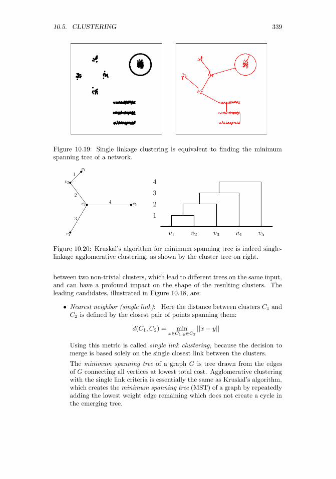
10.5. CLUSTERING 339
Figure 10.19: Single linkage clustering is equivalent to finding the minimumspanning tree of a network.
v1
v2
v3 v5
v4
1
2
3
4
v1 v2 v3 v4 v5
1
2
3
4
Figure 10.20: Kruskal’s algorithm for minimum spanning tree is indeed single-linkage agglomerative clustering, as shown by the cluster tree on right.
between two non-trivial clusters, which lead to different trees on the same input,and can have a profound impact on the shape of the resulting clusters. Theleading candidates, illustrated in Figure 10.18, are:
• Nearest neighbor (single link): Here the distance between clusters C1 andC2 is defined by the closest pair of points spanning them:
d(C1, C2) = minx∈C1,y∈C2
||x− y||
Using this metric is called single link clustering, because the decision tomerge is based solely on the single closest link between the clusters.
The minimum spanning tree of a graph G is tree drawn from the edgesof G connecting all vertices at lowest total cost. Agglomerative clusteringwith the single link criteria is essentially the same as Kruskal’s algorithm,which creates the minimum spanning tree (MST) of a graph by repeatedlyadding the lowest weight edge remaining which does not create a cycle inthe emerging tree.

340 CHAPTER 10. DISTANCE AND NETWORK METHODS
The connection between the MST (with n nodes and n − 1 edges) andthe cluster tree (with n leaves, n− 1 internal nodes, and 2n− 2 edges) issomewhat subtle: the order of insertion edges in the MST from smallestto largest describes the order of merging in the cluster tree, as shown inFigure 10.20.
The Platonic ideal of clusters are as compact circular regions, which gen-erally radiate out from centroids, as in k-means clustering. By contrast,single-link clustering tends to create relatively long, skinny clusters, be-cause the merging decision is based only on the nearness of boundarypoints. Single link clustering is fast, but tends to be error prone, as out-lier points can easily suck two well-defined clusters together.
• Average link: Here we compute distance between all pairs of cluster-spanning points, and average them for a more robust merging criteriathan single-link:
d(C1, C2) =1
|C1||C2|∑x∈C1
∑y∈C2
||x− y||
This will tend to avoid the skinny clusters of single-link, but at a greatercomputational cost. The straightforward implementation of average linkclustering is O(n3), because each of the n merges will potentially requiretouching O(n2) edges to recompute the nearest remaining cluster. This isn times slower than single link clustering, which can be implemented inO(n2) time.
• Nearest centroid: Here we maintain the centroid of each cluster, andmerge the cluster-pair with the closest centroids. This has two main ad-vantages. First, it tends to produce clusters similar to average link, be-cause outlier points in a cluster get overwhelmed as the cluster size (num-ber of points) increases. Second, it is much faster to compare the centroidsof the two clusters than test all |C1||C2| point-pairs in the simplest imple-mentation. Of course, centroids can only be computed for records with allnumerical values, but the algorithm can be adapted to use the centermostpoint in each cluster (medioid) as a representative in the general case.
• Furthest link: Here the cost of merging two clusters is the farthest pairof points between them:
d(C1, C2) = maxx∈C1,y∈C2
||x− y||
This sounds like madness, but this is the criteria which works hardest tokeep clusters round, by penalizing mergers with distant outlier elements.
Which of these is best? As always in this business, it depends. For verylarge data sets, we are most concerned with using the fastest algorithms , whichare typically single linkage or nearest centroid with appropriate data structures.For small to modest-sized data sets, we are most concerned with quality, makingmore robust methods attractive.

10.5. CLUSTERING 341
10.5.3 Comparing Clusterings
It is a common practice to try several clustering algorithms on the same dataset, and use the one which looks best for our purposes. The clusterings producedby two different algorithms should be fairly similar if both algorithms are doingreasonable things, but it is often of interest to measure exactly how similarthey are. This means we need to define a similarity or distance measure onclusterings.
Every cluster is defined by a subset of items, be they points or records. TheJaccard similarity J(s1, s2) of sets s1 and s2 is defined as the ratio of theirintersection and union:
J(s1, s2) =|s1 ∩ s2||s1 ∪ s2|
Because the intersection of two sets is always no bigger than the union of theirelements, 0 ≤ J(s1, s2) ≤ 1. Jaccard similarity is a generally useful measure toknow about, for example, in comparing the similarity of the k nearest neighborsof a point under two different distance metrics, or how often the top elementsby one criteria match the top elements by a different metric.
This similarity measure can be turned into a proper distance metric d(s1, s2)called the Jaccard distance, where
d(s1, s2) = 1− J(s1, s2)
This distance function only takes on values between 0 and 1, but satisfies all ofthe properties of a metric, including the triangle inequality.
Each clustering is described by a partition of the universal set, and mayhave many parts. The Rand index is a natural measure of similarity betweentwo clusterings c1 and c2. If the clusterings are compatible, then any pair ofitems in the same subset of c1 should be in the same subset of c2, and any pairsin different clusters of c1 should be separated in c2. The Rand index counts thenumber of such consistent pairs of items, and divides it by the total number of
pairs(n2
)to create a ratio from 0 to 1, where 1 denotes identical clusterings.
10.5.4 Similarity Graphs and Cut-Based Clustering
Recall our initial discussion of clustering, where I asked asked how many clustersyou saw in the point set repeated in Figure 10.21. To come up with the reason-able answer of nine clusters, your internal clustering algorithm had to managetricks like classifying a ring around a central blob as two distinct clusters, andavoid merging two lines that move suspiciously close to each other. k-meansdoesn’t have a chance of doing this, as shown in Figure 10.21 (left), becauseit always seeks circular clusters and is happy to split long stringy clusters. Ofthe agglomerative clustering procedures, only single-link with exactly the rightthreshold might have a chance to do the right thing, but it is easily fooled intomerging two clusters by a single close point pair.
Clusters are not always round. Recognizing those that are not requires ahigh-enough density of points that are sufficiently contiguous that we are not

342 CHAPTER 10. DISTANCE AND NETWORK METHODS
Figure 10.21: The results of k-means (left) and cut-based spectral clustering(right) on our 9-cluster example. Spectral clustering correctly finds connectedclusters here that k-means cannot.
tempted to cut a cluster in two. We seek clusters that are connected in anappropriate similarity graph.
An n×n similarity matrix S scores how much alike each pair of elements piand pj are. Similarity is essentially the inverse of distance: when pi is close topj , then the item associated with pi must be similar to that of pj . It is naturalto measure similarity on a scale from 0 to 1, where 0 represents completelydifferent and 1 means identical. This can be realized by making S[i, j] an inverseexponential function of distance, regulated by a parameter β:
S[i, j] = e−β||pi−pj ||
This works because e0 = 1 and e−x = 1/ex → 0 as x→∞.A similarity graph has a weighted edge (i, j) between each pair of vertices i
and j reflecting the similar of pi and pj . This is exactly the similarity matrixdescribed above. However, we can make this graph sparse by setting all smallterms (S[i, j] ≤ t for some threshold t) to zero. This greatly reduces the numberof edges in the graph. We can even turn it into an unweighted graph by settingthe weight to 1 for all S[i, j] > t.
Cuts in Graphs
Real clusters in similarity graphs have the appearance of being dense regionswhich are only loosely connected to the rest of graph. A cluster C has a weightwhich is a function of the edges within the cluster:
W (C) =∑x∈C
∑y∈C
S[i, j]

10.5. CLUSTERING 343
Figure 10.22: Low weight cuts in similarity graphs identify natural clusters.
The edges connecting C to the rest of the graph define a cut, meaning the set ofedges who have one vertex in C and the other in the rest of the graph (V −C).The weight of this cut W ′(C) is defined:
W ′(C) =∑x∈C
∑y∈V−C
S[i, j]
Ideally clusters will have a high weight W (C) but a small cut W ′(C), as shownin Figure 10.22. The conductance of cluster C is the ratio of cut weight overinternal weight (W ′(C)/W (C)), with better clusters having lower conductance.
Finding low conductance clusters is a challenge. Help comes, surprisingly,from linear algebra. The similarity matrix S is a symmetric matrix, meaningthat it has an eigenvalue decomposition as discussed in Section 8.5. We sawthat the leading eigenvector results in a blocky approximation to S, with thecontribution of additional eigenvectors gradually improving the approximation.Dropping the smallest eigenvectors removes either details or noise, dependingupon the interpretation.
Note that the ideal similarity matrix is a blocky matrix, because within eachcluster we expect a dense connection of highly-similar pairs, with little cross talkto vertices of other clusters. This suggests using the eigenvectors of S to definerobust features to cluster the vertices on. Performing k-means clustering on thistransformed feature space will recover good clusters.
This approach is called spectral clustering. We construct an appropriatelynormalized similarity matrix called the Laplacian, where L = D − S and Dis the degree-weighted identity matrix, so D[i, i] =
∑j S[i, j]. The k most
important eigenvectors of L define an n×k feature matrix. Curiously, the mostvaluable eigenvectors for clustering here turn out to have the smallest non-zeroeigenvalues, due to special properties of the Laplacian matrix. Performing k-means clustering in this feature space generates highly connected clusters.

344 CHAPTER 10. DISTANCE AND NETWORK METHODS
Take-Home Lesson: What is the right clustering algorithm to use for your data?There are many possibilities to consider, but your most important decisions are:
• What is the right distance function to use?
• What are you doing to properly normalize your variables?
• Do your clusters look sensible to you when appropriately visualized? Un-derstand that clustering is never perfect, because the algorithm can’t readyour mind. But is it good enough?
10.6 War Story: Cluster Bombing
My host at the research labs of a major media/tech company during my sabbat-ical was Amanda Stent, the leader of their natural language processing (NLP)group. She is exceptionally efficient, excessively polite, and generally imper-turbable. But with enough provocation she can get her dander up, and I heardthe exasperation in her voice when she muttered “Product people!”
Part of her mission at the lab was to interface with company product groupswhich needed expertise in language technologies. The offenders here were withthe news product, responsible for showing users recent articles of interest tothem. The article clustering module was an important part of this effort, becauseit grouped together all articles written about the same story/event. Users didnot want to read ten different articles about the same baseball game or Internetmeme. Showing users repeated stories from a single article cluster proved highlyannoying, and chased them away from our site.
But article clustering only helps when the clusters themselves are accurate.
“This is the third time they have come to me complaining about the clus-tering. They never give me specific examples of what is wrong, just complaintsthat the clusters are not good enough. They keep sending me links to postingsthey find on Stack Overflow about new clustering algorithms, and ask if weshould be using these instead.”
I agreed to talk to them for her.
First, I made sure that the product people understood that clustering is anill-defined problem, and that no matter what algorithm they used, there weregoing to be occasional mistakes that they would have to live with. This didn’tmean that there wasn’t any room for improvement over their current clusteringalgorithm, but that they would have to temper any dreams of perfection.
Second, I told them that we could not hope to fix the problem until wewere given clear examples of what exactly was going wrong. I asked them fortwenty examples of article pairs which were co-clustered by the algorithm, butshould not have been. And another twenty examples of article pairs whichnaturally belonged in the same cluster, yet this similarity was not recognizedby the algorithm.

10.7. CHAPTER NOTES 345
This had the desired effect. They readily agreed that my requests weresensible, and necessary to diagnose the problem. They told me they would getright on top of it. But this required work from their end, and everyone is busywith too many things. So I never heard back from them again, and was left tospend the rest of my sabbatical in a productive peace.
Months later, Amanda told me she had again spoken with the product peo-ple. Someone had discovered that their clustering module was only using thewords from the headlines as features, and ignoring the entire contents of theactual article. There was nothing wrong with the algorithm per-se, only withthe features, and it worked much better soon as it was given a richer featureset.
What are the morals of this tale? A man has got to know his limitations,and so does a clustering algorithm. Go to Google News right now, and carefullystudy the article clusters. If you have a discerning eye you will find several smallerrors, and maybe something really embarrassing. But the more amazing thingis how well this works in the big picture, that you can produce an informative,non-redundant news feed algorithmically from thousands of different sources.Effective clustering is never perfect, but can be immensely valuable.
The second moral is that feature engineering and distance functions matterin clustering much more than the specific algorithmic approach. Those prod-uct people dreamed of a high-powered algorithm which would solve all theirproblems, yet were only clustering on the headlines. Headlines are designed toattract attention, not explain the story. The best newspaper headlines in his-tory, such as “Headless Body Found in Topless Bar” and “Ford to City, DropDead” would be impossible to link to more sober ledes associated with the samestories.
10.7 Chapter Notes
Distance computations are a basis of the field of computational geometry, thestudy of algorithms and data structures for manipulating point sets. Excellentintroductions to computational geometry include [O’R01, dBvKOS00].
Samet [Sam06] is the best reference on kd-trees and other spatial data struc-tures for nearest neighbor search. All major (and many minor) variants are de-veloped in substantial detail. A shorter survey [Sam05] is also available. Indyk[Ind04] ably surveys recent results in approximate nearest neighbor search inhigh dimensions, based on random projection methods.
Graph theory is the study of the abstract properties of graphs, with West[Wes00] serving as an excellent introduction. Networks represent empiricalconnections between real-world entities for encoding information about them.Easley and Kleinberg [EK10] discuss the foundations of a science of networks insociety.
Clustering, also known as cluster analysis, is a classical topic in statistics andcomputer science. Representative treatments include Everitt et al. [ELLS11] andJames et al. [JWHT13].

346 CHAPTER 10. DISTANCE AND NETWORK METHODS
10.8 Exercises
Distance Metrics
10-1. [3] Prove that Euclidean distance is in fact a metric.
10-2. [5] Prove that Lp distance is a metric, for all p ≥ 1.
10-3. [5] Prove that dimension-weighted Lp distance is a metric, for all p ≥ 1.
10-4. [3] Experiment with data to convince yourself that (a) cosine distance is not atrue distance metric, and that (b) angular distance is a distance metric.
10-5. [5] Prove that edit distance on text strings defines a metric.
10-6. [8] Show that the expected distance between two points chosen uniformly andindependently from a line of length 1 is 1/3. Establish convincing upper andlower bounds on this expected distance for partial credit.
Nearest Neighbor Classification
10-7. [3] What is the maximum number of nearest neighbors that a given point p canhave in two dimensions, assuming the possibility of ties?
10-8. [5] Following up on the previous question, what is the maximum number ofdifferent points that can have a given point p as its nearest neighbor, again intwo dimensions?
10-9. [3] Construct a two-class point set on n ≥ 10 points in two dimensions, whereevery point would be misclassified according to its nearest neighbor.
10-10. [5] Repeat the previous question, but where we now classify each point accordingto its three nearest neighbors (k = 3).
10-11. [5] Suppose a two-class, k = 1 nearest-neighbor classifier is trained with at leastthree positive points and at least three negative points.
(a) Might it possible this classifier could label all new examples as positive?
(b) What if k = 3?
Networks
10-12. [3] Give explanations for what the nodes with the largest in-degree and out-degree might be in the following graphs:
(a) The telephone graph, where edge (x, y) means x calls y.
(b) The Twitter graph, where edge (x, y) means x follows y.
10-13. [3] Power law distributions on vertex degree in networks usually result frompreferential attachment, a mechanism by which new edges are more likely toconnect to nodes of high degree. For each of the following graphs, suggest whattheir vertex degree distribution is, and if they are power law distributed describewhat the preferential attachment mechanism might be.
(a) Social networks like Facebook or Instagram.
(b) Sites on the World Wide Web (WWW).
(c) Road networks connecting cities.

10.8. EXERCISES 347
(d) Product/customer networks like Amazon or Netflix.
10-14. [5] For each of the following graph-theoretic properties, give an example of areal-world network that satisfies the property, and a second network which doesnot.
(a) Directed vs. undirected.
(b) Weighted vs. unweighted.
(c) Simple vs. non-simple.
(d) Sparse vs. dense.
(e) Embedded vs. topological.
(f) Labeled vs. unlabeled.
10-15. [3] Prove that in any simple graph, there are always an even number of verticeswith odd vertex degree.
10-16. [3] Implement a simple version of the PageRank algorithm, and test it on yourfavorite network. Which vertices get highlighted as most central?
Clustering
10-17. [5] For a data set with points at positions (4, 10), (7, 10) (4, 8), (6, 8), (3, 4),(2, 2), (5, 2), (9, 3), (12, 3), (11, 4), (10, 5), and (12, 6), show the clustering thatresults from
(a) Single-linkage clustering
(b) Average-linkage clustering
(c) Furthest-neighbor (complete linkage) clustering.
10-18. [3] For each of the following The Quant Shop prediction challenges, proposeavailable data that might make it feasible to employ nearest-neighbor/analogicalmethods to the task:
(a) Miss Universe.
(b) Movie gross.
(c) Baby weight.
(d) Art auction price.
(e) White Christmas.
(f) Football champions.
(g) Ghoul pool.
(h) Gold/oil prices.
10-19. [3] Perform k-means clustering manually on the following points, for k = 2:
S = {(1, 4), (1, 3), (0, 4), (5, 1), (6, 2), (4, 0)}
Plot the points and the final clusters.

348 CHAPTER 10. DISTANCE AND NETWORK METHODS
10-20. [5] Implement two versions of a simple k-means algorithm: one of which usesnumerical centroids as centers, the other of which restricts centers to be inputpoints from the data set. Then experiment. Which algorithm converges fasteron average? Which algorithm produces clusterings with lower absolute andmean-squared error, and by how much?
10-21. [5] Suppose s1 and s2 are randomly selected subsets from a universal set withn items. What is the expected value of the Jaccard similarity J(s1, s2)?
10-22. [5] Identify a data set on entities where you have some sense of natural clusterswhich should emerge, be it on people, universities, companies, or movies. Clusterit by one or more algorithms, perhaps k-means and agglomerative clustering.Then evaluate the resulting clusters based on your knowledge of the domain.Did they do a good job? What things did it get wrong? Can you explain whythe algorithm did not reconstruct what was in your head?
10-23. [5] Assume that we are trying to cluster n = 10 points in one dimension, wherepoint pi has a position of x = i. What is the agglomerative clustering tree forthese points under
(a) Single-link clustering
(b) Average-link clustering
(c) Complete-link/furthest-neighbor clustering
10-24. [5] Assume that we are trying to cluster n = 10 points in one dimension, wherepoint pi has a position of x = 2i. What is the agglomerative clustering tree forthese points under
(a) Single-link clustering
(b) Average-link clustering
(c) Complete-link/furthest-neighbor clustering
Implementation Projects
10-25. [5] Do experiments studying the impact of merging criteria (single-link, cen-troid, average-link, furthest link) on the properties of the resulting cluster tree.Which leads to the tallest trees? The most balanced? How do their runningtimes compare? Which method produces results most consistent with k-meansclustering?
10-26. [5] Experiment with the performance of different algorithms/data structures forfinding the nearest neighbor of a query point q among n points in d dimensions.What is the maximum d for which each method remains viable? How muchfaster are heuristic methods based on LSH than methods that guarantee theexact nearest neighbor, at what loss of accuracy?
Interview Questions
10-27. [5] What is curse of dimensionality? How does it affect distance and similaritymeasures?
10-28. [5] What is clustering? Describe an example algorithm that performs clustering.How can we know whether it produced decent clusters on our data set?
10-29. [5] How might we be able to estimate the right number of clusters to use witha given data set?

10.8. EXERCISES 349
10-30. [5] What is the difference between unsupervised and supervised learning?
10-31. [5] How can you deal with correlated features in your data set by reducing thedimensionality of the data.
10-32. [5] Explain what a local optimum is. Why is it important in k-means clustering?
Kaggle Challenges
10-33. Which people are most influential in a given social network?
10-34. Who is destined to become friends in an online social network?
https://www.kaggle.com/c/socialNetwork
10-35. Predict which product a consumer is most likely to buy.
https://www.kaggle.com/c/coupon-purchase-prediction
https://www.kaggle.com/c/predict-who-is-more-influential-in-a-social-network

Chapter 11
Machine Learning
Any sufficiently advanced form of cheating is indistinguishable fromlearning.
– Jan Schaumann
For much of my career, I was highly suspicious of the importance of machinelearning. I sat through many talks over the years, with grandiose claims and verymeager results. But it is clear that the tide has turned. The most interestingwork in computer science today revolves around machine learning, both powerfulnew algorithms and exciting new applications.
This revolution has occurred for several reasons. First, the volume of dataand computing power available crossed a magic threshold where machine learn-ing systems started doing interesting things, even using old approaches. Thisinspired greater activity in developing methods that scale better, and greaterinvestment in data resources and system development. The culture of opensource software deserves to take a bow, because new ideas turn into availabletools amazingly quickly. Machine learning today is an exploding field with agreat deal of excitement about it.
We have so far discussed two ways of building models based on data, linearregression and nearest neighbor approaches, both in fairly extensive detail. Formany applications, this is all you will need to know. If you have enough labeledtraining data, all methods are likely to produce good results. And if you don’t,all methods are likely to fail. The impact of the best machine learning algorithmcan make a difference, but generally only at the margins. I feel that the purposeof my book is to get you from crawling to walking, so that more specialized bookscan teach you how to run.
That said, a slew of interesting and important machine learning algorithmshave been developed. We will review these methods here in this chapter, withthe goal of understanding the strengths and weaknesses of each, along severalrelevant dimensions of performance:
351© The Author(s) 2017S.S. Skiena, The Data Science Design Manual,Texts in Computer Science, https://doi.org/10.1007/978-3-319-55444-0_11

352 CHAPTER 11. MACHINE LEARNING
• Power and expressibility: Machine learning methods differ in the richnessand complexity of the models they support. Linear regression fits linearfunctions, while nearest neighbor methods define piecewise-linear sepa-ration boundaries with enough pieces to approximate arbitrary curves.Greater expressive power provides the possibility of more accurate mod-els, as well as the dangers of overfitting.
• Interpretability: Powerful methods like deep learning often produce mod-els that are completely impenetrable. They might provide very accurateclassification in practice, but no human-readable explanation of why theyare making the decisions they do. In contrast, the largest coefficientsin a linear regression model identify the most powerful features, and theidentities of nearest neighbors enable us to independently determine ourconfidence in these analogies.
I personally believe that interpretability is an important property of amodel, and am generally happier to take a lesser-performing model I un-derstand over a slightly more accurate one that I don’t. This may notbe a universally shared opinion, but you have a sense whether you reallyunderstand your model and its particular application domain.
• Ease of use: Certain machine learning methods feature relatively fewparameters or decisions, meaning they work right out of the box. Bothlinear regression and nearest neighbor classification are quite simple inthis regard. In contrast, methods like support vector machines (SVMs)provide much greater scope to optimize algorithm performance with theproper settings. My sense is that the available tools for machine learningwill continue to get better: easier to use and more powerful. But for now,certain methods allow the user enough rope to hang themselves if theydon’t know what they are doing.
• Training speed: Methods differ greatly in how fast they fit the neces-sary parameters of the model, which determines how much training datayou can afford to use in practice. Traditional linear regression methodscan be expensive to fit for large models. In contrast, nearest neighborsearch requires almost no training time at all, outside that of building theappropriate search data structure.
• Prediction speed: Methods differ in how fast they make classification de-cisions on a new query q. Linear/logistic regression is fast, just computinga weighted sum of the fields in the input records. In contrast, nearestneighbor search requires explicitly testing q against a substantial amountof the training test. In general there is a trade-off with training speed:you can pay me now or pay me later.
Figure 11.1 presents my subjective ratings of roughly where the approachesdiscussed in this chapter fit along these performance dimensions. These ratingsare not the voice of G-d, and reasonable people can have different opinions.

353
Figure 11.1: Subjective rankings of machine learning approaches along five di-mensions, on a 1 to 10 scale with higher being better.
Hopefully they survey the landscape of machine learning algorithms in a usefulmanner. Certainly no single machine learning method dominates all the others.This observation is formalized in the appropriately named no free lunch theorem,which proves there does not exist a single machine learning algorithm betterthan all the others on all problems.
That said, it is still possible to rank methods according to priority of use forpractitioners. My ordering of methods in this book (and Figure 11.1) starts withthe ones that are easy to use/tune, but have lower discriminative power than themost advanced methods. Generally speaking, I encourage you to start with theeasy methods and work your way down the list if the potential improvementsin accuracy really justify it.
It is easy to misuse the material I will present in this chapter, because thereis a natural temptation to try all possible machine learning algorithms andpick whichever model gives the highest reported accuracy or F1 score. Donenaively through a single library call, which makes this easy, you are likely todiscover that all models do about the same on your training data. Further,any performance differences between them that you do find are more likelyattributable to variance than insight. Experiments like this is what statisticalsignificance testing was invented for.
The most important factor that will determine the quality of your modelsis the quality of your features. We talked a lot about data cleaning in Chapter3, which concerns the proper preparation of your data matrix. We delve moredeeply into feature engineering in Section 11.5.4, before discussing deep learningmethods that strive to engineer their own features.
One final comment. Data scientists tend to have a favorite machine learningapproach, which they advocate for in a similar manner to their favorite pro-gramming language or sports team. A large part of this is experience, meaningthat because they are most familiar with a particular implementation it worksbest in their hands. But part of it is magical thinking, the fact that they noticedone library slightly outperforming others on a few examples and inappropriatelygeneralized.
Power of Ease of Ease of Training PredictionMethod Expression Interpretation Use Speed SpeedLinear Regression 5 9 9 9 9Nearest Neighbor 5 9 8 10 2Naive Bayes 4 8 7 9 8Decision Trees 8 8 7 7 9Support Vector Machines 8 6 6 7 7Boosting 9 6 6 6 6Graphical Models 9 8 3 4 4Deep Learning 10 3 4 3 7

354 CHAPTER 11. MACHINE LEARNING
Don’t fall into this trap. Select methods which best fit the needs of yourapplication based on the criteria above, and gain enough experience with theirvarious knobs and levers to optimize performance.
11.1 Naive Bayes
Recall that two events A and B are independent if p(A and B) = p(A) · p(B).If A is the event that “my favorite sports team wins today” and B is “the stockmarket goes up today,” then presumably A and B are independent. But this isnot true in general. Consider the case if A is the event that “I get an A in DataScience this semester” and B is “I get an A in a different course this semester.”There are dependencies between these events: renewed enthusiasms for eitherstudy or drinking will affect course performance in a correlated manner. In thegeneral case,
p(A and B) = p(A) · p(B|A) = p(A) + P (B)− p(A or B).
If everything was independent, the world of probability would be a muchsimpler place. The naive Bayes classification algorithm crosses its fingers andassumes independence, to avoid the need to compute these messy conditionalprobabilities.
11.1.1 Formulation
Suppose we wish to classify the vector X = (x1, . . . xn) into one of m classesC1, . . . , Cm. We seek to compute the probability of each possible class given X,so we can assign X the label of the class with highest probability. By Bayestheorem,
p(Ci|X) =p(Ci) · p(X|Ci)
p(X)
Let’s parse this equation. The term p(Ci) is the prior probability, the probabil-ity of the class label without any specific evidence. I know that you the readerare more likely to have black hair than red hair, because more people in theworld have black hair than red hair.1
The denominator P (X) gives the probability of seeing the given input vectorX over all possible input vectors. Establishing the exact value of P (X) seemssomewhat dicey, but mercifully is usually unnecessary. Observe that this de-nominator is the same for all classes. We only seek to establish a class label forX, so the value of p(X) has no effect on our decision. Selecting the class withhighest probability means
C(X) = arg maxi=1,...,m
p(Ci) · p(X|Ci)p(X)
= arg maxi=1,...,m
p(Ci) · p(X|Ci).
1Wikipedia claims that only 1–2% of the world’s population are redheads.

11.1. NAIVE BAYES 355
Day Outlook Temp Humidity Beach?
1 Sunny High High Yes2 Sunny High Normal Yes3 Sunny Low Normal No4 Sunny Mild High Yes5 Rain Mild Normal No6 Rain High High No7 Rain Low Normal No8 Cloudy High High No9 Cloudy High Normal Yes10 Cloudy Mild Normal No
P(X|Class) Probability in Class
Outlook Beach No Beach
Sunny 3/4 1/6Rain 0/4 3/6
Cloudy 1/4 2/6
Temperature Beach No Beach
High 3/4 2/6Mild 1/4 2/6Low 0/4 2/6
Humidity Beach No Beach
High 2/4 2/6Normal 2/4 4/6
P(Beach Day) 4/10 6/10
Figure 11.2: Probabilities to support a naive Bayes calculation on whethertoday is a good day to go to the beach: tabulated events (left) with marginalprobability distributions (right).
The remaining term p(X|Ci) is the probability of seeing input vector X giventhat we know the class of the item is Ci. This also seems somewhat dicey. Whatis the probability someone weighs 150 lbs and is 5 foot 8 inches tall, given thatthey are male? It should be clear that p(X|Ci) will generally be very small:there is a huge space of possible input vectors consistent with the class, onlyone of which corresponds to the given item.
But now suppose we lived where everything was independent, i.e. the prob-ability of event A and event B was always p(A) · p(B). Then
p(X|Ci) =
n∏j=1
p(xj |Ci).
Now anyone who really believes in a world of independent probabilities is quitenaive, hence the name naive Bayes. But such an assumption really does makethe computations much easier. Putting this together:
C(X) = arg maxi=1,...,m
p(Ci) · p(X|Ci) = arg maxi=1,...,m
p(Ci)
n∏j=1
p(xj |Ci).
Finally, we should hit the product with a log to turn it to a sum, for betternumerical stability. The logs of probabilities will be negative numbers, but lesslikely events are more negative than common ones. Thus the complete naiveBayes algorithm is given by the following formula:
C(X) = arg maxi=1,...,m
(log(p(Ci)) +
n∑j=1
log(p(xj |Ci))).
How do we calculate the p(xj |Ci), the probability of observation xj givenclass label i? This is easy from the training data, particularly if xj is a cate-gorical variable, like “has red hair.” We can simply select all class i instances

356 CHAPTER 11. MACHINE LEARNING
in the training set, and compute the fraction of them which have property xj .This fraction defines a reasonable estimate of p(xj |Ci). A bit more imaginationis needed when xj is a numerical variable, like “age=18” or “the word dog oc-curred six times in the given document,” but in principle is computed by howoften this value is observed in the training set.
Figure 11.2 illustrates the naive Bayes procedure. On the left, it presents atable of ten observations of weather conditions, and whether each observationproved to be a day to go to the beach, or instead stay home. This table has beenbroken down on the right, to produce conditional probabilities of the weathercondition given the activity. From these probabilities, we can use Bayes theoremto compute:
P (Beach|(Sunny,Mild,High))
= (P (Sunny|Beach)× P (Mild|Beach)× P (High|Beach)× P (Beach)
= (3/4)× (1/4)× (2/4)× (4/10) = 0.0375
P (No Beach|(Sunny,Mild,High))
= (P (Sunny|No)× P (Mild|No)× P (High|No))× P (No)
= (1/6)× (2/6)× (2/6)× (6/10) = 0.0111
Since 0.0375 > 0.0111, naive Bayes is telling us to hit the beach. Note thatit is irrelevant that this particular combination of (Sunny,Mild,High) appearedin the training data. We are basing our decision on the aggregate probabilities,not a single row as in nearest neighbor classification.
11.1.2 Dealing with Zero Counts (Discounting)
There is a subtle but important feature preparation issue particularly associatedwith the naive Bayes algorithm. Observed counts do not accurately capture thefrequency of rare events, for which there is typically a long tail.
The issue was first raised by the mathematician Laplace, who asked: Whatis the probability the sun will rise tomorrow? It may be close to one, but itain’t exactly 1.0. Although the sun has risen like clockwork each morning forthe 36.5 million mornings or so since man started noticing such things, it willnot do so forever. The time will come where the earth or sun explodes, and sothere is a small but non-zero chance that tonight’s the night.
There can always be events which have not yet been seen in any finite dataset. You might well have records on a hundred people, none of whom happento have red hair. Concluding that the probability of red hair is 0/100 = 0 ispotentially disastrous when we are asked to classify someone with red hair, sincethe probability of them being in each and every class will be zero. Even worsewould be if there was exactly one redhead in the entire training set, say labeled

11.2. DECISION TREE CLASSIFIERS 357
with class C2. Our naive Bayes classifier would decide that every future redheadjust had to be in class C2, regardless of other evidence.
Discounting is a statistical technique to adjust counts for yet-unseen events,by explicitly leaving probability mass available for them. The simplest and mostpopular technique is add-one discounting, where we add one to the frequency alloutcomes, including unseen. For example, suppose we were drawing balls froman urn. After seeing five reds and three greens, what is the probability we willsee a new color on the next draw? If we employ add-one discounting,
P (red) = (5 + 1)/((5 + 1) + (3 + 1) + (0 + 1)) = 6/11, and
P (green) = (3 + 1)/((5 + 1) + (3 + 1) + (0 + 1)) = 4/11,
leaving the new color a probability mass of
P (new-color) = 1/((5 + 1) + (3 + 1) + (0 + 1)) = 1/11.
For small numbers of samples or large numbers of known classes, the dis-counting causes a non-trivial damping of the probabilities. Our estimate for theprobability of seeing a red ball changes from 5/8 = 0.625 to 6/11 = 0.545 whenwe employ add-one discounting. But this is a safer and more honest estimate,and the differences will disappear into nothingness after we have seen enoughsamples.
You should be aware that other discounting methods have been developed,and adding one might not be the best possible estimator in all situations. Thatsaid, not discounting counts is asking for trouble, and no one will be fired forusing the add-one method.
Discounting becomes particularly important in natural language processing,where the traditional bag of words representation models a document as a wordfrequency count vector over the language’s entire vocabulary, say 100,000 words.Because word usage frequency is governed by a power law (Zipf’s law), wordsin the tail are quite rare. Have you ever seen the English word defenestratebefore?2 Even worse, documents of less than book length are too short tocontain 100,000 words, so we are doomed to see zeros wherever we look. Add-one discounting turns these count vectors into sensible probability vectors, withnon-zero probabilities of seeing rare and so far unencountered words.
11.2 Decision Tree Classifiers
A decision tree is a binary branching structure used to classify an arbitrary inputvector X. Each node in the tree contains a simple feature comparison againstsome field xi ∈ X, like “is xi ≥ 23.7?” The result of each such comparison iseither true or false, determining whether we should proceed along to the left orright child of the given node. These structures are sometimes called classificationand regression trees (CART) because they can be applied to a broader class ofproblems.
2It means to throw someone out the window.

358 CHAPTER 11. MACHINE LEARNING
Yes No
Survived0.73 35%
Died0.17 61%
Died0.05 2%
Survived0.89 2%
Is sex male?
Is age > 9.5?
More than two siblings?
Figure 11.3: Simple decision tree for predicting mortality on the Titanic.
The decision tree partitions training examples into groups of relatively uni-form class composition, so the decision then becomes easy. Figure 11.3 presentsan example of a decision tree, designed to predict your chances of survivingthe shipwreck of the Titanic. Each row/instance travels a unique root-to-leafpath to classification. The root test here reflects the naval tradition of womenand children first: 73% of the women survived, so this feature alone is enoughto make a prediction for women. The second level of the tree reflects childrenfirst: any male 10 years or older is deemed out of luck. Even the younger onesmust pass one final hurdle: they generally made it to a lifeboat only if they hadbrothers and sisters to lobby for them.
What is the accuracy of this model on the training data? It depends uponwhat faction of the examples end on each leaf, and how pure these leaf samplesare. For the example of Figure 11.3, augmented with coverage percentage andsurvival fraction (purity) at each node, the classification accuracy A of this treeis:
A = (0.35)(73%) + (0.61)(83%) + (0.02)(95%) + (0.02)(89%) = 78.86%.
An accuracy of 78.86% is not bad for such a simple decision procedure. Wecould have driven it up to 100% by completing the tree so each of the 1317passengers had a leaf to themselves, labeling that node with their ultimatefate. Perhaps 23-year-old second-class males were more likely to survive thaneither 22- or 24-year-old males, an observation the tree could leverage for highertraining accuracy. But such a complicated tree would be wildly overfit, findingstructure that isn’t meaningfully there. The tree in Figure 11.3 is interpretable,robust, and reasonably accurate. Beyond that, it is every man for himself.
Advantages of decision trees include:
• Non-linearity: Each leaf represents a chunk of the decision space, butreached through a potentially complicated path. This chain of logic per-mits decision trees to represent highly complicated decision boundaries.

11.2. DECISION TREE CLASSIFIERS 359
• Support for categorical variables: Decision trees make natural use ofcategorical variables, like “if hair color = red,” in addition to numericaldata. Categorical variables fit less comfortably into most other machinelearning methods.
• Interpretability: Decision trees are explainable; you can read them andunderstand what their reasoning is. Thus decision tree algorithms can tellyou something about your data set that you might not have seen before.Also, interpretability lets you vet whether you trust the decisions it willmake: is it making decisions for the right reasons?
• Robustness: The number of possible decision trees grows exponentiallyin the number of features and possible tests, which means that we canbuild as many as we wish. Constructing many random decision trees(CART) and taking the result of each as a vote for the given label increasesrobustness, and permits us to assess the confidence of our classification.
• Application to regression: The subset of items which follow a similarpath down a decision tree are likely similar in properties other than justlabel. For each such subset, we can use linear regression to build a specialprediction model for the numerical values of such leaf items. This willpresumably perform better than a more general model trained over allinstances.
The biggest disadvantage of decision trees is a certain lack of elegance.Learning methods like logistic regression and support vector machines use math.Advanced probability theory, linear algebra, higher-dimensional geometry. Youknow, math.
By contrast, decision trees are a hacker’s game. There are many cool knobsto twist in the training procedure, and relatively little theory to help you twistthem in the right way.
But the fact of the matter is that decision tree models work very well inpractice. Gradient boosted decision trees (GBDTs) are currently the most fre-quently used machine learning method to win Kaggle competitions. We willwork through this in stages. First decision trees, then boosting in the subse-quent section.
11.2.1 Constructing Decision Trees
Decision trees are built in a top-down manner. We start from a given collectionof training instances, each with n features and labeled with one of m classesC1, . . . , Cm. Each node in the decision tree contains a binary predicate, a logiccondition derived from a given feature.
Features with a discrete set of values vi can easily be turned into binarypredicates through equality testing: “is feature xi = vij?” Thus there are|vi| distinct predicates associated with xi. Numerical features can be turnedinto binary predicates with the addition of a threshold t: “is feature xi ≥ t?”

360 CHAPTER 11. MACHINE LEARNING
The set of potentially interesting thresholds t are defined by the gaps betweenthe observed values that xi takes on in the training set. If the complete setof observations of xi are (10, 11, 11, 14, 20), the meaningful possible values fort ∈ (10, 11, 14) or perhaps t ∈ (10.5, 11.5, 17). Both threshold sets produce thesame partitions of the observations, but using the midpoints of each gap seemssounder when generalizing to future values unseen in training.
We need a way to evaluate each predicate for how well it will contribute topartitioning the set S of training examples reachable from this node. An idealpredicate p would be a pure partition of S, so that the class labels are disjoint.In this dream all members of S from each class Ci will appear exclusively on oneside of the tree, however, such purity is not usually possible. We also want pred-icates that produce balanced splits of S, meaning that the left subtree containsroughly as many elements from S as the right subtree. Balanced splits makefaster progress in classification, and also are potentially more robust. Settingthe threshold t to the minimum value of xi picks off a lone element from S,produces a perfectly pure but maximally imbalanced split.
Thus our selection criteria should reward both balance and purity, to max-imize what we learn from the test. One way to measure the purity of an itemsubset S is as the converse of disorder, or entropy. Let fi denote the fraction ofS which is of class Ci. Then the information theoretic entropy of S, H(S), canbe computed:
H(S) = −m∑i=1
fi log2 fi
The negative sign here exists to make the entire quantity positive, since thelogarithm of a proper fraction is always negative.
Let’s parse this formula. The purest possible contribution occurs when allelements belong to a single class, meaning fj = 1 for some class j. The contri-bution of class j to H(S) is 1 log2(1) = 0, identical to that of all other classes:0·log2(0) = 0. The most disordered version is when all m classes are representedequally, meaning fi = 1/m. Then H(S) = log2(m) by the above definition. Thesmaller the entropy, the better the node is for classification.
The value of a potential split applied to a tree node is how much it reducesthe entropy of the system. Suppose a Boolean predicate p partitions S into twodisjoint subsets, so S = S1 ∪ S2. Then the information gain of p is defined
IGp(S) = H(S)−2∑j=1
|Si||S|
H(Si)
We seek the predicate p′ which maximizes this information gain, as the bestsplitter for S. This criteria implicitly prefers balanced splits since both sides ofthe tree are evaluated.
Alternate measures of purity have been defined and are used in practice.The Gini impurity is based on another quantity (fi(1 − fi)), which is zero in
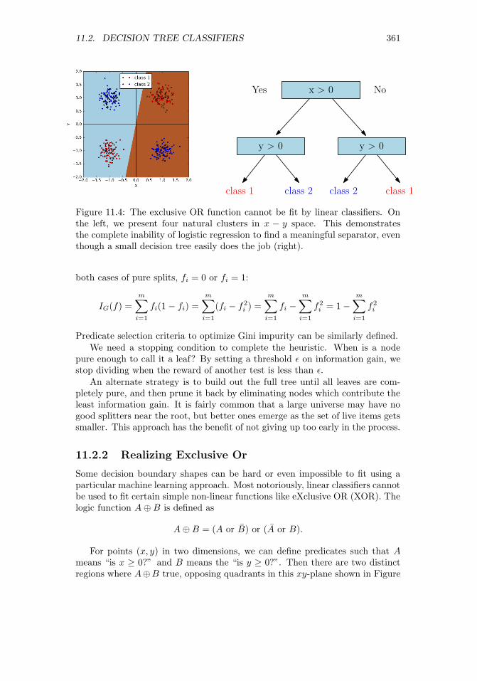
11.2. DECISION TREE CLASSIFIERS 361
Yes No
class 1
x > 0
y > 0y > 0
class 1class 2 class 2
Figure 11.4: The exclusive OR function cannot be fit by linear classifiers. Onthe left, we present four natural clusters in x − y space. This demonstratesthe complete inability of logistic regression to find a meaningful separator, eventhough a small decision tree easily does the job (right).
both cases of pure splits, fi = 0 or fi = 1:
IG(f) =
m∑i=1
fi(1− fi) =
m∑i=1
(fi − f2i ) =
m∑i=1
fi −m∑i=1
f2i = 1−
m∑i=1
f2i
Predicate selection criteria to optimize Gini impurity can be similarly defined.We need a stopping condition to complete the heuristic. When is a node
pure enough to call it a leaf? By setting a threshold ε on information gain, westop dividing when the reward of another test is less than ε.
An alternate strategy is to build out the full tree until all leaves are com-pletely pure, and then prune it back by eliminating nodes which contribute theleast information gain. It is fairly common that a large universe may have nogood splitters near the root, but better ones emerge as the set of live items getssmaller. This approach has the benefit of not giving up too early in the process.
11.2.2 Realizing Exclusive Or
Some decision boundary shapes can be hard or even impossible to fit using aparticular machine learning approach. Most notoriously, linear classifiers cannotbe used to fit certain simple non-linear functions like eXclusive OR (XOR). Thelogic function A⊕B is defined as
A⊕B = (A or B) or (A or B).
For points (x, y) in two dimensions, we can define predicates such that Ameans “is x ≥ 0?” and B means the “is y ≥ 0?”. Then there are two distinctregions where A⊕B true, opposing quadrants in this xy-plane shown in Figure

362 CHAPTER 11. MACHINE LEARNING
11.4 (left). The need to carve up two regions with one line explains why XORis impossible for linear classifiers.
Decision trees are powerful enough to recognize XOR. Indeed, the two-leveltree in Figure 11.4 (right) does the job. After the root tests whether A is trueor false, the second level tests for B are already conditioned on A, so each ofthe four leaves can be associated with a distinct quadrant, allowing for properclassification.
Although decision trees can recognize XOR, that doesn’t mean it is easy tofind the tree that does it. What makes XOR hard to deal with is that you can’tsee yourself making progress toward better classification, even if you pick thecorrect root node. In the example above, choosing a root node of “is x > 0?”causes no apparent enrichment of class purity on either side. The value of thistest only becomes apparent if we look ahead another level, since the informationgain is zero.
Greedy decision tree construction heuristics fail on problems like XOR. Thissuggests the value of more sophisticated and computationally expensive treebuilding procedures in difficult cases, which look-ahead like computer chessprograms, evaluating the worth of move p not now, but how it looks severalmoves later.
11.2.3 Ensembles of Decision Trees
There are an enormous number of possible decision trees which can be builton any training set S. Further, each of them will classify all training examplesperfectly, if we keep refining until all leaves are pure. This suggests buildinghundreds or even thousands of different trees, and evaluating a query item qagainst each of them to return a possible label. By letting each tree cast itsown independent vote, we gain confidence that the most commonly seen labelwill be the right label.
For this to avoid group-think, we need the trees to be diverse. Repeatedlyusing a deterministic construction procedure that finds the best tree is worthless,because they will all be identical. Better would be to randomly select a newsplitting dimension at each tree node, and then find the best possible thresholdfor this variable to define the predicate.
But even with random dimension selection, the resulting trees often arehighly correlated. A better approach is bagging, building the best possible treeson relatively small random subsets of items. Done properly, the resulting treesshould be relatively independent of each other, providing a diversity of classifiersto work with, facilitating the wisdom of crowds.
Using ensembles of decision trees has another advantage beyond robustness.The degree of consensus among the trees offers a measure of confidence for anyclassification decision. There is a big difference in the majority label appearingin 501 of 1000 trees vs. 947 of them.
This fraction can be interpreted as a probability, but even better might beto feed this number into logistic regression for a better motivated measure ofconfidence. Assuming we have a binary classification problem, let fi denote the

11.3. BOOSTING AND ENSEMBLE LEARNING 363
fraction of trees picking class C1 on input vector Xi. Run the entire trainingset through the decision tree ensemble. Now define a logistic regression problemwhere fi is input variable and the class of Xi the output variable. The resultinglogit function will determine an appropriate confidence level, for any observedfraction of agreement.
11.3 Boosting and Ensemble Learning
The idea of aggregating large numbers of noisy “predictors” into one strongerclassifier applies to algorithms as well as crowds. It is often the case that manydifferent features all weakly correlate with the dependent variable. So what isthe best way we can combine them into one stronger classifier?
11.3.1 Voting with Classifiers
Ensemble learning is the strategy of combining many different classifiers into onepredictive unit. The naive Bayes approach of Section 11.1 has a little of thisflavor, because it uses each feature as a separate relatively weak classifier, thenmultiplies them together. Linear/logistic regression has a similar interpretation,in that it assigns a weight to each feature to maximize the predictive power ofthe ensemble.
But more generally, ensemble learning revolves on the idea of voting. We sawthat decision trees can be more powerful in aggregate, by constructing hundredsor thousands of them over random subsets of examples. The wisdom of crowdscomes from the triumph of diversity of thought over the individual with greatestexpertise.
Democracy rests on the principle of one man, one vote. Your educated,reasoned judgment of the best course of action counts equally as the vote ofthat loud-mouthed idiot down the hall. Democracy makes sense in terms of thedynamics of society: shared decisions generally affect the idiot just as much asthey do you, so equality dictates that all people deserve an equal say in thematter.
But the same argument does not apply to classifiers. The most natural wayto use multiple classifiers gives each a vote, and takes the majority label. Butwhy should each classifier get the same vote?
Figure 11.5 captures some of the complexity of assigning weights to classi-fiers. The example consists of five voters, each classifying five items. All votersare pretty good, each getting 60% correct, with the exception of v1, who batted80%. The majority option proves no better than the worst individual classifier,however, at 60%. But a perfect classifier results if we drop voters v4 and v5 andweigh the remainders equally. What makes v2 and v3 valuable is not their over-all accuracy, but their performance on the hardest problems (D and especiallyE).
There seem to be three primary ways to assign weights to the classifier/voters.The simplest might be to give more weight to the votes of classifiers who have

364 CHAPTER 11. MACHINE LEARNING
Item/voter V1 V2 V3 V4 V5 Majority Best weightsA * * * * * *B * * * * * *C * * * * * *D * * *E * * *
% correct 80% 60% 60% 60% 60% 60% 100%best weight 1/3 1/3 1/3 0 0
Figure 11.5: Uniform weighting of votes does not always produce the best pos-sible classifier, even when voters are equally accurate, because some probleminstances are harder than others (here, D and E). The “*” denotes that thegiven voter classified the given item correctly.
proven accurate in the past, perhaps assigning vi the multiplicative weight ti/T ,where ti is the number of times vi classified correctly and T =
∑ci=1 ti. Note
that this weighting scheme would do no better than majority rule on the exampleof Figure 11.5.
A second approach could be to use linear/logistic regression to find the bestpossible weights. In a binary classification problem, the two classes would bedenoted as 0 and 1, respectively. The 0-1 results from each classifier can beused as a feature to predict the actual class value. This formulation would findnon-uniform weights that favor classifiers correlated with the correct answers,but do not explicitly seek to maximize the number of correct classifications.
11.3.2 Boosting Algorithms
The third idea is boosting. The key point is to weigh the examples accordingto how hard they are to get right, and reward classifiers based on the weight ofthe examples they get right, not just the count.
To set the weights of the classifier, we will adjust the weights of the trainingexamples. Easy training examples will be properly classified by most classifiers:we reward classifiers more for getting the hard cases right.
A representative boosting algorithm is AdaBoost, presented in Figure 11.6.We will not stress the details here, particularly the specifics of the weight ad-justments in each round. We presume our classifier will be constructed as theunion of non-linear classifiers of the form “is (vi ≥ ti)?”, i.e. using thresholdedfeatures as classifiers.
The algorithm proceeds in T rounds, for t = {0, . . . , T}. Initially all train-ing examples (points) should be of equal weight, so wi,0 = 1/n for all pointsx1, . . . , xn. We consider all possible feature/threshold classifiers, and identifythe fi(x) which minimizes εt, the sum of the weights of the misclassified points.The weight αt of the new classifier depends upon how accurate it is on the

11.3. BOOSTING AND ENSEMBLE LEARNING 365
AdaBoost
For t in 1 . . . T :
• Choose ft(x):
• Find weak learner ht(x) that minimizes εt, the weighted sumerror for misclassified points εt =
∑i wi,t
• Choose αt = 12 ln
(1−εtεt
)• Add to ensemble:
• Ft(x) = Ft−1(x) + αtht(x)
• Update weights:
• wi,t+1 = (wi,t)e−yiαtht(xi) for all i
• Renormalize wi,t+1 such that∑i wi,t+1 = 1
Figure 11.6: Pseudocode for the AdaBoost algorithm.
current point set, as measured by
αt =1
2ln(
1− εtεt
)
The point weights are normalized so∑ni=1 wi = 1, so there must always be a
classifier with error εt ≤ 0.5.3
In the next round, the weights of the misclassified points are boosted tomake them more important. Let ht(xi) be the class (−1 or 1) predicted for xi,and yi the correct class or that point. The sign of ht(xi) · y reflects whetherthe classes agree (positive) or disagree (negative). We then adjust the weightsaccording to
w′i,t+1 = wi,te−yiαtht(xi)
before re-normalizing all of them so they continue to sum to 1, i.e.
C =
n∑i=1
w′i,t+1, and wi,t+1 = w′i,t+1/C.
The example in Figure 11.7 shows a final classifier as the linear sum of threethresholded single-variable classifiers. Think of them as the simplest possible
3Consider two classifiers, one which calls class C0 if xi ≥ ti, the other of which calls classC1 if xi ≥ ti. The first classifier is right exactly when the second one is wrong, so one of thesetwo must be at least 50%.

366 CHAPTER 11. MACHINE LEARNING
0.42 + 0.65 + 0.92
Figure 11.7: The final classifier is a weighted ensemble that correctly classifiesall points, despite errors in each component classifier which are highlighted inred.
decision trees, each with exactly one node. The weights assigned by AdaBoostare not uniform, but not so crazily skewed in this particular instance that theybehave different than a majority classifier. Observe the non-linear decisionboundary, resulting from the discrete nature of thresholded tests/decision trees.
Boosting is particularly valuable when applied to decision trees as the el-ementary classifiers. The popular gradient boosted decision trees (GBDT) ap-proach typically starts with a universe of small trees, with perhaps four to tennodes each. Such trees each encode a simple-enough logic that they do notoverfit the data. The relative weights assigned to each of these trees followsfrom a training procedure, which tries to fit the errors from the previous rounds(residuals) and increases the weights of the trees that correctly classified theharder examples.
Boosting works hard to classify every training instance correctly, meaningit works particularly hard to classify the most difficult instances. There is anadage that “hard cases make bad law,” suggesting that difficult-to-decide casesmake poor precedents for subsequent analysis. This is an important argumentagainst boosting, because the method would seem prone to overfitting, althoughit generally performs well in practice.
The danger of overfitting is particularly severe when the training data isnot a perfect gold standard. Human class annotations are often subjective andinconsistent, leading boosting to amplify the noise at the expense of the signal.The best boosting algorithms will deal with overfitting though regularization.The goal will be to minimize the number of non-zero coefficients, and avoidlarge coefficients that place too much faith in any one classifier in the ensemble.
Take-Home Lesson: Boosting can take advantage of weak classifiers in an ef-fective way. However, it can behave in particularly pathological ways when afraction of your training examples are incorrectly annotated.
11.4 Support Vector Machines
Support vector machines (SVMs) are an important way of building non-linearclassifiers. They can be viewed as a relative of logistic regression, which sought

11.4. SUPPORT VECTOR MACHINES 367
Figure 11.8: SVMs seek to separate the two classes by the largest margin,creating a channel around the separating line.
the line/plane l best separating points with two classes of labels. Logistic re-gression assigned a query point q its class label depending upon whether q layabove or below this line l. Further, it used the logit function to transform thedistance from q to l into the probability that q belongs in the identified class.
The optimization consideration in logistic regression involved minimizingthe sum of the misclassification probabilities over all the points. By contrast,support vector machines work by seeking maximum margin linear separatorsbetween the two classes. Figure 11.8(left) shows red and blue points separatedby a line. This line seeks to maximize the distance d to the nearest trainingpoint, the maximum margin of separation between red and blue. This a naturalobjective in building a decision boundary between two classes, since the largerthe margin, the farther any of our training points are from being misclassified.The maximum margin classifier should be the most robust separator betweenthe two classes.
There are several properties that help define the maximum margin separatorbetween sets of red and blue points:
• The optimal line must be in the midpoint of the channel, a distance daway from both the nearest red point and the nearest blue point. If thiswere not so, we could shift the line over until it did bisect this channel,thus enlarging the margin in the process.
• The actual separating channel is defined by its contact with a small num-ber of the red and blue points, where “a small number” means at mosttwice the number of dimensions of the points, for well-behaved point setsavoiding d + 1 points lying on any d-dimensional face. This is differentthan with logistic regression, where all the points contribute to fitting the

368 CHAPTER 11. MACHINE LEARNING
Figure 11.9: Both logistic regression and SVMs produce separating lines betweenpoint sets, but optimized for different criteria.
best position of the line. These contact points are the support vectorsdefining the channel.
• Points inside the convex hull of either the red or blue points have absolutelyno effect on the maximum margin separator, since we need all same-coloredpoints to be on the same side of the boundary. We could delete theseinterior points or move them around, but the maximum margin separatorwill not change until one of the points leaves the hull and enters theseparating strip.
• It is not always possible to perfectly separate red from blue by using astraight line. Imagine a blue point sitting somewhere within the convexhull of the red points. There is no way to carve this blue point away fromthe red using only a line.
Logistic regression and support vector machines both produce separatinglines between point sets. These are optimized for different criteria, and hencecan be different, as shown in Figure 11.9. Logistic regression seeks the separatorwhich maximizes the total confidence in our classification summed over all thepoints, while the wide margin separator of SVM does the best it can withthe closest points between the sets. Both methods generally produce similarclassifiers.

11.4. SUPPORT VECTOR MACHINES 369
11.4.1 Linear SVMs
These properties define the optimization of linear support vector machines. Theseparating line/plane, like any other line/plane, can be written as
w · x− b = 0
for a vector of coefficients w dotted with a vector of input variables x. Thechannel separating the two classes will be defined by two lines parallel to thisand equidistant on both sides, namely w · x− b = 1 and w · x− b = 1.
The actual geometric separation between the lines depends upon w, namely2/||w||. For intuition, think about the slope in two dimensions: these lines willbe distance 2 apart for horizontal lines but negligibly far apart if they are nearlyvertical. This separating channel must be devoid of points, and indeed separatered from blue points. Thus we must add constraints. For every red (class 1)point xi, we insist that
w · x− b ≥ 1,
while every blue (class −1) point xi must satisfy
w · x− b ≤ −1,
If we let yi ∈ [−1, 1] denote the class of xi, then these can be combined to yieldthe optimization problem
max ||w||, where yi(w · xi − b) ≥ 1 for all 1 ≤ i ≤ n.
This can be solved using techniques akin to linear programming. Note thatthe channel must be defined by the points making contact with its boundaries.These vectors “support” the channel, which is where the provocative name sup-port vector machines comes from. The optimization algorithm of efficient solverslike LibLinear and LibSVM search through the relevant small subsets of supportvectors which potentially define separating channels to find the widest one.
Note that there are more general optimization criteria for SVMs, whichseek the line that defines a wide channel and penalizes (but does not forbid)points that are misclassified. This sort of dual-objective function (make thechannel wide while misclassifying few points) can be thought of as a form ofregularization, with a constant to trade off between the two objectives. Gradientdescent search can be used to solve these general problems.
11.4.2 Non-linear SVMs
SVMs define a hyperplane which separates the points from the two classes.Planes are lines in higher dimensions, readily defined using linear algebra. Sohow can this linear method produce a non-linear decision boundary?
For a given point set to have a maximum margin separator, the two colorsmust first be linearly separable. But as we have seen this is not always the case.Consider the pathological case of Figure 11.10 (left), where the cluster of red

370 CHAPTER 11. MACHINE LEARNING
Figure 11.10: Projecting points to higher dimensions can make them linearlyseparable.
points is surrounded by a ring-shaped cluster of black points. How might sucha thing arise? Suppose we partition travel destinations into day trips or longtrips, depending upon whether they are close enough to our given location. Thelongitude and latitudes of each possible destination will yield data with exactlythe same structure as Figure 11.10 (left).
The key idea is that we can project our d-dimensional points into a higher-dimensional space, where there will be more possibilities to separate them. Forn red/blue points along a line in one dimension, there are only n−1 potentiallyinteresting ways to separate them, specifically with a cut between the ith and
(i + 1)st points for 1 ≤ i < n. But this blows up to approximately(n2
)ways
as we move to two dimensions, because there is more freedom to partition aswe increase dimensionality. Figure 11.10 (right) demonstrates how lifting pointsthrough the transformation (x, y)→ (x, y, x2 + y2) puts them on a paraboloid,and makes it possible to linearly separate classes which were inseparable in theoriginal space.
If we jack the dimensionality of any two-class point set high enough, therewill always be a separating line between the red and black points. Indeed, ifwe put the n points in n dimensions through a reasonable transform, they willalways be linearly separable in a very simple way. For intuition, think about thespecial case of two points (one red and one blue) in two dimensions: obviouslythere must be a line separating them. Projecting this separating plane down tothe original space results in some form of curved decision boundary, and hencethe non-linearity of SVMs depends upon exactly how the input was projectedto a higher-dimensional space.
One nice way to turn n points in d dimensions into n points in n dimensions

11.4. SUPPORT VECTOR MACHINES 371
might be to represent each point by its distances to all n input points. Inparticular, for each point pi we can create a vector vi such that vij = dist(i, j),the distance from pi to pj . The vector of such distances should serve as apowerful set of features for classifying any new point q, since the distances tomembers of the actual class should be small compared to those of the otherclass.
This feature space is indeed powerful, and one can readily imagine writinga function to turn the original n × d feature matrix into a new n × n featurematrix for classification. The problem here is space, because the number ofinput points n is usually vastly larger than the dimension d that they sit in.Such a transform would be feasible to construct only for fairly small point sets,say n ≤ 1000. Further, working with such high-dimensional points should bevery expensive, since every single distance evaluation now takes time linear inthe number of points n, instead of the data dimension d. But something amazinghappens. . .
11.4.3 Kernels
The magic of SVMs is that this distance-feature matrix need not actually becomputed explicitly. In fact, the optimization inherent in finding the maximummargin separator only performs the dot products of points with other pointsand vectors. Thus we could imagine performing the distance expansion on thefly, when the associated point is being used in a comparison. Hence there wouldbe no need to precompute the distance matrix: we can expand the points fromd to n dimensions as needed, do the distance computation, and then throw theexpansions away.
This would work to eliminate the space bottleneck, but we would still paya heavy price in computation time. The really amazing thing is that there arefunctions, called kernels, which return what is essentially the distance compu-tation on the larger vector without ever constructing the larger vector. DoingSVMs with kernels gives us the power of finding the best separator over a varietyof non-linear functions without much additional cost. The mathematics movesbeyond the scope of what I’d like to cover here, but:
Take-Home Lesson: Kernel functions are what gives SVMs their power to sep-arate project d-dimensional points to n dimensions, so they can be separatedwithout spending more that d steps on the computation.
Support vector machines require experience to use effectively. There aremany different kernel functions available, beyond the distance kernel I presentedhere. Each have advantages on certain data sets, so there is a need to futz withthe options of tools like LibSVM to get the best performance. They work beston medium-sized data sets, with thousands but not millions of points.

372 CHAPTER 11. MACHINE LEARNING
11.5 Degrees of Supervision
There is a natural distinction between machine learning approaches based onthe degree and nature of the supervision employed in amassing training andevaluation data. Like any taxonomy, there is some fuzziness around the margins,making it an unsatisfying exercise to try to label exactly what a given systemis and is not doing. However, like any good taxonomy it gives you a frame toguide your thinking, and suggests approaches that might lead to better results.
The methods discussed so far in this chapter assume that we are given train-ing data with class labels or target variables, leaving our task as one to trainclassifier or regression systems. But getting to the point of having labeled datais usually the hard part. Machine learning algorithms generally perform betterthe more data you can give them, but annotation is often difficult and expen-sive. Modulating the degree of supervision provides a way to raise the volumeso your classifier can hear what is going on.
11.5.1 Supervised Learning
Supervised learning is the bread-and-butter paradigm for classification and re-gression problems. We are given vectors of features xi, each with an associatedclass label or target value yi. The annotations yi represent the supervision,typically derived from some manual process which limits the potential amountof training data.
In certain problems, the annotations of the training data come from obser-vations in interacting with the world, or at least a simulation of it. Google’sAlphaGo program was the first computer program to beat the world championat Go. A position evaluation function is a scoring function that takes a boardposition and computes a number estimating how strong it is. AlphaGo’s posi-tion evaluation function was trained on all published games by human masters,but much more data was needed. The solution was, essentially, to build a po-sition evaluator by training against itself. Position evaluation is substantiallyenhanced by search – looking several moves ahead before calling the evaluationfunction on each leaf. Trying to predict the post-search score without the searchproduces a stronger evaluation function. And generating this training data isjust a result of computation: the program playing against itself.
This idea of learning from the environment is called reinforcement learn-ing. It cannot be applied everywhere, but it is always worth looking for cleverapproaches to generate mechanically-annotated training data.
11.5.2 Unsupervised Learning
Unsupervised methods try to find structure in the data, by providing labels(clusters) or values (rankings) without any trusted standard. They are bestused for exploration, for making sense of a data set otherwise untouched byhuman hands.

11.5. DEGREES OF SUPERVISION 373
The mother of all unsupervised learning methods is clustering, which wediscussed extensively in Section 10.5. Note that clustering can be used to providetraining data for classification even in the absence of labels. If we presume thatthe clusters found represent genuine phenomenon, we can then use the clusterID as a label for all the elements in the given cluster. These can now serve astraining data to build a classifier to predict the cluster ID. Predicting clusterIDs can be useful even if these concepts do not have a name associated withthem, providing a reasonable label for any input record q.
Topic Modeling
Another important class of unsupervised methods is topic modeling, typicallyassociated with documents drawn over a given vocabulary. Documents are writ-ten about topics, usually a mix of topics. This book is partitioned into chapters,each of which is about a different topic, but it also touches on subjects rangingfrom baseball to weddings. But what is a topic? Typically each topic is associ-ated with a particular set of vocabulary words. Articles about baseball mentionhits, pitchers, strikeouts, bases, and slugging. Married, engaged, groom, bride,love, and celebrate are words associated with the topic of wedding. Certainwords can represent multiple topics. For example love is also associated withtennis, and hits with gangsters.
Once one has a set of topics (t1, . . . , tk) and the words which define them, theproblem of identifying the specific topics associated with any given documentd seems fairly straightforward. We count the number of word occurrences of din common with ti, and report success whenever this is high enough. If givena set of documents manually labeled with topics, it seems reasonable to countthe frequency of each word over every topic class, to construct the list of wordsmost strongly associated with each topic.
But that is all very heavily supervised. Topic modeling is an unsupervisedapproach that infers the topics and the word lists from scratch, just given un-labeled documents. We can represent these texts by a w × d frequency matrixF , where w is the vocabulary size and d the number of documents and F [i, j]reflects how many times work i appears in document j. Suppose we factor Finto F ≈W ×D, where W is a w× t word–topic matrix and D is a t× d topic–document matrix. The largest entries in the ith row of W reflect the topicsword wi is most strongly linked to, while the largest entries in the jth columnof D reflect the topics best represented in document dj .
Such a factorization would represent a completely unsupervised form oflearning, with the exception of specifying the desired number of topics t. Itseems a messy process to construct such an approximate factorization, but thereare a variety of approaches to try to do so. Perhaps the most popular methodfor topic modeling is an approach called latent Dirichlet allocation (LDA), whichproduces a similar set of matrices W and D, although not strictly produced byfactorization.
Figure 11.5.2 presents a toy example of LDA in action. Three excellentbooks were analyzed, with the goal of seeing how they were organized among

374 CHAPTER 11. MACHINE LEARNING
Figure 11.11: Illustration of topic modeling (LDA). The three books are rep-resented by their distribution of topics (left). Each topic is represented by alist of words, with the weight a measure of its importance to the topic (right).Documents are made up of words: the magic of LDA is that it simultaneouslyinfers the topics and word assignments in an unsupervised manner.
three latent topics. The LDA algorithm defined these topics in an unsupervisedway, by assigning each word weights for how much it contributes to each topic.The results here are generally effective: the concept of each topic emerges fromits most important words (on the right). And the word distribution within eachbook can then be readily partitioned among the three latent topics (on the left).
Note that this factorization mindset can be applied beyond documents, toany feature matrix F . The matrix decomposition approaches we have previouslydiscussed, like singular value decomposition and principle components analysis,are equally unsupervised, inducing structure inherent in the data sets withoutour lead in finding it.
11.5.3 Semi-supervised Learning
The gap between supervised and unsupervised learning is filled by semi-supervisedlearning methods, which amplify small amounts of labeled training data intomore. Turning small numbers of examples into larger numbers is often calledbootstrapping, from the notion of “pulling yourself up from your bootstraps.”Semi-supervised approaches personify the cunning which needs be deployed tobuild substantive training sets.
We assume that we are given a small number of labeled examples as (xi, yi)pairs, backed by a large number of inputs xj of unknown label. Instead ofdirectly building our model from the training set, we can use it to classify themass of unlabeled instances. Perhaps we use a nearest neighbor approach toclassify these unknowns, or any of the other approaches we have discussed here.But once we classify them, we assume the labels are correct and retrain on thelarger set.
Such approaches benefit strongly from having a reliable evaluation set. Weneed to establish that the model trained on the bootstrapped examples performsbetter than one trained on what we started with. Adding billions of trainingexamples is worthless if the labels are garbage.
There are other ways to generate training data without annotations. Oftenit seems easier to find positive examples than negative examples. Consider the
Text T1 T2 T3
The Bible 0.73 0.01 0.26Data Sci Manual 0.05 0.83 0.12Who’s Bigger? 0.08 0.23 0.69
T1 T2 T3
Term Weight Term Weight Term Weight
God 0.028 CPU 0.021 past 0.013Jesus 0.012 computer 0.010 history 0.011pray 0.006 data 0.005 old 0.006Israel 0.003 program 0.003 war 0.004Moses 0.001 math 0.002 book 0.002

11.5. DEGREES OF SUPERVISION 375
problem of training a grammar corrector, meaning it distinguishes proper bitsof writing from ill-formed stuff. It is easy to get a hold of large amounts ofproper examples of English: whatever gets published in books and newspapersgenerally qualifies as good. But it seems harder to get a hold of a large corporaof incorrect writing. Still, we can observe that randomly adding, deleting, orsubstituting arbitrary words to any text almost always makes it worse.4 Bylabeling all published text as correct and all random perturbations as incorrect,we can create as large a training set as we desire without hiring someone toannotate it.
How can we evaluate such a classifier? It is usually feasible to get enoughgenuine annotated data for evaluation purposes, because what we need for eval-uation is typically much smaller than that for training. We can also use ourclassifier to suggest what to annotate. The most valuable examples for the anno-tator to vet are those that our classifier makes mistakes on: published sentencesmarked incorrect or random mutations that pass the test are worth passing toa human judge.
11.5.4 Feature Engineering
Feature engineering is the fine art of applying domain knowledge to make iteasier for machine learning algorithms to do their intended job. In the contextof our taxonomy here, feature engineering can be considered an important partof supervised learning, where the supervision applies to the feature vectors xiinstead of the associated target annotations yi.
It is important to ensure that features are presented to models in a way thatthe model can properly use them. Incorporating application-specific knowledgeinto the data instead of learning it sounds like cheating, to amateurs. But thepros understand that there are things that cannot be learned easily, and henceare better explicitly put into the feature set.
Consider a model to price art at auctions. Auction houses make their moneyby charging a commission to the winning bidder, on top of what they paythe owner. Different houses charge different rates, but they can amount to asubstantial bill. Since the total cost to the winner is split between purchaseprice and commission, higher commissions may well lower the purchase price,by cutting into what the bidder can afford to pay the owner.
So how can you represent the commission price in an art pricing model? I canthink of at least three different approaches, some of which can have disastrousoutcomes:
• Specify the commission percentage as a feature: Representing the housecut (say 10%) as a column in the feature set might not be usable in alinear model. The hit taken by the bidder is the product of the tax rateand the final price. It has a multiplicative effect, not an additive effect,
4Give it a try someplace on this page. Pick a word at random and replace it by red. Thenagain with the. And finally with defenestrate. Is my original text clearly better written thanwhat you get after such a change?

376 CHAPTER 11. MACHINE LEARNING
and hence cannot be meaningfully exploited if the price range for the artspans from $100 to $1,000,000.
• Include the actual commission paid as a feature: Cheater. . . If you includethe commission ultimately paid as a feature, you pollute the features withdata not known at the time of the auction. Indeed, if all paintings werefaced with a 10% tax, and the tax paid was a feature, a perfectly accurate(and completely useless) model would predict the price as ten times thetax paid!
• Set the regression target variable to be the total amount paid: Since thehouse commission rates and add-on fees are known to the buyer beforethey make the bid, the right target variable should be the total amountpaid. Any given prediction of the total purchase price can be broken downlater into the purchase price, commission, and taxes according to the rulesof the house.
Feature engineering can be thought of as a domain-dependent version of datacleaning, so the techniques discussed in Section 3.3 all apply here. The mostimportant of them will be reviewed here in context, now that we have finallyreached the point of actually building data-driven models:
• Z-scores and normalization: Normally-distributed values over compara-ble numerical ranges make the best features, in general. To make theranges comparable, turn the values into Z-scores, by subtracting off themean and dividing by the standard deviation, Z = (x− µ)/σ. To make apower law variable more normal, replace x in the feature set with log x.
• Impute missing values: Make sure there are no missing values in yourdata and, if so, replace them by a meaningful guess or estimate. Recordingthat someone’s weight equals −1 is an effortless way to mess up any model.The simplest imputation method replaces each missing value by the meanof the given column, and generally suffices, but stronger methods traina model to predict the missing value based on the other variables in therecord. Review Section 3.3.3 for details.
• Dimension reduction: Recall that regularization is a way of forcing mod-els to discard irrelevant features to prevent overfitting. It is even moreeffective to eliminate irrelevant features before fitting your models, by re-moving them from the data set. When is a feature x likely irrelevant foryour model? Poor correlation with the target variable y, plus the lack ofany qualitative reason you can give for why x might impact y are bothexcellent indicators.
Dimension reduction techniques like singular-value decomposition are ex-cellent ways to reduce large feature vectors to more powerful and conciserepresentations. The benefits include faster training times, less overfitting,and noise reduction from observations.

11.6. DEEP LEARNING 377
• Explicit incorporation of non-linear combinations: Certain products orratios of feature variables have natural interpretations in context. Areaor volume are products of length, width, and height, yet cannot be partof any linear model unless explicitly made a column in the feature ma-trix. Aggregate totals, like career points scored in sports or total dollarsearned in salary, are usually incomparable between items of different ageor duration. But converting totals into rates (like points per game playedor dollars per hour) usually make more meaningful features.
Defining these products and ratios requires domain-specific information,and careful thought during the feature engineering process. You are muchmore likely to know the right combinations than your non-linear classifieris to find it on its own.
Don’t be shy here. The difference between a good model and a bad modelusually comes down to quality of its feature engineering. Advanced machinelearning algorithms are glamorous, but it is the data preparation that producesthe results.
11.6 Deep Learning
The machine learning algorithms we have studied here do not really scale well tohuge data sets, for several reasons. Models like linear regression generally haverelatively few parameters, say one coefficient per column, and hence cannotreally benefit from enormous numbers of training examples. If the data has agood linear fit, you will be able to find it with a small data set. And if doesn’t,well, you didn’t really want to find it anyway.
Deep learning is an incredibly exciting recent development in machine learn-ing. It is based on neural networks, a popular approach from the 1980s whichthen fell substantially out of style. But over the past five years something hap-pened, and suddenly multi-layer (deep) networks began wildly out-performingtraditional approaches on classical problems in computer vision and naturallanguage processing.
Exactly why this happened remains somewhat of a mystery. It doesn’t seemthat there was a fundamental algorithmic breakthrough so much as that datavolume and computational speeds crossed a threshold where the ability to ex-ploit enormous amounts of training data overcame methods more effective atdealing with a scarce resource. But infrastructure is rapidly developing to lever-age this advantage: new open source software frameworks like Google’s Tensor-Flow make it easy to specify network architectures to special-purpose processorsdesigned to speed training by orders of magnitude.
What distinguishes deep learning from other approaches is that it generallyavoids feature engineering. Each layer in a neural network generally acceptsas its input the output of its previous layer, yielding progressively higher-levelfeatures as we move up towards the top of the network. This serves to definea hierarchy of understanding from the raw input to the final result, and indeed

378 CHAPTER 11. MACHINE LEARNING
v1
1
v1
2
v1
3
v2
1
v2
2
v2
3
v2
4
v3
1
v3
2
v3
3
v3
4
v4
1
v4
2
w4
24
layer 1 layer 2 layer 3 layer 4
Figure 11.12: Deep learning networks have hidden layers of parameters.
the penultimate level of a network designed for one task often provides usefulhigh-level features for related tasks.
Why are neural networks so successful? Nobody really knows. There areindications that for many tasks the full weight of these networks are not reallyneeded; that what they are doing will eventually be done using less opaquemethods. Neural networks seem to work by overfitting, finding a way to usemillions of examples to fit millions of parameters. Yet they generally manageto avoid the worst behavior of overfitting, perhaps by using less precise ways toencode knowledge. A system explicitly memorizing long strings of text to splitout on demand will seem brittle and overfit, while one representing such phrasesin a looser way is liable to be more flexible and generalizable.
This is a field which is advancing rapidly, enough so that I want to keepmy treatment strictly at the idea level. What are the key properties of thesenetworks? Why have they suddenly become so successful?
Take-Home Lesson: Deep learning is a very exciting technology that has legs,although it is best suited for domains with enormous amounts of training data.Thus most data science models will continue to be built using the traditionalclassification and regression algorithms that we detailed earlier in this chapter.
11.6.1 Networks and Depth
Figure 11.12 illustrates the architecture of a deep learning network. Each nodex represents a computational unit, which computes the value of a given sim-ple function f(x) over all inputs to it. For now, perhaps view it as a simpleadder that adds all the inputs, then outputs the sum. Each directed edge (x, y)connects the output of node x to the input of a node y higher in the network.Further, each such edge has an associated multiplier coefficient wx,y. The valueactually passed to y is the wx,y · f(x), meaning node y computes a weightedsum of its inputs.
The left column of Figure 11.12 represents a set of input variables, the valuesof which change whenever we ask the network to make a prediction. Think of this

11.6. DEEP LEARNING 379
as the interface to the network. Links from here to the next level propagate outthis input value to all the nodes which will compute with it. On the right side areone or more output variables, presenting the final results of this computation.Between these input and output layers sit hidden layers of nodes. Given theweights of all the coefficients, the network structure, and the values of inputvariables, the computation is straightforward: compute the values of the lowestlevel in the network, propagate them forward, and repeat from the next leveluntil you hit the top.
Learning the network means setting the weights of the coefficient parameterswx,y. The more edges there are, the more parameters we have to learn. In prin-ciple, learning means analyzing a training corpus of (xi, yi) pairs, and adjustingweights of the edge parameters so that the output nodes generate somethingclose to yi when fed input xi.
Network Depth
The depth of the network should, in some sense, correspond to the conceptualhierarchy associated with the objects being modeled. The image we should haveis the input being successively transformed, filtered, boiled down, and bangedinto better and better shape as we move up the network. Generally speaking,the number of nodes should progressively decrease as we move up to higherlayers.
We can think of each layer as providing a level of abstraction. Consider aclassification problem over images, perhaps deciding whether the image containsa picture of a cat or not. Thinking in terms of successive levels of abstraction, im-ages can be said to be made from pixels, neighborhood patches, edges, textures,regions, simple objects, compound objects, and scenes. This is an argument thatat least eight levels of abstraction could potentially be recognizable and usableby networks on images. Similar hierarchies exist in document understanding(characters, words, phrases, sentences, paragraphs, sections, documents) andany other artifacts of similar complexity.
Indeed, deep learning networks trained for specific tasks can produce valu-able general-purpose features, by exposing the outputs of lower levels in thenetwork as powerful features for conventional classifiers. For example, Imagenetis a popular network for object recognition from images. One high-level layer of1000 nodes measures the confidence that the image contains objects of each of1000 different types. The patterns of what objects light up to what degree aregenerally useful for other tasks, such as measuring image similarity.
We do not impose any real vision of what each of these levels should repre-sent, only to connect them so that the potential to recognize such complexityexists. Neighborhood patches are functions of small groups of connected pixels,while regions will be made up of small numbers of connected patches. Somesense of what we are trying to recognize goes into designing this topology, butthe network does what it feels it has to do during training to minimize trainingerror, or loss.
The disadvantages of deeper networks is that they become harder to train

380 CHAPTER 11. MACHINE LEARNING
Figure 11.13: Addition networks do not benefit from depth. The two layernetwork (left) computes exactly the function as the equivalent one layer network(right).
the larger and deeper they get. Each new layer adds a fresh set of edge-weightparameters, increasing the risks of overfitting. Properly ascribing the effect ofprediction errors to edge-weights becomes increasingly difficult, as the numberof intervening layers grows between the edge and the observed result. However,networks with over ten layers and millions of parameters have been success-fully trained and, generally speaking, recognition performance increases withthe complexity of the network.
Networks also get more computationally expensive to make predictions asthe depth increases, since the computation takes time linear in the number ofedges in the network. This is not terrible, especially since all the nodes on anygiven level can be evaluated in parallel on multiple cores to reduce the predictiontime. Training time is where the real computational bottlenecks generally exist.
Non-linearity
The image of recognizing increasing levels of abstraction up the hidden layersof a network is certainly a compelling one. It is fair to ask if it is real, however.Do extra layers in a network really give us additional computational power todo things we can’t with less?
The example of Figure 11.13 seems to argue the converse. It shows additionnetworks built with two and three layers of nodes, respectively, but both com-pute exactly the same function on all inputs. This suggests that the extra layerwas unnecessary, except perhaps to reduce the engineering constraint of nodedegree, the number of edges entering as input.
What it really shows is that we need more complicated, non-linear node ac-tivation functions φ(v) to take advantage of depth. Non-linear functions cannotbe composed in the same way that addition can be composed to yield addition.This nonlinear activation function φ(vi) typically operates on a weighted sum

11.6. DEEP LEARNING 381
Figure 11.14: The logistic (left) and ReLU (right) activation functions for nodesin neural networks.
of the inputs x, where
vi = β +∑i
wixi.
Here β is a constant for the given node, perhaps to be learned in training. Itis called the bias of the node because it defines the activation in the absence ofother inputs.
That computing the output values of layer l involves applying the activationfunction φ to weighted sums of the values from layer l − 1 has an importantimplication on performance. In particular, neural network evaluation basicallyjust involves one matrix multiplication per level, where the weighted sums areobtained by multiplying an |Vl|×|Vl−1| weight matrix W by an |Vl−1|×1 outputvector Vl−1. Each element of the resulting |Vl| × 1 vector is then hit with theφ function to prepare the output values for that layer. Fast libraries for matrixmultiplication can perform the heart of this evaluation very efficiently.
A suite of interesting, non-linear activation functions have been deployed inbuilding networks. Two of the most prominent, shown in Figure 11.14, include:
• Logit: We have previously encountered the logistic function or logit, inour discussion of logistic regression for classification. Here
f(x) =1
1 + e−x
This unit has the property that the output is constrained to the range[0,1], where f(0) = 1/2. Further, the function is differentiable, so back-propagation can be used to train the resulting network.
• Rectified linear units (ReLU): A rectifier or diode in an electrical circuitlets current flow in only one direction. Its response function f(x) is linearwhen x is positive, but zero when x is negative, as shown in Figure 11.14

382 CHAPTER 11. MACHINE LEARNING
(right).
f(x) = x when x ≥ 0
= 0 when x < 0
This kink at x = 0 is enough to remove the linearity from the function,and provides a natural way to turn off the unit by driving it negative. TheReLU function remains differentiable, but has quite a different responsethan the logit, increasing monotonically and being unbounded on one side.
I am not really aware of a theory explaining why certain functions shouldperform better in certain contexts. Specific activation functions presumablybecame popular because they worked well in experiments, with the choice of unitbeing something you can change if you don’t feel your network is performing aswell as it should.
Generally speaking, adding one hidden layer adds considerable power to thenetwork, with additional layers suffering from diminishing returns. The theoryshows that networks without any hidden layers have the power to recognizelinearly separable classes, but we turned to neural nets to build more powerfulclassifiers.
Take-Home Lesson: Start with one hidden layer with a number of nodes be-tween the size of the input and output layers, so they are forced to learncompressed representations that make for powerful features.
11.6.2 Backpropagation
Backpropagation is the primary training procedure for neural networks, whichachieves very impressive results by fitting large numbers of parameters incre-mentally on large training sets. It is quite reminiscent of stochastic gradientdescent, which we introduced in Section 9.4.
Our basic problem is this. We are given a neural network with preliminaryvalues for each parameter wlij , meaning the multiplier that the output of node
vl−1j gets before being added to node vli. We are also given a training set
consisting of n input vector-output value pairs (xa, ya), where 1 ≤ a ≤ n. Inour network model, the vector xi represents the values to be assigned to theinput layer v1, and yi the desired response from the output layer vl. Evaluatingthe current network on xi will result in an output vector vl. The error El of thenetwork at layer l can be measured, perhaps as
El = ||yi − vl||2 =∑j
(φ(β +∑j
wlijvl−1ij )− yij)2
We would like to improve the values of the weight coefficients wlij so theybetter predict yi and minimize El. This equation above defines the loss El asa function of the weight coefficients, since the input values from the previous

11.6. DEEP LEARNING 383
Source 1 2 3 4 5Apple iPhone iPad apple MacBook iPodapple apples blackberry Apple iphone fruitcar cars vehicle automobile truck Car
chess Chess backgammon mahjong checkers tournamentsdentist dentists dental orthodontist dentistry Dentist
dog dogs puppy pet cat puppiesMexico Puerto Peru Guatemala Colombia Argentina
red blue yellow purple orange pinkrunning run ran runs runing start
write writing read written tell Write
Figure 11.15: Nearest neighbors in word embeddings capture terms with similarroles and meaning.
layer vl−1 is fixed. As in stochastic gradient descent, the current value of thewlij defines a point p on this error surface, and the derivative of El at this pointdefines the direction of steepest descent reducing the errors. Walking down adistance d in this direction defined by the current step size or learning rate yieldsupdated values of the coefficients, whose vl does a better job predicting ya fromxa.
But this only changes coefficients in the output layer. To move down to theprevious layer, note that the previous evaluation of the network provided anoutput for each of these nodes as a function of the input. To repeat the sametraining procedure, we need a target value for each node in layer l − 1 to playthe role of ya from our training example. Given ya and the new weights tocompute vl, we can compute values for the outputs of these layers which wouldperfectly predict yi. With these targets, we can modify the coefficient weightsat this level, and keep propagating backwards until we hit the bottom of thenetwork, at the input layer.
11.6.3 Word and Graph Embeddings
There is one particular unsupervised application of deep learning technologythat I have found readily applicable to several problems of interest. This hasthe extra benefit of being accessible to a broader audience with no familiaritywith neural networks. Word embeddings are distributed representations of whatwords actually mean or do.
Each word is denoted by a single point in, say, 100-dimensional space, so thatwords which play similar roles tend to be represented by nearby points. Figure11.15 presents the five nearest neighbors of several characteristic English wordsaccording to the GloVe word embedding [PSM14], and I trust you will agreethat they capture an amazing amount of each word’s meaning by association.
The primary value of word embeddings is as general features to apply in

384 CHAPTER 11. MACHINE LEARNING
specific machine learning applications. Let’s reconsider the problem of distin-guishing spam from meaningful email messages. In the traditional bag of wordsrepresentation, each message might be represented as a sparse vector b, whereb[i] might report the number of times vocabulary word wi appears in the mes-sage. A reasonable vocabulary size v for English is 100,000 words, turning b intoa ghastly 100,000-dimensional representation that does not capture the similar-ity between related terms. Word vector representations prove much less brittle,because of the lower dimensionality.
We have seen how algorithms like singular value decomposition (SVD) orprinciple components analysis can be used to compress an n×m feature matrixM to an n× k matrix M ′ (where k � m) in such a way that M ′ retains mostof the information of M . Similarly, we can think of word embeddings as acompression of a v× t word–text incidence matrix M , where t is the number ofdocuments in corpus, and M [i, j] measures the relevance of word i to documentj. Compressing this matrix to v × k would yield a form of word embedding.
That said, neural networks are the most popular approach to building wordembeddings. Imagine a network where the input layer accepts the current em-beddings of (say) five words, w1, . . . , w5, corresponding to a particular five wordphrase from our document training corps. The network’s task might be to pre-dict the embedding of the middle word w3 from the embeddings of the flankingfour words. Through backpropagation, we can adjust the weights of the nodesin the network so it improves the accuracy on this particular example. The keyhere is that we continue the backpropagation past the lowest level, so that wemodify the actual input parameters! These parameters represented the embed-dings for the words in the given phrase, so this step improves the embeddingfor the prediction task. Repeating this on a large number of training examplesyields a meaningful embedding for the entire vocabulary.
A major reason for the popularity of word embeddings is word2vec, a ter-rific implementation of this algorithm, which can rapidly train embeddings forhundreds of thousands of vocabulary words on gigabytes of text in a totally un-supervised manner. The most important parameter you must set is the desirednumber of dimensions d. If d is too small, the embedding does not have thefreedom to fully capture the meaning of the given symbol. If d is too large,the representation becomes unwieldy and overfit. Generally speaking, the sweetspot lies somewhere between 50 and 300 dimensions.
Graph Embeddings
Suppose we are given an n × n pairwise similarity matrix S defined over auniverse of n items. We can construct the adjacency matrix of similarity graph Gby declaring an edge (x, y) whenever the similarity of x and y in S is high enough.This large matrix G might be compressed using singular value decomposition(SVD) or principle components analysis (PCA), but this proves expensive onlarge networks.
Programs like word2vec do an excellent job constructing representations fromsequences of symbols in a training corpus. The key to applying them in new

11.7. WAR STORY: THE NAME GAME 385
domains is mapping your particular data set to strings over an interesting vo-cabulary. DeepWalk is an approach to building graph embeddings, point repre-sentations for each vertex such that “similar” vertices are placed close togetherin space.
Our vocabulary can be chosen to be the set of distinct vertex IDs, from 1 ton. But what is the text that can represent the graph as a sequence of symbols?We can construct random walks over the network, where we start from anarbitrary vertex and repeatedly jump to a random neighbor. These walks canbe thought of as “sentences” over our vocabulary of vertex-words. The resultingembeddings, after running word2vec on these random walks, prove very effectivefeatures in applications.
DeepWalk is an excellent illustration of how word embeddings can be usedto capture meaning from any large-scale corpus of sequences, irrespective ofwhether they are drawn from a natural language. The same idea plays animportant role in the following war story.
11.7 War Story: The Name Game
My brother uses the name Thor Rabinowitz whenever he needs an alias for arestaurant reservation or online form. To understand this war story, you firsthave to appreciate why this is very funny.
• Thor is the name of an ancient Norse god, and more recent super-herocharacter. There are a small but not insignificant number of people in theworld named Thor, the majority of whom presumably are Norwegian.
• Rabinowitz is a Polish-Jewish surname, which means “son of the rabbi.”There are a small but not insignificant number of people in the worldnamed Rabinowitz, essentially none of whom are Norwegian.
The upshot is that there has never been a person with that name, a factyou can readily confirm by Googling “Thor Rabinowitz”. Mentioning this nameshould trigger cognitive dissonance in any listener, because the two names areso culturally incompatible.
The specter of Thor Rabinowitz hangs over this tale. My colleague YifanHu was trying to find a way to prove that a user logging in from a suspiciousmachine was really who they said they were. If the next login attempt to myaccount suddenly comes from Nigeria after many years in New York, is it reallyme or a bad guy trying to steal my account?
“The bad guy won’t know who your friends are,” Yifan observed. “What ifwe challenge you to recognize the names of two friends from your email contactlist in a list of fake names. Only the real owner will know who they are.”
“How are you going to get the fake names?” I asked. “Maybe use the namesof other people who are not contacts of the owner?”
“No way,” said Yifan. “Customers will get upset if we show their names tothe bad guy. But we can just make up names by picking first and last namesand sticking them together.”

386 CHAPTER 11. MACHINE LEARNING
“But Thor Rabinowitz wouldn’t fool anybody,” I countered, explaining theneed for cultural compatibility.
We needed a way to represent names so as to capture subtle cultural affinities.He suggested something like a word embedding could do the job, but we neededtraining text be that would encode this information.
Yifan rose to the occasion. He obtained a data set composed of the namesof the most important email contacts for over 2 million people. Contact lists forrepresentative individuals5 might be:
• Brad Pitt: Angelina Jolie, Jennifer Aniston, George Clooney, Cate Blanchett,Julia Roberts.
• Donald Trump: Mike Pence, Ivanika Trump, Paul Ryan, Vladimir Putin,Mitch McConnell.
• Xi Jinping: Hu Jintao, Jiang Zemin, Peng Liyuan, Xi Mingze, Ke Lingling.
We could treat each email contact list as a string of names, and then con-catenate these strings to be sentences in a 2 million-line document. Feeding thisto word2vec would train embeddings for each first/last name token appearingin the corpus. Since certain name tokens like John could appear either as firstor last names, we created separate symbols to distinguish the cases of John/1from John/2.
Word2vec made short work of the task, creating a one hundred-dimensionalvector for each name token with marvelous locality properties. First namesassociated with the same gender clustered near each other. Why? Men generallyhave more male friends in their contact list than women, and visa versa. Theseco-locations pulled the genders together. Within each gender we see clusteringsof names by ethnic groupings: Chinese names near Chinese names and Turkishnames near other Turkish names. The principle that birds of a feather flocktogether (homophily) holds here as well.
Names regularly go in and out of fashion. We even see names clustering byage of popularity. My daughter’s friends all seem to have names like Brianna,Brittany, Jessica, and Samantha. Sure enough, these name embeddings clus-ter tightly together in space, because they do so in time: these kids tend tocommunicate most often with peers of similar age.
We see similar phenomena with last name tokens. Figure 11.16 presentsa map of the 5000 most frequent last names, drawn by projecting our onehundred-dimensional name embeddings down to two dimensions. Names havebeen color-coded according to their dominant racial classification according toU.S. Census data. The cutouts in Figure 11.16 highlight the homogeneity ofregions by cultural group. Overall the embedding clearly places White, Black,Hispanic, and Asian names in large contiguous regions. There are two distinct
5Great care was taken throughout this project to preserve user privacy. The names of theemail account owners were never included in the data, and all uncommon names were filteredout. To prevent any possible misinterpretation here, the examples shown are not really thecontact lists for Brad Pitt, Donald Trump, and Xi Jinping.

11.8. CHAPTER NOTES 387
Figure 11.16: Visualization of the name embedding for the most frequent 5000last names from email contact data, showing a two-dimensional projection viewof the embedding (left). Insets from left to right highlight British (center), andHispanic (right) names.
Asian regions in the map. Figure 11.17 presents insets for these two regions,revealing that one cluster consists of Chinese names and the other of Indiannames.
With very few Thors corresponding with very few Rabinowitzes, these corre-sponding name tokens are destined to lie far apart in embedding space. But thefirst name tokens popular within a given demographic are likely to lie near thelast names from the same demographic, since the same close linkages appear inindividual contact lists. Thus the nearest last name token y to a specific firstname token x is likely to be culturally compatible, making xy a good candidatefor a reasonable-sounding name.
The moral of this story is the power of word embeddings to effortlesslycapture structure latent in any long sequence of symbols, where order matters.Programs like word2vec are great fun to play with, and remarkably easy to use.Experiment with any interesting data set you have, and you will be surprisedat the properties it uncovers.
11.8 Chapter Notes
Good introductions to machine learning include Bishop [Bis07] and Friedmanet al. [FHT01]. Deep learning is currently the most exciting area of machinelearning, with the book by Goodfellow, Bengio, and Courville [GBC16] servingas the most comprehensive treatment.
Word embeddings were introduced by Mikolov et al. [MCCD13], along withtheir powerful implementation of word2vec. Goldberg and Levy [LG14] haveshown that word2vec is implicitly factoring the pointwise mutual informationmatrix of word co-locations. In fact, the neural network model is not reallyfundamental to what it is doing. Our DeepWalk approach to graph embeddingsis described in Perozzi et al. [PaRS14].
INFO
CORPORATION
SUPPORT
SMITH
AND
DE
JOHNSON
WILLIAMS JONES
BROWN
NOREPLY
MILLER
COM
GARCIA
SERVICE
OF
CASUALTY
DAVIS
GROUP
RODRIGUEZ
CUSTOMERSERVICE
ONE
AIRLINES
LEE
MARTINEZ
WILSON
THOMAS
ANDERSON
GONZALEZ
FARGO
SILVA
TAYLOR
LOPEZ
MARTIN
HERNANDEZ
MOORE
THOMPSON
HOME
WHITE
SANTOS
JACKSON
PEREZ
CUSTOMER
HARRIS
VAN
MARIA
BRANDS
SANCHEZ
ENTERTAINMENT
SECRET
AMAZON
LEWIS
CLARK
CO
ROBINSON
WALKER
YOUNG
OLIVEIRA
SCOTT
GAMBLE
ALLEN
KING
TORRES
SOFTWARE
NOBLE
HALL
ANN
CARLOS
HILL
WRIGHT
GREEN
STEWART
TO
RAMIREZ
YORK
ADAMS
PATEL
NEWSLETTER
CAMPBELL
NGUYEN
BAKER
BANK
NELSON
SINGH
RIVERA
FLORES
JAMES
DIAZ
CRUZ
MITCHELL
ROBERTS
GOMEZ
VIA
KUMAR
CLEARING
EVANS
RAMOS
LTD
RODRIGUES
DA
FERREIRA
EDWARDS
PARKER
PHILLIPS
CARTER
KELLY
KHAN
PEREIRA
TURNER
SOUZA
MURPHY
ALVESANTONIO
CARD
COLLINS
MARIE
MORRIS
REYES
CELL
CRISTINA
MORALES
EXPRESS
MORGAN
CASTRO
MEDIA
AMERICA
COOK
LIMA
BELL
COSTA
COOPER
FERNANDEZ
LUIS
ROGERS
ORTIZ
NEWS
ALI
STORE
ALVAREZ
DEL
BAILEY
RUIZ
ROSE
WATSON
WOOD
GOMES
WARD
DAVID
PETERSON
ROSS
WALGREEN
GUTIERREZ
MEMBER
GRAY
DONOTREPLY
BENNETT
HOWARD
UNION
RICHARDSON
ALEXANDER
COX
CASTILLO
ALBERTO
HEALTH
HUGHES
ROMERO
RIBEIRO
DANIEL
CLUB
SHAH
REED
MARTINS
WIRELESS
ITA
PAULA
BROOKS
PRICE
FOSTER
MORENO
VARGAS
JOSE
SULLIVAN
DO
WONG
LONG
SERVICING
PERRY
FERNANDES
MENDOZA
POWELL
JOHN
MURRAY
GRAHAM
KIM
RUSSELL
HAMILTON
WORK
DEPOT
FORD
WEST
JIMENEZ
LOANS
MYERS
FISHER
JORDAN
BUTLER
LAKES
PAUL
GORDON
AT
COLE
CREDIT
HERRERA
SANDERS
BARNES
HENRY
AHMED
MEDINA
RYAN
HENDERSON
JENKINS
GEORGE
WALLACEELLIS
CARVALHOALMEIDA
SHARMA
ANDRADE
OFFICE
TRAVEL
AL
KENNEDY
ONLINE
COLEMAN
SIMMONS
ROCHA
PATTERSON
MARSHALL
HAYES
RIVER
LOPES
CAMPOS
JOSEPH
HARRISON
REYNOLDS
HOUSE
MANUEL
MEYER
MIRANDA
MCDONALD
TEAM
ROJAS
LE
GIBSON
SHAW
STEVENS
SERVICES
NETWORK
BLACK
GRIFFIN
FERNANDO
STONE
CARE
SOARES
US
AGUILAR
CHEN
FOX
TRAN
BRYANT
LOVE
EDUARDO
GRANT
WAGNER
CHAVEZ
HUNTER
PALMER
WOODS
SIMPSON
CHAN
WELLS
SCHMIDT
PERMANENTE
BURNS
LYNN
RAY
DIAS
MASON
DIXONROBERTSON
PHARMACY
LP
FAMILY
MILLS
RICHARDS
CRAWFORD
ROSA
WEBB
VIEIRA
WASHINGTON
GONZALES
FREEMAN
ANGEL
HOLMES
BARBOSA
PORTER
PETERS
LAWRENCE
WARREN
JEAN
HUNT
TUCKER
SALES
SANTANA
REID
SALAZAR
CLARKE
KNIGHT
OWENS
LEISURE
FERGUSON
MENDEZ
HENRIQUE
LA
VASQUEZ
DOS
SANTIAGO
EL
OBRIEN
NEW
HART
SOTO
BOYD
LANE
AUTO
ANDREWS
MARQUES
CANADA
MICHAEL
VEGA
MACHADO
DUNN
VAZQUEZ
LLC
CENTER
BANKS
MATTHEWS
OLSON
ARAUJO
GARDNER
ANNE
ELENA
HICKS
JOHNSTON
WANG
DANIELS
BURKE
SNYDER
LUCAS
RICE
COHEN
PAYNE
STUDIOS
DELGADO
WALSH
GUZMAN
STEPHENS
SPENCER
ROBERTO
ARMSTRONG
BERRY
MORRISON
ARNOLD
CHAPMAN
HAWKINS
WEBMASTER
CUNNINGHAM
MAY
HANSEN
UNIVERSITY
GREENE
HUDSON
DI
RIOS
LUIZ
PARK
BRADLEY
MOM
JACOBS
ORTEGA
PATRICIA
RILEY
CARROLL
MOREIRA
ELLIOTT
SECURITY
CAROLINA
LYNCH
JO
GMAIL
MOLINA
HOFFMAN
DAY
SCHNEIDER
FRANCO
DEAN
LI
SPORTS
DOUGLAS
FRANCIS
WEBER
YAHOO
DUNCAN
LIMITED
CARR
KELLEY
OLIVER
AUSTIN
ALVARADO
WEAVER
NICHOLS
NUNES
ACOSTA
DUARTECESAR
MENDES
INSURANCE
NAVARRO
HARPER
WILLIS
HARVEY
GUERRERO
PERKINS
PIERCE
DAVIDSON
FROM
BARRETT
UK
AUGUSTO
GUPTA
JOS
ST
ELIZABETH
HELP
CARDOSO
WHEELER
LUCIA
ANTHONY
FREITAS
JENSEN
NASCIMENTO
FRANCISCO
DIRECT
SIMON
FRANKLIN
PARTS
CHARLES
IN
GILBERT
MALDONADO
BECKER
GONALVES
CARLSON
CONTRERAS
REIS
CARPENTER WATKINS
WILLIAMSON
GARZA
BISHOP
LUNA
LARSON
SUAREZ
MARY
DOMINGUEZ
KLEIN
LITTLE
WALTERS
NEWMAN
INTERNATIONAL
PACHECO
APARECIDA
TAN
JAVIER
MARA
FIGUEROA
MELO
LIU
GARCA
AVILA
AIRWAYS
DAD
LIFE
FOR
THE
GABRIEL
LAWSON
BURTON
BILLING
GUERRA
DEPARTMENT
BATISTA
SANDOVAL
RICHARD
FRANK
CHRISTIAN
ESTRADA
PEARSON
FULLER
LEON
SYSTEMS
BORGES
HOLLAND
MCCARTHY
CABRERA
MONTGOMERY
IP
HOWELL
GONZLEZ
CORREA
KAY
SAN
LPEZ
HANSON
SA
LAMBERT
CRAIG
LAURA
BECK
KELLER
TEIXEIRA
SCHULTZ
CHANG
COLLEGE
CURTIS
BER
ANDREA
SOUSA
BLOCK
FONSECA
MILES
WARNER
GAMING
PAULO
DEBT
SIMS
OCONNOR
JOBS
FOWLER
WELCH
MEJIA
PATRICK
LEONARD
SCHWARTZ
FITCH
LAW
LOWE
LIM
MIGUEL
CHAMBERS
MCCOY
ALEJANDRO
PADILLA
ORLANDO
WADE
HOTEL
MUOZ
MUNOZ
HASSAN
GARRETT
BENSON
DENNISGREGORY
BOWMAN
ISABEL
TERRY
GILL
MARQUEZ
ENRIQUE
MORAN
JANE
YANG
FLEMING
DAWSON
RICARDO
ROY
ROBERT
QUINN
FUENTES
MIKE
LARA
HOPKINS
MARK
TECHNOLOGY
DOYLE
VALDEZ
LIVRE
MUSIC
JUNIOR
BARKER
AHMAD
WOLF
BARNETT
SHOP
FERNANDA
PAGE
BATES
MANN
LIN
CITY
POWERS
HO
TODDWATTS
FINANCE
ARIAS
JENNINGS
FIELDS
STANLEY
PABLO
RODRGUEZ
AGUIRRE
BLAKE
MONTEIRO
CENTRAL
LYONS
FISCHER
ESPINOZA
CROSS
ADMISSIONS
AYALA
FLETCHER
STEELE
HIGGINSSUTTON
HUSSAIN
BARROS
TIM
NEAL
BREWER
ANDRES
HARDY
PENA
BRASIL
MORA
NATIONAL
BRITO
NG
PINTO
SCHOOL
JAIN
REGINA
FELIPE
PHAM
HERNNDEZ
CALDWELL
RIVAS
FITZGERALD
MANAGER
DAVIES
LAM
RHODES
ME
UPDATE
ESCOBAR
RO
PIERRE
BARBER
MOHAMED
SERRANO
PARKS
NORRIS
LLOYD
DURAN
BALL
BALDWIN
MY
WU
BAUER
WOLFE
WHITNEY
HAYNES
ROWE
SAUNDERS
BETH
MOSS
MEDEIROS
BLAIR
FRIEND
BRADY CUMMINGS
JOBROYALTY
WEBSTER
HOLT
CAMACHO
CARRILLO
GALLAGHER
BOWEN
JOE
ROMAN
LEAL
NEWTON
ZHANG
MAN
PREZ
BYRD
SOSA
MCLAUGHLIN
MICHELLE
MACDONALD
MAXWELL
MORAES
ENERGY
SCRIPTS
GRACE
MARTNEZ
BLANCO
OUTLET
FRAZIER
ZIMMERMAN
ALONSO
REEVES
BRUNO
MATOS
VALENCIA
BRYAN
CHURCH
HALE
SHELTON
LINDA
MC
CHANDLER
HORTON
MOURA
BHAI
CALDERON
JUAREZ
GRIFFITH
GOODMAN
BUSH
MANNING
CARDENAS
WEISS
STEVENSON
ADMIN
ROBLES
MUELLER
CAMERON
MERCADO
VAUGHN
SHARP
VINCENT
TAVARES
THORNTON
SUE
BRUCE
GRAVES
SWANSON
FLYNN
LEVY
BEATRIZ
BERNARD
PINEDA
ALEJANDRACORTEZ
DAS
BURGESS
GROSS
CASEY
PHOTO
AMP
RODGERS
MACK
HERTZ
TYLER
LOZANO
LANG
SHERMAN
MARIN
FINANCIAL
JOHNS
SALINAS
DESK
NUNEZ
ROBBINS
CASA
HAMMOND
COMMUNICATIONS
SOLIS
OPINIONS
HUANG
VERA
CURRY
NICOLE
OWEN
MCKENZIE
WALTER
TERESA
CRUISE
NORMAN
BABY
GUY
SNCHEZ
UNITED
CECILIA
MALONE
WATERS
BARTON
CORTES
FRENCH
MCDANIEL
ERICKSON
BUSINESS
JORGE
KRAMER
MOHAMMED
ENGLISH
CUNHA
GOODWIN
OCHOA
GABRIELA
YU
LOGAN
ROTH
MONTOYA
SALAS
POTTER
JOYCE
REDDY
HARRINGTONBARRY
WALTON
KAUR
JOY
WISE
CHRISTENSEN
ELLEN
GARNER
MOBILE
VILLA
RAMSEY
RESOURCES
EUGENIA
HOGAN
ANA
MARSH
RAHMAN
SCHROEDER
PINHEIRO
HELENA
MAG
NOGUEIRA
MA
CANNON
SEATS
MCGEE
MAMA
TOWNSEND
ONEILL
RAO
WILLIAM
RUSSO
VELASQUEZ
REESE
VILLANUEVA
ROSSI
PARSONS
ROSALES
CLAUDIA
GIBBS HINES
INTERNET
RAFAEL
PAZ
COELHO
BENJAMIN
MCKINNEY
USA
JOB
FELIX
VELEZ
IBRAHIM
BUCHANAN
ORG
CAREY
TATE
BEST
FARRELL
BRAVO
CHRIS
BRENNAN
WILKINSON
BAUTISTA
VON
ACEVEDO
OSBORNE
BRAGA
NORTON
SOLOMON
RANGEL
MCGUIRE
SILVEIRA
LOU
PONCE
VICTOR
PEA
KARMA
HARMON
PRIMA
ESPINOSA
RESEARCH
MOODY
KANE
PIRES
SAMUEL
GIL
ATKINSON
FARMER
MEHTA
POPEMORTON
NASH
END
INGRAM
FLOWERS
HUBBARD
PRADO
LOAN
LEITE
TRUJILLO
BEAN
ALEX
RICH
HOUSTON
BOWERS
MCLEAN
COLON
OROZCO
KERR
PATTON
AMARAL
NICHOLSON
GLOVER
NEVES
OLSEN
YATES
COBB
ZAMORA
HODGES
LAU
HAMPTON
STREET
CLAYTON
WALL
PRATT
SHEPHERD
BOND
HR
STOKES
PETERSEN
BARRETO
BY
BURNETT
BASS
STEIN
HARTMAN
BRIGGS
JUAN
CHUNG
ABRAHAM
VELAZQUEZ
SWEENEY
FLOYD
CAIN
CARSON
ROSARIO
AZEVEDO
SUN
DRAKE
MOON
BILL
FARIAS
STATE
CHIN
CHENG
MCBRIDE
MICHEL
CABRAL
MCCORMICK
TRUST
ADVISOR
CAROL
MARCELO
CHASE
FOLEY
ET
KEITH
DEE
MEYERS
LISA
XAVIER
LUZ
FRIENDFINDER
COUNTY
MENEZES
CONNER
VILLARREAL
GUEVARA
FREIGHT
MATERNITY
WILKINS
FOOTBALL
STRICKLAND
ON
PALACIOS
KENT
VICTORIA
DAIRY
BARRERA
VIDAL
SMALL
KOCH
LAMB
PRINCE
SAVAGE
BONILLA
PEDRO
ALLISON
MARKS
KAREN
ABREU
GLENN
MATHEWS
LARSEN
HESS
POWER
GOV
GERMANY
PETER
AID
ASHLEY
POOLE
AIRBNB
MAX
ELIAS
STEPHENSON
BEACH
DESAI
HOOD
ABBOTT
AUTHORIZED
SPARKS
HARDWARE
MONTES
LOUIS
BERGER
MULLER
BALLARD
BAXTER
MUHAMMAD
MULLINS
CHAVES
OMAR
ZENDESK
SUMMERS
VILLEGAS
RIGHTS
RUBIO
GOLDEN
IBARRA
BEN
KIRBY
BROCK
SHANNON
HUTCHINSON
ALEXANDRE
LUIZA
GAMES
PARRA
SALGADO
MARCOS
GMEZ
MORNING
ARAJO
MANAGEMENT
KIRKGLASS
MAIA
BRADFORD
COMPANY
RAYMOND
BUENO
LINDSEY
MARCELA
ANDREW
MELENDEZ
CERVANTES
WILCOX
BERG
DAVILA
ALBERT
COLLIER
MARIO
STEVE
BAY
ODONNELL
ALFONSO
FRASER
QUINTERO
BOB
FASHION
EDU
DILLON
MAE
JEFFERSON
GATES
SIERRA
MONROE
TOM
AO
MASSEY
RANDALL
JACOB
TECH
TOOMEY
BENITEZ
HORN
STUART
TAPIA
BARATO
NOLAN
NORTH
LAKE
VALENZUELA
DU
MAYER
LUISA
ROMANO
SHORT
PAT
MORROW
ACCOUNT
SANTA
DAN
NET
BERNAL
VELASCO
REILLY
KEMP
DONOVAN
GREER
JAY
JOSHI
AQUINO
LU
LEVINE
NUEZ
KATZ
LO
ARROYO
JESUS
HERMAN
HOLLOWAY
PERALTA
RODRIGO
SWEEPSTAKES
BOOTH
CONWAY
EN
FOOD
BOONE
FRIEDMAN
DAVENPORT
RUTH
SKINNER
MOTA
TANG
SHIELDS
SEGUROS
PRIMO
VIANA
DAVE
DENTAL
ABDUL
ADRIAN
MCKAY
FARIA
MELLO
CLAY
MALIK
MEZA
AGUIAR
CASE
COPELAND
COCHRAN
GOLD
FRANCE
SINGLETON
ADKINS
PHONE
DECKER
MACEDO
SRL
HEATH
ATKINS
HANCOCK
SNOW
CAMARGO
REAL
STRONG
CASH
WHITAKER
BOWLING
DYER
LEBLANC
MCINTYRE
VALLE
GUSTAVO
ADRIANA
TEST
TOLEDO
CALLAHAN
CHRISTOPHER
LIBRE
GIRL
BELTRAN
MCINTOSH
MADISON
HANNA
BRIDGES
BOYLE
PRESTON
FROST
MURILLO
FORBES
MACIEL
DALTON
NOEL
DALE
ZAPATA
HODGE
EAGLE
SUPPLY
MACIAS
UNDERWOOD
CANO
WORLD
FASHIONS
BUCKLEY
QUEIROZ
SMART
DUFFY
SO
NIELSEN
BIRD
IQBAL
BARR
JIM
BLUE
MCGRATH
SHAFFER
DAZ
REWARDS
HUGO
FERNNDEZ
STARK
AMORIM
TANNER
MCDOWELL
CARMEN
MCMAHON
COMFORT
SAWYER
GALLEGOS
HARDING
STAR
AZIZ
WARE
GILES
ALFREDO
SIS
MORAIS
DESIGN
MAHONEY
LEUNG
HOOVER
BOYER
EATON
SCHAEFER
FITZPATRICK
CAR
JACK
BARRIOS
KAPLAN
RECRUITMENT
CONLEY
GUADALUPE
ALEXANDRA
FITNESS
MEDICAL
OSORIO
VENTURA
OI
PITTMAN
HONG
MARKETING
ALICE
CUEVAS
SOLUTIONS
GOLDSTEIN
AUSTRALIA
PAOLA
CABALLERO
GILMORE
VIVO
ORR
HOBBS
HUFF
GENERAL
COOKE
ADAM
PAREDES
BARRON
CLINE
NANCY
MUNIZ
BRANCH
SPENCE
GOLDBERG
BARTLETT
HEAD
JARAMILLOANGELES
MAGAZINE
WYATT
ROBERSON
PAIVA
WIGGINS
MCCLURE
MOSES
LIST
HOWE
INDIA
ARTHUR
BRAZILIVAN
CHOI
MCLEOD
SINCLAIR
MARINO
CHU
MARINA
PRASAD
BYRNE
INES
JACOBSON
HUMPHREY
KNOX
KIDS
BRAUN
HUYNH
BEARD
PROPERTY
OCONNELL
MATHIS
THOMSON
LINDSAY
CONTROL
HURST
VU
LINE
STAFFORD
LANDRY
PHELPS
ROSAS
DICKSON
ARCHER
BRADSHAW
NAIR
RAMREZ
MIDDLETON
TRACY
ANNA
WILEY
LUGO
HAIR
LESTER
WERNER
BUCK
DIEGO
SWEET
GARRISON
GARY
SAM
MCCALL
VARELA
ANGELA
GOOD
IGNACIO
CHARTERED
HURLEY
HAHN
MATA
MARKET
SIQUEIRA
MCMILLAN
ANDRE
WINTER
GOULD
ALFARO
CORDERO
GRIMES
GILLESPIE
AMIN
MERRITT
VAUGHAN
HARRELL
LAI
BENDER
WAYNE
RELATIONS
SLOAN
MCCULLOUGHPACE
CONRAD
COMMUNITY
VICENTE
DANTAS
DIGITAL
ERIC
BLACKWELL
CONVERSE
WINTERS
FREDERICK
DALY
ARTURO
CEL
SANDRA
MAURICIO
RUSH
ABBAS
DELA
HAYDEN
WHITEHEAD
TREVINO
BEASLEY
ROACH
PARRISH
SHARE
ENTERPRISES
SCHMITT
GUIMARES
BENTLEY
RITA
ANDERSEN
MAC
SHIRLEY
BOY
BELLO
MEADOWS
IT
CARDONA
HIGH
COMBS
SUSAN
HENDRICKS
ARELLANO
KRAUSE
GALVAN
GALINDO
DIANE
CALL
MCKEE
HUBER
SAMPSON
SUTHERLAND
MORSE
MULLEN
BRO
DONNELLY
BROWNING
FIGUEIREDO
CRANE
DONALDSON
HULL
PITTS
VALENTINE
PEARCE
DICKERSON
HAAS
KNAPP
LESLIE
ISMAIL
NIXON
LEACH
NAVY
INVESTMENT
BRANDT
FREIRE
PLUS
ABU
MICRO
NOVAK
KAUFMAN
ROCK
FRY
BLANCHARD
SHAIKH
DADDY
KLINE
LIVINGSTON
XM
PIMENTEL
CORDOVA
CORREIA
HIDALGO
SHEA
LEO
LINK
CASTELLANOS
HEBERT
CARRASCO
LEMOS
DURHAM
DUKE
DIANA
BRIAN
CLAROCONTABILIDADE
CHEUNG
STUDENT
KAISER
VANCE
ONEAL
NIEVES
PECK
MCDERMOTT
PALMA
DORSEY
CONTACT
LEONARDO
ARTS
TRADING
MONICA
MELTON
DANIELA
WEEKS
TV
CHRISTINE
HUFFMAN
VERMA
GAINES
LORENA
MCCANN
ORDERS
WOODWARD
SHEPPARD
KATHY
MCPHERSON
GALLO
BULLOCK
ELLISON
CONNOR
WOODARD
ONEIL
MCCONNELL
ADMINISTRATOR
BRANDON
HASAN
CONNOLLY
CORDEIRO
LANGE
EVERETT
RANDOLPH
SERGIO
GONCALVES
BAIRD
PERSONAL
ART
BASTOS
BRIGHT
DINIZ
GUEDES
BEZERRA
QUINTANA
POTTS
REZENDE
KEVIN
ISAAC
MARCUS
VASCONCELOS
CAROLINE
MADDEN
TAX
SEBASTIAN
AVERY
STOUT
COSTELLO
CHOW
ENRIQUEZ
BROWNE
JENNIFER
BURGOS
RIVERS
GALLARDO
HOPE MCCLAIN
HORNE
CALHOUN
WILKERSON
DENISE
CASTANEDA
HEWITT
BARN
RAJ
JULIE
HENSON
MOSLEY
AMOR
GENTRY
RICHMOND
DIAMOND
NETO
BLACKBURN
HALEY
VALLEY
CARLA
GODOY
BOARD
TOURS
ZAVALA
POLLARD
RAMON
PUGH
EDWARD
DAILY
CARNEIRO
RENEE
CLEMENTS
CREATIVE
GRUPO
MALONEY
HUERTA
HURTADO
JARVIS
HICKMAN
VILLALOBOS
DOHERTY
DON
MILENA
NIETO
GORMAN
SILVIA
ALAM
ARMANDO
POST
DOUGHERTY
FLANAGAN
MCKENNA
ARORA
CHONG
IRWIN
RED
LILIANA
AGUILERA
ISLAM
CROSBY
LEARNING
BARBARA
ELECTRIC
TONY
SILVER
CARNEY
FIELD
PHAN
EDUCATION
SHARPE
ACADEMY
KEY
CHERRY
MATHEW
YEE
FERRARI
SAMPAIO
CAMP
HOANG
NGO
BUSTAMANTE
STANTON
LOUISE
HOOPER
COWAN
VOGEL
SANDY
KRUEGER
ROWLAND
CIV
SINGER
OR
PORTO
SELLERS
HILLS
CSAR
STUDIO
DELANEY
DEALS
MORIN
DAWN
SPEARS
BURCH
JUDY
SEGURA
CHACON
GAY
ABDULLAH
ZAMBRANO
SLATER
SISTER
JEFF
JAN
PENNINGTON
PROPERTIES
GOLDMAN
HERBERT
STARR
BUY
CLAUDIO
BARLOW
MONTERO
REALTY
ROSEN
HOLDEN
WALLER
CONSUMER
TRUONG
POP
KNOWLES
MAYO
COTTON
SEARS
MAHER
GUILLERMO
ARGENTINA
MCGOWAN
FILHO
WORLDWIDE
ERNESTO
SAMUELS
SHAPIRO
SANFORD
EVE
TREJO
TOVAR
HOLDER
RITTER
BAEZ
MCNEIL
TRAVIS
VENDAS
HAYS
SAENZ
OLX
AGARWAL
DUDLEY
MERCER
PAYMENTS
RICHTER
CROWLEY
ROSENBERG
REY
SHEPARD
BENTON
HENSLEY
AIR
KUHN
CISNEROS
BRAY
NICOLAS
SARAH
SHEEHAN
SOLANO
AARON
DUBOIS
MCFARLAND
NAVA
CANTU
OJEDA
MAYNARD
AYERS
RUBIN
SIR
DUNLAP
FAULKNER
BECERRA
NICHOLAS
VO
PRIETO
MENA
BERMUDEZ
ALUMNI
GUEST
ANTUNES
EVENTS
MIHAI
OTERO
MISHRA
SHARON
LEIGH
BOLTON
GLOBAL
VERGARA
RH
MAYSRASMUSSEN
CORBETT
CORONA
DONNA
FREY
URIBE
CLARA
PRUITT
DALEY
ESQUIVEL
DWYER
WELSH
GALLOWAY
SALVADOR
PLACE
OCAMPO
PROCTOR
FERRER
FARLEY
LUTZ
CREEK
WILLS
MCKNIGHT
MCCABE
LOBO
WEB
RAE
MARIANO
FONG
POPA
EMMANUEL
VALDES
SON
ROSADO
VANESSA
MOONEY
STERN
SPRINGER
POSTMASTER
HICKEY
GUIMARAES
DOWNS
FRITZ
DEVELOPMENT
MCNAMARA
ONG
LORD
LAND
FELDMAN
WALLS
DELEON
JULIA
CASSIDY
LANCASTER
LARRY
BOURKE
CARMONA
CLIENT
JIMNEZ
PRO
ALICIA
JASON
ZUNIGA
GODFREY
GEE
GLORIA
COMERCIAL
REALTYTRAC
FRANA
SAAD
HARTLEY
RAZA
PATIL
ELDER
FARM
DOLAN
ESTHER
LOWERY
ED
HINTON
DEPT
CAREERS
LUCERO
XU
CAVALCANTE
AMAYA
EMERSON
ARCE
HILTON
HERRING
ESPOSITO
GIBBONS
MOYER
DREW
ROLLINS
HARDIN
COUNTRY
CURRAN
STAFF
MAIN
RIO
APPLICATIONS
LEANDRO
KESSLER
LY
LEVIN
CLEMENT
GRIFFITHS
TALBOTS
RANA
KENNY
CRISTIAN
DODSON
DANG
SEXTON
MOSER
KENDALL
KORS
SCHULZ
VERONICA
NEWELL
MCCARTY
CORRETORA
LIRA
DRIVER
HAN
EWING
MERRILL
HOMES
BUI
DICKINSON
BRAND
QUIROZ
WIFE
WILDLIFE
CHRISTIE
BACON
LYON
FINLEY
SARMIENTO
APARTMENTS
CHAMBERLAIN
VINICIUS
OSCAR
VITAMIN
STEPHEN
ICE
BLOOM
MEIER
DUTRA
COMPTON
LORENZO
FINCH
SAEED
SWAN
RICO
DONAHUE
BRITT
RIVERO
JACQUES
HYDE
MONTENEGRO
PROGRAM
ANGELICA
EGAN
MADDOX
ENGLAND
ALAN
CLIFFORD
LONDON
ASSIS
MARGARITA
MARINHO
BENAVIDES
BOOKER
HESTER
ALLAN
BONNER
TOMLINSON
HENDRIX
CLAIMS
SCHMITZ
OLIVA
LEHMAN
BOSS
SKY
SOCIAL
HOFFMANN
CROWE
STERLING
QUEEN
FRYE
BOGDAN
SORIANO
FISH
CRESPO
MARIANA
ESTES
NO
TAM
GREENBERG
ISRAEL
MERCEDES
GMBH
WESLEY
CLEVELAND
FULTON
COFFEY
CRAFT
ANDREI
GO
CACERES
DODD
SENIOR
BOYCE
BLANKENSHIP
RESERVATIONS
ALBUQUERQUE
WEBBER
MCALLISTER
KARINA
BERNARDO
HUMBERTO
MASTERS
GROVE
FABIAN
PARIS
KENNEL
SAAVEDRA
RITCHIE
WESTON
ABRAMS
PETTY
MATTOS
MACKEY
MIHAELA
FIRST
FREE
WITT
ACCOUNTS
KIDD
JAIME
MCGILL
OLIVARES
KAMAL
VILA
FINK
REYNA
CAMILO
AMY
GRECO
YOU
GAL
AREVALO
MAGALHES
POPESCU
COURTNEY
RAUL
ODOM
KERN
SEED
SYKES
TRAINING
VALENTIN
BRITTON
SYED
IMVEIS
GREENWOOD
INS
MATIAS
PHOTOGRAPHY
YADAV
SIMMS
MACKENZIE
ALCANTARA
OTTO
SALEH
JULIO
RIGGS
FALCON
TYSON
MILTON
DANCE
ORELLANA
ABEL
TAXI
HASTINGS
BARON
DOWNING
MADRID
ROBIN
ROLAND
SENA
BETTY
BROTHERS
DEMPSEY
MICHAELS
LOCKE
RIZZO
ABD
PAPA
SAID
GUILLEN
HEALTHCARE
HELLER
DEBBIE
GAGNON
INVESTMENTS
JESSICA
TERRELL
BRENT
DSOUZA
HAINES
WOLFF
KENNEY
DRISCOLL
HOLMAN
GUTHRIE
CONSTRUCTION
DICK
SOUTH
MAGEE
CHILDS
RESPUESTA
ROQUE
STAFFING
OSBORN
SIMONS
BINTI
BYERS
SIEGEL
FRIDAY
DENTON
ENGEL
WILDER
LOW
RUTHERFORD
COOLEY
ESTEBAN
STEFAN
SWIFT
NA
SANDERSON
CASTAEDA
MCFADDEN
PHILIPPINES
WARRANTY
RAQUEL
MEXICO
KINNEY
ZIEGLER
MELISSA
RANKIN
CULLEN
MOTTA
STELLA
RENE
WITHIN
SELF
ESPARZA
GUNN
ATENDIMENTO
JUSTICE
GARRIDO
ASSOCIATES
BUTT
WHITFIELD
BEAR
DONALD
CHO
BEAUTY
SNIDER
BATTLE
BABU
KO
COUTO
COUTINHO
ENG
PORTILLO
JOYNER
YODER
RIDDLE
HOLLEY
SEYMOUR
FINANCEIRO
DEAL
ALARCON
CALIFORNIA
IGLESIAS
RASHID
AU
DAUGHERTY
SHERIDAN
KROGER
WILL
BOX
JUNG
SCHWAB
AVALOS
HELPDESK
REZA
LANGLEY
MARCO
SCHUMACHER
JANSEN
MATTHEW
TOYOTA
HATFIELD
MODAS
MAHMOOD
DAILEY
MEDRANO
LADY
LOCKHART
LUKE
LAB
ANGELO
PRINTING
LACERDA
FRANKS
SHOEMAKER
VAZ
PIZZA
CRAMER
HA
BIN
ALFORD
HEALY
GAUTHIER
MAR
DEVINE
LARKIN
STEINER
AMOS
SARGENT
RICK
HOTELS
WYNN
GOFF
ALERTS
BURT
AC
FEDERAL
BENOIT
INNOVATION
FERRELL
SONG
HANEY
DAVISON
KIRKLAND
MAJOR
JERRY
DENIS
CASAS
MONTALVO
GAMBOA
CLAUDEBROTHER
HUMANOS
INTERACTIVE
REGAN
PURCELL
HOTMAIL
LUCIANO
CARUSO
HELMS
PREMIER
MD
AMADOR
ELISA
MOTORS
HAY
MUSTAFA
CARVER
BETANCOURT
HATCHER
WORKFORCE
SIDDIQUI
FORREST
GRANADOS
LIGHT
CA
FRANCOIS
DUNBAR
ADVANTAGE
HU
DOWNEY
GANDHI
WAY
KIRKPATRICK
DARIO
ROCHE
PRITCHARD
MAHMOUD
MOYA
OTT
RON
DRUMMOND
KHALID
HOSPITAL
MOHAN
SORENSEN
AVILES
BERMAN
FAN
RADU
WINKLER
LING
HERRON
SIMONE
AMANDA
GUTIRREZ
CONSULTING
CLIENTES
CANTRELL
MENDONA
NAVARRETE
PICKETT
ALEXIS
VALLEJO
FELICIANO BRENDA
ALSTON
EMERY
GODWIN
KEARNEY
MOHAMMAD
PATE
PARDO
CHANEY
OHARA
HADDAD
CANALES
DILLARD
CATHERINE
CLAIRE
VIRTUAL
KYLE
ROGEREDGE
ALEXANDRU
CANCER
CINDY
MASTER
MAI
MINOR
ARRUDA
EAST
BINGHAM
LINARES
STEVEN
RIDGE
REHMAN
THORPE
LUDWIG
FATIMA
PLUMMER
MARIUS
KANG
CARVAJAL
MI
OSMAN
BEATTYROE
LEDESMA
PIKE
TALLEY
CASTLE
VILLAGE
TEMPLE
OLEARY
FOODS
PHILIP
READ
PUBLISHING
BOUCHER
MEEKS
TORO
MOHD
RINCON
ROYAL
CONNELLY
BUSTOS
KENDRICK
CS
MATT
VIRGINIA
MCMANUS
ACKERMAN
PRYOR
ZHOU
QUINONES
FERRAZ
GERMAN
CHANDRA
KRAFT
PAN
SALCEDO
OLVERA
DUQUE
GOLF
HANNAH
URBAN
ODELL
ENGINEERING
TILLMAN
NAME
FAJARDO
BOWDEN
EVANGELISTA
CARTWRIGHT
SU
SERRA
CORBIN
NOVO
CARRANZA
KEENAN
MEREDITH
INCORPORATED
CONNELL
DOE
RUCKER
PRESS
BURRELL
PIPER
ROLDAN
PERERA
WHALEN
HOLLIS
GRADY
DEWITT
VISION
KARIM
MAILER
RUTLEDGE
SONI
BERNSTEIN
GERARDO
NAGY
FOREMAN
PIERSON
POLLOCK
BURGER
BARNARD
ASH
DRAPER
HELEN
SWAIN
ELAINE
PAEZ
ROMO SOLEDAD
CHIU
OLIVIER
GLEASON
BARAJAS
BIG
SARA
LOTT
STRATTON
HENDRICKSON
EARL
HHONORS
GORE
STEPHANIE
ANWAR
FIX
MCGINNIS
MAURO
SEPULVEDA
MARCIA
PANDEY
LUND
LCIA
MARTA
CAHILL
HUSBAND
LOWRY
GROVES
JULIAN
BEE
COTE
COVINGTON
WOODRUFF
PLAZA
BROUSSARD
CALVO
MCCAULEY
EVENTOS
TRIBUNE
YOUR
LEN
GUILHERME
HUTCHISON
KURTZ
GAYLE
ARANDA
JARRETT
TIRE
CORNEJO
WINSTON
EDGAR
WHITLEY
DARLING
SCHAFER
MCCORMACK
COKER
JI
HAMMER
GILLIAM
MOBLEY
GREGG
COORDINATOR
ZEPEDA
IRENE
BERTRAND
KIMBALL
ESCALANTE
EDMONDS
HATCH
ASHRAF
GARLAND
PEACOCK
DYE
HOSSAIN
CARRERA
PLATT
ROUSE
DOTSON
PASSOS
WOOTEN
SUSANA
MAYFIELD
WOMACK
MARION
BIGGS
ALBA
TIME
FINN
ANDR
MAGUIRE
VIEW
GOSS
QUICK
SWARTZ
PARENT
BAPTIST
BIANCHI
MARRERO
TUTTLE
LEA
QURESHI
JOAN
METZGER
DODGE
KULKARNI
MAGALHAES
LEONE
HAND
WORKMAN
SP
CROCKER
BURKS
RAI
JANET
VERNON
SALEEM
HORNER
ARIEL
FABIO
PARTNERS
SANDS
COATES
BERGERON
CROW
PAL
RAM
UNCLE
ANDREEA
CRONIN
KOENIG
BLEVINS
GALVEZ
FARRIS
HOLCOMB
HOPPER
CUELLAR
KRISHNA
MONEY
STINSON
PAIGE
BRANDO
BELCHER
CHUA
VELA
TOTH
GAS
VALE
RESTREPO
WALDEN
HAGEN
EDDY
JOEL
STANFORD
CAMARA
JEFFREY
OMALLEY
BLAND
CHAPPELL
HSU
PENN
TONG
RECRUITING
PASTOR
KEN
JEFFRIES
WITH
DIRECTOR
SEWELL
MESQUITA
DOBSON
TURISMO
LUCA
STAHL
MEAD
LAURENT
DUONG
ANSARI
CORONADO
SLAUGHTER
CARMICHAEL
GIORDANO
PEDERSEN
QUEZADA
CHAU
KONG
SHAFER
MENESES
PAM
WEIR
HIRSCH
SALMON
GUSTAFSON
DUKES
TOPS
CARLTON
HARDEN
ADLER
LTDA
ROBISON
JAMISON
MAURER
PHIPPS
CLIFTON
ROBSON
ANIMAL
DOOLEY
TEAGUE
BLUM
APONTE
BUTCHER
PEIXOTO
MLLER
REDMOND
VERDE
VALENTE
CROUCH
MCCLELLAN
BAIN
MCHUGH
FLORIN
ELDRIDGE
THORNE
LETICIA
NOWAK
MICHELE
MARINE
FACTORY
MOUNTAIN
CAETANO
MCCRAY
FUNK
KAYE
LACY
SALEM
PAGAN
HERITAGE
NEUMANN
FOURNIER
JEWELL
SAMSON
SHERWOOD
GROSSMAN
NARANJO
LABEL
FAGAN
DAHL
CUMMINS
GERBER
HAMM
GALE
FAIR
AGRAWAL
PHILIPPE
SECRETARY
HUTCHINS
REPLY
MELL
RESENDE
ASSISTANT
MCNEILL
ORDER
HUGGINS
HEREDIA
REECE
MONROY
NATHAN
VINSON
CH
STACY
DANIELLE
BOWER
RUDOLPH
MAILBOX
TINA
MARC
YAN
FURTADO
HEART
LOTS
APARECIDO
TOBIN
CURRIE
JACKIE
CLINIC
COAST
ERWIN
CHI
RENATO
INN
CARL
NIX
FERRIS
POOL
DANA
ZHAO
CORRA
ZARATE
KATE
IRELAND
ROONEY
MARIAN
GREY
MCKINLEY
GAMA
GEIGER
GASTON
METZ
BACA
SADLER
RAINEY
DOAN
LILLY
SERNA
ANAND
MCELROY
CORP
SCHWARZ
DICKEY
MACKAY
TAMAYO
ROSENTHAL
PAYROLL
HIPOTECARIO
WHITTAKER
LEONGSCHAFFER
LOJA
BURRIS
AN
COYLE
CONDE
WORLEY
GIRALDO
RACHEL
SIM
SILVERMAN
PULIDO
LOMBARDI
COUCH
MARGARET
VARGHESE
ZONE
HARRY
NEELY
CHAUHAN
ANDRS
GRIGGS
TOMPKINS
CHERYL
KRUSE
STUBBS
VOGT
QUIROGA
BRIDAL
LAUREN
ARTEAGA
VIDEO
CAPITAL
TATUM
TECHNICAL
MCGHEE
TELLEZ
STROUD VICKERS
SYLVESTER
METCALF
ELMORE
QUIZ
KEATING
MANLEY
MERCHANT
PRAKASH
POLK
CEBALLOS
LOCKWOOD
BERGMAN
HINOJOSA
WEI
CONTI
BURROWS
FINE
MESA
CLIENTE
DUNHAM
BARROSO
WATT
ARAGON
BOSWELL
ALDRIDGE
SINGLE
KOEHLERVOSS
IVEY
HUSSEIN
MCDONOUGH
BHATT
POINT
HANLEY
HEARD
ROPER
PAINTER
VASILE
FARR
CHRISTINA
AMES
SHELDON
YEAGER
BOUTIQUE
STRAUSS
LEYVA
JACOBSEN
BOO
TRAVELS
STEWARD
CHRISTY
GIMENEZ
ALEMAN
SORIA
UP
NOVA
USER
PELLETIER
KAPOOR
DUMAS
KAHN
GARG
PUBLIC
NATION
GARDEN
FAY
TROTTER
PARTY
HOLBROOK
EDITH
EVELYN
LEIVA
BODY
DARBY
KITCHEN
CREWS
PASCUAL
NEGRON
ARREDONDO
AS
VALVERDE
WINN
SPORTSMANS
LIANG
BAUM
GREG
ERNST
CAVALCANTI
OREILLY
SCHREIBER
ERVIN
JOO
DUGAN
WOOMCGREGOR
LYN
STOVER
MORE
SANCHES
NETWORKS
DAFITI
RICCI
SHERRY
COLBERT
OSULLIVAN
BREWSTER
COULTER
MADRIGAL
INFORMATION
NOT
CHILDERS
LUJAN
BOGGS
TRINDADE
AGENCY
PERES
BASSETT
KRISHNAN
RATLIFF
SAUCEDO
SALIM
SUPER
SOL
LONGO
WILLARD
BOSTON
KRAUS
HAGAN
THI
GRIMM
SHEIKH
STORY
BUSCH
LEMUS
GIVENS
SRIVASTAVA
SHRESTHA
FUNG
HACKETT
MCMULLEN
LIZ
WEINSTEIN
HOSKINS
PADGETT
BUCKNER
DOMINGO
OKEEFE
MARTHA
VENTAS
CONNORS
OGDEN
MCRAE
LANGFORD
TREE
SCHUSTER
PET
HINDS
KHALIL
CONSTANTIN
MAYES
SCOUTS
GROVER
MCGRAW
HOLLIDAY
LACEY
LOMBARDO
SALAHCOLOMBIA
URBINA
PAPPAS
IONESCU
BB
VITOR
SFPPDRAFTAUTHORIZATION
WILHELM
PUCKETT
SOFIA
CHAGAS
BILLINGS
GOODE
WESTBROOK
ANAYA
NANCE
TIPTON
MEADE
DELIA
GAIL
TOUR
CORNELL
ARAYA
SMILEY
WHYTE
ZHU
LOVELL
MILLIGAN
AKERS
REA
HABIB
HONDA
FRED
VIP
ACCOUNTING
CATHY
WADDELL
BRENNER
RECIPIENTS
PONTES
COFFMAN
MARTINO
SNELL
MALCOLM
ADAMSON
BALANCE
ALBRIGHT
PIMENTA
WAITE
CONKLIN
HAWK
MCGOVERN
ALBRECHT
CONROY
WAN
LAY
KEYS
GILLIS
BARRIENTOS
JOLLY
MARI
HADLEY
PENNY
YEUNG
ANGULO
ARENAS
HUI
TOLBERT
CROCKETT
NUGENT
CHILDRESS
VISA
CARLISLE
FRIENDS
CAREER
DUBAI
CODY
LAYTON
ULLAH
NORWOOD
BELEN
MINER
DINH
WALDRON
STOCK
ABDEL
RUBEN
PERSAUD
AMBROSE
AURELIO
VENEGAS
TIWARI
FORTE
UDDIN
TIA
CAO
TALBOT
TODAY
LANIER
GARAY
FAGUNDES
BULLARD
HAYWARD
RENTALS
MO
REES
KRUGER
YARBROUGH
GRAF
WEINER
LORI
THURMAN
BHATIA
MELVIN
ANITA
CENTRE
SHEN
CARO
PESSOA
ESCOBEDO
MURDOCK
ANTNIO
HUTTON
CONCEPCION
GIRARD
SCHULTE
ALVARENGA
BENEDICT
FERRARO
DENNY
LOURDES
LYMPHOMA
HEATHER
MOHR
LINCOLN
CROWDER
DOLORES
SWENSON
CRABTREE
QUIGLEY
GERARD
RUEDA
HAWLEY
BEAL
EVA
LATHAM
POE
PINA
RUSS
MALAYSIA
EM
HOLLINGSWORTH
ULLOA
BRAGG
BATEMAN
MCWILLIAMS
CLEMENTE
TREMBLAY
ASSESSORIA
TECHNOLOGIES
BARBOZA
CENTENO
AUGUSTINE
KOHLER
SHEFFIELD
HINSON
NEFF
ROWLEY
PAI
MCFARLANE
FLOOD
LIVE
DORAN
WISEMAN
PORRAS
STACEY
BOWLES
FERRO
CORCORAN
ATLANTA
JARA
HANDY
NEWSOME
FRESHDESK
TUDOR
OROURKE
MARROQUIN
REPORTS
ROCIO
BLANTON
GARDINER
MANSFIELD
PAR
OVIEDO
VANDER
CLEARY
REEDER
MAYA
NUMBER
MCQUEEN
BARROW
BARTH
COLVIN
DESIGNS
WATER
GENTILE
DELUCA
DIETRICH
HECTOR
MCDONNELL
QUINTANILLA
PROF
GASPAR
CHRISTIANSEN
BEYER
LINS
ROB
RIDER
RADIO
CHOWDHURY
ESTEVES
GIFFORD
FLORENCE
CLEMONS
ALENCAR
SPA
SOCCER
STILES
ESCOLA
CHAMPION
AP
VILELA
ALINA
BAR
MONTIEL
FURNITURE
ELKINS
VZQUEZ
JORGENSEN
KOWALSKI
LUCY
BELLA
FRIAS
FONTANA
VANG
COE
BETTS
DAWKINS
IMRAN
TALENT
FACUL
FONTES
EMILIO
FRAGA
ADRIANO
SPRAGUE
DOMINGUES
SANTAMARIA
FLAHERTY
SHETTY
BLISS
DOG
ELECTRONICS
TRIPP
BULL
BA
WHITING
HAMID
ADDISON
DOWLING
SALDANA
SHEARER
GOLDSMITH
ROXANA
RAINES
DUMITRU
PEARL
NEIL
MORRISSEY
CRUMP
HILLIARD
LUCIO
GUNTER
DUFF
CORNELIUS
IOANA
RECORDS
ADOLFO
TEEN
HOYTGODDARD
MANCINI
HENLEY
ANTOINE
FENTON
SINHA
LOOK
ZIMMER
GANNON
MOSELEY
MUSA
LAZAR
PAYTON
TOLENTINO
CORMIER
PACK
RAJA
DOBBS
HOBSON
BLACKMON
MEEHAN
ECKERT
DENT
CASANOVA
HATHAWAY
BOOK
CHAVARRIA
BLOUNT
HUMAN
DOLL
STAN
INSTITUTE
SOTELO
CALVERT
MILLAN
BABCOCK
INMAN
CLINTON
PAULINO
PINO
CEZAR
NARVAEZ
AMARO
COUTURE
GOYAL
POLANCO
ASHBY
ADAIR
BRANTLEY
TRINH
BARRAGAN
CHADWICK
ROMANIA
SPIVEY
FONTAINE
HUNG
AGENT
JUDD
NAYLOR
GERALDO
SANABRIA
REGISTRATION
BARCLAY
CAMPO
NORIEGA
CENTRO
SHUKLA
PETTIT
QUESADA
JNIOR
COLES
YAP
EPSTEIN
SUMNER
TEJADA
PARIKH
LAIRD
WILKES
NOOR
FOUNTAIN
MOTT
OAKLEY
JAVED
SCHERER
RENDON
GRANGER
VIGIL
FAYE
REYNOSO
JONATHANCARON
PA
YOST
HENRIQUEZ
BELLAMY
KEEN
HINKLE
IRVING
TRINIDAD
BAUMANN
KWAN
VITALE
RALPH
BAHIA
DIEHL
YOUTH
HURT
DOSS
MONTANO
SMYTH
HYATT
LISBOA
ZELAYA
CRUISES
LOS
PAULSON
BAUMAN
PARTNER
CHESTER
PALACIO
HUMPHRIES
BALLESTEROS
ADEL
HAM
LAN
COLOMBO
GHOSH
STALEY
MENENDEZ
GRACIELA
FOOTE
GRANDE
ANTON
USMAN
BARONE
MAGNO
FEEDBACK
HIGHTOWER
CORDOBA
PERDOMO
CARRINGTON
HOFF
TOBIAS
CARLO
LORENZ
BEAVER
DUTTON
DUPONT
MAIER
CHEVROLET
LOZADA
MCKINNON
ASHTON
MOTOR
BAPTISTE
HERNAN
AKHTAR
KAUFFMAN
LYNNE
TIDWELL
PARR
STAPLETON
MICHAUD
SEGOVIA
OAKES
SOLORZANO
FUCHS
ROOT
DIALLO
DANGELO
LAGOS
NICK
COPE
BRIONES
DURAND
SONIA
GONZAGA
HAWTHORNE
JENNY
SCHMID
SHIPLEY
CARDOZO
YOLANDA
TELES
ARRINGTON
HOUSER
SHEETS
BEVERLY
HELTON
HAIDER
HORVATH
MED
HURD
KILGORE
SAINI
BOUTIQE
SIMES
PARA
URBANO
HODGSON
MARIS
BOTELHO
PUTNAM
RENNER
WRAY
DIETZ
DUGGAN
MCNALLY
HUNTERS
EPPS
AMERICAN
COREY
SULTAN
CERQUEIRA
ION
RING
JIANG
ADM
BAER
MACRI
RYDER
ESTELA
BANDA
ROS
WHALEY
HAMLIN
ORDOEZ
TARGET
DOW
LANDERS
BACH
HARMAN
GOODRICH
LINTON
SHOES
TU
CAVANAUGH
SADE
HE
NATALIA
AKBAR
BLACKMAN
MORELAND
ESTRELLA
GOINS
WHITMAN
BARTLEY
CONSULTORIA
PRESCOTT
OLIVERA
MULLIGAN
COUGHLIN
ROBERTA
HAUSER
PARRY
CHANCE
TRENT
CLOUD
MUIR
NAGEL
GAMEZ
STRINGER
BUTTS
ISAACS
BOUCHARD
YI
DALLAS
DICKENS
ZUIGA
HAYWOOD
BRYSON
MARCIO
JEN
VALDIVIA
MADSEN
AYRES
HARTMANN
LINHAS
CUZMEMBERSHIP
TIERNEY
IYER
DOCTOR
SAPP
SAYED
PETIT
FERRARA
BERRIOS
STEINBERG
BOLDEN
ALTAMIRANO
MESSINA
BURKETT
MALLORY
CRAVEN
STAPLES
MOREAU
MARX
SHIPPING
SHELLEY
VALERIA
LIVING
SALTER
PURDY
STEEL
MCCRACKEN
TERRA
JUDITH
GAVIN
EUBANKS
ANDY
YANEZ
HWANG
AFONSO
GUIDRY
MARTN
MEI
HILFIGER
ALTMAN
ORANGE
VIAJES
DELLA
ORNELAS
LANDIS
MCCAIN
CUTLER
COURT
NEWSLETTERS
BREEN
BARNHART
FRANZ
SAINT
COUSIN
EMANUEL
DEJESUS
MONTE
ESCAMILLA
BURROUGHS
WENDY
COMPRAS
BUNCH
TA
CASINO
IRVIN
FOUNDATION
AWAD
HENNING
MCCLENDON
PEDRAZA
TRANSPORT
PHILLIP
THAKUR
ELEMENTARY
HAGER
TIMMONS
ROMEO
ALONZO
ANDERS
PEREYRA
BRUNNER
HOUSING
VELOSO
YUSUF
RAMEY
FEDERICO
PEOPLES
POIRIER
RICKS
RICKETTS
GHEORGHE
STOREY
YUEN
APARICIO
TITUS
MISTRY
KAMINSKI
THACKER
SANTORO
CONOSCO
MUTUAL
NACIONAL
CLOTHING
ROA
CADENA
JEROME
GRAPHICS
ENNIS
ENGENHARIA
GREGORIO
FAROOQ
PASCAL
SARAIVA
LOURENO
WING
PICKERING
CASILLAS
FAITH
MCCORD
VIDA
CONNIE
CHEW
SAMS
ELIZONDO
VALLADARES
SHORE
PORTAL
COLIN
RASHEED
BOLAND
SANTO
MNDEZ
EASON
WELLER
HERNDON
GUZMN
LOVETT
CHISHOLM
BARB
MENSAH
GRAYSON
CONSULTANTS
SHAHID
SOLAR
DONOHUE
OVERTON
FS
WAKEFIELD
COACH
LAWTON
SEVILLA
FELTON
BT
ALLEY
JUSTIN
BIRCH
CORLEY
LEGAL
MAM
ULRICH
REAGAN
MUNRO
EASTMAN
MORLEY
CONTE
MATHUR
MARTINI
BERNARDES
FONTENOT
OAKS
TOMA
PENDLETON
JON
BAPTISTA
DILL
MENON
ENGLE
OH
LAWLER
CYCLES
BR
RESORT
ASLAM
MCNULTY
RENATA
JARDIM
DAMICO
PRODUCTS
LANGSTON
LEROY
ESPERANZA
MANSOUR
SCHILLING
COUNCIL
LAL
RUBY
IONUT
CHOICE
TSANG
HARGROVE
FLOREZ
WILD
MOSTAFA
AUCTIONS
SAC
BOURGEOIS
COMPUTER
CHING
MOJICA
MUNSON
MERINO
IRM
GRUBER
VEIGA
POLO
ALDANA
PRINTER
PUENTE
CROFTNISSAN
TATIANA
STORM
GARZON
ALINE
RAMSAY
AGUSTIN
HANKINS
CRENSHAW
MESSER
ACUA
KEENE
STARKS
MAYORGA
CHILD
IVY
YOUNGBLOOD
JEFFERS
HAMEED
WHITTINGTON
SPAULDING
ARRIAGA
TOWN
PRITCHETT
THIAGO
COONEY
ROUSSEAU
CROWELL
RODAS
JANSSEN
FORRESTER
HOOKER
DEMARCO
TRACEY
MIMSDOWD
GEORGES
BOCK
PFEIFFER
DAVEY
WASHBURN
BOSCO
CARRIER
WHITLOCK
PIA
RAHIM
MANZANO
VARNER
SAUER
FLINT
CC
CERDA
LIND
AMIGA
CAPUTO
SCHULER
CABLE
REARDON
WORTHINGTON
HERRMANN
LEMON
DAGOSTINO
HILLMAN
BLANK
DOUGLASS
LADD
POSEY
MCNEAL
VALERIO
TAMMY
EMILIA
ROWAN
ASSISTANCE
TROY
VILLAR
GOULART
ARANGO
LASER
SC
SHIN
BRAZ
RUSHING
PATERSON
MALHOTRA
MCNAIR
SAMIR
ZHENG
PARISH
CHUN
ETIENNE
ROBB
MONIQUE
BUSBY
PERRIN
SONS
CATALIN
LEVI
KEYES
CORRIGAN
OSPINA
RENTERIA
MIRZA
WETZEL
BENTO
WHELAN
CORONEL
YOUSSEF
MALLOY
KEANE
MARKETPLACE
BANSAL
LAUGHLIN
HARE
TRIVEDI
MAK
STONER
LINO
MACLEOD
JILL
BAYER
BURNHAM
HOLLY
BANCO
NAIK
IRIZARRY
FREECYCLE
THOMASON
PARKINSON
DUVALL
ROBLEDO
THAYER
PAMELA
HARLEYDUNNE
CANDIDO
RUFF
CONTATO
SALON
FIERRO
FAUST
CRAIN
REPAIR
CRANDALL
MATHIEU
DEVLIN
ARIF
CHOU
LACKEY
FOOT
GODINEZ
PTE
NAPIER
RICHEY
CLANCY
BIANCO
LEARY
HUMPHREYS
FEITOSA
REBECCA
JUNE
GALICIA
CAROLYN
WALLIS
SALE
ANSWER
LEASING
IRIS
SOMMER
NANA
JONAS
TSAI
LEHMANN
KEARNS
SY
VACATION
CHECK
PAK
HUBERT
SURVEY
MCCOLLUM
OSHEA
WHITMORE
CEPEDA
JOSHUA
MEHMOOD
GREENFIELD
NICOLAE
DELL
FALCO
SANTANDER
ABAD
SPRING
GIPSON
ISLAND
DOVE
RAPP
TELLO
AMATO
LUNDY
CULVER
WOODY
LAZO
SHELL
SNEED
FRANCES
RANSOM
ANG
CORRALES
AKINS
CIFUENTES
BAIG
DES
LILIA
EARLY
DOMINGOS
SPICER
BOURNE
JOHNSTONE
PATRICIO
WAREHOUSE
SCHRADER
BARTHOLOMEW
YBARRA
BH
DOTY
FU
FLOR
VIVIANA
HOUGH
PEGGY
LODGE
FARRAR
MAS
LANCE
FABER
PARMAR
LEAHY
ALDRICH
CATES
MONAHAN
JIN
HELM
BORDEN
ALFRED
JULIANA
LYLE
DEB
SLADE
CHAUDHARY
SEGURO
LENTZ
DOMINIQUE
JOINER
RESTAURANT
PATIO
MCLAIN
MATHIAS
SCHUBERT
ABBASI
STALLINGS
KOVACS
AUNT
SQUIRES
OSWALD
CASTING
HEARN
PS
BISPO
CAMILA
SPANGLER
EBERT
REPRESENTAES
SKELTON
KHANNA
ALL
DASH
APPLE
NUNN
HAIRSTON
WOODALL
BURR
CARBAJAL
TRIMBLE
PERSON
PR
PRESLEY
WELLINGTON
SHEILA
BARRAZA
BRISCOE
IRVINE
CHEEK
SCHOFIELD
LAURIE
SANDER
LAWS
YOGA
YONG
DELONG
DAMIAN
KATHERINE
MARTENS
HUTSON
STOVALL
ALAIN
RHOADES
GRAFF
ZIMMERMANN
LAYNE
BRICE
NADEAU
PEPPER
SPRINGS
GIRON
IMOVEIS
BARAHONA
TAHIR
LAS
TEACHER
GRILL
LEDBETTER
AG
KWOK
JESS
RACING
CHAMPAGNE
HYMAN
REGIONAL
RAMALHO
EMMA
GAGE
HEIN
COMER
CATALINA
TOMAS
OBAMA
PENG
CONCURSOS
SHAHZAD
ARTE
NESBITT
RAJU
AHMADI
STRANGE
NOW
DUVAL
DARNELL
OTOOLE
TE
ELITE
DAIGLE
MARCEL
BRODERICK
PETE
COYNE
TILLEY
DELIVERY
TEXAS
MONCADA
CROOK
THURSTON
SANTILLAN
SMALLS
WOODSON
KISER
MONGE
SOURCE
SPAIN
FR
BAGLEY
ATWOOD
BGOSH
CAT
KILPATRICK
FORTIN
FREEDMAN
NOBRE
BELANGER
DAUGHTER
MARVIN
ESTER
COLEY
KELLOGG
PAES
VITAL
CARABALLO
RUDD
GOUVEIA
SANDHU
WINNER
DURANT
NUEVO
BONNIE
ABERNATHY
SHAVER
UNGER
PRATER
THAKKAR
REN
KIMBLE
KINCAID
SHI
KARLA
BECKY
UNDERGRADUATE
NERI
DEVRIES
GOODSON
BLEDSOE
BITTENCOURT
SALLES
RADER
PANG
SALERNO
BYNUM
KINSEY
OUELLETTE
FORMAN
PATHAK
LUU
EMILY
MERCIER
LUCENA
YAO
TINSLEY
DAMASCENO
NOONAN
REICH
ERIKA
CELIA
MOE
LINN
KNOTT
BROOKE
WINSLOW
ISSA
RATE
DONATO
FACULDADE
ESPINO
ZARAGOZA
CONDON
BRANNON
CALDERN
HUMMEL
MALL
GILCHRIST
KEEGAN
POLICE
THERESA
CALLAWAY
LAVOIE
COTTRELL
MUNICIPAL
CLASS
FALK
MACLEAN
TONEY
EUGENIO
PIZARRO
KNUTSON
PANDYA
VLAD
CARIBBEAN
DEVI
GARVEY
HASKINS
JULIEN
RAPHAEL
CHVEZ
GYM
WILLOUGHBY
BORJA
GAMAL
TOTAL
FORSTER
ADMINISTRATION
MICROSOFT
LUTHER
DORIS
PYLE
DION
ALLRED
PREMIUM
IS
ROWELL
PALUMBO
CORRAL
EASTON
VICK
TADEU
DUMONT
ELY
NORMA
ARENA
MATEO
DUPREE
JAMIESON
STAUFFER
SEAMAN
SB
DESMOND
CAFE
CYNTHIA
COLLAZO
MENARD
MORTGAGE
CAVAZOS
MOCK
GAFFNEY
QUEVEDO
XIONG
RUFFIN
STACK
JAMAL
REDDING
NEVILLE
PRIEST
MAGDALENA
COSMETICS
AGGARWAL
SYLVIA
GRIER
BACK
ROOM
FALLON
SAS
BRUNSON
BOYKIN
ROD
PANTOJA
FIORE
PULSE
TIO
HEDRICK
CYR
SHULTZ
ARNDT MILLARD
HAKIM
SAMPLES
HOROWITZ
MARCH
SAGE
TARIQ
RINALDI
SIMOES
SHOOK
THAI
PRINGLE
FARAH
JAEGER
SI
ARGUETA
BARBOUR
SCHAEFFER
PAQUETTE
BENEFITS
PRESIDENT
BINDER
CLEMENS
MIRIAM
ASIF
SHANE
MEANS
SOLER
STARKEY
DUBE
KELSEY
WAHL
DOZIER
MOELLER
WORTH
COHN
INFANTE
HOUGHTON
COTA
JAMESON
HARWOOD
BHATTI
CRUM
MILNER
SUREZ
CARRION
HONEY
IRMA
TENORIO
SWANNHUSTON
FINNEY
LYLES
ANTONIA
DIGGS
UPTON
NOEMI
VYAS
LEFEBVRE
BECKMAN
MARKHAM
TEJEDA
SIMONA
MYLES
FORTUNE
BOSCH
HUDDLESTON
SECRETARIA
GRFICA
PRODUCTIONS
AR
ROBINS
GILLETTE
HENRIQUES
DERRICK
PARADISE
PARRIS
DELACRUZ
DAI
GAME
ESTEVEZ
ELLIOT
ARSHAD
SHIPMAN
SAXENA
REDMAN
KAMARA
MOSQUERA
LAWYER
RANDY
HITCHCOCK
SGT
LERNER
HOOK
LENNON
FLORA
CALDAS
FOSS
LUONG
PARENTS
AA
TEODORO
PARHAM
MOB
OLIVIA
PEACE
COMUNICAO
EMPLOYMENT
HORACIO
NEZ
NOTIFICATION
IMMIGRATION
APPAREL
VANN
HANKS
BIS
OLDHAM
ISABELLE
CHURCHILL
DELGADILLO
LOCKETT
SOPHIE
BRINK
CORNWELL
CHAND
PICKENS
KENYON
LEVESQUE
HADI
JEFFERY
GUO
AMIR
PM
MILLAR
HAQUE
HECK
BABA
FLORIDA
BONE
GOETZ
MCCLELLAND
SHAWN
SALMAN
TIRADO
PERDUE
FAISAL
RABELO
PURVIS
PHELAN
CAPPS
SMALLWOOD
SALAM
HERMANN
NOE
FANG
ECHOLS
MATEUS
WENDT
BURNETTE
GYMBOREE
IOAN
NICHOLLS
HUT
LAST
DYSON
YEN
WILDE
CARNES
NICOLETA
CARY
PARADA
CUNHADA
MOREL
MARTEL
SCRUGGS
AMIGO
SHETH
REAVES
BASHIR
HOLIDAY
GOH
MOSHER
SOUTO
CHAO
RANDLE
MCCALLUM
NASIR
SIZEMORE
JUDGE
NICKERSON
MONK
HAPPY
STEARNS
LIDIA
KELLEHER
VIANNA
RENAUD
BRUNER
VALADEZ
TABOR
MEU
CARBONE
CRYSTAL
MODI
HYLTON
LOGISTICS
RJ
SM
GUIDO
BOUDREAU
BRIDGE
BANDEIRA
NERY
SRINIVASAN
RAJAN
PARISI
LENZ
WHEATLEY
CIA
CHIANG
CECIL
SLACK
PILLAI
JERNIGAN
MUKHERJEE
JIMMY
JHA
THANH
BOUDREAUX
SEGAL
TEMPLETON
MASTERSON
GRACIA
COATS
SEE
DIEZ
COON
MCCARTNEY
WELDON
CINTRON
AREA
SEN
MCARTHUR
TIFFANY
SAMSUNG
STODDARD
COTTER
CARLIN
BADER
RADFORD
SHANKAR
JANICE
SPORT
OANA
NINA
TRIPLETT
LAING
LOUIE
FIRE
ASHER
TAHA
TOP
LOVELACE
BURNER
CLARKSON
DOUG
KRIEGER
SERVIOS
NATHALIE
NAWAZ
LATIF
CROOKS
HS
EDMONDSON
ASSOCIATION
YIP
DORMAN
CONFIRMATION
SCANLON
VIERA
YOON
LONGORIA
RENT
SH
FISCAL
JOAO
HANLON
TERAN
SALA
AJAYI
HARMS
MANCUSO
MEEK
MONDRAGON
RAND
SEALS
WYLIE
TEE
LUI
HEATON
ANCA
LOBATO
PATTY
AKRAM
LAUER
CBN
COOL
ALCALA
LUNSFORD
HOLGUIN
NURSE
HALIM
EDSON
DONG
AUGUSTIN
HERZOG
TSE
ABDALLAH
ANH
SORENSON
BEAUCHAMP
PC
HONEYCUTT
ALANIZ
SCHELL
JAIRO
GUILLORY
GROGAN
SALLY
ARNETT
OFFICER
TESTA
MOLNAR
GINA
KENNETH
SPEAR
ROJO
HOOKS
GARVIN
WHITTEN
BARBA
KA
BERLIN
ROYER
BEAM
BELLE
LEWANDOWSKI
ASKEW
PALERMO
SAHA
YVONNE
FESTAS
MARR
GALLANT
ARMOUR
DASILVA
KEMPER
ANGIE
BRANCO
GALLEGO
NASSER
TRABAJO
FABIANO
BUS
BECKETT
PANCHAL
DAO
SQUARE
JAMIL
SELL
CAN
HOGUE
SALOMON
CONNECTION
HATTON
YANCEY
CREW
BILAL
AM
HIGGS
STEEN
CHEE
KOPP
CONNECT
TURNBULL
CALLOWAY
PORTELA
ENTERPRISE
RENTAL
OWUSU
JOHANNA
BEATTIE
JURADO
MAGANA
GALVIN
VILLALBA
ESPINAL
FABIOLA
WEINBERG
STEFFEN
LAMAR
VISTA
PALOMINO
SALISBURY
GALARZA
DIN
SOMERS
VIOLA
PROMOTIONS
EYE
SCARBOROUGH
COBURN
ALERTER
MEDLEY
STYLES
SAFETY
RIDLEY
MAIS
SAYLOR
ECHEVERRIA
REGIS
MATTSON
MCAFEE
BROUGHTON
SUZANNE
PITT
JOHANSEN
VANEGAS
FEENEY
SEAN
FAIRCHILD
AKA
GOUGH
POINTE
POSTAL
SAUL
WILES
SZABO
ARANA
DARDEN
DOBBINS
BOWIE
GLEN
MAZZA
SPEED
OPERATIONS
MWANGI
JAIMES
CHARLTON
SOMMERS
PEREA
NORA
HEALEY
PAREKH
CURLEY
FENNELL
MILAN
BURK
BIBLE
CHOPRA
FUN
CAVE
BASSO
BRETT
MIN
KARL
HARDER
NOLASCO
BACHMANHENNESSY
SPECIAL
KOHN
WILLEY
WITHERS
CASPER
MOHAMAD
MONACO
SOUTHERN
MAHAN
EASLEY
JEWELRY
NAVAS
WINCHESTER
ZAMAN
KOLB
SILVESTRE
FOREST
MAYBERRY
CARMO
MATEI
BURDICK
GLYNN
HAMEL
FLAVIA
HILDEBRAND
WISNIEWSKI
LAURENCE
CONN
FENG
GALVO
HANNON
SHANK
GARBER
CONCEIO
MARILYN
PELLEGRINO
ANDINO
CAGLE
PRATHER
AGNEW
RONALD
WHARTON
COSGROVE
SEQUEIRA
RODOLFO
HUBBY
RAMONA
MING
TAI
WENZEL
BEJARANO
RETAIL
REINHARDT
FORSYTHE
RESORTS
REITER
BEEBE
NAEEM
MARES
UL
BROWER
KINGSLEY
FIT
ROCA
JEANNE
COOMBS
RESOURCE
IVERSON
CORNETT
NVC
CREATIONS
DUTTA
DAL
ELAM
KOH
VALERIE
QUINLAN
GILMAN
ROGERIO
WEATHERS
GOEL
CASTELLANO
THOM
GONSALVES
INQUIRY
LINDER
MAHARAJ
GRAND
KEEFE
SEAY
MIDDLE
BAUMGARTNER
LEDFORD
MANI
SETHI
MM
EUGENE
MULLIN
PADRON
BERNIER
CHAPA
FAHEY
LACROIX
DURBIN
RAVI
REWARD
FRANTZ
FORT
SABINO
CAICEDO
SATO
DIABETES
KEE
LEGGETT
SABRINAALLARD
GANT
TOSCANO
ALERT
MARLENE
JETER
PARROTT
PESSOAL
RUST
AIKEN
CAUDILL
VA
BABE
GAO
PICARD
FOY
OLGA
JOANNE
HIGGINBOTHAM
LIBRARY
TAIT
BIANCA
ELLSWORTH
JADHAV
WHITEHOUSE
DJ
SOLIMAN
VAL
ROAD
FORSYTH
RHOADS
FISHMAN
FRANCA
SHOESOURCE
KROLL
CULP
WINE
ELETRO
STILL
CHRISTOPHE
CON
DEBORAH
SORIN
ENQUIRIES
NAYAK
NIGERIA
PEOPLE
MABEL
ANNIE
DIZON
GARCES
NELLYGALAN
LUC
CARTAGENA
PSYCHICS
SUBRAMANIAN
BEAULIEU
FRESH
VIVAS
MAHON
ILIE
POLLACK
BRASWELL
WILBURN
SOCIETY
HOFMANN
HORAN
PEDERSON
NADEEM
ADI
NYESHANAHAN
BO
MART
RODNEY
MOTHER
NEWBERRY
BUITRAGO
POSADA
PEPE
COLLECTION
WAUGH
BARBIERI
HEINZ
WISDOM
MAT
KIMBERLY
CORPORATE
CRIS
PALM
WWASHINGTONW NN
FIELDS
HARDY
FRAZIER
MACK
SUN JEFFERSONSTRONG
GAINES
ANDOLPH
MCCLAIN
MAYO
WESLEY
MIL
TERRELL
BATTLE
JOYNER
ALSTON
MINOR
ILLMAN
FOREMAN
RL
PAIGE
SLAUGHTERJAMISON
MCCRAY
MELL
HEARD
STEWARDD
COLBERT
NORWOOD
PAYTON
EPPS
BOLDEN
HILFIGER
MCCLENDONN
STARKSMIMS
LUNDY
RANSOM
HAIRSTON
PERSON
BRICE
SMALLS
WO
RENRUFFIN
DOZIER
LYLES
DIGGS
VANN
LOCKETT
PICKENS
SMALLWOODSMSM
SEALS
CALLOWAYC
DARDEN
LEGGETT
GONZALES
LUNA
MUNO
PENA
JUAREZ
SALINAS
VIDAL
CERVANTES
VELASCO
GALLEGOS
ANGELES
ROSAS
AR
GALINDO
HUERTA
TREJO
SAENZ
NAVA
CORONA
ESQUIVEL
DELEON
ZUNIGA
RIC
O
MEXICO
ESPARZA
GARRIDO
MEDRANO
OLVERA
ROMO
BARAJAS
ZEPEDA
MENESES
MONRZARATE
BACA
TELLEZ
LEYVA
ARREDONDO
ANAYA
ESCOBEDO
MAYA
MONTIEL
SOTELO
BARRAGAN
MONTANO
DA
GAMEZ
YANEZ
ORNELAS
ILLA
ELIZONDO
COLIN
ARRIAGA
VALERIO
RENTERIA
GODINEZ
GALICIA
CA
ZARAGOZA
COTA
DELGADILLO
VALADEZ
MO
ALCAL
ROJO
MAGANA
ARES
JACOBS
N
POWERS
WOLFE
NORTON
CHASE
KENT
MATHEWS
GATES
D
SHAFFER
EATON
CONLEY
BENTLEY
CRANE
HUL
MC
BY
DER
CHAMBERLAIN
COFFEY
MICHAELS
YODER
SARGENT
BEATTYE
IKE
MCGINNIS
TUTTLE
DODGE
WORKMAN
HUTCHINS
FERRIS
D
METCALF
LOCKWOOD
OLBROOK
WILLARD
MCGRAW
BILLINGS
CONKLIN
MURDOCK
GIFFORD
STILES
SS
SHEARER
DUFF
PARR
ROOT
HAGER
STORM
WORTHINGTON
DOUGLASS
ADD
WHITMORE
BORDEN
RHOADES
LINN
LUTHER
PYLE
L REDDING
JAMESON
GILLETTE
RNWELL
KENYON
PURVIS
MON
CECIL
MEEK
GROGAN
SPEAR
SAYLOR
CONN
BROWER
LINDER
ELLSWORTH
NYE1
2
3
AIRLINES
FARGO
RET
GAMBLE
NGUYEN
STORE
LE
CHEN
AN
N
PERMANENTEEPERMANENTEPERMANENTE
WANG
LI
LIU
YANG
LIN
PHAM
LAM
WU
ZHANG
HUANG
NICOLE
CRUISE
YU
ASHLEY
TOOMEY
LU
LO
LEUNG
MO
HUYNH
VU
CHEUNG
CHOW
RENEE
PHAN
MP
HOANG
TRUONG
VO
XU
KORS
HAN
BUI
TAM
LOC
SONG
INTERACTIVINTINT
HU
FAN
MAI
KANG
ZHOU
PAN
SU
HSU
YAN
CHI
ZHAO
DOAN
LIANG
NOT
FUNG
ZHU
YEUNG
DINH
SHEN
TRINH
WAN
LAN
JIANG
TU
YI
DALLA
G
TA
TSANG
ZHENG
MAK
CHOU
TSAI
FU
KWOK
PENG
LUU
DE
GUO
ANG
CHIANG
LOUIE
YIP
TEE
LUI
DO
TSE
DAO
MIN
FENG
GAO
GH
KHAN
SHAH
SHARMA
GUPTA
HUSSAIN
JAIN
MEHTAI
MALIK
IQBAL
AMIN
SHAIKH
VERMA
ARORA
AGARWAL
MISHRA
RANA
SYED
YADAV
B
MAHMOOD
SIDDIQUI
GANDHI
KHALID
SONI
PANDEY
RAI
SALEEM
A
AGRAWAL
ANAND
PRAKASH
KAPOOR
SHEIKH
SRIVASTAVAA
SHRESTHA
TIWARI
RAJA
SHUKLA
PARIKH
JAVED
USMAN
AKHTAR
SAINI
IYER
R
MISTRY
FAROOQASLAM
MALHOTRA
BANSA
ARIF
BAIG
AUDHARY
KHANNA
TAHIR
THAKKAR
PATHAK
AGGA
ASIF
BHATT
ARSHAD
SAXENA
SHETH
BASHIR
JHA
NAWAZ
AL
PAREKH
UL
GOEL
SETHI
NAYAK
5

388 CHAPTER 11. MACHINE LEARNING
Figure 11.17: The two distinct Asian clusters in name space reflect differentcultural groups. On the left, an inset showing Chinese/South Asian names. Onthe right, an inset from the cluster of Indian family names.
The Titanic survival examples are derived from the Kaggle competitionhttps://www.kaggle.com/c/titanic. The war story on fake name genera-tion is a result of work with Shuchu Han, Yifan Hu, Baris Coskun, and MeizhuLiu at Yahoo labs.
11.9 Exercises
Classification
11-1. [3] Using the naive Bayes classifier of Figure 11.2, decide whether (Cloudy,High,Normal) and (Sunny,Low,High) are beach days.
11-2. [8] Apply the naive Bayes technique for multiclass text classification. Specif-ically, use The New York Times Developer API to fetch recent articles fromseveral sections of the newspaper. Then, using the simple Bernoulli model forword presence, implement a classifier which, given the text of an article fromThe New York Times, predicts which section the article belongs to.
11-3. [3] What is regularization, and what kind of problems with machine learningdoes it solve?
Decision Trees
11-4. [3] Give decision trees to represent the following Boolean functions:
(a) A and B.
(b) A or (B and C).
(c) (A and B) or (C and D).

11.9. EXERCISES 389
11-5. [3] Suppose we are given an n× d labeled classification data matrix, where eachitem has an associated label class A or class B. Give a proof or a counterexampleto each of the statements below:
(a) Does there always exist a decision tree classifier which perfectly separatesA from B?
(b) Does there always exist a decision tree classifier which perfectly separatesA from B if the n feature vectors are all distinct?
(c) Does there always exist a logistic regression classifier which perfectly sep-arates A from B?
(d) Does there always exist a logistic regression classifier which perfectly sep-arates A from B if the n feature vectors are all distinct?
11-6. [3] Consider a set of n labeled points in two dimensions. Is it possible to build afinite-sized decision tree classifier with tests of the form “is x > c?”, “is x < c?”,“is y > c?”, and “is y < c?” which classifies each possible query exactly like anearest neighbor classifier?
Support Vector Machines
11-7. [3] Give a linear-time algorithm to find the maximum-width separating line inone dimension.
11-8. [8] Give an O(nk+1) algorithm to find the maximum-width separating line in kdimensions.
11-9. [3] Suppose we use support vector machines to find a perfect separating linebetween a given set of n red and blue points. Now suppose we delete all thepoints which are not support vectors, and use SVM to find the best separatorof what remains. Might this separating line be different than the one before?
Neural Networks
11-10. [5] Specify the network structure and node activation functions to enable aneural network model to implement linear regression.
11-11. [5] Specify the network structure and node activation functions to enable aneural network model to implement logistic regression.
Implementation Projects
11-12. [5] Find a data set involving an interesting sequence of symbols: perhaps text,color sequences in images, or event logs from some device. Use word2vec toconstruct symbol embeddings from them, and explore through nearest neighboranalysis. What interesting structures do the embeddings capture?
11-13. [5] Experiment with different discounting methods estimating the frequency ofwords in English. In particular, evaluate the degree to which frequencies onshort text files (1000 words, 10,000 words, 100,000 words, and 1,000,000 words)reflect the frequencies over a large text corpora, say, 10,000,000 words.
Interview Questions
11-14. [5] What is deep learning? What are some of the characteristics that distinguishit from traditional machine learning

390 CHAPTER 11. MACHINE LEARNING
11-15. [5] When would you use random forests vs. SVMs, and why?
11-16. [5] Do you think fifty small decision trees are better than a large one? Why?
11-17. [8] How would you come up with a program to identify plagiarism in documents?
Kaggle Challenges
11-18. How relevant are given search results to the user?
https://www.kaggle.com/c/crowdflower-search-relevance
11-19. Did a movie reviewer like or dislike the film?
https://www.kaggle.com/c/sentiment-analysis-on-movie-reviews
11-20. From sensor data, determine which home appliance is currently in use.
https://www.kaggle.com/c/belkin-energy-disaggregation-competition

Chapter 12
Big Data: Achieving Scale
A change in quantity also entails a change in quality.
– Friedrich Engels
I was once interviewed on a television program, and asked the difference betweendata and big data. After some thought, I gave them an answer which I will stillhold to today: “size.”
Bupkis is a marvelous Yiddish word meaning “too small to matter.” Usedin a sentence like “He got paid bupkis for it,” it is a complaint about a paltrysum of money. Perhaps the closest analogy in English vernacular would be theword “peanuts.”
Generally speaking, the data volumes we have dealt with thus far in thisbook all amount to bupkis. Human annotated training sets run in the hundredsto thousands of examples, but anything you must pay people to create has ahard time running into the millions. The log of all New York taxi rides forseveral years discussed in Section 1.6 came to 80 million records. Not bad, butstill bupkis: you can store this easily on your laptop, and make a scan throughthe file to tabulate statistics in minutes.
The buzzword big data is perhaps reaching its expiration date, but presumesthe analysis of truly massive data sets. What big means increases with time,but I will currently draw the starting line at around 1 terabyte.
This isn’t as impressive as it may sound. After all, as of this writing aterabyte-scale disk will set you back only $100, which is bupkis. But acquiringa meaningful data set to fill it will take some initiative, perhaps privileged accessinside a major internet company or large volumes of video. There are plenty oforganizations wrestling with petabytes and even exabytes of data on a regularbasis.
Big data requires a larger scale of infrastructure than the projects we haveconsidered to date. Moving enormous volumes of data between machines re-quires fast networks and patience. We need to move away from sequentialprocessing, even beyond multiple cores to large numbers of machines floating
391© The Author(s) 2017S.S. Skiena, The Data Science Design Manual,Texts in Computer Science, https://doi.org/10.1007/978-3-319-55444-0_12

392 CHAPTER 12. BIG DATA: ACHIEVING SCALE
in the clouds. These computations scale to the point where we must considerrobustness, because of the near certainty that some hardware component willfail before we get our answer.
Working with data generally gets harder with size. In this section, I will tryto sensitize you to the general issues associated with massive data sets. It isimportant to understand why size matters, so you will be able to contribute toprojects that operate at that scale.
12.1 What is Big Data?
How big is big? Any number I give you will be out of date by the time Itype it, but here are some 2016 statistics I stumbled across, primarily at http:
//www.internetlivestats.com/ :
• Twitter: 600 million tweets per day.
• Facebook: 600 terabytes of incoming data each day, from 1.6 billion activeusers.
• Google: 3.5 billion search queries per day.
• Instagram: 52 million new photos per day.
• Apple: 130 billion total app downloads.
• Netflix: 125 million hours of TV shows and movies streamed daily.
• Email: 205 billion messages per day.
Size matters: we can do amazing things with this stuff. But other thingsalso matter. This section will look at some of the technical and conceptualcomplexities of dealing with big data.
Take-Home Lesson: Big data generally consists of massive numbers of rows(records) over a relatively small number of columns (features). Thus big datais often overkill to accurately fit a single model for a given problem. The valuegenerally comes from fitting many distinct models, as in training a custommodel personalized for each distinct user.
12.1.1 Big Data as Bad Data
Massive data sets are typically the result of opportunity, instead of design. Intraditional hypothesis-driven science, we design an experiment to gather exactlythe data we need to answer our specific question. But big data is more typi-cally the product of some logging process recording discrete events, or perhapsdistributed contributions from millions of people over social media. The data

12.1. WHAT IS BIG DATA? 393
scientist generally has little or no control of the collection process, just a vaguecharter to turn all those bits into money.
Consider the task of measuring popular opinion from the posts on a socialmedia platform, or online review site. Big data can be a wonderful resource.But it is particularly prone to biases and limitations that make it difficult todraw accurate conclusions from, including:
• Unrepresentative participation: There are sampling biases inherent in anyambient data source. The data from any particular social media site doesnot reflect the people who don’t use it – and you must be careful not toovergeneralize.
Amazon users buy far more books than shoppers at Walmart. Their polit-ical affiliations and economic status differs as well. You get equally-biasedbut very different views of the world if analyzing data from Instagram (tooyoung), The New York Times (too liberal), Fox News (too conservative),or The Wall Street Journal (too wealthy).
• Spam and machine-generated content: Big data sources are worse thanunrepresentative. Often they have been engineered to be deliberately mis-leading.
Any online platform large enough to generate enormous amounts of datais large enough for there to be economic incentives to pervert it. Armies ofpaid reviewers work each day writing fake and misleading product reviews.Bots churn out mechanically written tweets and longer texts in volume,and even are the primary consumers of it: a sizable fraction of the hitsreported on any website are from mechanical crawlers, instead of people.Fully 90% of all email sent over networks is spam: the effectiveness ofspam filters at several stages of the pipeline is the only reason you don’tsee more of it.
Spam filtering is an essential part of the data cleaning process on anysocial media analysis. If you don’t remove the spam, it will be lying toyou instead of just misleading you.
• Too much redundancy: Many human activities follow a power law distri-bution, meaning that a very small percentage of the items account for alarge percentage of the total activity. News and social media concentratesheavily on the latest missteps of the Kardashian’s and similar celebrities,covering them with articles by the thousands. Many of these will be al-most exact duplicates of other articles. How much more does the full setof them tell you than any one of them would?
This law of unequal coverage implies that much of the data we see throughambient sources is something we have seen before. Removing this duplica-tion is an essential cleaning step for many applications. Any photo sharingsite will contain thousands of images of the Empire State Building, butnone of the building I work in. Training a classifier with such images will

394 CHAPTER 12. BIG DATA: ACHIEVING SCALE
produce fabulous features for landmarks, that may or may not be usefulfor more general tasks.
• Susceptibility to temporal bias: Products change in response to competi-tion and changes in consumer demand. Often these improvements changethe way people use these products. A time series resulting from ambientdata collection might well encode several product/interface transitions,which make it hard to distinguish artifact from signal.
A notorious example revolves around Google Flu Trends, which for sev-eral years successfully forecast flu outbreaks on the basis of search enginequeries. But then the model started performing badly. One factor wasthat Google added an auto-complete mechanism, where it suggests rele-vant queries during your search process. This changed the distribution ofsearch queries sufficiently to make time series data from before the changeincomparable with the data that follows.
Some of these effects can be mitigated through careful normalization, butoften they are baked so tightly into the data to prevent meaningful longi-tudinal analysis.
Take-Home Lesson: Big data is data we have. Good data is data appropriateto the challenge at hand. Big data is bad data if it cannot really answer thequestions we care about.
12.1.2 The Three Vs
Management consulting types have latched onto a notion of the three Vs of bigdata as a means of explaining it: the properties of volume, variety, and velocity.They provide a foundation to talk about what makes big data different. TheVs are:
• Volume: It goes without saying that big data is bigger than little data.The distinction is one of class. We leave the world where we can representour data in a spreadsheet or process it on a single machine. This re-quires developing a more sophisticated computational infrastructure, andrestricting our analysis to linear-time algorithms for efficiency.
• Variety: Ambient data collection typically moves beyond the matrix toamass heterogeneous data, which often requires ad hoc integration tech-niques.
Consider social media. Posts may well include text, links, photos, andvideo. Depending upon our task, all of these may be relevant, but textprocessing requires vastly different techniques than network data and mul-timedia. Even images and videos are quite different beasts, not to be pro-cessed using the same pipeline. Meaningfully integrating these materialsinto a single data set for analysis requires substantial thought and effort.

12.2. WAR STORY: INFRASTRUCTURE MATTERS 395
• Velocity: Collecting data from ambient sources implies that the system islive, meaning it is always on, always collecting data. In contrast, the datasets we have studied to date have generally been dead, meaning collectedonce and stuffed into a file for later analysis.
Live data means that infrastructures must be built for collecting, index-ing, accessing, and visualizing the results, typically through a dashboardsystem. Live data means that consumers want real-time access to thelatest results, through graphs, charts, and APIs.
Depending upon the industry, real-time access may involve updating thestate of the database within seconds or even milliseconds of actual events.In particular, the financial systems associated with high-frequency tradingdemand immediate access to the latest information. You are in a raceagainst the other guy, and you profit only if you win.
Data velocity is perhaps the place where data science differs most substan-tially from classical statistics. It is what stokes the demand for advancedsystem architectures, which require engineers who build for scale using thelatest technologies.
The management set sometimes defines a fourth V: veracity, a measure forhow much we trust the underlying data. Here we are faced with the problemof eliminating spam and other artifacts resulting from the collection process,beyond the level of normal cleaning.
12.2 War Story: Infrastructure Matters
I should have recognized the depth of Mikhail’s distress the instant he lifted hiseyebrow at me.
My Ph.D. student Mikhail Bautin is perhaps the best programmer I haveever seen. Or you have ever seen, probably. Indeed, he finished in 1st place atthe 12th International Olympiad in Informatics with a perfect score, markinghim as the best high school-level programmer in the world that year.
At this point, our Lydia news analysis project had a substantial infrastruc-ture, running on a bunch of machines. Text spidered from news sources aroundthe world was normalized and passed through a natural language processing(NLP) pipeline we had written for English, and the extracted entities and theirsentiment were identified from the text and stored in a big database. With aseries of SQL commands this data could be extracted to a format where youcould display it on a webpage, or run it in a spreadsheet.
I wanted us to study the degree to which machine translation preserveddetectable sentiment. If so, it provided an easy way to generalize our sentimentanalysis to languages beyond English. It would be low-hanging fruit to sticksome third-party language translator into our pipeline and see what happened.
I thought this was a timely and important study, and indeed, our subsequentpaper [BVS08] has been cited 155 times as of this writing. So I gave the project

396 CHAPTER 12. BIG DATA: ACHIEVING SCALE
to my best Ph.D. student, and even offered him the services of a very able mas-ters student to help with some of the technical issues. Quietly and obediently,he accepted the task. But he did raise his eyebrow at me.
Three weeks later he stepped into my office. The infrastructure my lab haddeveloped for maintaining the news analysis in our database was old-fashionedand crufty. It would not scale. It offended his sense of being. Unless I let himrewrite the entire thing from scratch using modern technology, he was leavinggraduate school immediately. He had used his spare time during these threeweeks to secure a very lucrative job offer from a world-class hedge fund, andwas stopping by to say farewell.
I can be a very reasonable man, once things are stated plainly enough. Yes,his dissertation could be on such an infrastructure. He turned around andimmediately got down to work.
The first thing that had to go was the central MYSQL database where allour news and sentiment references were stored. It was a bottleneck. It could notbe distributed across a cluster of machines. He was going to store everything ina distributed file system (HDFS) so that there was no single bottleneck: readsand writes could happen all over our cluster.
The second thing that had to go was our jury-rigged approach to coordinat-ing the machines in our cluster on their various tasks. It was unreliable. Therewas no error-recovery mechanism. He was going to rewrite all our backendprocessing as MapReduce jobs using Hadoop.
The third thing that had to go was the ad hoc file format we used to repre-sent news articles and their annotations. It was buggy. There were exceptionseverywhere. Our parsers often broke on them for stupid reasons. This is whyG-d had invented XML, to provide a way to rigorously express structured data,and efficient off-the-shelf tools to parse it. Any text that passed through hiscode was going to pass an XML validator first. He refused to touch the disease-ridden Perl scripts that did our NLP analysis, but isolated this code completelyenough that the infection could be contained.
With so many moving parts, even Mikhail took some time to get his infras-tructure right. Replacing our infrastructure meant that we couldn’t advance onany other project until it was complete. Whenever I fretted that we couldn’tget any experimental analysis done until he was ready, he quietly reminded meabout the standing offer he had from the hedge fund, and continued right onwith what he was doing.
And of course, Mikhail was right. The scale of what we could do in the labincreased ten-fold with the new infrastructure. There was much less downtime,and scrambling to restore the database after a power-glitch became a thing ofthe past. The APIs he developed to regulate access to the data powered all ourapplication analysis in a convenient and logical way. His infrastructure cleanlysurvived a porting to the Amazon Cloud environment, running every night tokeep up with the world’s news.
The take-home lesson here is that infrastructure matters. Most of this booktalks about higher-level concepts: statistics, machine learning, visualization –and it is easy to get hoity-toity about what is science and what is plumbing.

12.3. ALGORITHMICS FOR BIG DATA 397
But civilization does not run right without effective plumbing. Infrastructuresthat are clean, efficient, scalable, and maintainable, built using modern softwaretechnologies, are essential to effective data science. Operations that reduce tech-nical debt like refactoring, and upgrading libraries/tools to currently supportedversions are not no-ops or procrastinating, but the key to making it easier to dothe stuff you really want to do.
12.3 Algorithmics for Big Data
Big data requires efficient algorithms to work on it. In this section, we will delvebriefly into the basic algorithmic issues associated with big data: asymptoticcomplexity, hashing, and streaming models to optimize I/O performance in largedata files.
I do not have the time or space here to provide a comprehensive introductionto the design and analysis of combinatorial algorithms. However, I can confi-dently recommend The Algorithm Design Manual [Ski08] as an excellent bookon these matters, if you happen to be looking for one.
12.3.1 Big Oh Analysis
Traditional algorithm analysis is based on an abstract computer called the Ran-dom Access Machine or RAM. On such a model:
• Each simple operation takes exactly one step.
• Each memory operation takes exactly one step.
Hence counting up the operations performed over the course of the algorithmgives its running time.
Generally speaking, the number of operations performed by any algorithmis a function of the size of the input n: a matrix with n rows, a text with nwords, a point set with n points. Algorithm analysis is the process of estimatingor bounding the number of steps the algorithm takes as a function of n.
For algorithms defined by for-loops, such analysis is fairly straightforward.The depth of the nesting of these loops defines the complexity of the algorithm.A single loop from 1 to n defines a linear-time or O(n) algorithm, while twonested loops defines a quadratic-time or O(n2) algorithm. Two sequential for-loops that do not nest are still linear, because n+n = 2n steps are used insteadof n× n = n2 such operations.
Examples of basic loop-structure algorithms include:
• Find the nearest neighbor of point p: We need to compare p againstall n points in a given array a. The distance computation between pand point a[i] requires subtracting and squaring d terms, where d is thedimensionality of p. Looping through all n points and keeping track ofthe closest point takes O(d · n) time. Since d is typically small enough tobe thought of as a constant, this is considered a linear-time algorithm.

398 CHAPTER 12. BIG DATA: ACHIEVING SCALE
• The closest pair of points in a set: We need to compare every point a[i]against every other point a[j], where 1 ≤ i 6= j ≤ n. By the reasoningabove, this takes O(d ·n2) time, and would be considered a quadratic-timealgorithm.
• Matrix multiplication: Multiplying an x× y matrix times a y × z matrixresults in an x× z matrix, where each of the x · z terms is the dot productof two y-length vectors:
C = numpy.zeros((x, z))
for i in range(0,x-1):
for j in range(0, z-1):
for k in range(0, y-1):
C[i][j] += A[i][k] * B[k][j]
This algorithm takes x · y · z steps. If n = max(x, y, z), then this takes atmost O(n3) steps, and would be considered a cubic-time algorithm.
For algorithms which are defined by conditional while loops or recursion,the analysis often requires more sophistication. Examples, with very conciseexplanations, include:
• Adding two numbers: Very simple operations might have no conditionals,like adding two numbers together. There is no real value of n here, onlytwo, so this takes constant time or O(1).
• Binary search: We seek to locate a given search key k in a sorted ar-ray A, containing n items. Think about searching for a name in thetelephone book. We compare k against the middle element A[n/2], anddecide whether what we are looking for lies in the top half or the bottomhalf. The number of halvings until we get down to 1 is log2(n), as wediscussed in Section 2.4. Thus binary search runs in O(log n) time.
• Mergesort: Two sorted lists with a total of n items can be merged intoa single sorted list in linear time: take out the smaller of the two headelements as first in sorted order, and repeat. Mergesort splits the n ele-ments into two halves, sorts each, and then merges them. The number ofhalvings until we get down to 1 is again log2(n) (do see Section 2.4), andmerging all elements at all levels yields an O(n log n) sorting algorithm.
This was a very fast algorithmic review, perhaps too quick for comprehen-sion, but it did manage to provide representatives of six different algorithmcomplexity classes. These complexity functions define a spectrum from fastestto slowest, defined by the following ordering:
O(1)� O(log n)� O(n)� O(n log n)� O(n2)� O(n3).

12.3. ALGORITHMICS FOR BIG DATA 399
Take-Home Lesson: Algorithms running on big data sets must be linear ornear-linear, perhaps O(n log n). Quadratic algorithms become impossible tocontemplate for n > 10, 000.
12.3.2 Hashing
Hashing is a technique which can often turn quadratic algorithms into linear-time algorithms, making them tractable for dealing with the scale of data wehope to work with.
We first discussed hash functions in the context of locality-sensitive hashing(LSH) in Section 10.2.4. A hash function h takes an object x and maps it to aspecific integer h(x). The key idea is that whenever x = y, then h(x) = h(y).Thus we can use h(x) as an integer to index an array, and collect all similarobjects in the same place. Different items are usually mapped to different places,assuming a well-designed hash function, but there are no guarantees.
Objects that we seek to hash are often sequences of simpler elements. Forexample, files or text strings are just sequences of elementary characters. Theseelementary components usually have a natural mapping to numbers: charactercodes like Unicode by definition map symbols to numbers, for example. Thefirst step to hash x is to represent it as a sequence of such numbers, with noloss of information. Let us assume each of the n = |S| character numbers of xare integers between 0 and α− 1.
Turning the vector of numbers into a single representative number is the jobof the hash function h(x). A good way to do this is to think of the vector as abase-α number, so
h(x) =
n−1∑i=0
αn−(i+1)xi (mod m).
The mod function (x mod m) returns the remainder of x divided by m, and soyields a number between 0 and m− 1. This n-digit, base-α number is doomedto be huge, so taking the remainder gives us a way to get a representative codeof modest size. The principle here is the same as a roulette wheel for gambling:the ball’s long path around the wheel ultimately ends in one of m = 38 slots, asdetermined by the remainder of the path length divided by the circumferenceof the wheel.
Such hash functions are amazingly useful things. Major applications include:
• Dictionary maintenance: A hash table is an array-based data structureusing h(x) to define the position of object x, coupled with an appropriatecollision-resolution method. Properly implemented, such hash tables yieldconstant time (or O(1)) search times in practice.
This is much better than binary search, and hence hash tables are widelyused in practice. Indeed, Python uses hashing below the hood to linkvariable names to the values they store. Hashing is also the fundamental

400 CHAPTER 12. BIG DATA: ACHIEVING SCALE
idea behind distributed computing systems like MapReduce, which will bediscussed in Section 12.6.
• Frequency counting: A common task in analyzing logs is tabulatingthe frequencies of given events, such as word counts or page hits. Thefastest/easiest approach is to set up a hash table with event types as thekey, and increment the associated counter for each new event. Properlyimplemented, this algorithm is linear in the total number of events beinganalyzed.
• Duplicate removal: An important data cleaning chore is identifying du-plicate records in a data stream and removing them. Perhaps these areall the email addresses we have of our customers, and want to make surewe only spam each of them once. Alternately, we may seek to constructthe complete vocabulary of a given language from large volumes of text.
The basic algorithm is simple. For each item in the stream, check whetherit is already in the hash table. If not insert it, if so ignore it. Properly im-plemented, this algorithm takes time linear in the total number of recordsbeing analyzed.
• Canonization: Often the same object can be referred to by multiple differ-ent names. Vocabulary words are generally case-insensitive, meaning that“The” is equivalent to “the.” Determining the vocabulary of a languagerequires unifying alternate forms, mapping them to a single key.
This process of constructing a canonical representation can be interpretedas hashing. Generally speaking, this requires a domain-specific simplifi-cation function doing such things as reduction to lower case, white spaceremoval, stop word elimination, and abbreviation expansion. These canon-ical keys can then be hashed, using conventional hash functions.
• Cryptographic hashing: By constructing concise and uninvertible repre-sentations, hashing can be used to monitor and constrain human behavior.How can you prove that an input file remains unchanged since you lastanalyzed it? Construct a hash code or checksum for the file when youworked on it, and save this code for comparison with the file hash at anypoint in the future. They will be the same if the file is unchanged, andalmost surely differ if any alterations have occurred.
Suppose you want to commit to a bid on a specific item, but not revealthe actual price you will pay until all bids are in. Hash your bid us-ing a given cryptographic hash function, and submit the resulting hashcode. After the deadline, send your bid in again, this time without en-cryption. Any suspicious mind can hash your now open bid, and confirmthe value matches your previously submitted hash code. The key is thatit be difficult to produce collisions with the given hash function, meaningyou cannot readily construct another message which will hash to the samecode. Otherwise you could submit the second message instead of the first,changing your bid after the deadline.
12.3. ALGORITHMICS FOR BIG DATA 401
12.3.3 Exploiting the Storage Hierarchy
Big data algorithms are often storage-bound or bandwidth-bound rather thancompute-bound. This means that the cost of waiting around for data to arrivewhere it is needed exceeds that of algorithmically manipulating it to get thedesired results. It still takes half an hour to just to read 1 terabyte of datafrom a modern disk. Achieving good performance can rest more on smart datamanagement than sophisticated algorithmics.
To be available for analysis, data must be stored somewhere in a computingsystem. There are several possible types of devices to put it on, which differgreatly in speed, capacity, and latency. The performance differences betweendifferent levels of the storage hierarchy is so enormous that we cannot ignore itin our abstraction of the RAM machine. Indeed, the ratio of the access speedfrom disk to cache memory is roughly the same (106) as the speed of a tortoiseto the exit velocity of the earth!
The major levels of the storage hierarchy are:
• Cache memory: Modern computer architectures feature a complex sys-tem of registers and caches to store working copies of the data activelybeing used. Some of this is used for prefetching: grabbing larger blocks ofdata around memory locations which have been recently accessed, in antic-ipation of them being needed later. Cache sizes are typically measured inmegabytes, with access times between five and one hundred times fasterthan main memory. This performance makes it very advantageous forcomputations to exploit locality, to use particular data items intensivelyin concentrated bursts, rather than intermittently over a long computa-tion.
• Main memory: This is what holds the general state of the computation,and where large data structures are hosted and maintained. Main memoryis generally measured in gigabytes, and runs hundreds to thousands oftimes faster than disk storage. To the greatest extent possible, we needdata structures that fit into main memory and avoid the paging behaviorof virtual memory.
• Main memory on another machine: Latency times on a local area net-work run into the low-order milliseconds, making it generally faster thansecondary storage devices like disks. This means that distributed datastructures like hash tables can be meaningfully maintained across net-works of machines, but with access times that can be hundreds of timesslower than main memory.
• Disk storage: Secondary storage devices can be measured in terabytes,providing the capacity that enables big data to get big. Physical deviceslike spinning disks take considerable time to move the read head to theposition where the data is. Once there, it is relatively quick to read alarge block of data. This motivates pre-fetching, copying large chunks offiles into memory under the assumption that they will be needed later.

402 CHAPTER 12. BIG DATA: ACHIEVING SCALE
Latency issues generally act like a volume discount: we pay a lot for the firstitem we access, but then get a bunch more very cheaply. We need to organizeour computations to take advantage of this, using techniques like:
• Process files and data structures in streams: It is important to accessfiles and data structures sequentially whenever possible, to exploit pre-fetching. This means arrays are better than linked structures, becauselogically-neighboring elements sit near each other on the storage device.It means making entire passes over data files that read each item once, andthen perform all necessary computations with it before moving on. Muchof the advantage of sorting data is that we can jump to the appropriatelocation in question. Realize that such random access is expensive: thinksweeping instead of searching.
• Think big files instead of directories: One can organize a corpus of doc-uments such that each is in its own file. This is logical for humans butslow for machines, when there are millions of tiny files. Much better is toorganize them in one large file to efficiently sweep through all examples,instead of requiring a separate disk access for each one.
• Packing data concisely: The cost of decompressing data being held inmain memory is generally much smaller than the extra transfer costs forlarger files. This is an argument that it pays to represent large data filesconcisely whenever you can. This might mean explicit file compressionschemes, with small enough file sizes so that they can be expanded inmemory.
It does mean designing file formats and data structures to be conciselyencoded. Consider representing DNA sequences, which are long stringson a four-letter alphabet. Each letter/base can be represented in 2 bits,meaning that four bases can be represented in a single 8-bit byte andthirty-two bases in a 64-bit word. Such data-size reductions can greatlyreduce transfer times, and are worth the computational effort to pack andunpack.
We have previously touted the importance of readability in file formatsin Section 3.1.2, and hold to that opinion here. Minor size reductions arelikely not worth the loss of readability or ease of parsing. But cutting afile size in half is equivalent to doubling your transfer rate, which maymatter in a big data environment.
12.3.4 Streaming and Single-Pass Algorithms
Data is not necessarily stored forever. Or even at all. In applications with avery high volume of updates and activity, it may pay to compute statistics onthe fly as the data emerges so we can then throw the original away.
In a streaming or single-pass algorithm, we get only one chance to view eachelement of the input. We can assume some memory, but not enough to store the

12.4. FILTERING AND SAMPLING 403
bulk of the individual records. We need to decide what to do with each elementwhen we see it, and then it is gone.
For example, suppose we seek to compute the mean of a stream of numbersas it passes by. This is not a hard problem: we can keep two variables: srepresenting the running sum to date, and n the number of items we have seenso far. For each new observation ai, we add it to s and increment n. Wheneversomeone needs to know the current mean µ = A of the stream A, we report thevalue of s/n.
What about computing the variance or standard deviation of the stream?This seems harder. Recall that
V (A) = σ2 =
∑ni=1(ai − A)2
n− 1
The problem is that the sequence mean A cannot be known until we hit theend of the stream, at which point we have lost the original elements to subtractagainst the mean.
But all is not lost. Recall that there is an alternate formula for the variance,the mean of the square minus the square of the mean:
V (a) = (1
n
n∑i=1
(ai)2)− (A)2
Thus by keeping track of a running sum of squares of the elements in addition ton and s, we have all the material we need to compute the variance on demand.
Many quantities cannot be computed exactly under the streaming model.An example would be finding the median element of a long sequence. Supposewe don’t have enough memory to store half the elements of the full stream. Thefirst element that we chose to delete, whatever it is, could be made to be themedian by a carefully-designed stream of elements yet unseen. We need to haveall the data simultaneously available to us to solve certain problems.
But even if we cannot compute something exactly, we can often come up withan estimate that is good enough for government work. Important problems ofthis type include identifying the most frequent items in a stream, the numberof distinct elements, or even estimating element frequency when we do not haveenough memory to keep an exact counter.
Sketching involves using what storage we do have to keep track of a partialrepresentation of the sequence. Perhaps this is a frequency histogram of itemsbinned by value, or a small hash table of values we have seen to date. The qualityof our estimate increases with the amount of memory we have to store our sketch.Random sampling is an immensely useful tool for constructing sketches, and isthe focus of Section 12.4.
12.4 Filtering and Sampling
One important benefit of big data is that with sufficient volume you can affordto throw most of your data away. And this can be quite worthwhile, to make

404 CHAPTER 12. BIG DATA: ACHIEVING SCALE
your analysis cleaner and easier.I distinguish between two distinct ways to throw data away, filtering and
sampling. Filtering means selecting a relevant subset of data based on a specificcriteria. For example, suppose we wanted to build a language model for anapplication in the United States, and we wanted to train it on data from Twitter.English accounts for only about one third of all tweets on Twitter, so filteringout all other languages leaves enough for meaningful analysis.
We can think of filtering as a special form of cleaning, where we remove datanot because it is erroneous but because it is distracting to the matter at hand.Filtering away irrelevant or hard-to-interpret data requires application-specificknowledge. English is indeed the primary language in use in the United States,making the decision to filter the data in this way perfectly reasonable.
But filtering introduces biases. Over 10% of the U.S. population speaksSpanish. Shouldn’t they be represented in the language model, amigo? It isimportant to select the right filtering criteria to achieve the outcome we seek.Perhaps we might better filter tweets based on location of origin, instead oflanguage.
In contrast, sampling means selecting an appropriate size subset in an arbi-trary manner, without domain-specific criteria. There are several reasons whywe may want to subsample good, relevant data:
• Right-sizing training data: Simple, robust models generally have few pa-rameters, making big data unnecessary to fit them. Subsampling yourdata in an unbiased way leads to efficient model fitting, but is still repre-sentative of the entire data set.
• Data partitioning: Model-building hygiene requires cleanly separatingtraining, testing, and evaluation data, typically in a 60%, 20%, and 20%mix. Constructing these partitions in an unbiased manner is necessary forthe veracity of this process.
• Exploratory data analysis and visualization: Spreadsheet-sized data setsare fast and easy to explore. An unbiased sample is representative of thewhole while remaining comprehensible.
Sampling n records in an efficient and unbiased manner is a more subtle taskthan it may appear at first. There are two general approaches, deterministicand randomized, which detailed in the following sections.
12.4.1 Deterministic Sampling Algorithms
Our straw man sampling algorithm will be sampling by truncation, which simplytakes the first n records in the file as the desired sample. This is simple, andhas the property that it is readily reproducible, meaning someone else with thefull data file could easily reconstruct the sample.
However, the order of records in a file often encodes semantic information,meaning that truncated samples often contain subtle effects from factors suchas:

12.4. FILTERING AND SAMPLING 405
• Temporal biases: Log files are typically constructed by appending newrecords to the end of the file. Thus the first n records would be the oldestavailable, and will not reflect recent regime changes.
• Lexicographic biases: Many files are sorted according to the primary key,which means that the first n records are biased to a particular population.Imagine a personnel roster sorted by name. The first n records mightconsist only of the As, which means that we will probably over-sampleArabic names from the general population, and under-sample Chineseones.
• Numerical biases: Often files are sorted by identity numbers, which mayappear to be arbitrarily defined. But ID numbers can encode meaning.Consider sorting the personnel records by their U.S. social security num-bers. In fact, the first five digits of social security numbers are generallya function of the year and place of birth. Thus truncation leads to ageographically and age-biased sample.
Often data files are constructed by concatenating smaller files together,some of which may be far more enriched in positive examples than others.In particularly pathological cases, the record number might completelyencode the class variable, meaning that an accurate but totally uselessclassifier may follow from using the class ID as a feature.
So truncation is generally a bad idea. A somewhat better approach is uni-form sampling. Suppose we seek to sample n/m records out of n from a givenfile. A straightforward approach is to start from the ith record, where i is somevalue between 1 and m, and then sample every mth record starting from i.Another way of saying this is that we output the jth record if j(mod m) = i.Such uniform sampling provides a way to balance many concerns:
• We obtain exactly the desired number of records for our sample.
• It is quick and reproducible by anyone given the file and the values of iand m.
• It is easy to construct multiple disjoint samples. If we repeat the processwith a different offset i, we get an independent sample.
Twitter uses this method to govern API services that provide access totweets. The free level of access (the spritzer hose) rations out 1% of the streamby giving every 100th tweet. Professional levels of access dispense every tenthtweet or even more, depending upon what you are willing to pay for.
This is generally better than truncation, but there still exist potential peri-odic temporal biases. If you sample every mth record in the log, perhaps everyitem you see will be associated with an event from a Tuesday, or at 11PM eachnight. On files sorted by numbers, you are in danger of ending up with itemswith the same lower order digits. Telephone numbers ending in “000” or repeat

406 CHAPTER 12. BIG DATA: ACHIEVING SCALE
digits like “8888” are often reserved for business use instead of residential, thusbiasing the sample. You can minimize the chances of such phenomenon by forc-ing m to be a large-enough prime number, but the only certain way to avoidsampling biases is to use randomization.
12.4.2 Randomized and Stream Sampling
Randomly sampling records with a probability p results in a selection of anexpected p · n items, without any explicit biases. Typical random number gen-erators return a value between 0 and 1, drawn from a uniform distribution. Wecan use the sampling probability p as a threshold. As we scan each new record,generate a new random number r. When r ≤ p, we accept this record into oursample, but when r > p we ignore it.
Random sampling is a generally sound methodology, but it comes with cer-tain technical quirks. Statistical discrepancies ensure that certain regions ordemographics will be over-sampled relative to population, however in an unbi-ased manner and to a predictable extent. Multiple random samples will not bedisjoint, and random sampling is not reproducible without the seed and randomgenerator.
Because the ultimate number of sampled records depends upon randomness,we may end up with slightly too many or too few items. If we need exactly kitems, we can construct a random permutation of the items and truncate it afterthe first k. Algorithms for constructing random permutations were discussedin Section 5.5.1. These are simple, but require large amounts of irregular datamovement, making them potentially bad news for large files. A simpler approachis to append a new random number field to each record, and sort with this asthe key. Taking the first k records from this sorted file is equivalent to randomlysampling exactly k records.
Obtaining a fixed size random sample from a stream is a trickier problem,because we cannot store all the items until the end. Indeed, we don’t even knowhow big n will ultimately be.
To solve this problem, we will maintain a uniformly selected sample in anarray of size k, updated as each new element arrives from the stream. Theprobability that the nth stream element belongs in the sample is k/n, and sowe will insert it into our array if random number r ≤ k/n. Doing so must kicka current resident out of the table, and selecting which current array element isthe victim can be done with another call to the random number generator.
12.5 Parallelism
Two heads are better than one, and a hundred heads better than two. Com-puting technology has matured in ways that make it increasingly feasible tocommandeer multiple processing elements on demand for your application. Mi-croprocessors routinely have 4 cores and beyond, making it worth thinking aboutparallelism even on individual machines. The advent of data centers and cloud

12.5. PARALLELISM 407
computing has made it easy to rent large numbers of machines on demand,enabling even small-time operators to take advantage of big distributed infras-tructures.
There are two distinct approaches to simultaneously computing with multi-ple machines, namely parallel and distributed computing. The distinction hereis how tightly coupled the machines are, and whether the tasks are CPU-boundor memory/IO-bound. Roughly:
• Parallel processing happens on one machine, involving multiple cores and/orprocessors that communicate through threads and operating system re-sources. Such tightly-coupled computation is often CPU-bound, limitedmore by the number of cycles than the movement of data through themachine. The emphasis is solving a particular computing problem fasterthan one could sequentially.
• Distributed processing happens on many machines, using network com-munication. The potential scale here is enormous, but most appropriateto loosely-coupled jobs which do not communicate much. Often the goalof distributed processing involves sharing resources like memory and sec-ondary storage across multiple machines, more so than exploiting multipleCPUs. Whenever the speed of reading data from a disk is the bottleneck,we are better off having many machines reading as many different disksas possible, simultaneously.
In this section, we introduce the basic principles of parallel computing,and two relatively simple ways to exploit it: data parallelism and grid search.MapReduce is the primary paradigm for distributed computing on big data, andwill be the topic of Section 12.6.
12.5.1 One, Two, Many
Primitive cultures were not very numerically savvy, and supposedly only countedusing the words one, two, and many. This is actually a very good way to thinkabout parallel and distributed computing, because the complexity increases veryrapidly with the number of machines:
• One: Try to keep all the cores of your box busy, but you are working onone computer. This isn’t distributed computing.
• Two: Perhaps you will try to manually divide the work between a fewmachines on your local network. This is barely distributed computing,and is generally managed through ad hoc techniques.
• Many: To take advantage of dozens or even hundreds of machines, per-haps in the cloud, we have no choice but to employ a system like MapRe-duce that can efficiently manage these resources.

408 CHAPTER 12. BIG DATA: ACHIEVING SCALE
Complexity increases hand-in-hand with the number of agents being coor-dinated towards a task. Consider what changes as social gatherings scale insize. There is a continual trend of making do with looser coordination as sizeincreases, and a greater chance of unexpected and catastrophic events occurring,until they become so likely that the unexpected must be expected:
• 1 person: A date is easy to arrange using personal communication.
• > 2 persons: A dinner among friends requires active coordination.
• > 10 persons: A group meeting requires that there be a leader in charge.
• > 100 persons: A wedding dinner requires a fixed menu, because thekitchen cannot manage the diversity of possible orders.
• > 1000 persons: At any community festival or parade, no one knows themajority of attendees.
• > 10, 000 persons: After any major political demonstration, somebodyis going to spend the night in the hospital, even if the march is peaceful.
• > 100, 000 persons: At any large sporting event, one of the spectatorswill presumably die that day, either through a heart attack [BSC+11] oran accident on the drive home.
If some of these sound unrealistic to you, recall that the length of a typicalhuman life is 80 years× 365 days/year = 29, 200 days. But perhaps this shedslight on some of the challenges of parallelization and distributed computing:
• Coordination: How do we assign work units to processors, particularlywhen we have more work units than workers? How do we aggregate orcombine each worker’s efforts into a single result?
• Communication: To what extent can workers share partial results? Howcan we know when all the workers have finished their tasks?
• Fault tolerance: How do we reassign tasks if workers quit or die? Must weprotect against malicious and systematic attacks, or just random failures?
Take-Home Lesson: Parallel computing works when we can minimize commu-nication and coordination complexity, and complete the task with low proba-bility of failure.

12.5. PARALLELISM 409
12.5.2 Data Parallelism
Data parallelism involves partitioning and replicating the data among multipleprocessors and disks, running the same algorithm on each piece, and then col-lecting the results together to produce the final results. We assume a mastermachine divvying out tasks to a bunch of slaves, and collecting the results.
A representative task is aggregating statistics from a large collection of files,say, counting how often words appear in a massive text corpus. The counts foreach file can be computed independently as partial results towards the whole,and the task of merging these resulting count files easily computed by a singlemachine at the end. The primary advantage of this is simplicity, because allcounting processes are running the same program. The inter-processor com-munication is straightforward: moving the files to the appropriate machine,starting the job, and then reporting the results back to the master machine.
The most straightforward approach to multicore computing involves dataparallelism. Data naturally forms partitions established by time, clusteringalgorithms, or natural categories. For most aggregation problems, records canbe partitioned arbitrarily, provided all subproblems will be merged together atthe end, as shown in Figure 12.1.
For more complicated problems, it takes additional work to combine theresults of these runs together later. Recall the k-means clustering algorithm(Section 10.5.1), which has two steps:
1. For each point, identifies which current cluster center is closest to it.
2. Computes the new centroid of the points now associated with it.
Assuming the points have been spread across multiple machines, the first steprequires the master to communicate all current centers to each machine, whilethe second step requires each slave to report back to the master the new centroidsof the points in its partition. The master then appropriately computes theaverages of these centroids to end the iteration.
12.5.3 Grid Search
A second approach to exploit parallelism involves multiple independent runson the same data. We have seen that many machine learning methods involveparameters which impact the quality of the ultimate result, such as selecting theright number of clusters k for k-means clustering. Picking the best one meanstrying them all, and each of these runs can be conducted simultaneously ondifferent machines.
Grid search is the quest for the right meta-parameters in training. It is diffi-cult to predict exactly how varying the learning rate or batch size in stochastic-gradient descent affects the quality of the final model. Multiple independentfits can be run in parallel, and in the end we take the best one according to ourevaluation.
Effectively searching the space over k different parameters is difficult becauseof interactions: identifying the best value single of each parameter separately

410 CHAPTER 12. BIG DATA: ACHIEVING SCALE
does not necessarily produce the best parameter set when combined. Typically,reasonable minimum and maximum values for each parameter pi are establishedby the user, as well as the number of values ti for this parameter to be testedat. Each interval is partitioned into equally-spaced values governed by this ti.We then try all parameter sets which can be formed by picking one value perinterval, establishing the grid in grid search.
How much should we believe that the best model in a grid search is reallybetter than the others? Often there is simple variance that explains the smalldifferences in performance on a given test set, turning grid search into cherry-picking for the number which makes our performance sound best. If you havethe computational resources available to conduct a grid search for your model,feel free to go ahead, but recognize the limits of what trial-and-error can do.
12.5.4 Cloud Computing Services
Platforms such as Amazon AWS, Google Cloud, and Microsoft Azure makeit easy to rent large (or small) numbers of machines for short-term (or long-term) jobs. They provide you with the ability to get access to exactly the rightcomputing resources when you need them, provided that you can pay for them,of course.
The cost models for these service providers are somewhat complicated, how-ever. They will typically be hourly charges for each virtual machine, as afunction of the processor type, number of cores, and main memory involved.Reasonable machines will rent for between 10 and 50 cents/hour. You will payfor the amount of long-term storage as a function of gigabyte/months, with dif-ferent cost tiers depending upon access patterns. Further, you pay bandwidthcharges covering the volume of data transfer between machines and over theweb.
Spot pricing and reserved instances can lead to lower hourly costs for specialusage patterns, but with extra caveats. Under spot pricing, machines go to thehighest bidder, so your job is at risk of being interrupted if someone else needs itmore than you do. With reserved instances, you pay a certain amount up frontin order to get a lower hourly price. This makes sense if you will be needingone computer 24/7 for a year, but not if you need a hundred computers eachfor one particular day.
Fortunately, it can be free to experiment. All the major cloud providersprovide some free time to new users, so you can play with the setup and decideon their dime whether it is appropriate for you.
12.6 MapReduce
Google’s MapReduce paradigm for distributed computing has spread widelythrough open-source implementations like Hadoop and Spark. It offers a simpleprogramming model with several benefits, including straightforward scaling to

12.6. MAPREDUCE 411
Work
Result
W1 W2 W3
F1 F2 F3
worker 2 worker 3worker 1
Figure 12.1: Divide and conquer is the algorithmic paradigm of distributedcomputing.
hundreds or even thousands of machines, and fault tolerance through redun-dancy.
The level of abstraction of programming models steadily increases over time,as reflected by more powerful tools and systems that hide implementation detailsfrom the user. If you are doing data science on a multiple-computer scale,MapReduce computing is probably going on under the hood, even if you arenot explicitly programming it.
An important class of large-scale data science tasks have the following basicstructure:
• Iterate over a large number of items, be they data records, text strings,or directories of files.
• Extract something of interest from each item, be it the value of a particularfield, frequency counts of each word, or the presence/absence of particularpatterns in each file.
• Aggregate these intermediate results over all items, and generate an ap-propriate combined result.
Representatives of these class of problems include word frequency count-ing, k-means clustering, and PageRank computations. All are solvable throughstraightforward iterative algorithms, whose running times scale linearly in thesize of the input. But this can be inadequate for inputs of massive size, where thefiles don’t naturally fit in the memory of a single machine. Think about web-scale problems, like word-frequency counting over billions of tweets, k-meansclustering on hundred of millions of Facebook profiles, and PageRank over allwebsites on the Internet.
The typical solution here is divide and conquer. Partition the input filesamong m different machines, perform the computations in parallel on each ofthem, and then combine the results on the appropriate machine. Such a solution

412 CHAPTER 12. BIG DATA: ACHIEVING SCALE
works, in principle, for word counting, because even enormous text corpora willultimately reduce to relatively small files of distinct vocabulary words with as-sociated frequency counts, which can then be readily added together to producethe total counts.
But consider a PageRank computation, where for each node v we need tosum up the PageRank from all nodes x where x points to v. There is no waywe can cut the graph into separate pieces such that all these x vertices will siton the same machine as v. Getting things in the right place to work with themis at the heart of what MapReduce is all about.
12.6.1 Map-Reduce Programming
The key to distributing such computations is setting up a distributed hash tableof buckets, where all the items with the same key get mapped to the same bucket:
• Word count: For counting the total frequency of a particular word wacross a set of files, we need to collect the frequency counts for all the filesin a single bucket associated with w. There they can be added togetherto produce the final total.
• k-means clustering: The critical step in k-means clustering is updatingthe new centroid c′ of the points closest to the current centroid c. Afterhashing all the points p closest to c to a single bucket associated with c,we can compute c′ in a single sweep through this bucket.
• PageRank: The new PageRank of vertex v is the sum of old PageRankfor all neighboring vertices x, where (x, v) is a directed edge in the graph.Hashing the PageRank of x to the bucket for all adjacent vertices v collectsall relevant information in the right place, so we can update the PageRankin one sweep through them.
These algorithms can be specified through two programmer-written func-tions, map and reduce:
• Map: Make a sweep through each input file, hashing or emitting key-value pairs as appropriate. Consider the following pseudocode for theword count mapper:
Map(String docid, String text):for each word w in text:
Emit(w, 1);
• Reduce: Make a sweep through the set of values v associated with aspecific key k, aggregating and processing accordingly. Pseudocode forthe word count reducer is:

12.6. MAPREDUCE 413
do your duty
do be do
be do
be there when
duty calls
Map
Map
Map
do: 1your: 1duty: 1
do: 3be: 2
be: 1there: 1when: 1duty: 1calls: 1
Reduce
Reduce
do: 4
duty: 2
there: 1
calls: 1
your: 1
be: 3
when: 1
Figure 12.2: Word count in action. Count combination has been performedbefore mapping to reduce the size of the map files.
Reduce(String term, Iterator<Int> values):int sum = 0;for each v in values:
sum += v;
The efficiency of a MapReduce program depends upon many things, but oneimportant objective is keeping the number of emits to a minimum. Emitting acount for each word triggers a message across machines, and this communicationand associated writes to the bucket prove costly in large quantities. The morestuff that is mapped, the more that must eventually be reduced.
The ideal is to combine counts from particular input streams locally before,and then emit only the total for each distinct word per file. This could bedone by adding extra logic/data structures to the map function. An alternateidea is to run mini-reducers in memory after the map phase, but before inter-processor communication, as an optimization to reduce network traffic. We notethat optimization for in-memory computation is one of the major performanceadvantages of Spark over Hadoop for MapReduce-style programming.
Figure 12.2 illustrates the flow of a MapReduce job for word counting, usingthree mappers and two reducers. Combination has been done locally, so thecounts for each word used more than once in an input file (here doc and be)have been tabulated prior to emitting them to the reducers.
One problem illustrated by Figure 12.2 is that of mapping skew, the naturalimbalance in the amount of work assigned to each reduce task. In this toyexample, the top reducer has been assigned map files with 33% more words and60% larger counts than its partner. For a task with a serial running time ofT , perfect parallelization with n processors would yield a running time of T/n.But the running time of a MapReduce job is determined by the largest, slowestpiece. Mapper skew dooms us to a largest piece that is often substantially higherthan the average size.

414 CHAPTER 12. BIG DATA: ACHIEVING SCALE
One source of mapper skew is the luck of the draw, that it is rare to flip ncoins and end up with exactly as many heads as tails. But a more serious prob-lem is that key frequency is often power law distributed, so the most frequentkey will come to dominate the counts. Consider the word count problem, andassume that word frequency observes Zipf’s law from Section 5.1.5. Then thefrequency of the most popular word (the) should be greater than the sum of thethousand words ranked from 1000 to 2000. Whichever bucket the ends up in islikely to prove the hardest one to digest.1
12.6.2 MapReduce under the Hood
All this is fine. But how does a MapReduce implementation like Hadoop ensurethat all mapped items go to the right place? And how does it assign work toprocessors and synchronize the MapReduce operations, all in a fault-tolerantway?
There are two major components: the distributed hash table (or file system),and the run-time system handling coordination and managing resources. Bothof these are detailed below.
Distributed File Systems
Large collections of computers can contribute their memory space (RAM) andlocal disk storage to attack a job, not just their CPUs. A distributed file systemsuch as the Hadoop Distributed File System (HDFS) can be implemented asa distributed hash table. After a collection of machines register their availablememory with the coordinating runtime system, each can be assigned a certainhash table range that it will be responsible for. Each process doing mappingcan then ensure that the emitted items are forwarded to the appropriate bucketon the appropriate machine.
Because large numbers of items might be mapped to a single bucket, wemay choose to represent buckets as disk files, with the new items appended tothe end. Disk access is slow, but disk throughput is reasonable, so linear scansthrough files are generally manageable.
One problem with such a distributed hash table is fault tolerance: a singlemachine crash could lose enough values to invalidate the entire computation.The solution is to replicate everything for reliability on commodity hardware.In particular, the run-time system will replicate each item on three differentmachines, to minimize the chances of losing data in a hardware failure. Once theruntime system senses that a machine or disk is down, it gets to work replicatingthe lost data from these copies to restore the health of the file system.
1This is one of the reasons the most frequent words in a language are declared stop words,and often omitted as features in text analysis problems.

12.6. MAPREDUCE 415
MapReduce Runtime System
The other major component of MapReduce environments for Hadoop or Sparkis their runtime system, the layer of software which regulates such tasks as:
• Processor scheduling: Which cores get assigned to running which mapand reduce tasks, and on which input files? The programmer can help bysuggesting how many mappers and reducers should be active at any onetime, but the assignment of jobs to cores is up to the runtime system.
• Data distribution: This might involve moving data to an available proces-sor that can deal with it, but recall that typical map and reduce operationsrequire simple linear sweeps through potentially large files. Thus movinga file might be more expensive than just doing the computation we desirelocally.
Thus it is better to move processes to data. The runtime system shouldhave configuration of which resources are available on which machine, andthe general layout of the network. It can make an appropriate decision ofwhich processes should run where.
• Synchronization: Reducers can’t run until something has been mapped tothem, and can’t complete until after the mapping is done. Spark permitsmore complicated work flows, beyond synchronized rounds of map andreduce. It is the runtime system that handles this synchronization.
• Error and fault tolerance: The reliability of MapReduce requires recov-ering gracefully from hardware and communications failures. When theruntime system detects a worker failure, it attempts to restart the com-putation. When this fails, it transfers the uncompleted tasks to otherworkers. That this all happens seamlessly, without the involvement ofthe programmer, enables us to scale computations to large networks ofmachines, on the scale where hiccups become likely instead of rare events.
Layers upon Layers
Systems like HDFS and Hadoop are merely layers of software that other systemscan build on. Although Spark can be thought of as a competitor for Hadoop,in fact it can leverage the Hadoop distributed file system and is often mostefficient when doing so. These days, my students seem to spend less time writinglow-level MapReduce jobs, because they instead use software layers working athigher levels of abstraction.
The full big data ecosystem consists of many different species. An importantclass are NoSQL databases, which permit the distribution of structured dataover a distributed network of machines, enabling you to combine the RAM anddisk from multiple machines. Further, these systems are typically designed soyou can add additional machines and resources as you need them. The cost ofthis flexibility is that they usually support simpler query languages than fullSQL, but still rich enough for many applications.

416 CHAPTER 12. BIG DATA: ACHIEVING SCALE
The big data software ecosystem evolves much more rapidly than the foun-dational matters discussed in this book. Google searches and a scan of theO’Reilly book catalog should reveal the latest technologies when you are readyto get down to business.
12.7 Societal and Ethical Implications
Our ability to get into serious trouble increases with size. A car can cause amore serious accident than a bicycle, and an airplane more serious carnage thanan automobile.
Big data can do great things for the world, but it also holds the power tohurt individuals and society at large. Behaviors that are harmless on a smallscale, like scraping, become intellectual property theft in the large. Describingthe accuracy of your model in an excessively favorable light is common for Pow-erPoint presentations, but has real implications when your model then governscredit authorization or access to medical treatment. Losing access to your emailaccount is a bonehead move, but not properly securing personal data for 100million customers becomes potentially criminal.
I end this book with a brief survey of common ethical concerns in the worldof big data, to help sensitize you to the types of things the public worries aboutor should worry about:
• Integrity in communications and modeling: The data scientist servesas the conduit between their analysis and their employer or the generalpublic. There is a great temptation to make our results seem strongerthan they really are, by using a variety of time-tested techniques:
– We can report a correlation or precision level, without comparing itto a baseline or reporting a p-value.
– We can cherry pick among multiple experiments, and present only thebest results we get, instead of presenting a more accurate picture.
– We can use visualization techniques to obscure information, insteadof reveal it.
Embedded within every model are assumptions and weaknesses. A goodmodeler knows what the limitations of their model are: what they trustit to be able to do and where they start to feel less certain. An honestmodeler communicates the full picture of their work: what they know andwhat they are not so sure of.
Conflicts of interest are a genuine concern in data science. Often, oneknows what the “right answer” is before the study, particularly the resultthat the boss wants most to hear. Perhaps your results will be used toinfluence public opinion, or appear in testimony before legal or govern-mental authorities. Accurate reporting and dissemination of results areessential behavior for ethical data scientists.

12.7. SOCIETAL AND ETHICAL IMPLICATIONS 417
• Transparency and ownership: Typically companies and research organi-zations publish data use and retention policies to demonstrate that theycan be trusted with their customer’s data. Such transparency is impor-tant, but has proven to be subject to change just as soon as the commercialvalue of the data becomes apparent. It is often easier to get forgivenessthan to get permission.
To what extent do users own the data that they have generated? Own-ership means that they should have the right to see what informationhas been collected from them, and the ability to prevent the future use ofthis material. These issues can get difficult, both technically and ethically.Should a criminal be able to demand all references to their crime be struckfrom a search engine like Google? Should my daughter be able to requestremoval of images of her posted by others without her permission?
Data errors can propagate and harm individuals, without allowing a mech-anism to people to access and understand what information has been col-lected about them. Incorrect or incomplete financial information can ruinsomebody’s credit rating, but credit agencies are forced by law to makeeach person’s record available to them and provide a mechanism to cor-rect errors. However, data provenance is generally lost in the course ofmerging files, so these updates do not necessarily get back to all derivativeproducts which were built from defective data. Without it, how can yourcustomers discover and fix the incorrect information that you have aboutthem?
• Uncorrectable decisions and feedback loops: Employing models as hardscreening criteria can be dangerous, particularly in domains where themodel is just a proxy for what you really want to measure. Correlationis not causation. But consider a model suggesting that it is risky to hirea particular job candidate because people like him who live in lower-classneighborhoods are more likely to be arrested. If all employers use suchmodels, these people simply won’t get hired, and are driven deeper intopoverty through no fault of their own.
These problems are particularly insidious because they are generally un-correctable. The victim of the model typically has no means of appeal.And the owner of the model has no way to know what they are miss-ing, i.e. how many good candidates were screened away without furtherconsideration.
• Model-driven bias and filters: Big data permits the customization ofproducts to best fit each individual user. Google, Facebook, and othersanalyze your data so as to show you the results their algorithms think youmost want to see.
But these algorithms may contain inadvertent biases picked up from ma-chine learning algorithms on dubious training sets. Perhaps the searchengine will show good job opportunities to men much more often than towomen, or discriminate on other criteria.

418 CHAPTER 12. BIG DATA: ACHIEVING SCALE
Showing you exactly what you say you want to see may prevent you fromseeing information that you really need to see. Such filters may have someresponsibility for political polarization in our society: do you see opposingviewpoints, or just an echo chamber for your own thoughts?
• Maintaining the security of large data sets: Big data presents a biggertarget for hackers than a spreadsheet on your hard drive. We have declaredfiles with 100 million records to be bupkis, but that might represent per-sonal data on 30% of the population of the United States. Data breachesof this magnitude occur with distressing frequency.
Making 100 million people change their password costs 190 man-years ofwasted effort, even if each correction takes only one minute. But mostinformation cannot be changed so readily: addresses, ID numbers, andaccount information persist for years if not a lifetime, making the damagefrom batch releases of data impossible to ever fully mitigate.
Data scientists have obligations to fully adhere to the security practicesof their organizations and identify potential weaknesses. They also havea responsibility to minimize the dangers of security breaches through en-cryption and anonymization. But perhaps most important is to avoidrequesting fields and records you don’t need, and (this is absolutely themost difficult thing to do) deleting data once your project’s need for it hasexpired.
• Maintaining privacy in aggregated data: It is not enough to delete names,addresses, and identity numbers to maintain privacy in a data set. Evenanonymized data can be effectively de-anonymized in clever ways, by us-ing orthogonal data sources. Consider the taxi data set we introduced inSection 1.6. It never contained any passenger identifier information in thefirst place. Yet it does provide pickup GPS coordinates to a resolutionwhich might pinpoint a particular house as the source, and a particu-lar strip joint as the destination. Now we have a pretty good idea whomade that trip, and an equally good idea who might be interested in thisinformation if the bloke were married.
A related experiment identified particular taxi trips taken by celebrities,so as to figure out their destination and how well they tipped [Gay14].By using Google to find paparazzi photographs of celebrities getting intotaxis and extracting the time and place they were taken, it was easy toidentify the record corresponding to that exact pickup as containing thedesired target.
Ethical issues in data science are serious enough that professional organiza-tions have weighed in on best practices, including the Data Science Code of Pro-fessional Conduct (http://www.datascienceassn.org/code-of-conduct.html)of the Data Science Association and the Ethical Guidelines for Statistical Prac-tices (http://www.amstat.org/about/ethicalguidelines.cfm) of the Amer-ican Statistical Association.

12.8. CHAPTER NOTES 419
I encourage you to read these documents to help you develop your sense ofethical issues and standards of professional behavior. Recall that people turn todata scientists for wisdom and consul, more than just code. Do what you canto prove worthy of this trust.
12.8 Chapter Notes
There exist no shortage of books on the topic of big data analysis. Leskovec,Rajarman and Ullman [LRU14] is perhaps the most comprehensive of these,and a good place to turn for a somewhat deeper treatment of the topics wediscuss here. This book and some companion videos are available at http:
//www.mmds.org.My favorite hands-on resources on software technologies are generally books
from O’Reilly Media. In the context of this chapter, I recommend their bookson data analytics with Hadoop [BK16] and Spark [RLOW15].
O’Neil [O’N16] provides a thought-provoking look at the social dangers ofbig data analysis, emphasizing the misuse of opaque models relying on proxydata sources that create feedback loops which exacerbate the problems they aretrying to solve.
The analogy of disk/cache speeds to tortoise/escape velocity is due to MichaelBender.
12.9 Exercises
Parallel and Distributed Processing
12-1. [3] What is the difference between parallel processing and distributed process-ing?
12-2. [3] What are the benefits of MapReduce?
12-3. [5] Design MapReduce algorithms to take large files of integers and compute:
• The largest integer.
• The average of all the integers.
• The number of distinct integers in the input.
• The mode of the integers.
• The median of the integers.
12-4. [3] Would we expect map skew to be a bigger problem when there are tenreducers or a hundred reducers?
12-5. [3] Would we expect the problem of map skew to increase or decrease when wecombine counts from each file before emitting them?
12-6. [5] For each of the following The Quant Shop prediction challenges dream upthe most massive possible data source that might reasonably exist, who mighthave it, and what biases might lurk in its view of the world.

420 CHAPTER 12. BIG DATA: ACHIEVING SCALE
(a) Miss Universe.
(b) Movie gross.
(c) Baby weight.
(d) Art auction price.
(e) White Christmas.
(f) Football champions.
(g) Ghoul pool.
(h) Gold/oil prices.
Ethics
12-7. [3] What are five practical ways one can go about protecting privacy in big data?
12-8. [3] What do you consider to be acceptable boundaries for Facebook to use thedata it has about you? Give examples of uses which would be unacceptable toyou. Are these forbidden by their data usage agreement?
12-9. [3] Give examples of decision making where you would trust an algorithm tomake as good or better decisions as a person. For what tasks would you trusthuman judgment more than an algorithm? Why?
Implementation Projects
12-10. [5] Do the stream sampling methods we discussed really produce uniform randomsamples from the desired distribution? Implement them, draw samples, and runthem through the appropriate statistical test.
12-11. [5] Set up a Hadoop or Spark cluster that spans two or more machines. Run abasic task like word counting. Does it really run faster than a simple job on onemachine? How many machines/cores do you need in order to win?
12-12. [5] Find a big enough data source which you have access to, that you can justifyprocessing with more than a single machine. Do something interesting with it.
Interview Questions
12-13. [3] What is your definition of big data?
12-14. [5] What is the largest data set that you have processed? What did you do, andwhat were the results?
12-15. [8] Give five predictions about what will happen in the world over the nexttwenty years?
12-16. [5] Give some examples of best practices in data science.
12-17. [5] How might you detect bogus reviews, or bogus Facebook accounts used forbad purposes?
12-18. [5] What do the map function and the reduce function do, under the Map-Reduceparadigm? What do the combiner and partitioner do?
12-19. [5] Do you think that the typed login/password will eventually disappear? Howmight they be replaced?
12-20. [5] When a data scientist cannot draw any conclusion from a data set, whatshould they say to their boss/customer?

12.9. EXERCISES 421
12-21. [3] What are hash table collisions? How can they be avoided? How frequentlydo they occur?
Kaggle Challenges
12-22. Which customers will become repeat buyers?
https://www.kaggle.com/c/acquire-valued-shoppers-challenge
12-23. Which customers are worth sending junk mail to?
https://www.kaggle.com/c/springleaf-marketing-response
12-24. Which hotel should you recommend to a given traveler?
https://www.kaggle.com/c/expedia-hotel-recommendations

Chapter 13
Coda
“Begin at the beginning,” the King said, gravely, “and go on till youcome to the end: then stop.”
– Lewis Carroll
Hopefully you the reader have been at least partially enlightened by this book,and remain excited by the power of data. The most common path to employingthese skills is to take a job in industry. This is a noble calling, but be awarethere are also other possibilities.
13.1 Get a Job!
There are very rosy predictions of the job prospects for future data scientists.The McKinsey Global Institute projects that demand for “deep analytical talentin the United States could be 50% to 60% greater than its projected supply by2018.” The job placement site www.glassdoor.com informs me that as of today,the average data scientist salary is precisely $113,436. Harvard Business Reviewdeclared that being a data scientist is “the sexiest job of the 21st century”[DP12]. That sounds like the place where I want to be!
But all this testimony would be much more convincing if there was somewidely shared understanding of what exactly a data scientist is. It is less obviousto me that there are ever destined to be vast numbers of jobs with the officialtitle of data scientist the way there are for, say software engineer or computerprogrammer. But don’t panic.
It is fair to say that there are several different types of jobs that relate todata science, distinguished by the relative importance of applications knowledgeand technical strength. I see the following basic career tracks related to datascience:
• Software engineering for data science: A substantial fraction of high-endsoftware development positions are at big data companies like Google,
423© The Author(s) 2017S.S. Skiena, The Data Science Design Manual,Texts in Computer Science, https://doi.org/10.1007/978-3-319-55444-0_13

424 CHAPTER 13. CODA
Facebook, and Amazon, or data-centric companies in the financial sector,like banks and hedge funds. These jobs revolve around building large-scale software infrastructures for managing data, and generally require adegree in computer science to acquire the necessary technical skills andexperience.
• Statistician/data scientists: There has always been a diverse job marketfor trained statisticians, especially in health care, manufacturing, busi-ness, education, and the government/non-profit sectors. This world willcontinue to grow and thrive, although I suspect it will demand strongercomputational skills than in the past. These computational-oriented sta-tistical analysts will have training or experience in data science, buildingon a strong foundation in statistics.
• Quantitative business analysts: A large cohort of business professionalswork in marketing, sales, advertising, and management, providing essen-tial functions at any product-based or consulting company. These careersrequire a greater degree of business domain knowledge than the previoustwo categories, but increasingly expect quantitative skills. They may behiring you to work in marketing, but demand a background or experiencein data science/analytics. Or they hire you to work in human resources,but expect you to be able to develop metrics for job performance andsatisfaction.
The material covered in this book is essential for all three of these careertracks, but obviously you have more to learn. The careers which are easiest totrain for also prove to be the quickest to saturate, so keep developing your skillsthrough coursework, projects, and practice.
13.2 Go to Graduate School!
If you find the ideas and methods presented in this book interesting, perhapsyou are the kind of person who should think about going to graduate school.1
Technical skills age quickly without advanced training, and it can be difficult tofind the time for professional training after joining the working world.
Graduate programs in data science are rapidly emerging from host depart-ments of computer science, statistics, business, applied mathematics, and thelike. Which type of program is most appropriate for you depends upon your un-dergraduate training and life experiences. Depending upon their focus, data sci-ence programs will differ wildly in the computational and statistical backgroundthey expect. Generally speaking, the technically-hardest programs in terms ofprogramming, machine learning, and statistics provide the best preparation forthe future. Be aware of grandiose claims from programs which minimize thesedemands.
1Good for you if you are already there!

13.3. PROFESSIONAL CONSULTING SERVICES 425
Most of these programs are at the masters level, but outstanding studentswho are able to make the life commitment should consider the possibility of un-dertaking a Ph.D degree. Graduate study in computer science, machine learn-ing, or statistics involves courses in advanced topics that build upon what youlearned as an undergraduate, but more importantly you will be doing new andoriginal research in the area of your choice. All reasonable American doctoralprograms will pay tuition and fees for all accepted Ph.D students, plus enoughof a stipend to live comfortably if not lavishly.
If you have a strong computer science background and the right stuff, Iwould encourage you to continue your studies, ideally by coming to work withus at Stony Brook! My group does research in a variety of interesting topicsin data science, as you can tell from the war stories. Please check us out athttp://www.data-manual.com/gradstudy.
13.3 Professional Consulting Services
Algorist Technologies is a consulting firm that provides its clients with short-term, expert help in data science and algorithm design. Typically, an Algoristconsultant is called in for one to three days worth of intensive on site discussionand analysis with the client’s own development staff. Algorist has built animpressive record of performance improvements with several companies andapplications, as well as expert witness services and longer-term consulting.
Visit www.algorist.com/consulting for more information on the servicesprovided by Algorist Technologies.

Chapter 14
Bibliography
[Abe13] Andrew Abela. Advanced Presentations by Design: Creating Communi-cation that Drives Action. Pfeiffer, 2nd edition, 2013.
[Ans73] Francis J Anscombe. Graphs in statistical analysis. The American Statis-tician, 27(1):17–21, 1973.
[Bab11] Charles Babbage. Passages from the Life of a Philosopher. CambridgeUniversity Press, 2011.
[Bar10] James Barron. Apple’s new device looks like a winner. From 1988. TheNew York Times, January 28, 2010.
[Ben12] Edward A Bender. An Introduction to Mathematical Modeling. CourierCorporation, 2012.
[Bis07] Christopher Bishop. Pattern Recognition and Machine Learning (Infor-mation Science and Statistics. Springer, New York, 2007.
[BK07] Robert M. Bell and Yehuda Koren. Lessons from the Netflix prize chal-lenge. ACM SIGKDD Explorations Newsletter, 9(2):75–79, 2007.
[BK16] Benjamin Bengfort and Jenny Kim. Data Analytics with Hadoop: AnIntroduction for Data Scientists. O’Reilly Media, Inc., 2016.
[BP98] Serge Brin and Larry Page. The Anatomy of a Large-Scale Hypertex-tual Web Search Engine. In Proc. 7th Int. Conf. on World Wide Web(WWW), pages 107–117, 1998.
[Bra99] Ronald Bracewell. The Fourier Transform and its Applications.McGraw-Hill, 3rd edition, 1999.
[Bri88] E. Oran Brigham. The Fast Fourier Transform. Prentice Hall, Engle-wood Cliffs NJ, facimile edition, 1988.
[BSC+11] M. Borjesson, L. Serratosa, F. Carre, D. Corrado, J. Drezner, D. Dug-more, H. Heidbuchel, K. Mellwig, N. Panhuyzen-Goedkoop, M. Pa-padakis, H. Rasmusen, S. Sharma, E. Solberg, F. van Buuren, andA. Pelliccia. Consensus document regarding cardiovascular safety atsports arenas. European Heart Journal, 32:2119–2124, 2011.
[BT08] Dimitri Bertsekas and John Tsitsklis. Introduction to Probability. AthenaScientific, 2nd edition, 2008.
427© The Author(s) 2017S.S. Skiena, The Data Science Design Manual,Texts in Computer Science, https://doi.org/10.1007/978-3-319-55444-0

428 CHAPTER 14. BIBLIOGRAPHY
[BVS08] Mikhail Bautin, Lohit Vijayarenu, and Steven Skiena. International Sen-timent Analysis for News and Blogs. In Proceedings of the InternationalConference on Weblogs and Social Media, Seattle, WA, April 2008.
[BWPS10] Mikhail Bautin, Charles B Ward, Akshay Patil, and Steven S Skiena.Access: news and blog analysis for the social sciences. In Proceedingsof the 19th International Conference on World Wide Web, pages 1229–1232. ACM, 2010.
[CPS+08] J Robert Coleman, Dimitris Papamichail, Steven Skiena, Bruce Futcher,Eckard Wimmer, and Steffen Mueller. Virus attenuation by genome-scalechanges in codon pair bias. Science, 320(5884):1784–1787, 2008.
[CPS15] Yanqing Chen, Bryan Perozzi, and Steven Skiena. Vector-based similar-ity measurements for historical figures. In International Conference onSimilarity Search and Applications, pages 179–190. Springer, 2015.
[dBvKOS00] Mark de Berg, Mark van Kreveld, Mark Overmars, and OtfriedSchwarzkopf. Computational Geometry: Algorithms and Applications.Springer, 2nd edition, 2000.
[DDKN11] Sebastian Deterding, Dan Dixon, Rilla Khaled, and Lennart Nacke. Fromgame design elements to gamefulness: defining gamification. In Proceed-ings of the 15th International Academic MindTrek Conference: Envi-sioning future media environments, pages 9–15. ACM, 2011.
[Don15] David Donoho. 50 years of data science. Tukey Centennial Workshop,Princeton NJ, 2015.
[DP12] Thomas H Davenport and DJ Patil. Data scientist. Harvard BusinessReview, 90(5):70–76, 2012.
[EK10] David Easley and Jon Kleinberg. Networks, Crowds, and Markets: Rea-soning about a highly connected world. Cambridge University Press, 2010.
[ELLS11] Brian Everitt, Sabine Landau, Mmorven Leese, and Daniel Stahl. ClusterAnalysis. Wiley, 5th edition, 2011.
[ELS93] Peter Eades, X. Lin, and William F. Smyth. A fast and effective heuristicfor the feedback arc set problem. Information Processing Letters, 47:319–323, 1993.
[FCH+14] Matthew Faulkner, Robert Clayton, Thomas Heaton, K Mani Chandy,Monica Kohler, Julian Bunn, Richard Guy, Annie Liu, Michael Olson,MingHei Cheng, et al. Community sense and response systems: Yourphone as quake detector. Communications of the ACM, 57(7):66–75,2014.
[Few09] Stephen Few. Now You See It: simple visualization techniques for quan-titative analysis. Analytics Press, Oakland CA, 2009.
[FHT01] Jerome Friedman, Trevor Hastie, and Robert Tibshirani. The Elementsof Statistical Learning. Springer, 2001.
[FPP07] David Freedman, Robert Pisani, and Roger Purves. Statistics. WWNorton & Co, New York, 2007.
[Gay14] C. Gayomali. NYC taxi data blunder reveals which celebs don’t tipand who frequents strip clubs. http://www.fastcompany.com/3036573/,October 2. 2014.

429
[GBC16] Ian Goodfellow, Yoshua Bengio, and Aaron Courville. Deep Learning.MIT Press, 2016.
[GFH13] Frank R. Giordano, William P. Fox, and Steven B. Horton. A FirstCourse in Mathematical Modeling. Nelson Education, 2013.
[Gle96] James Gleick. A bug and a crash: sometimes a bug is more than anuisance. The New York Times Magazine, December 1, 1996.
[GMP+09] Jeremy Ginsberg, Matthew H Mohebbi, Rajan S Patel, Lynnette Bram-mer, Mark S Smolinski, and Larry Brilliant. Detecting influenza epi-demics using search engine query data. Nature, 457(7232):1012–1014,2009.
[Gol16] David Goldenberg. The biggest dinosaur in history may never have ex-isted. FiveThirtyEight, http://fivethirtyeight.com/features/the-biggest-dinosaur-in-history-may-never-have-existed/, January 11, 2016.
[Gru15] Joel Grus. Data Science from Scratch: First principles with Python.O’Reilly Media, Inc., 2015.
[GSS07] Namrata Godbole, Manja Srinivasaiah, and Steven Skiena. Large-scalesentiment analysis for news and blogs. Int. Conf. Weblogs and SocialMedia, 7:21, 2007.
[HC88] Diane F Halpern and Stanley Coren. Do right-handers live longer? Na-ture, 333:213, 1988.
[HC91] Diane F Halpern and Stanley Coren. Handedness and life span. N EnglJ Med, 324(14):998–998, 1991.
[HS10] Yancheng Hong and Steven Skiena. The wisdom of bookies? sentimentanalysis vs. the NFL point spread. In Int. Conf. on Weblogs and SocialMedia, 2010.
[Huf10] Darrell Huff. How to Lie with Statistics. WW Norton & Company, 2010.
[Ind04] Piotr Indyk. Nearest neighbors in high-dimensional spaces. In J. Good-man and J. O’Rourke, editors, Handbook of Discrete and ComputationalGeometry, pages 877–892. CRC Press, 2004.
[Jam10] Bill James. The New Bill James Historical Baseball Abstract. Simon andSchuster, 2010.
[JLSI99] Vic Jennings, Bill Lloyd-Smith, and Duncan Ironmonger. Householdsize and the Poisson distribution. J. Australian Population Association,16:65–84, 1999.
[Joa02] Thorsten Joachims. Optimizing search engines using clickthrough data.In Proceedings of the Eighth ACM SIGKDD International Conference onKnowledge Discovery and Data Mining, pages 133–142. ACM, 2002.
[Joh07] Steven Johnson. The Ghost Map: The story of London’s most terrifyingepidemic – and how it changed science, cities, and the modern world.Riverhead Books, 2007.
[JWHT13] Gareth James, Daniela Witten, Trevor Hastie, and Robert Tibshirani.An Introduction to Statistical Learning. Springer-Verlag, sixth edition,2013.
[Kap12] Karl M Kapp. The Gamification of Learning and Instruction: Game-based methods and strategies for training and education. Wiley, 2012.

430 CHAPTER 14. BIBLIOGRAPHY
[KARPS15] Vivek Kulkarni, Rami Al-Rfou, Bryan Perozzi, and Steven Skiena. Sta-tistically significant detection of linguistic change. In Proceedings ofthe 24th International Conference on World Wide Web, pages 625–635.ACM, 2015.
[KCS08] Aniket Kittur, Ed H Chi, and Bongwon Suh. Crowdsourcing user studieswith mechanical turk. In Proceedings of the SIGCHI Conference onHuman Factors in Computing Systems, pages 453–456. ACM, 2008.
[KKK+10] Slava Kisilevich, Milos Krstajic, Daniel Keim, Natalia Andrienko, andGennady Andrienko. Event-based analysis of people’s activities and be-havior using flickr and panoramio geotagged photo collections. In 201014th International Conference Information Visualisation, pages 289–296.IEEE, 2010.
[Kle13] Phillip Klein. Coding the Matrix: Linear Algebra through ComputerScience Applications. Newtonian Press, 2013.
[KSG13] Michal Kosinski, David Stillwell, and Thore Graepel. Private traits andattributes are predictable from digital records of human behavior. Proc.National Academy of Sciences, 110(15):5802–5805, 2013.
[KTDS17] Vivek Kulkarni, Yingtao Tian, Parth Dandiwala, and Steven Skiena.Dating documents: A domain independent approach to predict year ofauthorship. Submitted for publication, 2017.
[Lei07] David J. Leinweber. Stupid data miner tricks: overfitting the S&P 500.The Journal of Investing, 16(1):15–22, 2007.
[Lew04] Michael Lewis. Moneyball: The art of winning an unfair game. WWNorton & Company, 2004.
[LG14] Omer Levy and Yoav Goldberg. Neural word embedding as implicit ma-trix factorization. In Advances in Neural Information Processing Sys-tems, pages 2177–2185, 2014.
[LKKV14] David Lazer, Ryan Kennedy, Gary King, and Alessandro Vespignani.The parable of Google flu: traps in big data analysis. Science,343(6176):1203–1205, 2014.
[LKS05] Levon Lloyd, Dimitrios Kechagias, and Steven Skiena. Lydia: A systemfor large-scale news analysis. In SPIRE, pages 161–166, 2005.
[LLM15] David Lay, Steven Lay, and Judi McDonald. Linear Algebra and itsApplications. Pearson, 5th edition, 2015.
[LM12] Amy Langville and Carl Meyer. Who’s #1? The Science of Rating andRanking. Princeton Univ. Press, 2012.
[LRU14] Jure Leskovec, Anand Rajaraman, and Jeffrey David Ullman. Mining ofMassive Datasets. Cambridge University Press, 2014.
[Mal99] Burton Gordon Malkiel. A Random Walk Down Wall Street: Includinga life-cycle guide to personal investing. WW Norton & Company, 1999.
[MAV+11] J. Michel, Y. Shen A. Aiden, A. Veres, M. Gray, Google Books Team,J. Pickett, D. Hoiberg, D. Clancy, P. Norvig, J. Orwant, S. Pinker,M. Nowak, and E. Aiden. Quantitative analysis of culture using millionsof digitized books. Science, 331:176–182, 2011.

431
[MBL+06] Andrew Mehler, Yunfan Bao, Xin Li, Yue Wang, and Steven Skiena.Spatial Analysis of News Sources. In IEEE Trans. Vis. Comput. Graph.,volume 12, pages 765–772, 2006.
[MCCD13] Tomas Mikolov, Kai Chen, Greg Corrado, and Jeffrey Dean. Effi-cient estimation of word representations in vector space. arXiv preprintarXiv:1301.3781, 2013.
[McK12] Wes McKinney. Python for Data Analysis: Data wrangling with Pandas,NumPy, and IPython. O’Reilly Media, Inc., 2012.
[McM04] Chris McManus. Right Hand, Left Hand: The origins of asymmetry inbrains, bodies, atoms and cultures. Harvard University Press, 2004.
[MCP+10] Steffen Mueller, J Robert Coleman, Dimitris Papamichail, Charles BWard, Anjaruwee Nimnual, Bruce Futcher, Steven Skiena, and EckardWimmer. Live attenuated influenza virus vaccines by computer-aidedrational design. Nature Biotechnology, 28(7):723–726, 2010.
[MOR+88] Bartlett W Mel, Stephen M Omohundro, Arch D Robison, Steven SSkiena, Kurt H. Thearling, Luke T. Young, and Stephen Wolfram.Tablet: personal computer of the year 2000. Communications of theACM, 31(6):638–648, 1988.
[NYC15] Anh Nguyen, Jason Yosinski, and Jeff Clune. Deep neural networks areeasily fooled: High confidence predictions for unrecognizable images. InComputer Vision and Pattern Recognition (CVPR), 2015 IEEE Confer-ence on, pages 427–436. IEEE, 2015.
[O’N16] Cathy O’Neil. Weapons of Math Destruction: How big data increasesinequality and threatens democracy. Crown Publishing Group, 2016.
[O’R01] Joseph O’Rourke. Computational Geometry in C. Cambridge UniversityPress, New York, 2nd edition, 2001.
[Pad15] Sydney Padua. The Thrilling Adventures of Lovelace and Babbage: The(mostly) true story of the first computer. Penguin, 2015.
[PaRS14] Bryan Perozzi, Rami al Rfou, and Steven Skiena. Deepwalk: Onlinelearning of social representations. In Proceedings of the 20th ACMSIGKDD International Conference on Knowledge Discovery and DataMining, pages 701–710. ACM, 2014.
[PFTV07] William Press, Brian Flannery, Saul Teukolsky, and William T. Vetter-ling. Numerical Recipes: The art of scientific computing. CambridgeUniversity Press, 3rd edition, 2007.
[PSM14] Jeffrey Pennington, Richard Socher, and Christopher D. Manning.Glove: Global vectors for word representation. In Empirical Methodsin Natural Language Processing (EMNLP), pages 1532–1543, 2014.
[RD01] Ed Reingold and Nachum Dershowitz. Calendrical Calculations: TheMillennium Edition. Cambridge University Press, New York, 2001.
[RLOW15] Sandy Ryza, Uri Laserson, Sean Owen, and Josh Wills. Advanced An-alytics with Spark: Patterns for Learning from Data at Scale. O’ReillyMedia, Inc., 2015.
[Sam05] H. Samet. Multidimensional spatial data structures. In D. Mehta andS. Sahni, editors, Handbook of Data Structures and Applications, pages16:1–16:29. Chapman and Hall/CRC, 2005.

432 CHAPTER 14. BIBLIOGRAPHY
[Sam06] Hanan Samet. Foundations of Multidimensional and Metric Data Struc-tures. Morgan Kaufmann, 2006.
[SAMS97] George N Sazaklis, Esther M Arkin, Joseph SB Mitchell, and Steven SSkiena. Geometric decision trees for optical character recognition. InProceedings of the 13th Annual Symposium on Computational Geometry,pages 394–396. ACM, 1997.
[SF12] Gail M. Sullivan and Richard Feinn. Using effect size: or why the p valueis not enough. J. Graduate Medical Education, 4:279282, 2012.
[Sil12] Nate Silver. The Signal and the Noise: Why so many predictions fail-butsome don’t. Penguin, 2012.
[Ski01] S. Skiena. Calculated Bets: Computers, Gambling, and MathematicalModeling to Win. Cambridge University Press, New York, 2001.
[Ski08] S. Skiena. The Algorithm Design Manual. Springer-Verlag, London,second edition, 2008.
[Ski12] Steven Skiena. Redesigning viral genomes. Computer, 45(3):0047–53,2012.
[SMB+99] Arthur G Stephenson, Daniel R Mulville, Frank H Bauer, Greg A Duke-man, Peter Norvig, Lia S LaPiana, Peter J Rutledge, David Folta, andRobert Sackheim. Mars climate orbiter mishap investigation board phasei report. NASA, Washington, DC, page 44, 1999.
[SRS+14] Paolo Santi, Giovanni Resta, Michael Szell, Stanislav Sobolevsky,Steven H Strogatz, and Carlo Ratti. Quantifying the benefits of ve-hicle pooling with shareability networks. Proceedings of the NationalAcademy of Sciences, 111(37):13290–13294, 2014.
[SS15] Oleksii Starov and Steven Skiena. GIS technology supports taxi tipprediction. Esri Map Book, 2014 User Conference, July 14-17, San Diego,2015.
[Str11] Gilbert Strang. Introduction to Linear Algebra. Wellesley-CambridgePress, 2011.
[Sur05] James Surowiecki. The wisdom of crowds. Anchor, 2005.
[SW13] Steven S. Skiena and Charles B. Ward. Who’s Bigger?: Where HistoricalFigures Really Rank. Cambridge University Press, 2013.
[Tij12] Henk Tijms. Understanding Probability. Cambridge University Press,2012.
[Tuc88] Alan Tucker. A Unified Introduction to Linear Algebra: Models, methods,and theory. Macmillan, 1988.
[Tuf83] Edward R Tufte. The Visual Display of Quantitative Information.Graphics Press, Cheshire, CT, 1983.
[Tuf90] Edward R Tufte. Envisioning Information. Graphics Press, Cheshire,CT, 1990.
[Tuf97] Edward R Tufte. Visual Explanations. Graphics Press, Cheshire, CT,1997.
[VAMM+08] Luis Von Ahn, Benjamin Maurer, Colin McMillen, David Abraham, andManuel Blum. recaptcha: Human-based character recognition via websecurity measures. Science, 321(5895):1465–1468, 2008.

433
[Vig15] Tyler Vigen. Spurious Correlations. Hatchette Books, 2015.
[Wat16] Thayer Watkins. Arrow’s impossibility theorem for ag-gregating individual preferences into social preferences.http://www.sjsu.edu/faculty/watkins/arrow.htm, 2016.
[Wea82] Warren Weaver. Lady Luck. Dover Publications, 1982.
[Wei05] Sanford Weisberg. Applied linear regression, volume 528. Wiley, 2005.
[Wes00] Doug West. Introduction to Graph Theory. Prentice-Hall, EnglewoodCliffs NJ, second edition, 2000.
[Whe13] Charles Wheelan. Naked Statistics: Stripping the dread from the data.WW Norton & Company, 2013.
[ZS09] Wenbin Zhang and Steven Skiena. Improving movie gross predictionthrough news analysis. In Proceedings of the 2009 IEEE/WIC/ACMInternational Joint Conference on Web Intelligence and Intelligent AgentTechnology-Volume 01, pages 301–304. IEEE Computer Society, 2009.
[ZS10] Wenbin Zhang and Steven Skiena. Trading strategies to exploit blog andnews sentiment. In Proc. Int. Conf. Weblogs and Social Media (ICWSM),2010.

Index
A/B testing, 86Aaron Schwartz case, 68AB testing, 137academic data, 66accuracy, 215, 228activation function, 380AdaBoost, 364add-one discounting, 357agglomerative cluster trees, 338aggregation mechanisms, 83Akaike information criterion, 289,
335algorithm analysis, 397Amazon Turk, 67, 84
tasks assigned, 85Turkers, 84
American basketball players, 97analogies, 312anchoring, 82angular distance, 310Anscombe’s Quartet, 159AOL, 64API, 65Apple iPhone sales, 34application program interfaces, 65area under the ROC curve, 219Aristotle, 326, 327Arrow’s impossibility theorem, 84,
114artifacts, 69Ascombe quartet, 272asking interesting questions, 4associativity, 244autocorrelation, 46
average link, 340
Babbage, Charles, 57, 90backpropagation, 382Bacon, Kevin, 9bag of words, 14bagging, 362balanced training classes, 295bar charts, 179
best practices, 181stacked, 181
Barzun, Jacques, 5baseball encyclopedia, 5baseline models, 210
for classification, 210for value prediction, 212
Bayes’ theorem, 150, 205, 299Baysian information criteria, 289bell-shaped, 123, 141
distribution, 101bias, 202, 417
lexicographic, 405numerical, 405temporal, 405
bias–variance trade-off, 202big data, 391
algorithms, 397bad data, 392statistics, 392
big data engineer, 4big oh analysis, 397binary relations, 320binary search, 398binomial distribution, 123
435© The Author(s) 2017S.S. Skiena, The Data Science Design Manual,Texts in Computer Science, https://doi.org/10.1007/978-3-319-55444-0

436 INDEX
bioinformatician, 50Blumenstock, Josh, 27Body Mass Index, 96, 177Bonferroni correction, 141boosting, 363, 364
algorithms, 364bootstrapping, 374Borda’s method, 108box plots, 175Box, George, 201box-and-whisker plots, 176bubble plots, 179bupkis, 391Bush, George W., 326
C–language, 59cache memory, 401canonical representation, 400canonization, 400CAPTCHAs, 89Carroll, Lewis, 423cartograms, 189Center for Disease Control, 204center of mass, 332centrality measures, 34centroids, 331character code unification, 74characteristic equation, 256characterizing distributions, 39chart types, 170
bar charts, 179data maps, 187dot and line plots, 174histograms, 183pie charts, 179scatter plots, 177tabular data, 170
cicada, 46classification, 16, 210, 289
binary, 290, 314multi-class, 297regression, 290
classification and regression trees,357
classifiersbalanced, 217
evaluating, 213one-vs.-all, 298perfect, 218
Clinton, Bill, 326Clinton, Bill], 326closest pair of points, 398cloud computing services, 410cluster
conductance, 343distance, 337
clustering, 327, 373agglomerative, 336applications, 328biological, 337cut-based, 341k-means, 330single link, 339visualization of, 337
clustersnumber of, 333organization of, 337
Clyde, 111, 112coefficient vector, 270Cohen’s d, 136collaborative filtering, 9communication, 408, 416commutativity, 243company data, 64computer scientist, 2conditional probability, 30, 31Condorcet jury theorem, 84confusion matrix, 214, 220connected components, 324contingency table, 214convex, 280convex hull, 368coordination, 408correlation
analysis, 40interpretation, 43significance, 45
correlation and causation, 45, 135cosine similarity, 309cross validation, 227
advantages, 227CrowdFlower, 67, 84, 86

INDEX 437
crowdsourcing, 67, 80bad uses, 87
crowdsourcing services, 84cryptographic hashing, 400CSV files, 62cumulative density function, 33,
132, 186currency conversion, 75cut, 343
damping factor, 325Darwin, Charles, 81data, 237, 391
quantitative vs. categorical, 15big vs. little, 15cleaning, 69collecting, 64compatibility, 72errors, 69for evaluation, 225for testing, 225for training, 225logging, 68properties, 14scraping, 67structured, 14types, 14unstructured, 14visualizing, 155
data analysis, 404data centrism, 2data cleaning, 376data errors, 417data formats, 61data hygiene
evaluation, 225data munging, 57data parallelism, 409data partition, 404data processing, 10data reduction, 329data science, 1
languages, 57models, 210
data science television, 17data scientist, 2
data sources, 64data visualization, 155data-driven, 156
models, 207de Mere, Chevalier, 29decision boundaries, 291decision tree classifiers, 299, 357decision trees, 357
advantages, 358construction, 359ensembles of, 362
deep learning, 202, 352, 377models, 209network, 378
DeepWalk, 385degree of vertex, 325depth, 378derivative, 281
partial, 282second, 281
descriptive statistics, 34deterministic sampling algorithms,
404developing scoring systems, 99dictionary maintenance, 399DiMaggio, 148dimension reduction, 277, 376dimensional egalitarianism, 308dimensions, 384dinosaur vertebra, 78directed acyclic graph, 110directed graph, 321discounting, 209, 356disk storage, 401distance methods, 303distance metrics, 304
Lk, 305euclidean, 305manhattan distance, 305maximum component, 305
distances, 319measuring, 303
distributed file system, 396distributed processing, 407divide and conquer, 411DNA sequences, 402

438 INDEX
dot product, 241duality, 268duplicate removal, 400
E-step, 335edge cuts, 324edges, 319effect size, 136eigenvalues, 255
computation, 256decomposition, 257properties of, 255
Elizabeth II, 326Elo rankings, 104embedded graph, 323embedding, 321Emoji Dick, 86Engels, Friedrich, 391ensemble learning, 363entropy, 310equations
determined, 251underdetermined, 251
error, 202, 221absolute, 221detection, 155mean squared, 223, 331relative, 222residual, 269root mean squared, 223squared, 222statistics, 221
errors vs. artifacts, 69ethical implications, 416Euclidean metric, 303evaluation
environments, 224statistics, 214
event, 28Excel, 59exclusive or, 361exercises, 23, 53, 90, 119, 151, 199,
234, 263, 301, 346, 388,419
expectation maximization, 335expected value, 28
experiment, 27exploratory data analysis, 155, 156
visualization, 160
F-score, 216Facebook, 21false negatives, 214false positives, 214fast Fourier transform, 47fault tolerance, 408feature engineering, 375feature scaling, 274
sublinear, 275z-scores, 275
featureshighly-correlated, 277
Fermat, Pierre de, 30Feynman, Richard, 229FFT, 47filtering, 403financial market, 126financial unification, 75fit and complexity, 288FoldIt, 89football, 111
American players, 97game prediction, 111
forecastingtime series, 212
formulation, 354Freedom of Information Act, 12, 65frequency counting, 400frequency distributions, 184furthest link, 340
Galton, Francis, 81games with a purpose, 88gamification, 88garbage in, garbage out, 3, 69Gates, Bill, 130Gaussian
elimination, 250Gaussian distribution, 124Gaussian noise, 125General Sentiment, 20genius, 19

INDEX 439
geometric mean, 35geometric point sets, 238geometry, 240Gini impurity, 360Global Positioning System, 12gold standards, 99good scoring functions, 101Goodhart’s law, 303Goodhart, Charles, 303Google
AlphaGo, 372TensorFlow, 377
Google Flu Trends, 394Google News, 219Google Ngrams, 10Google Scholar, 66government data, 65gradient boosted decision trees,
359, 366gradient descent search, 281graph embeddings, 384graph theory, 323graphs, 238, 319, 321
cuts, 342dense, 322directed, 321embedded, 323labeled, 323non-simple, 322simple, 322sparse, 322topological, 323undirected, 321unlabeled, 323unweighted, 322weighted, 320, 322
Gray, Dorian, 251grid indexes, 315grid search, 409
Hadoop distributed file system, 414Hamming, Richard W., 1hash functions, 399
applications, 399hashing, 399heatmaps, 178
hedge fund, 1hierarchy, 298higher dimensions, 307, 370histograms, 32, 183, 222
best practices, 186bin size, 184
Hitler, Adolf, 326HTML, 67hypothesis development, 328hypothesis driven, 156, 392
Imagenet, 379IMDb, 7imputation
by interpolation, 78by mean value, 77by nearest neighbor, 78by random value, 77heuristic-based, 77
independence, 30, 123, 354inflation rates, 76information gain, 360information theoretic entropy, 360infrastructure, 396inner product, 243institutional review board, 88Internet Movie Database, 7Internet of Things, 68inverse transform sampling, 132IPython, 61IQ testing, 89
Jaccard distance, 341Jaccard similarity, 341Jackson, Michael [136], 262Java, 59Jesus, 326JSON, 63
k-means clustering, 343, 409k-mediods algorithm, 332k-nearest neighbors, 313Kaggle, viiikd-trees, 316kernels, 371Kolmogorov-Smirnov test, 139

440 INDEX
Kruskal’s algorithm, 339Kullback-Leibler divergence, 311
labeled graphs, 323Lang, Andrew, 267Laplace, 356Laplacian, 343large-scale question, 9latent Dirichlet allocation, 373learning rate, 283, 383learning to rank, 119least squares regression, 270lie factor, 164Lincoln, Abraham, 242line charts, 174
advantages, 174best practices, 175
line hatchings, 177linear algebra, 237
power of, 237linear algebraic formulae
interpretation, 238linear equation, 238linear programming, 369linear regression, 212, 267
error, 269solving, 270
linear support vector machines, 369linear systems, 250Linnaeus, Carl, 326live data, 395locality, 401locality sensitive hashing, 317logarithm, 47logistic classification
issues, 295logistic function, 381logistic regression, 366logit, 381logit function, 106, 292loss function, 280, 294LU decomposition, 254lumpers, 329
M-step, 335machine learning, 351
algorithms, 375classifiers, 85models, 208
main memory, 401major league baseball, 6MapReduce, 407, 410
programming, 412MapReduce runtime system, 415matchings, 324Mathematica, 59, 61Matlab, 58matrix, 14, 237, 270, 373
addition, 242adjacency, 246, 320covariance, 245, 257, 271determinant, 249, 254eigenvalues, 255eigenvectors, 255factoring, 252identity, 246, 248inversion, 248linear combinations of, 242multiplication, 243multiplicative inverse of, 249non-singular, 249permutation, 247rank, 251reasons for factoring, 252rotation, 248singular, 249transpose of, 242triangular, 254underdetermined, 256
matrix multiplication, 243, 398applications, 244
matrix operationsvisualizing, 241
maximum margin separator, 367mean, 34, 83, 125, 132, 138, 212,
227, 403arithmetic, 35geometric, 35
measurement error, 125median, 35, 83, 132, 212, 403mergesort, 398metadata, 7

INDEX 441
method centrism, 2metric, 304
identity, 304positivity, 304symmetry, 304triangle inequality, 304
minimaglobal, 284local, 284
minimum spanning tree, 324, 339missing values, 76, 376mixture model, 333Moby Dick, 86mode, 36model-driven, 417modeling, 201, 328, 416
philosophies of, 201principles for effectiveness, 203
modelsad hoc, 208baseline, 210blackbox, 206data science, 210data-driven, 207deep learning, 209descriptive, 206deterministic, 208evaluating, 212first-principle, 207flat, 209Google’s forecasting, 204hierarchical, 209linear, 206live, 204machine learning, 208neural network, 206non-linear, 206overfit, 203simplifying, 286simulation, 229stochastic, 208taxonomy of, 205underfit, 202
Moneyball, 5monkey, 215monotonic, 307
Monte Carlosampling, 134simulations, 229
Mosteller, Frederick, 121multiclass systems
evaluating, 219multiedge, 322multinomial regression, 299multiplying probabilities, 48
naive Bayes, 354, 363name unification, 74Napoleon, 326NASA, 73National Football League, 112natural language processing, 20nearest centroid, 340nearest neighbor, 339, 397nearest neighbor classification, 311
advantages, 311nearest neighbors
finding, 315negative class, 213Netflix prize, 9network
depth, 379network methods, 303networks, 109, 238, 319, 378
induced, 320learning, 379
neural networks, 377new data set, 156New York, 277Nixon, Richard, 326NLP-based system, 21no free lunch theorem, 353node
bias of, 381non-linear classifiers, 366non-linear functions
fitting, 273non-linear support vector
machines, 369non-linearity, 358, 377, 380norm, 287normal, 125

442 INDEX
normal distribution, 79, 109, 124,141
implications, 126normality testing, 141normalization, 103, 376normalizing skewed distribution, 49norms, 309NoSQL databases, 415notebook environments, 59numerical conversions, 73
Obama, Barack, 326Obama, Barack [91], 327Obama, Barack], 326Occam’s razor, 201, 211, 286Occam, William of, 202Oh G-d, 177optimization
local, 284Oracle of Bacon, 9outlier, 118
detection, 78outlier detection, 329outliers
removing, 272overfitting, 202, 296overlap percentage, 137ownership, 417
p-values, 145packing data, 402PageRank, 100, 111, 325pairwise correlations, 158parallel processing, 407parallelism, 406parameter fitting, 279parameter spaces
convex, 280partition function, 299Pascal’s triangle, 123Pascal, Blaise, 30paths, 246Pearson correlation coefficient, 41,
136penalty function, 293performance of models, 39
periodic table, 188Perl, 58permutation, 246
randomly generating, 147tests, 145
personal wealth, 130pie charts, 179
bad examples, 183best practices, 181
point spread, 112points
rotating, 248points vs. vectors, 309Poisson distribution, 127position evaluation function, 372positive class, 213power law distribution, 129power law function, 276precision, 3, 215, 221prefetching, 401principal components, 260
analysis, 260prior probability, 354privacy, 418probabilistic, 203probability, 27, 29, 354probability density function, 32,
132, 186probability distribution, 32probability of an event, 28probability of an outcome, 28probability vs. statistics, 29program flow graph, 322programming languages, 57protocol buffers, 63proxies, 99psychologists, 89Pubmed, 70pure partition, 360Pythagorean theorem, 306Python, 58, 67
Quant Shop, 17
R, 58Rand index, 341

INDEX 443
random access machine, 397random sampling, 403, 406random variable, 28ranking systems
class rank, 100search results, 100top sports teams, 100university rankings, 100
rankings, 95digraph-based, 109historical, 117merging, 108techniques, 104
ratio, 48ray
unit, 241Reagan, Ronald, 326rearrangement operations, 238recall, 216, 221receiver-operator characteristic
curve, 218rectified linear units, 381rectifier, 381redundancy, 393regression, 16
application, 359for classification, 290LASSO, 287logistic, 289, 292ridge, 286
regression models, 272removing outliers, 272
regularization, 286, 376reinforcement learning, 372Richter scale, 131right-sizing training data, 404road network, 322robustness, 3, 96, 359Roosevelt, Franklin D., 326Rota, Gian-Carlo, 237
sabermetrics, 22sample space, 27sampling, 132, 403, 404
beyond one dimension, 133by truncation, 404
scalarmultiplication, 242
scale invariant, 132scales
Likert, 298ordinal, 297
scaling constant, 293scatter plots, 98, 177
best practices, 177three-dimensional, 179
Schaumann, Jan, 351scientist, 2scores, 95
threshold, 218scores vs. rankings, 100scoring functions, 95security, 418self-loop, 322semi-supervised learning, 374Shakespeare, William, 326sharp, 215Sheep Market, 86shortest paths, 324signal to noise ratio, 37significance level, 139Silver, Nate, 203similarity graphs, 341similarity matrix, 342simple graph, 322single-command program, 224single-pass algorithm, 402singular value decomposition, 258sketching, 403skew, 413Skiena, Len, ixsmall evaluation set, 226social media, 392
analysis, 21data, 394
Social Network–movie, 105spam, 393spam filtering, 393Spearman rank correlation
coefficient, 42, 108Spears, Britney [566], 262spectral clustering, 343

444 INDEX
spidering, 67splitters, 329sports performance, 38SQL databases, 63standard deviation, 36, 125, 132,
138, 227, 403statistical analysis, 121, 230statistical distributions, 122statistical proxy, 7statistical significance, 135statistics, 29stochastic gradient descent, 285,
296, 382stock market, 37, 79, 126Stony Brook University, 20stop words, 414storage hierarchy, 401streaming, 402summary statistics, 157, 159supervised learning, 372supervision, 372
degrees of, 372support vector machines, 352, 366support vectors, 368Surowiecki, James, 82sweat equity, 66
T-test, 137tangent line, 282target scaling, 274
sublinear, 276taxi
records from New York, 11tipping model, 286tipping rate, 13, 277
taxi driver, 277terms of service, 68test statistic, 138text analysis, 253theory of relativity, 144Tikhonov regularization, 287time unification, 75Titanic, 183, 358top-k success rate, 219topic modeling, 373topological graph, 323
topological sorting, 110, 324transparency, 417tree, 298, 336trees
agglomerative, 337true negatives, 214true positives, 214truncation, 405Tufte, Edward, 155, 162Twitter, 392, 404, 405
U.S. presidential elections, 187, 203uncertainty, 175undirected graph, 321uniform distribution, 406uniform sampling, 405uninvertible, 400unit conversions, 72UNIX time, 75unlabeled graphs, 323unrepresentative participation, 393unsupervised learning, 372unweighted graph, 322urban transportation network, 11
validation data, 95value prediction, 210value prediction models
evaluating, 221variability measures, 36variance, 36, 202, 403
interpretation, 37variation coefficient, 137variety, 394vectors, 240
unit, 240velocity, 394veracity, 395vertex, 319vertices, 319visualization, 404
chart types, 170critiquing, 189interactive, 195tools, 160
visualization aesthetic, 162

INDEX 445
chartjunk, 162, 165colors, 163, 168data-ink ratio, 162, 163lie factor, 162, 164repetition, 163, 169scaling and labeling, 162, 167
volume, 394Voronoi diagrams, 315voting, 363
with classifiers, 363
web crawling, 68weighted average, 84
weighted graph, 322Welch’s t-statistic, 138Wikipedia, 20, 79, 116, 326wisdom, 19wisdom of crowds, 81Wolfram Alpha, 59, 144word embeddings, 254, 383word2vec, 384
XML, 62
Z-score, 103, 308, 376Zipf’s law, 131, 357
Related Documents


