Energies 2015, 8, 7407-7427; doi:10.3390/en8077407 energies ISSN 1996-1073 www.mdpi.com/journal/energies Article Data Mining Techniques for Detecting Household Characteristics Based on Smart Meter Data Krzysztof Gajowniczek * and Tomasz Ząbkowski Department of Informatics, Faculty of Applied Informatics and Mathematics, Warsaw University of Life Sciences, Nowoursynowska 159, 02-787 Warsaw, Poland; E-Mail: [email protected] * Author to whom correspondence should be addressed; E-Mail: [email protected]; Tel.: +48-506-746-850. Academic Editor: Thorsten Staake Received: 16 April 2015 / Accepted: 6 July 2015 / Published: 22 July 2015 Abstract: The main goal of this research is to discover the structure of home appliances usage patterns, hence providing more intelligence in smart metering systems by taking into account the usage of selected home appliances and the time of their usage. In particular, we present and apply a set of unsupervised machine learning techniques to reveal specific usage patterns observed at an individual household. The work delivers the solutions applicable in smart metering systems that might: (1) contribute to higher energy awareness; (2) support accurate usage forecasting; and (3) provide the input for demand response systems in homes with timely energy saving recommendations for users. The results provided in this paper show that determining household characteristics from smart meter data is feasible and allows for quickly grasping general trends in data. Keywords: data mining; users’ behaviors; smart metering; smart home; energy usage patterns 1. Introduction Smart metering systems are key components for creating environmental sustainability by managing energy at homes. They are supposed to play an important role in reducing overall energy consumption and increasing energy awareness of the users through being better informed about consumption patterns. OPEN ACCESS

Welcome message from author
This document is posted to help you gain knowledge. Please leave a comment to let me know what you think about it! Share it to your friends and learn new things together.
Transcript

Energies 2015, 8, 7407-7427; doi:10.3390/en8077407
energies ISSN 1996-1073
www.mdpi.com/journal/energies
Article
Data Mining Techniques for Detecting Household Characteristics Based on Smart Meter Data
Krzysztof Gajowniczek * and Tomasz Ząbkowski
Department of Informatics, Faculty of Applied Informatics and Mathematics,
Warsaw University of Life Sciences, Nowoursynowska 159, 02-787 Warsaw, Poland;
E-Mail: [email protected]
* Author to whom correspondence should be addressed; E-Mail: [email protected];
Tel.: +48-506-746-850.
Academic Editor: Thorsten Staake
Received: 16 April 2015 / Accepted: 6 July 2015 / Published: 22 July 2015
Abstract: The main goal of this research is to discover the structure of home appliances
usage patterns, hence providing more intelligence in smart metering systems by taking into
account the usage of selected home appliances and the time of their usage. In particular,
we present and apply a set of unsupervised machine learning techniques to reveal specific
usage patterns observed at an individual household. The work delivers the solutions
applicable in smart metering systems that might: (1) contribute to higher energy awareness;
(2) support accurate usage forecasting; and (3) provide the input for demand response
systems in homes with timely energy saving recommendations for users. The results
provided in this paper show that determining household characteristics from smart meter
data is feasible and allows for quickly grasping general trends in data.
Keywords: data mining; users’ behaviors; smart metering; smart home; energy usage patterns
1. Introduction
Smart metering systems are key components for creating environmental sustainability by managing
energy at homes. They are supposed to play an important role in reducing overall energy consumption
and increasing energy awareness of the users through being better informed about consumption patterns.
OPEN ACCESS

Energies 2015, 8 7408
Leveraging smart metering to support energy efficiency on the individual user level poses novel research
challenges in monitoring usage and providing high granularity information for the end users.
In this work, we see two complementary research goals impacting the energy usage at the household
level. Firstly, we aim to prove the hypothesis that revealing household characteristics from smart meter
data is feasible and allows for grasping general trends in data. Secondly, we try to find the best way to
illustrate individual patterns of energy consumption to household members. For this reason, we test a
diversified set of data mining algorithms to identify significant associations between energy usage and
analysed features.
With this kind of analysis we aim to fill the gap on context annotated energy data including the
following contextual features: hour of the day, day of the week and other devices used concurrently.
We anticipate that attracting users with explicit annotation would encourage them to reflect on their daily
activities and on their impact on the overall use of energy. Understanding of how energy consumption
at home is related to the activity of the users, the time at which it is used, or other devices that may be
used simultaneously is a key element of many applications that are intended to help users reduce or better
understand their energy usage. In this context, the article addresses the needs to provide more intelligence
in smart metering systems and to enhance future design and implementation of new features for the
benefit of the end users. The outcomes of our study may apply to the following areas:
(1) To deliver additional information in smart metering solutions as a part of intelligent home
infrastructure that enables energy usage visualizations, increases awareness and understanding of
home energy consumption which ultimately may lead to an overall energy consumption decrease;
(2) To utilize a set of household behavioral data (patterns of home appliances usage) that can
significantly improve the accuracy of the forecasts generated at the household level;
(3) To provide the input needed in demand response systems where the individual customers can
directly participate in demand management with timely recommendations aimed at energy savings.
The proposed research begins with the review of related works. Smart meter data characteristics as
provided by self-designed metering infrastructure from one experimental household are described in the
third section. In the fourth section, properties of chosen clustering methods and sequential rules are
briefly discussed. The empirical analysis and comparison of the algorithms outcomes are presented in
the fifth section. Clustering techniques and sequential rule mining techniques are applied to extract
explicit rules that may be useful for forming the basis of demand patterns. Conclusions are given in the
last section.
2. Literature Review on Related Works
In the attempt of reducing electricity consumption in buildings, identification of individual patterns
of energy usage is a key to raising energy awareness and improving efficiency of available energy usage [1].
Therefore, the primary interest of ongoing scientific and commercial research is to help users understand
their own energy consumption as an important and necessary step on the way to energy reduction.
The end users can be independently motivated to conserve energy due to intrinsic (e.g., moral motive or
acquired knowledge) or extrinsic (e.g., economic rewards) reasons as explained in [2–5].
Energies 2015, 8 7409
The possible means that can support energy and, in general, resource conservation at individual homes
have been the object of the studies in social sciences and in engineering sciences since the 1970s and are
still conducted nowadays [3]. It has been identified that the provision of feedback about energy usage is
one of the most effective strategies for conservation [3,6]. The other strategies include the provision of
information about energy conservation, goal setting to induce energy efficiency and conservation
actions, and the reward of savings in monetary terms.
Recent years, with the development of smart metering solutions, have seen an increase in the number
of tools that individual users can employ to monitor their energy consumption. Most of the tools simply
provide access to raw usage data including, for instance, readouts of the watt hours consumed by a
household or by a particular home appliance, and calculate the estimated costs. Previous researches have
shown that users seek solutions that can provide greater insight into energy usage and its impact as they
desire more real-time information to help them save money, and keep the homes comfortable and
environmentally friendly [4,6,7]. In light of the cited works, the mechanisms that enable a user to link
the activities and energy consumption by attaching contextual labels to energy events are a promising
step to support energy conservation, however solutions for collecting annotations from users can be error
prone or too intrusive. Nevertheless, there are successful applications for collecting annotations as a
representation of electricity consumption data, and therefore make sense of past energy usage,
as reported in [2,8].
Many research projects are involved in development of user-friendly and convenient feedback tools
for visualization of electricity consumption providing instantaneous consumption data, often through
suggesting ambient displays aiming at emotional reactions [9,10]. It can be found that both commercially
and freely available resources use feedback tools including point of consumption devices such as Kill a
Watt electricity usage monitors, information dashboards, analysis interfaces, and online profiling and
visualization tools such as Microsoft Hohm, PowerMeter by Google, ODEnergy, OPOWER or AlertMe.
These tools offer precise quantitative measures of energy expenditures, historical and predictive charting
facilities, cost breakdowns, and performance tracking. However, they require some effort to integrate
them into home infrastructure, and they lack convenient feedback on real-time resource use. This might
have an impact on the decision to discontinue development of some of them due to a lack of consumer
uptake (PowerMeter service was ceased in 2011 and Hohm in 2012). Nevertheless, new tools are
constantly being developed to provide more detailed energy feedback. The itemized energy consumption
from different appliances can be achieved by individually monitoring each of them. However, this
strategy is expensive due to the hardware costs and complex infrastructure that may be difficult to
deploy. In this context, there is a significant number of researches focused on appliance recognition
based on non-intrusive appliance load monitoring approach (NIALM) [11–14]. It involves the use of
machine learning algorithms and optimization techniques to recognize energy signatures of home
devices. The challenge in NIALM is that individual appliances have very different energy signatures
that are hard to distinguish unless very sensitive and high resolution meters are used. Therefore, this is
an area of research which is still being thoroughly explored [15].
Based on NIALM, there have been research attempts devoted to load prediction on the individual
household level [16–19]. They utilize smart meter data enriched with a set of household behavioral data
(patterns of home appliances usage) and dwelling characteristics to benefit significant improvement in
terms of the accuracy of the forecasts generated at the household level.

Energies 2015, 8 7410
The proposed work fits into the research stream that looks at challenges associated with causal factors
that impact energy usage of individual appliances observed at the household level. This is to provide
customer feedback on usage patterns and derive significant underlying associations between several
contextual factors including time of use and user activities. It shows a broad set of useful insights that
may increase awareness and understanding of home energy consumption.
3. Smart Meter Data
Electricity measurements data were prepared using Mieo HA104 meter installed in one of the
households in Warsaw, Poland for the purpose of SMEPI project (SMEPI—Smart Metering Poland, a
Hi-Tech project to develop smart metering solutions partially financed by National Centre for Research
and Development (NCBiR) and led by Vedia S.A in cooperation with GridPocket and Faculty of Applied
Mathematics and Informatics at Warsaw University of Life Sciences). The household consisted of two
adult people (in their mid-40s) and two pre-teen children. The adult members of the family were
employed full time with standard office hours. The household was situated in a flat of about 140 m2 floor
area and was equipped with various home appliances including a washing machine, refrigerator,
dishwasher, iron, electric oven, two TV sets, audio set, coffee maker, desk lamps, computer, and a couple
of light bulbs. The data were gathered during 60 days, starting from 29 August until 27 October 2012.
However, for the analysis we extracted 44 days for which we gathered a set of user behavioral
information such as devices’ operational characteristics at the household. These data were produced by
the reference system which was constructed to collect binary data about the ON-OFF states of the devices.
The reference data were individually collected for: washing machine (WM), dish washer (DW), tumble
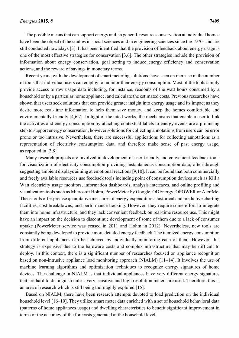
dryer (TD), kettle (KE) and microwave oven (MO); please refer to Table 1 and Figure 1 to see the details.
Table 1. The structure of raw data collected by smart meters.
Time ID Observed Real Power (in Watts)
Reference Home Appliance Data (“1”—ON State, “0”—OFF State)
WM DW TD KE MO
120910 301 0 0 0 0 0 120911 312 0 0 0 0 0 120912 300 0 0 0 0 0 120913 314 0 0 0 0 0 120914 306 0 0 0 0 0 120915 314 0 0 0 0 0 120916 378 0 0 0 0 0 120917 1478 0 0 0 1 0 120918 1524 0 0 0 1 0 120919 1598 0 0 0 1 0 120920 1605 0 0 0 1 0
The original dataset contained the electricity usage readings of the smart meter at every second, every
minute and every hour. From these readings, we extracted the hour loads (in kWh) for the purpose of
short-term load forecasting [19,20], and reference information. In this paper, only on-off states related
with the above mentioned appliances will be used.
Energies 2015, 8 7411
Figure 1. Power demand and reference information for 11 October 2012.
In this study, we are aware of limitations due to the nature of the problem and data availability. Firstly,
although we possess behavioral variables including devices’ operational characteristics of the household,
in practical applications such data may be accessible only if the end user will make the effort to help the
system gather the reference data about the operating devices. This is a manual process aimed at
identification of which appliances are being switched on and off by the household members. Secondly,
we are obtaining the data from only one smart meter and therefore we treat this experiment as proof of
concept for the research tasks outlined at the beginning of the paper. Nevertheless, we believe that the
results of the analysis may be generalized, to some extent, to any other household with similar
socio-demographic characteristics, since electricity consumption in the household is highly dependent
on the floor area of dwelling, area of living, number of occupants and age of the children [21,22].
4. Revealing Usage Pattern Characteristics with Data Mining Techniques
4.1. The Rationale behind the Choice of the Methods
In this section, we briefly present the diverse set of data mining techniques to address the problem of
capturing and presenting individual patterns of energy consumption to the household members based on
the smart meter data collected. Our primary motivation is to apply such techniques that will help users
to understand their own energy consumption—since such understanding is a necessary step on the way
to reduction. Without correct understanding, users may misplace their effort and resources, whether that
is, for example, in terms of limiting household activities or replacement of appliances. Previous studies
of energy usage analysis and visualisation identified that one of the main problems of current approaches
is the lack of context around the information provided and resulting difficulties that users encounter in
making sense of information provided [6,7,23]. This is due to the fact that information is often presented
numerically and the household users are not familiar with the displayed units without provision of a
reference. It is therefore important to highlight the need of providing a link between actions and

Energies 2015, 8 7412
consequent energy consumption, through the provision of feedback that refers to particular appliances
or specific time of use over the day, week or longer period.
For this reason, we adopt relatively simple but reliable techniques that are intended to help consumers
understand their energy usage and support their efforts in energy conservation.
4.2. Data Preparation
The starting point for the usage patterns detection was to prepare the matrix with switching on
probabilities for each of the individual devices over a specified time period. The probabilities were
estimated using the following formula:
(1)
Table 2 presents the matrix with observed probabilities for each appliance turn ON events over the
analyzed period of 44 days. The probabilities for each appliance are equal to 1. The highest probabilities
(more than 0.06) for each appliance are shown in bold.
Table 2. The matrix with probabilities of appliances’ turn ON events in each hour.
Hour KE MO WM TD DW
0 0 0 0.02 0.06 0 1 0 0 0 0.04 0 2 0 0 0 0.02 0 3 0 0 0.02 0 0 4 0 0.01 0 0.02 0 5 0 0.01 0 0.02 0 6 0.03 0.03 0.02 0 0 7 0.12 0.16 0.02 0 0.088 0.08 0.08 0.06 0.02 0.069 0.09 0.08 0.05 0.02 0.09
10 0.07 0.06 0.05 0.07 0.0811 0.06 0.04 0.08 0.06 0.1112 0.05 0.01 0.08 0.04 0.0513 0.05 0.02 0.05 0.06 0.0814 0.05 0.03 0.05 0.04 0.0615 0.03 0.02 0.06 0.04 0.0916 0.04 0.03 0.08 0.11 0.0617 0.03 0.02 0.03 0.06 0.0318 0.06 0.1 0.05 0.04 0.0519 0.08 0.03 0.06 0.02 0.0320 0.09 0.12 0.08 0.07 0.0321 0.05 0.09 0.08 0.07 0.0622 0.02 0.06 0.06 0.09 0.0523 0.01 0 0.06 0.06 0.02

Energies 2015, 8 7413
It can be noticed that the highest probabilities to use the kettle (KE) are in the morning
(between 7 am and 9 am) and in the evening (between 7 pm and 8 pm). The microwave (MO) is used
frequently between 7 am and 9 am, and at 8–9 pm. The use of washing machine (WM) and tumble dryer
(TD) is to some extent correlated since both activities usually take place at 11–12 am and 8–9 pm.
The dishwasher (DW) operates more frequently in the morning and early afternoon hours.
In the same manner, a bigger table (Supplementary Information) has been created, which consists of
a 24 rows (representing hours) and 35 columns (representing appliances over the seven days of the week).
For each appliance, seven columns show the turn ON events’ probabilities in a specified day of the week.
4.3. Detecting Patterns Using Hierarchical Clustering
Hierarchical cluster analysis is an algorithmic approach to find discrete groups with varying degrees
of similarity in a data set represented by a similarity matrix. These groups are hierarchically organized
as the algorithms proceed and may be presented as a dendrogram. Many of these algorithms are greedy
(i.e., the optimal local solution is always taken in the hope of finding an optimal global solution) and
heuristic, requiring the results of cluster analysis to be evaluated for stability.
Hierarchical clustering methods can be divided into agglomerative and divisive approach.
Agglomerative clustering is a widespread approach to cluster analysis. Agglomerative algorithms
successively merge individual entities and clusters that have the highest similarity values computed
using for instance Euclidean distance.
One of the most popular agglomerative clustering algorithm is Ward’s method [24]. This is an
alternative approach for performing cluster analysis. Basically, it looks at cluster analysis as an analysis
of variance problem, instead of using distance metrics or measures of association. It will start out at the
leaves and work its way to the trunk, so to speak. It looks for groups of leaves that it forms into branches,
the branches into limbs and eventually into the trunk. Ward’s method starts out with clusters of size 1
and continues until all the observations are included in one cluster.
In general, Ward’s method can be defined and implemented recursively by a Lance–Williams
algorithm. The Lance–Williams [25] algorithms are an infinite family of agglomerative hierarchical
clustering algorithms which are represented by a recursive formula for updating cluster distances in
terms of squared similarities at each step (each time a pair of clusters is merged).
The recurrence formula allows, at each new level of the hierarchical clustering, the dissimilarity
between the newly formed group and the rest of the groups to be computed from the dissimilarities of
the current grouping. This approach can result in a large computational savings compared with
re-computing at each step in the hierarchy from the observation-level data.
The purpose of this analysis is to discover similar profiles or, in other words, appliances with similar
switch ON probability distribution through the whole day or the whole week. As a result of grouping
using Ward’s method with the Euclidean distance measure, the following dendrogram was obtained as
presented in Figure 2.

Energies 2015, 8 7414
Figure 2. Dendrogram for grouping the electrical appliances throughout the whole day.
The height of each edge of the dendogram is proportional to the distance between the joined groups.
As provided in Figure 2, two groups are distinctly separated from each other, and then one of them is
further separated into two subgroups. Such information can be used to determine the final division of
the data (in this case, three final groups).
From the visual analysis of the dendrogram, it can be observed that the switch ON probability of the
kettle and the microwave at certain times are very similar (cluster marked in blue). In particular, it can
be observed between 7 am and 9 am (as shown before in Table 2), which is usually associated with the
users’ activity related with breakfast preparation.
A similar correlation in periods of joint work, can be seen in the case of washing machine and tumble
dryer. In the investigated households, there is a logical relationship taking washing first and then drying
the washed clothes (cluster marked in red).
Graphical representation of data from Supplementary Information (Table S1) is shown in Figure 3.
On the right hand side of the chart (marked in blue) one can find a group of similar usage patterns for
the kettle and the microwave in the middle of the week. In the middle of the graph (marked in red) there
is a group associated with the use of big household appliances consuming greater amounts of electricity.
This group is also associated with the work period taking place in the middle of the week. The group
marked in yellow and purple is related with the weekend use of such appliances as washing machine,
tumble dryer, dishwasher and microwave. Group marked in green is the least likely to be interpreted,
since it clusters different devices working throughout the whole week.

Energies 2015, 8 7415
Figure 3. Dendrogram for grouping the electrical appliances throughout the whole week.
4.4. Detecting patterns Using C-Means Clustering and Multidimensional Scaling
-means [26] is one of the simplest unsupervised learning algorithms that solve the well-known
clustering problem. The procedure follows a simple and easy way to classify a given data set through a
certain number of clusters (assume clusters) fixed a priori. The main idea is to define centroids,
one for each cluster.
Clustering is the process of partitioning a group of data points into a small number of clusters.
In general, we have data points , 1. . . that have to be partitioned in clusters. The goal is to
assign a cluster to each data point. -means is a clustering method that aims to find the positions
, 1. . . of the clusters that minimize the distance from the data points to the cluster. -means clustering solves:

Energies 2015, 8 7416
argmin ,∈
argmin ‖ ‖∈
(2)
where is the set of points that belong to cluster . The -means clustering uses the square of the
Euclidean distance , ‖ ‖ .
Unfortunately, there is no general theoretical solution to find the optimal number of clusters for any
given data set. Although it can be proved that the procedure will always terminate and the -means
algorithm does not necessarily find the most optimal configuration, corresponding to the global objective
function minimum. A simple approach is to compare the results of multiple runs with different classes
and choose the best one according to a given criterion, but we need to be careful because increasing
results in smaller error function values by definition, but also an increasing risk of overfitting. The
algorithm is also significantly sensitive to the initial randomly selected cluster centers.
Multidimensional scaling (MDS) [27] is a term that is applied to a class of techniques that analyses a
matrix of distances or dissimilarities in order to produce a representation of the data points in a
reduced-dimension space. Most of the data reduction methods have analyzed the data matrix or
the sample covariance or correlation matrix. Thus, MDS differs in the form of the data matrix on which
it operates—it is an individual-directed method. Of course given a data matrix, a dissimilarity matrix
could be constructed and then proceed with an analysis using MD techniques. However, data often arise
already in the form of dissimilarities and so there is no recourse to the other techniques. Also, in other
methods, the data-reducing transformation is linear. Some forms of multidimensional scaling permit a
nonlinear data-reducing transformation.
There are many types of MDS, but all address the same basic problem: Given an matrix of
dissimilarities and a distance measure find a configuration of points x , … , x in the reduced
dimension space so that the distance between a pair of points is close in some sense to the
dissimilarity between the points. All methods must find the coordinates of the points and the dimension
of the space, . Two basic types of MDS are metric and nonmetric MDS. Metric MDS assumes that the
data are quantitative and metric MDS procedures assume a functional relationship between the interpoint
distances and the given dissimilarities. Nonmetric MDS assumes that the data are qualitative, having
perhaps ordinal significance and nonmetric MDS procedures produce configurations that attempt to
maintain the rank order of the dissimilarities. In our study we used one form of metric MDS, namely
classical scaling.
In general, given a set of n points in p-dimensional space, x , … , x , it is straightforward to calculate
the distance between each pair of points. Classical scaling (or principal coordinates analysis) is
concerned with the converse problem to determine the coordinates of a set of points in a dimension [28].
Classical scaling is one particular form of metric MDS in which an objective function measuring the discrepancy between the given dissimilarities, δ , and the derived distances in , d , is optimized. The
derived distances depend possible to calculate on the coordinates of the samples that we wish to find.
There are many forms that the objective function may take. To find the minimum of the stress function,
most implementations of MDS algorithms use standard gradient methods [29].
The purpose of these computational experiment is to discover similar profile, in the same way as in
the previous case. As it was mentioned, the partitioning method divides the data into C disjoint clusters,

Energies 2015, 8 7417
so that objects of the same cluster are close to each other and objects of different clusters are dissimilar.
The output of a partitioning method is simply a list of clusters and their objects, which may be hard to
interpret. Therefore, it would be useful to have a graphical display which describes the objects with their
interrelations, and showing, at the same time, the clusters. Such a display was constructed using so-called
CLUSPLOT [30].
For this purpose we have used the -means algorithm, but of course also other clustering methods
can be applied. For higher-dimensional data sets a dimension reduction technique before constructing
the plot was applied, as described in Section 4.2. The MDS method yields components such that the first
component explains as much variability as possible, the second component explains as much of the
remaining variability as possible. The percentage of point variability explained by these two components
(relative to all components) is listed below the plot.
Then, CLUSPLOT uses the resulting partition, as well as the original data, to produce Figure 4.
The ellipses are based on the average and the covariance matrix of each cluster, and their size is such
that they contain all the points of their cluster. This explains why there is always an object on the
boundary of each ellipse [31].
Figure 4. MDS surface for grouping the electrical appliances throughout the whole week.
In our study, we examined several dissimilarity measures, but in the Figure 4 we show results based
only on Euclidean distance, which explain 42.53% of the point variability. It is due to the fact that other
measures explain less the point variability, namely: maximum −26.34%, Manhattan −30.15%, Canberra
−32.84%. The results refer to the larger input data matrix, as denoted in Section 5.1.
On the right hand side of the picture (marked in red) can clearly be seen a group of similar periods of
work of the washing machine, tumble dryer and microwave oven in the weekend. On the left hand side
of the graph (marked in blue) there is a group associated with the use of kettle and the microwave in the
middle of the week. Group marked in purple is the least likely to be interpreted, which cluster different
devices working throughout the working days and weekend days.

Energies 2015, 8 7418
4.5. Detecting Patterns Using Grade Data Analysis
Grade data analysis is efficient technique which works on variables measured on any measurement
scales (including categorical), since it bases on dissimilarity measures such as concentration curves and
some precisely defined measure of monotonic dependence. Its main framework is constituted of grade
transformation proposed by [32]. The idea is to transform any distribution of two variables into a
convenient form of the so called grade distribution. This transformation is characterized by the property
which leaves unchanged the order of variables, ranks, values of monotone dependence measures like
Spearman’s ρ∗ and Kendall’s τ. In case of empirical data this approach consists of analyzing the two-way
table with objects/variables, which is preceded by proper recoding of variable values.
The main tool of grade methods is Grade Correspondence Analysis (GCA), which refers to classical
correspondence analysis, but it is going significantly beyond it, by the mean of grade transformation.
To put it shortly, GCA is ordering the variables/objects table in such a way that neighboring objects are
more similar than those further apart, and at the same time, neighboring variables are also more similar
than those further apart. After optimal ordering is found it is possible to aggregate neighboring objects
and neighboring variables, and therefore to build a clusters with similar distributions. The Spearman ρ∗ was originally defined for continuous distributions, but it may be defined also as Pearson’s correlation
applied to distribution after the grade transformation. The grade distribution may be defined for discrete
distribution too, and it is possible to calculate Spearman ρ∗ for probability table P with rows and
columns, where is the frequency (treated as probability) of -th row in -th column:
ρ∗ 3 2 1 2 1 (3)
where
12
,12
(4)
and and p and p are marginal sums defined as: ∑ p ∑ p ,
∑ p ∑ p .
GCA tends to maximize ρ∗ by ordering row and columns according to their grade regression value,
which is the center of the gravity for each row or each column. The grade regression for the rows is
defined as:
∑ (5)
and for the columns:
∑ (6)
The algorithm calculates the grade regression for columns and sorts the columns by its values what
results in increase of the regression for columns, but at the same time the regression for rows changes.
If the regression for rows is sorted then regression for columns changes. As proved in [33] each sorting

Energies 2015, 8 7419
of the grade regression increases the value of Spearman ρ∗. The number of possible states (combination
of permutations of rows and columns) is finite and is equal to ! !. Each time the value of Spearman
ρ∗ increases, and the last ordering produces the largest ρ∗, called local maximum of Spearman ρ∗. The
output from GCA depends on the initial permutation of rows and columns, and if it is ordered in reversed
way with respect to initial permutation, it is possible to achieve symmetrically reversed local maximum.
GCA primarily permutes randomly rows and columns and reorders them to achieve a local maximum.
This process is iterated as many times as needed, but typically 100 iterations is enough to receive the
result with the highest ρ∗. Having checked all possible start permutation then the result would be the
global maximum of ρ∗ thus resulting in the largest possible value in the analyzed table. It is important
to mention that calculation of grade regression requires non-zero sum of every row and column in a
table, so this requirement applies also to the GCA. More detailed description about grade transformation
can be found in [34,35].
Finally, grade analysis technique is aided by visualizations using over-representation map which is
the chart of the probability density of grade distribution, showing which cells are over or under-represented
in a particular dataset.
The data structure presented in Table 2 have been analyzed in GradeStat tool [36] which has been
developed in Institute of Computer Science Polish Academy of Science.
The first step was to calculate over-representation ratios for each field (cell) of the table. A given
data matrix with non-negative values can be visualized using over-representation map in the same way as a contingency table [28]. Instead of frequency the value of -th variable for -th object is used.
Next, it is compared in a contingency table with the corresponding neutral or fair representation
/∑∑ where /∑ , /∑ . The ratio of the first and second expression is called
the over-representation ratio. An over-representation surface over a unit square is divided into
rectangles situated in m rows and columns, and the area of rectangle placed in row and column being equal to fair representation of normalized . For instance, taking into account the use of kettle at
7 am on Monday the ratio would be equal to 1.579 (for Table 2), since probability of using the kettle in
this hour is 0.12 and the row sum is 0.38 (for five appliances) then we have: 1.579 = 0.12/((1 × 0.38)/5).
In the same manner, the calculations for the Supplementary Information were prepared. Having the
over-representation ratios, the over-representation map for the initial raw data can be constructed.
The color of each field in the map depends on the comparison of the two values: (1) the real value of
measure connected to the considered field and corresponding to population element; (2) the expected
value of the measure. The cells’ colors in the map are grouped into three classes:
Gray—the measure for the element is neutral (ranging between 0.99 and 1.01) what means that
the real value of the measure is equal to its expected value;
black or dark gray—the measure for the element is over-represented (between 1.01 and 1.5 for
weak over-representation and more than 1.5 for strong) what means that the real value of the
measure is greater than the expected one;
light gray or white the measure for the element is under-represented (between 0.66 and 0.99 for
weak under-representation and less than 0.66 for strong under-representation) what means that
the real value of measure is less than the expected one.

Energies 2015, 8 7420
The following step was to apply the grade analysis to measure the dissimilarity between two data
distributions in order to reveal the structural trends in data. The grade analysis was done based on
Spearman’s ρ∗, used as the total diversity index. The value of ρ∗ strongly depends on the mutual order
of the map’s rows and columns. To calculate ρ∗, the concentration indexes of differentiation between
the distributions are used. The basic procedure of GCA is executed through permuting the rows and
columns of a table in order to maximize the value of ρ∗. After each sorting the ρ∗ value increases and
the map becomes more similar to the ideal one. That means that the darkest fields are placed in the
upper-left and lower-right map corners while the rest of the fields is assigned according to the following
property: the farther from the diagonal towards the two other map corners (the lower-left and upper-right
ones) the lighter gray (or white) color the fields have.
The result of the GCA procedure for the Supplementary Information is presented in Figure 5. The
initial value of the Spearman’s ρ∗ was 0.1045, and after sorting the overrepresentation map the ρ∗ value
increases to 0.5563 (which means that neighboring objects are more similar than those further apart).
Additionally, cluster analysis was performed through the aggregation of some columns into one column
(and for the rows respectively). The optimal number of clusters is obtained when the changes of the
subsequent ρ∗ values appear to be negligible as referenced in [35]. Based on the results presented in
Figure 6 (showing increase in ρ∗ depending on the number of columns and rows), overrepresentation
map was divided into 25 clusters (five clusters for the rows and five for the columns).
Figure 5. Overrepresentation map after transformations and grouping for the whole week.
MO
_Tu
eM
O_F
riD
W_T
ue
KE
_T
ueW
M_T
ue
KE
_T
huD
W_
Fri
WM
_W
edK
E_
Fri
DW
_Mo
nD
W_
We
d
MO
_Su
nT
D_
Fri
WM
_M
on
DW
_S
un
WM
_S
un
TD
_W
ed
TD
_S
at
6
10
8
23
12
19
20
163
21
15 2
5
9
717
18
11
134
14
22
0 1
TD
_Tu
eM
O_
Th
uW
M_T
hu
KE
_Mon
MO
_Mo
nM
O_
We
d
DW
_S
at
KE
_Wed
TD
_Th
uK
E_S
atK
E_S
un
MO
_Sat
TD
_Mo
nT
D_S
un
DW
_Th
uW
M_F
ri
WM
_Sa
t
Hou
r
Appliance_day_of_the_week

Energies 2015, 8 7421
Figure 6. The values of the rho-Spearman depending on the number of clusters.
The resulting order presents the structure of underlying trends in data. Twenty-five clusters show
typical usage patterns of home appliances. The overrepresentation map in Figure 5 presents that the use
of all devices on Tuesday morning happens very often (four clusters in the left upper corner),
as frequently as the usage of tumble dryer with washing machine on Friday and Saturday in late afternoon
or in the evening (four clusters in the right bottom corner). In the opposite corners (upper right and
bottom left) there are devices which were operated very rarely.
4.6. Detecting Patterns Using Sequential Association Rules
The problem of discovering sequential patterns is based on a database containing information about
events that occurred within a specified period of time. The aim of the sequential association rules is to
find the relationship between the occurrences of certain events in the selected time period [37].
The problem of discovering frequent item sets is to find all item sets occurring in the database D with
the support higher or equal to minimum support threshold supplied by a user. An itemset with the support
higher than minsup is called a frequent item set.
The support of the rule X → Y is the ratio of the number of transactions that support both the
antecedent and the consequent of the rule to the total number of transactions. The support of a rule
denotes its statistical significance. Rules with low support tend to describe relationships that are not
common in the database. On the other hand, rules with high support are covered by many transactions
in the database and they describe common patterns.
The confidence of the rule X → Y is the ratio of the number of transactions that support both the
antecedent and the consequent of the rule to the number of transactions that support only the antecedent
of the rule. The confidence of a rule denotes its statistical strength. High confidence indicates strong
correlation between elements contained in the antecedent and the consequent of the rule. Low confidence
denotes weak correlation between elements and may indicate purely coincidental co-occurrence of elements.
Lift of the ruleX → Y in the database D is called the measure of the rule correlation, indicating what
is the impact of an element X for occurrence of an element Y. In other words, lift measures how many
times more often X and Y occur together than expected if they where statistically independent. Lift is not
down-ward closed and does not suffer from the rare item problem. Also, lift is susceptible to noise in
small databases. Rare item sets with low counts (low probability) which per chance occur a few times
(or only once) together can produce enormous lift values.

Energies 2015, 8 7422
A sequence is an ordered list of elements X , X , . . . , X where X is a set of items,∀iX ⊆ L.
Each set X is called a sequence element. The length of a sequence X is the number of sequence elements.
Each sequence element has a timestamp denoted as ts X . A sequence X , X , . . . , X is contained
in another sequence Y , Y , . . . , Y if there exist integers i i i in such that
X Y , X Y , … , X Y . The sequence Y , Y , … , Y is called an occurrence of X in Y.
There are three main time constraints involved in sequential pattern discovery, namely, the minimum
and the maximum time gap between consecutive occurrences of elements within a sequence element
(called min-gap and max-gap respectively) and the size of the time window which allows for merging
items into sequence elements, denoted as window-width [38].
The starting point for the usage patterns detection, based on the sequential association rules, was to
determine the transaction matrix. Each transaction has a time stamp indicating the occurrence of the
elements in the specified sequence. In this case, we assume that a single sequence is the whole day,
therefore, the tag sequence is the particular date. The time stamp is the hour at which specific devices
were turned ON (column 3 of Table 3). Created transaction table takes into account only the binary
information (the appliance was turned ON or not), but does not include the number of switch ON states
in a given hour. In the analyzed period, there are theoretically 24 × 44 = 1056 transactions (the number
of hours multiplied by the number of days), whereas the used SPADE algorithm (Sequential Pattern
Discovery using Equivalence classes [39]) does not include empty transaction (hours, in which none of
the tested devices was turned ON); therefore, the final transaction table contains only 319 transactions.
Given the rules with the support of more than 0.1, the minimum time difference between successive
elements in the sequence of 1 and a maximum time difference between successive elements in the
sequence of 1, the following behavior patterns can be observed:
with the support equal to 0.1 and with the confidence of 100%, if in a certain hour the washing
machine operated, in the next hour the tumble dryer and kettle operated;
with the support equal to 0.1 and with the confidence of 100%, if in a certain hour the washing
machine operated, in the next hour the washing machine and kettle operated, and in the next hour
the washing machine also operated, so did the tumble dryer and kettle;
rule No. 4 with the support equal to 0.15, and with the confidence of 75% shows that the
occurrence in a sequence of such devices as kettle, dish washer and washing machine influences
the occurrence in a sequence of such appliances as tumble dryer and kettle.
with the support equal to 0.1 and with the confidence of 66%, if in a certain hour the kettle
operated, in the next hour the washing machine was turned ON, then in the next hour the washing
machine and microwave were in operation.
All these observed sequential rules have lift greater than one, which means that the occurrence of the
elements in the left side of the rules influence the occurrence of the elements contained on the right side
of the sequential rule (Table 4).

Energies 2015, 8 7423
Table 3. Part of the transaction table.
Sequence Stamp Time Stamp Elements
20120910 8 kettle 20120910 9 kettle, microwave 20120910 10 kettle, dish washer 20120910 11 kettle, dish washer 20120910 18 microwave 20120910 19 kettle 20120910 20 washing machine 20120910 21 washing machine, tumble dryer 20120910 22 microwave, washing machine, tumble dryer 20120911 10 kettle, microwave, dish washer, tumble dryer 20120911 11 tumble dryer, dish washer 20120911 12 kettle 20120911 13 microwave 20120911 19 washing machine 20120911 20 microwave, washing machine 20120911 21 kettle, microwave, tumble dryer
Table 4. Selected sequential association rules.
Sequence Support Confidence Lift
{washing machine} => {kettle, tumble dryer} 0.10 1.00 4.44{kettle} => {kettle, tumble dryer} 0.10 1.00 4.44{washing machine},{kettle, washing machine},{washing machine} => {kettle, tumble dryer}
0.10 1.00 4.44
{kettle},{dish washer},{kettle},{washing machine},{washing machine} => {kettle, tumble dryer}
0.15 0.75 3.33
{washing machine},{kettle},{washing machine} => {washing machine, tumble dryer}
0.10 0.66 2.96
{kettle},{washing machine} => {microwave, washing machine} 0.10 0.66 2.96
5. Conclusions
The worldwide adoption of smart metering systems supported by data analysis techniques leads to
the realization of dynamic tariffs, energy usage visualization, and efficient meter-to-cash billing
processes. Nevertheless, there is a need to deliver simple and reliable tools that are intended to help
consumers understand their energy usage and support their efforts in energy conservation.
The simulations presented here can support development of tools that allow customers to gain
important insights on energy consumption. For the policy makers and distribution entities, it can indicate
the direction towards provision of personalized and scalable energy efficiency programs and present a
view of how the smart metering infrastructure can be enhanced in the near future. From this perspective,
the results are interesting and constitute a promising step to support energy conservation.
The set of clustering and association techniques helped to examine the interdependence between the
usage patterns of home appliances and derive significant underlying associations between several
contextual factors including time of the use and user activities. Certainly, the analysis showed a number

Energies 2015, 8 7424
of useful insights that may increase awareness and understanding of home energy consumption.
In particular, we could observe that:
(1) big appliances consuming greater amounts of electricity were predominantly used during
weekend days or late afternoons during working days;
(2) the kettle and microwave oven were frequently used in the morning during working days;
(3) the use of the washing machine implied the kettle and tumble dryer would be switched on soon;
(4) time-based associations can be easily observed using segmentation algorithms while associations
between devices can be revealed using sequential rules;
(5) working periods of the washing machine and the tumble dryer are very similar and depend on
each other;
(6) in general, appliances were operated in a way that they formed stable patterns as to the time of
the use and day of the week.
The findings (1)–(6) on appliances’ typical operating time windows and their co-occurrence can be
considered here for tariff plan optimization, since the analyzed household had a fixed price energy tariff
plan. Such action is especially recommended since the adult household members are working full time
and the majority of their daily routines falls on off-peak periods. In practice, a saving of 10% or more is
achievable by matching household needs with the most appropriate profile, as estimated by electricity
distributing companies.
The proposed set of diversified data mining algorithms provides, in our opinion, the best way to
illustrate individual patterns of energy consumption. We show that revealing household characteristics
from smart meter data is feasible and offers appealing visualization of general patterns in data. We need
to keep in mind that those particular techniques represent slightly different approaches to data analysis,
thus they cannot be compared directly, since their evaluation may be, to a large extent, subjective and
may depend on user preferences.
For future research, we see the following direction. Since the results are promising and visually
appealing, we plan to design a larger experiment for a dozen or more households. Additionally, we aim
to explore algorithmic approaches for mining usage patterns and utilize them for the purpose of energy
consumption forecasting and the development of unique, individualized energy management strategies.
Additionally, since the electricity consumption of households varies over time based on the actions of
individual electrical appliances operated by the members, we would like to propose the optimal structure
of the data set, which takes into account the variability associated with the switch ON states of individual
devices to support their accurate recognition. In future studies, special attention will also be focused on
the design of algorithms that in real time will be able to identify working states of the electrical
appliances in the household.
In the end, it is worth mentioning there are high expectations for combination of research on
forecasting systems utilizing non-intrusive appliance recognition and user pattern behavior with
multi-agent systems [40–43].
Supplementary Materials
Supplementary materials can be accessed at: http://www.mdpi.com/1996-1073/8/7/7407/s1.

Energies 2015, 8 7425
Acknowledgments
This research was financed by VEDIA Inc. leading a project partially supported by National Centre
for Research and Development in Poland (NCBiR).
The computations were performed partially employing the computational resources of the
Interdisciplinary Centre for Mathematical and Computational Modeling at the Warsaw University
(Computational Grant No. G59-31).
Author Contributions
Krzysztof Gajowniczek prepared the simulation, analysis and wrote half of the manuscript;
Tomasz Ząbkowski coordinated the main theme of the research and wrote other half of the manuscript.
Conflicts of Interest
The authors declare no conflict of interest.
References
1. Beckel, C.; Sadamoria, L.; Staake, T.; Santini, S. Revealing Household Characteristics from Smart
Meter Data. Energy 2014, 78, 397–410.
2. Costanza, E.; Ramchurn, S.D.; Jennings, N.R. Understanding domestic energy consumption
through interactive visualisation: A field study. In Proceedings of the 2012 ACM Conference on
Ubiquitous Computing, UbiComp ’12, New York, NY, USA, 5–8 September 2012; pp. 216–225.
3. Abrahamse, W.; Steg, L.; Vlek, C.; Rothengatter, T. A review of intervention studies aimed at
household energy conservation. J. Environ. Psychol. 2005, 25, 273–291.
4. Chetty, M.; Tran, D.; Grinter, R. Getting to Green: Understanding Resource Consumption in the Home.
In Proceedings of the Ubicomp ’08, Seoul, Korea, 21–24 September 2008; pp. 242–251.
5. Froehlich, J.; Findlater, L.; Landay, J. The design of eco-feedback technology. In Proceedings of
the CHI ’10, Atlanta, GA, USA, 10–15 April 2010; pp. 1999–2008.
6. Fischer, C. Feedback on household electricity consumption: A tool for saving energy? Energy Effic.
2008, 1, 79–104.
7. Fitzpatrick, G.; Smith, G. Technology-enabled feedback on domestic energy consumption:
articulating a set of design concerns. IEEE Pervasive Comput. 2009, 8, 37–44.
8. Rollins, S.; Banerjee, N.; Choudhury, L.; Lachut, D. A system for collecting activity annotations
for home energy management. Pervasive Mob. Comput. 2014, 15, 153–165.
9. Gustafsson, A.; Gyllensward, M. The power-aware cord: energy awareness through ambient
information display. In Proceedings of the CHI EA ’05, Portland, OR, USA, 2–7 April 2005;
pp. 1423–1426.
10. Rodgers, J.; Bartram, L. Exploring ambient and artistic visualization for residential energy use
feedback. IEEE Trans. Vis. Comput. Graph. 2011, 17, 2489–2497.
11. Firth, S.; Lomas, K.; Wright, A.; Wall, R. Identifying trends in the use of domestic appliances from
household electricity consumption measurements. Energy Build. 2008, 40, 926–936.

Energies 2015, 8 7426
12. Chang, H.H. Non-intrusive demand monitoring and load identification for energy management
systems based on transient feature analyses. Energies 2012, 5, 4569–4589.
13. Tina, G.M.; Amenta, V.A. Consumption awareness for energy savings: NIALM algorithm efficiency
evaluation. In Proceedings of the 5th International Renewable Energy Congress (IREC),
Hhammamet, Tunisia, 25–27 March 2014.
14. Dent, I. Deriving Knowledge of Household Behaviour from Domestic Electricity Usage Metering.
Ph.D. Thesis, University of Nottingham, Nottingham, England, UK, 1 July 2015.
15. Zeifman, M.; Roth, K. Nonintrusive appliance load monitoring: Review and outlook. Consumer
Electronics. IEEE Trans. Consum. Electron. 2011, 57, 76–84.
16. Ghofrani, M.; Hassanzadeh, M.; Etezadi-Amoli, M.; Fadali, M.F. Smart meter based short-term load
forecasting for residential customers. In Proceedings of the North American Power Symposium
(NAPS), Northeastern University, Boston, MA, USA, 4–6 August 2011; pp. 1–5.
17. Aung, Z.; Williams, J.; Sanchez, A.; Toukhy, M.; Herrero, S. Towards Accurate Electricity Load
Forecasting in Smart Grids. In Proceedings of the 4th International Conference on Advances in
Databases, Knowledge and Data Applications, DBKDA 2012, Saint Gilles, Reunion Island,
29 February–5 March 2012; pp. 51–57.
18. Javed, F.; Arshad, N.; Wallin, F.; Vassileva, I.; Dahlquist, E. Forecasting for demand response in
smart grids: an analysis on use of anthropologic and structural data and short term multiple loads
forecasting. Appl. Energy 2012, 69, 151–160.
19. Gajowniczek, K.; Ząbkowski, T. Short term electricity forecasting using individual smart meter
data. Procedia Comput. Sci. 2014, 35, 589–597.
20. Ząbkowski, T.; Gajowniczek, K. Forecasting of individual electricity usage using smart meter data.
Quantitative Methods in Economics 2013, 14, 289–297.
21. Ghaemi, S.; Brauner, G. User behavior and patterns of electricity use for energy saving.
In Proceedings of the Internationale Energiewirtschaftstagung an der TU Wien, IEWT, Vienna,
Austria, 11–13 February 2009.
22. Yohanis, Y.G.; Mondol, J.D.; Wright, A.; Norton, B. Real-life energy use in the UK: How occupancy
and dwelling characteristics affect domestic energy use. Energy Build. 2008, 40, 1053–1059.
23. Hargreaves, T.; Nye, M.; Burgess, J. Making energy visible: A qualitative field study of how
householders interact with feedback from smart energy monitors. Energy Policy 2010, 38, 6111–6119.
24. Ward, J.H. Hierarchical grouping to optimize an objective function. J. Am. Stat. Assoc. 1963, 58,
236–244.
25. Lance, G.N.; Williams, W.T. A general theory of classificatory sorting strategies 1. Hierarchical
systems. Comput. J. 1967, 9, 373–380.
26. MacQueen, J.B. Some Methods for classification and Analysis of Multivariate Observations.
In Proceedings of the 5th Berkeley Symposium on Mathematical Statistics and Probability;
University of California Press: Berkeley, CA, USA, 1967; pp. 281–297.
27. Gower, J.C. Some distance properties of latent root and vector methods used in multivariate
analysis. Biometrika 1966, 53, 325–328.
28. Mardia, K.V. Some properties of classical multidimensional scaling. Commun. Stat. Theory Methods
1978, A7, 1233–1241.

Energies 2015, 8 7427
29. Siedlecki, W.; Siedlecka, K.; Sklanski, J. An overview of mapping for exploratory pattern analysis.
Pattern Recognit. 1988, 21, 411–430.
30. Kaufman, L.; Rousseeuw, P.J. Finding Groups in Data; Wiley: New York, NY, USA, 1990.
31. Pison, G.; Struyf; A.; Rousseeuw, P.J. Displaying a clustering with CLUSPLOT. Comput. Stat.
Data Anal. 1999, 30, 381–392.
32. Szczesny, W. On the performance of a discriminant function. J. Classif. 1991, 8, 201–215.
33. Ciok, A.; Kowalczyk, T.; Pleszczyńska, E. How a New Statistical Infrastructure Induced a
New Computing Trend in Data Analysis. In Rough Sets and Current Trends in Computing;
Polkowski, L., Skowron, A., Eds.; Lecture Notes in Artificial Intelligence; Springer Verlag: Berlin,
Germany, 1998; Volume 1424; pp. 75–82.
34. Szczesny, W. Grade correspondence analysis applied to contingency tables and questionnaire data.
Intell. Data Anal. 2002, 6, 17–51.
35. Kowalczyk, T.; Pleszczyńska, E.; Ruland, F. Grade Models and Methods of Data Analysis. With
applications for the Analysis of Data Population; 1st ed.; Studies in Fuzziness and Soft Computing;
Springer Verlag: Berlin, Germany; Heidelberg, Germany; New York, NY, USA, 2004; Volume 151.
36. GradeStat—Program for Grade Data Analysis. Available online: http://www.gradestat.
ipipan.waw.pl (accessed on 10 January 2015).
37. Agrawal, R.; Srikant, R. Mining sequential patterns. In Proceedings of the 11th International
Conference on Data Engineering, Taipei, Taiwan, 6–10 March 1995.
38. Bębel, B.; Morzy, M.; Morzy, T.; Królikowski, Z.; Wrembel, R. OLAP-Like analysis of time
point-based sequential data. In Advances in Conceptual Modeling; Springer Verlag: Berlin, Germany;
2012; pp. 153–161.
39. Zaki, M.J. Spade: An efficient algorithm for mining frequent sequences. Mach. Learn. 2001, 42,
31–60.
40. Radziszewska, W.; Nahorski, Z.; Parol, M.; Pałka, P. Intelligent computations in an agent-based
prosumer-type electric microgrid control system. In Issues and Challenges of Intelligent Systems
and Computational Intelligence; Springer Verlag: Berlin, Germany, 2014; pp. 293–312.
41. Radziszewska, W.; Kowalczyk, R.; Nahorski, Z. El Farol Bar problem, Potluck problem and electric
energy balancing–on the importance of communication. In Proceedings of the 2014 Federated
Conference on Computer Science and Information Systems, Warsaw, Poland, 7–10 September 2014;
pp. 1515–1523.
42. Pałka, P.; Radziszewska, W.; Nahorski, Z. Balancing electric power in a microgrid via
programmable agents auctions. Control Cybern. 2012, 41, 777–797.
43. Radziszewska, W.; Nahorski, Z. Modeling of power consumption in a small microgrid.
In Proceedings of the 28th EnviroInfo 2014 Conference, Oldeburg, Germany, 10–12 September
2014; pp. 381–388.
© 2015 by the authors; licensee MDPI, Basel, Switzerland. This article is an open access article
distributed under the terms and conditions of the Creative Commons Attribution license
(http://creativecommons.org/licenses/by/4.0/).
Related Documents


