1 LESSON 1 INTRODUCTION TO COLOURS AND COLOUR MEDIA STRUCTURE 1.0 OBJECTIVES 1.1 INTRODUCTION 1.2 HOW IS COLOUR PERCEIVED? 1.3 WHY OBJECTS APPEAR WHITE, BLACK OR IN SPECIFIC COLOURS? 1.4 EXPLORING MEDIA 1.4.1 ACRYLIC PAINTS 1.4.2 WATER COLOURS 1.4.3 PASTELS 1.4.4 POSTER COLOURS 1.4.5 COLOURED INKS 1.4.6 OIL PAINTS 1.5 ASSIGNMENTS 1.5.1 CLASS ASSIGNMENTS 1.5.2 HOME ASSIGNMENTS 1.6 SUMMING UP 1.7 POSSIBLE ANSWERS TO SELF-CHECK QUESTIONS 1.8 TERMINAL QUESTIONS 1.9 REFERENCES AND SUGGESTED FURTHER READING 1.10 GLOSSARY

CTD-104-1
Mar 15, 2016
1.0 O BJECTIVES 1.9 R EFERENCES AND S UGGESTED F URTHER R EADING 1.10 G LOSSARY 1.6 S UMMING U P 1.8 T ERMINAL Q UESTIONS 1.4 E XPLORING M EDIA S TRUCTURE 1.2 H OW IS C OLOUR P ERCEIVED ? 1.7 P OSSIBLE A NSWERS TO S ELF - CHECK Q UESTIONS 1.3 W HY O BJECTS A PPEAR W HITE , B LACK OR IN S PECIFIC C OLOURS ? 1
Welcome message from author
This document is posted to help you gain knowledge. Please leave a comment to let me know what you think about it! Share it to your friends and learn new things together.
Transcript

1
LESSON 1 INTRODUCTION TO COLOURS AND
COLOUR MEDIA
STRUCTURE
1.0 OBJECTIVES
1.1 INTRODUCTION
1.2 HOW IS COLOUR PERCEIVED?
1.3 WHY OBJECTS APPEAR WHITE, BLACK OR IN SPECIFIC COLOURS?
1.4 EXPLORING MEDIA
1.4.1 ACRYLIC PAINTS 1.4.2 WATER COLOURS 1.4.3 PASTELS 1.4.4 POSTER COLOURS 1.4.5 COLOURED INKS 1.4.6 OIL PAINTS
1.5 ASSIGNMENTS
1.5.1 CLASS ASSIGNMENTS 1.5.2 HOME ASSIGNMENTS
1.6 SUMMING UP
1.7 POSSIBLE ANSWERS TO SELF-CHECK QUESTIONS
1.8 TERMINAL QUESTIONS
1.9 REFERENCES AND SUGGESTED FURTHER READING
1.10 GLOSSARY

2
1. INTRODUCTION TO COLOURS AND COLOUR
MEDIA
This unit is devoted to the study of colours and their media. The first lesson will introduce you to the colours and colour media. In the second lesson, we will be discussing the language of colours in terms of the colour wheel different colour schemes and their mixed medium in the second one. In the third and final lesson of this unit, we shall be talking about various colour families according to their visual effects.
1.0 Objectives
After going through this lesson you will be able to:
• Define the term ‘colour’.
• Understand how colour is perceived through the eyes.
• Explain why the objects appear white, black or in a whole range of specific colours.
• Describe the different types of colour media that can be used to give expression to your drawing.
1.1 Introduction
Colour is a physiological response to a physical stimulus. The world is illuminated with wonderful colours. Colours and their combinations can dazzle, charm or ruffle one’s feathers.
The reason why a coloured photograph is preferred to a black and white image is because colour infuses life into the object. The Sun rays shower their blessings, by giving colour and life to the inhabitants of the earth. White sunlight actually comprises of the seven major colours and makes nature so very colourful.
A peacock’s stunning plumage of blues and greens, the beautiful soothing greens of a forest during monsoons, the rich gold zardozi work on a red sari of a bride, the yellow wall of a child’s room and the bright orange background of an advertisement grabs your attention and quickens the heart beat of the viewers. Colours also have very strong associations just as red is associated with Coco-Cola and green and blue colours with Reliance Company. Colour should be understood in its two aspects, scientific and artistic (aesthetic).
This lesson will familiarize you with the process of perception of colours through the eyes and how the objects appear to be white, black or in specific

3
colours. Then we shall discuss the properties of various forms of colour media which can be used to give colours and shades to art work
1.2 How is Colour Perceived?
Colour is nothing but a visual sensation (Fig. 1.1). There is an impulse caused on the retina of the eye and the sensory nerves take it to the brain which reacts through the motor nerves. This is a very basic scientific explanation of what colour is and how we see colour.
Our ability to see colour depends on many highly complex workings of the eye and the brain. When we look at an object, light coming from the object enters our eyes. Each eye focuses the light, forming an image of the object on the retina. The retina is a thin layer of tissue covering the back and sides of the inside of the eyeball. It contains millions of light sensitive cells. These cells absorb most of the light that falls on the retina and convert the light to electrical signals. These electrical signals then travel through nerves to the brain. The brain organizes nerve signals from the eye and interprets them as coloured visual images.
1.3 Why Objects Appear White, Black or in Specific Colours?
White colour is the combination of all the colours. When all the visible light rays are reflected an object appears white. When none of the rays are reflected (because all of them are absorbed) the viewer sees Black. If one colour is reflected and all the rest of the rays are absorbed the viewer sees the colour produced by the specific reflected ray or combination of rays.
4
Self-check Questions
1. Fill in the blanks:
i) The _______ is a thin layer of tissue covering the back and sides of the inside of the eyeball.
ii) These cells absorb most of the light that falls on the retina and convert the light to ______ ______.
iii) When ____ the visible light rays are reflected an object appears white. When _______of the rays are reflected the viewer sees it Black.
2. Why can’t we see colours in darkness?
1.4 Exploring Media
Various forms of colours are described below to enable one to handle different media effectively and skillfully.
1.4.1 Acrylic paints
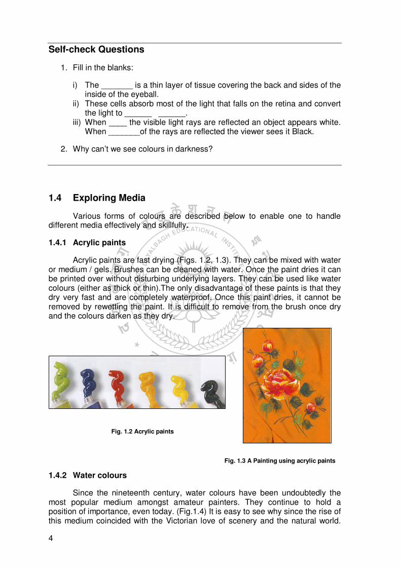
Acrylic paints are fast drying (Figs. 1.2, 1.3). They can be mixed with water or medium / gels. Brushes can be cleaned with water. Once the paint dries it can be printed over without disturbing underlying layers. They can be used like water colours (either as thick or thin).The only disadvantage of these paints is that they dry very fast and are completely waterproof. Once this paint dries, it cannot be removed by rewetting the paint. It is difficult to remove from the brush once dry and the colours darken as they dry.
1.4.2 Water colours
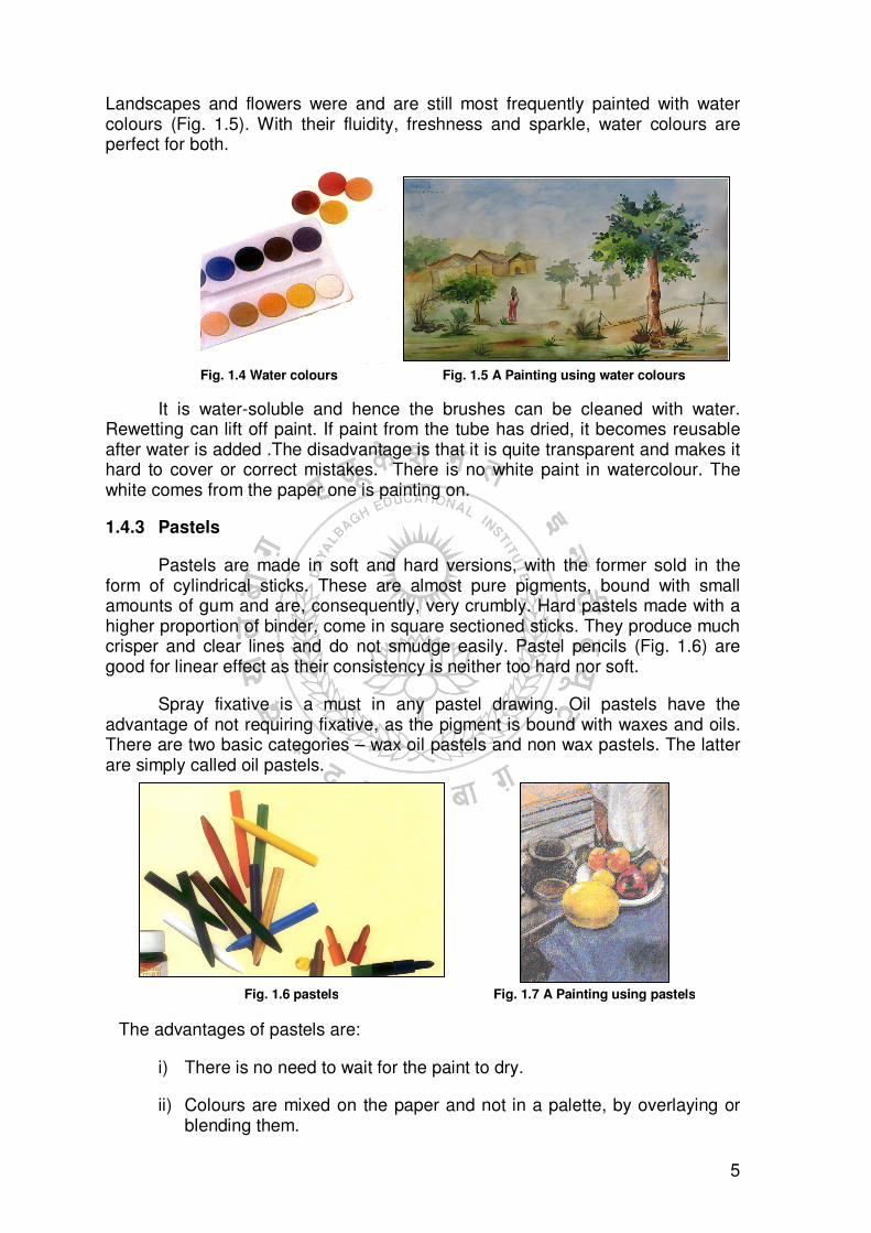
Since the nineteenth century, water colours have been undoubtedly the most popular medium amongst amateur painters. They continue to hold a position of importance, even today. (Fig.1.4) It is easy to see why since the rise of this medium coincided with the Victorian love of scenery and the natural world.
Fig. 1.2 Acrylic paints
Fig. 1.3 A Painting using acrylic paints
5
Landscapes and flowers were and are still most frequently painted with water colours (Fig. 1.5). With their fluidity, freshness and sparkle, water colours are perfect for both.
It is water-soluble and hence the brushes can be cleaned with water. Rewetting can lift off paint. If paint from the tube has dried, it becomes reusable after water is added .The disadvantage is that it is quite transparent and makes it hard to cover or correct mistakes. There is no white paint in watercolour. The white comes from the paper one is painting on.
1.4.3 Pastels
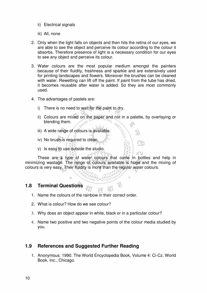
Pastels are made in soft and hard versions, with the former sold in the form of cylindrical sticks. These are almost pure pigments, bound with small amounts of gum and are, consequently, very crumbly. Hard pastels made with a higher proportion of binder, come in square sectioned sticks. They produce much crisper and clear lines and do not smudge easily. Pastel pencils (Fig. 1.6) are good for linear effect as their consistency is neither too hard nor soft.
Spray fixative is a must in any pastel drawing. Oil pastels have the advantage of not requiring fixative, as the pigment is bound with waxes and oils. There are two basic categories – wax oil pastels and non wax pastels. The latter are simply called oil pastels.
The advantages of pastels are:
i) There is no need to wait for the paint to dry.
ii) Colours are mixed on the paper and not in a palette, by overlaying or blending them.
Fig. 1.5 A Painting using water colours Fig. 1.4 Water colours
Fig. 1.7 A Painting using pastels Fig. 1.6 pastels

6
iii) A wide range of colours is available.
iv) No brush required to clean.
v) Easy to use outside the studio.
Oil based pastels, which can be thinned and blended with turpentine or scraped off to reveal the colours underneath, are known as graffito.
Some disadvantages of pastels are that it usually requires a greater range of colours to create a picture (fig 1.7) than for the other media, as these colours do not mix well to produce other colours but remain aloof. The soft pastel work is prone to smudging and the pastel coming off the support. Using a spray on fixative, taping a piece of tracing paper on it or framing it with a mount that keeps it away from the glass can rectify this.
1.4.4 Poster colours
These are a type of water colours and come in bottles (Fig 1.8) that help in minimizing wastage .The range of colours available is huge and the mixing of colours is very easy .The fluidity is more than the regular water colours. The only big disadvantage is that these colours are very opaque in their look and light cannot pass through it and are as transparent as watercolours. They are good where solid colours are needed (Fig. 1.9).
1.4.5 Coloured inks
Coloured drawing inks (Fig 1.10) can be divided into two broad types – waterproof and water-soluble. They are made in a wide range of brilliant colours and can be mixed together to further increase the range. Some waterproof inks are bound with shellac, which means that they cannot be mixed successfully with water based inks, but others are acrylic based and are known as liquid acrylics. These behave like water-soluble inks, except that they are impermeable when dry. They are translucent in nature. One cannot see through it but light can pass (Fig. 1.11).
Fig. 1.9 A Painting using poster colours Fig. 1.8 Poster colours

7
The advantage of coloured inks is that they are very bright and the effect is like a photograph, especially if worked on white photographic paper. The biggest disadvantage is that they become impermeable when dry and hence cannot be worked upon.
1.4.6 Oil paints
Oil paints are of various qualities (Fig 1.12) and different types of oils / spirits are mixed in it to work with it .The drying time of the painting depends on the oil / spirit that is used with it.
Oils dry very slowly, allowing plenty of time to work and blend colours. They can be painted over without disturbing the underlying layers. Rich deep colours, which maintain their intensity when dry, can be used in thick or thin smooth washes (Fig. 1.13). This was the medium used by the old masters.
The disadvantages of oil paints are that, being solvent-based, they are used to work in a well-ventilated room, and one has to wait for a couple of months to ensure that the work is dry before it can be varnished.
Fig. 1.11 A Painting using coloured inks Fig. 1.10 Coloured inks
Fig. 1.13 A Painting, using Oil Paints Fig. 1.12 Oil Paints

8
Self-check Questions
3. Why is Watercolour the most popular medium amongst the painters?
4. What are the advantages of using pastels?
5. Write a few lines in favor of using poster colours?
In order to apply theoretical knowledge to practical efforts you are advised to procure the following materials and bring them to the practical class:
• Pencil - HB and B. The HB pencil is medium dark and appropriate for lighter drawing.
• Eraser - A good quality soft eraser is as important as the pencil.
• A piece of cotton cloth - To wipe and clean the brushes.
• Sharpener- For sharpening pencils.
• Colour Medium - Coloured inks, Pastels, Poster colours and Water colours can be used to add colour, brightness and beauty to the designs.
• Brushes - Brushes are made in two basic shapes, round and flat. Good quality soft brushes of both the types are required for using coloured inks, poster colours and water colours.
• Palette - A separate palette is useful for mixing colours.
• Paper - Inexpensive paper for croquis is good. Cartridge and smooth finished paper can be used for final work.
• Jar - A jar to hold water is required.
Activity
1. Take a paper and oil pastels / chalk colours and ordinary pastels and do baby drawings- just lines or wild colouring, and write down your observations of the different media.
1.5 Assignments
1.5.1 Class assignments
i) Take any one or two colours and put them in a plate, do not add too much water. Cover the entire palm and fingers with it and take your hand prints (Fig. 1.14). You can also take foot prints, by walking on a newspaper. You

9
can use blocks, potatoes, okra (bhindi) and do variations. You can even frame your footprints and handprints.
Repeat the same activity with poster colours, water colours, and inks. Notice the difference in the mediums. Write down your experience of this colour exercise in terms of the difference between the 3 media that you used namely:
i) Water colours
ii) Poster colours
iii) Inks
1.5.2 Home assignments
i) Collect various items in a certain colour (various shades and tints) and get them to class.
1.6 Summing Up
The salient points of the lesson are:
• Colour is visual sensation that is produced from the stimulation of the retina of the human eye by light.
• Colours have very strong associations.
• Sunlight, also called white light, is made up if seven major colours viz VIBGYOR (violet, indigo, blue, green, yellow, orange and red)-the colours of the rainbow.
• Colour has two aspects, Scientific and Artistic.
• Objects appear in white, black and specific colours.
• The different media of colour, are
o Acrylic colours
o Water colours
o Pastels
o Poster colours
o Coloured inks
o Oil paints
1.7 Possible Answers to Self-check Questions
1. Fill in the blanks:
i) Retina
Fig. 1.14 Hand Prints
10
ii) Electrical signals
iii) All, none
2. Only when the light falls on objects and then hits the retina of our eyes, we are able to see the object and perceive its colour according to the colour it absorbs. Therefore presence of light is a necessary condition for our eyes to see any object and perceive its colour.
3. Water colours are the most popular medium amongst the painters because of their fluidity, freshness and sparkle and are extensively used for printing landscapes and flowers. Moreover the brushes can be cleaned with water. Rewetting can lift off the paint. If paint from the tube has dried, it becomes reusable after water is added. So they are most commonly used.
4. The advantages of pastels are:
i) There is no need to wait for the paint to dry.
ii) Colours are mixed on the paper and not in a palette, by overlaying or blending them.
iii) A wide range of colours is available.
iv) No brush is required to clean.
v) Is easy to use outside the studio.
These are a type of water colours that come in bottles and help in minimizing wastage. The range of colours available is huge and the mixing of colours is very easy. Their fluidity is more than the regular water colours.
1.8 Terminal Questions
1. Name the colours of the rainbow in their correct order.
2. What is colour? How do we see colour?
3. Why does an object appear in white, black or in a particular colour?
4. Name two positive and two negative points of the colour media studied by you.
1.9 References and Suggested Further Reading
1. Anonymous. 1990. The World Encyclopedia Book, Volume 4: Ci-Cz. World Book, Inc., Chicago.

11
1.10 Glossary
1. Physiological Relating to the functions of living organisms and their parts
2. Stimulus Acts to arouse action
3. Dazzle To cause someone to lose clear vision, esp. from intense light
4. Ruffle Stir up (water) so as to form ripples
5. Stunning Surprise greatly, knock someone's socks off
6. Plumage The light horny waterproof structure forming the external covering of birds,
7. Soothing Calming
8. Grabs catches
9. Shellac A thin varnish made by dissolving lac in ethanol; used to finish wood
10. Impermeable Preventing liquids (mainly) to pass or diffuse through
11. Translucent Almost transparent; allowing light to pass through diffusely,
12. Visual sensation the perceptual experience of seeing
13. Impulse A sudden desire, an instinctive motive
14. Reflect To throw back light from a surface
15. Amateur Someone who pursues a study or sport as a pastime not for livelihood
16. Coincided Happen simultaneously, Be the same
17. Fluidity The property of flowing easily
18. Sparkle Reflect brightly
19. Smudge A blemish made by dirt
20. Crisper Pleasingly firm and fresh and making a crunching noise when crushed Opaque Not clear; not transmitting light or radiant energyp
Related Documents


