CSS level 3

Welcome message from author
This document is posted to help you gain knowledge. Please leave a comment to let me know what you think about it! Share it to your friends and learn new things together.
Transcript
CSS level 3
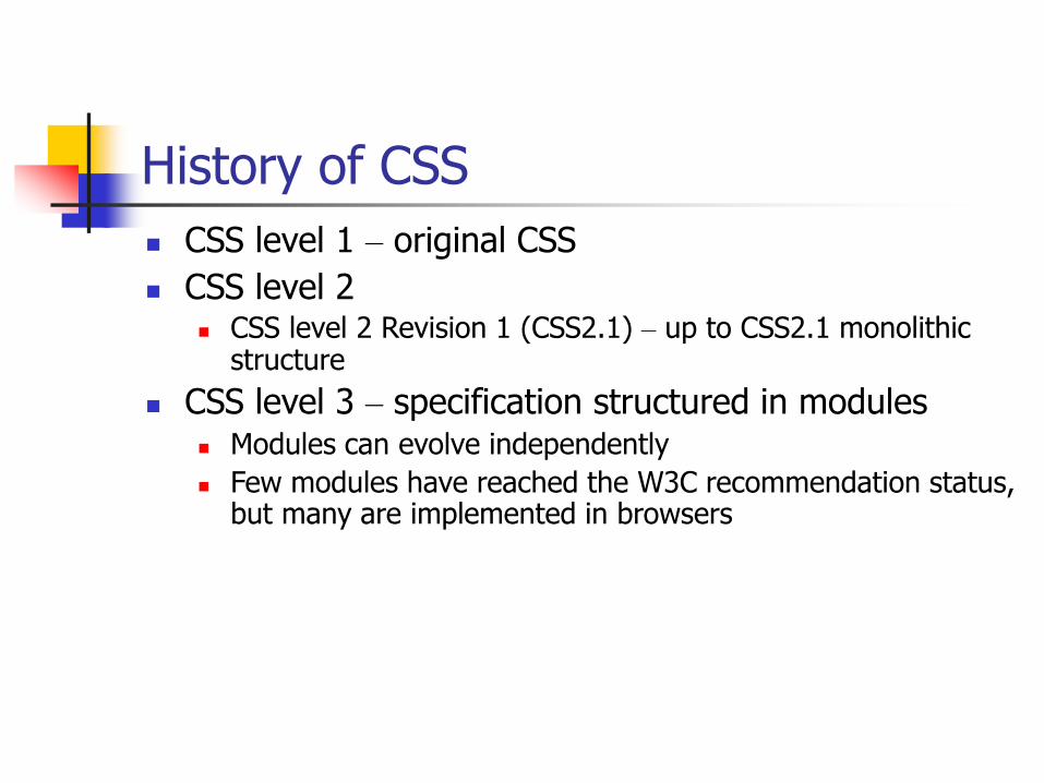
History of CSS
CSS level 1 – original CSS
CSS level 2 CSS level 2 Revision 1 (CSS2.1) – up to CSS2.1 monolithic
structure
CSS level 3 – specification structured in modules Modules can evolve independently
Few modules have reached the W3C recommendation status, but many are implemented in browsers
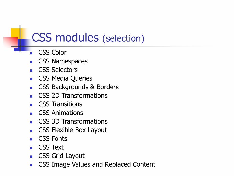
CSS modules (selection)
CSS Color
CSS Namespaces
CSS Selectors
CSS Media Queries
CSS Backgrounds & Borders
CSS 2D Transformations
CSS Transitions
CSS Animations
CSS 3D Transformations
CSS Flexible Box Layout
CSS Fonts
CSS Text
CSS Grid Layout
CSS Image Values and Replaced Content
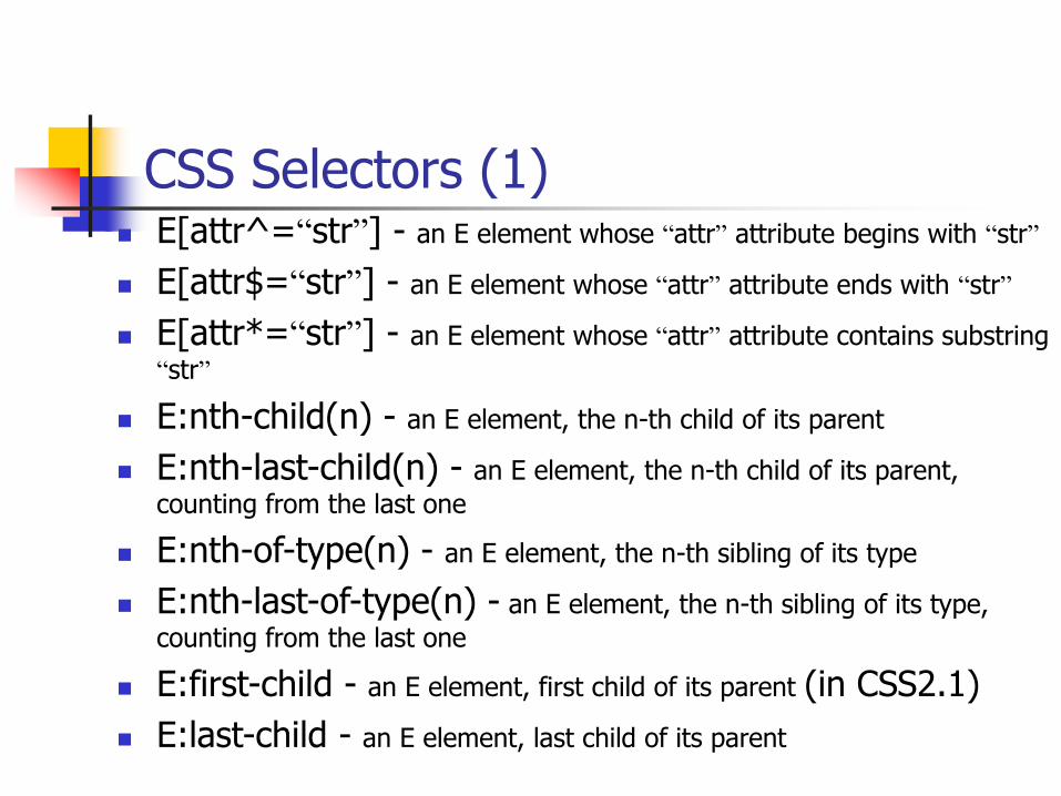
CSS Selectors (1) E[attr^=“str”] - an E element whose “attr” attribute begins with “str”
E[attr$=“str”] - an E element whose “attr” attribute ends with “str”
E[attr*=“str”] - an E element whose “attr” attribute contains substring
“str”
E:nth-child(n) - an E element, the n-th child of its parent
E:nth-last-child(n) - an E element, the n-th child of its parent,
counting from the last one
E:nth-of-type(n) - an E element, the n-th sibling of its type
E:nth-last-of-type(n) - an E element, the n-th sibling of its type,
counting from the last one
E:first-child - an E element, first child of its parent (in CSS2.1)
E:last-child - an E element, last child of its parent
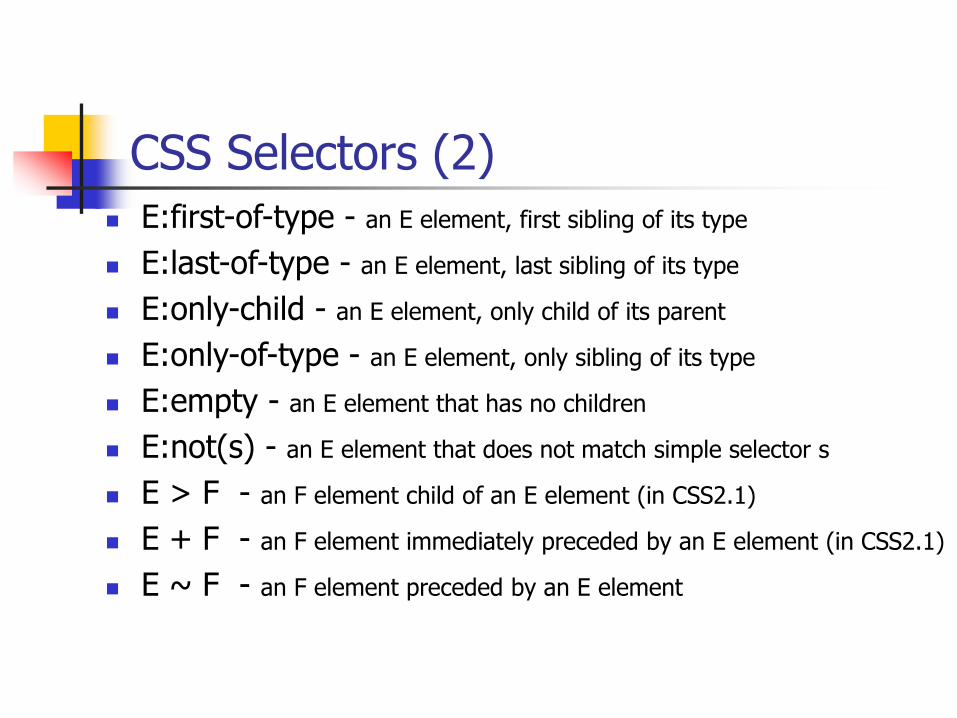
CSS Selectors (2)
E:first-of-type - an E element, first sibling of its type
E:last-of-type - an E element, last sibling of its type
E:only-child - an E element, only child of its parent
E:only-of-type - an E element, only sibling of its type
E:empty - an E element that has no children
E:not(s) - an E element that does not match simple selector s
E > F - an F element child of an E element (in CSS2.1)
E + F - an F element immediately preceded by an E element (in CSS2.1)
E ~ F - an F element preceded by an E element
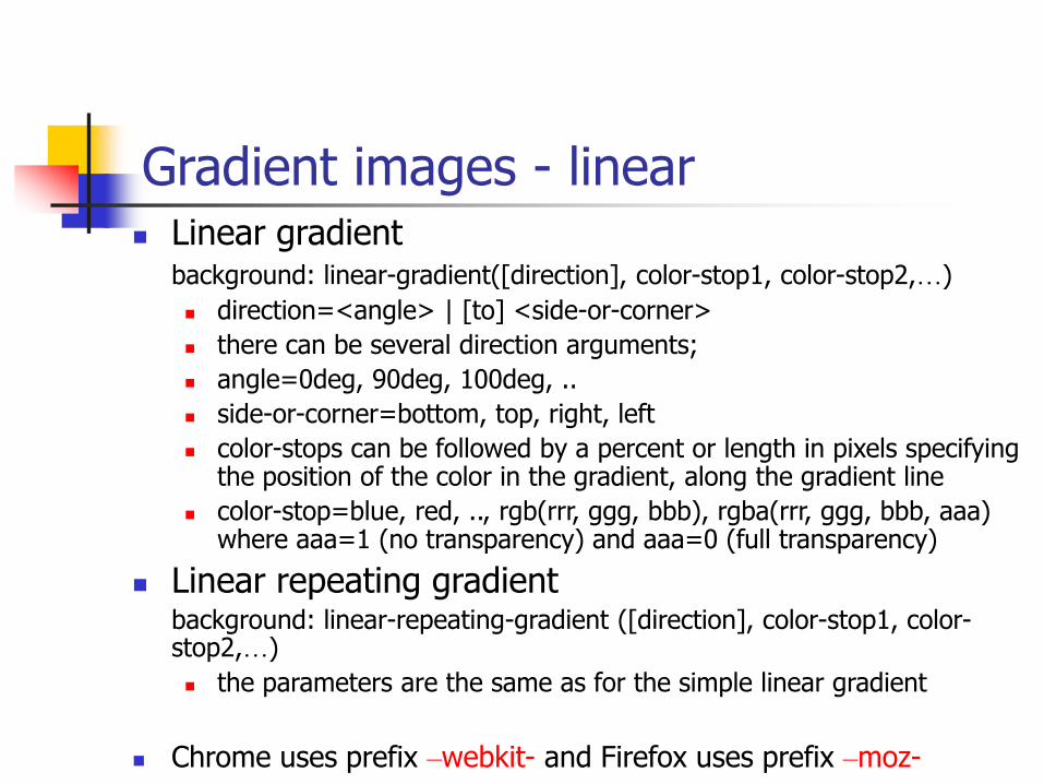
Gradient images - linear Linear gradient
background: linear-gradient([direction], color-stop1, color-stop2,…)
direction=<angle> | [to] <side-or-corner>
there can be several direction arguments;
angle=0deg, 90deg, 100deg, ..
side-or-corner=bottom, top, right, left
color-stops can be followed by a percent or length in pixels specifying the position of the color in the gradient, along the gradient line
color-stop=blue, red, .., rgb(rrr, ggg, bbb), rgba(rrr, ggg, bbb, aaa) where aaa=1 (no transparency) and aaa=0 (full transparency)
Linear repeating gradientbackground: linear-repeating-gradient ([direction], color-stop1, color-stop2,…)
the parameters are the same as for the simple linear gradient
Chrome uses prefix –webkit- and Firefox uses prefix –moz-
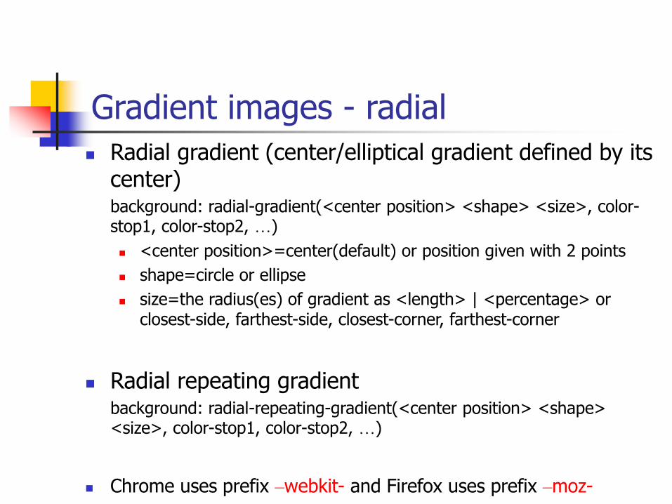
Gradient images - radial
Radial gradient (center/elliptical gradient defined by its center)background: radial-gradient(<center position> <shape> <size>, color-stop1, color-stop2, …)
<center position>=center(default) or position given with 2 points
shape=circle or ellipse
size=the radius(es) of gradient as <length> | <percentage> or closest-side, farthest-side, closest-corner, farthest-corner
Radial repeating gradientbackground: radial-repeating-gradient(<center position> <shape> <size>, color-stop1, color-stop2, …)
Chrome uses prefix –webkit- and Firefox uses prefix –moz-
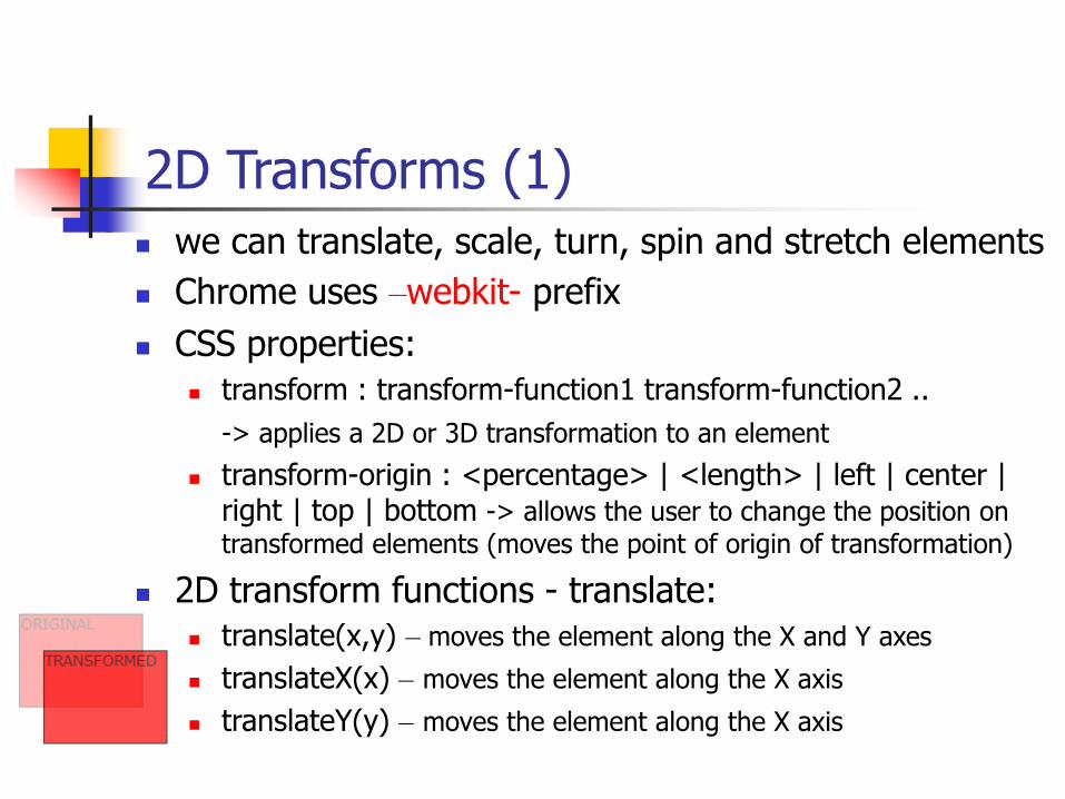
2D Transforms (1)
we can translate, scale, turn, spin and stretch elements
Chrome uses –webkit- prefix
CSS properties:
transform : transform-function1 transform-function2 ..
-> applies a 2D or 3D transformation to an element
transform-origin : <percentage> | <length> | left | center | right | top | bottom -> allows the user to change the position on
transformed elements (moves the point of origin of transformation)
2D transform functions - translate:
translate(x,y) – moves the element along the X and Y axes
translateX(x) – moves the element along the X axis
translateY(y) – moves the element along the X axis
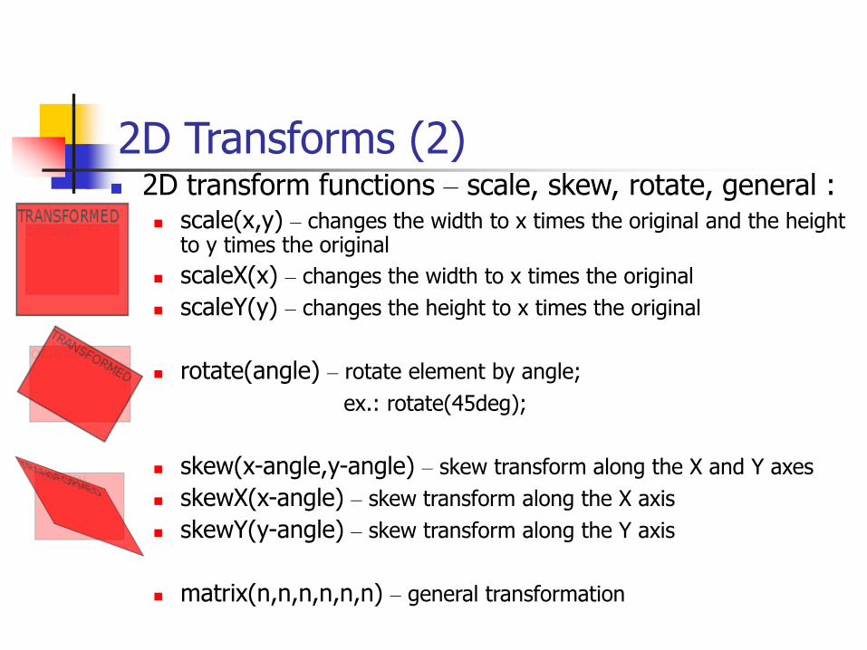
2D Transforms (2) 2D transform functions – scale, skew, rotate, general :
scale(x,y) – changes the width to x times the original and the height to y times the original
scaleX(x) – changes the width to x times the original
scaleY(y) – changes the height to x times the original
rotate(angle) – rotate element by angle;
ex.: rotate(45deg);
skew(x-angle,y-angle) – skew transform along the X and Y axes
skewX(x-angle) – skew transform along the X axis
skewY(y-angle) – skew transform along the Y axis
matrix(n,n,n,n,n,n) – general transformation
3D Transforms (1) apply 3D transforms to elements
Chrome uses –webkit- prefix
CSS properties:
transform : transform-function1 transform-function2 ..
transform-origin : <percentage> | <length> | left | center | right | top | bottom
transform-style : flat | preserve-3d -> a nested child element will not preserve its 3d position (‘flat’) or it will preserve it position (‘preserve-3d’)
perspective : none | number -> how many pixels the element is
placed from the viewport
perspective : x y -> define the view’s x- and y-axis for nested
elements; x,y= left | center | right | length | percent
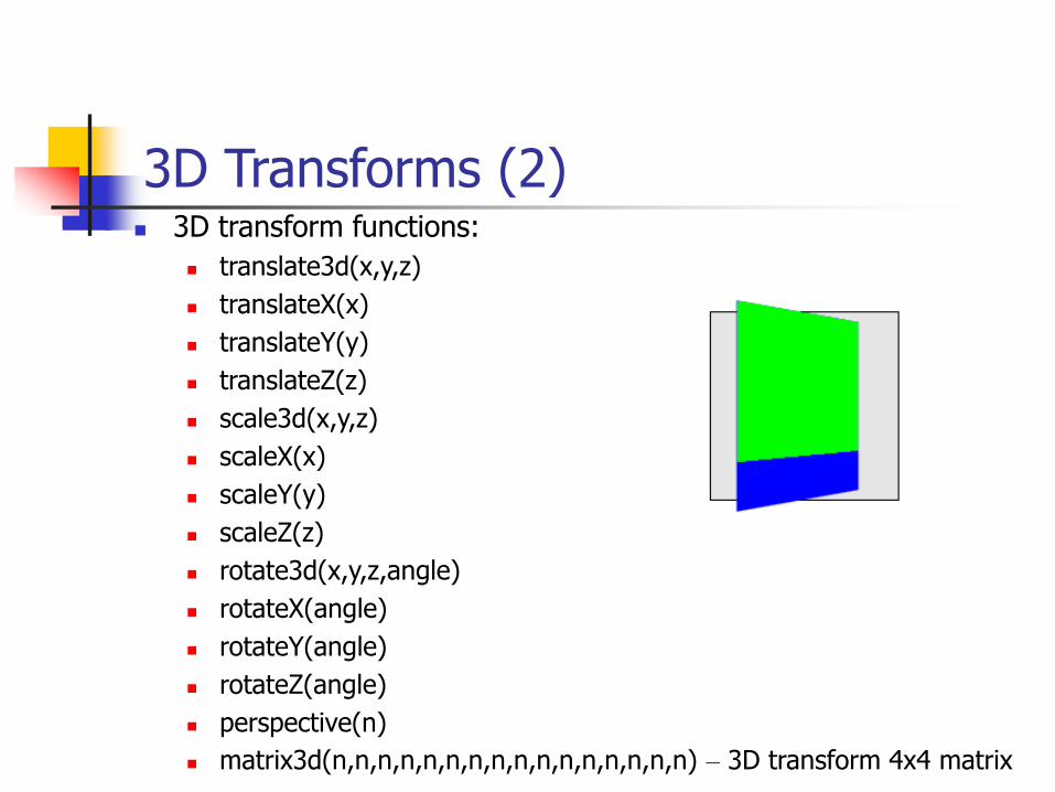
3D Transforms (2) 3D transform functions:
translate3d(x,y,z)
translateX(x)
translateY(y)
translateZ(z)
scale3d(x,y,z)
scaleX(x)
scaleY(y)
scaleZ(z)
rotate3d(x,y,z,angle)
rotateX(angle)
rotateY(angle)
rotateZ(angle)
perspective(n)
matrix3d(n,n,n,n,n,n,n,n,n,n,n,n,n,n,n,n) – 3D transform 4x4 matrix
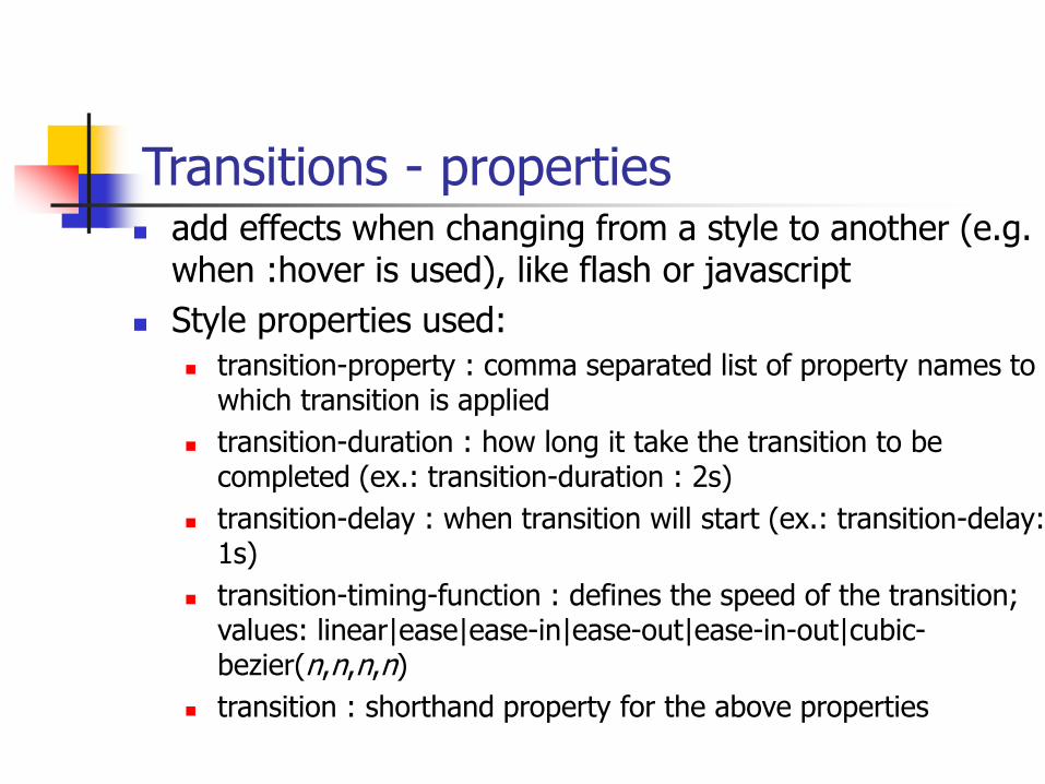
Transitions - properties add effects when changing from a style to another (e.g.
when :hover is used), like flash or javascript
Style properties used:
transition-property : comma separated list of property names to which transition is applied
transition-duration : how long it take the transition to be completed (ex.: transition-duration : 2s)
transition-delay : when transition will start (ex.: transition-delay: 1s)
transition-timing-function : defines the speed of the transition; values: linear|ease|ease-in|ease-out|ease-in-out|cubic-bezier(n,n,n,n)
transition : shorthand property for the above properties
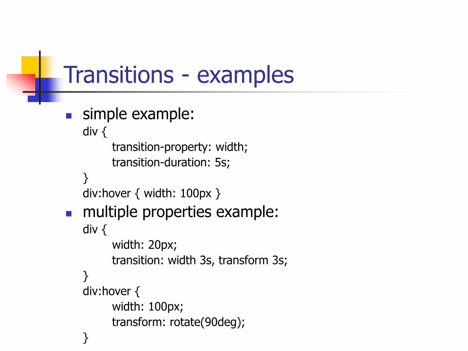
Transitions - examples
simple example:div {
transition-property: width;
transition-duration: 5s;
}
div:hover { width: 100px }
multiple properties example:div {
width: 20px;
transition: width 3s, transform 3s;
}
div:hover {
width: 100px;
transform: rotate(90deg);
}
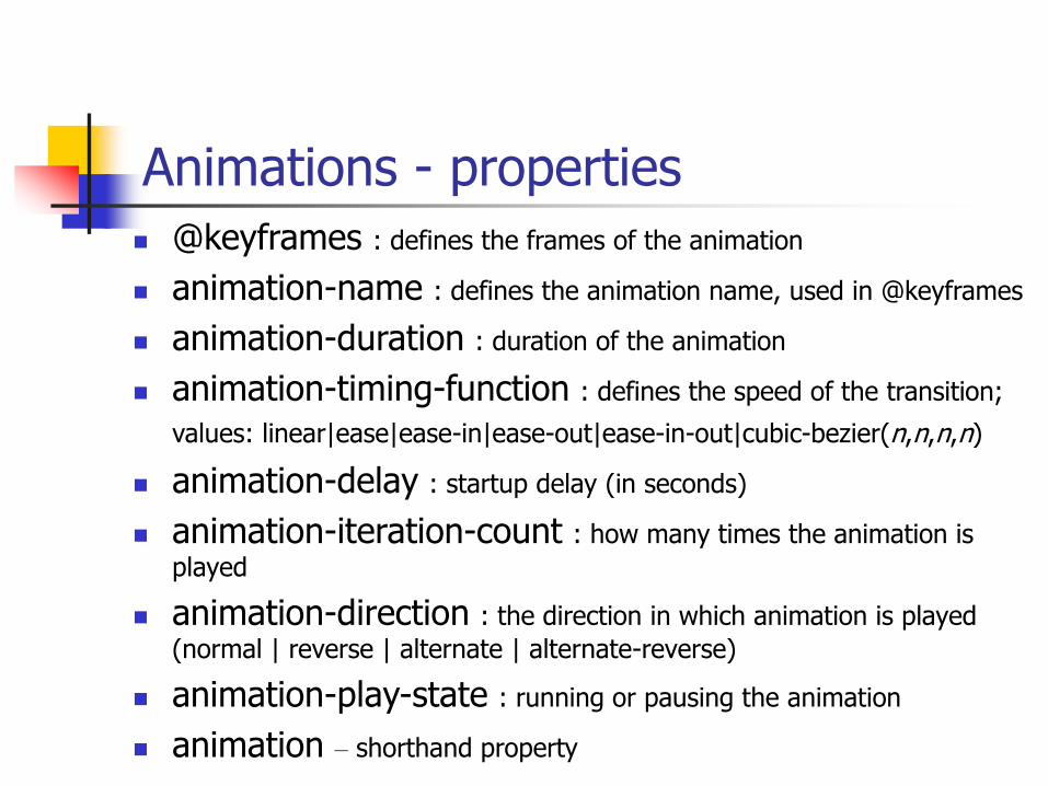
Animations - properties
@keyframes : defines the frames of the animation
animation-name : defines the animation name, used in @keyframes
animation-duration : duration of the animation
animation-timing-function : defines the speed of the transition;
values: linear|ease|ease-in|ease-out|ease-in-out|cubic-bezier(n,n,n,n)
animation-delay : startup delay (in seconds)
animation-iteration-count : how many times the animation is
played
animation-direction : the direction in which animation is played
(normal | reverse | alternate | alternate-reverse)
animation-play-state : running or pausing the animation
animation – shorthand property
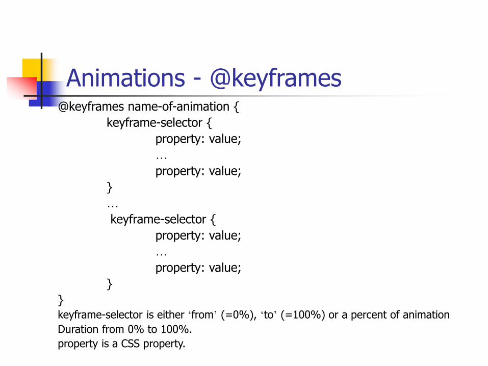
Animations - @keyframes@keyframes name-of-animation {
keyframe-selector {
property: value;
…
property: value;
}
…
keyframe-selector {
property: value;
…
property: value;
}
}keyframe-selector is either ‘from’ (=0%), ‘to’ (=100%) or a percent of animation
Duration from 0% to 100%.
property is a CSS property.
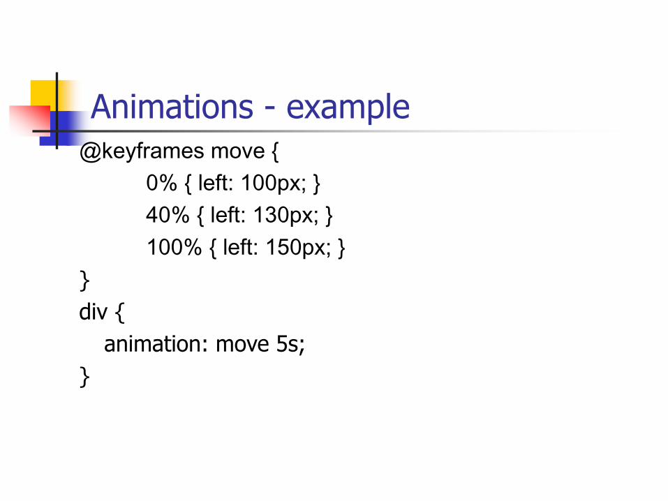
Animations - example@keyframes move {
0% { left: 100px; }
40% { left: 130px; }
100% { left: 150px; }
}
div {
animation: move 5s;
}
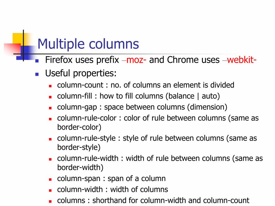
Multiple columns Firefox uses prefix –moz- and Chrome uses –webkit-
Useful properties:
column-count : no. of columns an element is divided
column-fill : how to fill columns (balance | auto)
column-gap : space between columns (dimension)
column-rule-color : color of rule between columns (same as border-color)
column-rule-style : style of rule between columns (same as border-style)
column-rule-width : width of rule between columns (same as border-width)
column-span : span of a column
column-width : width of columns
columns : shorthand for column-width and column-count
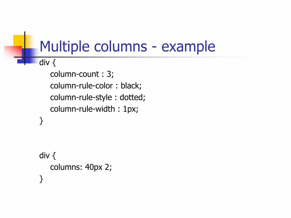
Multiple columns - examplediv {
column-count : 3;
column-rule-color : black;
column-rule-style : dotted;
column-rule-width : 1px;
}
div {
columns: 40px 2;
}
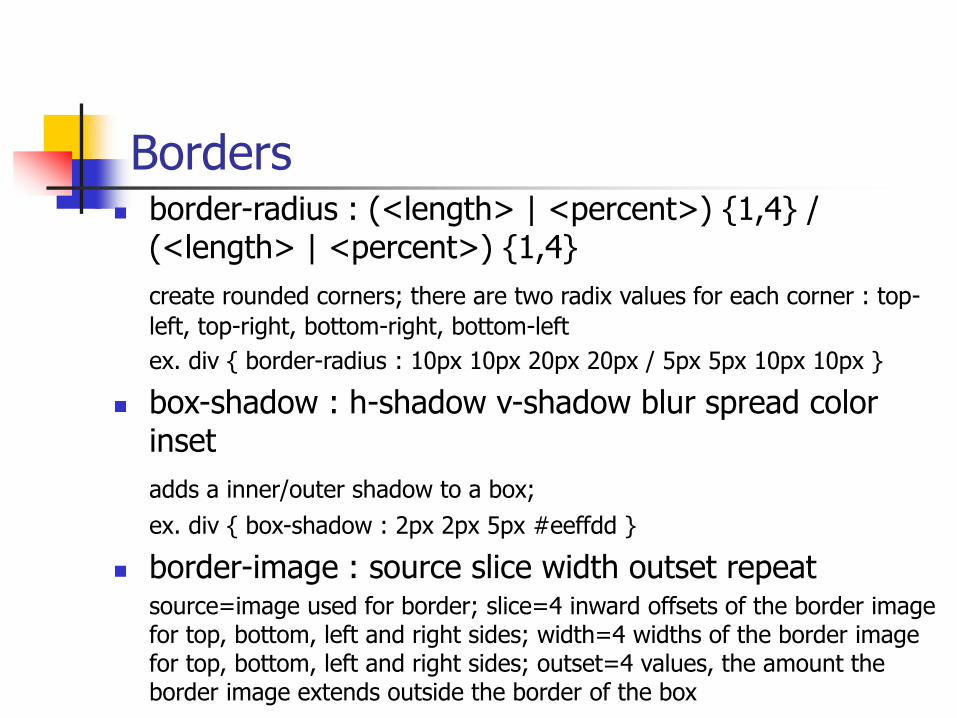
Borders border-radius : (<length> | <percent>) {1,4} /
(<length> | <percent>) {1,4}
create rounded corners; there are two radix values for each corner : top-
left, top-right, bottom-right, bottom-left
ex. div { border-radius : 10px 10px 20px 20px / 5px 5px 10px 10px }
box-shadow : h-shadow v-shadow blur spread color inset
adds a inner/outer shadow to a box;
ex. div { box-shadow : 2px 2px 5px #eeffdd }
border-image : source slice width outset repeatsource=image used for border; slice=4 inward offsets of the border image for top, bottom, left and right sides; width=4 widths of the border image for top, bottom, left and right sides; outset=4 values, the amount the border image extends outside the border of the box
Background and sprites
CSS3 allows to have several background images for an element
Sprites are several images contained in one image which can individually be used as backgrounds by setting different values for background-position; see example..
Text shadow
text-shadow : h-shadow v-shadow blur color;
Ex.: div {
text-shadow: 2px 2px 4px #ff00dd;}
Beyond CSS : CSS preprocessors
Stylus
Compass
Less
Related Documents


![Level Up with Post CSS - Developer Summit€¦ · postcss.plugin(['myplugin'], options => { PostCSS Plugin /* Use options */ return css => { /* process css *](https://static.cupdf.com/doc/110x72/5f5fdd72cd909c3af36e72ca/level-up-with-post-css-developer-postcsspluginmyplugin-options-.jpg)


![CSS Techniques for Web Content Accessibility Guidelines 1 · Sheets (CSS). Cascading Style Sheets are defined by the W3C Recommendations "CSS Level 1" [CSS1] [p. 21] and "CSS Level](https://static.cupdf.com/doc/110x72/5f1f4a74cfb3245cd008a96a/css-techniques-for-web-content-accessibility-guidelines-1-sheets-css-cascading.jpg)