CS 235: User Interface Design December 8 Class Meeting Department of Computer Science San Jose State University Fall 2014 Instructor: Ron Mak www.cs.sjsu.edu/~mak

CS 235: User Interface Design December 8 Class Meeting Department of Computer Science San Jose State University Fall 2014 Instructor: Ron Mak mak.
Dec 24, 2015
Welcome message from author
This document is posted to help you gain knowledge. Please leave a comment to let me know what you think about it! Share it to your friends and learn new things together.
Transcript
CS 235: User Interface DesignDecember 8 Class Meeting
Department of Computer ScienceSan Jose State University
Fall 2014Instructor: Ron Mak
www.cs.sjsu.edu/~mak
Computer Science Dept.Fall 2014: December 8
CS 235: User Interface Design© R. Mak
2
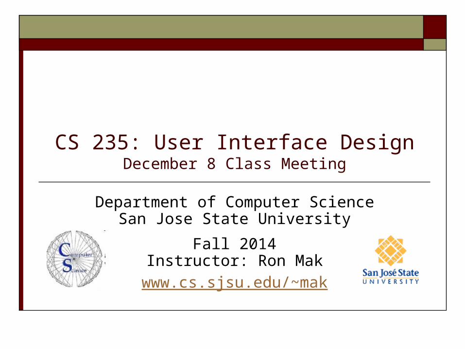
How to Display a Data Value
Consider a single simple display:
We can add more information:
We need to pay attention to this value!
Show the reason to pay attention: the target.
YTD Expenses $487,321
YTD Expenses $487,321
Actual Target
YTD Expenses $487,321 $450,000
Computer Science Dept.Fall 2014: December 8
CS 235: User Interface Design© R. Mak
3
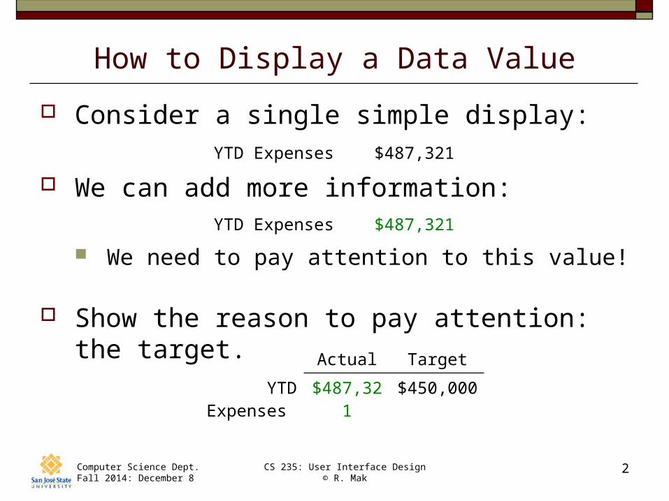
How to Display a Data Value, cont’d
Show more information: the variance.
Actual Target Variance
YTD Expenses $487,321 $450,000 +$37,321
Actual Target Variance %
YTD Expenses $487,321 $450,000 +8%
Computer Science Dept.Fall 2014: December 8
CS 235: User Interface Design© R. Mak
4
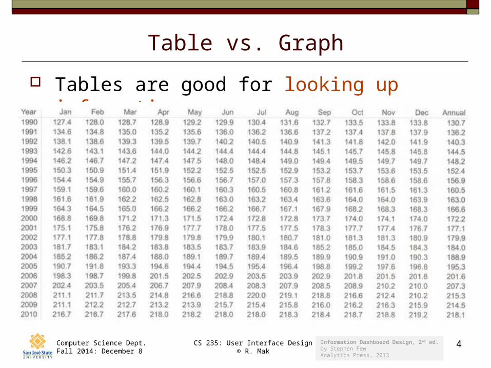
Table vs. Graph
Tables are good for looking up information:
Information Dashboard Design, 2nd ed.by Stephen FewAnalytics Press, 2013
Computer Science Dept.Fall 2014: December 8
CS 235: User Interface Design© R. Mak
5
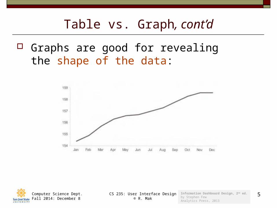
Table vs. Graph, cont’d
Graphs are good for revealing the shape of the data:
Information Dashboard Design, 2nd ed.by Stephen FewAnalytics Press, 2013
Computer Science Dept.Fall 2014: December 8
CS 235: User Interface Design© R. Mak
6
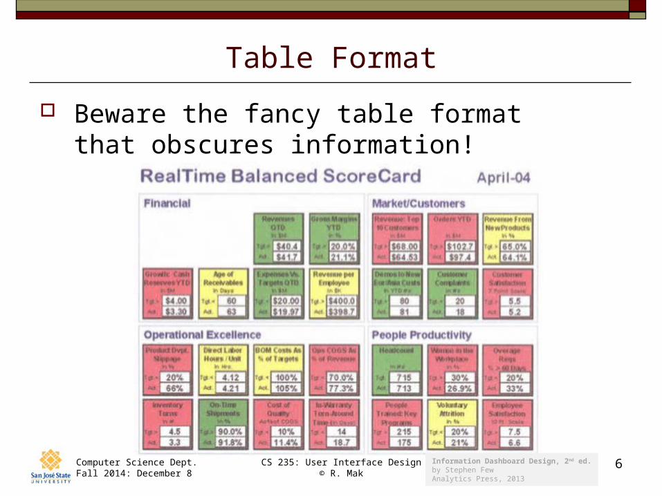
Table Format
Beware the fancy table format that obscures information!
Information Dashboard Design, 2nd ed.by Stephen FewAnalytics Press, 2013
Computer Science Dept.Fall 2014: December 8
CS 235: User Interface Design© R. Mak
7
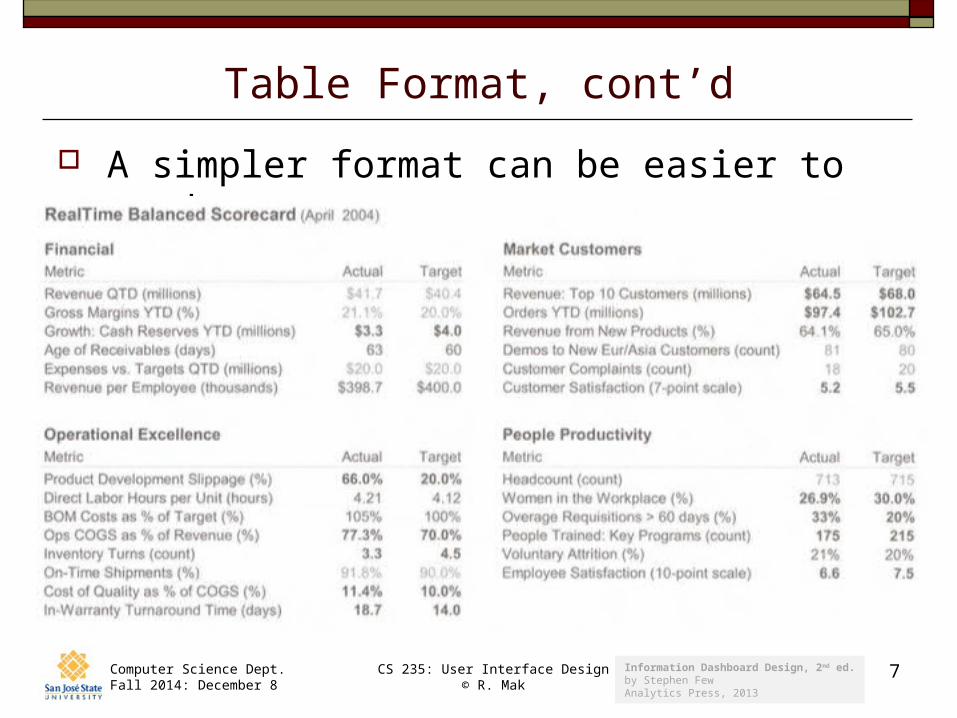
Table Format, cont’d
A simpler format can be easier to read:
Information Dashboard Design, 2nd ed.by Stephen FewAnalytics Press, 2013
Computer Science Dept.Fall 2014: December 8
CS 235: User Interface Design© R. Mak
8
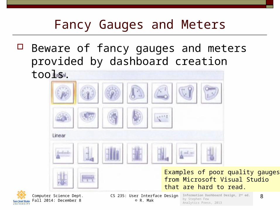
Fancy Gauges and Meters
Beware of fancy gauges and meters provided by dashboard creation tools.
Examples of poor quality gaugesfrom Microsoft Visual Studio that are hard to read.
Information Dashboard Design, 2nd ed.by Stephen FewAnalytics Press, 2013
Computer Science Dept.Fall 2014: December 8
CS 235: User Interface Design© R. Mak
9
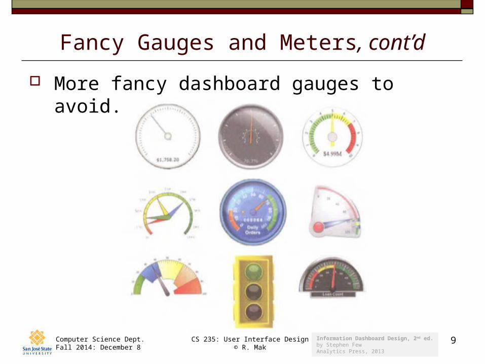
Fancy Gauges and Meters, cont’d
More fancy dashboard gauges to avoid.
Information Dashboard Design, 2nd ed.by Stephen FewAnalytics Press, 2013
Computer Science Dept.Fall 2014: December 8
CS 235: User Interface Design© R. Mak
10
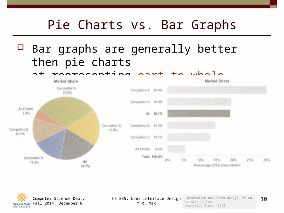
Pie Charts vs. Bar Graphs
Bar graphs are generally better then pie chartsat representing part-to-whole.
Information Dashboard Design, 2nd ed.by Stephen FewAnalytics Press, 2013
Computer Science Dept.Fall 2014: December 8
CS 235: User Interface Design© R. Mak
11
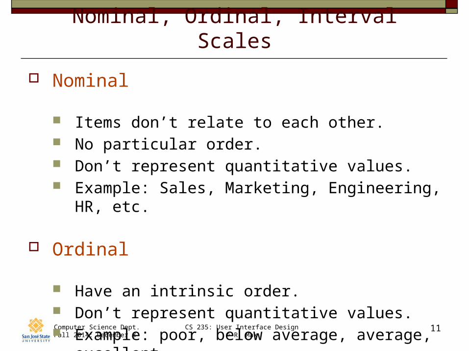
Nominal, Ordinal, Interval Scales
Nominal
Items don’t relate to each other. No particular order. Don’t represent quantitative values. Example: Sales, Marketing, Engineering, HR, etc.
Ordinal
Have an intrinsic order. Don’t represent quantitative values. Example: poor, below average, average, excellent
Computer Science Dept.Fall 2014: December 8
CS 235: User Interface Design© R. Mak
12
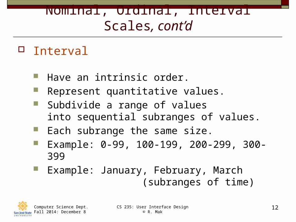
Nominal, Ordinal, Interval Scales, cont’d
Interval
Have an intrinsic order. Represent quantitative values. Subdivide a range of values
into sequential subranges of values. Each subrange the same size. Example: 0-99, 100-199, 200-299, 300-399 Example: January, February, March
(subranges of time)
Computer Science Dept.Fall 2014: December 8
CS 235: User Interface Design© R. Mak
13
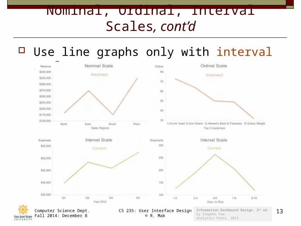
Nominal, Ordinal, Interval Scales, cont’d
Use line graphs only with interval scales.
Information Dashboard Design, 2nd ed.by Stephen FewAnalytics Press, 2013
Computer Science Dept.Fall 2014: December 8
CS 235: User Interface Design© R. Mak
14
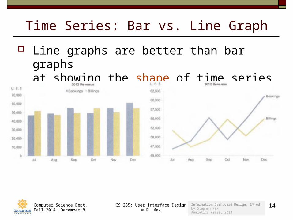
Time Series: Bar vs. Line Graph
Line graphs are better than bar graphsat showing the shape of time series data.
Information Dashboard Design, 2nd ed.by Stephen FewAnalytics Press, 2013
Computer Science Dept.Fall 2014: December 8
CS 235: User Interface Design© R. Mak
15
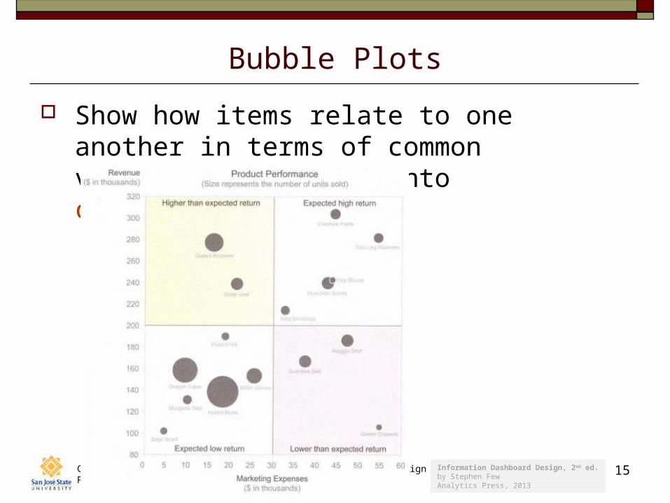
Bubble Plots
Show how items relate to one another in terms of common variables that fall into categories.
Information Dashboard Design, 2nd ed.by Stephen FewAnalytics Press, 2013
Computer Science Dept.Fall 2014: December 8
CS 235: User Interface Design© R. Mak
16
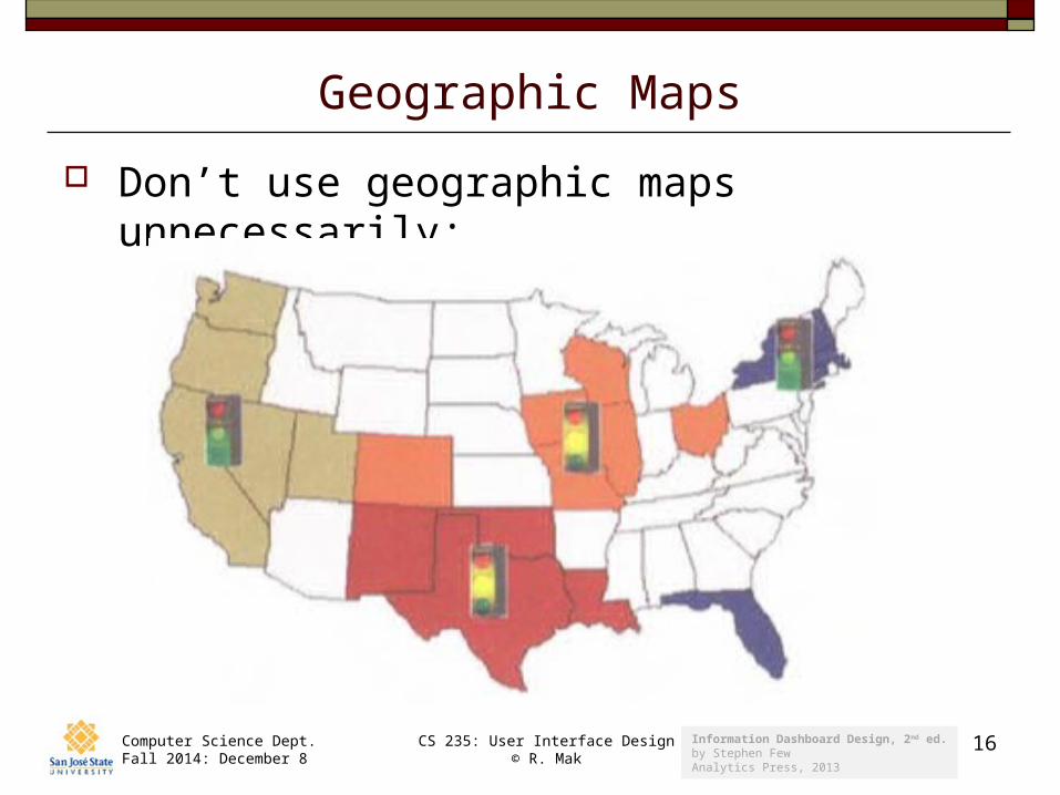
Geographic Maps
Don’t use geographic maps unnecessarily:
Information Dashboard Design, 2nd ed.by Stephen FewAnalytics Press, 2013
Computer Science Dept.Fall 2014: December 8
CS 235: User Interface Design© R. Mak
17
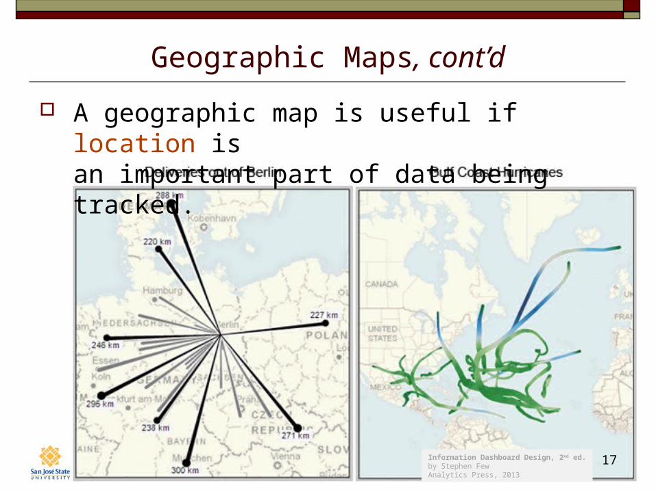
Geographic Maps, cont’d
A geographic map is useful if location is an important part of data being tracked.
Information Dashboard Design, 2nd ed.by Stephen FewAnalytics Press, 2013
Computer Science Dept.Fall 2014: December 8
CS 235: User Interface Design© R. Mak
18
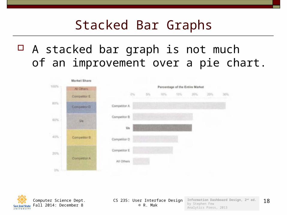
Stacked Bar Graphs
A stacked bar graph is not much of an improvement over a pie chart.
Information Dashboard Design, 2nd ed.by Stephen FewAnalytics Press, 2013
Computer Science Dept.Fall 2014: December 8
CS 235: User Interface Design© R. Mak
19
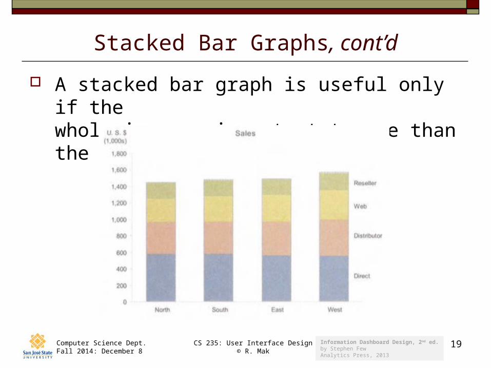
Stacked Bar Graphs, cont’d
A stacked bar graph is useful only if the whole is more important to see than the parts.
Information Dashboard Design, 2nd ed.by Stephen FewAnalytics Press, 2013
Computer Science Dept.Fall 2014: December 8
CS 235: User Interface Design© R. Mak
20
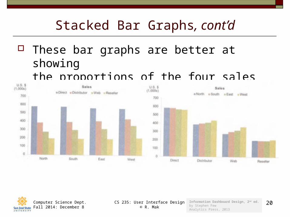
Stacked Bar Graphs, cont’d
These bar graphs are better at showing the proportions of the four sales channels.
Information Dashboard Design, 2nd ed.by Stephen FewAnalytics Press, 2013
Computer Science Dept.Fall 2014: December 8
CS 235: User Interface Design© R. Mak
21
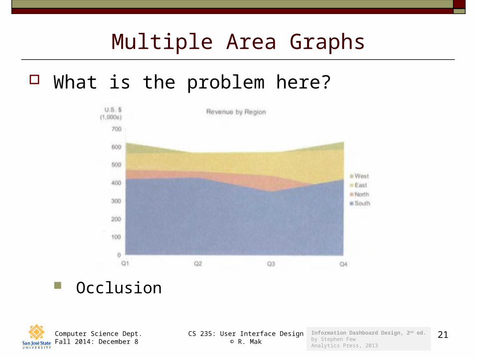
Multiple Area Graphs
What is the problem here?
Occlusion
Information Dashboard Design, 2nd ed.by Stephen FewAnalytics Press, 2013
Computer Science Dept.Fall 2014: December 8
CS 235: User Interface Design© R. Mak
22
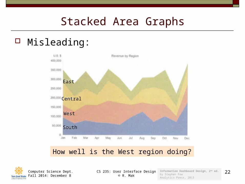
Stacked Area Graphs
Misleading:
How well is the West region doing?
East
Central
West
South
Information Dashboard Design, 2nd ed.by Stephen FewAnalytics Press, 2013
Computer Science Dept.Fall 2014: December 8
CS 235: User Interface Design© R. Mak
23
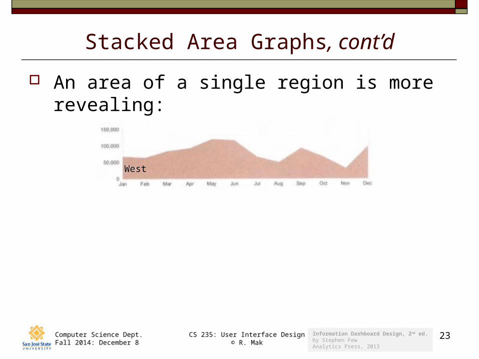
Stacked Area Graphs, cont’d
An area of a single region is more revealing:
West
Information Dashboard Design, 2nd ed.by Stephen FewAnalytics Press, 2013
Computer Science Dept.Fall 2014: December 8
CS 235: User Interface Design© R. Mak
24
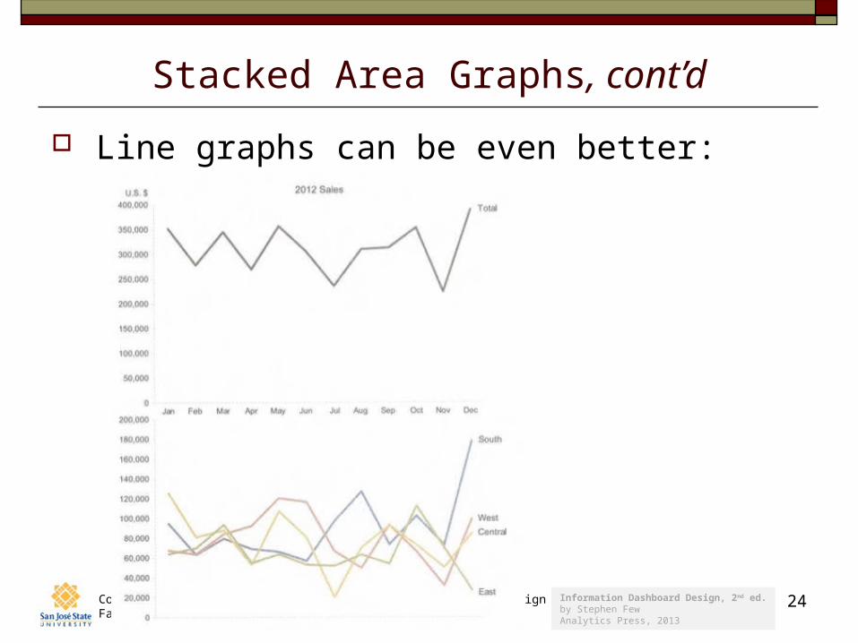
Stacked Area Graphs, cont’d
Line graphs can be even better:
Information Dashboard Design, 2nd ed.by Stephen FewAnalytics Press, 2013
Computer Science Dept.Fall 2014: December 8
CS 235: User Interface Design© R. Mak
25
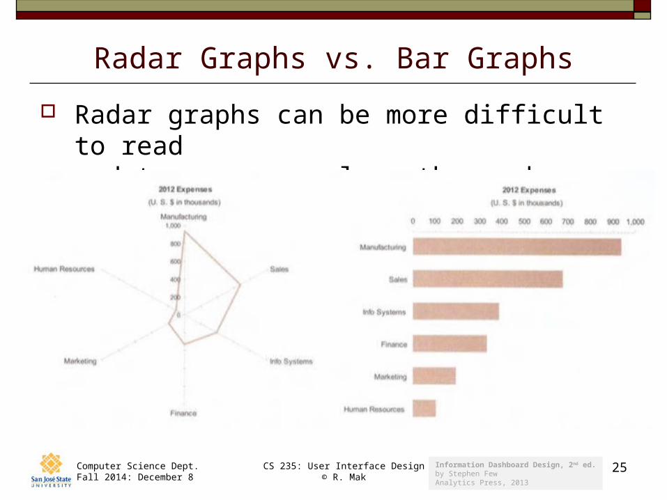
Radar Graphs vs. Bar Graphs
Radar graphs can be more difficult to readand to compare values than a bar graph:
Information Dashboard Design, 2nd ed.by Stephen FewAnalytics Press, 2013
Computer Science Dept.Fall 2014: December 8
CS 235: User Interface Design© R. Mak
26
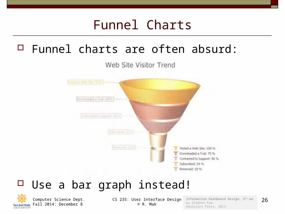
Funnel Charts
Funnel charts are often absurd:
Use a bar graph instead!
Information Dashboard Design, 2nd ed.by Stephen FewAnalytics Press, 2013
Computer Science Dept.Fall 2014: December 8
CS 235: User Interface Design© R. Mak
27
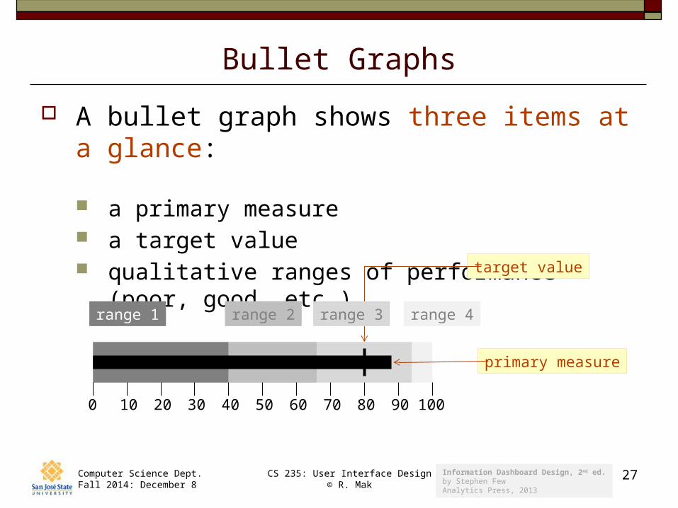
Bullet Graphs
A bullet graph shows three items at a glance:
a primary measure a target value qualitative ranges of performance (poor, good, etc.)
0 10 20 30 40 50 60 70 80 90 100
primary measure
target value
range 1 range 2 range 3 range 4
Information Dashboard Design, 2nd ed.by Stephen FewAnalytics Press, 2013
Computer Science Dept.Fall 2014: December 8
CS 235: User Interface Design© R. Mak
28
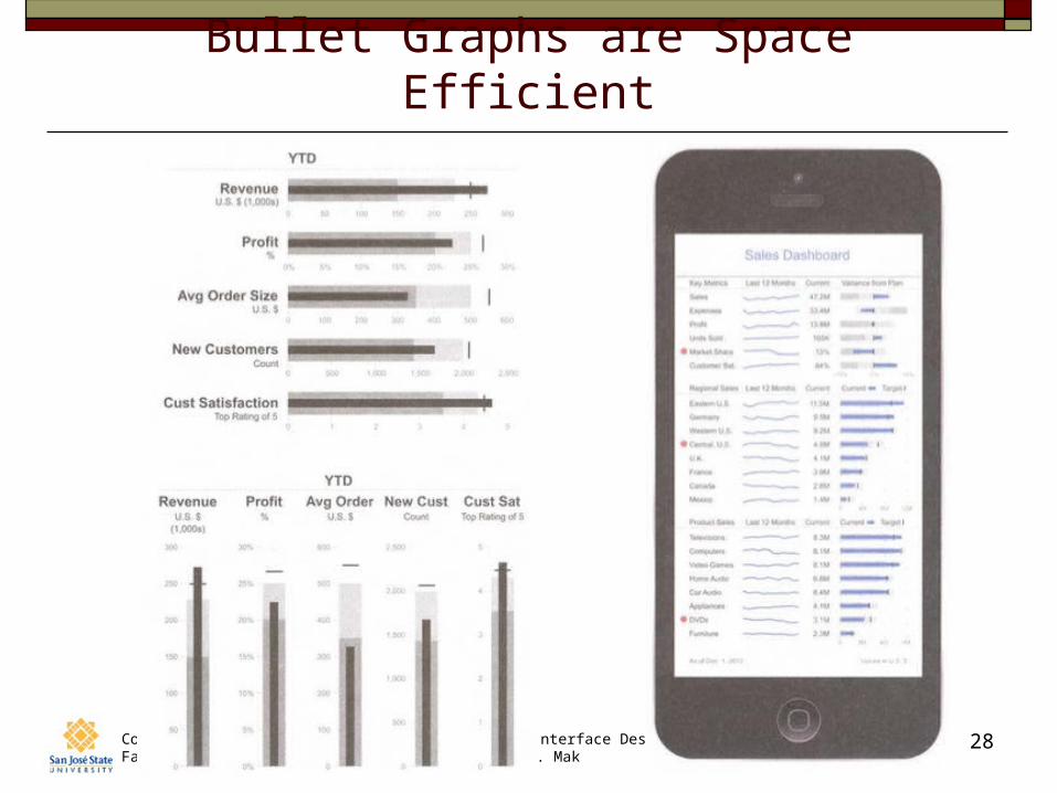
Bullet Graphs are Space Efficient
Computer Science Dept.Fall 2014: December 8
CS 235: User Interface Design© R. Mak
29
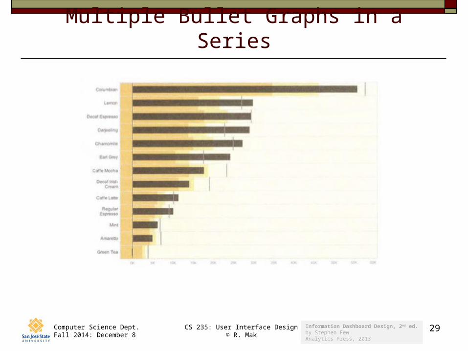
Multiple Bullet Graphs in a Series
Information Dashboard Design, 2nd ed.by Stephen FewAnalytics Press, 2013
Computer Science Dept.Fall 2014: December 8
CS 235: User Interface Design© R. Mak
30
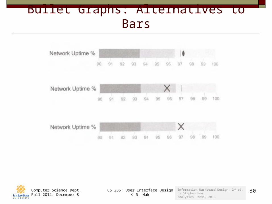
Bullet Graphs: Alternatives to Bars
Information Dashboard Design, 2nd ed.by Stephen FewAnalytics Press, 2013
Related Documents