CROP CONDITION AND YIELD PREDICTION AT THE FIELD SCALE WITH GEOSPATIAL AND ARTIFICIAL NEURAL NETWORK APPLICATIONS A dissertation submitted to Kent State University in partial fulfillment of the requirements for the degree of Doctor of Philosophy by David L. Hollinger August, 2011

Welcome message from author
This document is posted to help you gain knowledge. Please leave a comment to let me know what you think about it! Share it to your friends and learn new things together.
Transcript

CROP CONDITION AND YIELD PREDICTION AT THE FIELD SCALE WITH GEOSPATIAL AND ARTIFICIAL NEURAL NETWORK APPLICATIONS
A dissertation submitted to Kent State University in partial
fulfillment of the requirements for the degree of Doctor of Philosophy
by
David L. Hollinger
August, 2011

ii
Dissertation written by David L. Hollinger
B.S., University of Southern California, 1987 M.A, California State University, Northridge, 2005
Ph.D., Kent State University, 2011
Approved by
Dr. Mandy Munro-Stasiuk , Chair, Doctoral Dissertation Committee
Dr. Scott Sheridan , Members, Doctoral Dissertation Committee Dr. Emariana Taylor________ _ _ ____
Dr. Joseph Ortiz __________ ___ ____
Dr. Murali Shanker______ ____ ____
Accepted by
Dr. Mandy Munro-Stasiuk ____ _ __ , Chair, Department of Geography
Dr. Timothy Moerland_____________, Dean, College of Arts and Sciences

iii
TABLE OF CONTENTS
LIST OF FIGURES………………………………………………………………. v
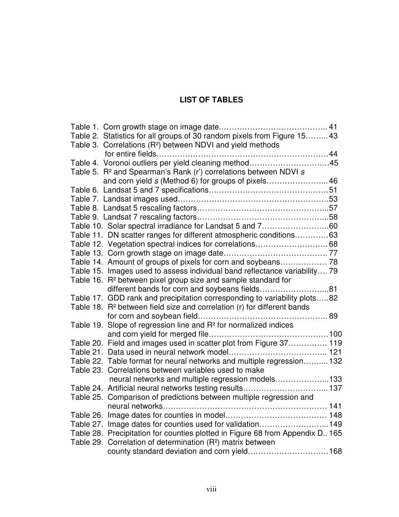
LIST OF TABLES…………………………………………………………………viii ACKNOWLEDGEMENTS………………………………………………………. x CHAPTER 1. INTRODUCTION……………………………………………………………… 1 Introduction ………………………………………………………….…… 1 The concept of management zones…………………………… 2 Research Area…………………………………………..………………. 9 2. A GIS-BASED STEP-BY-STEP YIELD DATA CLEANING METHODOLOGY……………………………………..… 17
Introduction …………………………………………………………….… 17 Study Area…. ………………………………………………………….… 19 Methods…………………………………………………………………… 20
Validation……………………………………………………….… 39 Data Analysis…………………………………………………………..… 41 Conclusion...……………………………………………..…………….… 46
3. SPATIAL CORRELATIONS BETWEEN LANDSAT-BASED REFLECTANCE VALUES AND CORN OR SOYBEAN YIELD………….. 49
Introduction……………………………………………..………………… 49 Study Area………………………………..…………………………….… 50 Methods………………………………………………….……………….. 51
Landsat data acquisition………………………………………….51 Image-based atmospheric correction………………………….. 58 Vegetation spectral indices………………………………………67
Data Analysis….………………………………….………………………. 69 Soil bias…………………………………………………….69 Reflectance variability…………………………………….78 Spatial correlation…………………………………………88
Conclusion…………………………………………………………………103 4. ARTIFICIAL NEURAL NETWORKS PREDICTION OF CORN AND SOYBEAN YIELD VARIABILITY…………………………108
Introduction……………………………………………..………………….108 Artificial Neural Networks Background……………………………….... 110 Dataset Development………………..………………………….………..116

iv
Pixel groups in model……..……………………………………... 117 Types of data in models…………………………………………. 121
Landsat-based values……………………..…………….. 121 LiDAR values……………………………………………... 127
Data Analysis…………………………………………………………...... 133 Conclusion……………………………………………………………....... 142
5. A GIS-BASED ERROR RESILIENT METHOD TO PREDICT COUNTY CORN AND SOYBEAN YIELD IN WESTERN OHIO BASED ON RETRIEVED REFLECTANCE VARIABILITY……………………………... 144
Introduction……………………………………………..……………….... 144 Study Area…………………………………………..……………………..146 Methods………………………………………..………………….………. 154
County dataset development…………………………………….154 Data Analysis….………………………………….………………………. 163 Conclusion………………………………………………………………... 174
6. CONCLUSION………………………………………………………………... 178 References…………………………………………………………………………185 Appendix A. Comparison of Corn Yield Maps from
Method 1 and Method 6…………………………………………. 204 Appendix B. Clean Yield Monitor Data (Method 6) Compared to
Weighted Average Yield from Nearby County centroids…….. 218 Appendix C. Steps for Developing a Landsat Yield Prediciton Map……….. 222 Appendix D Precipitation Amounts for Counties and Image Dates In county yield prediction model in Chapter 5………………….240
v
LIST OF FIGURES
Figure 1. Research area.…………….……………………..………………….. 10 Figure 2. Physiographic regions of Ohio.………………............................... 12 Figure 3. Annual normal precipitation for research area……………………. 14 Figure 4. Monthly normal precipitation for research area…………………… 15 Figure 5. Location of fields with yield data in study………………………..… 19 Figure 6. Flow chart of yield cleaning methods.……………………………… 25 Figure 7. Effect of incorrect delay time on yield monitor data…………….… 26 Figure 8. Result of ramping effect when harvester leaves field …………… 28 Figure 9. Effect of pixel averaging.………………………………………….… 30 Figure 10. Field with many zero yield values………………………………… 31 Figure 11. Pixels with inconsistent yield data………………………………... 32 Figure 12. Low yielding transects.…………………………............................ 33 Figure 13. Local yield outliers.…………………………………………………. 36 Figure 14. Corn vegetative stage……………………………………………… 40 Figure 15. R² values between NDVI and corn yield………………………… 42 Figure 16. Vicinity of fields with yield monitor and satellite data…………… 50 Figure 17. Imagery that need to be better aligned…………………………… 52 Figure 18. Edge of Landsat scene.……………………………………………. 66 Figure 19. Soil influence on reflectance-based values……………………… 71 Figure 20. Correlation (r) between band 4 and yield for entire fields Different sizes) for early season images ordered by GDDs…....72 Figure 21. Field with part wheat planted.………………………………………74 Figure 22. Landsat Band 3 imagery of two types of crop residue…………..74 Figure 23. Background influence in imagery. …………………………………75 Figure 24. Images of different amounts of canopy closure………………..... 76 Figure 25. Appearance of corn and soy through the growing season…….. 80 Figure 26. Comparison of standard deviation for corn and soybeans bands 1 and 2 for images dates that correspond to Table 17.. . 83 Figure 27. Comparison of standard deviation for corn and soybeans bands 3 and 4 for images dates that correspond to Table 17... 84 Figure 28. Comparison of how many different reflectance values there are in fields for bands 1 and 2 for images dates that correspond to Table 17………………………………………........ 86 Figure 29. Comparison of how many different reflectance values there are in fields for bands 3 and 4 for images dates that correspond to Table 17………………………………………….... 87 Figure 30. Correlations (r) between corn yield monitor data and reflectance during different times of the season………….. 90
vi
Figure 31. Correlations (r) between soybean yield monitor data and reflectance during different times of the season…………... 92 Figure 32. Plot of normalized band 4 reflectance and normalized soybean yield monitor data with linear regression information… 95 Figure 33. Frequency histogram of retrieved band 4 reflectance values for soybeans used in the Figure 32 regression…………………. 96 Figure 34. Soybean reflectance per leaf area index………………………… 97 Figure 35. Histogram for average soybean yield corresponding to the pixels in Figure 33…………………………………..……….98 Figure 36 Plot and linear regression for normalized NNIR and normalized corn yield monitor…………………………………….. 101 Figure 37 Merged corn and soybean normalized linear regression. ………102 Figure 38 Average of normalized Landsat yield prediction maps…………. 105 Figure 39 Potential management zone data………………….……………... 106 Figure 40. Diagram of neuron………………………………………………….. 111 Figure 41. Diagram showing area of synapses………………………………. 111 Figure 42. Artificial Neural Network feed forward
back propagation design…………………………………………... 112 Figure 43. Yield patterns causing two separate yield files for field………… 120 Figure 44. Landsat pixel extent with centroids that are interpolated from… 122 Figure 45. Pixel and spline interpolation of soybean field based on band 4……………………………………………………. 123 Figure 46. Comparison between yield data and Landsat data with same interpolation method……………………..................... 124 Figure 47. Landsat interpolation extent……………………………………….. 126 Figure 48. Comparison of location of yield points and Landsat interpolated points…………………………………………………..127 Figure 49. Comparison between LiDAR and smoothed LiDAR……………..128 Figure 50. Example of conversion of raw elevation data to leveled elevation data………………………………………………………..130 Figure 51. LiDAR curvature based on smoothed elevation………………….131 Figure 52. Artificial neural networks testing results: for learning rate 0.2 and for tolerances 0.01, 0.05, 0.10, and 0.15…………………… 138 Figure 53. Artificial neural networks testing results: for learning rate 1.0 and for tolerances 0.01, 0.05, 0.10, and 0.15…………………… 139 Figure 54. Artificial neural networks testing results: for learning rate 2.0 and for tolerances 0.01, 0.05, 0.10, and 0.15…………………… 140 Figure 55. Physiographic regions of Ohio…………………………………….. 146 Figure 56. Counties that had data used in model development and validation………………………………………………………..147 Figure 57. Band 4 image after corn has tasseled…………………………….150 Figure 58. Comparison of band 4 imagery in August and September…….. 151
Figure 59. Landsat 7 stripings of missing data …..…………..……………… 152 Figure 60. Effect of soy aphids on band 4 imagery………………………….. 153
vii
Figure 61. Correlation between corn and soybean yield……………………. 155 Figure 62. Histogram Type 1…………………………………………………… 159 Figure 63. Histogram Type 2…………………………………………………… 159 Figure 64. Histogram Type 3…………………………………………………… 160 Figure 65. Histogram Type 4…………………………………………………… 160 Figure 66. Histogram Type 5…………………………………………………… 161 Figure 67. Histogram Type 6…………………………………………………… 162 Figure 68. Precipitation effect on band 2 and 3 variability………………….. 166 Figure 69. Band 3 s correlation to yield (logarithmic and polynomial)…….. 170 Figure 70. Band 3 s correlation with yield (power and exponential)……….. 171 Figure 71. Plot of validation data in Table 31………………………………… 173 Figure 72. Plot of corn band 3 s and soybean yield…………………………. 174 Figure 73. County with uniform and variable band 4 values………………... 176
viii
LIST OF TABLES
Table 1. Corn growth stage on image date.………………………………….. 41 Table 2. Statistics for all groups of 30 random pixels from Figure 15……... 43 Table 3. Correlations (R²) between NDVI and yield methods for entire fields………………………………………………………… 44 Table 4. Voronoi outliers per yield cleaning method……………………….…45 Table 5. R² and Spearman’s Rank (r’) correlations between NDVI s and corn yield s (Method 6) for groups of pixels…………………... 46 Table 6. Landsat 5 and 7 specifications………………………………………. 51 Table 7. Landsat images used…………………………………………………. 53 Table 8. Landsat 5 rescaling factors…………………………………………... 57 Table 9. Landsat 7 rescaling factors…………………………………………... 58 Table 10. Solar spectral irradiance for Landsat 5 and 7…………………….. 60 Table 11. DN scatter ranges for different atmospheric conditions…………. 63 Table 12. Vegetation spectral indices for correlations………………………. 68 Table 13. Corn growth stage on image date…………………………………. 77 Table 14. Amount of groups of pixels for corn and soybeans……………… 78 Table 15. Images used to assess individual band reflectance variability…. 79 Table 16. R² between pixel group size and sample standard for different bands for corn and soybeans fields……………………... 81 Table 17. GDD rank and precipitation corresponding to variability plots….. 82 Table 18. R² between field size and correlation (r) for different bands for corn and soybean field………………………………………….. 89 Table 19. Slope of regression line and R² for normalized indices and corn yield for merged file………………………………………. 100 Table 20. Field and images used in scatter plot from Figure 37…………… 119 Table 21. Data used in neural network model……………………………….. 121 Table 22. Table format for neural networks and multiple regression…….... 132 Table 23. Correlations between variables used to make neural networks and multiple regression models………………... 133 Table 24. Artificial neural networks testing results…………………………... 137 Table 25. Comparison of predictions between multiple regression and neural networks……………………………………………………… 141 Table 26. Image dates for counties in model………………………………… 148 Table 27. Image dates for counties used for validation……………………... 149 Table 28. Precipitation for counties plotted in Figure 68 from Appendix D.. 165 Table 29. Correlation of determination (R²) matrix between county standard deviation and corn yield…………………………. 168

ix
Table 30. Accuracy of different standard deviation county corn yield prediction models………………………………………... 169 Table 31. Validation county data for band 3 logarithmic prediction model... 172 Table 32. Average U.S. farm prices of selected fertilizers………………….. 183

x
ACKNOWLEDGEMENTS
I would like to thank my advisor, Dr. Mandy Munro-Stasiuk, for the time
and effort involved in reviewing and providing feedback for the many drafts
throughout the process. I am grateful to Dr. Joseph Ortiz, Dr. Scott Sheridan,
Dr. Emariana Taylor, and Dr. Murali Shanker for serving as committee members.
I would like to give a special thanks to farmers Lanny Boes and Randy
Boes for providing the yield monitor data that made the research possible, for
answering many questions, and providing agricultural insight and knowledge. I
would also like thank my wife, Carrie, for her continual support throughout the
process.

1
CHAPTER 1
INTRODUCTION
Precision agriculture is the method of matching agricultural inputs such as
fertilizer, pesticides, or herbicides, to a local site based on an understanding of
the variability of conditions within a field (e.g. yield patterns, pest damage, or
weeds). The aims of precision agriculture are to improve economics by applying
inputs more directly where they are needed and to provide a beneficial
environmental effect by lessening the amount of material that runs-off or seeps
into the hydrologic system. The method has been extensively applied to corn
and soybean production which comprises more harvested acreage than any
other crops in the United States (USDA, 2011).
Crop yield maps are a common and important component for the
development of management zones. Kleinjan et al. (2006) describes yield as
“the ultimate integrator of landscape and climatic variability and therefore should
provide useful information for identifying management zones” but goes on to say
that because of seasonal climatic variability, multiple seasons should be used in
order to produce and apply average and variability yield maps. A survey in Ohio
showed that 25.3 percent of all farms have adopted yield monitors (Batte and
Diekmann, 2010) but when weighted based on farm sales (weighting procedure
is described in Batte and Diekmann, 2010) that is to be representative for the

2
population of Ohio farmers, the percent increases to 62.7 (OSU, 2010). The
results of this survey are related to the overall research question, which is: “how
do you best produce field-scale yield prediction maps for corn or soybean
farmers in the Midwest and elsewhere who do not have yield monitors or access
to yield maps so they can apply yield-based maps for management zone
development?” Answering this question is a multi-component (step) process that
includes applying different geospatial data and prediction methods; each
component has different questions that need to be answered. Components to
answer the research question are organized into separate chapters that include:
yield monitor data cleaning (Chapter 2), spatial correlation between Landsat and
yield (Chapter 3), artificial neural networks predictions of yield (Chapter 4), and
Landsat-derived corn yield quantity prediction (Chapter 5).
The concept of management zones
A common method to apply precision agriculture is to develop and use
management zones for variable rate application. Management zones are
subregions within a field that are identified as having homogeneous
characteristics within them. Realistically, these zones should be applied to fields
with a reasonable amount of variability for whatever the application is and should
be spatially and temporally consistent through the years; additionally, they should
be coarse, generally about 2 to 5 zones per field, in order to be practical.
Management zones can be utilized for soil sampling and crop inputs. Soil
sampling zones are areas with homogeneous characteristics that affect the

3
presence of a particular nutrient that needs to be assessed. In zone soil
sampling, a nutrient requirement is derived for each zone. The premise of zone
soil sampling is that an effective variable rate application map (based on the
requirements of the zones) can be produced with fewer samples than with
traditional grid sampling methods (a common density is one sample every 2.5
acres); sampling can be performed less densely in zones because it is likely that
the nutrient level will be similar throughout the zone. Multiple years of yield maps
(yield maps are explained in detail in Chapter 2) along with other layers, such as
remote sensing imagery, are data that can be included for developing sampling
zones as long as the patterns show consistency with each other (Ferguson and
Hegert, 2009). It has been suggested (Franzen, 2008) and shown (Franzen and
Nanna, 2006) that yield maps combined with topographic, electro-conductivity
(EC), and Landsat NDVI maps could be useful to delineate management zones
for residual soil nitrate sampling.
Management zones are also developed and applied as the basis for
variable rate application of inputs (without soil sampling first). Doerge (1999)
defined a management zone as “a sub-region of a field that expresses a
relatively homogeneous combination of yield limiting factors for which a single
rate of a specific crop input is appropriate”. In the context of this definition, yield
maps are a logical source of data for management zone development and
variable rate application to be based on. Yield maps have been applied solely or,
more commonly with other data, to delineate zones for variable rate application

4
of different fertilizers. Ferguson et al. (2007) suggests using yield maps along
with soil electro-conductivity (EC) and aerial imagery (as well as other data) to
develop management zones for certain nitrogen applications for corn. Koch et al.
(2004) found in Colorado that including yield maps in management zones for
nitrogen application for corn was cost-effective. The normal practice in regards
to nitrogen application and corn has been that areas of higher yield ultimately
receive more fertilizer input because of the higher crop potential in those areas.
However, Franzen (2009) found that the areas with higher organic matter on
lower slopes did not respond to nitrogen which meant that minimal supplemental
nitrogen is needed in these areas even if residual soil nitrogen levels are low.
Franzen also found that lower-yielding areas on hilltops and eroded slopes
require more nitrogen than previously thought. Overall, Franzen found that
variable rate application would result in economic and environmental benefits.
Management zones for variable rate application of phosphorus and potassium
have shown positive results. Barker (2008) applied yield maps to produce zones
for the variable rate application of phosphorus and potassium in Ohio and saved
$88.04 dollars per acre and used much less fertilizer than “normal production
practices” (variable rate technology is not applied in “normal” practices).
Mallarino and Wittry (2006) showed that variable rate application of phosphorus
and potassium has environmental benefits.
There are different methods of delineating management zone boundaries
once the appropriate map layers have been acquired. The layers can be viewed

5
side by side and boundaries can manually be drawn (Ferguson et al., 2007),
landforms (topography) can be used as criteria (Clay et al., 2004), or clustering
classification methods in software can be applied (Franzen, 2009). When
applying yield maps for management zone development, yield values can be
associated with the zones based on the actual values of past yield maps by
including yield amounts in equations that calculate the amount of an input that
should be applied. Another method is described by Ferguson et al. (2007) where
the middle yield potential zone is set to the field expected average, then higher
and lower zones are set accordingly but not > ± 30 percent of the average, and
input quantities are calculated based on those values.
In order to develop yield prediction models, field yield datasets need to be
produced. Yield data are derived from yield monitors that are equipped on
combine harvesters; data are produced from the yield monitor systems when
harvesting and can ultimately represent the harvested yield. Yield monitor data
in its original form are not suitable for analysis; there are inevitable errors in the
data that should be cleaned prior to analysis. (Details about yield monitor data
and cleaning are included in Chapter 2.) A comparison of different cleaning
methods is performed in order to provide evidence to answer the question: “what
is the best method to clean data?” The best method can be used to produce
clean yield maps in general and will also be used in this research to produce the
yield data which be used as the dependent variable in the development of yield
variability prediction models in Chapters 3 and 4.

6
In Chapter 3, Landsat data is assessed to determine the best way to
predict the spatial patterns of “clean” corn and soybean yield monitor data. Many
different vegetation spectral indices (VSIs) have been developed over the years
for the purpose of assessing vegetation condition; the most notable of these is
the Normalized Difference Vegetation Index (Rouse, 1973). VSIs aim to take
advantage of the reflectance difference of vegetation between bands. The
spongy mesophyll of vegetation reflects a relatively large amount of near infrared
(NIR) radiation while chlorophyll absorbs much of the visible radiation (less green
light than blue or red is absorbed but there is still a large amount of green
radiation absorbed compared to NIR radiation). Twenty-two different VSIs in
addition to individual bands will be assessed and compared to determine the
methods that best predict corn and soybean yield. Corn and soybeans have a
very different appearance from each other throughout the growing season, corn
changes dramatically in appearance, and canopies fill in for both crops. The
main question here that needs to be answered is: “When and how is Landsat
most effective at predicting corn and soybean yield patterns so predicted data
can better be applied for management zone development?” Steps to apply the
thirty-meter resolution Landsat data to produce yield prediction maps to the
extent of the field boundary will be shown. An assessment of spatial stability can
be made based on historic spatial patterns of predicted yield and if a field is
shown to be spatially stable, average prediction maps can be made (as well as
7
variability maps). Background information regarding application of remote
sensing data to vegetation is included in Chapter 3.
Landsat is applied to produce yield prediction maps in Chapter 3 as data
for management zone development. In Chapter 4, other variables that correlate
to yield are applied to predictions. An artificial neural network (ANN) and multiple
linear regression (MLR) are methods that can be applied to develop yield
prediction models based on multiple variables that can be use for management
zone development purposes. (ANNs are explained in detail in Chapter 4.)
These two methods are applied and prediction results are compared based on
data from fields that show spatially stable yield patterns, as those are the better
candidates for management zone applications. ANN-based crop yield
predictions have been reported to outperform MLR when predicting areas of
soybean yield based on rainfall parameters (Kaul et al., 2005). An ANN-derived
product called Spatial Analysis Neural Networks (SANN; contains a function that
accounts for influence of neighboring points) (Green et al., 2007) did not
outperform univariate linear regression (one topographic variable) when used to
predict wheat yield at the field-scale but when 3 to 5 topographic inputs were
applied, SANN consistently outperformed MLR. Soil darkness is data that
corresponds to yield (Ferguson and Hegert, 2009; Hornung et al., 2006).
Landsat soil darkness data will be applied as an independent variable (in addition
to the vegetation-related data that corresponds to vegetation). Topographic-
related layers have been mentioned or included as data for management zones

8
(Ferguson et al., 2007; Clay et al., 2004; Doerge, 1999; Ferguson and Hegert,
2009; Franzen, 2008, Franzen and Nanna, 2006; Franzen and Kitchen, 1999;
Hornung et al., 2006). Two topography layers will be derived from LiDAR
aircraft-based elevation data (OGRIP, 2011) and will be applied as independent
variables along with the two Landsat variables to develop yield prediction
models. LiDAR has a much finer resolution (2.5 foot pixel size based on a
statewide average 2 meter post spacing [OSIP, 2006]) and can add detail to the
Lansat data. A question that needs to be answered is: “does adding the three
additional variables improve correlation with yield (compared to solely the
Landsat vegetation data) when developing models with neural networks and
MLR? Another question is: “can ANN or MLR be shown to be a better predictor
(by producing higher correlation and lower errors) based on being developed by
precisely the same data?” There are many different types of data that can be
used for crop yield predictions; the point here is to determine if, with all else
being equal, ANN can outperform MLR and do correlations increase by using
other variables. Brainmaker Professional Version 3.1 for Windows (California
Scientific) is used to develop ANN models. An additional objective of the neural
networks chapter is to develop and describe a practical methodology that utilizes
different parameters of the Brainmaker software to produce predictive models
that are superior to MLR models so that the information and steps provided that
can be applied to develop prediction models in general (other types of datasets).

9
The yield values predicted are values that have been normalized to the
means of their corresponding fields. In order to complete the yield prediction
process, the normalized field values need to be multiplied by an average value.
(Field averages can be derived based on harvested loads being weighed but a
prediction method of average yield is included anyways.) Chapter 5 describes
Landsat-based yield prediction methods that predict average corn or soybean
yield for areas; the intention is to apply the average predicted value of the areas
that a field is in by multiplying it by a fields predicted normalized values. Landsat
5 is operating beyond its expectancy and Landsat 7 has a problem that creates
stripings of missing data. A question that needs to be answered here is not only
“how can a model be developed that predicts average corn yield quantity?” but is
also “can Landsat 7 data be used to predict a yield quantity for a field that has
missing data associated with it?” A model is developed that predicts yield from
about 1 ½ to 2 months prior to harvest where Landsat 5 or 7 can be inputted.
This component completes the process of producing yield prediction maps.
Research Area
The research area for the fields with yield monitor data is in northwest
Hancock County, Ohio (vicinity of fields is represented by green point in Figure
1). The counties used for the corn yield prediction model are generally in the
western part of the state (orange in Figure 1). (There are more details about the
fields applied in prediction models in Chapters 3 and 4 and counties used in
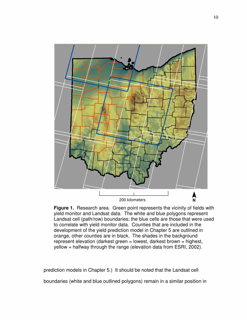
10
prediction models in Chapter 5.) It should be noted that the Landsat cell
boundaries (white and blue outlined polygons) remain in a similar position in
Figure 1. Research area. Green point represents the vicinity of fields with yield monitor and Landsat data. The white and blue polygons represent Landsat cell (path/row) boundaries; the blue cells are those that were used to correlate with yield monitor data. Counties that are included in the development of the yield prediction model in Chapter 5 are outlined in orange, other counties are in black. The shades in the background represent elevation (darkest green = lowest, darkest brown = highest, yellow = halfway through the range (elevation data from ESRI, 2002).
200 kilometers ¯ N

11
different images but are not always in precisely the same location (the cells
outlined in dark blue are those that were applied for yield monitor data cleaning,
spatial correlations, and for neural networks model development; the more
northern cell is path 20/row 31 and the more southern cell is path 19/ row 32). It
can be seen by looking at the boundaries that there is some overlap between
cells whereby a location can be within the extent of two different cells which is
helpful in acquiring more data than always being located only in one cell; fields in
this research were always located within path 20/row 31 and were sometimes
also within path 19 / row 32 (the edge of the Landsat scene changed locations so
sometimes fields were within the extent of path 19/row 32 and sometimes they
were not). Counties were included in the yield prediction model if they met the
criteria described in Chapter 5. By looking at the Figure 1 it can be seen that
Hancock County (the county that fields with yield monitor data were located in)
was not included (the black county boundary on the west is the border with
Putnam County, which was also not included); the exclusion was because
Landsat boundaries cross the county whereby there is not enough imagery
available to associate county Landsat values with county average yield.
The fields used in the research (located in northwestern Hancock county
in Figure 2 below) are near the boundary (bold line) of the lake plains (blue) and
till plains (green) but are mostly within the lake plain area (the most southern field
used in this research is the most likely to be located along the lake and till plain
boundary or within the till plain based on the map by Brockman [1998]). The
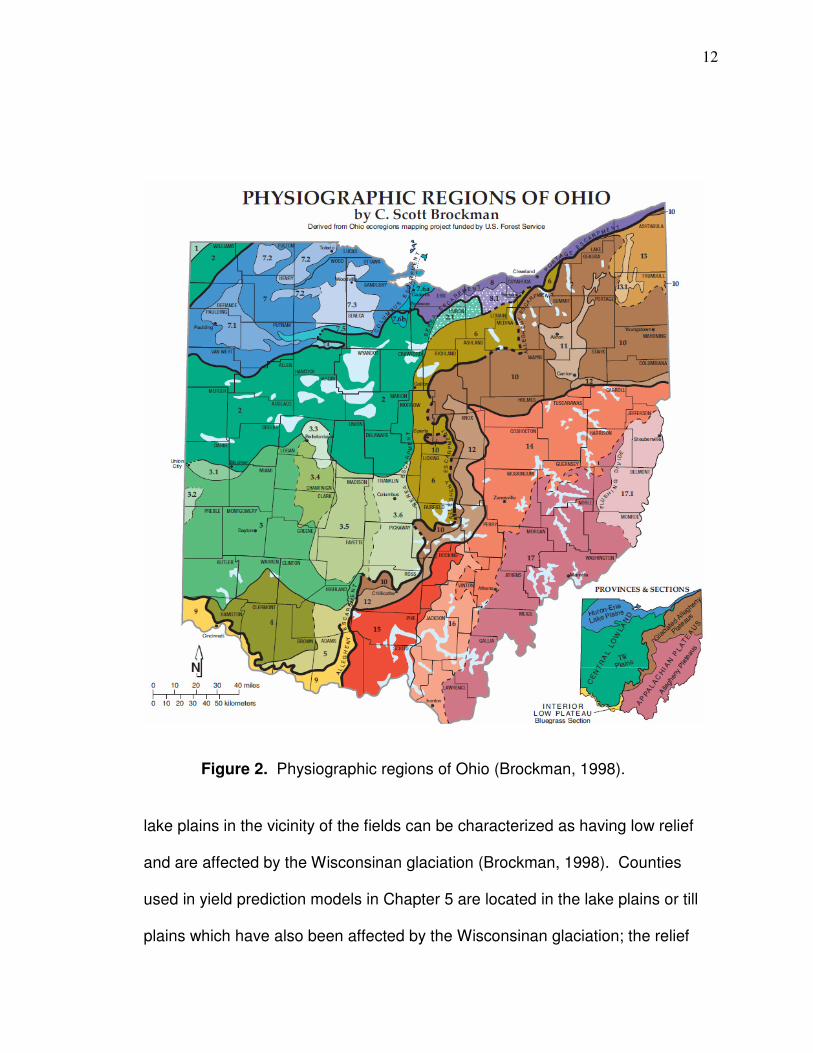
12
lake plains in the vicinity of the fields can be characterized as having low relief
and are affected by the Wisconsinan glaciation (Brockman, 1998). Counties
used in yield prediction models in Chapter 5 are located in the lake plains or till
plains which have also been affected by the Wisconsinan glaciation; the relief
Figure 2. Physiographic regions of Ohio (Brockman, 1998).
13
changes overall from “low” in the lake plains to “moderate” in the till plains
(Brockman, 1998).
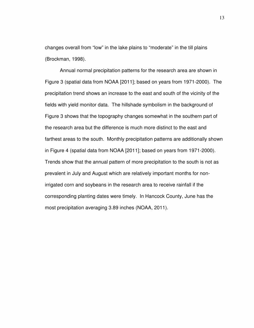
Annual normal precipitation patterns for the research area are shown in
Figure 3 (spatial data from NOAA [2011]; based on years from 1971-2000). The
precipitation trend shows an increase to the east and south of the vicinity of the
fields with yield monitor data. The hillshade symbolism in the background of
Figure 3 shows that the topography changes somewhat in the southern part of
the research area but the difference is much more distinct to the east and
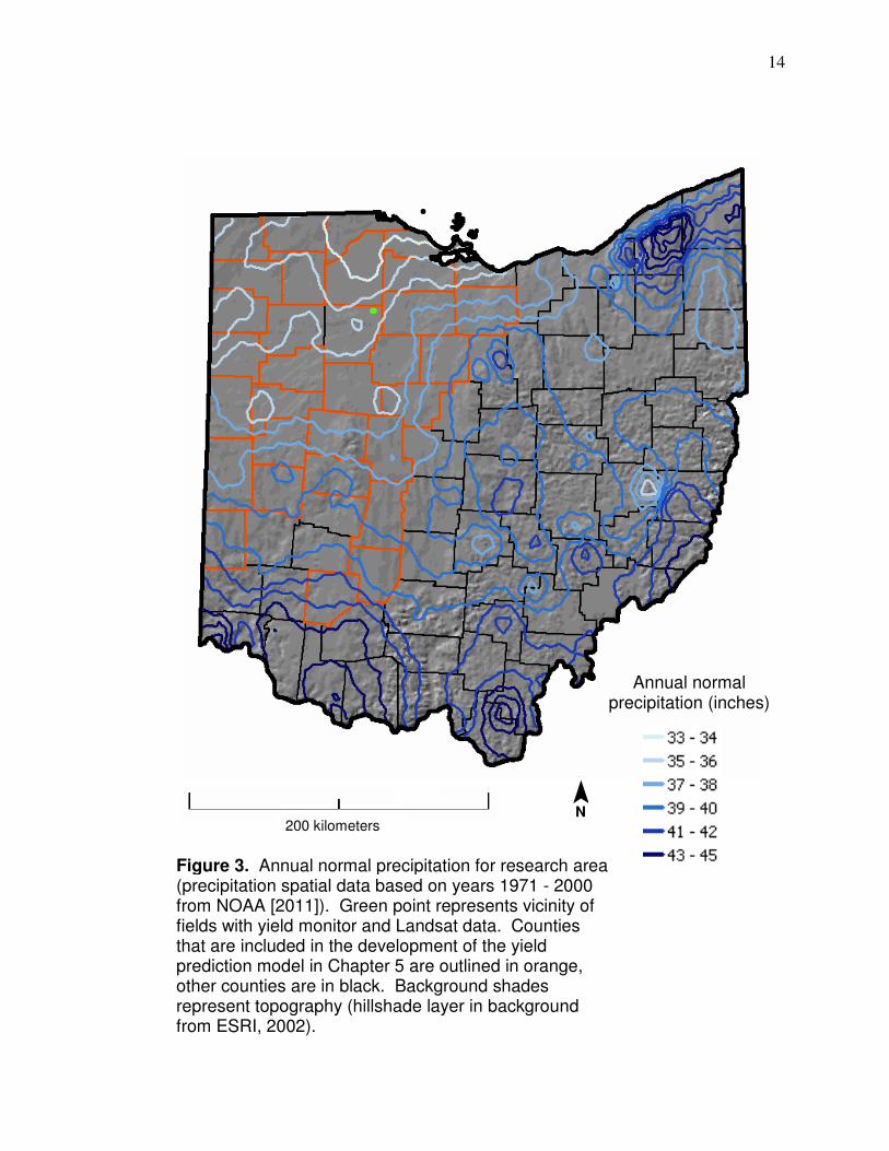
farthest areas to the south. Monthly precipitation patterns are additionally shown
in Figure 4 (spatial data from NOAA [2011]; based on years from 1971-2000).
Trends show that the annual pattern of more precipitation to the south is not as
prevalent in July and August which are relatively important months for non-
irrigated corn and soybeans in the research area to receive rainfall if the
corresponding planting dates were timely. In Hancock County, June has the
most precipitation averaging 3.89 inches (NOAA, 2011).
14
Annual normal precipitation (inches)
Figure 3. Annual normal precipitation for research area (precipitation spatial data based on years 1971 - 2000 from NOAA [2011]). Green point represents vicinity of fields with yield monitor and Landsat data. Counties that are included in the development of the yield prediction model in Chapter 5 are outlined in orange, other counties are in black. Background shades represent topography (hillshade layer in background from ESRI, 2002).
¯ N
200 kilometers
15
April May June
July August September
October
Figure 4. Monthly normal precipitation for research area (precipitation spatial data based on years 1971 - 2000 from NOAA [2011]). Higher precipitation amounts are darker blue (there are six shades of blue with natural breaks classification). Green point with black outline represents vicinity of fields with yield monitor and Landsat data. Counties that are included in the development of the yield prediction model in Chapter 5 are outlined in orange, other counties are in black.
¯ N
200 kilometers

16
Hancock County and the larger research area can be considered hot in
the summer and cold in the winter, although average temperature, overall, gets
colder further north in the winter. In Hancock County, January is the coldest
month with average daily temperature of 23.3 º F (USDA, 2006) while in the
furthest county south, Clinton County, January is the coldest month but has an
average daily temperature 26.4 º F (USDA, 2005). In Preble County, the
southern most county in the research area along the border with Indiana,
January is also the coldest month with an average temperature of 24.6 º F
(USDA, 2006b). For Hancock, Clinton, and Preble counties July is the hottest
month with average daily temperatures of 72.9 and 72.8, and also 72.8 º,
respectively. The month that has the high average daily maximum temperature
for Hancock, Clinton, and Preble counties is also July with temperatures of 83.4,
84.2, and 84.6 º F, respectively.

17
CHAPTER 2
A GIS-BASED STEP-BY-STEP YIELD DATA CLEANING METHODOLOGY
Introduction
Combine harvesters can be equipped with yield monitor systems that ultimately
derive spatial data that represent the harvested yield. The average resolution of
the data is largely a function of the logging interval (how often the system is set
to record data; typically every 2 or 3 seconds), the traveling speed (usually driven
from 2 to 5 miles per hour), and the width of each harvested transect (varies
depending on how combine is equipped; typically about 15 and 20 feet for corn
and soybeans, respectively, in this research). However, the data need to be
“cleaned” to use it for analysis and to produce more coherent maps. Generally,
yield data will be more accurate if the combine operates in a steady, uniform
environment but even with excellent attention to driving or global positioning
system (GPS) based auto-steering, the combine will inevitably exit and enter the
field or need to be abruptly steered around an object or slow down or stop.
These inevitable actions, as well as others, can produce erroneous values that
should be removed to derive data more suitable for the analysis and application
in later chapters and, in general, when applying yield monitor data. The

18
existence of such data errors and cleaning methods have been well-documented
(Sudduth and Drummond, 2007; Lowenberg-DeBoer et al., 2005; Adamchuk et
al., 2004; Simbahan et al., 2004; Wiebold et al., 2003; Kleinjan et al., 2002;
Arslan and Colvin, 2001; Arslan and Colvin, 2002; Blackmore and Moore, 1999)
and are described in more detail later in this chapter.
Different step-by-step methods to produce clean yield monitor data will be
outlined, described, and analyzed in order that a “best” cleaning method can be
determined. Data cleaned by this method will then be applied for different
purposes in later chapters. Geographic information systems (GIS) software is a
powerful spatial data processing and analysis tool that can be applied to clean
yield data. Hence, methods to clean yield monitor data using ArcGIS with the
intent of improving the spatial variability of the data are compared and the
method shown to produce more accurate and coherent data will be used as the
cleaning method in this research. This is important because more accurate yield
data can be better applied to compare the effectiveness of different individual
bands and reflectance-based vegetation spectral indices to predict yield patterns
in Chapter 3 (by spatially correlating yield data to reflectance-based data) while
more visually coherent yield maps are better to base location-based field
decisions on, such as management zone delineation (which yield maps have
been used or included as the basis for).
19
Study Area
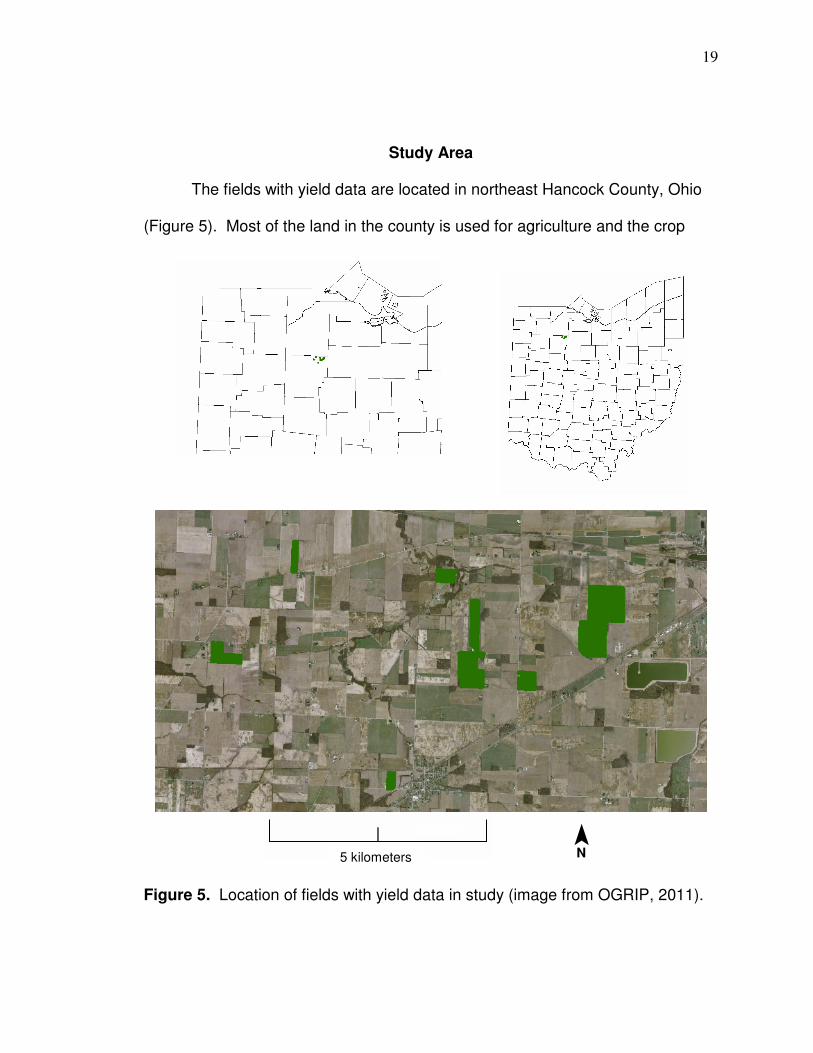
The fields with yield data are located in northeast Hancock County, Ohio
(Figure 5). Most of the land in the county is used for agriculture and the crop
Figure 5. Location of fields with yield data in study (image from OGRIP, 2011).
¯ N 5 kilometers

20
agriculture is predominantly nonirrigated. The climate is generally cold in the
winter and hot in the summer. January is the coldest month with average daily
maximum and minimum temperatures of 30.7 and 15.9 º F while July is the
hottest month with average daily maximum and minimum temperatures of 83.4
and 62.4 º F (USDA, 2006). June has the most precipitation averaging 3.89
inches (NOAA, 2011). The average annual precipitation is 35.81 inches of which
17.06 inches accumulates from May through October (NOAA, 2011). (The
following description is from USDA [2006]). Most of the physiographic features in
the county are a result of Wisconsinan Glaciation and the county is an area of
lake plain and till plain physiography. As a result, Hancock County has a
relatively uniform, level topography. The highest point in the county is about 955
feet above sea level and the lowest point in the county is about 715 feet above
sea level. In most areas of the county, the slope is 6 percent or less. The
steeper areas correspond with end moraines or stream dissection or are on
bedrock ridges. Hancock County drains northward into Lake Erie.
Methods
Crop yield data for corn and soybeans were acquired from a harvester
equipped with an Ag Leader PFadvantage yield monitor. A yield monitor is part
of a system that produces data that can ultimately be used to derive digital dry
yield maps. Yield variability in the data is affected by naturally occurring variation
due to climate and soil, management-induced causes, and measurement errors
that can be caused by the yield monitoring process itself (Simbahan et al., 2004).

21
As previously stated, data are generally most accurate when the combine is
operating in a uniform environment which includes a steady flow of grain and
traveling velocity. A uniform operating environment inherently cannot always
occur due to such factors as exiting and entering the field (which causes grain
flow to diminish and increase) and steering around objects (such as electrical
installations) or a corner which can result in velocity changes. For most
locations, variation caused by occurrences such as planter skips and yield
monitor system measurement errors represent random, short distances that differ
from year to year and should be removed from the dataset to display and
properly interpret the major patterns of yield variation as a basis for making crop
management decisions (Simbahan and Dobermann, 2005).
The accuracy of yield quantities throughout the field is also a function of
the calibration process. If the calibration is not accurate, “yield maps still identify
areas of higher and lower yield” but are not accurate enough for making
decisions based on yield quantities (Trengove, 2008). However, no matter how
well calibrated, impact-based yield monitors inherently cannot produce data that
have the same values as actual yield amounts on a point-by-point basis (Colvin
and Arslan [1999]). This is so because the mechanics of the yield monitor
system smoothes data values. Colvin and Arslan (1999) showed in an
experiment where they harvested 10 feet of corn kernels that were painted blue
(the corn was 60 to 70 feet from the edge of the field) that “it took 20 feet before
blue kernels were measured, 50 feet to reach a peak, and 100 feet to get the

22
majority through the machine”. One reason for the lag is that it takes longer for
grain that is farther to the outside of a harvested transect to get measured than
grain near the center. The errors tend to average themselves out over a larger
area. If calibrated correctly, expected accuracy is 1 to 3 percent of actual yield
(Ag Leader, 2003). The monitor used to acquire data for this research had
calibration for distance, temperature, vibration, and moisture checked and was
recalibrated if necessary. Instructions in the Ag Leader PFadvantage Operator
Manual (2003) state that: “For accurate calibration results, you must obtain at
least four to six calibration loads (loads with actual weights) of grain. Each
calibration load must be harvested under a different grain flow rate by varying
either your travel speed or your swath width. To vary the grain flow rate you
should either vary the travel speed or swath width for each calibration load.” The
calibration loads should be 3,000 or more pounds (Ag Leader, 2003).
Additionally, yield monitors may need to be calibrated more than once a season
(Watermeier, 2001; Grisso et al., 2009). Calibration of yield monitors can be a
“challenge” (Cowan, 2000) and recording the grain weight for calibration “can
become a logistical problem on some farms” (Casady et al., 1998). The monitor
used to derive data in this research was calibrated for weight when the operator
felt it was necessary (based on viewing values recorded on monitor screen when
harvesting) by harvesting about two or three loads (about one full grain tank each
which is more that 3,000 pounds) with an effort made to operate at varying
speeds then calibrating based on the known approximate weight of the full (or

23
nearly full) grain tank (grain was not weighed). A comparison of field yield
averages to county averages for data included in predictive models is shown in
Appendix B.
The equation to determine dry yield from an Ag Leader Technology
(Ames, Iowa) yield monitor in bushels per acre are (Adamchuk et al., 2004):
Yieldcompensated = Yield ([100 – Moisture] / [100 – Moisturereference)
where, Yieldcompensated = yield value after moisture has been deducted (final
yield value); Yield = K ([Flow x Length] / [Width x Length]), where, Yield = total
yield without moisture deduction; Flow = grain flow in pounds per second; Time =
logging interval in seconds (yield value sampling rate); Width = swath width of the
header; Length = distance traveled during the logging interval; K is a coefficient
to convert to units of bushels per acre that equals 112011 for corn and 104544
for soybeans and wheat. Dry yield can then be determined with the equation;
Moisture = grain moisture in percent measured by the grain moisture sensor on
the harvester; Moisturereference = standard reference moisture values, 15.5
percent for corn, 13 percent for soybeans, 12 percent for wheat (Adamchuk et
al., 2004).
The objective of this section is to compare the effectiveness of different
yield cleaning methods by 1) showing how well corn yield data from each method
correlate to Landsat-based Normalized Difference Vegetation Index (NDVI)
24
(Rouse et al., 1973) ([NIR – red] / [NIR + red]), and 2) by comparing the
coherence of yield maps by the amount of local outliers determined by the
Voronoi cluster map in ArcGIS and also simply by visual appearance. Cleaning
methods that produce higher correlation to satellite data and have less data that
represents abruptly different values for short differences such as the “small
patches” or “narrow strips” described by Simbahan et al., (2004) or single points
will be deemed better. Additionally, a comparison will be made between the
correlation levels of yield data and Landsat-based NDVI and ground-based corn
yield and NDVI measurements (Martin et al., 2007) so there is not only evidence
regarding how significant correlation are between yield data and satellite data
(and, hence, if satellite data can detect inter-field crop condition) but also how
comparable correlations are with ground measurement–based values. The
cleaning methods can be applied to yield data of different types and locations
than those used in this research, as well as, to data that was calibrated for weight
with more or fewer loads. Cleaning methods are shown in Figure 6 and are
subsequently described in detail.
25
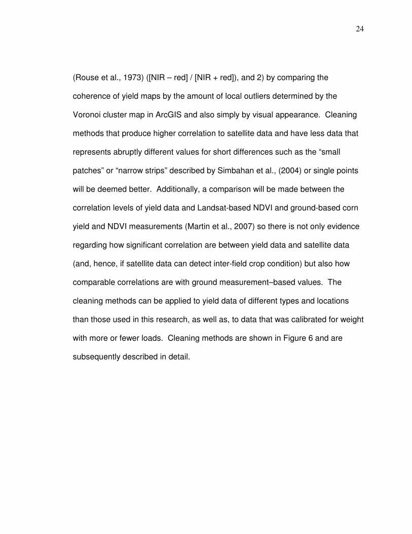
Figure 6. Flow chart of yield cleaning methods.
26
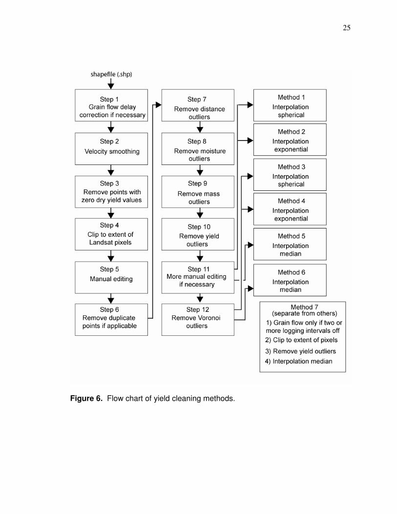
Step 1: Yield maps can have time delay problems associated with grain flow.
When the combine operates, it takes a certain amount of time between the
process of grain being cut and finally measured for dry yield. The yield monitor
places the yield measurement back in time to a GPS coordinate that corresponds
to the amount of delay time. If the delay time is incorrect, a sawtooth pattern
(Figure 7) can develop along the edge of symbolized classes of yield (Wiebold et
al., 2003). If this occurs, yield points must be moved forward or backward in
time so there is a smooth transition along class boundaries. This can be done in
GIS by first adding XY coordinates in the attribute table to the yield points and
then reassigning coordinates backward or forward in time. For example, in
Figure 7 if the red symbolized data that is inset is moved to the right, the red
symbolized points in the adjacent rows that protrude will correspondingly shift to
Figure 7. Effect of incorrect delay time on yield monitor data. A sawtooth pattern can be seen on yield map on the left due to incorrect delay time (compared to correct delay time on right). (Wiebold et al., 2003)

27
the left because the adjacent rows are harvested one after another but in
opposite directions (common operating procedure is to turn around at the end
and harvest the next row) smoothing the sawtooth pattern which more likely
represents actual yield patterns.
Step 2: All data points are eliminated that represent an increase or decrease in
speed of 10 percent or more since errors are related to speed change (Colvin
and Arslan, 1999). This needs to be done when the temporal order of yield
points in the spatial dataset (yield map) is intact (no points can have already
been removed from) in order that the speed change from one point to the next
can be deduced. Data elimination is accomplished in Excel (.dbf file
corresponding to point file is accessed) where the file lists each yield point in the
order that it was recorded along with the distance traveled from the previous
point. Distance traveled from the previous point is recorded for each yield point.
A yield point is recorded at an equal time interval so the percent change from the
previous point is relative to its speed. Percent change was calculated in Excel
and pasted into the shapefile attribute table in GIS. At the end of this first stage
of data elimination, yield points can now be selected based on the speed change
(percent change of distance) values by selecting yield points that have a speed
change > -10 and < 10.
28
Step 3: Yield data with associated yield values of zero are generally erroneous
and should be removed. They can be due, for example, to the combine stopping
in the field and still having a yield point recorded. They can actually exist, but for
the purposes here they were removed.
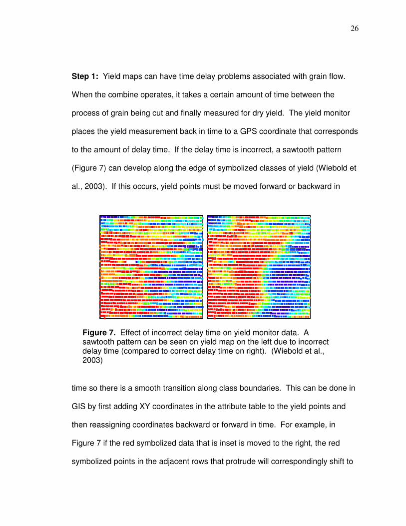
Step 4: Yield data in this research are correlated with Landsat pixels so it is not
necessary to process points outside the extent of the pixels. The data from step
3 are clipped to the extent of a polygon shapefile that represents the extent of
Landsat pixel that will be used for a particular field. Clipping to the extent of
pixels excludes much potentially erroneous data. For example areas of ramping
(Figure 8) are excluded as pixels are only included from areas that are
Figure 8. Result of ramping effect when harvester leaves field (left). The yield monitor has a delay time set whereby yield points are assigned GPS coordinates back in time that should corresponds to how long it takes the system to harvest the grain and eventually calculate yield (usually about 12 to 14 seconds). Accurate location of yield with the delay is based on a steady, consistent flow of grain. This steady flow is disturbed after the harvester exits the field and is not established until it has been harvesting a row for a period of time. The change in grain flow causes incorrect measurement of yield. Colors above represent yield (red = highest value, dark blue = lowest value). (Wiebold et al., 2003, circle on left added here).

29
unaffected by ramping (pixels would not include points in the circled area).
Ramping can occur at the end of rows as the harvester exits and enters the field
due to grain flow being different than the steady flow that had been developed
prior to exit or entry, causing incorrect yield measurements (the effect is
described by Blackmore and Moore, 1999, and Wiebold et al., 2003). Outside
transects harvested perpendicular to the majority of field (the headlands) are not
included because pixels will not be able to be filled adequately with yield points
from that area when correlating yield data and pixel data especially subsequent
to the removal of points due to the effects of ramping. Other criteria for pixel
selection are as follows: 1) remove pixels if they include or could be in the
shadow of an obstruction (e.g. electrical tower) at various azimuths and solar
elevations based on high resolution and positionally accurate imagery; 2) remove
pixels if there is apparent pixel averaging from areas outside of the field for any
of the image dates (Figure 9) used; the combination of pixel edges sometimes
being closer to the sides of fields than other times and varying Landsat positional
degree of accuracy can cause problematic averaging of areas outside of a field
into pixel values; 3) do not include pixels that have any yield data from the
outside two transects, the yield from areas nearer the edges of a field are more
susceptible to random variation such as damage caused by animals (Boes,
2007); this exclusion also helps ensure pixels are not included that have
boundaries too close to the field edge which, in turn, helps reduce the chance
that pixels will be included that are averaging areas from outside the field;
30
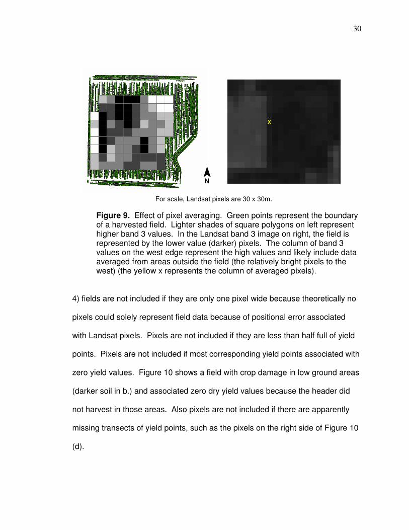
Figure 9. Effect of pixel averaging. Green points represent the boundary of a harvested field. Lighter shades of square polygons on left represent higher band 3 values. In the Landsat band 3 image on right, the field is represented by the lower value (darker) pixels. The column of band 3 values on the west edge represent the high values and likely include data averaged from areas outside the field (the relatively bright pixels to the west) (the yellow x represents the column of averaged pixels).
4) fields are not included if they are only one pixel wide because theoretically no
pixels could solely represent field data because of positional error associated
with Landsat pixels. Pixels are not included if they are less than half full of yield
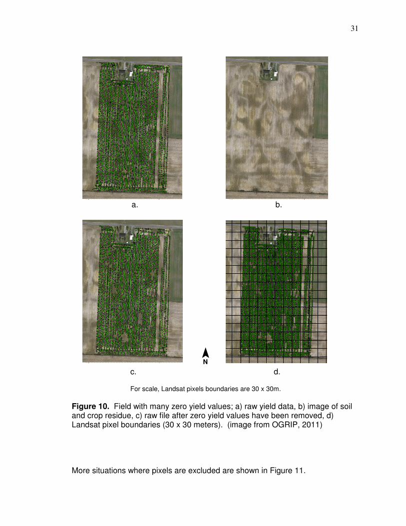
points. Pixels are not included if most corresponding yield points associated with
zero yield values. Figure 10 shows a field with crop damage in low ground areas
(darker soil in b.) and associated zero dry yield values because the header did
not harvest in those areas. Also pixels are not included if there are apparently
missing transects of yield points, such as the pixels on the right side of Figure 10
(d).
x
¯ N
For scale, Landsat pixels are 30 x 30m.
31
a. b.
Figure 10. Field with many zero yield values; a) raw yield data, b) image of soil and crop residue, c) raw file after zero yield values have been removed, d) Landsat pixel boundaries (30 x 30 meters). (image from OGRIP, 2011)
More situations where pixels are excluded are shown in Figure 11.
¯ N
For scale, Landsat pixels boundaries are 30 x 30m.
c. d.
32
a. b.
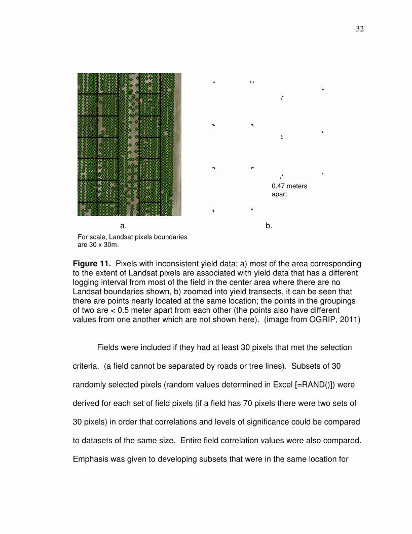
Figure 11. Pixels with inconsistent yield data; a) most of the area corresponding to the extent of Landsat pixels are associated with yield data that has a different logging interval from most of the field in the center area where there are no Landsat boundaries shown, b) zoomed into yield transects, it can be seen that there are points nearly located at the same location; the points in the groupings of two are < 0.5 meter apart from each other (the points also have different values from one another which are not shown here). (image from OGRIP, 2011)
Fields were included if they had at least 30 pixels that met the selection
criteria. (a field cannot be separated by roads or tree lines). Subsets of 30
randomly selected pixels (random values determined in Excel [=RAND()]) were
derived for each set of field pixels (if a field has 70 pixels there were two sets of
30 pixels) in order that correlations and levels of significance could be compared
to datasets of the same size. Entire field correlation values were also compared.
Emphasis was given to developing subsets that were in the same location for
a. b.
For scale, Landsat pixels boundaries are 30 x 30m.
0.47 meters apart
33
different image dates and years in order that comparisons can be made at the
same location for different times and crops.
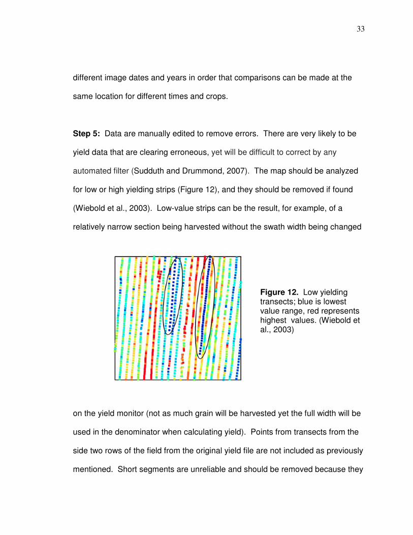
Step 5: Data are manually edited to remove errors. There are very likely to be
yield data that are clearing erroneous, yet will be difficult to correct by any
automated filter (Sudduth and Drummond, 2007). The map should be analyzed
for low or high yielding strips (Figure 12), and they should be removed if found
(Wiebold et al., 2003). Low-value strips can be the result, for example, of a
relatively narrow section being harvested without the swath width being changed
on the yield monitor (not as much grain will be harvested yet the full width will be
used in the denominator when calculating yield). Points from transects from the
side two rows of the field from the original yield file are not included as previously
mentioned. Short segments are unreliable and should be removed because they
Figure 12. Low yielding transects; blue is lowest value range, red represents highest values. (Wiebold et al., 2003)

34
are affected by start or end-pass delays (ramping) (Simbahan et al., 2004).
Points associated with significant turning and maneuvering, for example around
an electrical installation, and commonly erroneous and are removed if deemed
appropriate.
Step 6: Duplicate points can exist and are erroneous and need to be removed.
A determination as to whether a file had duplicate points was determined in GIS
by the Geostatistical Analyst > Explore Data > Histogram function. Virtually all
duplicate points have the same associated attribute values. There have been
virtually no points that have the same coordinates and associated different
values (including yield amounts). Unique identifiers can be made by multiplying
meter coordinates: latitude x longitude x latitude, then through a sorting process
in Excel duplicates can be located and eliminated. A simpler method is to
dissolve a file with duplicate points on the unique identifier. That results in a
point file with no duplicates which can be spatially joined to the file with
duplicates (the average, minimum, or maximum of points of duplicates will be
joined to the duplicate free file which results in correct data if values are the
same).
Step 7: Distance values > ± 3 standard deviation from the mean are removed.
Distance is relative to speed and is a factor in dry yield calculation. Arslan and
Colvin (2001) found that, although not as significant as sudden changes in
35
speed, variable ground speed introduced more yield errors when compared to
constant speed. Simbahan et al. (2004) found removing distance outliers > ± 3
standard deviations from the mean improved map precision.
Step 8: Moisture values > ± 3 standard deviation from the mean are removed.
Moisture is a factor in dry yield calculation. Varying moisture makes sensors
more susceptible to error (Arslan and Colvin, 2002). In the case of corn,
moisture on the surface of the kernel changes impact characteristics (Doerge,
1997). Simbahan et al. (2004) found removing moisture outliers > ± 3 standard
deviations from the mean improved map precision.
Step 9: Grain flow (mass) values > ± 3 standard deviation from the mean
removed (as in YieldCheck [Simbahan and Dobermann, 2005]).
Step 10: “Dry yield” outliers > ± 3 standard deviation from the mean are
removed (Kleinjan et al., 2002).
Step 11: After steps 1 through 10 are complete and the map is resymbolized,
new erroneous points can be noticed and should be removed. This step also
includes removing pixels that are now less than half full of yield points.
36
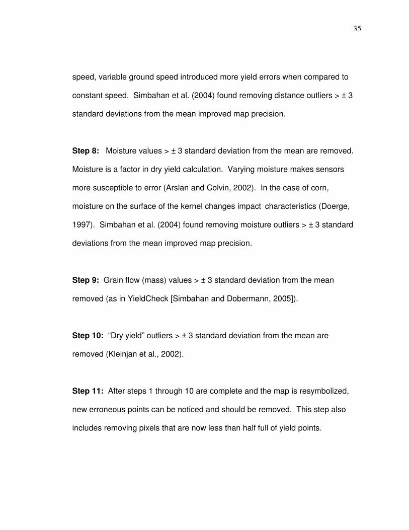
Step 12: Voronoi outliers (Figure 13) are removed for Methods 3,4, and 6. A
Voronoi map is produced in ArcGIS of the map after step 11. The Voronoi map
identifies local outliers which are points whose neighbors all are classified
differently. Simbahan and Dobermann (2005) designed a tool to remove local
outliers and strips with distinctly different values than nearby points. Voronoi
polygons are produced whereby every location within a polygon is closer to the
point in that polygon than any other point. If there have been point/s eliminated
or clipped, the distance of the point/s that are neighbors increases. The Voronoi
Figure 13. Local yield outliers. Yield map on left has been processed through step 11 (darker green is higher yield and dark reddish-brown is lower yield). There is an electrical installation and corresponding shadow in center of field so the pixels and corresponding yield points that could be affected by it are not used. A Voronoi cluster map is on right. The white points represent local outliers (the program stretches the sides of the map to a particular extent, which is why polygons are elongated on sides).
200 meters
¯ N

37
cluster map is classified by geometric interval (“smart quantiles”) which is
essentially a mixture of equal interval and quantile and ensures that each class
range has approximately the same number of values with each class and that the
change between intervals is fairly consistent (ESRI, 2011). The map identifies
points whose neighbors are all classified differently and establishes those as
local outliers.
Method 1: Data from Step 11 are interpolated to a 4 x 4 meter grid with ordinary
kriging (per Dobermann et al., 2003) with a spherical semivariogram model (it
has been found that in many cases the spherical and exponential models provide
a good fits and suffice [ACPS, 2006]), distance of 20m (approximates the scale
over which harvester mixing grain before it reaches the sensor) (ACPA, 2006b),
with a minimum of 90 points (necessary amount to produce an adequate
variogram cloud) (ACPS, 2006).
Method 2: Same as Method 1 but with an exponential semivariogram.
Method 3: Same as Method 1 but data interpolated has Voronoi cluster outliers
removed (Step 12).
Method 4: Same as Method 2 but data interpolated has Voronoi cluster outliers
removed (Step 12).
38
Method 5: This is a sequential processing series developed here for this
research that includes: 1) natural neighbor interpolation of data from step 11 with
the predominant yield file swath width used for cell size (natural neighbor is most
appropriate when sample data points are distributed with uneven density; yield
points are less evenly distributed than in the original dataset); this interpolation
does not smooth data but produces a raster grid linearly related to actual values
of nearby points, 2) neighborhood statistics median processing with a 3 cell
rectangle, with a predominant swath width cell size (median processing can
ignore erroneous values that have not been removed at this point), 3) median
raster is converted to a point shapefile, and 4) kriging interpolation of the point
file to a 4 meter grid with a spherical semivariogram, variable search radius, and
12 points.
Method 6: This is the same as Method 5 but the data interpolated has Voronoi
cluster outliers removed immediately before.
Method 7: This is a much simpler method than the other six. Grain flow delay is
only checked if points are two logging intervals or more off. I did not encounter a
dataset where this was the situation (adjacent data would be offset by four points
if logging intervals are off by two). The interpolation described in Method 5
corrects for time delay problems at class boundaries if a logging interval is off by
one (which would cause an offset of two and probable sawtooth pattern at class

39
boundaries), because a median values of neighbors will be substituted and
smooth sawtooth patterns. If grain flow correction is not necessary the
sequential steps are 1) clip raw data to extent of Landsat pixels, 2) remove zero
values, 3) remove yield ± > 3 standard deviation from the mean, and 4) apply the
sequential processing series from Method 5.
It has been suggested that there be a minimum swath width applied
because relatively narrow swath widths results in lower grain flow which can
increase the opportunity for “noise” (Sudduth and Drummond, 2007). Points
were not removed here based on swath width, the data were viewed and points
were manually removed if they seemed to represent an out of place strip. All
yield files were used that met the minimum 30 pixel requirement except
soybeans from 2003; a decision was made to exclude these because there was
a soybean aphid problem that season that resulted in damaged crops.
Validation
Yield data cleaned by the different methods are analyzed to determine
which better represent spatial patterns by comparing correlations with the NDVI
and the local outlier amounts from the Voronoi cluster map. Martin et al. (2007)
found that NDVI based on ground measurements correlates to corn yield much
higher starting at vegetative stage (V-stage) 8 (V8) (Figure 14) and diminishes in
the tassel stage (VT) (the correlations are listed in the data analysis section). A
particular vegetative stage is due to how many collars there are on the corn
plant. A collar is the band located at the base of a leaf (there can be more leaves
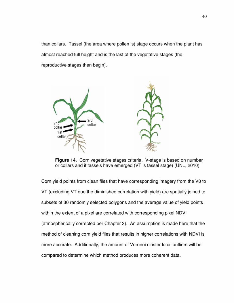
40
than collars. Tassel (the area where pollen is) stage occurs when the plant has
almost reached full height and is the last of the vegetative stages (the
reproductive stages then begin).
Figure 14. Corn vegetative stages criteria. V-stage is based on number or collars and if tassels have emerged (VT is tassel stage) (UNL, 2010)
Corn yield points from clean files that have corresponding imagery from the V8 to
VT (excluding VT due the diminished correlation with yield) are spatially joined to
subsets of 30 randomly selected polygons and the average value of yield points
within the extent of a pixel are correlated with corresponding pixel NDVI
(atmospherically corrected per Chapter 3). An assumption is made here that the
method of cleaning corn yield files that results in higher correlations with NDVI is
more accurate. Additionally, the amount of Voronoi cluster local outliers will be
compared to determine which method produces more coherent data.
41
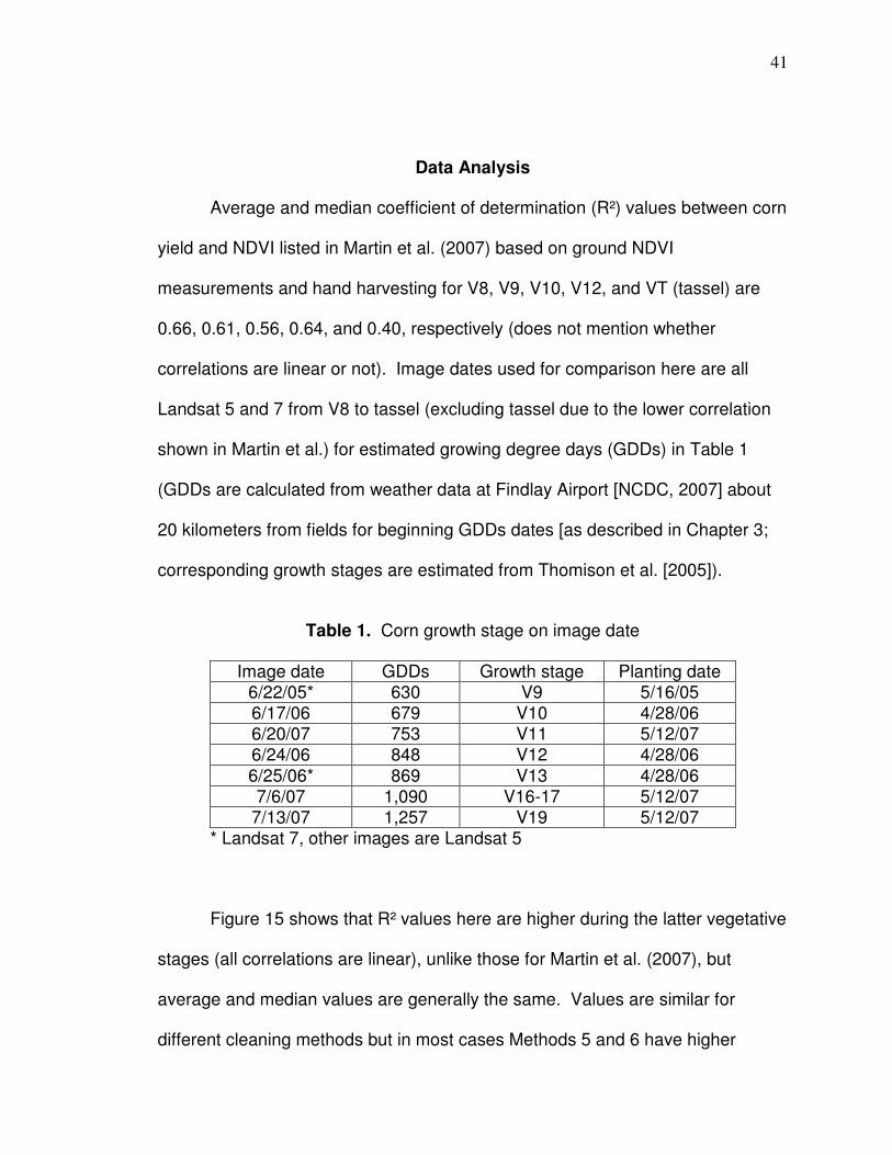
Data Analysis
Average and median coefficient of determination (R²) values between corn
yield and NDVI listed in Martin et al. (2007) based on ground NDVI
measurements and hand harvesting for V8, V9, V10, V12, and VT (tassel) are
0.66, 0.61, 0.56, 0.64, and 0.40, respectively (does not mention whether
correlations are linear or not). Image dates used for comparison here are all
Landsat 5 and 7 from V8 to tassel (excluding tassel due to the lower correlation
shown in Martin et al.) for estimated growing degree days (GDDs) in Table 1
(GDDs are calculated from weather data at Findlay Airport [NCDC, 2007] about
20 kilometers from fields for beginning GDDs dates [as described in Chapter 3;
corresponding growth stages are estimated from Thomison et al. [2005]).
Table 1. Corn growth stage on image date
Image date GDDs Growth stage Planting date
6/22/05* 630 V9 5/16/05 6/17/06 679 V10 4/28/06 6/20/07 753 V11 5/12/07 6/24/06 848 V12 4/28/06 6/25/06* 869 V13 4/28/06 7/6/07 1,090 V16-17 5/12/07
7/13/07 1,257 V19 5/12/07 * Landsat 7, other images are Landsat 5
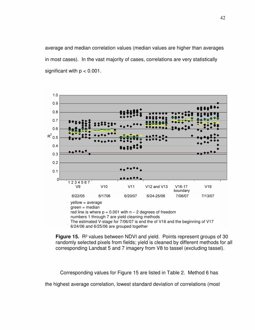
Figure 15 shows that R² values here are higher during the latter vegetative
stages (all correlations are linear), unlike those for Martin et al. (2007), but
average and median values are generally the same. Values are similar for
different cleaning methods but in most cases Methods 5 and 6 have higher
42
average and median correlation values (median values are higher than averages
in most cases). In the vast majority of cases, correlations are very statistically
significant with p < 0.001.
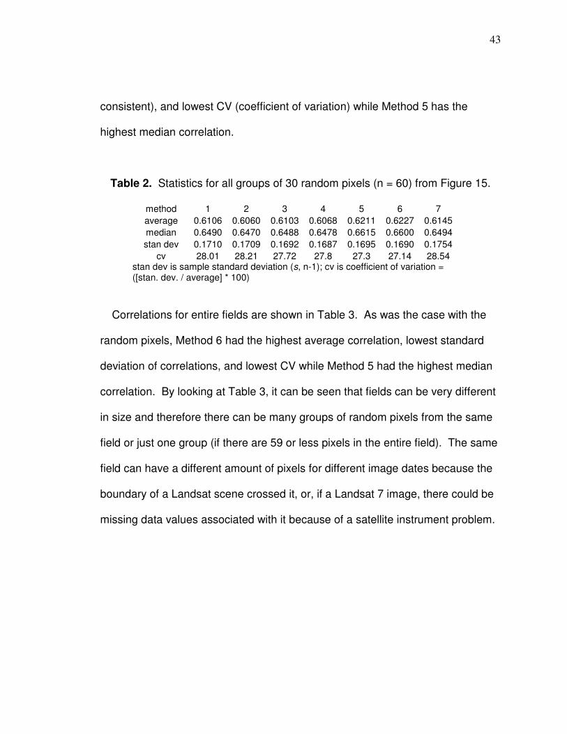
Corresponding values for Figure 15 are listed in Table 2. Method 6 has
the highest average correlation, lowest standard deviation of correlations (most
Figure 15. R² values between NDVI and yield. Points represent groups of 30 randomly selected pixels from fields; yield is cleaned by different methods for all corresponding Landsat 5 and 7 imagery from V8 to tassel (excluding tassel).
yellow = average green = median red line is where p = 0.001 with n – 2 degrees of freedom numbers 1 through 7 are yield cleaning methods The estimated V-stage for 7/06/07 is end the of V16 and the beginning of V17 6/24/06 and 6/25/06 are grouped together
43
consistent), and lowest CV (coefficient of variation) while Method 5 has the
highest median correlation.
Table 2. Statistics for all groups of 30 random pixels (n = 60) from Figure 15.
method 1 2 3 4 5 6 7
average 0.6106 0.6060 0.6103 0.6068 0.6211 0.6227 0.6145
median 0.6490 0.6470 0.6488 0.6478 0.6615 0.6600 0.6494
stan dev 0.1710 0.1709 0.1692 0.1687 0.1695 0.1690 0.1754
cv 28.01 28.21 27.72 27.8 27.3 27.14 28.54 stan dev is sample standard deviation (s, n-1); cv is coefficient of variation = ([stan. dev. / average] * 100)
Correlations for entire fields are shown in Table 3. As was the case with the
random pixels, Method 6 had the highest average correlation, lowest standard
deviation of correlations, and lowest CV while Method 5 had the highest median
correlation. By looking at Table 3, it can be seen that fields can be very different
in size and therefore there can be many groups of random pixels from the same
field or just one group (if there are 59 or less pixels in the entire field). The same
field can have a different amount of pixels for different image dates because the
boundary of a Landsat scene crossed it, or, if a Landsat 7 image, there could be
missing data values associated with it because of a satellite instrument problem.
44
Table 3. Correlations (R²) between NDVI and yield methods for entire fields.
image field pixels 1 2 3 4 5 6 7
6/17/06 J 38 0.4770 0.4738 0.4822 0.4795 0.4972 0.5030 0.5030
6/24/06 J 65 0.6706 0.6692 0.6739 0.6727 0.6762 0.6791 0.6760
6/25/06 J 33 0.7969 0.7990 0.7979 0.7997 0.7952 0.7954 0.8025
6/17/06 N 98 0.5908 0.5907 0.5932 0.5933 0.5869 0.5934 0.5664
6/24/06 N 98 0.6088 0.6084 0.6069 0.6066 0.6022 0.6032 0.5849
6/25/06 N 98 0.6245 0.6239 0.6234 0.6232 0.6200 0.6241 0.5990
6/20/07 E 35 0.7146 0.7130 0.7151 0.7142 0.7306 0.7358 0.7310
6/20/07 G 213 0.6489 0.6422 0.6503 0.6442 0.6617 0.6634 0.6607
6/20/07 H 107 0.1738 0.1697 0.1843 0.1807 0.1932 0.1980 0.1667
6/20/07 K 36 0.3340 0.3338 0.3287 0.3293 0.3469 0.3446 0.3490
6/20/07 I 77 0.4037 0.4039 0.4047 0.4054 0.4069 0.4152 0.3626
6/22/05 G 120 0.5240 0.5114 0.5168 0.5121 0.5314 0.5292 0.5226
6/22/05 H 72 0.5894 0.5742 0.5921 0.5738 0.6297 0.6335 0.6417
6/22/05 K 69 0.5877 0.5769 0.5813 0.5717 0.6120 0.6072 0.6227
6/22/05 M 37 0.5882 0.5909 0.5720 0.5741 0.5909 0.5744 0.5954
6/22/05 I 74 0.4613 0.4580 0.4739 0.4728 0.5073 0.5165 0.5058
6/24/06 D 43 0.6371 0.6378 0.6349 0.6356 0.6364 0.6318 0.6386
7/06/07 G 132 0.7415 0.7379 0.7377 0.7347 0.7579 0.7560 0.7617
7/06/07 K 36 0.6799 0.6790 0.6526 0.6525 0.6644 0.6525 0.6588
7/06/07 I 77 0.5861 0.5878 0.5830 0.5849 0.5944 0.5990 0.5690
7/13/07 E 35 0.7323 0.7283 0.7362 0.7339 0.7503 0.7567 0.7491
7/13/07 G 213 0.7703 0.7627 0.7715 0.7644 0.7852 0.7870 0.7897
7/13/07 H 107 0.4902 0.4802 0.5140 0.5034 0.5193 0.5329 0.4968
7/13/07 B 36 0.3186 0.3132 0.3281 0.3273 0.3417 0.3428 0.3635
7/13/07 K 36 0.6285 0.6254 0.6045 0.6039 0.6151 0.6074 0.6066
7/13/07 I 77 0.6506 0.6482 0.6513 0.6497 0.6573 0.6663 0.6504
average 0.5781 0.5746 0.5773 0.5748 0.5889 0.5903 0.5836
median 0.5998 0.5997 0.5988 0.5986 0.6135 0.6073 0.6028
stan dev 0.1481 0.1486 0.1449 0.1450 0.1439 0.1431 0.1490
cv 25.62 25.86 25.11 25.22 24.45 24.24 25.53 p < 0.001 for all correlations
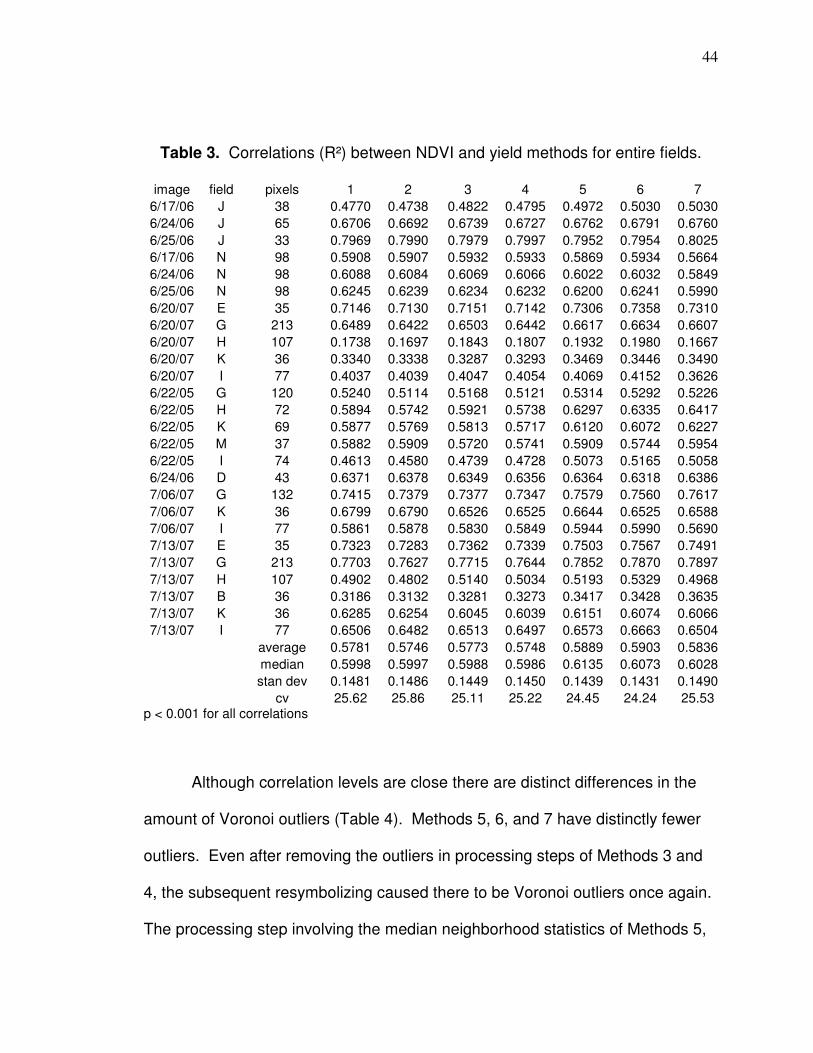
Although correlation levels are close there are distinct differences in the
amount of Voronoi outliers (Table 4). Methods 5, 6, and 7 have distinctly fewer
outliers. Even after removing the outliers in processing steps of Methods 3 and
4, the subsequent resymbolizing caused there to be Voronoi outliers once again.
The processing step involving the median neighborhood statistics of Methods 5,
45
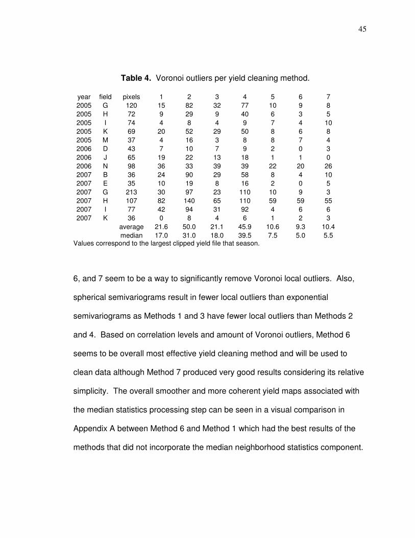
Table 4. Voronoi outliers per yield cleaning method.
year field pixels 1 2 3 4 5 6 7
2005 G 120 15 82 32 77 10 9 8
2005 H 72 9 29 9 40 6 3 5
2005 I 74 4 8 4 9 7 4 10
2005 K 69 20 52 29 50 8 6 8
2005 M 37 4 16 3 8 8 7 4
2006 D 43 7 10 7 9 2 0 3
2006 J 65 19 22 13 18 1 1 0
2006 N 98 36 33 39 39 22 20 26
2007 B 36 24 90 29 58 8 4 10
2007 E 35 10 19 8 16 2 0 5
2007 G 213 30 97 23 110 10 9 3
2007 H 107 82 140 65 110 59 59 55
2007 I 77 42 94 31 92 4 6 6
2007 K 36 0 8 4 6 1 2 3
average 21.6 50.0 21.1 45.9 10.6 9.3 10.4
median 17.0 31.0 18.0 39.5 7.5 5.0 5.5 Values correspond to the largest clipped yield file that season.
6, and 7 seem to be a way to significantly remove Voronoi local outliers. Also,
spherical semivariograms result in fewer local outliers than exponential
semivariograms as Methods 1 and 3 have fewer local outliers than Methods 2
and 4. Based on correlation levels and amount of Voronoi outliers, Method 6
seems to be overall most effective yield cleaning method and will be used to
clean data although Method 7 produced very good results considering its relative
simplicity. The overall smoother and more coherent yield maps associated with
the median statistics processing step can be seen in a visual comparison in
Appendix A between Method 6 and Method 1 which had the best results of the
methods that did not incorporate the median neighborhood statistics component.
46
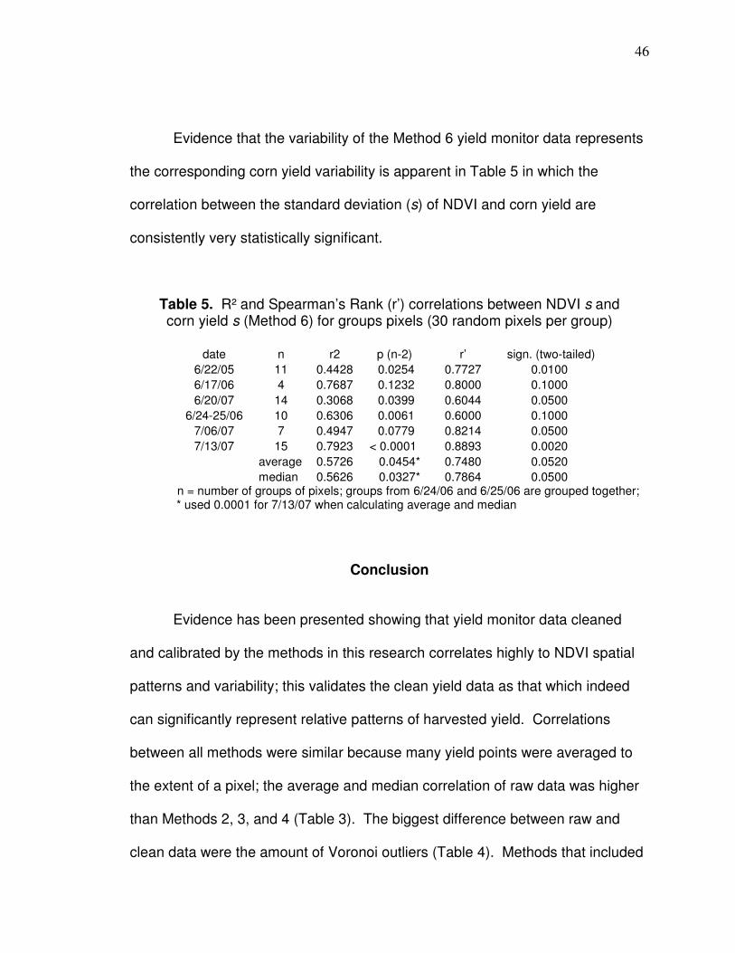
Evidence that the variability of the Method 6 yield monitor data represents
the corresponding corn yield variability is apparent in Table 5 in which the
correlation between the standard deviation (s) of NDVI and corn yield are
consistently very statistically significant.
Table 5. R² and Spearman’s Rank (r’) correlations between NDVI s and corn yield s (Method 6) for groups pixels (30 random pixels per group)
date n r2 p (n-2) r’ sign. (two-tailed)
6/22/05 11 0.4428 0.0254 0.7727 0.0100
6/17/06 4 0.7687 0.1232 0.8000 0.1000
6/20/07 14 0.3068 0.0399 0.6044 0.0500
6/24-25/06 10 0.6306 0.0061 0.6000 0.1000
7/06/07 7 0.4947 0.0779 0.8214 0.0500
7/13/07 15 0.7923 < 0.0001 0.8893 0.0020
average 0.5726 0.0454* 0.7480 0.0520
median 0.5626 0.0327* 0.7864 0.0500 n = number of groups of pixels; groups from 6/24/06 and 6/25/06 are grouped together; * used 0.0001 for 7/13/07 when calculating average and median
Conclusion
Evidence has been presented showing that yield monitor data cleaned
and calibrated by the methods in this research correlates highly to NDVI spatial
patterns and variability; this validates the clean yield data as that which indeed
can significantly represent relative patterns of harvested yield. Correlations
between all methods were similar because many yield points were averaged to
the extent of a pixel; the average and median correlation of raw data was higher
than Methods 2, 3, and 4 (Table 3). The biggest difference between raw and
clean data were the amount of Voronoi outliers (Table 4). Methods that included

47
the median neighborhood statistics step (Methods 5, 6, and 7) had distinctly
fewer Voronoi outliers. The preferred yield cleaning methods require GIS
software which can be expensive; however, Method 7 provided good results and
is much simpler and faster than the other methods. If variability such as that in
Field N 2006 in Appendix A is desired, then cleaning Method 1 should be used
because Method 5, 6, and 7 will eliminate most of the variability. If a yield
monitor data cleaning was applied to an entire field, a necessary modification
would be the exclusion of step 4 (clipping to the extent of pixels) then the points
affected by ramping (Figure 8) and erroneous points in the headlands area would
be manually deleted in step 5. An example of an entire field yield map is shown
in Appendix C.
High yield data correlations with Landsat-derived NDVI provide evidence
that Landsat data can be used (at the 30 meter scale) to map patterns of crop
condition and yield (Franzen [2008] stated that NDVI from satellites with 10 to 30
meters resolution can be used to develop meaningful soil sampling zones);
however, correlations between yield data and different vegetation spectral
indices are necessary to determine if there is a particular Landsat-based value
that predicts yield better (Chapter 3). Yield monitor data for corn and soybeans
cleaned by Method 6 (shown to be the better overall method here due the
highest average correlation [Table 3] and fewest average Voronoi outliers [Table
4]) will be used to correlate to Landsat-based values in Chapter 3. Appendix A
shows a comparison between yield data cleaned by Methods 1 and 6.

48
Additionally, the coherence of yield maps is particularly improved by the yield
cleaning methods that apply the median neighborhood statistics component, so
they can better be visually understood and applied to represent change over
time. This improves the effectiveness for using the maps for spatially-based
management decisions.
49
CHAPTER 3
SPATIAL CORRELATIONS BETWEEN LANDSAT-BASED
REFLECTANCE VALUES AND CORN OR SOYBEAN YIELD
Introduction
Landsat data can provide information about crop yield patterns at the field-
scale over many decades. Landsat 4 Thematic Mapper (TM) dates back to July
of 1982 and Landsat 5 TM and 7 Enhanced Thematic Mapper Plus (ETM+) are
currently operational. Landsat 4 and 5 TM and Landsat 7 ETM+ imagery are
free to download and have 30 meter resolution. In western Ohio, the area of a
typical field includes tens to over hundred Landsat resolution (30 x 30 meter)
pixels within it. Knowledge of crop yield patterns can be applied, for example, to
management zone development in which data from the past and present
seasons are both useful. There have been numerous different vegetation indices
developed to assess crop condition and Landsat data can be acquired at times
corresponding to different growth stages. In order to more effectively apply
Landsat to corn and soybean agriculture, the question of “how and when does
Landsat best correlate to corn and soybean yield?” should be answered. Hence,
spatial correlations between corn or soybean yield monitor data (cleaned by
Method 6 as described in Chapter 2) and atmospherically corrected individual
band reflectance or vegetation spectral indices are analyzed for different
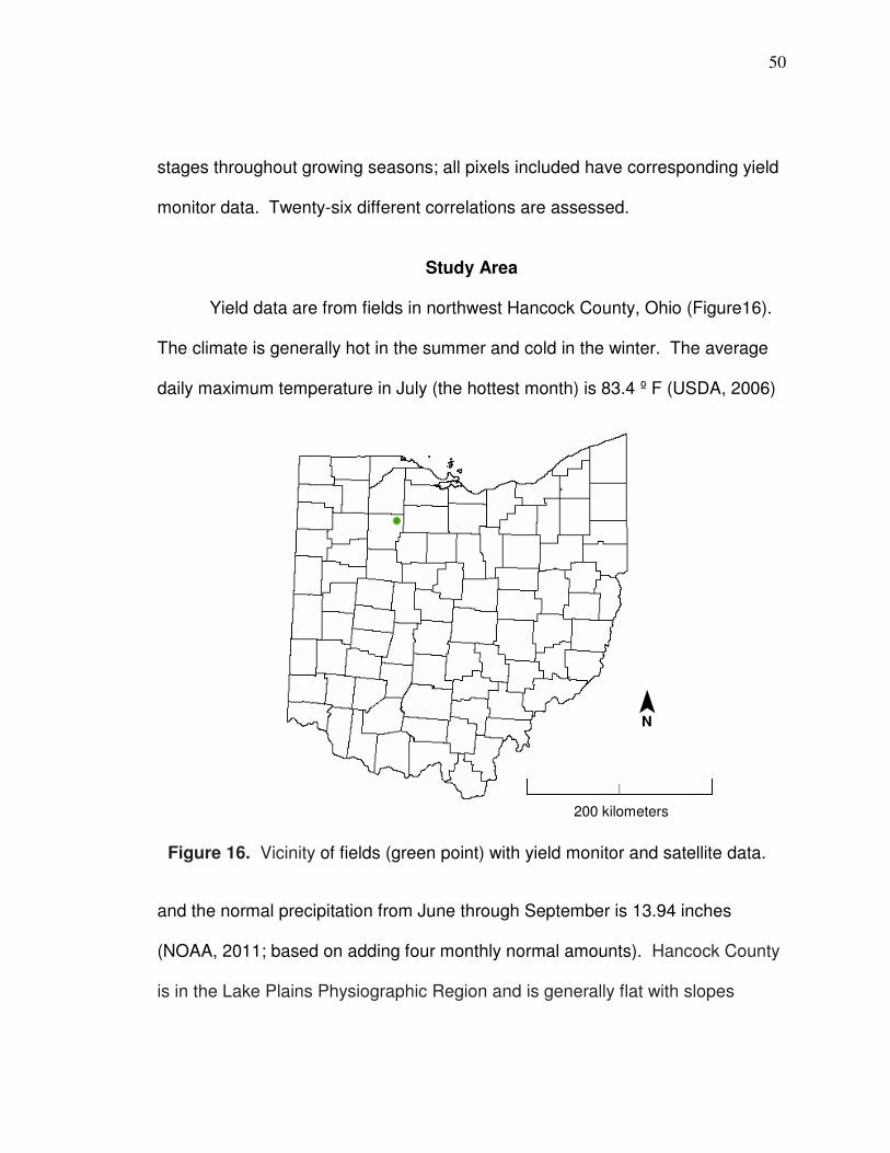
50
stages throughout growing seasons; all pixels included have corresponding yield
monitor data. Twenty-six different correlations are assessed.
Study Area
Yield data are from fields in northwest Hancock County, Ohio (Figure16).
The climate is generally hot in the summer and cold in the winter. The average
daily maximum temperature in July (the hottest month) is 83.4 º F (USDA, 2006)
and the normal precipitation from June through September is 13.94 inches
(NOAA, 2011; based on adding four monthly normal amounts). Hancock County
is in the Lake Plains Physiographic Region and is generally flat with slopes
Figure 16. Vicinity of fields (green point) with yield monitor and satellite data.
¯ N
200 kilometers
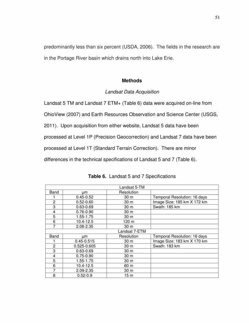
51
predominantly less than six percent (USDA, 2006). The fields in the research are
in the Portage River basin which drains north into Lake Erie.
Methods
Landsat Data Acquisition
Landsat 5 TM and Landsat 7 ETM+ (Table 6) data were acquired on-line from
OhioView (2007) and Earth Resources Observation and Science Center (USGS,
2011). Upon acquisition from either website, Landsat 5 data have been
processed at Level 1P (Precision Geocorrection) and Landsat 7 data have been
processed at Level 1T (Standard Terrain Correction). There are minor
differences in the technical specifications of Landsat 5 and 7 (Table 6).
Table 6. Landsat 5 and 7 Specifications
Landsat 5-TM
Band µm Resolution
1 0.45-0.52 30 m Temporal Resolution: 16 days
2 0.52-0.60 30 m Image Size: 185 km X 172 km
3 0.63-0.69 30 m Swath: 185 km
4 0.76-0.90 30 m
5 1.55-1.75 30 m
6 10.4-12.5 120 m
7 2.08-2.35 30 m
Landsat 7-ETM
Band µm Resolution Temporal Resolution: 16 days
1 0.45-0.515 30 m Image Size: 183 km X 170 km
2 0.525-0.605 30 m Swath: 183 km
3 0.63-0.69 30 m
4 0.75-0.90 30 m
5 1.55-1.75 30 m
6 10.4-12.5 60 m
7 2.09-2.35 30 m
8 0.52-0.9 15 m
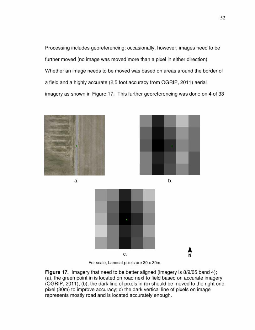
52
Processing includes georeferencing; occasionally, however, images need to be
further moved (no image was moved more than a pixel in either direction).
Whether an image needs to be moved was based on areas around the border of
a field and a highly accurate (2.5 foot accuracy from OGRIP, 2011) aerial
imagery as shown in Figure 17. This further georeferencing was done on 4 of 33
Figure 17. Imagery that need to be better aligned (imagery is 8/9/05 band 4); (a), the green point in is located on road next to field based on accurate imagery (OGRIP, 2011); (b), the dark line of pixels in (b) should be moved to the right one pixel (30m) to improve accuracy; c) the dark vertical line of pixels on image represents mostly road and is located accurately enough.
a. b.
c. ¯ N
For scale, Landsat pixels are 30 x 30m.

53
images. The decision to move images should be done on a field-by-field basis
based on evidence such as that shown in Figure 17 or other apparent reasons (in
some cases, an image was not moved for all fields it corresponded to). Images
used are listed in Table 7.
Table 7. Landsat images used
Landsat date path/row moved
7 7/19/2003 19/32 moved one pixel to east
5 8/19/2003 20/31
7 8/27/2003 20/31
5 9/13/2003 19/32
7 7/28/2004 20/31
7 8/22/2004 19/32
5 9/6/2004 20/31
7 9/23/2004 19/32
7 9/30/2004 20/31
7 6/22/2005 19/32
5 723/05 20/31
7 7/31/2005 20/31
5 8/1/2005 19/32
7 8/9/2005 19/32 moved one pixel to east
5 8/17/2005 19/32
7 9/1/2005 20/31
5 9/2/2005 19/32 moved one pixel to north
7 9/10/2005 19/32
5 6/17/2006 19/32
5 6/24/2006 20/31
7 6/25/2006 19/32
5 7/19/2006 19/32
5 8/4/2006 19/32
7 8/12/2006 19/32
5 4/24/2007 20/31
5 6/11/2007 20/31
5 6/20/2007 19/32
5 7/6/2007 19/32
5 7/13/2007 20/31
5 8/23/2007 19/32
7 8/31/2007 19/32 moved one pixel to east
7 9/16/2007 19/32
7 9/23/2007 20/31
33 images; 17 Landsat 5, 16 Landsat 7; 20 from path 19, row 32 and 13 from path 20, row 32. 4/24/2007 is included for soil data;

54
Imagery from areas within cumulus cloud fields were excluded due to the
effect on reflectance [Wen et al., 2001]). (The only image I am aware of that is
available and not included is from Landsat 7, path 19, row 32 from 9/21/2003 of a
part of one corn field [30 or more pixels].)
For both Landsat 5 TM and Landsat 7 ETM+, radiometric calibration is
included. As a result, pixel values in the Level 1 data have been modified from
raw image data pixel values (Q) to Qcal (pixel values radiometrically calibrated).
During the radiometric calibration, pixel values (Q) from the raw data image data
are converted to units of absolute radiance using 32-bit floating-point
calculations. The absolute-radiance values are then scaled to 8-bit values
representing the calibrated digital numbers (Qcal). The digital number (DN)
values range from 0-255. The first necessity in atmospheric correction is to
convert the calibrated DNs back to radiance through the following relationships
(Chander et al., 2007):
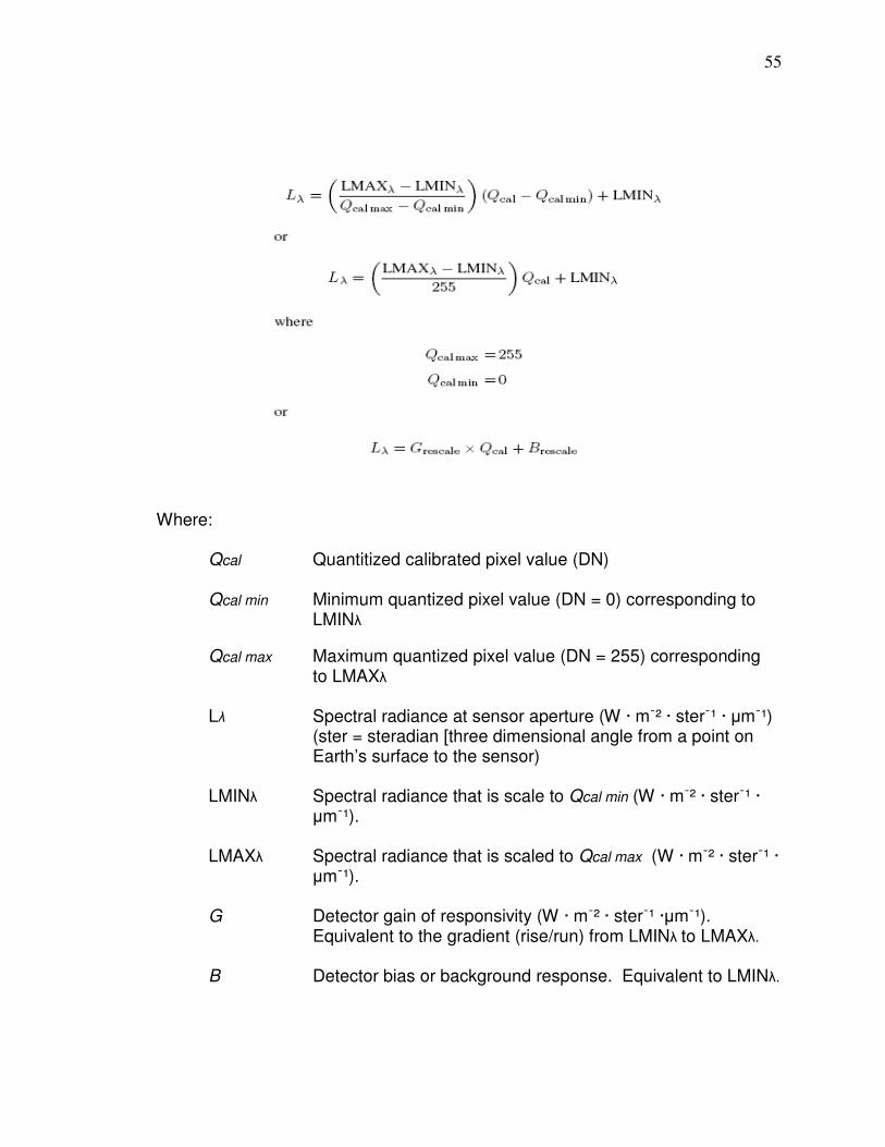
55
Where: Qcal Quantitized calibrated pixel value (DN)
Qcal min Minimum quantized pixel value (DN = 0) corresponding to LMINλ
Qcal max Maximum quantized pixel value (DN = 255) corresponding to LMAXλ Lλ Spectral radiance at sensor aperture (W · mֿ² · sterֿ¹ · µmֿ¹) (ster = steradian [three dimensional angle from a point on Earth’s surface to the sensor)
LMINλ Spectral radiance that is scale to Qcal min (W · mֿ² · sterֿ¹ · µmֿ¹).
LMAXλ Spectral radiance that is scaled to Qcal max (W · mֿ² · sterֿ¹ · µmֿ¹).
G Detector gain of responsivity (W · mֿ² · sterֿ¹ ·µmֿ¹). Equivalent to the gradient (rise/run) from LMINλ to LMAXλ.
B Detector bias or background response. Equivalent to LMINλ.
56
To convert from Qcal in L1 products back to Lλ requires knowledge of the
original rescaling factors (LMINλ and LMAXλ) which have changed over time
(Tables 8 and 9). It is apparent from viewing the Landsat 7 gain data that the
satellite can operate under two different gain states (unlike Landsat 5), which
effects the reconversion back to radiance. Gain selection for a scene is
controlled by the Mission Operation Center with the ultimate goal of maximizing
the instrument's 8 bit radiometric resolution without saturating the detectors.
Prior to July 13th, 2000, band 4 always operated in high gain mode when
imaging land (land is classified as non-desert and non-ice). After July 13th,
2000, low gain mode was used when sun elevation exceeded 45° and high gain
mode continued to be used for land when the sun elevation did not exceed 45°
(Landsat 7, 2008). However, whether a gain setting was changed should be
verified by looking in the .MTL file.
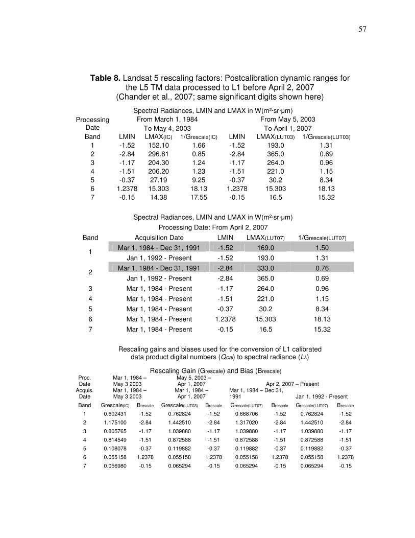
57
Table 8. Landsat 5 rescaling factors: Postcalibration dynamic ranges for the L5 TM data processed to L1 before April 2, 2007
(Chander et al., 2007; same significant digits shown here)
Rescaling gains and biases used for the conversion of L1 calibrated data product digital numbers (Qcal) to spectral radiance (Lλ)
Spectral Radiances, LMIN and LMAX in W(m²·sr·µm)
From March 1, 1984 From May 5, 2003 Processing Date To May 4, 2003 To April 1, 2007
Band LMIN LMAX(IC) 1/Grescale(IC) LMIN LMAX(LUT03) 1/Grescale(LUT03)
1 -1.52 152.10 1.66 -1.52 193.0 1.31
2 -2.84 296.81 0.85 -2.84 365.0 0.69
3 -1.17 204.30 1.24 -1.17 264.0 0.96
4 -1.51 206.20 1.23 -1.51 221.0 1.15
5 -0.37 27.19 9.25 -0.37 30.2 8.34
6 1.2378 15.303 18.13 1.2378 15.303 18.13
7 -0.15 14.38 17.55 -0.15 16.5 15.32
Spectral Radiances, LMIN and LMAX in W(m²·sr·µm)
Processing Date: From April 2, 2007
Band Acquisition Date LMIN LMAX(LUT07) 1/Grescale(LUT07)
Mar 1, 1984 - Dec 31, 1991 -1.52 169.0 1.50 1
Jan 1, 1992 - Present -1.52 193.0 1.31
Mar 1, 1984 - Dec 31, 1991 -2.84 333.0 0.76 2
Jan 1, 1992 - Present -2.84 365.0 0.69
3 Mar 1, 1984 - Present -1.17 264.0 0.96
4 Mar 1, 1984 - Present -1.51 221.0 1.15
5 Mar 1, 1984 - Present -0.37 30.2 8.34
6 Mar 1, 1984 - Present 1.2378 15.303 18.13
7 Mar 1, 1984 - Present -0.15 16.5 15.32
Rescaling Gain (Grescale) and Bias (Brescale) Proc. Date
Mar 1, 1984 – May 3 2003
May 5, 2003 – Apr 1, 2007 Apr 2, 2007 – Present
Acquis. Date
Mar 1, 1984 – May 3 2003
Mar 1, 1984 – Apr 1, 2007
Mar 1, 1984 – Dec 31, 1991 Jan 1, 1992 - Present
Band Grescale(IC) Brescale Grescale(LUT03) Brescale Grescale(LUT07) Brescale Grescale(LUT07) Brescale
1 0.602431 -1.52 0.762824 -1.52 0.668706 -1.52 0.762824 -1.52
2 1.175100 -2.84 1.442510 -2.84 1.317020 -2.84 1.442510 -2.84
3 0.805765 -1.17 1.039880 -1.17 1.039880 -1.17 1.039880 -1.17
4 0.814549 -1.51 0.872588 -1.51 0.872588 -1.51 0.872588 -1.51
5 0.108078 -0.37 0.119882 -0.37 0.119882 -0.37 0.119882 -0.37
6 0.055158 1.2378 0.055158 1.2378 0.055158 1.2378 0.055158 1.2378
7 0.056980 -0.15 0.065294 -0.15 0.065294 -0.15 0.065294 -0.15
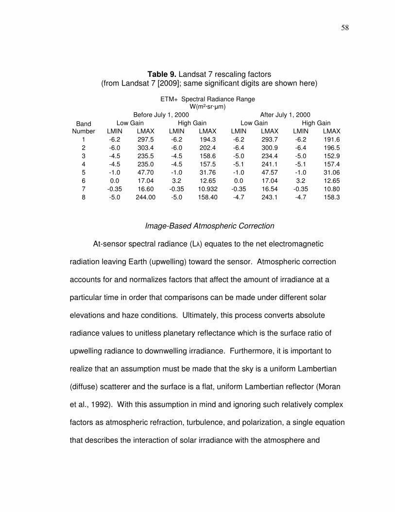
58
Table 9. Landsat 7 rescaling factors (from Landsat 7 [2009]; same significant digits are shown here)
Image-Based Atmospheric Correction
At-sensor spectral radiance (Lλ) equates to the net electromagnetic
radiation leaving Earth (upwelling) toward the sensor. Atmospheric correction
accounts for and normalizes factors that affect the amount of irradiance at a
particular time in order that comparisons can be made under different solar
elevations and haze conditions. Ultimately, this process converts absolute
radiance values to unitless planetary reflectance which is the surface ratio of
upwelling radiance to downwelling irradiance. Furthermore, it is important to
realize that an assumption must be made that the sky is a uniform Lambertian
(diffuse) scatterer and the surface is a flat, uniform Lambertian reflector (Moran
et al., 1992). With this assumption in mind and ignoring such relatively complex
factors as atmospheric refraction, turbulence, and polarization, a single equation
that describes the interaction of solar irradiance with the atmosphere and
ETM+ Spectral Radiance Range W(m²·sr·µm)
Before July 1, 2000 After July 1, 2000
Low Gain High Gain Low Gain High Gain Band Number LMIN LMAX LMIN LMAX LMIN LMAX LMIN LMAX
1 -6.2 297.5 -6.2 194.3 -6.2 293.7 -6.2 191.6
2 -6.0 303.4 -6.0 202.4 -6.4 300.9 -6.4 196.5
3 -4.5 235.5 -4.5 158.6 -5.0 234.4 -5.0 152.9
4 -4.5 235.0 -4.5 157.5 -5.1 241.1 -5.1 157.4
5 -1.0 47.70 -1.0 31.76 -1.0 47.57 -1.0 31.06
6 0.0 17.04 3.2 12.65 0.0 17.04 3.2 12.65
7 -0.35 16.60 -0.35 10.932 -0.35 16.54 -0.35 10.80
8 -5.0 244.00 -5.0 158.40 -4.7 243.1 -4.7 158.3

59
retrieves surface reflectance is as follows (based of Moran et al., [1992] as
written in Chavez [1996]):
ρgλ = ( pi [ Lsλ – Lpλ] ) / ( Tv [ Eoλ · cosθs · Tz + Edλ ] ) [1] ρgλ Spectral reflectance at the surface, assuming atmospheric scattering and absorption as accounted for Lsλ Spectral radiance at satellite sensor (W · mֿ² · sterֿ¹ · µmֿ¹). Lpλ Path radiance (upwelled) atmospherically scattered solar spectral irradiance (W · mֿ² · sterֿ¹ · µmֿ¹). Tv Atmospheric spectral transmittance in a satellite view path with satellite view angle θv. This value is equivalent to Cosθv which equals 1.0 for Landsat because of nadir (0°) views. Eoλ Solar spectral irradiance on a surface perpendicular on a surface perpendicular to the sun’s ray outside of the atmosphere (W · mֿ² · µmֿ¹) (Table 10). θs Solar zenith angle, angle of incidence of solar ray’s on Earth’s surface. Tz Atmospheric transmittance along a path from the sun to the ground surface. Edλ Downwelling spectral irradiance at the surface due to scattered solar in the atmosphere

60
Table 10. Solar spectral irradiance for Landsat 5 and 7
Landsat 5-TM Landsat 7-ETM
Band Eoλ (W · mֿ² · µmֿ¹) Band Eoλ (W · mֿ² · µmֿ¹) 1 1957 1 1969
2 1826 2 1840
3 1554 3 1551
4 1036 4 1044
5 215 5 225.7
7 80.67 7 82.07
8 1368
Moran et al.’s (1992) model has an embedded term that takes into
account the Earth-sun distance in astronomical units (AUs) (Chavez, 1996). This
factor is usually represented separately as d or D. Radiance reaching Earth
diminishes proportional to the square of the earth-sun distance, so this factor is
listed as either D² or d². This factor is sometimes listed in the denominator or
numerator the same way. However, if in the denominator, it is the radius vector
which equals 1 / Earth-sun distance and should be expressed as d. If this factor
is to be expressed in the numerator the symbol should be do (ESA, 2007). The
expression do² will be used in the numerator in the model in this research. The
Earth-sun distance is approximated in the numerator with the equation:
(1 - 0.016729 cos[0.9856(DOY – 4)]), DOY = day of year from 1-365-366 (ESA, 2007)
Solar elevation data can be acquired in the WO.tif file (work order) of
Landsat 5 images or MTL.txt file for Landsat 7 and the solar zenith can be
calculated (90 – solar elevation). At the time of download, some earlier Landsat
5 imagery from OhioView used in this research did not have WO files available
61
and MTL.txt files were excluded from Landsat 7 data starting in the latter half of
2001. As a result, solar elevation information needed for atmospheric correction
for some images dates was not available with the imagery. In order to calculate
θs for images that do not have that data available, scene center coordinates and
time of day of imagery was needed. The scene center coordinates stay virtually
the same over time and are virtually the same for Landsat 5 and 7. The time of
day of image acquisition is also similar over time and the time of day that Landsat
5 and 7 go overhead is very similar to each other. The data available with
Landsat 5 (WO.tif files) can be used for a close approximation of Landsat 7
values. Averages of scene center coordinates and times of imaging were
calculated for all Landsat 5 imagery that had that data available and used to
calculate solar elevation. Solar elevation was then calculated on-line with the
University of Oregon, Solar Radiation Monitoring Laboratory Solar Calculator
(UO, 2011); the solar zenith was then calculated (90 – solar elevation) to acquire
data needed for atmospheric correction. All images downloaded from
http://glovis.usgs.gov/ had the solar elevation data included.
The COST model (Chavez, 1996) can be written as Equation 1 with Edλ
omitted. (Details of the COST model can be found in Chavez [1988 and 1996],
Moran et al. [1992], and Wu et al. [2005]). The average difference in computed
ρgλ and ground measurements for bands1-4 for COST model for soil and
vegetation was 0.0094 and 0.0123, respectively (Chavez, 1996). The Edλ term
is omitted even though downscattered irradiance can account for up to 25% of
62
ground radiance (Moran et al., 1992). Chavez (1996) surmised the model is
accurate even though Edλ is omitted for the following reasons: 1) although Edλ
can account for a substantial percent of the ground radiance, it is a relatively
small percent of the denominator in Equation 1; the first term in the denominator
is much larger than the downwelling term so the effect of downwelling is
minimized; 2) the Tv term in the denominator is set to one even though in
actuality the term should be slightly smaller because in reality Landsat is not
often viewing at nadir (due to the whisk broom motion); the value of one,
therefore, makes the denominator overall larger (and is multiplicative) than it
should be which decreases reflectance as the omission of Edλ would do if
applied. The COST model used cosine of θs to estimate Tz. Chavez (1996)
found that the average Tz for bands 1-4 estimated by the cosine of θs varied by
only 0.01 from the average of Tz values that were computed using optical depth
values. It is relevant that It has been documented that total atmospheric
precipitable water (w) has a significant absorption effect on near infrared (NIR)
radiation (Eldridge, 1967; Guzzi and Rizzi). Wu et al. (2005) found that NIR ρgλ
values calculated from image-based atmospheric correction were more than 20
percent lower than ground measurements because of the absorption effects of w
and found it necessary to develop a factor in order that retrieved NIR ρgλ values
were acceptable for agricultural applications. The COST model applies relative
Lpλ across bands from a single band based on atmospheric condition (Chavez,
1988). Chavez established the initial Lpλ as the value at the low end of the

63
histogram; this was not the lowest value but the value at the base of the low end
of the histogram where bins distinctly get larger (there were some lower values
than the one at the base). Chavez (1988) based Lpλ relationships on
environmental conditions at the time and listed five distinct types of environments
as very clear, clear, moderate, hazy, and very hazy. He suggested that a
continuous model could be produced through a power relationship, instead of
defining Lpλ based on atmospheric conditions with distinct breaks. The power
line would continuously predict Lpλ in one band based on the input of the Lpλ in
another band, so Lpλ in different bands would be relative. Band 1 DN Lpλ ranges
for different atmospheric conditions and the corresponding values in other bands
are listed in Table 11. From the data Chavez supplied, a center range can be
defined; the center point in that range can be used as the interpolation point for
the moderate and clear conditions. Chavez listed the DN Lpλ range of the band
1 very clear atmosphere as 55 or less, and gave values of 30, 35, 40, 45, 50, and
55.
TABLE 11. DN SCATTER RANGES FOR DIFFERENT ATMOSPHERIC CONDITIONS
Condition Band 1 B1 RCP B3 RCP B3 CP B3 CR Ratio B4 RS
Very Clear ≤ 55 35 - 50 8.4 - 11.4 9.90 6.81 0.3998 2.72
Clear 56 - 75 60 - 70 23.3 - 26.9 25.10 19.05 0.6324 12.05
Moderate 76 - 95 80 - 90 41.0 - 45.9 43.45 33.84 0.7954 26.92 DN ranges from Chavez (1988); B1 RCP=band 1 range used to determine center point to interpolate power line; B3 RCP=corresponding band 3 range; B3 CP=DN center point in range; B3 CR=band 3 center point radiance used for interpolation for power line; Ratio=ratio of band 4 to band 3 scatter for the particular atmospheric condition (from Chavez, 1988). B4 RS= band 4 relative scatter.

64
For this study, the low band 1 DN Lpλ value used in the very clear
atmosphere range was 35, and the middle range to determine the center point
was 35-50. A range of 30-55 would result in nearly the same center radiance
and virtually the same power line equation. The DN center point of the band 3
Lpλ ranges for the atmospheric conditions of very clear, clear, and moderate
were converted to radiance and used as the basis to develop a power line.
Corresponding band 4 values were calculated based on band 4 to band 3 ratios
from data in Chavez (1988). Band 3 and relative band 4 Lpλ (B3 CR and B4 RS
in Table 11) were used to plot the power line in Equation 2 (the actual plotting
values used had more significant digits). This is the equation to determine
relative Lpλ for band 4 (based on band 3 scatter).
y = 0.17566506516169x1.43086075074431 (R² = 0.99993) [2]
Equations were also produced by the same method (from Chavez [1988])
to calculate relative Lpλ for bands 2 and 1 based on the Lpλ from band 3. They
are listed as Equations 3 and 4. Equation 3 is used to determine relative Lpλ for
band 2 (based on band 3 Lpλ), and Equation 4 is used to determine relative Lpλ
for band 1 (based on band 3 Lpλ).
y = 3.47830688848018x0.69127362593832 (R² = 0.99984) [3]
y = 10.35914451773370x0.42089972569617 (R² = 0.99847) [4]
Teillet and Fedosejevs (1995) established the Lpλ value as the lowest
value from the histogram with at least 1,000 pixels from an entire Landsat scene.

65
This technique was applied here to derive the starting Lpλ value in band 3 even
for Landsat 7 scenes that had significant amount of missing data. Images from
OhioView have clipped edges and, as a result there are no erroneous data near
the image edge. Images from the Glovis website do not have clipped ends and
there are erroneous data near the edge (Figure 18); if downloading Landsat 7
from Glovis, there are masks for the missing data but these do not cover some
erroneous data at the edges. In order to select the pixel from the histogram by
the 1,000 pixel method, the first pixel with 1,000 valid values needs to be
selected. This value is located where bins increase in size after the initial
decrease shown in Figure 18; however, the value may not be the first value
where there is 1,000 pixels (the value of 13 in Figure 18), because there still may
be erroneous values in this part of the histogram even though it increase in size.
For this research, band 3 raster cells were converting to points and if there
was 1,000 valid points that could be selected, then that value was established as
the digital number to based scatter on.
Moran et al. (1992) and Chavez (1996) additionally conclude that very few
targets on Earth are absolutely black so in theory you should not create a zero
reflectance value by the deduction of Lpλ. To account for this, one-percent of
total possible ρgλ is deducted from the value that represents Lpλ by using the
following equation (ARSC, 2002):
1 percent reflectance = (0.01 x Eoλ x cosθs²)/(do² x pi)(W·mֿ²·sterֿ¹·µmֿ¹) [5]
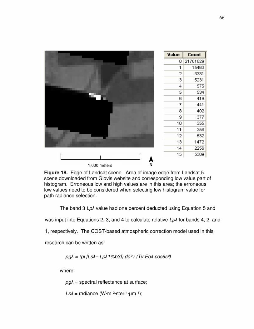
66
The band 3 Lpλ value had one percent deducted using Equation 5 and
was input into Equations 2, 3, and 4 to calculate relative Lpλ for bands 4, 2, and
1, respectively. The COST-based atmospheric correction model used in this
research can be written as:
ρgλ = (pi [Lsλ– Lpλ1%b3]) do² / (Tv·Eoλ·cosθs²)
where
ρgλ = spectral reflectance at surface; Lsλ = radiance (W·mֿ²·sterֿ¹·µmֿ¹);
Figure 18. Edge of Landsat scene. Area of image edge from Landsat 5 scene downloaded from Glovis website and corresponding low value part of histogram. Erroneous low and high values are in this area; the erroneous low values need to be considered when selecting low histogram value for path radiance selection.
¯ N
1,000 meters

67
Lpλ1%b3 = band 3 path radiance less one percent or relative path
radiance (W·mֿ²·sterֿ¹·µmֿ¹) calculated from Equations 2, 3, or 4; do = earth-sun distance in AUs calculated from the following
equation from (ESA, 2007): (1-0.016729 cos[0.9856(DOY-4)]), DOY = day of year from 1- 365-366; Tv = viewing angle transmittance (1.0 for Landsat); Eoλ = solar spectral irradiance on a surface perpendicular to the
sun’s ray outside of the atmosphere (W·mֿ²·µmֿ¹); and cosθs = cosine of solar zenith angle.
Vegetation spectral indices
Numerous indices have been developed to asses the condition of vegetation.
Indices have been designed to solely sense vegetation, minimize the impact of
the soil background while also sensing vegetation, and to be resilient to
atmospheric effects while sensing vegetation. Correlations are made and
analyzed here between yield data (cleaned per Method 6 from Chapter 2) and
bands 1–4 plus the 22 spectral indices from Table 12 (the average of the yield
points within the extent of the pixels are correlated to the pixel values). It was
shown in Chapter 2 that the corn yield data accurately mapped areas of higher
and lower yield. Correlations with individual bands are initially analyzed to
determine when there is a consistently correct relationship with yield (visible
bands should be negatively correlated and the NIR should be positively
correlated) in order to determine when indices (which use a combination of
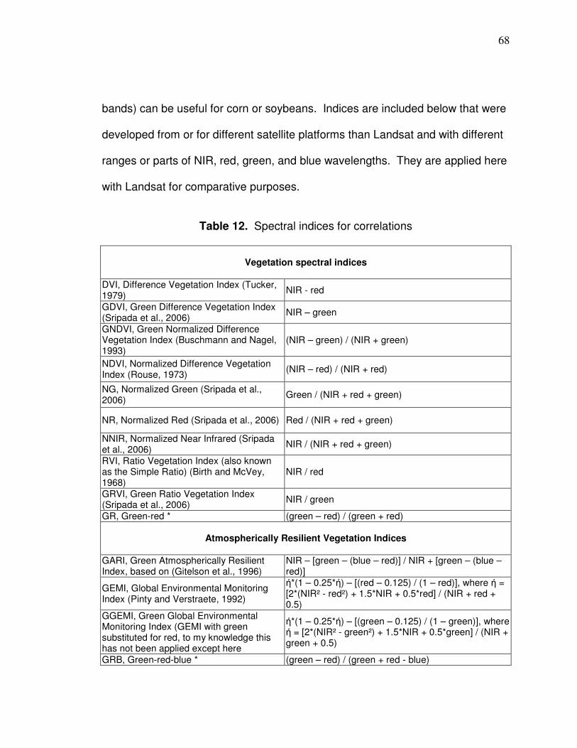
68
bands) can be useful for corn or soybeans. Indices are included below that were
developed from or for different satellite platforms than Landsat and with different
ranges or parts of NIR, red, green, and blue wavelengths. They are applied here
with Landsat for comparative purposes.
Table 12. Spectral indices for correlations
Vegetation spectral indices
DVI, Difference Vegetation Index (Tucker, 1979)
NIR - red
GDVI, Green Difference Vegetation Index (Sripada et al., 2006)
NIR – green
GNDVI, Green Normalized Difference Vegetation Index (Buschmann and Nagel, 1993)
(NIR – green) / (NIR + green)
NDVI, Normalized Difference Vegetation Index (Rouse, 1973)
(NIR – red) / (NIR + red)
NG, Normalized Green (Sripada et al., 2006)
Green / (NIR + red + green)
NR, Normalized Red (Sripada et al., 2006) Red / (NIR + red + green)
NNIR, Normalized Near Infrared (Sripada et al., 2006)
NIR / (NIR + red + green)
RVI, Ratio Vegetation Index (also known as the Simple Ratio) (Birth and McVey, 1968)
NIR / red
GRVI, Green Ratio Vegetation Index (Sripada et al., 2006)
NIR / green
GR, Green-red * (green – red) / (green + red)
Atmospherically Resilient Vegetation Indices
GARI, Green Atmospherically Resilient Index, based on (Gitelson et al., 1996)
NIR – [green – (blue – red)] / NIR + [green – (blue – red)]
GEMI, Global Environmental Monitoring Index (Pinty and Verstraete, 1992)
ή*(1 – 0.25*ή) – [(red – 0.125) / (1 – red)], where ή = [2*(NIR² - red²) + 1.5*NIR + 0.5*red] / (NIR + red + 0.5)
GGEMI, Green Global Environmental Monitoring Index (GEMI with green substituted for red, to my knowledge this has not been applied except here
ή*(1 – 0.25*ή) – [(green – 0.125) / (1 – green)], where ή = [2*(NIR² - green²) + 1.5*NIR + 0.5*green] / (NIR + green + 0.5)
GRB, Green-red-blue * (green – red) / (green + red - blue)
69
Soil-Adjusted Vegetation Indices
EVI, Enhance Vegetation Index (Liu and Huete, 1995)
G * [(NIR – red) / (NIR + C1*red – C2*blue + L)], where G = 2.5, C1 = 6, C2 = 7.5, L = 1
MSAVI2, Modified Soil Adjusted Vegetation Spectral Index (Equation 19 in Qi et al., 1994)
[2*NIR + 1 - √(2*NIR+1)² - 8*(NIR – red)] / 2
GMSAVI2, Green Modified Soil Adjusted Vegetation Spectral Index (MSAVI with green substituted for red, to my knowledge this has not been applied except here)
[2*NIR + 1 - √(2*NIR+1)² - 8*(NIR – green] / 2
OSAVI, Optimized Soil Adjusted Vegetation Index (Rondeaux et al., 1996)
[(NIR – red) / (NIR + red +L)] * (1 + L) where L is a correction factor that equals 0.16 (the same equation as SAVI but with a correction factor of 0.16 instead of 0.5)
GOSAVI, Green Optimized Soil Adjusted Vegetation Index (OSAVI with the green substituted for red, to my knowledge this has not been applied except here)
[(NIR – green) / (NIR + green +L)] * (1 + L) where L is a correction factor that equals 0.16
SAVI, Soil Adjusted Vegetation Index (Huete, 1988)
[(NIR – red) / (NIR + red +L)] * (1 + L), where L = 0.5where L is a correction factor which ranges from 0 for very high vegetation cover to 1 for very low vegetation cover. The most typically used value is 0.5 which is for intermediate vegetation cover and that is the value used here.
GSAVI, Green Soil Adjusted Vegetation Index (Sripada et al., 2006)
[(NIR – green) / (NIR + green +L)] * (1 + L), where L = 0.5
TSAVI, Transformed Soil Adjusted Vegetation Index) (Baret et al., 1989)
[a (NIR – a*red – b)] / [a*NIR + red – (a*b) + X(1+a²)] where a = slope of the soil line, b = intercept of the soil line, X = 0.8 (adjustment factor with this value is in original paper); the median soil line value reported in (Baret and Guyot, 1991) are a= 1.2 and b = 0.04 and were used here.
* Idea for band combinations is from (Gitelson et al., 2002); they were able to apply much smaller
portions of visible bands than are available with Landsat.
Data Analysis
Soil bias
Soil becomes less visible throughout the (vegetative stage) VS as the crop
canopy develops (the corn reproductive stage [RS] begins July 15th in a normal
year [Thomison et al., 2005]). Overall, higher yields occur in darker soil in the

70
research area (which is the lower ground soil); this does not hold true if flooding
harms crops, then part of the relatively higher ground areas have higher yields.
(Hornung et al. [2006] discuss the relationship between darker soil and higher
corn yield in relationship to management zone development.) Bands 1-4 all have
darker values on the darker soil. Soil background is averaged into pixel values
when the soil surface is visible beneath the canopy, influencing correlations from
different indices (Figure 19). It is the nature of many indices that when values
are calculated based on soil reflectance (vegetation spectral indices calculated
based on soil imagery) that relatively high values are in areas of darker soil; so
darker soil areas tend to correlate positively with yield when soil is visible as can
be seen by some of the correlation values on the x-axis in Figure 19. The
canopy closes throughout the growing season and correlations between indices
tend to even out. It can be seen in Figure 19 that band 4 solely does not
positively correlate to yield in the images on 6/11/07 and 6/20/07 as the other
indices do.
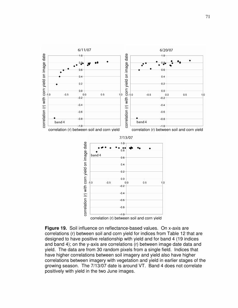
71
Figure 19. Soil influence on reflectance-based values. On x-axis are correlations (r) between soil and corn yield for indices from Table 12 that are designed to have positive relationship with yield and for band 4 (19 indices and band 4); on the y-axis are correlations (r) between image date data and yield. The data are from 30 random pixels from a single field. Indices that have higher correlations between soil imagery and yield also have higher correlations between imagery with vegetation and yield in earlier stages of the growing season. The 7/13/07 date is around VT. Band 4 does not correlate positively with yield in the two June images.
correlation (r) between soil and corn yield correlation (r) between soil and corn yield
correlation (r) between soil and corn yield
corr
ela
tion (
r) w
ith c
orn
yie
ld o
n im
age d
ate
corr
ela
tion (
r) w
ith c
orn
yie
ld o
n im
age d
ate
corr
ela
tion (
r) w
ith c
orn
yie
ld o
n im
age d
ate
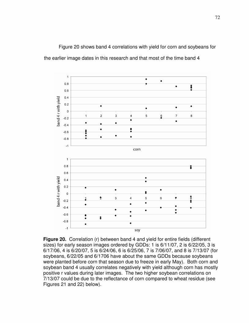
72
Figure 20 shows band 4 correlations with yield for corn and soybeans for
the earlier image dates in this research and that most of the time band 4
Figure 20. Correlation (r) between band 4 and yield for entire fields (different sizes) for early season images ordered by GDDs: 1 is 6/11/07, 2 is 6/22/05, 3 is 6/17/06, 4 is 6/20/07, 5 is 6/24/06, 6 is 6/25/06, 7 is 7/06/07, and 8 is 7/13/07 (for soybeans, 6/22/05 and 6/1706 have about the same GDDs because soybeans were planted before corn that season due to freeze in early May). Both corn and soybean band 4 usually correlates negatively with yield although corn has mostly positive r values during later images. The two higher soybean correlations on 7/13/07 could be due to the reflectance of corn compared to wheat residue (see Figures 21 and 22) below).
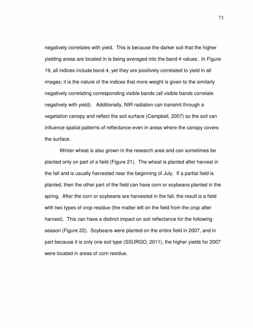
73
negatively correlates with yield. This is because the darker soil that the higher
yielding areas are located in is being averaged into the band 4 values. In Figure
19, all indices include band 4, yet they are positively correlated to yield in all
images; it is the nature of the indices that more weight is given to the similarly
negatively correlating corresponding visible bands (all visible bands correlate
negatively with yield). Additionally, NIR radiation can transmit through a
vegetation canopy and reflect the soil surface (Campbell, 2007) so the soil can
influence spatial patterns of reflectance even in areas where the canopy covers
the surface.
Winter wheat is also grown in the research area and can sometimes be
planted only on part of a field (Figure 21). The wheat is planted after harvest in
the fall and is usually harvested near the beginning of July. If a partial field is
planted, then the other part of the field can have corn or soybeans planted in the
spring. After the corn or soybeans are harvested in the fall, the result is a field
with two types of crop residue (the matter left on the field from the crop after
harvest). This can have a distinct impact on soil reflectance for the following
season (Figure 22). Soybeans were planted on the entire field in 2007, and in
part because it is only one soil type (SSURGO, 2011), the higher yields for 2007
were located in areas of corn residue.
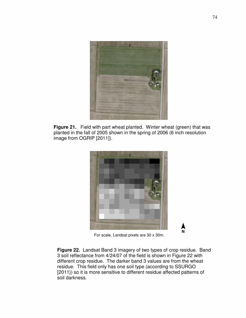
74
Figure 21. Field with part wheat planted. Winter wheat (green) that was planted in the fall of 2005 shown in the spring of 2006 (6 inch resolution image from OGRIP [2011]).
Figure 22. Landsat Band 3 imagery of two types of crop residue. Band 3 soil reflectance from 4/24/07 of the field is shown in Figure 22 with different crop residue. The darker band 3 values are from the wheat residue. This field only has one soil type (according to SSURGO [2011}) so it is more sensitive to different residue affected patterns of soil darkness.
For scale, Landsat pixels are 30 x 30m.
¯ N
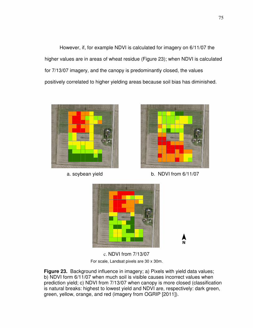
75
However, if, for example NDVI is calculated for imagery on 6/11/07 the
higher values are in areas of wheat residue (Figure 23); when NDVI is calculated
for 7/13/07 imagery, and the canopy is predominantly closed, the values
positively correlated to higher yielding areas because soil bias has diminished.
a. soybean yield b. NDVI from 6/11/07
c. NDVI from 7/13/07
Figure 23. Background influence in imagery; a) Pixels with yield data values; b) NDVI form 6/11/07 when much soil is visible causes incorrect values when prediction yield; c) NDVI from 7/13/07 when canopy is more closed (classification is natural breaks: highest to lowest yield and NDVI are, respectively: dark green, green, yellow, orange, and red (imagery from OGRIP [2011]).
For scale, Landsat pixels are 30 x 30m.
¯ N
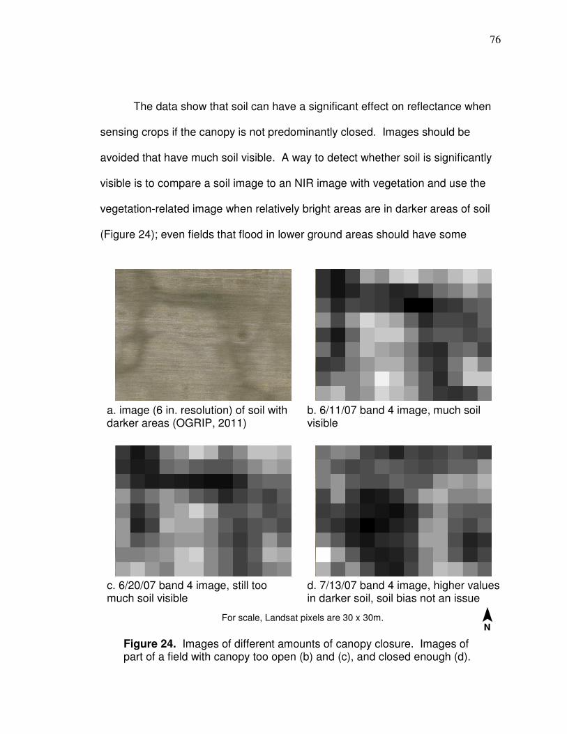
76
The data show that soil can have a significant effect on reflectance when
sensing crops if the canopy is not predominantly closed. Images should be
avoided that have much soil visible. A way to detect whether soil is significantly
visible is to compare a soil image to an NIR image with vegetation and use the
vegetation-related image when relatively bright areas are in darker areas of soil
(Figure 24); even fields that flood in lower ground areas should have some
a. image (6 in. resolution) of soil with darker areas (OGRIP, 2011)
b. 6/11/07 band 4 image, much soil visible
c. 6/20/07 band 4 image, still too much soil visible
d. 7/13/07 band 4 image, higher values in darker soil, soil bias not an issue
Figure 24. Images of different amounts of canopy closure. Images of part of a field with canopy too open (b) and (c), and closed enough (d).
For scale, Landsat pixels are 30 x 30m.
¯ N
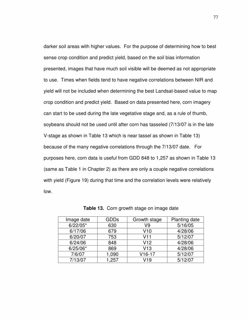
77
darker soil areas with higher values. For the purpose of determining how to best
sense crop condition and predict yield, based on the soil bias information
presented, images that have much soil visible will be deemed as not appropriate
to use. Times when fields tend to have negative correlations between NIR and
yield will not be included when determining the best Landsat-based value to map
crop condition and predict yield. Based on data presented here, corn imagery
can start to be used during the late vegetative stage and, as a rule of thumb,
soybeans should not be used until after corn has tasseled (7/13/07 is in the late
V-stage as shown in Table 13 which is near tassel as shown in Table 13)
because of the many negative correlations through the 7/13/07 date. For
purposes here, corn data is useful from GDD 848 to 1,257 as shown in Table 13
(same as Table 1 in Chapter 2) as there are only a couple negative correlations
with yield (Figure 19) during that time and the correlation levels were relatively
low.
Table 13. Corn growth stage on image date
Image date GDDs Growth stage Planting date 6/22/05* 630 V9 5/16/05 6/17/06 679 V10 4/28/06 6/20/07 753 V11 5/12/07 6/24/06 848 V12 4/28/06 6/25/06* 869 V13 4/28/06 7/6/07 1,090 V16-17 5/12/07
7/13/07 1,257 V19 5/12/07
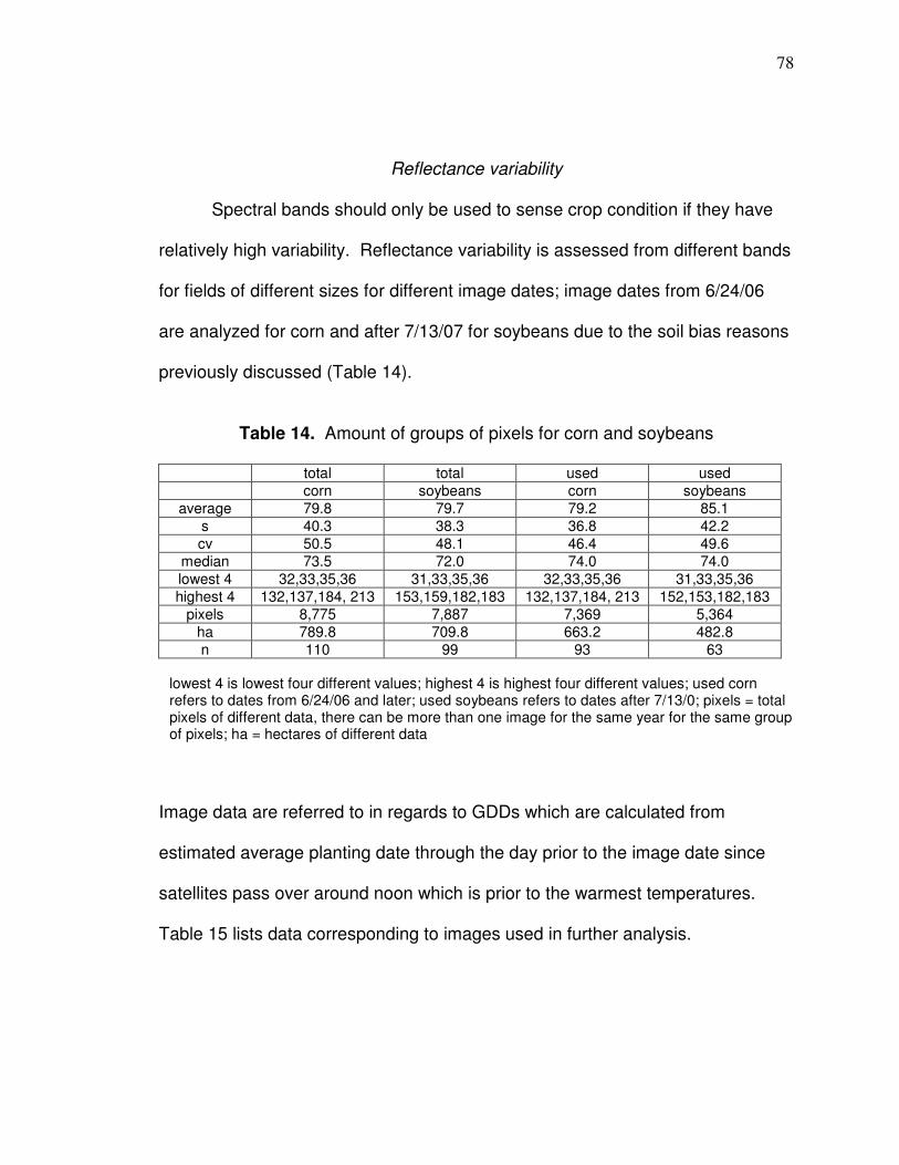
78
Reflectance variability
Spectral bands should only be used to sense crop condition if they have
relatively high variability. Reflectance variability is assessed from different bands
for fields of different sizes for different image dates; image dates from 6/24/06
are analyzed for corn and after 7/13/07 for soybeans due to the soil bias reasons
previously discussed (Table 14).
Table 14. Amount of groups of pixels for corn and soybeans
total total used used
corn soybeans corn soybeans
average 79.8 79.7 79.2 85.1
s 40.3 38.3 36.8 42.2
cv 50.5 48.1 46.4 49.6
median 73.5 72.0 74.0 74.0
lowest 4 32,33,35,36 31,33,35,36 32,33,35,36 31,33,35,36
highest 4 132,137,184, 213 153,159,182,183 132,137,184, 213 152,153,182,183
pixels 8,775 7,887 7,369 5,364
ha 789.8 709.8 663.2 482.8
n 110 99 93 63
Image data are referred to in regards to GDDs which are calculated from
estimated average planting date through the day prior to the image date since
satellites pass over around noon which is prior to the warmest temperatures.
Table 15 lists data corresponding to images used in further analysis.
lowest 4 is lowest four different values; highest 4 is highest four different values; used corn refers to dates from 6/24/06 and later; used soybeans refers to dates after 7/13/0; pixels = total pixels of different data, there can be more than one image for the same year for the same group of pixels; ha = hectares of different data
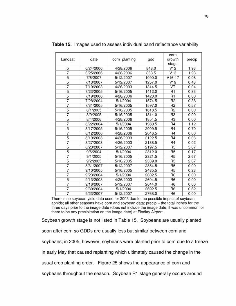
79
Table 15. Images used to assess individual band reflectance variability
Landsat date corn planting gdd corn
growth stage
precip
5 6/24/2006 4/28/2006 848.0 V12 1.93
7 6/25/2006 4/28/2006 868.5 V13 1.93
5 7/6/2007 5/12/2007 1090.0 V16-17 0.08
5 7/13/2007 5/12/2007 1257.0 V19 0.43
7 7/19/2003 4/26/2003 1314.5 VT 0.04
5 7/23/2005 5/16/2005 1412.0 R1 0.83
5 7/19/2006 4/28/2006 1420.0 R1 0.00
7 7/28/2004 5/1/2004 1574.5 R2 0.38
7 7/31/2005 5/16/2005 1597.0 R2 0.57
5 8/1/2005 5/16/2005 1618.5 R2 0.00
7 8/9/2005 5/16/2005 1814.0 R3 0.00
5 8/4/2006 4/28/2006 1854.5 R3 0.00
7 8/22/2004 5/1/2004 1989.5 R4 1.12
5 8/17/2005 5/16/2005 2009.5 R4 0.70
7 8/12/2006 4/28/2006 2046.5 R4 0.00
5 8/19/2003 4/26/2003 2122.5 R4 0.03
7 8/27/2003 4/26/2003 2138.5 R4 0.02
5 8/23/2007 5/12/2007 2197.5 R5 5.67
5 9/6/2004 5/1/2004 2312.0 R5 0.17
7 9/1/2005 5/16/2005 2321.5 R5 2.67
5 9/2/2005 5/16/2005 2339.0 R5 2.67
7 8/31/2007 5/12/2007 2354.5 R5 0.00
7 9/10/2005 5/16/2005 2485.5 R5 0.23
7 9/23/2004 5/1/2004 2602.5 R6 0.00
5 9/13/2003 4/26/2003 2604.5 R6 0.00
7 9/16/2007 5/12/2007 2644.0 R6 0.00
7 9/30/2004 5/1/2004 2692.5 R6 0.62
7 9/23/2007 5/12/2007 2768.0 R6 0.00
Soybean growth stage is not listed in Table 15. Soybeans are usually planted
soon after corn so GDDs are usually less but similar between corn and
soybeans; in 2005, however, soybeans were planted prior to corn due to a freeze
in early May that caused replanting which ultimately caused the change in the
usual crop planting order. Figure 25 shows the appearance of corn and
soybeans throughout the season. Soybean R1 stage generally occurs around
There is no soybean yield data used for 2003 due to the possible impact of soybean aphids; all other seasons have corn and soybean data; precip = the total inches for the three days prior to the image date (does not include the image date; it was uncommon for there to be any precipitation on the image date) at Findlay Airport.
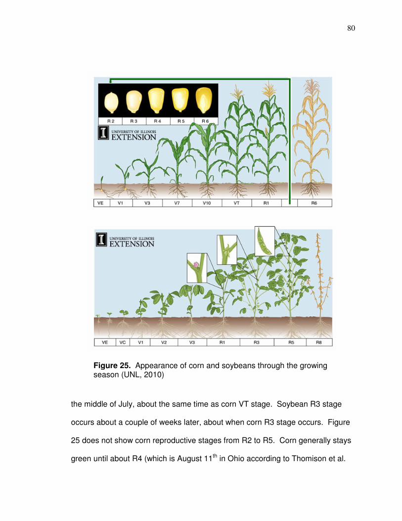
80
the middle of July, about the same time as corn VT stage. Soybean R3 stage
occurs about a couple of weeks later, about when corn R3 stage occurs. Figure
25 does not show corn reproductive stages from R2 to R5. Corn generally stays
green until about R4 (which is August 11th in Ohio according to Thomison et al.
Figure 25. Appearance of corn and soybeans through the growing season (UNL, 2010) (UNL, 2007)
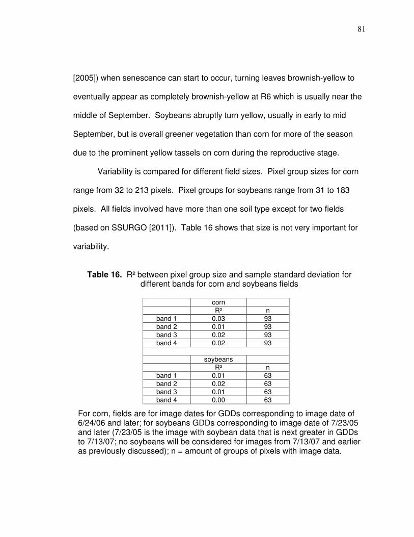
81
[2005]) when senescence can start to occur, turning leaves brownish-yellow to
eventually appear as completely brownish-yellow at R6 which is usually near the
middle of September. Soybeans abruptly turn yellow, usually in early to mid
September, but is overall greener vegetation than corn for more of the season
due to the prominent yellow tassels on corn during the reproductive stage.
Variability is compared for different field sizes. Pixel group sizes for corn
range from 32 to 213 pixels. Pixel groups for soybeans range from 31 to 183
pixels. All fields involved have more than one soil type except for two fields
(based on SSURGO [2011]). Table 16 shows that size is not very important for
variability.
Table 16. R² between pixel group size and sample standard deviation for different bands for corn and soybeans fields
corn
R² n
band 1 0.03 93
band 2 0.01 93
band 3 0.02 93
band 4 0.02 93
soybeans
R² n
band 1 0.01 63
band 2 0.02 63
band 3 0.01 63
band 4 0.00 63
For corn, fields are for image dates for GDDs corresponding to image date of 6/24/06 and later; for soybeans GDDs corresponding to image date of 7/23/05 and later (7/23/05 is the image with soybean data that is next greater in GDDs to 7/13/07; no soybeans will be considered for images from 7/13/07 and earlier as previously discussed); n = amount of groups of pixels with image data.
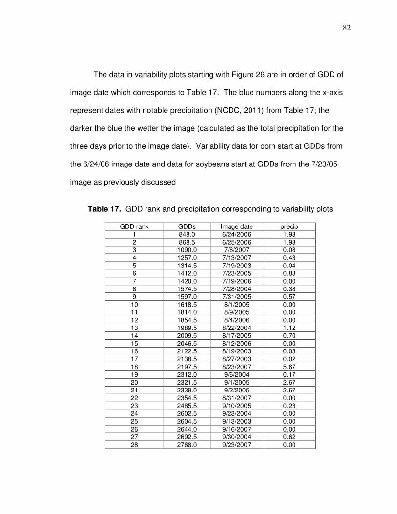
82
The data in variability plots starting with Figure 26 are in order of GDD of
image date which corresponds to Table 17. The blue numbers along the x-axis
represent dates with notable precipitation (NCDC, 2011) from Table 17; the
darker the blue the wetter the image (calculated as the total precipitation for the
three days prior to the image date). Variability data for corn start at GDDs from
the 6/24/06 image date and data for soybeans start at GDDs from the 7/23/05
image as previously discussed
Table 17. GDD rank and precipitation corresponding to variability plots
GDD rank GDDs Image date precip
1 848.0 6/24/2006 1.93
2 868.5 6/25/2006 1.93
3 1090.0 7/6/2007 0.08
4 1257.0 7/13/2007 0.43
5 1314.5 7/19/2003 0.04
6 1412.0 7/23/2005 0.83
7 1420.0 7/19/2006 0.00
8 1574.5 7/28/2004 0.38
9 1597.0 7/31/2005 0.57
10 1618.5 8/1/2005 0.00
11 1814.0 8/9/2005 0.00
12 1854.5 8/4/2006 0.00
13 1989.5 8/22/2004 1.12
14 2009.5 8/17/2005 0.70
15 2046.5 8/12/2006 0.00
16 2122.5 8/19/2003 0.03
17 2138.5 8/27/2003 0.02
18 2197.5 8/23/2007 5.67
19 2312.0 9/6/2004 0.17
20 2321.5 9/1/2005 2.67
21 2339.0 9/2/2005 2.67
22 2354.5 8/31/2007 0.00
23 2485.5 9/10/2005 0.23
24 2602.5 9/23/2004 0.00
25 2604.5 9/13/2003 0.00
26 2644.0 9/16/2007 0.00
27 2692.5 9/30/2004 0.62
28 2768.0 9/23/2007 0.00
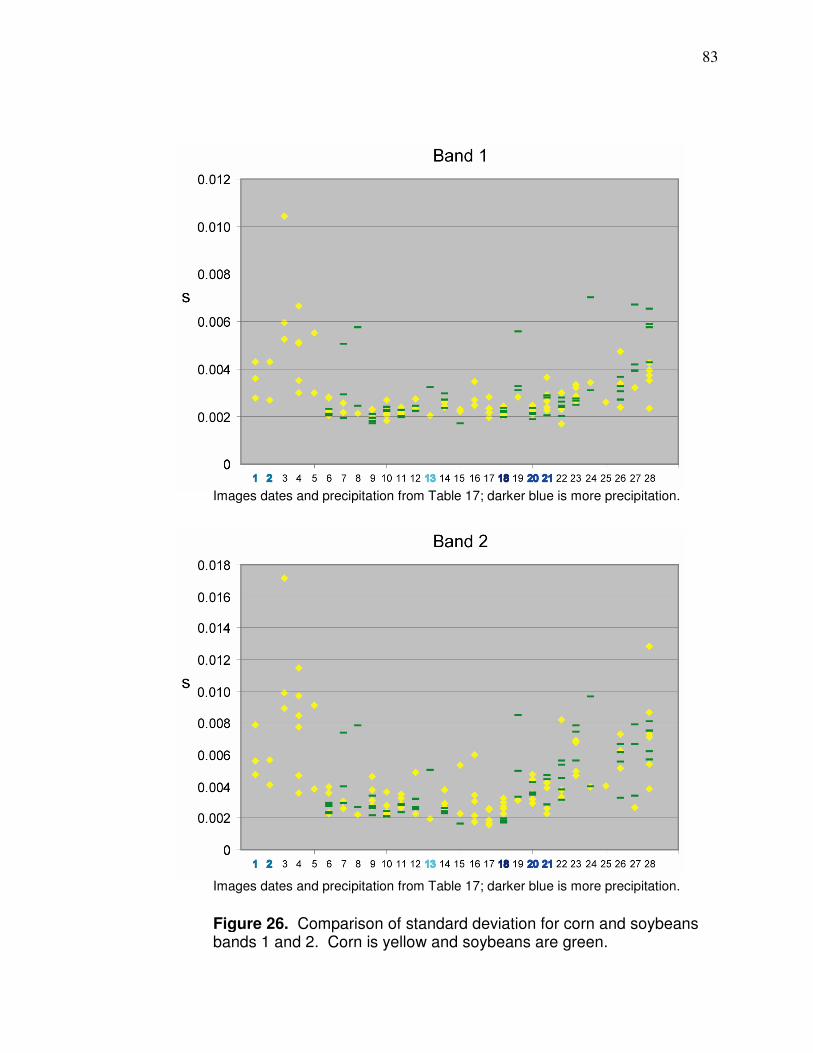
83
Figure 26. Comparison of standard deviation for corn and soybeans bands 1 and 2. Corn is yellow and soybeans are green.
Images dates and precipitation from Table 17; darker blue is more precipitation.
Images dates and precipitation from Table 17; darker blue is more precipitation.
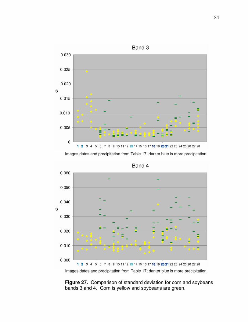
84
Figure 27. Comparison of standard deviation for corn and soybeans bands 3 and 4. Corn is yellow and soybeans are green.
Images dates and precipitation from Table 17; darker blue is more precipitation.
Images dates and precipitation from Table 17; darker blue is more precipitation.

85
Overall, the Figures 26 and 27 show that corn is consistently most variable
in bands 1-3 early on in the images which represent the later vegetation stage
and that this could be a more effective time to sense crops and predict yield if the
variability coincides with the correct correlation relationship with yield. Corn and
soybeans are each more consistent in band 4 variability throughout the image
dates. The most distinct difference in variability is soybean band 4 compared to
corn band 4 with soybeans being much more variable throughout. This provides
evidence that band 4 solely could be used to map crop condition and predict
yield patterns; however, there should be corresponding correlation with yield data
that show the correct, positive, relationship. Jang et al. (2006) showed, based on
hyperspectral imagery from an aircraft that standard deviations are higher for NIR
than visible reflectance later in the season. Based on viewing Figure 26 and 27,
the highest precipitation seemed to cause there to be a smaller dispersion of
standard deviations in the visible bands of both crops, so very wet images could
affect variability at some level. Overall, standard deviation values represent a
lack of enough variability for reflectance data in visible bands in most cases.
Figures 28 and 29 show how many different reflectance values there are
within a field for the different image dates (some values for different pixel groups
are exactly the same). The data show that there is overall not enough variability
in any visible bands for corn or soybeans from GDD 1,412 and later (this is
image 6 in the plots and the date is 7/23/05 which corresponds to corn R1). The
amount of different values for corn or soybeans for visible bands for data on
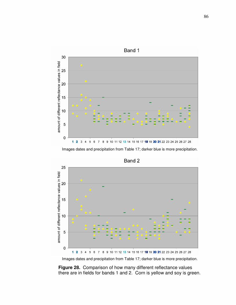
86
Figure 28. Comparison of how many different reflectance values there are in fields for bands 1 and 2. Corn is yellow and soy is green.
Images dates and precipitation from Table 17; darker blue is more precipitation.
Images dates and precipitation from Table 17; darker blue is more precipitation.
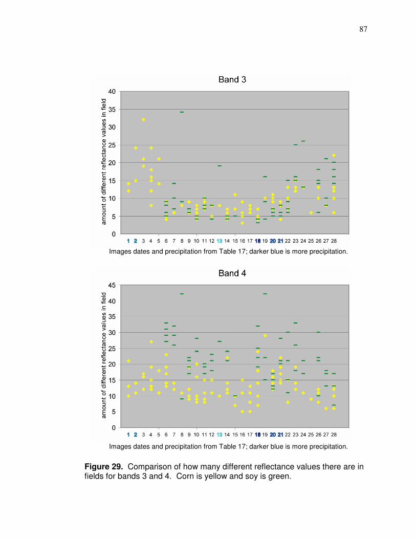
87
Figure 29. Comparison of how many different reflectance values there are in fields for bands 3 and 4. Corn is yellow and soy is green.
Images dates and precipitation from Table 17; darker blue is more precipitation.
Images dates and precipitation from Table 17; darker blue is more precipitation.
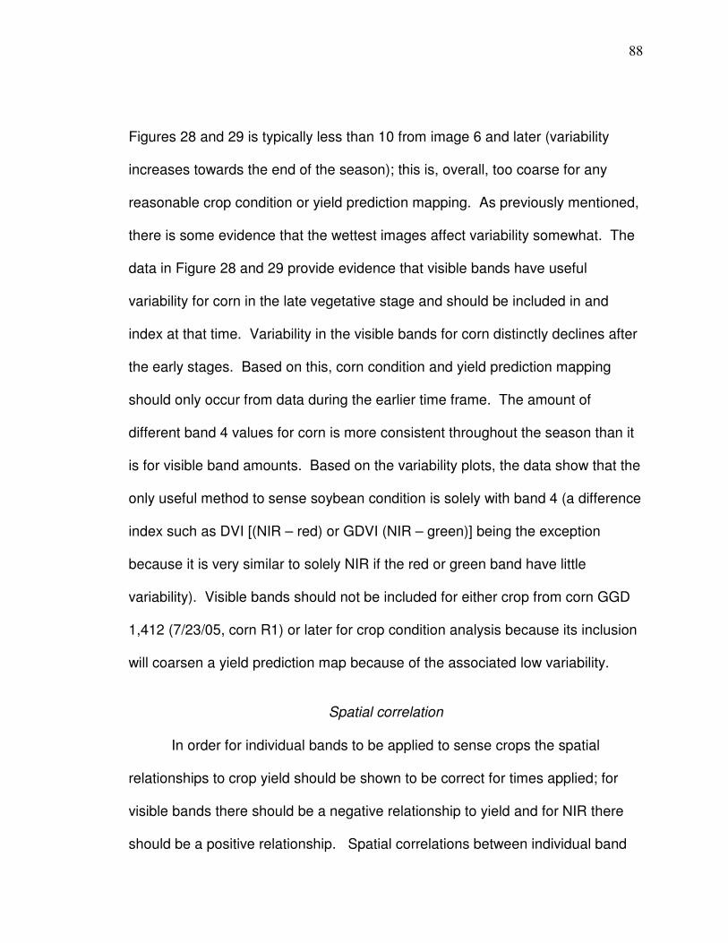
88
Figures 28 and 29 is typically less than 10 from image 6 and later (variability
increases towards the end of the season); this is, overall, too coarse for any
reasonable crop condition or yield prediction mapping. As previously mentioned,
there is some evidence that the wettest images affect variability somewhat. The
data in Figure 28 and 29 provide evidence that visible bands have useful
variability for corn in the late vegetative stage and should be included in and
index at that time. Variability in the visible bands for corn distinctly declines after
the early stages. Based on this, corn condition and yield prediction mapping
should only occur from data during the earlier time frame. The amount of
different band 4 values for corn is more consistent throughout the season than it
is for visible band amounts. Based on the variability plots, the data show that the
only useful method to sense soybean condition is solely with band 4 (a difference
index such as DVI [(NIR – red) or GDVI (NIR – green)] being the exception
because it is very similar to solely NIR if the red or green band have little
variability). Visible bands should not be included for either crop from corn GGD
1,412 (7/23/05, corn R1) or later for crop condition analysis because its inclusion
will coarsen a yield prediction map because of the associated low variability.
Spatial correlation
In order for individual bands to be applied to sense crops the spatial
relationships to crop yield should be shown to be correct for times applied; for
visible bands there should be a negative relationship to yield and for NIR there
should be a positive relationship. Spatial correlations between individual band
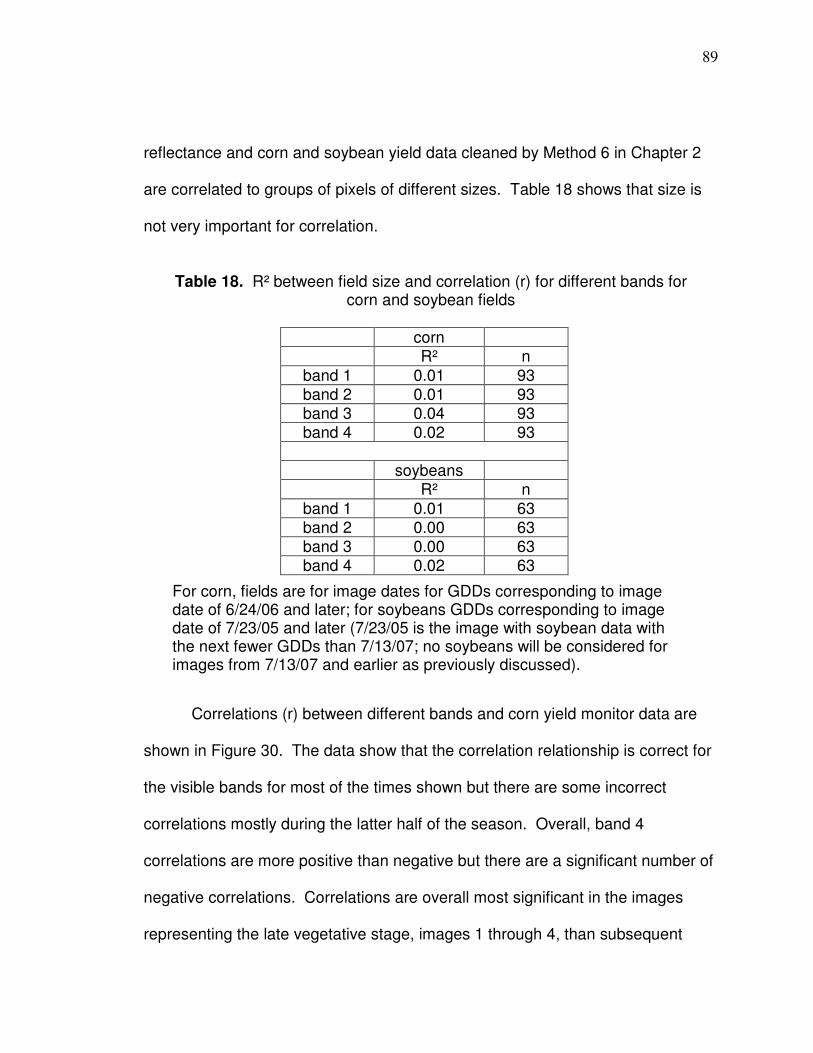
89
reflectance and corn and soybean yield data cleaned by Method 6 in Chapter 2
are correlated to groups of pixels of different sizes. Table 18 shows that size is
not very important for correlation.
Table 18. R² between field size and correlation (r) for different bands for corn and soybean fields
corn R² n
band 1 0.01 93 band 2 0.01 93 band 3 0.04 93 band 4 0.02 93
soybeans R² n
band 1 0.01 63 band 2 0.00 63 band 3 0.00 63 band 4 0.02 63
Correlations (r) between different bands and corn yield monitor data are
shown in Figure 30. The data show that the correlation relationship is correct for
the visible bands for most of the times shown but there are some incorrect
correlations mostly during the latter half of the season. Overall, band 4
correlations are more positive than negative but there are a significant number of
negative correlations. Correlations are overall most significant in the images
representing the late vegetative stage, images 1 through 4, than subsequent
For corn, fields are for image dates for GDDs corresponding to image date of 6/24/06 and later; for soybeans GDDs corresponding to image date of 7/23/05 and later (7/23/05 is the image with soybean data with the next fewer GDDs than 7/13/07; no soybeans will be considered for images from 7/13/07 and earlier as previously discussed).
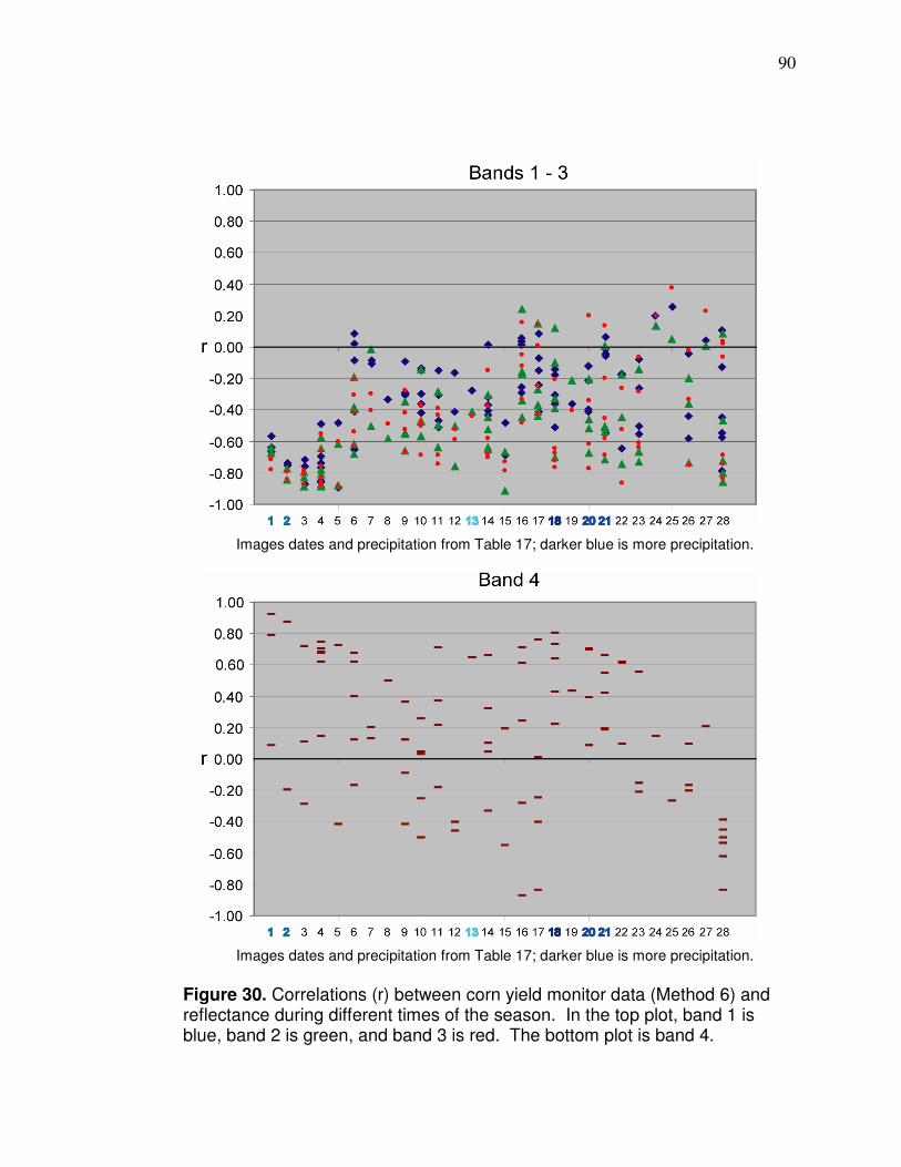
90
Figure 30. Correlations (r) between corn yield monitor data (Method 6) and reflectance during different times of the season. In the top plot, band 1 is blue, band 2 is green, and band 3 is red. The bottom plot is band 4.
Images dates and precipitation from Table 17; darker blue is more precipitation.
Images dates and precipitation from Table 17; darker blue is more precipitation.
91
times; image 5 represent the tassel stage which, as previously mentioned, as
been shown to correlate with decreased correlation to yield (Martin et al., 2007).
The last stage that represents the vegetative stage according to the GDDs
calculated is image date 4 (7/13/07); there are only two NIR negative correlations
up to that date. The ratio of positive to negative correlations subsequently
decreases in the early reproductive stage. There is a time from around image 18
to 22 where NIR correlations are all positive but corresponding visible band
correlations are not as significant as early on and there are some positive
(incorrect) correlations between visible band and yield during this time. Overall,
visible and NIR correlation relationships are more unreliable in the reproductive
stage than in the vegetative stage and that it is useful to use Landsat to sense
crop condition and predict yield for corn in the later vegetative stage and it should
not be applied in the reproductive stage. It is difficult to determine if precipitation
affects corn yield correlation in any band.
Correlations (r) between different bands and soybean yield monitor data
are shown in Figure 31. Correlations between soybeans and visible bands are
similar as those between corn and visible bands. The relationship is correct most
of the time and correlation levels are similar to those corresponding to corn.
Band 4 correlations with soybeans have the most consistently correct
relationship and have the highest overall correlation values. It appears that the
wettest image, number 18, could be causing correlations to be less significant in
the visible bands but does not have any affect in the NIR (although no evidence
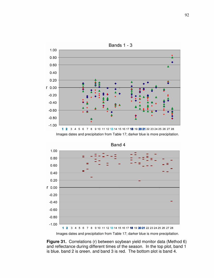
92
Figure 31. Correlations (r) between soybean yield monitor data (Method 6) and reflectance during different times of the season. In the top plot, band 1 is blue, band 2 is green, and band 3 is red. The bottom plot is band 4.
Images dates and precipitation from Table 17; darker blue is more precipitation.
Images dates and precipitation from Table 17; darker blue is more precipitation.

93
is too overwhelming that very wet images affect correlation). Soybean band 4
correlations decreased overall during the latest few image dates so data
corresponding to these GDDs should not be used. The data from Figure 31
show that soybean data should be used from image date 9 (the fourth grouping
from left in the plots which 7/31/05) which is about 1,600 GDDs into the season
which corresponds to about the end of July or beginning of August in typical
years. Correlations diminish overall during the last three image dates, but are
still high at image date 24 which represents about 2,600 GDDs which is normally
in the first half of September. The data here show that band 4 correlations
always have the correct relationship to yield monitor data (which has been
untenably shown to map higher and lower areas of yield in the right vicinities in
Chapter 2) during this time while visible bands can have incorrect correlations
throughout the same time frame. Band 4 solely during this time is, therefore, the
most reliable method to map crop condition and predict spatial patterns of yield;
to include visible band data would be to include potentially erroneous data and
data with relatively low variability. Jang et al. (2006) reported that the overall
trend in the green, red, and NIR band (based on hyperspectral imagery), in
regards to correlation with corn and soybean yield, was that there was no “readily
apparent relationship” for either corn or soybean yield early in the growing
season but linear relationships appeared at later imaging dates. Jang et al. also
reported that, although there were exceptions, overall, the visible bands had
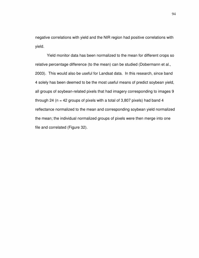
94
negative correlations with yield and the NIR region had positive correlations with
yield.
Yield monitor data has been normalized to the mean for different crops so
relative percentage difference (to the mean) can be studied (Dobermann et al.,
2003). This would also be useful for Landsat data. In this research, since band
4 solely has been deemed to be the most useful means of predict soybean yield,
all groups of soybean-related pixels that had imagery corresponding to images 9
through 24 (n = 42 groups of pixels with a total of 3,807 pixels) had band 4
reflectance normalized to the mean and corresponding soybean yield normalized
the mean; the individual normalized groups of pixels were then merge into one
file and correlated (Figure 32).
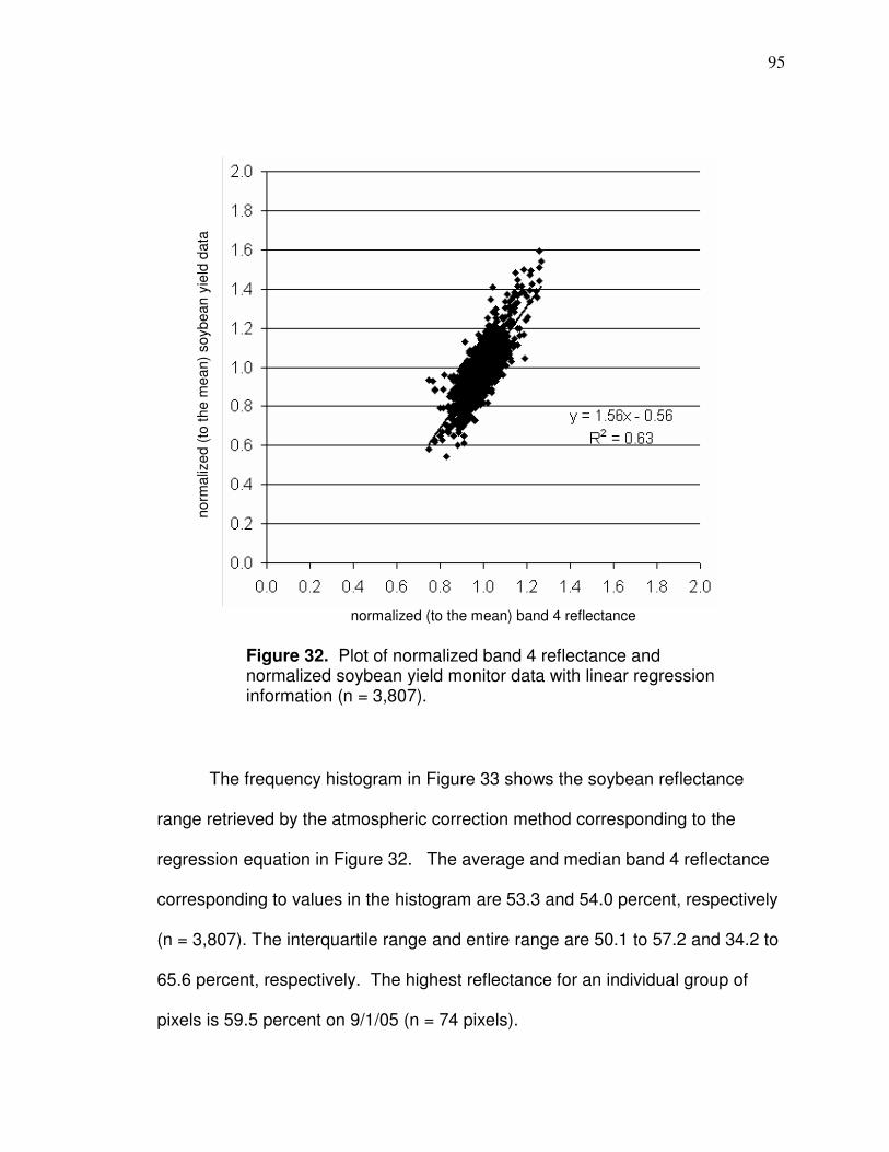
95
The frequency histogram in Figure 33 shows the soybean reflectance
range retrieved by the atmospheric correction method corresponding to the
regression equation in Figure 32. The average and median band 4 reflectance
corresponding to values in the histogram are 53.3 and 54.0 percent, respectively
(n = 3,807). The interquartile range and entire range are 50.1 to 57.2 and 34.2 to
65.6 percent, respectively. The highest reflectance for an individual group of
pixels is 59.5 percent on 9/1/05 (n = 74 pixels).
Figure 32. Plot of normalized band 4 reflectance and normalized soybean yield monitor data with linear regression information (n = 3,807).
normalized (to the mean) band 4 reflectance
norm
aliz
ed (
to t
he m
ea
n)
soybean
yie
ld d
ata
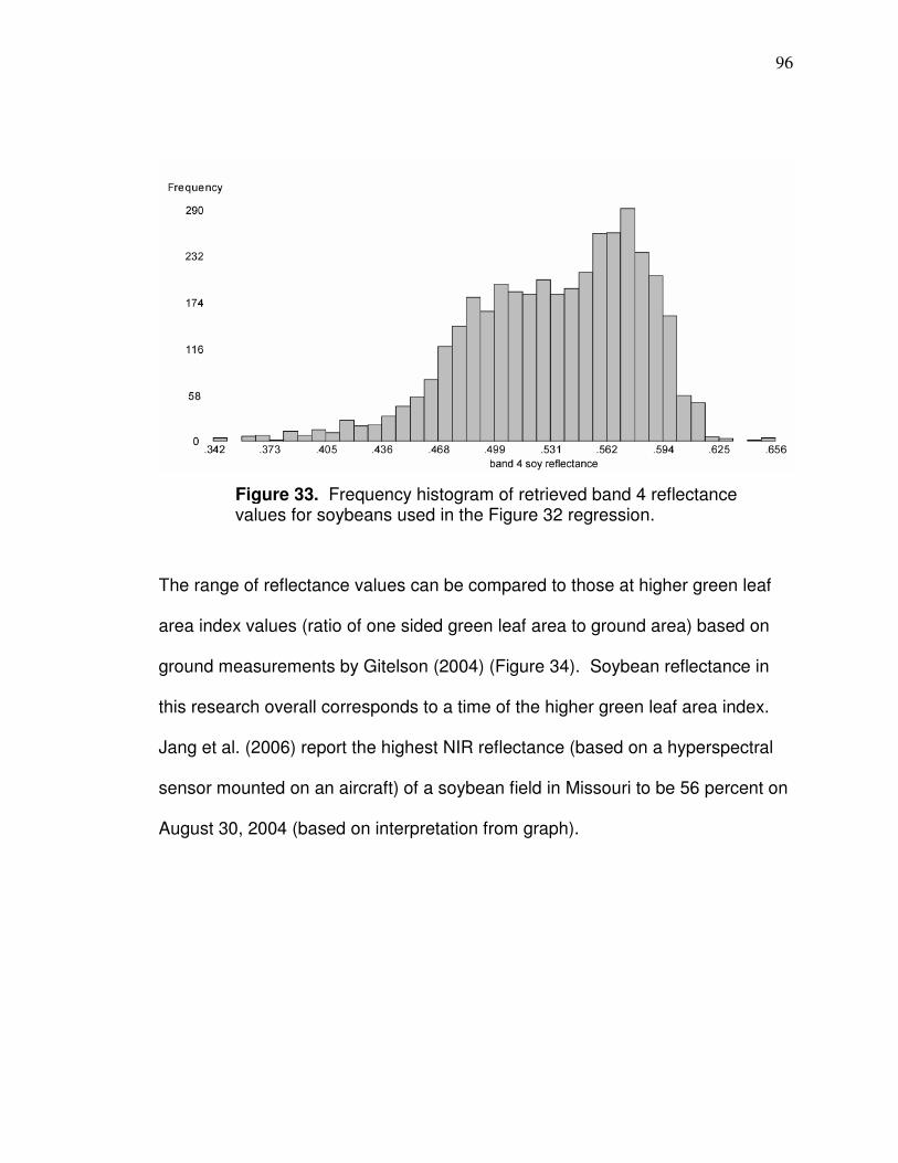
96
The range of reflectance values can be compared to those at higher green leaf
area index values (ratio of one sided green leaf area to ground area) based on
ground measurements by Gitelson (2004) (Figure 34). Soybean reflectance in
this research overall corresponds to a time of the higher green leaf area index.
Jang et al. (2006) report the highest NIR reflectance (based on a hyperspectral
sensor mounted on an aircraft) of a soybean field in Missouri to be 56 percent on
August 30, 2004 (based on interpretation from graph).
Figure 33. Frequency histogram of retrieved band 4 reflectance values for soybeans used in the Figure 32 regression.
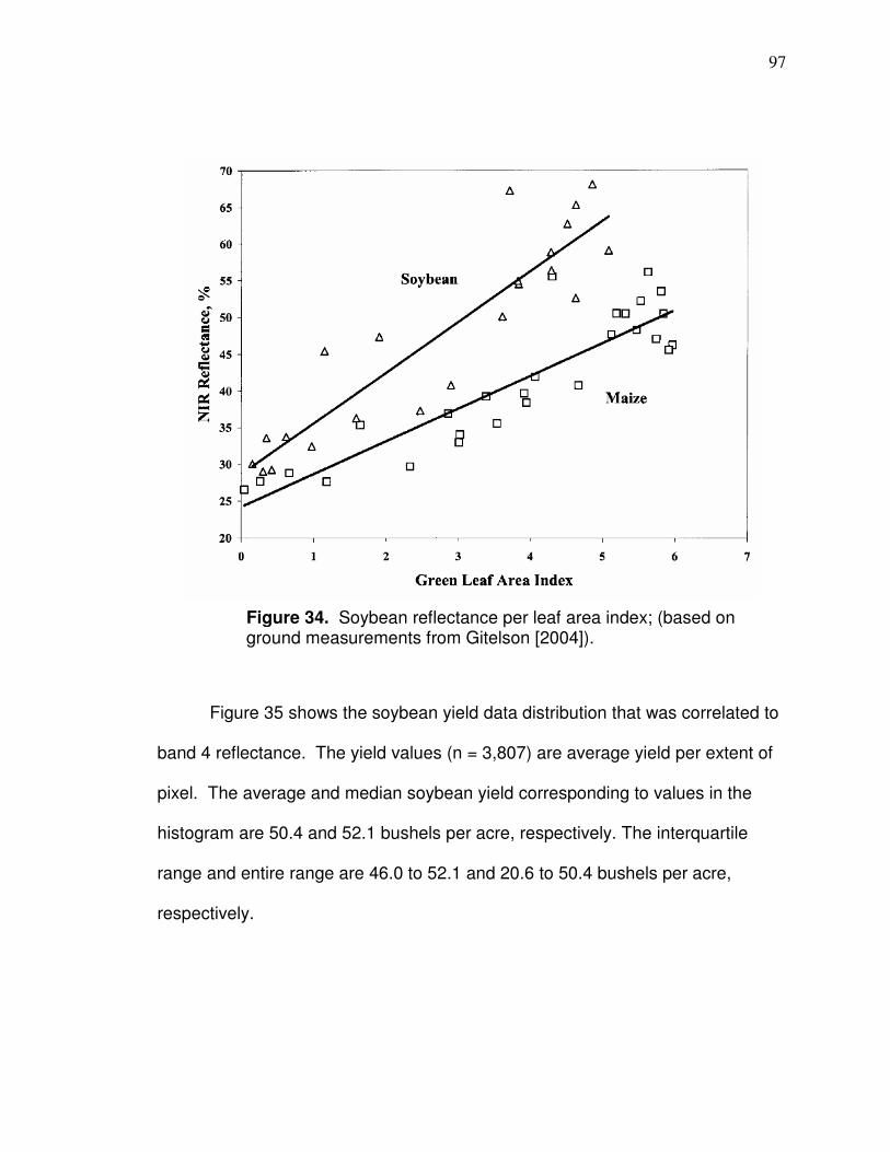
97
Figure 35 shows the soybean yield data distribution that was correlated to
band 4 reflectance. The yield values (n = 3,807) are average yield per extent of
pixel. The average and median soybean yield corresponding to values in the
histogram are 50.4 and 52.1 bushels per acre, respectively. The interquartile
range and entire range are 46.0 to 52.1 and 20.6 to 50.4 bushels per acre,
respectively.
Figure 34. Soybean reflectance per leaf area index; (based on ground measurements from Gitelson [2004]).
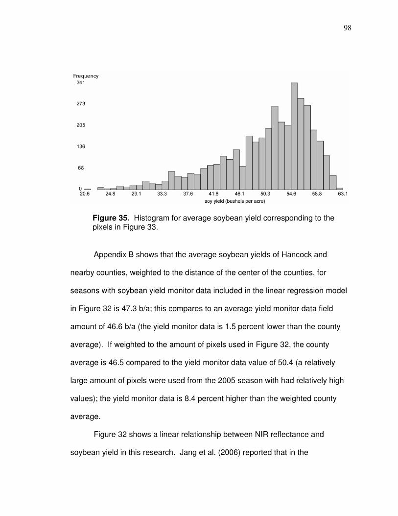
98
Appendix B shows that the average soybean yields of Hancock and
nearby counties, weighted to the distance of the center of the counties, for
seasons with soybean yield monitor data included in the linear regression model
in Figure 32 is 47.3 b/a; this compares to an average yield monitor data field
amount of 46.6 b/a (the yield monitor data is 1.5 percent lower than the county
average). If weighted to the amount of pixels used in Figure 32, the county
average is 46.5 compared to the yield monitor data value of 50.4 (a relatively
large amount of pixels were used from the 2005 season with had relatively high
values); the yield monitor data is 8.4 percent higher than the weighted county
average.
Figure 32 shows a linear relationship between NIR reflectance and
soybean yield in this research. Jang et al. (2006) reported that in the
Figure 35. Histogram for average soybean yield corresponding to the pixels in Figure 33.
99
reproductive stage corn NIR plateaued while soybean NIR reflectance kept
increasing and that there were “linear” relationships between NIR reflectance and
soybean yield corresponding to image dates later in the season. Jones et al.
(2003) showed that a significant linear relationship between leaf area index and
soybean yield when only LAI was relatively low.
A criteria to determine the best corn index here is to establish which index,
when normalized and correlated to normalized corn yield, has the most similar
regression slope to the soybean normalized regression slope so the corn data
can fit with soybean data in a regression. All indices from Table 12 were
calculated for corn yield data for the fourteen pixel groups with imagery in the V-
stage from GDD 848 (6/24/06) to GDD 1,257 (7/13/07). As with soybeans,
values were normalized to the mean and merged into one file and slope and
correlation values were compared to determine which would fit best with
soybeans when merged with the soybean file (Table 19). It is apparent from
Table 19, based on slope of the regression line, that NNIR is the best index;
because it is the only one that has a slope that closely matches that of the
soybean slope and the correlation level is relatively high. NNIR is deemed the
best index to apply here for the purposes of fitting data with soybean yield. The
normalized NNIR and corn plot is shown in Figure 36. However, it is notable that
vegetation indices had the highest overall correlations and that if data were made
solely for corn, TSAVI should be applied based on the data in Table 19.
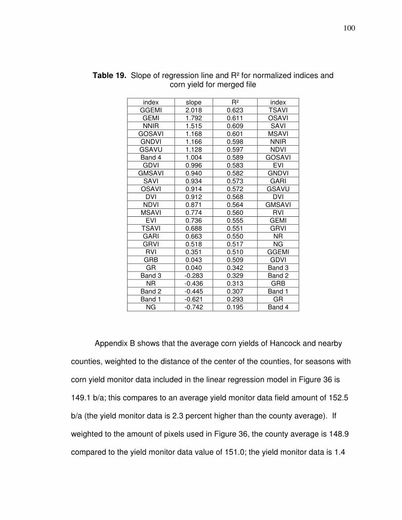
100
Table 19. Slope of regression line and R² for normalized indices and corn yield for merged file
index slope R² index
GGEMI 2.018 0.623 TSAVI
GEMI 1.792 0.611 OSAVI
NNIR 1.515 0.609 SAVI
GOSAVI 1.168 0.601 MSAVI
GNDVI 1.166 0.598 NNIR
GSAVU 1.128 0.597 NDVI
Band 4 1.004 0.589 GOSAVI
GDVI 0.996 0.583 EVI
GMSAVI 0.940 0.582 GNDVI
SAVI 0.934 0.573 GARI
OSAVI 0.914 0.572 GSAVU
DVI 0.912 0.568 DVI
NDVI 0.871 0.564 GMSAVI
MSAVI 0.774 0.560 RVI
EVI 0.736 0.555 GEMI
TSAVI 0.688 0.551 GRVI
GARI 0.663 0.550 NR
GRVI 0.518 0.517 NG RVI 0.351 0.510 GGEMI
GRB 0.043 0.509 GDVI
GR 0.040 0.342 Band 3
Band 3 -0.283 0.329 Band 2
NR -0.436 0.313 GRB
Band 2 -0.445 0.307 Band 1
Band 1 -0.621 0.293 GR
NG -0.742 0.195 Band 4
Appendix B shows that the average corn yields of Hancock and nearby
counties, weighted to the distance of the center of the counties, for seasons with
corn yield monitor data included in the linear regression model in Figure 36 is
149.1 b/a; this compares to an average yield monitor data field amount of 152.5
b/a (the yield monitor data is 2.3 percent higher than the county average). If
weighted to the amount of pixels used in Figure 36, the county average is 148.9
compared to the yield monitor data value of 151.0; the yield monitor data is 1.4
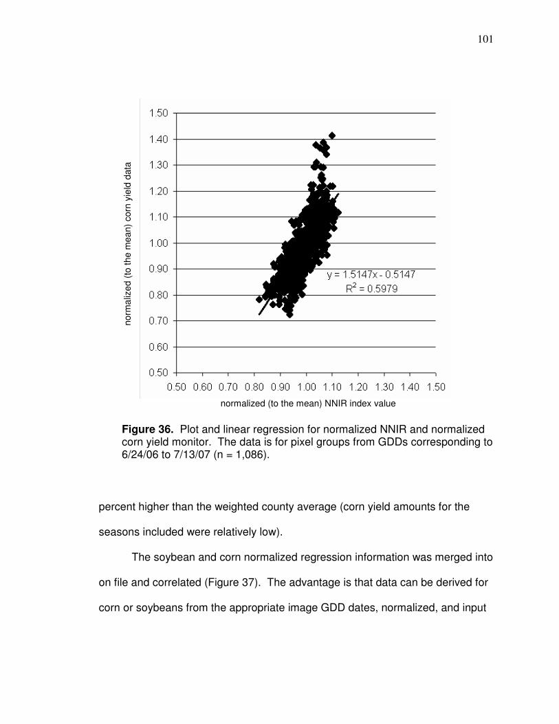
101
percent higher than the weighted county average (corn yield amounts for the
seasons included were relatively low).
The soybean and corn normalized regression information was merged into
on file and correlated (Figure 37). The advantage is that data can be derived for
corn or soybeans from the appropriate image GDD dates, normalized, and input
Figure 36. Plot and linear regression for normalized NNIR and normalized corn yield monitor. The data is for pixel groups from GDDs corresponding to 6/24/06 to 7/13/07 (n = 1,086).
normalized (to the mean) NNIR index value
norm
aliz
ed (
to t
he m
ea
n)
corn
yie
ld d
ata
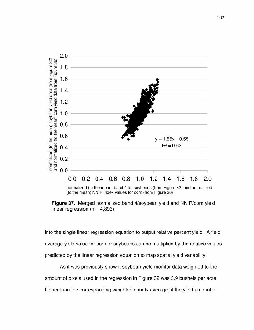
102
y = 1.55x - 0.55
R2 = 0.62
0.0
0.2
0.4
0.6
0.8
1.0
1.2
1.4
1.6
1.8
2.0
0.0 0.2 0.4 0.6 0.8 1.0 1.2 1.4 1.6 1.8 2.0
into the single linear regression equation to output relative percent yield. A field
average yield value for corn or soybeans can be multiplied by the relative values
predicted by the linear regression equation to map spatial yield variability.
As it was previously shown, soybean yield monitor data weighted to the
amount of pixels used in the regression in Figure 32 was 3.9 bushels per acre
higher than the corresponding weighted county average; if the yield amount of
Figure 37. Merged normalized band 4/soybean yield and NNIR/corn yield linear regression (n = 4,893)
normalized (to the mean) band 4 for soybeans (from Figure 32) and normalized (to the mean) NNIR index values for corn (from Figure 36)
norm
aliz
ed (
to t
he m
ea
n)
soybean
yie
ld d
ata
(fr
om
Fig
ure
32)
and n
orm
aliz
ed (
to t
he m
ea
n)
corn
yie
ld d
ata
fro
m F
igu
re 3
6)
103
soybeans is decreased by 3.9 b/a in order to have the same weighted average
as the county, the slope of the soybean regression line increases to 1.69. This
produces a soybean slope that is closer to matching GEMI in Table 19. If the
normalized soybean, based on the new slope, is merged with the normalized
corn GEMI data, the merged corn-soybean regression correlation is R² = 0.61,
which is still lower than R² = 0.62 when NNIR was included. GEMI has a lower
correlation to corn than NNIR. If the value of corn yield is decrease by 2.1 to
have the same weighted average as the weighted county average, then the slope
of NNIR would increase and become closer to that of soybean while the slope of
the GEMI regression line would also increase, becoming more different to that of
soybeans.
Conclusion
A comparison of reflectance-based values presented here provides evidence
about which methods are better for applying Landsat data at the field-scale for
corn and soybeans. Figure 37 includes a linear regression model where
information based on satellite data for both corn and soybeans can be input to
predict normalized yield. A comparison of the yield values (used in the models)
to county yield from NASS (2011) is described in Appendix B. The normalized
Landsat yield prediction maps can be applied for purposes when 30 meter
resolution data is suitable, such as developing or helping to develop
104
management zones. The Landsat yield prediction maps can be particularly
useful for fields without yield monitor data.
Steps to produce a Landsat yield prediction map to the extent of a field are
shown in Appendix C. A point or raster map based on Landsat values that have
been normalized to the mean can be produced to the boundaries of a field. The
normalized Landsat values can be multiplied by the equation in Figure 37 to
produce a normalized (to the mean) yield prediction map for corn or soybeans. If
applying to develop management zones, numerous normalized predicted yield
maps can be averaged to produce a single map. The average map can be
multiplied by a field average for corn or soybean to produce a map with yield
values. The Landsat yield prediction map can be in point (shapefile) form or can
be converted to a raster. Figure 38 shows a raster Landsat yield prediction map
from Appendix C that represents an average of values from the equation in
Figure 37 for 2005 soybeans, 2006 corn, and 2007 soybeans (details are shown
in Appendix C). Figure 39 shows the Landsat normalized yield prediction map
reclassified into four natural breaks with corn and soybean values associated.
The average predicted normalized yield values were multiplied by 50 to produce
soybean zones and 170 to produce corn zones. (There are different methods of
classifying or clustering data and determining how many zones there should be.)
Figure 39 is an example of how a Landsat yield prediction data can be applied at
the field scale.
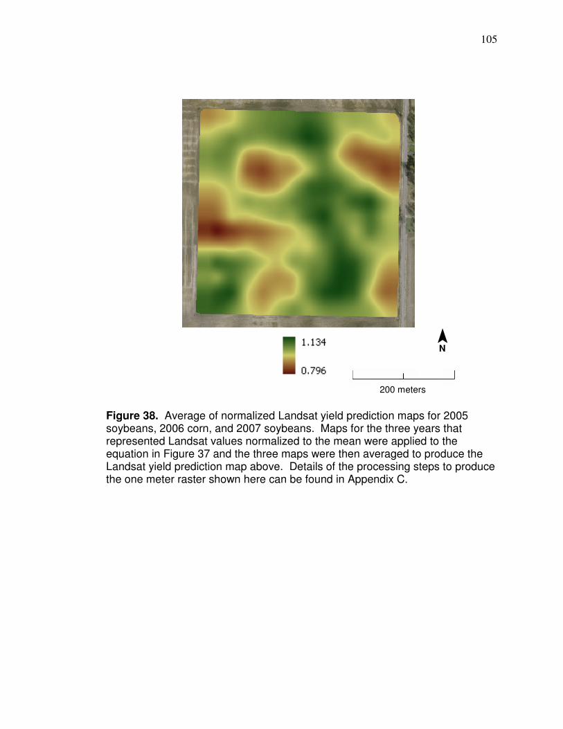
105
Figure 38. Average of normalized Landsat yield prediction maps for 2005 soybeans, 2006 corn, and 2007 soybeans. Maps for the three years that represented Landsat values normalized to the mean were applied to the equation in Figure 37 and the three maps were then averaged to produce the Landsat yield prediction map above. Details of the processing steps to produce the one meter raster shown here can be found in Appendix C.
¯ N
200 meters
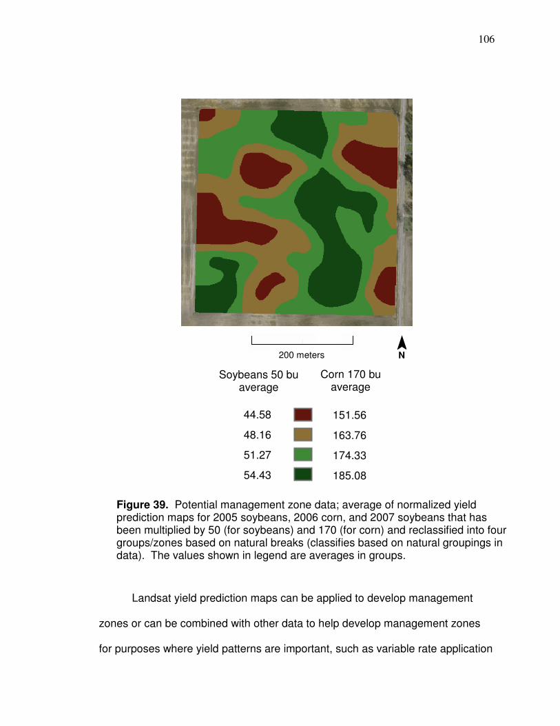
106
Landsat yield prediction maps can be applied to develop management
zones or can be combined with other data to help develop management zones
for purposes where yield patterns are important, such as variable rate application
¯ N
Soybeans 50 bu average
Corn 170 bu average
44.58
48.16
51.27
54.43
151.56
163.76
174.33
185.08
200 meters
Figure 39. Potential management zone data; average of normalized yield prediction maps for 2005 soybeans, 2006 corn, and 2007 soybeans that has been multiplied by 50 (for soybeans) and 170 (for corn) and reclassified into four groups/zones based on natural breaks (classifies based on natural groupings in data). The values shown in legend are averages in groups.

107
of phosphorus or potassium (Barker, 2008). In the case of Figure 39, if applying
the map to base management zones on, a shapefile representing the divisions
can be developed that can be read by farm software and variable fertilizer
amounts can then be assigned to the different zones or fertilizer amounts can be
calculated by equations based in part on the yield values. A resulting file can be
exported that can be read by fertilizer spreader controllers and inputs can be
applied variably.
108
CHAPTER 4
ARTIFICIAL NEURAL NETWORKS PREDICTION OF
CORN AND SOYBEAN YIELD
Introduction
Information about yield variability patterns can be applied to field
management decisions such as helping to develop management zones.
Management zones can help increase farming efficiency by reducing the number
of soil samples needed and can increase efficiency and be environmentally
beneficial by promoting variable rate application of inputs (as described in
Chapter 1). Yield monitors produce spatial data that show yield variability
patterns throughout a field (as shown in Chapter 2) which can be used to help
develop management zones. A survey in Ohio showed that 25.3 percent of all
farms have adopted yield monitors (Batte and Diekmann, 2010) and when
weighted based on farm sales (weighting procedure is described in Batte and
Diekmann, 2010), 62.7 percent have adopted yield monitors (OSU, 2010), so
many farmers do not have yield monitors.
In Chapter 3, Landsat was shown to significantly predict yield patterns;
however, the 30 meter Landsat resolution is not as detailed as yield monitor data.
In order to increase the detail of the Landsat-based yield prediction and have
access to data closer to the edges of fields, higher resolution variables should be
109
added to a model as independent variables. Topographic data has been found
to correlate to yield and LiDAR elevation data are available for the state of Ohio
with an average post spacing of two meters (has been derived into a raster with
2.5 foot pixels) (OGRIP, 2011). Yield variability has been shown to correlate to
elevation (Kravchenko and Bullock, 2000) and curvature (Timlin et al., 1998;
Kravchenko and Bullock, 2000) – LiDAR elevation data can be used as a high
resolution elevation variable and to derive a high resolution curvature variable in
GIS, which can both be included as independent variables in a model to predict
yield. Additionally, because it has higher resolution than Landsat, LiDAR
provides data that are closer to the edges of fields and it, also, has better
positional accuracy than Landsat. In this chapter, LiDAR-derived elevation and
curvature data will be combined with Landsat vegetation and soil darkness data
(Mzuku et al. [2005] showed soil darkness corresponds to yield differences) to
produce four independent variables that will be applied to predict yield; all
variables have corresponding yield monitor data (that has been cleaned by
Method 6 from Chapter 2) that they will be predict (correlations between
independent variables and yield are listed). A comparison will be made between
multiple linear regression and artificial neural networks software (BrainMaker,
California Scientific) in regards to the ability to predict yield variability for a field
(yield normalized to the mean). In addition, a method that describes a practical
way to apply Brainmaker neural networks to develop prediction models in general
will be described.

110
Artificial Neural Networks background
Artificial neural networks (ANN) is designed after the learning functions of the
human brain so it can recognize patterns and predict. (There is no universal
acceptance that there is any simulated intelligence that matches that of humans’,
so calling programs such as artificial neural networks “computer intelligence”
instead of “artificial intelligence” is less misleading [Lawrence, 1994]). ANNs are
formed from simulated neurons that are analogous to functions of the human
brain for numerous reasons. In the brain, a neuron sends out an electrical signal
through a strand known as an axon, which splits into many branches (Figures 40
and 41). At the end of each branch, there is an area called a synapse (Figure
41). A synapse is not part of the neuron but is a region between the branches of
an axon of a sending neuron and dendrites of the receiving neuron that regulates
how much of each incoming signal pass into the neuron, some synapses tend to
amplify signals and some tend to decrease their effect (Lawrence, 1994). The
signals that pass through the synapses are added up in the soma of the neuron
and “when enough signal energy is present, cause the neuron to fire a signal to
other neurons” (Lawrence, 1994). An ANN is similar to the functioning of the
brain because there are weighted connections (correspond to synapses)
between simulated neurons where signals it receives (numbers) are summed
and then (with most neuron models) a signal is sent (fired) if a certain threshold
is reached (Lawrence, 1994).

111
There are different neural network designs whereby information is
processed in different manners. The most used type of ANN today is nonlinear
Figure 40. Diagram of neuron (Carlson, 1992). The dendrites receive input signals of other neurons through synapses (areas between the ends of axon branches and dendrites shown in Figure 39), which regulate how much of each signal passes into the dendrites of each neuron (Lawrence, 1994). The signals are added up in the soma of the neuron and if enough signal energy is present, the neuron fires a signal to other neurons (Lawrence, 1994).
Figure 41. Diagram showing area of synapses (NIH, 2008)
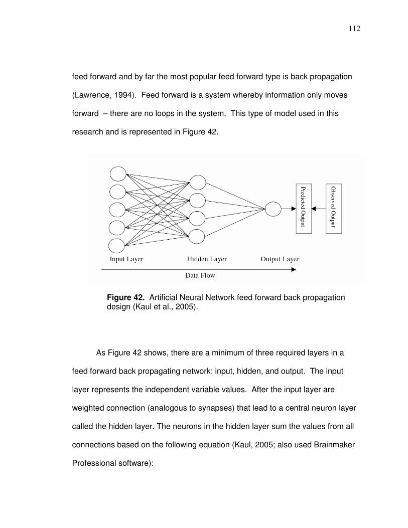
112
feed forward and by far the most popular feed forward type is back propagation
(Lawrence, 1994). Feed forward is a system whereby information only moves
forward – there are no loops in the system. This type of model used in this
research and is represented in Figure 42.
As Figure 42 shows, there are a minimum of three required layers in a
feed forward back propagating network: input, hidden, and output. The input
layer represents the independent variable values. After the input layer are
weighted connection (analogous to synapses) that lead to a central neuron layer
called the hidden layer. The neurons in the hidden layer sum the values from all
connections based on the following equation (Kaul, 2005; also used Brainmaker
Professional software):
Figure 42. Artificial Neural Network feed forward back propagation design (Kaul et al., 2005).
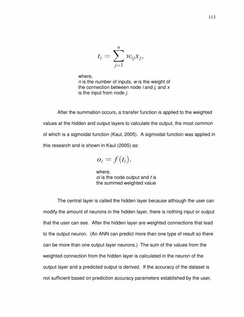
113
After the summation occurs, a transfer function is applied to the weighted
values at the hidden and output layers to calculate the output, the most common
of which is a sigmoidal function (Kaul, 2005). A sigmoidal function was applied in
this research and is shown in Kaul (2005) as:
The central layer is called the hidden layer because although the user can
modify the amount of neurons in the hidden layer, there is nothing input or output
that the user can see. After the hidden layer are weighted connections that lead
to the output neuron. (An ANN can predict more than one type of result so there
can be more than one output layer neurons.) The sum of the values from the
weighted connection from the hidden layer is calculated in the neuron of the
output layer and a predicted output is derived. If the accuracy of the dataset is
not sufficient based on prediction accuracy parameters established by the user,
where, n is the number of inputs, w is the weight of the connection between node i and j, and x is the input from node j.
where, oi is the node output and t is the summed weighted value

114
the system “back propagates” and the connection weights are modified moving
from those near the output layer to those near the input layer and all data is run
through the system again. This process reiterates until prediction results for a
dataset meet the established accuracy parameters or the user stops the process.
Setting up an ANN dataset is similar to that of multiple regression in that
data must include rows of information that includes values of independent and
dependent variables with the categories being organized in columns. It is rarely
the case that there can be too much data (Lawrence, 1994), so there need not be
concern regarding a large amount of data in the design process. Once the
dataset is developed, there are two main steps necessary to develop a neural
network model: training and testing.
Training is a process where the system teaches itself how to learn to
predict or recognize the dependent variable values based on independent
variable values to an accuracy, or tolerance, level acceptable to the user.
Brainmaker neural network software defines tolerance as ± a percent of the
range of predicted (or pattern) values; the range can be modified to any value,
however. The tolerance amount affects the model development because it will
adjust weights to try to predict better based on a particular tolerance so different
tolerances will cause different weighted connections. The learning rate
determines how large an adjustment to a connection will be in an attempt to
predict better. Some ways the user can automatically have training stop on a
particular run (and, hence, produce a model) include but are not limited to: 1) a

115
particular percent of values have been predicted to a particular tolerance, 2) the
error is less than a certain threshold, or 3) a particular number of runs through
the data have been reached. The user can manually save a training network at
any particular time during training. It is important to note that all BrainMaker
statistics are calculated based on internal normalized data representation and all
outputs and patterns (predictions) are offset and scaled to be in the range of 0
and 1 (CSS, 1998). The actual error values that are reported and shown in are
relative to actual values. As a network trains the display will show how many
dependent variables have been predicted within the tolerance and will graph the
relative root mean square error (RMSE; calculated as the square root of the
average of the squared error) so a training set can be saved when the amount of
correctly predicted values seems relatively high and the RMSE seems relatively
low. Once a training network has been saved, the next step is to test how well
the training network can make predictions based on data that was not included in
the development of the network. Brainmaker by default sets aside 10 percent of
the training data for the testing process but this can be changed to any percent.
Training and testing results can be written to a file that includes, among other
statistics, the average error and RMSE (both based on the internal normalized
values) of each run (and, hence, model). If testing predictions are within an
acceptable range, then there is evidence that the model can be applied to predict
in situations with unknown results.

116
An important component of a neural networks model is amount of neurons
in the hidden layer. One can design a model with more than one hidden layer
but it will take considerably longer to train and there is no evidence that a model
will benefit by an extra hidden layer (Lawrence, 1994). There have been rules of
thumb published to establish the number of hidden layer neurons. Baum and
Haussler (1988) suggested that the number of neurons in the hidden layer should
be calculated as follows: j = (me) / (n + z), where j = the number of neurons in the
hidden layer; m = the rows of data in the training set; e = the error tolerance, n is
the number of input neurons; and z = the number of output neurons. Lawrence
(1994) suggests the following equation to calculate a lower limit of the number of
hidden neurons: number of hidden neurons = (number of training facts / number
of input neurons) x testing tolerance. These rules of thumb might or might not be
realistic based on your dataset. Brainmaker has a feature that automatically
adds a neuron based on the RMSE after a particular amount of runs, so if the
error does not decrease by a particular amount after a particular amount of runs
the system can add a neuron. The particular method of training, developing
models, testing, and validating model applied here will be discussed in the data
analysis section.
Dataset Development
A dataset was developed and tested here that includes fields that
predominantly did not have drainage problems (based in part on there not being
much evidence of flooding or ponding that damage crops). Predictions for well-

117
drained fields are important because yield patterns are more spatially consistent,
which is an important factor to consider when applying management zone.
Chang et al. (2000) found that yield variability was highest in footslope areas that
were not drained and lowest in footslope areas that were drained. It is important
to use fields that have proper drainage to develop a predictive model because
predicted relative yield amounts will correlate more consistently with static
features and characteristics such as topography and soil darkness which are
important to include in management zones delineation. For example, Ferguson
et al. (2007) suggests elevation be included to develop management zones for
nitrogen; Adamchuk and Mulliken (2005) suggest topographic position can affect
soil pH and could be a factor for possible zone management for lime application;
and Ferguson and Hergert (2009) include soil darkness as a factor for developing
zones for soil sampling. Areas of fields with drainage problems can be revealed
with in-season satellite imagery of vegetation (e.g. values that represent
relatively low vegetation condition being in relatively darker soil could be
evidence of drainage problems) because it is dynamic data, then those areas of
a field can be treated differently if necessary depending on the particular
purpose.
Pixel groups in model
Based on the analysis in Chapter 3, corn NNIR values and soybean band 4
values for appropriate image dates are used as a variable to predict yield. The
data in the linear regression in Figure 37 in Chapter 3 represents all data for corn

118
and soybean fields that had imagery from the correct time. Fields that are
adequately drained are determined generally by whether yield is higher in the
darker soil and lower ground areas as it should be. If a field exhibits significant
amounts or relatively lower yield in lower ground area, data from that field is not
included. Fields in this study have different levels of drainage ability mainly due
to whether they have been properly tiled or not. Table 20 shows the data for all
fields represented in the Figure 37 scatter. The red represents fields that
exhibited significant amounts of relatively poor crop condition in lower ground
areas and were not included in the model dataset for well-drained fields. The
blue are fields that only have one soil type based on SSURGO and were
excluded here because relative yield amount may be a factor of crop residue as
shown in Chapter 3. It can be seen by Table 20 that field J happens to have a lot
of satellite data and has drainage problems. Field N has a relatively large
amount of data for the 2005 season, so only the image dates that have imagery
of the entire field was used; the image dates of 8/1/05, 8/17/05, and 9/2/05
represented a majority of the appropriate time frame for soybeans. Field H, had
problems with soybeans in 2004 but did not have a problems with corn in 2007.
Field O was tiled after the 2005 season which resulted in good drainage patterns
in 2007. Field O has two yield files listed in Table 20 for the 8/23/07 date
because the same field was harvested as two separate yield fields that season
(Figure 43). The point of the model in regards to Landsat-based data is to find
an appropriate image or if there is more than one image to the same extent of a
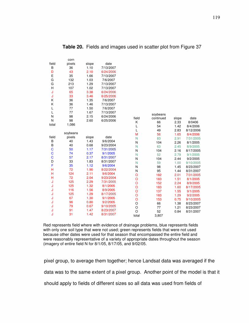
119
Table 20. Fields and images used in scatter plot from Figure 37
pixel group, to average them together; hence Landsat data was averaged if the
data was to the same extent of a pixel group. Another point of the model is that it
should apply to fields of different sizes so all data was used from fields of
corn
field pixels slope date
B 36 1.10 7/13/2007
D 43 2.10 6/24/2006
E 35 1.66 7/13/2007
G 132 1.03 7/6/2007
G 213 1.29 7/13/2007
H 107 1.02 7/13/2007
J 65 3.38 6/24/2006
J 33 3.46 6/25/2006
K 36 1.35 7/6/2007
K 36 1.46 7/13/2007
L 77 1.50 7/6/2007
L 77 1.67 7/13/2007
N 98 2.15 6/24/2006
N 98 2.60 6/25/2006
total 1,086
soybeans
field pixels slope date
B 40 1.43 9/6/2004
B 40 0.68 9/23/2004
C 50 1.17 7/31/2005
C 74 0.37 9/1/2005
C 57 2.17 8/31/2007
D 33 1.83 8/31/2007
F 35 1.12 9/6/2004
H 72 1.90 8/22/2004
H 124 2.11 9/6/2004
H 72 2.04 9/23/2004
J 125 2.29 7/31/2005
J 125 1.32 8/1/2005
J 116 1.56 8/9/2005
J 125 1.29 8/17/2005
J 67 1.30 9/1/2005
J 96 0.80 9/2/2005
J 79 0.67 9/10/2005
J 91 1.47 8/23/2007
J 31 1.42 8/31/2007
field soybeans continued slope date
K 66 2.33 8/0406
L 54 1.42 8/4/2006
L 49 2.83 8/12/2006
M 56 1.65 8/4/2006
N 83 2.91 7/31/2005
N 104 2.26 8/1/2005
N 63 2.45 8/9/2005
N 104 2.16 8/17/2005
N 52 2.79 9/1/2005
N 104 2.44 9/2/2005
N 59 1.00 9/10/2005
N 98 1.45 8/23/2007
N 95 1.44 8/31/2007
O 182 2.01 7/31/2005
O 183 1.51 8/1/2005
O 152 2.24 8/9/2005
O 183 1.60 8/17/2005
O 137 1.55 9/1/2005
O 183 1.29 9/2/2005
O 153 0.75 9/10/2005
O 66 1.38 8/23/2007
O 77 1.21 8/23/2007
O 52 0.84 8/31/2007
total 3,807
Red represents field where with evidence of drainage problems, blue represents fields with only one soil type that were not used; green represents fields that were not used because other dates were used for that season that encompassed the entire field and were reasonably representative of a variety of appropriate dates throughout the season (imagery of entire field N for 8/1/05, 8/17/05, and 9/02/05.
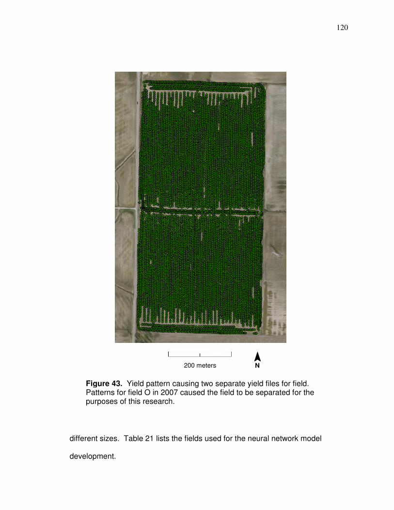
120
different sizes. Table 21 lists the fields used for the neural network model
development.
Figure 43. Yield pattern causing two separate yield files for field. Patterns for field O in 2007 caused the field to be separated for the purposes of this research.
200 meters ¯ N
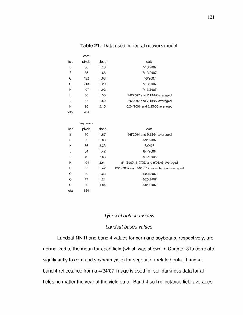
121
Table 21. Data used in neural network model
Types of data in models
Landsat-based values
Landsat NNIR and band 4 values for corn and soybeans, respectively, are
normalized to the mean for each field (which was shown in Chapter 3 to correlate
significantly to corn and soybean yield) for vegetation-related data. Landsat
band 4 reflectance from a 4/24/07 image is used for soil darkness data for all
fields no matter the year of the yield data. Band 4 soil reflectance field averages
corn
field pixels slope date
B 36 1.10 7/13/2007
E 35 1.66 7/13/2007
G 132 1.03 7/6/2007
G 213 1.29 7/13/2007
H 107 1.02 7/13/2007
K 36 1.35 7/6/2007 and 7/13/07 averaged
L 77 1.50 7/6/2007 and 7/13/07 averaged
N 98 2.15 6/24/2006 and 6/25/06 averaged
total 734
soybeans
field pixels slope date
B 40 1.67 9/6/2004 and 9/23/04 averaged
D 33 1.83 8/31/2007
K 66 2.33 8/0406
L 54 1.42 8/4/2006
L 49 2.83 8/12/2006
N 104 2.61 8/1/2005, 817/05, and 9/02/05 averaged
N 95 1.47 8/23/2007 and 8/31/07 intersected and averaged
O 66 1.38 8/23/2007
O 77 1.21 8/23/2007
O 52 0.84 8/31/2007
total 636
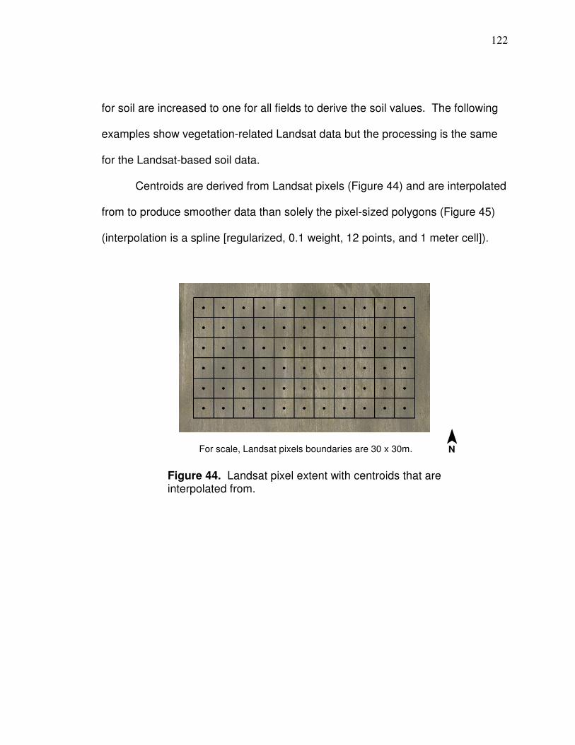
122
for soil are increased to one for all fields to derive the soil values. The following
examples show vegetation-related Landsat data but the processing is the same
for the Landsat-based soil data.
Centroids are derived from Landsat pixels (Figure 44) and are interpolated
from to produce smoother data than solely the pixel-sized polygons (Figure 45)
(interpolation is a spline [regularized, 0.1 weight, 12 points, and 1 meter cell]).
Figure 44. Landsat pixel extent with centroids that are interpolated from.
For scale, Landsat pixels boundaries are 30 x 30m. ¯ N
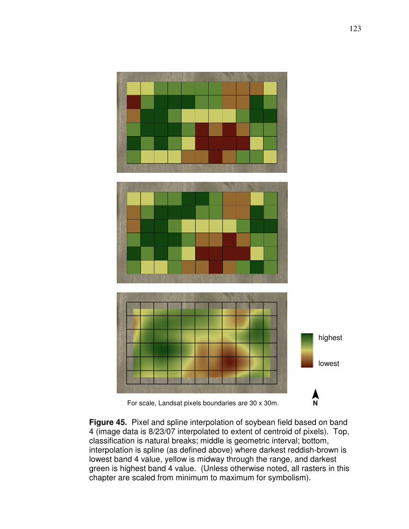
123
Figure 45. Pixel and spline interpolation of soybean field based on band 4 (image data is 8/23/07 interpolated to extent of centroid of pixels). Top, classification is natural breaks; middle is geometric interval; bottom, interpolation is spline (as defined above) where darkest reddish-brown is lowest band 4 value, yellow is midway through the range, and darkest green is highest band 4 value. (Unless otherwise noted, all rasters in this chapter are scaled from minimum to maximum for symbolism).
For scale, Landsat pixels boundaries are 30 x 30m.
highest
lowest
¯ N
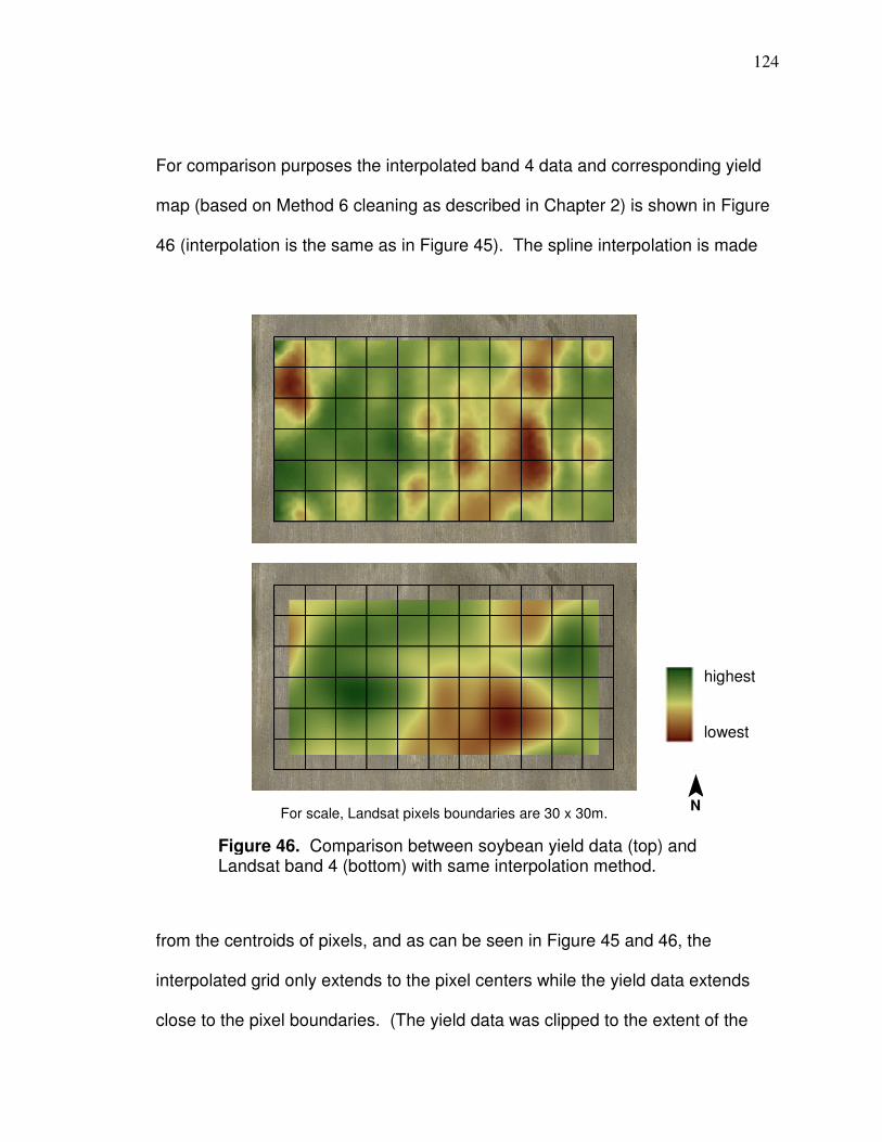
124
For comparison purposes the interpolated band 4 data and corresponding yield
map (based on Method 6 cleaning as described in Chapter 2) is shown in Figure
46 (interpolation is the same as in Figure 45). The spline interpolation is made
from the centroids of pixels, and as can be seen in Figure 45 and 46, the
interpolated grid only extends to the pixel centers while the yield data extends
close to the pixel boundaries. (The yield data was clipped to the extent of the
Figure 46. Comparison between soybean yield data (top) and Landsat band 4 (bottom) with same interpolation method.
For scale, Landsat pixels boundaries are 30 x 30m.
highest
lowest
¯ N

125
Landsat pixels as part of the processing as described in Chapter 2 and is based
on 4-meter spacing, so data extend is closer to the pixel boundaries.) For the
dataset used for the prediction models, the interpolated grids have rasters
converted to a one meter grid of points and the yield points have the closest point
from the interpolate Landsat grid joined with them. As a procedure in the
processing of the data, the points converted from the spline grid are clipped to
the extent of the pixels. In the case of Figure 46, all interpolated points are within
the pixel extent; however, this is not always the case. There would likely have
been times when the nearest point was from slightly outside the extent of the
Landsat pixel extent, but it would be close to the Landsat boundary and probably
would not make much difference. It is not known how important this step is.
Also, if interpolated data cross over pixels boundaries, the data then extend to
pixel boundaries (or meter of less within the boundary) when it is clipped (as is
shown in Figure 47), so data that are joined to yield points in these areas are not
joined from as far a distance.
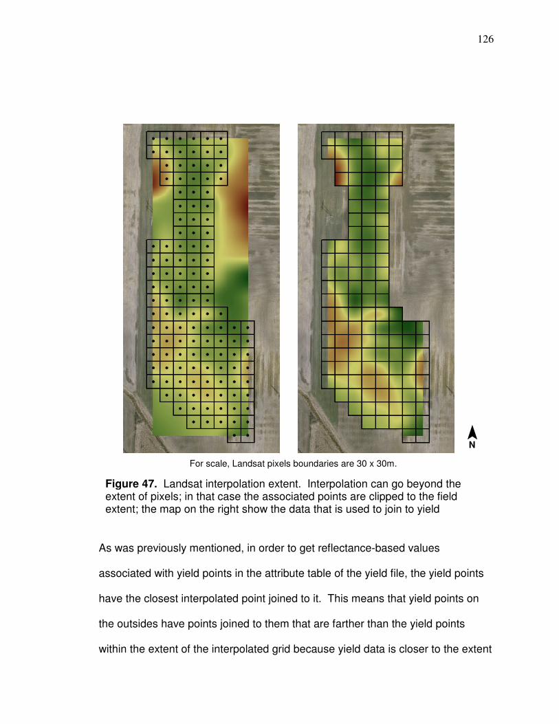
126
As was previously mentioned, in order to get reflectance-based values
associated with yield points in the attribute table of the yield file, the yield points
have the closest interpolated point joined to it. This means that yield points on
the outsides have points joined to them that are farther than the yield points
within the extent of the interpolated grid because yield data is closer to the extent
Figure 47. Landsat interpolation extent. Interpolation can go beyond the extent of pixels; in that case the associated points are clipped to the field extent; the map on the right show the data that is used to join to yield
For scale, Landsat pixels boundaries are 30 x 30m.
¯ N
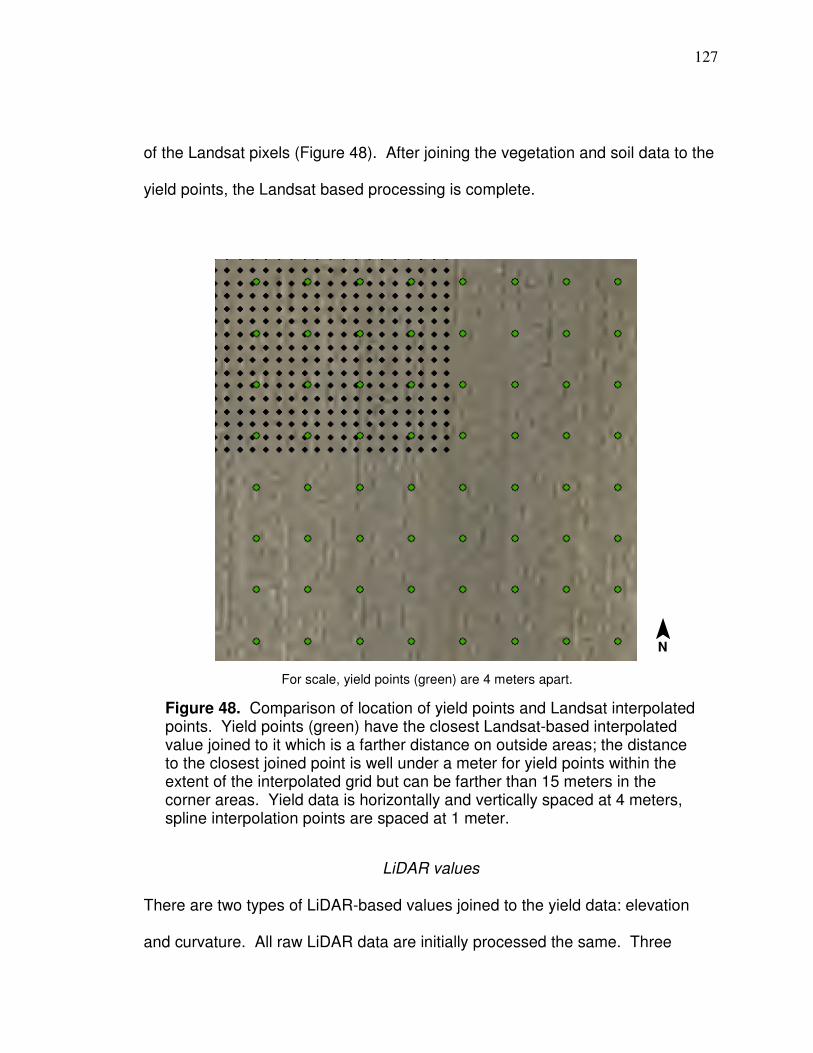
127
of the Landsat pixels (Figure 48). After joining the vegetation and soil data to the
yield points, the Landsat based processing is complete.
LiDAR values
There are two types of LiDAR-based values joined to the yield data: elevation
and curvature. All raw LiDAR data are initially processed the same. Three
Figure 48. Comparison of location of yield points and Landsat interpolated points. Yield points (green) have the closest Landsat-based interpolated value joined to it which is a farther distance on outside areas; the distance to the closest joined point is well under a meter for yield points within the extent of the interpolated grid but can be farther than 15 meters in the corner areas. Yield data is horizontally and vertically spaced at 4 meters, spline interpolation points are spaced at 1 meter.
For scale, yield points (green) are 4 meters apart.
¯ N
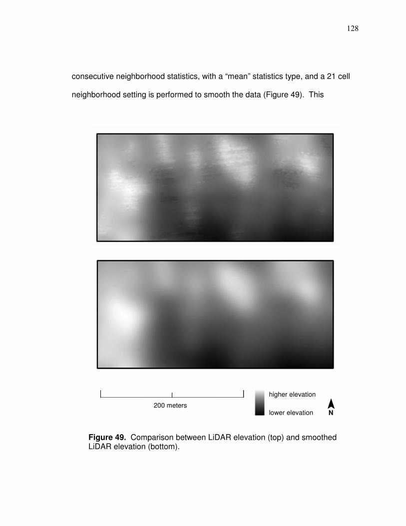
128
consecutive neighborhood statistics, with a “mean” statistics type, and a 21 cell
neighborhood setting is performed to smooth the data (Figure 49). This
Figure 49. Comparison between LiDAR elevation (top) and smoothed LiDAR elevation (bottom).
200 meters
higher elevation
lower elevation ¯ N

129
produces data that more realistically models the topographic scale that
agricultural process functions at in regards to yield. After the data has been
smoothed, elevation and curvature data were then derived.
Elevation data can sometimes be useful without further processing in
addition to the smoothing. However, if there is a gradual decline in overall
elevation, lower ground soil on the higher end of a field can start to approach the
same elevation as higher ground soil on the lower end of a field. Elevation data
should not be used if this is the case without further processing. The data should
be leveled so lower ground soil has a similar elevation at either end of the field.
This can be done by overlaying rasters with values on the elevation raster (the
overlaid raster grid needs to have the same spatial extent as the elevation raster)
and adding them with the raster calculator. A good rule of thumb is that the
elevation grid should visually match an interpolated soil darkness grid because
soil darkness is highly correlated to lower ground soil. This inherently means that
the soil darkness and elevation independent variables are significantly correlated
but the LiDAR is at a 2.5 foot resolution (originally interpolated for 2 meter post
spacing) and covers the entire field so it is important to include. If elevation
needs to be leveled, it is leveled before it is smoothed. Figure 50 shows the
progression from raw elevation data to leveled and smoothed data. Elevation
was leveled for five of the fields in Table 21. Smoothed elevation values or
leveled and smoothed elevation values for fields all had the difference between
the field mean and 100 subtracted in order that the mean for all fields was 100;
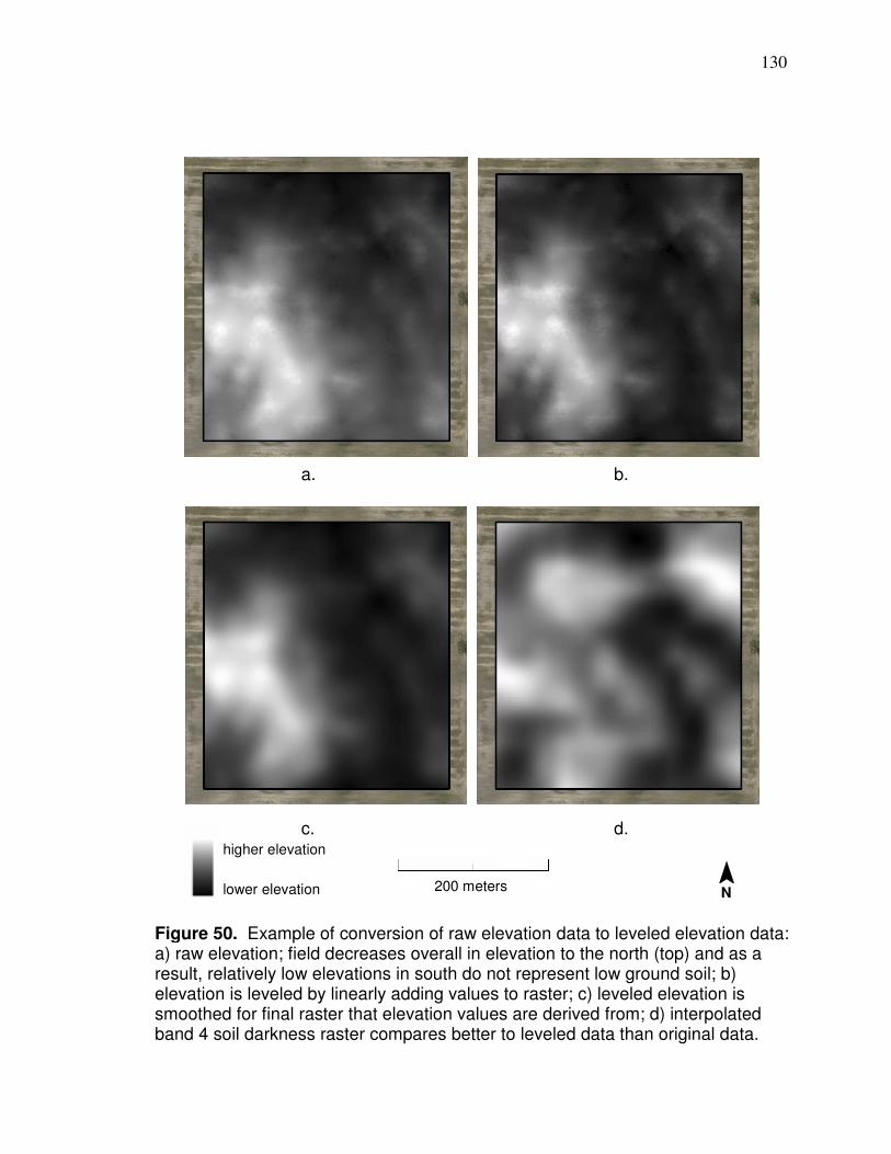
130
a. b.
c. d.
Figure 50. Example of conversion of raw elevation data to leveled elevation data: a) raw elevation; field decreases overall in elevation to the north (top) and as a result, relatively low elevations in south do not represent low ground soil; b) elevation is leveled by linearly adding values to raster; c) leveled elevation is smoothed for final raster that elevation values are derived from; d) interpolated band 4 soil darkness raster compares better to leveled data than original data.
200 meters
higher elevation
lower elevation
¯ N
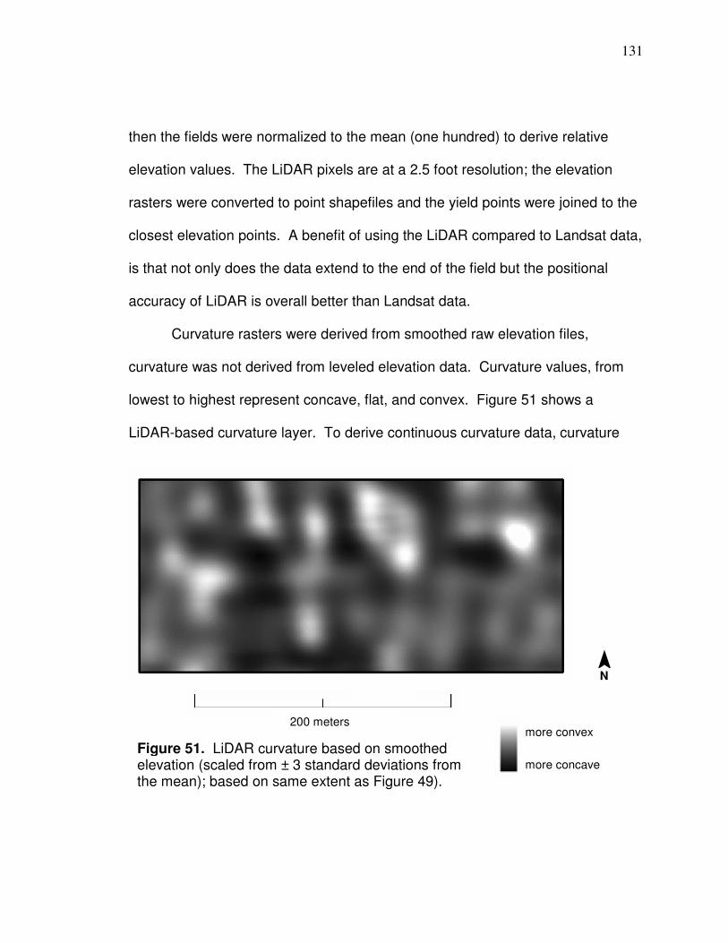
131
then the fields were normalized to the mean (one hundred) to derive relative
elevation values. The LiDAR pixels are at a 2.5 foot resolution; the elevation
rasters were converted to point shapefiles and the yield points were joined to the
closest elevation points. A benefit of using the LiDAR compared to Landsat data,
is that not only does the data extend to the end of the field but the positional
accuracy of LiDAR is overall better than Landsat data.
Curvature rasters were derived from smoothed raw elevation files,
curvature was not derived from leveled elevation data. Curvature values, from
lowest to highest represent concave, flat, and convex. Figure 51 shows a
LiDAR-based curvature layer. To derive continuous curvature data, curvature
Figure 51. LiDAR curvature based on smoothed elevation (scaled from ± 3 standard deviations from the mean); based on same extent as Figure 49).
200 meters
more convex
more concave
¯ N
132
rasters were converted to point shapefile and yield points had the nearest point
joined to it. Curvature values for each field had the difference between the field
mean and one added to them in order that each field mean equaled one, and
yield points were joined to the nearest curvature point from the 2.5 foot grid.
After Landsat and LiDAR values were joined to yield points/files associated with
the fields listed in Table 21, points were randomized for each field (random
values were processed in Excel [=RAND()]), then half of each yield file was
exported for data for model development. The half-field files were merged into
two separate files, one for model development and one for validation, and each
merged file was then randomized. The datasets included the four independent
variables of reflectance, soil, elevation, and curvature and the dependent variable
of normalized yield. Table 22 shows columns of independent and dependent
variables used for the models.
Table 22. Table format for neural networks and multiple regression
The data file for model development had 38,842 rows. As previously mentioned,
when neural networks software develops a model it can save a percent of data
for testing the model (that data is not used in the model development). For the
research here, fifty percent of the data (19,421 rows) were set aside for testing;
iv iv iv iv dv
reflectance soil elevation curvature yield
iv is independent variable; dv is dependent variable.
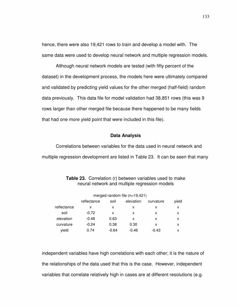
133
hence, there were also 19,421 rows to train and develop a model with. The
same data were used to develop neural network and multiple regression models.
Although neural network models are tested (with fifty percent of the
dataset) in the development process, the models here were ultimately compared
and validated by predicting yield values for the other merged (half-field) random
data previously. This data file for model validation had 38,851 rows (this was 9
rows larger than other merged file because there happened to be many fields
that had one more yield point that were included in this file).
Data Analysis
Correlations between variables for the data used in neural network and
multiple regression development are listed in Table 23. It can be seen that many
Table 23. Correlation (r) between variables used to make neural network and multiple regression models
independent variables have high correlations with each other; it is the nature of
the relationships of the data used that this is the case. However, independent
variables that correlate relatively high in cases are at different resolutions (e.g.
merged random file (n=19,421)
reflectance soil elevation curvature yield
reflectance x x x x x
soil -0.72 x x x x
elevation -0.48 0.63 x x x
curvature -0.24 0.38 0.30 x x
yield 0.74 -0.64 -0.46 -0.43 x
134
Landsat soil and LiDAR elevation); usable LiDAR data essentially extends to the
ends of fields due to the resolution unlike Landsat data and is more positionally
accurate than Landsat, so it is important to include both Landsat and LiDAR.
The relationships of correlation in Table 23 are supported in literature. As
is the case in Table 23, correlations (r) between elevation and corn or soybean
yield and curvature (concave areas are represented by negative curvature values
and convex areas have positive values) reported in Kravchenko and Bullock
(2000) show that the overall relationship for both is negative and elevation has a
higher negative correlation than curvature. Average correlations (r) in
Kravchenko and Bullock (2000) between elevation and corn or soybean yield and
curvature and corn or soybean yield for all fields reported are -0.29 (n = 17) and -
0.10 (n = 8), respectively, but for fields with only negative relationships between
elevation and curvature and corn and soybean yield (as is the case in this
research) correlations are -0.47 (n = 13) and -0.38 (n = 4), respectively.
Kravchenko and Bullock (2000) reported that positive relationships between
curvature and yield occurred when excessive water accumulated in concave
areas due to unusually wet periods during seasons. Correlations between
curvature and corn or soybean yield and between elevation and corn or soybean
yield correlations from Kravchenko and Bullock (2000) are not as high as
correlations between reflectance and yield in Table 23. Topographic correlations
with yield being lower than reflectance correlations with yield is supported by
Martin et al. (2005) correlation between corn yield and NDVI (as shown in

135
Chapter 2) where average NDVI correlations with corn yield in V8, V9, V10, and
V12 is R² = 0.62. Mzuku et al. (2005) found that management zones with darker
soil correlated to higher corn productivity (which may be due to more organic
matter in darker soil).
As previously discussed, there are different parameters that can be used
to develop a neural network model; the different parameters have an effect on
model development so various parameters should be used to develop different
models in order to have a better chance of developing a better model. In this
research different learning rates, tolerances, and amounts of neurons were
applied in an attempt to extract a better model. A combination of learning rates
of 0.2 (a low learning rate [CSS, 1998]), 1.0 (default BrainMaker learning rate),
and 2.0 along with tolerances of 0.01, 0.05, 0.10, and 0.15 were applied. So
there were twelve combinations of learning rates and tolerances (each of the
three different learning rate had each of four tolerances associated applied). For
each of the combinations, a procedure was applied where a neuron was added
every fifty runs starting with one neuron for the first run (this can be
accomplished in the “Modify Size While Training” dialogue in the “Add Neurons
During Training” feature by indicating that a neuron should be added every fifty
runs if the RMSE does not decrease by an amount that is unattainable [the value
of one was used here). Neural networks was run for each of the twelve
combinations of parameters and the first 5,000 runs were used for each of the
twelve combinations for a total of 60,000 different models. Because a neuron

136
was added every fifty runs, all models had 1 through 100 neurons applied. As a
feature on BrainMaker, each run through the data can produce a model that is
saved and can be accessed. All models were saved in this research for runs 1
through 5,000 so there were 60,000 different models that could be accessed and
applied. As another feature of BrainMaker, a file can be written that lists testing
statistics of each individual model that includes the relative RMSE and relative
average error, as well as, the run number so you can access a particular model
(by default Brainmaker saves models with the run number in the file name). Files
in this research were opened in Excel and the data were sorted to determine the
models with the lowest RMSE and average error (this is extremely helpful in this
case because there are 60,000 different models). Table 24 shows relative
average error and RMSE for the different combinations of neural network
models. An asterisk means that only one run (model) had the lowest average
error or RMSE, if there is not an asterisk there were at least two runs that had the
same lowest value and that case the model with the lowest corresponding run
number is listed. It can be seen by viewing Table 24 that lower average error
and RMSE results were produced with learning rates of 0.2 and 1.0, so in
regards to this data, certain learning rates are important to derive better models.
Also, models with the best results have closer to 100 neurons than one neuron.
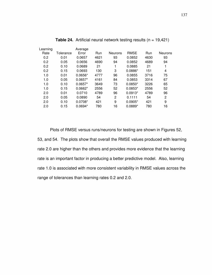
137
Table 24. Artificial neural network testing results (n = 19,421)
Learning Rate Tolerance
Average Error Run Neurons RMSE Run Neurons
0.2 0.01 0.0657 4621 93 0.0852 4630 93
0.2 0.05 0.0656 4690 94 0.0852 4689 94
0.2 0.10 0.0689 21 1 0.0885 21 1
0.2 0.15 0.0693 130 3 0.0886* 151 4
1.0 0.01 0.0656* 4777 96 0.0855 3716 75
1.0 0.05 0.0657* 4161 84 0.0853 3314 67
1.0 0.10 0.0657* 3649 73 0.0850* 3226 65
1.0 0.15 0.0662* 2556 52 0.0853* 2556 52
2.0 0.01 0.0710 4789 96 0.0913* 4789 96
2.0 0.05 0.0890 54 2 0.1111 54 2
2.0 0.10 0.0708* 421 9 0.0905* 421 9
2.0 0.15 0.0694* 780 16 0.0889* 780 16
Plots of RMSE versus runs/neurons for testing are shown in Figures 52,
53, and 54. The plots show that overall the RMSE values produced with learning
rate 2.0 are higher than the others and provides more evidence that the learning
rate is an important factor in producing a better predictive model. Also, learning
rate 1.0 is associated with more consistent variability in RMSE values across the
range of tolerances than learning rates 0.2 and 2.0.
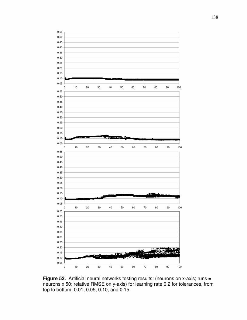
138
0.05
0.10
0.15
0.20
0.25
0.30
0.35
0.40
0.45
0.50
0.55
0 10 20 30 40 50 60 70 80 90 100
0.05
0.10
0.15
0.20
0.25
0.30
0.35
0.40
0.45
0.50
0.55
0 10 20 30 40 50 60 70 80 90 100
0.05
0.10
0.15
0.20
0.25
0.30
0.35
0.40
0.45
0.50
0.55
0 10 20 30 40 50 60 70 80 90 100
0.05
0.10
0.15
0.20
0.25
0.30
0.35
0.40
0.45
0.50
0.55
0 10 20 30 40 50 60 70 80 90 100
Figure 52. Artificial neural networks testing results: (neurons on x-axis; runs = neurons x 50; relative RMSE on y-axis) for learning rate 0.2 for tolerances, from top to bottom, 0.01, 0.05, 0.10, and 0.15.
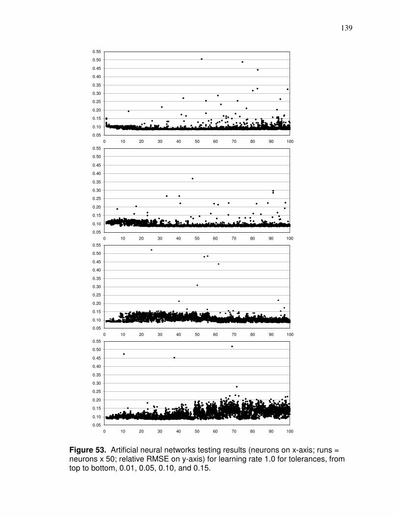
139
0.05
0.10
0.15
0.20
0.25
0.30
0.35
0.40
0.45
0.50
0.55
0 10 20 30 40 50 60 70 80 90 100
0.05
0.10
0.15
0.20
0.25
0.30
0.35
0.40
0.45
0.50
0.55
0 10 20 30 40 50 60 70 80 90 100
0.05
0.10
0.15
0.20
0.25
0.30
0.35
0.40
0.45
0.50
0.55
0 10 20 30 40 50 60 70 80 90 100
0.05
0.10
0.15
0.20
0.25
0.30
0.35
0.40
0.45
0.50
0.55
0 10 20 30 40 50 60 70 80 90 100
Figure 53. Artificial neural networks testing results (neurons on x-axis; runs = neurons x 50; relative RMSE on y-axis) for learning rate 1.0 for tolerances, from top to bottom, 0.01, 0.05, 0.10, and 0.15.
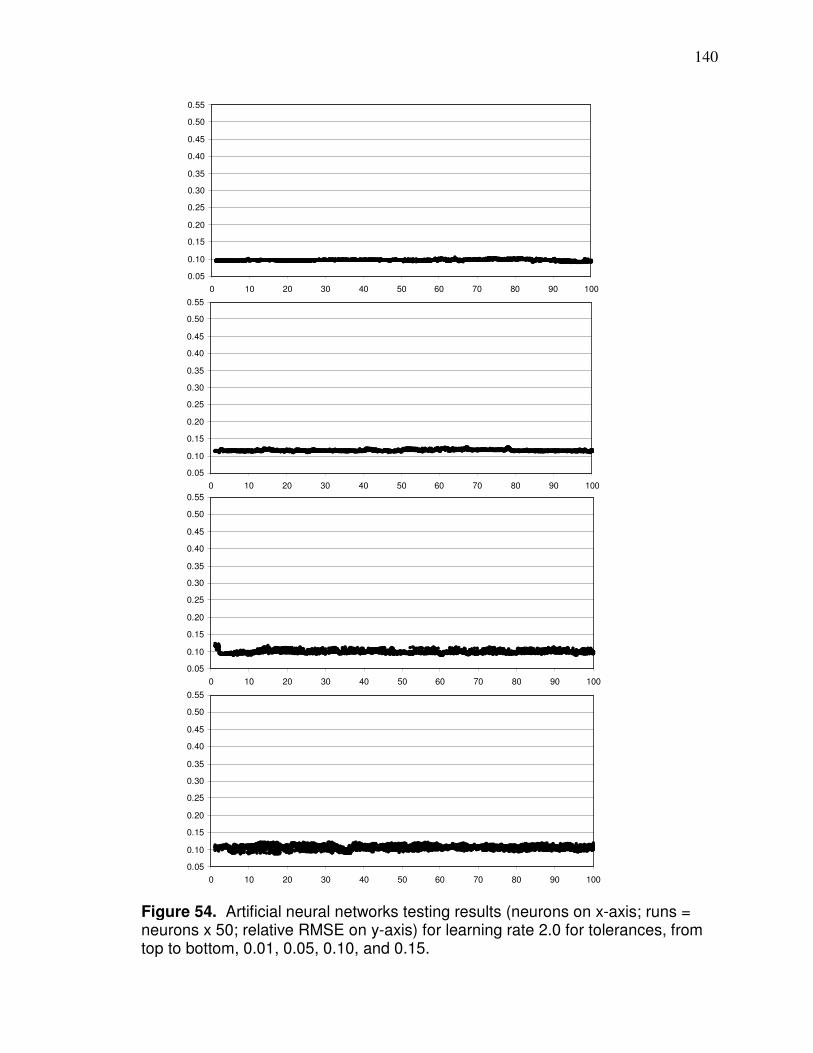
140
0.05
0.10
0.15
0.20
0.25
0.30
0.35
0.40
0.45
0.50
0.55
0 10 20 30 40 50 60 70 80 90 100
0.05
0.10
0.15
0.20
0.25
0.30
0.35
0.40
0.45
0.50
0.55
0 10 20 30 40 50 60 70 80 90 100
0.05
0.10
0.15
0.20
0.25
0.30
0.35
0.40
0.45
0.50
0.55
0 10 20 30 40 50 60 70 80 90 100
0.05
0.10
0.15
0.20
0.25
0.30
0.35
0.40
0.45
0.50
0.55
0 10 20 30 40 50 60 70 80 90 100
Figure 54. Artificial neural networks testing results (neurons on x-axis; runs = neurons x 50; relative RMSE on y-axis) for learning rate 2.0 for tolerances, from top to bottom, 0.01, 0.05, 0.10, and 0.15.
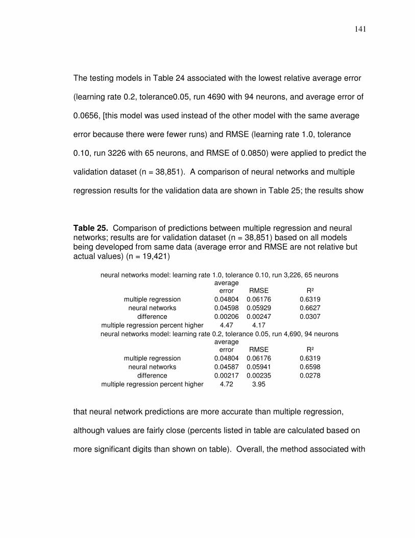
141
The testing models in Table 24 associated with the lowest relative average error
(learning rate 0.2, tolerance0.05, run 4690 with 94 neurons, and average error of
0.0656, [this model was used instead of the other model with the same average
error because there were fewer runs) and RMSE (learning rate 1.0, tolerance
0.10, run 3226 with 65 neurons, and RMSE of 0.0850) were applied to predict the
validation dataset (n = 38,851). A comparison of neural networks and multiple
regression results for the validation data are shown in Table 25; the results show
Table 25. Comparison of predictions between multiple regression and neural networks; results are for validation dataset (n = 38,851) based on all models being developed from same data (average error and RMSE are not relative but actual values) (n = 19,421)
neural networks model: learning rate 1.0, tolerance 0.10, run 3,226, 65 neurons
average
error RMSE R²
multiple regression 0.04804 0.06176 0.6319
neural networks 0.04598 0.05929 0.6627
difference 0.00206 0.00247 0.0307
multiple regression percent higher 4.47 4.17
neural networks model: learning rate 0.2, tolerance 0.05, run 4,690, 94 neurons
average
error RMSE R²
multiple regression 0.04804 0.06176 0.6319
neural networks 0.04587 0.05941 0.6598
difference 0.00217 0.00235 0.0278
multiple regression percent higher 4.72 3.95
that neural network predictions are more accurate than multiple regression,
although values are fairly close (percents listed in table are calculated based on
more significant digits than shown on table). Overall, the method associated with

142
learning rate 1.0 predicted better, having a slightly lower RMSE and slightly
higher R² value than the model associated with learning rate 0.2.
Conclusion
An objective of this chapter was to compare the ability of neural networks
and multiple regression to predict yield variability based on the variables applied
here. Evidence was provided that showed neural networks can predict yield
better than multiple regression – correlations with yield were higher and residuals
were lower. Neural networks improved the R² correlation with yield from the
highest individual independent variable value in Table 23 (reflectance) of 0.5476
(based on r = 0.74) to 0.6627. Although, yield variability was predicted here, the
predictions reflect characteristics of vegetation reflectance, soil darkness,
elevation, and curvature which have been shown to be important for
management zone delineation.
The combination of parameters and processing steps used to develop the
predictive models showed different types of scatter of results when applied to
testing data; this provides information in regards to how ANN learns to generalize
and predict in regards to the parameters applied here. It is important to develop
models using different parameters in order that a better combination for a
particular dataset can be found. The amount of neurons in the hidden layer in
the best predicting model was closer to 100 than 1 which shows that it is
important to allow ANN to develop model with many neurons. The parameters

143
used to develop the ANN models produced variable results and prediction
patterns. It seems logical that parameters that produce these types of differing
results could be effectively applied to develop prediction models for various types
of data.
144
CHAPTER 5
A GIS-BASED ERROR RESILIENT METHOD TO PREDICT COUNTY CORN
AND SOYBEAN YIELD IN WESTERN OHIO BASED ON RETRIEVED
LANDSAT REFLECTANCE VARIABILITY
(based on Hollinger, D. 2008. A GIS-based method to predict county corn yield based on retrieved Landsat reflectance variability in western Ohio. Papers of the Applied Geography Conference [2009] 32: 281-290)
Introduction
The importance of corn and soybeans as a commodity and investment justifies
the need to determine how to best predict yield. Landsat can provide information
about crops; however, the 16-day revisit time plus the reality that cloud cover can
impede data acquisition restricts its agricultural applications. A model needs to
be developed that is temporally flexible enough to allow data derived from about
a month window to realistically use Landsat data for crop yield prediction.
Because crop phenology, size, and overall appearance are dynamic throughout
the growing season, a Landsat model that relies on reflectance cannot
realistically be developed and applied due to the revisit time.
Additionally, calculating image-based atmospheric correction surface
reflectance (ρgλ) of different bands can be problematic. Total atmospheric
precipitable water (w) has a significant absorption effect on near infrared (NIR)
radiation. Wu et al. (2005) found that NIR ρgλ calculated from image-based
145
atmospheric correction can be more than 20 percent lower than ground
measurements. Also, path radiance (Lpλ) cannot be deducted accurately
enough in the visible bands during the atmospheric correction process to ensure
that there will not be a significant proportional error in the calculated ρgλ of corn
or soybean fields because ρgλ is so low due to not only plant pigment absorption
of radiation but by canopy shadow. Reflectance in the visible bands from a
broad-leaved canopy is only 40 percent of the reflectance of an individual leaf
and typically reduces reflectance to about 3 to 5 percent (Knipling, 1970). The
potential reflectance calculation errors can be ignored if just analyzing ρgλ in
uniformly clear areas of the same Landsat scene but need to be accounted for if
developing a ρgλ-based yield prediction model with data from different Landsat
scenes due to differing impacts of w and Lpλ. Martin et al. (2007) reported that
the coefficient of variation of the Normalized Difference Vegetation Index of corn
rows based on ground measurements (therefore free from band 4 error due to w
or band 3 error as a result of incorrect Lpλ estimation) was highly correlated with
grain yield at all growth stages. In this research, county corn and soybean yield
prediction models have been developed based on variability of Landsat-based
ρgλ: the variability values used are not affected by error associated with varying
amounts of w or incorrect Lpλ estimation. The county model can be applied to
estimate field scale yield.
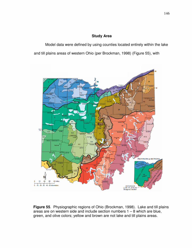
146
Study Area
Model data were defined by using counties located entirely within the lake
and till plains areas of western Ohio (per Brockman, 1998) (Figure 55), with
Figure 55. Physiographic regions of Ohio (Brockman, 1998). Lake and till plains areas are on western side and include section numbers 1 – 8 which are blue, green, and olive colors; yellow and brown are not lake and till plains areas.

147
agricultural use representing at least 65 percent of total land area (NASS, 2007)
and with at least 80 percent clear Landsat imagery over agricultural lands
(agricultural lands in the context of this research are defined later). Validation
data included counties with agricultural use representing less than 65 percent of
total land area and had agricultural lands that were less than one hundred and
more than ninety percent located within the lake and till plains (Brown, Morrow,
and Highland counties). Counties in the model and validation datasets are
shown in Figure 56. There remains imagery that can be used that meets the
qualification to be included in the model dataset and there are more data that can
be used for validation purposes.
Figure 56. Counties that had data used in model development (green) and validation (yellow).
200 kilometers
¯ N
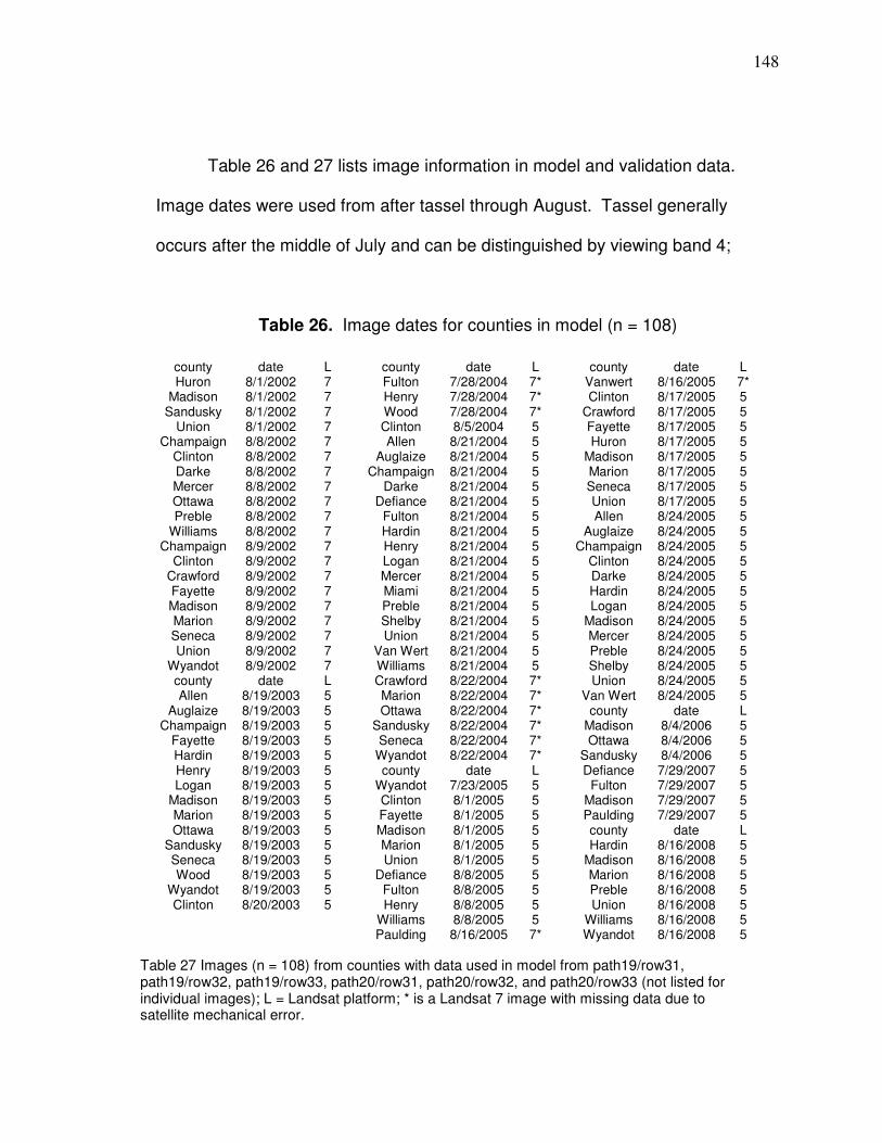
148
Table 26 and 27 lists image information in model and validation data.
Image dates were used from after tassel through August. Tassel generally
occurs after the middle of July and can be distinguished by viewing band 4;
Table 26. Image dates for counties in model (n = 108)
county date L Huron 8/1/2002 7
Madison 8/1/2002 7 Sandusky 8/1/2002 7
Union 8/1/2002 7 Champaign 8/8/2002 7
Clinton 8/8/2002 7 Darke 8/8/2002 7 Mercer 8/8/2002 7 Ottawa 8/8/2002 7 Preble 8/8/2002 7
Williams 8/8/2002 7 Champaign 8/9/2002 7
Clinton 8/9/2002 7 Crawford 8/9/2002 7 Fayette 8/9/2002 7 Madison 8/9/2002 7 Marion 8/9/2002 7 Seneca 8/9/2002 7 Union 8/9/2002 7
Wyandot 8/9/2002 7 county date L Allen 8/19/2003 5
Auglaize 8/19/2003 5 Champaign 8/19/2003 5
Fayette 8/19/2003 5 Hardin 8/19/2003 5 Henry 8/19/2003 5 Logan 8/19/2003 5
Madison 8/19/2003 5 Marion 8/19/2003 5 Ottawa 8/19/2003 5
Sandusky 8/19/2003 5 Seneca 8/19/2003 5 Wood 8/19/2003 5
Wyandot 8/19/2003 5 Clinton 8/20/2003 5
county date L Fulton 7/28/2004 7* Henry 7/28/2004 7* Wood 7/28/2004 7* Clinton 8/5/2004 5 Allen 8/21/2004 5
Auglaize 8/21/2004 5 Champaign 8/21/2004 5
Darke 8/21/2004 5 Defiance 8/21/2004 5
Fulton 8/21/2004 5 Hardin 8/21/2004 5 Henry 8/21/2004 5 Logan 8/21/2004 5 Mercer 8/21/2004 5 Miami 8/21/2004 5 Preble 8/21/2004 5 Shelby 8/21/2004 5 Union 8/21/2004 5
Van Wert 8/21/2004 5 Williams 8/21/2004 5 Crawford 8/22/2004 7* Marion 8/22/2004 7* Ottawa 8/22/2004 7*
Sandusky 8/22/2004 7* Seneca 8/22/2004 7*
Wyandot 8/22/2004 7* county date L
Wyandot 7/23/2005 5 Clinton 8/1/2005 5 Fayette 8/1/2005 5 Madison 8/1/2005 5 Marion 8/1/2005 5 Union 8/1/2005 5
Defiance 8/8/2005 5 Fulton 8/8/2005 5 Henry 8/8/2005 5
Williams 8/8/2005 5 Paulding 8/16/2005 7*
county date L Vanwert 8/16/2005 7* Clinton 8/17/2005 5
Crawford 8/17/2005 5 Fayette 8/17/2005 5 Huron 8/17/2005 5
Madison 8/17/2005 5 Marion 8/17/2005 5 Seneca 8/17/2005 5 Union 8/17/2005 5 Allen 8/24/2005 5
Auglaize 8/24/2005 5 Champaign 8/24/2005 5
Clinton 8/24/2005 5 Darke 8/24/2005 5 Hardin 8/24/2005 5 Logan 8/24/2005 5
Madison 8/24/2005 5 Mercer 8/24/2005 5 Preble 8/24/2005 5 Shelby 8/24/2005 5 Union 8/24/2005 5
Van Wert 8/24/2005 5 county date L
Madison 8/4/2006 5 Ottawa 8/4/2006 5
Sandusky 8/4/2006 5 Defiance 7/29/2007 5
Fulton 7/29/2007 5 Madison 7/29/2007 5 Paulding 7/29/2007 5 county date L Hardin 8/16/2008 5
Madison 8/16/2008 5 Marion 8/16/2008 5 Preble 8/16/2008 5 Union 8/16/2008 5
Williams 8/16/2008 5 Wyandot 8/16/2008 5
Table 27 Images (n = 108) from counties with data used in model from path19/row31, path19/row32, path19/row33, path20/row31, path20/row32, and path20/row33 (not listed for individual images); L = Landsat platform; * is a Landsat 7 image with missing data due to satellite mechanical error.

149
Table 27. Image dates for counties used for validation (n = 15)
there are three distinct shades of gray at this time (Figure 57). Band 4 image
data in September can be too unreliable to classify in certain years because
natural senescence of corn can start to make corn digital numbers (shades of
gray) approach too closely those of soil (Figure 58). In some years, September
imagery can be used for classification, but for purposes here it was not used to
make a simple cut of range of images that can be used in a yield prediction
model.
county date L reason in validation
Brown 8/1/2005 5 < 100 percent in lake and till
Brown 8/5/2004 5 < 100 percent in lake and till
Brown 8/8/2002 7 < 100 percent in lake and till
Brown 8/9/2002 7 < 100 percent in lake and till
Brown 8/20/2003 5 < 100 percent in lake and till
Brown 8/24/2005 5 < 100 percent in lake and till
Erie 8/4/2006 5 40 to 65 percent ag land
Greene 8/21/2004 5 40 to 65 percent ag land
Highland 8/1/2005 5 < 100 percent in lake and till
Highland 8/5/2004 5 < 100 percent in lake and till
Lucas 7/28/2004 7* under 40 percent county ag land
Montgomery 7/29/2007 5 under 40 percent county ag land
Montgomery 8/21/2004 5 under 40 percent county ag land
Morrow 8/9/2002 7 < 100 percent in lake and till
Morrow 8/17/2005 5 < 100 percent in lake and till
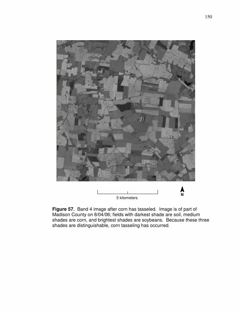
150
Figure 57. Band 4 image after corn has tasseled. Image is of part of Madison County on 8/04/06; fields with darkest shade are soil, medium shades are corn, and brightest shades are soybeans. Because these three shades are distinguishable, corn tasseling has occurred.
¯ N
5 kilometers
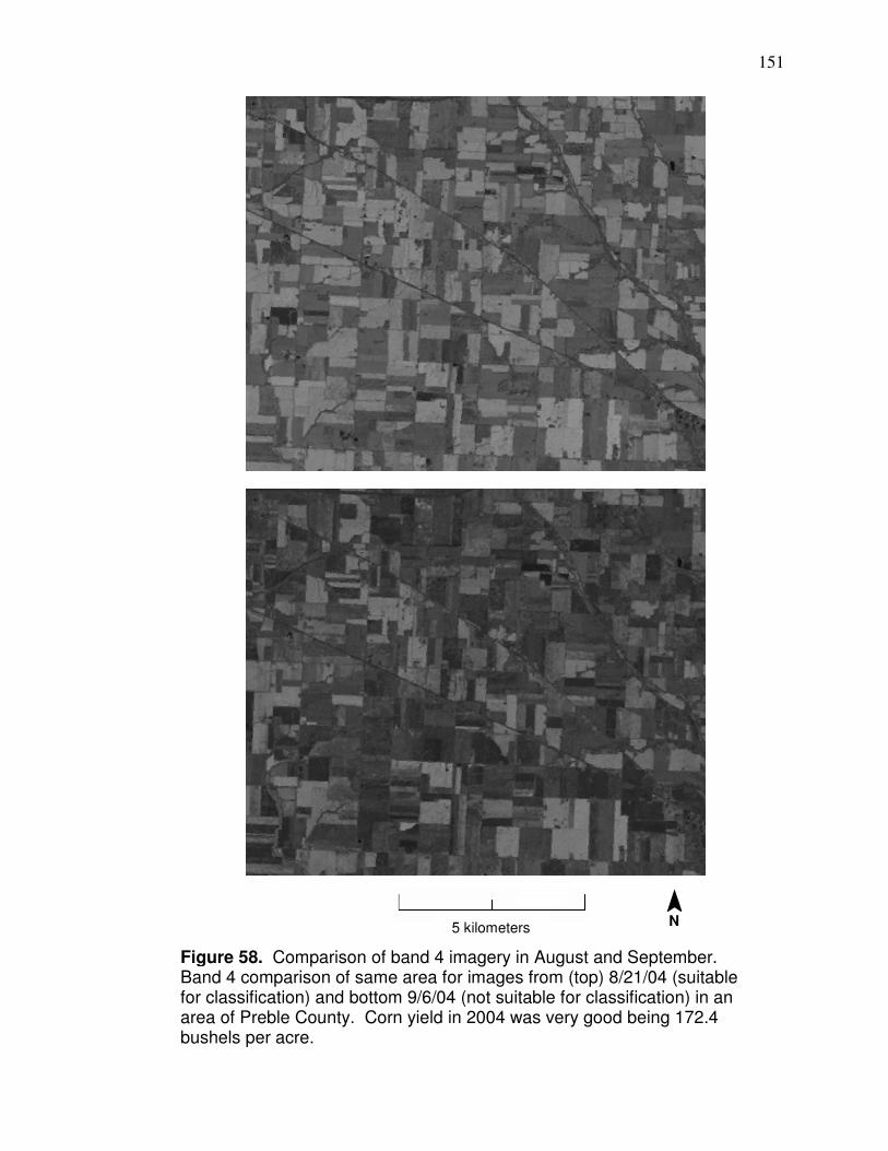
151
Figure 58. Comparison of band 4 imagery in August and September. Band 4 comparison of same area for images from (top) 8/21/04 (suitable for classification) and bottom 9/6/04 (not suitable for classification) in an area of Preble County. Corn yield in 2004 was very good being 172.4 bushels per acre.
¯ N
5 kilometers
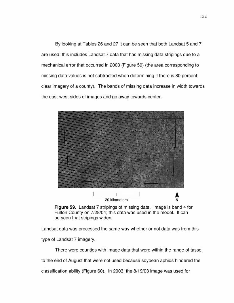
152
By looking at Tables 26 and 27 it can be seen that both Landsat 5 and 7
are used: this includes Landsat 7 data that has missing data stripings due to a
mechanical error that occurred in 2003 (Figure 59) (the area corresponding to
missing data values is not subtracted when determining if there is 80 percent
clear imagery of a county). The bands of missing data increase in width towards
the east-west sides of images and go away towards center.
Landsat data was processed the same way whether or not data was from this
type of Landsat 7 imagery.
There were counties with image data that were within the range of tassel
to the end of August that were not used because soybean aphids hindered the
classification ability (Figure 60). In 2003, the 8/19/03 image was used for
Figure 59. Landsat 7 stripings of missing data. Image is band 4 for Fulton County on 7/28/04; this data was used in the model. It can be seen that stripings widen.
¯ N
20 kilometers
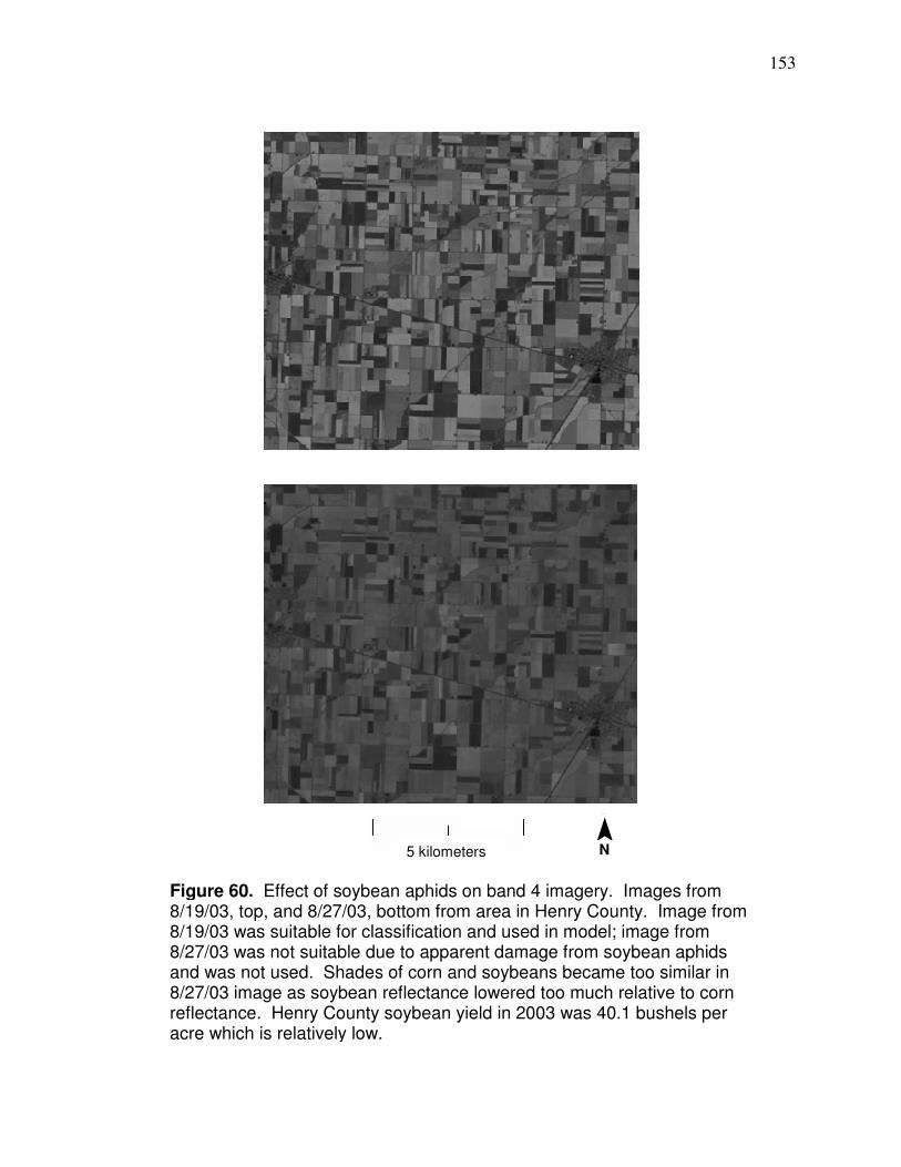
153
Figure 60. Effect of soybean aphids on band 4 imagery. Images from 8/19/03, top, and 8/27/03, bottom from area in Henry County. Image from 8/19/03 was suitable for classification and used in model; image from 8/27/03 was not suitable due to apparent damage from soybean aphids and was not used. Shades of corn and soybeans became too similar in 8/27/03 image as soybean reflectance lowered too much relative to corn reflectance. Henry County soybean yield in 2003 was 40.1 bushels per acre which is relatively low.
¯ N
5 kilometers
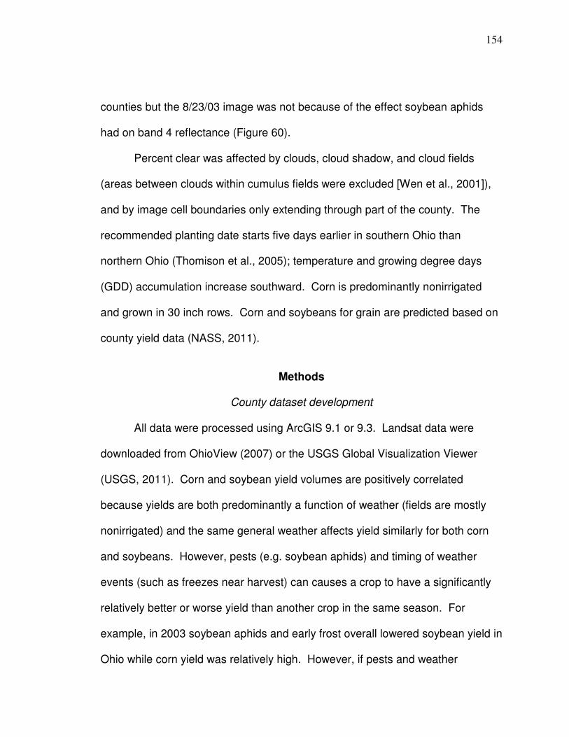
154
counties but the 8/23/03 image was not because of the effect soybean aphids
had on band 4 reflectance (Figure 60).
Percent clear was affected by clouds, cloud shadow, and cloud fields
(areas between clouds within cumulus fields were excluded [Wen et al., 2001]),
and by image cell boundaries only extending through part of the county. The
recommended planting date starts five days earlier in southern Ohio than
northern Ohio (Thomison et al., 2005); temperature and growing degree days
(GDD) accumulation increase southward. Corn is predominantly nonirrigated
and grown in 30 inch rows. Corn and soybeans for grain are predicted based on
county yield data (NASS, 2011).
Methods
County dataset development
All data were processed using ArcGIS 9.1 or 9.3. Landsat data were
downloaded from OhioView (2007) or the USGS Global Visualization Viewer
(USGS, 2011). Corn and soybean yield volumes are positively correlated
because yields are both predominantly a function of weather (fields are mostly
nonirrigated) and the same general weather affects yield similarly for both corn
and soybeans. However, pests (e.g. soybean aphids) and timing of weather
events (such as freezes near harvest) can causes a crop to have a significantly
relatively better or worse yield than another crop in the same season. For
example, in 2003 soybean aphids and early frost overall lowered soybean yield in
Ohio while corn yield was relatively high. However, if pests and weather
155
conditions do not have dramatically different effects on either crop, yields are
highly correlated as shown in Figure 61 (which excludes 2003 because of
soybean aphids and an early frost that lowered soybean yields in many areas).
Predictive values from the corn model will be correlated with soybean yield to
develop the soybean model, which can be applied because of the high
correlation between corn and soybean yield in years when there are not pest or
0
10
20
30
40
50
60
0 50 100 150 200 250
Figure 61. Correlation between corn and soybean yield. Scatter plot of corn yield on x-axis and soybean yield on y-axis (bushels per acre) for seasons from 2002, and 2004 – 2009 for counties with at least 65 percent land use that is agriculture and that are completely within the lake and till plain area (except Fulton County because there was no soybean yield reported for 2008) (R² = 0.71 and 0.73 for linear and exponential correlations, respectively).
County corn for grain yield (bu per acre) from NASS (2011)
County
soyb
eans f
or
gra
in y
ield
(bu p
er
acre
) fr
om
NA
SS
(2
011)
156
frost problems. (Predicted county corn and soybean yield quantities are from
NASS [2011]).
Imagery from after tassel through August is used in the model because
corn can be classified (as previously described). Also, these dates are far
enough from harvest to be useful, and drought from 2,000 GDDs (usually about
mid August) will only reduce yield 20 to 30 percent after four consecutive days of
visible leaf wilting (Thomison et al., 2005). The model was validated by using
data from counties that were not entirely within the lake and till plain area (> 90
percent within the lake and till plain area) and from those that have less than 65
percent of land used for agricultural purposes (NASS, 2007). The model is
designed to use a single image for classification and prediction. This differs from
Doraiswamy et al.’s (2007) MODIS-based county corn yield prediction model,
which can rely on images from earlier in the season for classification because of
MODIS’ faster revisit time. It is important to base a Landsat model on as few
images as possible due to Landsat’s revisit time (16 days) and the variability of
cloud cover.
Instructions to derive values to predict corn yield are detailed so
predictions can be made based on the information in this document. The spatial
properties of each county dataset are defined by the following criteria:
1) Point (vector) data are used and have been initially derived by
conversion from Landsat raster and are, therefore, located at the
centroid of the spatial extent of Landsat pixels.
157
2) Points are only included that have an associated band 4 3x3 cell
range (Spatial Analyst → Neighborhood Statistics → Range) that is ≤
9. This is usually a high range in a corn field for the time of year of
this research if all pixels in the 3x3 neighborhood are corn or virtually
all corn (it can be exceeded in years with high variability such as
those caused by types of droughts), so it is ordinarily high enough to
exclude pixels if the neighborhood contains pixels that are relatively
low in reflectance, such as asphalt or water, or high, such as greener
vegetation. This limits the number of non-corn pixels that could be
averaged in surface reflectance by including only those that are more
likely to be surrounded by corn.
3) Points are clipped to the extent of a file (mask) that represents
agricultural land that is defined as the county area outside 50 meter
buffered polygon files of roads, rails, hydrography, urban areas, and
water polygons (from ESRI, 2009; urban area file is the most recent
year if there is more than one year available), and a file that
represents all land cover except agricultural/open urban areas (from
ODNR, 2011).
Points representing clouds, cloud fields (includes areas between clouds in
clouds fields), and cloud shadows were removed manually or in some cases
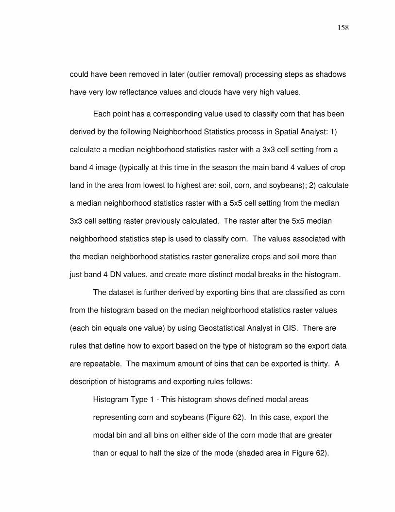
158
could have been removed in later (outlier removal) processing steps as shadows
have very low reflectance values and clouds have very high values.
Each point has a corresponding value used to classify corn that has been
derived by the following Neighborhood Statistics process in Spatial Analyst: 1)
calculate a median neighborhood statistics raster with a 3x3 cell setting from a
band 4 image (typically at this time in the season the main band 4 values of crop
land in the area from lowest to highest are: soil, corn, and soybeans); 2) calculate
a median neighborhood statistics raster with a 5x5 cell setting from the median
3x3 cell setting raster previously calculated. The raster after the 5x5 median
neighborhood statistics step is used to classify corn. The values associated with
the median neighborhood statistics raster generalize crops and soil more than
just band 4 DN values, and create more distinct modal breaks in the histogram.
The dataset is further derived by exporting bins that are classified as corn
from the histogram based on the median neighborhood statistics raster values
(each bin equals one value) by using Geostatistical Analyst in GIS. There are
rules that define how to export based on the type of histogram so the export data
are repeatable. The maximum amount of bins that can be exported is thirty. A
description of histograms and exporting rules follows:
Histogram Type 1 - This histogram shows defined modal areas
representing corn and soybeans (Figure 62). In this case, export the
modal bin and all bins on either side of the corn mode that are greater
than or equal to half the size of the mode (shaded area in Figure 62).
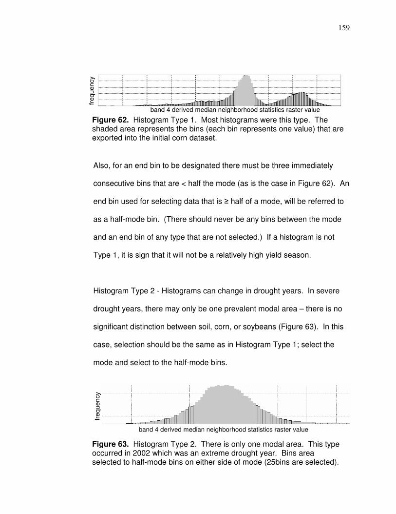
159
Also, for an end bin to be designated there must be three immediately
consecutive bins that are < half the mode (as is the case in Figure 62). An
end bin used for selecting data that is ≥ half of a mode, will be referred to
as a half-mode bin. (There should never be any bins between the mode
and an end bin of any type that are not selected.) If a histogram is not
Type 1, it is sign that it will not be a relatively high yield season.
Histogram Type 2 - Histograms can change in drought years. In severe
drought years, there may only be one prevalent modal area – there is no
significant distinction between soil, corn, or soybeans (Figure 63). In this
case, selection should be the same as in Histogram Type 1; select the
mode and select to the half-mode bins.
Figure 62. Histogram Type 1. Most histograms were this type. The shaded area represents the bins (each bin represents one value) that are exported into the initial corn dataset.
Figure 63. Histogram Type 2. There is only one modal area. This type occurred in 2002 which was an extreme drought year. Bins area selected to half-mode bins on either side of mode (25bins are selected).
band 4 derived median neighborhood statistics raster value
freque
ncy
band 4 derived median neighborhood statistics raster value
freque
ncy
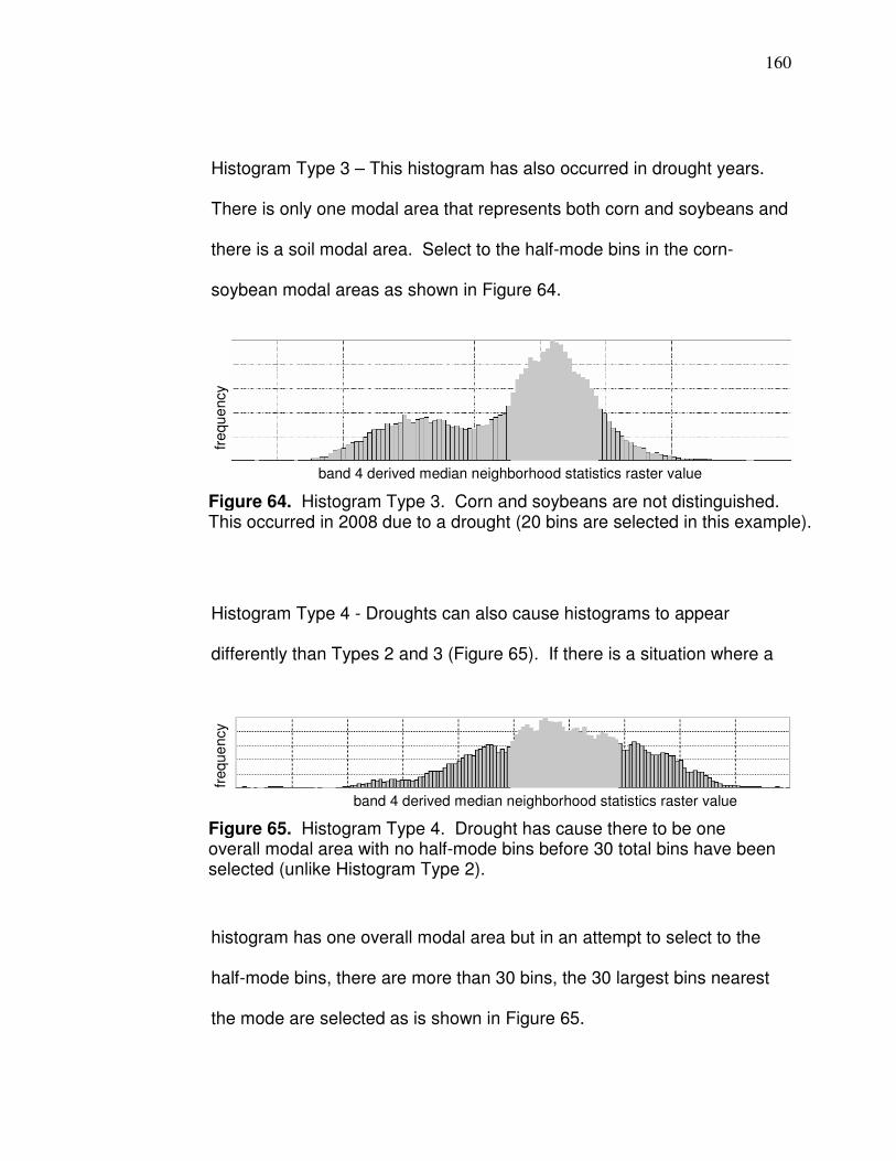
160
Histogram Type 3 – This histogram has also occurred in drought years.
There is only one modal area that represents both corn and soybeans and
there is a soil modal area. Select to the half-mode bins in the corn-
soybean modal areas as shown in Figure 64.
Histogram Type 4 - Droughts can also cause histograms to appear
differently than Types 2 and 3 (Figure 65). If there is a situation where a
histogram has one overall modal area but in an attempt to select to the
half-mode bins, there are more than 30 bins, the 30 largest bins nearest
the mode are selected as is shown in Figure 65.
Figure 64. Histogram Type 3. Corn and soybeans are not distinguished. This occurred in 2008 due to a drought (20 bins are selected in this example).
Figure 65. Histogram Type 4. Drought has cause there to be one overall modal area with no half-mode bins before 30 total bins have been selected (unlike Histogram Type 2).
band 4 derived median neighborhood statistics raster value
freque
ncy
band 4 derived median neighborhood statistics raster value
freque
ncy
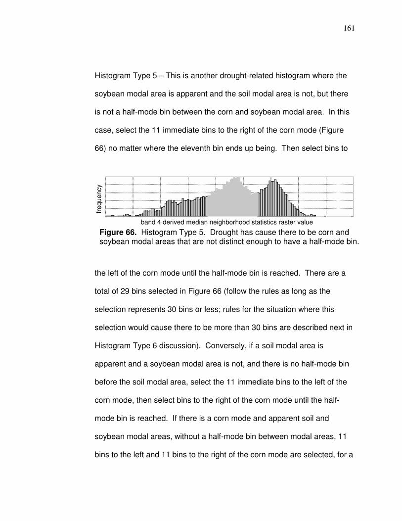
161
Histogram Type 5 – This is another drought-related histogram where the
soybean modal area is apparent and the soil modal area is not, but there
is not a half-mode bin between the corn and soybean modal area. In this
case, select the 11 immediate bins to the right of the corn mode (Figure
66) no matter where the eleventh bin ends up being. Then select bins to
the left of the corn mode until the half-mode bin is reached. There are a
total of 29 bins selected in Figure 66 (follow the rules as long as the
selection represents 30 bins or less; rules for the situation where this
selection would cause there to be more than 30 bins are described next in
Histogram Type 6 discussion). Conversely, if a soil modal area is
apparent and a soybean modal area is not, and there is no half-mode bin
before the soil modal area, select the 11 immediate bins to the left of the
corn mode, then select bins to the right of the corn mode until the half-
mode bin is reached. If there is a corn mode and apparent soil and
soybean modal areas, without a half-mode bin between modal areas, 11
bins to the left and 11 bins to the right of the corn mode are selected, for a
Figure 66. Histogram Type 5. Drought has cause there to be corn and soybean modal areas that are not distinct enough to have a half-mode bin.
band 4 derived median neighborhood statistics raster value
freque
ncy
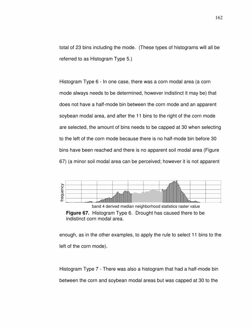
162
total of 23 bins including the mode. (These types of histograms will all be
referred to as Histogram Type 5.)
Histogram Type 6 - In one case, there was a corn modal area (a corn
mode always needs to be determined, however indistinct it may be) that
does not have a half-mode bin between the corn mode and an apparent
soybean modal area, and after the 11 bins to the right of the corn mode
are selected, the amount of bins needs to be capped at 30 when selecting
to the left of the corn mode because there is no half-mode bin before 30
bins have been reached and there is no apparent soil modal area (Figure
67) (a minor soil modal area can be perceived; however it is not apparent
enough, as in the other examples, to apply the rule to select 11 bins to the
left of the corn mode).
Histogram Type 7 - There was also a histogram that had a half-mode bin
between the corn and soybean modal areas but was capped at 30 to the
Figure 67. Histogram Type 6. Drought has caused there to be indistinct corn modal area.
band 4 derived median neighborhood statistics raster value
freque
ncy

163
left of the corn mode because there was no apparent soil modal area and
no half-mode bin prior to 30 bins being reached.
The histogram types and export rules described include those
corresponding to the model and validation datasets. An unusual histogram can
be derived, such as Histogram Type 6, but methods to export from the
histograms are clear and straightforward in the vast majority of the cases.
In addition to the value from the median neighborhood statistics raster,
each point has an associated band 2, 3, and 4 digital number value. Digital
number values for all bands are atmospherically corrected per Chapter 3. The
final step in the county dataset development is to remove outliers (which are
defined as atmospherically corrected ρgλ values > ± 3 standard deviation from
the mean) from data exported from the histogram in the following order: bands 2,
3, and 4 (atmospheric correction as described in the spatial correlation with yield
section).
Data Analysis
Variability data for the visible bands not affected by Lpλ error that will be
analyzed in this research are the sample standard deviation (s) of bands 2 and 3.
A different amount of Lpλ deducted in the numerator of the atmospheric
correction equation, with all else being the same, does not change s. Wu et al.
(2005) account for the influence of w on NIR ρgλ by modifying the denominator in
the NIR band atmospheric correction process – changing the denominator

164
changes s, so w affects the NIR reflectance s according to Wu et al. (2005).
However, variability data associated with NIR ρgλ that is resilient to w differences
is the amount of bins exported from the median neighborhood statistics raster
and the amount of band 4 bins in the exported data file from the histogram.
Changing the denominator in the atmospheric correction process does not affect
the amount of bins exported.
Imagery can occur when there is a different amount of moisture on the
surface. As part of the analysis here, the effect of precipitation on variability
will be assessed to determine if certain images should be excluded in the
model dataset because moisture has affected variability a reasonable
enough amount. Appendix D lists rainfall amounts at county weather stations
(NCDC, 2011). Amounts shown are for the immediate three consecutive
days prior to imagery and, if applicable, the amount of precipitation that
occurred on the day of imagery is listed. It is not known if precipitation that
occurred the day of imagery fell before or after the image was acquired.
There is hourly rainfall data available but that data has a coarser network of
associated weather stations. Viewing Appendix D, it is apparent that the
image date that had the most rainfall on the actual date of imagery was
8/21/04. The image date with the most precipitation associated was 8/23/07;
the Upper Sandusky weather station in Wyandot County recorded 9.87
inches for the three immediate days. A couple images from 7/29/07 are also
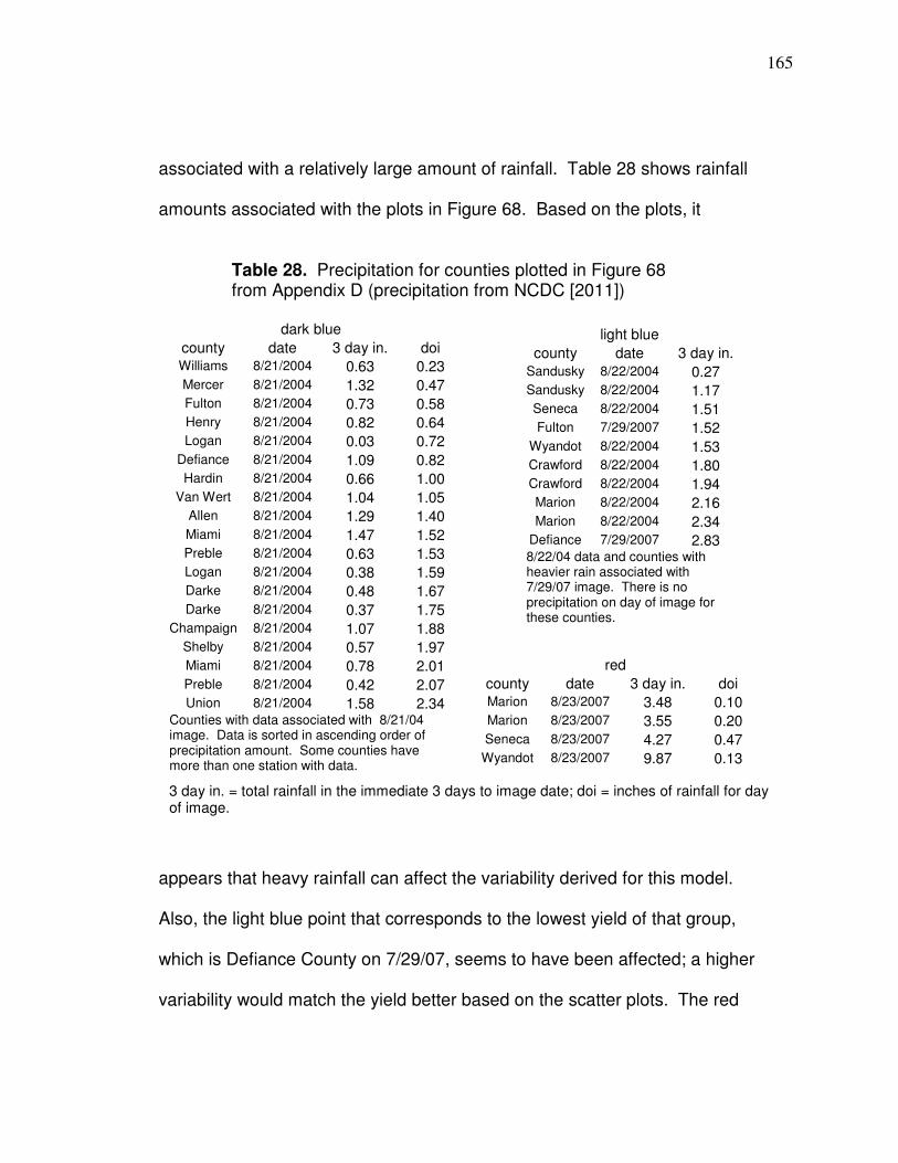
165
associated with a relatively large amount of rainfall. Table 28 shows rainfall
amounts associated with the plots in Figure 68. Based on the plots, it
Table 28. Precipitation for counties plotted in Figure 68 from Appendix D (precipitation from NCDC [2011])
appears that heavy rainfall can affect the variability derived for this model.
Also, the light blue point that corresponds to the lowest yield of that group,
which is Defiance County on 7/29/07, seems to have been affected; a higher
variability would match the yield better based on the scatter plots. The red
dark blue
county date 3 day in. doi Williams 8/21/2004 0.63 0.23
Mercer 8/21/2004 1.32 0.47 Fulton 8/21/2004 0.73 0.58 Henry 8/21/2004 0.82 0.64 Logan 8/21/2004 0.03 0.72
Defiance 8/21/2004 1.09 0.82 Hardin 8/21/2004 0.66 1.00
Van Wert 8/21/2004 1.04 1.05 Allen 8/21/2004 1.29 1.40
Miami 8/21/2004 1.47 1.52 Preble 8/21/2004 0.63 1.53 Logan 8/21/2004 0.38 1.59 Darke 8/21/2004 0.48 1.67
Darke 8/21/2004 0.37 1.75 Champaign 8/21/2004 1.07 1.88
Shelby 8/21/2004 0.57 1.97 Miami 8/21/2004 0.78 2.01
Preble 8/21/2004 0.42 2.07 Union 8/21/2004 1.58 2.34
Counties with data associated with 8/21/04 image. Data is sorted in ascending order of precipitation amount. Some counties have more than one station with data.
light blue
county date 3 day in.
Sandusky 8/22/2004 0.27 Sandusky 8/22/2004 1.17 Seneca 8/22/2004 1.51 Fulton 7/29/2007 1.52
Wyandot 8/22/2004 1.53 Crawford 8/22/2004 1.80 Crawford 8/22/2004 1.94 Marion 8/22/2004 2.16
Marion 8/22/2004 2.34 Defiance 7/29/2007 2.83 8/22/04 data and counties with heavier rain associated with 7/29/07 image. There is no precipitation on day of image for these counties.
red
county date 3 day in. doi Marion 8/23/2007 3.48 0.10 Marion 8/23/2007 3.55 0.20
Seneca 8/23/2007 4.27 0.47 Wyandot 8/23/2007 9.87 0.13
3 day in. = total rainfall in the immediate 3 days to image date; doi = inches of rainfall for day of image.
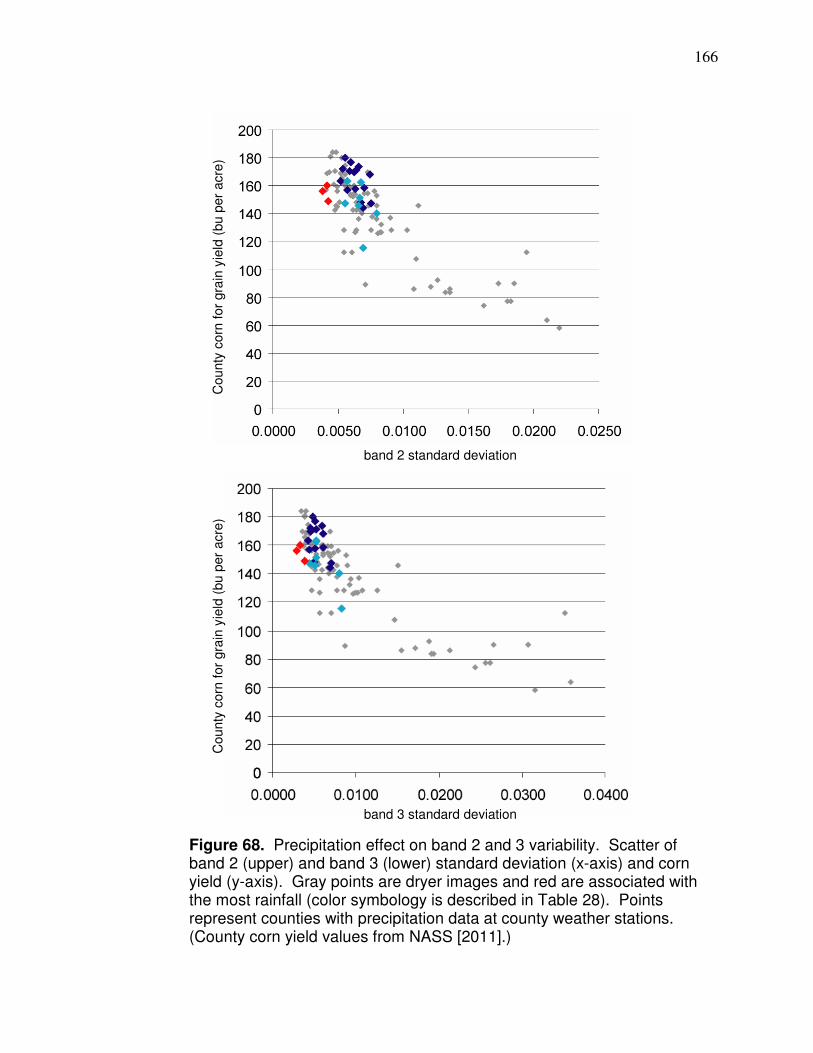
166
Figure 68. Precipitation effect on band 2 and 3 variability. Scatter of band 2 (upper) and band 3 (lower) standard deviation (x-axis) and corn yield (y-axis). Gray points are dryer images and red are associated with the most rainfall (color symbology is described in Table 28). Points represent counties with precipitation data at county weather stations. (County corn yield values from NASS [2011].)
band 3 standard deviation
band 2 standard deviation
County
corn
for
gra
in y
ield
(bu p
er
acre
)
County
corn
for
gra
in y
ield
(bu p
er
acre
)

167
points, 8/23/07, and the one light blue point represent the most precipitation
in Table 28 for the three immediate day totals, a range of 2.83 to 9.87 inches.
The images actually had precipitation fall predominantly within the two
immediate days of the imagery. Defiance County had the least with 2.8
inches and seemed to be affected so this amount and time frame will be
established as the parameter at which images should be used in this model;
images must have < 2.8 inches of precipitation fall at a county weather
station within the immediate two days of imagery to be used. This is an
uncommon amount of rainfall that should not impact many images. The
images associated with 8/23/07 and the Defiance County image from 7/29/07
will not be used; all others will be used.
Histogram Type 1 represents the highest yielding seasons (Figure 62
corresponds to a county yield of 167.1 bushels per acre). In regards to the
drought-related histograms (Types 2 - 6), Histogram Type 2, more than others,
has only one modal area; there is no significant modal distinction between soil,
corn, and soybeans. Histogram Type 2 represents Darke County, OH, on
8/08/02 which had an average county yield of 74.5 bushels per acre that season.
Pixels in the selected modal area in Histogram Type 2 represent surfaces other
than corn more than the other histograms, particularly Histogram Type 1. The
classification method in the drought season of 2002 was less effective at
differentiating corn and other surfaces; as a result, there are many pixels
misclassified as corn exported into the final dataset. The misclassification

168
included pixels that have much higher corresponding band 2 and 3 reflectance,
increasing s, so the surfaces represented by the pixels are possibly non-
vegetated or the vegetation is much less healthy than even a stressed cornfield.
The misclassification in lower yielding years is why band 2 or 3 s is an effective
predictor of very low future yields and helps the variability model work when
reflectance variability is low in actual field area due to low yield throughout.
Drought-related histograms can also represent actual increased reflectance
variability within cornfields that occurs due to a greater difference in crop
condition existing between plants in lower and higher ground soil. For example,
the highest band 3 reflectance associated with data in the final data set
corresponding to Histogram Type 2 in Figure 63 is 0.151 which is in the range of
soil, while the highest band 3 reflectance corresponding to Histogram Type 6 in
Figure 67 is 0.087 which is more likely to be vegetation.
Correlations with yield for band 2 and 3 s are shown in Table 29. The
band 3 polynomial (second order) relationship has the highest correlation at two
Table 29. Correlation of determination (R²) matrix between
county standard deviation and corn yield (NASS, 2011)
Regression B2s B3s B23s
Linear .67 .68 .68
Logarithmic .70 .76 .74
Polynomial* .70 .77 .75
Power .72 .76 .76
Exponential .72 .73 .73
B2s= county band 2 s; B3s = county band 3s; B23s= average of B2s and B3s; * 2
nd order.
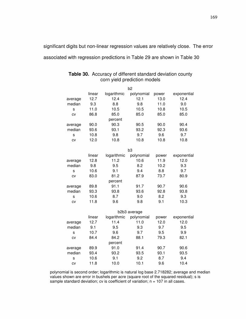
169
significant digits but non-linear regression values are relatively close. The error
associated with regression predictions in Table 29 are shown in Table 30
Table 30. Accuracy of different standard deviation county
corn yield prediction models
b2
linear logarithmic polynomial power exponential
average 12.7 12.4 12.1 13.0 12.4
median 9.3 8.8 9.8 11.0 9.0
s 11.0 10.5 10.5 10.8 10.5
cv 86.8 85.0 85.0 85.0 85.0
percent
average 90.0 90.3 90.5 90.0 90.4
median 93.6 93.1 93.2 92.3 93.6
s 10.8 9.8 9.7 9.6 9.7
cv 12.0 10.8 10.8 10.8 10.8
b3
linear logarithmic polynomial power exponential
average 12.8 11.2 10.6 11.9 12.0
median 9.8 9.5 8.2 10.2 9.3
s 10.6 9.1 9.4 8.8 9.7
cv 83.0 81.2 87.9 73.7 80.9
percent
average 89.8 91.1 91.7 90.7 90.6
median 93.3 93.8 93.6 92.8 93.8
s 10.6 8.7 9.0 8.2 9.3
cv 11.8 9.6 9.8 9.1 10.3
b2b3 average
linear logarithmic polynomial power exponential
average 12.7 11.4 11.0 12.0 12.0
median 9.1 9.5 9.3 9.7 9.5
s 10.7 9.6 9.7 9.5 9.9
cv 84.4 84.2 88.1 79.3 82.1
percent
average 89.9 91.0 91.4 90.7 90.6
median 93.4 93.2 93.5 93.1 93.5
s 10.6 9.1 9.2 8.7 9.4
cv 11.8 10.0 10.1 9.6 10.4
polynomial is second order; logarithmic is natural log base 2.718282; average and median values shown are error in bushels per acre (square root of the squared residual); s is sample standard deviation; cv is coefficient of variation; n = 107 in all cases.
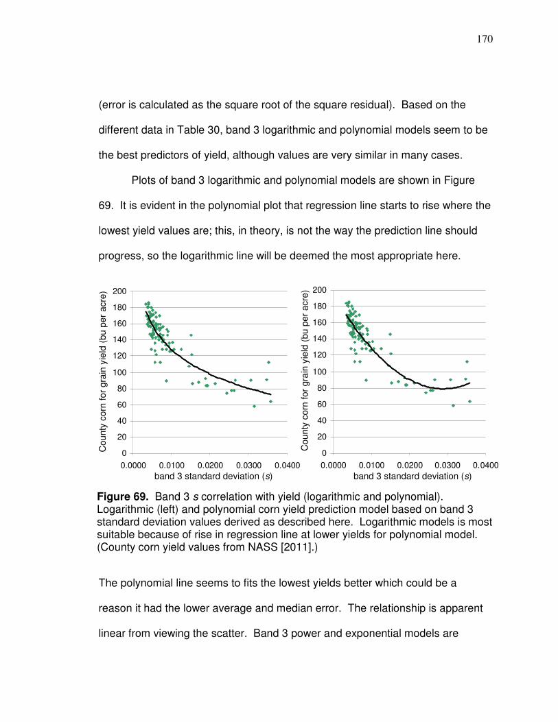
170
(error is calculated as the square root of the square residual). Based on the
different data in Table 30, band 3 logarithmic and polynomial models seem to be
the best predictors of yield, although values are very similar in many cases.
Plots of band 3 logarithmic and polynomial models are shown in Figure
69. It is evident in the polynomial plot that regression line starts to rise where the
lowest yield values are; this, in theory, is not the way the prediction line should
progress, so the logarithmic line will be deemed the most appropriate here.
The polynomial line seems to fits the lowest yields better which could be a
reason it had the lower average and median error. The relationship is apparent
linear from viewing the scatter. Band 3 power and exponential models are
0
20
40
60
80
100
120
140
160
180
200
0.0000 0.0100 0.0200 0.0300 0.0400
0
20
40
60
80
100
120
140
160
180
200
0.0000 0.0100 0.0200 0.0300 0.0400
Figure 69. Band 3 s correlation with yield (logarithmic and polynomial). Logarithmic (left) and polynomial corn yield prediction model based on band 3 standard deviation values derived as described here. Logarithmic models is most suitable because of rise in regression line at lower yields for polynomial model. (County corn yield values from NASS [2011].)
County
corn
for
gra
in y
ield
(bu p
er
acre
)
County
corn
for
gra
in y
ield
(bu p
er
acre
)
band 3 standard deviation (s) band 3 standard deviation (s)
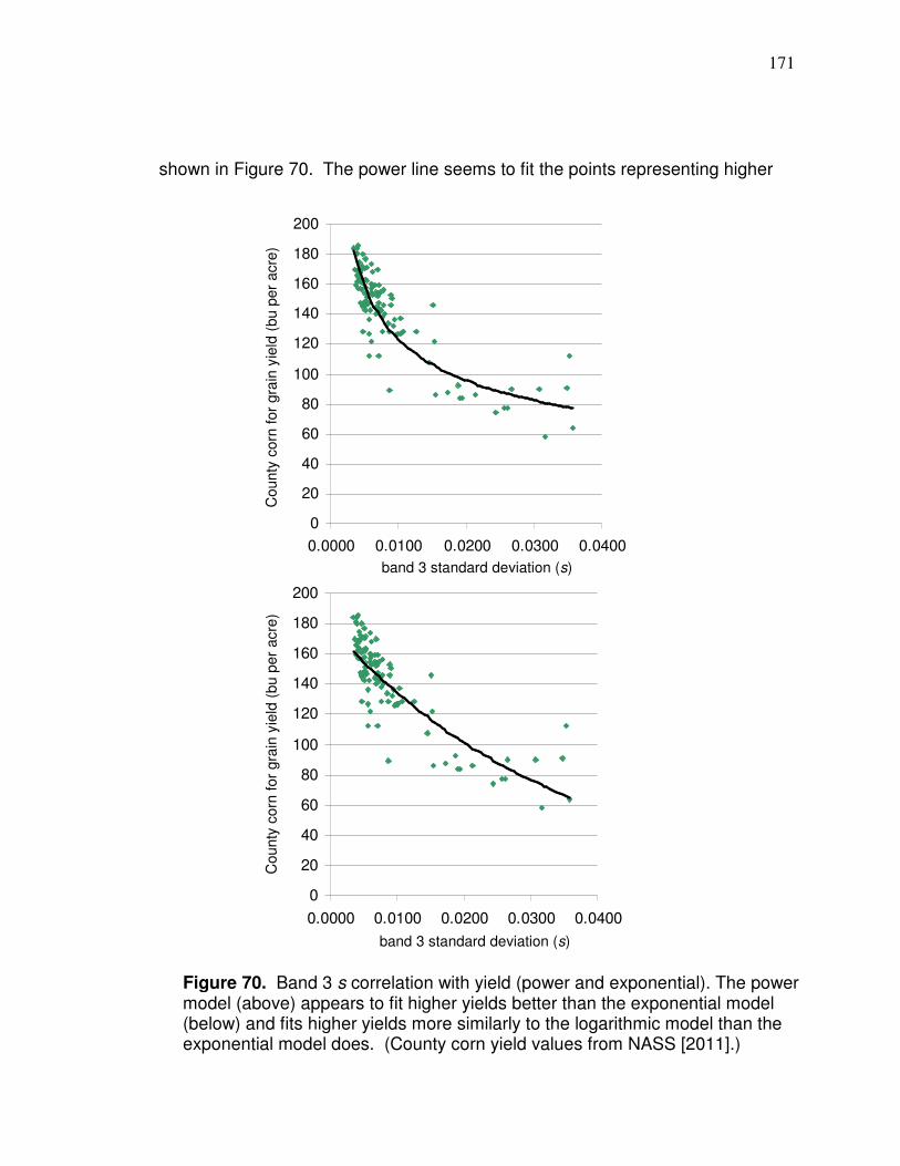
171
shown in Figure 70. The power line seems to fit the points representing higher
0
20
40
60
80
100
120
140
160
180
200
0.0000 0.0100 0.0200 0.0300 0.0400
0
20
40
60
80
100
120
140
160
180
200
0.0000 0.0100 0.0200 0.0300 0.0400
Figure 70. Band 3 s correlation with yield (power and exponential). The power model (above) appears to fit higher yields better than the exponential model (below) and fits higher yields more similarly to the logarithmic model than the exponential model does. (County corn yield values from NASS [2011].)
County
corn
for
gra
in y
ield
(bu p
er
acre
)
County
corn
for
gra
in y
ield
(bu p
er
acre
)
band 3 standard deviation (s)
band 3 standard deviation (s)
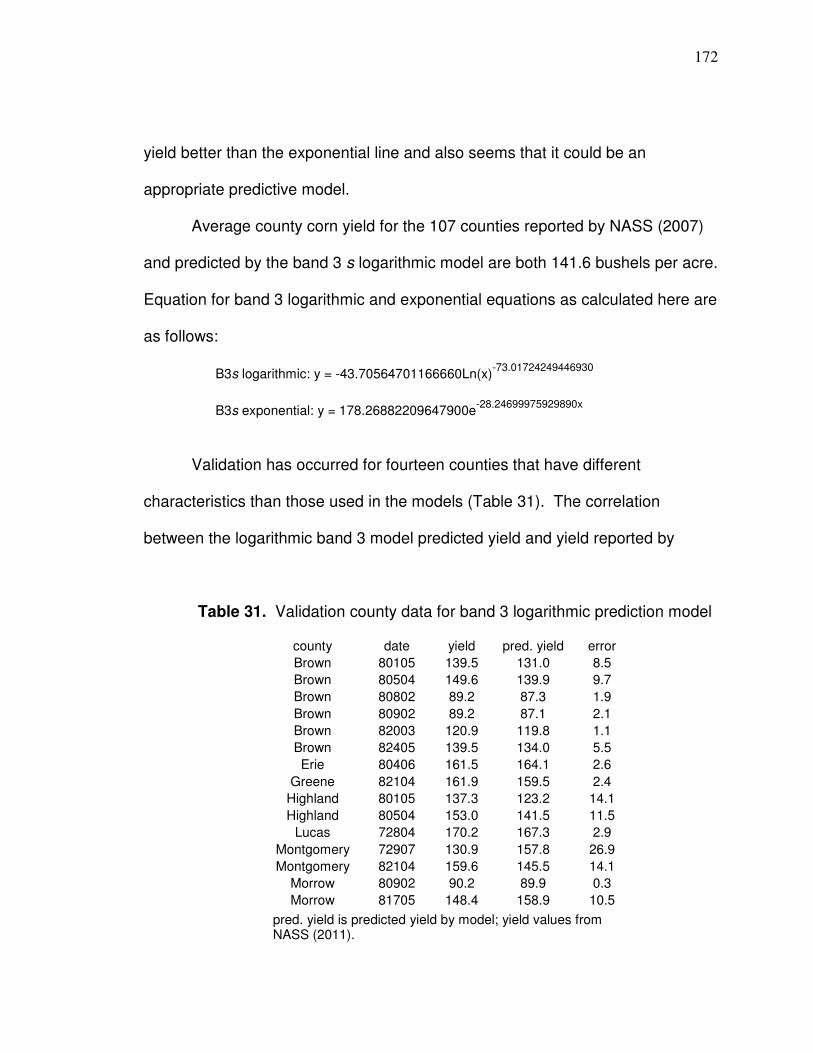
172
yield better than the exponential line and also seems that it could be an
appropriate predictive model.
Average county corn yield for the 107 counties reported by NASS (2007)
and predicted by the band 3 s logarithmic model are both 141.6 bushels per acre.
Equation for band 3 logarithmic and exponential equations as calculated here are
as follows:
B3s logarithmic: y = -43.70564701166660Ln(x)-73.01724249446930
B3s exponential: y = 178.26882209647900e-28.24699975929890x
Validation has occurred for fourteen counties that have different
characteristics than those used in the models (Table 31). The correlation
between the logarithmic band 3 model predicted yield and yield reported by
Table 31. Validation county data for band 3 logarithmic prediction model
county date yield pred. yield error
Brown 80105 139.5 131.0 8.5
Brown 80504 149.6 139.9 9.7
Brown 80802 89.2 87.3 1.9
Brown 80902 89.2 87.1 2.1
Brown 82003 120.9 119.8 1.1
Brown 82405 139.5 134.0 5.5
Erie 80406 161.5 164.1 2.6
Greene 82104 161.9 159.5 2.4
Highland 80105 137.3 123.2 14.1
Highland 80504 153.0 141.5 11.5
Lucas 72804 170.2 167.3 2.9
Montgomery 72907 130.9 157.8 26.9
Montgomery 82104 159.6 145.5 14.1
Morrow 80902 90.2 89.9 0.3
Morrow 81705 148.4 158.9 10.5
pred. yield is predicted yield by model; yield values from NASS (2011).
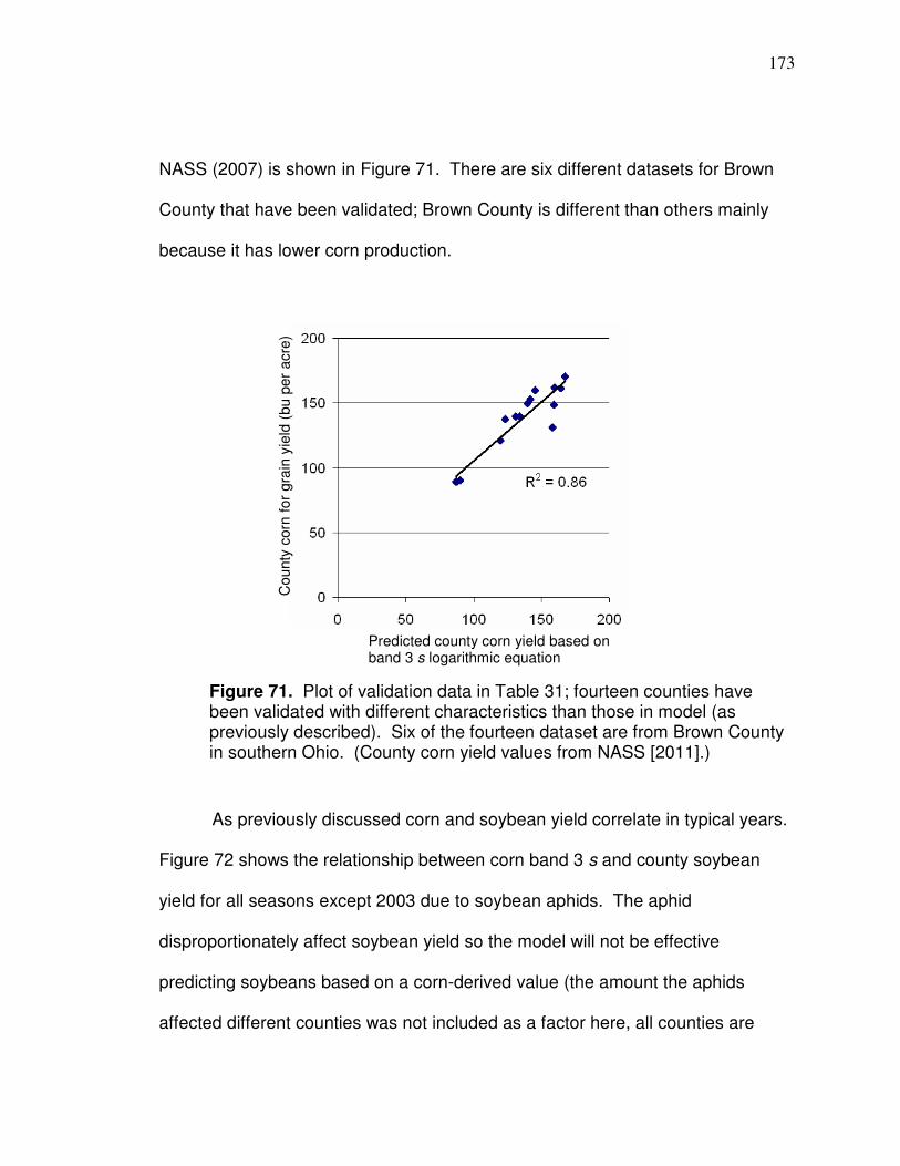
173
NASS (2007) is shown in Figure 71. There are six different datasets for Brown
County that have been validated; Brown County is different than others mainly
because it has lower corn production.
As previously discussed corn and soybean yield correlate in typical years.
Figure 72 shows the relationship between corn band 3 s and county soybean
yield for all seasons except 2003 due to soybean aphids. The aphid
disproportionately affect soybean yield so the model will not be effective
predicting soybeans based on a corn-derived value (the amount the aphids
affected different counties was not included as a factor here, all counties are
Figure 71. Plot of validation data in Table 31; fourteen counties have been validated with different characteristics than those in model (as previously described). Six of the fourteen dataset are from Brown County in southern Ohio. (County corn yield values from NASS [2011].)
Predicted county corn yield based on band 3 s logarithmic equation
County
corn
for
gra
in y
ield
(bu p
er
acre
)
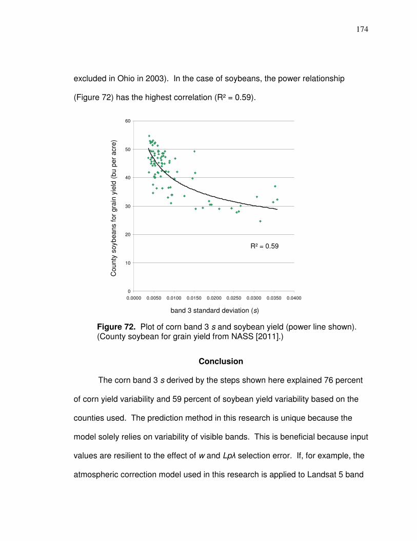
174
excluded in Ohio in 2003). In the case of soybeans, the power relationship
(Figure 72) has the highest correlation (R² = 0.59).
Conclusion
The corn band 3 s derived by the steps shown here explained 76 percent
of corn yield variability and 59 percent of soybean yield variability based on the
counties used. The prediction method in this research is unique because the
model solely relies on variability of visible bands. This is beneficial because input
values are resilient to the effect of w and Lpλ selection error. If, for example, the
atmospheric correction model used in this research is applied to Landsat 5 band
R2 = 0.59
0
10
20
30
40
50
60
0.0000 0.0050 0.0100 0.0150 0.0200 0.0250 0.0300 0.0350 0.0400
R² = 0.59
Figure 72. Plot of corn band 3 s and soybean yield (power line shown). (County soybean for grain yield from NASS [2011].)
band 3 standard deviation (s)
County
soyb
eans f
or
gra
in y
ield
(bu p
er
acre
)

175
3 in the middle of August and ρgλ is about 5 percent, a scatter digital number of
10 instead of 12 increases ρgλ from 4.74 to 5.36 percent; the 0.62 increase is
13.08 percent of 4.74.
The county predicted yield value can be used to estimate yield at the field-
scale by calculating the s for a reasonably large area encompassing a particular
field. To accomplish this, an area with uniform band 4 values should be used to
develop a prediction value. Soybean NIR radiance correlates to yield this time of
year (as shown in Chapter 3) and soybean and corn yield correlate to each other
(as shown in this chapter) so the soybean field NIR can be viewed along with the
corn fields to help distinguish areas of similar corn yield (radiance as a whole can
be viewed in areas where corn and soybeans are the predominant crops).
Band 4 radiance can be variable within a county as is shown in Figure 73
and the amount of variable can change. Figure 73a shows Madison County,
Ohio, in 2006 which was a good yield year; there is a similar overall brightness of
band 4 values throughout the county so in this case a county yield prediction
would likely be a good indicator of corn or soybean yield of a particular field if that
field typically yields about what the county average is. Figure 73b represents a
different situation, a drought year, where areas with the county have more
apparent different NIR values/shades; the southwestern area seems to have
brighter NIR values and could have received rainfall that other areas of the
county did not. In this case, if a particular field is located in a brighter area, only
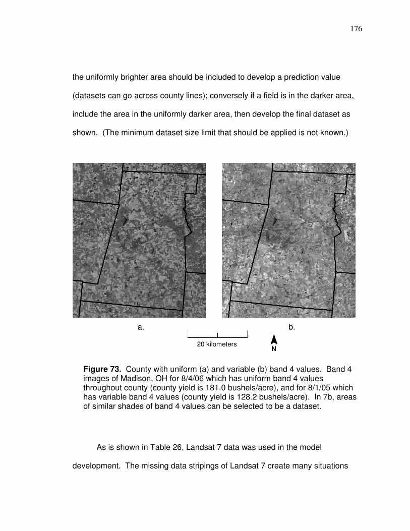
176
the uniformly brighter area should be included to develop a prediction value
(datasets can go across county lines); conversely if a field is in the darker area,
include the area in the uniformly darker area, then develop the final dataset as
shown. (The minimum dataset size limit that should be applied is not known.)
As is shown in Table 26, Landsat 7 data was used in the model
development. The missing data stripings of Landsat 7 create many situations
Figure 73. County with uniform (a) and variable (b) band 4 values. Band 4 images of Madison, OH for 8/4/06 which has uniform band 4 values throughout county (county yield is 181.0 bushels/acre), and for 8/1/05 which has variable band 4 values (county yield is 128.2 bushels/acre). In 7b, areas of similar shades of band 4 values can be selected to be a dataset.
a. b.
¯ N
20 kilometers

177
where data throughout a field is not available. If a field typically yields similarly to
the nearby area, a dataset can be developed of uniform NIR values that
encompass the area around a field that has some or all missing Landsat 7 data;
a prediction can be made for the area encompassing the field to derive a yield
estimate.
178
CHAPTER 6
CONCLUSION
Different components necessary to understand how to better produce corn
or soybean yield prediction maps were assessed individually in chapters for
organizational purposes. In Chapter 2, yield monitor data cleaning methods were
compared whereby the differences were mainly interpolation and neighborhood
statistics techniques. With all else being equal, the evidence showed that
cleaning methods that include the median neighborhood statistics step produce
more accurate and coherent maps.
In Chapter 3, different times and ways to use Landsat data to predict
spatial patterns of corn and soybean yield were analyzed. For soybeans, it was
apparent that the only reliable band to use was band 4 (NIR) during times that
typically correspond to the beginning of August through the first half of
September; variability and correlation with yield were relatively high during these
times. For corn, it was determined that the best time to predict patterns of yield
was from the later vegetative stage to the end of the vegetative stage, excluding
tassel stage; this corresponds to about the last week in June through the first two
weeks in July when the planting date is at the beginning of May. It is important to
exclude corn imagery before the later vegetation stage because of the influence
of soil. The four highest correlations with corn were from soil adjusted vegetation
179
indices with TSAVI being the highest. However, when compared with soybean
band 4 values, NNIR for corn has a more similar regression slope when
reflectance-based values and yield were both normalized to the mean (NNIR had
the fifth highest correlation with corn). A model was developed that combined
normalized soybean band 4 and corn NNIR to predict normalized yield based on
the cleaning method deemed best in Chapter 2. Since soybean imagery can be
applied to predict patterns of yield at later dates during the season (times closer
to maturity and harvest) it seems intuitive that correlations between Landsat and
soybean yield would be higher than between Landsat and corn yield. However,
dates for effective corn yield pattern prediction represent times of enough growth
that spatial patterns of yield are, overall, significantly established; quantity of corn
yield is not as established. (There was not a significant drought in the
reproductive stage associated with any season with corn yield monitor data in
this research however, which could produce higher relative crop condition in
lower ground areas after imagery was applied in the vegetative stage). If the
logical assumption is made that spatial patterns of corn yield is highly correlated
to spatial patterns of crop condition during the later vegetative stages, then this
research has shown that Landsat can sense corn crop condition significantly
well. Essentially then, Landsat can be applied to sense spatial patterns of corn
condition in the later vegetative stages (excluding tassel), predict spatial patterns
of corn condition later in the season, and predict spatial patterns of corn yield.
Predicting soybean yield patterns is simpler because only one band needs to be

180
applied and there is a longer time period for correct imagery. If the assumption is
made that spatial patterns of soybean yield is highly correlated to spatial patterns
of crop condition during the early to later reproductive stages, then this research
has shown that Landsat can sense soybean crop condition significantly well.
Landsat can be applied to sense spatial patterns of soybean condition from the
early reproductive stage to a time near the beginning of maturity, predict spatial
patterns of soybean condition during maturity stages, and predict spatial patterns
of soybean yield.
Chapter 4 showed that, with all else being equal, artificial neural networks
is able to predict yield variability better than multiple linear regression based on
independent variables of Landsat vegetation and soil darkness data and LiDAR
elevation and curvature data. Parameters of developing neural networks models
were discussed and a method to extract a better model was shown. Yield
prediction maps can be developed with ANN to the extent of the field, and zones
can be developed in a similar manner as that shown in Appendix C.
Chapter 5 showed that Landsat bands 2 and band 3 reflectance variability
could be applied to predict corn yield significantly well at the county level and that
soybean yield is highly positively correlated to corn yield in normal years. The
model was developed based on county yield values but can be applied at the
field scale if it is apparent that yields will be too variable within a county; a
dataset that represent more uniform yield can be developed by selecting areas
encompass a particular field that have similar NIR values. If a grower feels a field
181
typically yields similar to the surrounding area, then the predicted yield amount of
the area can be used to estimate the yield for the field within the area. The
model is designed to predict about 1 ½ to 2 months prior to harvest which can
help economic planning. The predicted values can be used to calculate yield
amounts for the normalized yield values that are predicted from Landsat or
artificial neural networks models if yield amounts are not available. (Appendix C
shows the steps that can be applied to produce a yield prediction map from
Landsat for an individual field.)
Overall, the data show that solely Landsat or Landsat combined with
LiDAR in neural networks can be used to predict yield patterns significantly well
and can therefore be used to develop or help develop management zones.
Management zones based on yield differences have been applied for variable
rate application of different fertilizers as mentioned in Chapter 1. When applying
nitrogen based on management zones, higher yielding areas, typically, but do not
always correspond to the need to apply more inputs. Franzen (2009) listed
appropriate rates of preplant nitrogen for a wheat field for zones with “high-
yielding” soil as 80 pounds per acre, zones with the “highest-yielding” soil as 70
pounds per acre (less than the “high yielding zone”), zones with “generally poor”
yield as 60 pounds per acre, and poorly drained depression with high organic
matter as 40 pounds per acre; the estimated net return from the variable rate
method on the 40 acre field would be from $402 to $802. The profit is based on
an estimated higher yield and 630 pounds less of preplant nitrogen (from 4,000

182
to 3,370 pounds) than with uniform application. In Colorado, Koch et al. (2004)
reported in irrigated cornfields that applying nitrogen variably based on
management zones that were developed in part based on yield maps resulted in
net returns that were $18.21 to $29.57 per hectare ($7.37 to $11.97 per acre)
greater than with uniform application; the amount of nitrogen that was applied
was reduced from 6 to 46 percent.
Management zones that have been developed solely on yield maps have
been successfully utilized for variable rate application of phosphorus and
potassium to a field with a corn-soybean rotation in Ohio (Barker, 2008). Barker
reported savings of $88.04 per acre when applying phosphorus and potassium
variably based on management zones that were solely developed from yield
maps; in the process the amount of combined fertilizer applied on the 45-acre
field was reduced from 385 to 221 pounds. Dividing the field into management
zones based on soil type, then zone soil sampling and applying variable rate
technology, produced similarly effective results saving $84.91 per acre compared
to uniform application while reducing the amount of combined fertilizer from 385
to 224 pounds (this method called for more phosphorus and less potassium than
management zones developed from yield maps). Grid soil sampling at a 2.5 acre
density resulted in savings of $36.36 per acre compared to uniform rate and
reduced the amount of combined fertilizer from 385 to 309 pounds.
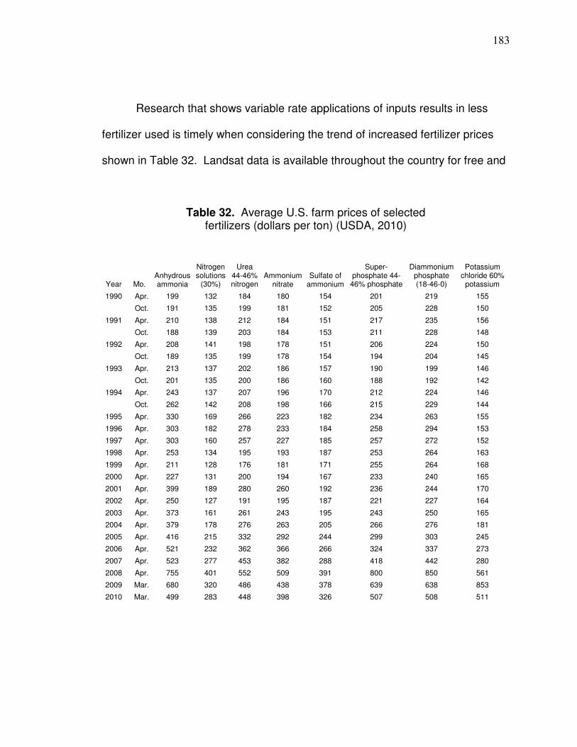
183
Research that shows variable rate applications of inputs results in less
fertilizer used is timely when considering the trend of increased fertilizer prices
shown in Table 32. Landsat data is available throughout the country for free and
Table 32. Average U.S. farm prices of selected fertilizers (dollars per ton) (USDA, 2010)
Year Mo. Anhydrous ammonia
Nitrogen solutions
(30%)
Urea 44-46% nitrogen
Ammonium nitrate
Sulfate of ammonium
Super-phosphate 44-
46% phosphate
Diammonium phosphate (18-46-0)
Potassium chloride 60%
potassium
1990 Apr. 199 132 184 180 154 201 219 155
Oct. 191 135 199 181 152 205 228 150
1991 Apr. 210 138 212 184 151 217 235 156
Oct. 188 139 203 184 153 211 228 148
1992 Apr. 208 141 198 178 151 206 224 150
Oct. 189 135 199 178 154 194 204 145
1993 Apr. 213 137 202 186 157 190 199 146
Oct. 201 135 200 186 160 188 192 142
1994 Apr. 243 137 207 196 170 212 224 146
Oct. 262 142 208 198 166 215 229 144
1995 Apr. 330 169 266 223 182 234 263 155
1996 Apr. 303 182 278 233 184 258 294 153
1997 Apr. 303 160 257 227 185 257 272 152
1998 Apr. 253 134 195 193 187 253 264 163
1999 Apr. 211 128 176 181 171 255 264 168
2000 Apr. 227 131 200 194 167 233 240 165
2001 Apr. 399 189 280 260 192 236 244 170
2002 Apr. 250 127 191 195 187 221 227 164
2003 Apr. 373 161 261 243 195 243 250 165
2004 Apr. 379 178 276 263 205 266 276 181
2005 Apr. 416 215 332 292 244 299 303 245
2006 Apr. 521 232 362 366 266 324 337 273
2007 Apr. 523 277 453 382 288 418 442 280
2008 Apr. 755 401 552 509 391 800 850 561
2009 Mar. 680 320 486 438 378 639 638 853
2010 Mar. 499 283 448 398 326 507 508 511

184
dates back decades so any field can most likely have management zones
developed solely based on Landsat data (it is possible but unlikely that there may
never be appropriate imagery available for a particular field; also, the amount of
different seasons that have appropriate imagery is unknown until researched).
Additionally, LiDAR elevation data, where available, can be combined with
Landsat in artificial neural networks to produce data for management zone
development.
Further research should include studying the economic and environmental
effects of variable rate application of different inputs based on management
zones developed by data described here. Landsat imagery is free and covers a
large spatial extent over many seasons and LiDAR elevation data is free for
certain areas of the country; this helps to make usage of the data more financially
feasible. An efficient method of processing and distributing data could help
promote application.

185
References
ACPA. 2006. Vesper User Manual, Vesper 1.6. Australian Centre for Precision
Agriculture. The University of Sydney. Cited at http://sydney.edu.au/
agriculture/acpa/documents/Vesper_1.6_User_Manual.pdf. Last
accessed: July, 2011.
ACPA. 2006b. Making yield maps: a guide for the precision agriculture industry.
Australian Centre for Precision Agriculture. The University of Sydney.
Cited at: http://www.usyd.edu.au/agriculture/acpa/documents/
YieldMapping.pdf. Last accessed: July, 2011.
Adamchuk, V., and J. Mulliken. 2005. Site-specific management of soil pH
(FAQ). Precision Agriculture. University of Nebraska, Lincoln Extension,
EC 05-75.
Adamchuck, V., Dobermann, A., and J. Ping. 2004. Precision Agriculture:
Listening to the story told by yield maps. University of Nebraska
Cooperative Extension, EC 04-704.
Ag Leader. 2003. PFadvantage. Precision Farming System Operators Manual.
ARSC. 2002. Arizona Remote Sensing Center: Landsat 5 atmospheric and
radiometric correction. Information on website adapted from Skirvin, S
(2000). Cited at: http://arsc.arid.arizona.edu/resources/
image_processing/landsat/ls5-atmo.html. Last accessed: July, 2011.

186
Arslan, S., and T.S. Colvin. 2002. Grain yield mapping: yield sensing, yield
reconstruction, and errors. Precision Agriculture 3:135-154.
Arslan, S., and T.S. Colvin. 2001. An evaluation of the response of yield monitors
and combines to varying yields. Precision Agriculture 3:107-122.
Baret, F., and G. Guyot. 1991. Potentials and limits of vegetation indices for LAI
and PAR assessment. Remote Sensing of Environment 35:161– 173.
Baret, F., G. Guyot, and D. Major. 1989. TSAVI: a vegetation index which
minimizes soil brightness effects on LAI and APAR estimation. 12th
Canadian Symposium on Remote Sensing and IGARSS’90, p.4,
Vancouver, Canada, 10-14 July 1989. Cited in Baret and Guyot, 1991.
Barker, J. 2008. Today's Higher Fertilizer Prices Show Even Greater Savings
for Precision Agriculture. Ohio Ag Manager. The Ohio State University
Extension. Cited at: http://ohioagmanager.osu.edu/uncategorized/todays-
higher-fertilizer-prices-show-even-greater-savings-for-precision-
agriculture/. Last accessed: July, 2011.
Batte, M.T., and F. Diekmann. 2010. 2010 Ohio farming Practices Survey:
Adoption and Use of Precision Farming Technology in Ohio. The Ohio
State University Extension; Report Series: AEDE-RP-0129-10

187
Baum, E. B., and D. Haussler. 1988. Neural Computation 1: 151–160. In: Tan,
C.N.W. (no date listed). An Artificial Neural Networks Primer with
Financial Applications Examples in Financial Distress Predictions and
Foreign Exchange Hybrid Trading System. School of Information
Technology, Bond University, Gold Coast, QLD 4229, Australia. Cited at:
http://www.smartquant.com/references/NeuralNetworks/neural28.pdf.
Last accessed: July, 2011.
Birth, G.S., and G.R. McVey. 1968. Measuring color of growing turf with a
reflectance spectrophotometer. Agronomy Journal 60: 640-649.
Blackmore, B.S., and M. Moore. 1999. Remedial correction of yield map data.
Precision Agriculture 1:53-66.
Boes, L. 2007. Personal communication. Ohio farmer.
Brockman, C.S. 1998. Physiographic Regions of Ohio. Ohio Department of
Natural Resources. Division of Geological Survey. Cited at:
http://www.cetconnect.org/ohiorocks/resources/docs/OhioPhysiographic.p
df. Last accessed: July, 2011.
Buschmann, C., and E. Nagel. 1993. In vivo spectroscopy and internal optics of
leaves as basis for remote sensing of vegetation. International Journal of
Remote Sensing 14:711–722.
Campbel, J. B. 2007. Introduction to Remote Sensing: Fourth Edition. The
Guilford Press, New York.

188
Carlson, N.A. 1992. Foundations of Physiological Psychology. Needham
Heights, Massachusetts: Simon & Schuster. pp. 36. Cited at:
http://www.mindcreators.com/NeuronBasics.htm. Cofer, D. 2002.
Neuron Basics, 4.1.1. Mindcreators.com. Last accessed: July, 2011.
Cassady, W., Pfost, D., Ellis, C., and K. Shannon. 1998. Precision agriculture:
yield monitors. Water Quality; WQ 451. Published by University
Extension, University of Missouri – System. Cited at:
http://extension.missouri.edu/explorepdf/envqual/wq0451.pdf. Last
accessed: July, 2011.
Chander, G., Markham, B.L., and J.A. Barsi. 2007. Revised Landsat-5 Thematic
Mapper Radiometric Calibration. IEE Geoscience and Remote Sensing
Letters: Vol. 4, no. 3. Cited at: http://landsat.usgs.gov/documents/
L5TM_postcal.pdf. Last accessed: July, 2011.
Chang, J., Murphy, D., Reese, C., Clay, D., Ellsbury, M., Carlson, C., and D.
Malo. 2000. Spatial and temporal yield variability in a field located in
eastern South Dakota. Soil/water research, South Dakota station; 2000
progress report. Agricultural Experiment Station; Plant Science
Department, South Dakota State University, Brookings, SD.
Chavez, P.S., Jr. 1996. Image-based atmospheric corrections – revisited and
improved. Photogrammetric Engineering and Remote Sensing
62(9):1025-1036.
189
Chavez, P.S., Jr. 1988. An improved dark-object subtraction technique for
atmospheric scattering correction of multispectral data. Remote Sensing
of Environment 24:459-479.
Clay, D.E. Carlson, C.G. and J. Chang. 2004. Determining the “best” approach
to identify nutrient management zones: a South Dakota example. Site-
Specific Management Guidelines: SSMG-41. Cited at:
http://www.ipni.net/ppiweb/ppibase.nsf/b369c6dbe705dd13852568e3000d
e93d/270e96a8657d8d5e85256e760059234d/$FILE/SSMG%2041.pdf.
Last accessed: July, 2011.
Colvin, T.S., and S. Arslan. 1999. Yield monitor accuracy. Site-Specific
Management Guidelines: SSMG-9. Cited at: http://www.ipni.net/ppiweb/
ppibase.nsf /b369c6dbe705dd13852568e3000de93d/bde10c510454e0ca
85256965005e1b99/$FILE/SSMG%209.pdf. Last accessed: July, 2011.
Cowan, T. 2000. Precision agriculture and site-specific management: current
status and emerging policy issues. CRS Report for Congress; received
through the CRS web. Order Code RL30630. Cited at.
http://www.policyarchive.org/handle/10207/bitstreams/1070.pdf. Last
accessed: July, 2011.
CSS. 1998. Brainmaker, User’s Guide and Reference Manual, 5th Edition; June,
1998.

190
Dobermann, A., Ping, J.L., Adamchuck, V.I., Simbahan, G.C., and R.B.
Ferguson. 2003. Classification of crop yield variability in irrigated
production fields. Agronomy Journal 95:1105–1120.
Doerge, T.A. 1999. Management zone concepts. Site-Specific Management
Guidelines: SSMG-2. Cited at: http://www.ipni.net/ppiweb/ppibase.nsf/
b369c6dbe705dd13852568e3000de93d/cf15e6b8375fac44852569
5a00559405/$FILE/SSMG%202.pdf. Last accessed: July, 2011.
Doraiswamy, P.D., Akhmedov, B., Beard, L., Stern, A., and R. Mueller. 2007.
Operational prediction of crop yields using MODIS data and products.
2007 International Archives of Photogrammetry. ISPRS Archives XXXVI-
8/W48 Workshop proceedings. Cited at:
http://www.isprs.org/proceedings/XXXVI/8-W48/45_XXXVI-8-W48.pdf.
Last accessed: July, 2011.
Eldridge, R.G. 1967. Water vapor absorption of visible and near infrared
radiation. Applied Optics 6(4):709-714.
ESA. 2007. European Space Agency. Earth Observation Quality Control:
Landsat frequently asked questions. Copyright 2000-2007. Cited at:
http://earth.esa.int/pub/ESA_DOC/landsat_FAQ/. Last accessed: July,
2011.
ESRI. 2011. Environmental Systems Research Institute, Inc. Classification
description acquired from website at: http://www.esri.com/. Last
accessed: July, 2011.

191
ESRI. 2009. Environmental Systems Research Institute. Census 2000
TIGER/Line Shapefiles. Cited at: http://arcdata.esri.com/data
/tiger2000/tiger_download.cfm. Last accessed: July, 2011.
ESRI. 2002. Environmental Systems Research Institute, Inc. Data include with
version 8 ArcView educational version.
Ferguson, R.B. and G.W. Hegert. 2009. Soil sampling for precision agriculture.
Precision Agriculture. University of Nebraska, Lincoln, Extension: EC154.
Ferguson, R., Dobermann, A., and J. Schepers. 2007. Site-specific nitrogen
management for irrigated corn. Precision Agriculture. University of
Nebraska, Lincoln, Extension: EC163. Cited at:
http://www.ianrpubs.unl.edu/epublic/live/ec163/build/ec163.pdf. Last
accessed: July, 2011.
Franzen, D. 2009. Economics and the environment. Site-Specific Farming 4;
North Dakota State University Extension Service; SF-1176-4 (Revised).
Cited at: http://www.ag.ndsu.edu/pubs/plantsci/soilfert/sf1176-4.pdf. Last
accessed: July, 2011.
Franzen, D. 2008. Developing zone soil sampling maps. Site-Specific Farming
2; North Dakota State University Extension Service; SF-1176-2 (Revised).
Cited at: http://www.ag.ndsu.edu/pubs/plantsci/soilfert/sf1176-2.pdf. Last
accessed: July, 2011.
192
Franzen, D. and T. Nanna. 2006. Use of data layering to address changes in
nitrogen management zone delineation. USDA Forest Service
Proceedings RMRS-P-42CD. 2006. Cited at: http://www.fs.fed.us/
rm/pubs/rmrs_p042/rmrs_p042_344_349.pdf. Last accessed: July, 2011.
Franzen, D. and N.R. Kitchen. 1999. Developing management zones to target
nitrogen applications. Site-Specific Management Guidelines: SSMG-5.
Cited at: http://www.ipni.net/ppiweb/ppibase.nsf/b369c6dbe
705dd13852568e3000de93d/9f5e03cd772be73b8525695a005a12e9/$FIL
E/SSMG%205.pdf. Last accessed: July, 2011.
Gitelson, A.A. 2004. Wide dynamic range vegetation index for remote
quantification of biophysical characteristics of vegetation. J. Plant Physiol.
161:165-173. Cited at: http://www.calmit.unl.edu/people/agitelson2/pdf/
JPP-04.pdf. Last accessed: July, 2011.
Gitelson, A.A., Y.J. Kaufman, R. Stark, and D. Rundquist. 2002. Novel
algorithms for remote estimation of vegetative fraction. Remote Sensing
of Environment 80: 76–87. Cited at: http://digitalcommons.unl.edu/cgi/
viewcontent. cgi?article=1151&context=natrespapers&sei-redir=1#
search=%22Novel%20algorithms%20remote%20estimation%20vegetative
%20fraction%22. Last accessed: July, 2011.
Gitelson, A.A., Y. Kaufman, and M.N. Merzlyak. 1996. Use of a green
channel in remote sensing of global vegetation from EOS-MODIS. Remote
Sensing of Environment 58:289–298. Last accessed: July, 2011.

193
Green, T.R., Salas, J.D., Martinez, A., R.H. Erskine. 2007. Relating crop yield to
topographic attributes using Spatial Analysis Neural Networks and
regression. Geoderma 139 (2007) 23–37. Cited at: http://www.engr.
colostate. edu/~jsalas/pdf%20files/71.%202007Geoderma_GreenSalas
MartinezErskine.pdf. Last accessed: July, 2011.
Grisso, R., Alley, M., and P. McClellan. 2009. Precision farming tools: yield
monitor. Virginia Cooperative Extension. Publication 442-502. Cited at:
http://pubs.ext.vt.edu/442/442-502/442-502_pdf.pdf. Last accessed: July,
2011.
Guzzi, R., and R. Rizzi. 1984. Water vapor absorption in the visible and near
infrared: results of field measurements. Applied Optics 23(11):1853-1861.
Hornung, A., Khosla, R., Reich, R., Inman, D and D. G. Westfall. 2006.
Comparison of site-specific management zones: soil-color-based and
yield-based. Agronomy Journal: 98:407–415.
Huete, A. R. 1988. A soil-adjusted vegetation index (SAVI). Remote Sensing of
Environment 25:295–309.
Jang, G., Sudduth, K.A., Hong, S.Y., Kitchen, N.R., and H.L. Palm. 2006.
Relating hyperspectral image bands and vegetation indices to corn and
soybean yield. Korean Journal of Remote Sensing; Vol. 22, No.3:183-
197.
194
Jones, B.P., Holshouser, D.L., Alley, M.M., Roygard, J.K.F., and C.M. Anderson-
Cook, C.M. 2003. Double-crop soybean leaf area and yield responses to
mid-Atlantic soils and cropping systems. Agronomy Journal, 95:436–445.
Cited at: http://www.ipni.net/far/farguide.nsf/926048f0196c9d42852569
83005c64de/6d125f1d58f3017385256f18004e739a/$FILE/VA-
20F%20Agron%20J%20Holshouser%20soy%20leaf%20area.pdf. Last
accessed: July, 2011.
Kaul, M., Hill, R.L., and C. Walthall. 2005. Artificial neural networks for corn and
soybean yield prediction. Agricultural Systems 85; 1–18. Cited at:
http://www.agro.uba.ar/users/paruelo/redes/B-0145%202005%20
Artificial%20 neural%20networks%20for%20corn%20and%20soybean
%20yield%20prediction.pdf. Last accessed: July, 2011.
Kleinjan, J., Clay, D.E., Carlson, C.G. and S.A. Clay. 2006. Developing
productivity zones from multiple years of yield monitor data. Site-Specific
Management Guidelines: SSMG-45. Cited at: http://www.ipni.net/ppiweb/
ppibase.nsf/b369c6dbe705dd13852568e3000de93d/8ad67017bdd356558
525725e0075145d/$FILE/SSMG%2045.pdf. Last accessed: July, 2011.
Kleinjan, J., Chang, J., Wilson, J., Humburg, D., Carlson, G., Clay, D., and D.
Long. 2002. Cleaning yield data. South Dakota State University. College
of Agricultural and Biological Science, Precision Agriculture.
195
Knipling, E. B. 1970. Physical and physiological basis for the reflectance of
visible and near-infrared radiation from vegetation. Remote Sensing of
Environment 1:155-159.
Koch, B., Khosla, R., Frasier, W.M., Westfall, D.G. and D. Inman. 2004.
Economic feasibility of variable-rate nitrogen application utilizing site-
specific management zones. Agronomy Journal: 96:1572–1580.
Kravchenko, A.N., Bullock, D.G. 2000. Spatial variability: correlation of corn and
soybean grain yield with topography and soil properties. Agronomy
Journal:92, 75-83.
Landsat 7. 2009. Landsat 7: Science data user handbook. Chapter 11: Data
Products. Cited at: http://landsathandbook.gsfc.nasa.gov/handbook/
handbook_htmls/chapter11/chapter11.html. Last accessed: 2009.
Landsat 7. 2008. Landsat 7: Science data user handbook. Chapter 6: Data
Properties. Cited at: http://landsathandbook.gsfc.nasa.gov/handbook/
handbook_htmls/chapter6/chapter6.html. Last accessed: 2008.
Lawrence, J., 1994. Introduction to neural networks. California Scientific Software
Press, Nevada City, CA.
Lowenberg-DeBoer, J., Griffin, T.W., and J.P. Brown. 2005. Yield monitor data
analysis: data acquisition, management, and analysis protocol. Version 1.
Department of Agricultural Economics, Purdue University. Cited at:
http://www.agriculture.purdue.edu/ssmc/publications/YieldData
Analysis.pdf. Last accessed: July, 2011.

196
Mallarino, A.P. and D.J. Wittry. 2006. Variable-rate application for phosphorus
and potassium: Impacts on yield and nutrient management. Integrated
Crop Management Conference, Iowa State University. Cited at:
http://www.agronext.iastate.edu/soilfertility/info/mallarino_Variable-
PK%202.pdf. Last accessed: July, 2011.
Martin, K. L., Girma, K., Freeman, K. W., Teal, R. K., Tubana, B., Arnall, D. B.,
Chung, B., Walsh, O., Solie, J. B., Stone, M. L., and W.R. Raun. 2007.
Expression of variability in corn as influenced by growth stage using
optical sensor measurements. Agronomy Journal, 99:pp. 384–389. Cited
at: http://www.nue.okstate.edu/Index_Publications/Kent_cv.pdf. Last
accessed: July, 2011.
Moran, M.S., Jackson, R.D., Slater, P.N., and P.M. Teillet. 1992. Evaluation of
simplified procedures for retrieval of land surface reflectance factors from
satellite sensor output. Remote Sensing of Environment, 41, pp. 169-184.
Cited at: http://ddr.nal.usda.gov/bitstream/10113/37763/1/
IND92050283.pdf. Last accessed: July, 2011.
Mzuku, M., Khosla, Reich, R., Inman, D., Smith, F., and L. MacDonald. 2005.
Spatial variability of measured soil properties across site-specific
management zones. Soil Science Society of America Journal 69: 1572-
1579. Cited at: http://warnercnr.colostate.edu/~leemac/publications/
Mzuku_Khosla_et_al.pdf.
197
NASS. 2011. National Agricultural Statistics Service. Ohio Annual Statistical
Bulletin page. Cited at: http://www.nass.usda.gov/Statistics_by_State/
Ohio/ Publications/Annual_Statistical_Bulletin/index.asp. Last accessed:
July, 2011.
NASS. 2007. 2007 Ohio Agricultural Statistics. Ohio Department of Agriculture
cooperating with USDA National Agricultural Statistics Service. 2007 year
used for crop percentages. Cited at:
http://www.nass.usda.gov/Statistics_by_State/Ohio/Publications/Annual_S
tatistical_Bulletin/Master07.pdf. Last accessed: July, 2011.
NCDC. 2011. National Climatic Data Center weather data website.
Precipitation data downloaded at: http://www.ncdc.noaa.gov
/oa/climate/stationlocator.html. Last accessed: July, 2011.
NIH. 2008. The Brain: Understanding Neurobiology. National Institute of
Health, Teacher’s Guide: Lesson 2. Last update: 2008. Cited at:
http://science.education.nih.gov/supplements/nih2/addiction/guide/lesson2
-1.htm. Last accessed: July, 2011.
NOAA. 2011. National Weather Service, Advance Hydrologic Prediction
Service; precipitation spatial data downloaded at: http://water.
weather.gov/precip/download.php. Last accessed: July, /2011.
ODNR. 2011. Ohio Department of Natural Resources. GIS Download page.
1994 County Land Cover. Cited at: http://www.dnr.state.oh.us/tabid/
15402/default.aspx. Last accessed: July, 2011.

198
OGRIP. 2011. Ohio Geographically Referenced Information Program. LiDAR
downloaded at: http://ogrip.oit.ohio.gov/.
OhioView. 2007. OhioView website. Cited at:: http://www.ohioview.org/. Last
accessed: July, 2011.
OSIP. 2006. Ohio Statewide Imagery Program. Ohio Office of
Information Technology (OIT); document dated 8/21/06.
OSU. 2010. 2010 Ohio Farming Practices Survey - Weighted Summary Results.
The Ohio State University, College of Food, Agricultural, and
Environmental Sciences, Department of Agricultural, Environmental, and
Development Economics.
Pinty, B., and M.M. Verstraete. 1992. GEMI: a non-linear index to monitor global
vegetation from satellites. Vegetation 101: 15-20.
Qi, J., Chehbouni, A., Huete, A. R., and Y.H. Kerr. 1994. A Modified Soil
Adjusted Vegetation Index. Remote Sensing of Environment 48: 119-126.
Rondeaux, G., Steven, M., and F. Baret. 1996. Optimization of soil-adjusted
vegetation indices. Remote Sensing of Environment 55: 95-107.
Rouse, J.W., R.H. Haas, J.A. Schell, and D.W. Deering. 1973. Monitoring
vegetation systems in the Great Plains with ERTS. Third ERTS
Symposium, NASA SP-351 I: 309-317.
Simbahan, G.C., and A. Dobermann. 2005. Yield check: an algorithm for
filtering yield monitor data. Department of Agronomy and Horticulture,
University of Nebraska, Lincoln.
199
Simbahan, G.C., Dobermann, A., and J.L. Ping. 2004. Screening Yield Monitor
Data Improves Grain Yield Maps. Agronomy Journal, 96, pp. 1091–1102.
Sripada, R.P., Heiniger, R.W., White, J.G., and A.D. Meijer. 2006. Aerial color
infrared photography for determining early in-season nitrogen
requirements in corn. Agronomy Journal 98: 968-977. Cited at:
SSURGO. 2011. Soil Survey Geographic Database. Natural Resources
Conservation Services. Soil data downloaded at: http://www.soils.usda.
gov/survey/geography/ssurgo/. Last accessed: July, 2011.
Sudduth, K.A., and S. T. Drummond. 2007. Yield editor: software for removing
errors from crop yield maps. Agronomy Journal, 99: pp. 1471–1482.
Cited at: http://ddr.nal.usda.gov/ bitstream/10113/14697/1/IND4
4011569.pdf. Last accessed: July, 2011.
Teillet, P. M., and G. Fedosejevs. 1995. On the dark target approach to
atmospheric correction of remotely sensed data. Can. Journal of Remote
Sensing, 21, pp. 373–387.
Thomison, P., Lipps, P., Hammond, R., Mullen, R., and B. Eisley. 2005. Ohio
Agronomy Guide, 14th Edition. Chapter 4, Corn Production. Cited at:
http://ohioline.osu.edu/b472/0005.html. Last accessed: July, 2011.
Timlin, D.J., Pachepsky, Y., Snyder, V.A., and R.B. Bryant. 1998. Spatial and
temporal variability of corn grain yield on a hillslope. Soil Sci. Soc. Am. J.
62:764–773.
200
Trengove, S. 2008. Making Yield Maps. Southern Precision Agricultural
Association. Newsletter, Summer2008.
http://www.spaa.com.au/files/catalog//NewsletterSummer2008.pdf.
Tucker, C.J. 1979. Red and photographic infrared linear combinations for
monitoring vegetation. Remote Sensing of Environment 8: 127–150.
UNL. 2010. Corn growth stage development. University of Nebraska, Lincoln.
Graphic is cited from the University of Illinois, Extension. Cited at:
http://weedsoft.unl.edu/documents/GrowthStagesModule/Corn/Corn.htm#.
Last accessed: July, 2011.
UO. 2011. University of Oregon. Solar Radiation Monitoring Laboratory, Solar
Position Calculator. Cited at: http://solardat.uoregon.edu
/SolarPositionCalculator.html. Last accessed: July, 2011.
USDA. 2011. United States Department of Agriculture. World Agricultural
Production. Cited at: http://www.fas.usda.gov/wap/current/toc.asp. Last
accessed: July, 2011.
USDA. 2010. Average U.S. farm prices of selected fertilizers, 1960-2010.
United States Department of Agriculture, Economic Research Service.
Cited at: http://www.ers.usda.gov/data/fertilizerUse/. Last accessed: July,
2011.
201
USDA. 2006. Soil Survey of Hancock County, Ohio, 2006. United States
Department of Agriculture, Natural Resources Conservation Service.
Cited at: http://soildatamart.nrcs.usda.gov/Manuscripts/OH063/0/
OHHancock6_7_2006.pdf. Last accessed: July, 2011.
USDA. 2006b. Soil Survey of Preble County, OH. United States Department of
Agriculture, Natural Resources Conservation Service. Downloaded at:
http://soildatamart.nrcs.usda.gov/Manuscripts/OH135/0/Preble_OH.pdf.
Last accessed: July, 2011.
USDA. 2005. Soil Survey of Clinton County, OH. United States Department of
Agriculture, Natural Resources Conservation Service. Downloaded at:
http://soildatamart.nrcs.usda.gov/Manuscripts/OH027/0/Clinton_OH.pdf.
Last accessed: July, 2011.
USDA. 2011. World Agricultural Production.
Cited at: http://www.fas.usda.gov/wap/current/toc.asp. Last accessed:
July, 2011.
USDA. 2006. Soil Survey of Hancock County, Ohio, 2006. United States
Department of Agriculture, Natural Resources Conservation Service.
Downloaded at: http://soildatamart.nrcs.usda.gov/Manuscripts/OH063/0/
OHHancock6_7_2006.pdf Last accessed: July, 2011.
202
USDA. 2006b. Soil Survey of Preble County, OH. United States Department of
Agriculture, Natural Resources Conservation Service. Downloaded at:
http://soildatamart.nrcs.usda.gov/Manuscripts/OH135/0/Preble_OH.pdf.
Last accessed: July, 2011.
USDA. 2005. Soil Survey of Clinton County, OH. United States Department of
Agriculture, Natural Resources Conservation Service. Downloaded at:
http://soildatamart.nrcs.usda.gov/Manuscripts/OH027/0/Clinton_OH.pdf.
USGS. 2011. United States Geological Survey. Earth Resources Observation
and Science Center (EROS). USGS Global Visualization Viewer.
Landsat imagery downloaded at: http://glovis.usgs.gov/. Last accessed:
July, 2011.
Watermeier, N. 2001. Yield monitor calibration tips—making the most from your
data. The Ohio State University Extension; ANR-8-01. Cited at:
http://ohioline.osu.edu/anr-fact/0008.html. Last accessed: July, 2011.
Wen, G., Cahalan, R.F., Tsay, S., and L. Oreopoulus. 2001. Impact of cumulus
cloud spacing on Landsat atmospheric correction and aerosol retrieval.
Journal of Geophysical Research 106(D11):12129-12138.

203
Wiebold, W., Palm, H., Sudduth, K., Kitchen, N., Batchelor, B., Thelen, K., Clay,
D., Bullock, D., Bollero, G., and R. Schuler. 2003. The basics of cleaning
yield monitor data. Produced as part of a project jointly funded by the
North Central Soybean Research Program and the United Soybean
Board, posted 2003. Cited at: http://www.planthealth.info/pdf_docs/
yield_data_guide.pdf. Last accessed: July, 2011.
Wu, J., Wang, D., and M.E. Bauer. 2005. Image-based atmospheric correction of
Quickbird imagery of Minnesota cropland. Remote Sensing of
Environment 99:315-325. Cited at::http://rsl.gis.umn.edu/Documents/
QuickBird_image-based_atmos_correction.pdf. Last accessed: July,
2011.
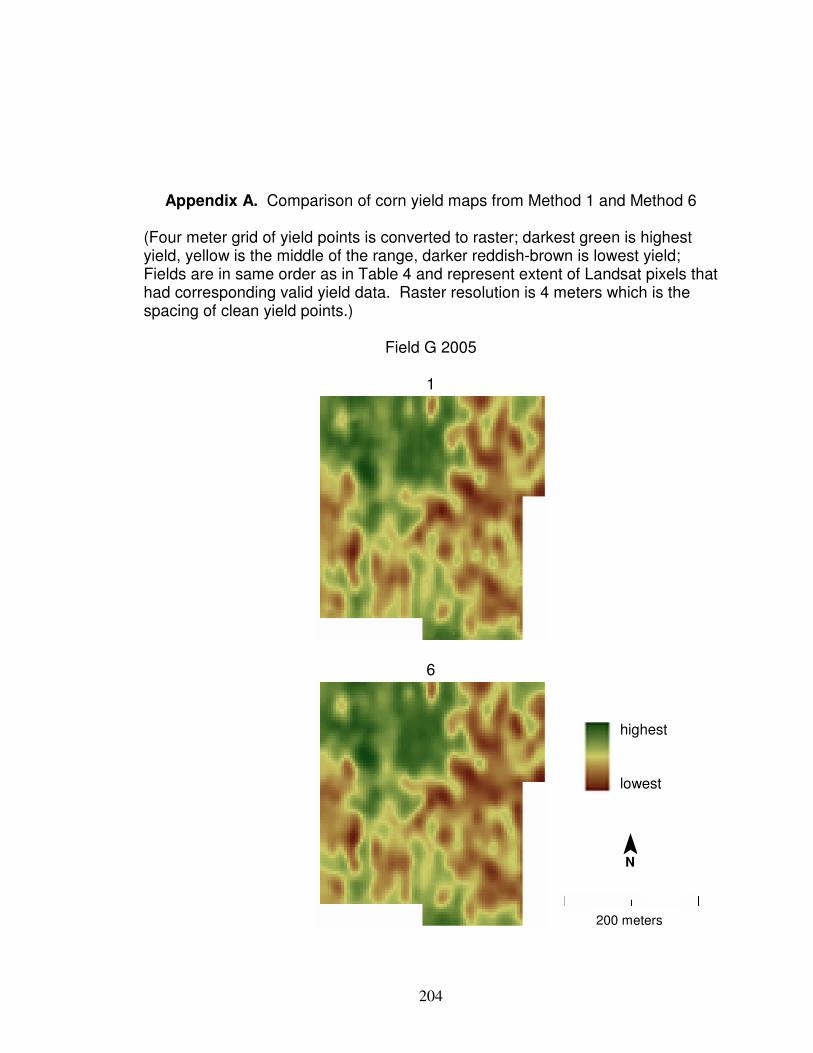
204
Appendix A. Comparison of corn yield maps from Method 1 and Method 6 (Four meter grid of yield points is converted to raster; darkest green is highest yield, yellow is the middle of the range, darker reddish-brown is lowest yield; Fields are in same order as in Table 4 and represent extent of Landsat pixels that had corresponding valid yield data. Raster resolution is 4 meters which is the spacing of clean yield points.)
Field G 2005
1
6
¯ N
200 meters
highest
lowest
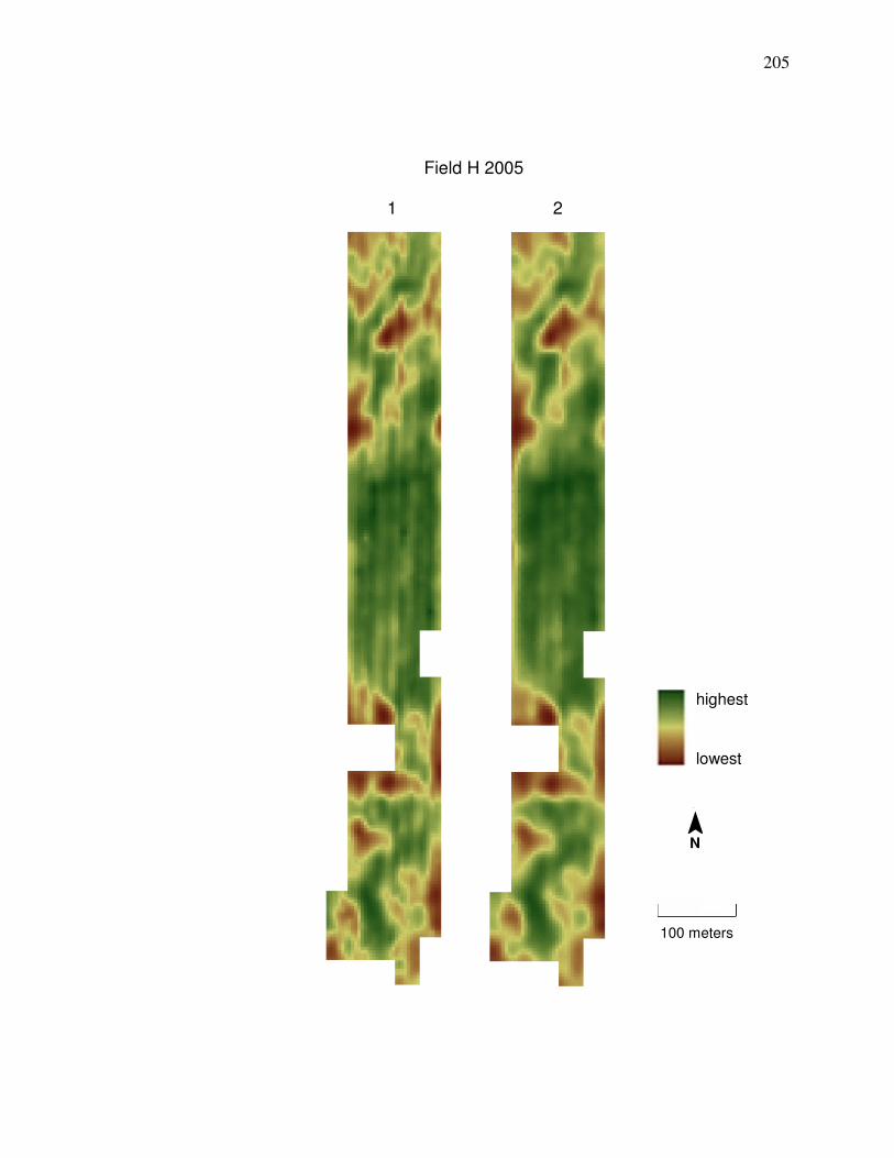
205
Field H 2005
1 2
100 meters
¯ N
highest
lowest
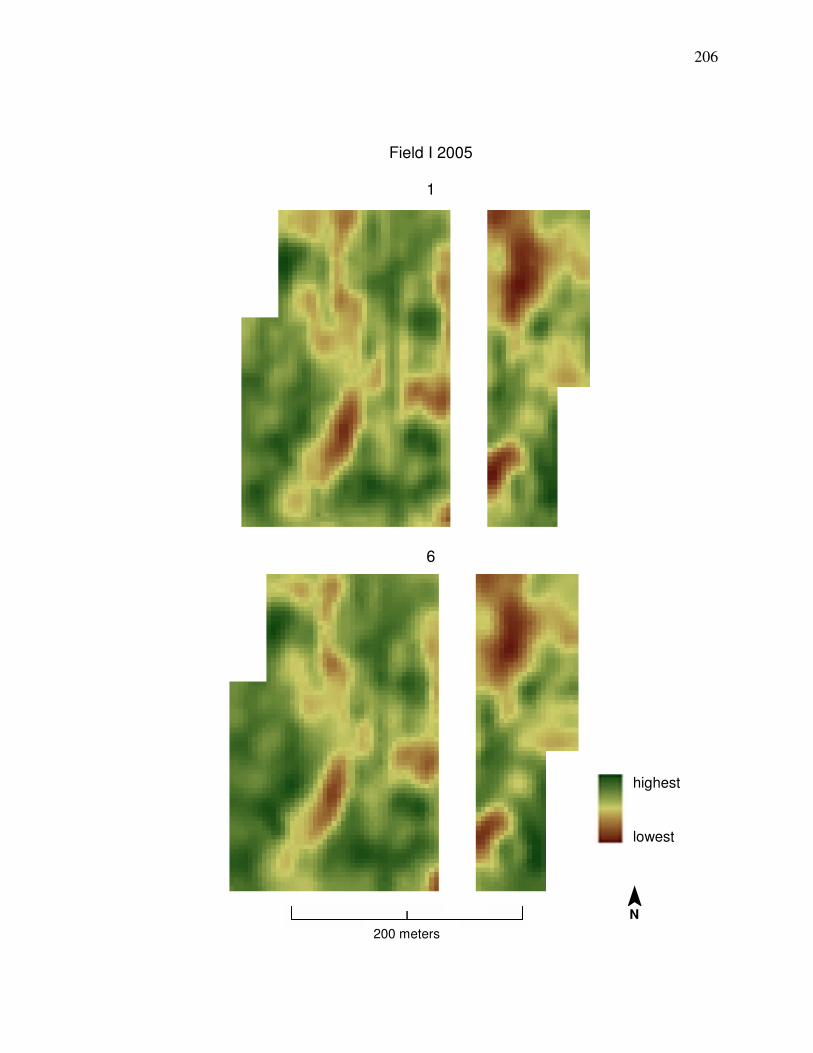
206
Field I 2005
1
6
¯ N
200 meters
highest
lowest
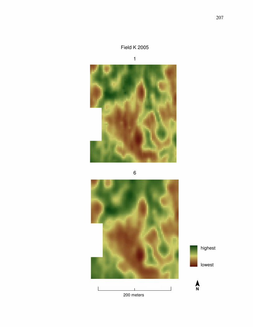
207
Field K 2005
1
6
200 meters
¯ N
highest
lowest
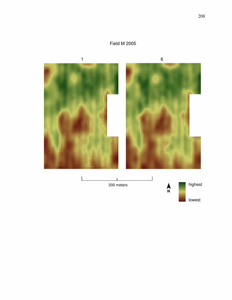
208
Field M 2005
1 6
200 meters ¯ N
highest
lowest
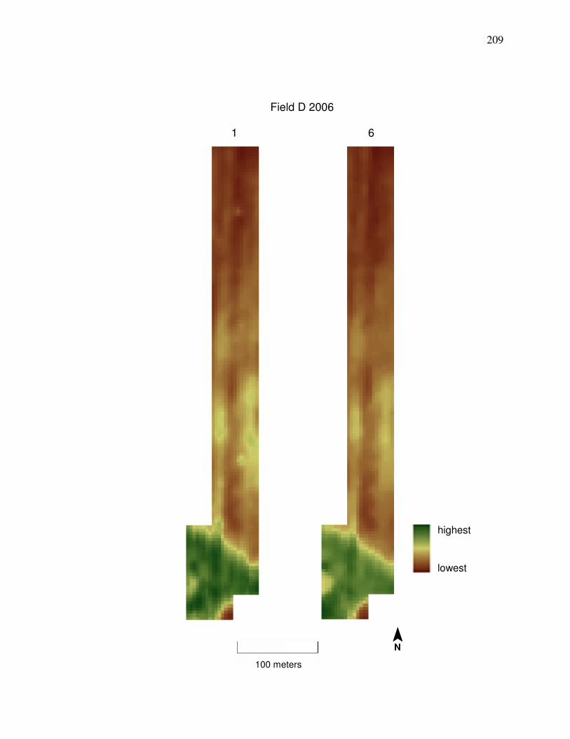
209
Field D 2006
1 6
100 meters
¯ N
highest
lowest
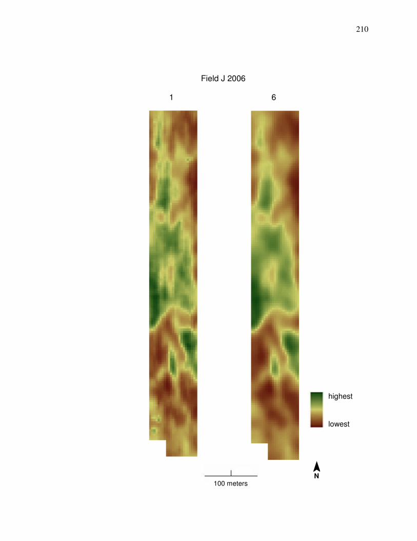
210
Field J 2006
1 6
100 meters
highest
lowest
¯ N
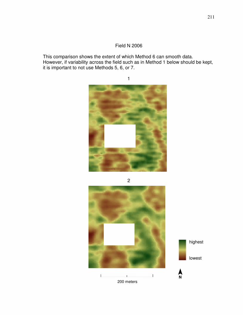
211
Field N 2006
This comparison shows the extent of which Method 6 can smooth data. However, if variability across the field such as in Method 1 below should be kept, it is important to not use Methods 5, 6, or 7.
1
2
200 meters
highest
lowest
¯ N
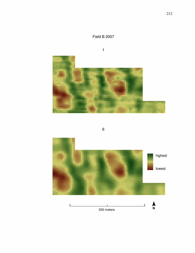
212
Field B 2007
1
6
200 meters
highest
lowest
¯ N
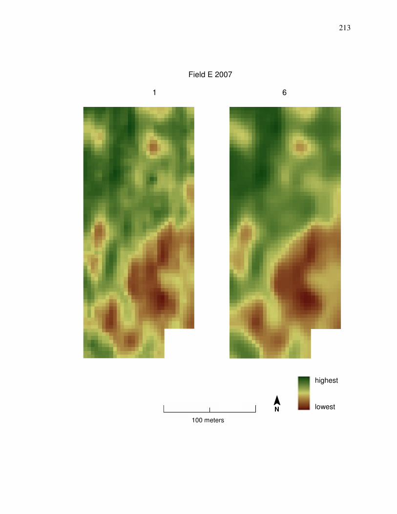
213
Field E 2007
1 6
100 meters
highest
lowest ¯ N
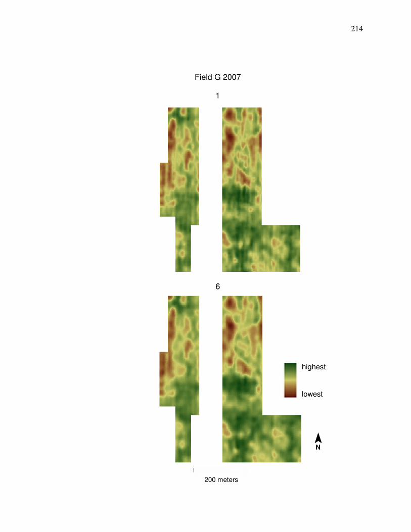
214
Field G 2007
1
6
200 meters
highest
lowest
¯ N
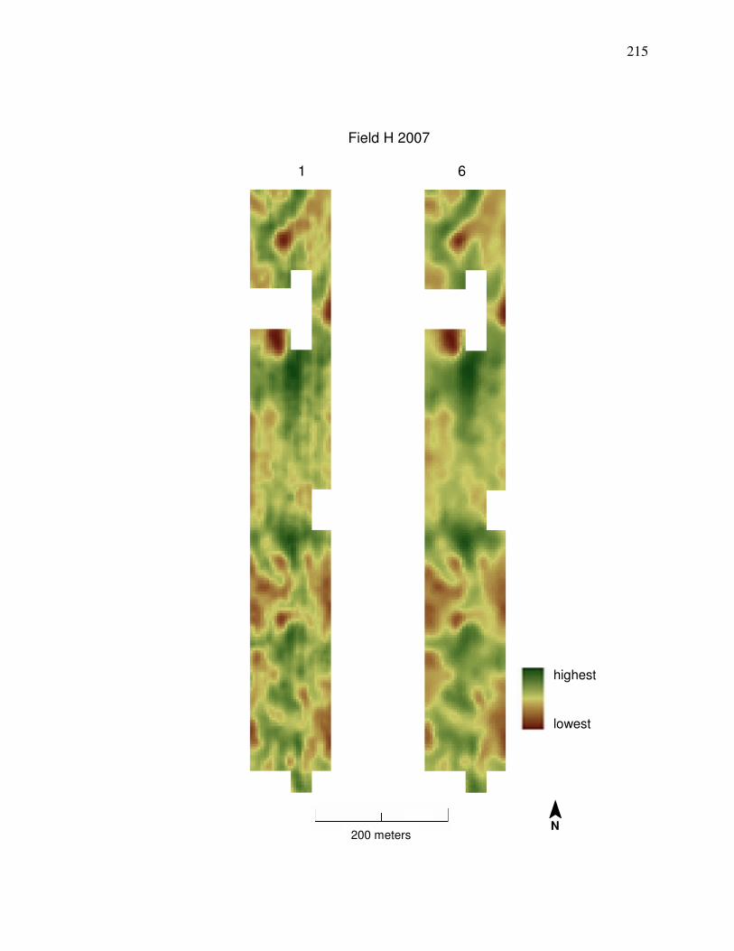
215
Field H 2007
1 6
200 meters
highest
lowest
¯ N
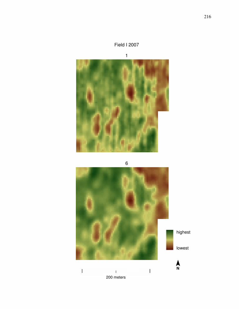
216
Field I 2007
1
6
200 meters
highest
lowest
¯ N
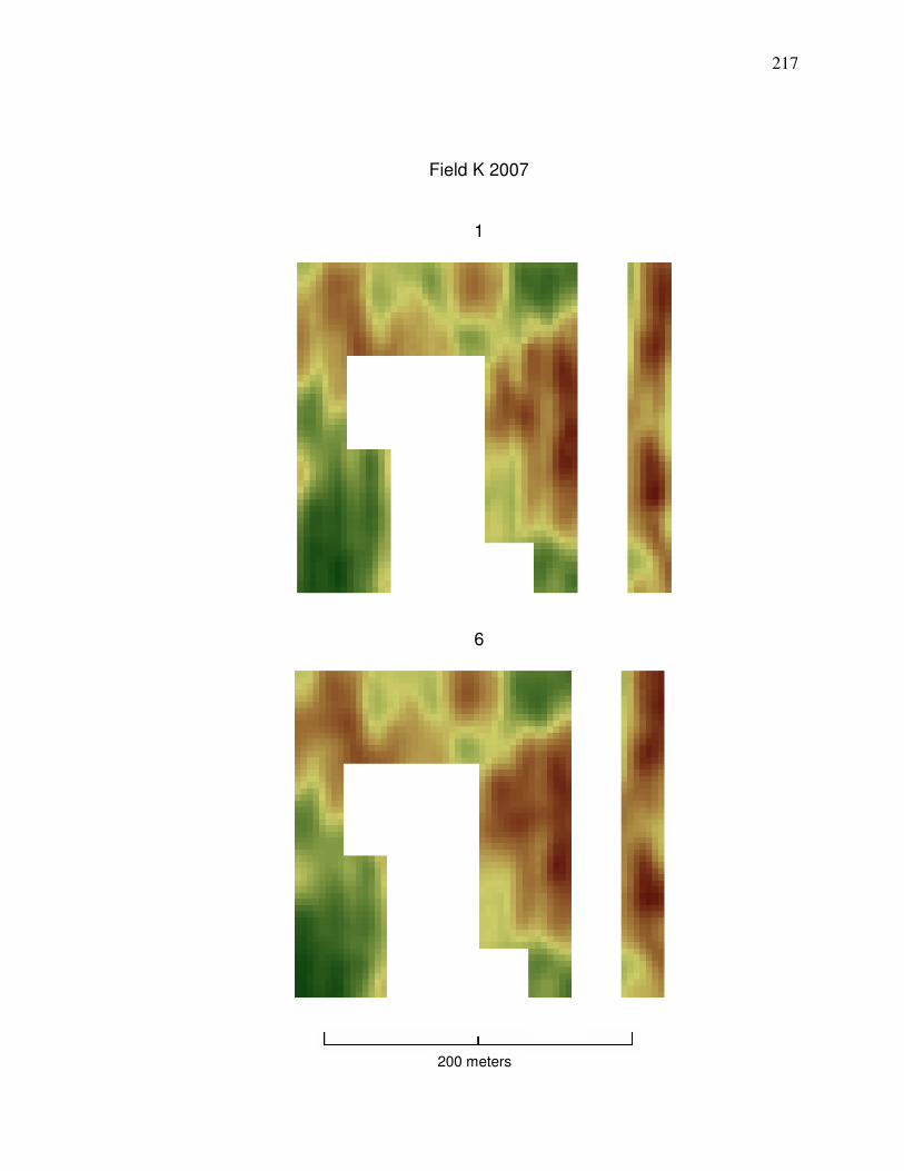
217
Field K 2007
1
6
200 meters

218
Appendix B. Clean yield monitor data (Method 6) compared to weighted average yield from nearby county centroids
The location of pixel groups from fields included in Figures 32 and 36 are located near the junction of Hancock, Wood, and Seneca counties as shown below (field area in green and have an outline on their boundaries to make them larger and more visible). To estimate what county average yield at the locations of the different pixel groups included in the models is, National Agricultural Statistics Service (NASS, 2011) yield quantities for corn and soybeans for grain were weighted based on the distance from the centroid of the pixel group to the centroids (black points) of the counties.
Wood
Hancock
Seneca
¯ N
50 kilometers
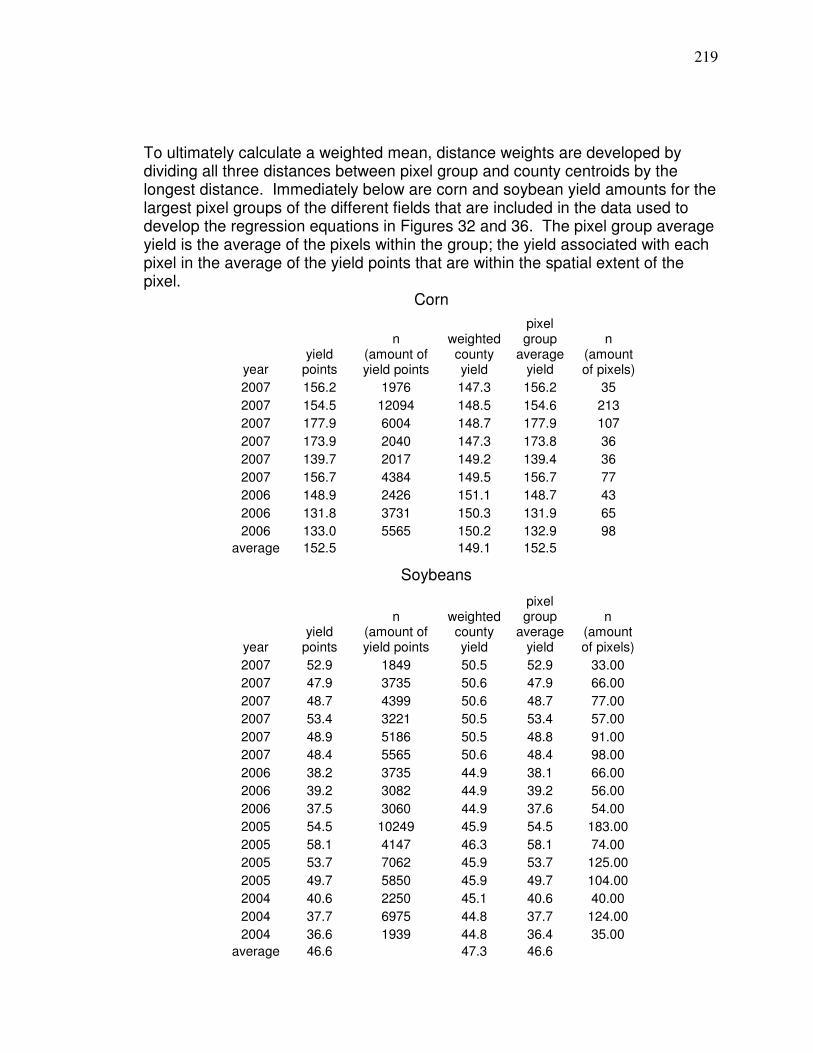
219
To ultimately calculate a weighted mean, distance weights are developed by dividing all three distances between pixel group and county centroids by the longest distance. Immediately below are corn and soybean yield amounts for the largest pixel groups of the different fields that are included in the data used to develop the regression equations in Figures 32 and 36. The pixel group average yield is the average of the pixels within the group; the yield associated with each pixel in the average of the yield points that are within the spatial extent of the pixel.
Corn Soybeans
year
yield points
n (amount of yield points
weighted county yield
pixel group
average yield
n (amount of pixels)
2007 156.2 1976 147.3 156.2 35
2007 154.5 12094 148.5 154.6 213
2007 177.9 6004 148.7 177.9 107
2007 173.9 2040 147.3 173.8 36
2007 139.7 2017 149.2 139.4 36
2007 156.7 4384 149.5 156.7 77
2006 148.9 2426 151.1 148.7 43
2006 131.8 3731 150.3 131.9 65
2006 133.0 5565 150.2 132.9 98
average 152.5 149.1 152.5
year
yield points
n (amount of yield points
weighted county yield
pixel group
average yield
n (amount of pixels)
2007 52.9 1849 50.5 52.9 33.00
2007 47.9 3735 50.6 47.9 66.00
2007 48.7 4399 50.6 48.7 77.00
2007 53.4 3221 50.5 53.4 57.00
2007 48.9 5186 50.5 48.8 91.00
2007 48.4 5565 50.6 48.4 98.00
2006 38.2 3735 44.9 38.1 66.00
2006 39.2 3082 44.9 39.2 56.00
2006 37.5 3060 44.9 37.6 54.00
2005 54.5 10249 45.9 54.5 183.00
2005 58.1 4147 46.3 58.1 74.00
2005 53.7 7062 45.9 53.7 125.00
2005 49.7 5850 45.9 49.7 104.00
2004 40.6 2250 45.1 40.6 40.00
2004 37.7 6975 44.8 37.7 124.00
2004 36.6 1939 44.8 36.4 35.00
average 46.6 47.3 46.6
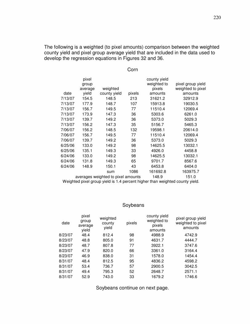
220
The following is a weighted (to pixel amounts) comparison between the weighted county yield and pixel group average yield that are included in the data used to develop the regression equations in Figures 32 and 36.
Corn
Soybeans
date
pixel group
average yield
weighted county yield
pixels
county yield weighted to
pixels amounts
pixel group yield weighted to pixel
amounts
8/23/07 48.4 812.4 98 4988.9 4742.9
8/23/07 48.8 805.0 91 4631.7 4444.7
8/23/07 48.7 807.8 77 3922.1 3747.6
8/23/07 47.9 820.0 66 3361.0 3164.4
8/23/07 46.9 838.0 31 1578.0 1454.4
8/31/07 48.4 812.5 95 4836.2 4598.2
8/31/07 53.4 736.7 57 2900.5 3042.5
8/31/07 49.4 795.3 52 2648.7 2571.1
8/31/07 52.9 743.0 33 1679.2 1746.6
Soybeans continue on next page.
date
pixel group
average yield
weighted county yield pixels
county yield weighted to
pixels amounts
pixel group yield weighted to pixel
amounts
7/13/07 154.5 148.5 213 31621.2 32912.9
7/13/07 177.9 148.7 107 15913.8 19030.5
7/13/07 156.7 149.5 77 11510.4 12069.4
7/13/07 173.9 147.3 36 5303.6 6261.0
7/13/07 139.7 149.2 36 5373.0 5029.3
7/13/07 156.2 147.3 35 5156.7 5465.3
7/06/07 156.2 148.5 132 19598.1 20614.0
7/06/07 156.7 149.5 77 11510.4 12069.4
7/06/07 139.7 149.2 36 5373.0 5029.3
6/25/06 133.0 149.2 98 14625.5 13032.1
6/25/06 135.1 149.3 33 4926.0 4458.8
6/24/06 133.0 149.2 98 14625.5 13032.1
6/24/06 131.8 149.3 65 9701.7 8567.6
6/24/06 148.9 150.1 43 6453.8 6404.0
sum 1086 161692.8 163975.7
averages weighted to pixel amounts 148.9 151.0 Weighted pixel group yield is 1.4 percent higher than weighted county yield.
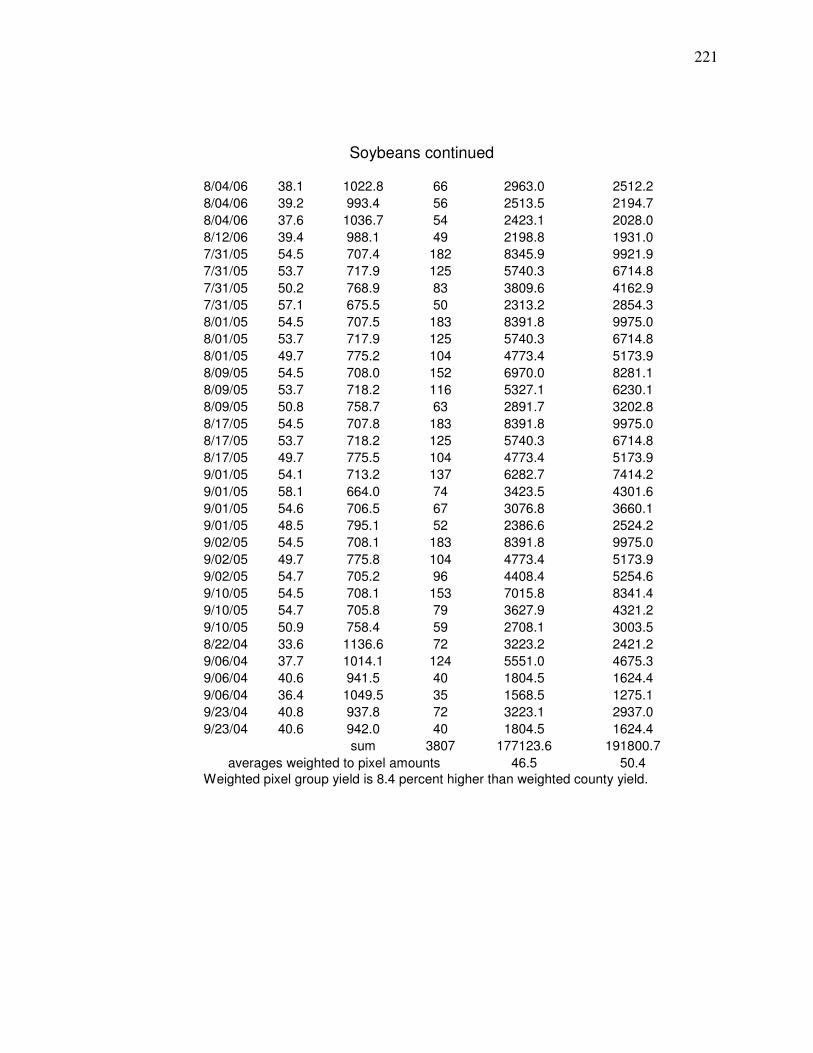
221
Soybeans continued
8/04/06 38.1 1022.8 66 2963.0 2512.2
8/04/06 39.2 993.4 56 2513.5 2194.7
8/04/06 37.6 1036.7 54 2423.1 2028.0
8/12/06 39.4 988.1 49 2198.8 1931.0
7/31/05 54.5 707.4 182 8345.9 9921.9
7/31/05 53.7 717.9 125 5740.3 6714.8
7/31/05 50.2 768.9 83 3809.6 4162.9
7/31/05 57.1 675.5 50 2313.2 2854.3
8/01/05 54.5 707.5 183 8391.8 9975.0
8/01/05 53.7 717.9 125 5740.3 6714.8
8/01/05 49.7 775.2 104 4773.4 5173.9
8/09/05 54.5 708.0 152 6970.0 8281.1
8/09/05 53.7 718.2 116 5327.1 6230.1
8/09/05 50.8 758.7 63 2891.7 3202.8
8/17/05 54.5 707.8 183 8391.8 9975.0
8/17/05 53.7 718.2 125 5740.3 6714.8
8/17/05 49.7 775.5 104 4773.4 5173.9
9/01/05 54.1 713.2 137 6282.7 7414.2
9/01/05 58.1 664.0 74 3423.5 4301.6
9/01/05 54.6 706.5 67 3076.8 3660.1
9/01/05 48.5 795.1 52 2386.6 2524.2
9/02/05 54.5 708.1 183 8391.8 9975.0
9/02/05 49.7 775.8 104 4773.4 5173.9
9/02/05 54.7 705.2 96 4408.4 5254.6
9/10/05 54.5 708.1 153 7015.8 8341.4
9/10/05 54.7 705.8 79 3627.9 4321.2
9/10/05 50.9 758.4 59 2708.1 3003.5
8/22/04 33.6 1136.6 72 3223.2 2421.2
9/06/04 37.7 1014.1 124 5551.0 4675.3
9/06/04 40.6 941.5 40 1804.5 1624.4
9/06/04 36.4 1049.5 35 1568.5 1275.1
9/23/04 40.8 937.8 72 3223.1 2937.0
9/23/04 40.6 942.0 40 1804.5 1624.4
sum 3807 177123.6 191800.7
averages weighted to pixel amounts 46.5 50.4
Weighted pixel group yield is 8.4 percent higher than weighted county yield.

222
Appendix C. Steps for Developing a Landsat Yield Prediction Map
The example that follows involves a field that has corresponding yield monitor
data; although it is not necessary to have yield monitor data to produce a yield
prediction map, the extent of the field that a prediction map is for needs to be
known. The yield map used in this example defines the extent of the field. The
clean yield map shown was produced by modifying the Method 6 yield data
cleaning procedure in Chapter 2 because the yield map needed to be produced
to the extent of the field. Changes include not clipping the data to the extent of
Landsat pixels and to make sure there is data that extend to the ends of the field.
The cleaning process can eliminate data at the sides of the fields or there may be
data missing there; in this case the nearest clean yield points were simply
duplicated and moved 4 meters to the north or south (clean yield points should
not be based too much, or at all, on data beyond a boundary delineated by the
yield map after Step 12 of the yield monitor data cleaning method shown in
Figure 6 of Chapter 2). There is more editing likely when the data are not clipped
to the extent of pixels (Step 4 in yield cleaning method shown in Chapter 2)
because the row ends will remain and commonly have a relatively large amount
of erroneous data as explained in Chapter 2. There will be correlations shown
between Landsat prediction maps and clean yield map in this example.
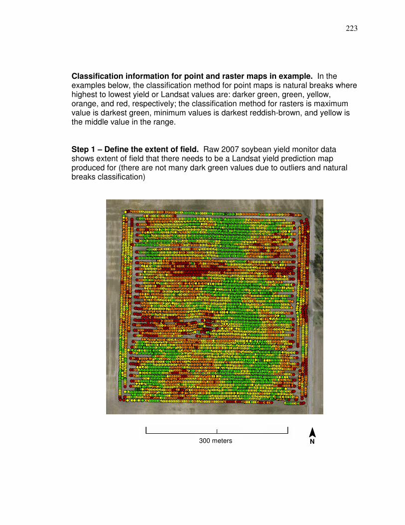
223
Classification information for point and raster maps in example. In the examples below, the classification method for point maps is natural breaks where highest to lowest yield or Landsat values are: darker green, green, yellow, orange, and red, respectively; the classification method for rasters is maximum value is darkest green, minimum values is darkest reddish-brown, and yellow is the middle value in the range. Step 1 – Define the extent of field. Raw 2007 soybean yield monitor data shows extent of field that there needs to be a Landsat yield prediction map produced for (there are not many dark green values due to outliers and natural breaks classification)
300 meters ¯ N
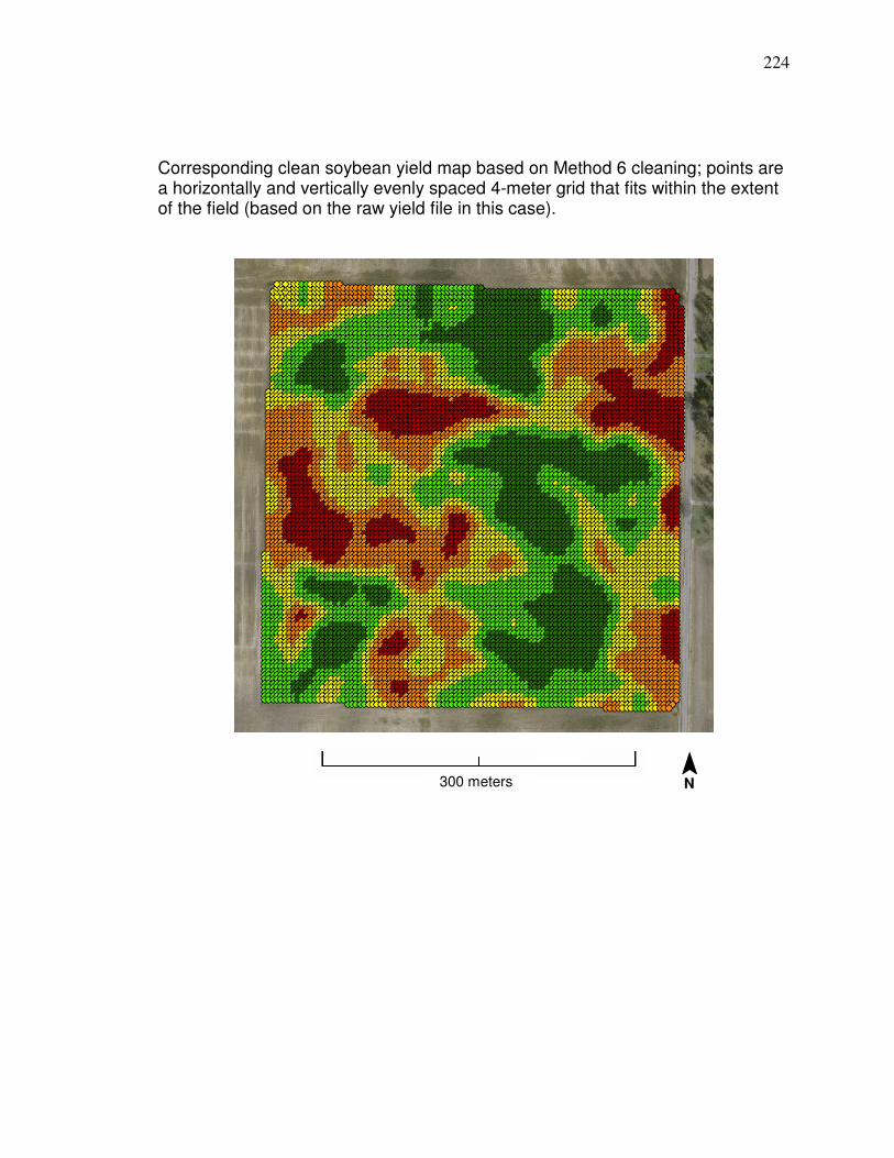
224
Corresponding clean soybean yield map based on Method 6 cleaning; points are a horizontally and vertically evenly spaced 4-meter grid that fits within the extent of the field (based on the raw yield file in this case).
300 meters ¯ N
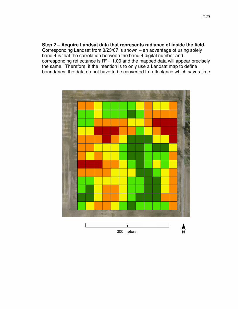
225
Step 2 – Acquire Landsat data that represents radiance of inside the field. Corresponding Landsat from 8/23/07 is shown – an advantage of using solely band 4 is that the correlation between the band 4 digital number and corresponding reflectance is R² = 1.00 and the mapped data will appear precisely the same. Therefore, if the intention is to only use a Landsat map to define boundaries, the data do not have to be converted to reflectance which saves time
300 meters ¯ N
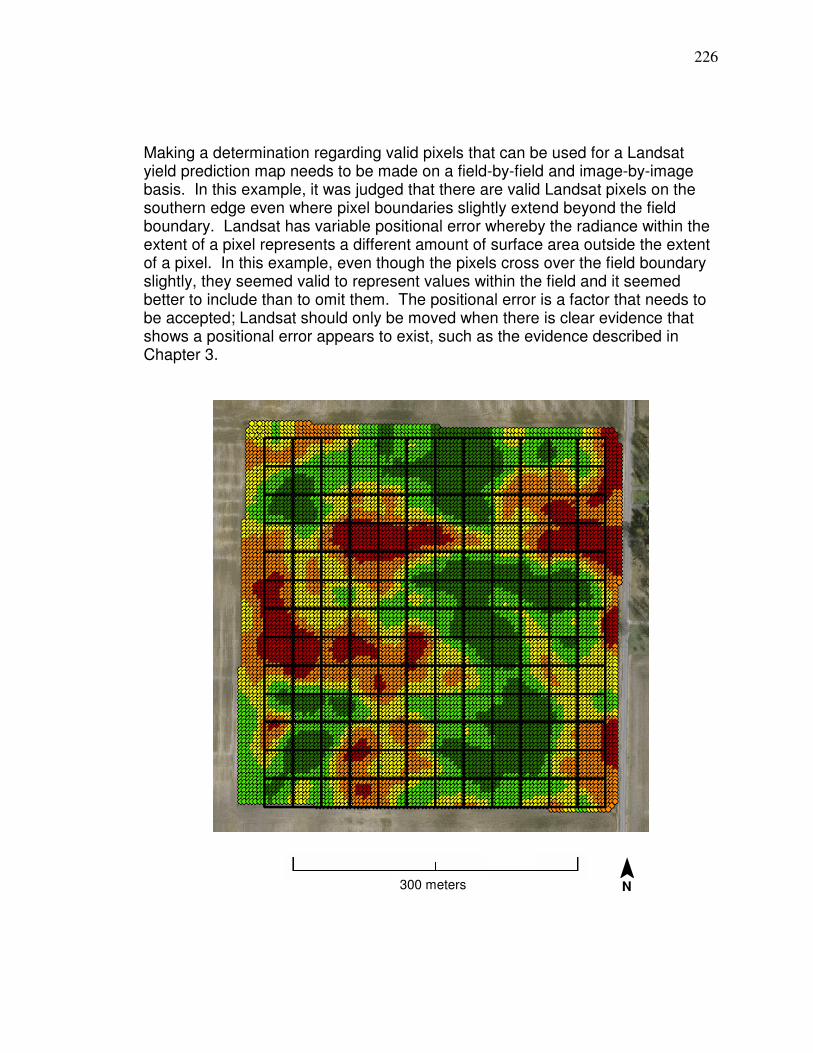
226
Making a determination regarding valid pixels that can be used for a Landsat yield prediction map needs to be made on a field-by-field and image-by-image basis. In this example, it was judged that there are valid Landsat pixels on the southern edge even where pixel boundaries slightly extend beyond the field boundary. Landsat has variable positional error whereby the radiance within the extent of a pixel represents a different amount of surface area outside the extent of a pixel. In this example, even though the pixels cross over the field boundary slightly, they seemed valid to represent values within the field and it seemed better to include than to omit them. The positional error is a factor that needs to be accepted; Landsat should only be moved when there is clear evidence that shows a positional error appears to exist, such as the evidence described in Chapter 3.
300 meters ¯ N
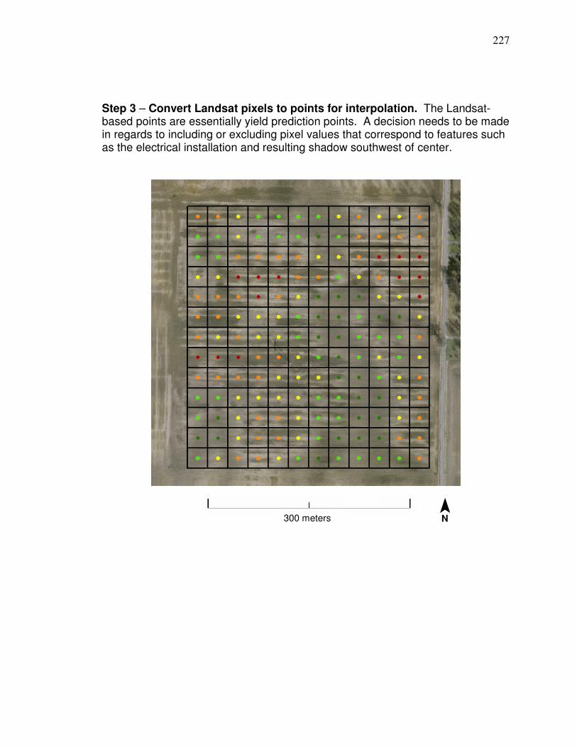
227
Step 3 – Convert Landsat pixels to points for interpolation. The Landsat-based points are essentially yield prediction points. A decision needs to be made in regards to including or excluding pixel values that correspond to features such as the electrical installation and resulting shadow southwest of center.
300 meters ¯ N
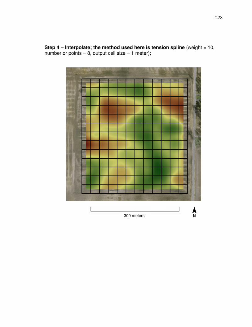
228
Step 4 – Interpolate; the method used here is tension spline (weight = 10, number or points = 8, output cell size = 1 meter);
300 meters ¯ N
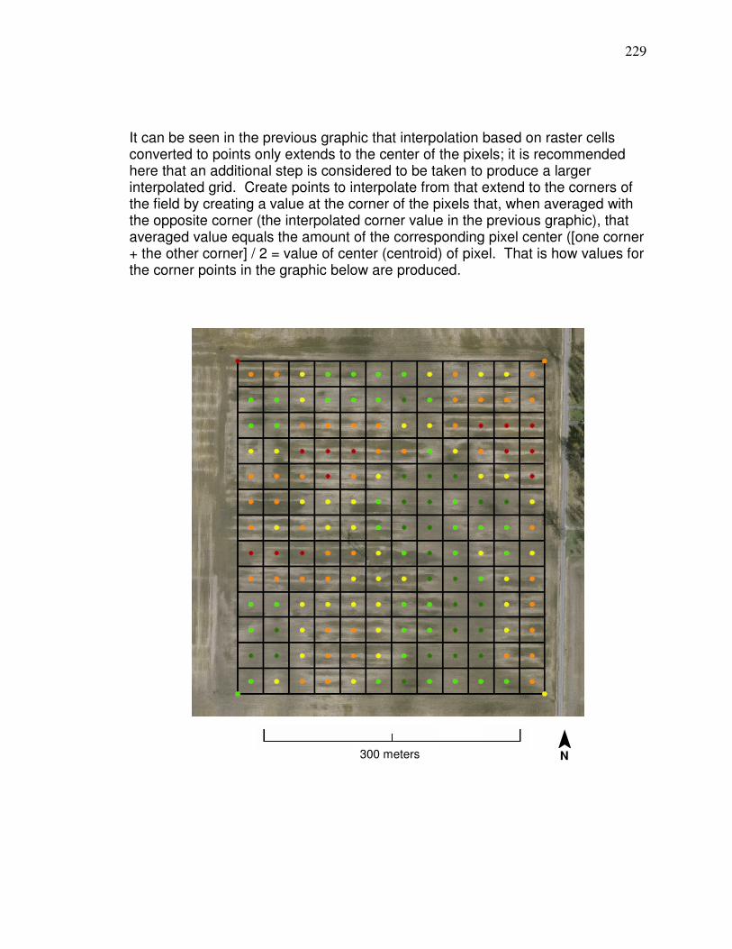
229
It can be seen in the previous graphic that interpolation based on raster cells converted to points only extends to the center of the pixels; it is recommended here that an additional step is considered to be taken to produce a larger interpolated grid. Create points to interpolate from that extend to the corners of the field by creating a value at the corner of the pixels that, when averaged with the opposite corner (the interpolated corner value in the previous graphic), that averaged value equals the amount of the corresponding pixel center ([one corner + the other corner] / 2 = value of center (centroid) of pixel. That is how values for the corner points in the graphic below are produced.
300 meters ¯ N
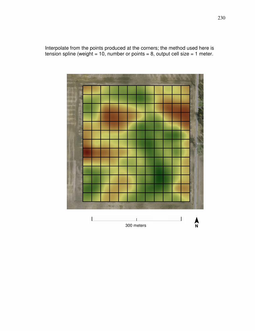
230
Interpolate from the points produced at the corners; the method used here is tension spline (weight = 10, number or points = 8, output cell size = 1 meter.
300 meters ¯ N
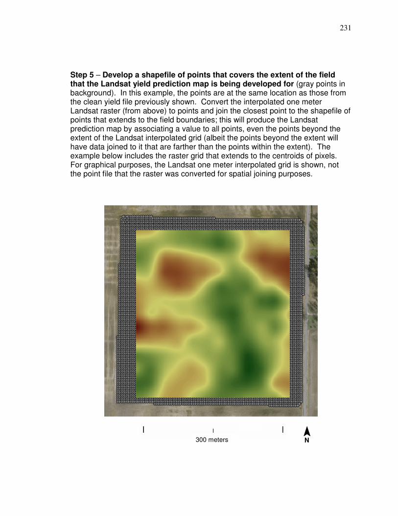
231
Step 5 – Develop a shapefile of points that covers the extent of the field that the Landsat yield prediction map is being developed for (gray points in background). In this example, the points are at the same location as those from the clean yield file previously shown. Convert the interpolated one meter Landsat raster (from above) to points and join the closest point to the shapefile of points that extends to the field boundaries; this will produce the Landsat prediction map by associating a value to all points, even the points beyond the extent of the Landsat interpolated grid (albeit the points beyond the extent will have data joined to it that are farther than the points within the extent). The example below includes the raster grid that extends to the centroids of pixels. For graphical purposes, the Landsat one meter interpolated grid is shown, not the point file that the raster was converted for spatial joining purposes.
300 meters ¯ N
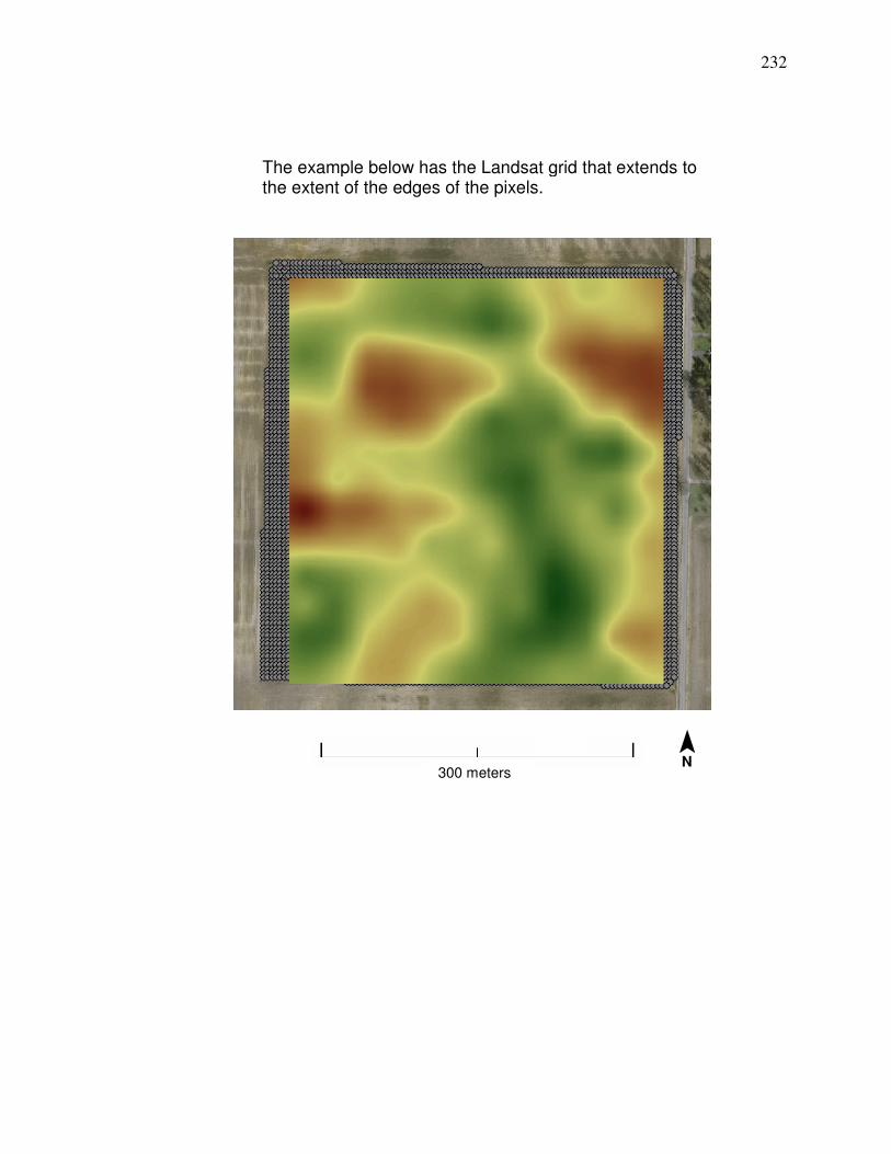
232
The example below has the Landsat grid that extends to the extent of the edges of the pixels.
300 meters
¯ N
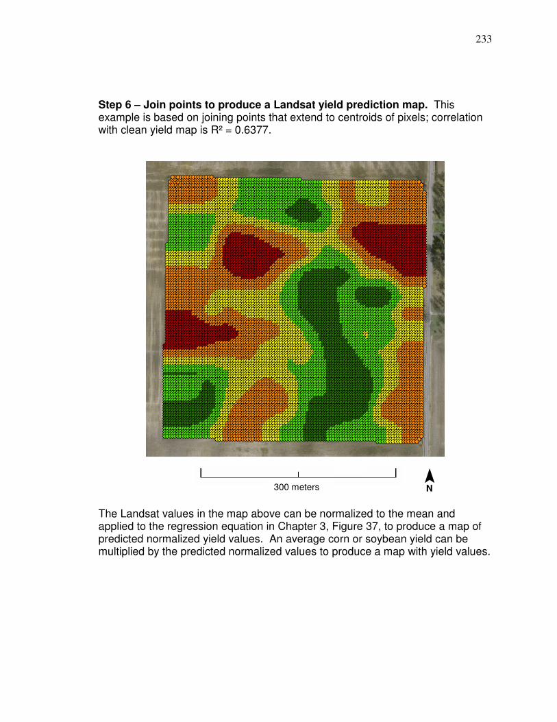
233
Step 6 – Join points to produce a Landsat yield prediction map. This example is based on joining points that extend to centroids of pixels; correlation with clean yield map is R² = 0.6377.
The Landsat values in the map above can be normalized to the mean and applied to the regression equation in Chapter 3, Figure 37, to produce a map of predicted normalized yield values. An average corn or soybean yield can be multiplied by the predicted normalized values to produce a map with yield values.
300 meters ¯ N
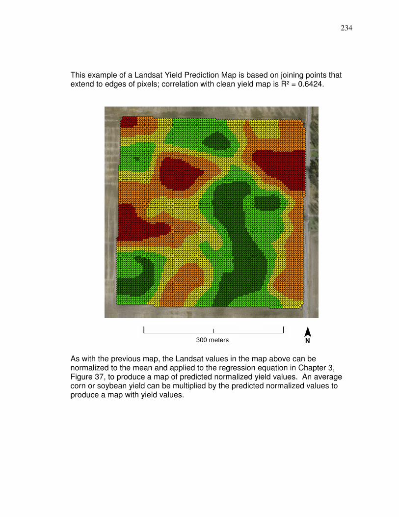
234
This example of a Landsat Yield Prediction Map is based on joining points that extend to edges of pixels; correlation with clean yield map is R² = 0.6424.
As with the previous map, the Landsat values in the map above can be normalized to the mean and applied to the regression equation in Chapter 3, Figure 37, to produce a map of predicted normalized yield values. An average corn or soybean yield can be multiplied by the predicted normalized values to produce a map with yield values.
300 meters ¯ N

235
Conversion of point Landsat yield prediction map to raster
The point Landsat yield prediction map on the previous page can have the
Landsat values normalized to the mean and applied to the regression equation
shown in Figure 37 in Chapter 3 to produce predicted normalized yield. To
produce a raster Landsat yield prediction map, the grid of points can be
converted to a raster (in this example a four meter raster) then resampled
(bilinear) to one meter for a smoother appearance. If resampling to one meter is
performed, it is important that enough rows are copied and produced along the
outside of the yield map so that there are no erroneous values when eventually
resampling to the smaller pixel size (from four meters to one meter in this
example) and extracting a raster to the extent of the field. The clean yield point
map on the previous page had rows (space at four meters) duplicated and added
prior to converting to a four meter raster (which was then resampled [bilinear] to
one meter), so there would be data to the extent of the boundary that the field
was extracted to. An advantage of solely using Landsat 5 band 4 to map yield
patterns (for soybeans) is that the normalized digital numbers correlate at R² =
1.0 and have a slope of close to 1.0 (Landsat 7 needs to be assessed separately
because it can operate under a band 4 low gain state), so it is not necessary to
convert to reflectance if normalizing to the mean. For example, the field included
in this example had 98 pixels that were used for correlation between band 4
reflectance on 8/23/07 and soybean yield in Chapter 3; the relationship between
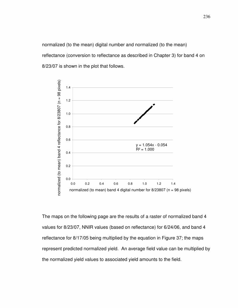
236
normalized (to the mean) digital number and normalized (to the mean)
reflectance (conversion to reflectance as described in Chapter 3) for band 4 on
8/23/07 is shown in the plot that follows.
The maps on the following page are the results of a raster of normalized band 4
values for 8/23/07, NNIR values (based on reflectance) for 6/24/06, and band 4
reflectance for 8/17/05 being multiplied by the equation in Figure 37; the maps
represent predicted normalized yield. An average field value can be multiplied by
the normalized yield values to associated yield amounts to the field.
0.0
0.2
0.4
0.6
0.8
1.0
1.2
1.4
0.0 0.2 0.4 0.6 0.8 1.0 1.2 1.4
y = 1.054x - 0.054 R² = 1.000
normalized (to mean) band 4 digital number for 8/23807 (n = 98 pixels)
norm
aliz
ed (
to m
ea
n)
ba
nd 4
reflecta
nce f
or
8/2
38
07 (
n =
98 p
ixels
)
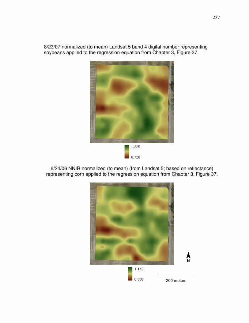
237
8/23/07 normalized (to mean) Landsat 5 band 4 digital number representing soybeans applied to the regression equation from Chapter 3, Figure 37.
6/24/06 NNIR normalized (to mean) (from Landsat 5; based on reflectance)
representing corn applied to the regression equation from Chapter 3, Figure 37.
¯ N
200 meters
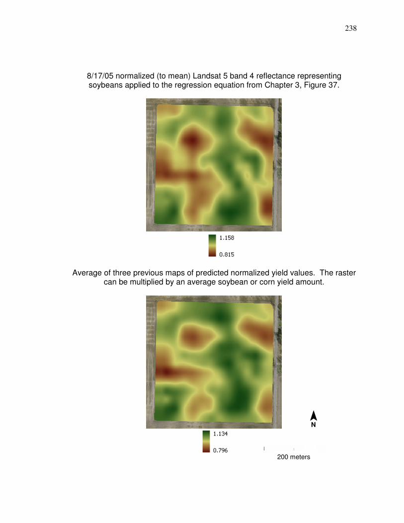
238
8/17/05 normalized (to mean) Landsat 5 band 4 reflectance representing soybeans applied to the regression equation from Chapter 3, Figure 37.
Average of three previous maps of predicted normalized yield values. The raster
can be multiplied by an average soybean or corn yield amount.
¯ N
200 meters
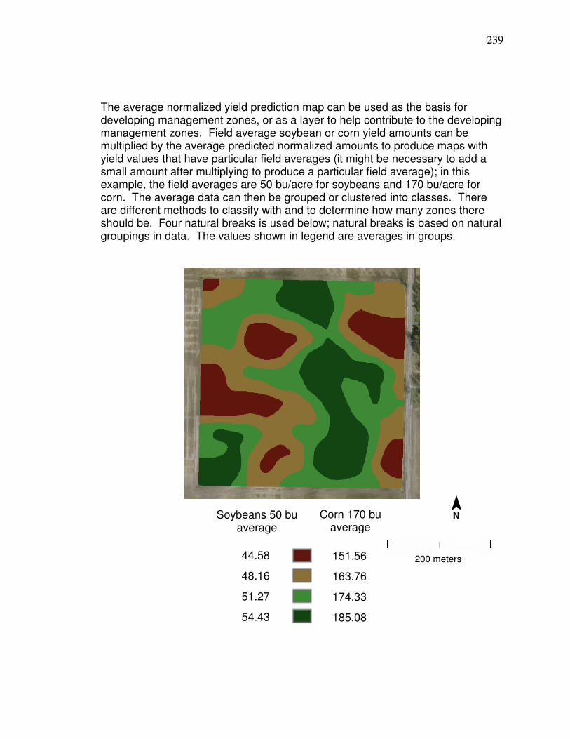
239
The average normalized yield prediction map can be used as the basis for developing management zones, or as a layer to help contribute to the developing management zones. Field average soybean or corn yield amounts can be multiplied by the average predicted normalized amounts to produce maps with yield values that have particular field averages (it might be necessary to add a small amount after multiplying to produce a particular field average); in this example, the field averages are 50 bu/acre for soybeans and 170 bu/acre for corn. The average data can then be grouped or clustered into classes. There are different methods to classify with and to determine how many zones there should be. Four natural breaks is used below; natural breaks is based on natural groupings in data. The values shown in legend are averages in groups.
Soybeans 50 bu average
Corn 170 bu average
44.58
48.16
51.27
54.43
151.56
163.76
174.33
185.08
¯ N
200 meters
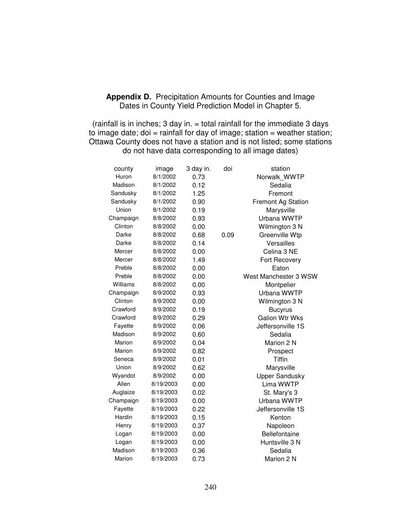
240
Appendix D. Precipitation Amounts for Counties and Image Dates in County Yield Prediction Model in Chapter 5.
(rainfall is in inches; 3 day in. = total rainfall for the immediate 3 days
to image date; doi = rainfall for day of image; station = weather station; Ottawa County does not have a station and is not listed; some stations
do not have data corresponding to all image dates)
county image 3 day in. doi station
Huron 8/1/2002 0.73 Norwalk_WWTP Madison 8/1/2002 0.12 Sedalia
Sandusky 8/1/2002 1.25 Fremont Sandusky 8/1/2002 0.90 Fremont Ag Station
Union 8/1/2002 0.19 Marysville Champaign 8/8/2002 0.93 Urbana WWTP
Clinton 8/8/2002 0.00 Wilmington 3 N Darke 8/8/2002 0.68 0.09 Greenville Wtp
Darke 8/8/2002 0.14 Versailles Mercer 8/8/2002 0.00 Celina 3 NE Mercer 8/8/2002 1.49 Fort Recovery Preble 8/8/2002 0.00 Eaton
Preble 8/8/2002 0.00 West Manchester 3 WSW Williams 8/8/2002 0.00 Montpelier
Champaign 8/9/2002 0.93 Urbana WWTP Clinton 8/9/2002 0.00 Wilmington 3 N
Crawford 8/9/2002 0.19 Bucyrus Crawford 8/9/2002 0.29 Galion Wtr Wks Fayette 8/9/2002 0.06 Jeffersonville 1S Madison 8/9/2002 0.60 Sedalia
Marion 8/9/2002 0.04 Marion 2 N Marion 8/9/2002 0.82 Prospect Seneca 8/9/2002 0.01 Tiffin Union 8/9/2002 0.62 Marysville
Wyandot 8/9/2002 0.00 Upper Sandusky Allen 8/19/2003 0.00 Lima WWTP
Auglaize 8/19/2003 0.02 St. Mary's 3 Champaign 8/19/2003 0.00 Urbana WWTP
Fayette 8/19/2003 0.22 Jeffersonville 1S Hardin 8/19/2003 0.15 Kenton Henry 8/19/2003 0.37 Napoleon Logan 8/19/2003 0.00 Bellefontaine
Logan 8/19/2003 0.00 Huntsville 3 N Madison 8/19/2003 0.36 Sedalia Marion 8/19/2003 0.73 Marion 2 N
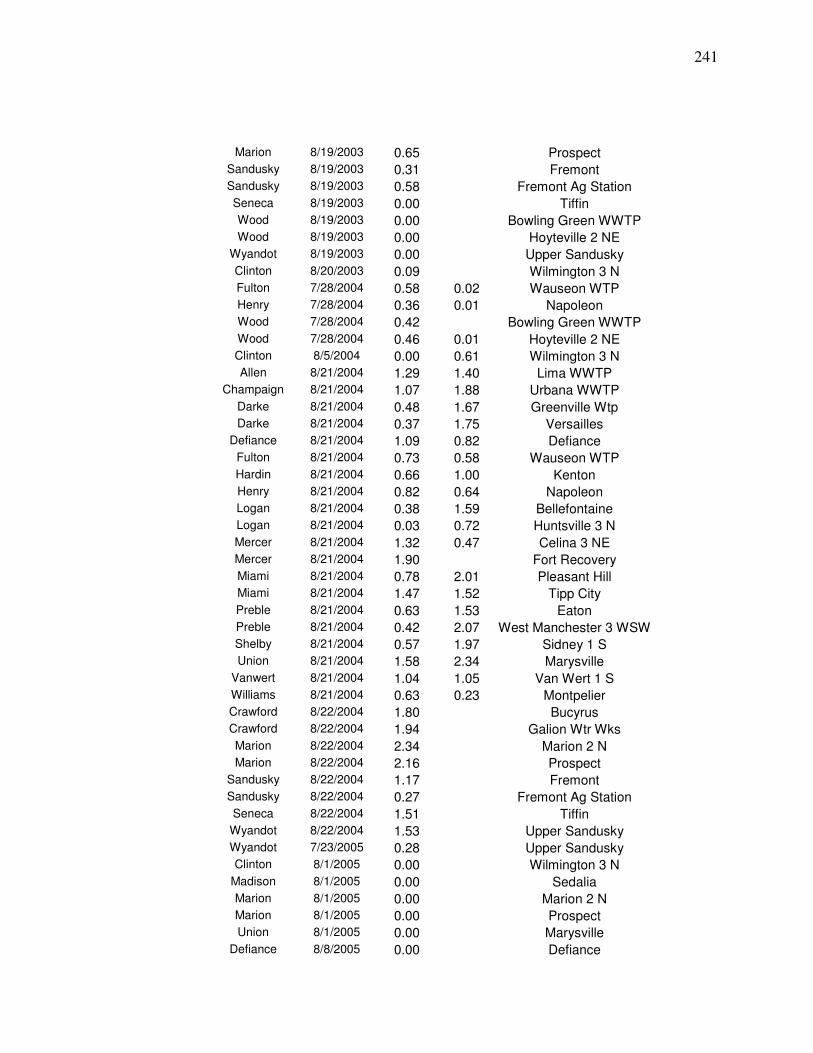
241
Marion 8/19/2003 0.65 Prospect Sandusky 8/19/2003 0.31 Fremont Sandusky 8/19/2003 0.58 Fremont Ag Station
Seneca 8/19/2003 0.00 Tiffin Wood 8/19/2003 0.00 Bowling Green WWTP Wood 8/19/2003 0.00 Hoyteville 2 NE
Wyandot 8/19/2003 0.00 Upper Sandusky
Clinton 8/20/2003 0.09 Wilmington 3 N Fulton 7/28/2004 0.58 0.02 Wauseon WTP Henry 7/28/2004 0.36 0.01 Napoleon Wood 7/28/2004 0.42 Bowling Green WWTP
Wood 7/28/2004 0.46 0.01 Hoyteville 2 NE Clinton 8/5/2004 0.00 0.61 Wilmington 3 N Allen 8/21/2004 1.29 1.40 Lima WWTP
Champaign 8/21/2004 1.07 1.88 Urbana WWTP
Darke 8/21/2004 0.48 1.67 Greenville Wtp Darke 8/21/2004 0.37 1.75 Versailles
Defiance 8/21/2004 1.09 0.82 Defiance Fulton 8/21/2004 0.73 0.58 Wauseon WTP
Hardin 8/21/2004 0.66 1.00 Kenton Henry 8/21/2004 0.82 0.64 Napoleon Logan 8/21/2004 0.38 1.59 Bellefontaine Logan 8/21/2004 0.03 0.72 Huntsville 3 N
Mercer 8/21/2004 1.32 0.47 Celina 3 NE Mercer 8/21/2004 1.90 Fort Recovery Miami 8/21/2004 0.78 2.01 Pleasant Hill Miami 8/21/2004 1.47 1.52 Tipp City
Preble 8/21/2004 0.63 1.53 Eaton Preble 8/21/2004 0.42 2.07 West Manchester 3 WSW Shelby 8/21/2004 0.57 1.97 Sidney 1 S Union 8/21/2004 1.58 2.34 Marysville
Vanwert 8/21/2004 1.04 1.05 Van Wert 1 S Williams 8/21/2004 0.63 0.23 Montpelier Crawford 8/22/2004 1.80 Bucyrus Crawford 8/22/2004 1.94 Galion Wtr Wks
Marion 8/22/2004 2.34 Marion 2 N Marion 8/22/2004 2.16 Prospect
Sandusky 8/22/2004 1.17 Fremont Sandusky 8/22/2004 0.27 Fremont Ag Station
Seneca 8/22/2004 1.51 Tiffin Wyandot 8/22/2004 1.53 Upper Sandusky Wyandot 7/23/2005 0.28 Upper Sandusky Clinton 8/1/2005 0.00 Wilmington 3 N
Madison 8/1/2005 0.00 Sedalia Marion 8/1/2005 0.00 Marion 2 N Marion 8/1/2005 0.00 Prospect Union 8/1/2005 0.00 Marysville
Defiance 8/8/2005 0.00 Defiance
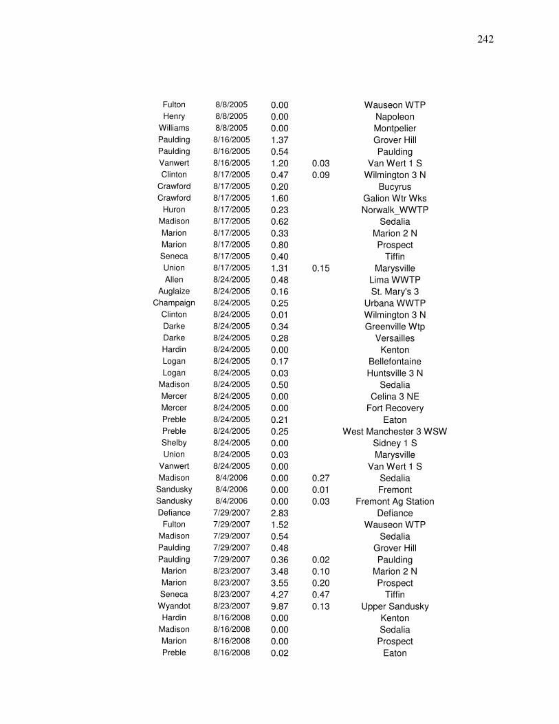
242
Fulton 8/8/2005 0.00 Wauseon WTP Henry 8/8/2005 0.00 Napoleon
Williams 8/8/2005 0.00 Montpelier
Paulding 8/16/2005 1.37 Grover Hill Paulding 8/16/2005 0.54 Paulding Vanwert 8/16/2005 1.20 0.03 Van Wert 1 S Clinton 8/17/2005 0.47 0.09 Wilmington 3 N
Crawford 8/17/2005 0.20 Bucyrus Crawford 8/17/2005 1.60 Galion Wtr Wks
Huron 8/17/2005 0.23 Norwalk_WWTP Madison 8/17/2005 0.62 Sedalia
Marion 8/17/2005 0.33 Marion 2 N Marion 8/17/2005 0.80 Prospect Seneca 8/17/2005 0.40 Tiffin Union 8/17/2005 1.31 0.15 Marysville
Allen 8/24/2005 0.48 Lima WWTP Auglaize 8/24/2005 0.16 St. Mary's 3
Champaign 8/24/2005 0.25 Urbana WWTP Clinton 8/24/2005 0.01 Wilmington 3 N
Darke 8/24/2005 0.34 Greenville Wtp Darke 8/24/2005 0.28 Versailles Hardin 8/24/2005 0.00 Kenton Logan 8/24/2005 0.17 Bellefontaine
Logan 8/24/2005 0.03 Huntsville 3 N Madison 8/24/2005 0.50 Sedalia Mercer 8/24/2005 0.00 Celina 3 NE Mercer 8/24/2005 0.00 Fort Recovery
Preble 8/24/2005 0.21 Eaton Preble 8/24/2005 0.25 West Manchester 3 WSW Shelby 8/24/2005 0.00 Sidney 1 S Union 8/24/2005 0.03 Marysville
Vanwert 8/24/2005 0.00 Van Wert 1 S Madison 8/4/2006 0.00 0.27 Sedalia
Sandusky 8/4/2006 0.00 0.01 Fremont Sandusky 8/4/2006 0.00 0.03 Fremont Ag Station
Defiance 7/29/2007 2.83 Defiance Fulton 7/29/2007 1.52 Wauseon WTP
Madison 7/29/2007 0.54 Sedalia Paulding 7/29/2007 0.48 Grover Hill
Paulding 7/29/2007 0.36 0.02 Paulding Marion 8/23/2007 3.48 0.10 Marion 2 N Marion 8/23/2007 3.55 0.20 Prospect Seneca 8/23/2007 4.27 0.47 Tiffin
Wyandot 8/23/2007 9.87 0.13 Upper Sandusky Hardin 8/16/2008 0.00 Kenton
Madison 8/16/2008 0.00 Sedalia Marion 8/16/2008 0.00 Prospect
Preble 8/16/2008 0.02 Eaton

243
Preble 8/16/2008 0.00 West Manchester 3 WSW Union 8/16/2008 0.06 Marysville
Williams 8/16/2008 0.00 Montpelier
Wyandot 8/16/2008 0.05 Upper Sandusky
Related Documents