Copy & conversion Optimizing the customer experience Or: putting the ‘fun’ in ‘funnel’

Welcome message from author
This document is posted to help you gain knowledge. Please leave a comment to let me know what you think about it! Share it to your friends and learn new things together.
Transcript
Copy & conversionOptimizing the customer experience
Or: putting the ‘fun’ in ‘funnel’
In this presentation• The funnel model
• The funnel archetype
• Product and landing pages
• Order and payment details
• Summary and check
• Confirmation
• Applying the right interaction principles
• Dark patterns (don’t be evil)
• Check list

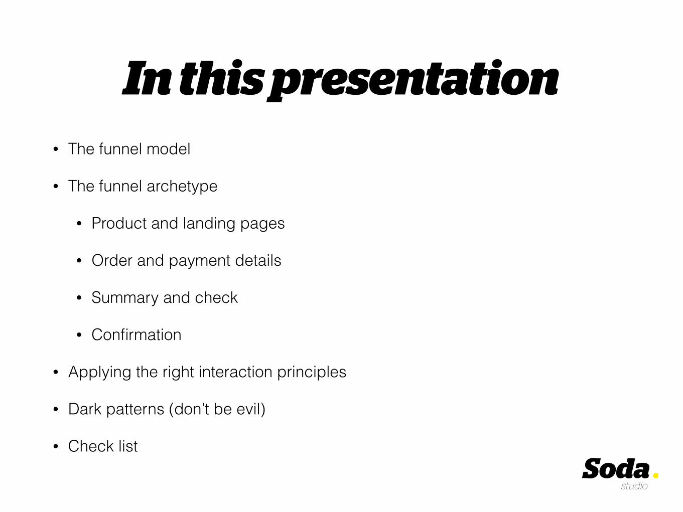
What funnel?
Here’s one..

Here’s one..Homepage / landingpage
Product page(s)
Product details
Buy
Generally. Each decision ‘mode’ is covered by individual pages or information.
Tumbling down should be smooth and easy.

Why this model?

Visitors
Customers
The road to conversion..
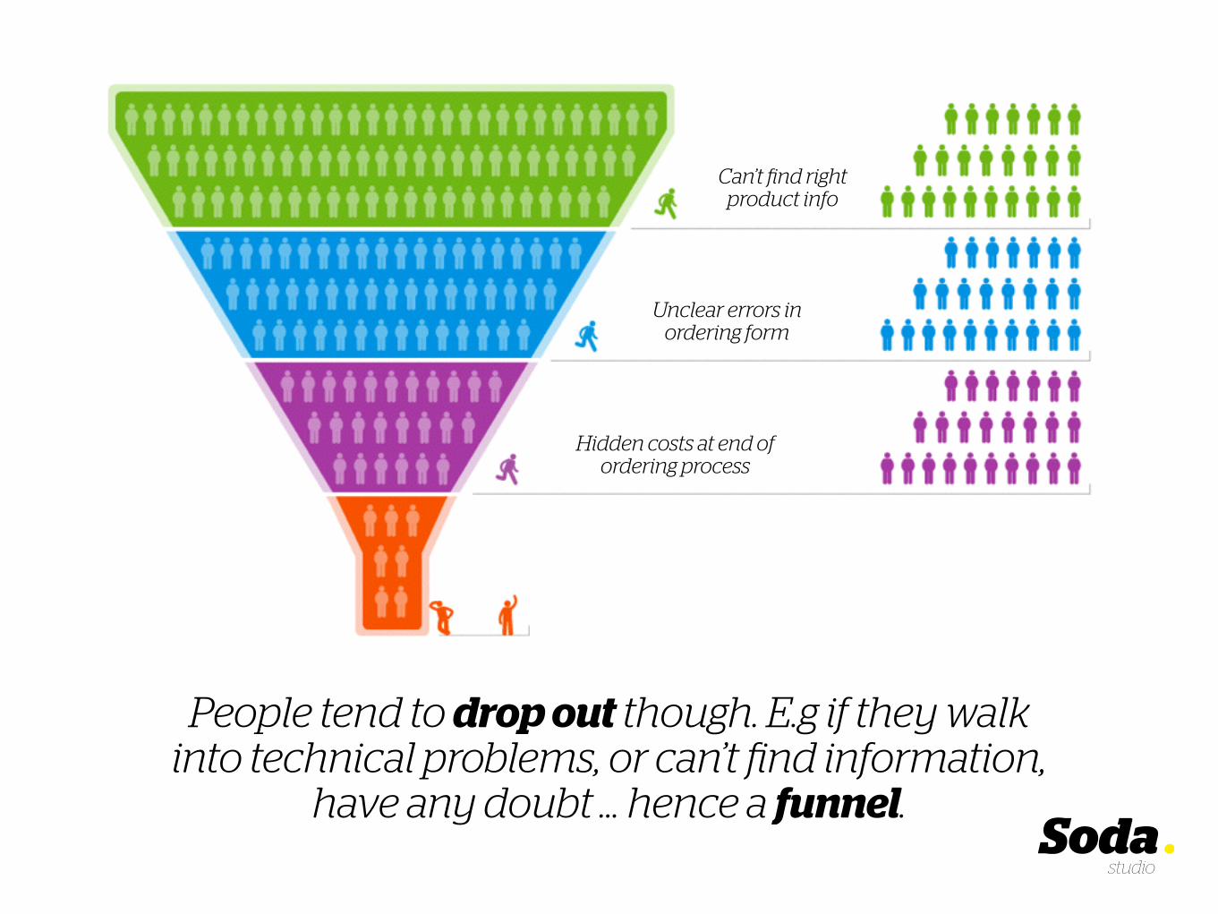
People tend to drop out though. E.g if they walk into technical problems, or can’t find information,
have any doubt … hence a funnel.
Can’t find right product info
Unclear errors in ordering form
Hidden costs at end of ordering process

It’s up to UX teams (designers, copywriters, developers) to broaden the
funnel and increase conversion.
Can’t find right product info
Unclear errors in ordering form
Hidden costs at end of ordering process
Product & landing pages
The funnel archetype
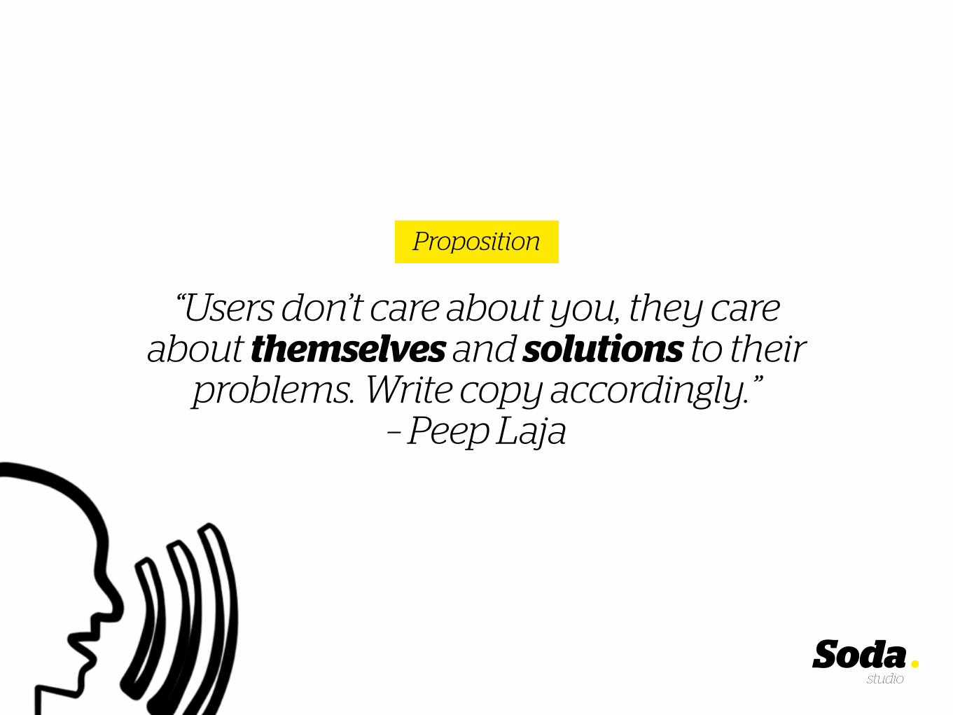
“Users don’t care about you, they care about themselves and solutions to their
problems. Write copy accordingly.” – Peep Laja
Proposition

Pinterest shows a series of simple use cases which people relate to. It might also work for you!

Too bad though, this user remains very vague. It doesn’t feel that authentic..

Talking about vague: ‘Find things that inspire you’? Like what? What added value does Pinterest have?
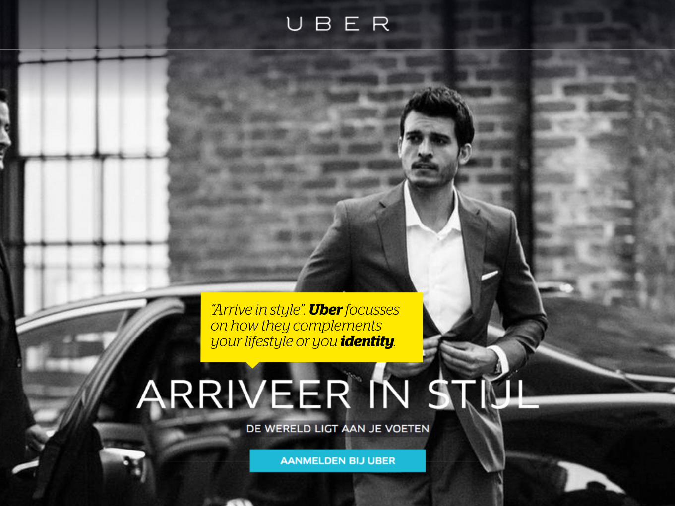
“Arrive in style”. Uber focusses on how they complements your lifestyle or you identity.
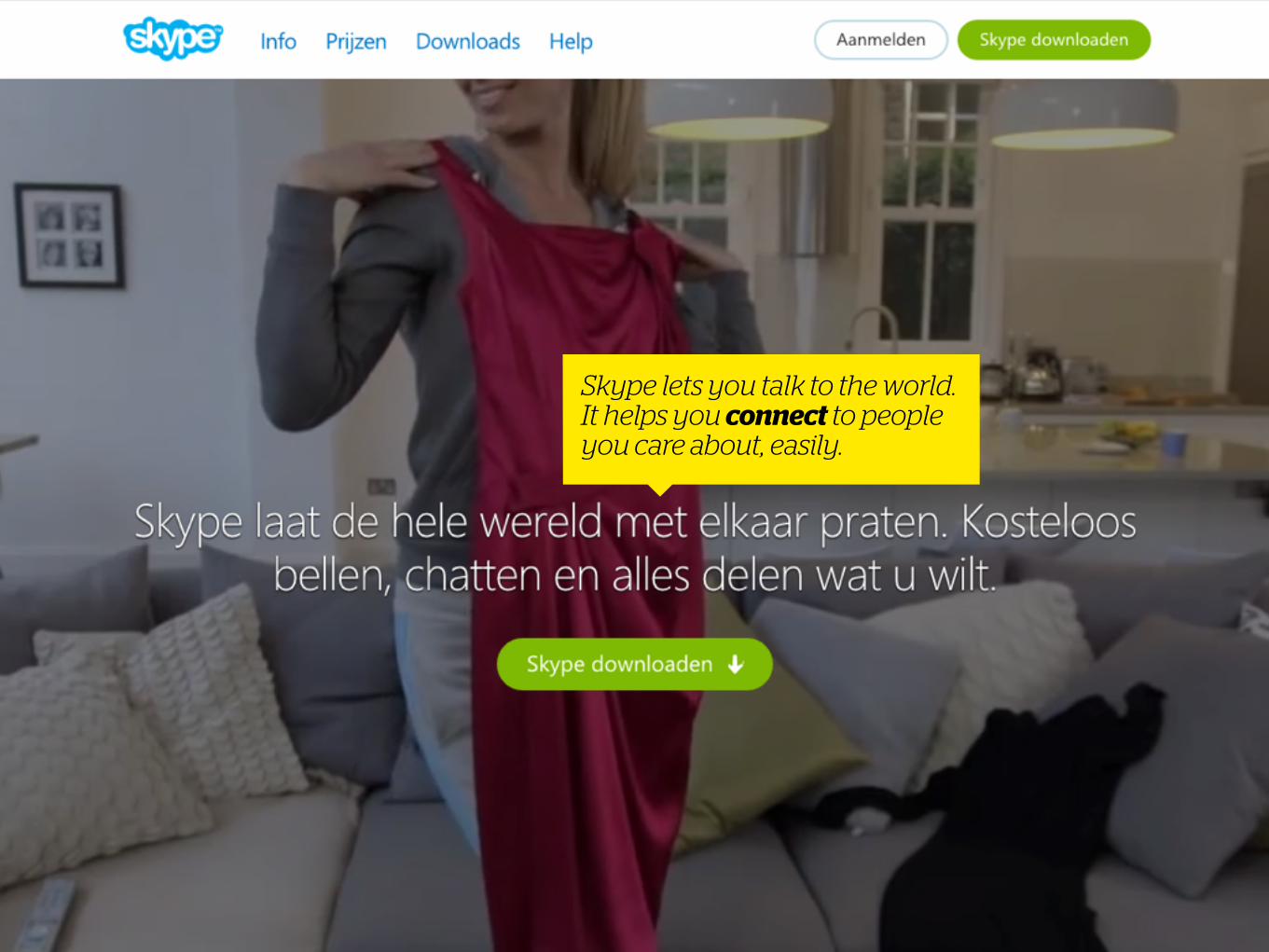
Skype lets you talk to the world. It helps you connect to people you care about, easily.

Dutch telecom company Simyo clearly lists the most important unique selling points on the product selection page.

They also includes, amongst others, a logo of their network provider to boost trust.
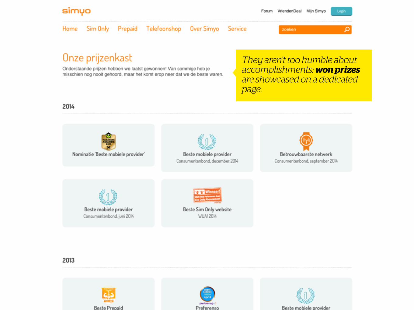
They aren’t too humble about accomplishments: won prizes are showcased on a dedicated page.
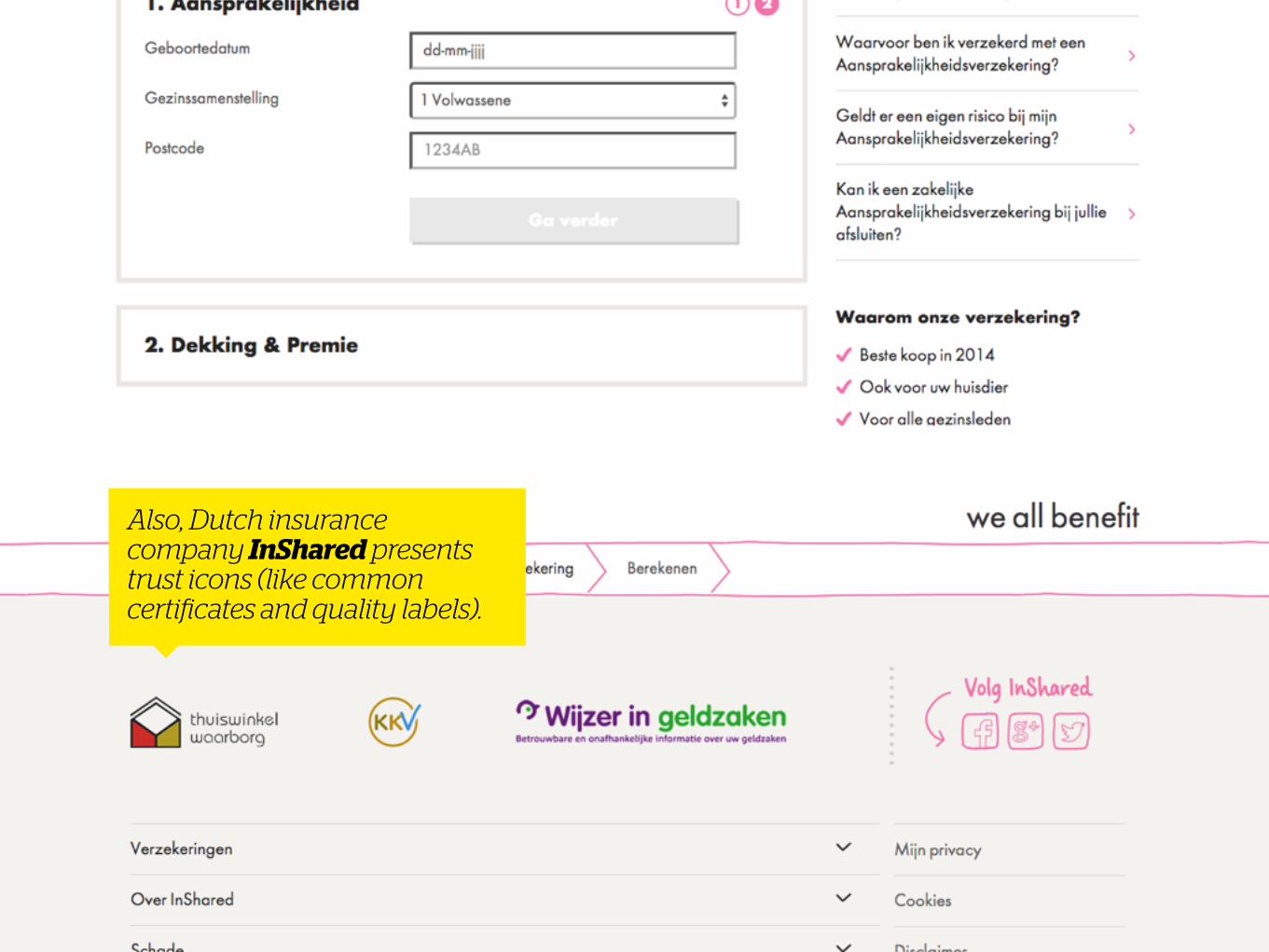
Also, Dutch insurance company InShared presents trust icons (like common certificates and quality labels).

“One jar held ten cookies while the other contained just two. Though the cookies and
jars were identical, participants valued the ones in the near-empty jar more highly.
Scarcity had somehow affected their perception of value.” – Nir Eyal
Scarcity

On Booking scarcity is all over the place. There’s a sense of urgency. (Up to the point that it’s uncomfortable to look at.)

On eBay, the number of viewers is shown, also driving the sense of urgency.

On VakantieVeilingen, winning an auction is key, the actual product becomes secondary. Winning at the last second is the ‘rush’.

Pushing scarcity, and people’s “fear of missing out” may seem nasty (especially when the
scarcity is artificially created by the site owners)..
On the other hand, a case can be made for showing availability, to give the customer a
fair chance to buy the product. Ultimately, to manage a customer’s
expectations
Afterthoughts
But let’s move on..
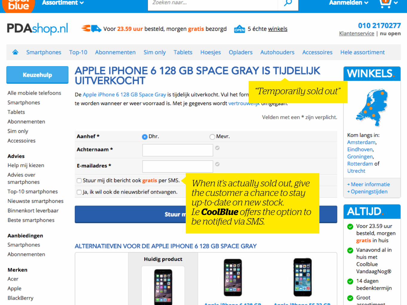
When it’s actually sold out, give the customer a chance to stay up-to-date on new stock. I.e CoolBlue offers the option to be notified via SMS.
“Temporarily sold out”

Quantitative: How many customers have bought your product?
Qualitative: What customers or businesses use it? What’s their story?
Social proof

Apparently, large renowned companies (with authority) are already using Slack. They can’t be wrong, right?

Additionally, Slack features the love users have for the product..

.. Which links to this Twitter page (‘wall of love’). The reviews you see here are curated, but they’re authentic!

Kickstarter is all about the numbers. You’d want to fund projects in large amounts, jump the bandwagon. And, in many cases, support the ‘new player’ in the field to excel with their product.

Making decision-making easier
Product options

Labels like “Most popular” make choosing easy on Simyo. Apparently, this option is sufficient for most people.
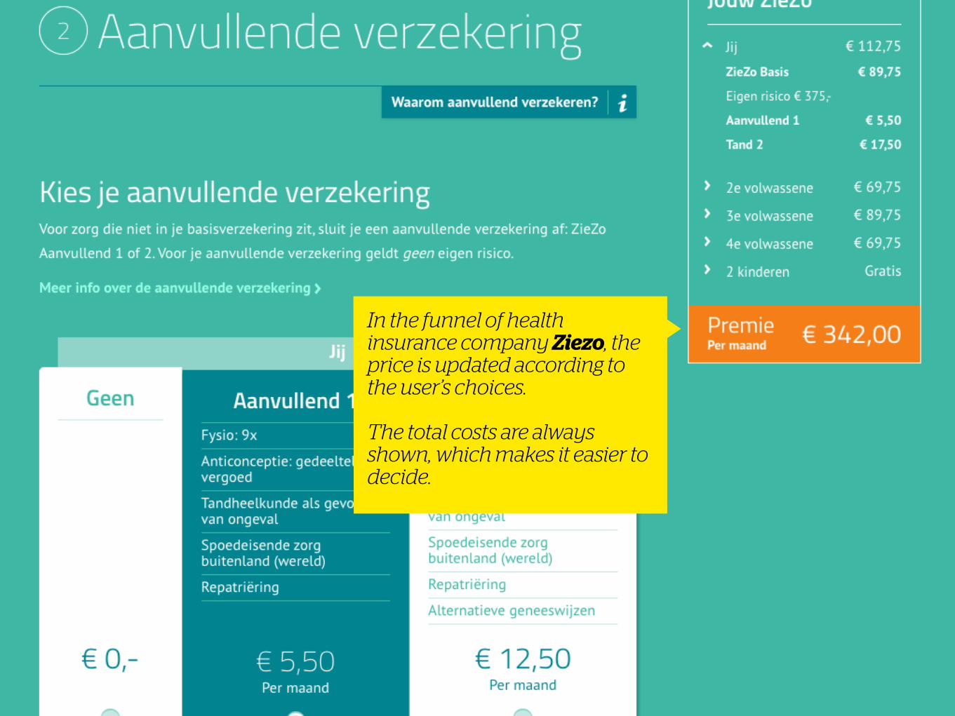
In the funnel of health insurance company Ziezo, the price is updated according to the user’s choices.
The total costs are always shown, which makes it easier to decide.

The choice paradox
People want control. But in most cases too much choice backfires; resulting in
people not choosing anything.

“Most people online are gorillas. When a gorilla walks into an experiment, what they
say is ‘What do I do now? Where’s the banana?’” – Seth Godin
Call-to-actions (CTA’s)

Differentiate
http://blog.codinghorror.com/the-god-login/
Be clear on labelling, provide sufficient feedforward and differentiate multiple
CTA’s.

‘Click magnets’• Use words that trigger
• ‘Fast’, ‘easy’, ‘convenient’, ‘free’ et cetera
• (The offer has to be relevant in order to be effective though.)

The 3rd option
Adding a trivial third option increases conversion. (Supposedly, because user
feel in control.)
http://www.marketingfacts.nl/berichten/conversieknaller-de-extra-link-die-niemand-klikt-hobson1-effect

Order & payment details
The funnel archetype
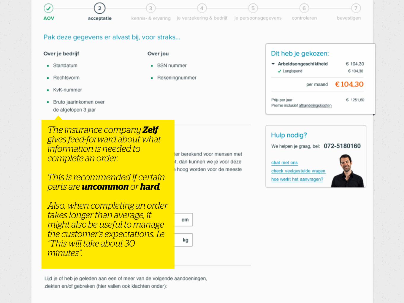
The insurance company Zelf gives feed-forward about what information is needed to complete an order.
This is recommended if certain parts are uncommon or hard.
Also, when completing an order takes longer than average, it might also be useful to manage the customer’s expectations. I.e “This will take about 30 minutes”.

Booking uses this to their advantage. It just takes 2 minutes.
.. Same trick here. You don’t need to many details to complete a booking.
Promoting convenience
Step indication• Emphasize on ‘Where am I?’ and ‘What’s next?’
• Apply ‘just’ enough, clearly demarcated steps.
• Splitting input into steps (and making the user submit more often) avoids errors
• Splitting up forms and information keeps your pages more digestible
• Label the steps consistently
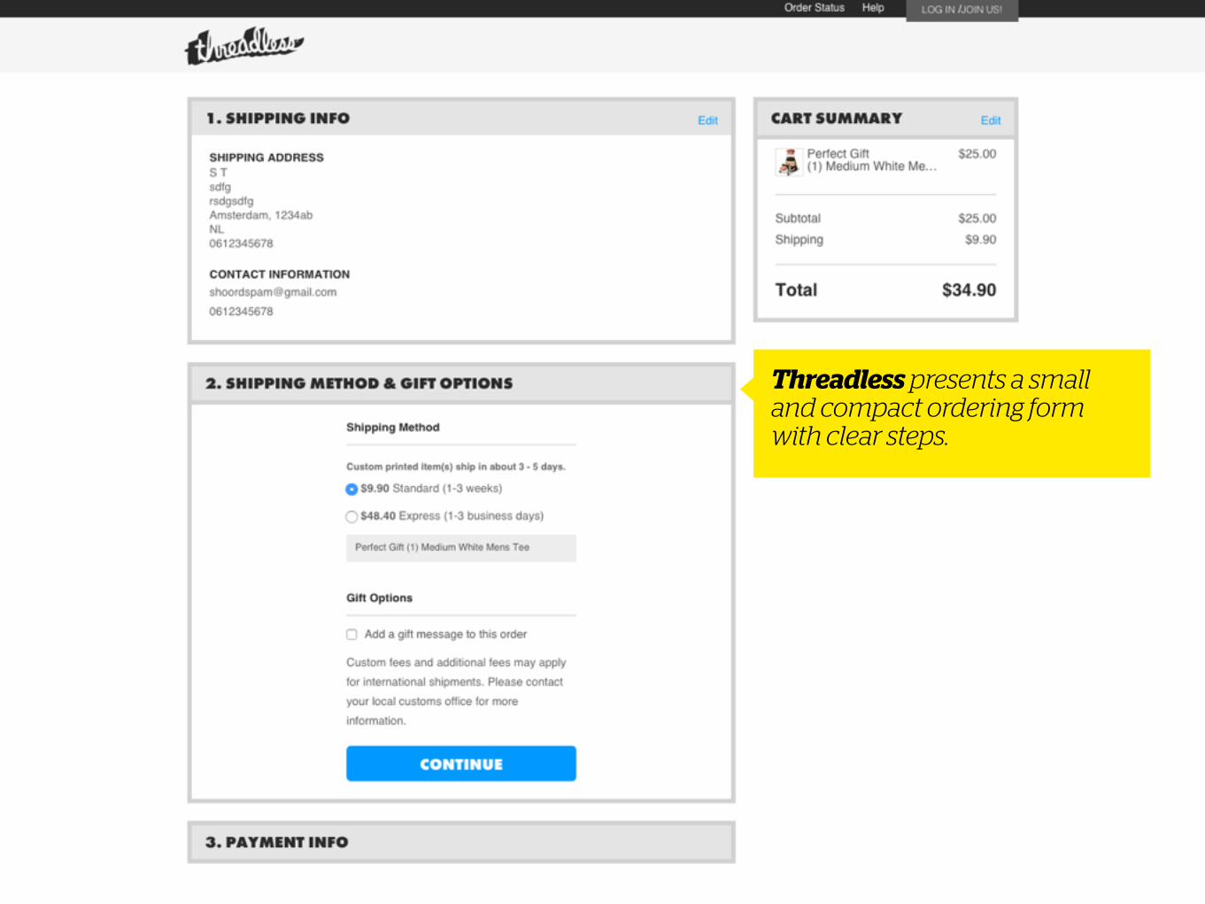
Threadless presents a small and compact ordering form with clear steps.
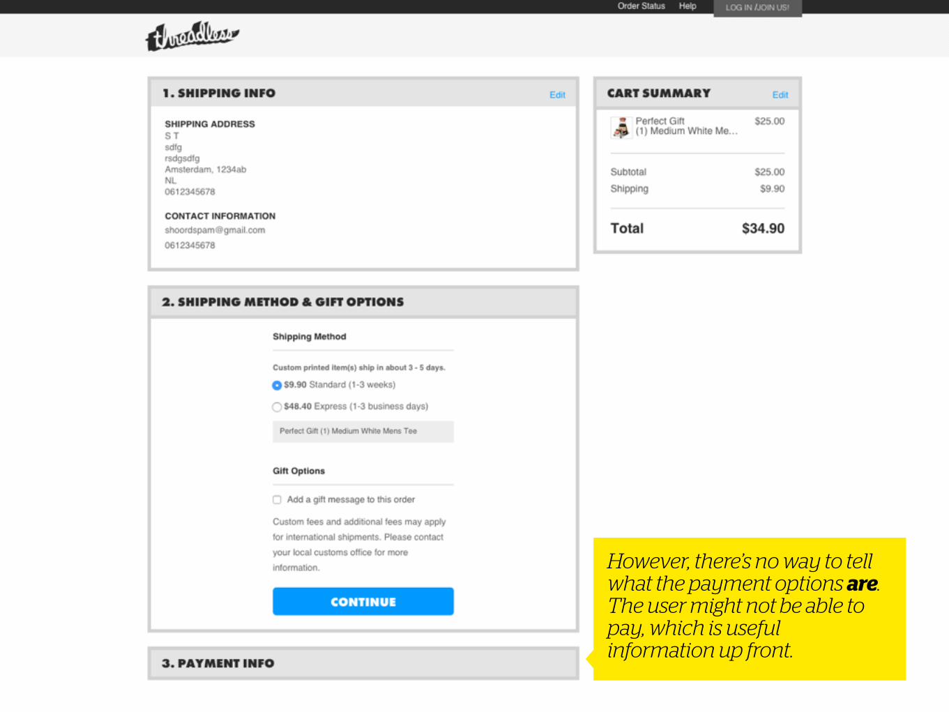
However, there’s no way to tell what the payment options are. The user might not be able to pay, which is useful information up front.

On the site of cable company Tele2, labelling of steps is short and sweet.
Step indication

But what about ‘levering’ (delivery)? Are there elaborate options? Might be useful to communicate this earlier in the process..
Step indication
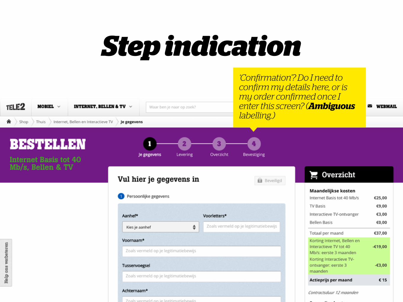
‘Confirmation’? Do I need to confirm my details here, or is my order confirmed once I enter this screen? (Ambiguous labelling.)
Step indication

Step indicationOn Booking, it’s clear what expected of the user in each step. (1 to 3 is all requires input.)

Step indication‘Geboekt’ (booked) is clearly ‘just’ a confirmation. Also fits with the excitement after having booked.
Minimize ‘escapes’

Minimize ‘escapes’
The Vodafone funnel uses another header and footer which contains a minimal amount of outgoing links. The focus is on making a purchase.

Minimize ‘escapes’
They also have a nice heads-up about what information is needed to complete the order.

Defaults & shortcutsTo make going through forms lightning fast:
• Use smart defaults (i.e for a country dropdown), so most users don’t have to fiddle with those inputs.
• Use shortcuts for entering information, i.e entering postal code as a shortcut for city + street name. So the number of input fields can be reduced.

Defaults & shortcuts
Vodafone offers the option to re-use information which is entered earlier. In this case for delivery/billing address.

Sell!

Up or cross?• Upselling:
“A sales technique whereby a seller induces the customer to purchase more expensive items, upgrades, or other add-ons [e.g] services or products [or showing] other options.” – Wikipedia
• Cross-selling: “[trying] to sell something else.” – Wikipedia

On Asos, the customer is tempted to keep shopping so that certain delivery options are free (upsell).
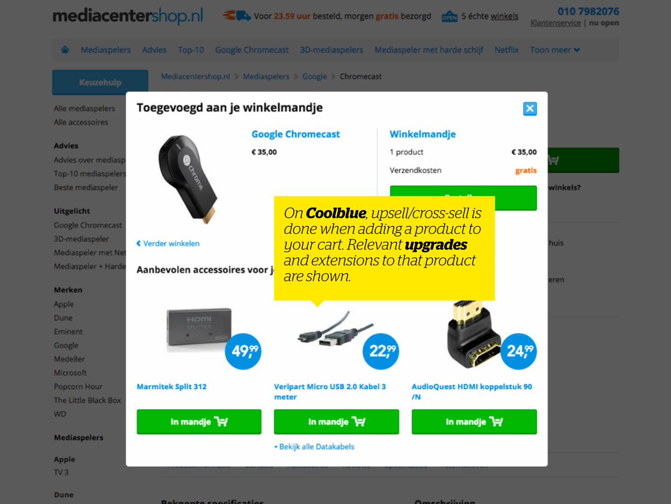
On Coolblue, upsell/cross-sell is done when adding a product to your cart. Relevant upgrades and extensions to that product are shown.

In the KLM funnel, choosing extras is a separate step in the ordering process. The used photography feels overly ‘stocky’ though..

Taking away doubt• Answer questions that the customer might have on
relevant locations (FAQ’s are often clunky)
• Provide a telephone number, chats or other ways for quick Q&A
• Make the user feel safe, highlight the SSL certificate, possibly with the security provider (Norton, MacAfee et cetera)

Coolblue always shows their telephone number. (Moreover, they are practically always open.)

Account management• Don’t force the user in creating an account, offer a
guest user option
• If an account needs to be created..
• Use e-mail als key identifier (not a username)
• Leave out password creation (i.e generate one and send it via e-mail), otherwise, be clear about your password criteria when choosing one
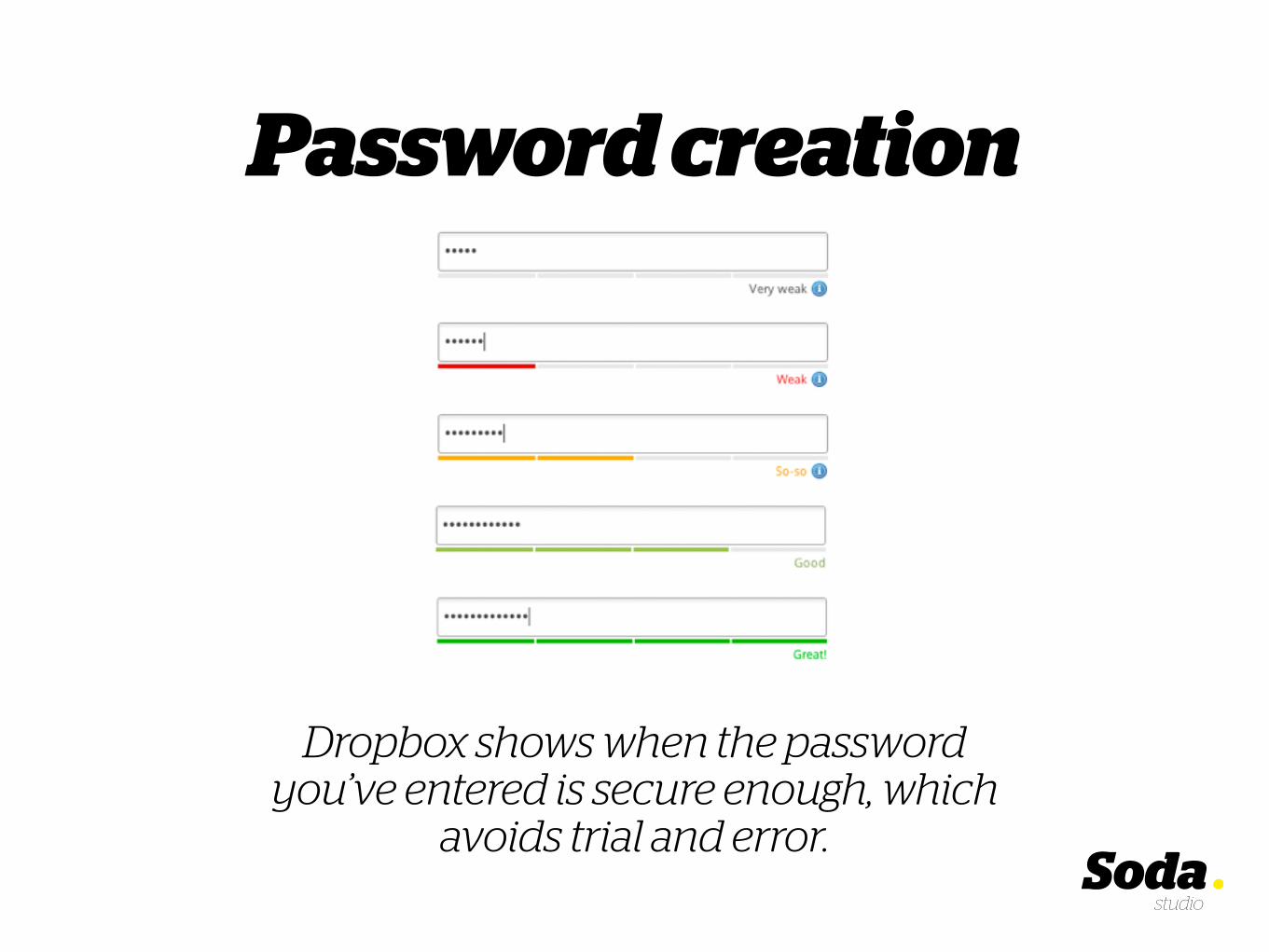
Password creation
Dropbox shows when the password you’ve entered is secure enough, which
avoids trial and error.

Summarize the order
The funnel archetype

Summarize the order• Summarize clearly, make checking quick and easy
• Provide all possible information
• Summarize the terms & conditions so the user knows what he agrees with
• Make the submit (order) button feel ‘definitive’
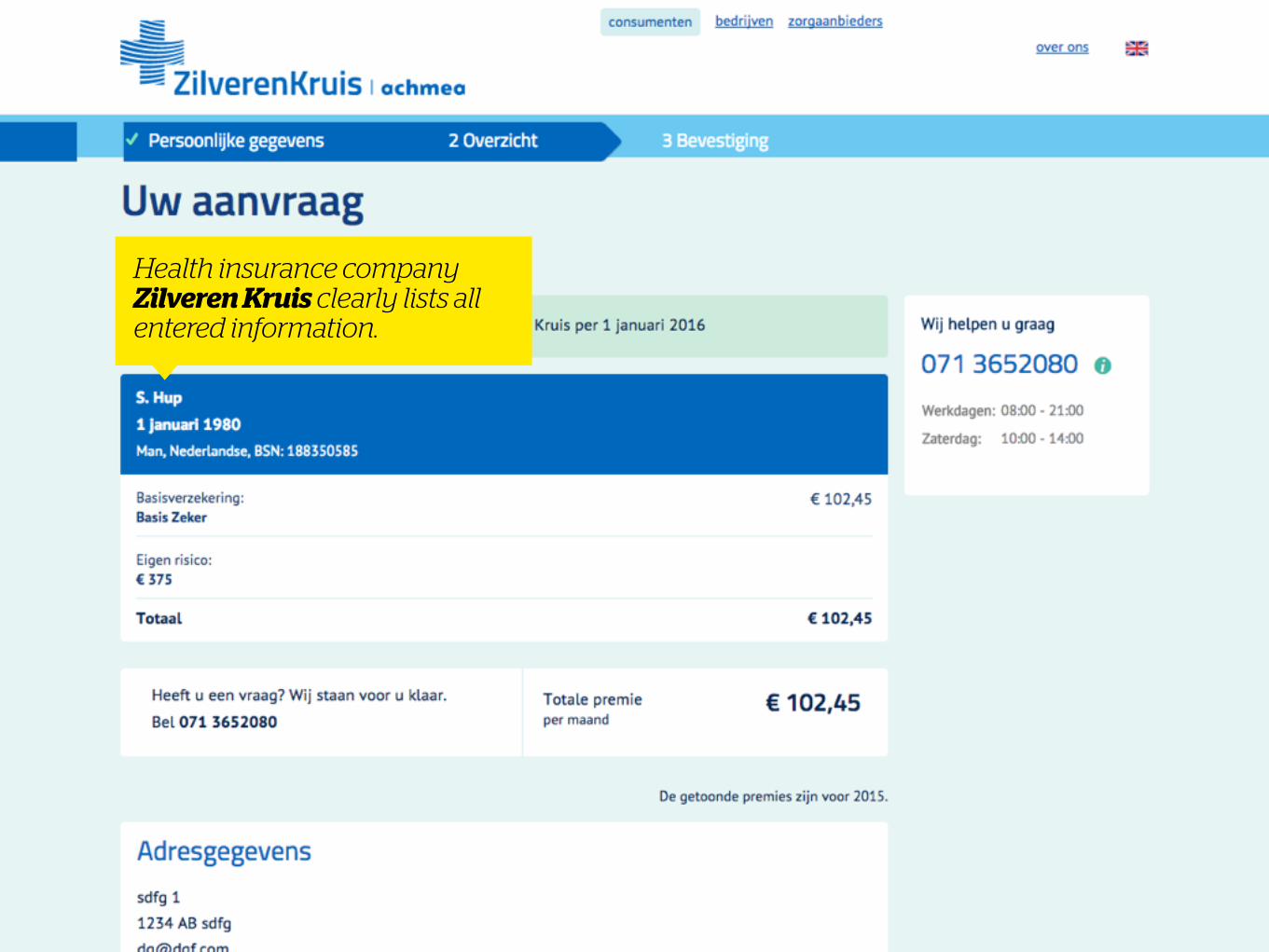
Health insurance company Zilveren Kruis clearly lists all entered information.
ConfirmationThe funnel archetype
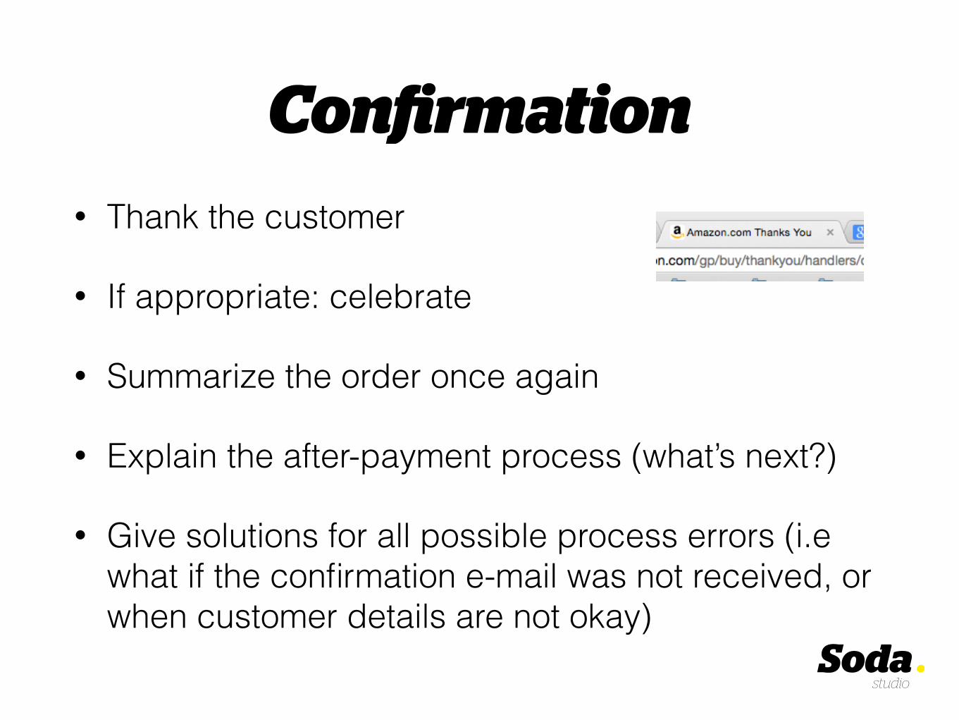
Confirmation• Thank the customer
• If appropriate: celebrate
• Summarize the order once again
• Explain the after-payment process (what’s next?)
• Give solutions for all possible process errors (i.e what if the confirmation e-mail was not received, or when customer details are not okay)

Car rental service YellowBrick tells what the next steps are. What to expect.

However, the copywriting is very formal.

Presents a link to ‘the site’. Is this page not ‘the site’?

A link to the order summary is hidden over here, and doesn’t feel very clickable.

Interaction principles
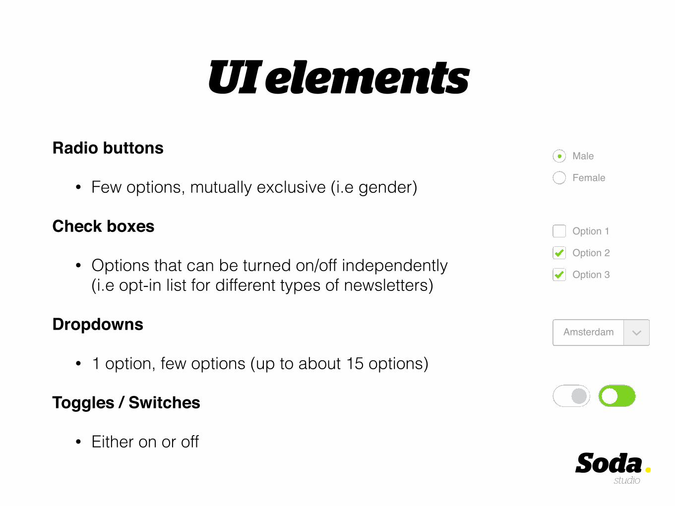
UI elementsRadio buttons
• Few options, mutually exclusive (i.e gender)
Check boxes
• Options that can be turned on/off independently (i.e opt-in list for different types of newsletters)
Dropdowns
• 1 option, few options (up to about 15 options)
Toggles / Switches
• Either on or off
Option 1
Option 2
Option 3
Male
Female
Amsterdam
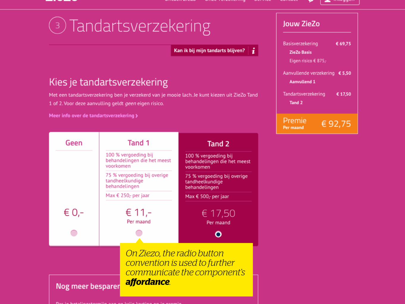
On Ziezo, the radio button convention is used to further communicate the component’s affordance.
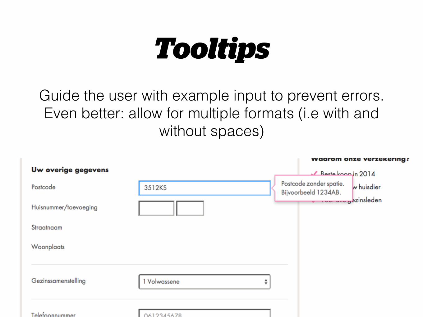
TooltipsGuide the user with example input to prevent errors. Even better: allow for multiple formats (i.e with and
without spaces)
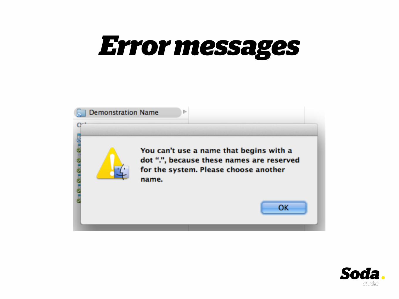
Error messages

“Error messages punish people for not behaving like machines. […] It is time to design
and build machines that conform to our requirements. Stop confronting us:
Collaborate with us.” – Don Norman
Error messages

Error messages• Explain what’s gone wrong
• Don’t ‘blame’ the user
• Provide solutions to the problem
• Avoid technical jargon
• Allow for different values: make the system more forgiving if possible
Inline validation
Inline validation means giving feedback while the input field is active. This
makes your forms faster to go through, and relieves some of the hassle.
On Bol suggestions are given when common mistakes are made when entering an e-mail address.

Inline validation
However, choose the moment for feedback wisely. You don’t want to show
errors before the user has had the chance to complete the input.
“This is no valid date of birth.”

Error messages
Choose copy that’s human, and not too harsh..
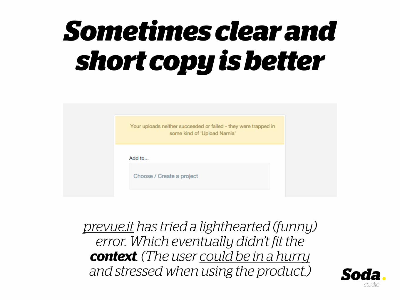
Sometimes clear and short copy is better
prevue.it has tried a lighthearted (funny) error. Which eventually didn’t fit the
context. (The user could be in a hurry and stressed when using the product.)

Lightheartedly
In other cases, a lighthearted error is appropriate. (Above: the error when
submitting a empty login form.)
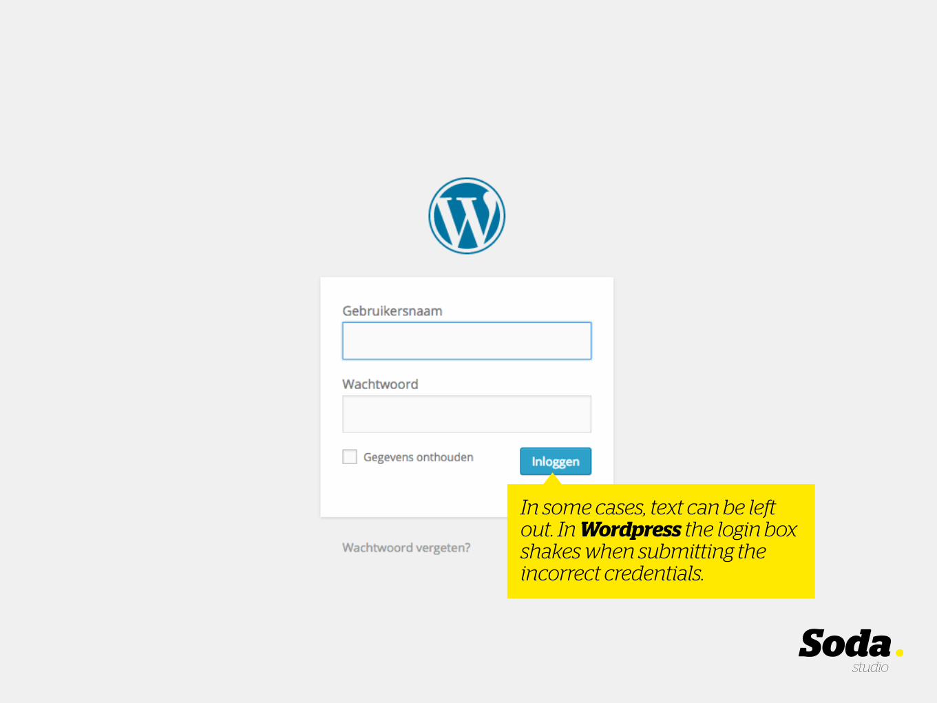
In some cases, text can be left out. In Wordpress the login box shakes when submitting the incorrect credentials.
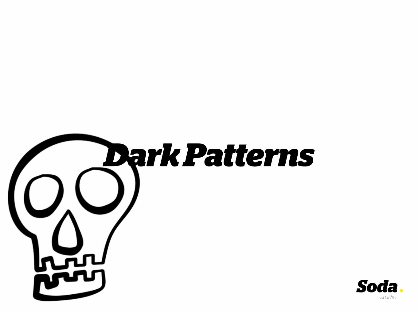
Dark Patterns
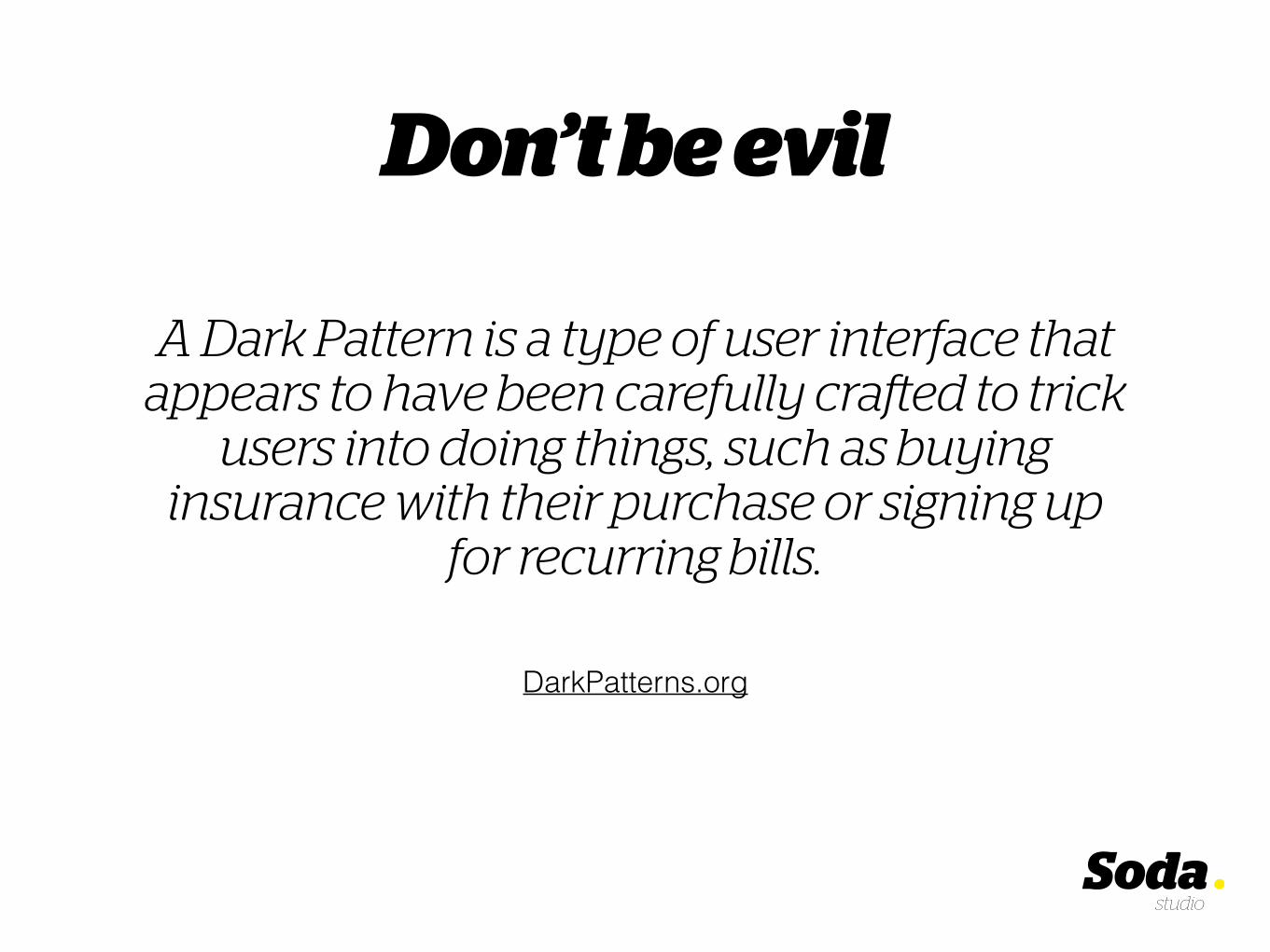
A Dark Pattern is a type of user interface that appears to have been carefully crafted to trick
users into doing things, such as buying insurance with their purchase or signing up
for recurring bills.
Don’t be evil
DarkPatterns.org

Don’t be evil• Provide sufficient information
• Avoid hidden costs, be transparent about price
• Don’t put something in the shopping cart without a user’s consent, or check product options by default
• Avoid trick questions

On Hotels, the opt-in for newsletter is phrased as a double negative. “Check if you do not want to receive..”.
Thus exploiting the user’s mental model (the convention).
Moreover, the text is pretty long for something that’s fairly simple.

On SeeTickets, the total price is shown, but the check (by default) makes it so that additional costs can be added further on in the funnel.
In conclusion..
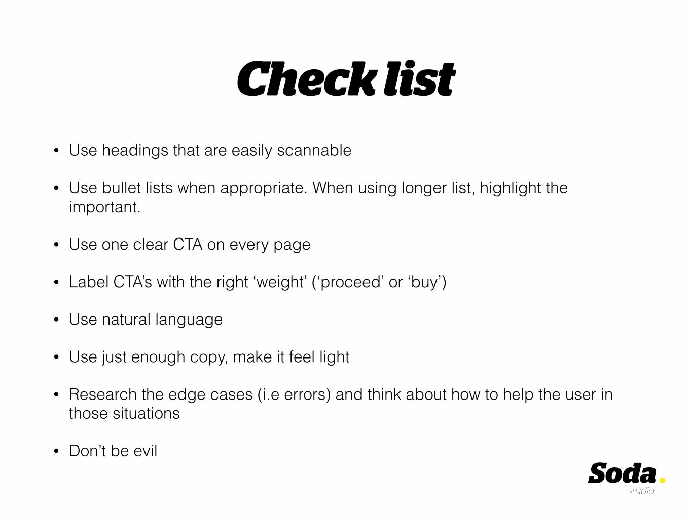
Check list• Use headings that are easily scannable
• Use bullet lists when appropriate. When using longer list, highlight the important.
• Use one clear CTA on every page
• Label CTA’s with the right ‘weight’ (‘proceed’ or ‘buy’)
• Use natural language
• Use just enough copy, make it feel light
• Research the edge cases (i.e errors) and think about how to help the user in those situations
• Don’t be evil

Let’s make shopping more convenient!
Photo: Hans Kemp Questions? E-mail me at [email protected]
Good luck!
Related Documents