Conventions Edward Marshall

Welcome message from author
This document is posted to help you gain knowledge. Please leave a comment to let me know what you think about it! Share it to your friends and learn new things together.
Transcript
ConventionsEdward Marshall

Ancillary TextsPoster and Magazine
Poster and Horror Conventions Use of the Actors names to promote film Darks Colours Use of Film credits at the bottom of the page Production logos Scary/Spooky Image Bold Distressed Fonts

The Red in the Poster connotes Danger and warning.
There are credits at the bottom of the poster and there is also the release date.
The image on the poster is central and catches our eye straight away
Serif Type face is used to give the poster an aged creepy feel to it
The tag line of the film is on the poster above the title.
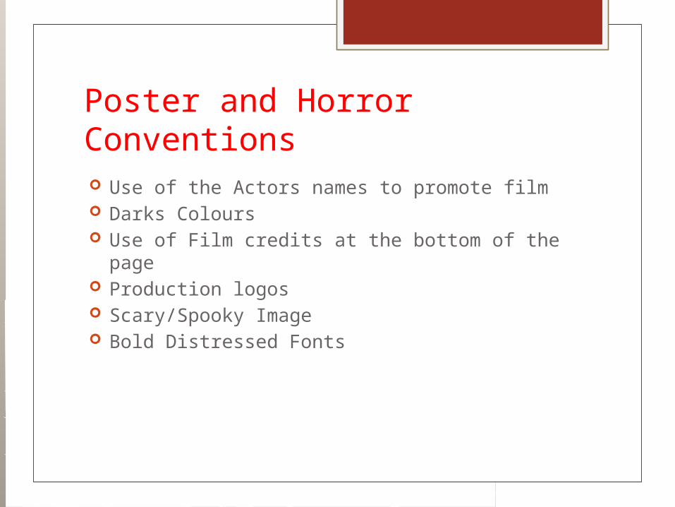
The Title of the film and the tagline is at the bottom of the screen. This keeps all of the Actors names at the top of the poster gain peoples interest by the name of the people.
The image on the poster looks creepy and also takes up the majority of the poster. The release date at the bottom of the page is bold and shows up clearly. Along with the movie credits there are the production logos that customers can spot to see if the production companies are well known.

Magazine and Horror Conventions Bold Mast head including Date and Website Variety of fonts Main Story cover line going across the whole
page Smaller Cover lines dotted around the Magazine Language used is formal Fonts are usually bold and eye catching Route of eye Hotspots

Bold Masthead
3 Colours in the Colour scheme
Cover lines are across the page
There are a lot of cover lines
Image is eye catching and show the dark nature of the filmThe main image is not disturbed by cover liens
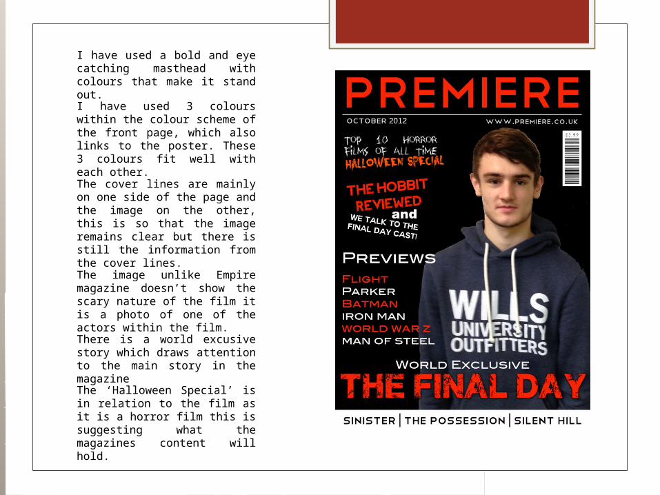
I have used a bold and eye catching masthead with colours that make it stand out.
I have used 3 colours within the colour scheme of the front page, which also links to the poster. These 3 colours fit well with each other.
The cover lines are mainly on one side of the page and the image on the other, this is so that the image remains clear but there is still the information from the cover lines.
The image unlike Empire magazine doesn’t show the scary nature of the film it is a photo of one of the actors within the film.There is a world excusive story which draws attention to the main story in the magazine
The ‘Halloween Special’ is in relation to the film as it is a horror film this is suggesting what the magazines content will hold.
The Effect
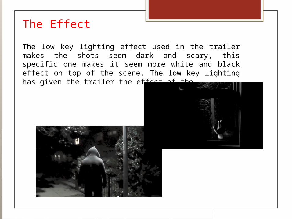
The low key lighting effect used in the trailer makes the shots seem dark and scary, this specific one makes it seem more white and black effect on top of the scene. The low key lighting has given the trailer the effect of the

The Effect
Dark Colour Schemes – The dark colours schemes I have used have a massive effect on the genre, the reason for this is that if I had of used bright colour scheme it would have not had a scary effect and feel to it, the black and red colours connote danger, warning, blood and the black connotes darkness, unknown, death and power. These colours make the products look more effective as horror products.
Low Key Lighting – Within the trailer, the low key lighting makes the trailer seems more dark and scary than if all the shots were in the daytime. This effect is also crucial to making the trailer instantly recognisable as a horror film, the low key lighting is used throughout the trailer and is in most of the scenes.
Fast Paced Editing – The fast paced editing at the end of the trailer where the shots cut back and fourth through a variety of different scenes. This gives a freaky effect to the trailer and as it is a teaser trailer the fact that it doesn’t make complete sense doesn’t matter as it is just teasing the audience.
Related Documents